1/43
We Asked 20 Designers for Their Favorite Paint Colors for Windows
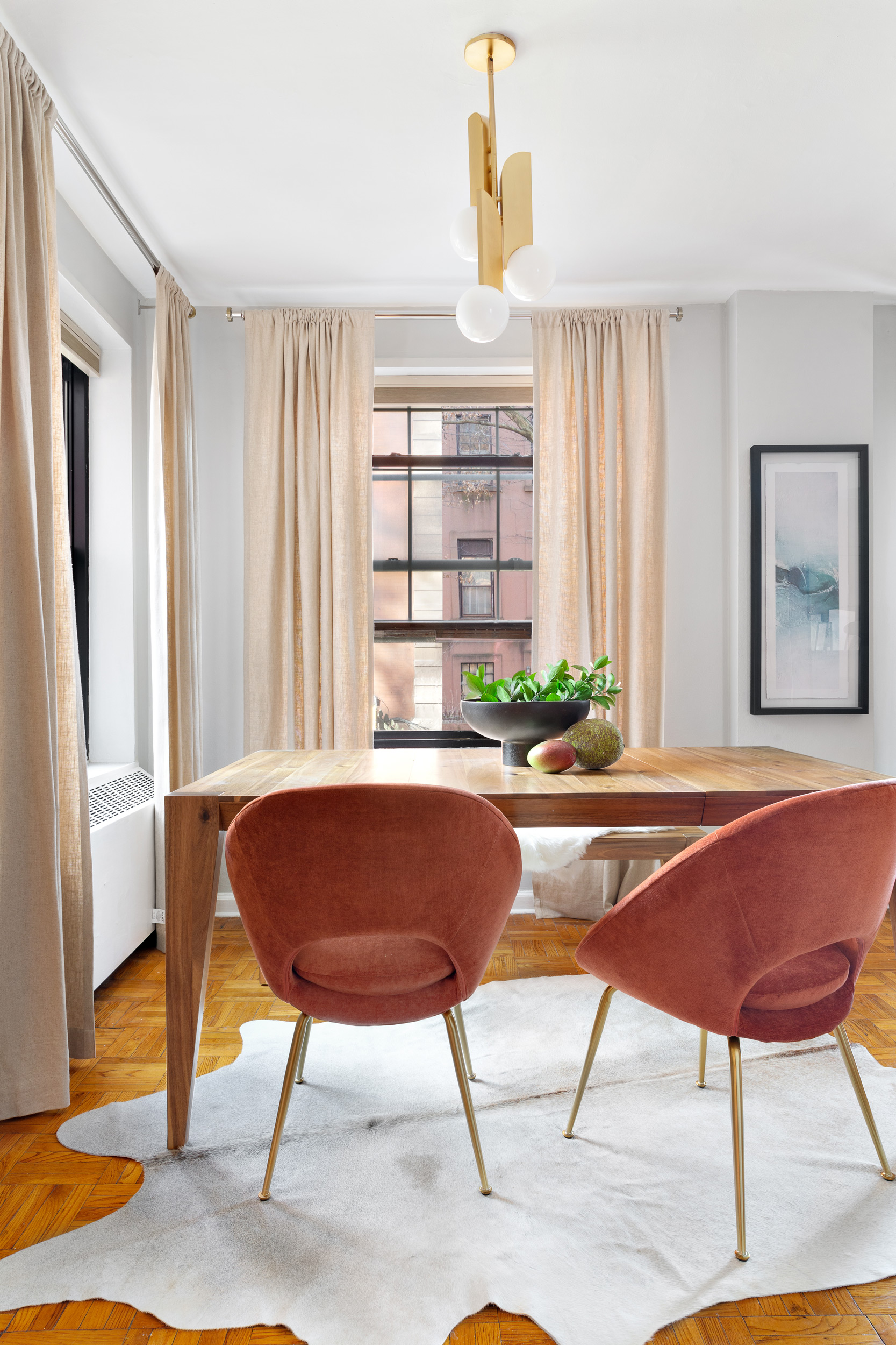
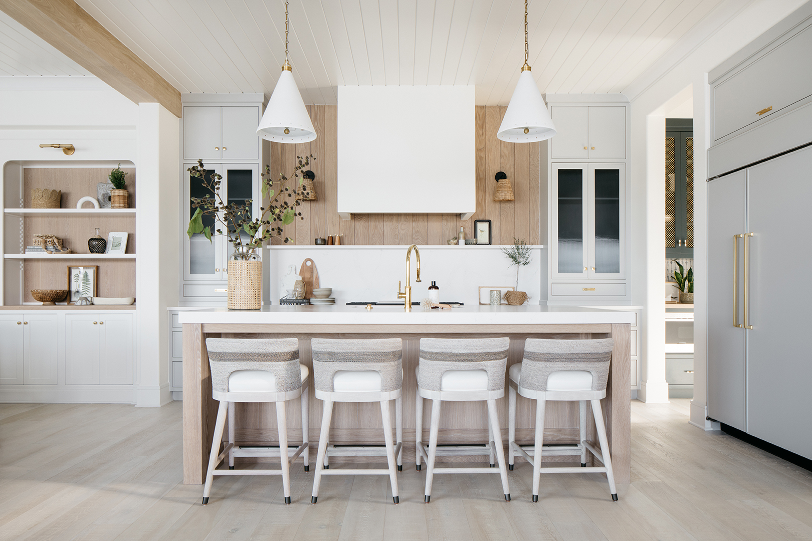
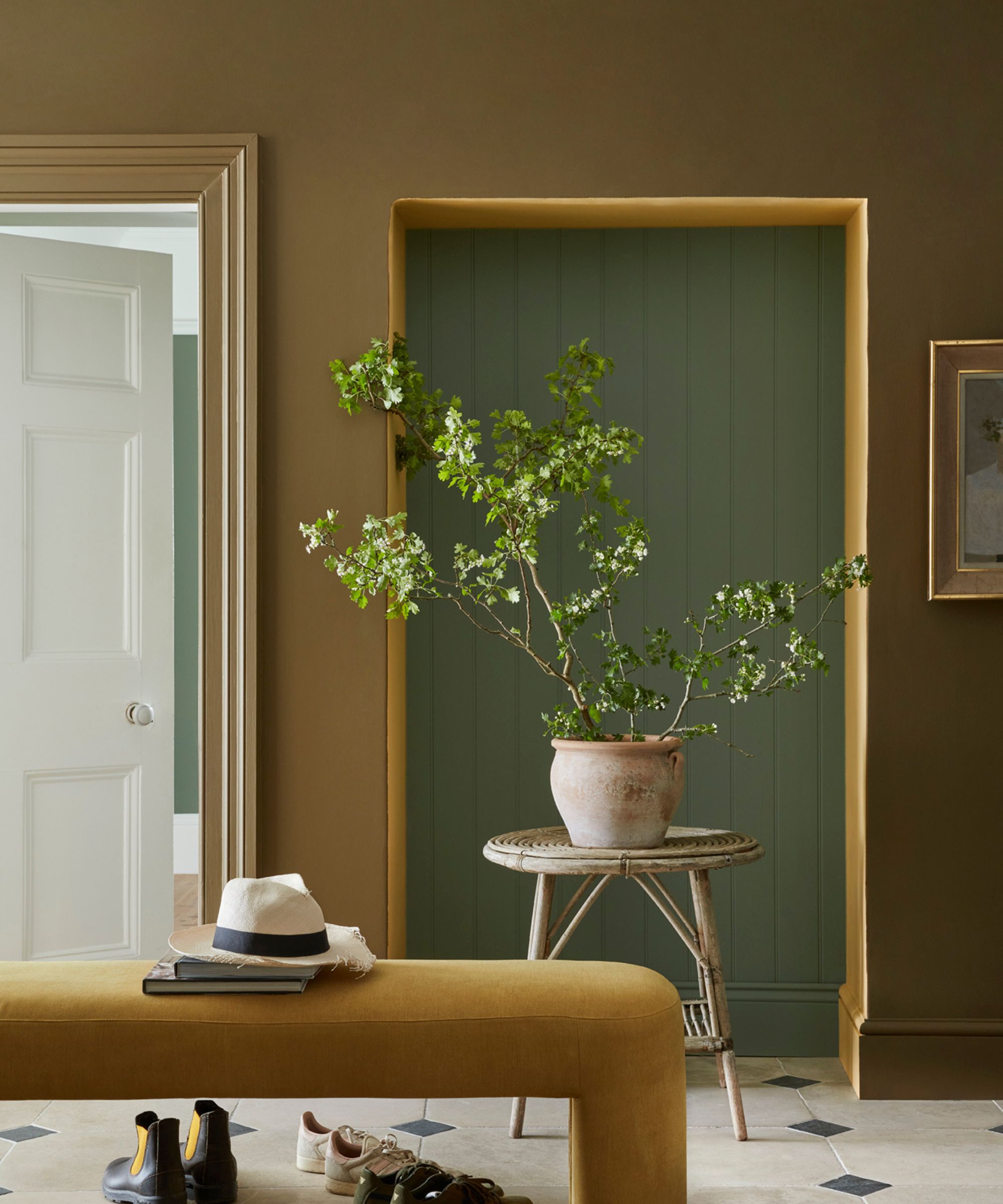
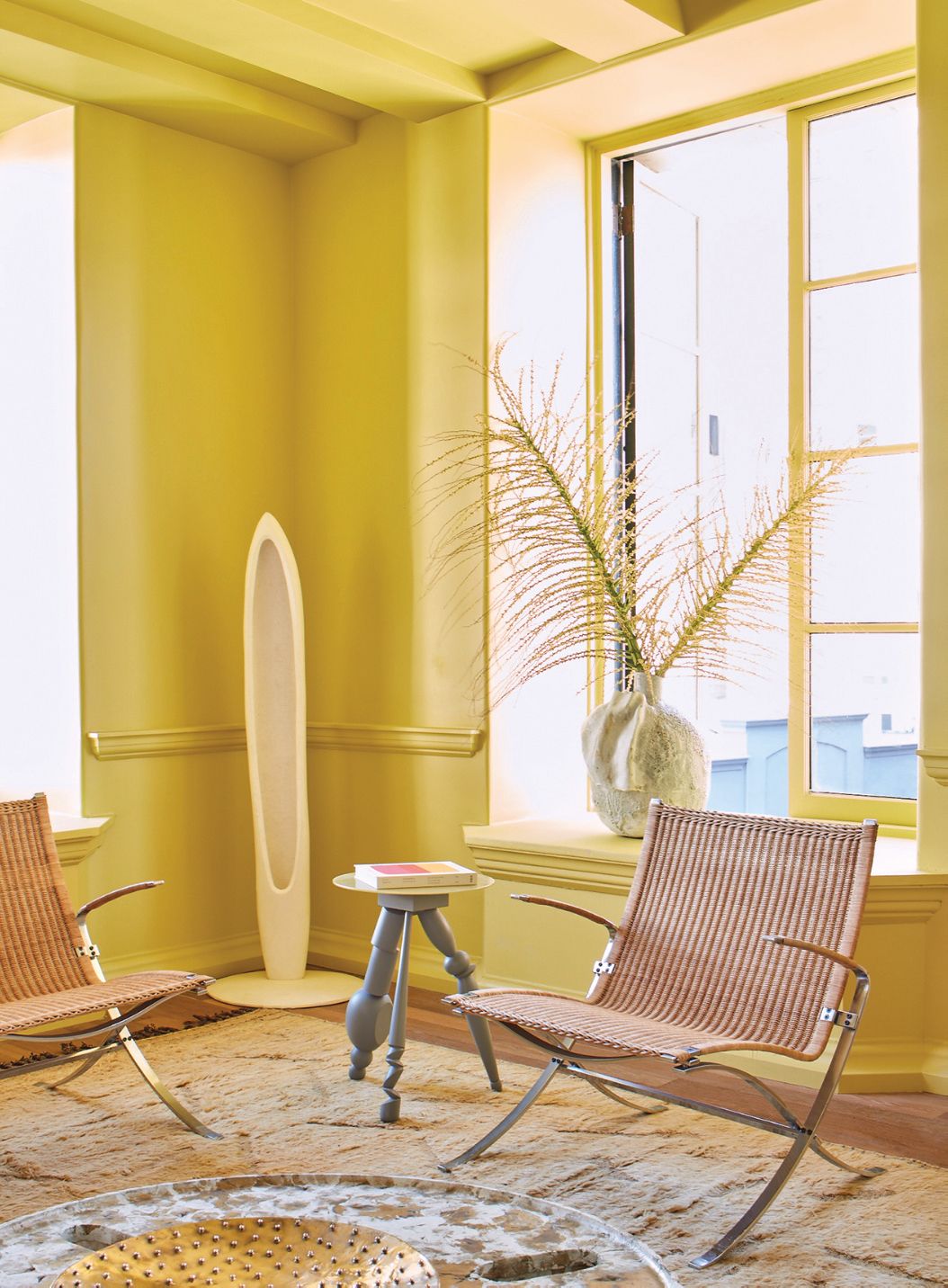
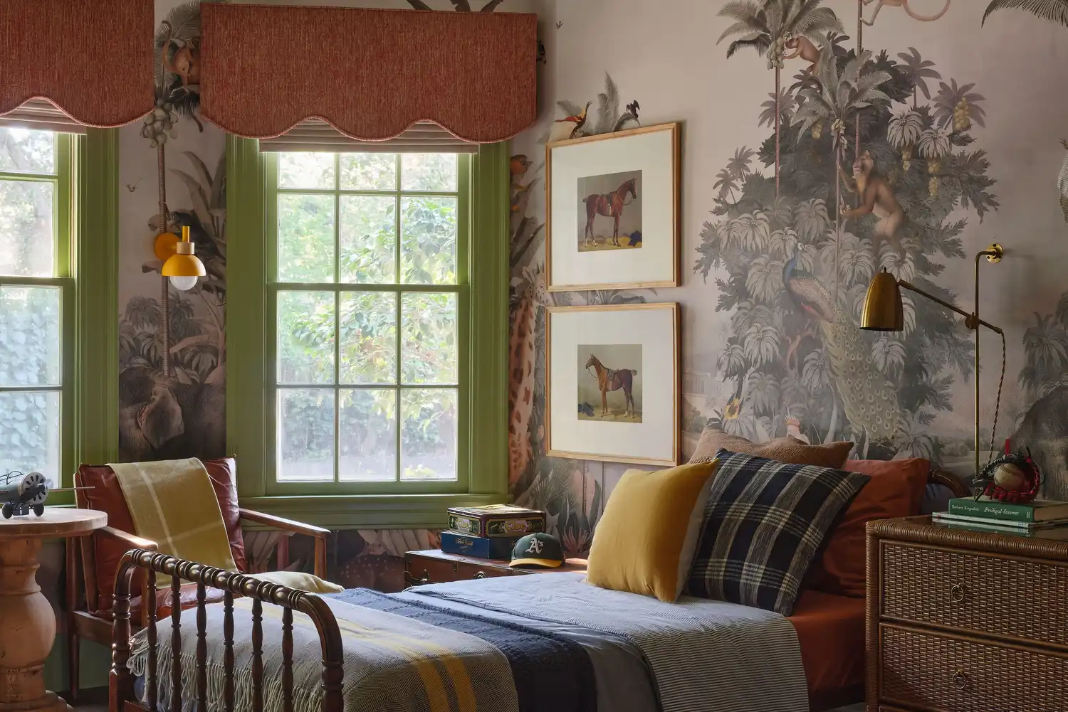
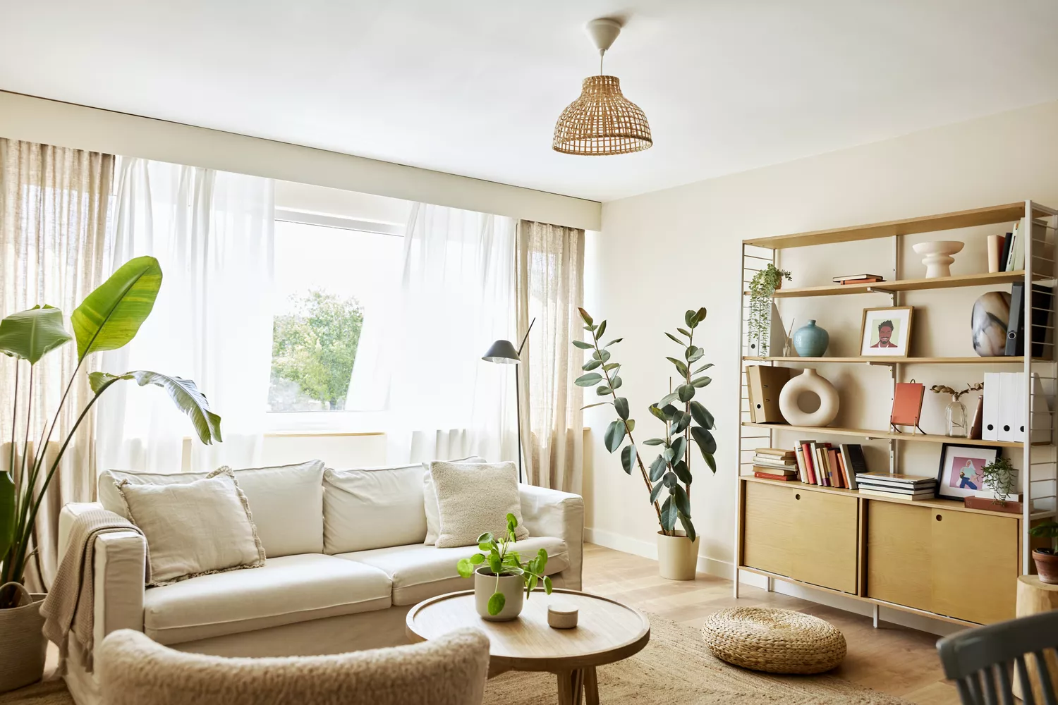
Interior designers suggest painting window trim in unexpected colors to add character and avoid a generic look. Kristin Harrison of Georgia & Hunt Design House recommends skipping stark white for shades like blue-gray, taupe-pink, or rich black, citing Benjamin Moore's Smoke as a personal favorite due to its versatile appearance. The article highlights that even plain windows can be enhanced with a unique color. Designers often approach window trim painting in two ways: either creating contrast or matching the frame and sash to the wall color. A recurring theme among the 20 featured designers is the versatility and appeal of green shades for window trims.
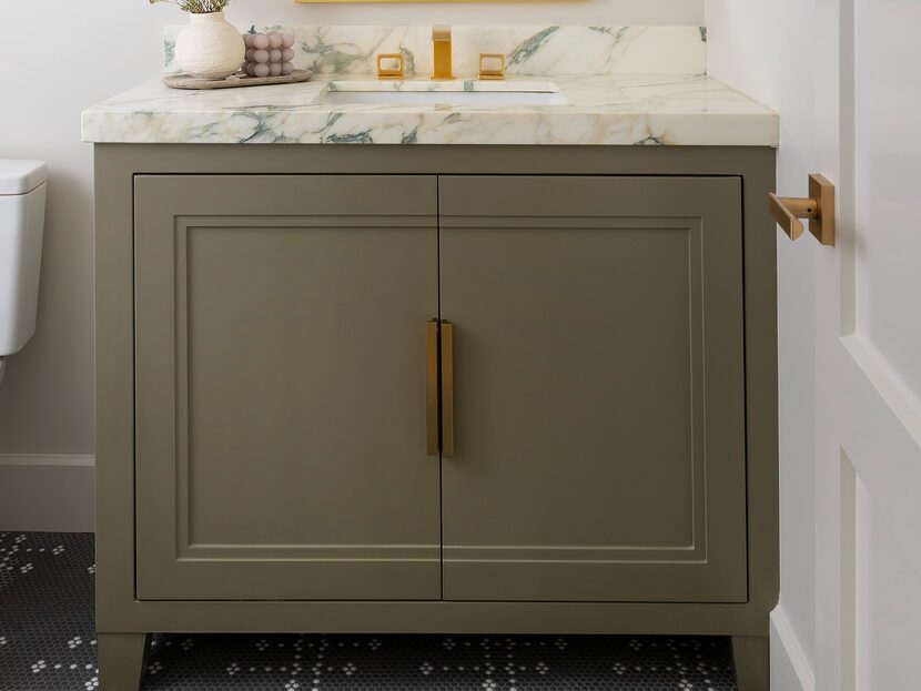
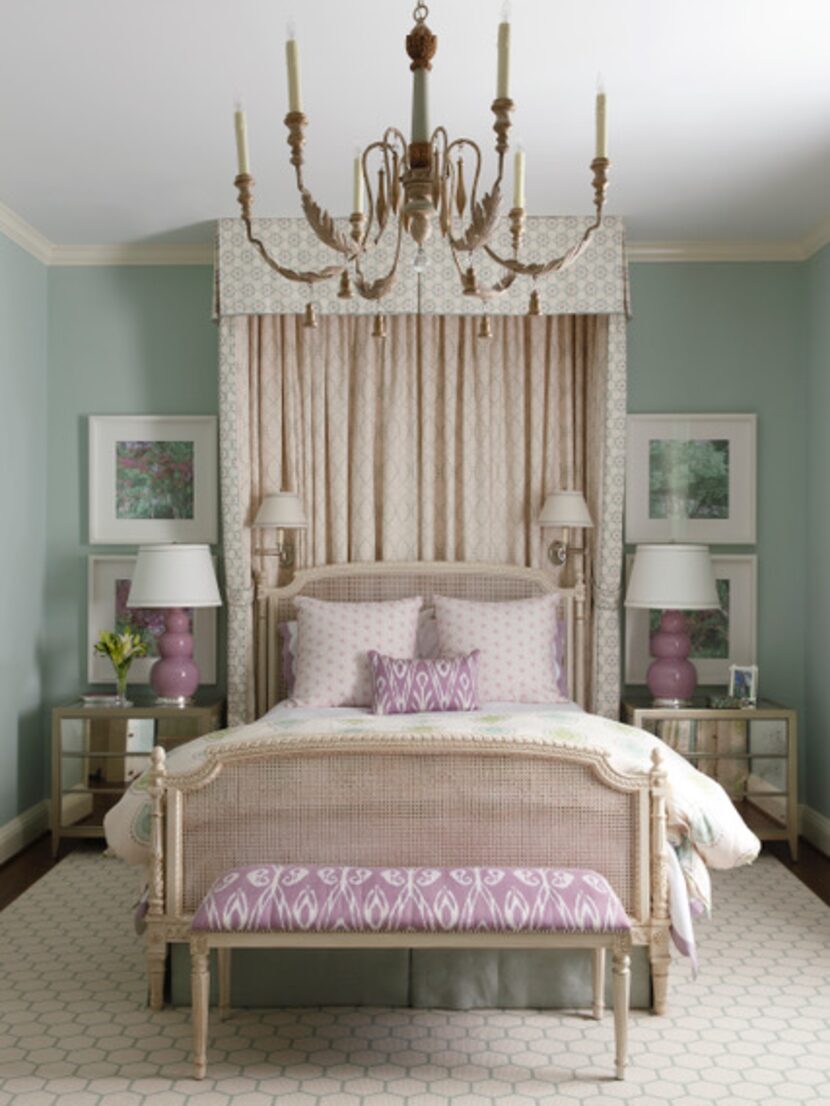
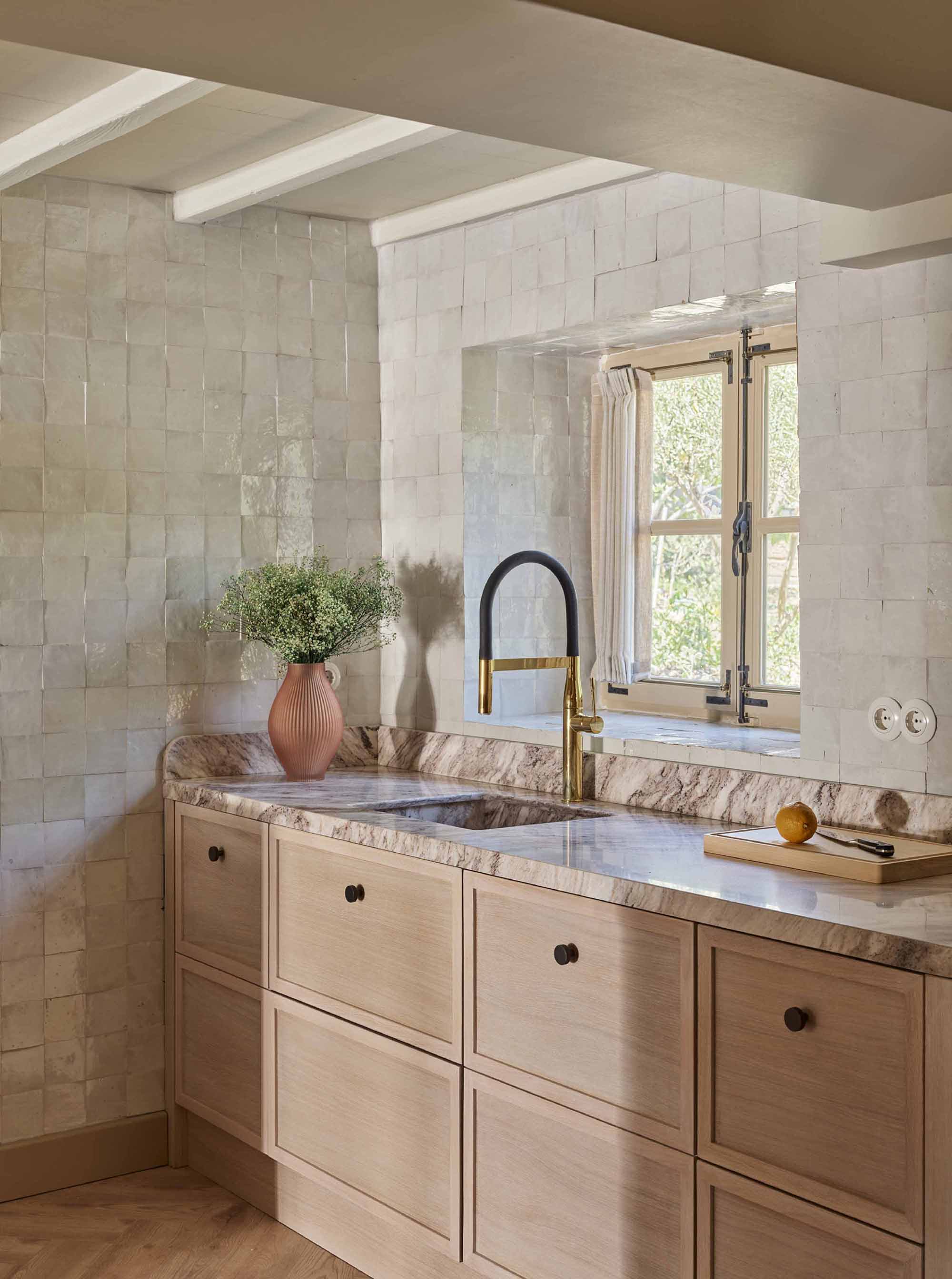
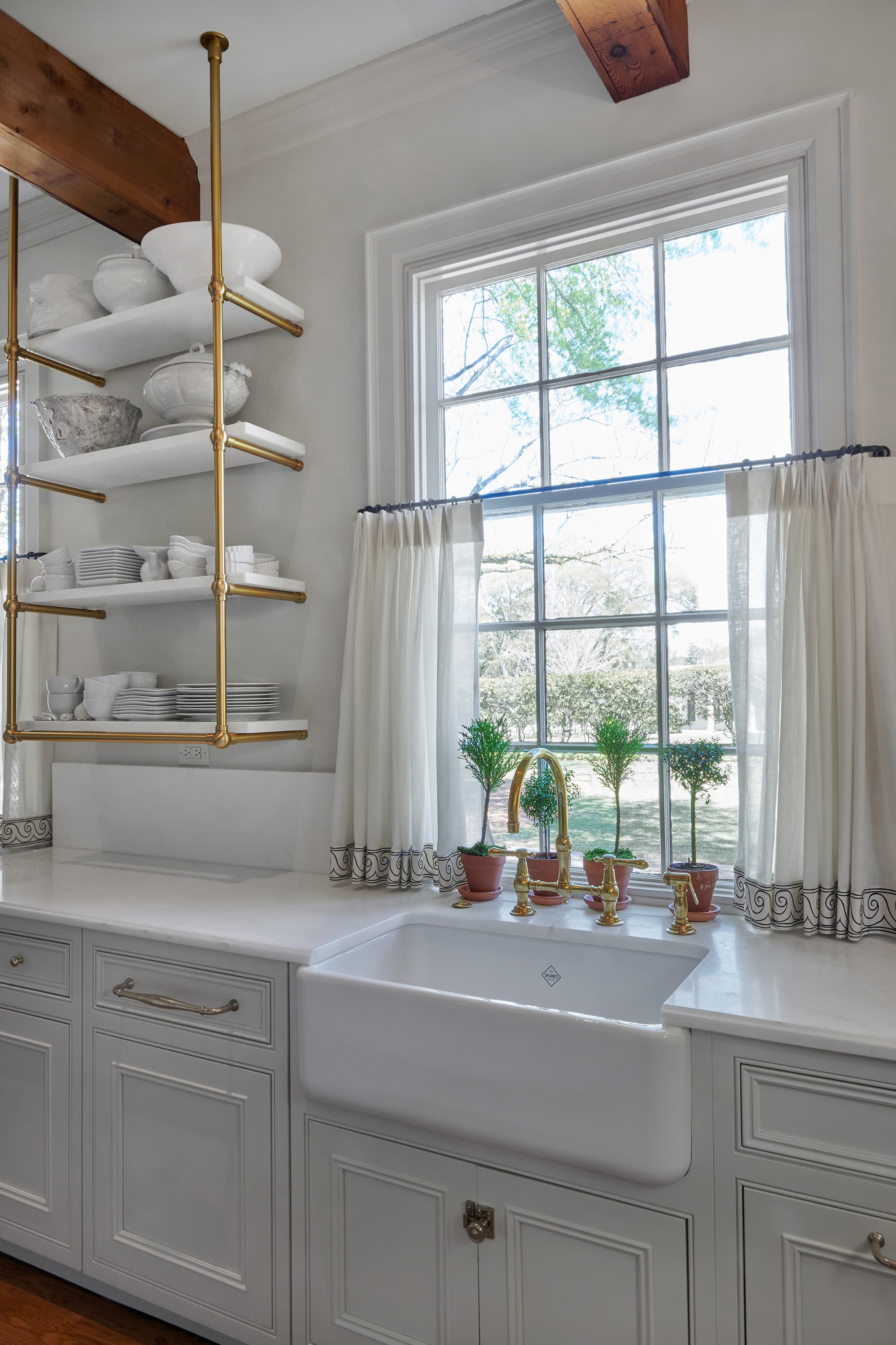
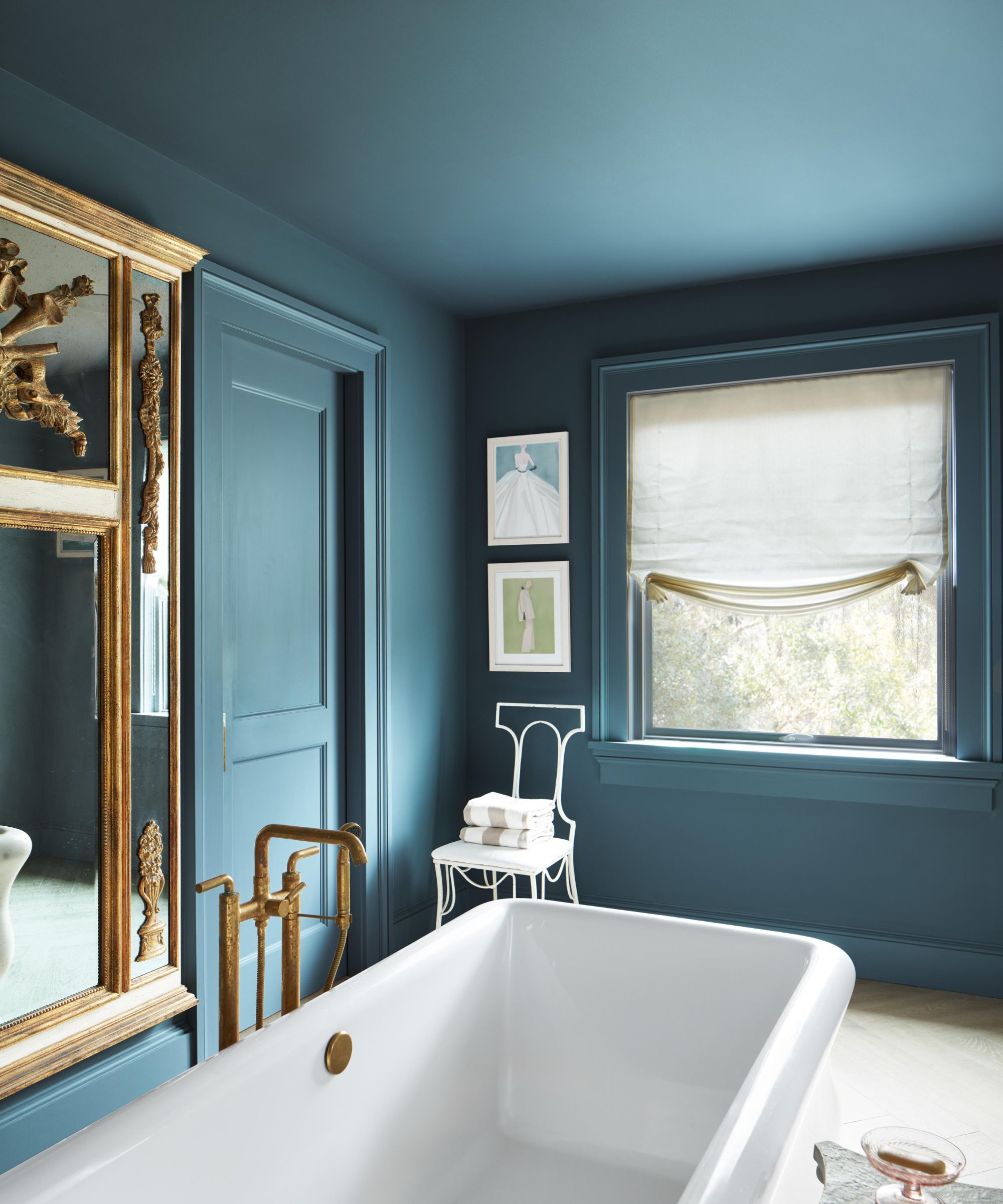
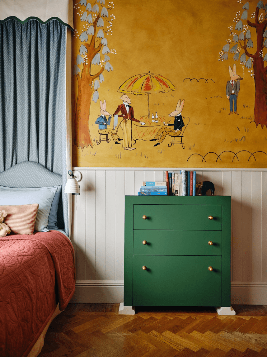
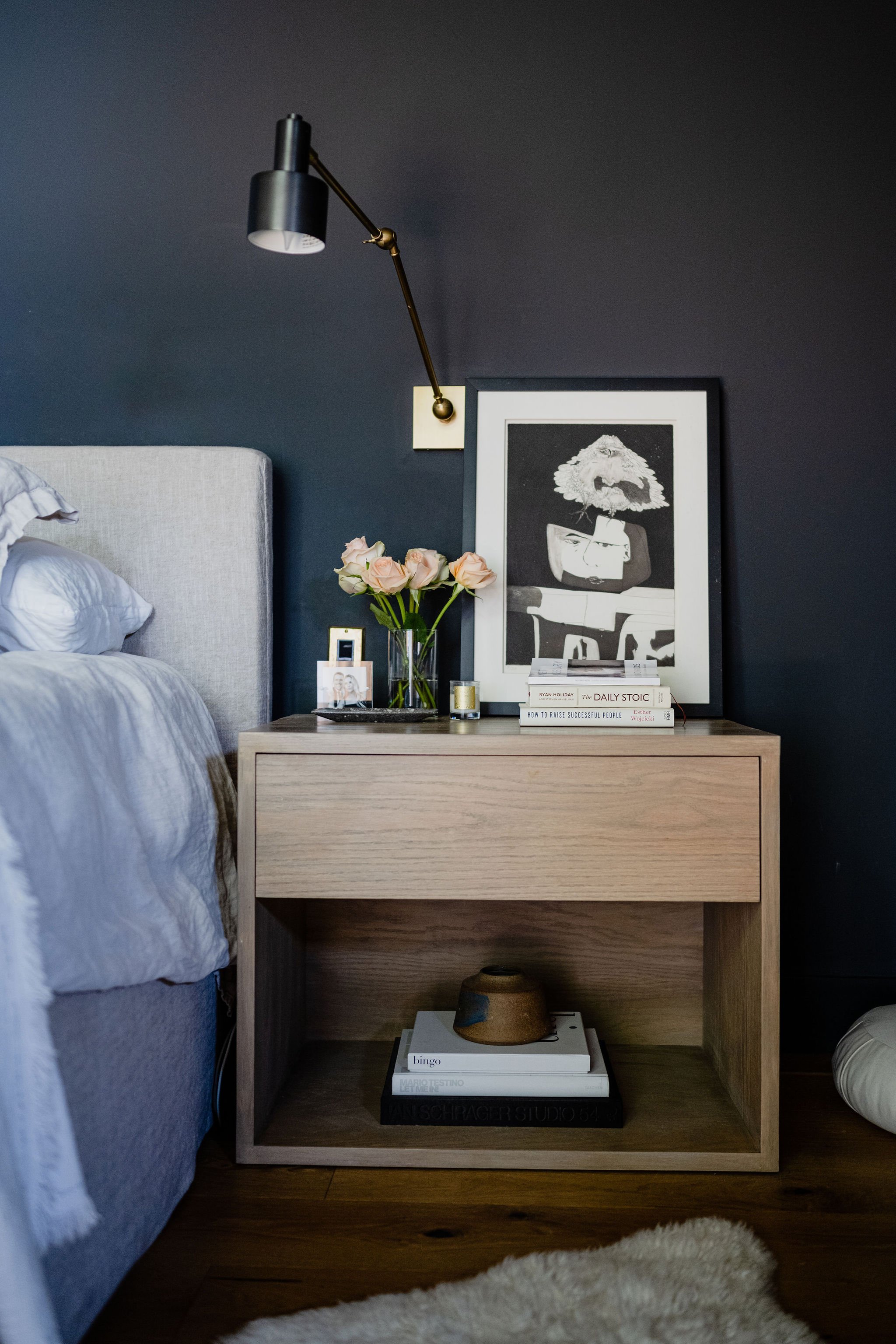
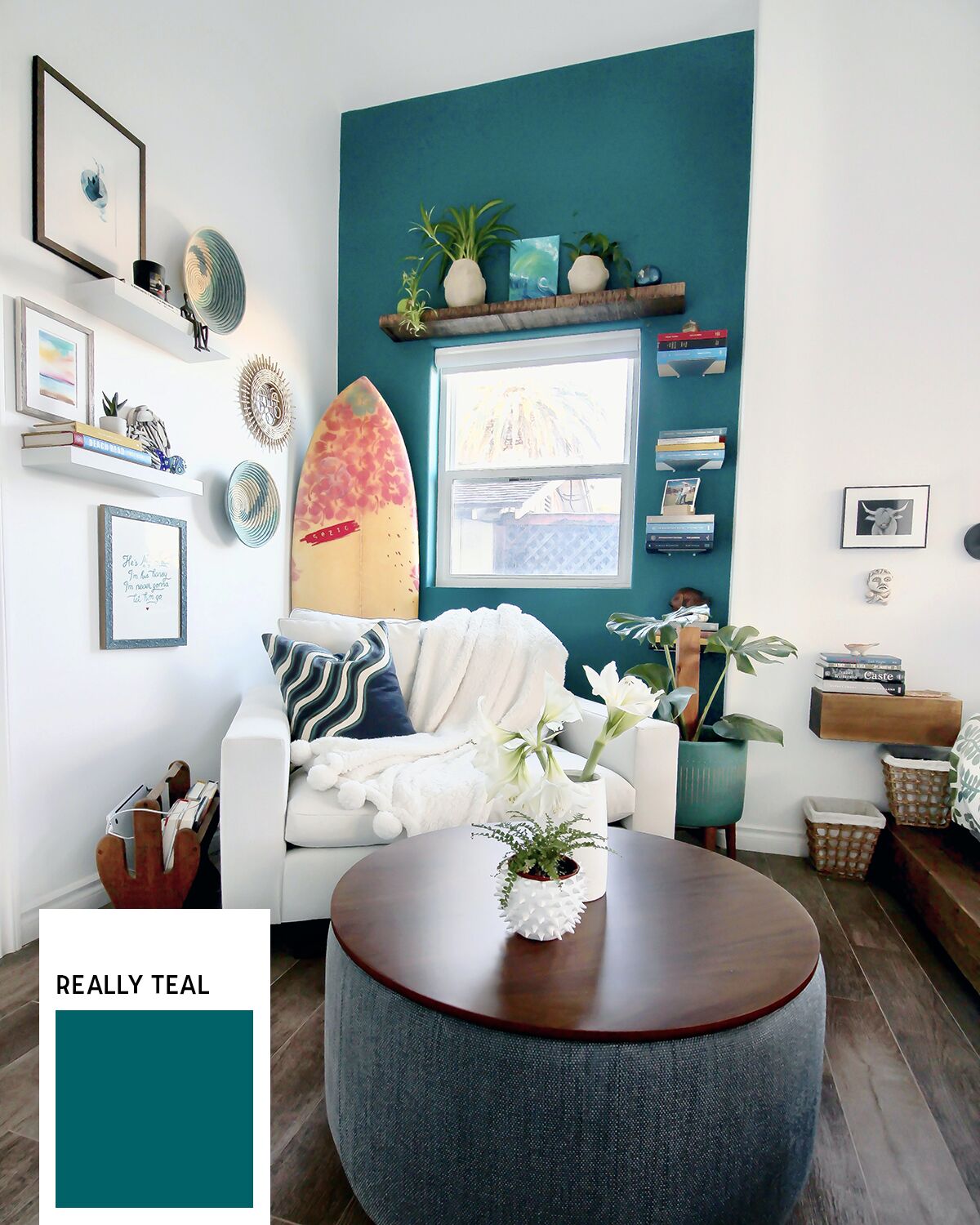
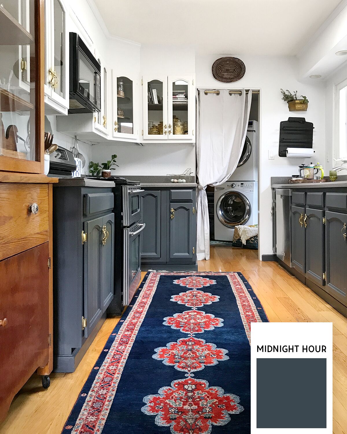
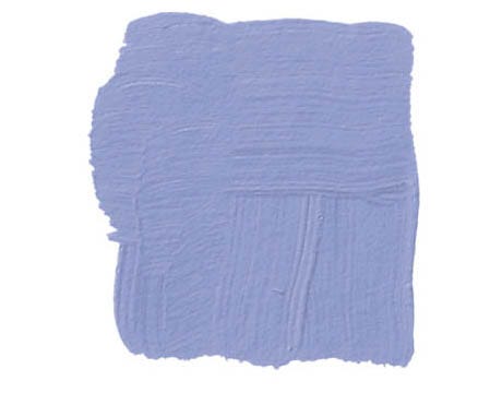
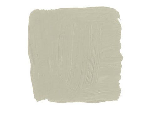
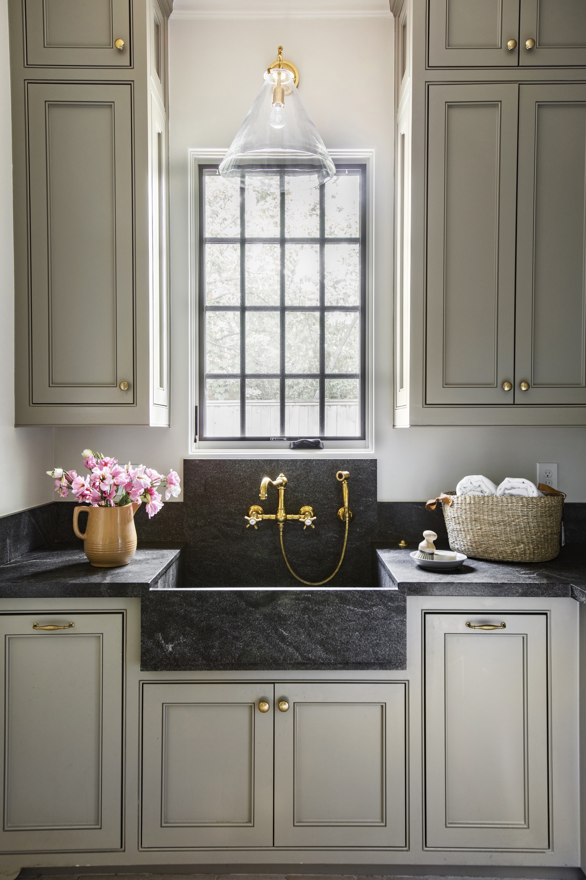
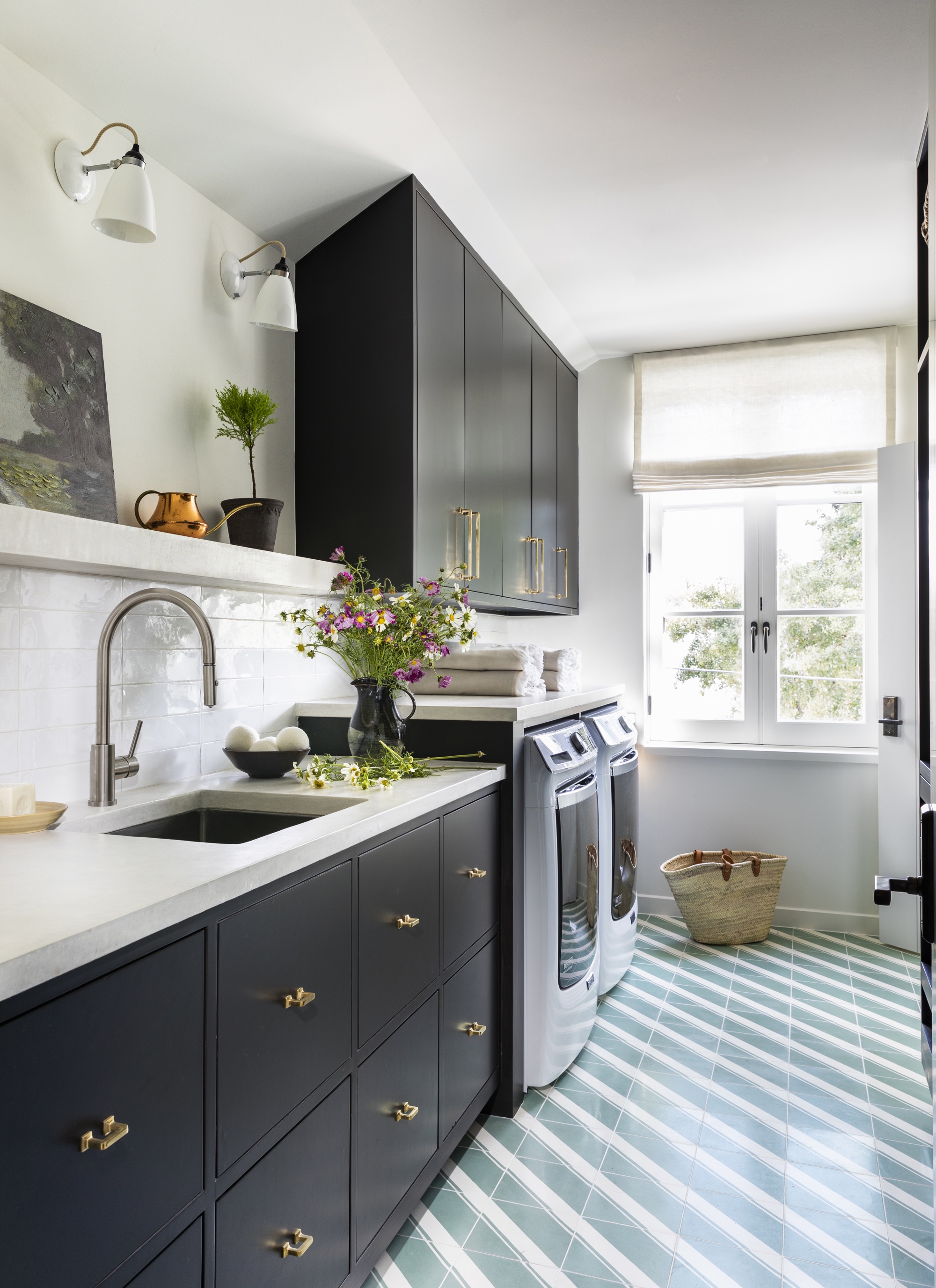
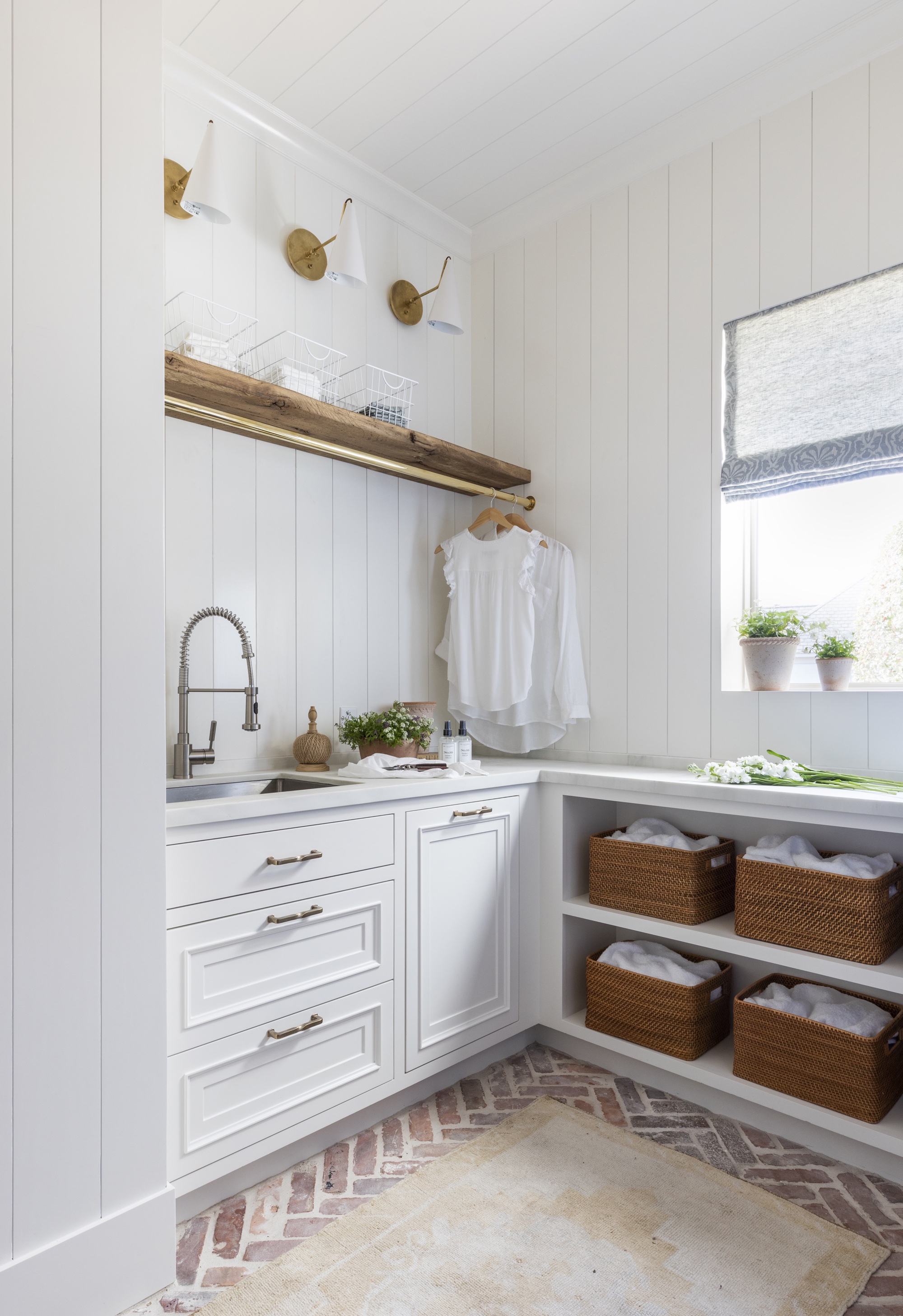
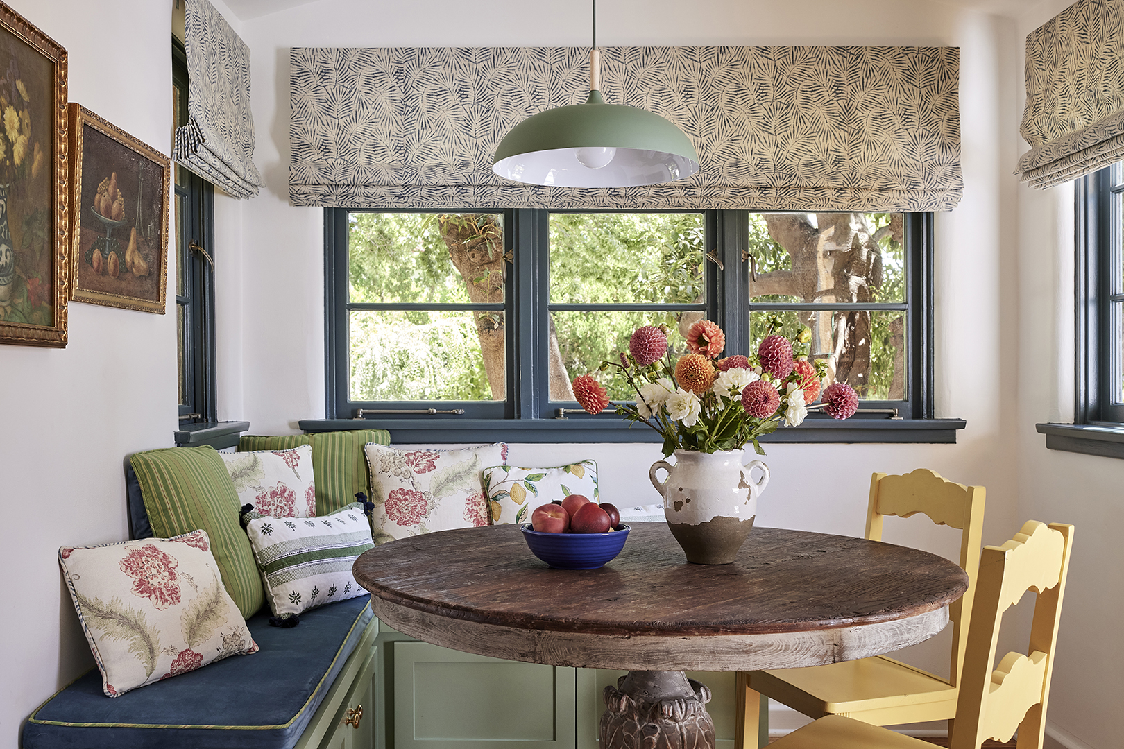
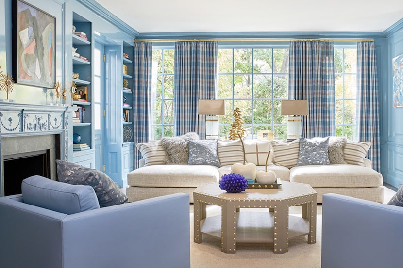
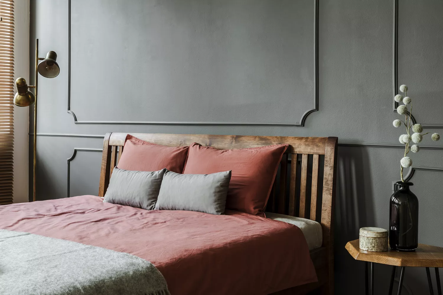
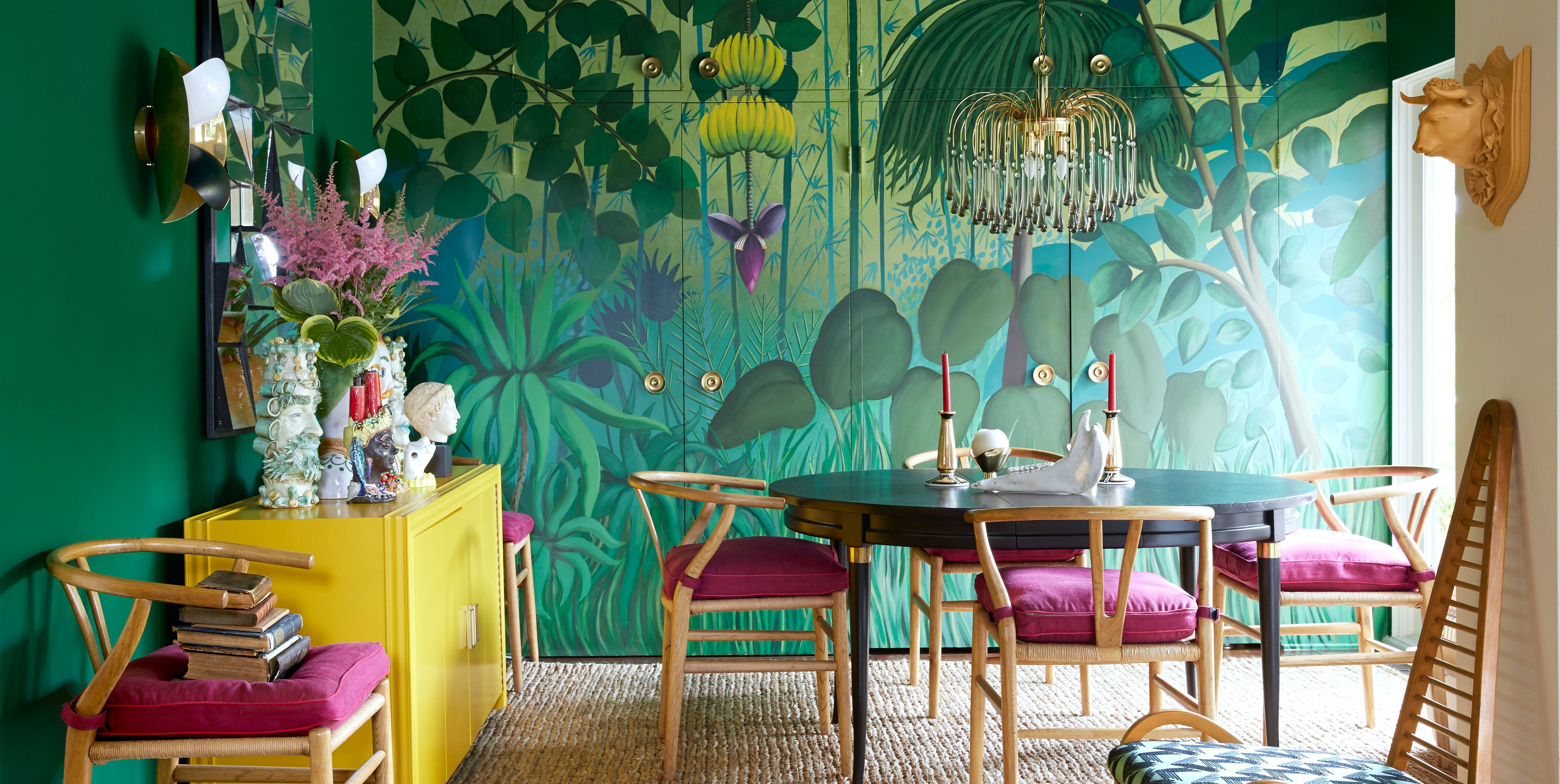
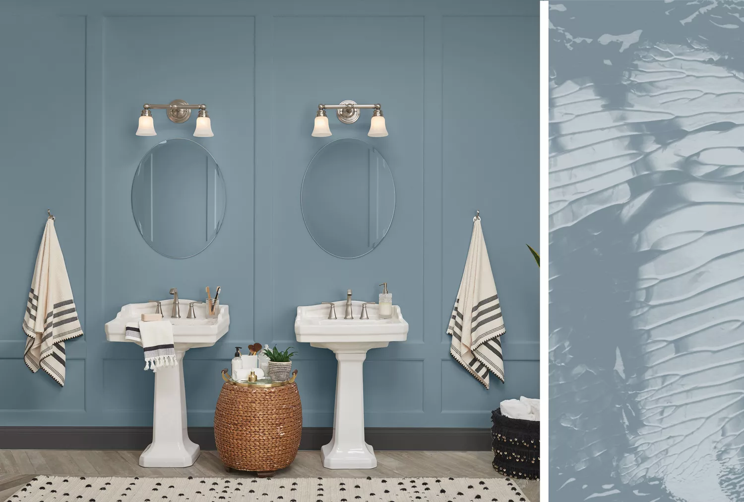
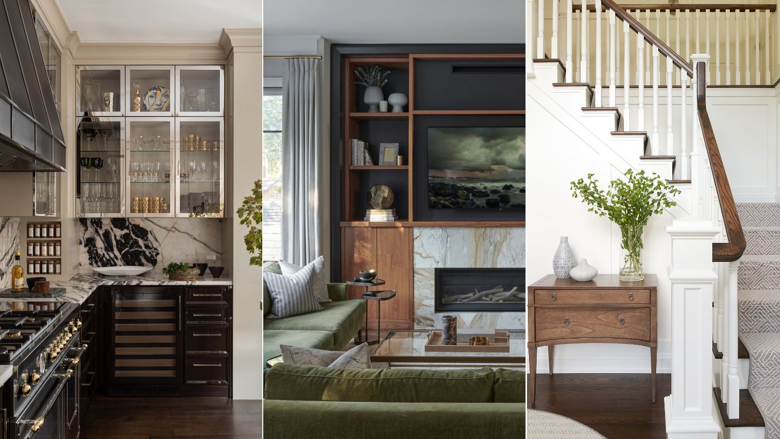
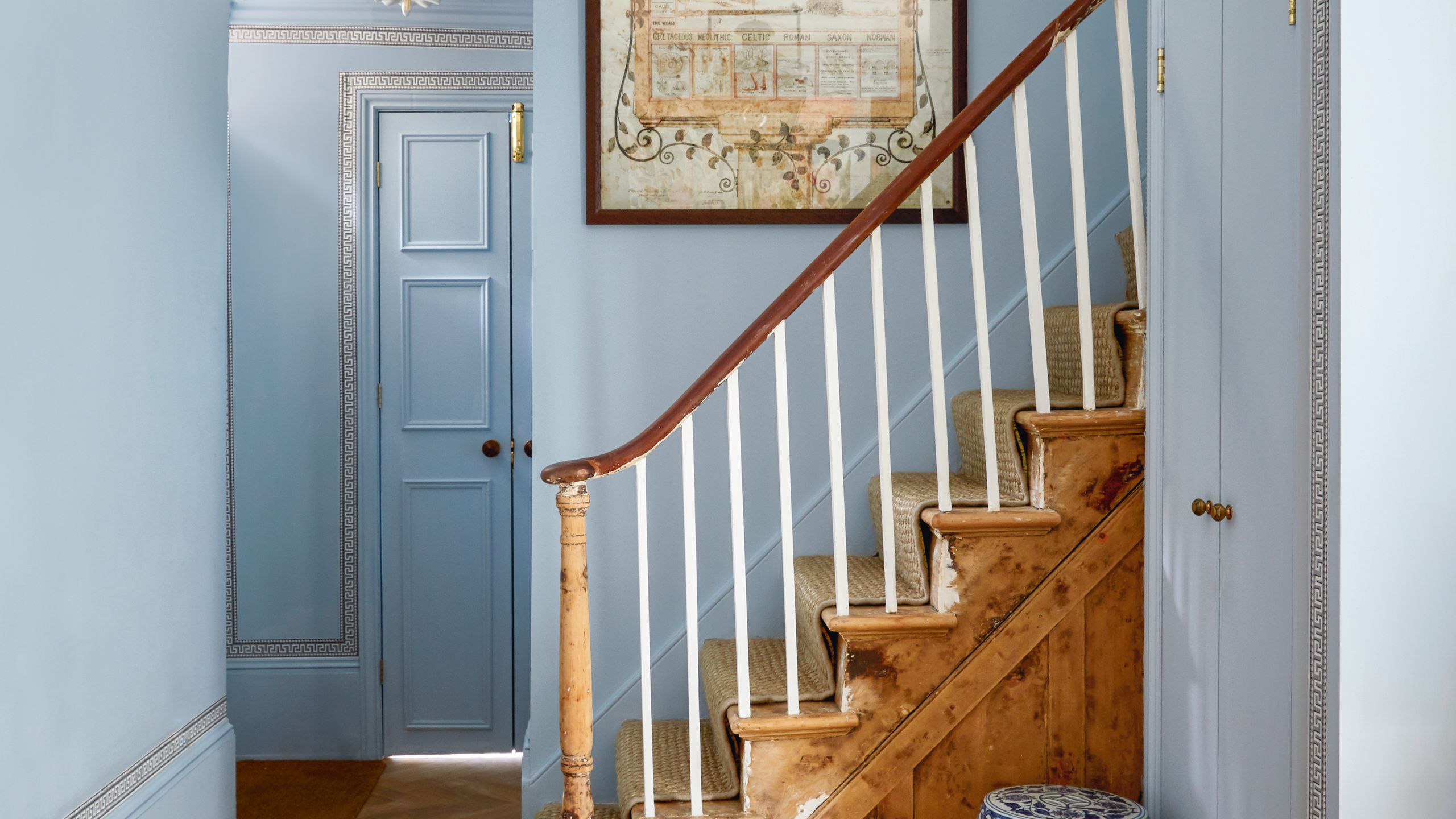
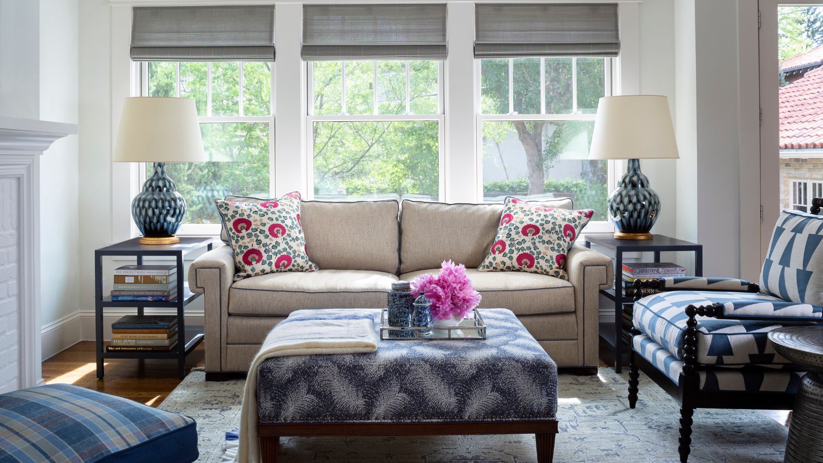
Several designers shared their preferred non-white paint colors. Luke Havekes favors Farrow & Ball's Railings, a dark bronze that creates contrast and makes the exterior view stand out. Laura Jenkins uses Farrow & Ball's French Gray with neutral walls, giving a historic yet contemporary feel. Maggie Goodrich suggests Benjamin Moore's Tapestry Beige paired with White Dove walls for a subtle, inviting warmth. Ashton Taylor uses Sherwin-Williams' Rookwood Shutter Green to match wall coverings, creating a tailored and immersive effect. Christine Vroom recommends Benjamin Moore's Graphite for moody depth without high contrast. Melanie Love prefers Benjamin Moore's Nature Lover to frame outdoor views and bring nature indoors. Jessica Bennett highlights Benjamin Moore's Cashmere Wrap for adding playfulness and sophistication in a powder bath. Julia Chasman appreciates Farrow & Ball's Inchyra Blue for its chameleon-like quality, shifting between blue and green to reflect natural outdoor tones. Leah Ring uses Benjamin Moore's Napa Vineyards to create an accent color that ties into the room's overall scheme, matching it to green tiles for cohesion. Jamie Toporovsky selected Benjamin Moore's Hidden Sapphire for its ability to complement blue elements in wallpaper.
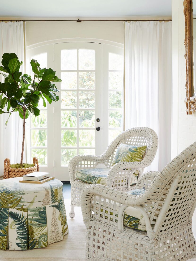
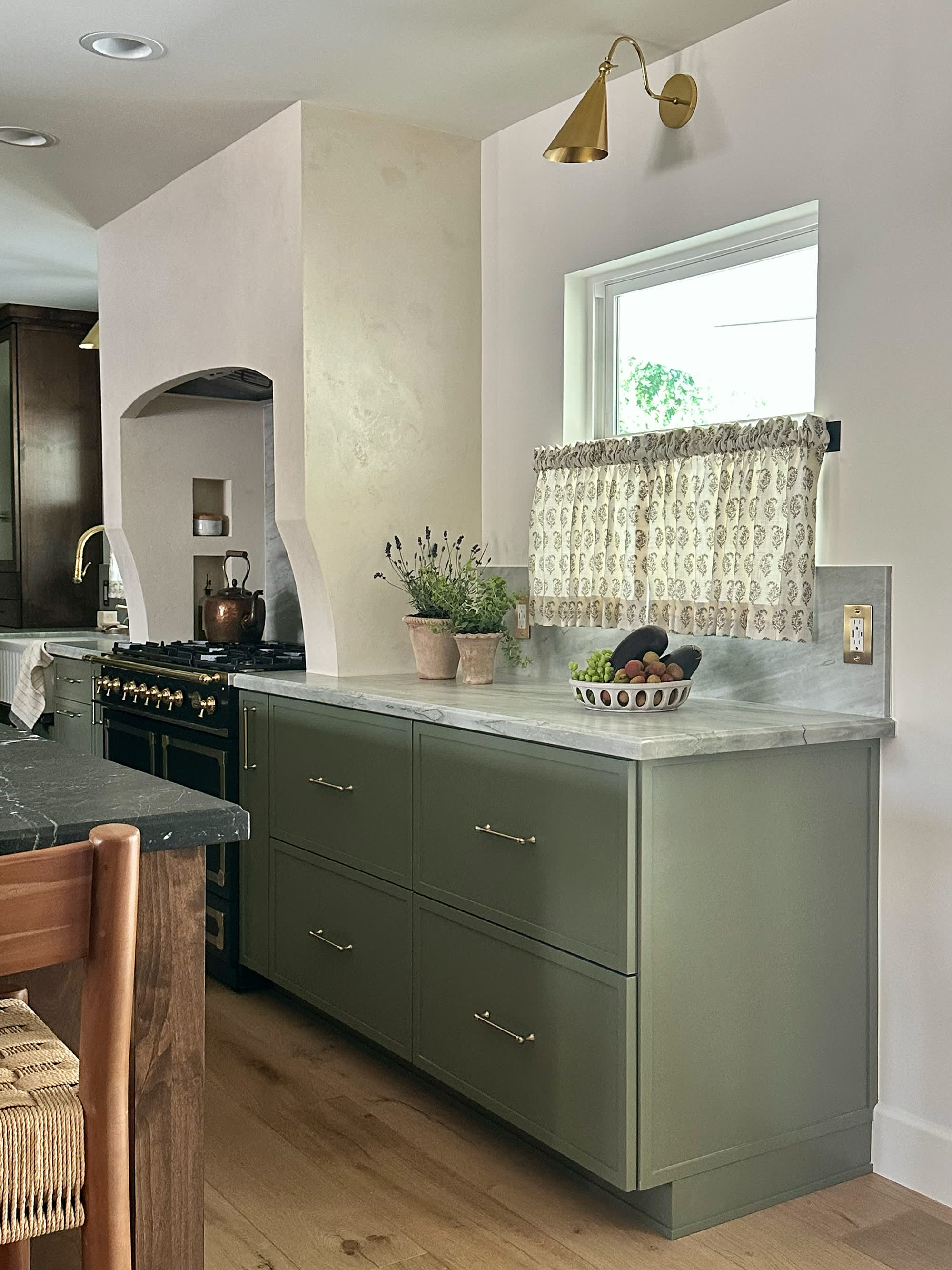
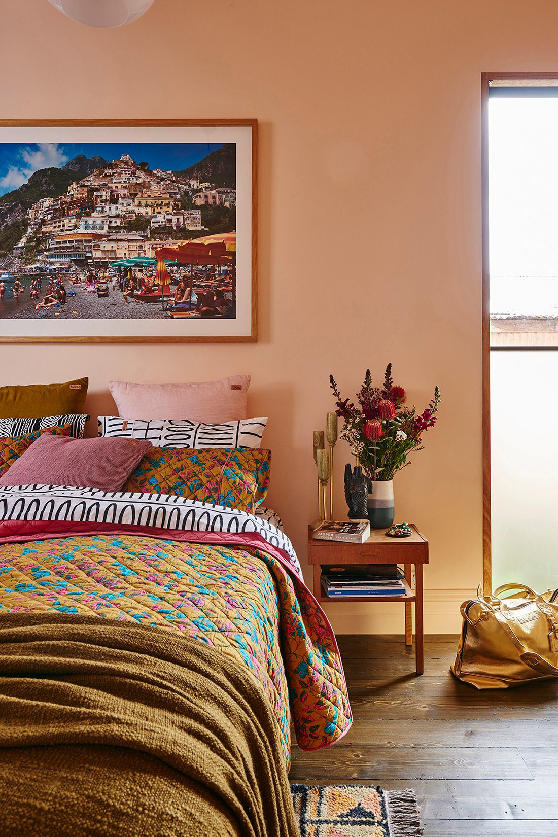
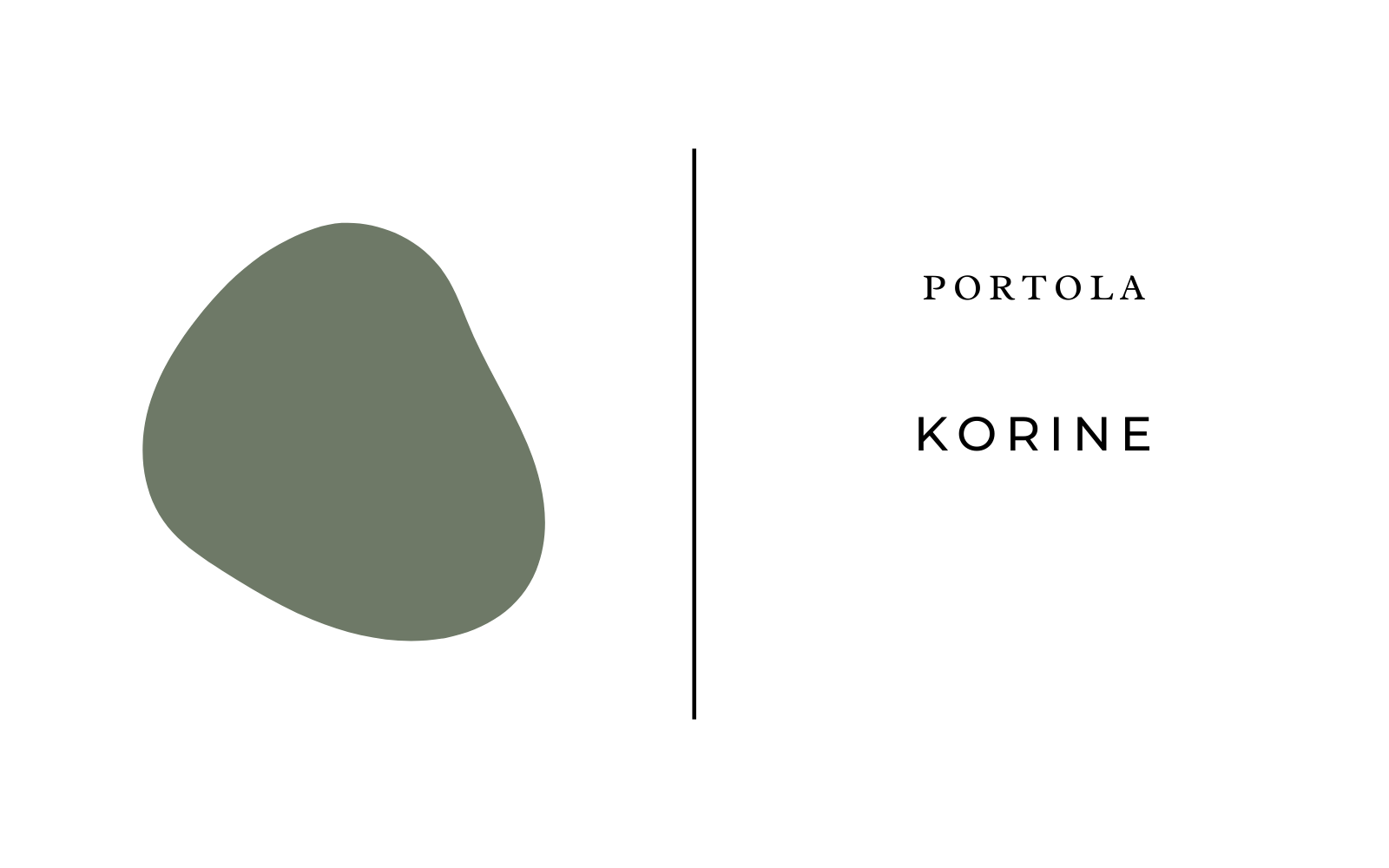
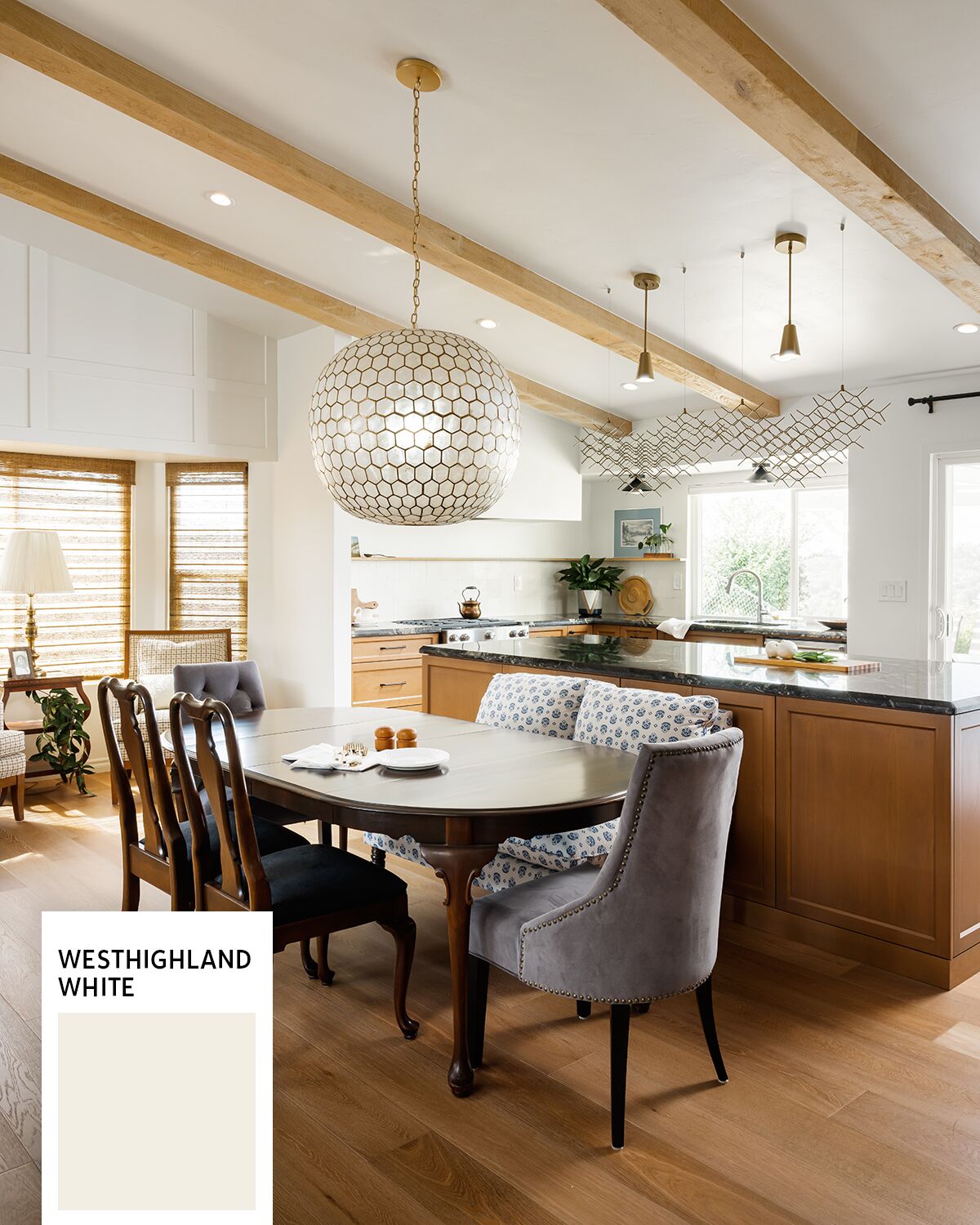
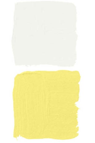
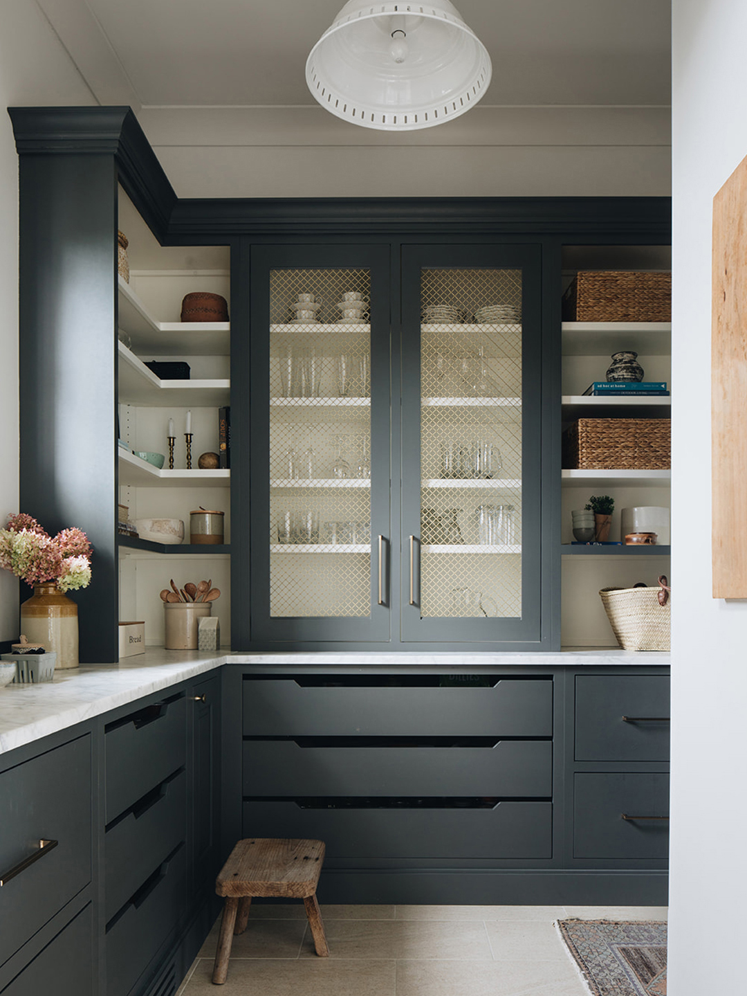
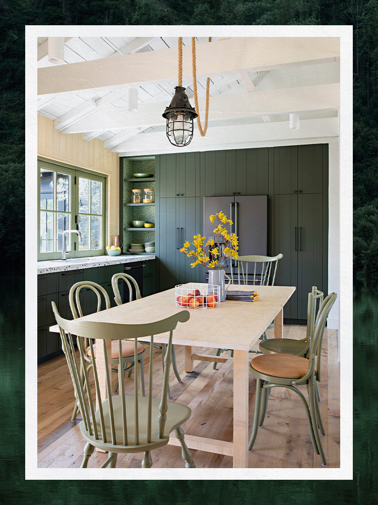
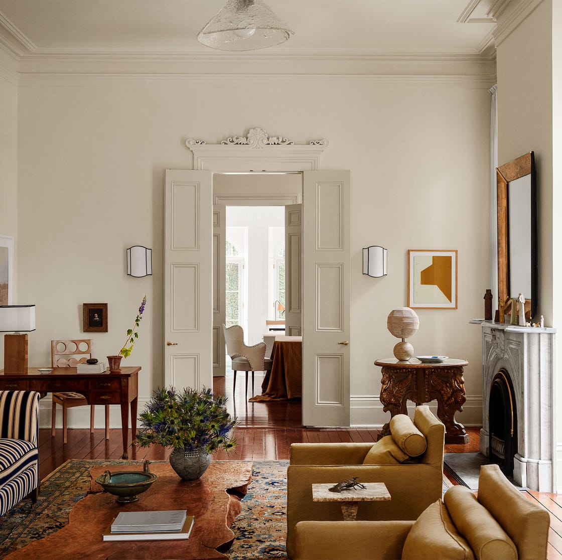
Maria Wu advocates for Benjamin Moore's Cedar Path to introduce personality in a low-pressure way, creating a sunny and playful touch against light walls. Trish Lynn suggests Farrow & Ball's Card Room Green for visual cohesion when matching cabinetry or millwork. Anabel Herring believes white trim can disrupt a room's vibe and instead uses Benjamin Moore's Dark Olive, matching it to walls to allow architecture to recede. Laura Brophy prefers Benjamin Moore's Cotswold for its weathered neutral depth that complements organic textures. Raili Clasen uses Sherwin-Williams' Avocado for interior window trim in spaces with existing color, opting for a sage that complements an olive green kitchen without being overly matchy. Ashley Clark chose Portola Paints' Piano Room for its rich, moody depth and timeless elegance. Emily Tucker uses Benjamin Moore's Million Dollar Red to create a focal point, framing the outdoor view as a piece of art. Diane Rath uses Benjamin Moore's Black to sharpen the overall palette and elevate layered spaces. Miranda Cullen suggests Sherwin-Williams' Restful for a muted green trim that introduces color while maintaining softness, particularly effective with vintage or patterned details. Rachel Sherman applies Farrow & Ball's Dead Salmon to all painted surfaces, including trim, when using a bold wall color, recommending semi-gloss for durability. Finally, Courtney Batten proposes custom paint colors that match surrounding finishes, such as a deep green backsplash tile, to create a cohesive look.
Overall, the consensus among these designers is that moving beyond traditional white window trim offers significant opportunities to enhance a room's aesthetic, introduce personality, and create visual harmony or striking contrast. Green shades are particularly popular for their ability to connect indoor and outdoor spaces, while other colors like dark bronzes, grays, beiges, pinks, and blacks are used to achieve specific moods and design intentions. The use of custom-matched colors further emphasizes the tailored approach designers take to integrate window trims into the broader interior design scheme.
#InteriorDesign #PaintColors #WindowTrim #HomeDecor #DesignInspiration #FarrowAndBall #BenjaminMoore #SherwinWilliams #ColorTheory #InteriorDesign #PaintColors #WindowTrim #HomeDecor #DesignInspiration #FarrowAndBall #BenjaminMoore #SherwinWilliams #ColorTheory
0 comment in total
You may also like
19 go-to paint colors that Dallas designers love
The Paint Color That All This Designer's Followers Ask About | domino

4 Interior Designers Share the Biggest Paint Color Trends Right Now (and What’s Out!)

We Asked Designers to Pick the Most Timeless Bedroom Paint Colors—Here's What They Said

Designers’ Favorite White Paints Are Always Changing—We Asked 3 for Their Latest Pick

We Asked 6 Designers Their Favorite Way to Dress Up a Kitchen Window, and They Did Not Disappoint
We Asked Designers for Their Favorite Kitchen Cabinet Paint Colors—and Not One Picked White
Need A Furniture Refresh? These Are Paint Colors That Top Designers Recommend

Designers Share Their Tried-and-True Shades From the Best Interior Paint Brands
20 Interior Paint Colors Decorating Experts Love

Interior Designers Share Their Favorite Cream Paint Colors

6 Paint Color Duos Designers Can't Get Enough of This Fall
We Asked Designers to Pick the Most Timeless Living Room Paint Color—and They Agreed
I asked 3 interior designers for their must-try paint colors in 2025 – they are all the perfect 'in-between' shades

8 Favorite Paint Colors of Local Interior Designers

6 colors designers pick for laundry rooms - exact paint matches, from classic choices to surprising shades

We asked 12 interior designers for their favorite Sherwin-Williams paints – these are the colors that came out on top
All the interior designers with paint collaborations (and our favourite shades)
I asked interior designers what color they include in every project – these 5 enduring shades were the favorites
We Asked Designers Which Living Room Paint Colors People Always Regret—These 6 Came Up the Most