We Asked Designers to Pick the Most Timeless Bedroom Paint Colors—Here's What They Said
A bedroom serves as a personal sanctuary, emphasizing the importance of creating a soothing and timeless environment. The choice of paint color is crucial in achieving this, as it significantly influences the room's overall feel. Designers suggest that while personal preferences dictate much of the design, opting for colors with enduring appeal ensures longevity and avoids frequent redecoration. The article explores how to select the ideal paint color, focusing on colors that promote relaxation and deep rest.
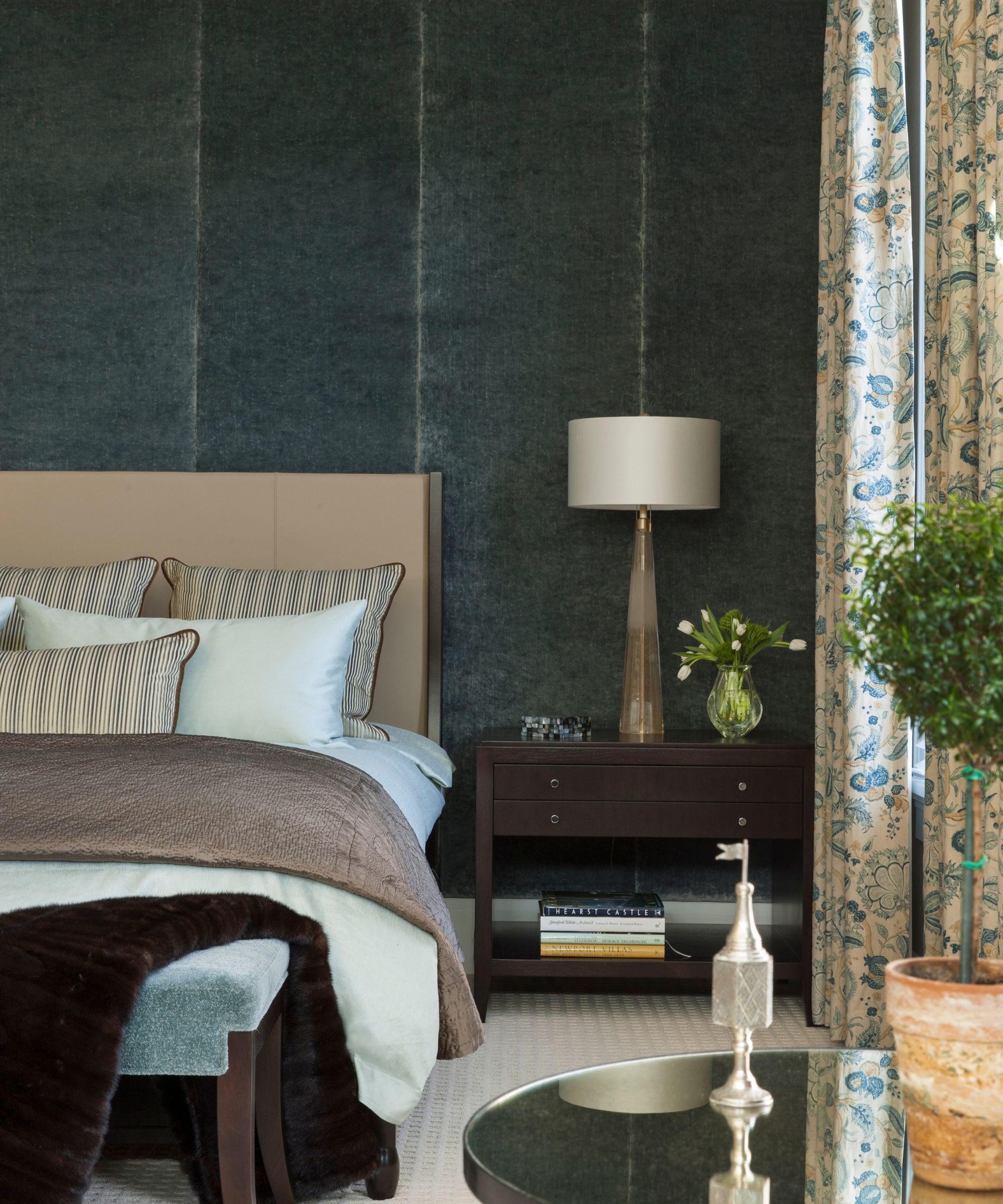
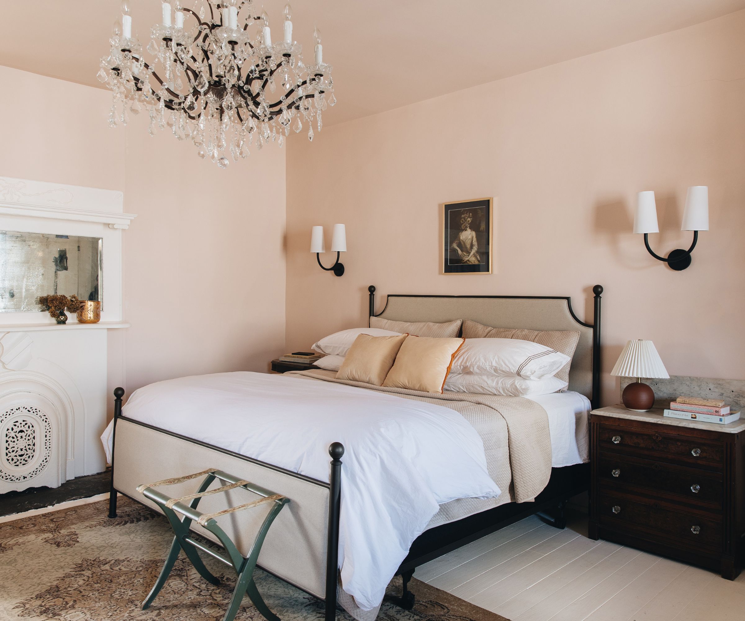
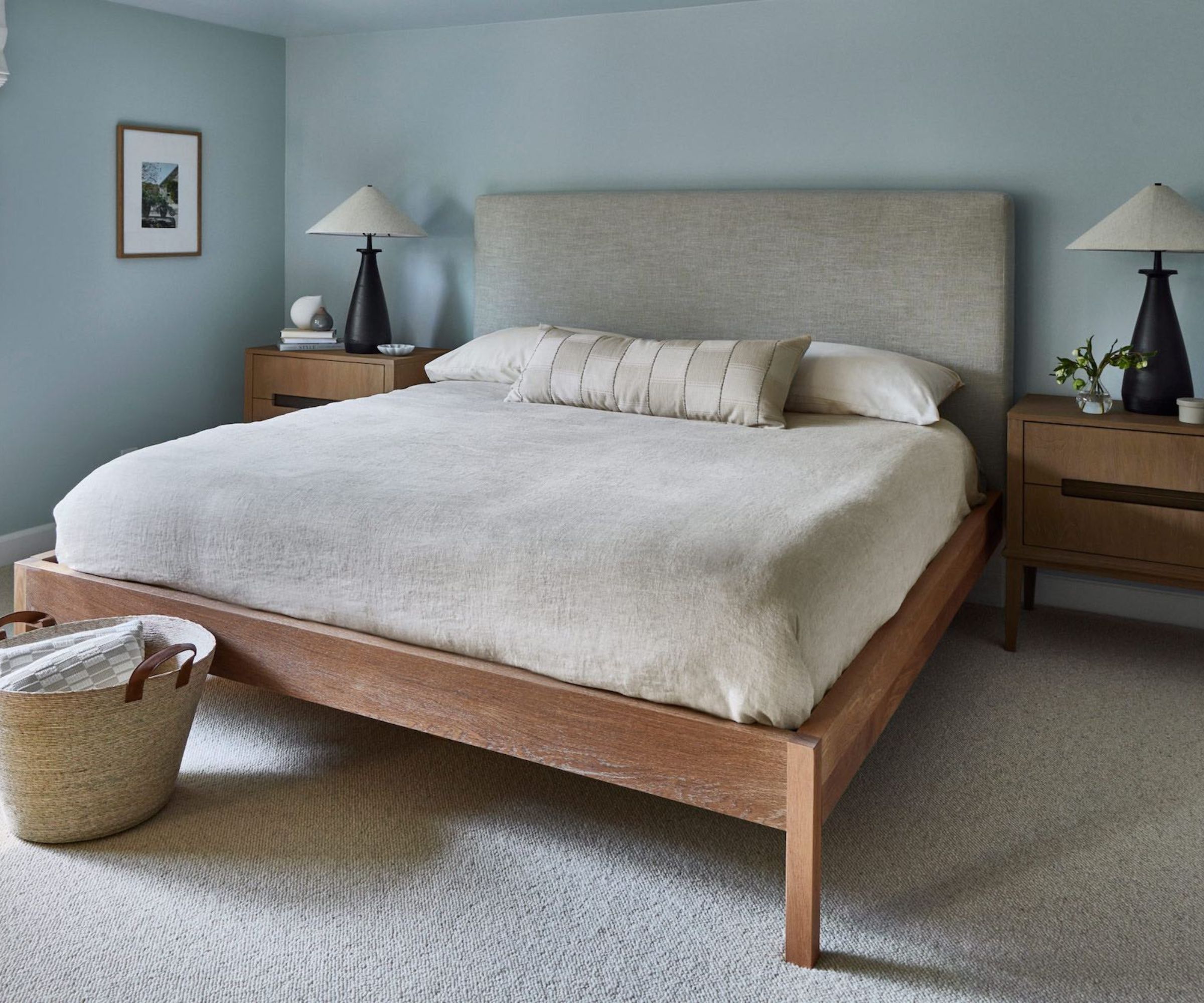
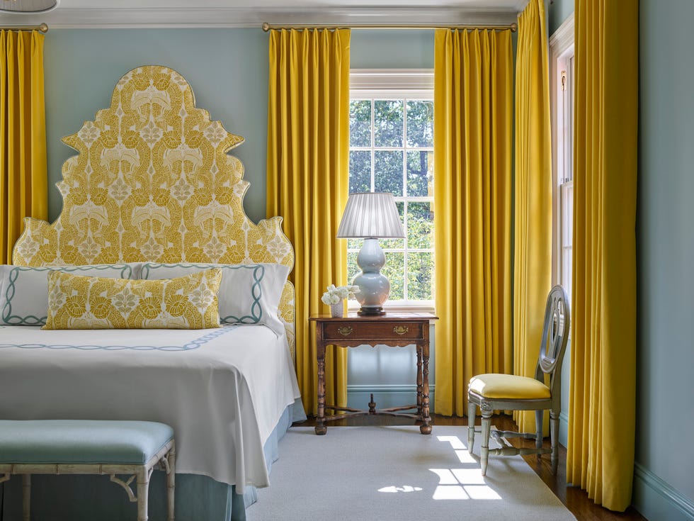
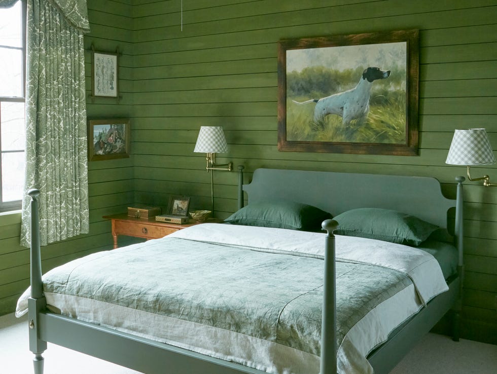
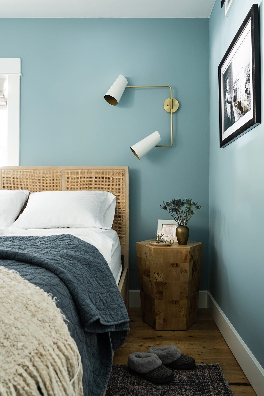
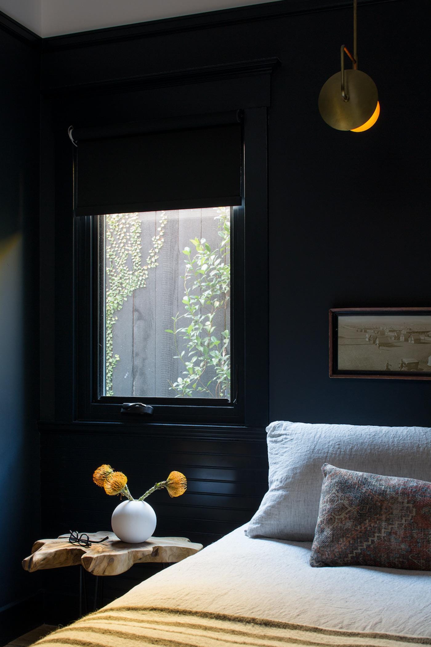
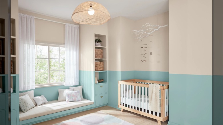
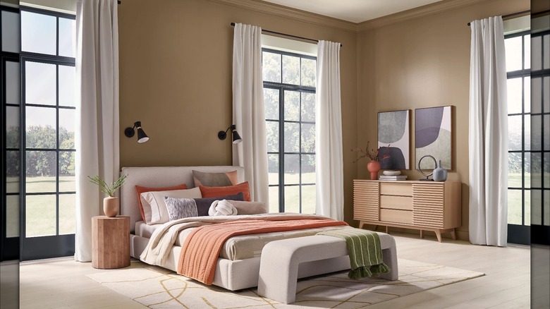
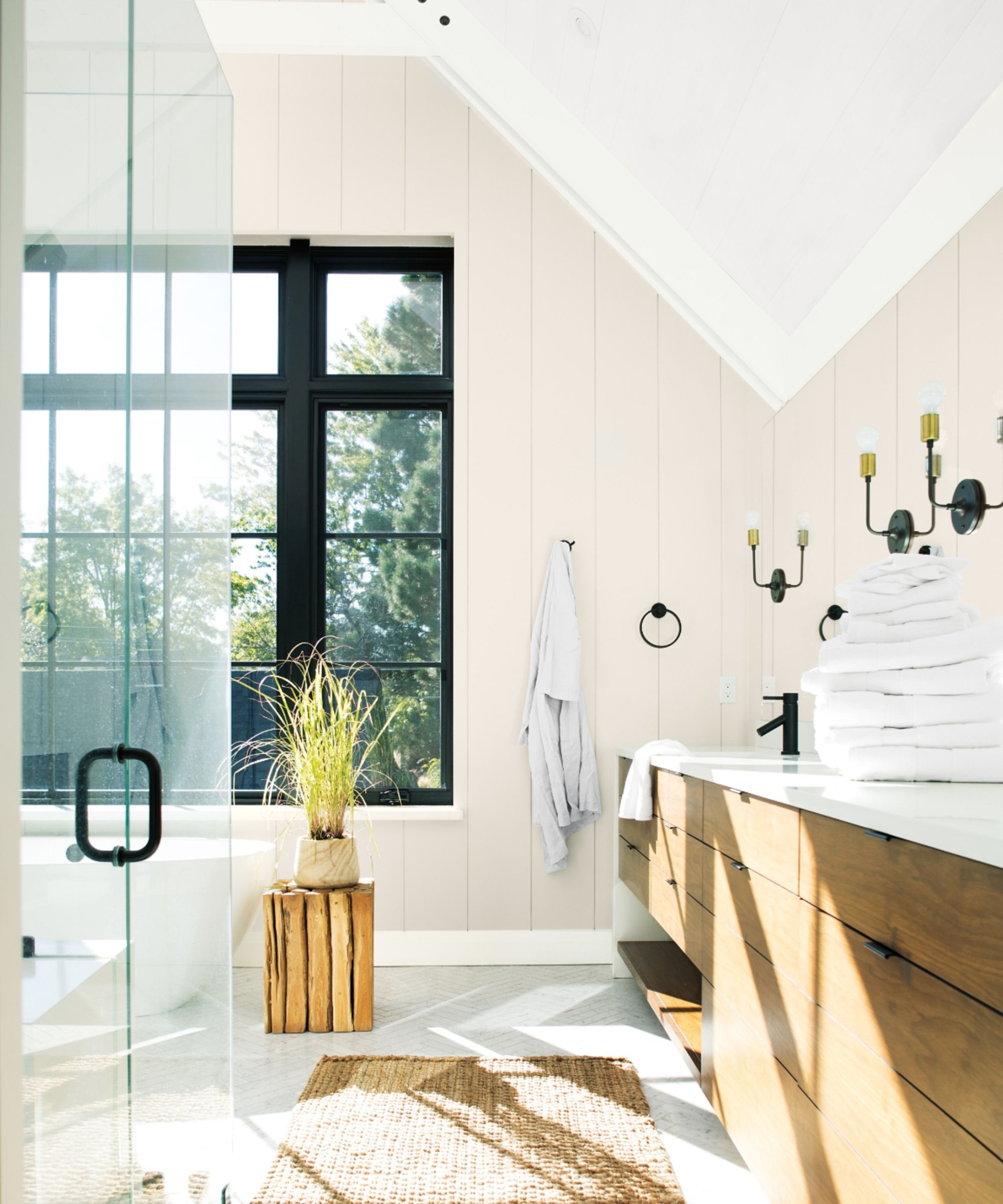
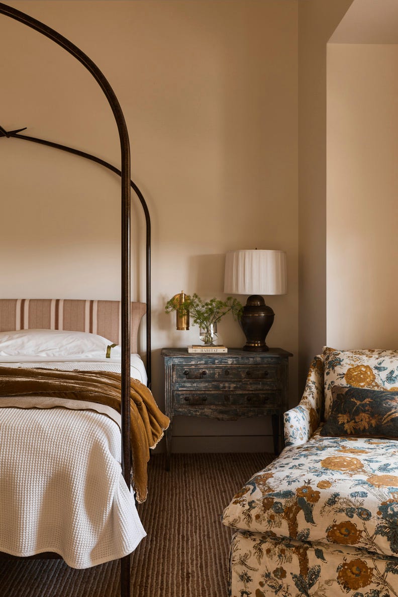
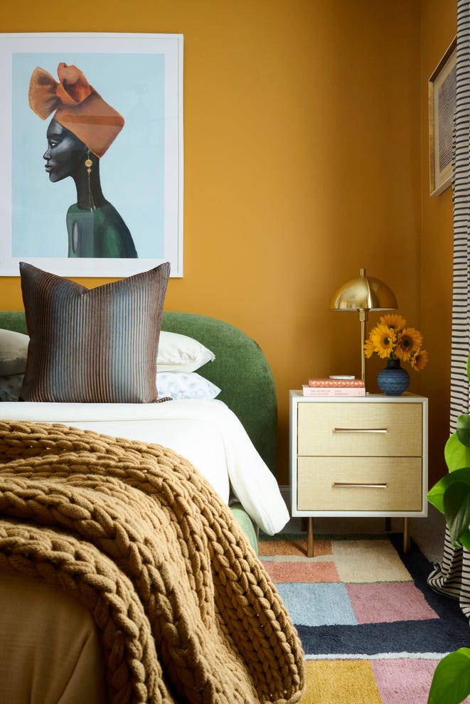
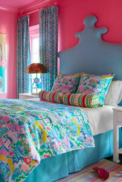
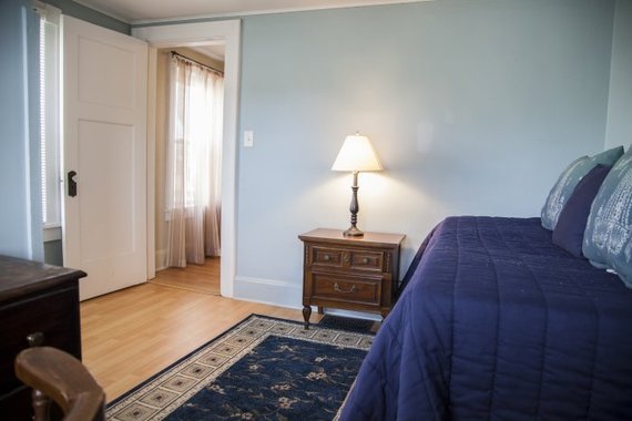
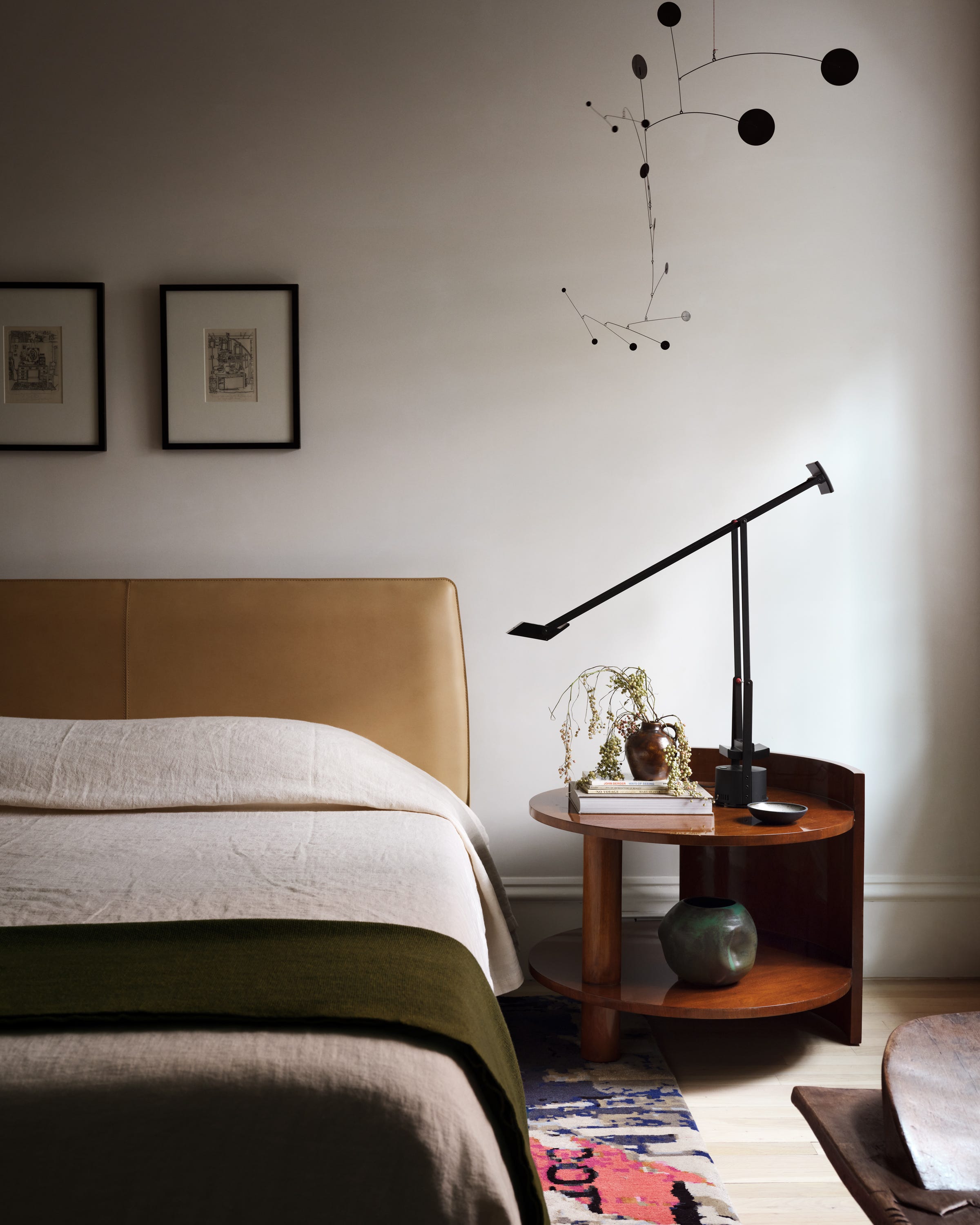
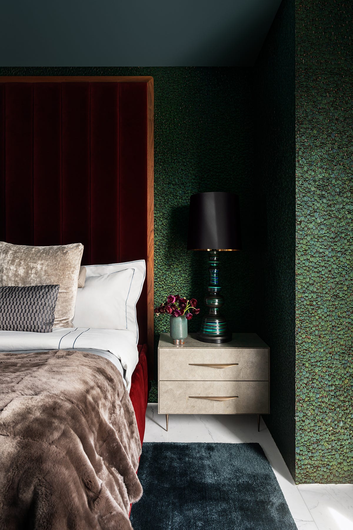
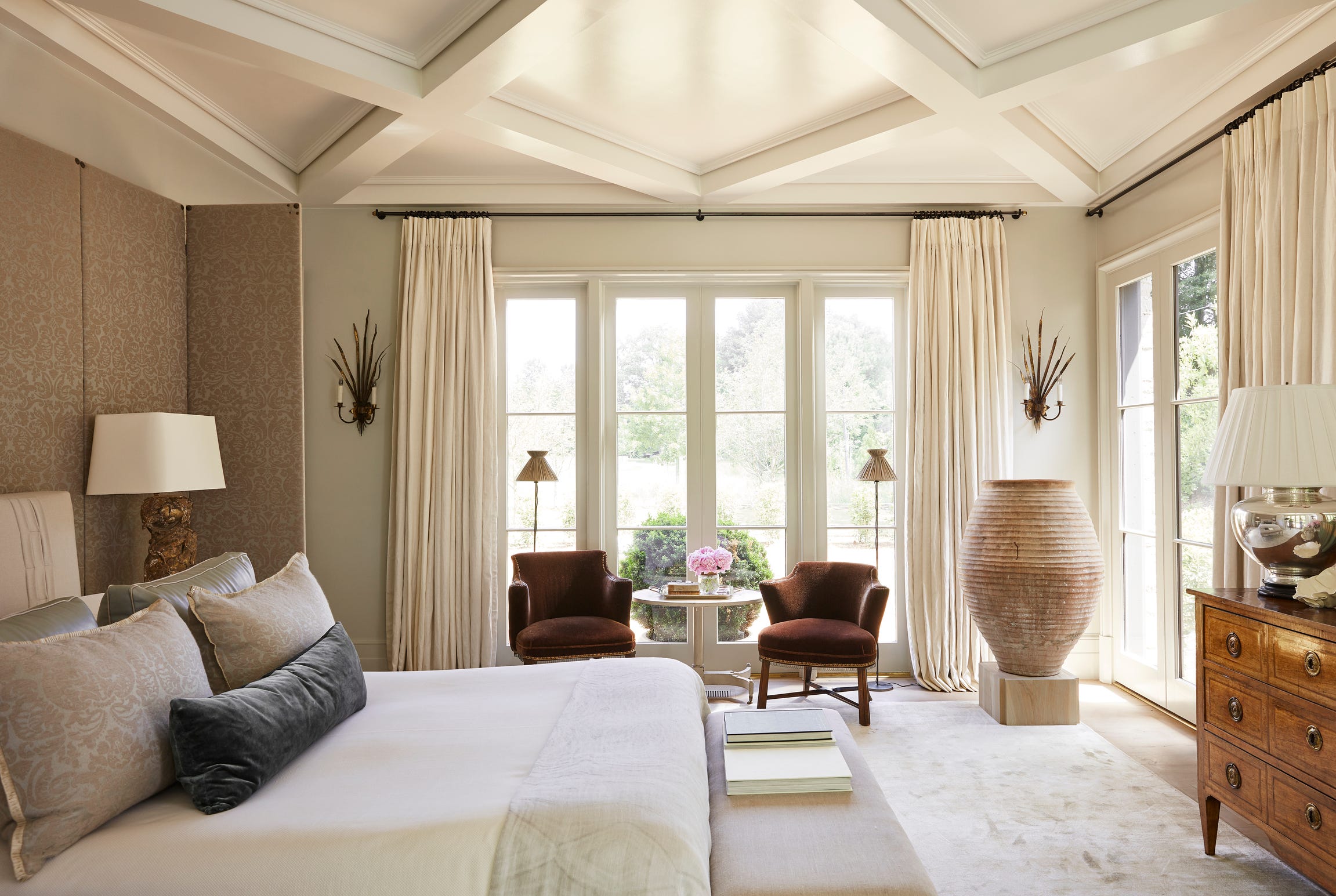
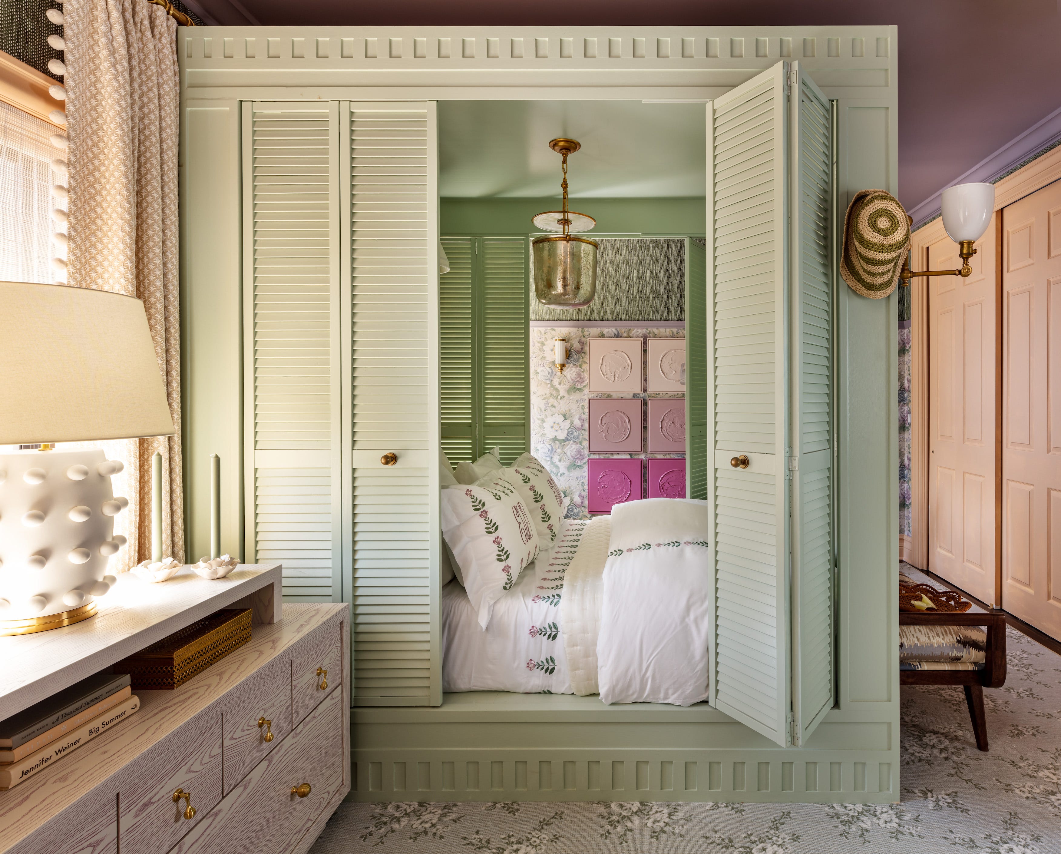
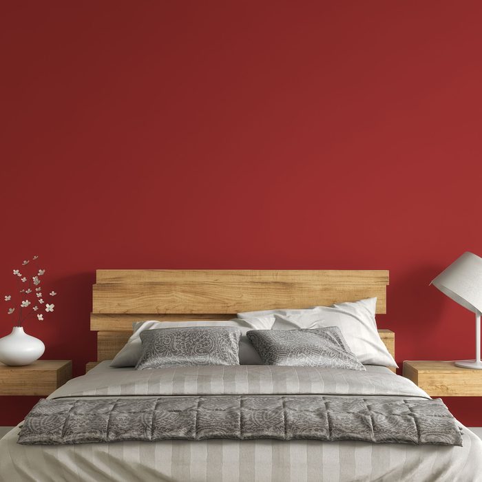
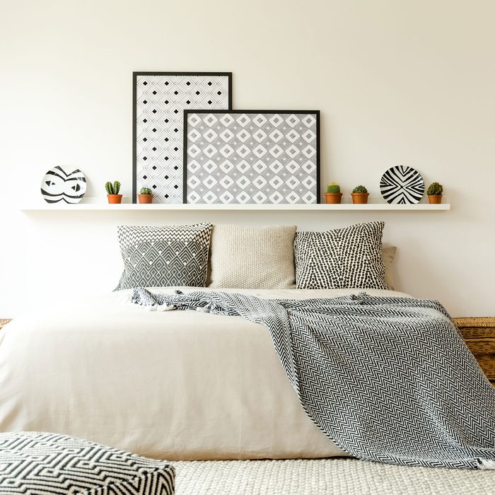
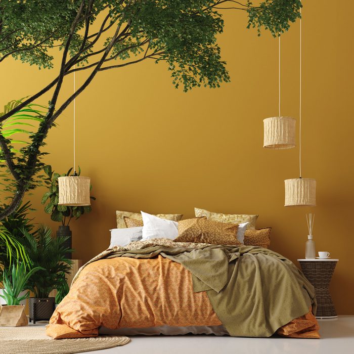
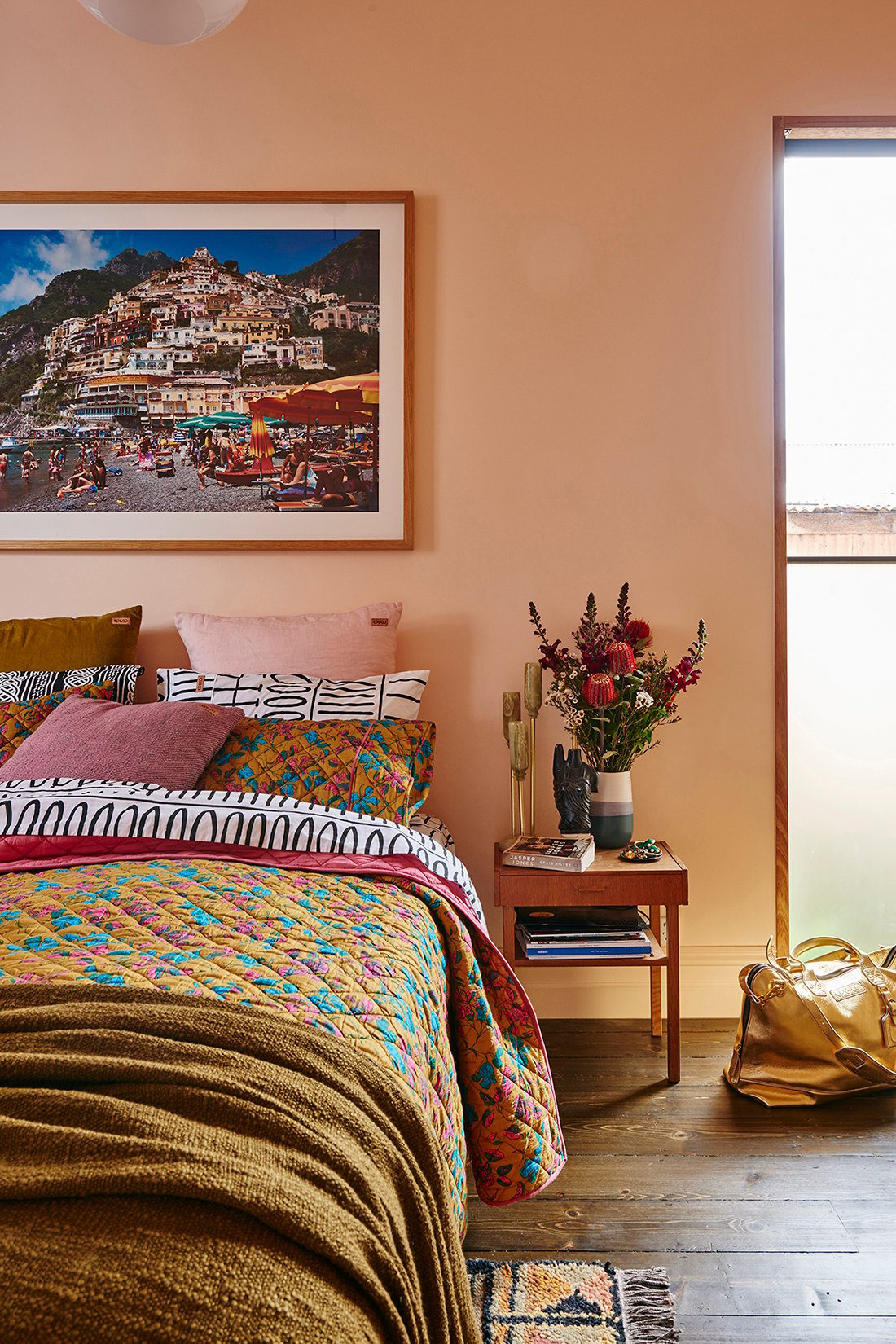
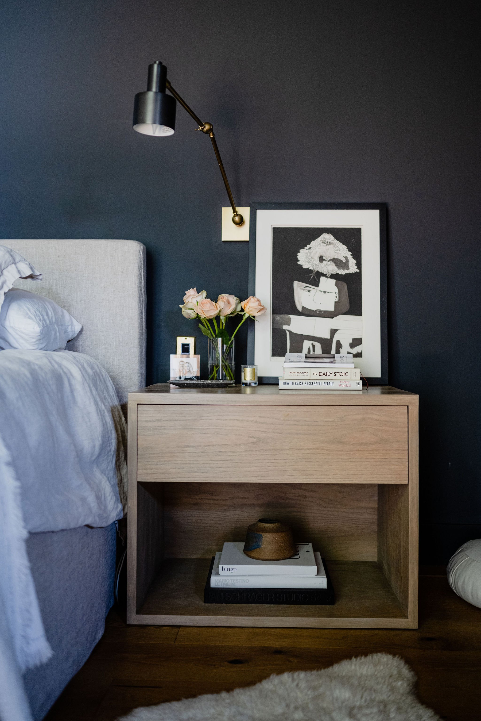
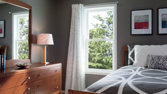
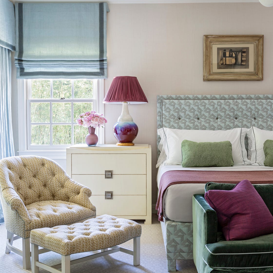
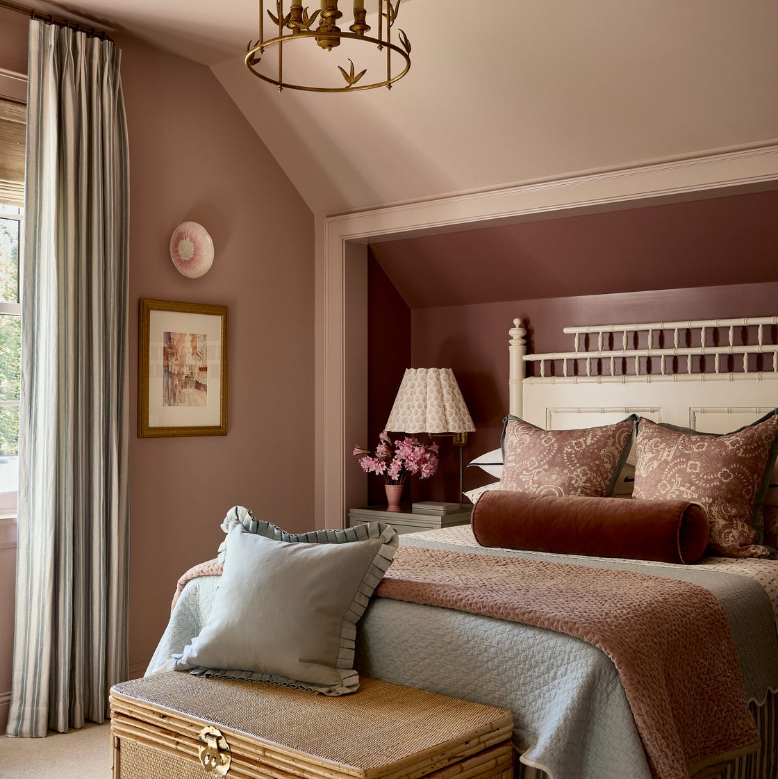
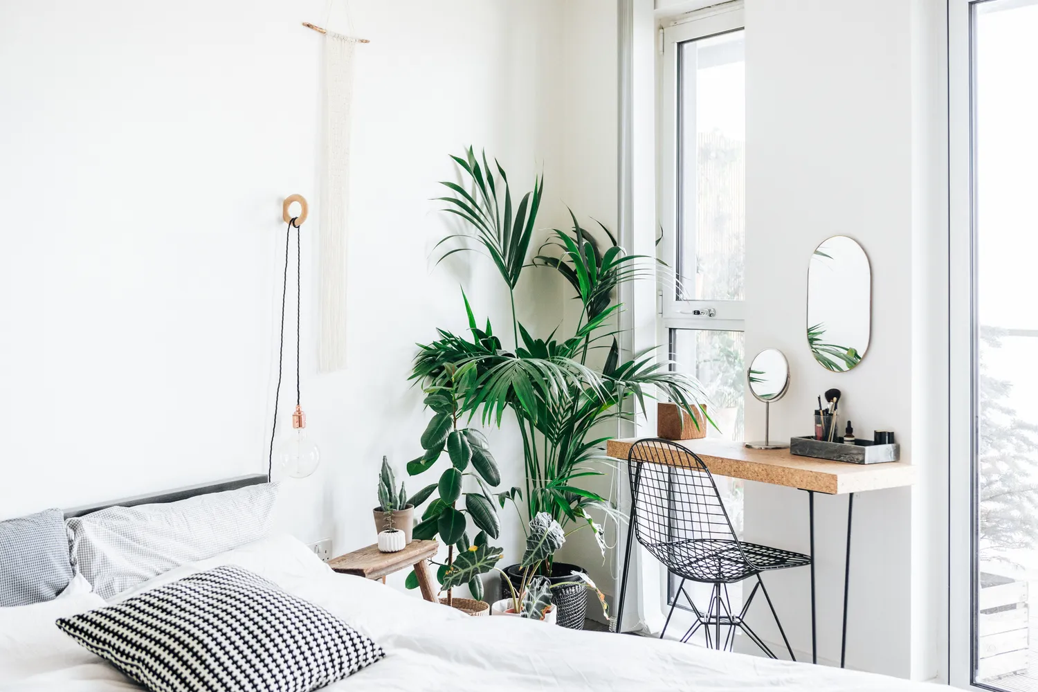
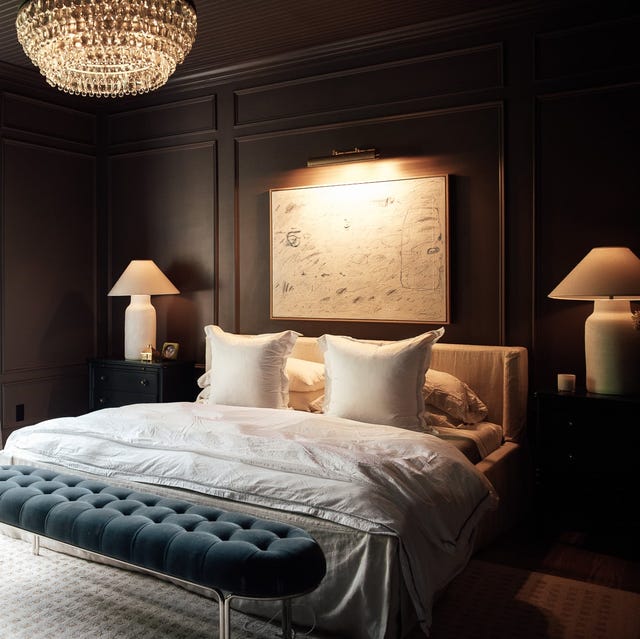
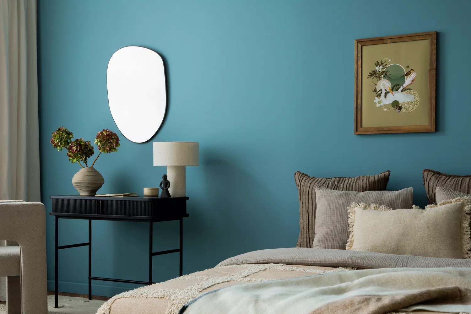
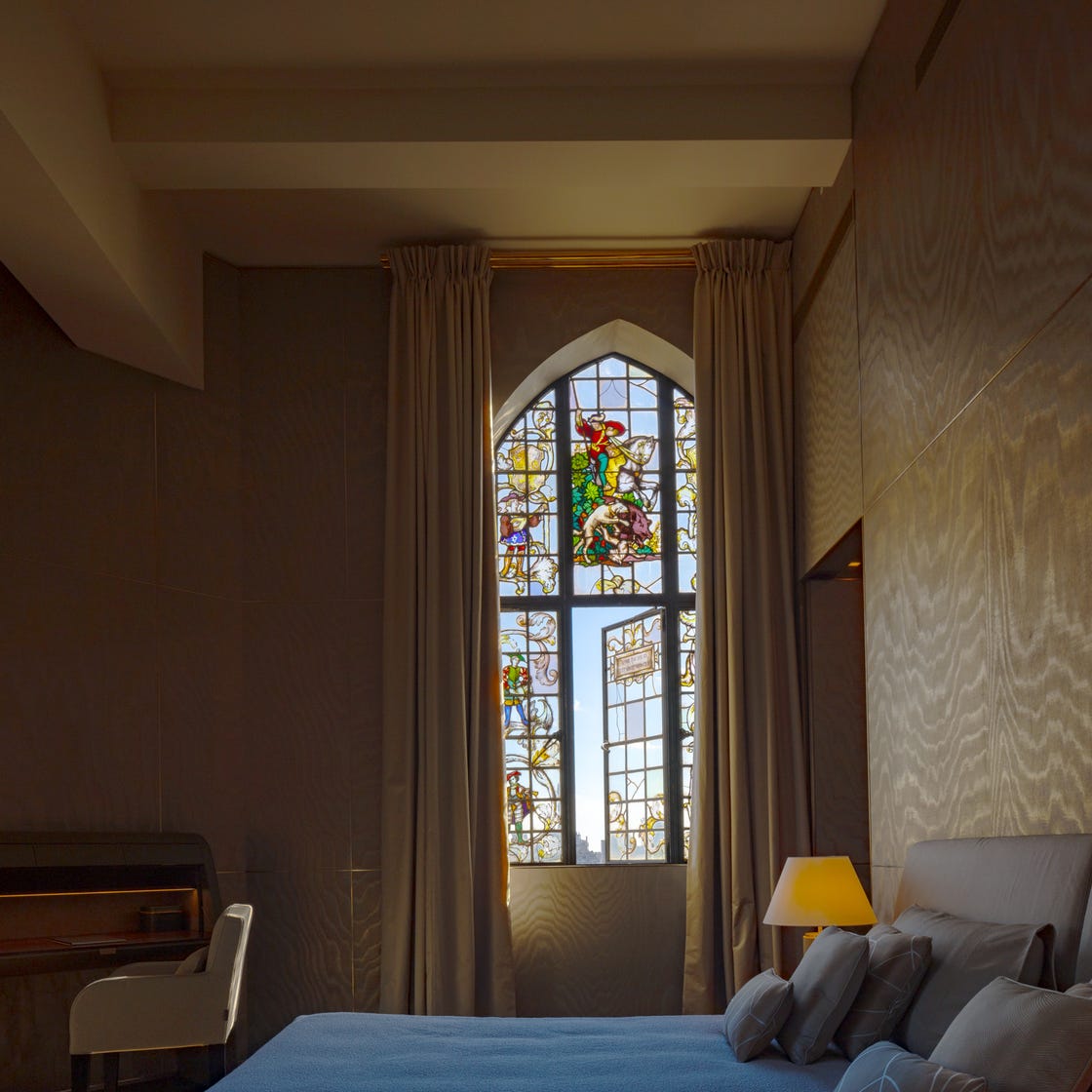
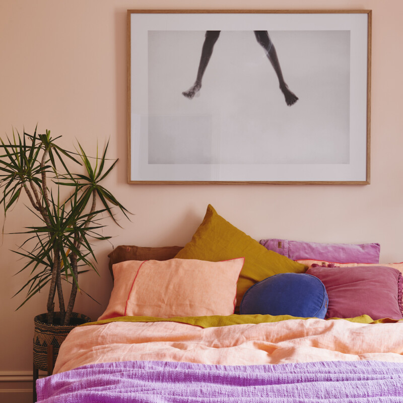
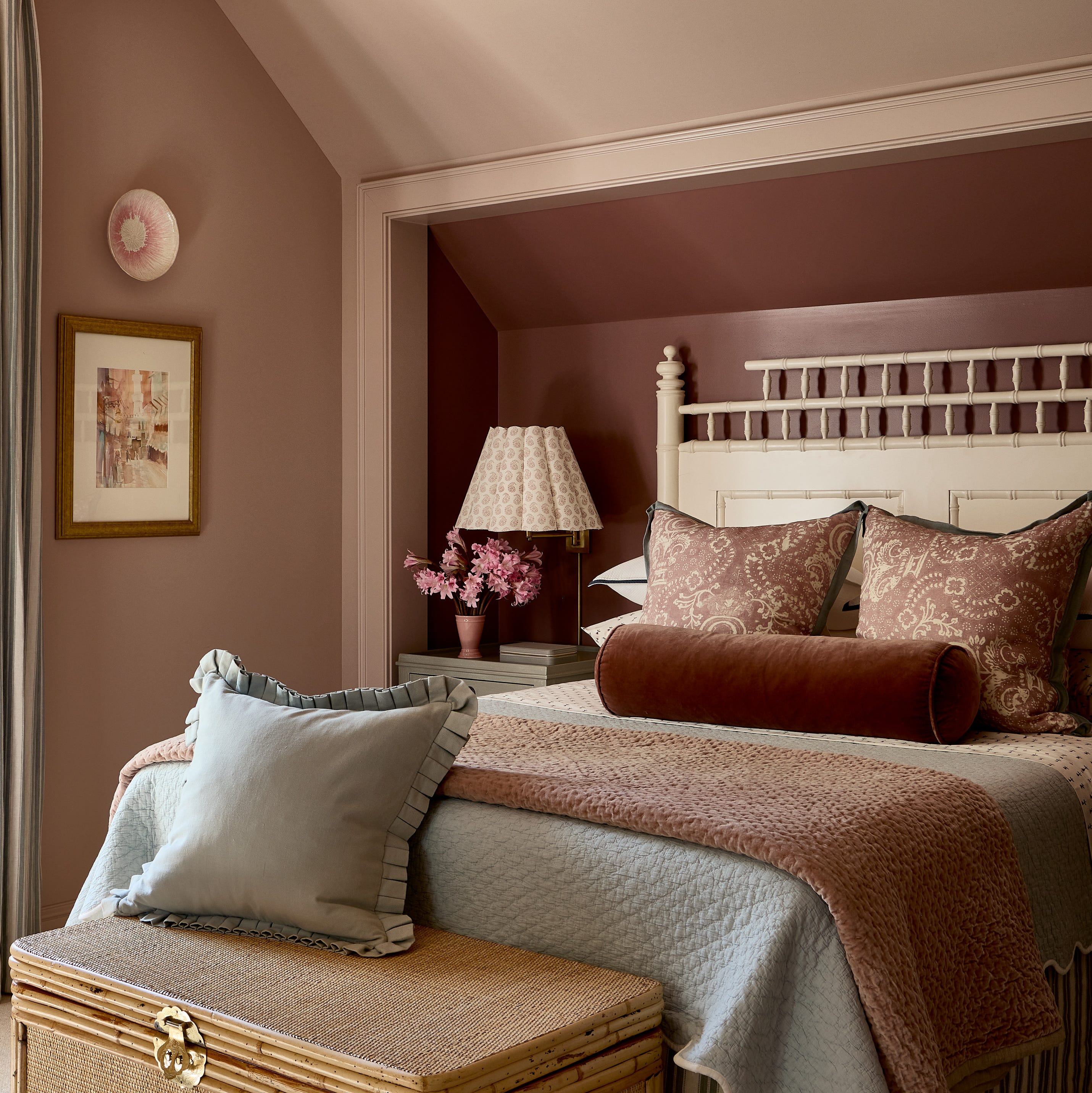
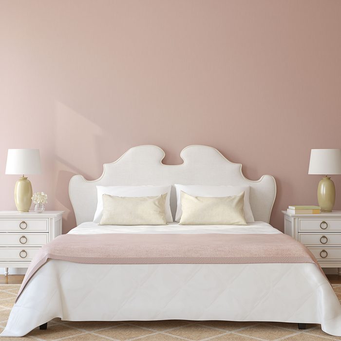
Malorie Goldberg of Noa Blake Design highlights that paint color determines the desired mood—be it light and bright, warm and cozy, or dark and moody. Jennifer Daskal, an interior designer, advises imagining what 'calm' feels like, considering how light interacts with the color throughout the day and night. She emphasizes that a bedroom should feel like a 'vacation' from the rest of the home. David Quarles of Studio 417 recommends colors that not only induce sleep but deep rest, specifically mentioning blues, greens, and deep, wine-adjacent reds for their classic quality. For those preferring less bold choices, designers Mallory Robins and Elizabeth Bennett of Kobel + Co suggest warm neutrals with a flattering tone to create an inviting atmosphere. Jessica Nicastro of Jessica Nicastro Design further elaborates on warm neutrals like creams and beiges, suggesting that texture through accessories such as velvet or linen bedding, wool rugs, and wood nightstands can add depth without relying on vibrant colors.
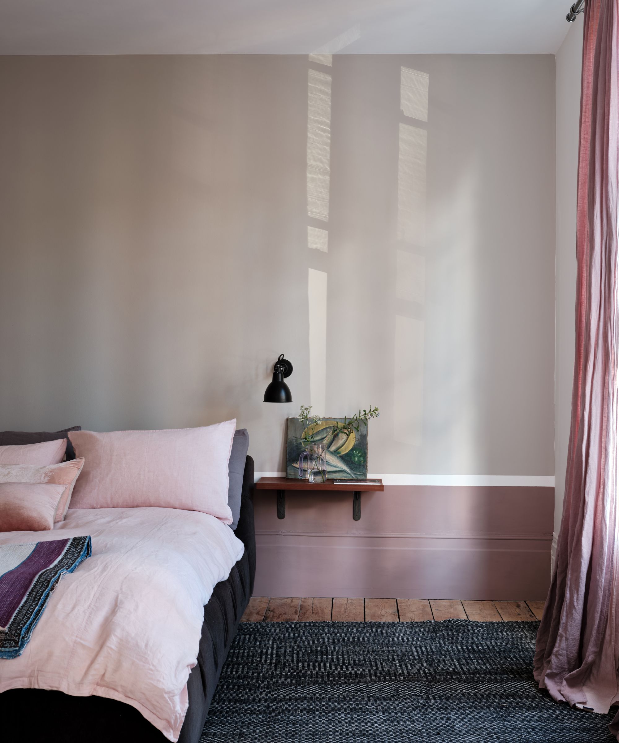
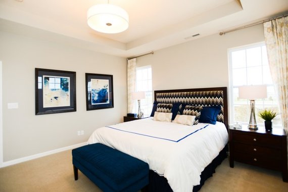
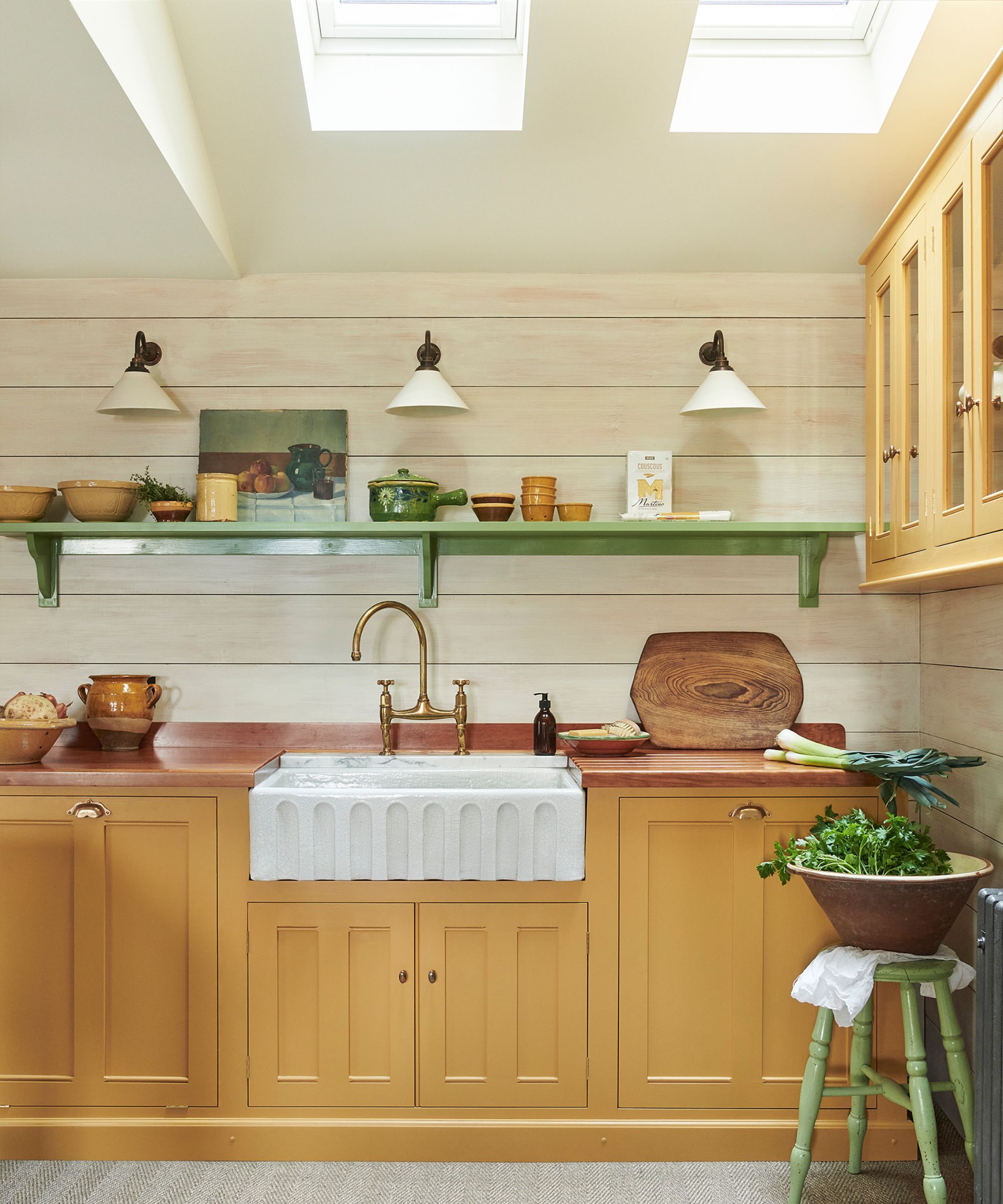
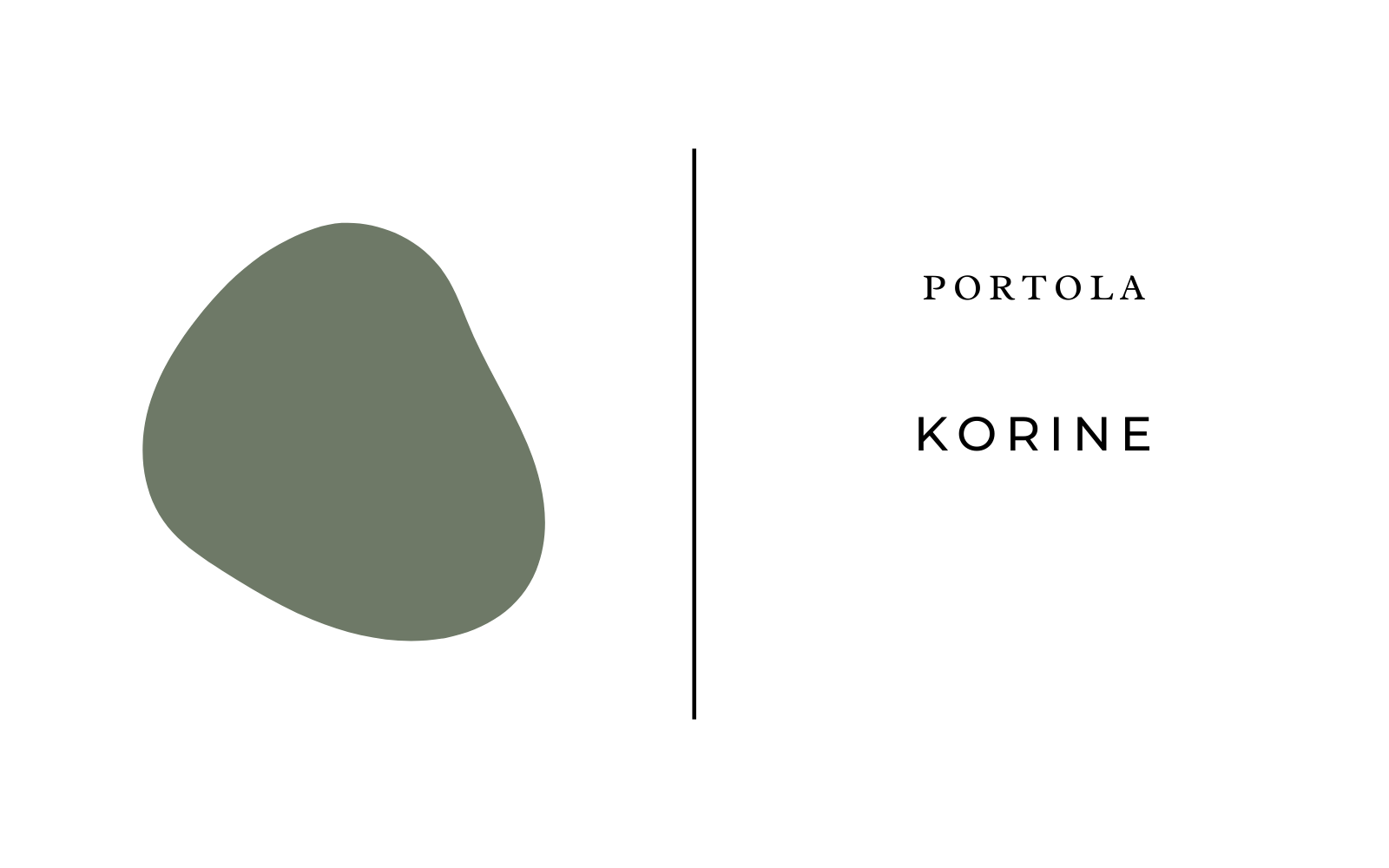
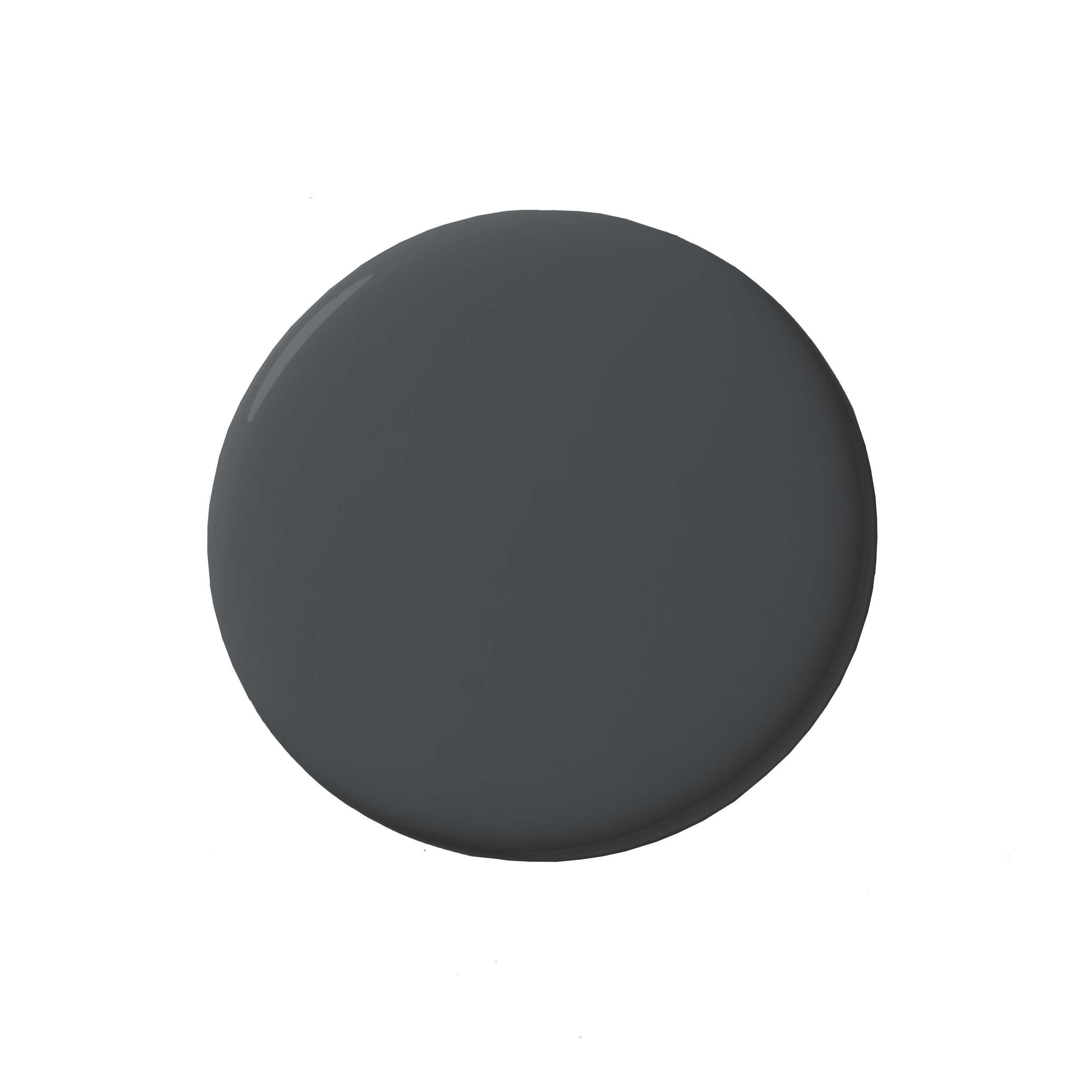
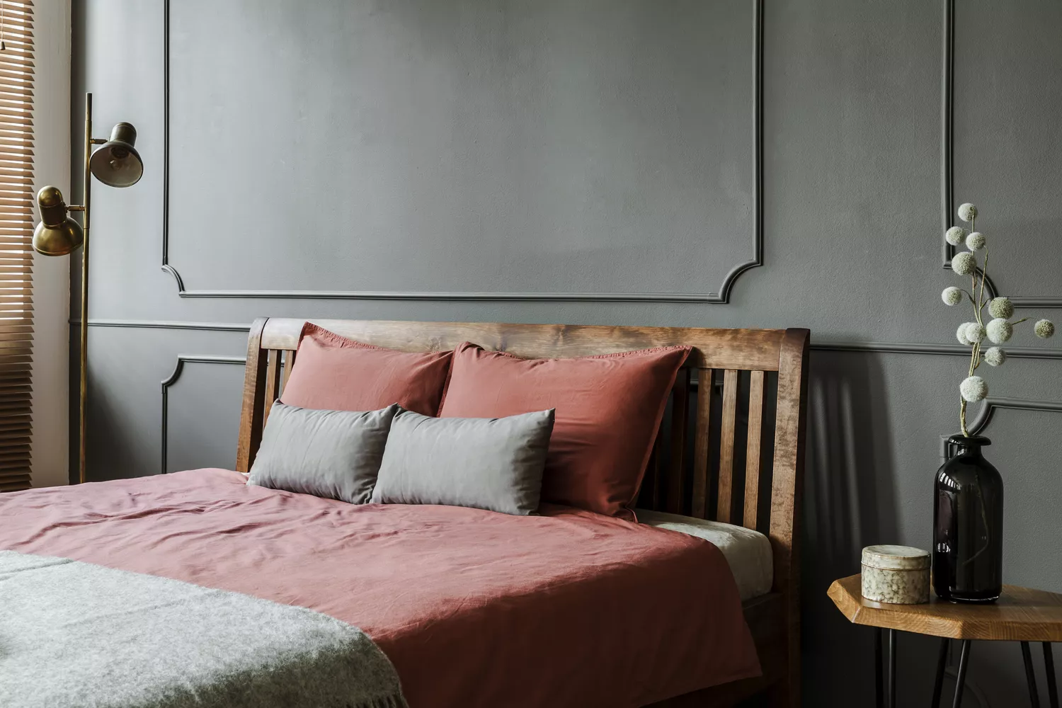
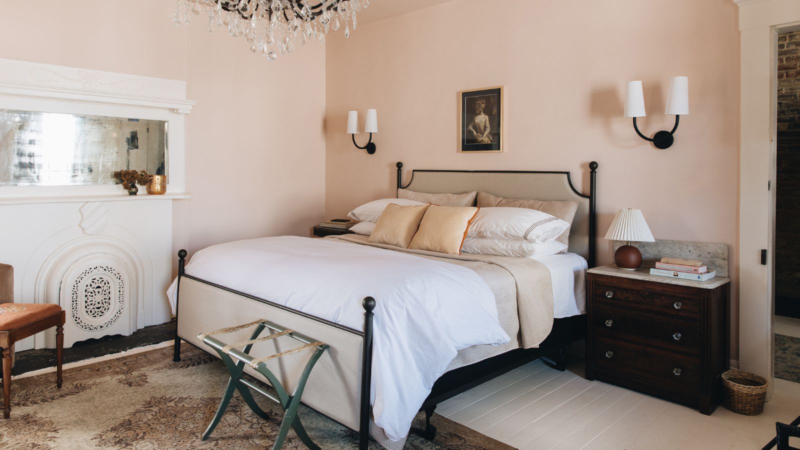
The consensus among designers for timeless bedroom paint colors narrows down to two main categories: warm neutrals and bold blues. Six specific paint colors are recommended. For warm neutrals, 'Piano Room' by Portola Paints is praised by Jessica Nicastro for its inviting feel, acting as a perfect timeless neutral. 'Swiss Coffee' by Benjamin Moore is Daskal’s choice for its warm tones and balanced appeal, which she suggests pairing with vintage decor. Malorie Goldberg recommends 'Chantilly Lace' by Benjamin Moore as a versatile, bright white that is neither stark nor sterile and lacks distracting undertones, making it a strong foundation for any design. 'Stone Lion' by Sherwin-Williams is Elizabeth Bennett’s pick for its ability to create an intimate and inviting bedroom, suggesting it be complemented with varied textures and crisp white bedding.
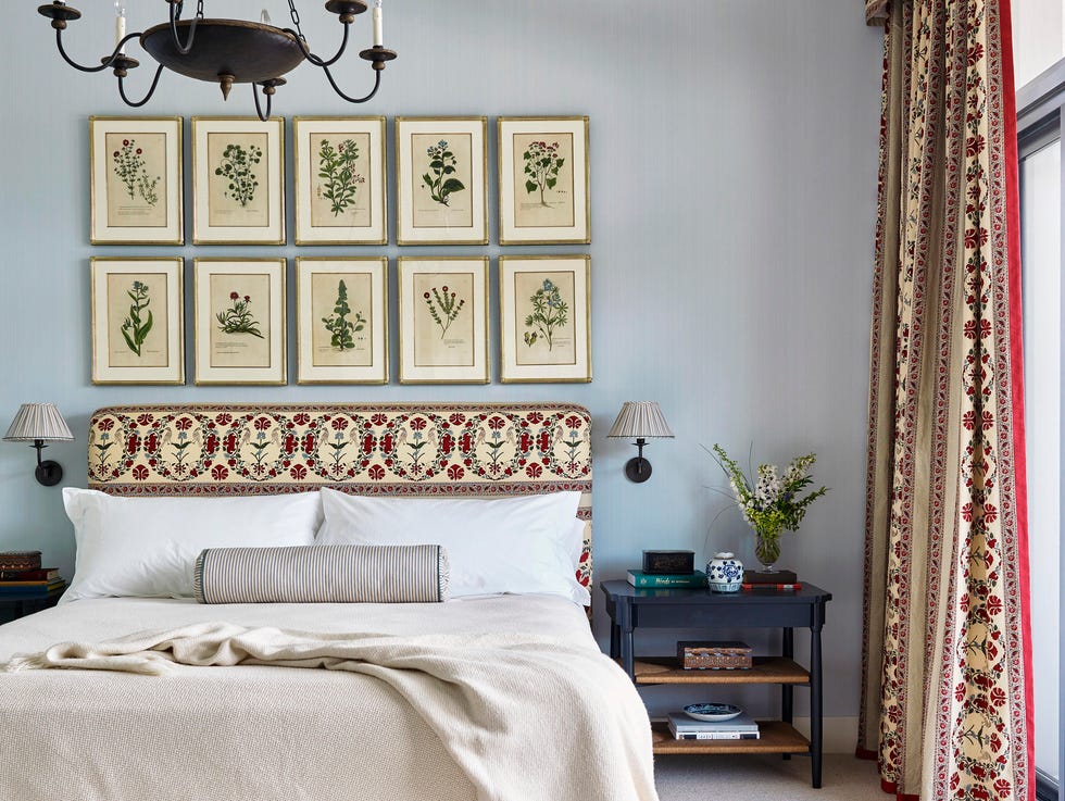
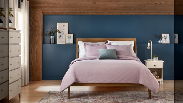
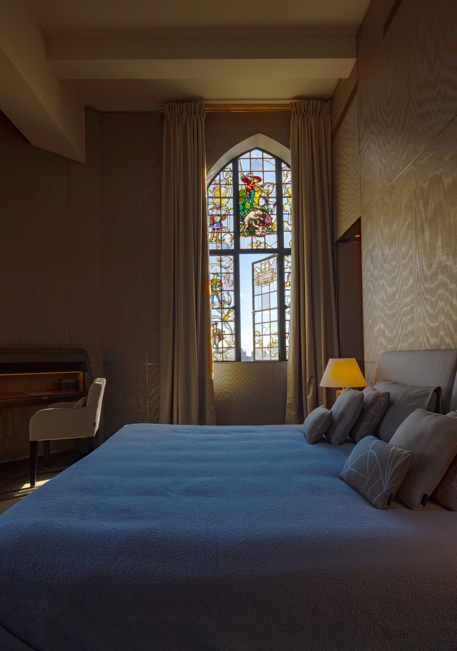
For bold blues, Daskal points to 'Oval Room Blue' by Farrow & Ball, named after 18th-century rooms, as a historically timeless option. She suggests using various shades of blue in bedding and accessories to create an immersive, water-like ambiance. David Quarles recommends 'Inchyra Blue' by Farrow & Ball, noting its perfect balance of warm, greenish-blue that has been historically significant in art. He highlights its adaptability across diverse design styles, including contemporary, mid-century modern, and traditional aesthetics. These selections provide a range of choices that ensure a serene and enduring bedroom design, focusing on comfort and style that withstands fleeting trends.
#BedroomDecorating #PaintColors #InteriorDesign #HomeDecor #TimelessStyle #NeutralColors #BlueHues #DesignTips #BedroomDecorating #PaintColors #InteriorDesign #HomeDecor #TimelessStyle #NeutralColors #BlueHues #DesignTips
0 comment in total
You may also like
10 designers on the bedroom colors they always recommend
The most timeless paint colors according to designers

Best Bedroom Colors for Sleep

7 Bedding Colors That Are Outdated, According To Designers
These Designer-Approved Bedroom Paint Colors Are the Key to the Best Sleep of Your Life

You Can Wake Up HAPPIER Just by Painting Your Bedroom—Here Are the Colors Designers Love

6 Bedroom Paint Colors Designers Don't Want to See in 2026

I asked interior designers what color they include in every project – these 5 enduring shades were the favorites
We've Rounded Up the Best Bedroom Paint Colors — No Matter Your Style

We Asked Designers to Predict the Top Bedroom Paint Colors for 2025, Here's What They Said
The Best Bedroom Colors to Help You Sleep (And Wake Up Happy)

4 Interior Designers Share the Biggest Paint Color Trends Right Now (and What’s Out!)

We Asked Designers to Pick the Most Timeless Living Room Paint Color—and They Agreed
Designer-Approved Bedroom Paint Colors That'll Help You Wake Up Happier
These Beautiful Paint Colors Will Make You Want to Switch Up Your Bedroom Right Now
We Asked 20 Designers for Their Favorite Paint Colors for Windows

Bedroom Paint Colors That Will Be Huge, According To Our Paint Industry Experts
This "Controversial" Bedroom Color Is a Designer Favorite—Here's Why
These Are the Top Bedroom Colors of 2024

5 Paint Colors You Should Never Use In A Bedroom, According to Designers