1/4
Designers’ Favorite White Paints Are Always Changing—We Asked 3 for Their Latest Pick
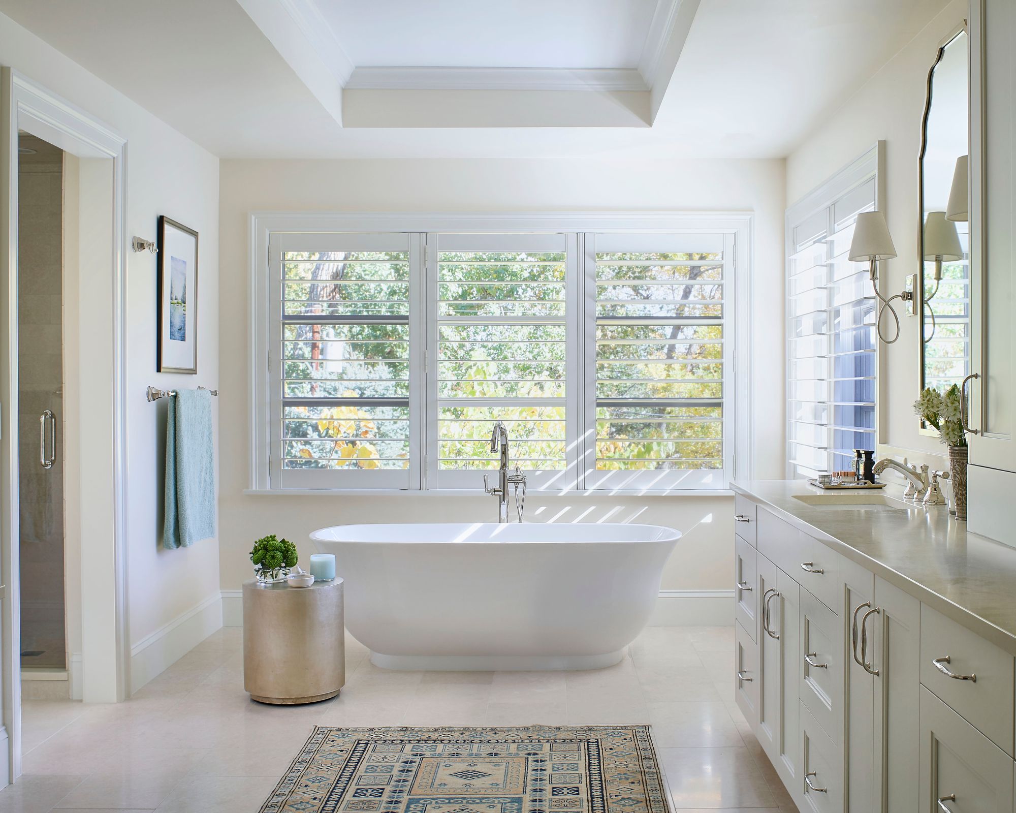
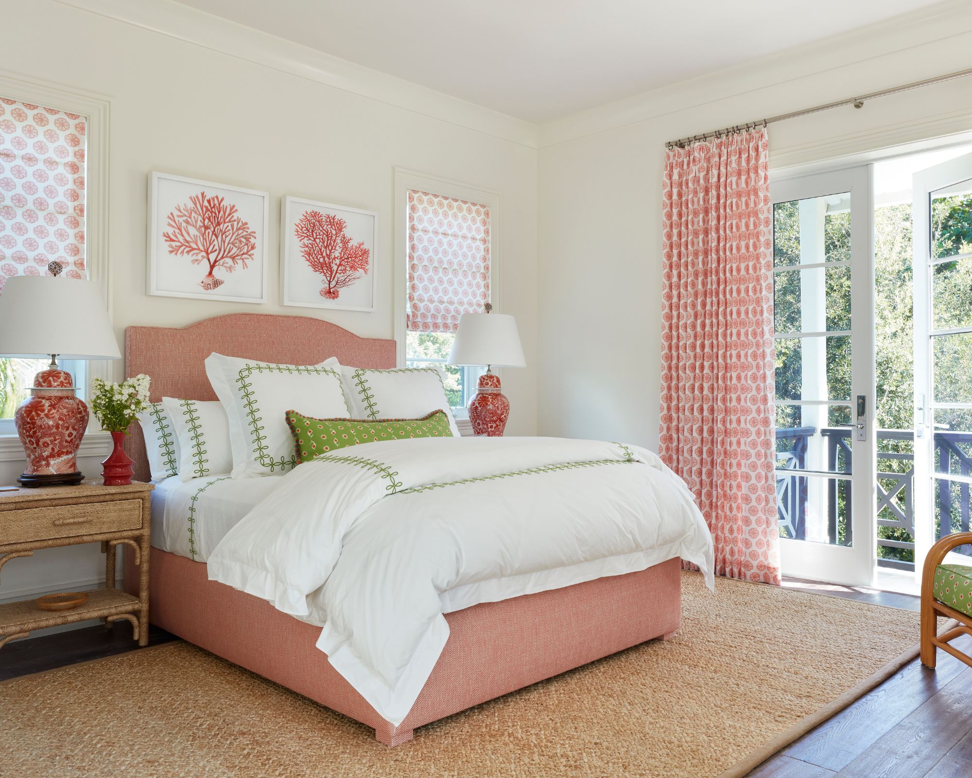
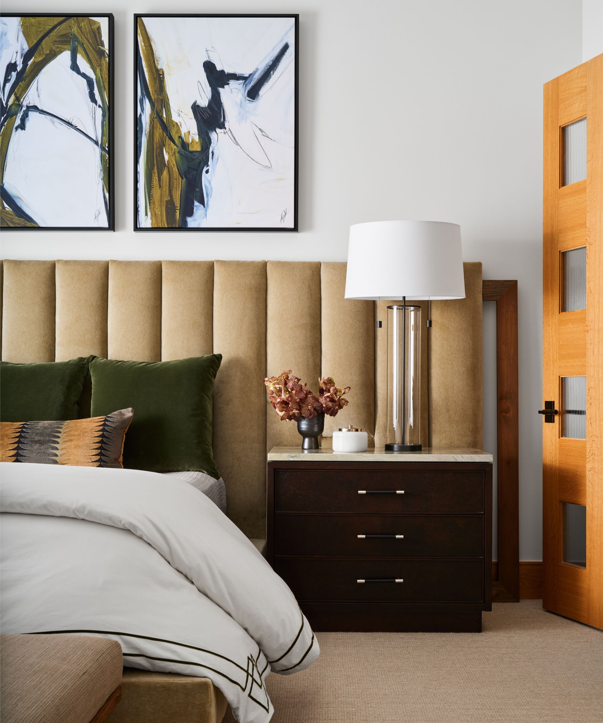
The article explores the dynamic preferences of interior designers regarding white paint colors, noting that while some classics endure, many professionals continuously seek new shades tailored to specific project needs. This constant evolution in preferred white paints is driven by various factors, including room orientation, natural light conditions, and desired aesthetic.
To provide up-to-date insights, three interior design experts were consulted for their current go-to white paint recommendations. Interestingly, two designers highlighted paints with cool gray undertones, while one maintained a preference for a timeless, well-established white shade. This diversity in preferences underscores the nuanced considerations involved in selecting the perfect white paint.
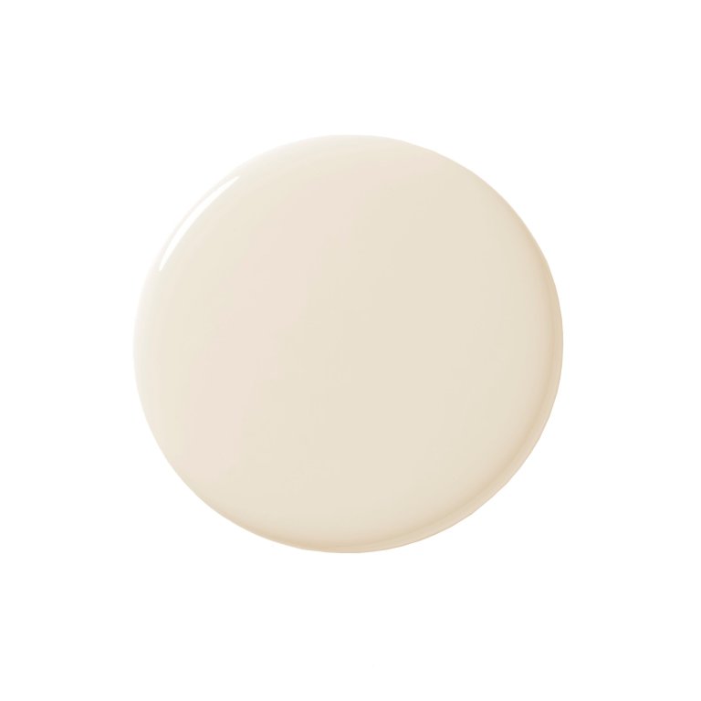
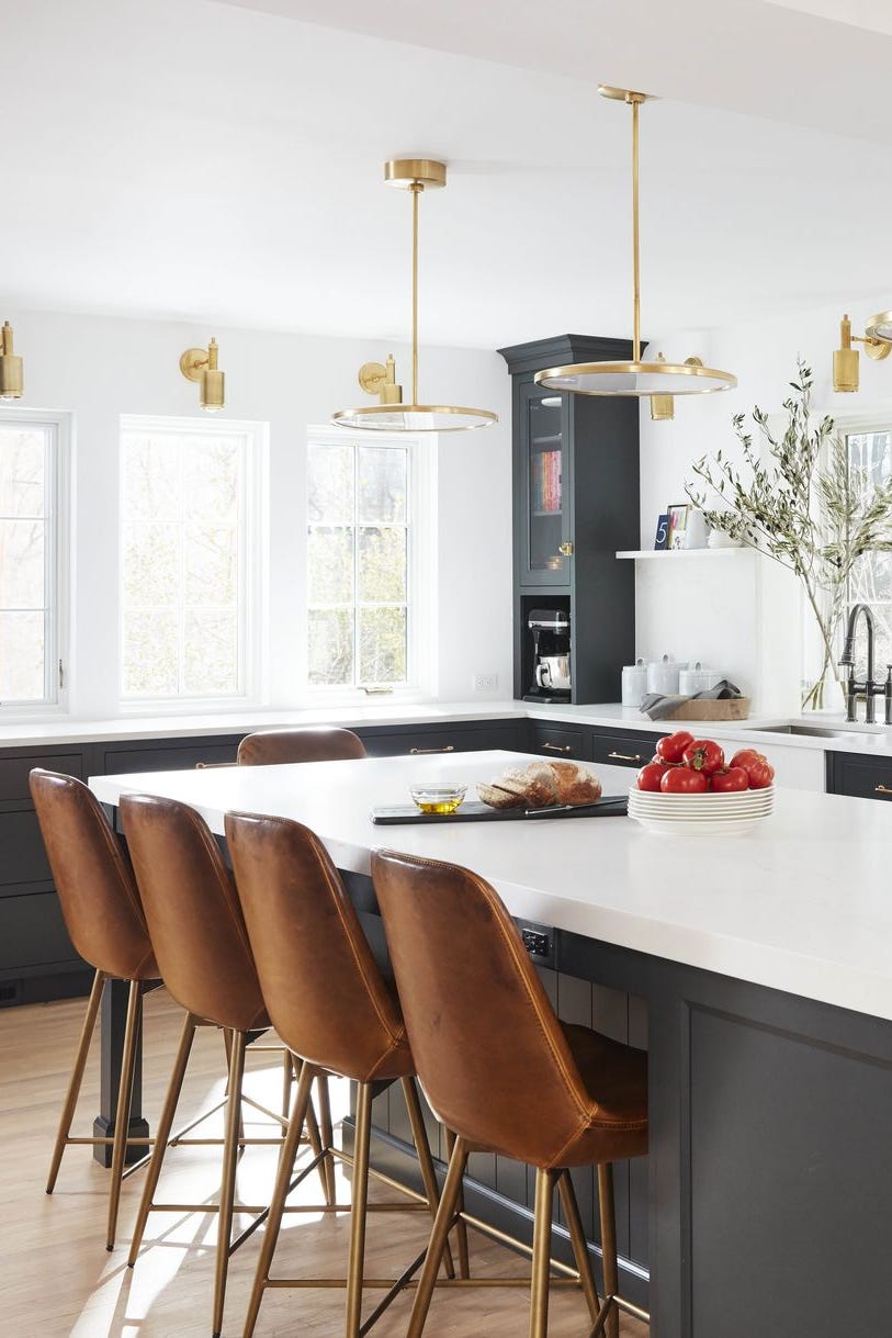
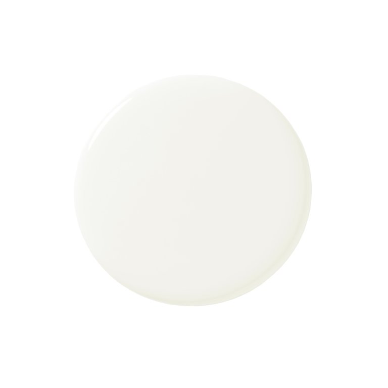
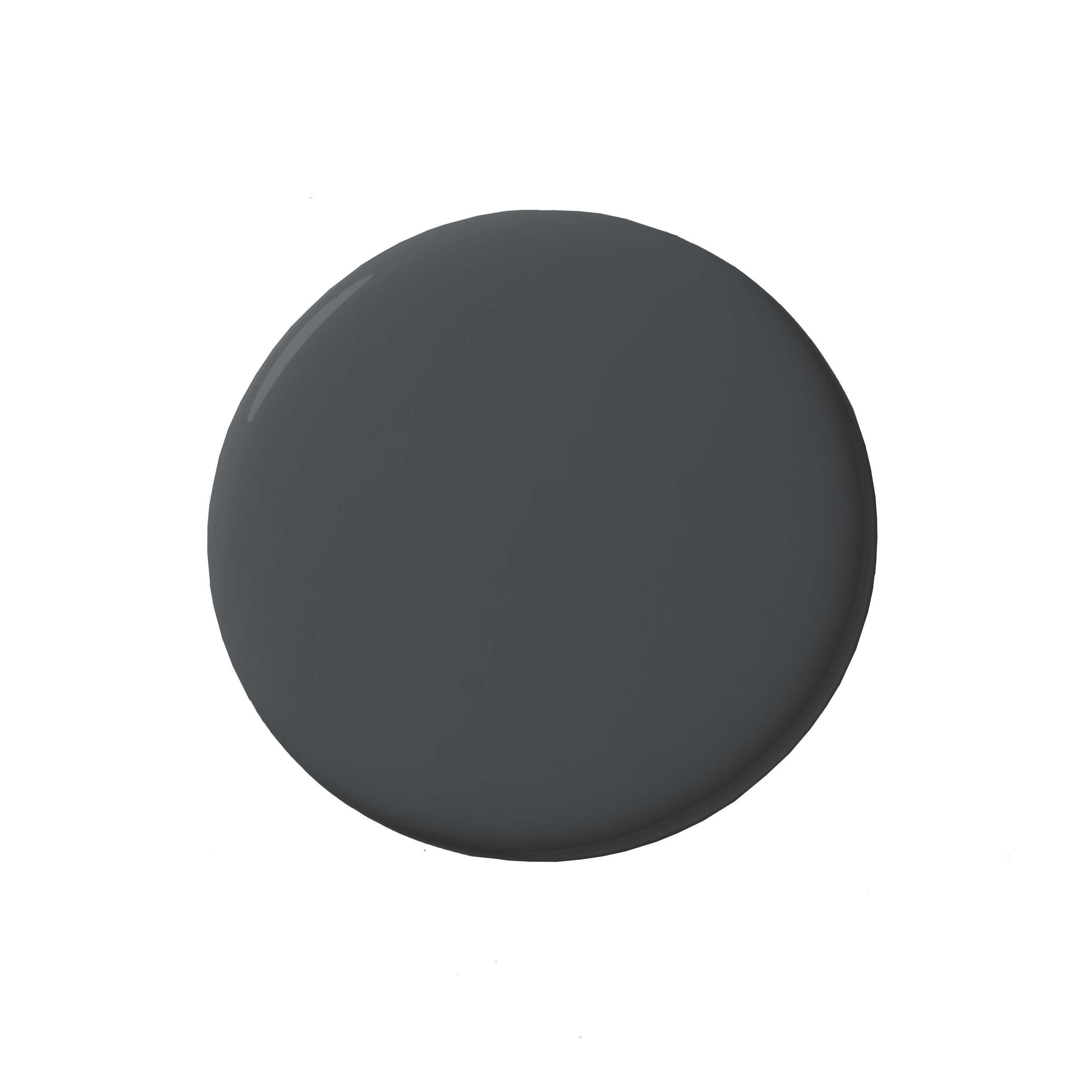
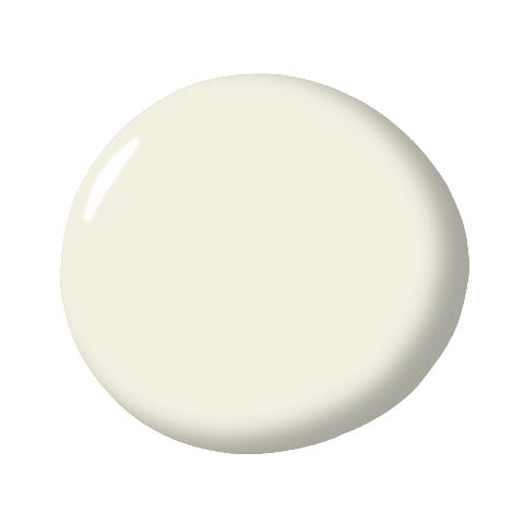
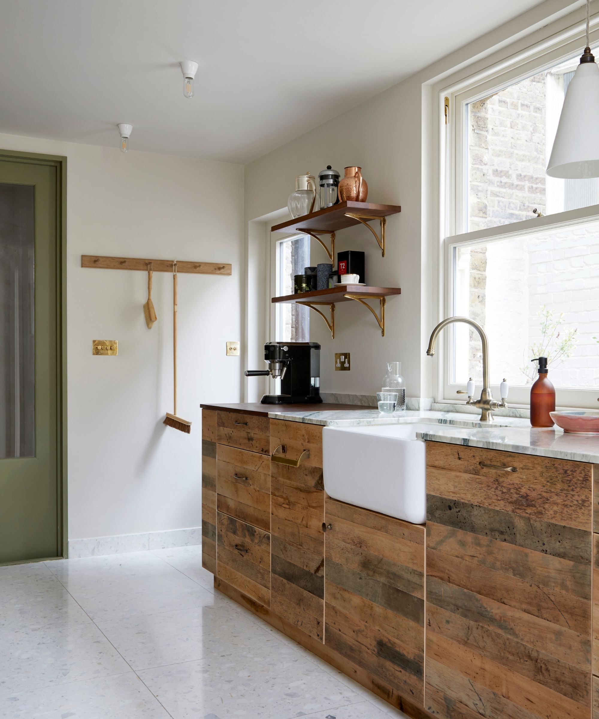
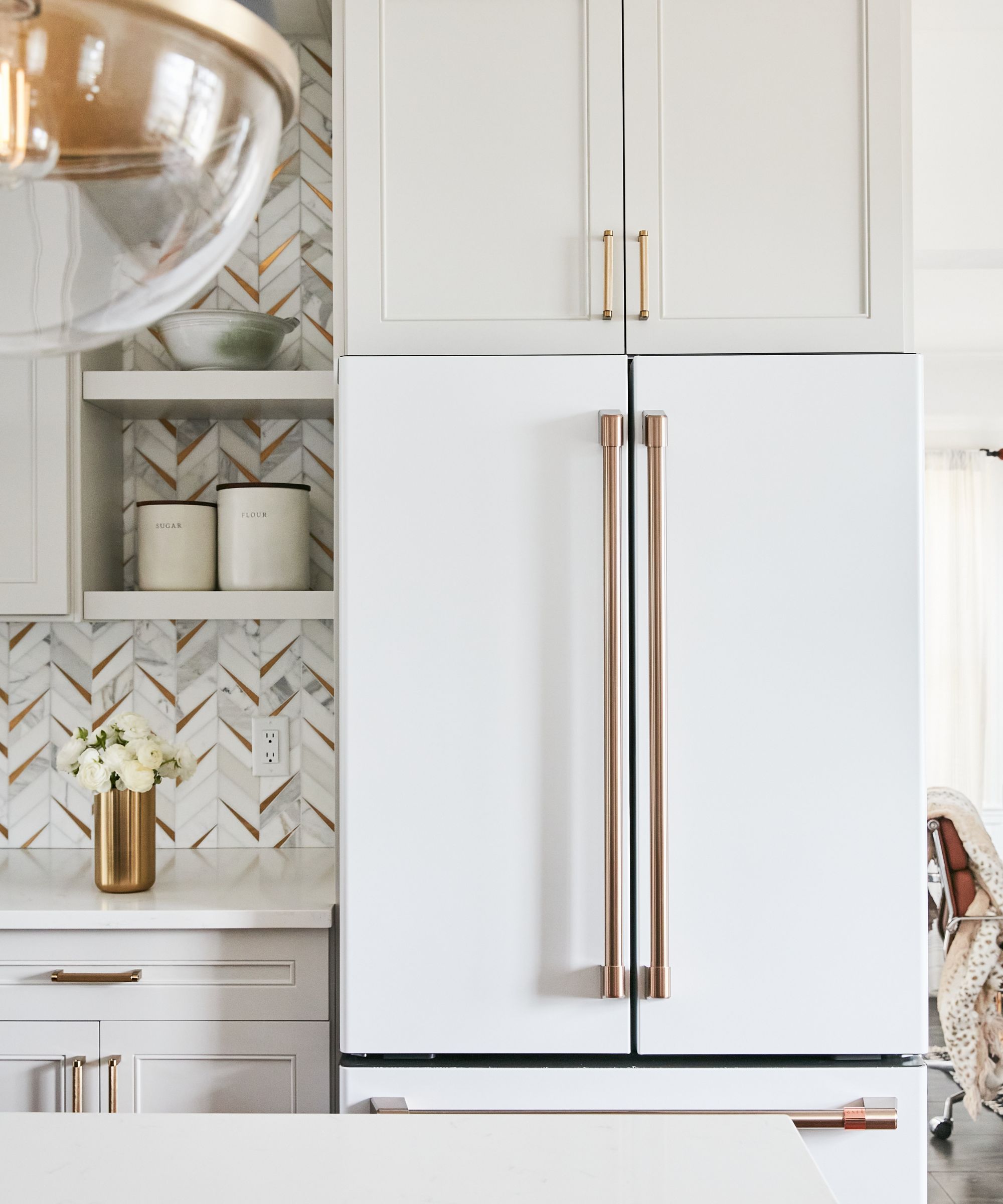
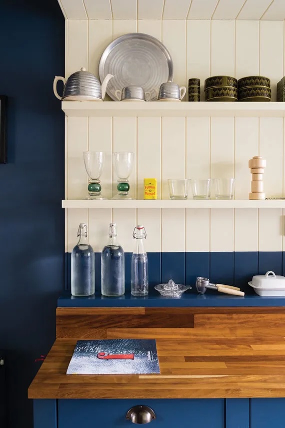
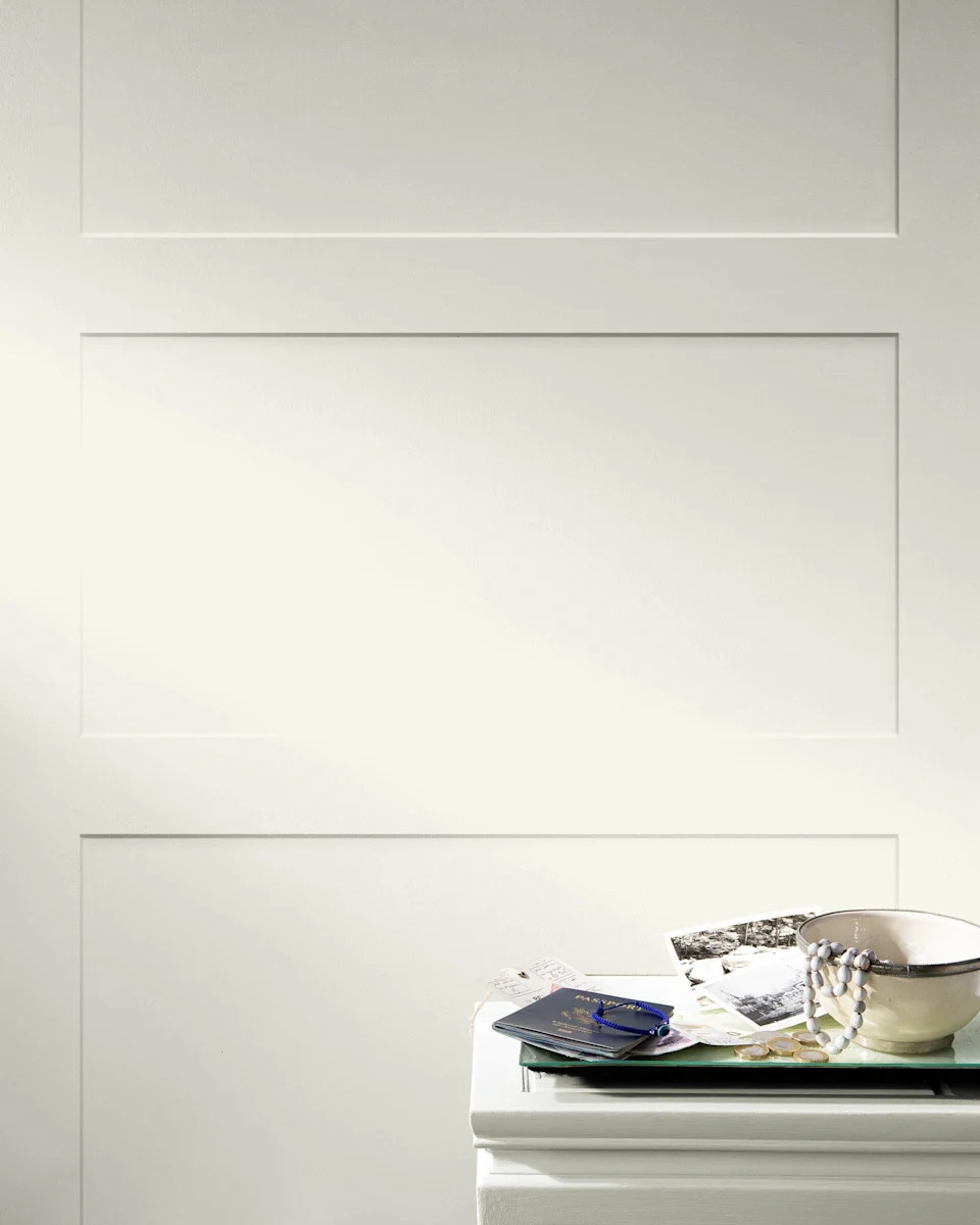
Annie Sullivan, cofounder of Sullivan Matthews, expresses a partiality for Farrow & Ball's curated palette, specifically recommending their 'Salt' paint. She describes 'Salt' as a crisp white featuring subtle chalky gray undertones, suggesting its suitability for creating sophisticated and clean interiors. This choice indicates a lean towards whites that offer a delicate balance between starkness and warmth, with a hint of coolness.
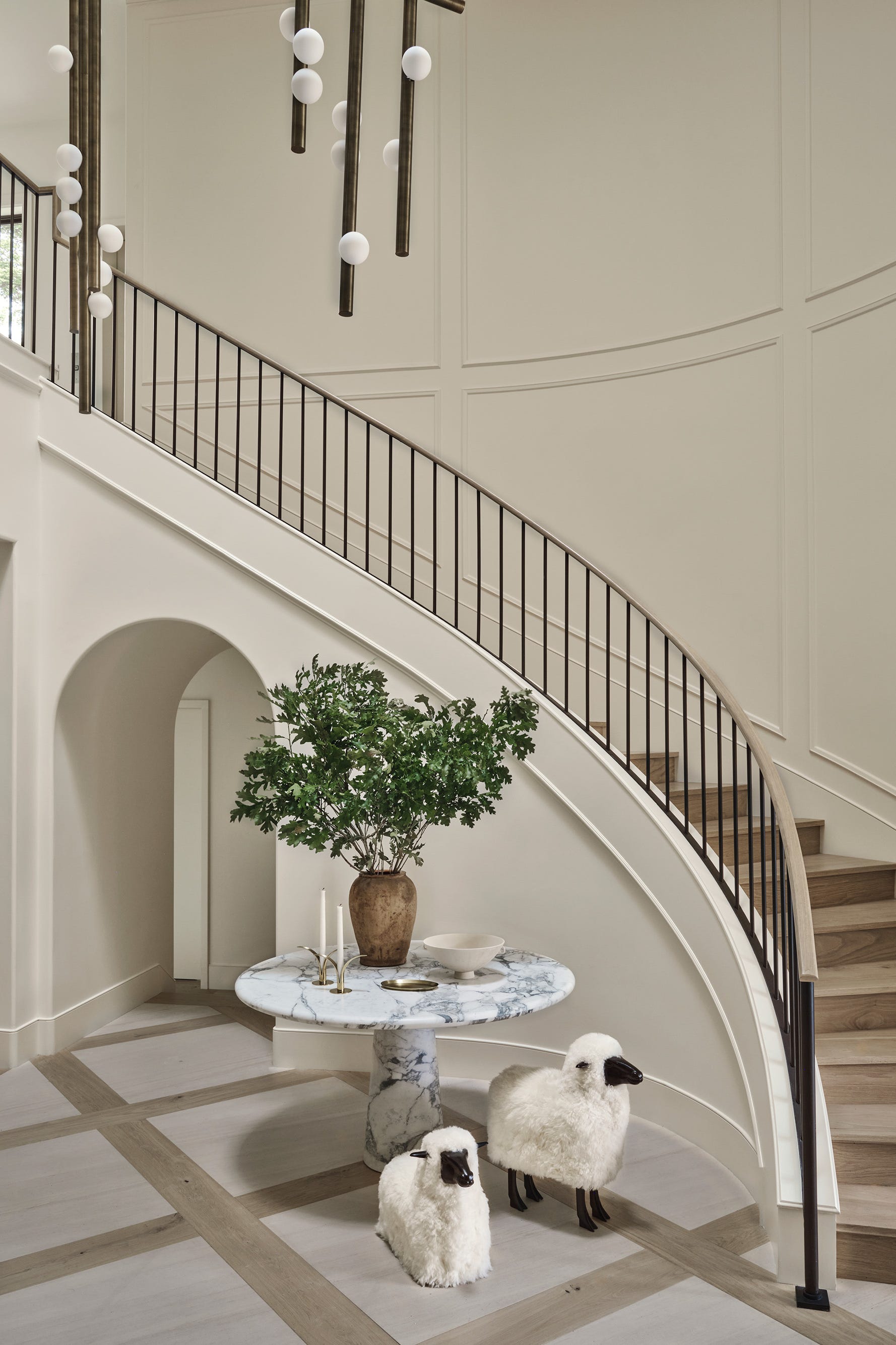
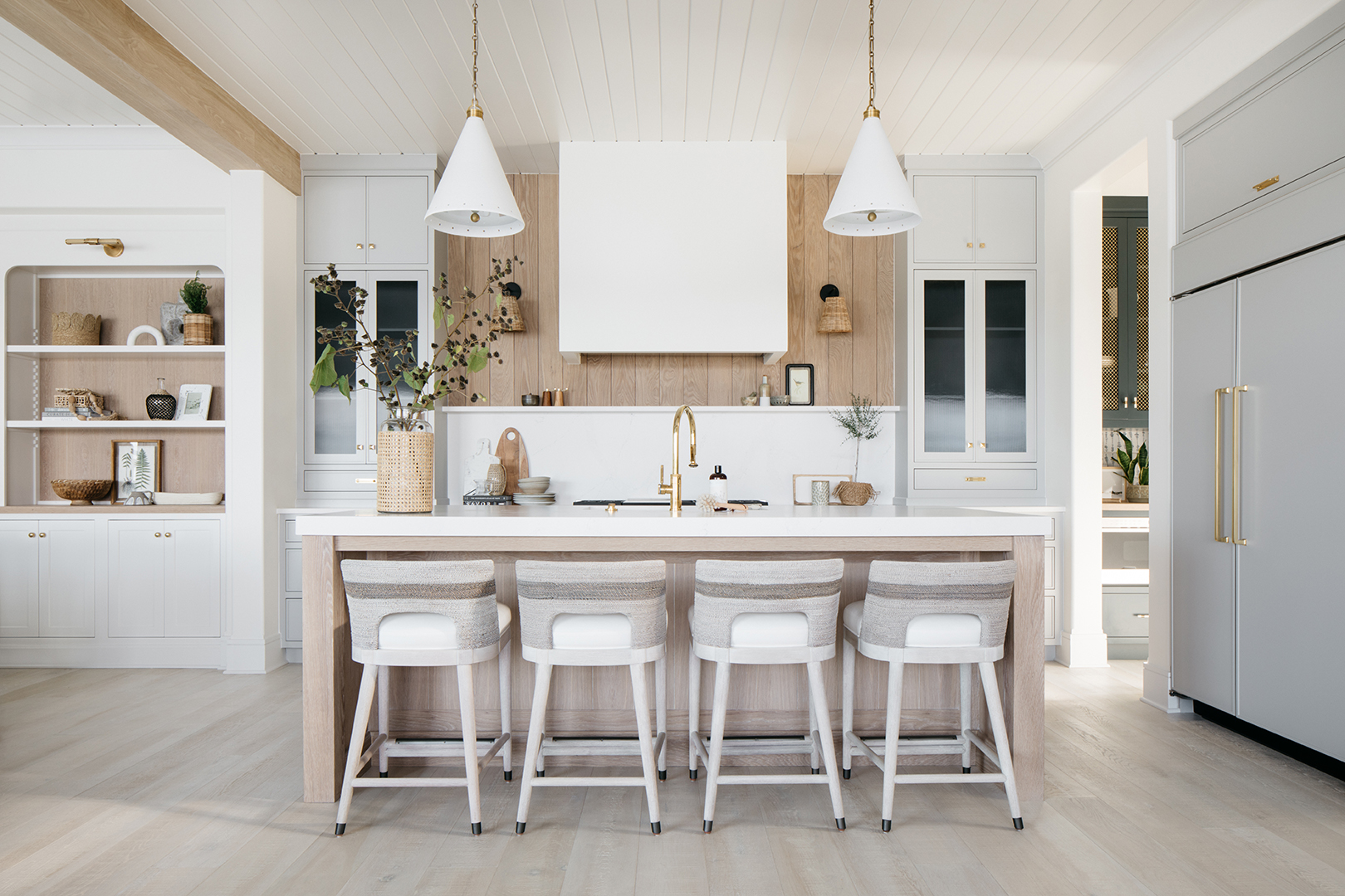
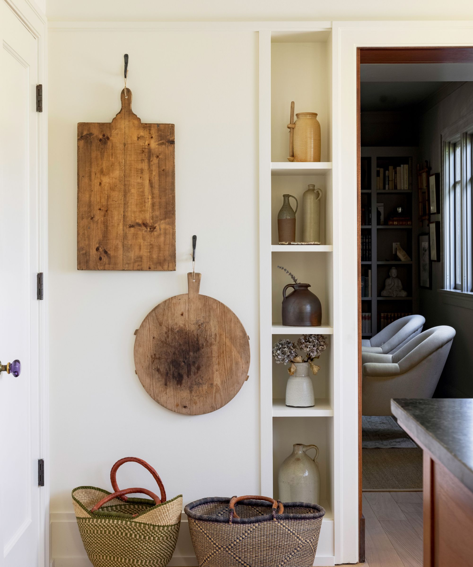
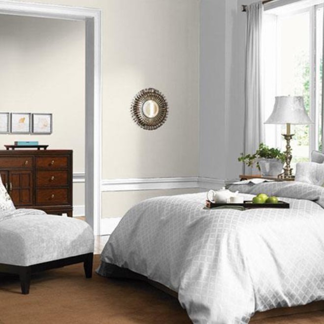
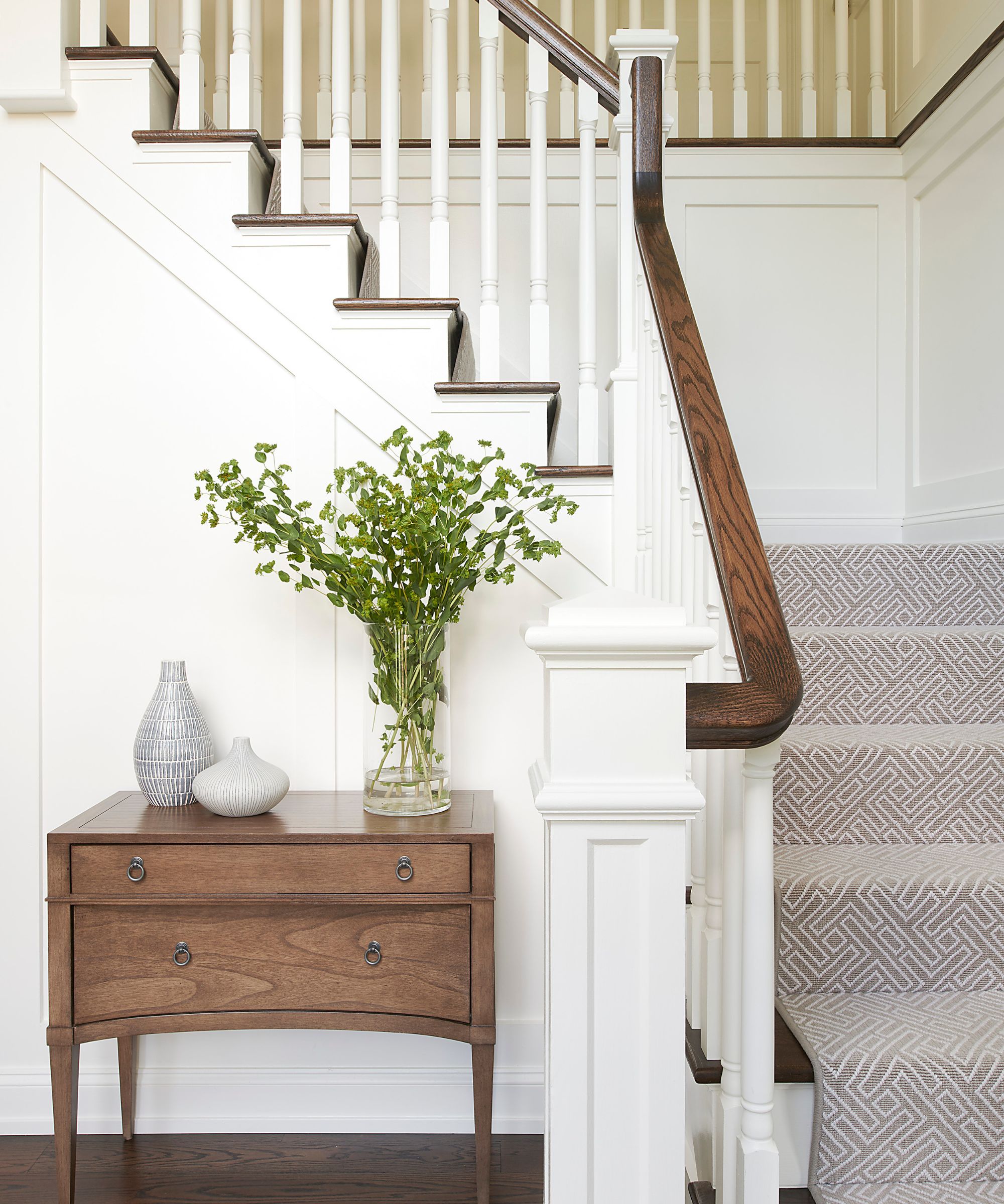
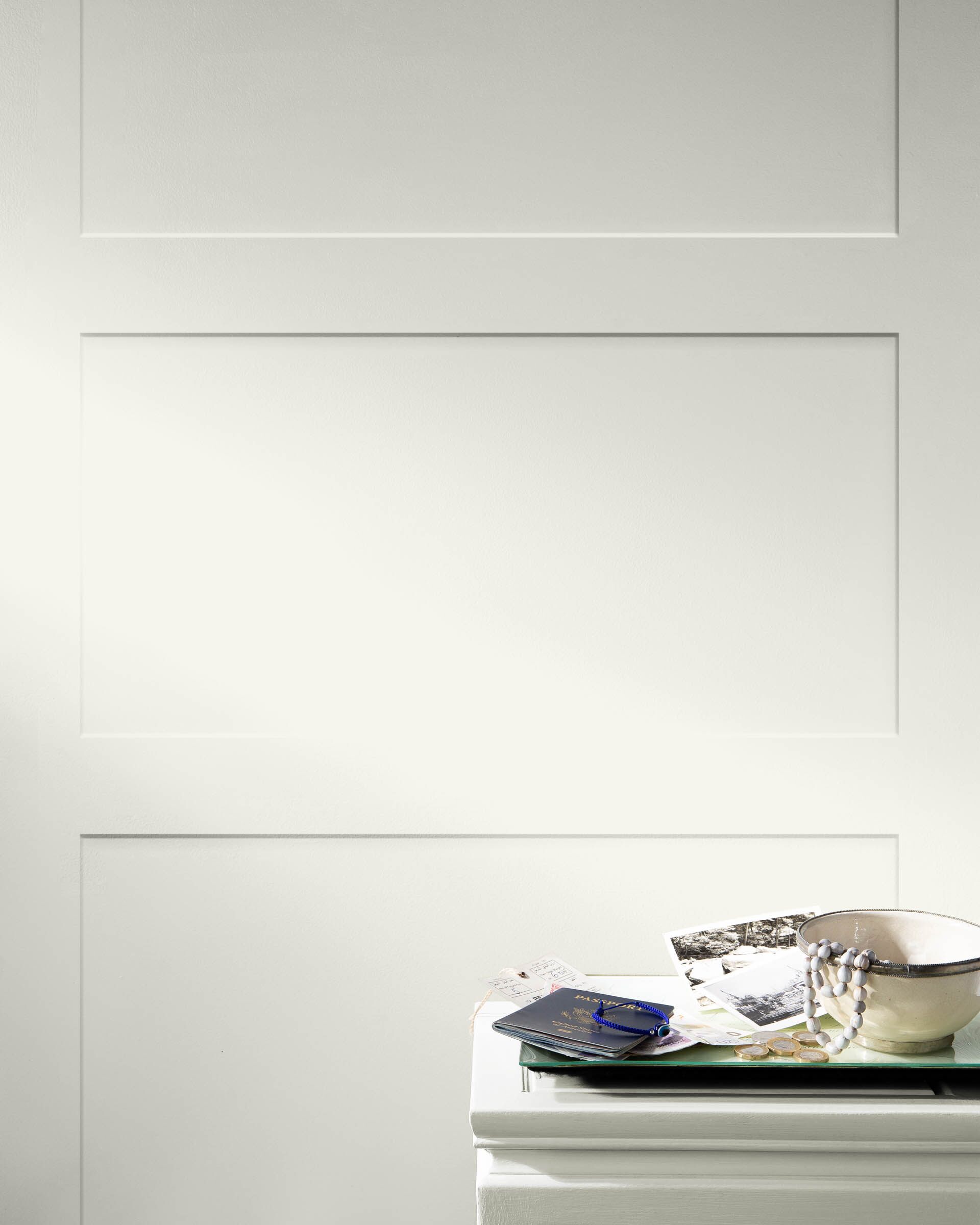
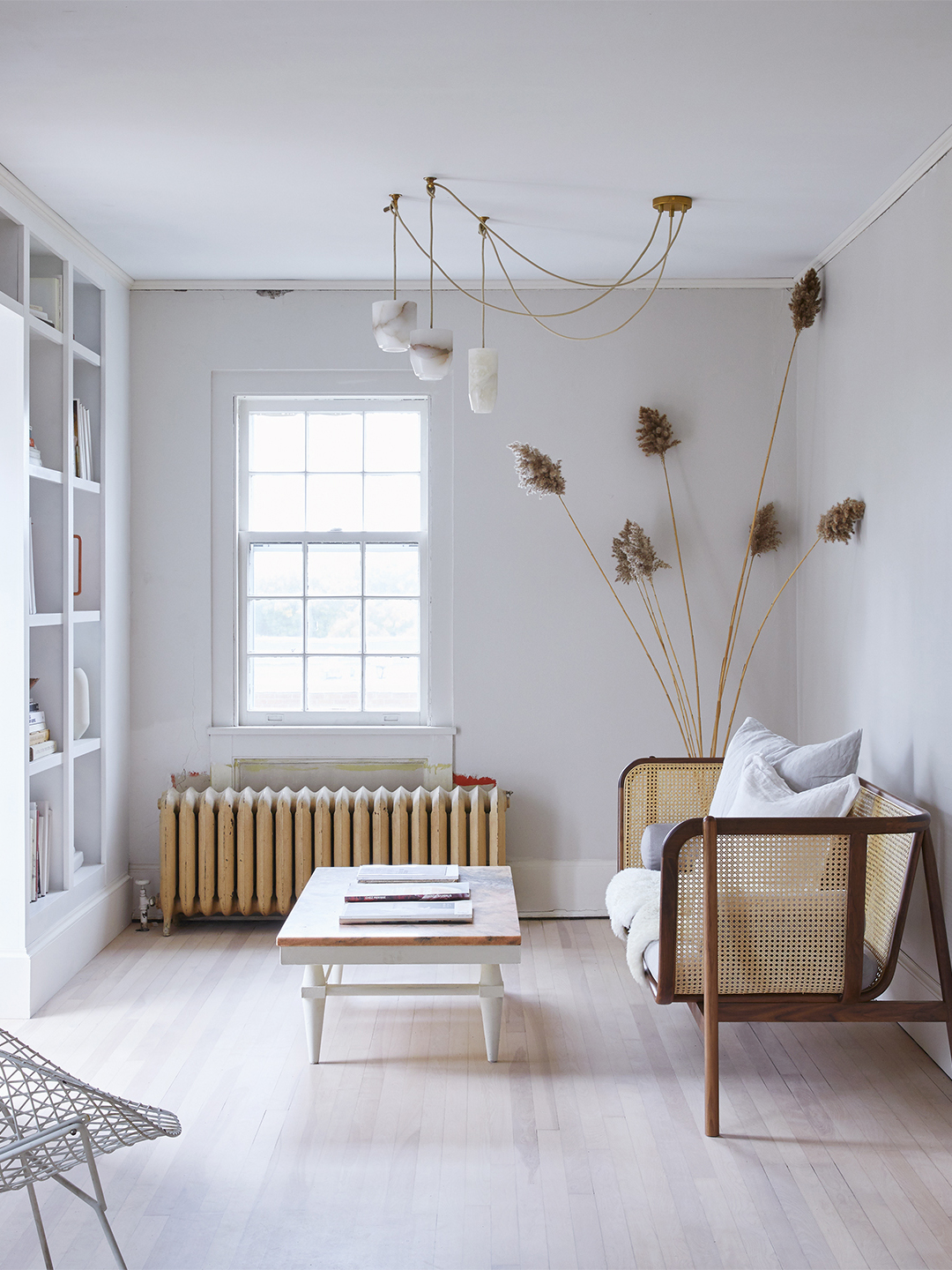
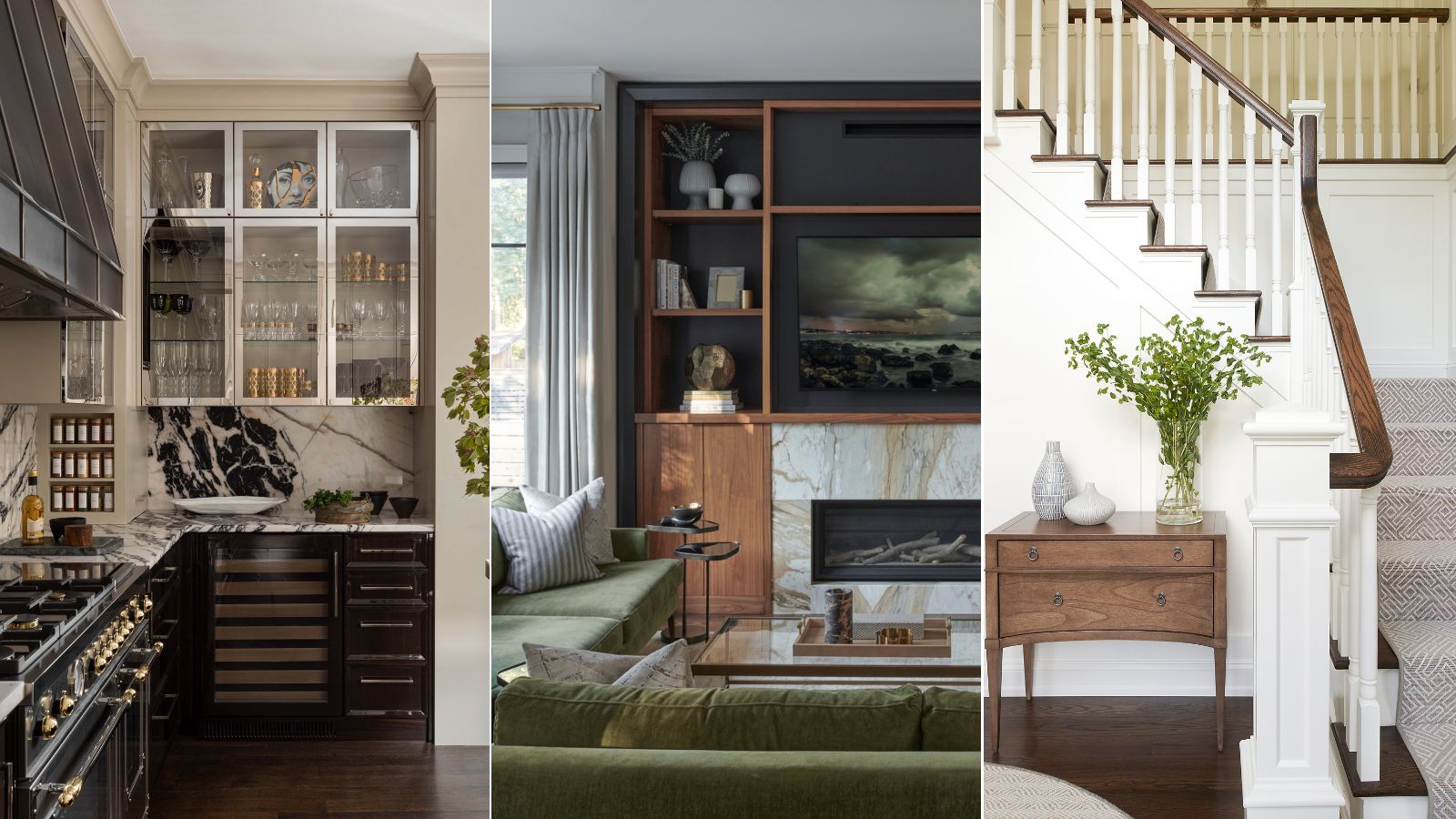
Grace Lee-Lim, founder of Grace Lee-Lim Interiors + Design, champions Backdrop's 'Moonstone' as her preferred white. She characterizes 'Moonstone' as the ideal 'greige'—a blend of gray and beige—which provides more depth than a standard off-white without being overtly gray or beige. Lee-Lim cites its application in her 'Descanso Project's entertainment room, where it was used on wainscoting, trim, and doors, demonstrating its versatility and ability to enhance architectural details.
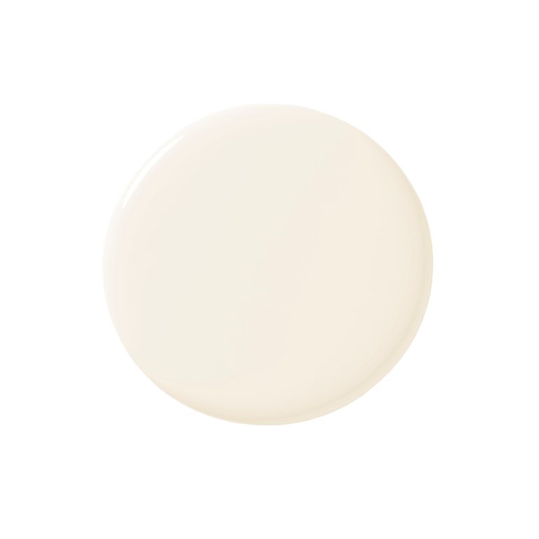
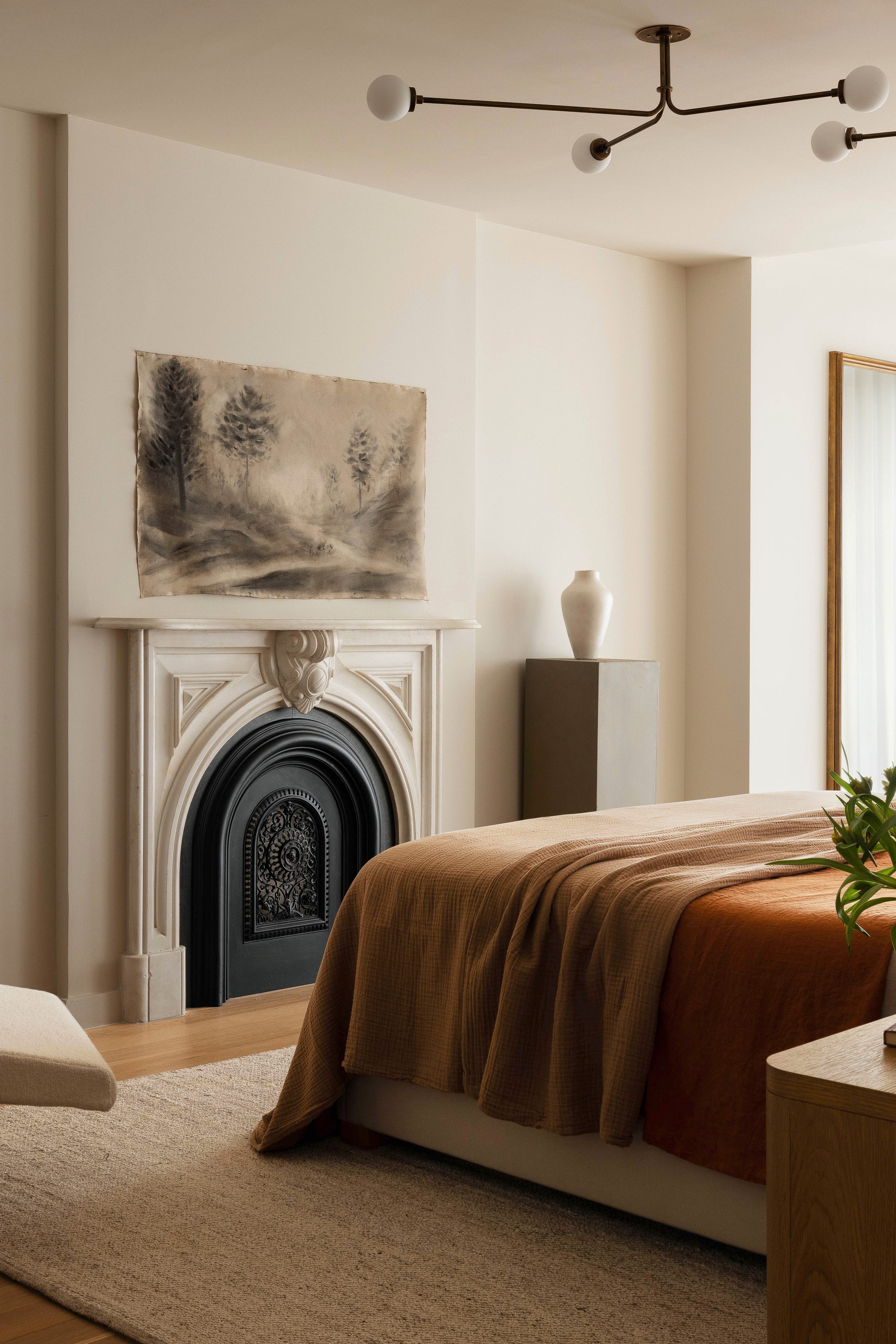
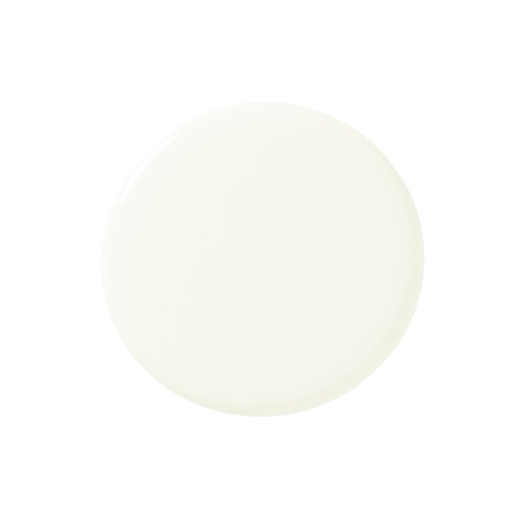
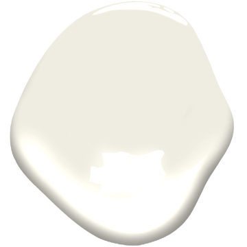
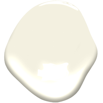
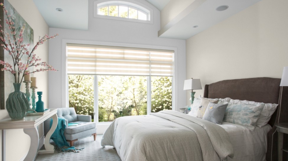
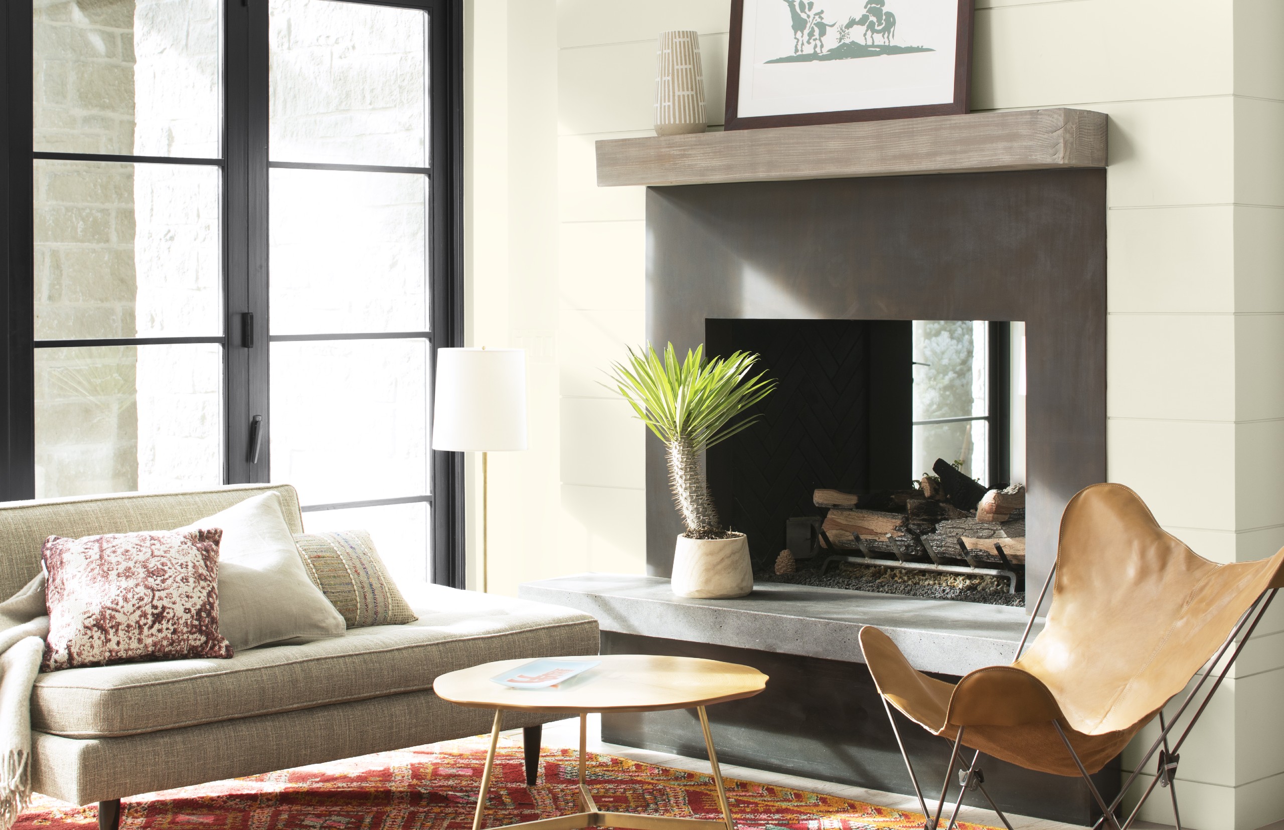
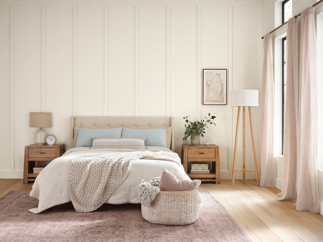
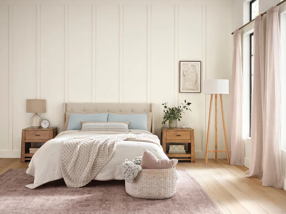
Abbie Naber, founder of A. Naber Design, opts for Benjamin Moore’s 'Simply White'. She praises this particular white for its capacity to soften the edges of walls and its adaptability across various home styles, including modern, transitional, and California coastal. Naber emphasizes that 'Simply White' is a versatile, soft white that avoids being too glaring, making it a reliable choice for achieving a serene and inviting atmosphere in diverse design contexts.
In summary, the insights from these designers reveal a complex landscape of white paint preferences. While some gravitate towards cooler, gray-infused whites for their crispness and subtle character, others rely on warmer, softer whites for their timeless appeal and ability to adapt to different design aesthetics. The article reinforces that the 'perfect' white paint is often a subjective choice, deeply informed by a project's unique requirements and the designer's vision.
#WhitePaintColors #InteriorDesignTrends #DesignersFavoritePaints #HomeDecoration #PaintRecommendations #ColorSelection #ArchitecturalDetails #ModernDesign #TransitionalStyle #CaliforniaCoastal #WhitePaintColors #InteriorDesignTrends #DesignersFavoritePaints #HomeDecoration #PaintRecommendations #ColorSelection #ArchitecturalDetails #ModernDesign #TransitionalStyle #CaliforniaCoastal
0 comment in total
 No comments yet
You may also like
The Best White Paint Colors Experts Turn to Again and Again
We Asked 20 Designers for Their Favorite Paint Colors for Windows

Best white paint colors: Expert share the top options

We Asked Southern Designers The Best White Paint Color, And This Shade Was The Winner
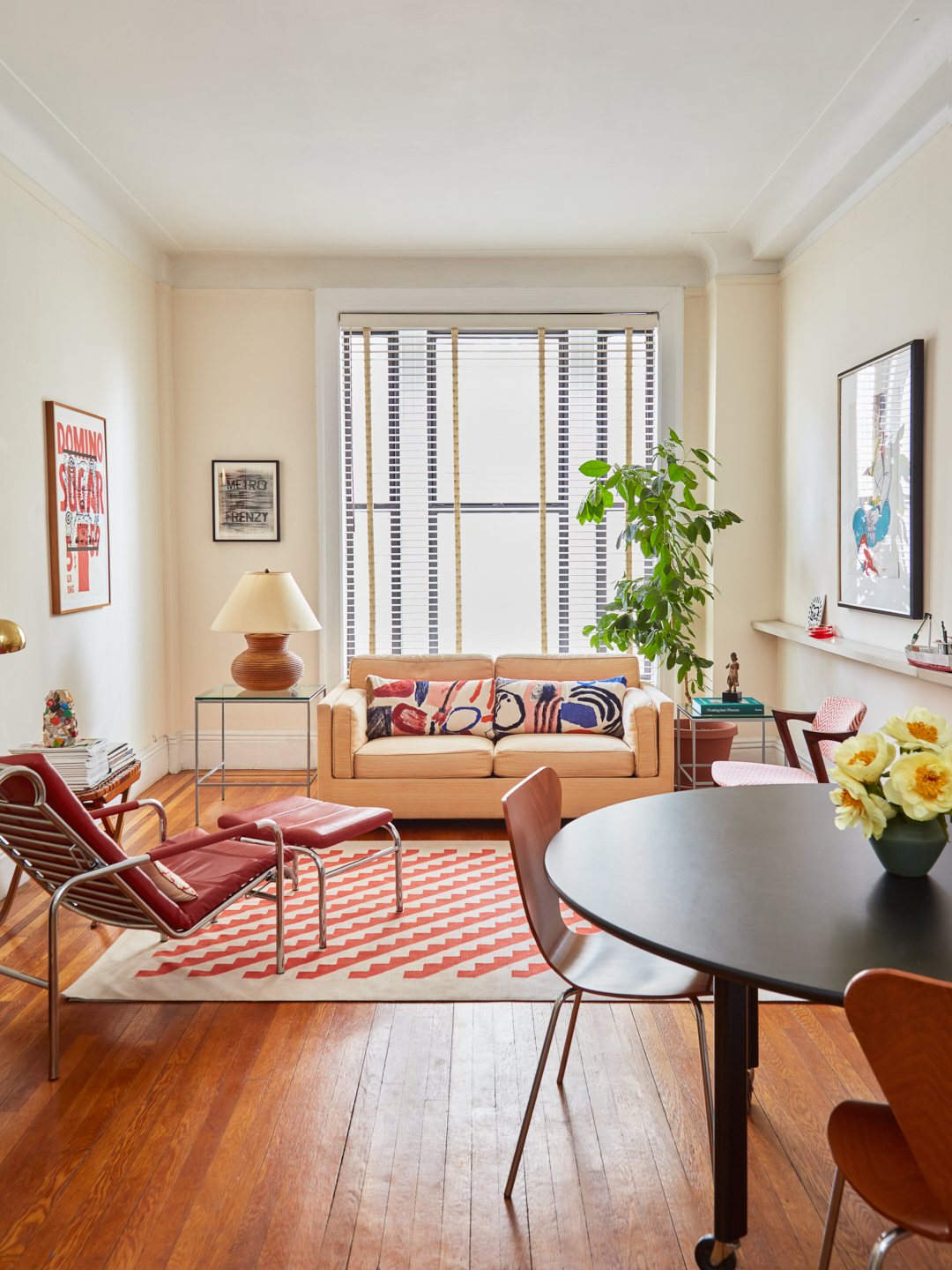
I Asked 3 Pros for White Paint Recs, and They All Agreed on This Undertone
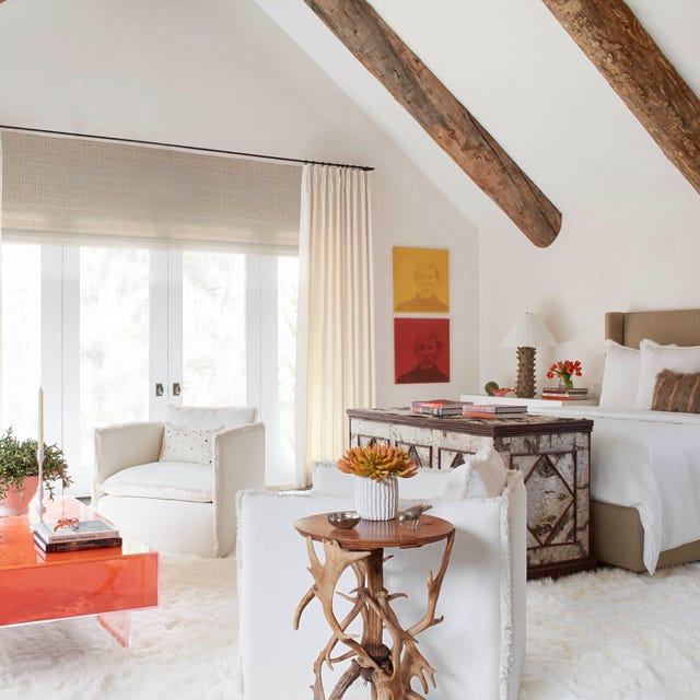
The 40 Best White Paint Colors, According to Designers
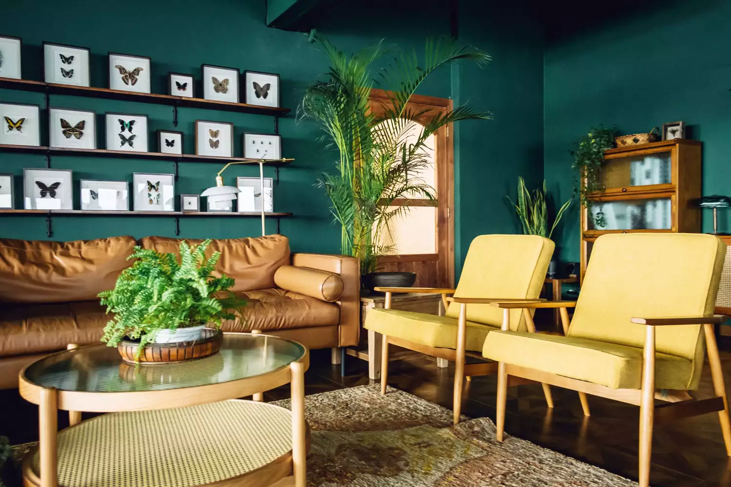
12 Jewel-Tone Paint Colors Designers Say Are Always On-Trend
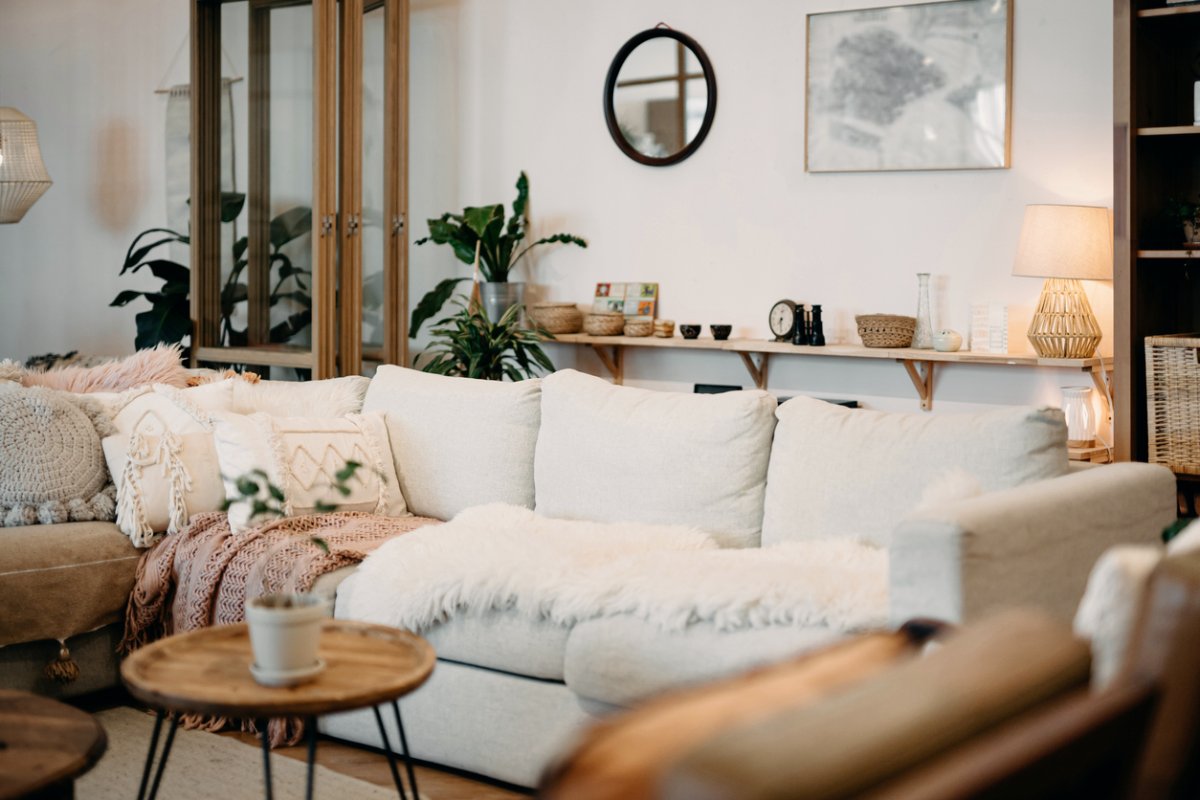
The 11 Best Warm White Paint Colors, According to Designers

The 13 Best White Paint Colors That Interior Designers Swear By

We Asked Designers for Their Favorite Kitchen Cabinet Paint Colors—and Not One Picked White

White vs Cream: designers weigh in on these enduring neutrals
The 11 Best Warm White Paint Colors, According to Designers
15 White Paint Colors Interior Designers Reach for Time and Again
5 best warm white paints, as chosen by interior designers

13 Tried-and-True White Paint Colors Recommended by Pros


The most timeless paint colors according to designers
The Paint Color That All This Designer's Followers Ask About | domino


4 Interior Designers Share the Biggest Paint Color Trends Right Now (and What’s Out!)

We asked 12 interior designers for their favorite Sherwin-Williams paints – these are the colors that came out on top
We Asked Designers to Pick the Most Timeless Living Room Paint Color—and They Agreed