1/11
5 best warm white paints, as chosen by interior designers
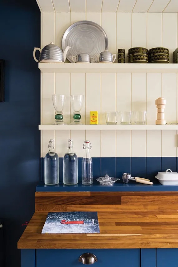
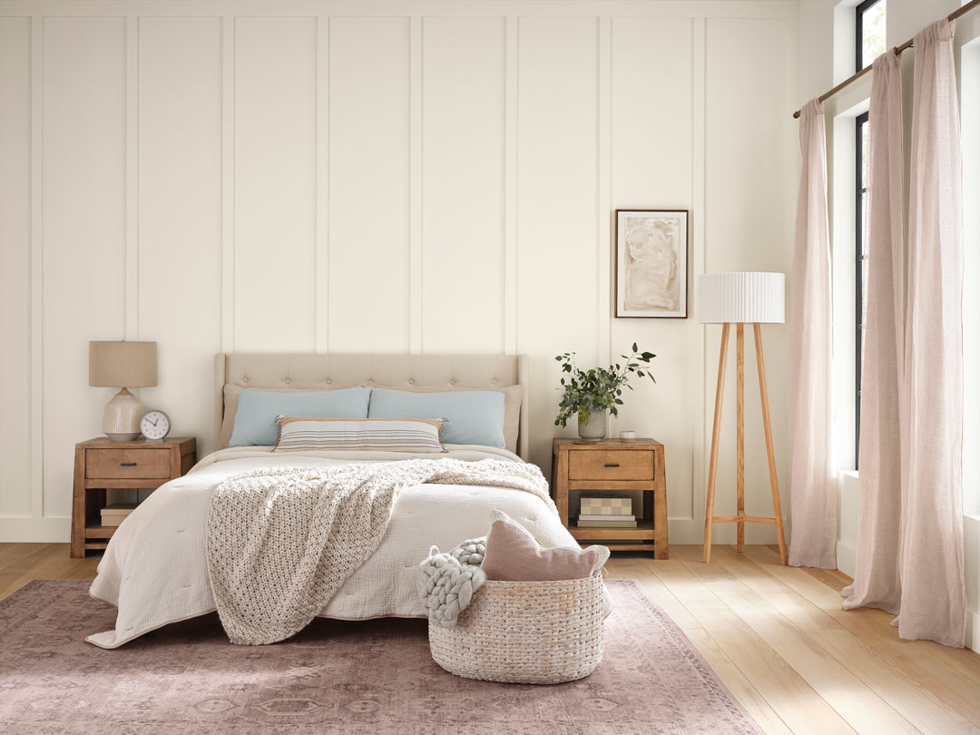
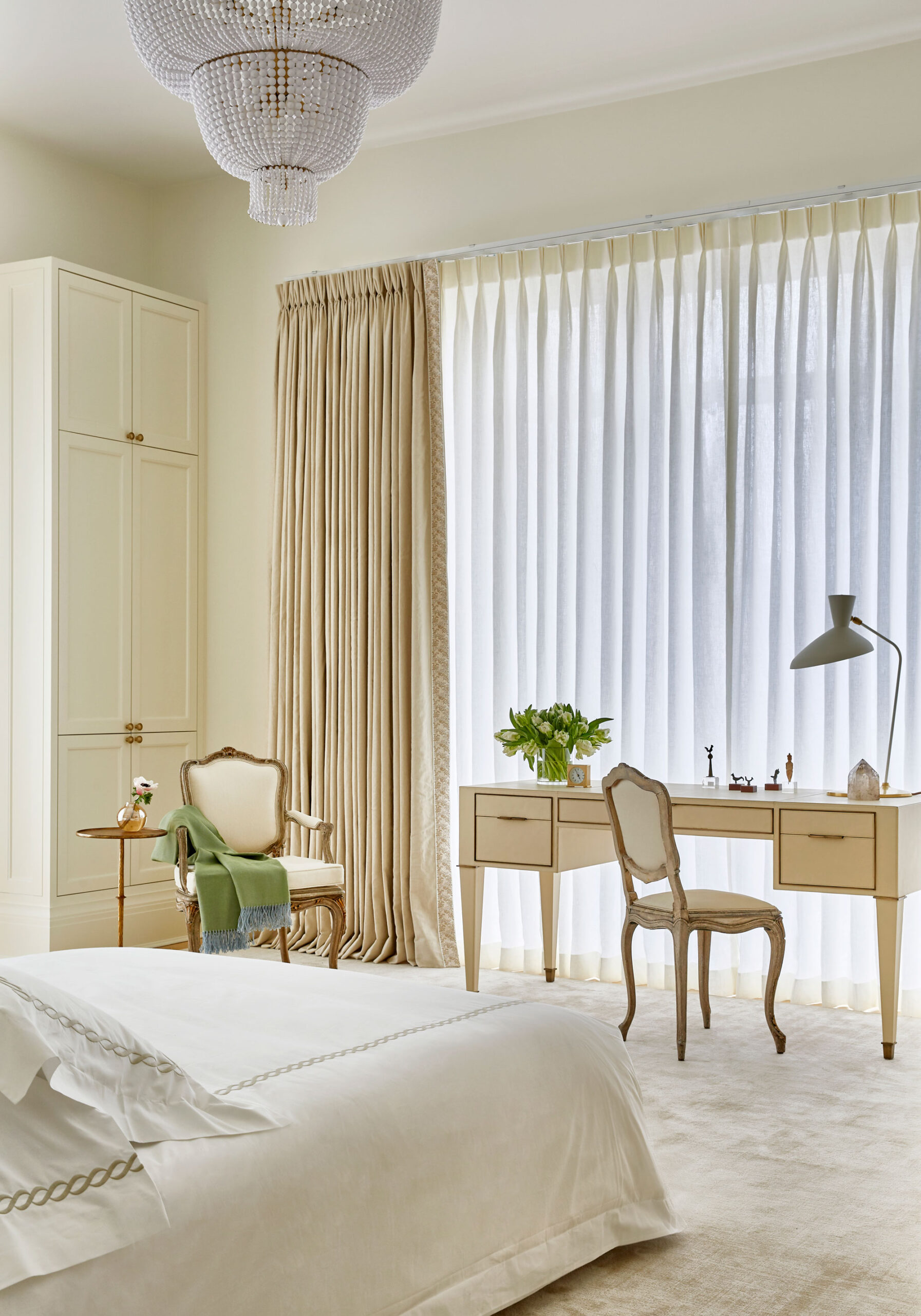
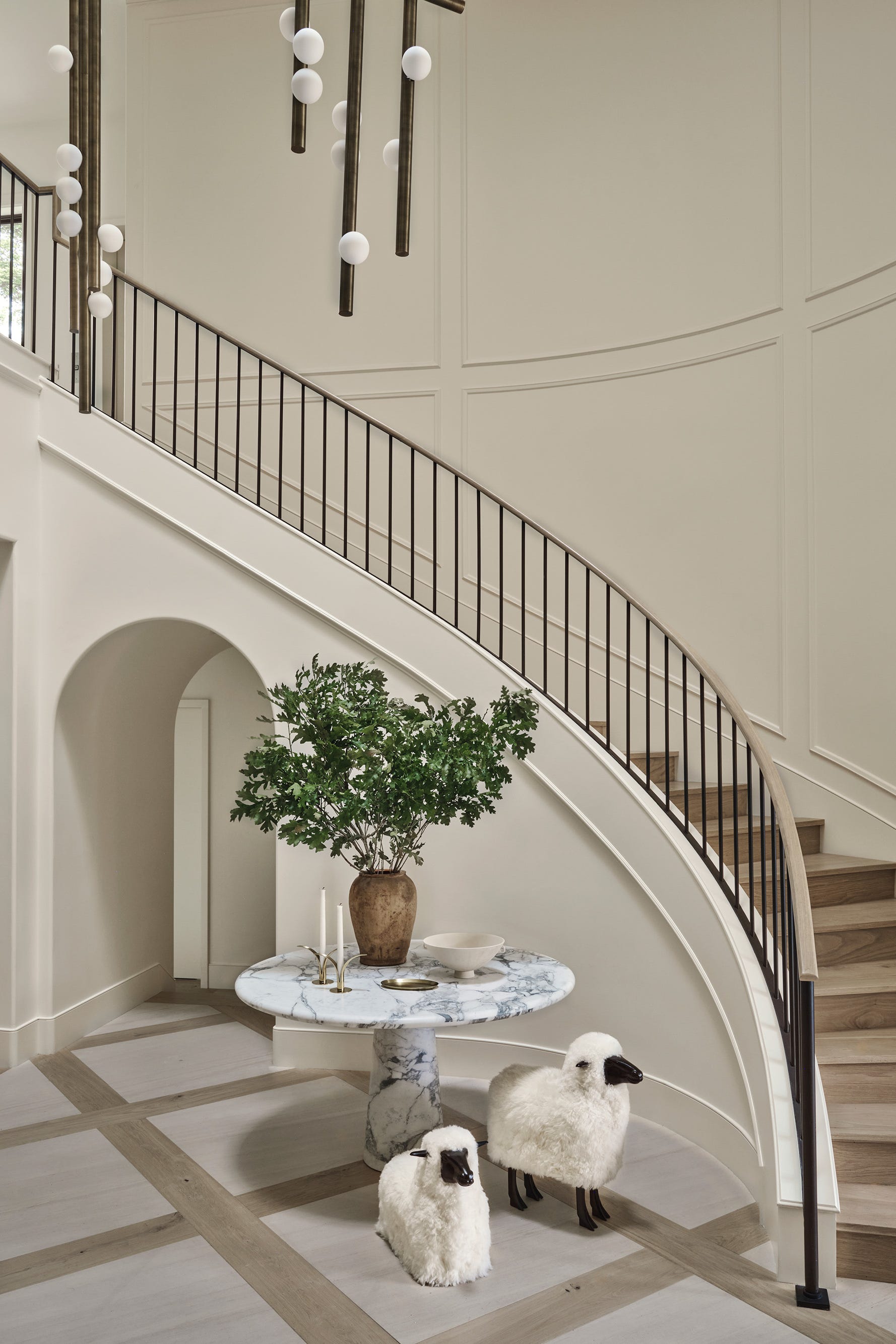
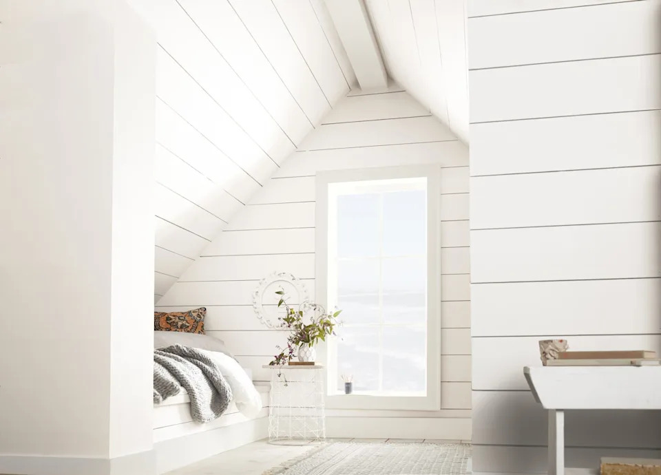
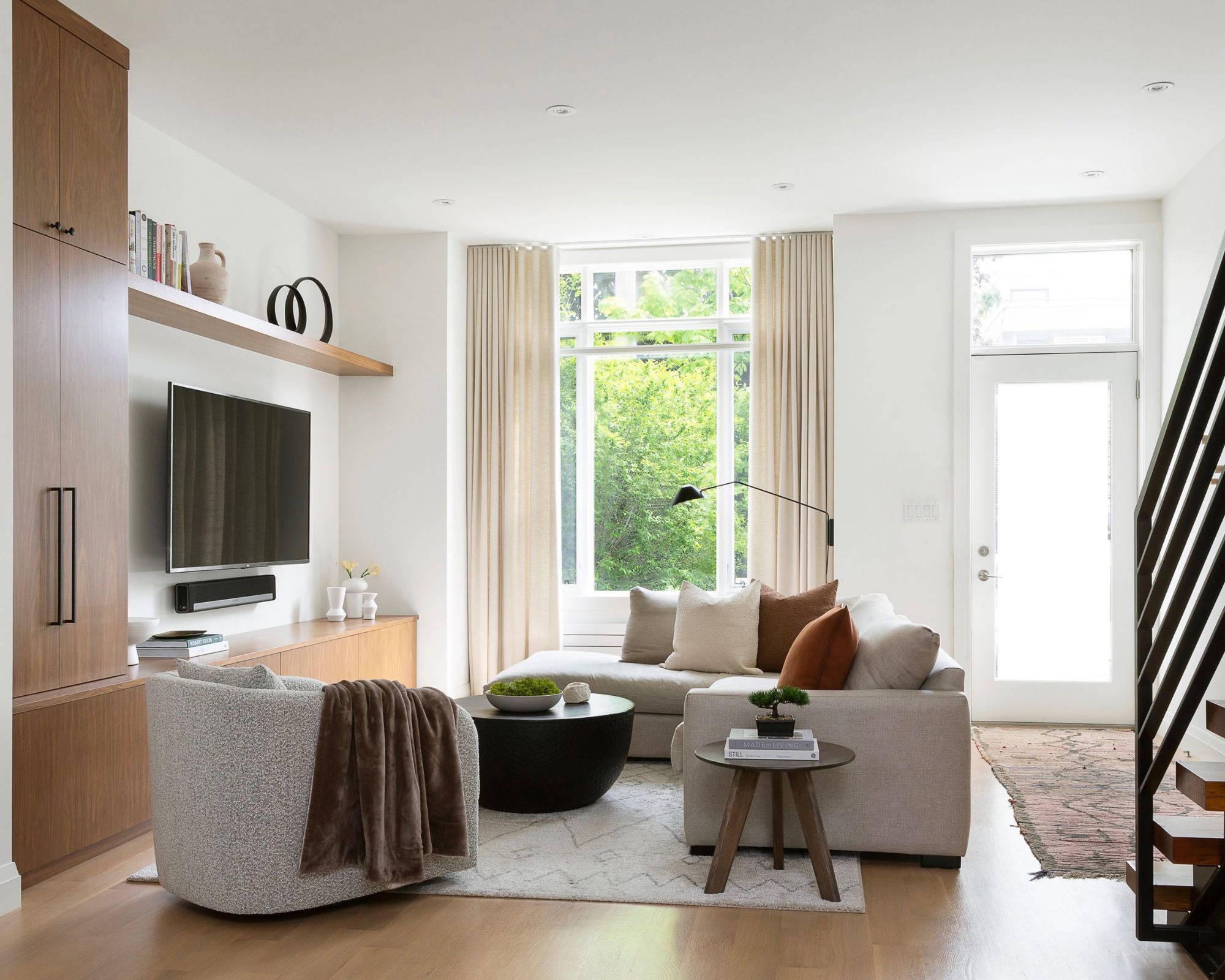
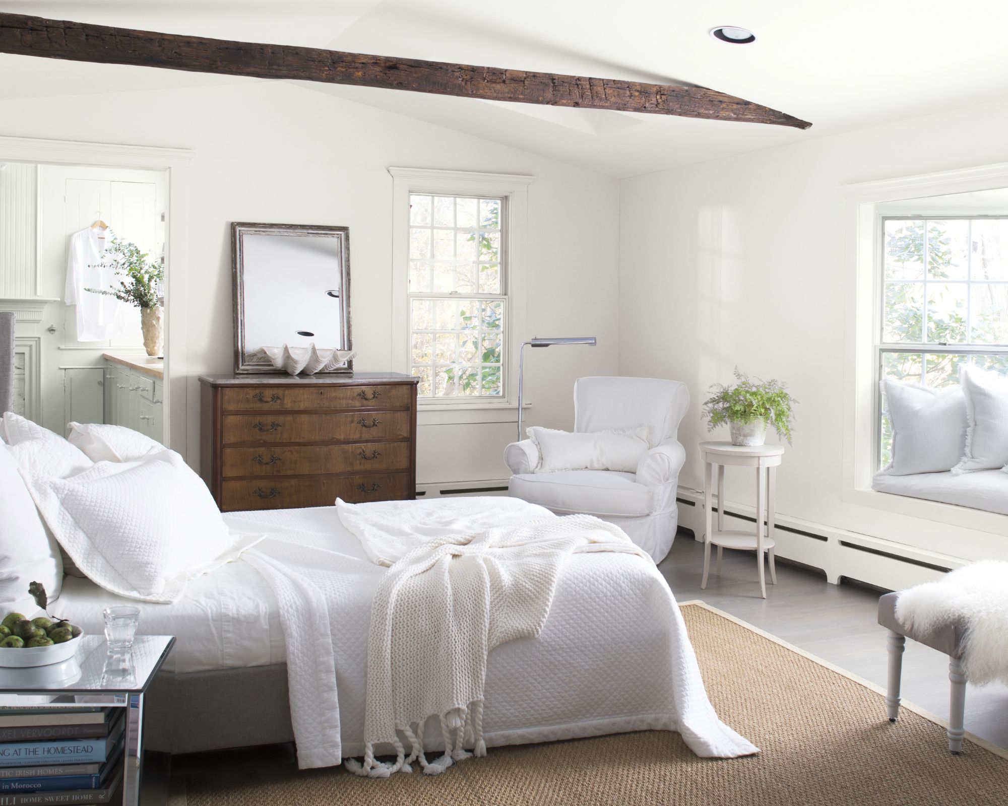
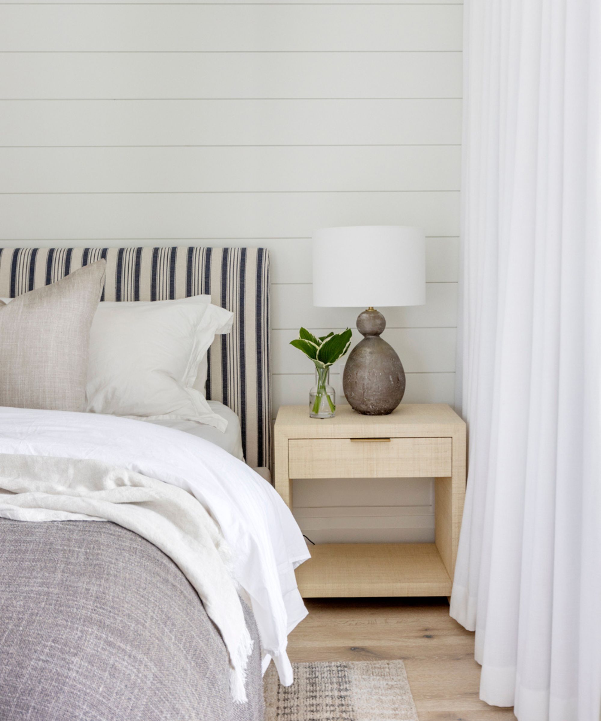
The article highlights the current trend in interior design favoring warm white paints over cooler tones, emphasizing a shift towards creating cozy and inviting home environments. It acknowledges the overwhelming number of white paint options available and provides a curated list of five top warm white shades recommended by interior designers. The piece stresses that while white is a classic and versatile color, the specific undertones and how a paint reacts to different lighting conditions and surrounding colors are crucial considerations. Therefore, it advises readers to always test swatches before committing to a particular shade.
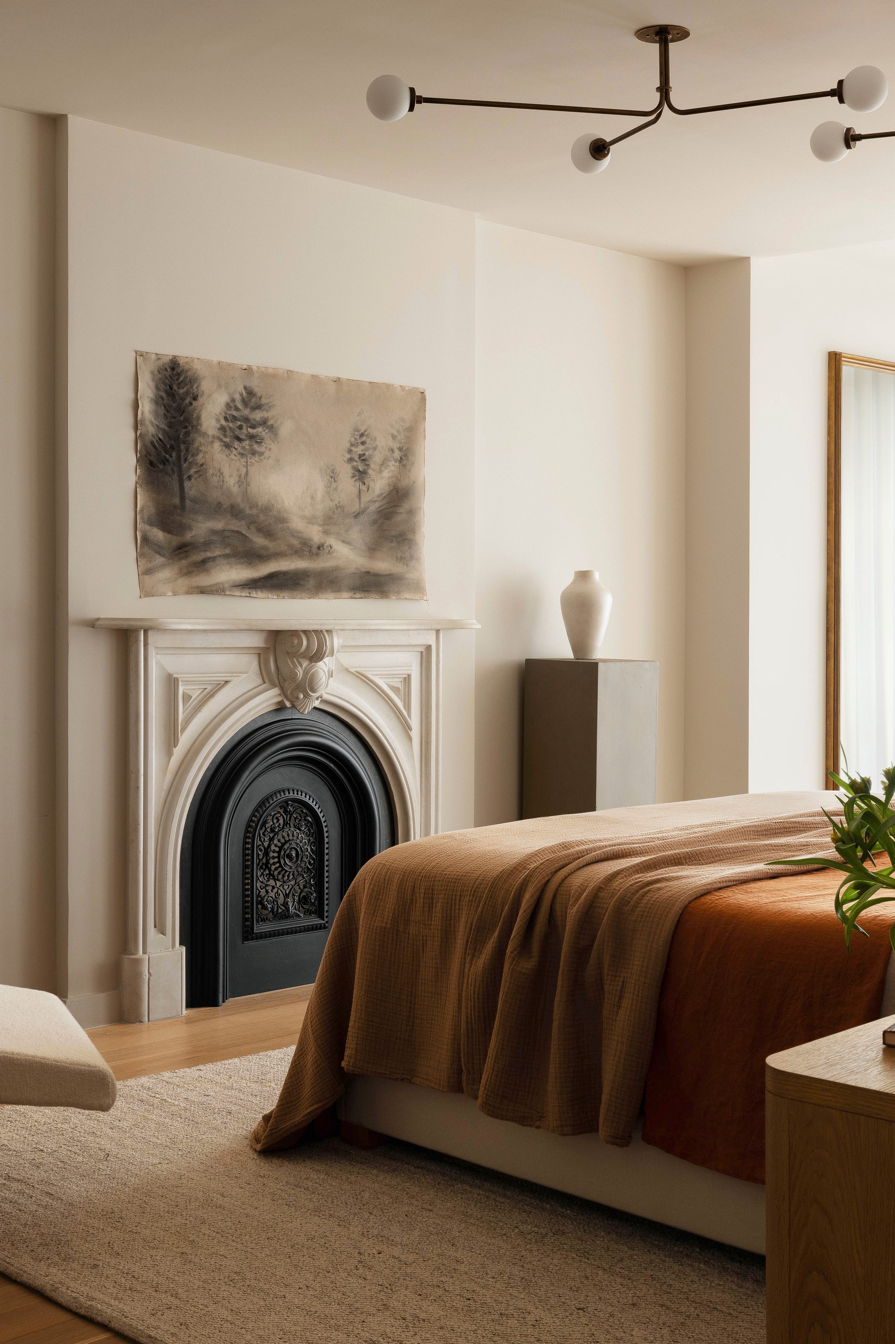
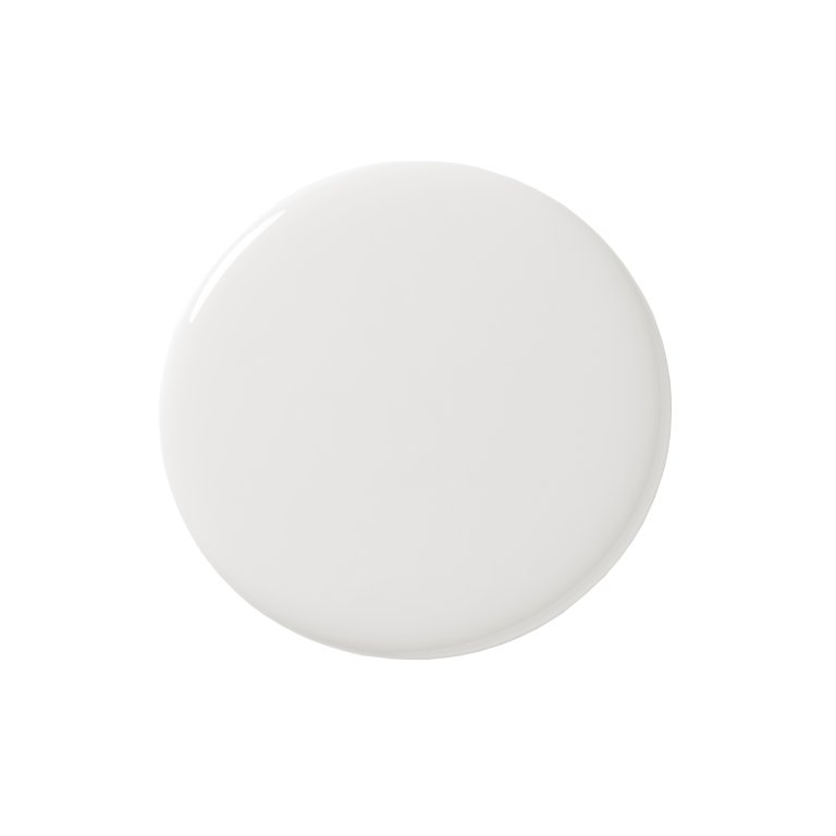
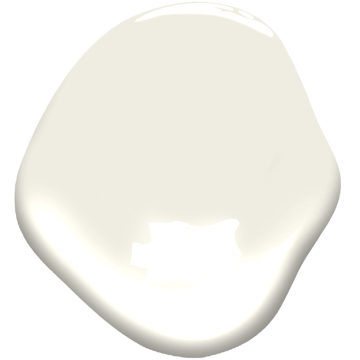
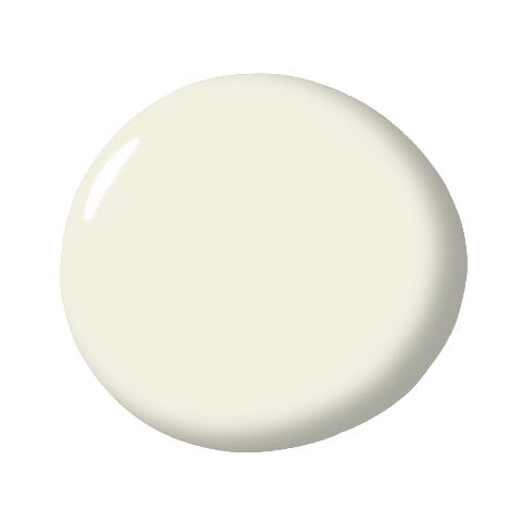
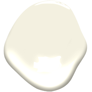
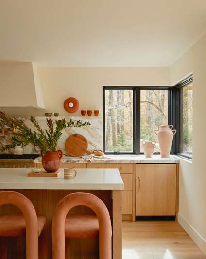
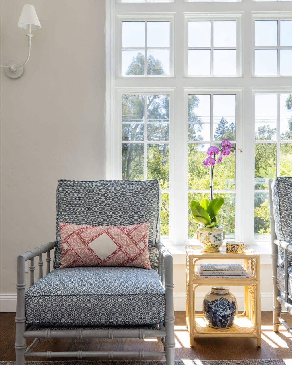
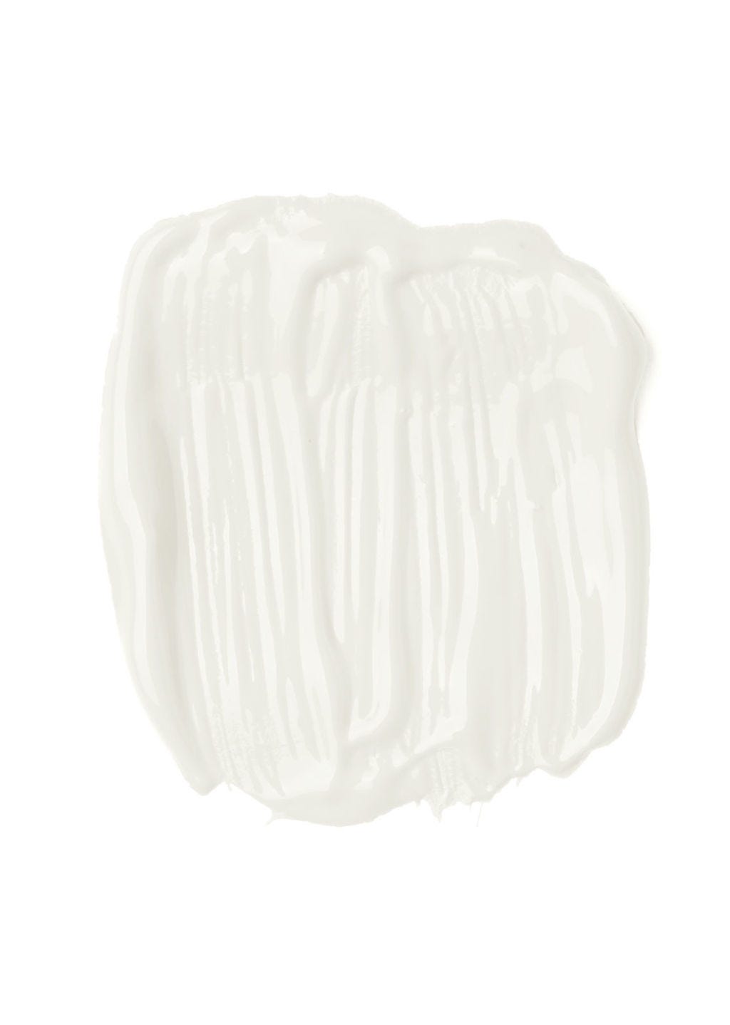
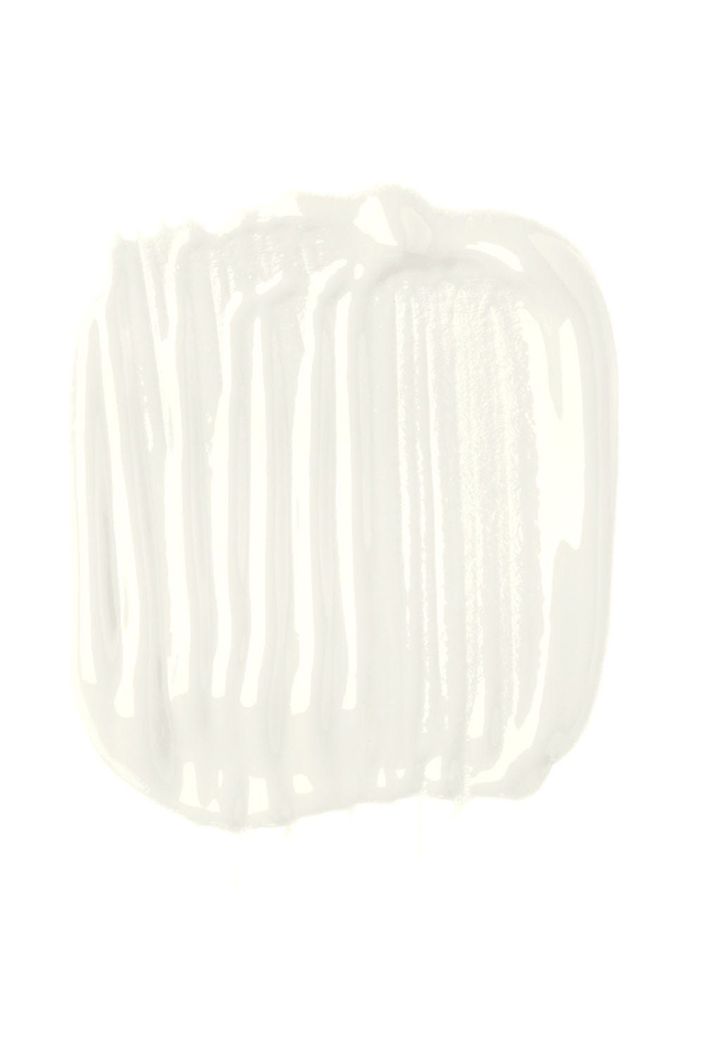
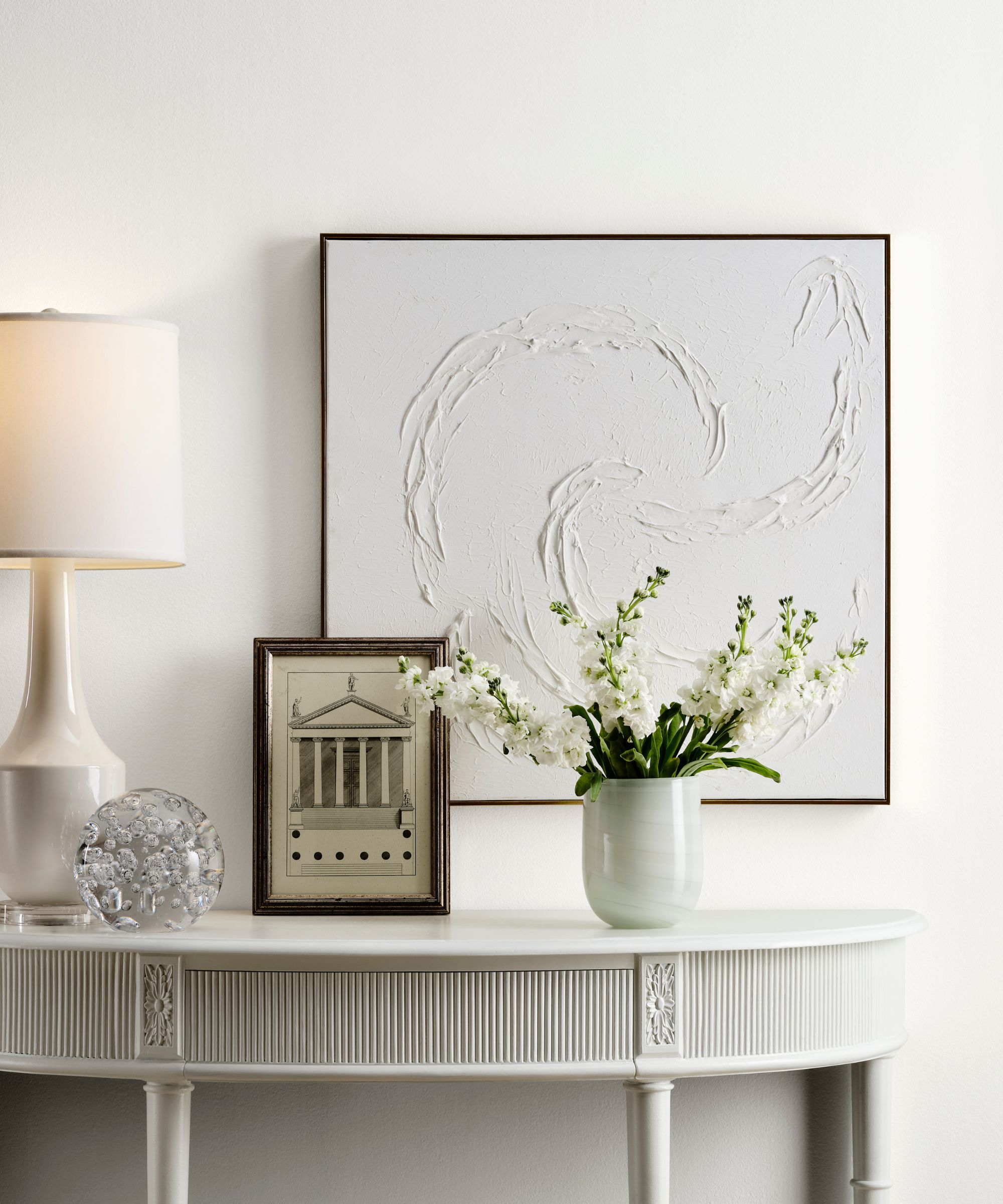
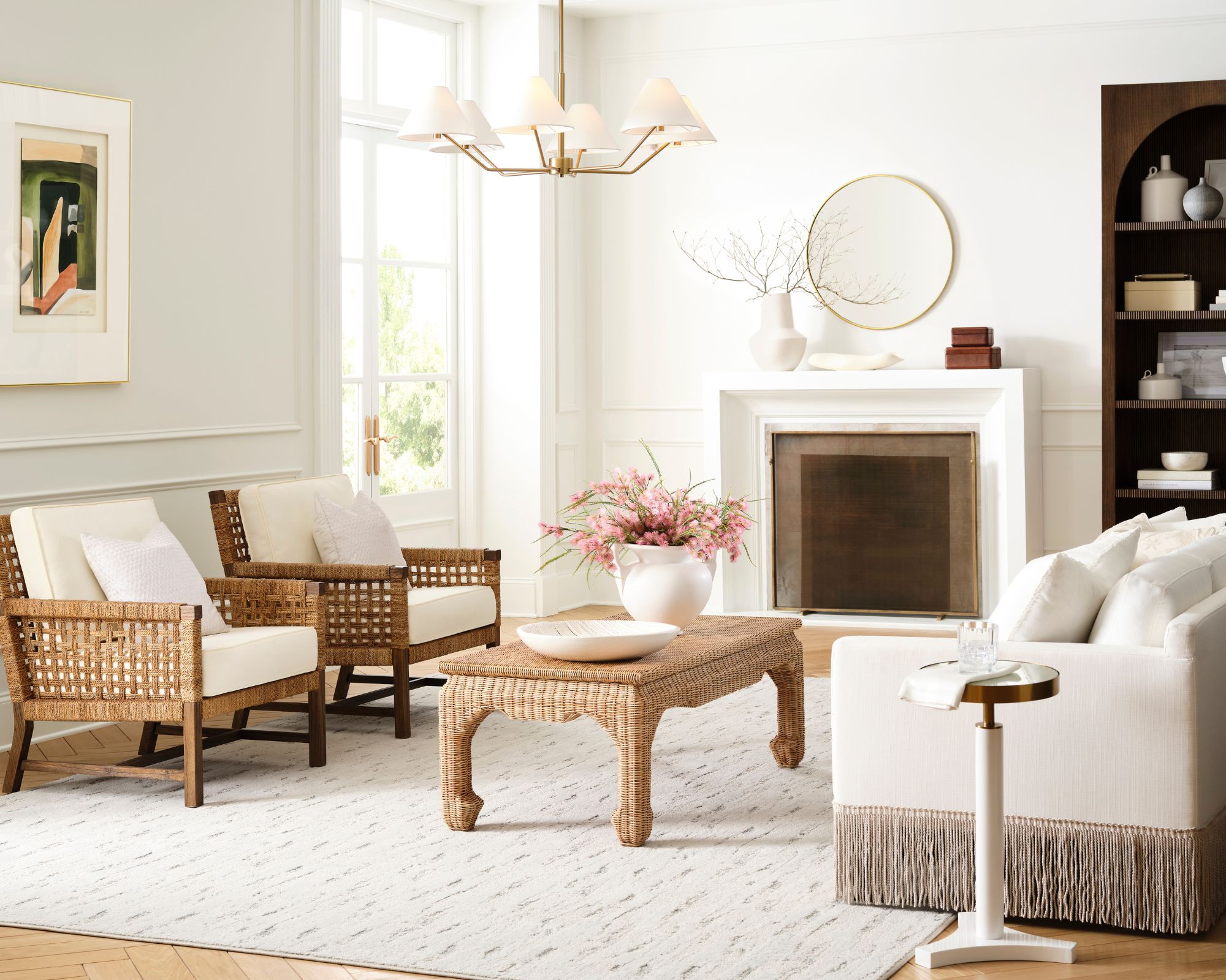
The first recommended paint is Benjamin Moore's 'Swiss Coffee.' This shade is praised for being a perfect warm white that avoids yellowing while still providing sufficient warmth, making it a popular choice among designers and homeowners, including Nate Berkus. It features a slight green undertone, which allows it to harmonize beautifully with natural materials such as light-colored wood, terracotta, rattan, and natural stone, as noted by designer Kathy Kuo. Its versatility makes it suitable for various styles.
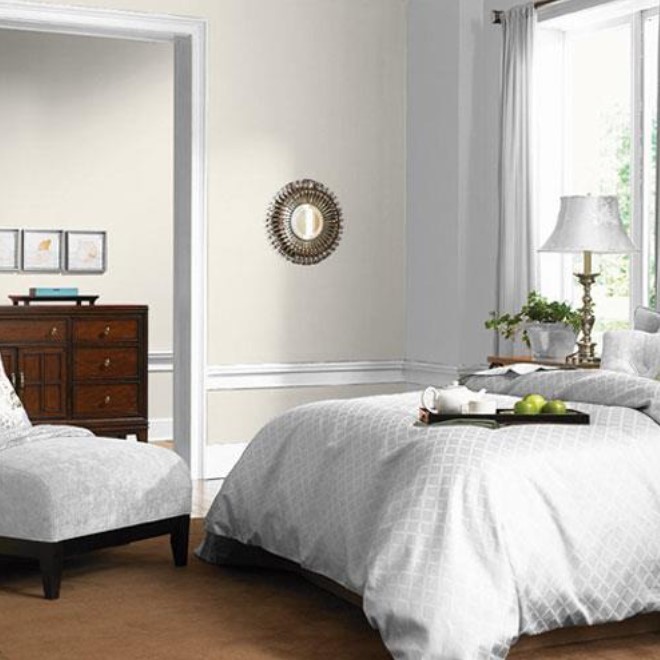
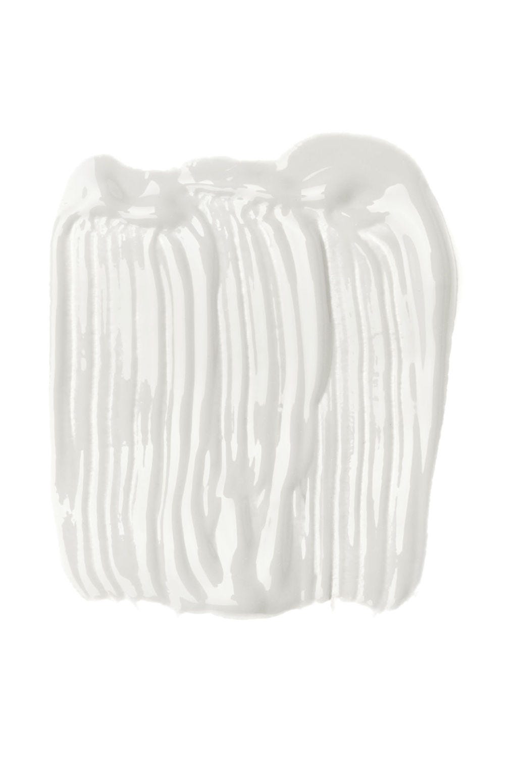
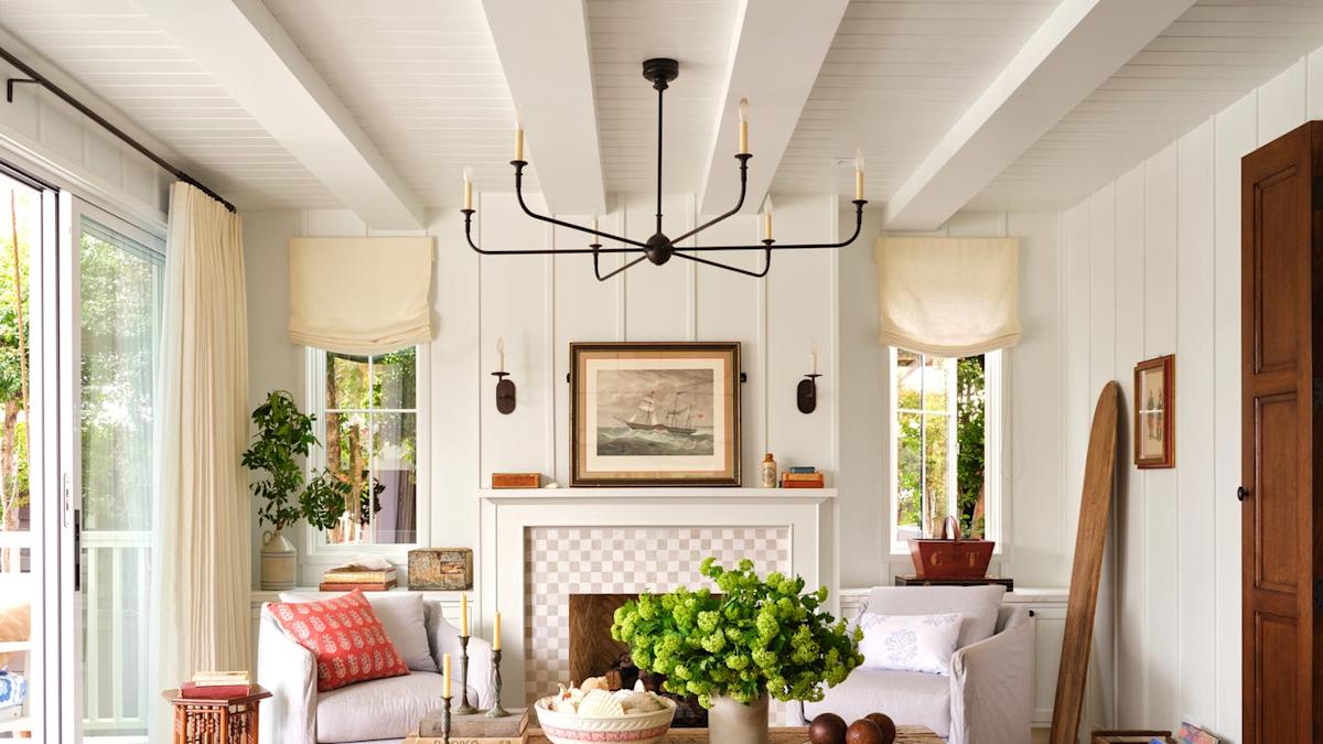
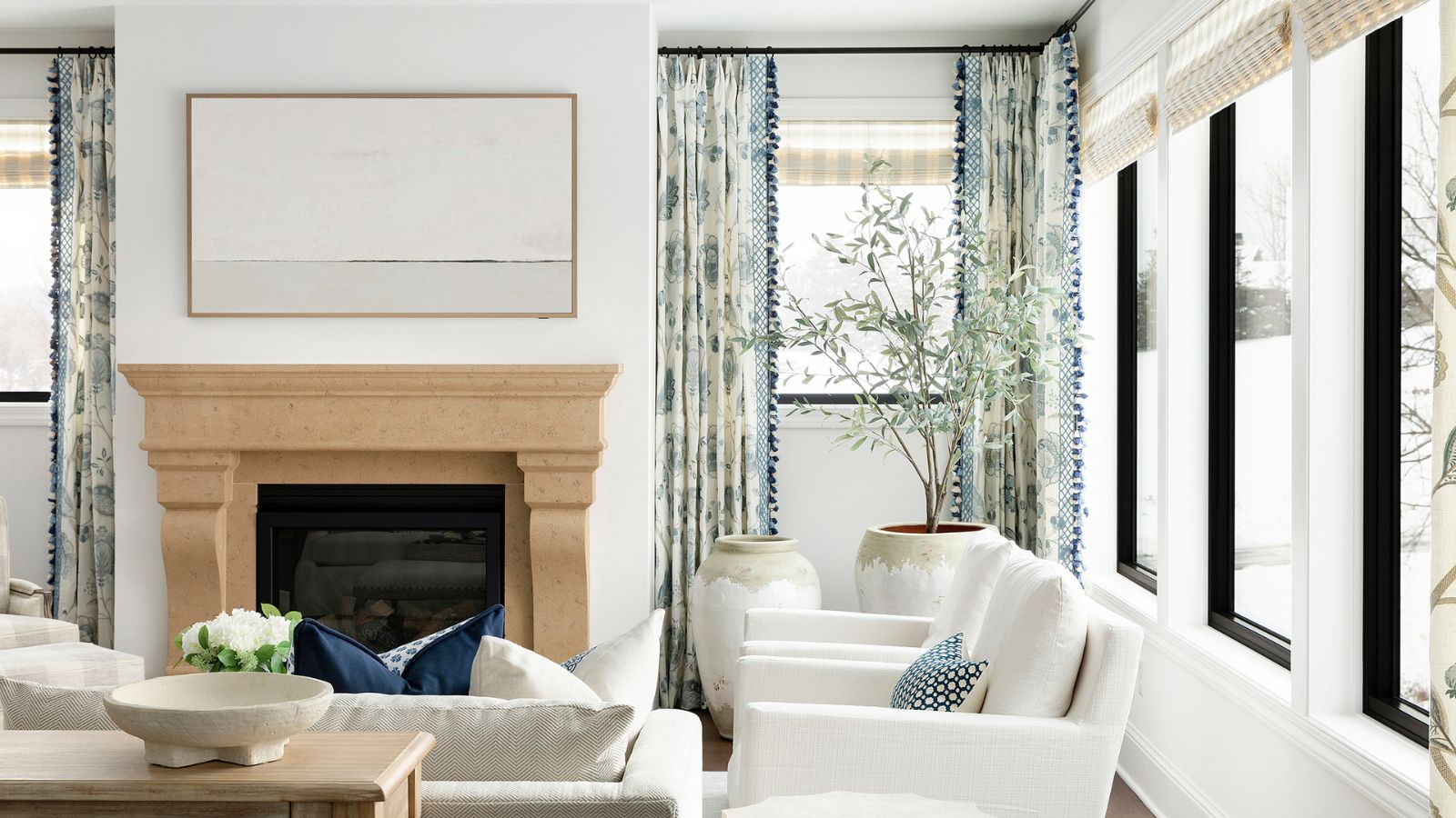
Next, the article introduces Sherwin Williams' 'Drift of Mist,' an off-white with a subtle gray undertone that maintains warmth. This paint is ideal for rooms that receive a lot of golden hour light or evening sun, as it helps to neutralize warmer tones and create balance. Lauren Sullivan of Well x Design suggests pairing it with brighter whites, as its minimal yellow undertone prevents stark contrasts, making it a good choice for modern spaces seeking a warm yet contemporary feel.
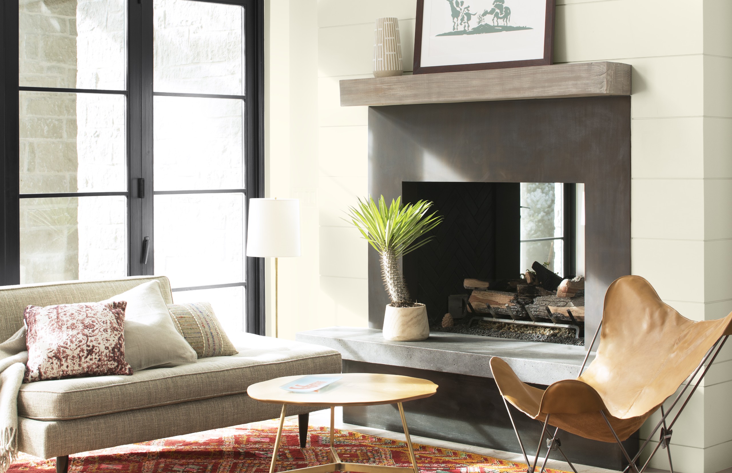
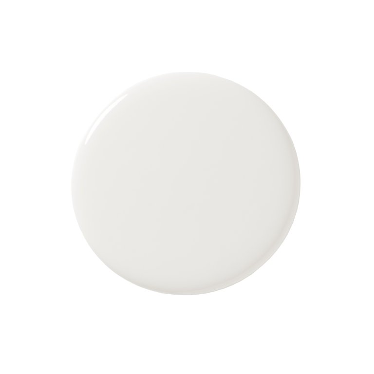
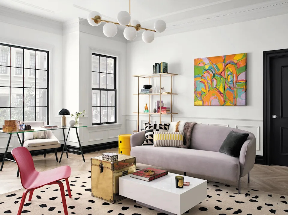
Benjamin Moore's 'Cotton Balls' is presented as a very warm white that borders on cream but retains its brightness, making it a versatile option for achieving a cozy, layered neutral aesthetic. Jennifer Jones of Niche Interiors highlights its warm feel and suitability for interiors decorated solely with neutral palettes, inviting the incorporation of beige shades and creams to enhance the warm, tonal scheme.
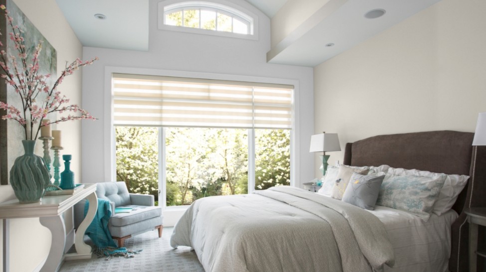
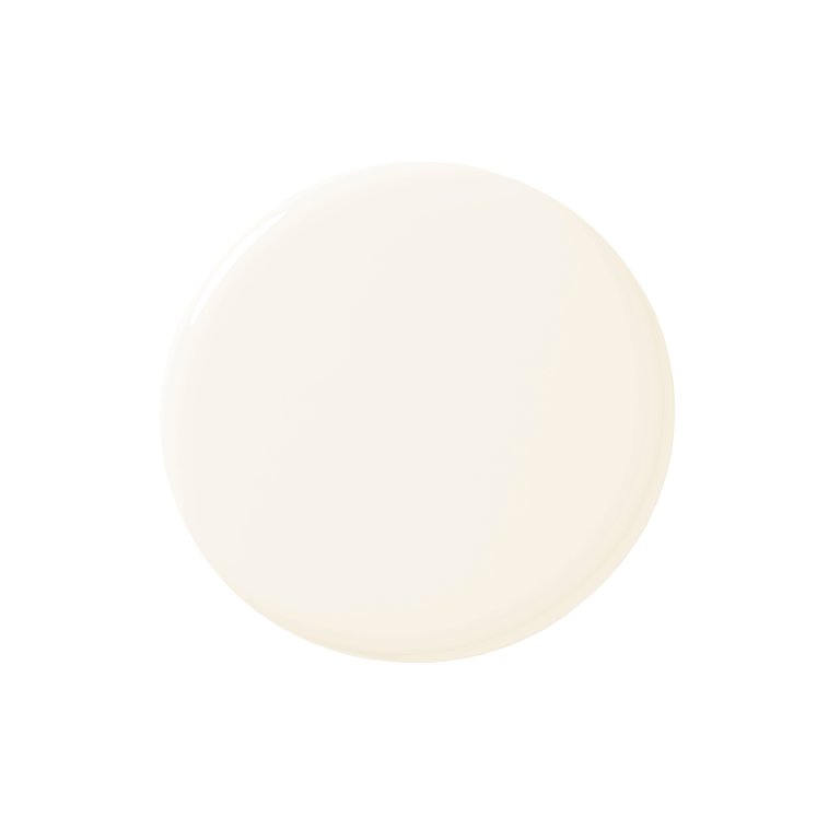
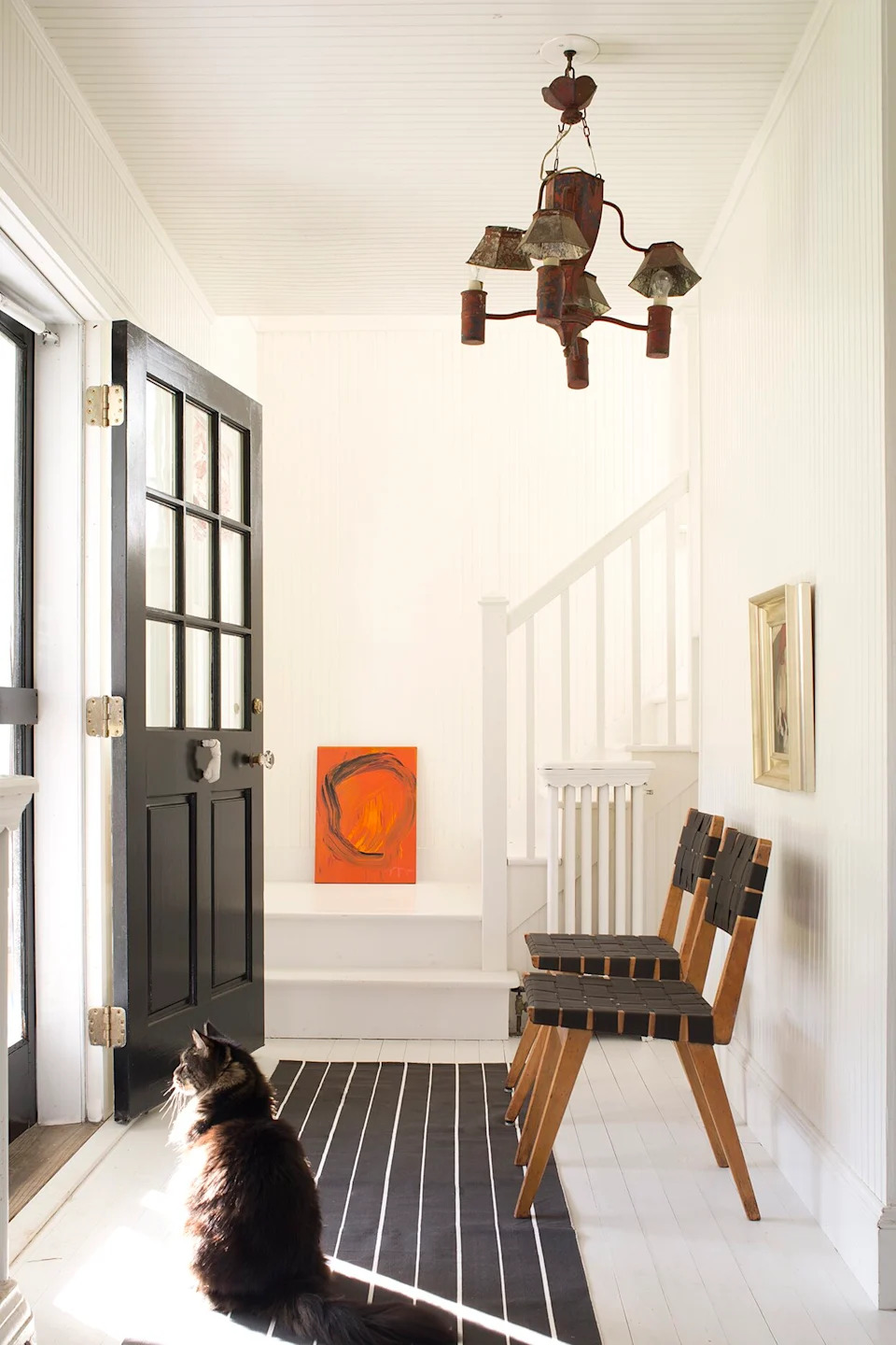
Farrow & Ball's 'Wimborne White' is another top pick, described as a shade that is just off-white, offering warmth without being overly yellow. Keren Ritcher of White Arrow frequently uses it in projects due to its flattering neutral undertones and its ability to look great in both north and south-facing rooms. The paint is noted for providing the crispness of a true white but with a softer touch, making it ideal for smaller rooms. Its subtle warmth becomes apparent when contrasted with Farrow & Ball's 'All White.'
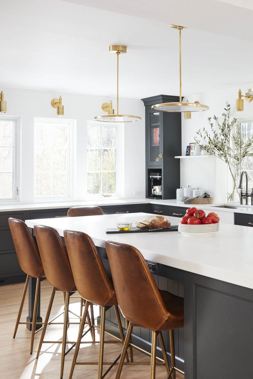
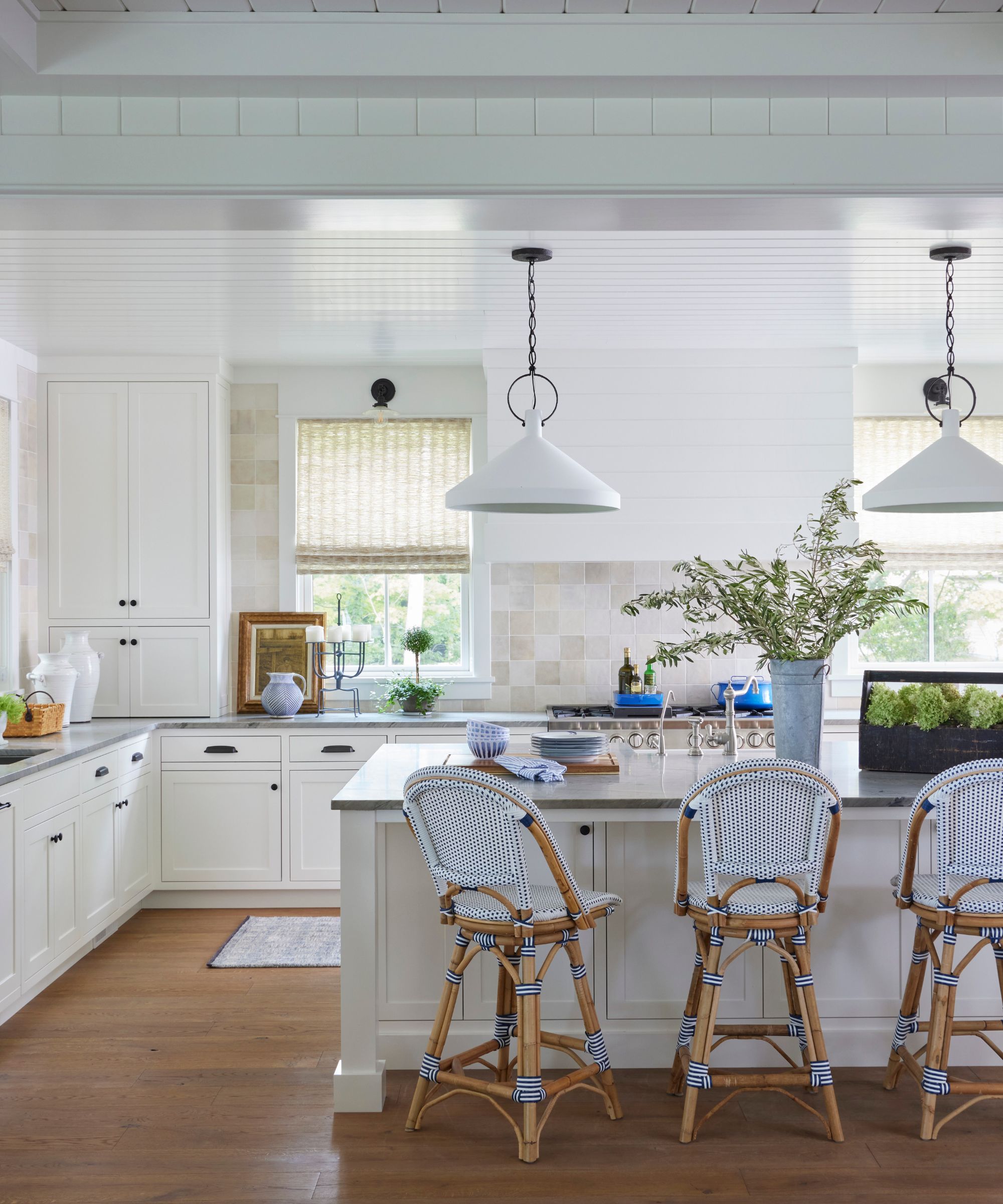
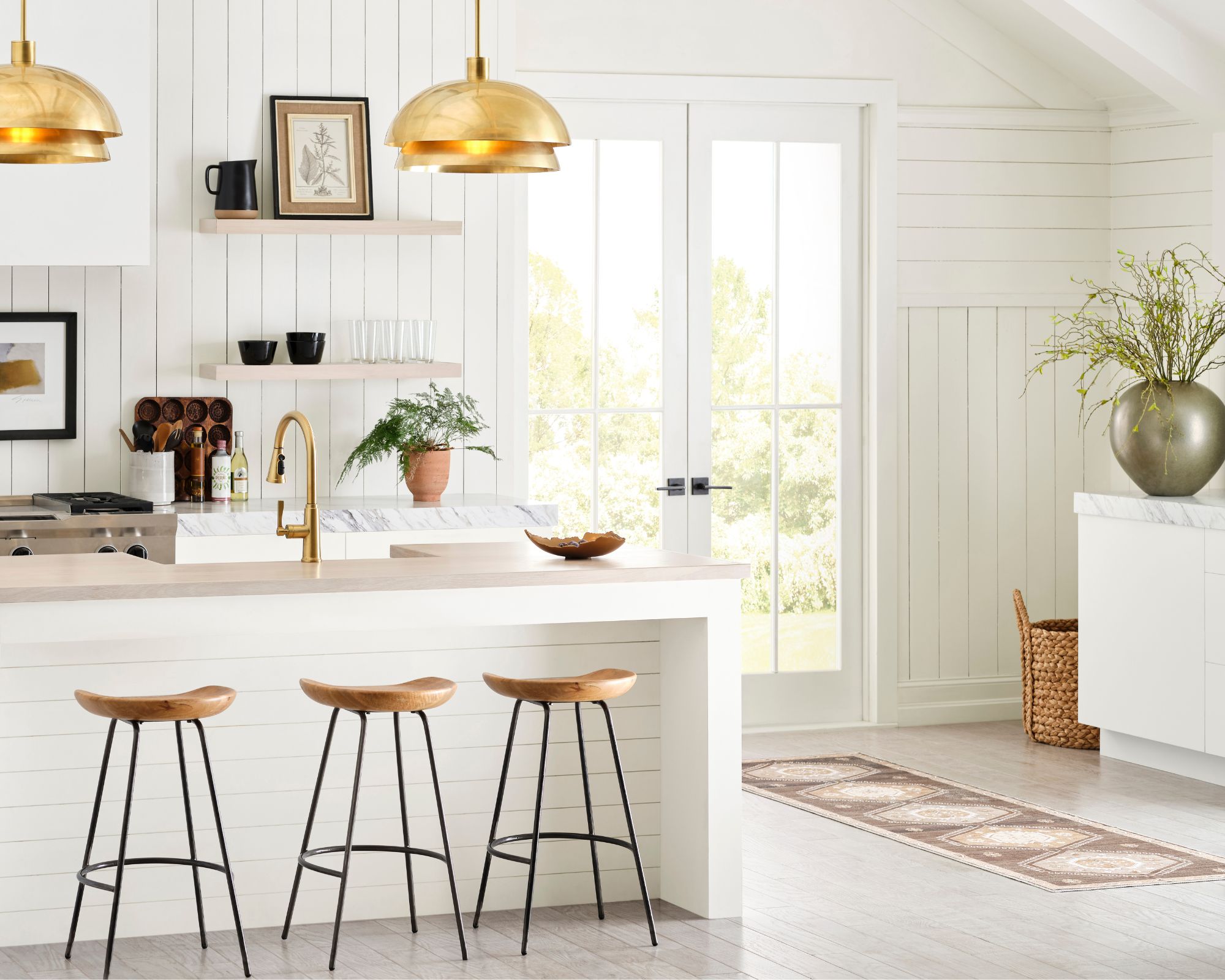
Finally, Sherwin Williams' 'Alabaster' is featured as a consistent best-seller and a former Color of the Year. Designer Jennifer Davis praises its ability to appear as a true clear white without leaning into yellow or blue undertones, creating a soft, warm, and inviting atmosphere. It is a versatile neutral that could serve as an excellent choice for kitchen cabinets, especially for those desiring a white kitchen that feels welcoming rather than cold. The article concludes by reiterating the importance of testing swatches and trusting these expert-recommended warm white paints as a strong starting point for any decorating project.
#WarmWhitePaints #InteriorDesign #PaintTrends #BenjaminMoore #SherwinWilliams #FarrowAndBall #HomeDecor #NeutralPalette #DesignerPicks #WarmWhitePaints #InteriorDesign #PaintTrends #BenjaminMoore #SherwinWilliams #FarrowAndBall #HomeDecor #NeutralPalette #DesignerPicks
0 comment in total
 No comments yet
You may also like
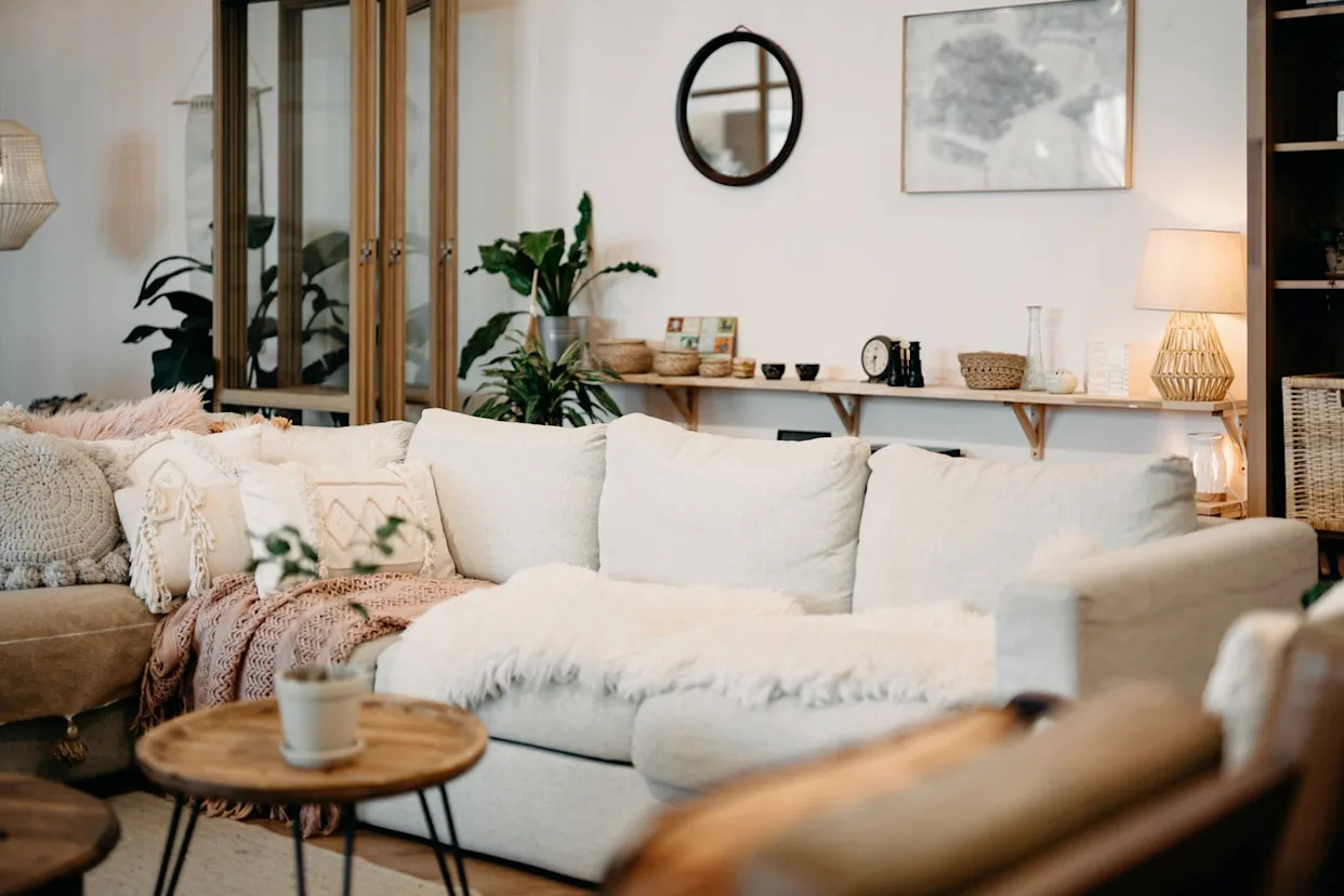
The 11 Best Warm White Paint Colors, According to Designers
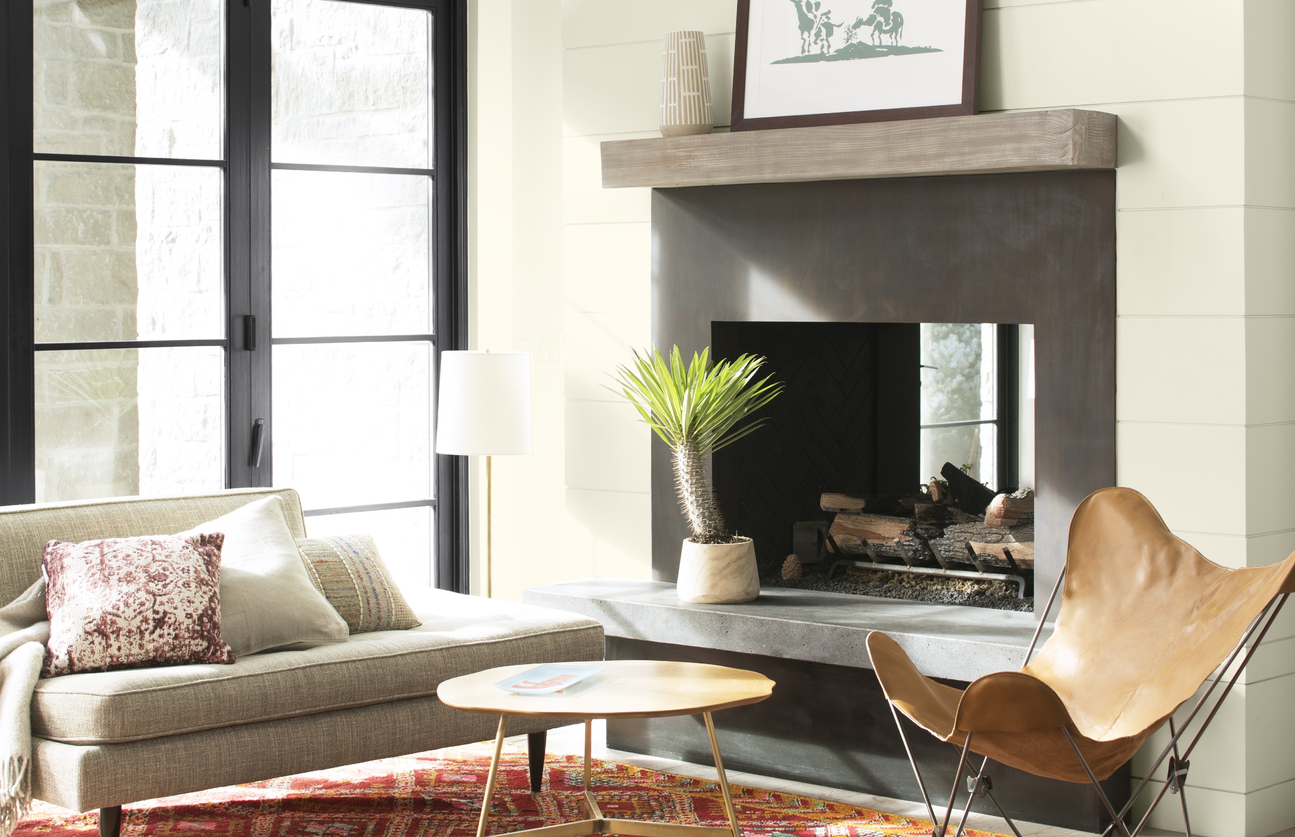
Best white paint colors: Expert share the top options


13 Tried-and-True White Paint Colors Recommended by Pros

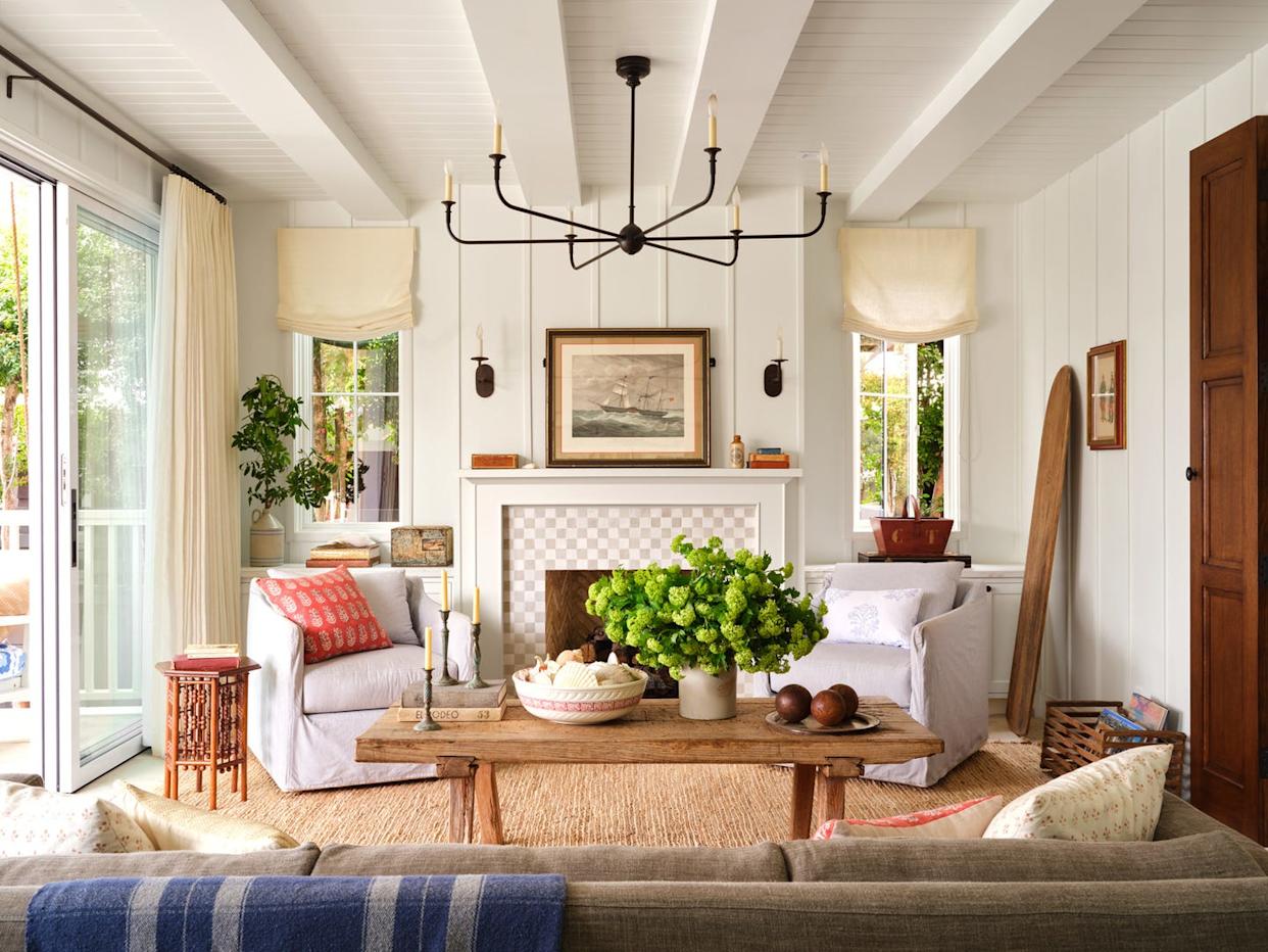
How to Pick the Best White Paint Color—Without the Headache
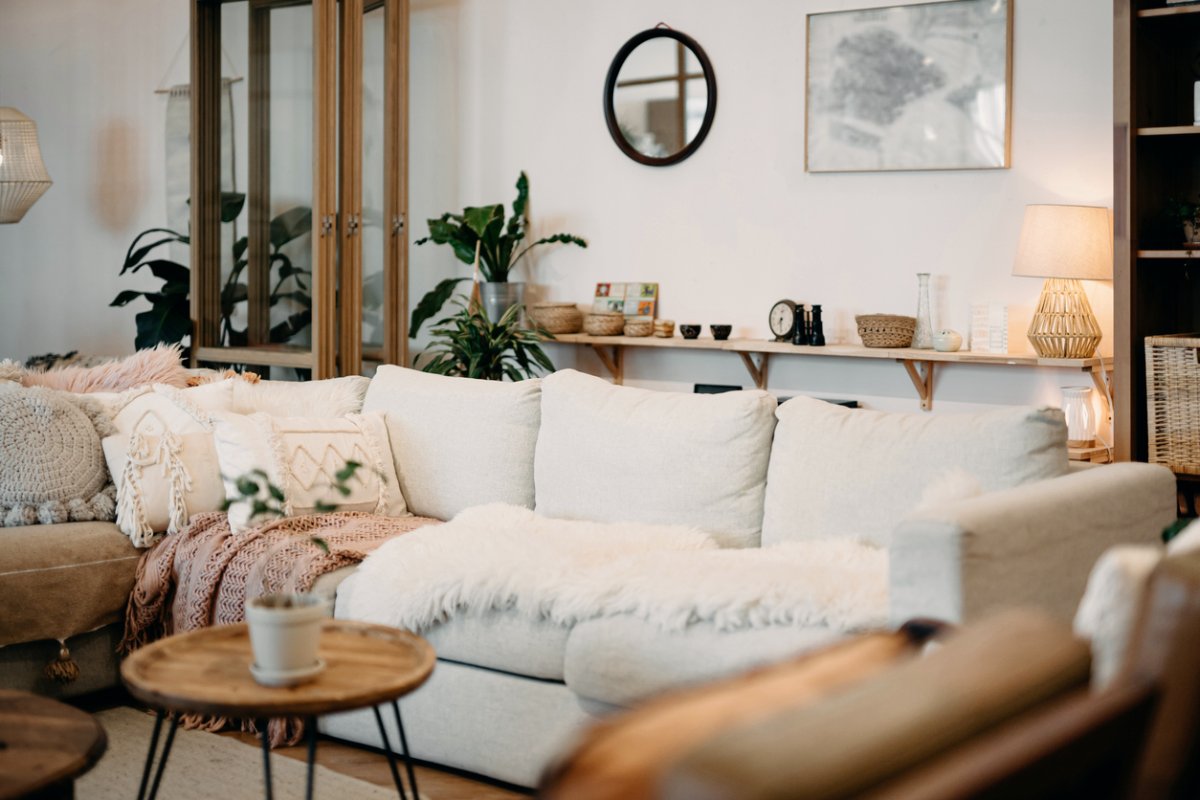
The 11 Best Warm White Paint Colors, According to Designers

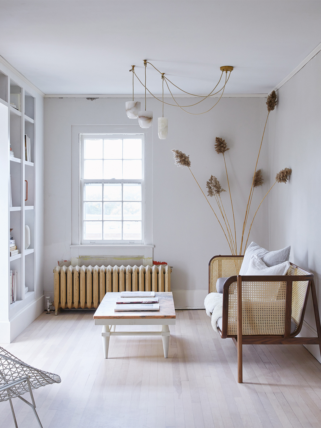
Designers’ Favorite White Paints Are Always Changing—We Asked 3 for Their Latest Pick

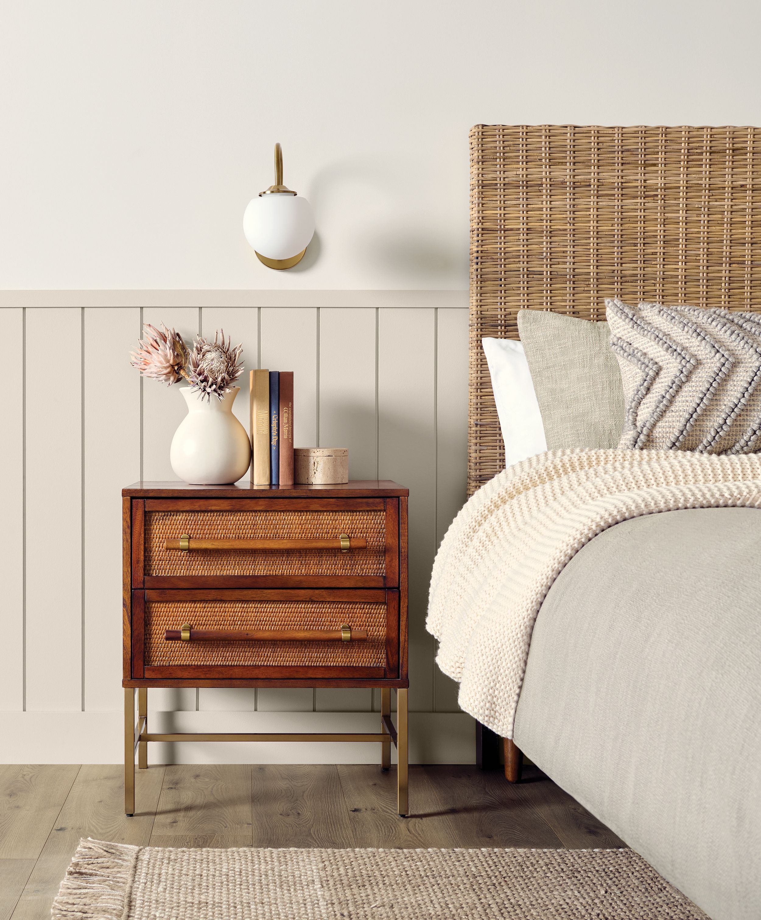
10 Best Warm White Paint Colors for a Cozy Neutral Refresh

The Best White Paint Colors Experts Turn to Again and Again
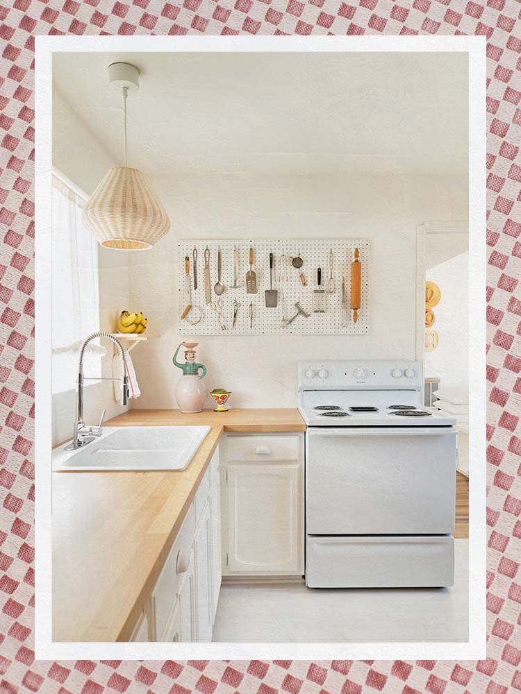
The Best Warm White Paint Colors, as Seen in 8 Designers’ Favorite Spaces
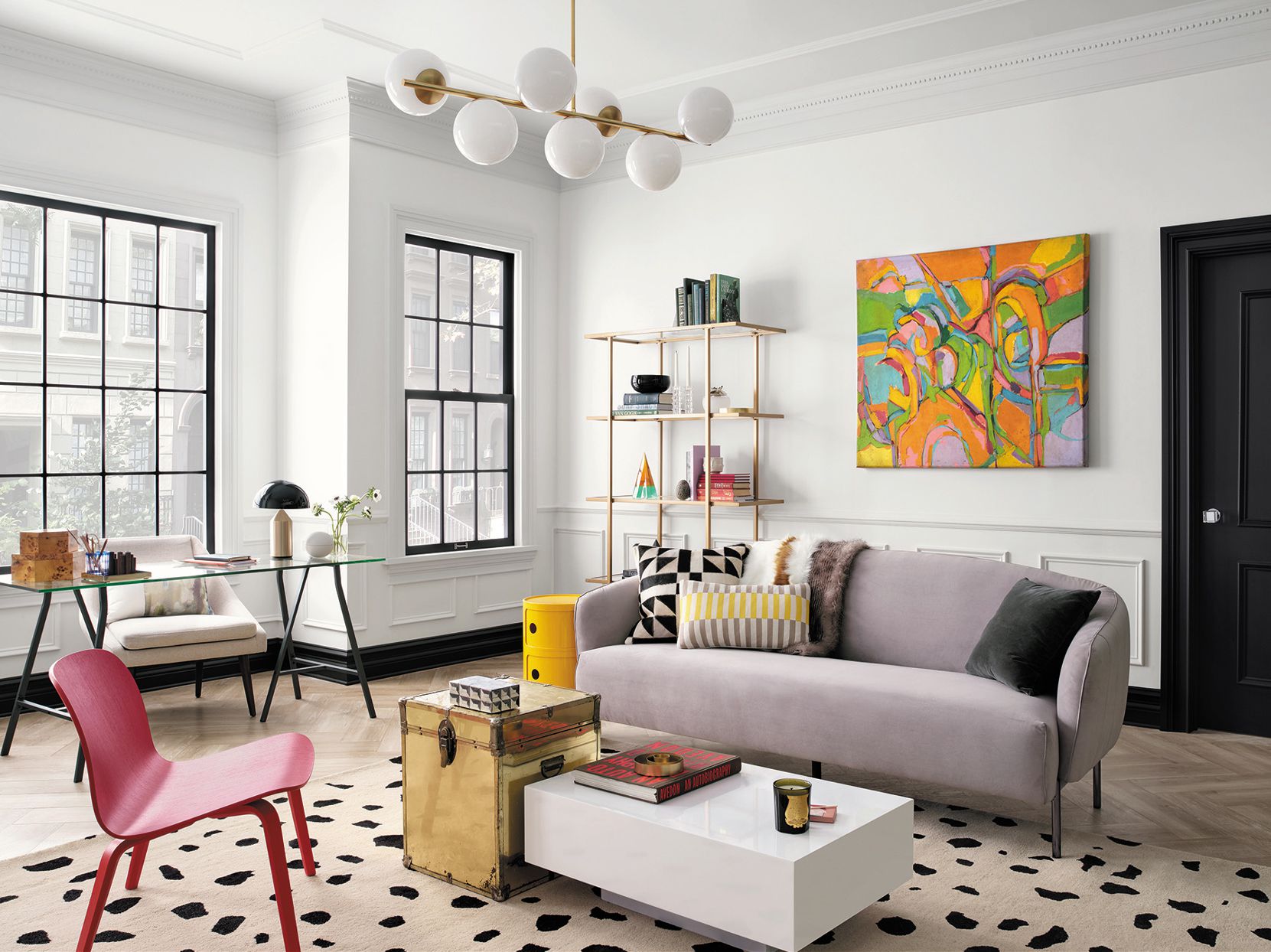
The Best White Paint for Walls That Experts Swear By
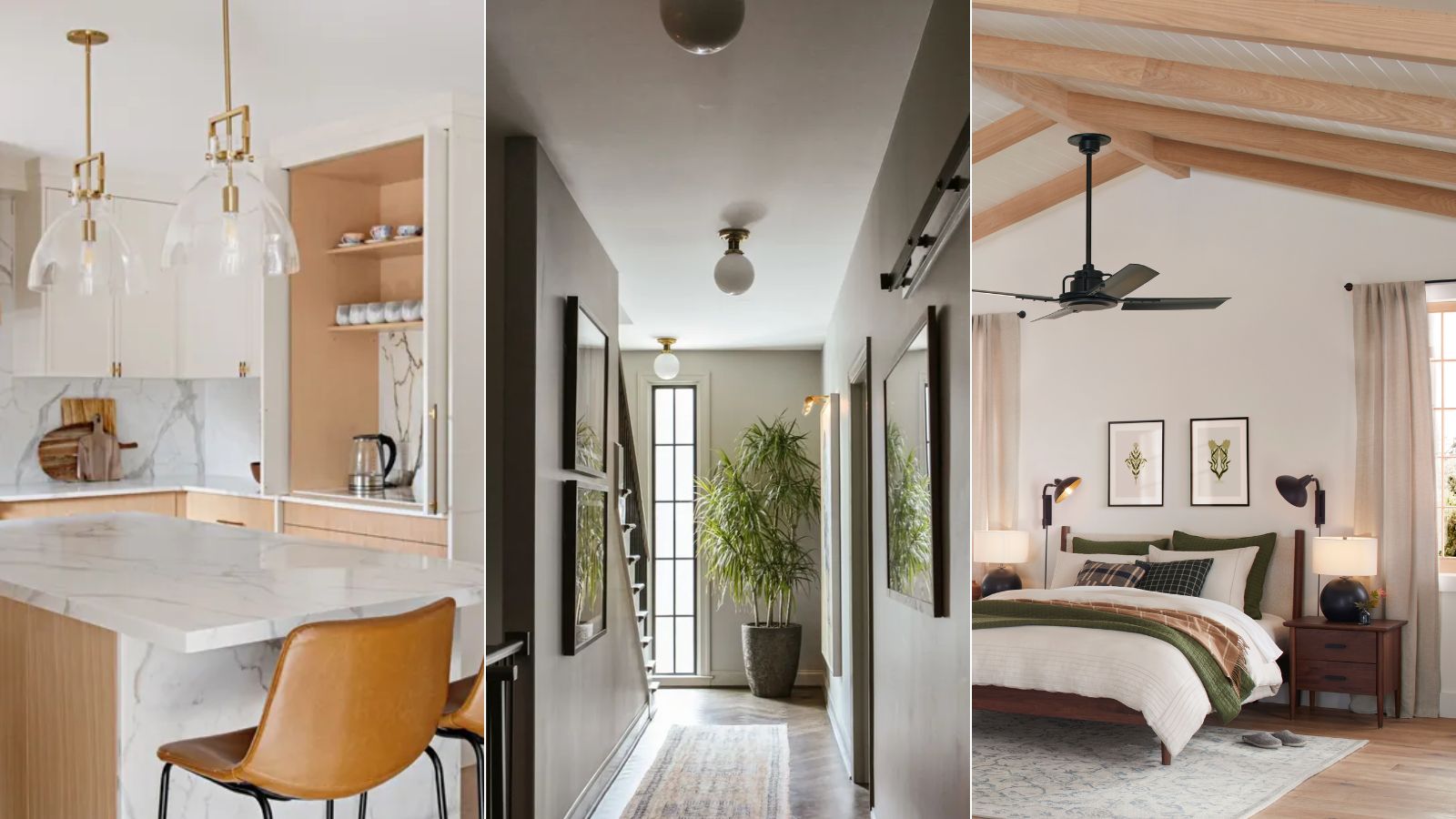
What are the best Sherwin-Williams white paints? 6 favorite shades amongst interior designers
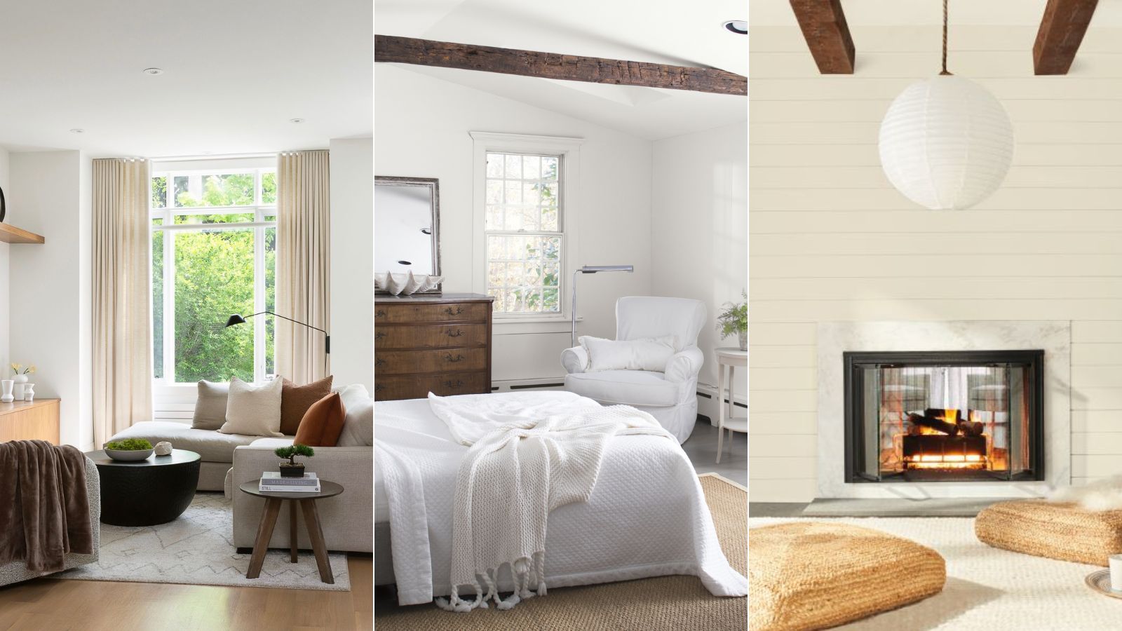
5 of the best Benjamin Moore white paints – classic shades that experts always use in interior projects
The Best White Paint Colors for Kitchen Cabinets, According to Designers

What are the best white paints for kitchens? 6 light and airy picks from interior designers
13 Best Off-White Paint Colors, According to Interior Designers

Sherwin-Williams' Designer Color Collection: 5 bright white paints
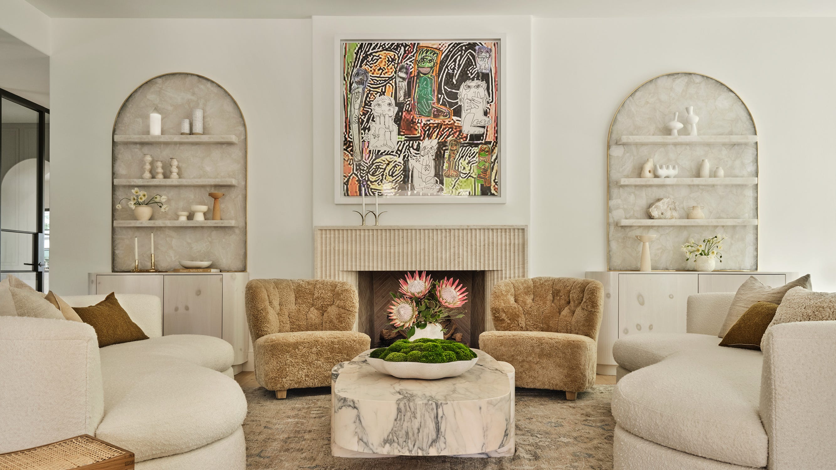
The 13 Best White Paint Colors That Interior Designers Swear By

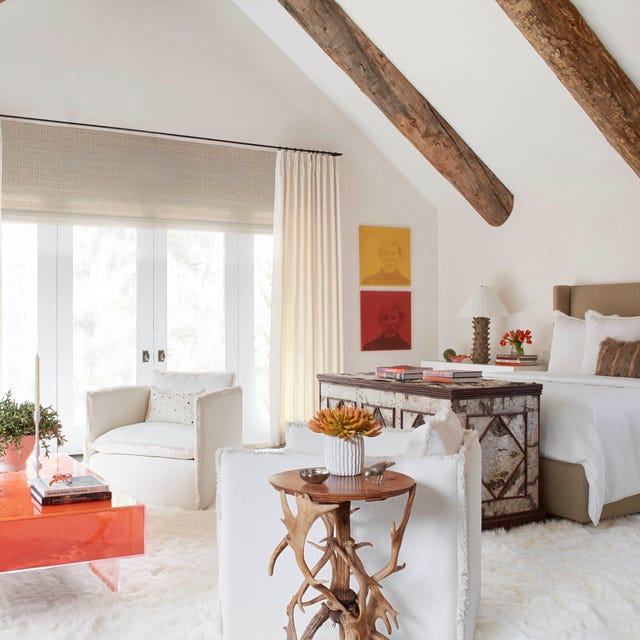
The 40 Best White Paint Colors, According to Designers
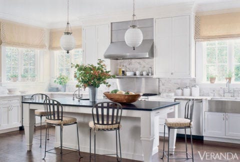
5 White Kitchen Paints Designers Swear By
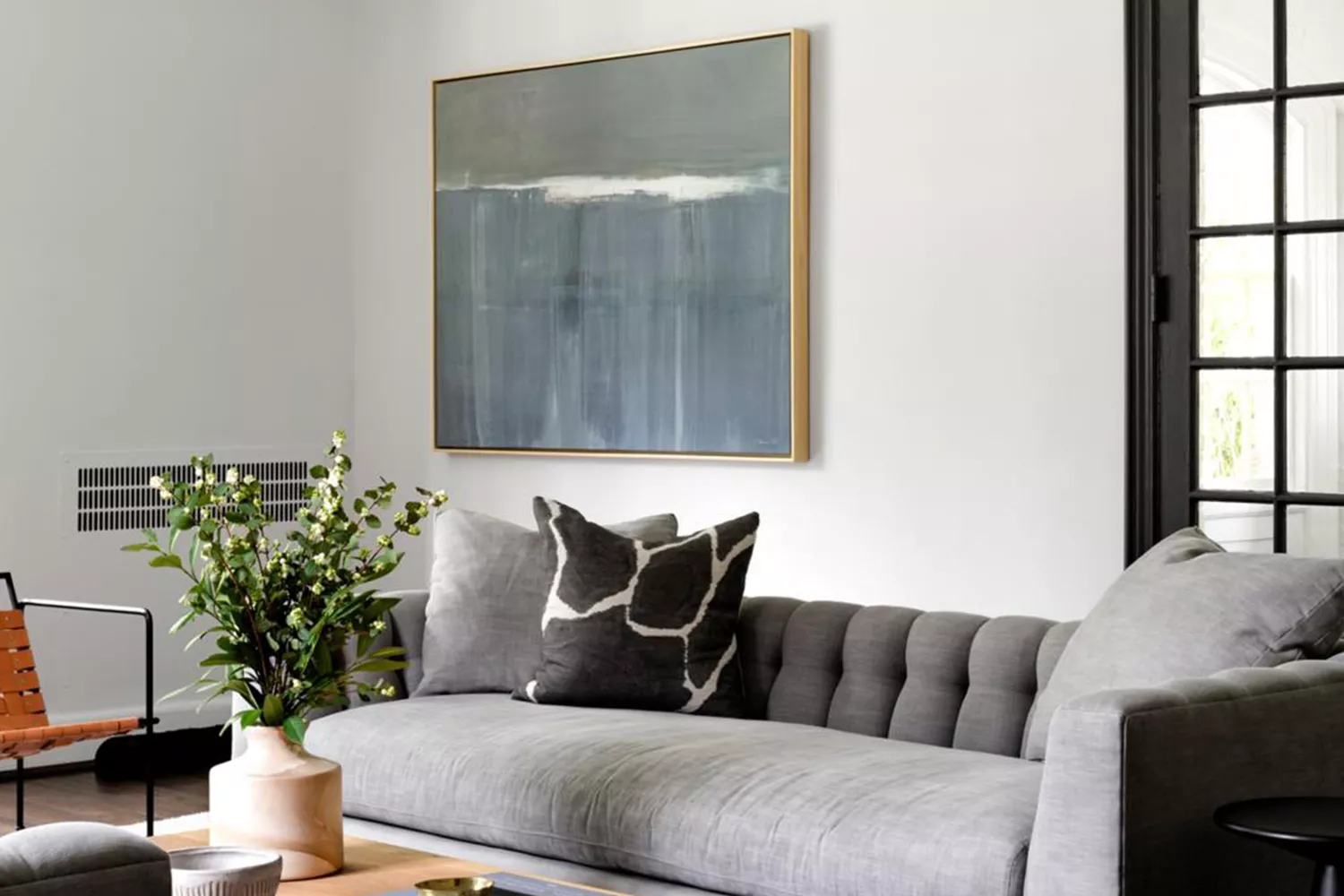
15 White Paint Colors Interior Designers Reach for Time and Again