1/14
The Best Warm White Paint Colors, as Seen in 8 Designers’ Favorite Spaces
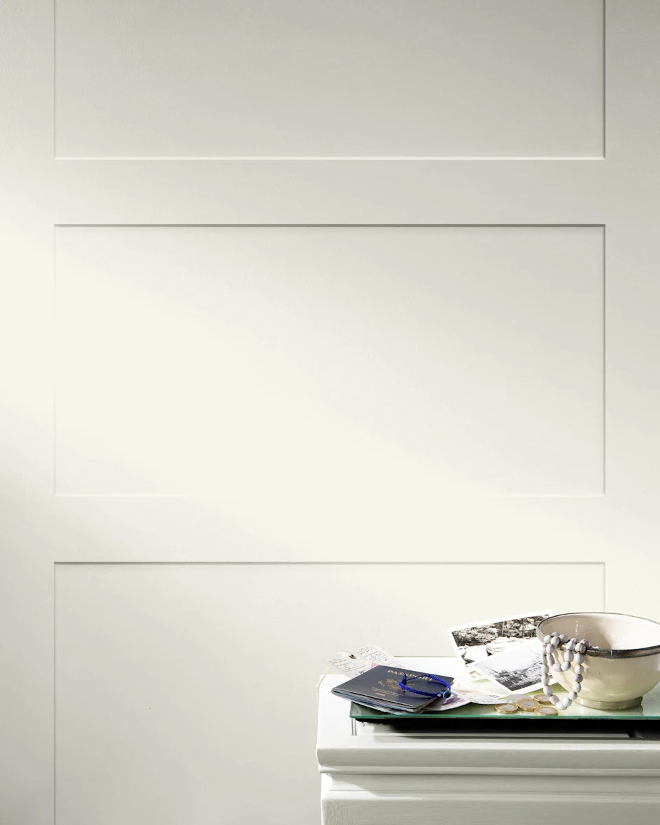
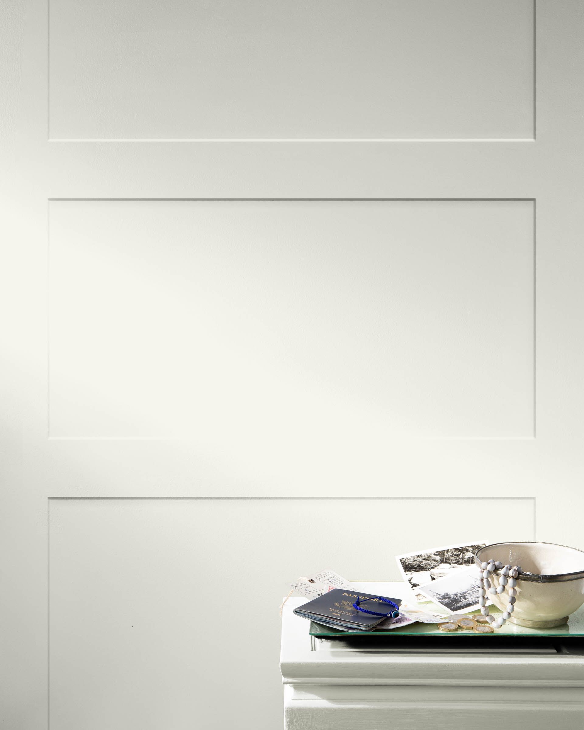
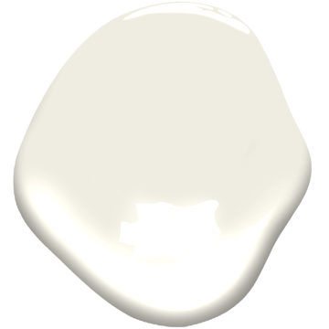
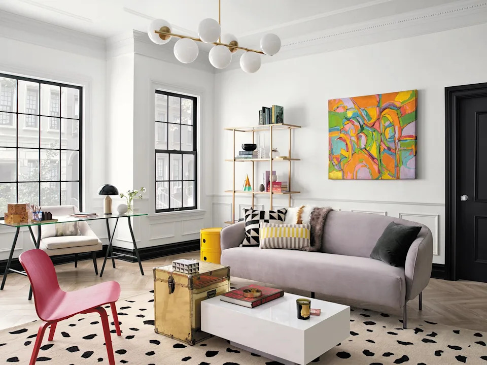
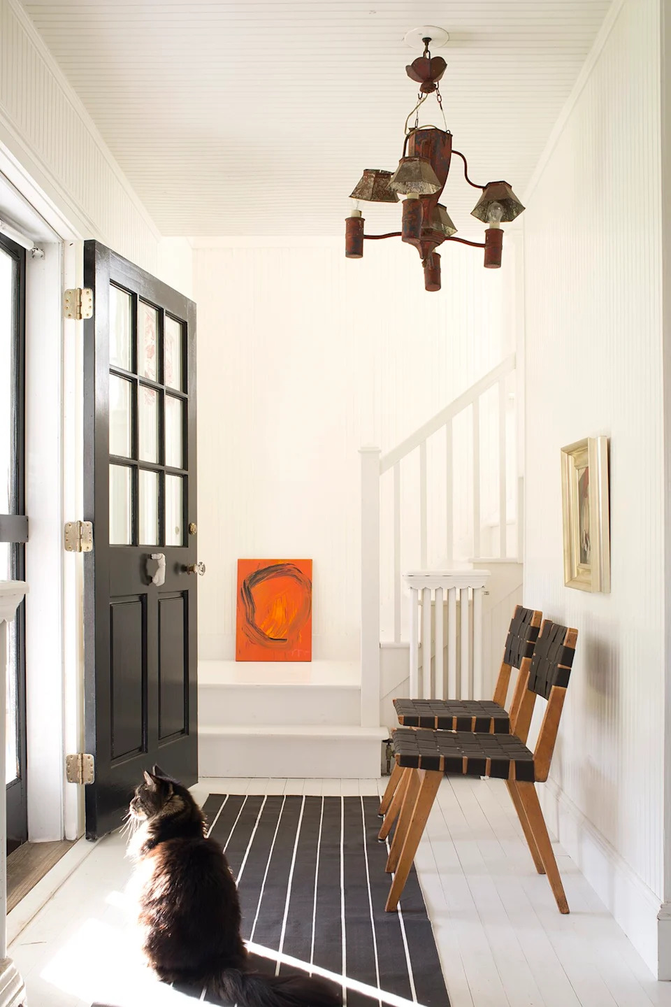
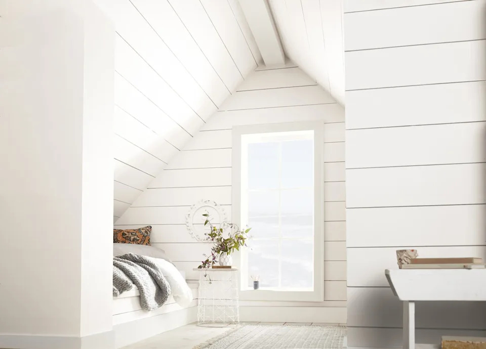
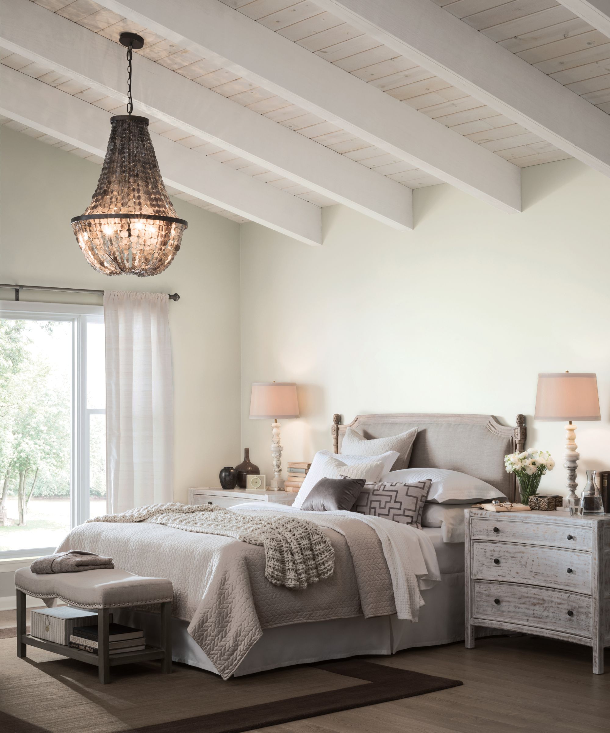
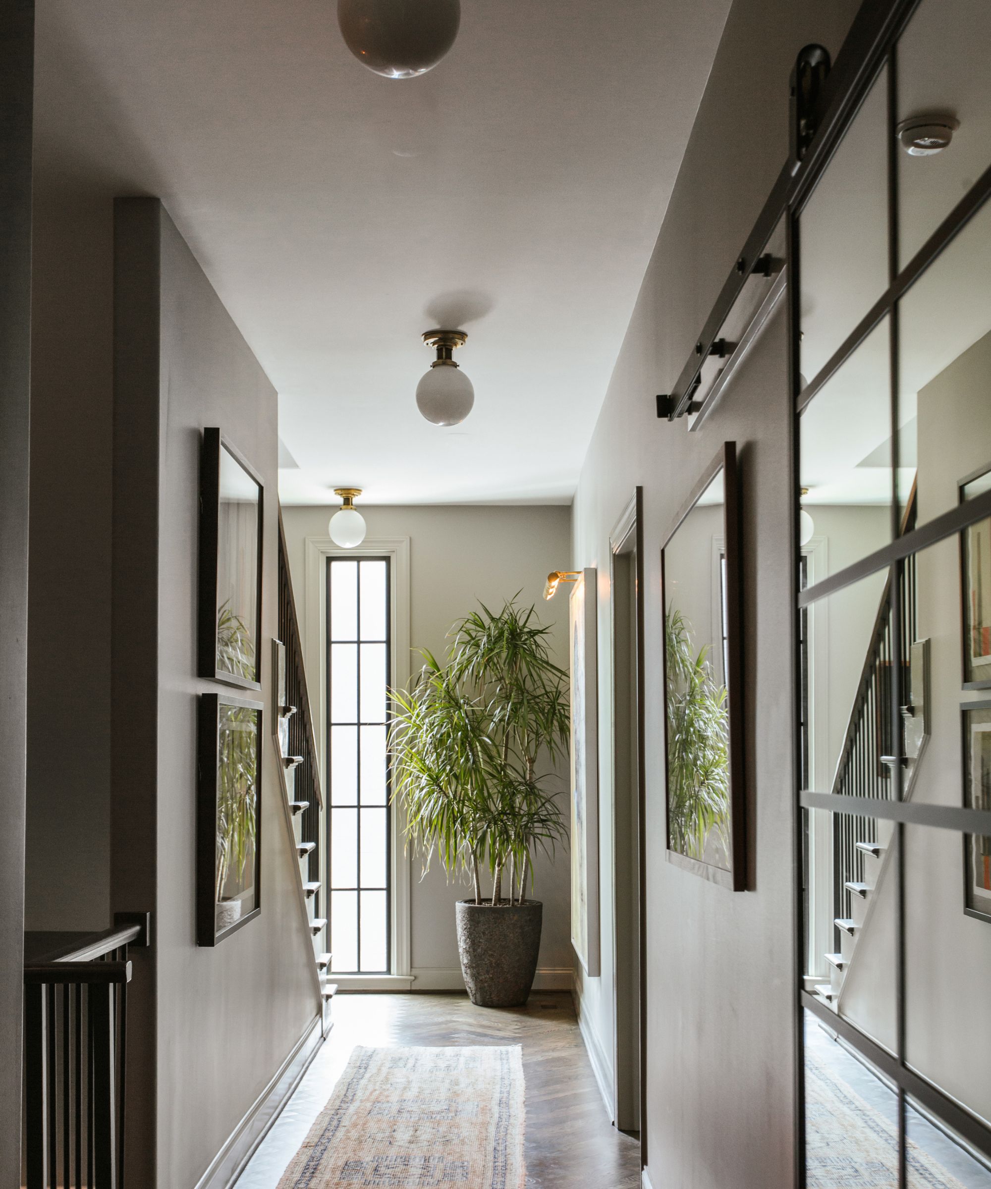
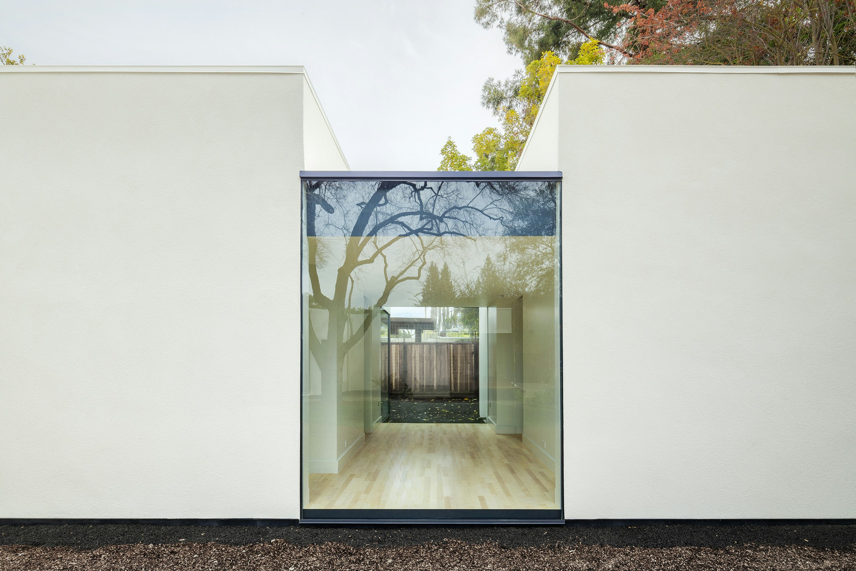
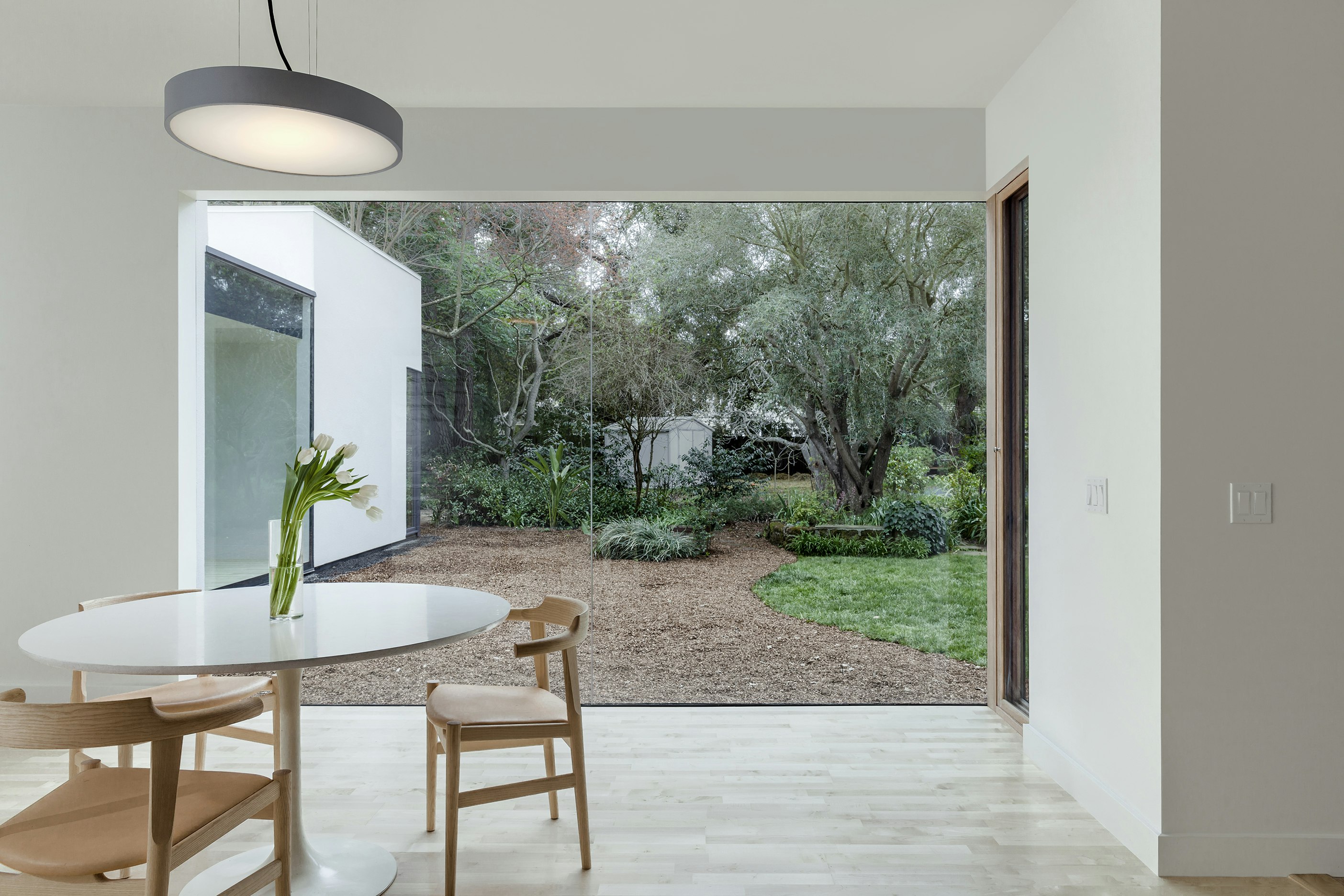
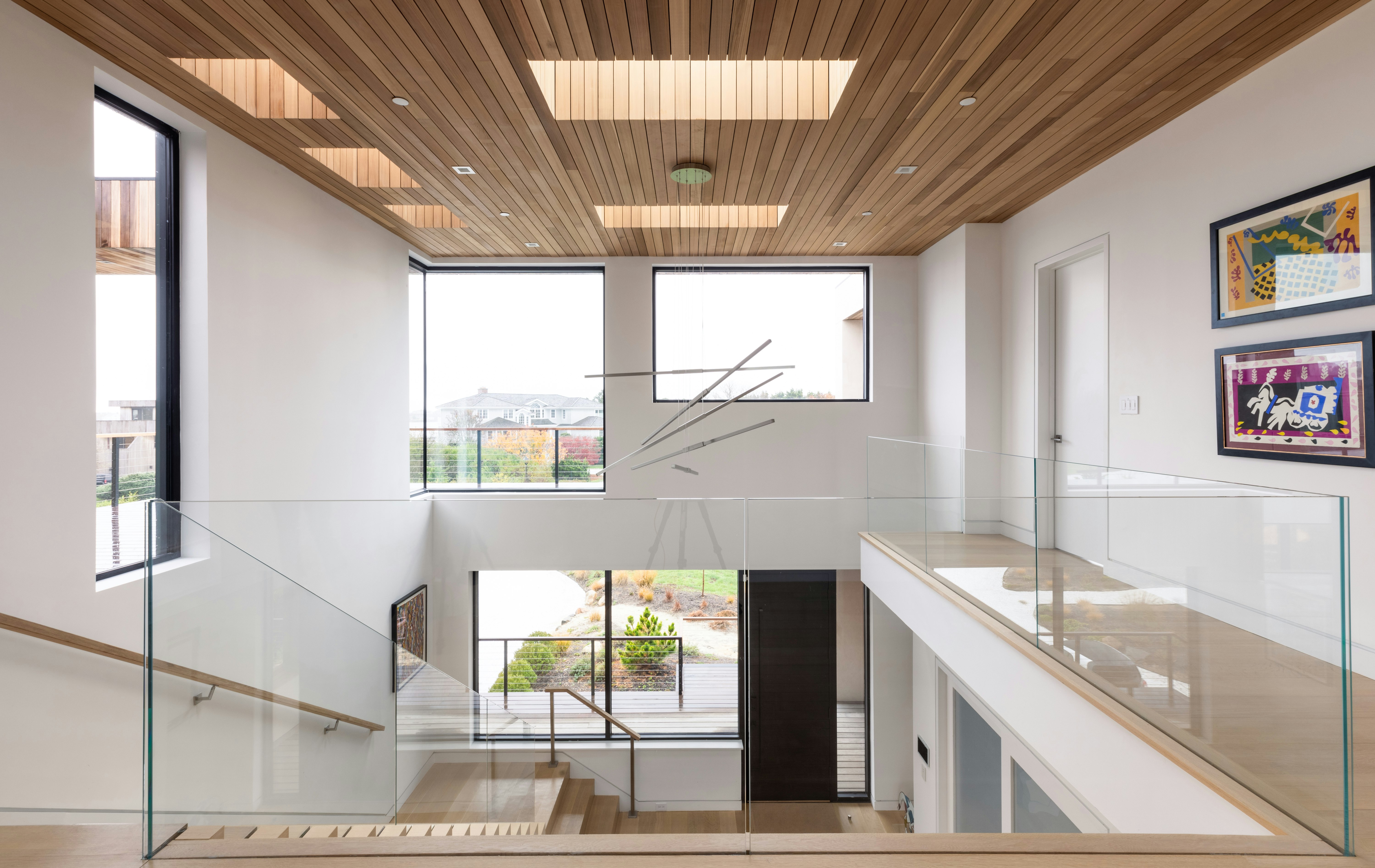
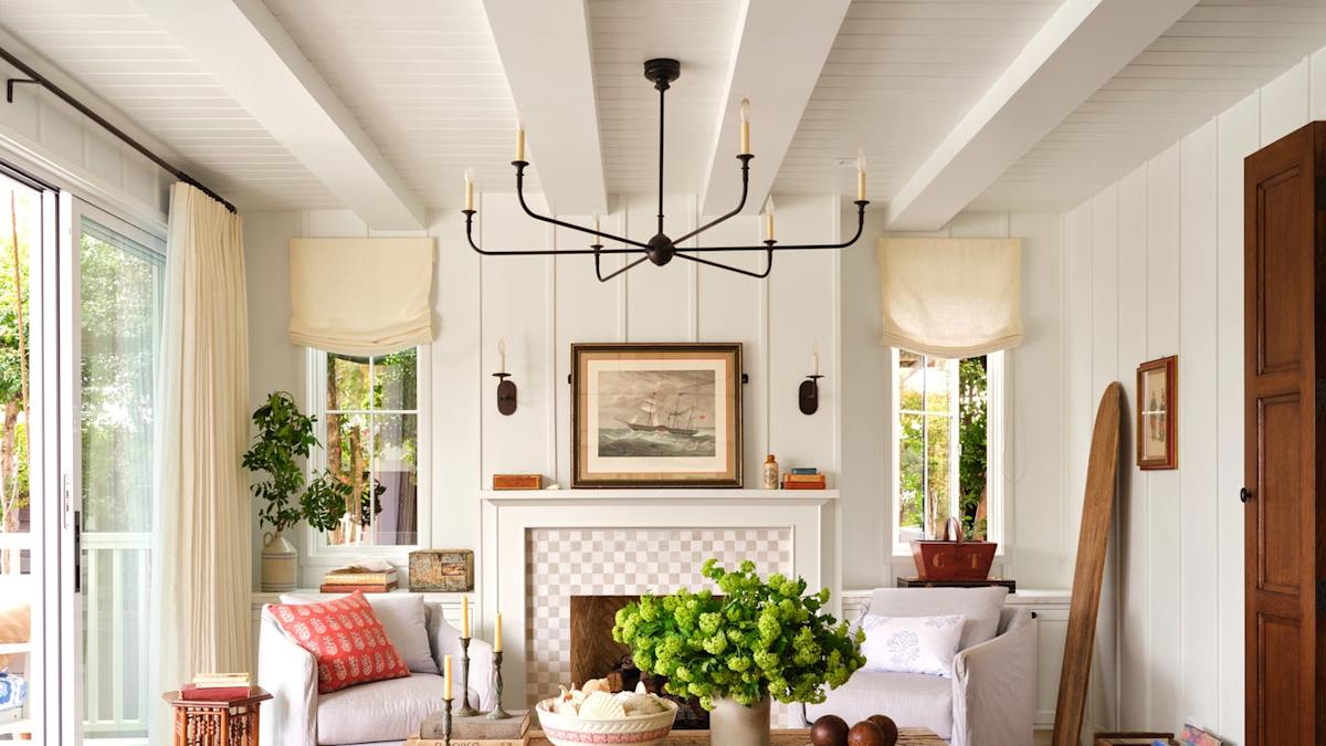
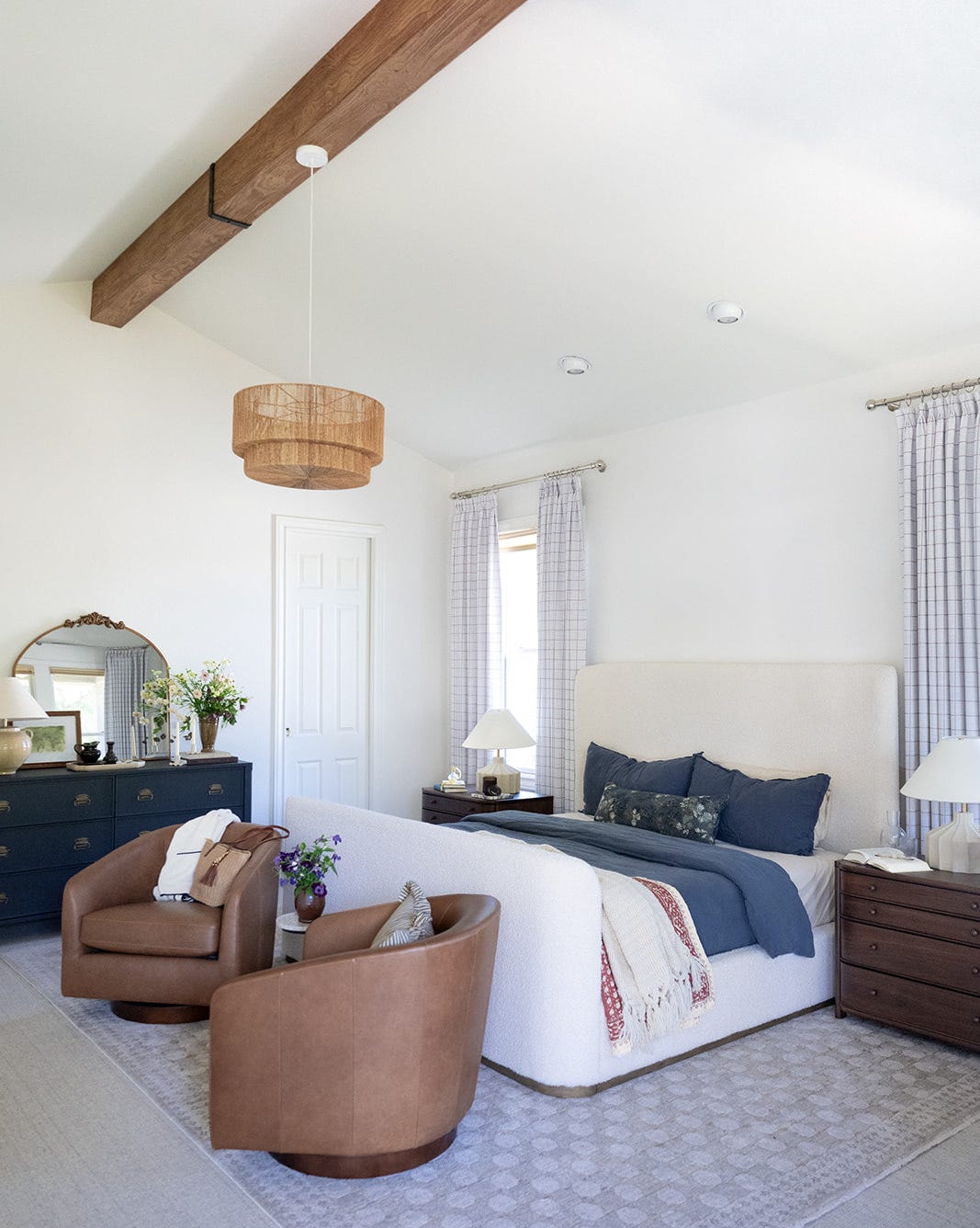
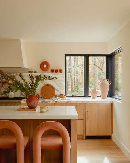
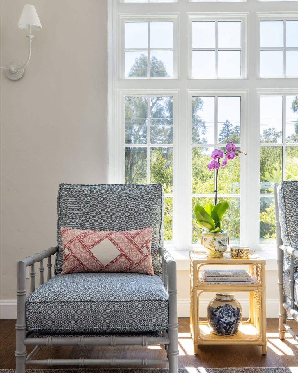
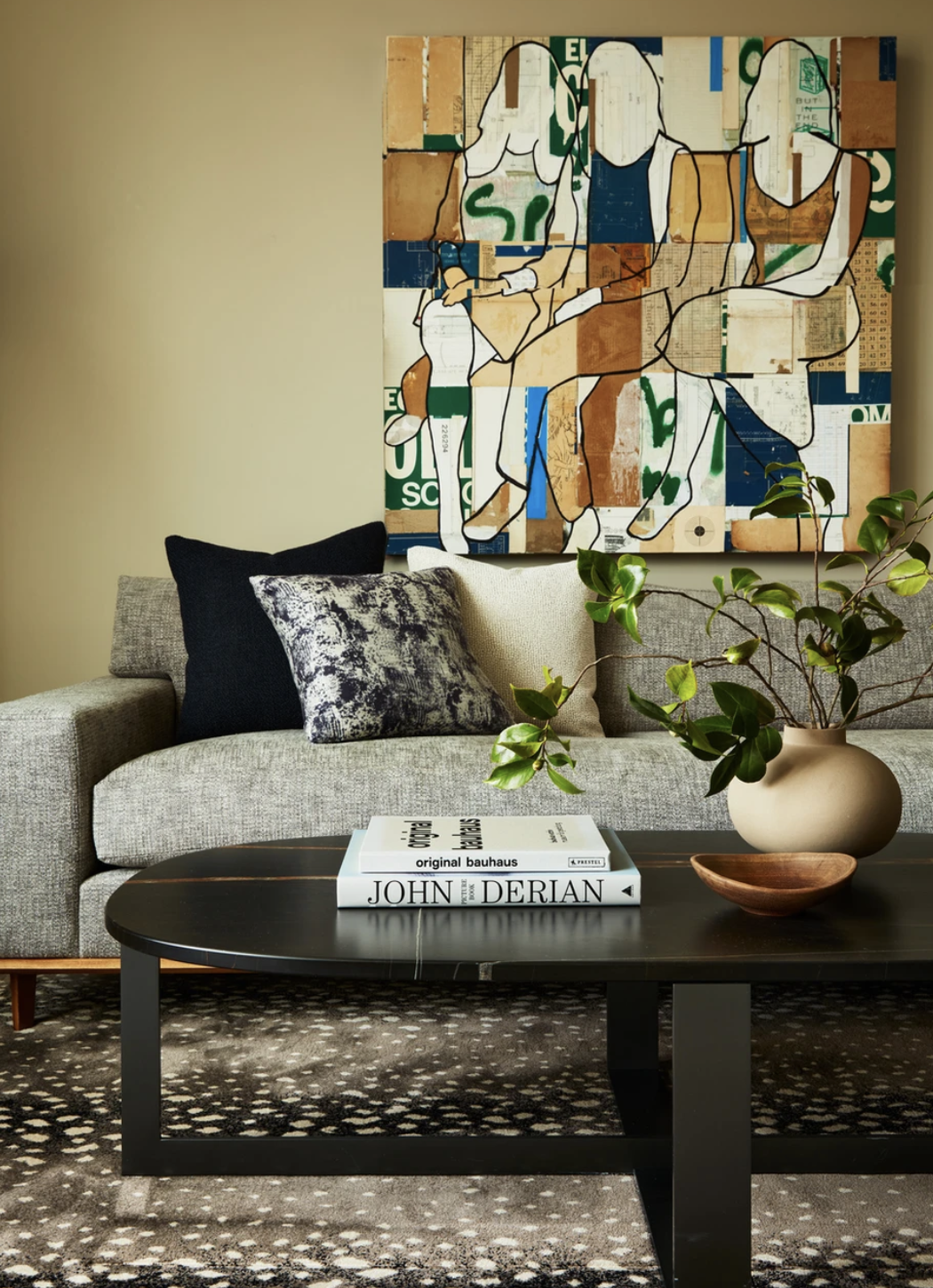
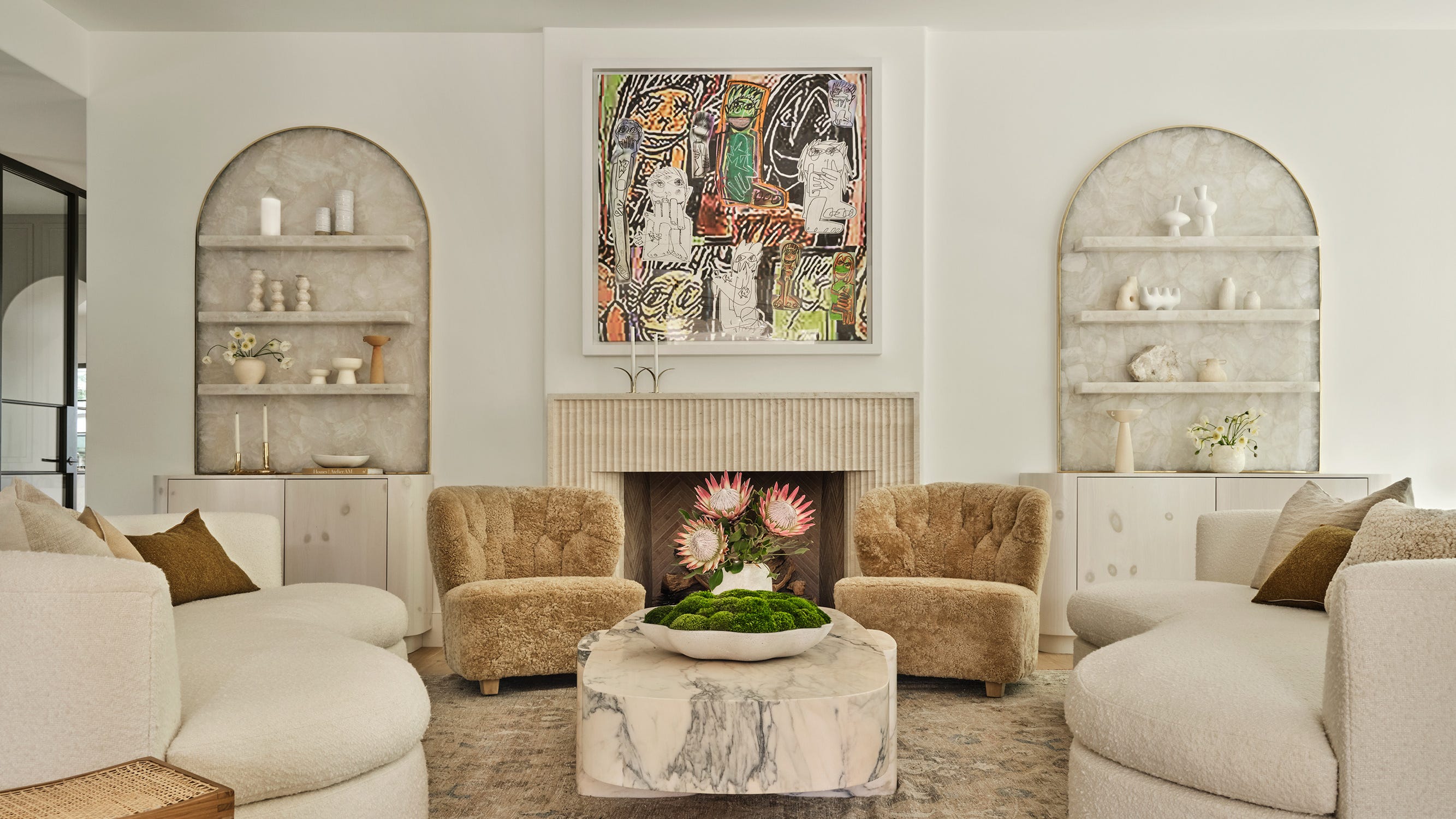
While bold and vibrant color palettes are currently popular in interior design, the timeless appeal of simple white walls remains a powerful design statement, particularly when aiming to highlight artwork or curated collections. Warm white paint colors, preferred over cooler tones by designers like Katie Rosenfeld, offer a crisp, clean, and neutral backdrop that complements colorful designs. These creamy hues are versatile and enduring, evoking the comfort of natural materials such as linen, bouclé, plaster, and parchment, while still providing ample brightness for decor to stand out. Designer Alex Boudreau highlights white's ability to create a cohesive space, allowing textiles and artwork to be maximized, and camouflaging any minor imperfections in a room's structure.
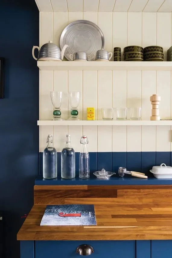
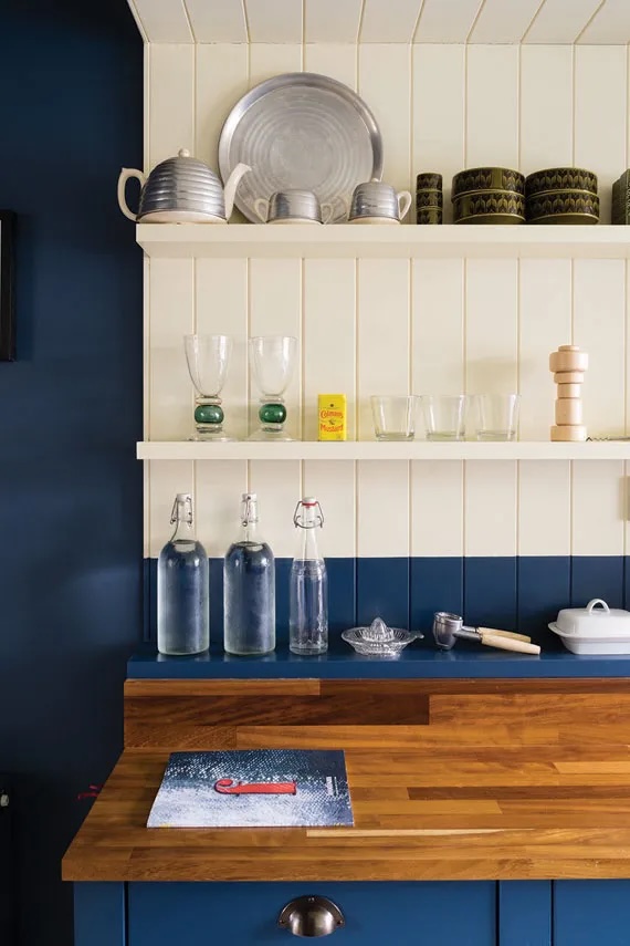
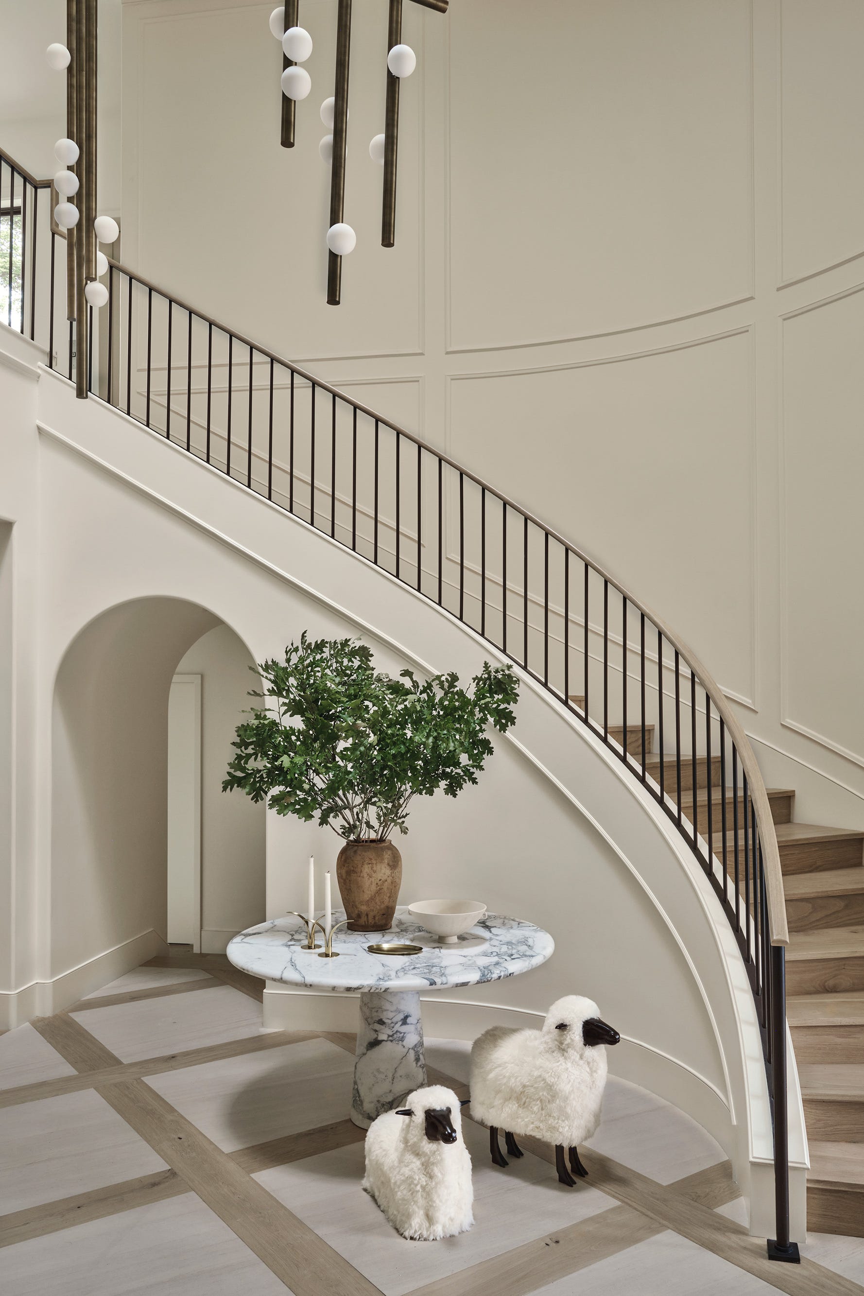
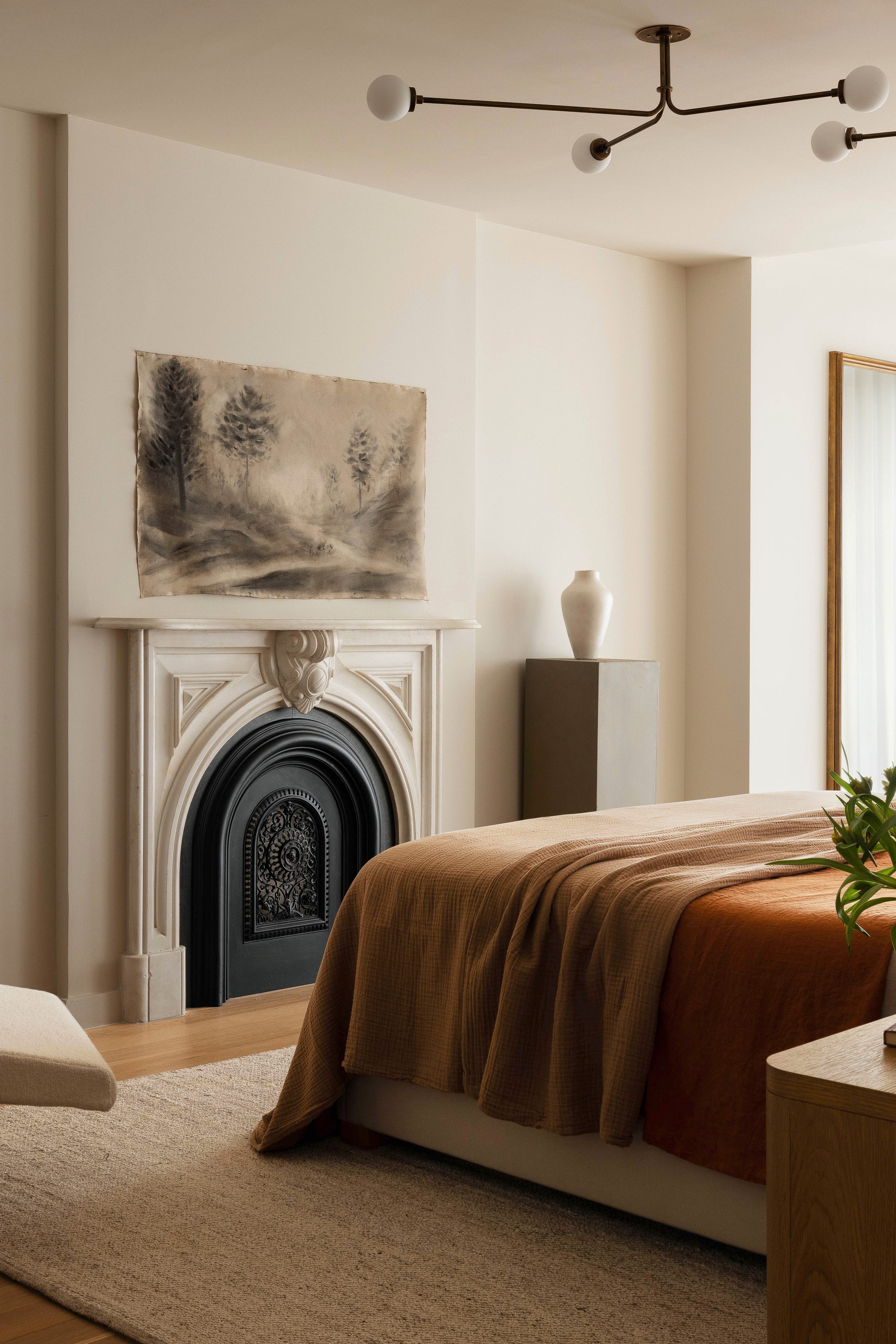
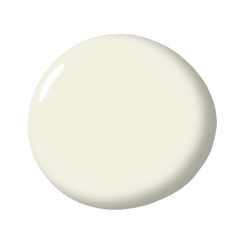
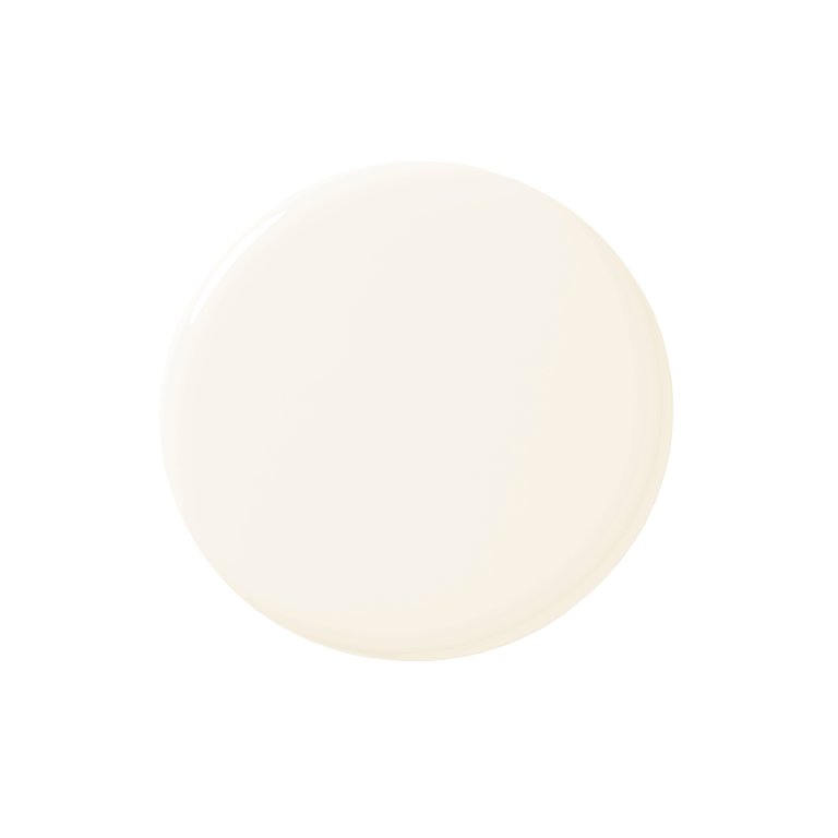
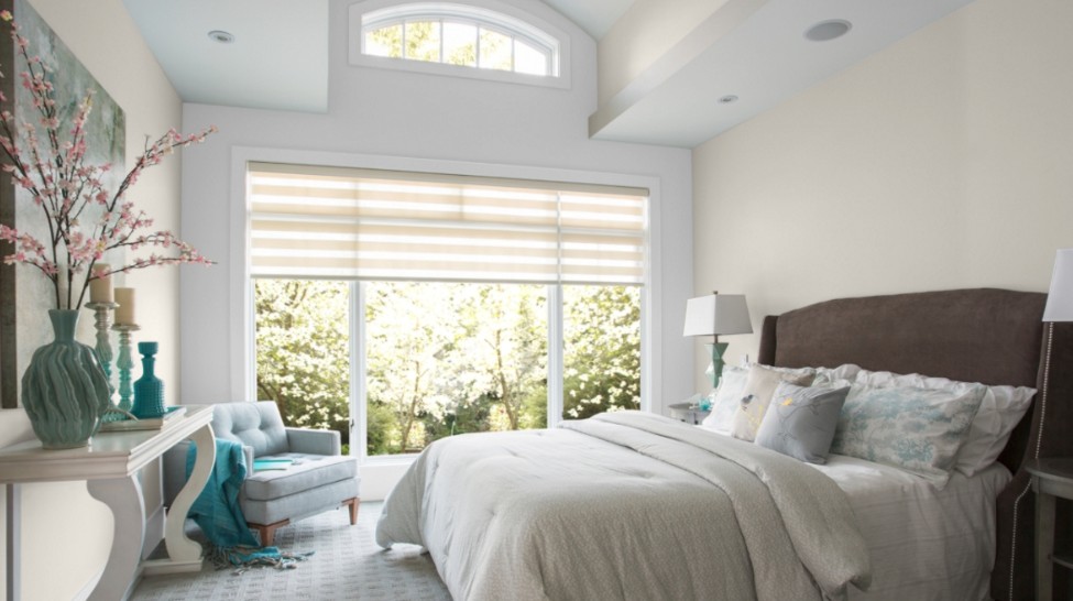
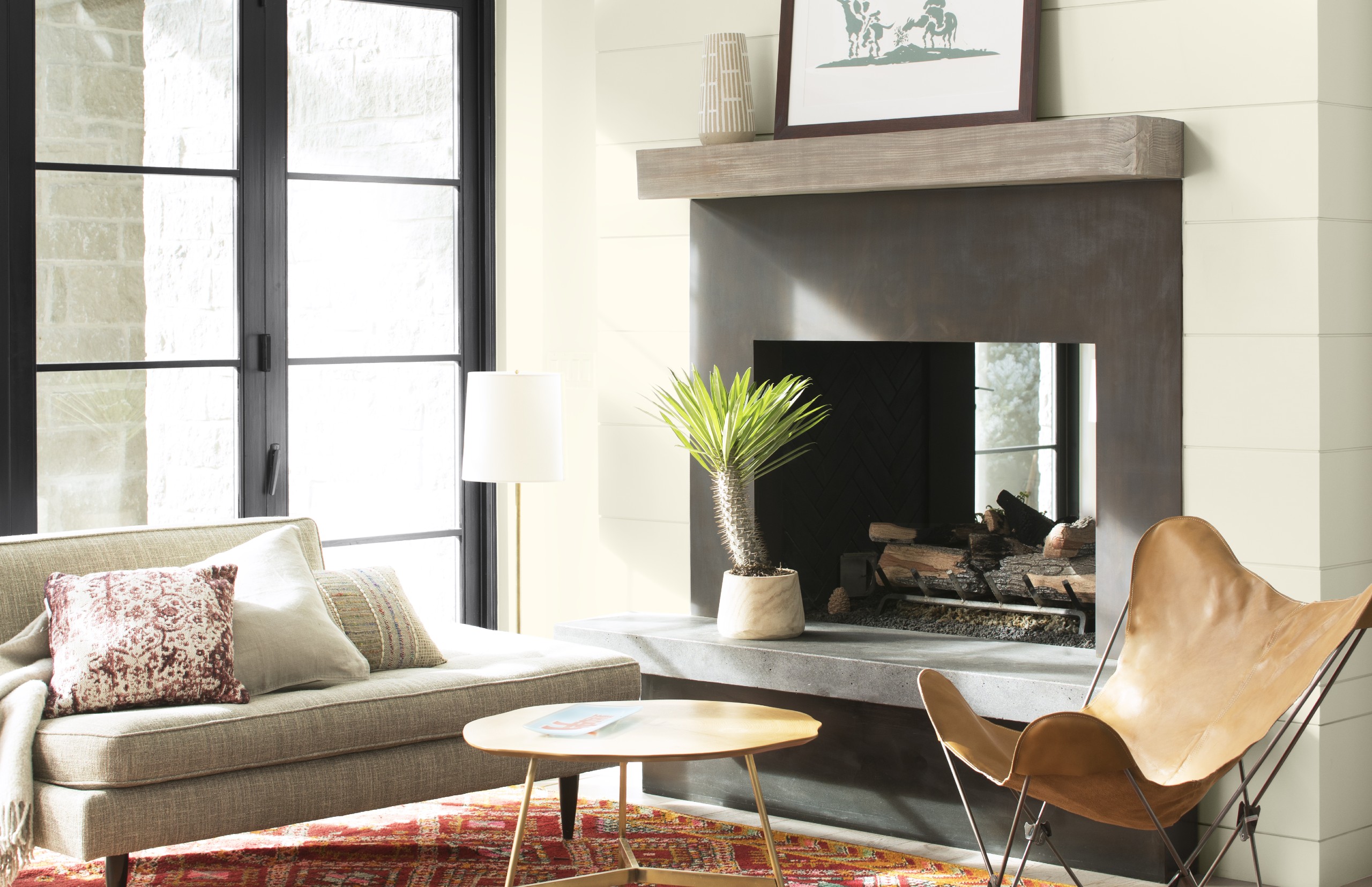
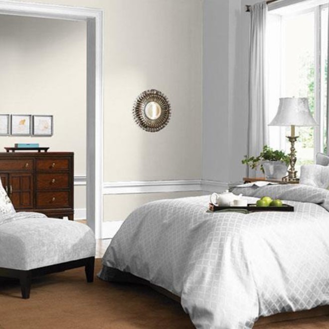
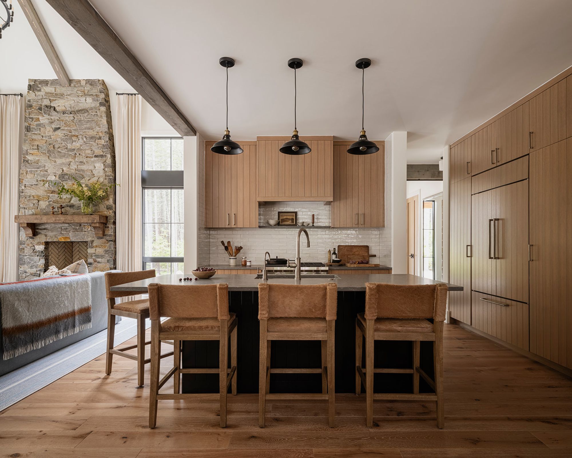
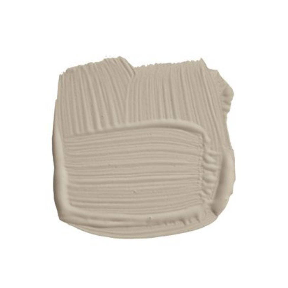
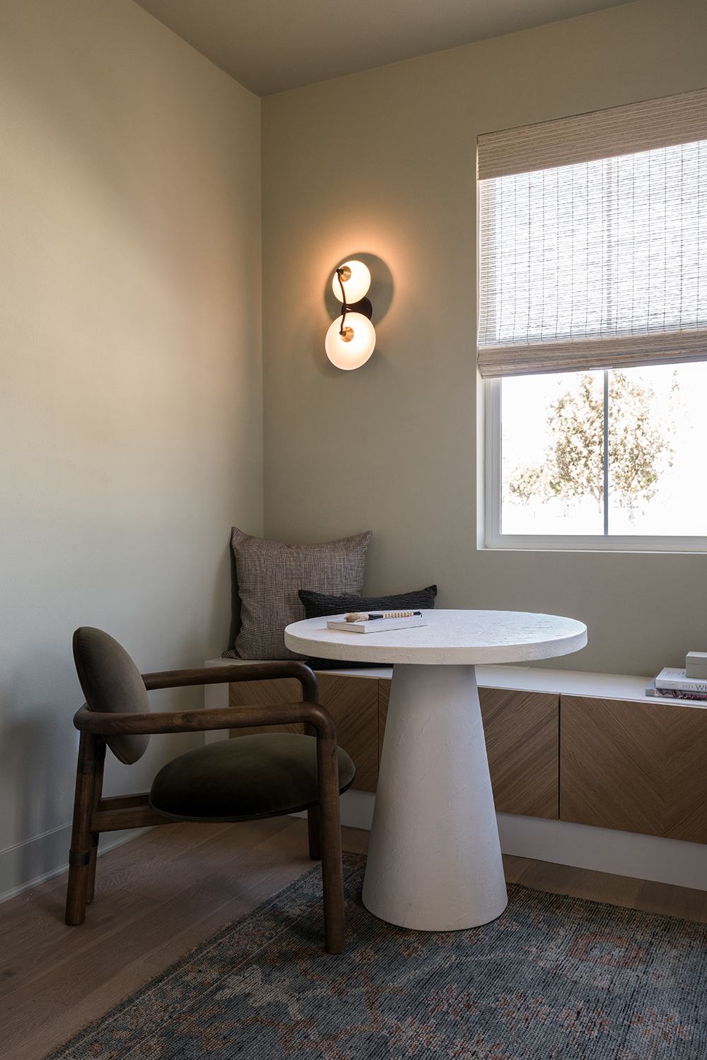
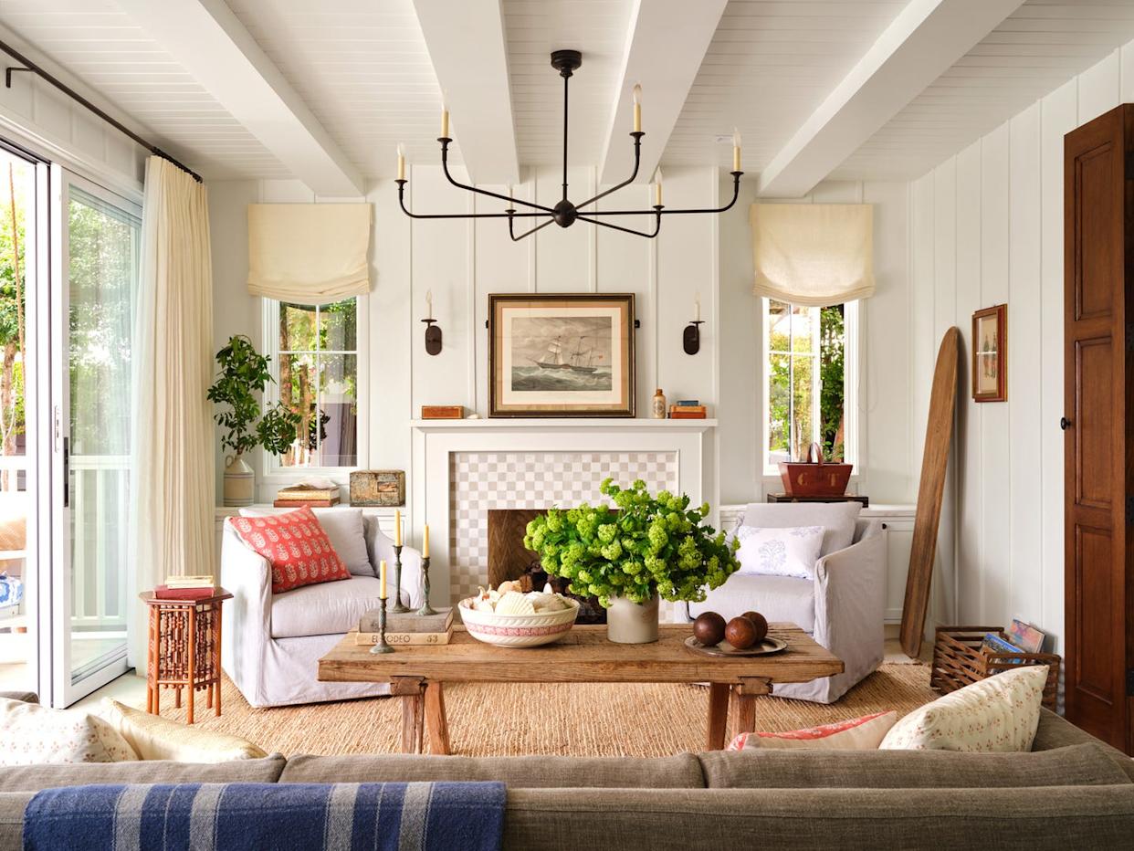
The article features eight designers' top warm white paint selections and their applications. Benjamin Moore Swiss Coffee is praised by Young Huh for its sophisticated warmth, subtle yellow and green undertones, and dynamic changes throughout the day, suitable for studies, living rooms, and kitchens. Behr Crisp Linen, a favorite of Leanne Ford, offers a chalky finish with a hint of vintage charm, used across entire homes for a warm yet clean aesthetic. Sherwin-Williams Shoji White, a darker white bordering on beige with brown undertones, is recommended by Kara Phillips for window-filled living rooms to create a warm, livable, and bright atmosphere, especially when paired with white oak and cool marble.
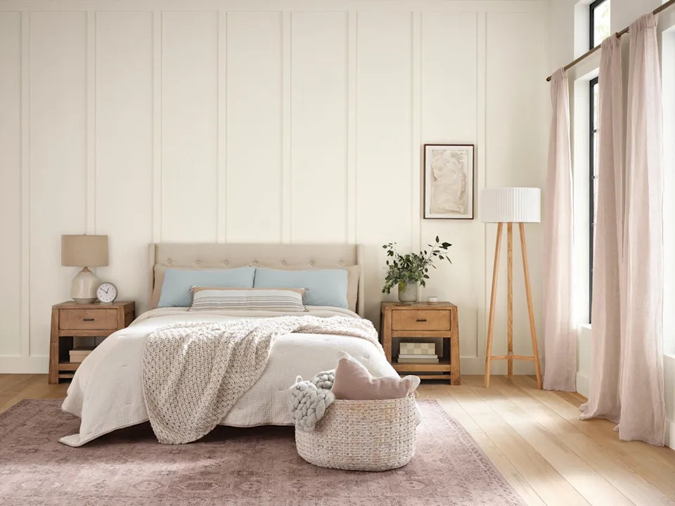
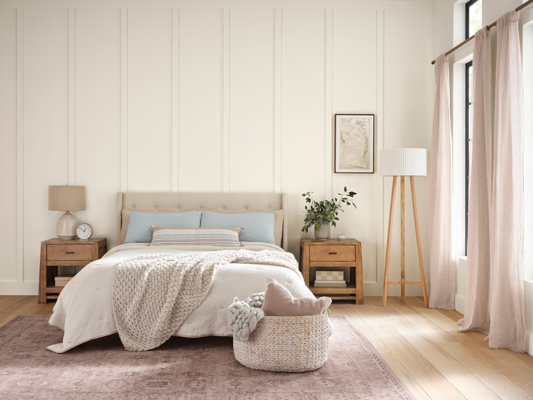
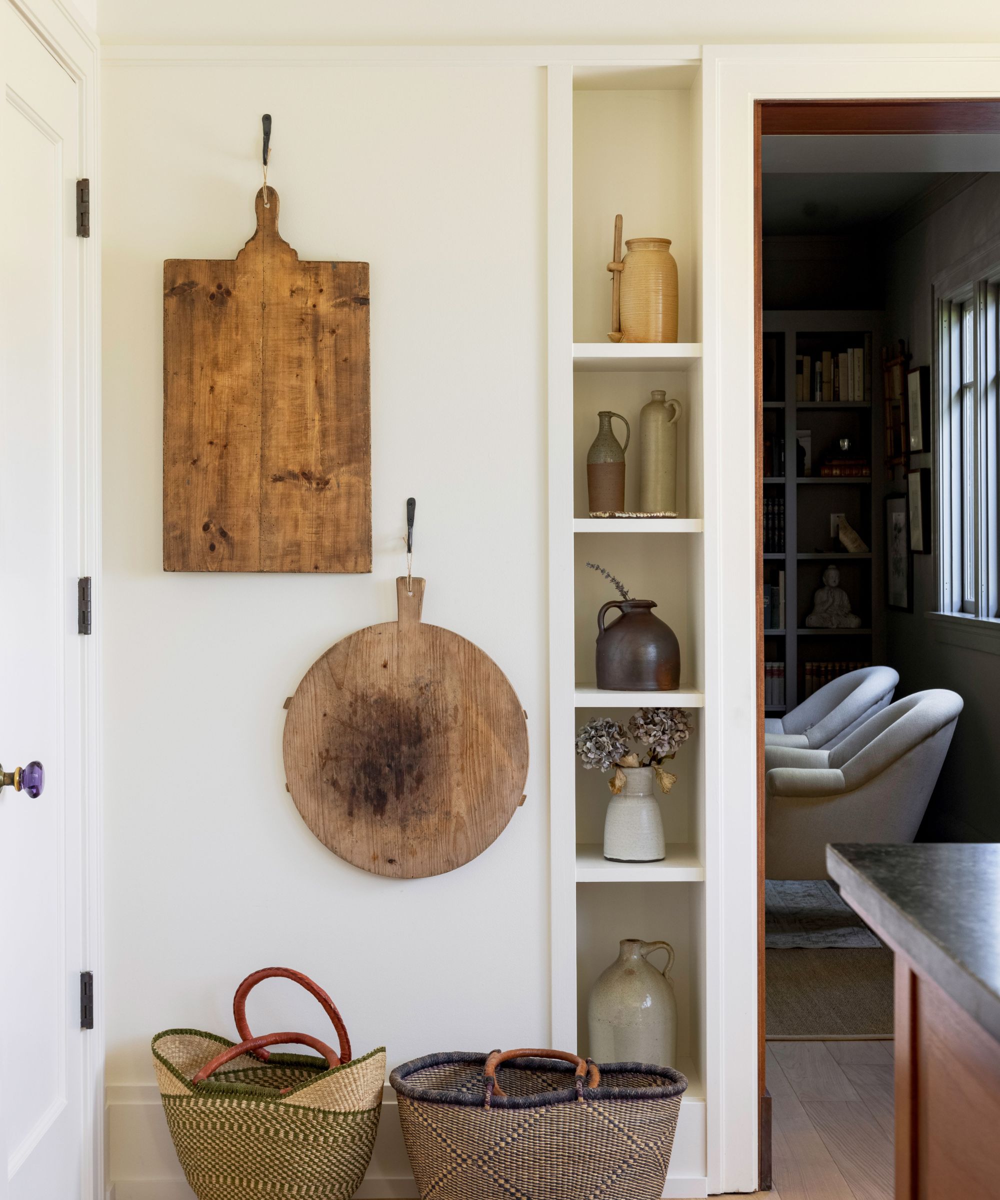
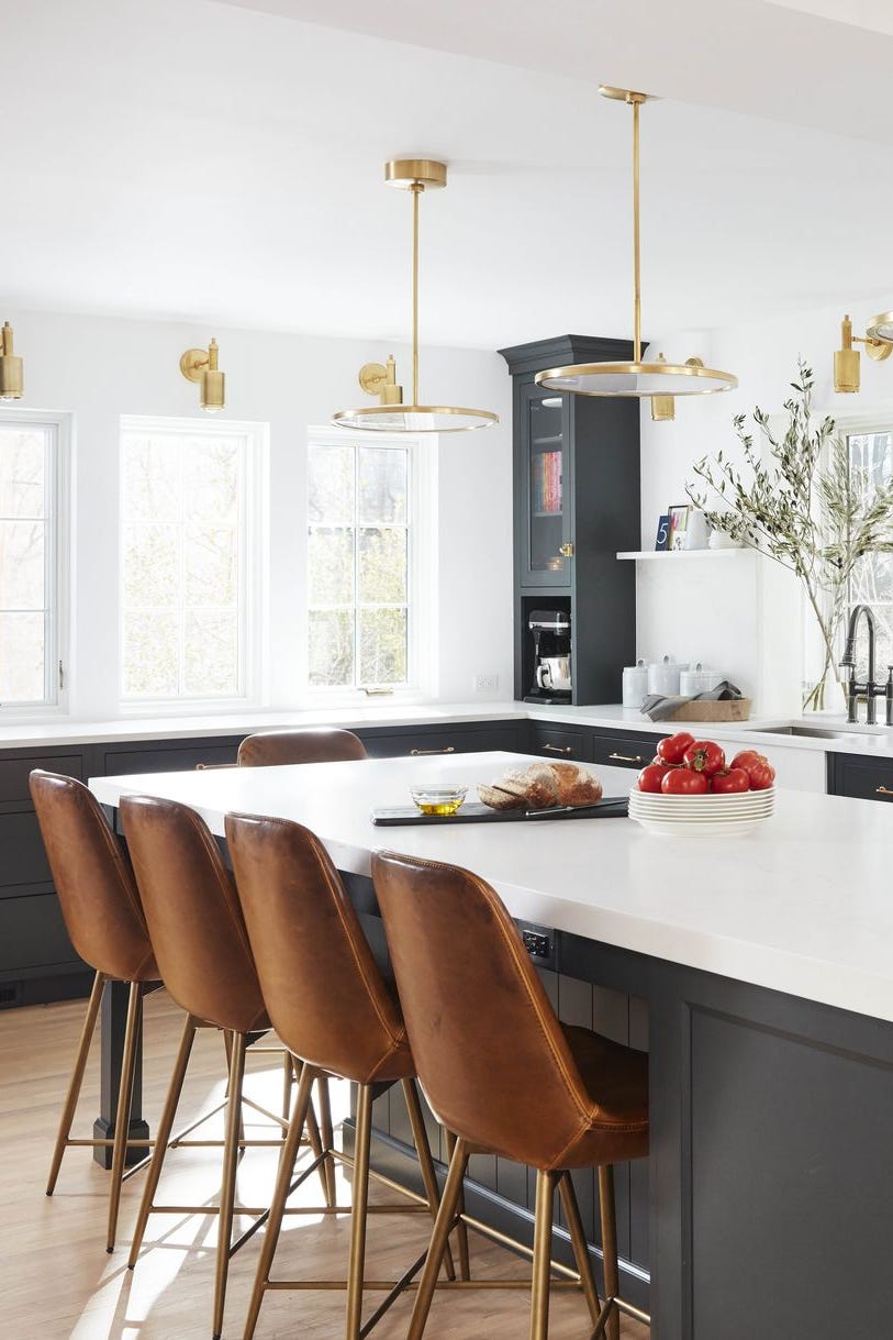
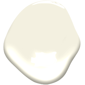
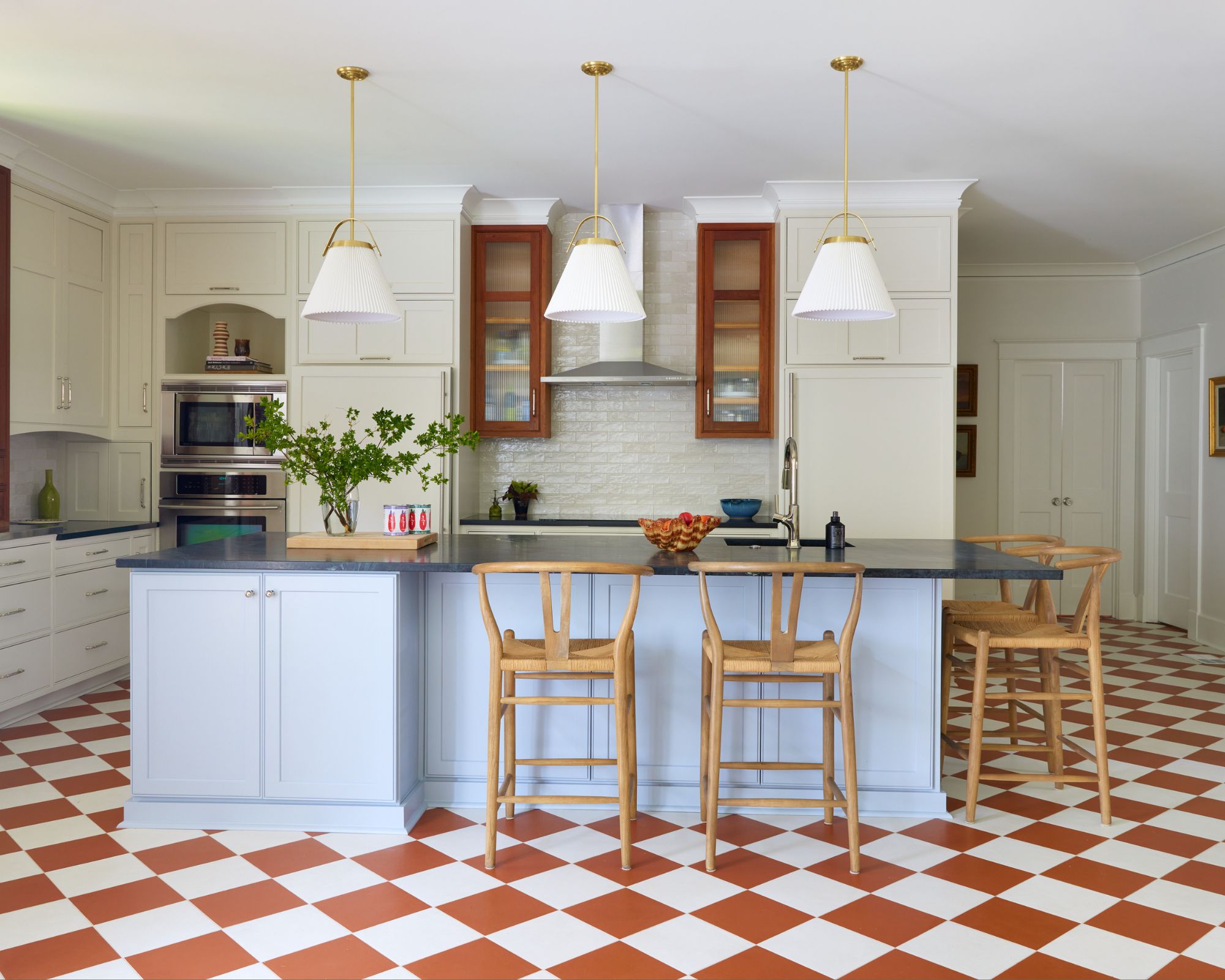
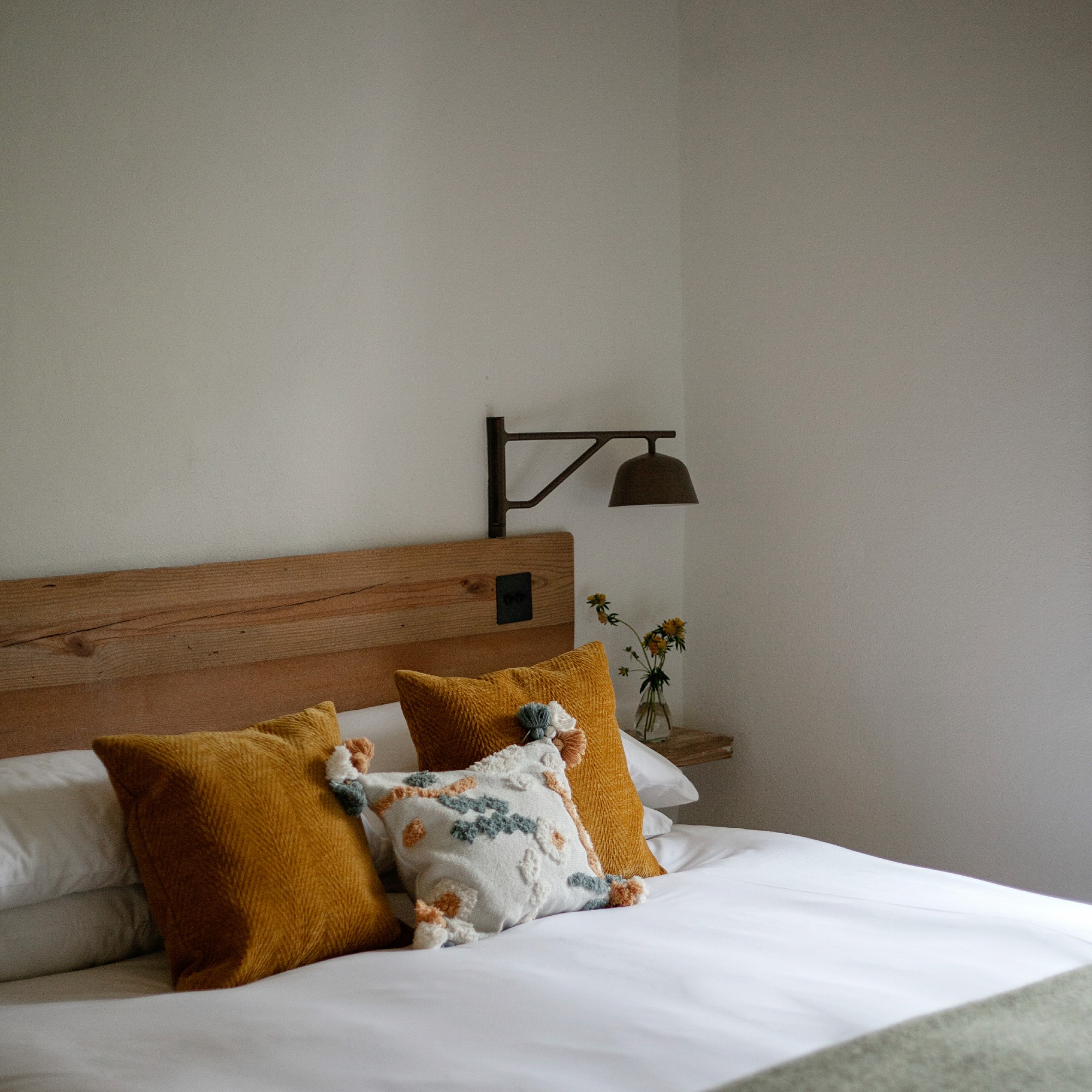
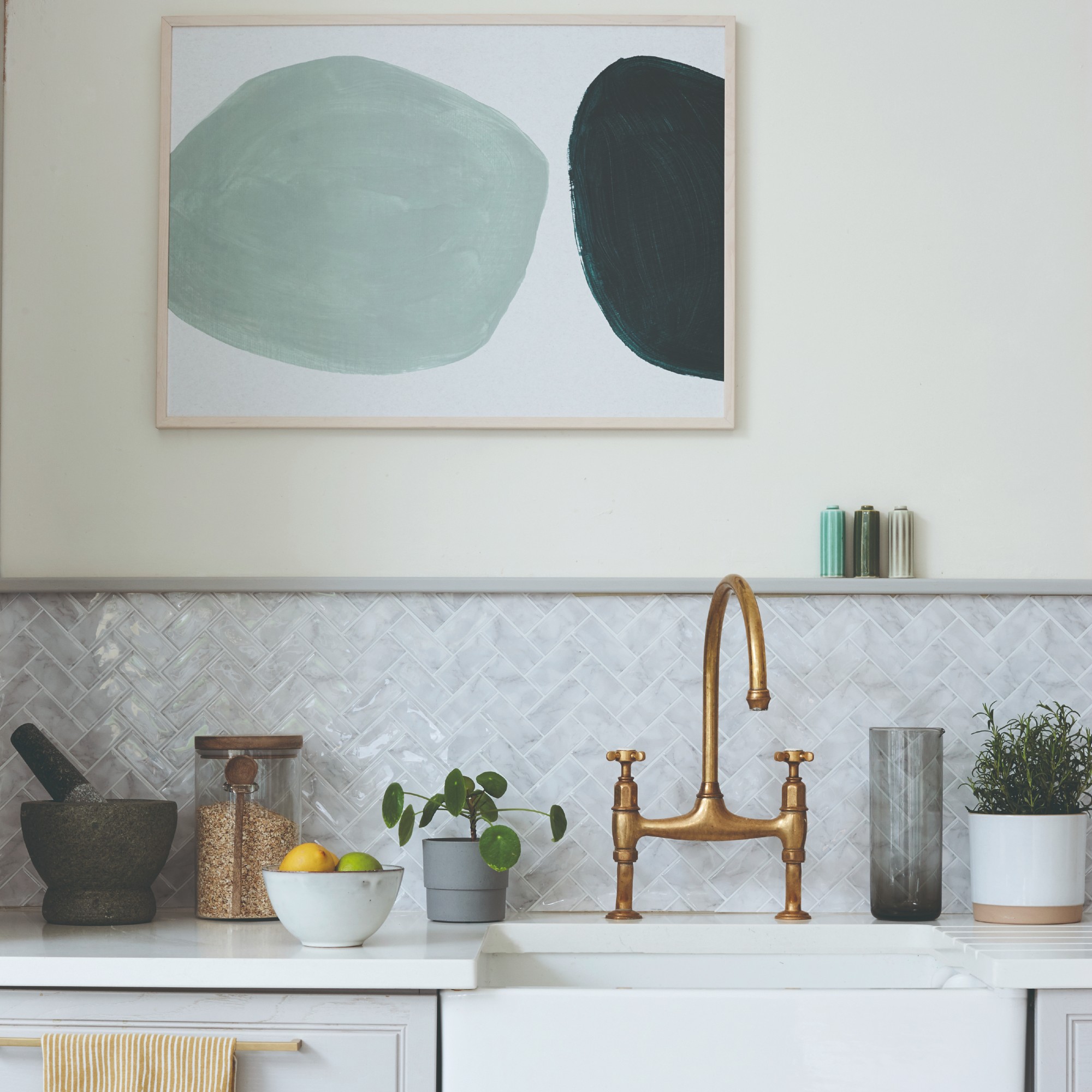
Benjamin Moore Simply White is chosen for its ability to be fresh yet moody, with warm yellow and green undertones that prevent it from appearing sterile. Kate Lester notes its versatility as it adapts to ambient lighting, making it suitable for kitchens and bedrooms. Dunn-Edwards Exclusive Ivory is highlighted for millwork, offering an off-white hue with greige undertones that is neither too white nor too beige, providing dimension and character to a room. Sherwin-Williams Greek Villa, an under-the-radar off-white with yellow undertones, is Katie Rosenfeld's choice for traditional spaces, offering a crisp, clean feel without being stark.
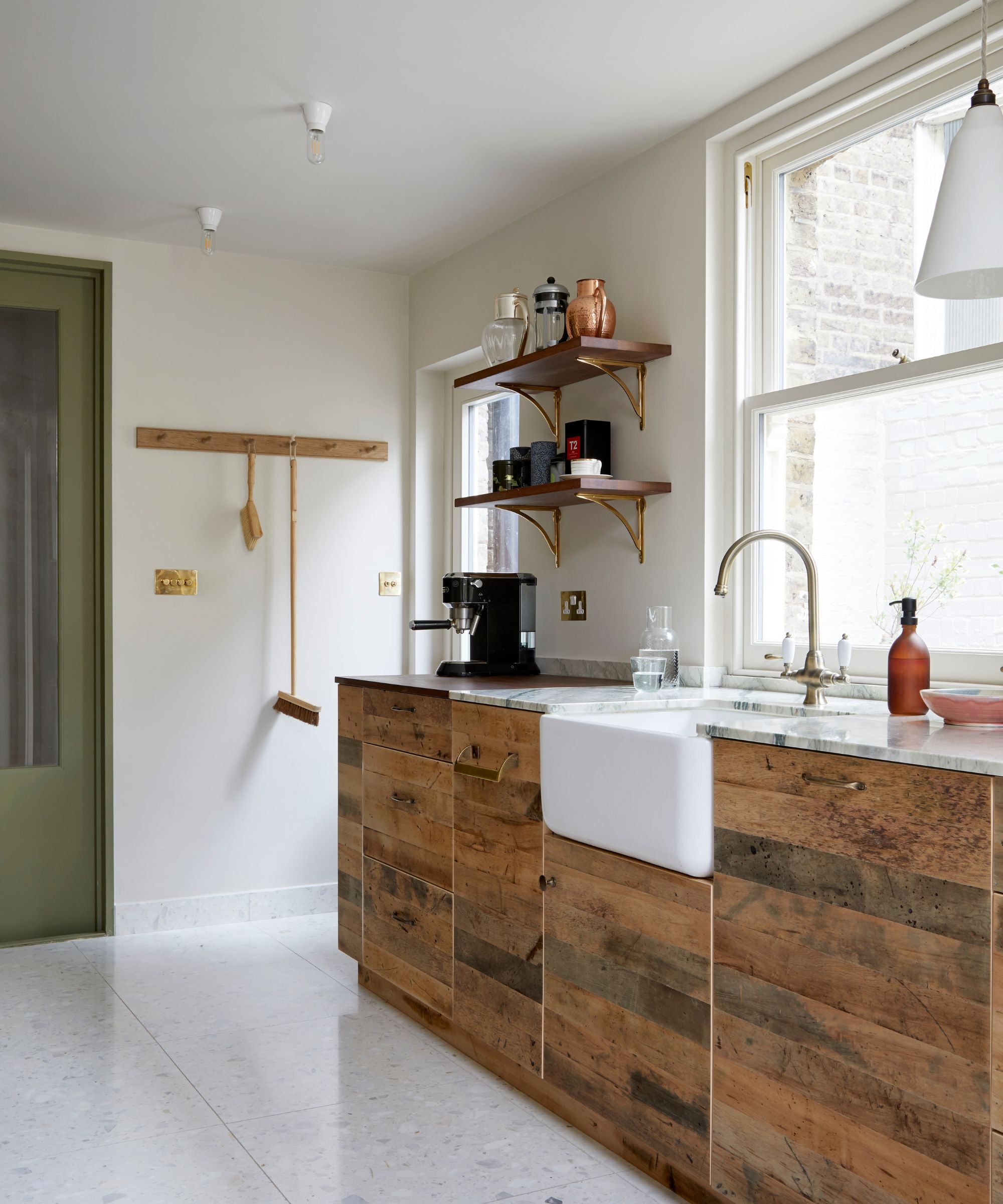
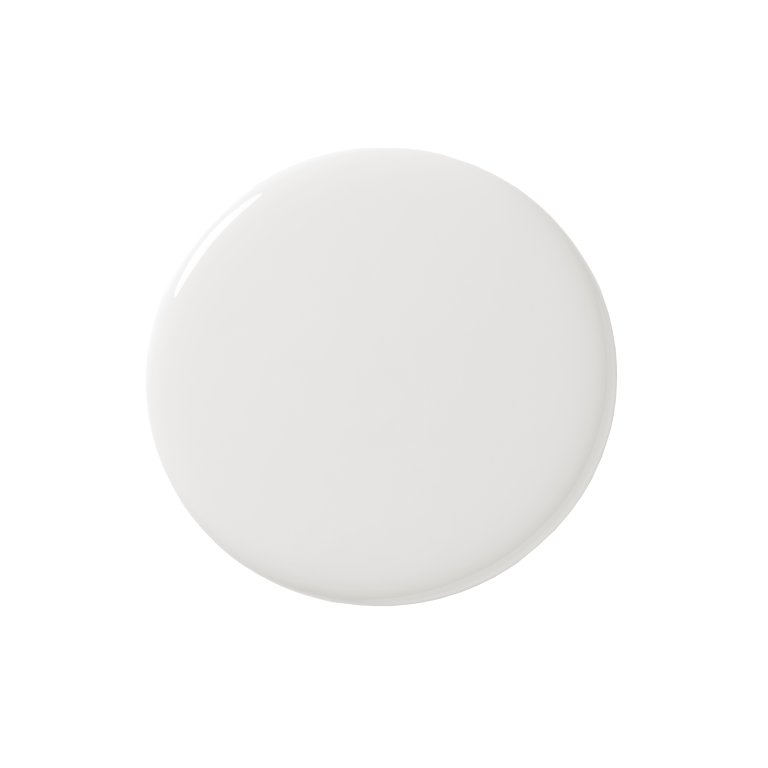
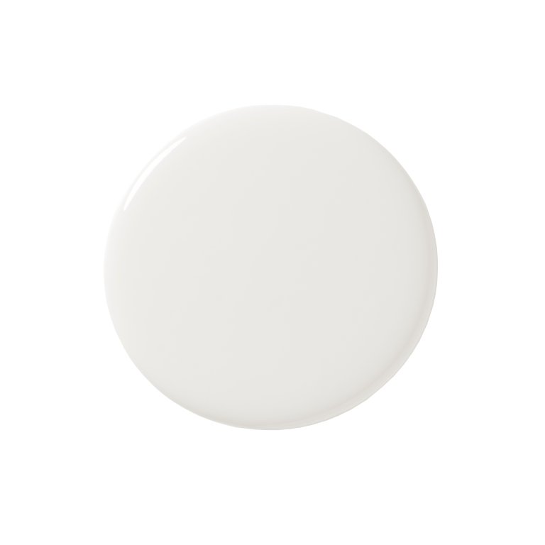
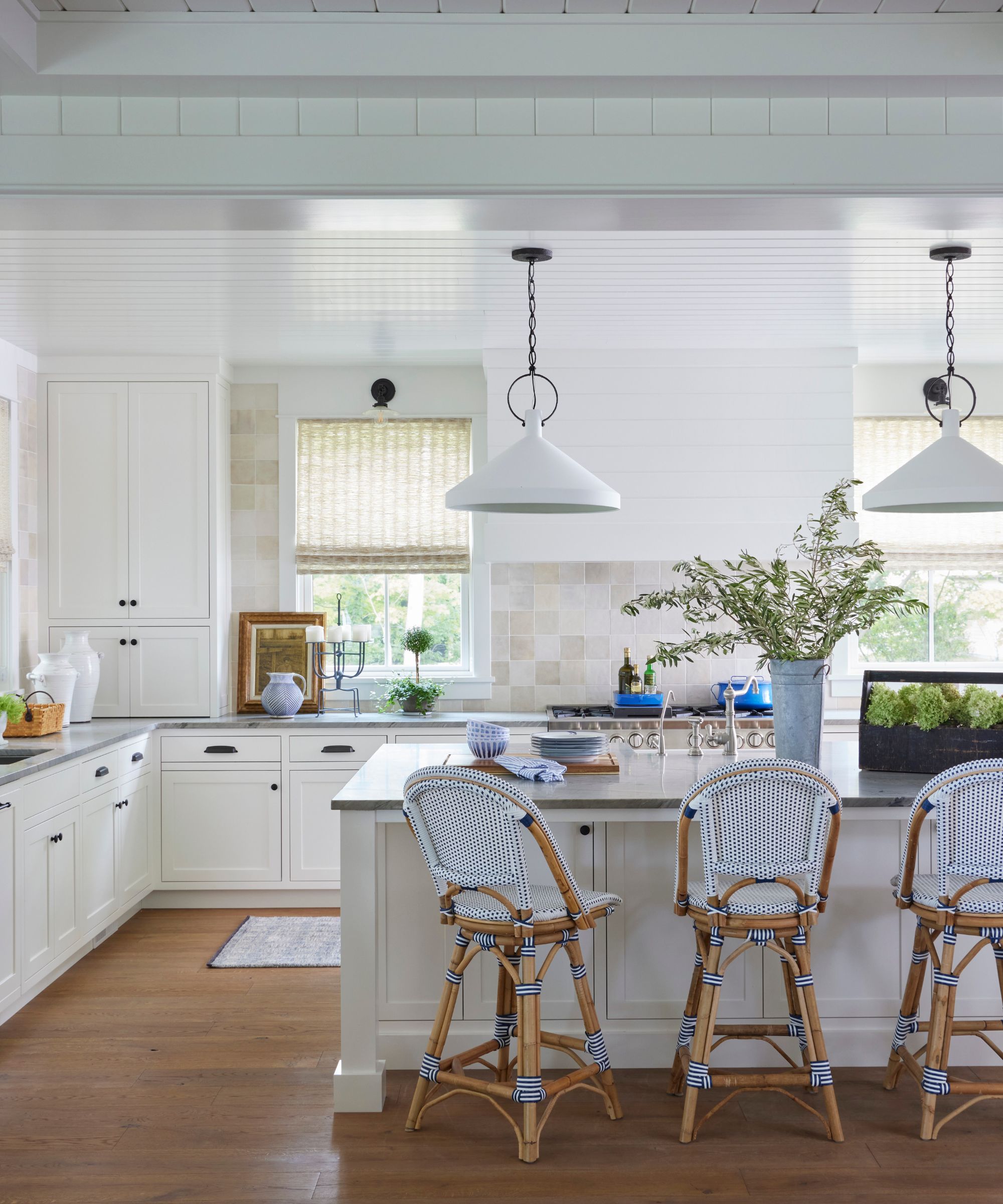
Benjamin Moore Cloud White is used by Alex Boudreau to soften spaces and maintain budget, applied to walls, ceilings, trim, and cabinets for a light and airy feel. Lastly, Farrow & Ball All White is selected for minimal intensity, described as a widely appealing pure white that adds depth and richness without odd undertones, pairing well with various decor styles. The article also provides a shopping checklist, detailing important considerations such as light reflectance value (LRV), the impact of light and mood on paint appearance, the role of pigmentation in color depth, and the significance of undertones in achieving desired room aesthetics. Tips on painting ceilings and walls, primer use, and recreating a plastered look are also included, emphasizing that warm white paints contribute to a calming and comforting interior with a neutral yet inviting ambiance.
#WarmWhitePaint #InteriorDesign #PaintColors #HomeDecor #DesignerFavorites #BenjaminMoore #SherwinWilliams #BehrPaint #DunnEdwards #WarmWhitePaint #InteriorDesign #PaintColors #HomeDecor #DesignerFavorites #BenjaminMoore #SherwinWilliams #BehrPaint #DunnEdwards
0 comment in total
 No comments yet
You may also like
The 11 Best Warm White Paint Colors, According to Designers
The 40 Best White Paint Colors, According to Designers

The Best White Paint Colors Experts Turn to Again and Again
How to Pick the Best White Paint Color—Without the Headache
The 11 Best Warm White Paint Colors, According to Designers

Designers’ Favorite White Paints Are Always Changing—We Asked 3 for Their Latest Pick

10 Best Warm White Paint Colors for a Cozy Neutral Refresh

13 Best Off-White Paint Colors, According to Interior Designers

5 best warm white paints, as chosen by interior designers

8 Calming Paint Colors Designers Use to Create a Warm, Welcoming Living Room

What are the best Sherwin-Williams white paints? 6 favorite shades amongst interior designers
The 8 Best Beige Paints Designers Turn to for Warmly Luxe Schemes – "It Evokes a Sense of Calm"

Designers Swear By These 8 Off-White Paint Colors For Every Project


8 Favorite Paint Colors of Local Interior Designers

13 Tried-and-True White Paint Colors Recommended by Pros

Which white paint is the best? Experts reveal the perfect shade of white for every room and feature
The 13 Best White Paint Colors That Interior Designers Swear By

Best white paint colors: Expert share the top options

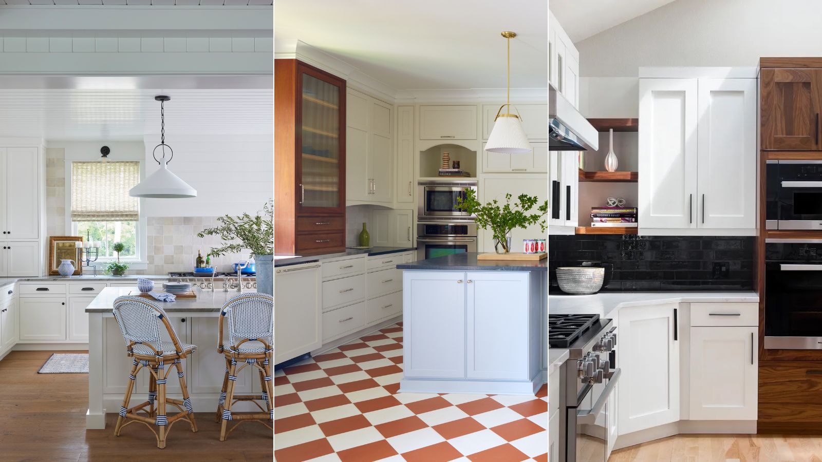
What are the best white paints for kitchens? 6 light and airy picks from interior designers
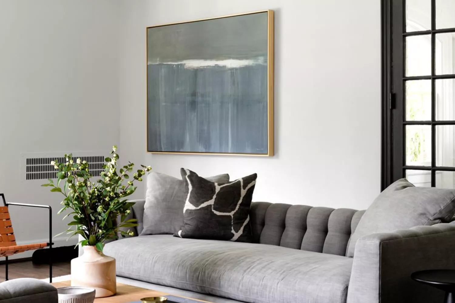
15 White Paint Colors Interior Designers Reach for Time and Again