1/16
Which white paint is the best? Experts reveal the perfect shade of white for every room and feature
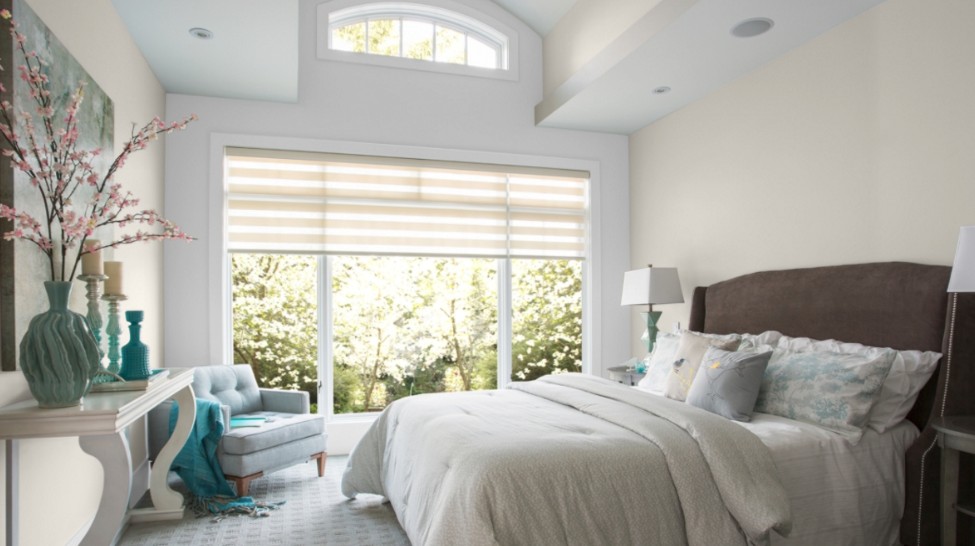
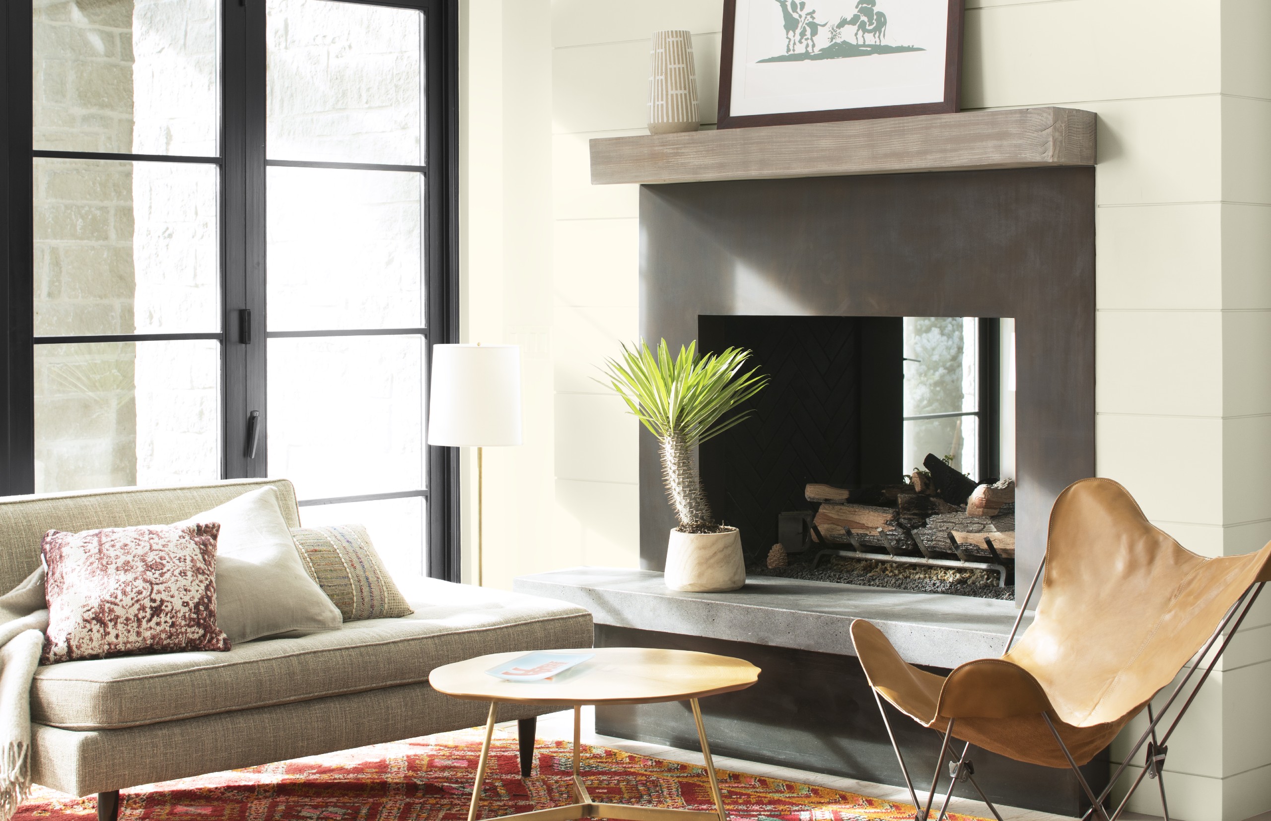
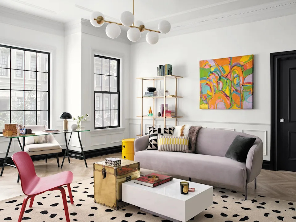
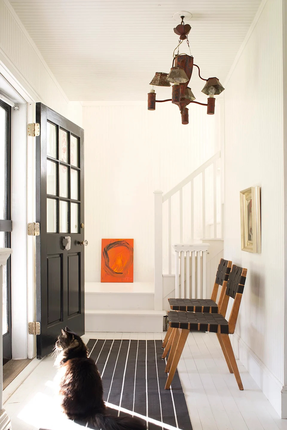
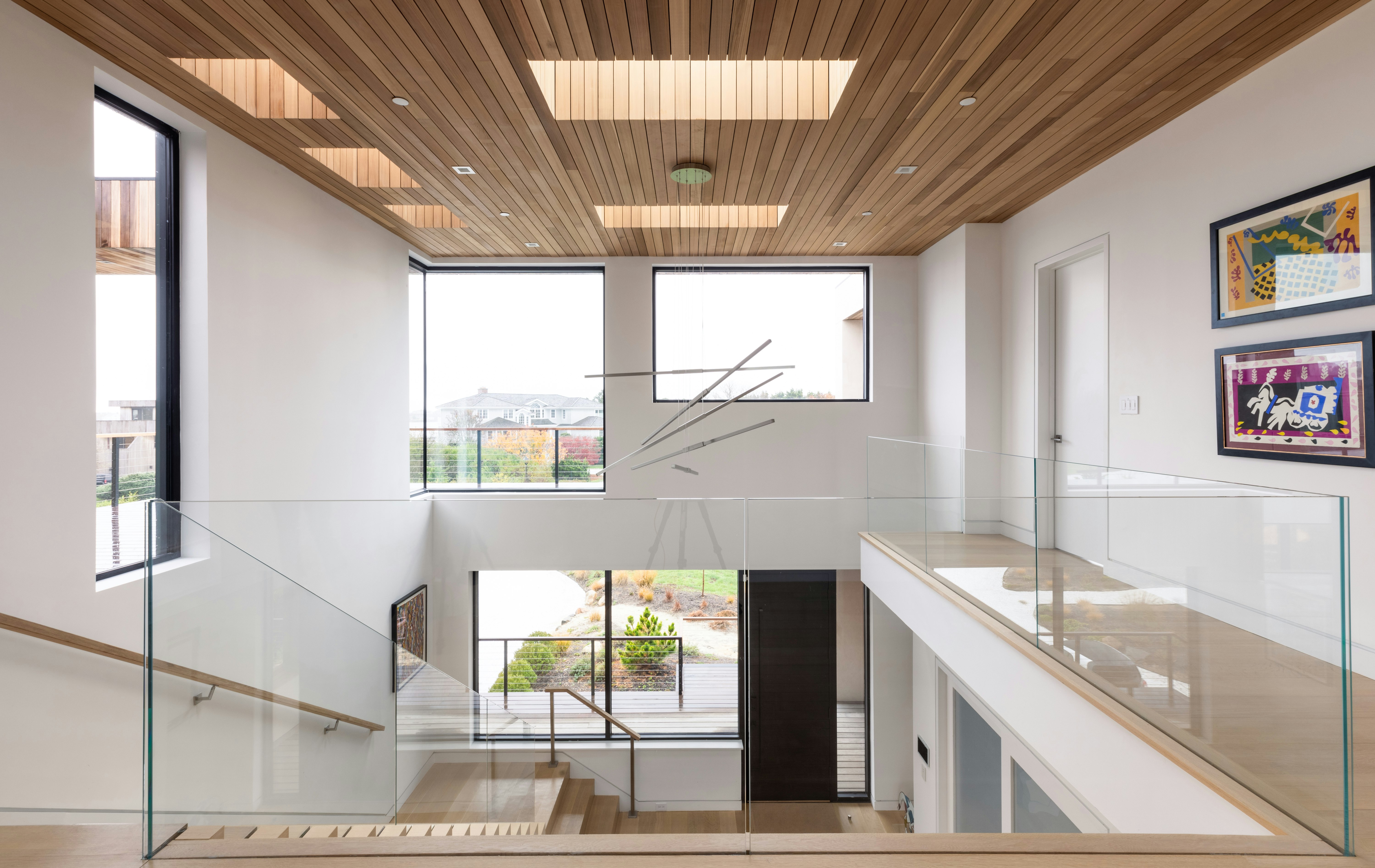
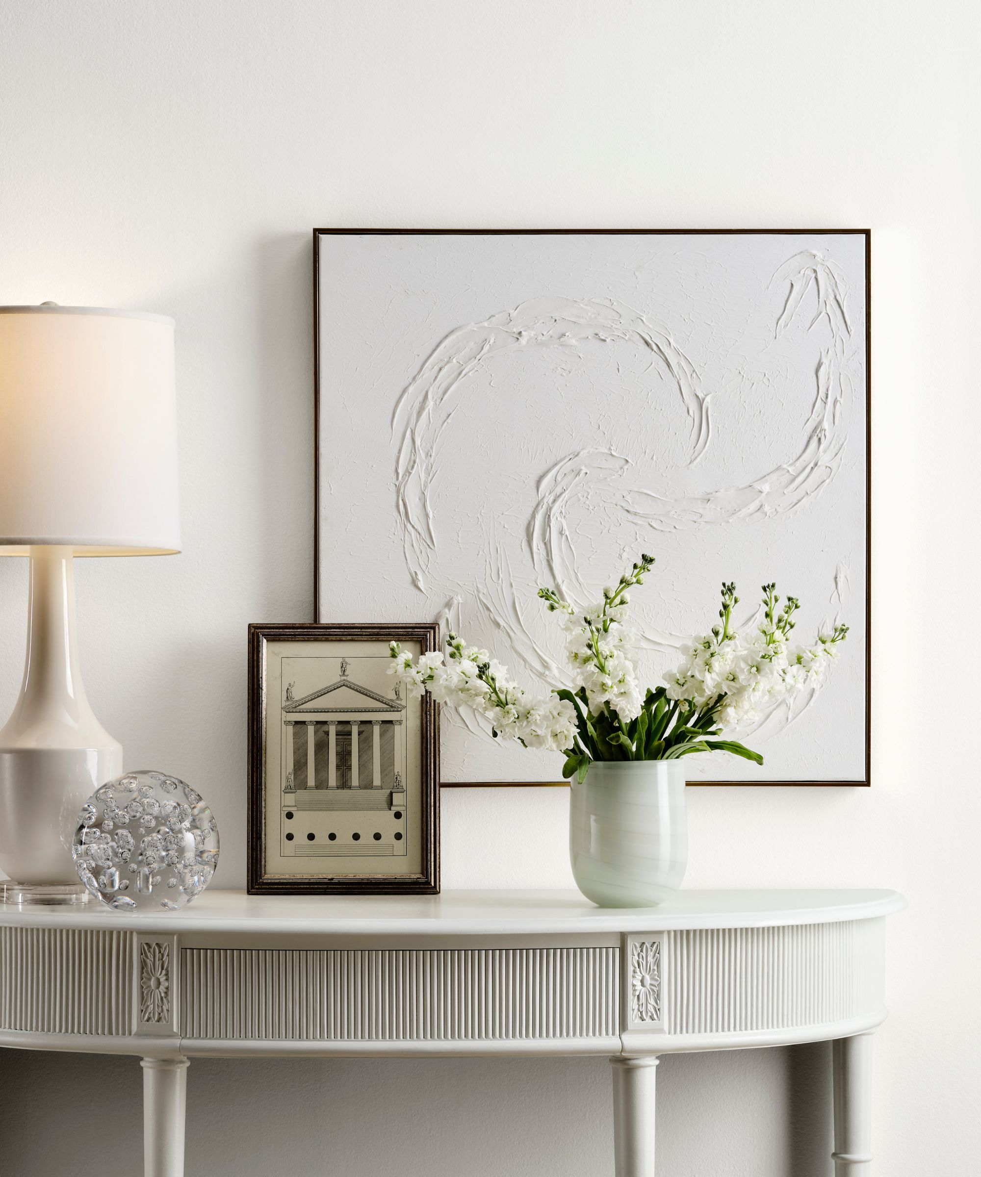
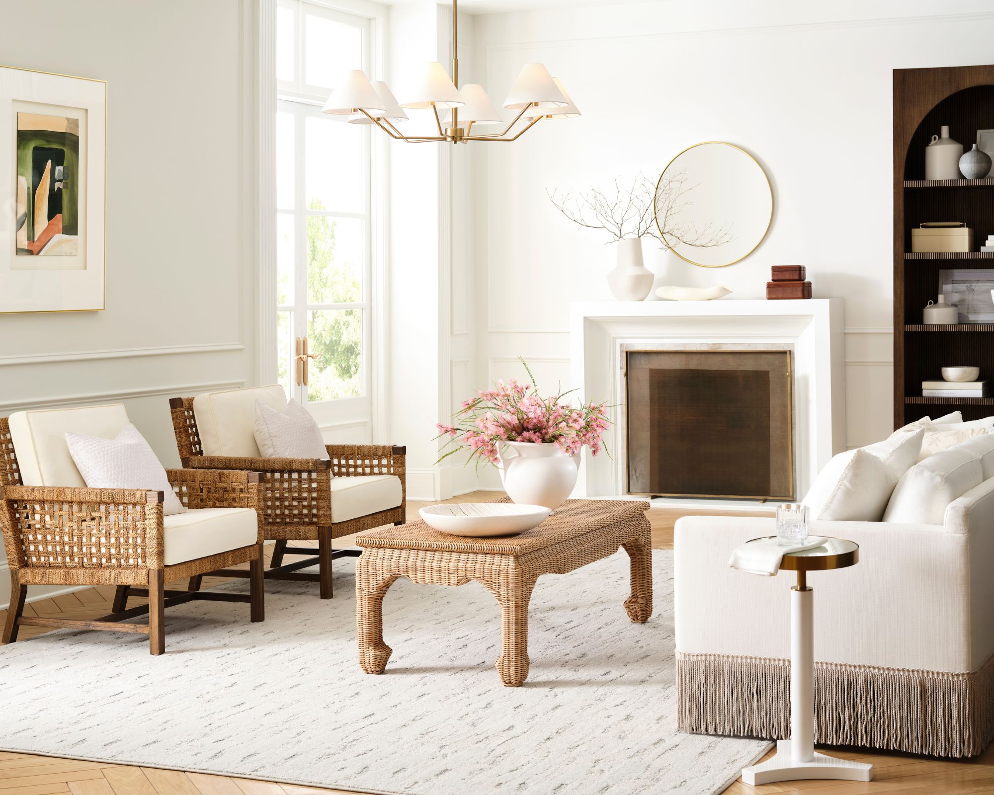
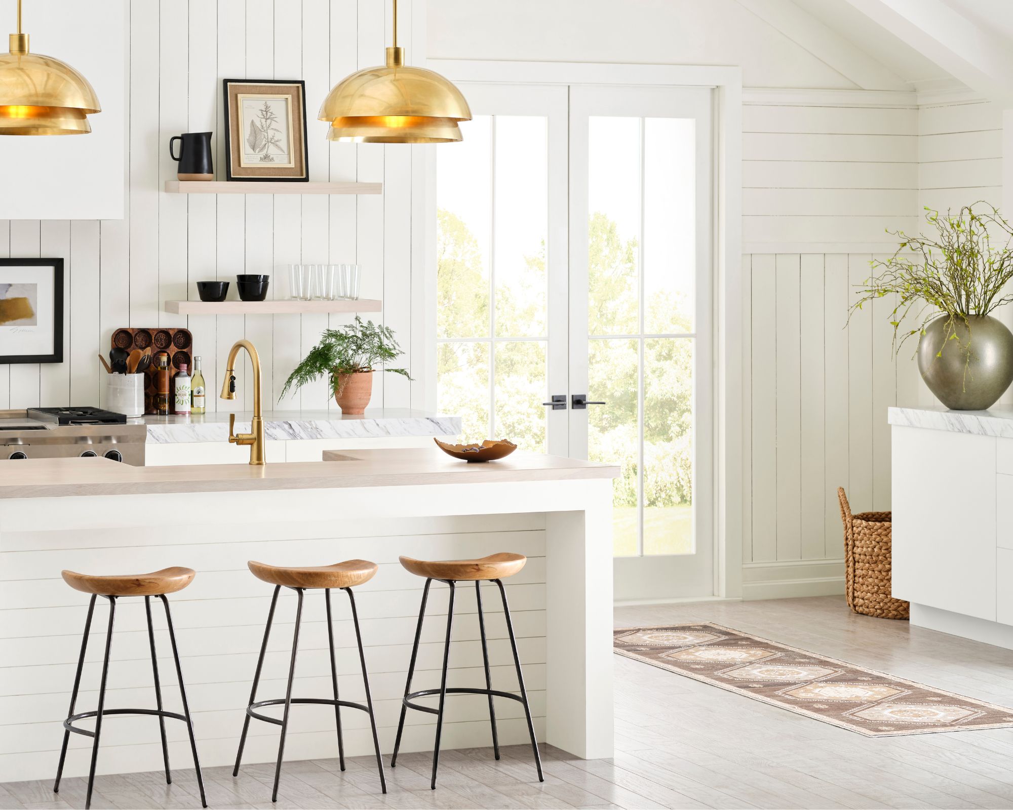
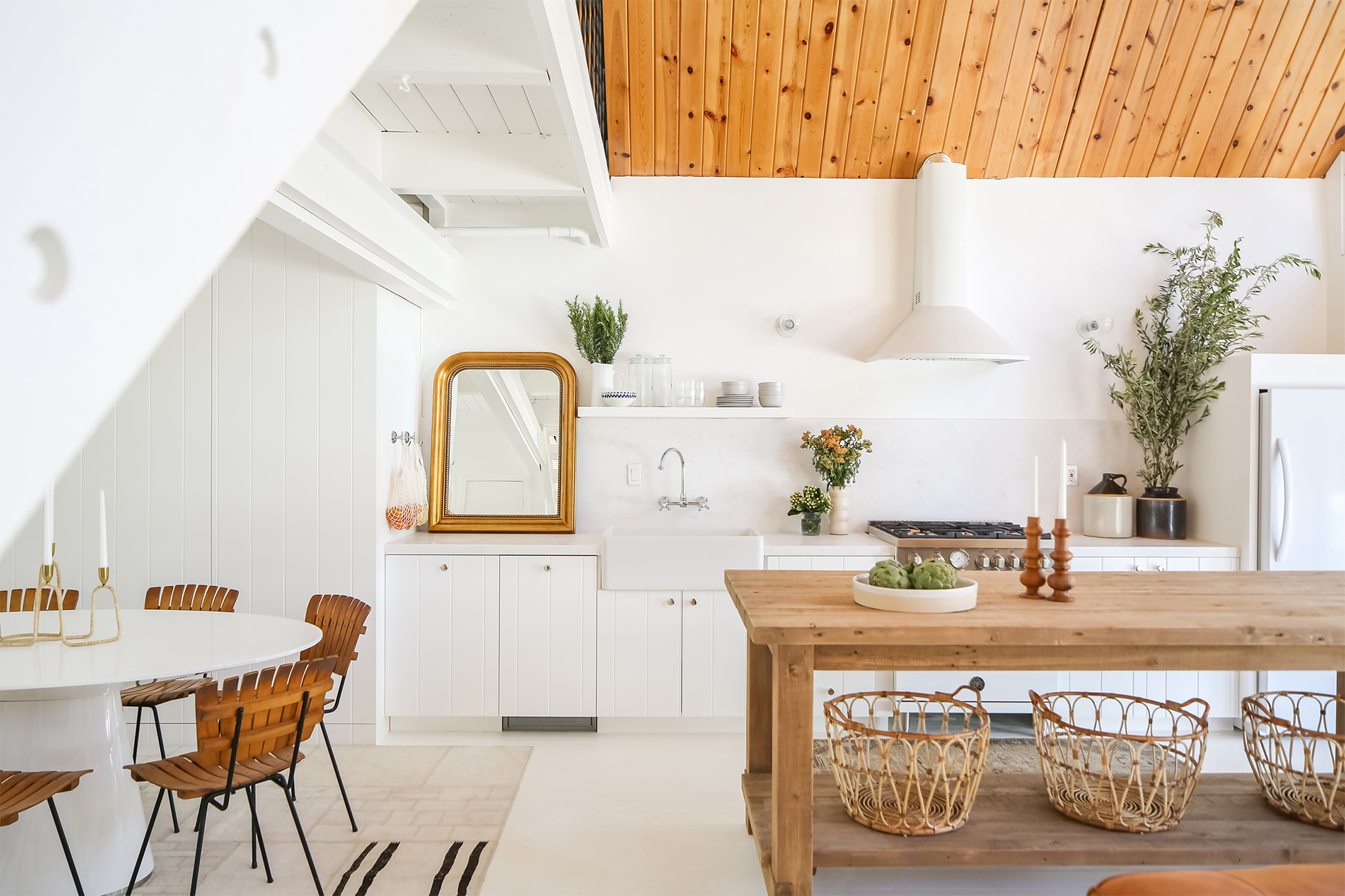
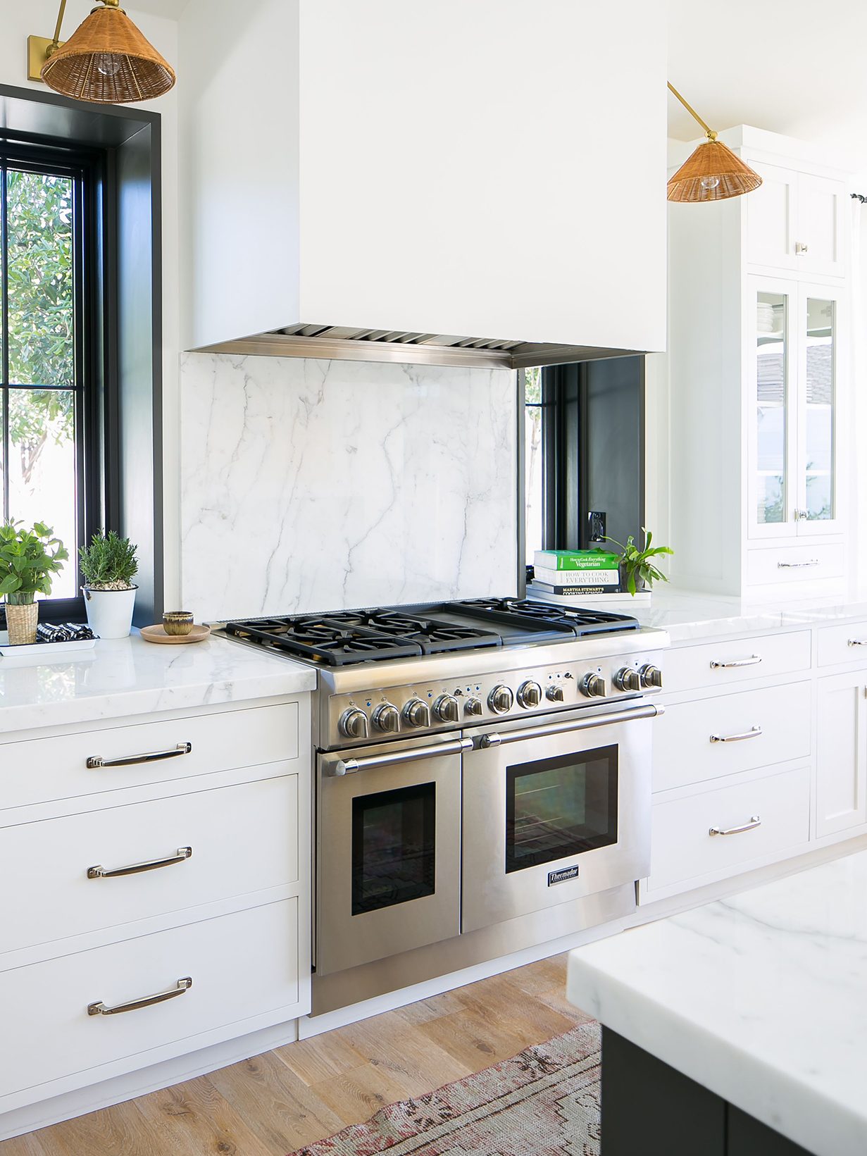
White paint is widely considered the most popular and versatile shade for home interiors globally. However, selecting the appropriate white hue is crucial, as various shades and undertones exist, each suited for different rooms and features. Incorrect white paint choices can make a space appear cold, sterile, or too yellow, while the right selection can significantly enhance a room's aesthetic. White paint is appealing due to its versatility, ability to brighten any space, and its complementary nature with all other colors. The market offers numerous off-white options, providing choices for every design project and personal preference.
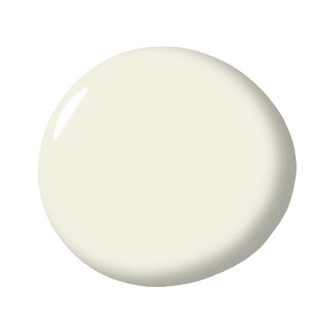
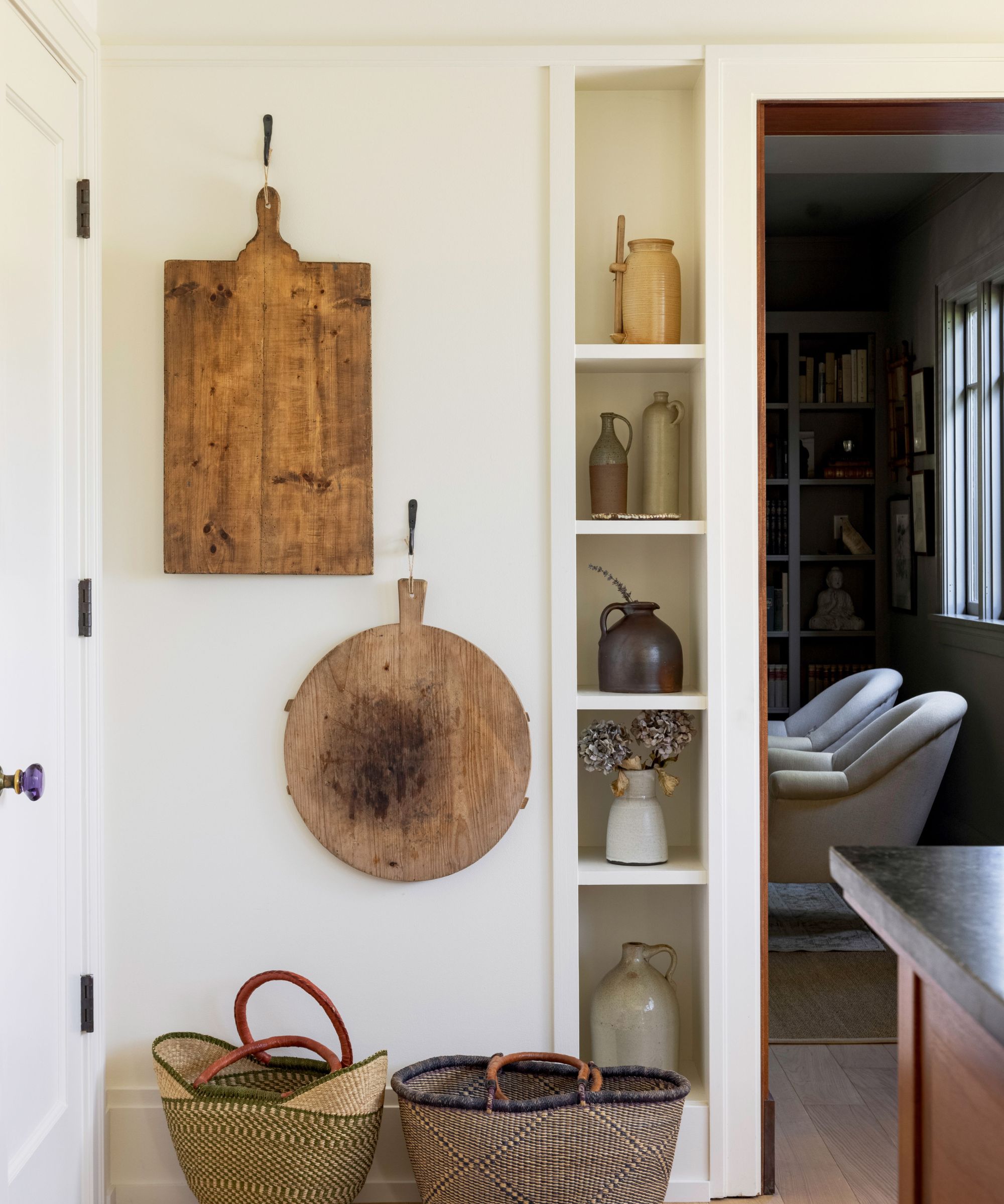
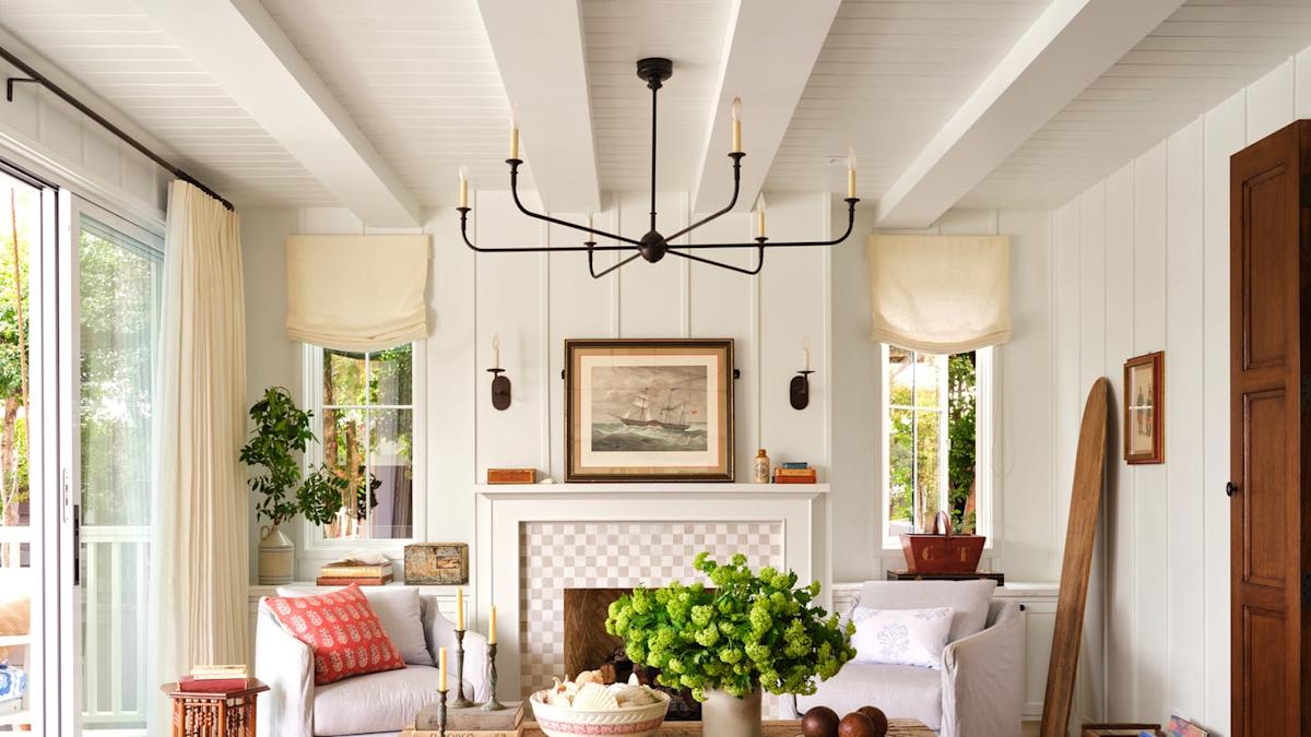
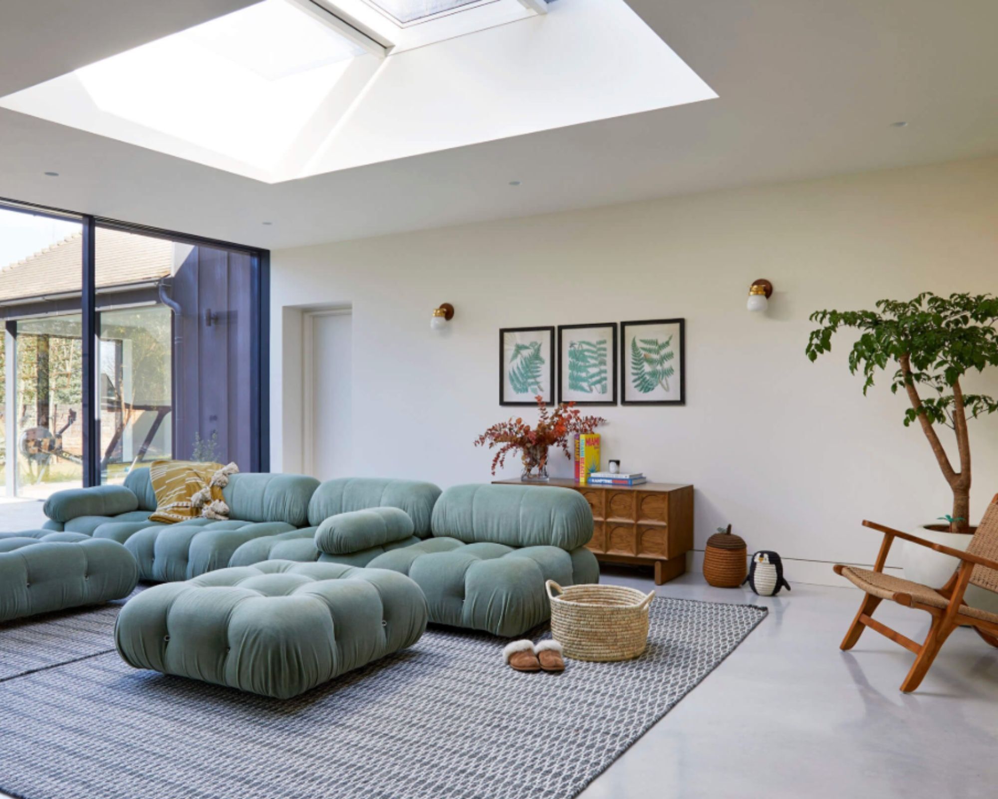
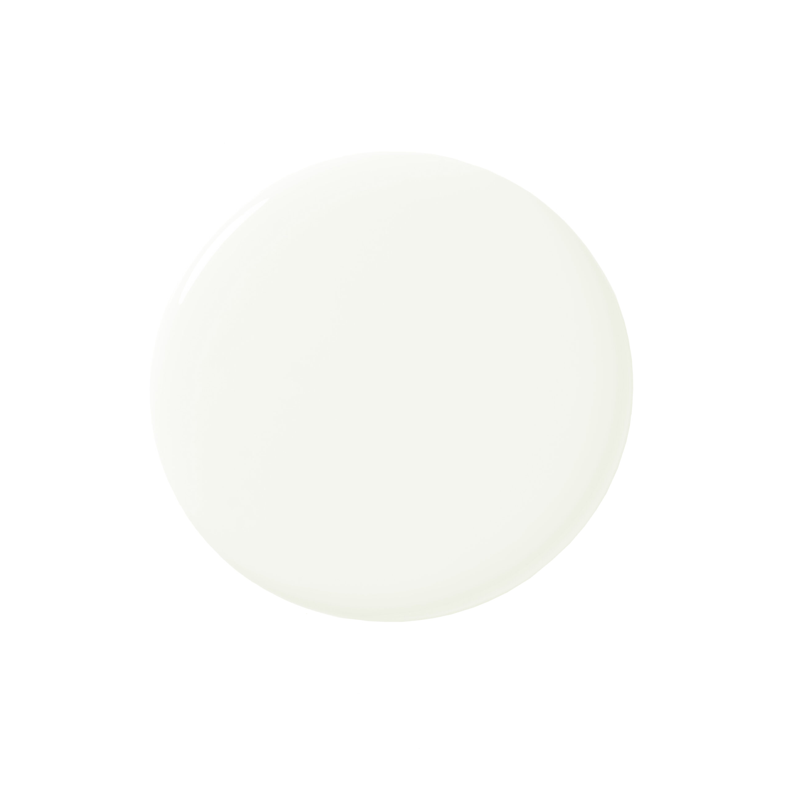
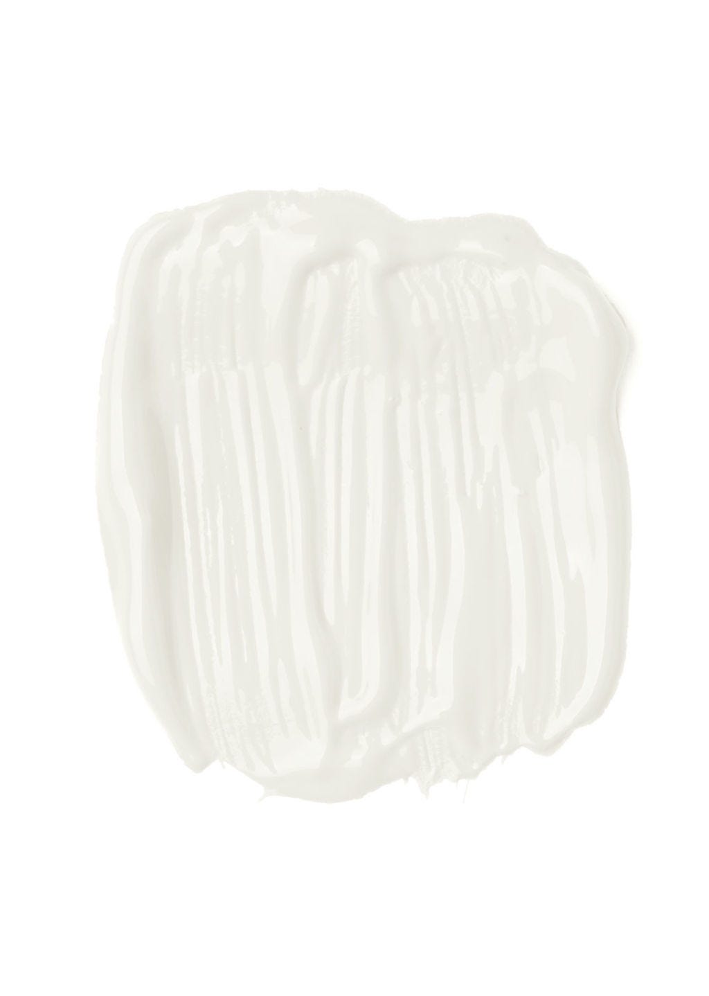
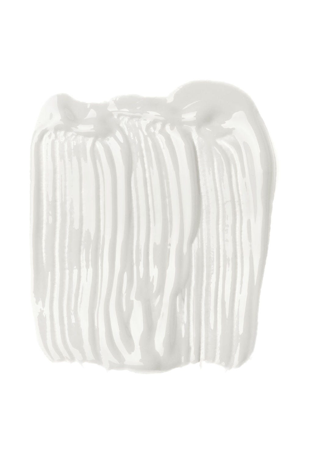
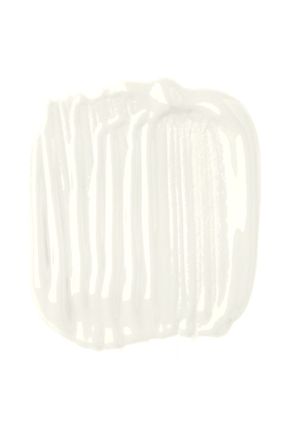
For overall use in most rooms, a warm, inviting shade of white is recommended as it fosters a welcoming atmosphere and pairs well with almost any color. Earthborn's 'White Clay' is cited as a well-balanced, traditional white that is less harsh than brilliant white and effective in various decor styles, suitable for both north and south-facing rooms due to its subtle warmth. Thorndown's 'Whey White' is another versatile off-white with a 'dirty' cream tone, suitable for any room.
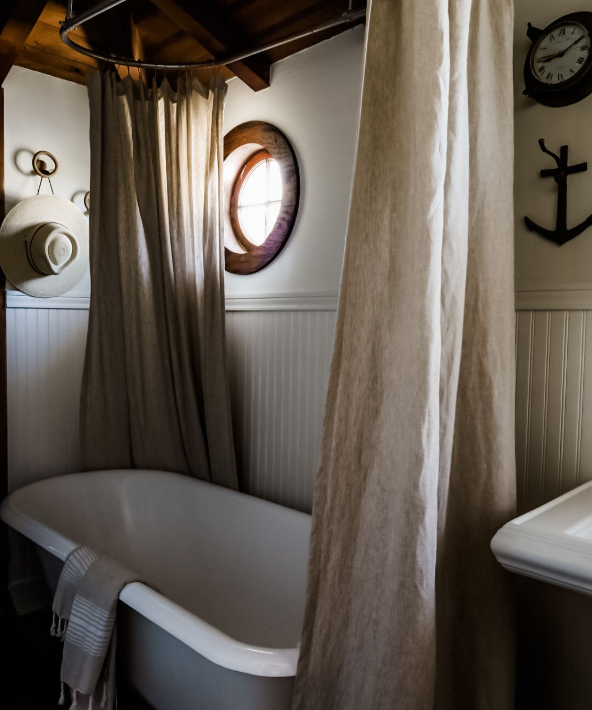
In high-moisture areas like bathrooms or humid homes, specific white paints are necessary. Zinsser Perma White Matt is a popular choice for its versatility and affordability. This paint is resistant to cracks, peeling, and blistering, is water-based for quick drying, and is highly durable, allowing for frequent scrubbing without compromising finish or color. It also offers mold resistance and odor-blocking properties.
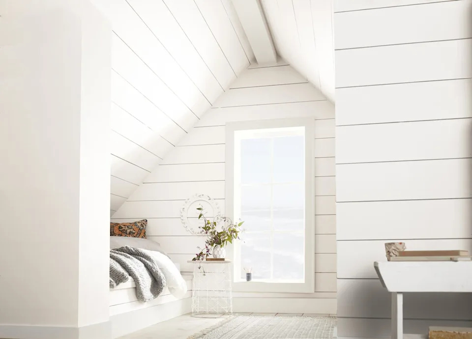
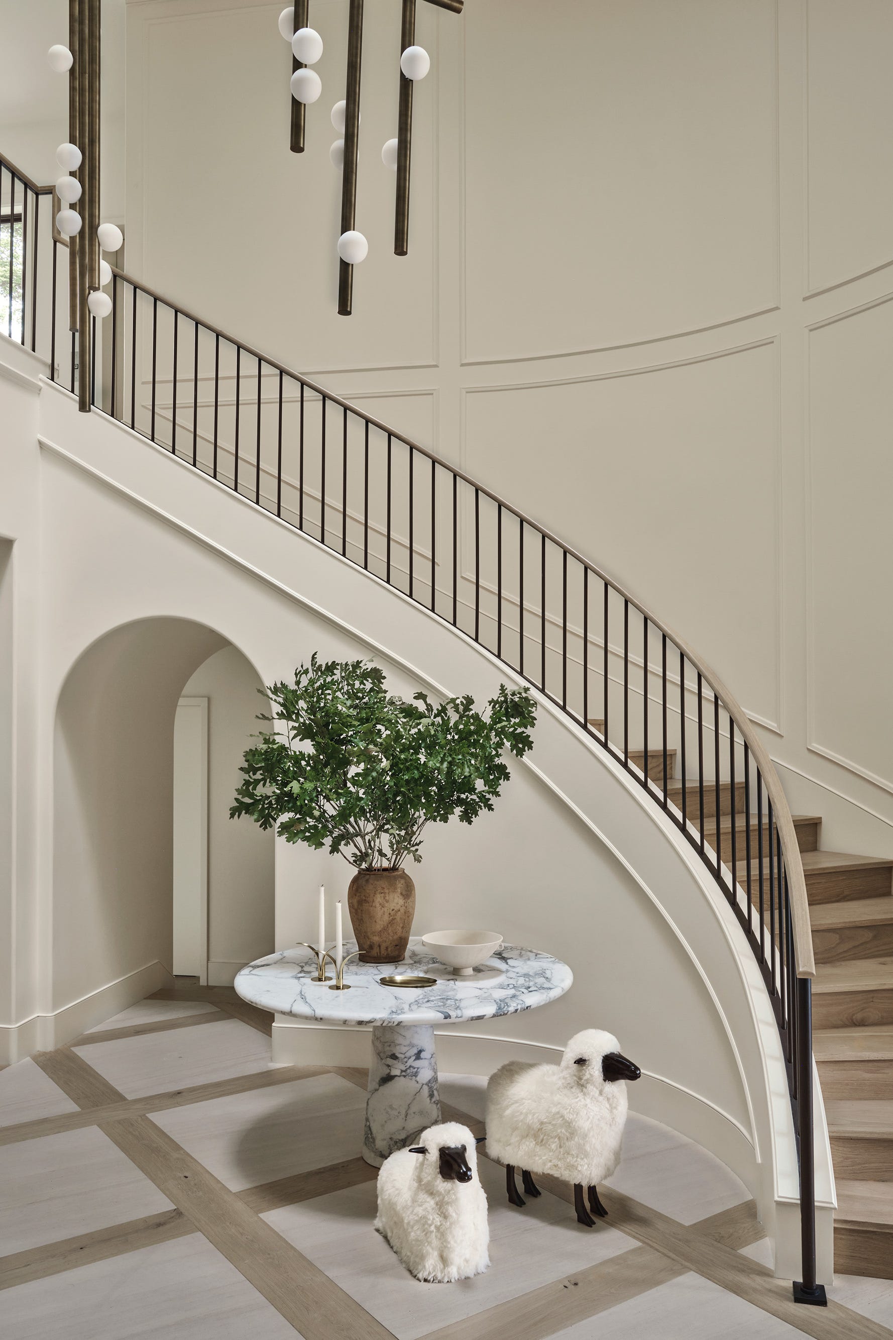
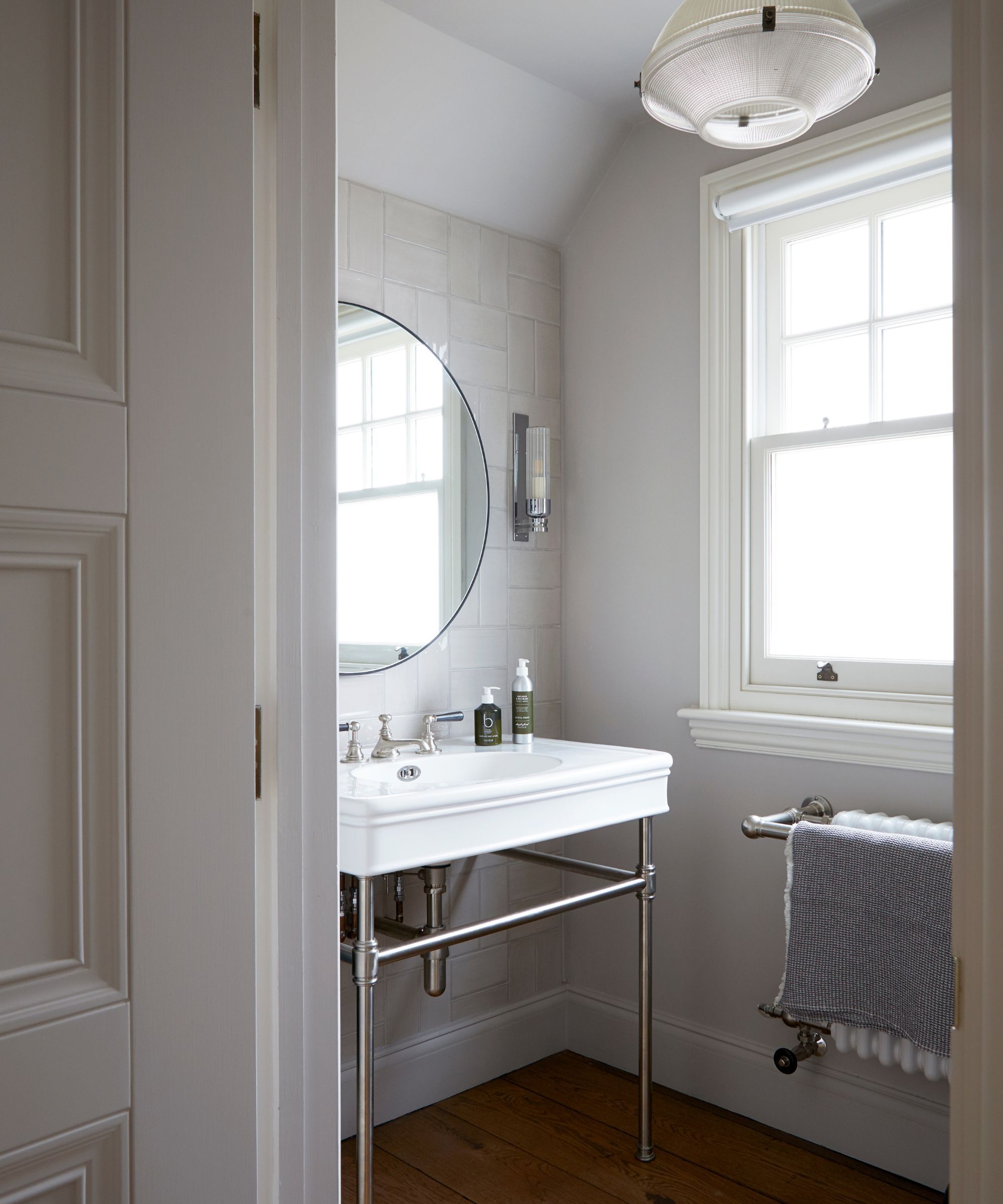
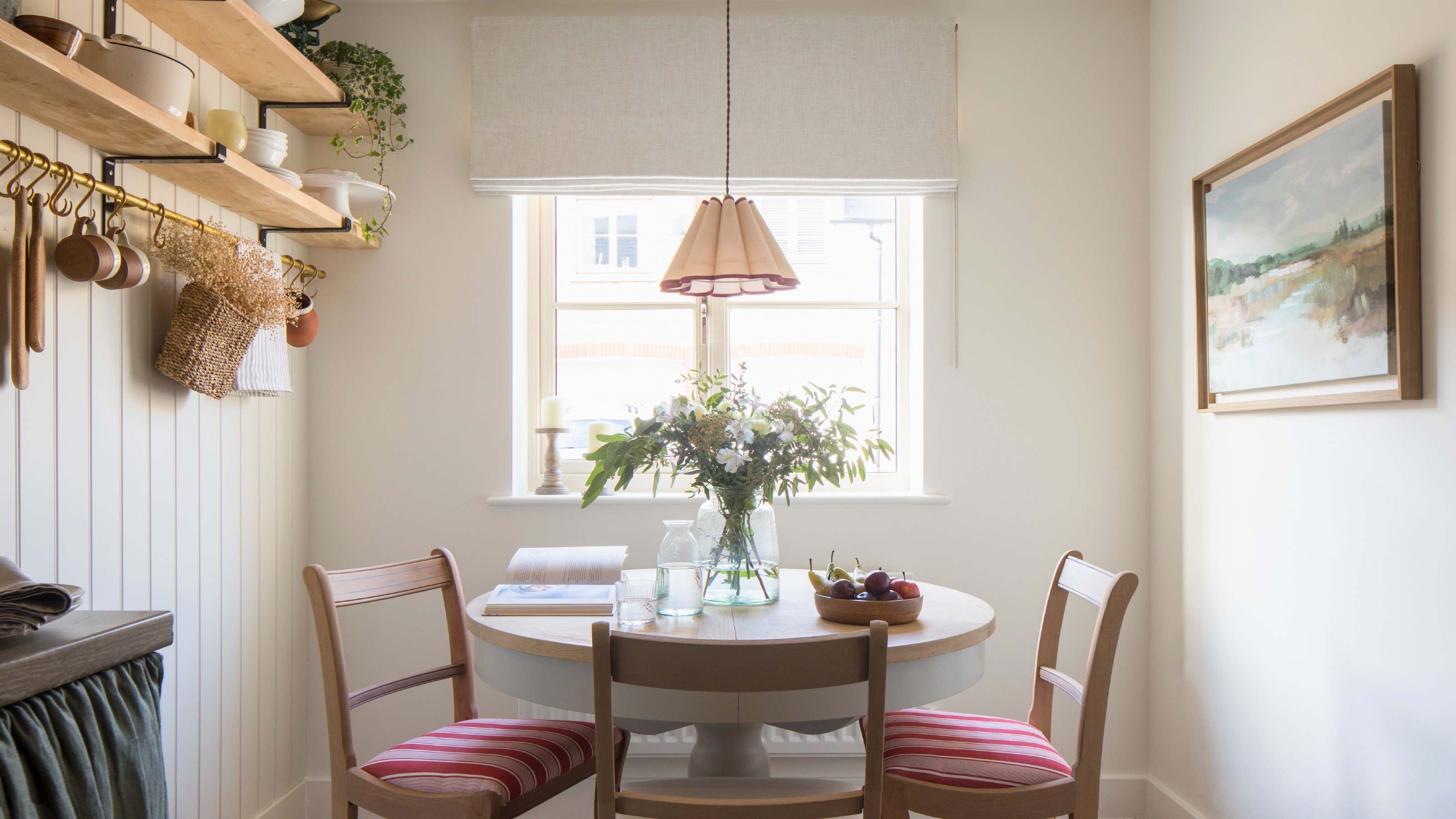
For small rooms, white paint can visually expand the space, making it feel larger and brighter. However, instead of a stark brilliant white, experts suggest off-white shades to soften the space, particularly in rooms that may lack natural light. A very bright white can appear harsh and less inviting in compact areas. Farrow & Ball's Estate Off-white is recommended for its creamy, warm undertone, which is more inviting than a stark white.
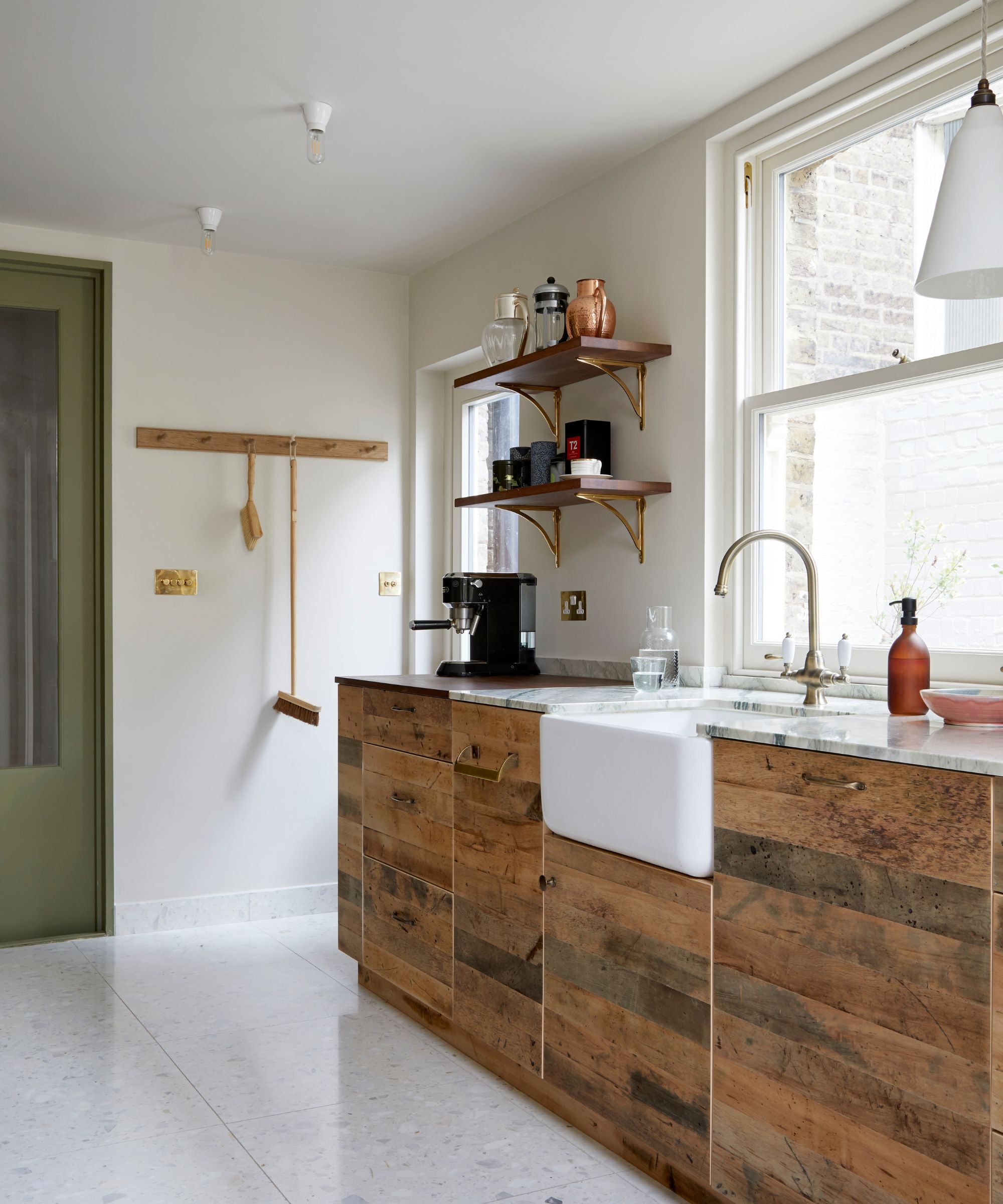
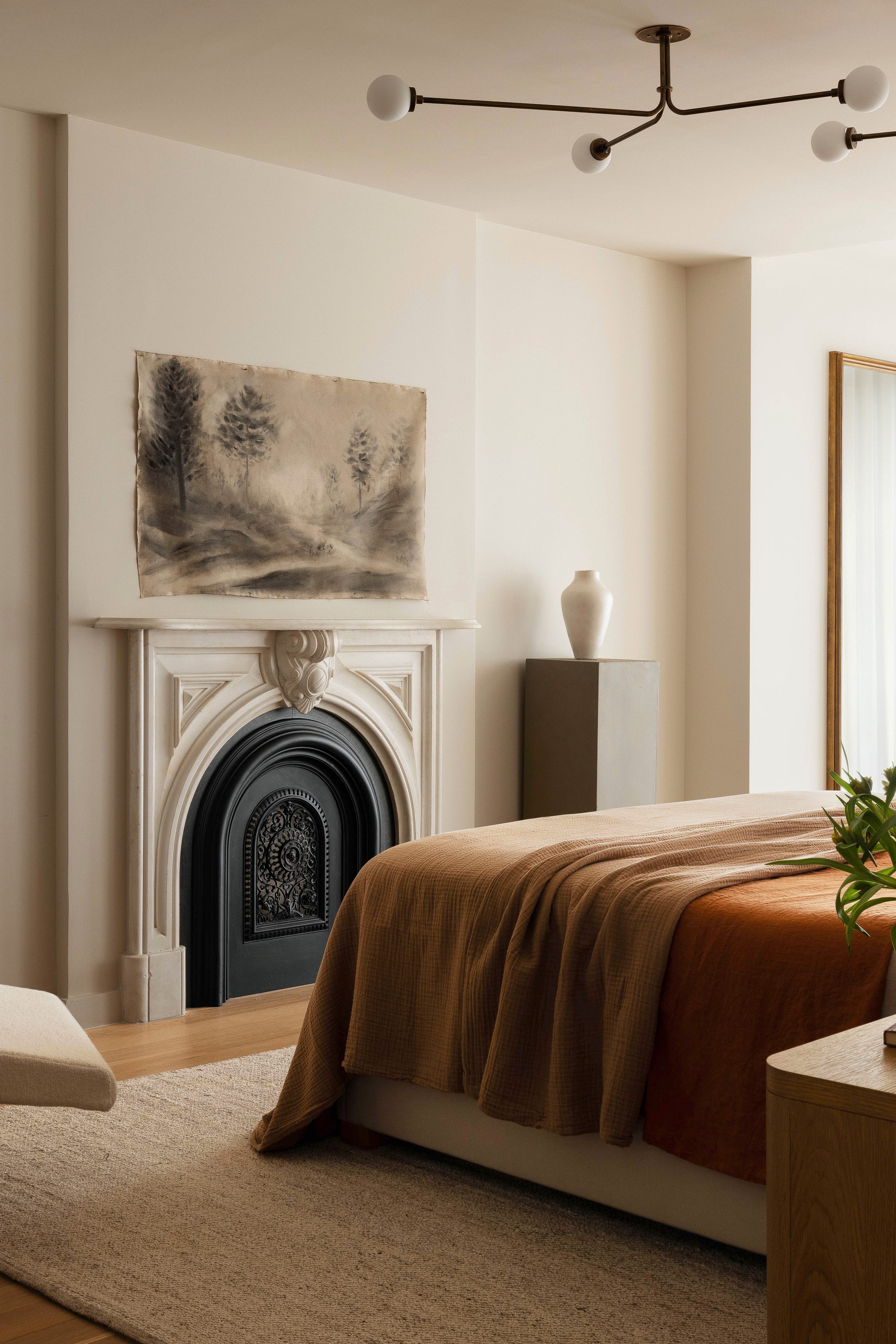
North-facing rooms receive less direct sunlight and are prone to blue and grey tones. Pure white or cool-toned white paints can appear darker and dismal in such environments. Warm white paints with yellow or red undertones are recommended to counteract the cool light and add a sunlit warmth. Dulux Heritage Roman White and Mallow White, with their hints of gold and pink, and Lick White 03, with its warm undertones, are suggested for creating a cozy, brighter feel.
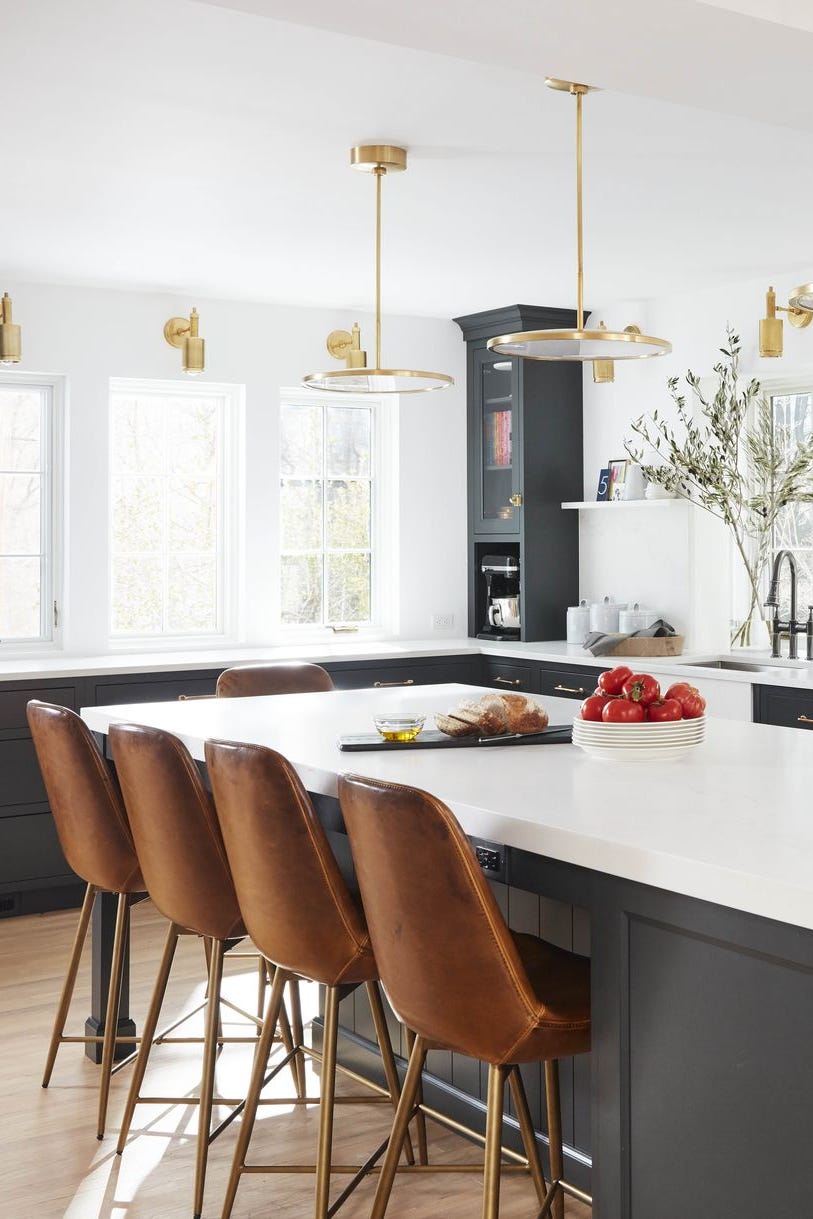
South-facing rooms receive abundant natural light, which can amplify warm undertones in white paint, making seemingly pale ivory whites appear yellow. To achieve a true white appearance, cooler-toned whites with hints of grey, blue, green, or violet are advised to balance the natural warmth. Valspar Paint's Brushed Cotton and Dulux Heritage Lead White and Swedish White are examples of cool whites that allow sunlight to be the focal point. A matt finish is also recommended for south-facing rooms to balance brightness and conceal wall imperfections.
For skirting boards, while many color options exist, white remains a traditional choice. Experts advise selecting a white shade with an undertone that complements the wall color or furniture to create tonal harmony and avoid stark contrast. Durable, water-based paints are preferred for skirting boards, as they are prone to dirt and can be cleaned frequently without damage. Oil-based paints should be avoided as they can yellow over time. Frenchic's Lamb's Wool Trim Paint, a pale off-white, is recommended for its durability and water-based composition.
White paint can yellow over time, primarily due to oil-based paints oxidizing in low-light areas and environmental factors like cigarette smoke or cooking fumes. To prevent yellowing, high-quality water-based paints are recommended, along with good ventilation, regular exposure to daylight, and the use of non-yellowing finishes.
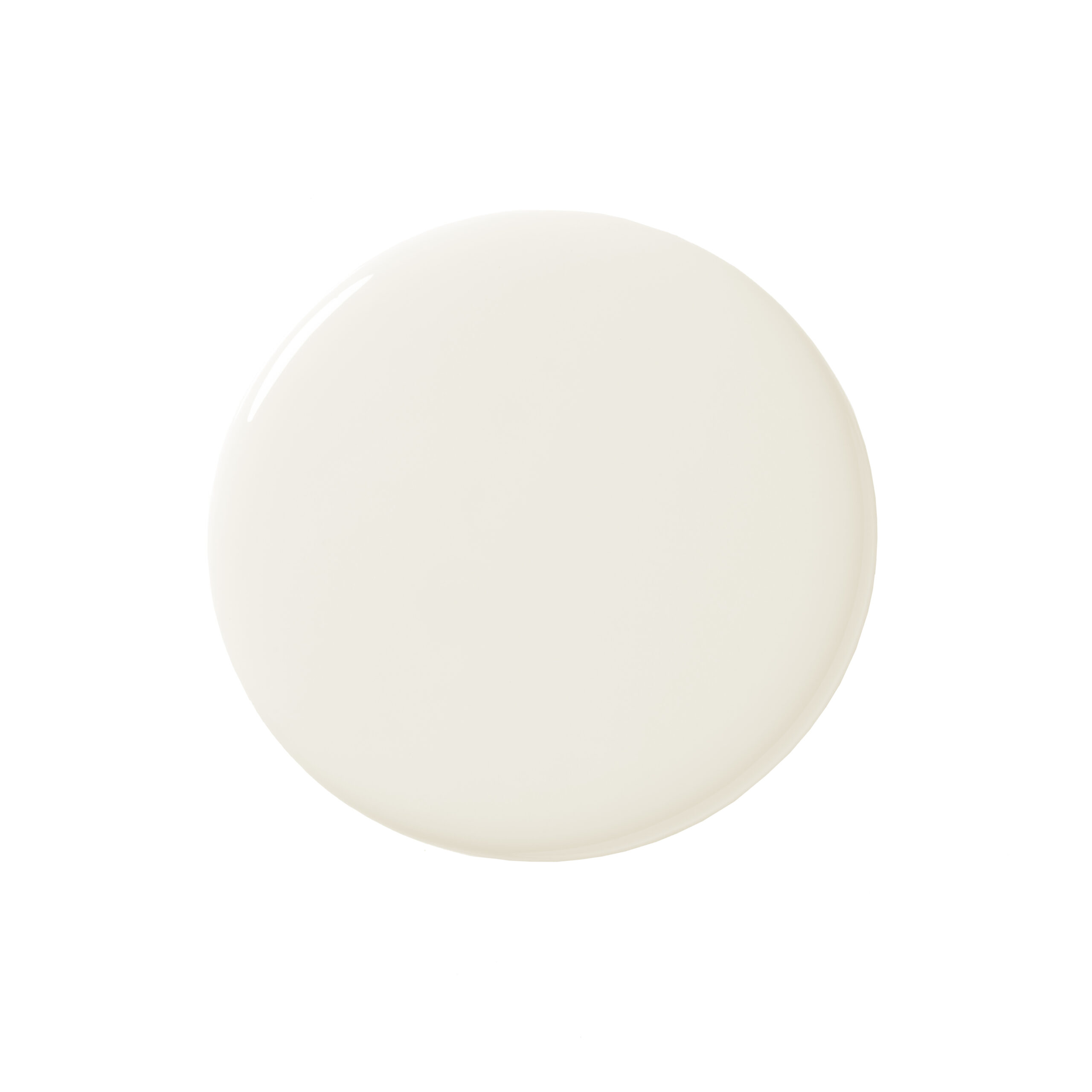
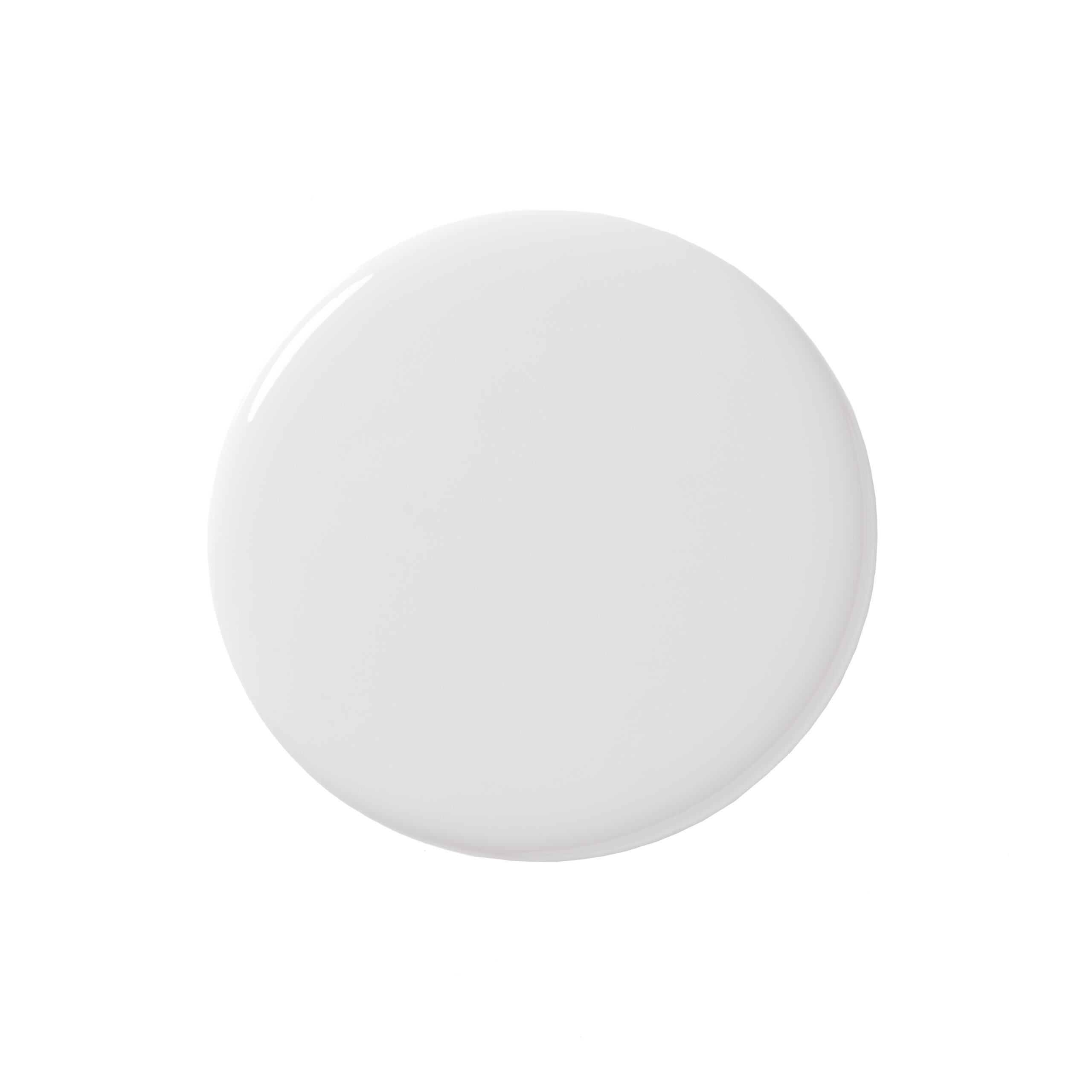
When choosing white paint, it is important to understand its undertones and how they interact with other colors and lighting conditions in a room. Swatching white paints next to a pure white reference can help identify true undertones. For ceilings, coordinating the white with the room's interiors, wall colors, and furnishings is key, also considering undertones. Mylands Pure White No. 1 is suggested for ceilings due to its versatility and durability. Alternatively, a statement color or a soft sheen emulsion can be used for ceilings to bounce light effectively.
#WhitePaint #InteriorDesign #PaintColors #HomeDecor #PaintSelection #RoomSpecificPaint #PaintUndertones #MoistureResistantPaint #DIYHomeImprovement #WhitePaint #InteriorDesign #PaintColors #HomeDecor #PaintSelection #RoomSpecificPaint #PaintUndertones #MoistureResistantPaint #DIYHomeImprovement
0 comment in total
 No comments yet
You may also like
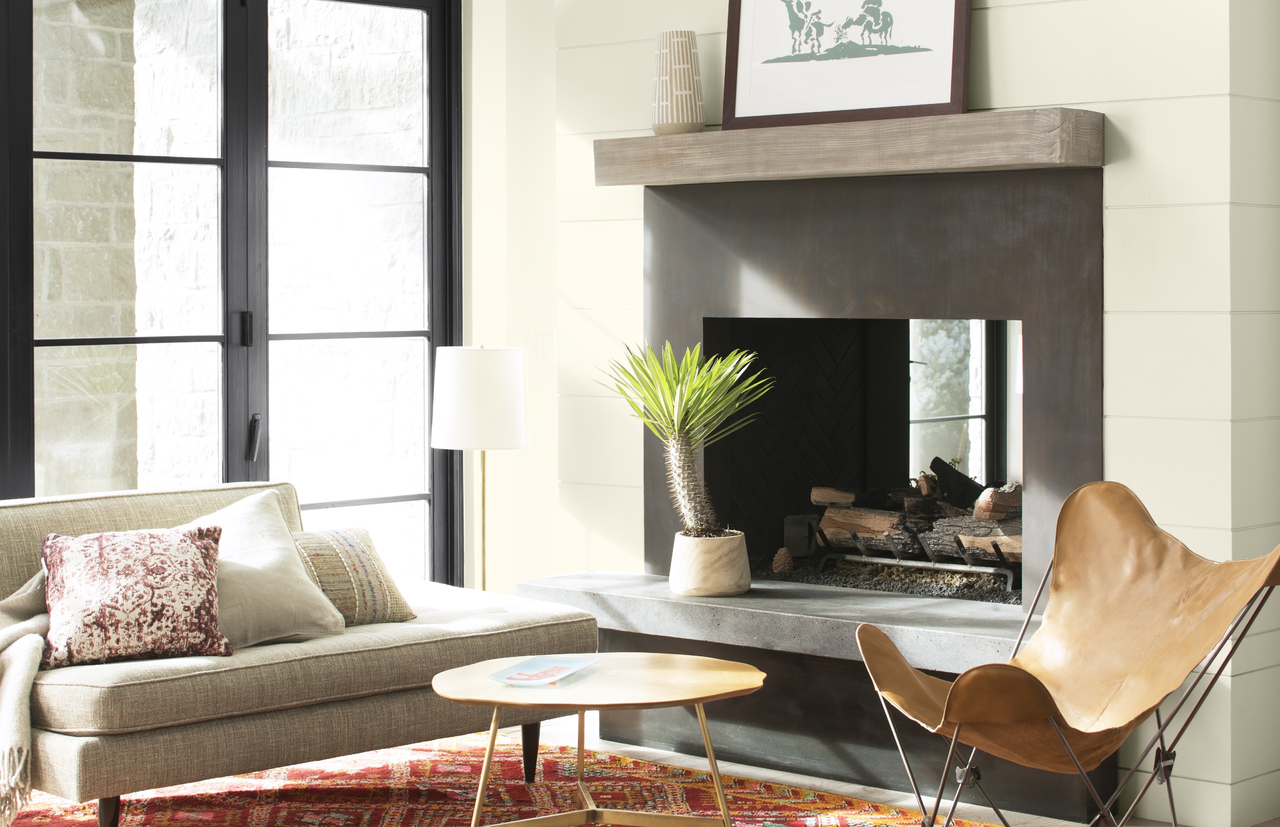
Best white paint colors: Expert share the top options

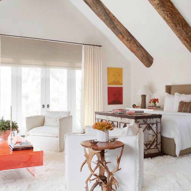
The 40 Best White Paint Colors, According to Designers
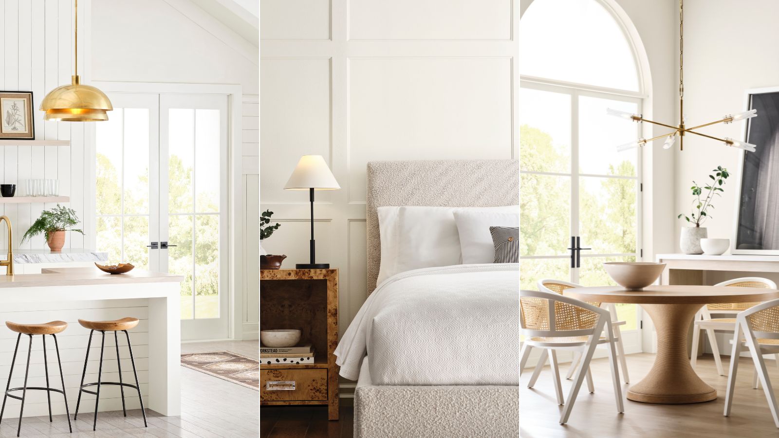
Sherwin-Williams' Designer Color Collection: 5 bright white paints

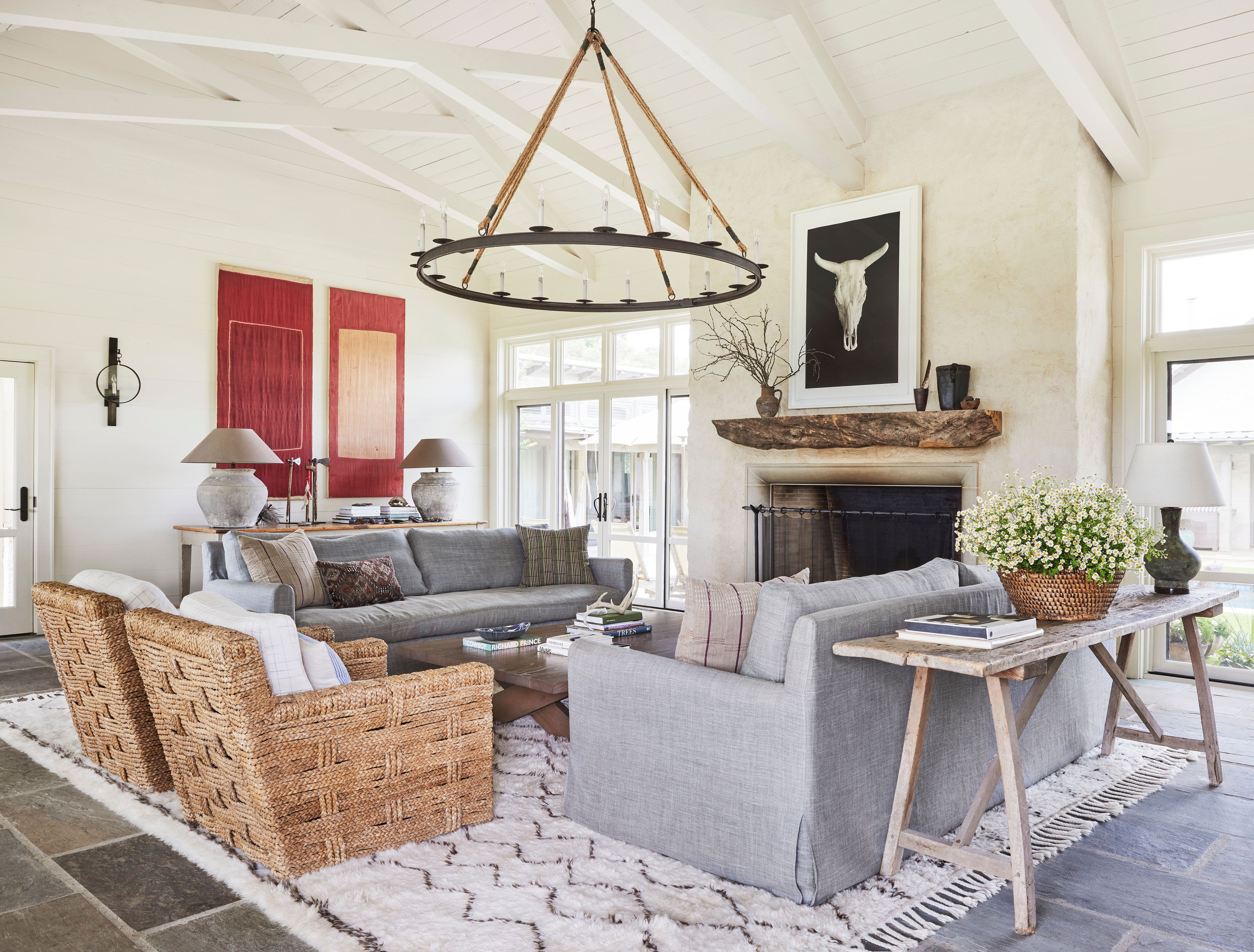
13 Off-White Paint Colors the Experts Recommend for Any Space


The Best White Paint Colors Experts Turn to Again and Again
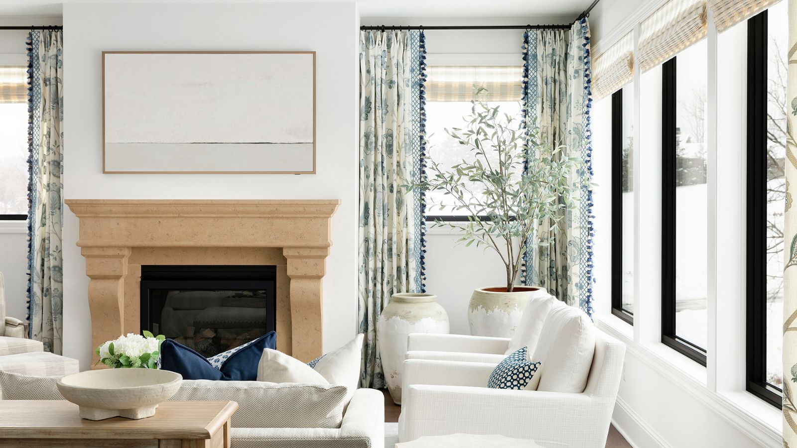
5 best warm white paints, as chosen by interior designers
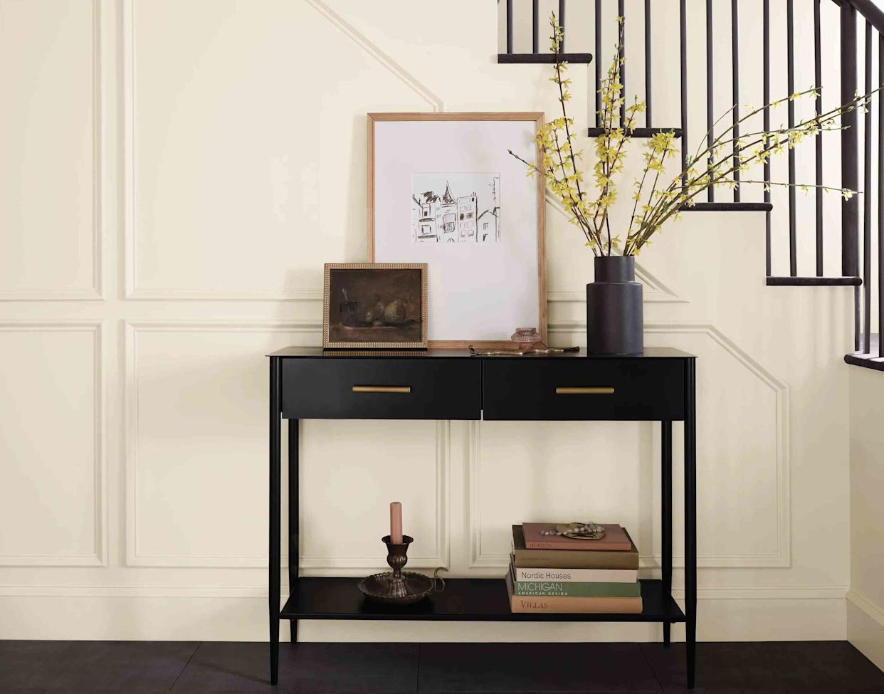
13 Off-White Paint Colors the Experts Recommend for Any Space

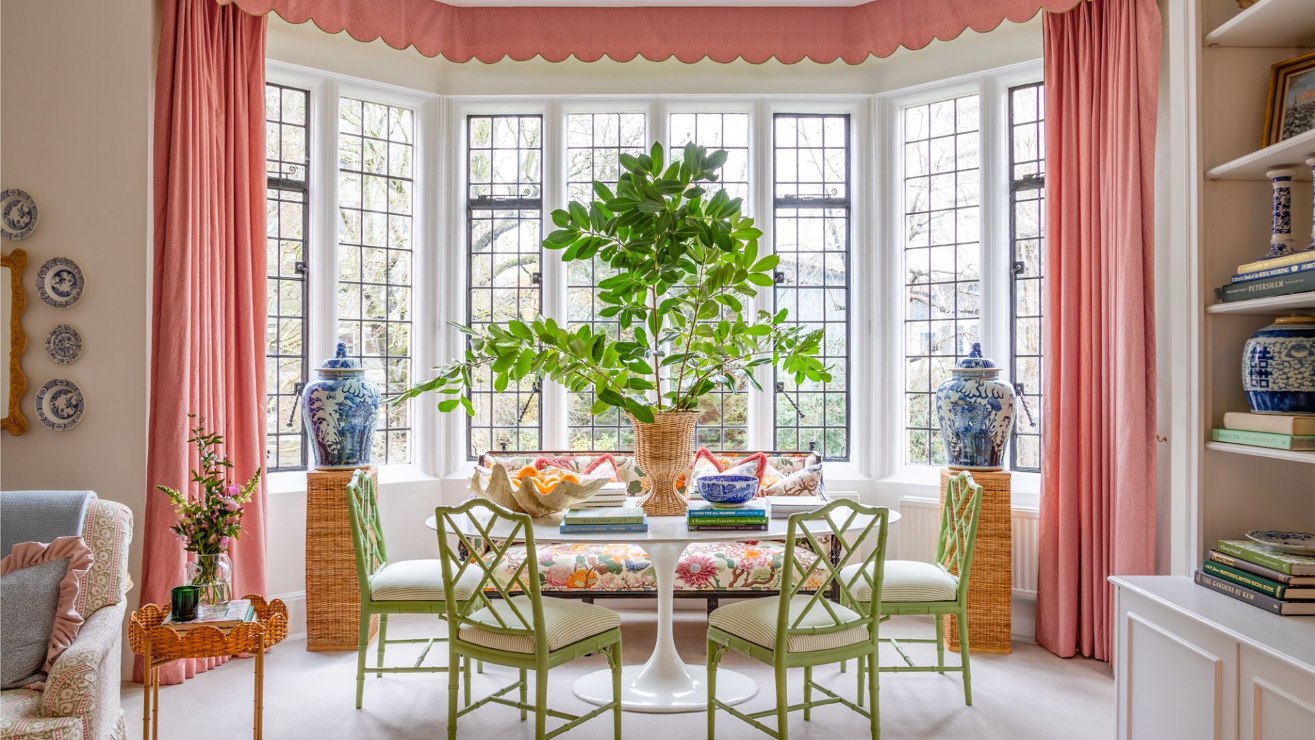
7 times you should never paint a room white
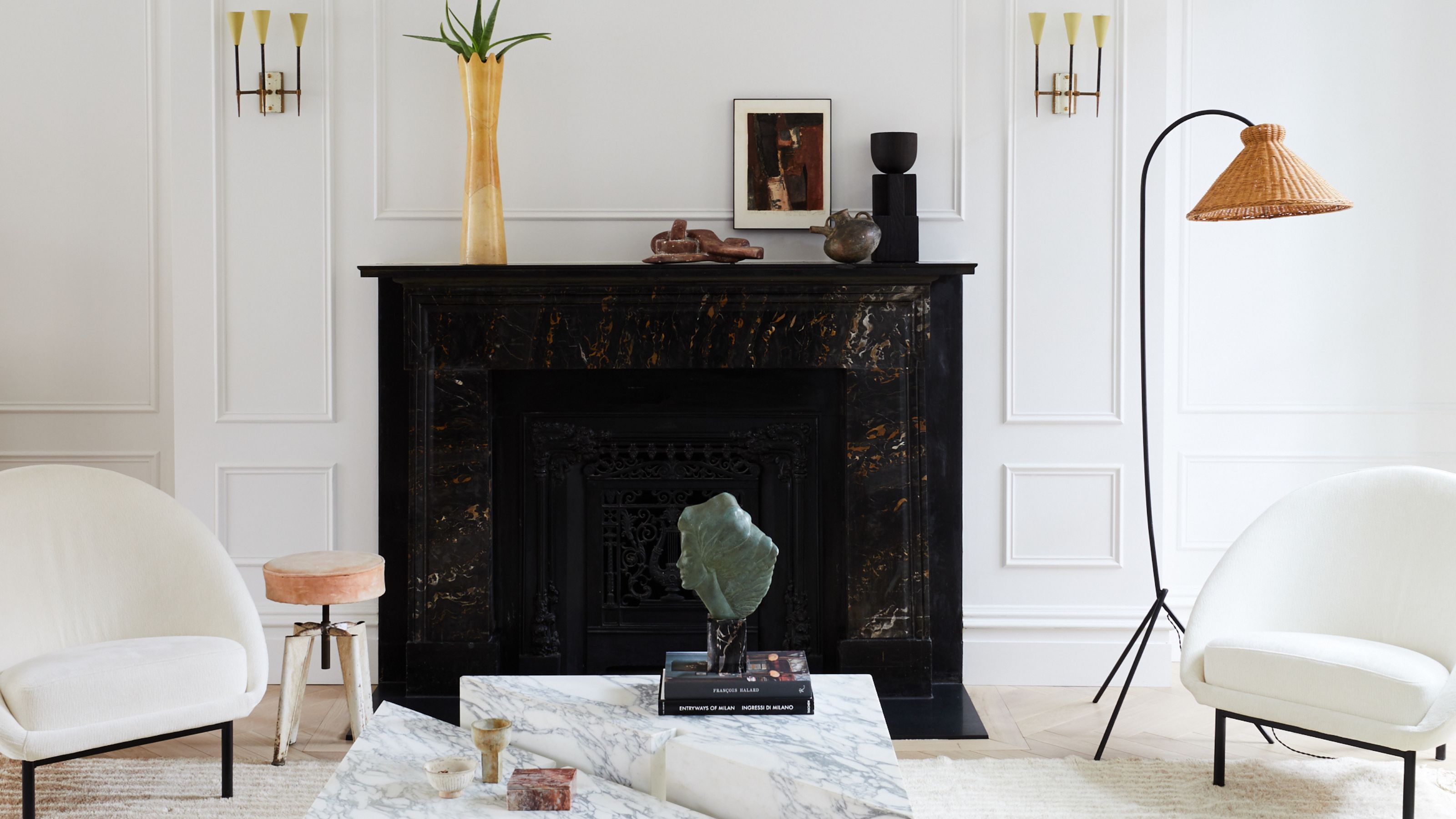
The ultimate guide to choosing the right shade of white for your walls

How to Pick the Best White Paint Color—Without the Headache
What are the best white paints for kitchens? 6 light and airy picks from interior designers
I Sampled 24 White Paints—Here’s the One I Chose for Every Room of My Home

The Best White Paint for Walls That Experts Swear By
The 13 Best White Paint Colors That Interior Designers Swear By

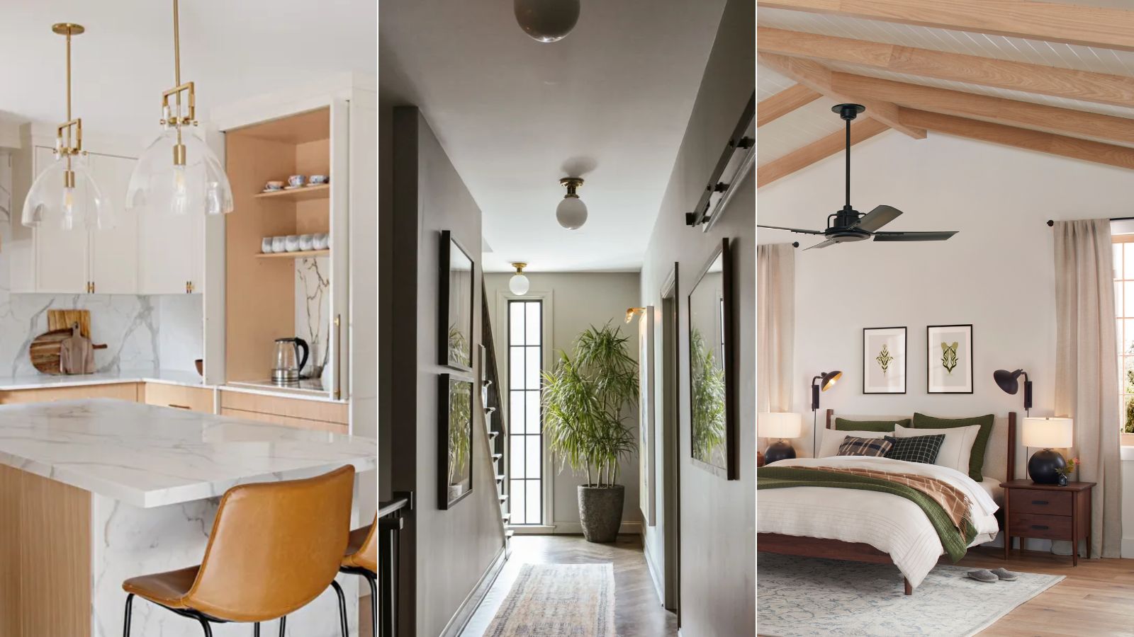
What are the best Sherwin-Williams white paints? 6 favorite shades amongst interior designers
5 White Kitchen Paints Designers Swear By
13 Tried-and-True White Paint Colors Recommended by Pros

Designers’ Favorite White Paints Are Always Changing—We Asked 3 for Their Latest Pick
The Best White Paint for Kitchen Cabinets as Seen in Our Favorite Spaces
White walls? The trick is choosing the right white