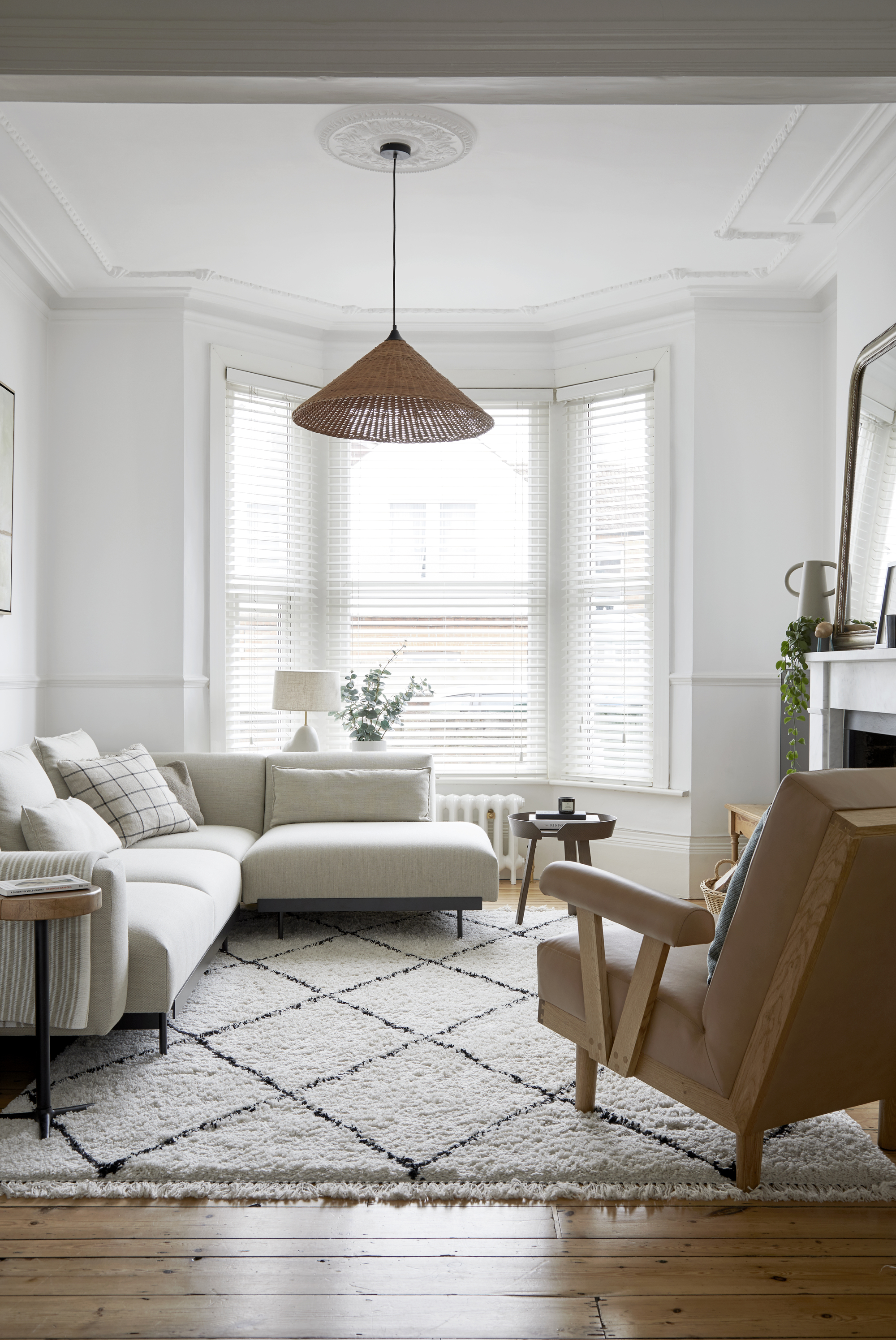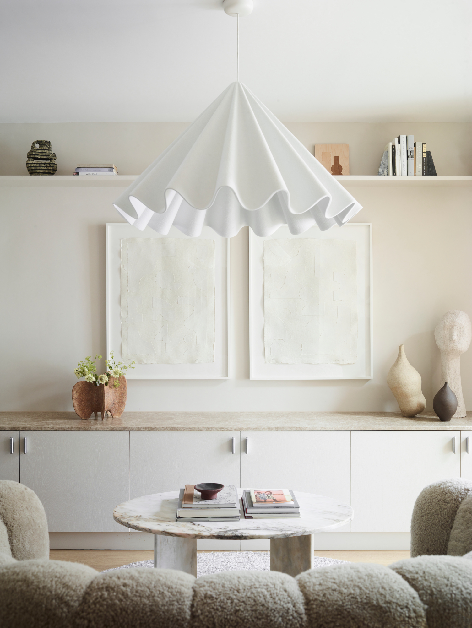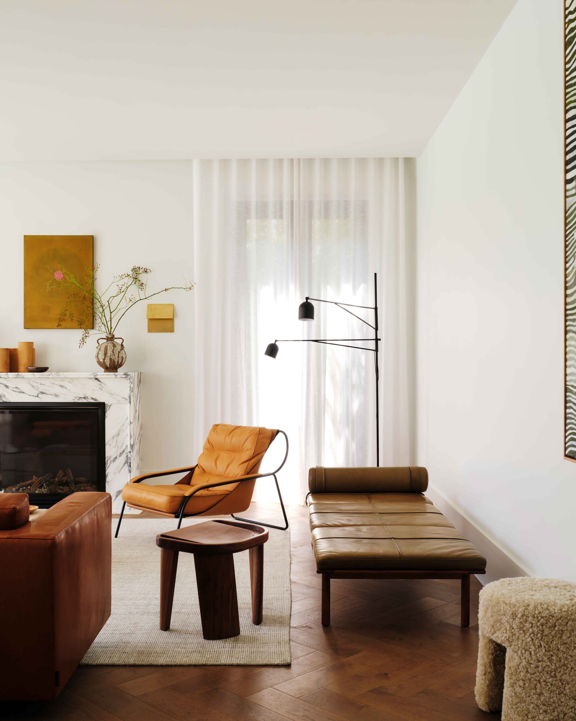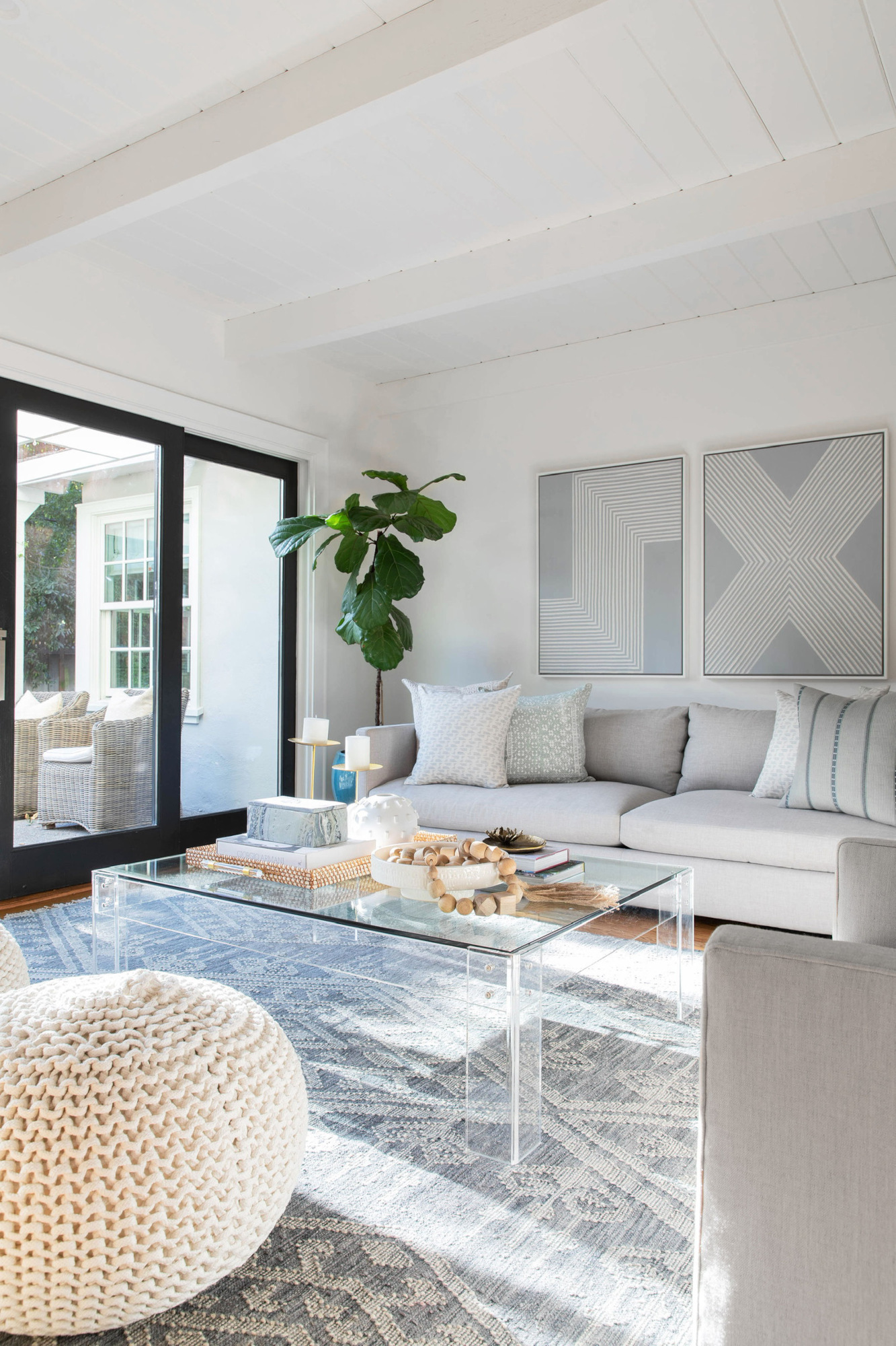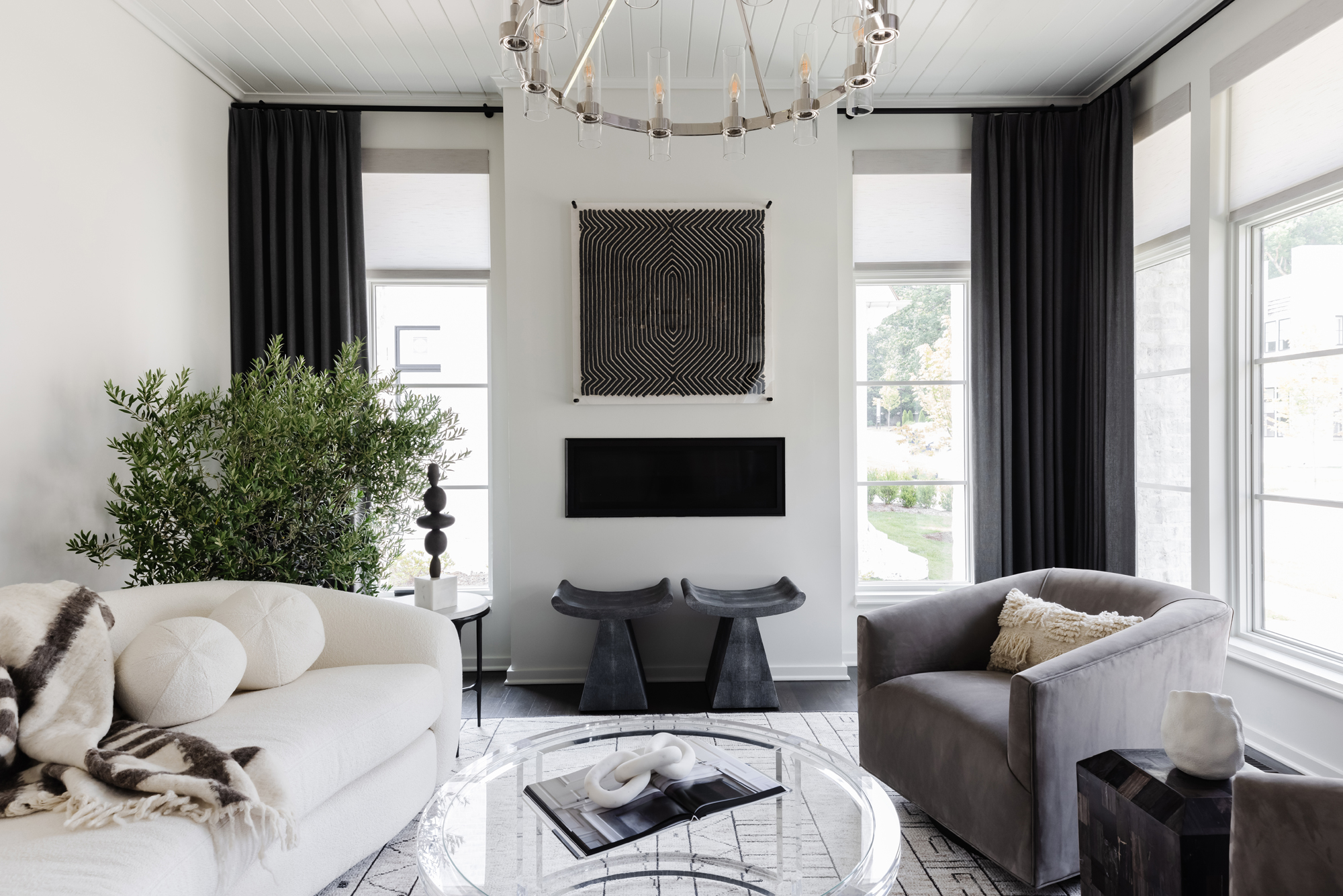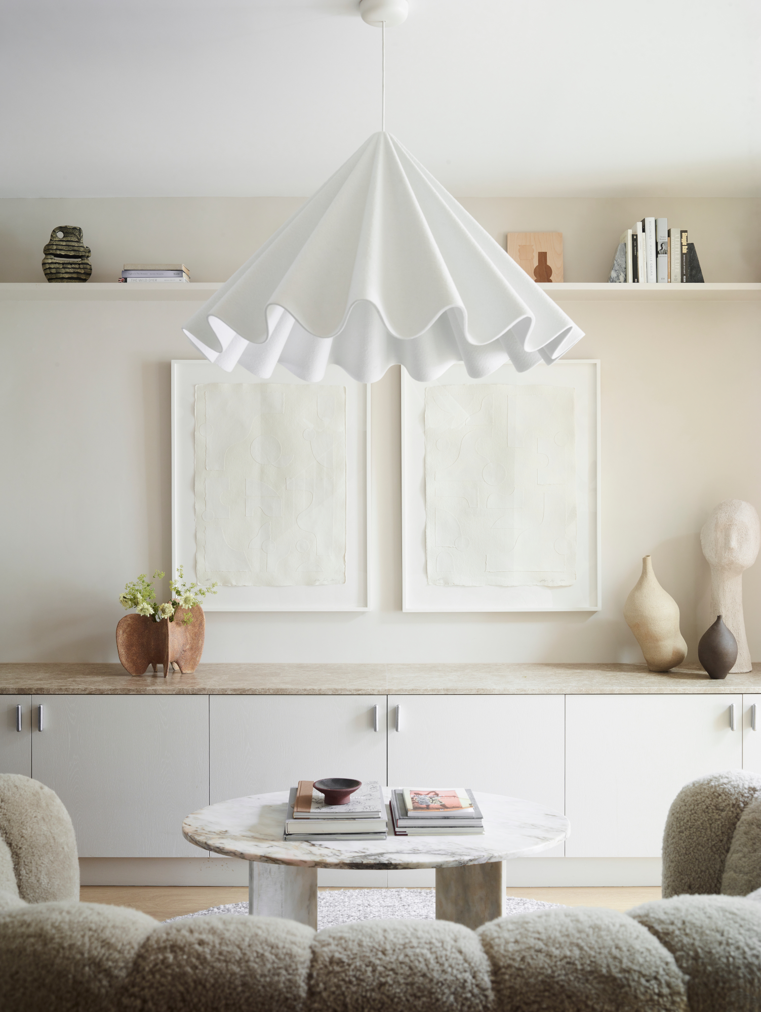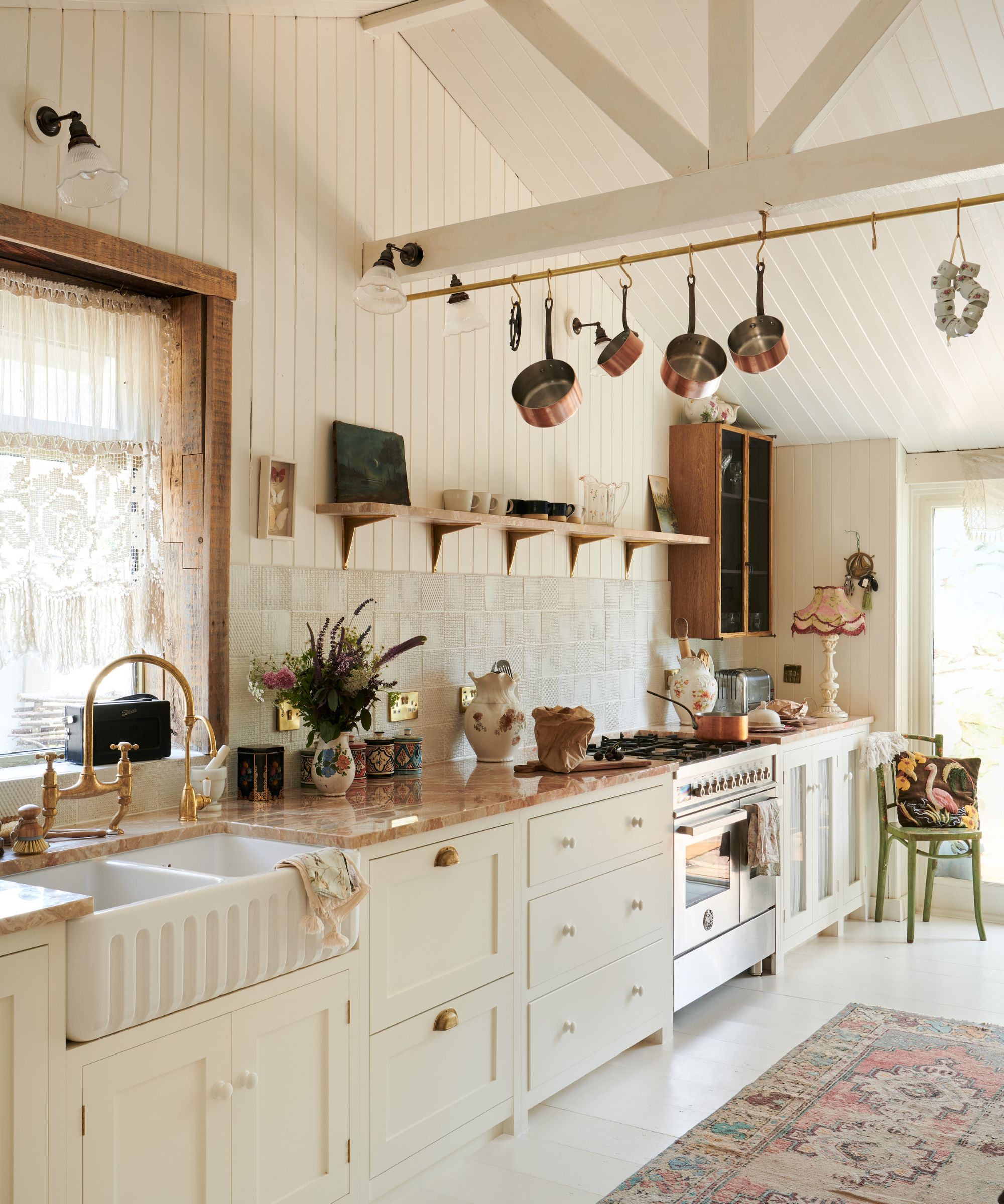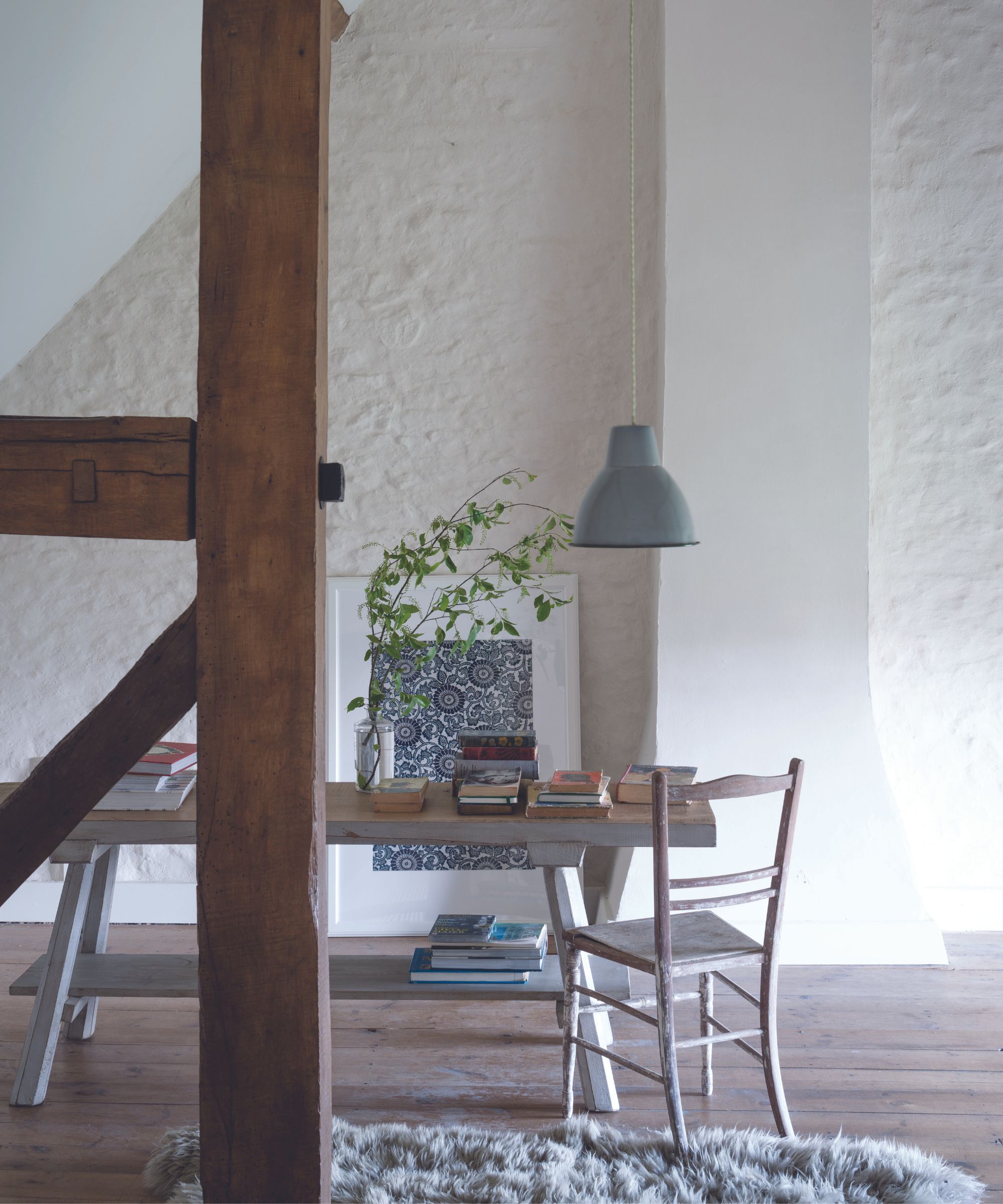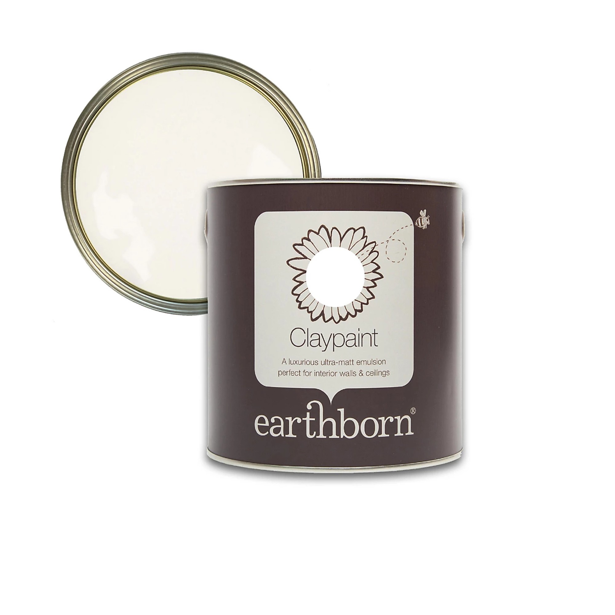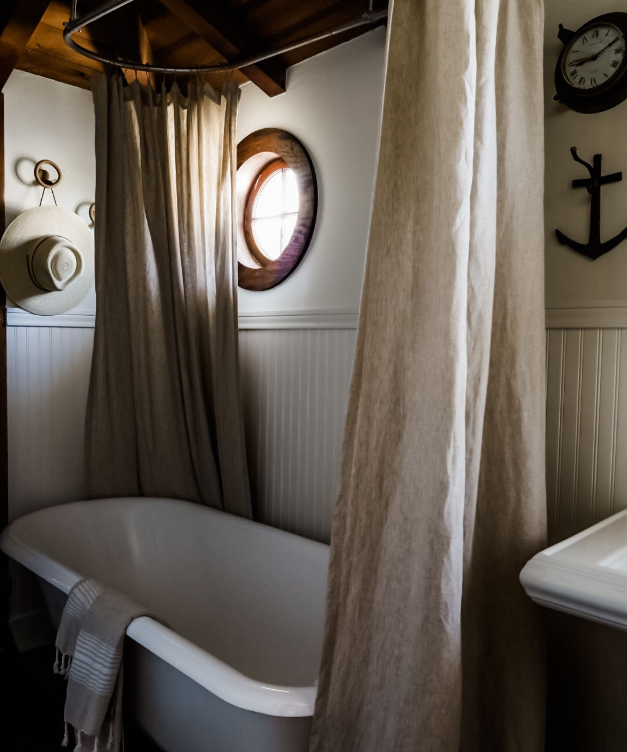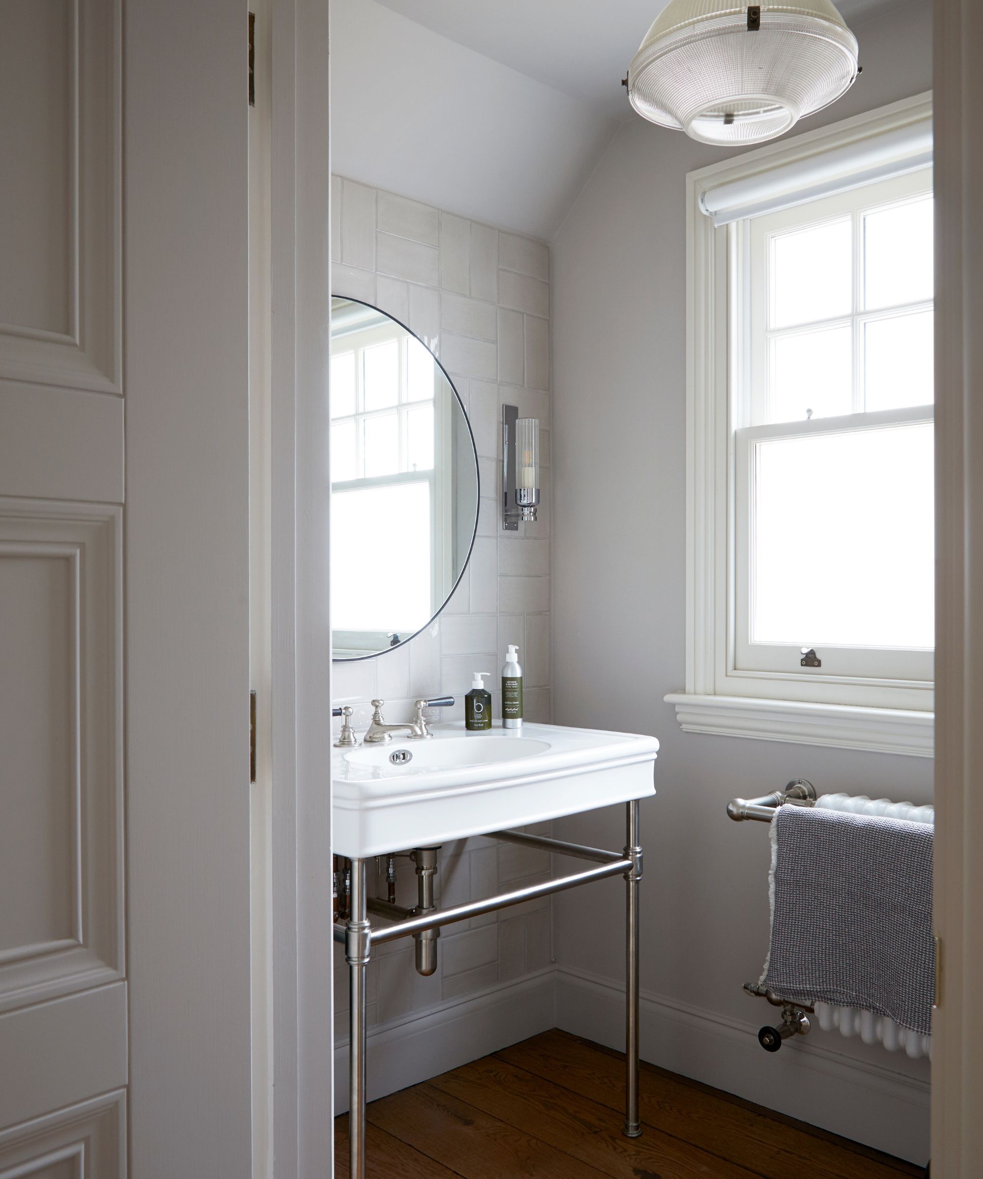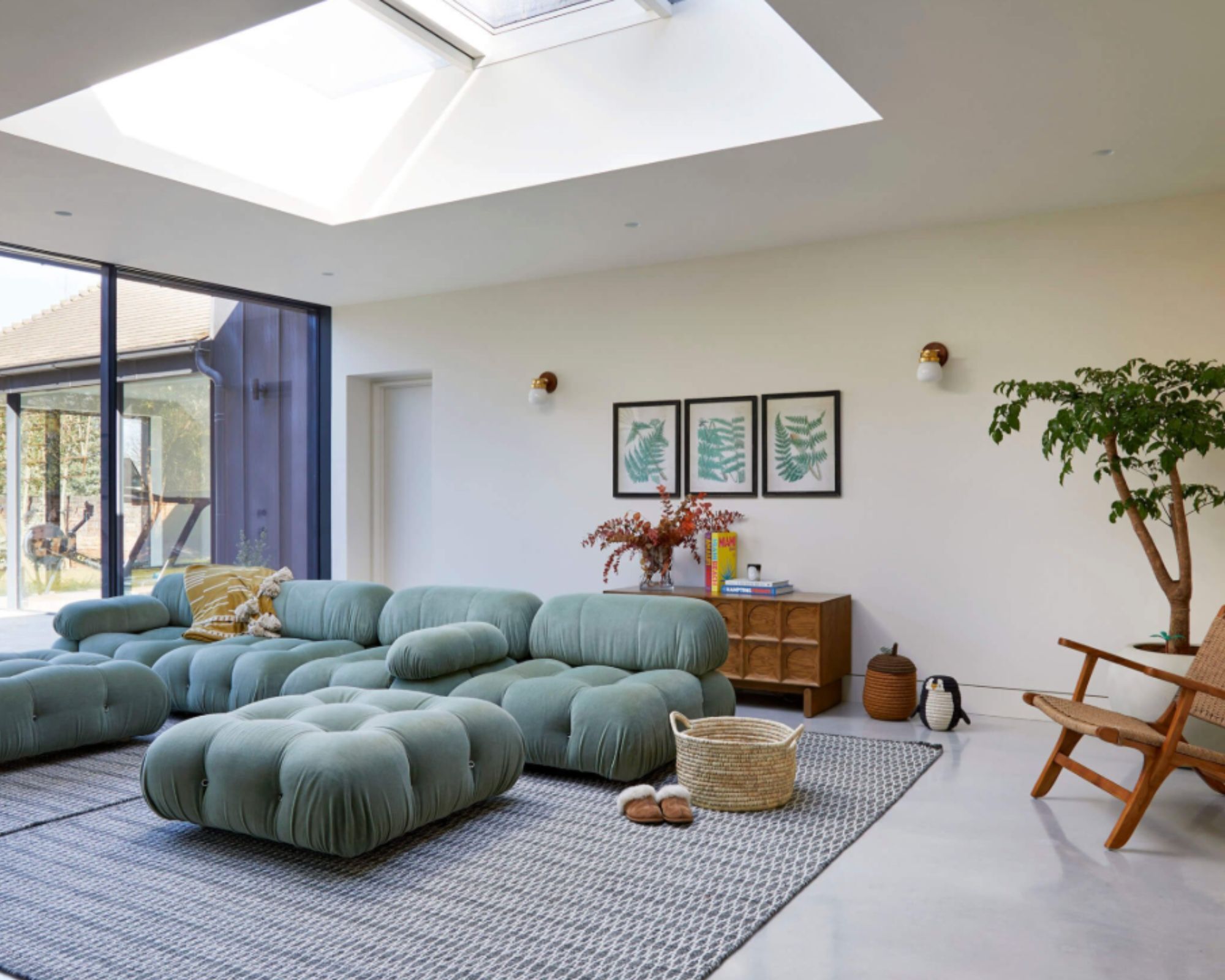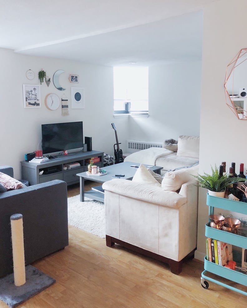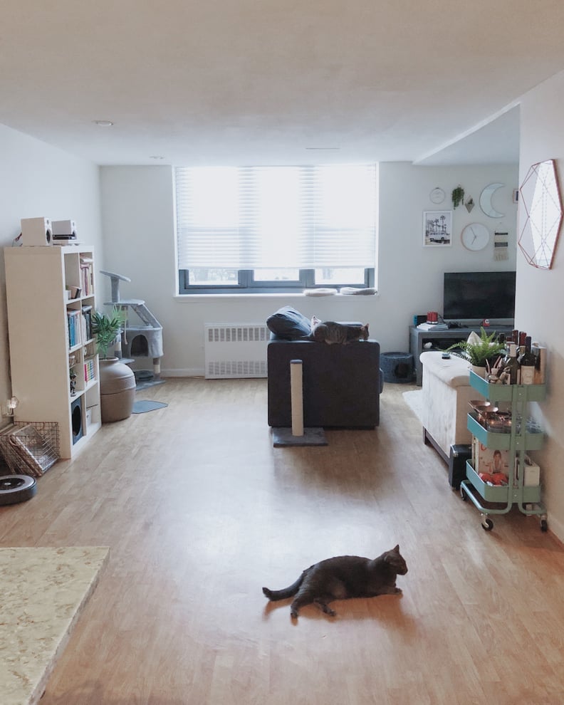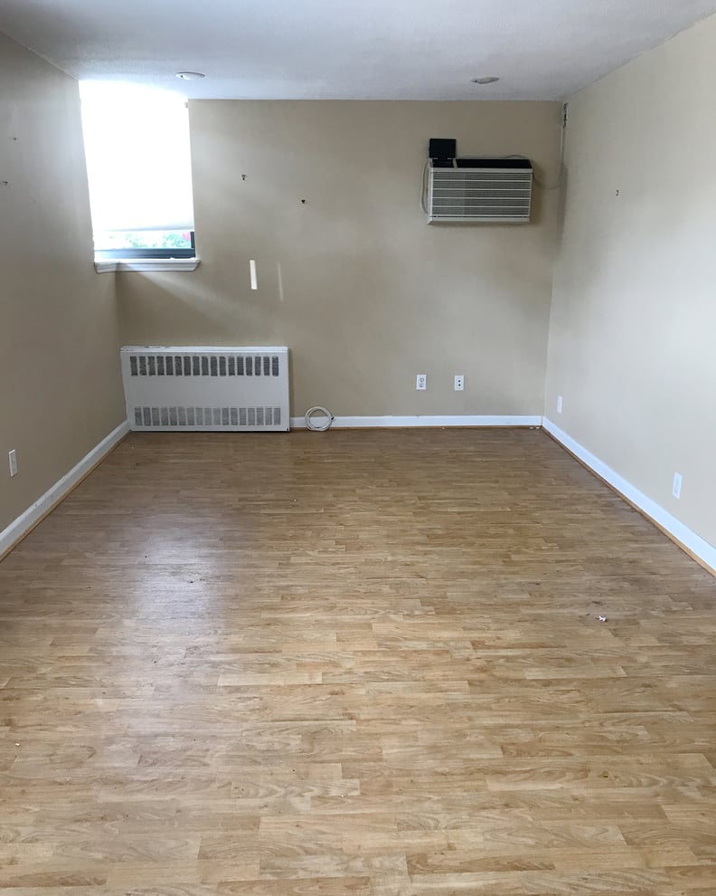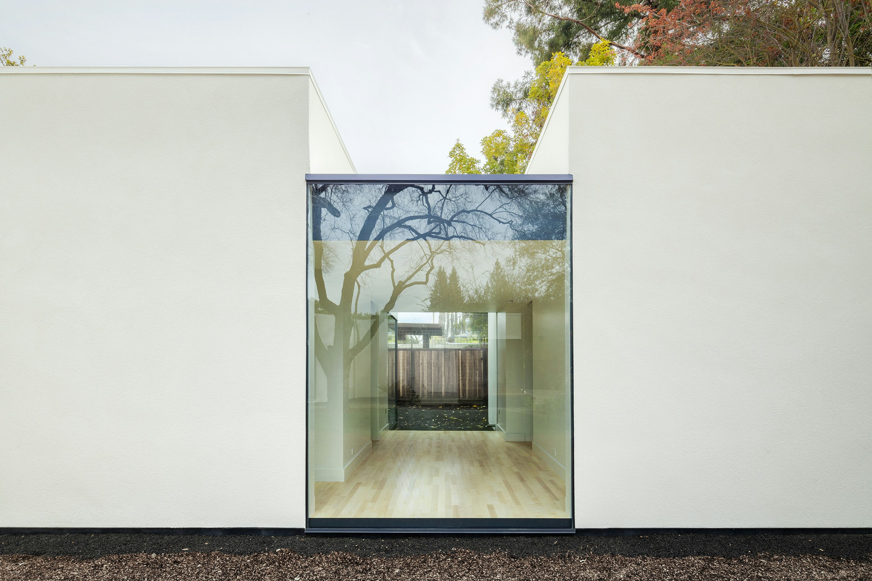
White walls? The trick is choosing the right white
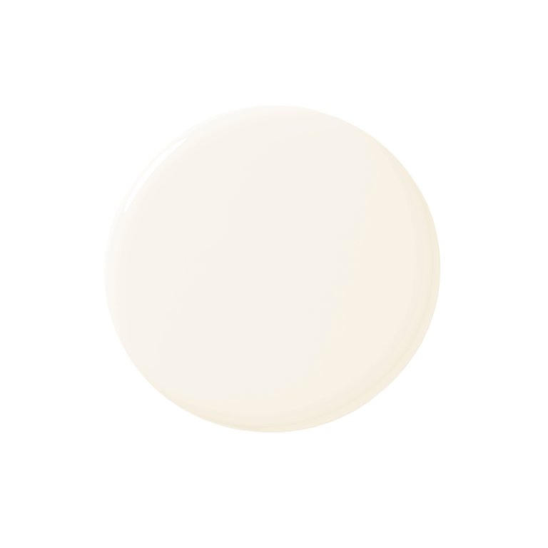
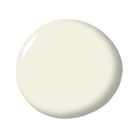
Choosing the right shade of white paint for a room can be surprisingly complex, despite its seeming simplicity. Many individuals opt for white to avoid strong colors, yet are often met with a bewildering array of choices, each with a subtly different undertone. Paint companies like Benjamin Moore offer over 150 variations of white, and experts note that people tend to be more dissatisfied with their white paint choices than with other colors.
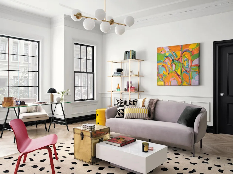
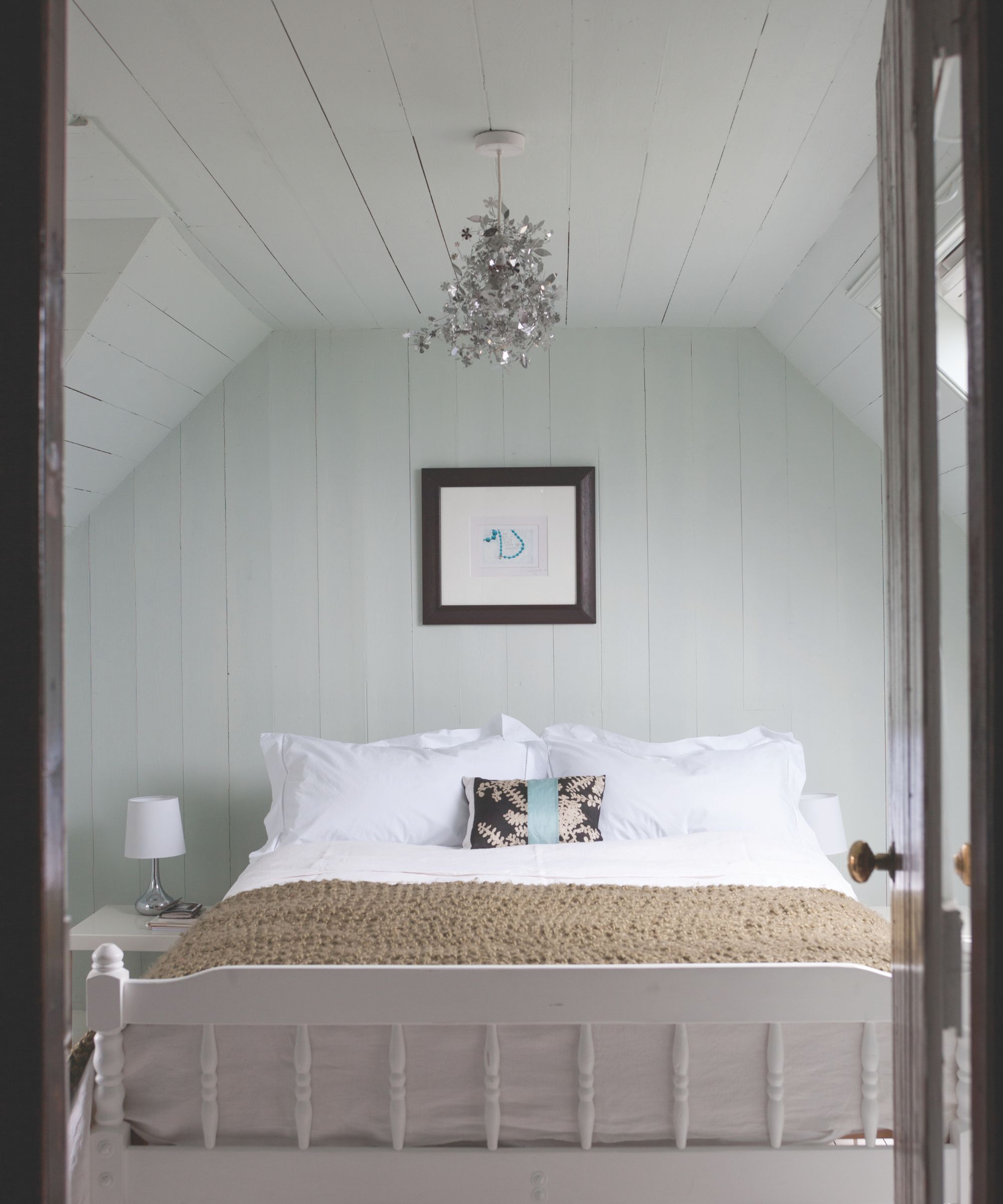
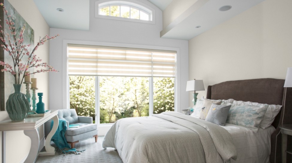
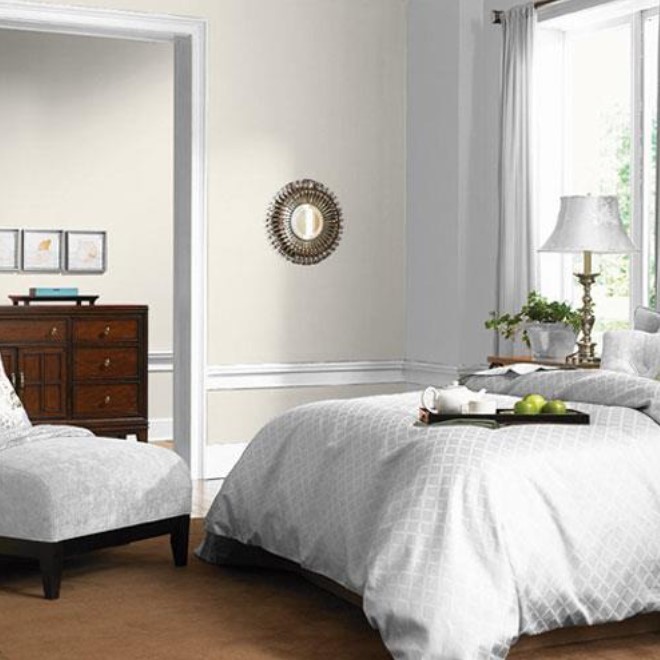
Pure, untinted whites, while symbolizing cleanliness, can appear sterile and cold, potentially causing eyestrain. Therefore, caution is advised against using a stark, unmodulated white throughout a living space. The surrounding environment significantly influences how a white paint appears. It is crucial to test a sample directly in the room where it will be used. This involves painting a 2-by-2-foot board and observing it at different times of day, under varying lighting conditions, and against existing furnishings like rugs. This practice helps reveal unexpected undertones, such as pink or green, which might not be apparent on a color chart.
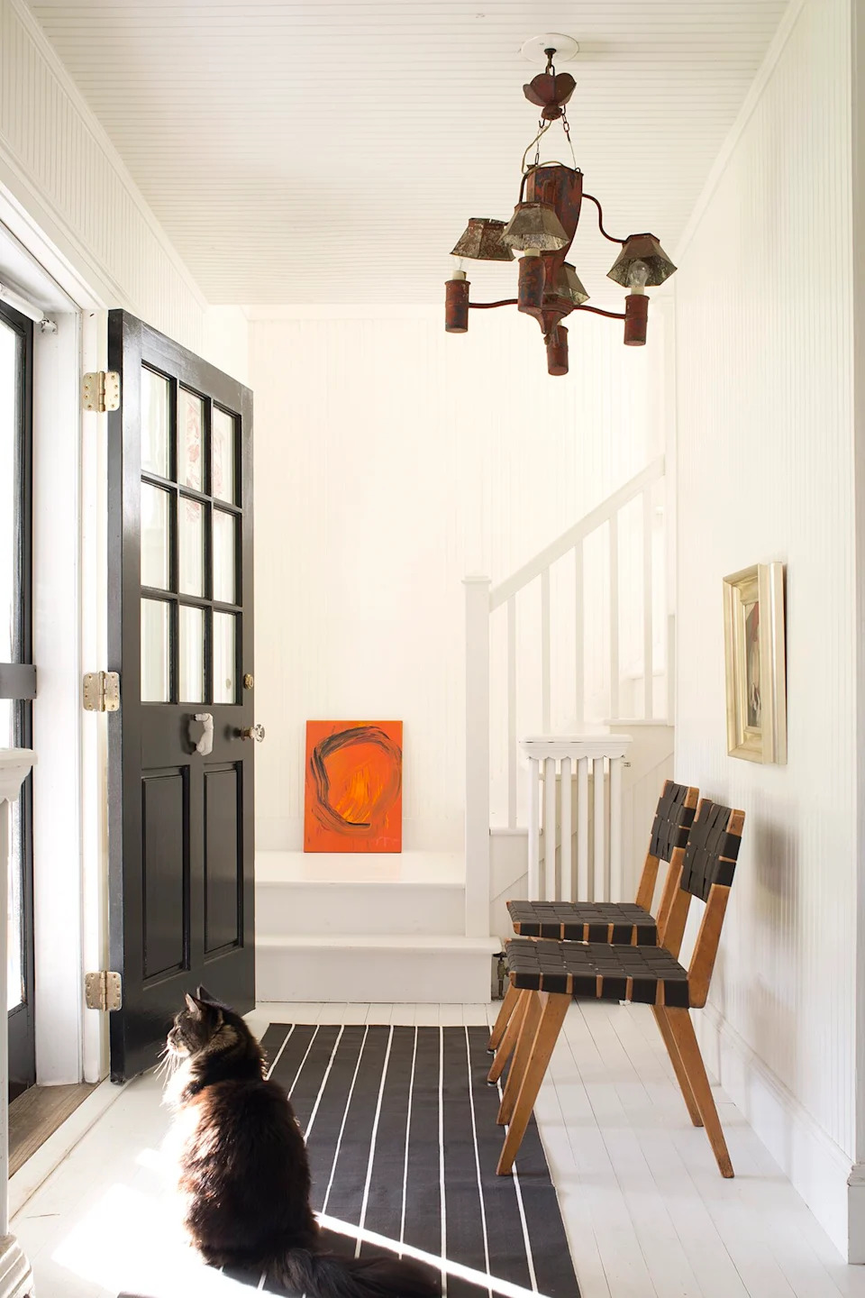
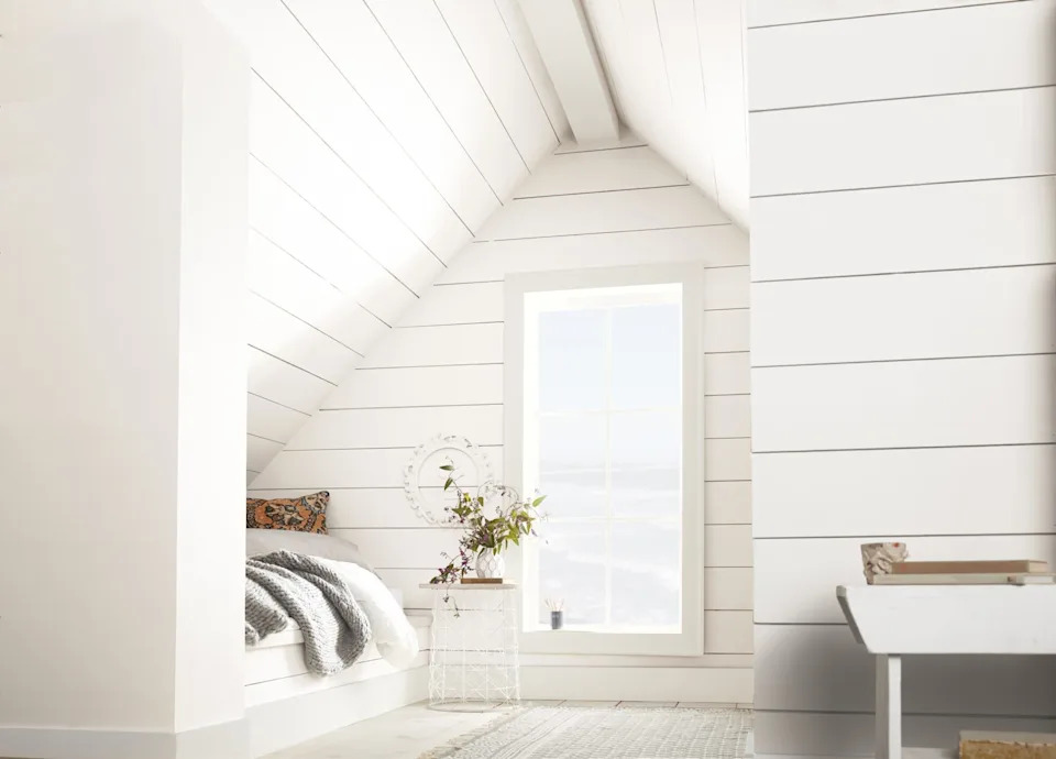
Paint sheen also plays a vital role in the final aesthetic. Options range from matte (flat) to high-gloss. A common recommendation is to pair a semi-gloss trim with matte walls. Moreover, the ceiling should be considered an integral part of the room's color scheme, often referred to as the 'fifth wall.' While flat paint is typical for ceilings, a semi-gloss or high-gloss finish can create a striking effect in suitable spaces.
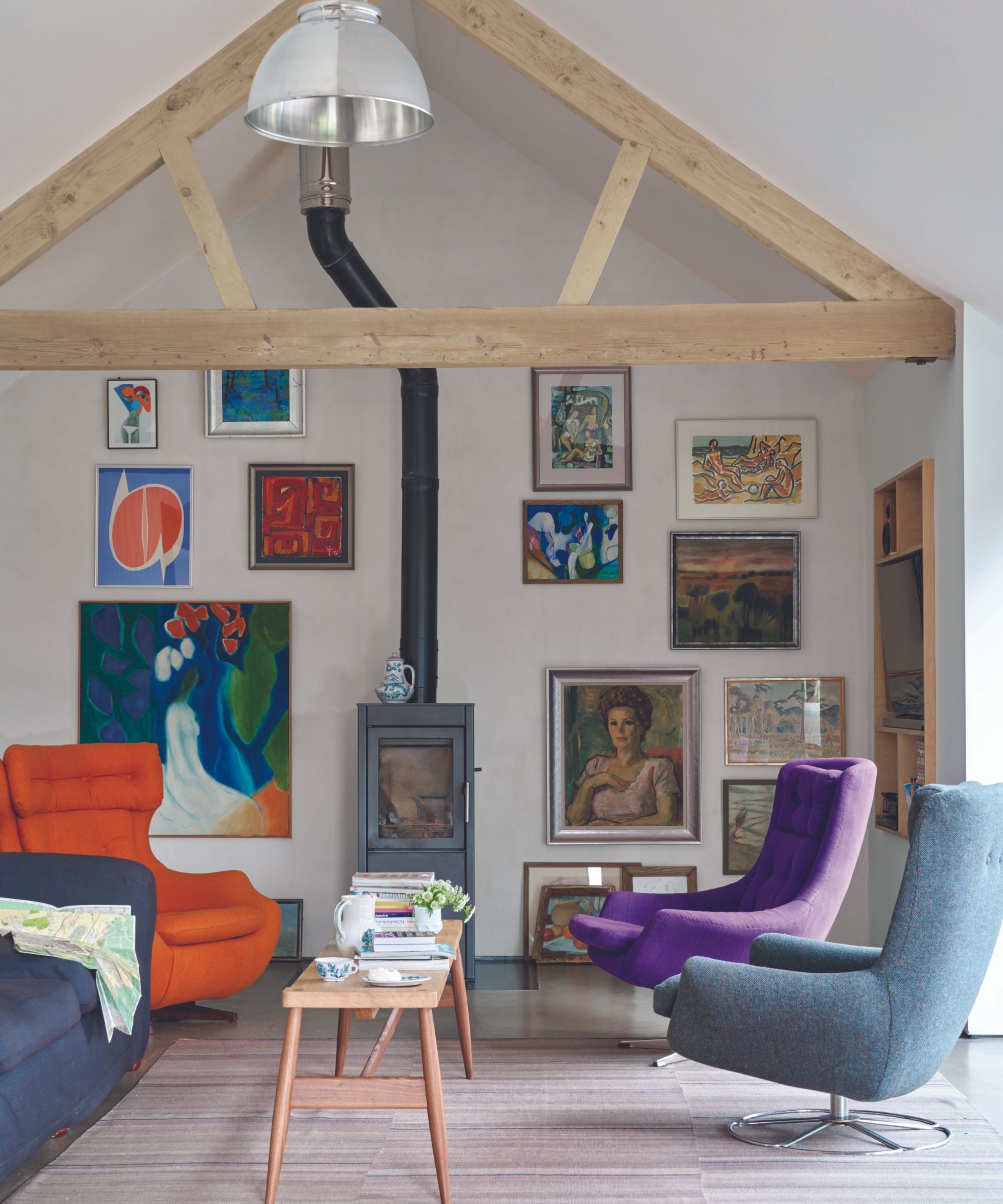
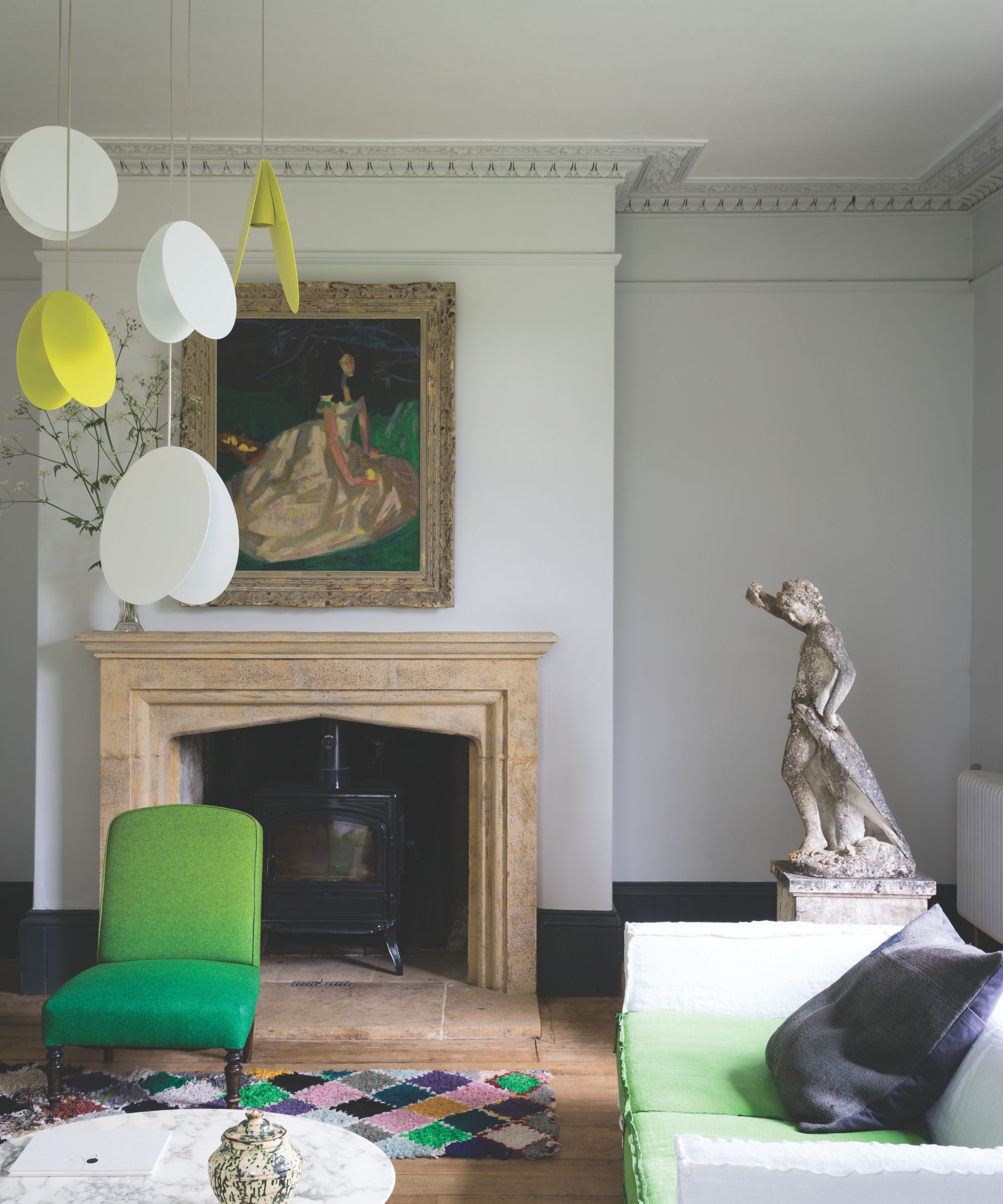
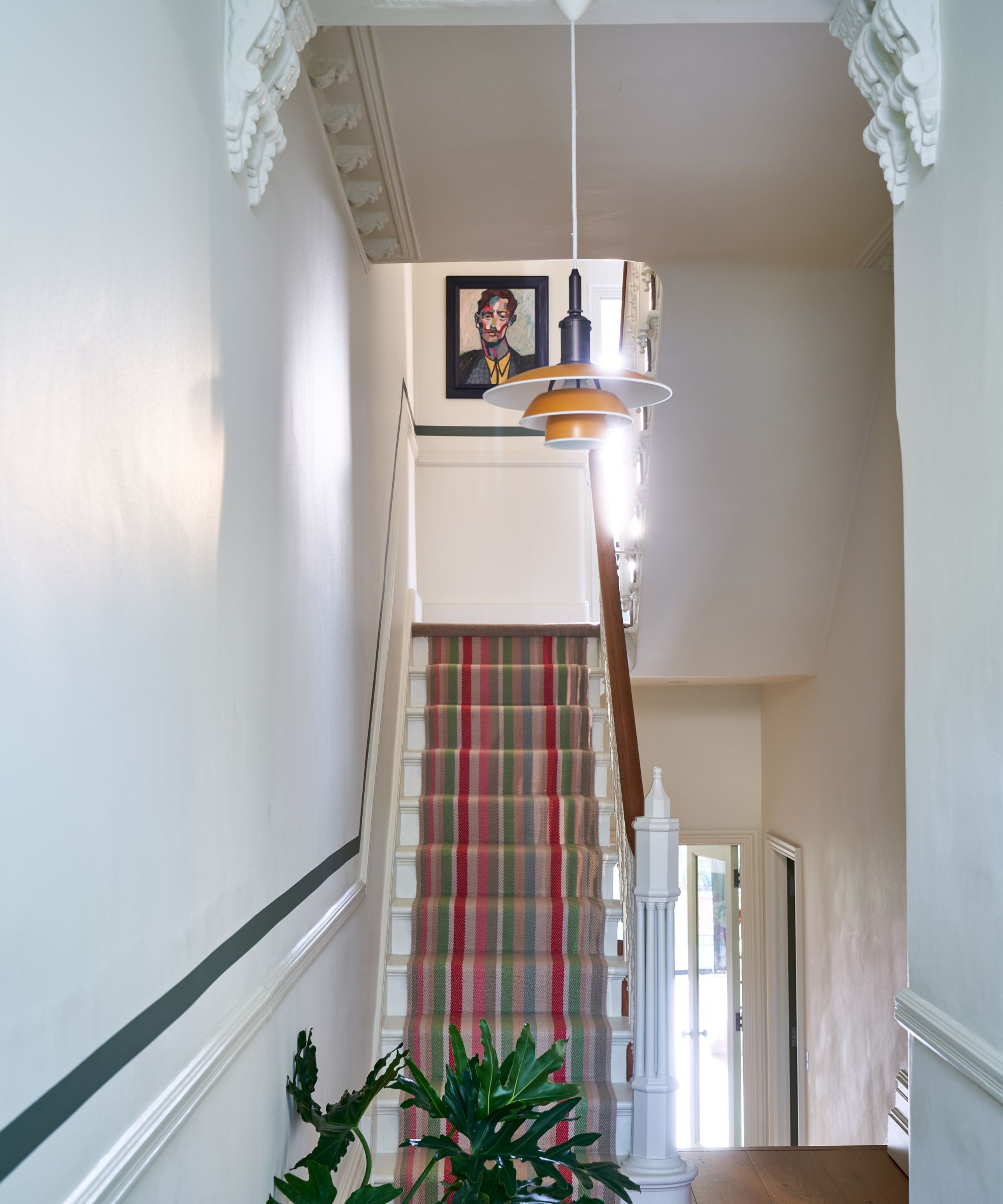
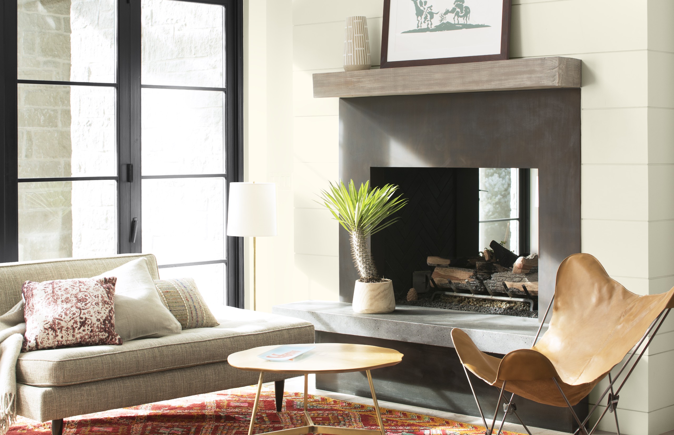
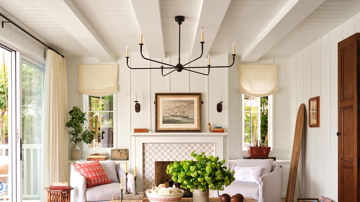
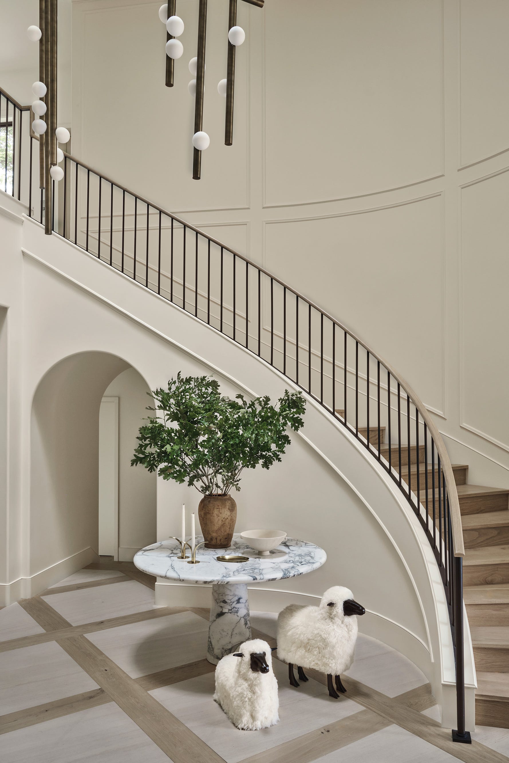
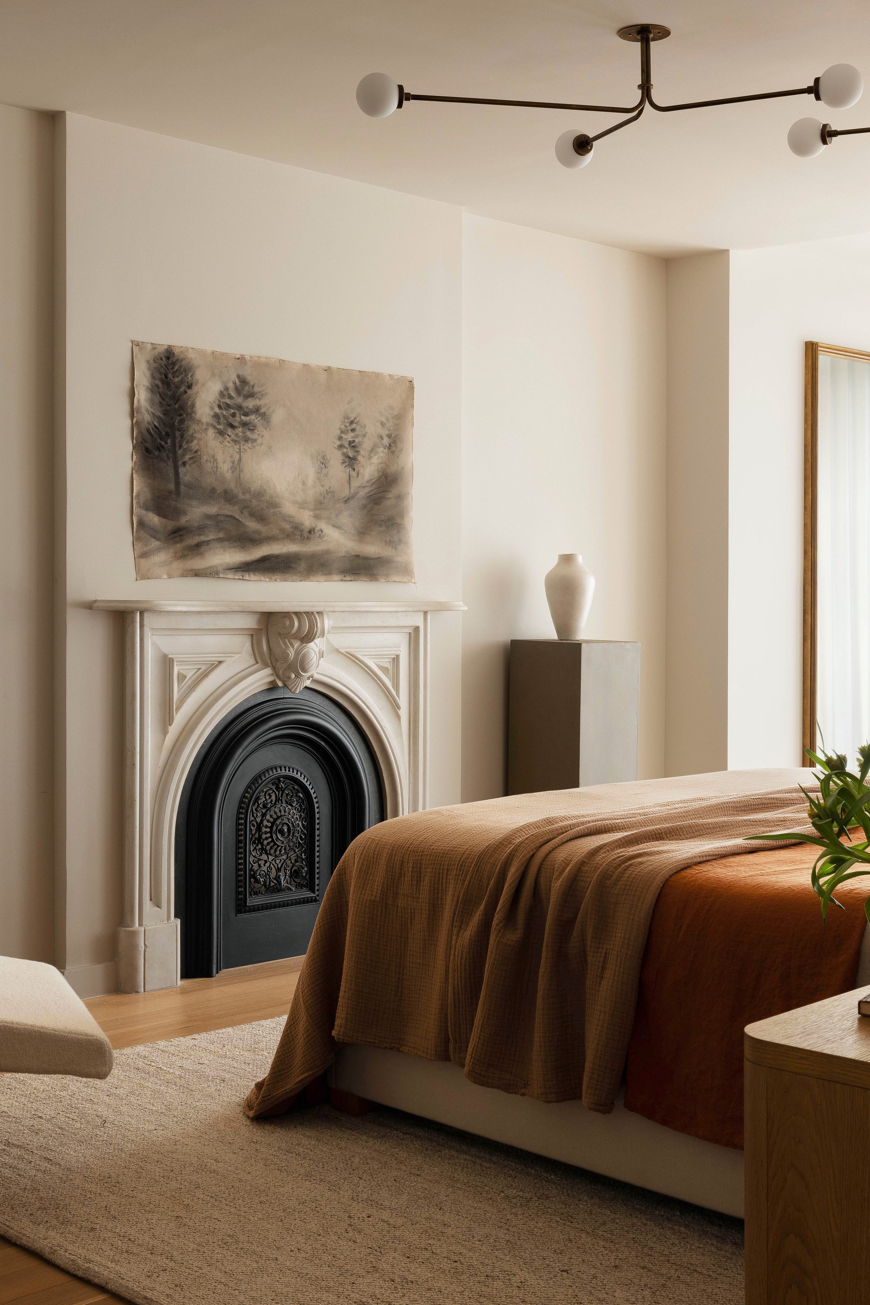
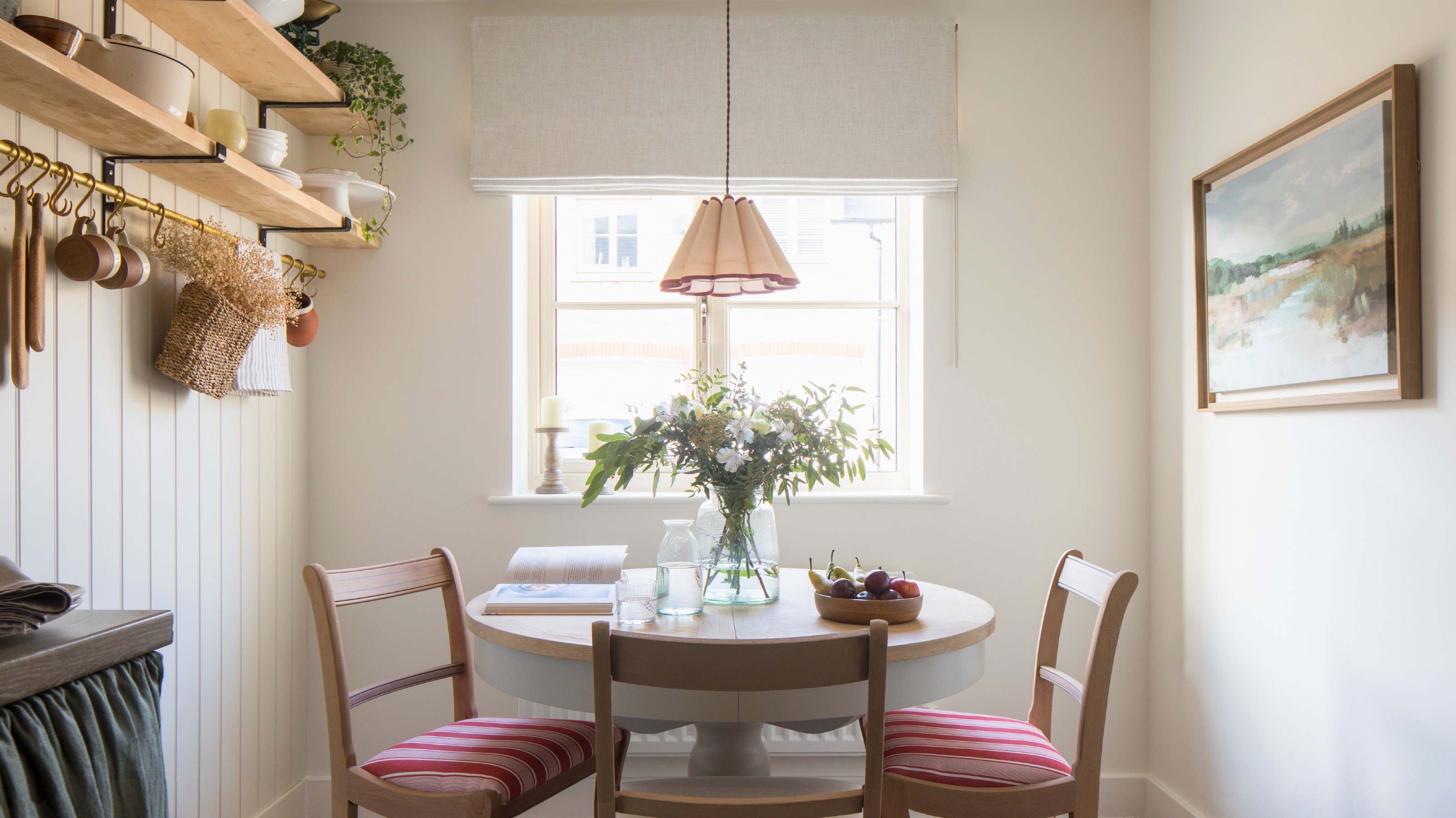
Architectural color consultant James Martin advocates for warm whites—those with yellow, peachy, or rosy undertones—for living spaces. Warm whites enhance the details of surrounding woodwork, particularly in older homes. Martin also suggests that white walls can diminish the vibrancy of art, making paintings appear isolated. He argues that art against a colored wall can draw out the painting's hues and bring it to life. If white is preferred, he recommends a warm white with a flat sheen for walls, complemented by high-gloss trim of the same color, creating a subtle and sophisticated look. He advises against bright white trim and ceilings if other colors are present, as they can make those colors appear overly bright.
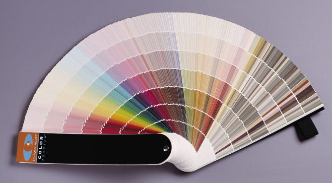
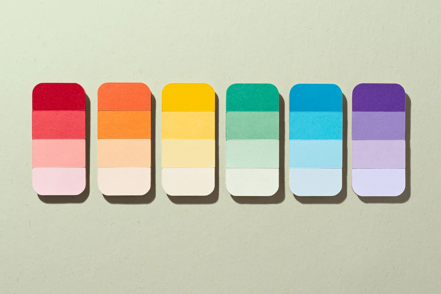
When selecting colors, it is important to avoid making decisions based solely on online images, as digital displays can distort hues. Instead, when using a physical fan deck of paint colors, a useful technique is to isolate the desired color by viewing it through a cutout in a white piece of paper. To identify a white's true undertone—whether it leans rosy, orange, blue, or green—one should follow its progression from the palest to the deepest shade within the fan deck. Warm tints include red, orange, and yellow, along with their variations like peach and apricot, while cool colors encompass blue and purple. Neutrals such as taupe, gray, and beige fall in between. Ultimately, personal judgment and comfort are key, as individuals often instinctively know what pleases their eye. The decision-making process for choosing white paint, therefore, merges technical considerations with personal preference to achieve the desired atmosphere and aesthetic in a home.
#HomeDesign #InteriorPainting #WhitePaint #ColorSelection #PaintSheen #HomeDecoration #ColorConsultation #WarmWhites #Undertones #HomeDesign #InteriorPainting #WhitePaint #ColorSelection #PaintSheen #HomeDecoration #ColorConsultation #WarmWhites #Undertones
0 comment in total
 No comments yet
You may also like
The ultimate guide to choosing the right shade of white for your walls

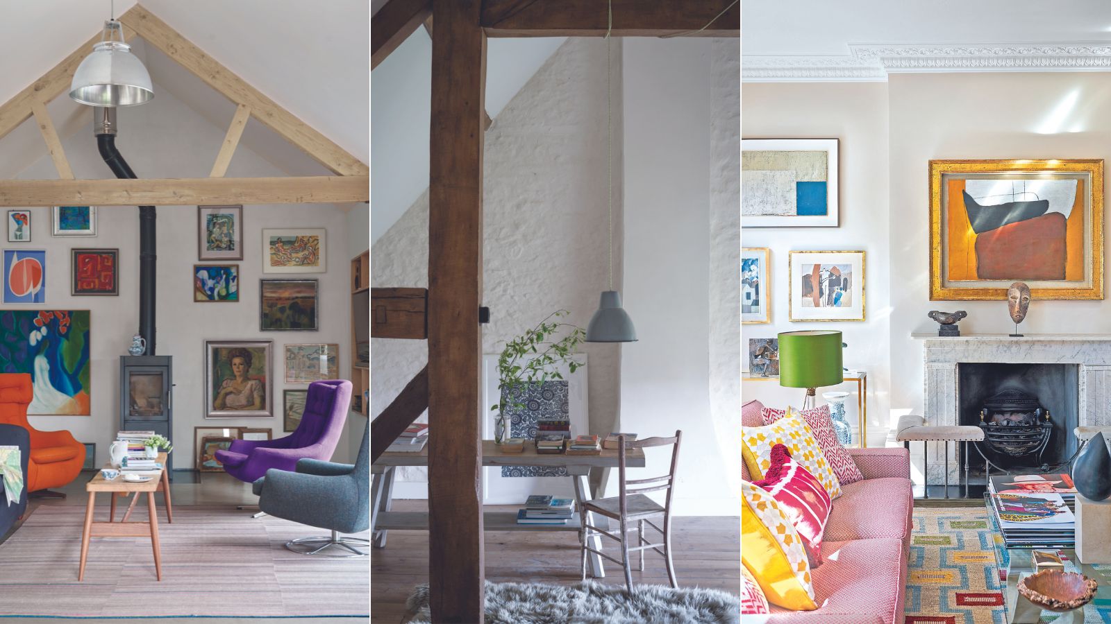
Are white walls still on trend? Designers weigh in on whether this classic shade is on the out
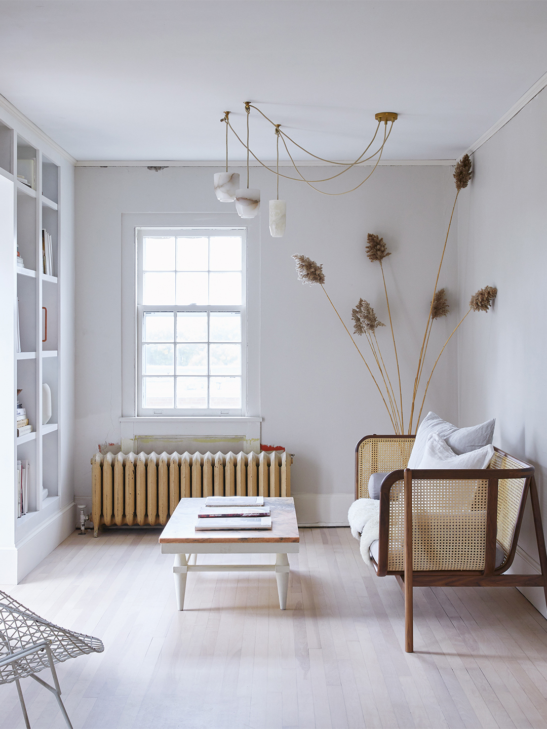
Designers’ Favorite White Paints Are Always Changing—We Asked 3 for Their Latest Pick

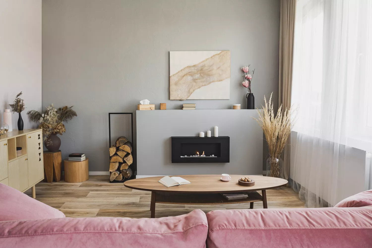
Bored With White Walls? Try One of These Designer-Recommended Neutral Paints Instead

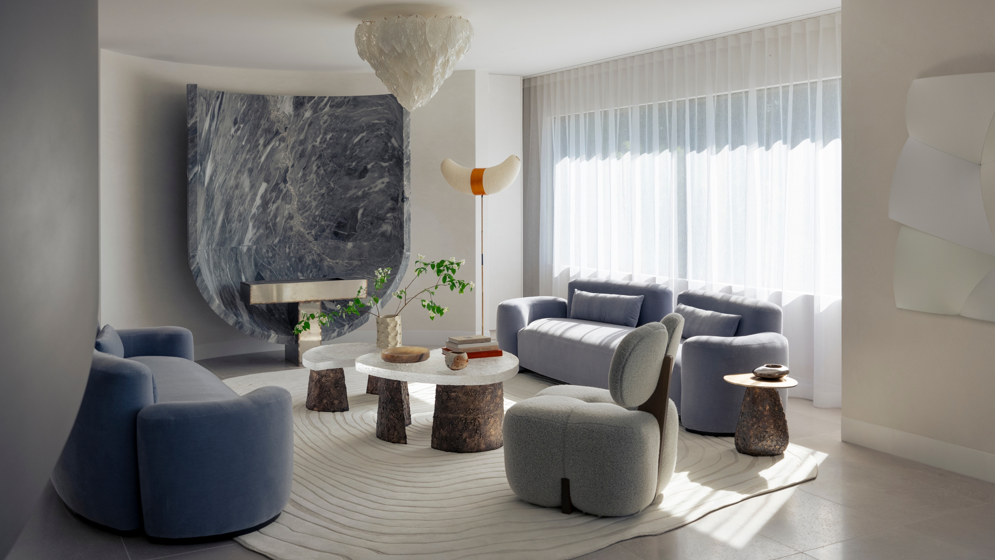
"Help, My White Walls Look Blue" — Here's Why It's Happening, and How to Fix This Common Problem

The Best White Paint Colors Experts Turn to Again and Again
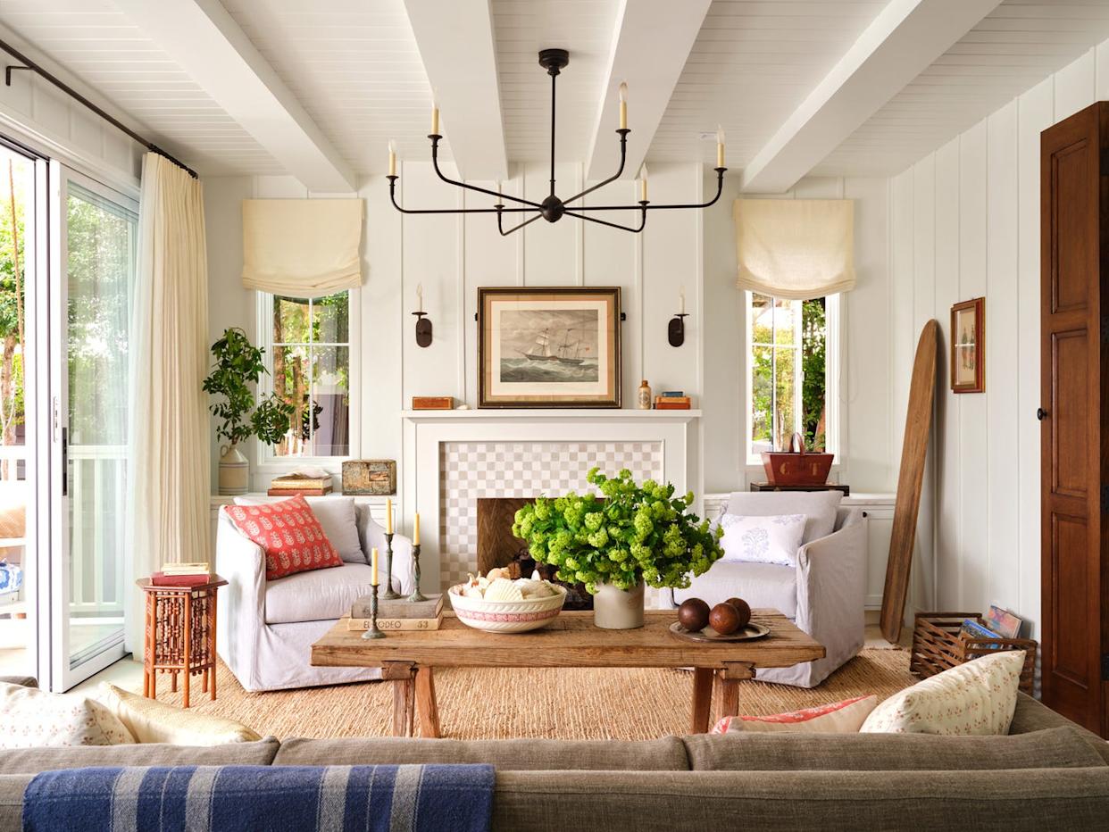
How to Pick the Best White Paint Color—Without the Headache
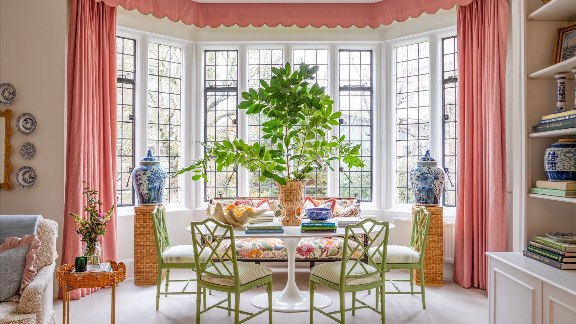
7 times you should never paint a room white

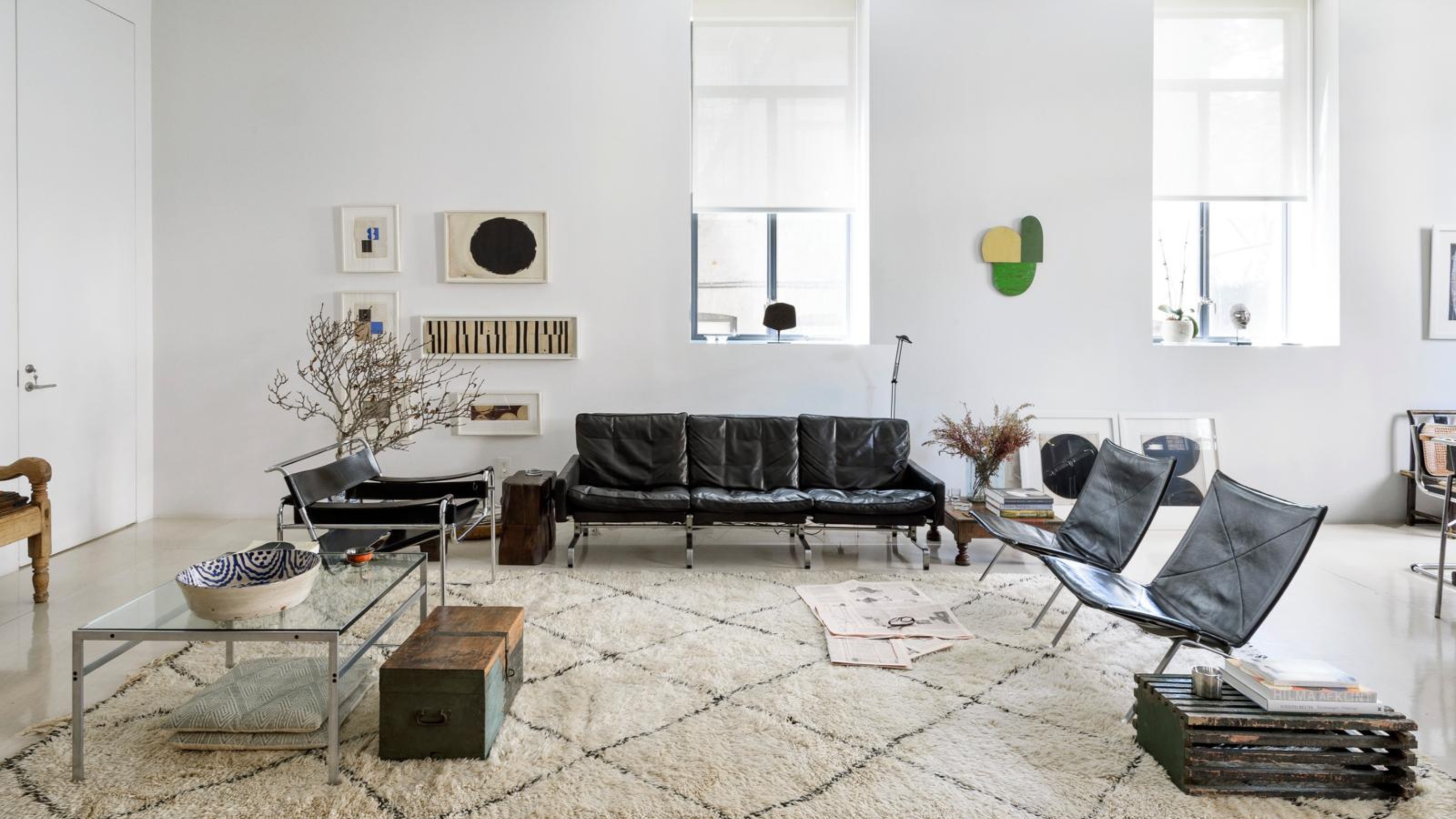
5 Problems With Painting Your Walls White That No-One Ever Talks About (Until Now)
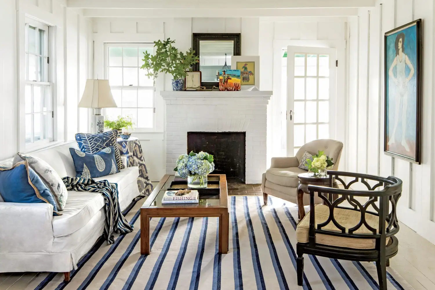
The Design Trick That Will Change How You Feel About White Walls
The 40 Best White Paint Colors, According to Designers
How White Wall Paint Can Transform the Look of Your Home | PS Home
The Best White Paint for Walls That Experts Swear By

I promise, these 6 best white Farrow & Ball paints will end your search for the perfect shade
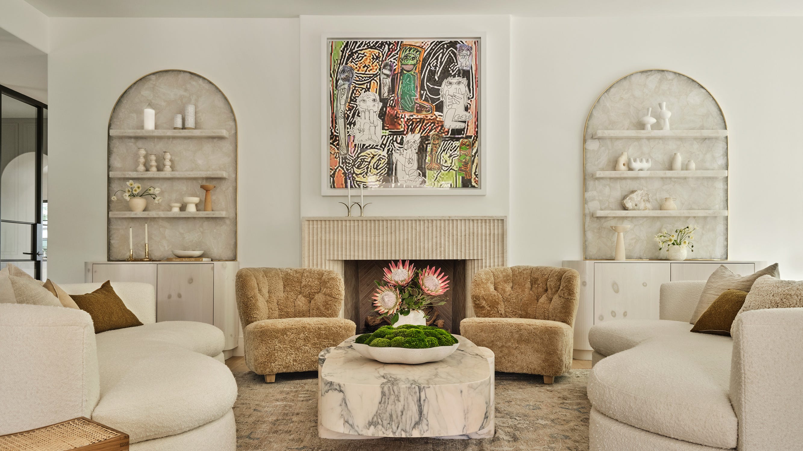
The 13 Best White Paint Colors That Interior Designers Swear By


13 Tried-and-True White Paint Colors Recommended by Pros

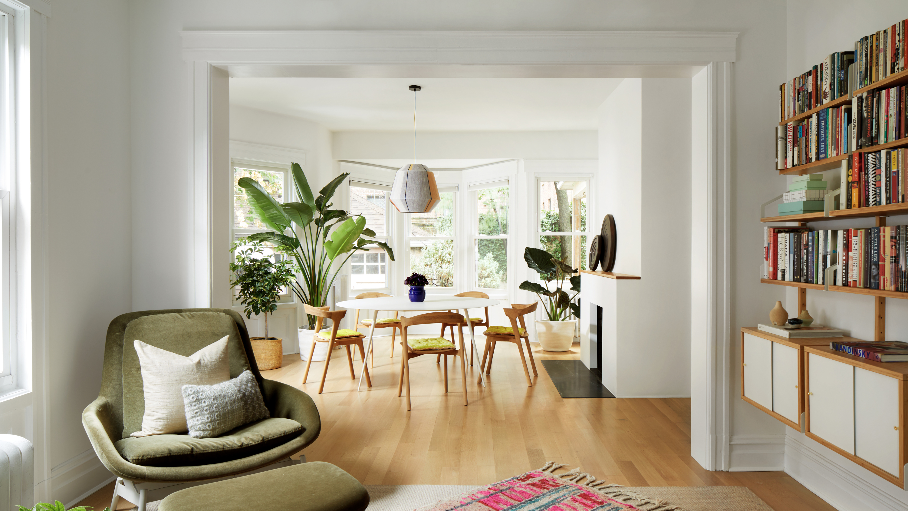
Are white walls still in style for 2023? How to rework this ‘vanilla’ palette for now, according to designers
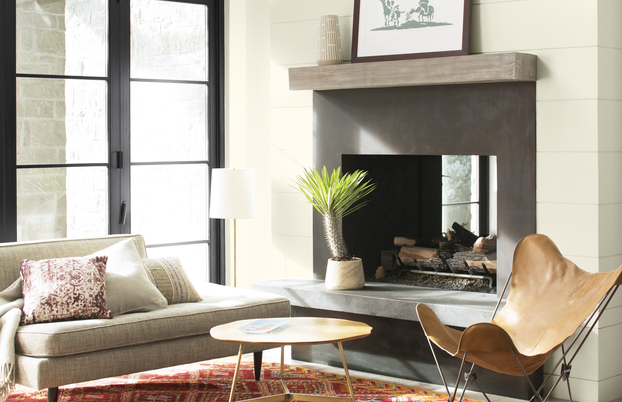
Best white paint colors: Expert share the top options

Which white paint is the best? Experts reveal the perfect shade of white for every room and feature
Real Simple Home Designers Share Their Secrets for Picking the Perfect Wall Color