


1/11
We asked 12 interior designers for their favorite Sherwin-Williams paints – these are the colors that came out on top
Choosing the right paint color for a home can be a challenging process, given the vast number of options available from brands like Sherwin-Williams, which alone offers over 1,700 shades. To simplify this decision, a panel of 12 interior designers shared their most preferred Sherwin-Williams paint colors across various categories, providing insights into their versatility and application in different home styles and settings.
For white paints, often considered the most difficult to select due to their varied reactions to lighting and accent colors, designers highlighted several go-to shades. Glenna Stone favors 'White Flour' and 'Origami White' for their versatility, suitable for both accents like millwork and entire rooms. She notes that 'Origami White' serves as an excellent neutral background, allowing for layered colors through furniture, while 'White Flour' brightens a room, especially when paired with natural elements. Devin Kimmel, an architect, recommends 'Pure White' and 'Greek Villa' for their light, airy feel, suitable for walls, ceilings, and moldings, and adaptable to different light sources. Shani Risinger Core champions 'Extra White' as the purest white with no hidden undertones, ideal for both interiors and exteriors, particularly when highlighting extensive art collections or ensuring a crisp look for cabinetry, trims, and walls.
In the gray paint spectrum, which ranges from subtle to bold, designers also have clear favorites. Devin Kimmel appreciates 'Drift of Mist' for its adaptability and warmth. Dani Crawford leans towards moodier shades like 'Peppercorn,' which offers rich charcoal tones without the intensity of true black. Nureed Saeed points to 'Mercurial' as the perfect greige, balancing gray, white, and beige, making it suitable for cabinetry, walls, and trim. Jessica Cinnamon prefers greige shades like 'Big Chill' for its undertones that complement busy stones, and 'Crushed Ice' for its warm, calming, and inviting qualities.
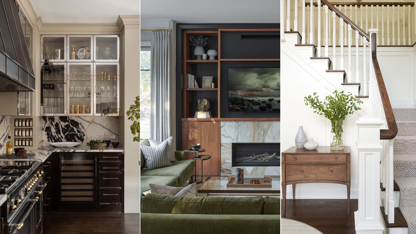
Black paints are used by designers to make a bold statement and create cozy yet impactful spaces. Jessica Cinnamon used 'Black Magic' to highlight a built-in entertainment center, grounding lighter colors in the room. Dani Crawford and Taylor Lewis-Costa favor 'Iron Ore' for its depth and drama, especially when contrasted with light hues, giving spaces a modern feel. Taylor also mentions 'Black Fox' for its blend of warm and cool undertones, adding romance and masculinity. Matthew O'Grady finds 'Tricorn Black' intensely sophisticated and versatile, using it to highlight accent walls and recommending contrasting shades like crisp whites or vintage golds to make the color pop.
Blue, a popular and versatile color, offers a wide range of shades. Glenna Stone used 'Turkish Tile' in a home office for a bold, jewel-toned statement that can extend to the ceiling. Jennifer Verruto suggests 'Gale Force' for kitchen cabinetry as an accent, bringing color and depth. Dani Crawford recommends 'Dark Night' for a luxurious feel, while Devin Kimmel prefers 'Loyal Blue' for a more traditional pop of color, both suitable for moody living room designs.
Purple paints, though less common, can be powerful, especially for creating dramatic and character-filled spaces. Devin Kimmel suggests 'Plum Brown' and 'Marooned' as versatile options that bring drama and character, particularly for those who appreciate a bold, jewel-tone palette, aligning with styles like Art Deco.
Green paints, with their earthy hues, offer a rich palette. Donna Mondi used 'Cocoon,' a dark green-gray, in a dining room for a dramatic, moody environment, applicable to walls, ceilings, millwork, and furniture. Elizabeth Drake recommends 'Rain Washed' and 'Piedmont' for lighter, barely-there green-blue-celadon shades, avoiding overly yellow or blue undertones. Matthew O'Grady praises 'Sea Salt' for its serenity, suggesting it for bathrooms or bedrooms to create a calm, spa-like atmosphere, paired with white furnishings and natural wood.
Brown, projected to be a dominant color trend, is embraced for its comforting and welcoming qualities. Donna Mondi highlights 'French Roast,' a deep brown with red undertones, for its ability to infuse color and depth into various spaces, such as contrasting with bright windows and textured curtains in a home office.
Finally, for neutral paints beyond white, black, and gray, designers offer more choices. Donna Mondi selects 'Shiitake,' a warm stone gray, for its chameleon-like ability to complement wooden cabinetry and stone countertops. Glenna Stone includes 'Skipping Rocks' for its versatility as a non-imposing neutral, suitable for accents or entire rooms. Taylor Lewis-Costa calls 'Agreeable Gray' a classic, adaptable to any home and personality, with subtle pink undertones that make it light and agile for any space.
These expert recommendations provide valuable guidance for selecting Sherwin-Williams paint colors, ensuring a stylish and effective outcome for any interior design project.
#InteriorDesign #PaintColors #SherwinWilliams #HomeDecor #DesignerFavorites #ColorTrends #WhitePaint #GrayPaint #BlackPaint #BluePaint #GreenPaint #NeutralPaint #PurplePaint #BrownPaint #InteriorDesign #PaintColors #SherwinWilliams #HomeDecor #DesignerFavorites #ColorTrends #WhitePaint #GrayPaint #BlackPaint #BluePaint #GreenPaint #NeutralPaint #PurplePaint #BrownPaint