1/8
7 times you should never paint a room white
White paint is often considered a universal neutral in interior design, providing a clean and fresh backdrop that complements various aesthetics. However, relying solely on white can sometimes lead to a sterile, cold, or uninviting atmosphere, depending on the room's specific characteristics. This article identifies seven scenarios where using white paint might be counterproductive and offers alternative color strategies to achieve a more desirable effect.
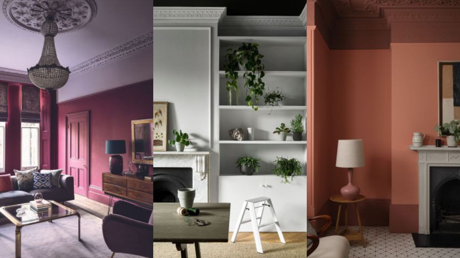
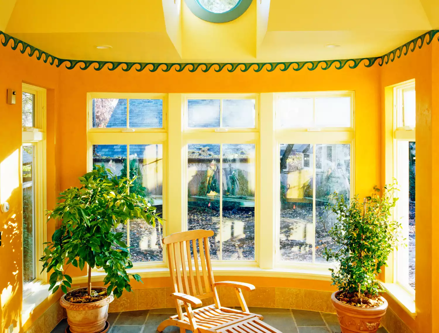
Firstly, for rooms with limited natural light, white paint, contrary to popular belief, can make the space appear dull and dingy rather than bright. The absence of adequate light prevents white from reflecting and instead causes it to look flat and lifeless. In such cases, leaning into warmer tones can create a cozier and more balanced environment.
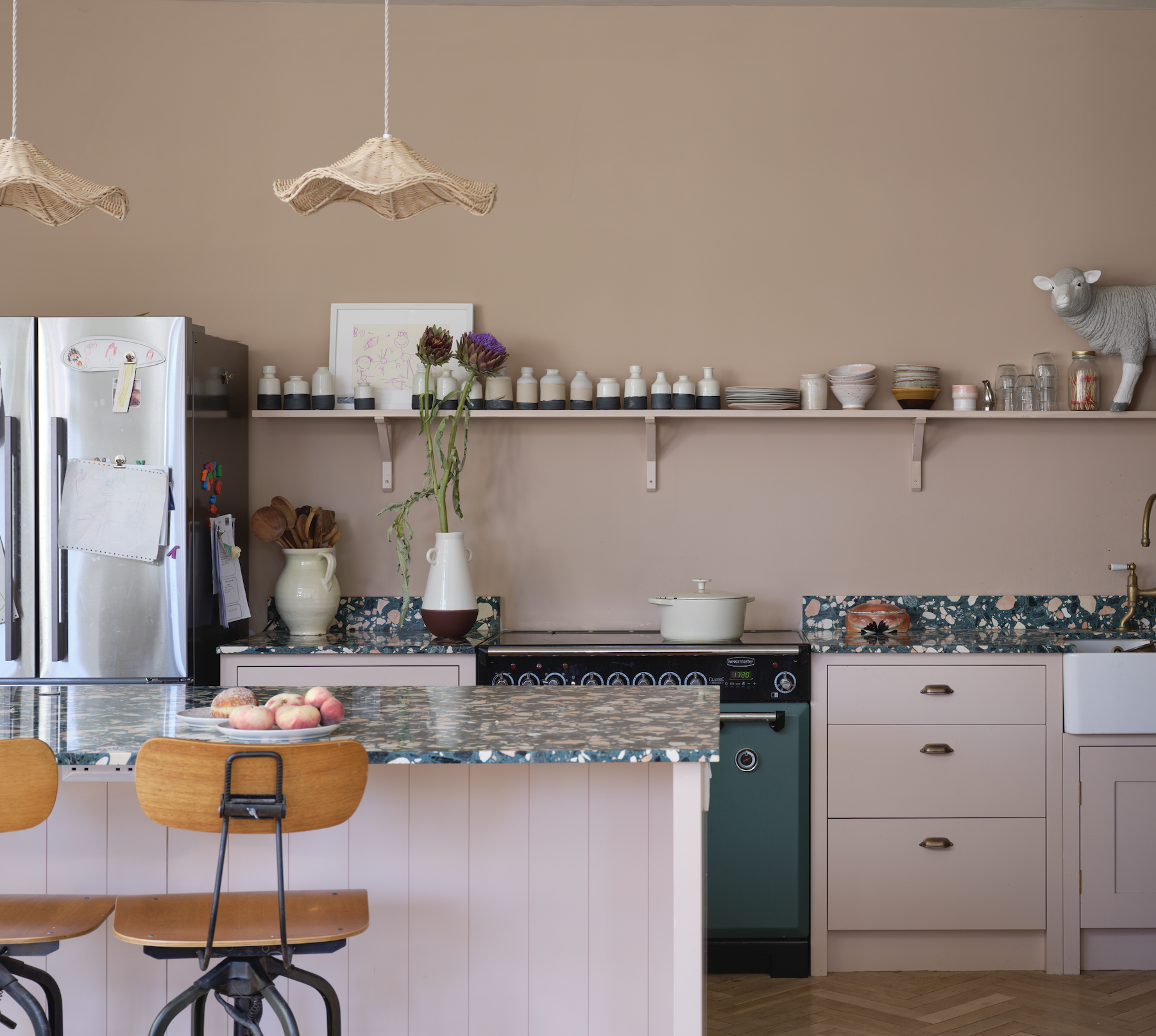
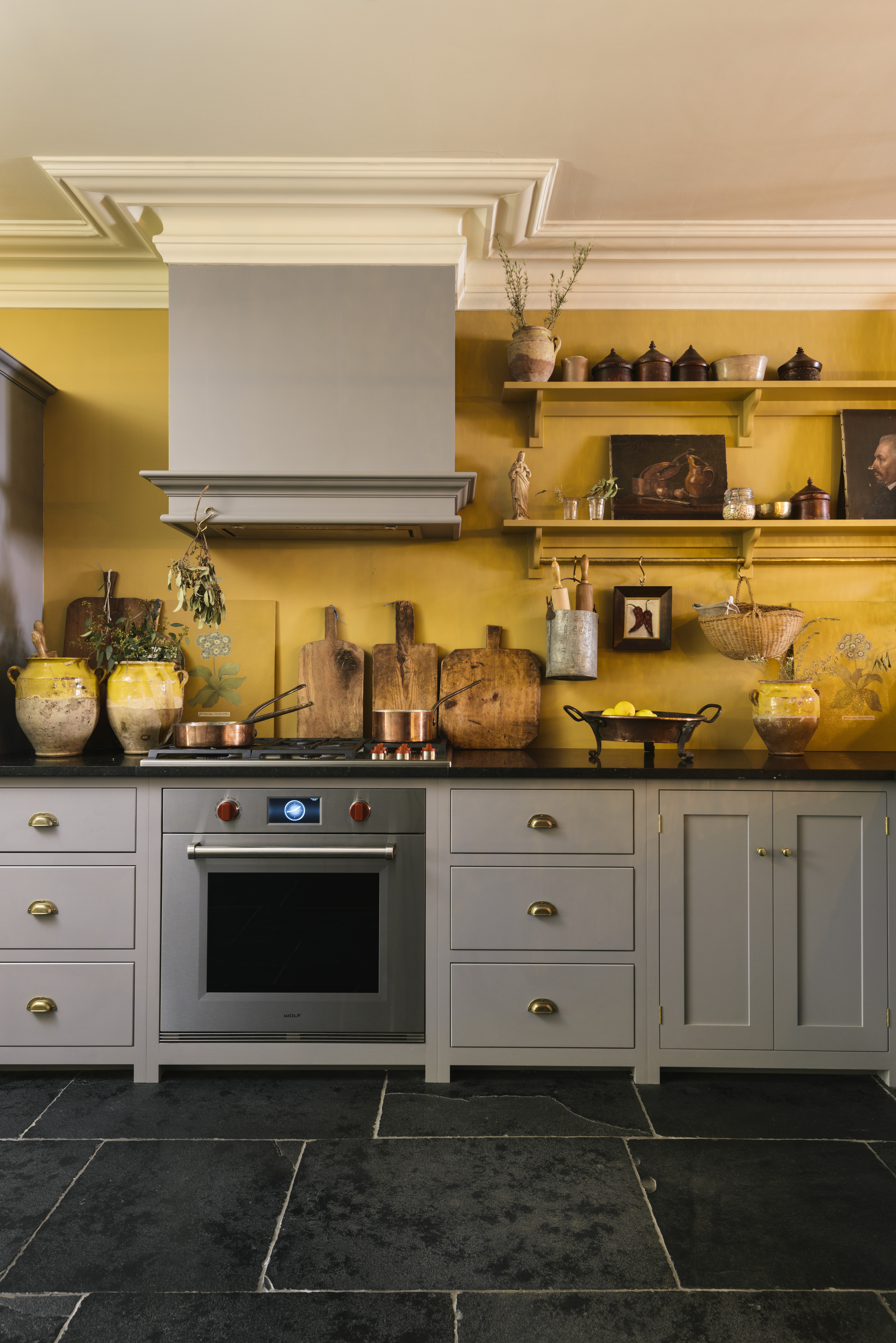
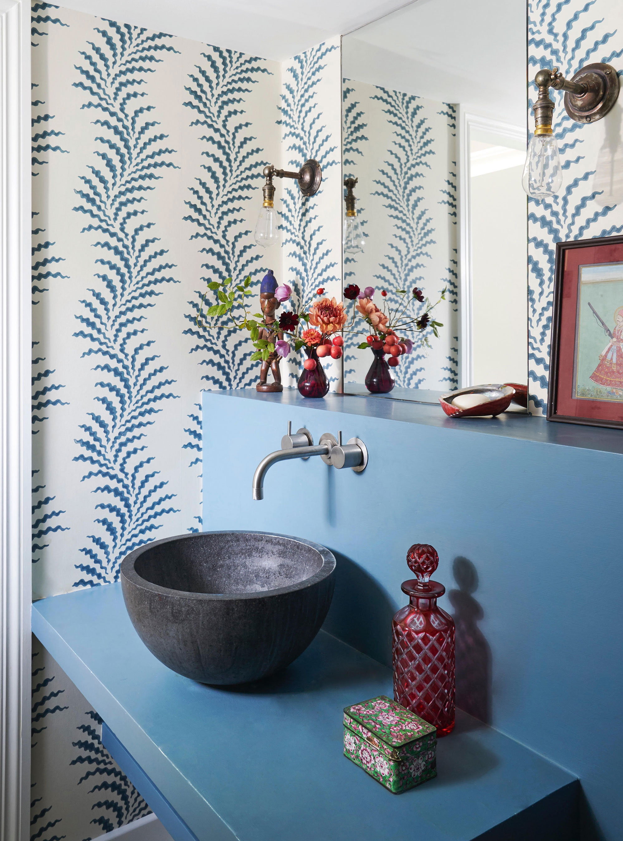
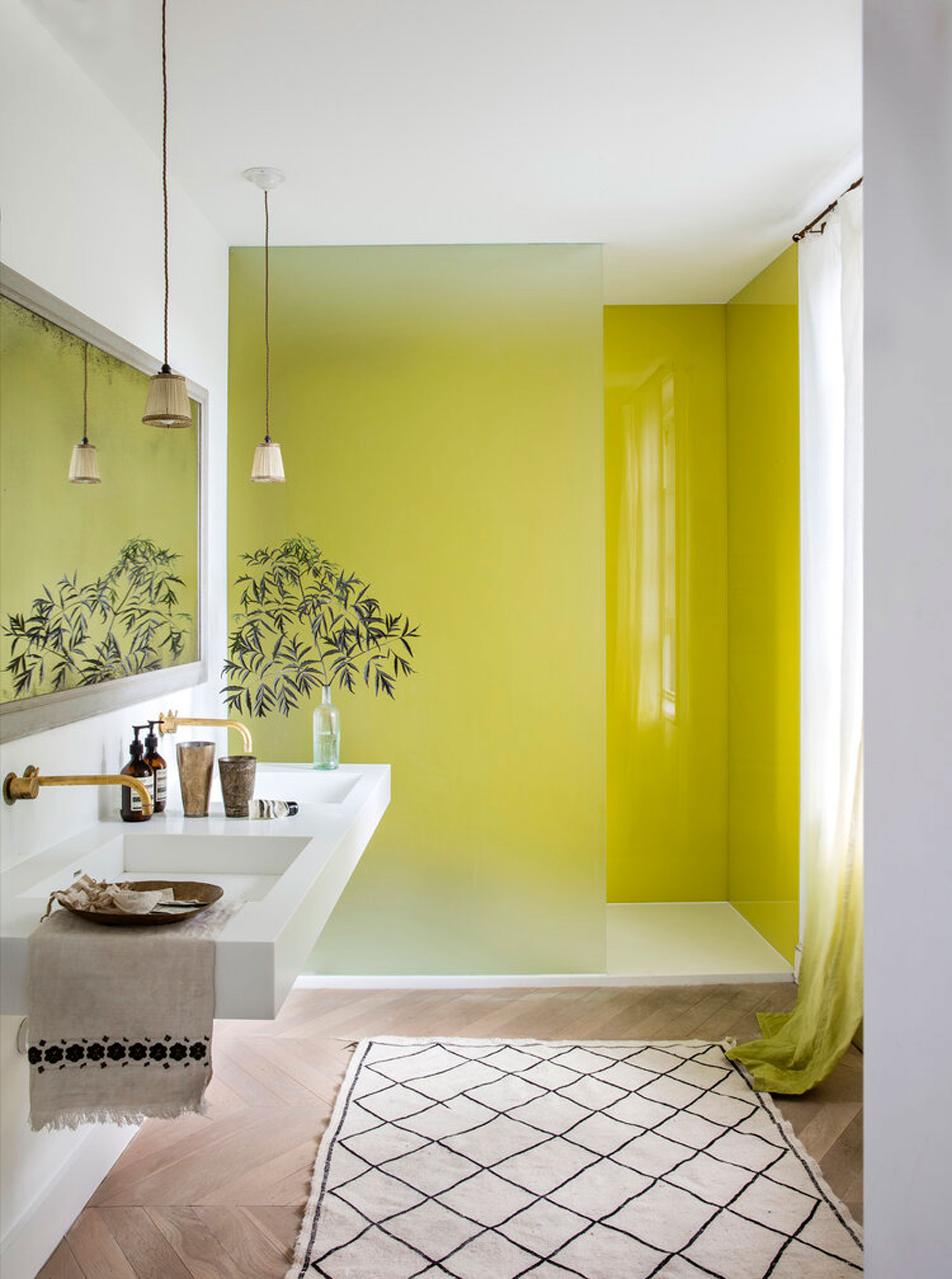
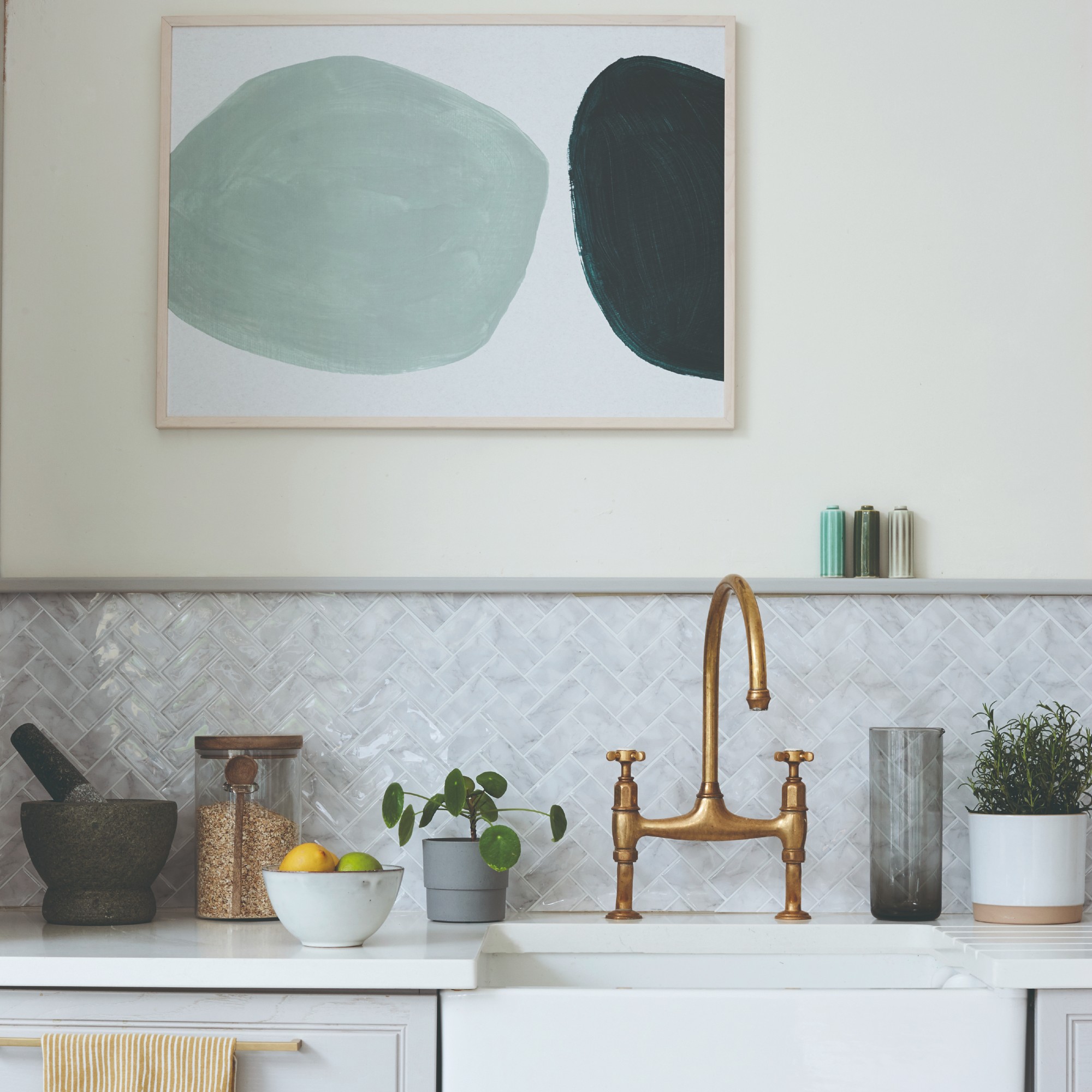
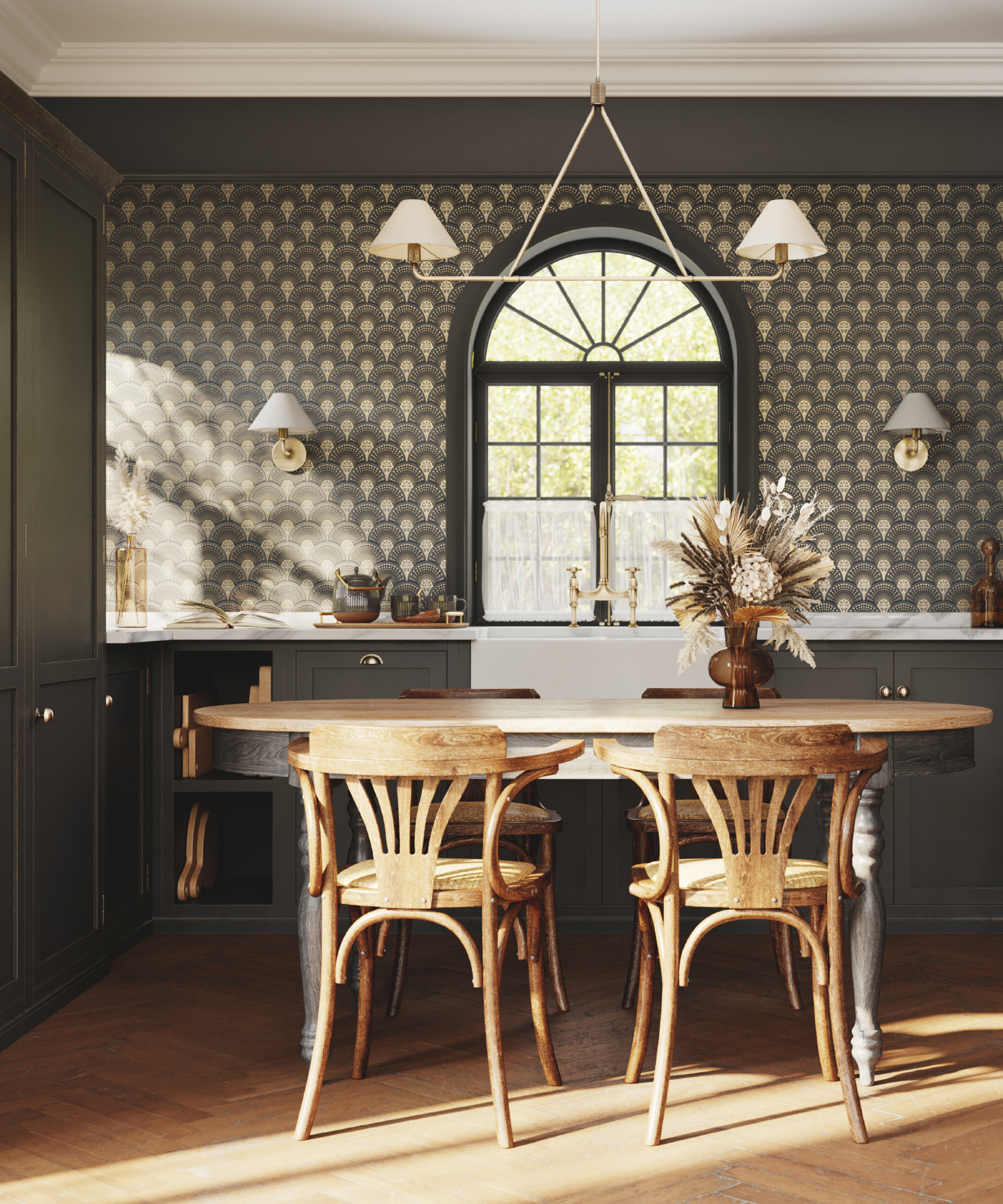
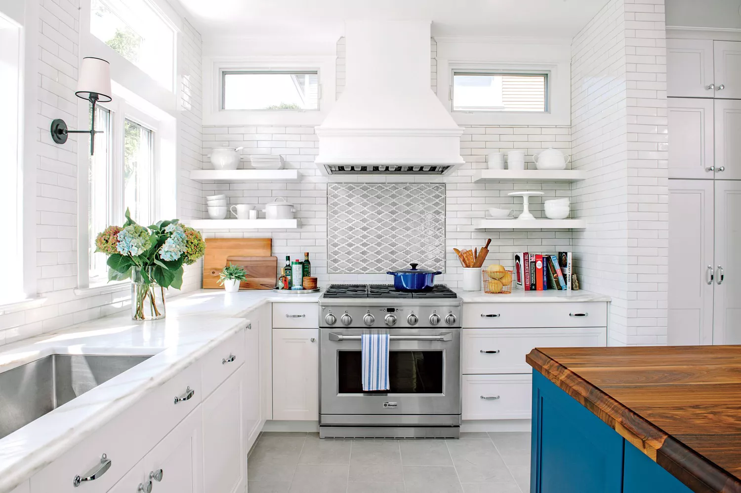
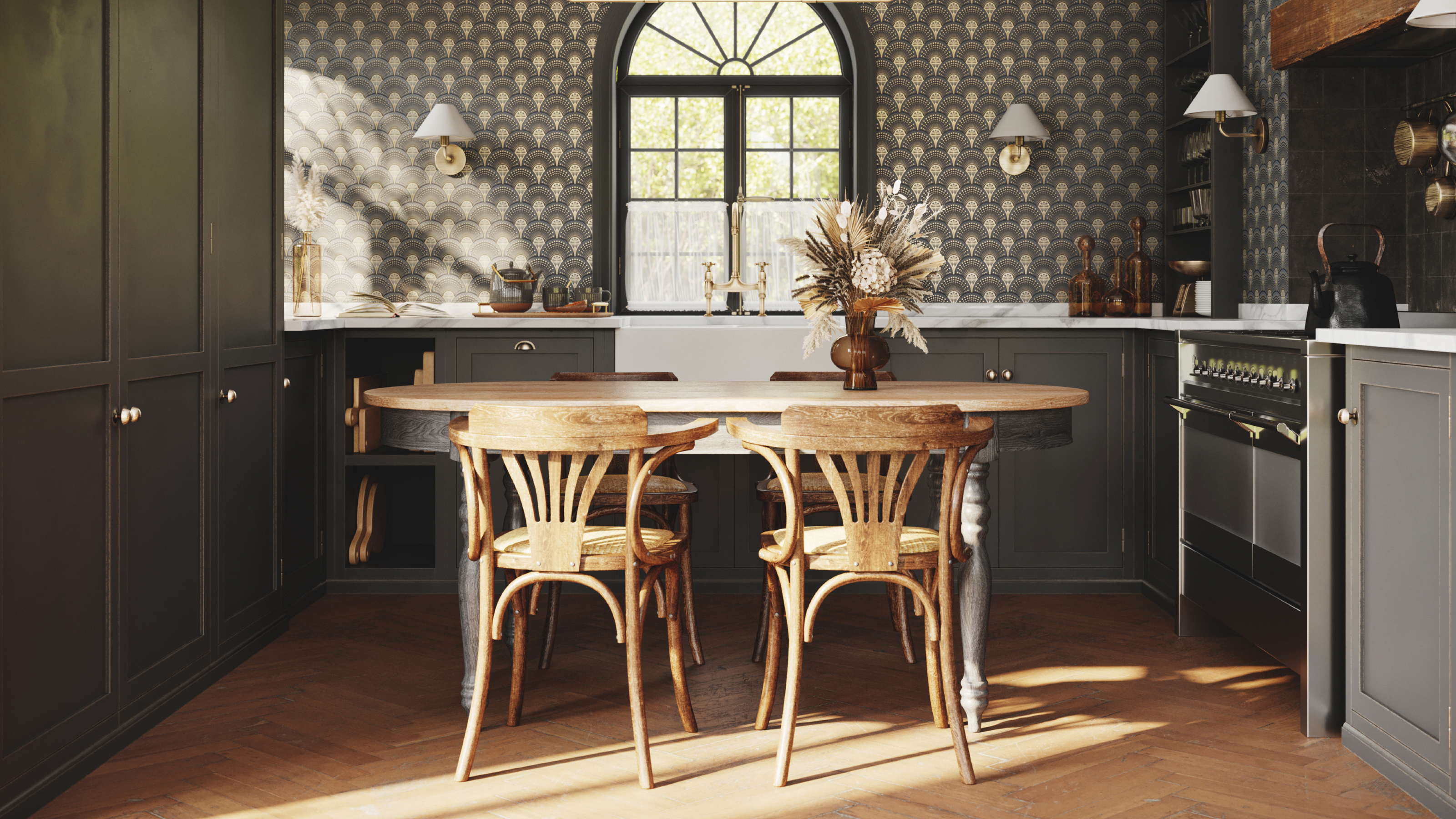
Secondly, bathrooms, with their abundance of hard surfaces and fixtures, can feel overly clinical when painted entirely white. Instead of stark white, introducing colorful or patterned wallpaper can add character and a dynamic color palette. Pulling accent colors from the wallpaper for vanities or tiles can bring warmth and energy to these often light-limited spaces.
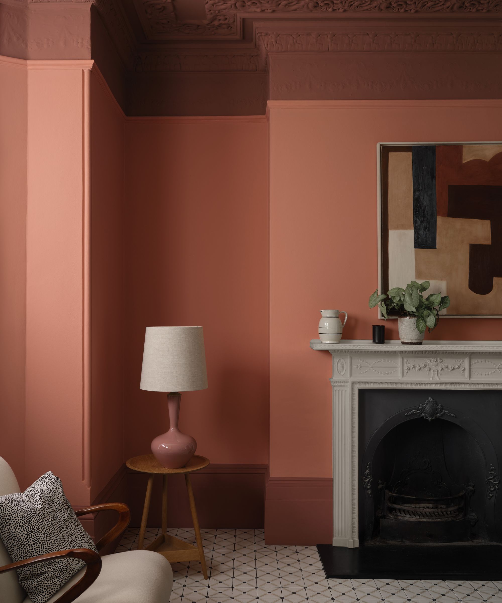
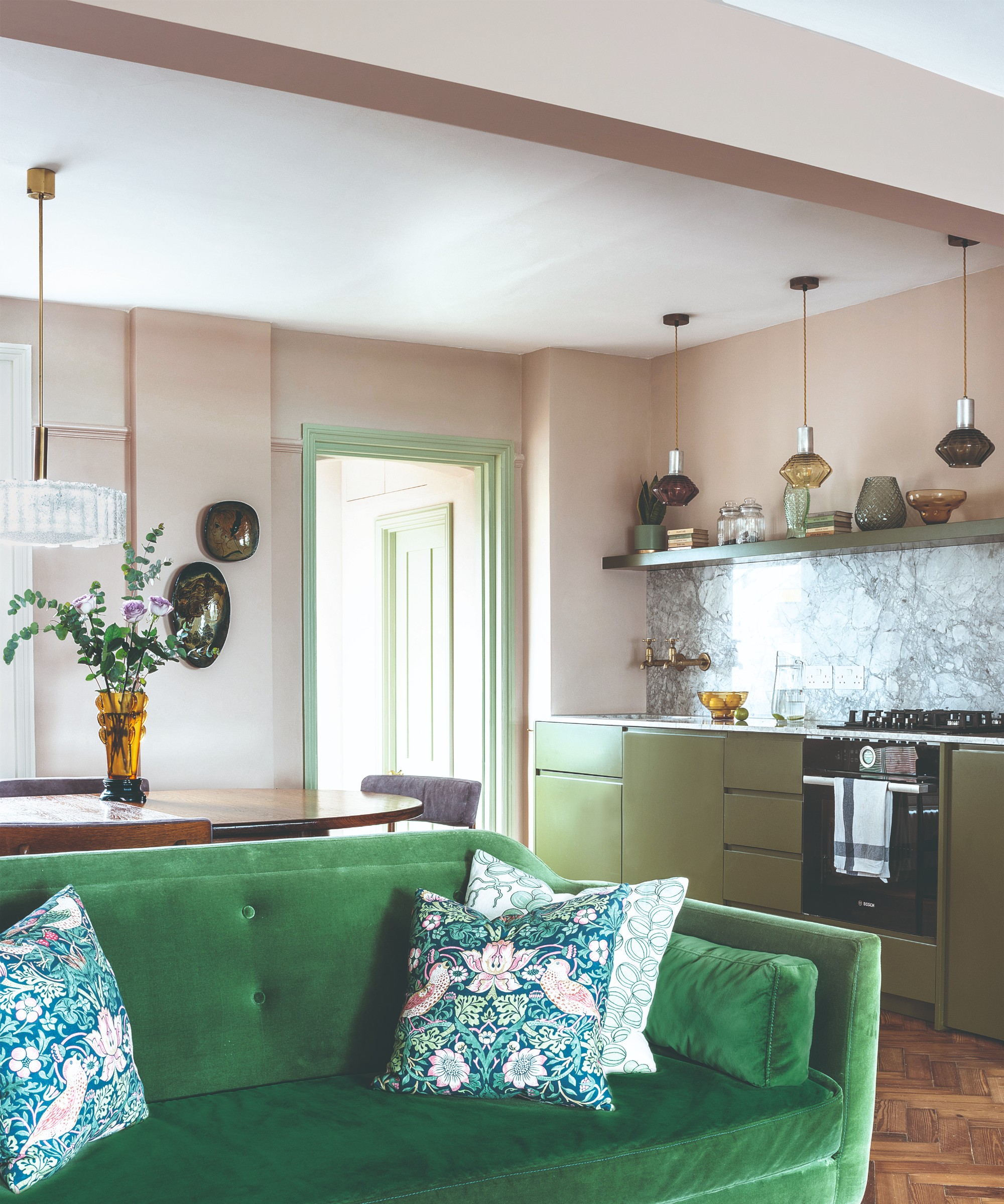
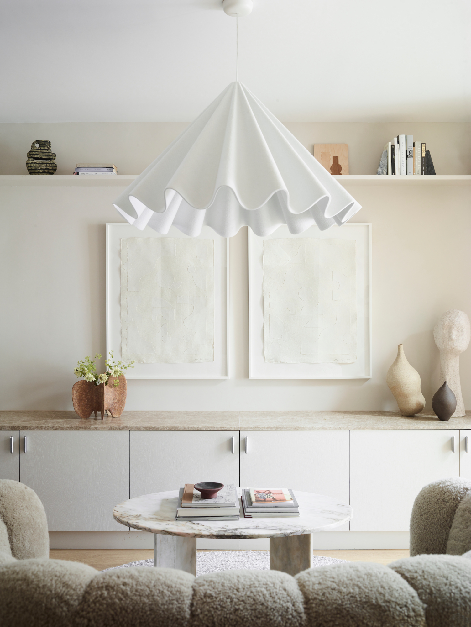
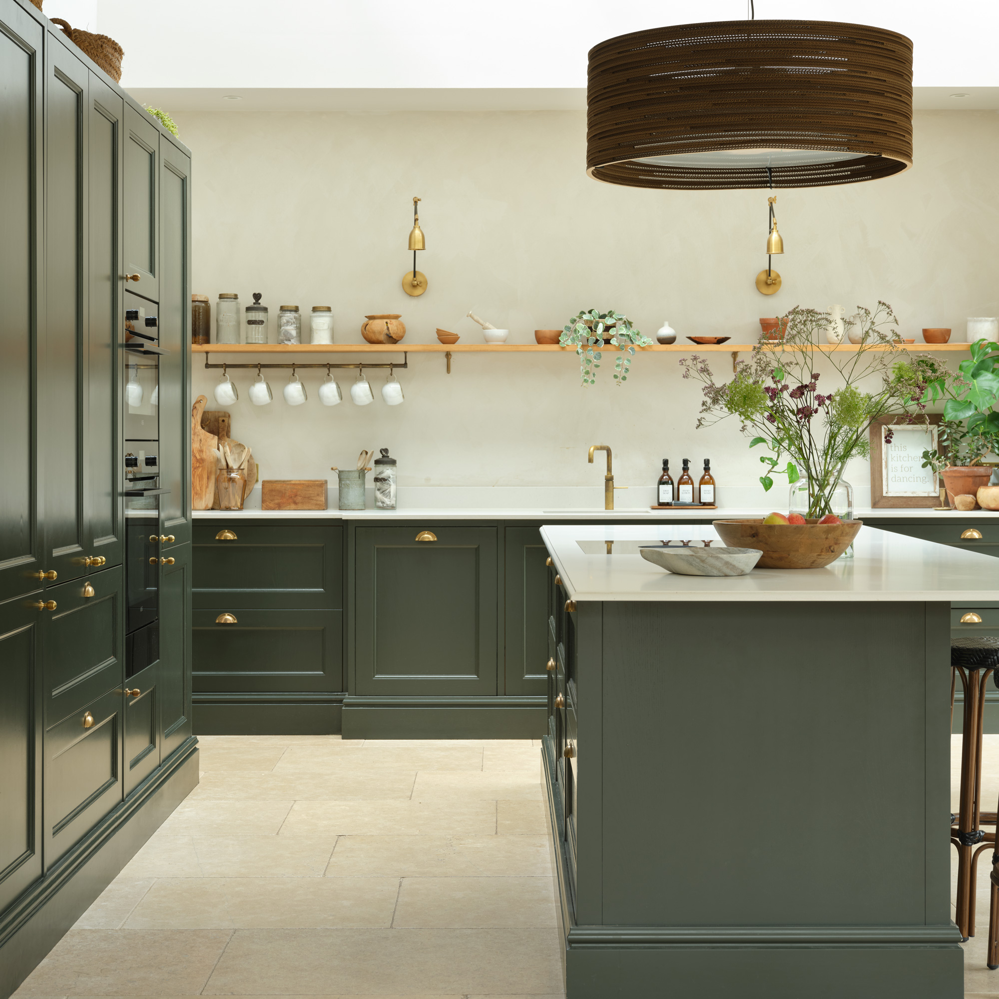
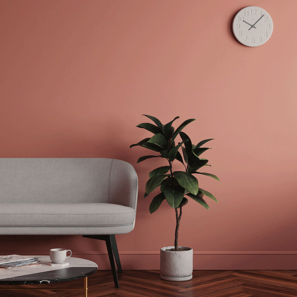
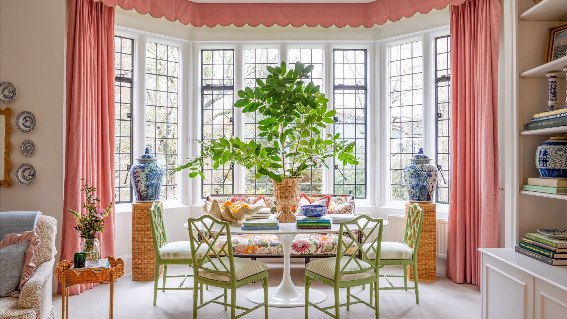
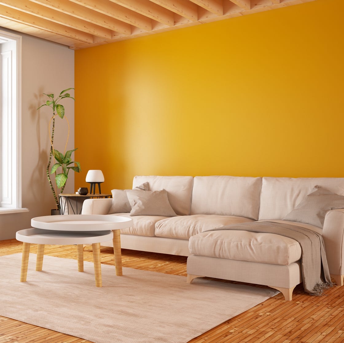
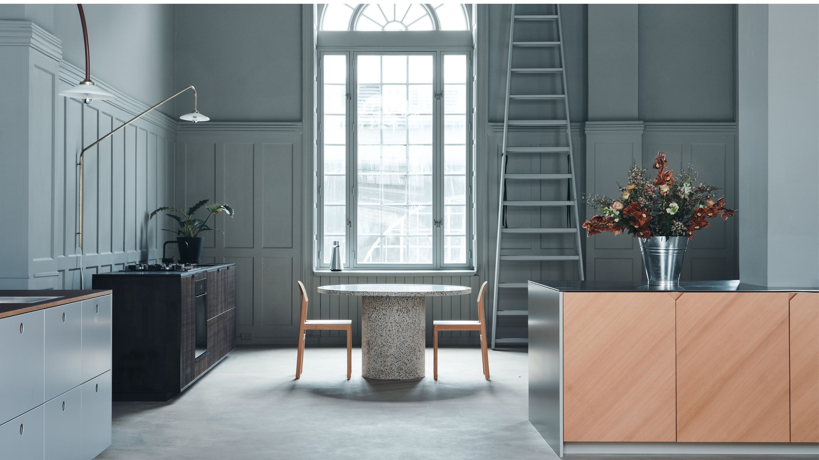
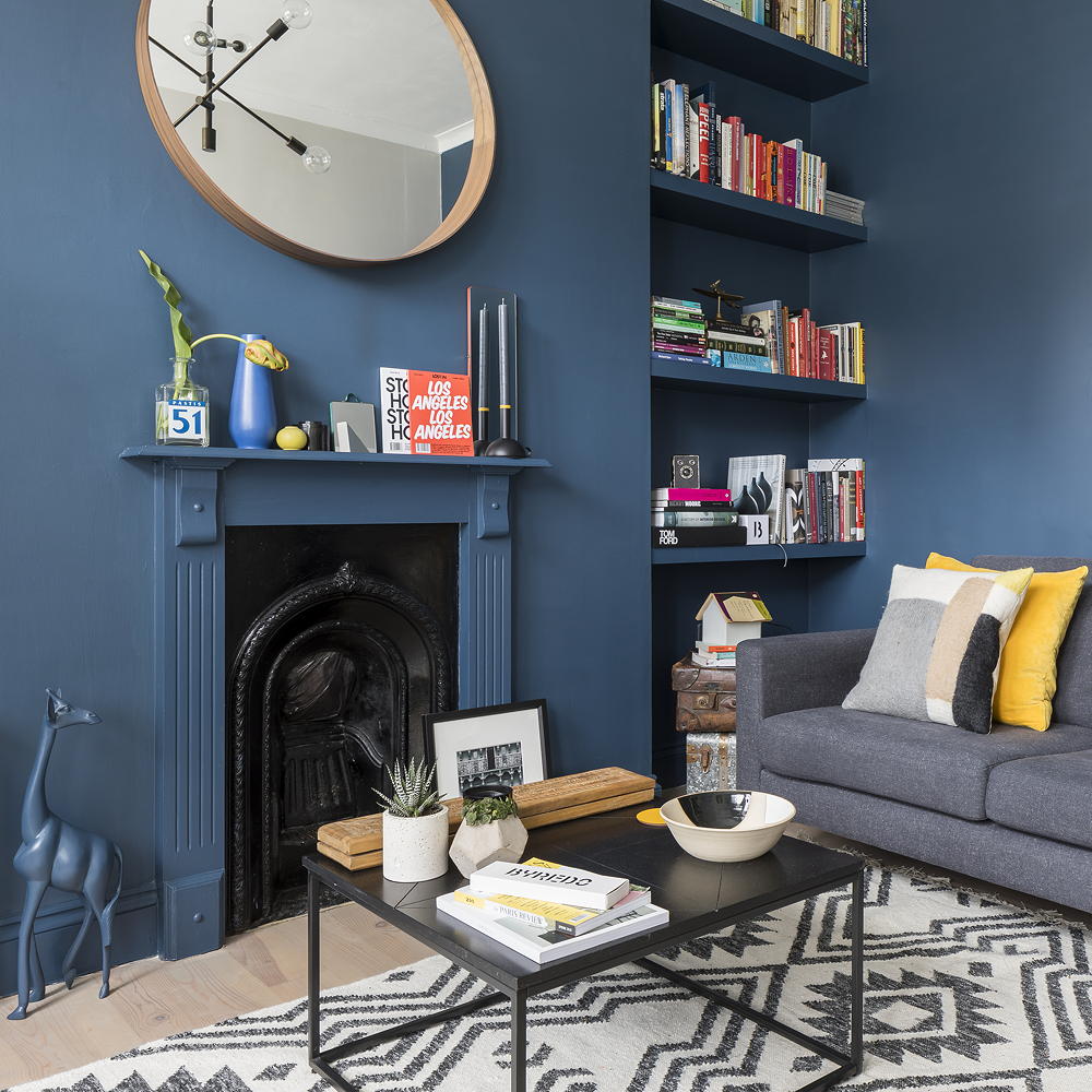
Thirdly, large open-plan areas painted completely white can lack definition and warmth, appearing as an undifferentiated expanse. To mitigate this, visual layering and strategic doses of color or texture are essential. Soft neutrals, or even blues and greens with gray undertones, can make the space feel more cohesive and spacious by visually receding and connecting to nature.
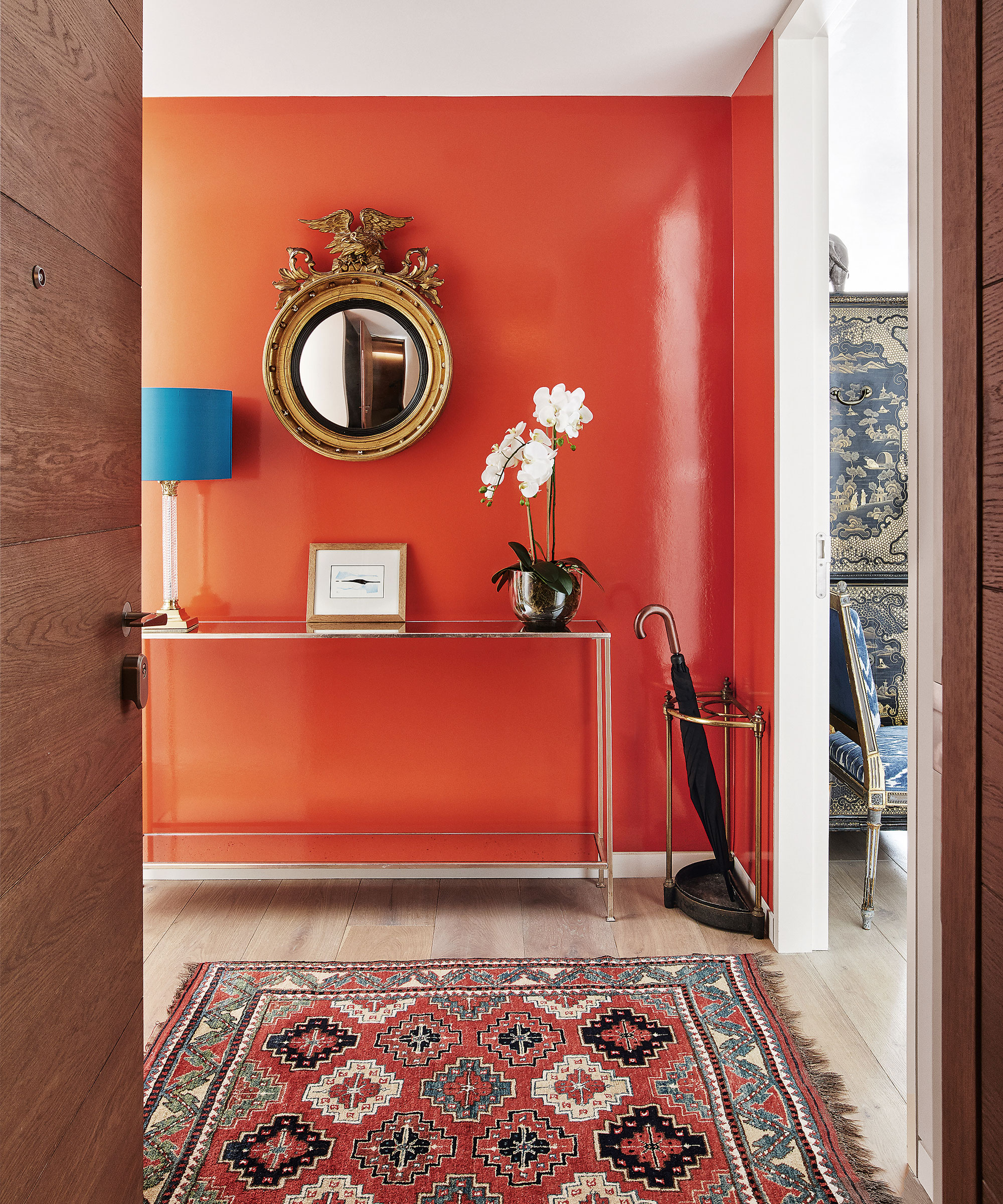
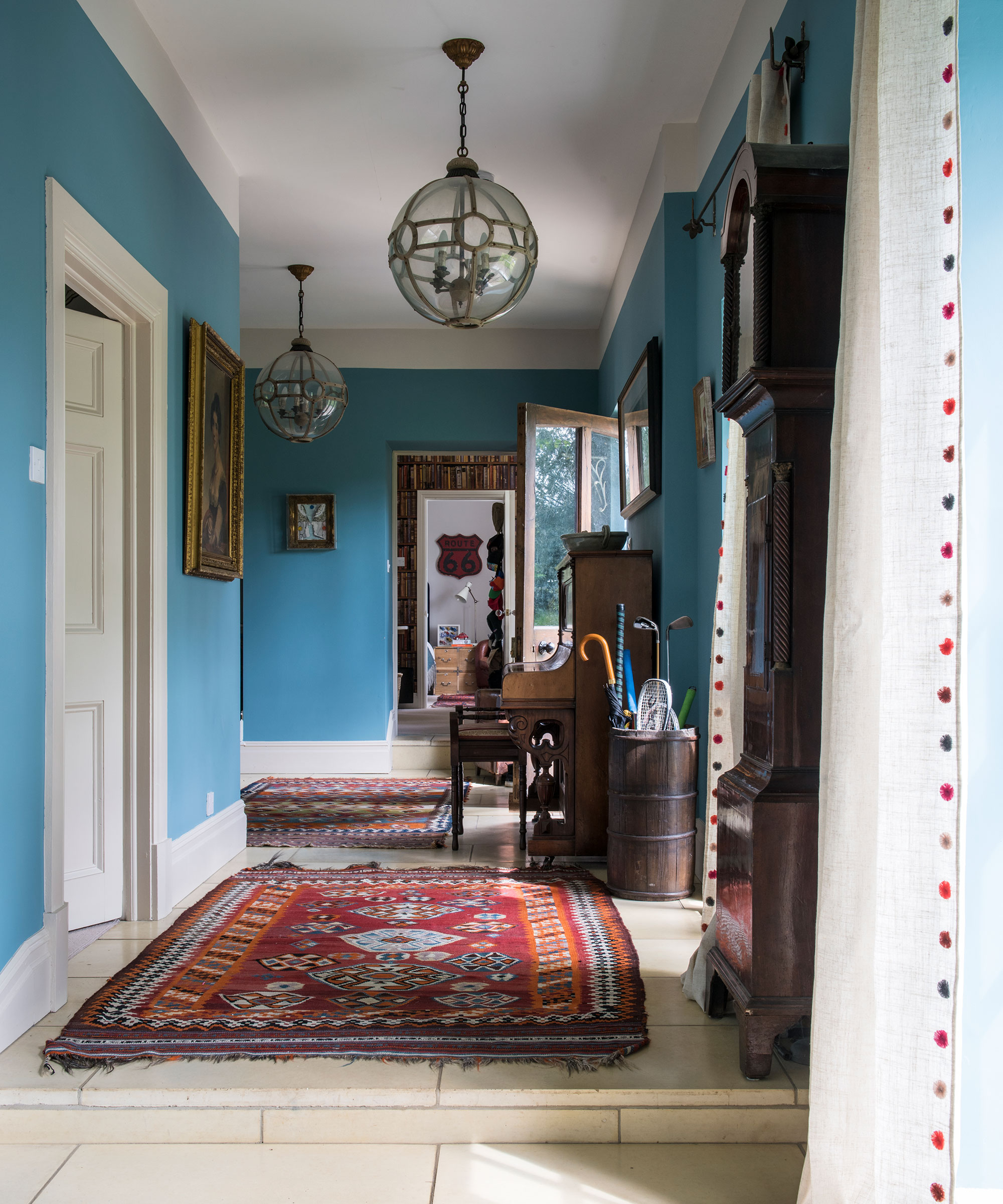
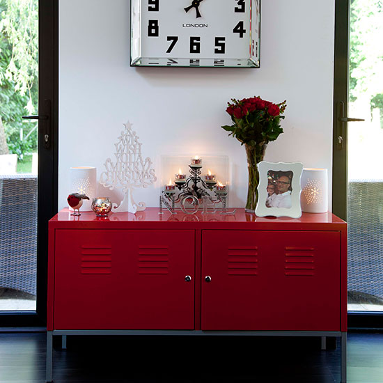
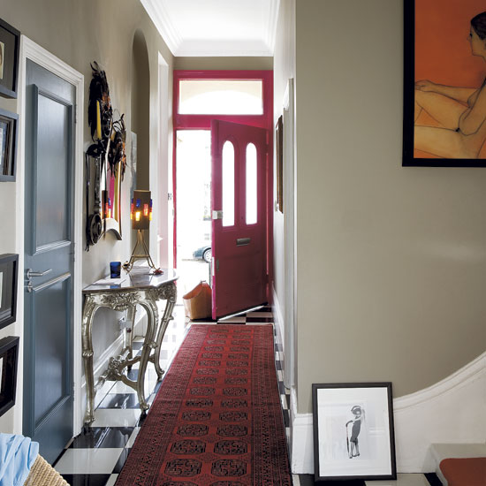
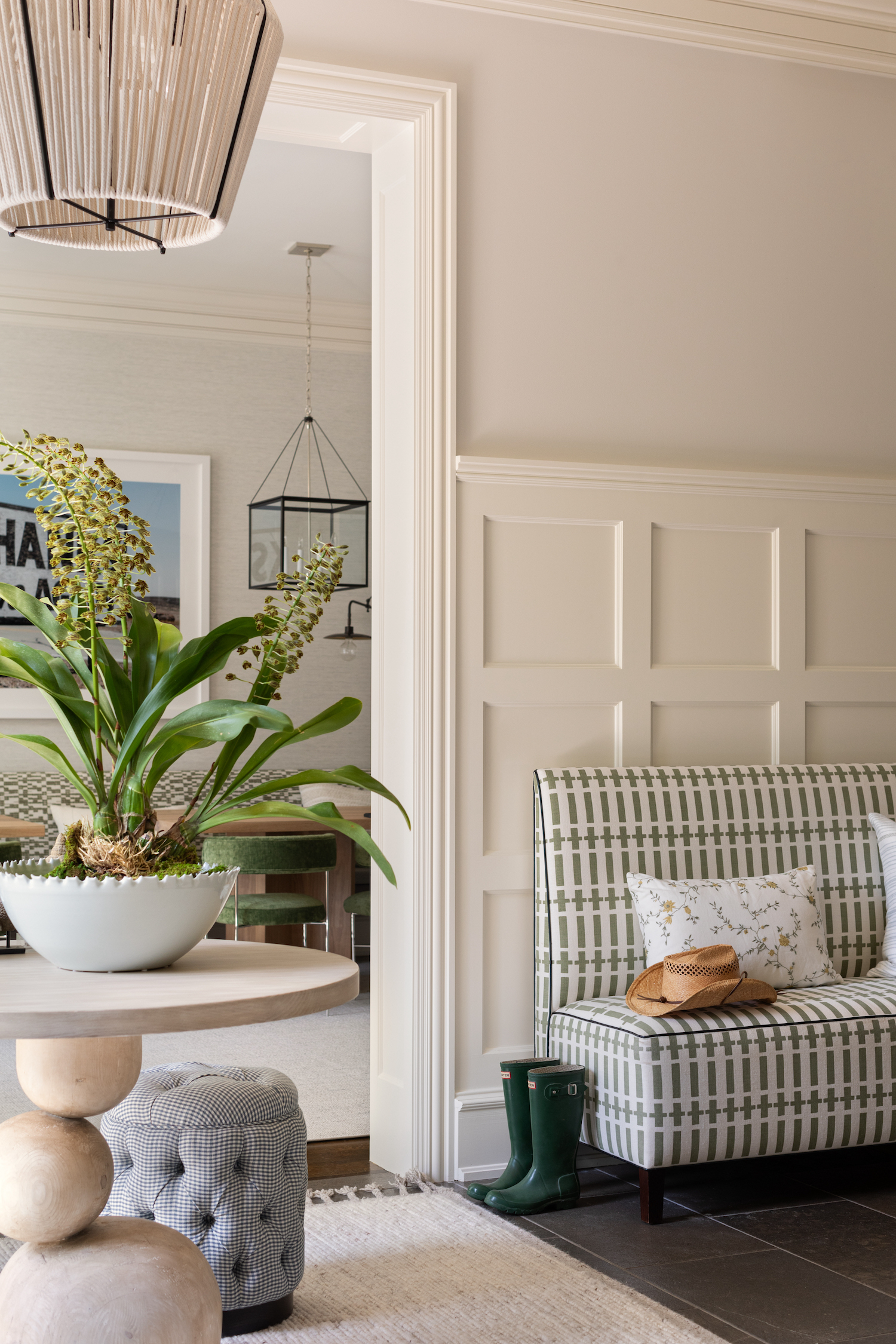
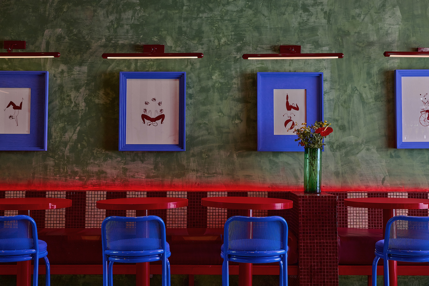
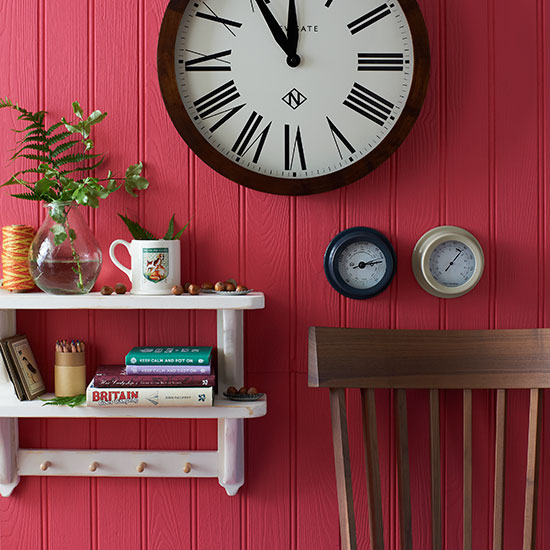
Fourthly, high-traffic areas like entryways and boot rooms are generally unsuitable for white paint. White surfaces in these zones quickly show dirt, scuffs, and wear, requiring frequent repainting. Textured alternatives like clay, limewash, or subtly tinted plaster offer greater durability and visual interest while reducing maintenance.
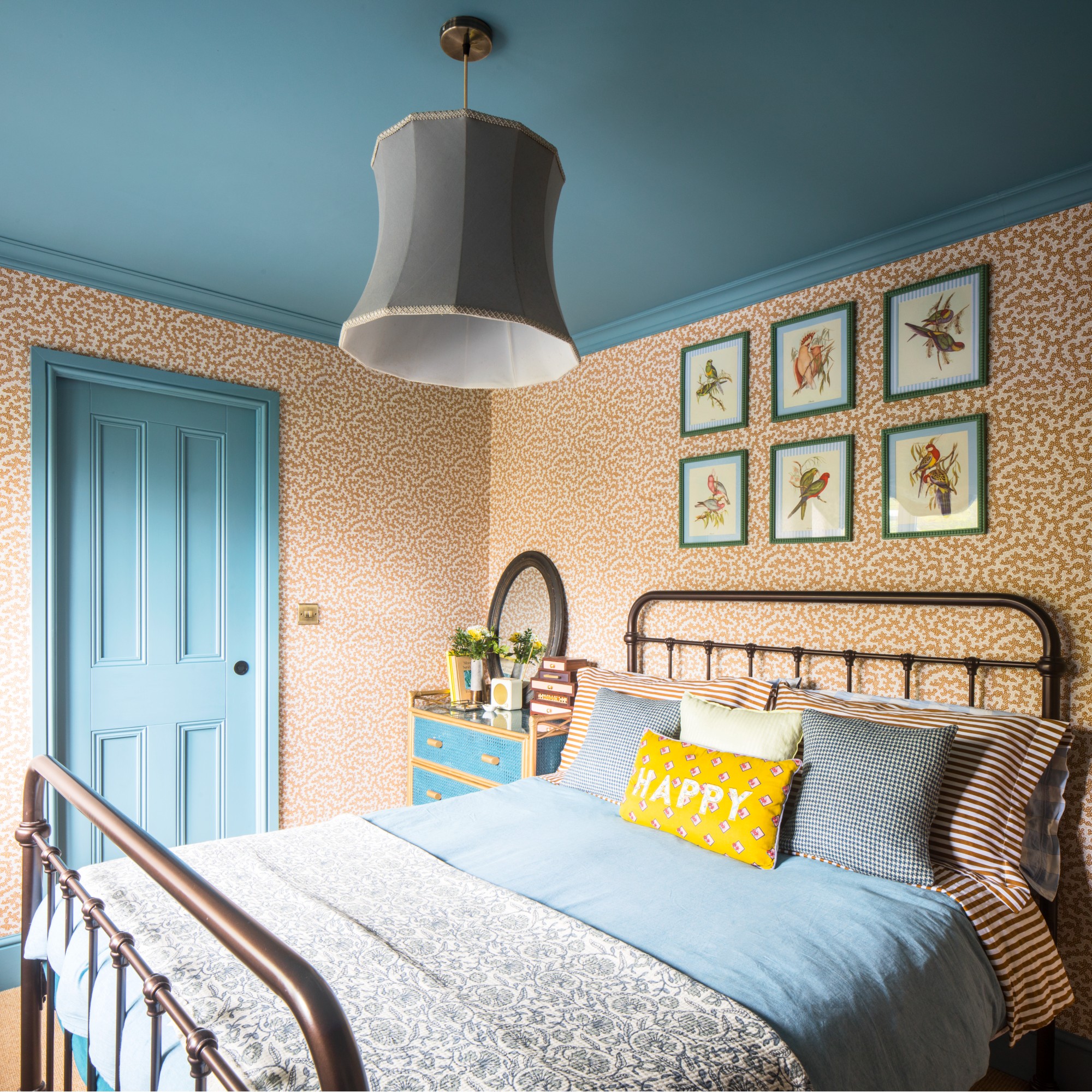
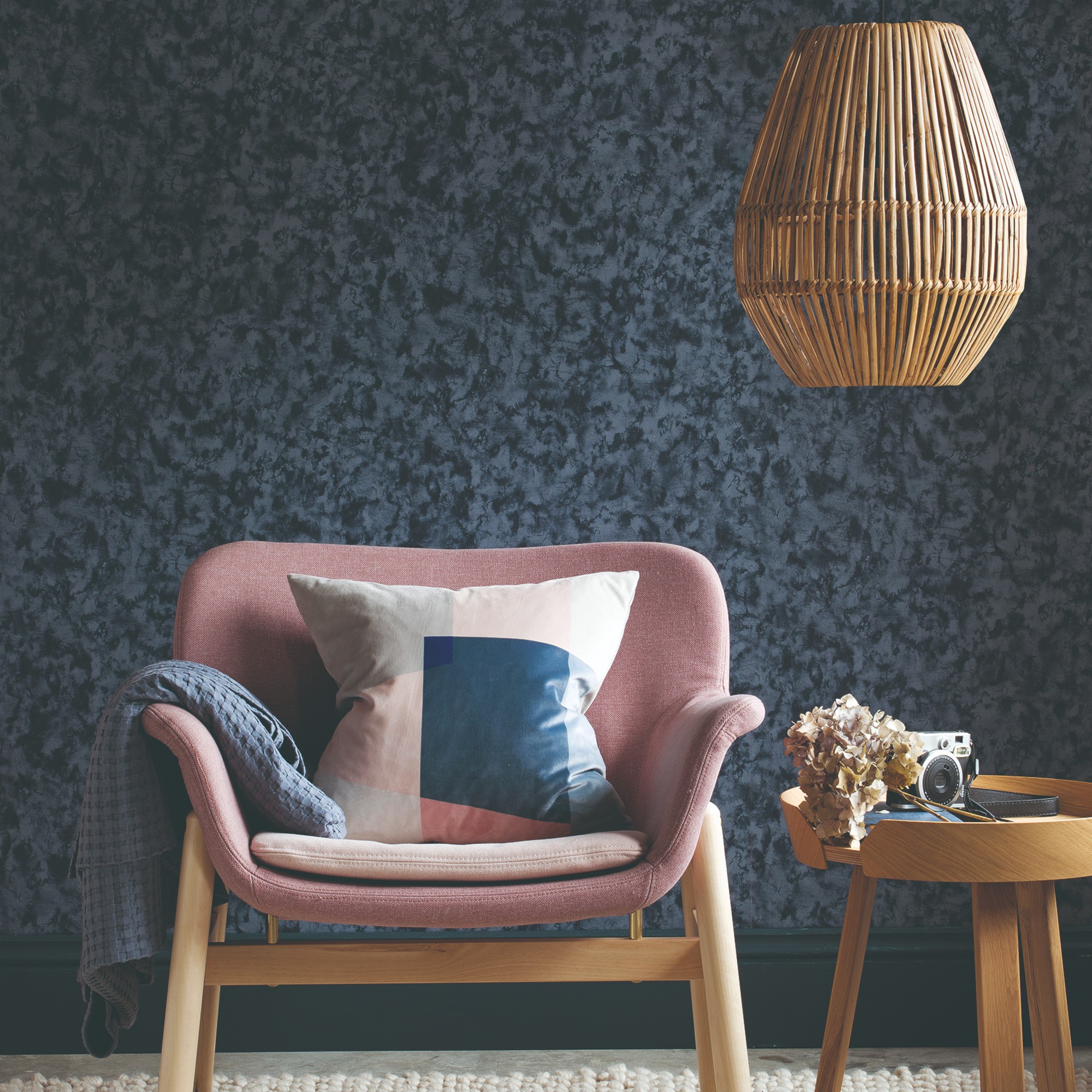
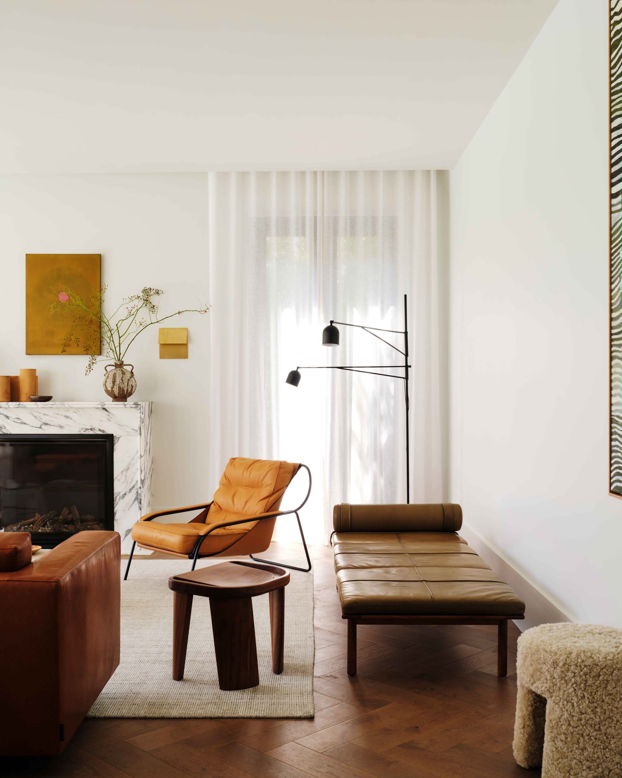
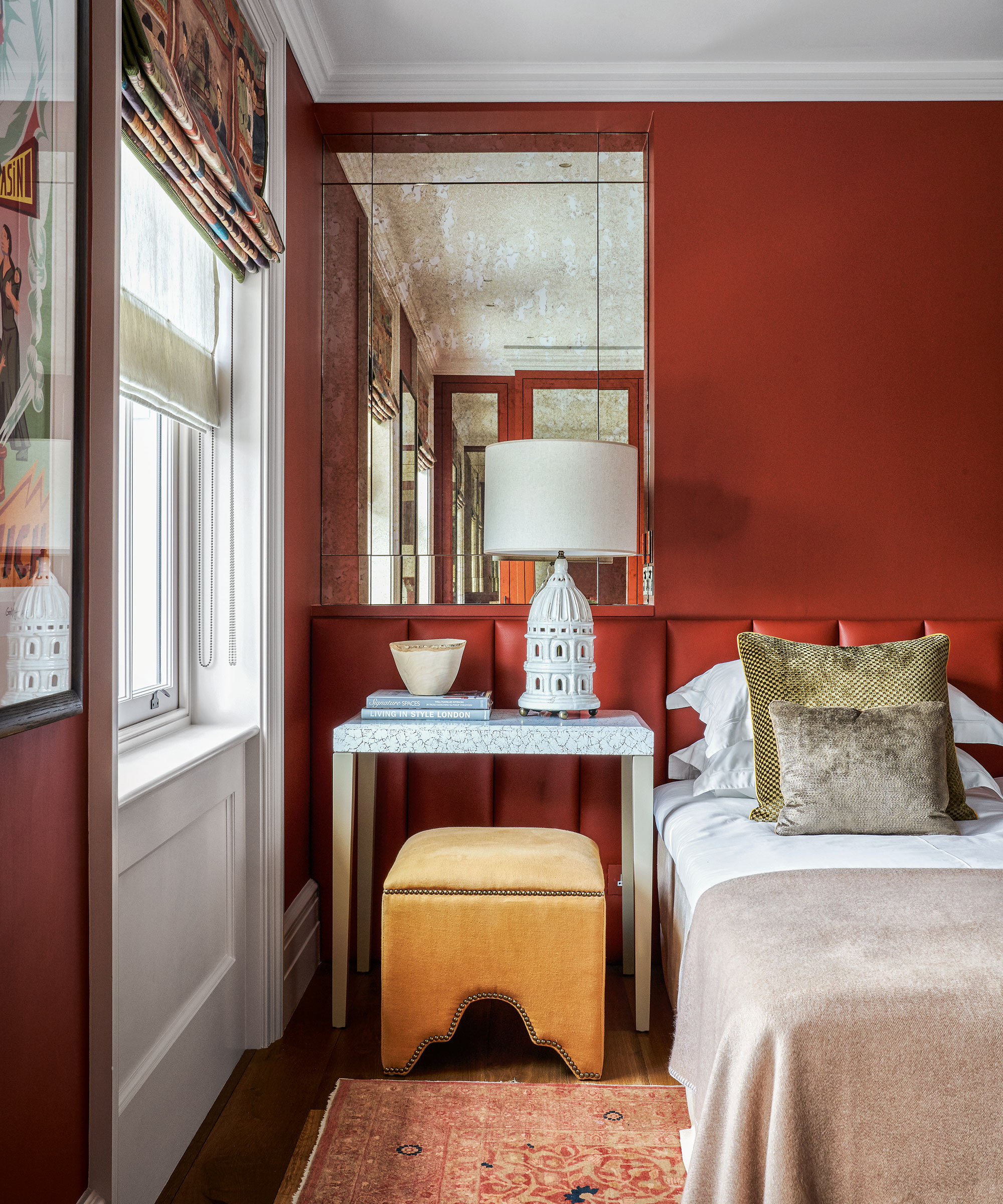
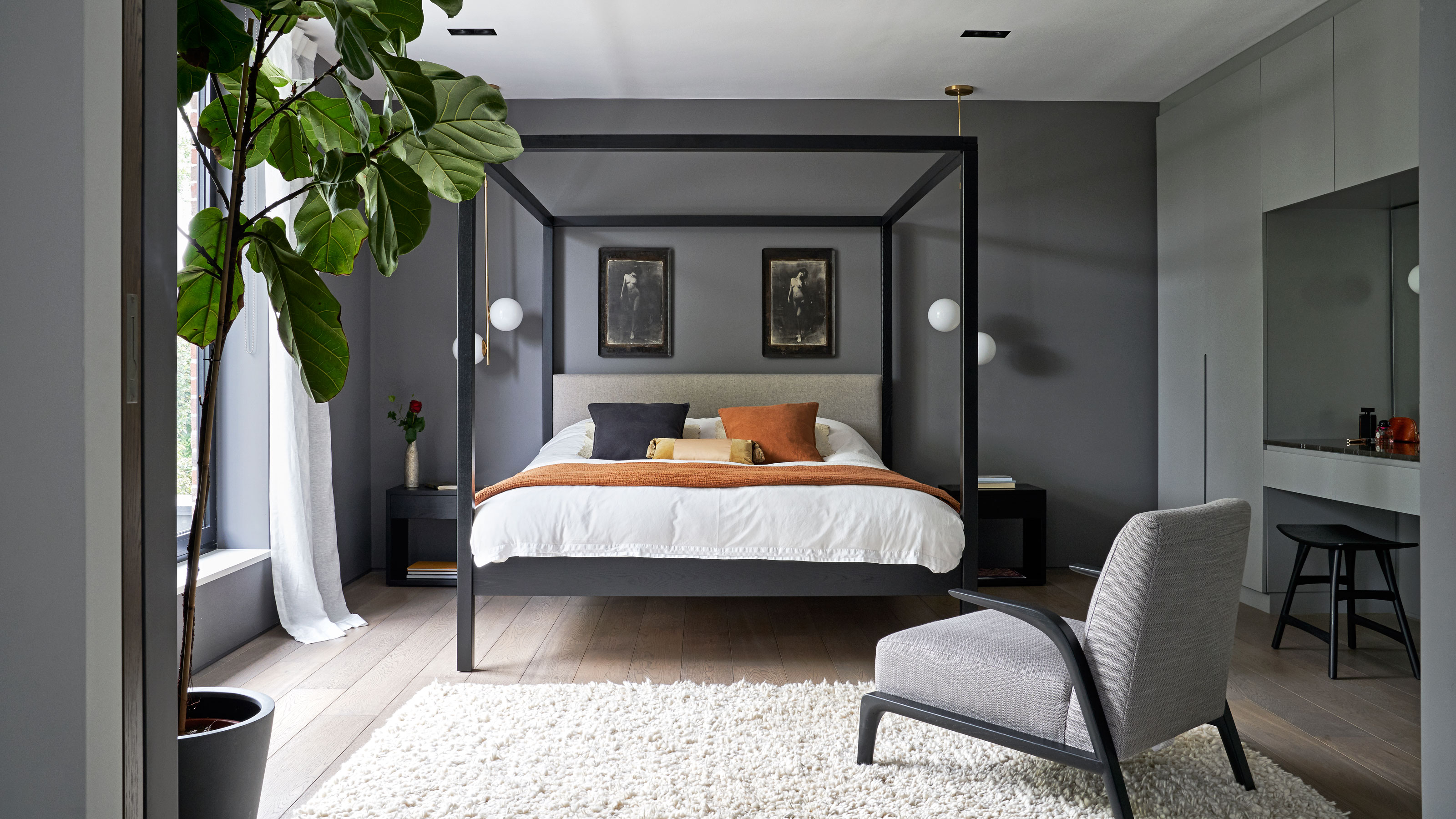
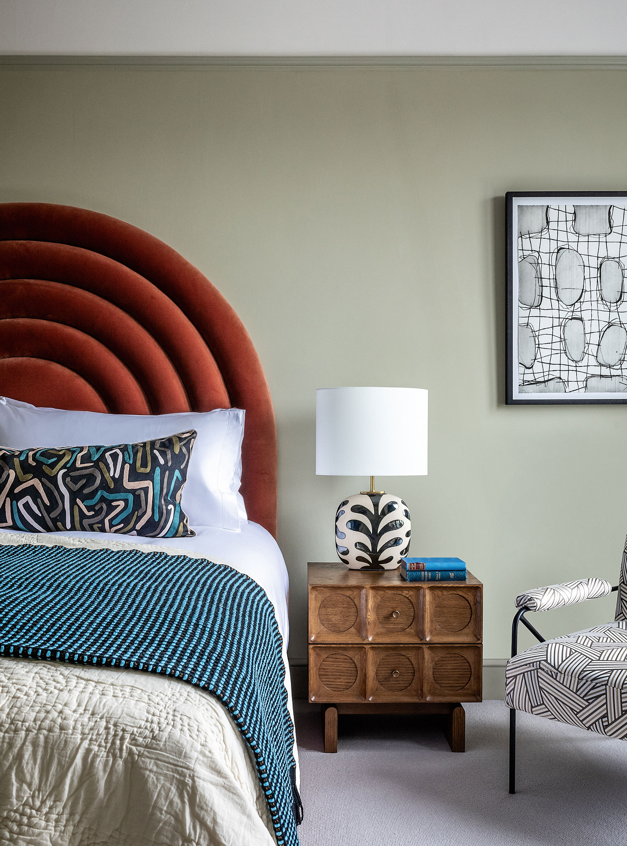
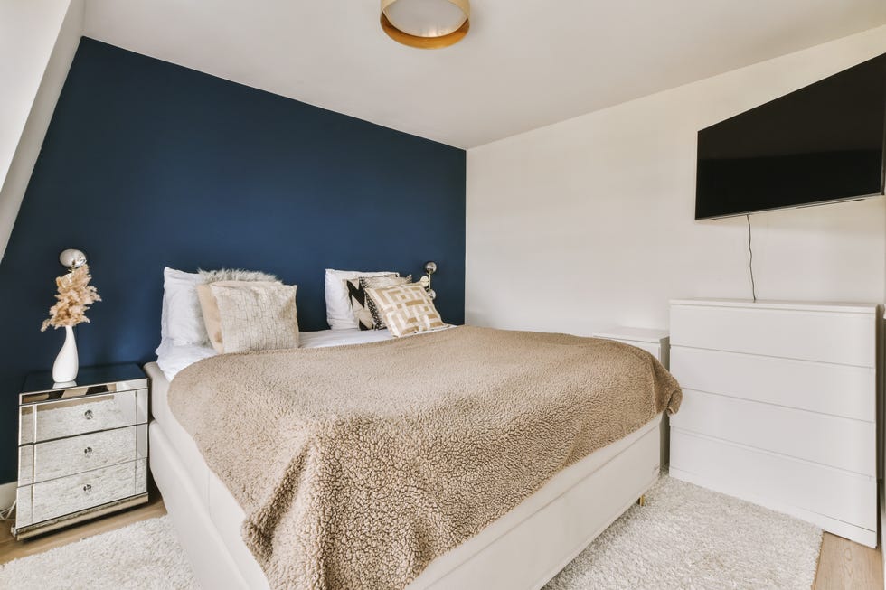
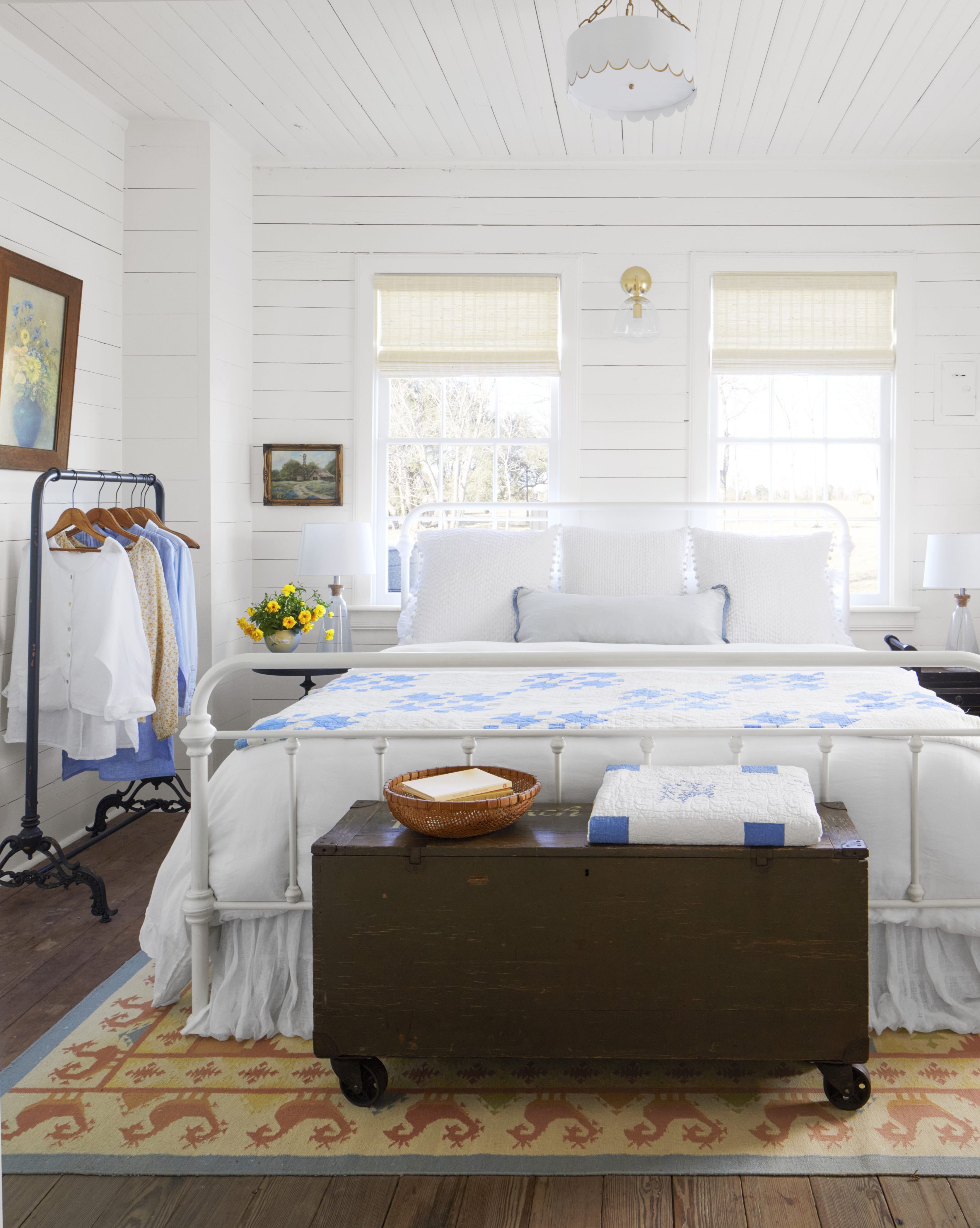
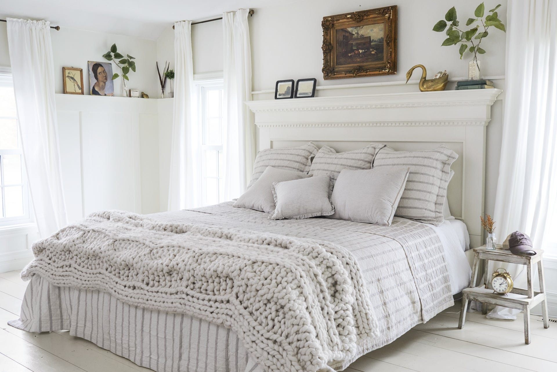
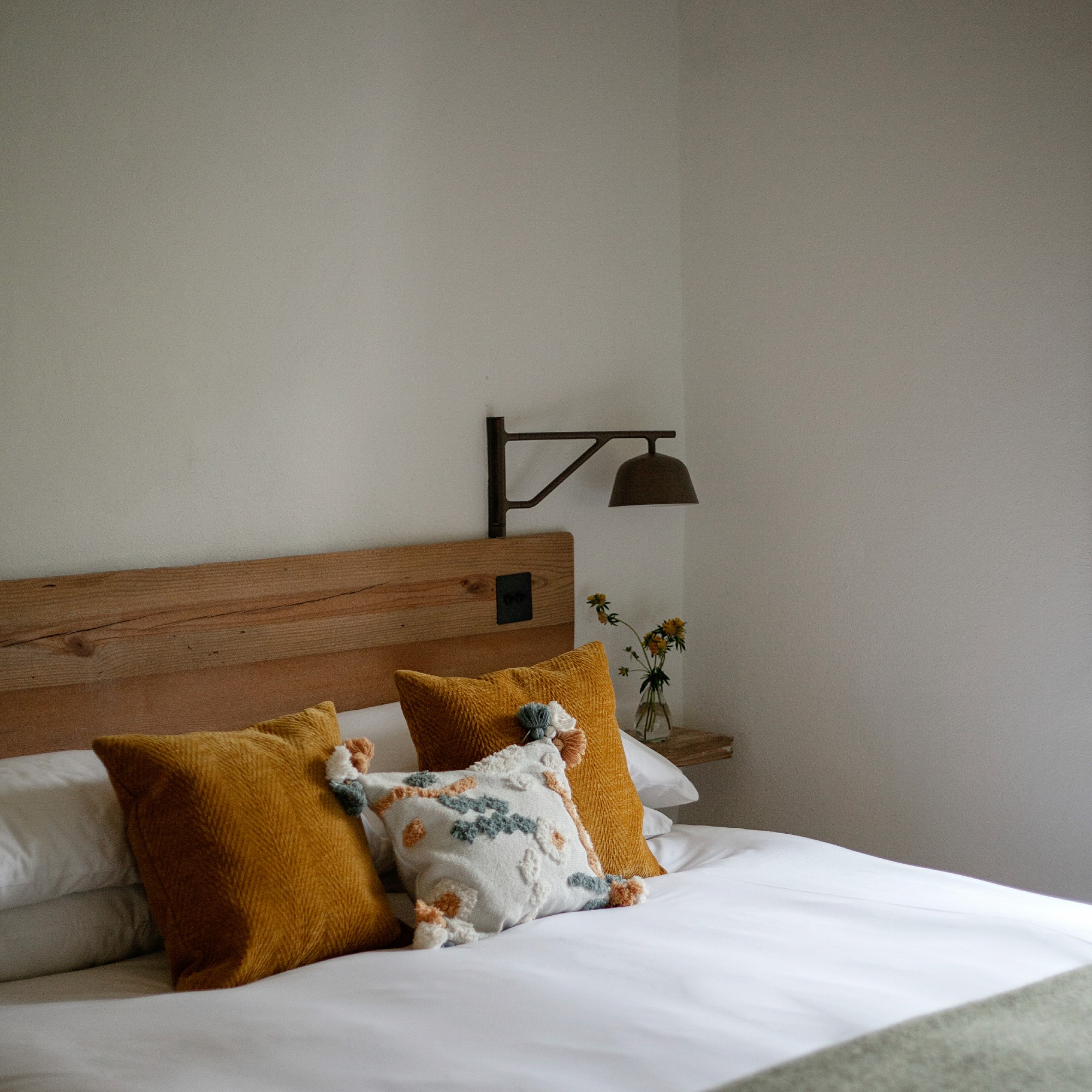
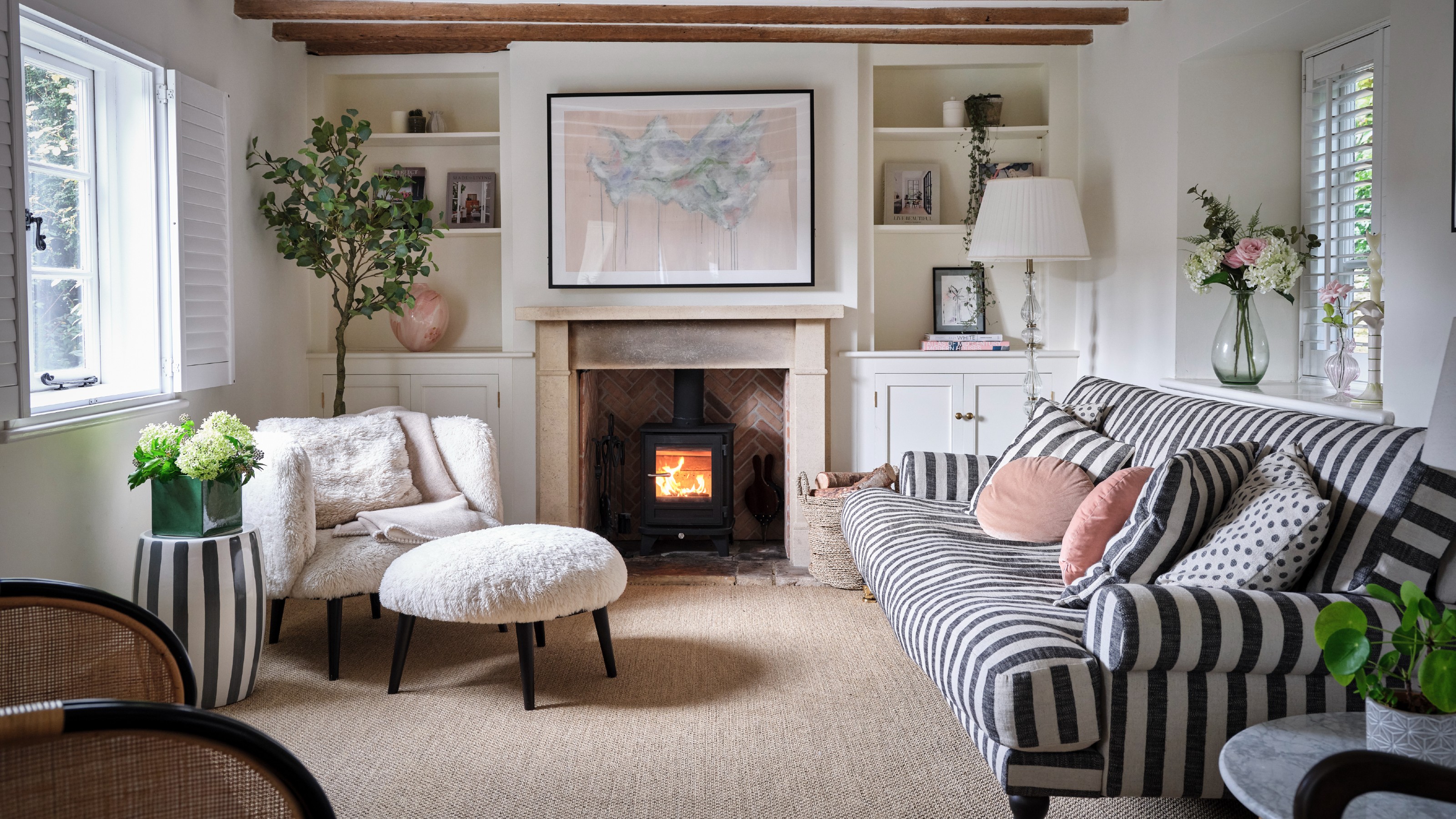
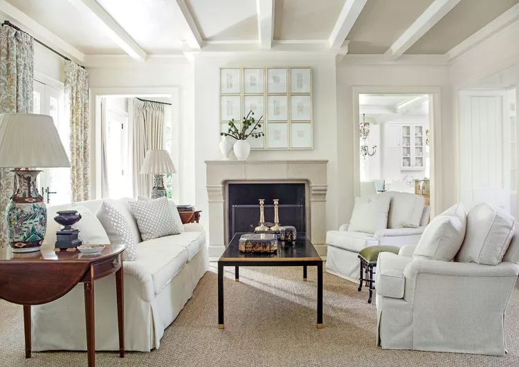
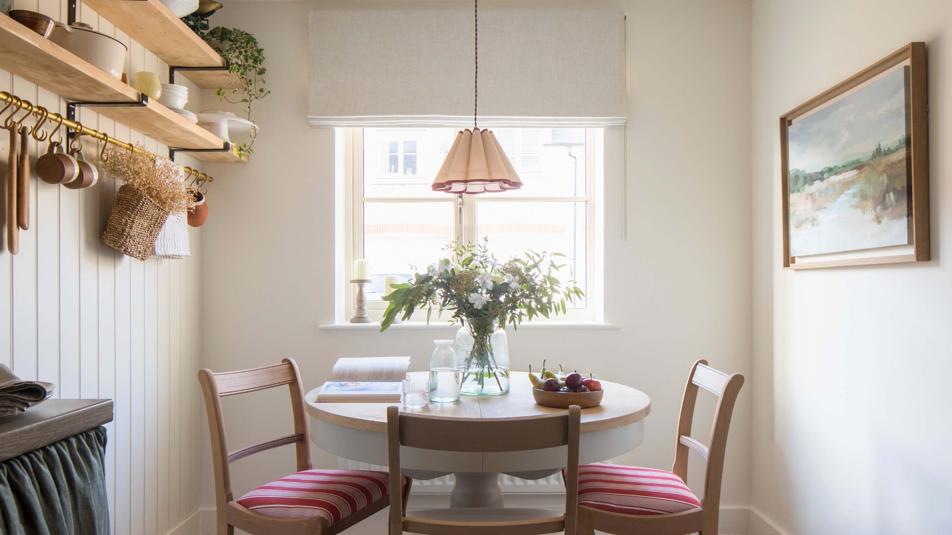
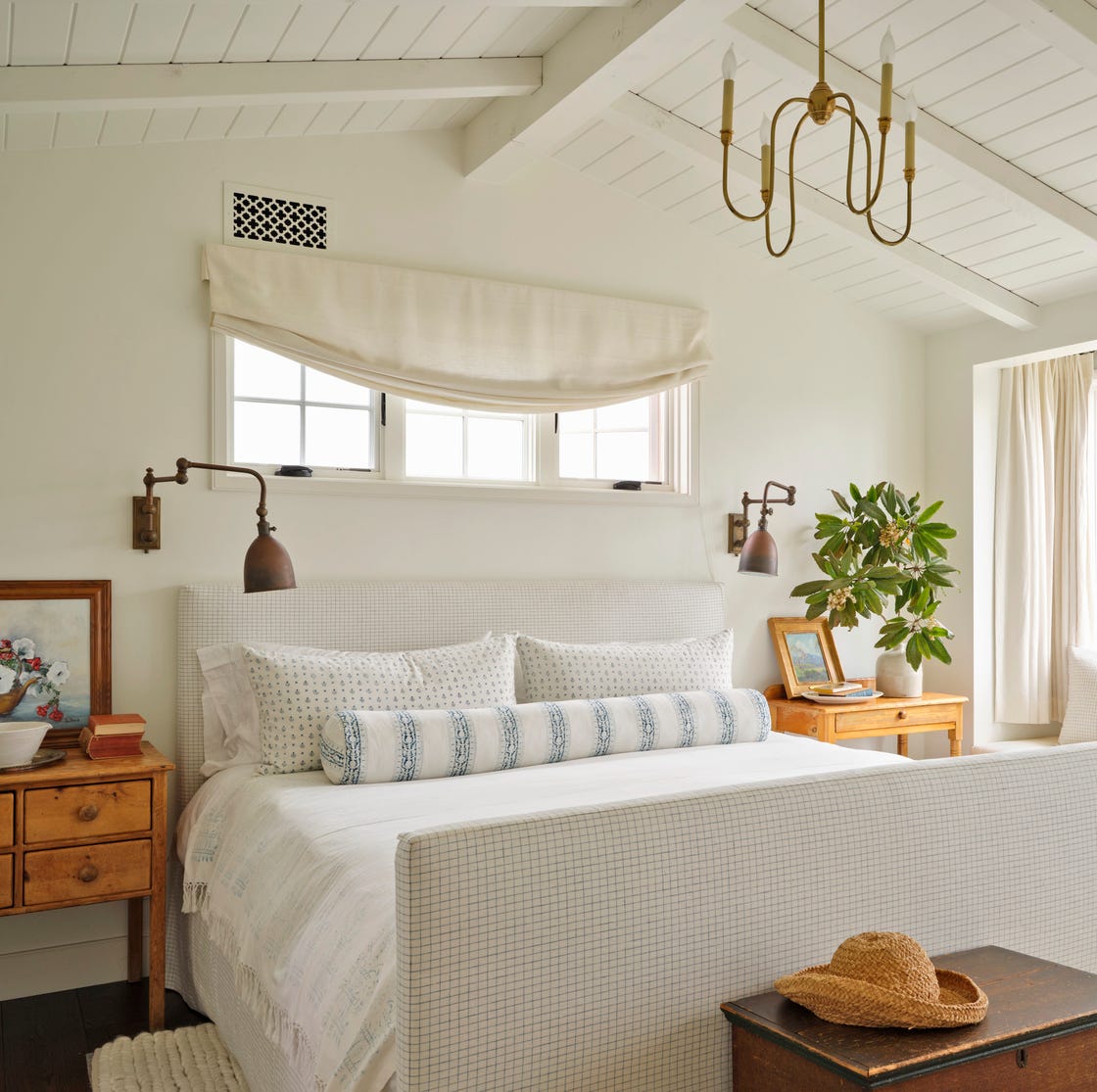
Fifthly, bedrooms, intended for rest and relaxation, can feel sterile and jarring if painted in stark white. While a crisp, airy aesthetic is achievable with white, it requires careful consideration. Cooler, creamier tones or pastels are often more effective in creating a calm and neutral atmosphere without the harshness of pure white, softly reflecting natural light.
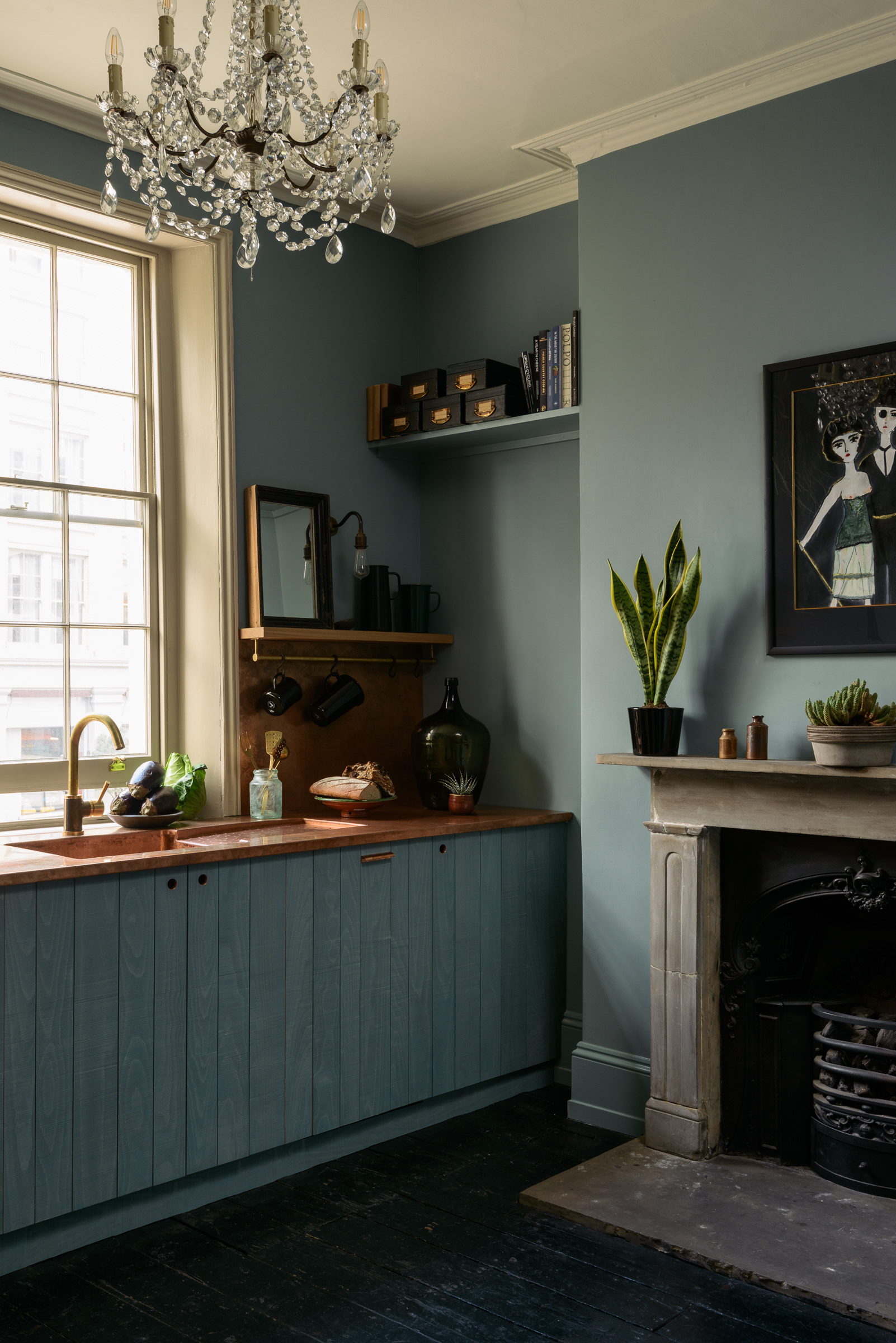
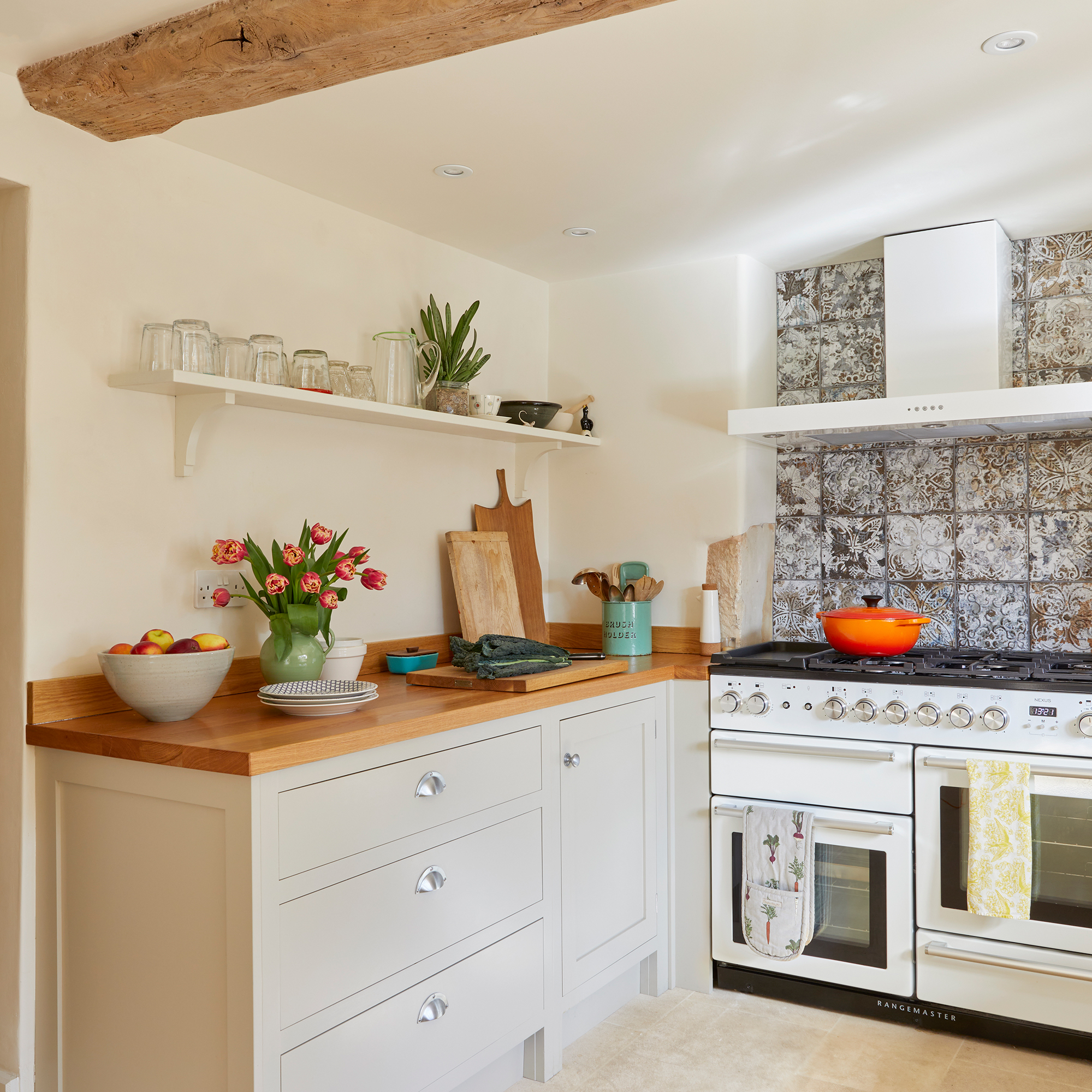
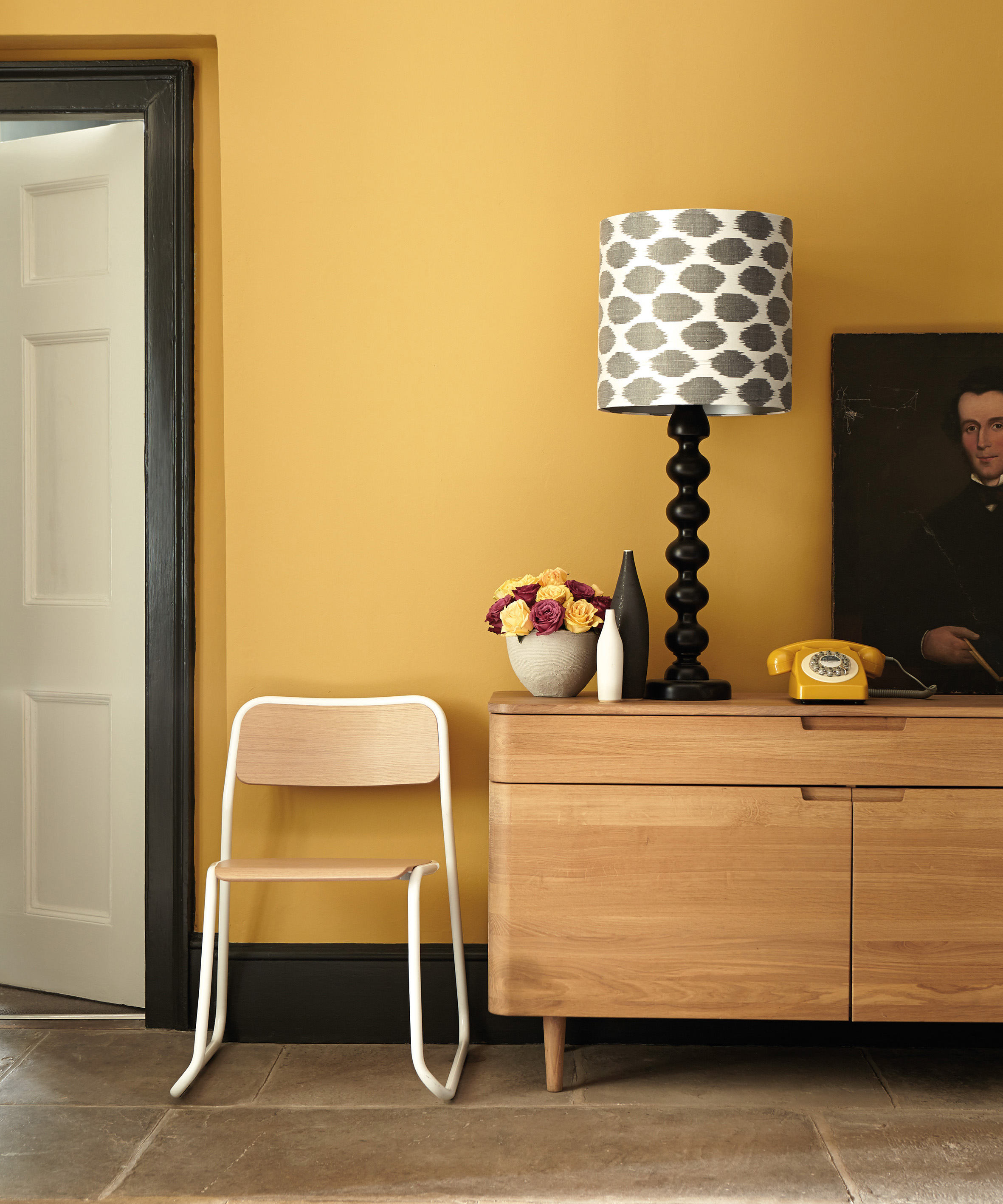
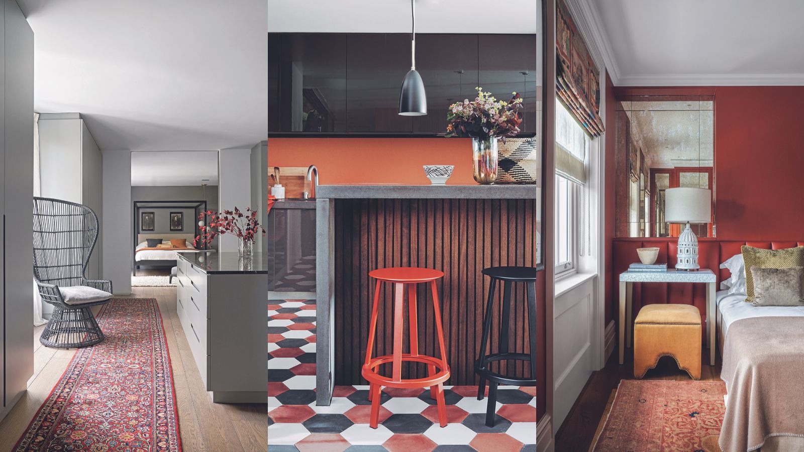
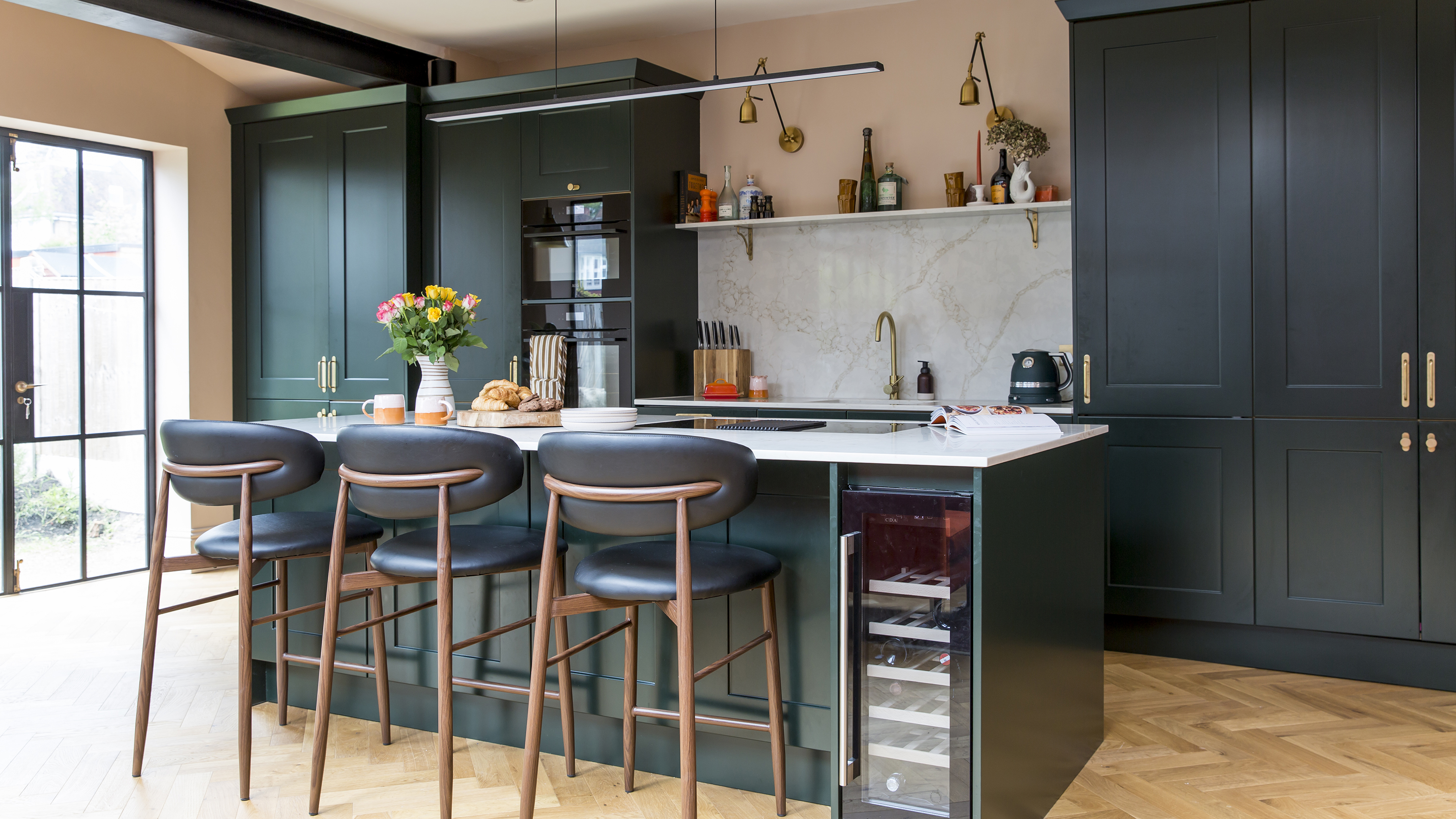
Sixthly, north-facing rooms, which receive indirect, cooler light, tend to appear gloomy with stark white paint. These rooms benefit from warm neutral paints with yellow or red undertones to inject a sense of warmth and counteract the cool light. Materials like limestone cladding or hand-troweled plaster can also add depth and character without relying on cold whites.
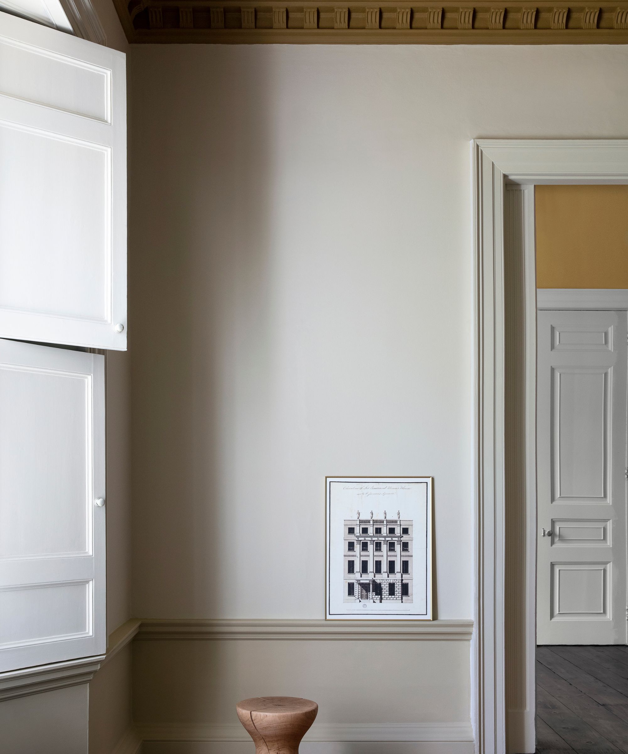
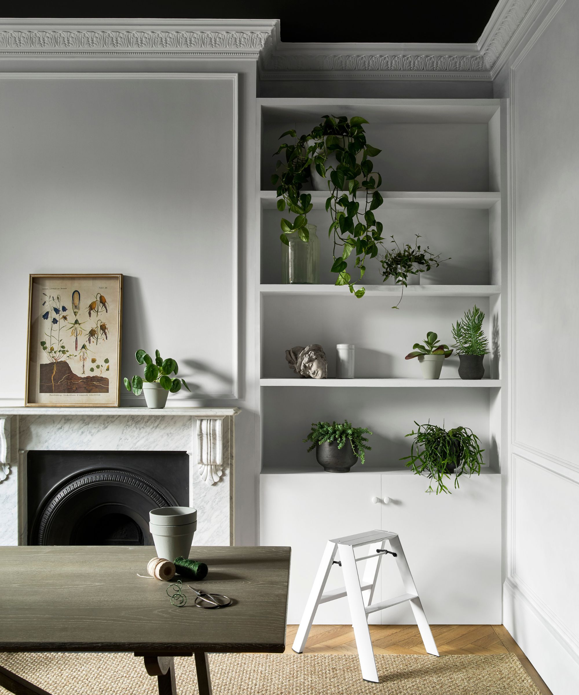
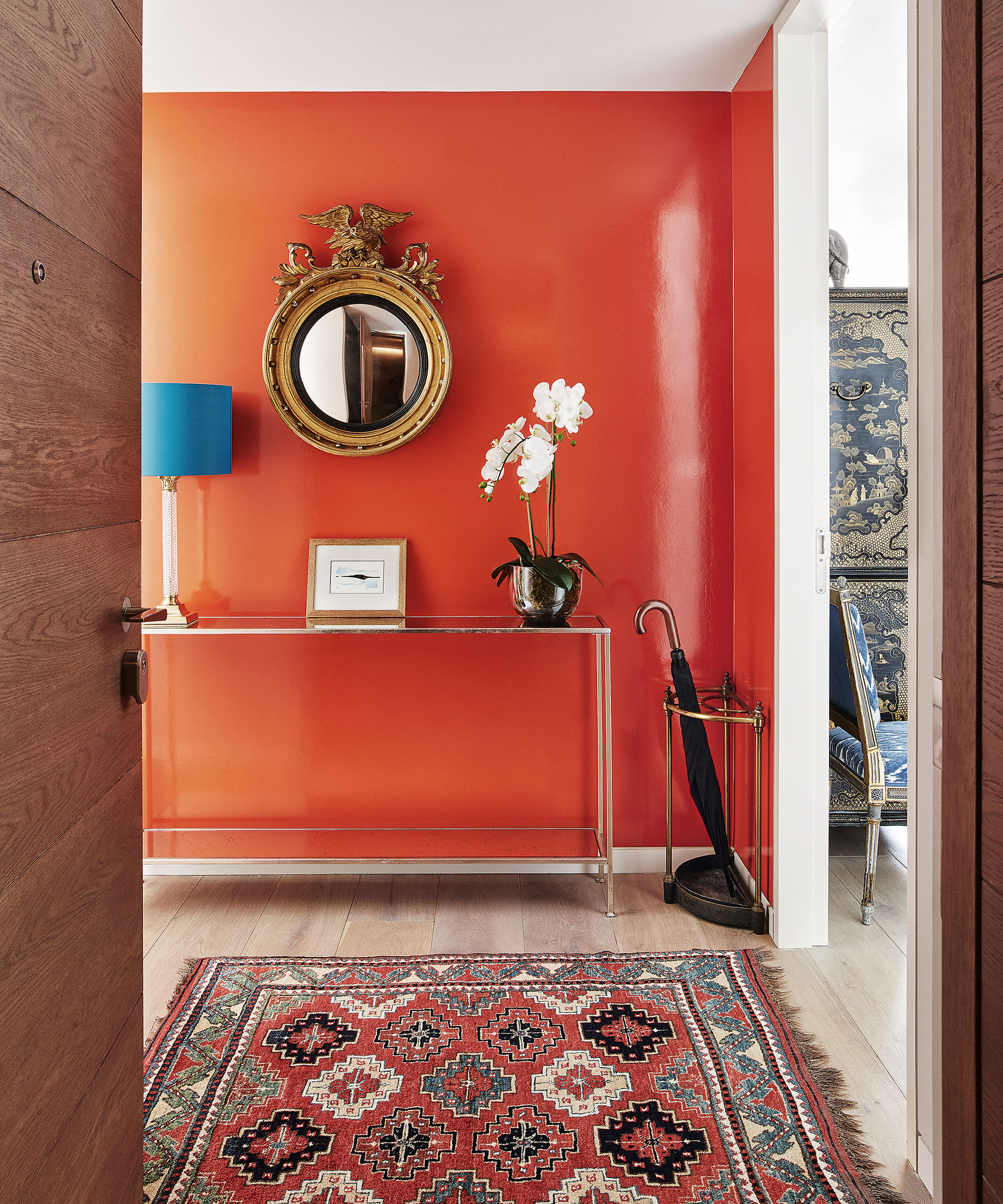
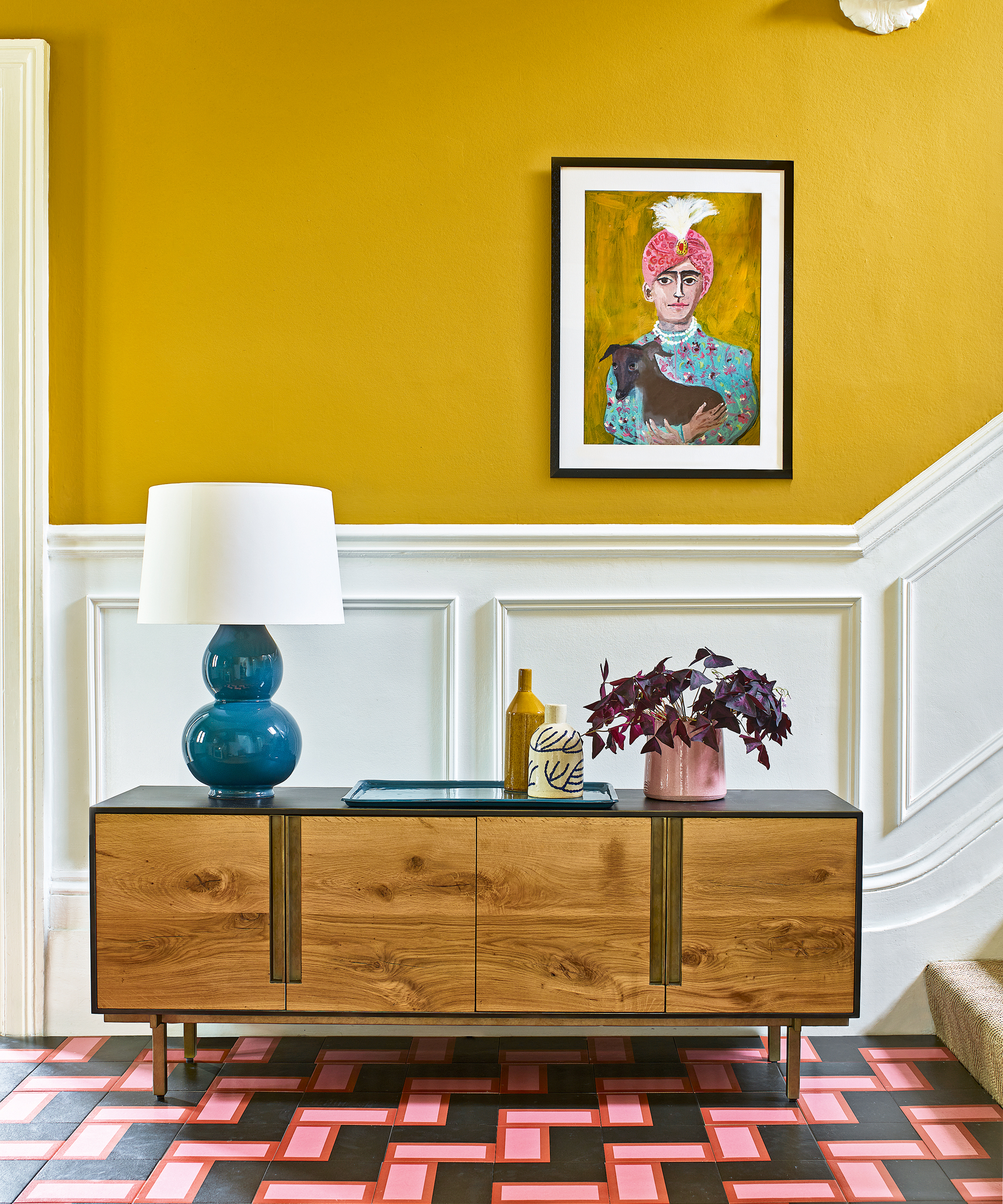
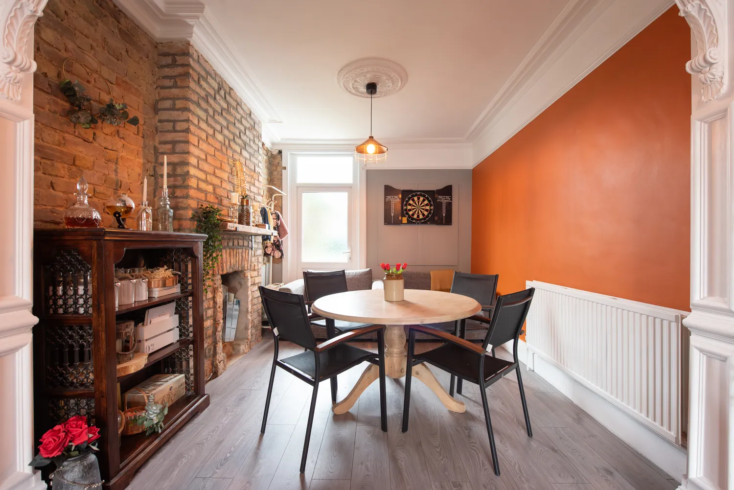
Lastly, painting over intricate architectural details with white can diminish their visual impact, making them appear flat and uninspired. Nuanced shades that provide dimension, such as soft off-whites or natural wood stains, can highlight these elements more effectively, preserving their historic charm and contributing to the room's character.
#WhitePaint #InteriorDesign #HomeDecoration #PaintColors #RoomDesign #ColorPsychology #ArchitecturalDetails #HomeImprovement #WhitePaint #InteriorDesign #HomeDecoration #PaintColors #RoomDesign #ColorPsychology #ArchitecturalDetails #HomeImprovement
0 comment in total
You may also like
5 reasons why you should never paint a ceiling white, reveals a leading paint and color expert
5 Problems With Painting Your Walls White That No-One Ever Talks About (Until Now)

7 Paint Mistakes That Make Designers Instantly Cringe When They Walk Into Someone's Home

7 Paint Colors To Never Use In Your Kitchen, According To Designers
4 surprising areas in your home that experts say you really shouldn't paint white – and what to do with them instead
What are the worst colors to paint a room? The shades experts say you should never use
7 Paint Colors to Never Use on Your Ceiling, According to Interior Designers
7 'Unhappy' Colors That Color Psychology Experts Would Never Paint Their Walls
5 Reasons You Shouldn't Paint Your Kitchen Walls White — And the Alternatives You Need to Try
7 Living Room Decorating Mistakes You Should Never Make
The colors you should never paint your hallway – and what really works
Which white paint is the best? Experts reveal the perfect shade of white for every room and feature
An interior expert reveals the one thing you should never do when painting your walls
3 reasons you shouldn't paint your kitchen walls white – plus the new neutrals to try instead, according to kitchen pros
You should never paint your hallway this colour, according to colour psychologists
8 colors you should never paint kitchen cabinets according to the experts

I’m an interior designer - the worst paint colours for small rooms, and why bright white walls is not a good idea

5 colors you should never paint a small room – designers warn us to steer clear of these hues, and what to pick instead
These White Bedrooms Will Inspire You to Say No to Color
Don't Use These 7 Dining Room Paint Colors — Designers Say You Should Avoid Them at All Costs