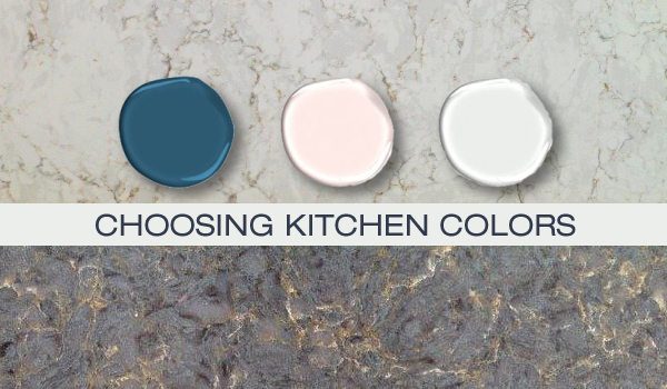
7 Paint Colors To Never Use In Your Kitchen, According To Designers
While personal preference in paint color ultimately dictates a homeowner's choice, interior designers offer guidance on colors that may not be ideal for kitchen spaces. The kitchen, being a high-traffic area, benefits from thoughtful color selection to enhance its functionality and aesthetic appeal. Designers generally agree that certain hues can detract from the kitchen's inviting atmosphere and may not withstand the demands of the space over time.
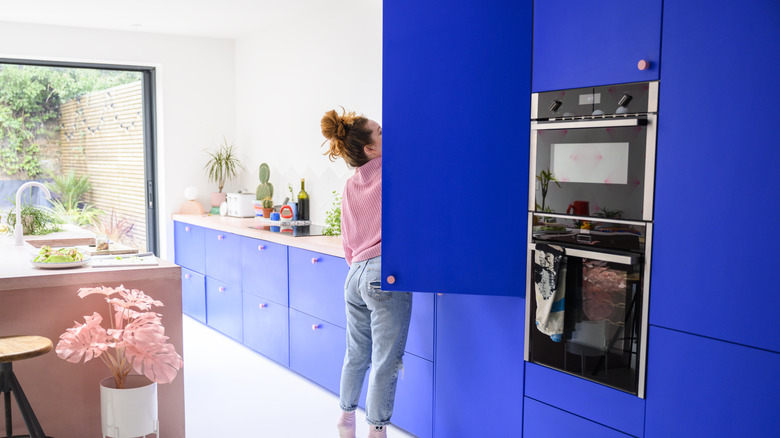
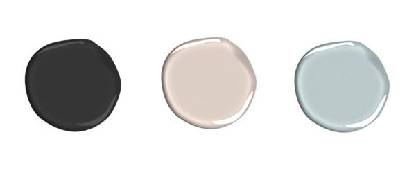
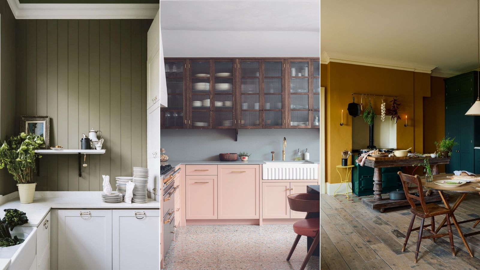
Neon colors are universally advised against by designers. Christine Carney, director of design at Blackberry Farm Design, and Amy Switzer, founder of Amy Switzer Design, highlight the difficulty in complementing neon shades with other kitchen elements and their tendency to quickly become outdated. Mallory Mathison also specifically warns against neon and pink tones in the kitchen.
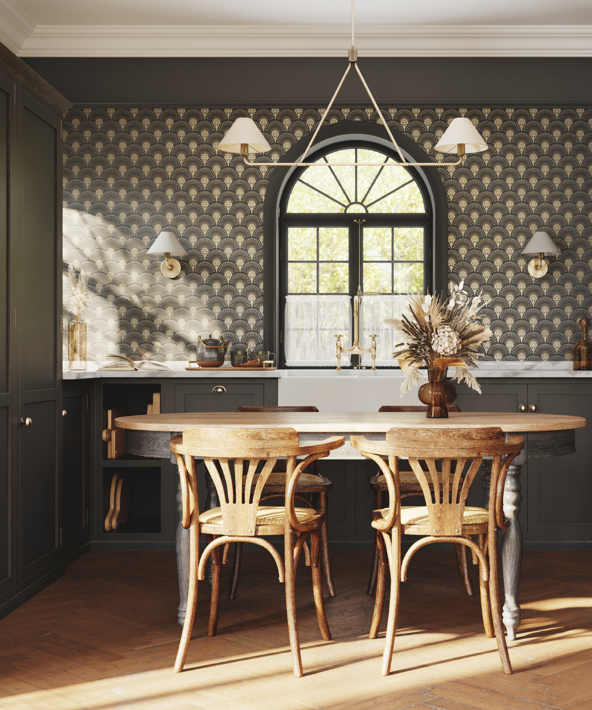
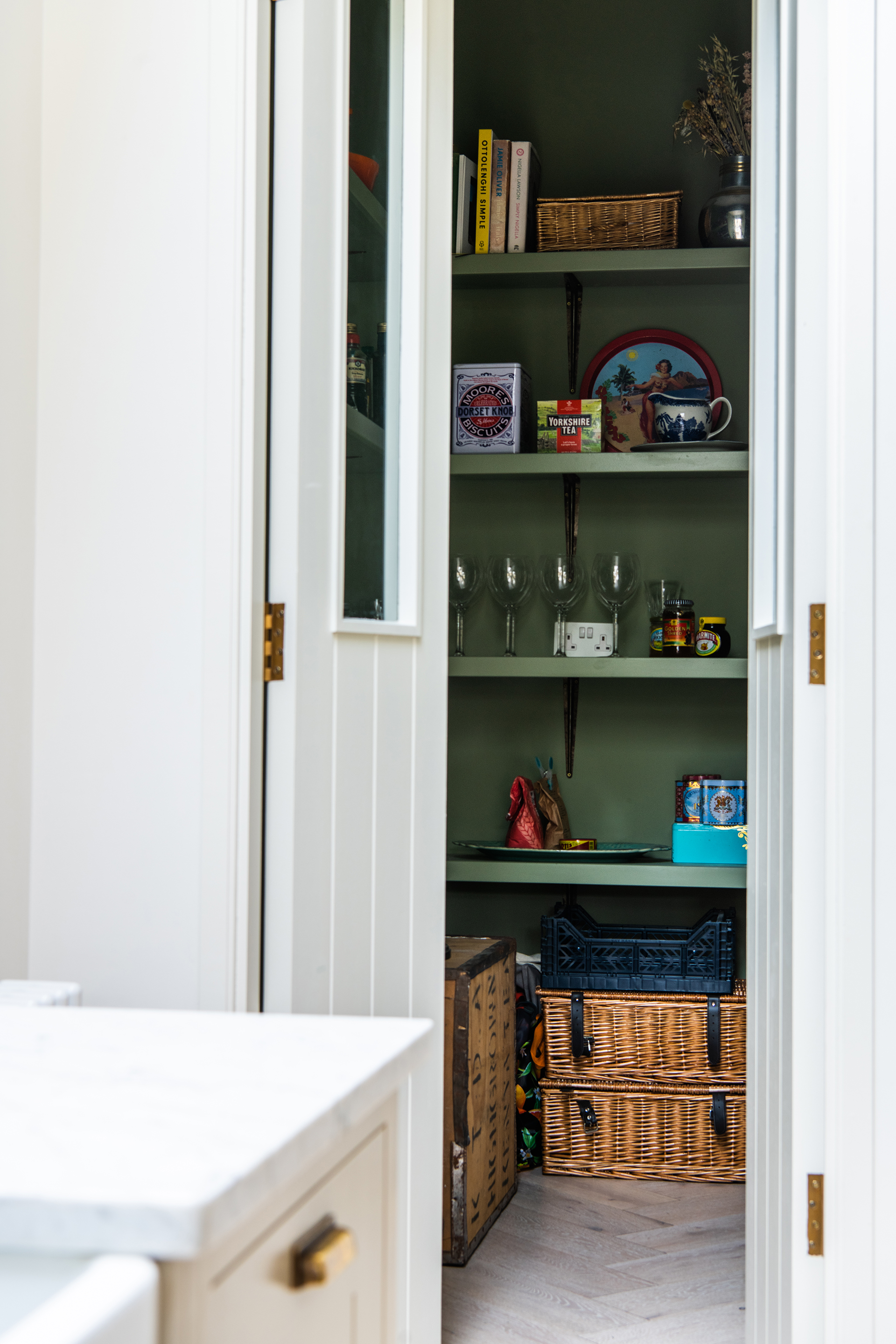
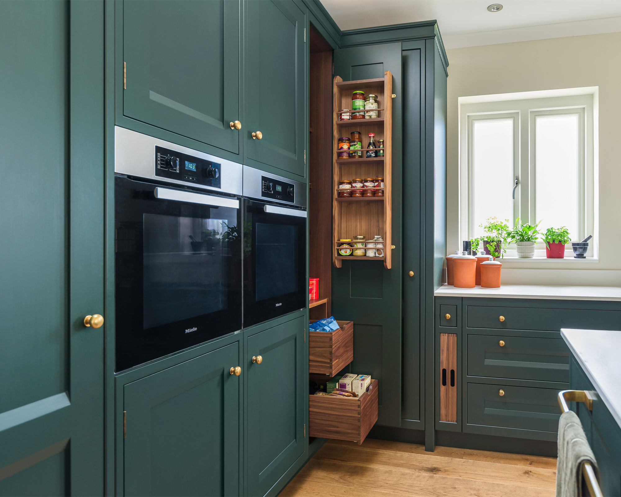
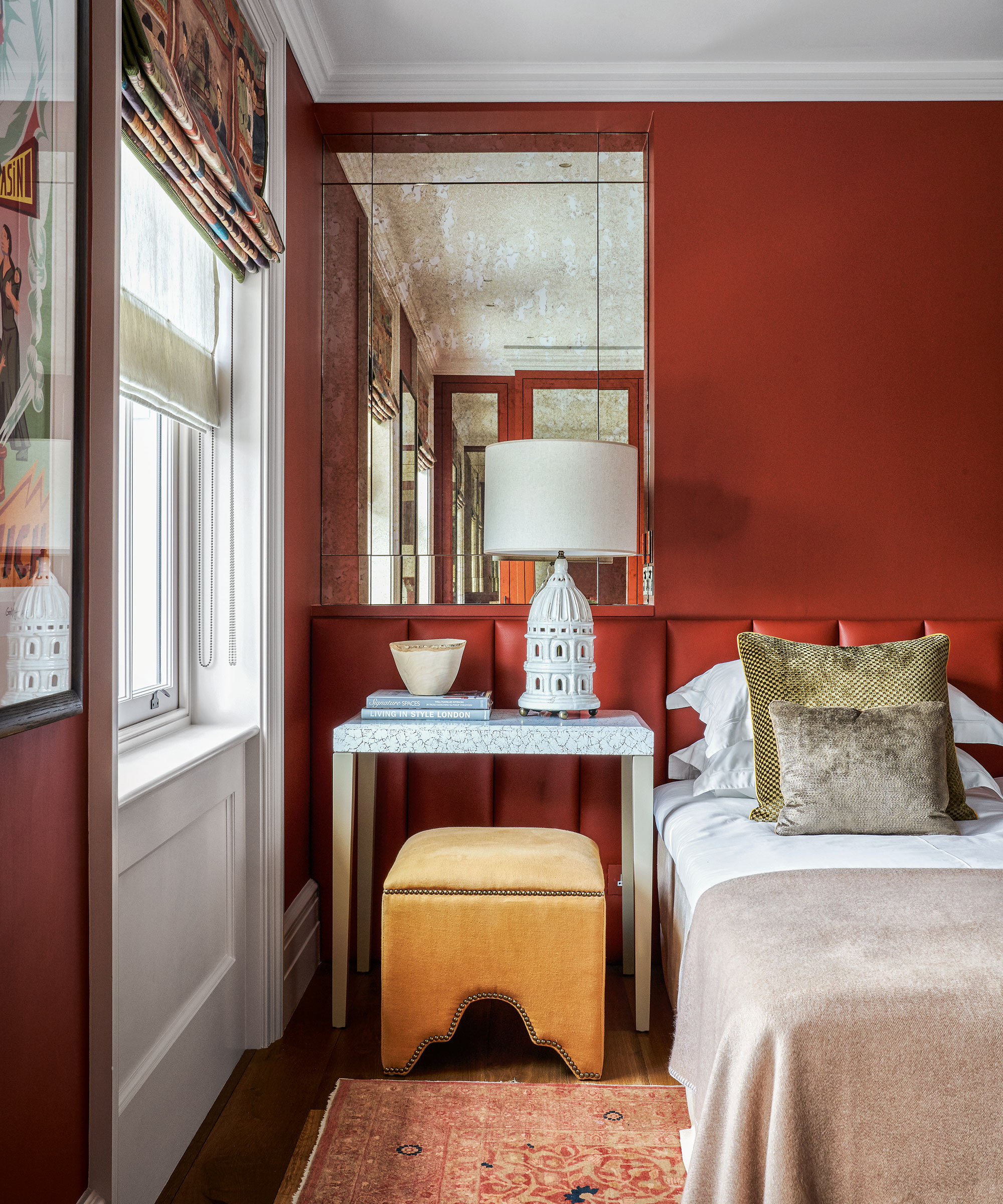
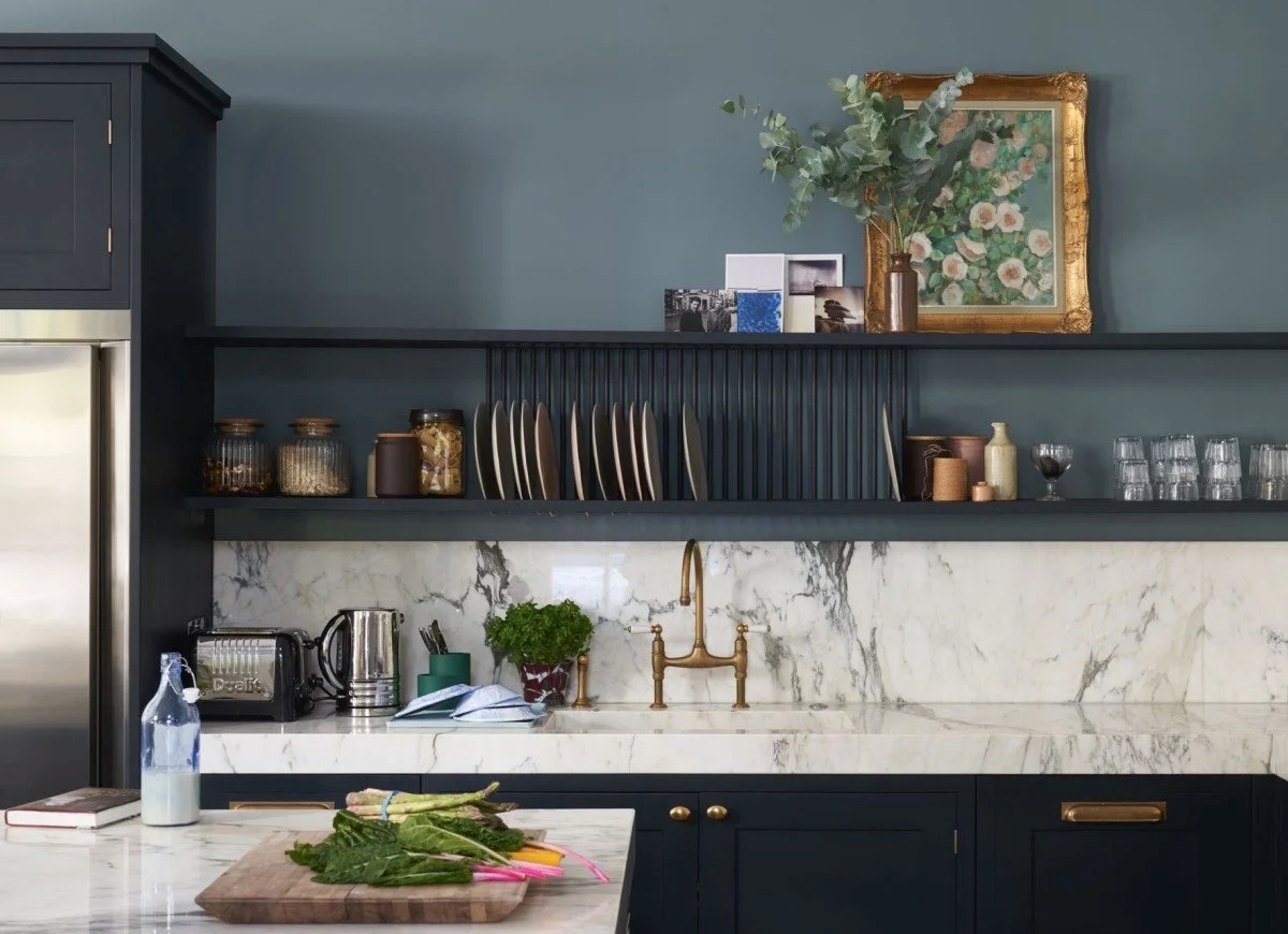
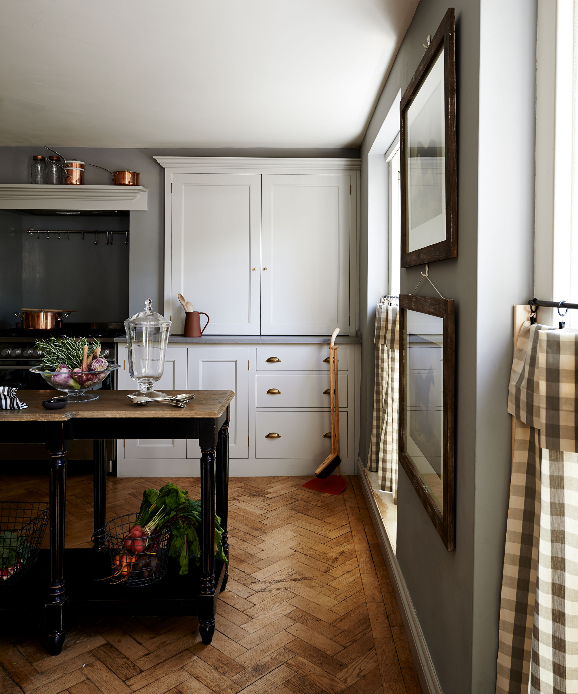
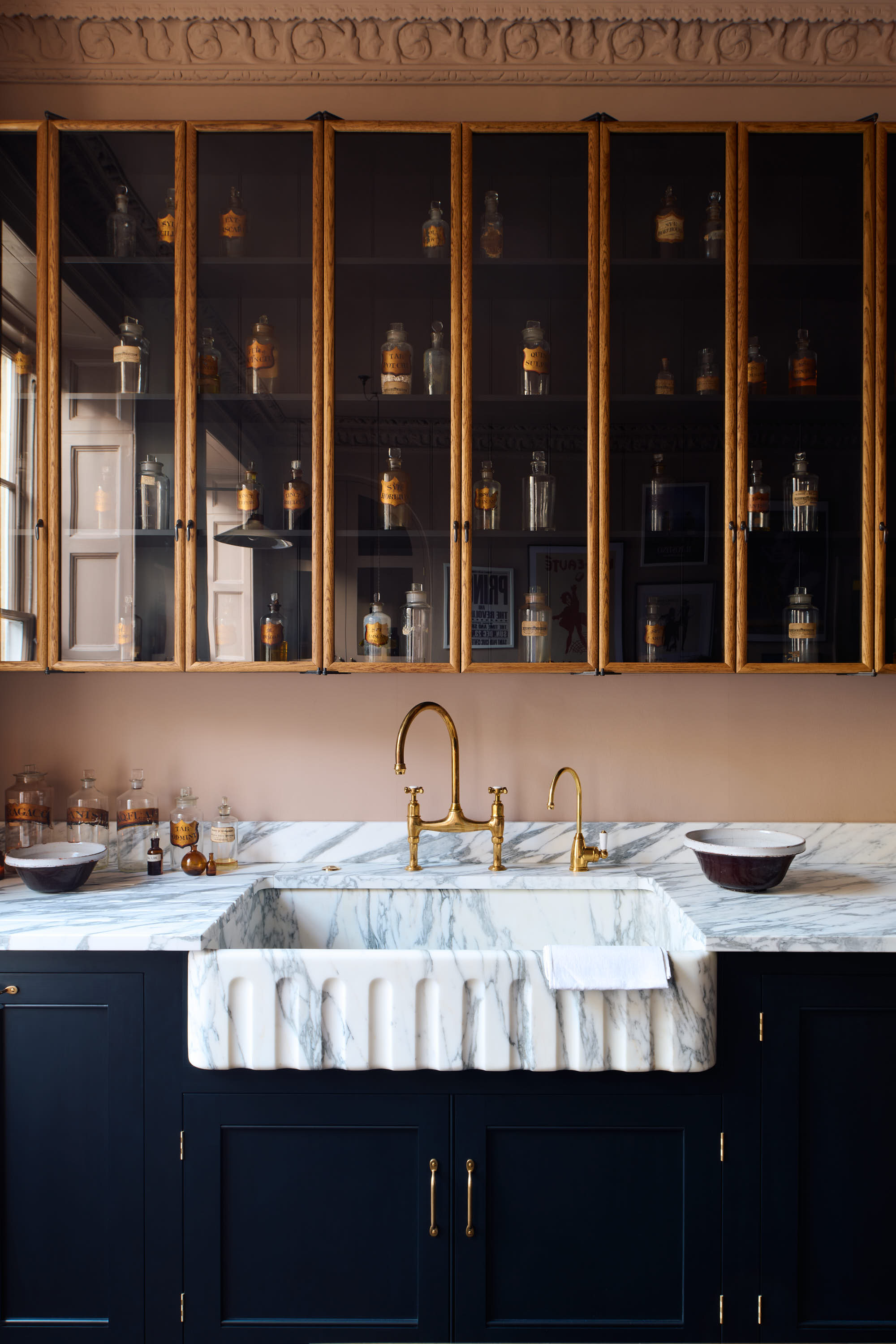
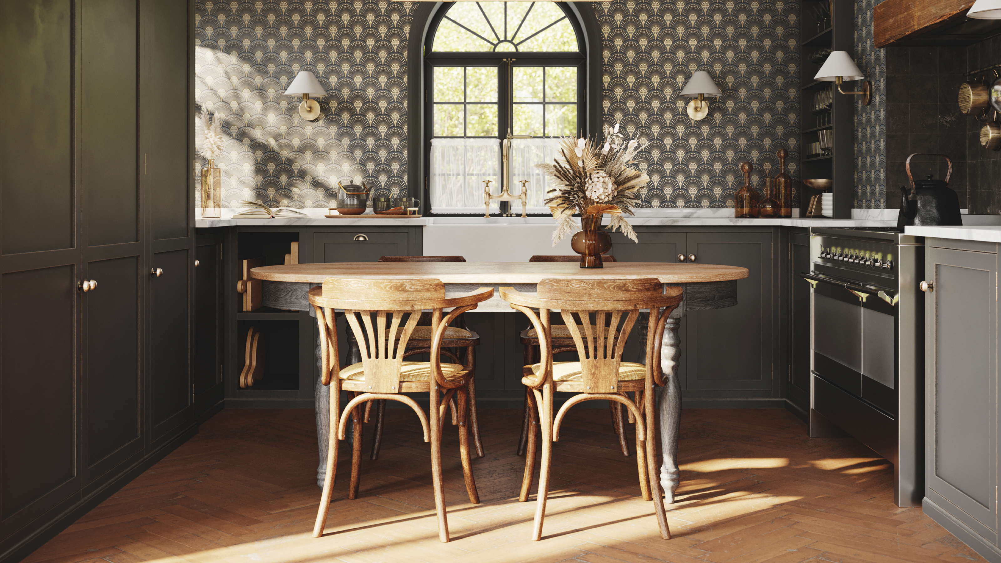
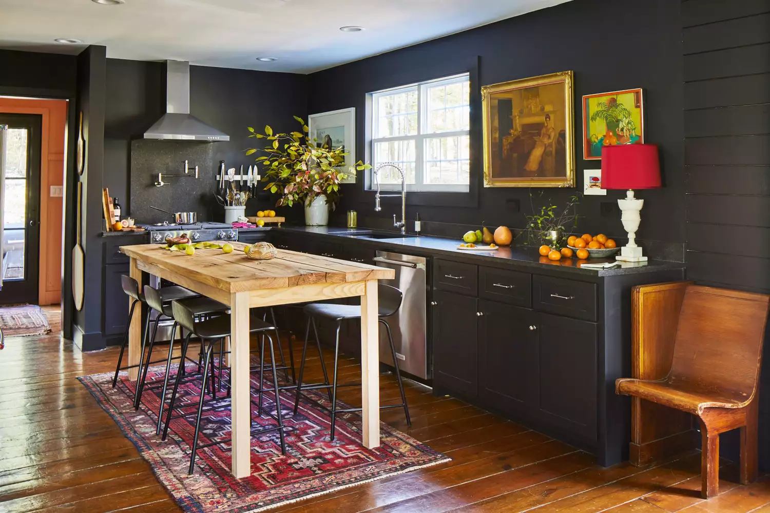
Very dark hues, such as deep grays and blacks, are also frequently cited as colors to avoid. Switzer notes that these colors can make a kitchen appear smaller and less welcoming. Furthermore, their practicality is questioned in a space prone to wear and tear, as they tend to reveal scratches and imperfections more readily. Margie Kaercher of Hearth & Honey Homes adds that dark colors can make kitchens with limited natural light feel gloomy and uninviting, suggesting their suitability is limited to specific, well-lit spaces.
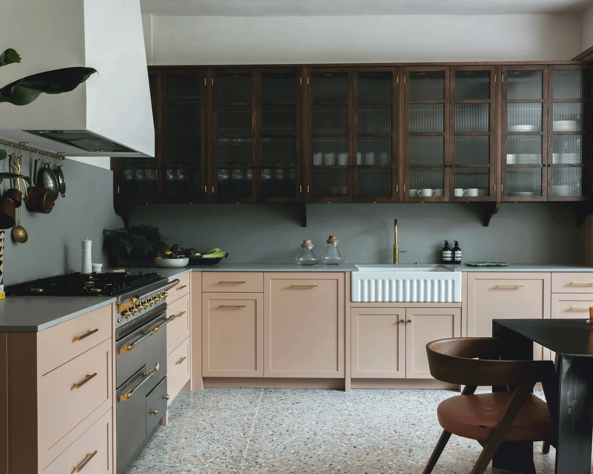
Brown shades are another category that designers approach with caution. Andrea Seymour, founding partner of Springdale Custom Builders, suggests reserving brown tones for natural wood or stained cabinets, and occasionally countertops, rather than using them as a primary paint color for walls, to maintain a fresh and appealing look.
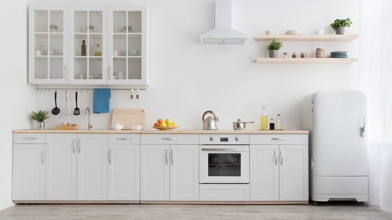
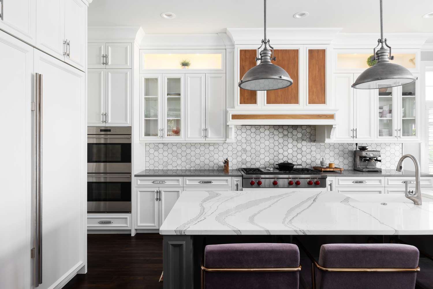
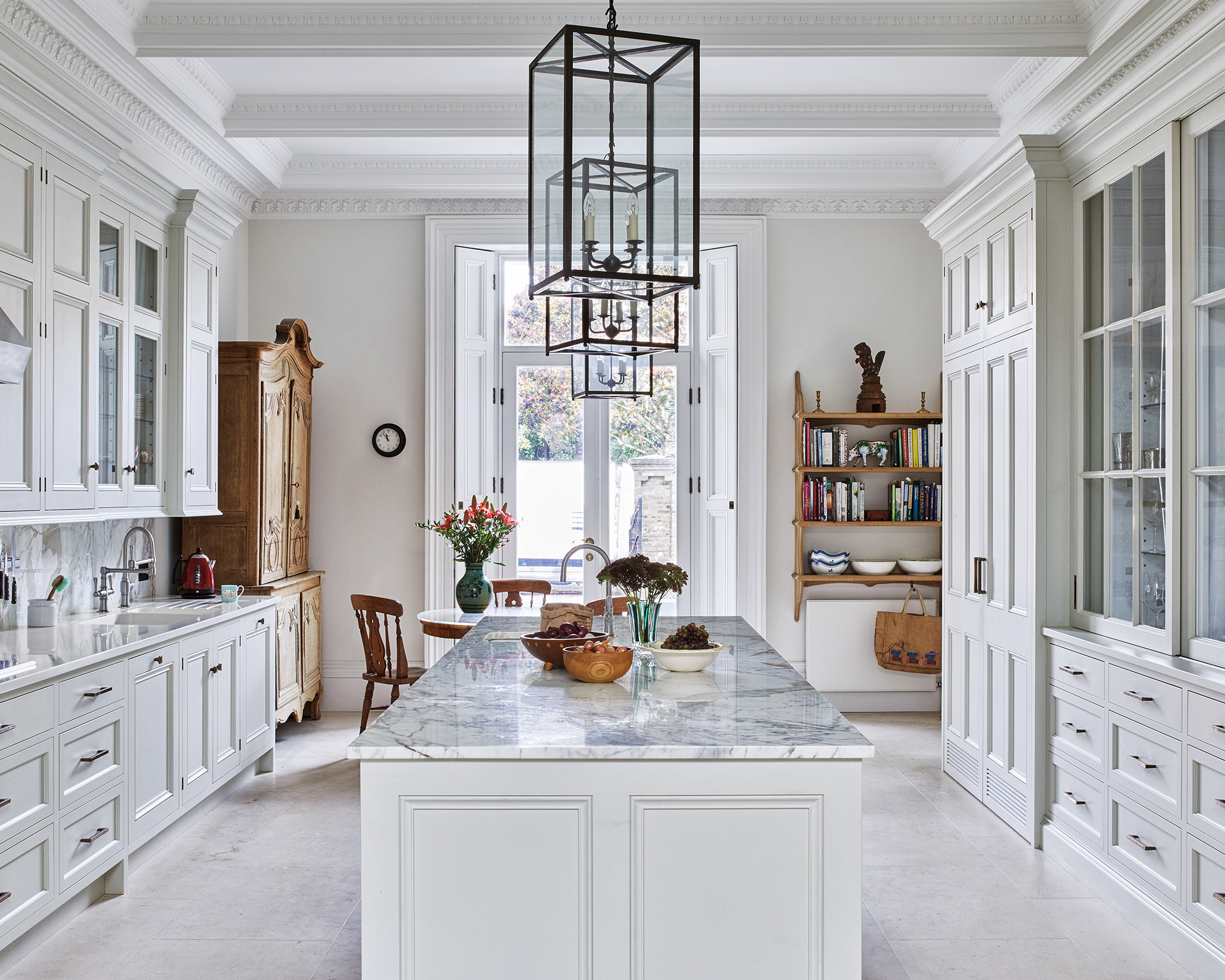
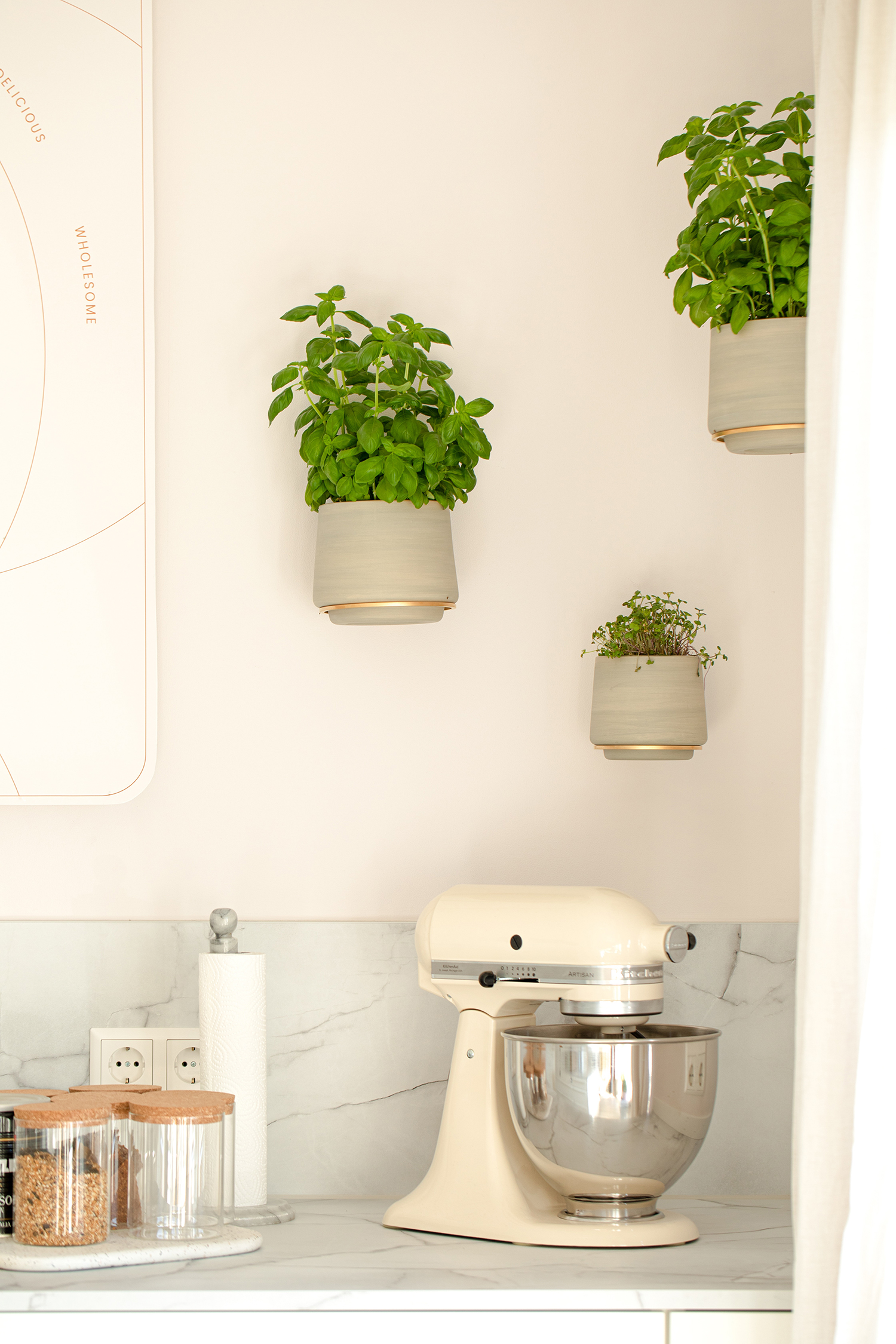
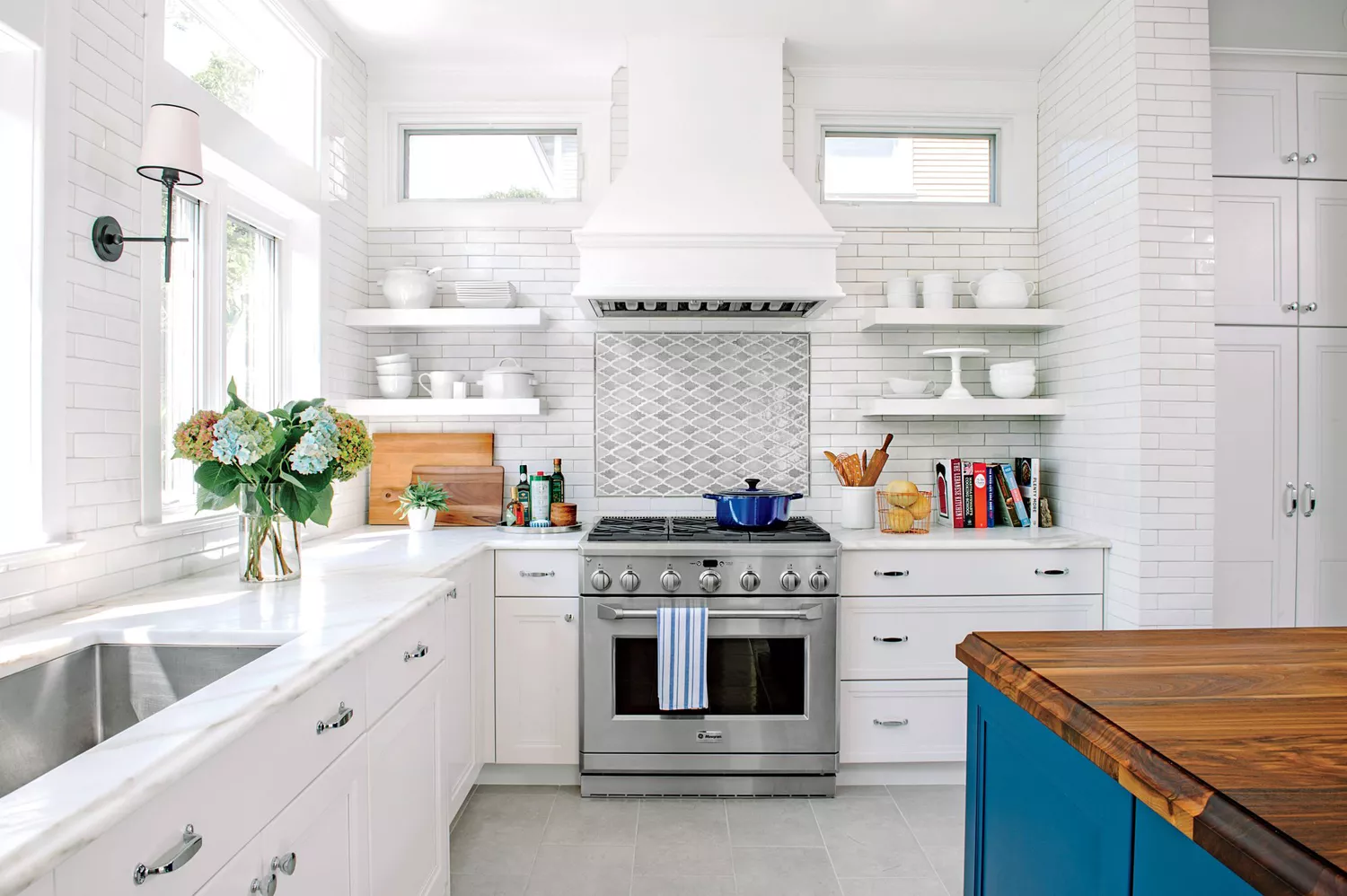
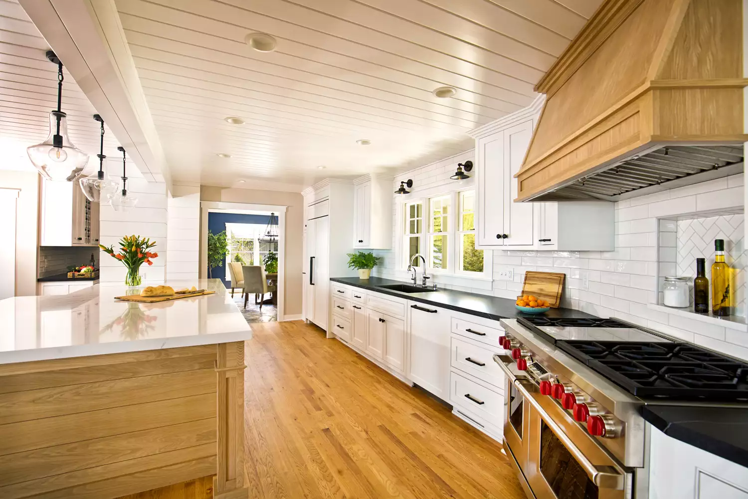
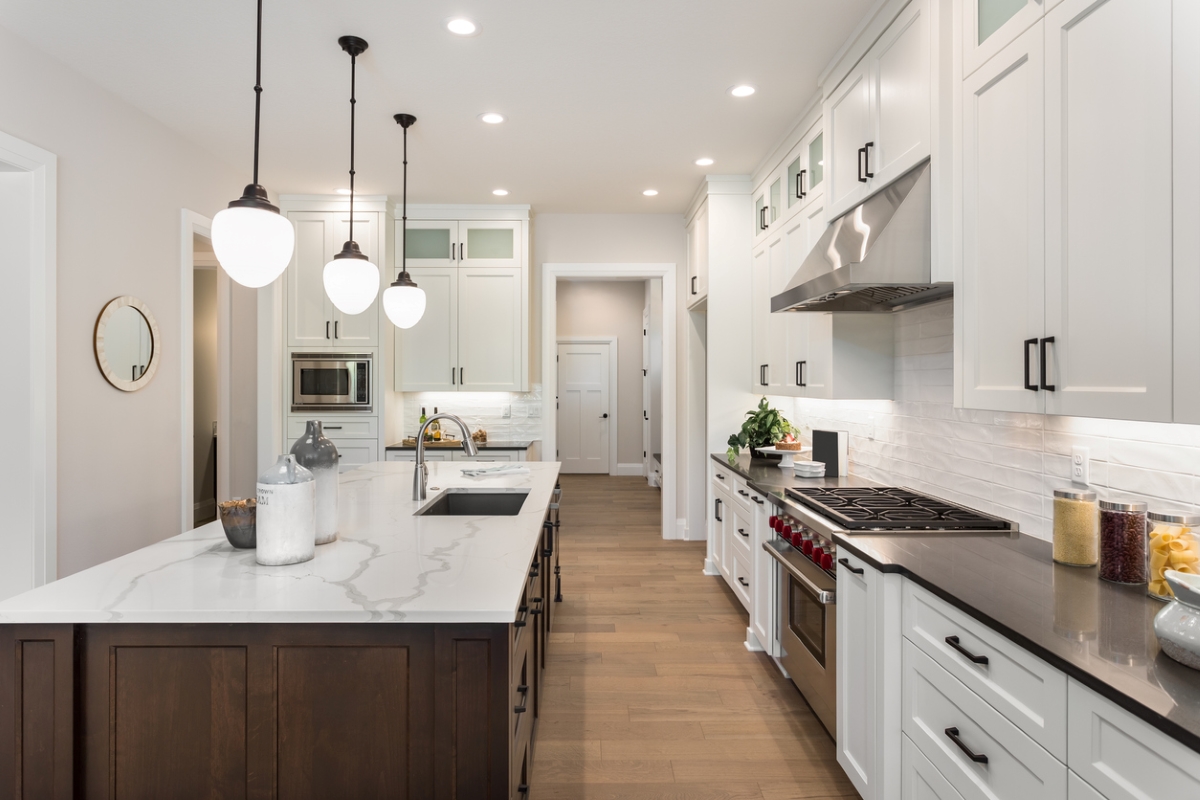
Stark white, despite the popularity of all-white kitchens, is also on the list of colors to reconsider. Jennifer McKissick of Jennifer McKissick Interior Design emphasizes that overly bright whites can result in a sterile and unwelcoming ambiance. She advises opting for slightly off-white or creamy shades to achieve a classic and polished look that feels warmer and more inviting.
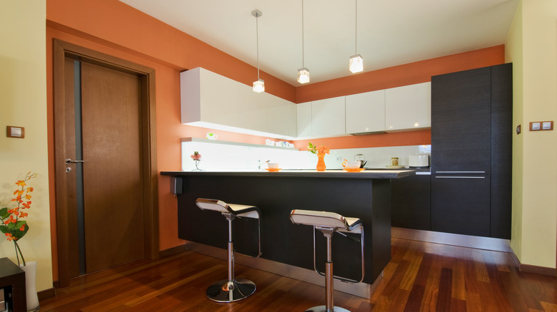
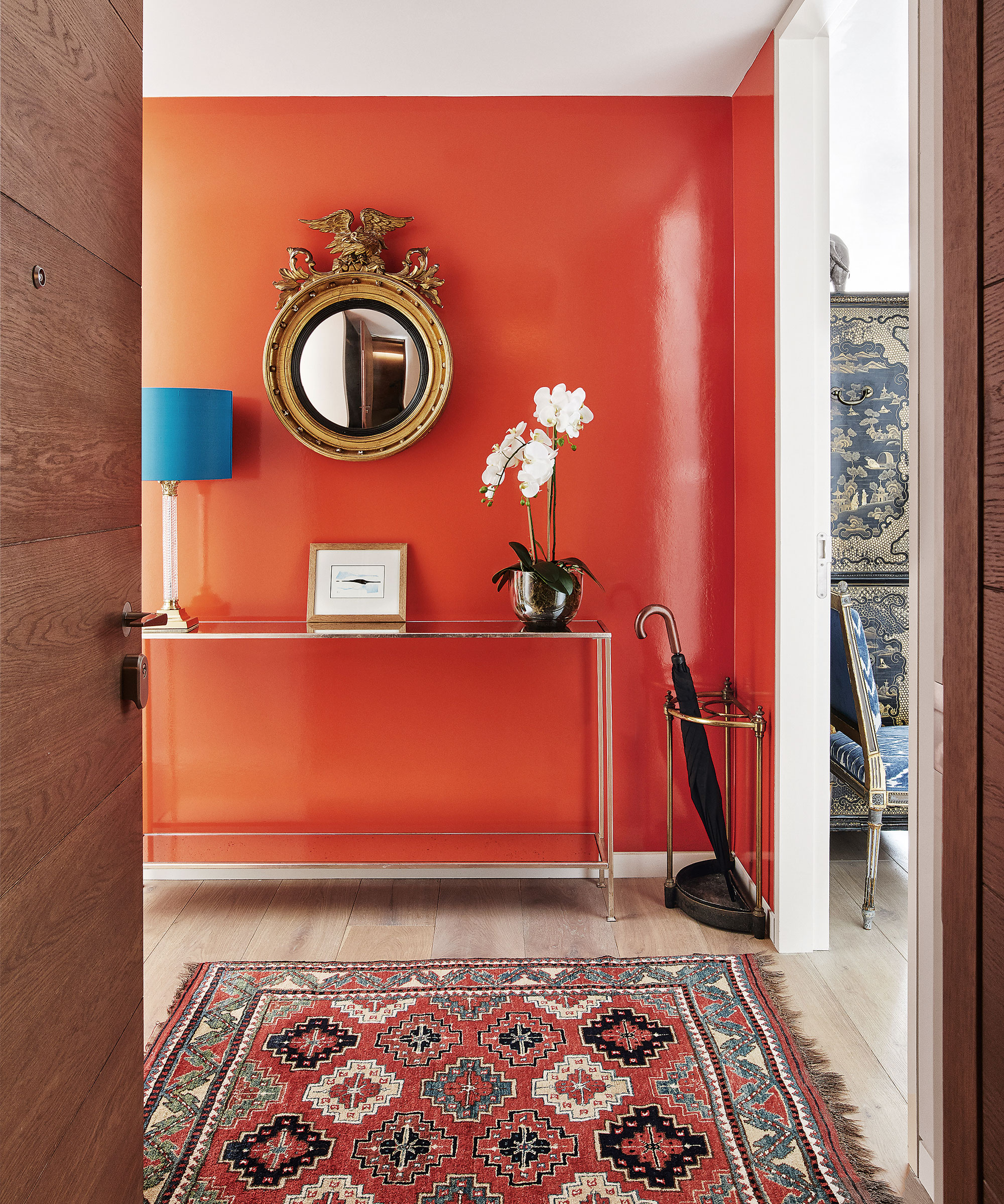
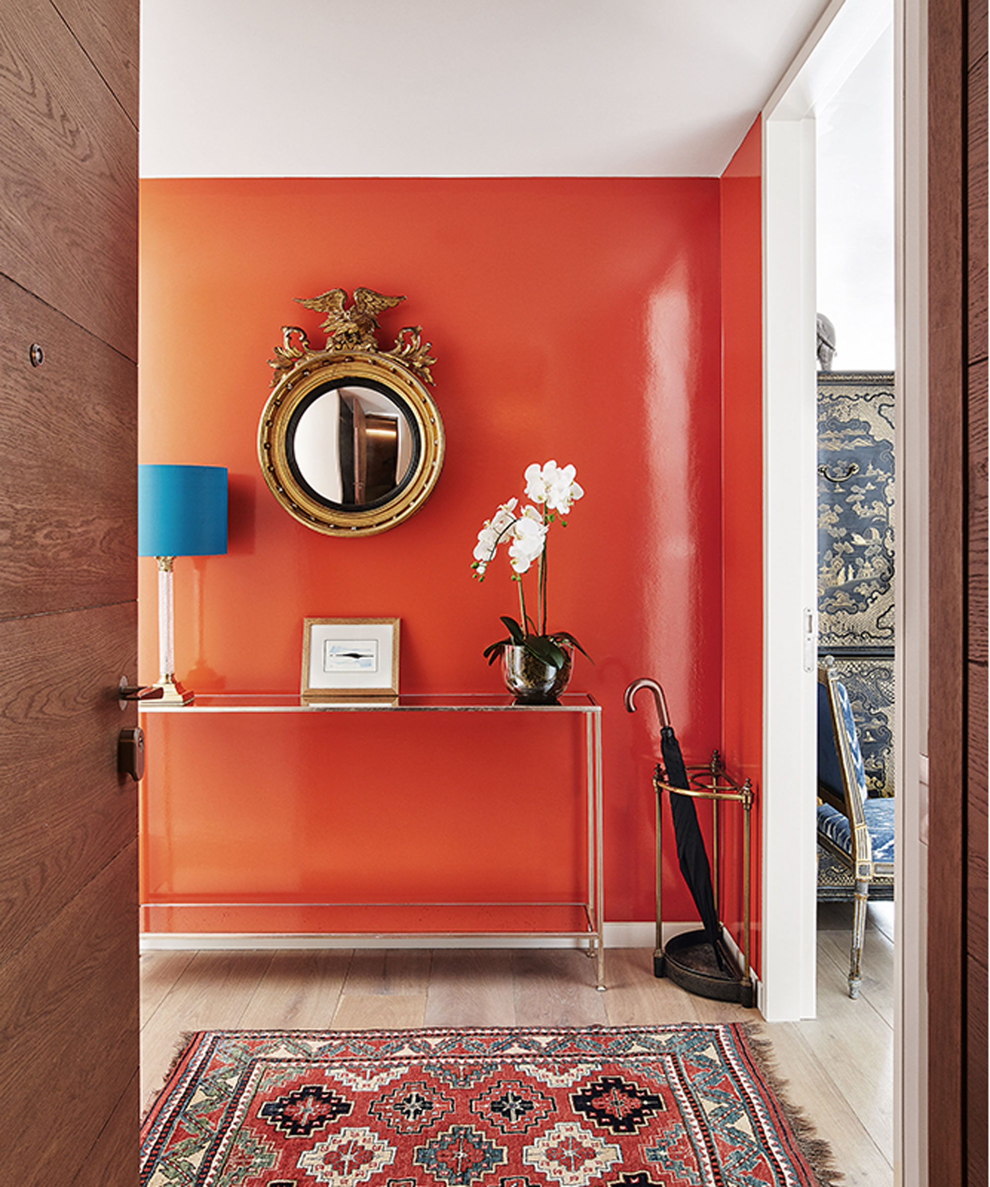
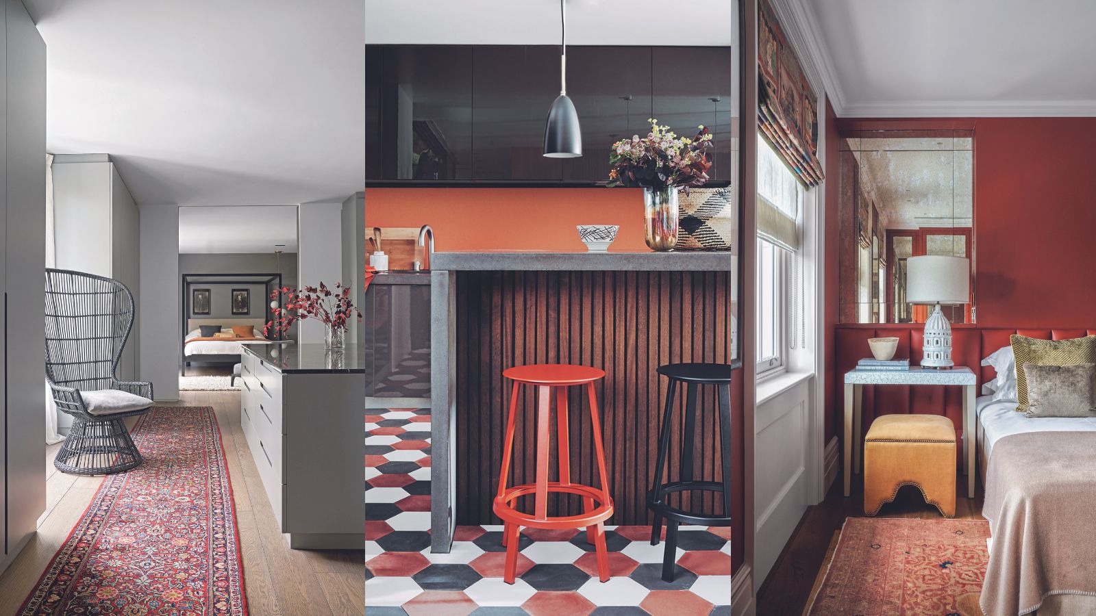
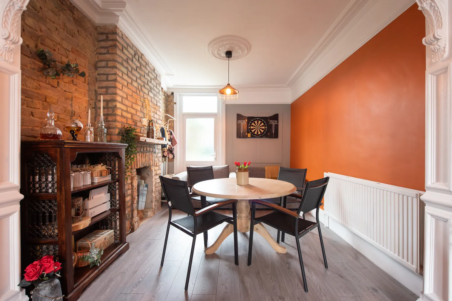
Bright red is a color that several designers strongly recommend avoiding in the kitchen. Lisa Henderson, a Dallas-based designer, cautions against shades like fire-engine red. Bethany Adams, a Louisville designer, concurs, stating that 'bright tomato red' is too intense for a busy kitchen environment. Adams also points out that red is known to stimulate appetite, which might be counterproductive in a space where one seeks to control eating habits. Alisa Popelka of Alisa Cristine Interiors extends this advice to include orange, noting that large amounts of these colors can be distracting and overwhelming in a space meant for relaxation, cooking, and entertaining.
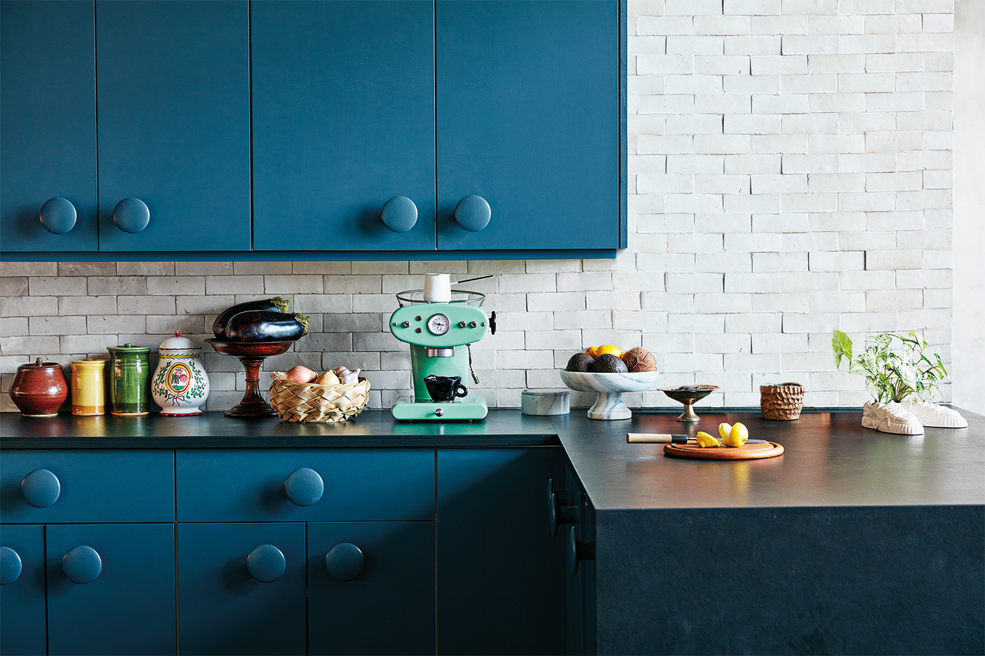
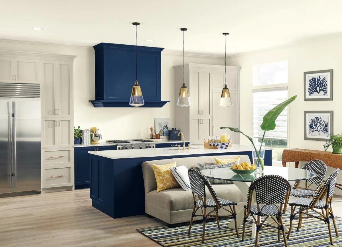
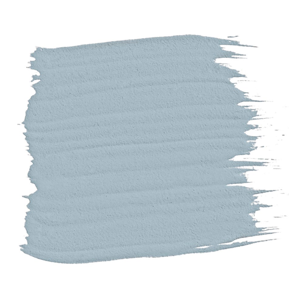
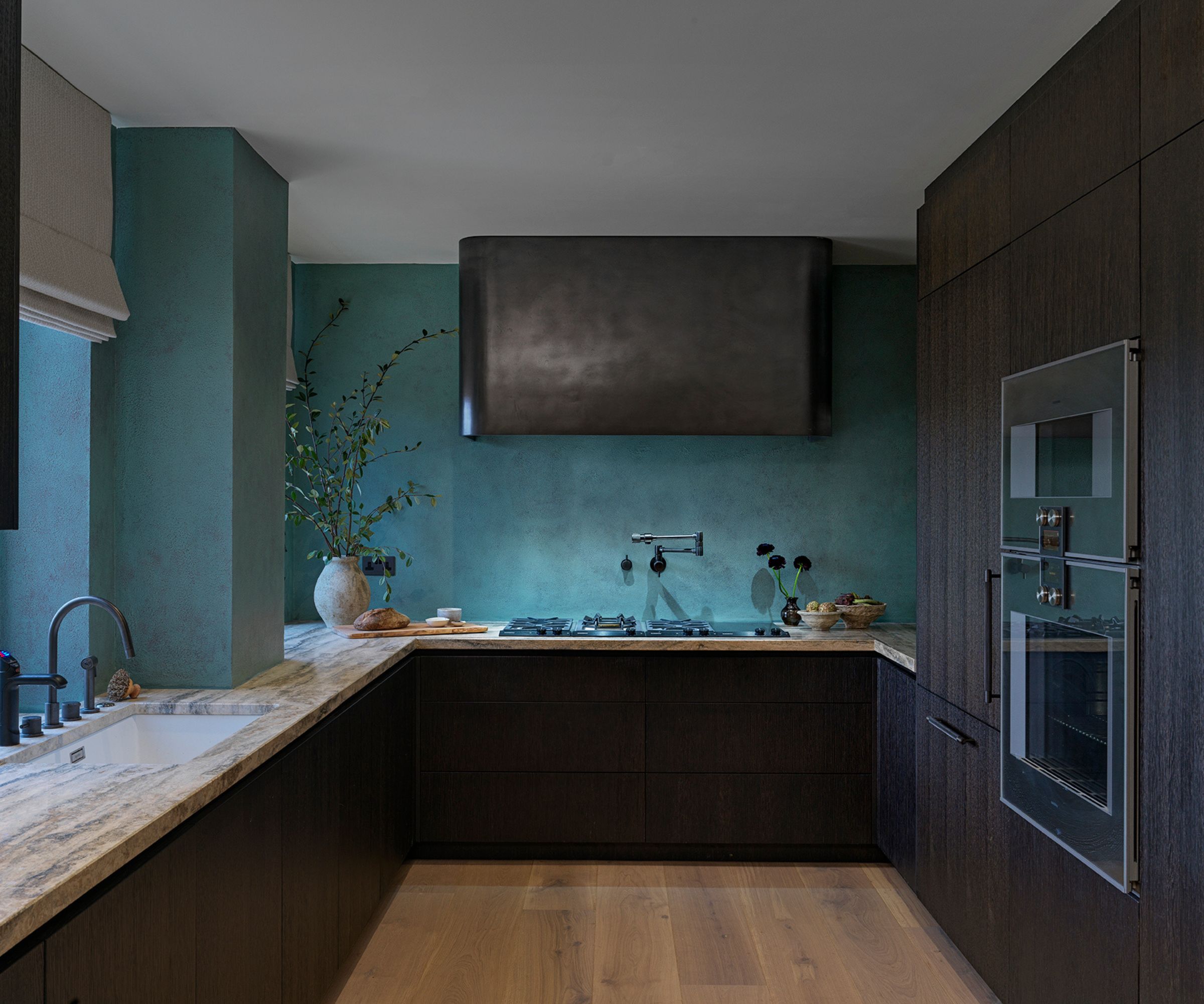
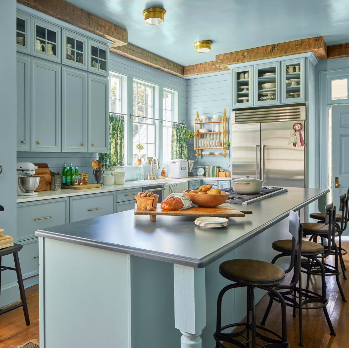
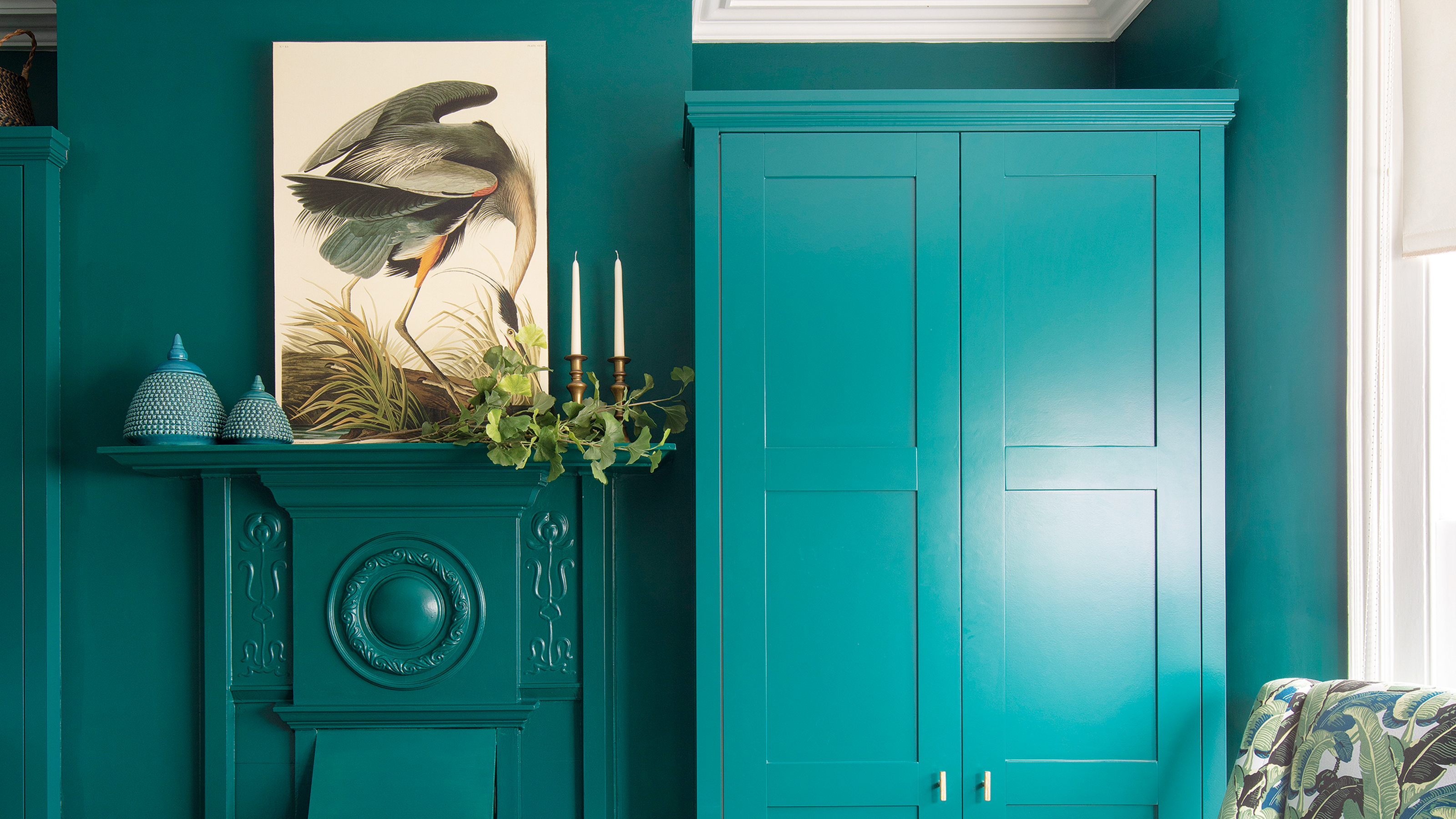
Icy tones, including cool blues and ash-toned grays, are discouraged by Erica Volkmer, founder of Evenson Design. She believes that kitchens, as the heart of the home, should exude an approachable, warm, and inviting atmosphere, which these cool tones may undermine.
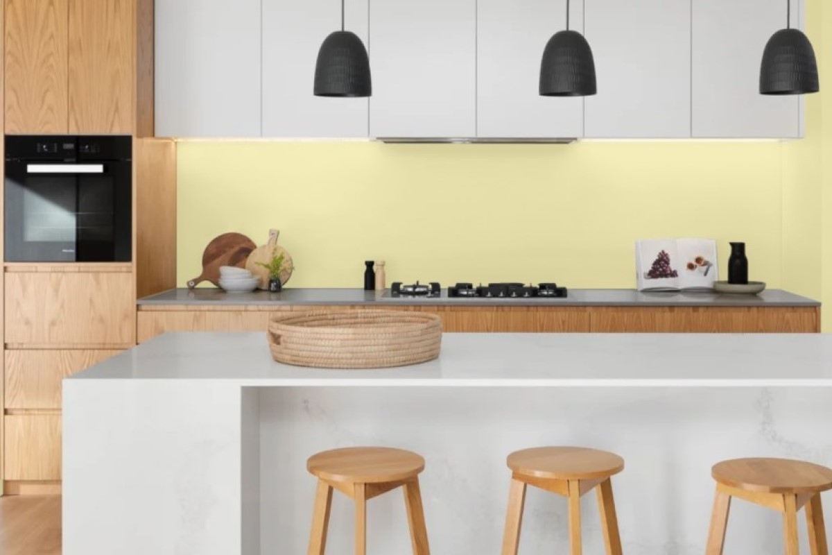
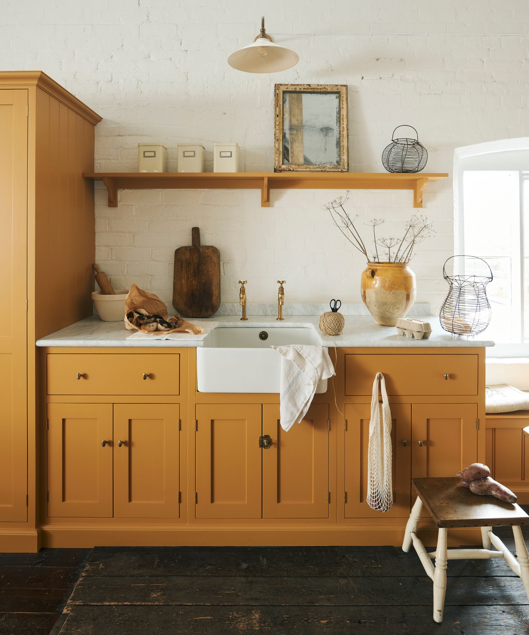
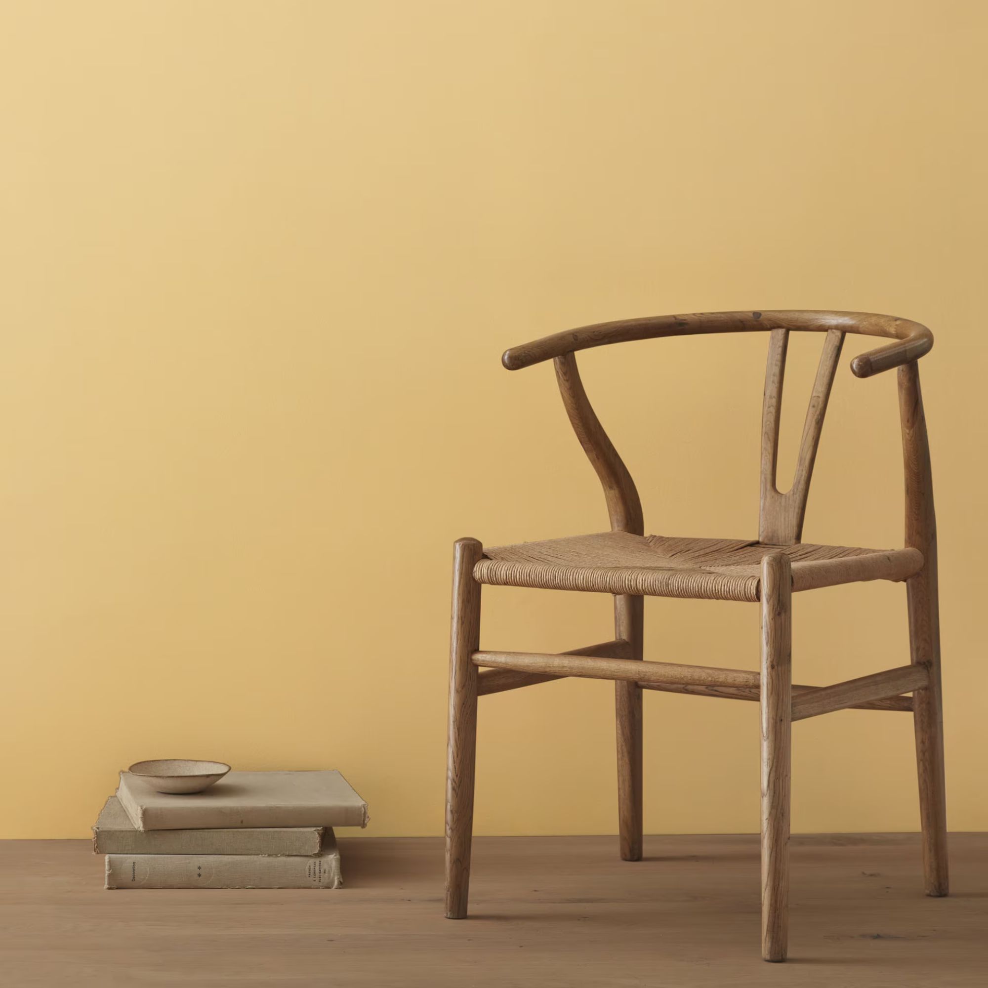
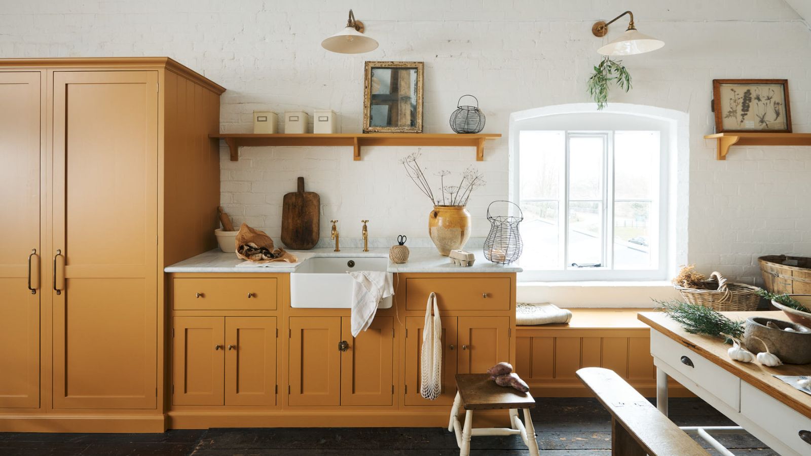
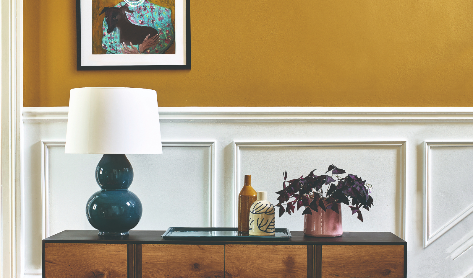
Finally, overly saturated yellows are also considered less welcoming than their muted counterparts. Jen Stevens of Fonde Interiors guides clients away from bright yellows, which can appear dingy over time, towards sophisticated, grounded neutrals like Farrow & Ball's Shaded White and Skimming Stone. These alternatives enhance both the atmosphere and function of the kitchen, providing a more enduring and pleasant environment.
#KitchenDesign #PaintColors #InteriorDesign #HomeDecor #ColorPalettes #DesignerTips #KitchenRenovation #HomeImprovement #KitchenDesign #PaintColors #InteriorDesign #HomeDecor #ColorPalettes #DesignerTips #KitchenRenovation #HomeImprovement
0 comment in total
You may also like
8 colors you should never paint kitchen cabinets according to the experts

5 colors you should never paint a small room – designers warn us to steer clear of these hues, and what to pick instead

10 Kitchen Paint Colors You Won’t Regret in 10 Years, According to Designers
Experts Rank the 10 Worst Paint Colors for Your Kitchen

The Color to Never Paint Your Kitchen Cabinets, According to a Top L.A. Designer
What are the worst colors to paint a room? The shades experts say you should never use
Don't Use These 7 Dining Room Paint Colors — Designers Say You Should Avoid Them at All Costs

The 6 Paint Colors for Your Kitchen That Will Never Go out of Style
5 colors you should never paint a pantry – designers share the shades they swerve

The One Paint Color Designers Always Avoid in Kitchens—and What They Use Instead
3 overlooked colors you never thought could work in your kitchen – but interior designers swear by them
Interior design experts reveal the colour rules you should be breaking
7 Kitchen Cabinet Colors Designers Never Want to See Again
29 Best Paint Colors for a Kitchen You’ll Never Want to Leave

Kitchen Color Selection Tips from 5 Designers
7 Kitchen Storage Trends That Designers say are Best Avoided

6 Worst Colors To Paint Your Kitchen (And What To Choose Instead)
5 colors you should never paint your entryway – according to interior experts
5 outdated kitchen cabinet color trends to avoid if you don't want your kitchen to look unfashionable, say designers
4 Colors You Should Never Paint Cabinets, According To Designers