1/7
The 6 Paint Colors for Your Kitchen That Will Never Go out of Style
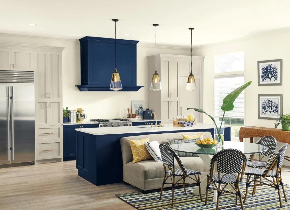
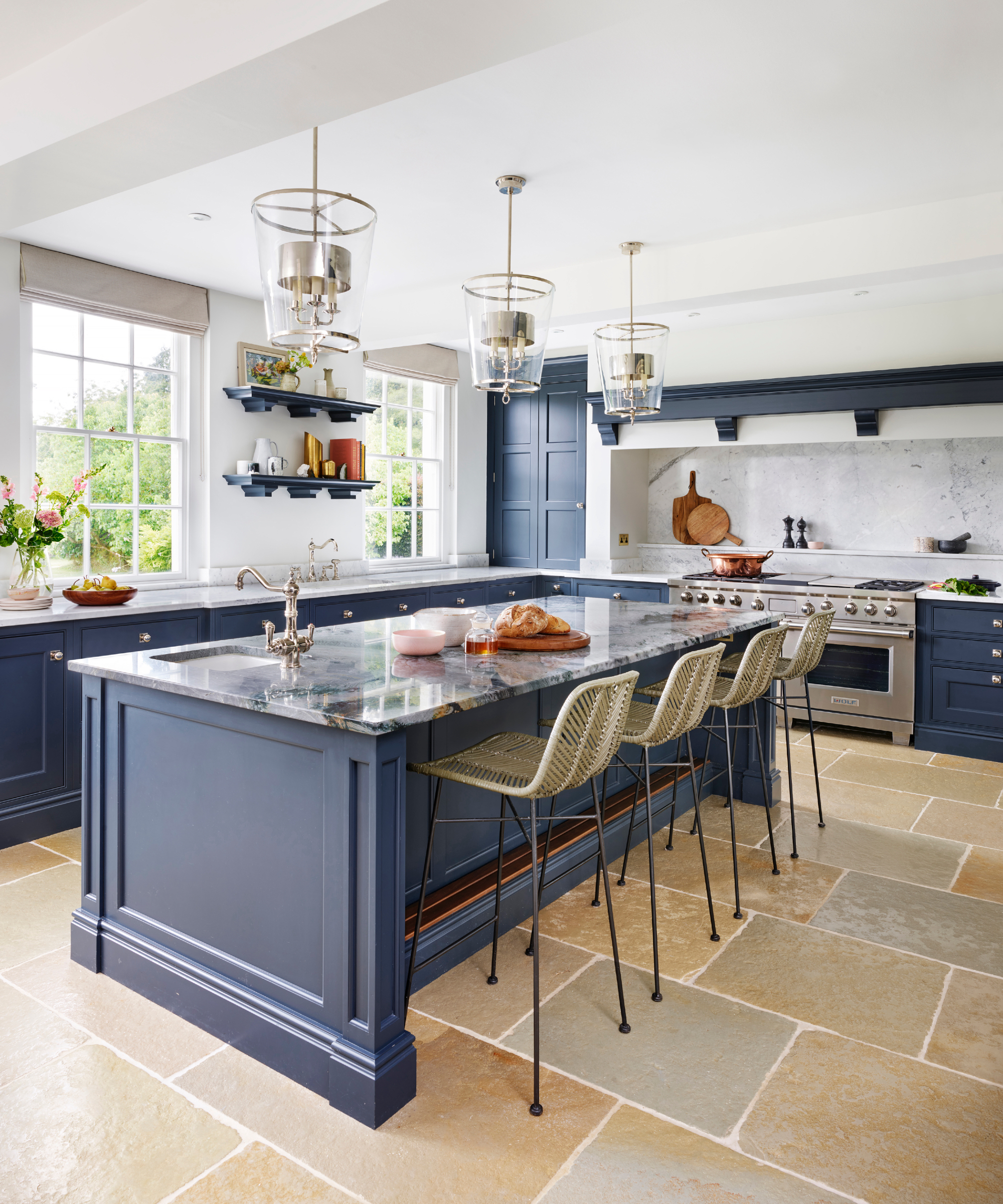
The kitchen is often considered the heart of the home, serving as a central gathering place for friends and family, and a hub for preparing meals. Given its importance, selecting the right paint color is a crucial design decision that sets the overall tone for the space. This article explores six timeless kitchen paint colors recommended by expert interior designers, offering insights into why these shades remain popular and how they can be effectively incorporated into various kitchen designs.
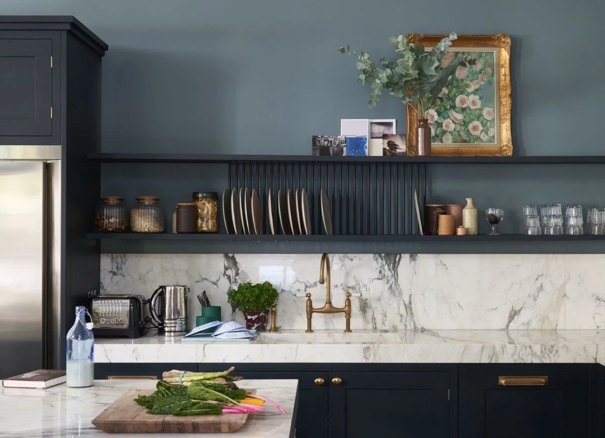
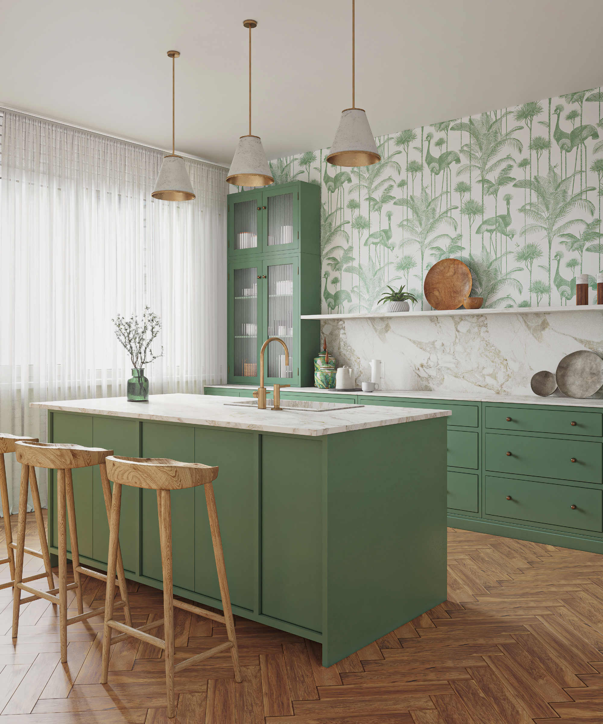
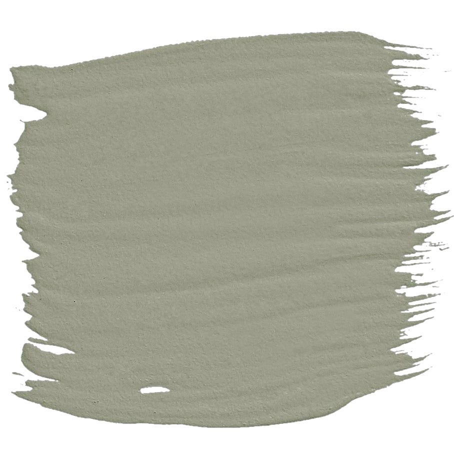
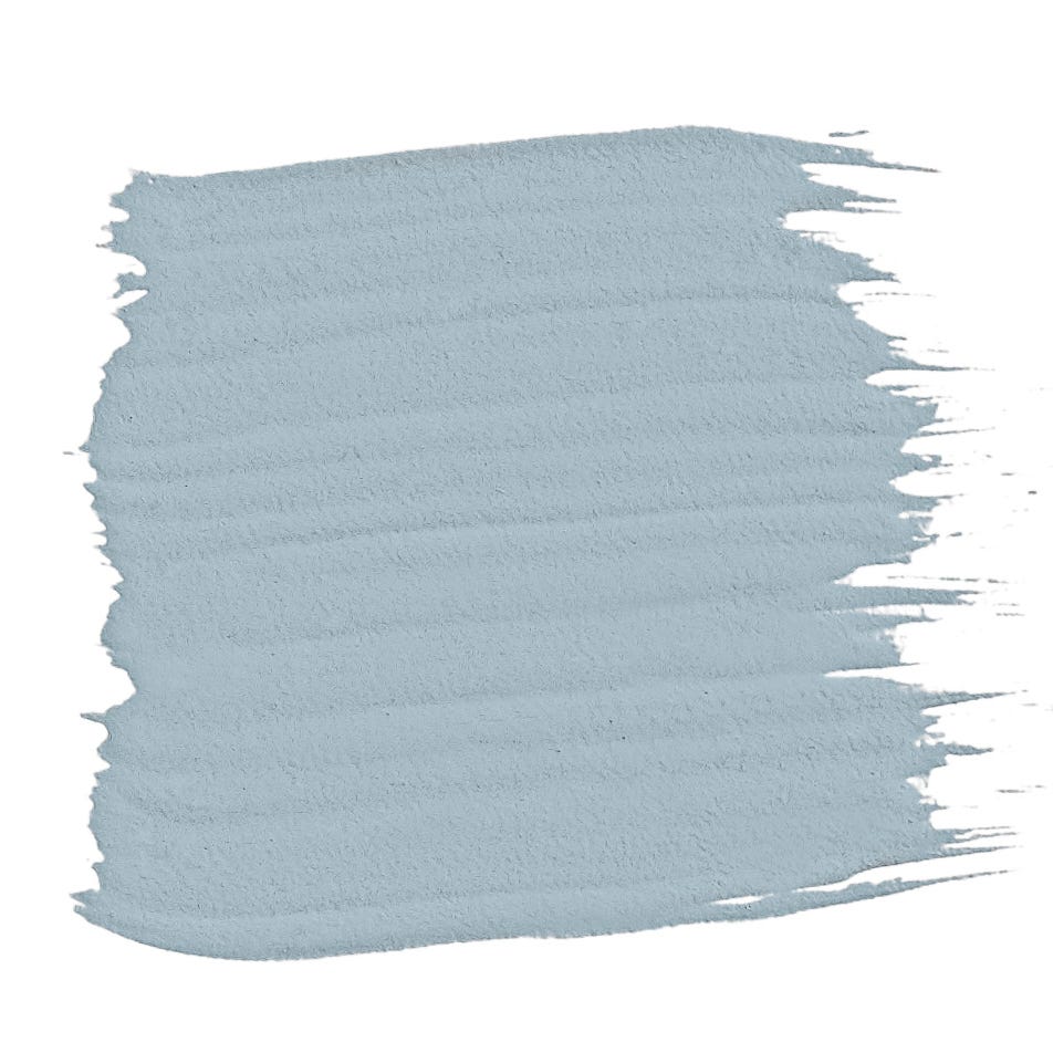
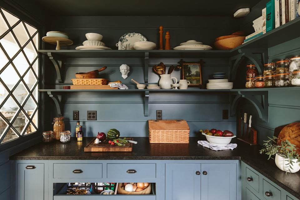
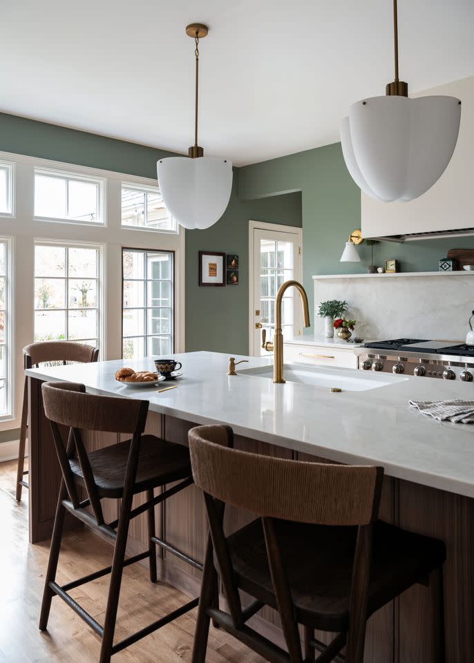
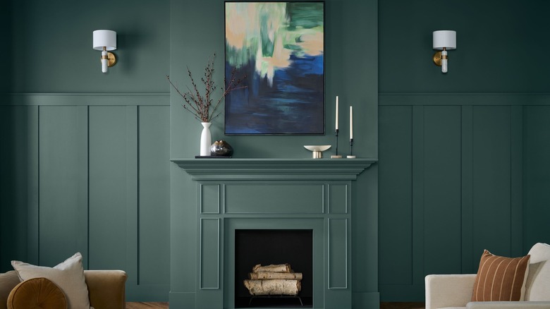
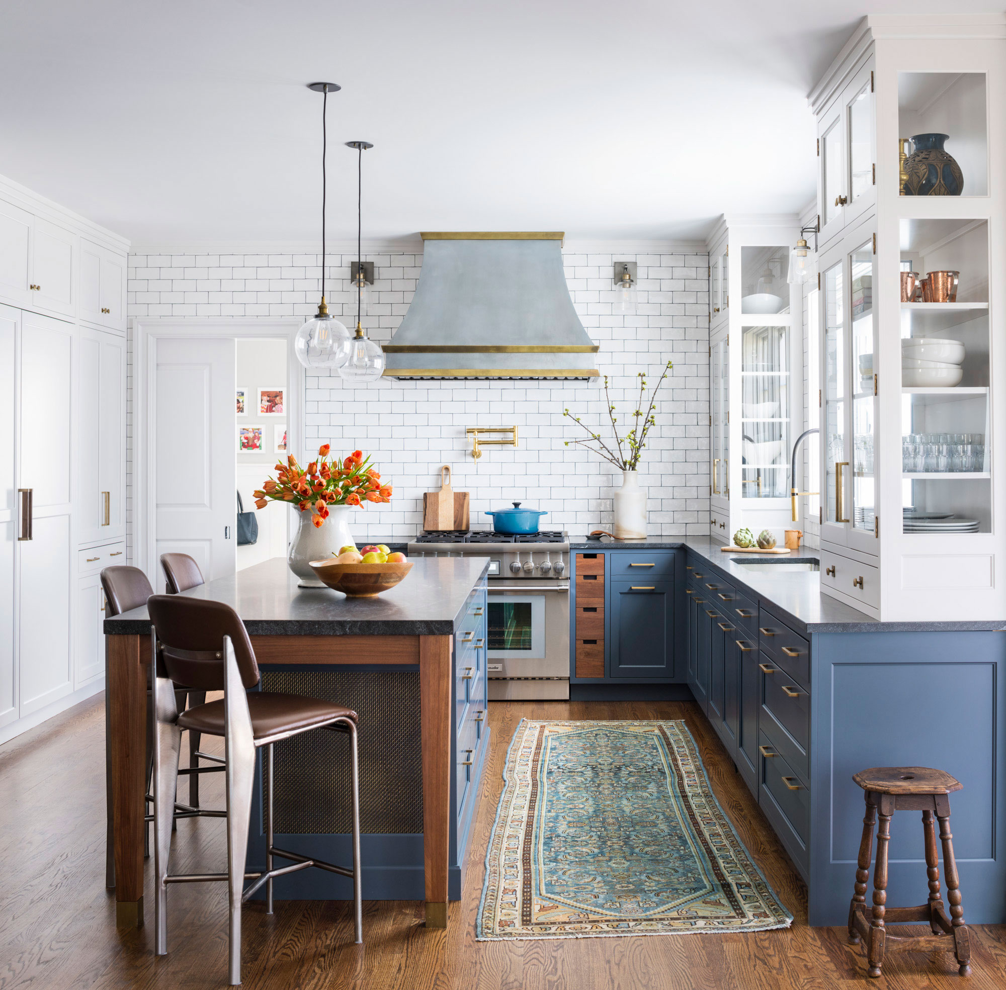
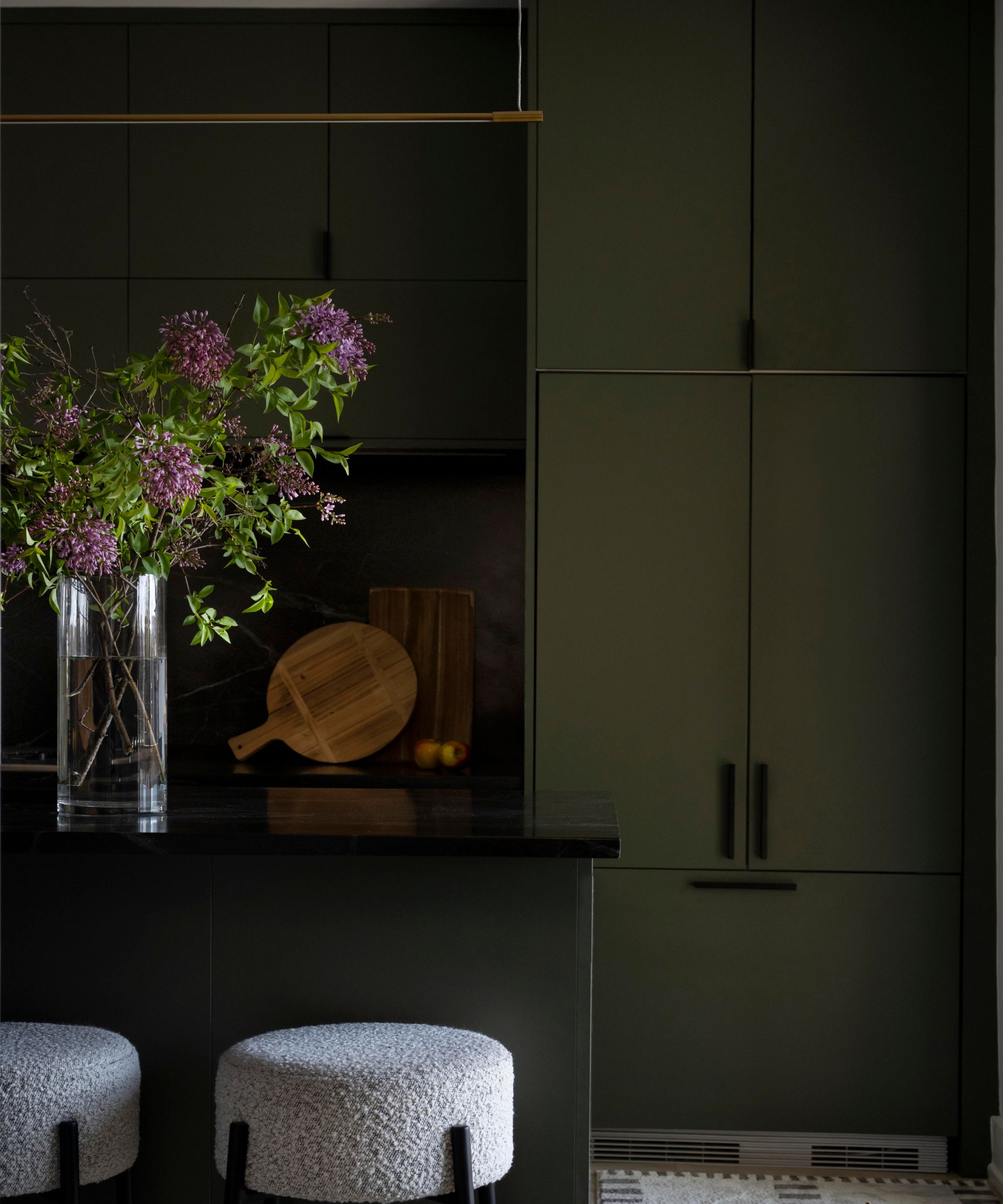
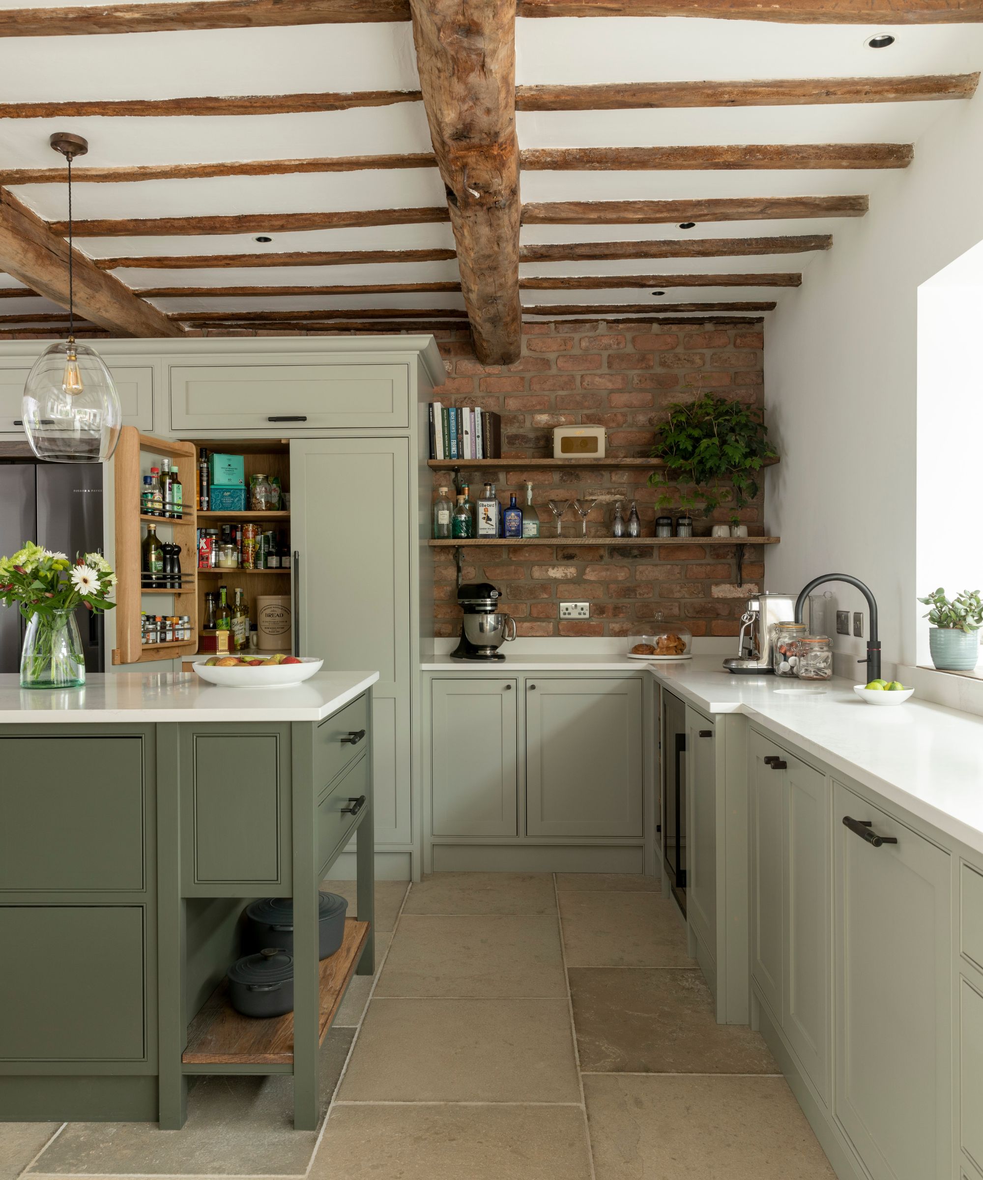
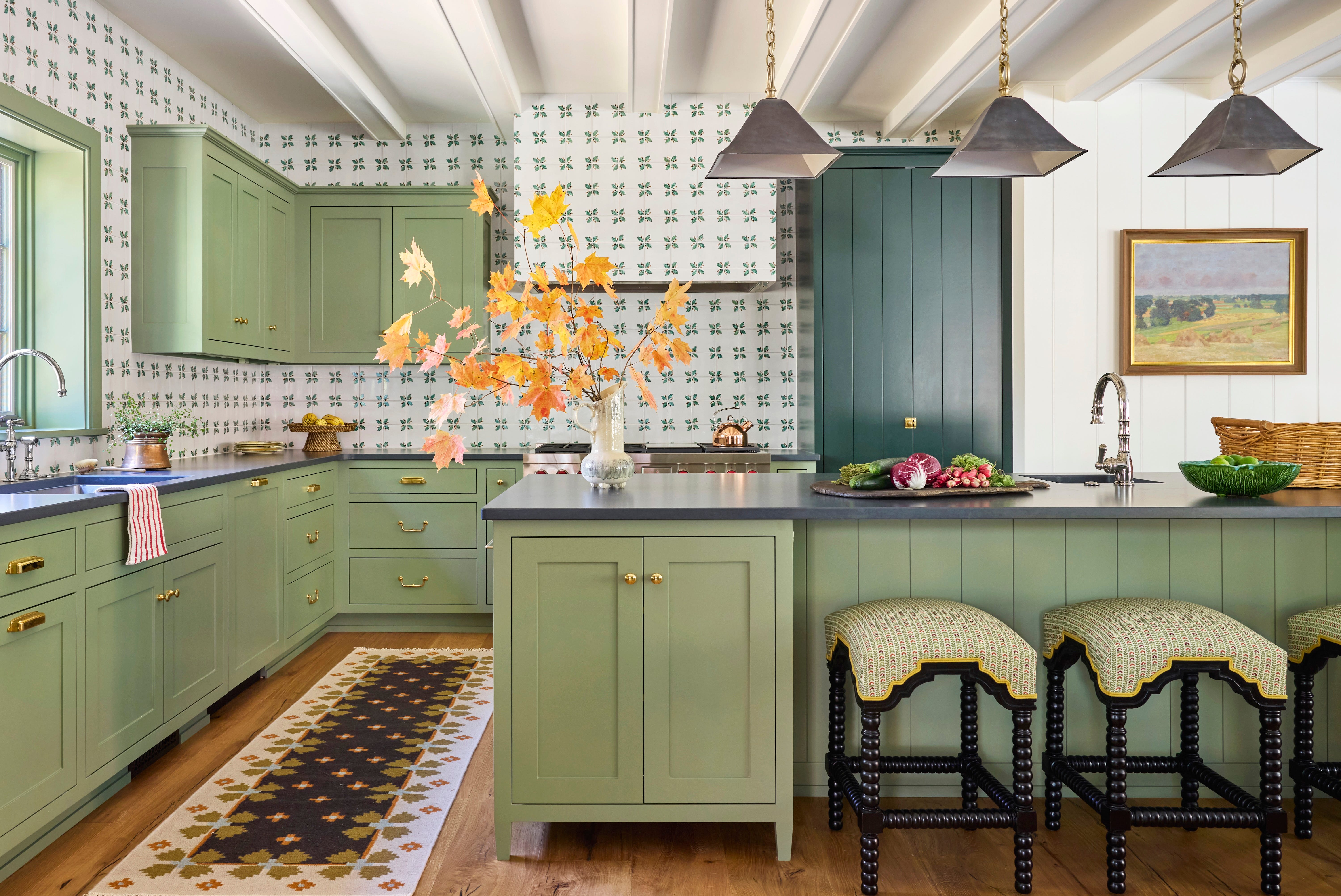
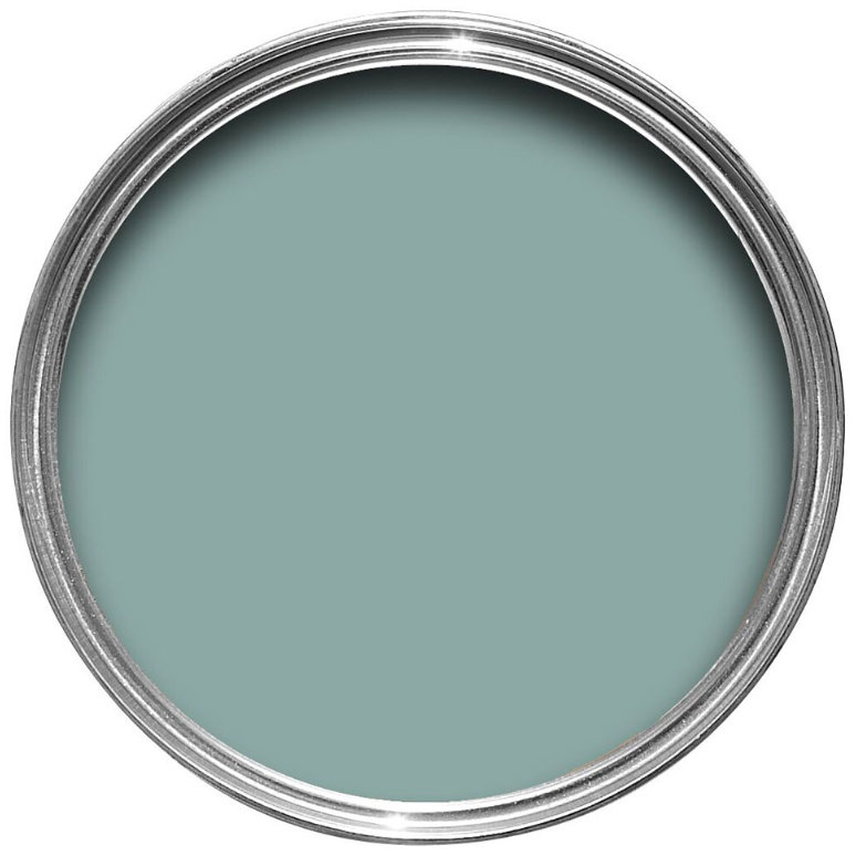
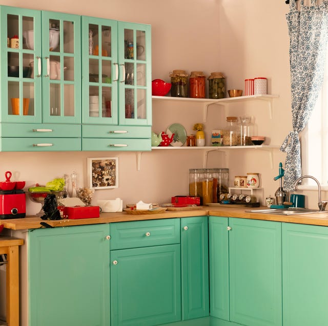
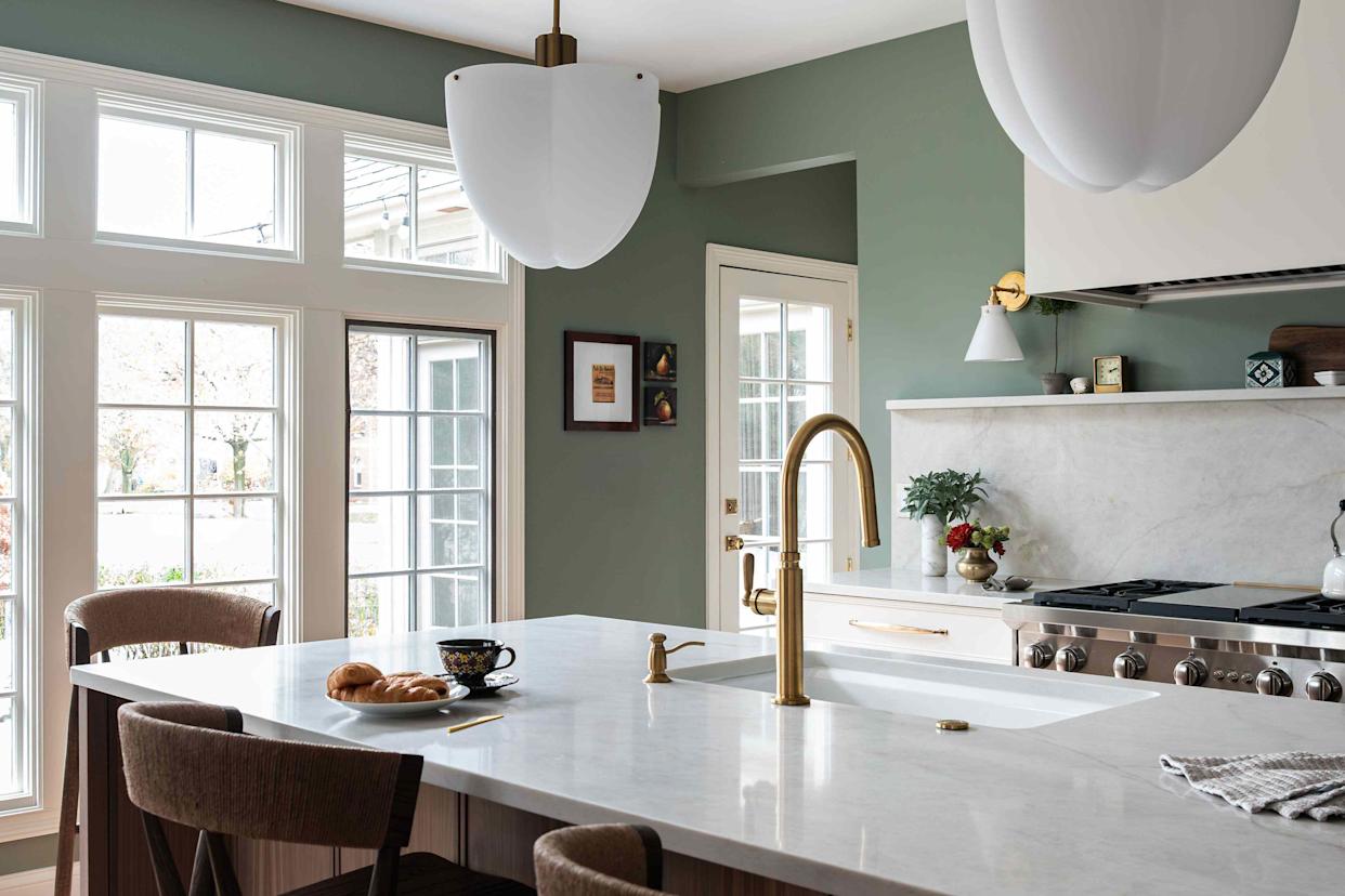
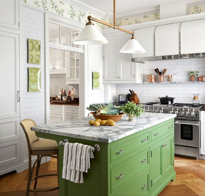
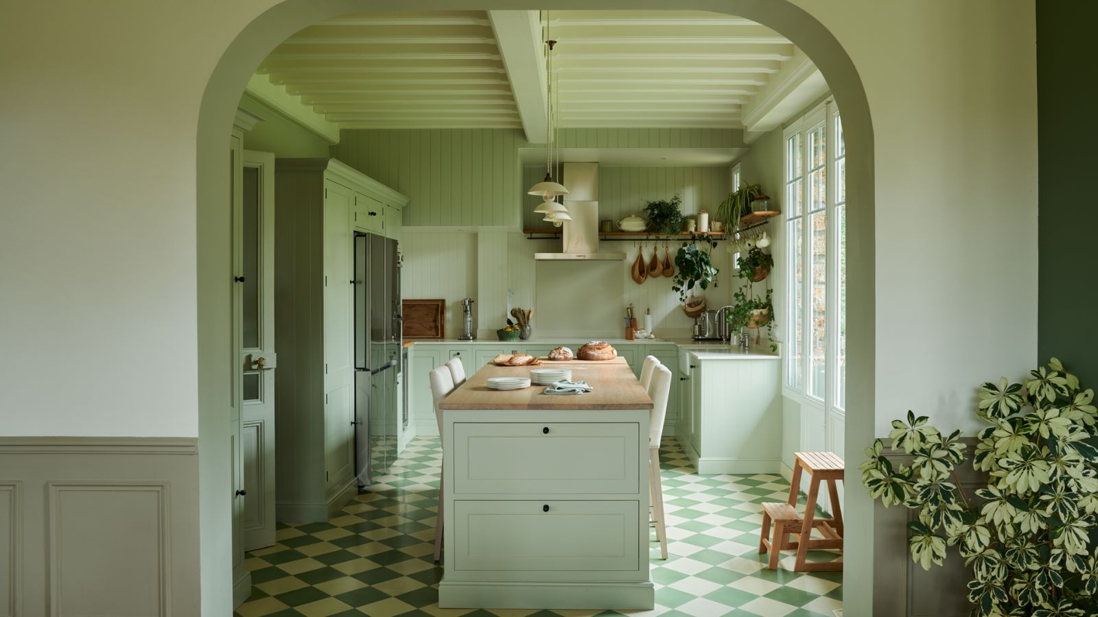
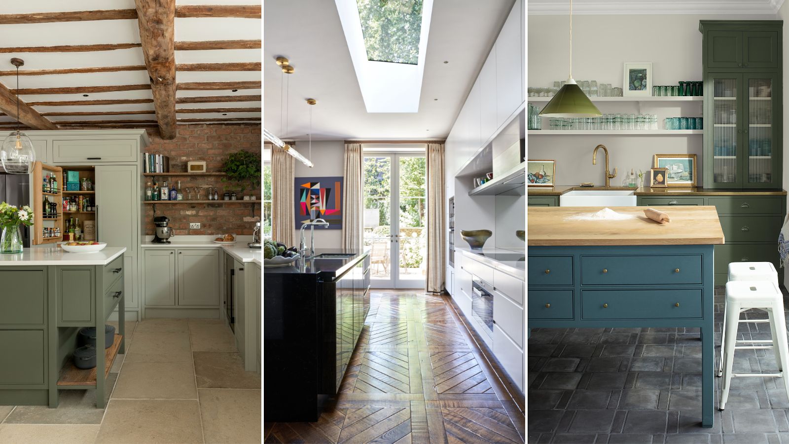
Green kitchens have seen a notable increase in popularity in recent years, offering a refreshing alternative to traditional neutrals. Amanda Barnes of Amanda Barnes Interiors favors green, particularly combining white upper cabinets with green lower cabinets or utilizing two shades of green to differentiate the island. She highlights Farrow and Ball's Pigeon and Benjamin Moore's Fieldstone as excellent choices, noting their gray undertones allow them to shift between green and gray depending on the natural light. This versatility makes green a dynamic and enduring option for kitchen spaces.
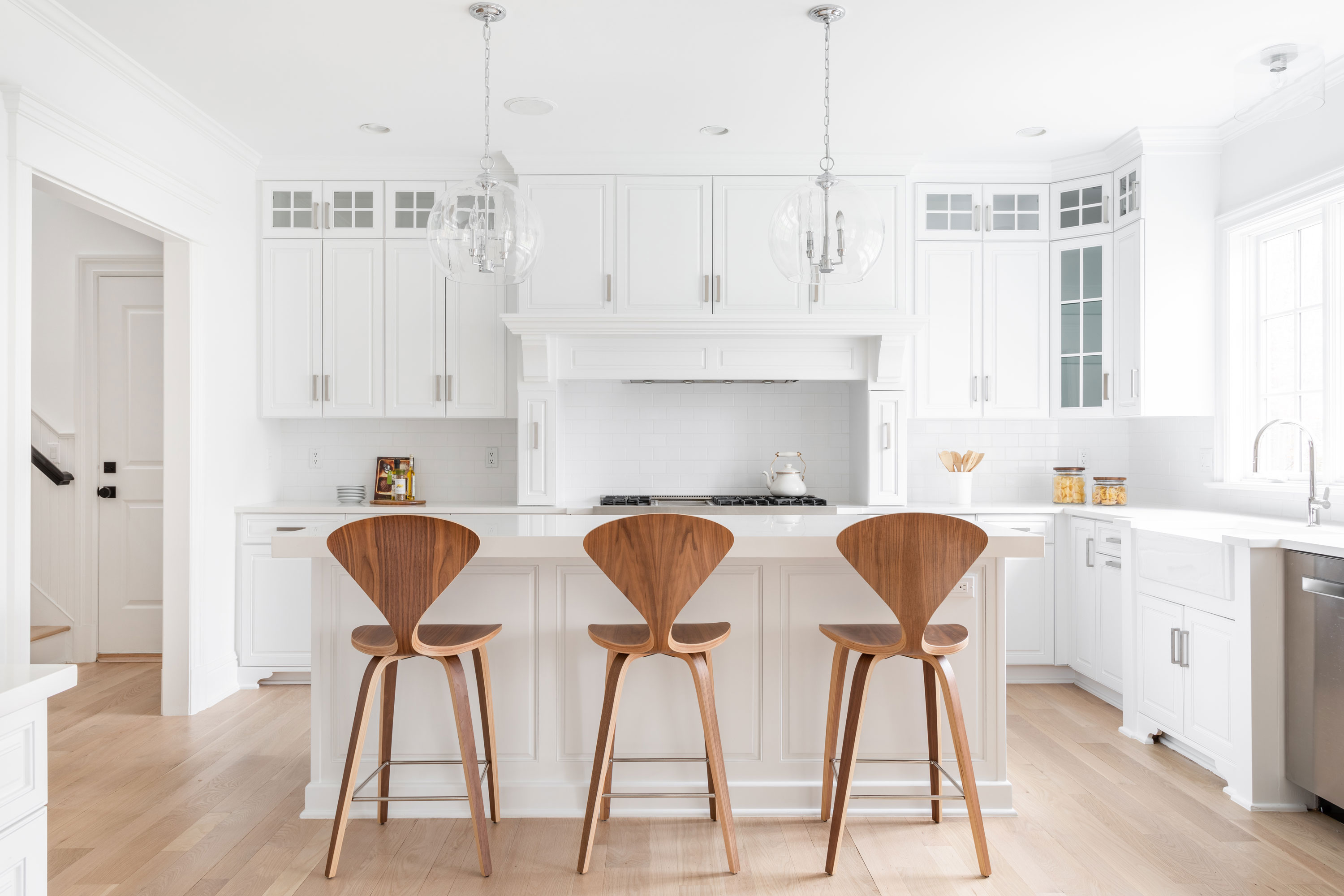
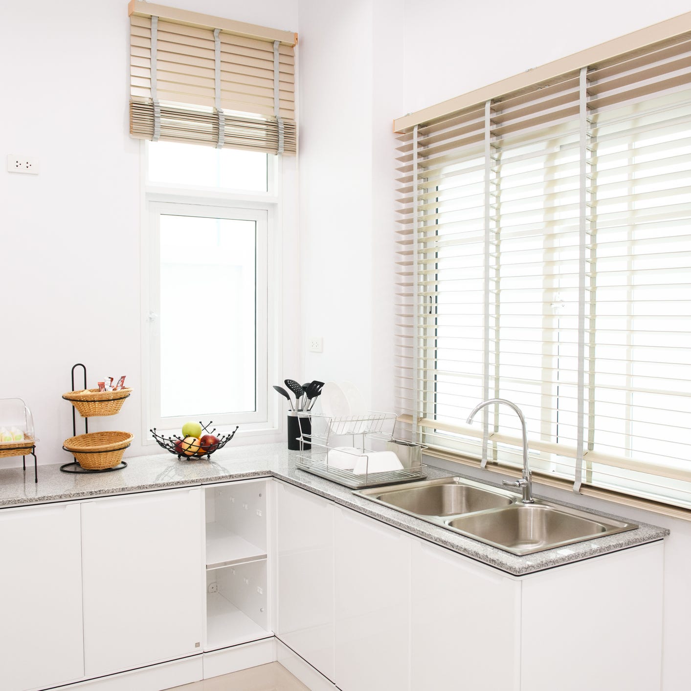
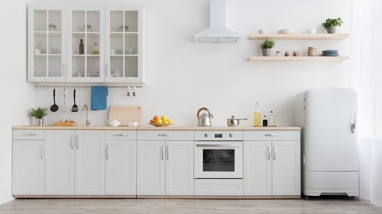
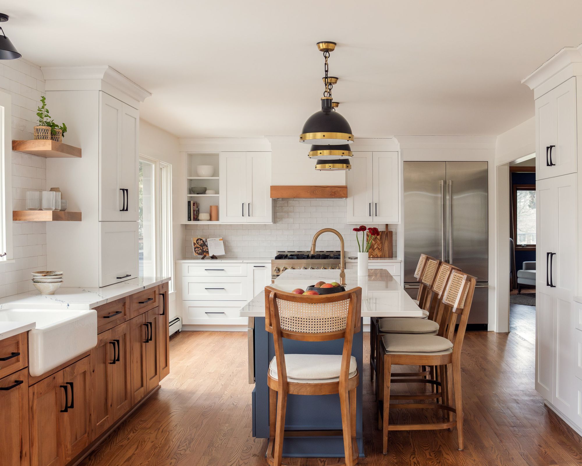
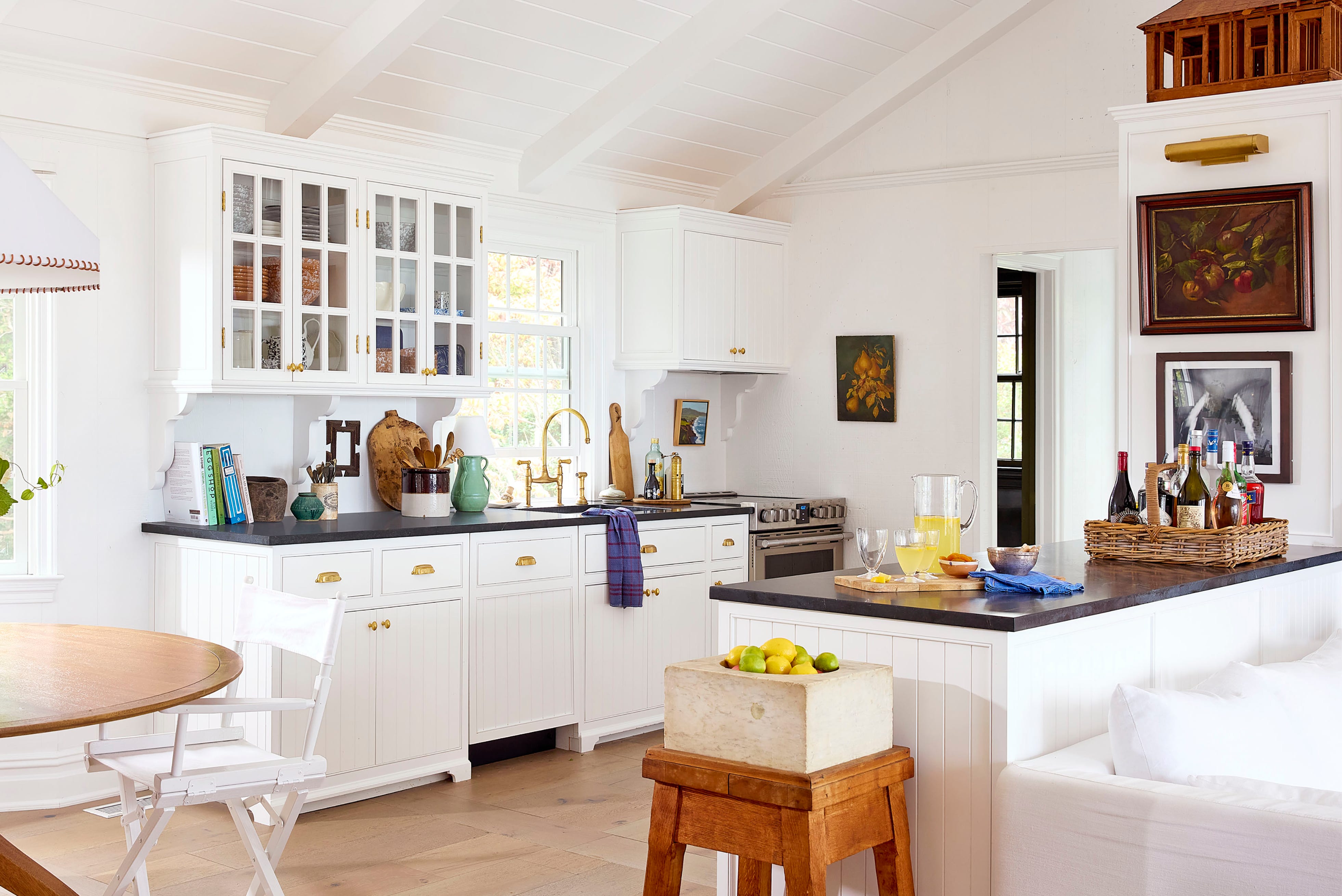
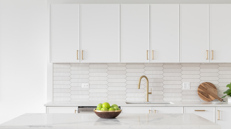
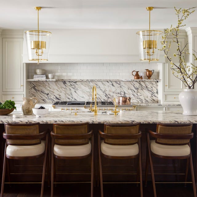
White remains a classic and beloved choice for kitchen paint, especially warm whites. Designers like Jenn Feldman of Jenn Feldman Designs appreciate warm whites for their ability to provide a clean, neutral backdrop that allows for layering with various metallic hardware and light fixtures. Karen Harautuneian of Hub of the House Studio and Linda Hayslett of LH.Designs also advocate for warm whites such as Farrow & Ball's Wimborne White, Benjamin Moore's Bavarian Cream, White Opulence, and Frostine. These shades create an inviting atmosphere, serving as a versatile canvas for diverse design elements.
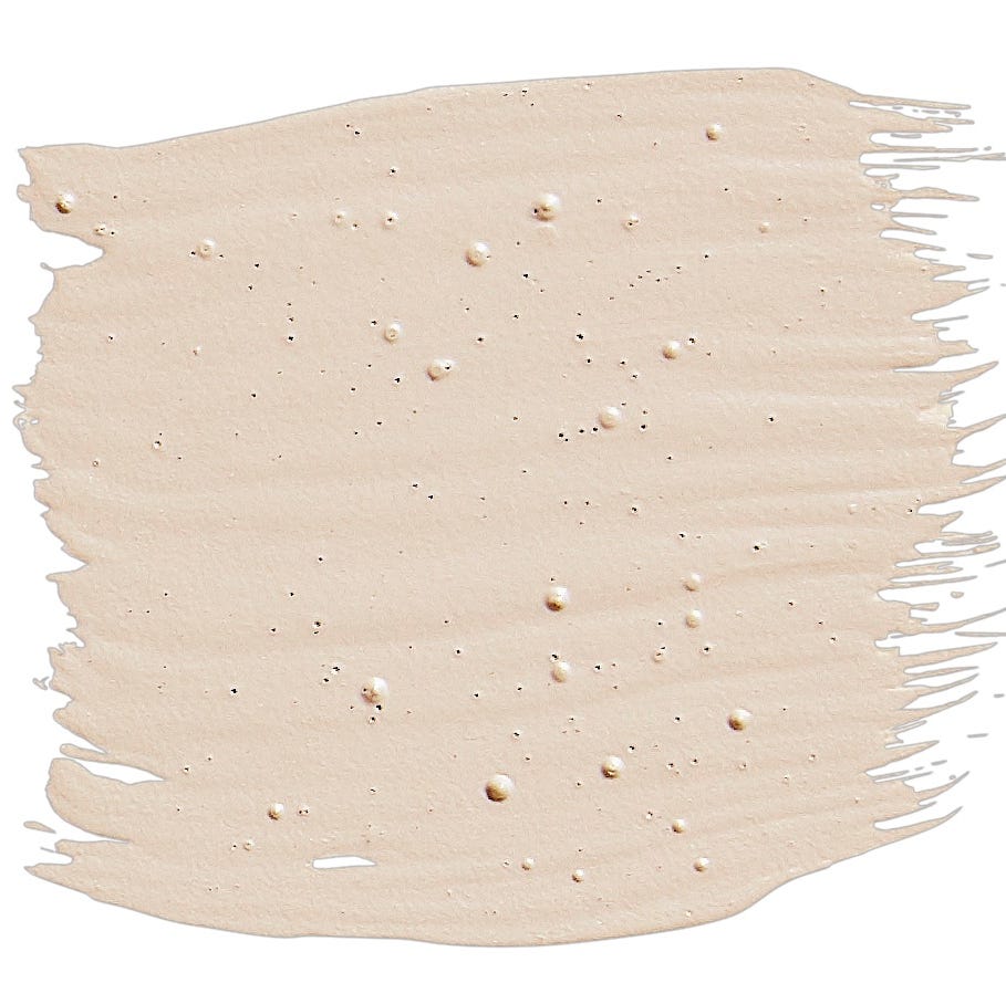
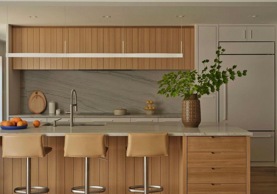
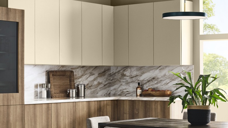
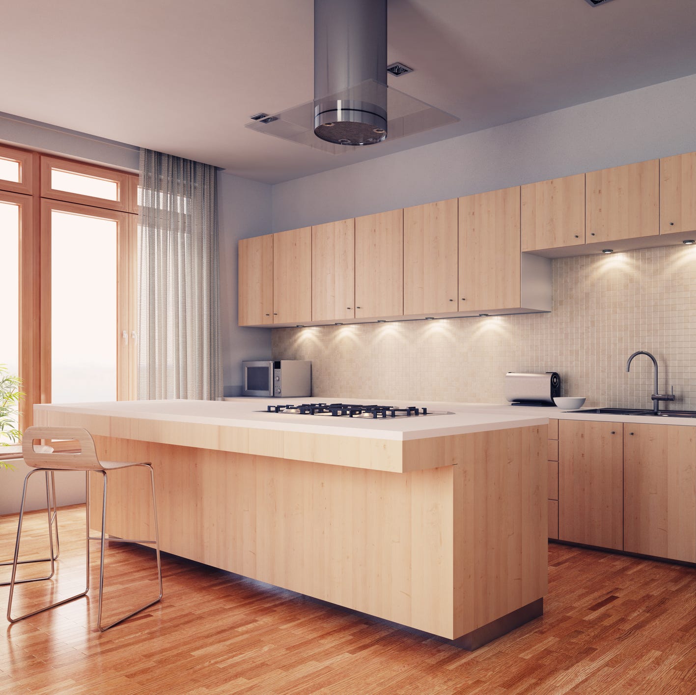
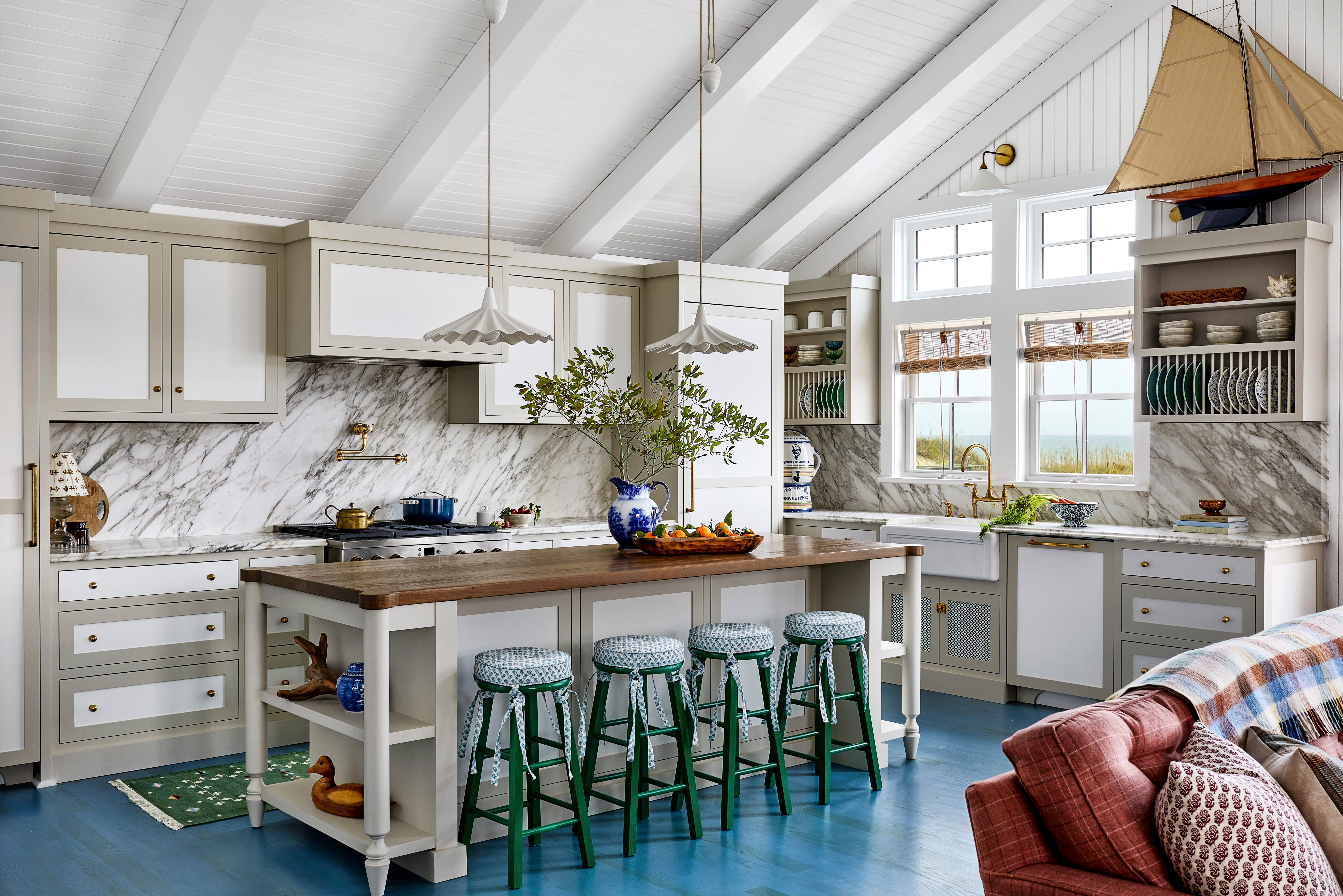
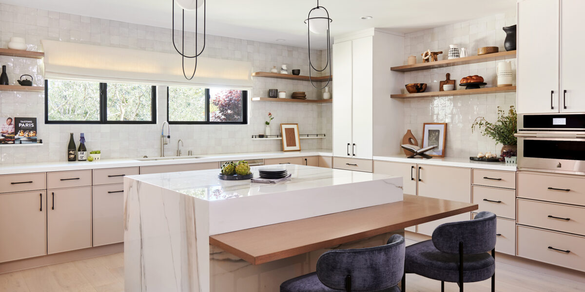
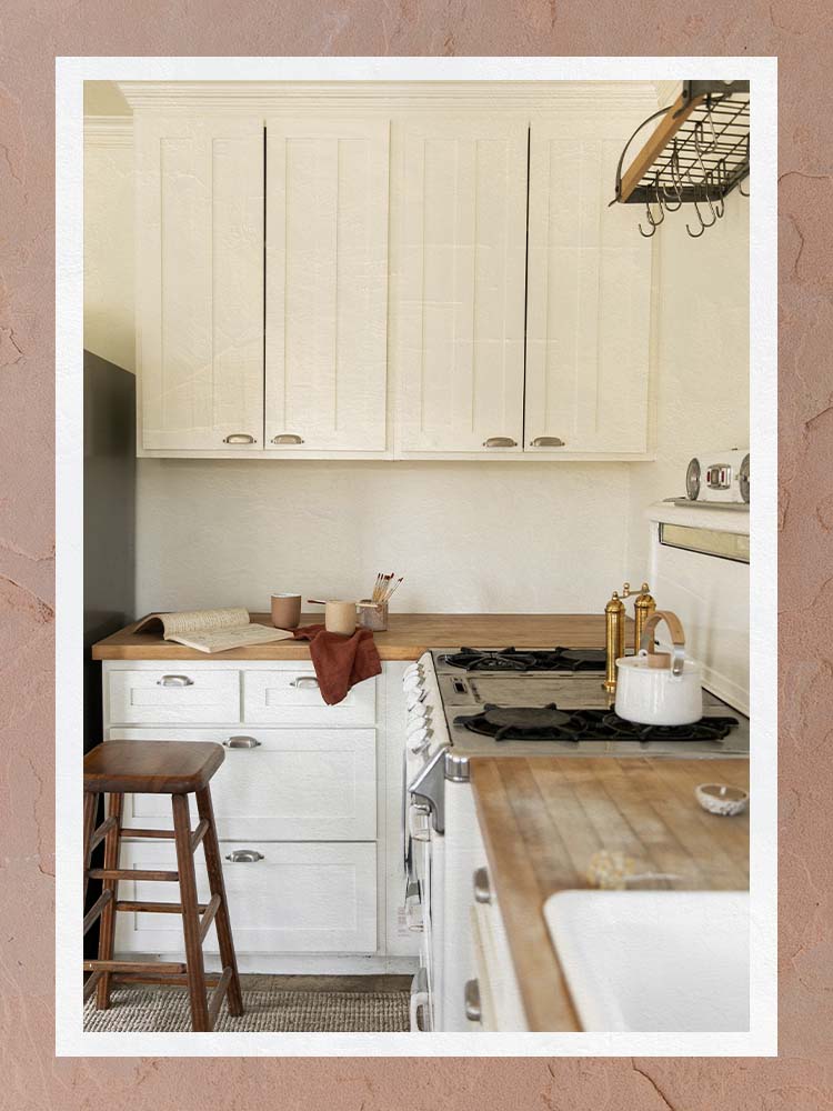
For those who appreciate the aesthetic of white but wish to avoid a stark appearance, off-white presents an appealing alternative. Melinda Trembly of Rincon Rd. recommends creamy off-whites like Benjamin Moore's Mascarpone. This hue blends seamlessly with warm woods and earthy tiles and stones, offering a softer, richer feel. Off-white cabinets can be combined with wooden islands or hutches to create a warm and sophisticated kitchen environment.
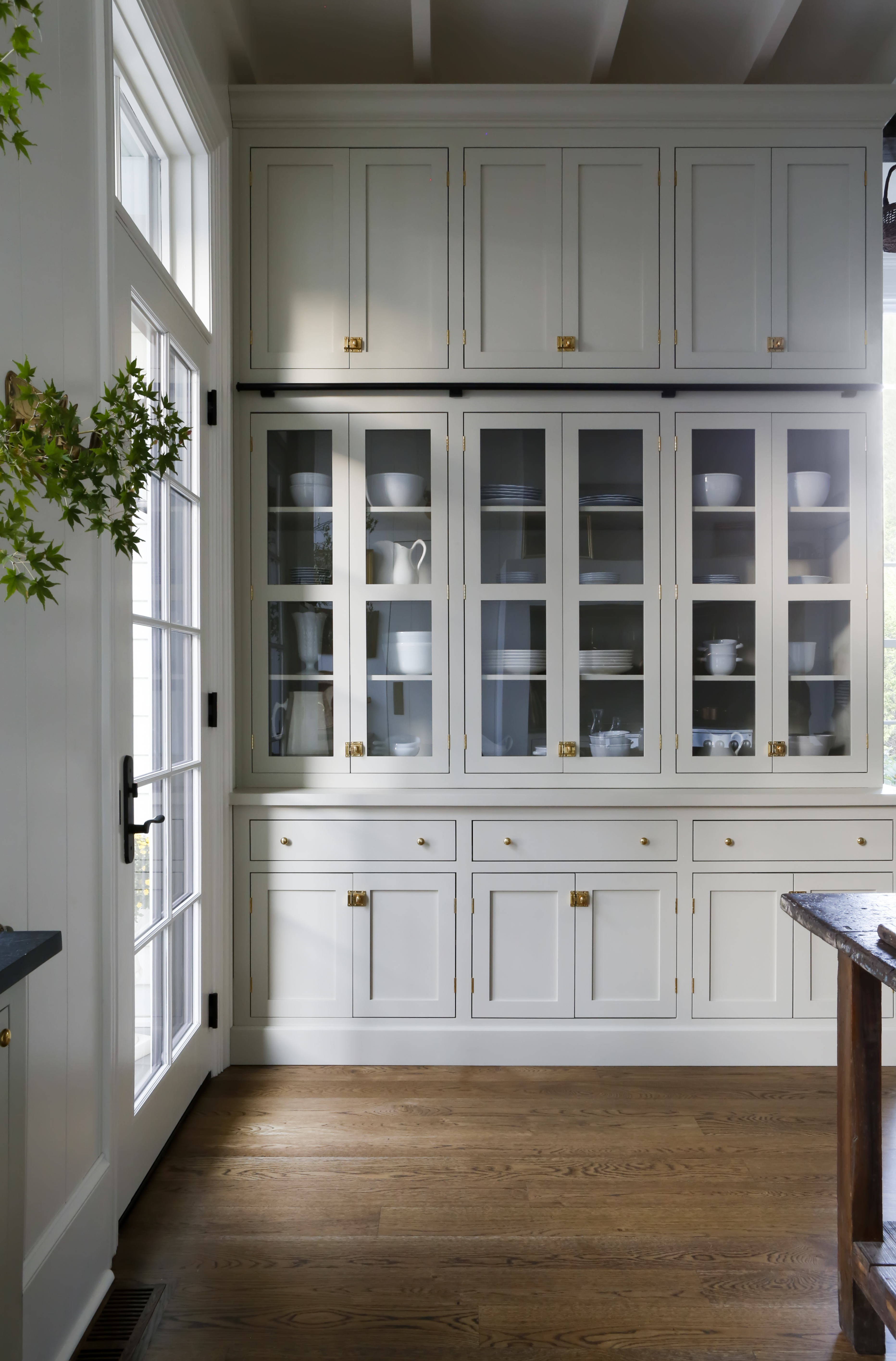
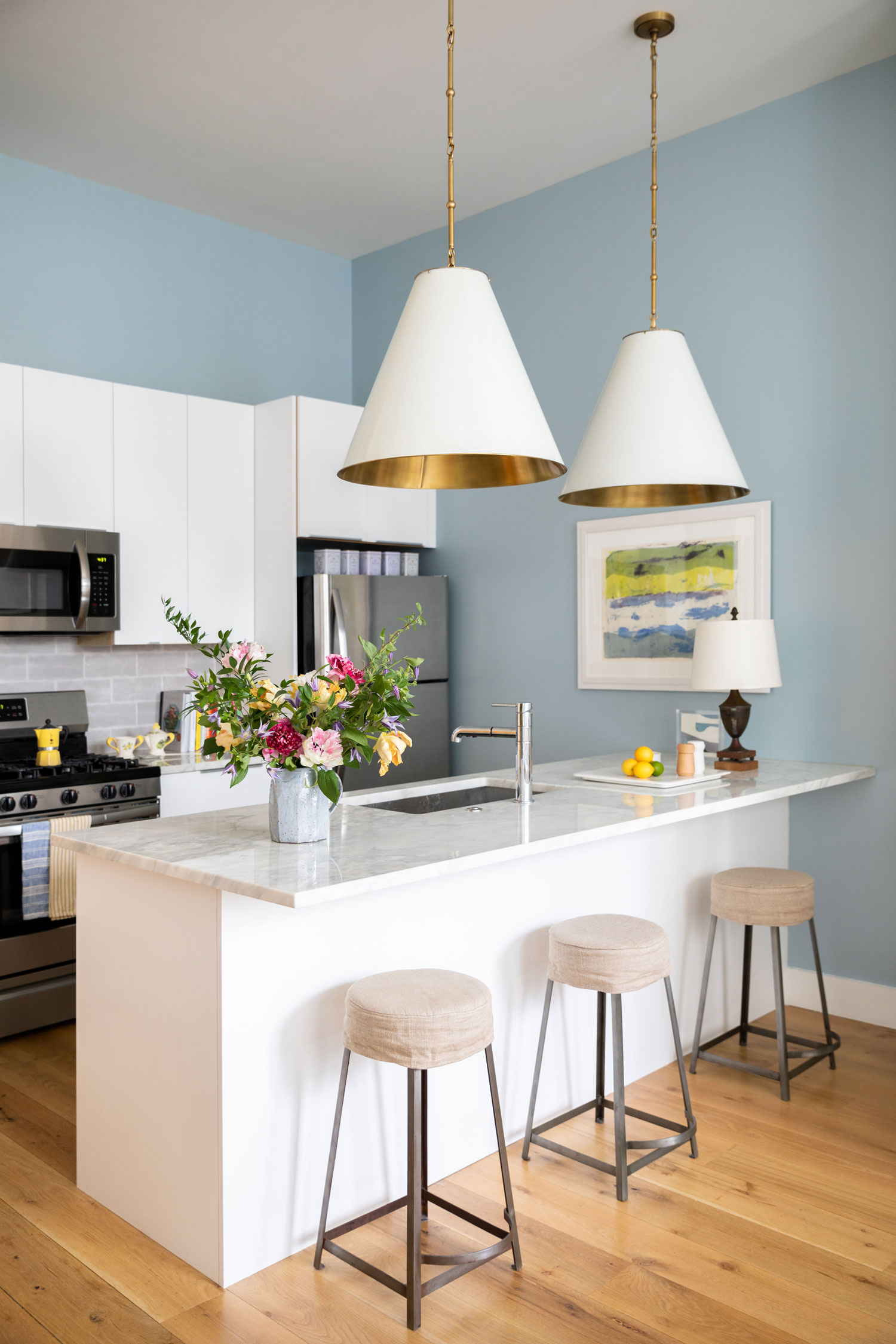
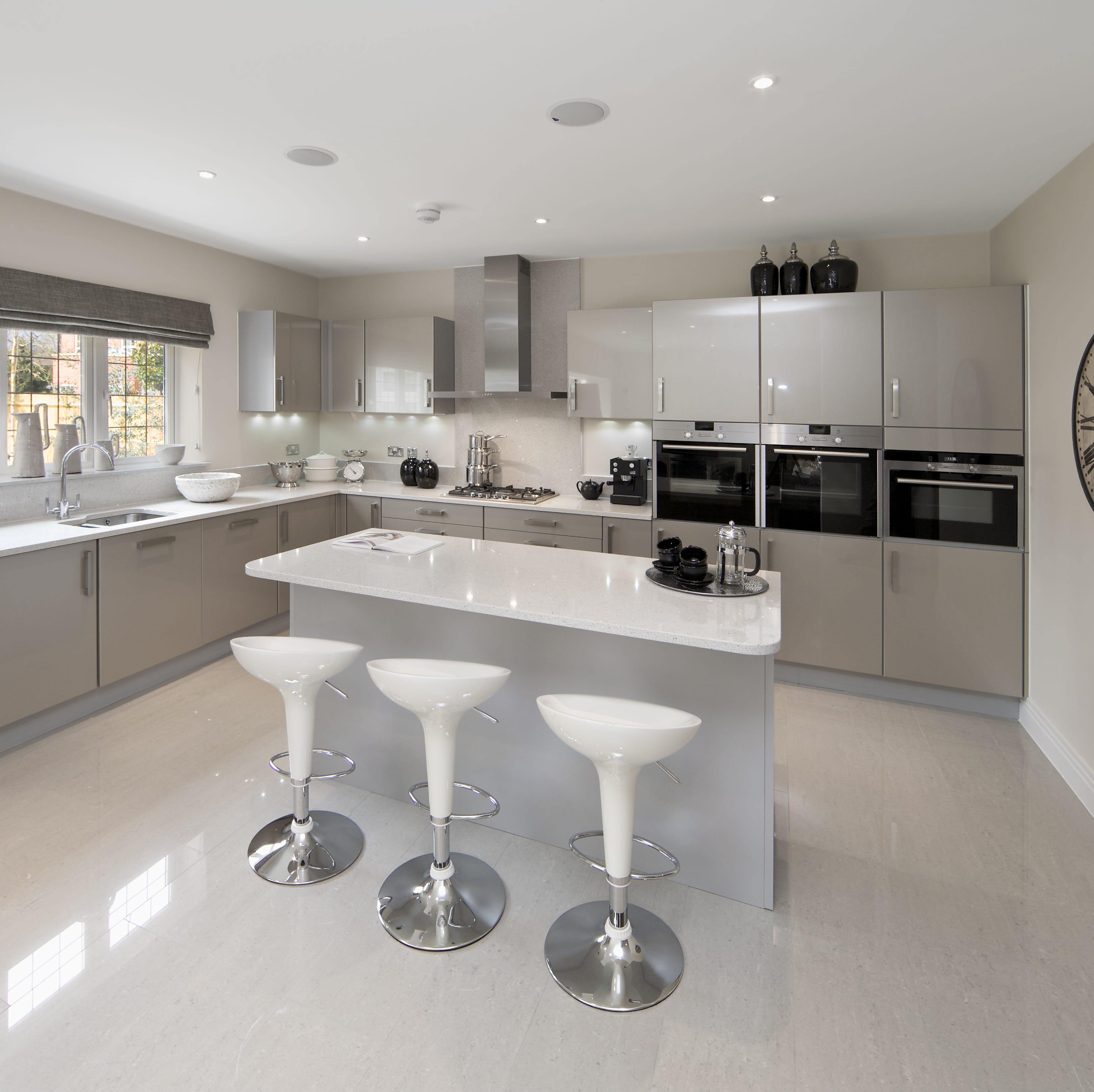
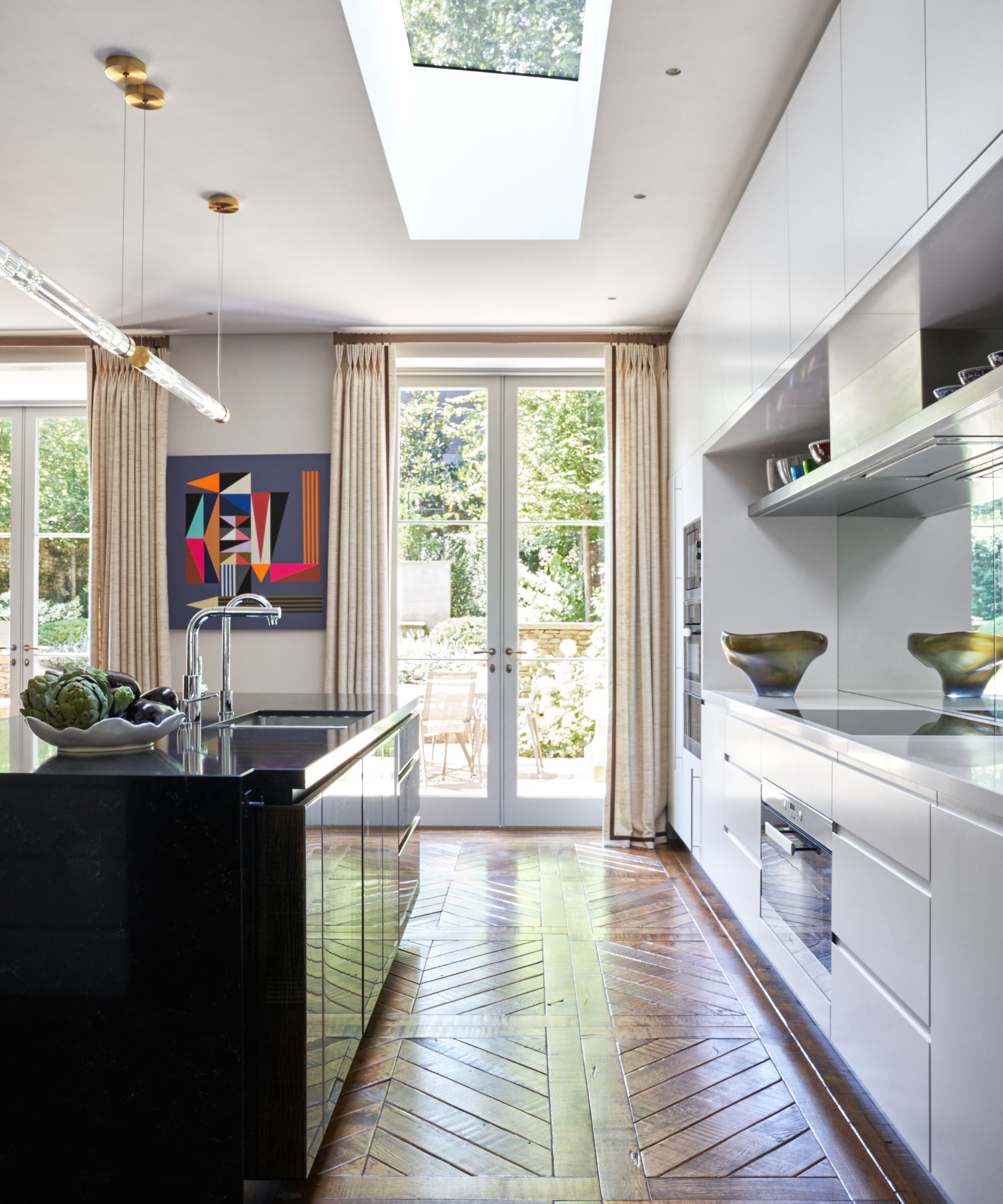
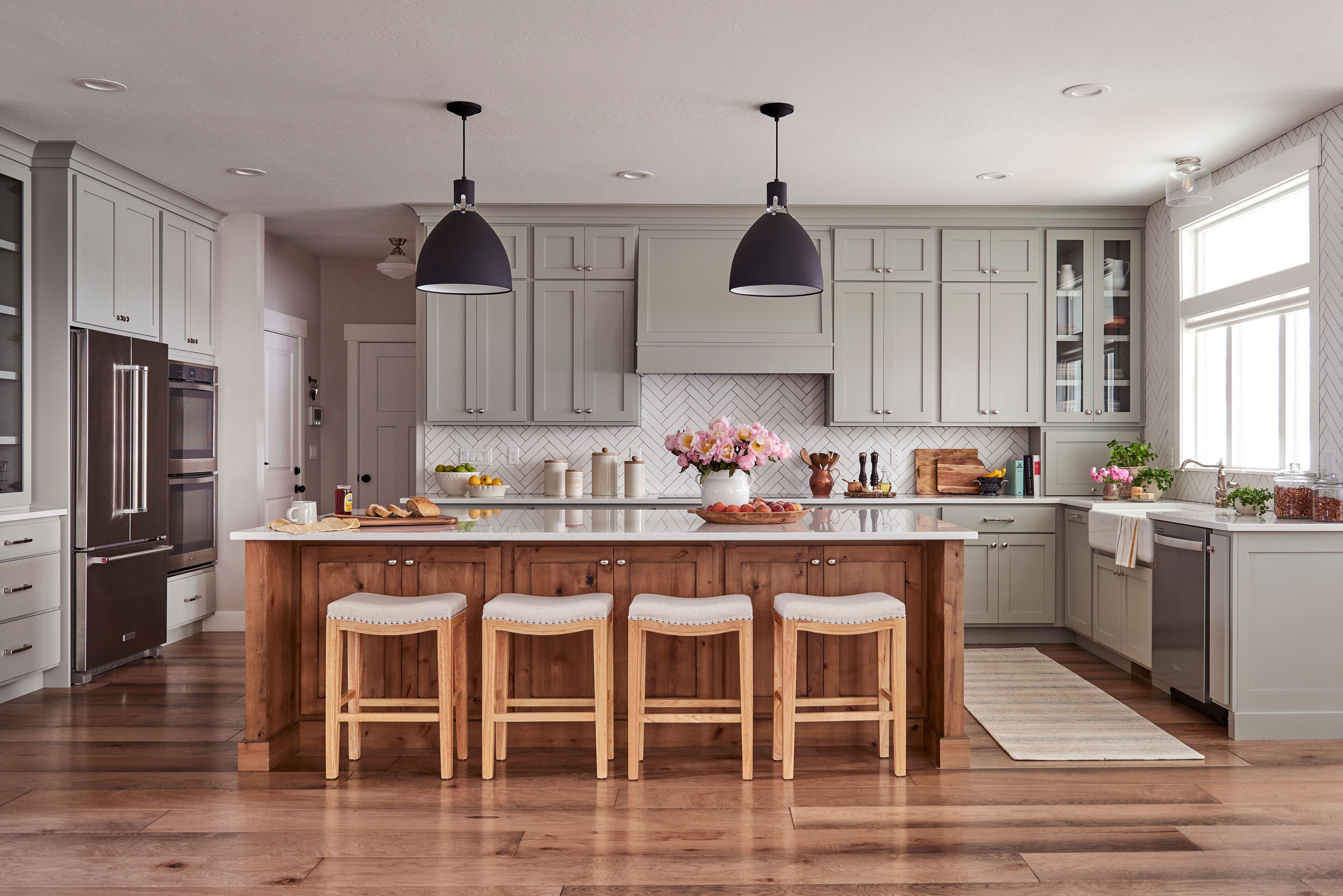
Light gray is another excellent neutral for homeowners seeking a softer option than pure white. Kristen Pena of K Interiors suggests light gray as a middle ground, providing a subtle depth of color while still appearing white in certain lighting conditions. This color choice offers versatility, allowing for a neutral backdrop that can adapt to different design preferences without committing to the boldness of other colors.
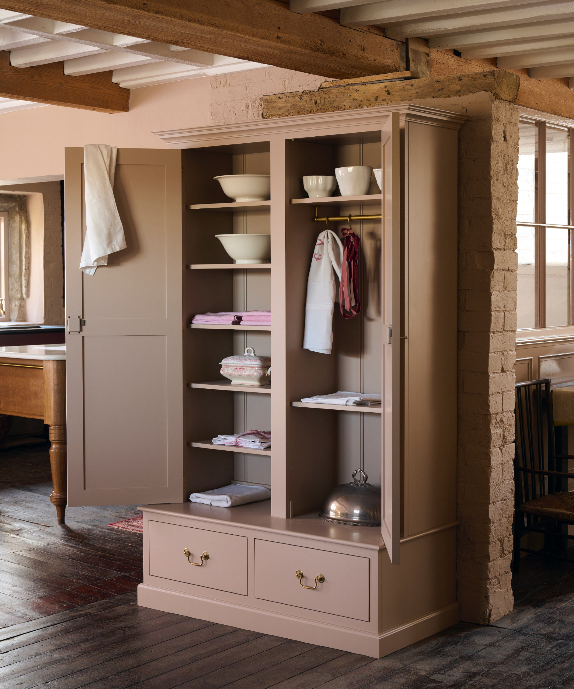
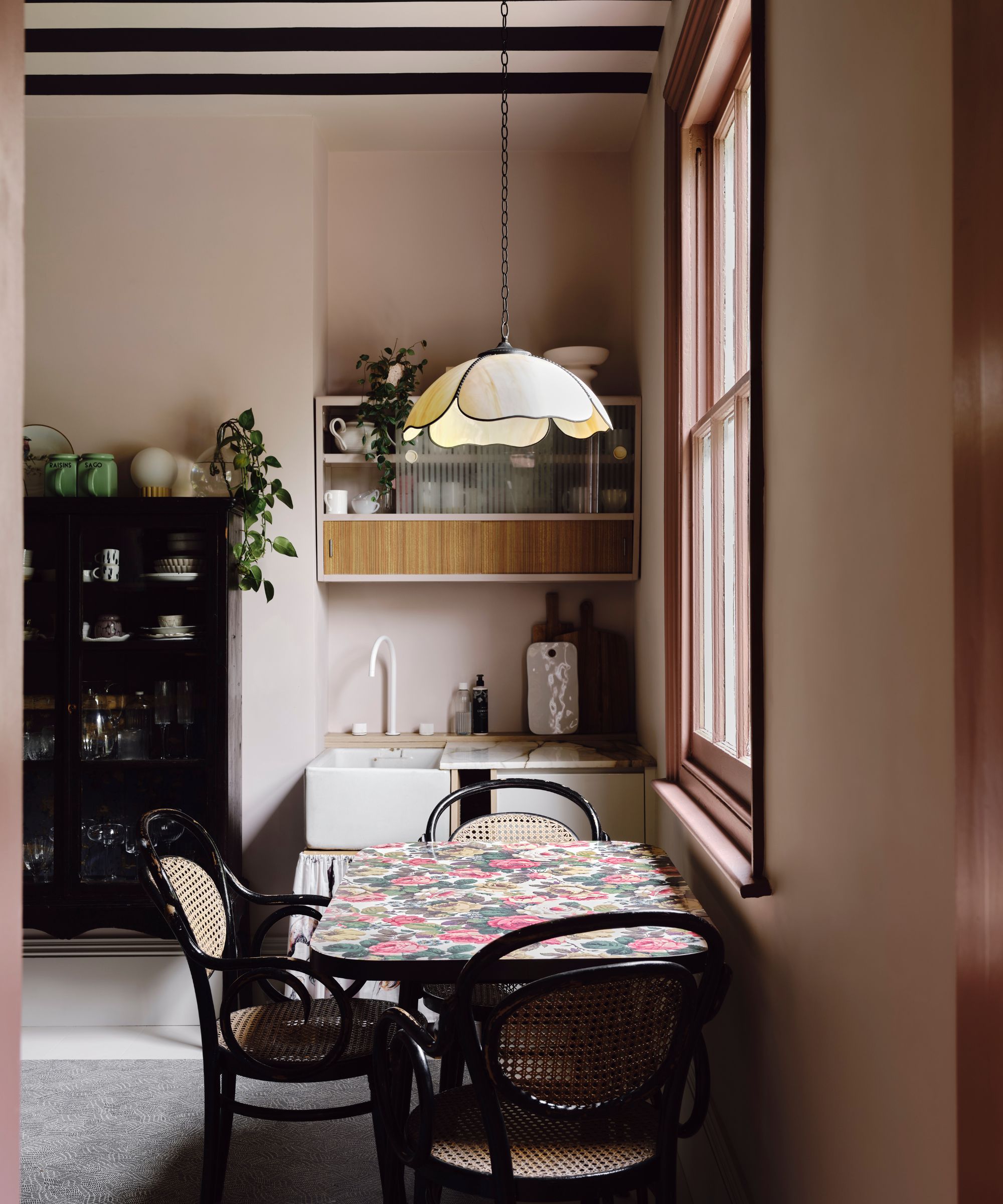
Taupe provides a warm neutral alternative for kitchens, adding coziness without being overly striking. Wendy Labrum of Wendy Labrum Interiors utilizes Benjamin Moore's Smokey Taupe for cabinetry, often coordinating it with custom Venetian plaster colors on the walls. This approach creates a cohesive and inviting space that feels both sophisticated and comforting, making taupe a timeless option for a kitchen's color palette.
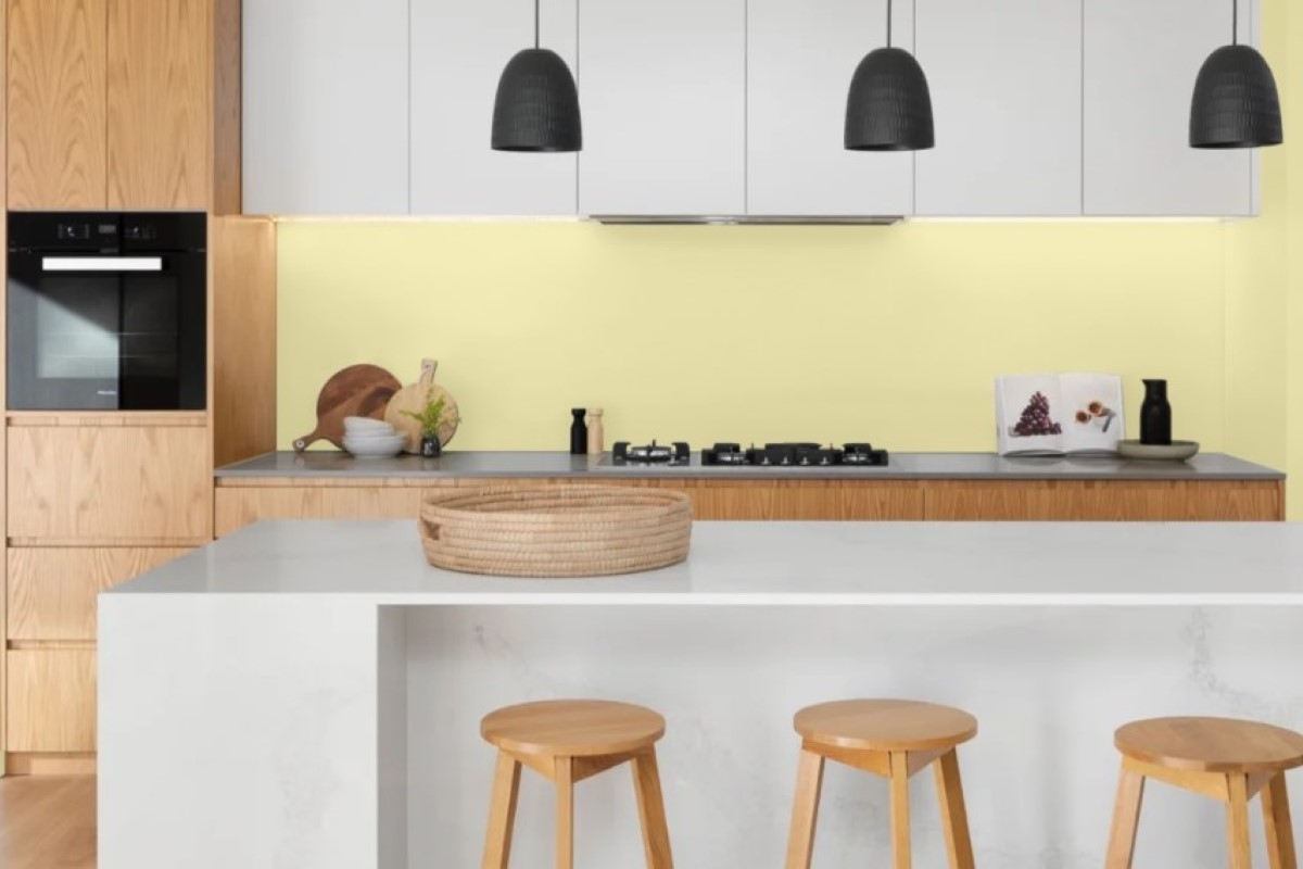
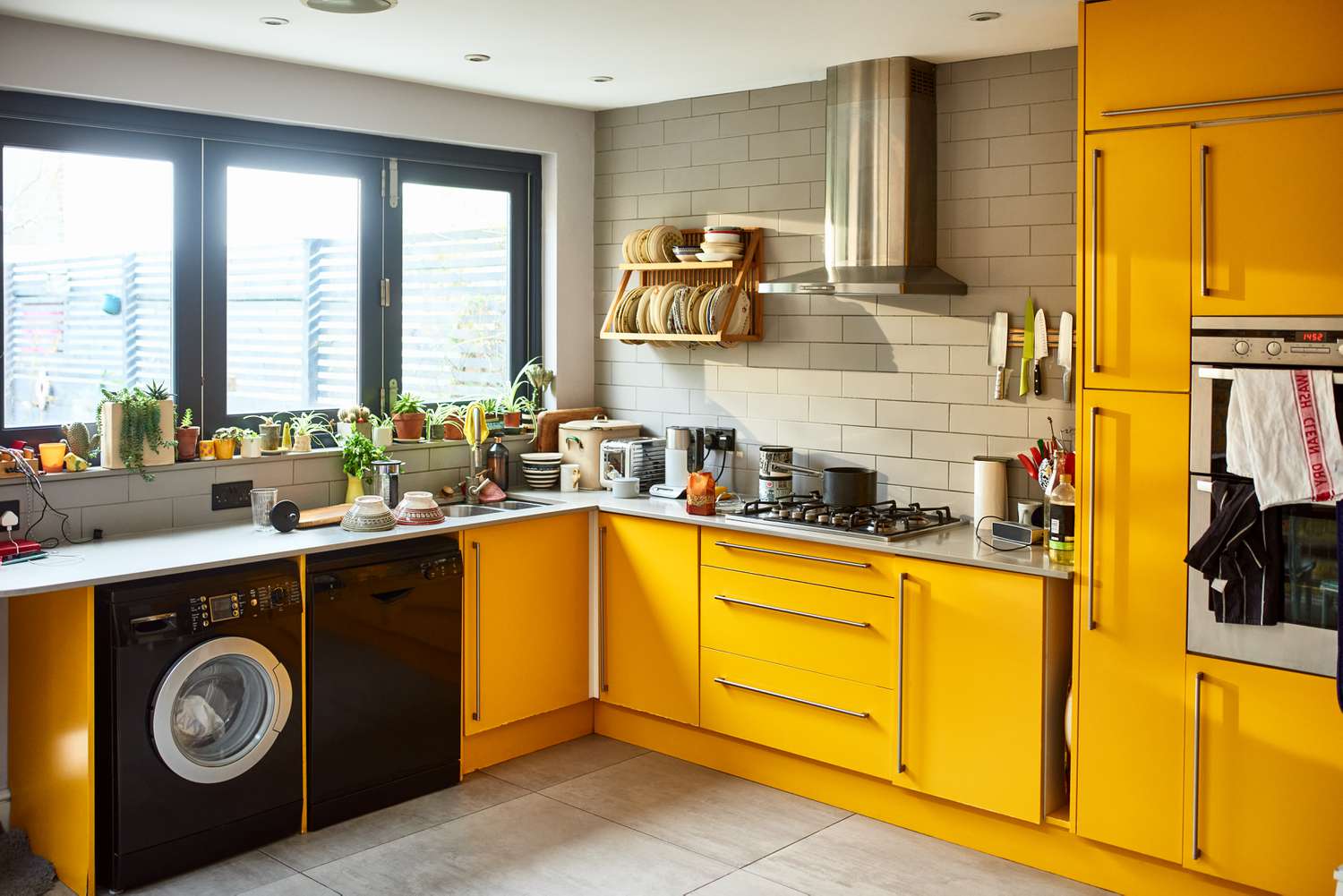
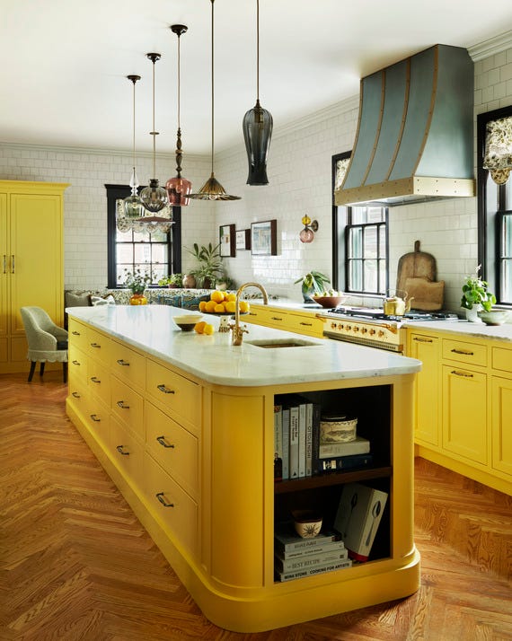
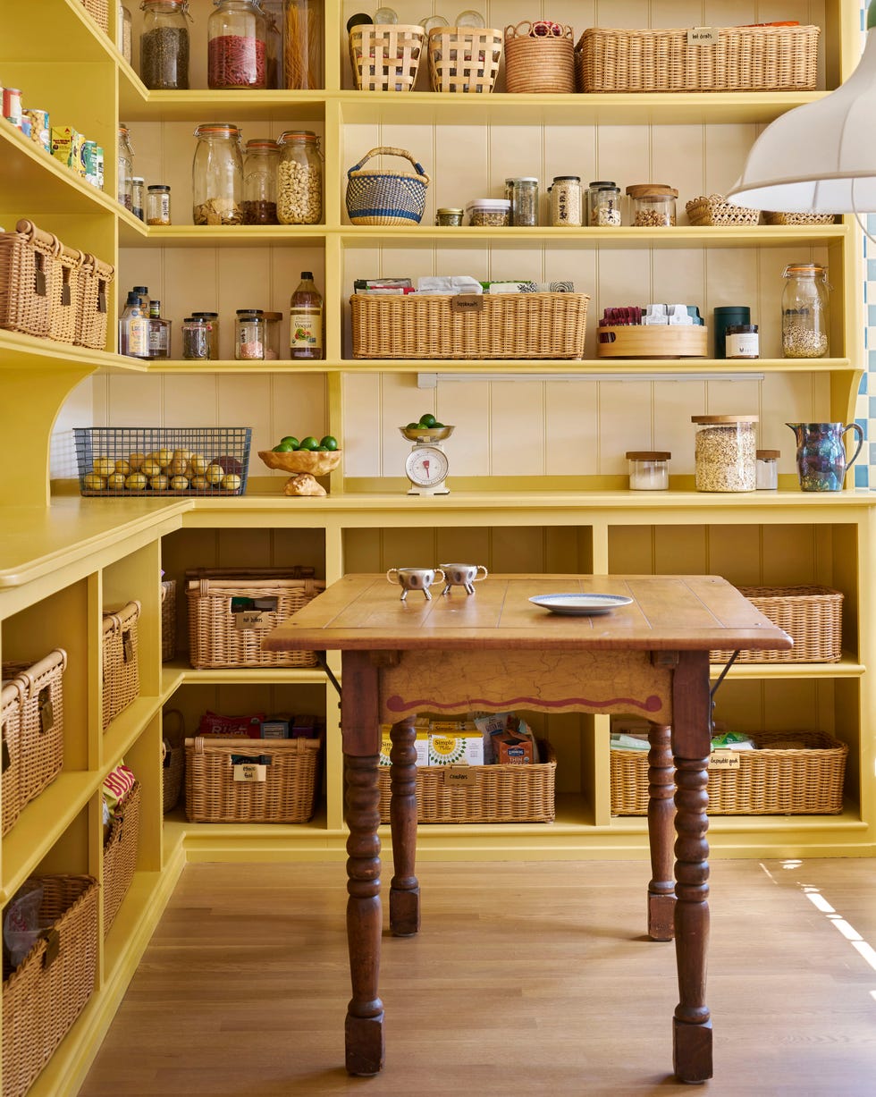
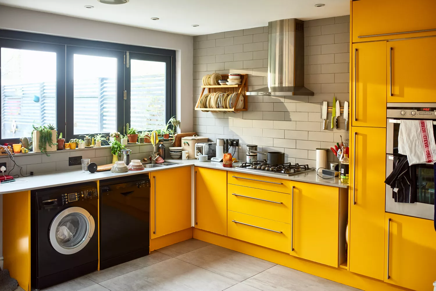
Finally, yellow is a cheerful and welcoming choice for those who embrace color. Kristen Fiore of Kristen Elizabeth Design highlights Benjamin Moore's Chestertown Buff and Tavern Ochre as popular yellow hues. These sunny shades can be used as accent colors for islands or even on walls, injecting a happy and inviting energy into the kitchen. Yellow's inherent warmth ensures it remains a classic option for creating a vibrant and welcoming atmosphere in the home's culinary center.
#KitchenDesign #PaintColors #InteriorDesign #HomeDecor #KitchenTrends #NeutralColors #GreenKitchens #WhiteKitchens #ColorTheory #KitchenDesign #PaintColors #InteriorDesign #HomeDecor #KitchenTrends #NeutralColors #GreenKitchens #WhiteKitchens #ColorTheory
0 comment in total
 No comments yet
You may also like
29 Best Paint Colors for a Kitchen You’ll Never Want to Leave

10 Kitchen Paint Colors You Won’t Regret in 10 Years, According to Designers
26 Most Popular Kitchen Paint Colors Throughout the Decades

5 Outdated Kitchen Paint Colors That Interior Designers Are Tired of Seeing
Kitchen Cabinet Colors That Will Never Go Out of Style — 10 Tones That Are a Timeless Choice

6 Kitchen Paint Color Trends That Are Already Taking Over Walls in 2026
Top 20 Kitchen Paint Colors for Every Style—From Timeless Neutrals to Rich Earth Tones
The Kitchen of Your Dreams Is Just a Paintbrush Away
Which kitchen color is timeless? Our experts give us their take

5 Timeless Kitchen Cabinet Paint Colors Designers Love
6 Worst Colors To Paint Your Kitchen (And What To Choose Instead)
It’s Official: These are the Best Kitchen Paint Colors, According to Designers
3 Kitchen Paint Colors Experts Promise Will Never Go Out of Style

11 Trendy Kitchen Paint Colors To Try In 2026

9 color-drenched kitchens that prove this paint trend is totally timeless when used in this hardworking space
Five Mistakes People Make When Selecting Kitchen Cabinets—and How to Avoid Them


5 Timeless Paint Colors That Will NEVER Go Out of Style, According to Designers
The Best Kitchen Paint Colors All Have This One Thing In Common
5 fail-safe kitchen cabinet color combinations that always work

15 Timeless Paint Colors You’ll Never Tire Of, According To Designers