7 Kitchen Cabinet Colors Designers Never Want to See Again
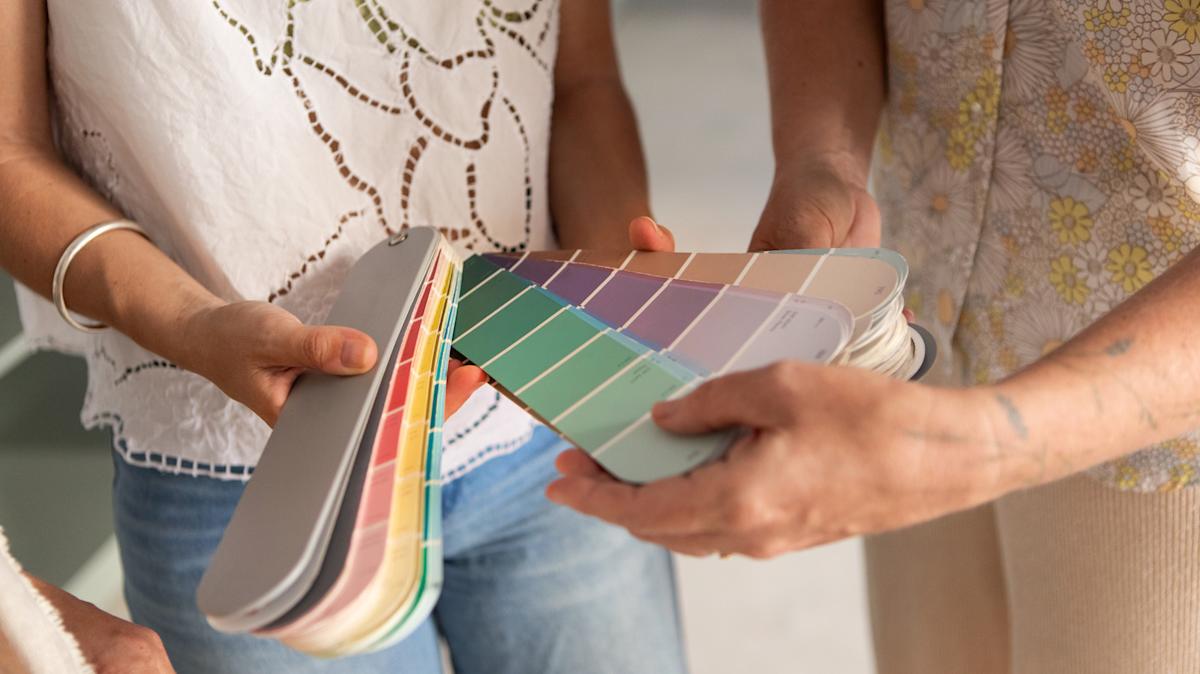
The selection of paint colors for kitchen cabinets plays a crucial role in establishing the overall ambiance of the room, with certain shades being more effective in creating a warm and inviting atmosphere. According to interior design experts, one common decorating error observed in clients' homes is the use of outdated kitchen cabinet colors. This article highlights seven specific shades that designers suggest avoiding to achieve a modern aesthetic.
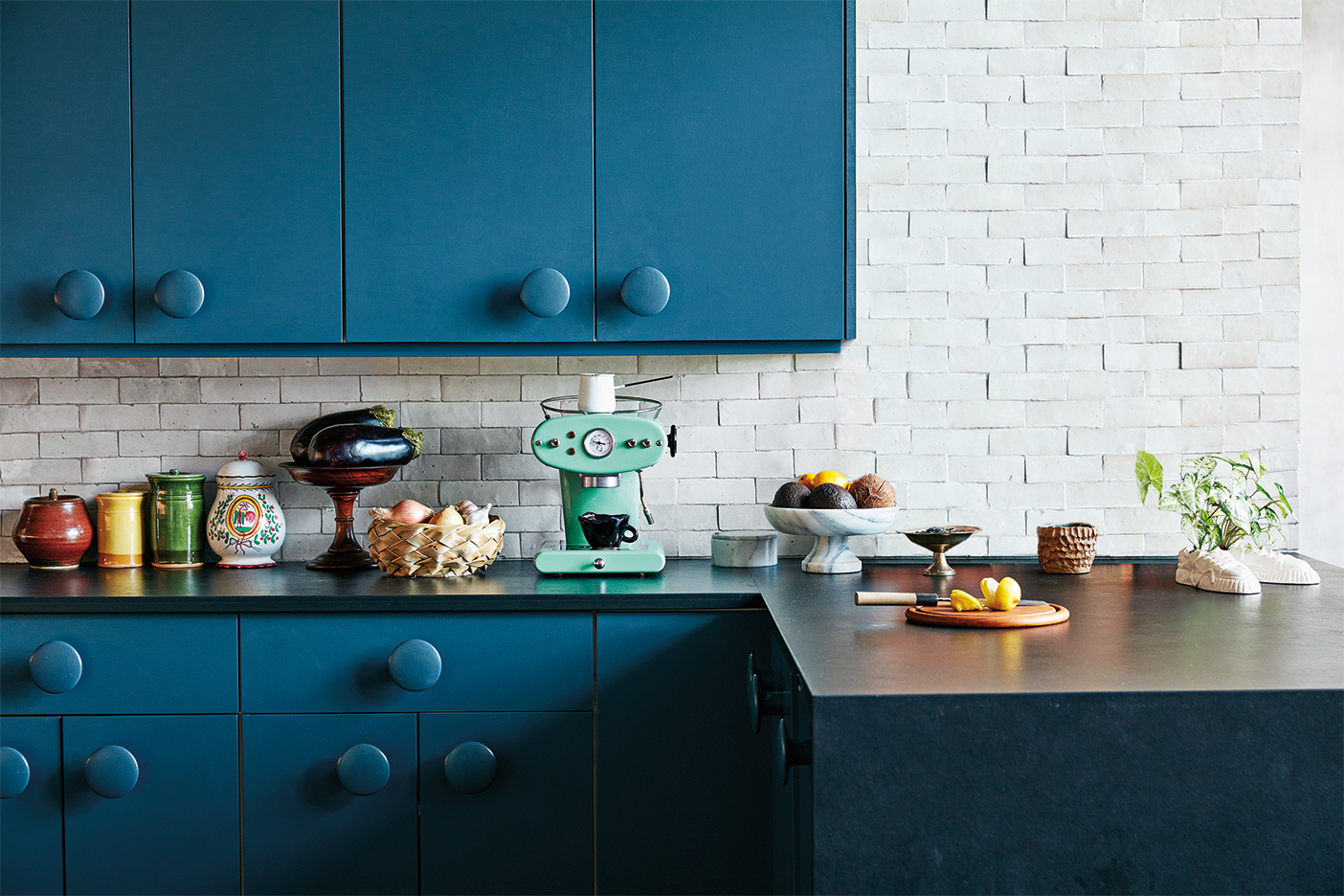
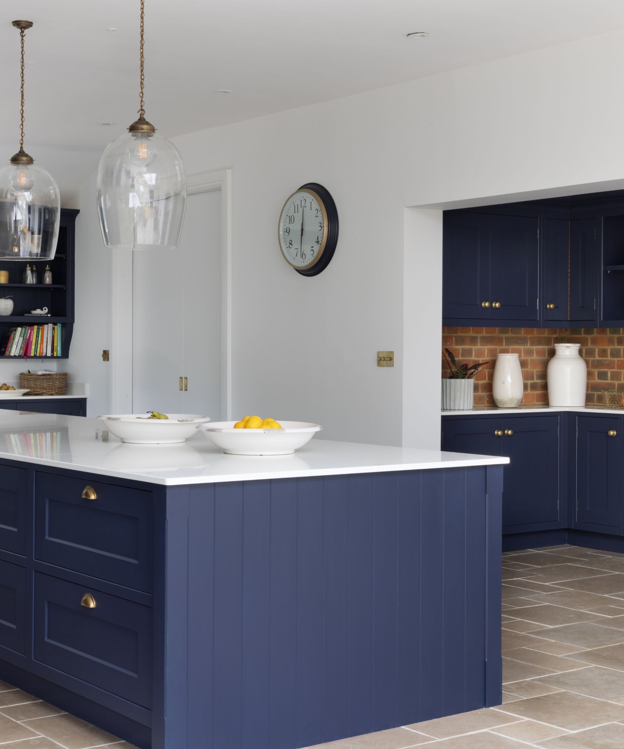
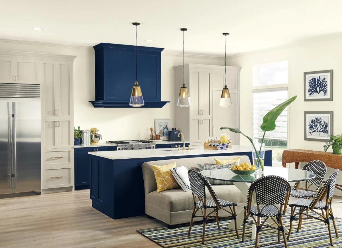
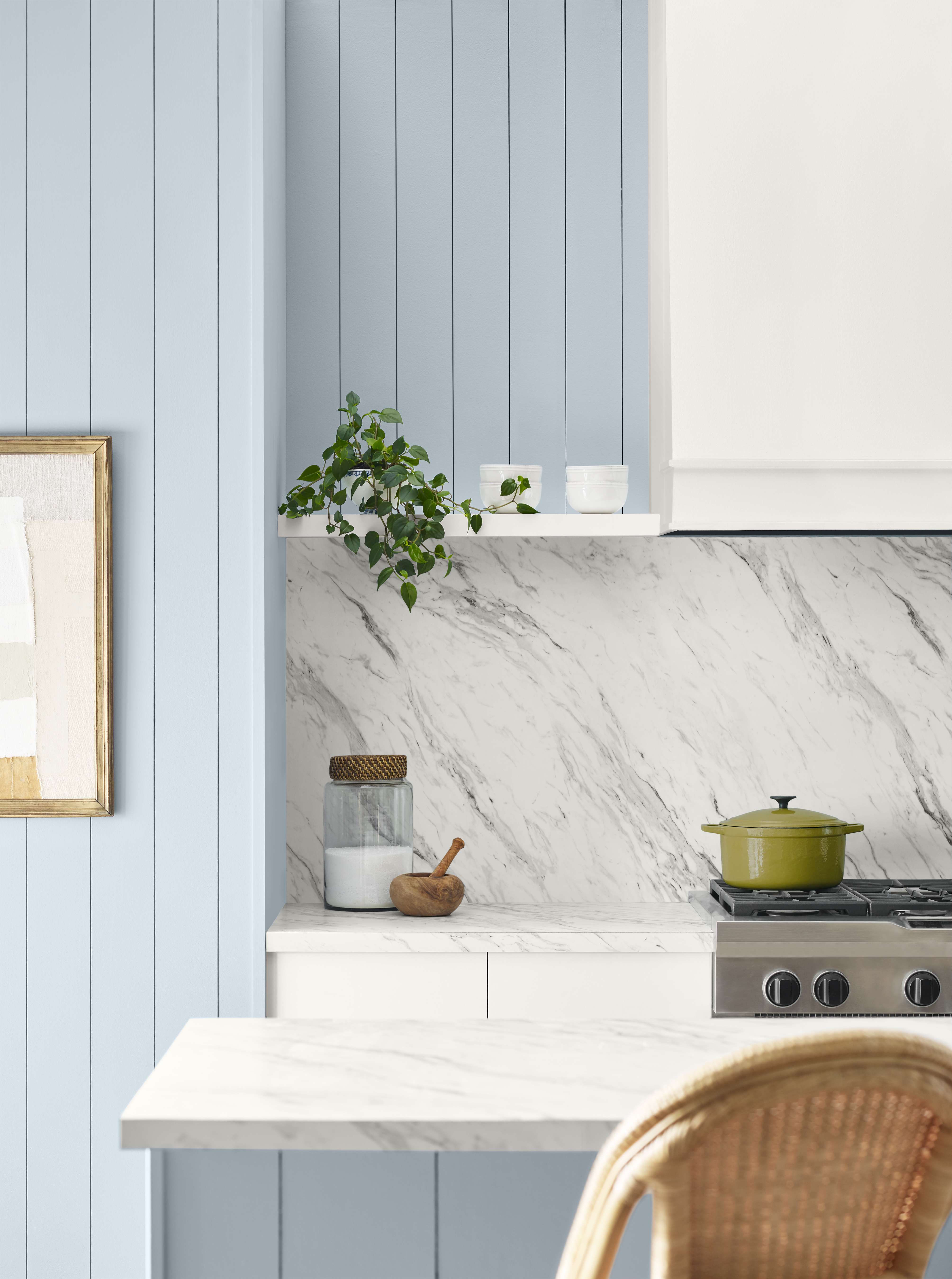
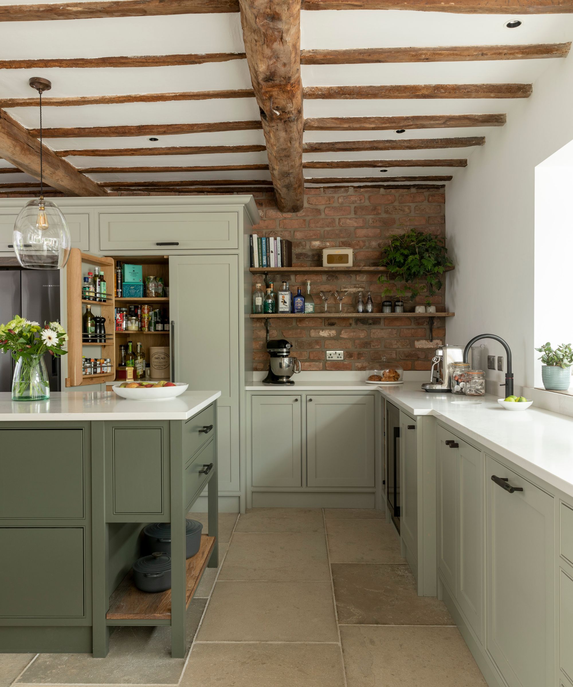
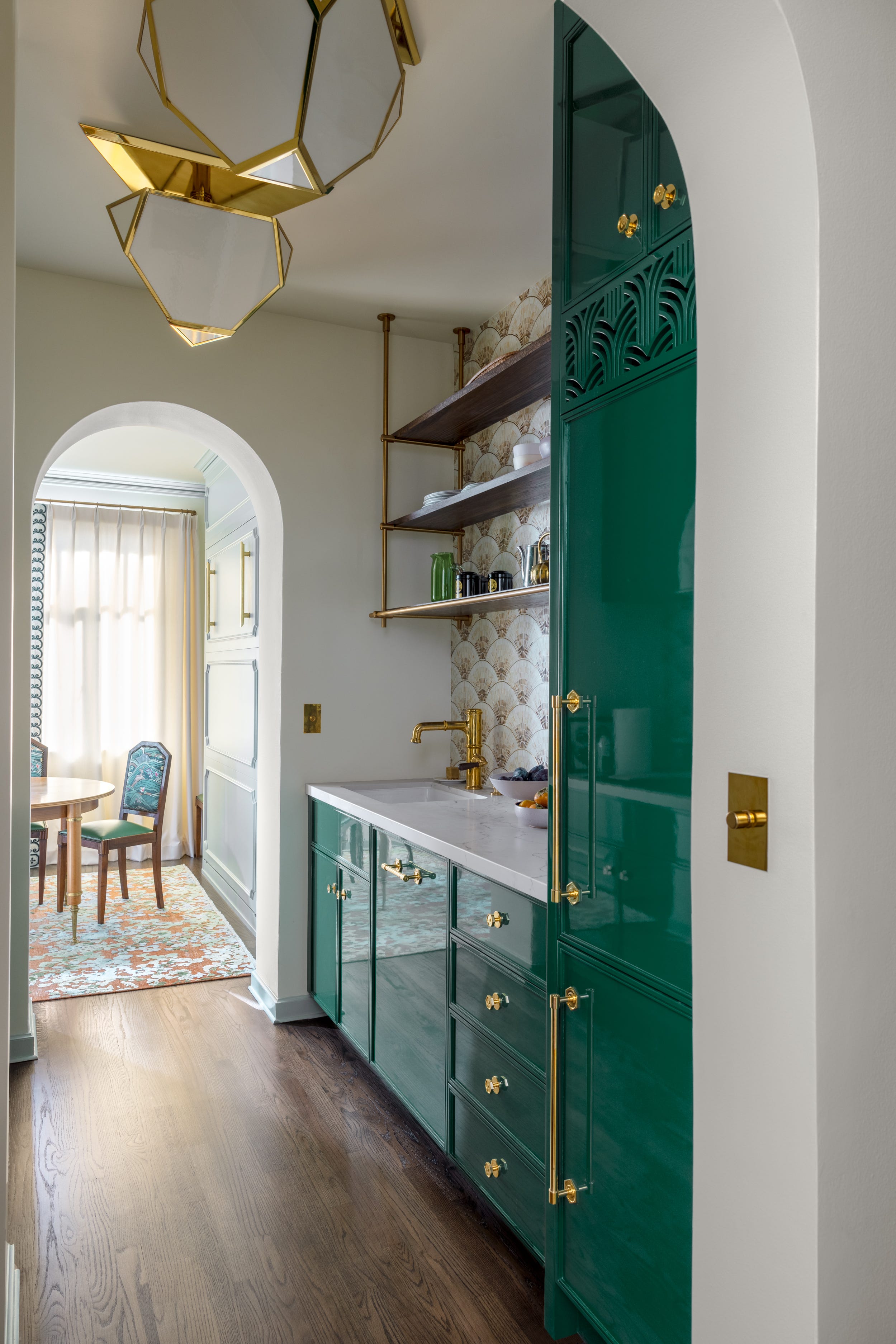
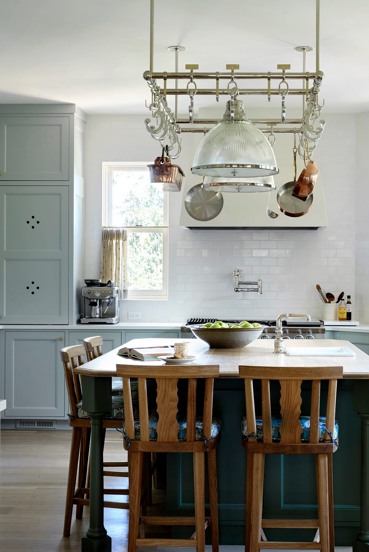
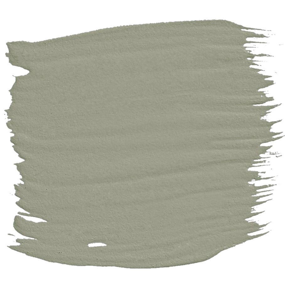
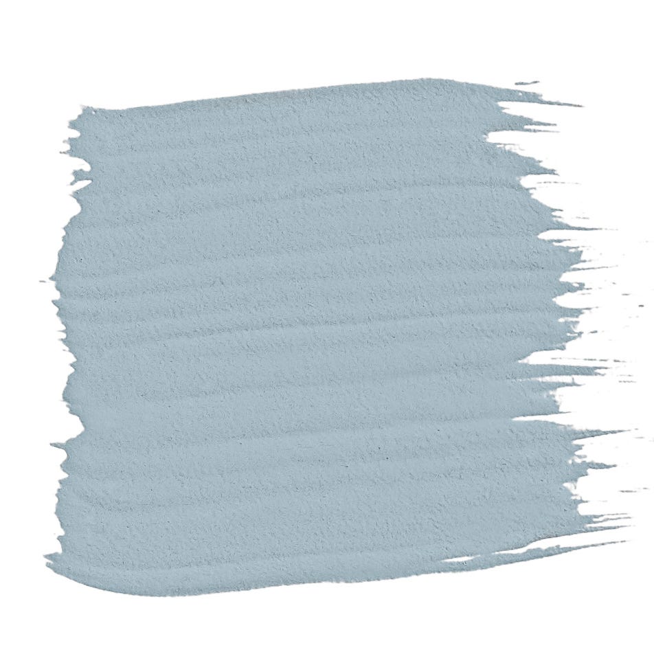
Navy blue, for instance, is identified by designers Dan Mazzarini and Gaia Guidi Filippi as a color that now appears nautical and antiquated, despite softer blues being considered inviting. Guidi Filippi notes that navy has been overused in kitchen remodels over the past decade and no longer fits a modern kitchen design. Similarly, mint green, while once popular in midcentury modern kitchens, is now seen as tired by Peter Spalding and Nina Lichtenstein. They argue that although green was a gateway to colorful cabinetry, artificial-feeling mint green hues should be retired in favor of more natural, earthy tones like sage or olive for a timeless look.
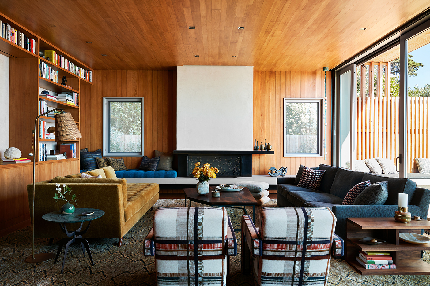
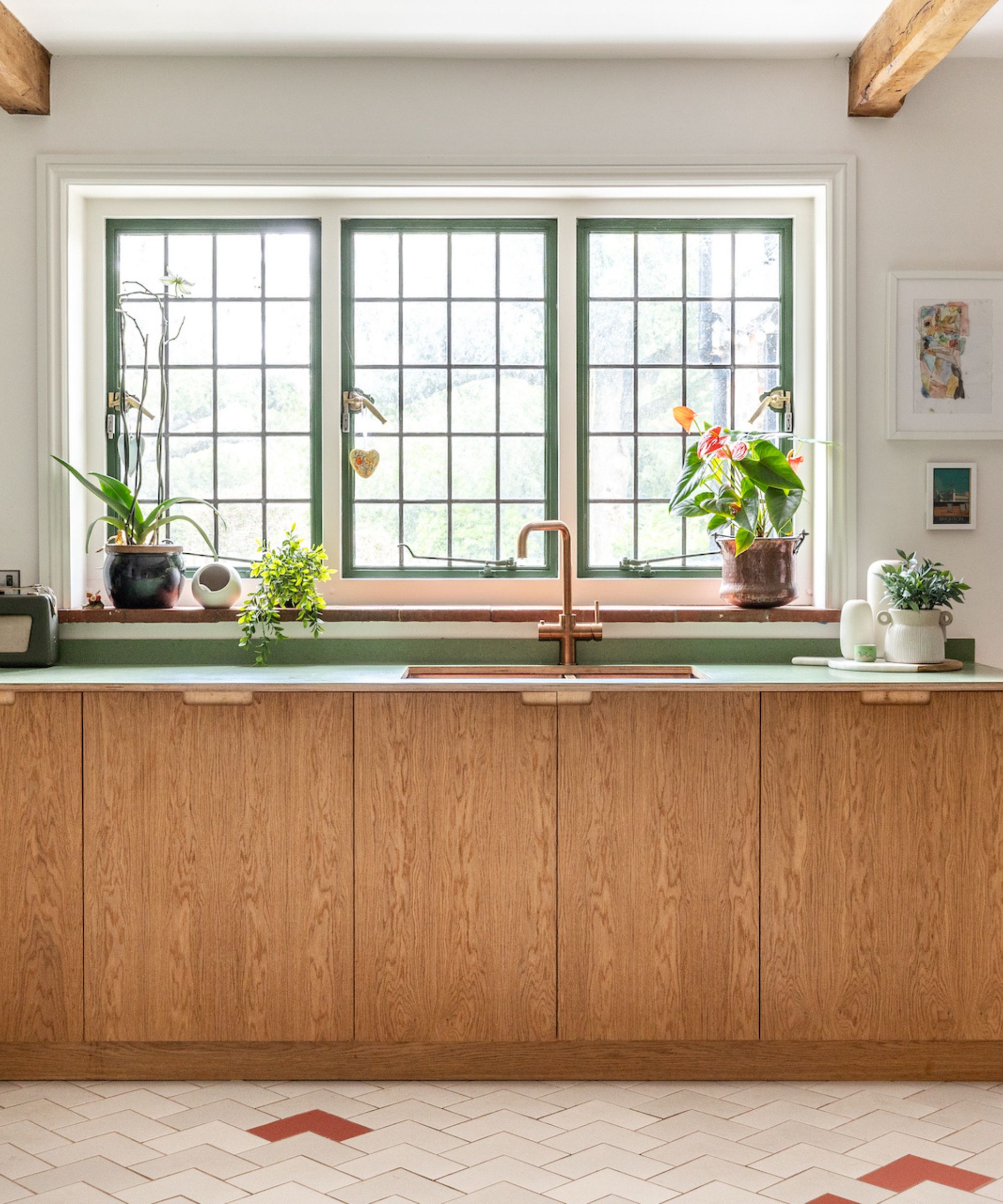
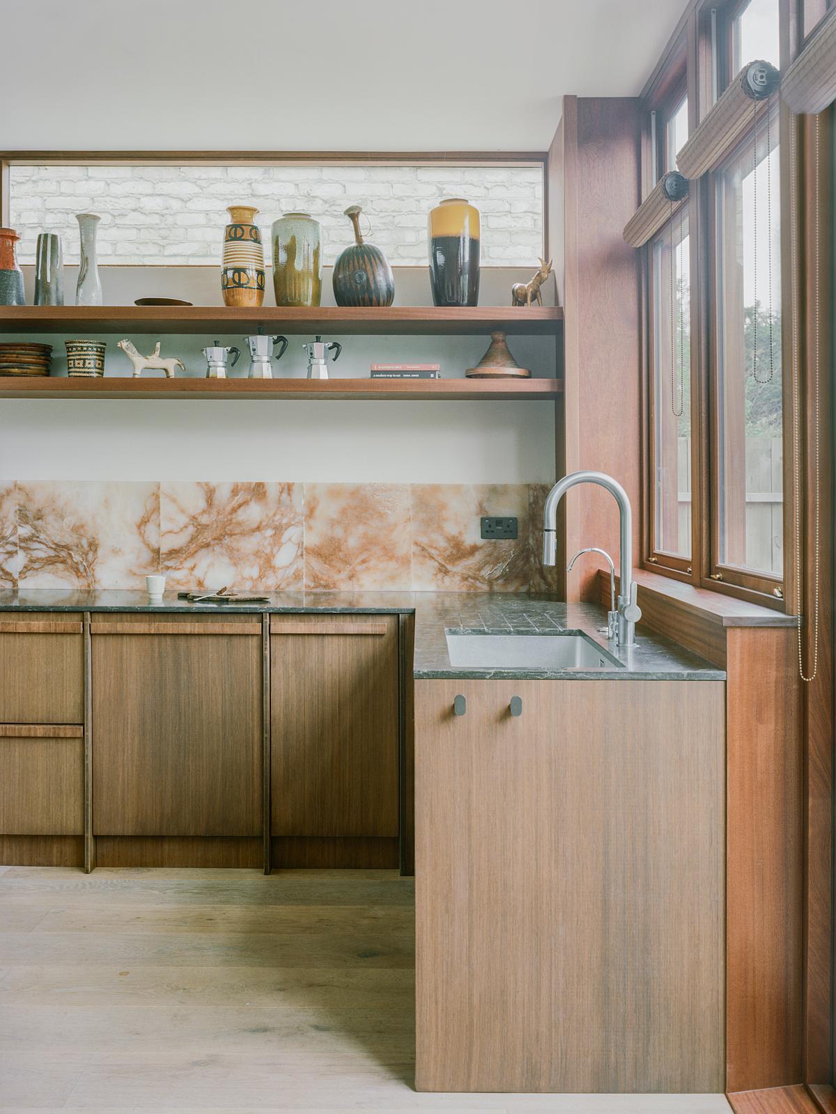
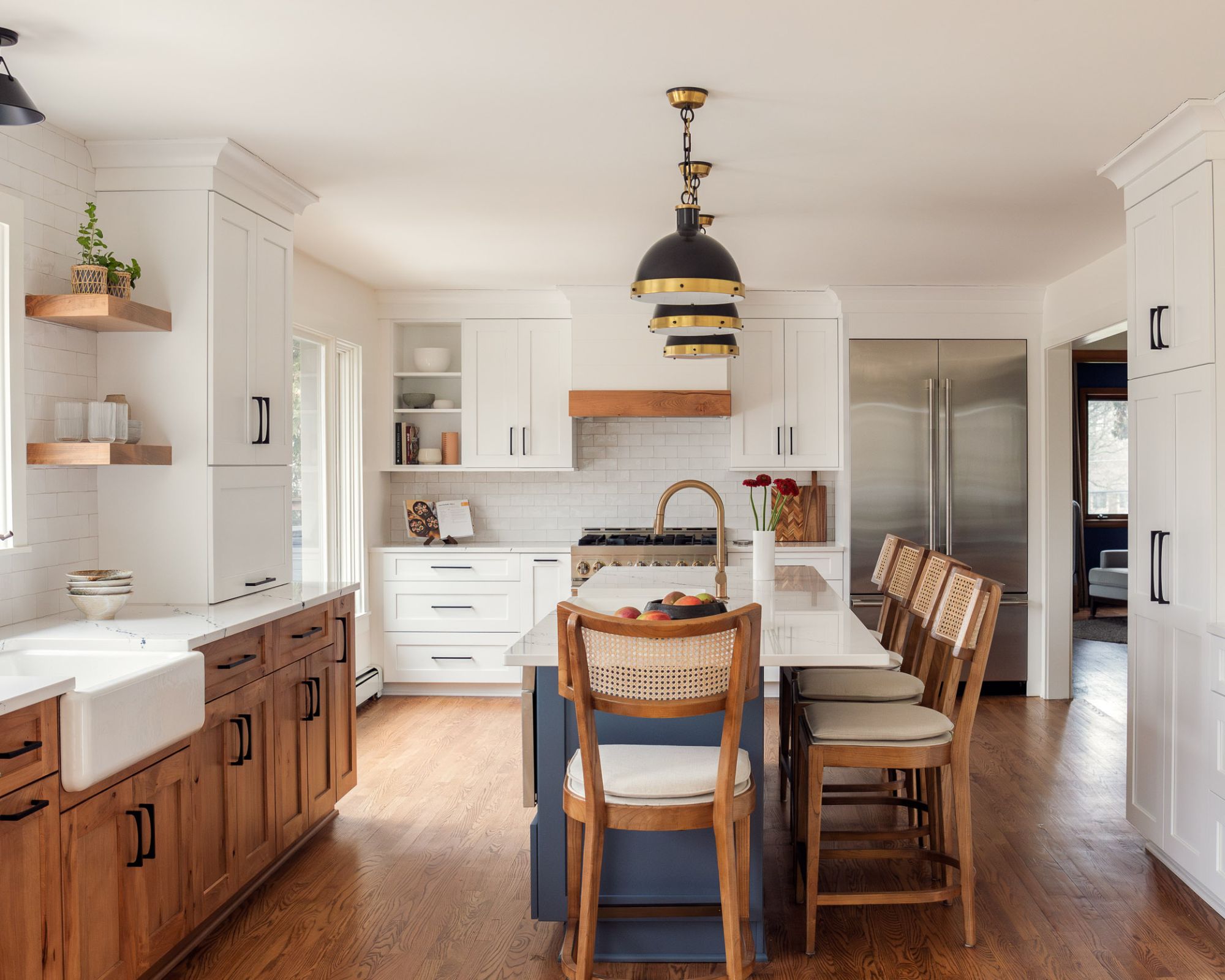
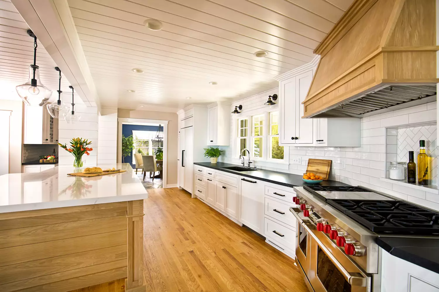
Honey oak wood, characterized by its bright, warm, and orangey tones, is frequently encountered in rental properties and builder-grade kitchens. When polished, this wood type immediately dates a kitchen, making it feel older and heavy, according to Lichtenstein. She suggests that while it represented a homey vibe in the 1980s and 1990s, it now contributes to an outdated feel. For those who prefer the organic feel of wood, Lichtenstein recommends more subtle options like warm maple, contemporary dark walnut, or Scandinavian-style ash wood.
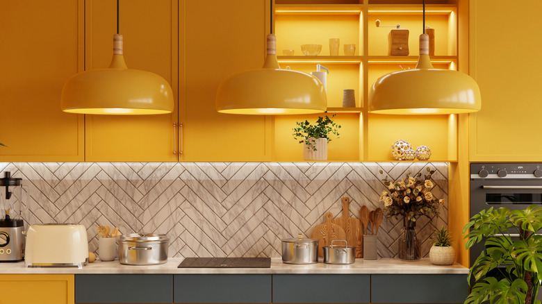
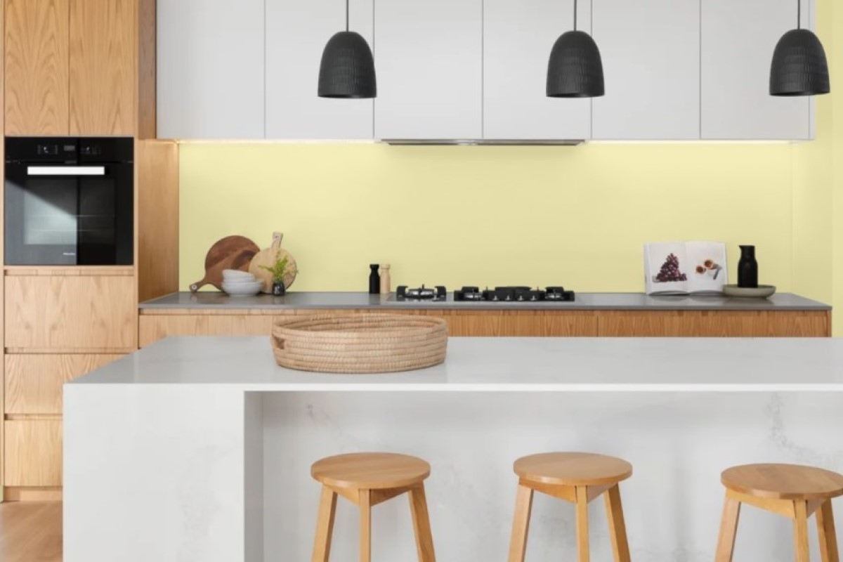
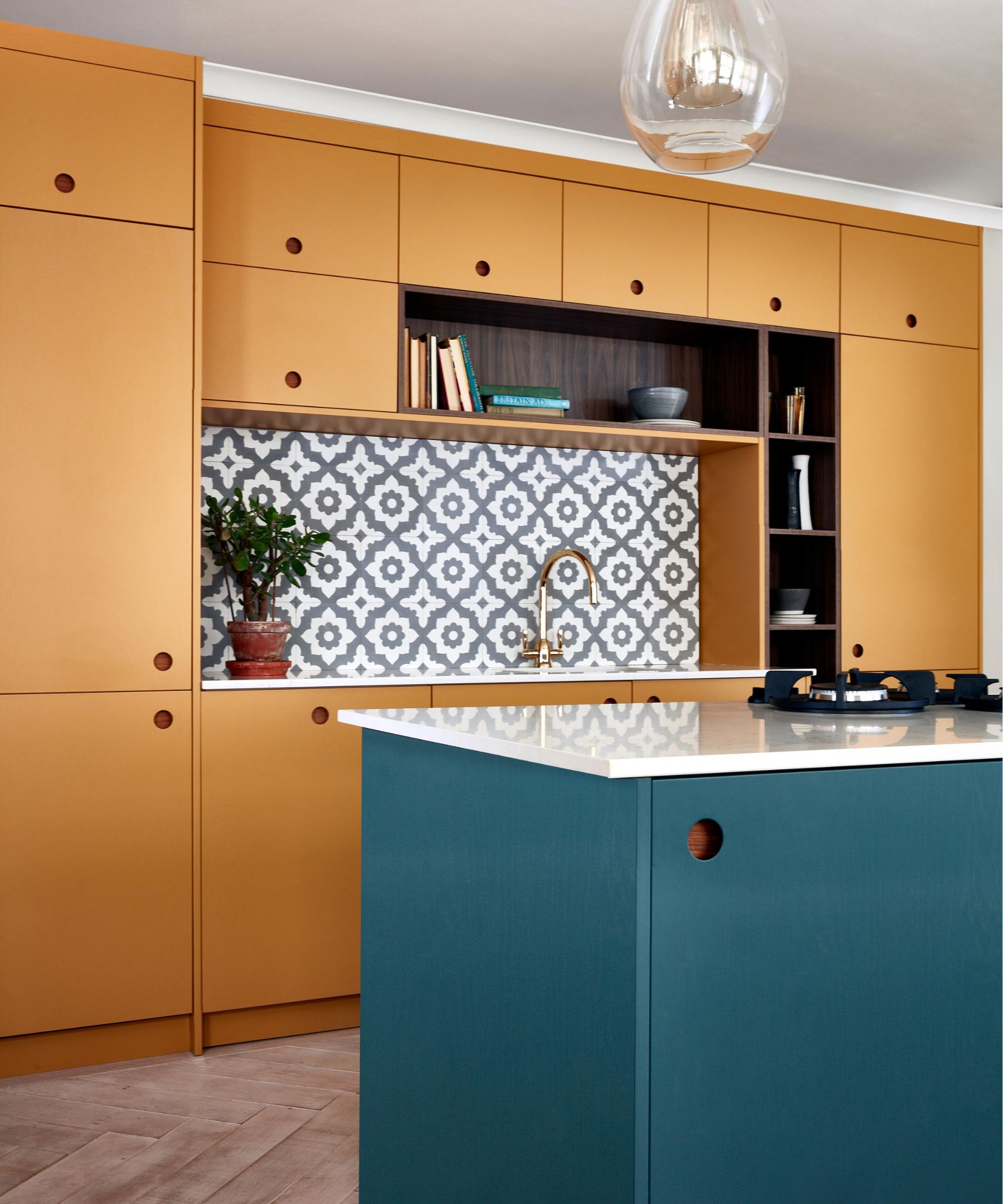
Cherry red wood, particularly stained cherry wood cabinets, was a prominent feature in kitchens from the '80s, '90s, and early 2000s, often paired with granite countertops to evoke luxury. However, the shift towards lighter and neutral spaces has rendered this look obsolete. Lichtenstein explains that rich, dark cherry and mahogany, once symbols of sophistication, now appear too formal and oppressive in modern kitchens. Guidi Filippi explicitly states she will avoid red-toned cherry woods in her designs. Mustard yellow, another color tied to the early 2000s Tuscan-inspired trend, is deemed overwhelming and old-fashioned. While light butter yellow shades are appreciated for their cheerful qualities, bolder variations are associated with an overly thematic design style that does not align with modern living. Lichtenstein advises using yellow as an accent color rather than for main cabinetry, pairing it with neutral cabinets and yellow decor or backsplash elements.
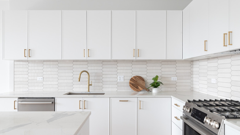
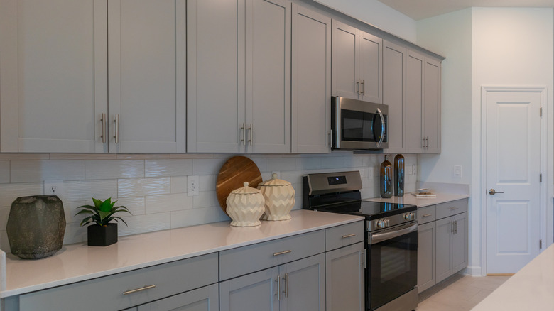
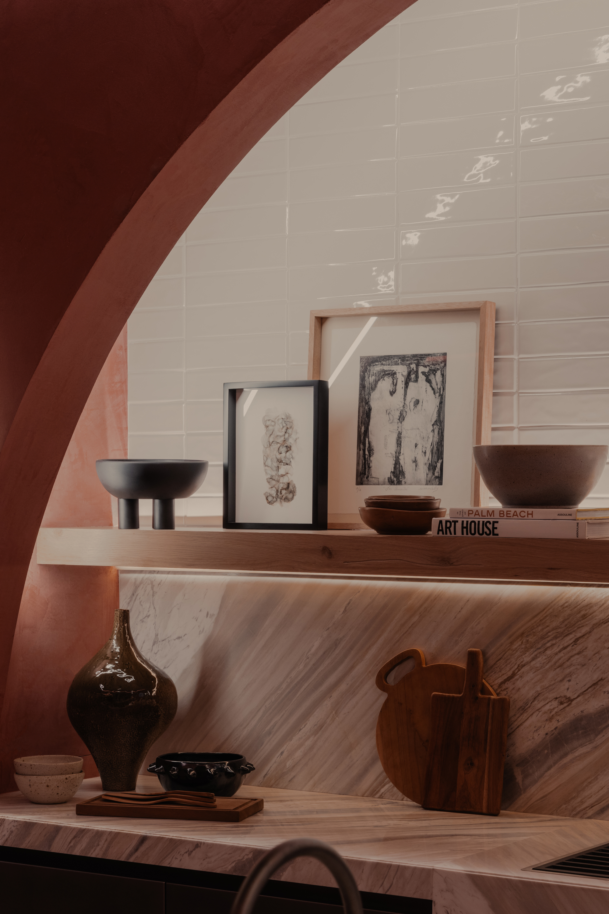
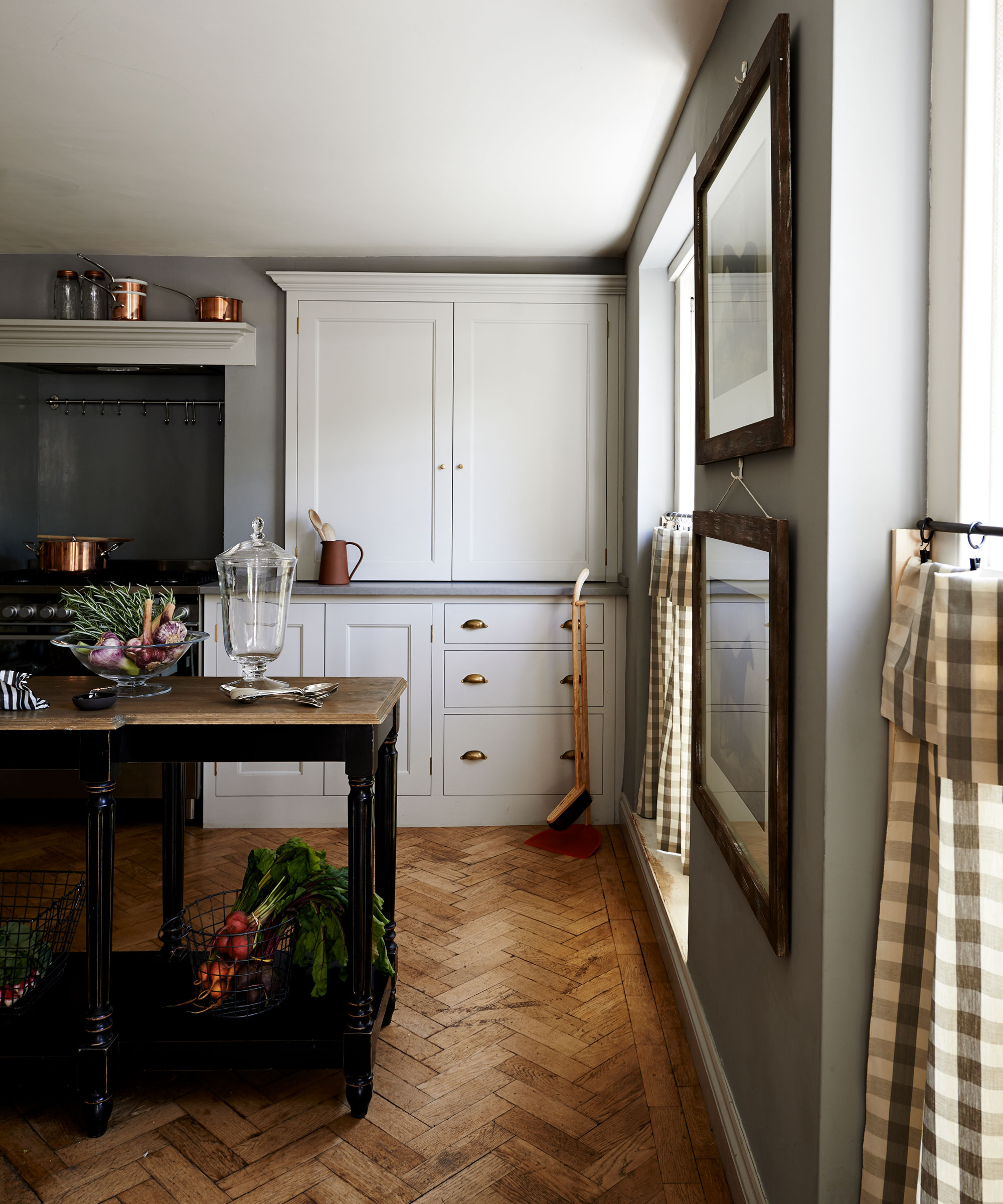
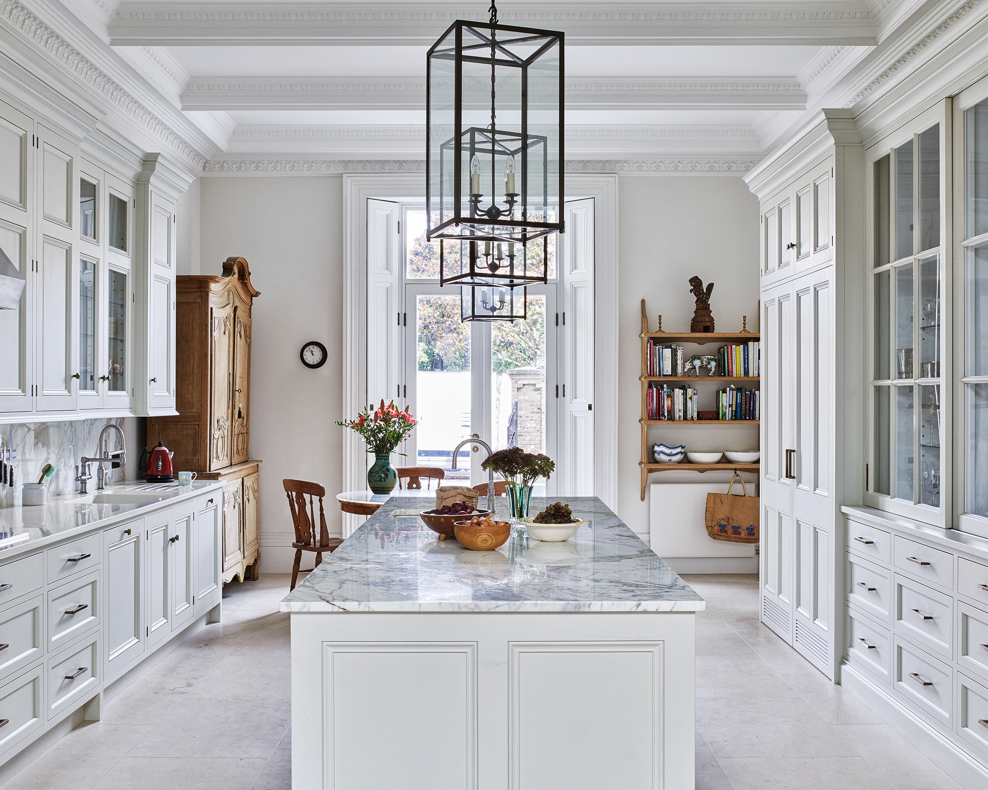
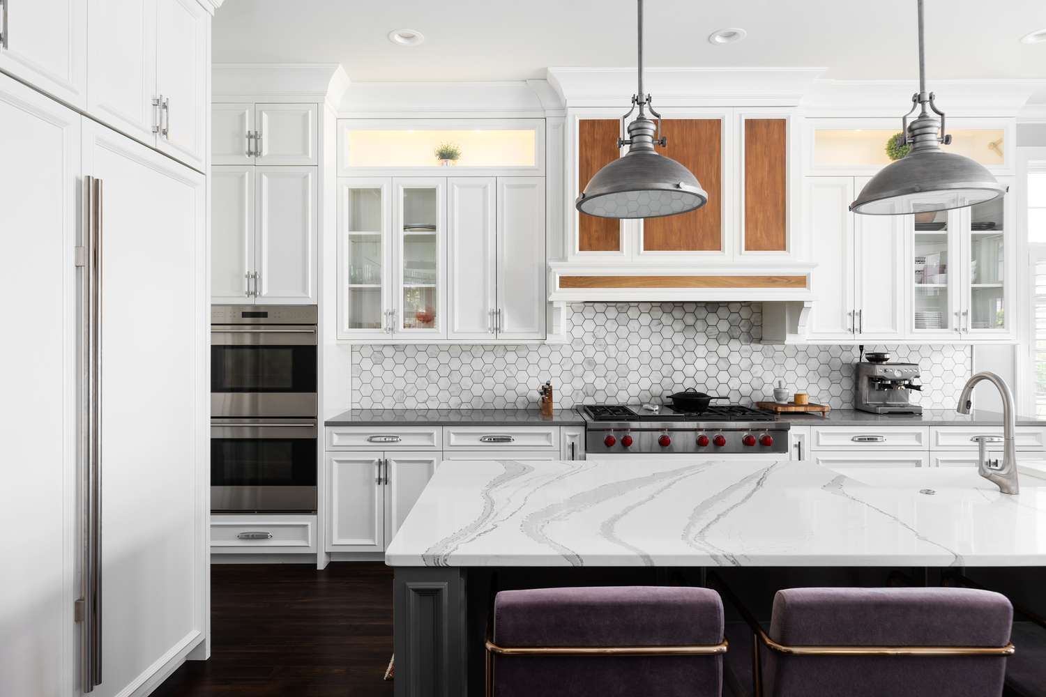
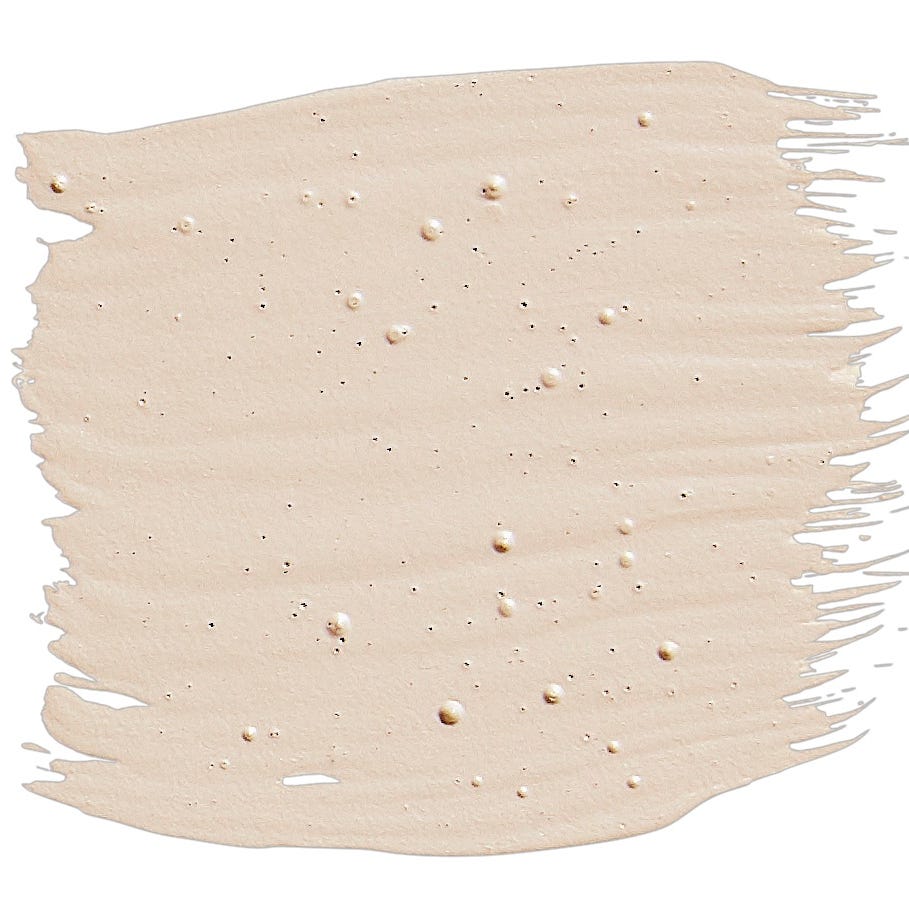
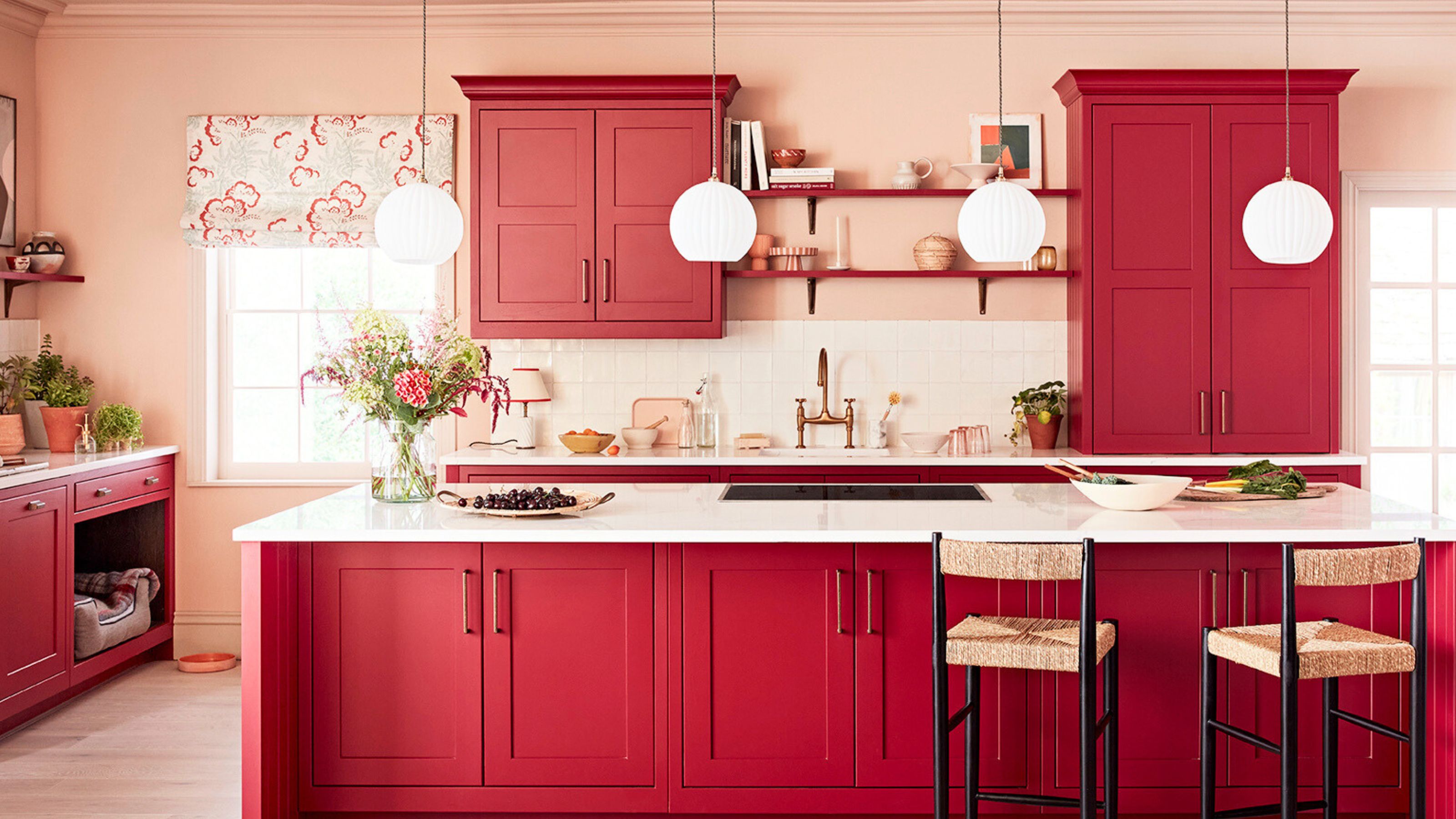
Country red is also cited as an overpowering shade to avoid. Like red-toned woods and Tuscan yellows, it was often used to convey warmth but now looks out of place in contemporary homes. Spalding suggests that if a space's lighting demands such colors, richer, quieter tones like plum, apricot, curry, and dark chocolate are better alternatives, providing a warmer background for activities like cooking and dining. Lastly, stark white, despite its versatility and popularity for making kitchens feel lighter and larger since the early 2000s, is increasingly seen as cold and clinical by Lichtenstein. She recommends moving towards softer, warmer neutrals such as creamy off-whites, soft grays, or greiges, which offer the brightness of white but with added depth and warmth, creating a more inviting atmosphere.
#KitchenDesign #CabinetColors #InteriorDesignTrends #HomeDecorating #OutdatedStyles #ModernKitchens #DesignTips #ColorPsychology #KitchenDesign #CabinetColors #InteriorDesignTrends #HomeDecorating #OutdatedStyles #ModernKitchens #DesignTips #ColorPsychology
0 comment in total
 No comments yet
You may also like
The Color to Never Paint Your Kitchen Cabinets, According to a Top L.A. Designer
7 outdated kitchen cabinet colors designers say you should wave goodbye to, plus what to try instead

5 outdated kitchen cabinet color trends to avoid if you don't want your kitchen to look unfashionable, say designers

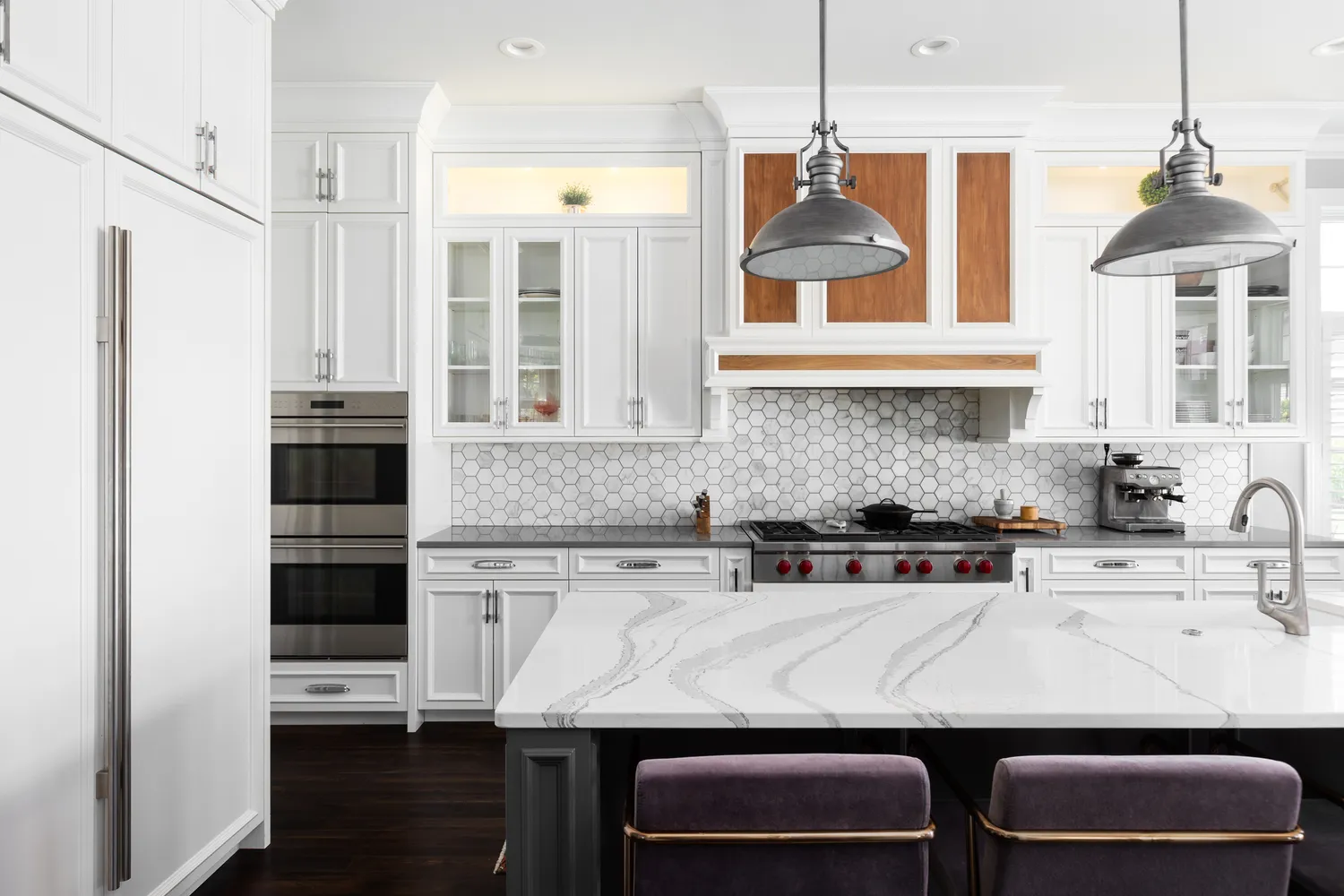
The One Paint Color Designers Always Avoid in Kitchens—and What They Use Instead

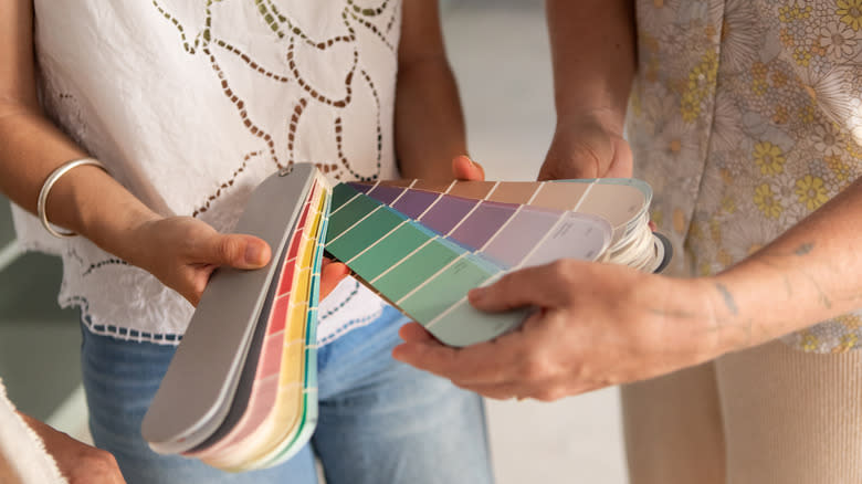
9 Outdated Kitchen Cabinet Colors We Hope To Never See In 2026

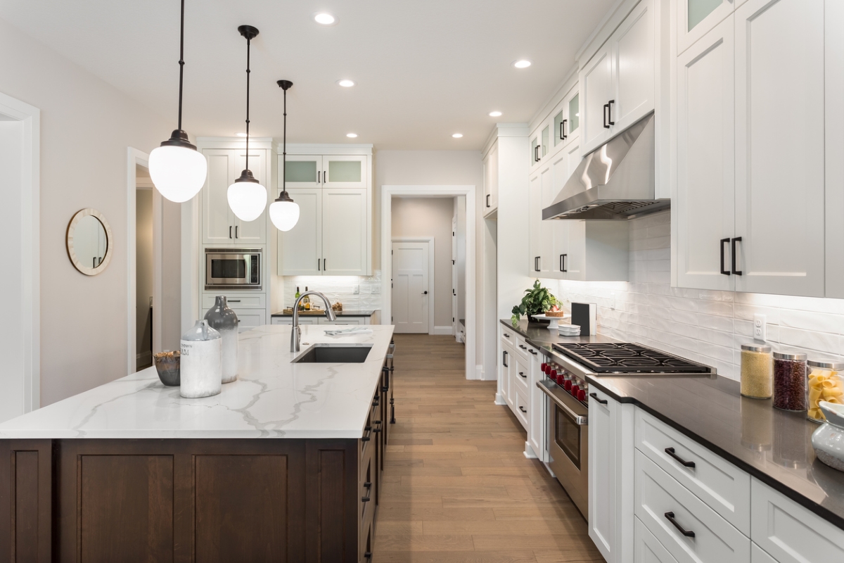
29 Best Paint Colors for a Kitchen You’ll Never Want to Leave

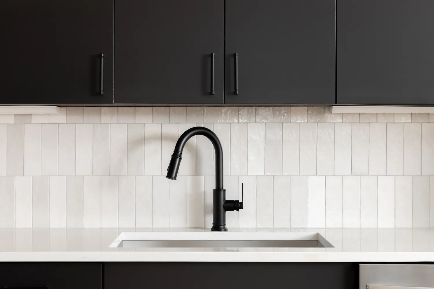
6 Kitchen Cabinet Colors Designers Advise Against—and the Alternatives They Recommend Instead

18 Gorgeous Kitchen Cabinet Paint Colors, According To Kitchen Designers

9 Outdated Kitchen Cabinet Colors We Hope To Never See In 2026
9 Outdated Kitchen Cabinet Colors We Hope To Never See In 2026

Kitchen Cabinet Colors That Will Never Go Out of Style — 10 Tones That Are a Timeless Choice

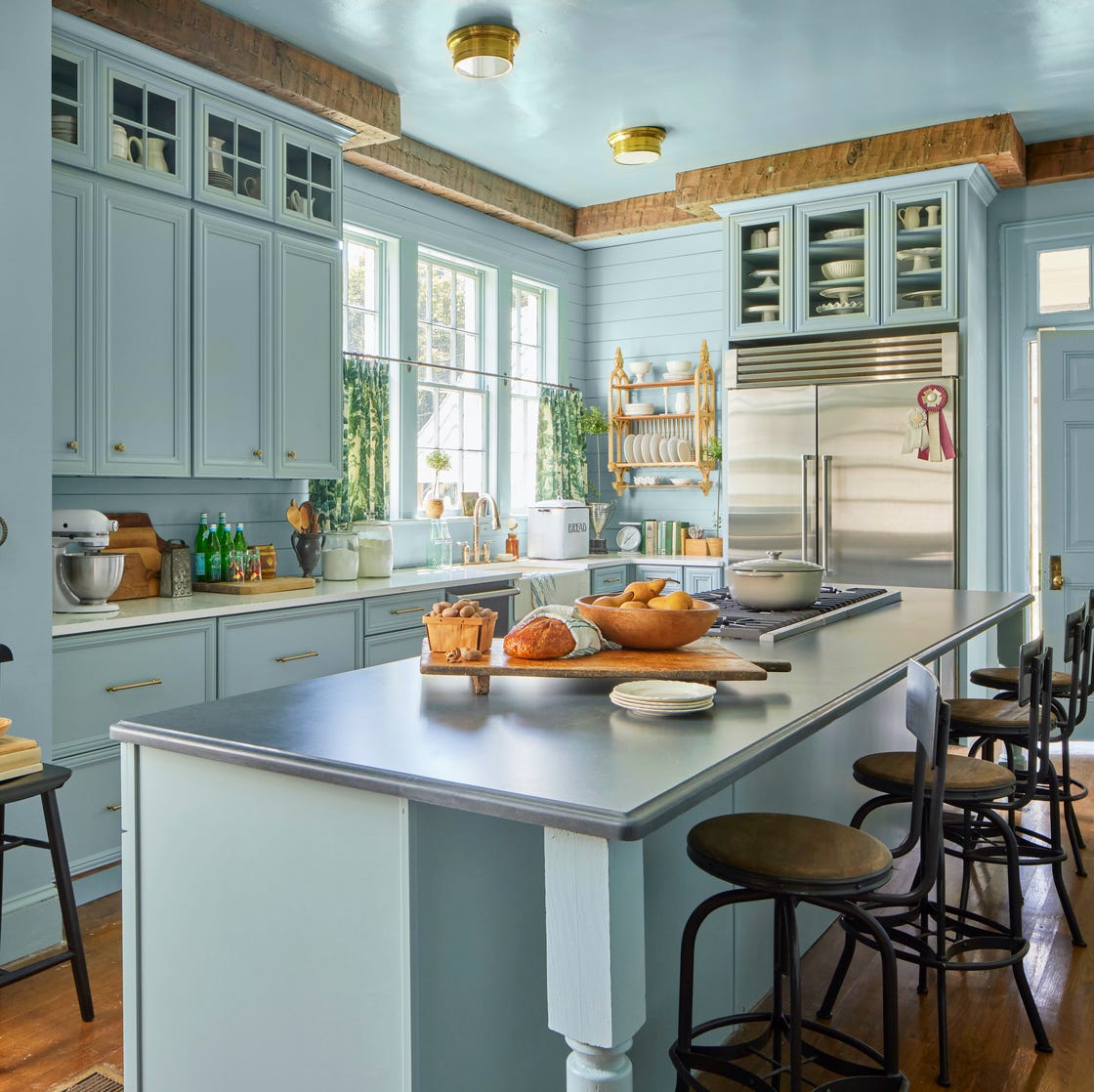
10 Kitchen Paint Colors You Won’t Regret in 10 Years, According to Designers
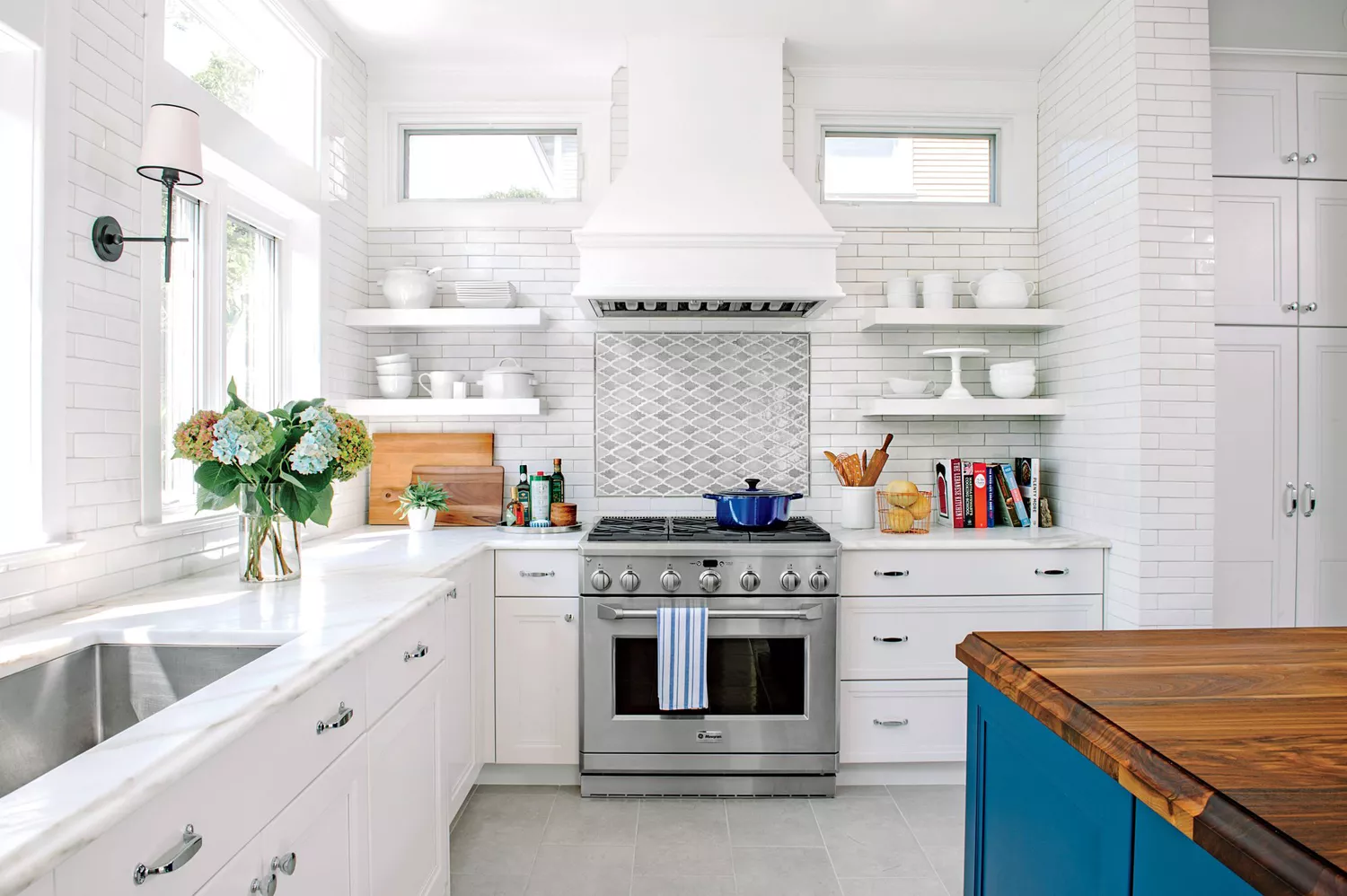
7 Paint Colors To Never Use In Your Kitchen, According To Designers
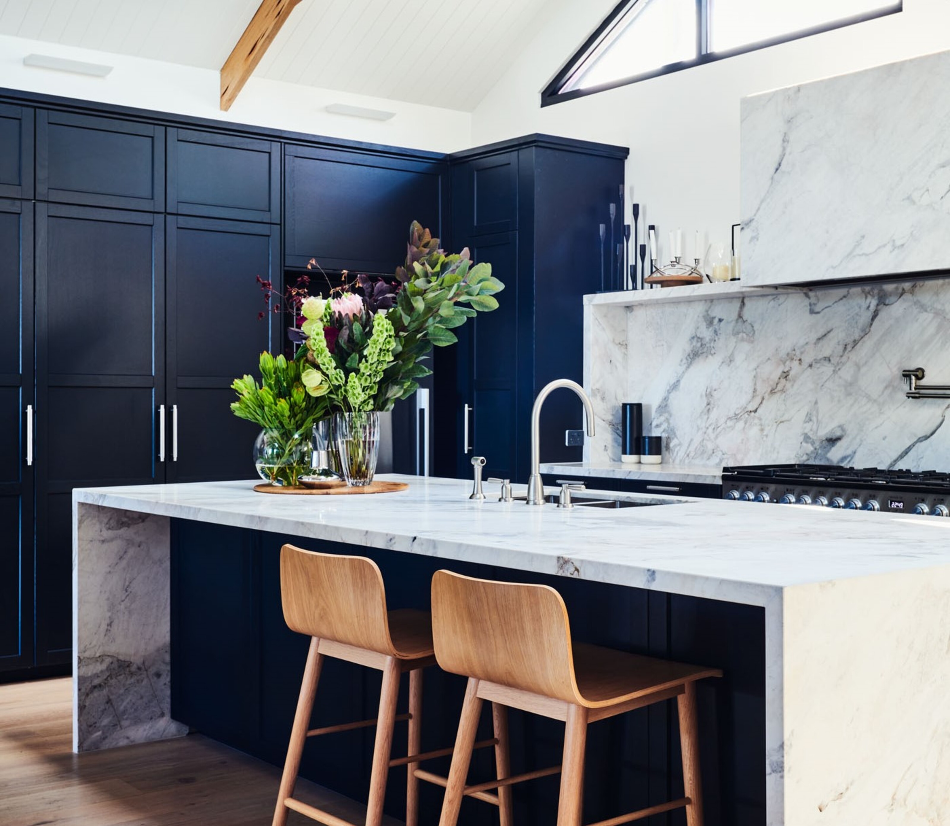
5 kitchen cabinet colors interior designers are avoiding for 2024 - and the shades they're picking instead
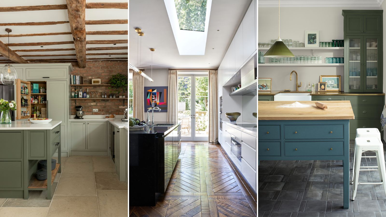
5 fail-safe kitchen cabinet color combinations that always work
10 kitchen cabinet color mistakes to avoid for a cool and contemporary result

8 colors you should never paint kitchen cabinets according to the experts

5 colors you should never paint a pantry – designers share the shades they swerve
The Kitchen Colors Designers Call “Forever Favorites”

4 Colors You Should Never Paint Cabinets, According To Designers