6 Kitchen Cabinet Colors Designers Advise Against—and the Alternatives They Recommend Instead
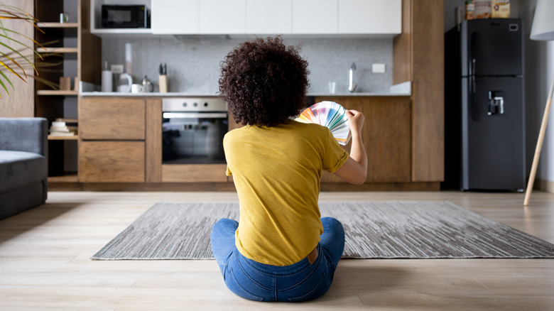
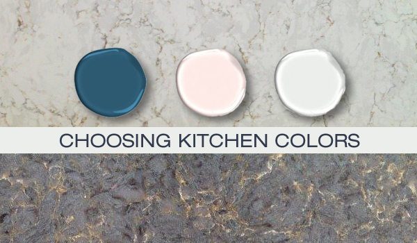
Choosing the right paint color for kitchen cabinets is a critical decision in kitchen renovation, as certain colors can lead to design regret and require significant time and money to correct. Interior designers warn against specific cabinet colors due to their impracticality, dated appearance, or specific connotations, and offer alternative suggestions to achieve a sophisticated and timeless kitchen aesthetic.
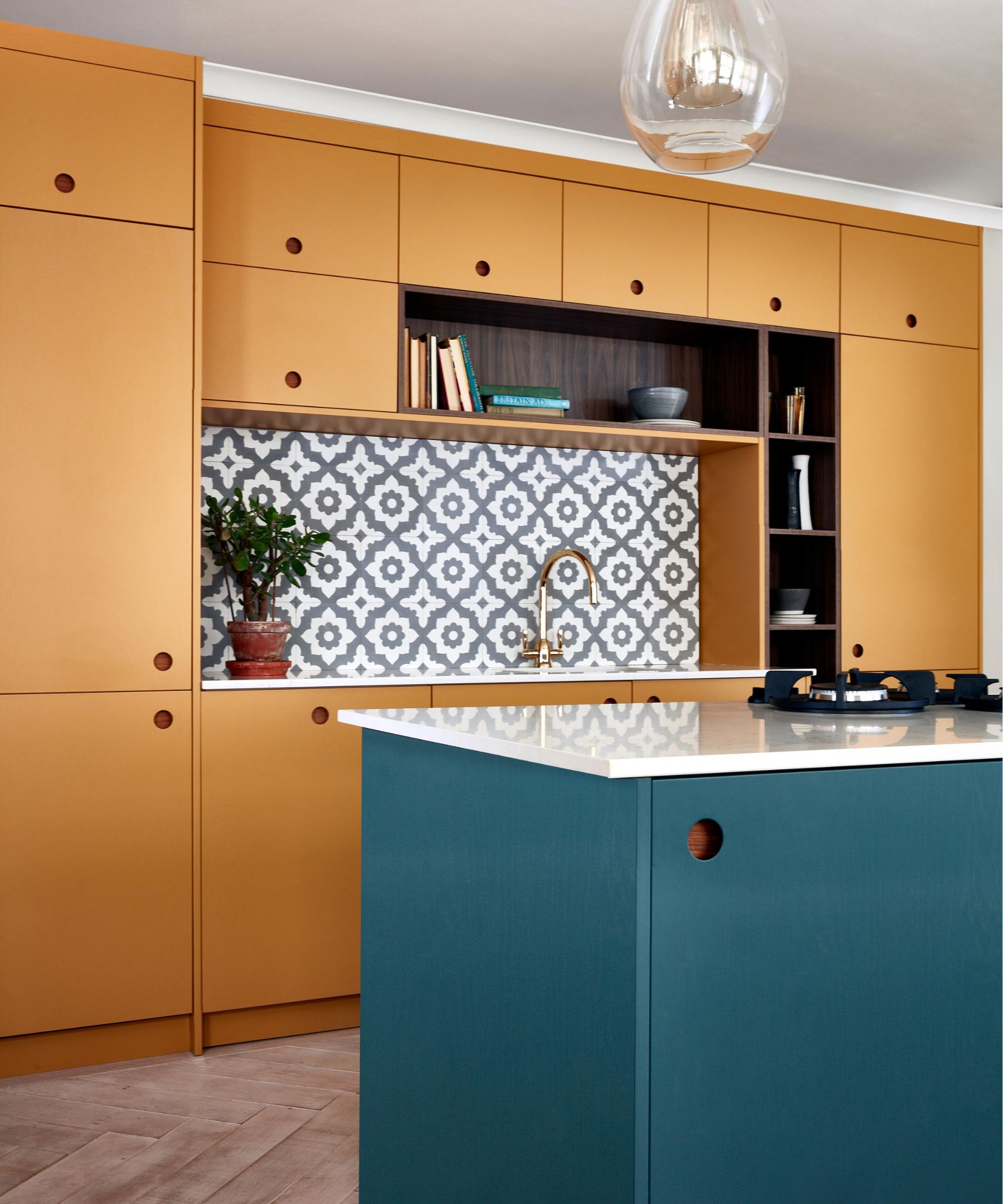
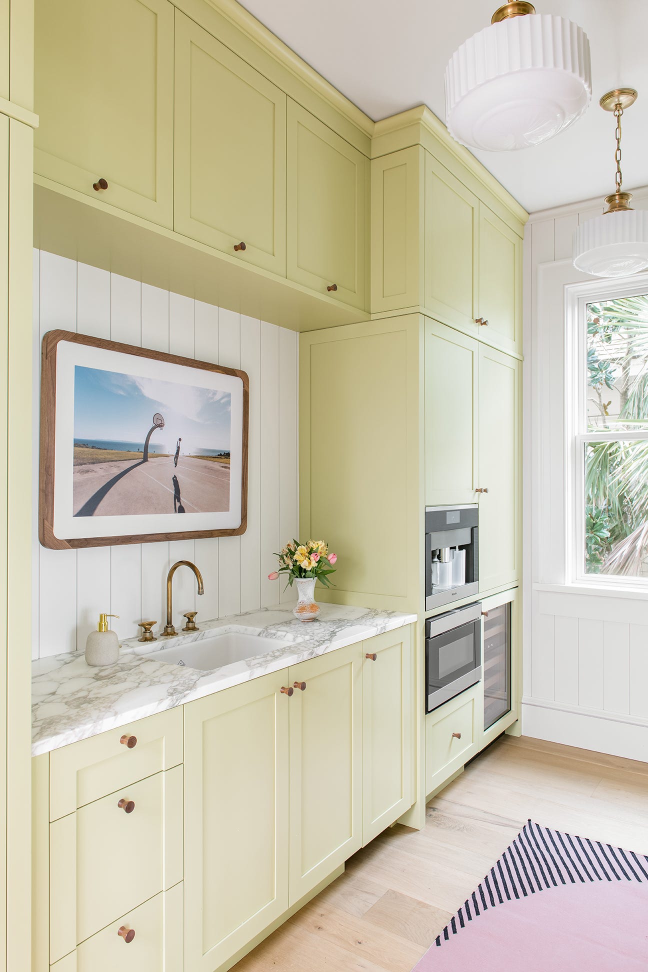
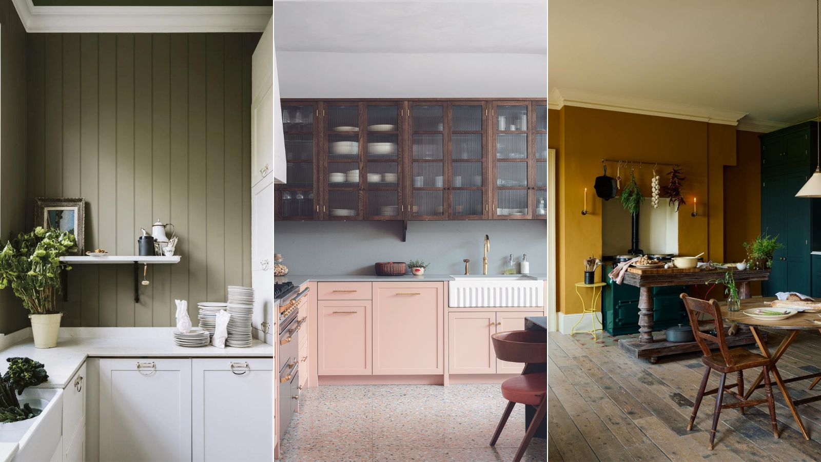
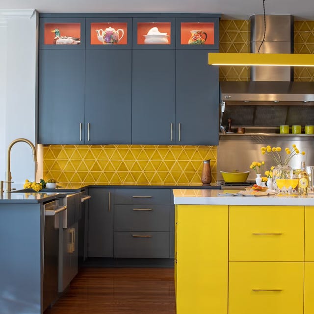
Bright yellow is one color that designers advise against. While it is often associated with happiness, its strong link to fast-food chains like McDonald’s Golden Arches can make it appear unsophisticated in a kitchen setting. Instead, designers suggest opting for more muted yellows or earthy mushroom tones to achieve a softer and more appealing look.
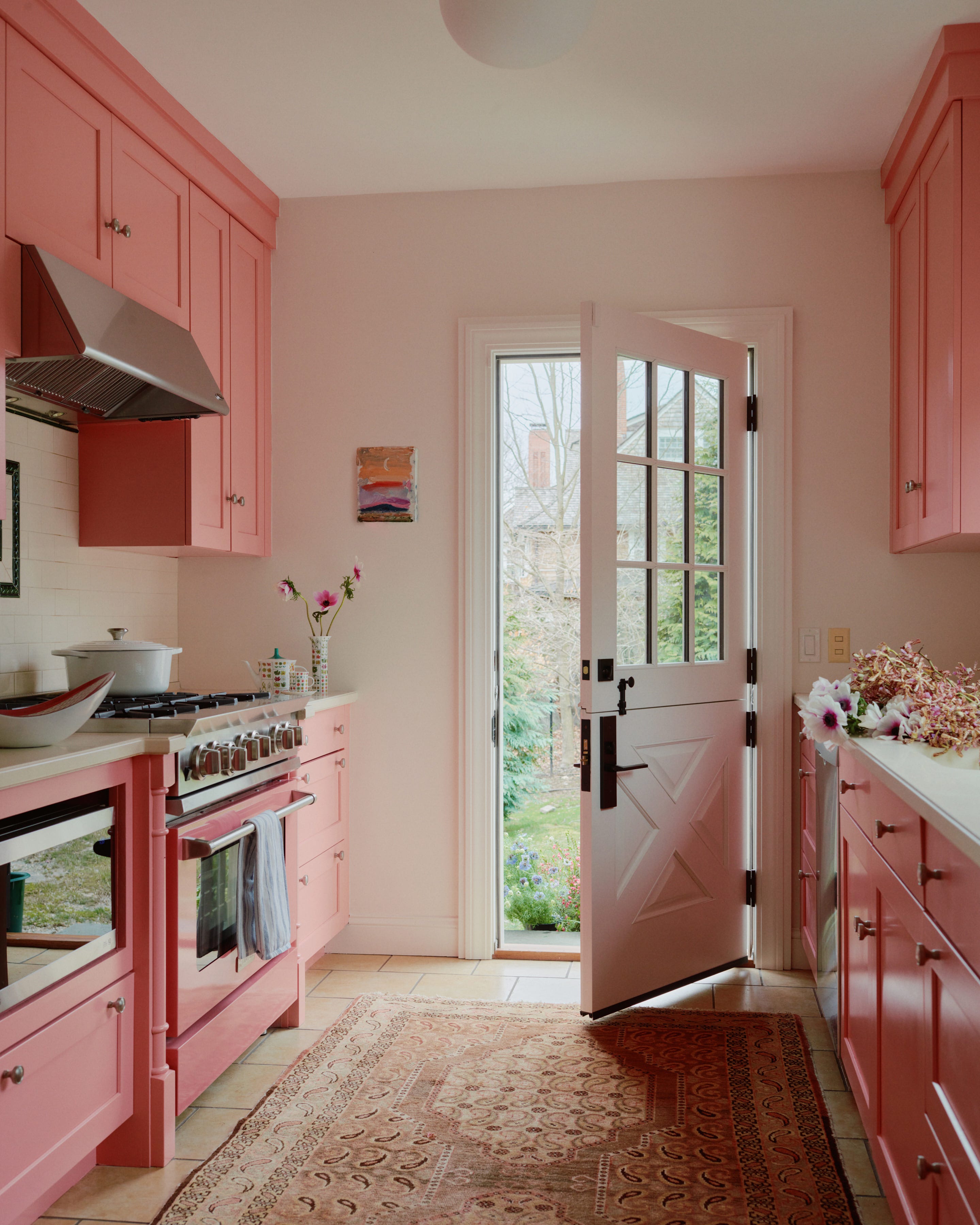
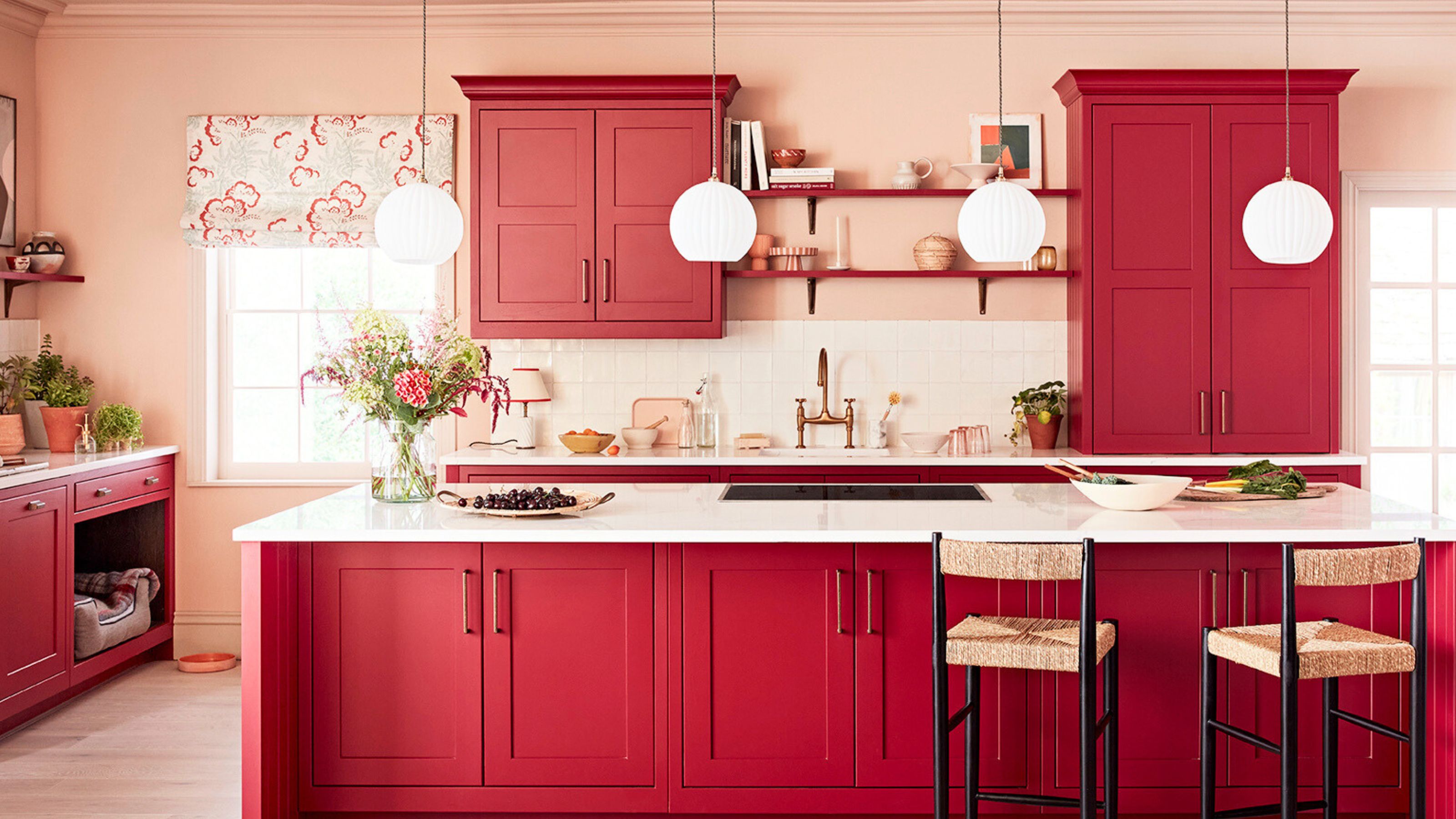
Similarly, bright red is generally discouraged for kitchen cabinets. This intense hue can feel more like a warning sign than a welcoming element in a kitchen. However, this does not mean all reds should be avoided. Alternatives like wine, burgundy, or deep plum colors are recommended as they offer richness and warmth without the harshness of a bright red.
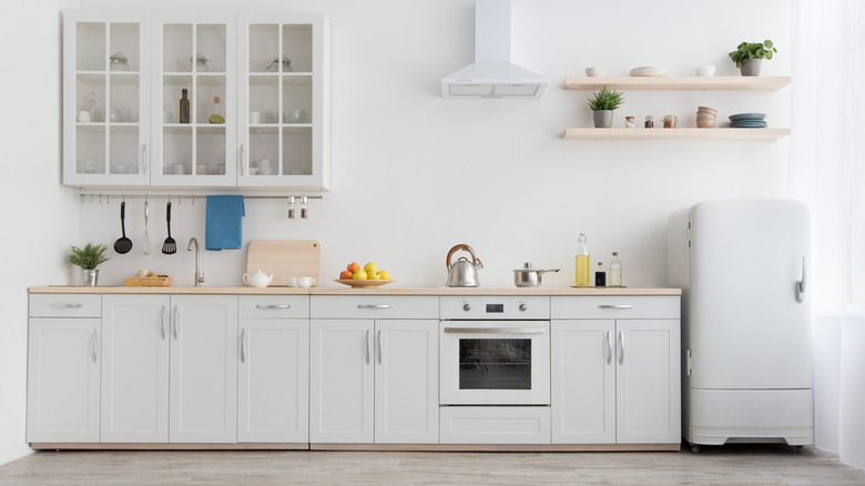
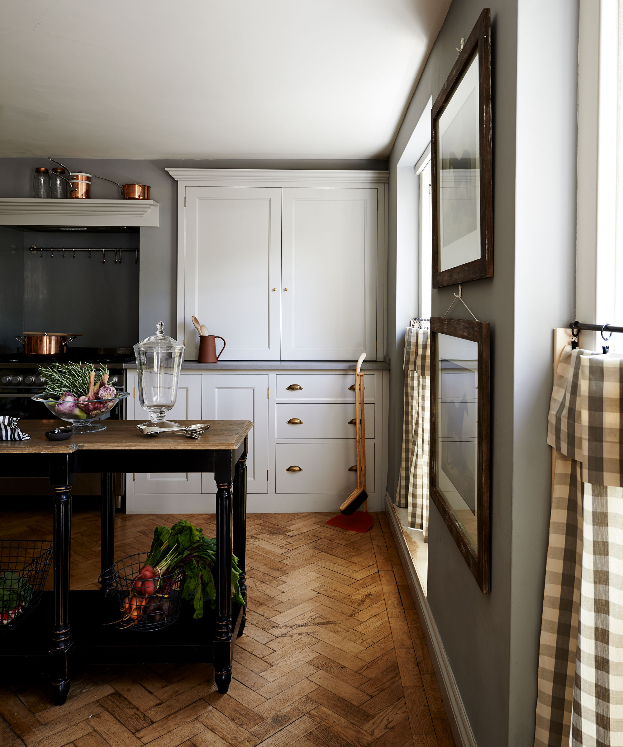
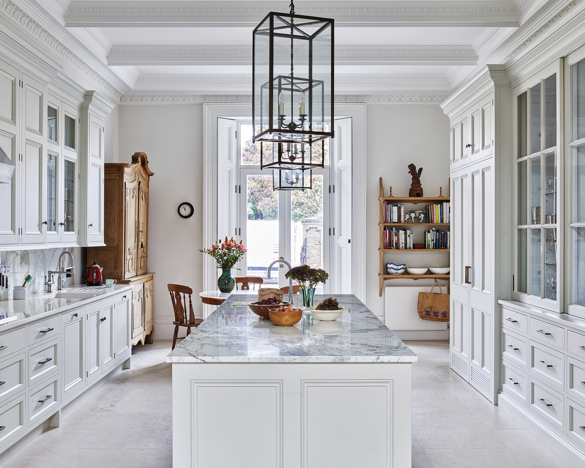
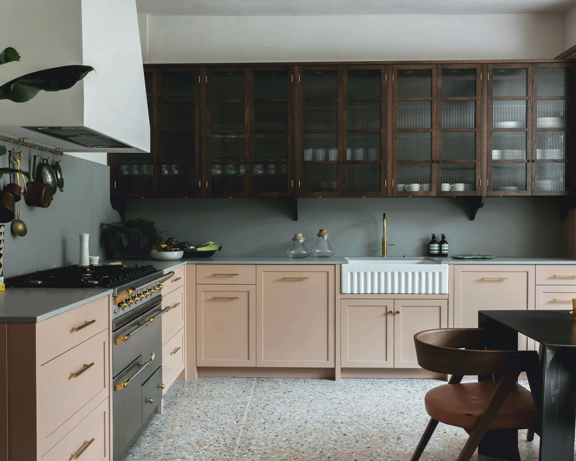
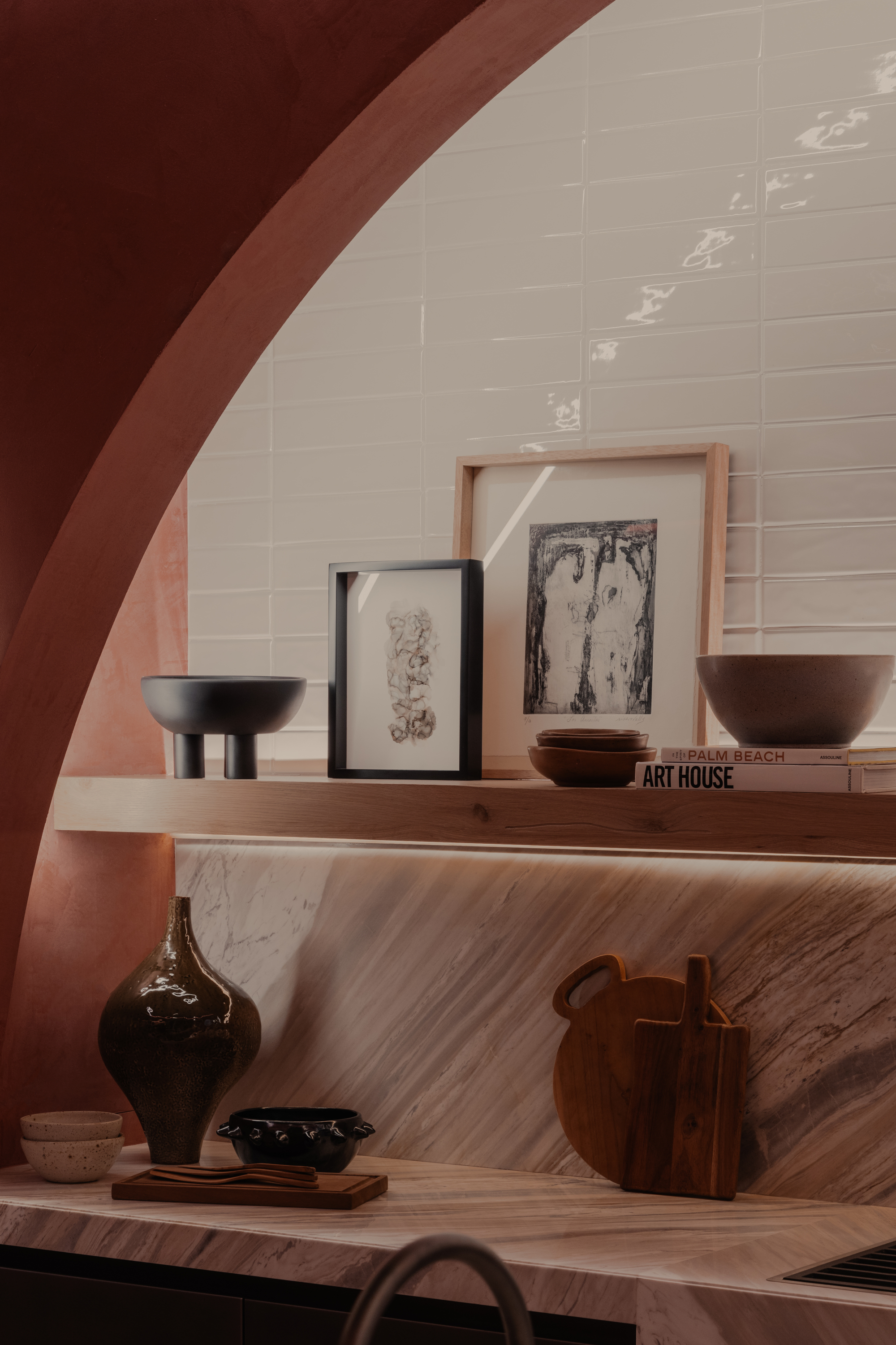
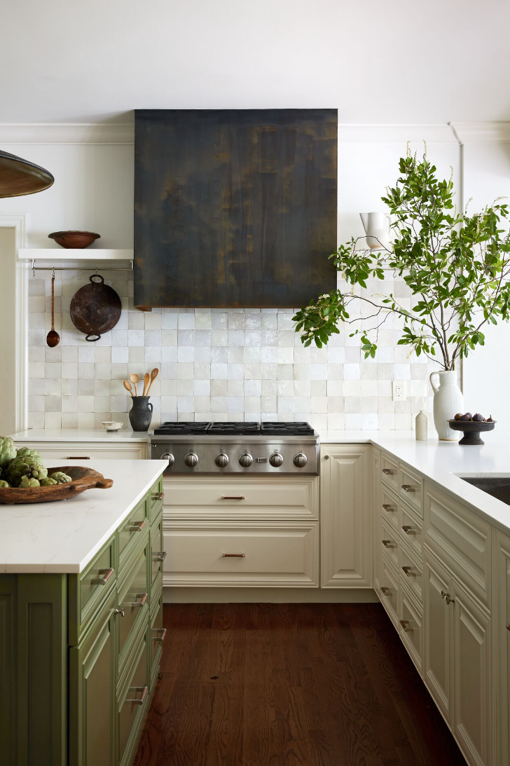
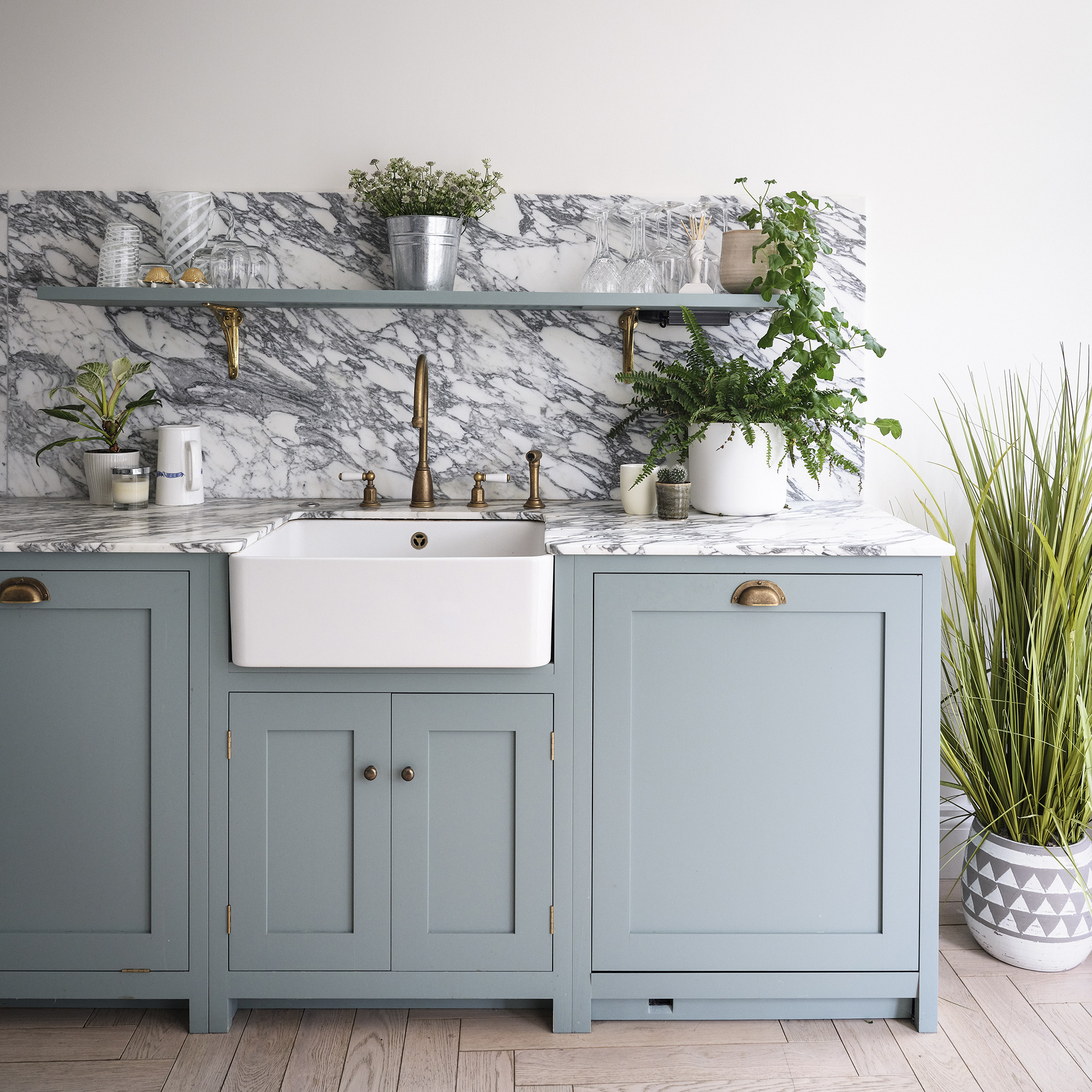
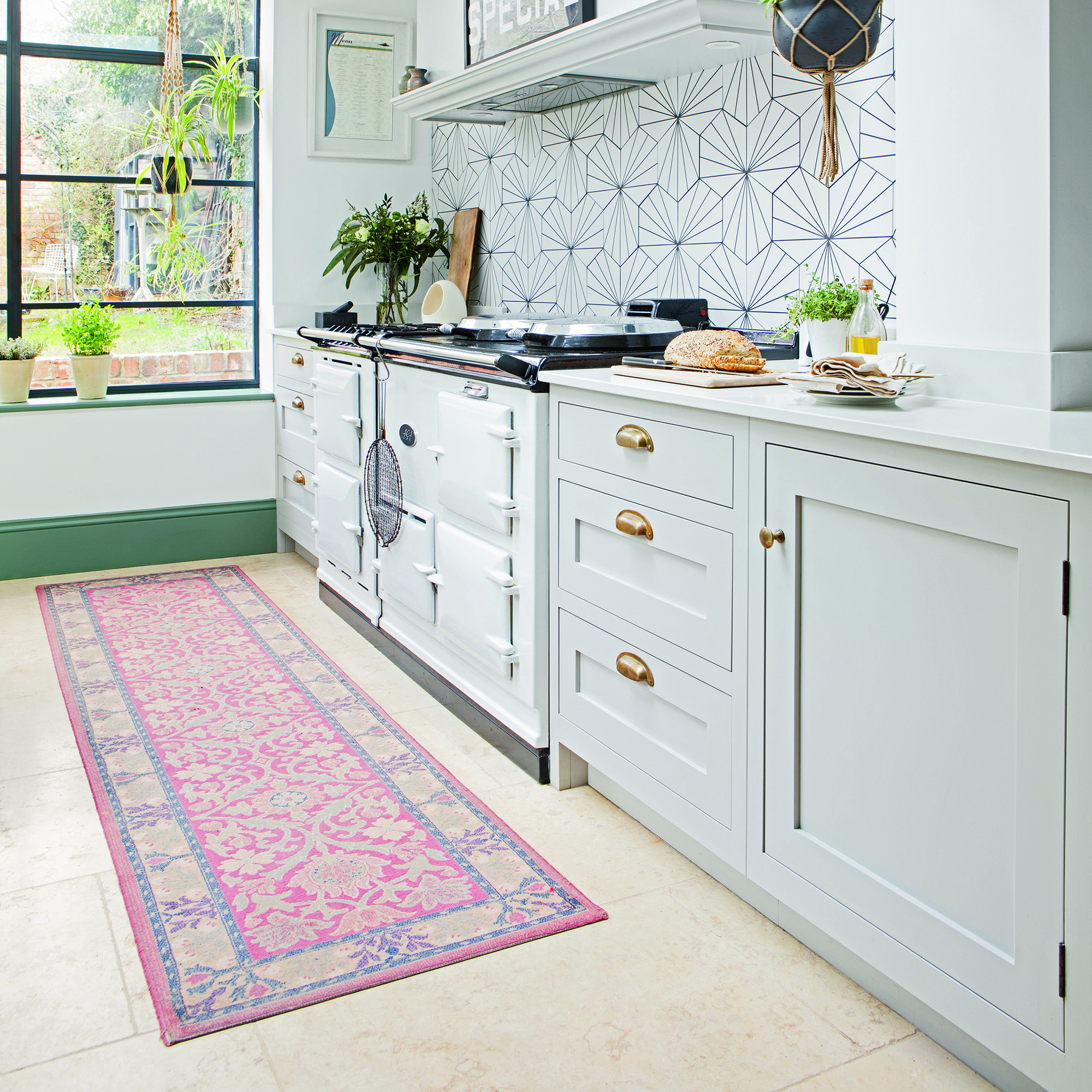
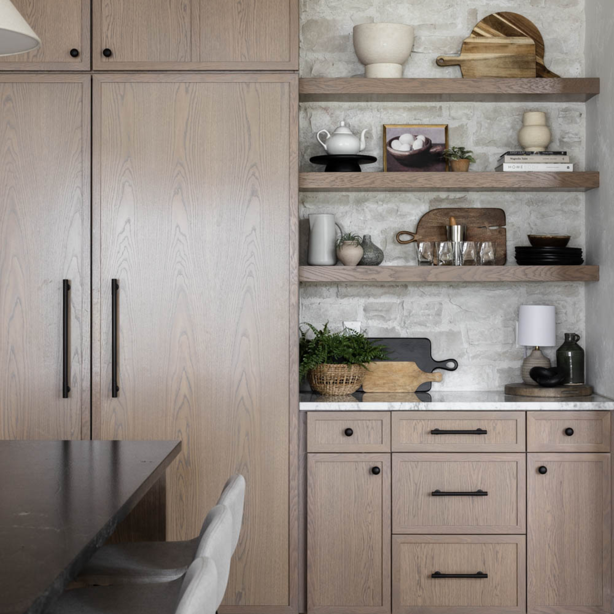
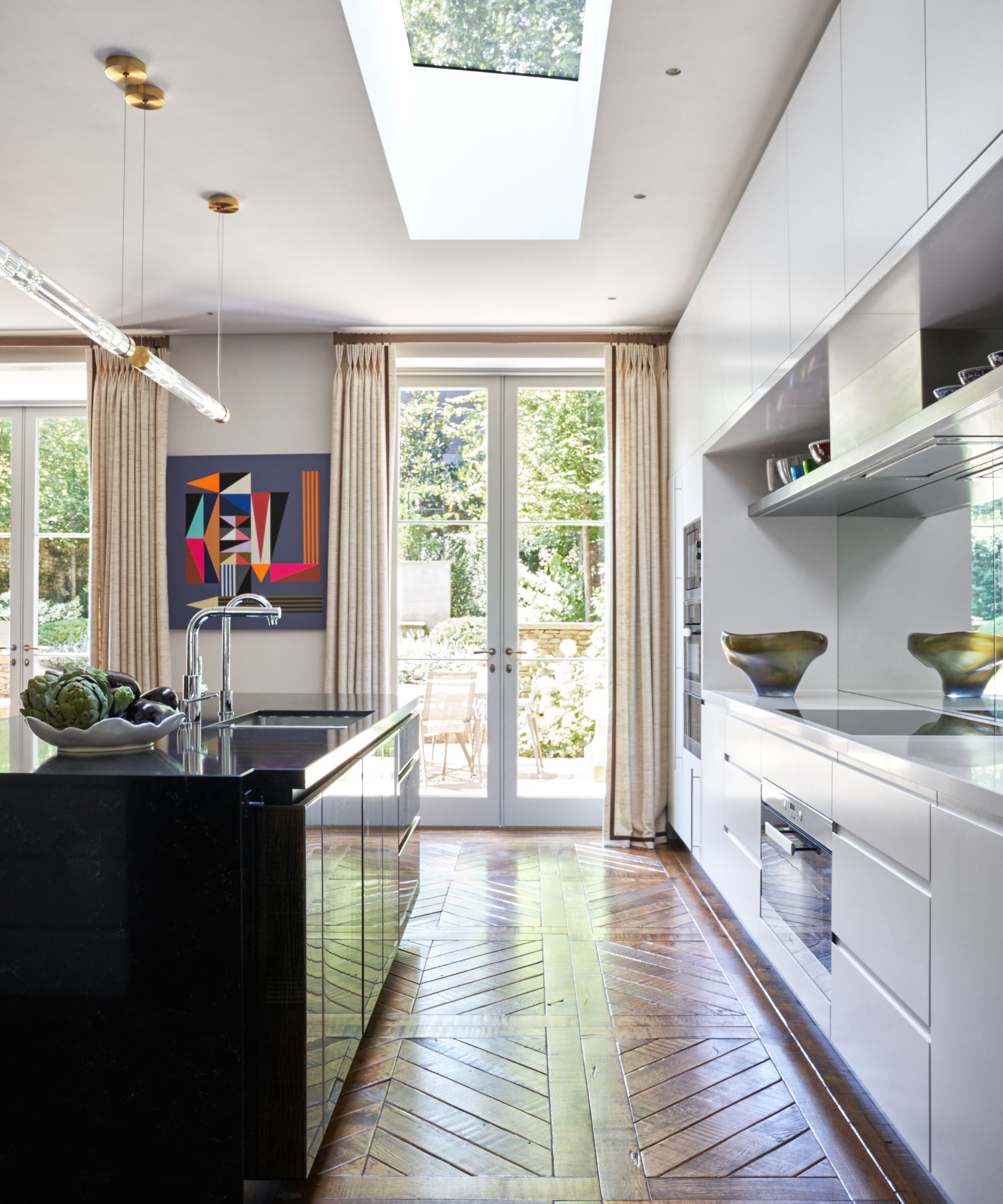
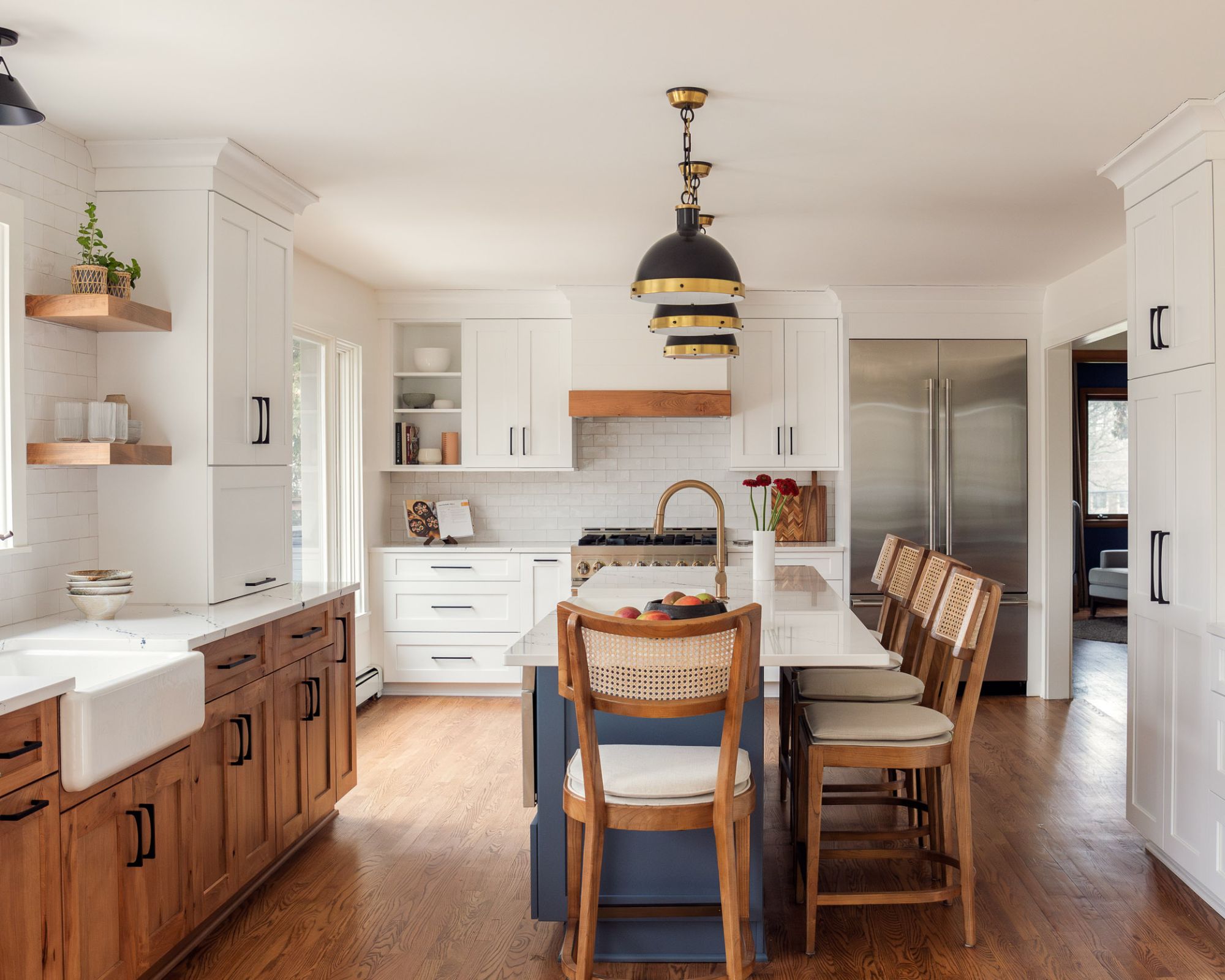
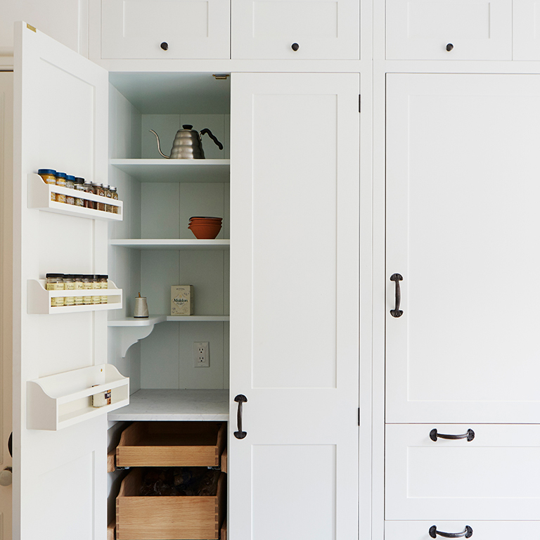
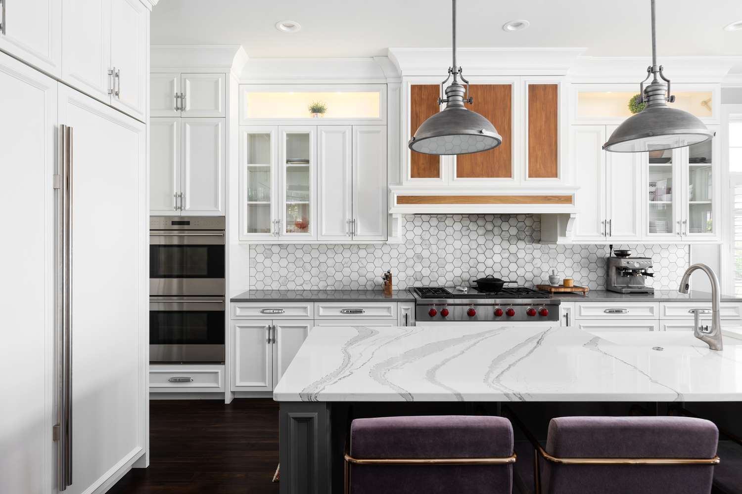
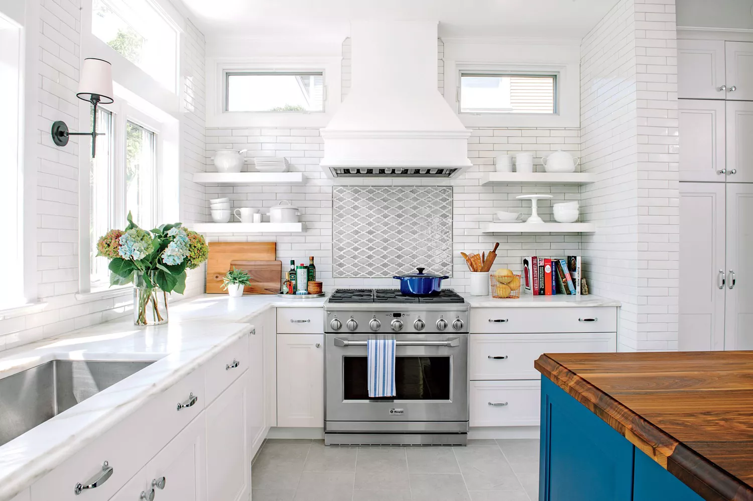
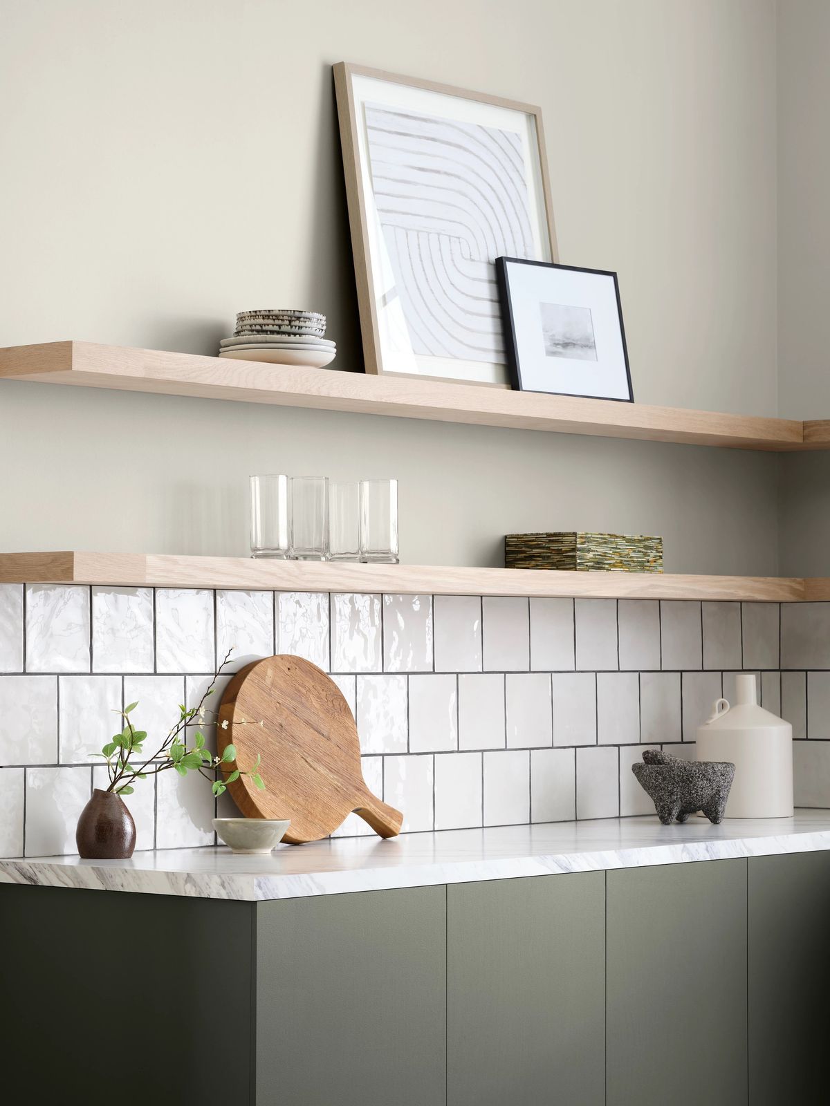
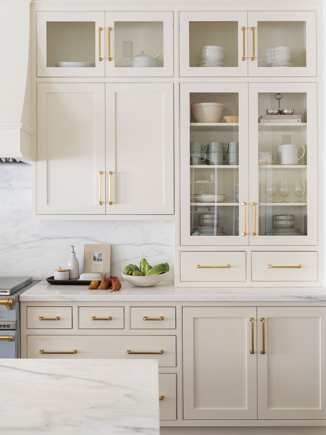
While white cabinetry remains popular and classic, bright white is highlighted as a high-maintenance choice. It can quickly show fingerprints, dust, and food splatters, making it challenging to keep clean and crisp. Furthermore, pure whites can sometimes appear dated and uninviting. Designers recommend using off-whites and creams to achieve a softer, less clinical, and more inviting feel in the kitchen.
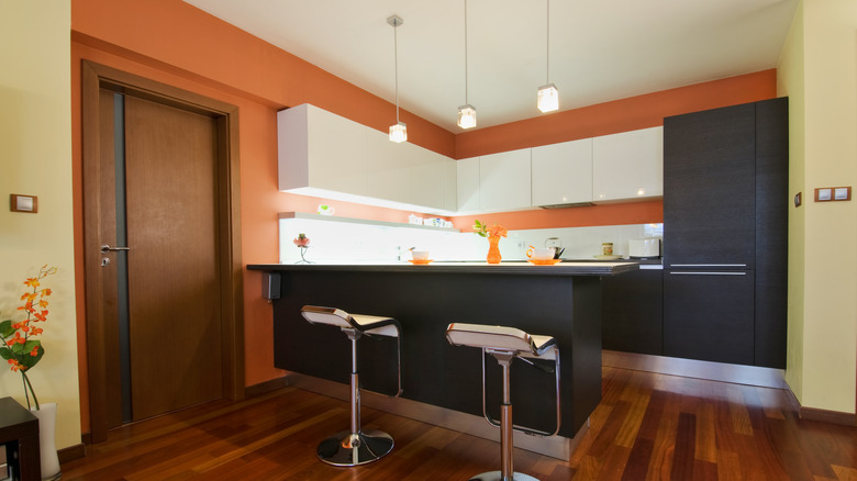
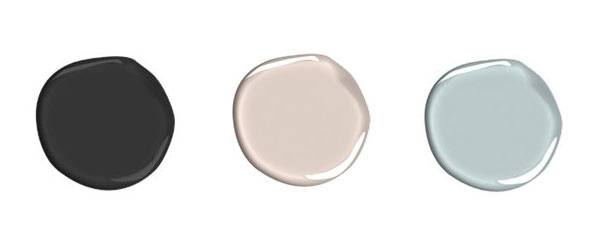
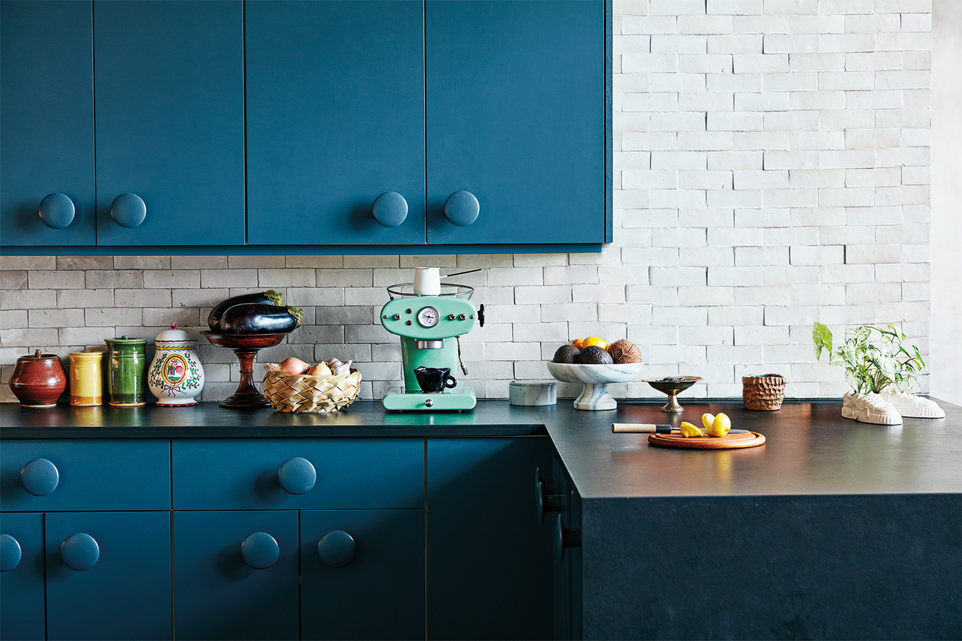
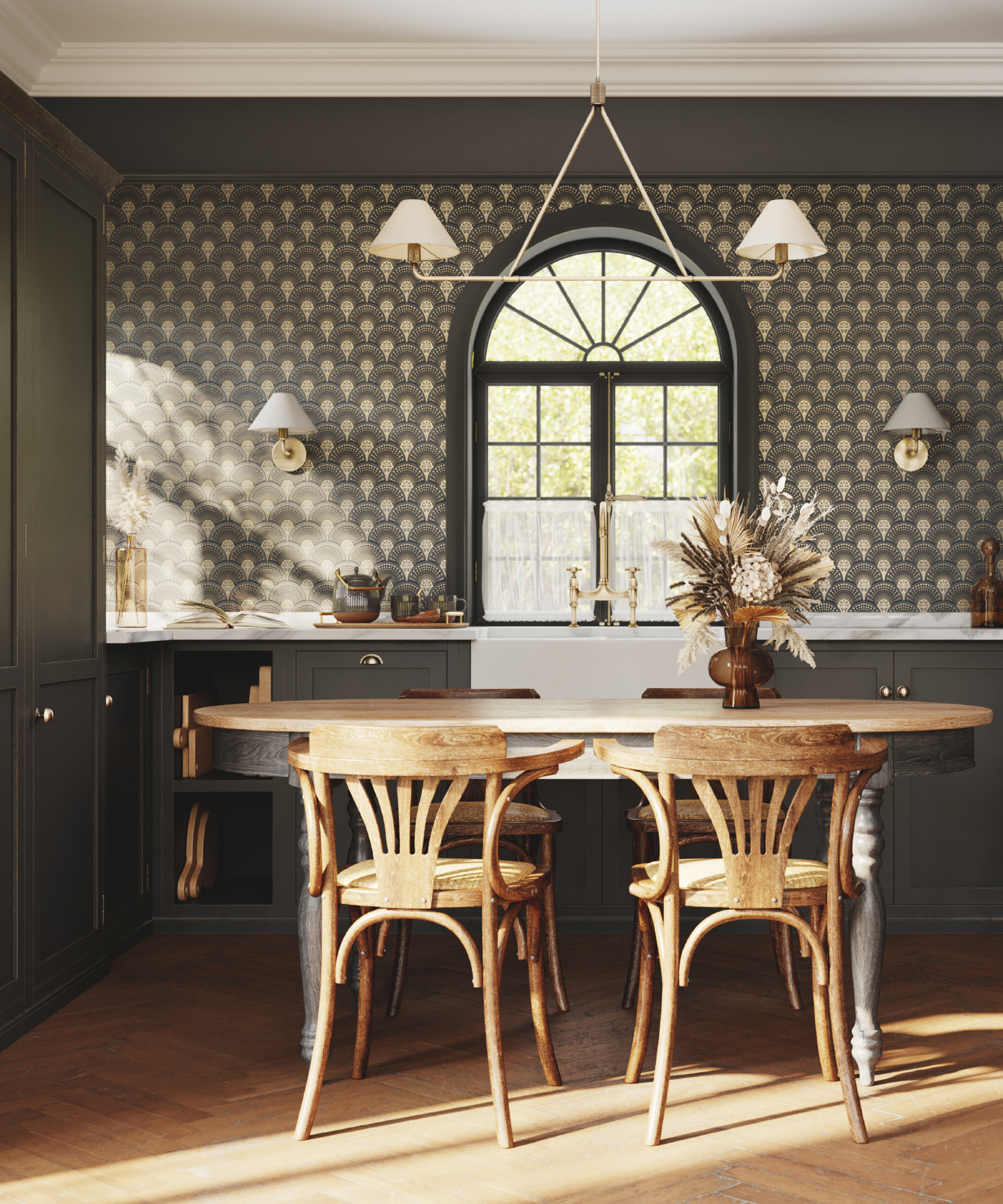
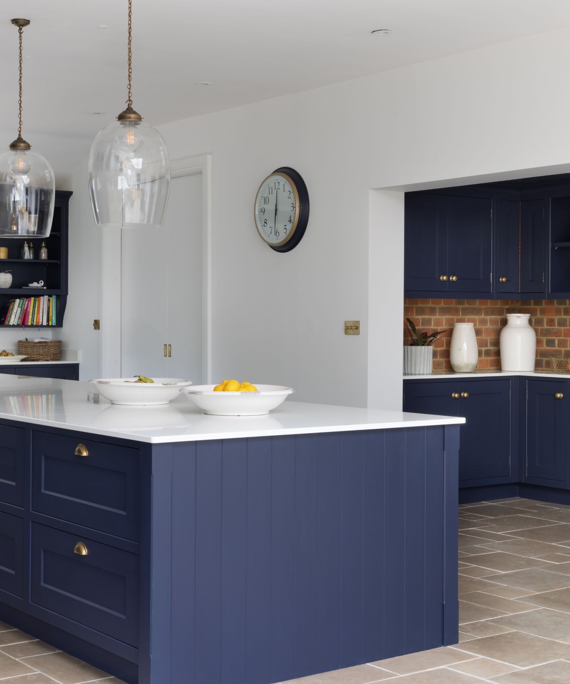
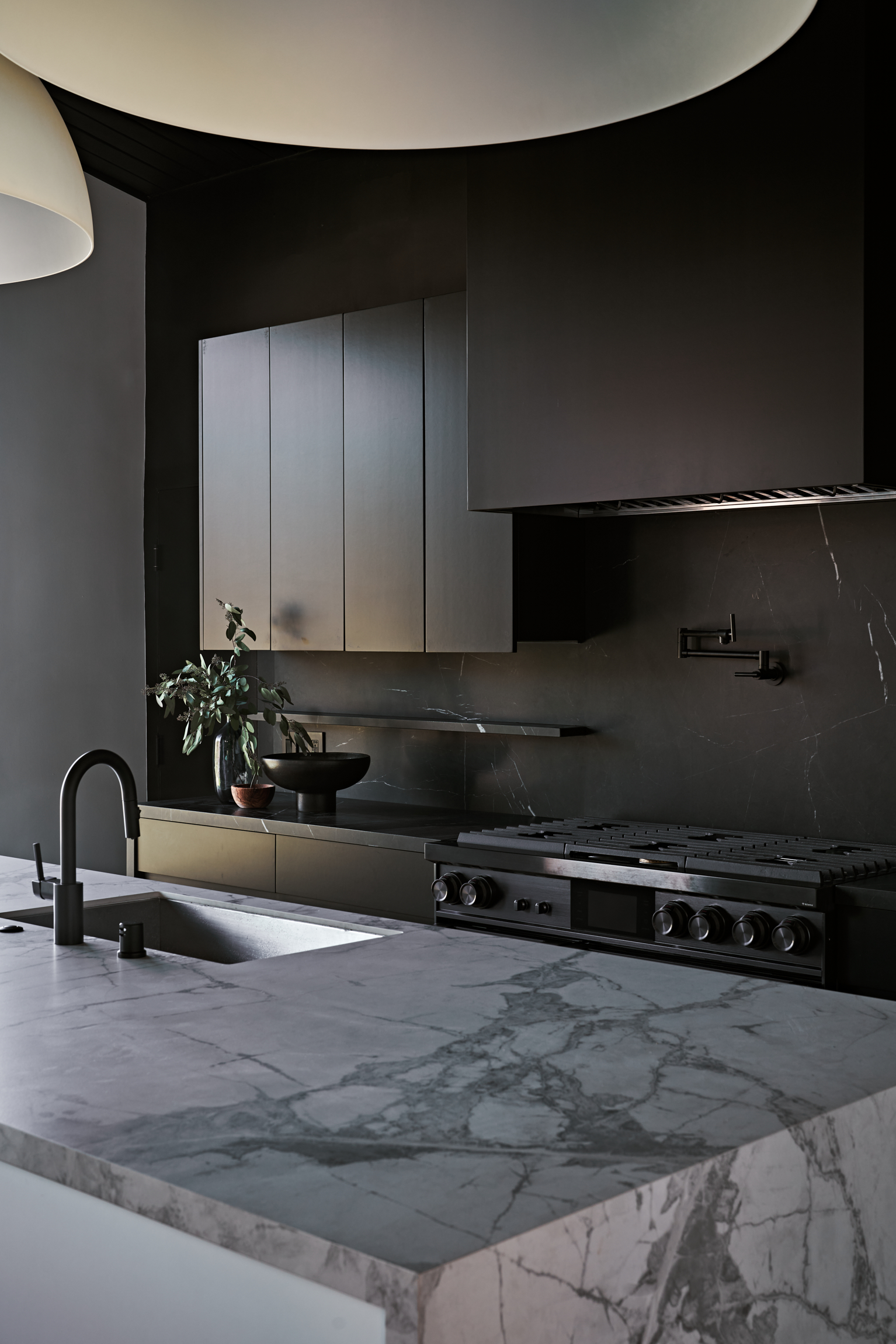
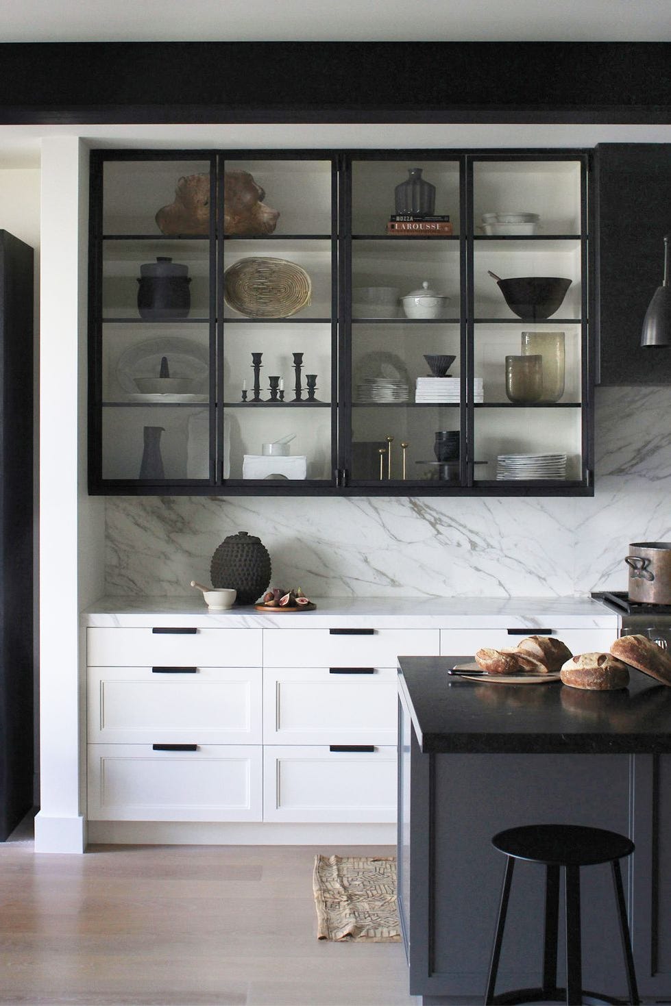
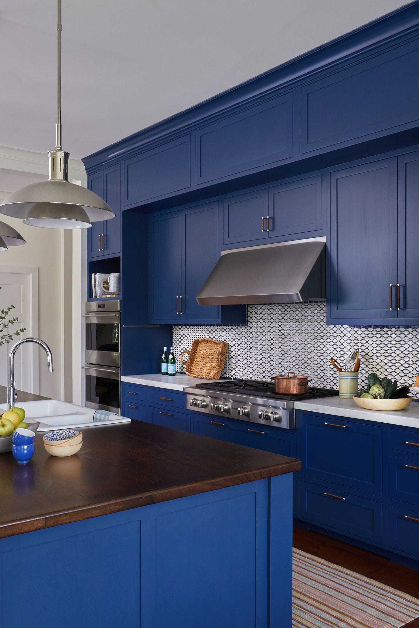
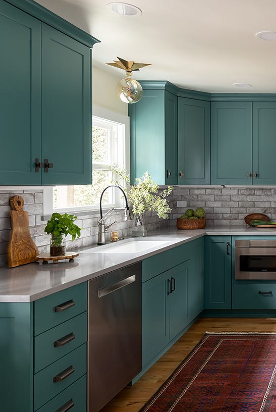
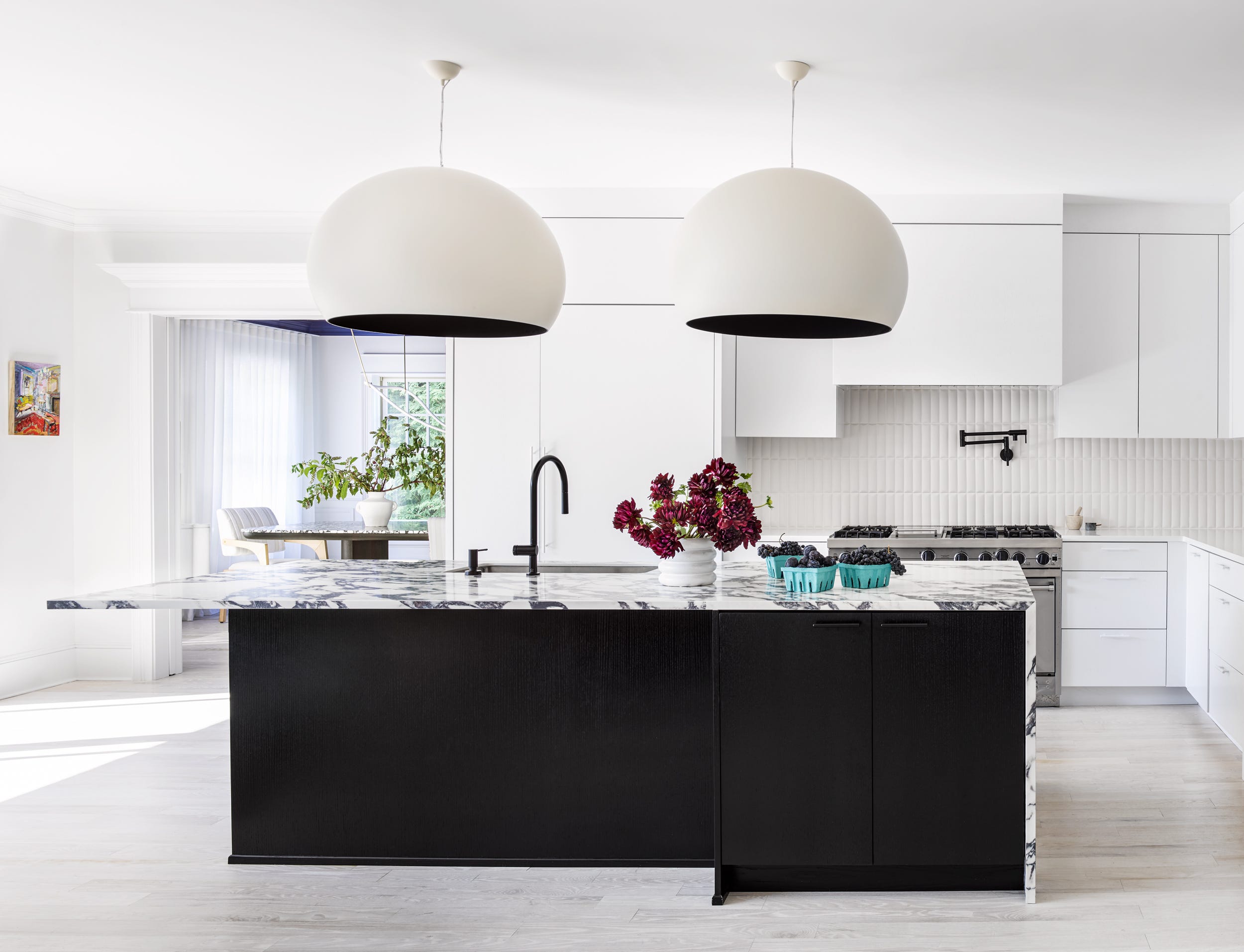
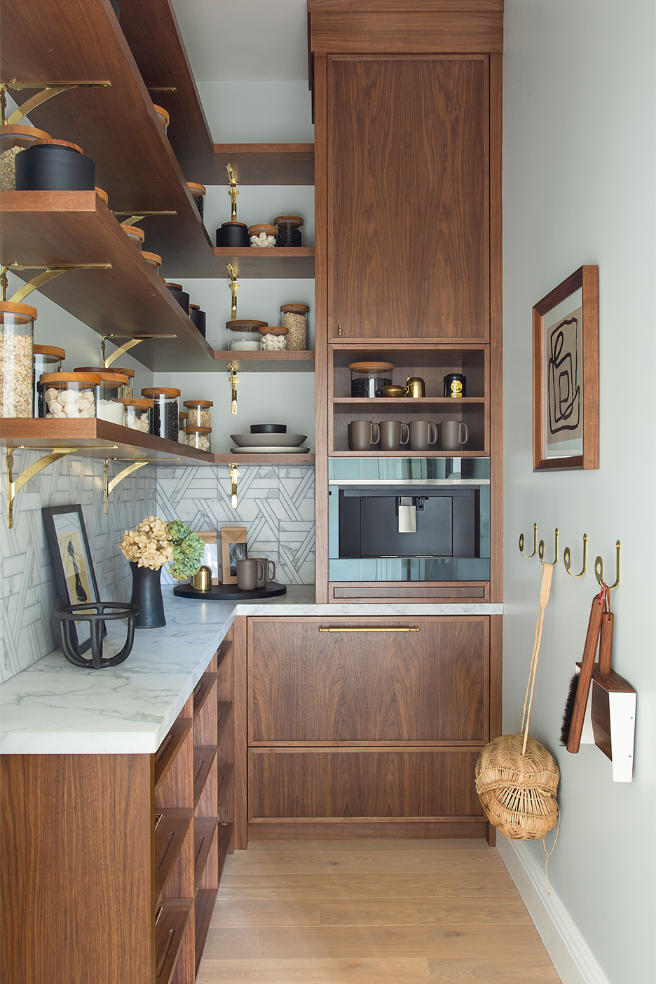
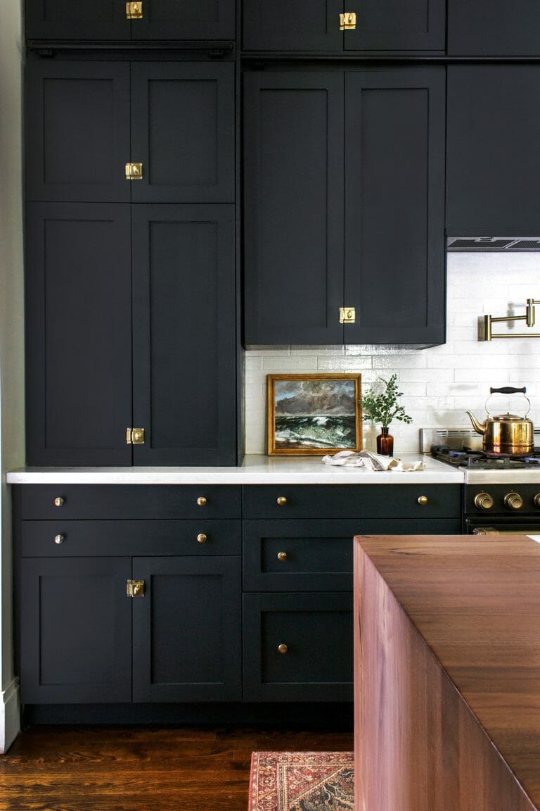
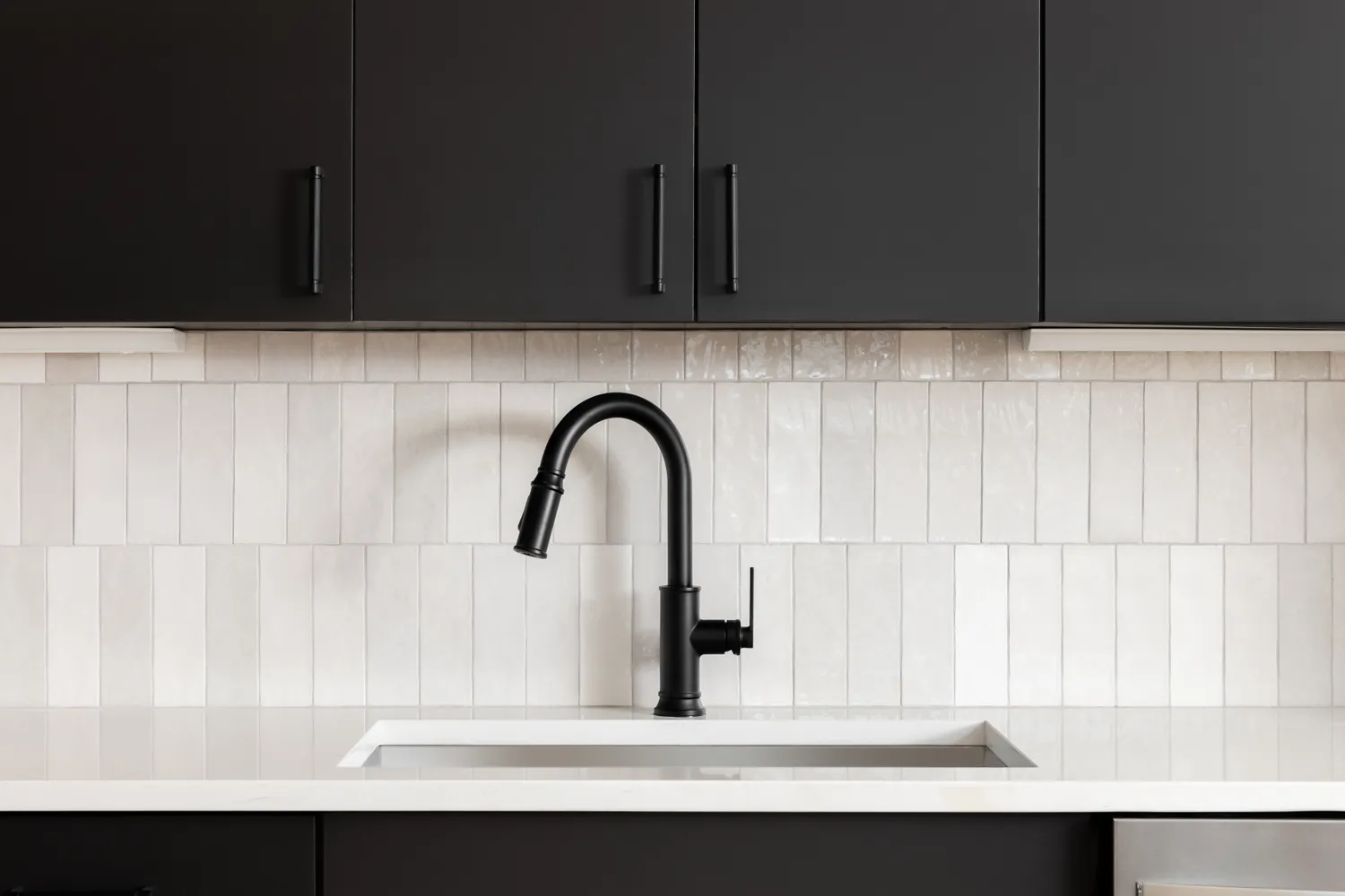
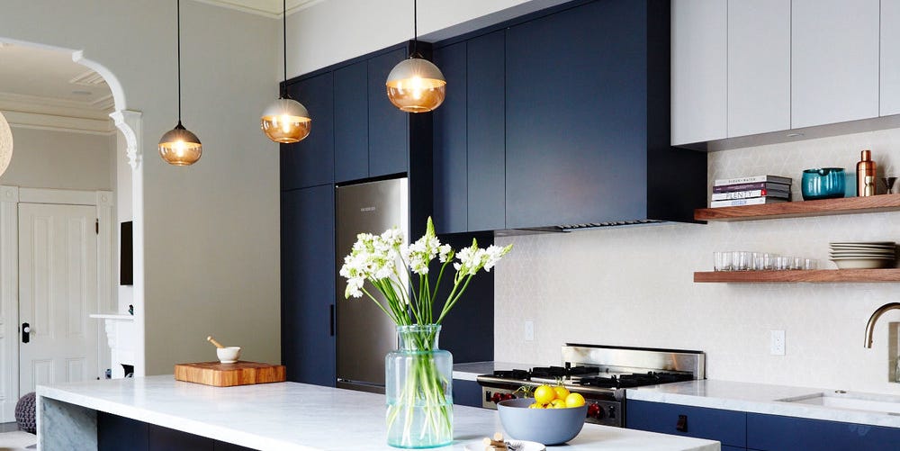
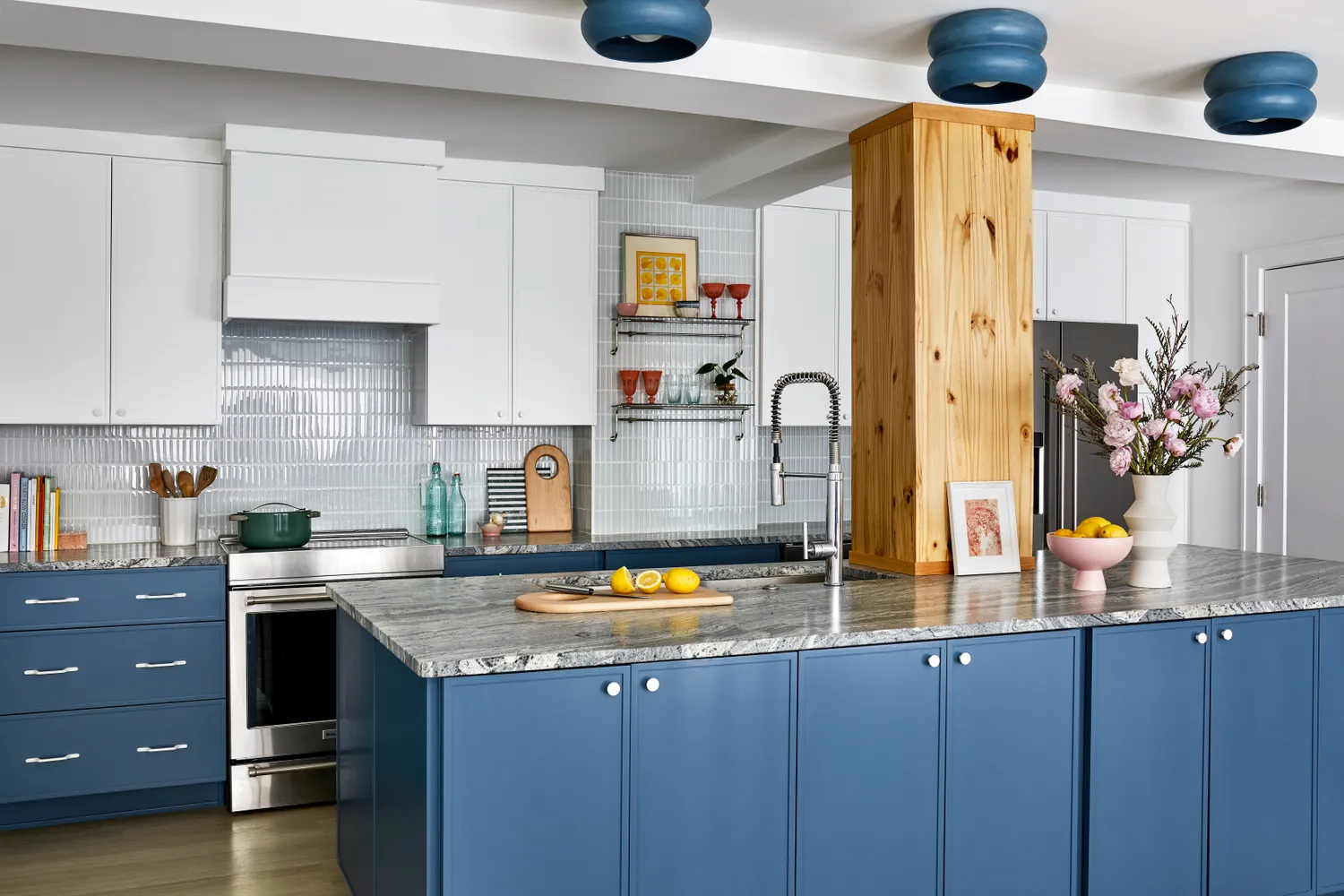
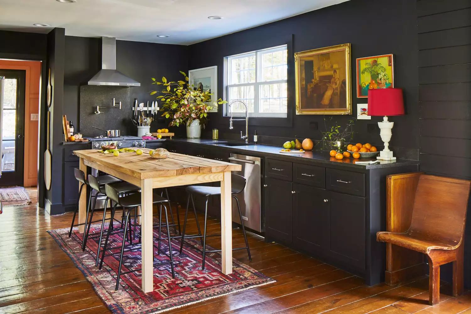
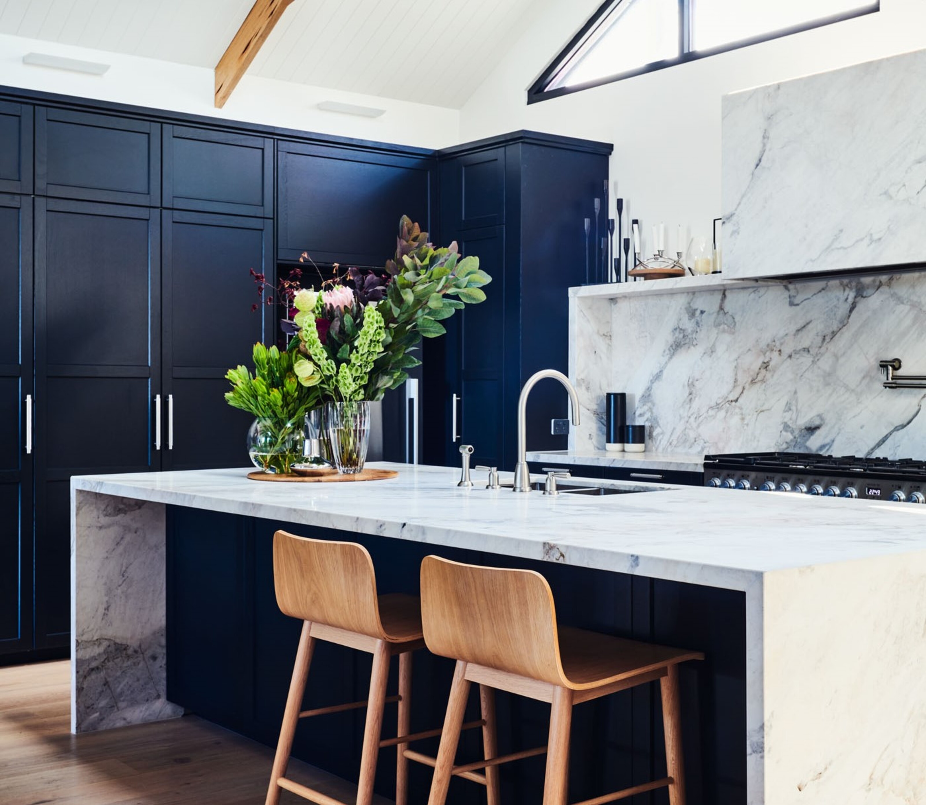
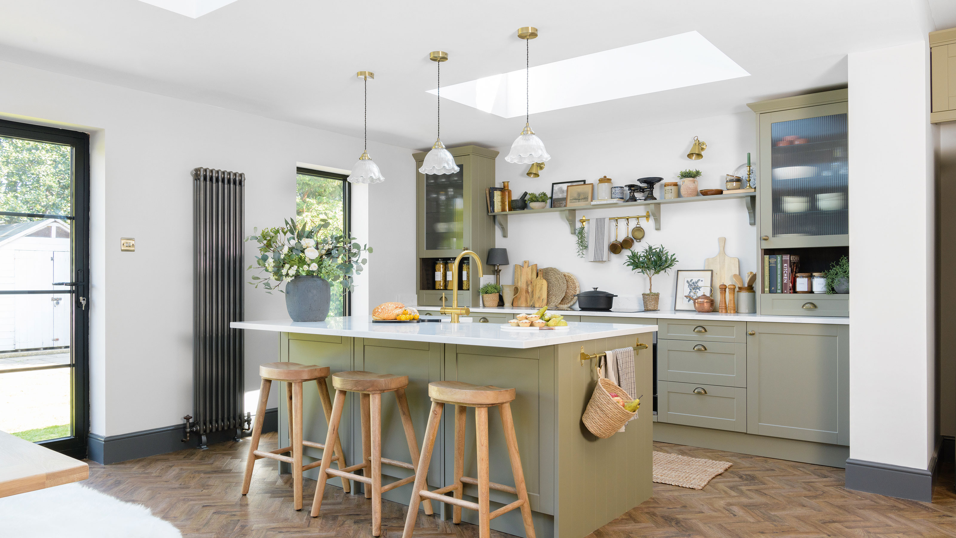
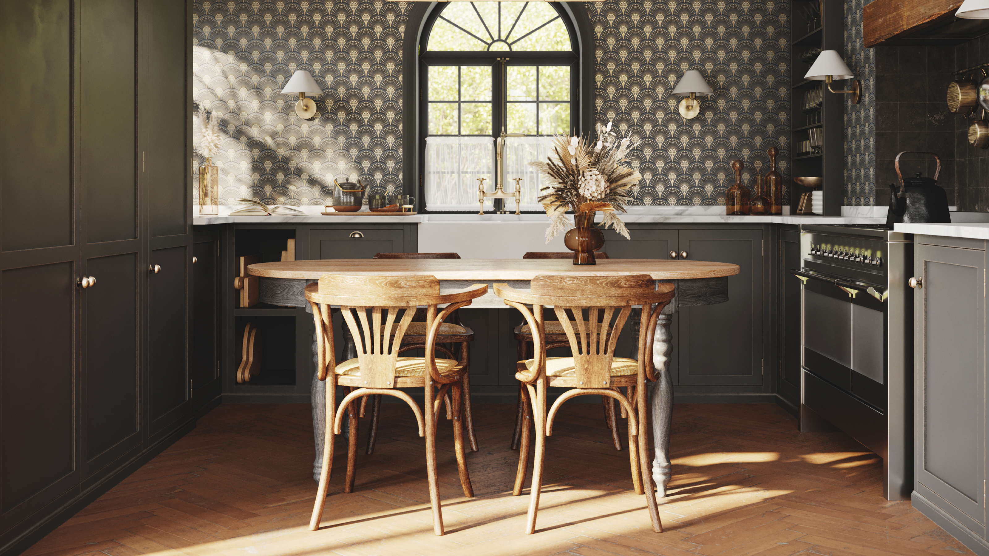
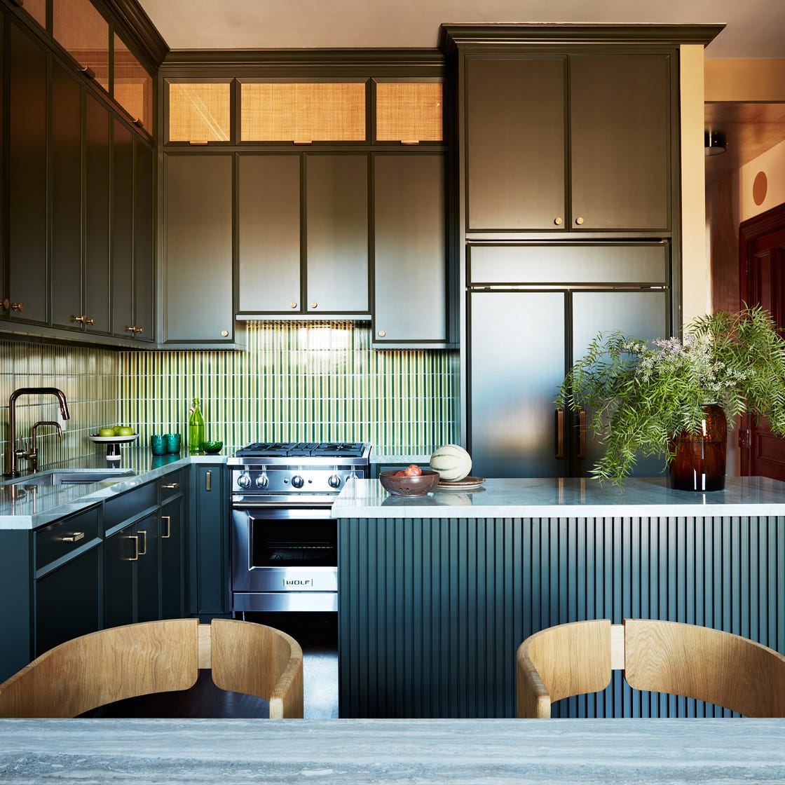
Jet black is another color to approach with caution due to its impracticality. Despite appearing chic in photographs, in real-life settings, jet black cabinets are prone to showing every fingerprint, dust speck, and water spot, making them particularly unsuitable for homes with children or pets. For those desiring a dark aesthetic, designers suggest choosing blacks with charcoal, green, or blue undertones to add warmth and depth, making them more forgiving and inviting.
Fuchsia, a bright pink, is not recommended for kitchen cabinets unless the home's overall aesthetic is specifically aiming for a 'Barbie-core' style. This vibrant color can be overwhelming and lack timeless appeal. Better alternatives for a bold yet elegant look include rusts, soft browns, or even elevated lavender shades, which offer a more sophisticated and enduring style.
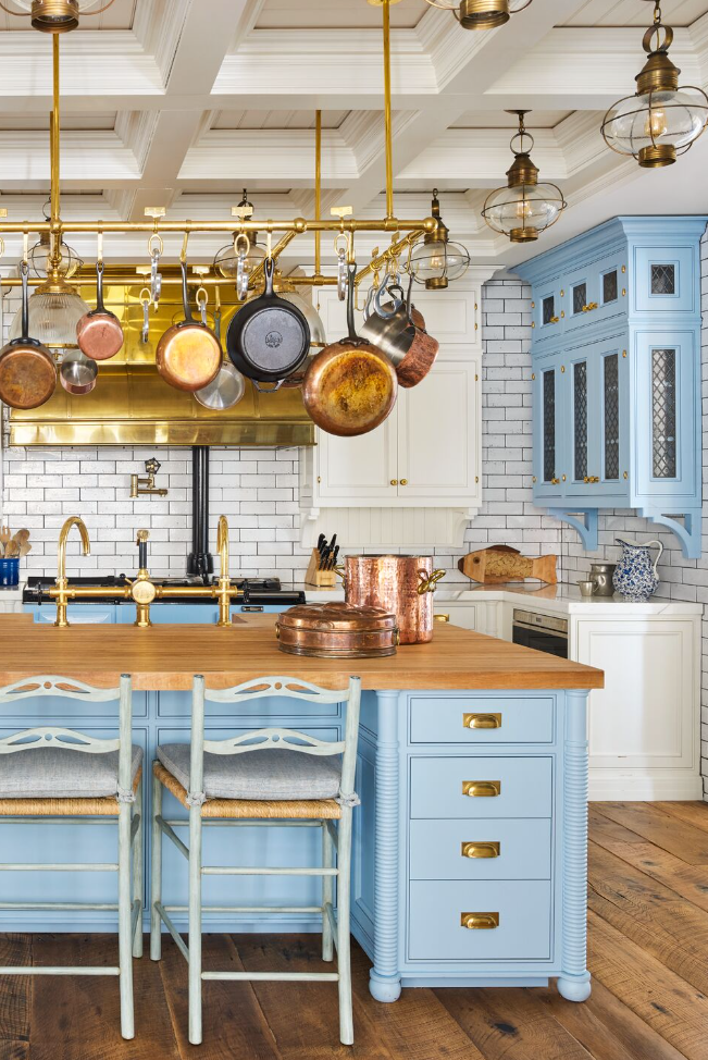
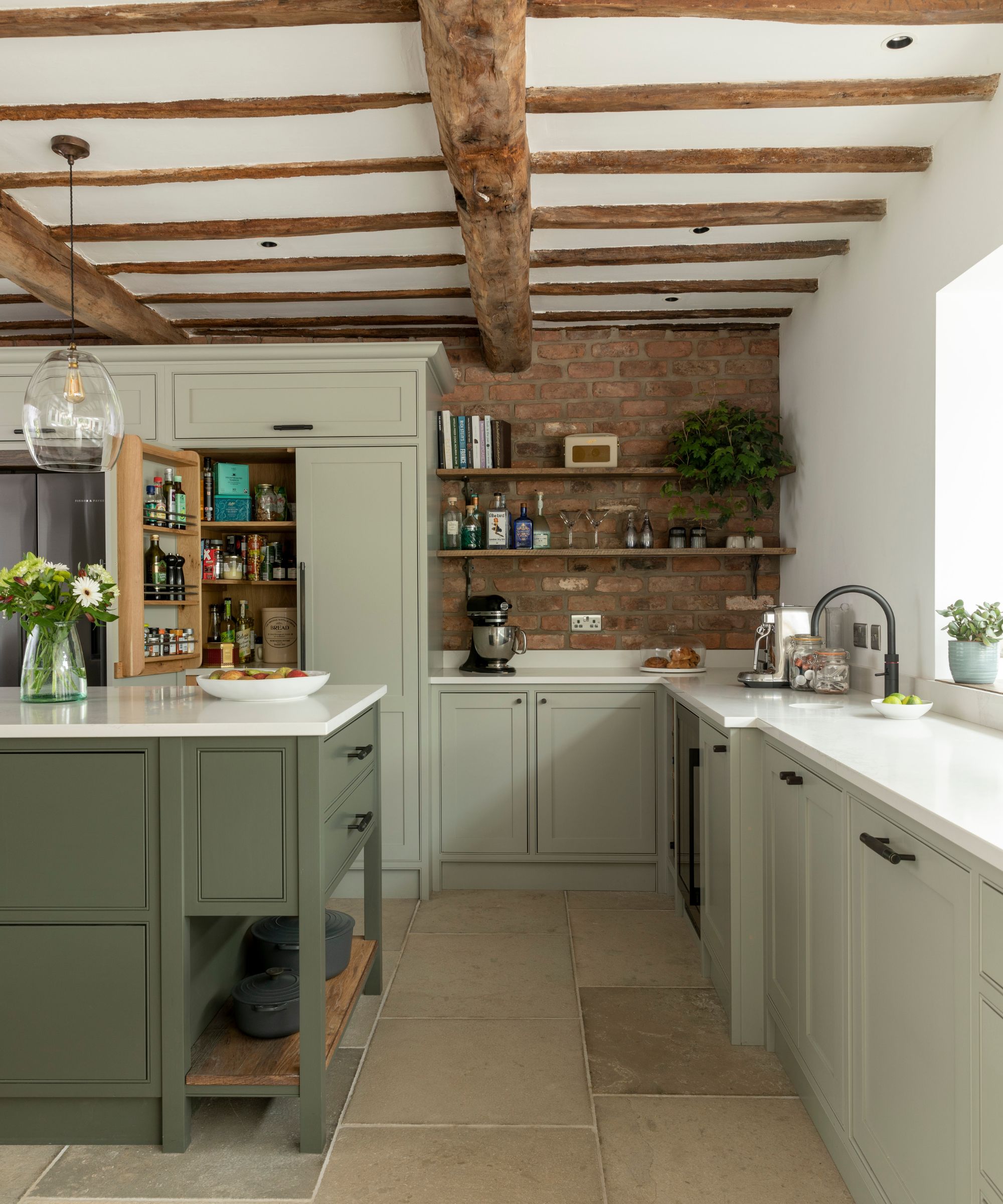
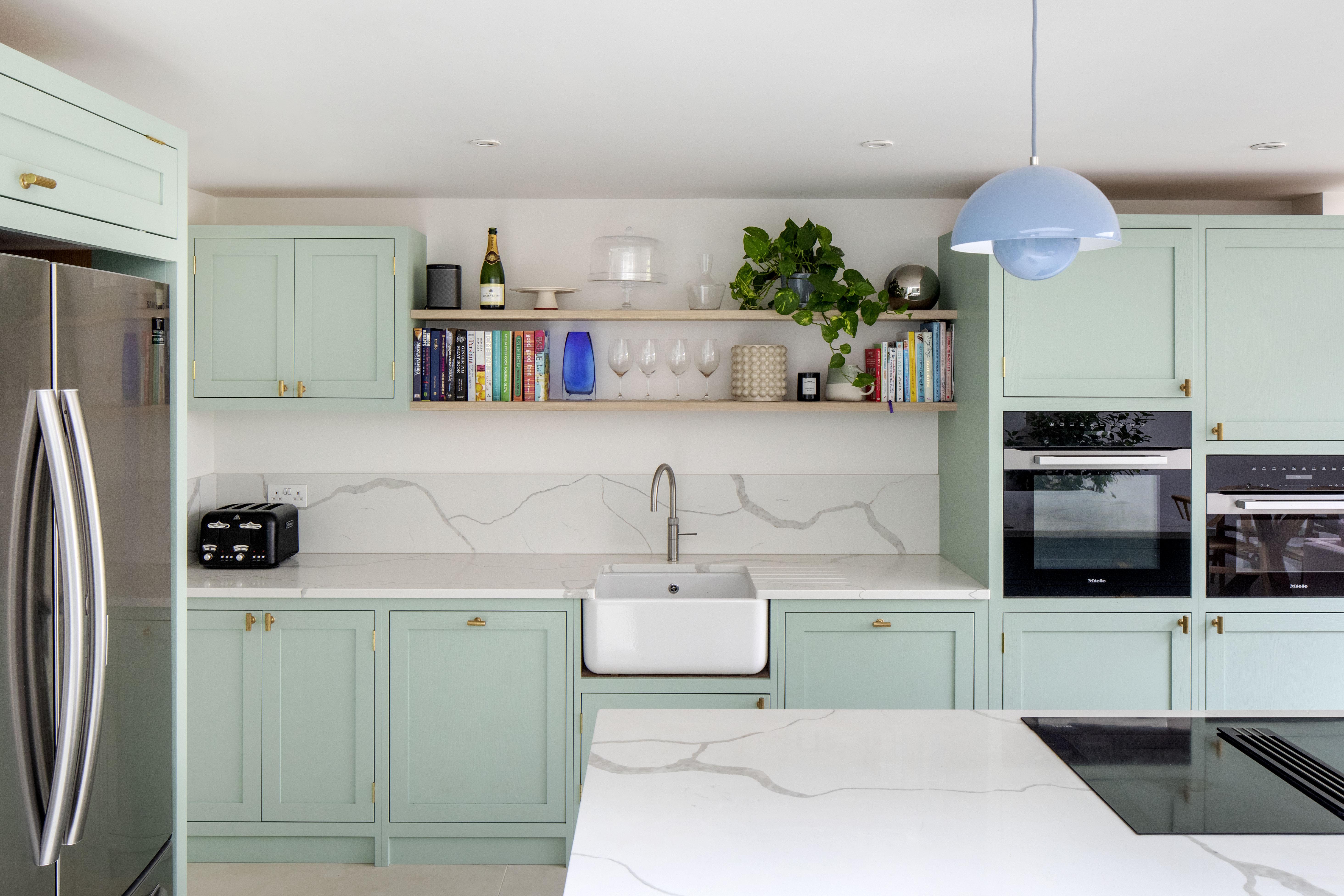
Finally, pastel colors such as baby blue, mint green, and peach are generally advised against for kitchen cabinetry. These colors can create a overly cutesy tone, reminiscent of a toddler's playroom or an old-fashioned ice cream shop. While they convey a soft and calming feel, pastels can limit the ability to layer stronger colors in adjacent rooms, potentially pigeonholing the entire home's palette. Designers advocate for deeper, richer colors for kitchen cabinets, which provide a more mature and versatile foundation for home decor.
#KitchenDesign #CabinetColors #InteriorDesign #HomeImprovement #KitchenRenovation #ColorPalette #DecoratingTips #HomeDecor #KitchenDesign #CabinetColors #InteriorDesign #HomeImprovement #KitchenRenovation #ColorPalette #DecoratingTips #HomeDecor
0 comment in total
You may also like
6 Worst Colors To Paint Your Kitchen (And What To Choose Instead)
5 outdated kitchen cabinet color trends to avoid if you don't want your kitchen to look unfashionable, say designers

14 Kitchen Cabinet Colors You Can Easily Mix and Match

We Asked Designers for Their Favorite Kitchen Cabinet Paint Colors—and Not One Picked White
Kitchen Color Selection Tips from 5 Designers
7 outdated kitchen cabinet colors designers say you should wave goodbye to, plus what to try instead

7 Paint Colors To Never Use In Your Kitchen, According To Designers
5 fail-safe kitchen cabinet color combinations that always work
The Color to Never Paint Your Kitchen Cabinets, According to a Top L.A. Designer
7 Kitchen Cabinet Colors Designers Never Want to See Again
Ditch the White! Try One of These Designer-Approved Kitchen Colors

18 Gorgeous Kitchen Cabinet Paint Colors, According To Kitchen Designers

4 Colors You Should Never Paint Cabinets, According To Designers
5 kitchen cabinet colors interior designers are avoiding for 2024 - and the shades they're picking instead

5 kitchen cabinet colours to avoid in 2024 - and what to choose instead, according to experts
Our 87 Favorite Kitchen Cabinet Colors, All Gathered in One Place
8 colors you should never paint kitchen cabinets according to the experts

10 kitchen cabinet color mistakes to avoid for a cool and contemporary result
16 Designer-Approved Kitchen Color Schemes You’ll Want to Steal

The One Paint Color Designers Always Avoid in Kitchens—and What They Use Instead