1/2
Don't Use These 7 Dining Room Paint Colors — Designers Say You Should Avoid Them at All Costs
The dining room serves as a central space for meals and social gatherings, and its ambiance is significantly influenced by the chosen paint color. Interior designers emphasize that while paint can enhance the room's atmosphere, certain colors can inadvertently create an unwelcoming, dated, or visually disruptive environment. This article, featuring insights from interior designers Monique Holland and Tavia Forbes, identifies seven specific paint colors and categories that should be avoided in dining rooms, along with alternative suggestions to foster a more appealing and functional space.
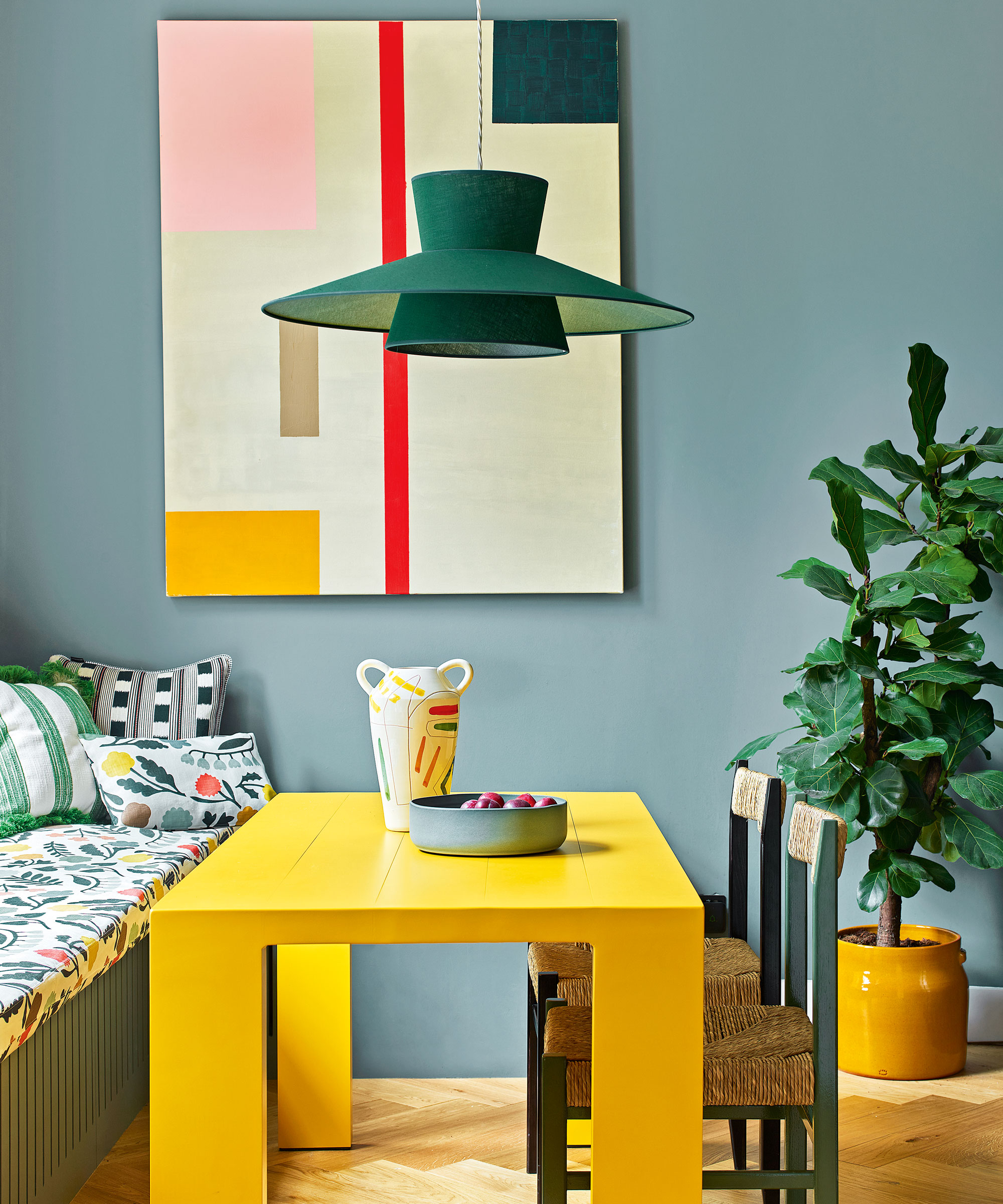
One category to steer clear of is neon colors. Designers advise against vibrant, fluorescent shades in a dining room, as these can overstimulate the senses and induce anxiety, potentially reflecting onto surfaces and causing distractions. Instead of painting entire walls in neon, it is recommended to incorporate these bright hues sparingly through accents like art, decor, accent furniture, or light fixtures.
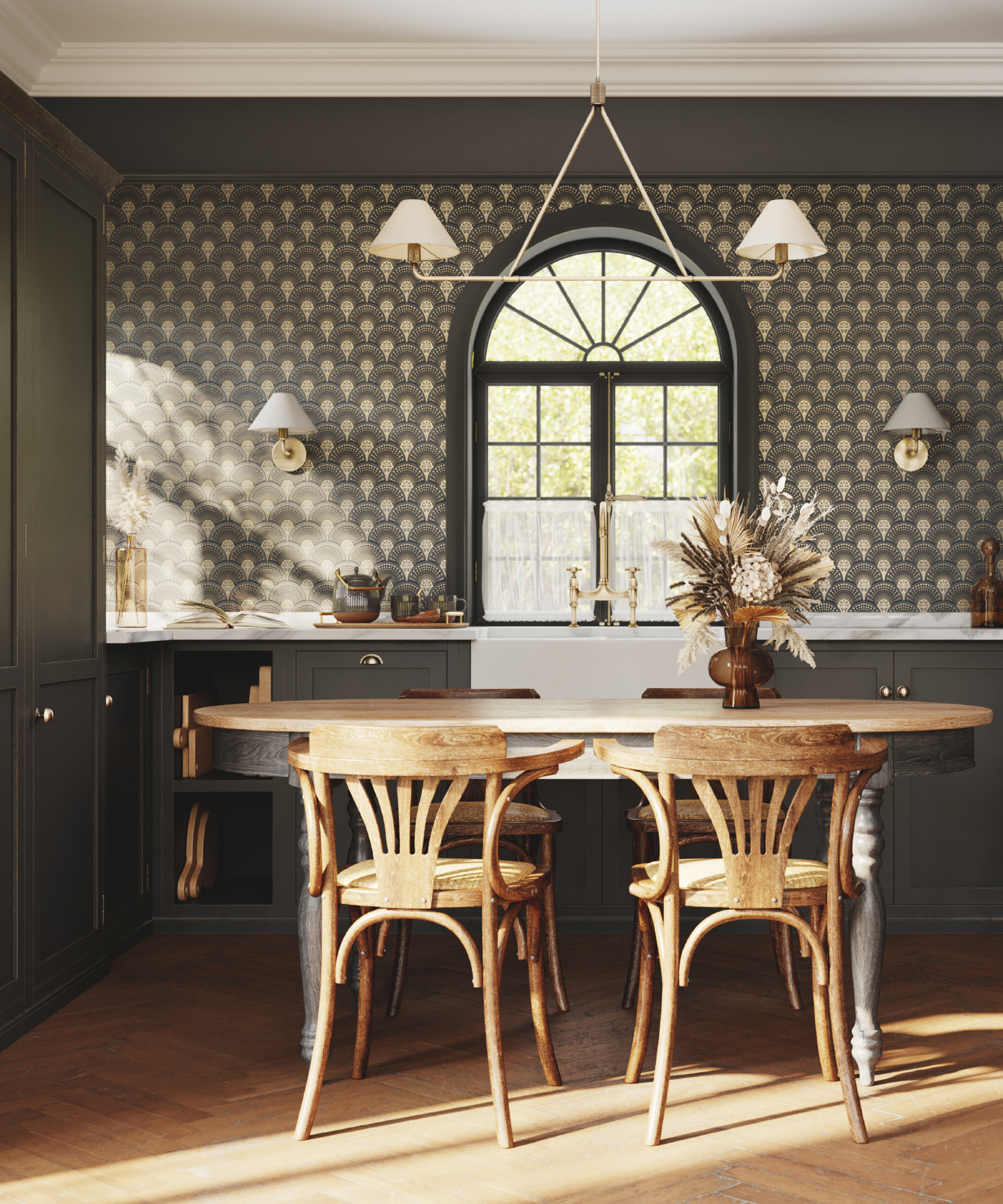
Dull grays are another paint color category to avoid. Cool, drab gray tones can make a dining room feel uninviting and lack warmth. For a cozier and more welcoming atmosphere, designers suggest opting for earth tones or natural muted colors such as army green, terracotta, coffee, camel, warm beiges, or taupe. These richer tones are believed to improve the room's energy, encourage conversation, and stimulate appetite.
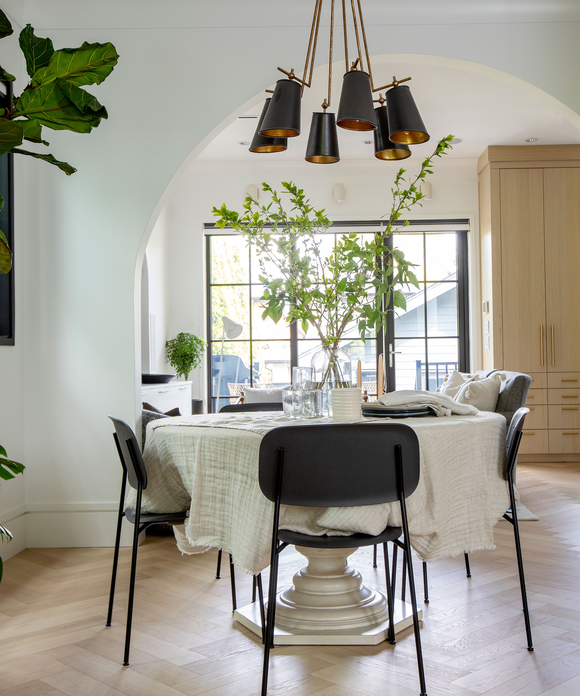
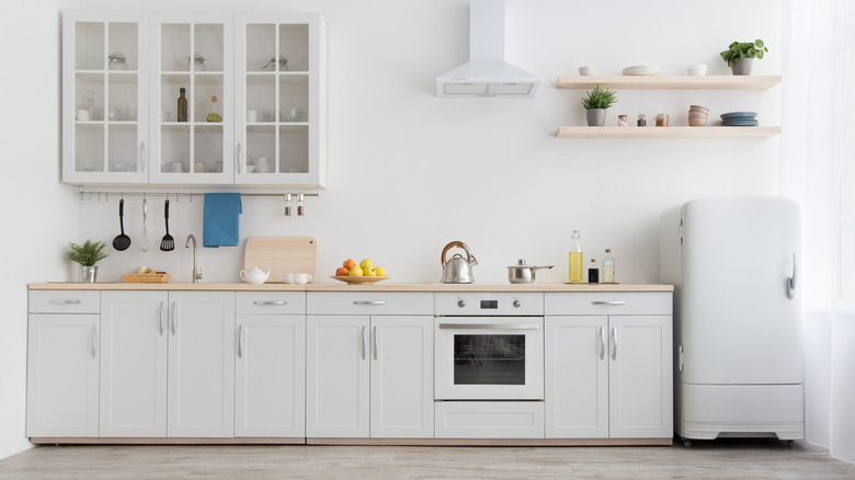
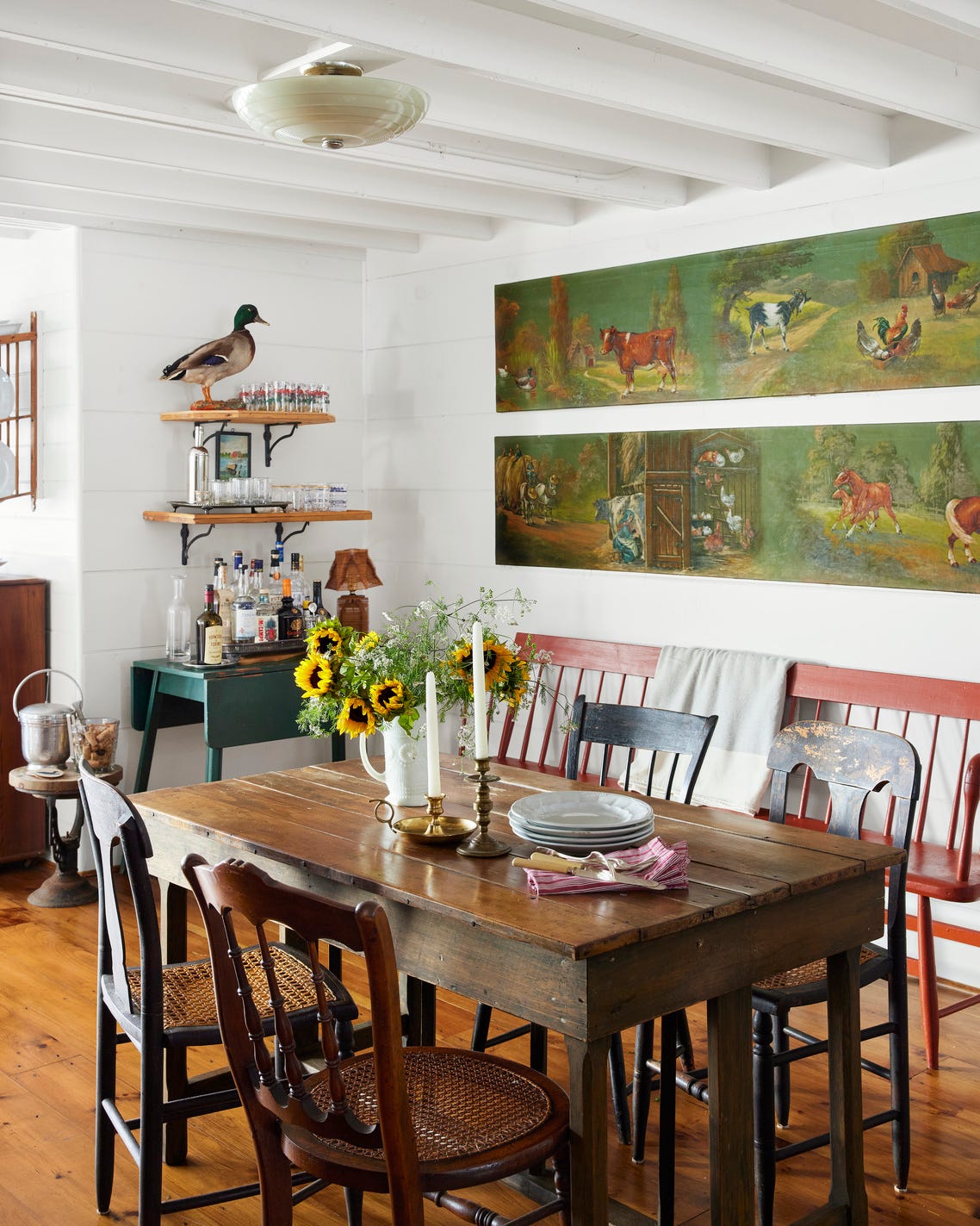
Similarly, cold whites are problematic if not chosen carefully. A stark white paint color can make a space feel cold and impersonal, lacking the desired warmth for a dining area. To prevent this, a softer off-white is recommended for walls, reserving cooler white shades for trim details to maintain a sense of coziness.
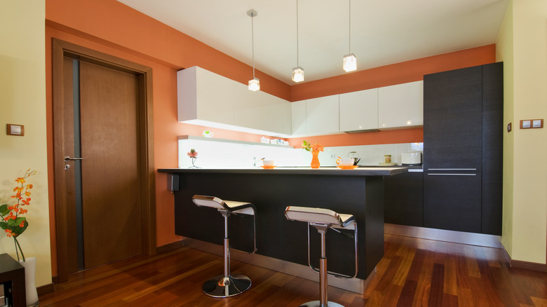
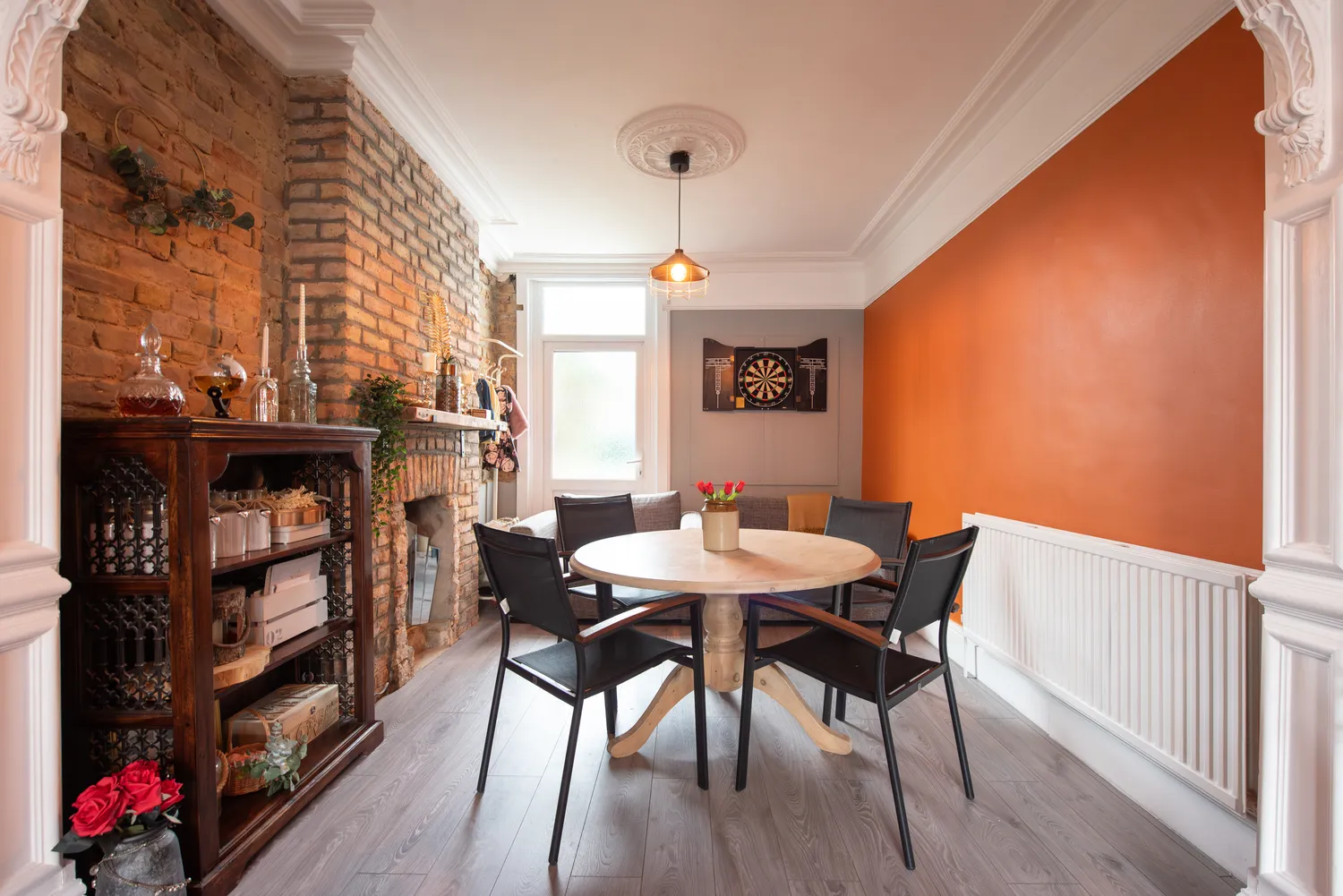
Bold oranges, particularly overly vibrant ones, are also cautioned against. Such intense oranges can create an unsettling 'Halloween dinner party' vibe and cast unflattering tones on food and complexions. More refined alternatives include earthy burnt orange or copper for warmth, or olive green for a calming, grounded, and versatile backdrop that complements both modern and traditional decor and enhances the appearance of diners.
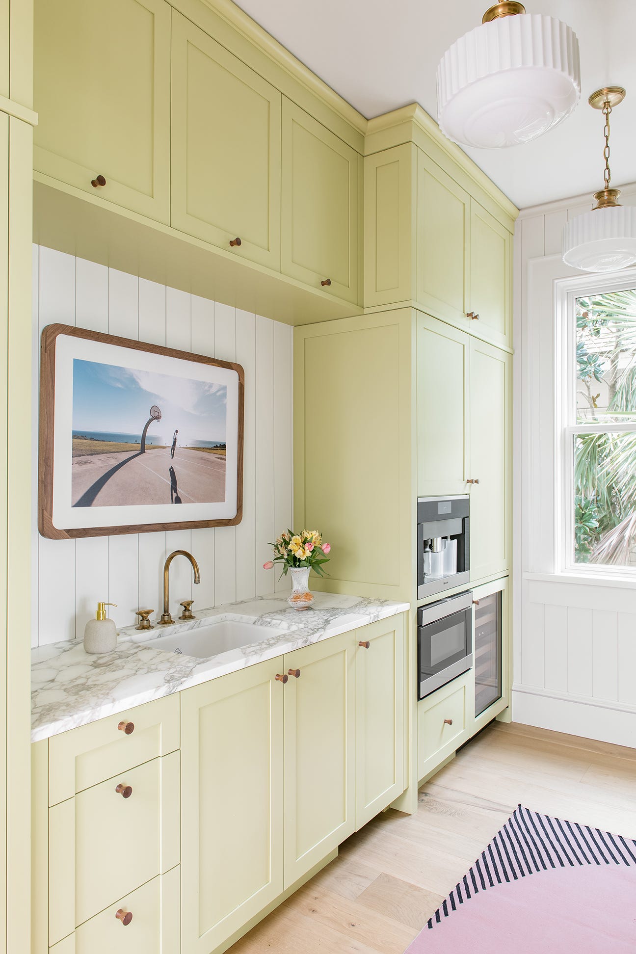
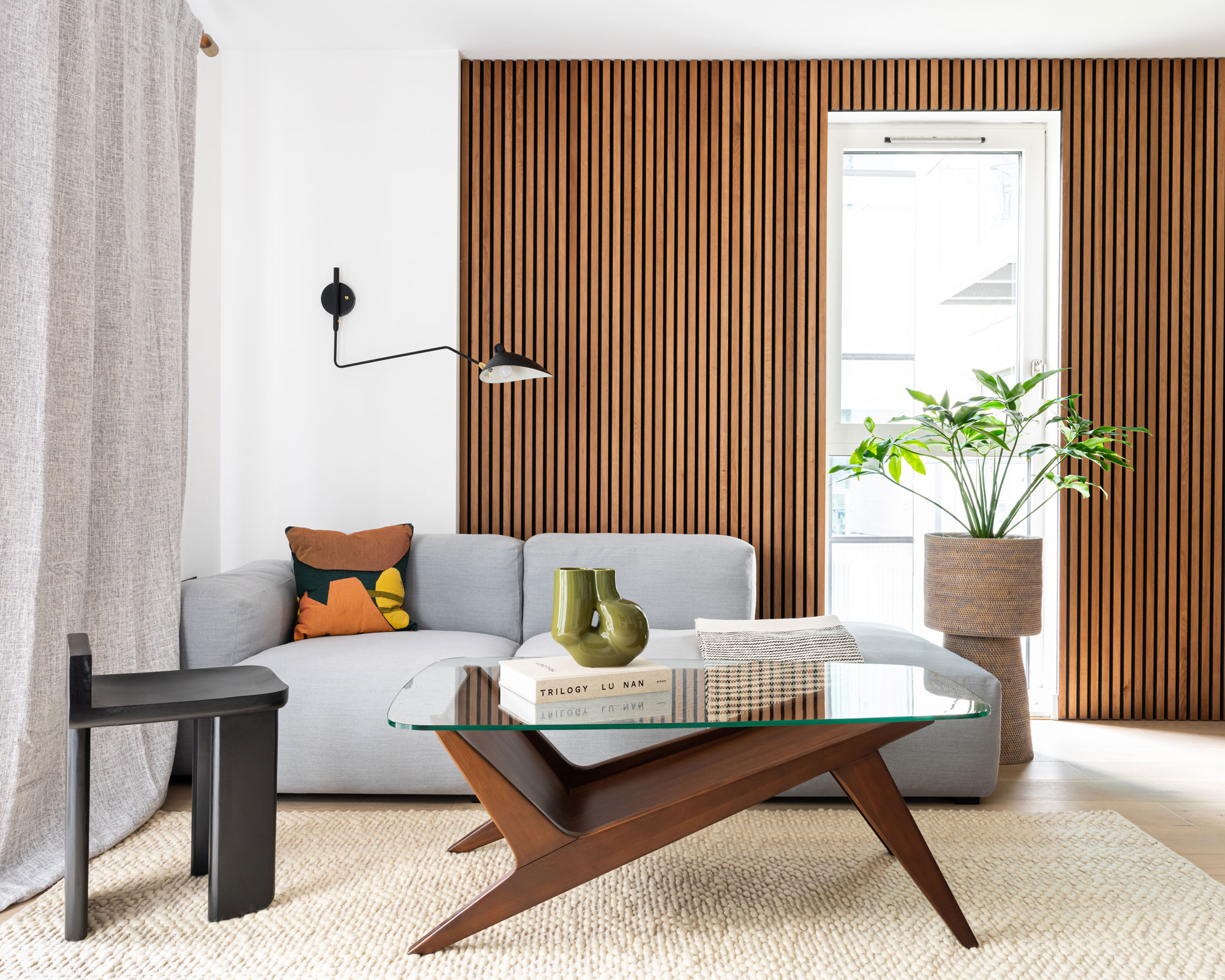
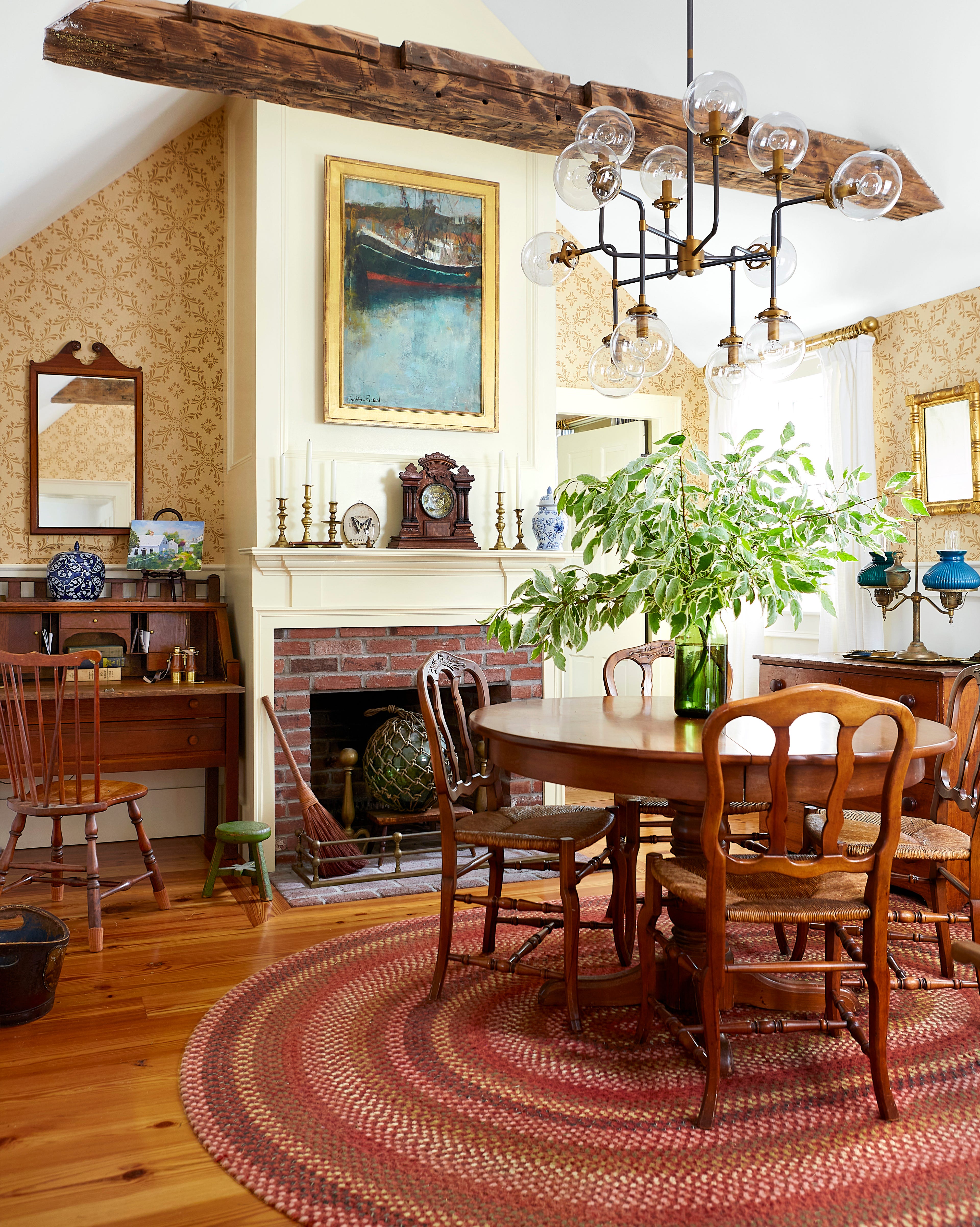
Pastel yellows, especially those resembling nursery colors, are considered outdated and can make a dining room appear washed out, often flattening the look of food and decor. Deeper tones like ochre or mustard are suggested to add depth and elegance. Timeless alternatives include warm taupe or greige, which offer a soft and inviting feel while allowing art, furniture, and food to stand out.
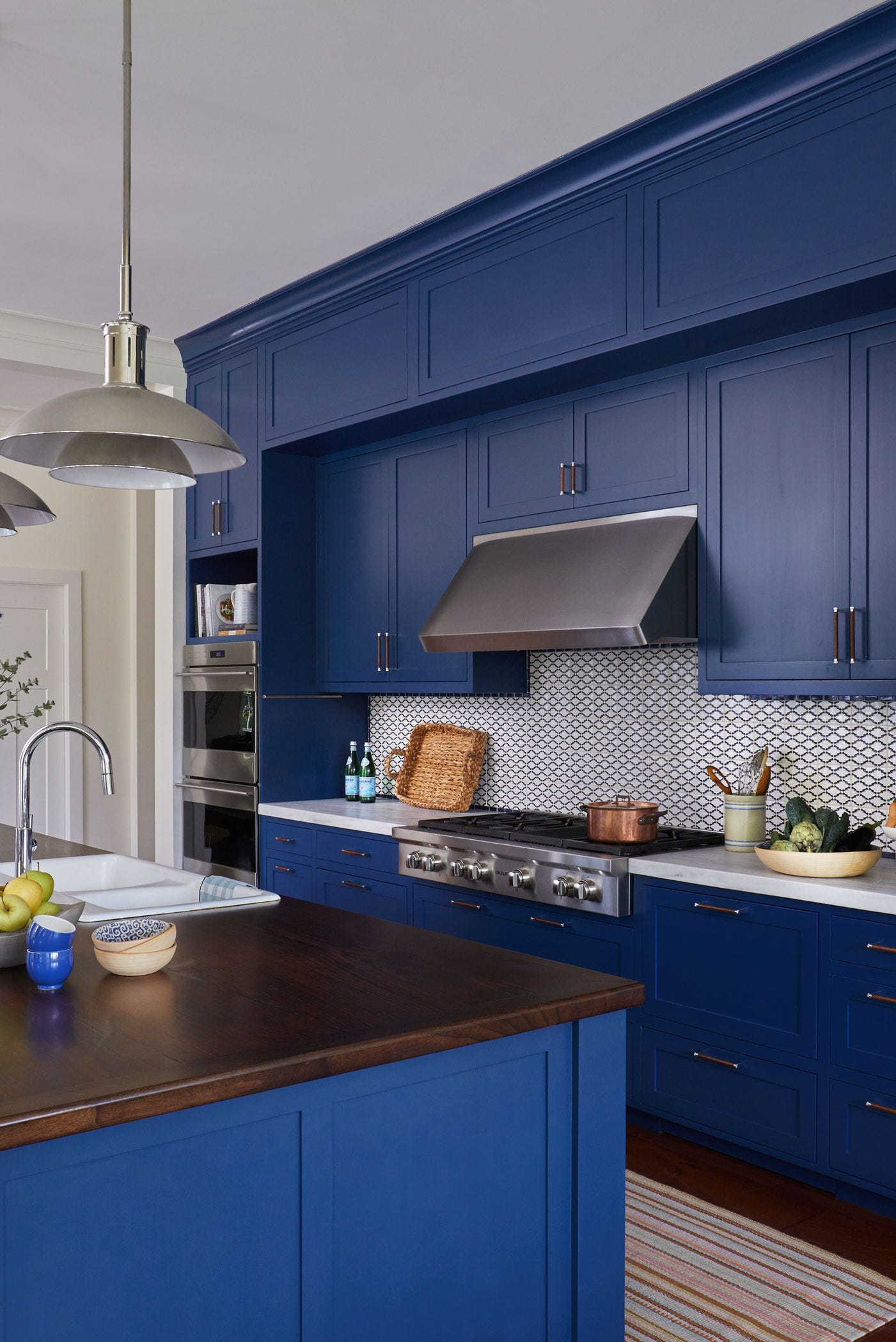
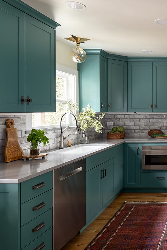
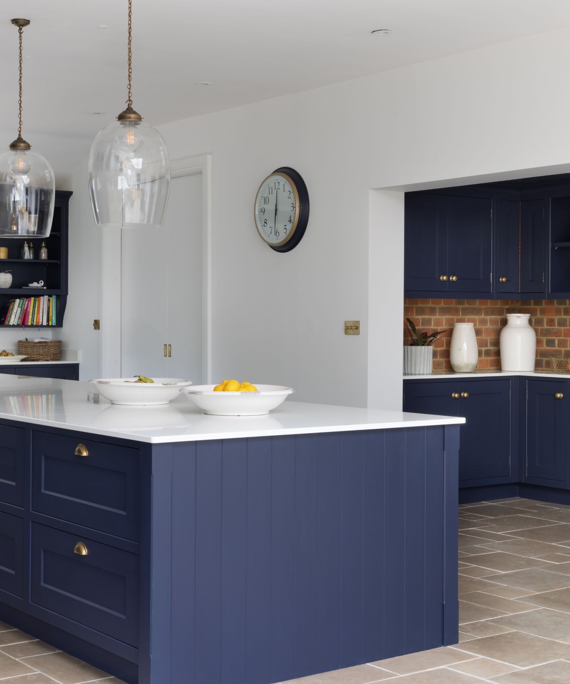
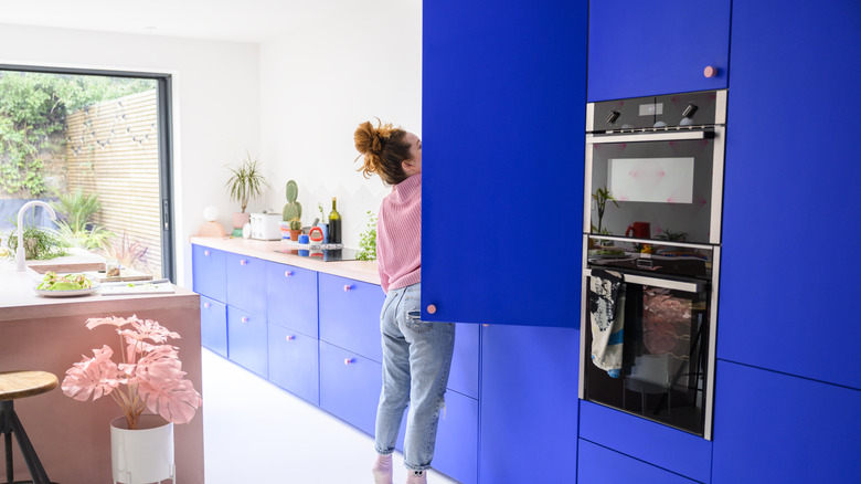
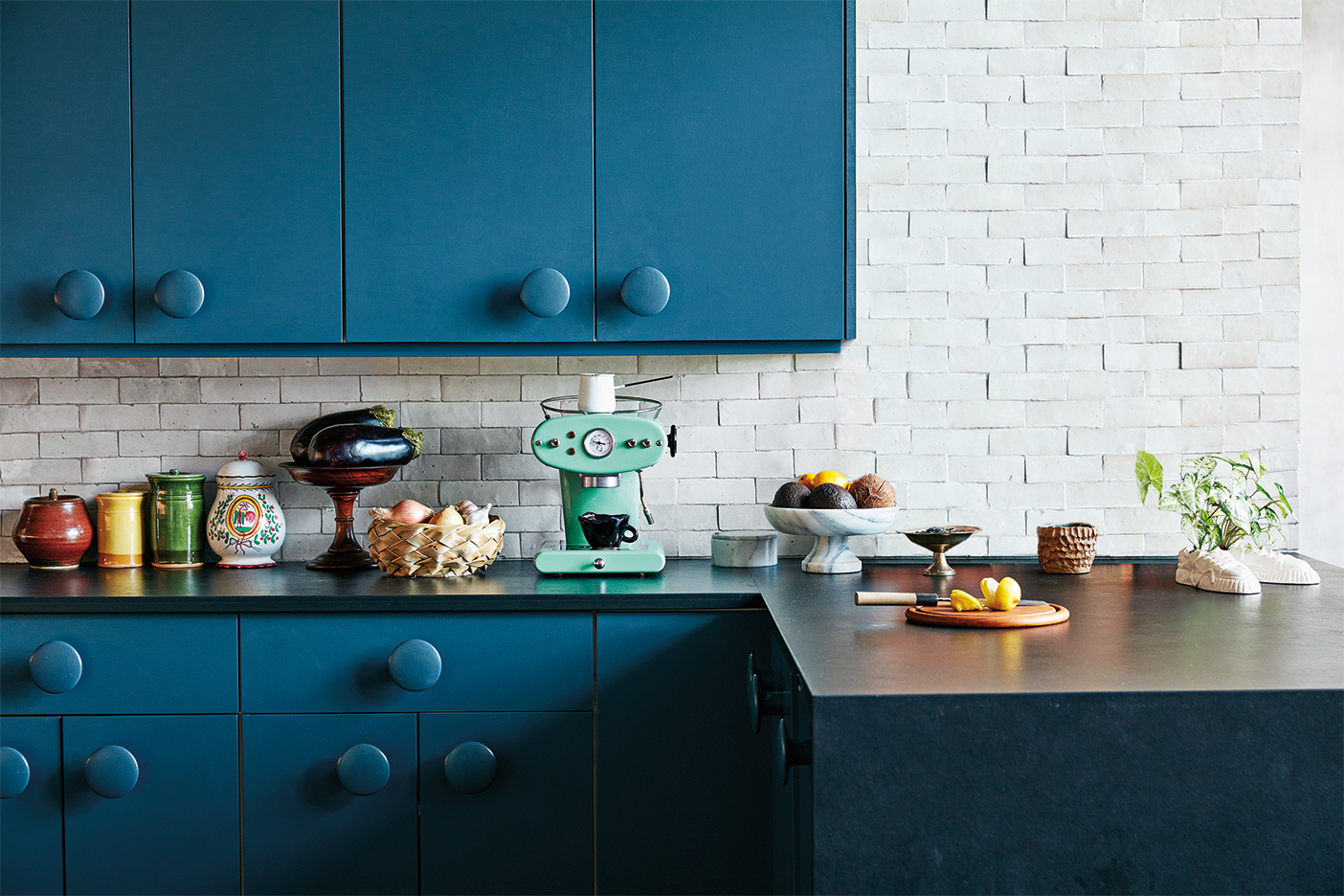
Bright blues, including aqua, turquoise, or electric blue, are often too playful for a dining room and are better suited for children's rooms or beach-themed spaces. These shades can evoke a 'beach rental' aesthetic and make meals appear unappetizing. For a sophisticated dining environment, deep, moody blues like indigo or midnight are recommended, creating a cocooning effect for evening dining. Soft teal or muted blue-green shades can offer personality without resembling a swimming pool.
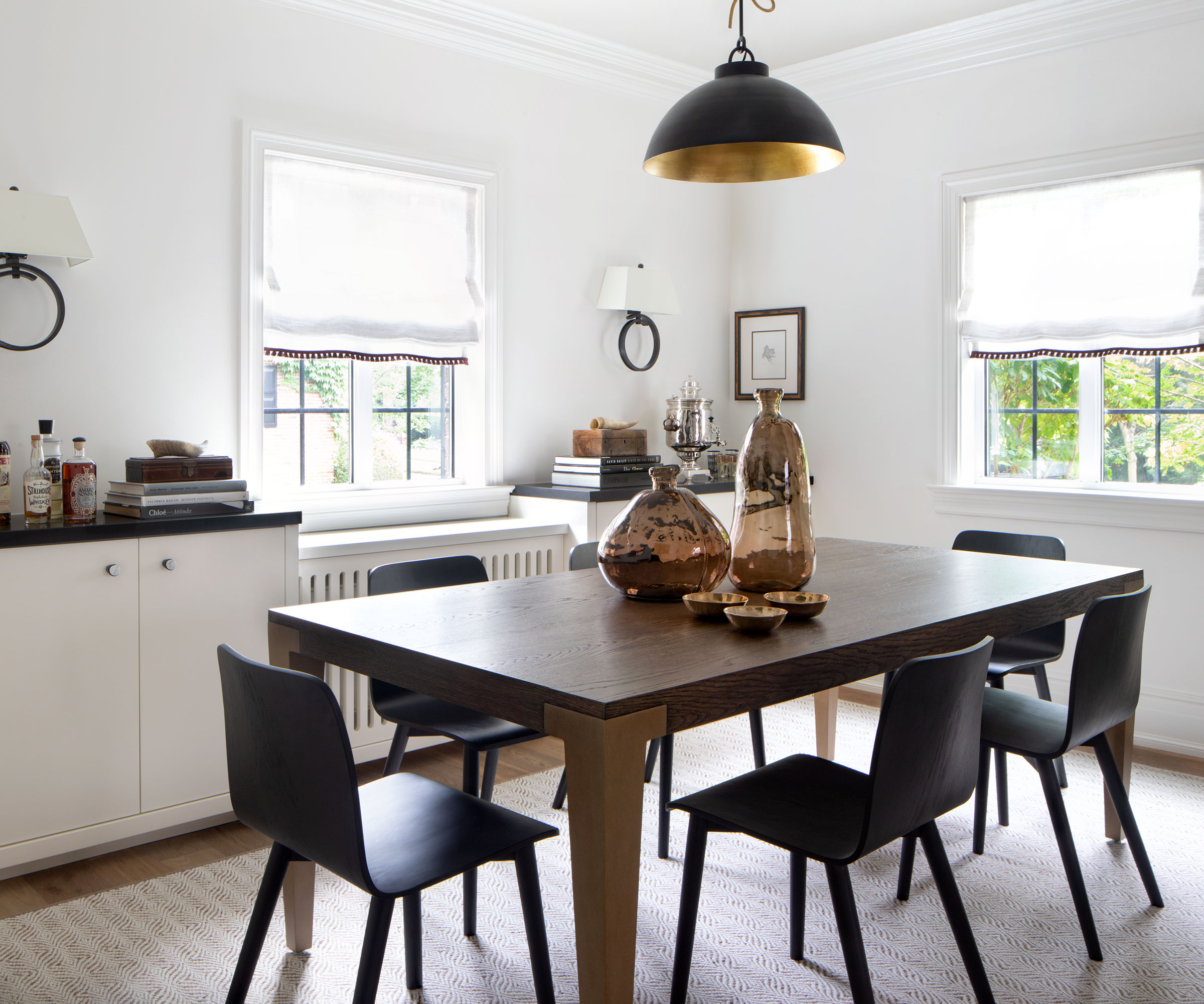
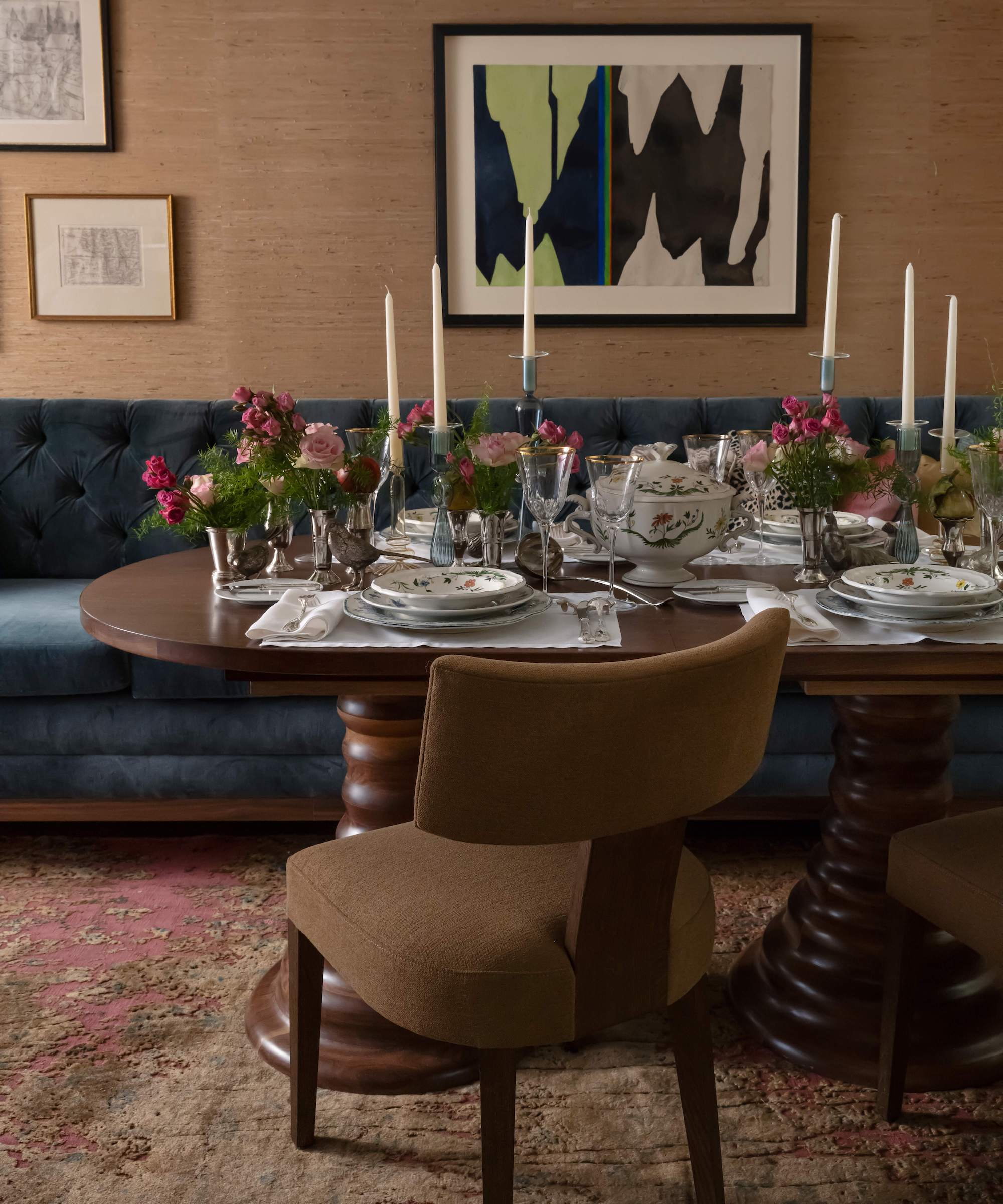
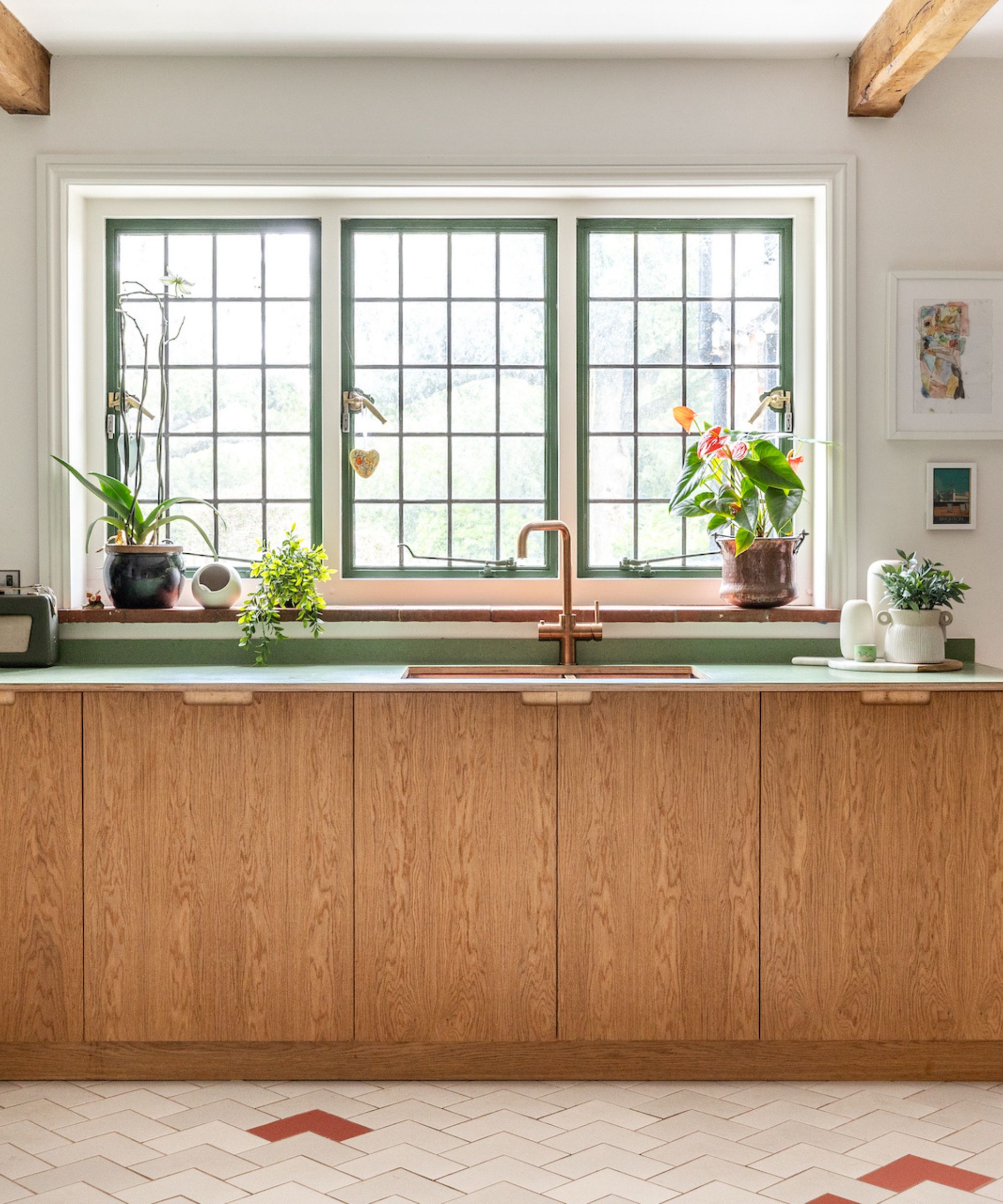
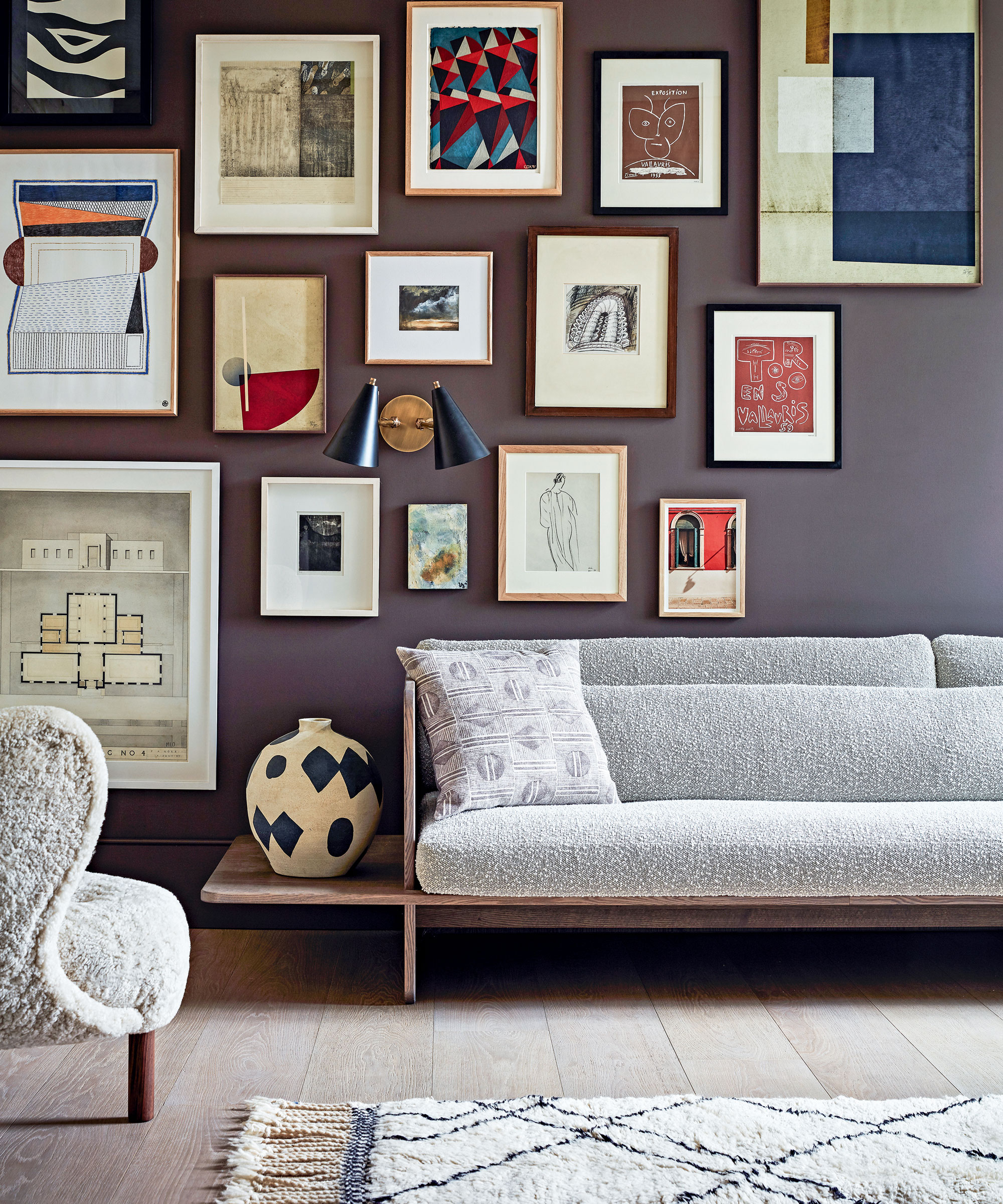
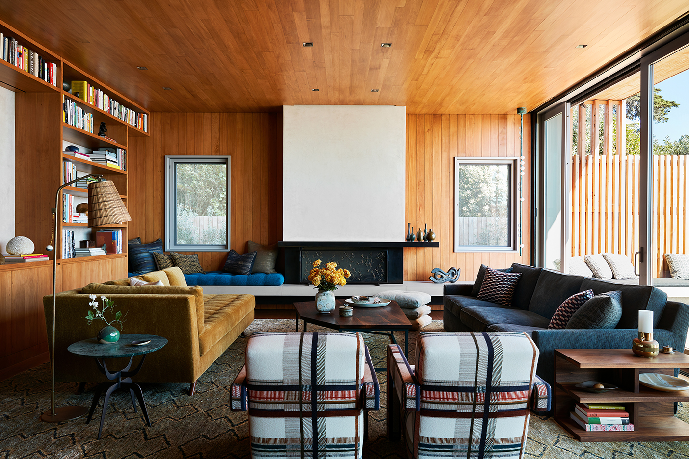
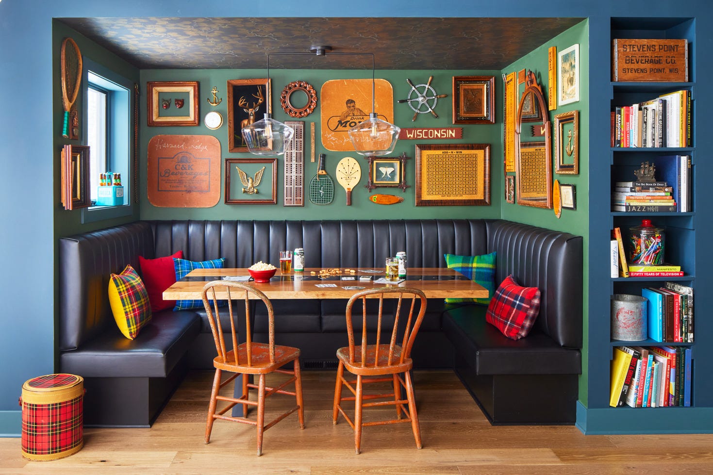
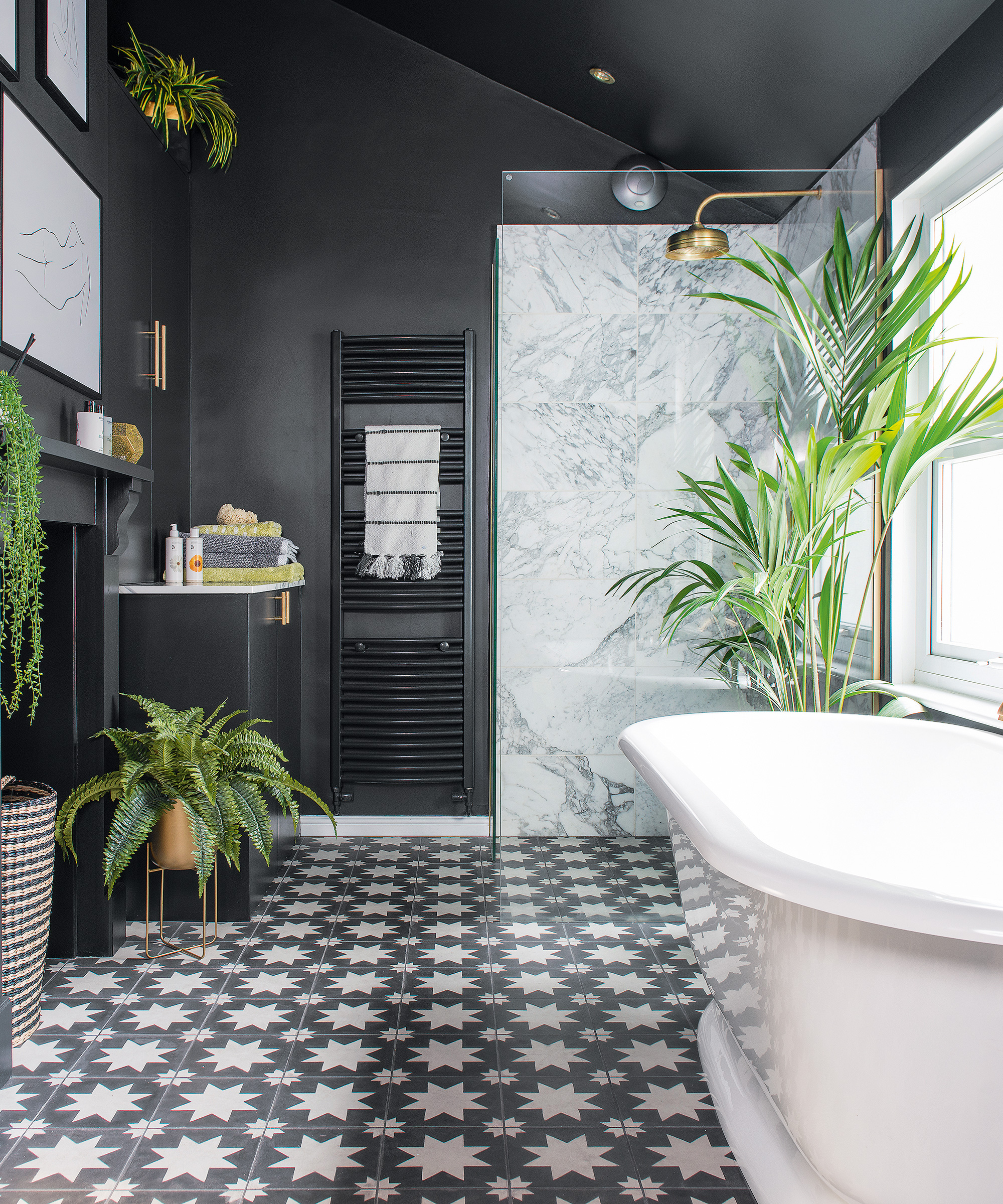
Finally, very dark browns, particularly heavy, chocolatey tones, are discouraged. These can make a dining room feel dated, like an '80s steakhouse, and sap energy from the space rather than providing warmth. Lighter, wood-inspired browns or caramel tones can offer coziness without being oppressive. Charcoal or soft black are also viable options for adding drama without appearing anachronistic, pairing well with lighter furniture, artwork, and metallic finishes. The overarching advice from designers is to prioritize colors that promote warmth, conversation, and an appealing dining experience.
#DiningRoomDecor #PaintColors #InteriorDesignTips #HomeDecor #ColorPsychology #DesignTrends #RoomDesign #DiningRoomDecor #PaintColors #InteriorDesignTips #HomeDecor #ColorPsychology #DesignTrends #RoomDesign
0 comment in total
 No comments yet
You may also like

4 Outdated Colors Designers say you Should Steer Clear of When Decorating a Living Room

8 colors you should never paint kitchen cabinets according to the experts

7 outdated kitchen cabinet colors designers say you should wave goodbye to, plus what to try instead

7 Paint Colors to Never Use on Your Ceiling, According to Interior Designers
7 major dining room layout mistakes to avoid, according to designers


Interior design experts reveal the colour rules you should be breaking
7 Paint Colors Designers Wish They Never Used (and What You Should Use Instead)
The Color to Never Paint Your Kitchen Cabinets, According to a Top L.A. Designer

5 colors you should never paint a small room – designers warn us to steer clear of these hues, and what to pick instead
7 Kitchen Cabinet Colors Designers Never Want to See Again

5 colors you should never paint a pantry – designers share the shades they swerve
The Only Dining Room Paint Colors You’ll Ever Need
7 Paint Colors To Never Use In Your Kitchen, According To Designers
6 things you should never put on your dining room table, according to interior designers
Couch colors to avoid – and what designers are recommending instead
5 colors to avoid in a bathroom – according to designers

What are the worst colors to paint a room? The shades experts say you should never use
Ditch the White! Try One of These Designer-Approved Kitchen Colors

6 Worst Colors To Paint Your Kitchen (And What To Choose Instead)
5 Paint Colors to Never Use in Your Living Room, According to Interior Designers