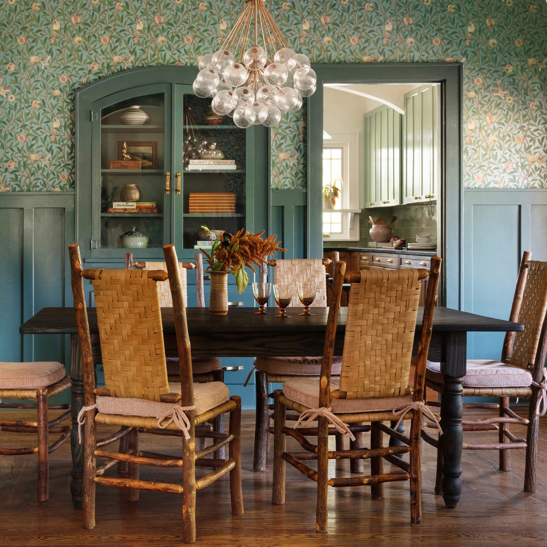
1/21
The Only Dining Room Paint Colors You’ll Ever Need
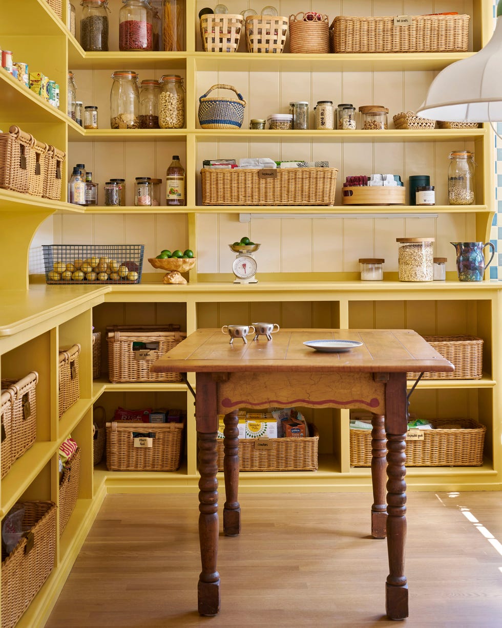
This article offers a comprehensive guide to selecting the ideal paint colors for dining rooms, catering to various design aesthetics and room sizes. It begins by highlighting that a simple coat of paint can significantly transform a dining space, whether it's a small, cozy nook or a large, grand room. The article presents a curated list of favorite dining room paint colors, ensuring there's a shade to suit every preference, from classic warm whites to bold blues and greens. For instance, it suggests warm white paint colors for those who prefer their decor to be the focal point, while bold blues or greens are recommended for a more central role in the room's design.
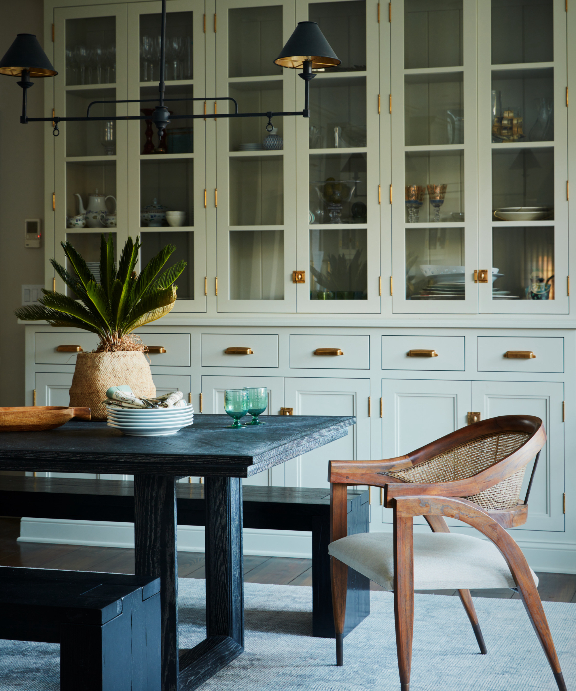
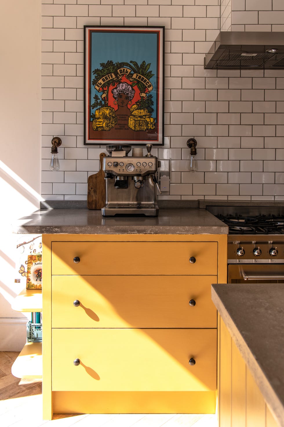
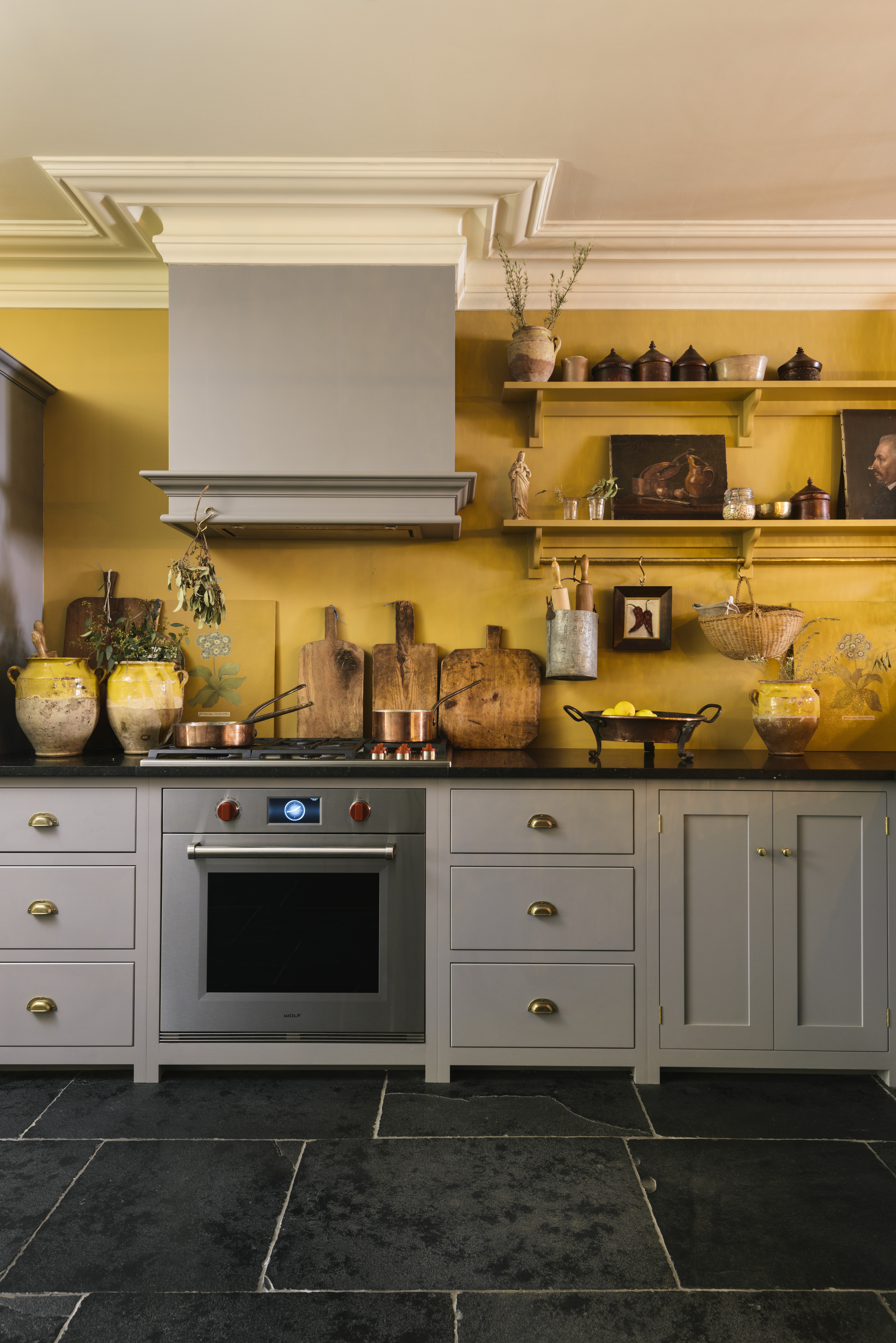
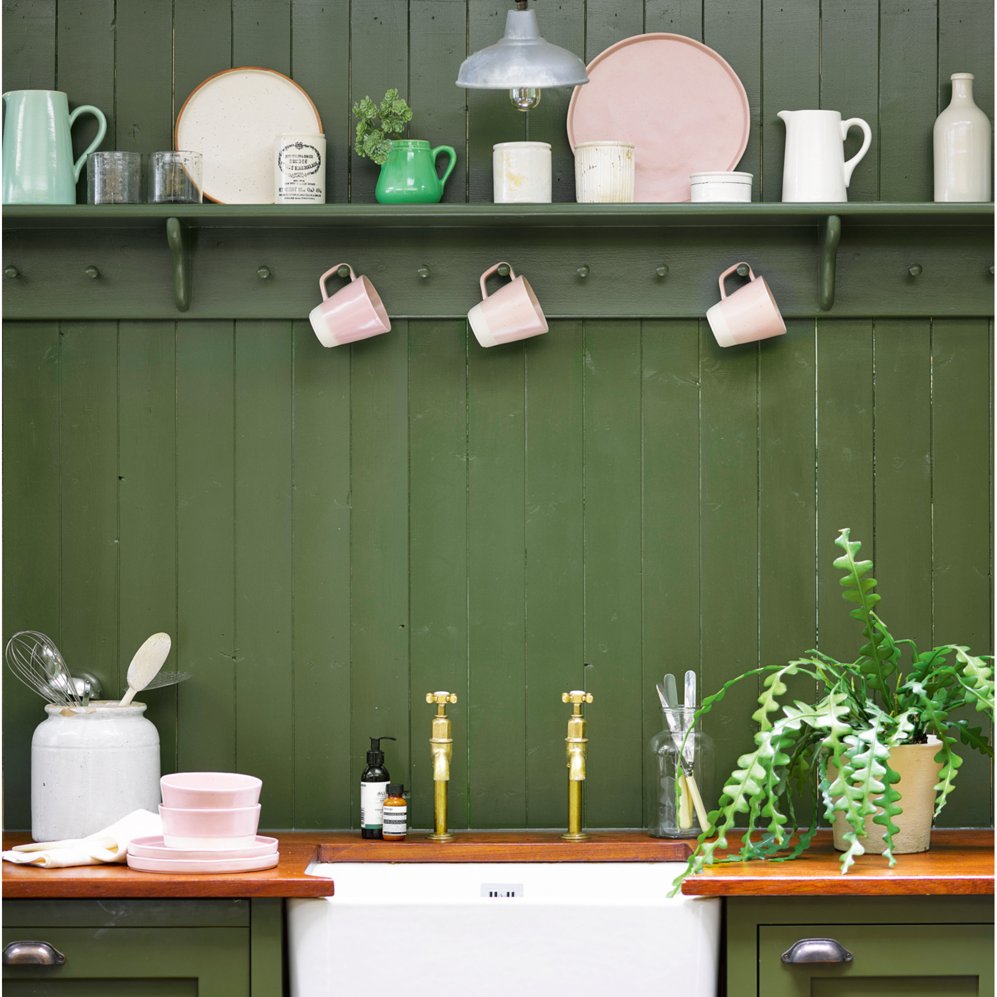
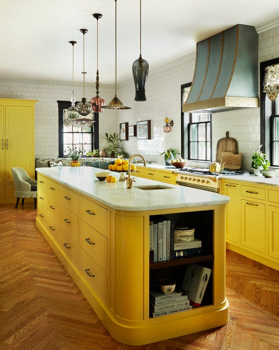
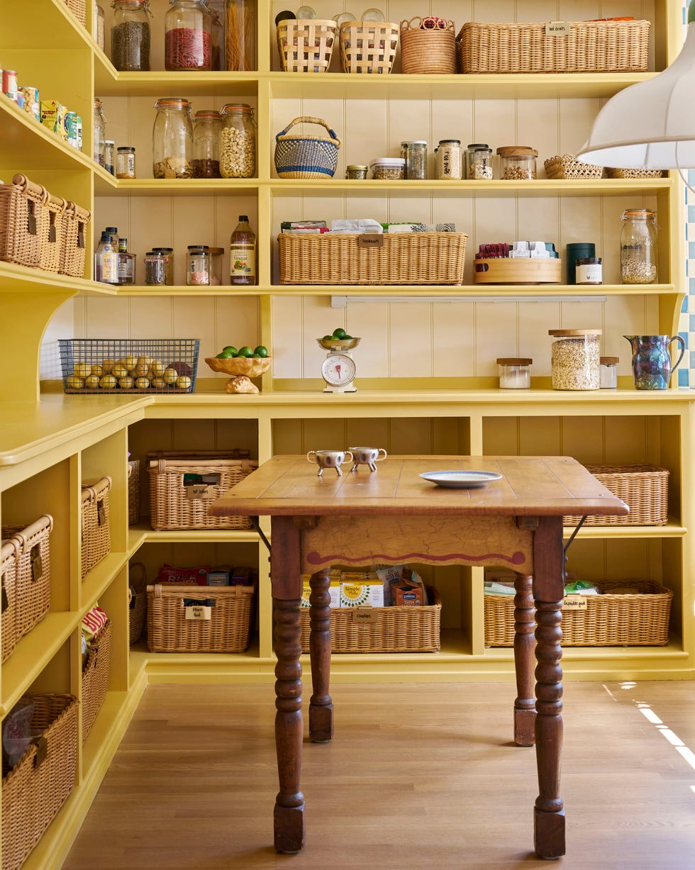
The guide addresses diverse design sensibilities, such as modern farmhouse style, proposing whites and dark blacks for a striking combination. For enthusiasts of cottagecore aesthetics, it recommends a range of verdant green shades. The article also includes suggestions for more adventurous choices, like yellow paint colors, and assures gray-lovers that suitable options are available. The overarching goal of the paint color selections is to help homeowners create an inviting atmosphere where family and friends can gather and enjoy meals together, with the chosen backdrop serving as a delightful complement to these social interactions.
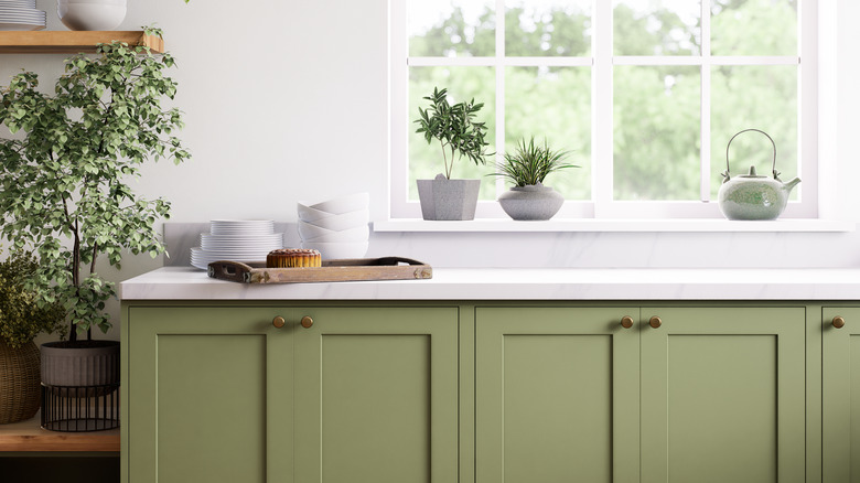
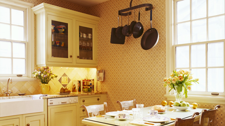
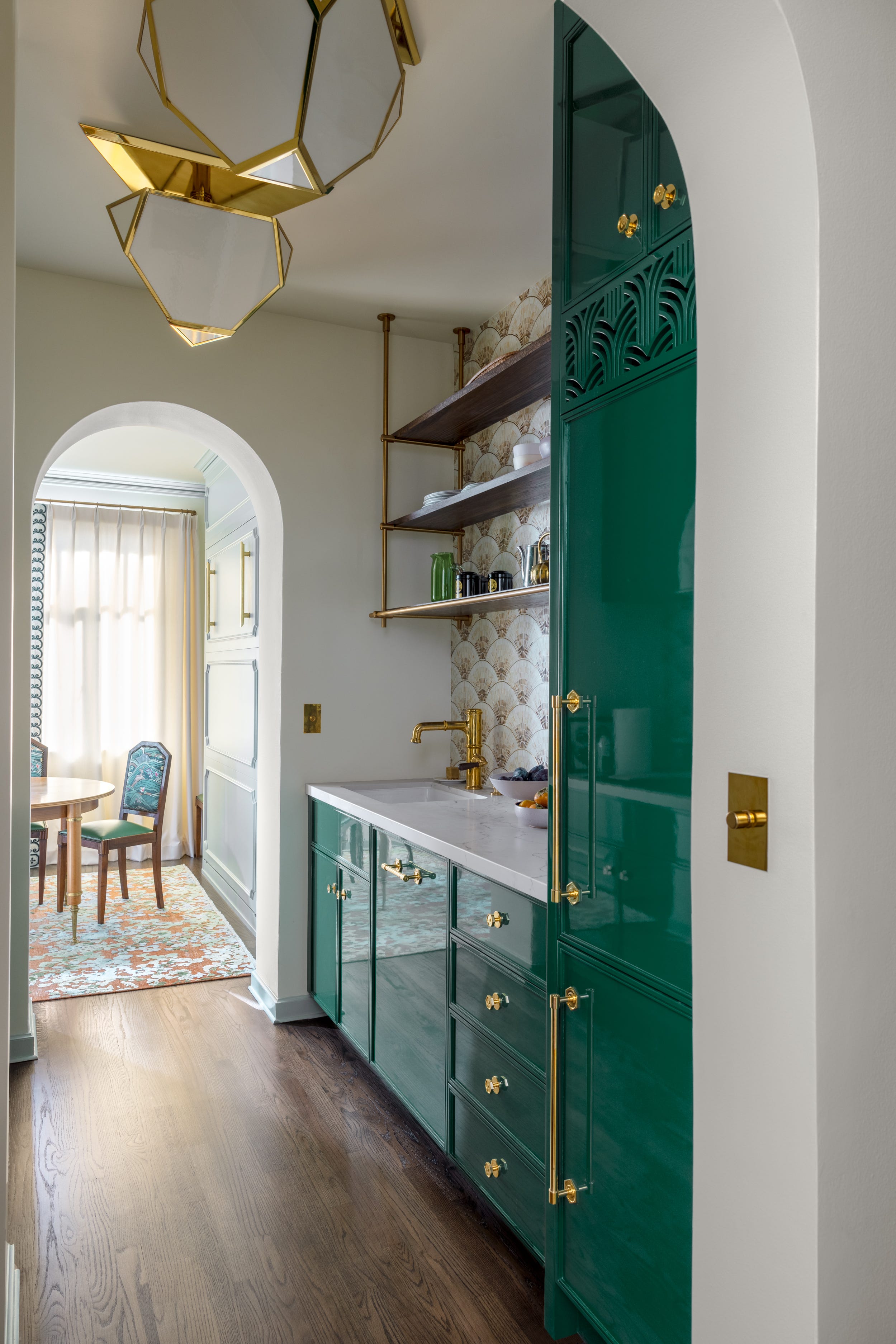

Several specific paint color examples are provided, each with a brief description and recommended paint brands. For an airy and traditional feel, Snowbound by Sherwin-Williams is suggested, a warm white with subtle gray undertones ideal for antique-filled spaces. Linen White by Benjamin Moore, a buttery cream with soft yellow undertones, is recommended for rooms with abundant wood tones to create a relaxed, cheerful ambiance. A classic deep green, Vogue Green by Sherwin-Williams, is presented as a sophisticated choice for dining areas, complemented by Dark Night by Sherwin-Williams for exterior walls in a cabin setting.
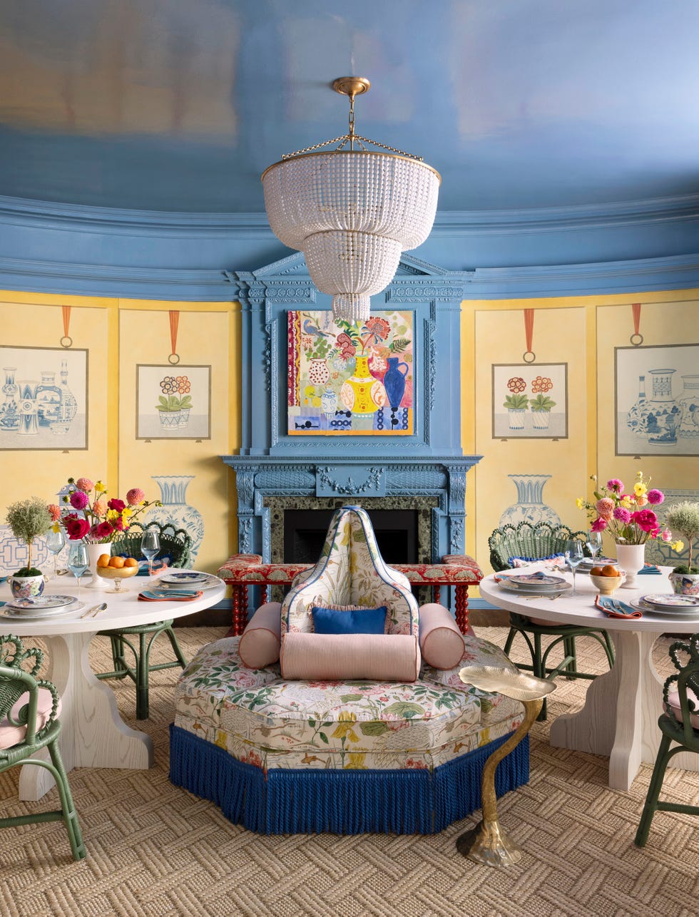
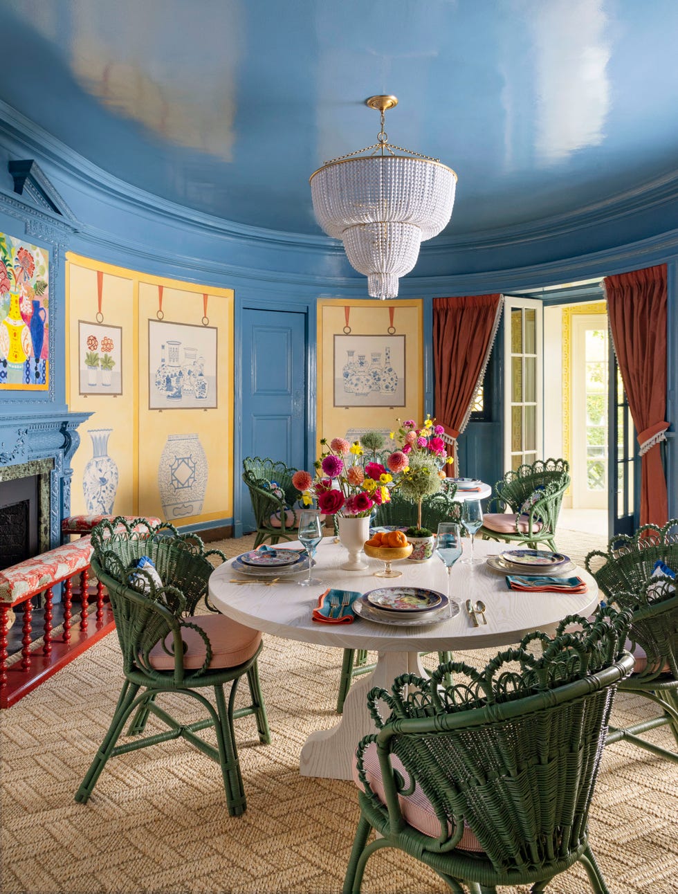
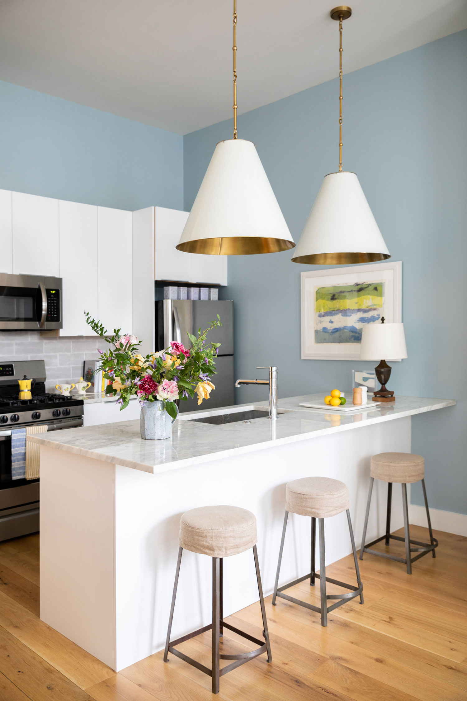
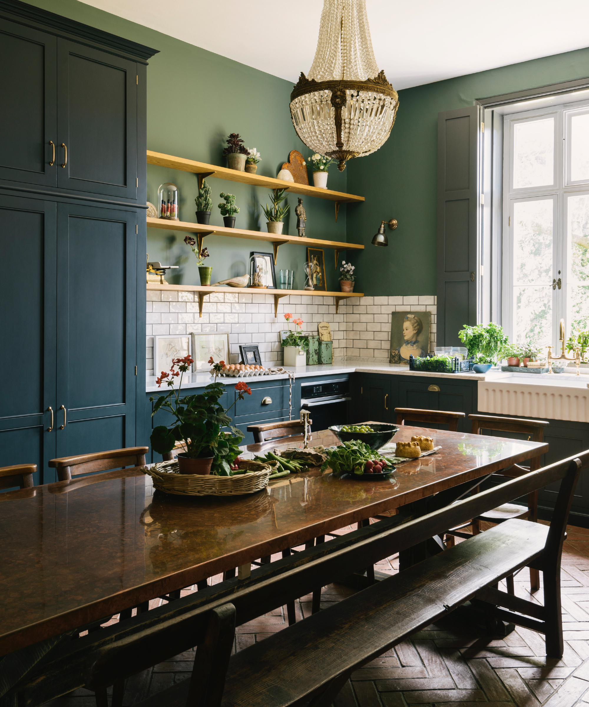
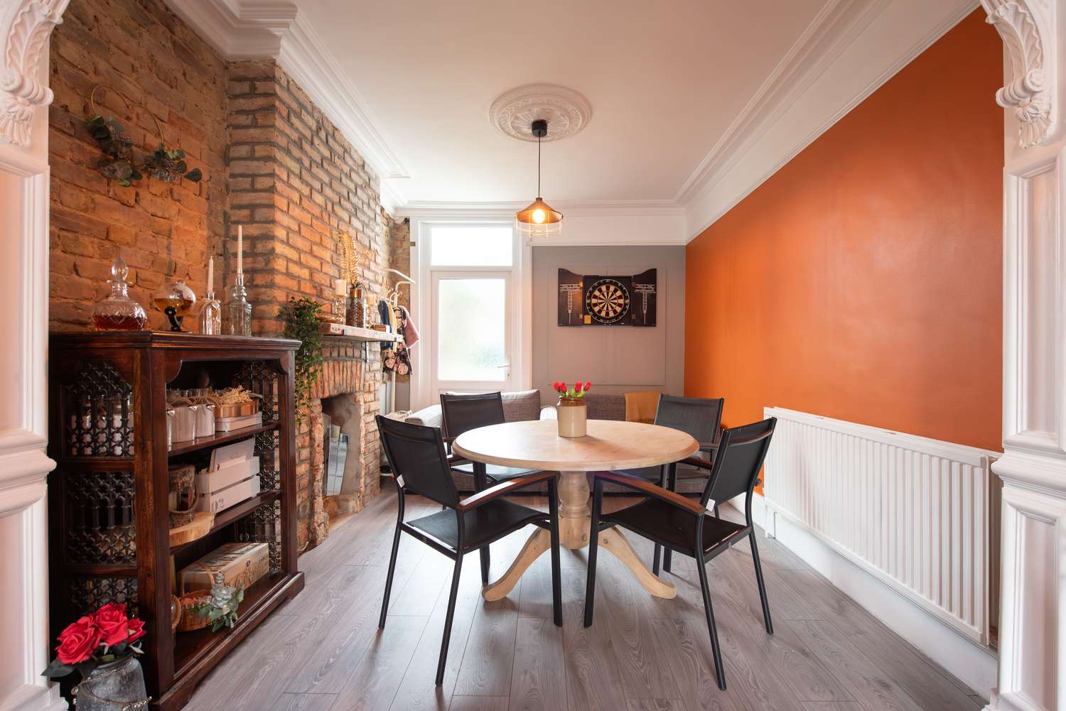
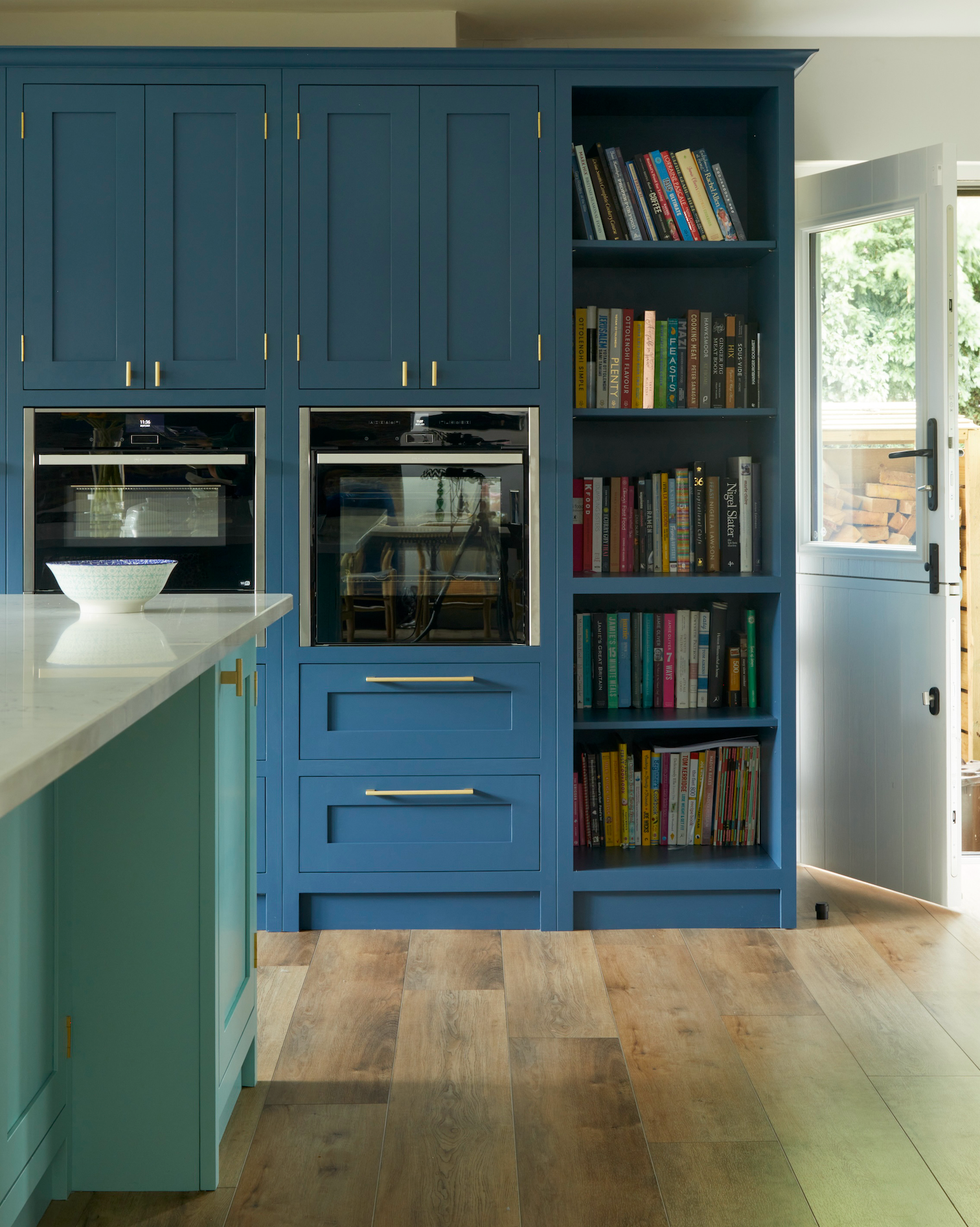
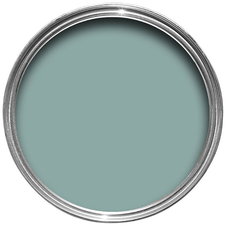
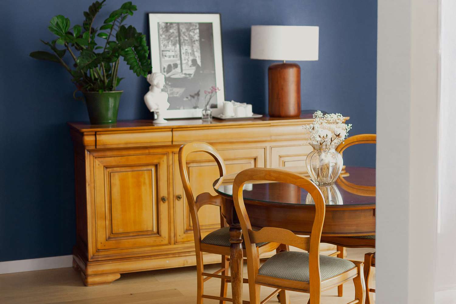
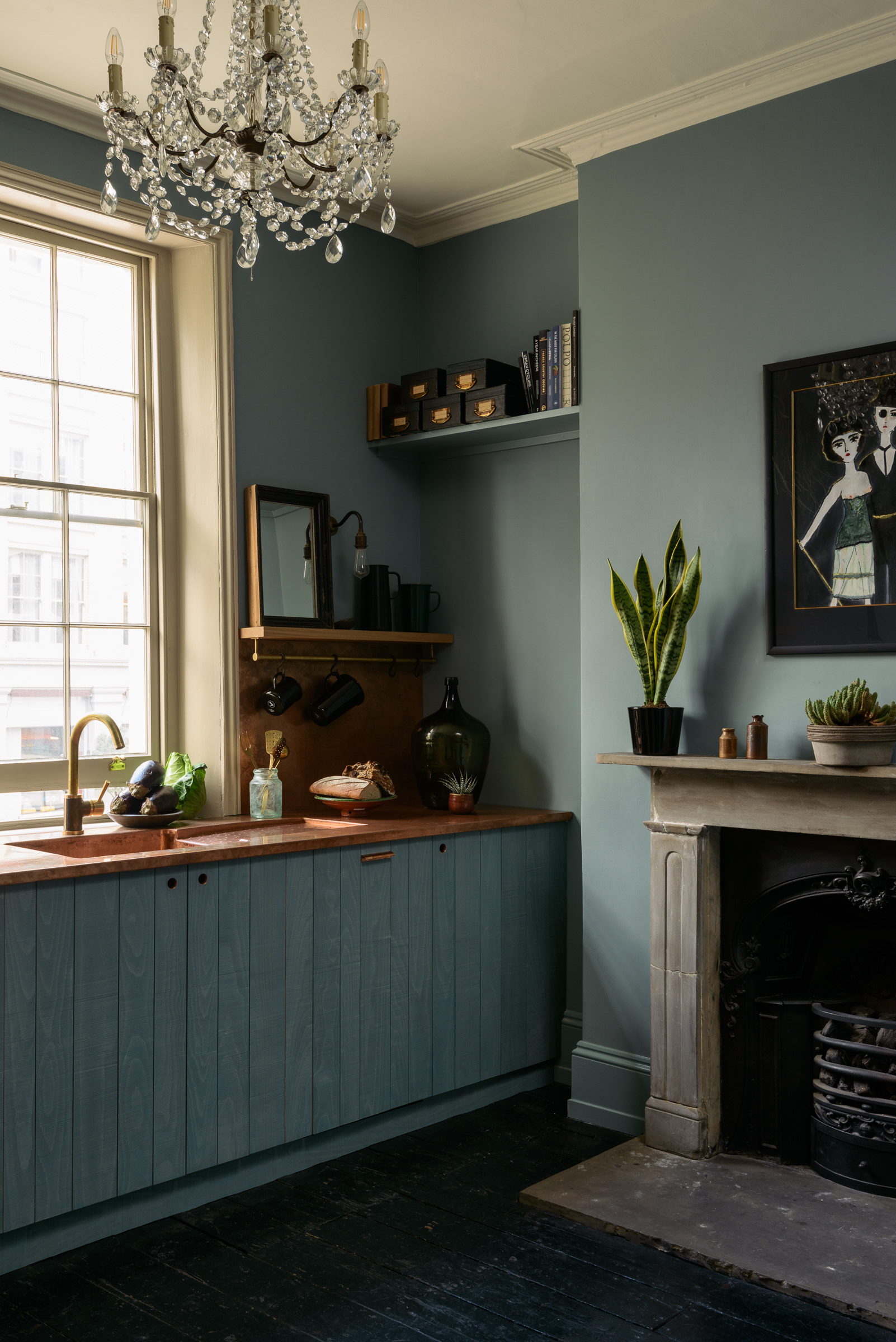
For those drawn to blues, Lulworth Blue by Farrow & Ball is a fresh pale blue that pairs well with other blue hues and white china. A cool slate blue, North Star by Sherwin-Williams, is highlighted for its calming quality and depth, which changes with the light. An aged blue-green, Copper Patina by Behr, is perfect for 18th- or 19th-century homes, offering a blend of boldness and breathability, especially when paired with creamy white trim. Warm Beige, such as Ryokan Guesthouse by Backdrop, is shown to be alluring and sophisticated when combined with rustic wood finishes. Grass Green, like Cypress Vine by Behr for floors and Simply White by Benjamin Moore for walls, is ideal for rooms with scenic outdoor views.
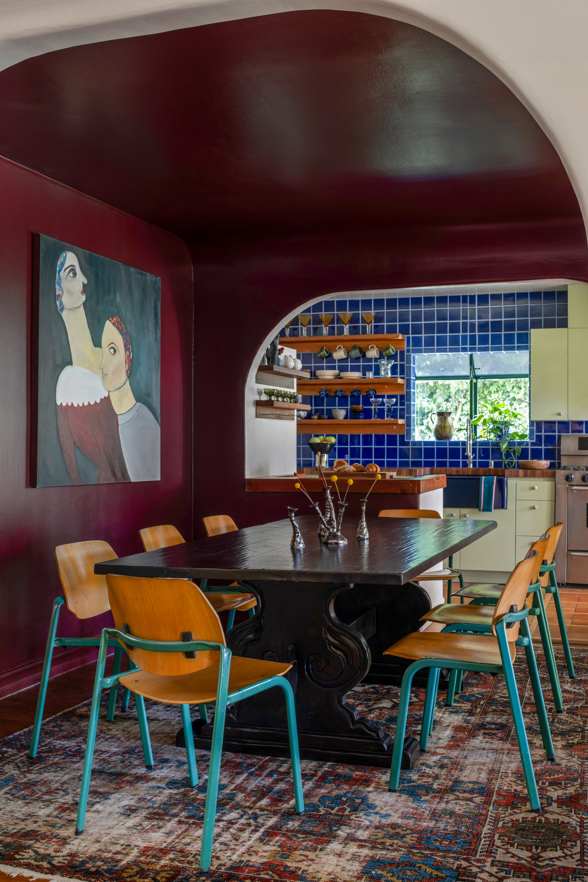
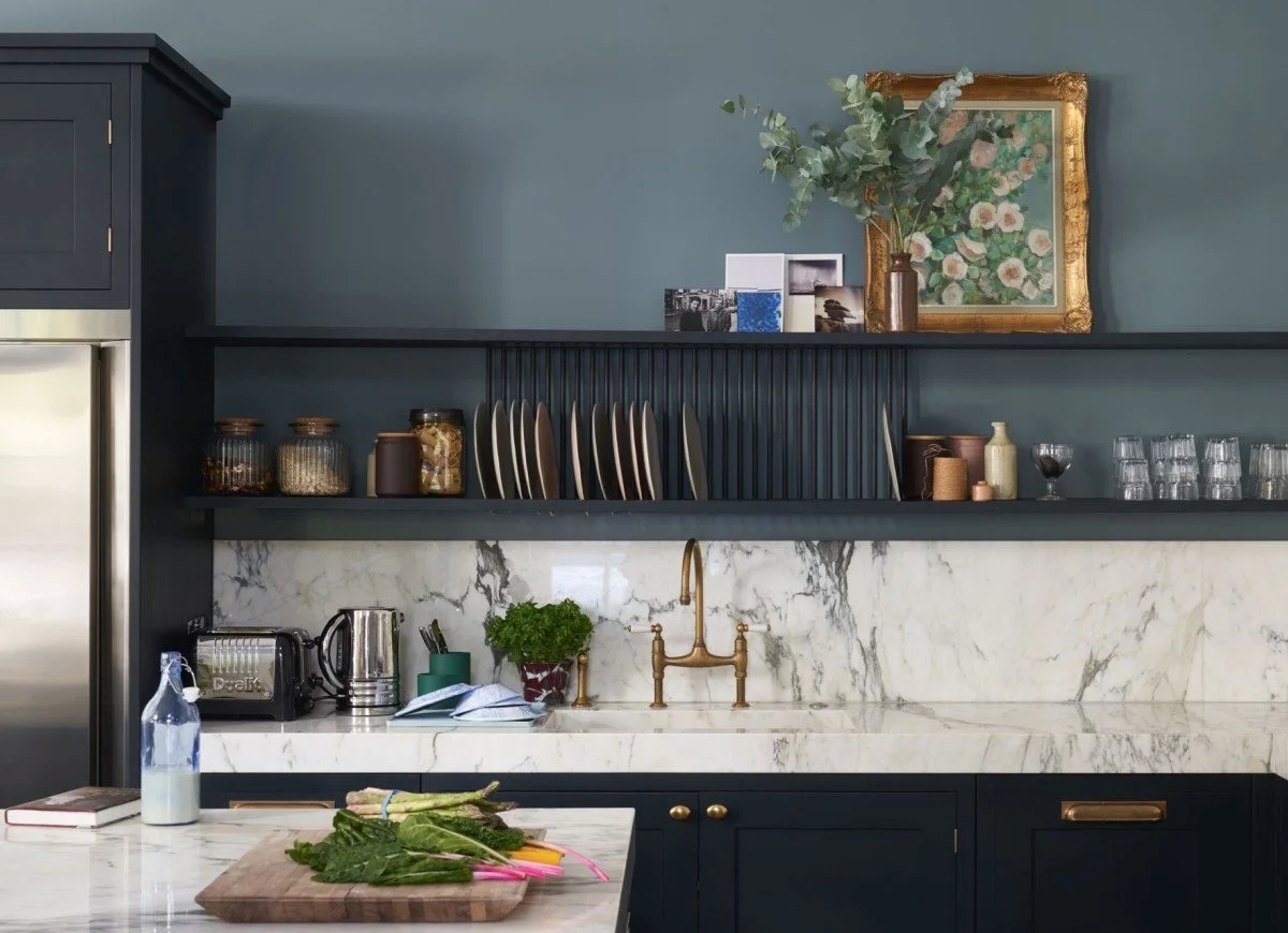
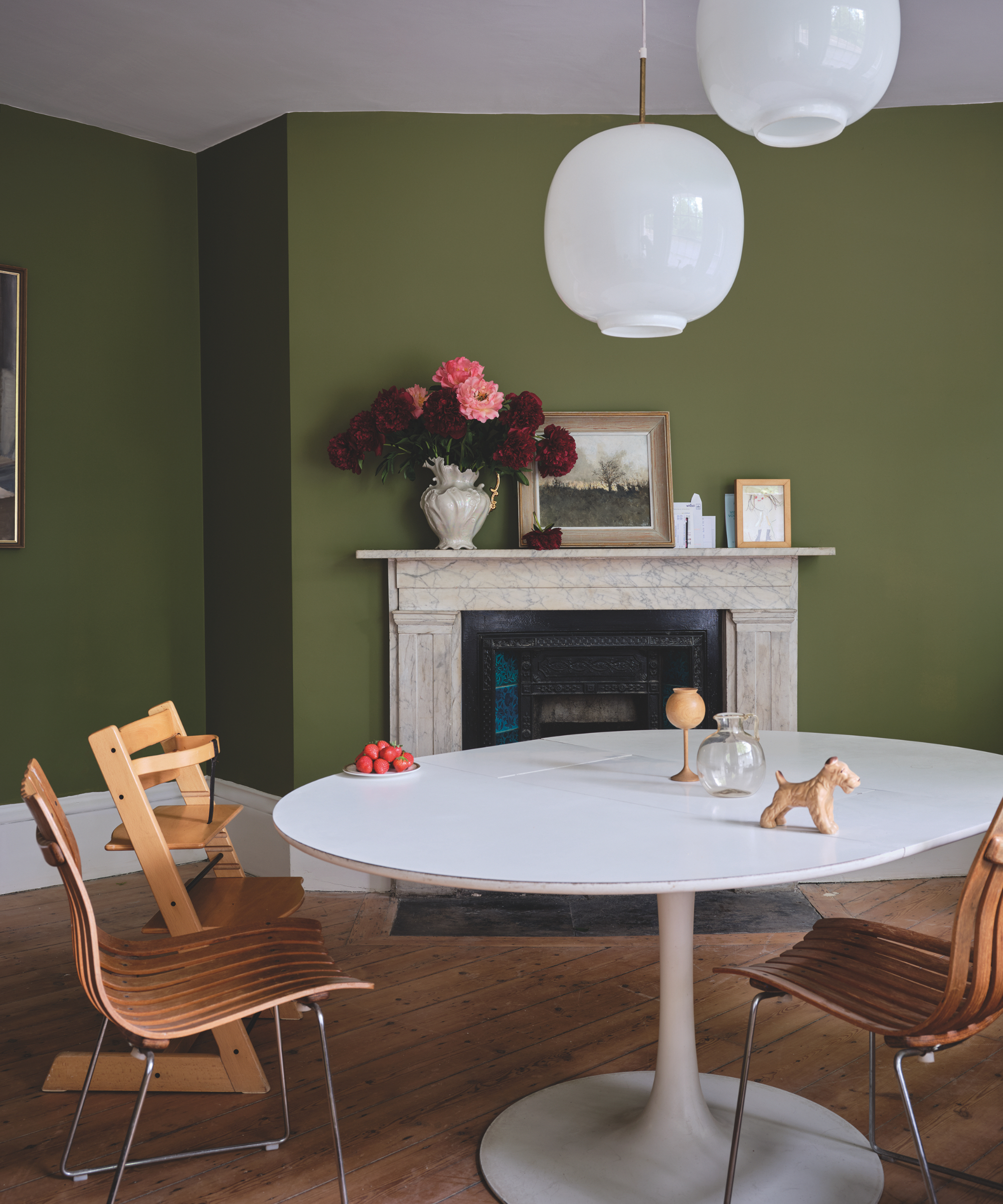
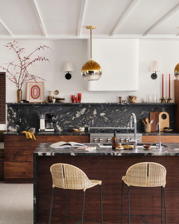
Darker, moodier options include Moody Teal (Saturday on Sunday by Backdrop for wainscoting and Bird & Pomegranate by William Morris wallpaper) for a sophisticated touch, and Warm Charcoal (Gray Mountain by Benjamin Moore) with a hint of purple for a contemporary, moody feel. Classic Black (Tricorn Black by Sherwin-Williams) paired with true white is presented for an airy yet grounded dining room. The article also features more unconventional combinations, such as Muddy Green (Breakfast Room Green by Farrow & Ball) with muted red for a stately, year-round appeal. Each recommendation is designed to assist readers in finding a paint color that harmonizes with their home's architectural and design style, ensuring the dining room becomes a cherished gathering space.
#DiningRoom #PaintColors #HomeDecor #InteriorDesign #ColorPalette #FarmhouseStyle #Cottagecore #Renovation #DiningRoom #PaintColors #HomeDecor #InteriorDesign #ColorPalette #FarmhouseStyle #Cottagecore #Renovation
0 comment in total
 No comments yet
You may also like
The Color Trend Designers Are Painting Dining Rooms Right Now

10 green dining room ideas that will lift a tired space

It’s Official: These are the Best Kitchen Paint Colors, According to Designers
Designers say the key to kitchen paint colors in 2024 is to go bold


This Art-Filled Dining Room Is a Conversation Starter

5 Gorgeous Paint Colors To Elevate Your Kitchen Cabinets In 2025

We Asked Designers Which Paint Colors Shrink a Dining Room—And These 5 Are Cramping Your Style

Five Mistakes People Make When Selecting Kitchen Cabinets—and How to Avoid Them
29 Best Paint Colors for a Kitchen You’ll Never Want to Leave

Don't Use These 7 Dining Room Paint Colors — Designers Say You Should Avoid Them at All Costs
5 Reasons You Shouldn't Paint Your Kitchen Walls White — And the Alternatives You Need to Try
The 6 Paint Colors for Your Kitchen That Will Never Go out of Style
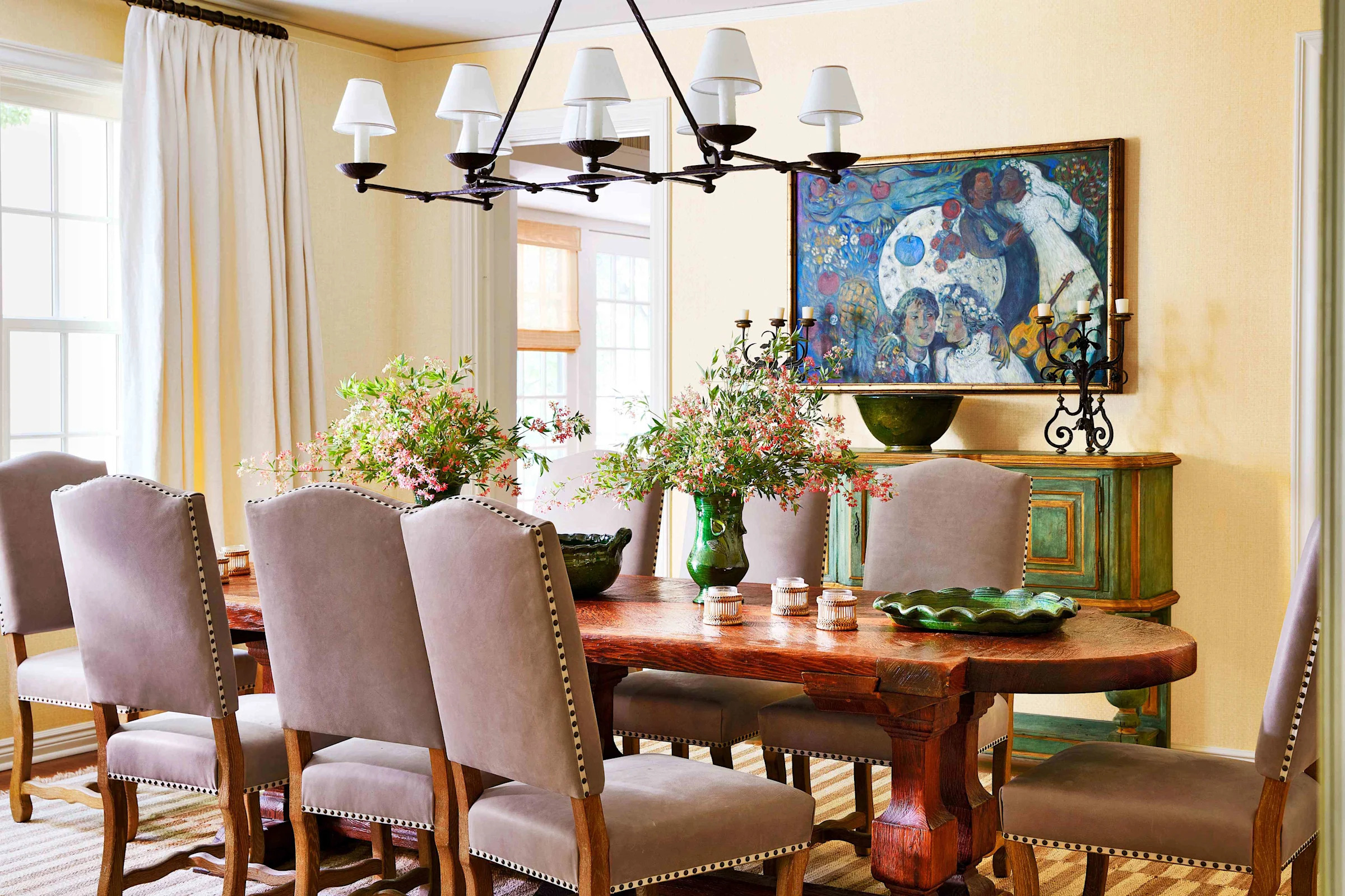
5 Dining Room Paint Colors For An Entertaining-Worthy Space

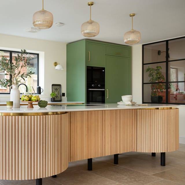
These kitchen paint colours will be everywhere in 2025 – and there's even one for neutral lovers
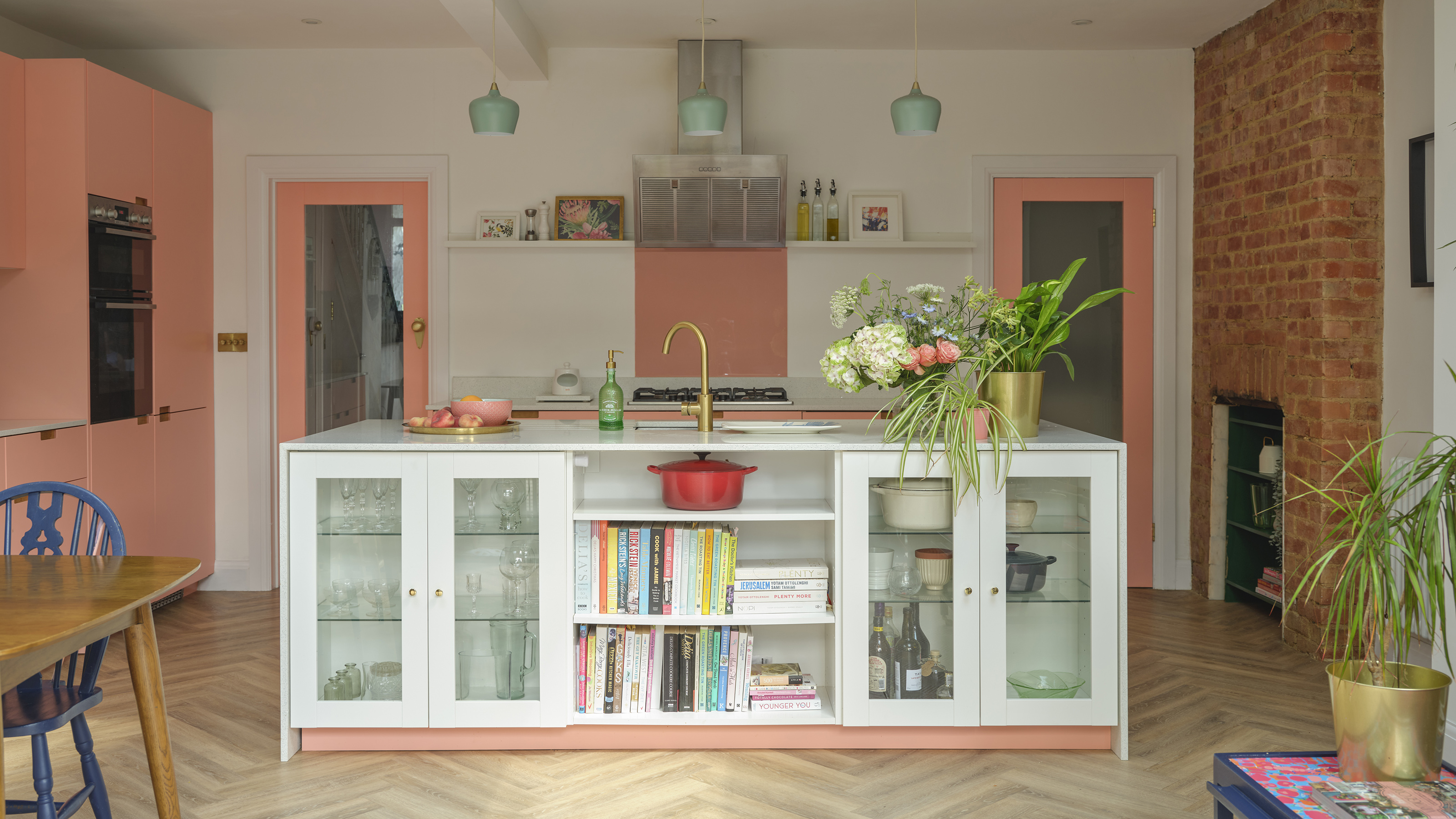
The best colours to paint a kitchen according to paint pros - pick the perfect shade for large, small, dark and light spaces
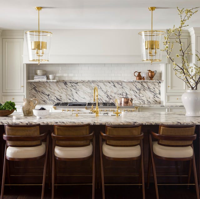
These Kitchen Paint Colors Will Be Everywhere in 2025
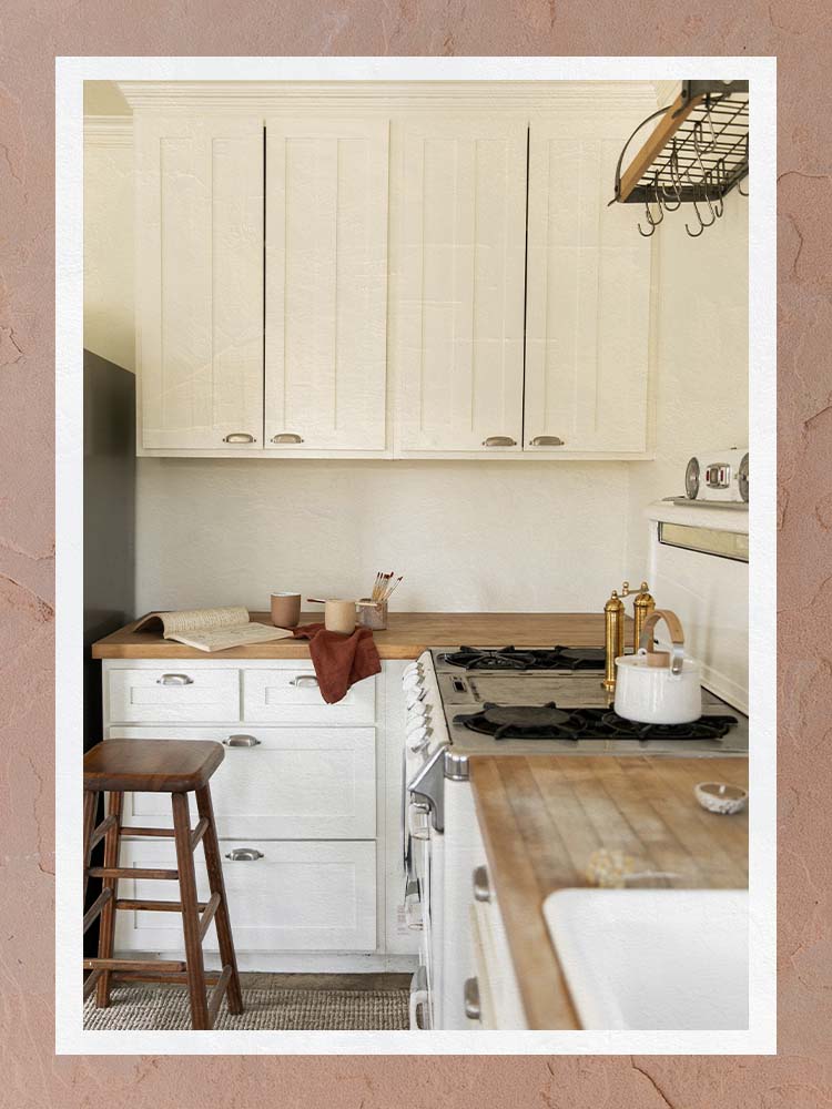
The Best Kitchen Paint Colors All Have This One Thing In Common
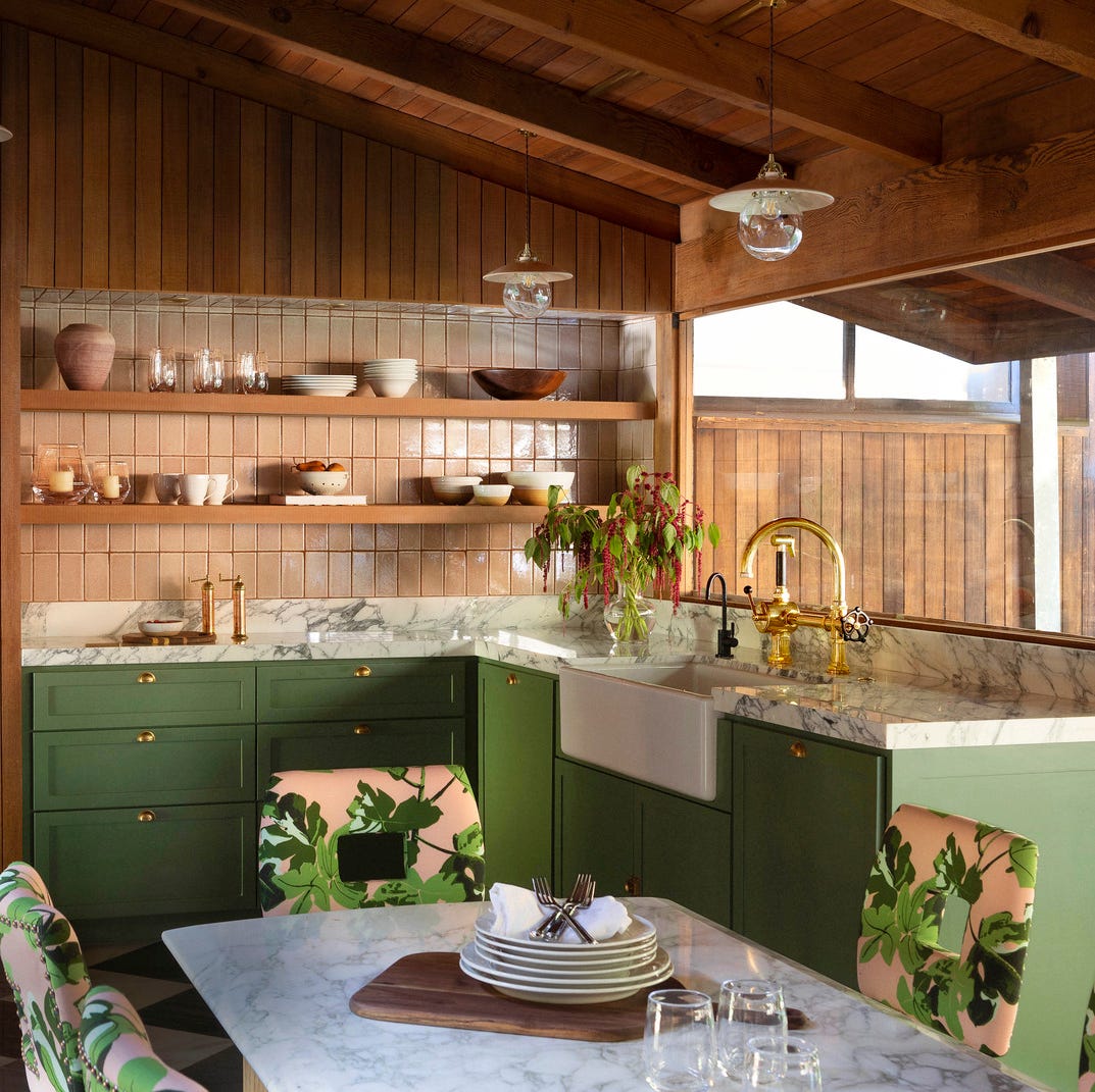
The Kitchen Colors Designers Call “Forever Favorites”
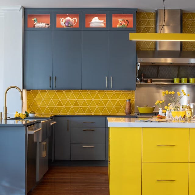
Ditch the White! Try One of These Designer-Approved Kitchen Colors

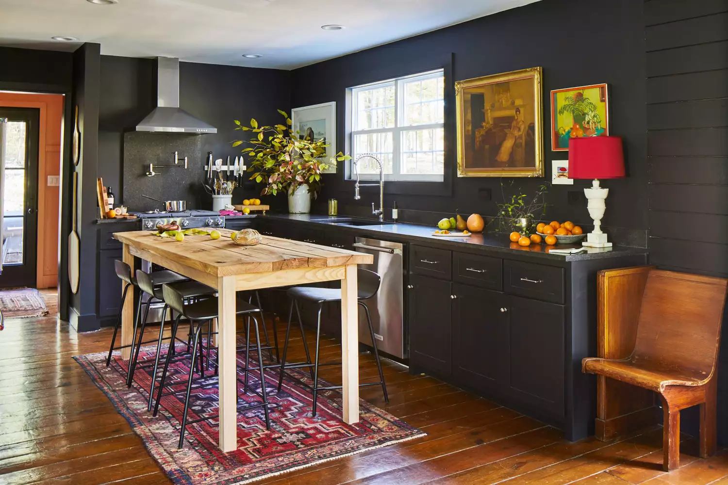
4 Colors You Should Never Paint Cabinets, According To Designers