1/11
10 Kitchen Paint Colors You Won’t Regret in 10 Years, According to Designers
Selecting the right paint color for a kitchen is a significant decision given its prominent role and often higher renovation costs compared to other rooms in a home. This article presents ten enduring kitchen paint colors, handpicked by designers and homeowners, ranging from warm neutrals to vibrant blues and greens. These selections are chosen for their timeless appeal and ability to maintain relevance over an extended period. Each color recommendation is accompanied by practical advice and real-world examples, offering readers a curated list of reliable options for their kitchen design projects.
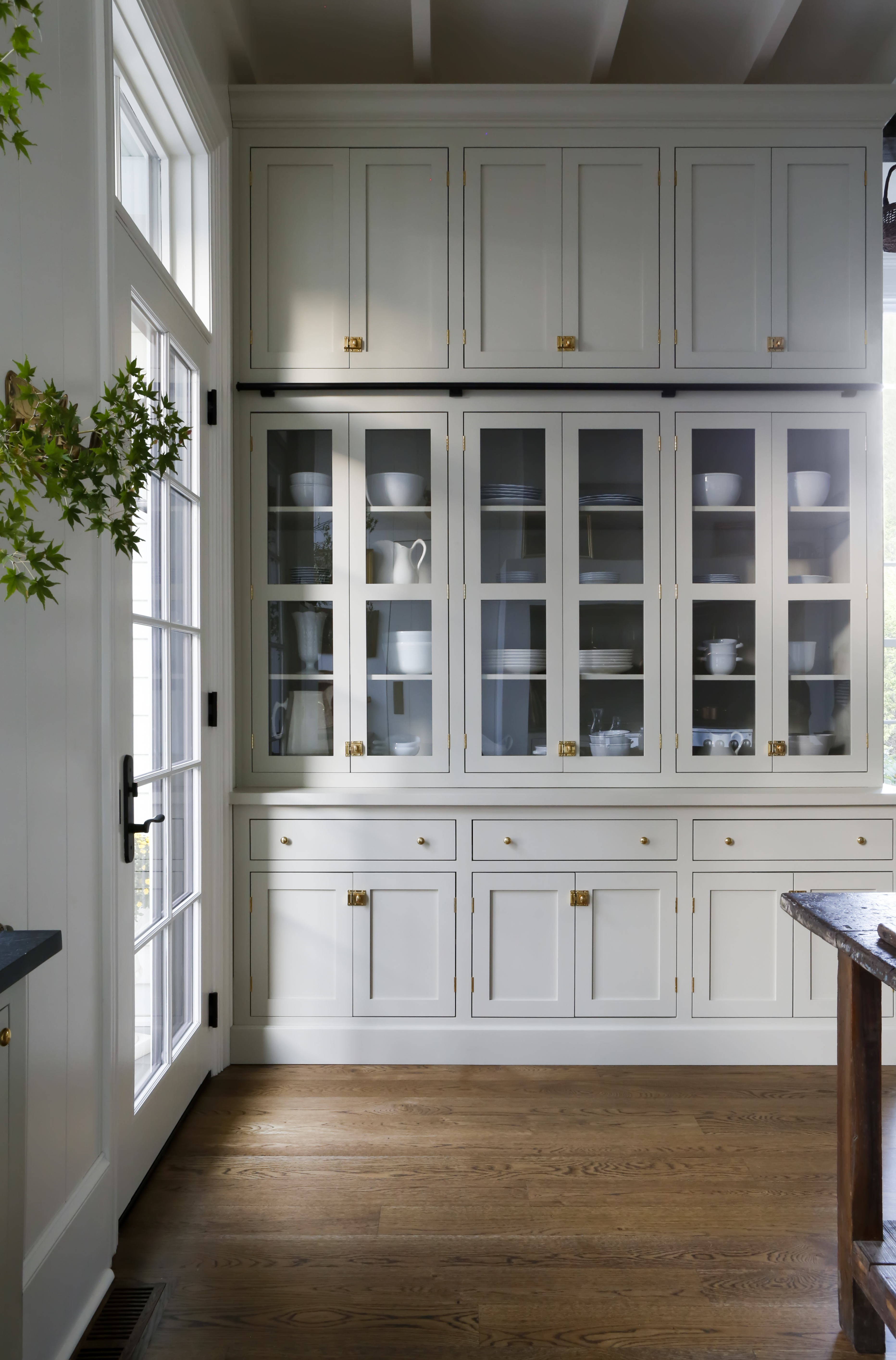
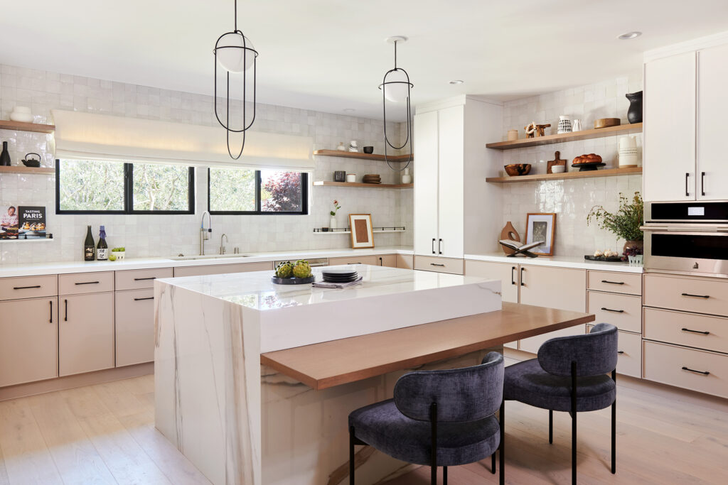
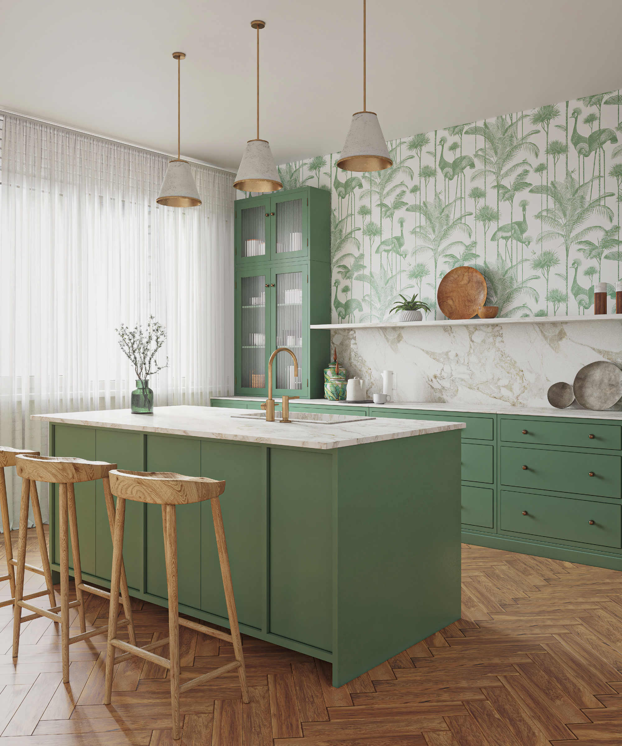
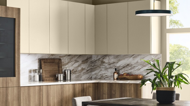
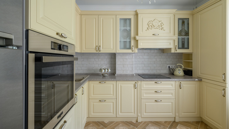
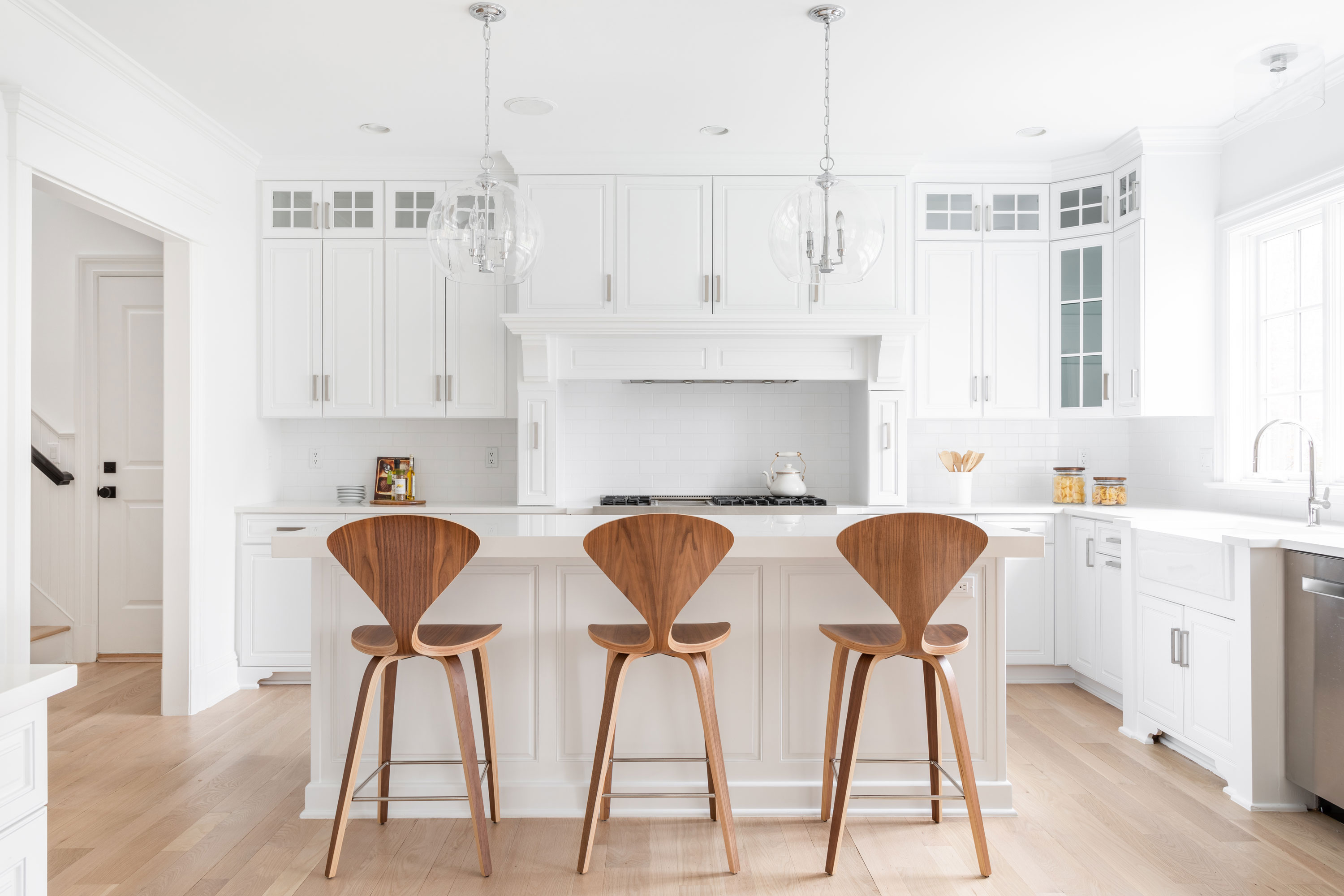
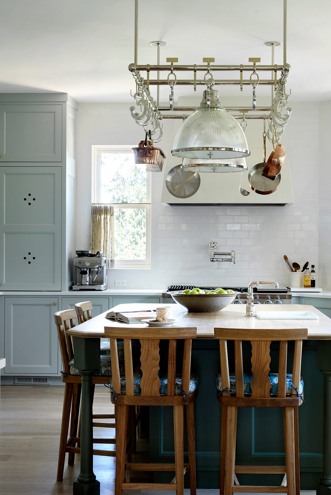
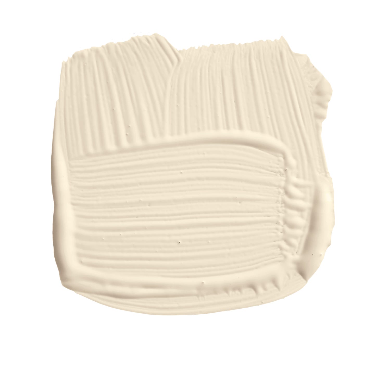
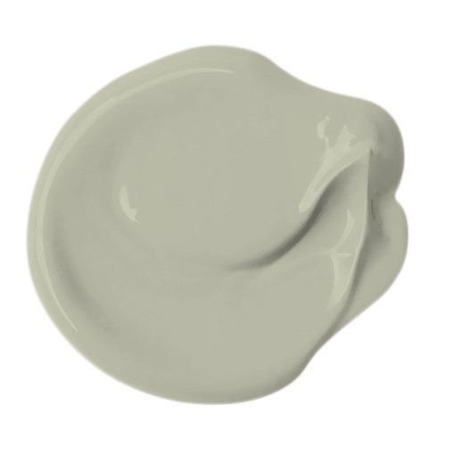
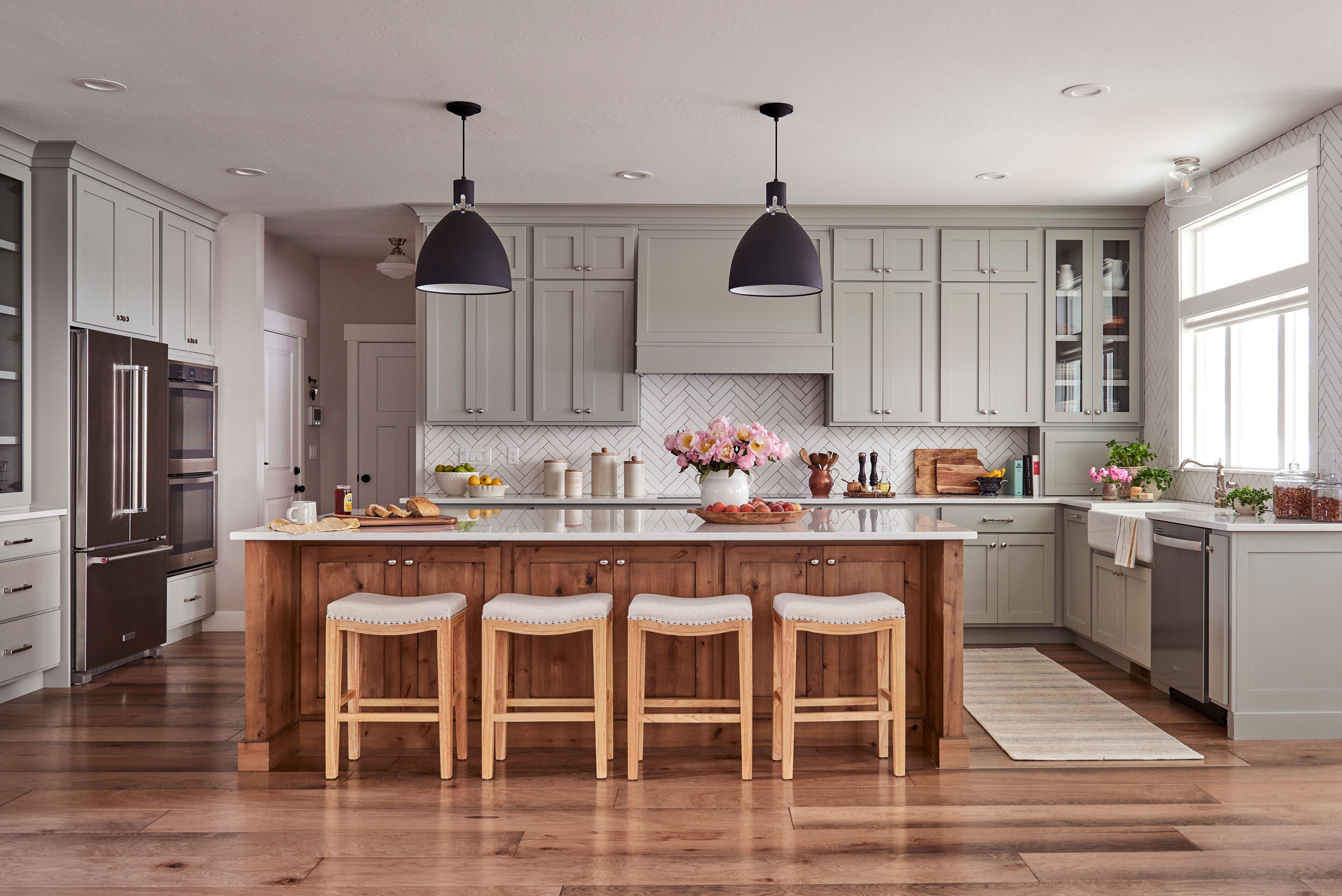
First, Natural Linen by Sherwin-Williams is highlighted as an excellent choice for those desiring an airy kitchen without the starkness of pure white. This shade offers creamy undertones that create a welcoming atmosphere suitable for breakfast nooks and family kitchens, often used on cabinetry. Another popular and versatile color is Lichen by Farrow & Ball, a dusty sage with gray undertones, frequently recommended by designers like Claire Zinnecker for kitchen cabinets. This color bridges the gap between classic and contemporary aesthetics, ensuring longevity in design.
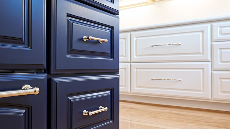
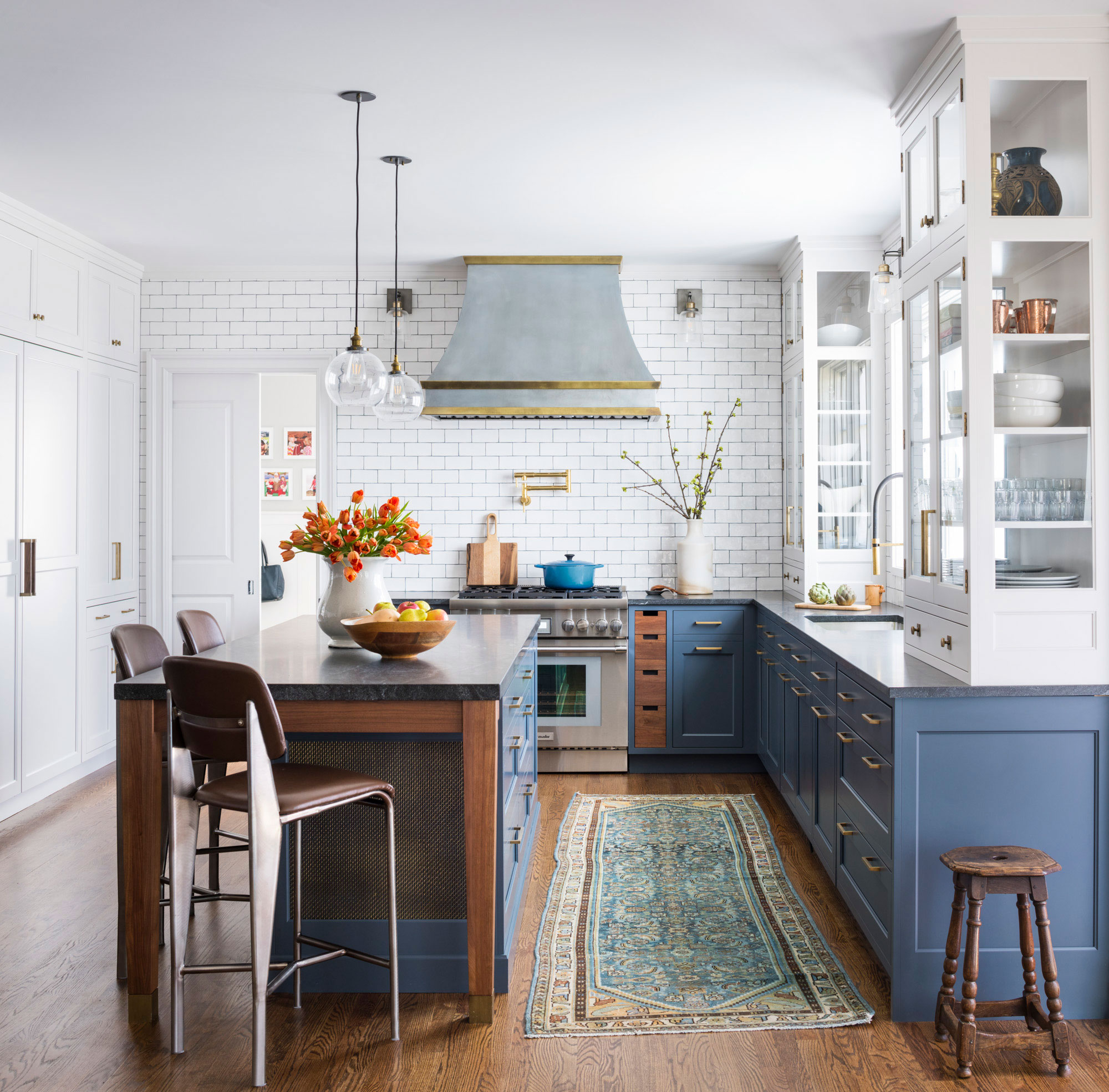
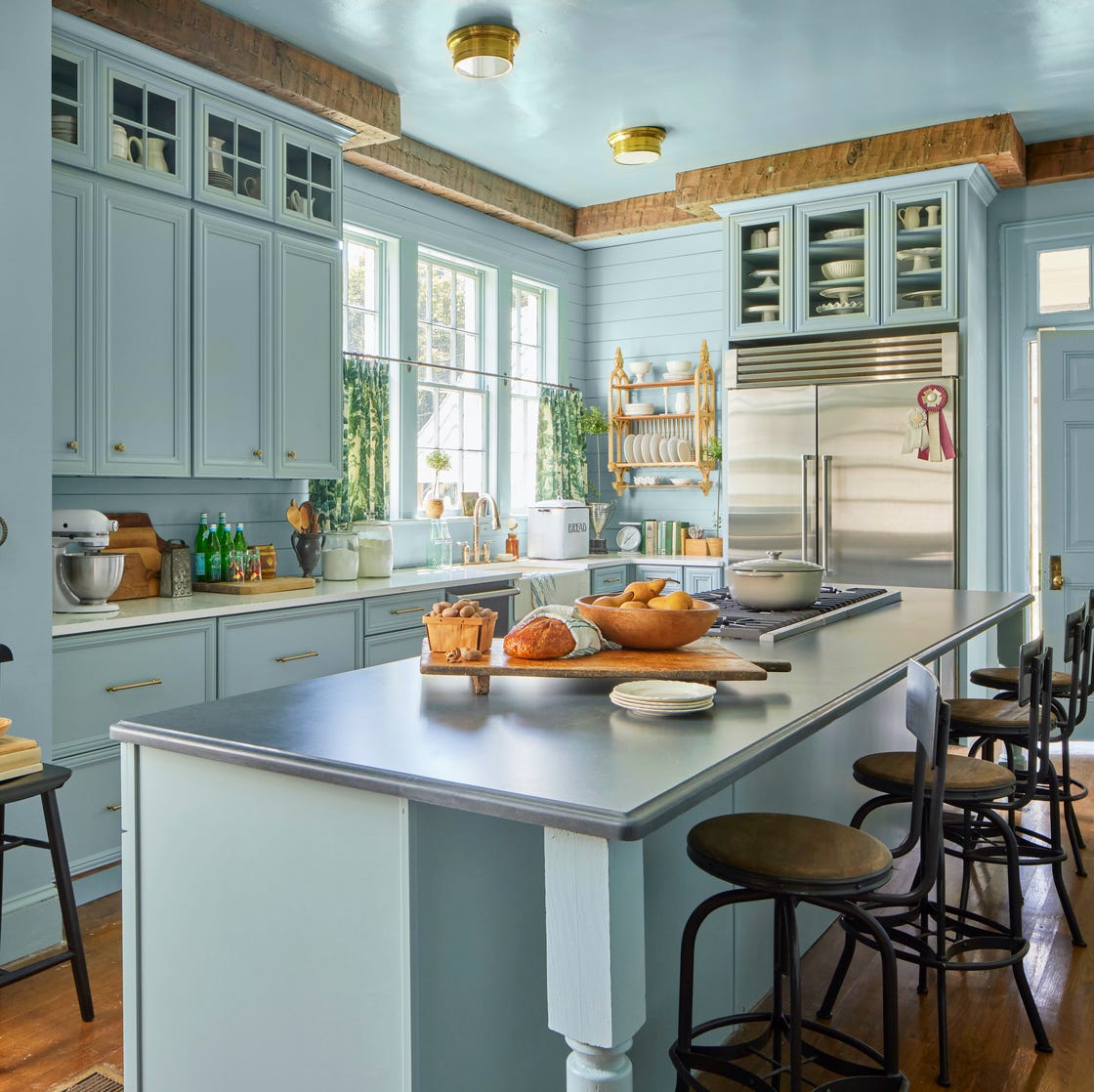
For a bolder yet still classic statement, Dutch Tile Blue by Sherwin-Williams is presented as a neutral option. This moody, historic-inspired blue, as utilized by Country Living's editor-in-chief Rachel Hardage Barrett in her Mississippi farmhouse, works well for entire spaces or just cabinetry, providing a timeless feel that avoids a purely coastal look. Delicate White by Glidden offers a universal white that is praised for its timeless quality without appearing clinical, making it suitable for ultimate white kitchen designs and carrying the Good Housekeeping Seal of Approval.
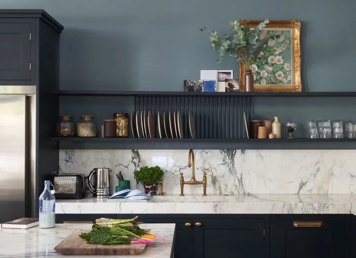
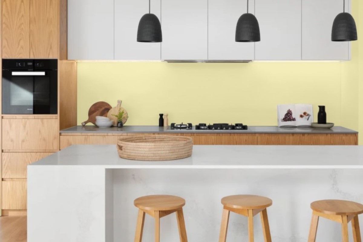

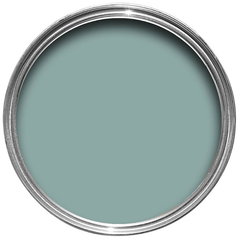
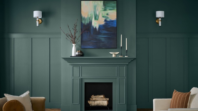
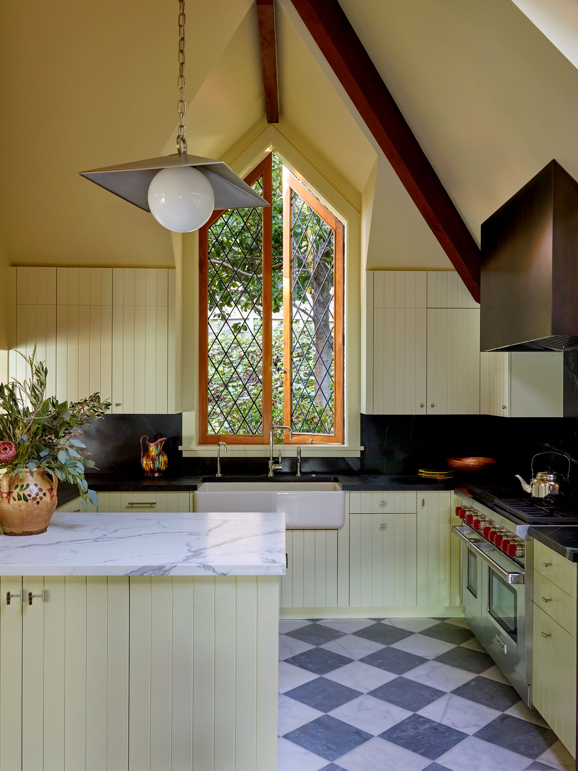
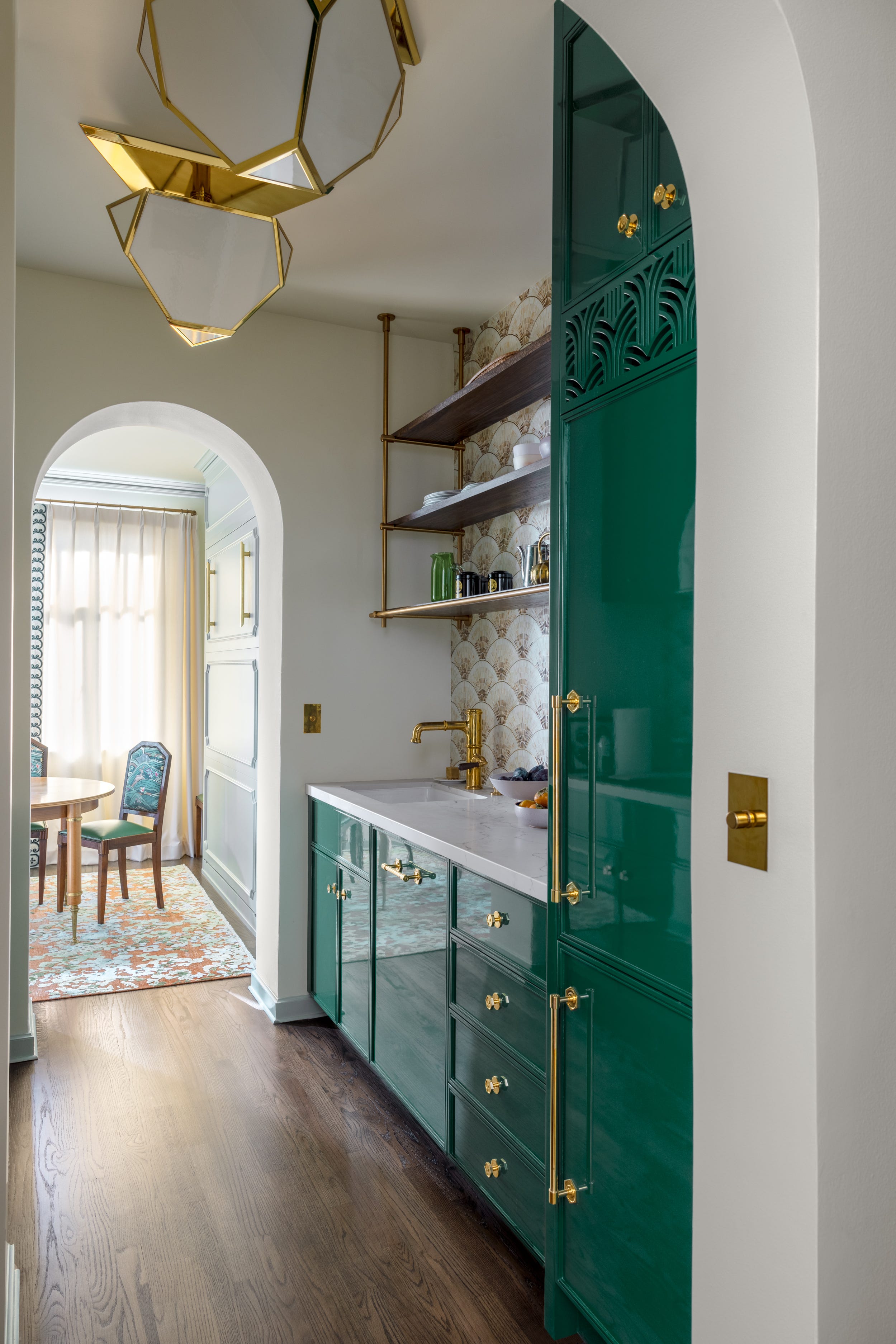
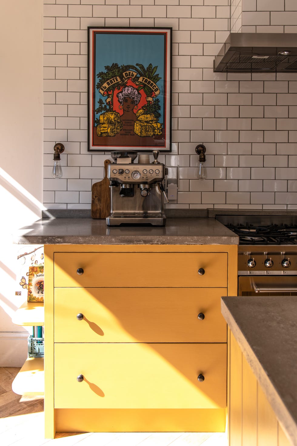
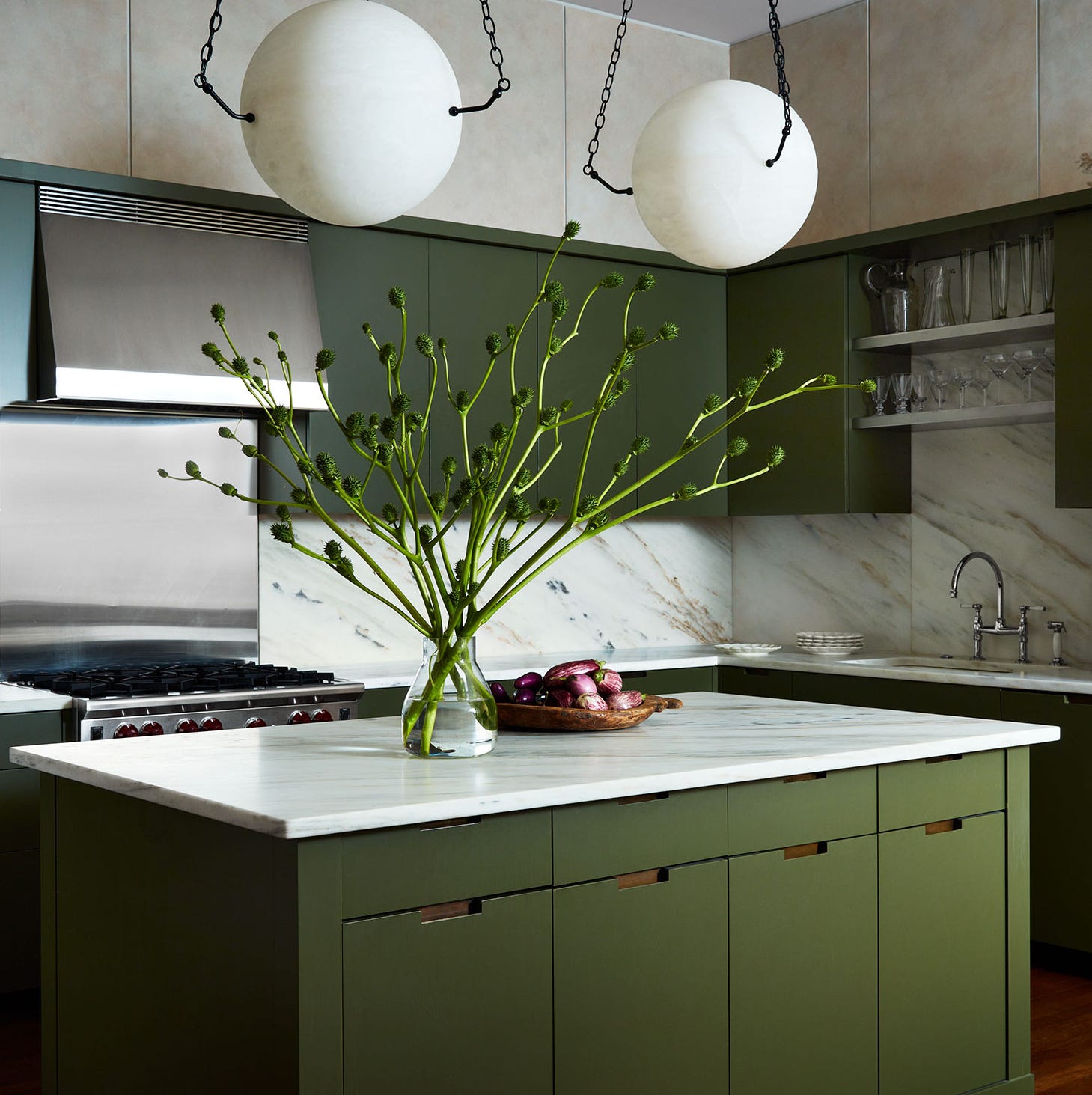
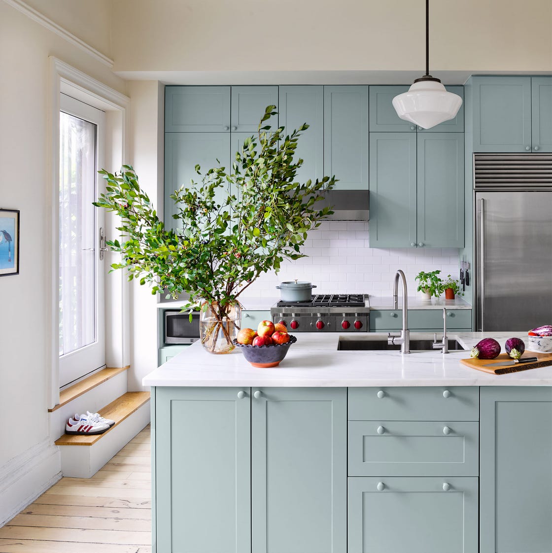
Hunt Club by Sherwin-Williams, a steely blue-green jewel tone, is a favorite among designers for cabinetry due to its ability to ground a space with its deep shade, as noted by Country Living’s Associate Art Director Virginia England. Sudbury Yellow by Farrow & Ball provides a cheerful and timeless option, often used by designers like Country Living’s Design Director Maribeth Jones to create sunny, British-inspired cottage kitchens. This color offers a lively character without being overly trendy.
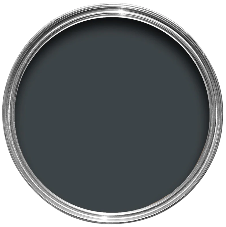
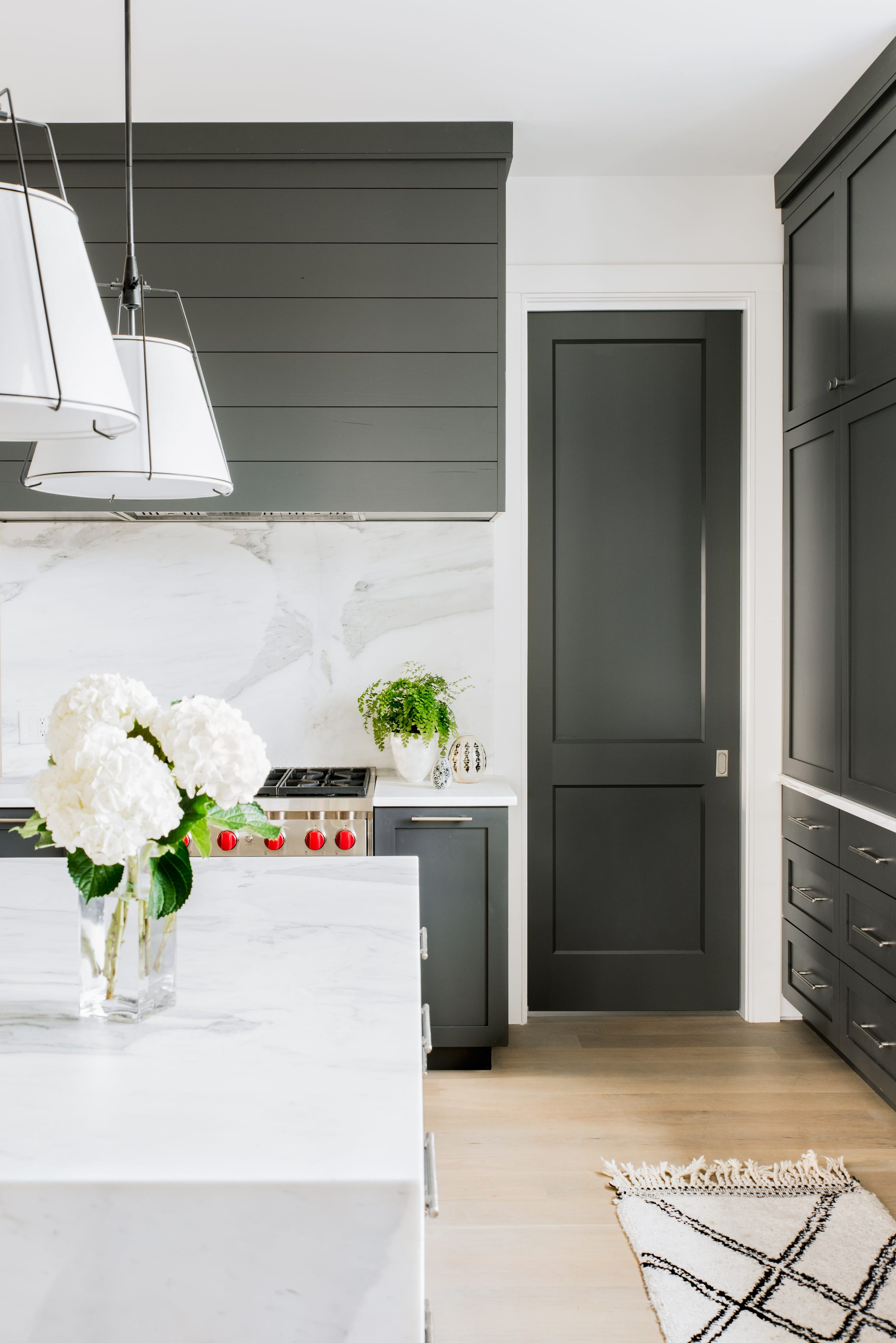
Shaded White by Farrow & Ball is a softer white option, ideal for homes with children and pets due to its ability to conceal everyday dirt and wear effectively. Designer Heather Chadduck Hillegas suggests pairing it with Natural Linen for a cohesive look. Tricorn Black by Sherwin-Williams is a versatile black paint color that adds an edgy, retro-inspired feel to kitchens, particularly when paired with black and white hex tiles. Holly Audrey Williams, a Country Living contributor, endorses its ability to bring a distinct character to a room.
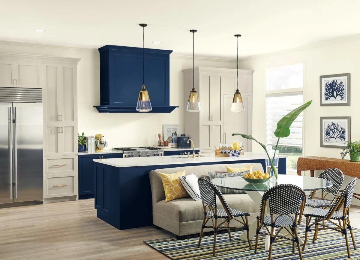
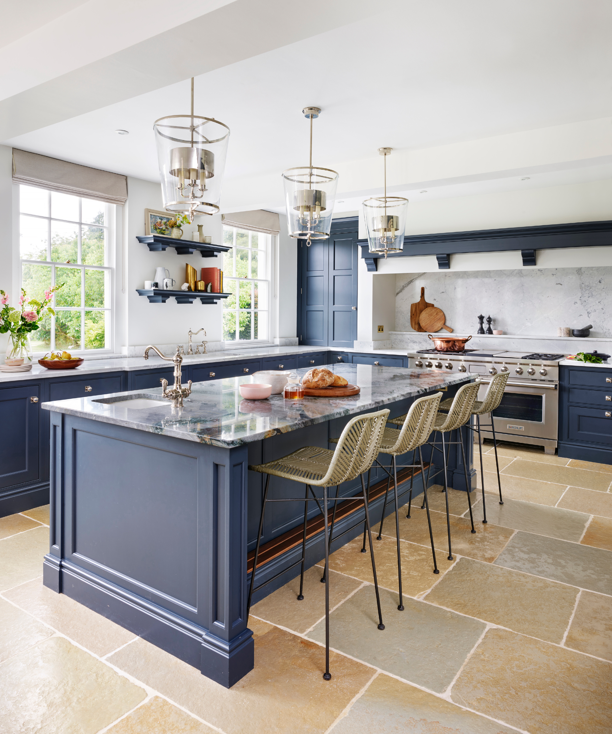
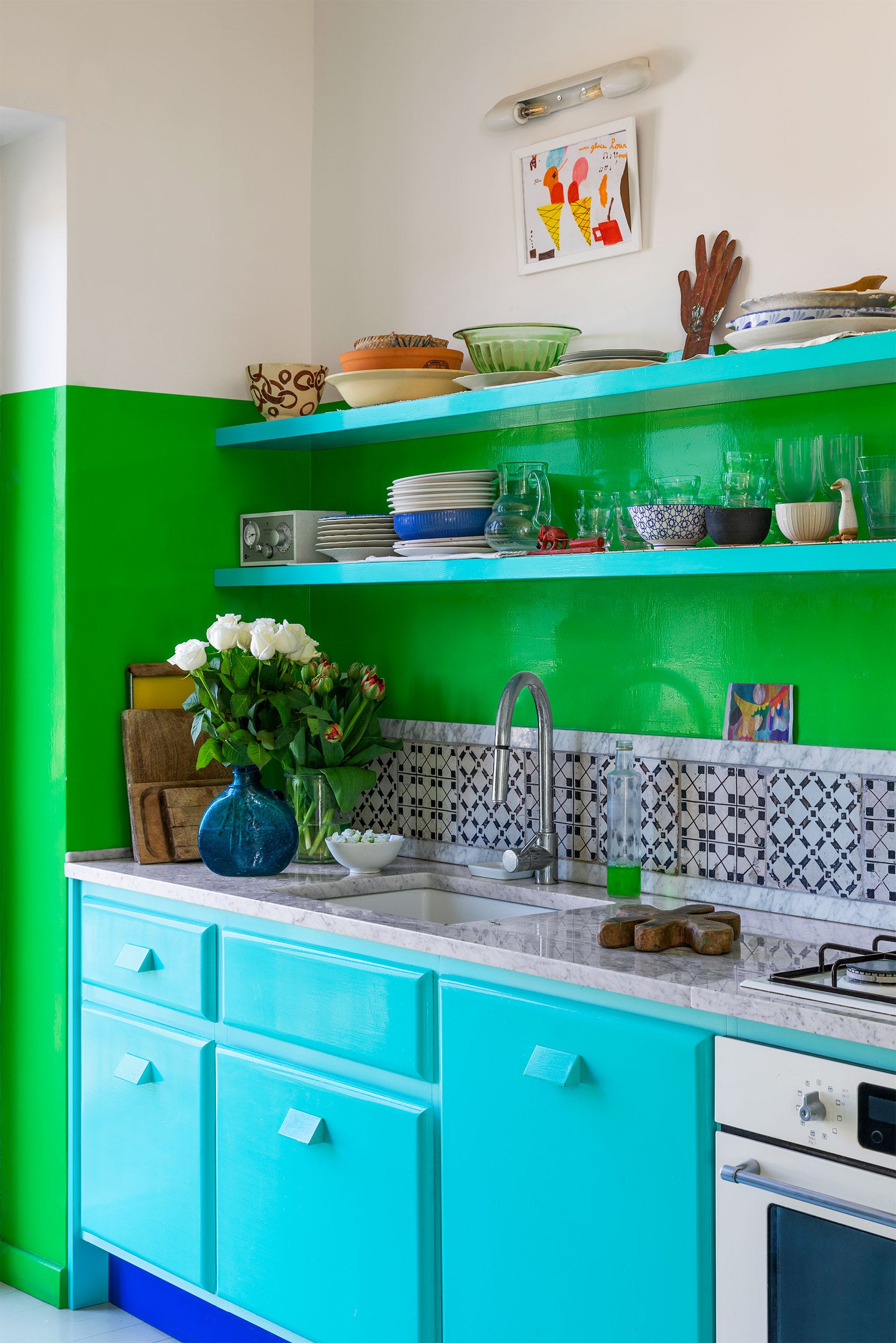
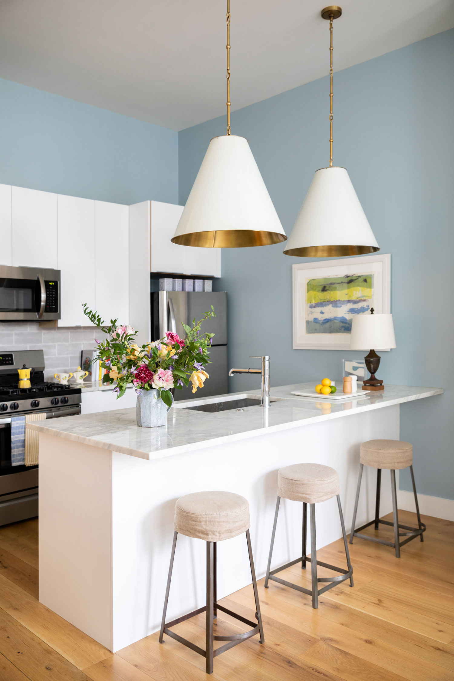
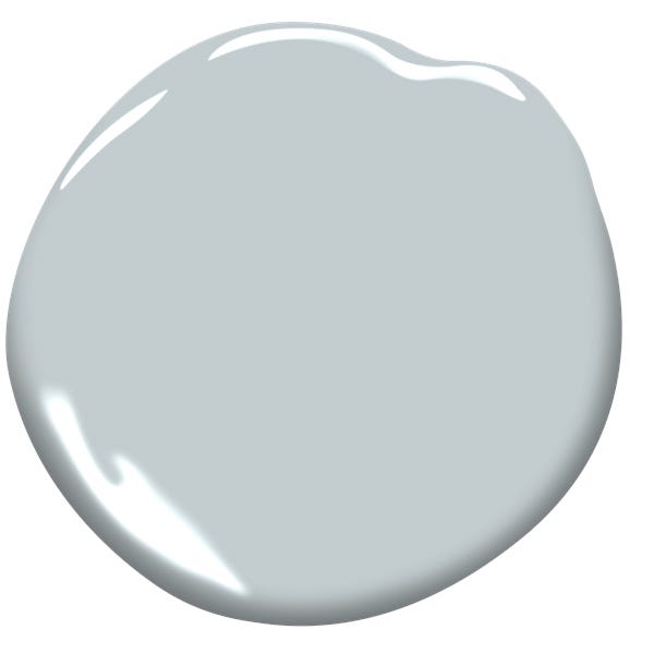
Salty Dog by Sherwin-Williams is recommended for those looking to make a strong statement with a bold yet classic blue. This shade is often used on cabinetry, particularly in coastal cottage designs, and is best complemented by butcher block countertops for a lived-in feel. Finally, Cumulus Cloud by Benjamin Moore is a warm gray shade favored by Martha Stewart for its fresh and sophisticated appearance. This color offers a refined neutral base that can enhance various kitchen styles, demonstrating that even a gray can be delightfully fresh rather than mundane.
#KitchenDesign #PaintColors #HomeDecor #InteriorDesign #TimelessStyle #SherwinWilliams #FarrowAndBall #Glidden #BenjaminMoore #KitchenDesign #PaintColors #HomeDecor #InteriorDesign #TimelessStyle #SherwinWilliams #FarrowAndBall #Glidden #BenjaminMoore
0 comment in total
 No comments yet
You may also like
Kitchen Cabinet Colors That Will Never Go Out of Style — 10 Tones That Are a Timeless Choice

It’s Official: These are the Best Kitchen Paint Colors, According to Designers
10 Trendy Kitchen Cabinet Colors You Should Try In 2025
10 Exterior Paint Colors You’ll Never, Ever Regret

29 Best Paint Colors for a Kitchen You’ll Never Want to Leave

Which kitchen color is timeless? Our experts give us their take

Experts Rank the 10 Worst Paint Colors for Your Kitchen
These kitchen paint colours will be everywhere in 2025 – and there's even one for neutral lovers

The 6 Paint Colors for Your Kitchen That Will Never Go out of Style

Top 10 Trendy Kitchen Colour Combinations in 2025

20 Kitchen Paint Colors to Try in 2024

These 2025 Kitchen Color Trends Are Unexpectedly Chic
3 Kitchen Paint Colors Experts Promise Will Never Go Out of Style

11 Trendy Kitchen Paint Colors To Try In 2026

The Best Kitchen Paint Colors All Have This One Thing In Common
These 20 Paint Colors Will Never Go Out of Style, According to Designers

5 "trend-proof" colors for your home designers think will be just as popular in 10 years' time

10 Timeless Living Room Paint Colors Designers Swear By
The Kitchen Colors Designers Call “Forever Favorites”
5 Timeless Kitchen Cabinet Paint Colors Designers Love