An interior expert reveals the one thing you should never do when painting your walls
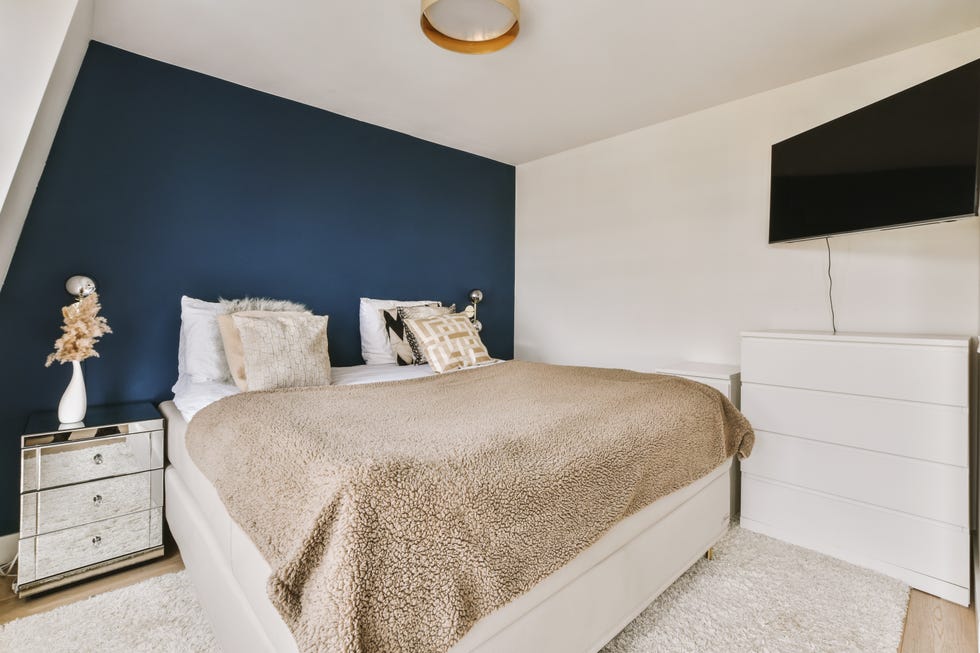
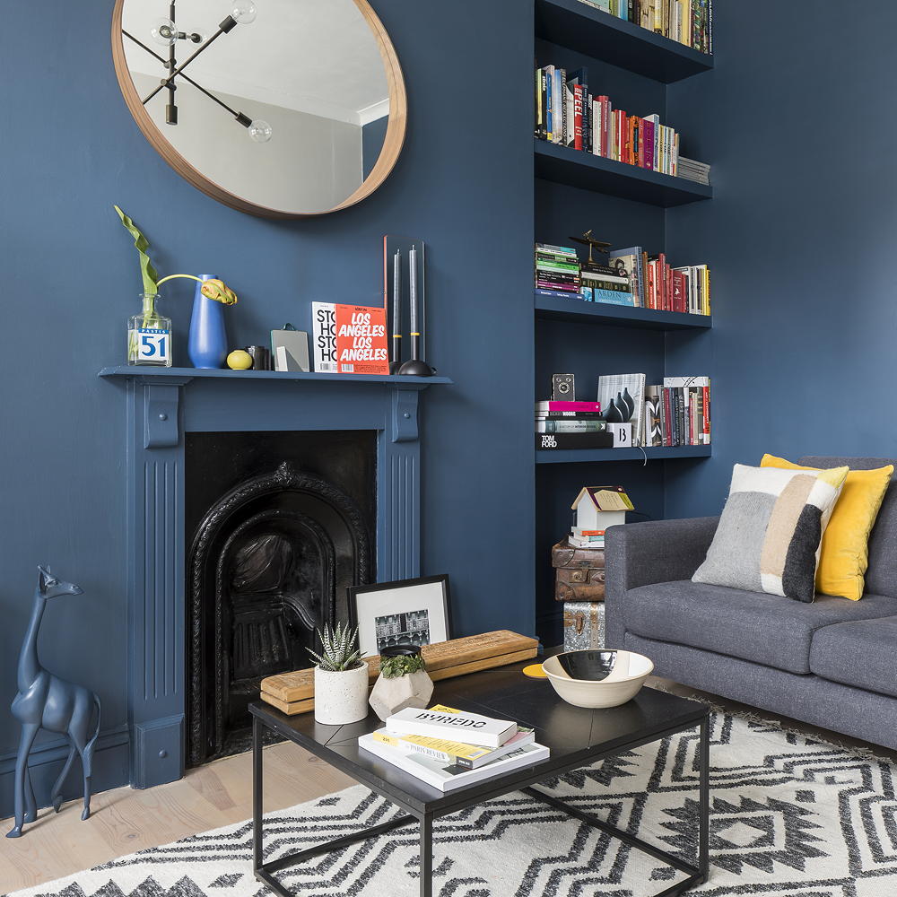
Painting with dark colors like purple, chocolate brown, or black can be a challenging yet rewarding endeavor, capable of transforming a room's aesthetic dramatically. A recent survey by Barclays Mortgages indicated that over half of Britons used their increased time at home to undertake long-postponed home improvement tasks, with 33% focusing on painting and decorating. As more individuals embrace dark color schemes, a common mistake often undermines their efforts: failing to paint the skirting boards to match the wall color.
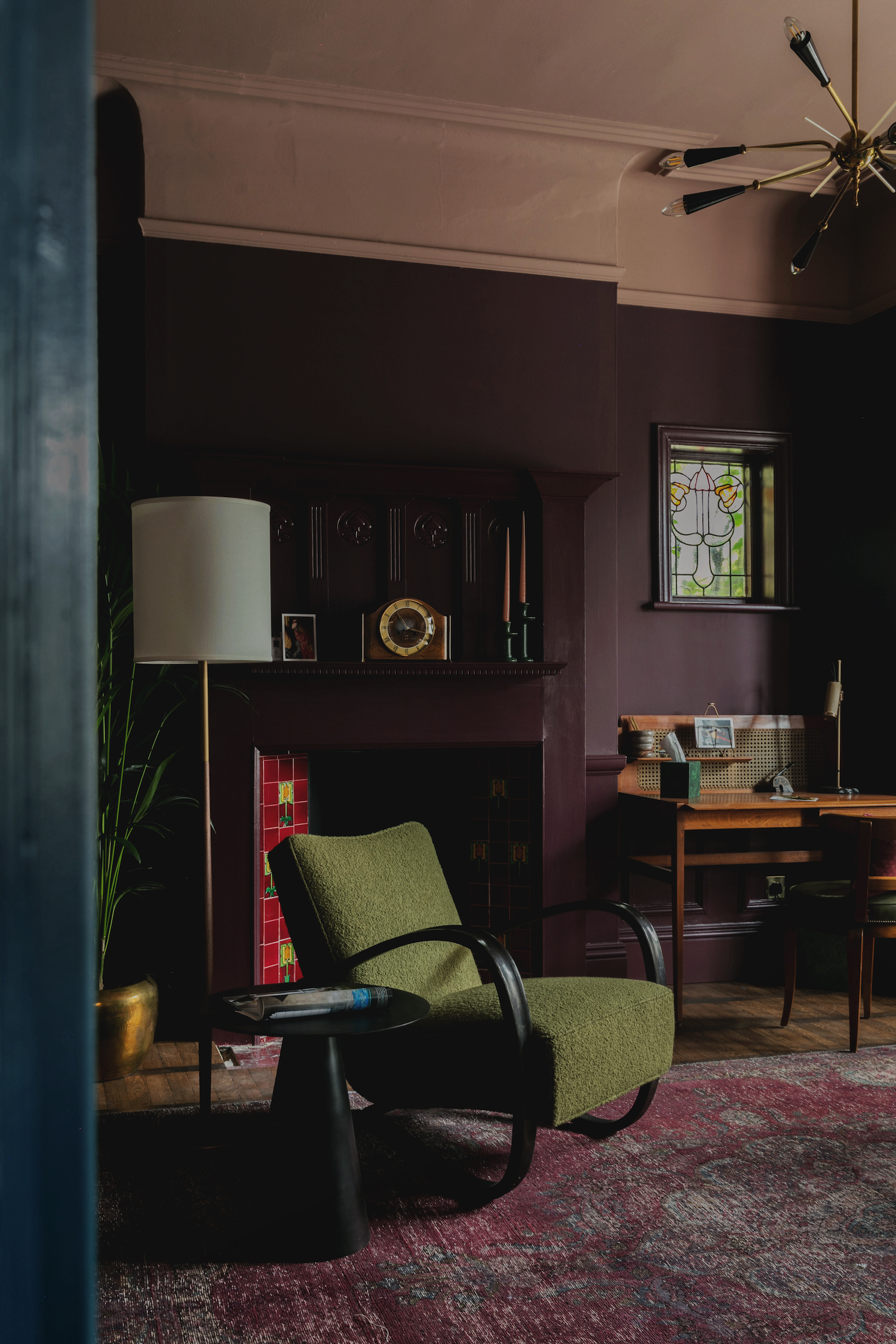
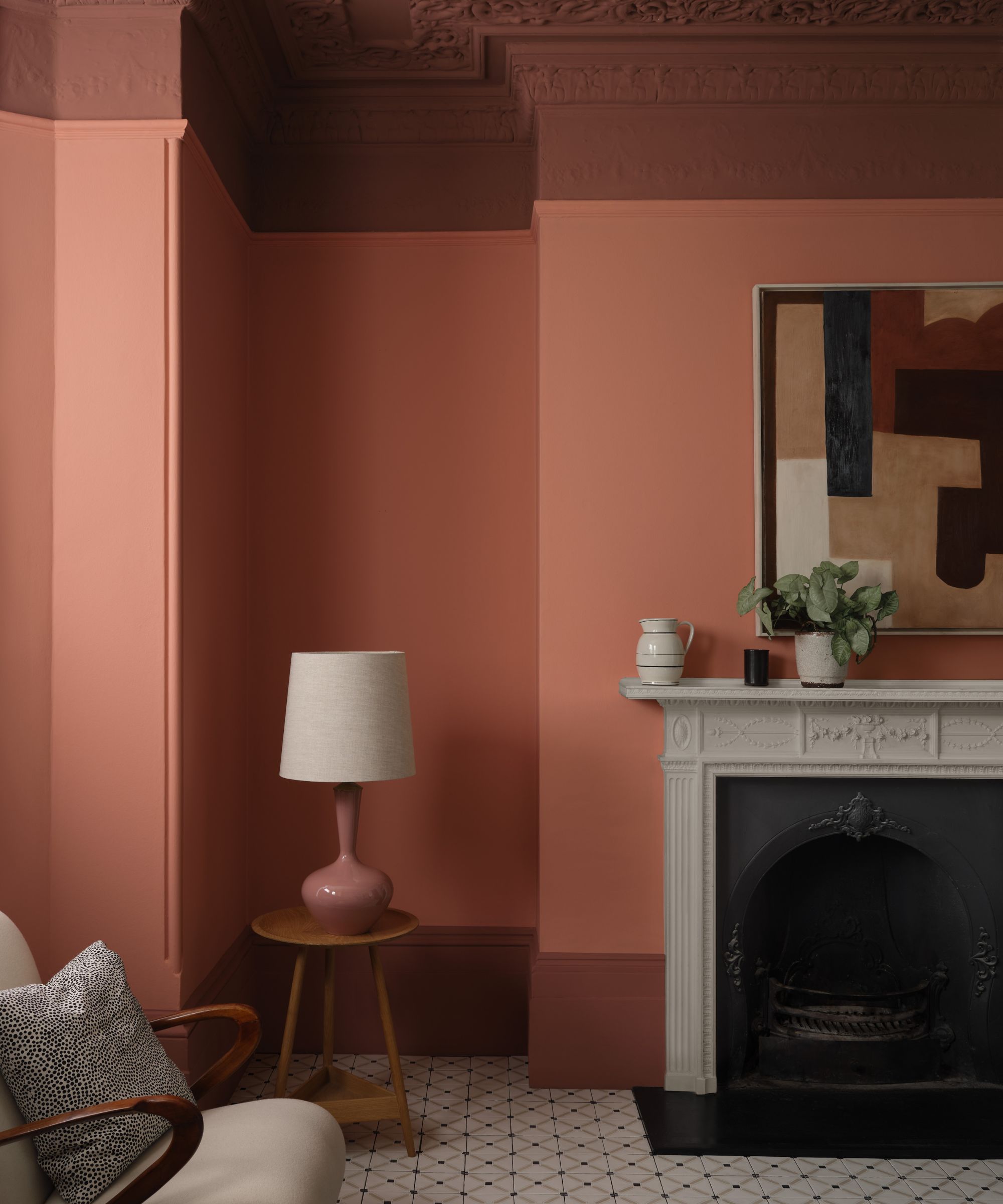
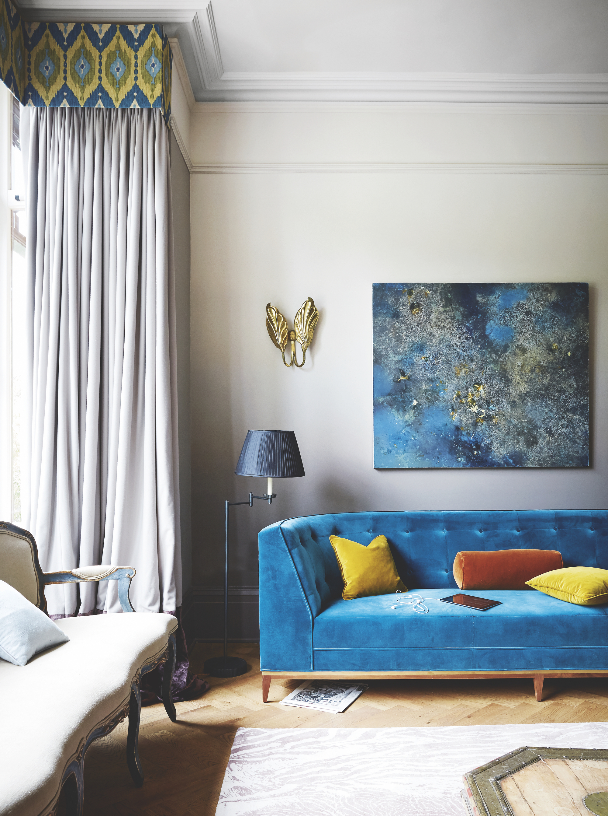
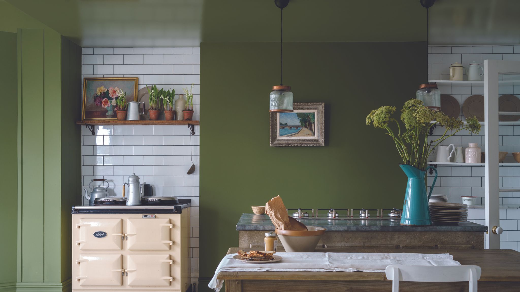
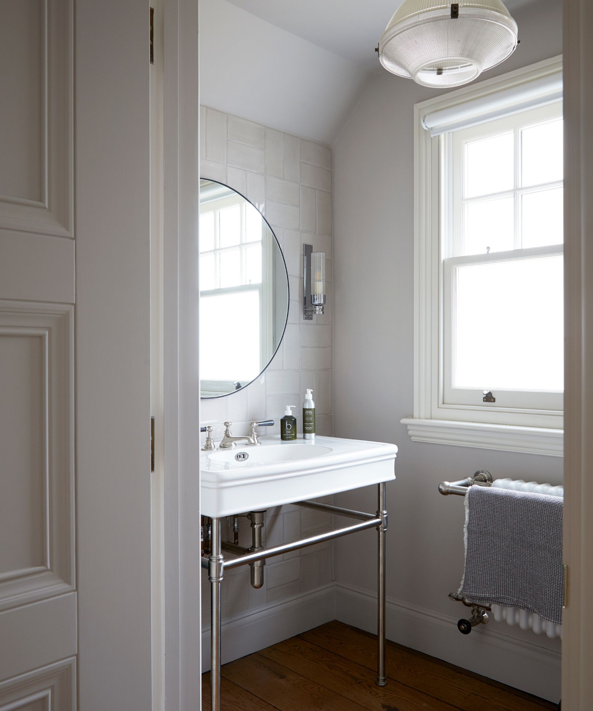
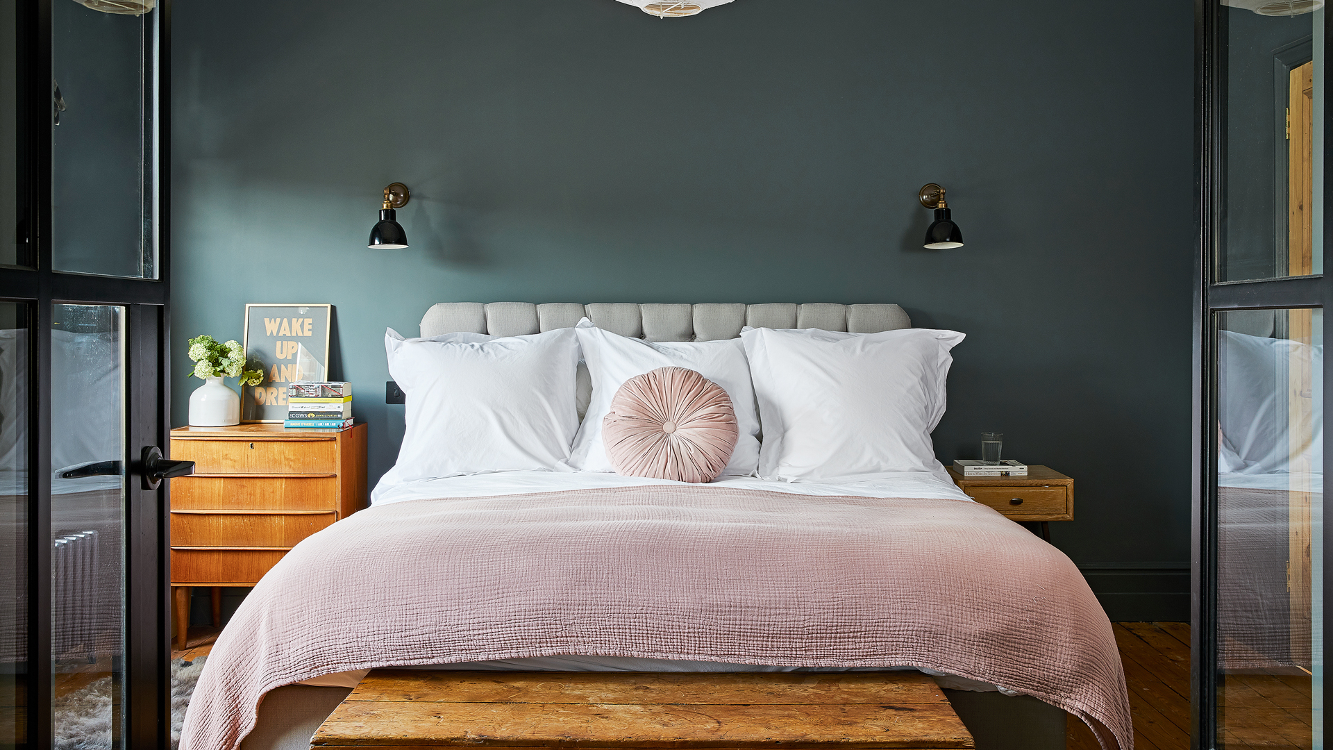
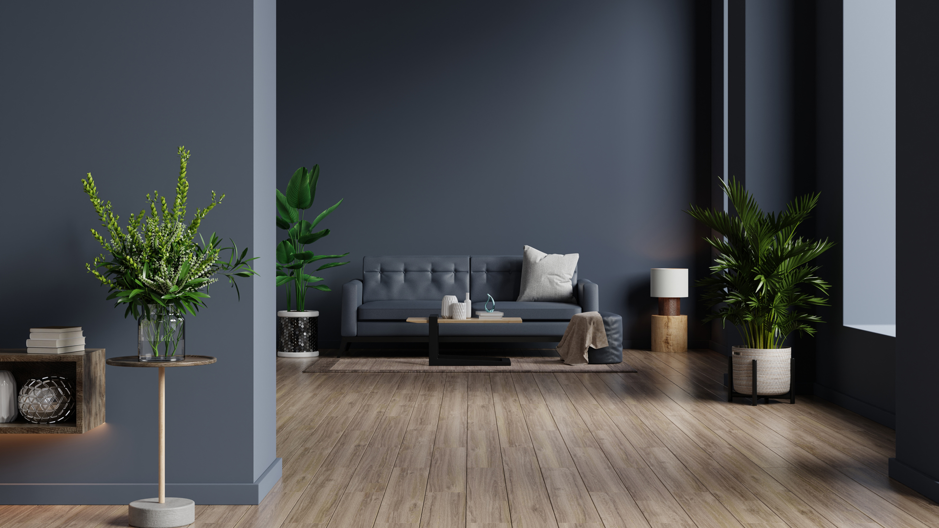
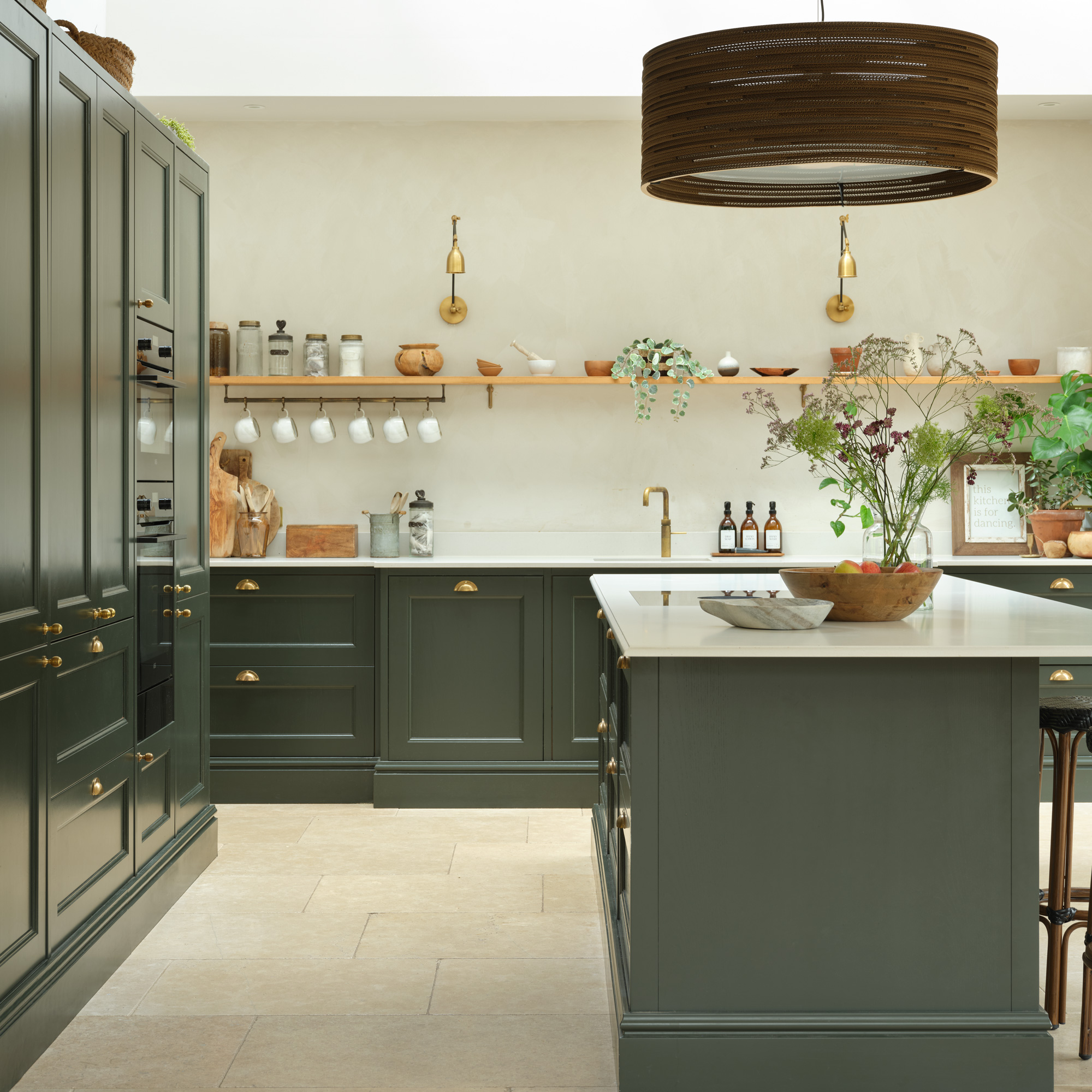
According to interior expert Kate Watson-Smyth, painting skirting boards the same or a similar dark color as the wall is crucial for achieving a cohesive and elevated look. This technique makes the wall appear taller and helps to integrate the skirting boards into the overall design, rather than allowing them to create a visual break. She emphasizes that if a dark color is chosen for the walls, the skirting boards should never be left white or a contrasting light color, as this diminishes the impact of the dark scheme.
Watson-Smyth provides several additional tips for successfully incorporating dark colors into interior design. Firstly, radiators should also be painted to match the wall color. She explains that radiators, much like skirting boards, are not intended to be decorative focal points. By painting them with an eggshell, wood, or metal paint that matches the wall, they visually disappear, contributing to a seamless and sophisticated finish without impairing their functionality.
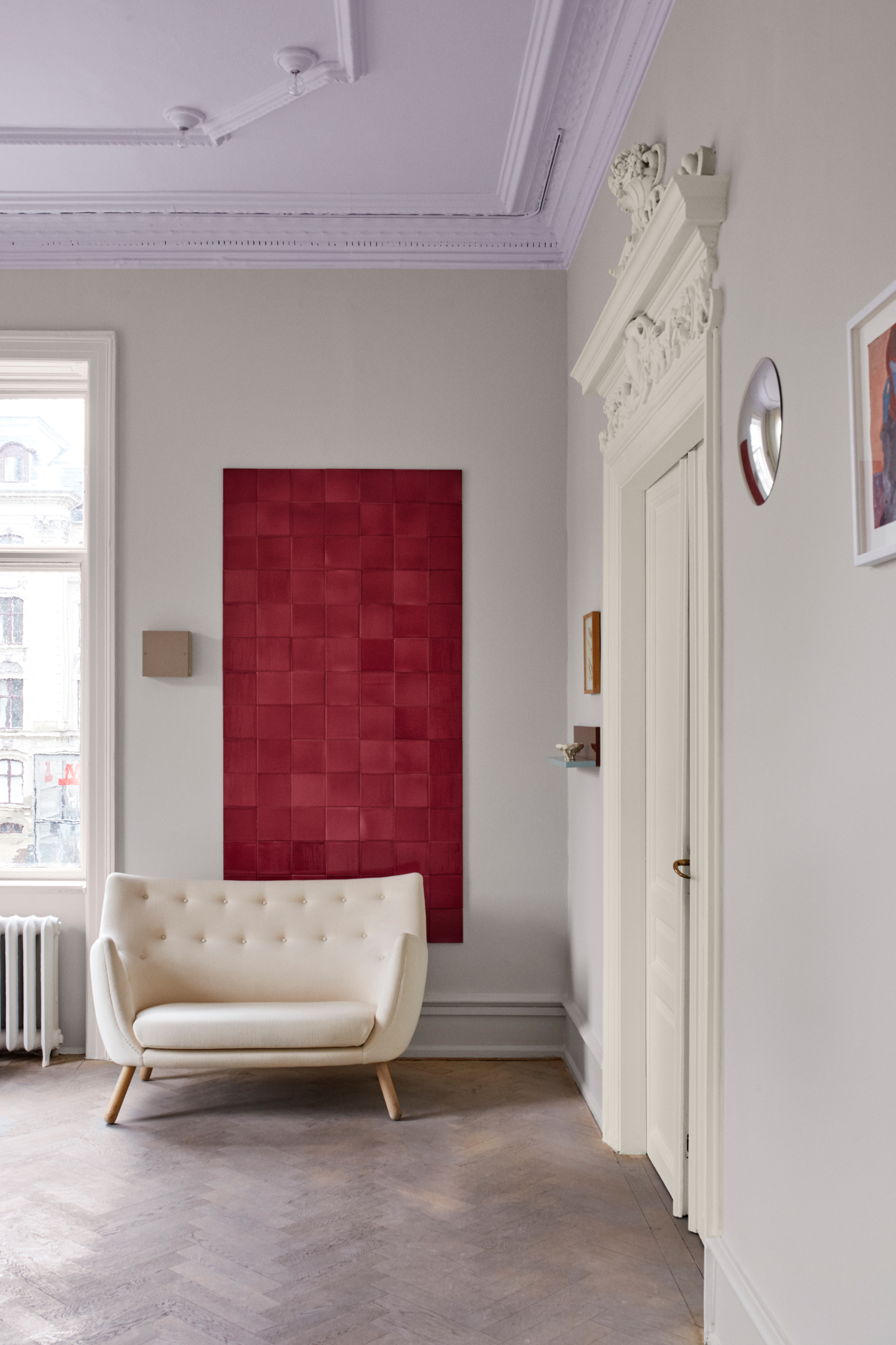
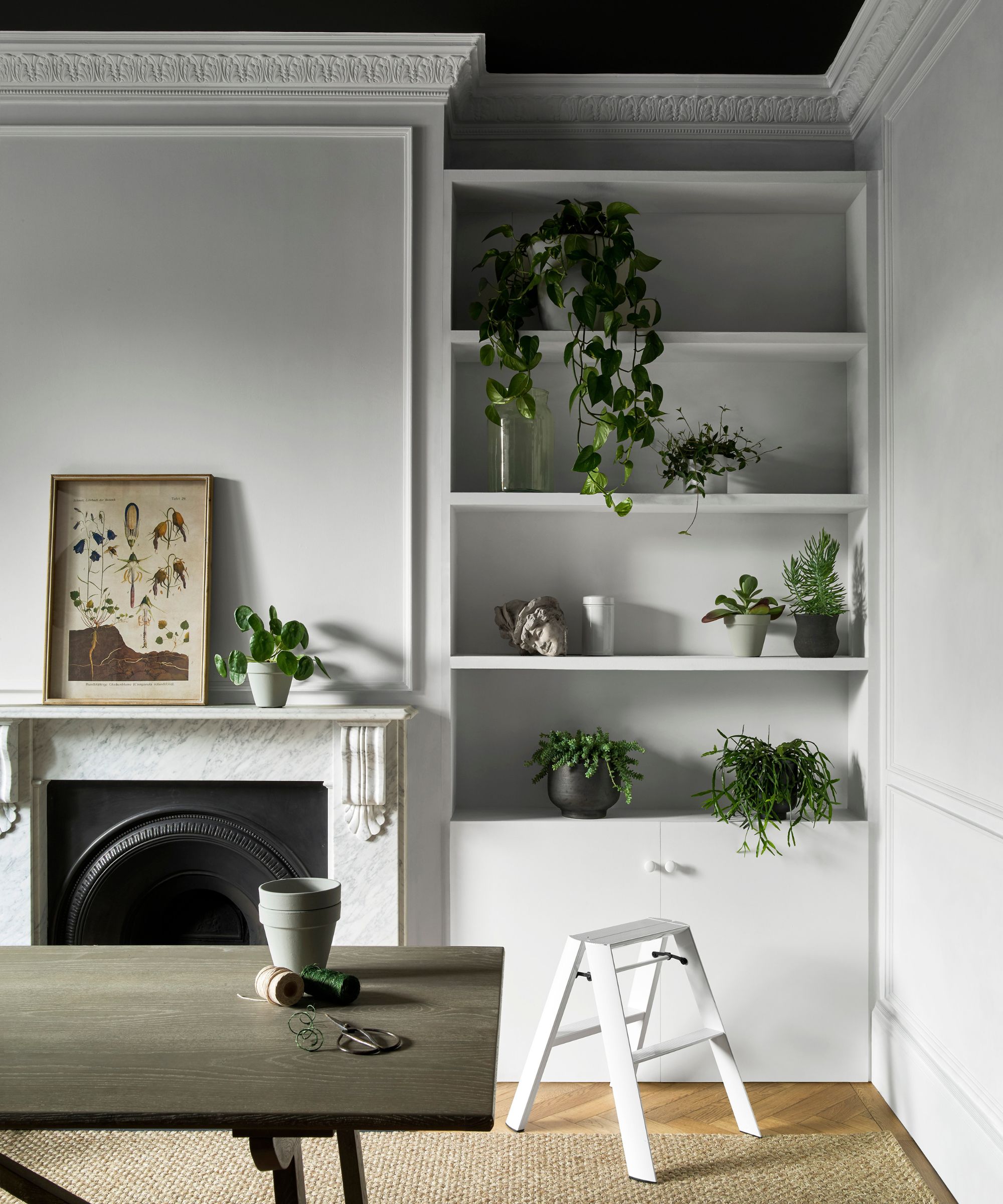
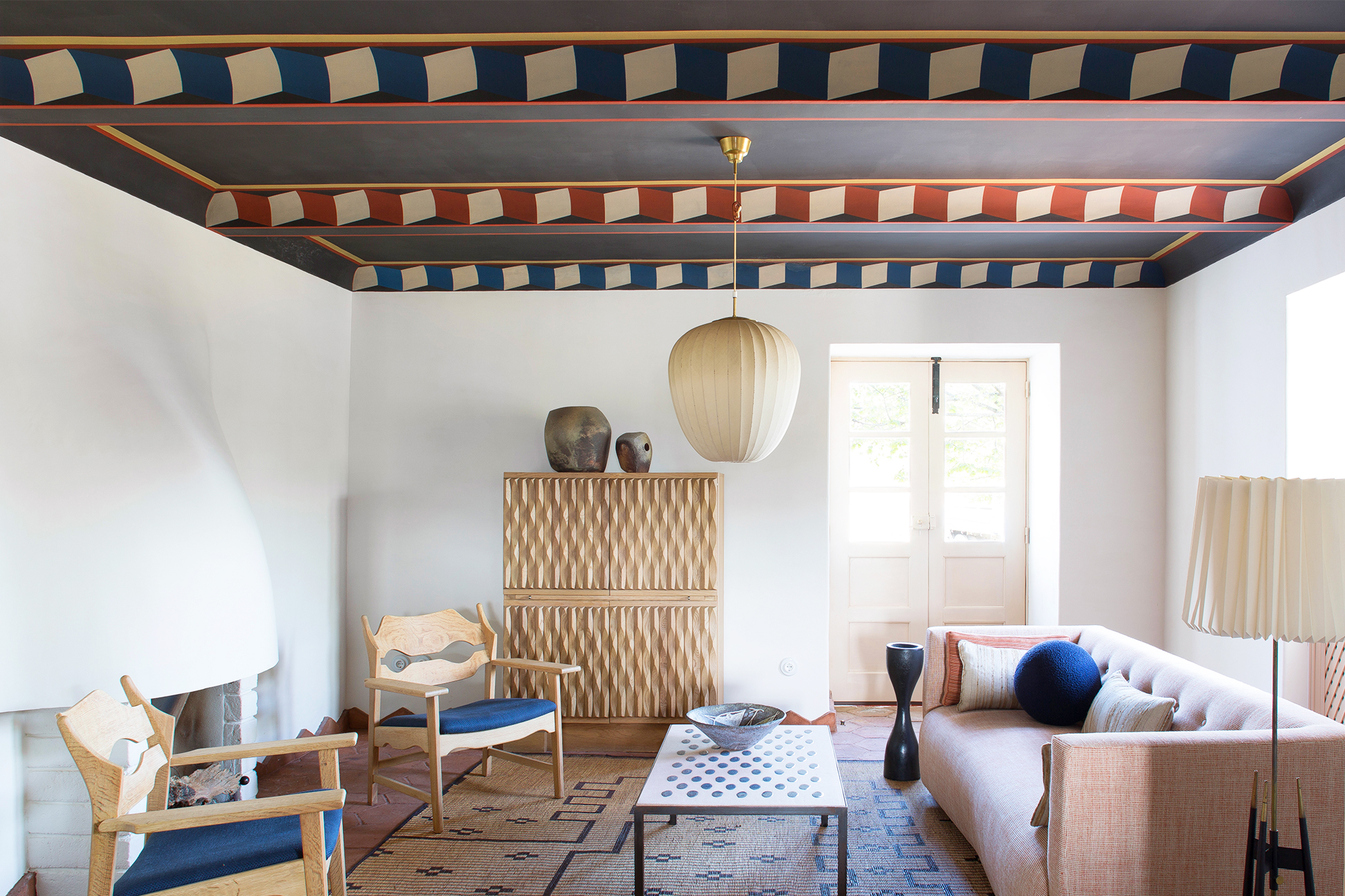
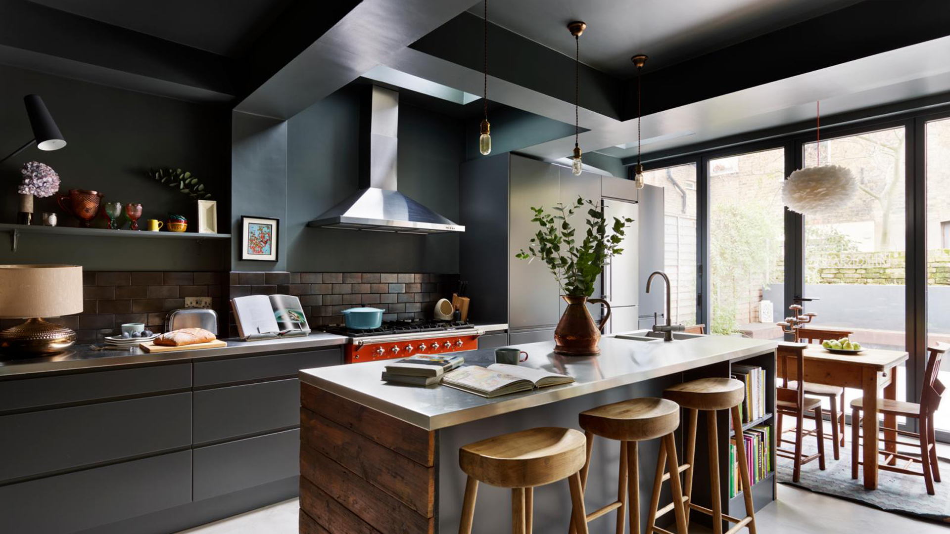
Secondly, when painting a room a dark color, it is advisable to extend the dark paint up to a picture rail or an imaginary line approximately 30 cm down from the ceiling. The ceiling and the area above this line can then be painted a paler color. This method blurs the edges of the ceiling, making the room feel more expansive and preventing the eye from being drawn to the precise outlines of the room. The effect is one of 'folding the ceiling down,' which adds to the perceived height and openness of the space.
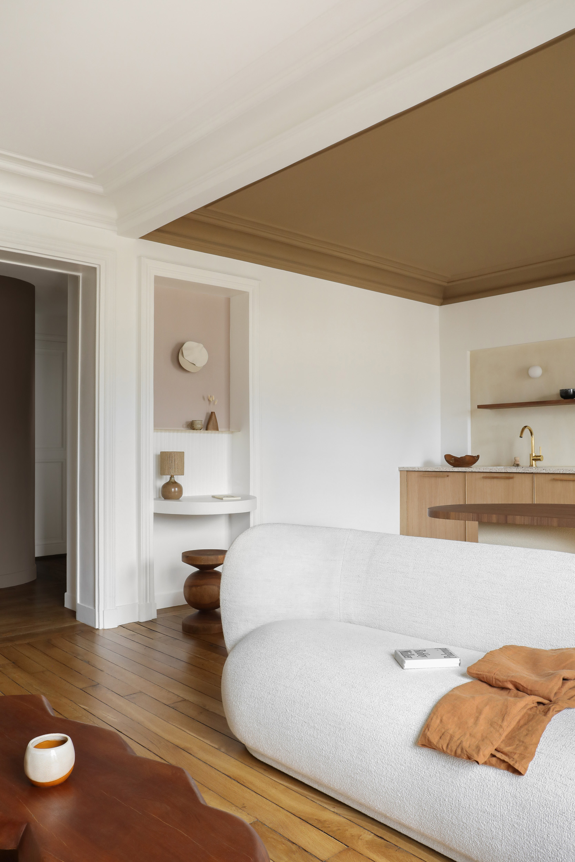
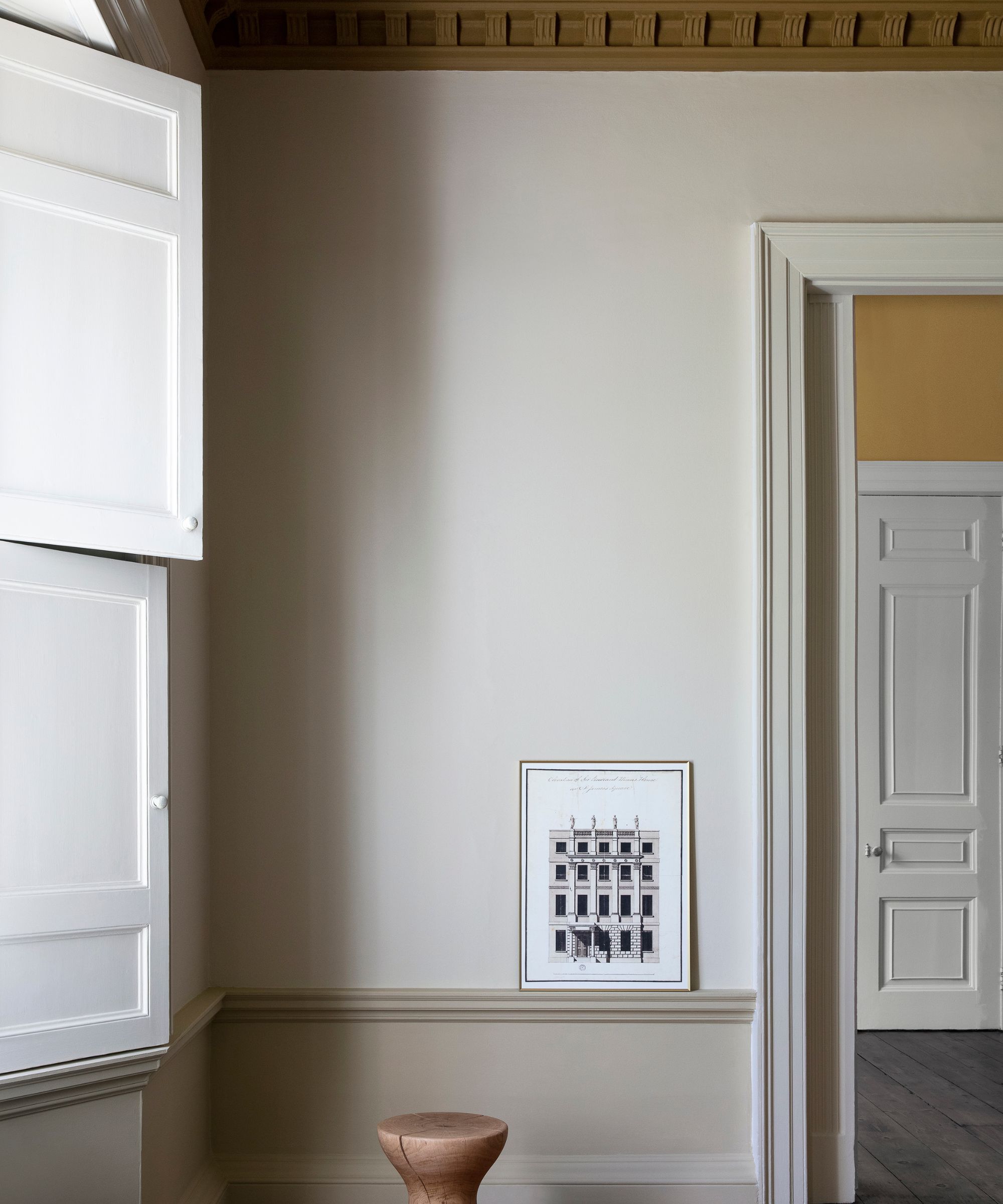
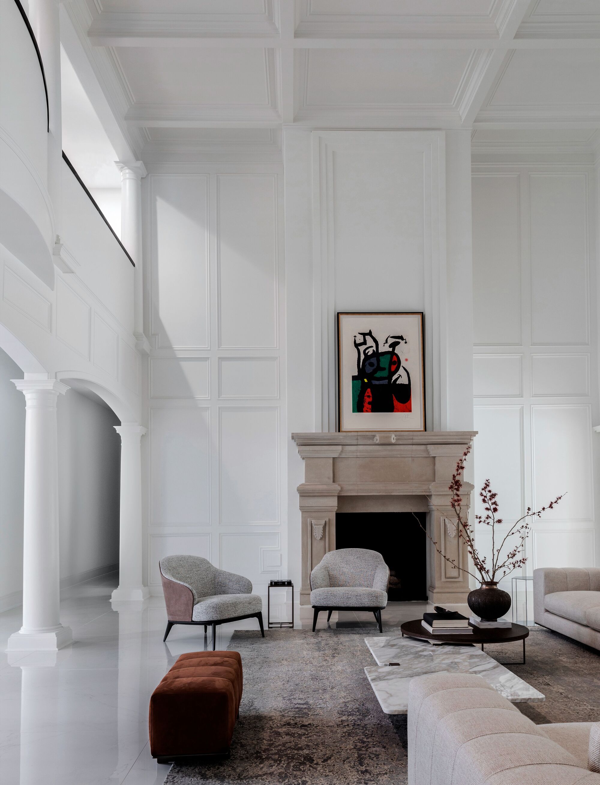
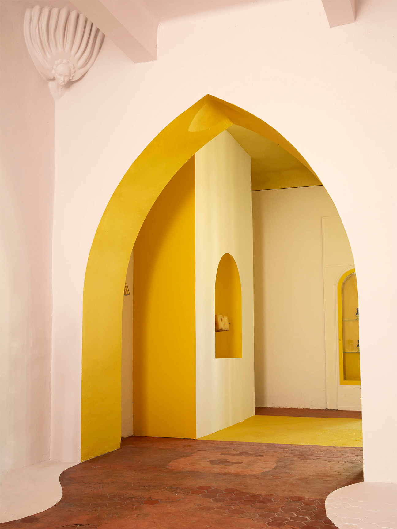
Finally, a prevalent habit is to automatically use white paint for ceilings and woodwork. However, Watson-Smyth argues against this default approach. Homeowners often dedicate considerable thought and effort to selecting wall colors, using samples and agonizing over choices, only to revert to white for the ceiling and trim. She compares this to wearing a white T-shirt with any outfit—while it might match, many other pale shades could also complement the chosen wall color more effectively. Instead, she recommends taking the time to select a ceiling and woodwork color that truly enhances the wall color and aligns with the desired aesthetic. This thoughtful selection process contributes significantly to a more harmonious and refined interior.
These expert recommendations highlight that successful dark color schemes require attention to detail beyond just the walls. By integrating architectural elements like skirting boards, radiators, and ceilings into the color scheme, a room can achieve a cohesive, elegant, and seemingly larger appearance.
#InteriorDesign #PaintingTips #DarkColors #HomeImprovement #SkirtingBoards #RadiatorPainting #CeilingDesign #ColorPsychology #DIYHome #InteriorDesign #PaintingTips #DarkColors #HomeImprovement #SkirtingBoards #RadiatorPainting #CeilingDesign #ColorPsychology #DIYHome
0 comment in total
 No comments yet
You may also like
4 Times Designers Say You Definitely Shouldn't Paint Your Walls and Ceiling in the Same Color

6 painting mistakes that are making your walls look 'dirtier' – and what you should be doing instead

5 colors you should never paint your entryway – according to interior experts

5 Colors You Should Never Paint Your Hallway, According to Designers

7 Wall Murals In, This DIYer’s Top Paint Tip Is to—Gasp!—Not Use Tape

For This French Interior Architect, Paint Belongs Everywhere But the Walls
4 Paint Colors Designers Say You Should Never Use In A Hallway

What are the worst colors to paint a room? The shades experts say you should never use
5 reasons why you should never paint a ceiling white, reveals a leading paint and color expert
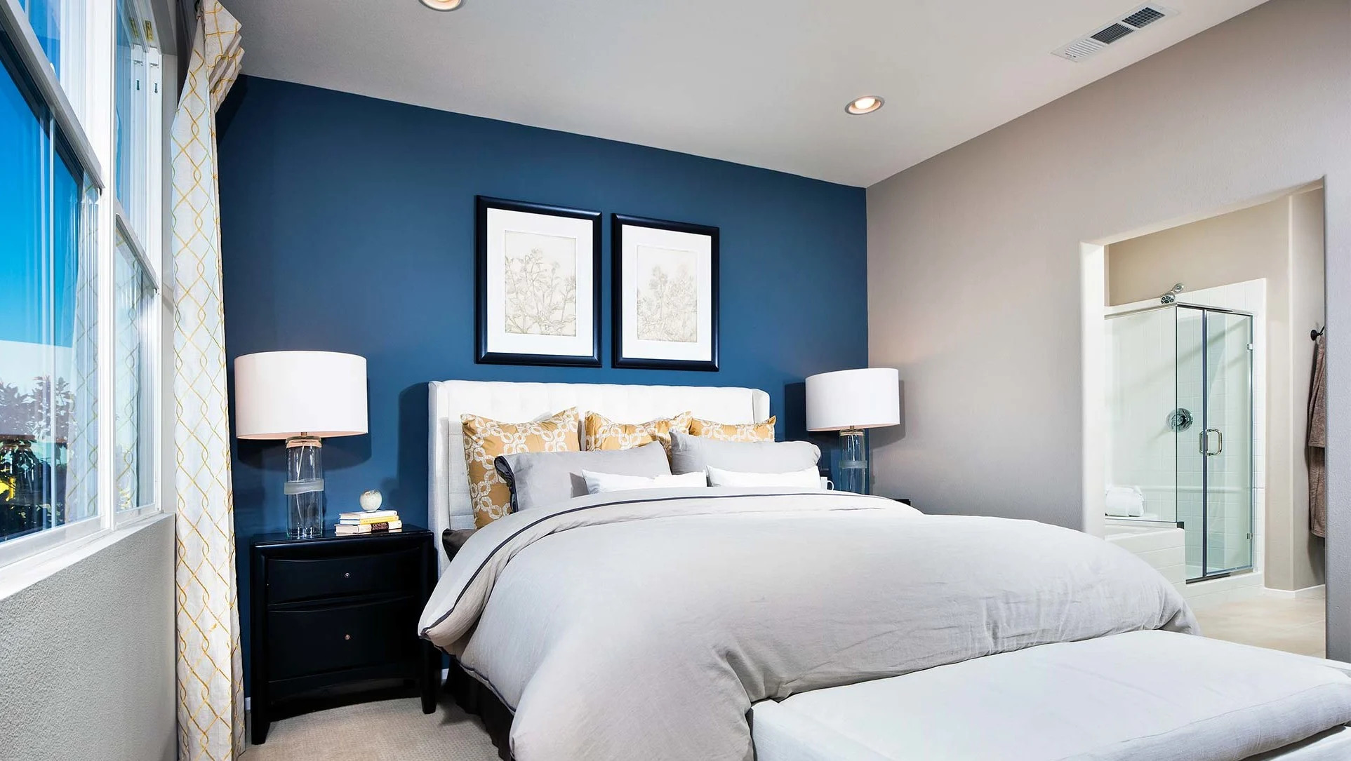
You’re Doing It Wrong: Painting an Accent Wall


Interior design experts reveal the colour rules you should be breaking
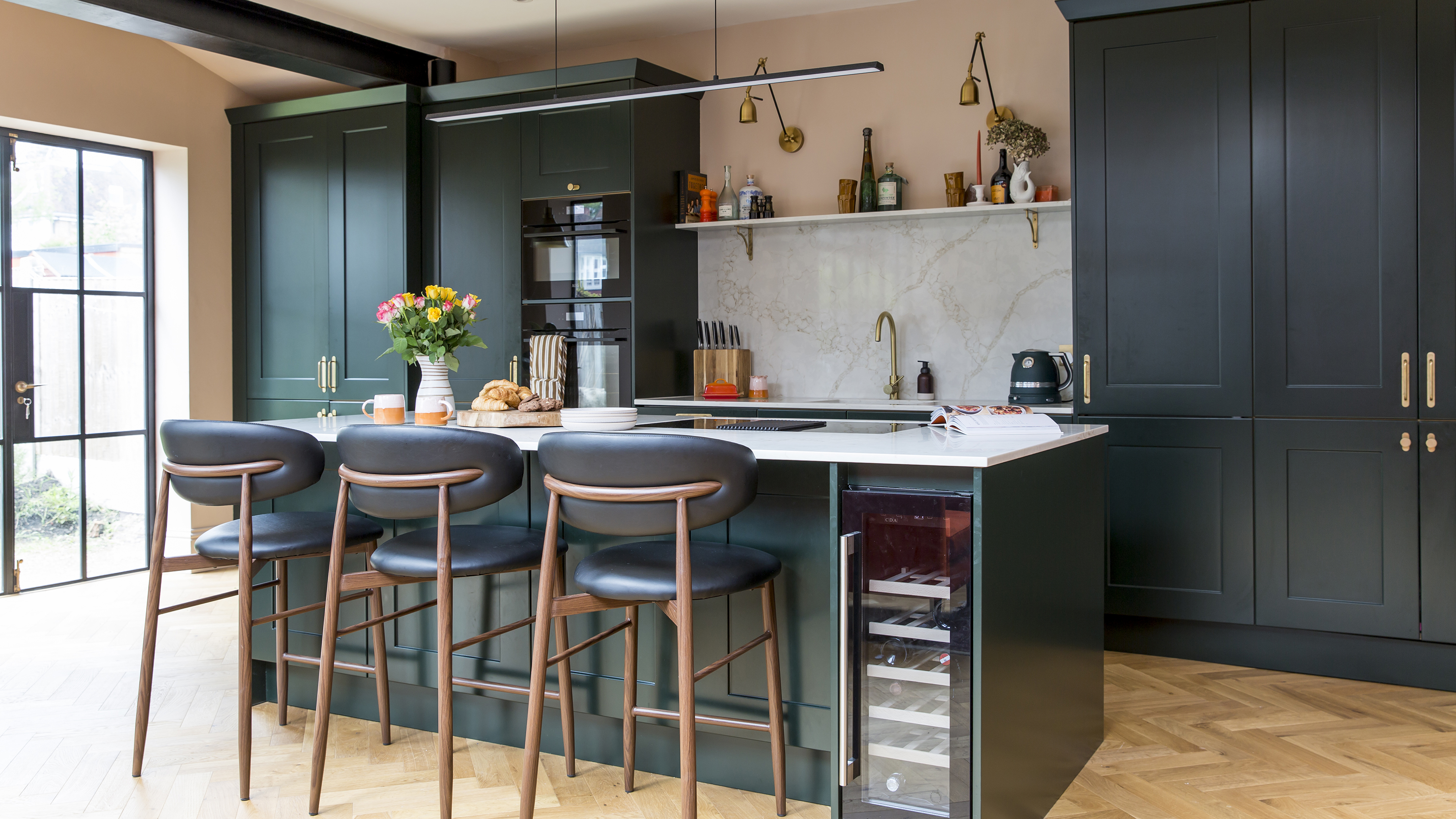
3 reasons you shouldn't paint your kitchen walls white – plus the new neutrals to try instead, according to kitchen pros
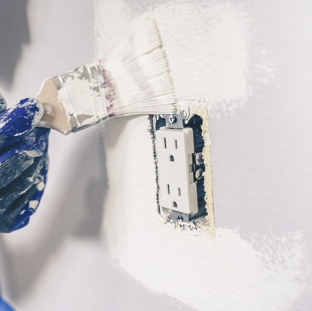
Don't Make this Common DIY Painting Mistake

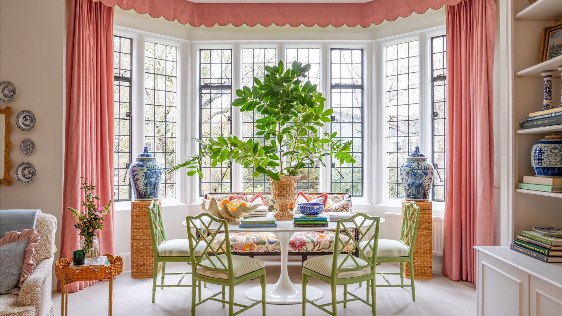
7 times you should never paint a room white
7 Paint Mistakes That Make Designers Instantly Cringe When They Walk Into Someone's Home


Interior Paint

You should never paint your hallway this colour, according to colour psychologists
An interior designer reveals the 5 mistakes to avoid when painting with dark colours


5 colors you should never paint a small room – designers warn us to steer clear of these hues, and what to pick instead
5 Paint Colors You Should Never Use in a Bathroom, Designers Warn