1/14
How to Combine Colors and Textures in Interior Decor
Colors and textures are fundamental elements in interior design, profoundly influencing the perception and mood of a space. The judicious combination of these elements can transform an ordinary room into one with distinct personality and aesthetic appeal, catering to contemporary desires for unique and visually engaging environments. Understanding the principles of color theory, particularly the chromatic circle, and experimenting with various textures are crucial steps for designers and individuals alike in achieving harmonious and impactful interiors.
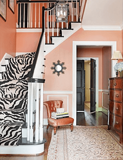
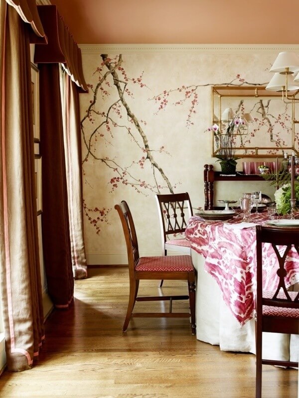
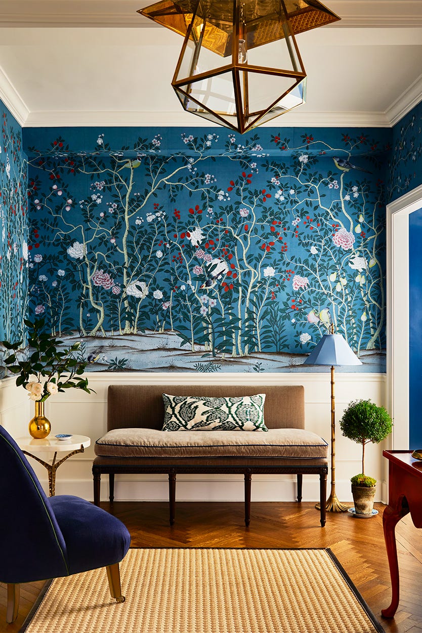
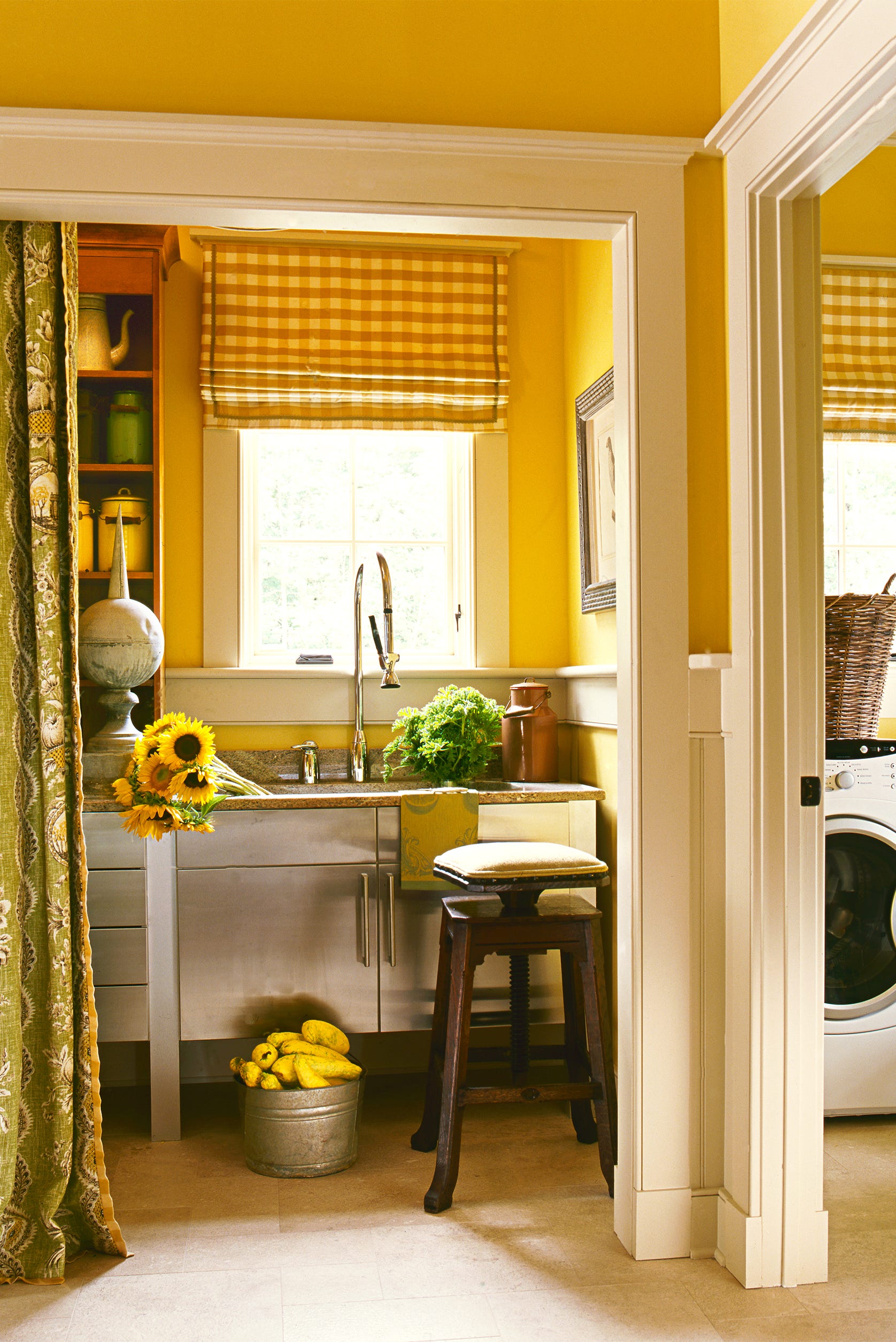
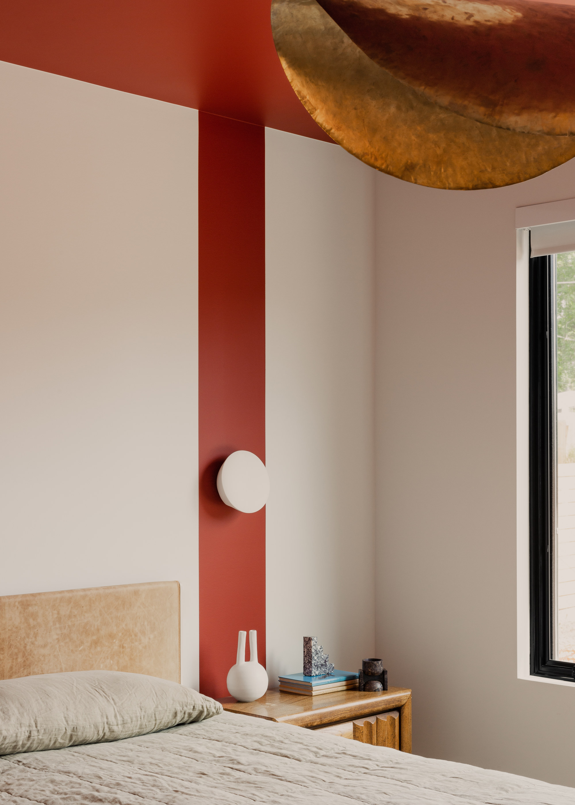
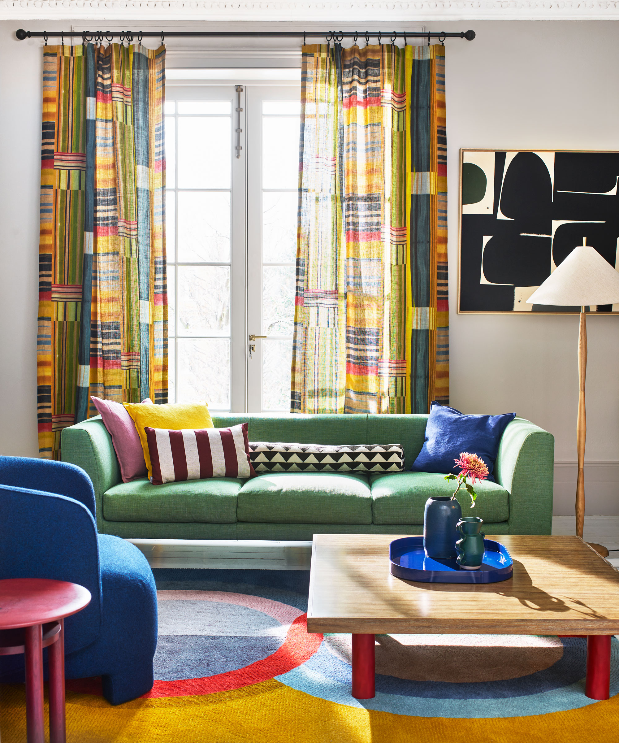
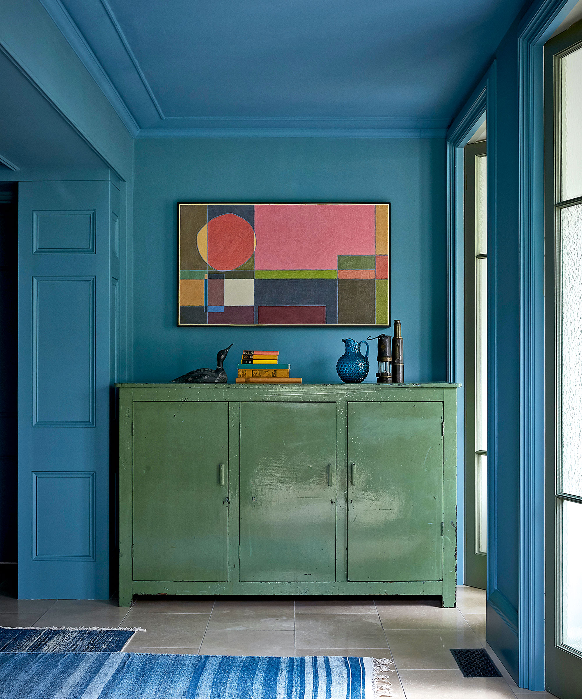
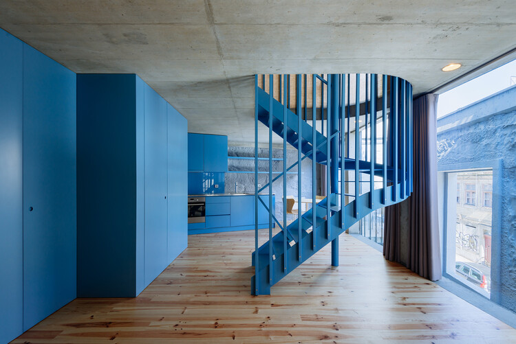
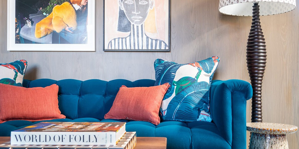
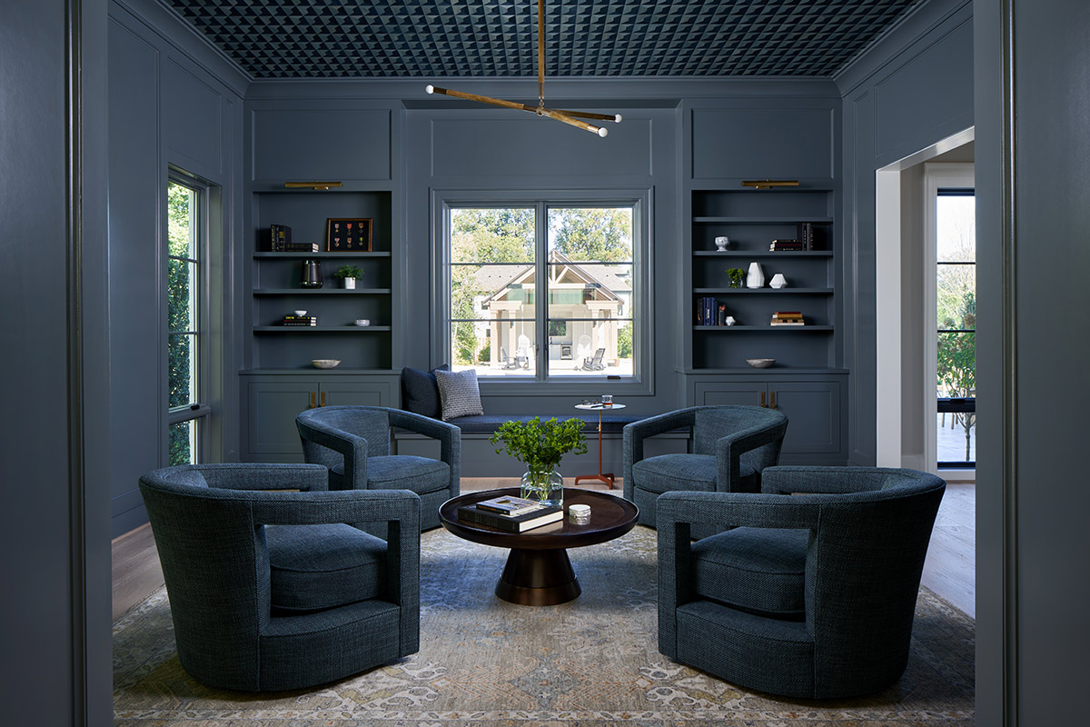
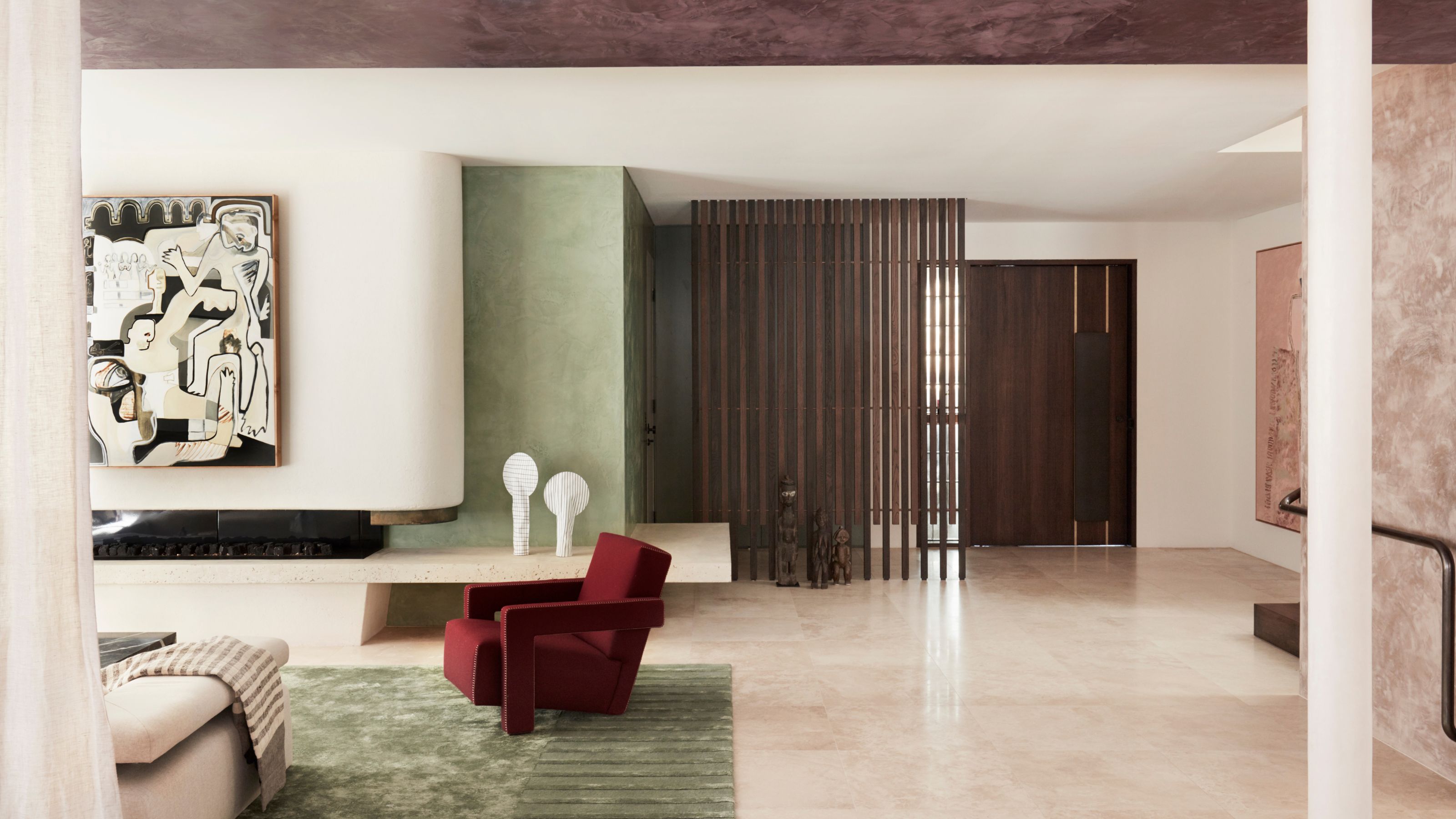
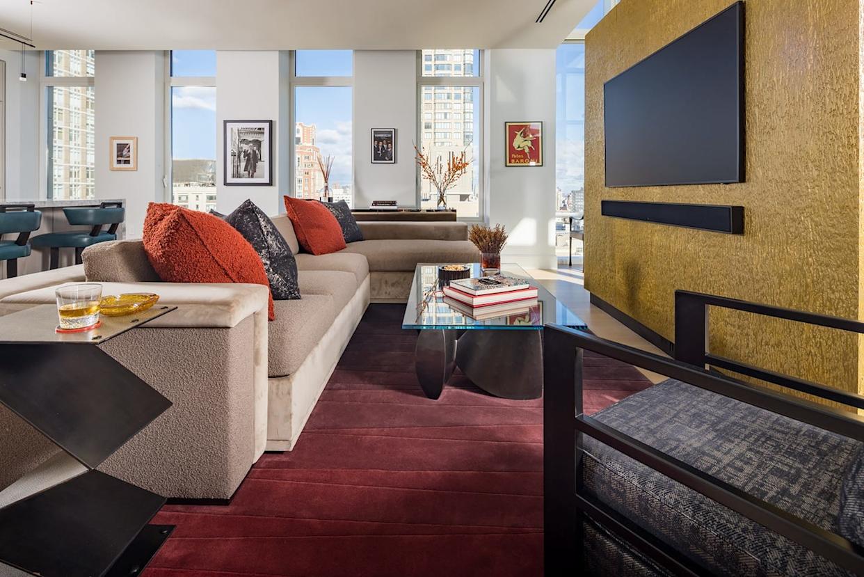
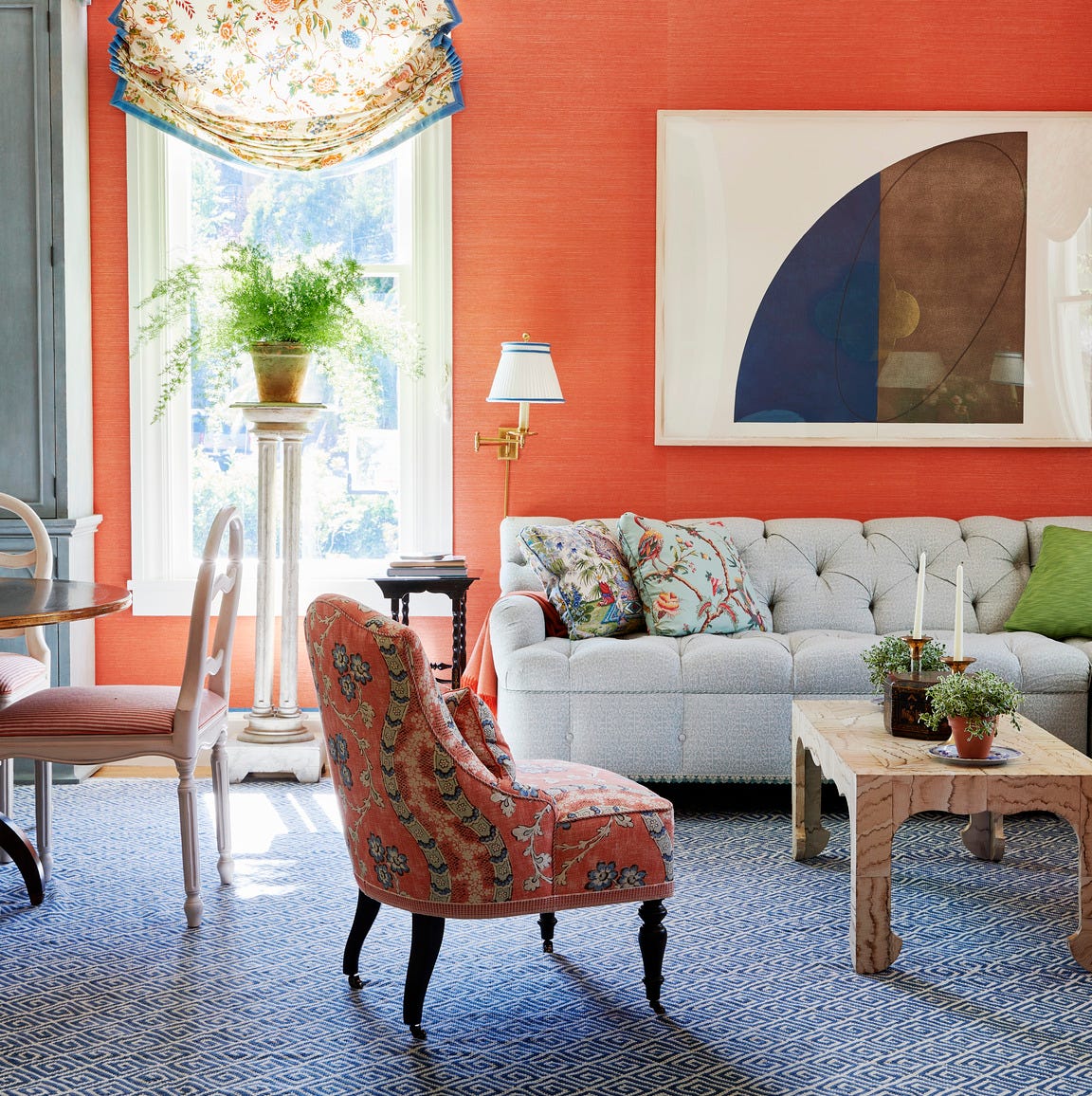
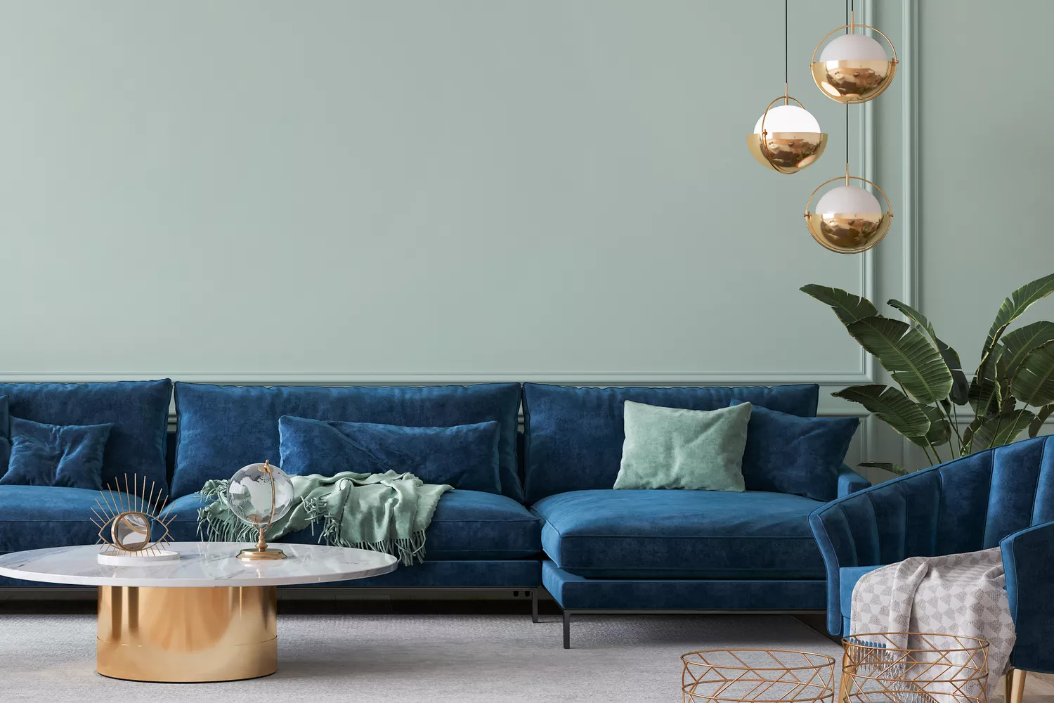
The article emphasizes that colors directly affect how a space is perceived. They can stimulate specific moods, making a room feel calm, energetic, spacious, or cozy, without necessitating structural changes. For instance, cool colors like blues and greens tend to evoke tranquility and expand a space, while warm colors such as reds and yellows create a sense of intimacy and warmth. The strategic use of color can thus manipulate spatial perception and emotional response.
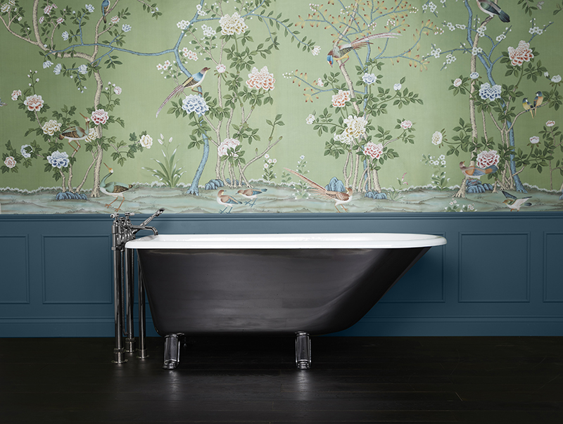
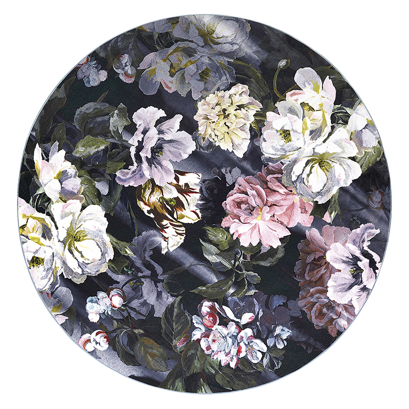
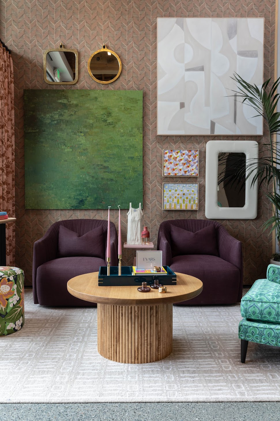
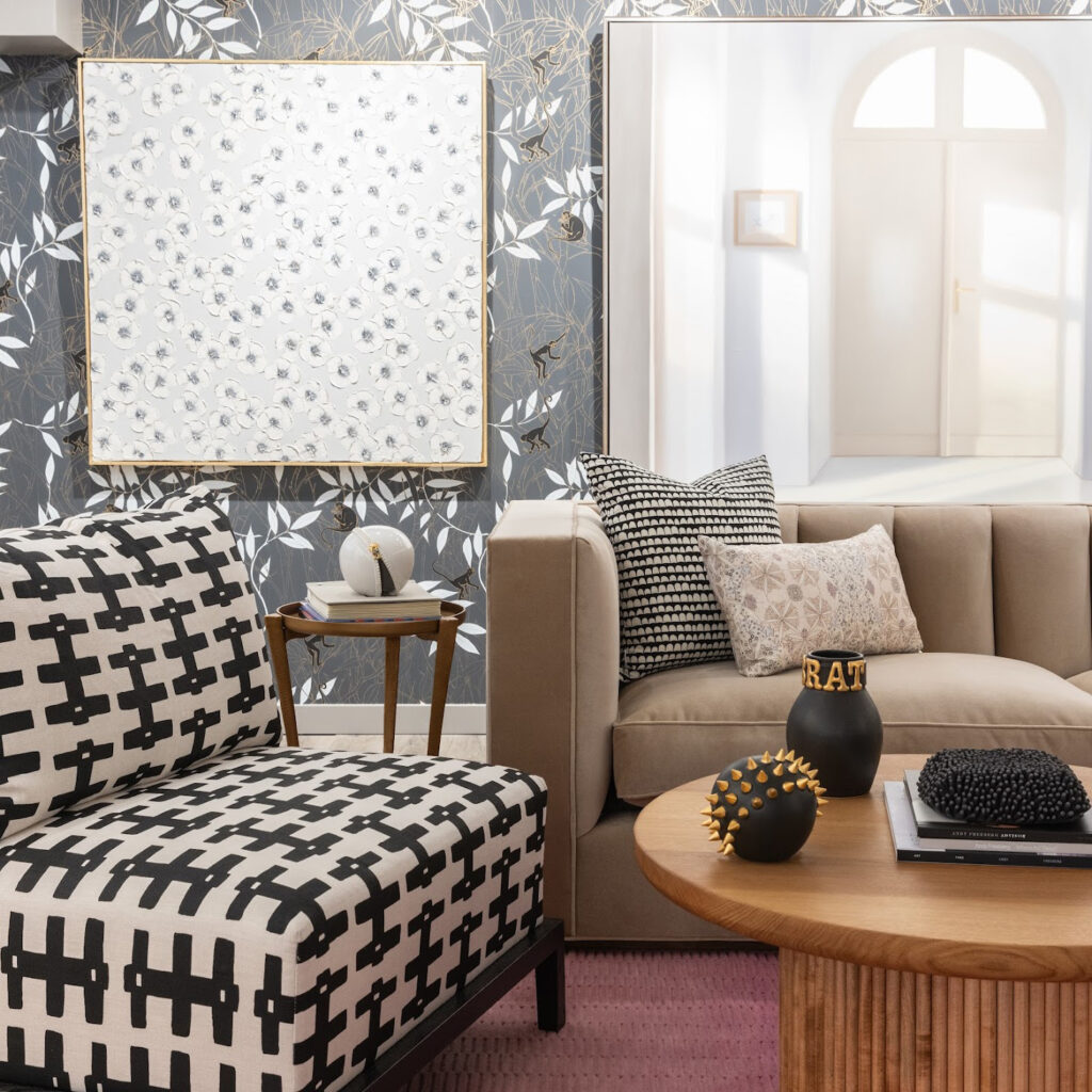
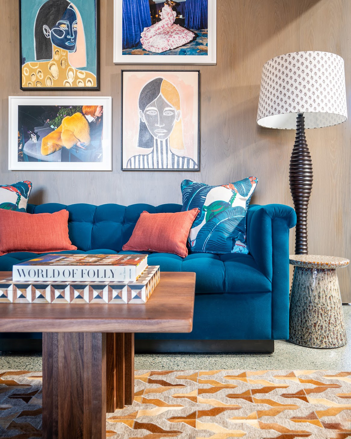
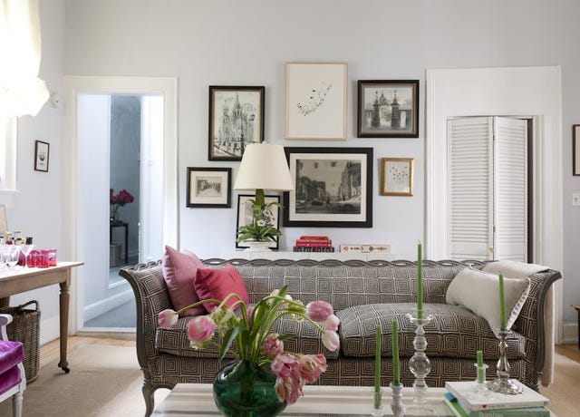
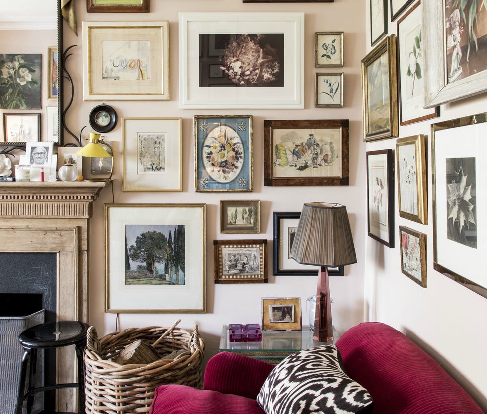
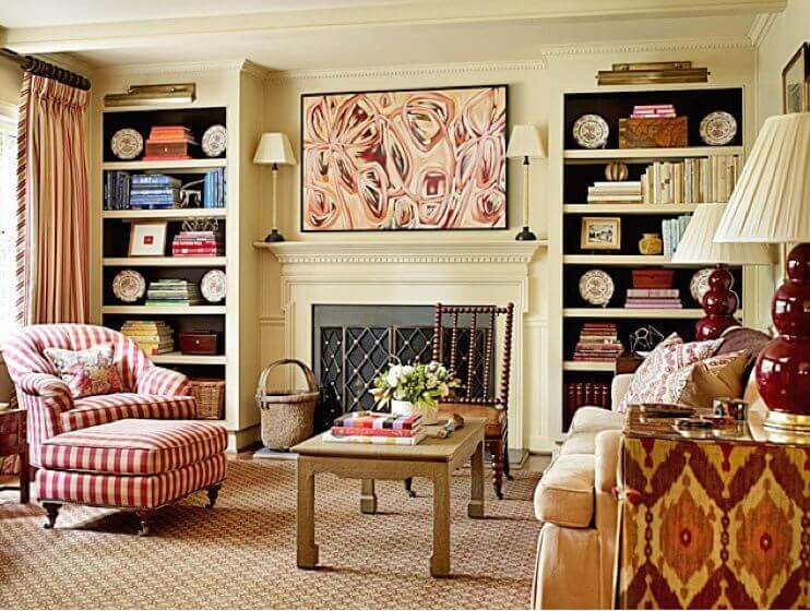
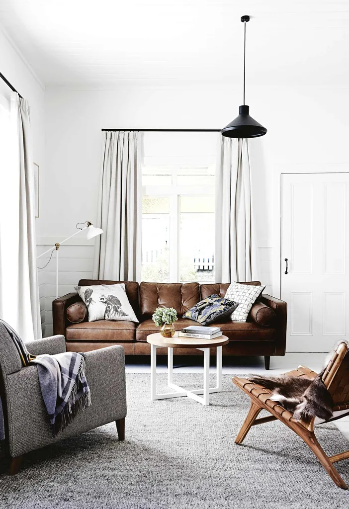
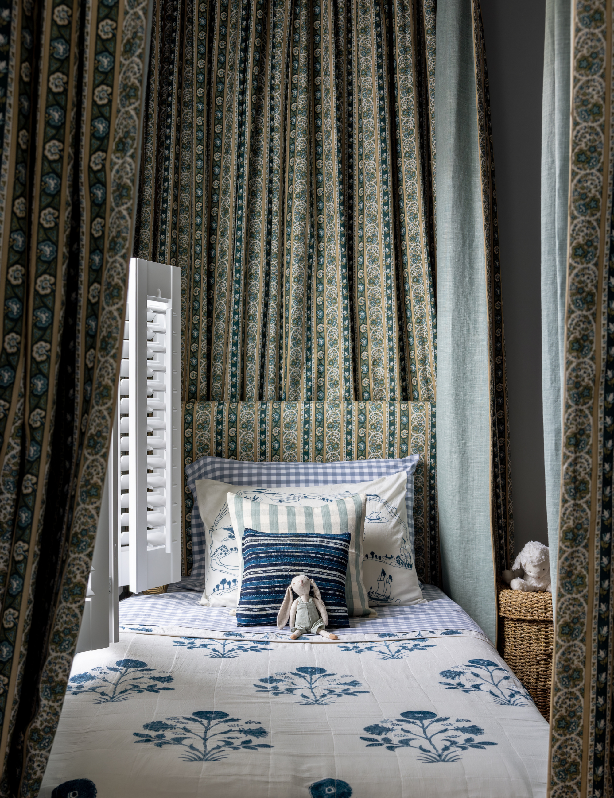
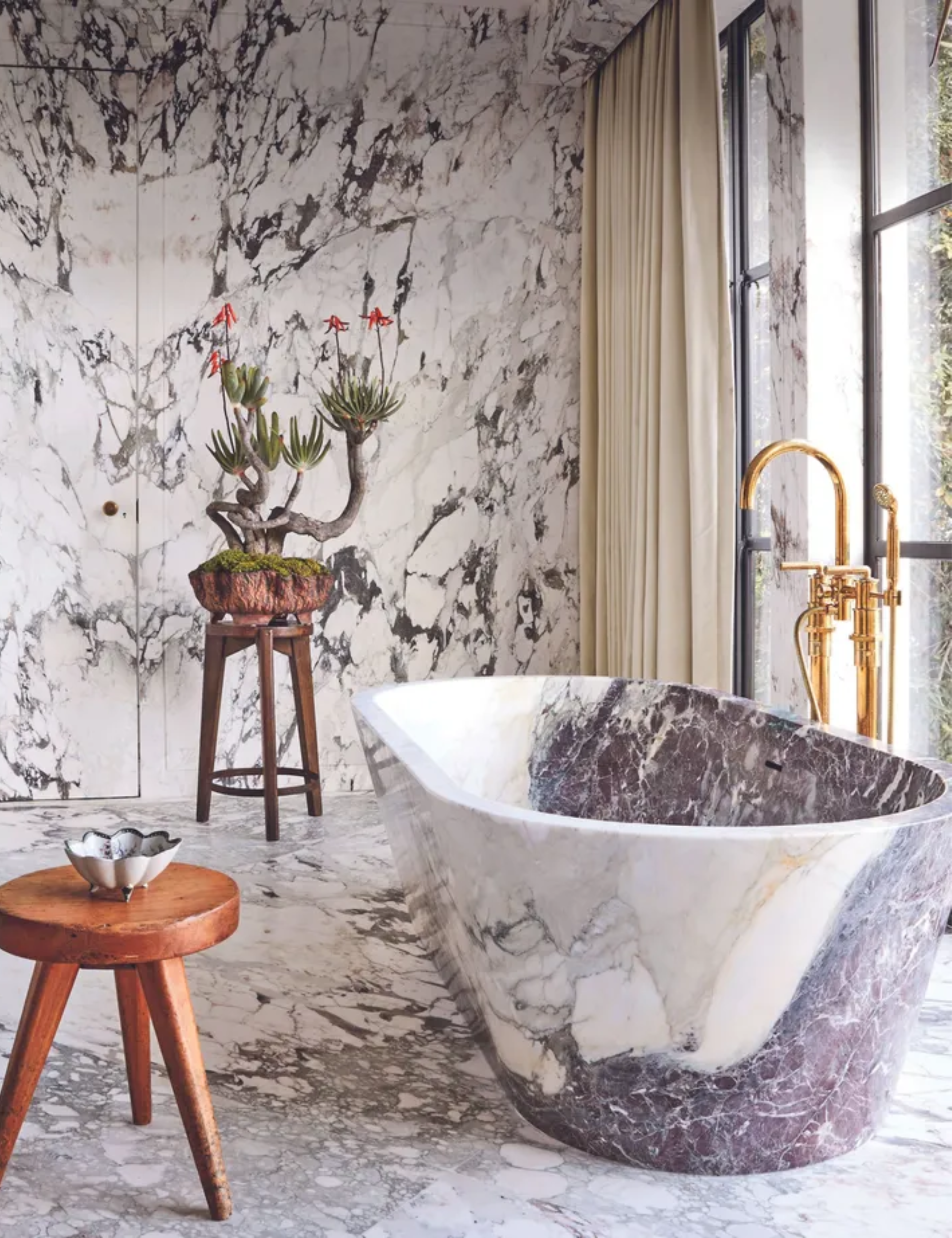
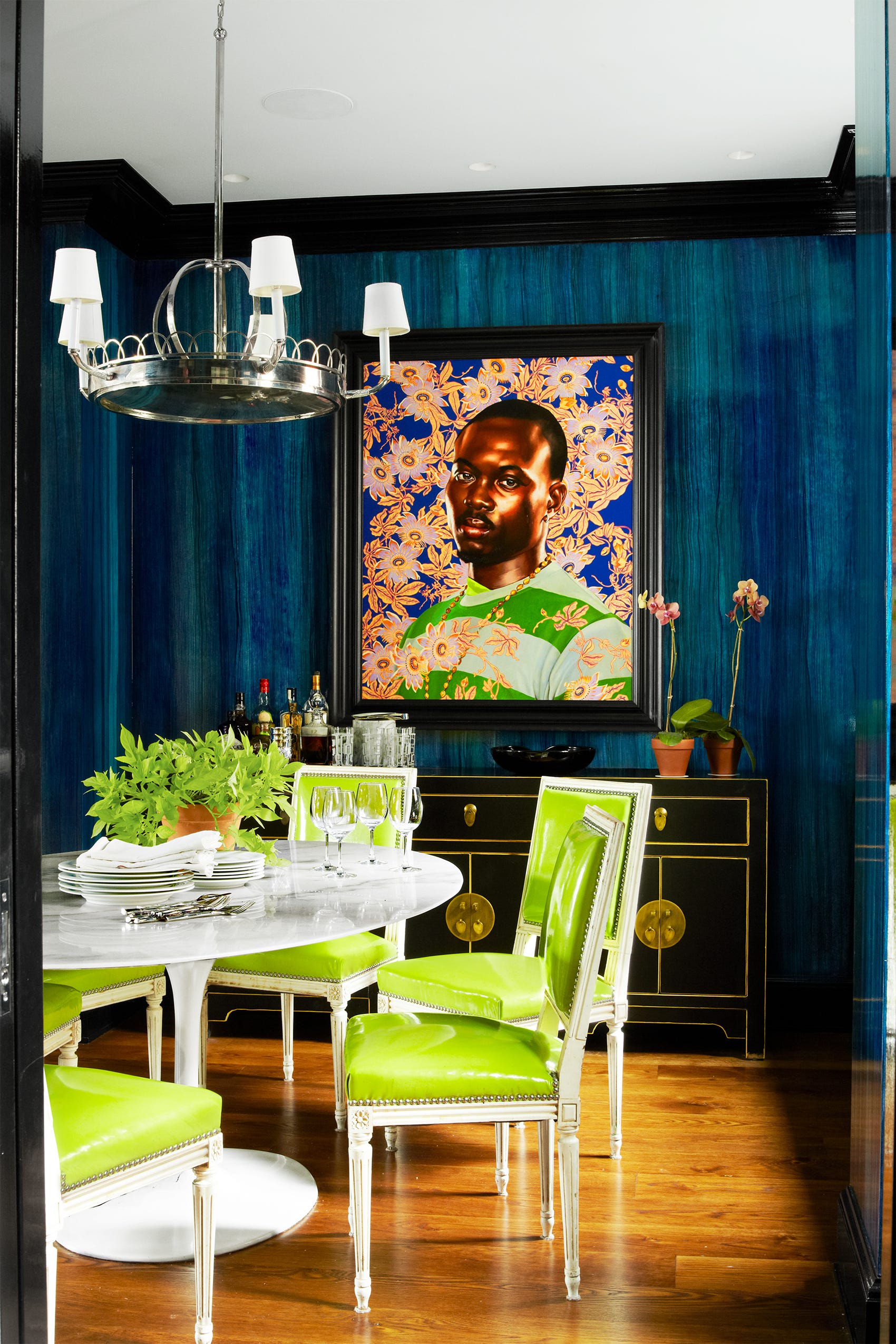
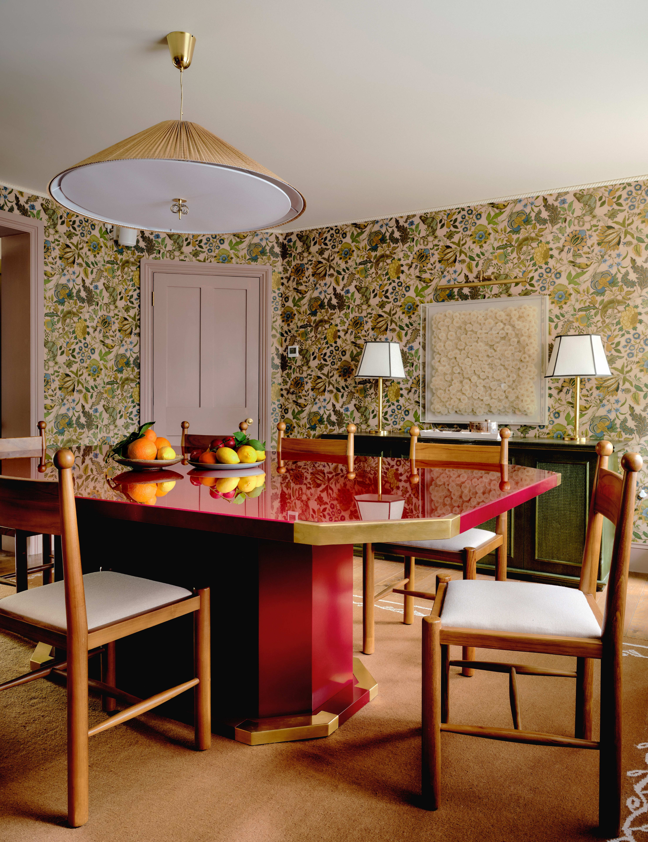
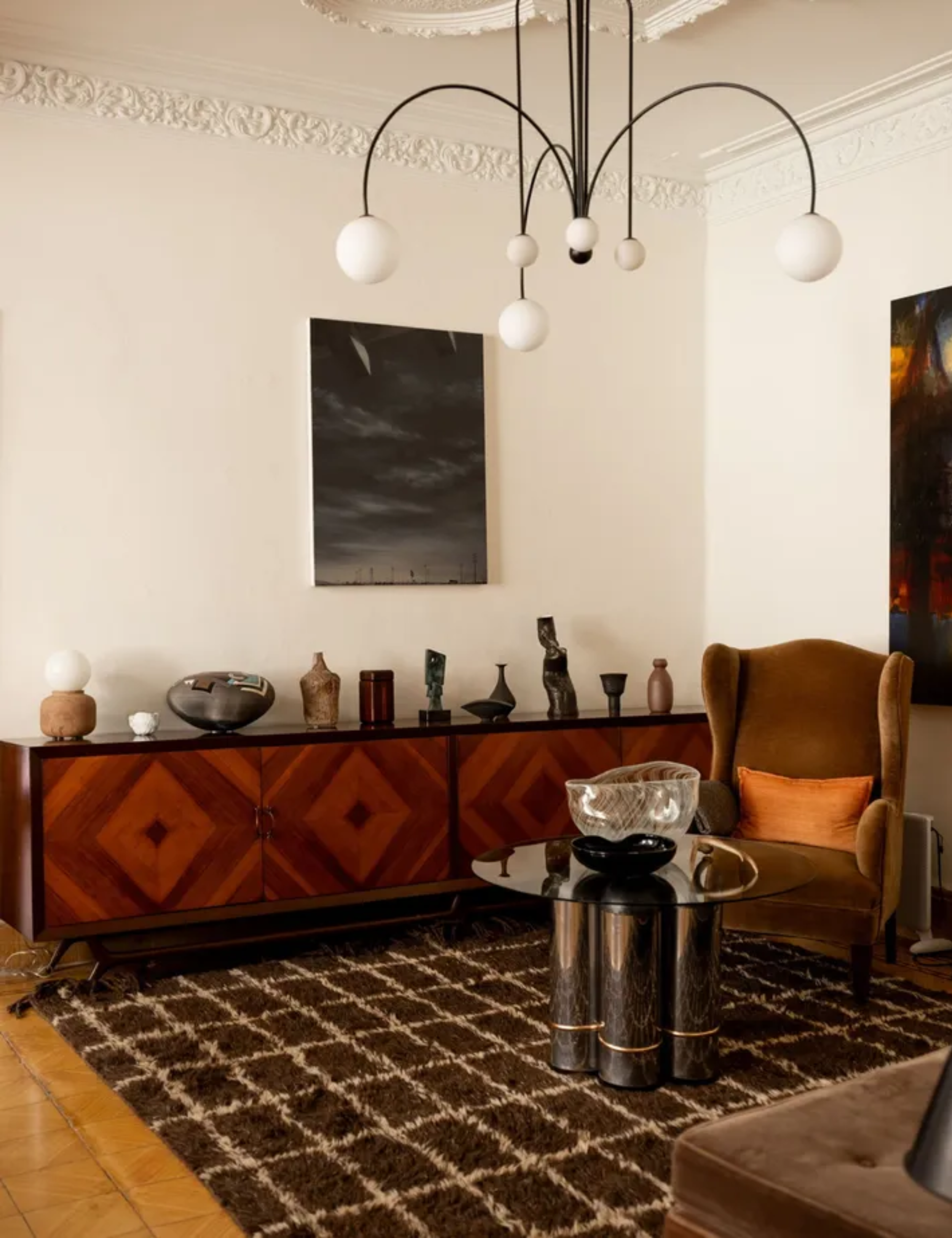
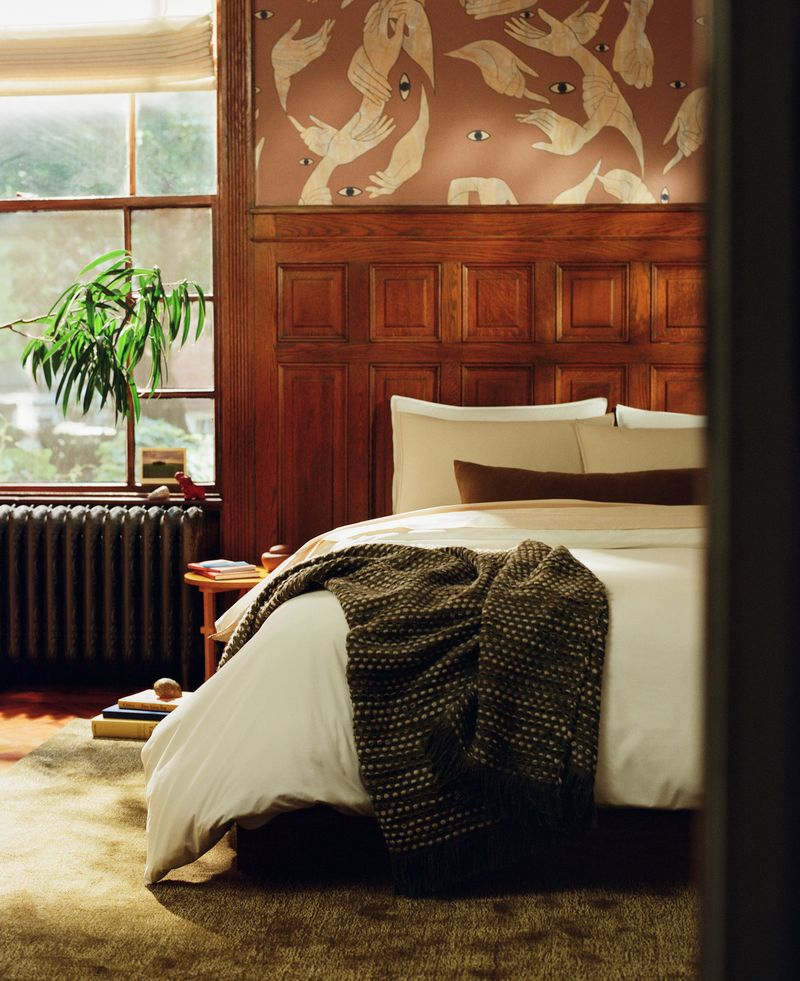
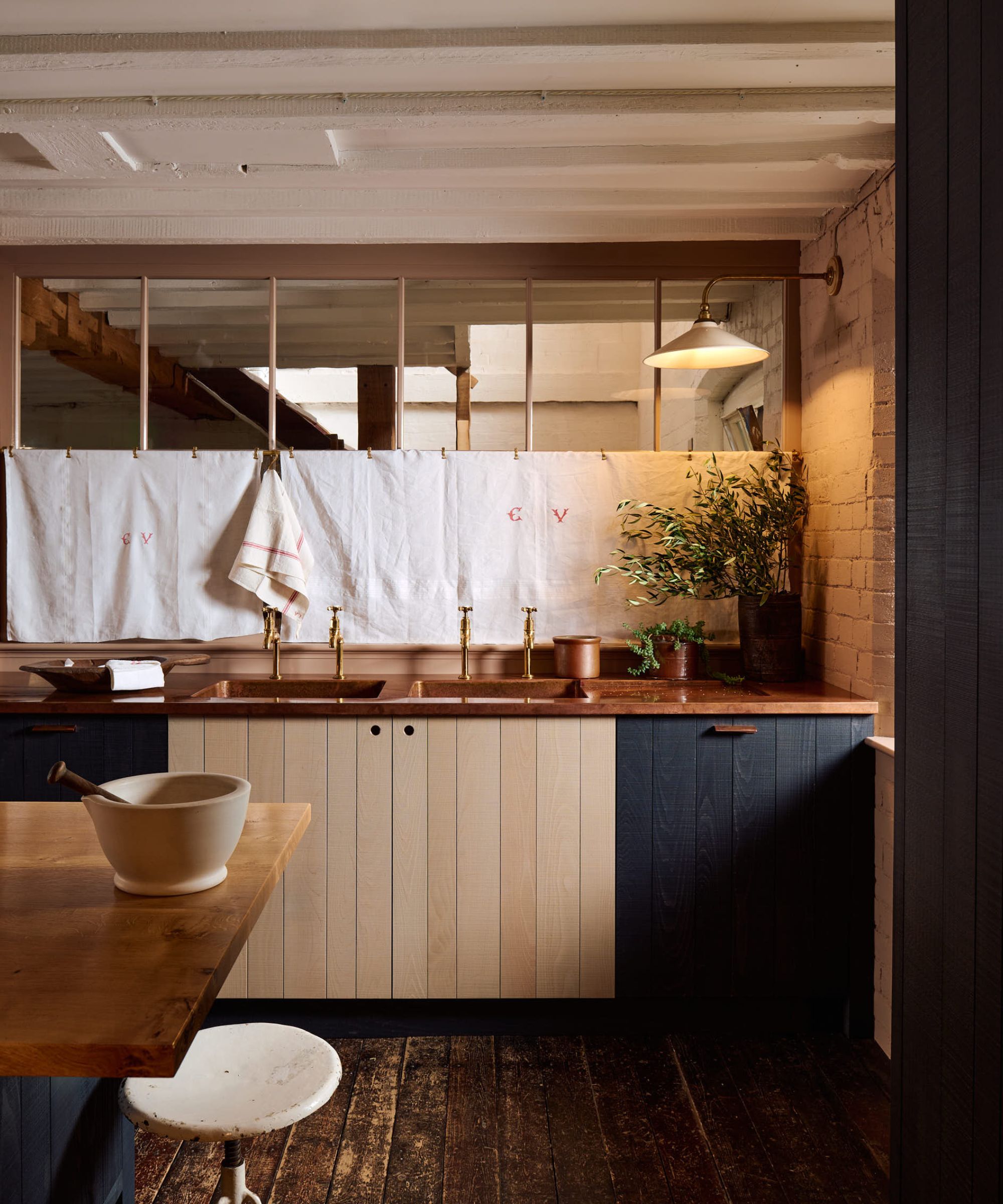
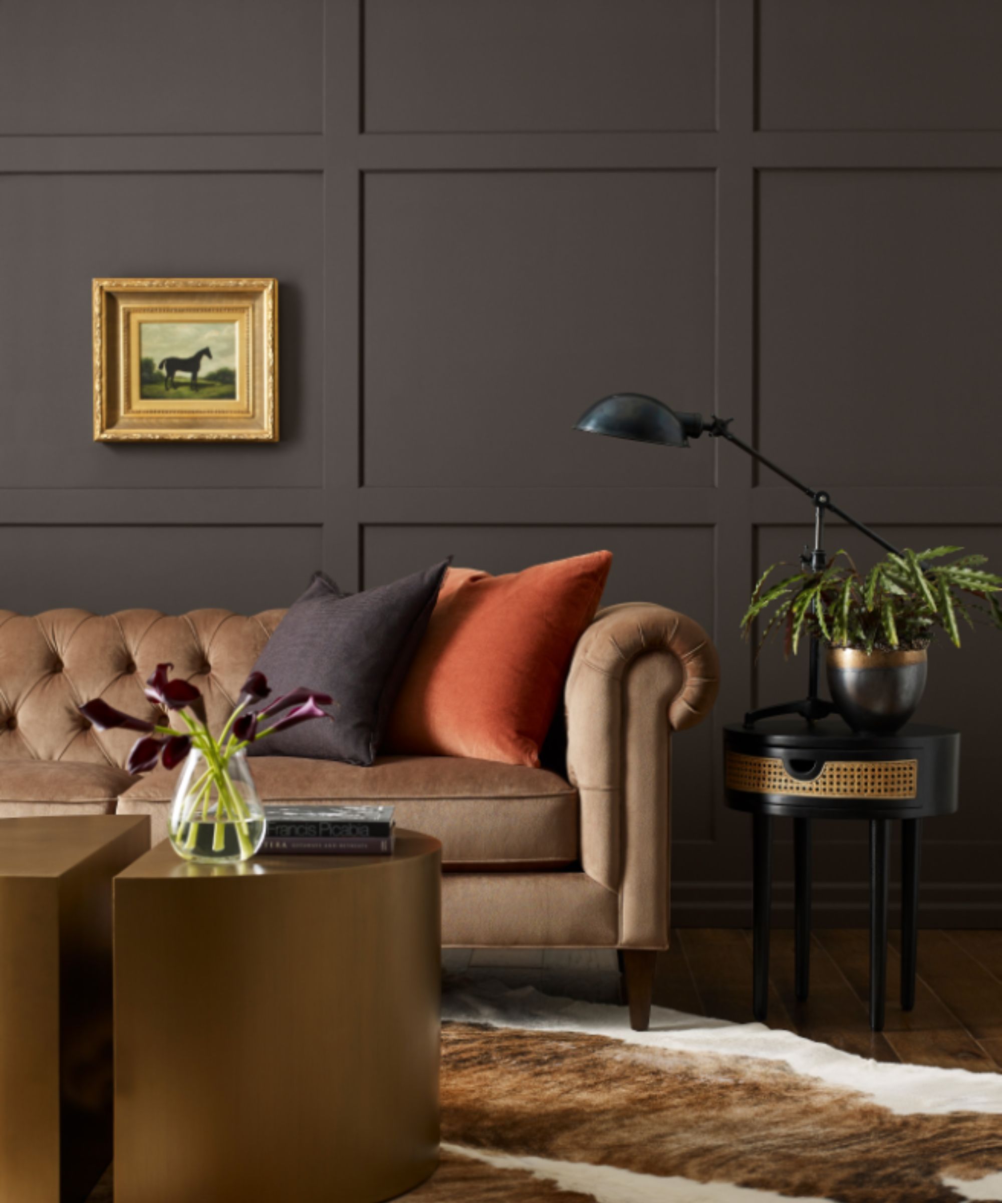
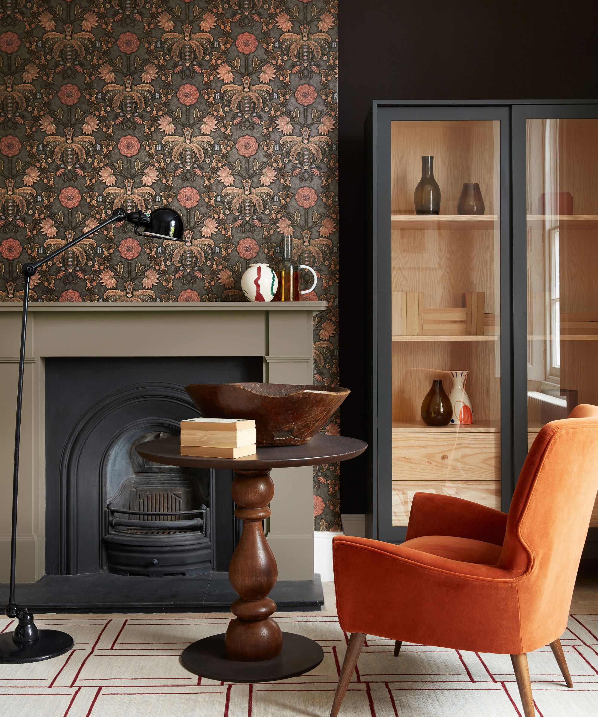
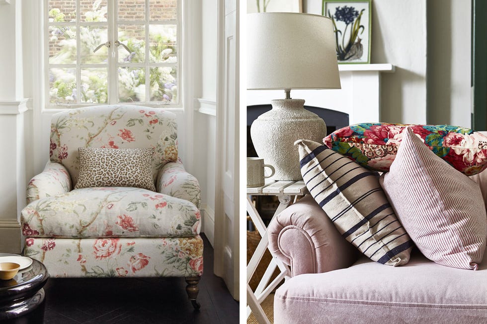
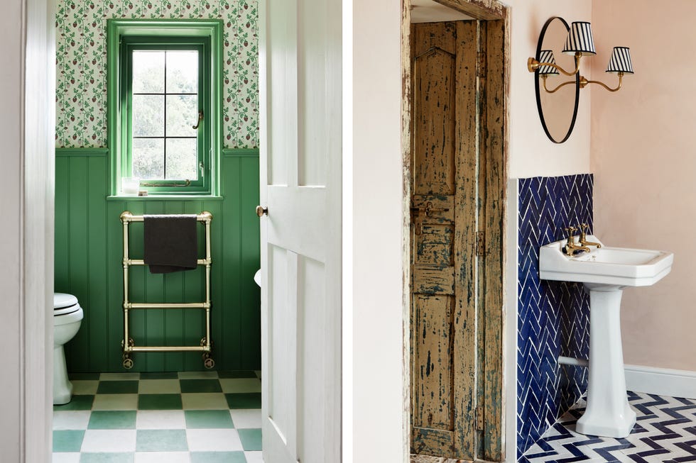
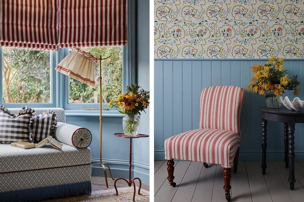
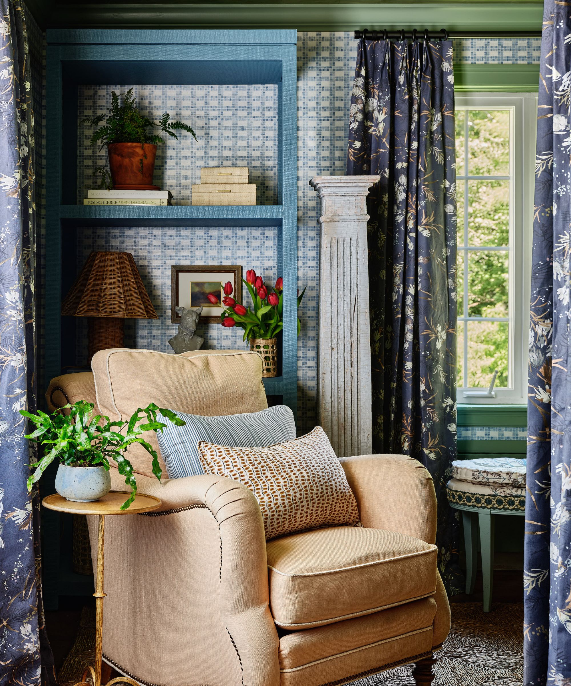
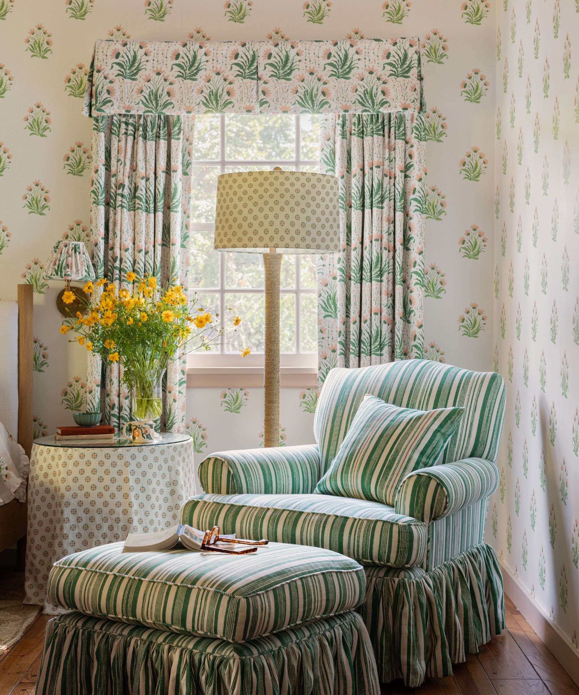
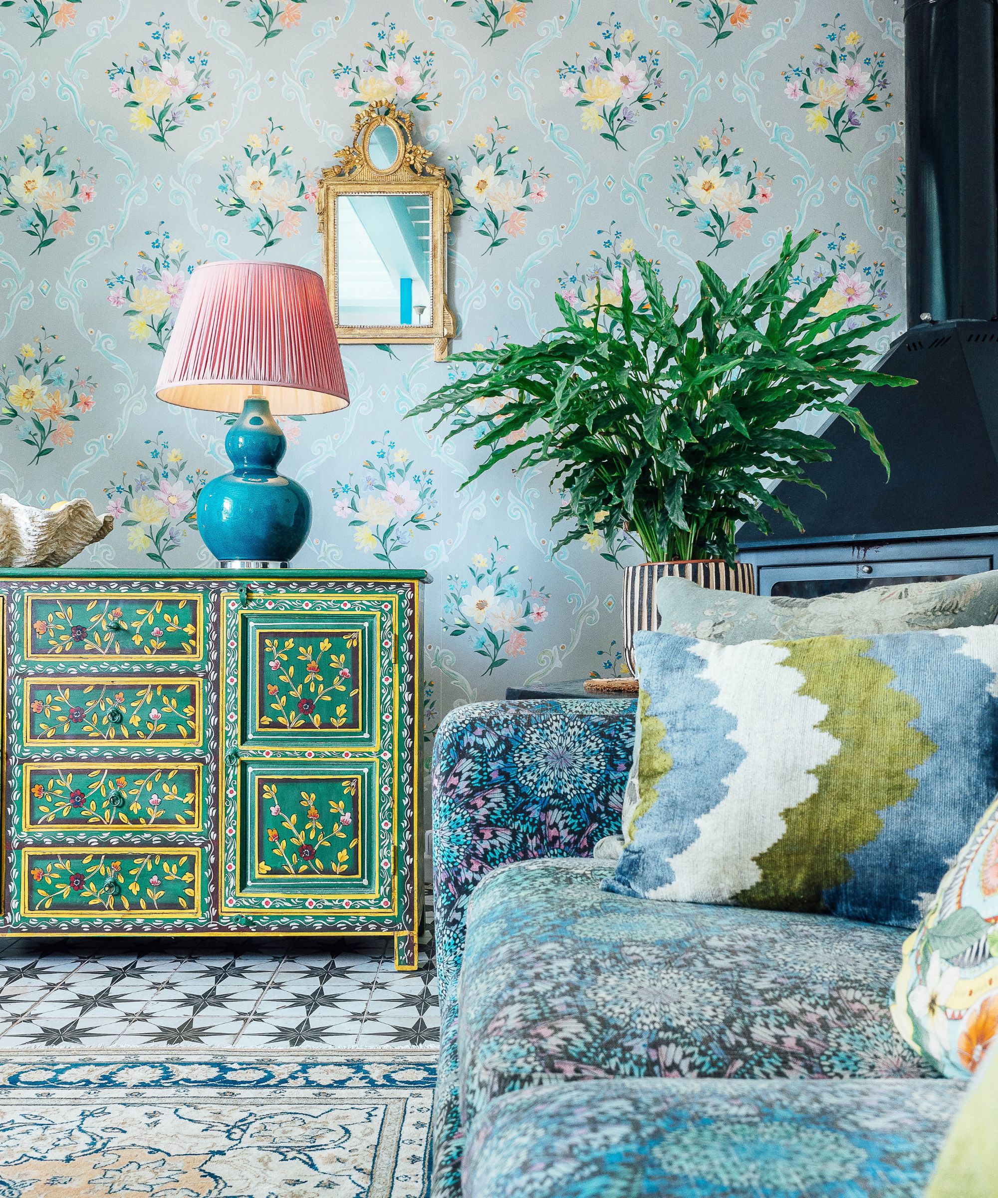
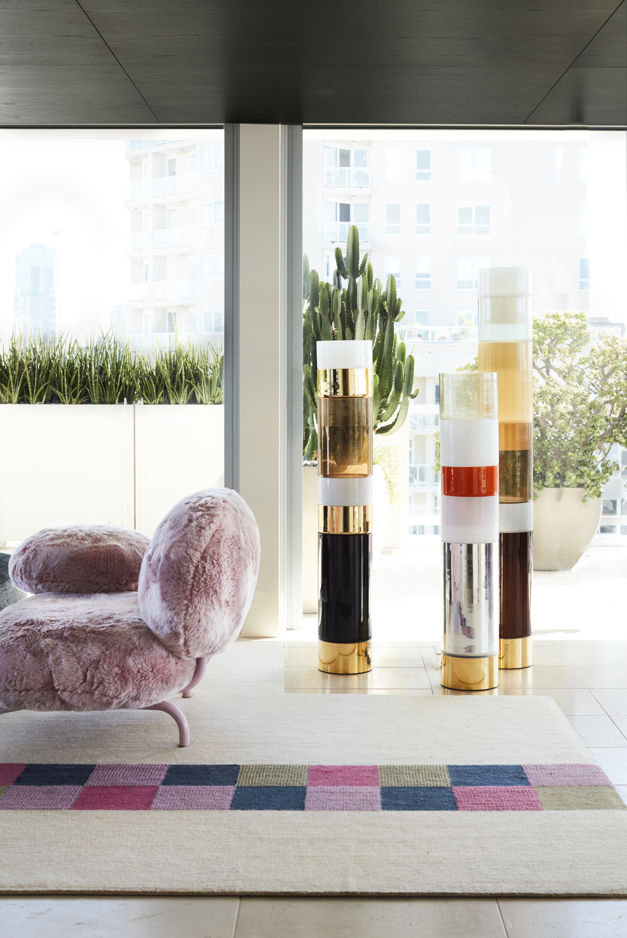
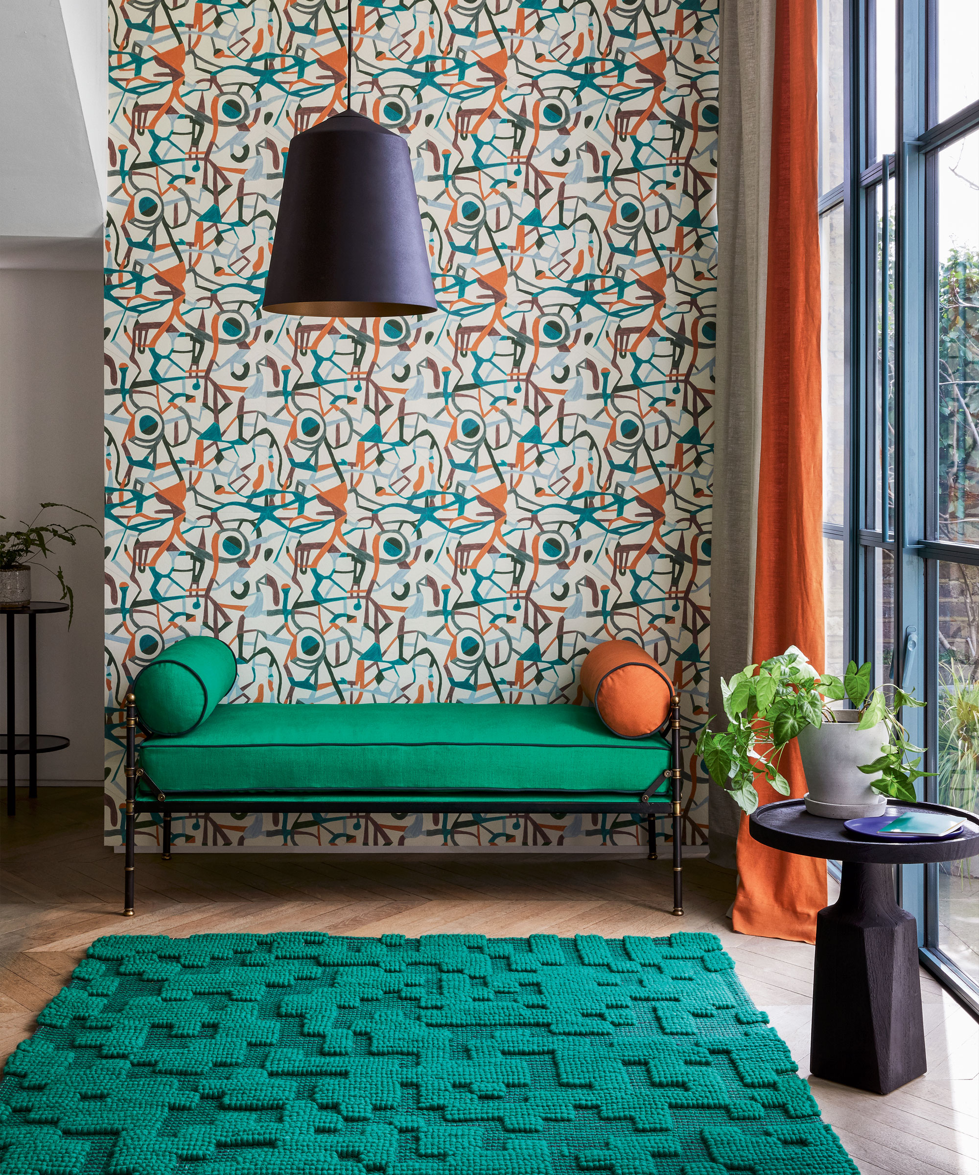
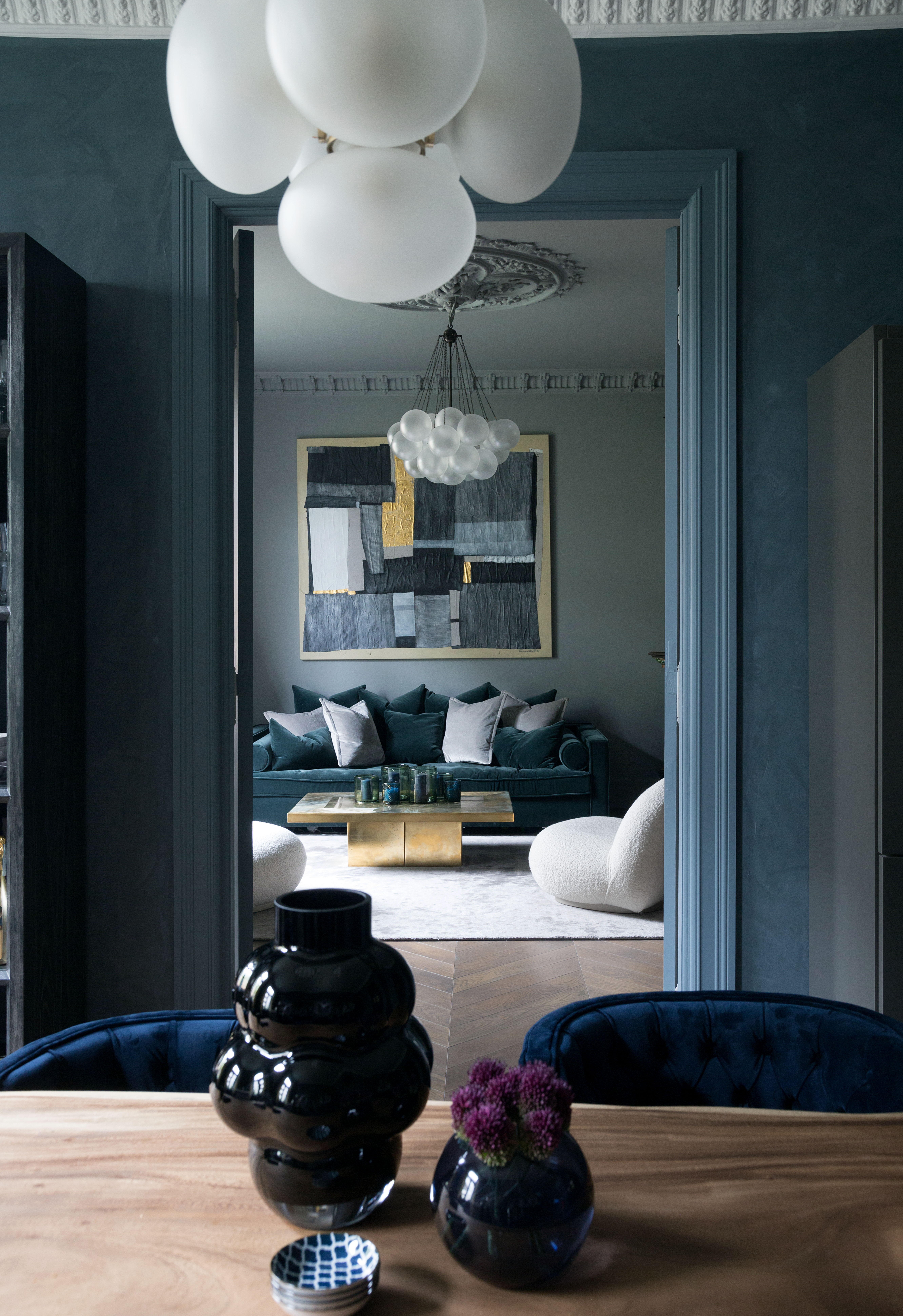
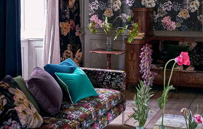
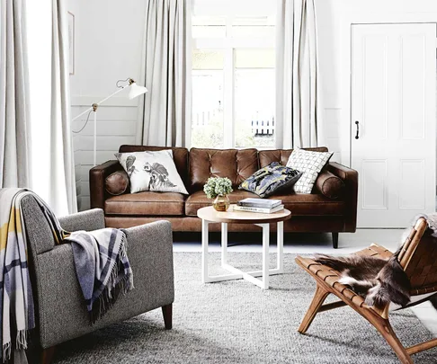
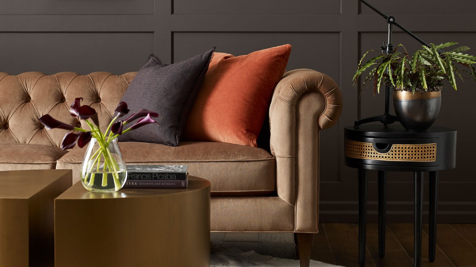
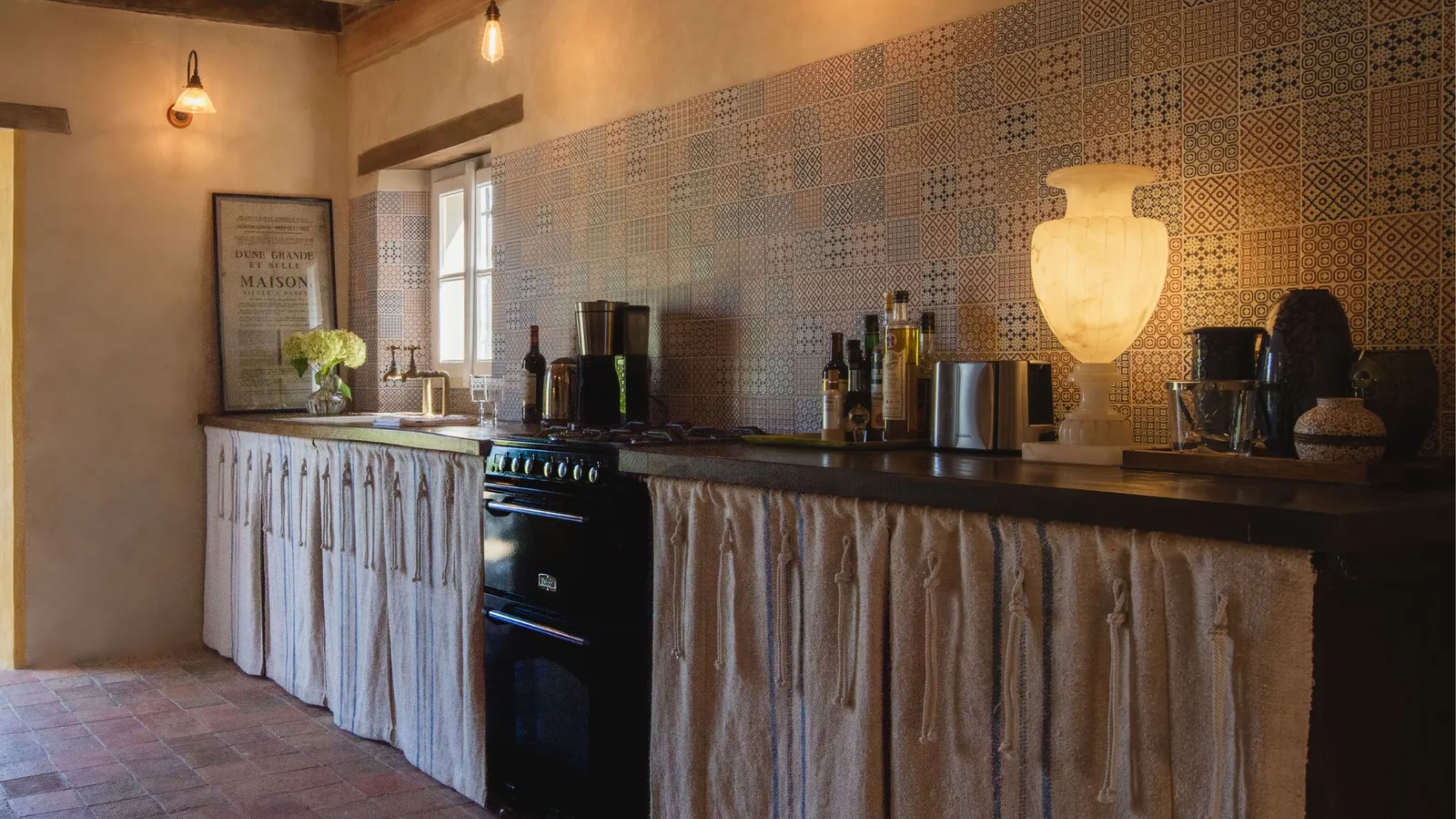
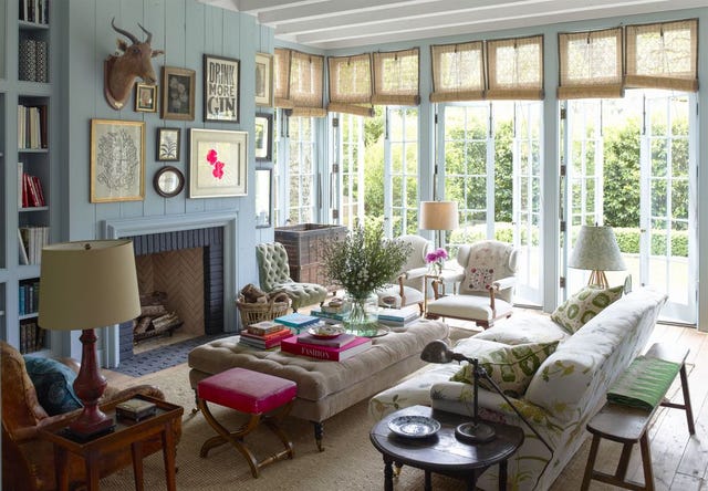
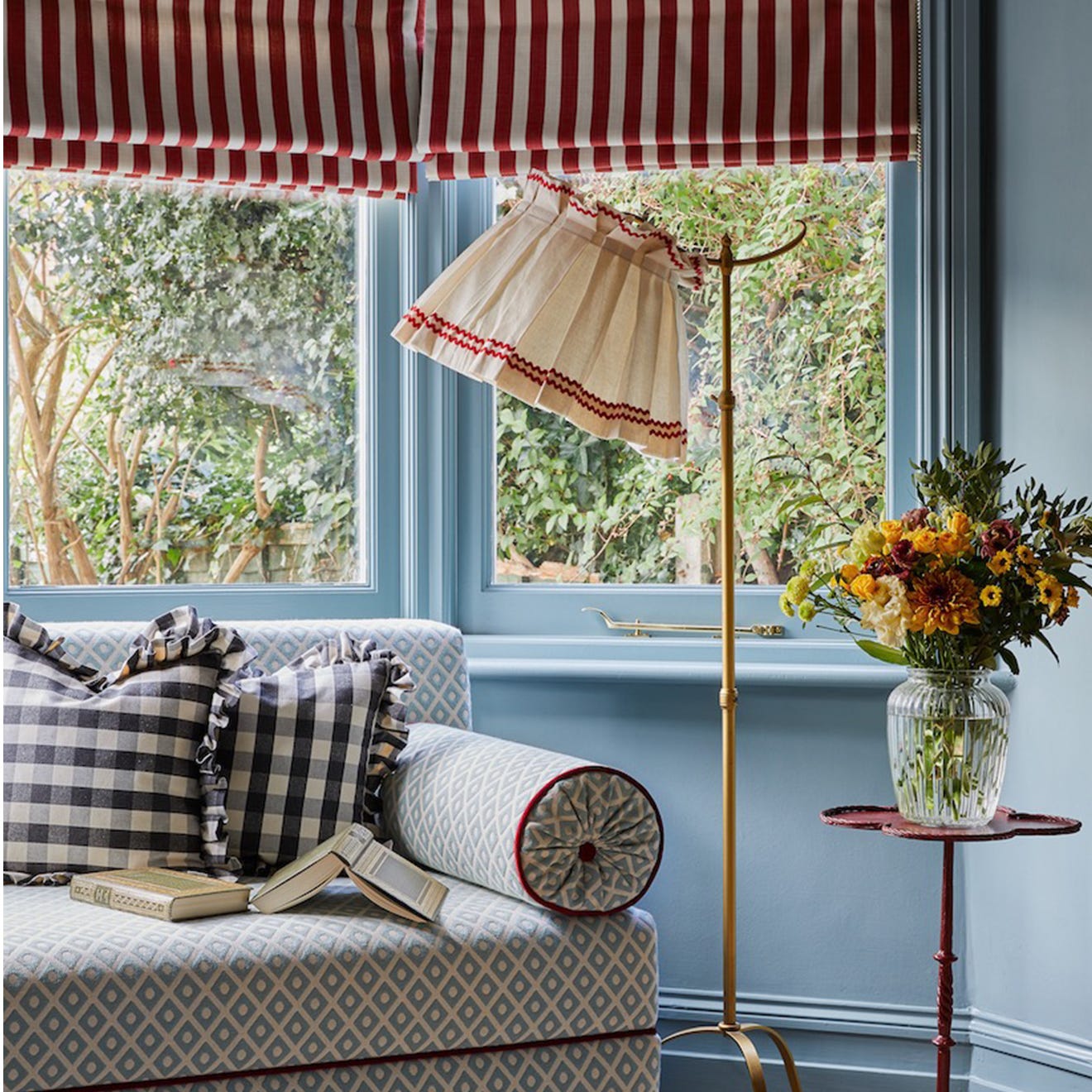
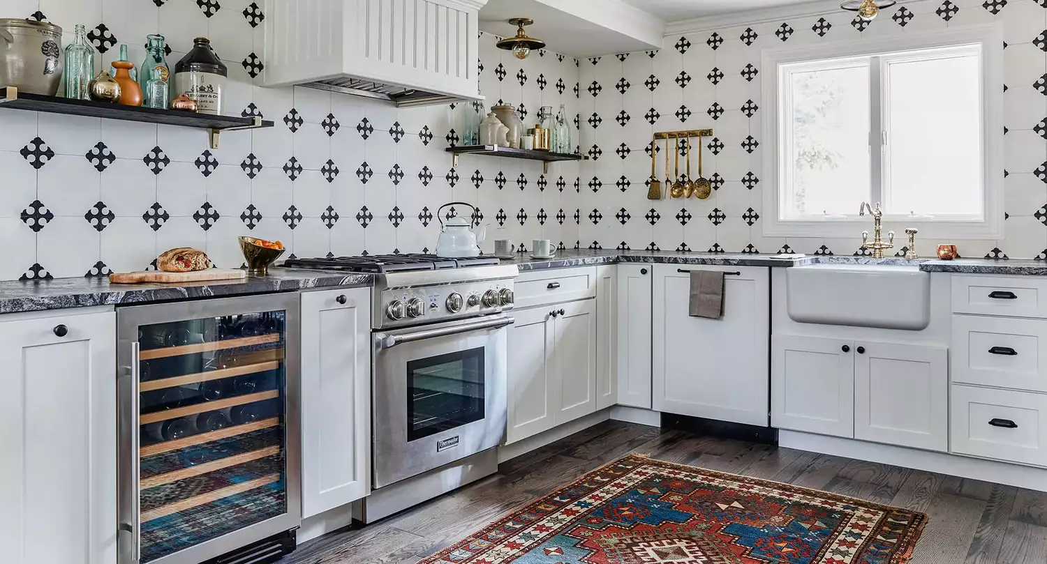
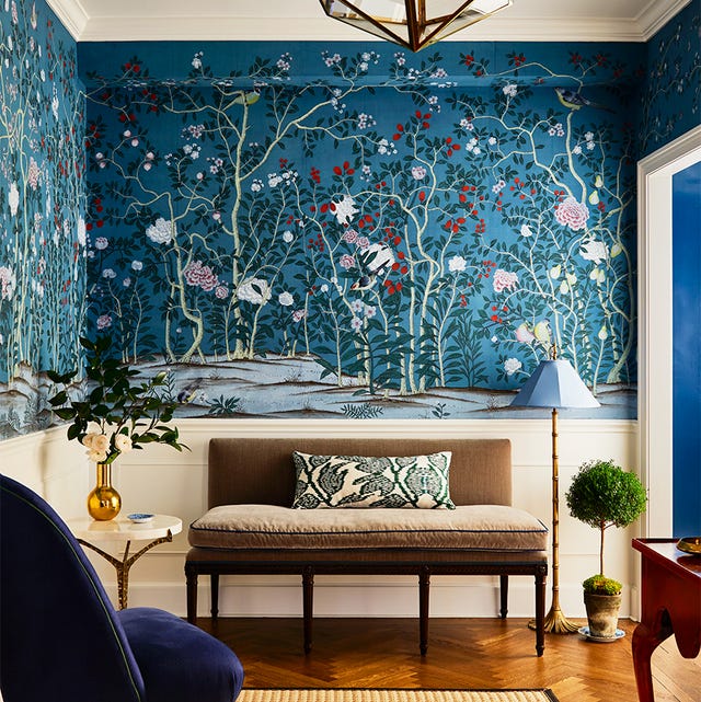
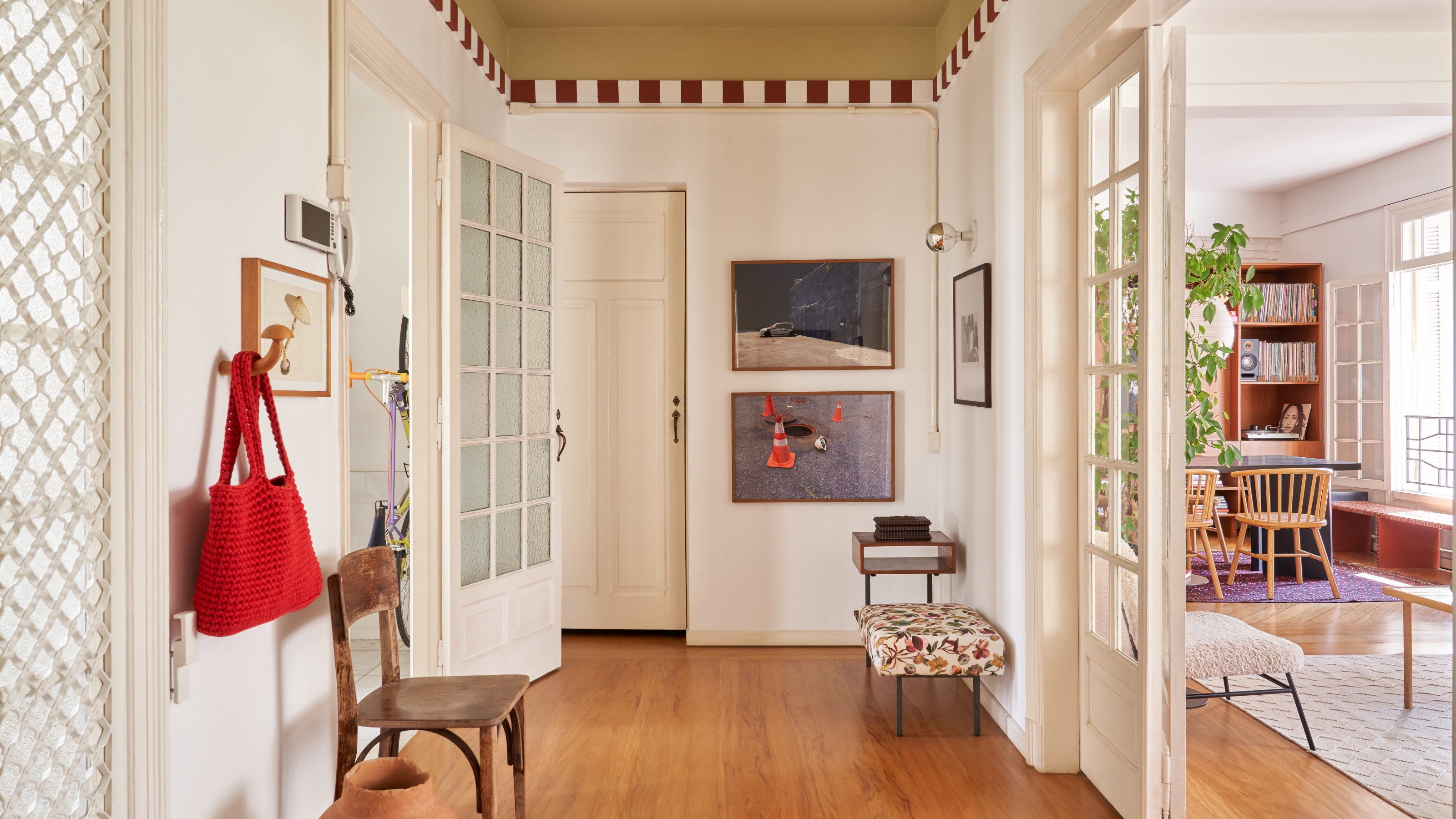
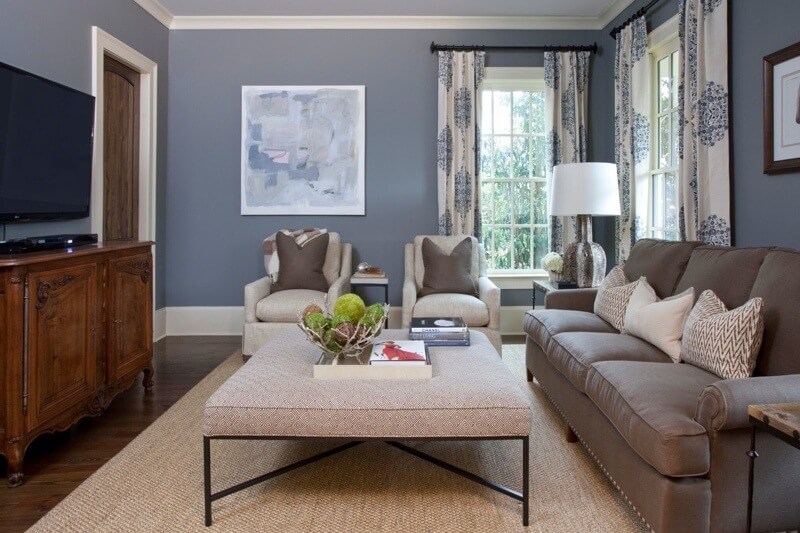
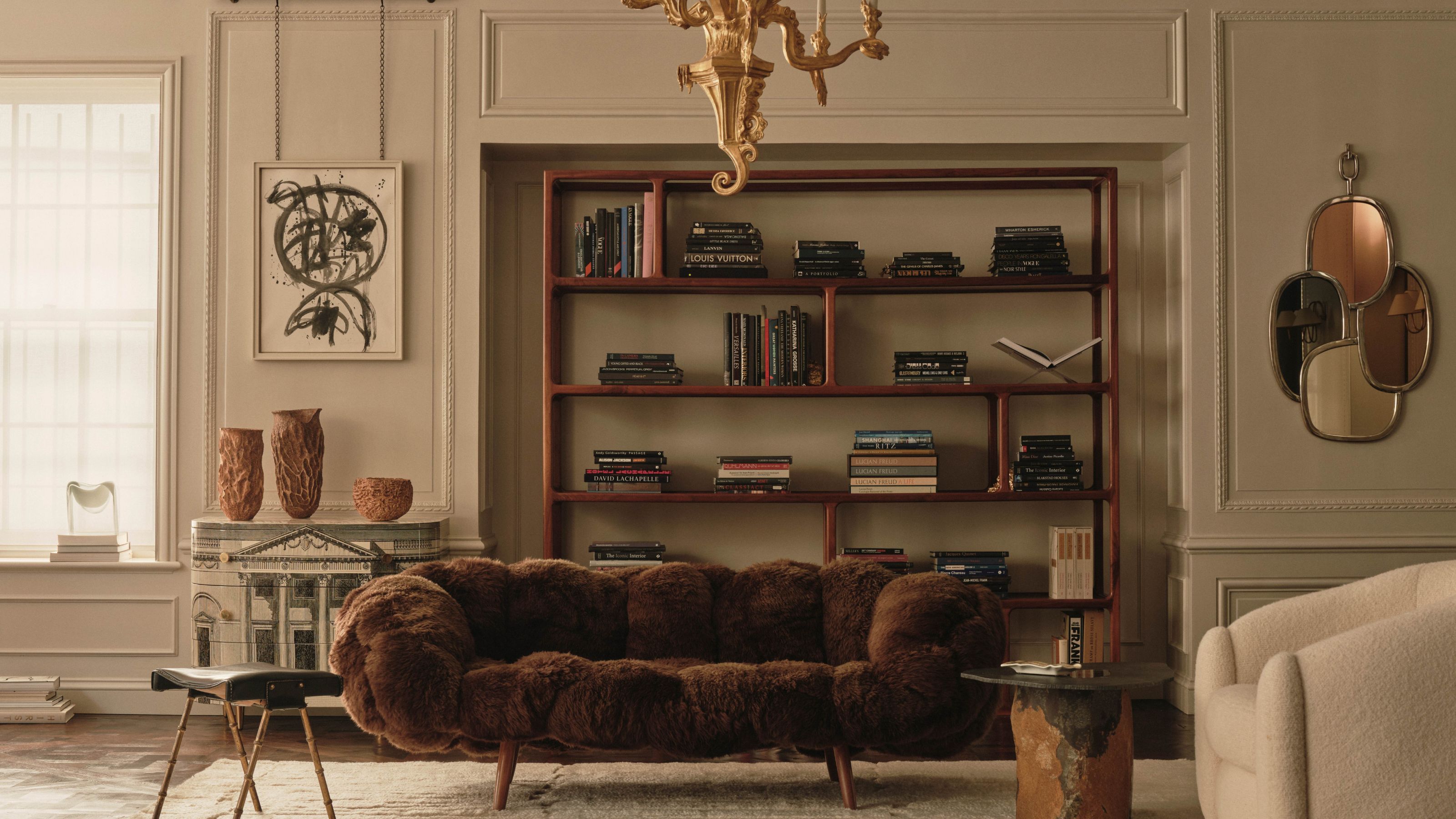
Beyond color, texture introduces a tactile and visual dimension that adds depth and interest to a design. Textures can range from rough and natural materials like stone and wood to smooth and luxurious fabrics like silk and velvet. Mixing different textures prevents a space from appearing flat or monotonous, creating layers of visual and sensory experience. For example, pairing a smooth, minimalist wall with a textured rug or a plush sofa can create a dynamic contrast that enhances the overall aesthetic.
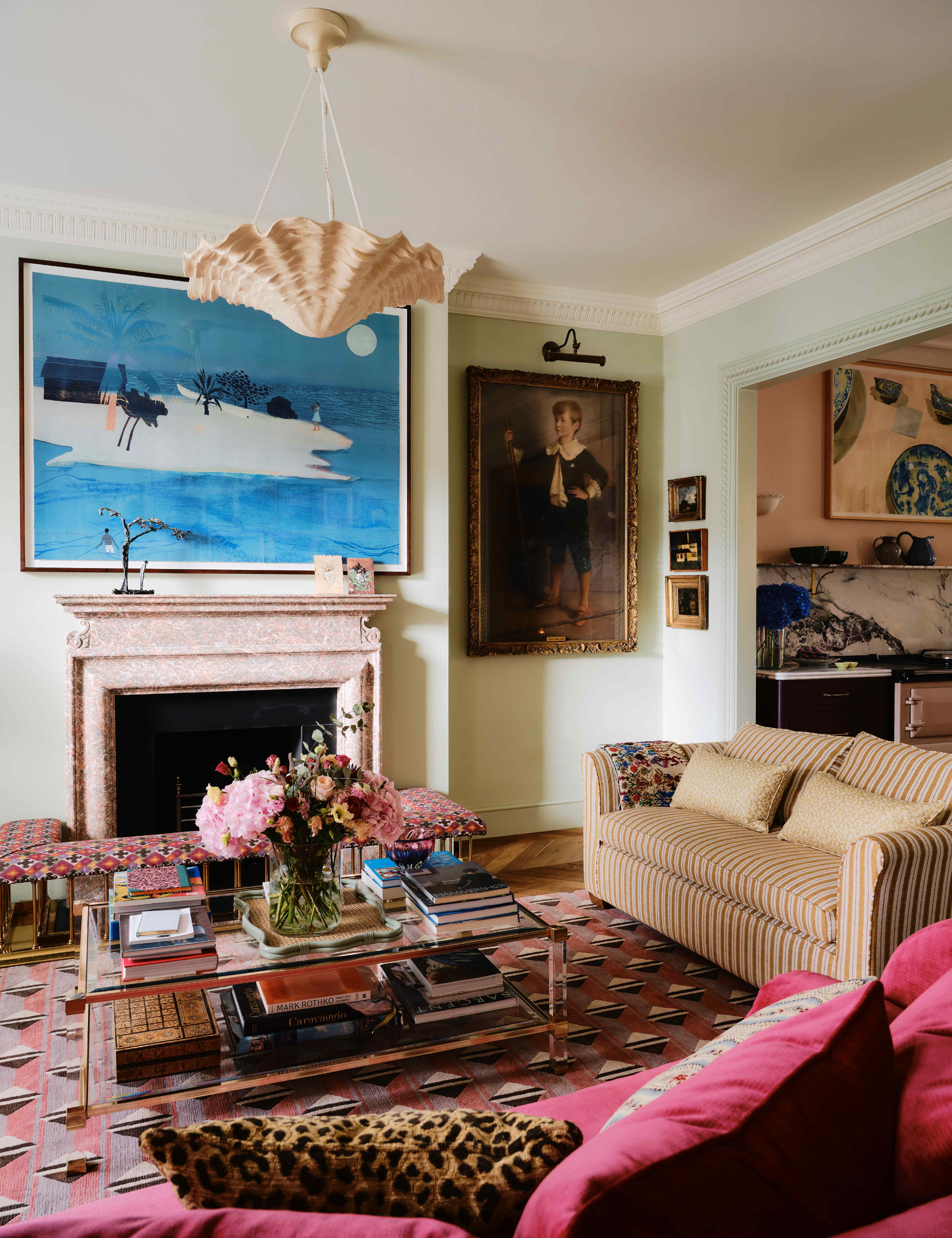
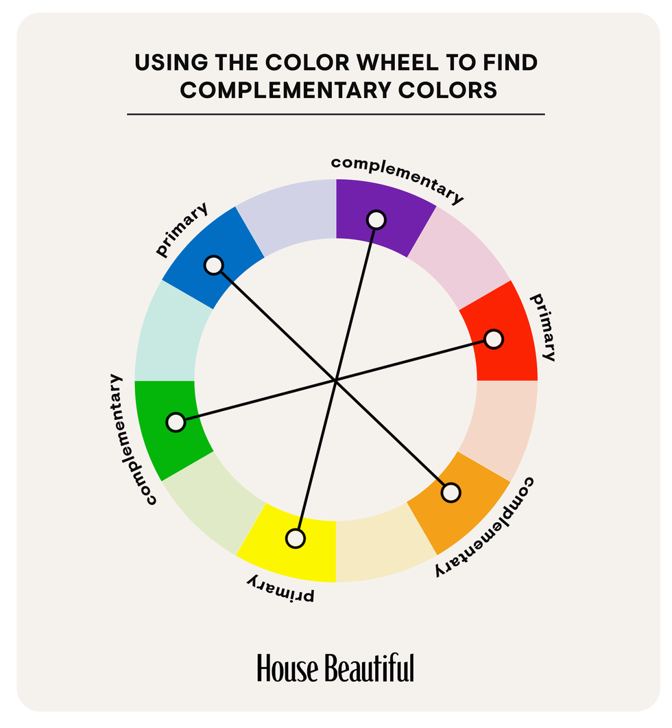
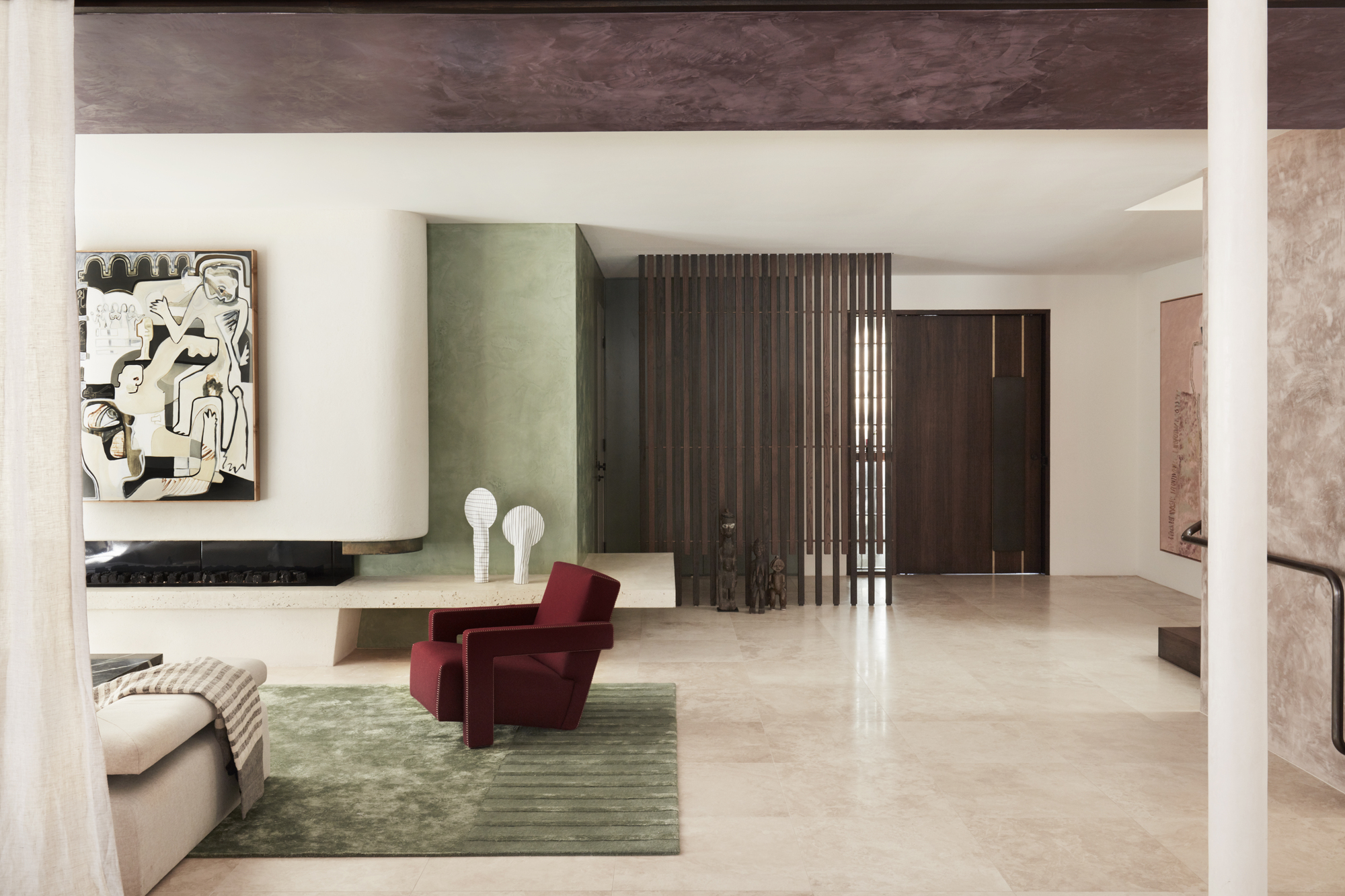
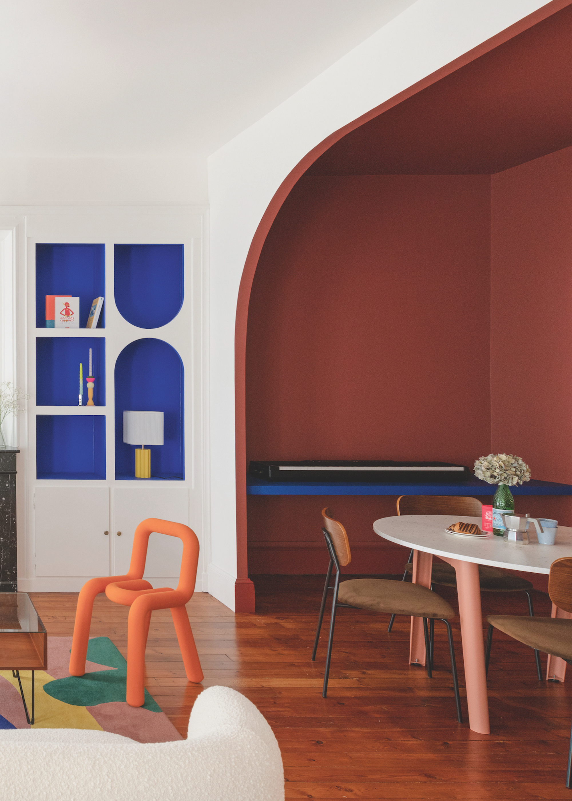
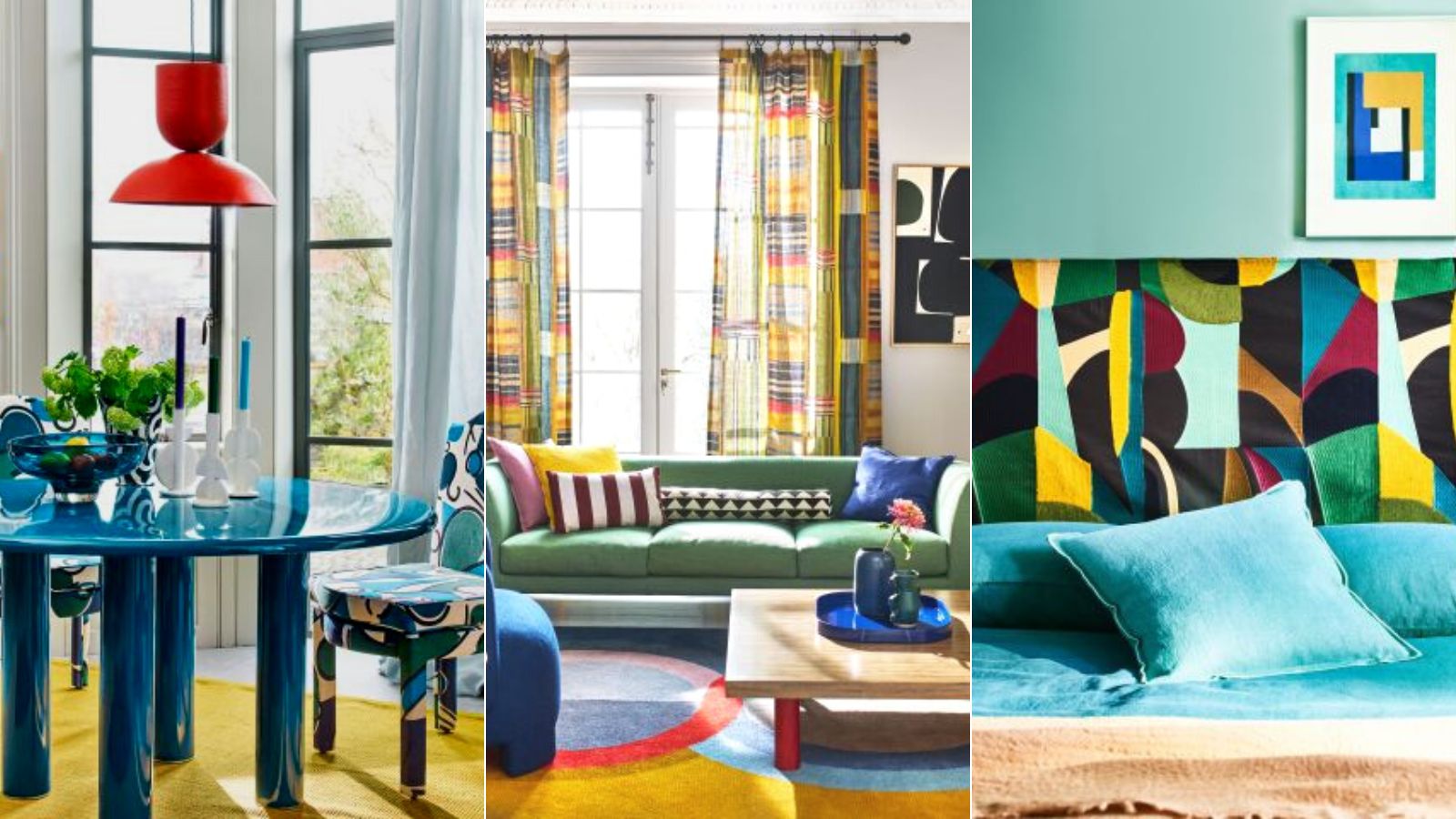
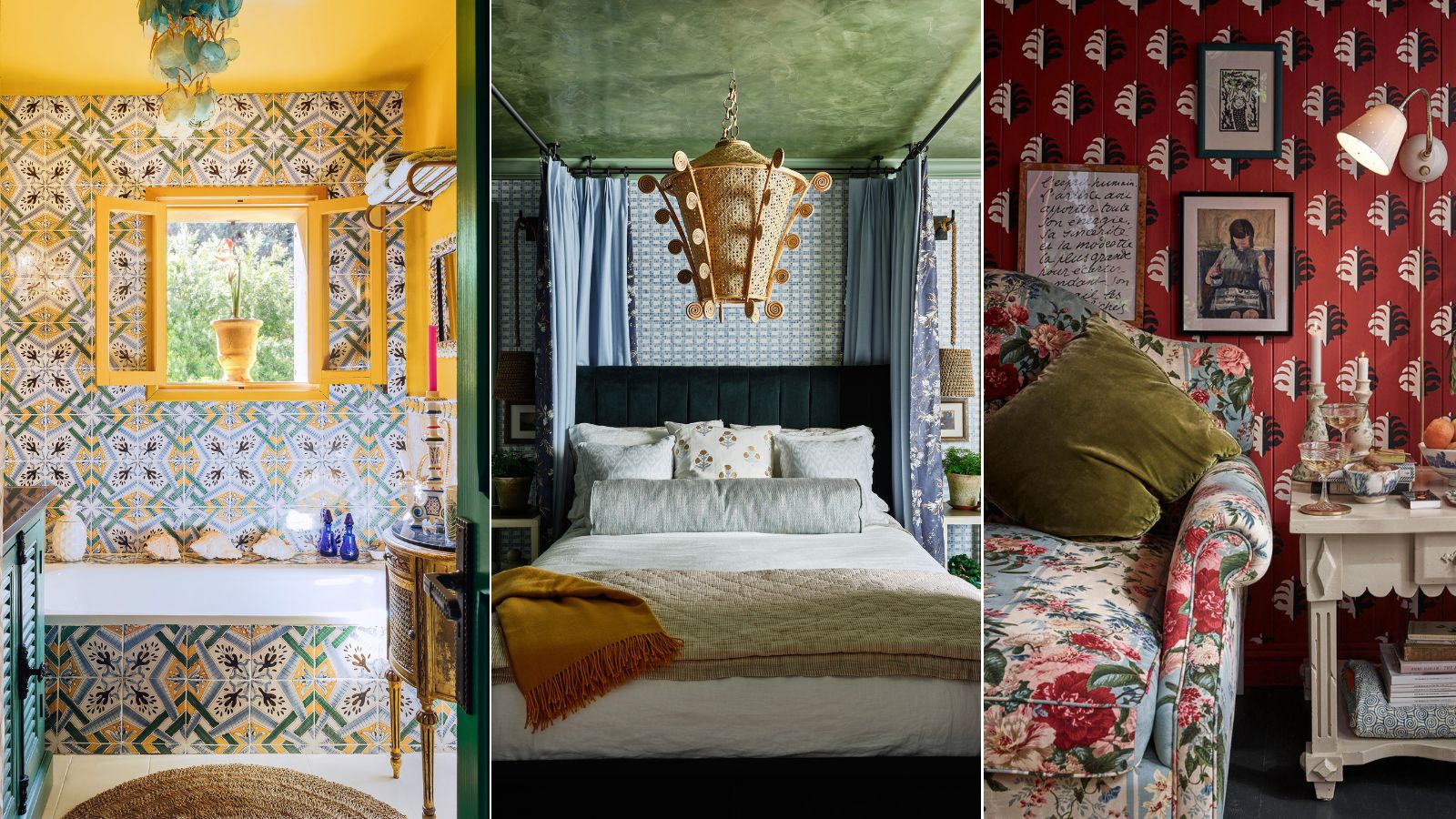
When combining colors and textures, several strategies can be employed. The monochromatic palette involves using different shades, tints, and tones of a single color, relying heavily on varied textures to maintain interest and prevent flatness. This approach creates a sophisticated and cohesive look. Complementary color schemes, using colors opposite each other on the color wheel, offer high contrast and vibrancy, while analogous schemes, employing colors next to each other on the color wheel, provide a more serene and harmonious effect.
The article suggests practical approaches for experimenting with these elements. Utilizing visual examples and mood boards can help visualize potential combinations before implementation. This aids in communicating design intentions to clients and making informed decisions that contribute to a unique and personalized space. The goal is to create an interior that not only looks appealing but also feels inviting and reflective of the desired atmosphere.
In essence, mastering the art of combining colors and textures involves an understanding of their psychological and aesthetic impacts. It requires thoughtful selection and placement to achieve balance, contrast, and visual interest. By applying these principles, designers and homeowners can craft interiors that are both functional and expressively beautiful, contributing to a more engaging and personalized living or working environment.
#InteriorDesign #Colors #Textures #Decoration #SpacePerception #ChromaticCircle #DesignPrinciples #InteriorDesign #Colors #Textures #Decoration #SpacePerception #ChromaticCircle #DesignPrinciples
0 comment in total
You may also like
How to combine colour, pattern and texture without making a complete mess of things
How to layer materials and add texture to your home decor

How to decorate with black and brown – experts weigh in on this moody and sophisticated color combination

Interior Design Tips: The Dos and Don’ts of Layering

The 8 Dos and Don’ts of Mixing Patterns in Your Home
Why Designers Always Start, But Never End, With Layering – 10 Ways They Build Depth Into Every Room
How to Incorporate Color Drenching in Your Home Design
'The World of Color is Rife With Danger' — 5 Color Combinations That Don't Go Together and What to Use Instead

Here's How to Pull Off an Eclectic Decorating Style

Designers Say You Might Be Mixing Textures in Your Home All Wrong

How to use clashing patterns in your home, according to design experts
Colorful room ideas – 15 vibrant spaces with daring decor
7 Golden Rules for Mixing and Matching Patterns That Designers Swear By

35 Unexpected Color Combos We Can't Get Enough Of

How to Choose Colors That Work Together Every Time
Here's How to Coordinate Paint Colors Throughout Your Home, so That It Looks Cohesive, Curated, but Still Creative
The ONLY Advice You Need to Mix Patterns Like a Pro!
The Power of Texture in Interior Design – 6 Ways Designers Use It to Shape the Look (and Feel) of Every Room
Pattern clashing is the tricky trend we are loving – 10 rules designers always follow to ensure it works
7 Color Combos That ALWAYS Look Good Together, According to Designers