1/10
Pattern clashing is the tricky trend we are loving – 10 rules designers always follow to ensure it works
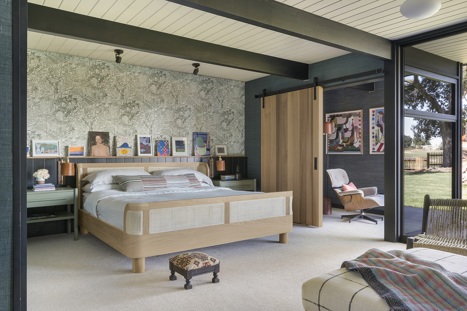
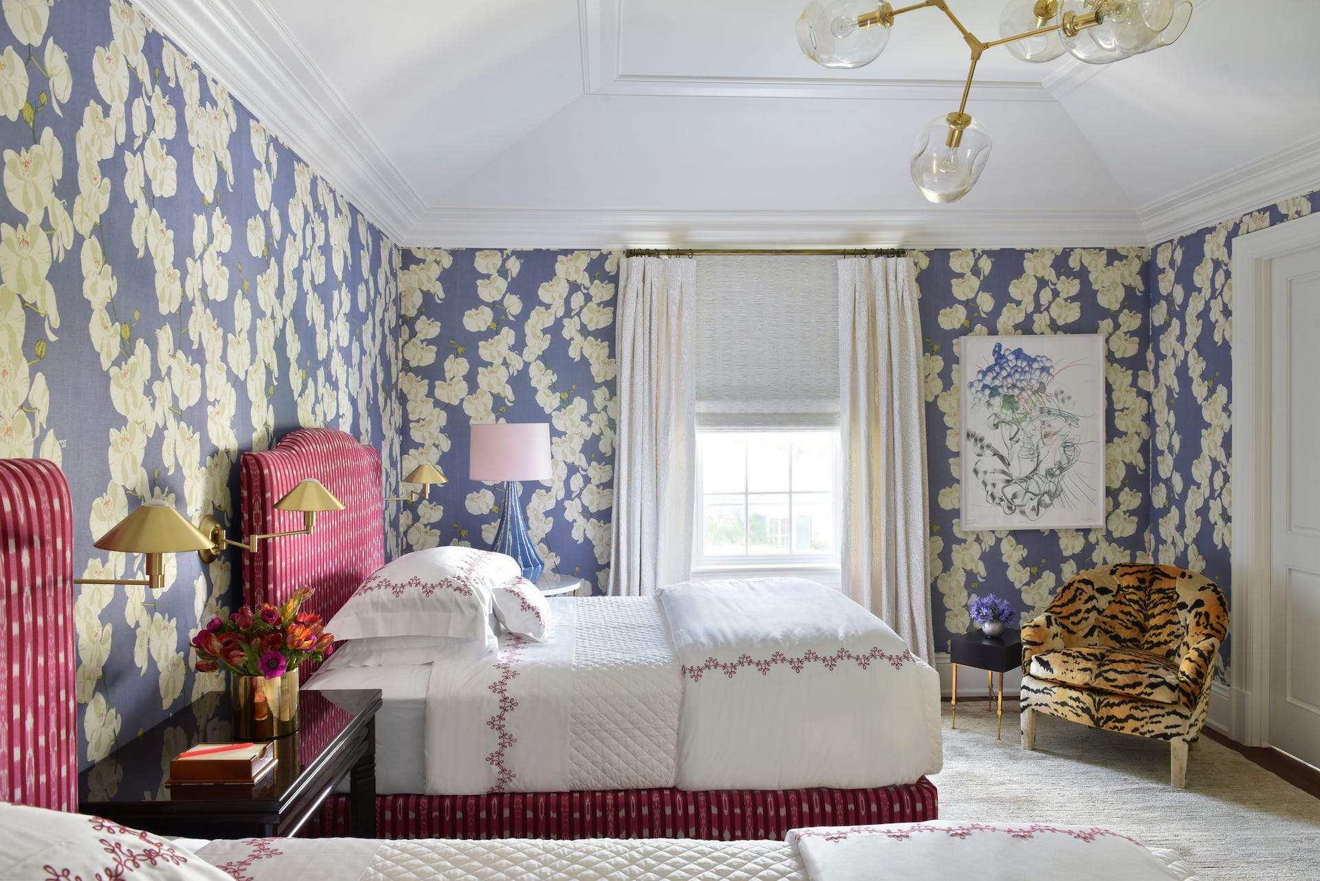
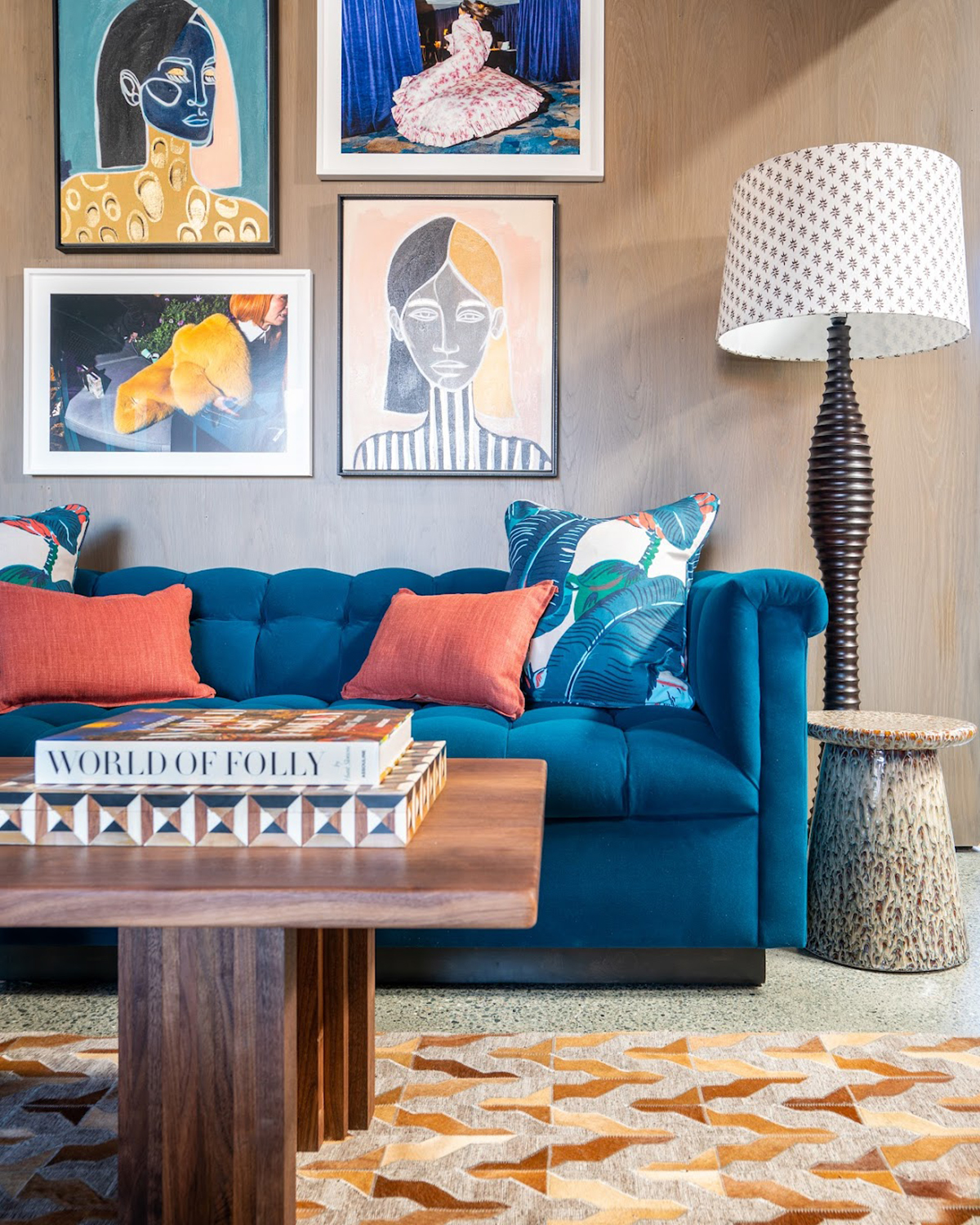
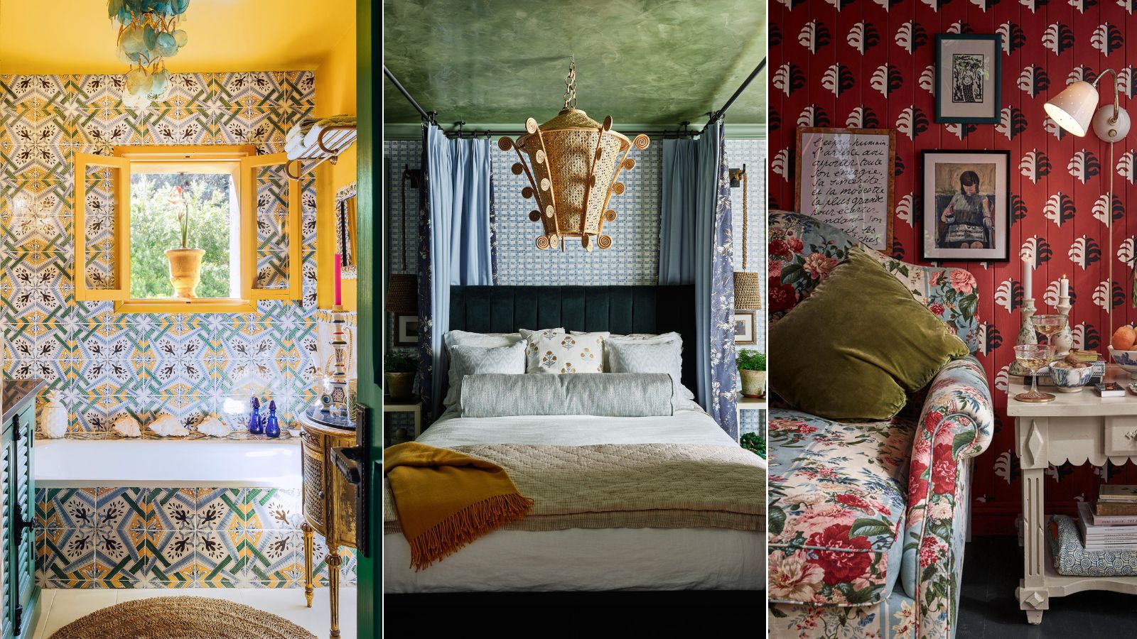
The article explores the concept of pattern clashing in interior design, offering ten rules that designers follow to successfully integrate multiple patterns into a space without creating visual chaos. It begins by acknowledging that while introducing patterns can be intimidating, especially for those accustomed to neutral palettes, mastering pattern mixing can elevate a design scheme from good to great. The article aims to demystify this technique by drawing on expert advice.
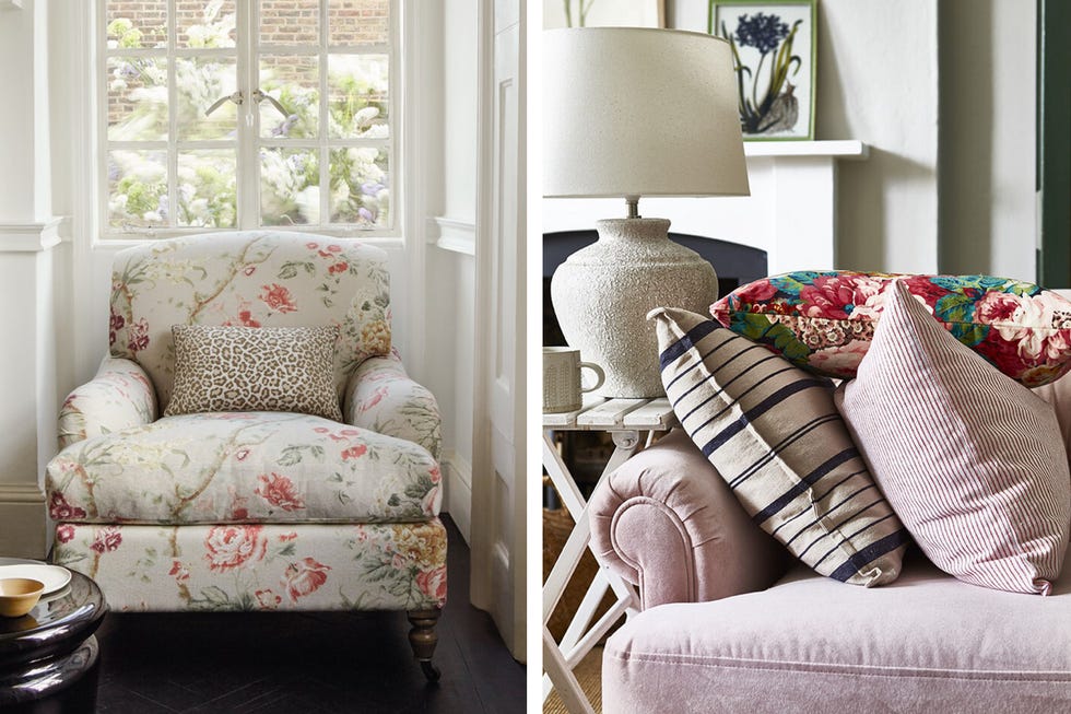
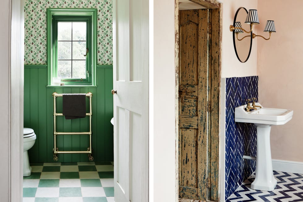
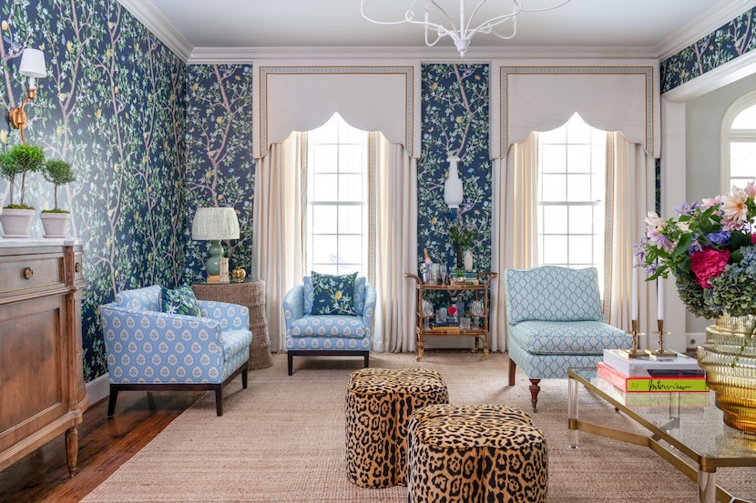
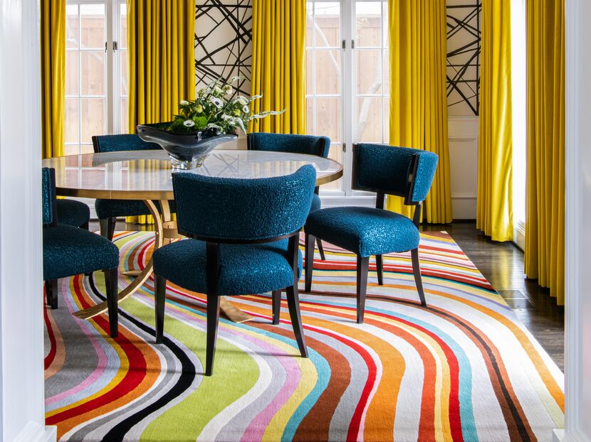
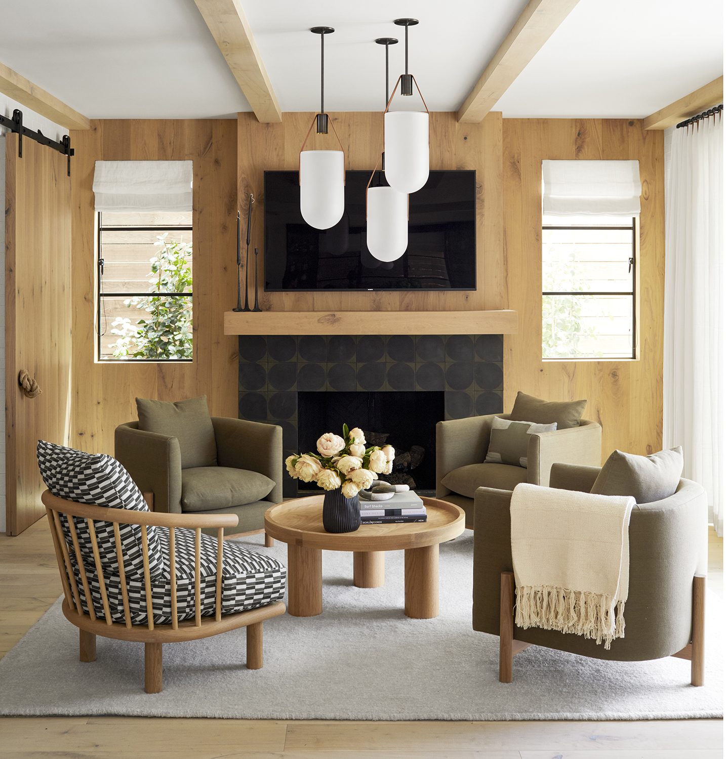
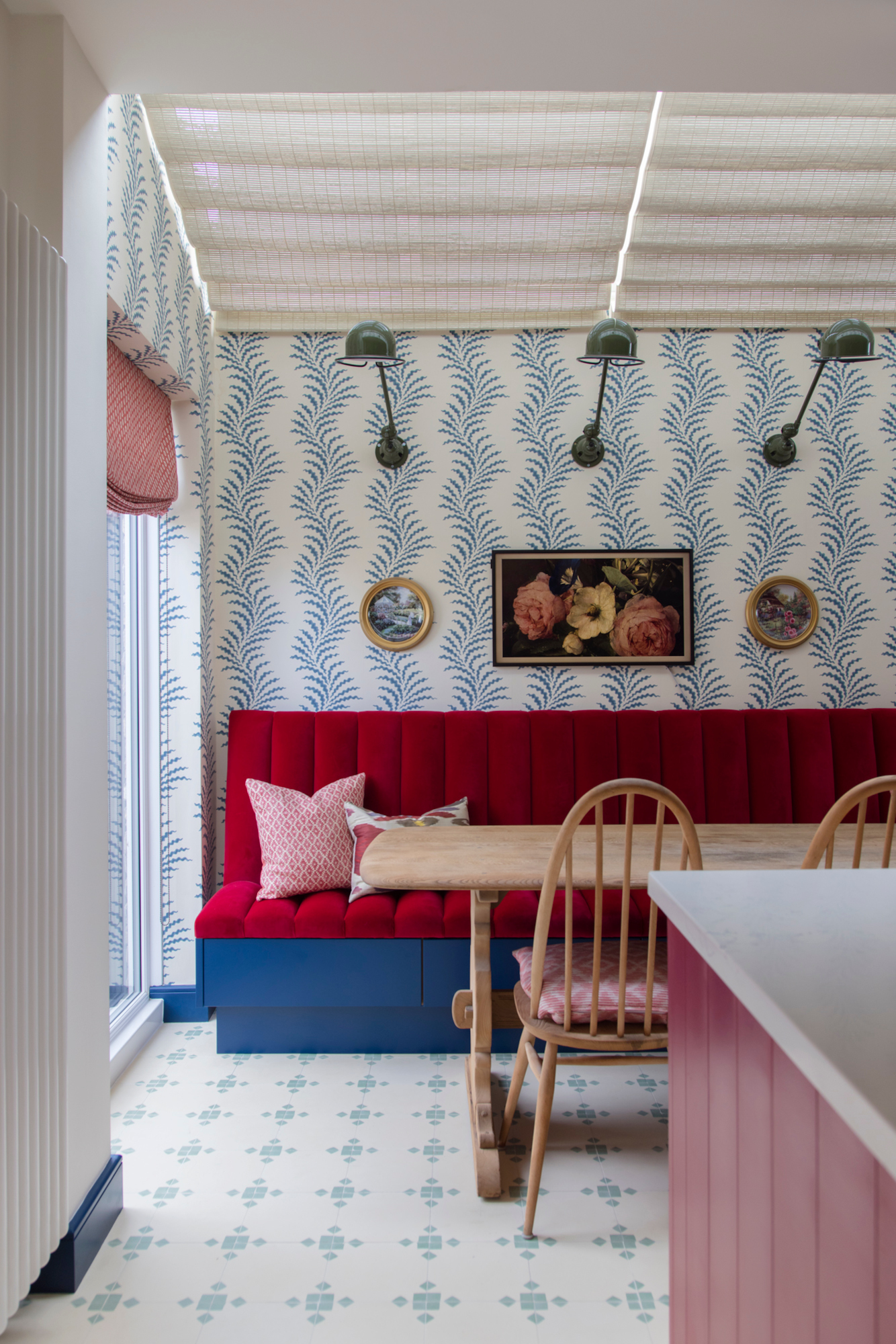
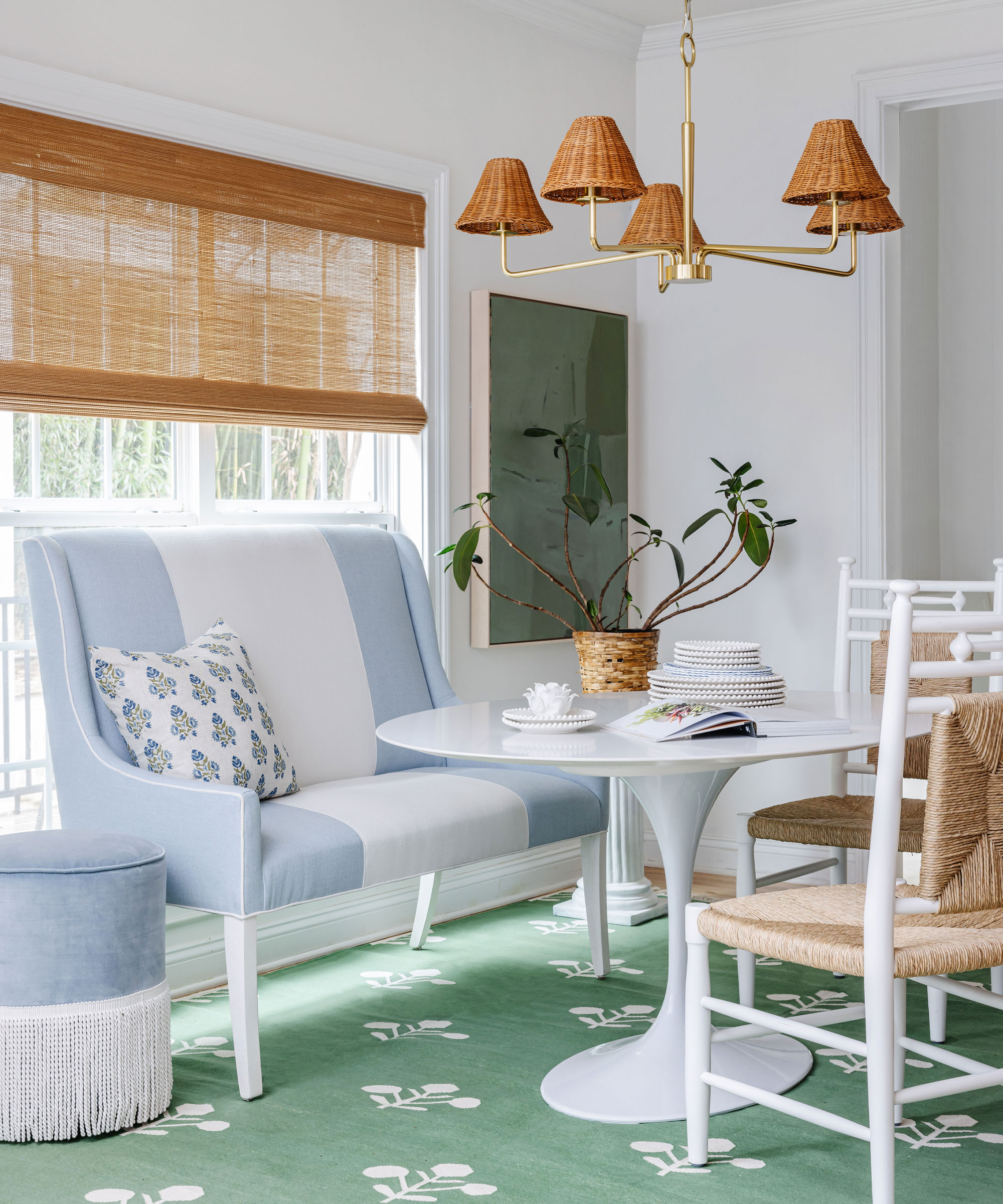
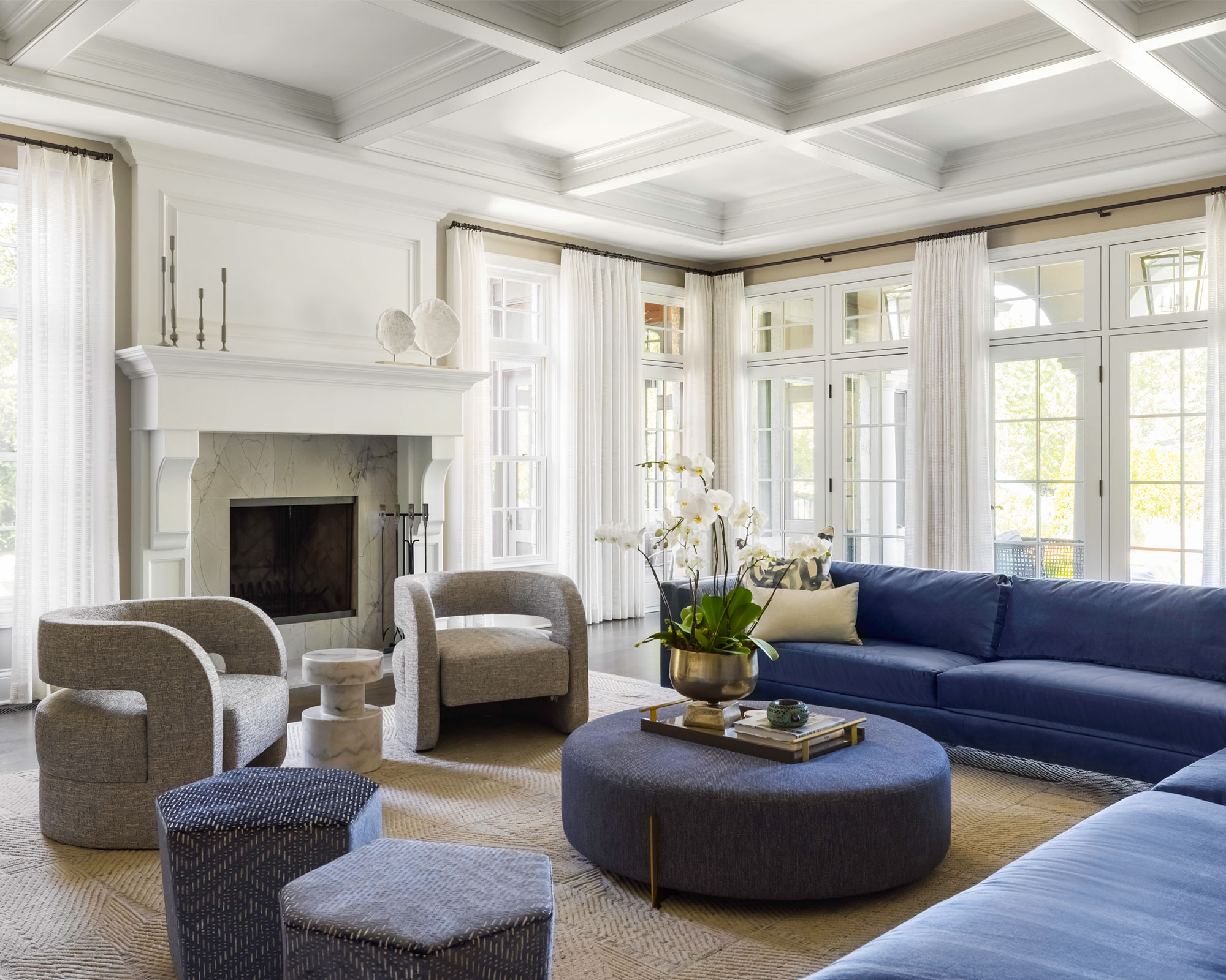
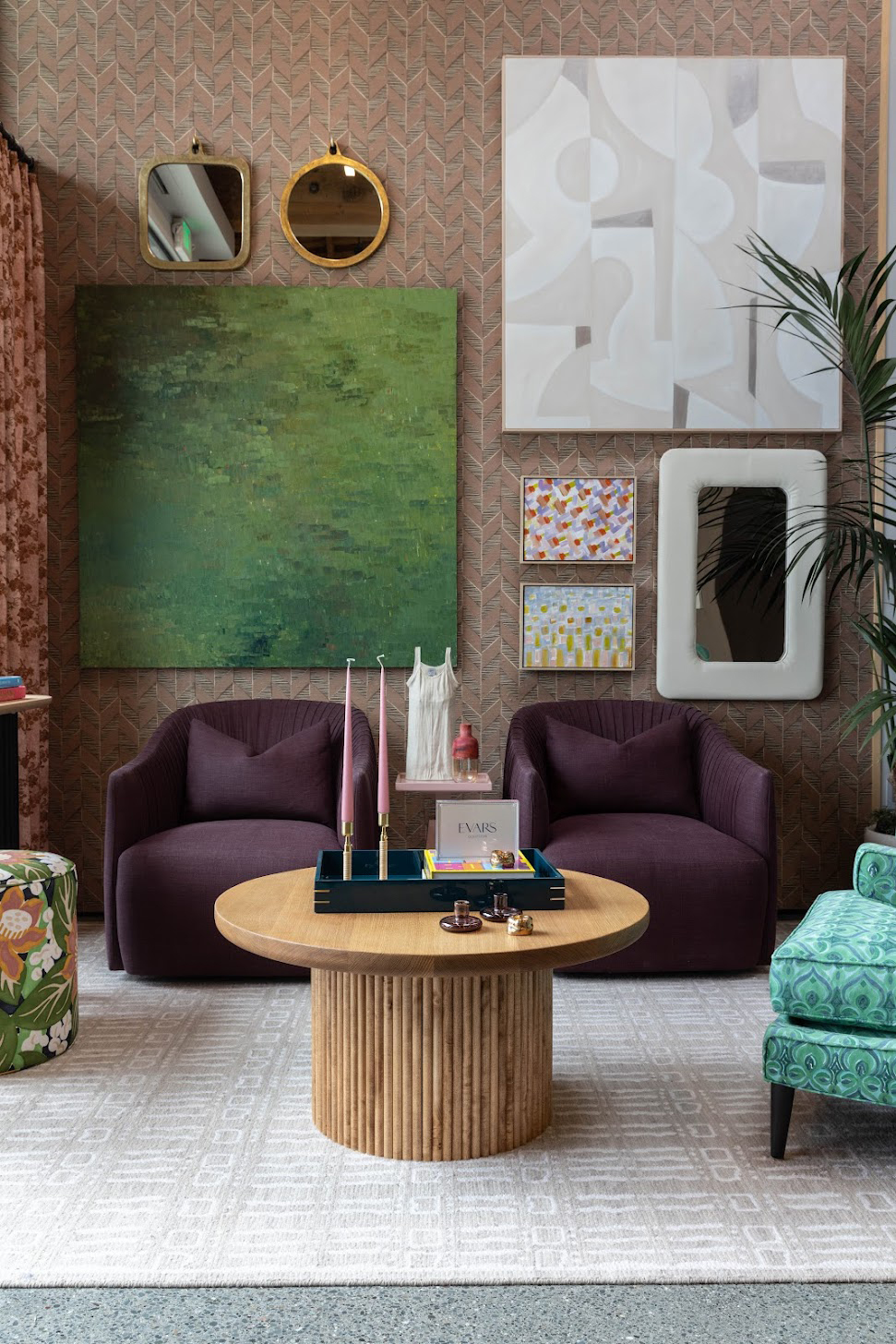
One of the foundational rules highlighted is the importance of finding a common color thread. Designers emphasize that even with diverse patterns, selecting shades within the same color family or using complementary, monochromatic, or analogous colors ensures cohesion. This approach provides a solid base, allowing for greater freedom in experimenting with different shapes and scales of patterns. Neutrals, blues, greens, and pastels are suggested as versatile starting points for color palettes.
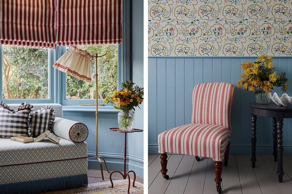
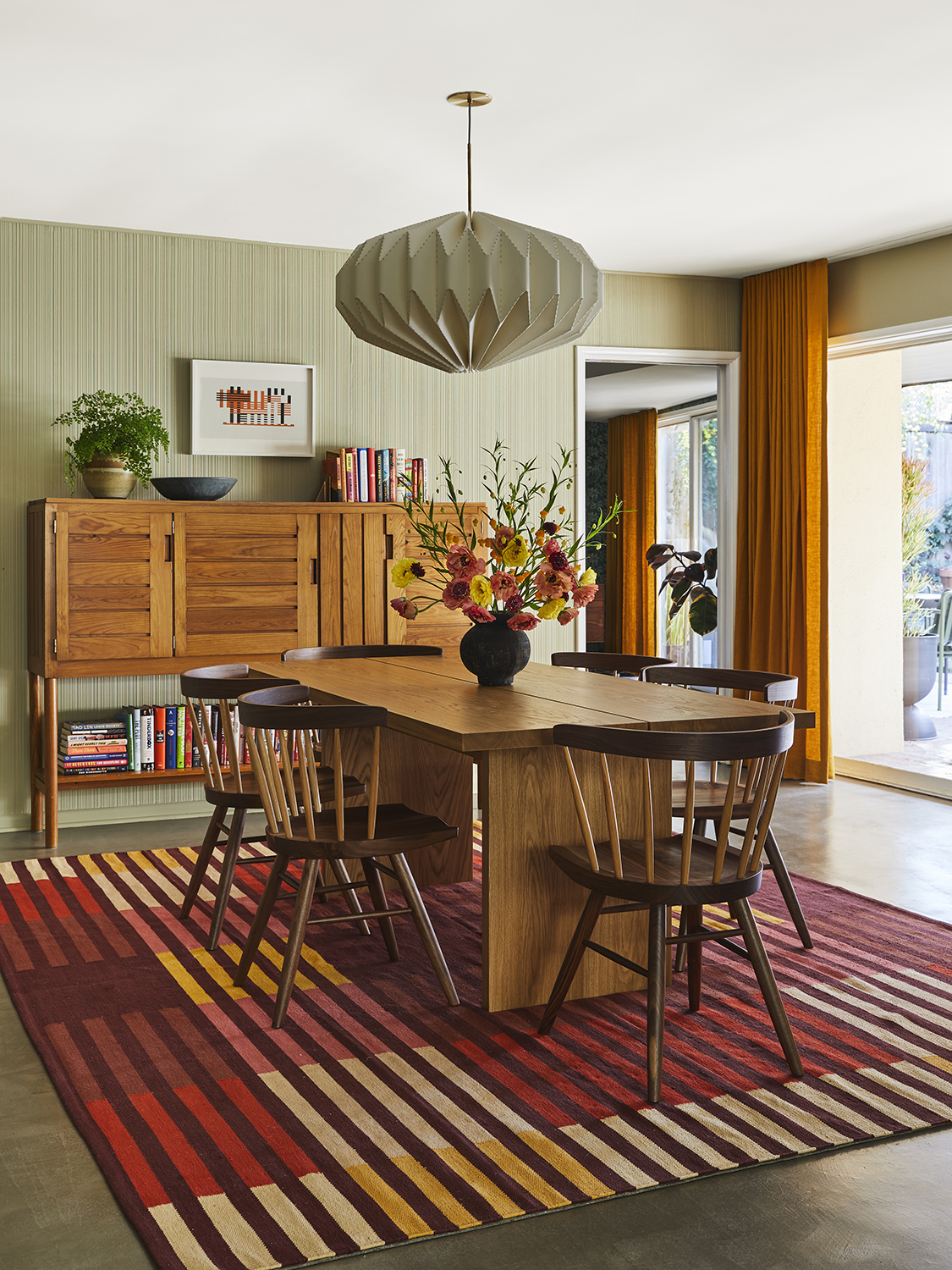
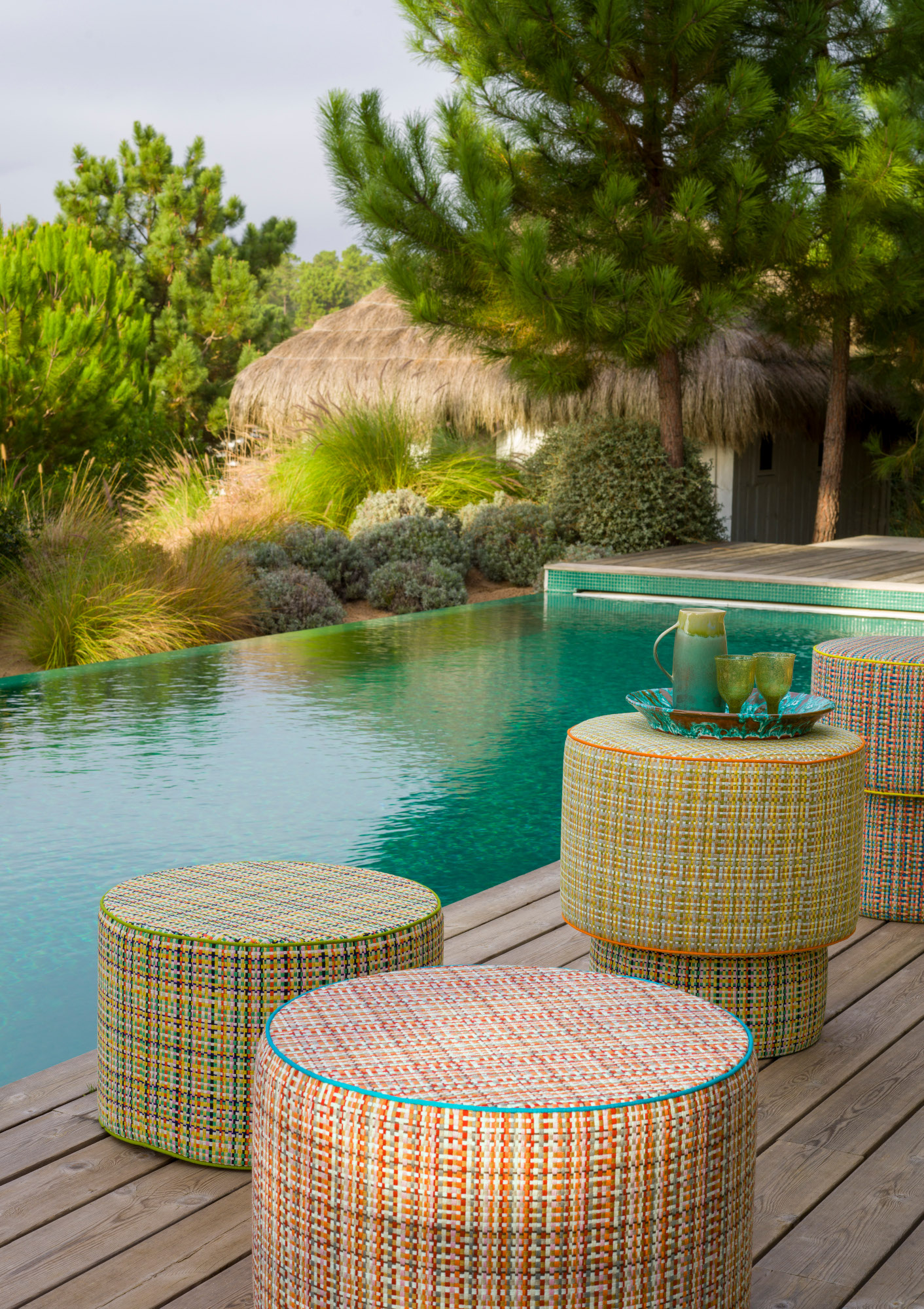
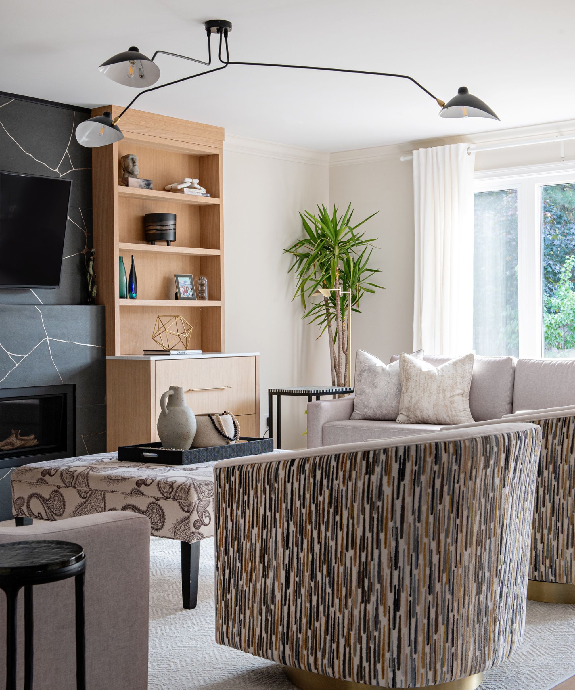
The second rule focuses on experimenting with scale. It is crucial to mix large and small patterns to achieve balance and prevent a space from appearing too busy or overwhelming. The article advises against using only dense, detailed patterns, suggesting the inclusion of some textiles with minimal print or texture to tie bolder elements together. Matching patterns based on their style and period is also recommended to maintain a cohesive aesthetic.
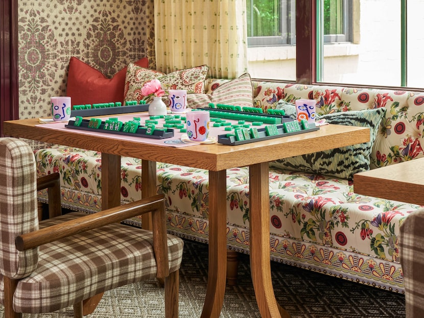
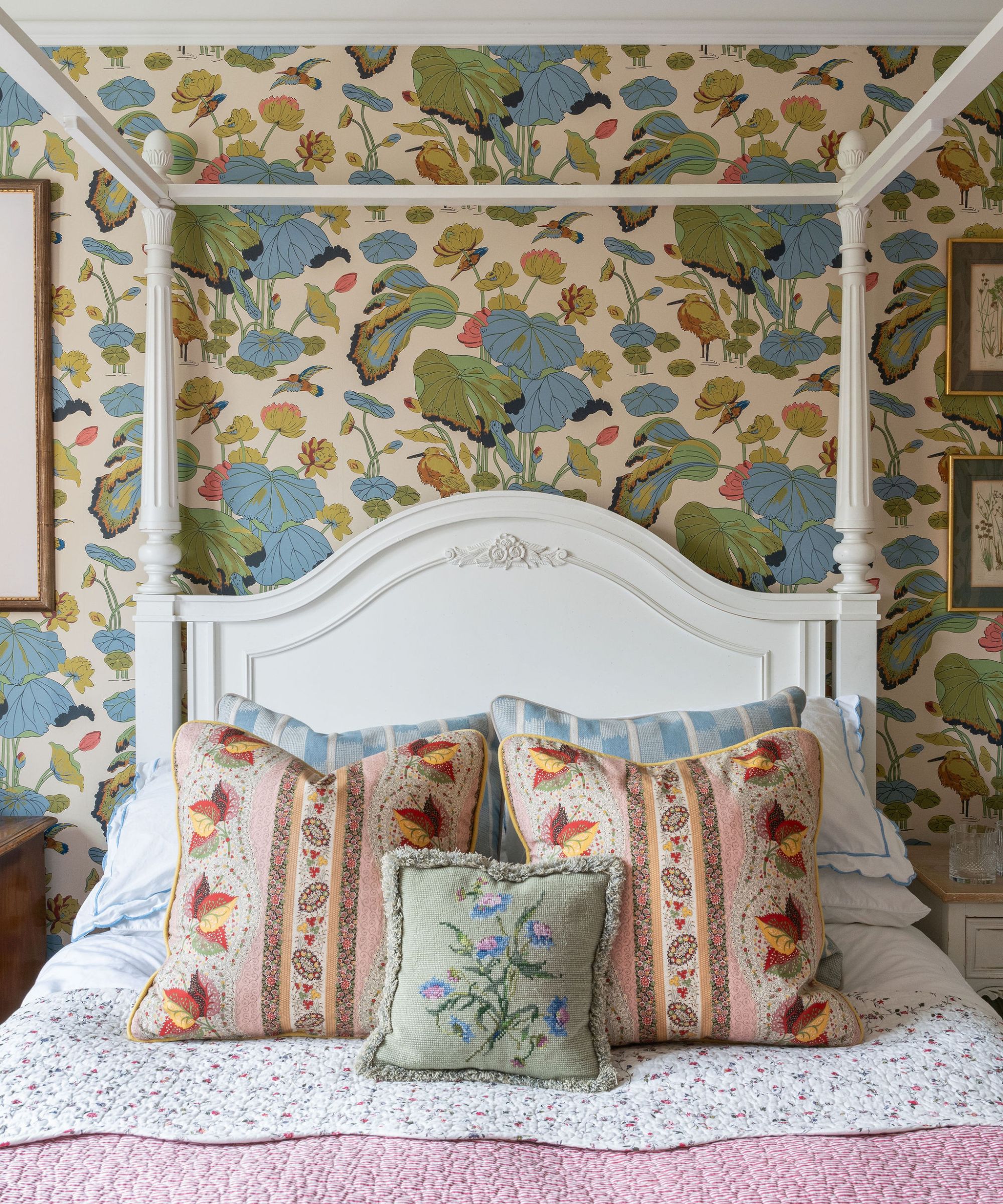
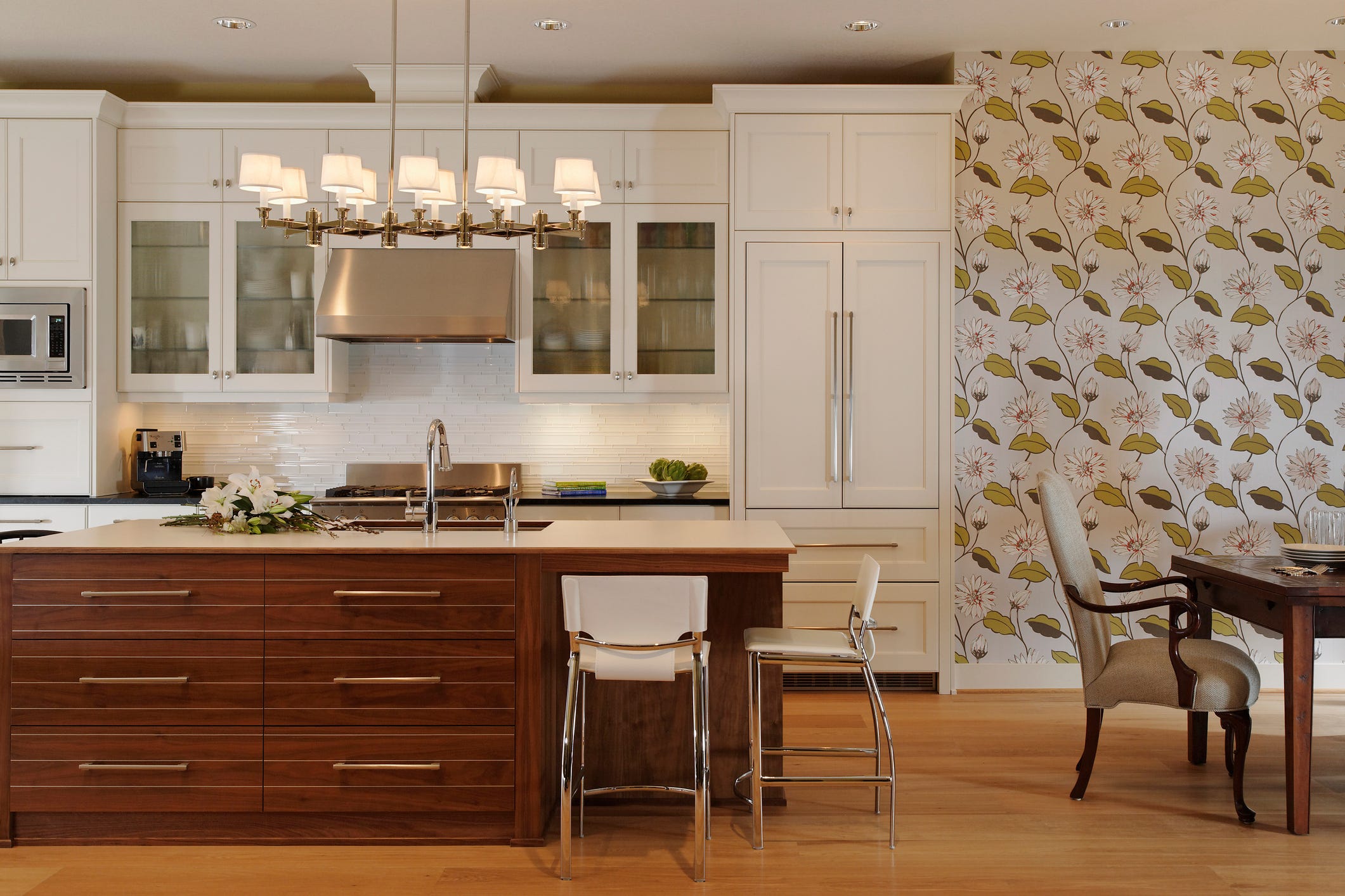
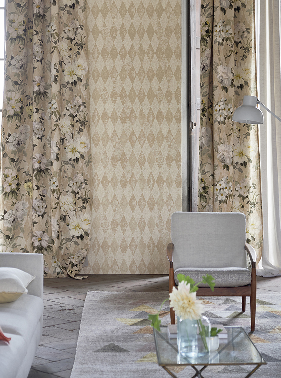
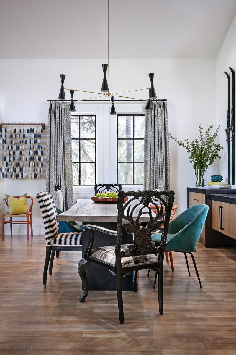
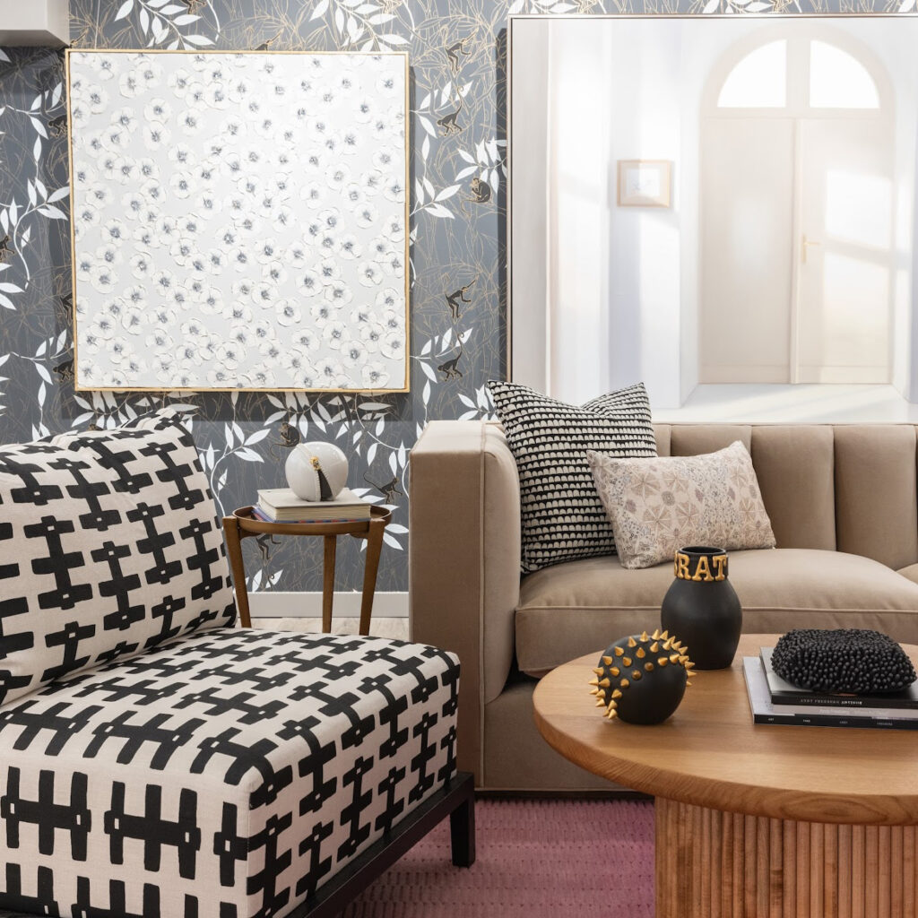
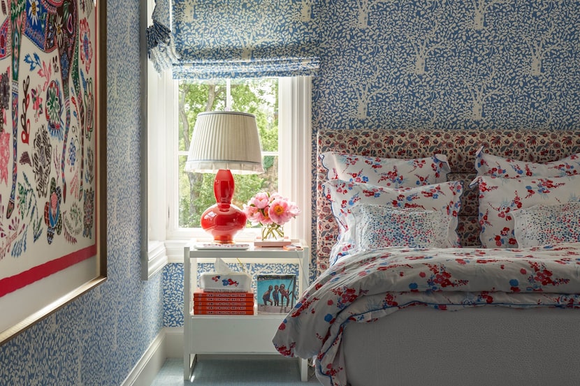
Further, the article encourages mixing and matching different types of patterns rather than sticking to a single kind. Combining a vibrant floral with a geometric design, for instance, can add interest and depth to a room. Even small touches of varied pattern types in accents like throw pillows and drapery can significantly enhance the visual appeal of a space.
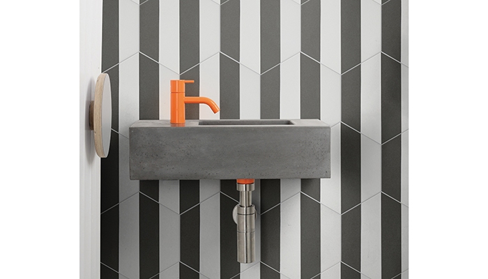
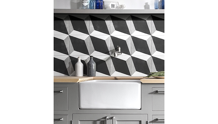
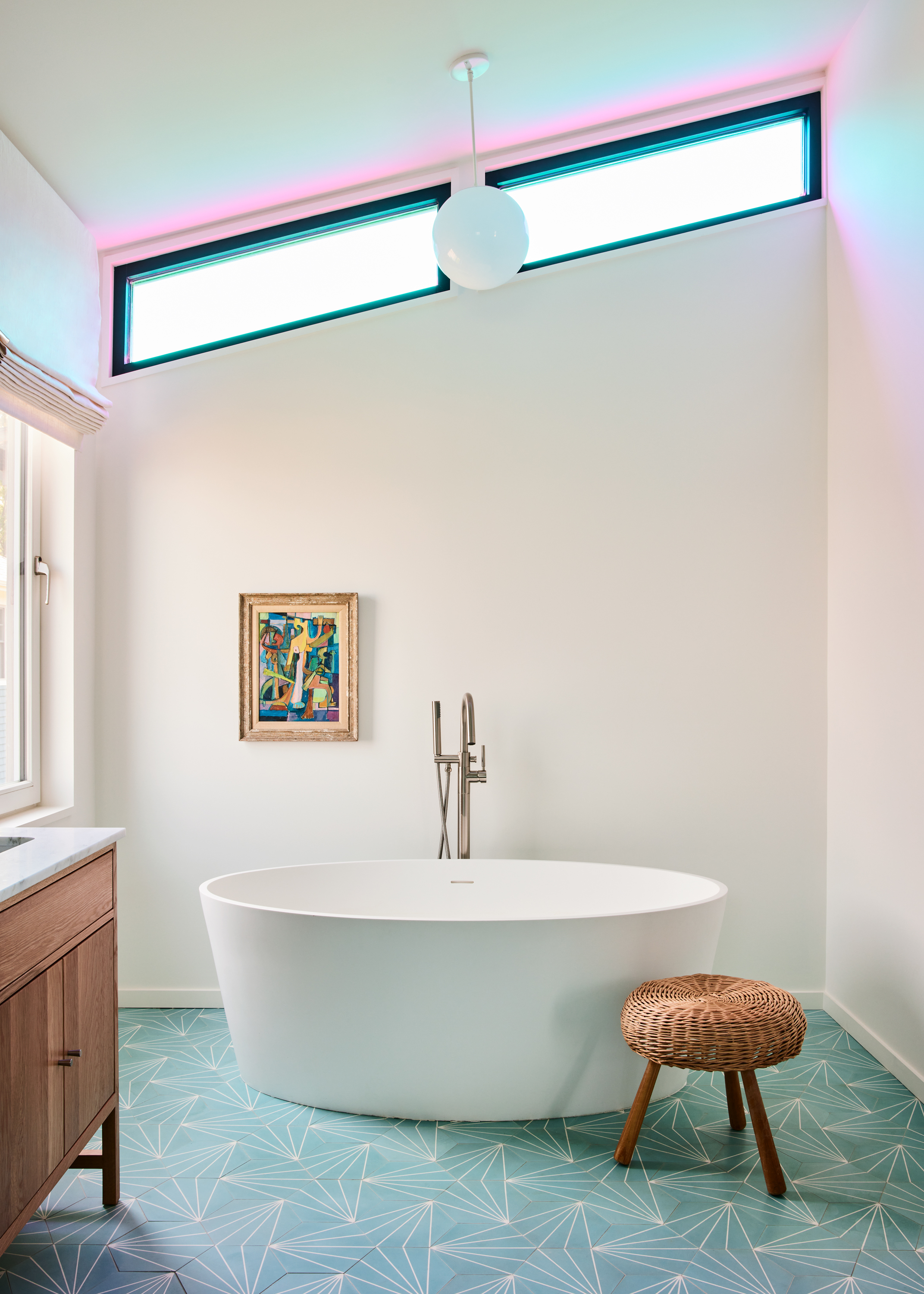
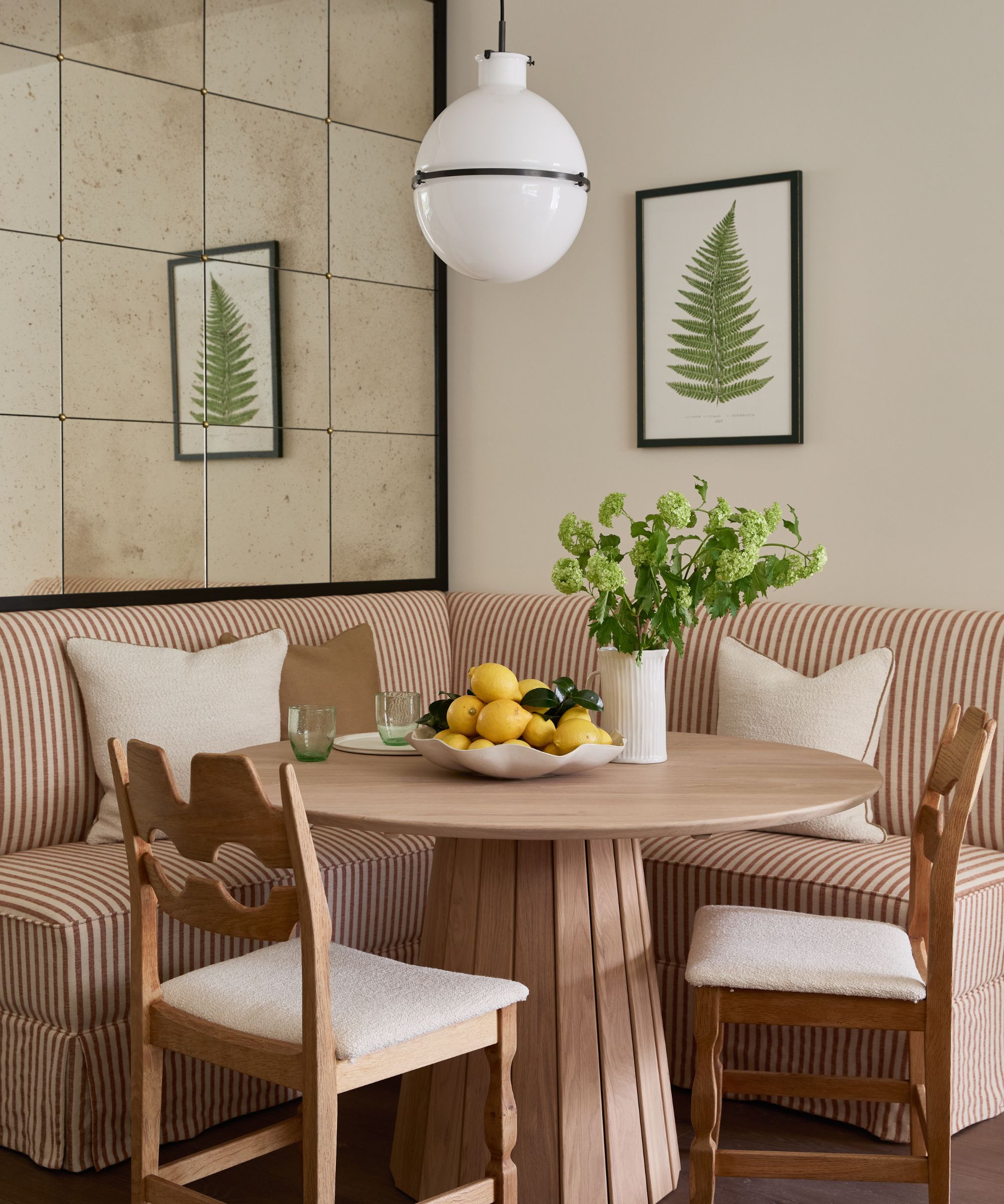
The fourth rule suggests starting with geometric patterns and stripes, as they are highly versatile and tend to mix well with almost any other design. Their structured lines provide a nice contrast to more organic or intricate patterns, and they pair seamlessly with florals, abstract designs, and polka dots. Stripes and geometrics, especially in neutral tones, can anchor bolder hues without causing visual discord.
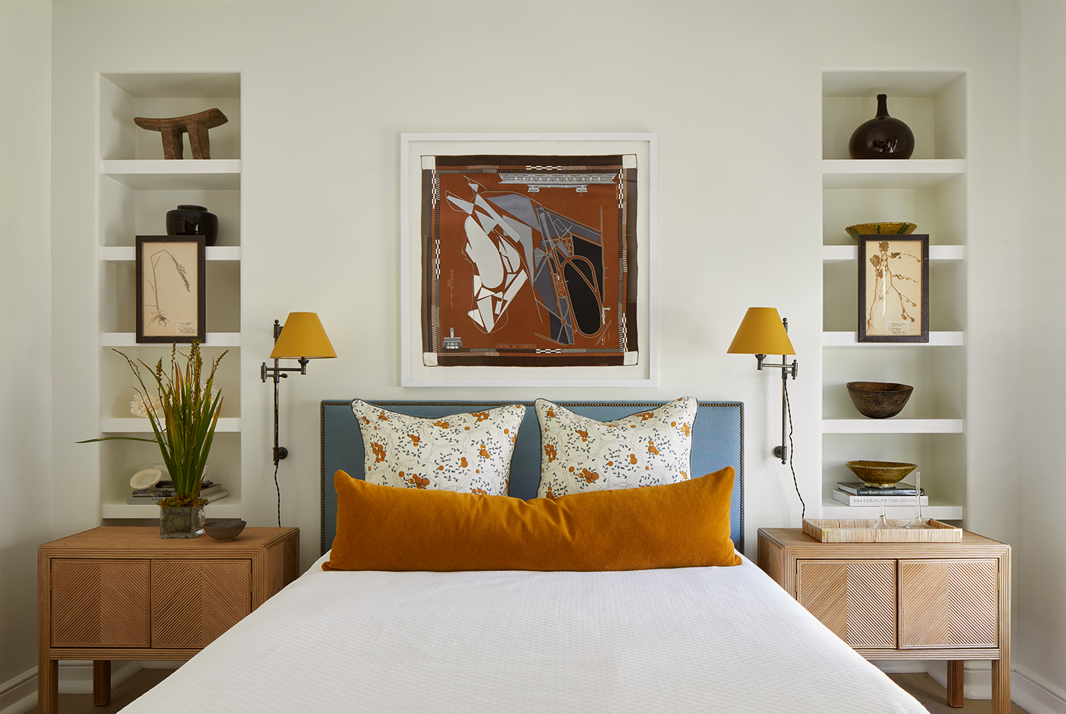
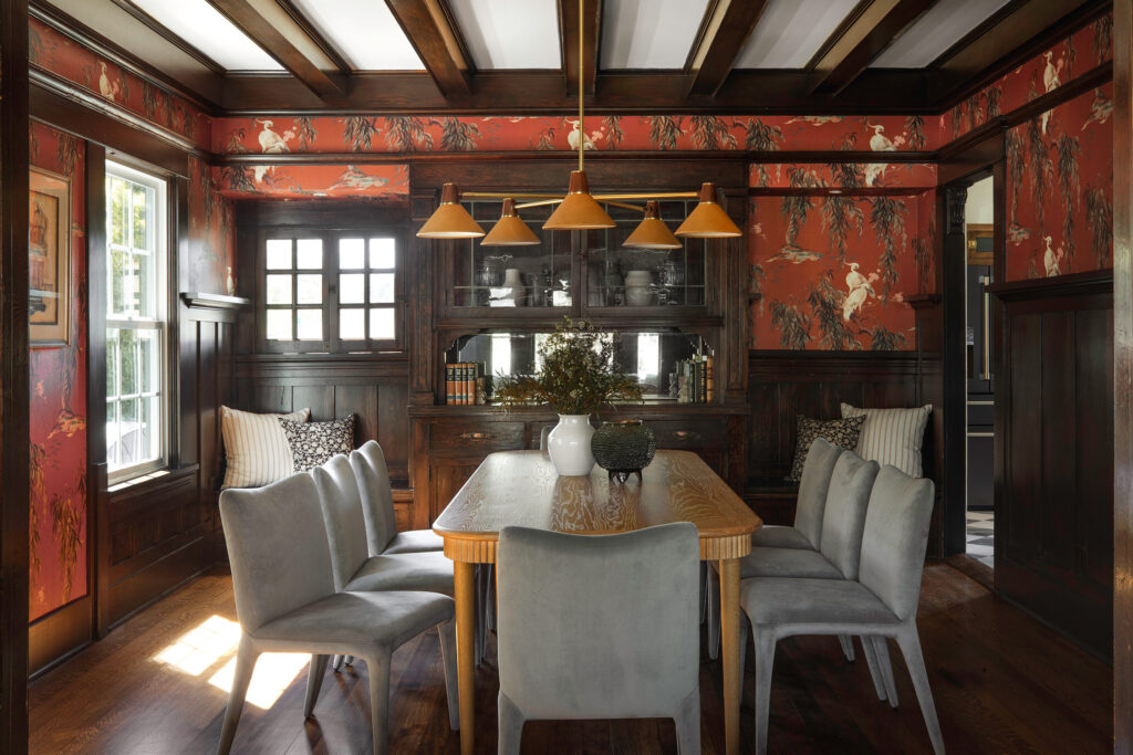
Using bold accents to create contrast is another key guideline. The article notes that too much uniformity can make a room feel flat, and layering different tones and colors, including dynamic complementary shades, adds depth. It introduces the 80/20 rule, where about 20% of patterns are super poppy and bold, supported by 80% of more subdued, yet colorful or textural, elements. Accents can also incorporate metallics or punchy versions of existing colors.
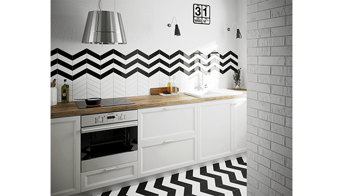
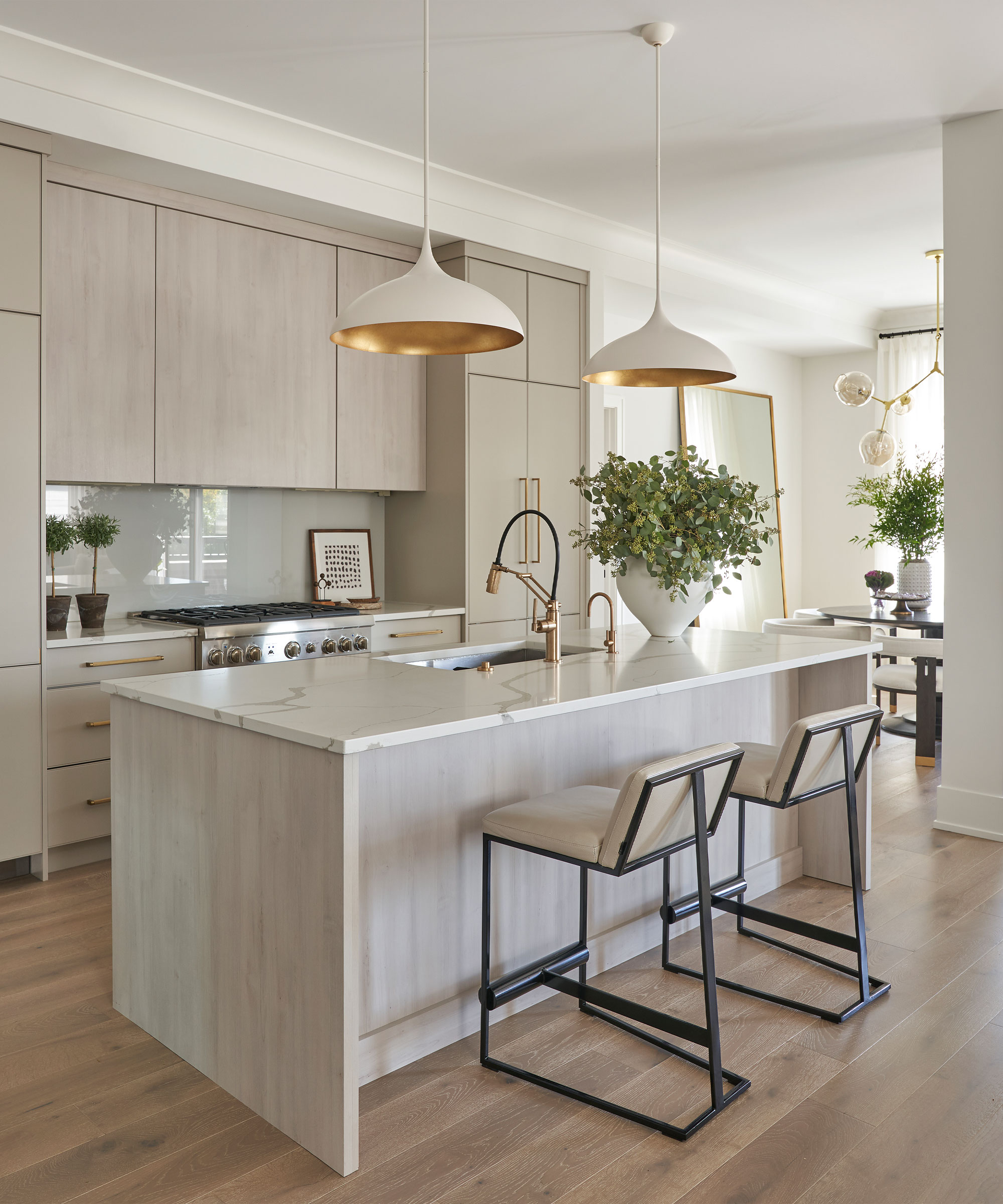
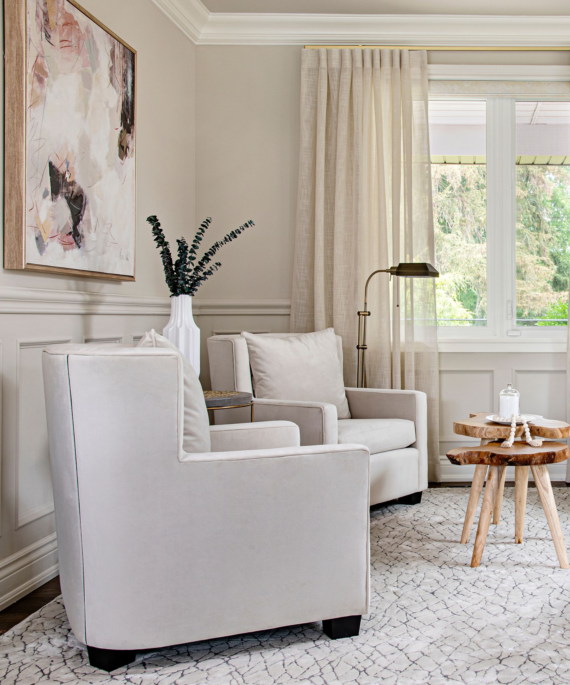
The sixth rule advises starting with neutral shades and then building upon them. A neutral base, whether pared-back or moody, helps ground the overall look. Pairing high-contrast hues like blues, blacks, navys, grays, ivories, and whites creates a dynamic yet cohesive design, with darker shades offering a dramatic backdrop and lighter tones adding brightness.
Inspiration from fashion is recommended as the seventh rule, as interior design often intersects with fashion trends. Observing how clothing designers blend patterns can provide insights into successful rhythm and combinations. This approach encourages bold choices while emphasizing careful planning.
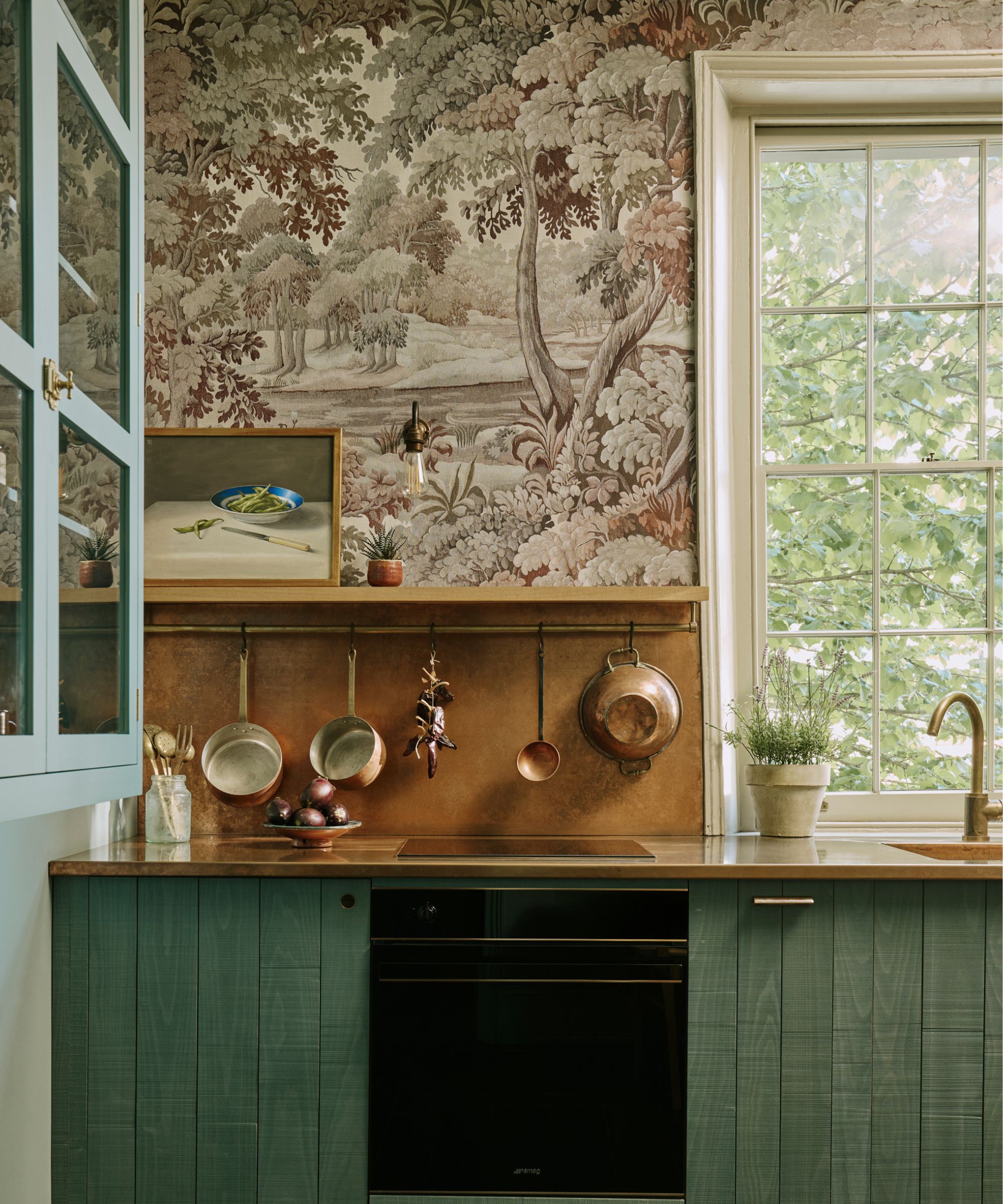
Texture is highlighted as the eighth important consideration. Combining smooth, shiny fabrics with rough, textured ones adds depth. Designers should select a dominant pattern and build around it with more subtle ones, ensuring that placement aligns with the room's purpose. Thoughtful use of texture can elevate the entire scheme.
The ninth rule suggests allowing patterns to clash slightly. The goal is not perfect matching but rather cohesion with a touch of unexpected contrast. An intentional mismatch can prevent a design from appearing too 'twee' or old-fashioned, contributing to a stylish and trendy aesthetic.
Finally, the tenth rule advises taking time to perfect the look, acknowledging that pattern mixing is an art that requires experimentation. Even experienced designers iterate through options before finalizing a scheme. The process encourages testing different combinations until a beloved and visually interesting result is achieved, with the ultimate goal being a space that reflects unique personality.
#InteriorDesign #PatternClashing #HomeDecoration #ColorTheory #TextileMixing #DesignRules #DecoratingWithPattern #HomeStyling #InteriorTrends #InteriorDesign #PatternClashing #HomeDecoration #ColorTheory #TextileMixing #DesignRules #DecoratingWithPattern #HomeStyling #InteriorTrends
0 comment in total
 No comments yet
You may also like
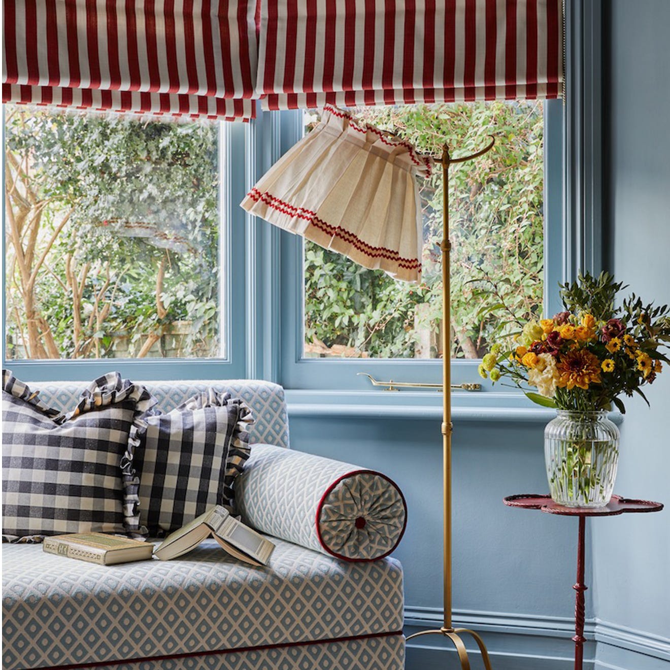
How to use clashing patterns in your home, according to design experts
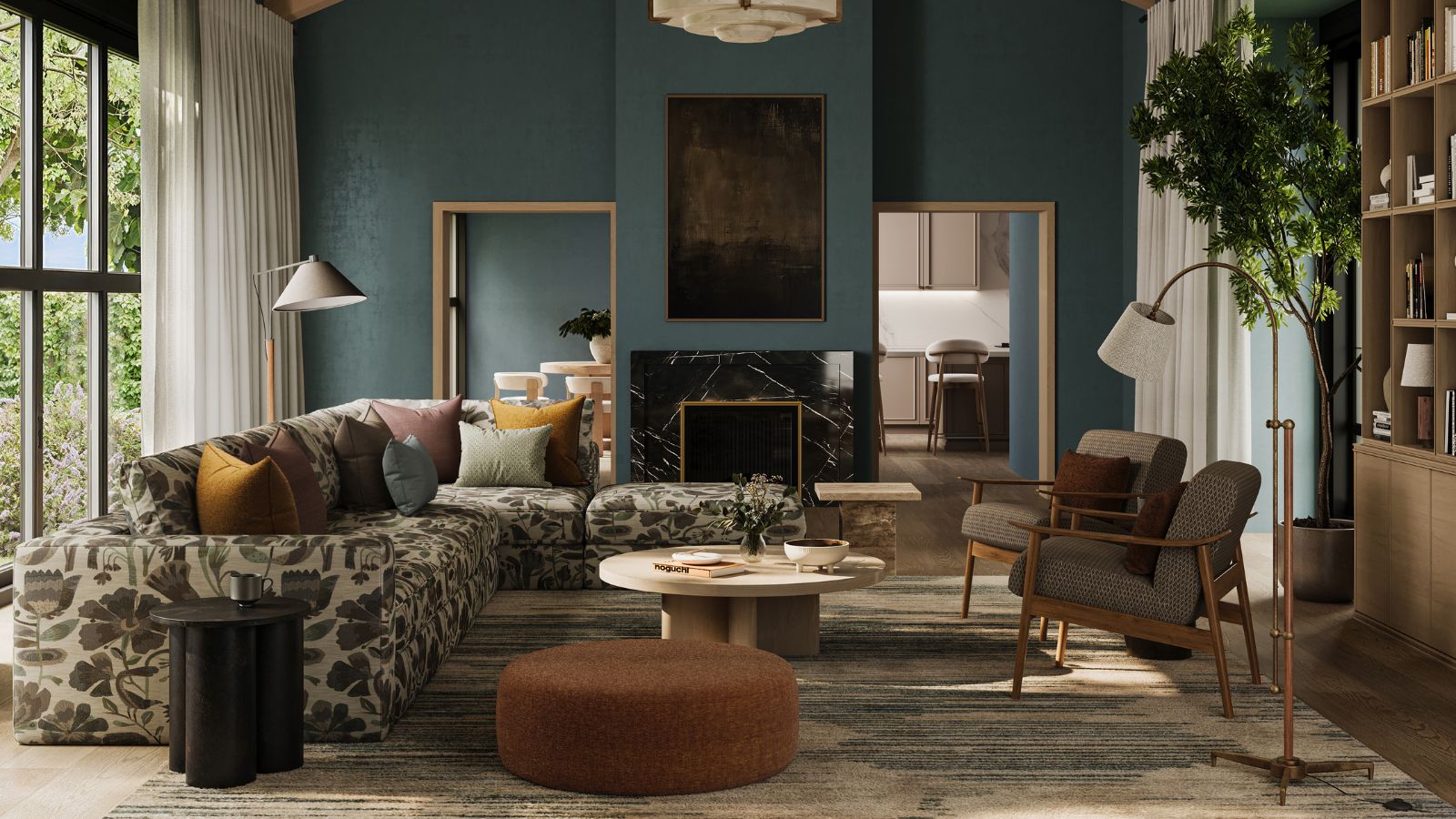
These are the biggest pattern trends designers are using in 2025 and beyond

6 "Essential" Architecture Trends Design Lovers Need to Know

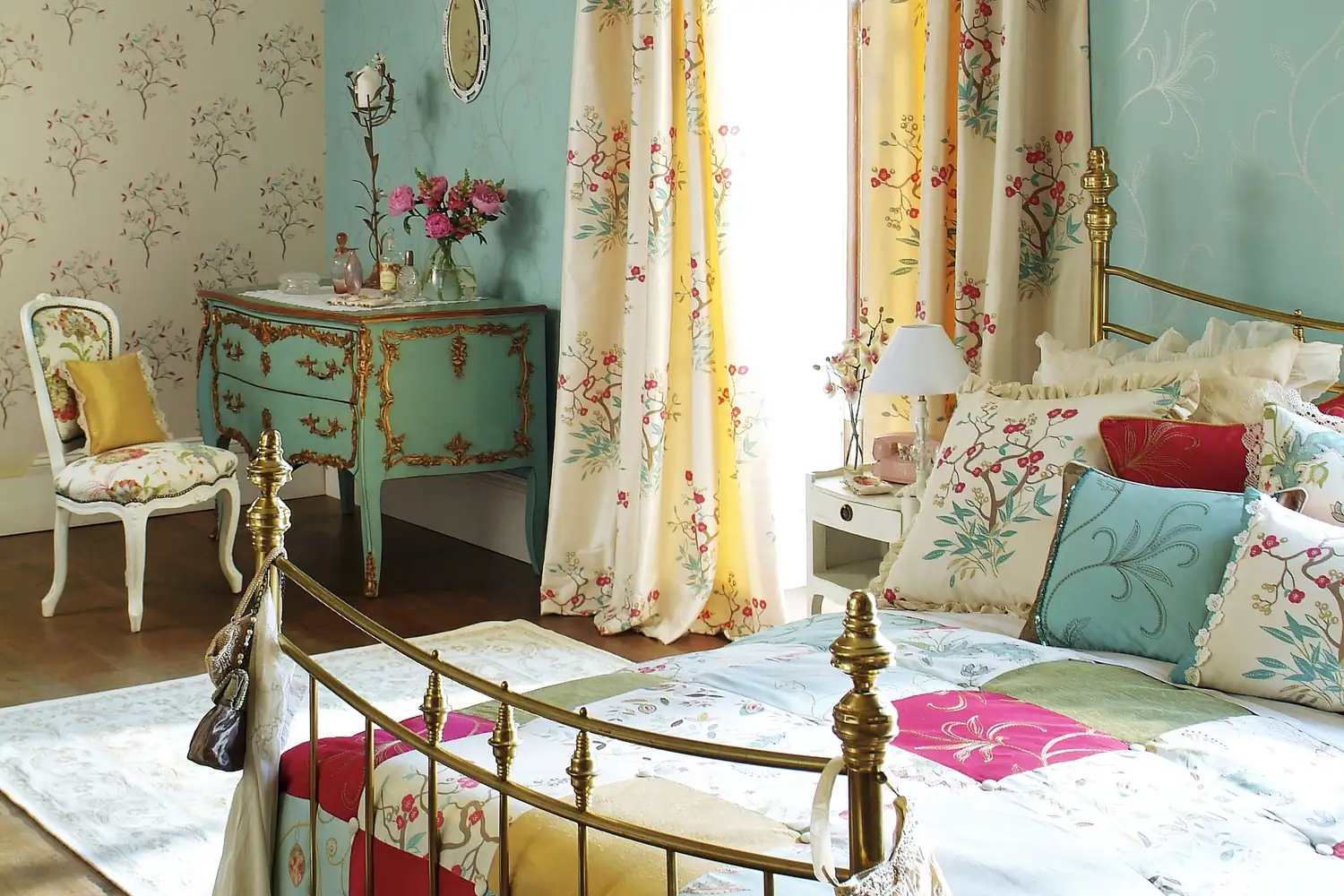
Pattern Drenching Is the Latest Maximalist Approach to Home Decor—Here’s How to Embrace It Without Feeling Overwhelmed

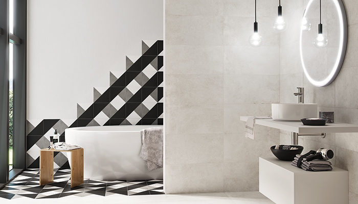
Tile trends: Using pattern and contrast to create daring designs

Interior design experts reveal the colour rules you should be breaking
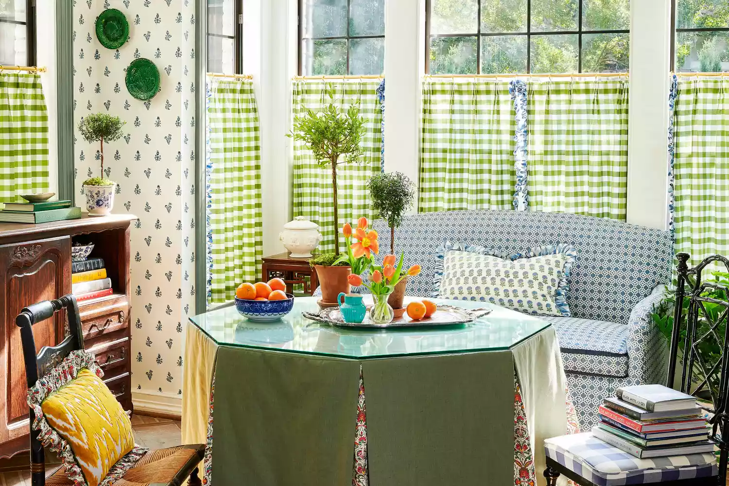
This Bold Decor Trend Is Proof That Grandma Is Always Right
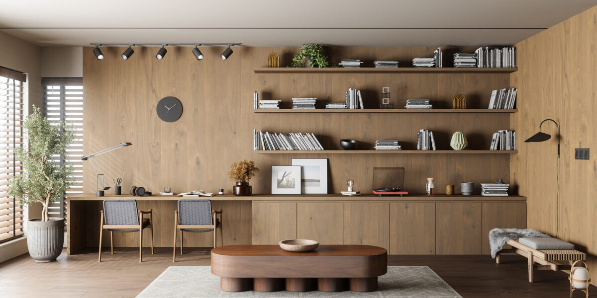
The 5 Design Rules That Are Meant to Be Broken—and What to Do Instead
Pattern play: These 15 rooms by Dallas designers will inspire mixing and matching
5 Home Decorating Rules Interior Designers Think You Should Break
5 outdated pattern trends that will make your home feel old-fashioned – and what to use instead

This Is the Correct Way to Mix Design Eras and Styles
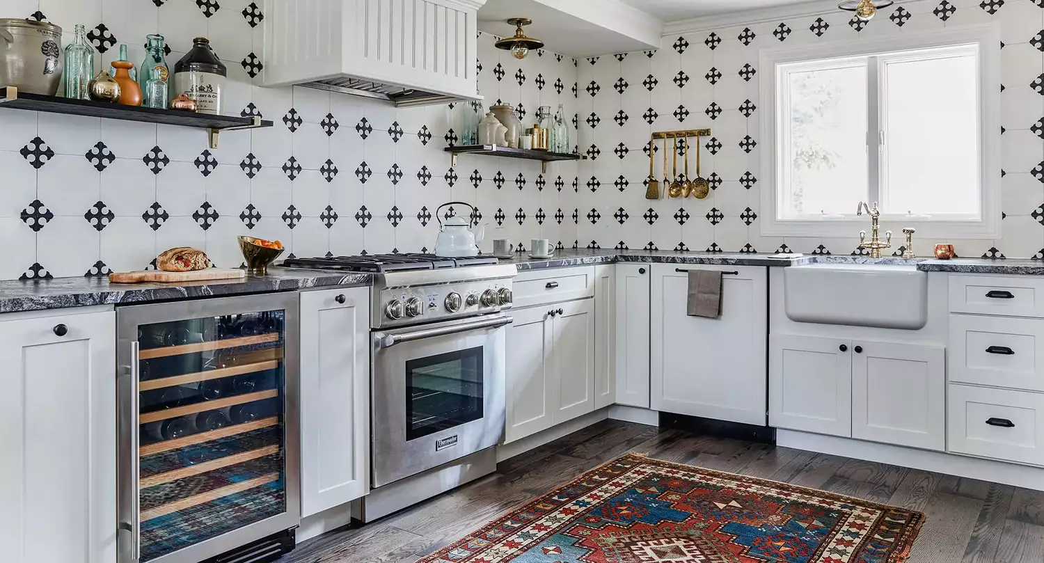
7 Golden Rules for Mixing and Matching Patterns That Designers Swear By

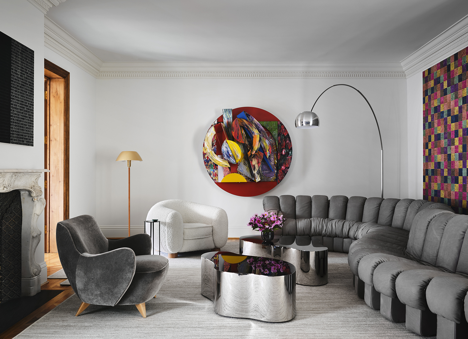
Rhythm in interior design - 11 ways to use this clever technique for rooms that look professionally done
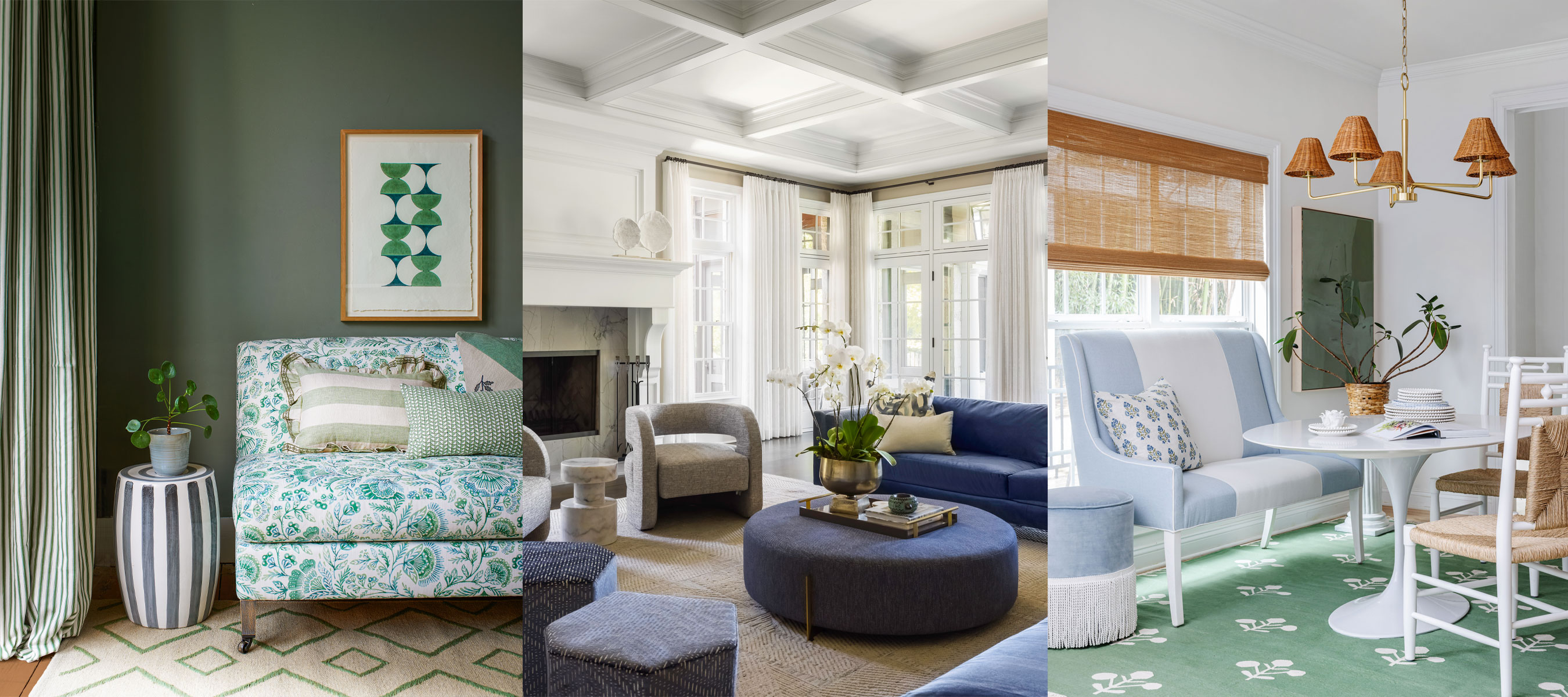
How to create repetition in interior design – 7 ideas for decorating success
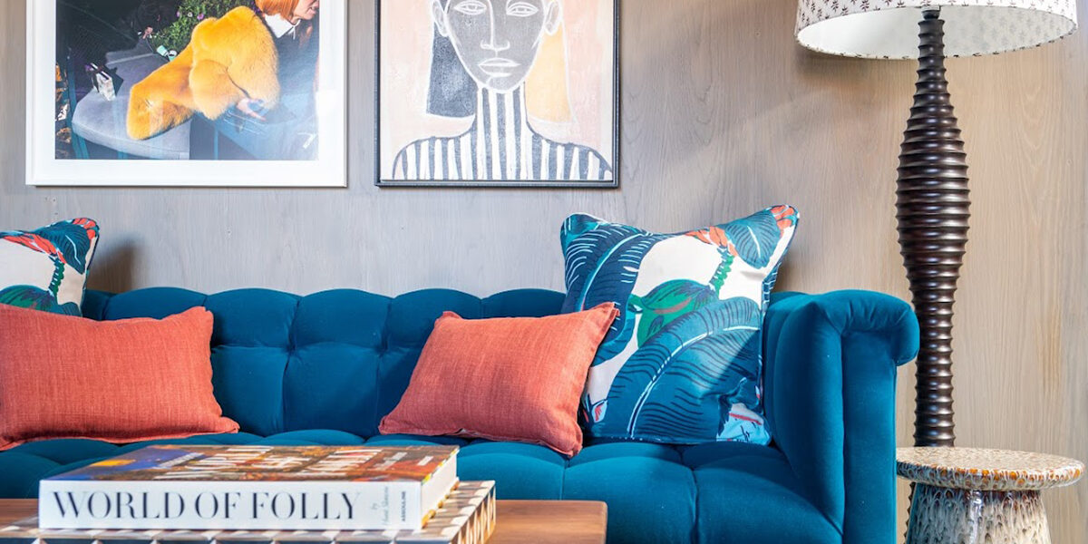
The 8 Dos and Don’ts of Mixing Patterns in Your Home
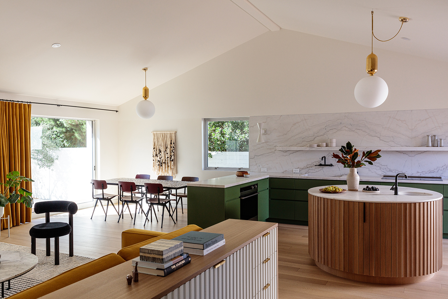
10 rules to achieve balance in interior design - the secret style sauce which brings schemes together
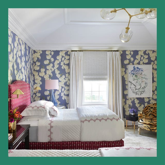
These Are The Top Design Trends Worth Trying
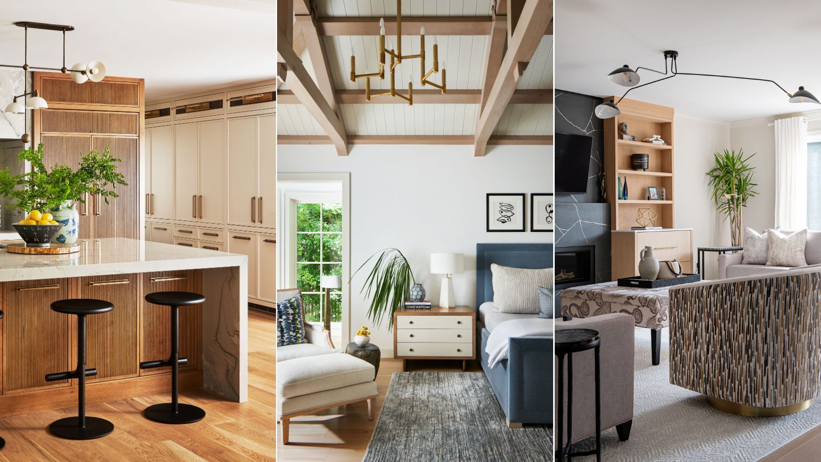
9 transitional style decorating rules – the ultimate checklist to channel the perfect old-meets-new look
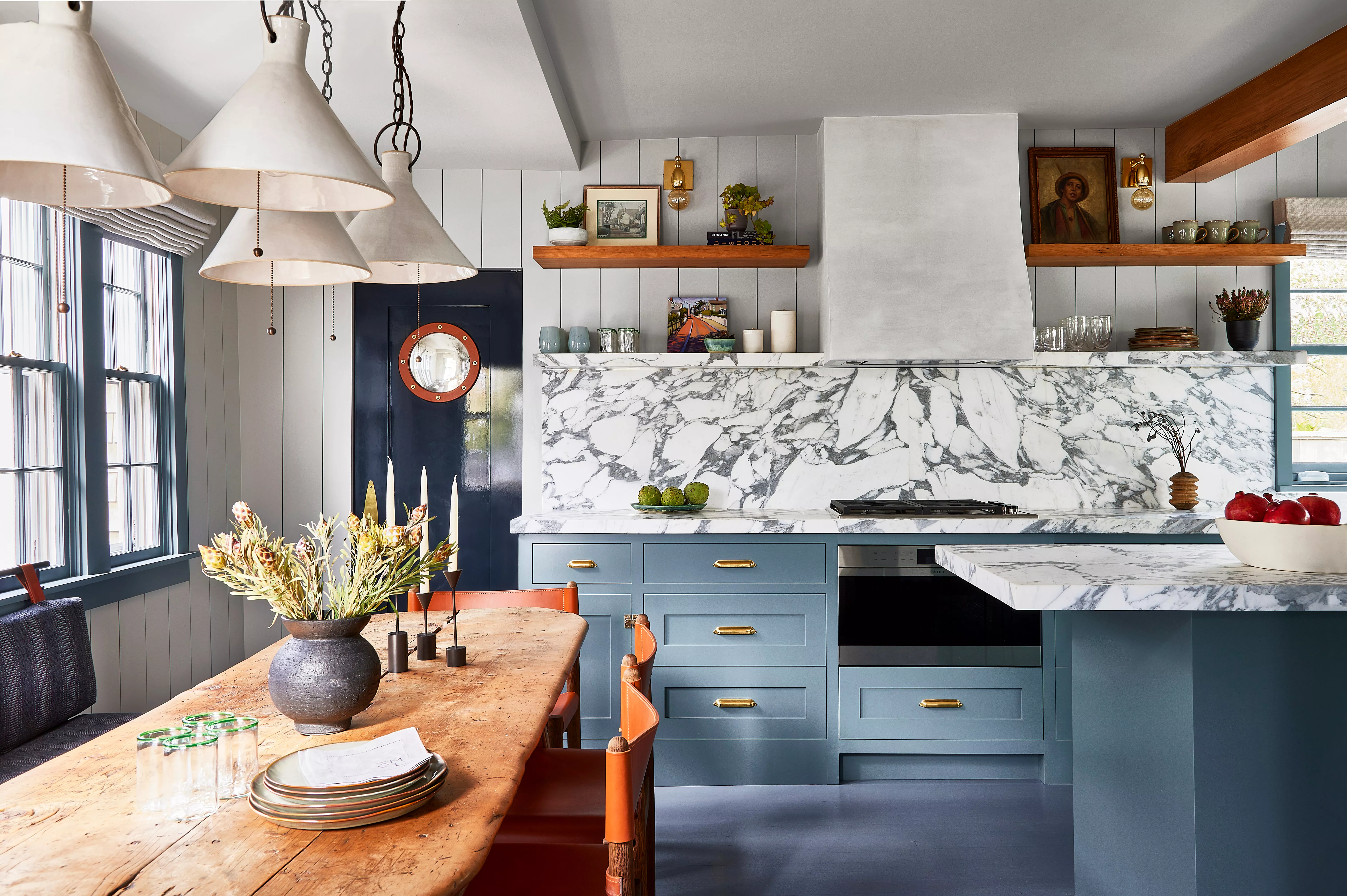
These 5 Design Style Crossovers Prove That Opposites Really Do Attract