This Controversial Interior Paint Color Is My All-Time Favorite
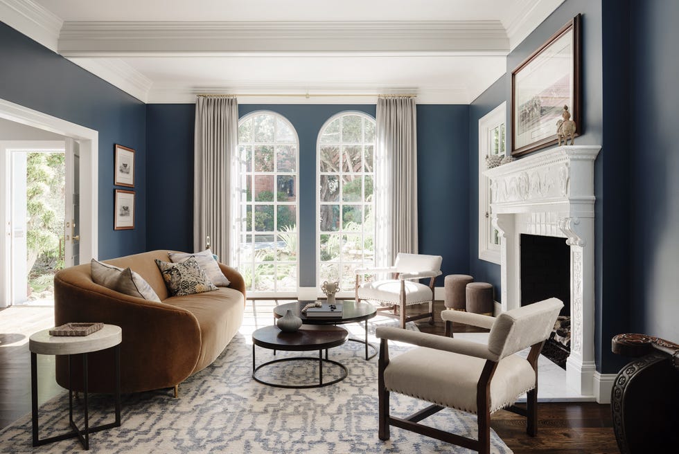
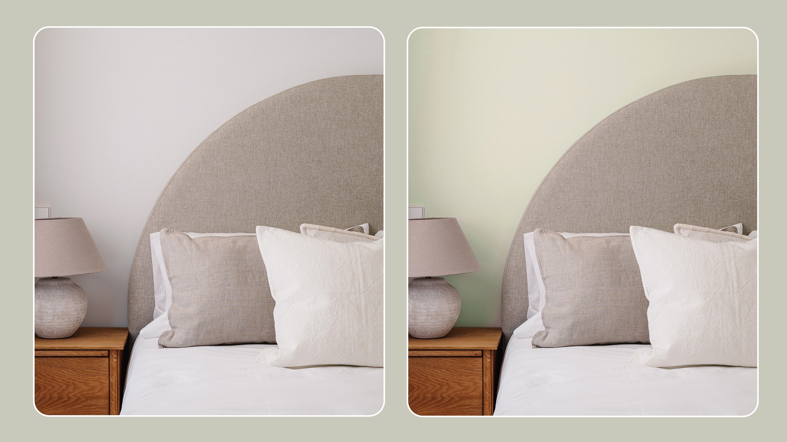
The author shares their enduring appreciation for a specific interior paint color, Sherwin Williams' Agreeable Gray, despite its often controversial reception in design circles. The piece begins by contrasting a past paint choice – a springy blue inspired by a `Downton Abbey` bedroom – with the neutral tone recommended for selling a previous home. While initially considering Agreeable Gray bland, the author acknowledges its effectiveness in the quick sale of that property, marking a shift in their perspective.
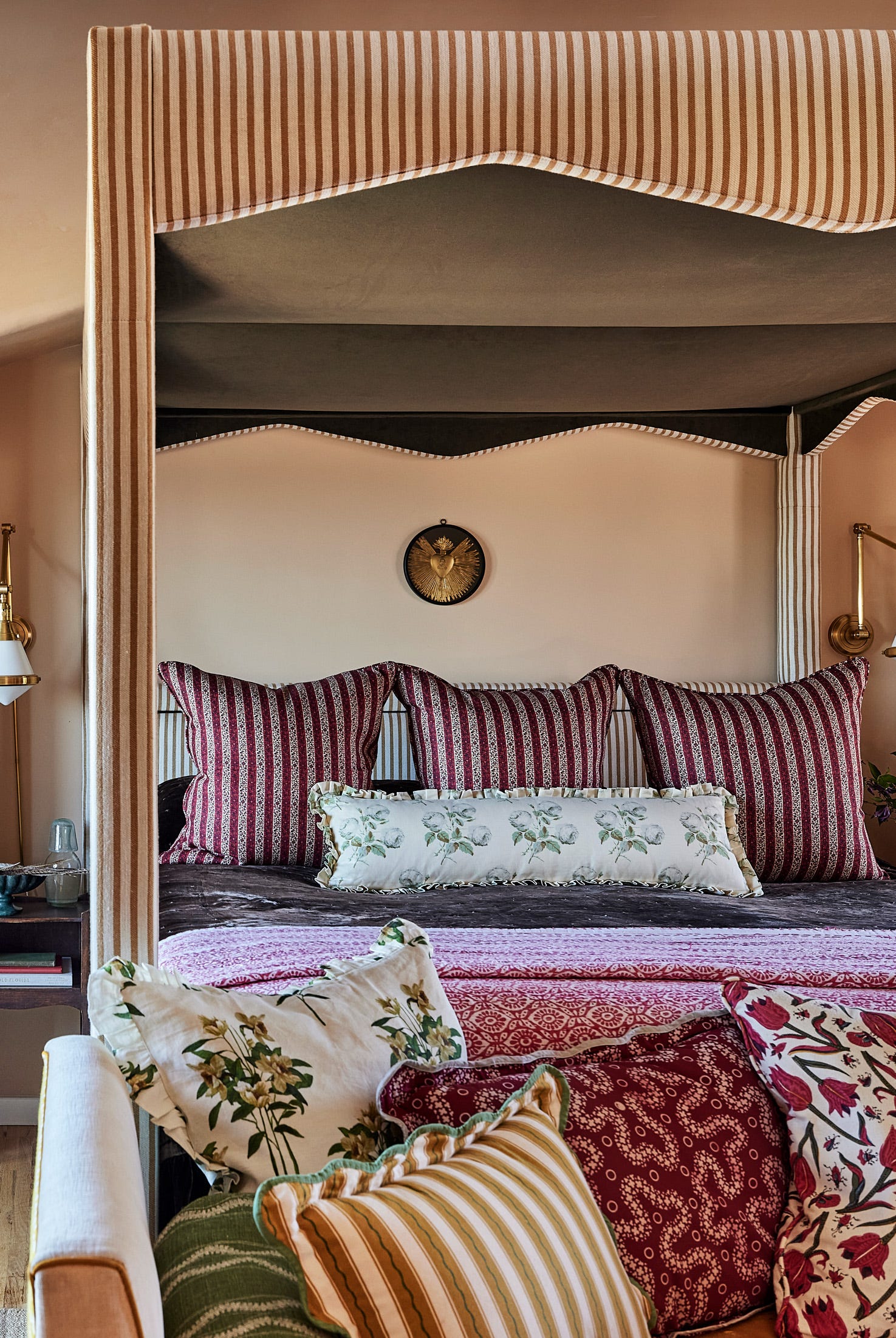
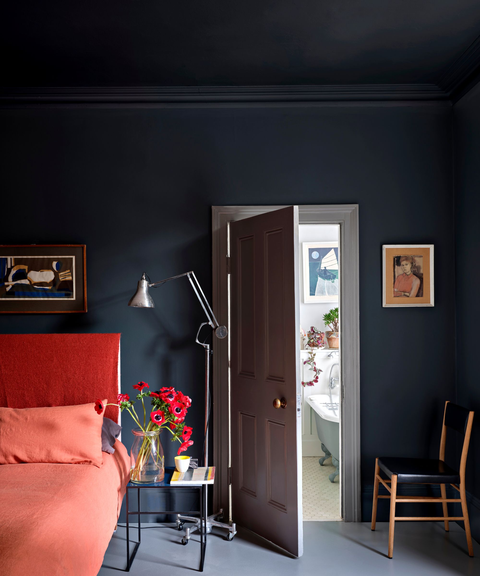
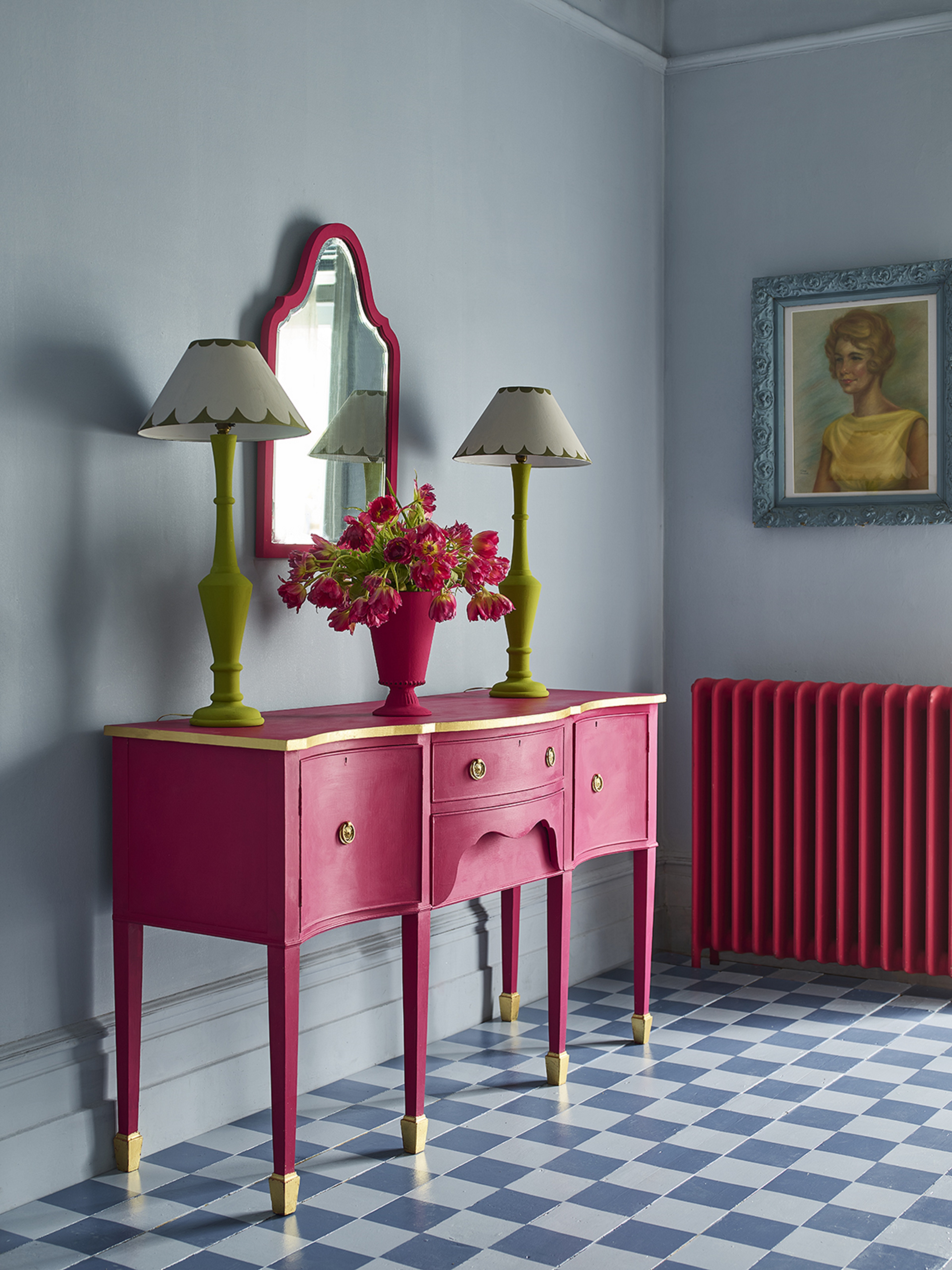
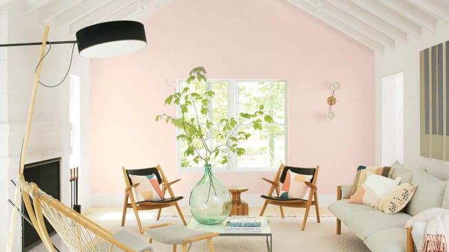
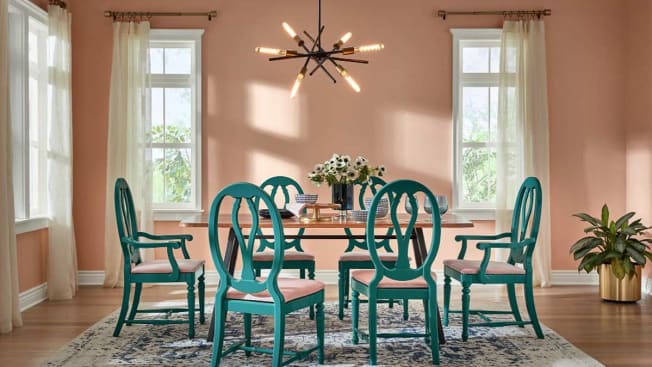
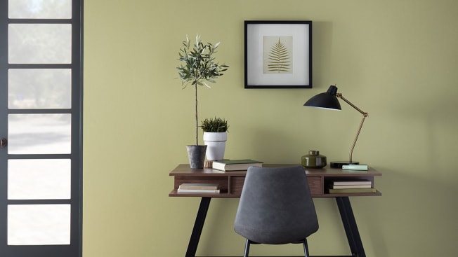
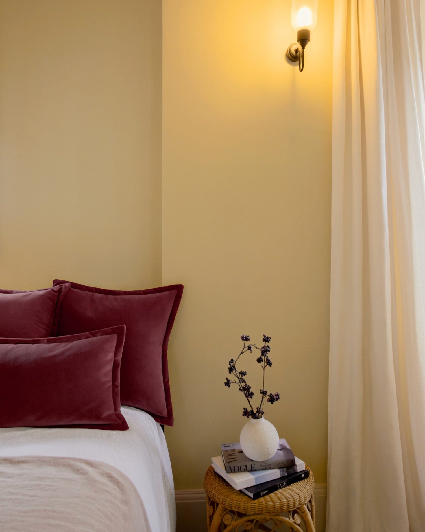
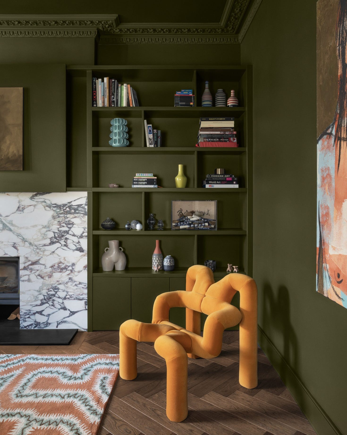
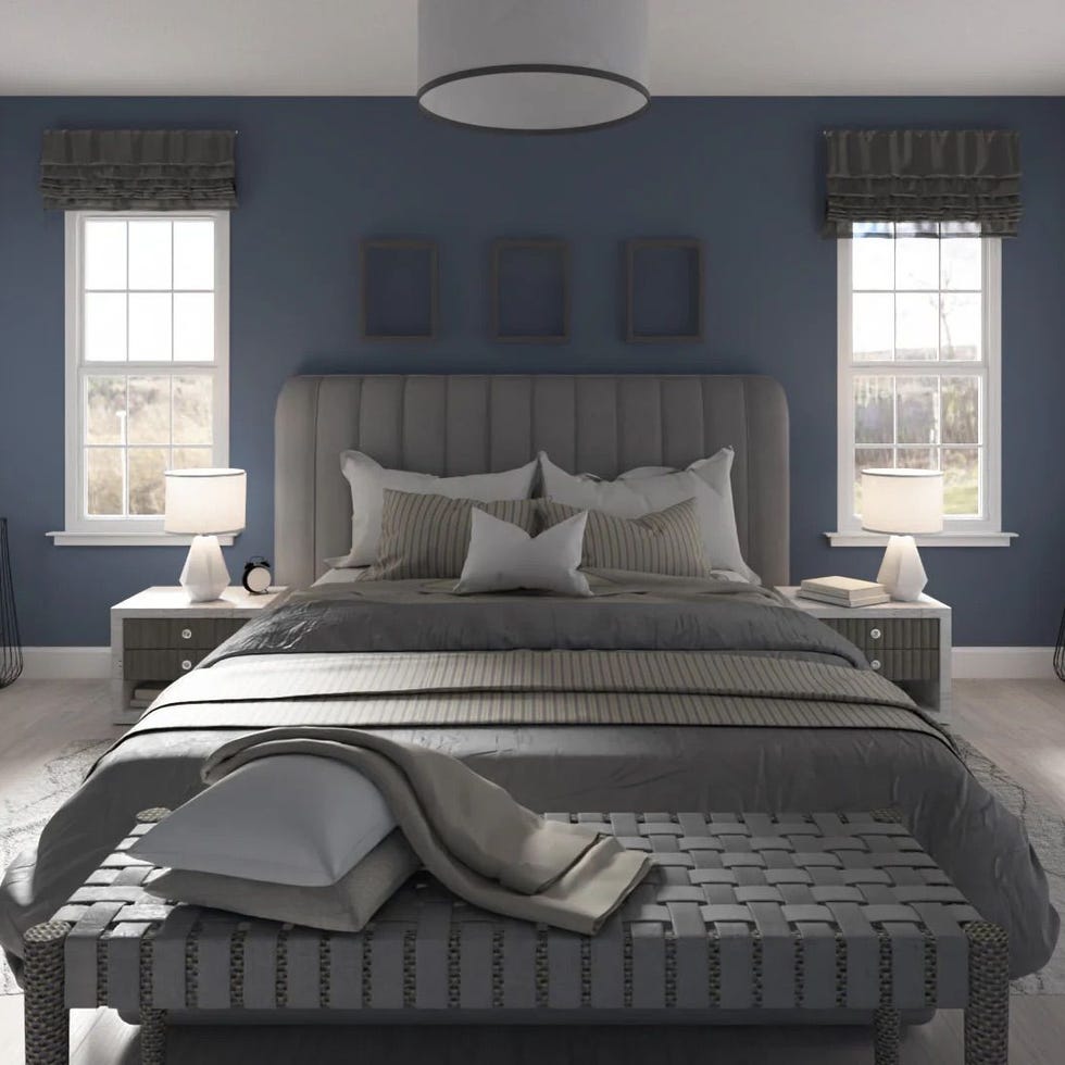
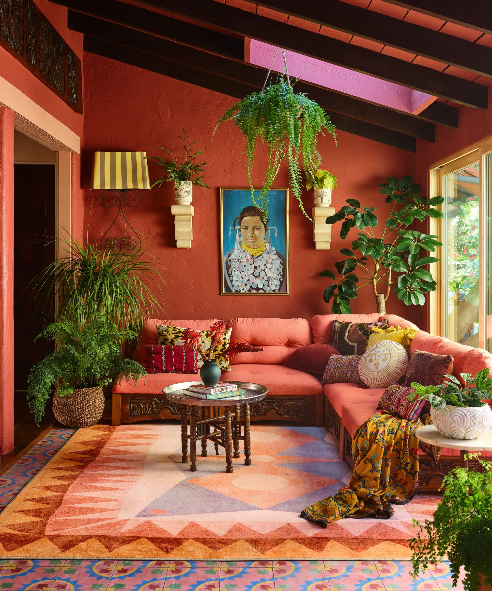
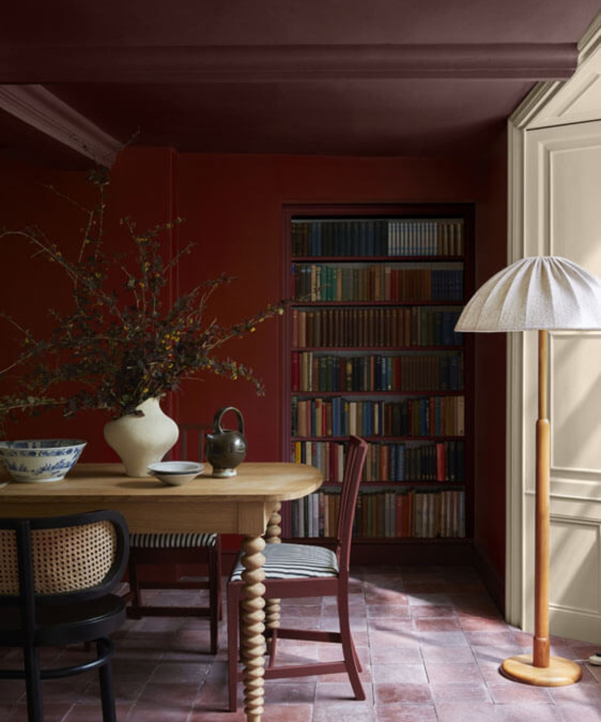
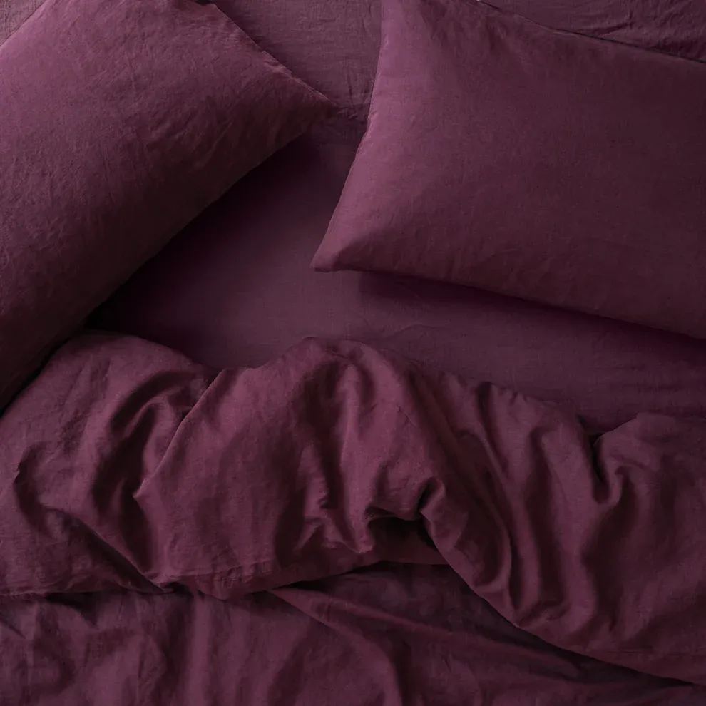
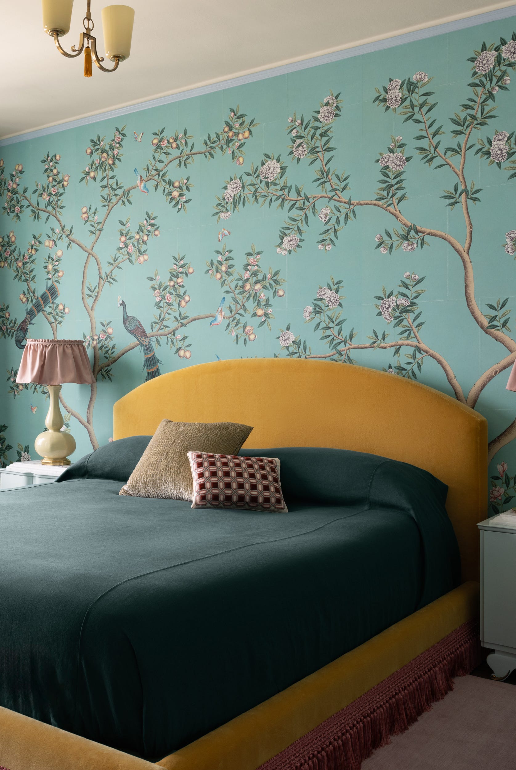
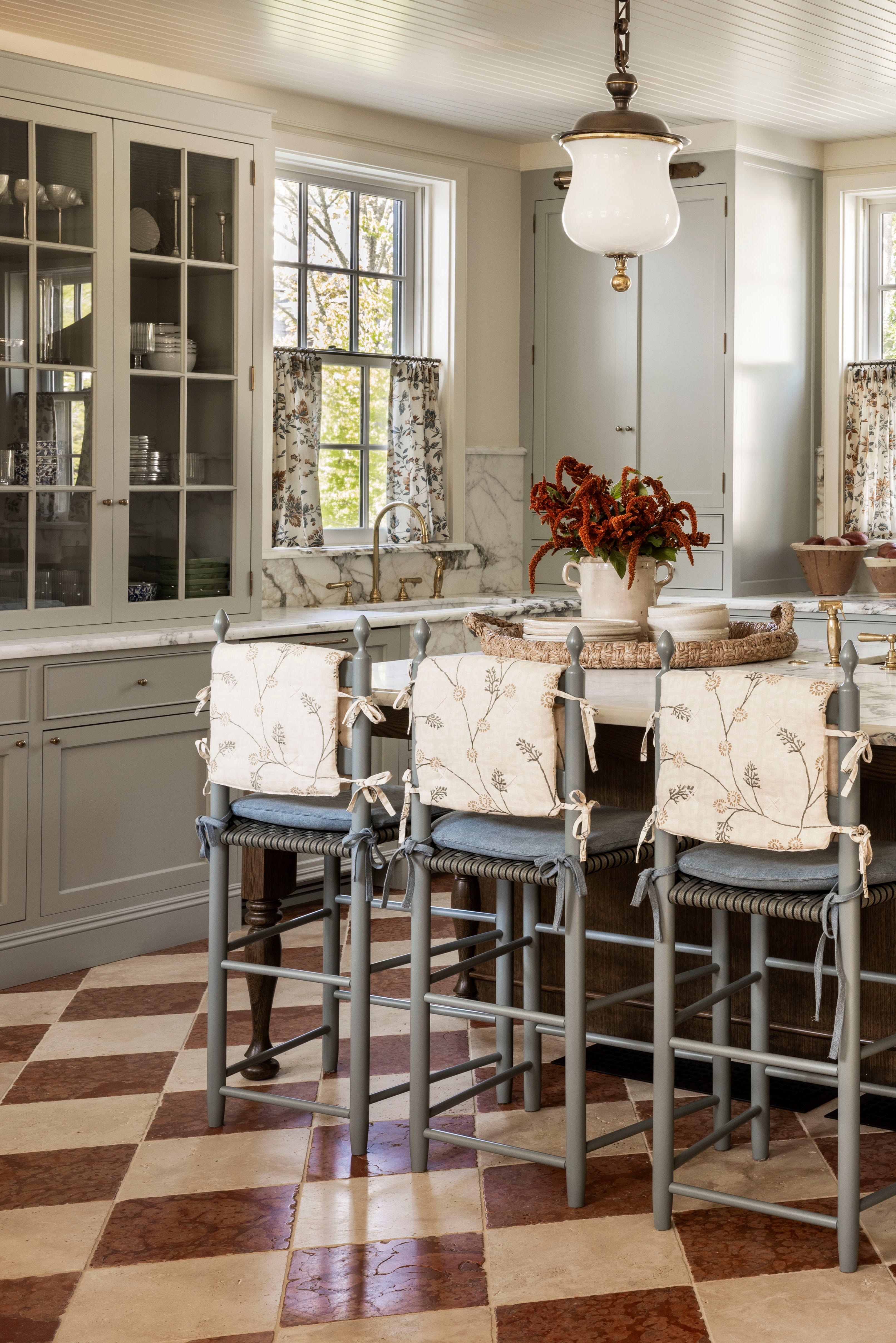
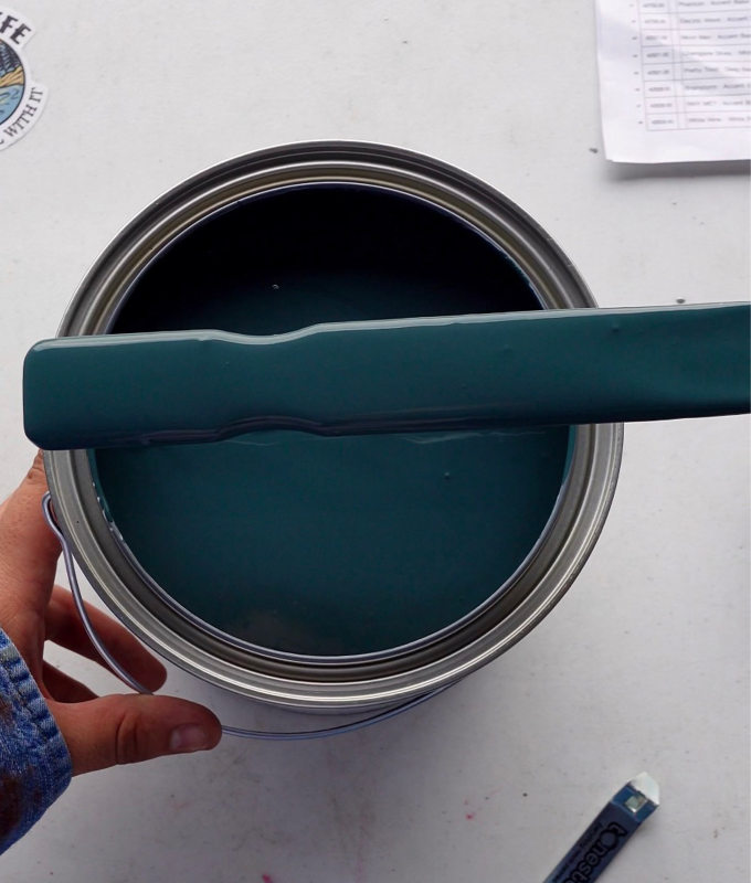
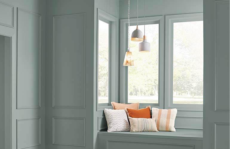
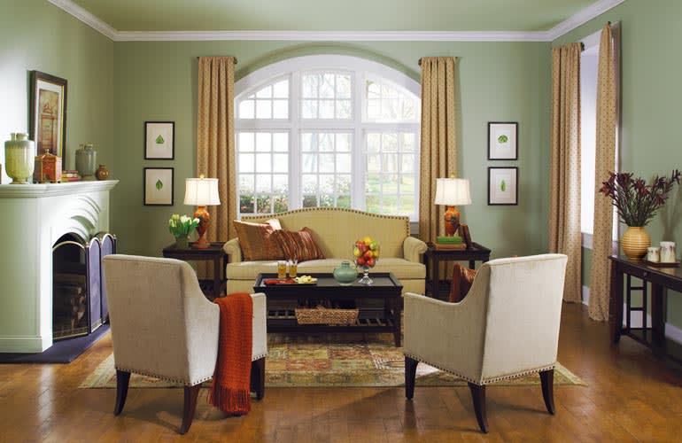
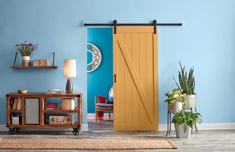
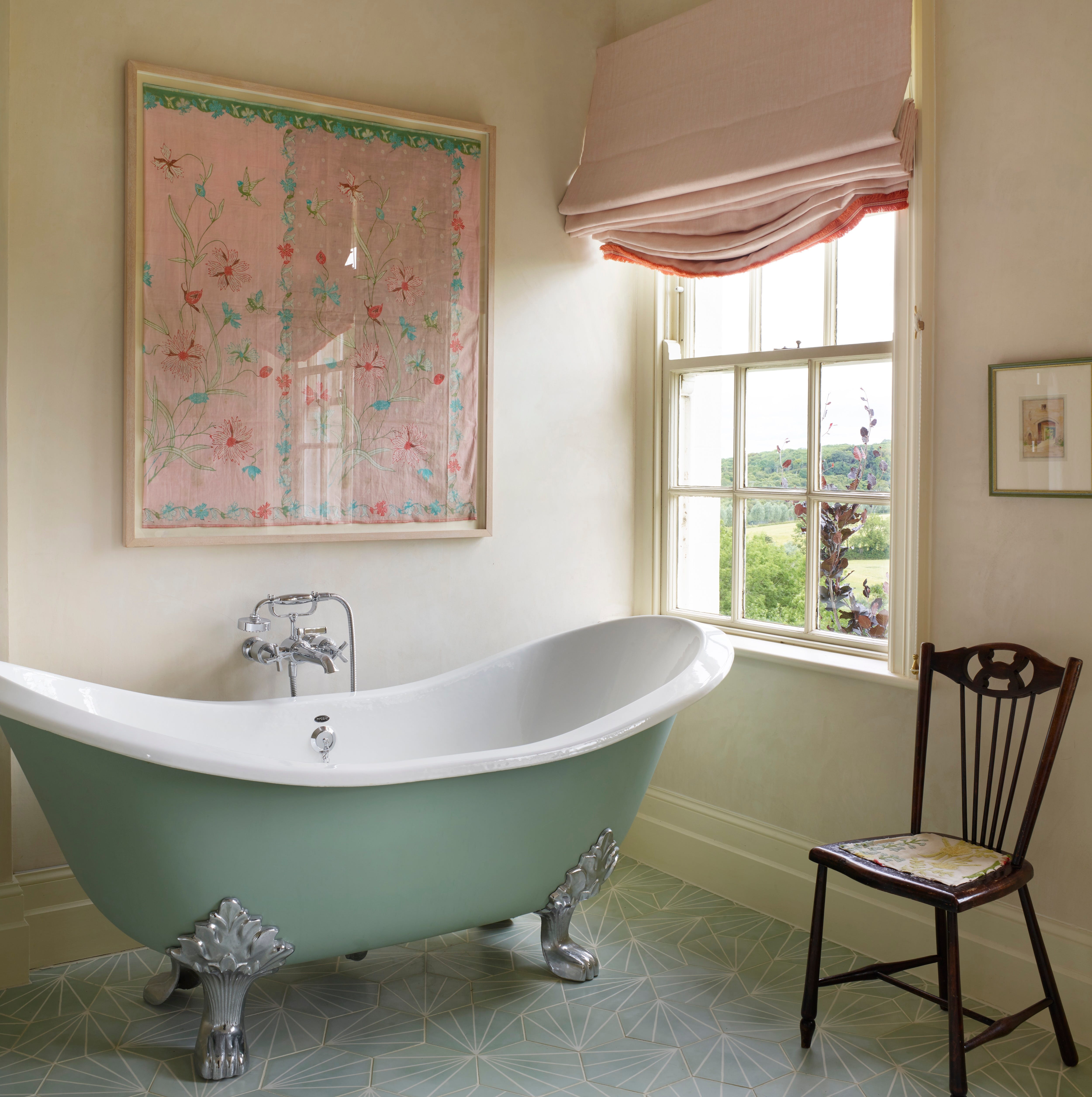
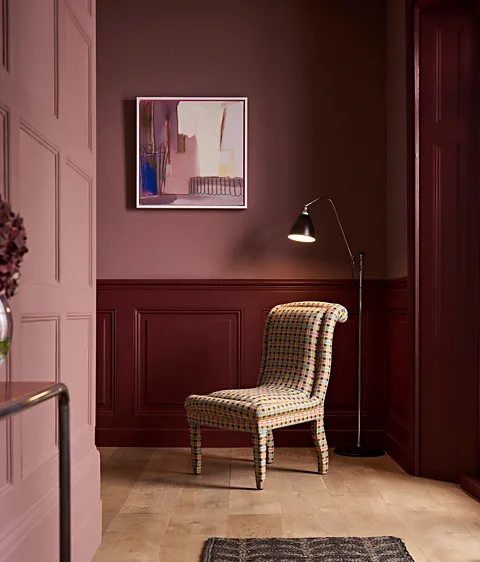
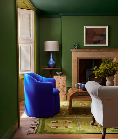
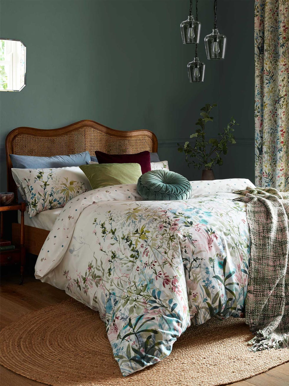
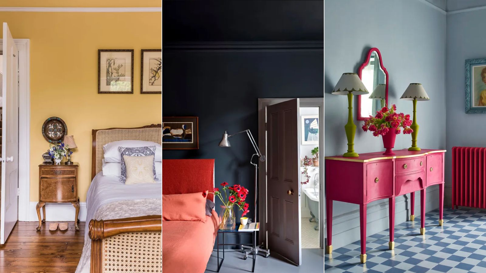
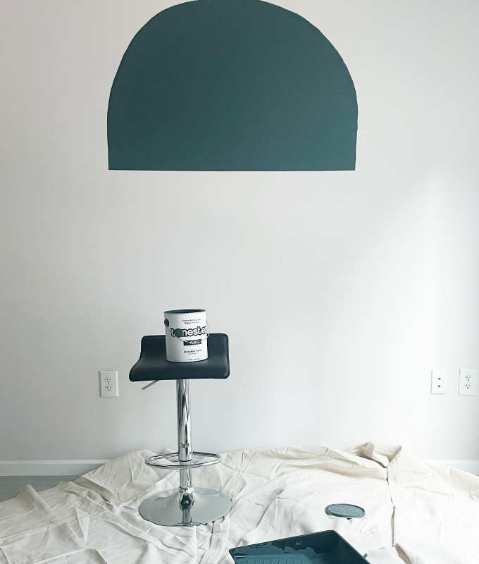
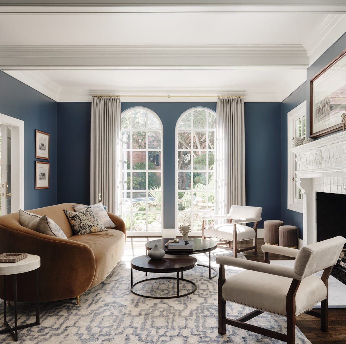
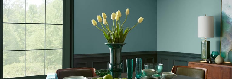
The narrative then delves into the current design landscape, noting a perceived decline in the popularity of neutral colors, especially white, in bathroom spaces. Design professionals like Diana Melichar suggest a move towards softer, more curated aesthetics, with earth and rose tones emerging as new neutrals for bathrooms. This trend is further supported by the 2025 colors of the year from prominent brands like Sherwin Williams and Pantone, which include richer hues such as deep plum, caramel terracotta brown, teal blue, deep navy, and off-sage green.
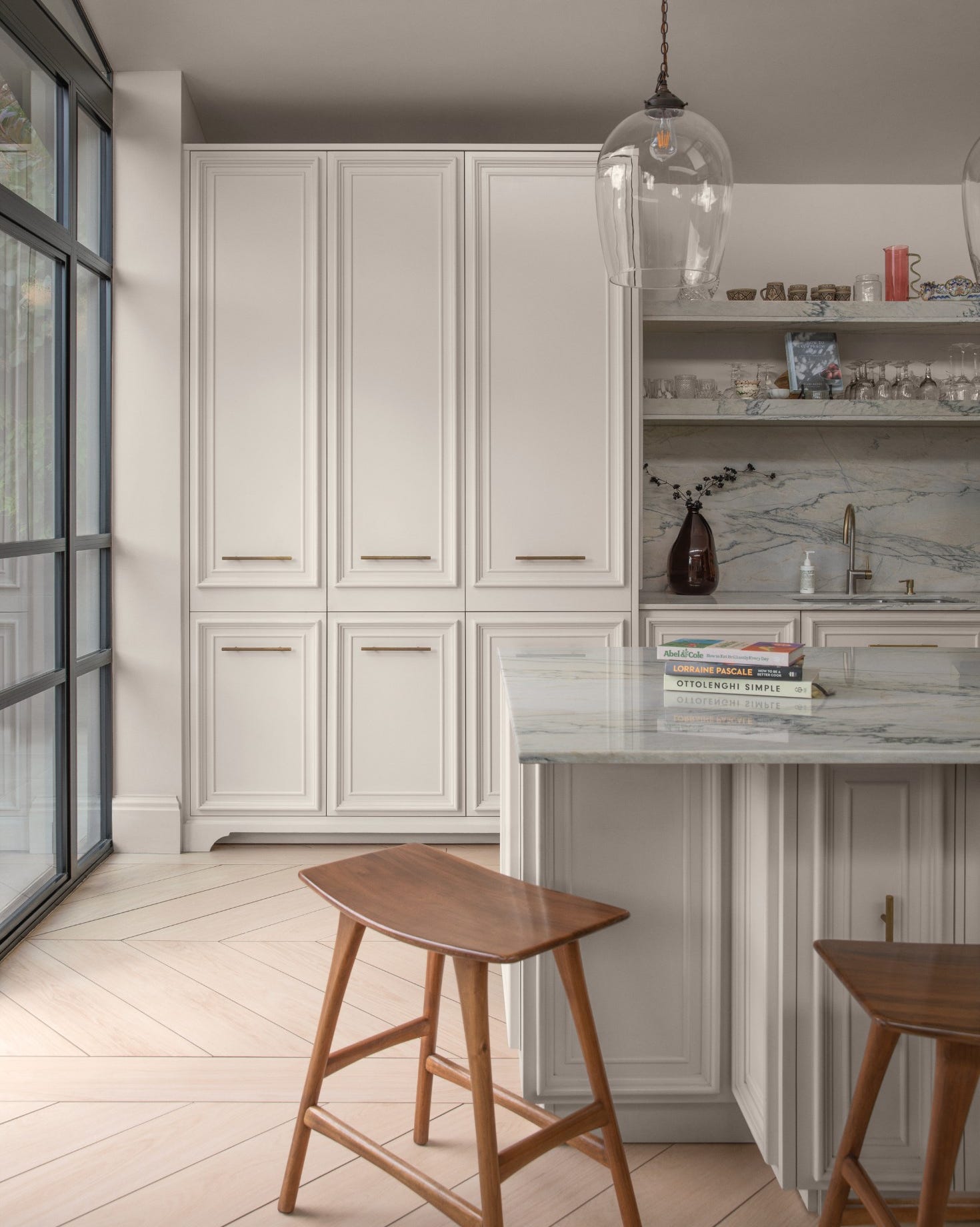
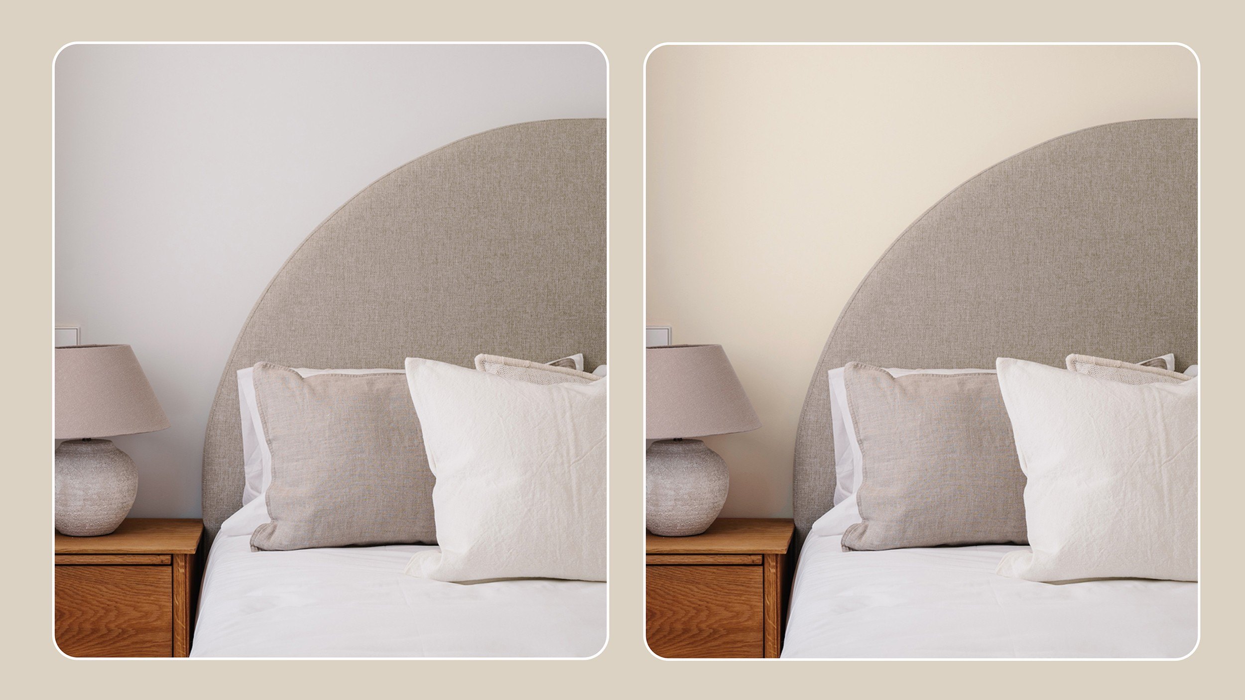
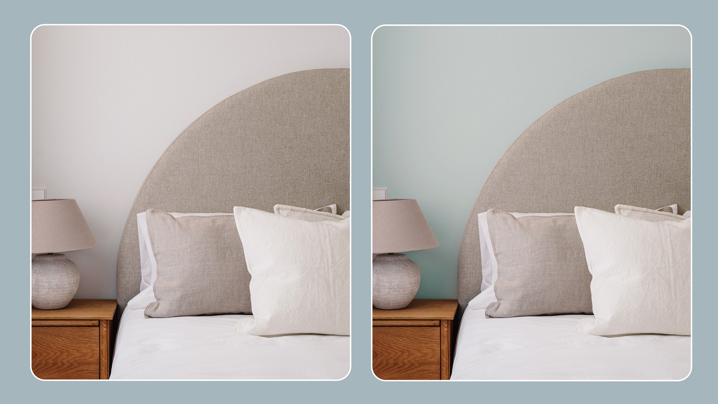
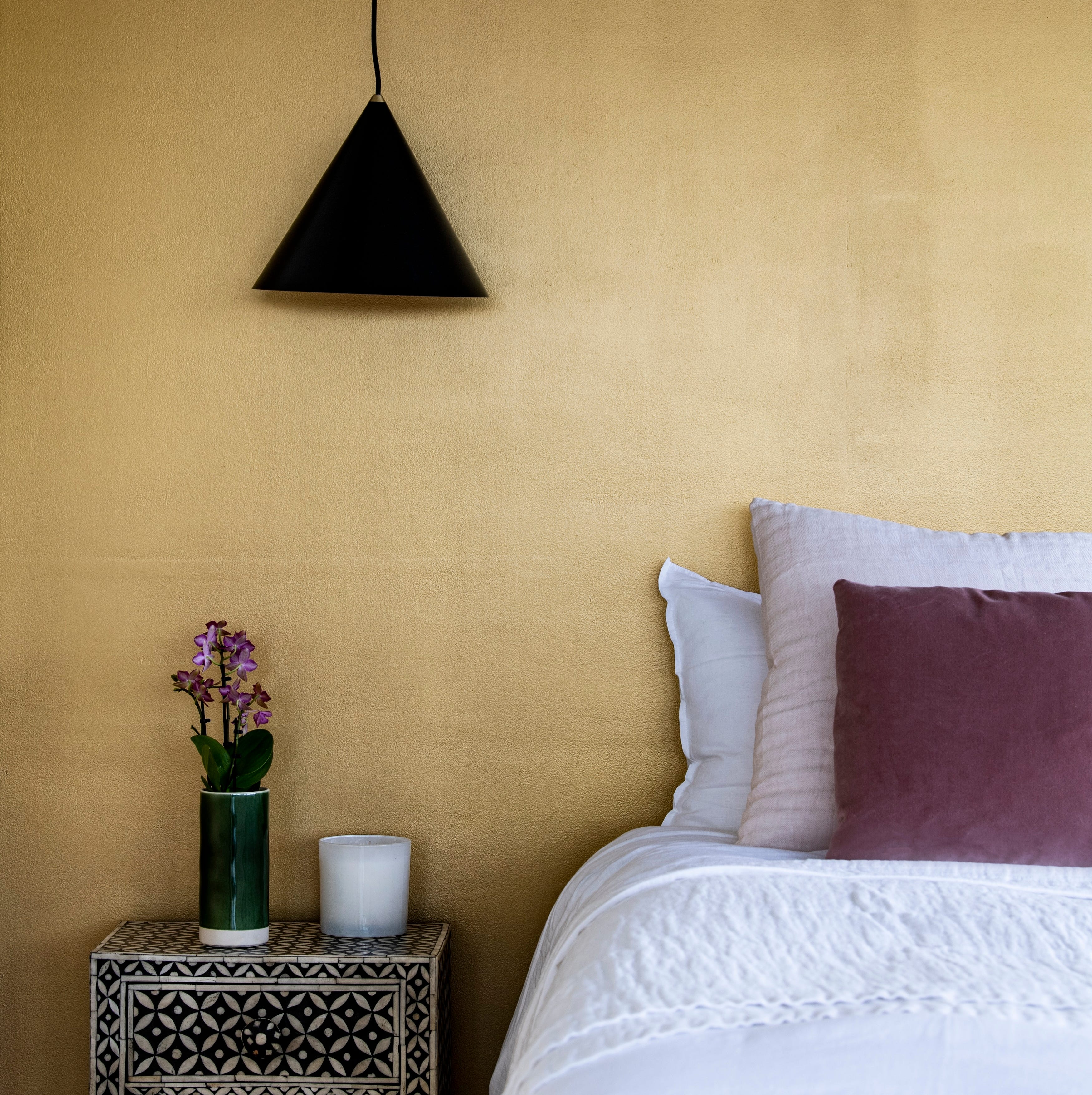
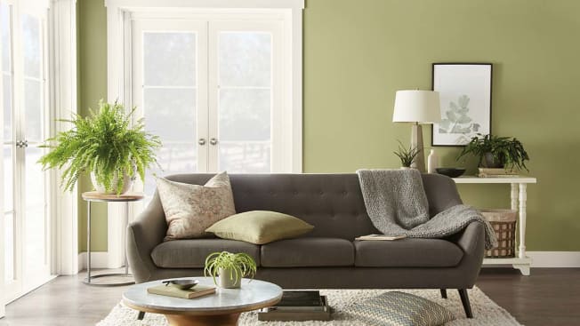
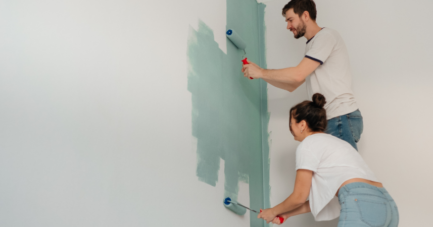
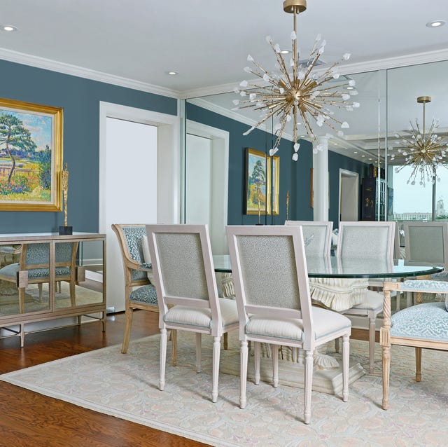
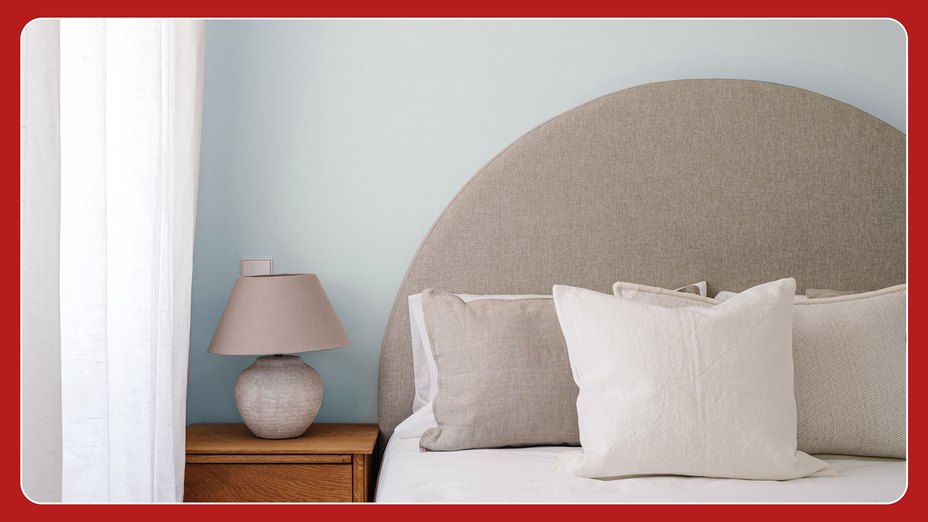
Despite these prevailing trends and the general shift away from traditional neutrals, the author emphasizes their continued fondness for Agreeable Gray. The article describes the process of moving into a new home, which featured dark brown walls and a blue-gray kitchen. To unify the aesthetic and create a more expansive feel, the author opted to paint the entire interior, including the trim and doors, in Agreeable Gray. This decision was driven by the desire for a light and airy atmosphere and the goal of creating a consistent backdrop for the home's various elements.
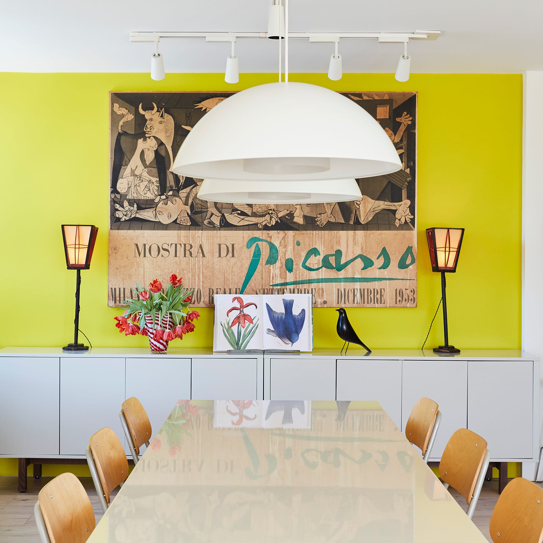
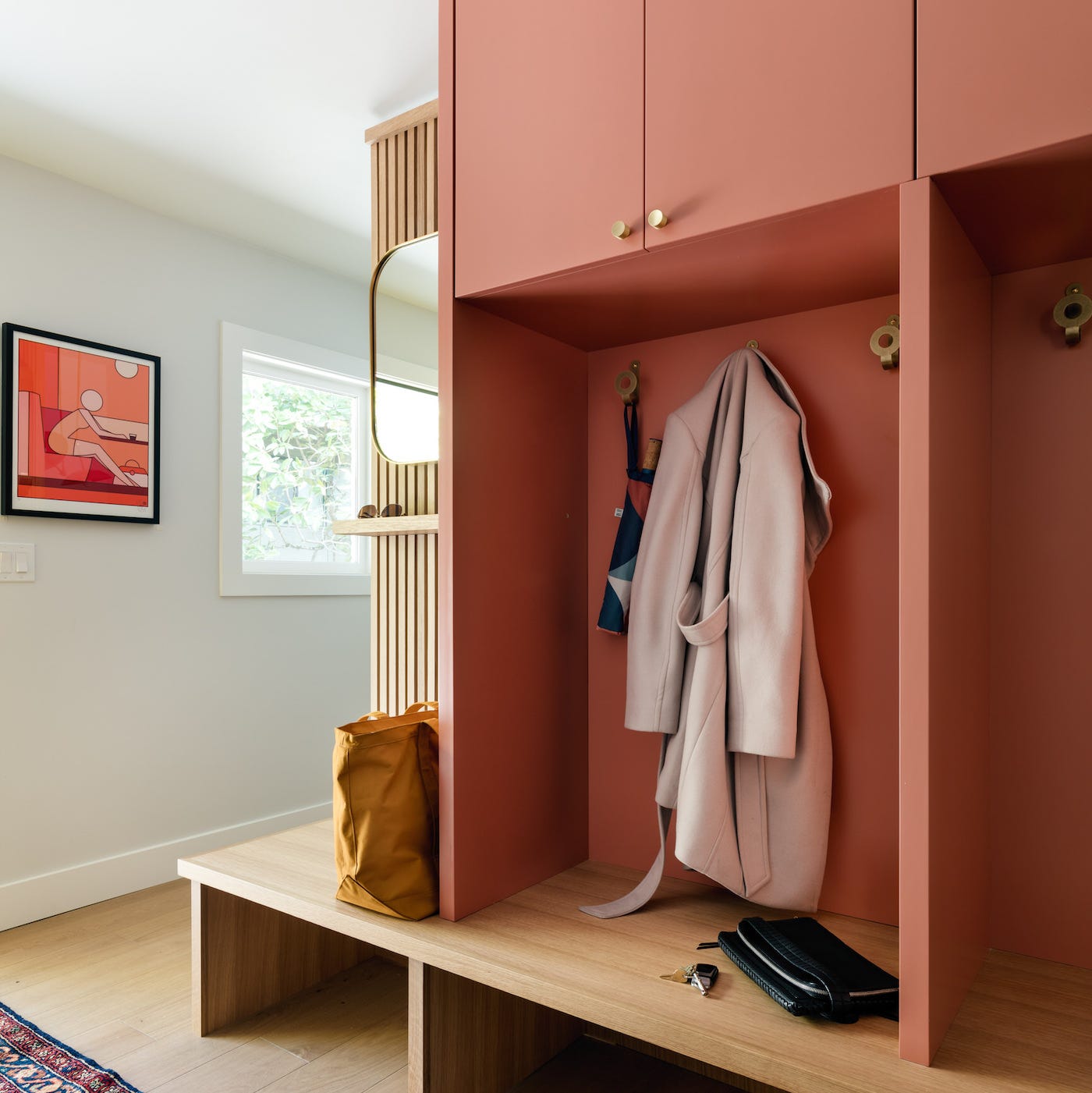
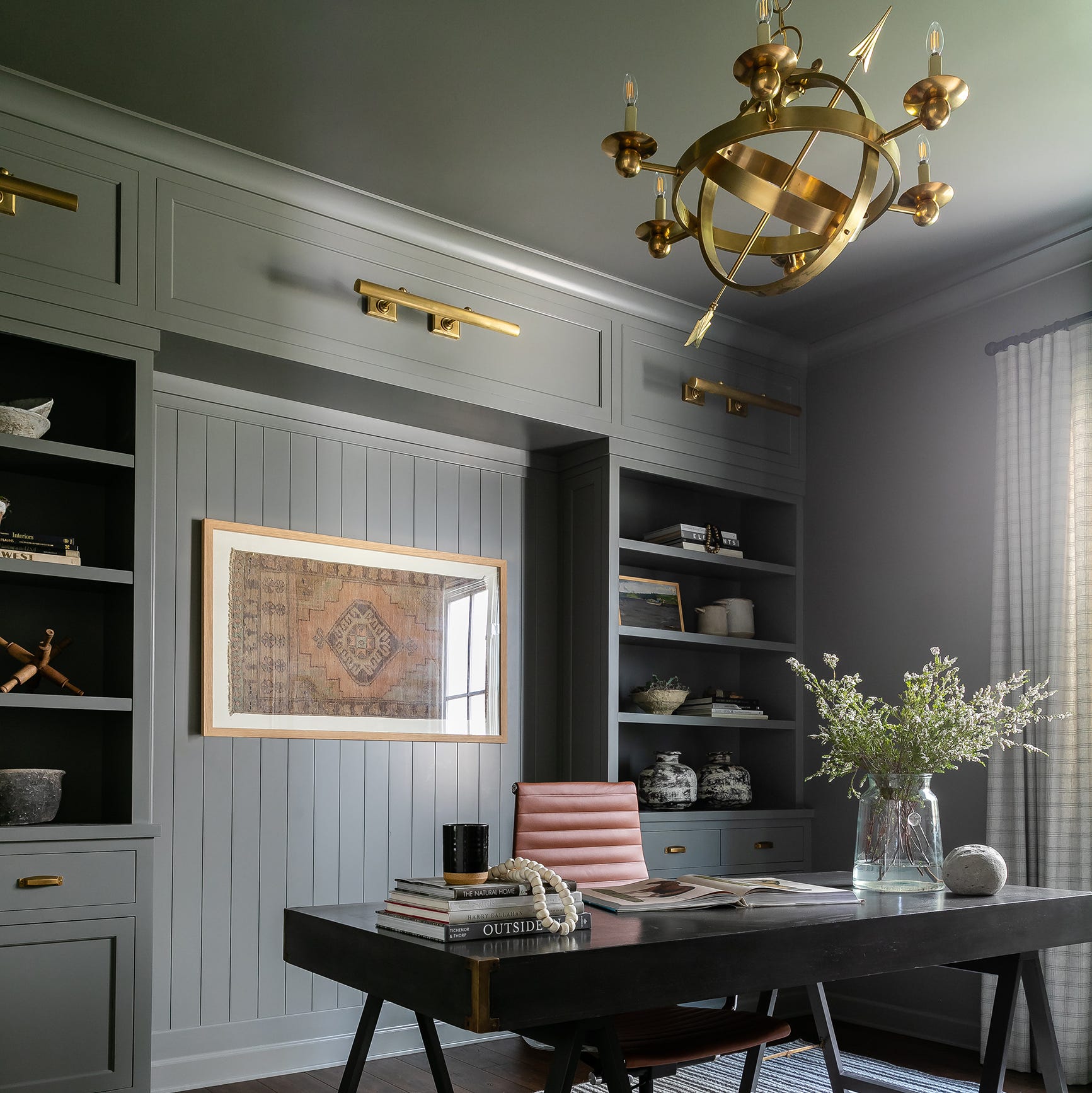
The author defends their choice by highlighting the versatility of Agreeable Gray. They explain that the color serves as a neutral base that allows other design elements, such as furniture, art, and natural light, to stand out. This approach creates a cohesive and adaptable environment, enabling the integration of diverse styles and preferences without clashing with the wall color. The argument is made that a carefully chosen neutral color like Agreeable Gray provides a foundation for personal expression through decor, rather than dominating the space.
The article concludes by reaffirming the author's satisfaction with Agreeable Gray, positioning it as their all-time favorite interior paint color. This preference is grounded in the color's ability to create a harmonious and inviting living space that accommodates various design choices and personal tastes, contrasting with the evolving and sometimes transient nature of design trends.
#InteriorDesign #PaintColors #SherwinWilliams #AgreeableGray #NeutralColors #HomeDecor #DesignTrends #LauraWheatmanHill #InteriorDesign #PaintColors #SherwinWilliams #AgreeableGray #NeutralColors #HomeDecor #DesignTrends #LauraWheatmanHill
0 comment in total
You may also like
This "Controversial" Bedroom Color Is a Designer Favorite—Here's Why

Hottest Interior Paint Colors of 2020

Designers LOVE Pairing These Unexpected Colors With This One Timeless Hue

7 living room paint colors lower-middle-class people adore but others secretly find questionable

3 'small but impactful' paint updates to try in 2024, according to a color expert

Lick’s 2026 Colour Edit Just Dropped – 4 Colour Trends You’ll Want In Your Home
The Hottest Paint Color Nobody Saw Coming: How ‘Storms in Paris’ Is Taking Over Homes Everywhere
7 Most Underrated Paint Colours, According To Colour Experts
Timeless Paint Colors The Stars Of Fixer To Fabulous Love Seeing In Homes
5 Underrated Paint Colors Designers Always Use in Their Projects (and You Should Too)

Design Pros Have Spoken: Here Are the Only Paint Color Trends That Matter in 2023

'Mocha mousse' to plum: The nine paint colours that can transform your home
Designers Agree: This Classic Living Room Paint Color Never Goes Out of Style

Lick Paint Will Transform the Mood in Your Home Through Color Psychology
Millennial Gray Is So Over—Here Are 5 Paint Colors to Try Right Now
Colour experts share their top paint trends for 2024

6 key colors to decorate with in May 2025, according to interior design and color experts in the know
Designer Justina Blakeney Says This Paint Color Flatters Everyone and Is Perfect for Drenching Rooms
Hottest Interior Paint Colors of 2018
We Asked 5 Designers If Moody Paint Colors Are Still Trendy, and They All Said the Same Thing