7 living room paint colors lower-middle-class people adore but others secretly find questionable
This article explores seven popular living room paint colors favored by lower-middle-class households, analyzing why these choices are cherished by some for their comfort, nostalgia, and aspirational qualities, while quietly being questioned by others for being dated or less tasteful according to modern interior design standards. The piece highlights the sociological aspect of color choice, suggesting that aesthetic preferences often reflect identity and emotional connection more than adherence to trends.
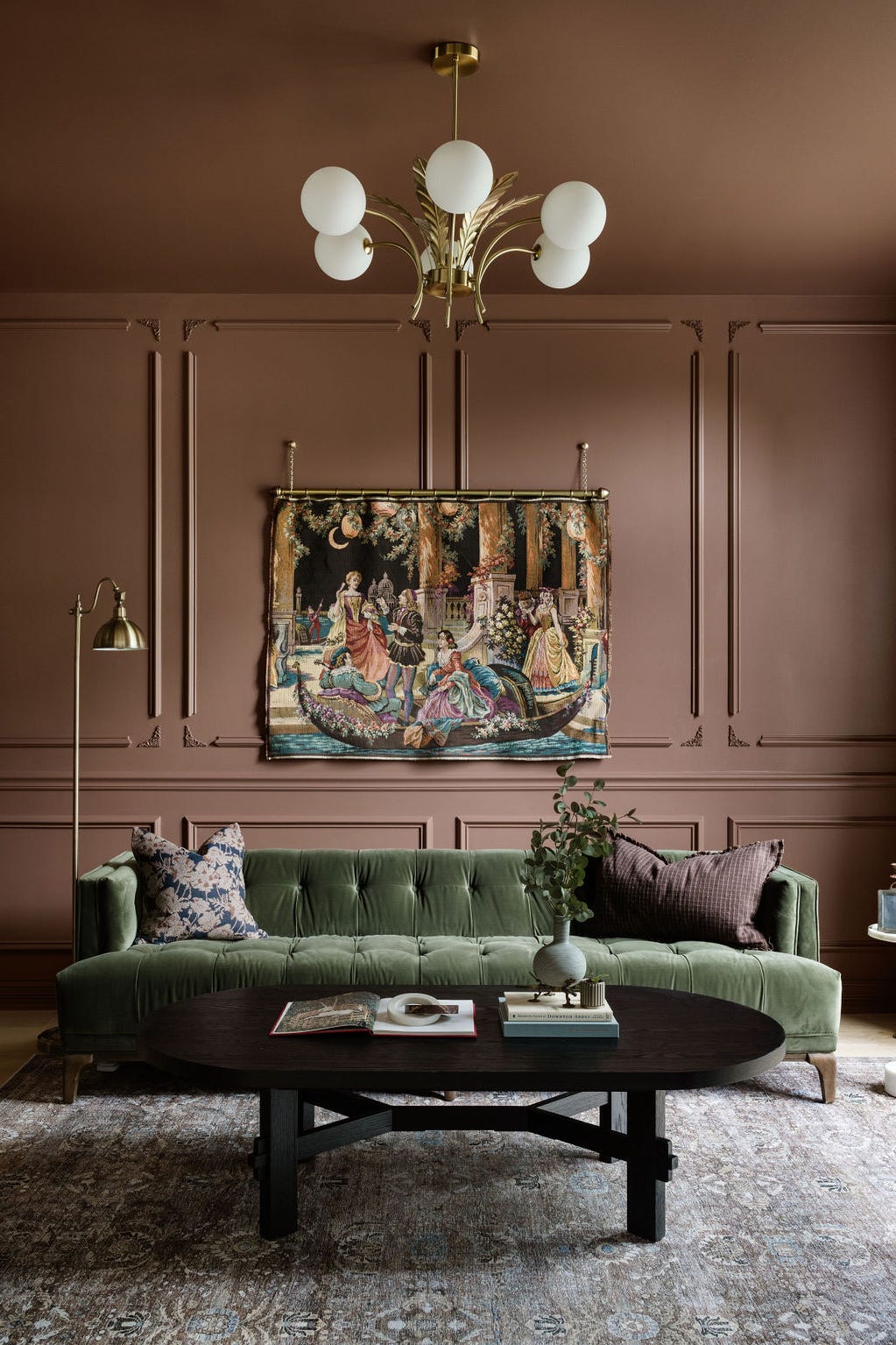
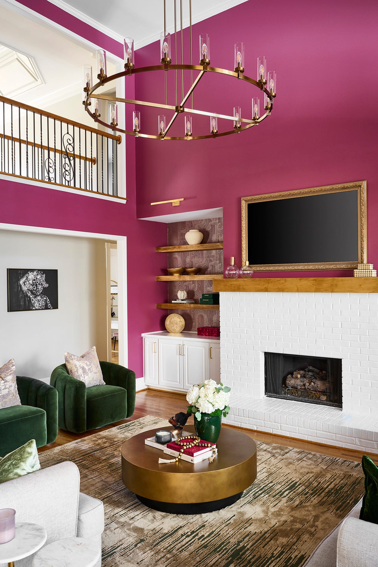
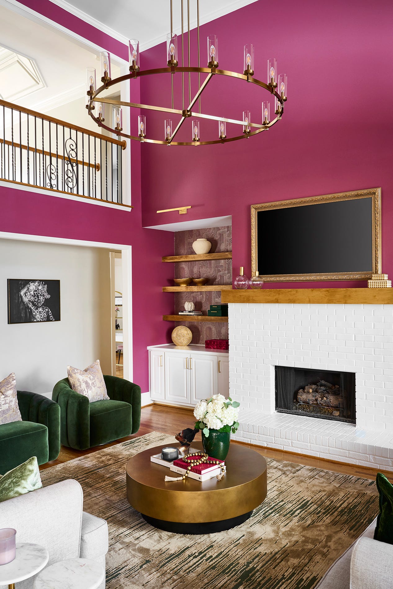
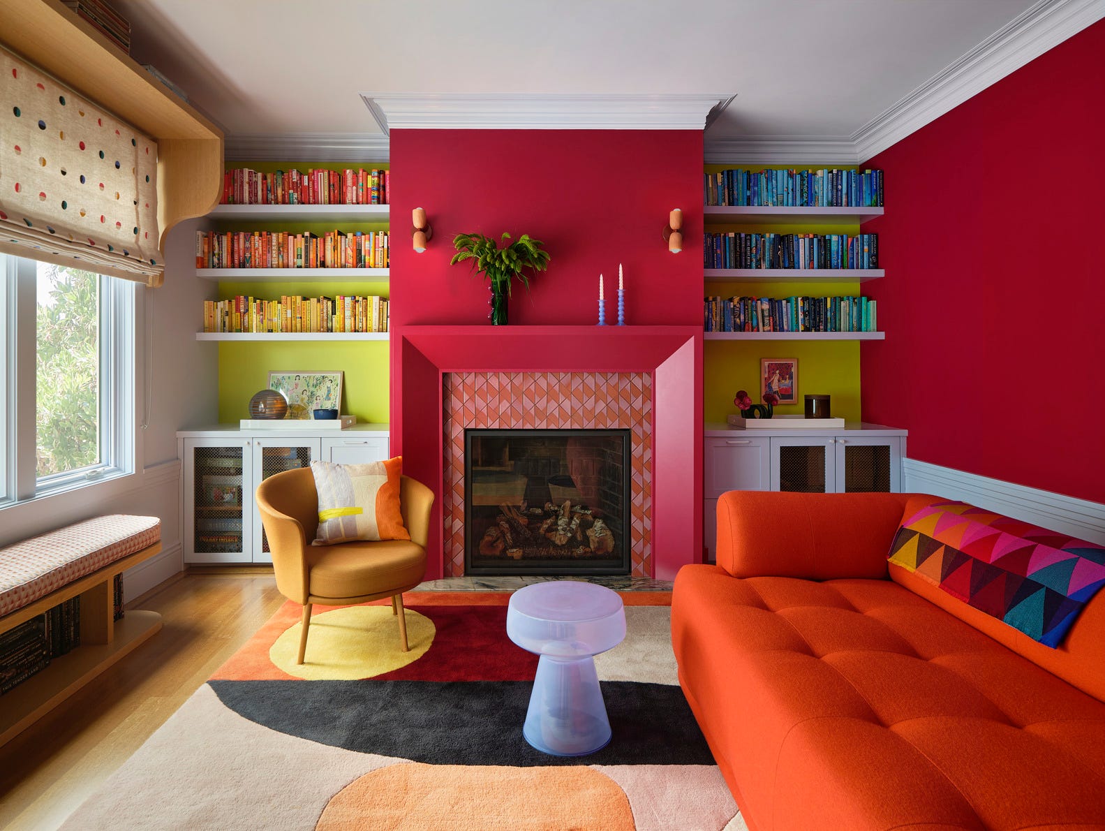
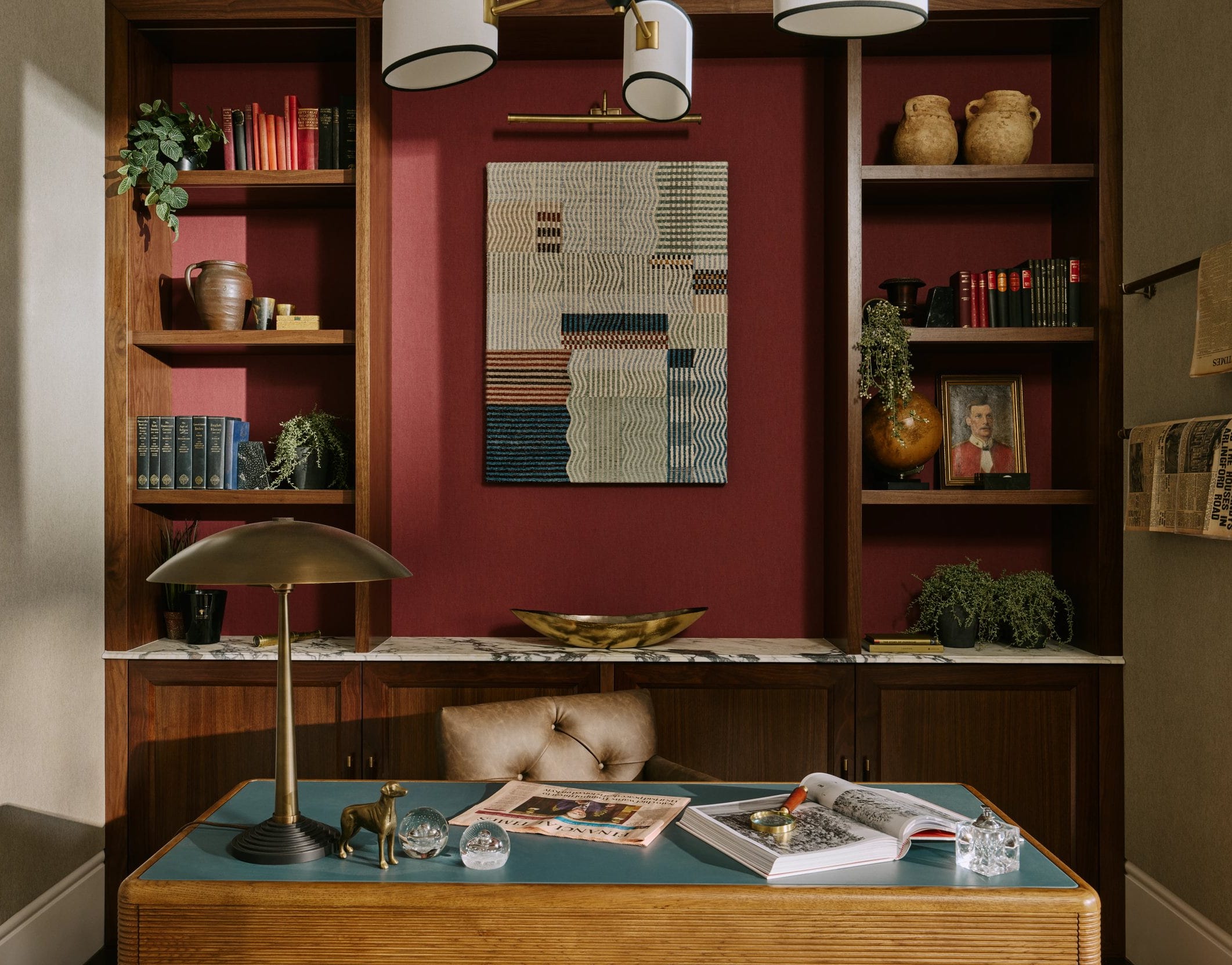
First, burgundy red, a color that gained popularity in the late 1990s and early 2000s, is discussed. For many, it represented sophistication, ambition, and a sense of having “made it.” It was often paired with dark wood and leather, creating a formal atmosphere. However, to some, burgundy now appears heavy, outdated, and reminiscent of chain restaurant decor, often making rooms feel darker. Despite this, it continues to evoke warmth and old-school elegance for its admirers.
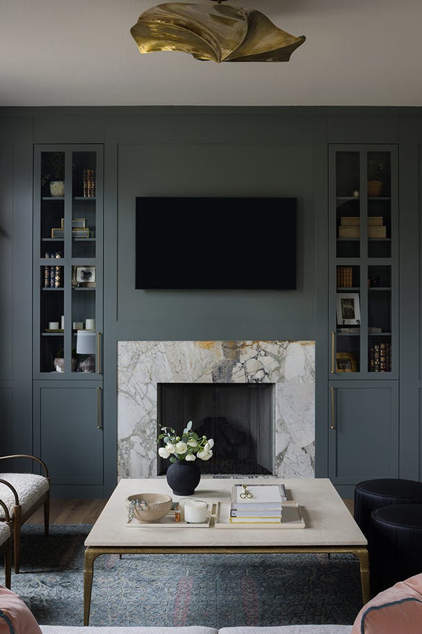
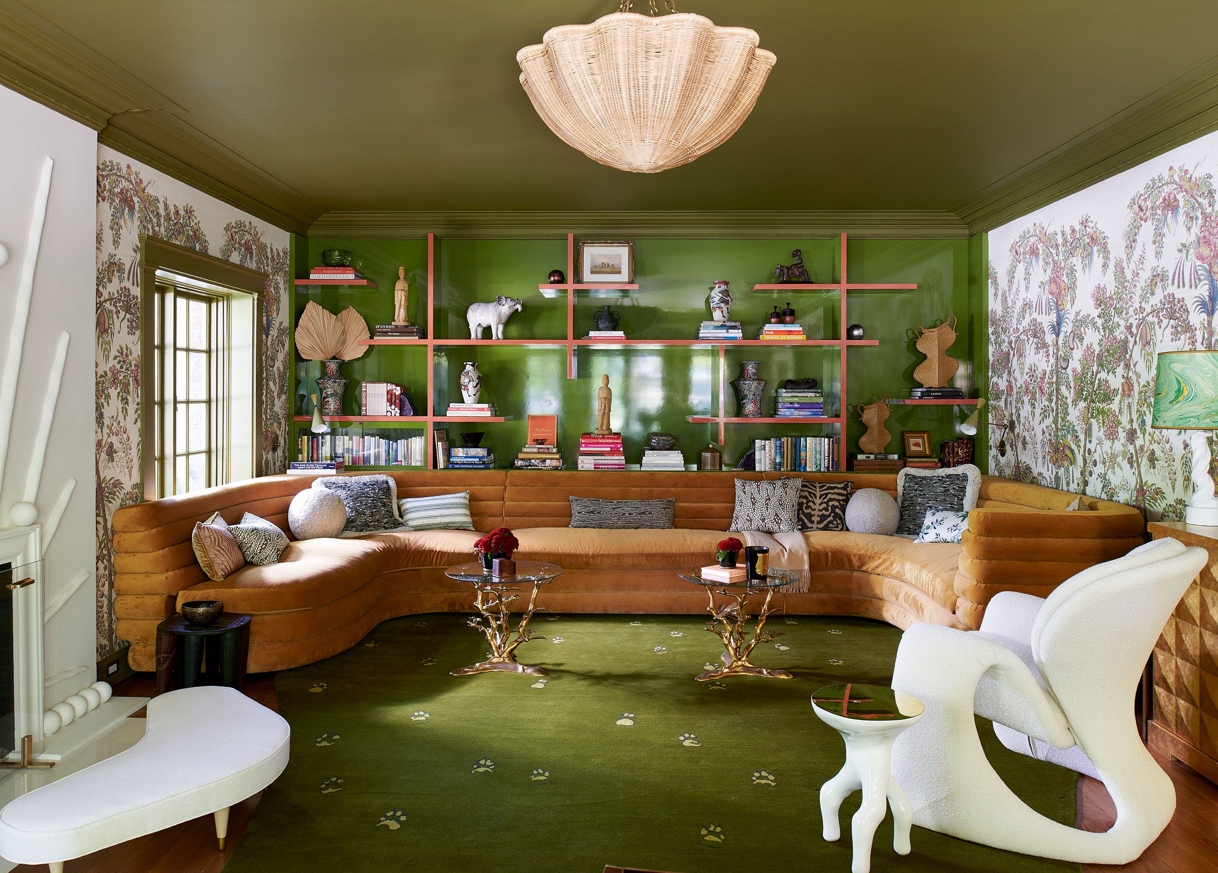
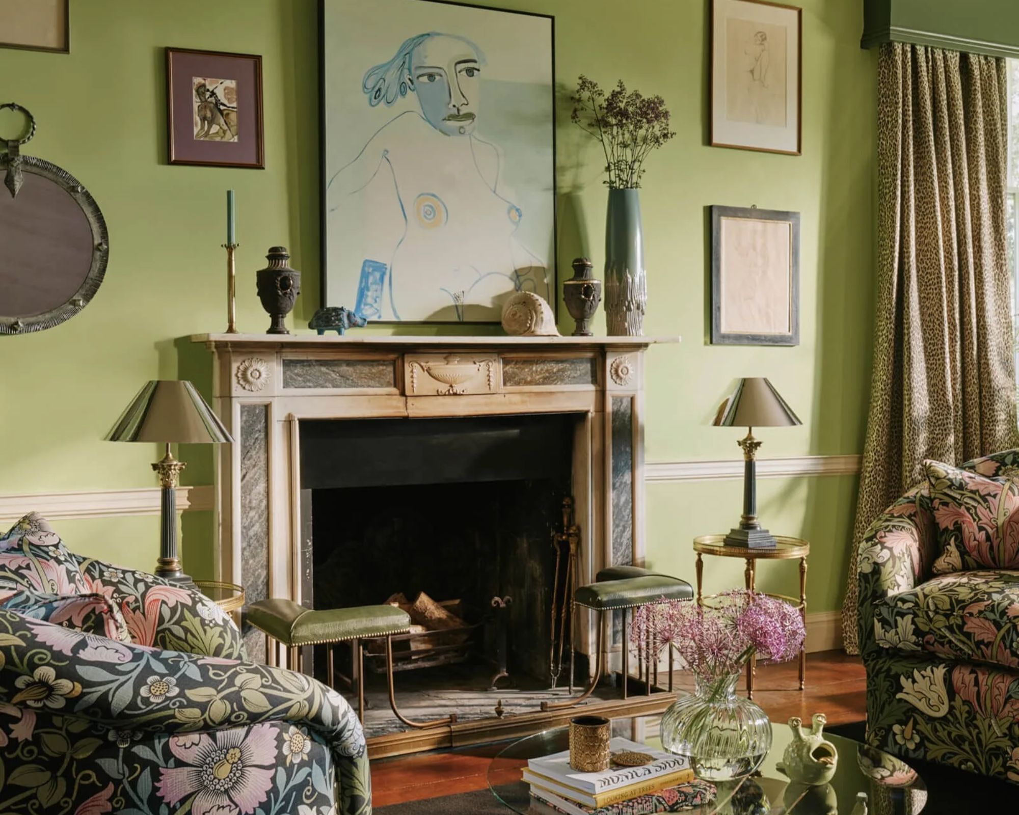
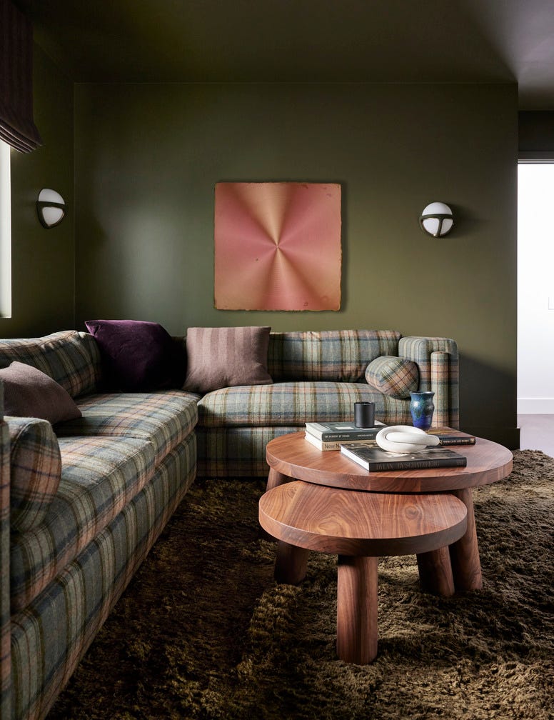
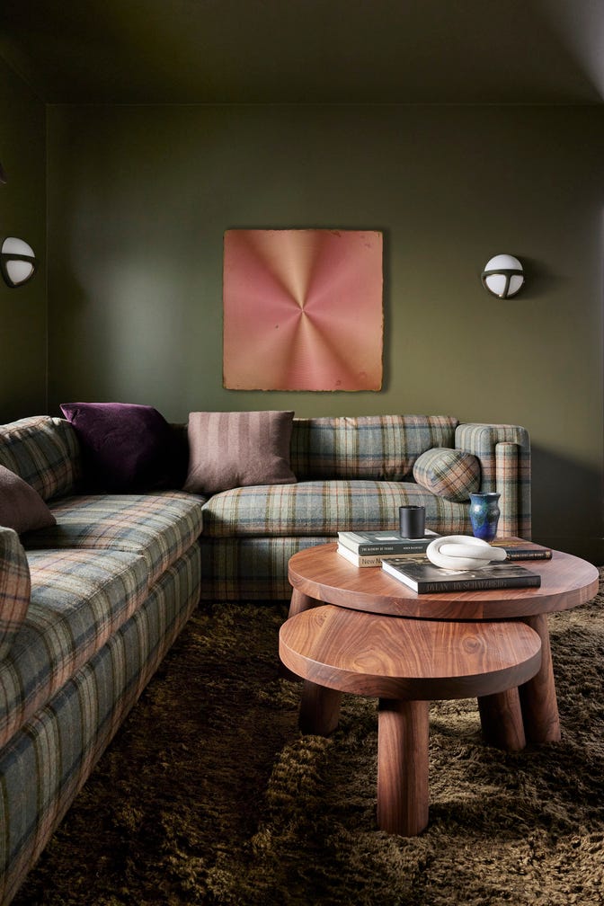
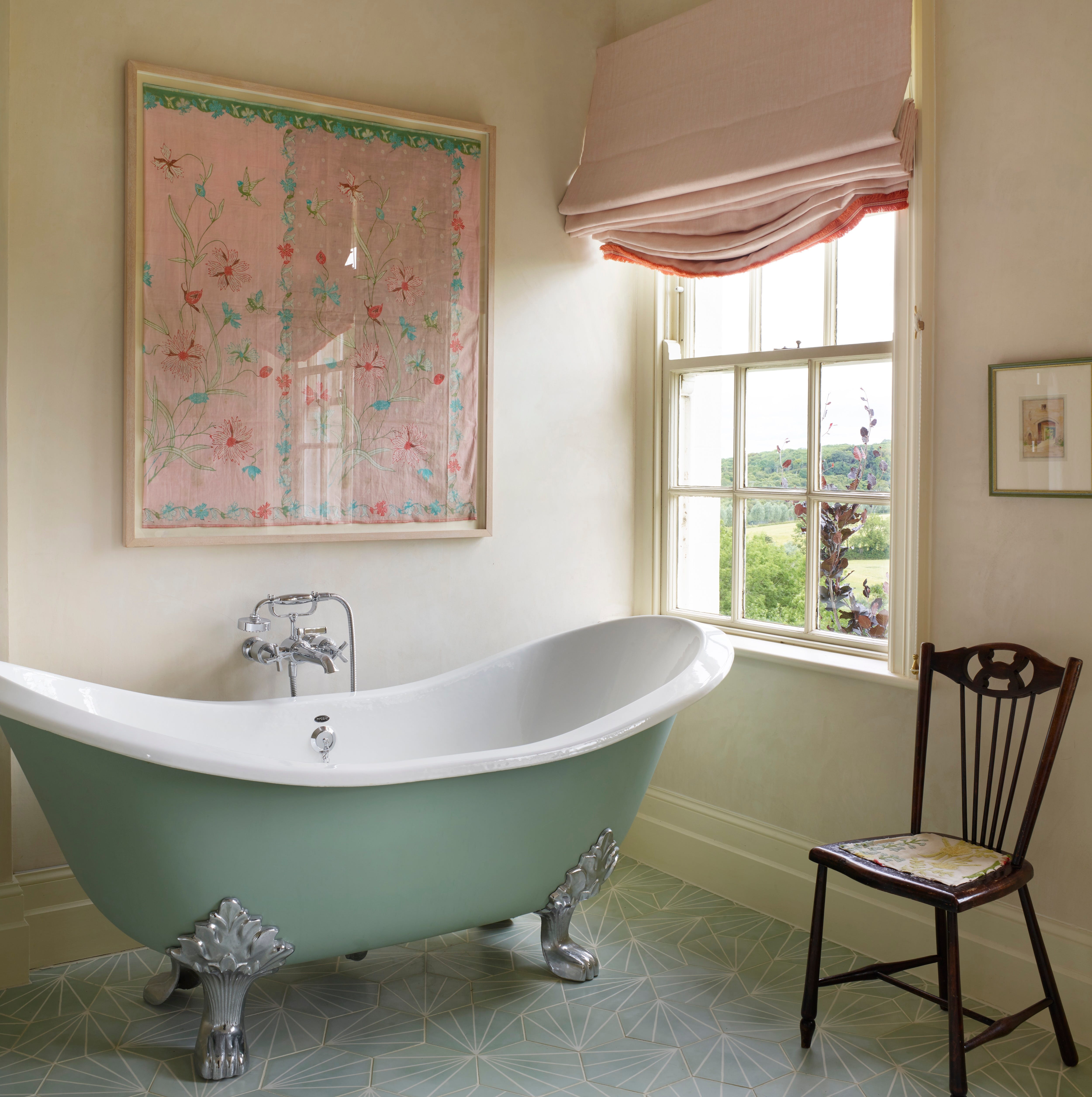
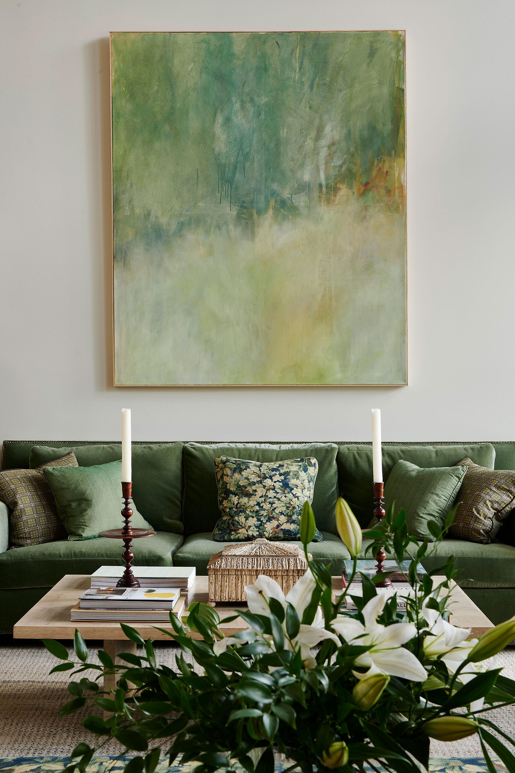
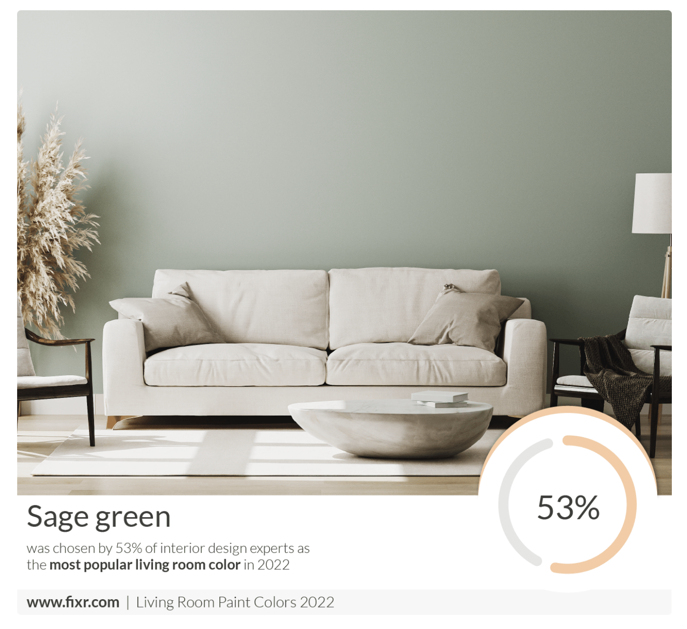
Sage green is presented as another widely adopted color, initially valued for its earthy and calming presence, conveying a subtle sense of design awareness. Its widespread use in the mid-2000s, however, led to its perception as a “safe choice” that eventually lost its unique appeal, especially when combined with common household items like faux plants. Yet, for those who grew up with it, sage remains a symbol of coziness, familiarity, and practicality due to its ability to conceal everyday wear and tear.
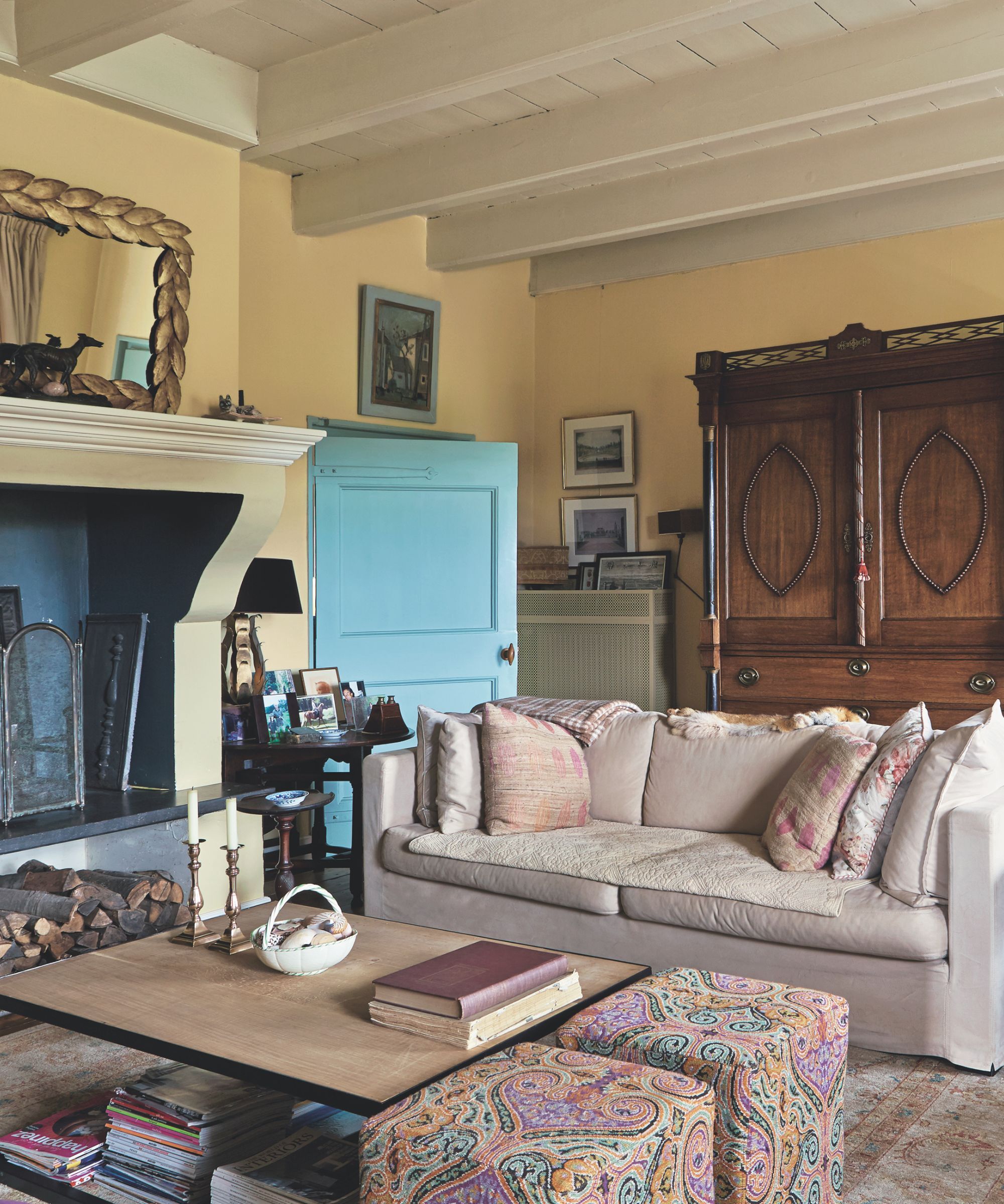
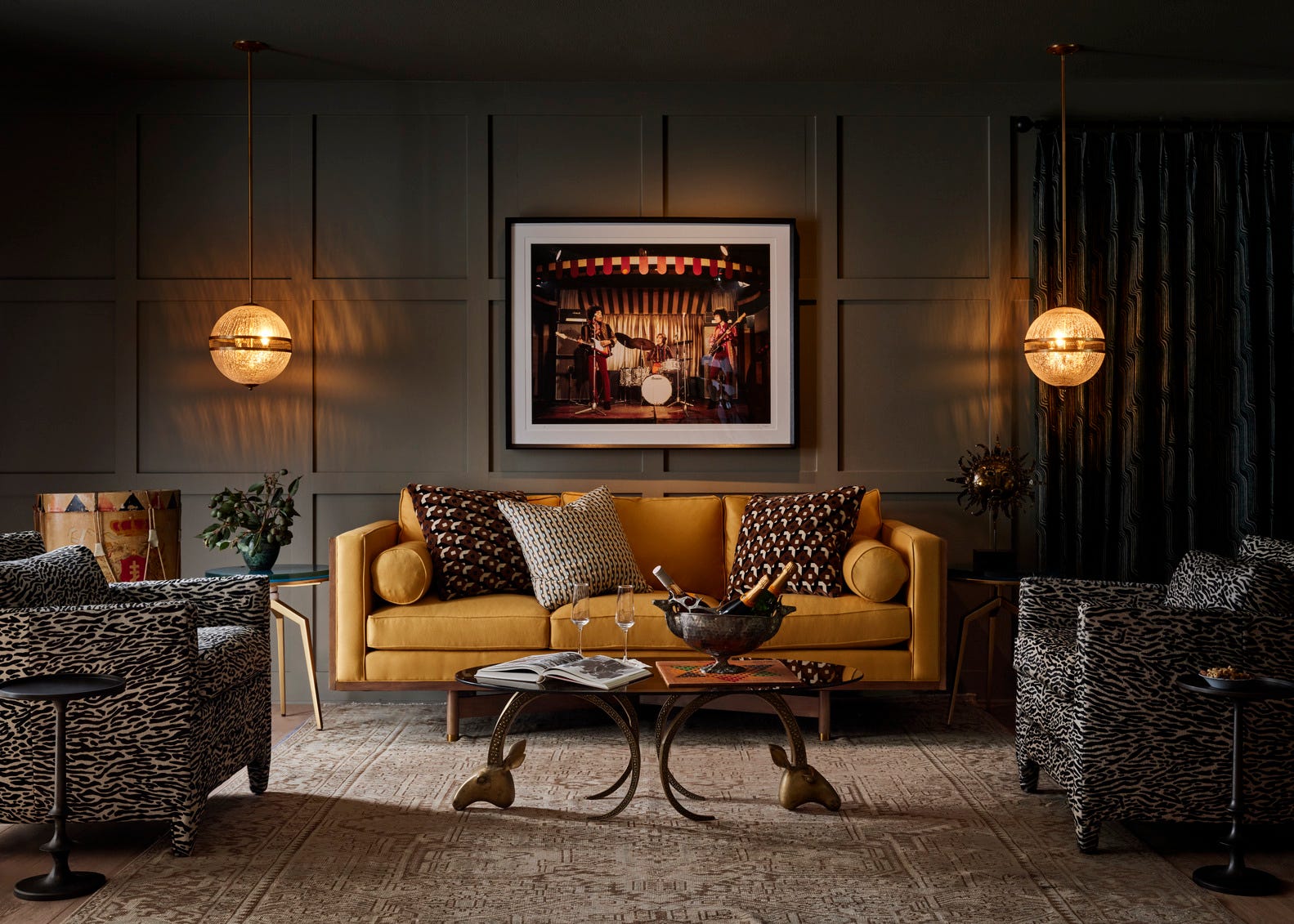
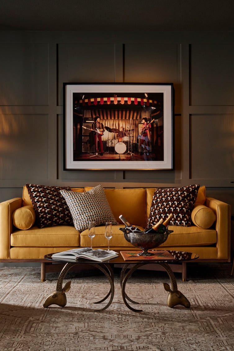
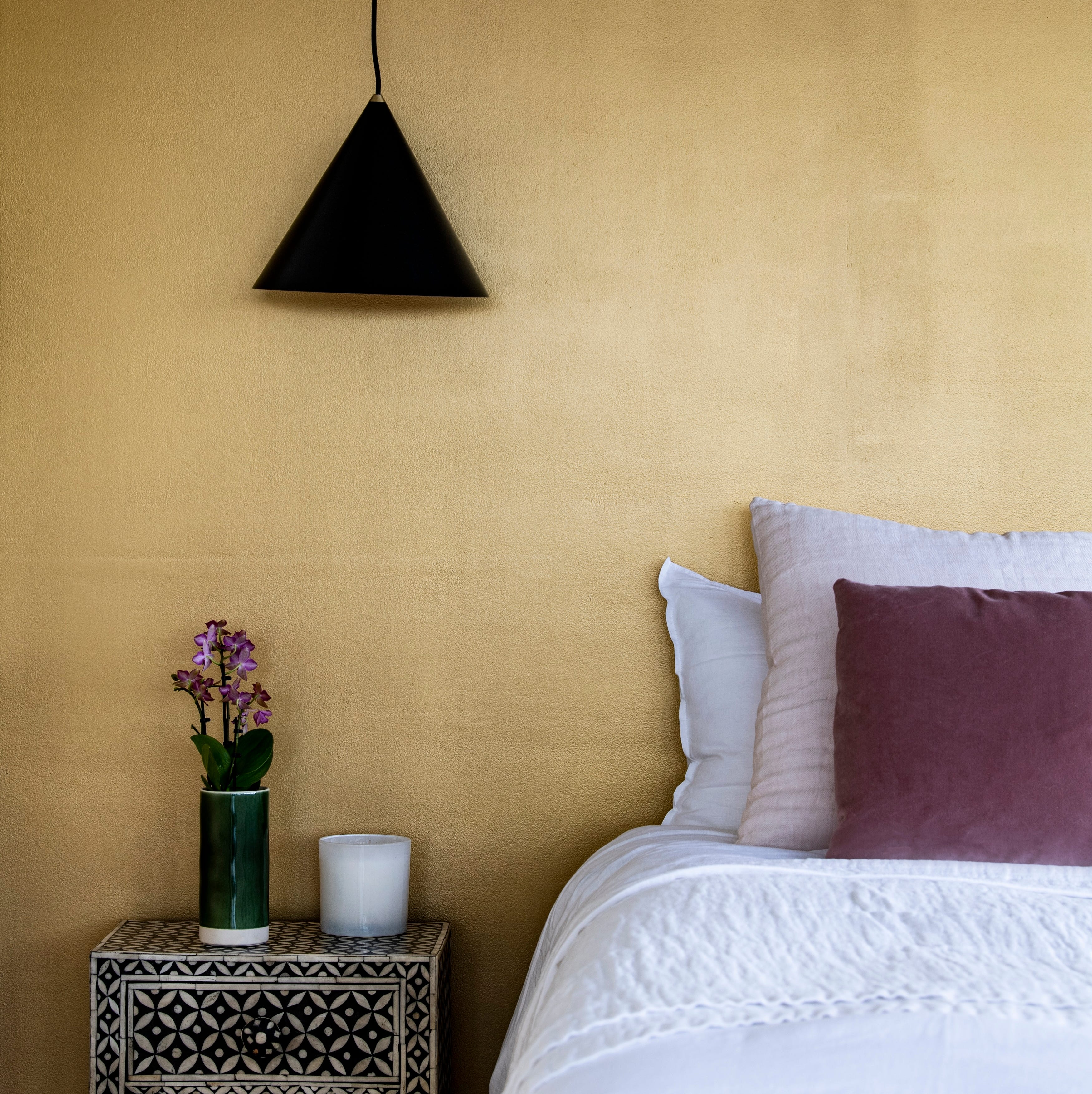
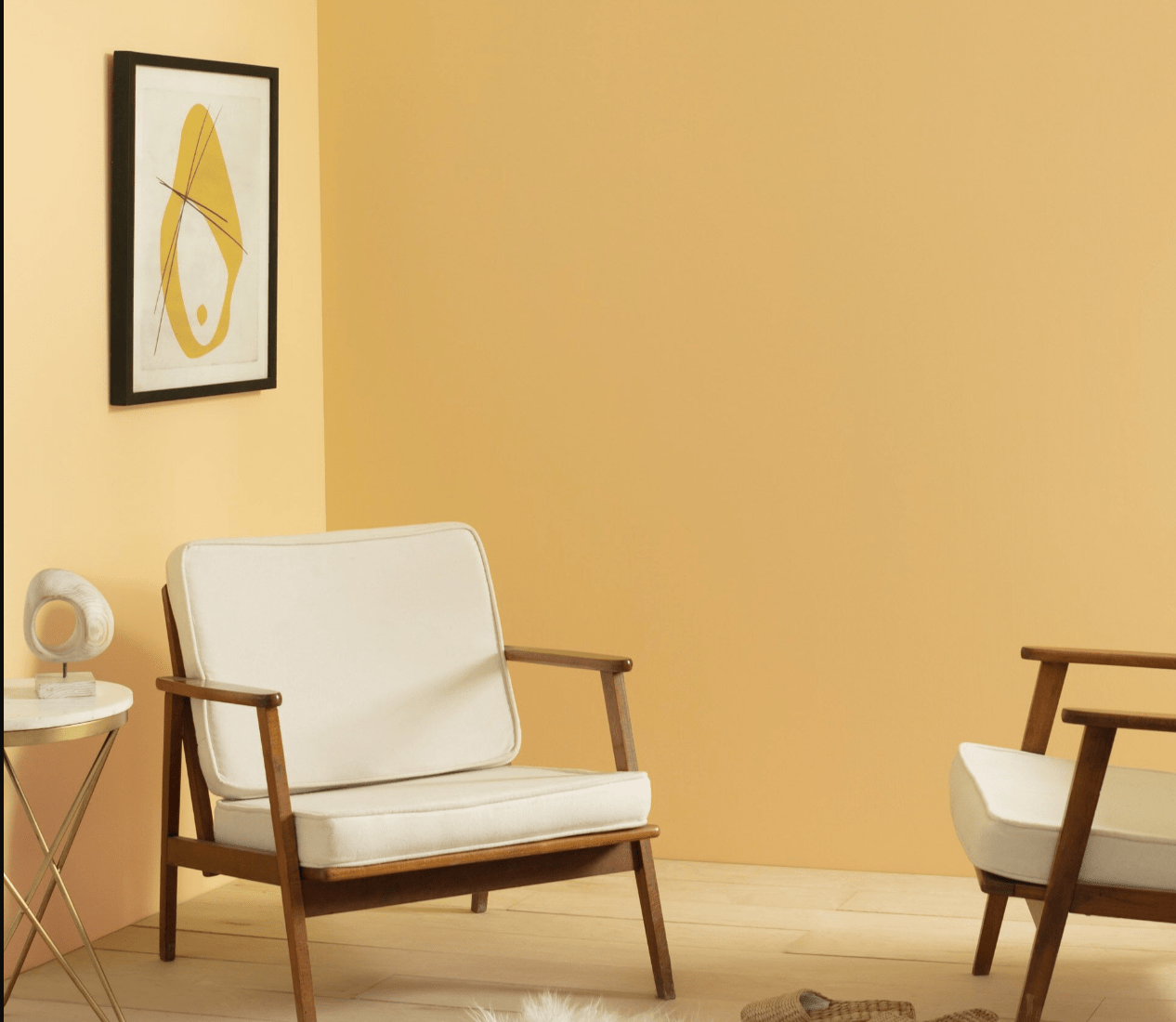
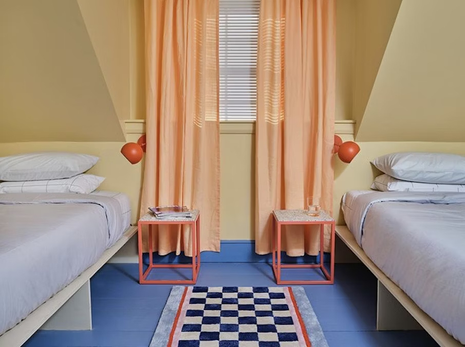
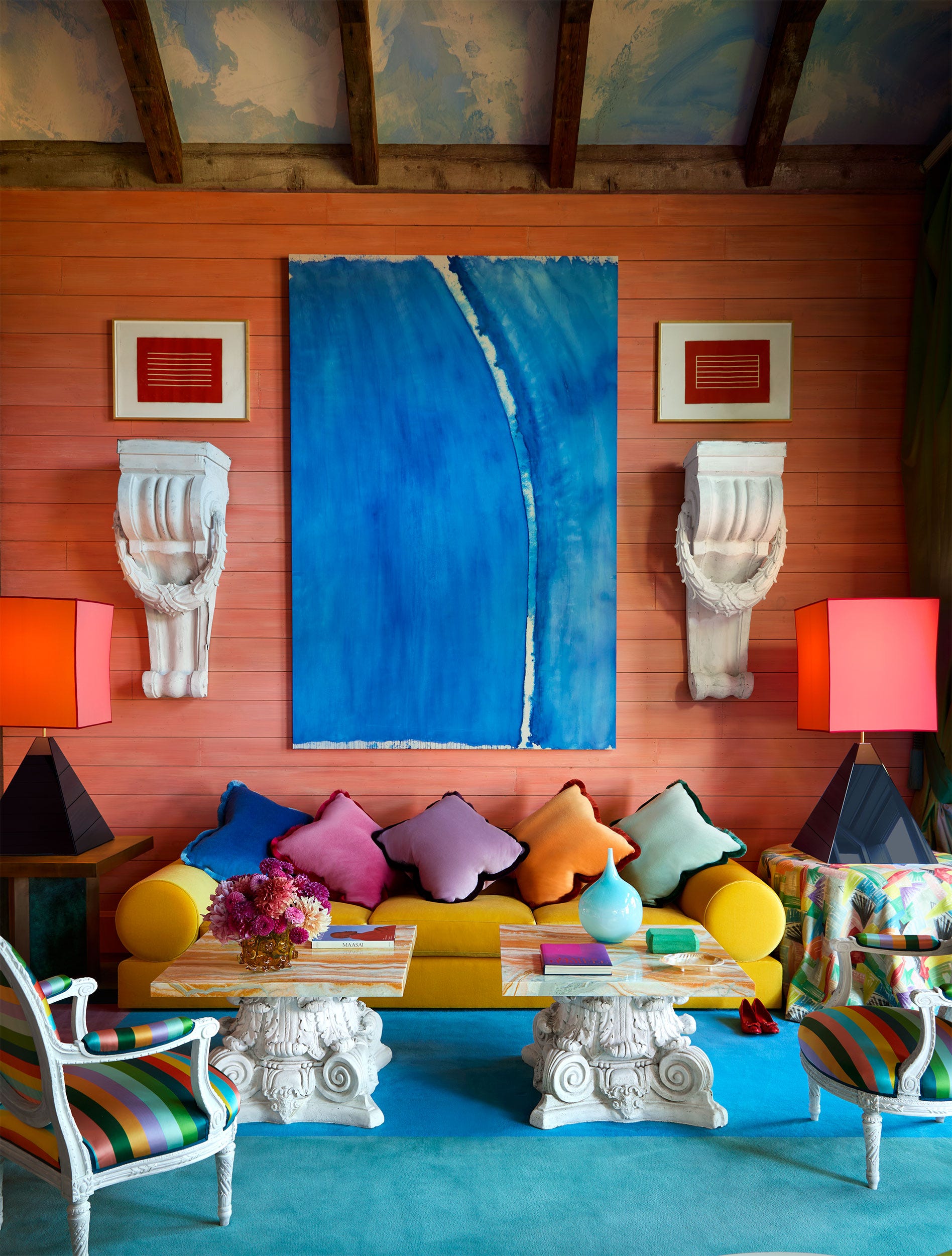
Mustard yellow is examined as a color chosen for its perceived cheerfulness and ability to bring energy and optimism into a room, often as a break from neutral palettes. While intended to modernize spaces, it sometimes resulted in an overwhelming or garish effect, particularly under unflattering lighting or when paired with certain furniture. Despite external critiques, its selection often stems from a genuine desire for warmth and joy.
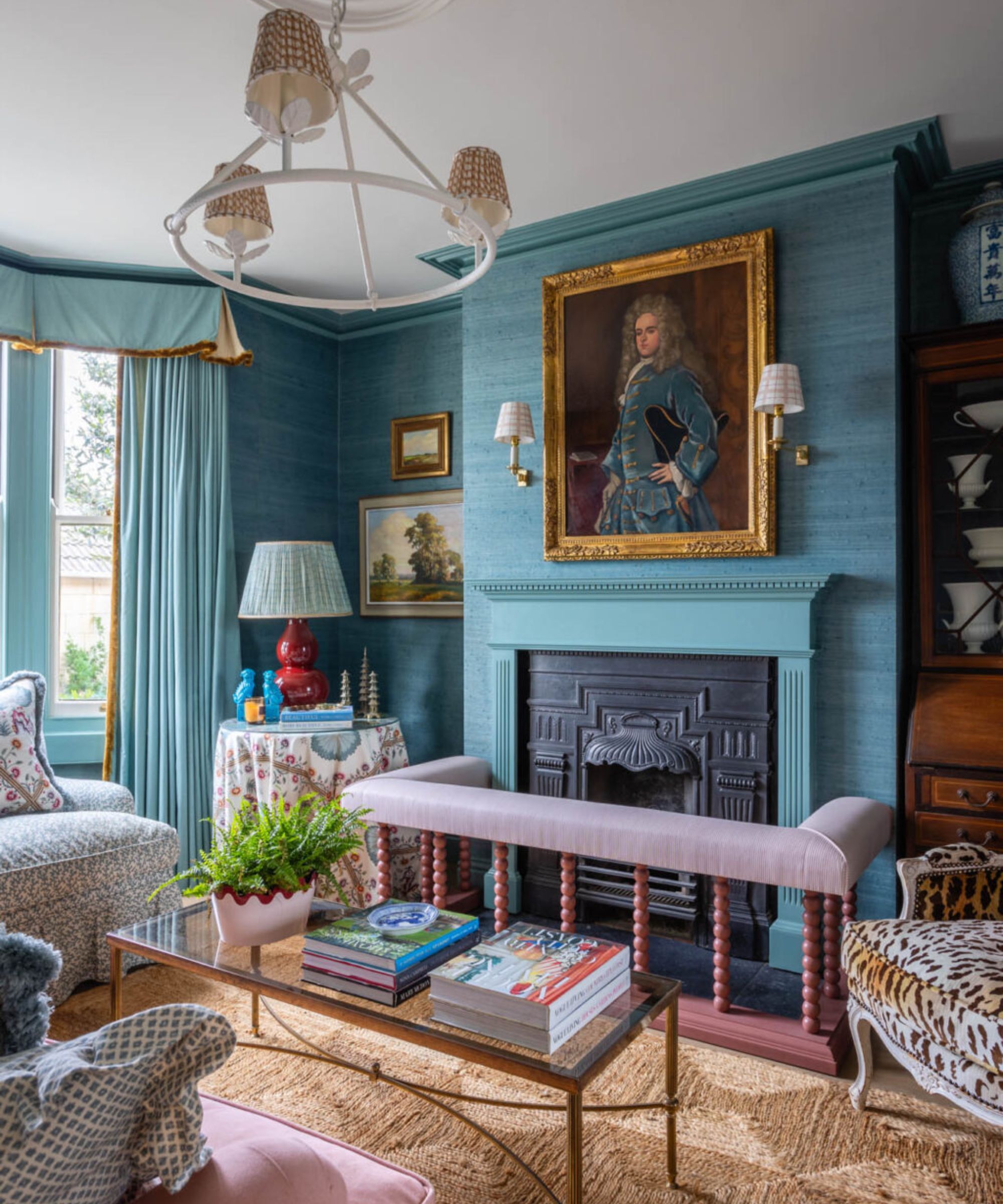
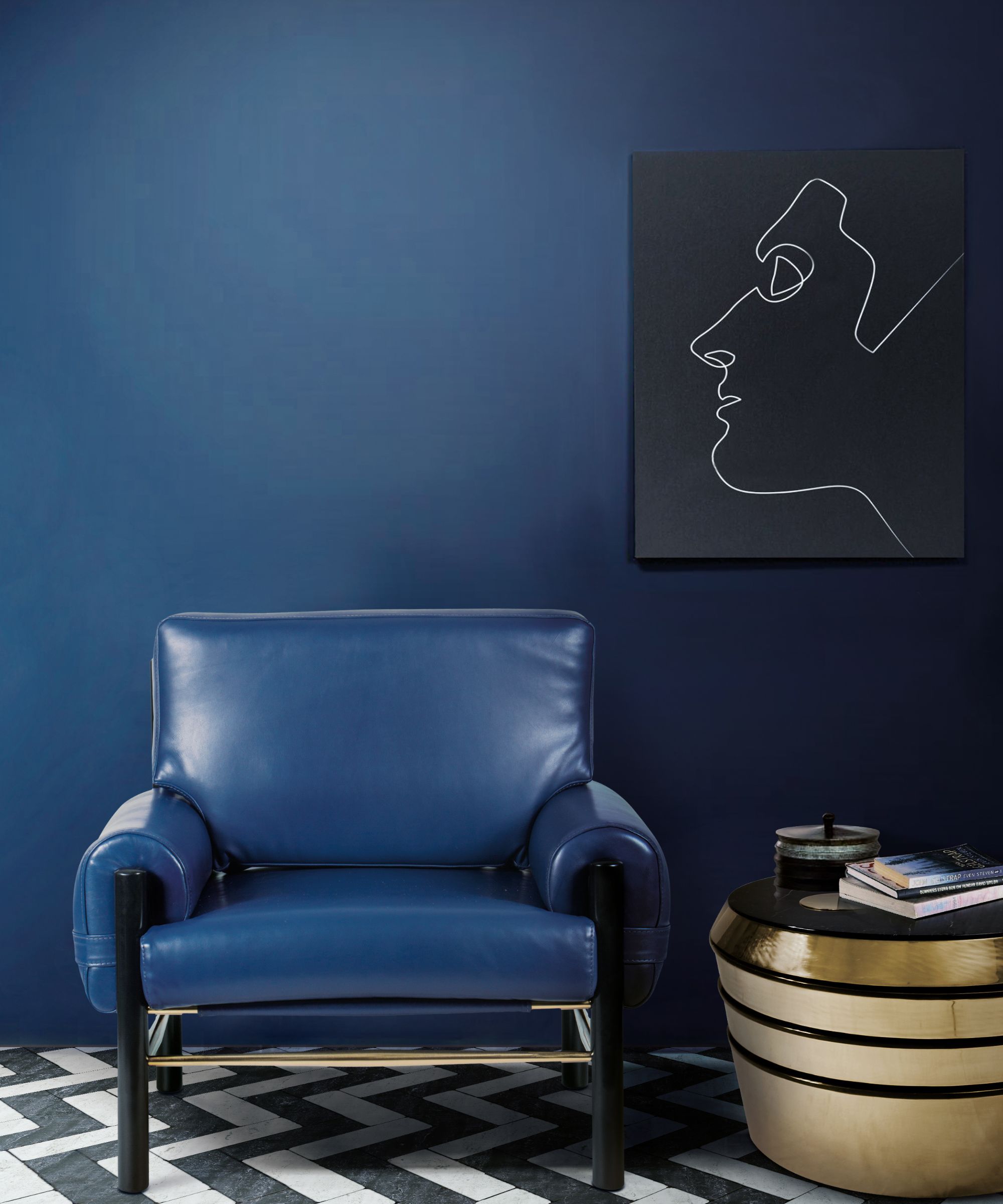
Navy blue, historically seen as a classic and elegant choice, is also discussed. While it can convey a timeless and tasteful vibe, in smaller or poorly lit homes, it can lead to a gloomy atmosphere, especially when combined with heavy drapes and dark furniture. Its choice often signifies an aspiration for refinement, even if the practical outcome does not always meet the desired aesthetic.
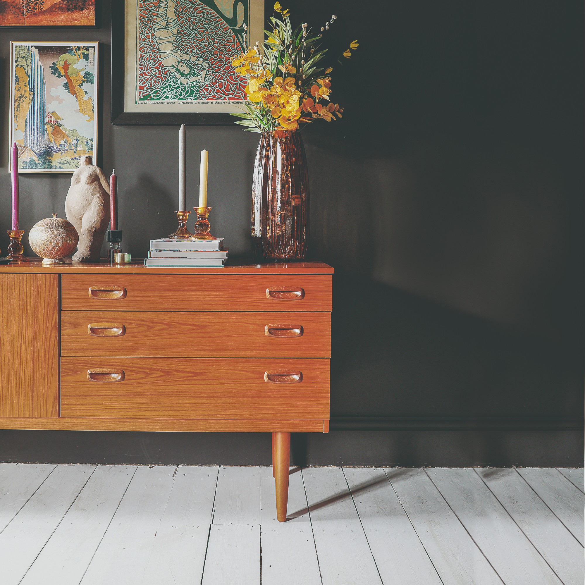
Chocolate brown is featured as a color that strongly evokes the feeling of a “family home,” praised for its warmth, inviting nature, and ability to conceal imperfections. Despite its cozy appeal, it tends to make rooms appear smaller and darker, particularly when matched with similar-toned furniture and flooring. Its enduring popularity is attributed to its comfort factor and prioritization of practicality over perfect aesthetics.
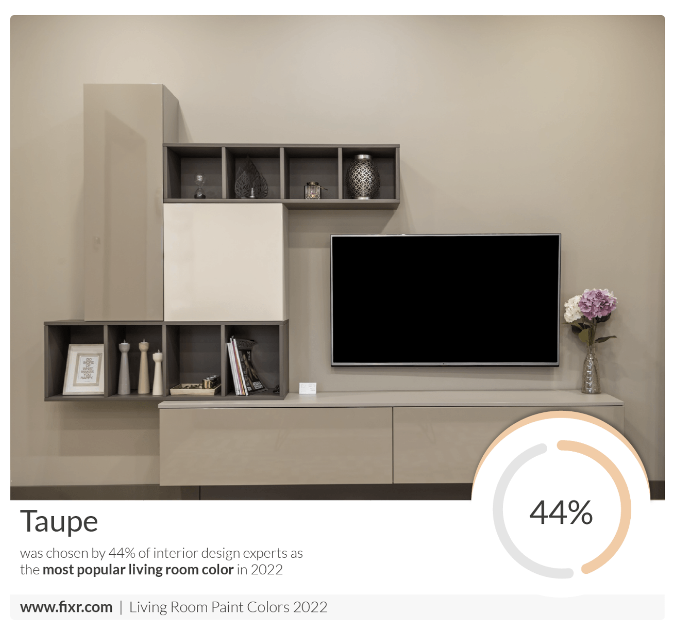
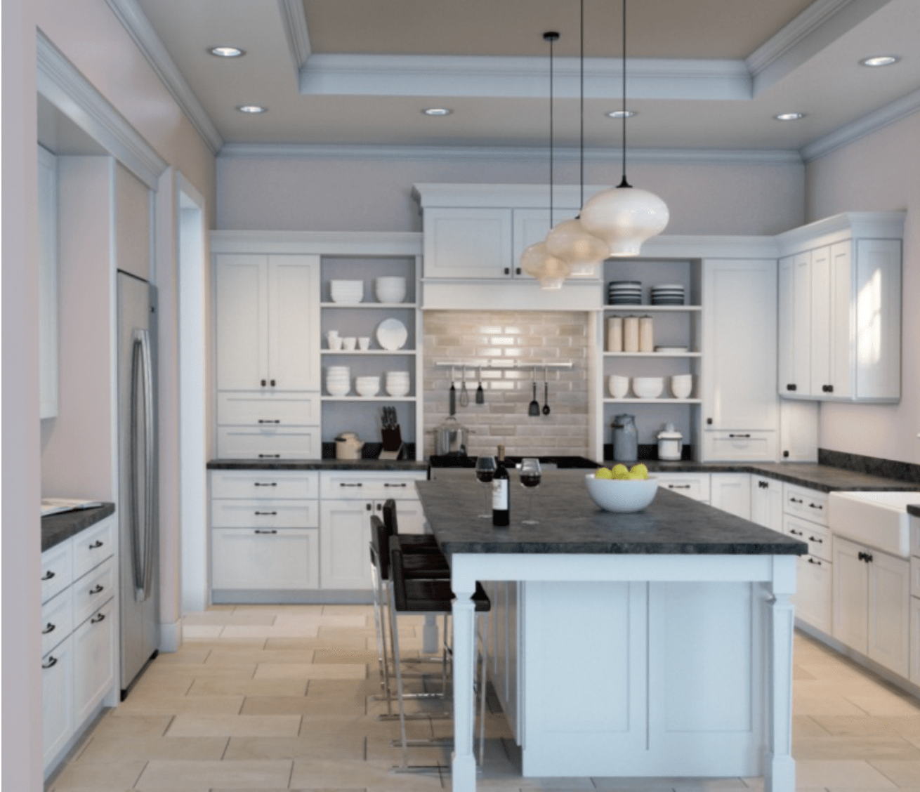
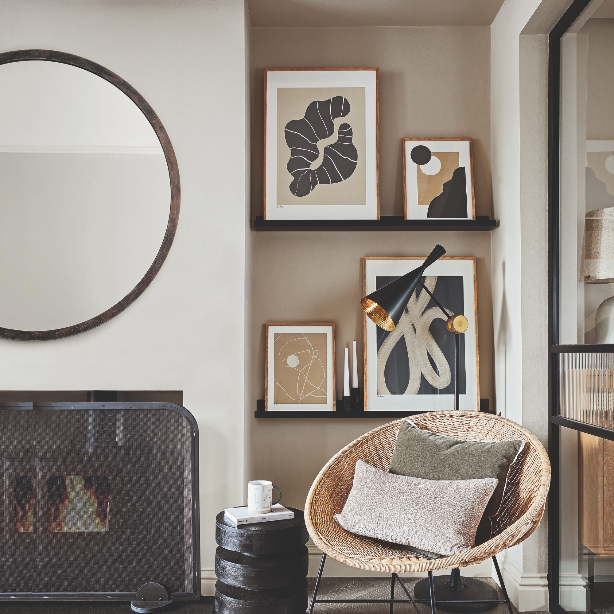
Greige, a gray-beige hybrid, emerged as a symbol of modern taste and minimalist design. Initially seen as a sophisticated upgrade from plain white, its ubiquitous adoption eventually led to a perception of sterility and lack of personality, resembling waiting rooms rather than living spaces. Nevertheless, it continues to appeal to those who seek a clean, calm, and current aesthetic on a budget.
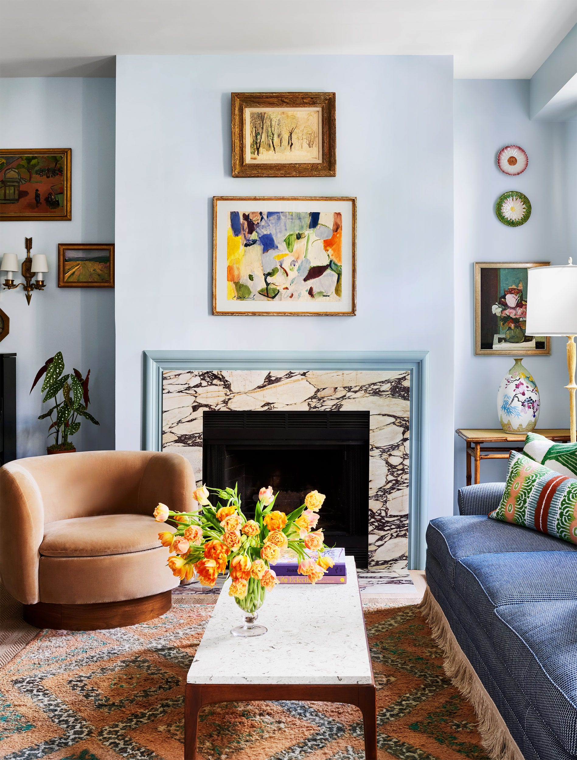
Finally, pale lavender is explored as a choice made by those seeking uniqueness and a touch of luxury. However, this color often proved tricky, sometimes appearing cold or overly feminine and clashing with common household furnishings. Despite the potential for others to question this bold statement, its advocates view it as an expression of creativity and optimism, representing a brave departure from conventional choices.
In summary, the article concludes that paint color choices are deeply tied to identity, aspiration, and emotional connection, transcending mere style. These colors reflect the efforts of families to create successful and safe home environments, highlighting that what some perceive as questionable or dated, others find comforting and familiar, reinforcing that the most cherished homes often prioritize emotional resonance over strict adherence to design trends.
#InteriorDesign #HomeDecor #PaintColors #SocialClass #AestheticPreferences #Nostalgia #LifestyleChoices #ColorPsychology #InteriorDesign #HomeDecor #PaintColors #SocialClass #AestheticPreferences #Nostalgia #LifestyleChoices #ColorPsychology
0 comment in total
 No comments yet
You may also like
7 Popular Paint Colors for the Living Room
These Living Room Paint Colors Are a Total Mindset Shift
Design Pros Have Spoken: Here Are the Only Paint Color Trends That Matter in 2022

The 3 All-Time Worst Living-Room Paint Colors, According to Designers


Experts reveal the best living room paint colours to transform every space

5 living room paint colors going out of style in 2025
4 Living Room Paint Colors That Are So Outdated, According to Designers

Living room paint ideas – 27 easy ways to bring your lounge to life with stylish and creative colours and techniques
Listen Up: These Are the Best Paint Colors for Your Living Room
10 home color choices that scream lower middle class energy to refined observers

7 Most Underrated Paint Colours, According To Colour Experts

Hottest Interior Paint Colors of 2020
5 Underrated Paint Colors Designers Always Use in Their Projects (and You Should Too)

Jewel Tones Are Trending for Living Room Paint Colors, According to Designers

The 13 Best Paint Colors for Low-Light Rooms

The best paint colors for small living rooms, according to design experts

The 60 Most Popular Living Room Paint Colors Right Now
Designer-Approved Living Room Colors That'll Make You Feel Happier
55 Living Room Color Ideas That Will Take Your Space from Drab to Fab
Living room paint ideas – stylish ways with paint