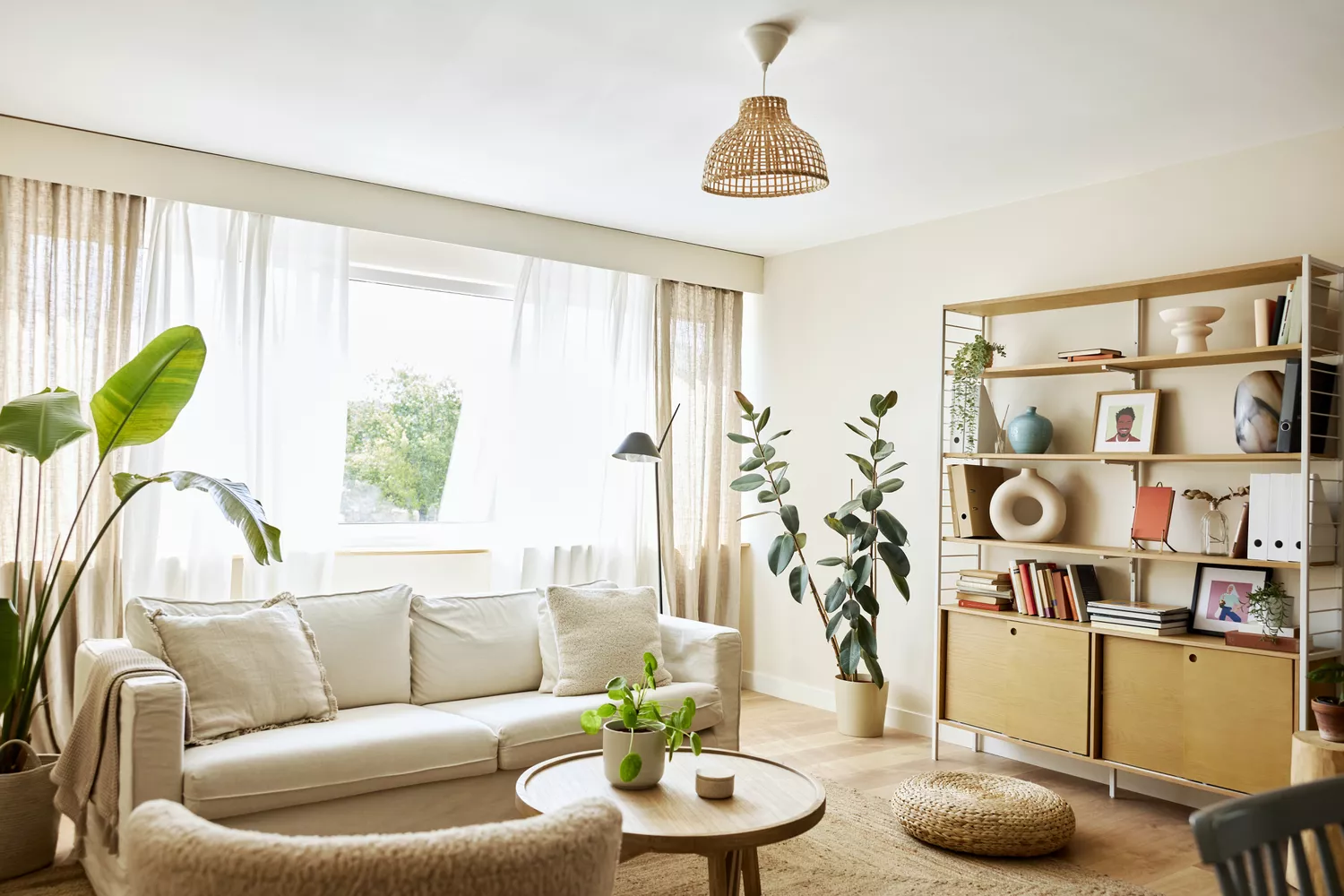
Designers Agree: This Classic Living Room Paint Color Never Goes Out of Style
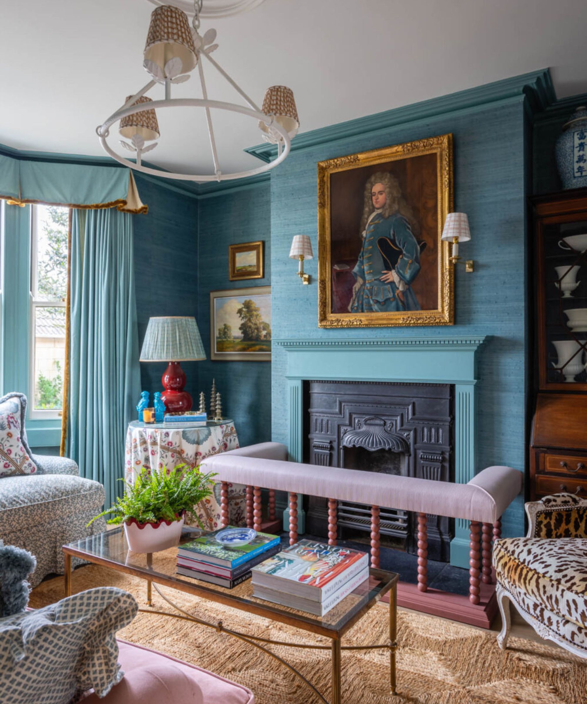
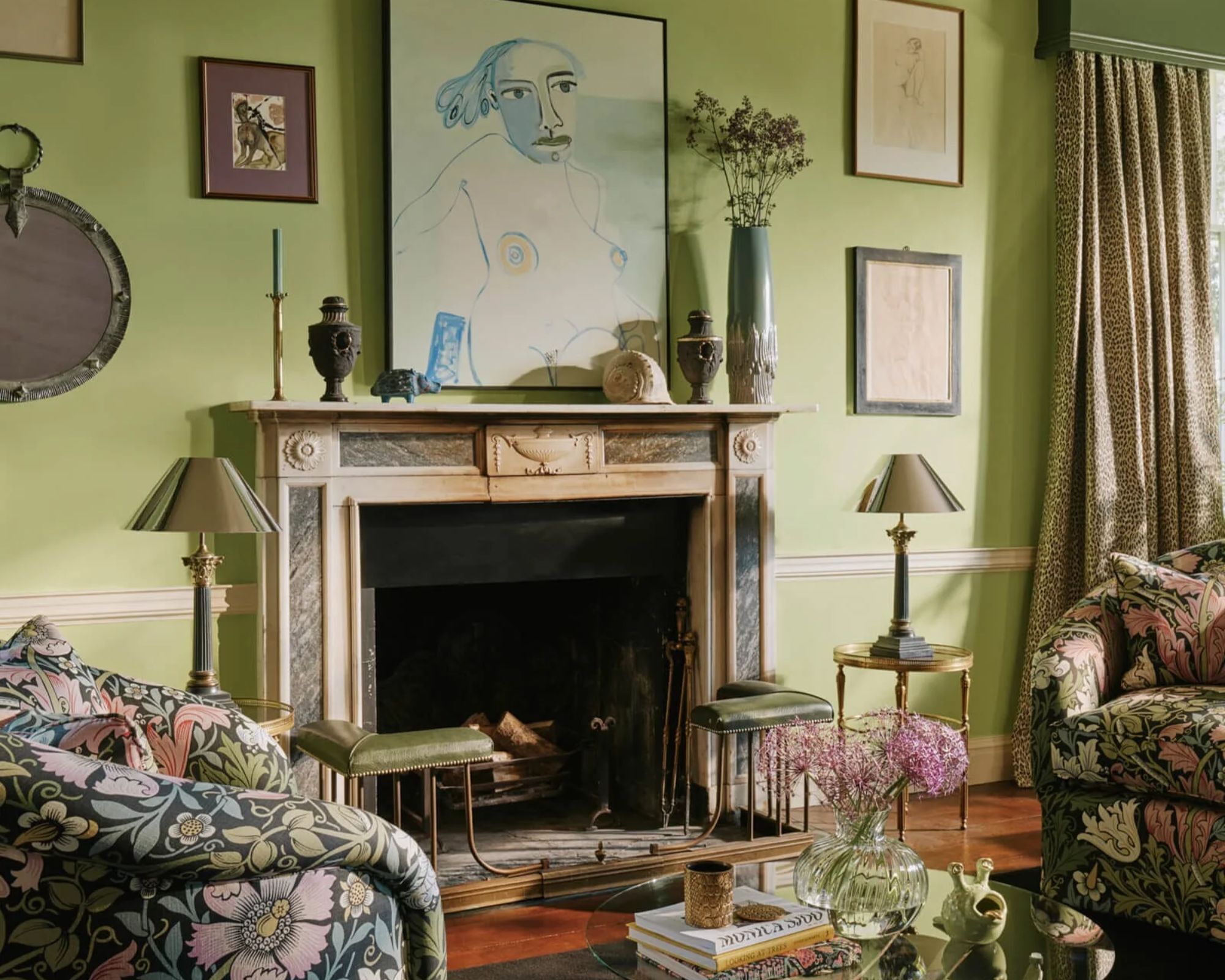
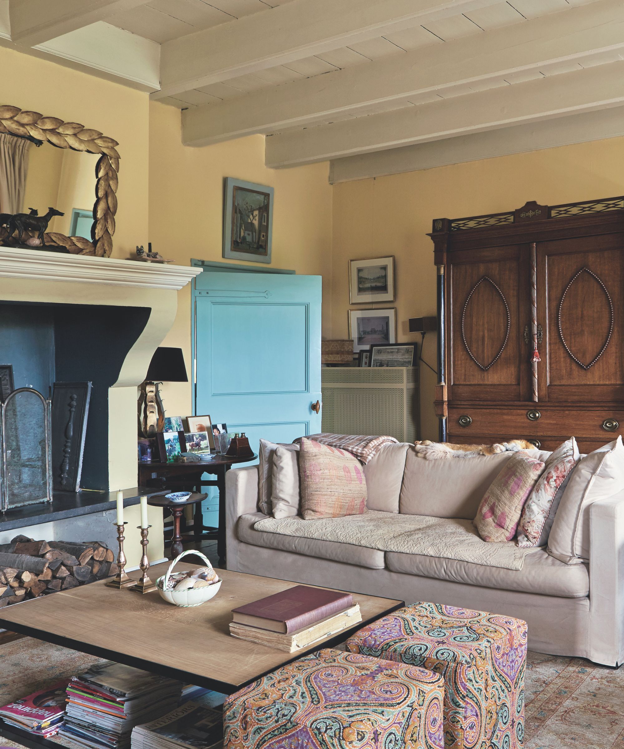
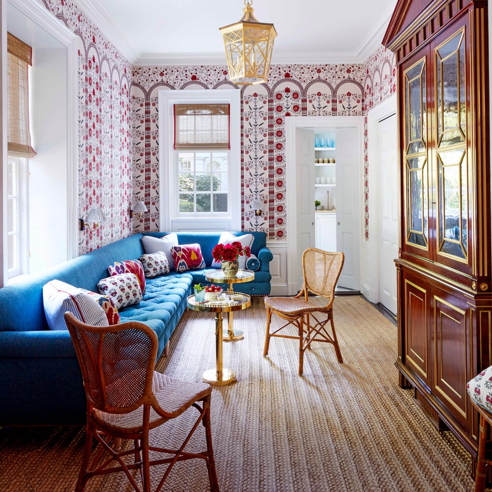
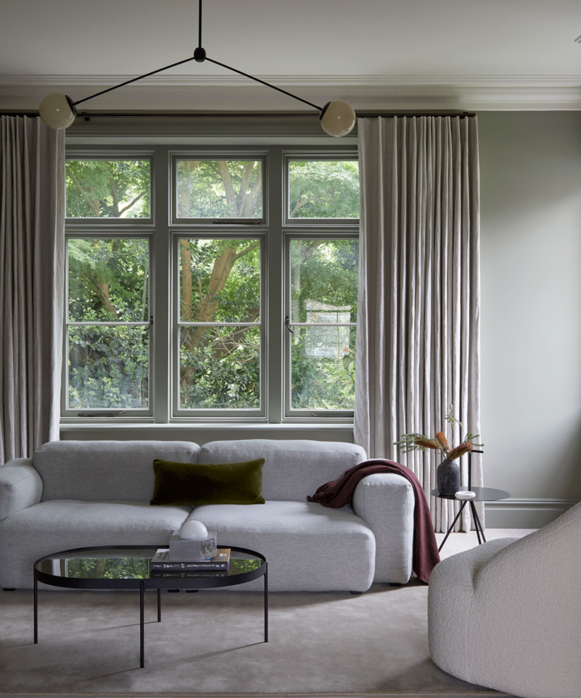
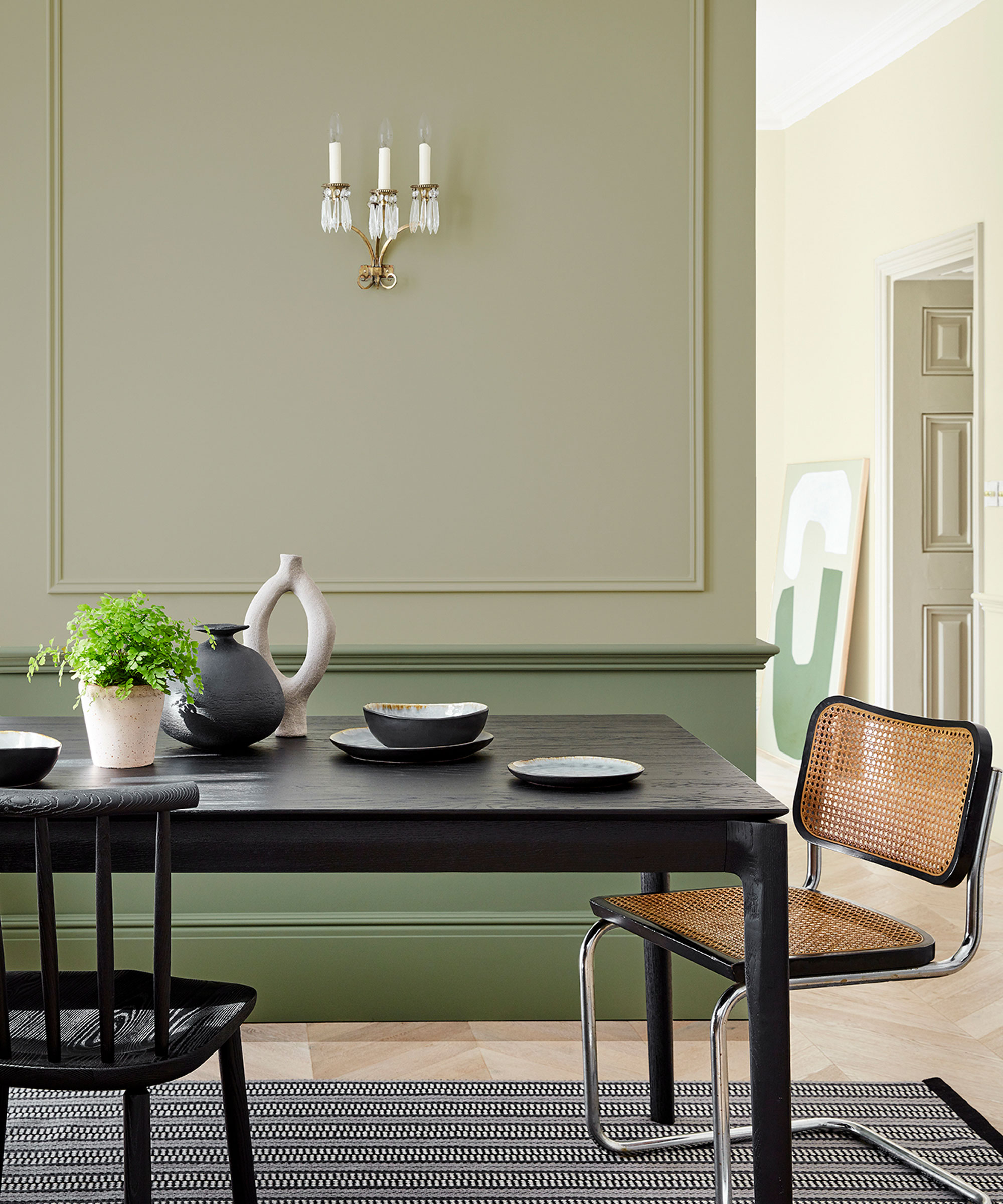
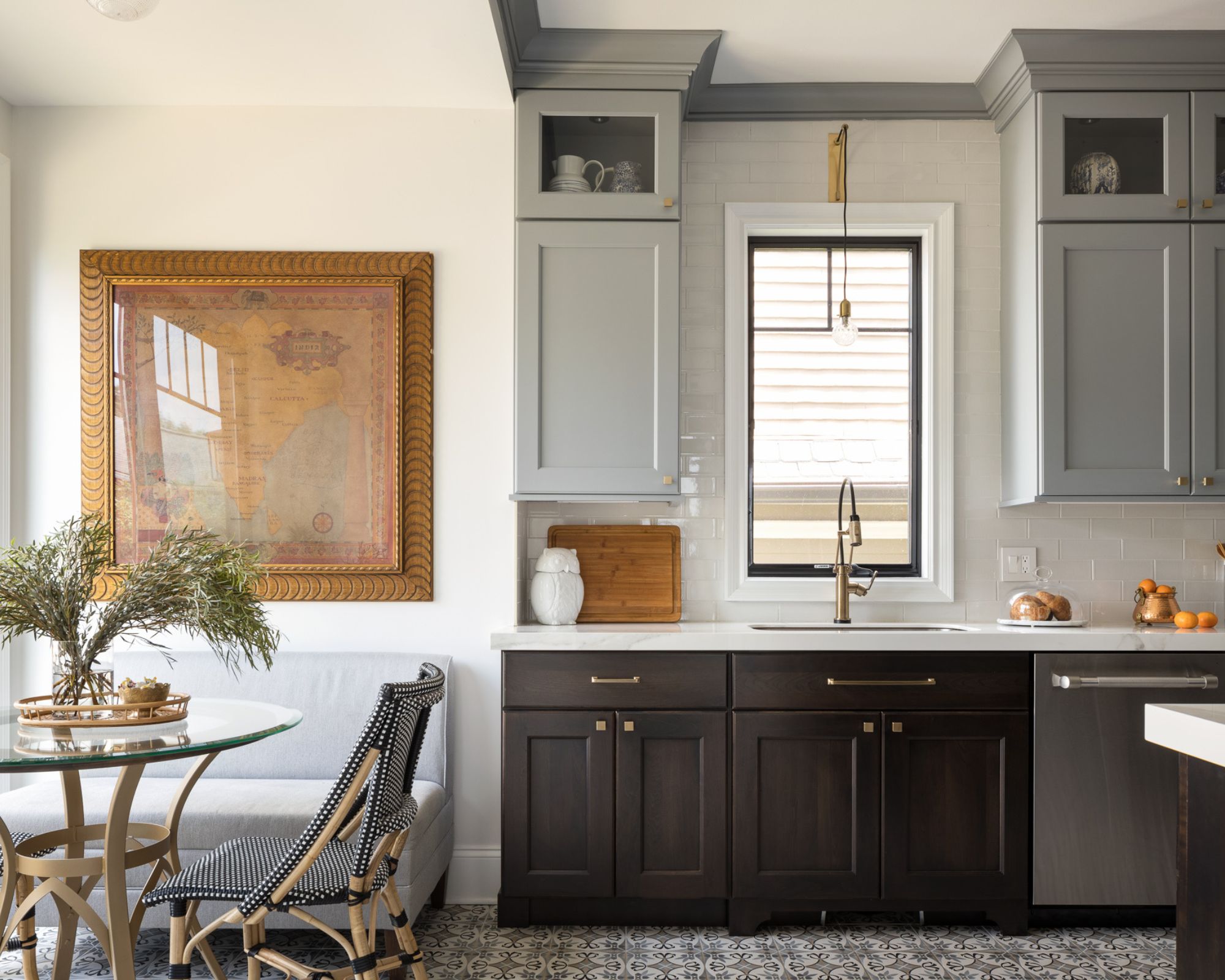
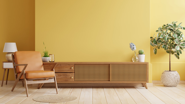
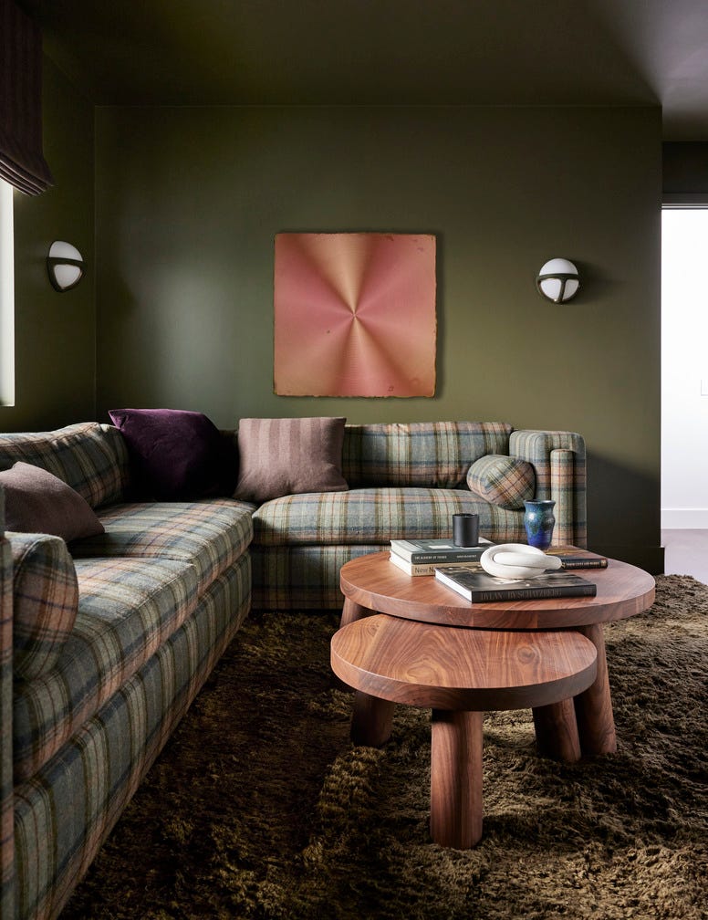
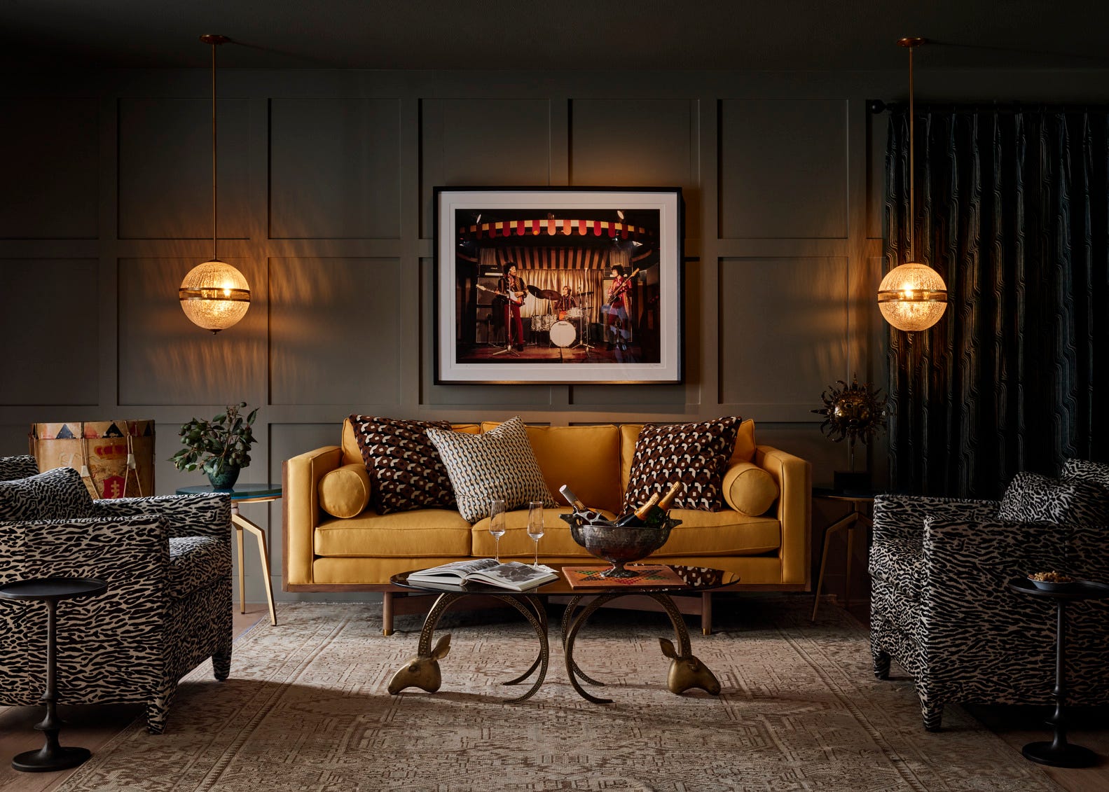
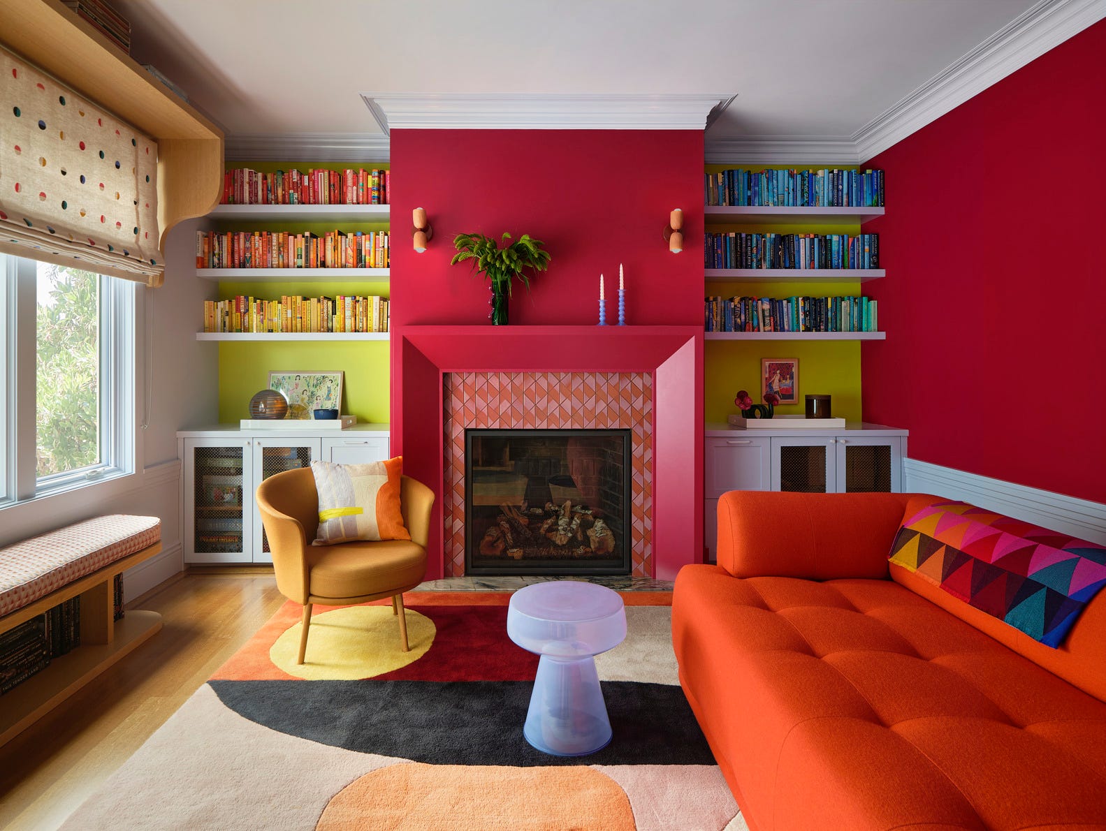
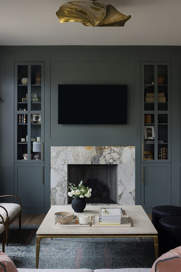
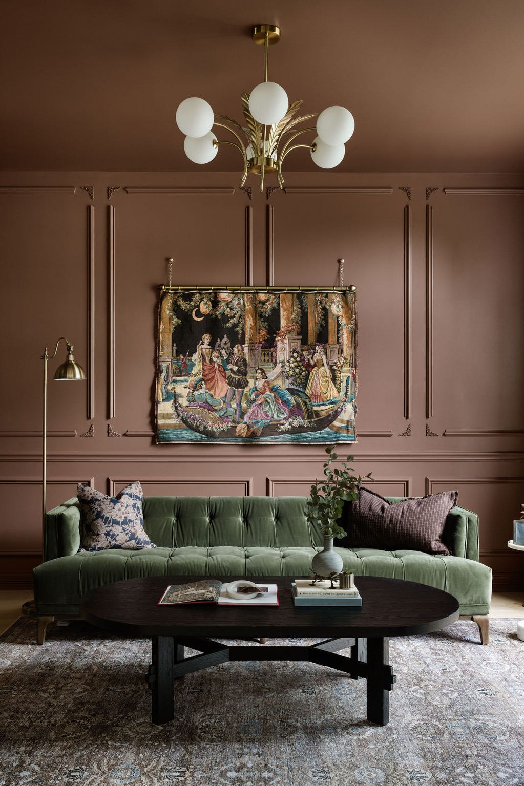
Achieving a timeless living room design often hinges on selecting the right paint color, a foundational element that can influence every other detail of a space, from furniture choices to artwork. While many are tempted by fleeting trends, the goal for most homeowners is to create a living room that maintains its appeal for years without frequent updates. Vyanca Soto, owner and principal designer at Market Studio Interiors, emphasizes that a living room should feel inviting, layered, and adaptable to evolving styles, suggesting colors that serve as a refined backdrop, complementing natural and artificial light, and harmonizing with various textures.
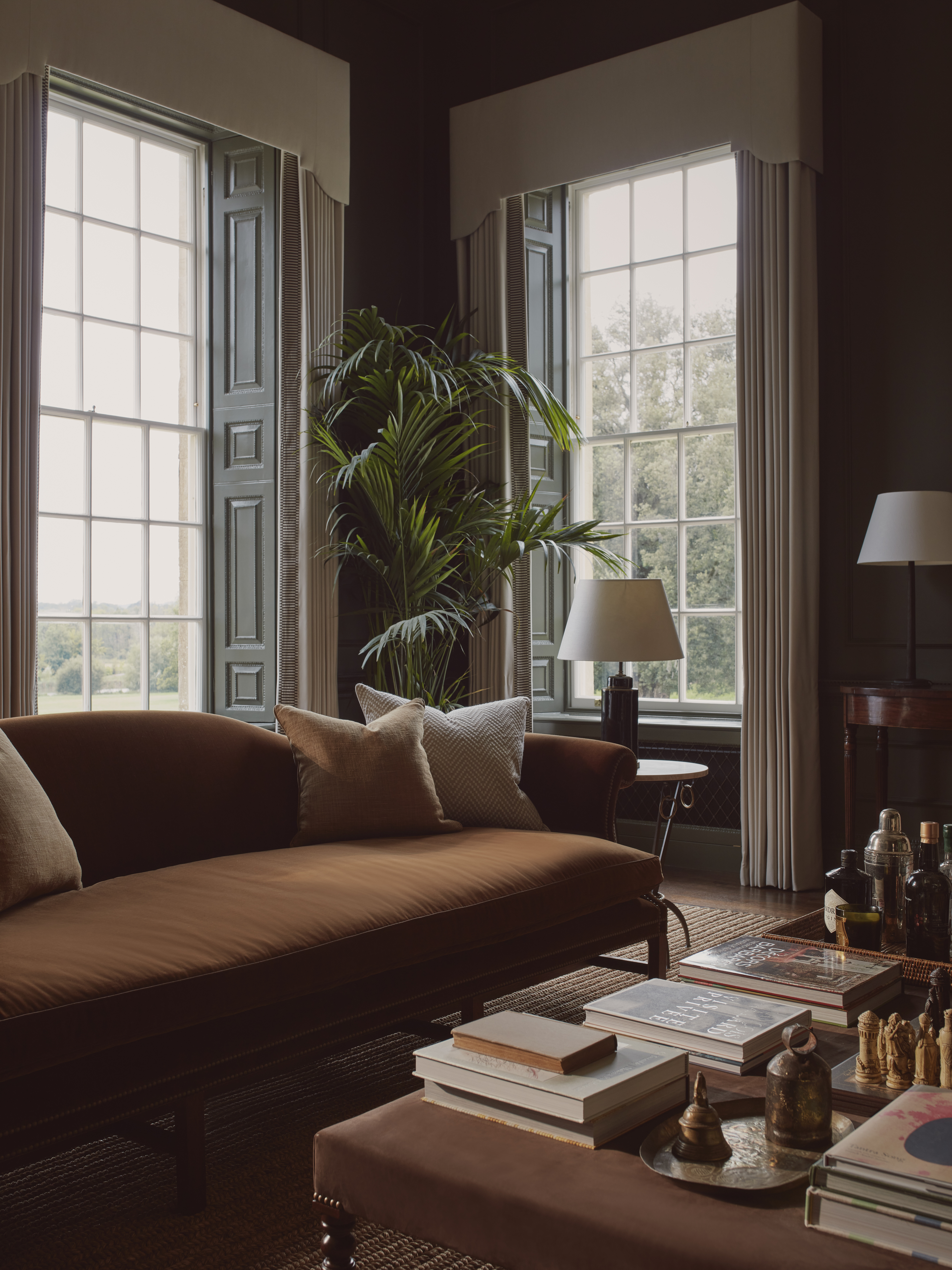
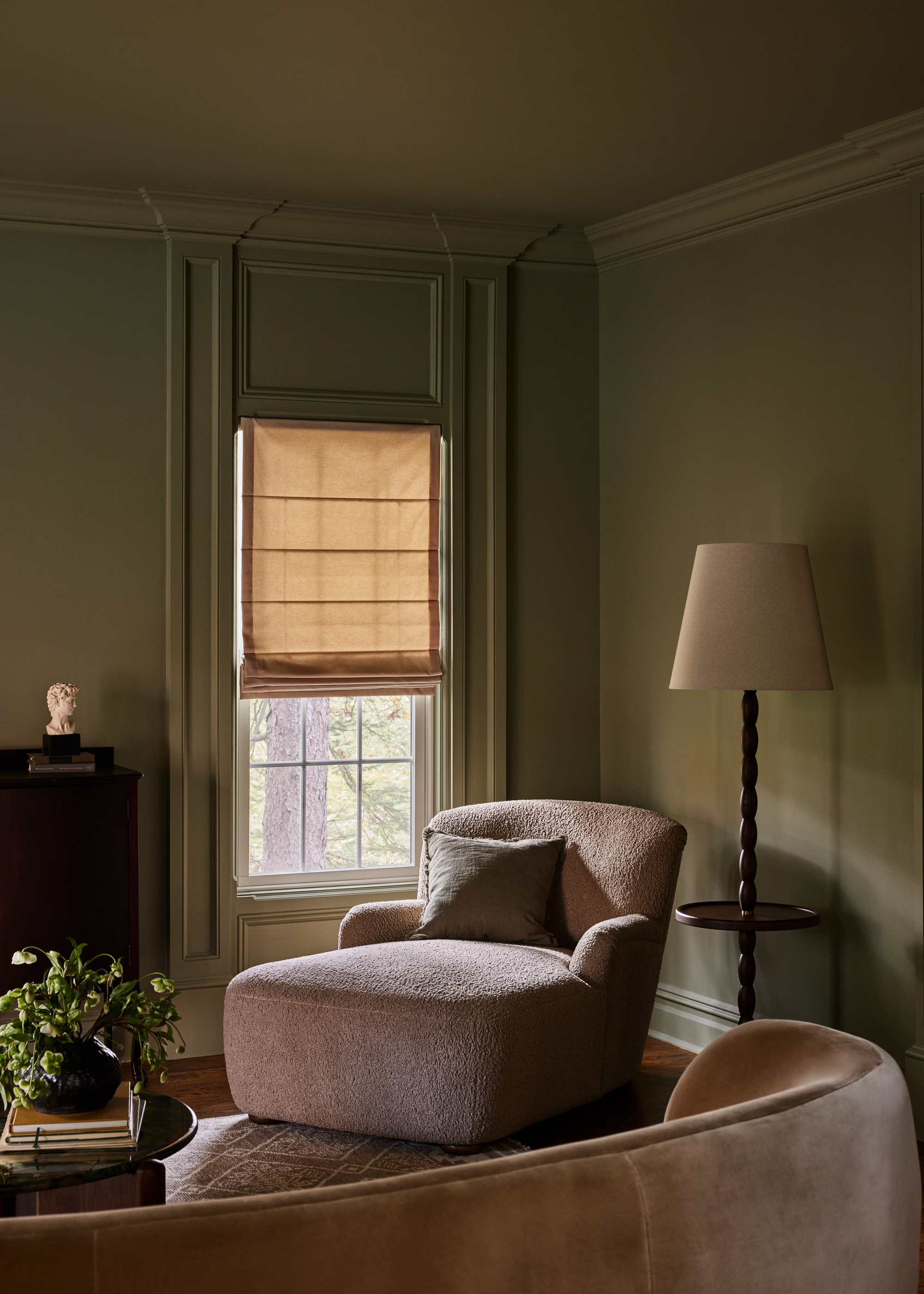
Choosing the optimal paint color involves several considerations. Designer Ali Milch advises assessing the natural light in the room and determining the desired mood. For spaces with abundant sunlight, a darker color might be considered to prevent the room from feeling too bright or stark, whereas a shaded area could embrace moodier tones. It is crucial to test paint swatches on all walls to observe how the color appears under different lighting conditions throughout the day. However, Sasha Basso, a designer at Capiz Studio, reassures that paint is a low-commitment design element, as it can always be changed, encouraging individuals to choose colors that resonate with them.
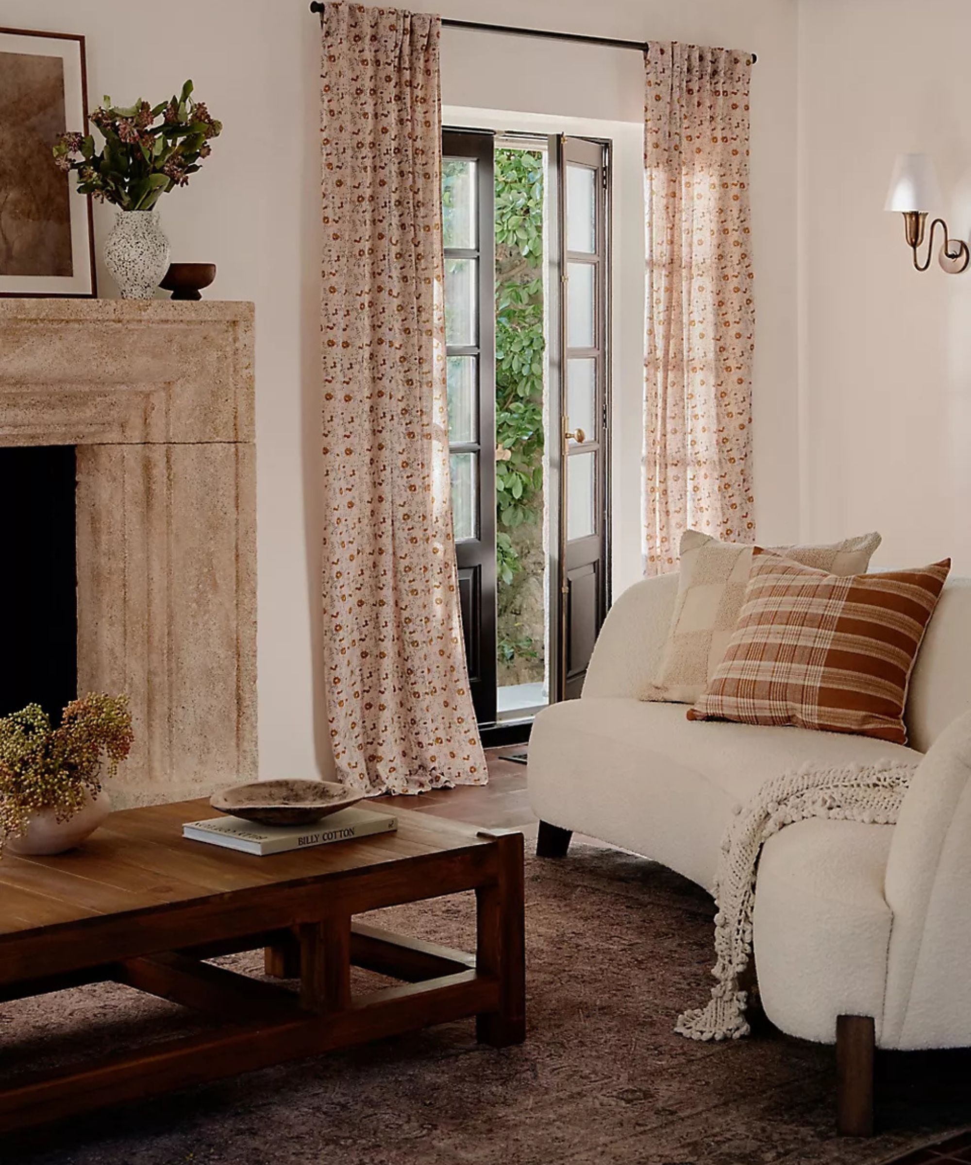
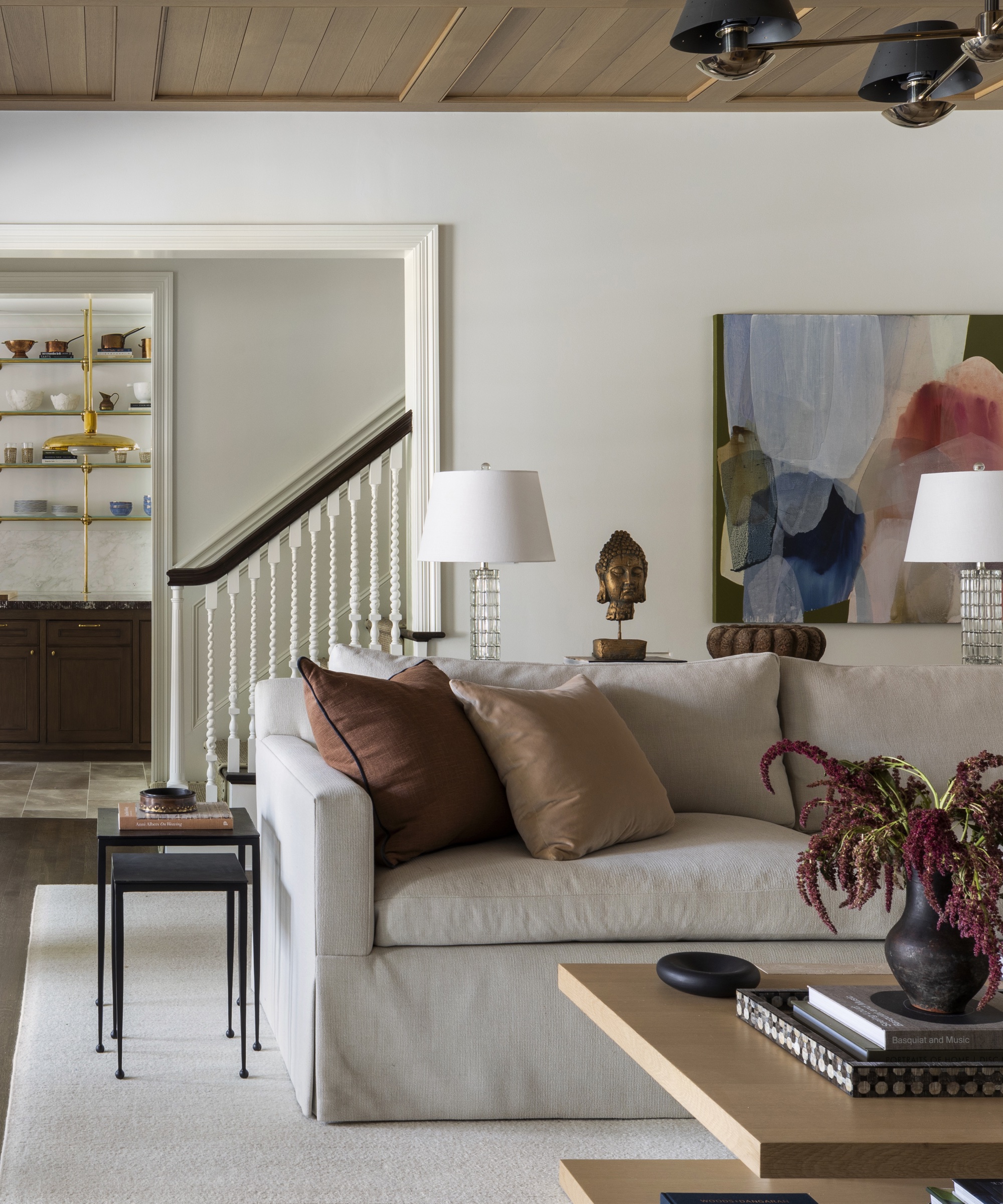
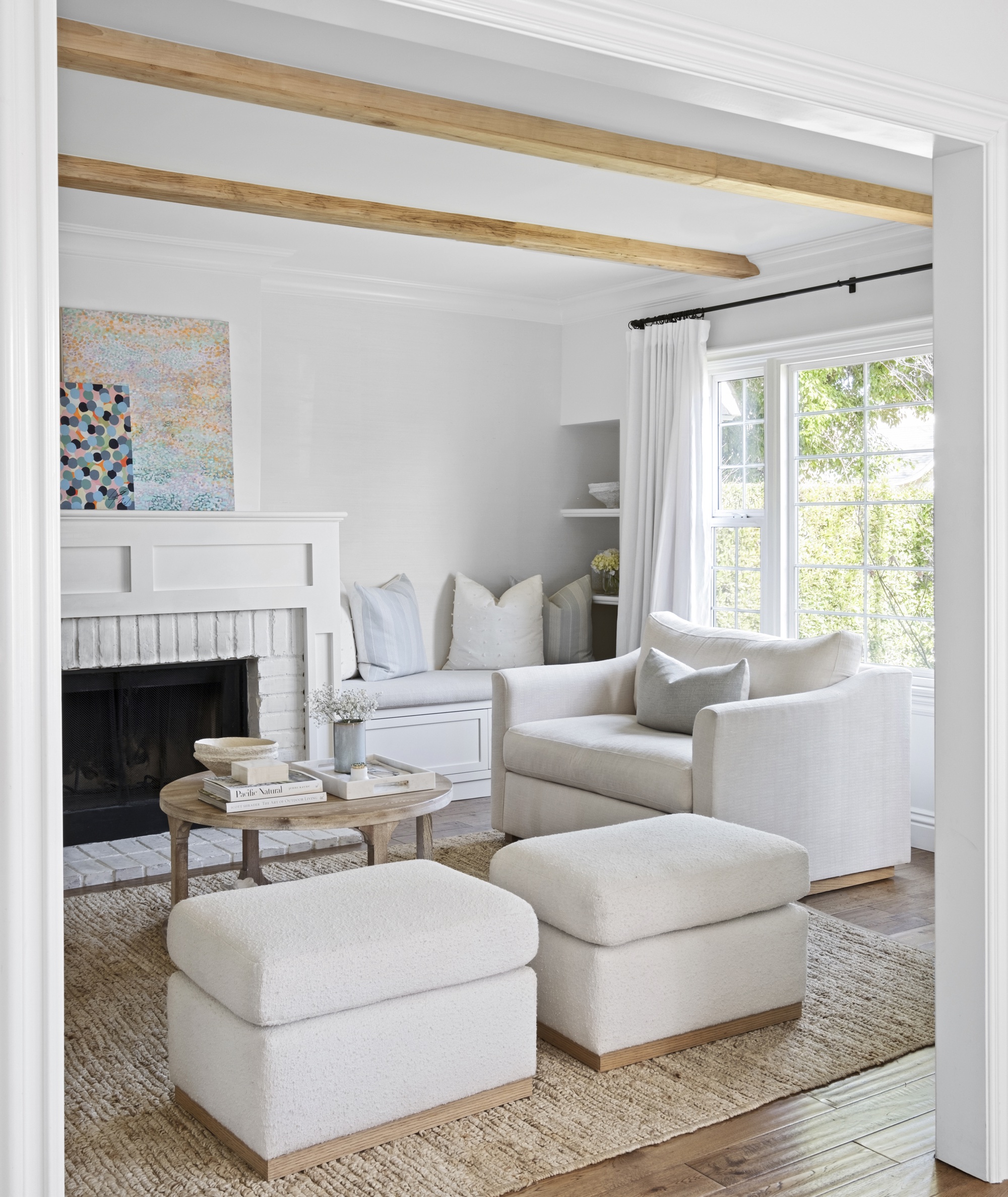
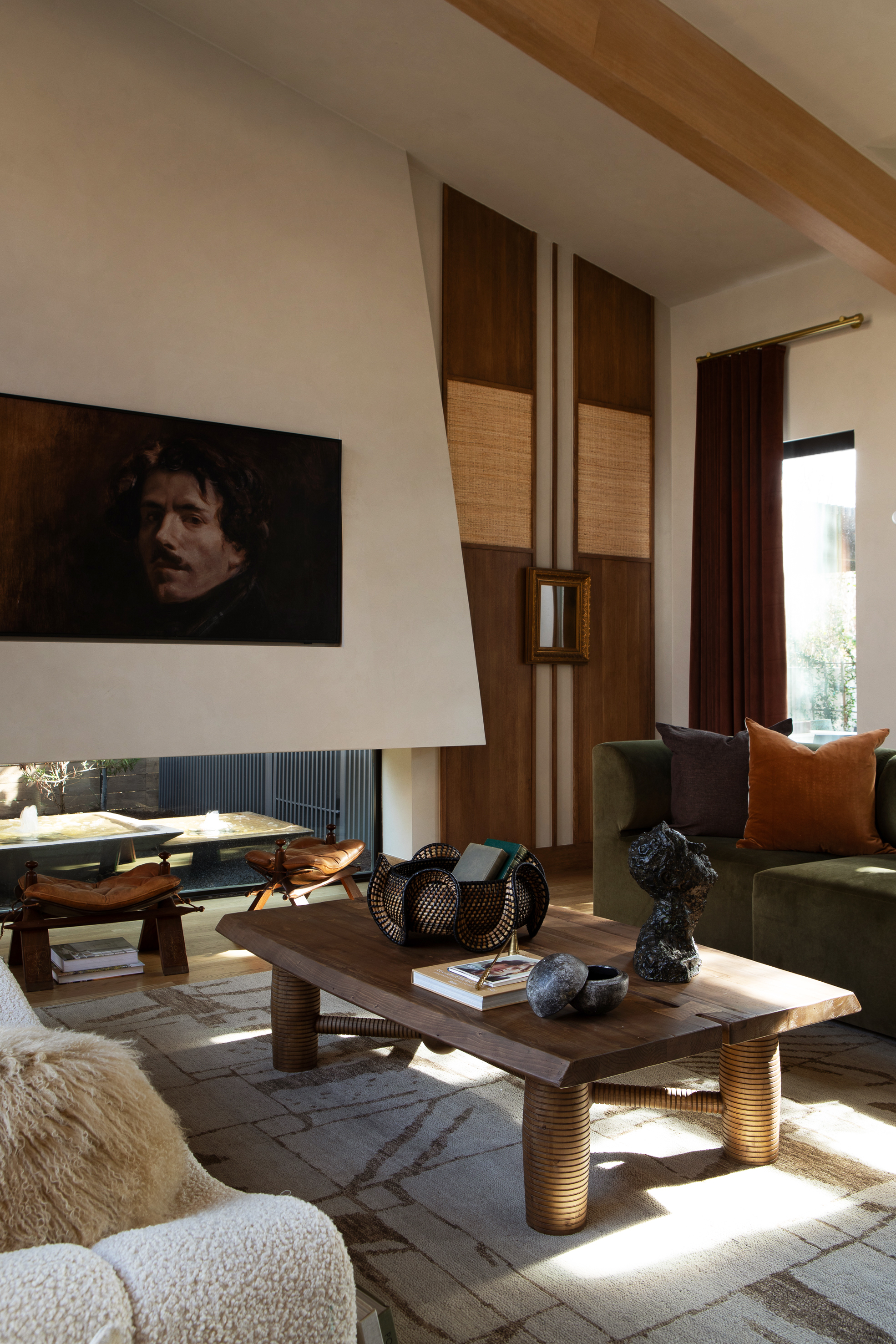
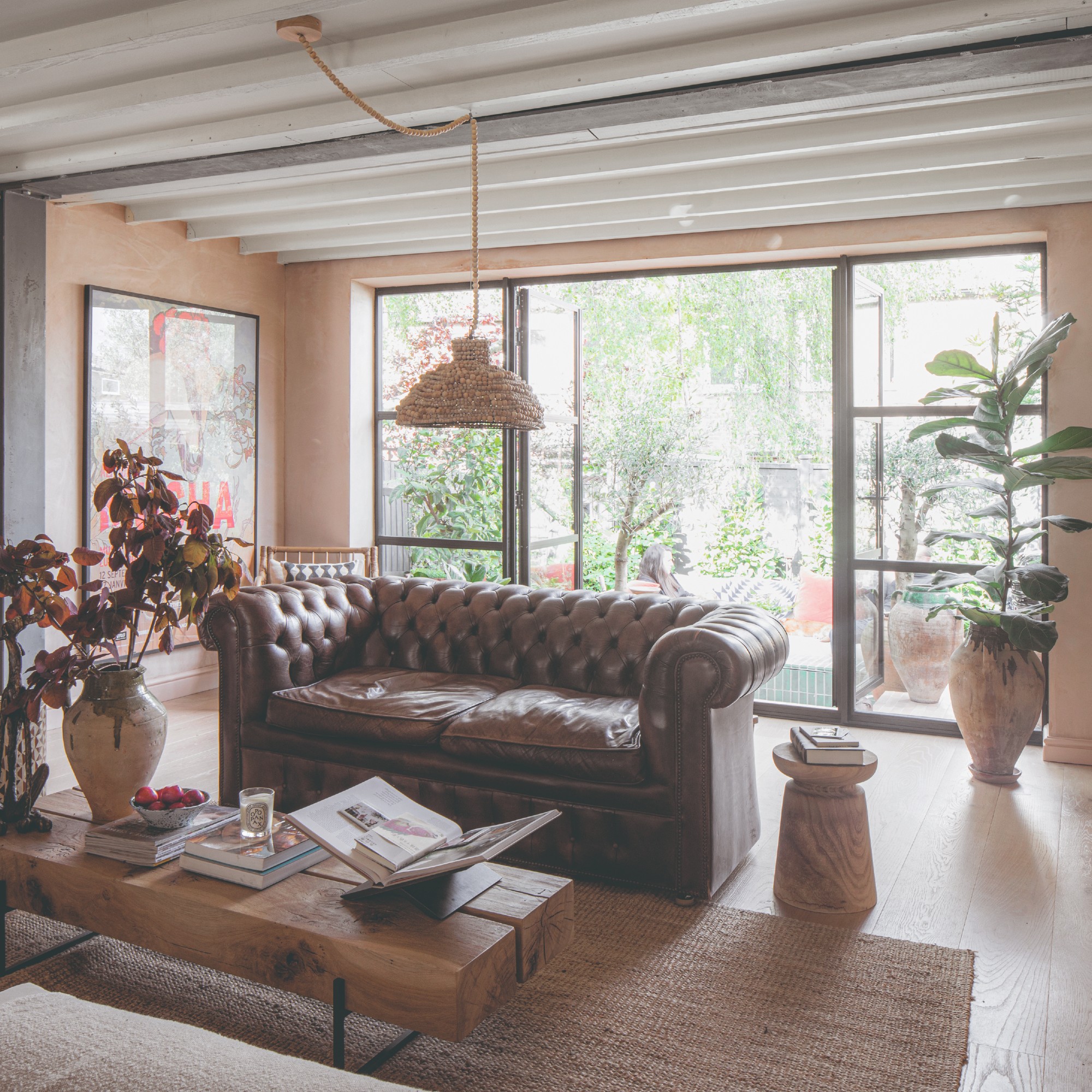
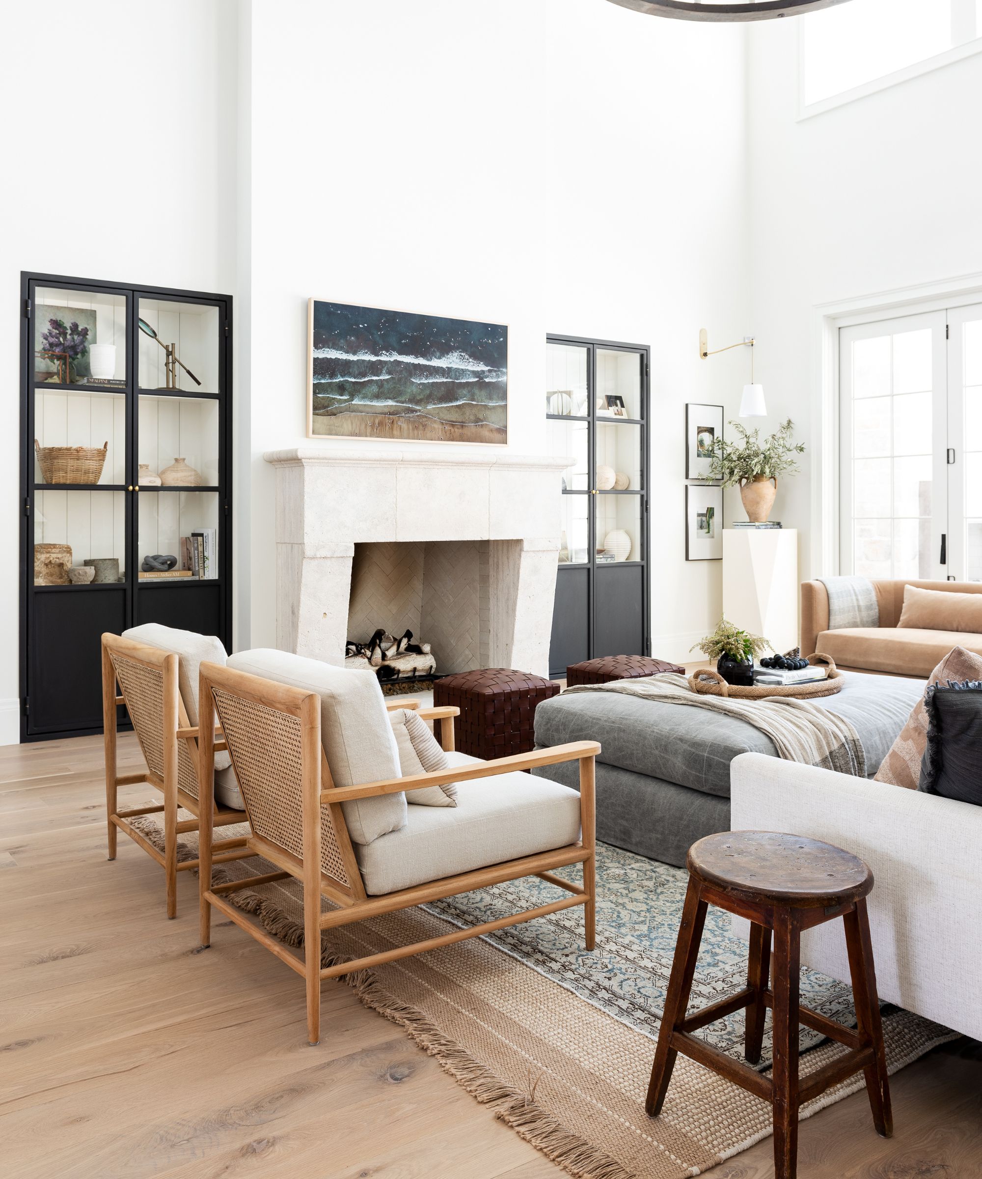
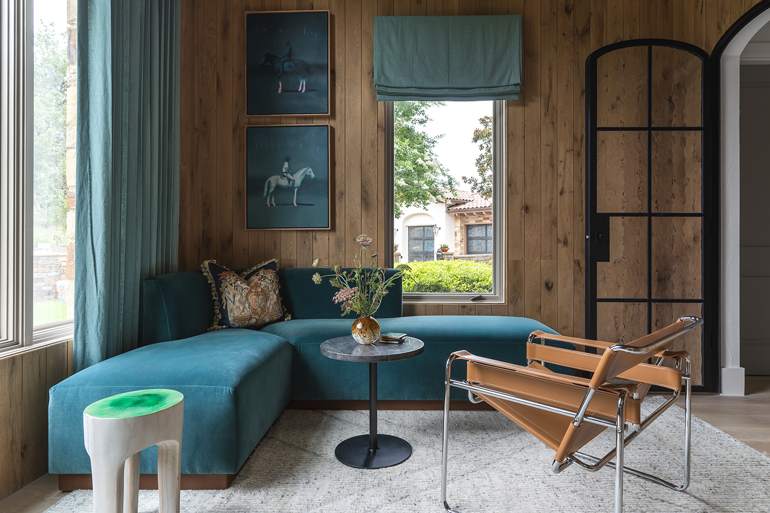

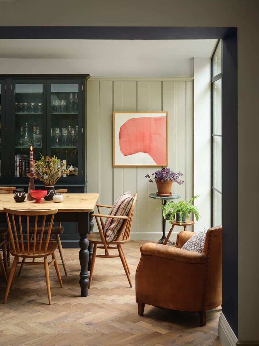
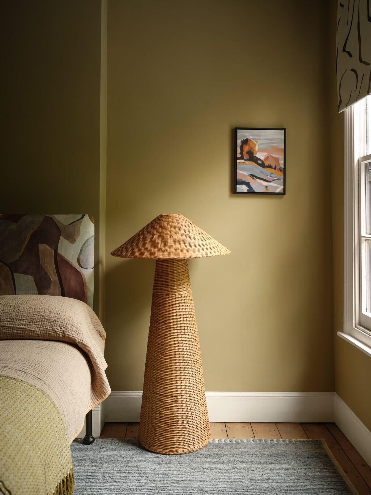
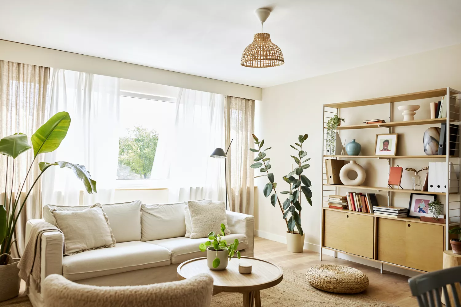
For a truly timeless aesthetic, all three featured designers unanimously recommend neutral shades, particularly creamy whites or very light taupes. Ali Milch highlights that crisp, clean walls benefit from the addition of natural wood and earthy stone accents to introduce warmth. She also suggests incorporating meaningful art and layering complementary patterns to infuse personality into the space. Benjamin Moore’s Swiss Coffee is a standout recommendation from both Milch and Basso. This classic, slightly off-white hue with warm undertones is likened to milk in a morning brew. Basso cautions that whites can appear differently in various rooms due to light conditions, underscoring the importance of testing samples directly on the walls.
Beyond Swiss Coffee, other recommended timeless white and neutral paint colors include Color Atelier’s Limewash in White Clay or Chèvre, Farrow and Ball’s All White or Pointing, Benjamin Moore’s Cloud White, and Farrow and Ball’s Strong White. Vyanca Soto describes Strong White as a soft, warm white with ideal depth, providing an effortless and elegant foundation suitable for diverse aesthetics, whether incorporating rich textures or maintaining a light, airy feel. Ultimately, the consensus among designers points to a sophisticated and versatile neutral palette as the key to a living room that remains stylish and appealing across time.
#LivingRoomDecorating #PaintColors #HomeDesign #InteriorDesign #TimelessStyle #NeutralPalette #BenjaminMoore #FarrowAndBall #DecoratingTips #LivingRoomDecorating #PaintColors #HomeDesign #InteriorDesign #TimelessStyle #NeutralPalette #BenjaminMoore #FarrowAndBall #DecoratingTips
0 comment in total
 No comments yet
You may also like
5 living room paint colors going out of style in 2025

4 Outdated Colors Designers say you Should Steer Clear of When Decorating a Living Room

5 enduring colors designers always return to when they have trend fatigue

The Vintage Color Everyone Will Be Painting Their Living Room Walls
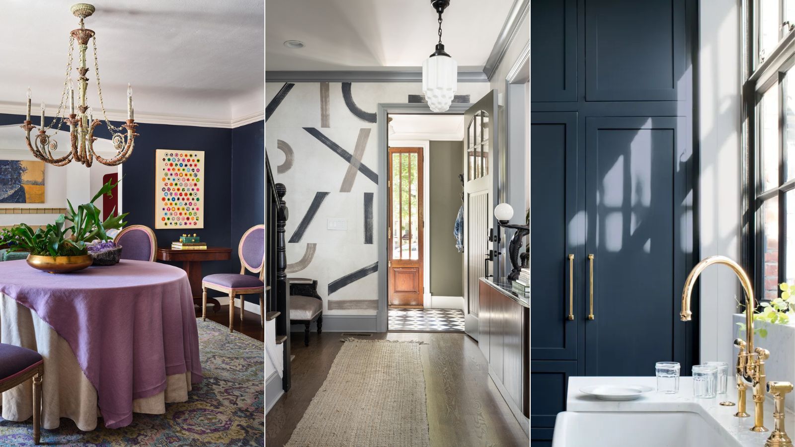
Designers who never follow trends swear by this color family to make their homes look timeless

10 Timeless Living Room Paint Colors Designers Swear By
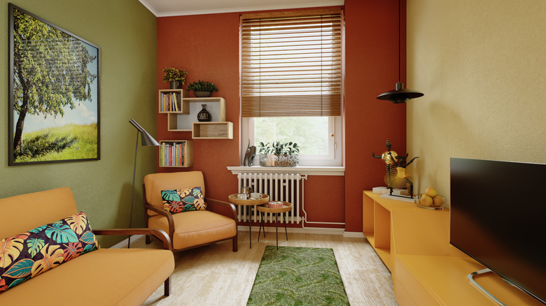
The Vintage Paint Color That Will Never Go Out Of Style


The most timeless paint colors according to designers
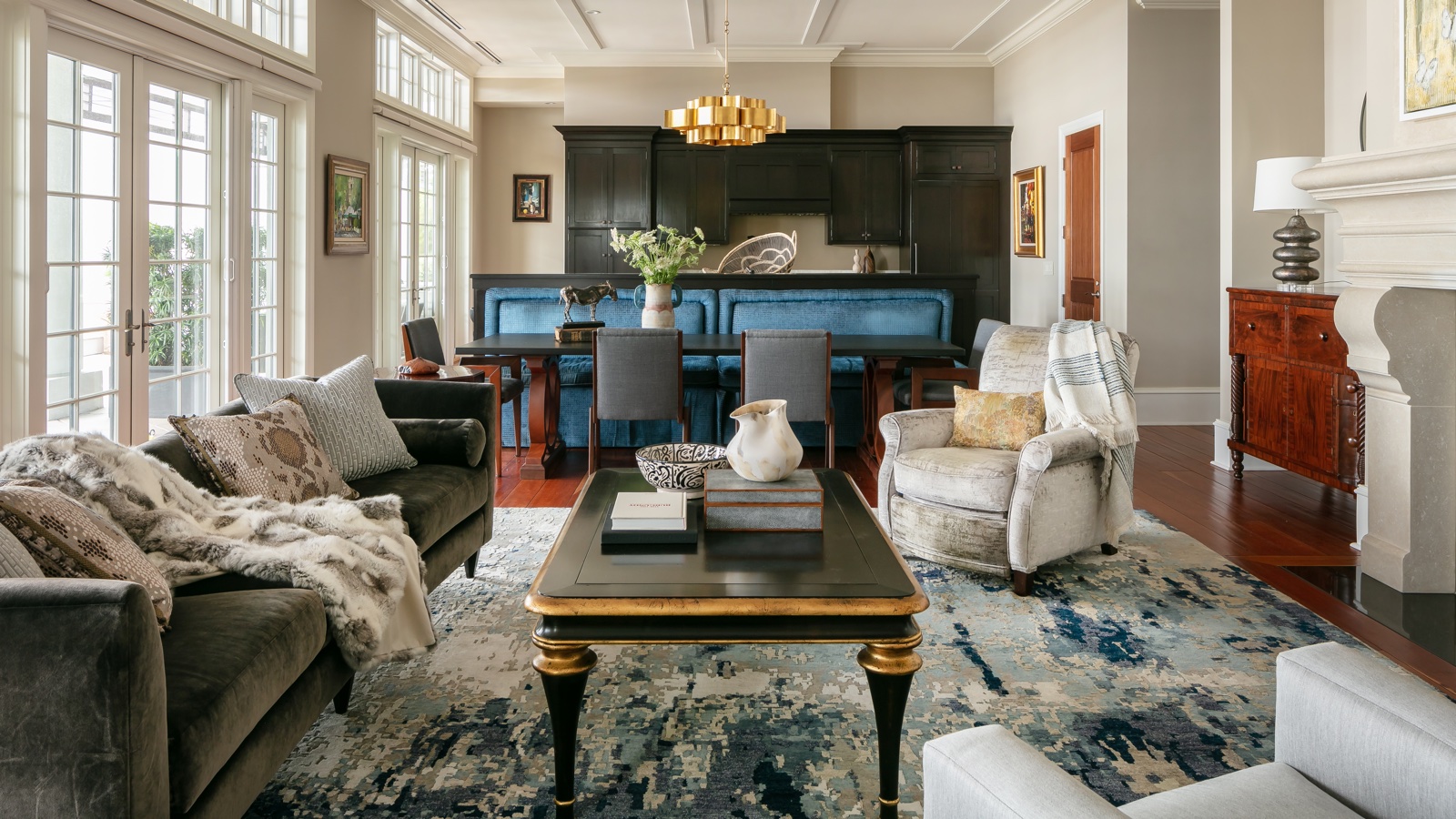
7 couch colors that will never go out of style, according to interior designers
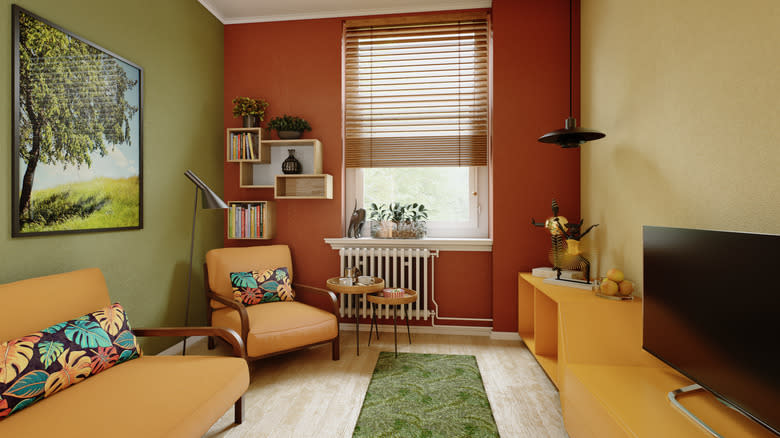
The Vintage Paint Color That Will Never Go Out Of Style
Jewel Tones Are Trending for Living Room Paint Colors, According to Designers

5 trends that look good right now but interior designers warn they won't last
Classic Color Schemes That Never Go Out of Style

Experts Predict These 6 Living Room Trends Will Be Huge in 2025

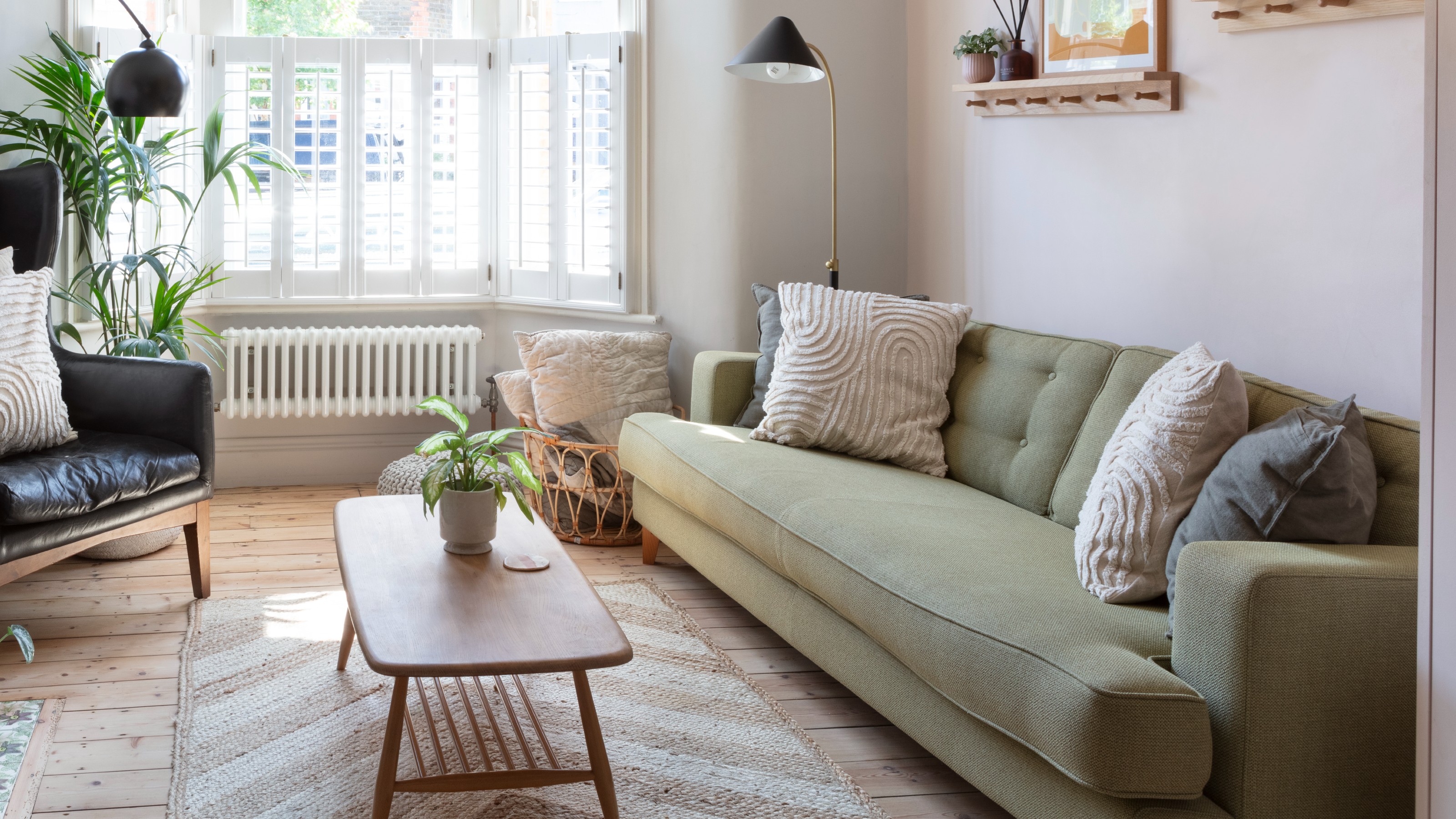
‘When your sofa and wall colours are in sync, the space feels intentional’ – experts reveal the 4 best paint and sofa colour combinations
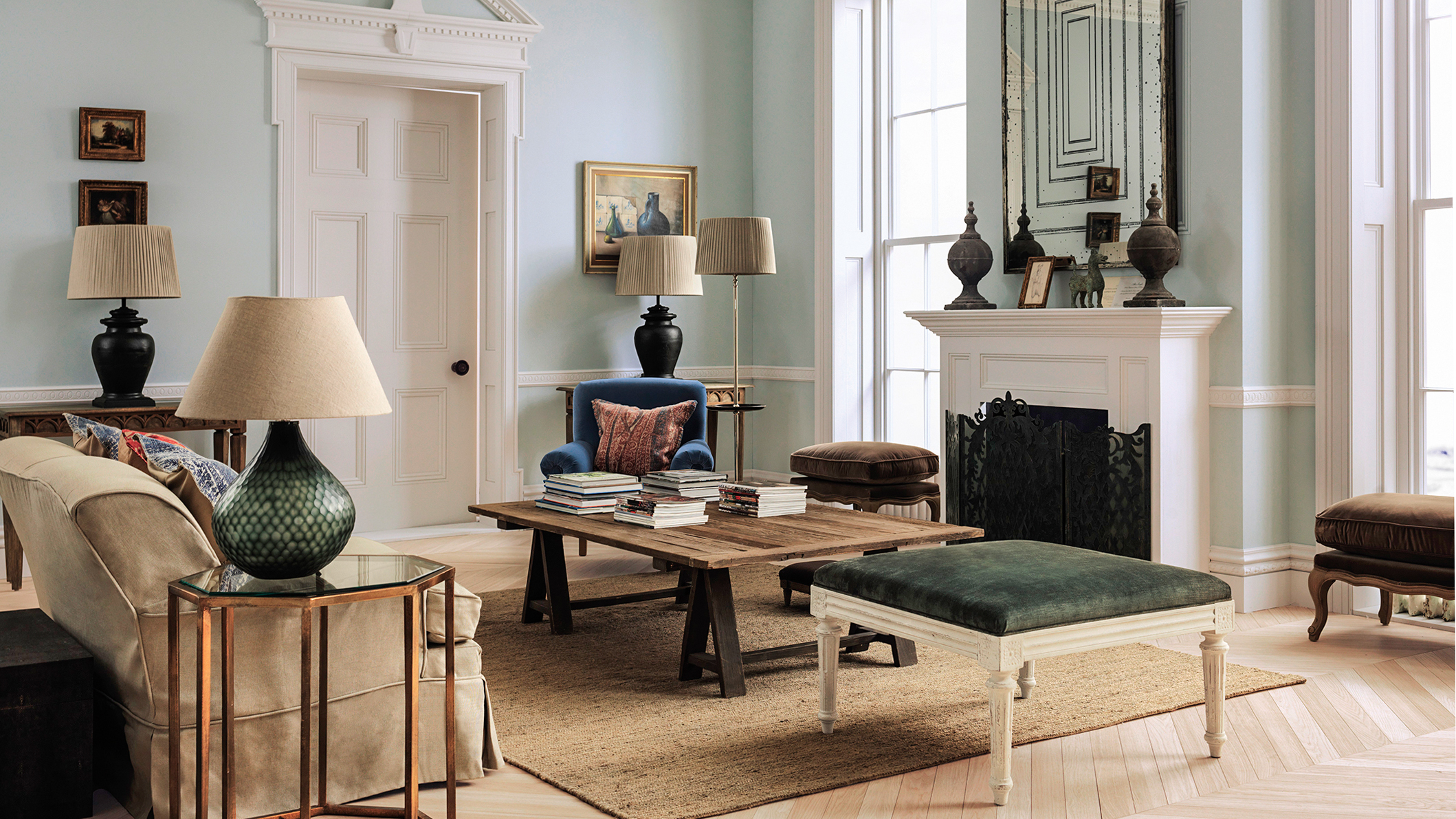
The Best Vintage-Inspired Paint Colors — 6 Expert-Approved Shades for a Touch of Chic Nostalgia

5 Timeless Paint Colors That Will NEVER Go Out of Style, According to Designers
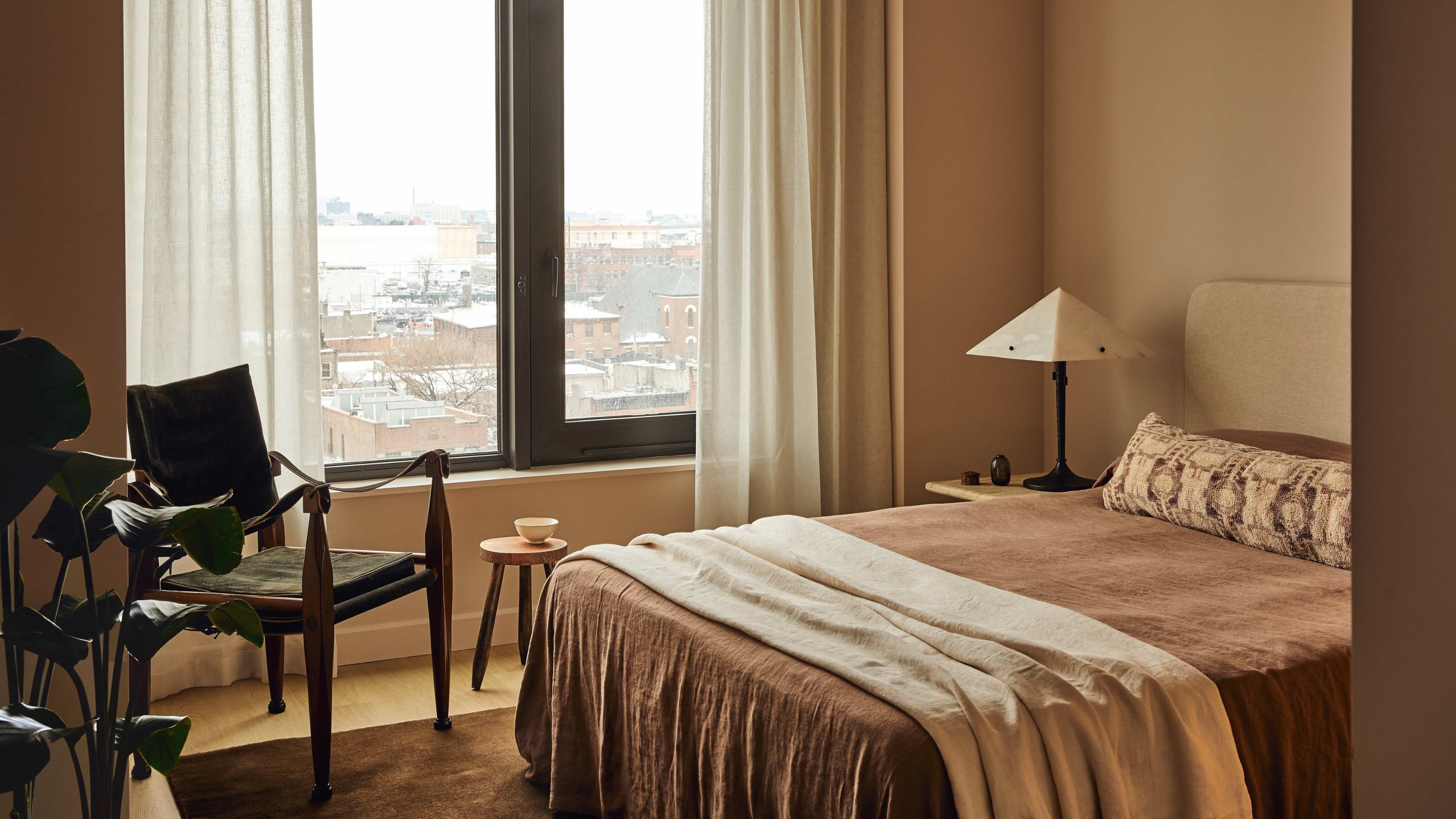
3 Classic Color Palettes That I'm Betting Will Feel Just as Current in 100 Years' Time
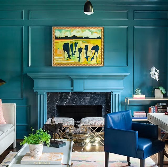
The 60 Most Popular Living Room Paint Colors Right Now

We Asked Designers to Pick the Most Timeless Living Room Paint Color—and They Agreed