1/6
8 Favorite Paint Colors of Local Interior Designers
This article explores popular paint color choices favored by local interior designers, offering guidance for refreshing home interiors. It highlights that selecting a paint color can be challenging due to the vast number of available options, even within a single hue or brand. The article aims to simplify this process by presenting expert-approved shades for various home environments, ranging from calming neutrals to bold statement colors.
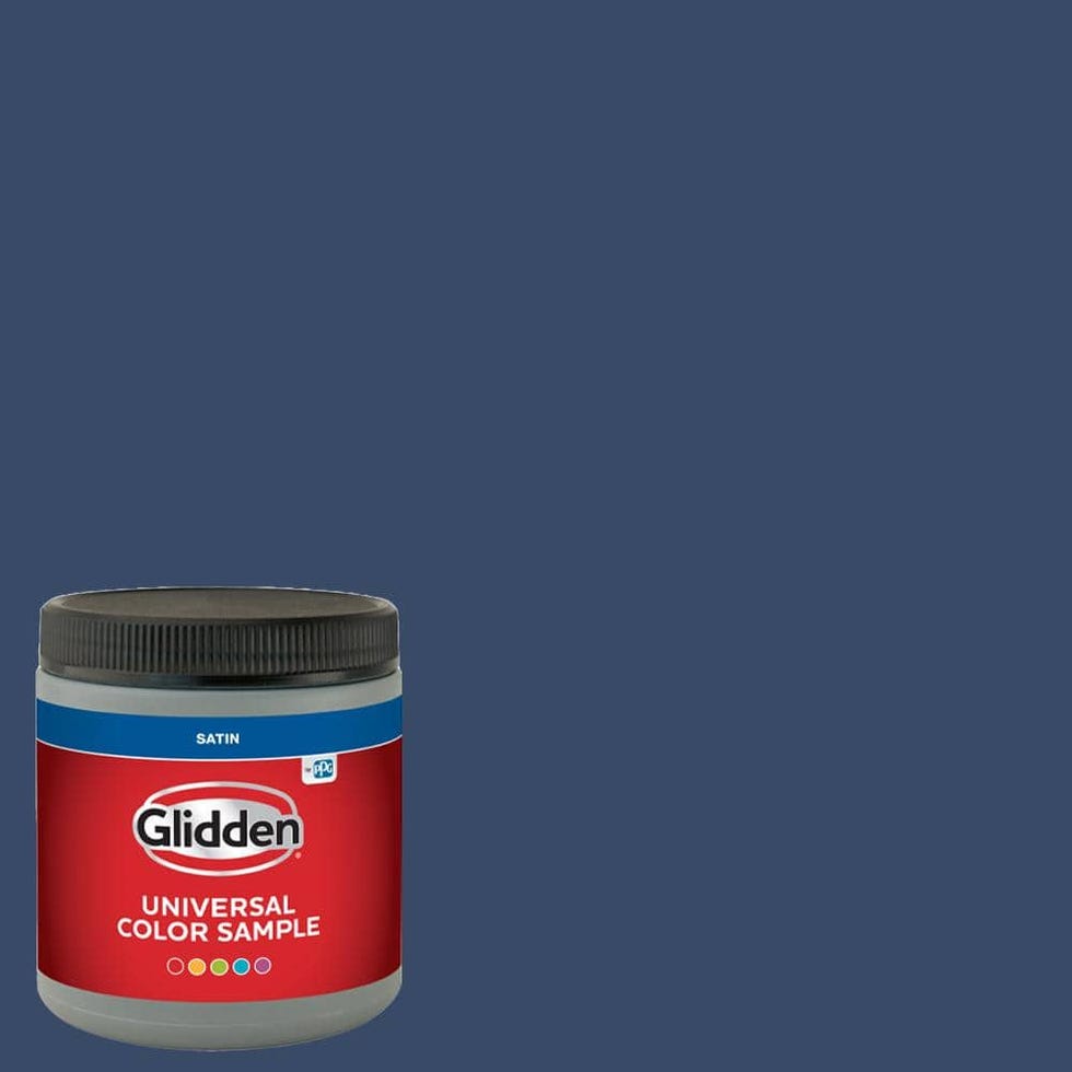
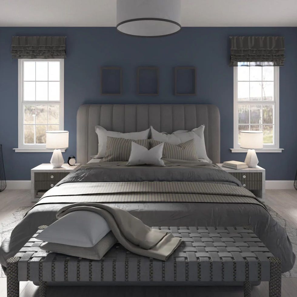
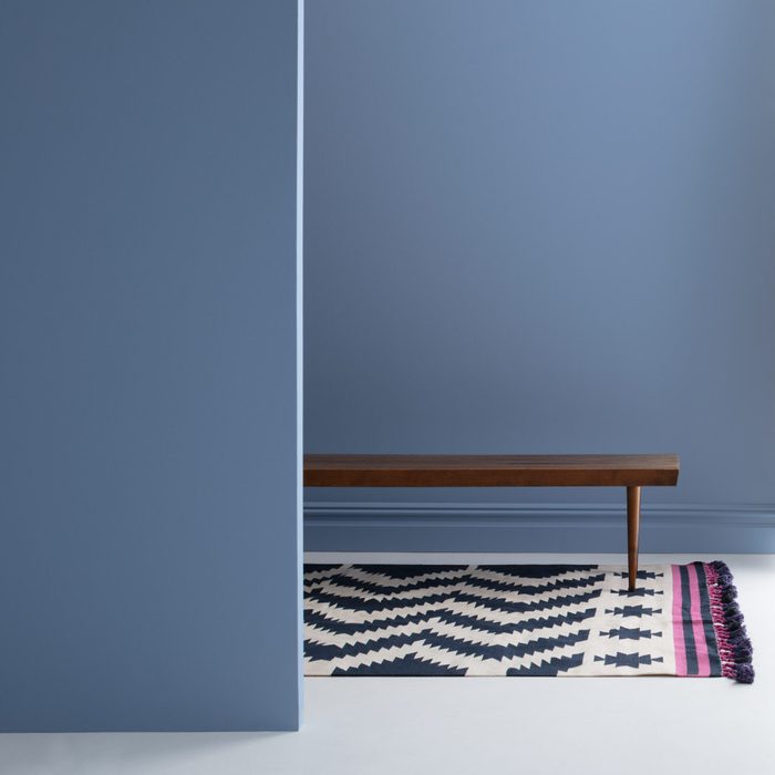
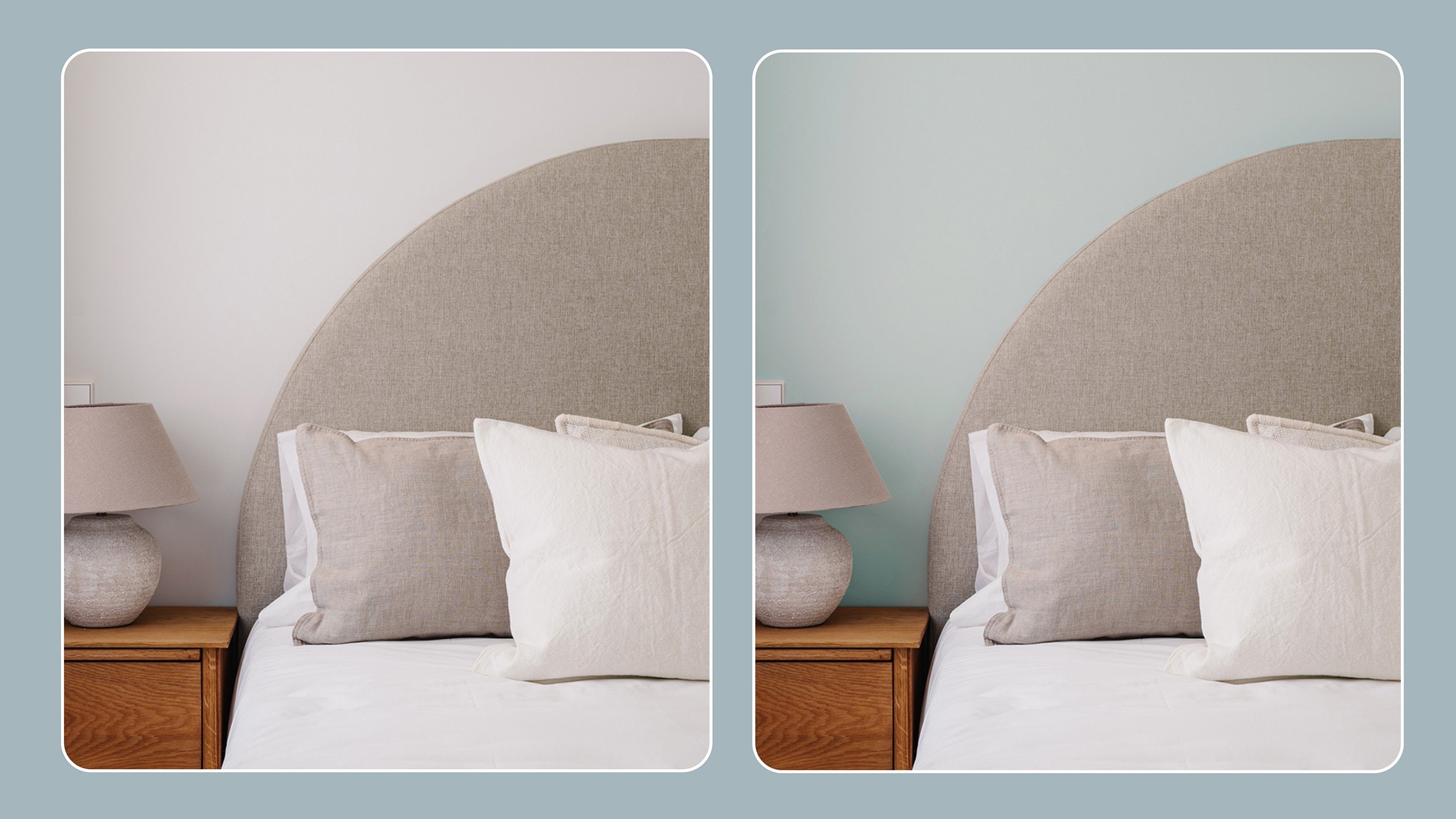
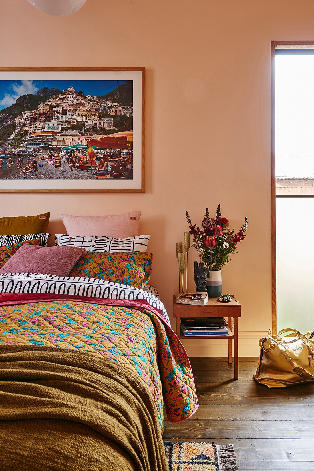
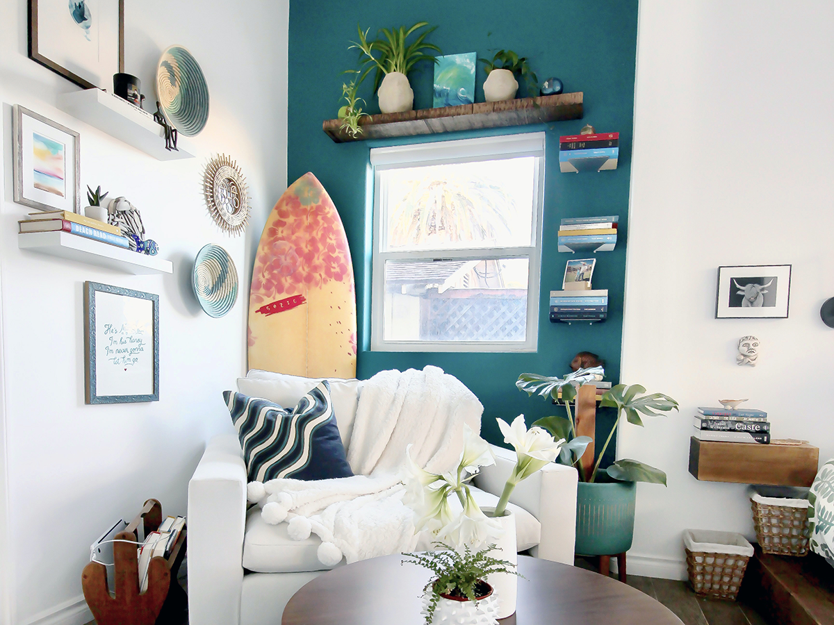
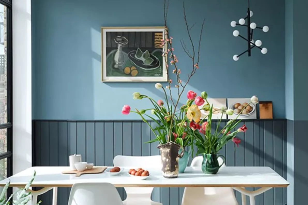
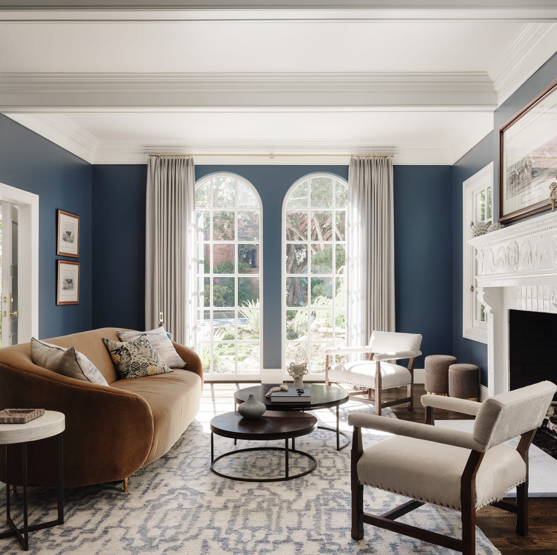
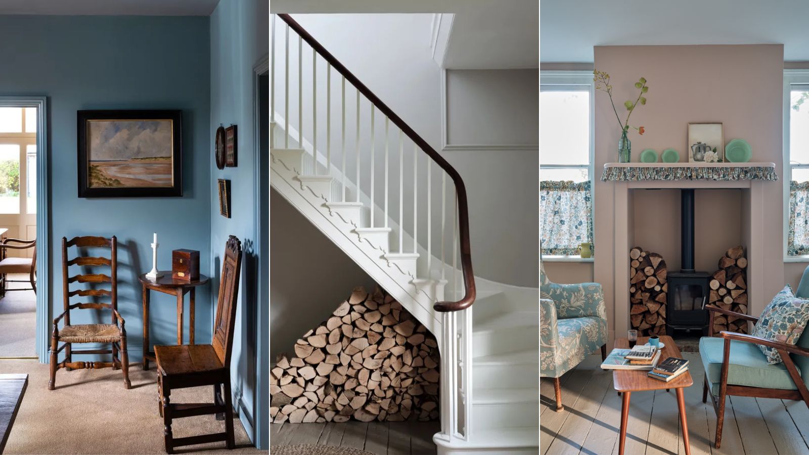
Jennifer Verruto, founder and designer-in-chief of Blythe Interiors, recommends Sherwin-Williams's "Really Teal" for small spaces, describing it as bright, fresh, and cheerful, perfect for creating an intentional and vivid pop in areas like a reading nook. Verruto also expresses her affinity for Sherwin-Williams's "Naval," a timeless, bold color that adds richness and depth. She advises that despite its dark tone, "Naval" can make a room feel cozy rather than small, provided there is ample natural light and large furnishings to balance the color, as demonstrated in her son's nursery.
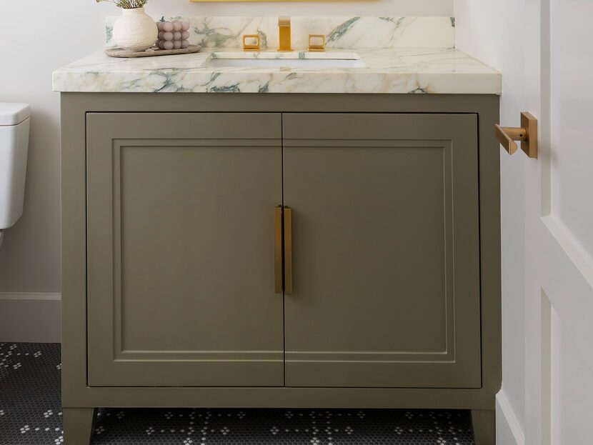
Danielle Perkins, principal designer and owner of Danielle Interior Design & Decor, often uses Sherwin-Williams's "Westhighland White" for clients seeking white walls. She notes that this warm white is ideal for rooms with abundant natural light, creating a welcoming atmosphere. However, she cautions that in rooms with limited light, it might exhibit a yellowish tint. Perkins has applied this color throughout open-plan spaces, including ceilings, to allow architectural features like woodwork to stand out. For windowless rooms, Perkins consistently opts for Sherwin-Williams's "Alabaster," a cooler shade. She pairs it with warmer lighting to prevent the space from appearing stark, emphasizing its reliability in such settings.
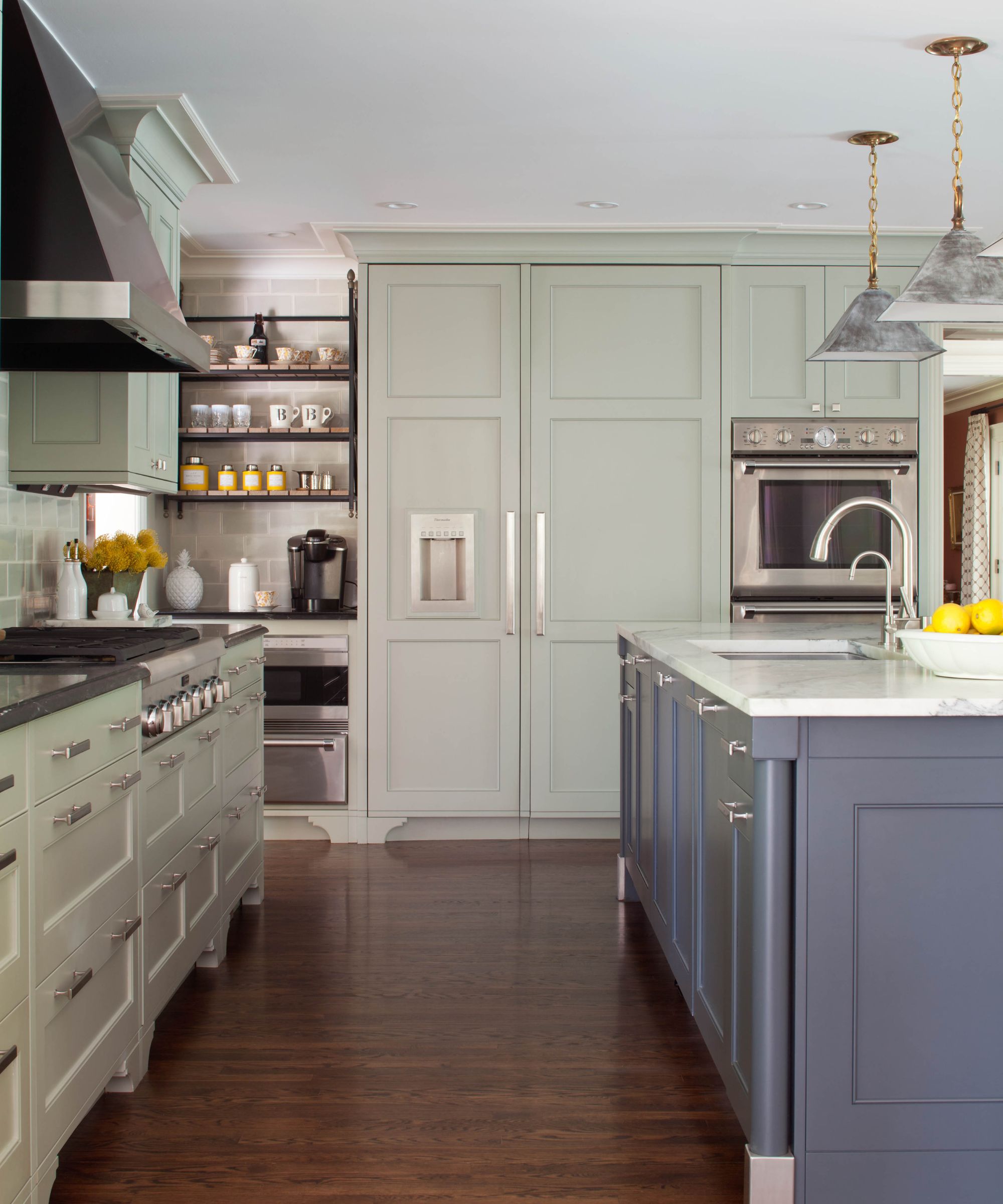
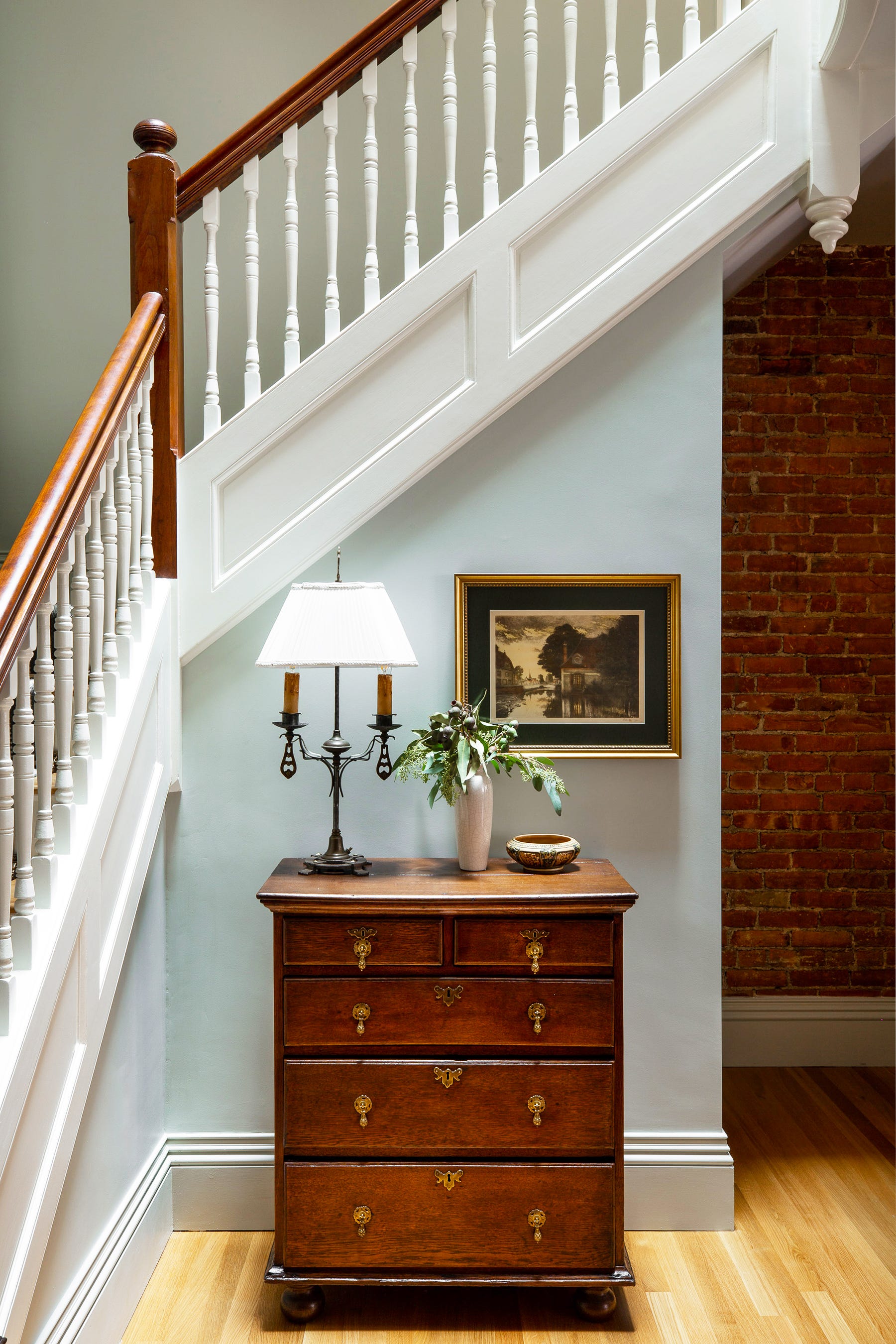
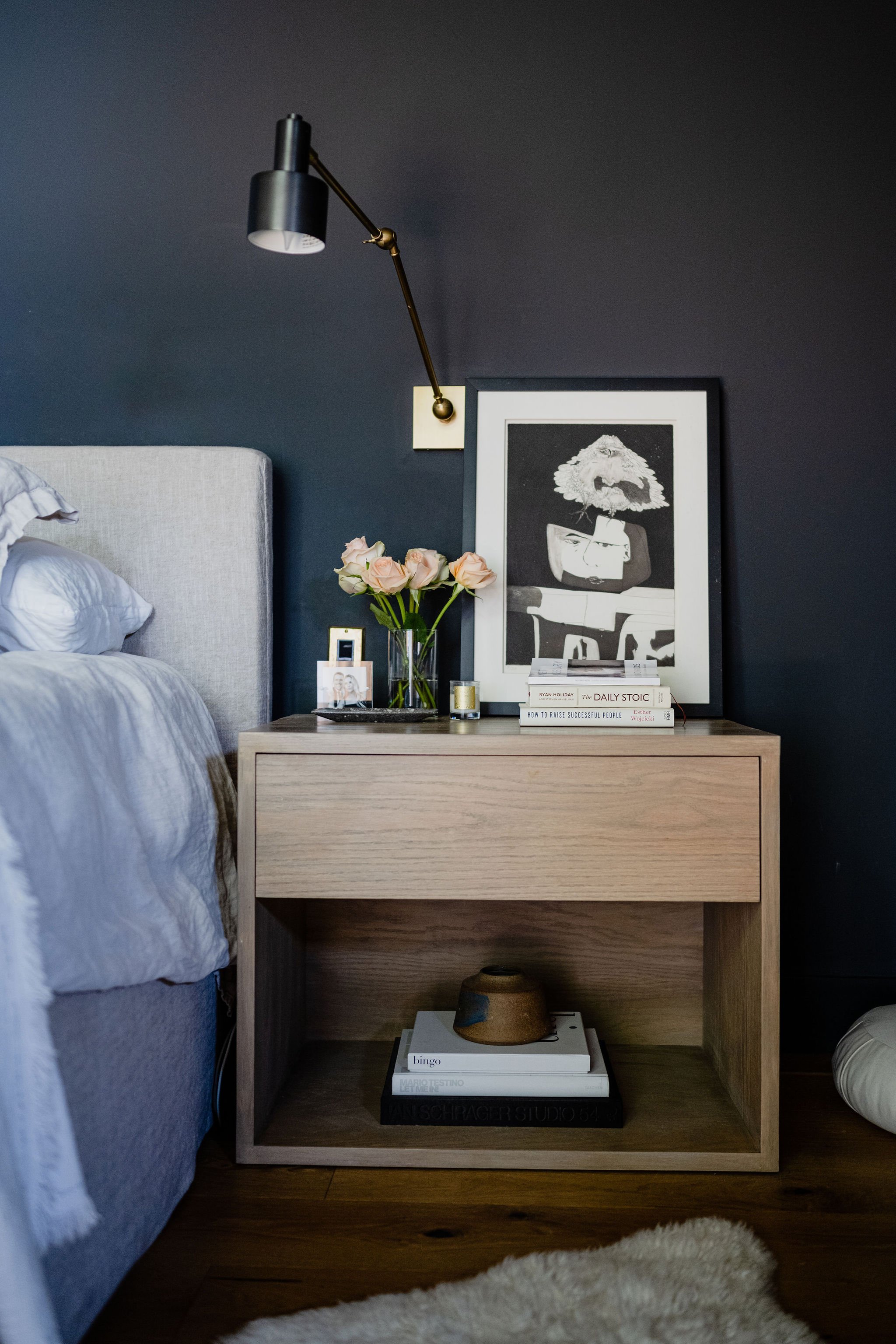
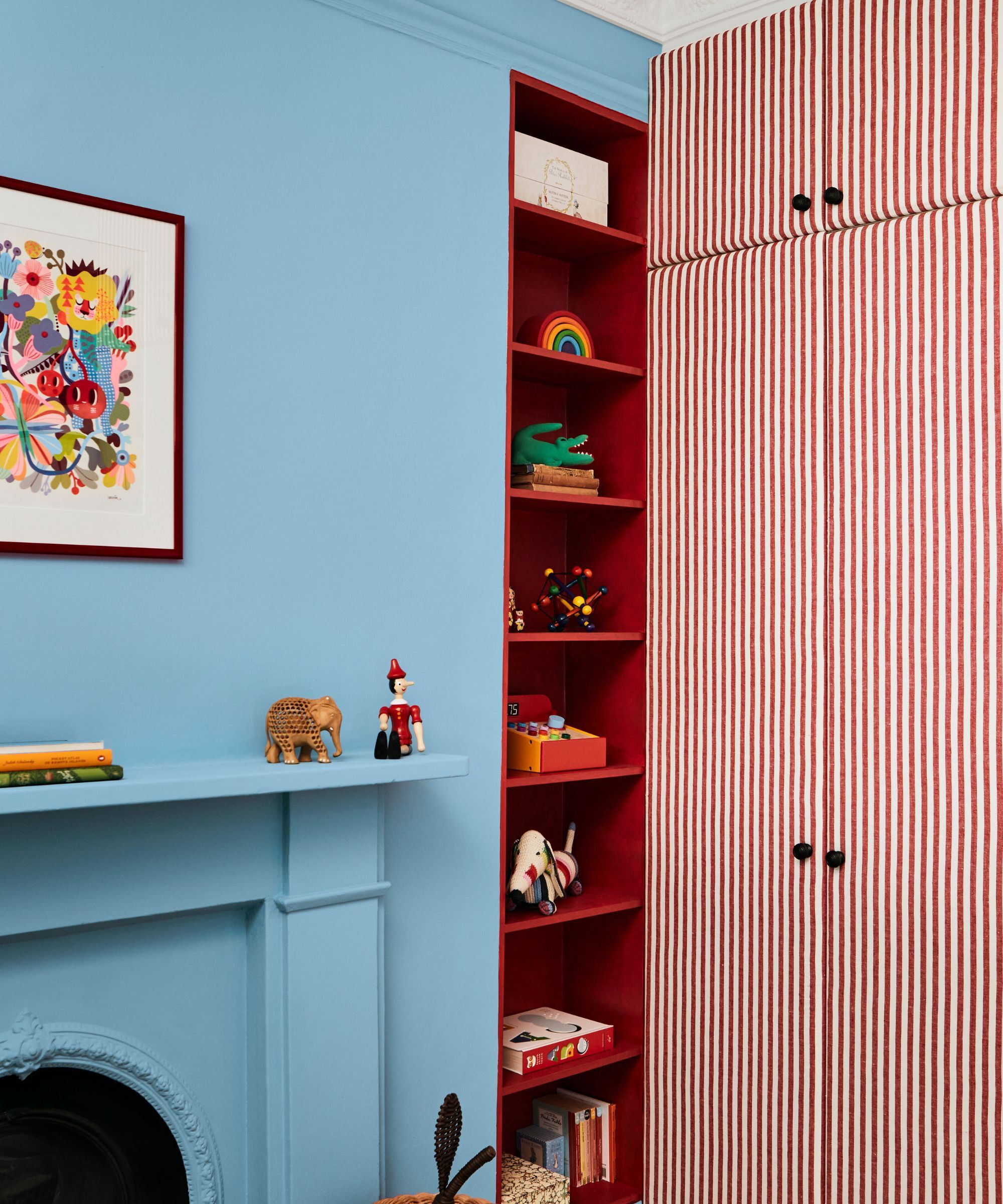
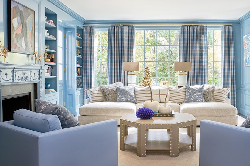
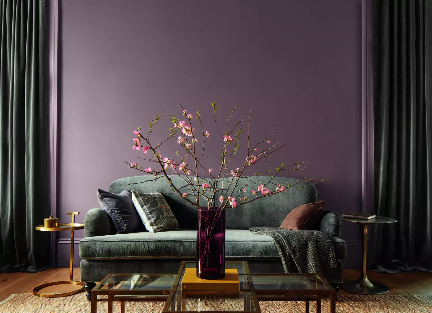
Treci Smith, an interior stylist from Treci Smith Designs, suggests Glidden's "Midnight Hour" as a versatile charcoal neutral. She has utilized this dark gray extensively, painting fences, her studio, and various rooms within her home. Smith characterizes "Midnight Hour" as sophisticated and moody, suitable for both small, dramatic spaces, like a kids' bathroom, and larger rooms with ample natural light, such as an all-white kitchen where she used it on lower cabinets. Hope Clark, founder and principal designer of Olive + Oak Interiors, considers Benjamin Moore's "Silver Satin" the ideal gray. She describes it as a balanced shade—neither too light nor too dark, and neither too cool nor too warm—making it perfect for creating a subtle contrast against white trim.
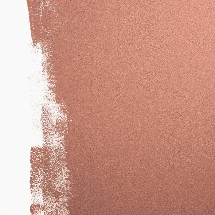
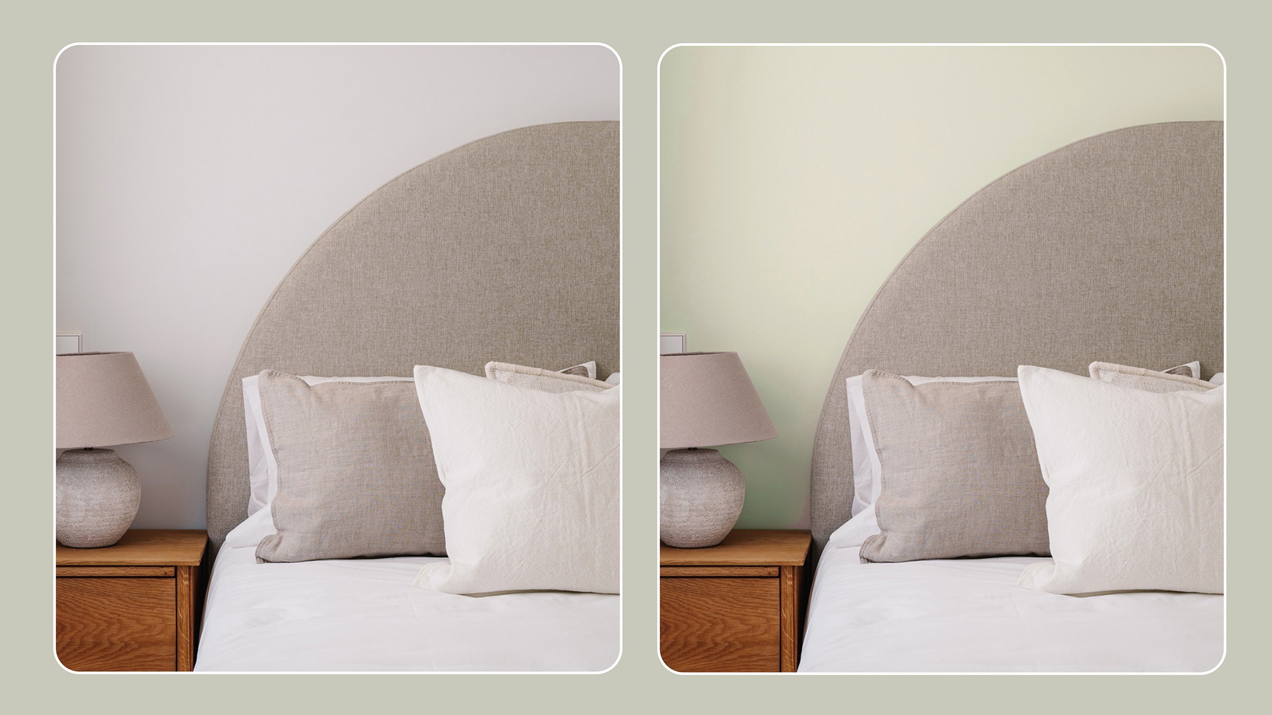
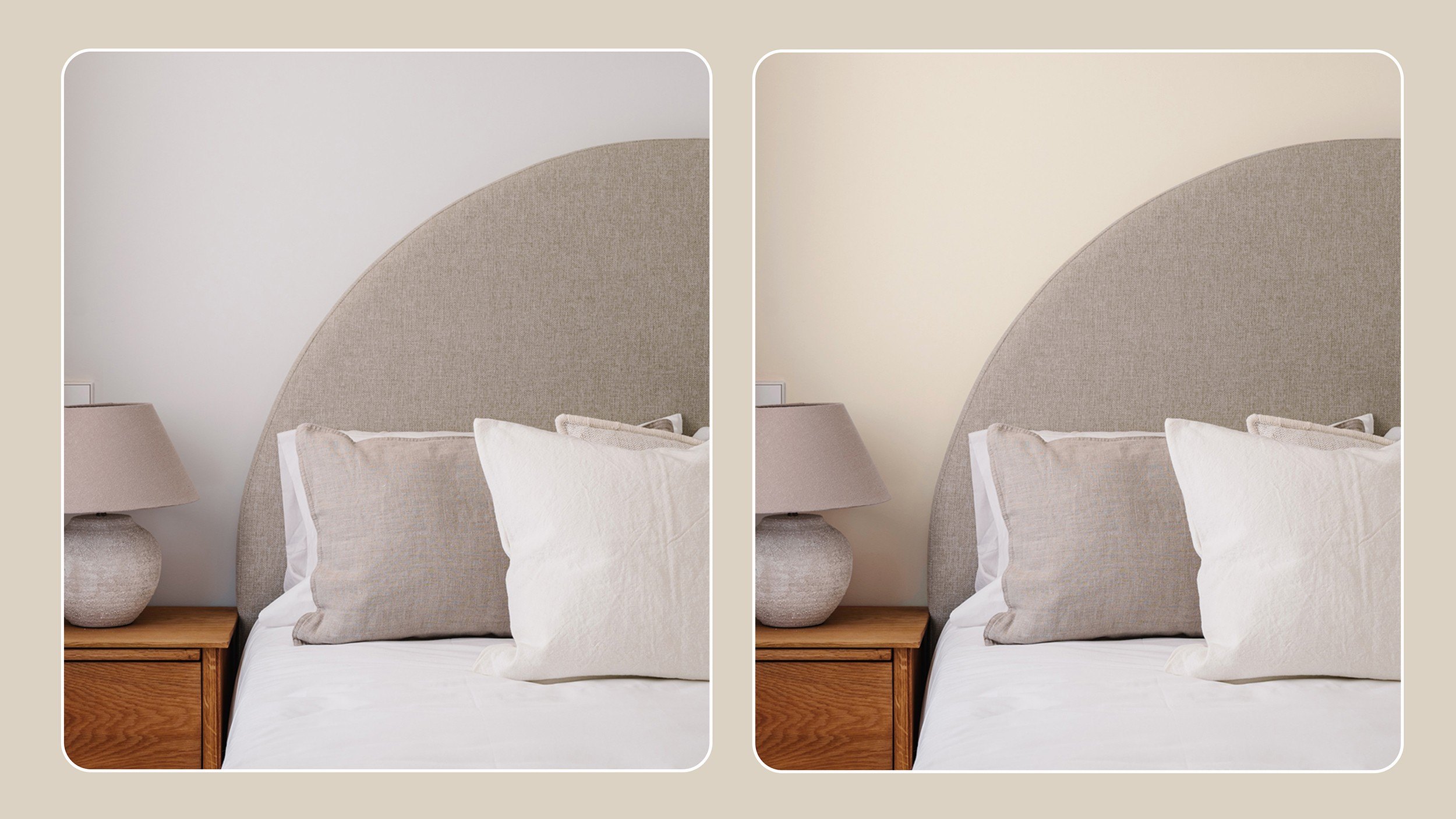
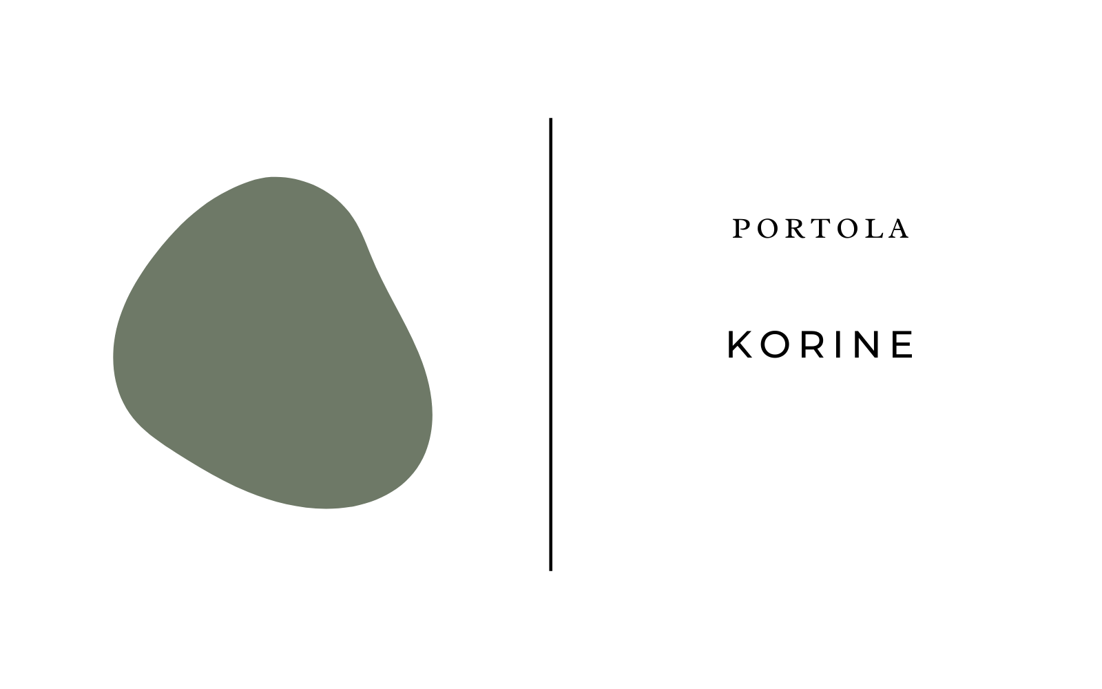
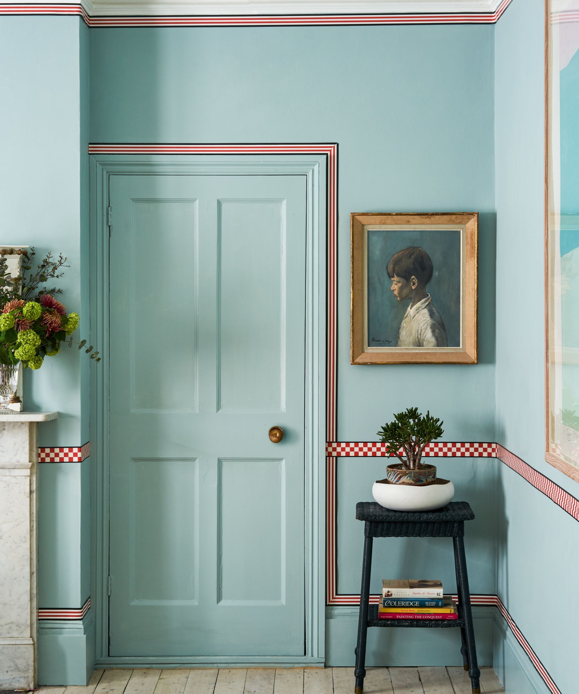
Clark also highlights Farrow & Ball's "Card Room Green" as a popular choice, reflecting a trend toward soothing colors inspired by natural elements. She used a lightened version of this soft green (25 percent brighter) on the woodwork in her son's nursery to evoke a sense of calm. Oscar Bravo of Oscar Bravo Home recommends Behr's "Rustic Taupe," a warm taupe that appears almost gray. He notes its effectiveness in rooms lacking natural light, explaining that a saturated hue like this can make a space feel cozy and elegant, contrary to the misconception that bright colors are always best for dark rooms. Bravo applied "Rustic Taupe" to textured wallpaper in his guest room to achieve this effect. The article concludes by encouraging readers to consider these designer-approved shades for their home renovation projects.
#InteriorDesign #PaintColors #HomeDecor #DesignTips #SherwinWilliams #BenjaminMoore #Glidden #Behr #InteriorDesign #PaintColors #HomeDecor #DesignTips #SherwinWilliams #BenjaminMoore #Glidden #Behr
0 ความคิดเห็นรวม
คุณอาจจะชอบอีกด้วย
Designers Share Their Tried-and-True Shades From the Best Interior Paint Brands
All the interior designers with paint collaborations (and our favourite shades)
9 Best Interior Paint Colors

7 Bold Paint Colors Interior Designers Are Longing to Use on Their Next Projects

Britain's best interior designers on the paint colours you just can't go wrong with

Lick Paint Will Transform the Mood in Your Home Through Color Psychology

Four Designers Pick Their Fave Exterior Paint Color For Your Abode

19 go-to paint colors that Dallas designers love
11 Paint Colors That INSTANTLY Make Your Home Look "Expensive," According to Designers
20 Interior Paint Colors Decorating Experts Love

Millennial Gray Is So Over—Here Are 5 Paint Colors to Try Right Now
6 key colors to decorate with in May 2025, according to interior design and color experts in the know

12 Paint Colors That Interior Designers Are Buzzing About—See the Gorgeous Hues Here
These are interior designers' favorite color combinations for living rooms – from neutral and calming to bold and playful
35 Paint Colors to Consider for Every Room in Your House
Interior Designers Share Their Favorite Cream Paint Colors
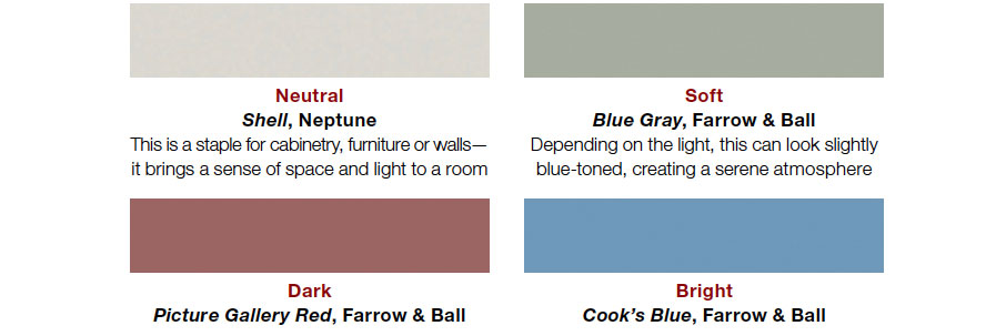
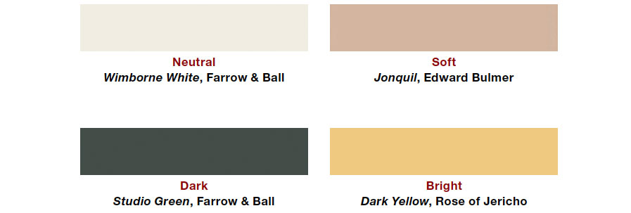
Interior designers' favorite Farrow & Ball paint colors
12 Color Schemes That Are Popping Off Right Now, According to Designers
4 Interior Designers Share the Biggest Paint Color Trends Right Now (and What’s Out!)

The 5 Most Overused Paint Colors and What to Try Instead, According to Designers