The 5 Most Overused Paint Colors and What to Try Instead, According to Designers
Designers identify five paint colors that have become overused and suggest alternative shades to create more contemporary and unique home interiors. The article emphasizes that while some colors were once popular, their ubiquitous use has made them appear generic and dated as decor trends evolve. Expert interior designers Tavia Forbes, Rebekah Murphy, and Kim Dee offer their perspectives on these colors and provide specific recommendations for more refined and current alternatives.
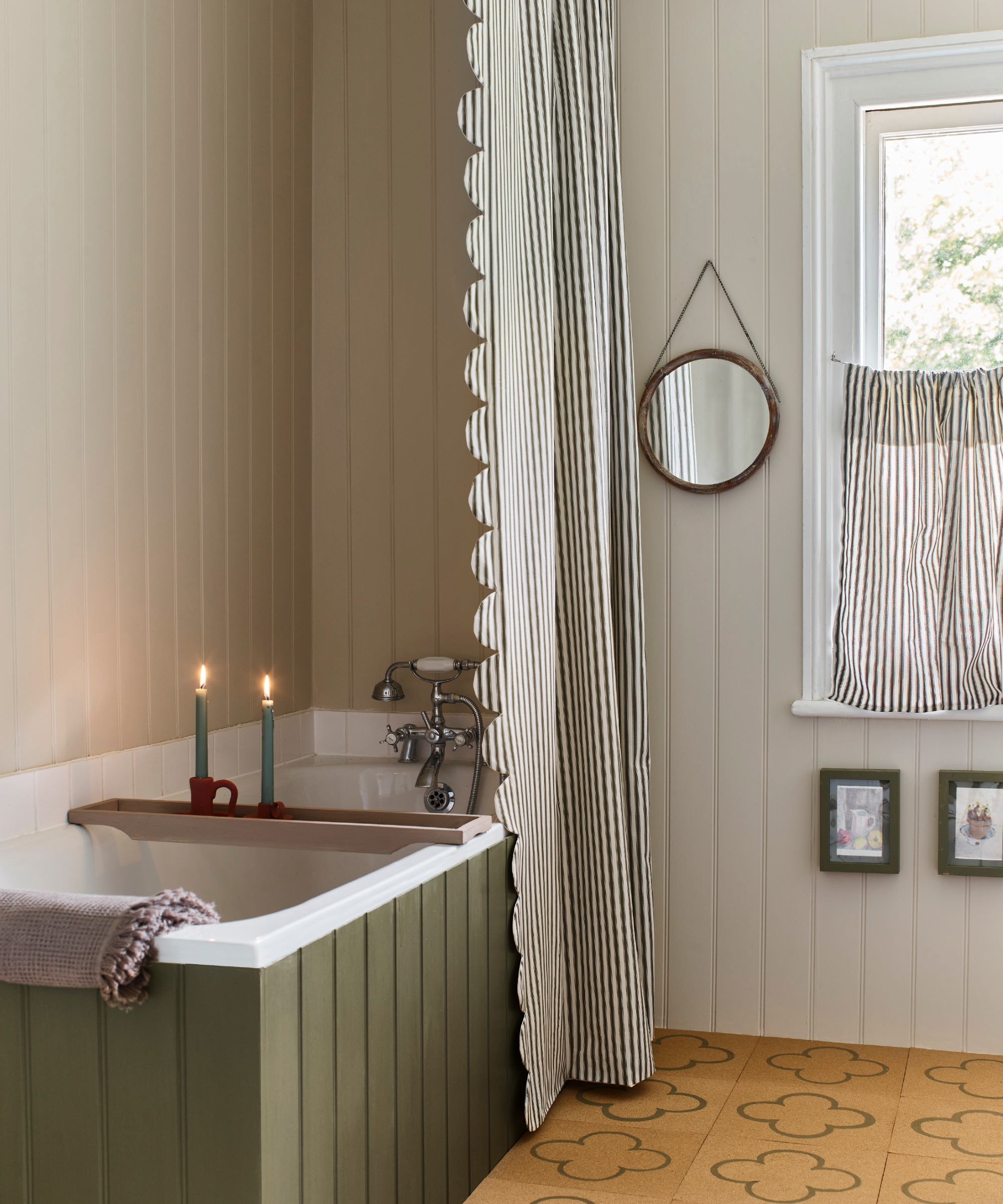
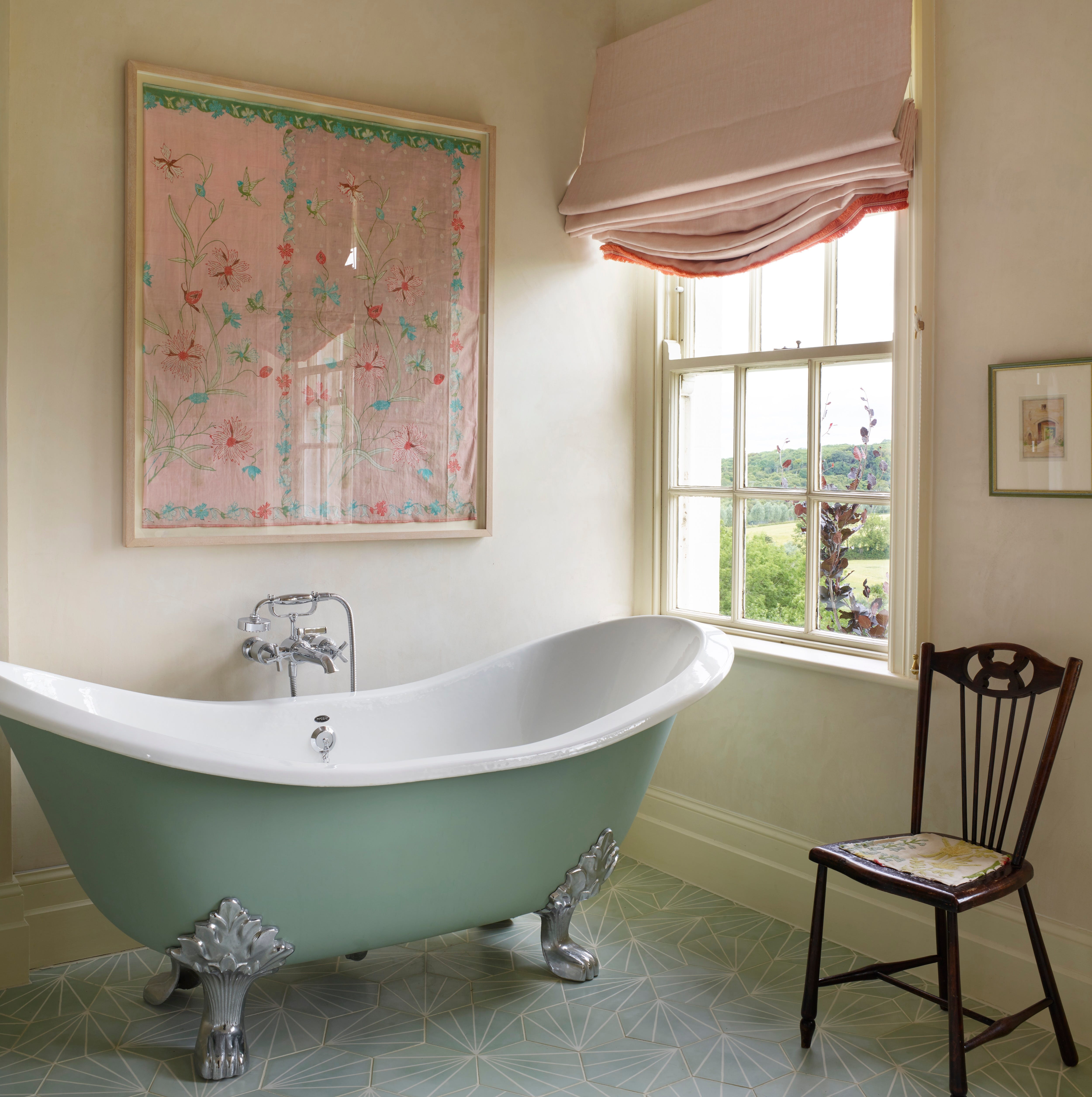
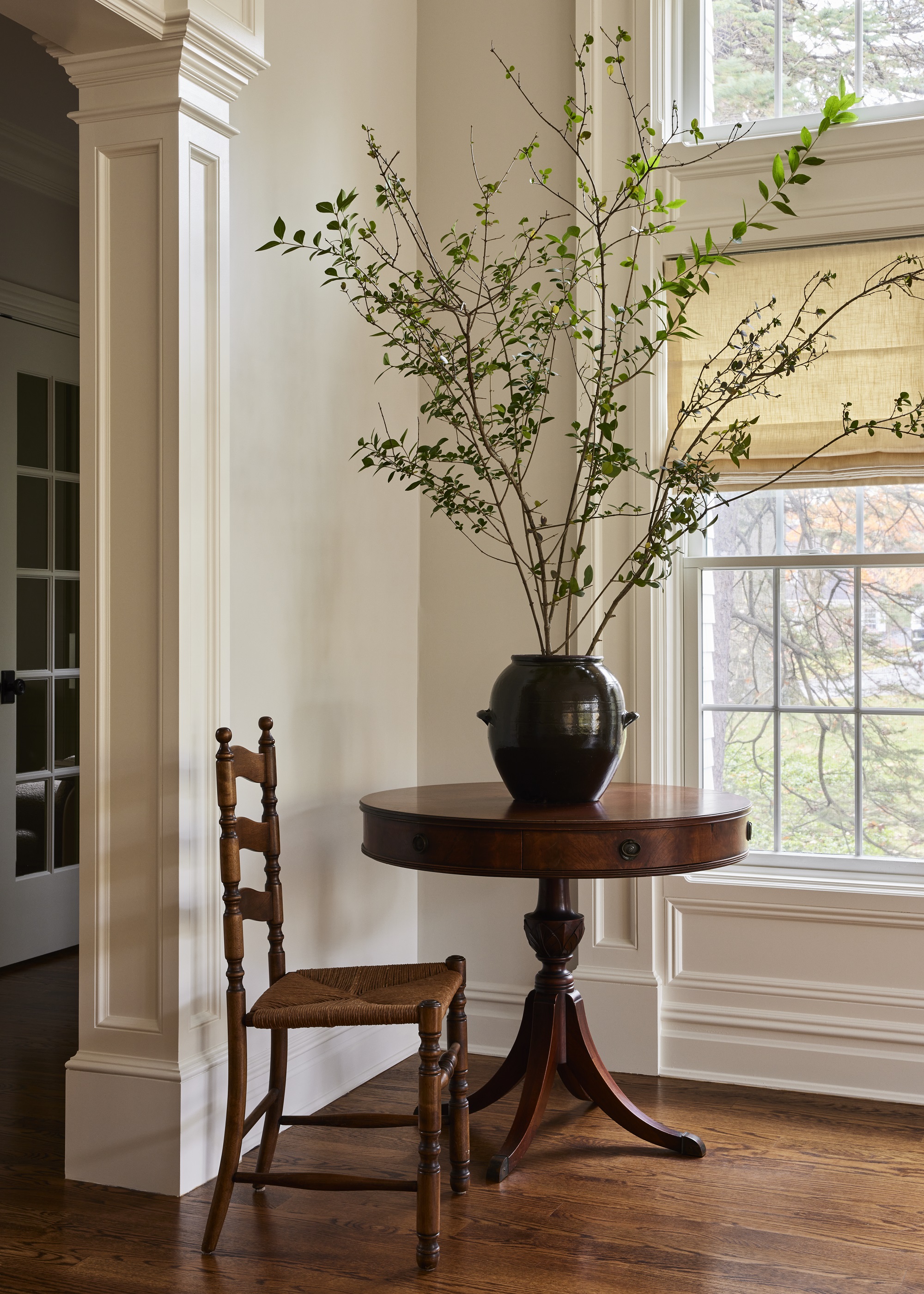
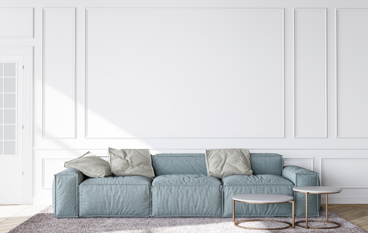
First, 'Cold White,' particularly cool-toned white walls, is discussed. Designers note that while white is classic and creates a sense of space, an undifferentiated bright white can look like primer rather than a deliberate design choice. Instead of a sterile bright white, Forbes suggests Benjamin Moore's Chantilly Lace for a crisp, gallery-style white that complements modern decor, or Swiss Coffee for its warmth, making a space feel more lived-in and soft. Murphy recommends Benjamin Moore White Dove, which has creamy undertones that add warmth without yellowing, suitable for kitchens, living rooms, and spaces with natural textures. Dee advises replacing Sherwin-Williams Extra White with Sherwin-Williams Shoji White, a creamy white that offers warmth without appearing yellow, suitable for all rooms, cabinetry, kitchens, and bathrooms.
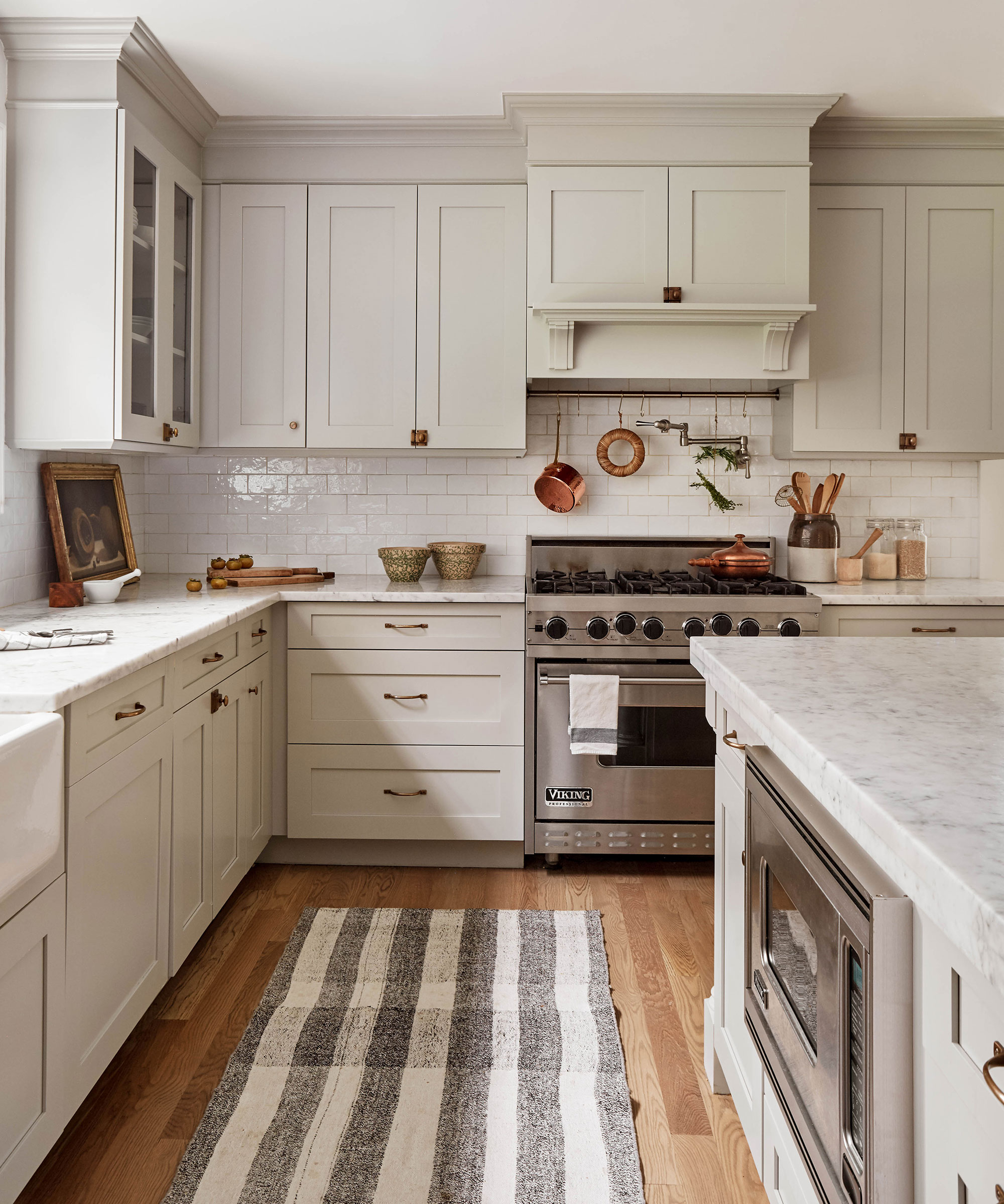
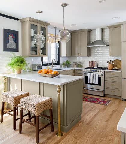
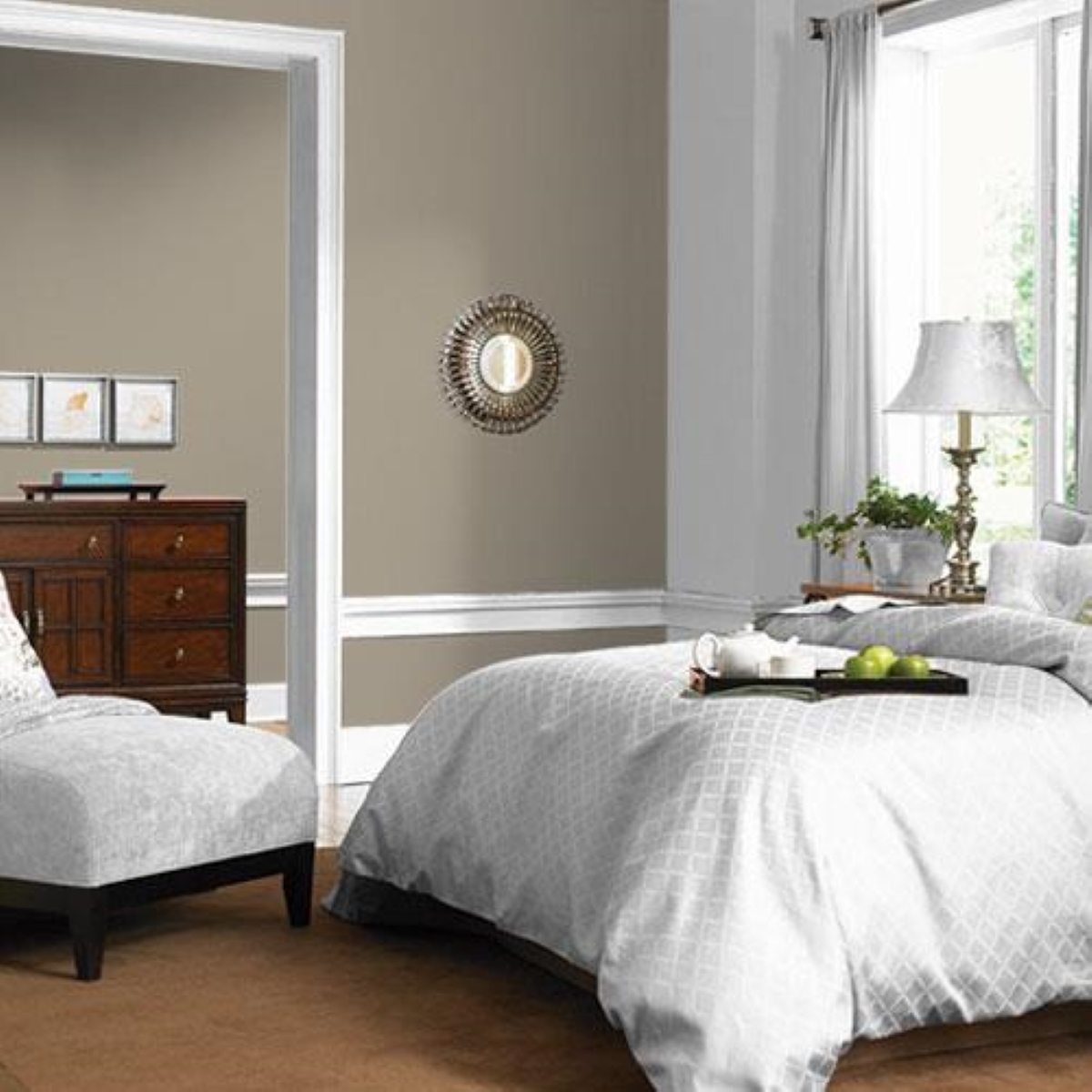
Second, 'Light Greige,' specifically Sherwin-Williams Agreeable Gray, is cited as overused. Designers feel it has become a default 'safe' color that now appears dull and dated. Forbes recommends Sherwin-Williams Repose Gray for a cooler, more refined option or Benjamin Moore Balboa Mist for warmth without muddiness, both working well with modern finishes and organic textures. Murphy suggests Farrow & Ball Skimming Stone as an alternative, offering depth and softness suitable for bedrooms and studies. Dee proposes Benjamin Moore Revere Pewter for a richer, more current, earthy, and inviting feel, ideal for home offices and family rooms.
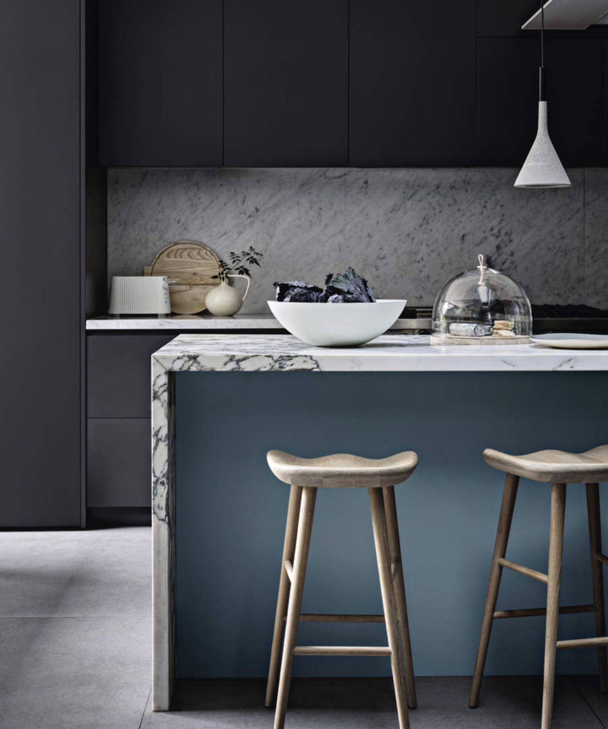
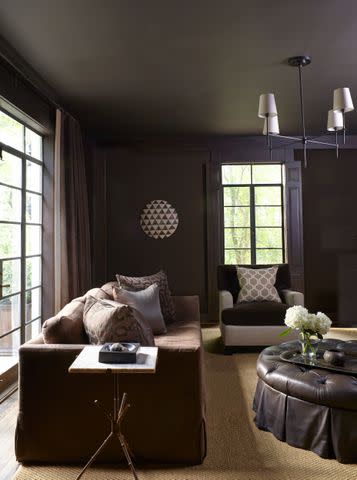
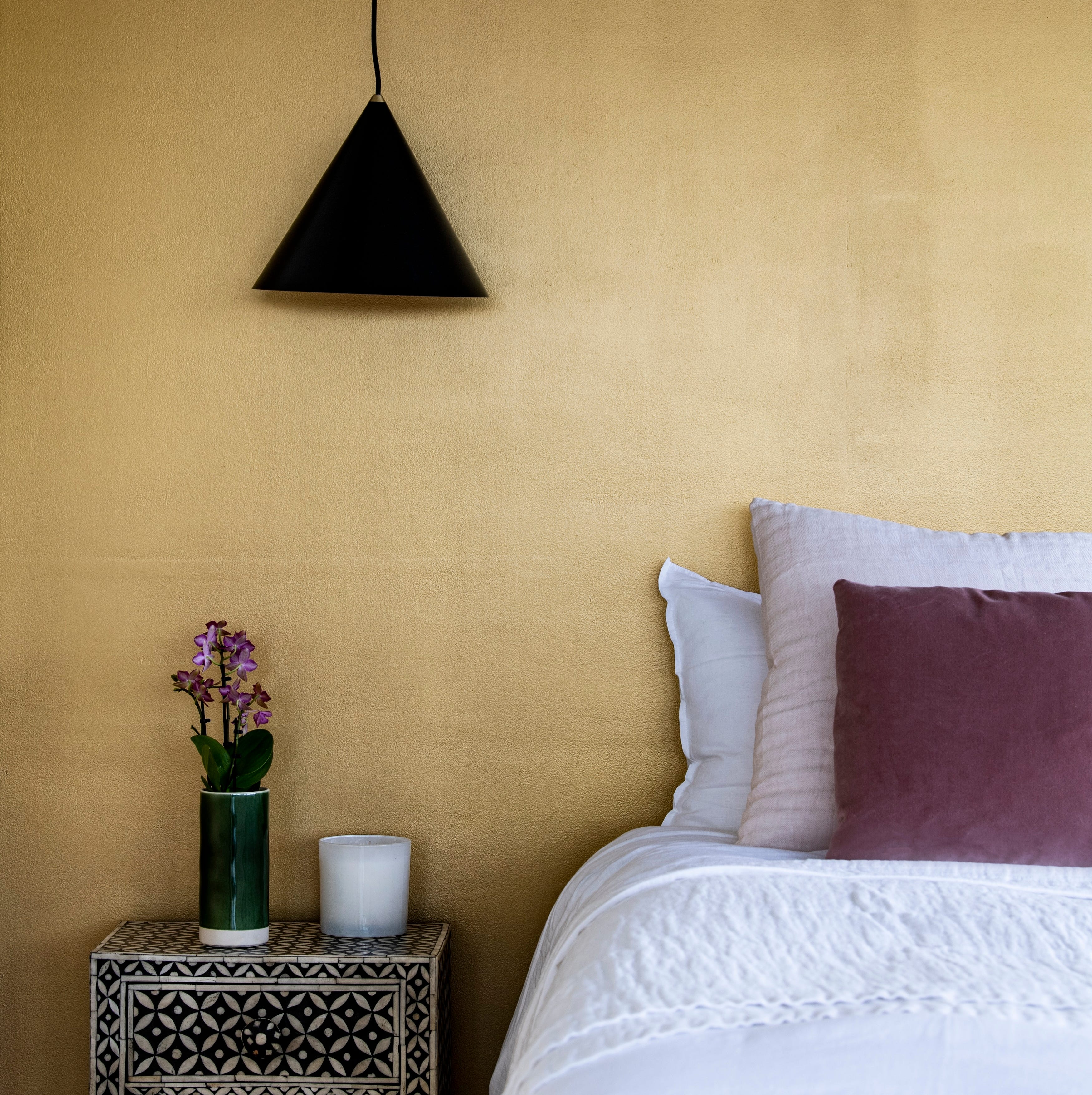
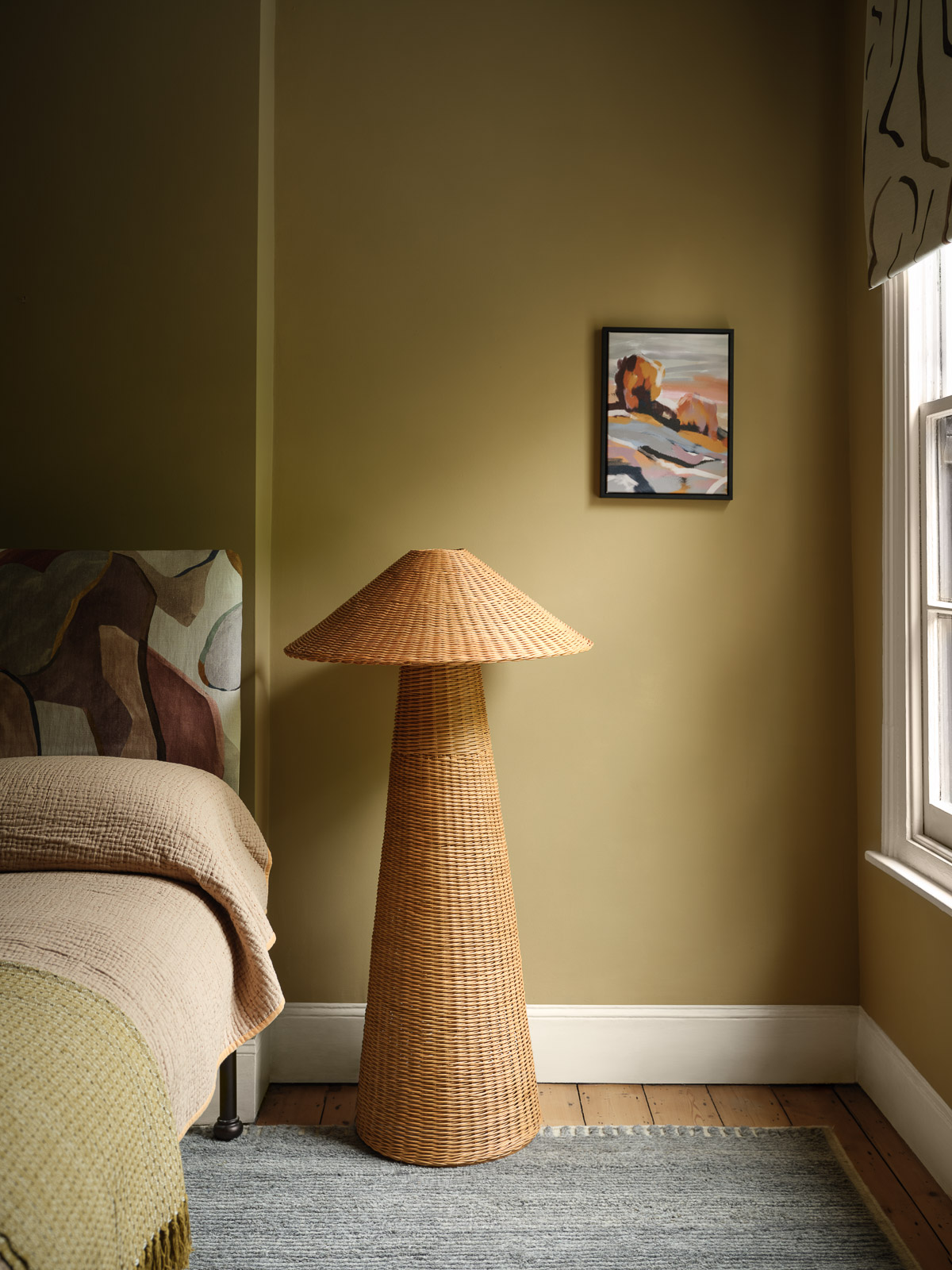
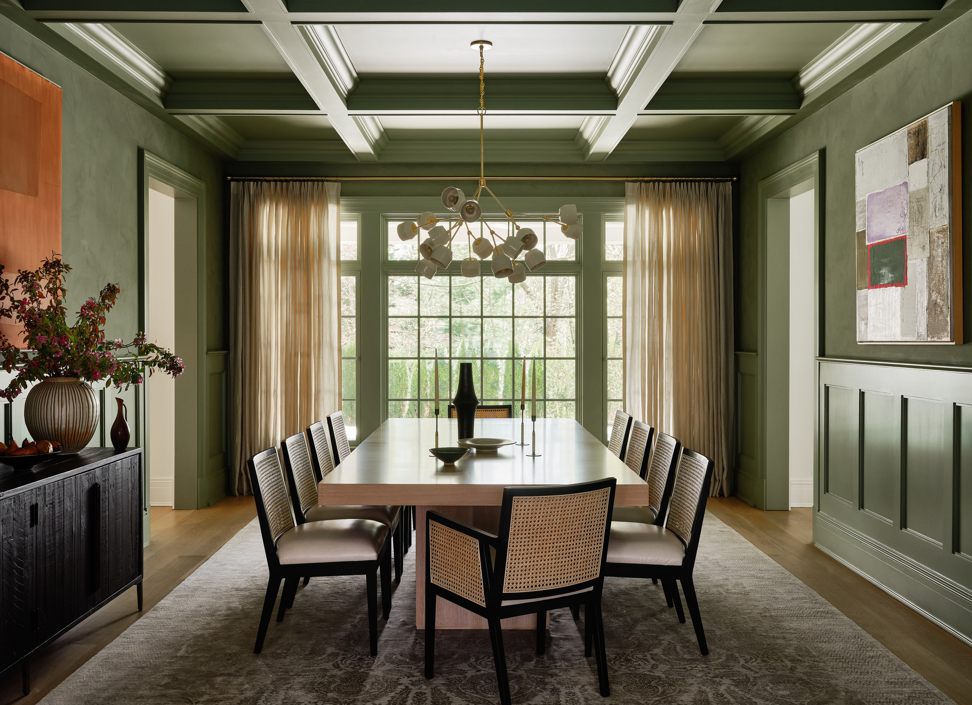
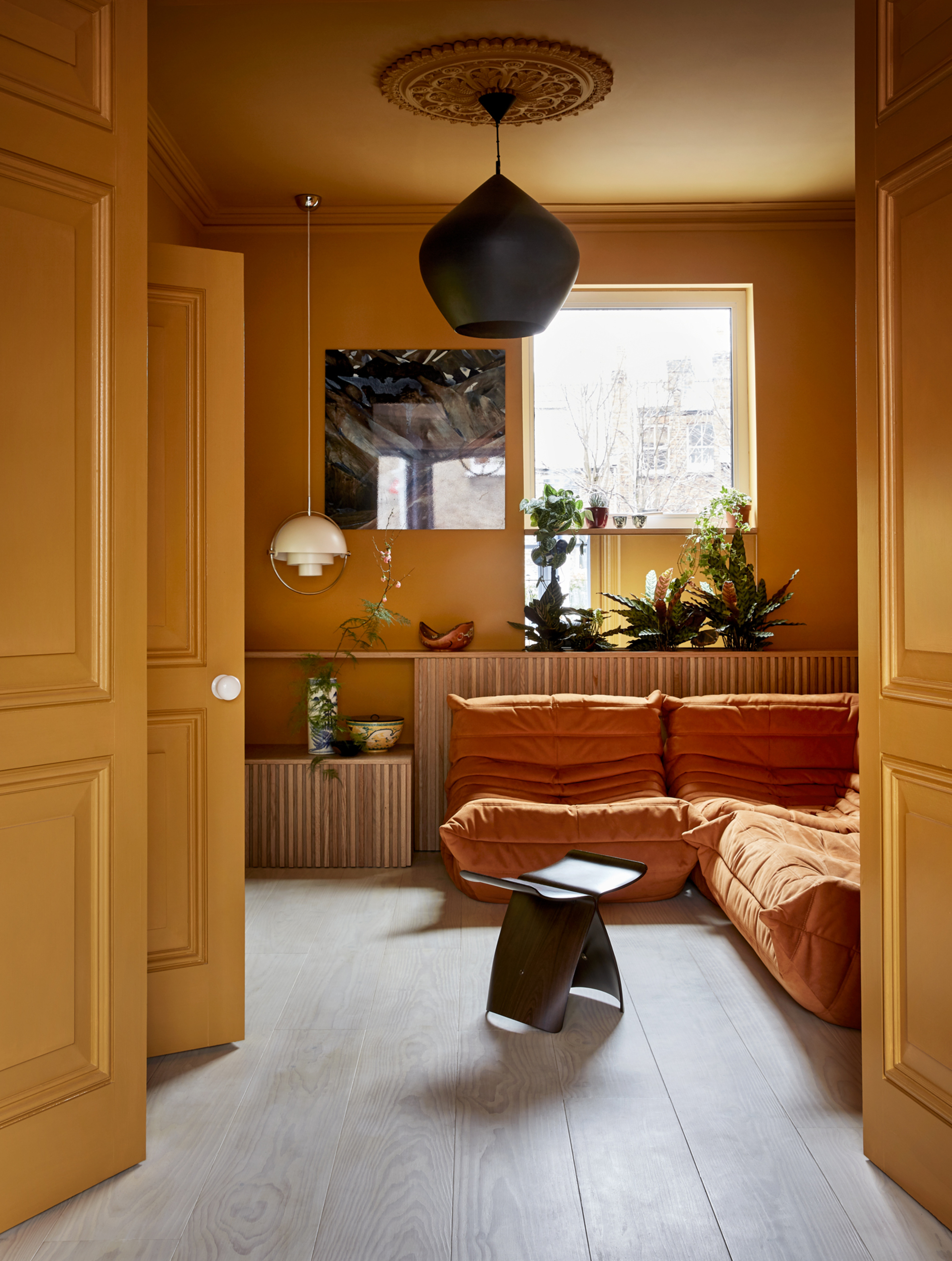
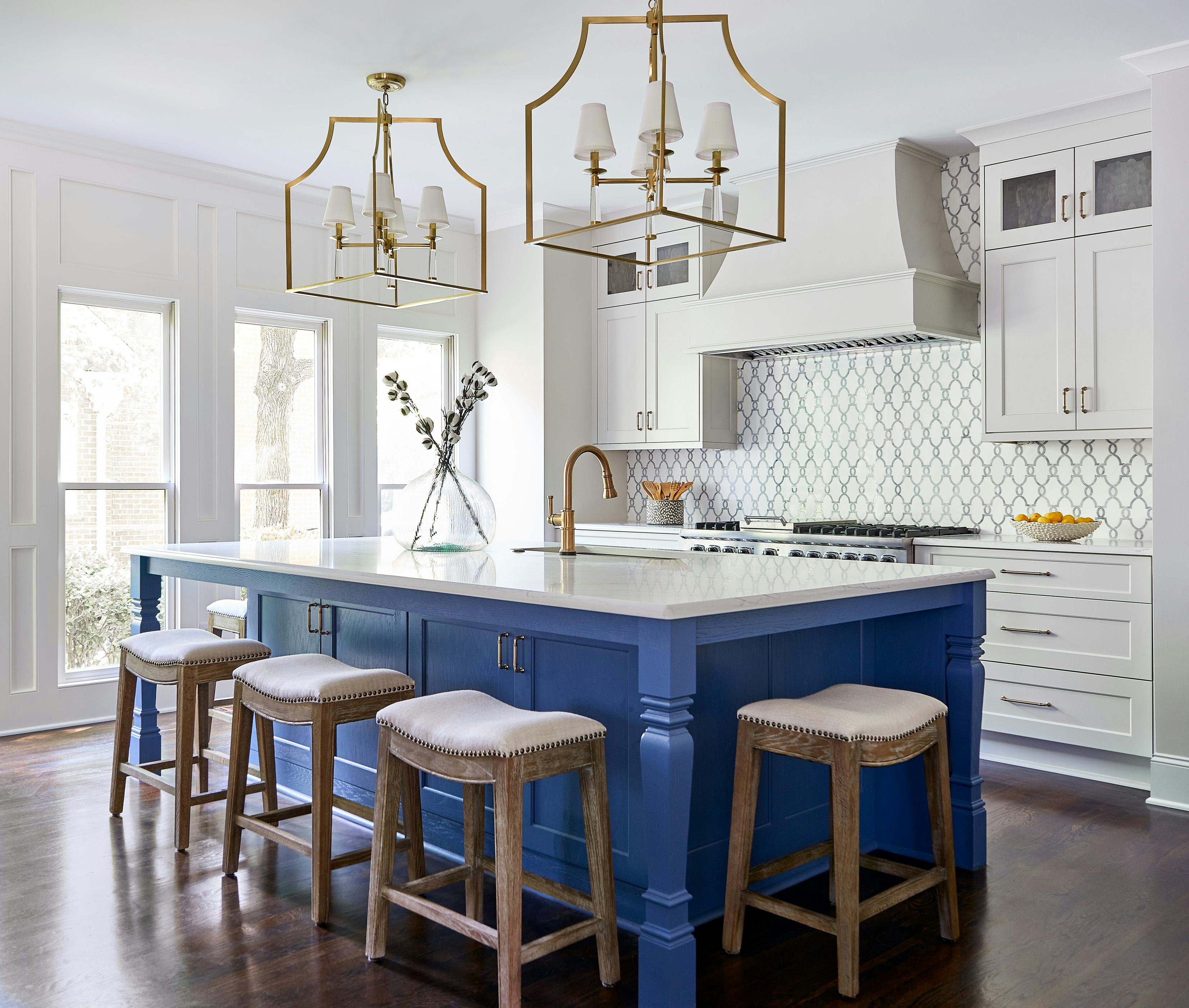
Third, 'Navy Blue' is highlighted as a predictable choice. Forbes suggests moving away from navy, which is seen as a 'bold-but-not-too-bold' option, toward deep olive green or charcoal brown. She explains that deep olive brings warmth and earthiness, while charcoal brown offers a luxurious and grounding effect, especially when layered with mixed materials. For those who prefer blue, Murphy recommends Benjamin Moore Boothbay Gray, a gentle blue-gray that evokes coastal calmness with subtle moodiness, perfect for powder rooms or laundry spaces. Dee suggests embracing newly trendy butter yellows like Benjamin Moore Sweet Cream for kitchens, offering a light, cozy, and unique feel.
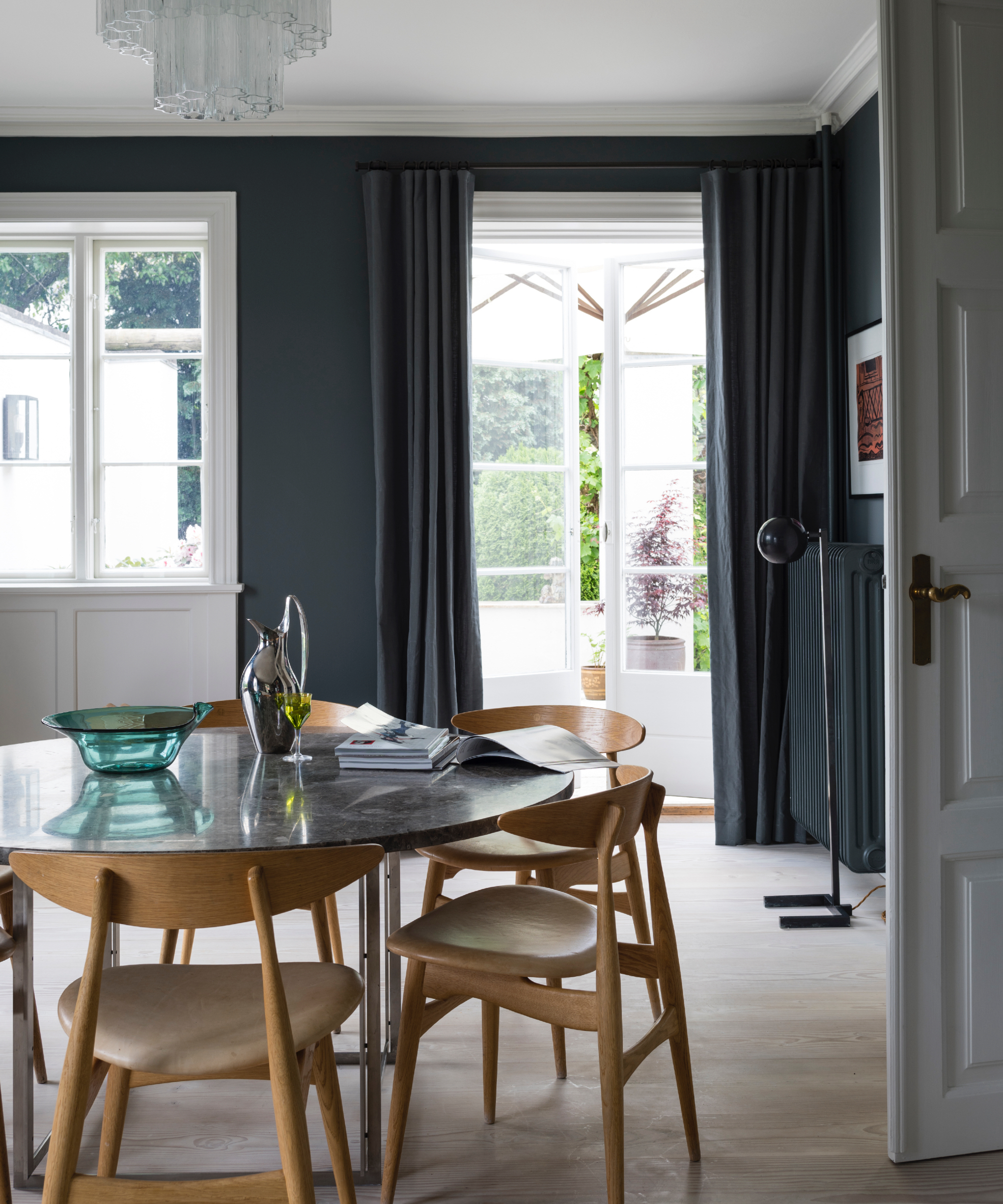
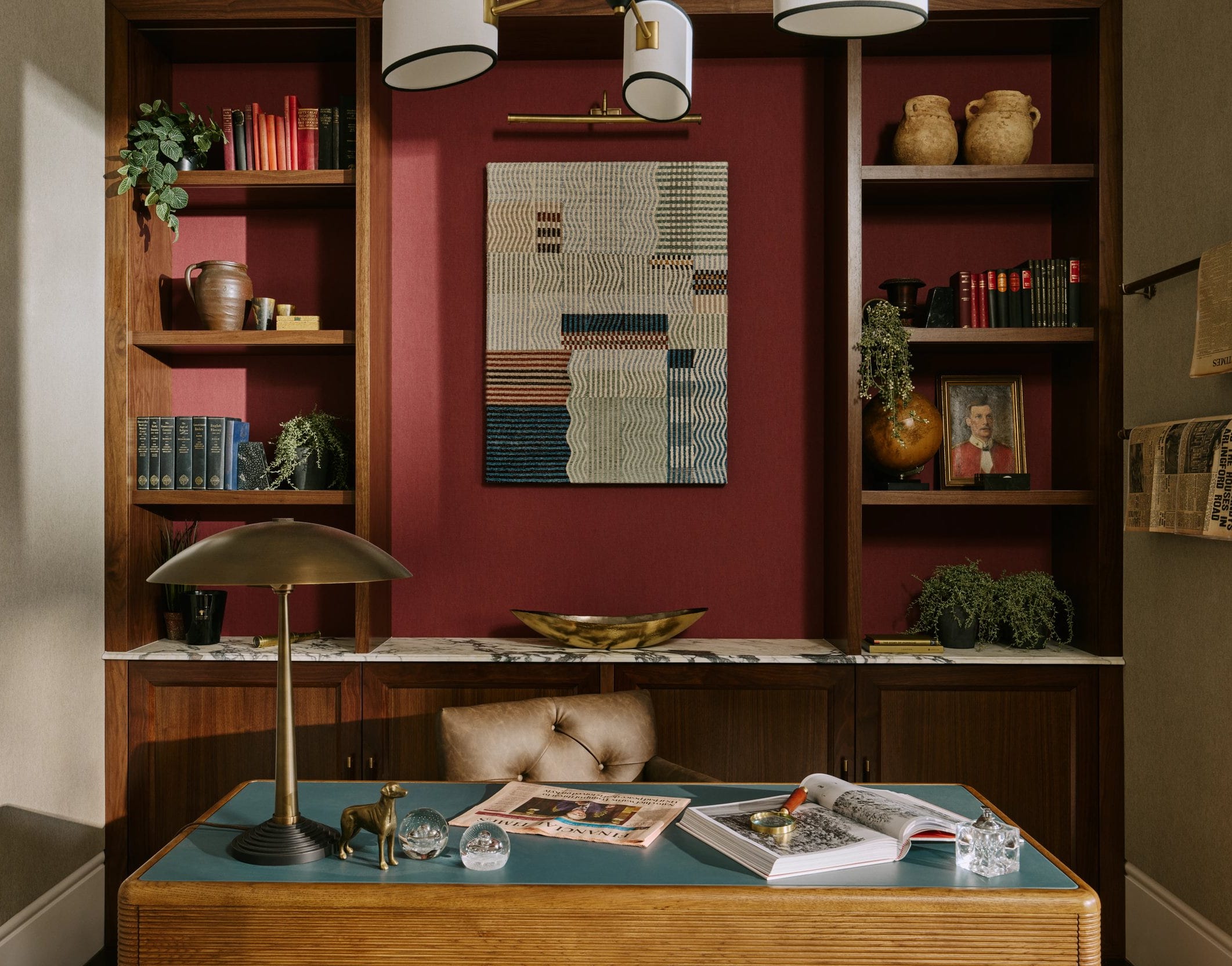
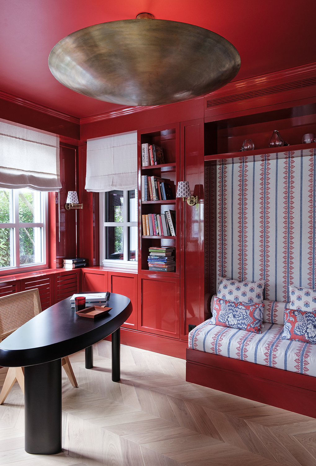
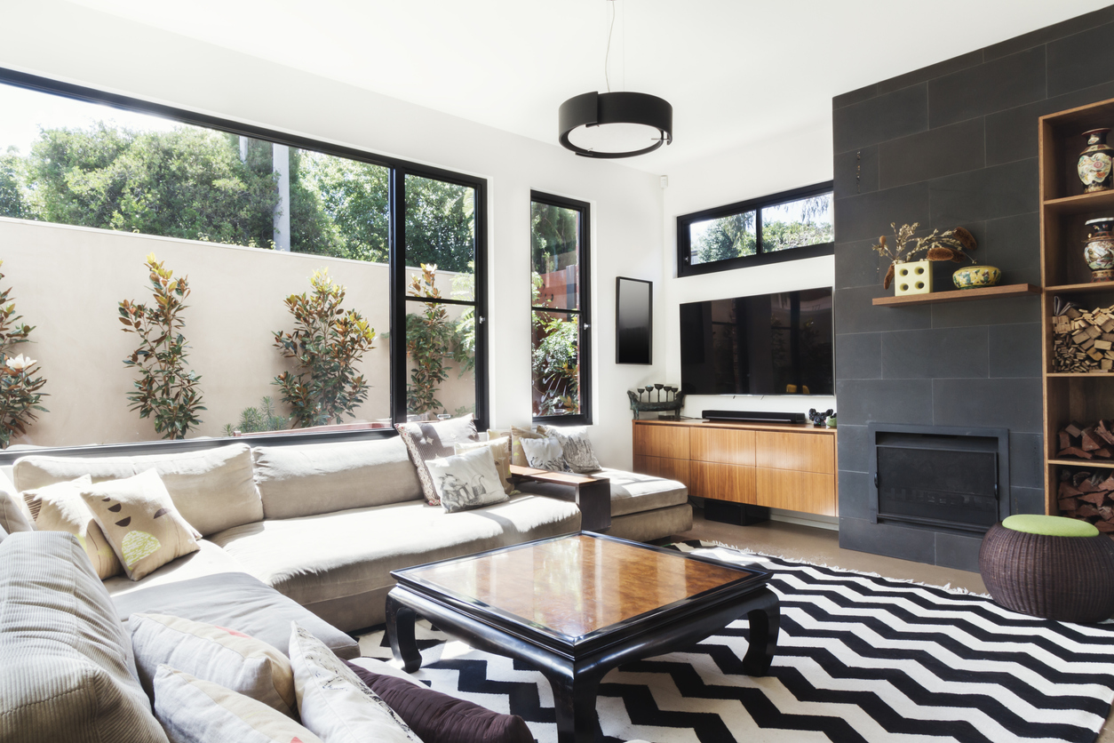
Fourth, 'Cool Charcoal Gray' is mentioned, with Benjamin Moore Chelsea Gray specifically. Dee suggests replacing it with Sherwin-Williams Urbane Bronze, which provides depth with warm, moody undertones, creating a fresh and dramatic look. This color is recommended for powder rooms, built-ins, or exterior trim to add understated boldness.
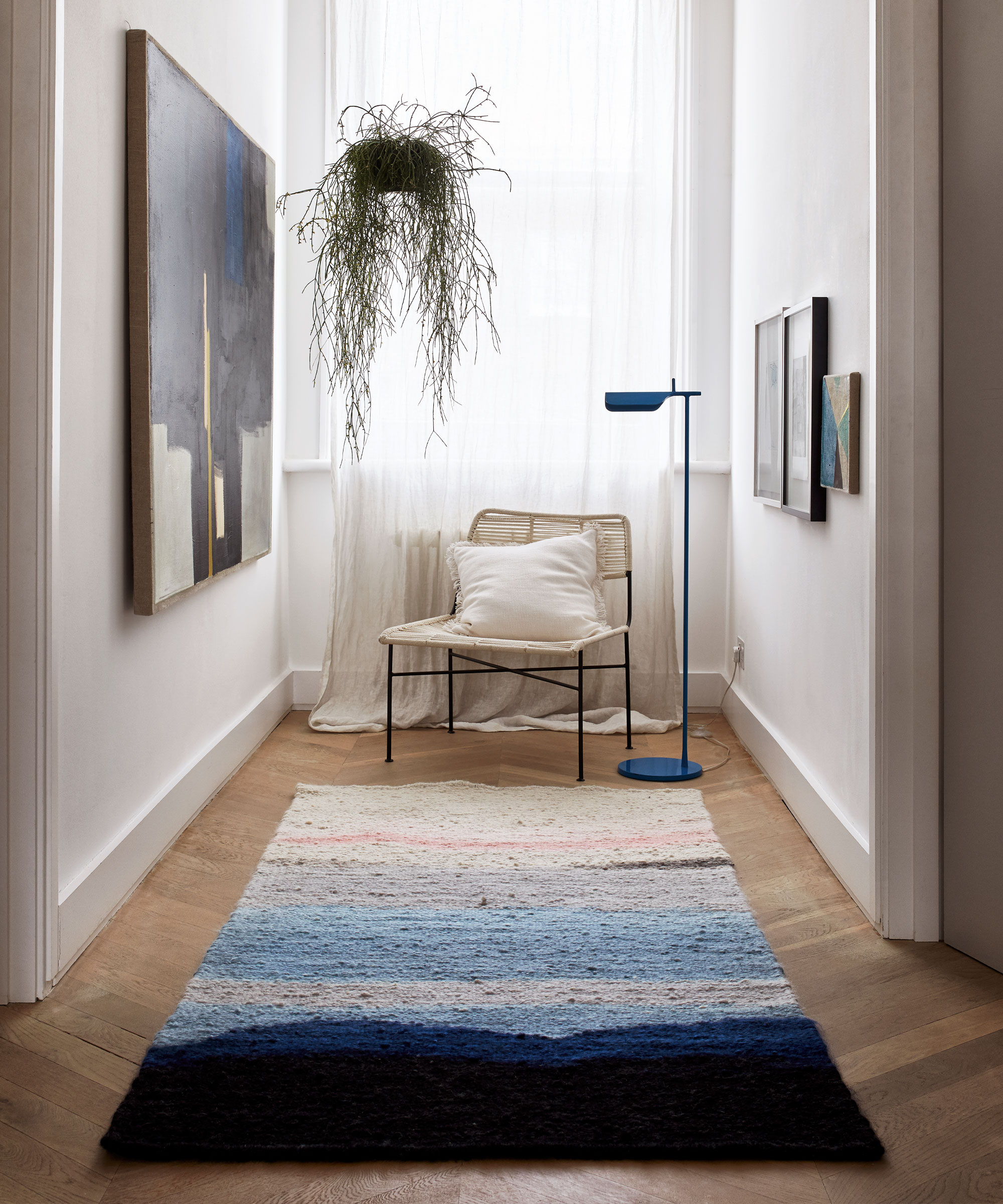
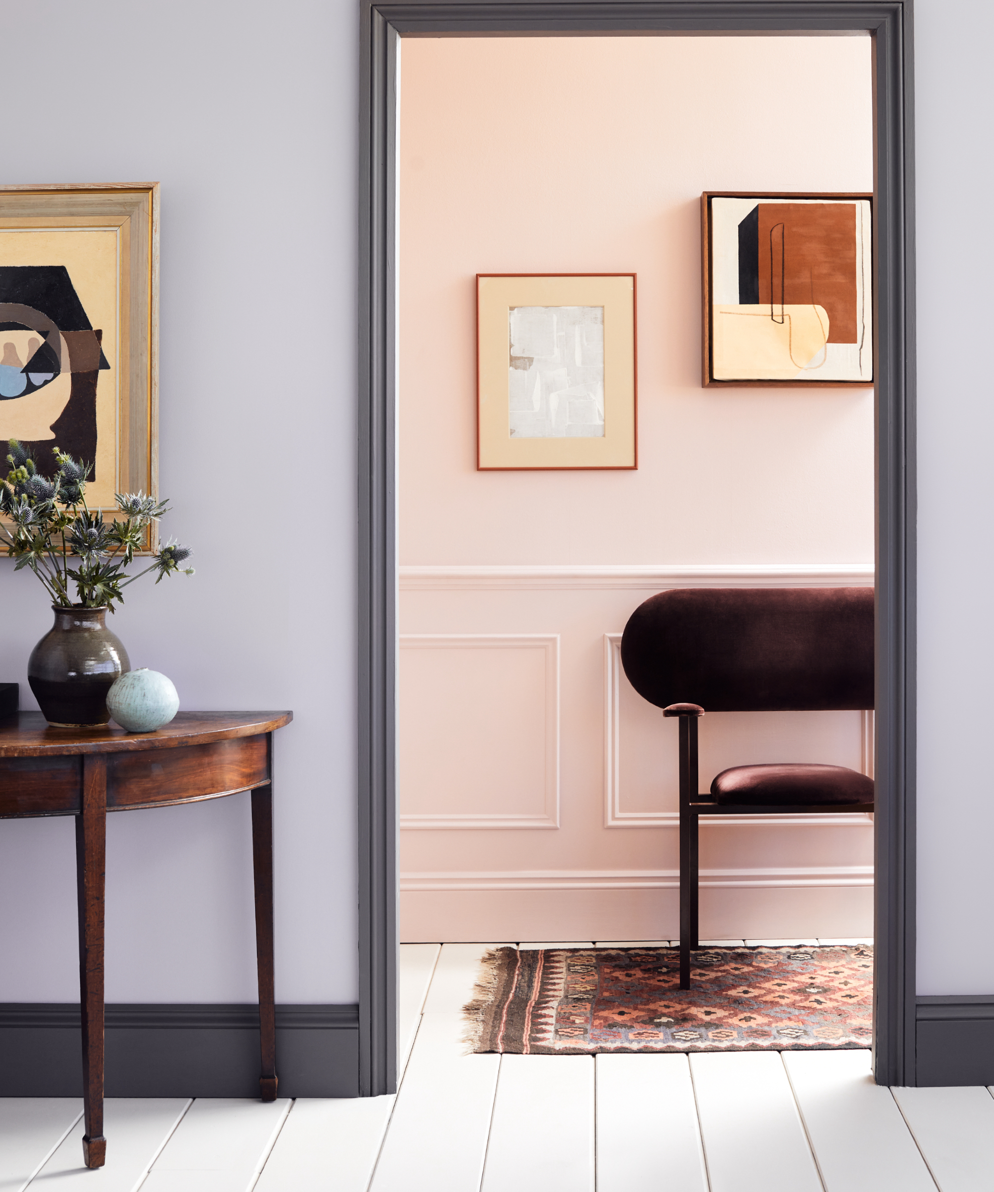
Finally, 'Pale Blue' is identified as potentially washed-out or overly delicate. Interior designer Lauren Saab advises trading 'forgettable soft sky blues' for deeper, more nuanced options. She recommends Farrow & Ball Hague Blue, a rich, moody, and elevated blue that offers quiet confidence and depth, making it ideal for libraries, entryways, or dining rooms. These recommendations aim to guide homeowners and designers towards more sophisticated and current color choices, avoiding the pitfalls of overly common trends.
#PaintColors #InteriorDesign #HomeDecor #DesignTrends #ColorPalette #HomeImprovement #DesignerTips #ModernInteriors #PaintColors #InteriorDesign #HomeDecor #DesignTrends #ColorPalette #HomeImprovement #DesignerTips #ModernInteriors
0 comment in total
 No comments yet
You may also like
Outdated color trends – 5 overdone colors that designers no longer love, and what to use instead


The most timeless paint colors according to designers

4 Interior Designers Share the Biggest Paint Color Trends Right Now (and What’s Out!)

6 Paint Color Mistakes To Stop Making, According To Designers

7 of the most versatile and easy to use paint colors according to designers
5 Countertop Colors That Are Going Out of Style, and What You Should Choose Instead — According to Kitchen Designers

6 Paint Color Mistakes To Stop Making, According To Designers

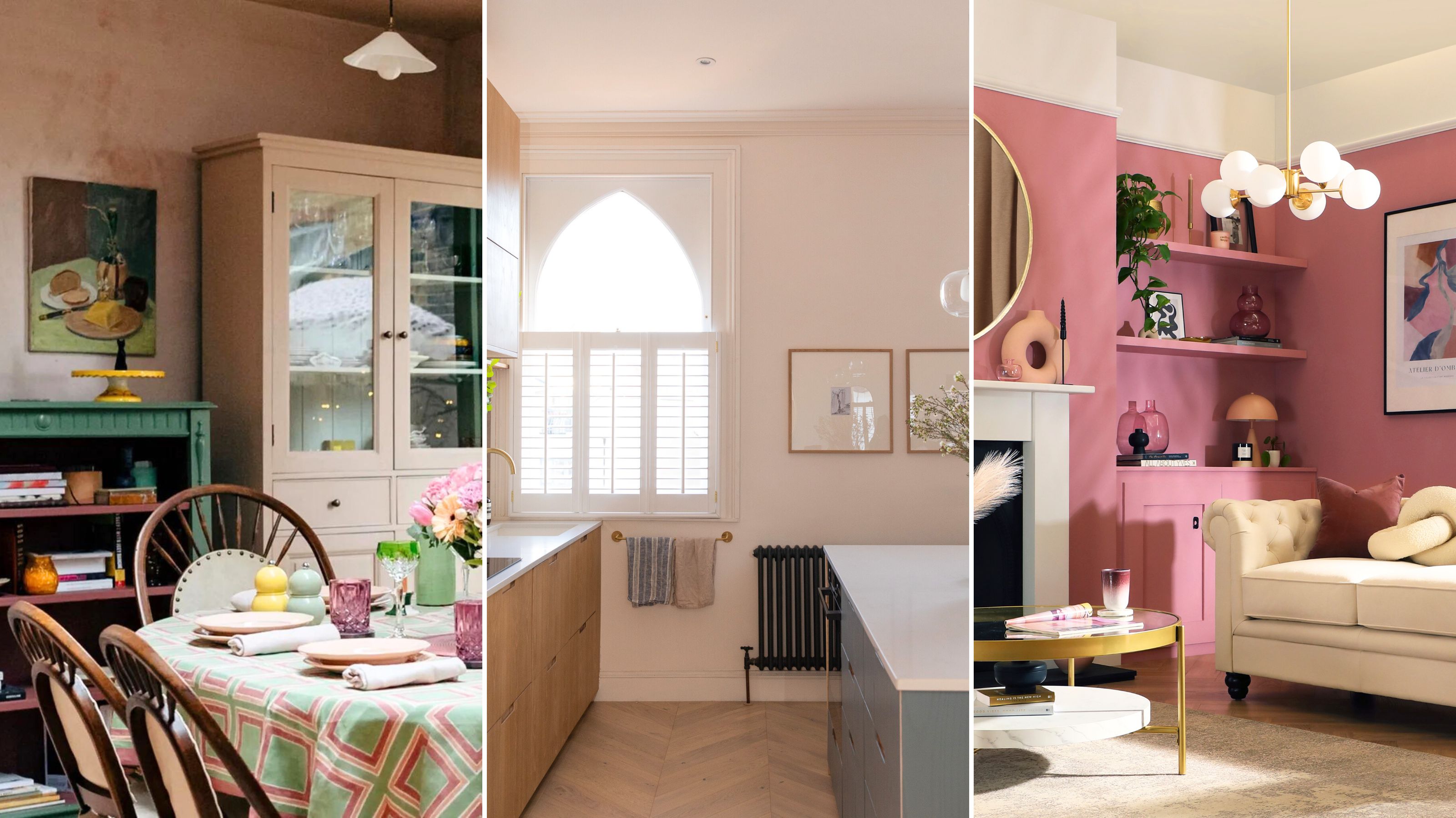
The 5 outdated paint colors of 2024 designers loathe — and what they're loving instead


5 Timeless Paint Colors That Will NEVER Go Out of Style, According to Designers

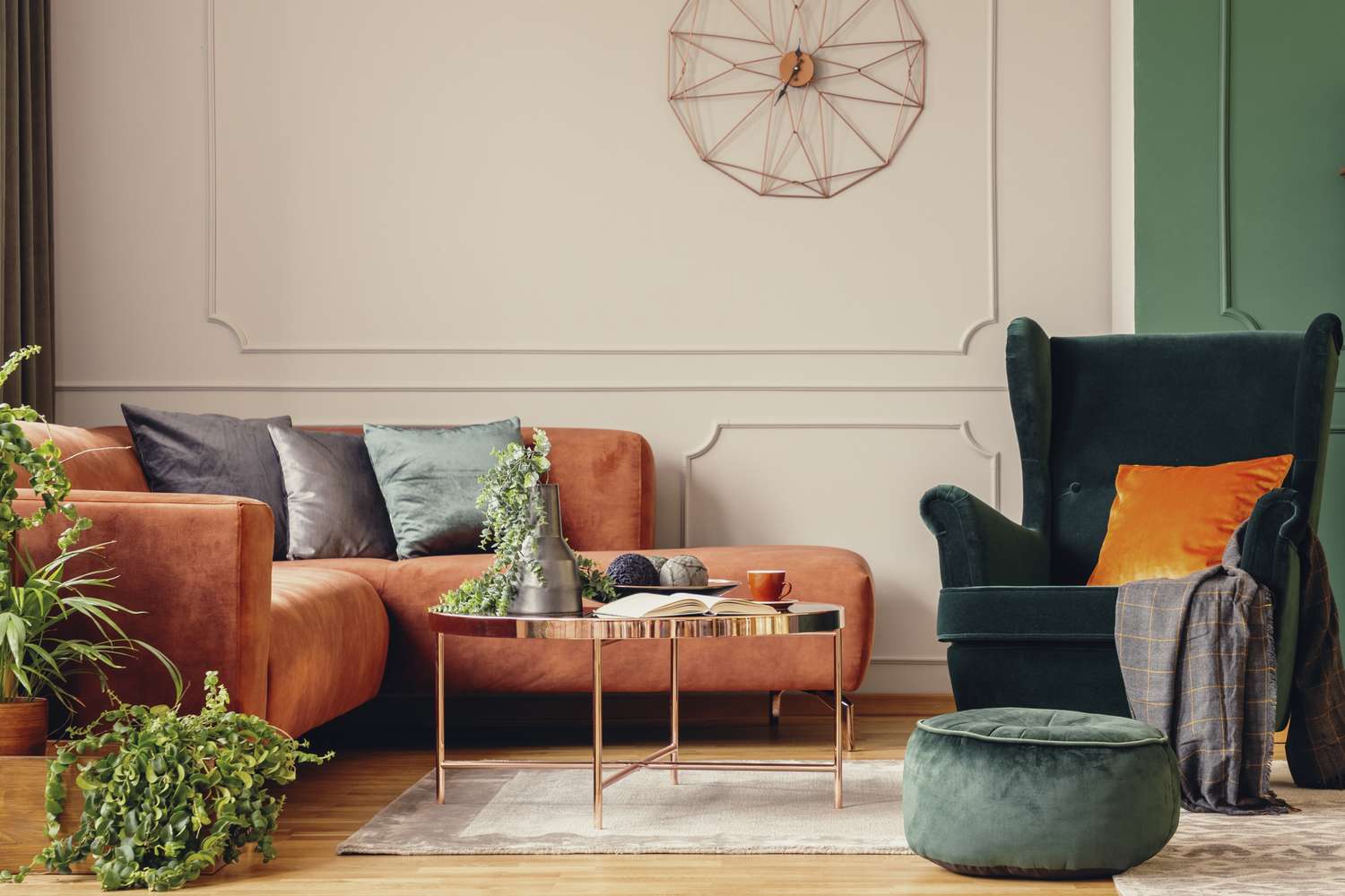
5 Timeless Paint Colors That Go With Absolutely Everything, According to Color Experts

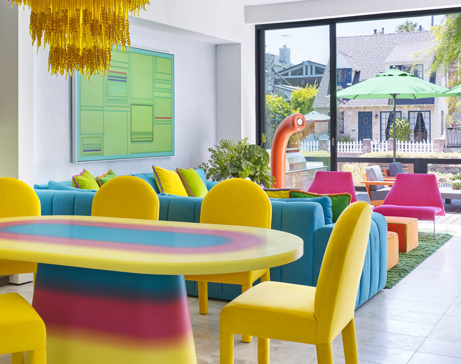
5 Vibrant Color Palettes Designers Are Using to Add Energy and Excitement to Decor

5 colors you should never paint a small room – designers warn us to steer clear of these hues, and what to pick instead
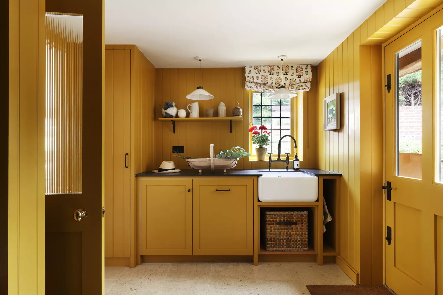
5 Underrated Paint Colors Designers Always Use in Their Projects (and You Should Too)


7 Most Underrated Paint Colours, According To Colour Experts

5 outdated paint trends that interior designers are glad to see the back of – and what they're doing instead
5 Classic Wall and Trim Color Combinations—and 5 for Rule-Breakers Only

5 Paint Colors That Experts Say You Shouldn't Use in 2025

5 Paint Colors Going Out of Style in 2025 — And What You Should Replace Them With Before Then
These Unusual Paint Colors May Not Be An Obvious Choice, But Designers Can’t Get Enough
We Asked Designers Which Paint Colors Homeowners Always Regret—These 5 Came Up the Most