1/5
These Unusual Paint Colors May Not Be An Obvious Choice, But Designers Can’t Get Enough
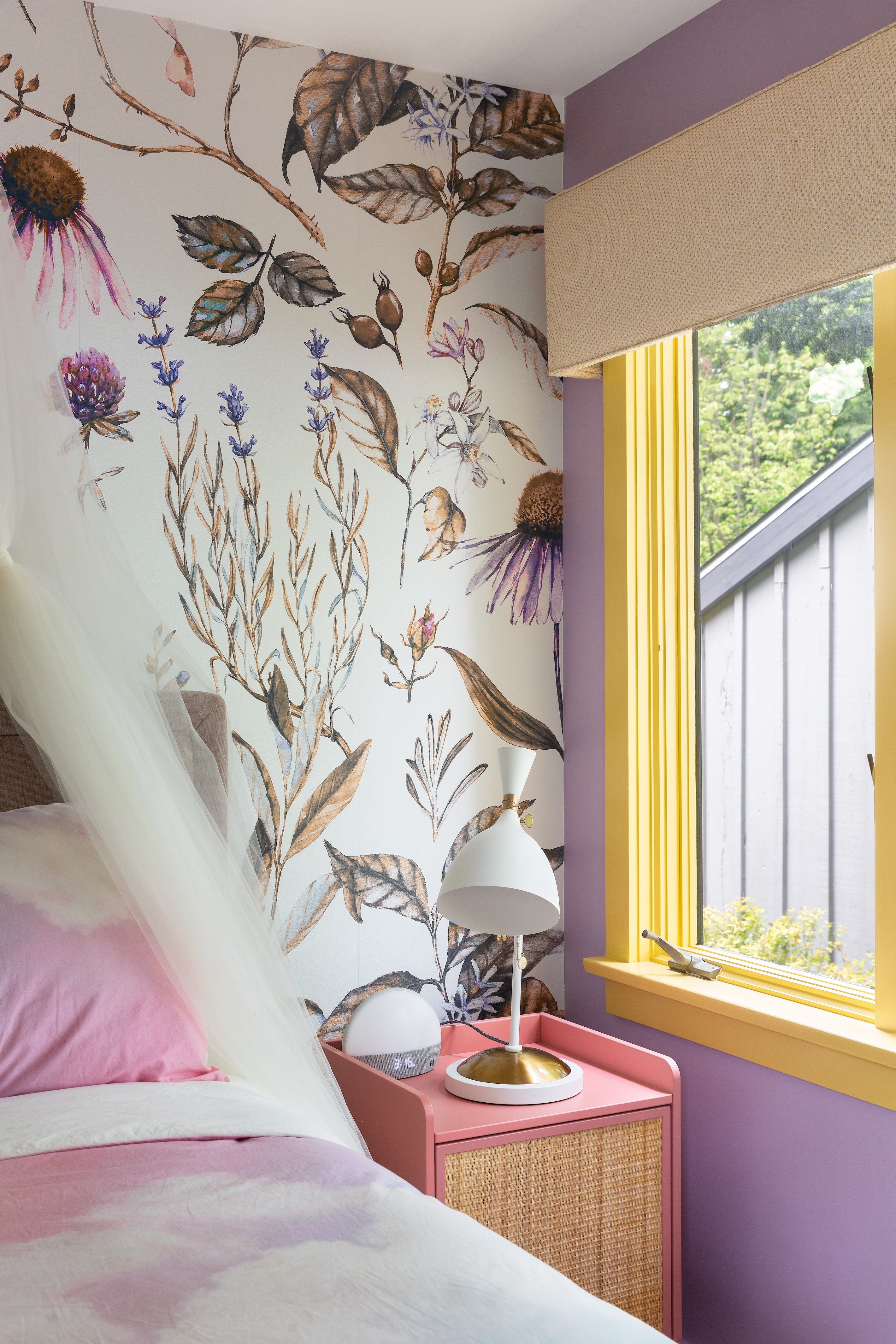
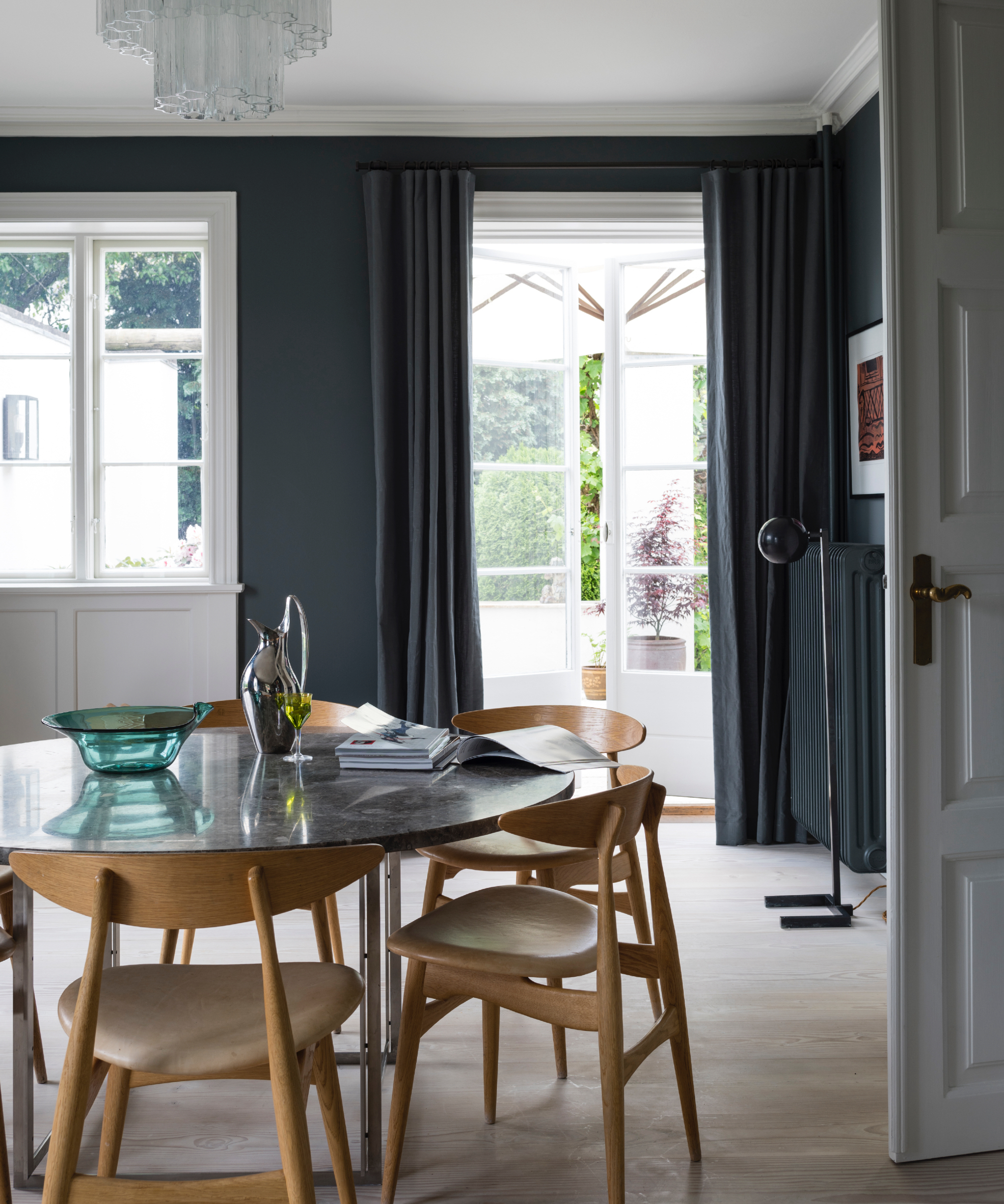
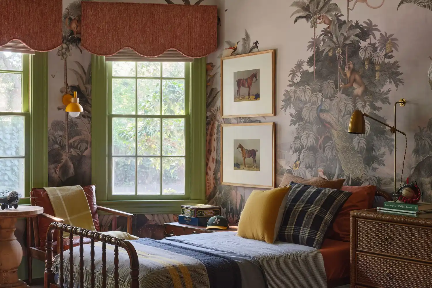
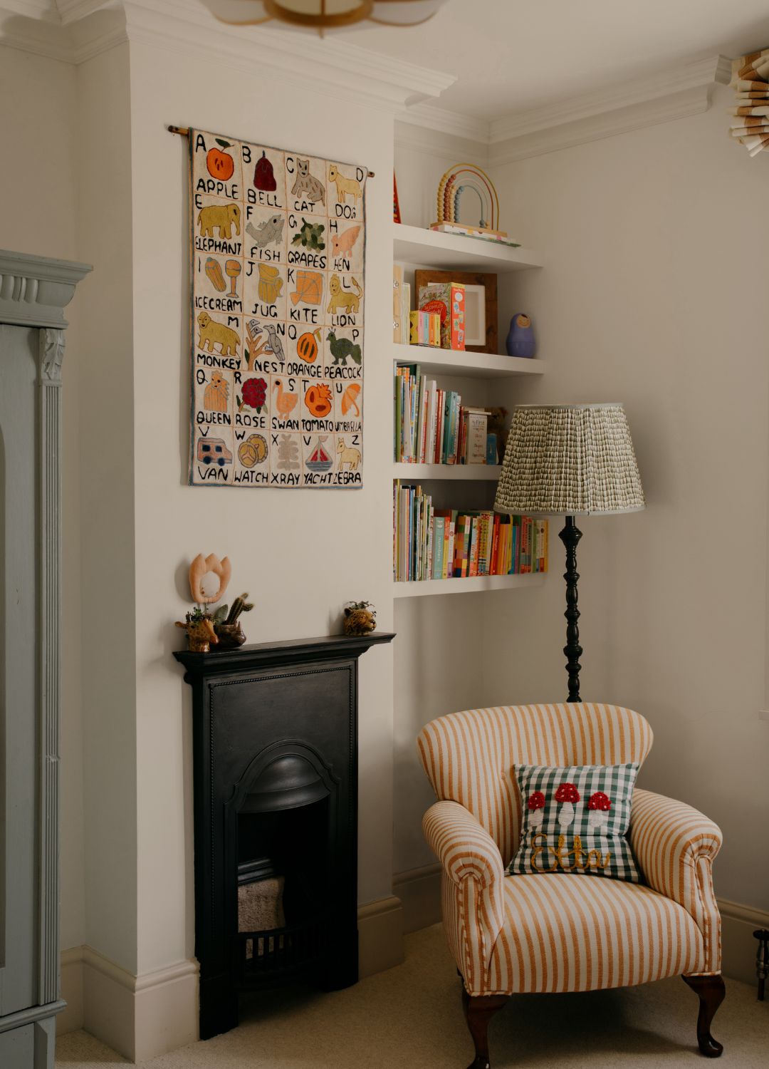
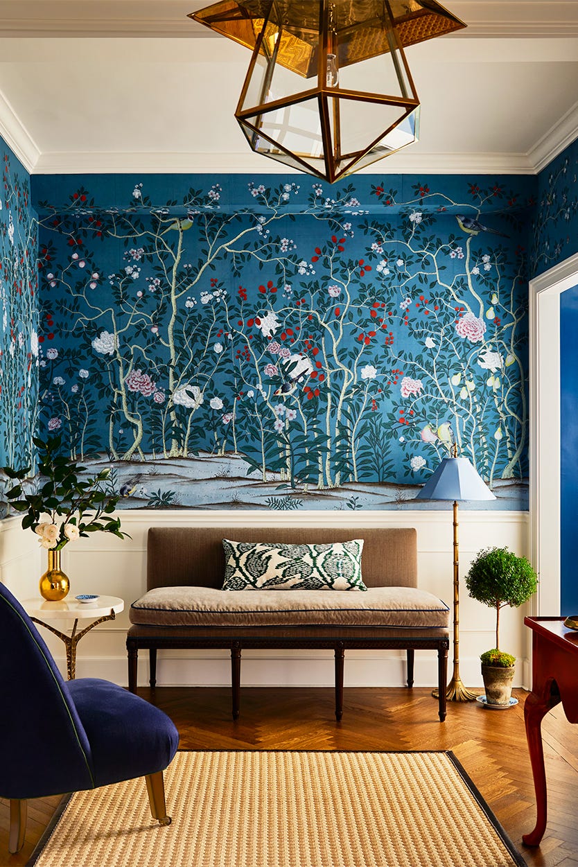
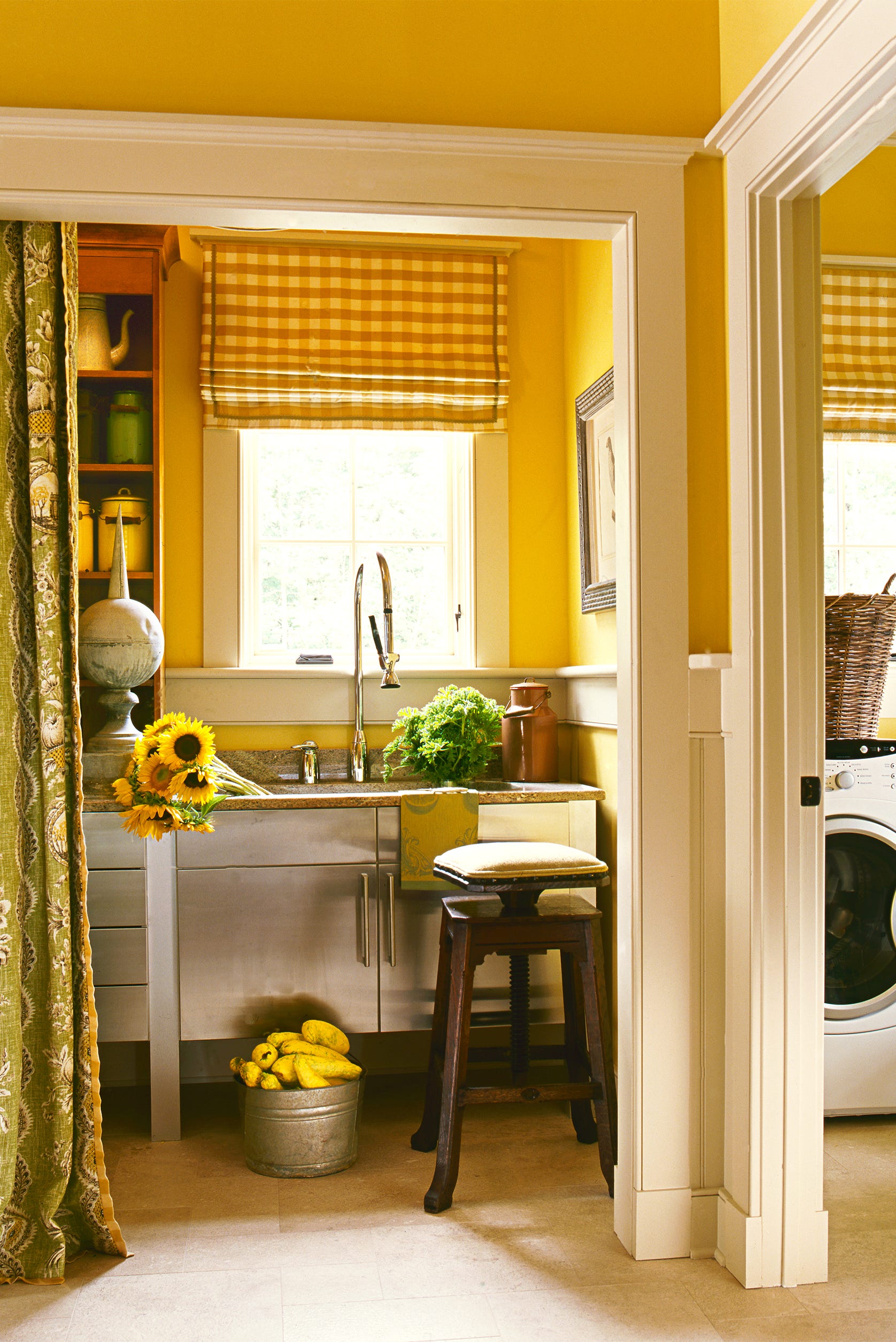
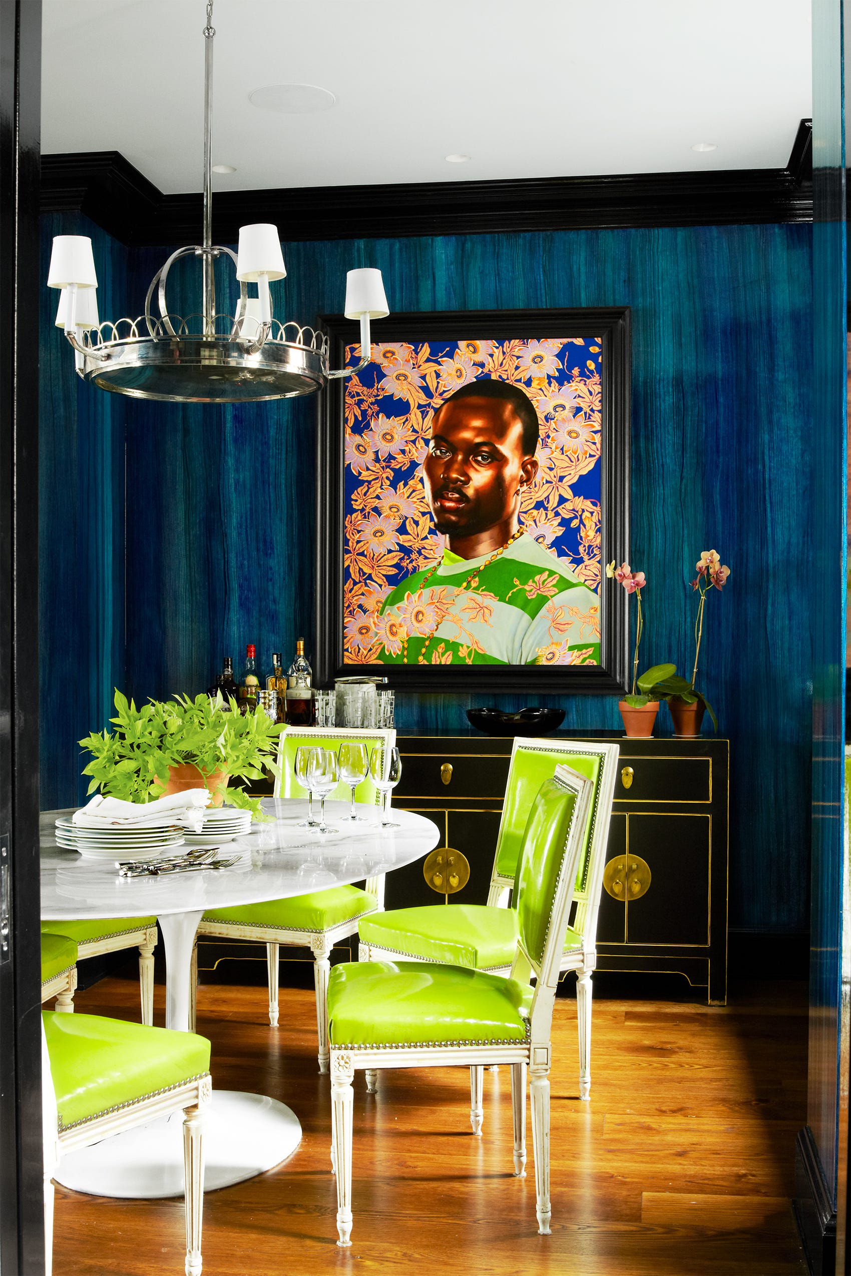
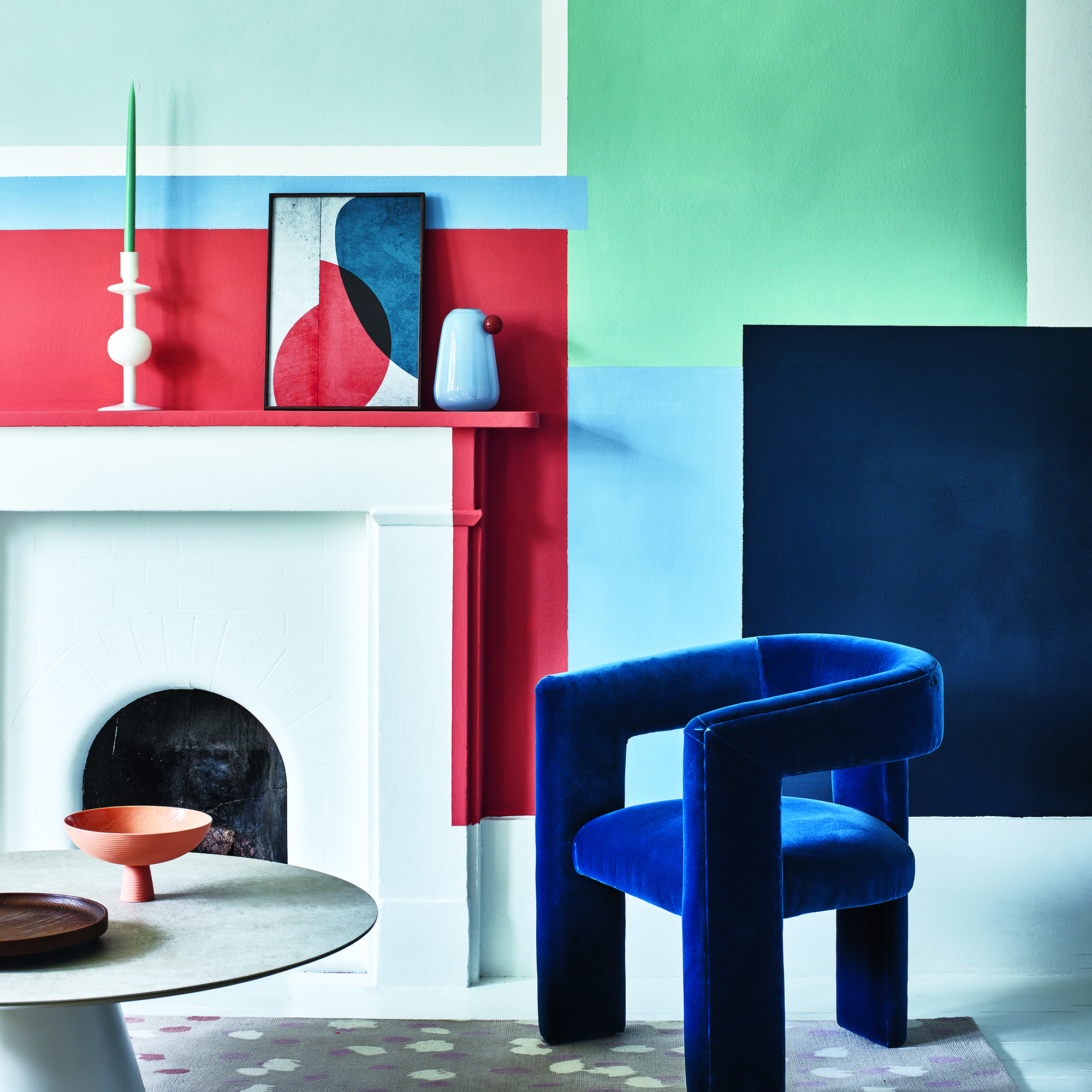
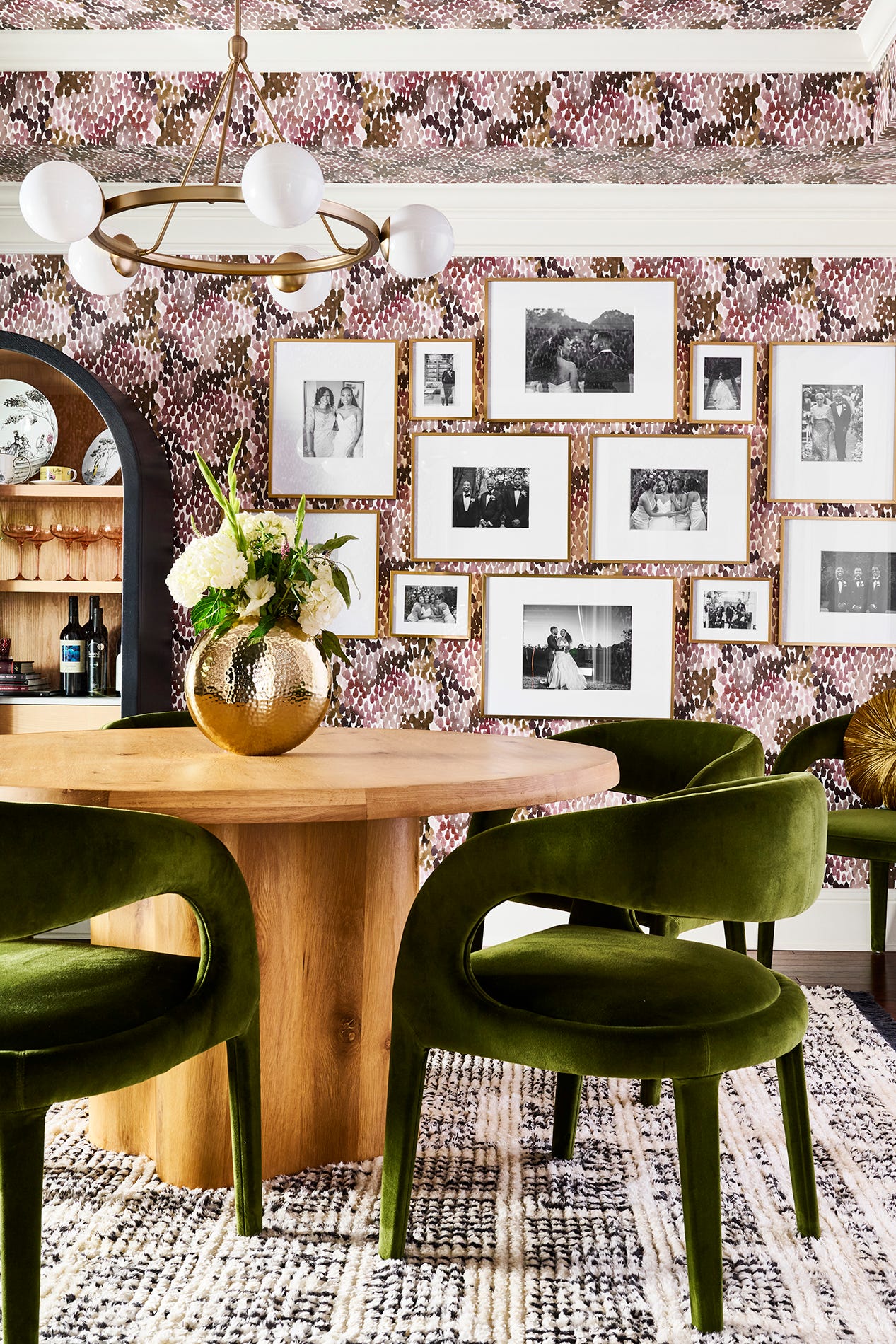
In 2022, a growing desire for self-expression through home design has led to an increased interest in incorporating bold and unexpected paint colors. While traditional hues have their charm, interior designers are now advocating for more unusual shades to add character and personality to living spaces. For those hesitant to fully commit to a bold color, designers suggest starting with smaller areas such as an accent wall or an anteroom. This approach allows individuals to gauge their comfort level with the chosen hue before painting an entire room. It is also emphasized that paint is a low-commitment design element; if a color doesn't work out, it can easily be repainted, encouraging experimentation without significant investment or risk.
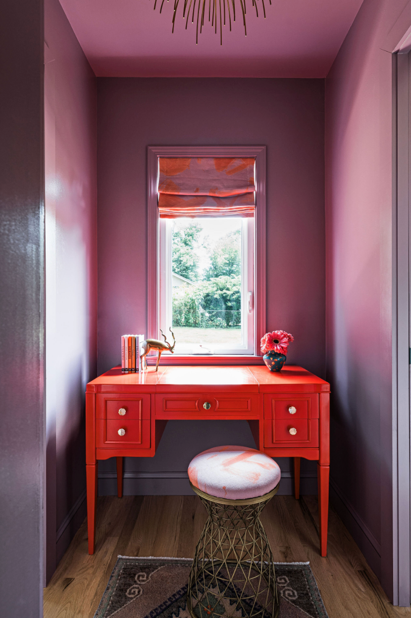
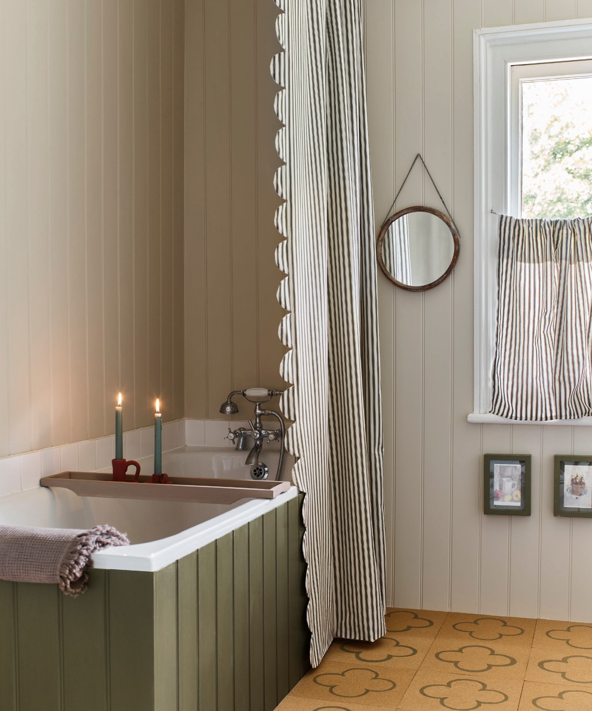
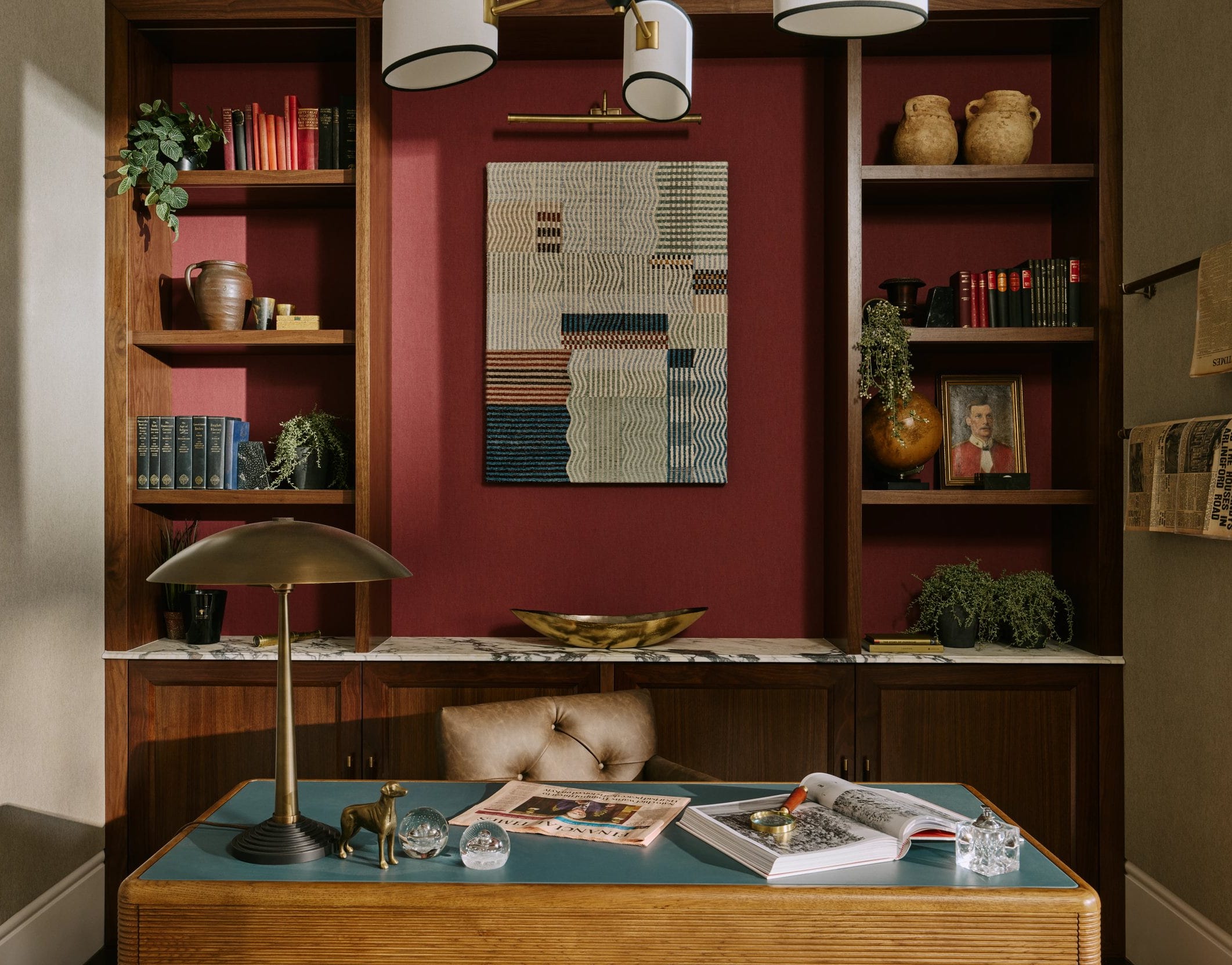
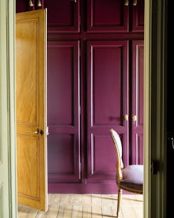
Expert designers have shared their top recommendations for distinctive paint colors. Lauren Clement of Lauren Nicole Designs champions Fresh Fennel by Magnolia Paint Co, Benjamin Moore. This green shade, which she created, is praised for its ability to evoke nature and bring vitality into a space. Clement suggests its use on bathroom vanities or doors, noting its excellent pairing with gray, navy, and gold hardware, though she advises against using it on entire walls. Joy Williams, an interior designer, is drawn to Brinjal by Farrow & Ball, a sophisticated aubergine. She discovered this deep, muted red-like color from a paint deck and appreciates its dramatic effect, especially in a high-gloss finish on ceilings or in a flat emulsion across an entire closet, including floors and trim. Williams also recommends pairing Brinjal with Farrow & Ball's Peignoir, which offers subtle earthen pinkish tones, acting as a perfect neutral complement.
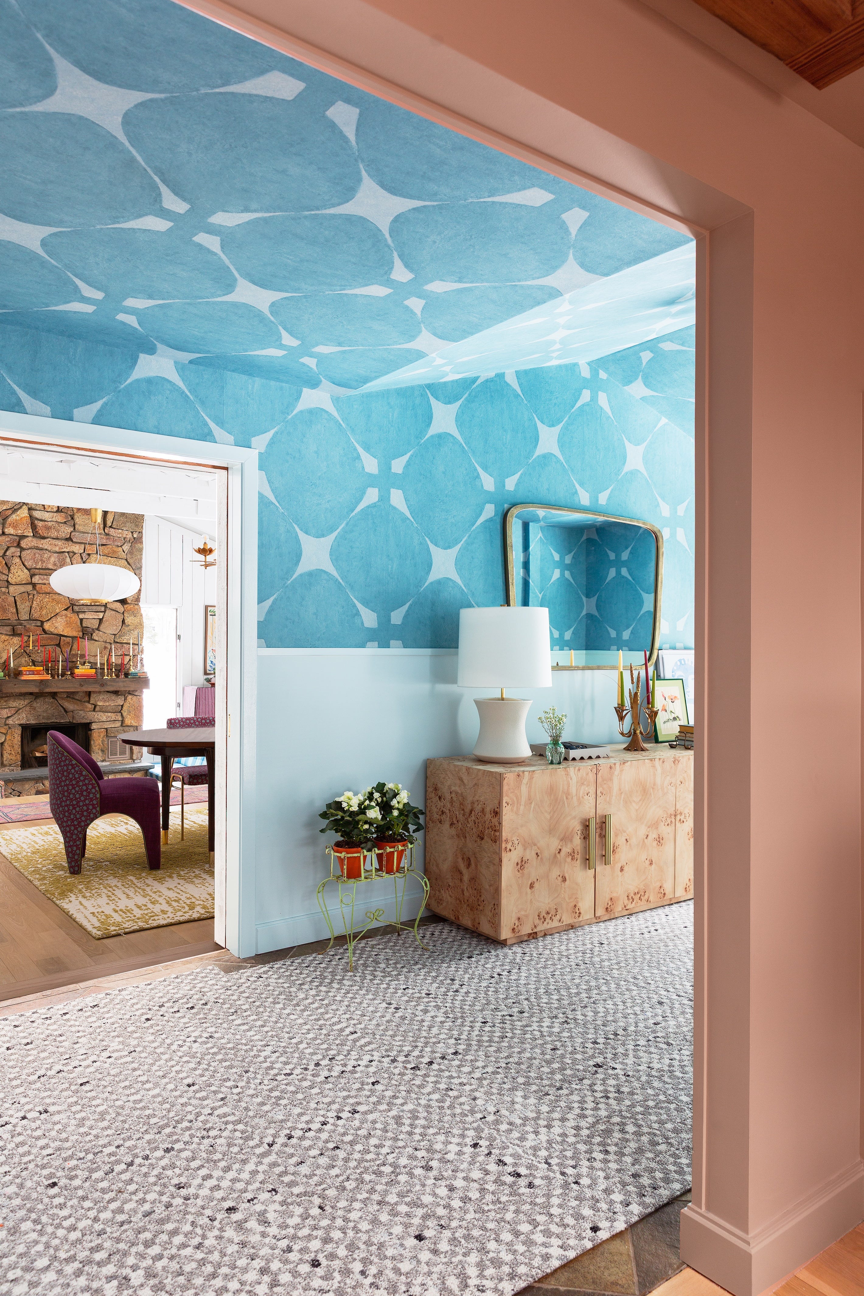
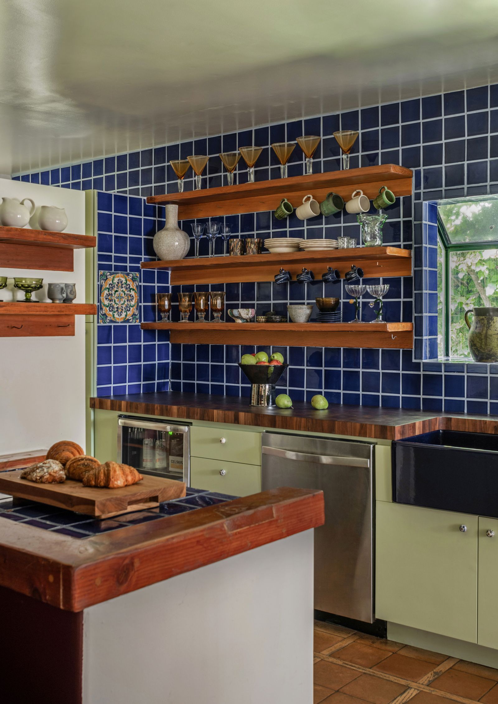
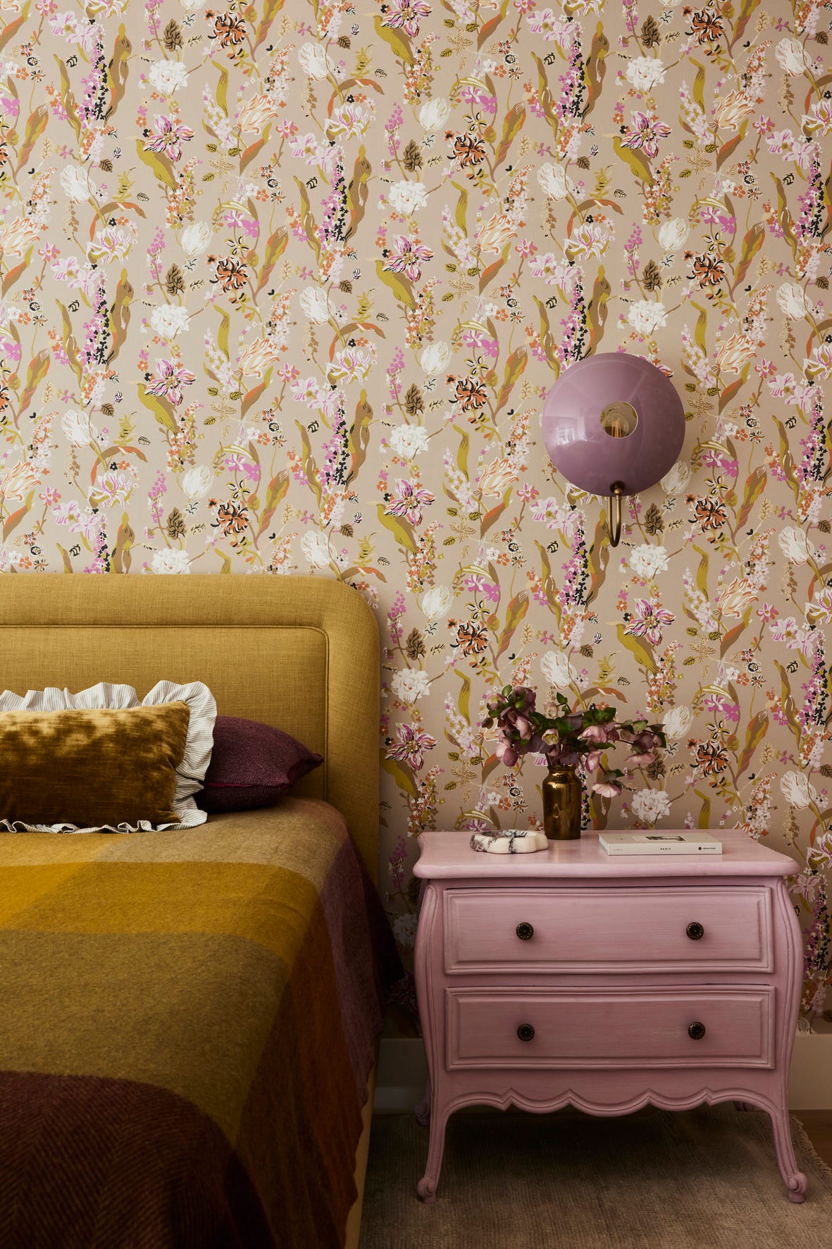
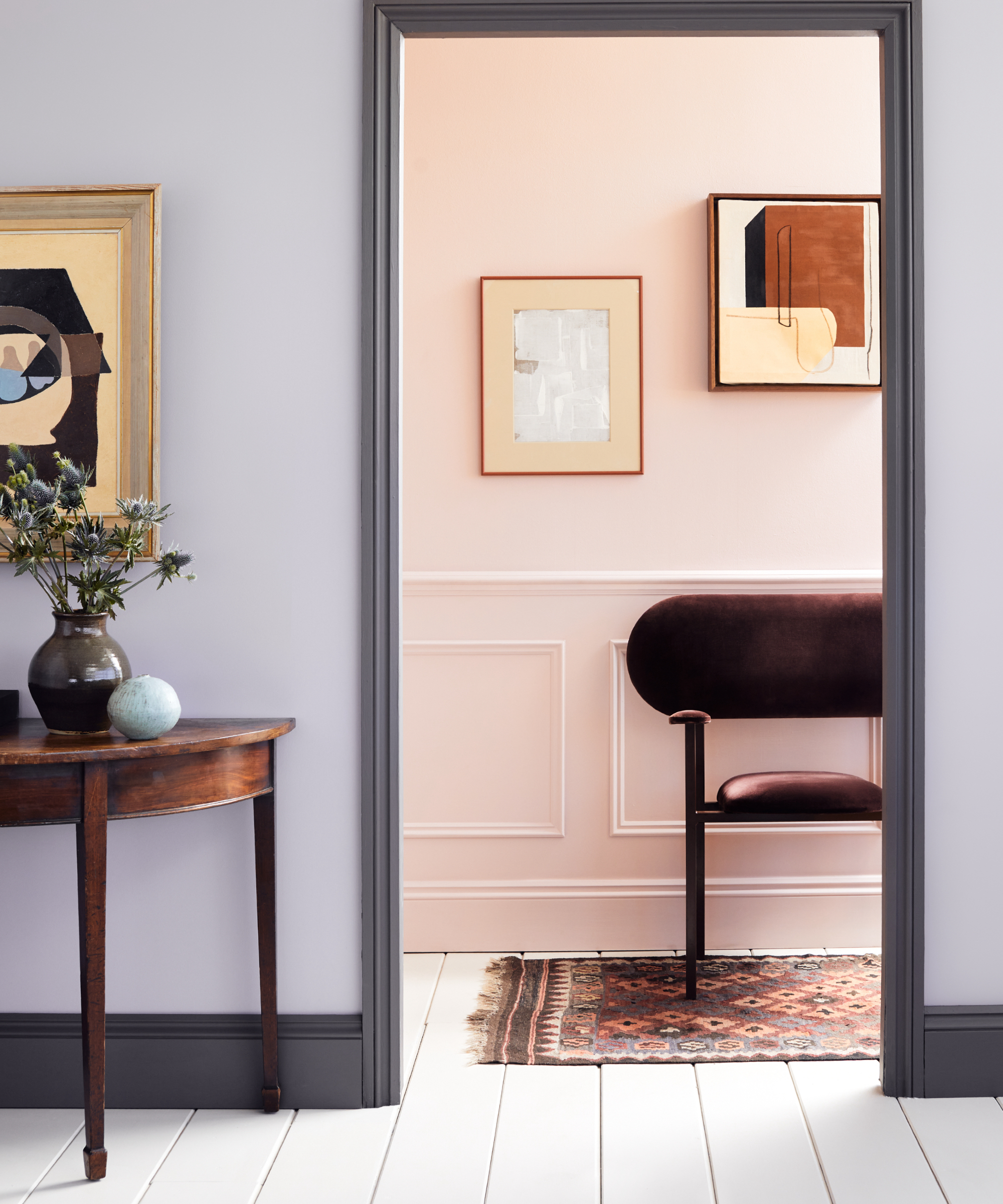
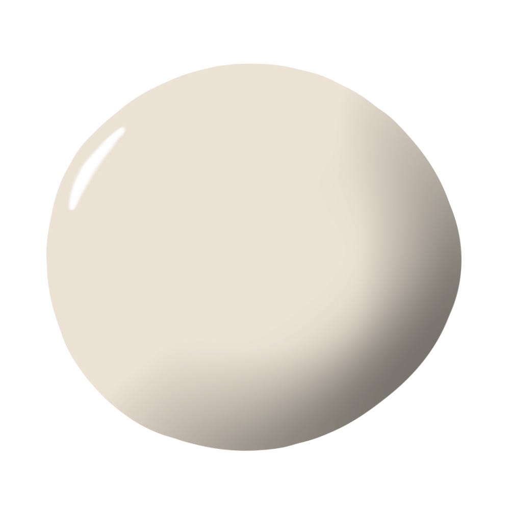
Another creation by Clement, Aiken Park by Magnolia Paint Co, Benjamin Moore, offers a brightened navy that deviates from typical home palettes. This color has been used successfully on kitchen islands and coffee bar areas, pairing well with light gray wall paint and gold hardware. Clement also suggests its application in powder rooms, master bathroom vanities, or offices, highlighting its capacity to infuse a space with personality. Sara Barney from BANDD/DESIGN has a current fondness for pinks, particularly Morristown Cream and Teacup Rose by Benjamin Moore. She sought shades that would provide a beautiful pop without being overly loud or dominant. Barney successfully used these pinks on a living room cabinet, creating a soft yet striking effect that harmonizes with cream and light blue elements in the room.
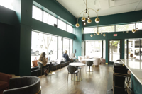
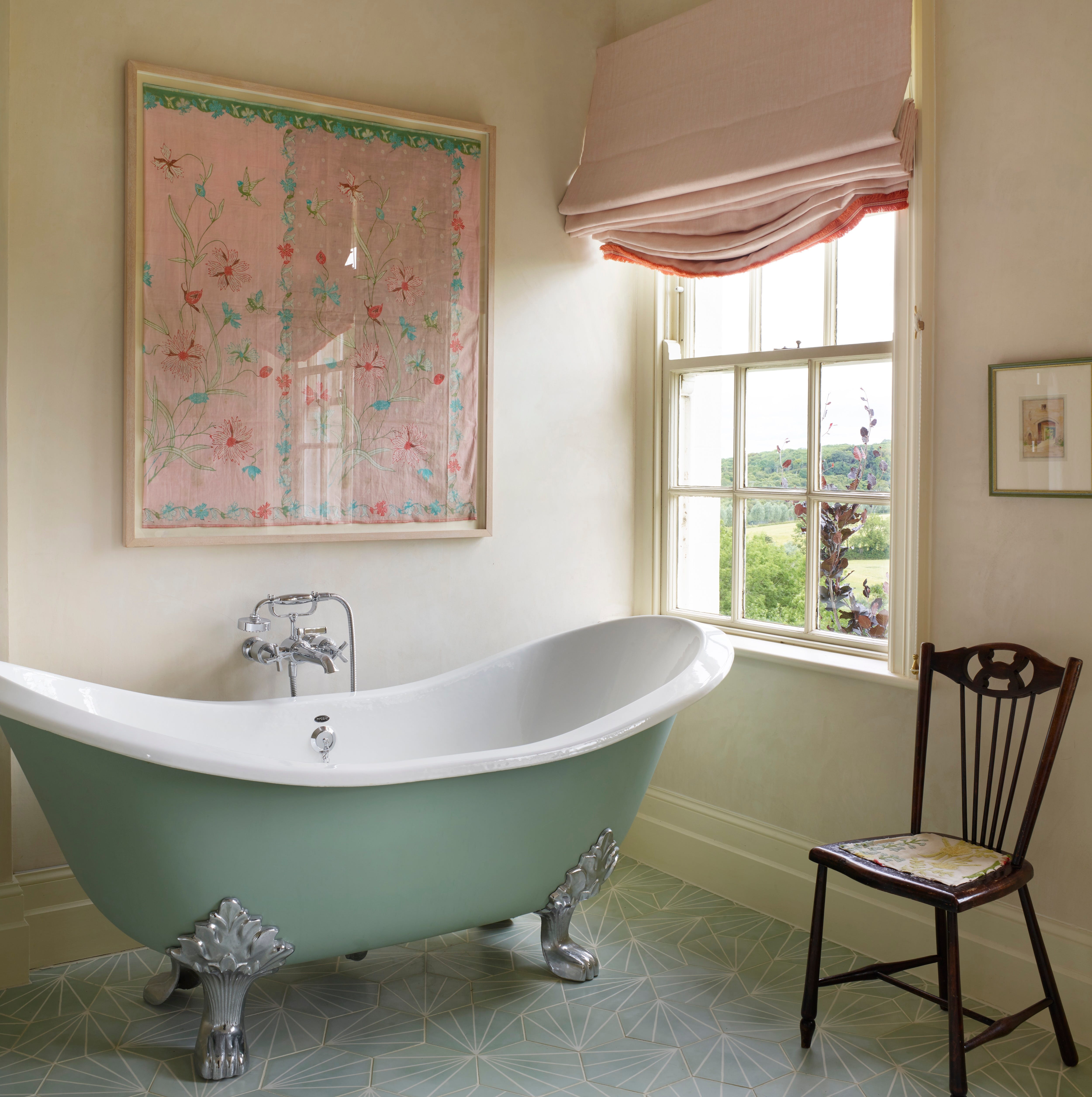
Finally, Aegean Teal by Benjamin Moore has garnered a significant following despite its unique character. Emily Ruff of Cohesively Curated Interiors discovered this blue-green hue while searching for cabinet colors for a vanity. She used it in a powder room alongside navy blue zellige tile, and its success has prompted plans for its re-use in a client's vanity, to be paired with a forest-themed wallpaper and an elegant mirror. These designer insights collectively offer guidance and inspiration for those looking to explore unconventional paint colors, transforming their homes with confidence and style.
#UnusualPaintColors #InteriorDesign #HomeDecor #PaintTrends #BenjaminMoore #FarrowAndBall #ColorPsychology #HomeStyle #DIYHome #UnusualPaintColors #InteriorDesign #HomeDecor #PaintTrends #BenjaminMoore #FarrowAndBall #ColorPsychology #HomeStyle #DIYHome
0 comment in total
 No comments yet
You may also like
Designers Say These Unusual Paint Color Combos Will Transform Your Home


7 of the most versatile and easy to use paint colors according to designers

Rich colors and sumptuous textures are on designers' minds
7 Paint Colors Designers Wish They Never Used (and What You Should Use Instead)

9 'good weird' paint colours approved by designers

6 Paint Color Duos Designers Can't Get Enough of This Fall

9 Paint Colors You’ll Never Find in an Interior Designer’s Home
Primary colours are having a moment - but the secret to styling them is through 'unexpected' touches
Designers LOVE Pairing These Unexpected Colors With This Sophisticated Hue

The 5 Most Overused Paint Colors and What to Try Instead, According to Designers
35 Unexpected Color Combos We Can't Get Enough Of


7 Most Underrated Paint Colours, According To Colour Experts
5 Underrated Paint Colors Designers Always Use in Their Projects (and You Should Too)

Make choosing paint easy with new 'natural light' colours

These Are the Almond Paint Colors Designers Are Obsessed With
12 Color Schemes That Are Popping Off Right Now, According to Designers

Designers LOVE Pairing These Unexpected Colors With This One Timeless Hue

The most timeless paint colors according to designers
The Paint Color That All This Designer's Followers Ask About | domino

7 Paint Colors Designers Totally Regret Using (and What They Wish They’d Used Instead)