We Asked Designers Which Paint Colors Homeowners Always Regret—These 5 Came Up the Most
Choosing paint colors for a home can be a challenging task, with many homeowners ultimately regretting their choices. While paint offers an affordable and impactful way to transform a room, selecting the wrong shade can create an undesirable atmosphere. Designers emphasize considering the emotional impact of a color within a space, rather than solely focusing on its appearance on a swatch. Certain colors are frequently cited as sources of regret due to their intensity, maintenance requirements, or inability to promote desired feelings like relaxation.
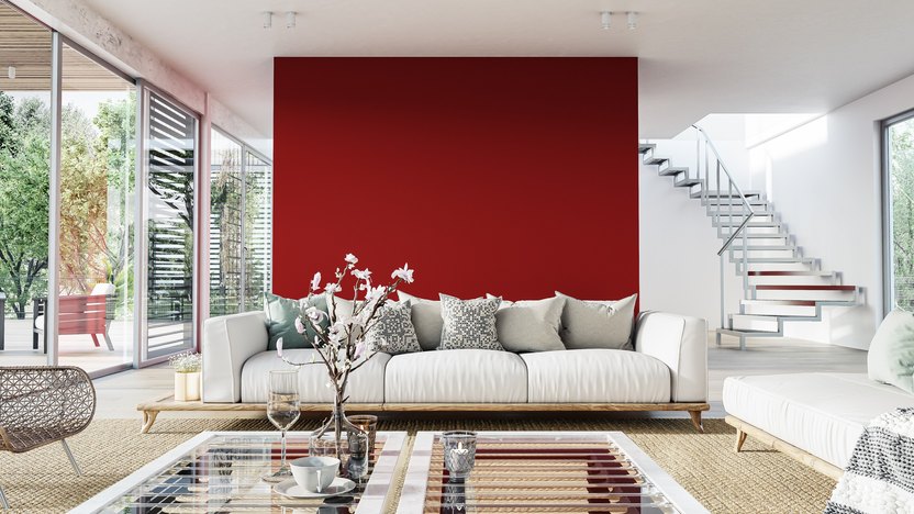
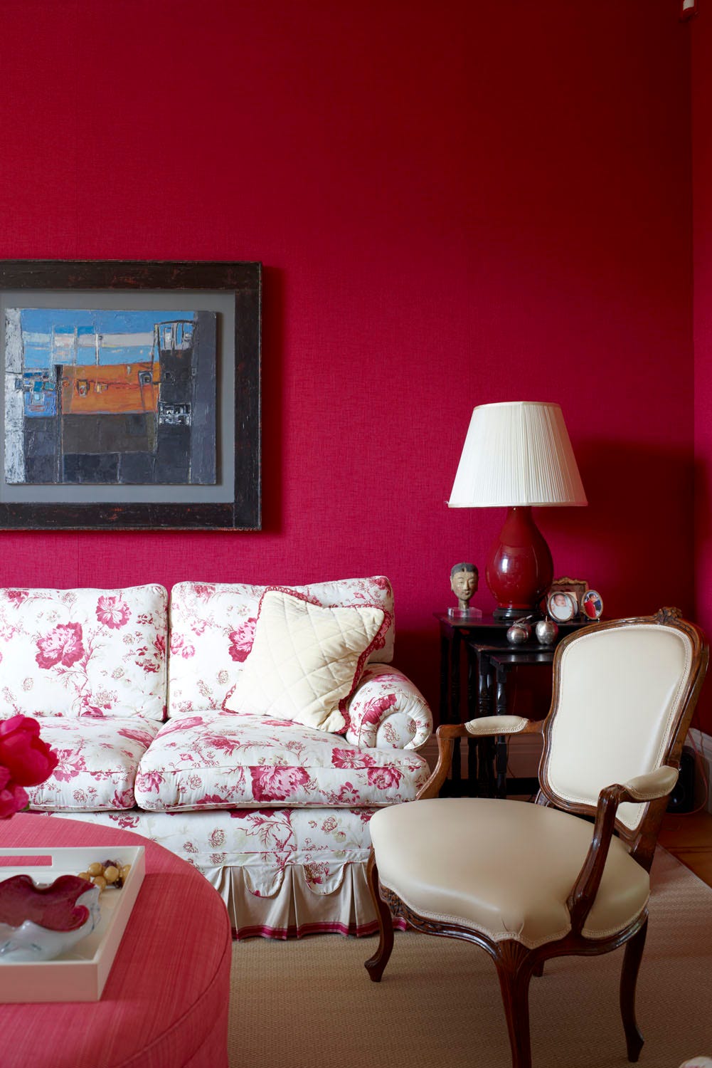
Bright red is a common source of regret, often perceived as aggressive and overwhelming when used on large surfaces. Instead of energizing a room positively, it can foster restlessness and tension, making it unsuitable for areas intended for relaxation, such as bedrooms or living rooms. For those who appreciate red, incorporating it in smaller accents or furnishings is a recommended alternative.
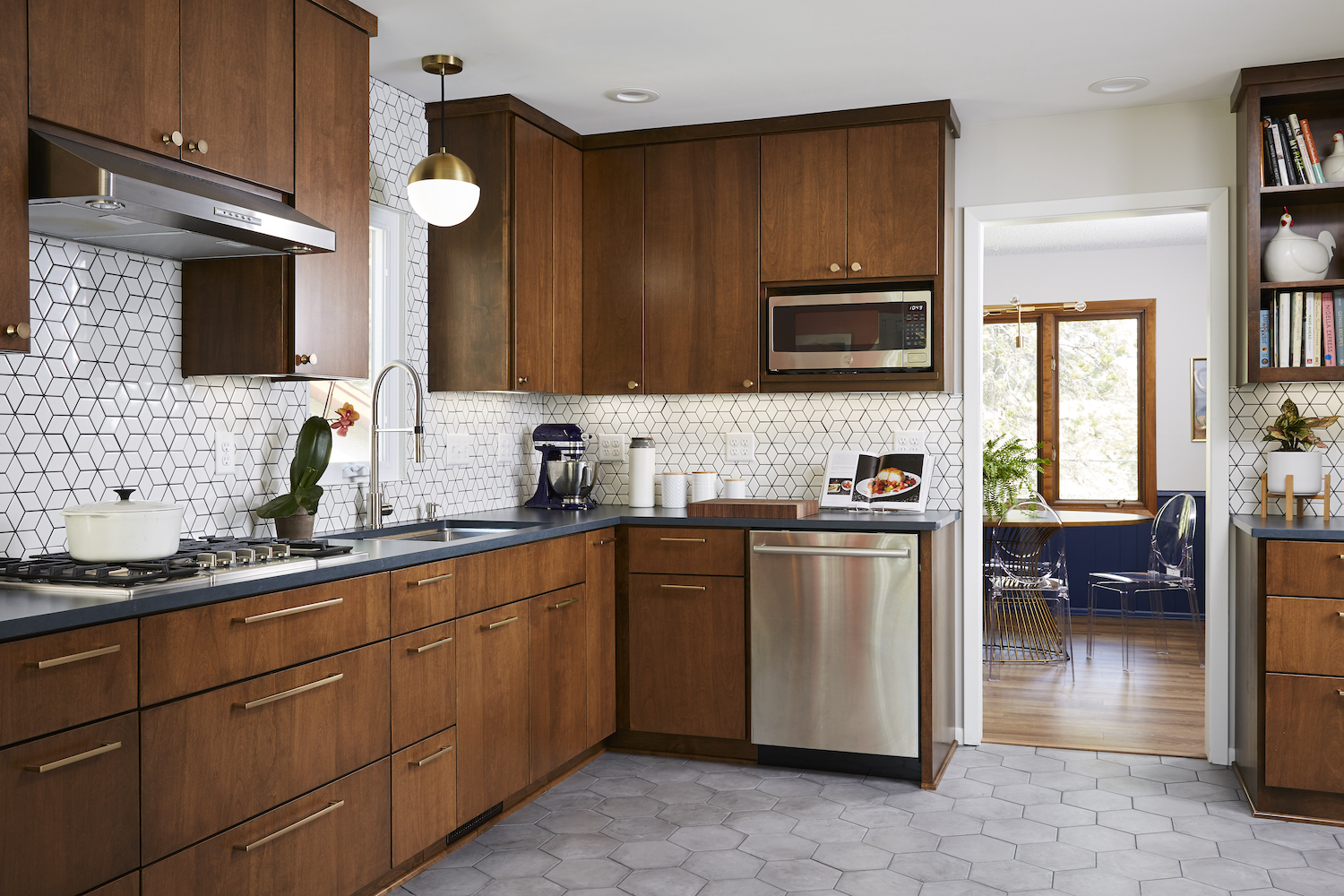
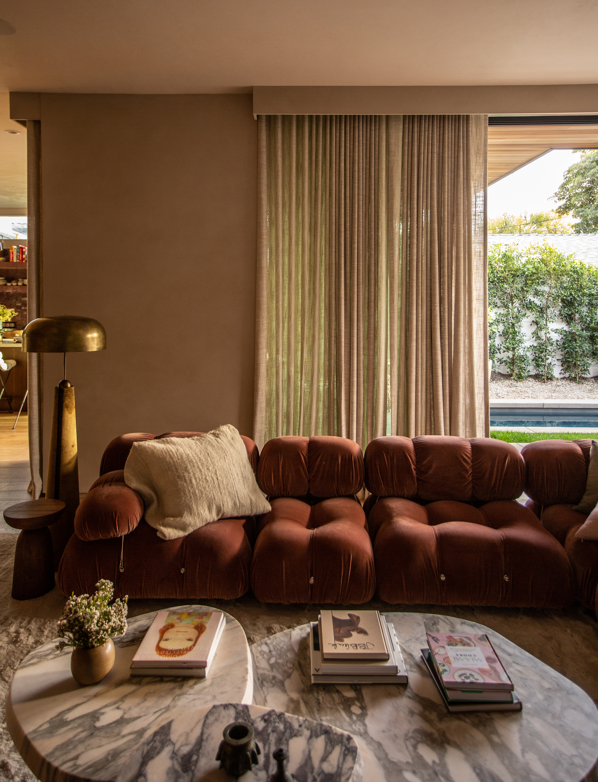
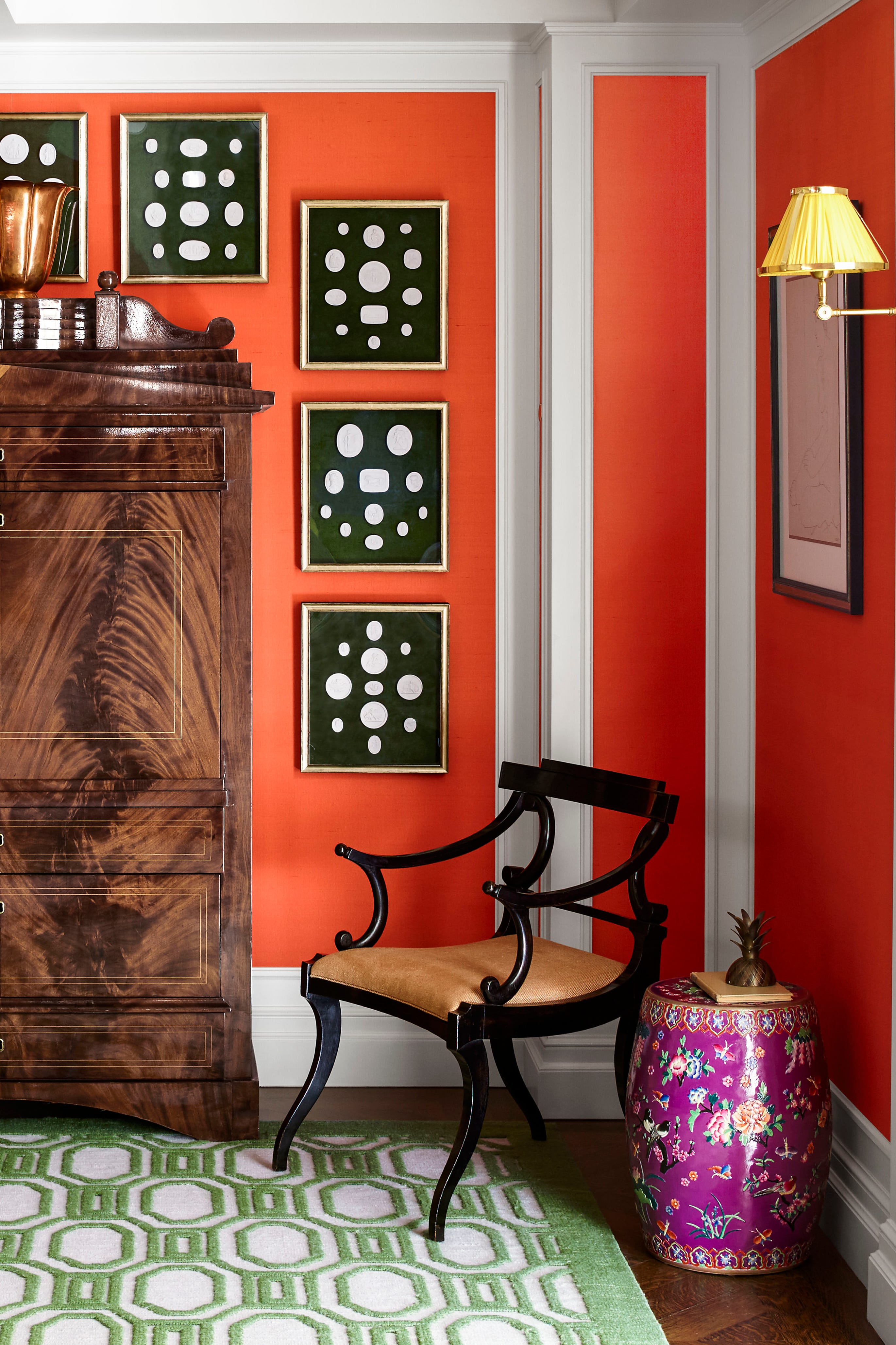
Rusty orange, despite its earthy connotations, tends to make rooms feel heavy and dated when applied to walls. Its intensity can also clash with other design elements, complicating the overall decor. Softer alternatives like terracotta or peachy neutrals are suggested to achieve a similar warm aesthetic without the harshness.
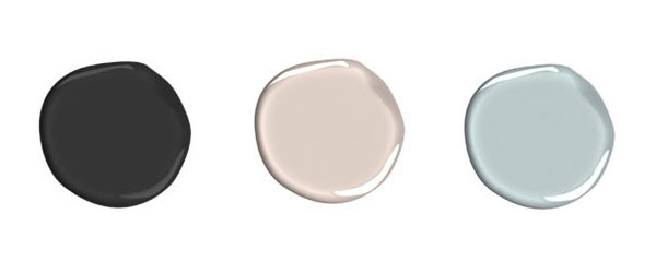
Black walls, while appearing dramatic and chic in photographs, often prove impractical in real-life settings. They absorb light, making spaces feel smaller, and are prone to showing dust and fingerprints, leading to high maintenance. Charcoal or navy are more forgiving options for those seeking a dark, sophisticated look.
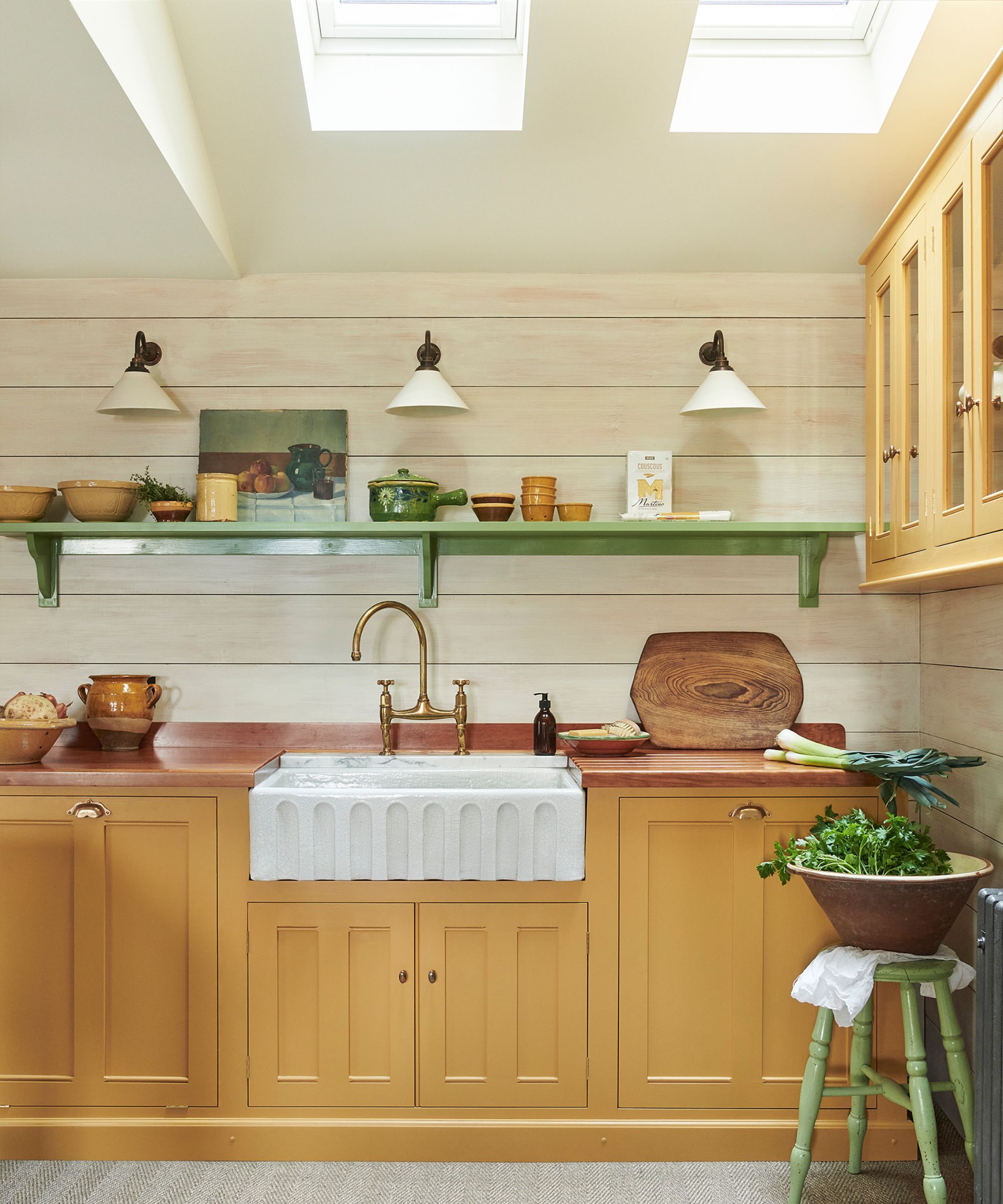
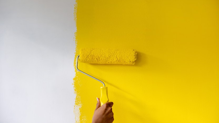
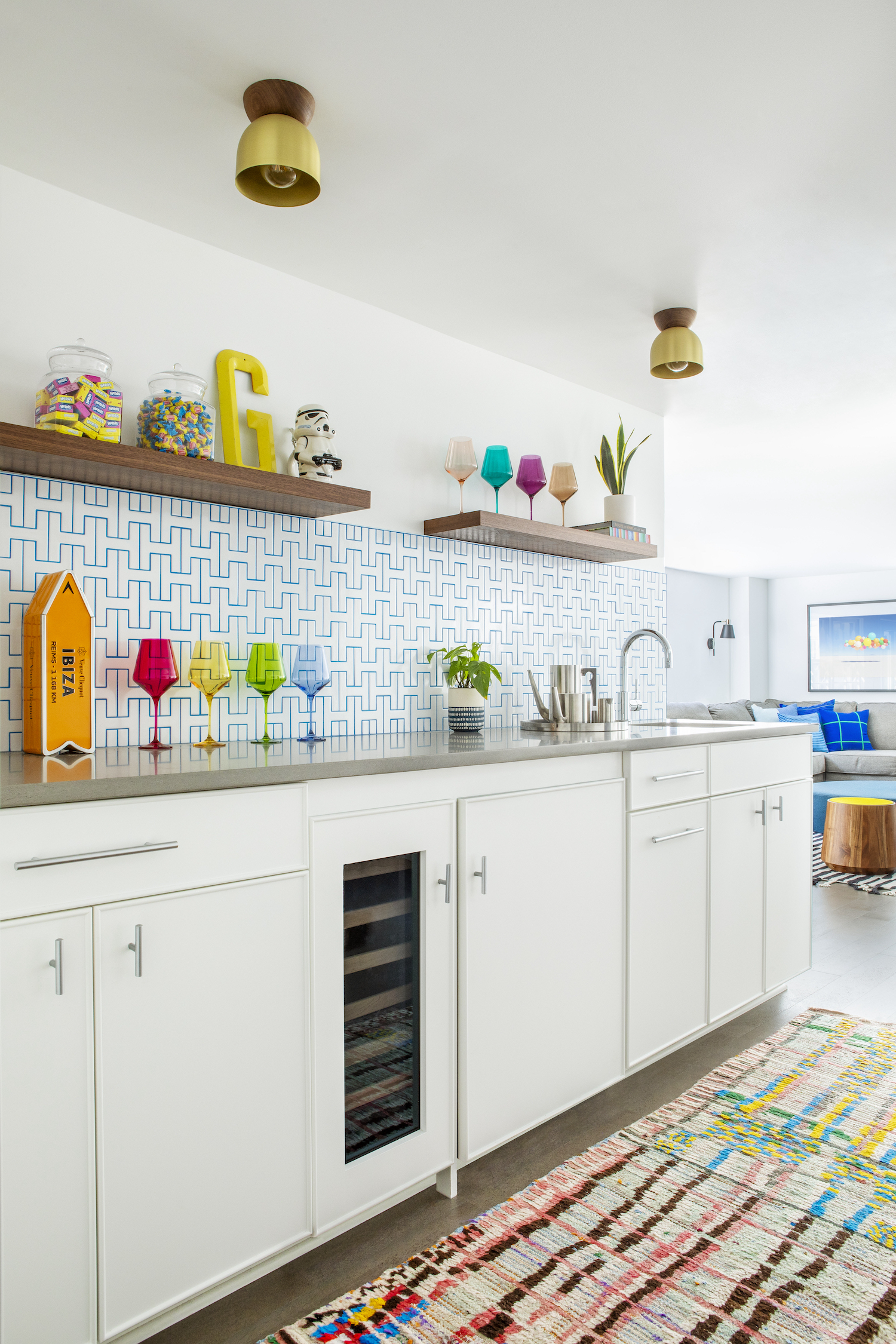
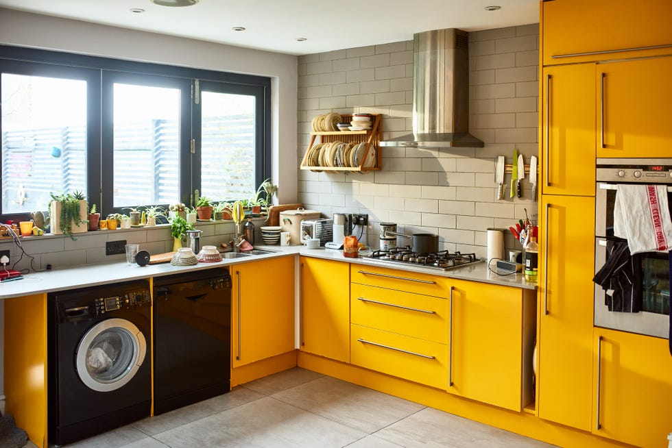
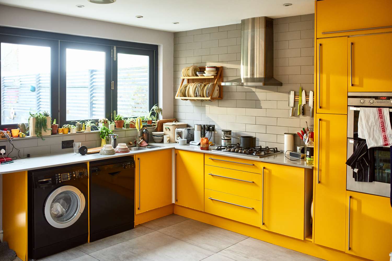
Sunshine yellow, typically associated with happiness and energy, can be problematic in spaces meant for rest. While suitable for kitchens or playrooms where activity is desired, its stimulating nature can prevent relaxation and sleep in bedrooms. Muted yellows, such as buttercream or soft gold, offer warmth without overstimulation.
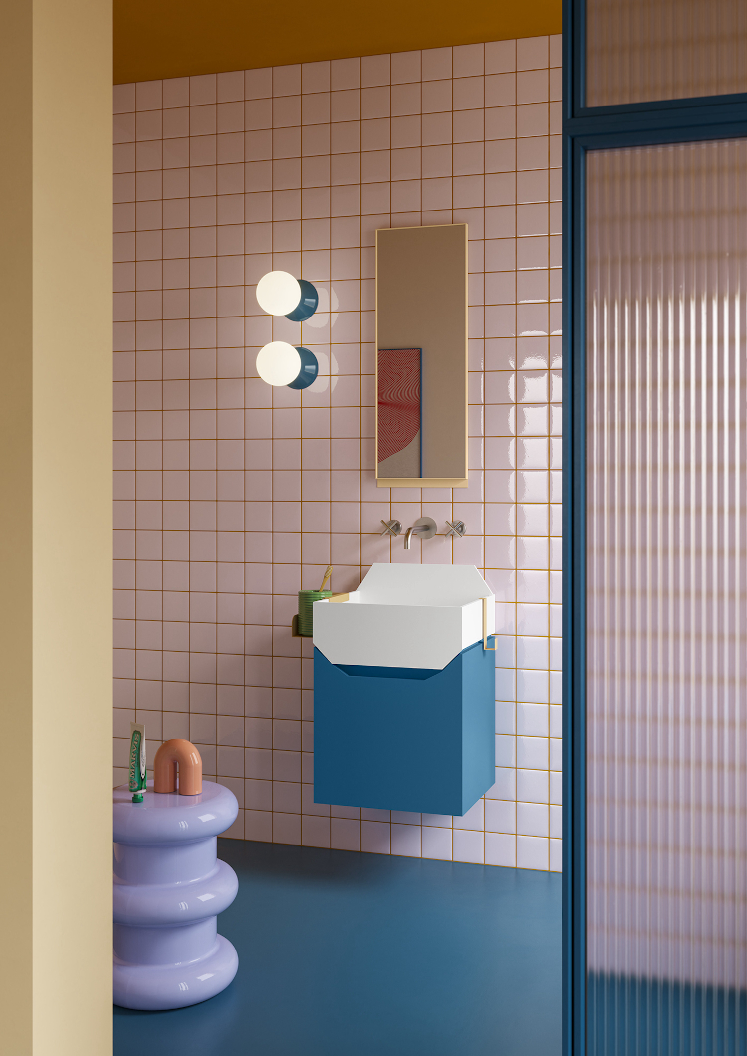
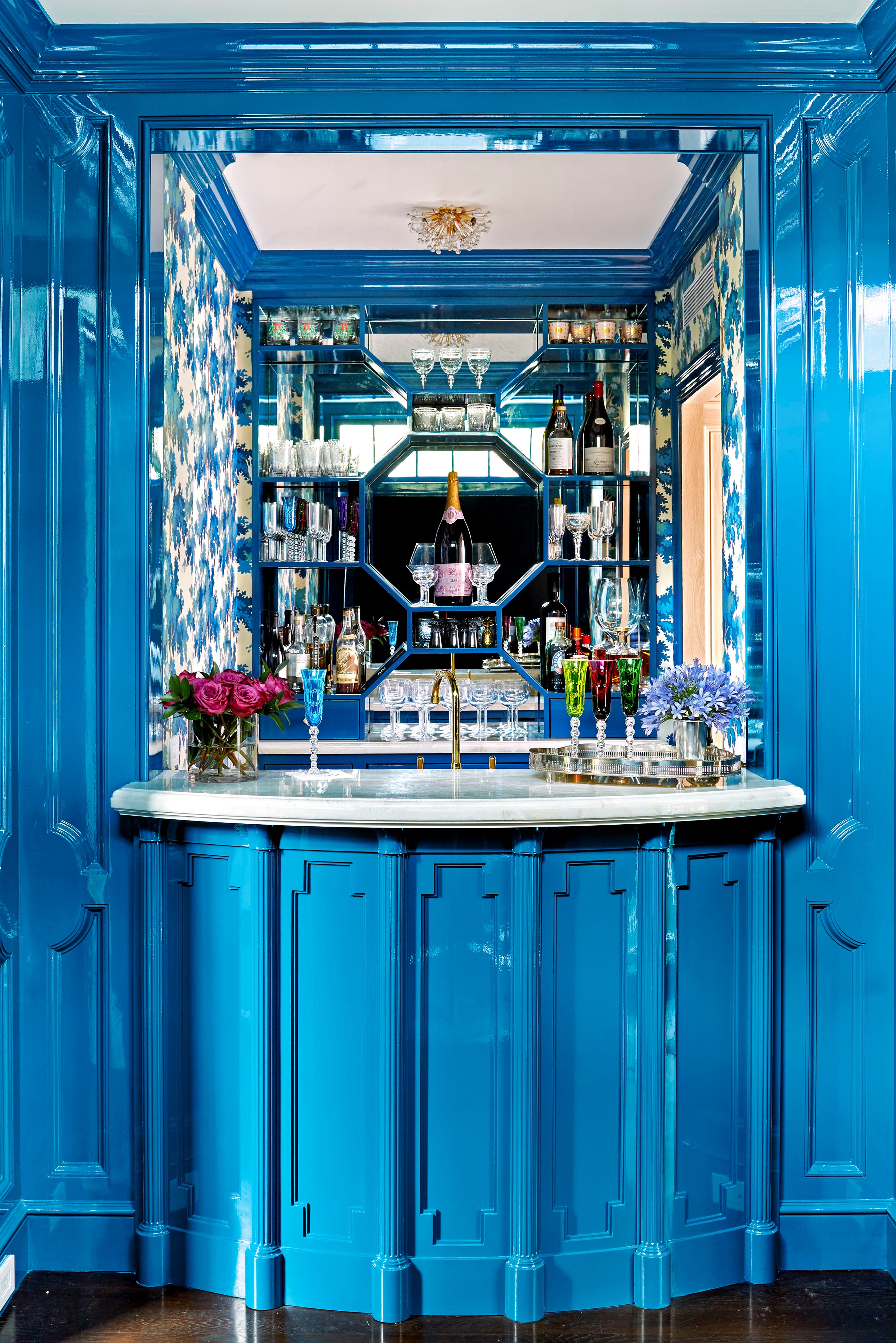
Finally, neon and overly bright colors are generally ill-suited for interior walls, especially in bedrooms. These hues create an excessive amount of energy, disrupting the calm and restful ambiance essential for sleep. Even for children's or teenagers' rooms, toned-down versions of these vibrant colors are preferred to avoid creating an overstimulating environment. Ultimately, careful consideration of a color's psychological effects and practical implications is crucial for successful home painting projects.
#PaintColors #HomeDecor #InteriorDesign #DesignRegrets #ColorPsychology #RoomTransformation #DecoratingTips #AccentColors #DIYHome #PaintColors #HomeDecor #InteriorDesign #DesignRegrets #ColorPsychology #RoomTransformation #DecoratingTips #AccentColors #DIYHome
0 comment in total
 No comments yet
You may also like
I asked interior designers what color they include in every project – these 5 enduring shades were the favorites
Kitchen Color Selection Tips from 5 Designers

8 Favorite Paint Colors of Local Interior Designers

The 5 Most Overused Paint Colors and What to Try Instead, According to Designers
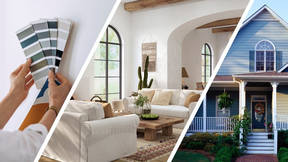
Real Estate Experts Reveal the Paint Colors That Decrease Your Home Value—and Tricks for Finding the Perfect Hue
5 "trend-proof" colors for your home designers think will be just as popular in 10 years' time

We Asked Designers Which Living Room Paint Colors People Regret Most—And We're All Guilty


5 Timeless Paint Colors That Will NEVER Go Out of Style, According to Designers

5 Times Interior Designers Used Colorful Tile Grout That Make Me Never Want to Choose White Again
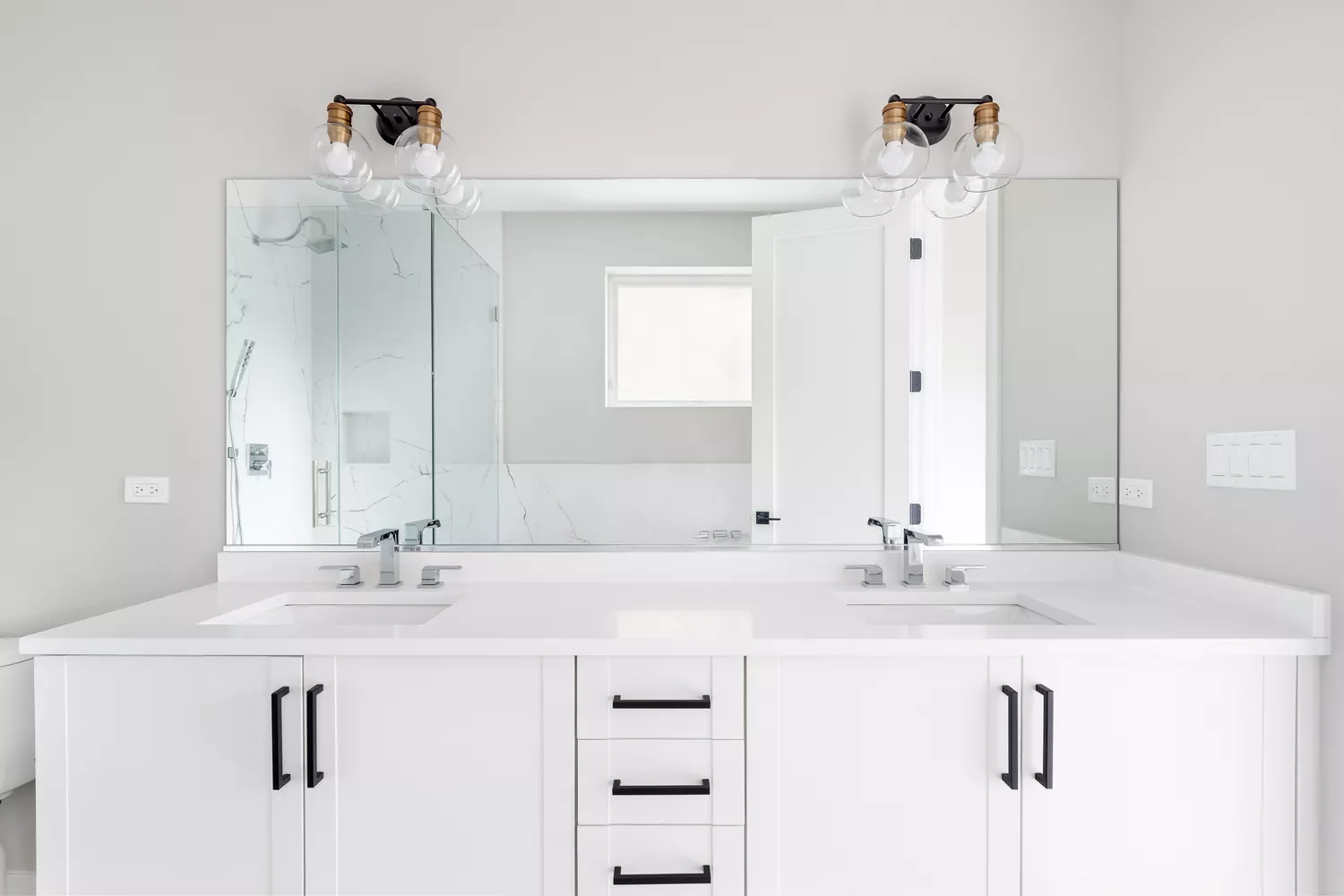
We Asked a Designer Which Bathroom Paint Colors People Always Regret—These 4 Came Up the Most

Interior design experts reveal the colour rules you should be breaking
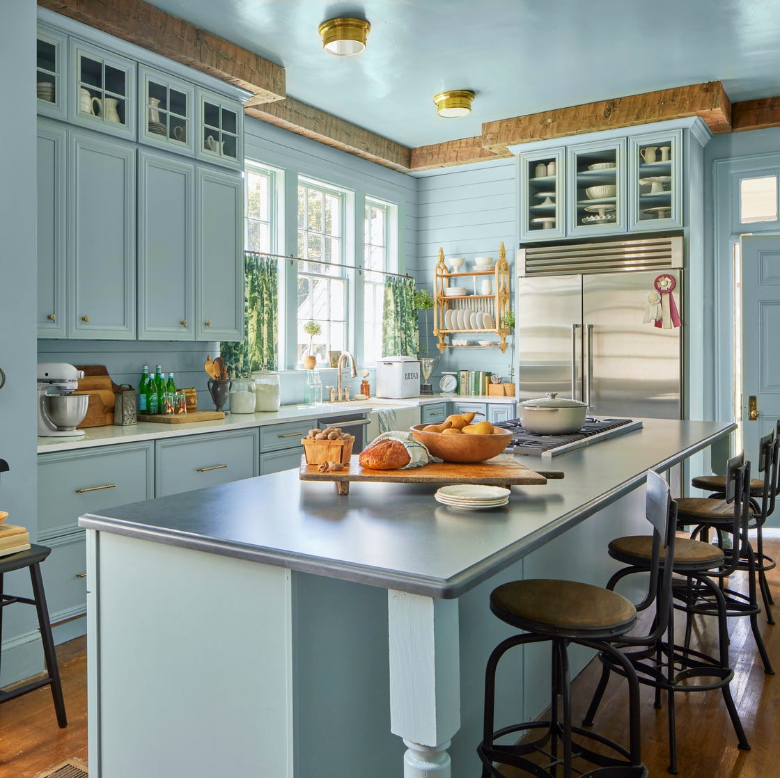
10 Kitchen Paint Colors You Won’t Regret in 10 Years, According to Designers
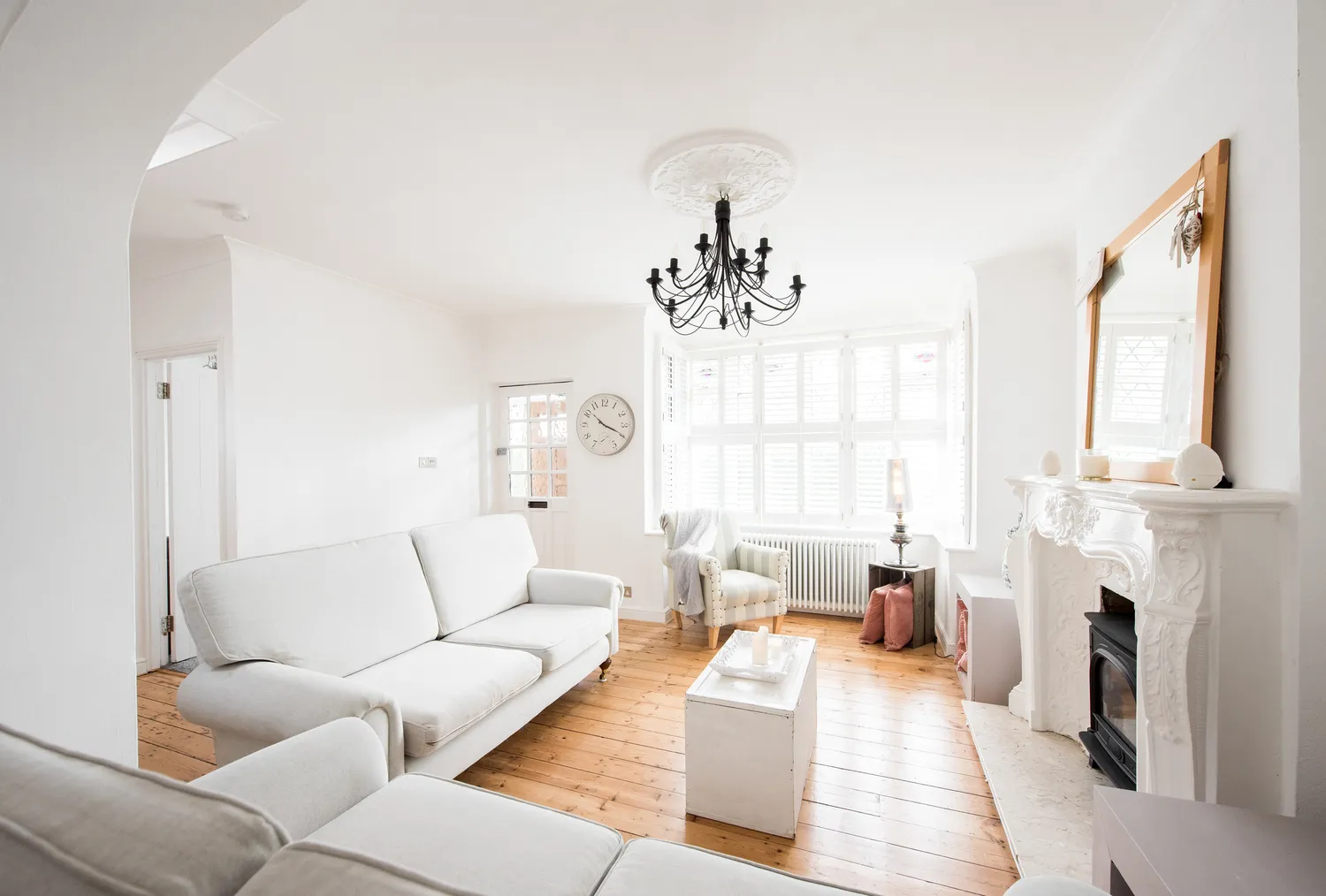
We Asked Designers Which Living Room Paint Colors People Always Regret—These 6 Came Up the Most

5 colors you should never paint your entryway – according to interior experts

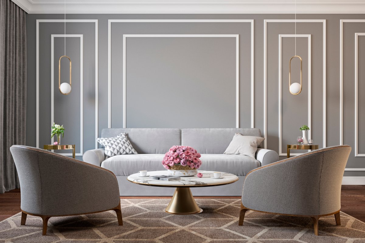
5 Classic Wall and Trim Color Combinations—and 5 for Rule-Breakers Only

Can You Guess The Most Popular Paint Color The Year You Were Born?

4 Interior Designers Share the Biggest Paint Color Trends Right Now (and What’s Out!)

8 Surprising Colors That Will Decrease Your Home's Value, According to Experts

5 colors you should never paint a small room – designers warn us to steer clear of these hues, and what to pick instead
5 Outdated Kitchen Paint Colors That Interior Designers Are Tired of Seeing