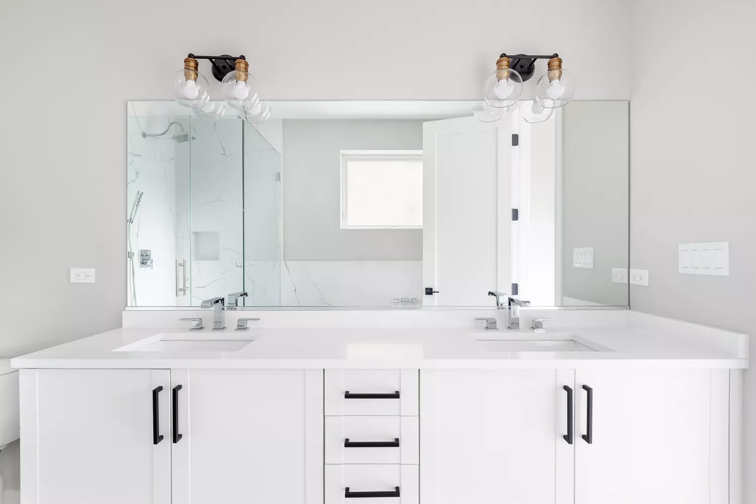
We Asked a Designer Which Bathroom Paint Colors People Always Regret—These 4 Came Up the Most
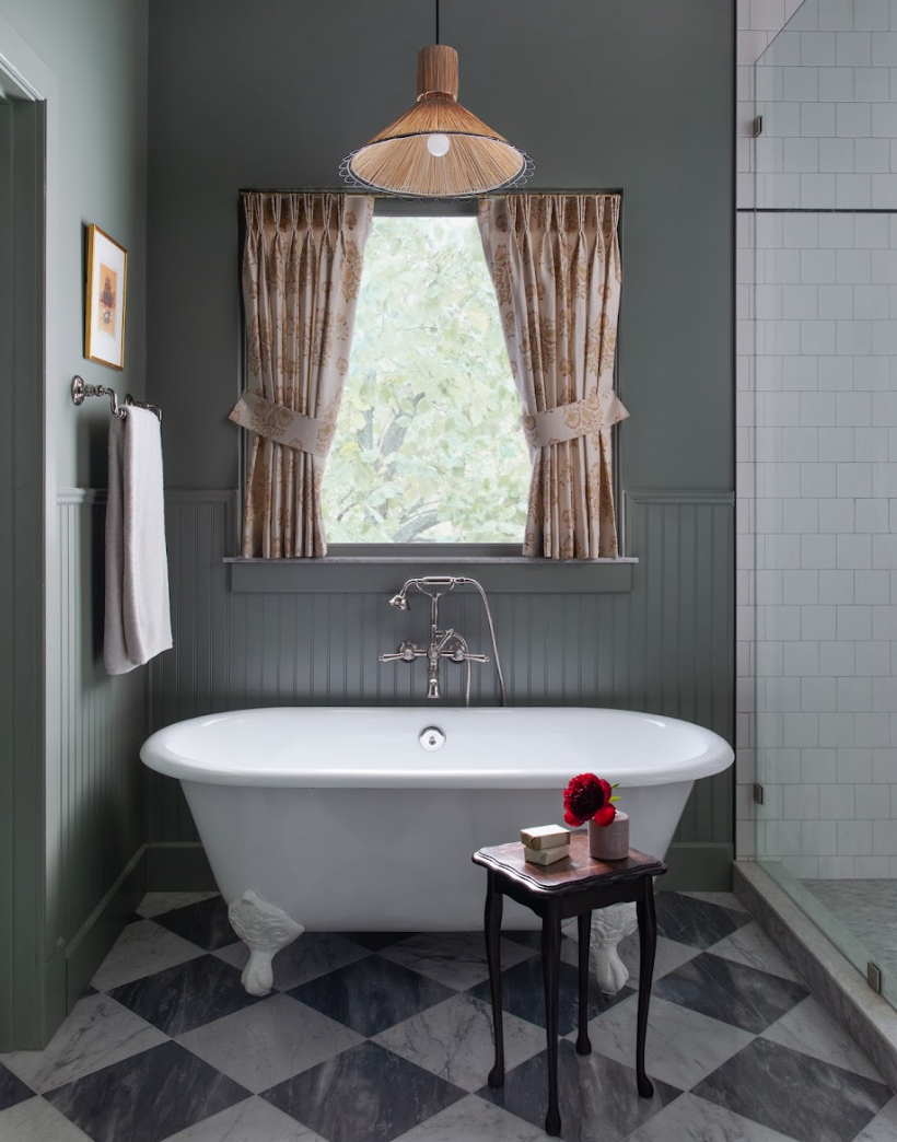
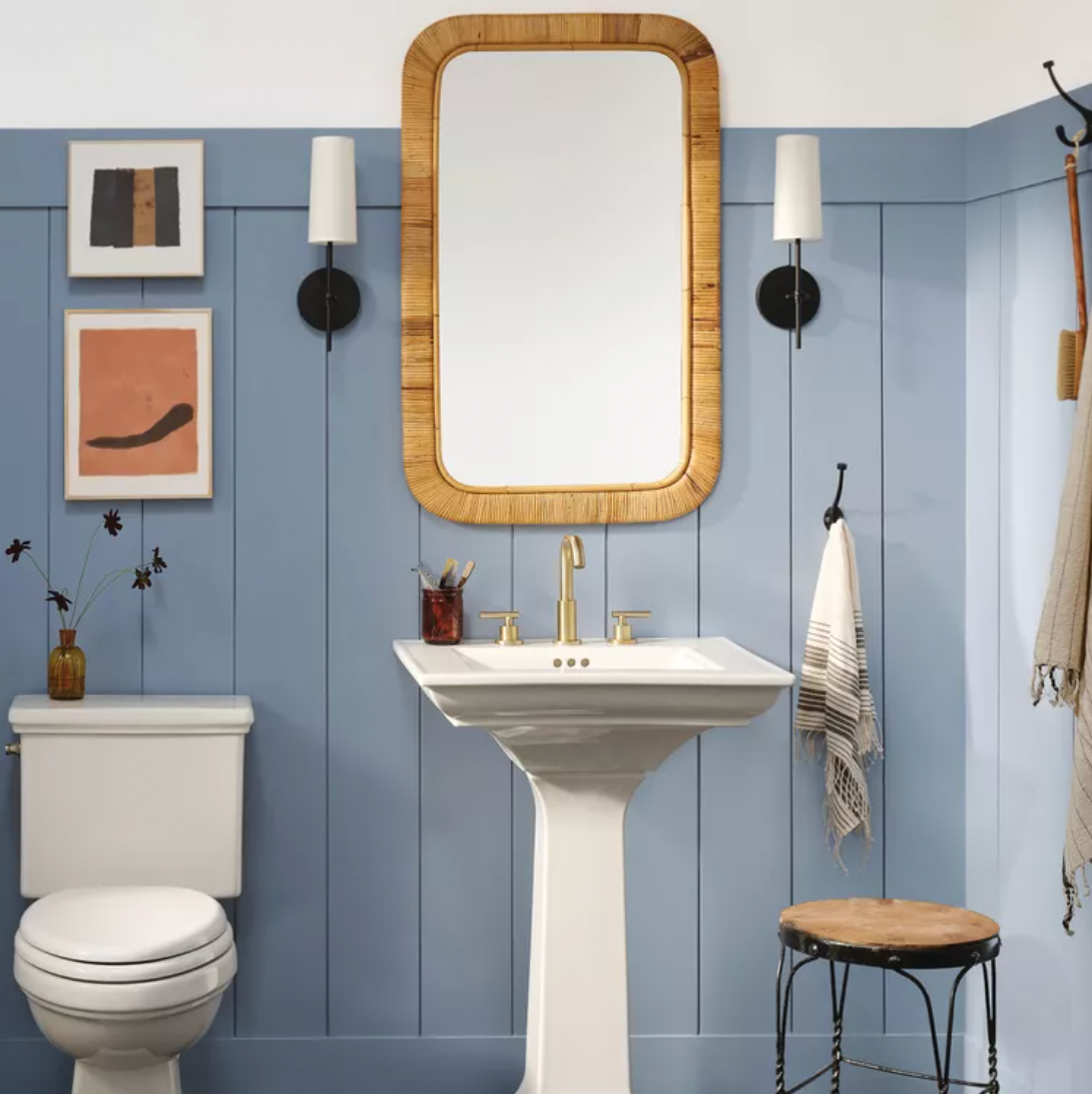
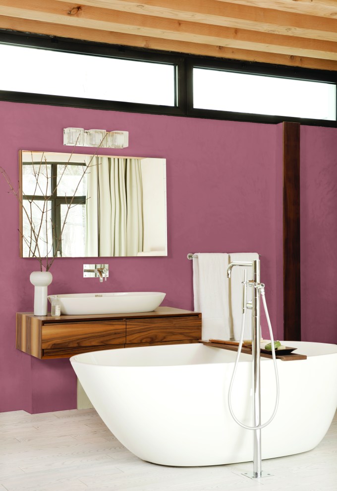
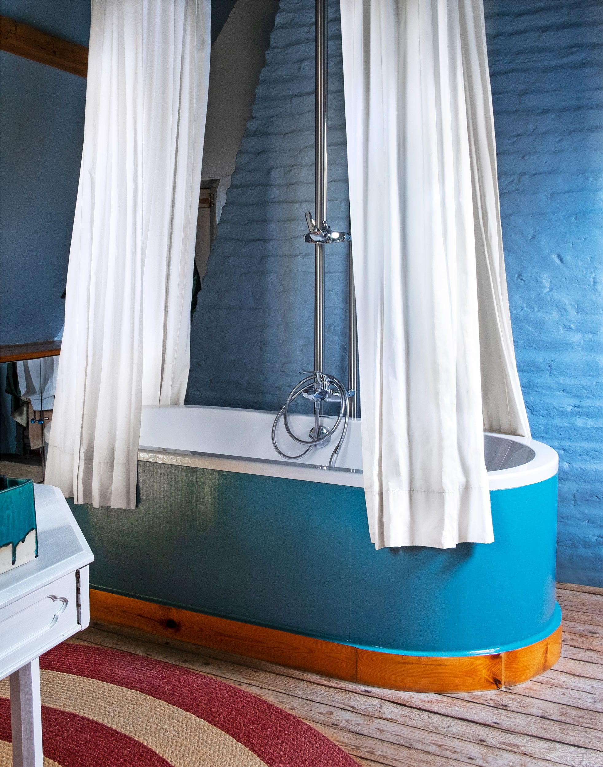
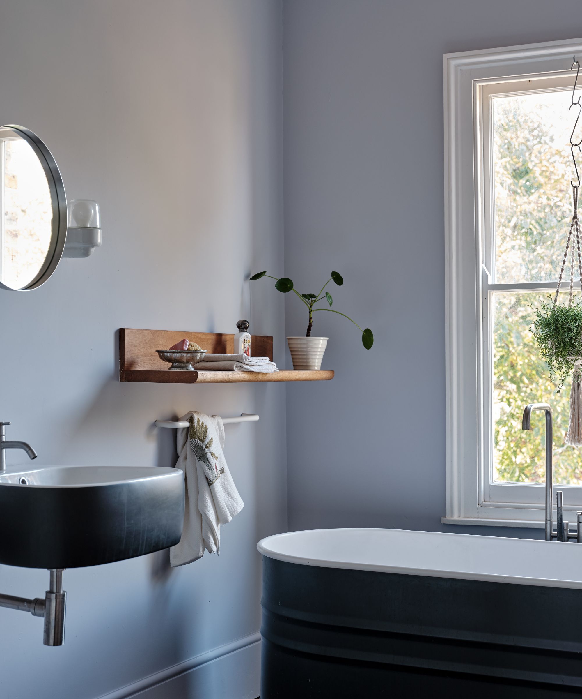
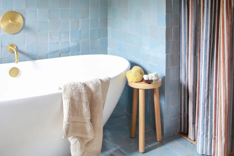
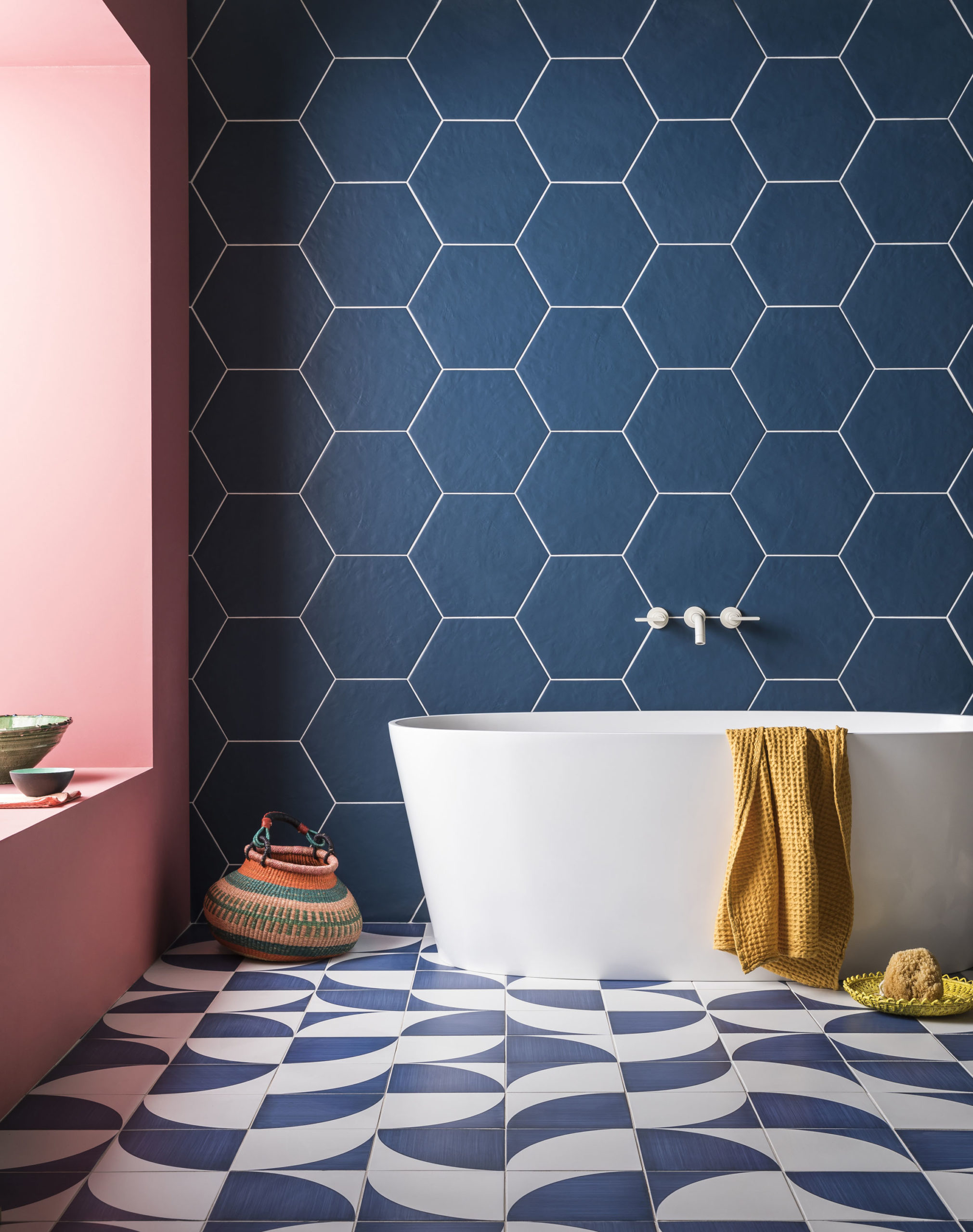
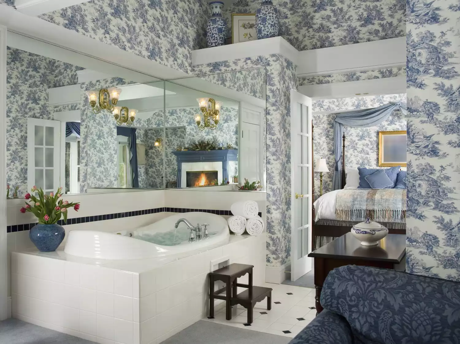
This article discusses common bathroom paint color regrets, drawing insights from Melanie Grabarkiewicz, lead designer at Meadowlark Design + Build. Many people tend to choose paint colors that, while appealing in theory, often fall short in practice, impacting both the room's ambiance and personal appearance. The article highlights that cool-toned blues are frequently regretted, as they can make a bathroom feel dull and unflattering to one's complexion, especially under varying light conditions. Grabarkiewicz suggests opting for warmer, softer tones to create a more inviting and restorative atmosphere, which also better complements natural skin tones.
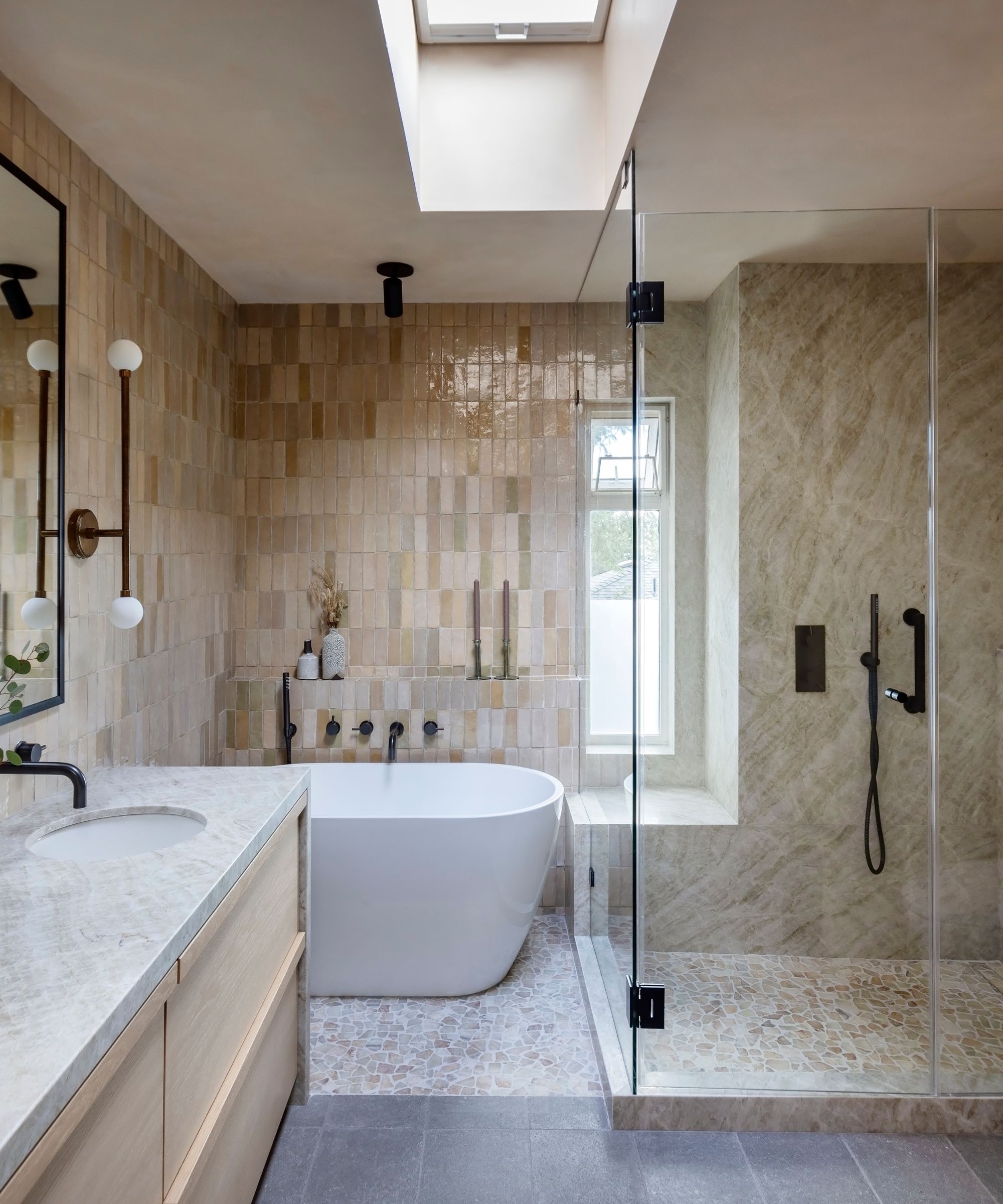
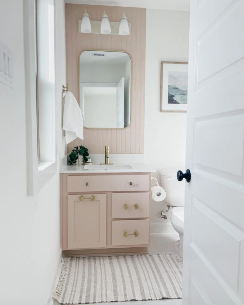
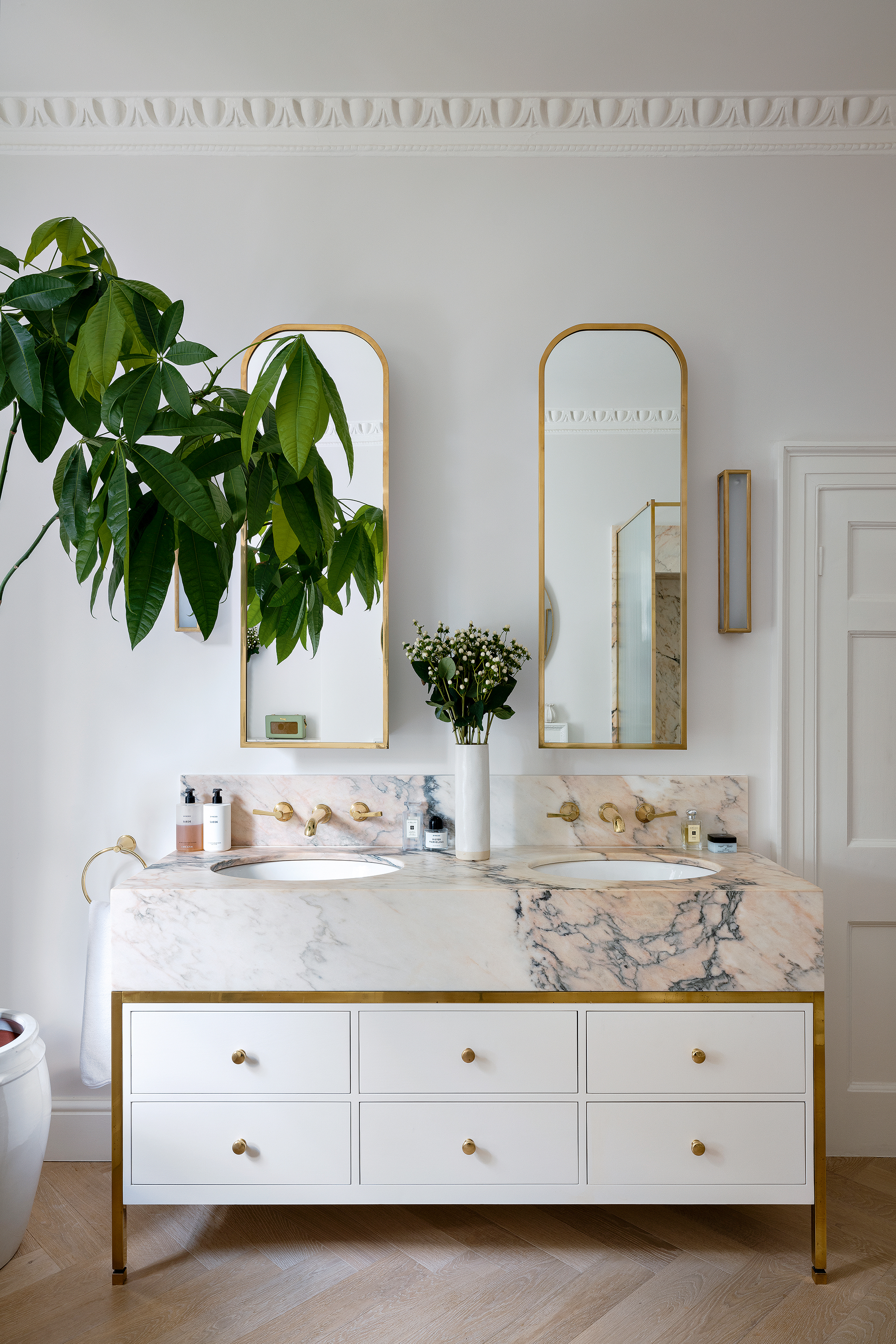
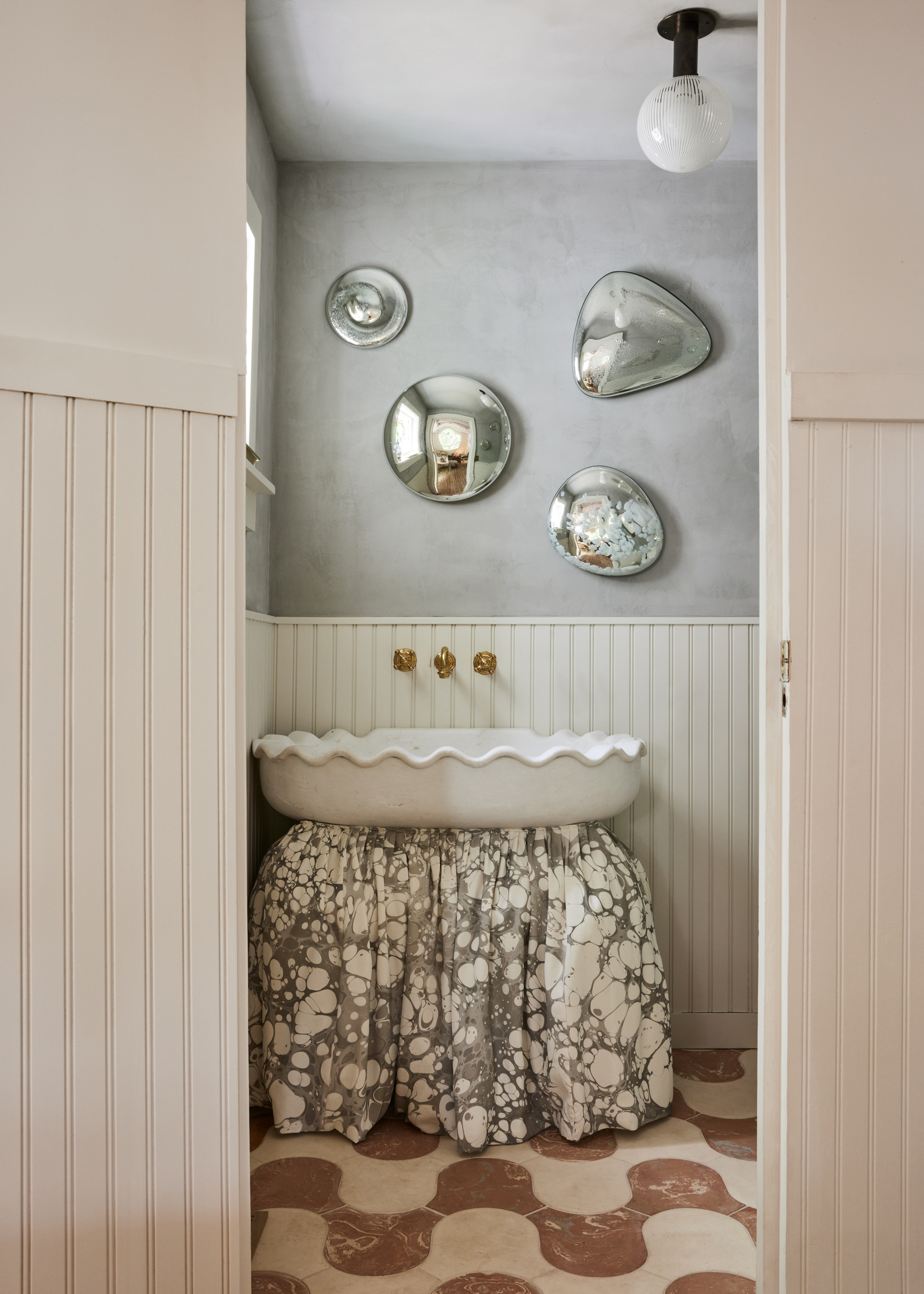
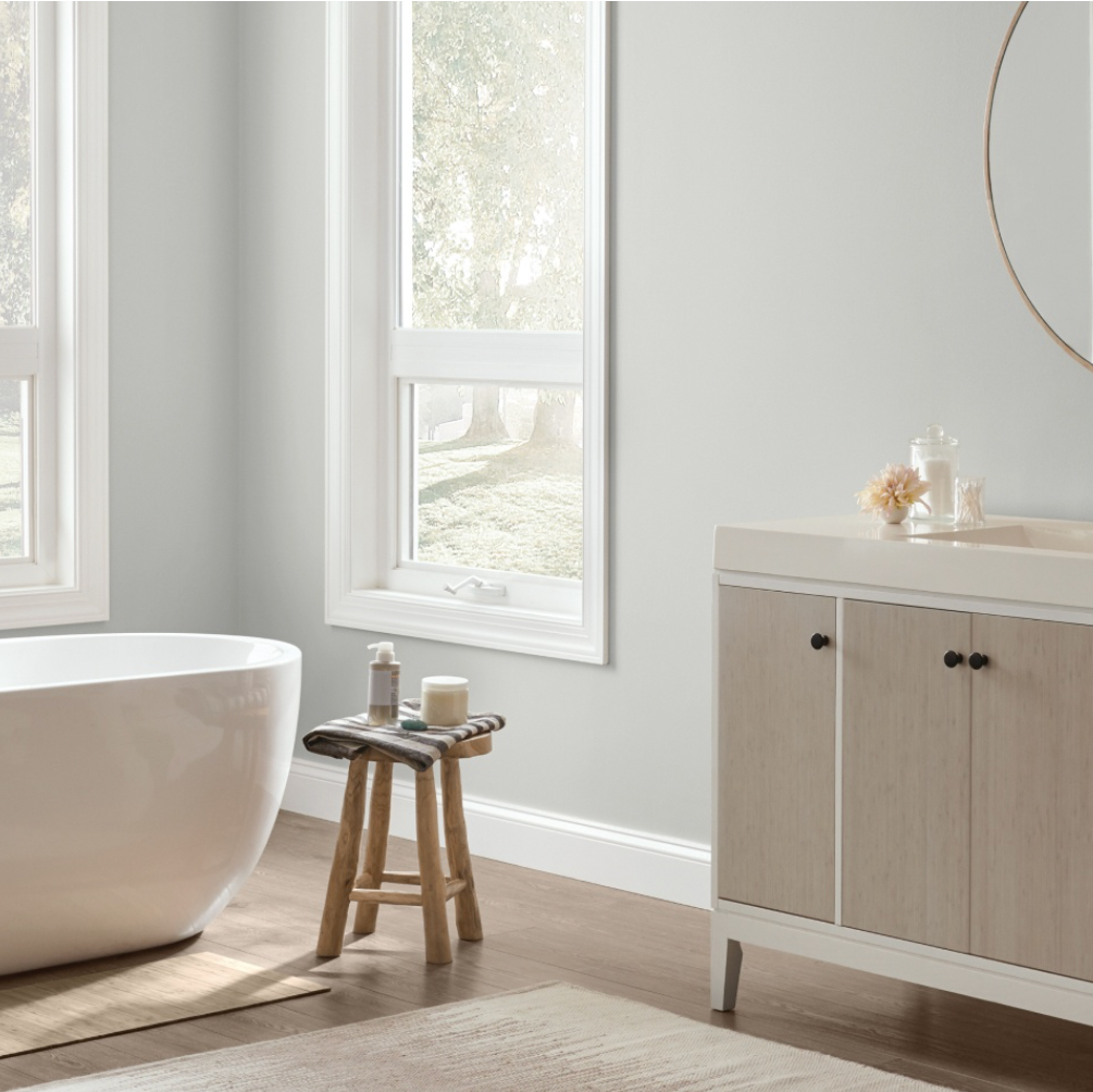
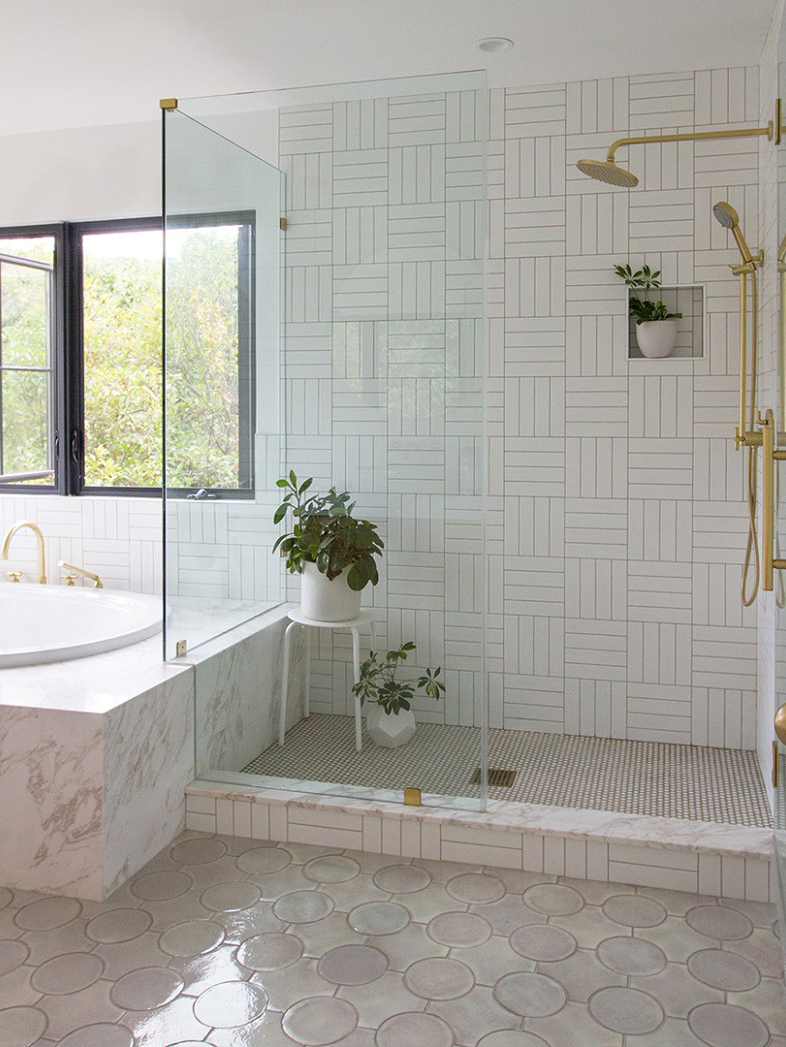
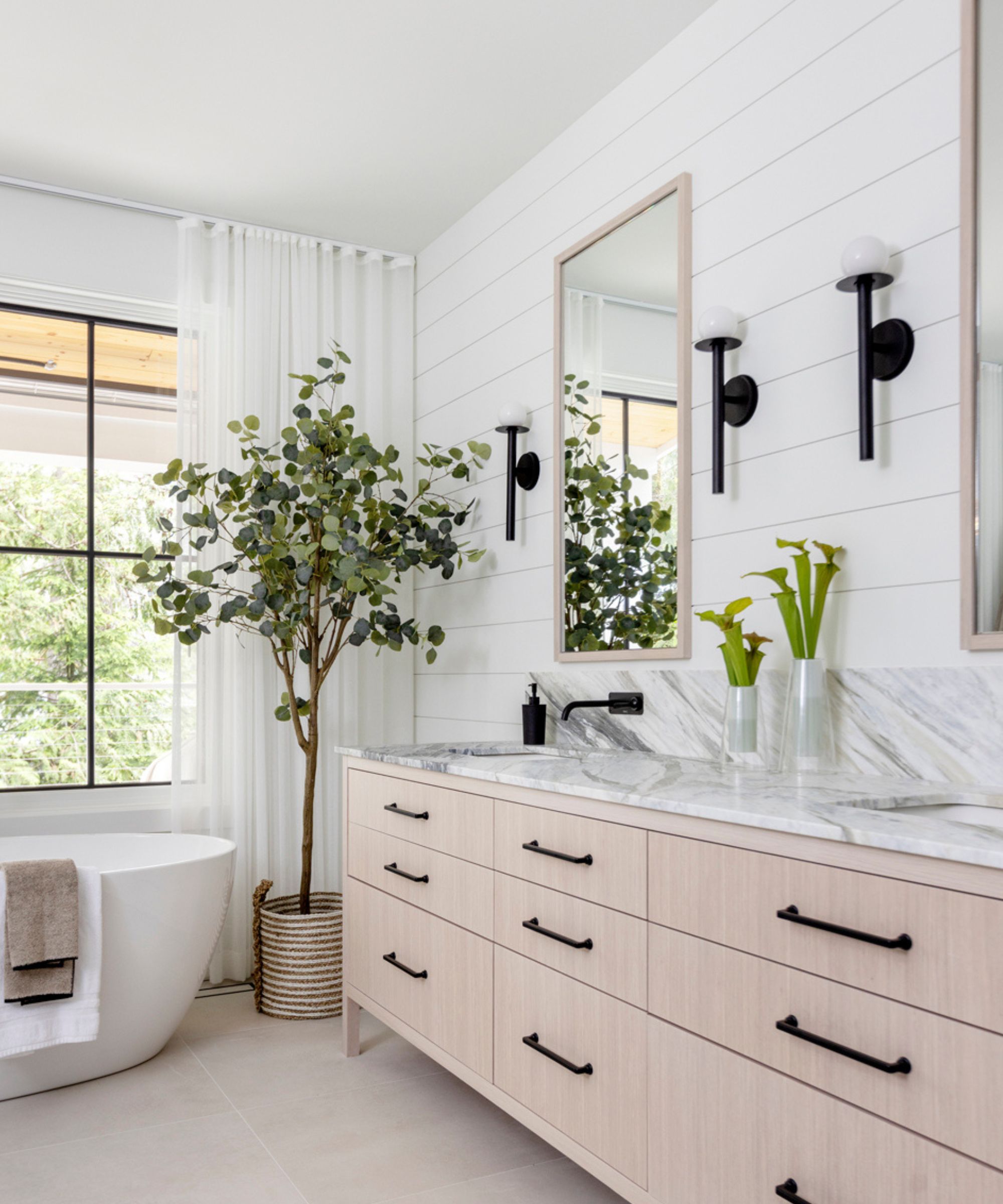
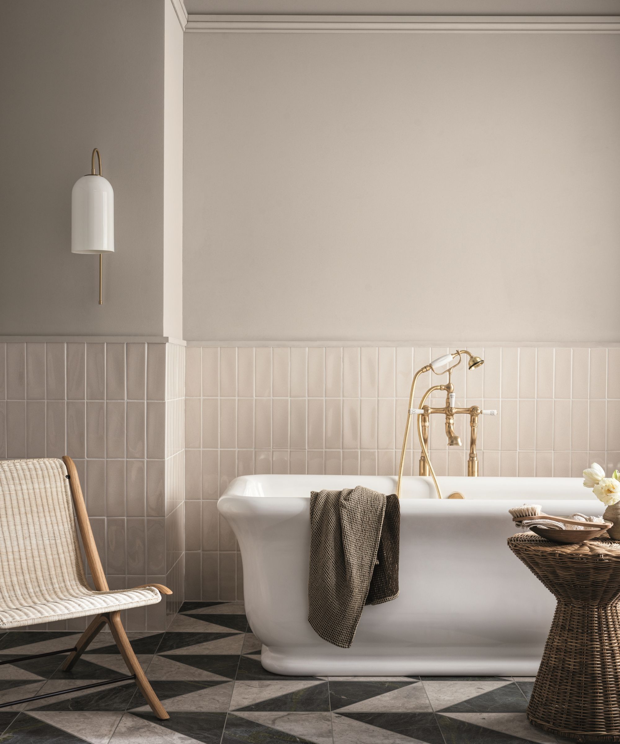
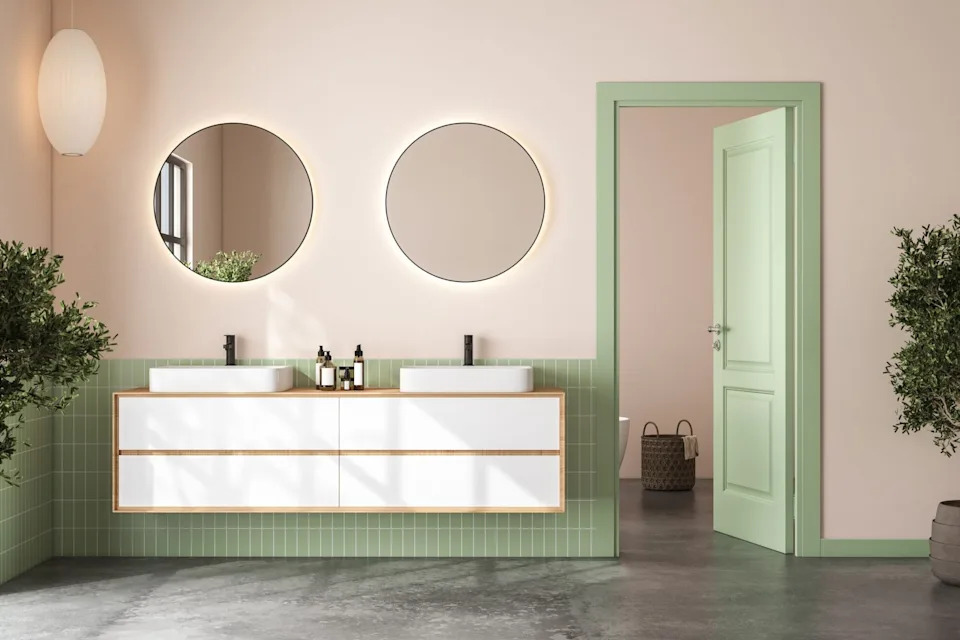
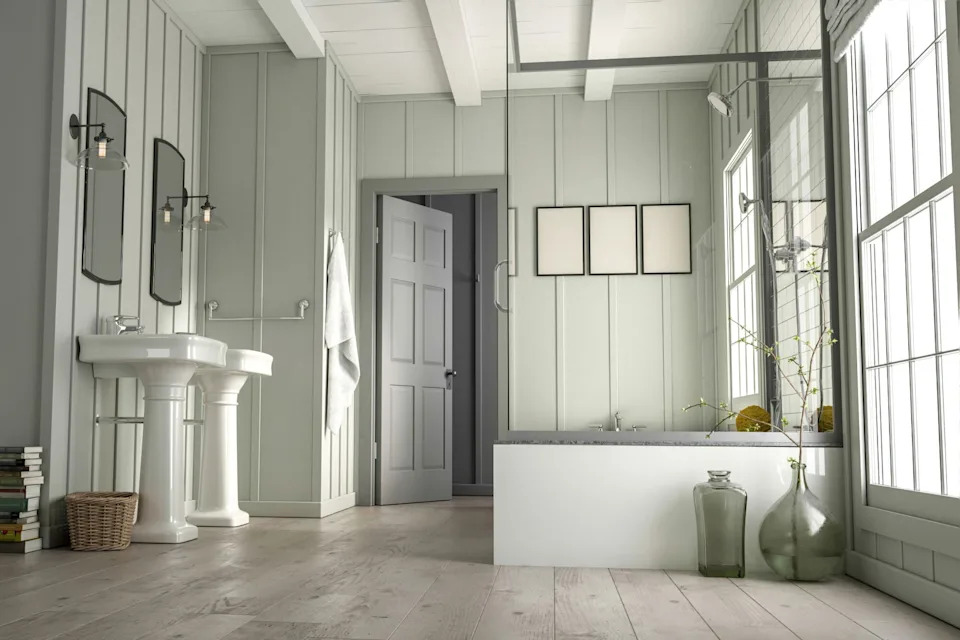
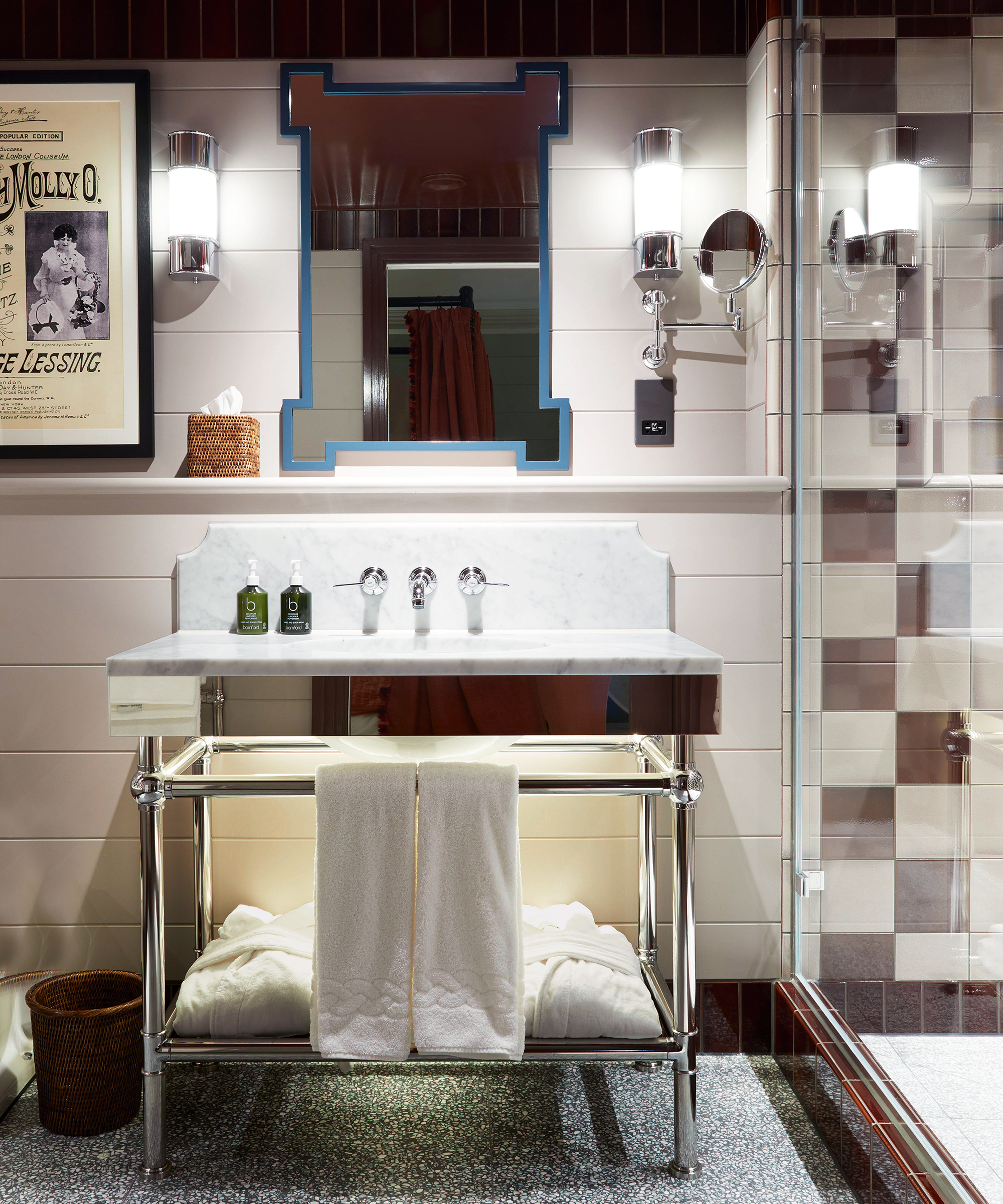
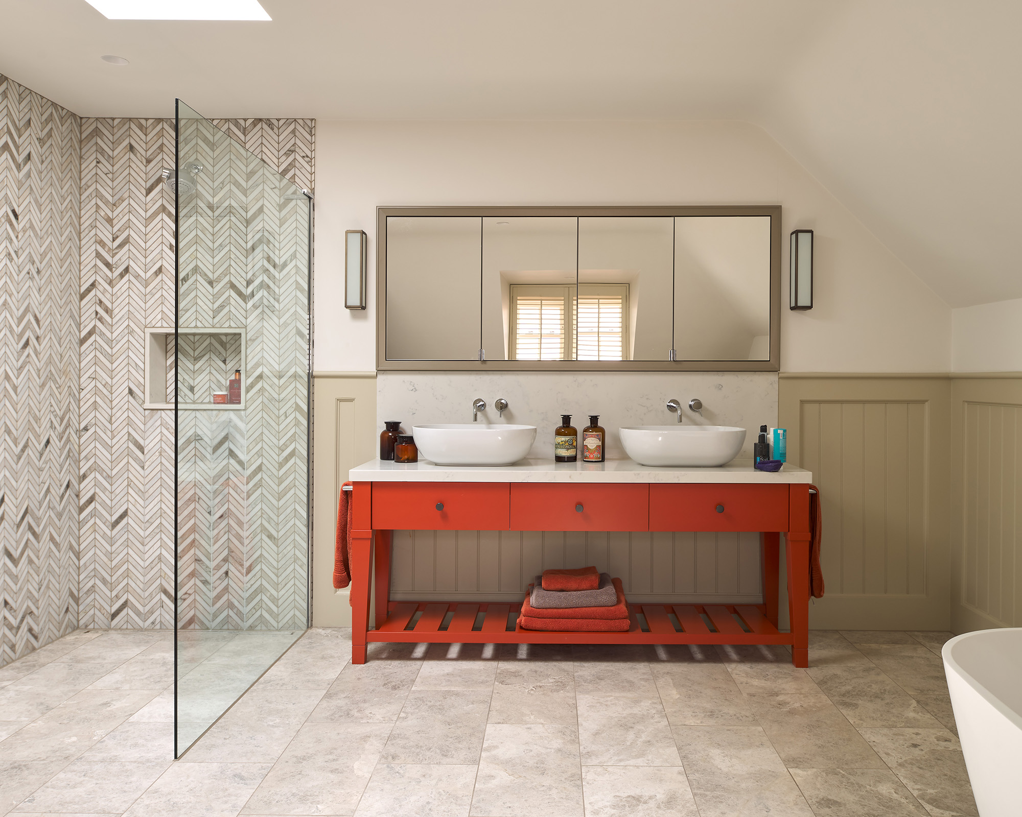
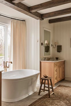
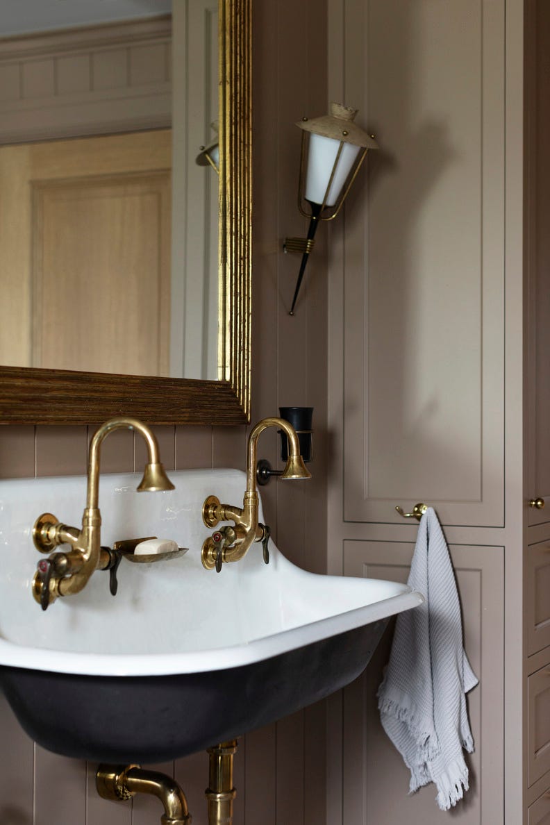
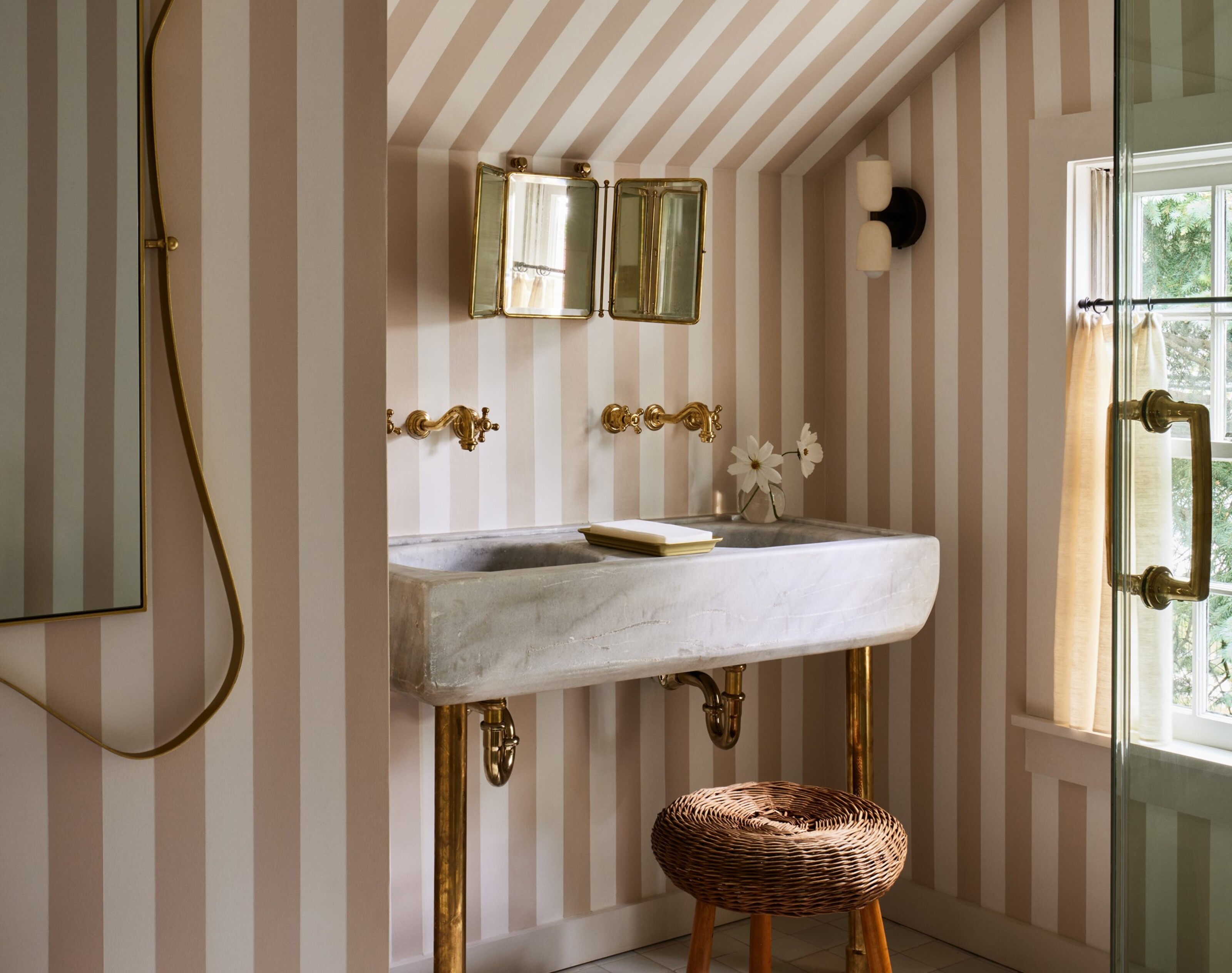
Another significant regret is the use of stark grays or whites. While initially perceived as clean and modern, these colors can result in a clinical and sterile bathroom environment, particularly when paired with cool LED lighting. The article advises homeowners to move away from the all-gray bathroom trend and instead consider warmer neutrals or whites with subtle undertones of cream, taupe, or blush. These alternative hues are described as more inviting and harmonize well with contemporary trends in tile and stone, offering an easy way to introduce warmth without a complete overhaul.
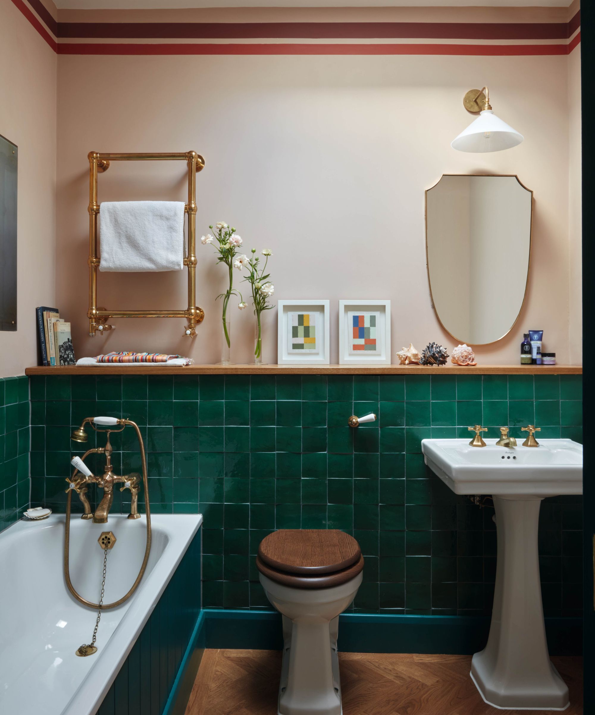
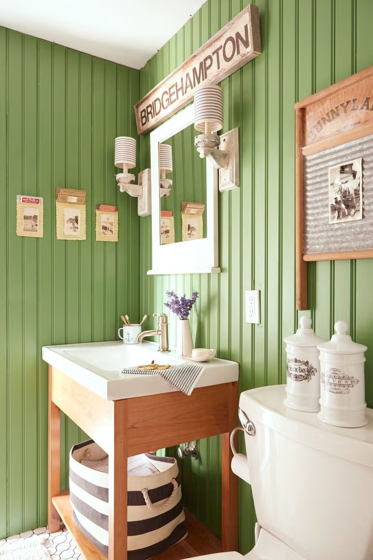
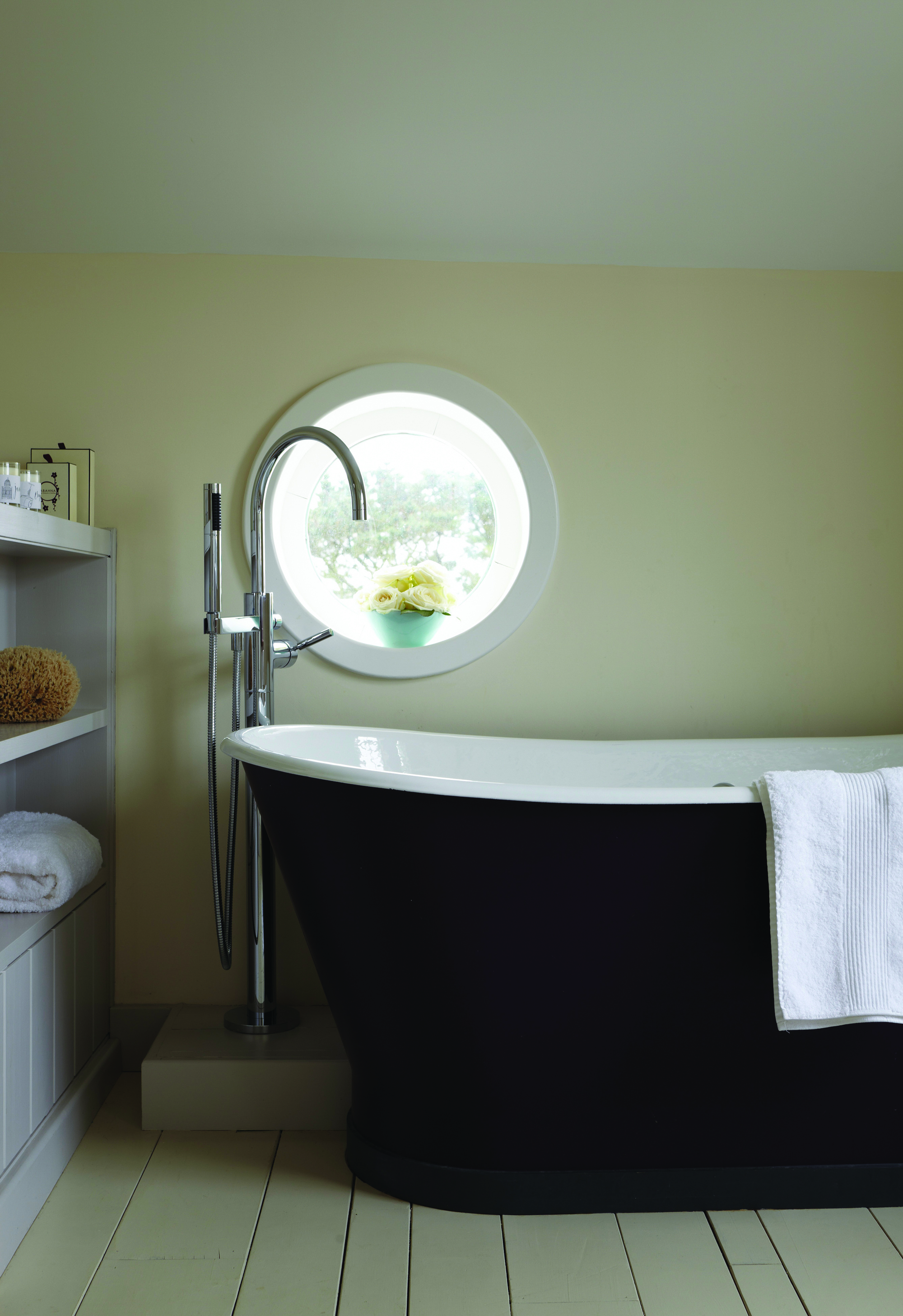
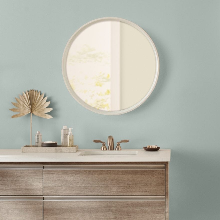
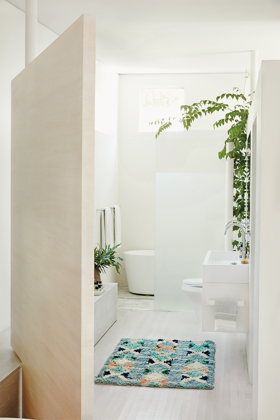
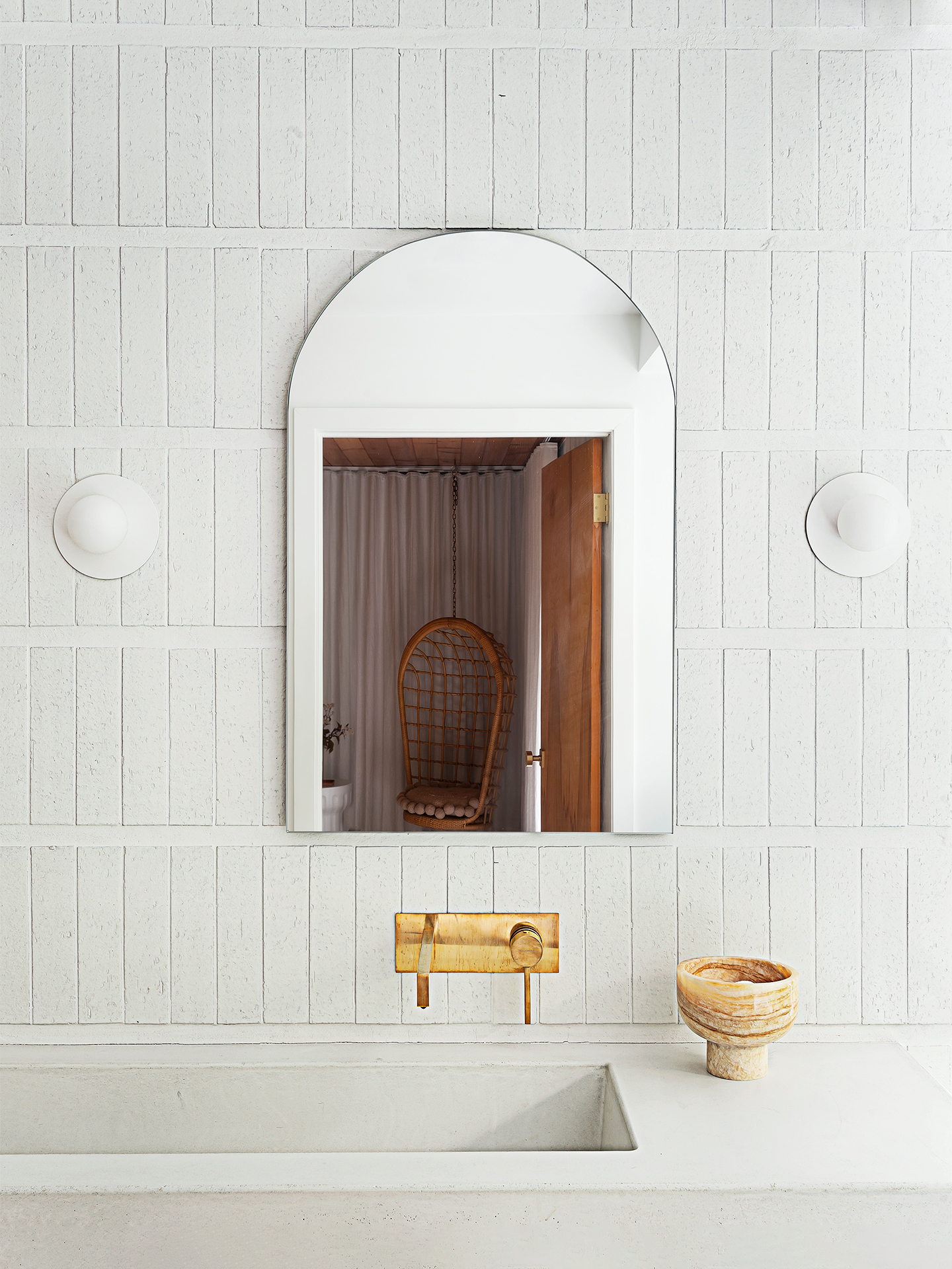
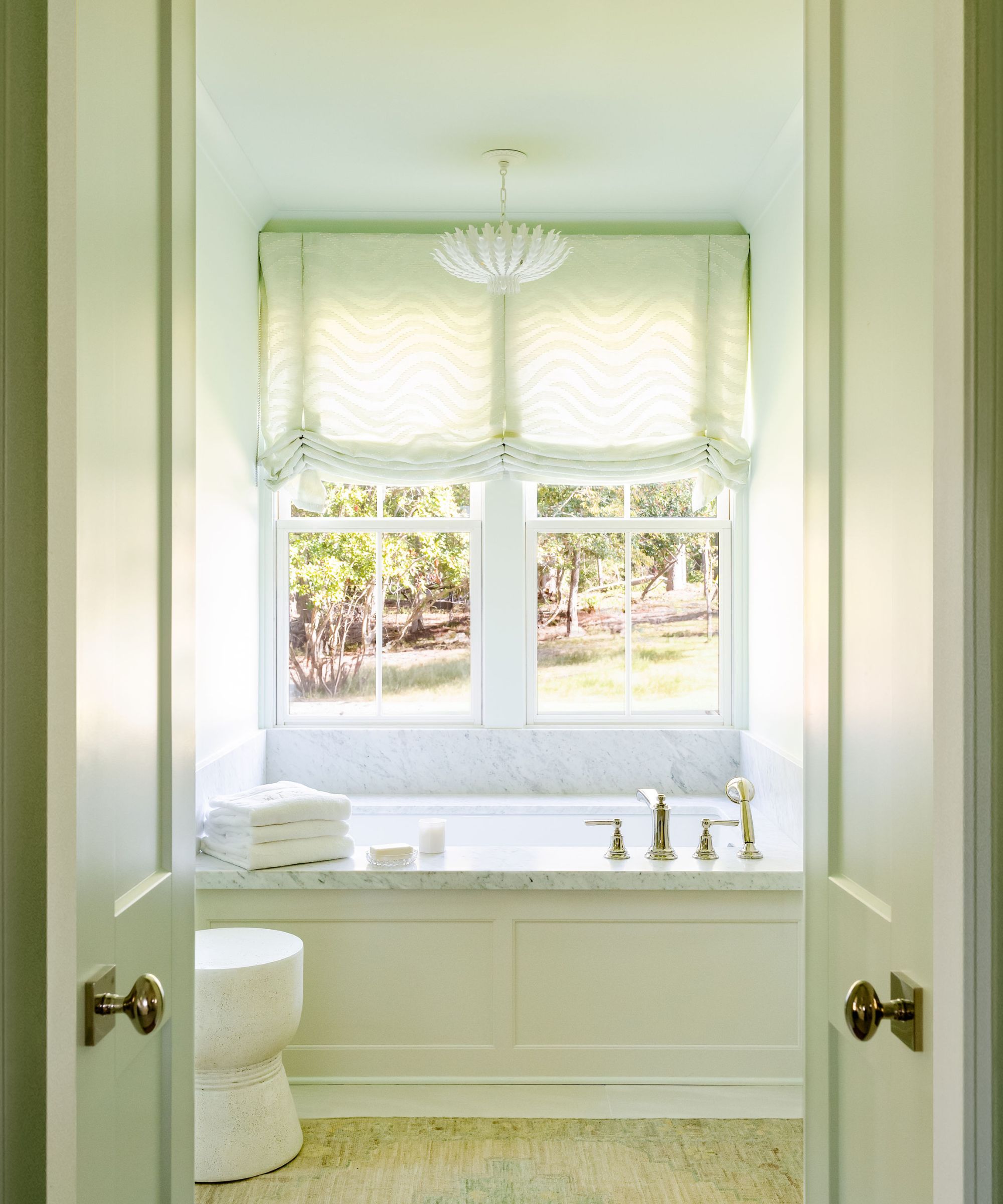
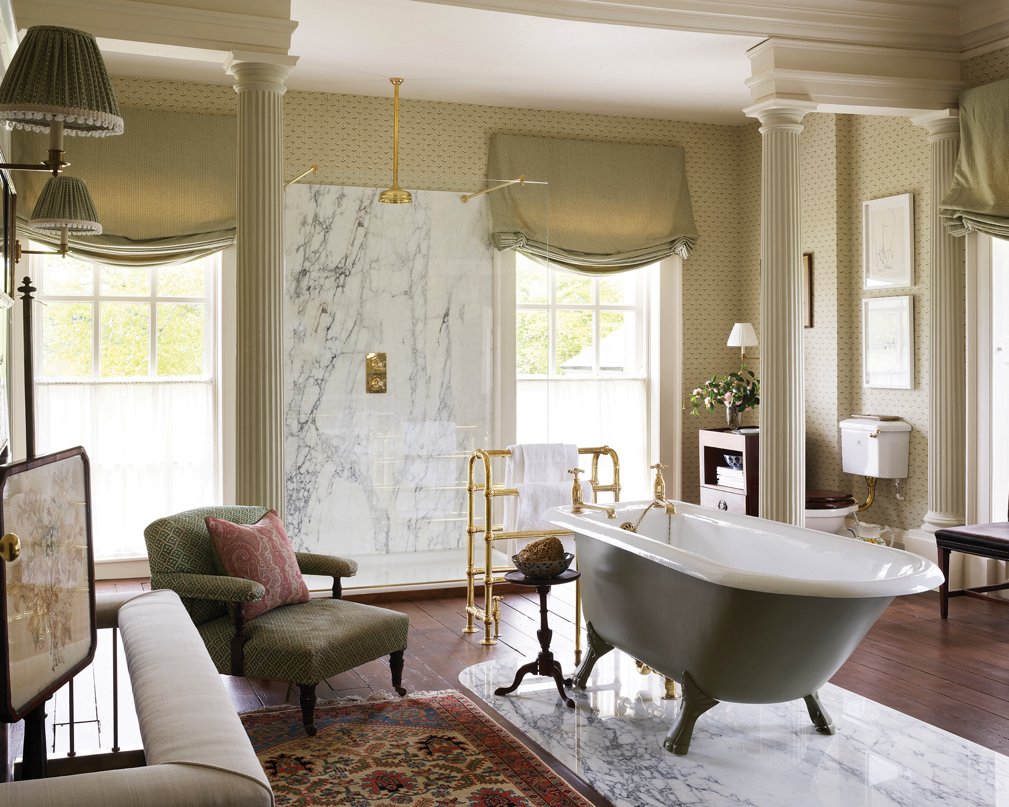
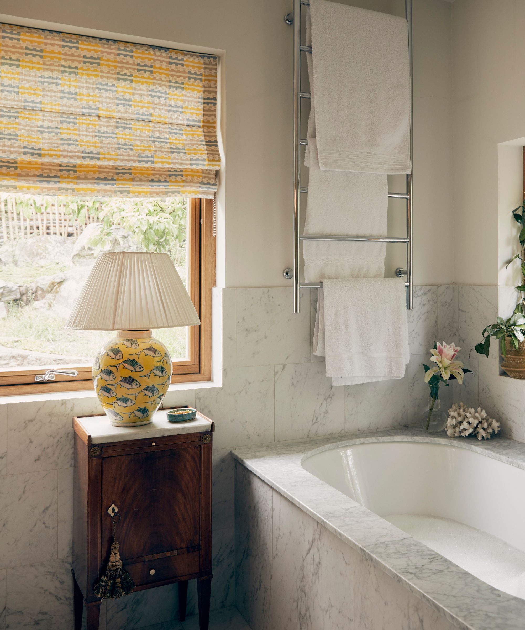
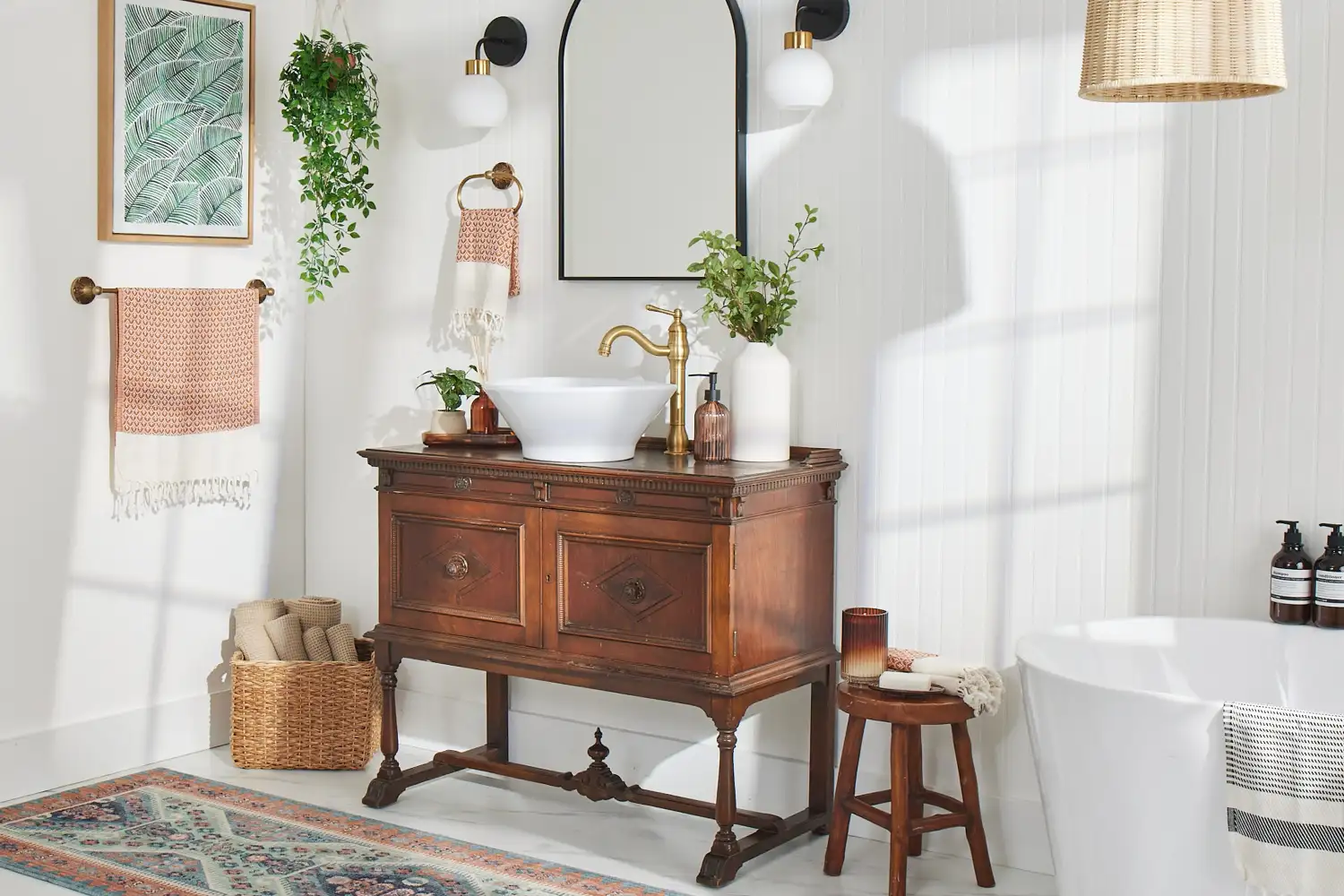
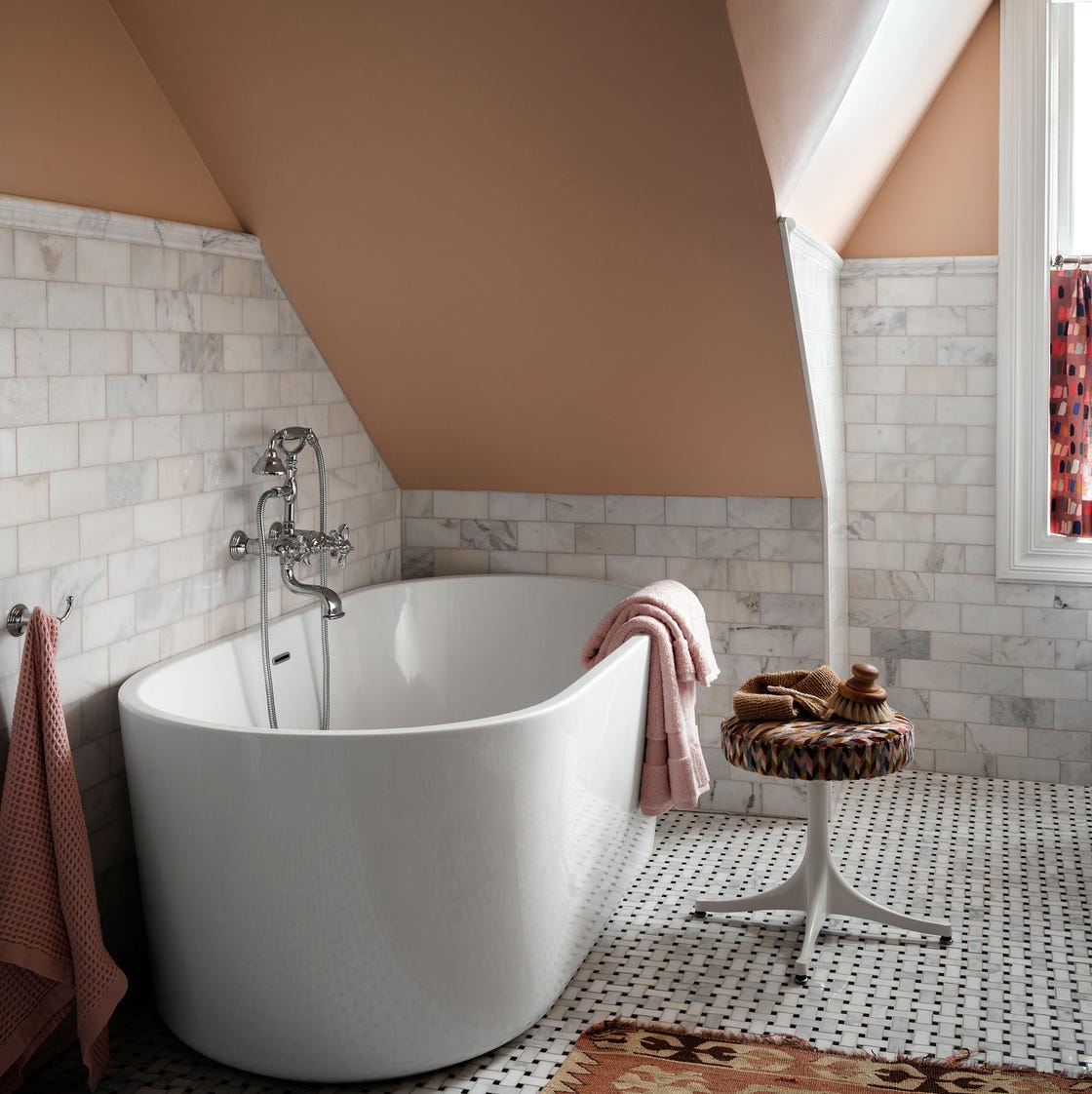
Crisp, bright white walls, despite their initial appeal for a clean aesthetic, are also identified as a source of regret. Designers find that in real-world application, bright white can appear harsh and unwelcoming. A recommended solution is to replace stark white with a warmer white that has hints of cream or beige. This adjustment allows for the maintenance of a bright space while achieving a more serene and spa-like feel. The article also suggests incorporating gentle patterns, subtle colors, or moody shades like inky blue or hunter green to add depth and personality to a white bathroom.
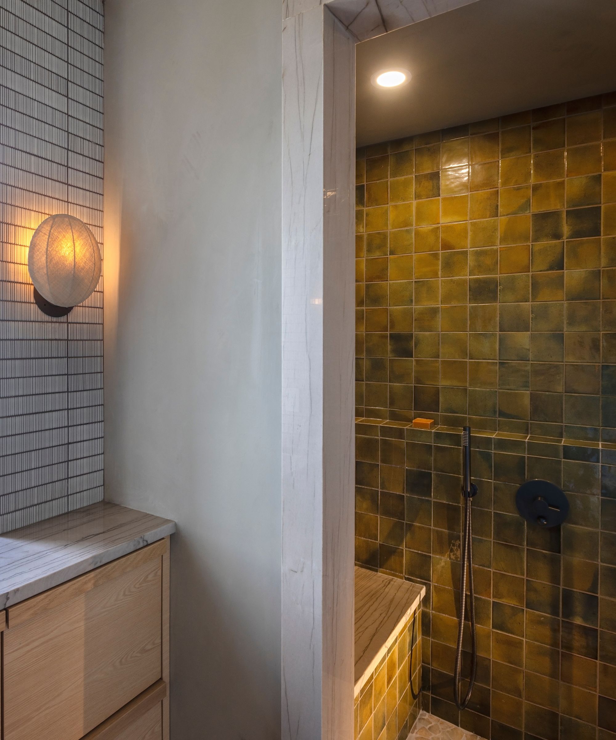
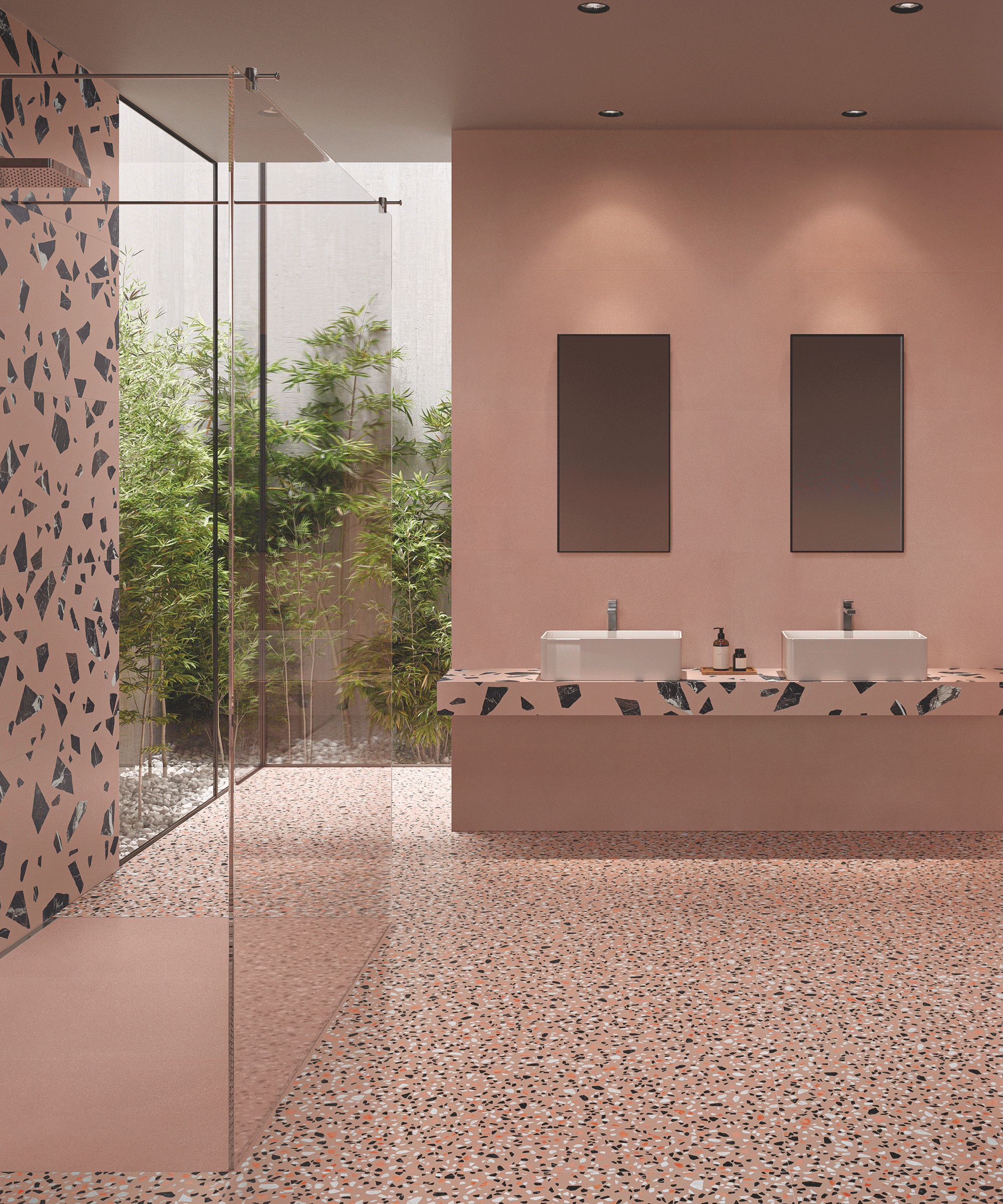
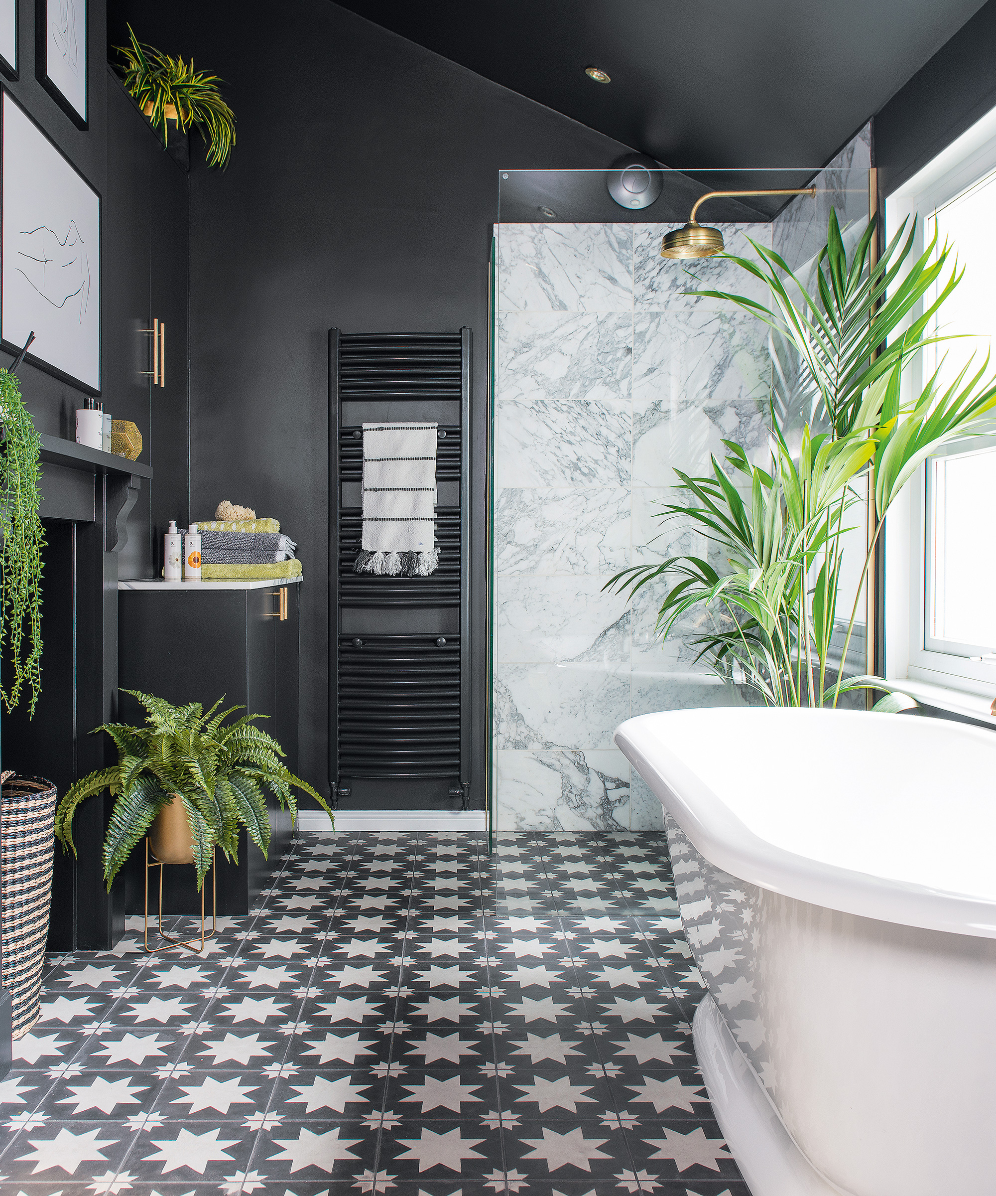
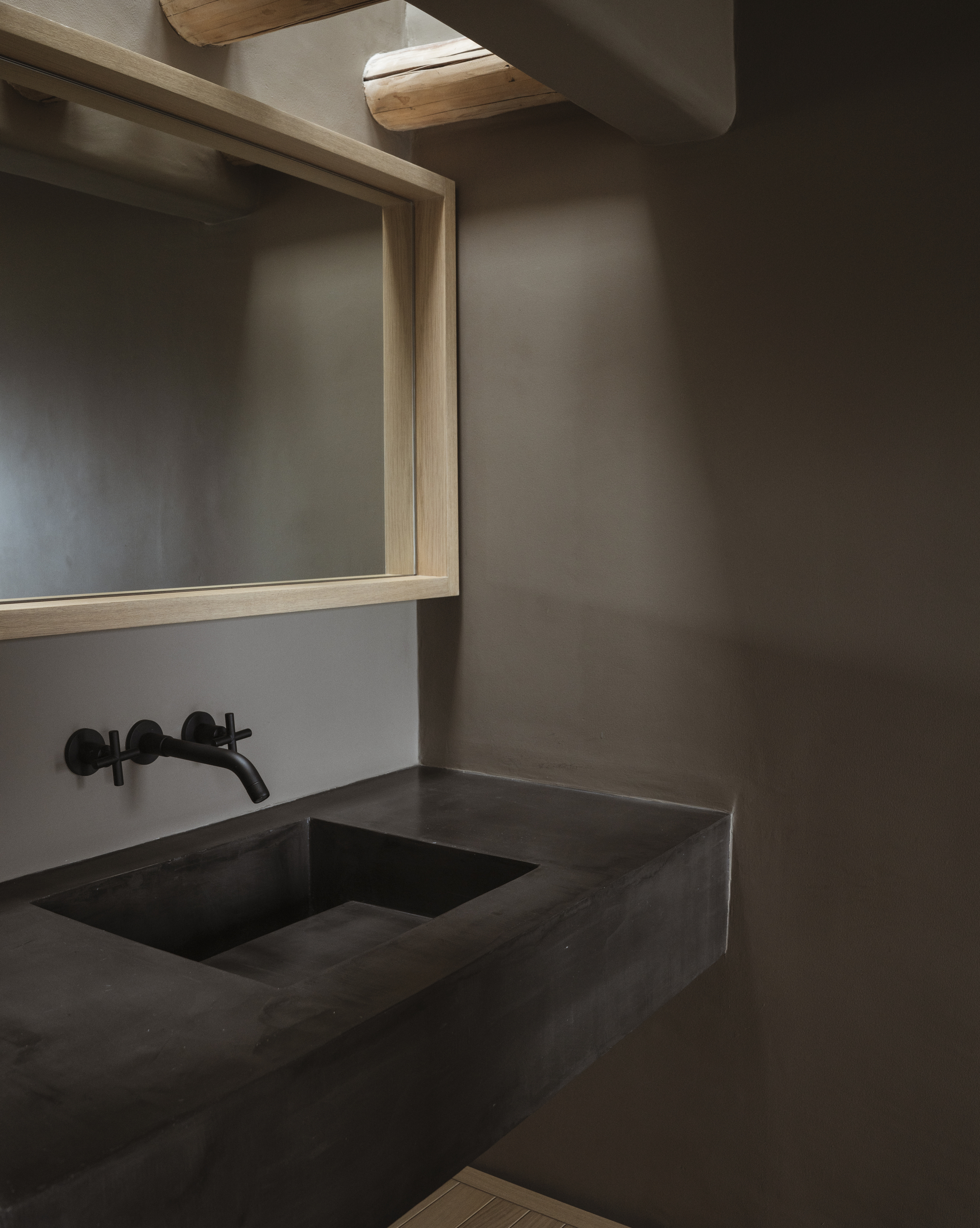
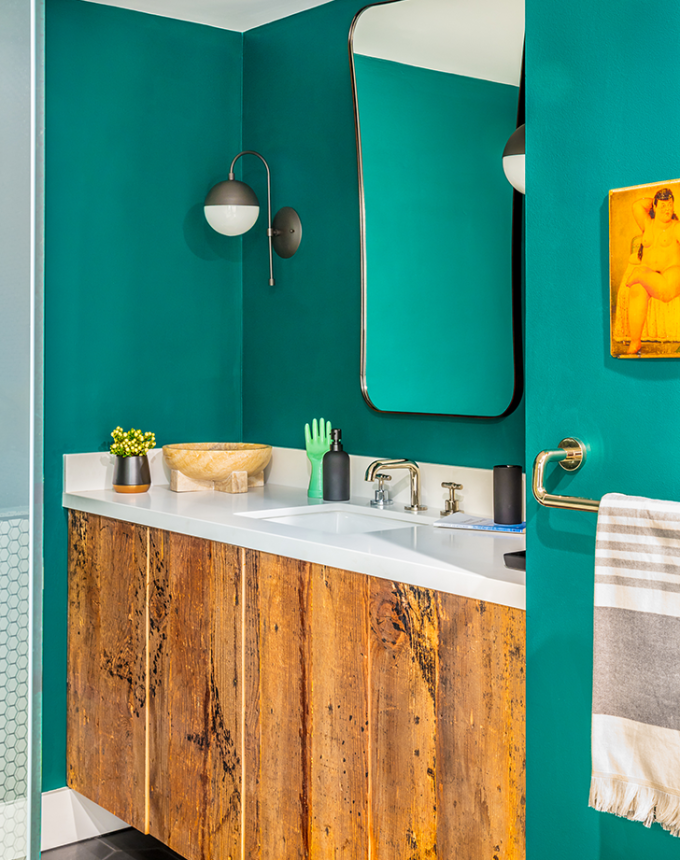
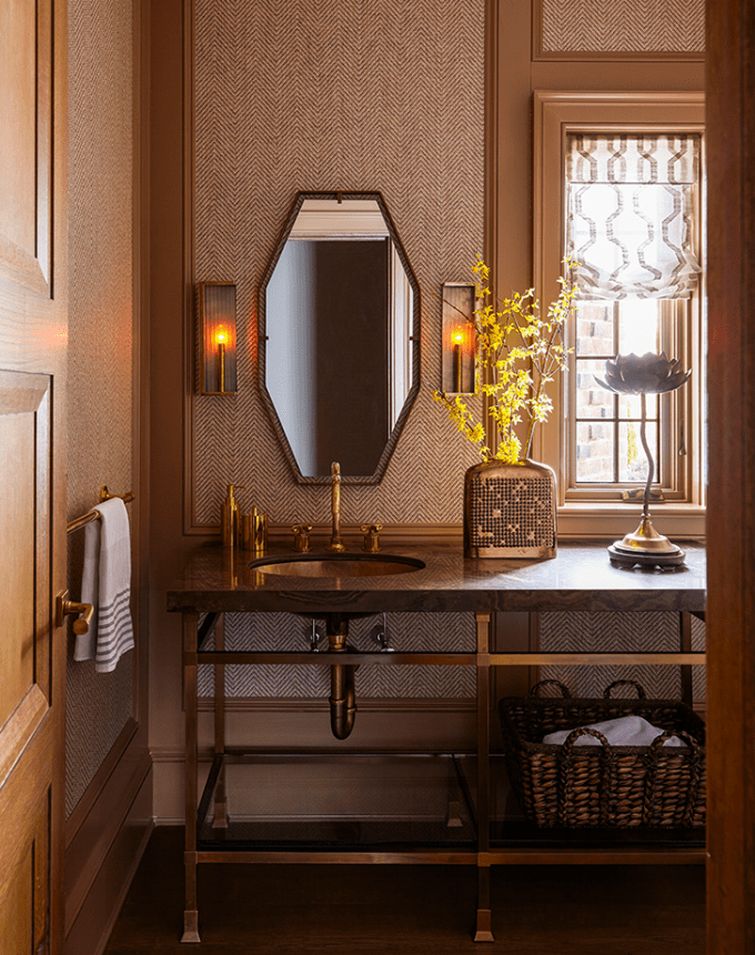
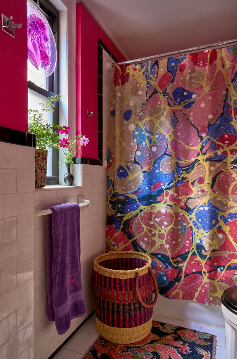
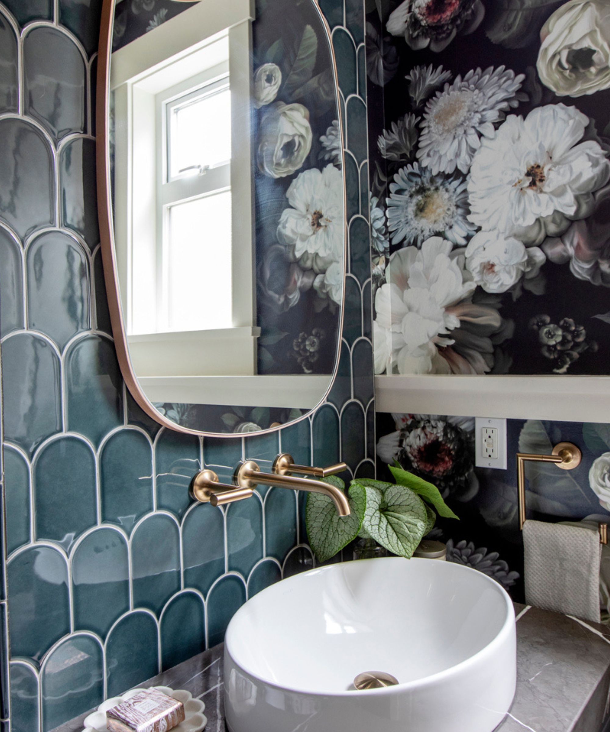
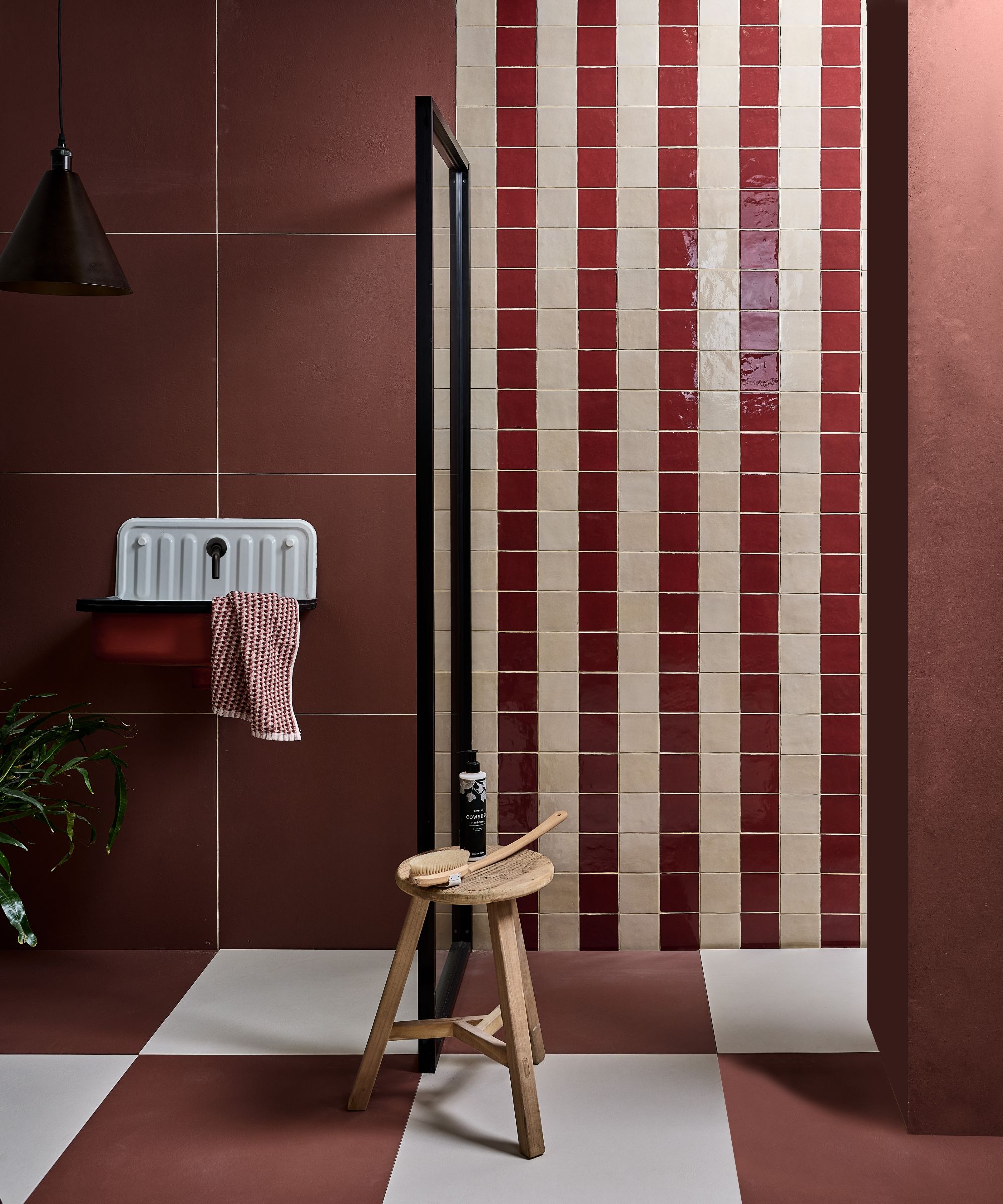
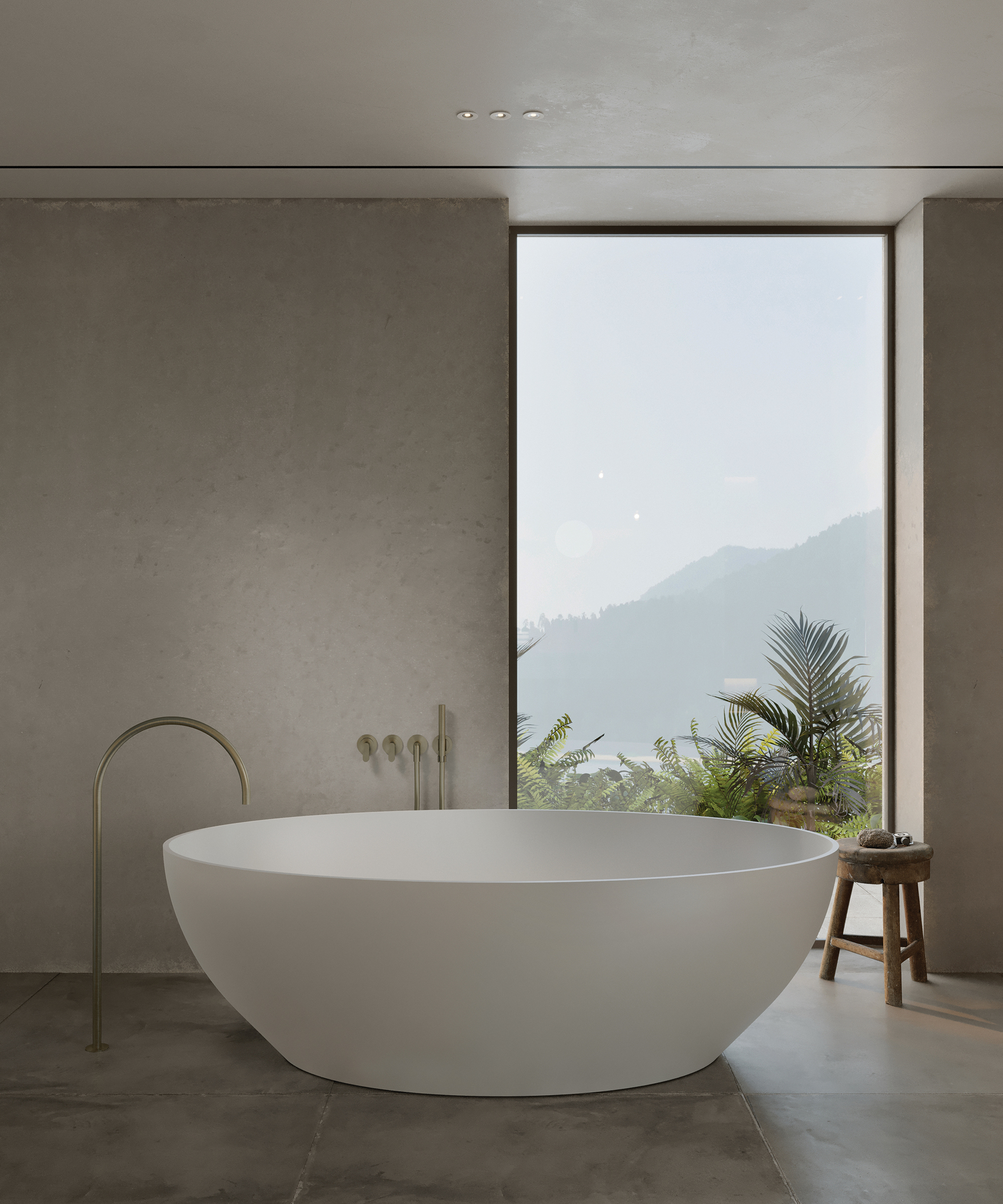
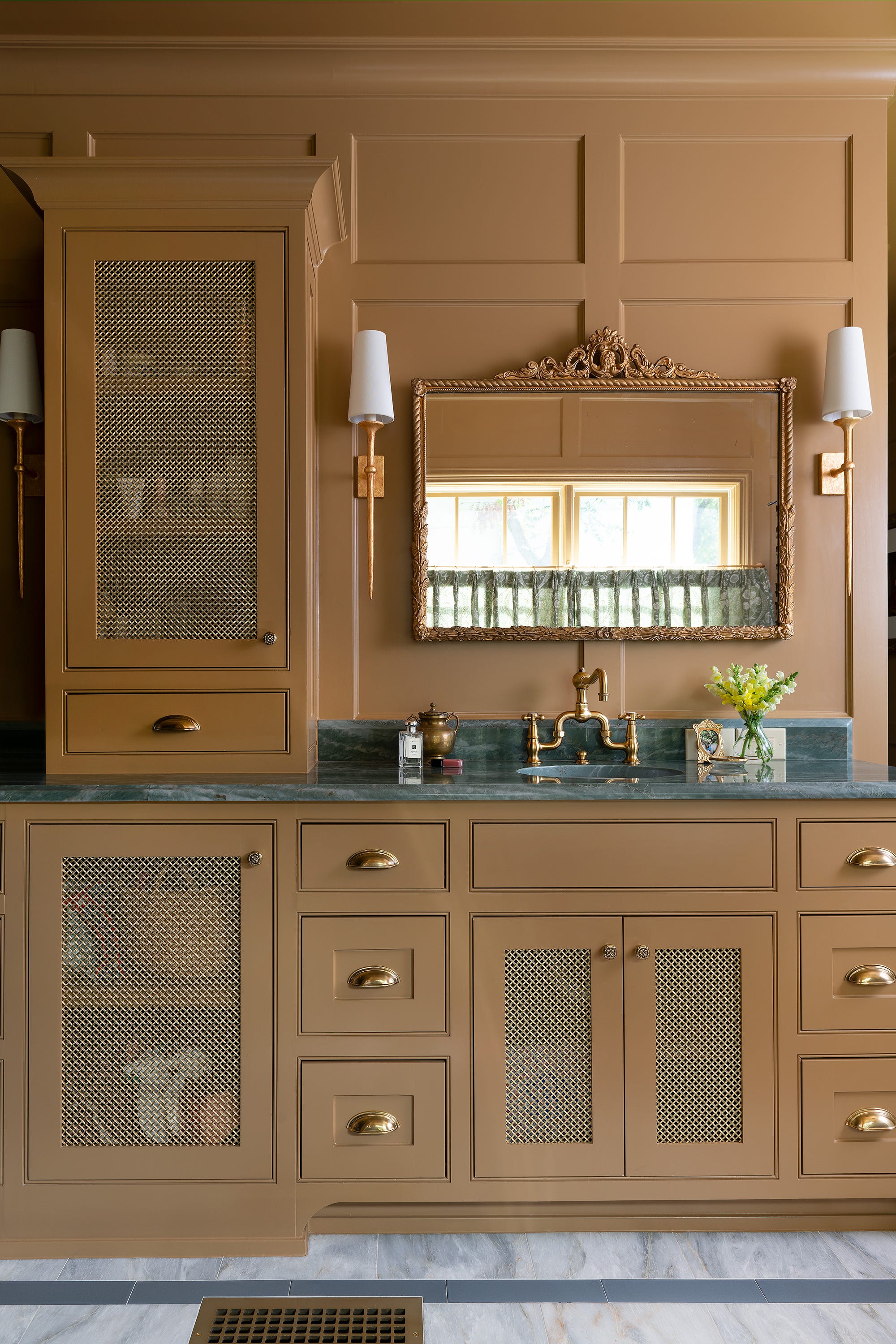
Finally, the trend of deep color drenching, often inspired by dark academia aesthetics, is highlighted as a common regret. While visually stunning in photographs, achieving a functional and appealing dark bathroom in reality proves challenging due to lighting requirements. Homeowners often underestimate the amount and type of light needed to prevent the space from feeling heavy or cave-like. For those determined to experiment with darker hues, the powder room is suggested as a suitable space, provided that careful attention is paid to balancing rich tones with well-placed sconces, mirrors, and warm lighting. However, for primary bathrooms where daily preparation occurs, dark walls are generally not recommended due to their impracticality in such settings.
#BathroomDesign #PaintColors #HomeDecor #InteriorDesign #ColorPsychology #DesignTips #RenovationRegrets #BathroomDesign #PaintColors #HomeDecor #InteriorDesign #ColorPsychology #DesignTips #RenovationRegrets
0 comment in total
 No comments yet
You may also like
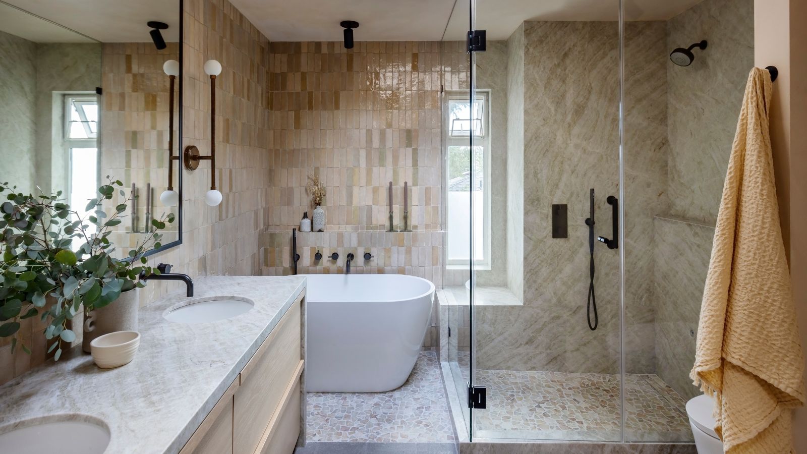
These are the 4 color schemes designers say will always make a bathroom look more expensive
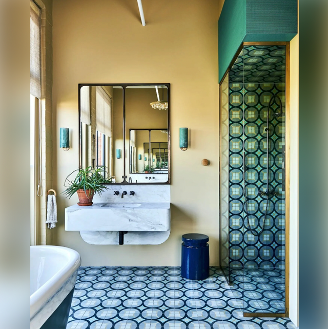
Try These Expert-Approved Bathroom Paint Colors for Your Next Home Makeover

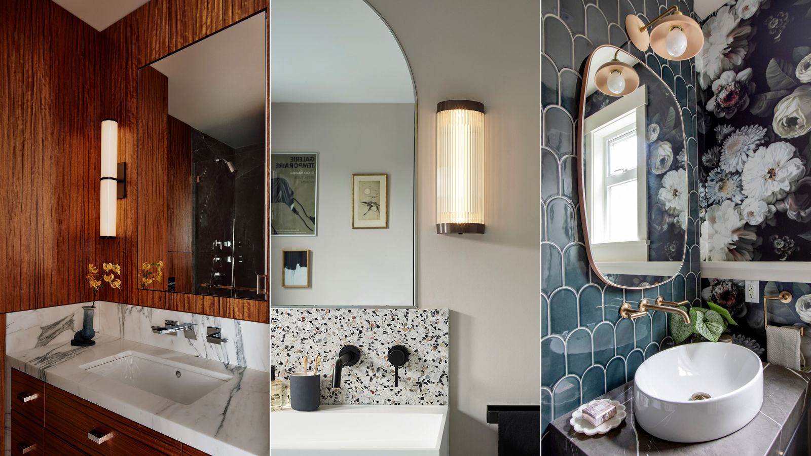
What are the most popular bathroom colors right now? Designers weigh in

We Asked a Designer Which Bathroom Features People Regret the Most, and Now We Can't Unsee It
The Bathroom Paint Colors Interior Designers Swear By

12 Bathroom Paint Color Ideas You Haven't Thought of Before
We Asked Designers Which Living Room Paint Colors People Regret Most—And We're All Guilty


4 Interior Designers Share the Biggest Paint Color Trends Right Now (and What’s Out!)

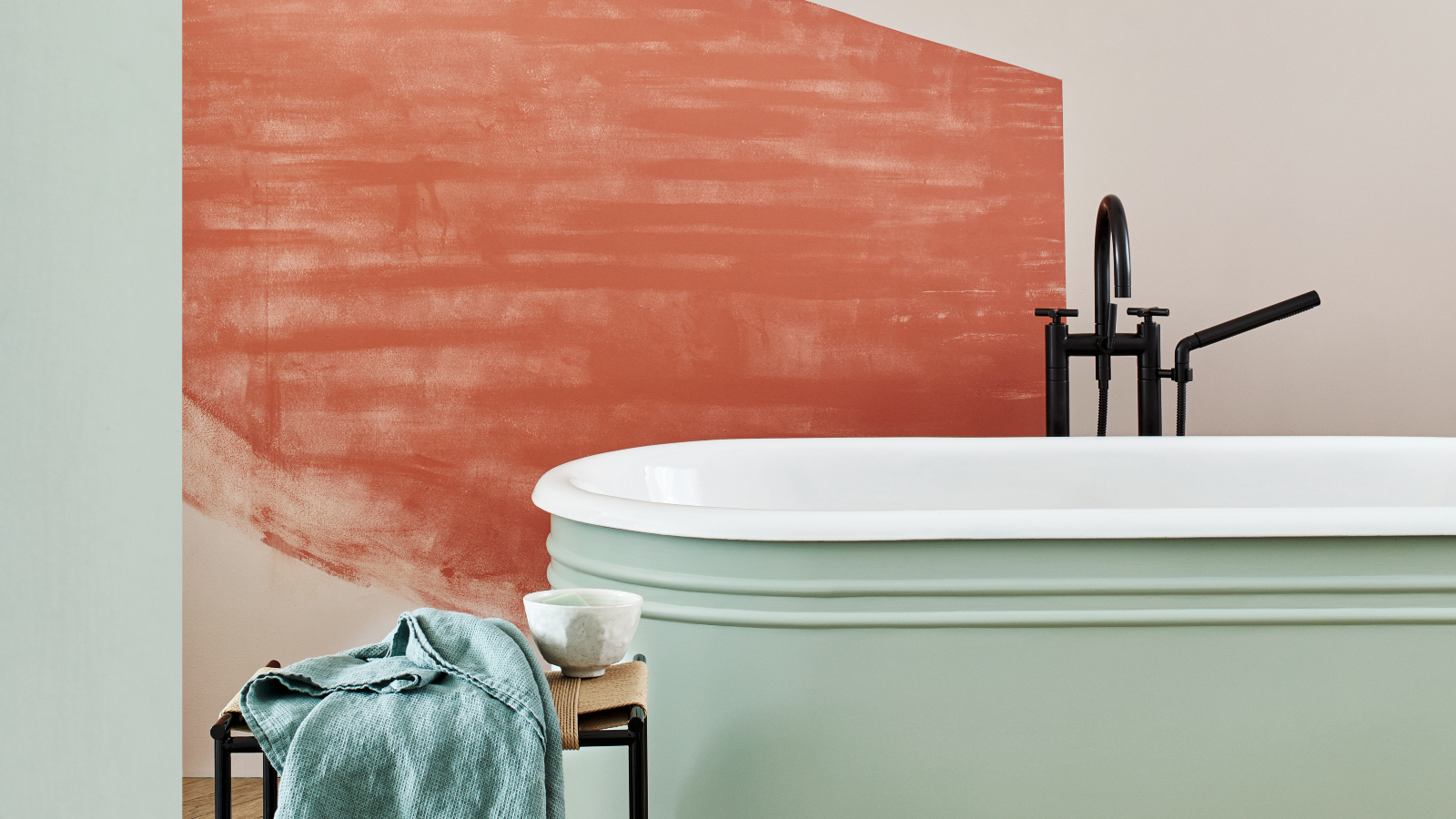
5 colors to avoid in a bathroom – according to designers
We Asked Designers Which Paint Colors Homeowners Always Regret—These 5 Came Up the Most
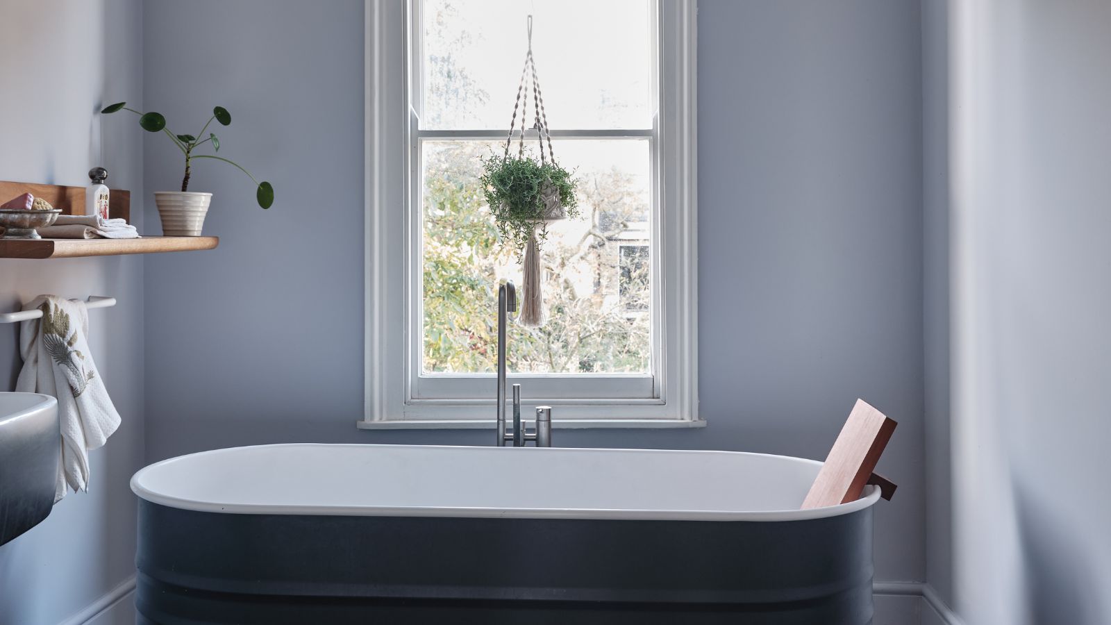
Bathroom colors going out of style in 2025 – and the designer-approved shades to decorate with instead
Towel colors to avoid in bathrooms – and what to buy instead, according to designers
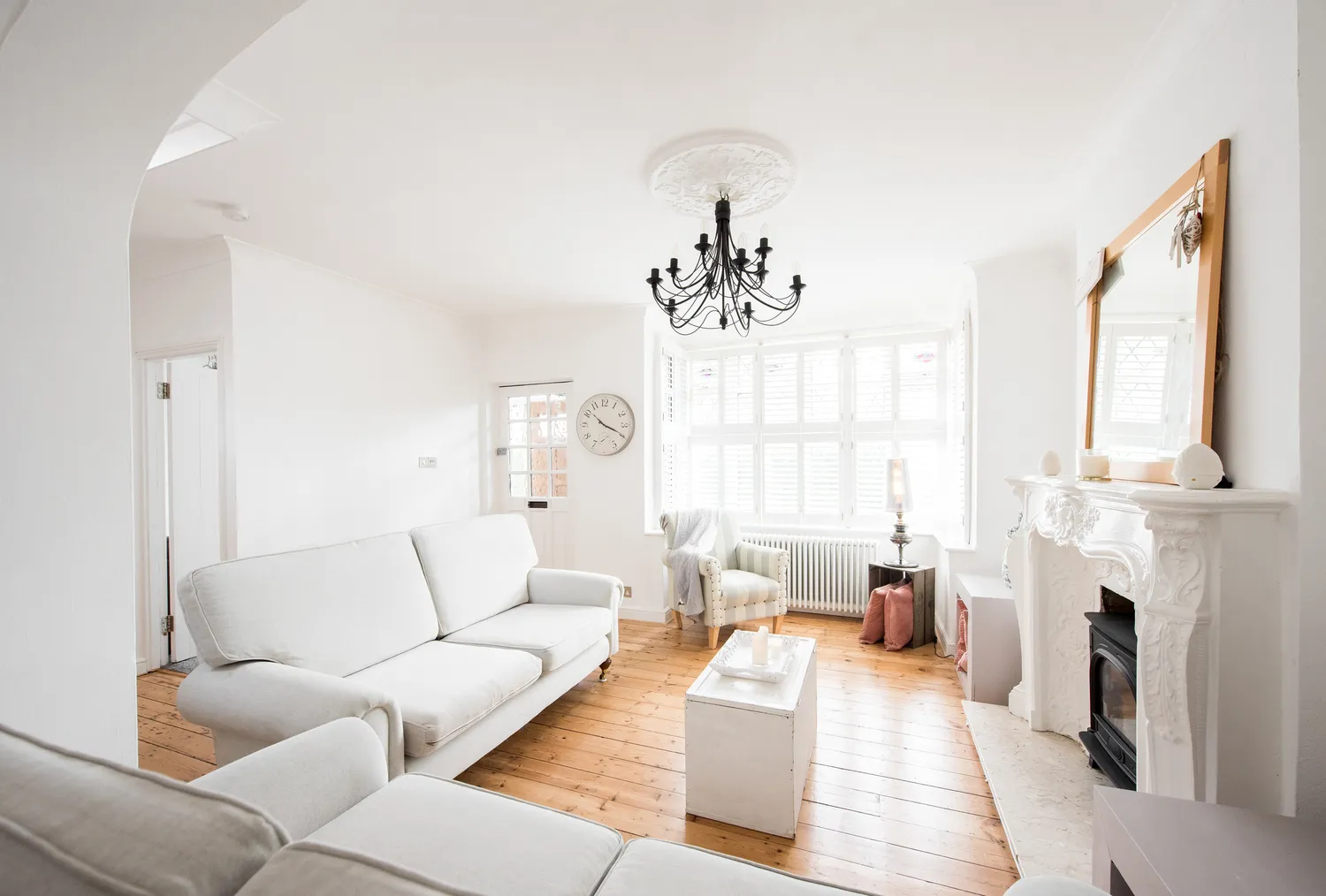
We Asked Designers Which Living Room Paint Colors People Always Regret—These 6 Came Up the Most
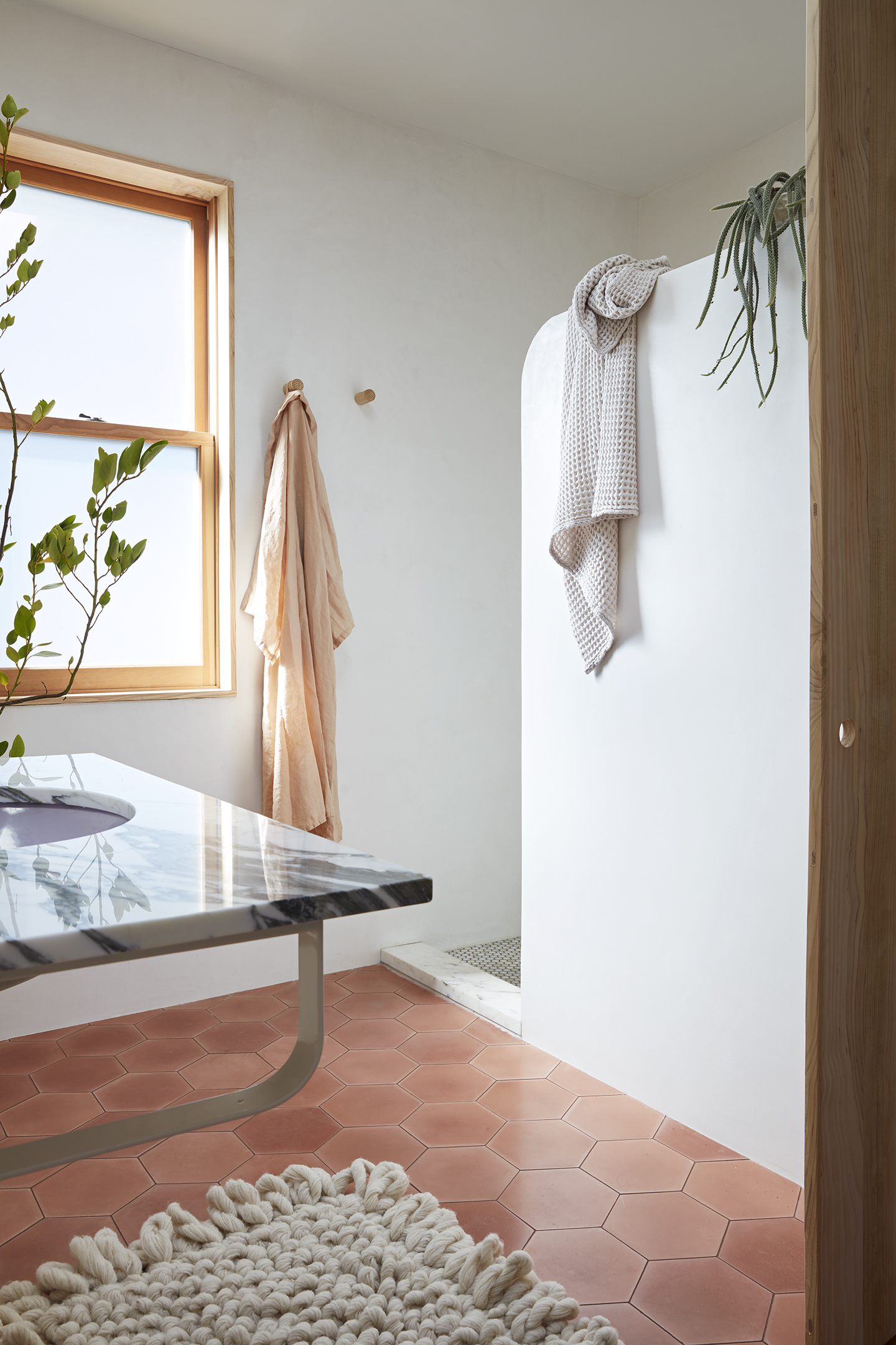
This Color Is Still the Most Popular for Bathroom Countertops and Walls

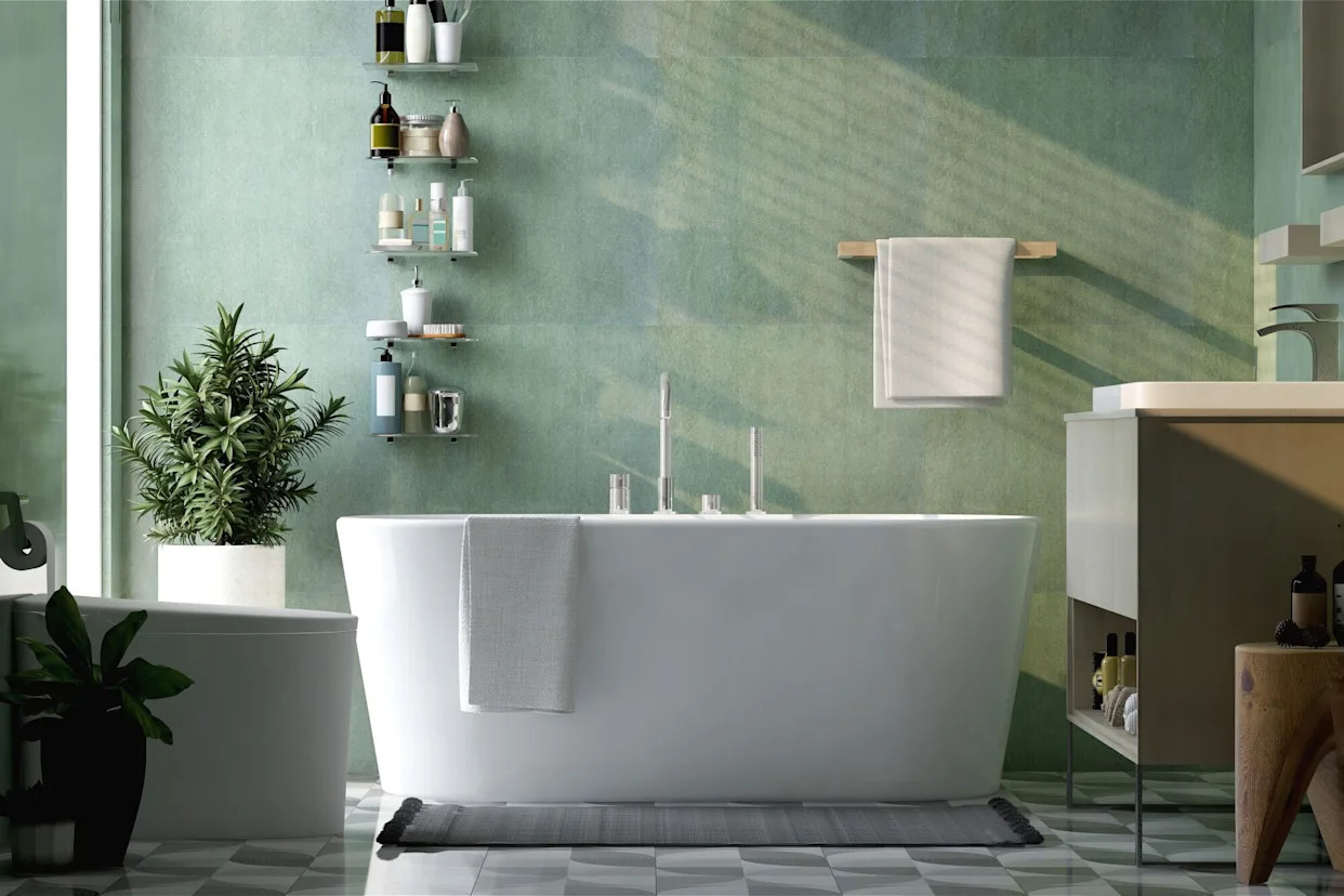
The Bathroom Paint Color Trends of 2023 Revolve Around Contrast and Tranquility
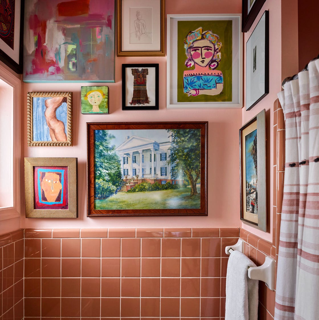
25 Designer-Approved Bathroom Paint Colors to Refresh Your Retreat

5 colors designers say are outdated for bathrooms - and what they're choosing instead for 2024

30 Paint Colors to Help You Create the Bathroom of Your Dreams
What are the most popular bathroom themes? 4 favorite looks loved by the experts
8 Underrated Bathroom Paint Colors Designers Wish You Would Use This Year