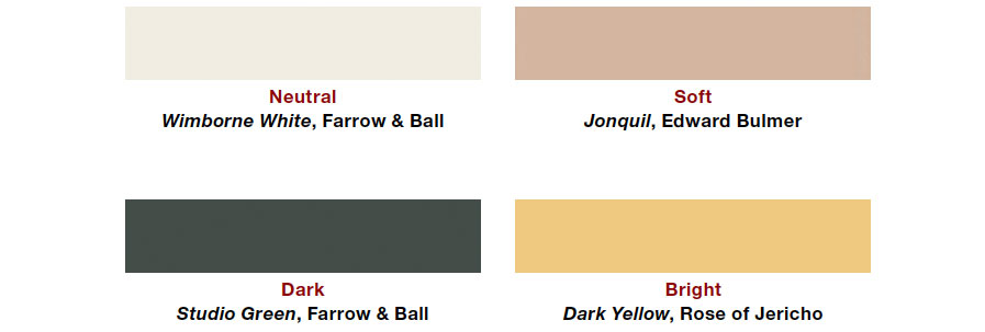
7 Bold Paint Colors Interior Designers Are Longing to Use on Their Next Projects
This blog post explores a collection of bold paint colors that interior designers are eager to incorporate into their future projects. It highlights the unique opportunity individuals have to be both client and designer in their own homes, allowing for unconstrained color choices, unlike professional designers who often work within client preferences. The article then delves into specific color recommendations from several prominent interior designers, providing insights into their preferences and suggested applications.
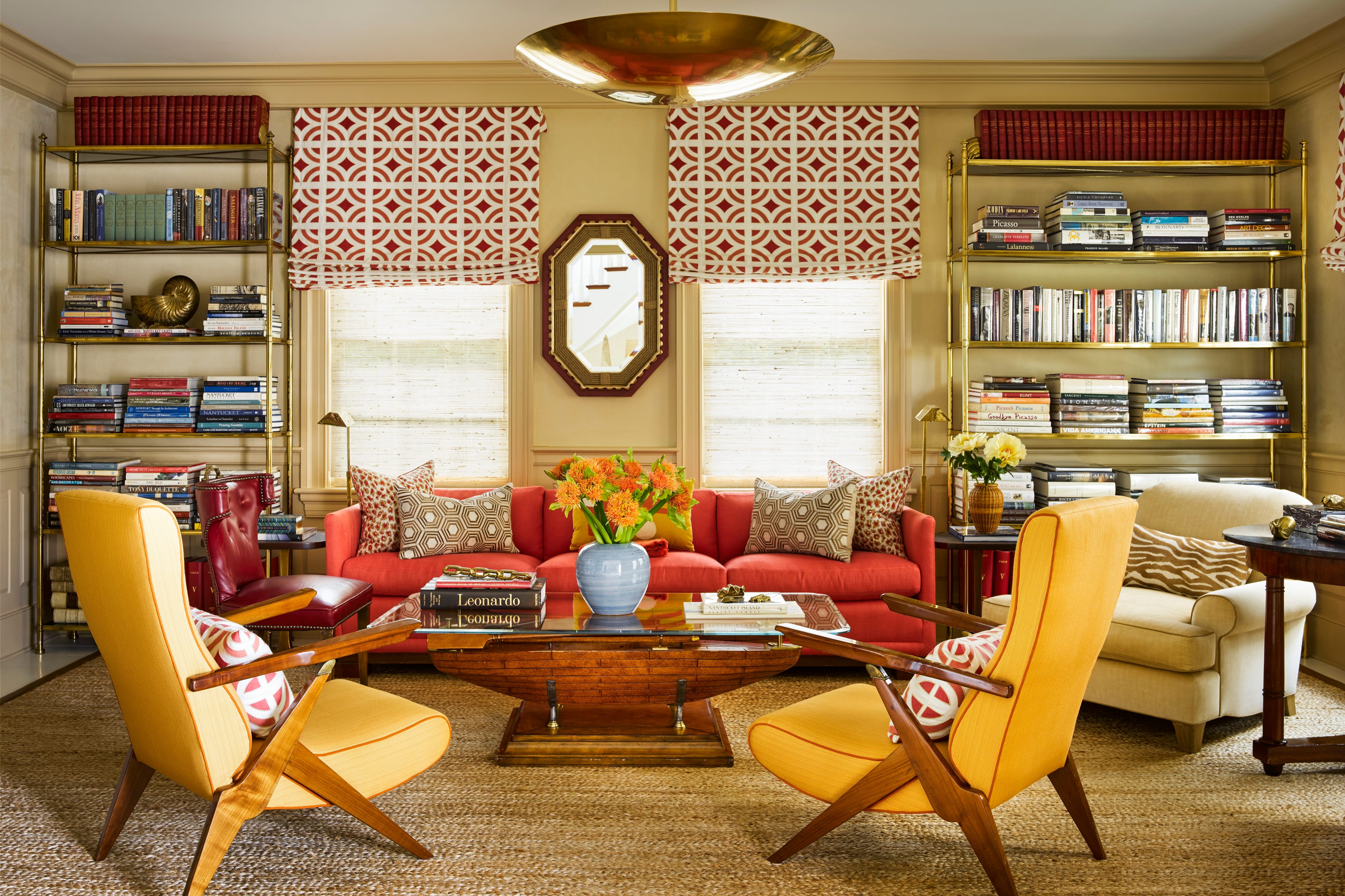
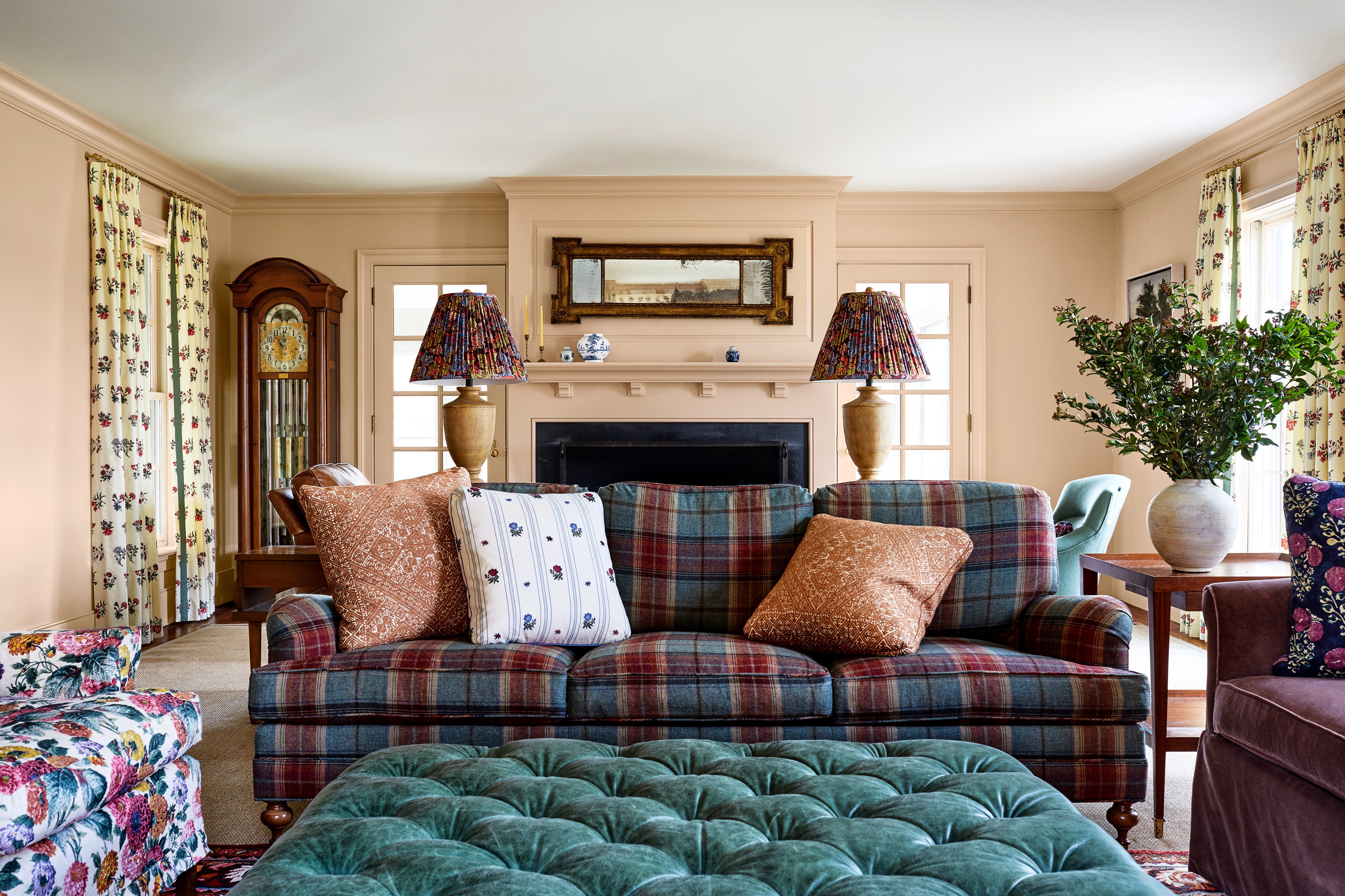
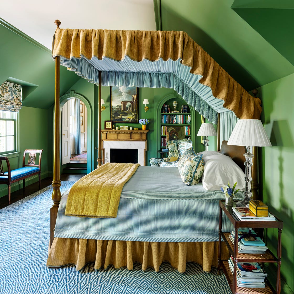
May Harrington of Huff Harrington in Atlanta, Georgia, expresses enthusiasm for "French Ochre" by Benjamin Moore. She describes this color as a deep, saturated ochre with hints of olive and burnished gold, making it a bold yet grounding neutral. Harrington suggests pairing it with black, deep browns, golds, or rich cognac to create a moody and unexpected aesthetic.
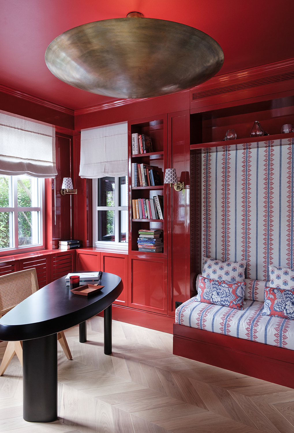
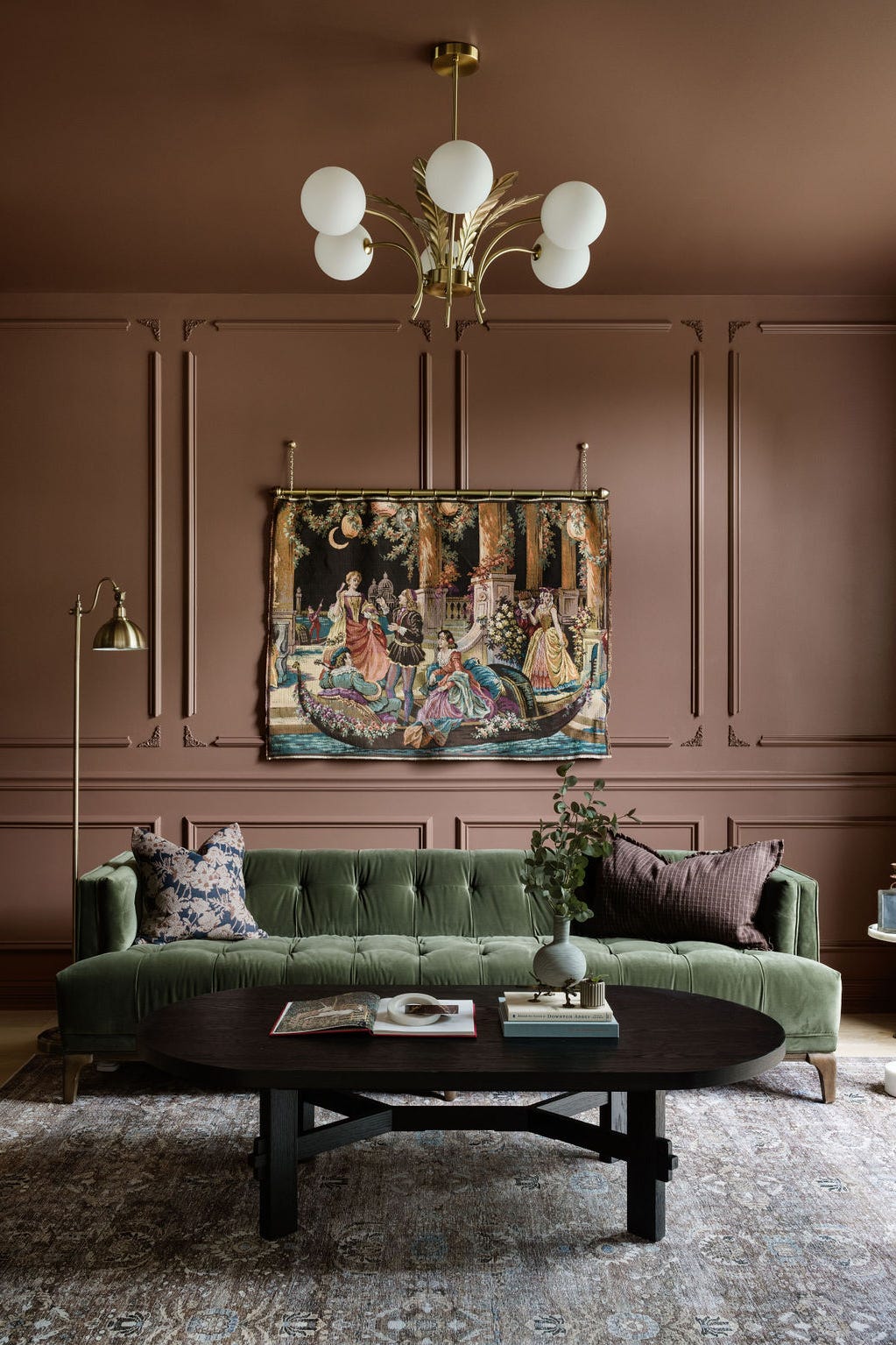
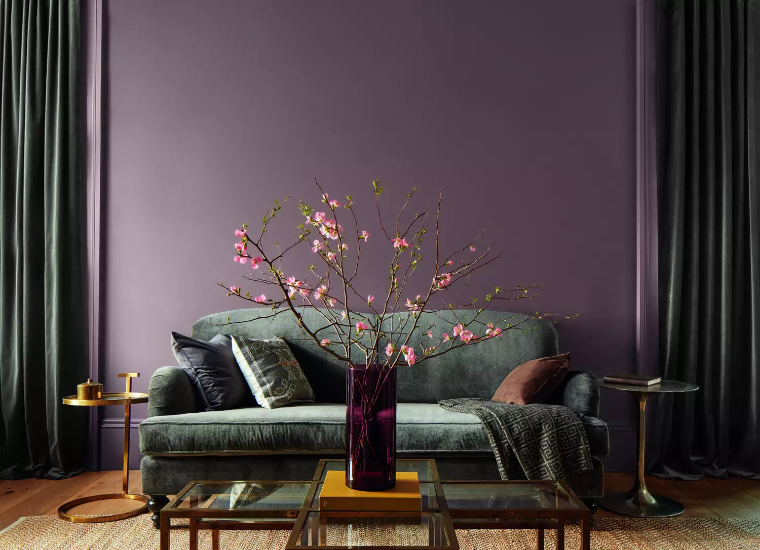
Another Atlanta-based designer, Micaela Quinton of Copper Sky Design & Remodel, favors deep plum and raisin hues, specifically recommending Sherwin-Williams' "Blackberry." Quinton notes that these colors are sophisticated and dramatic while simultaneously fostering a cozy atmosphere within a space.
Emilie Munroe of Studio Munroe in San Francisco is inspired by a recent manicure to suggest "Hot Lips" by Benjamin Moore, a deep neon pink. Munroe believes this vibrant pink would be impactful on a ceiling, storage cabinet, or stair rail. She emphasizes that pink radiates warmth and gives skin a vibrant quality, making it particularly suitable for powder rooms and entertainment areas.
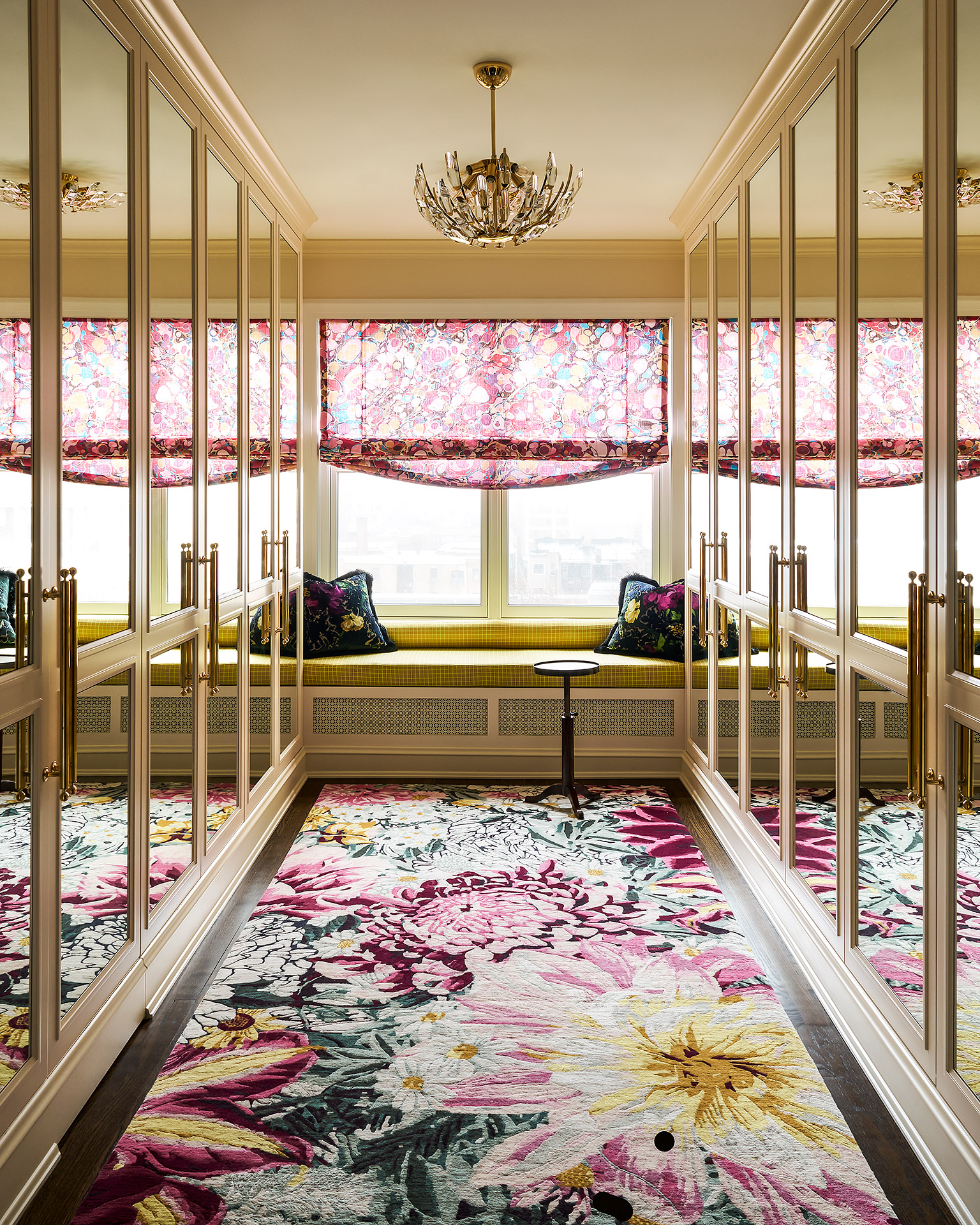
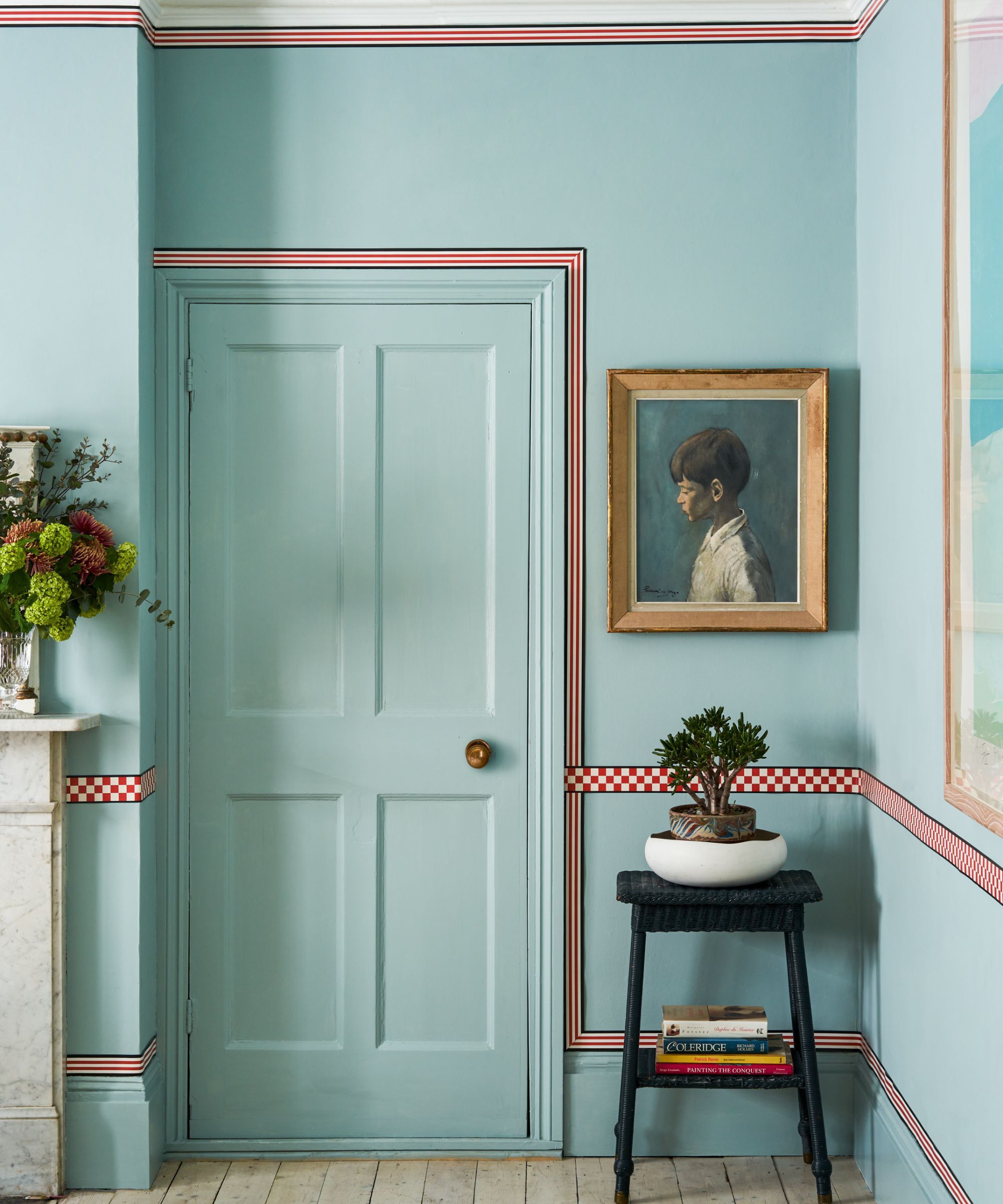
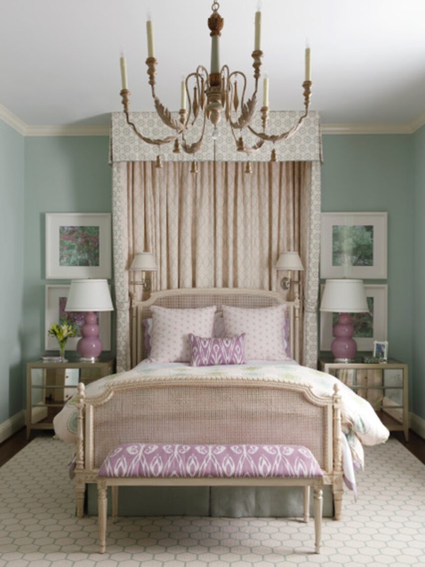
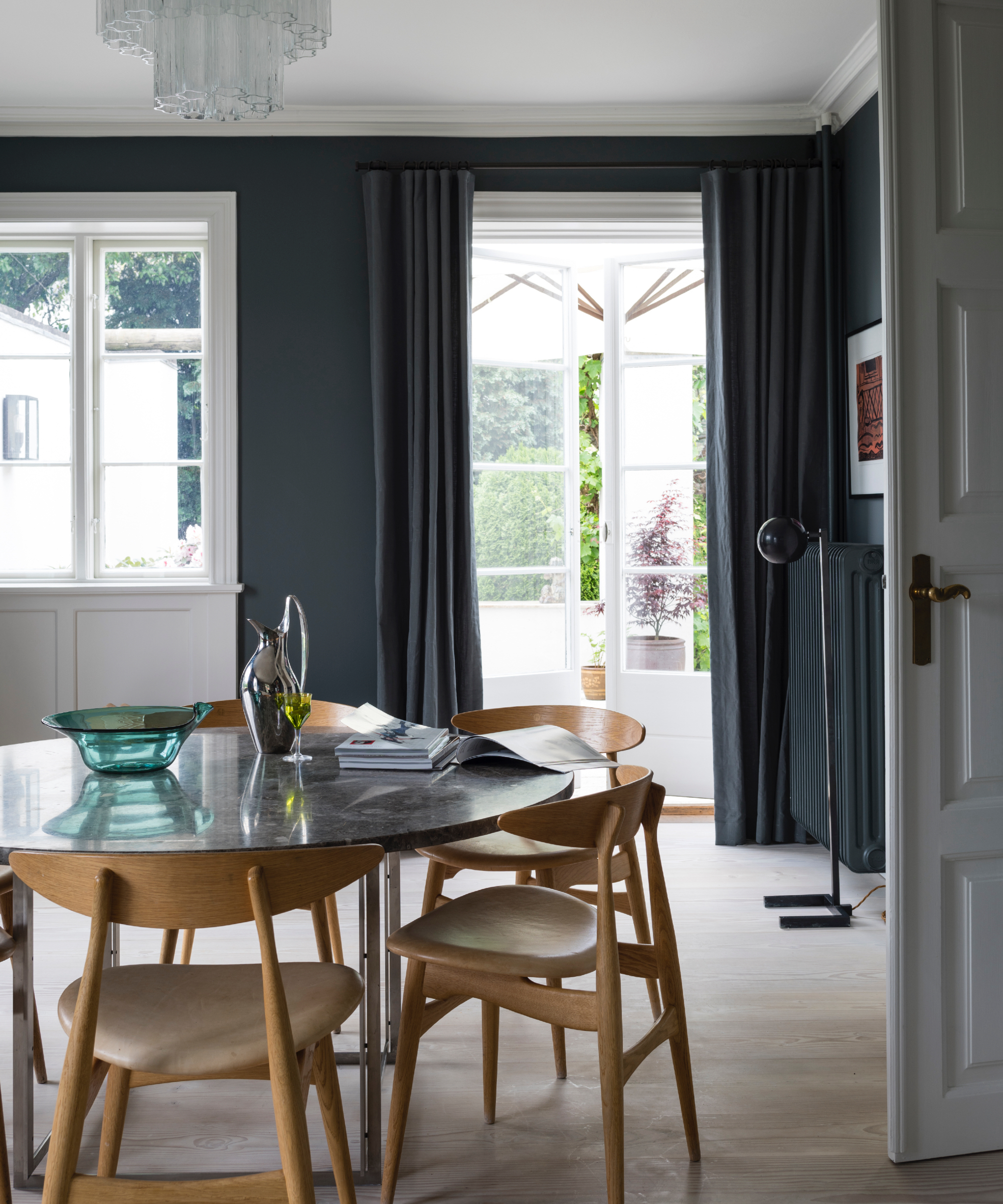
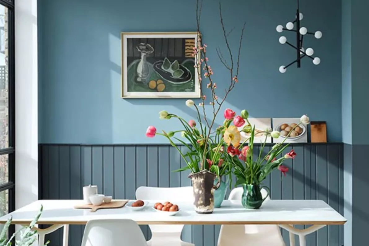
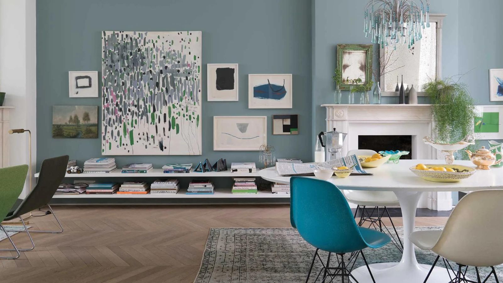
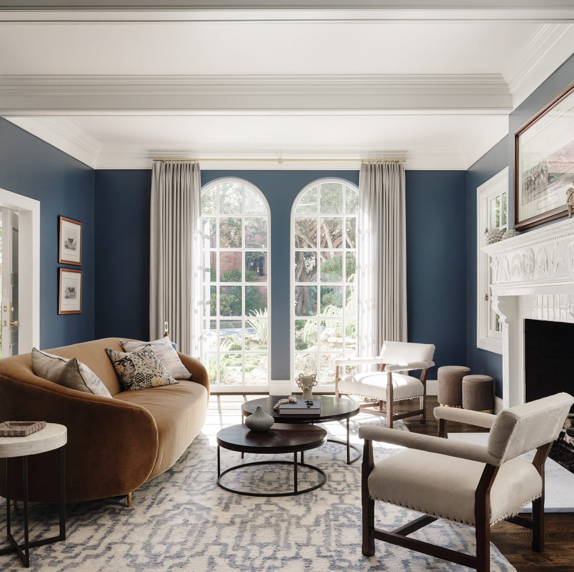
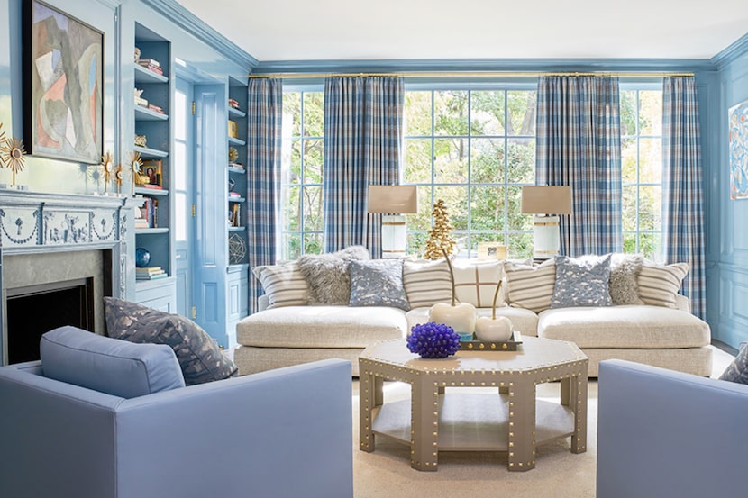
Katie Lee Jacobs of Katie Lee Interiors in Westchester, New York, reveals her long-standing affection for "Stone Blue" by Farrow & Ball, describing it as a notably bright and bold blue.
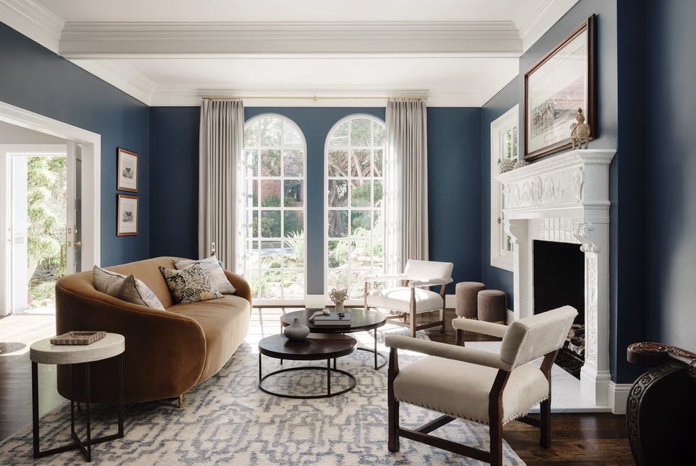
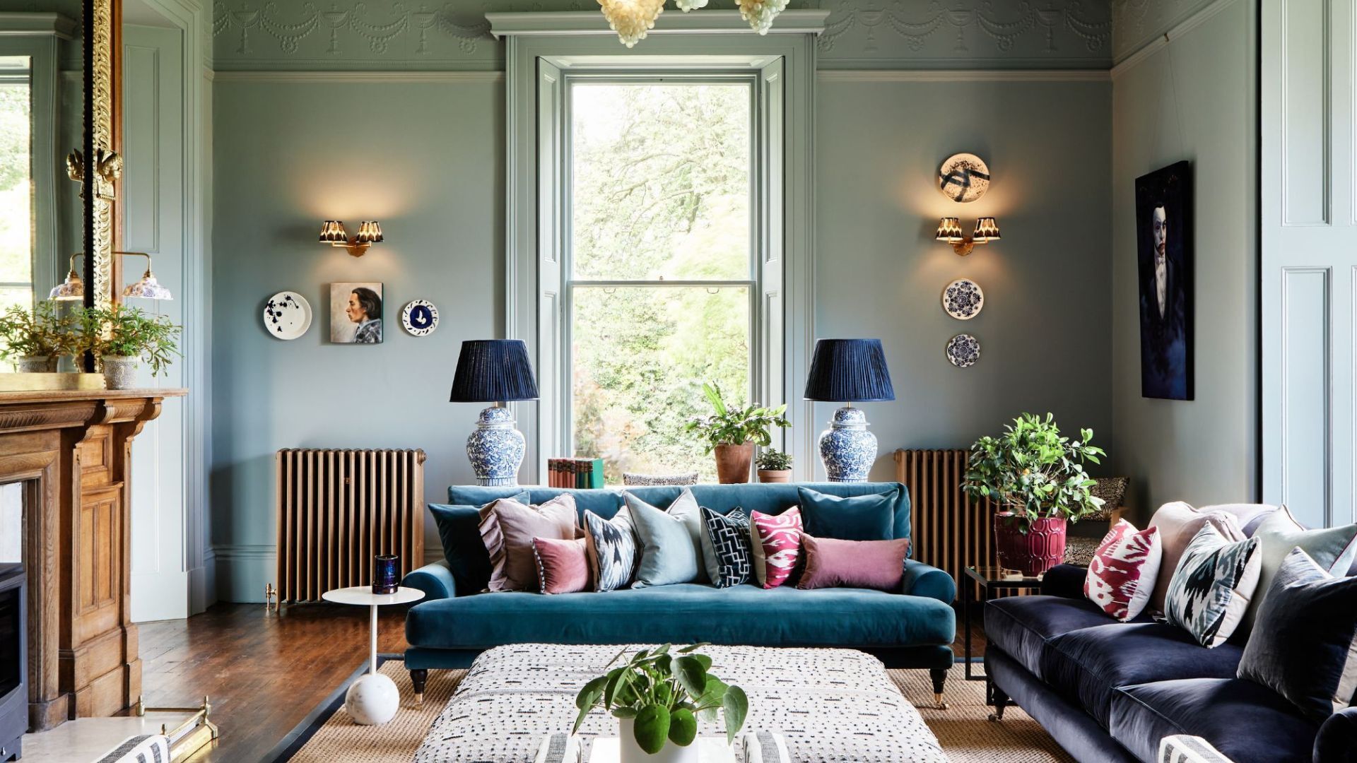
Jeanne Barber of Camden Grace Interiors in West Hartford, Connecticut, is a strong advocate for Benjamin Moore's "Evening Blue." She envisions this bright electric blue being used on trim or built-ins to create a striking contrast.
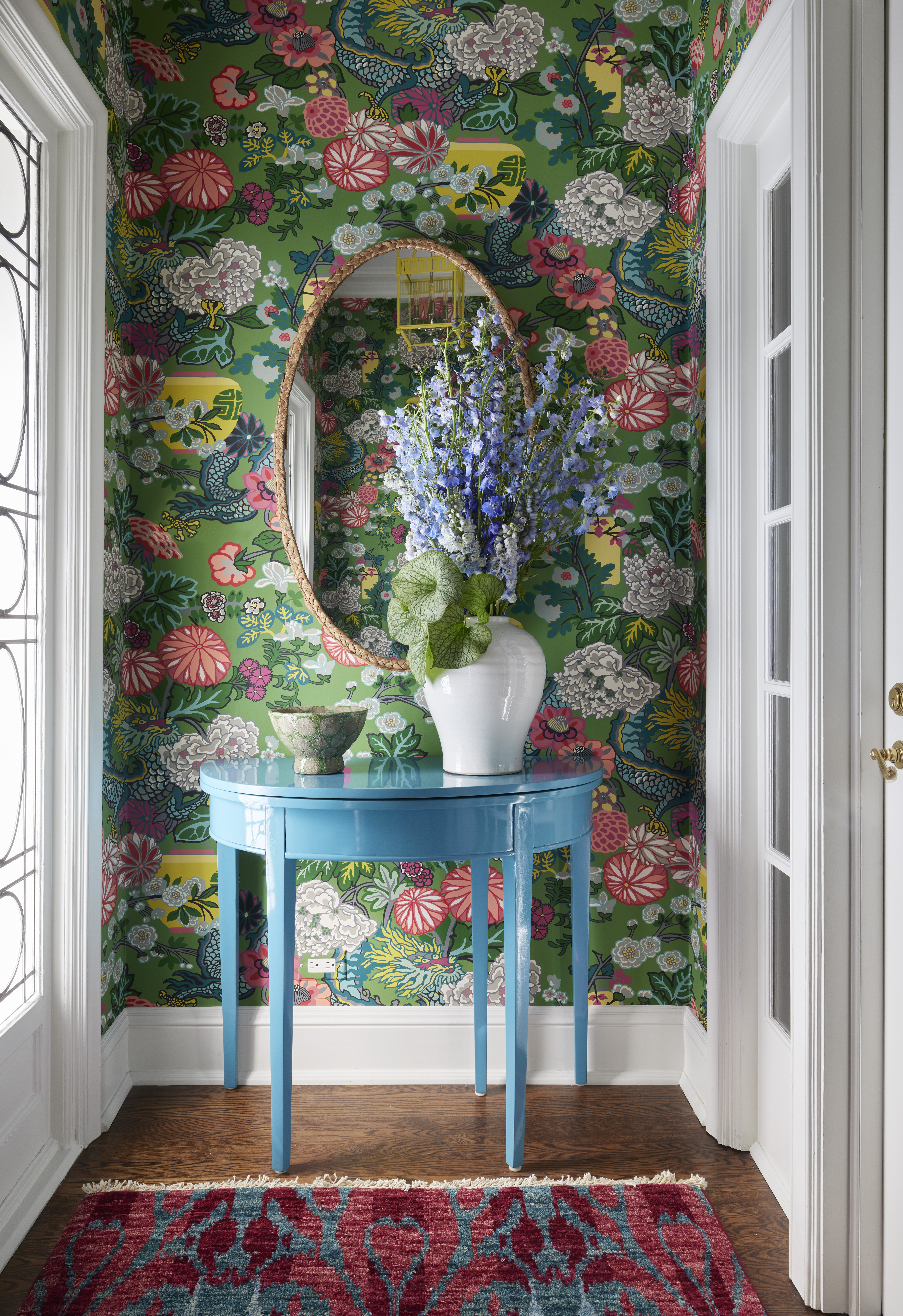
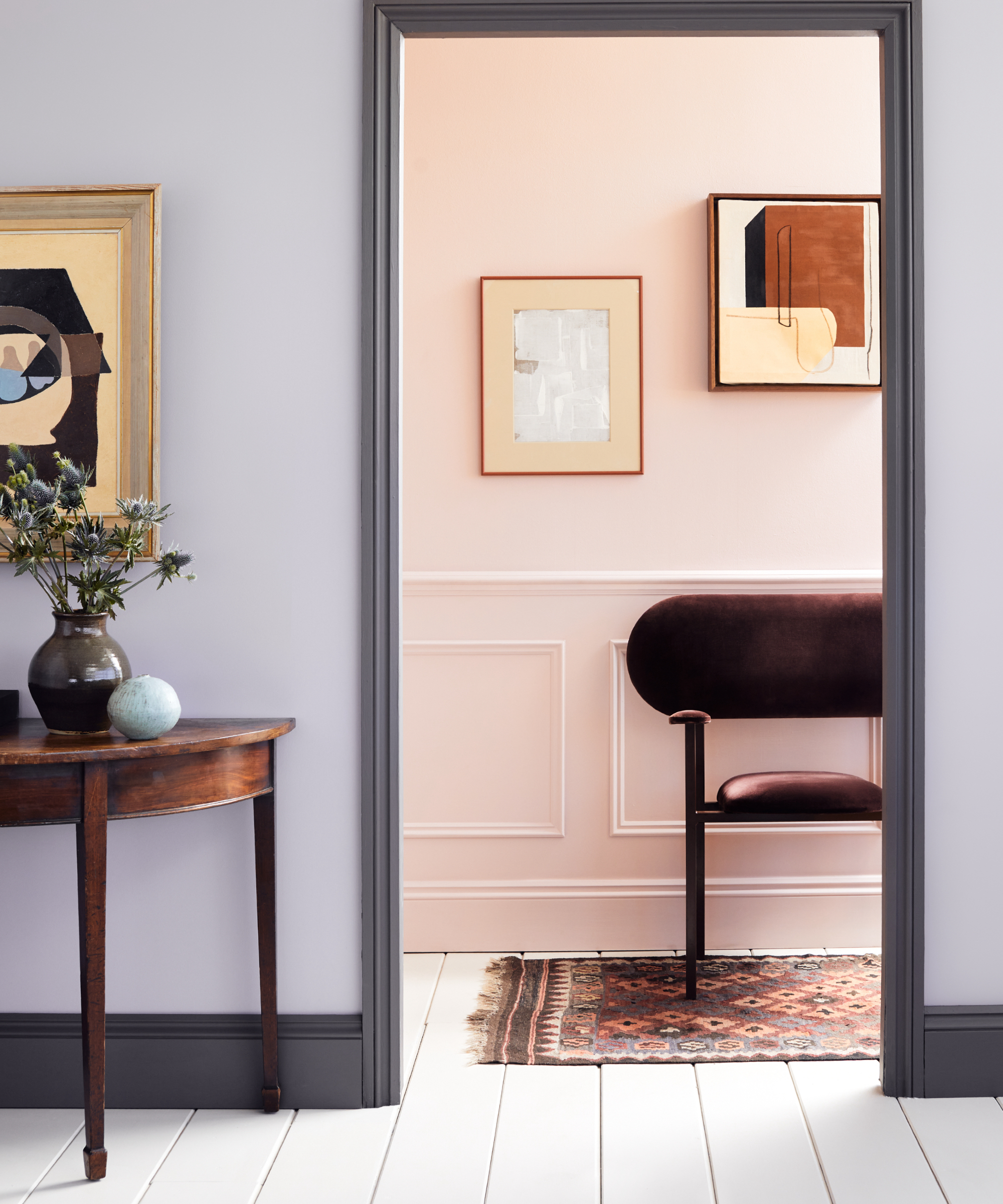
Naïka Andre of NJA Interiors, also based in Connecticut, is drawn to "Brassica" by Farrow & Ball, a moody lavender. Andre finds this color to perfectly balance charm and drama, suggesting its versatility in various design schemes.
Finally, Arizona designer Bari J. Ackerman of Bari J. Designs expresses a desire to experiment with a lilac-pink color, combining it with greens or mustard. Her recent experience with a painting featuring a lilac background sparked the idea of using this color for an entire room, indicating a broader application of this soft yet distinctive hue. These diverse recommendations collectively showcase a trend towards embracing expressive and unconventional color palettes in interior design.
#InteriorDesign #BoldColors #PaintColors #HomeDecor #DesignTrends #ColorPalette #BenjaminMoore #FarrowAndBall #SherwinWilliams #InteriorDesign #BoldColors #PaintColors #HomeDecor #DesignTrends #ColorPalette #BenjaminMoore #FarrowAndBall #SherwinWilliams
0 comment in total
You may also like
8 Favorite Paint Colors of Local Interior Designers

5 Vibrant Color Palettes Designers Are Using to Add Energy and Excitement to Decor

7 of the most versatile and easy to use paint colors according to designers


Designers Agree: These 7 Underrated Paint Colors Will Be Huge in 2026

4 Interior Designers Share the Biggest Paint Color Trends Right Now (and What’s Out!)

6 key colors to decorate with in May 2025, according to interior design and color experts in the know
7 Sherwin-Williams Paint Colors Interior Designers Can’t Stop Using
Designers Share Their Tried-and-True Shades From the Best Interior Paint Brands
15 high-risk high-reward paint hues
Designers Reveal 7 Exterior Paint Colors They Always Use for Their Projects
11 Paint Colors That INSTANTLY Make Your Home Look "Expensive," According to Designers

10 Timeless Living Room Paint Colors Designers Swear By
12 Paint Colors That Interior Designers Are Buzzing About—See the Gorgeous Hues Here
19 go-to paint colors that Dallas designers love
Britain's best interior designers on the paint colours you just can't go wrong with
These 7 Colors Will Rule Interiors in 2026, According to Experts

7 colour combination ideas that AD100 designers swear by for home interiors

The #1 Paint Color Trend of 2025, According to Designers


Lick Paint Will Transform the Mood in Your Home Through Color Psychology
5 Underrated Paint Colors Designers Always Use in Their Projects (and You Should Too)