7 Sherwin-Williams Paint Colors Interior Designers Can’t Stop Using
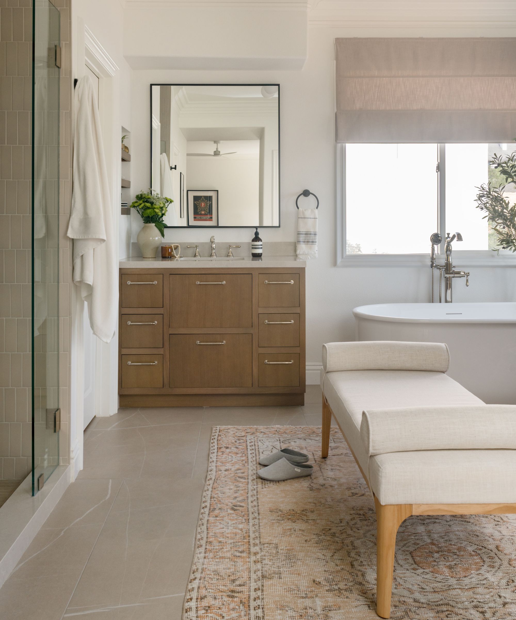
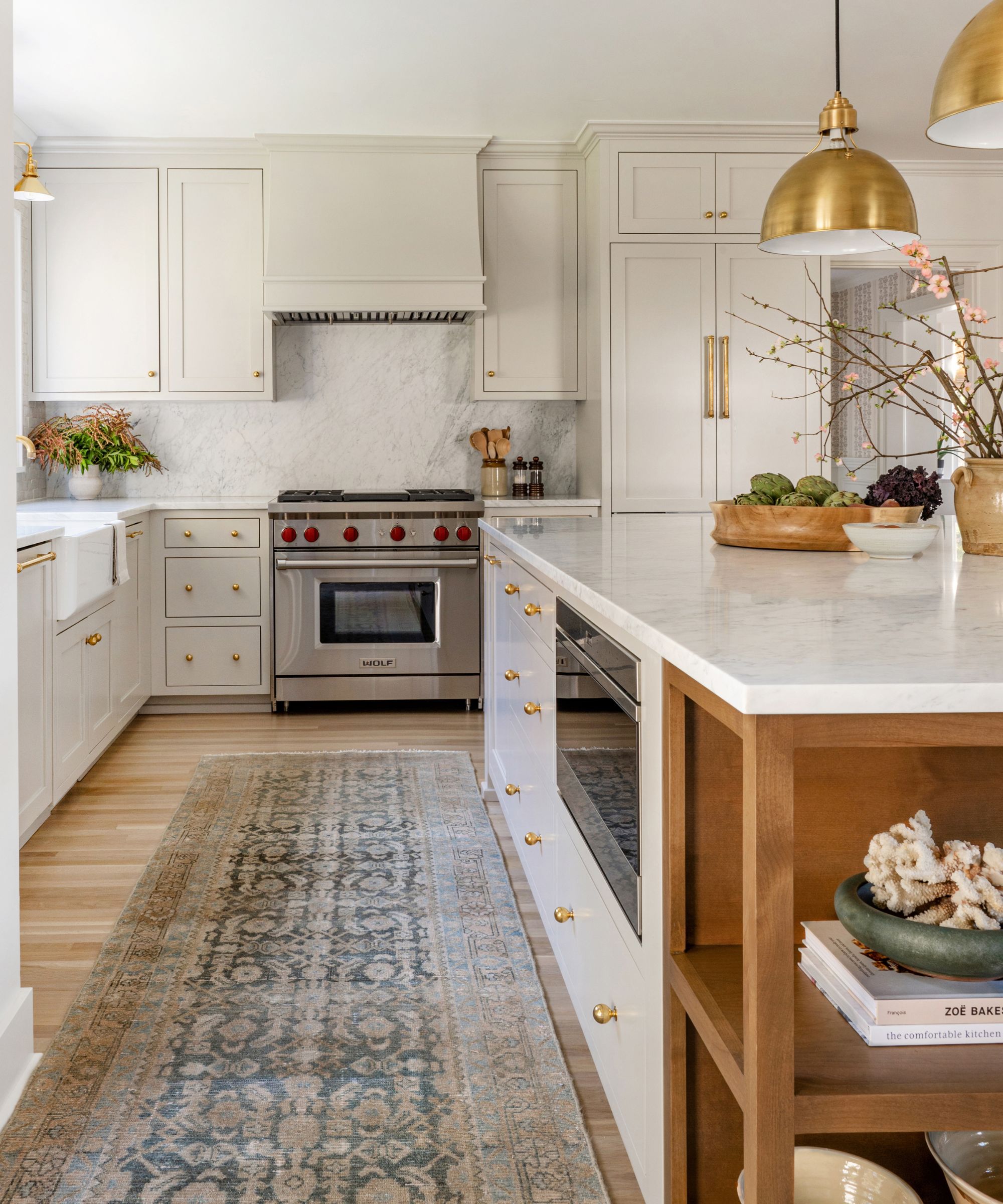
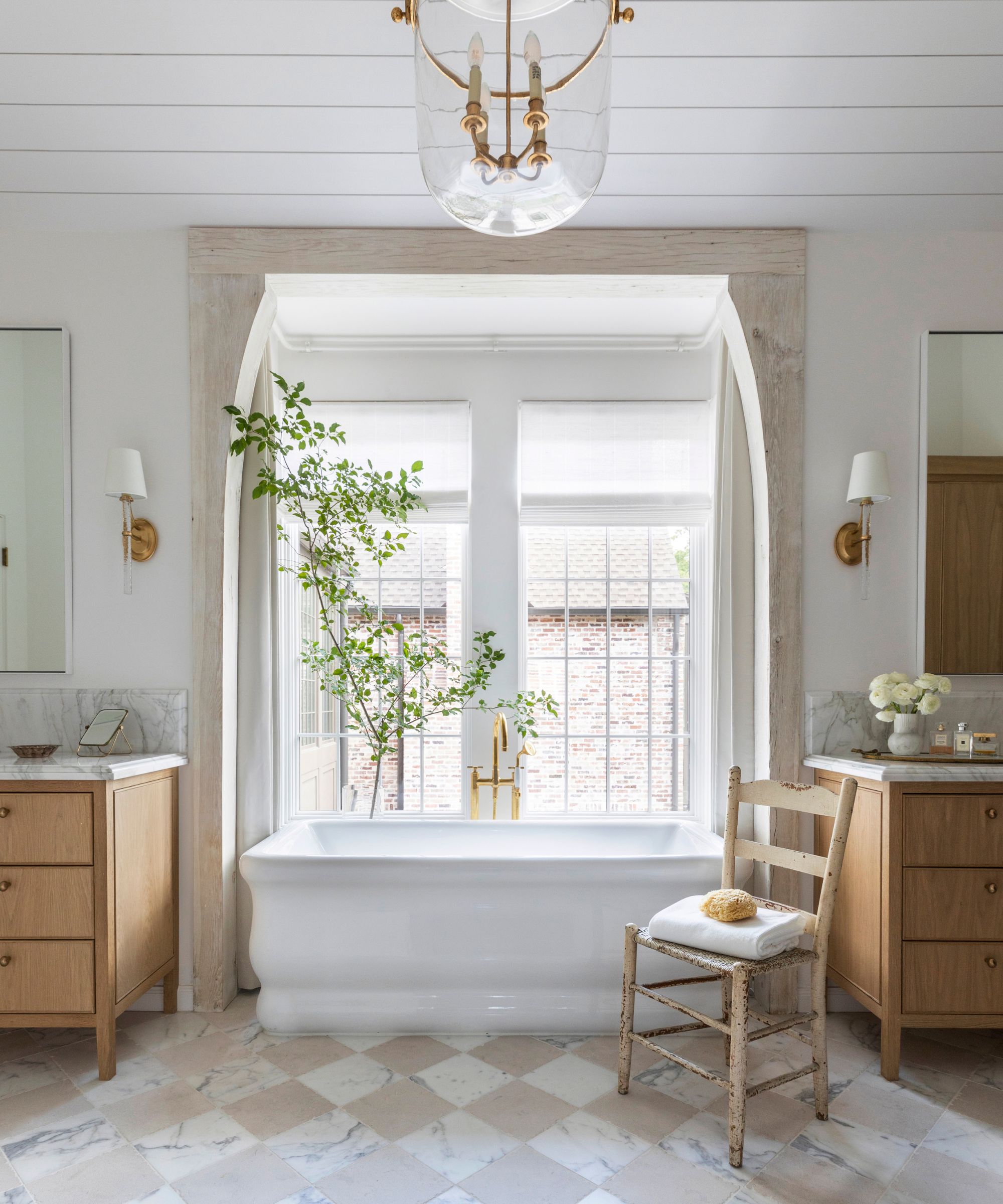
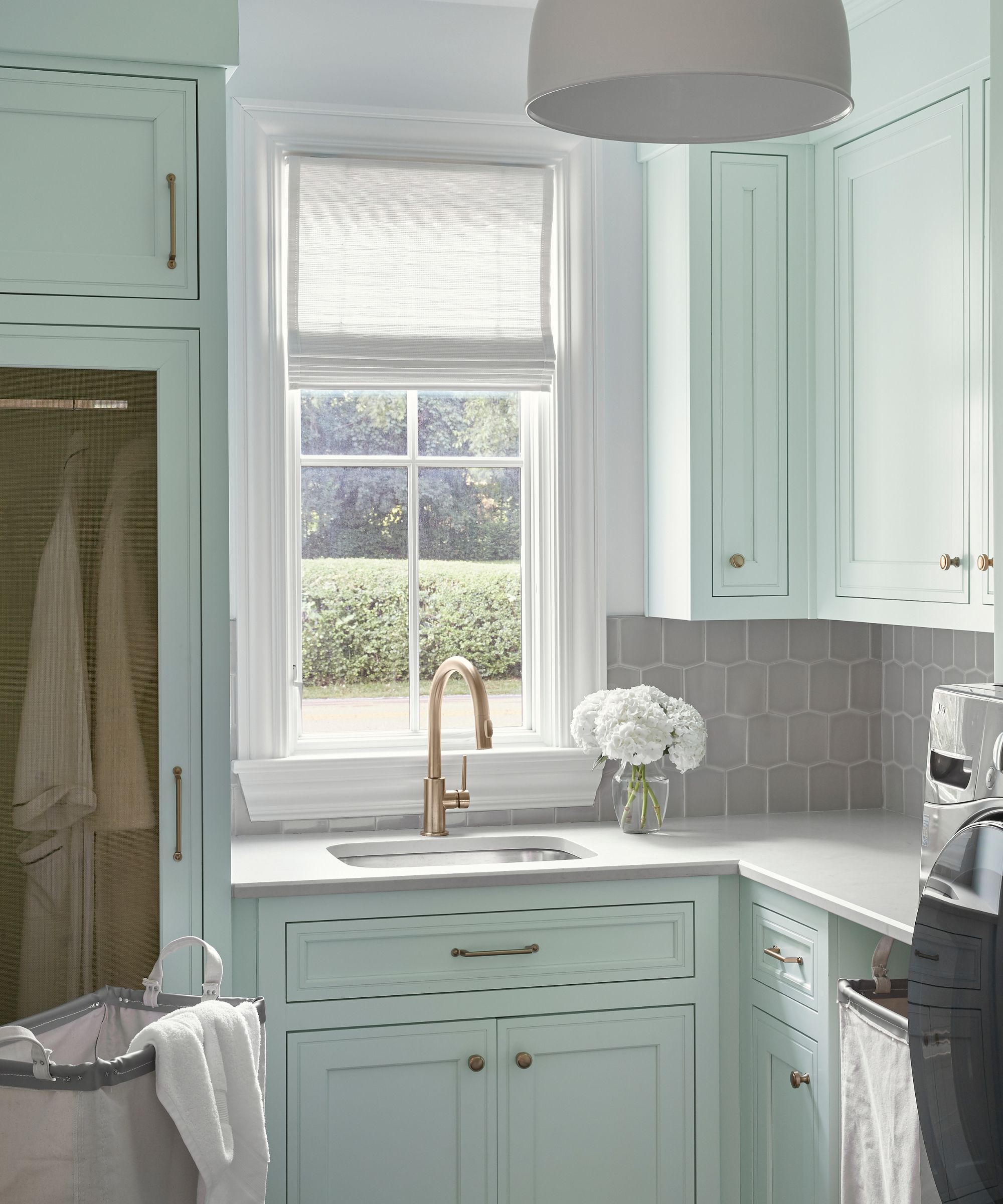
Choosing the right paint color can significantly transform a room, and given the effort involved in painting, it's crucial to select a durable and timeless shade from a reputable brand. Sherwin-Williams stands out as a brand highly favored by interior designers, owing to its long-standing history, consistent provision of high-quality paints, approachable price points, and wide availability in major retailers, making it convenient for home projects. Designers like Sasha Basso from Capiz Studio and David Quarles IV from Studio 417 commend the brand for its ability to blend tradition with current trends and technology, ensuring both efficiency and aesthetic appeal.
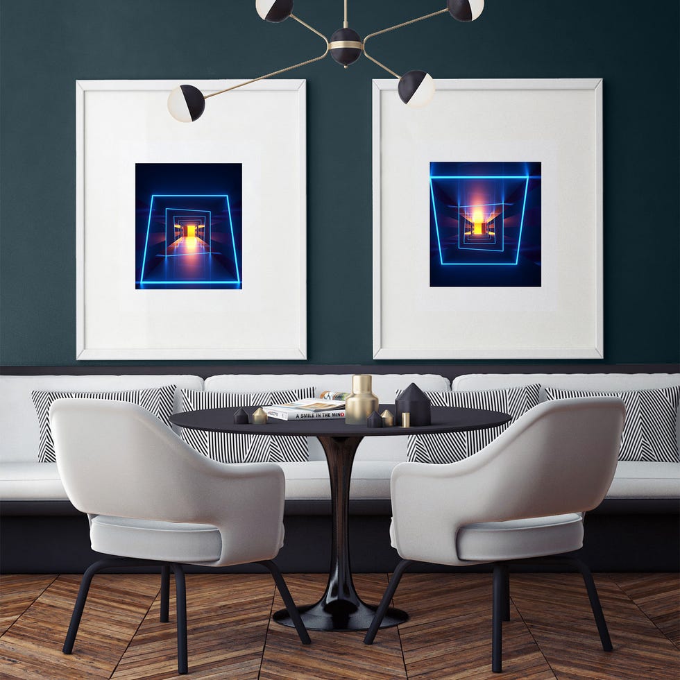
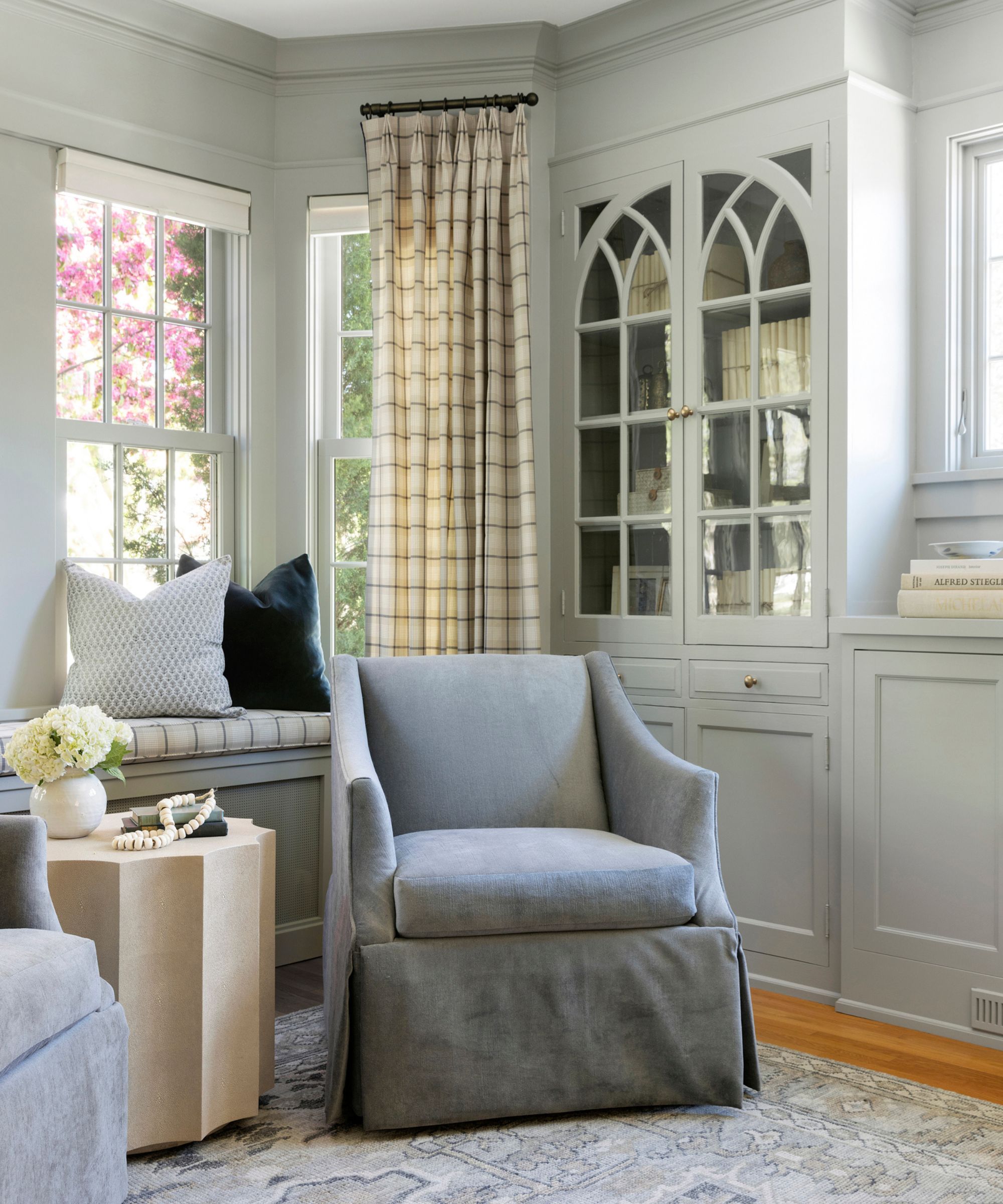
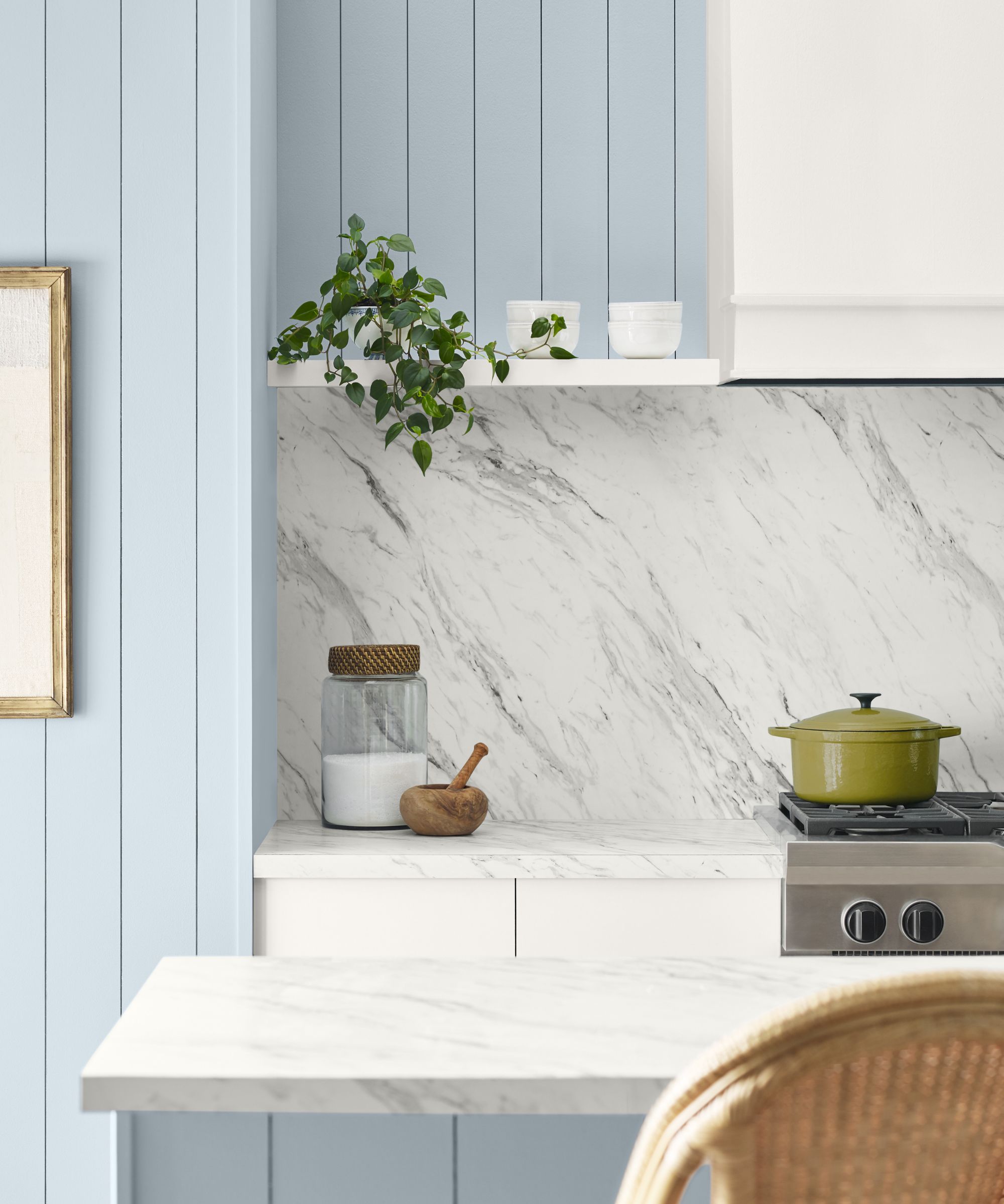
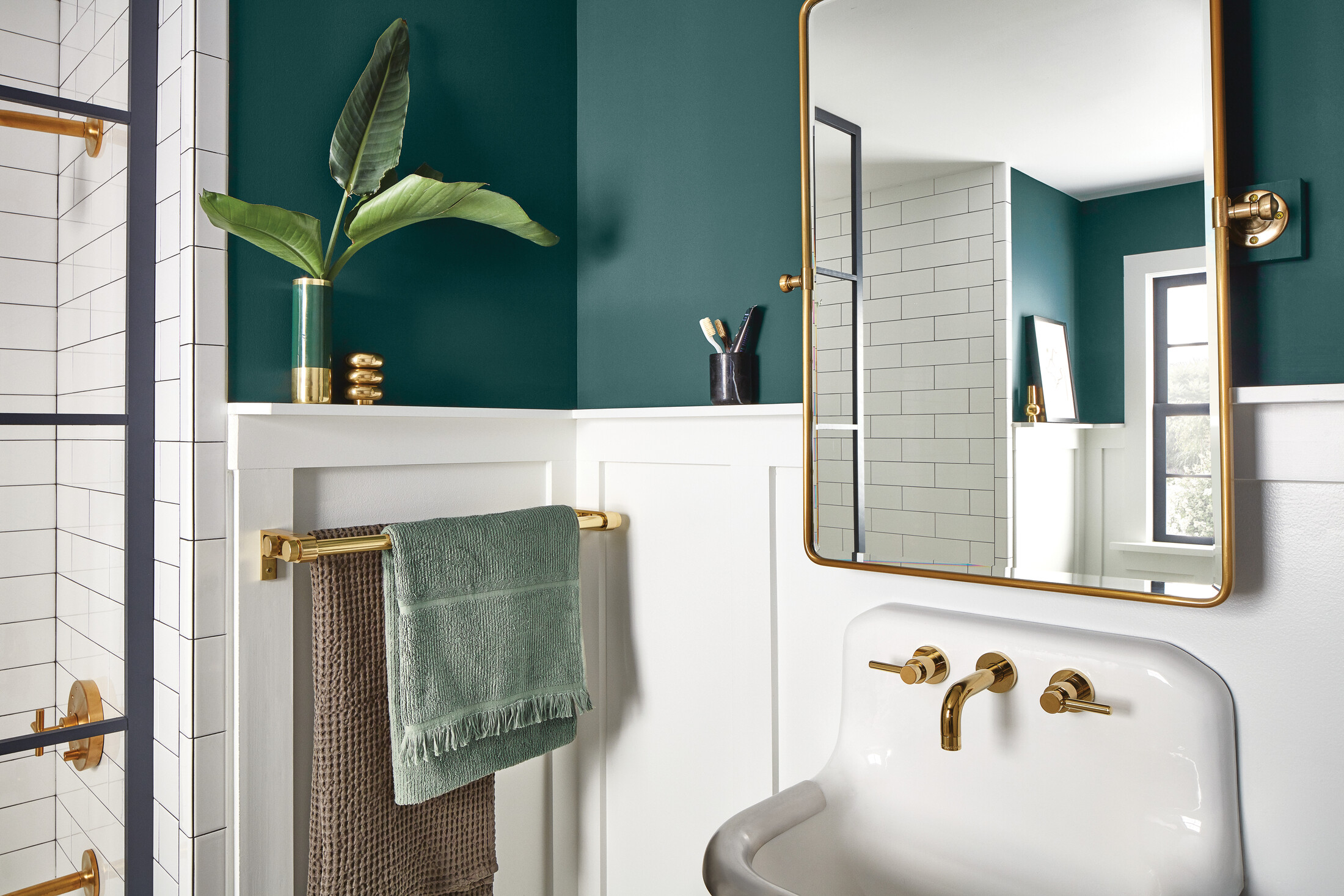
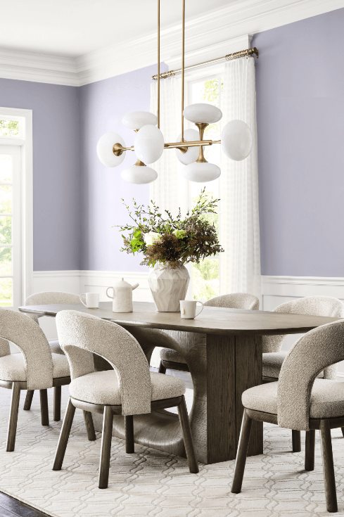
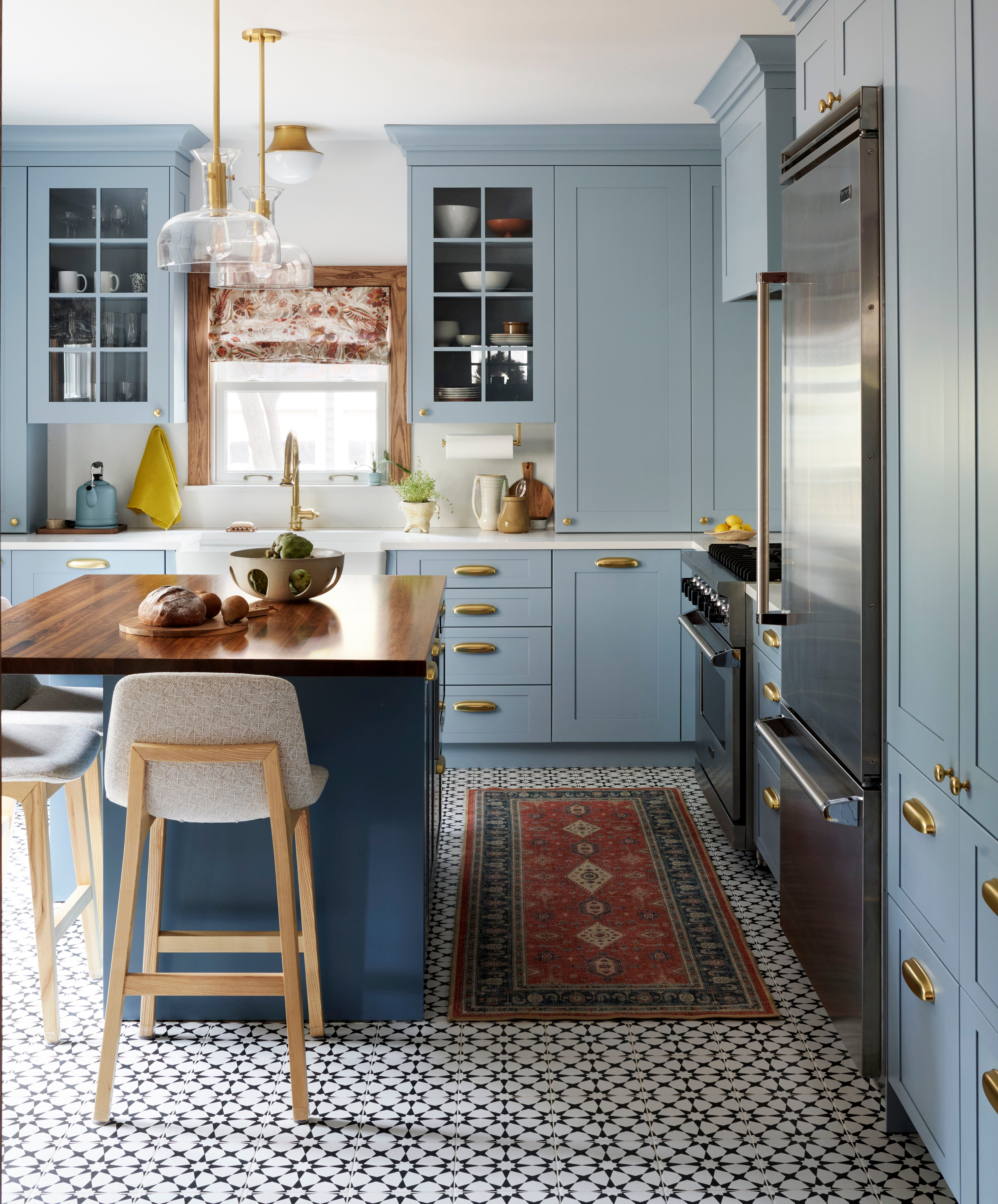
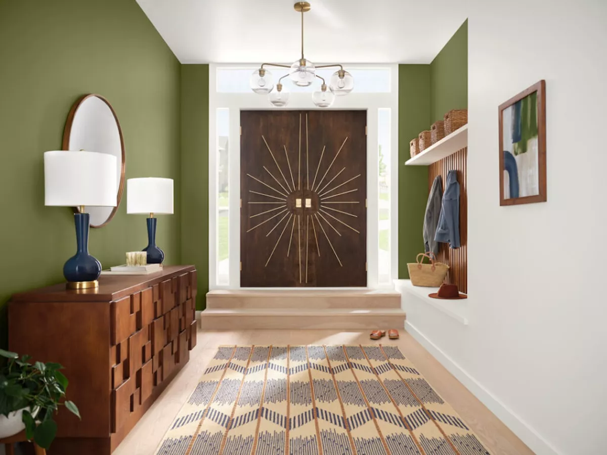
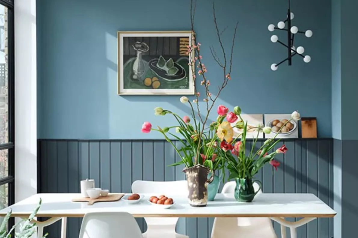
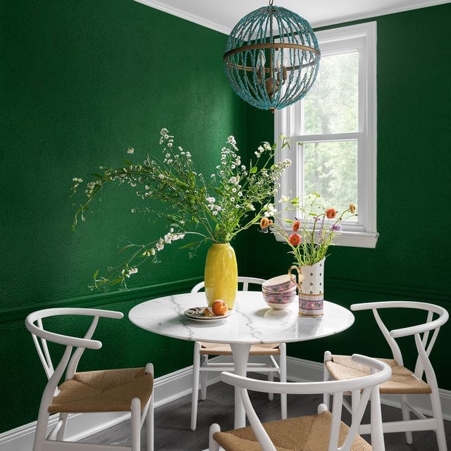
To assist in the daunting task of selecting a paint color, several designers have shared their top Sherwin-Williams picks. David Quarles IV, for instance, highlights "Rhythmic Blue" (SW 7611) as a warm, soft blue that beautifully interacts with natural light, creating a sunny glow in spaces like dining rooms. For millwork in the same project, he chose "Basque Green" (SW 6426), a warm green that evokes lush foliage and has become a signature color, even finding its way into his own home’s dining room.
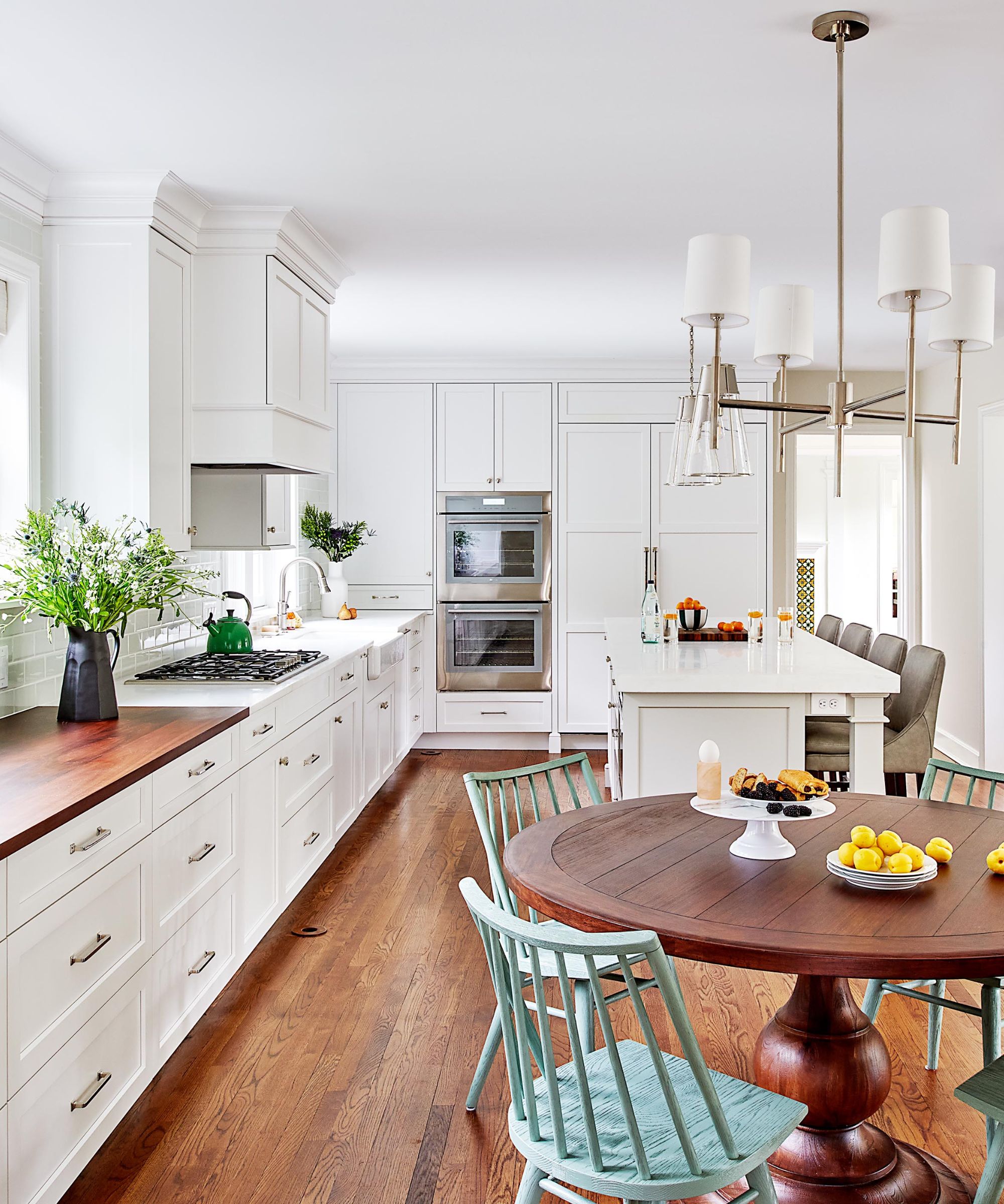
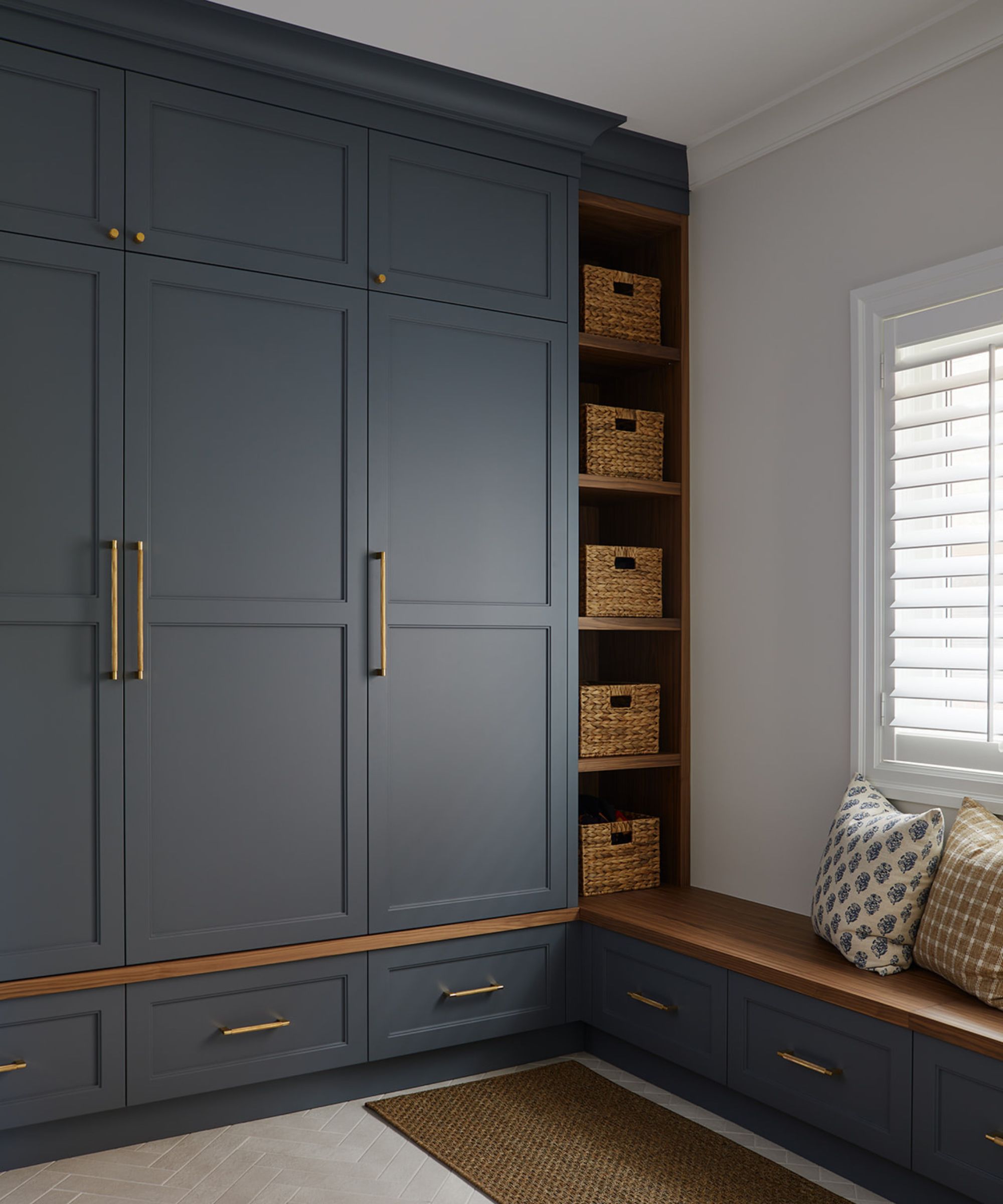
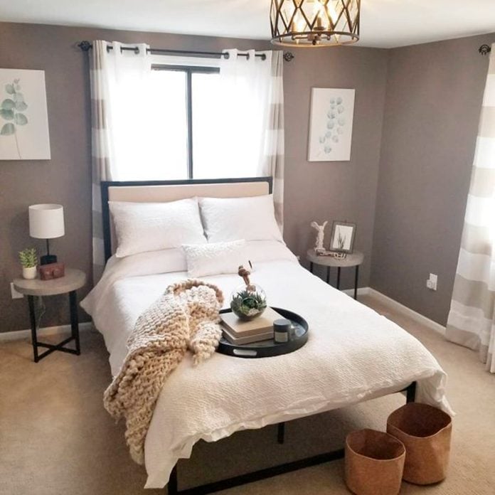
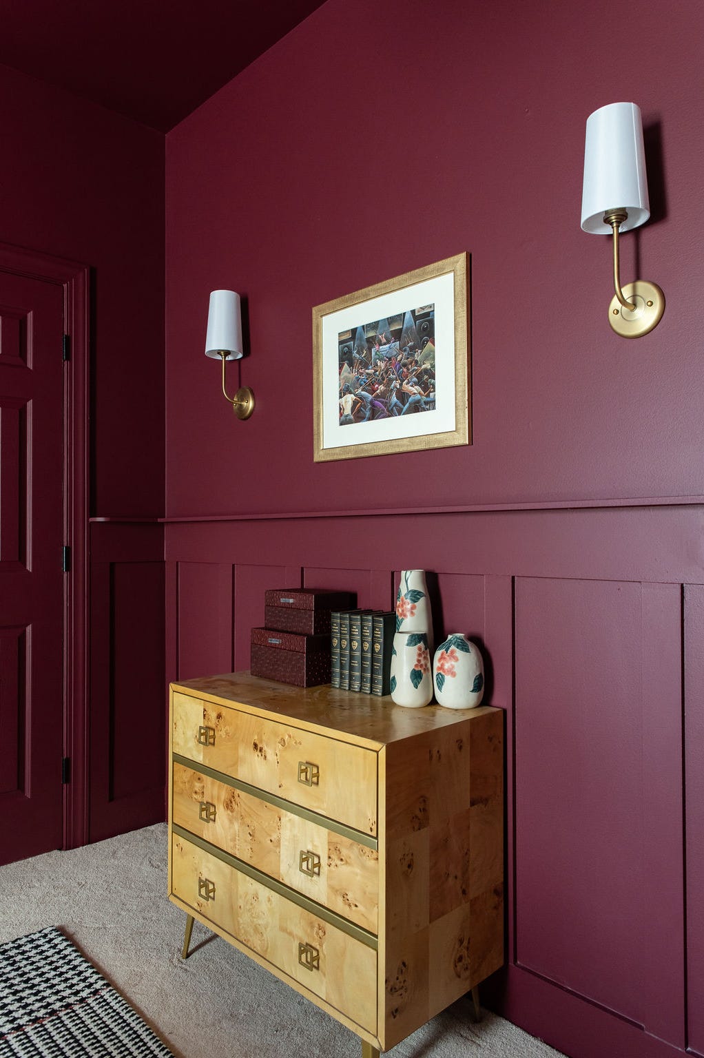
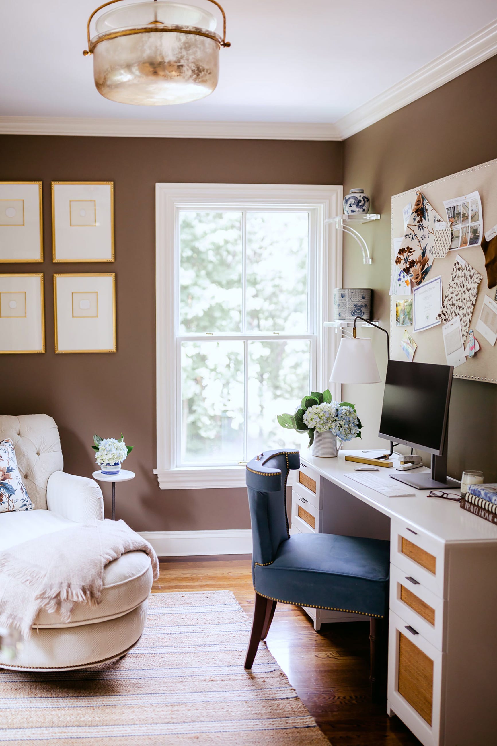
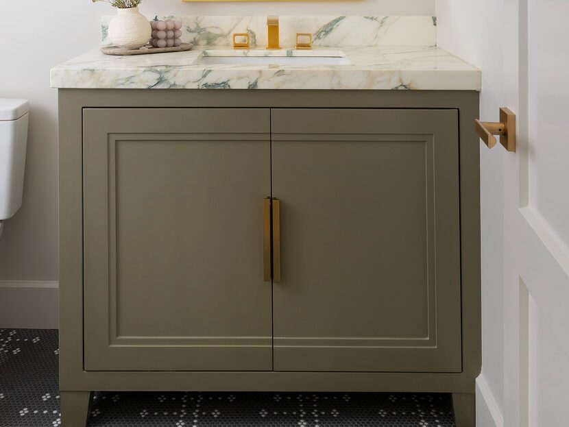
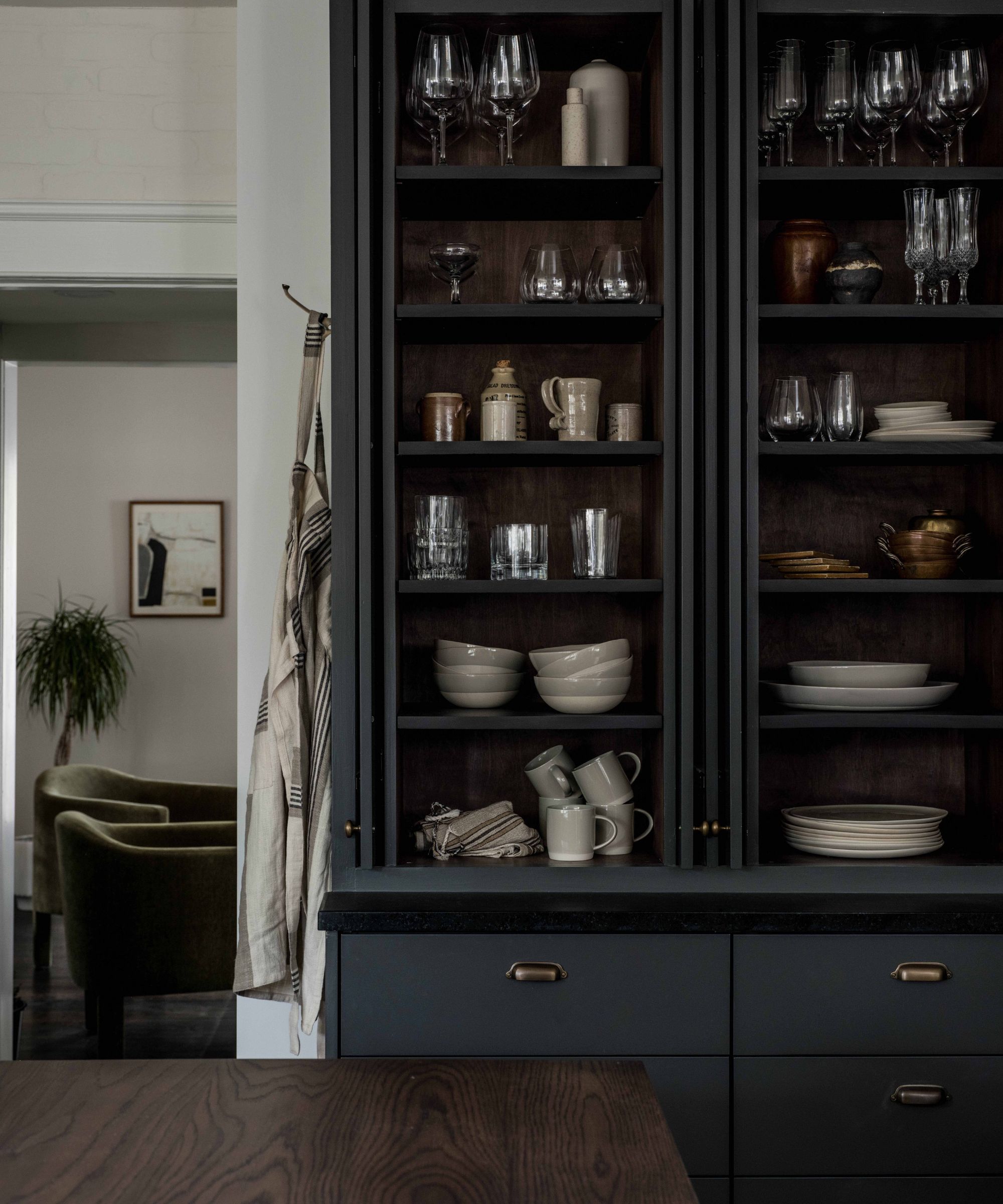
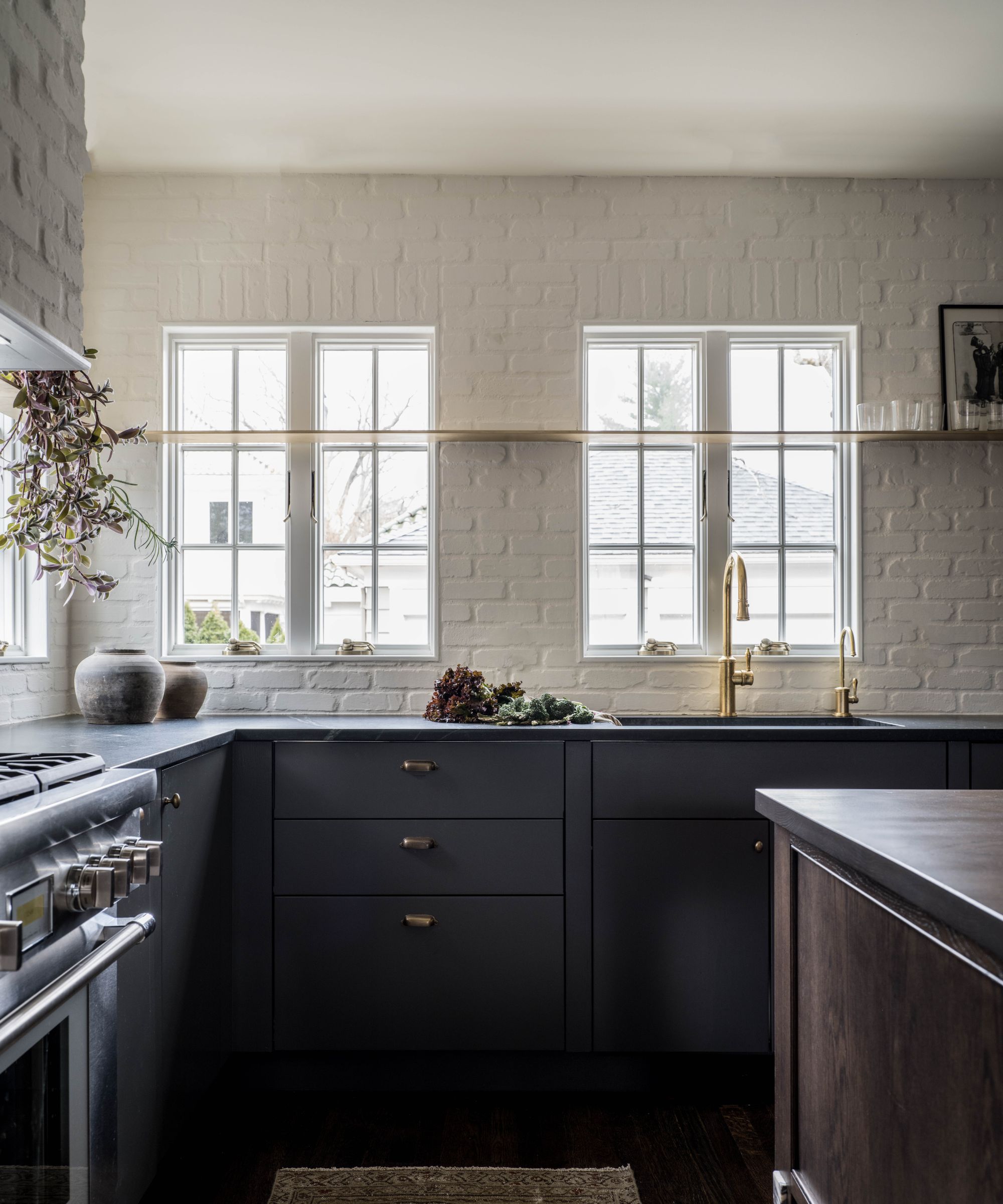
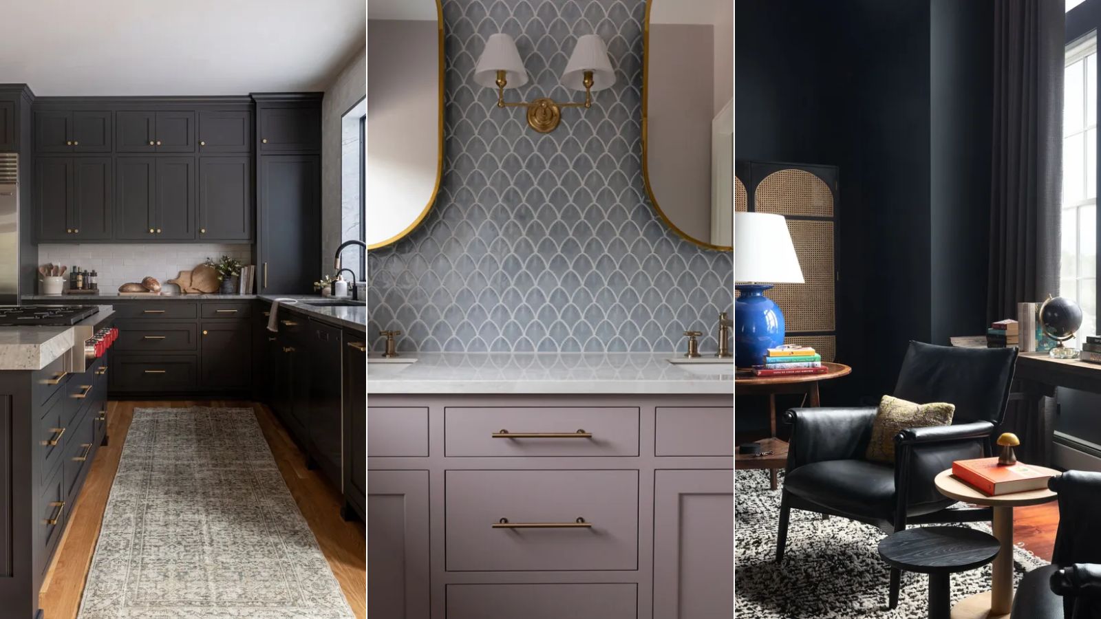
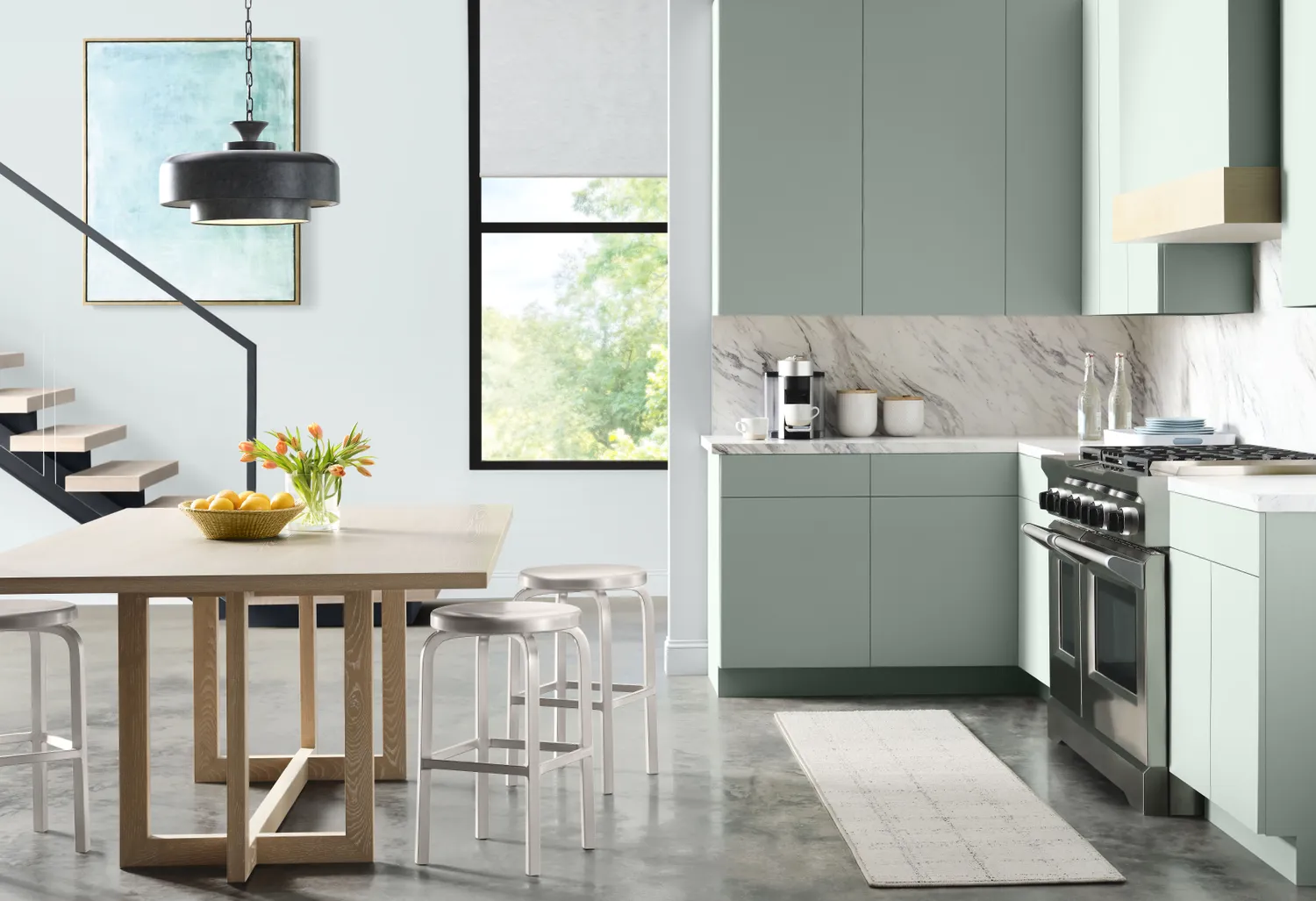
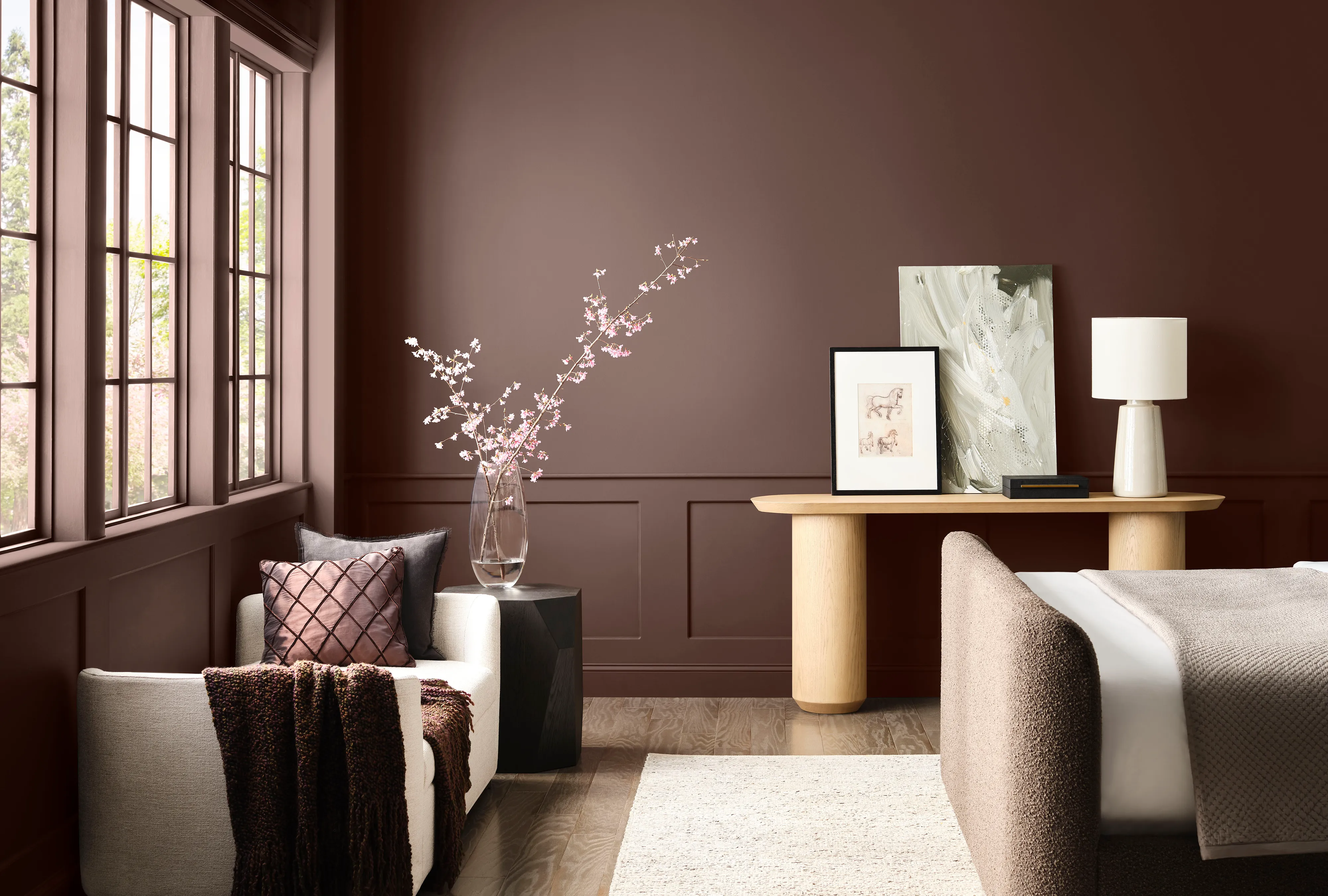
Melissa Oholendt of Oho Interiors recommends "Jasper" (SW 6216) for cabinetry. This deep green with cool undertones can appear almost black in certain lighting conditions, offering a classic yet fresh look when applied in a satin-enamel finish. Sasha Basso suggests "Armory" (SW 9600), a dark brown that provides a warmer alternative to black for elements like window trim and garage doors, adding drama without starkness.
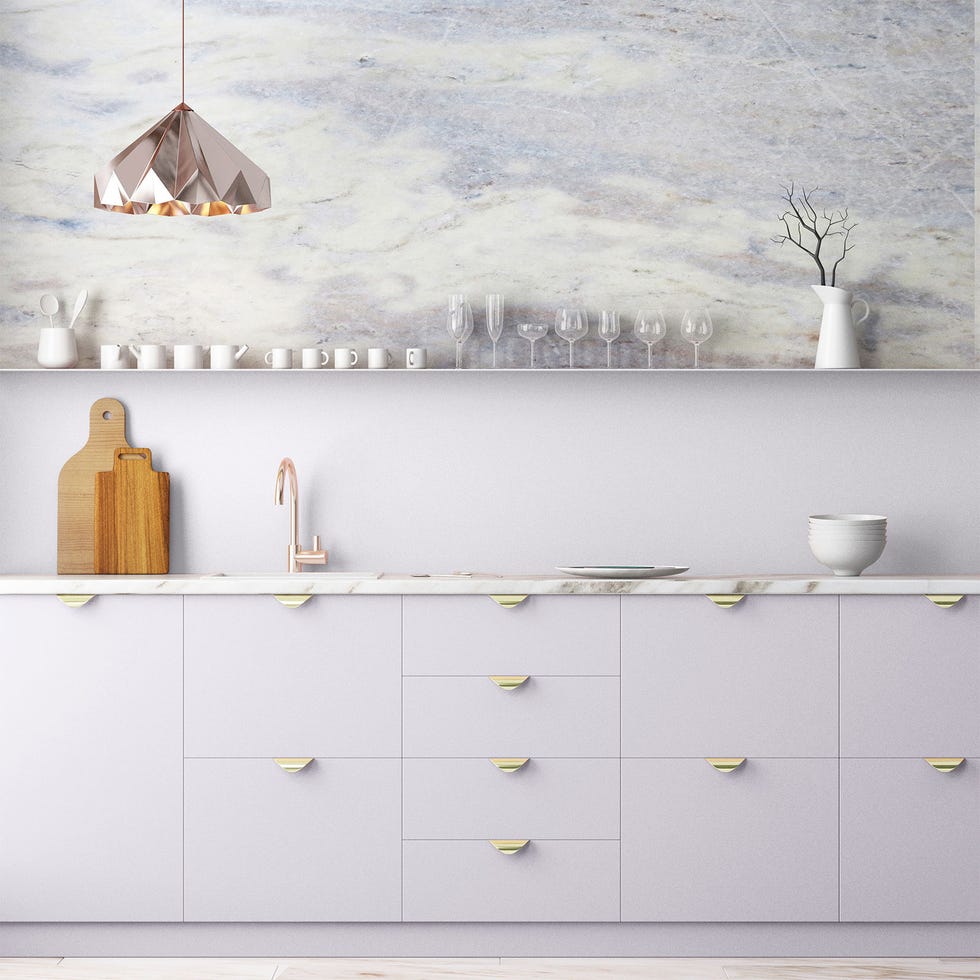
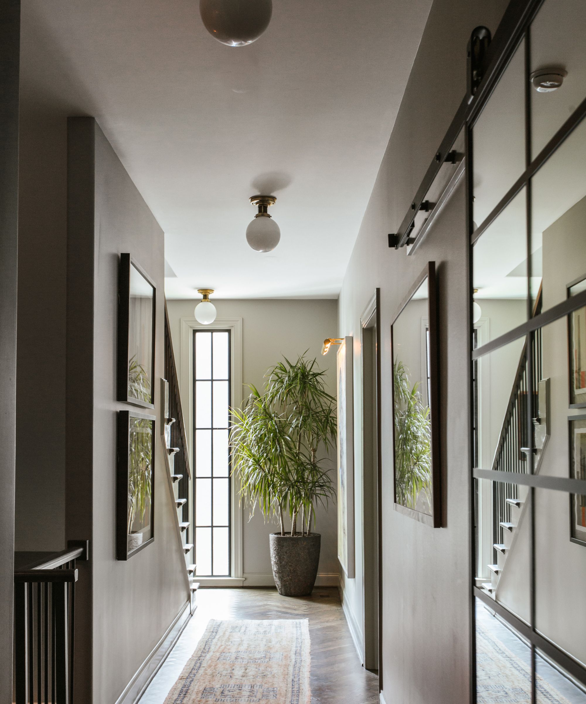
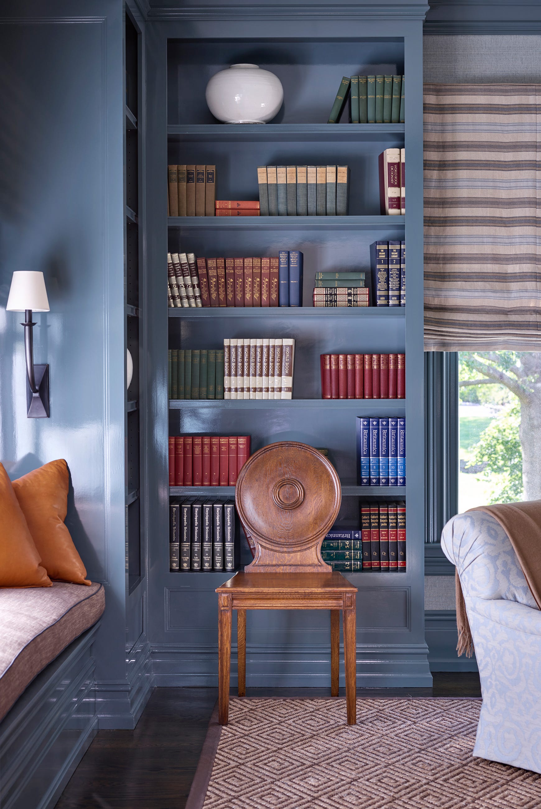
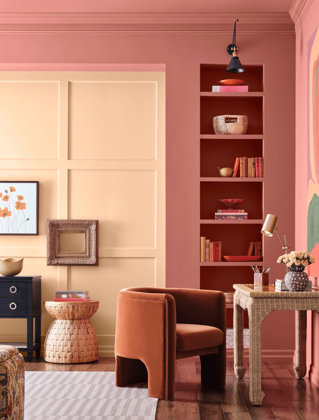
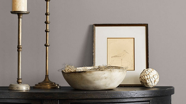
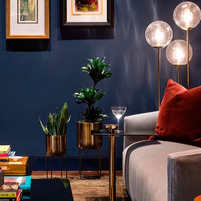
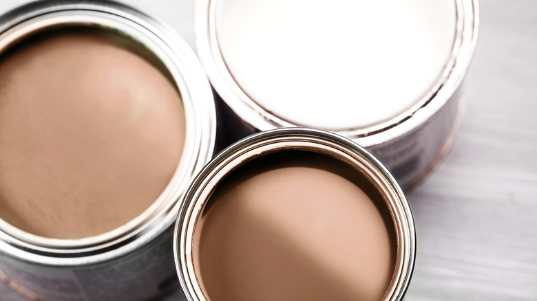
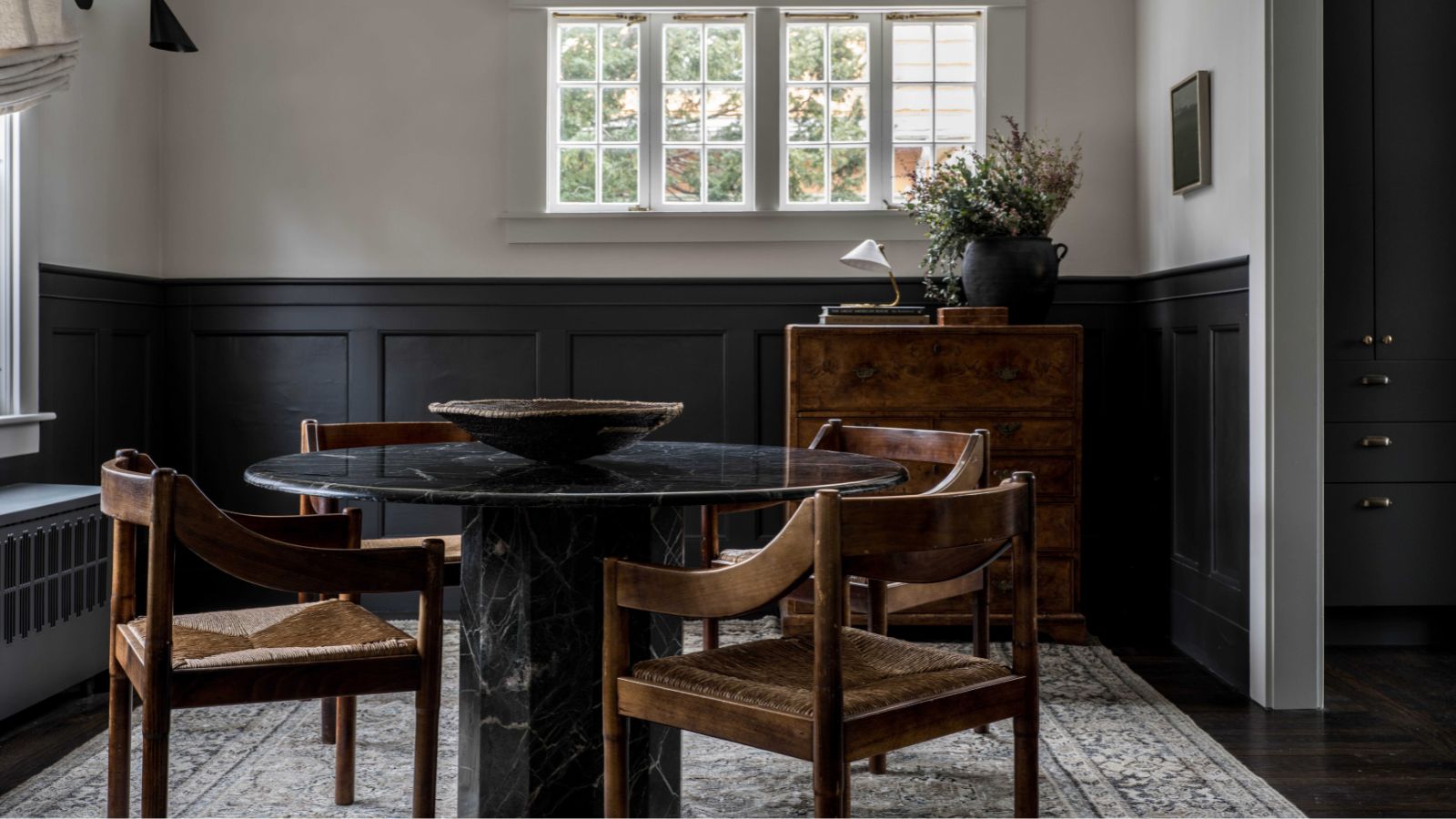
For a rich, warm charcoal gray, Basso also points to "Iron Ore" (SW 7069). She advises using it in a flat finish for offices, libraries, or family rooms, where it can contribute to a cozy, inviting atmosphere, especially when paired with velvet curtains and a deep couch. For those gravitating towards neutrals, Quarles praises "Lightweight Beige" (SW 6092), a warm tan with a subtle pink undertone that imparts sophistication. This versatile shade can be used on ceilings, doors, trim, or to drench an entire space.
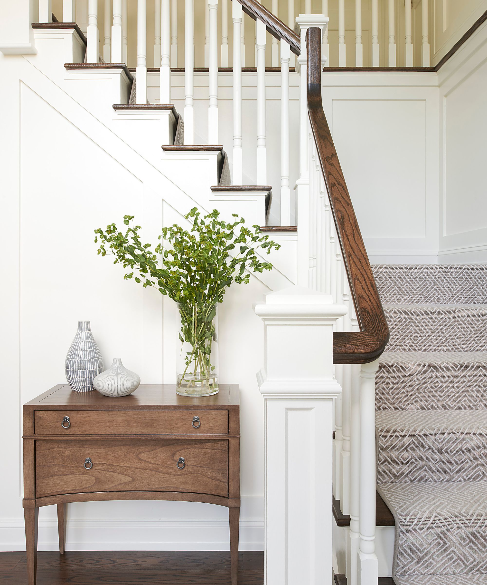
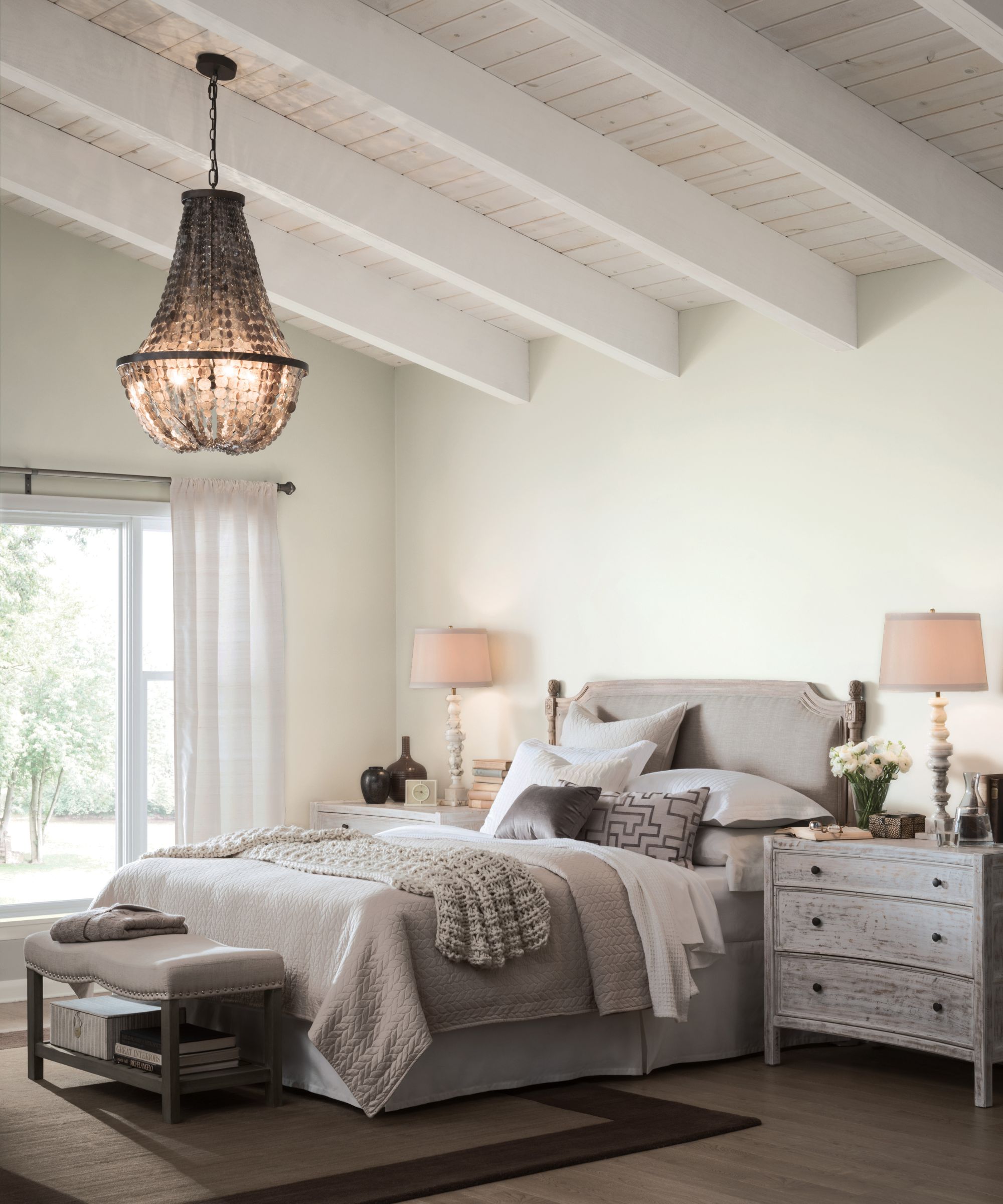
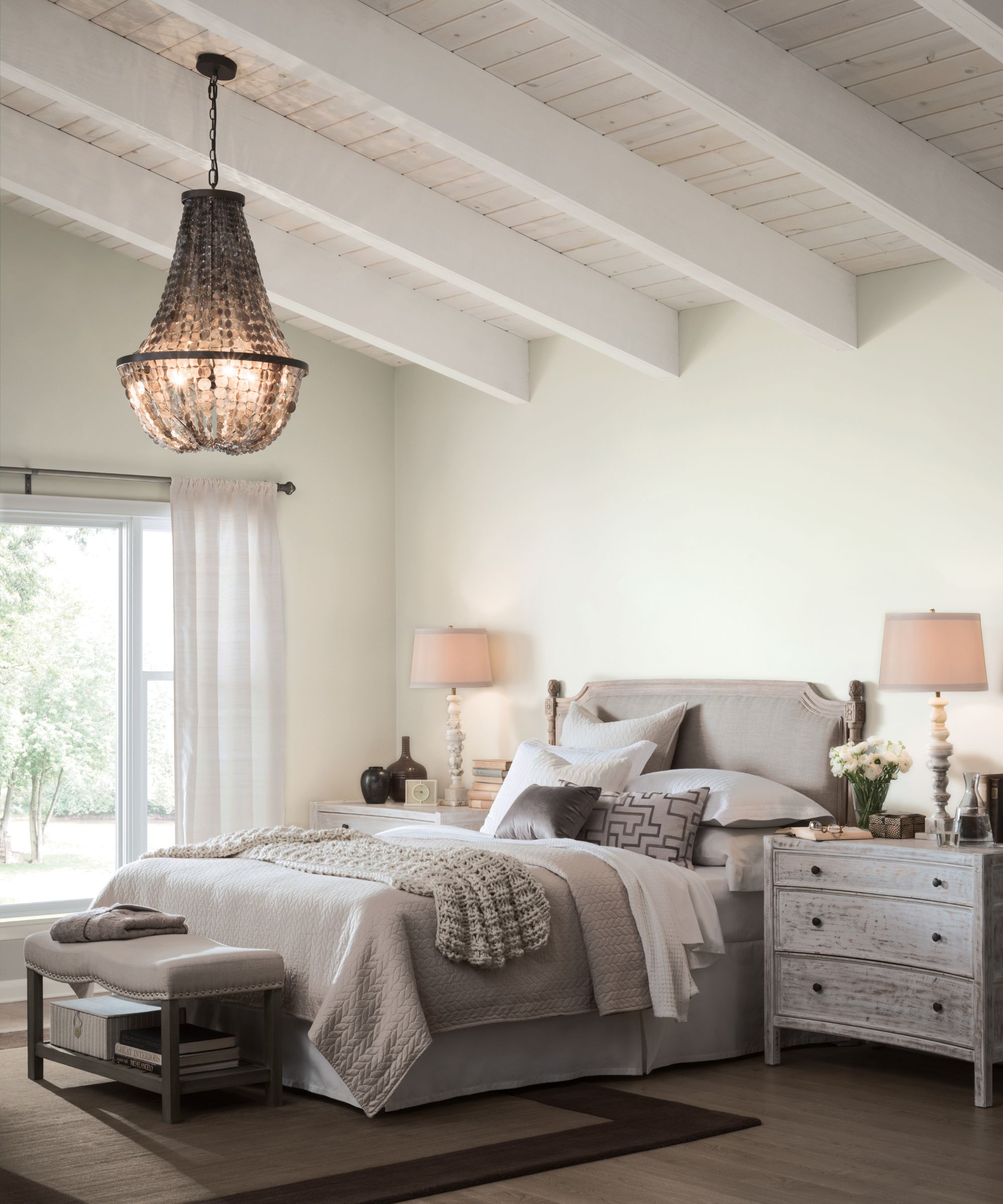
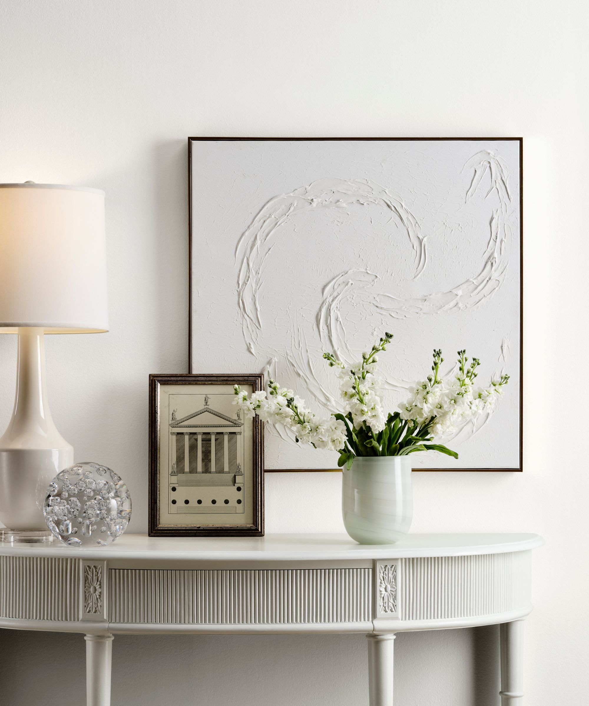
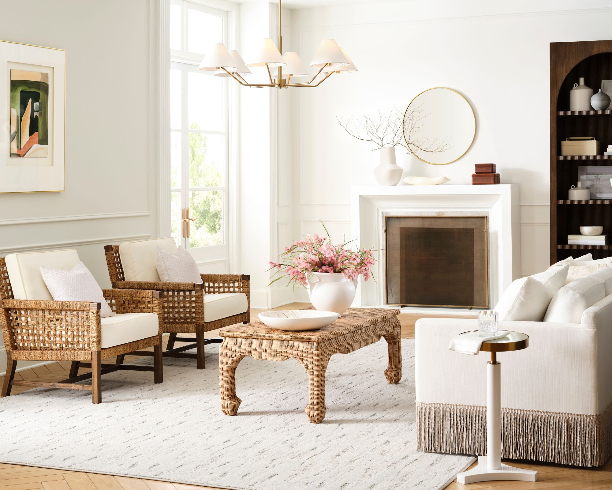
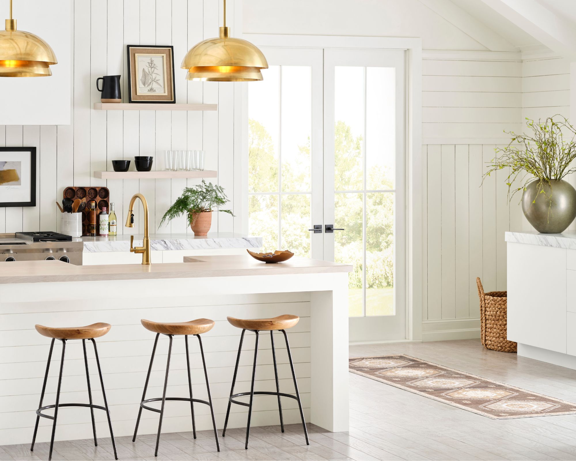
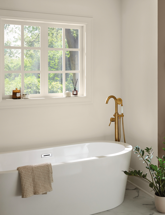
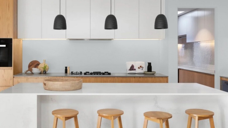
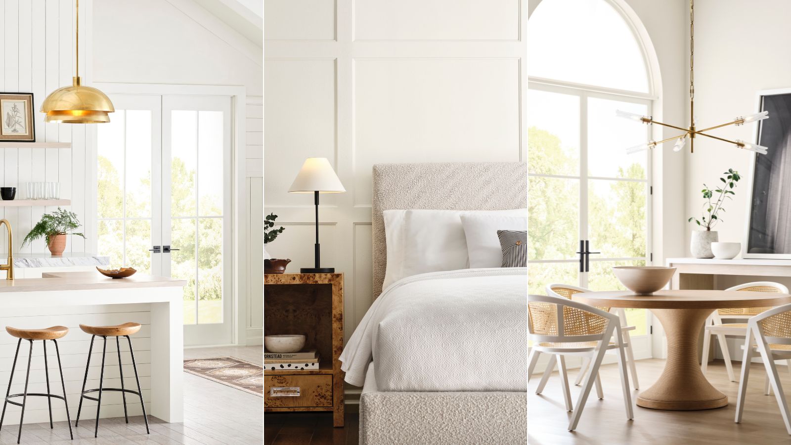
Finally, "Alabaster" (SW 7008), a creamy white, is a favorite of both Basso and Oholendt due to its incredible versatility. Basso notes that in a flat finish, it mimics a natural lime wash or plaster, making it ideal for Mediterranean or Scandi-inspired designs. It allows architectural features and furnishings to shine while effectively reflecting natural light throughout a room. These designer-approved selections demonstrate the breadth and timeless appeal of Sherwin-Williams paint colors, offering dependable choices for various interior design needs.
#InteriorDesign #PaintColors #SherwinWilliams #HomeImprovement #Decorating #DesignerFavorites #ColorPalette #HomeDecor #InteriorDesign #PaintColors #SherwinWilliams #HomeImprovement #Decorating #DesignerFavorites #ColorPalette #HomeDecor
0 comment in total
 No comments yet
You may also like
We asked 12 interior designers for their favorite Sherwin-Williams paints – these are the colors that came out on top

Sherwin-Williams paint colors in real homes – 13 designer-approved shades, from neutrals to bolds
Sherwin-Williams' Designer Color Collection: 5 bright white paints
If You Can't Find Your New Paint Color in Sherwin-Williams' 2026 Palettes, We'll Be Shocked

These Are the Colors You'll Be Obsessed With Next Year, Based on Your Personality

A Look Back at the Last Decade of Sherwin-Williams’ Color of the Year

4 Color Palettes That Will Dominate Home Design in 2026 and Beyond, According to Sherwin-Williams
10 Lesser-Known Neutral Paint Shades From Sherwin Williams You Shouldn't Overlook
What are the best Sherwin-Williams white paints? 6 favorite shades amongst interior designers
7 Bold Paint Colors Interior Designers Are Longing to Use on Their Next Projects
The Best Sherwin Williams Paint Colors for a Bathroom — 5 Picks Designers and Experts Love

19 go-to paint colors that Dallas designers love
Sherwin-Williams Predicts These 4 Color Palettes Will Dominate Homes in 2026—and One May Surprise You

5 of the Most Calming Paint Colors From Sherwin-Williams
Sherwin-Williams' 2026 Color Forecast Is Here and It’s Packed With 48 Fresh Hues
How to decorate with Sherwin Williams’ Iron Ore – a ‘sophisticated, warm and timeless gray’
What are Sherwin-Williams' best-selling paints? And how interior designers put them to use
The Interior Paint Colors You'll Be Seeing Everywhere in 2024

6 Ways to Decorate with Sherwin Williams' 'Dried Thyme'
How to Decorate with Sherwin-Williams’ Shade ‘Debonair’ — 'It's The Embodiment of Modern Sophistication!'