1/8
Interior designers' favorite Farrow & Ball paint colors
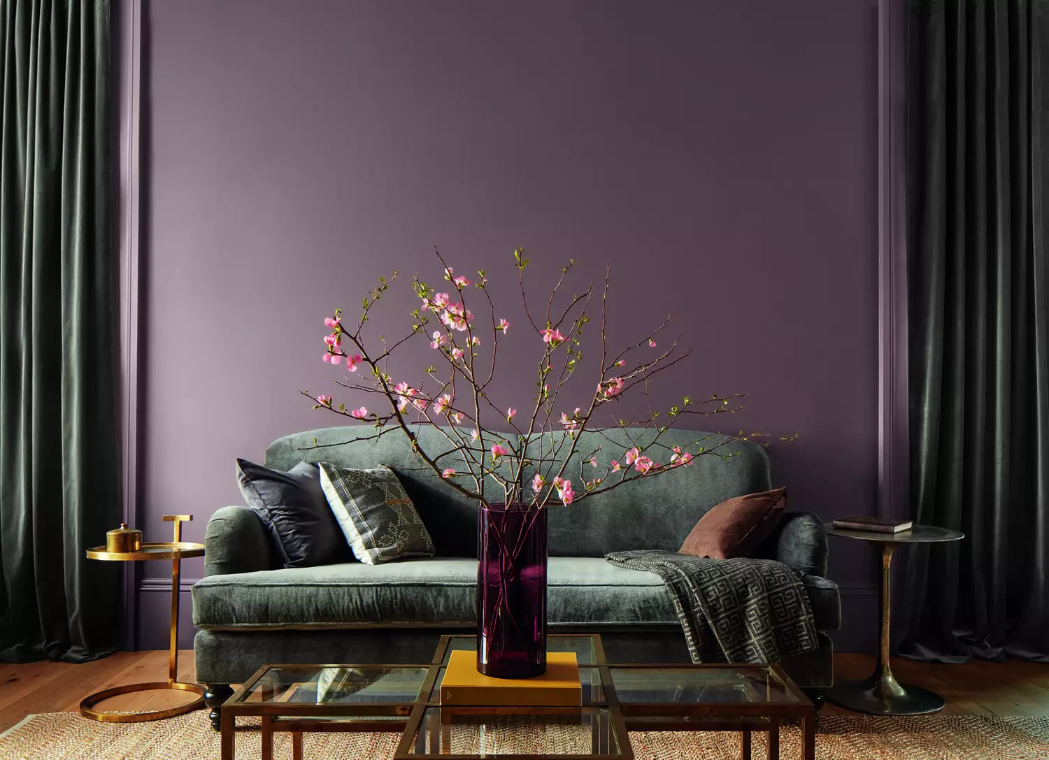
This article highlights the preferred Farrow & Ball paint colors of interior designers, showcasing a range from moody blues to delicate neutrals, all known for their rich pigments and liveable qualities. Farrow & Ball is a highly recommended brand in interior design due to its distinctive color palette and high-quality paint formulas. Given the extensive selection of colors available, selecting the right one for home decor can be challenging. To assist homeowners, several interior designers share their most frequently used and favored Farrow & Ball shades, providing insights into how these colors can transform various spaces.
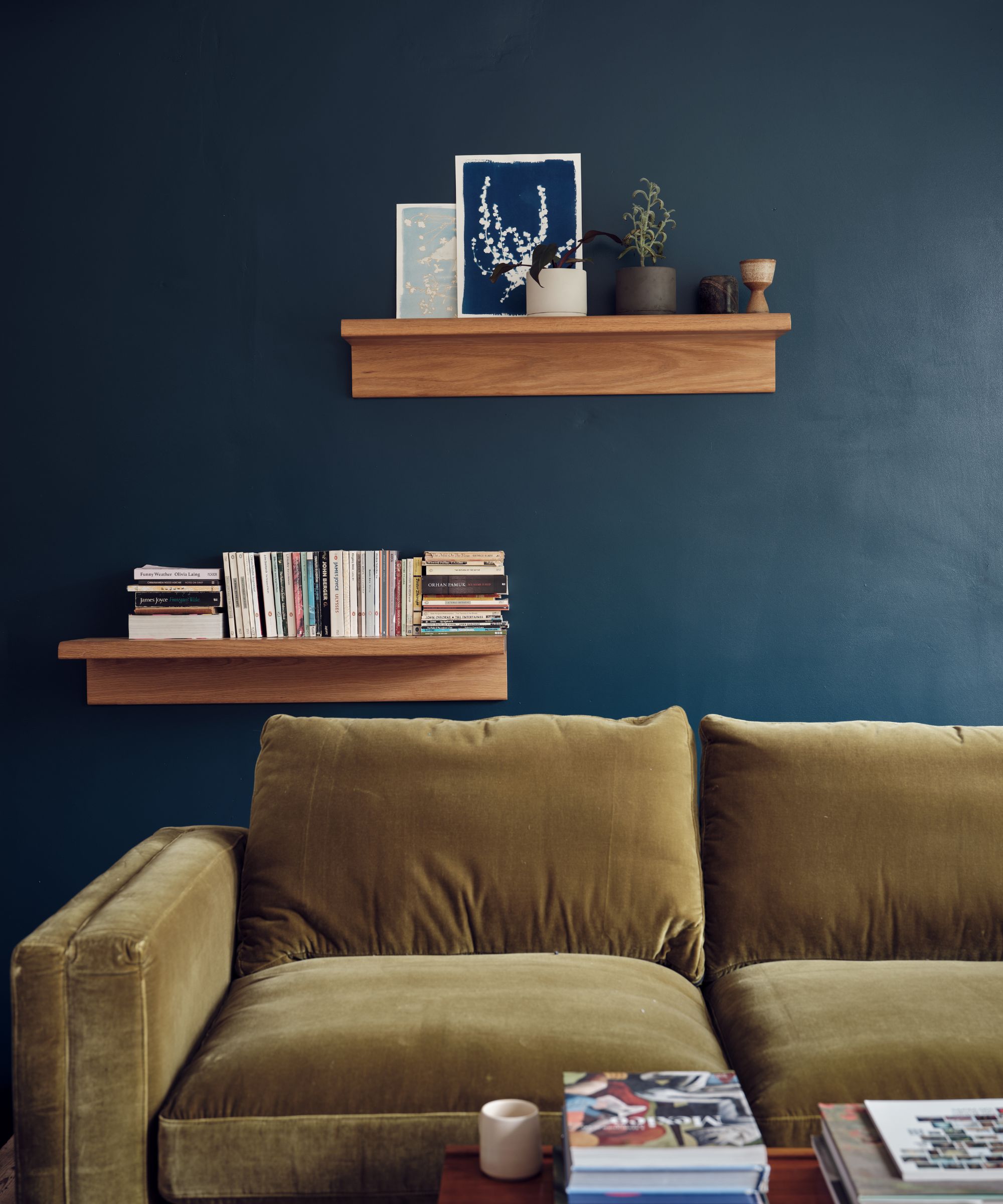
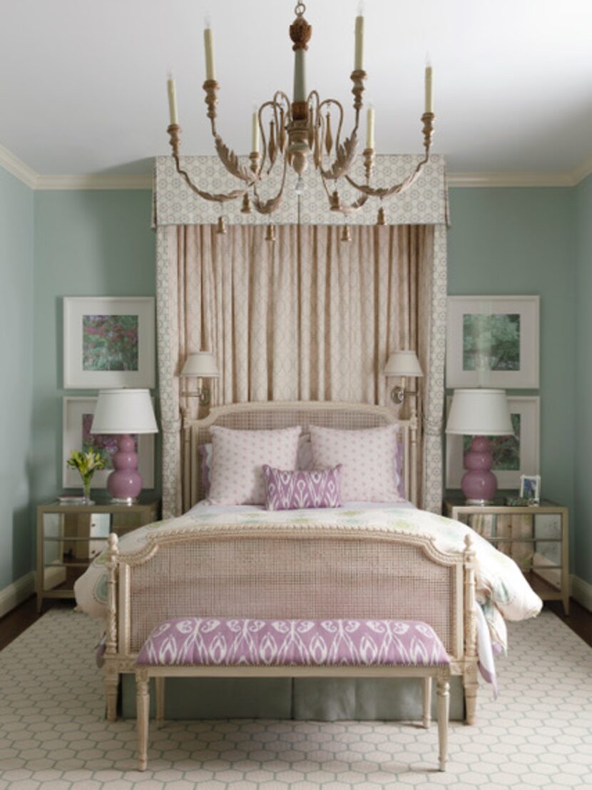
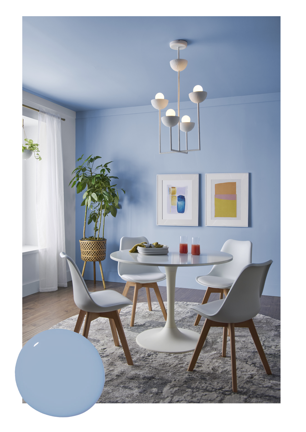
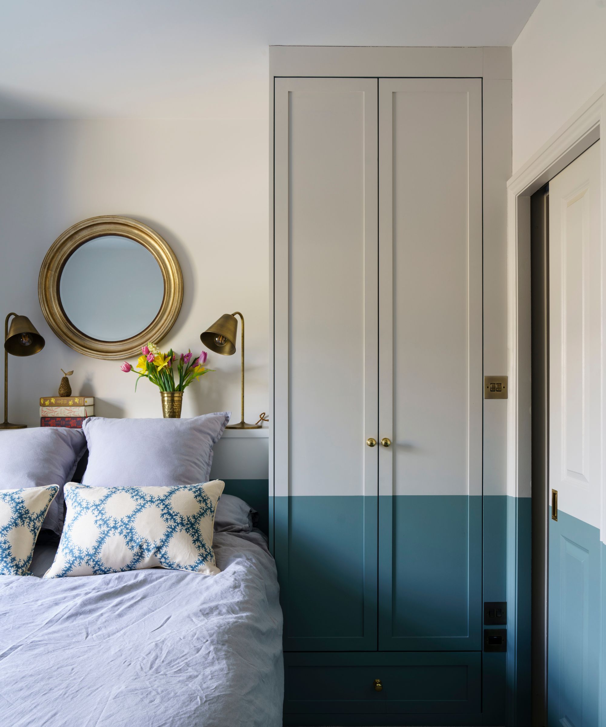
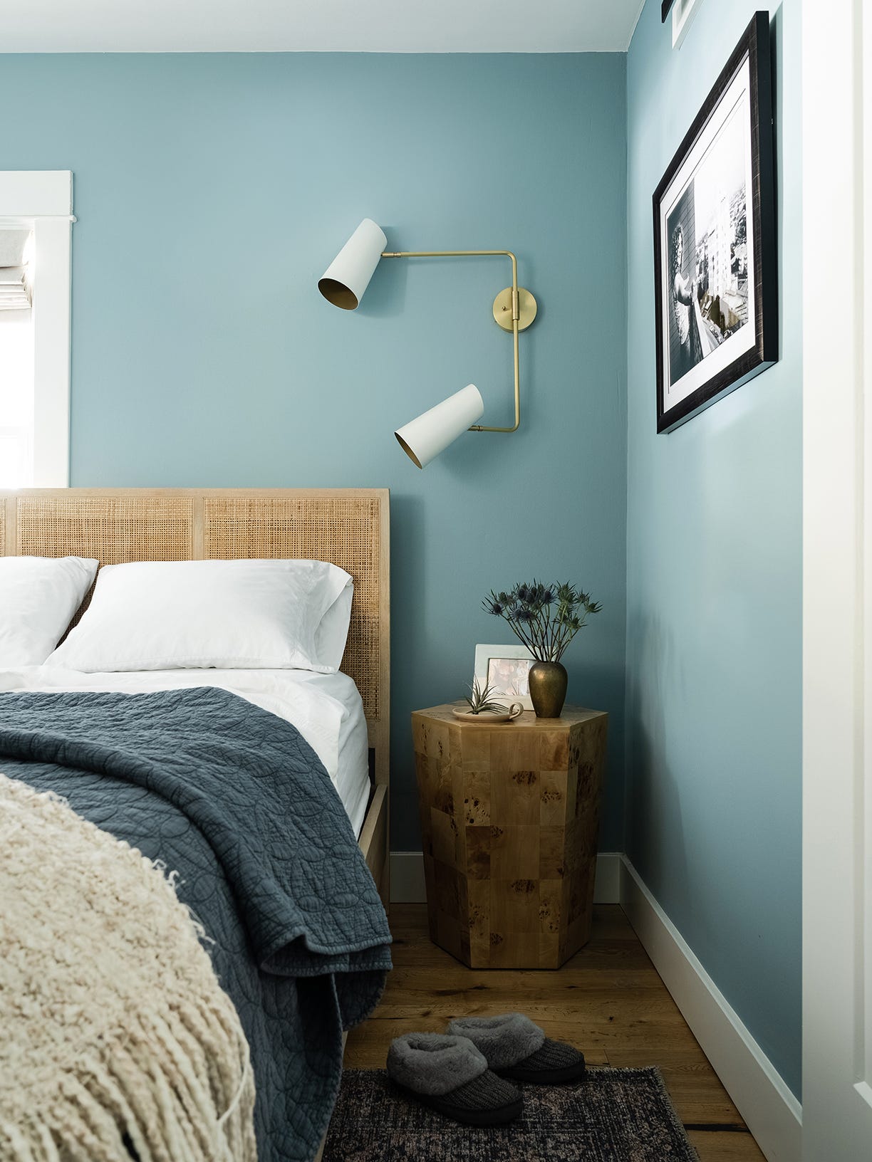
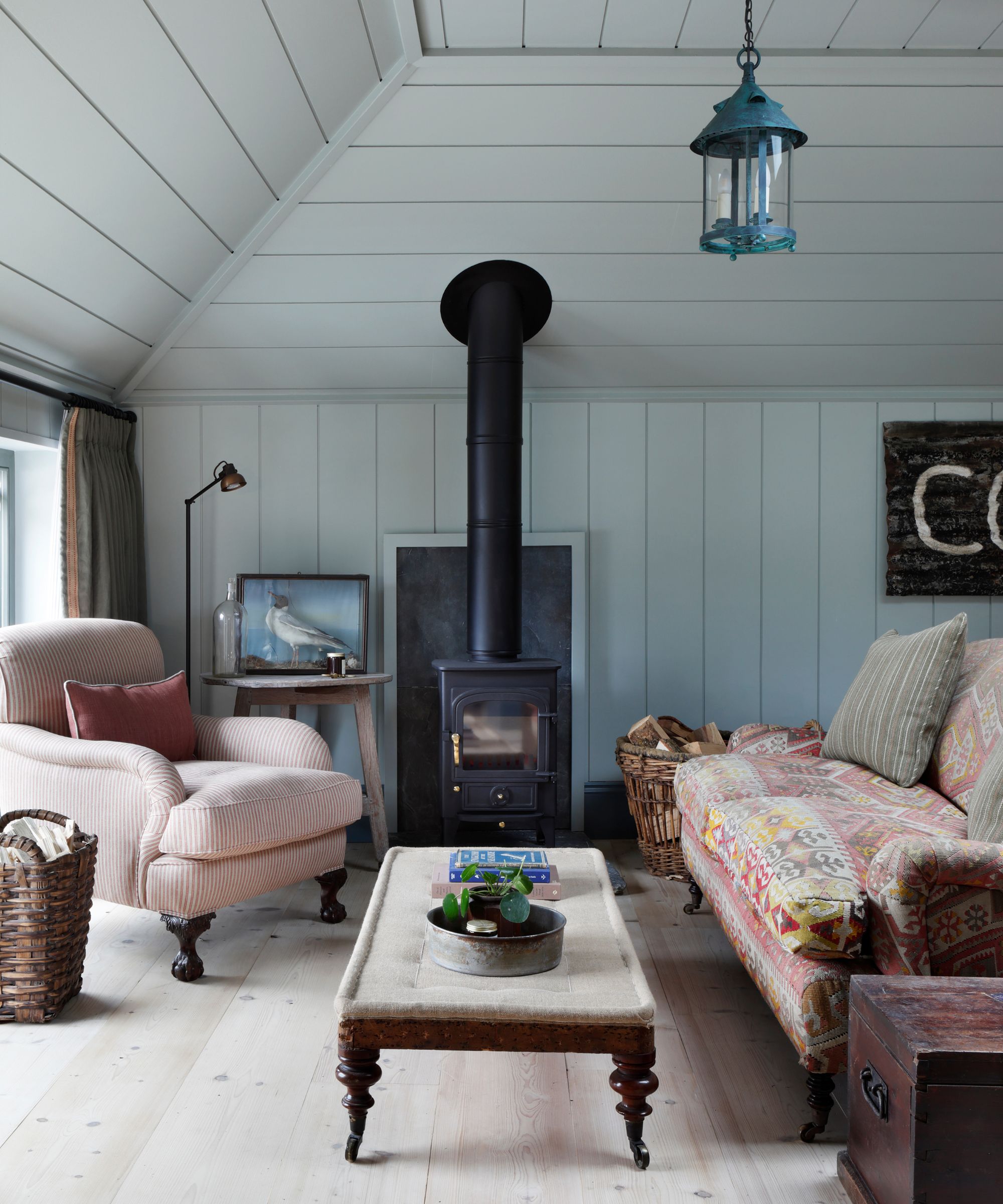
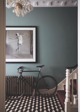
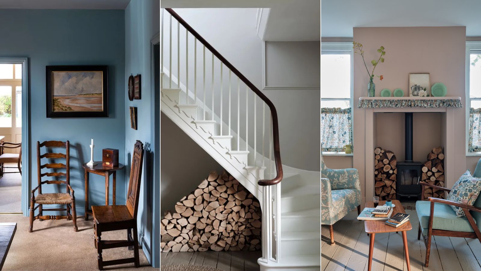
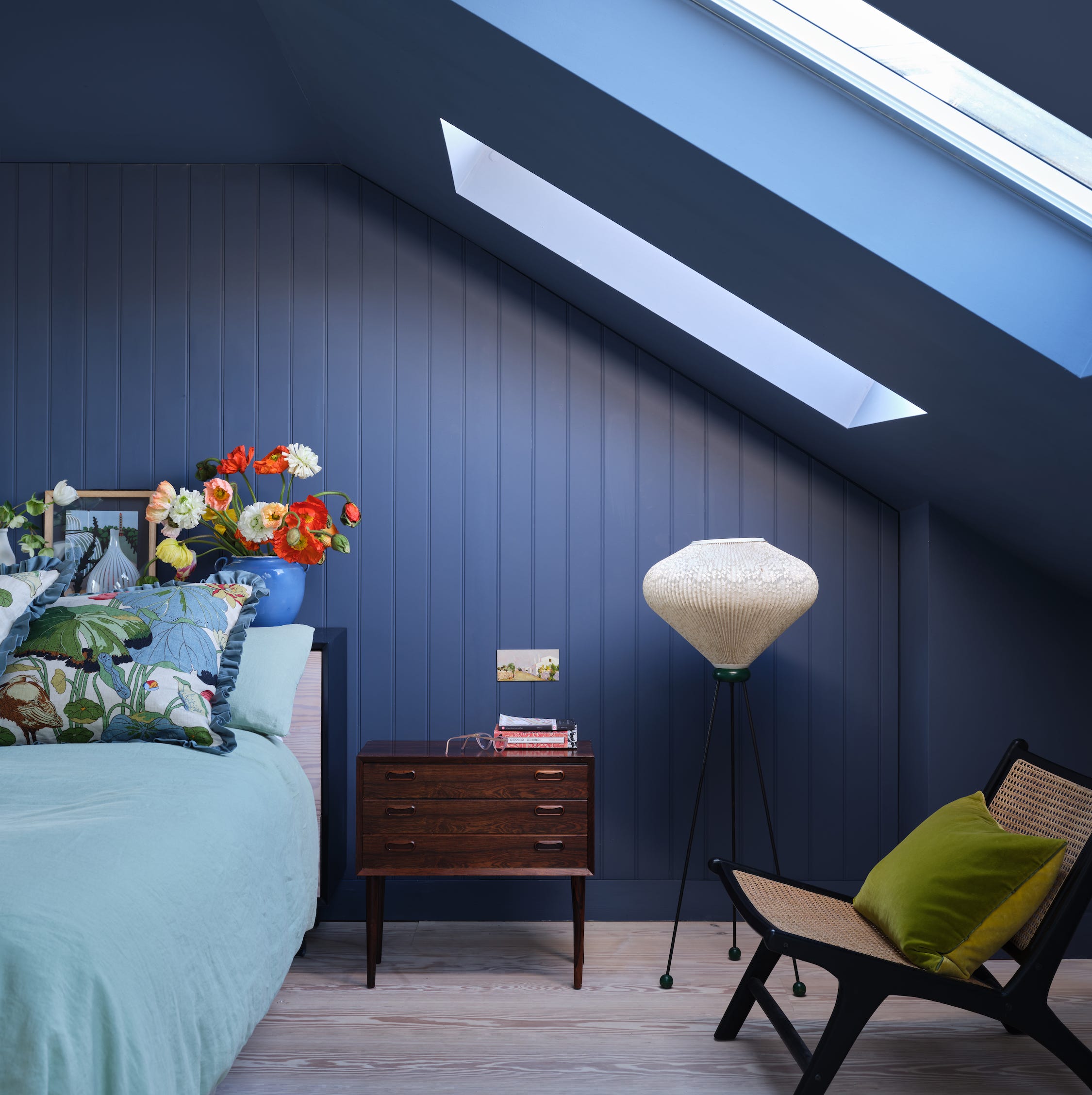
The featured colors include 'Middle Ground,' an archive color described as a warm blue, ideal for south-facing rooms where it creates a calming backdrop that changes beautifully with the light throughout the day. Alice Gaskell of Alice Grace Interiors particularly favors this shade for bedrooms, noting its unique blue-green balance that complements warm wooden tones.
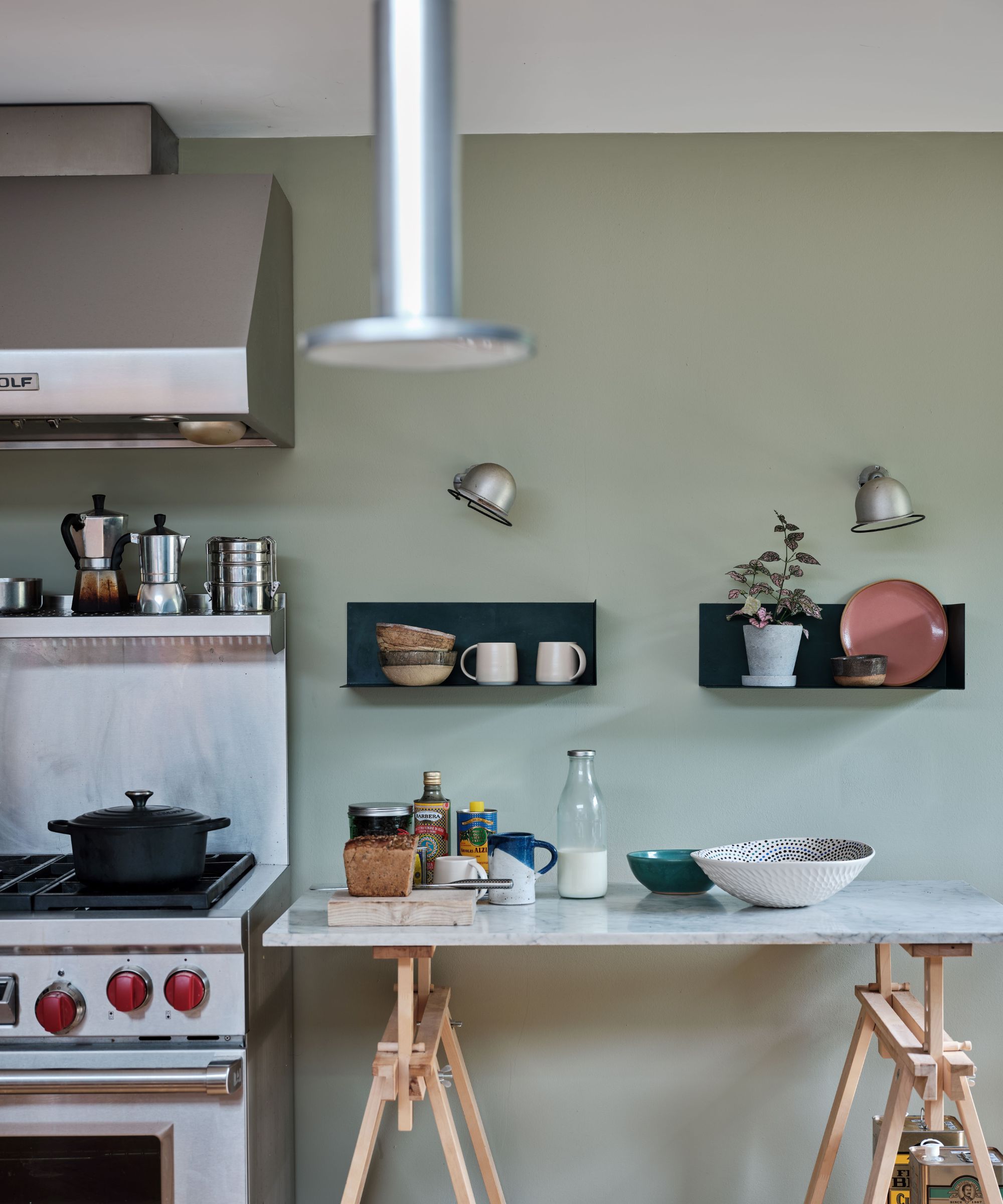
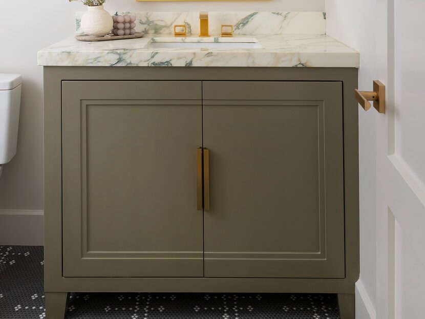
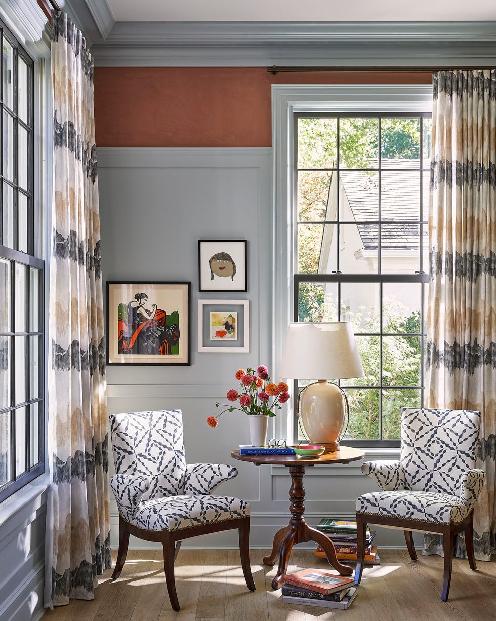
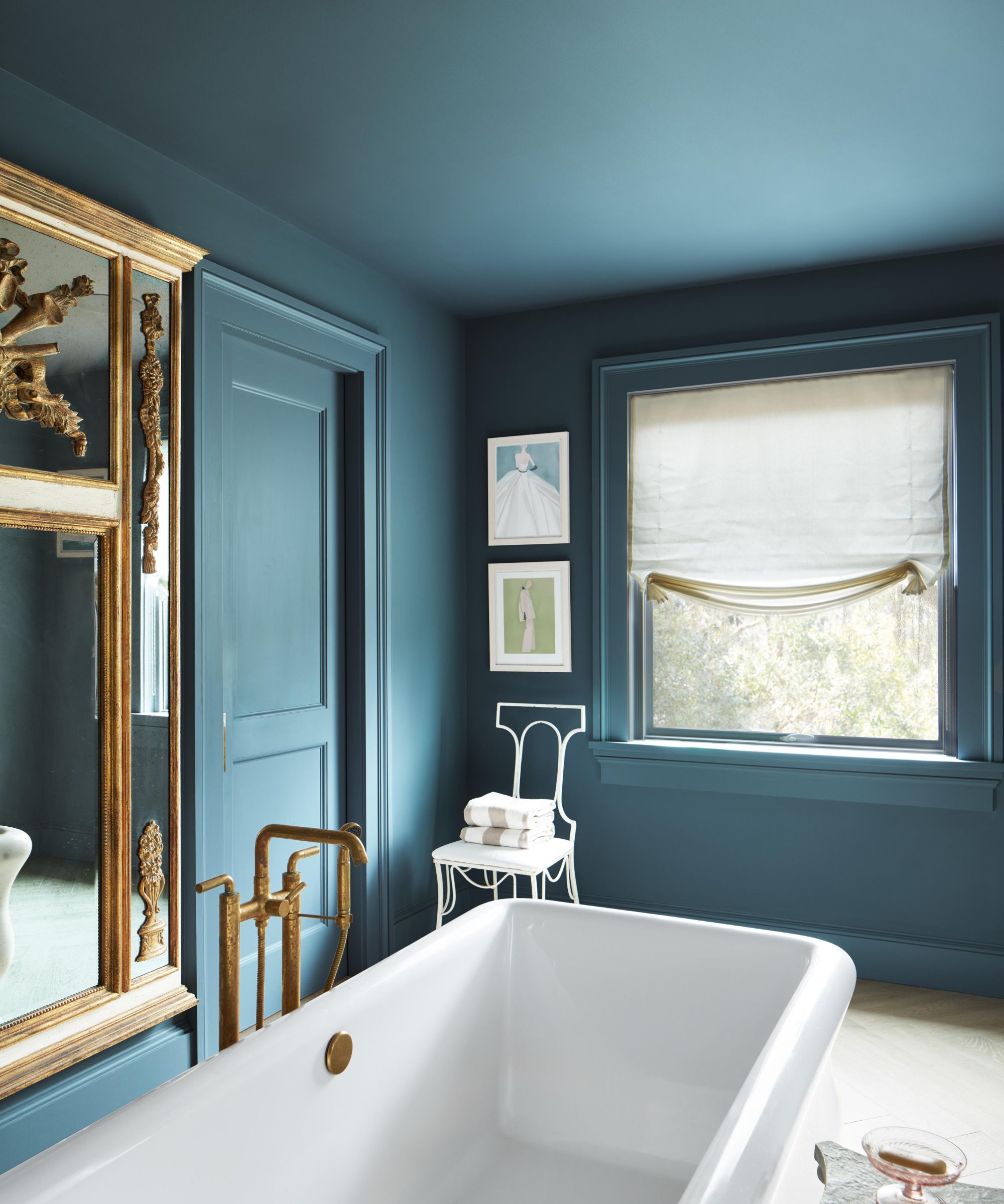
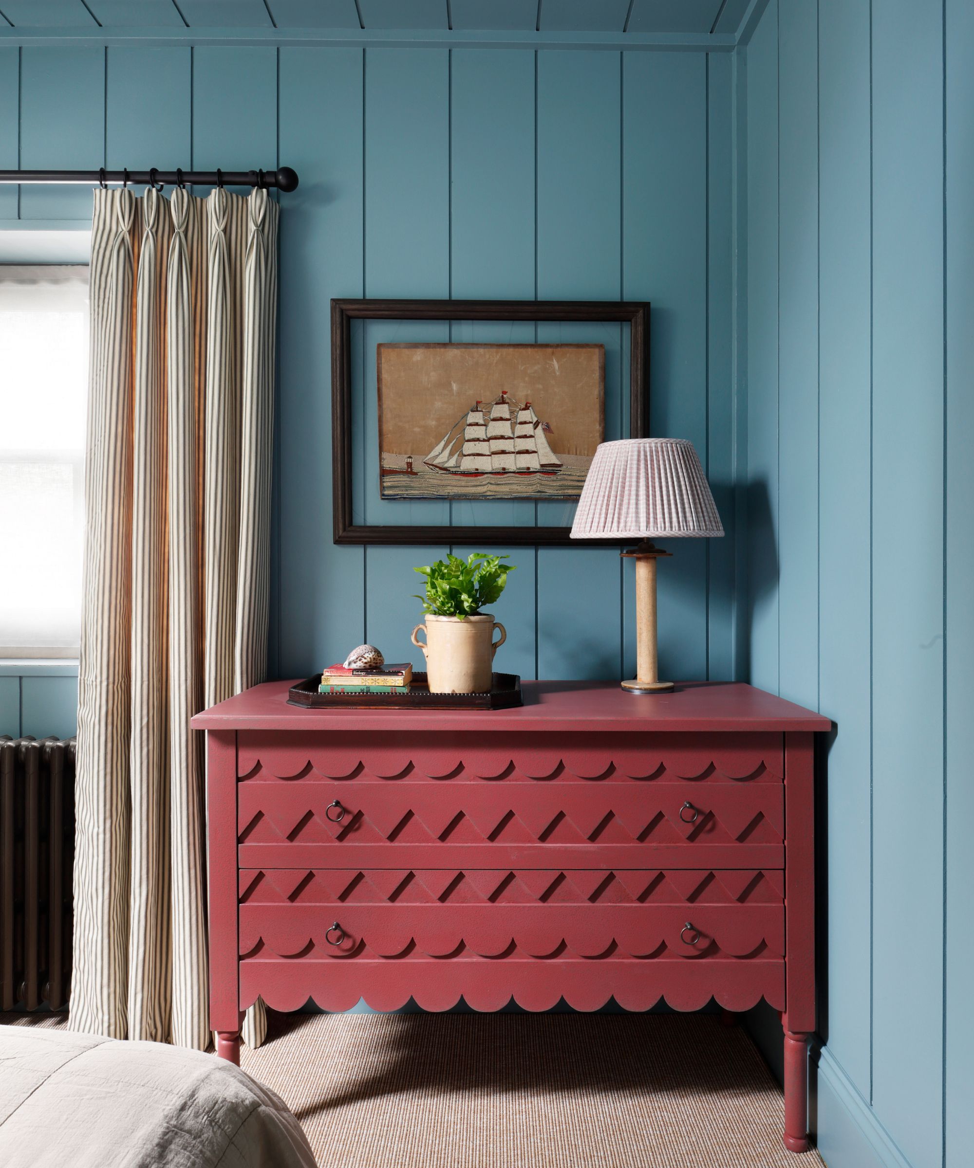
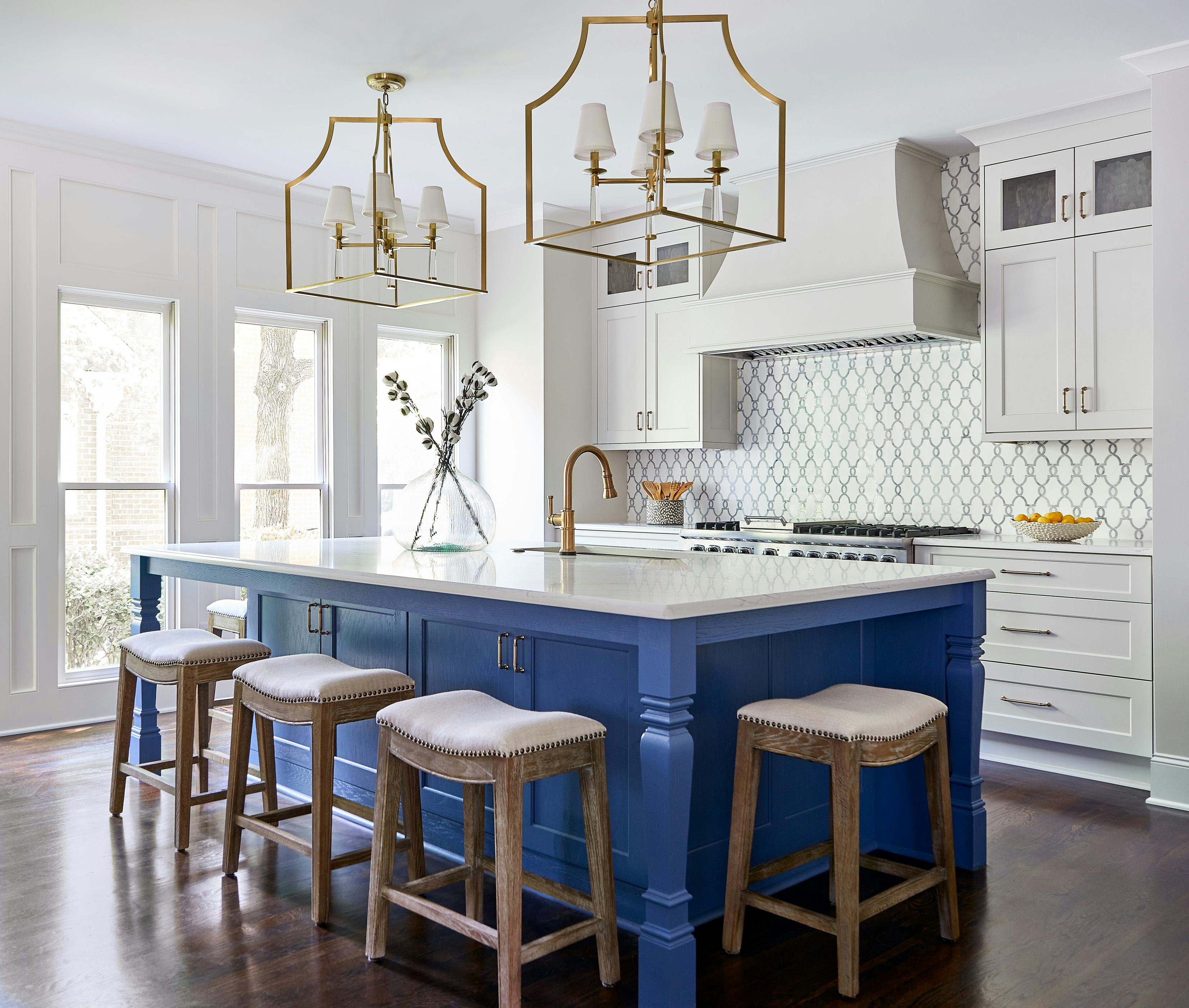
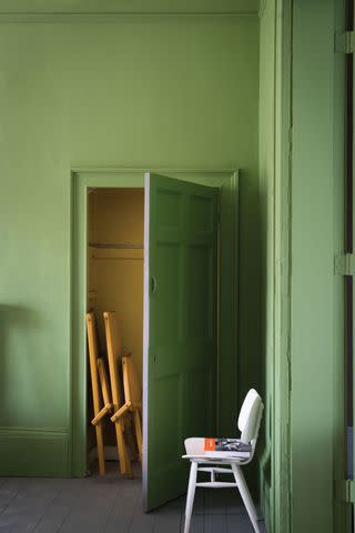
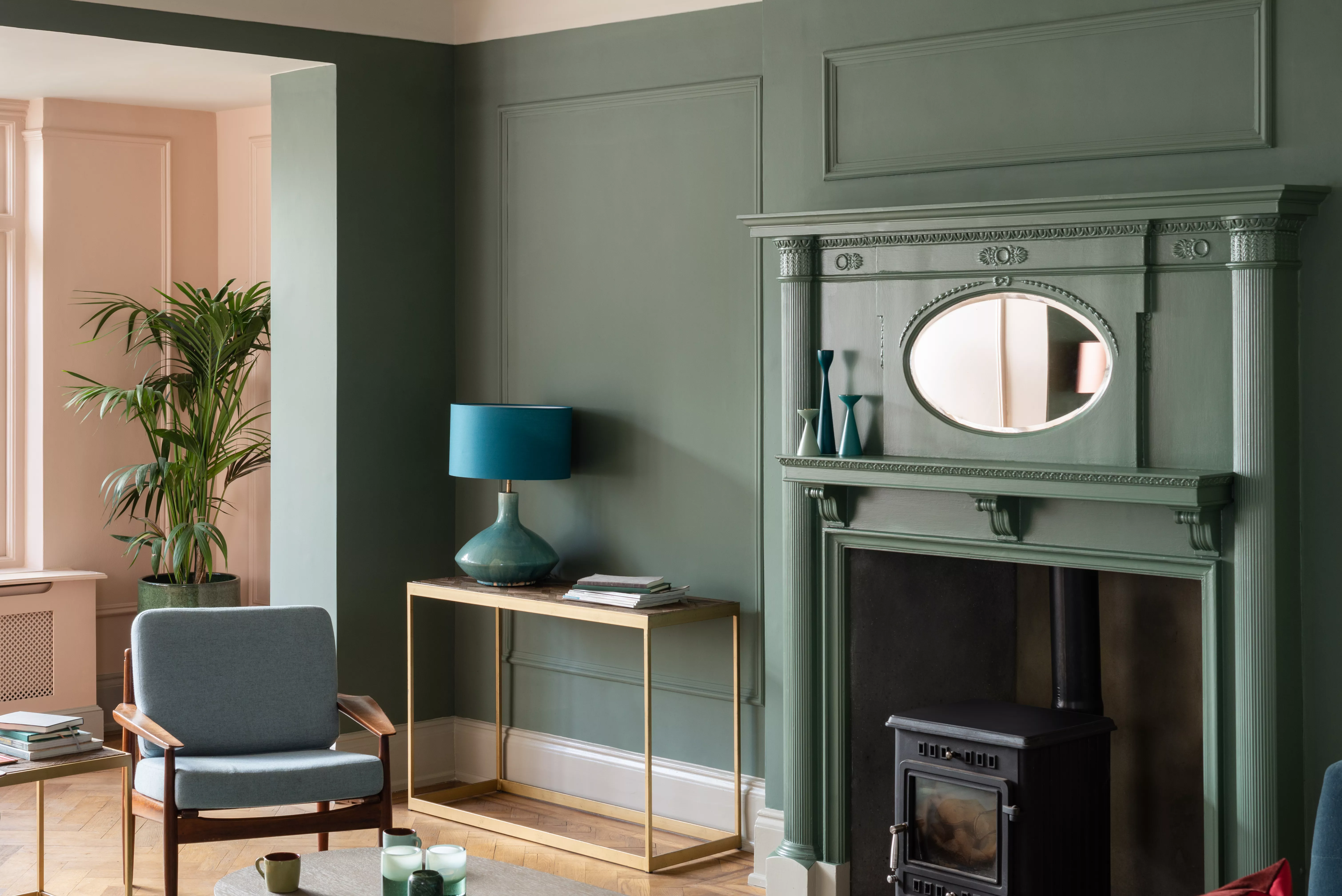
Another popular choice is the combination of 'Mizzle' and 'Down Pipe.' Nadia Watts, a Denver-based interior designer, frequently uses Mizzle as a main color for kitchen cabinets, contrasting it with Down Pipe for kitchen islands. Mizzle, a soft gray-green reminiscent of a misty drizzle, pairs well with Down Pipe, a deep blue with gray undertones, creating a complex and rich effect. These 'in-between' colors function almost as neutrals, making them versatile enough to integrate with various other colors and patterns and ensuring they remain timeless.
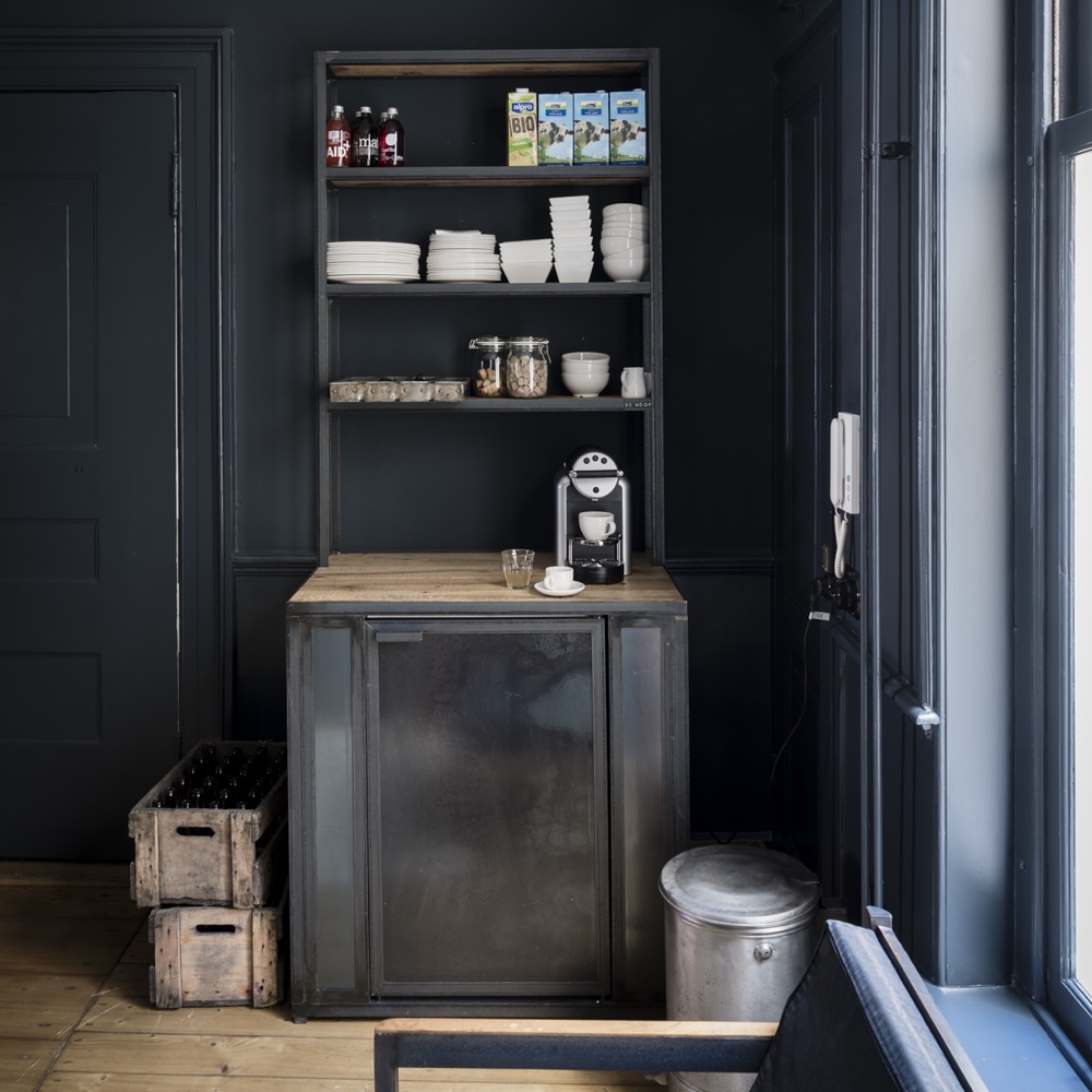
'Elephant's Breath' is another standout, particularly for its deep and rich pigments, according to Kristen Fiore of Kristen Elizabeth Design. Along with 'Dove Tale' and 'Worsted,' these gentle neutrals are recommended for cabinets as an alternative to solid black, bringing depth without overwhelming the space. Lighter gray tones from this collection are also suggested for trim and baseboard moldings.
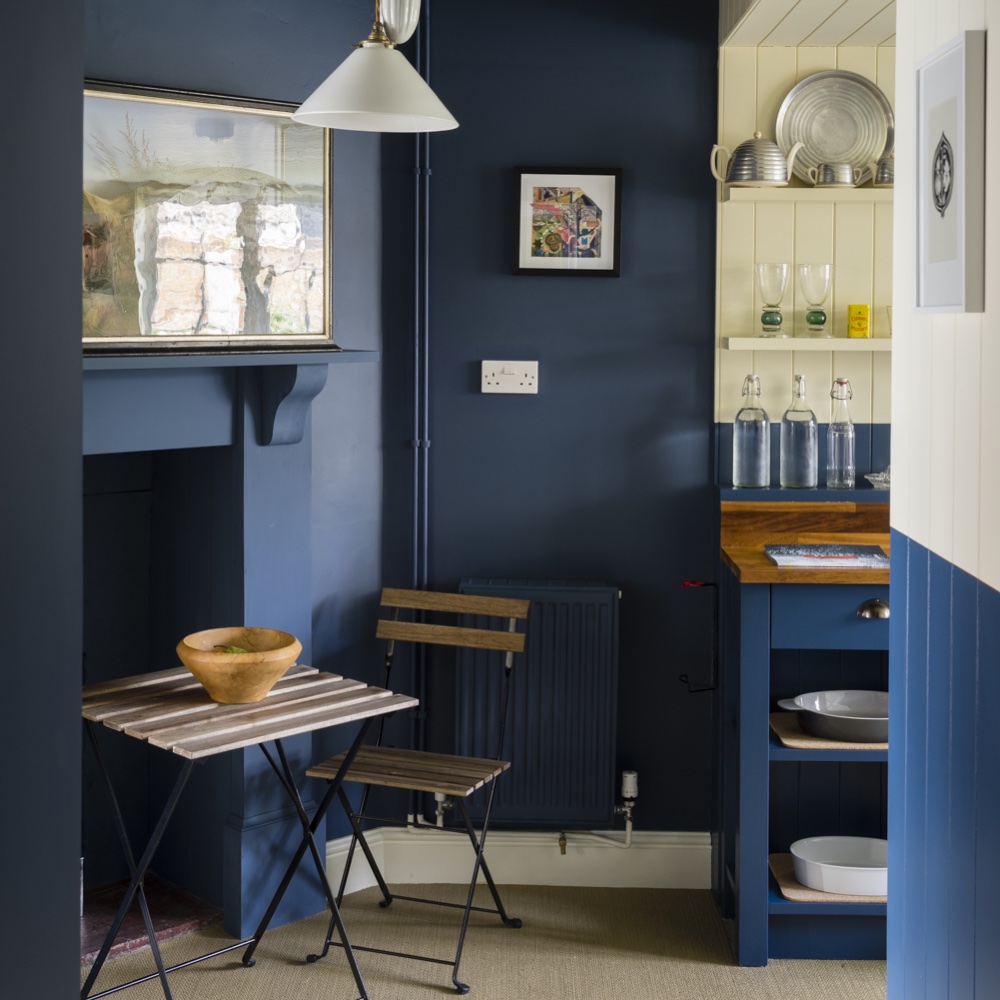
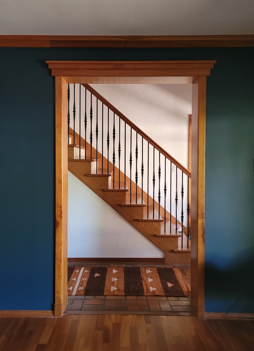
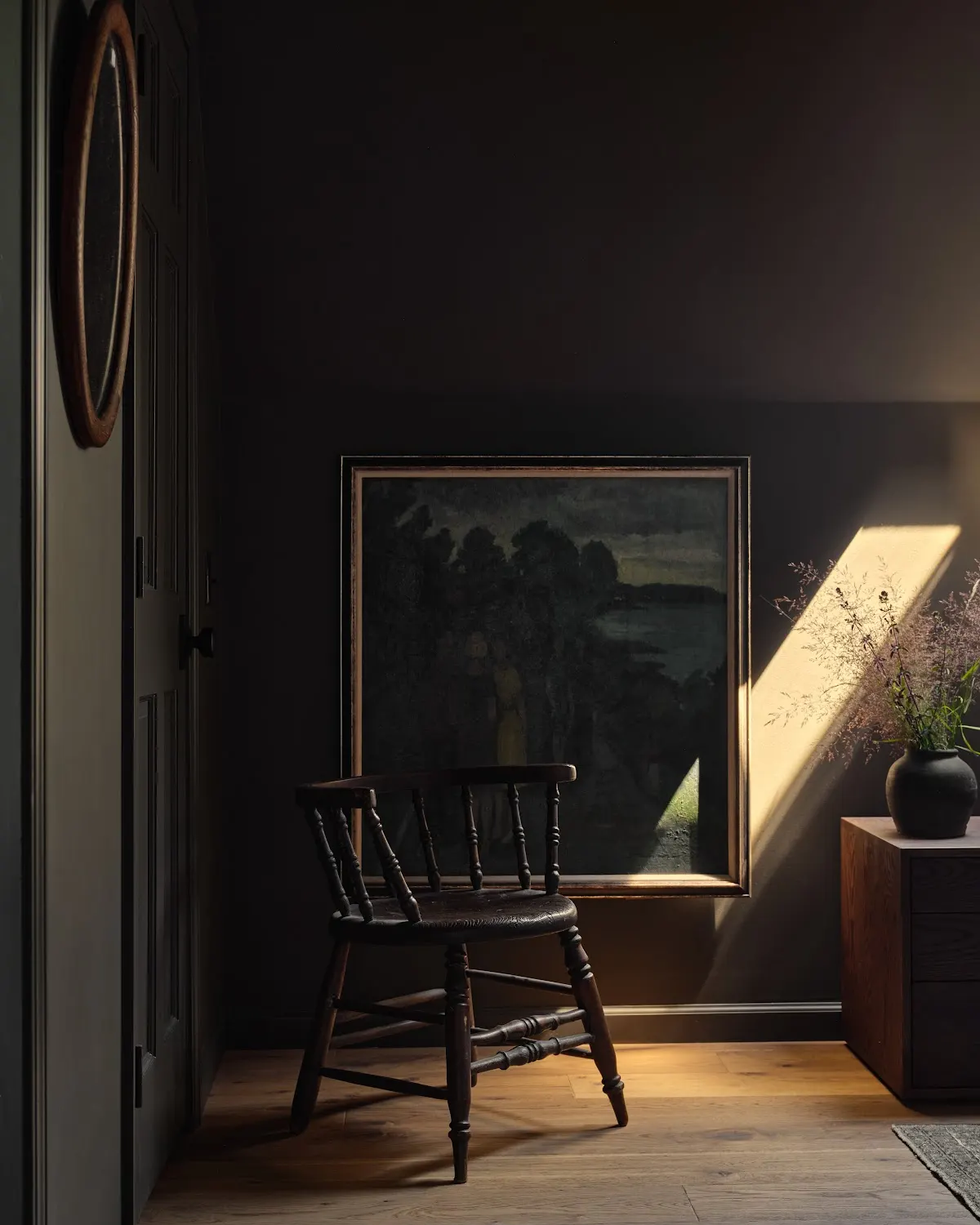
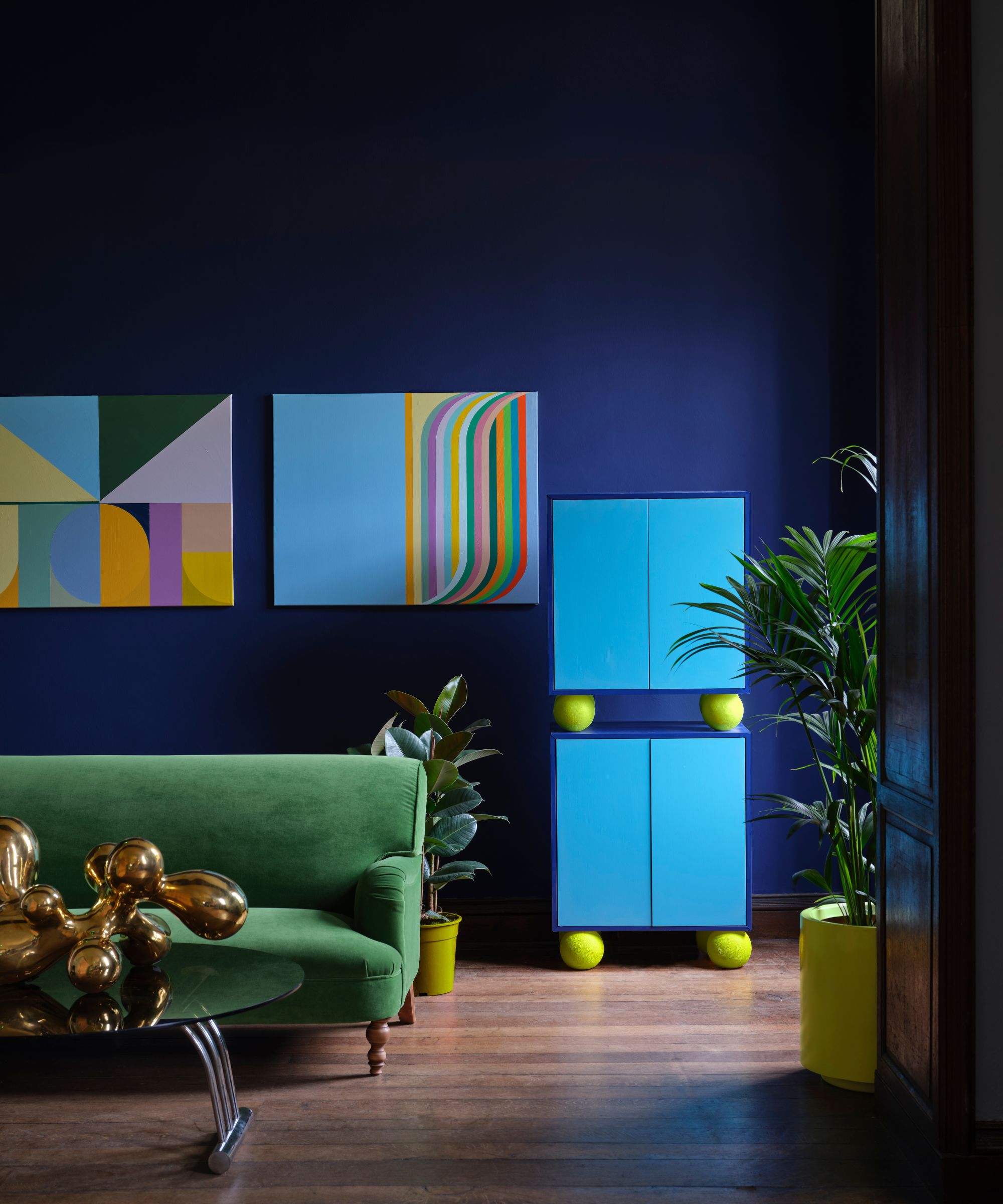
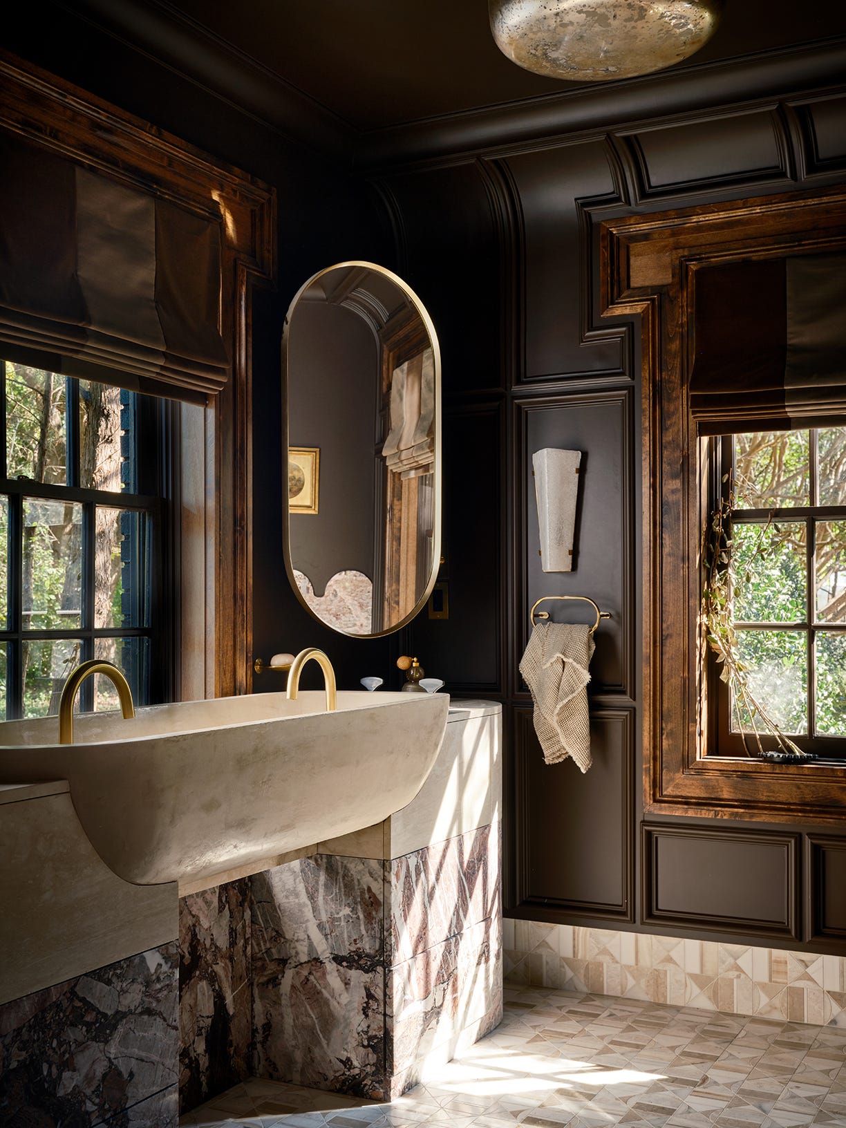
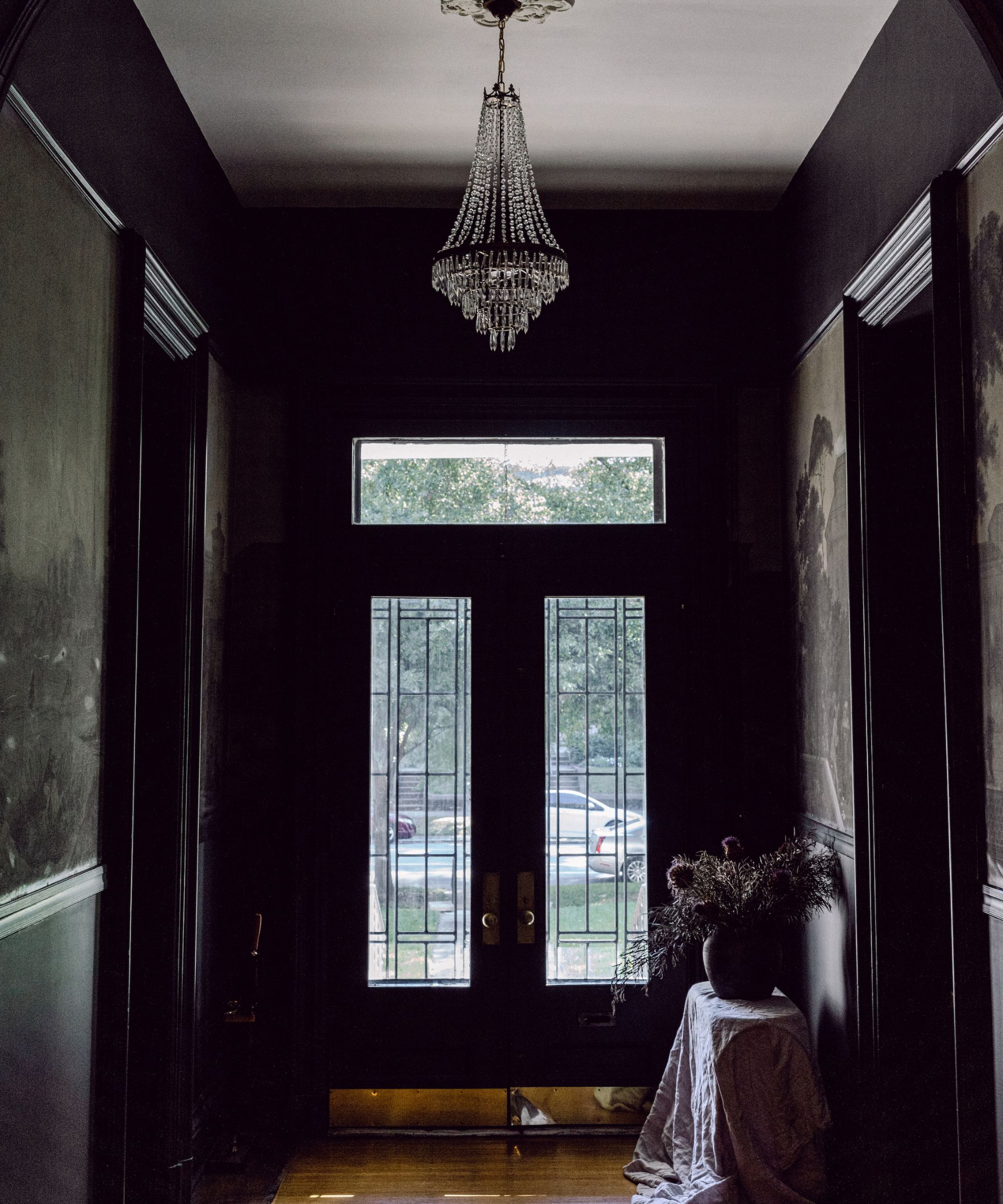
Lucy Currell of Studio Iro favors 'Oval Room Blue,' a perfectly balanced dark blue, which she used to color-drench an entryway in an old pub. This approach, covering walls, woodwork, and ceiling in the same shade, created a profoundly relaxing ambiance in the large space, demonstrating the color's depth and tone.
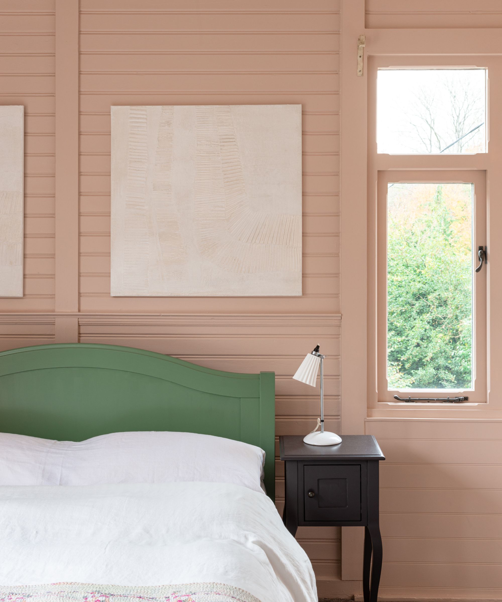
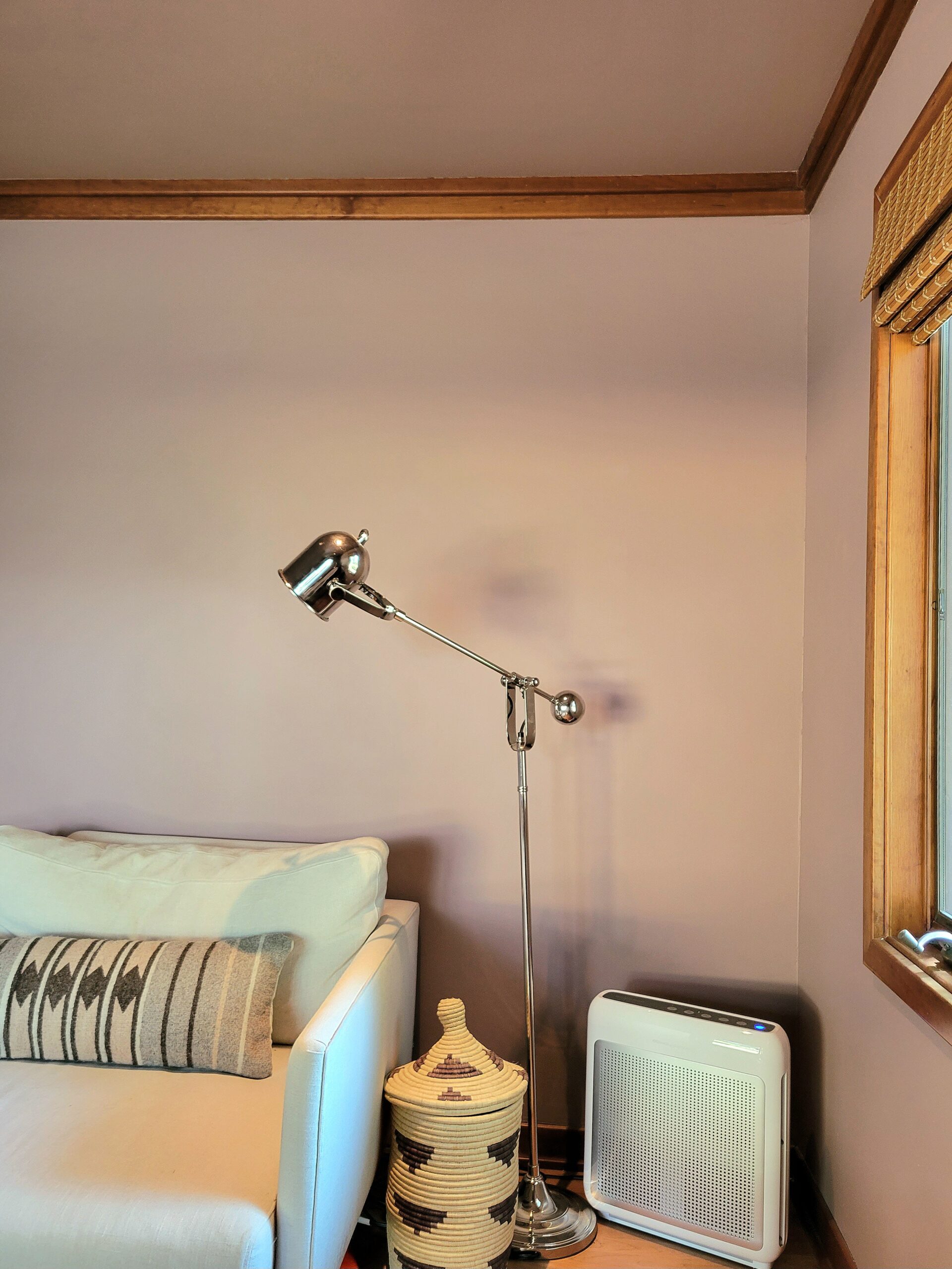
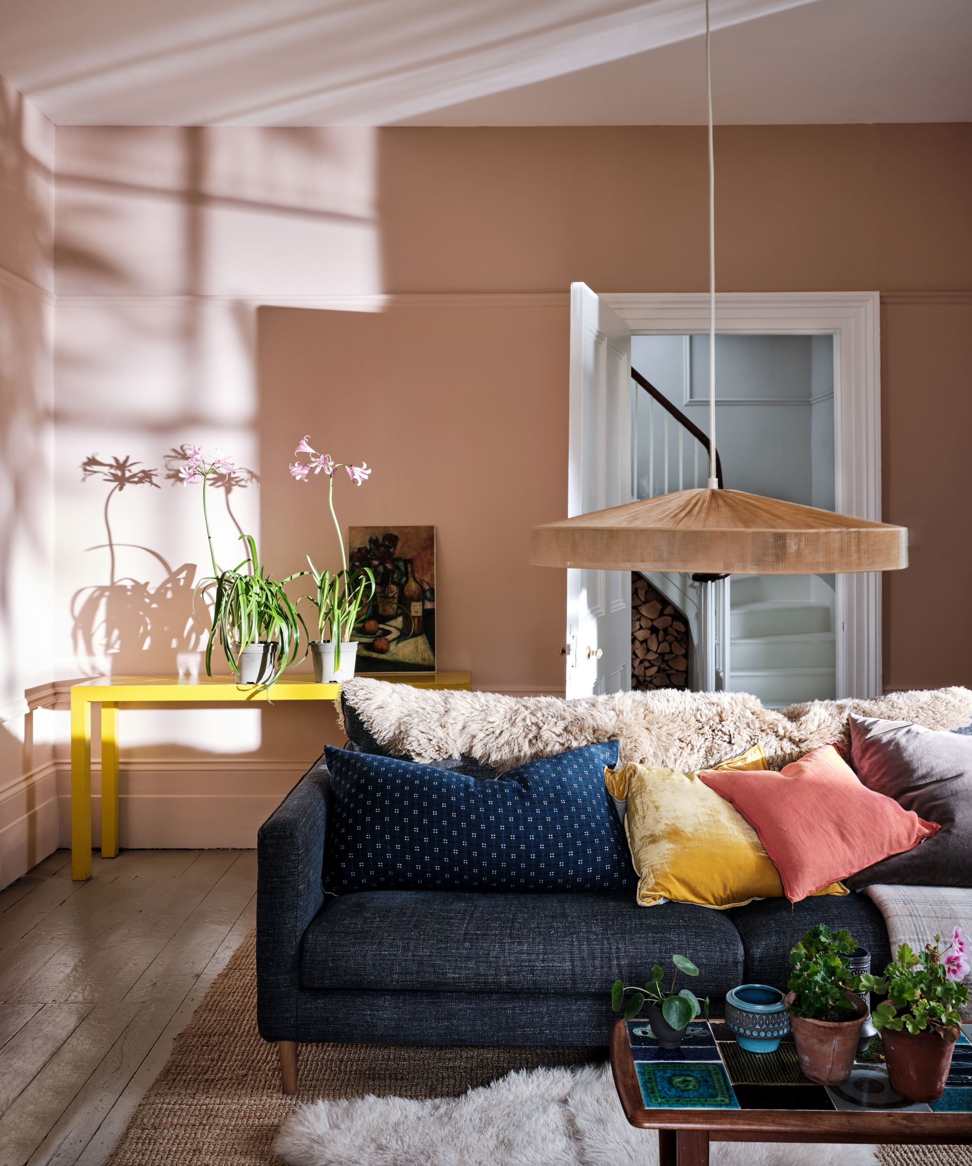
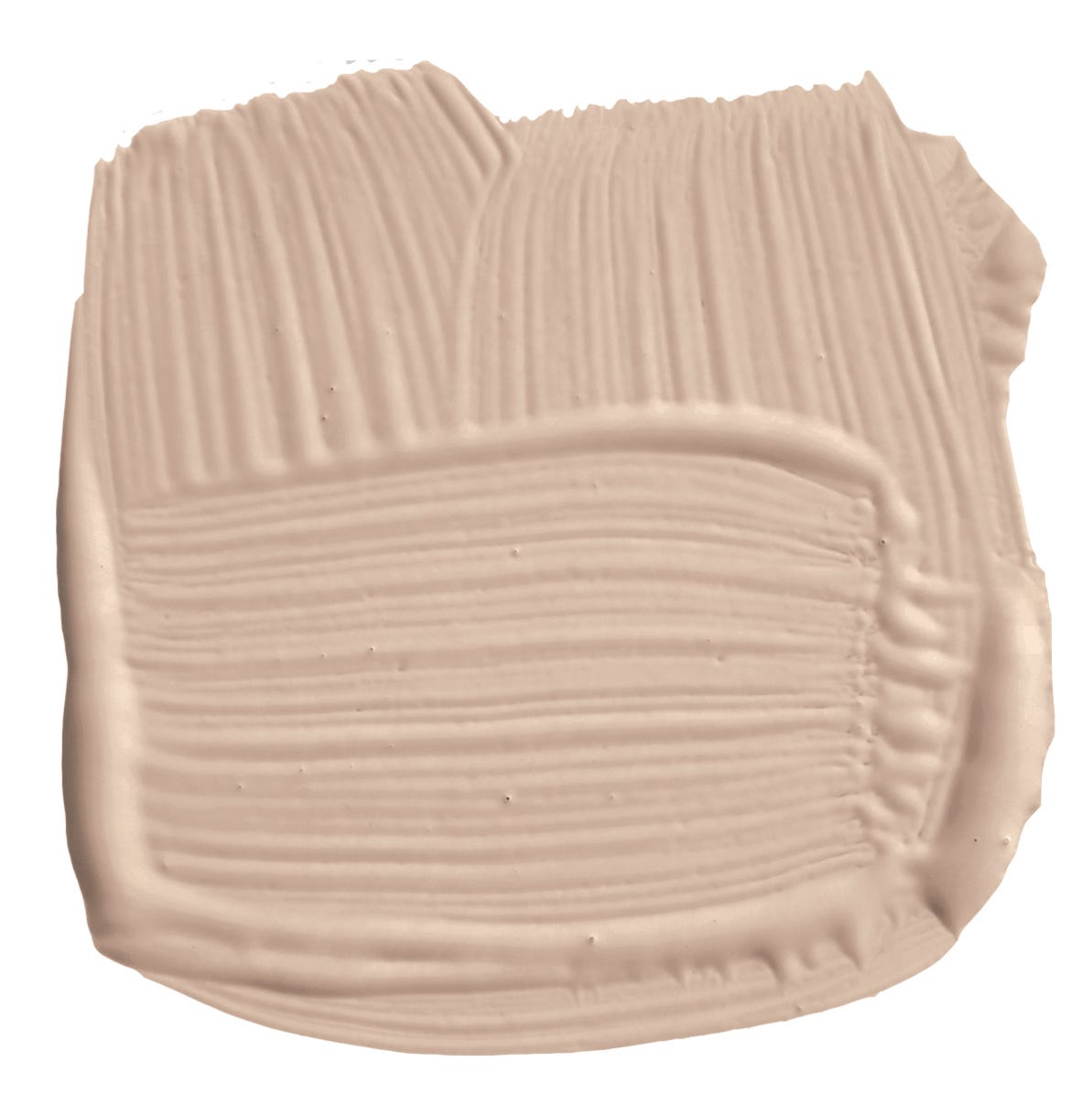
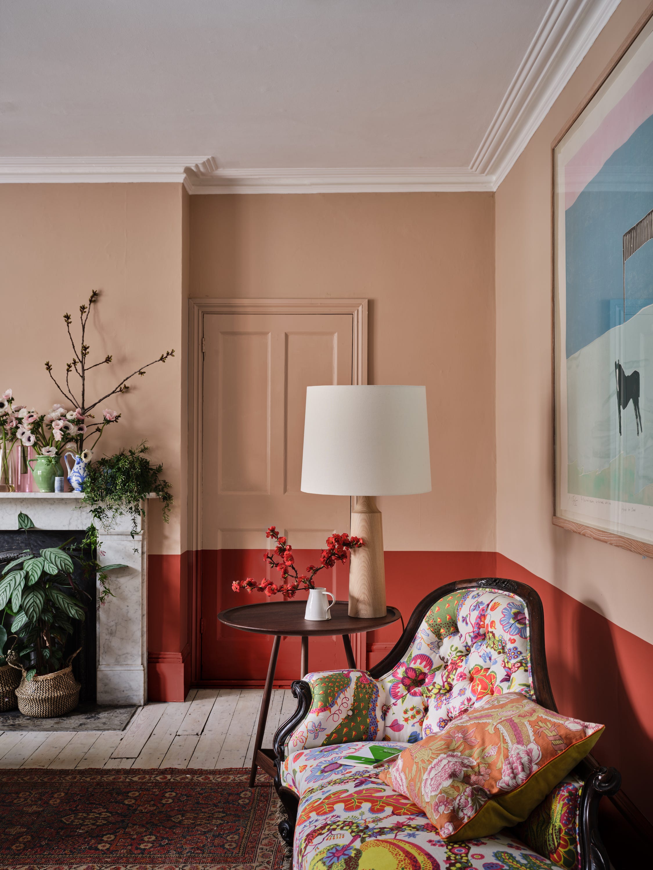
For those seeking something a bit more unique, Nicola Sanders of Studio Sanders recommends 'Potted Shrimp,' a gentle blush pink from Farrow & Ball's archive collection. She describes it as an excellent pink that avoids being too fresh or cloying, with a subtle yellow undertone that imparts a warm, glowing quality. This versatile shade has been used for front doors and effectively in color-drenched sitting rooms.
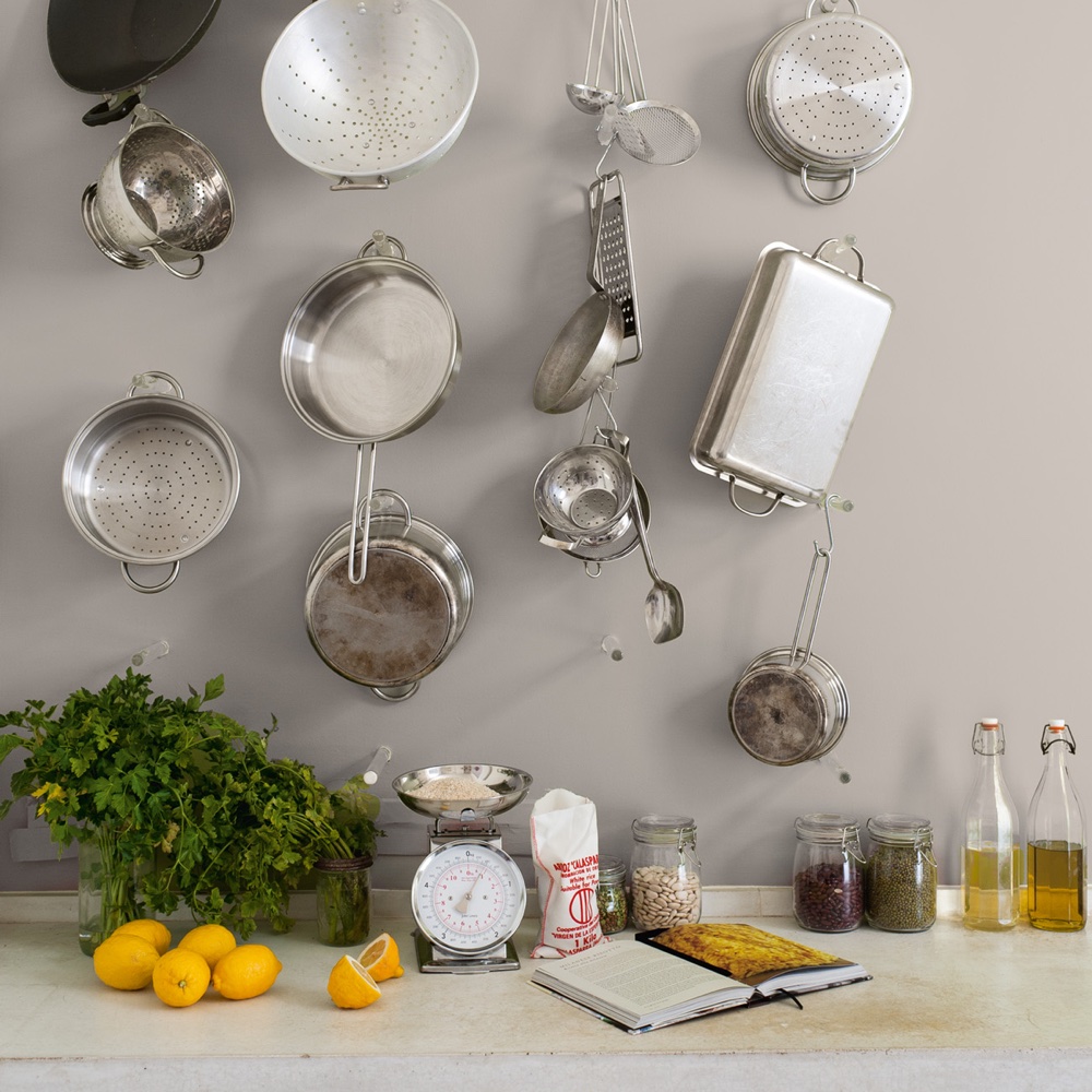
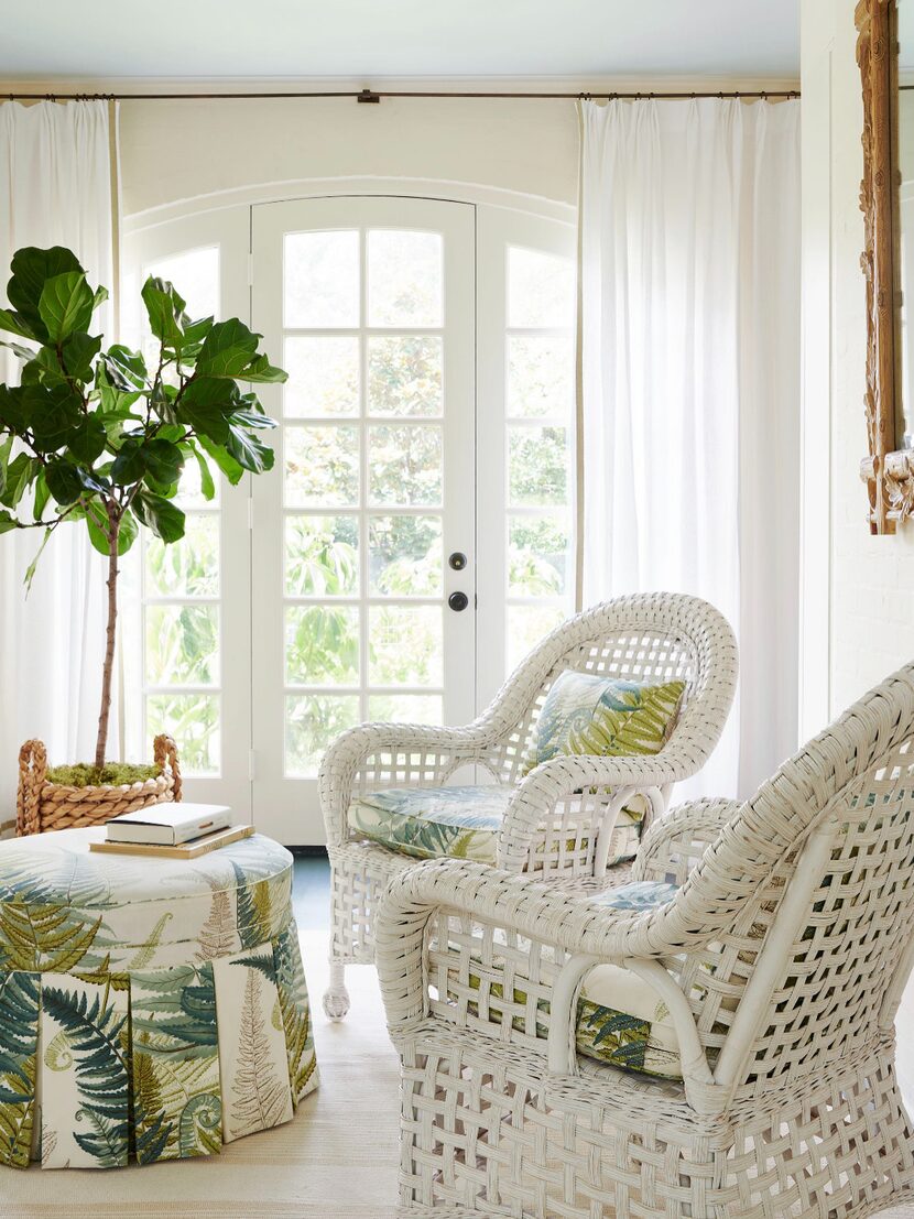
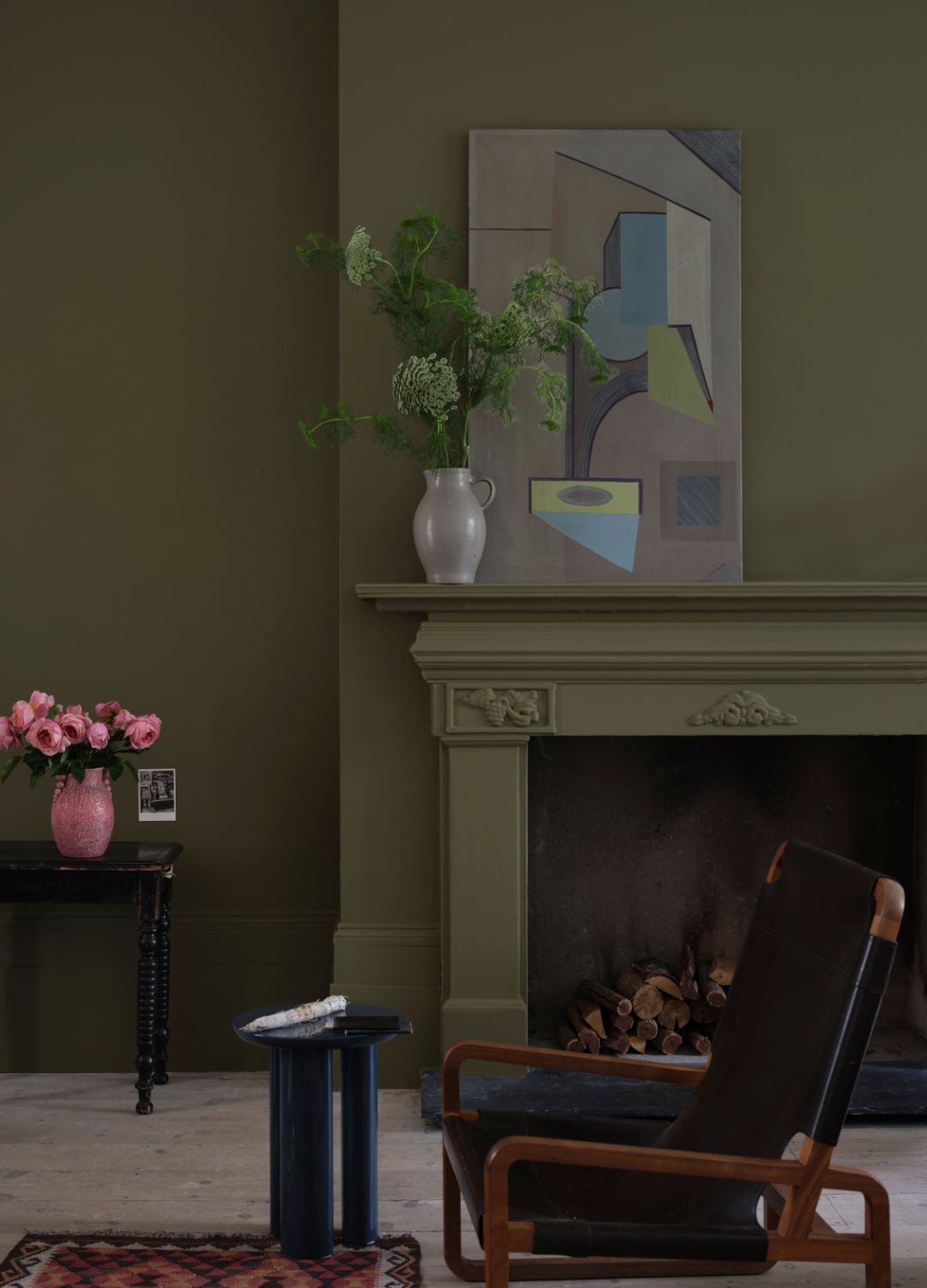
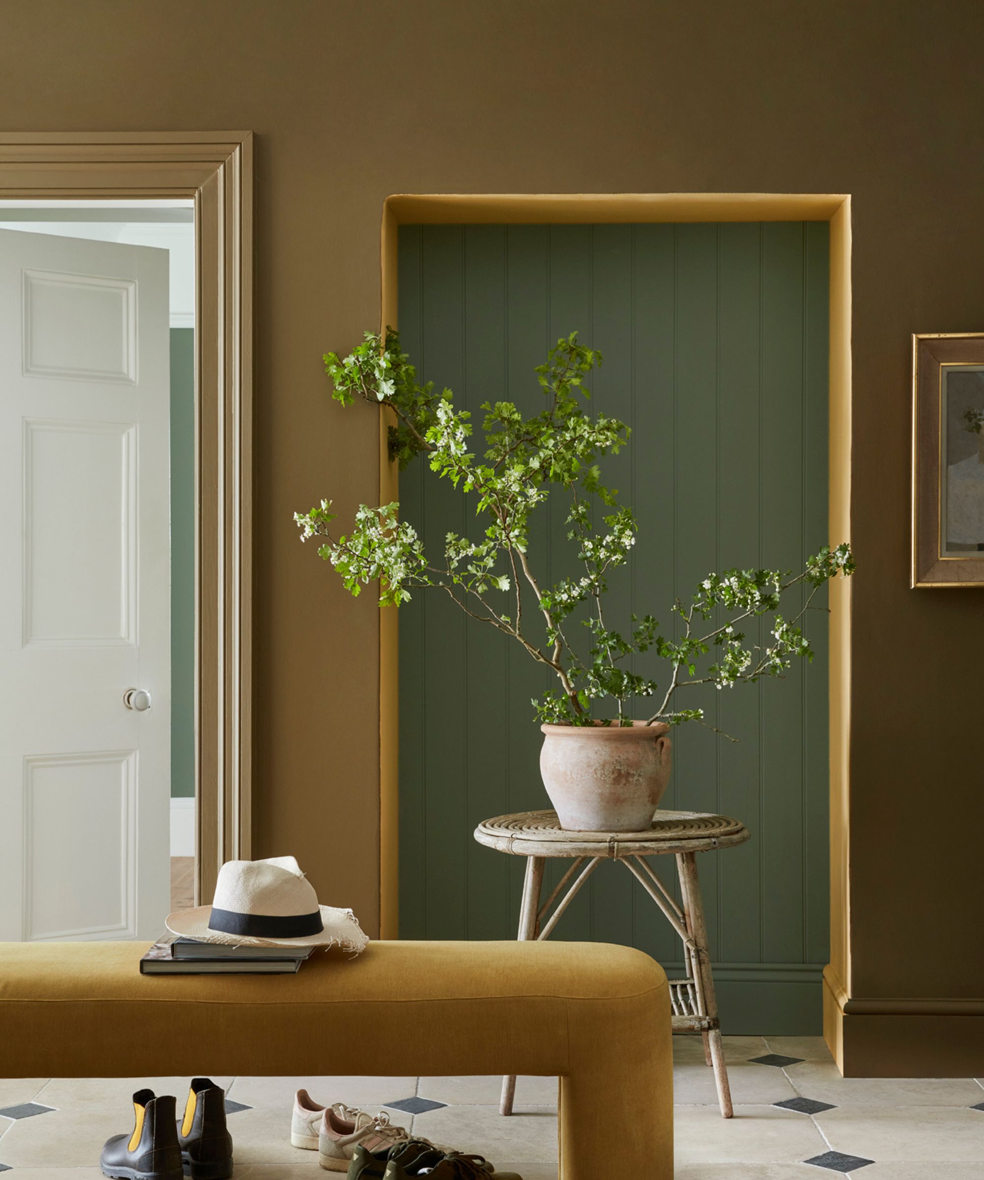
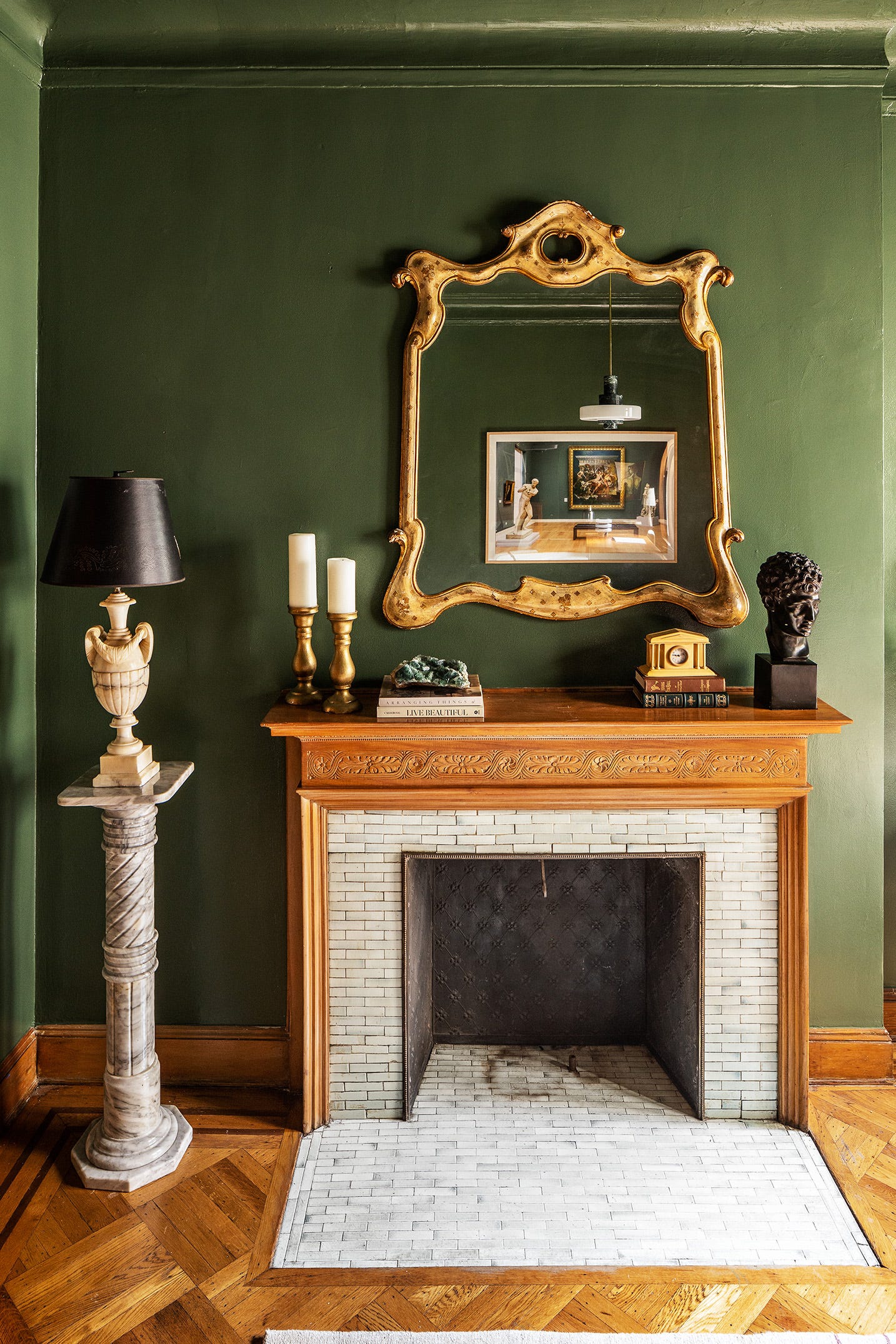
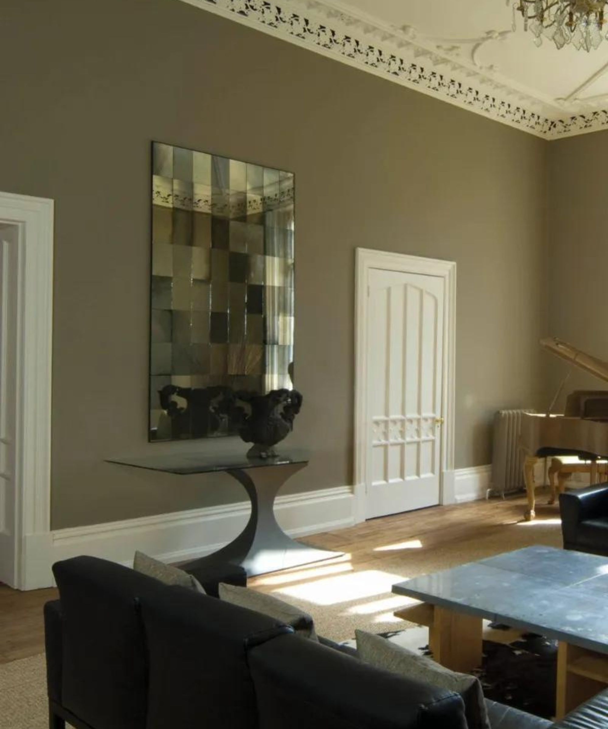
Finally, 'Skimming Stone' and 'Cornforth White' offer versatile neutral options. Melissa Read of Studio Burntwood highlights Skimming Stone as an extremely versatile and conservative choice, valued for its warm undertones without being yellow, making it an ideal calming backdrop that can be enhanced with accent colors. Rina Patel of Vastu Interior Design suggests Cornforth White as a subtle gray alternative to stark whites or creams, especially for clients transitioning from cooler gray trends who wish to introduce warmer tones. It works well to make other colors stand out in a scheme, much like pebbles on a beach. The article concludes by emphasizing that in addition to color, paint finish is crucial, with Farrow & Ball offering options from Dead Flat matte to Full Gloss, and Eggshell for a mid-sheen look.
#InteriorDesign #PaintColors #FarrowAndBall #HomeDecor #ColorSchemes #NeutralColors #BluePaint #PinkPaint #GrayPaint #InteriorDesign #PaintColors #FarrowAndBall #HomeDecor #ColorSchemes #NeutralColors #BluePaint #PinkPaint #GrayPaint
0 comment in total
 No comments yet
You may also like
The top 54 paint colours of the decade – all the shades we couldn't live without
How We Color Drenched Our Dallas Home in Farrow & Ball’s Most Practical Paint Yet
I asked 3 interior designers for their must-try paint colors in 2025 – they are all the perfect 'in-between' shades
33 Absolutely Perfect Paint Colors Designers Love


8 Favorite Paint Colors of Local Interior Designers

Sherwin-Williams Just Announced the Color of the Year

7 Bold Paint Colors Interior Designers Are Longing to Use on Their Next Projects

20 Hallway Paint Colors That Bring This Space to Life
These are Farrow & Ball's current 'most loved' paints – and how to decorate with them throughout the home
How Do Paint Colors Get Their Names?
12 Trending Paint Colors for 2024, According to Design Experts

First look! Farrow & Ball has just released 11 new colours
The 10 Best Farrow & Ball Paint Colors of All Time

Interior paint colour trends 2025: 10 hues you'll be seeing everywhere this year

15 Farrow & Ball paint colors in real homes – from calming blues to warm neutrals
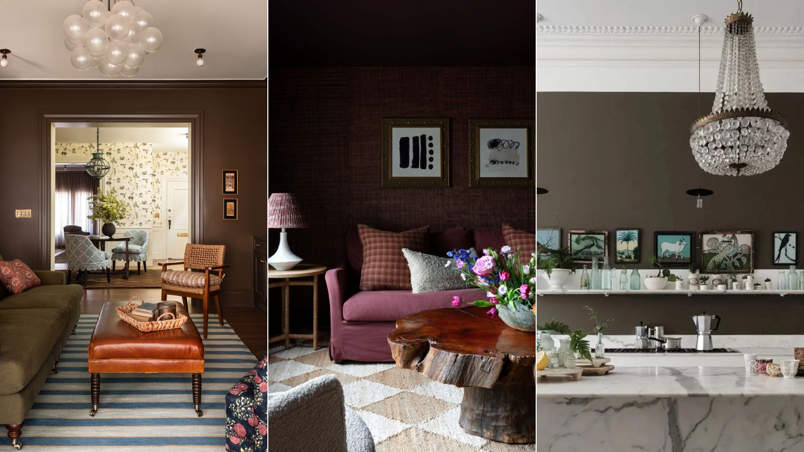
6 best brown paints to embrace the trend for this soft and moody hue
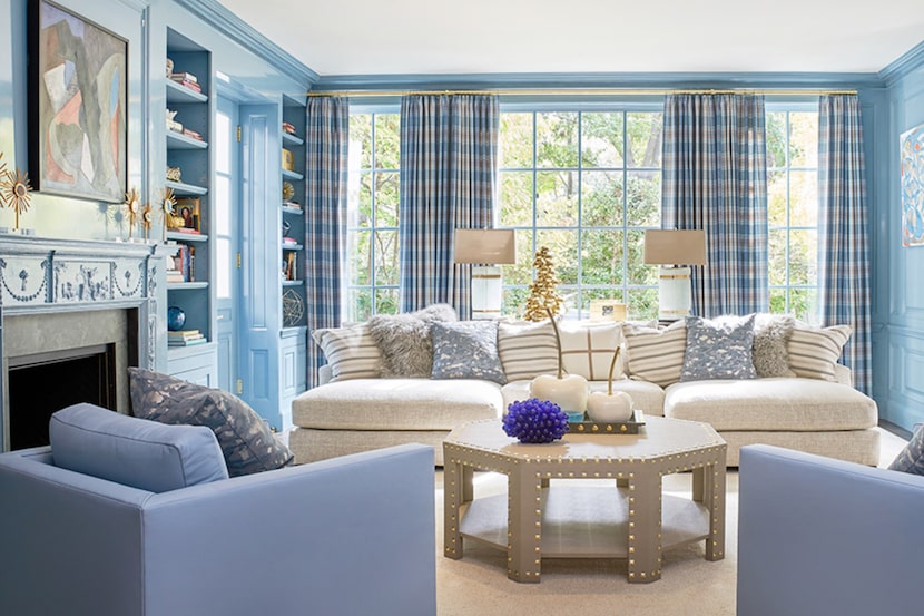
19 go-to paint colors that Dallas designers love
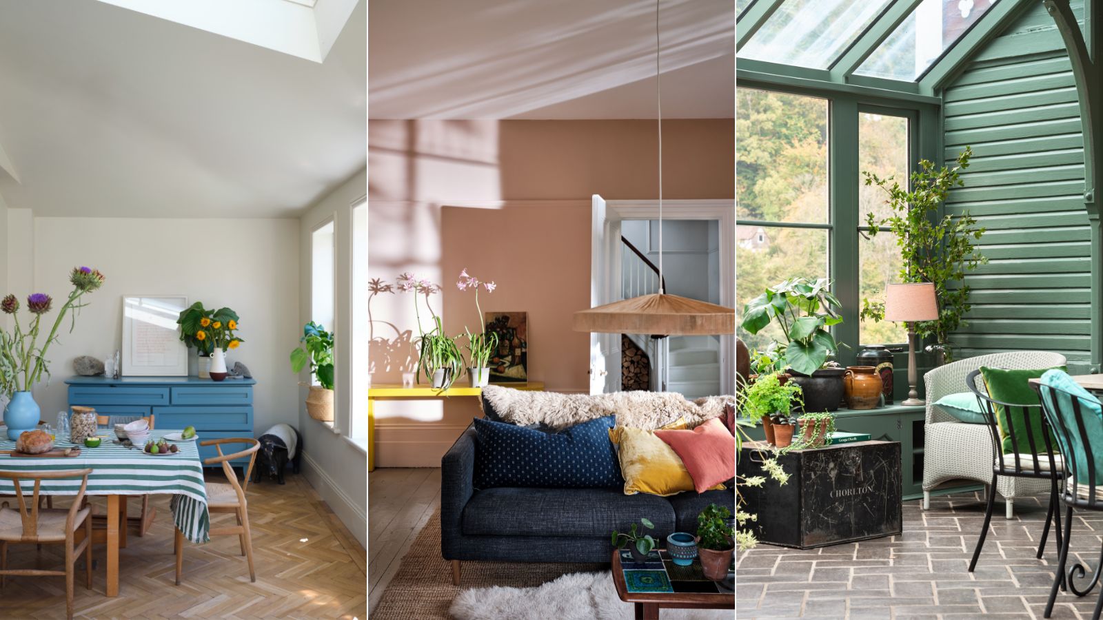
These 10 Farrow & Ball colors are their most popular paints – from earthy neutrals to deep and dark shades
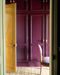
These Unusual Paint Colors May Not Be An Obvious Choice, But Designers Can’t Get Enough
12 Paint Colors That Interior Designers Are Buzzing About—See the Gorgeous Hues Here