1/21
First look! Farrow & Ball has just released 11 new colours
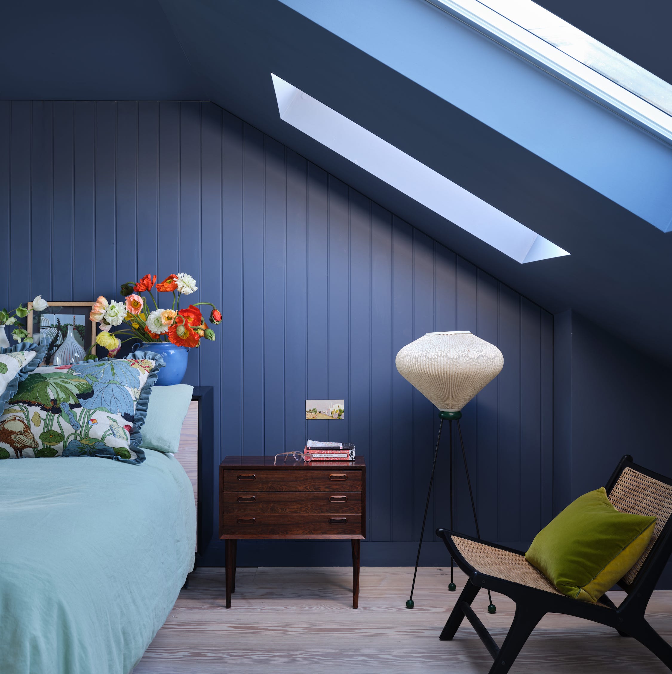
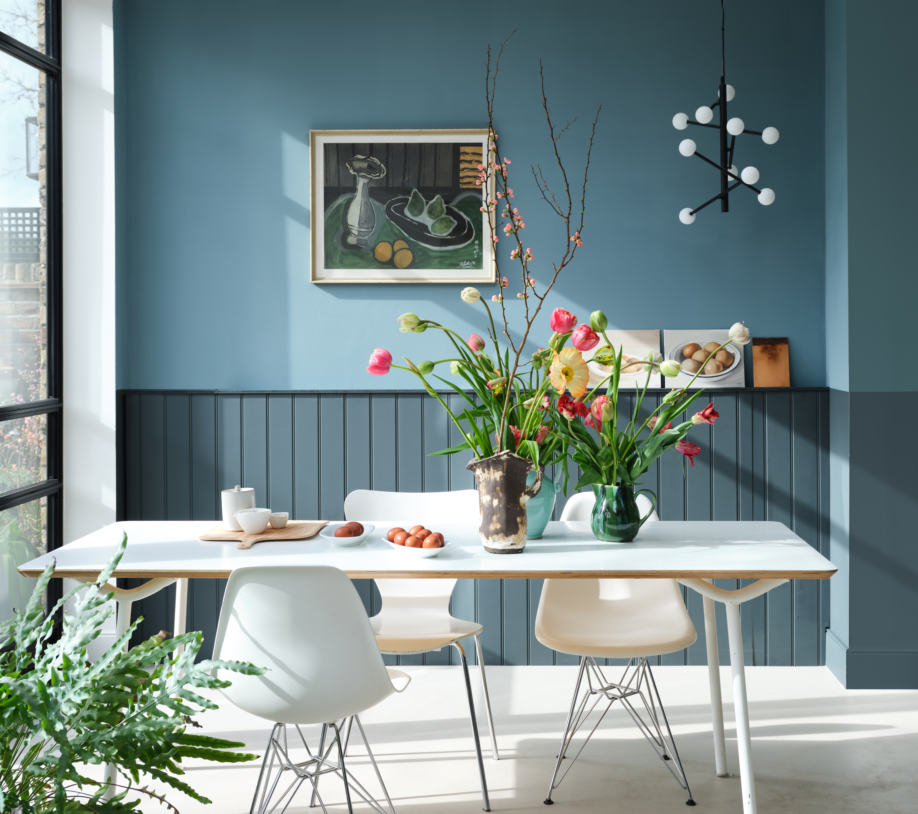
Farrow & Ball has recently unveiled 11 new paint colours, marking the first additions to its colour card in four years. These new shades aim to provide a wider selection for decorating projects, catering to preferences ranging from bold statements to warm neutrals. The collection includes a diverse palette, from a vibrant flame red to a delicate pink, a forest green, and a lighter interpretation of the brand's popular De Nimes blue. Despite the variety, all new colours maintain Farrow & Ball's characteristic richness, depth, and ability to react to light, contributing to a sense of warmth and character in any living space.
Joa Studholme, Colour Curator for Farrow & Ball, notes that the introduction of these colours is timely, given the evolving relationship people have with their homes. She emphasizes that the palette, featuring both gentle lights and dramatic darks, empowers individuals to express their personal style. Charlotte Cosby, Head of Creative, adds that the new colours are inspired by feelings of joy, comfort, and refreshment, designed to foster emotional ease and sensory delight in home decoration. Cosby expresses a personal fondness for 'Beverly,' a clean mid-green, highlighting its reassuring and deep qualities, particularly when paired with 'Selvedge' in a kitchen setting.
The article provides a detailed look at each of the 11 new colours, offering insights into their inspirations and characteristics:
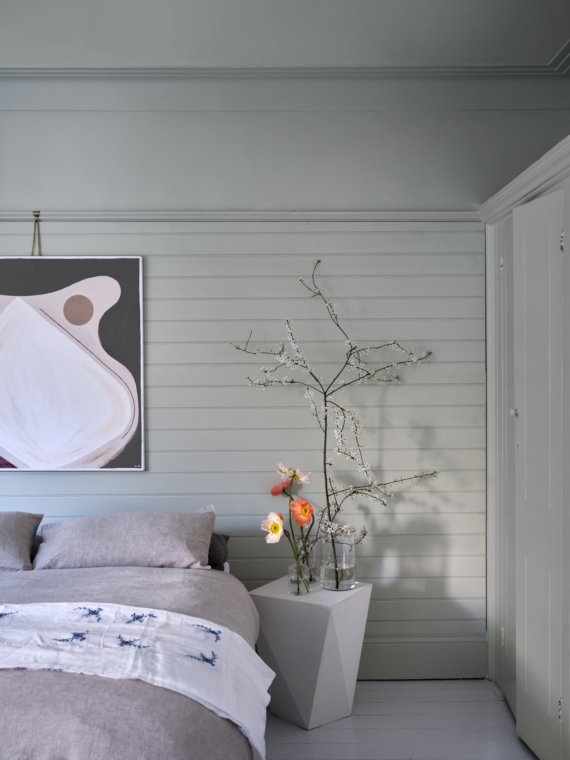
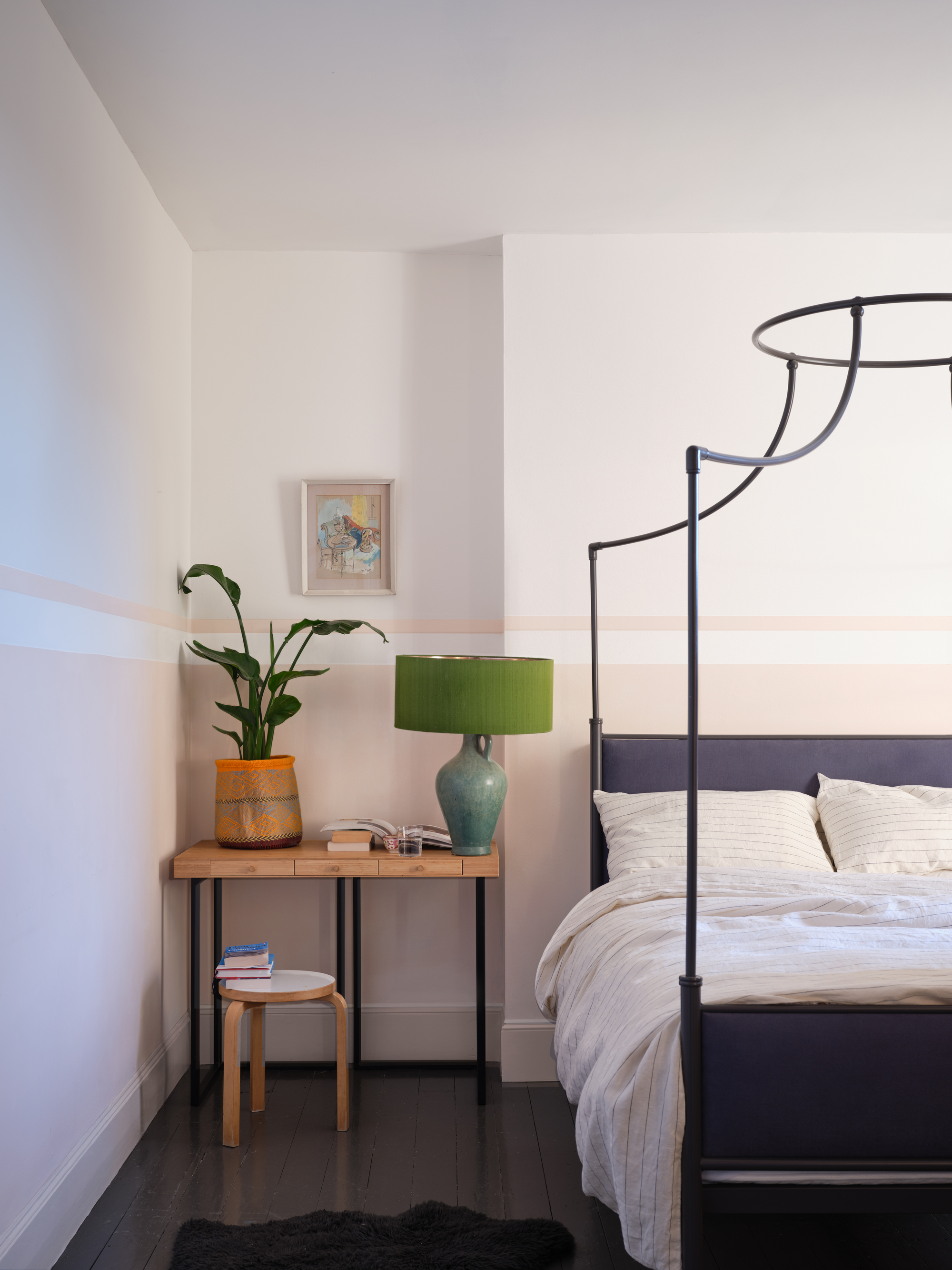
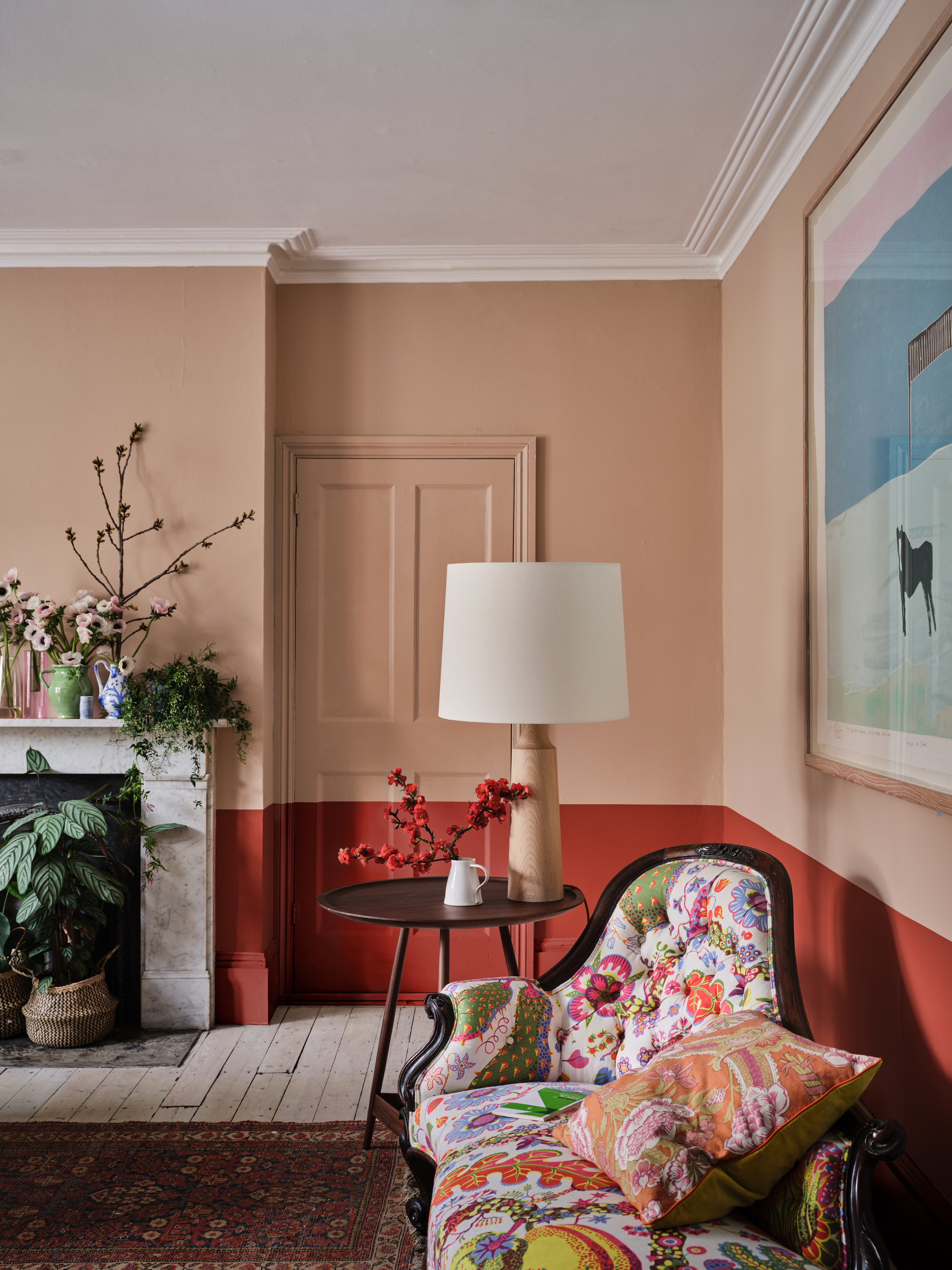
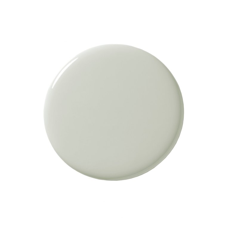
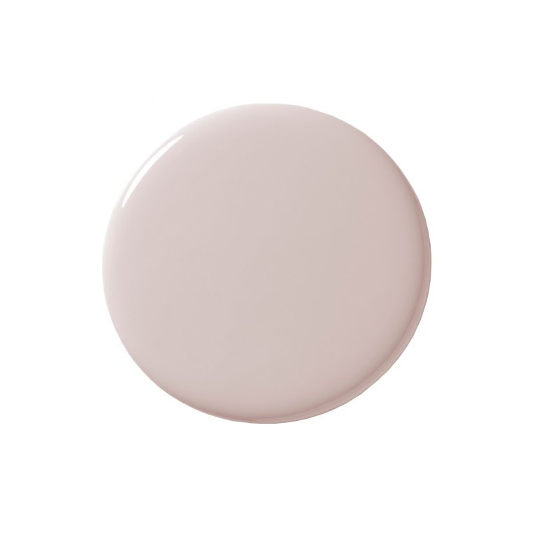
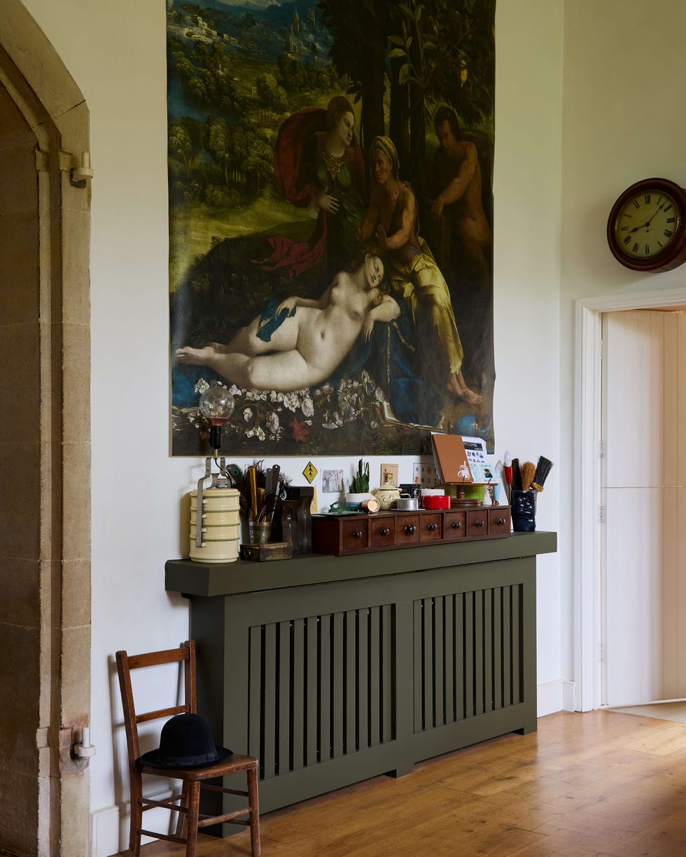
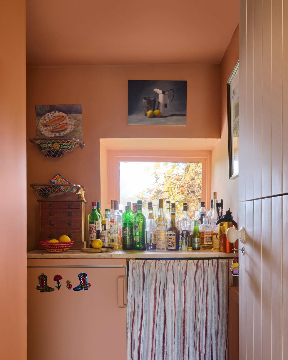
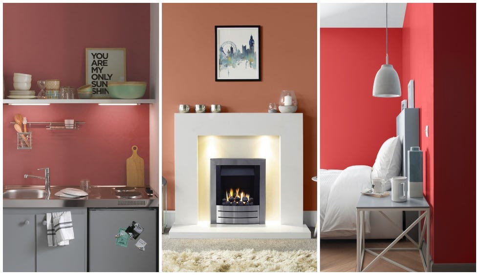
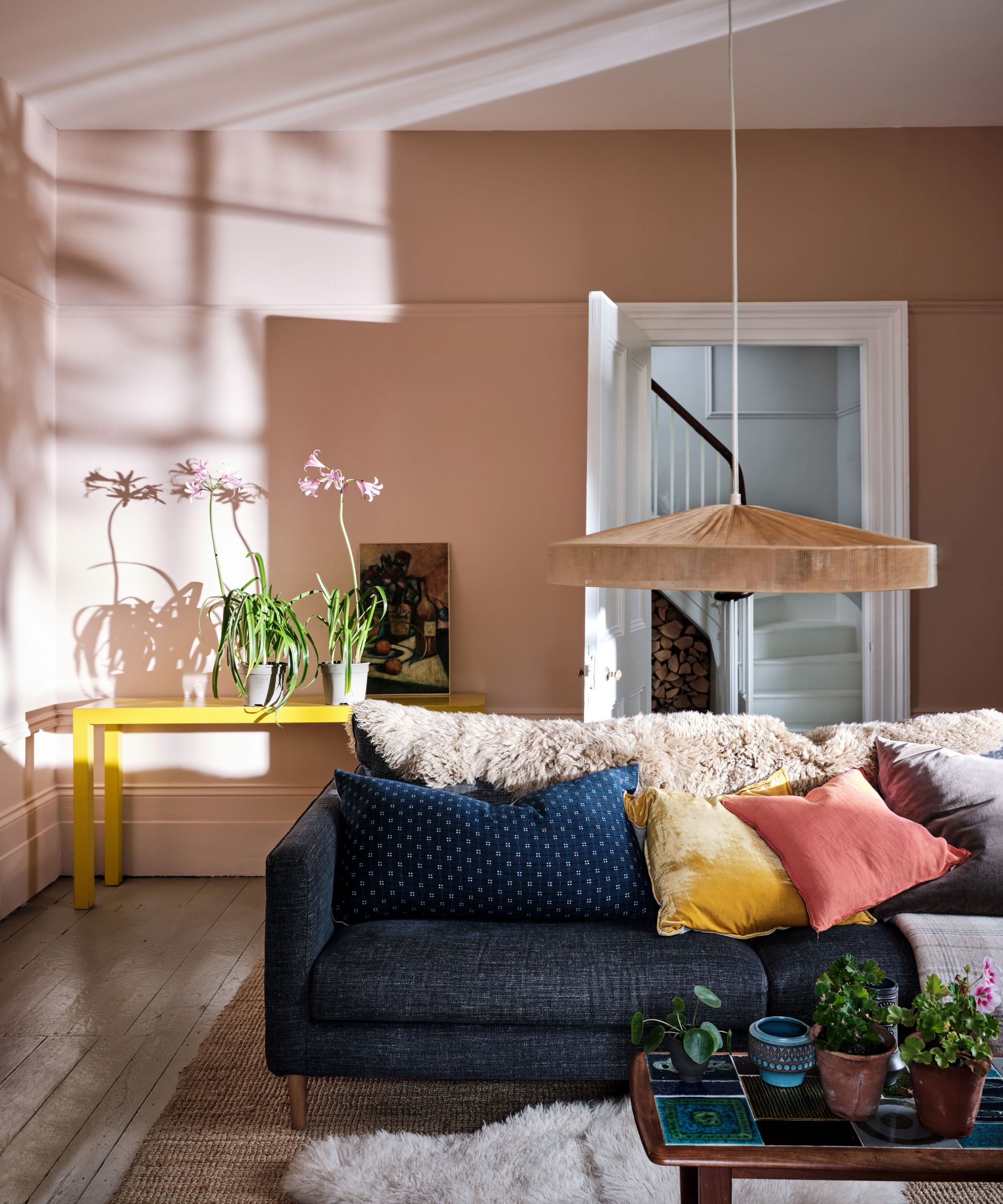
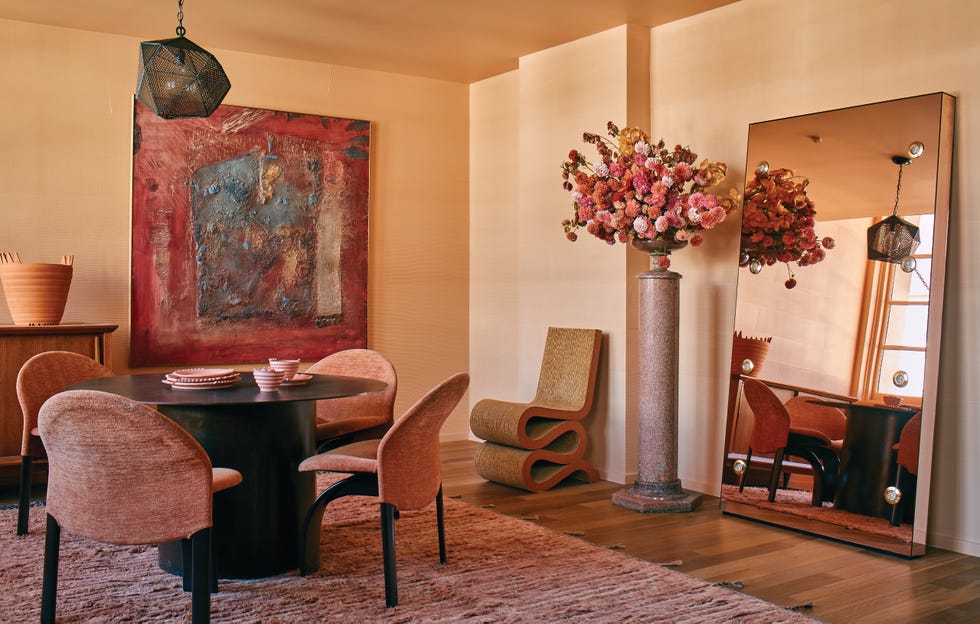
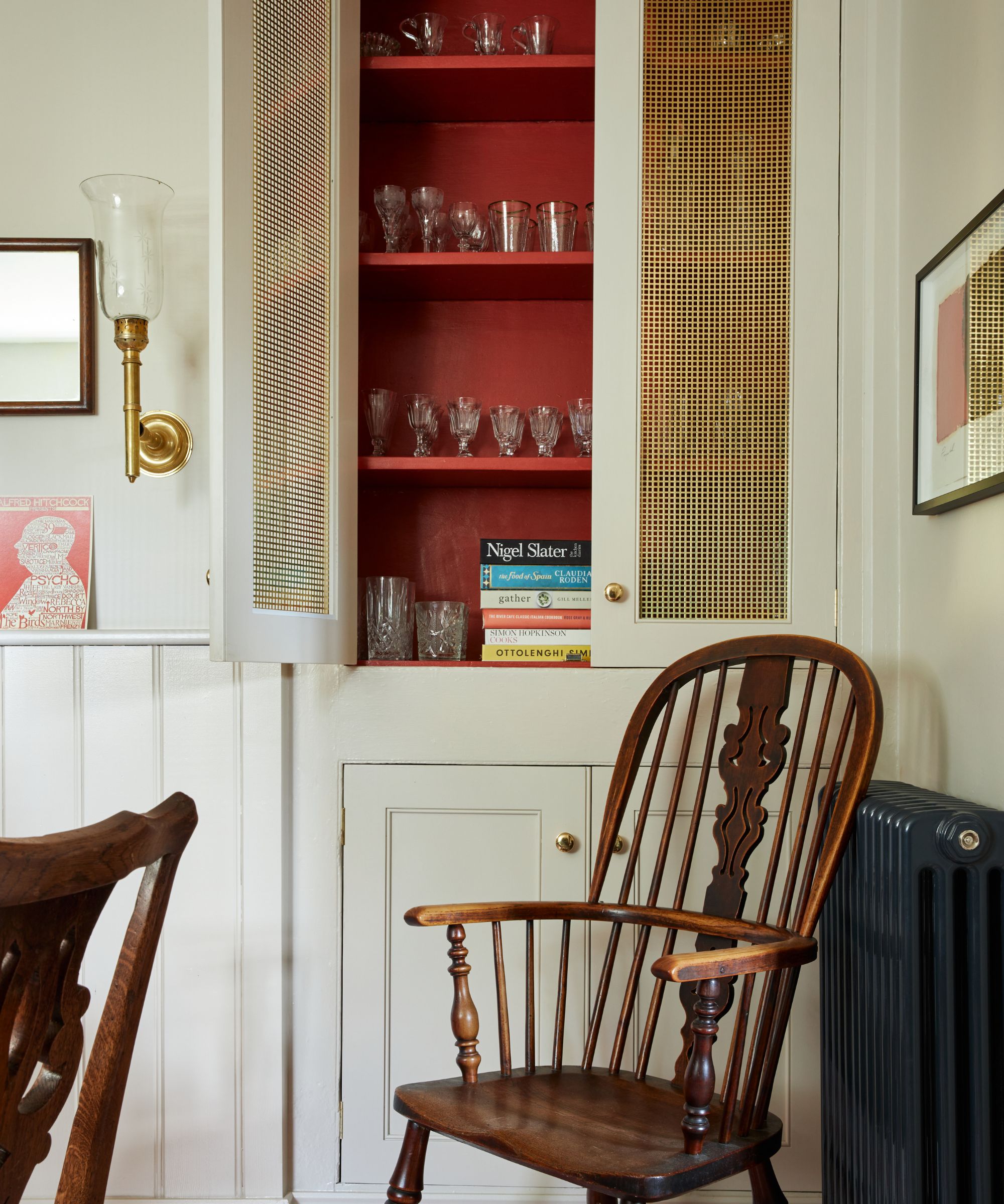
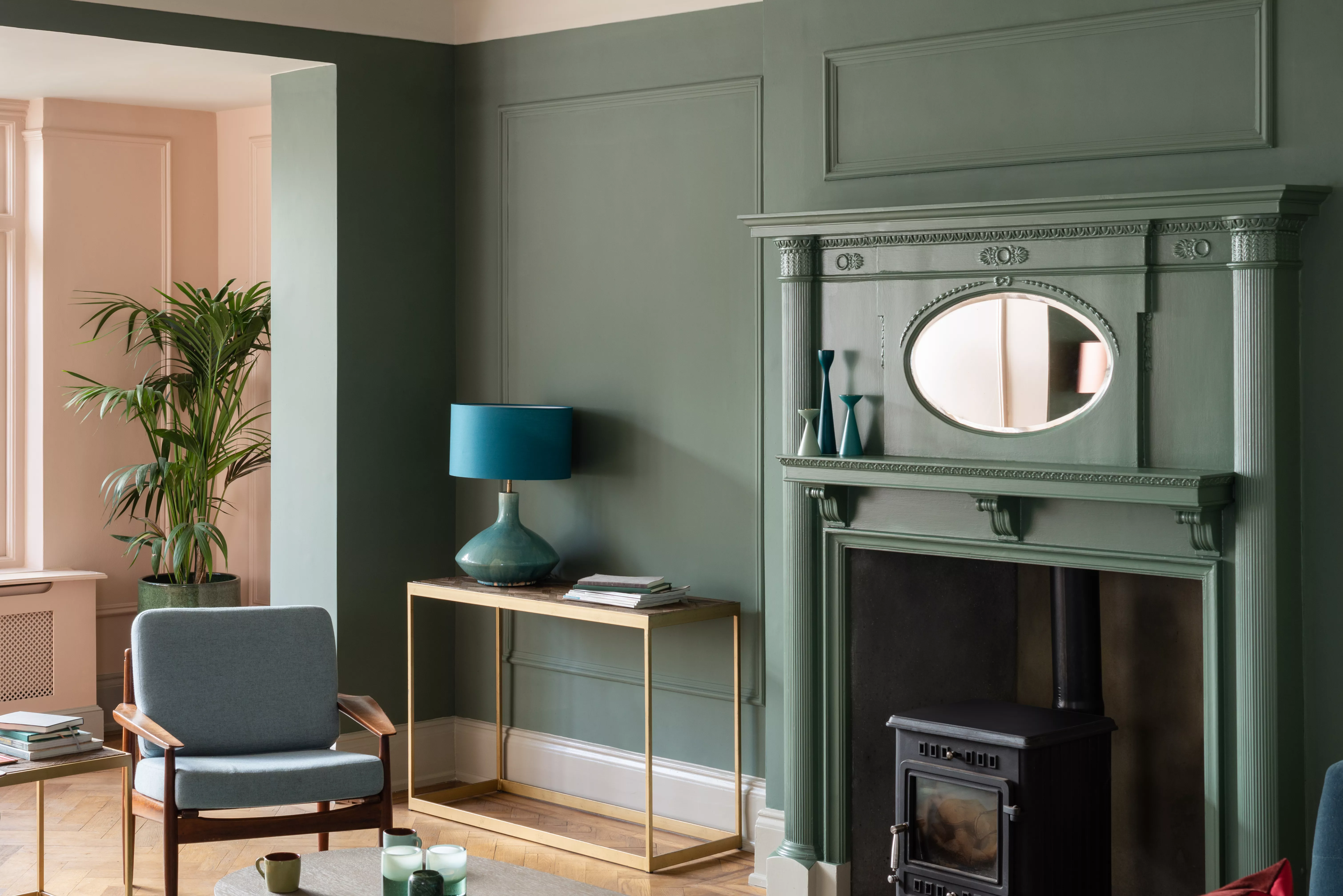
'Bamboozle,' a flame-red hue, is described as embodying a buccaneering spirit, perfect for adding joy. 'Templeton Pink' is a historic-feeling pink developed for a dining room at Templeton House. 'Beverly' is a clean mid-green, named in honour of a valued Farrow & Ball team member. 'Eddy,' a lighter shade than French Gray or a greener alternative to Cromarty, is inspired by the circular currents enjoyed by wild swimmers. 'Hopper Head,' an architectural dark shade, sits between Railings and Down Pipe, drawing inspiration from rain-catching iron containers.
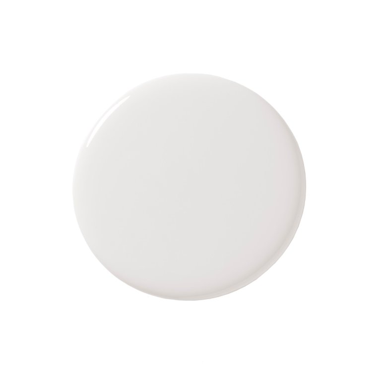
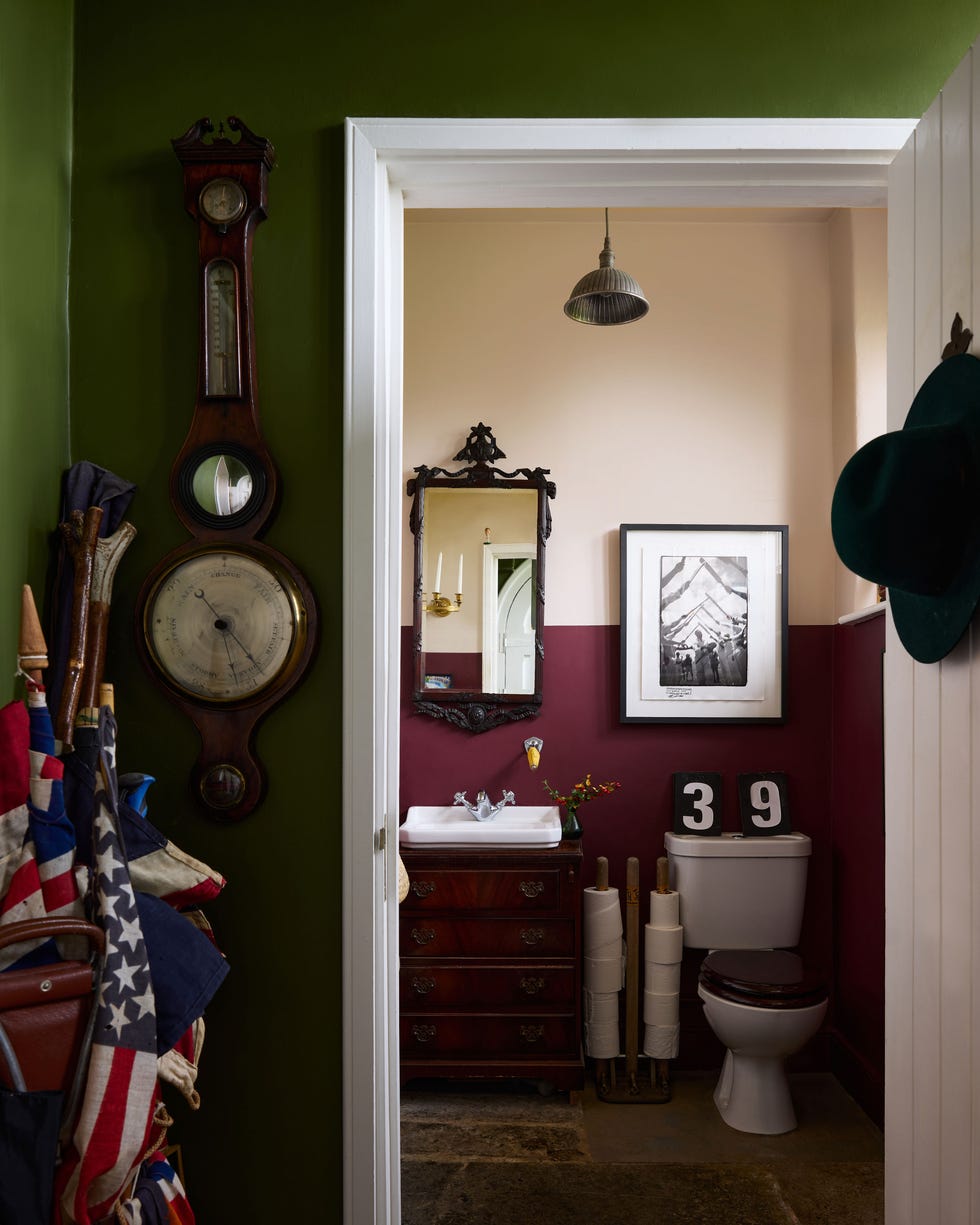
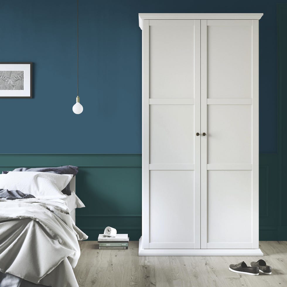
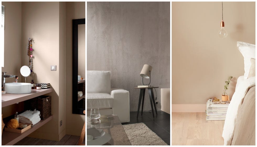
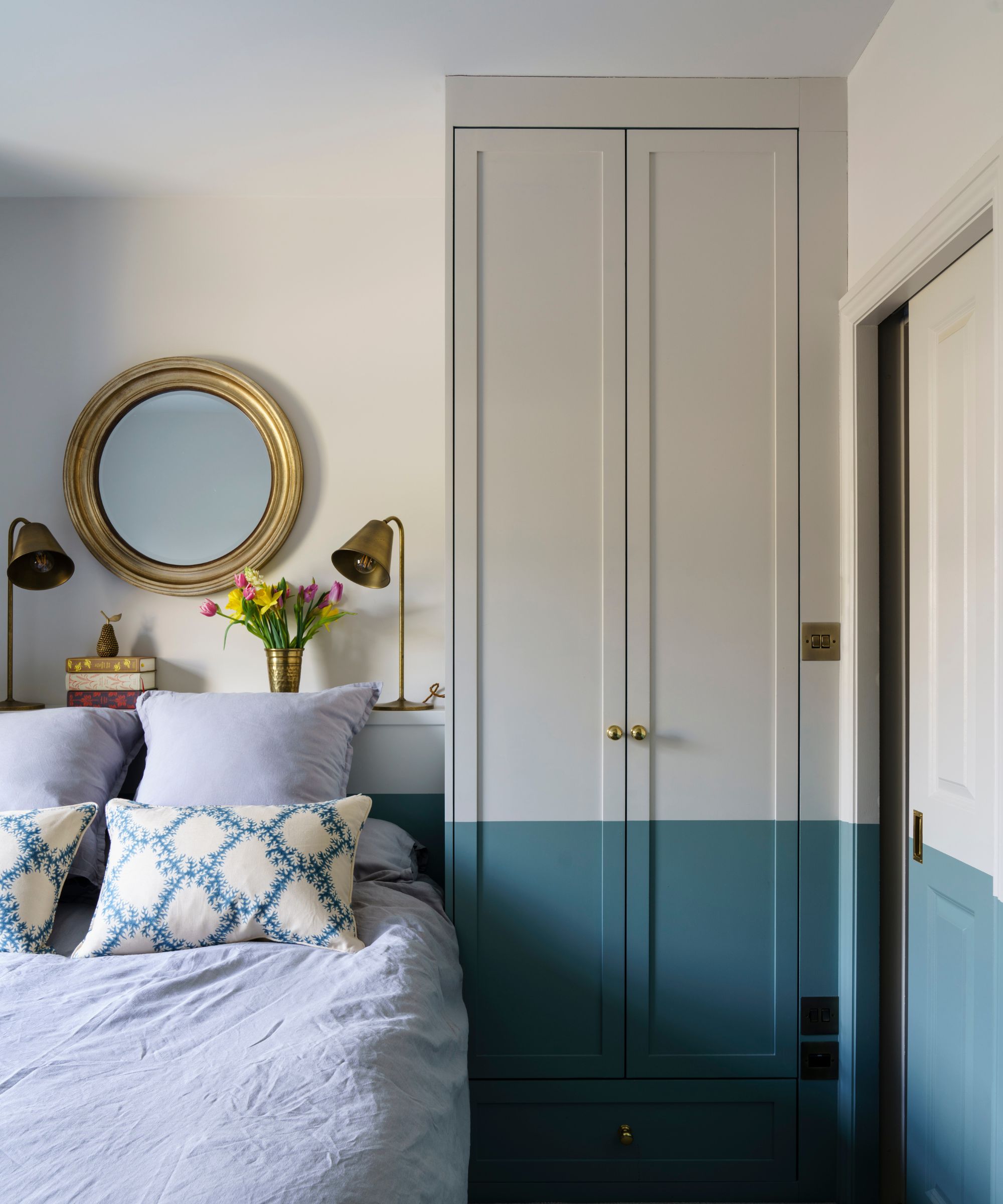
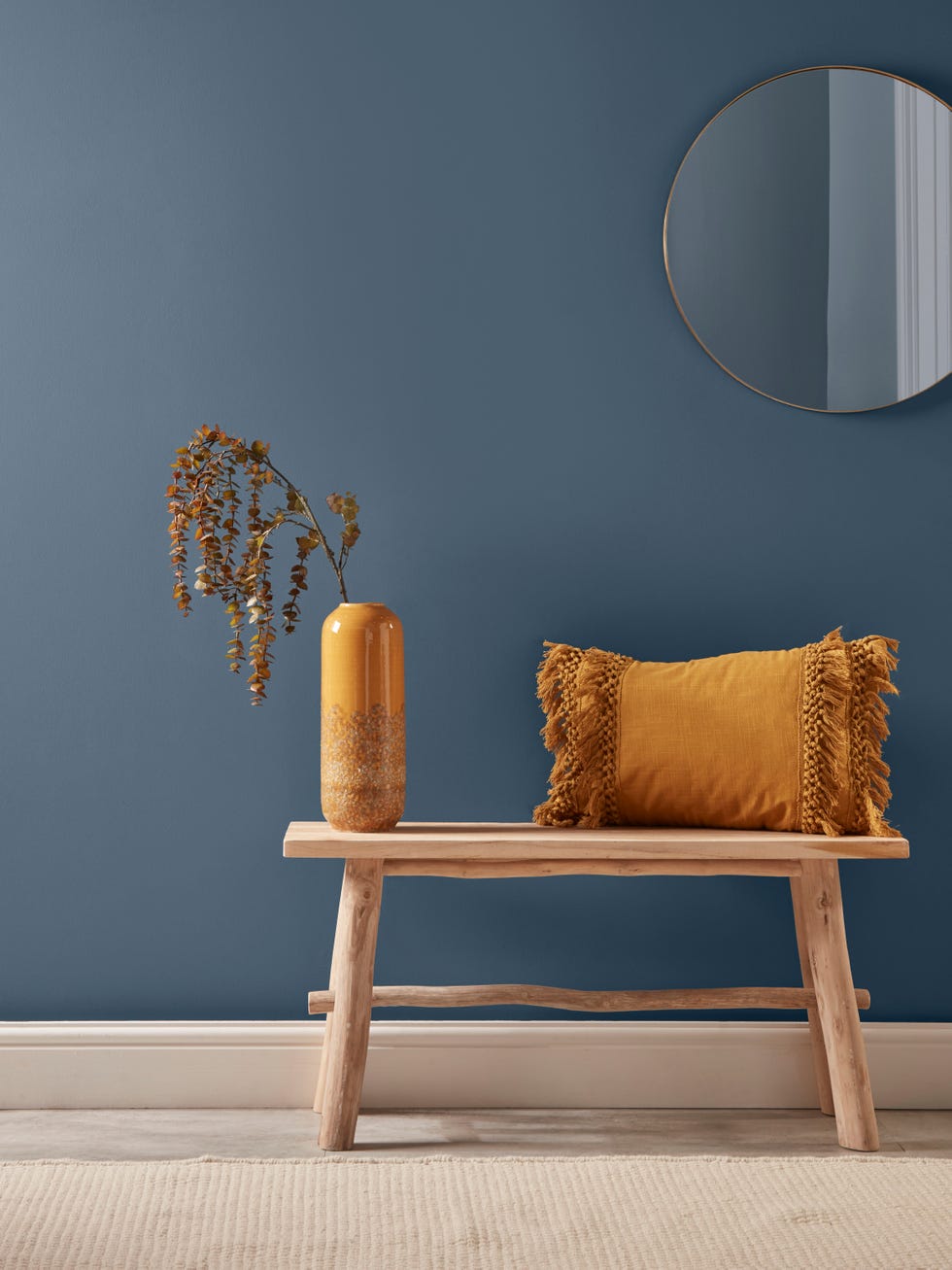
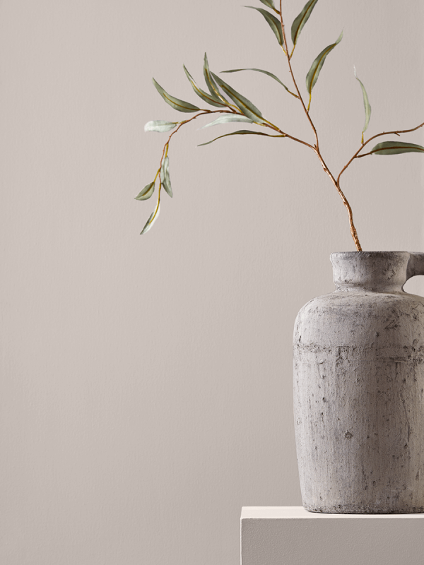
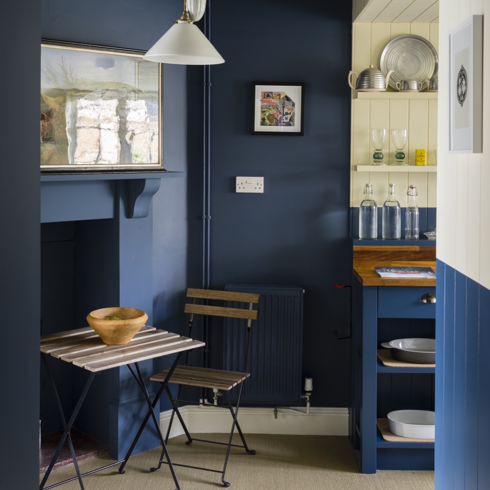
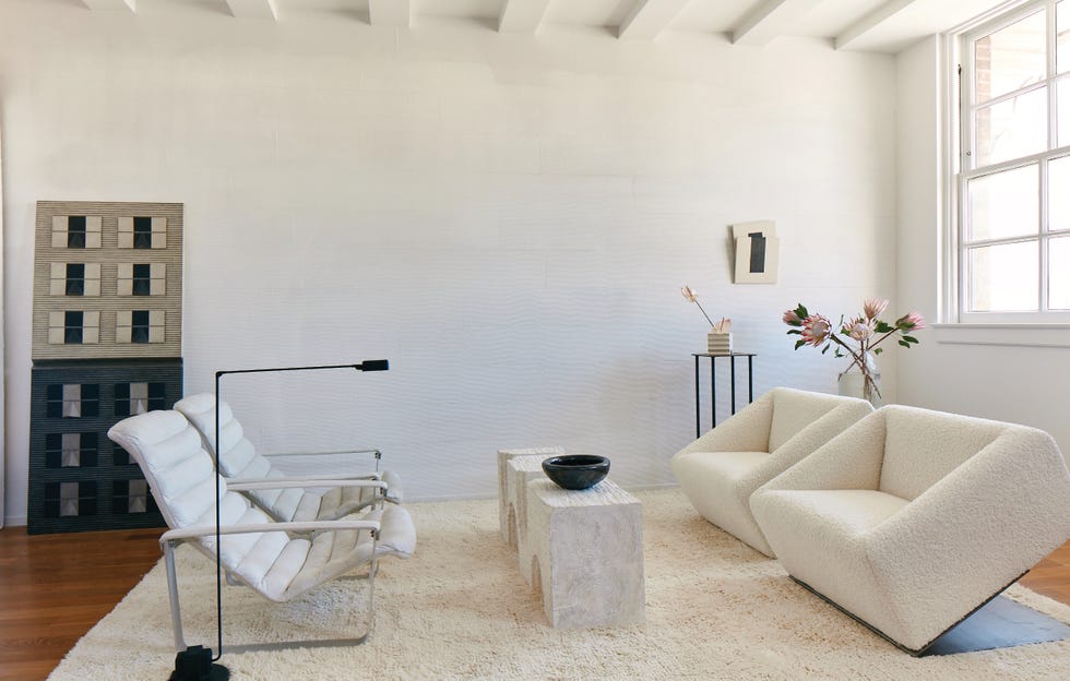
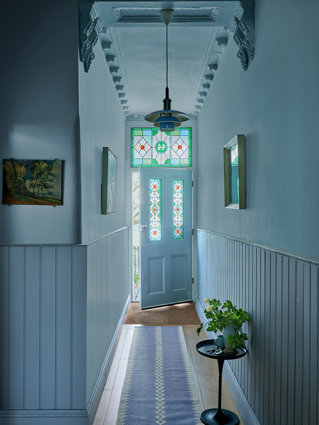
'Kittiwake' is a clean, cool blue, reminiscent of a seabird's wings in sunlight, positioned between Parma Gray and Lulworth Blue. 'Stirabout,' a warm neutral with a grey undertone, is inspired by traditional Irish porridge and offers a lighter alternative to Jitney. 'Selvedge' is a lighter version of De Nimes, named after high-quality denim. 'Tailor Tack' is the lightest and most delicate pink, referencing the tacks used in haute couture ateliers. 'Whirlybird,' a softer take on Breakfast Room Green, is inspired by winged seeds. Finally, 'Wine Dark,' a spiritual colour reminiscent of midnight skies, is named after Homer's description of the sea and is intended to create an intimate atmosphere.
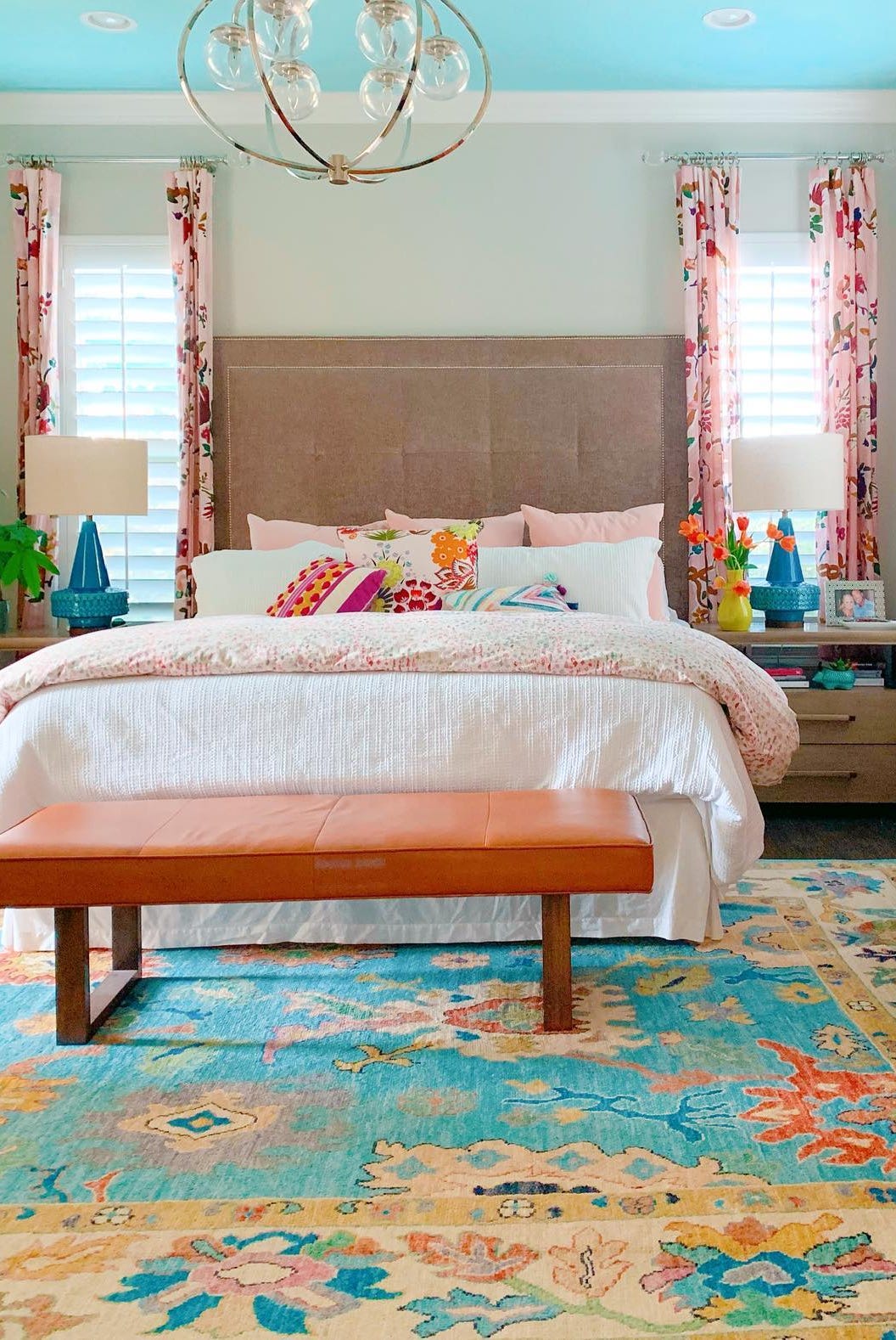
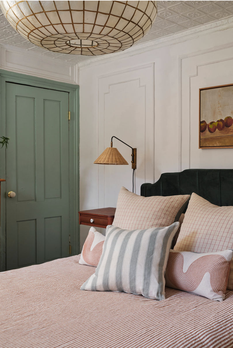
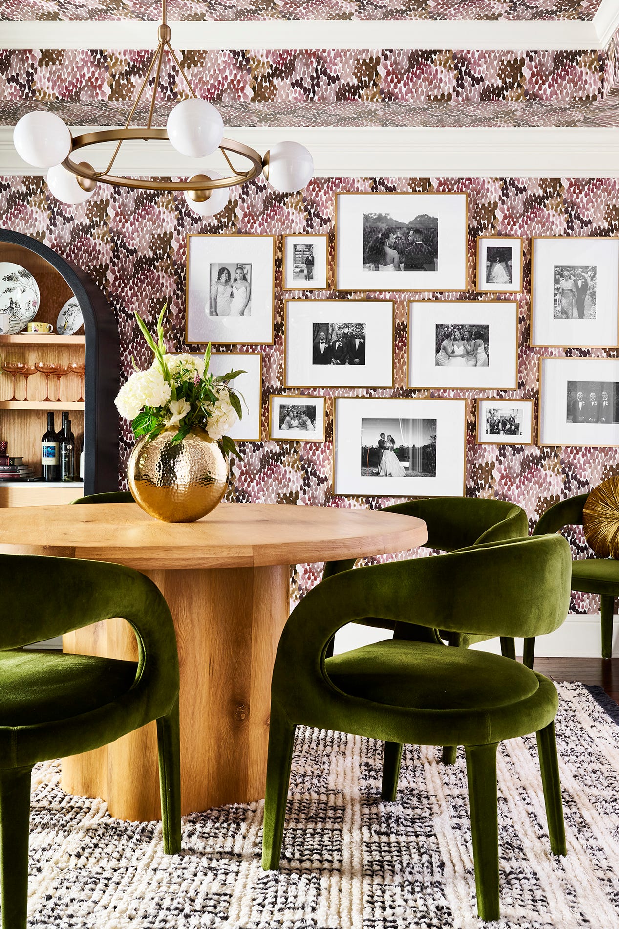
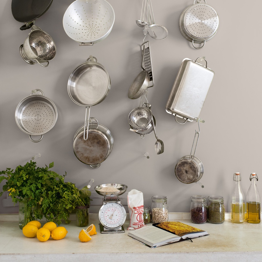
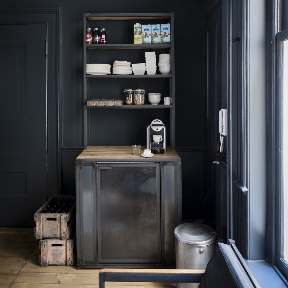
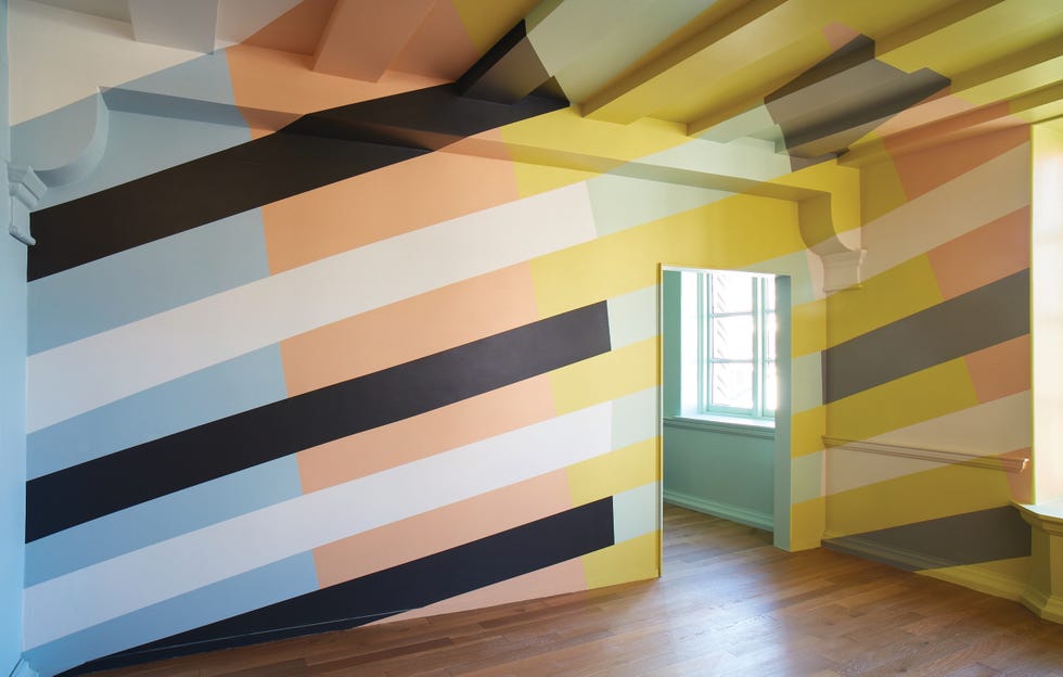
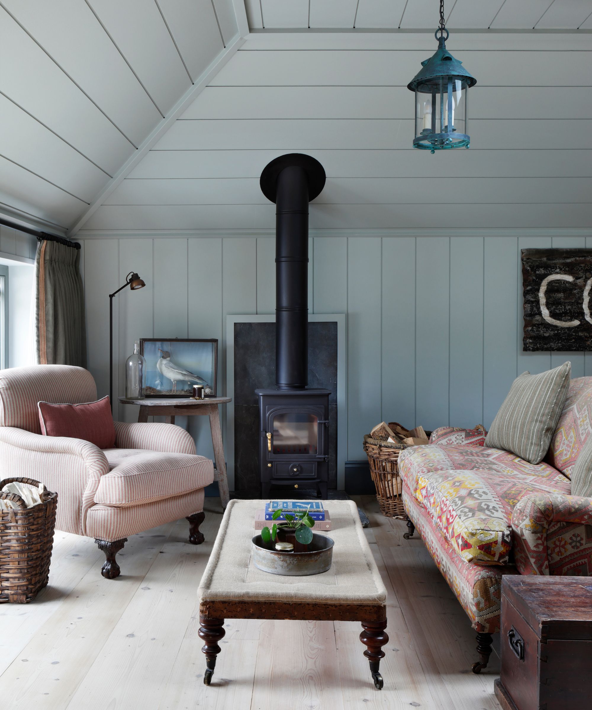
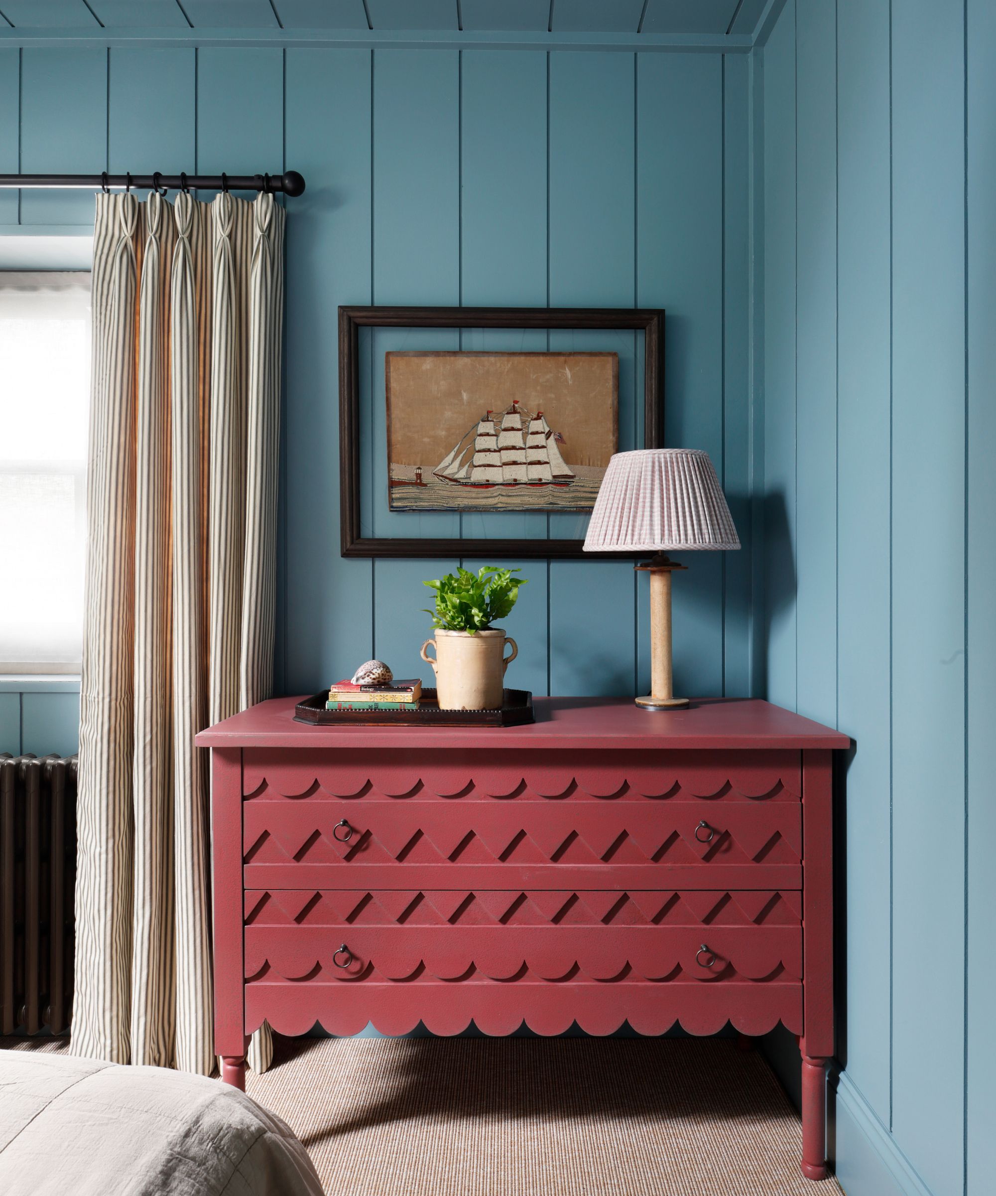
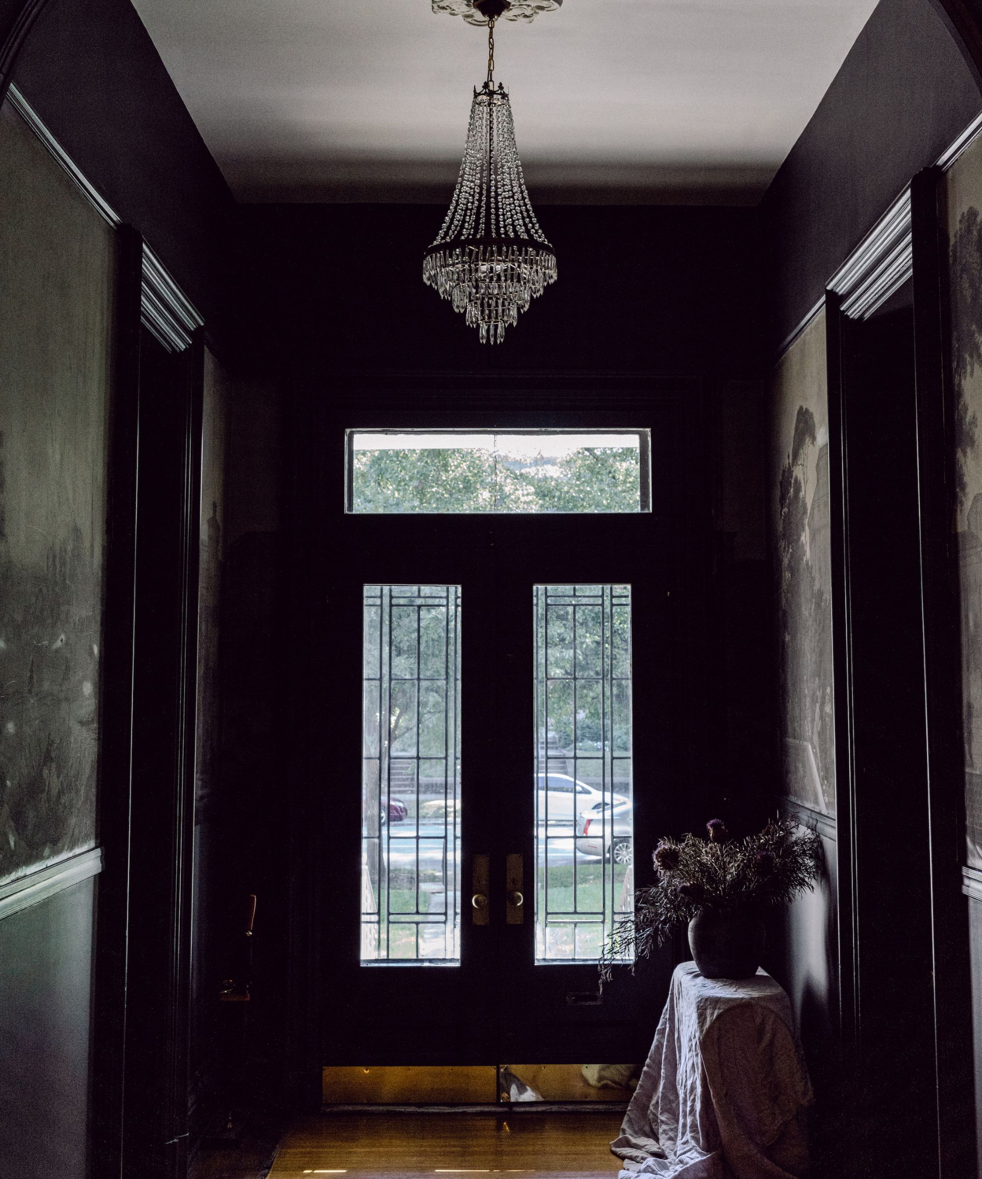
The article includes images of each colour, often showcasing them in room settings or paired with other Farrow & Ball shades, and provides links for purchasing the new paints. The launch reflects Farrow & Ball's ongoing commitment to offering a sophisticated and inspiring range of colours for home interiors.
#FarrowAndBall #NewPaintColors #HomeDecor #InteriorDesign #PaintTrends #ColorPalette #DecoratingTips #HomeRenovation #FarrowAndBallColors #FarrowAndBall #NewPaintColors #HomeDecor #InteriorDesign #PaintTrends #ColorPalette #DecoratingTips #HomeRenovation #FarrowAndBallColors
0 comment in total
 No comments yet
You may also like
Farrow & Ball's new colors have just launched – we ask designers how to use this calm, yet colorful palette

B&Q is launching a new range of paint from just £8
Victoria + Albert Unleashes a New Spectrum of Colors for Its Englishcast Freestanding Tub Line

The 10 Best Farrow & Ball Paint Colors of All Time

130 New Paint Colors Just Dropped, Including an Ultra-Fast-Drying Exterior Finish

These 10 Farrow & Ball colors are their most popular paints – from earthy neutrals to deep and dark shades

12 Jewel-Tone Paint Colors Designers Say Are Always On-Trend
15 Farrow & Ball paint colors in real homes – from calming blues to warm neutrals
The Woman Behind Farrow & Ball’s Most Iconic Colors Has a New Favorite for 2025

DUPES for Farrow & Ball Scallop, Kakelugn, Marmelo, Naperon, Duster, Sizing, and more

The top 54 paint colours of the decade – all the shades we couldn't live without
Farrow & Ball's 60-second kitchen color scheme is all about red
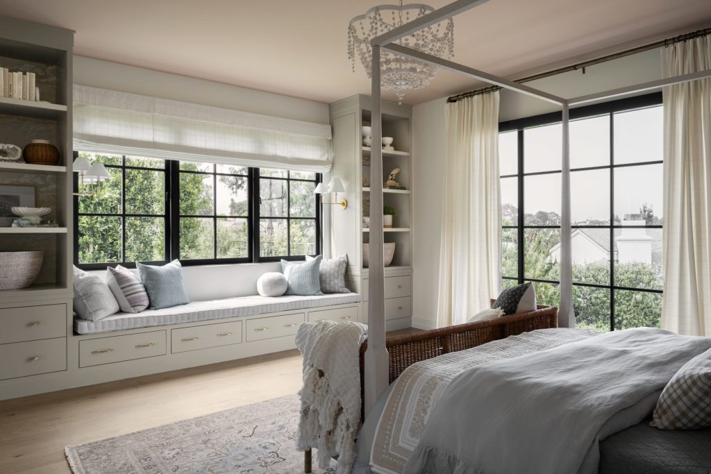
Shea On Farrow & Ball's New Paint Colors
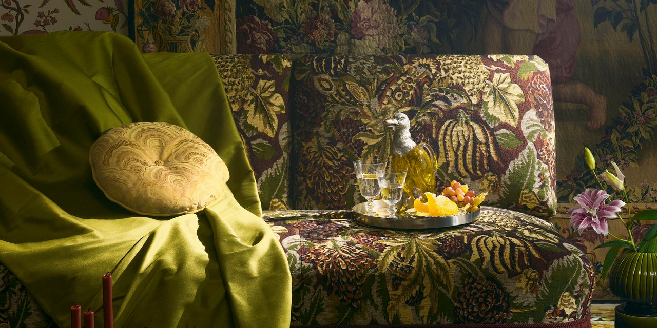
32 Spectacular Fabrics and Trims Coming to Market This Year

Deeper, moody colours and precious jewel tones are in style this year
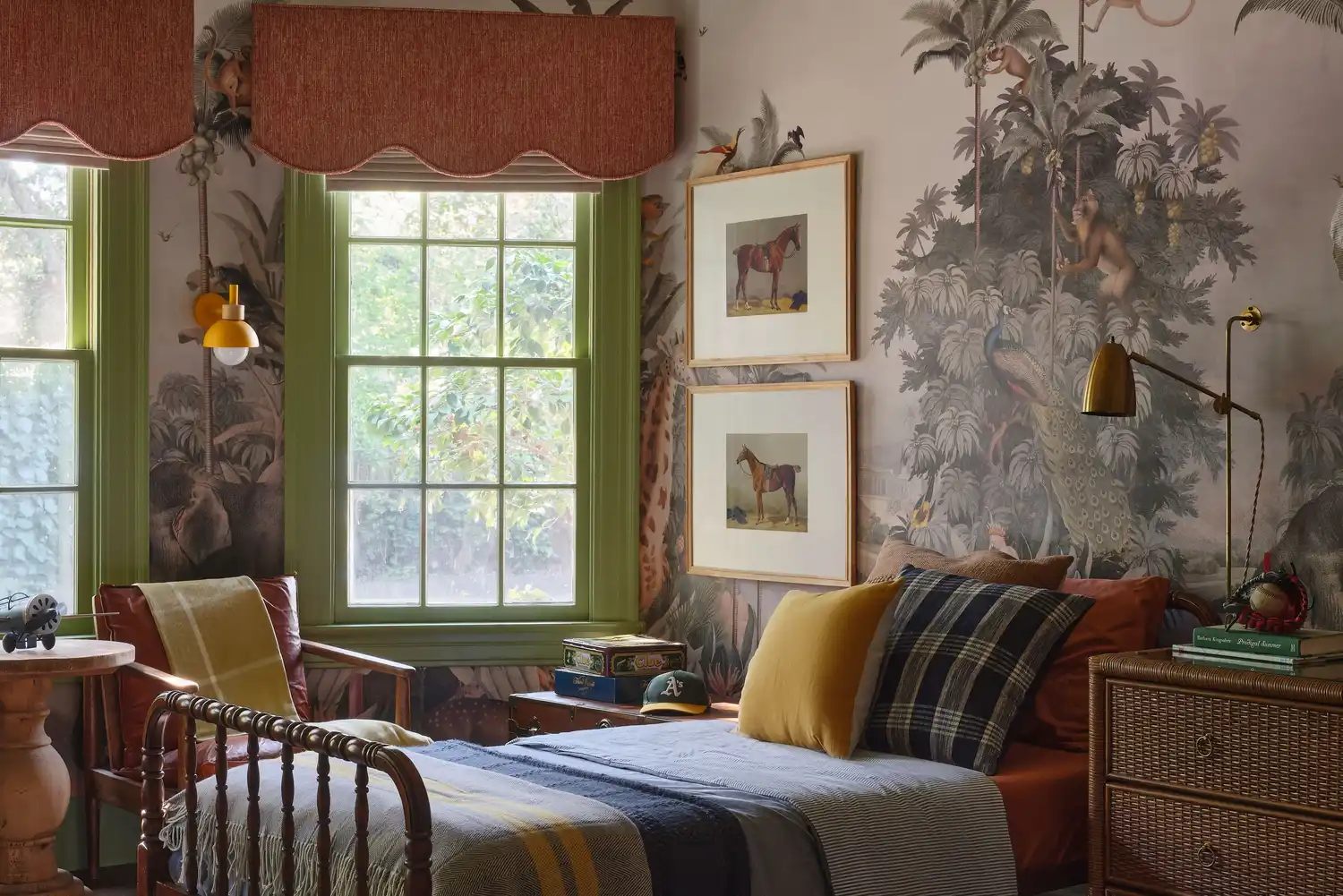
6 Paint Color Duos Designers Can't Get Enough of This Fall

12 Color Schemes That Are Popping Off Right Now, According to Designers

Cox & Cox launches its first wall paint range — and it's available in 16 beautiful colours
Kelly Wearstler Shares How to Create a Color Palette for Your Home

9 Paint Colors for When You Need a Fresh Start