1/12
These 10 Farrow & Ball colors are their most popular paints – from earthy neutrals to deep and dark shades
Farrow & Ball paints are widely recognized for their rich pigments and flattering shades, making them a continuous favorite among interior designers and homeowners. The brand offers a diverse palette, ranging from relaxed and earthy neutrals that serve as timeless backdrops to moody blues and greens, all designed to create warm and welcoming spaces. Joa Studholme, Farrow & Ball Color Curator, emphasizes that the primary goal of using color is to foster environments where individuals feel proud and comfortable in their homes.
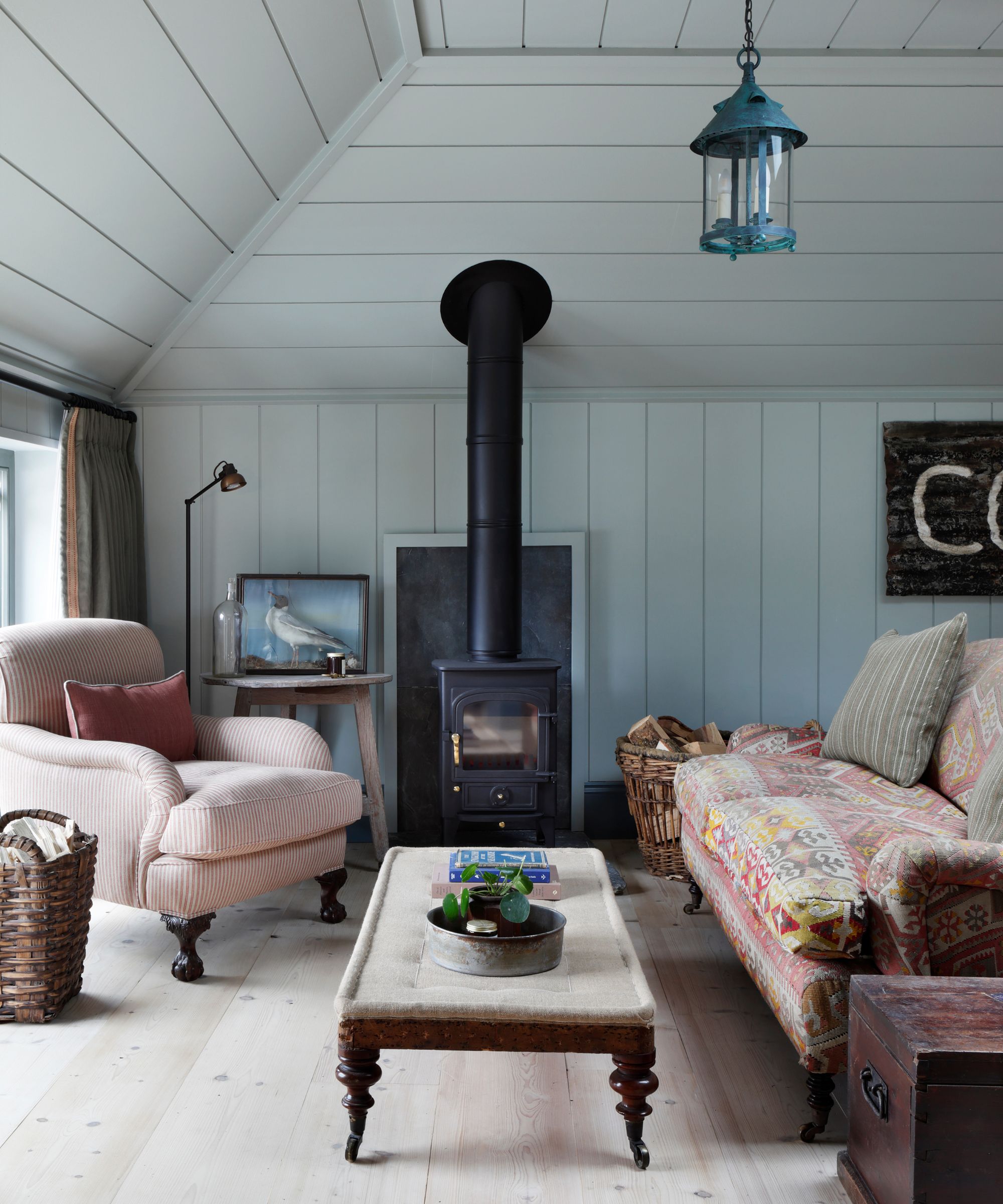
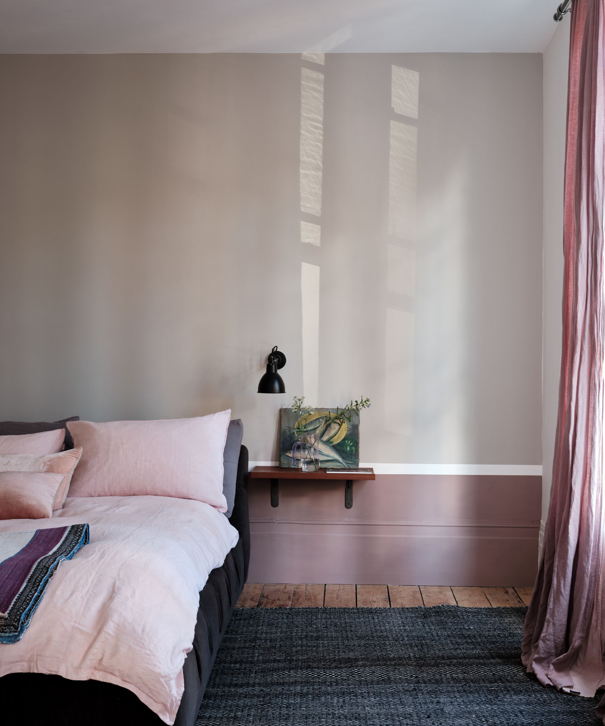
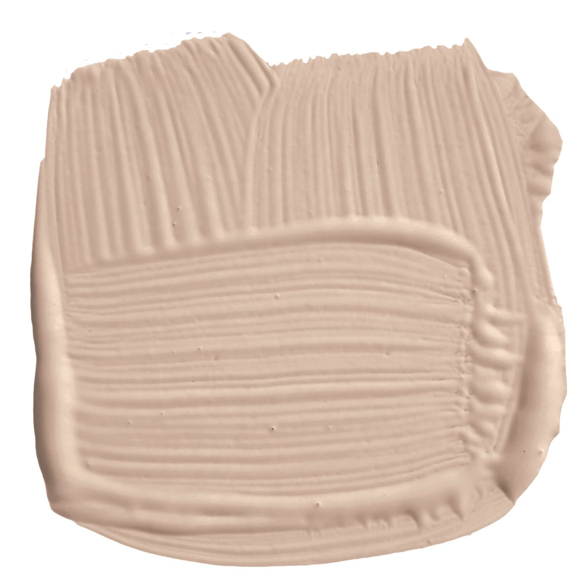
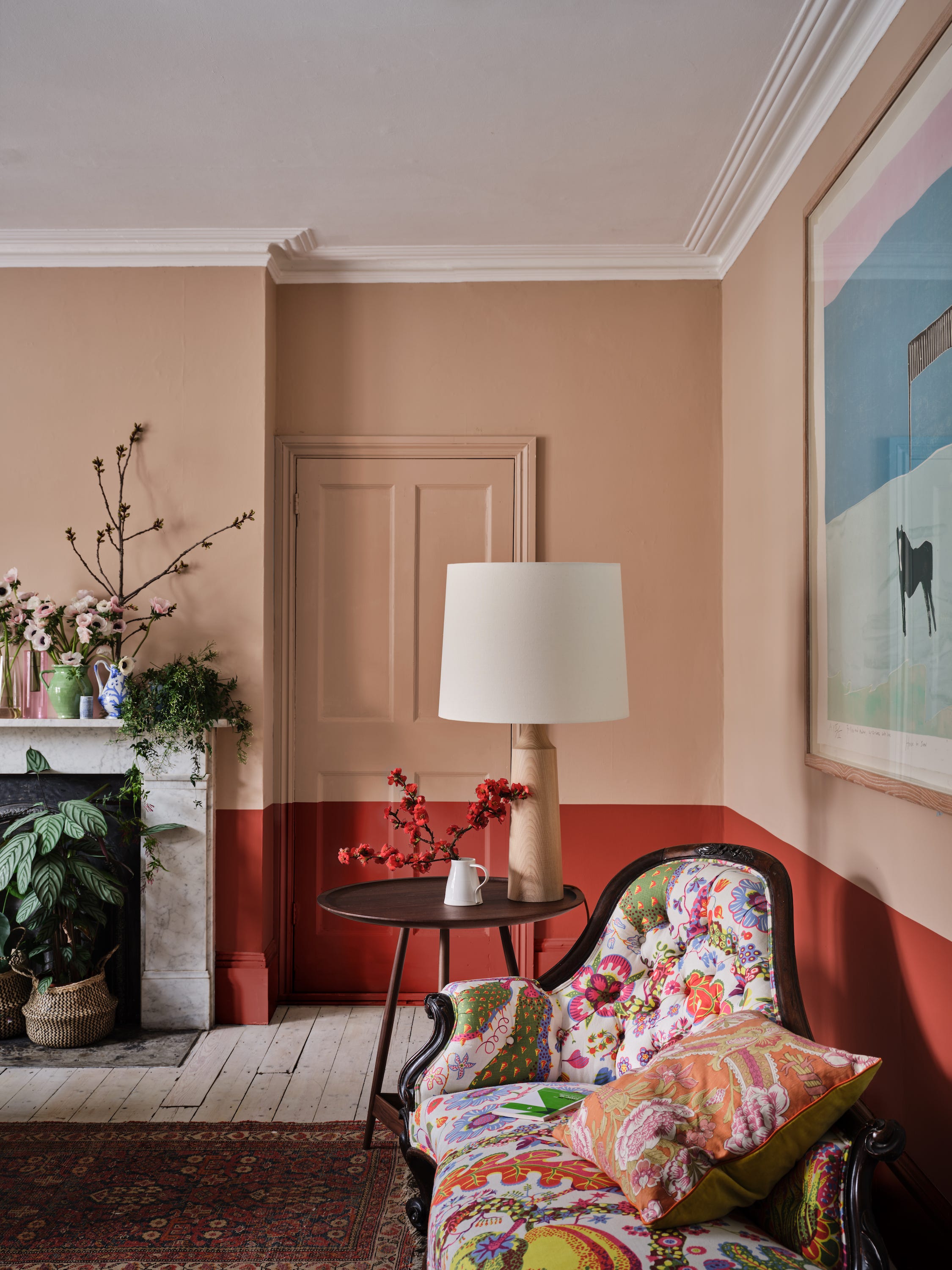
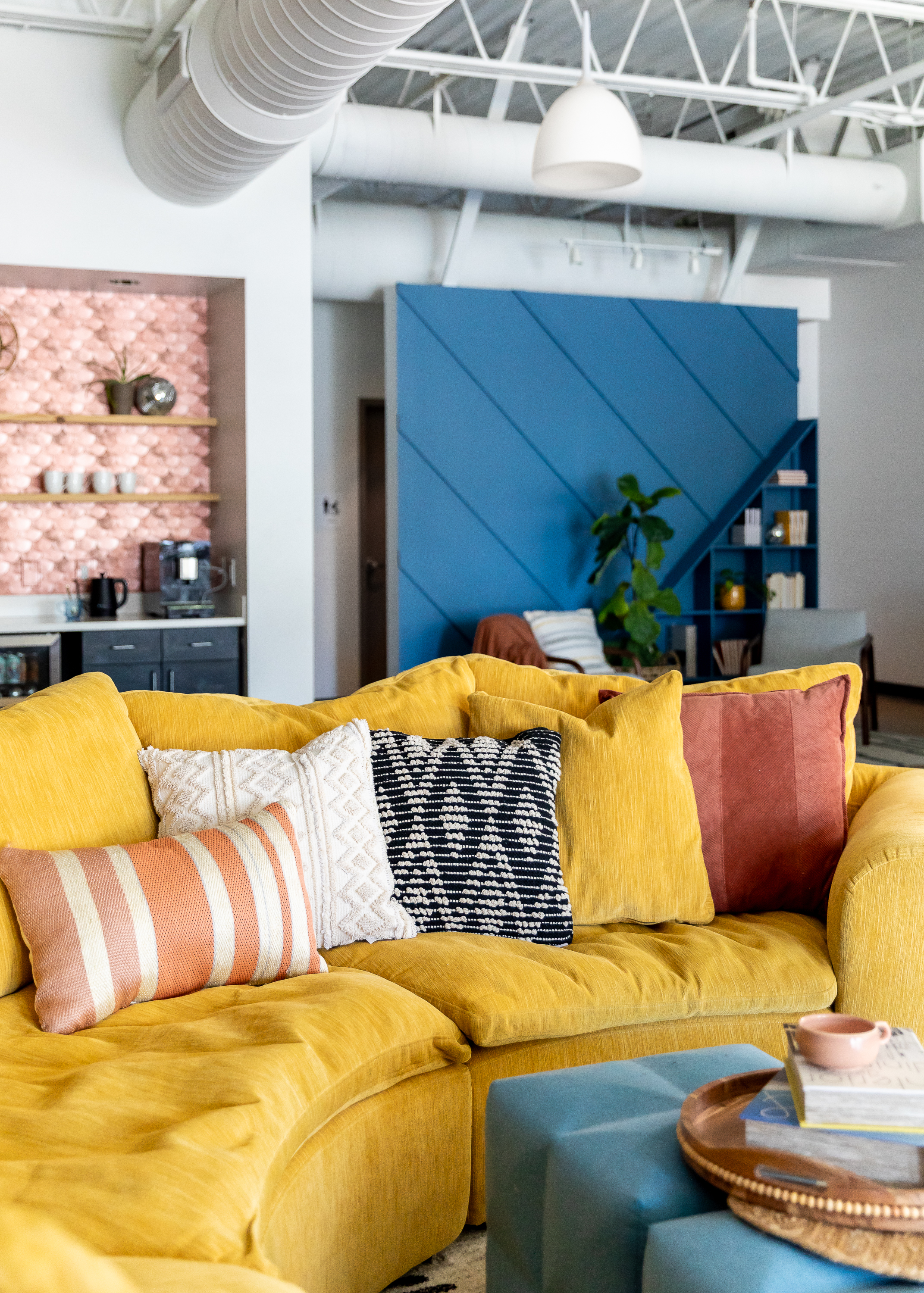
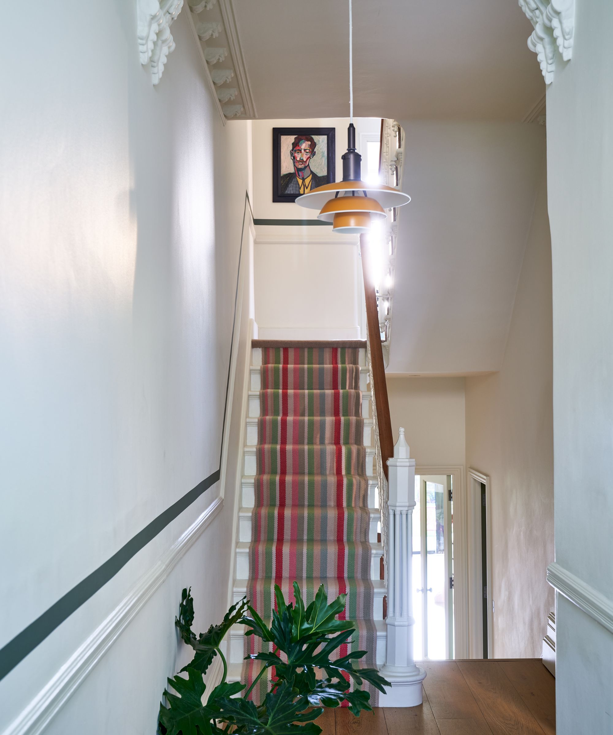
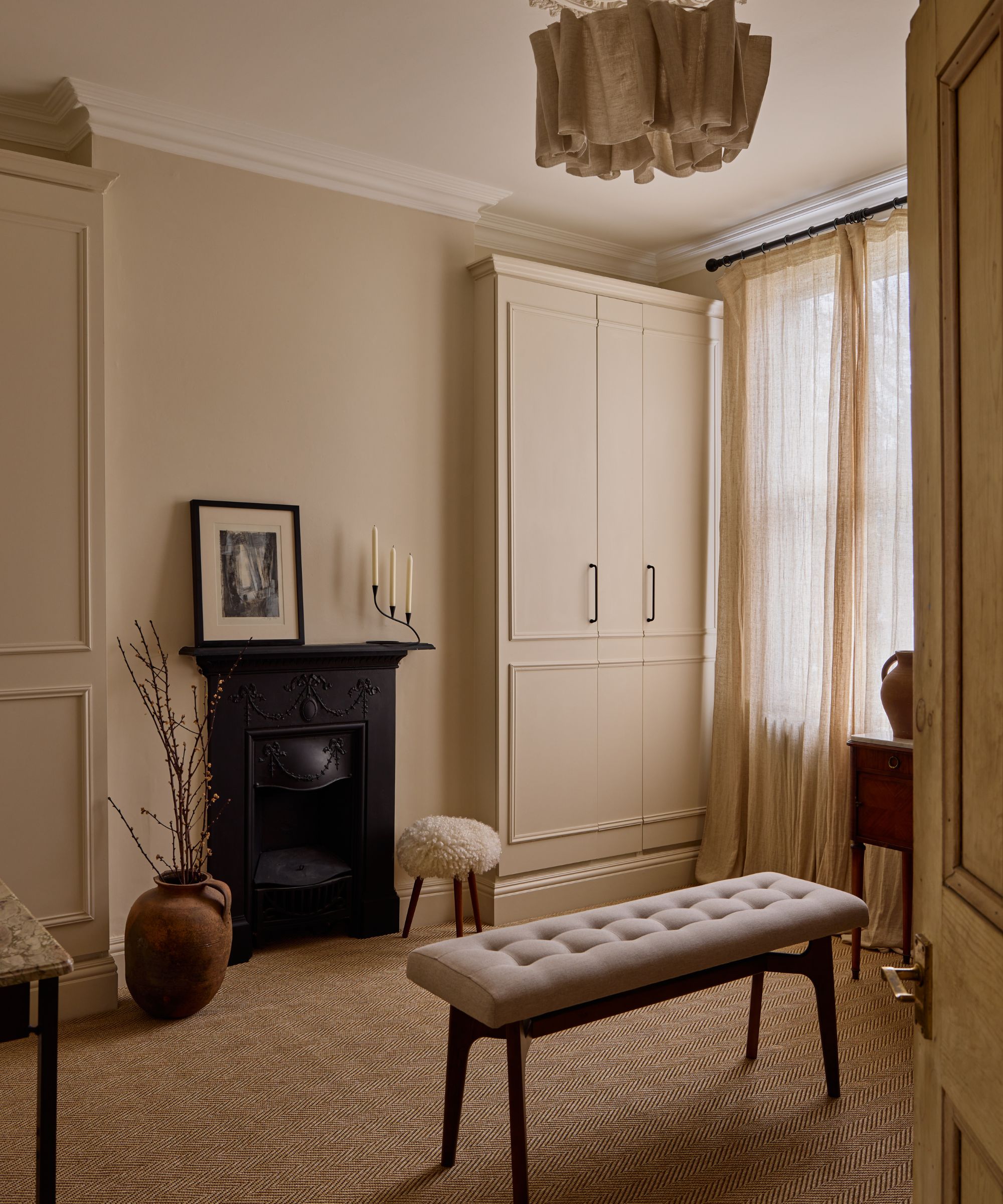
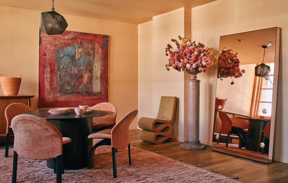
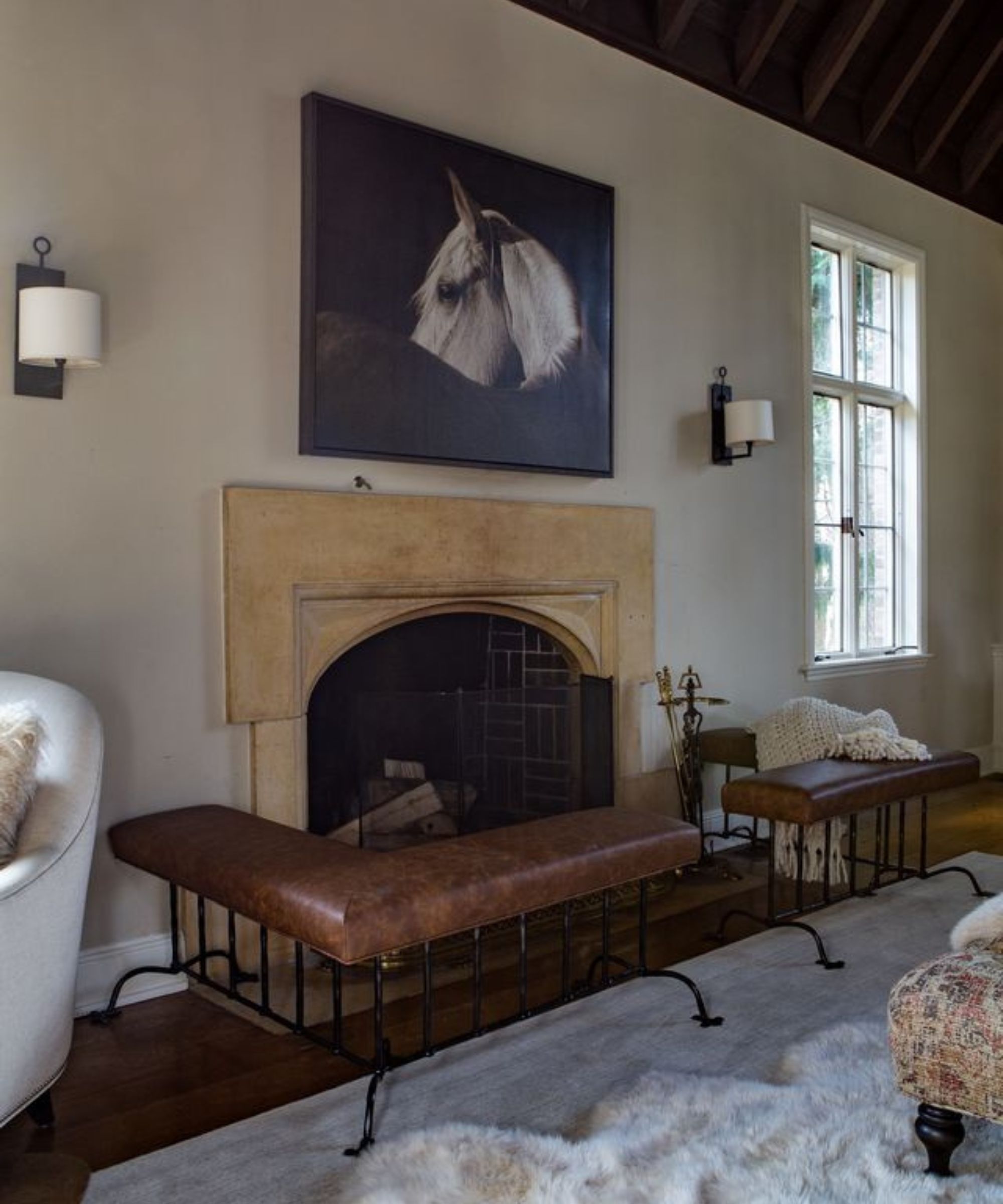
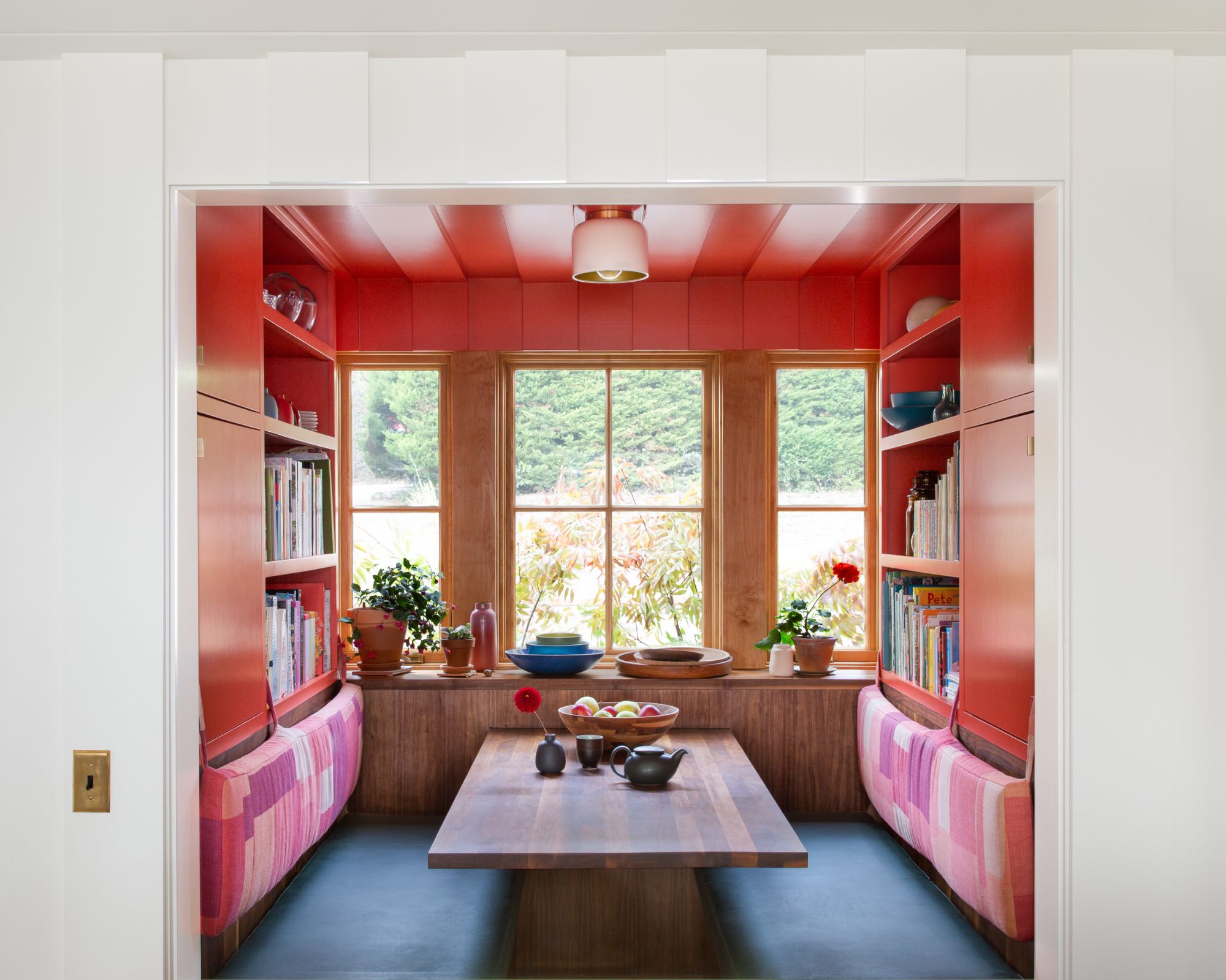
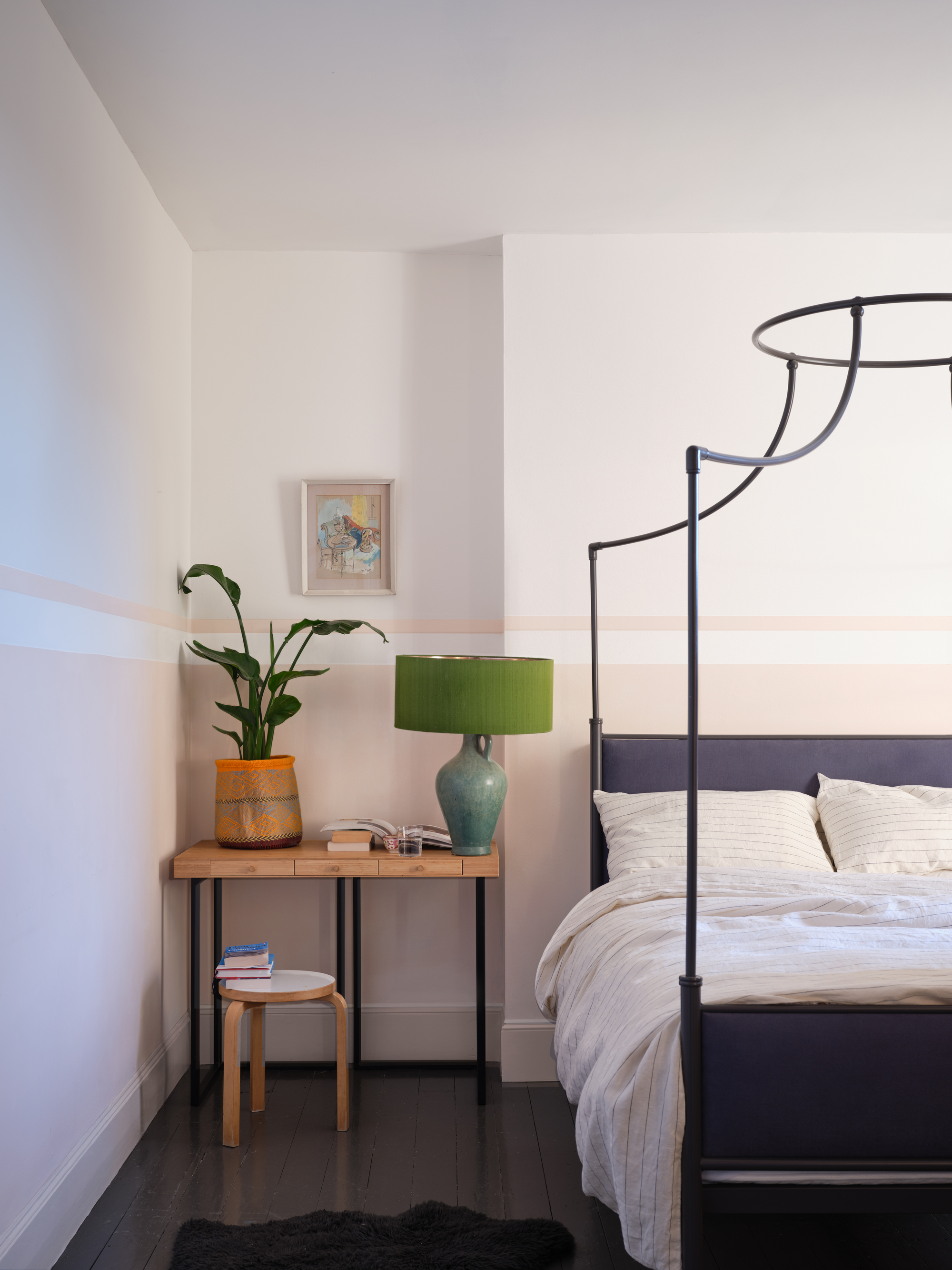
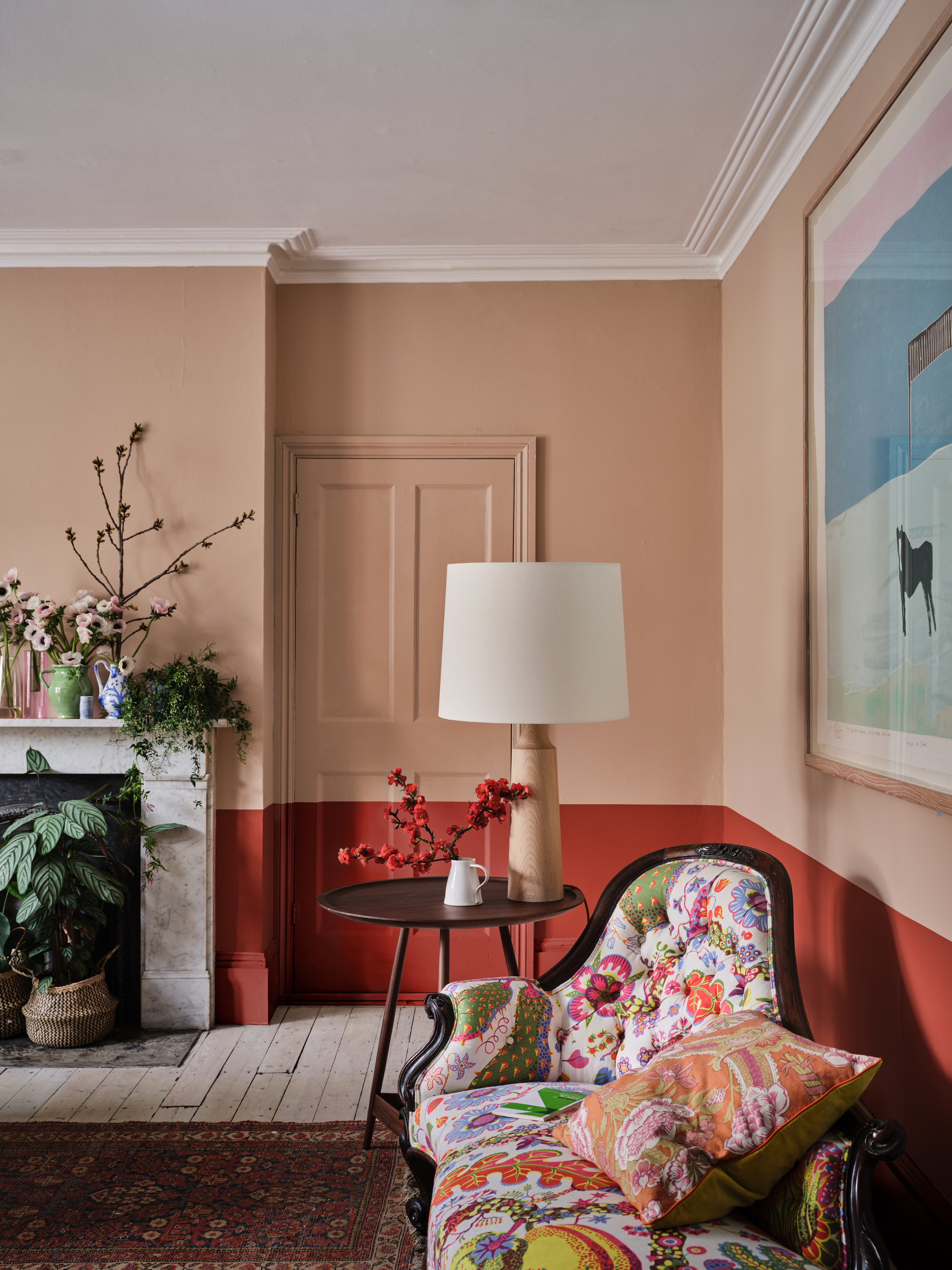
The article highlights ten of Farrow & Ball's most popular paint colors, offering inspiration for elevating home interiors in 2024 with sophisticated and versatile shades. Each color, whether subtle or bold, aims to feel deeply livable, contributing to a warm and inviting atmosphere. The selection includes 'Setting Plaster,' a dusty, earthy pink inspired by freshly plastered walls, which has become a best-seller and a new neutral alternative to grays. Charlotte Cosby, Creative Director at Farrow & Ball, notes its understated beauty in creating a soft, dreamy environment, especially when applied across ceilings and woodwork.
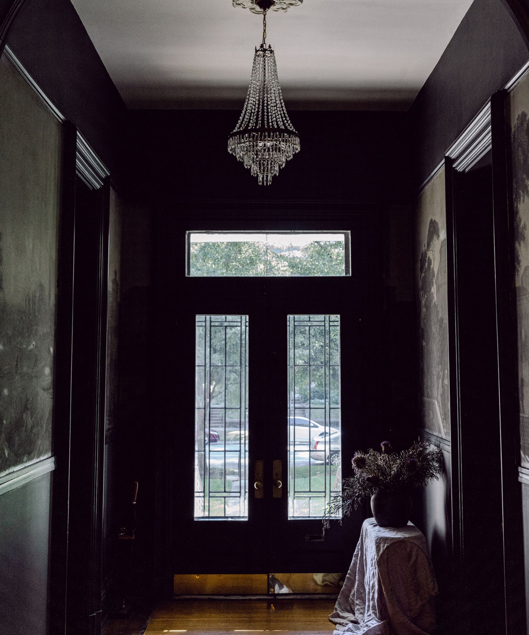
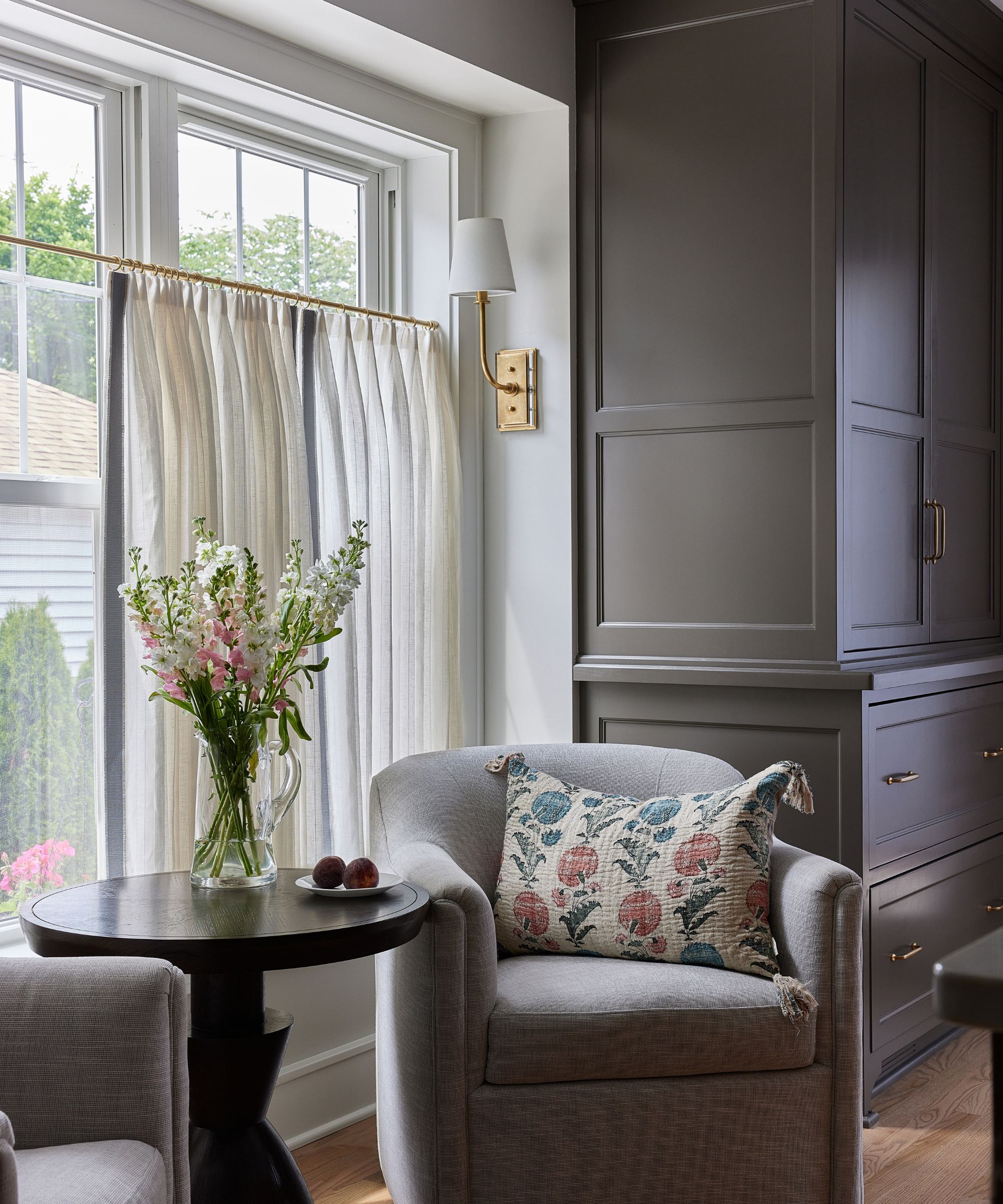
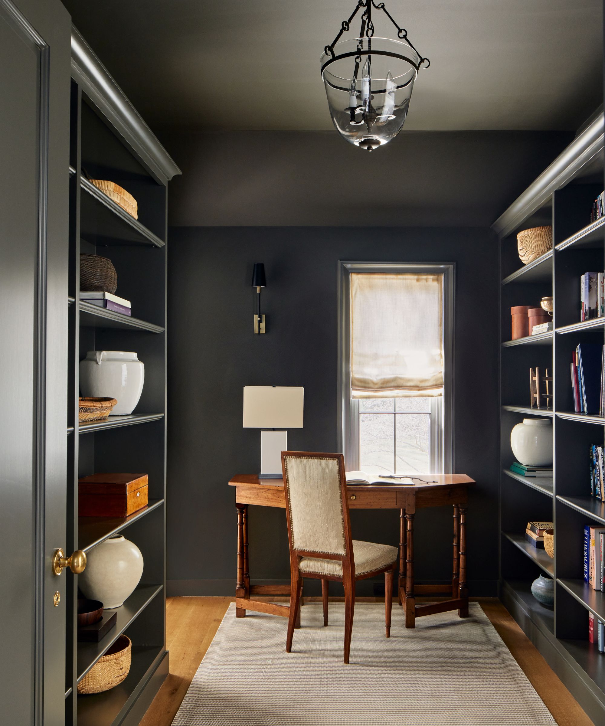
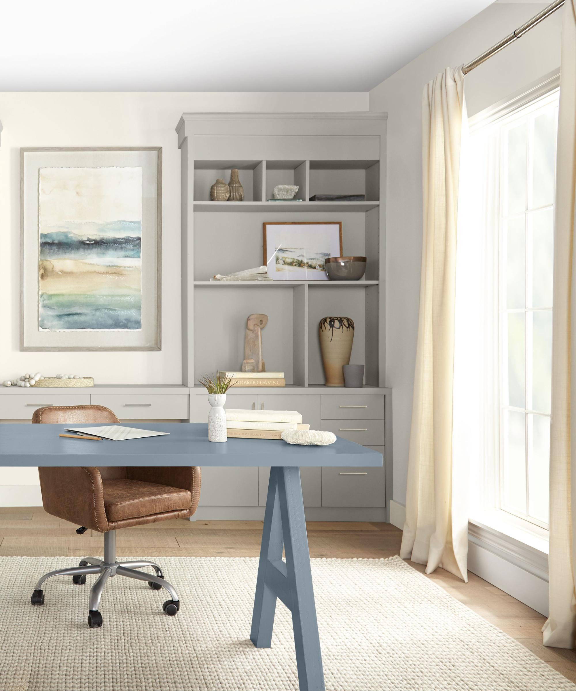
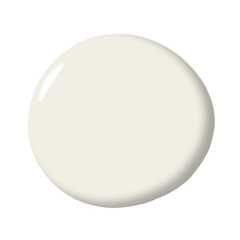
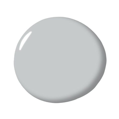
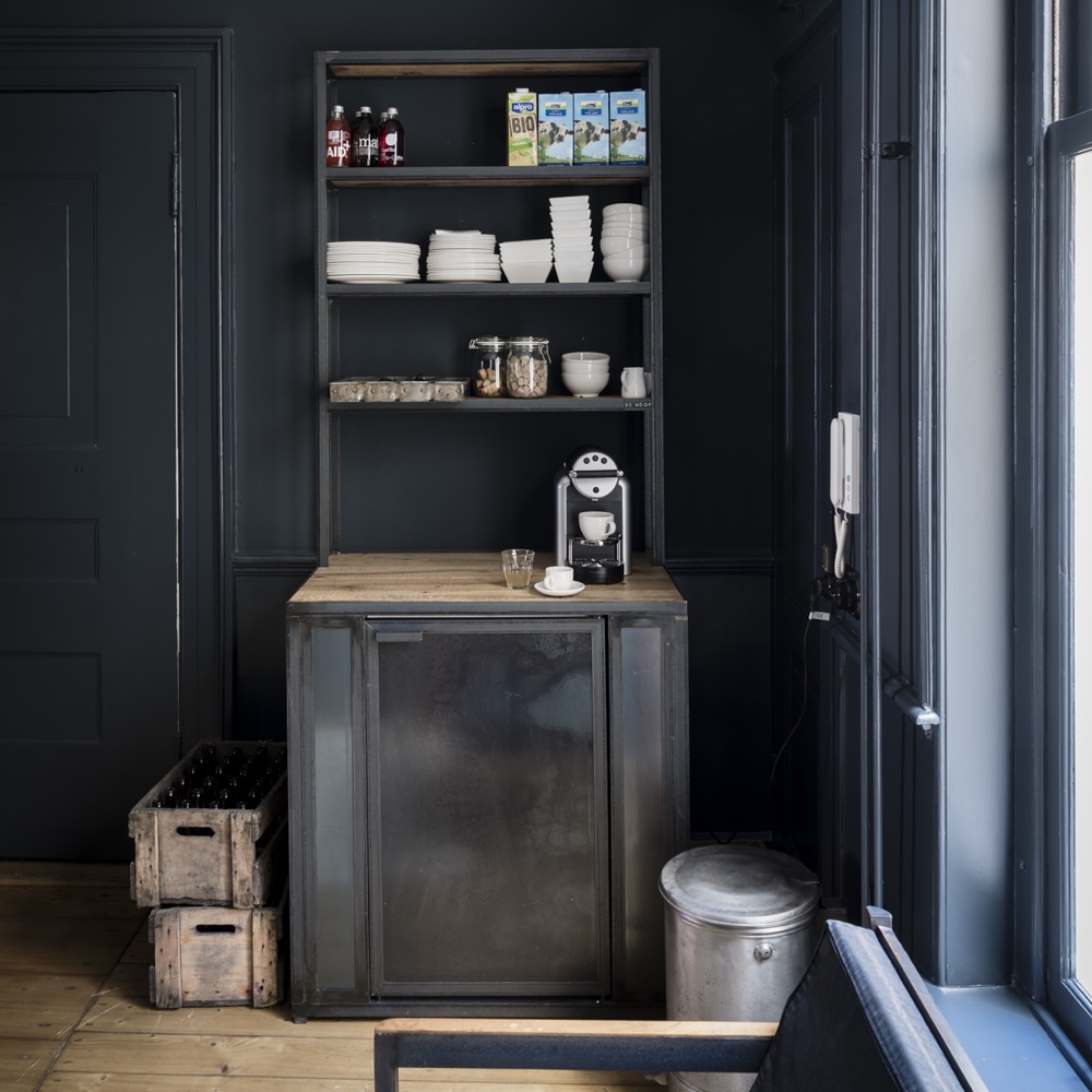
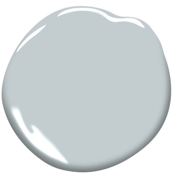
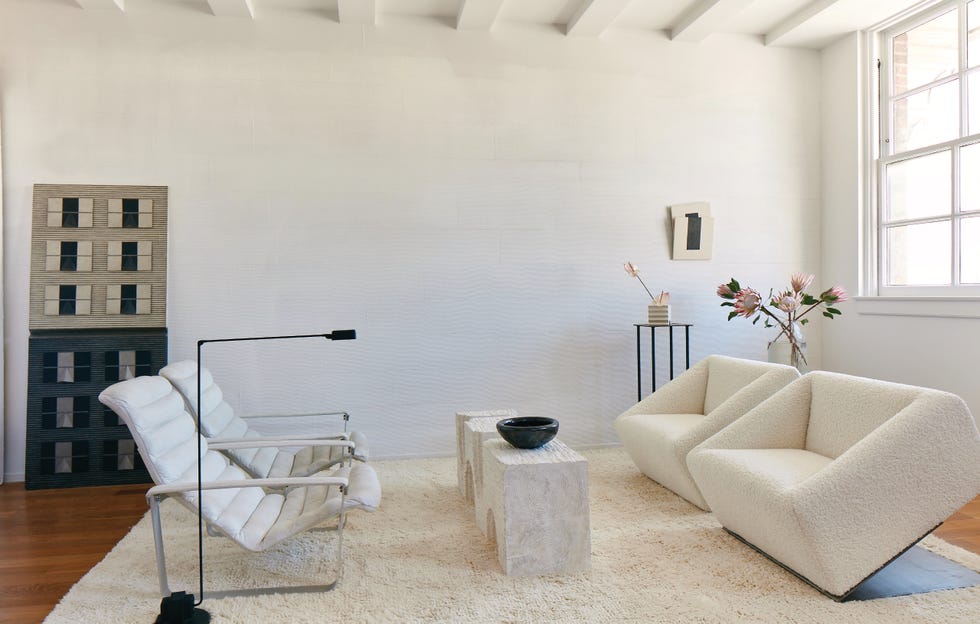
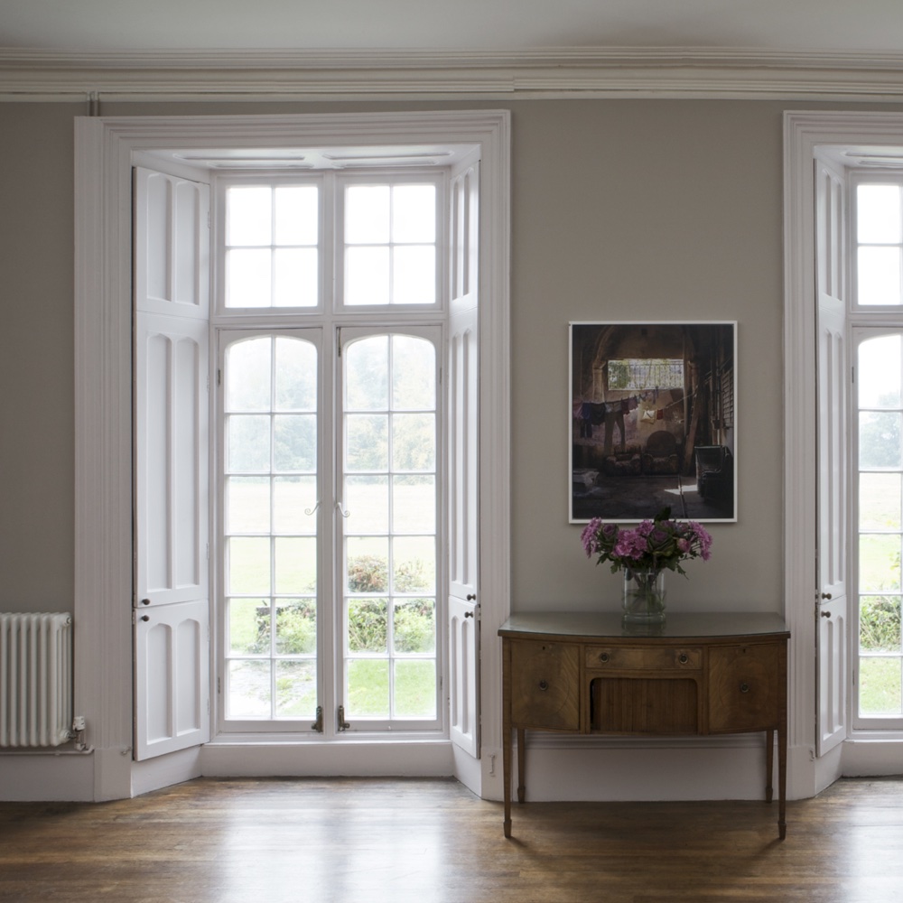
'Ammonite,' named after Dorset coast fossils, stands as Farrow & Ball's most popular neutral. It possesses a subtle gray tone, adaptable to any room orientation, and offers a calming feel. Joa Studholme suggests pairing it with brighter whites like All White for a noticeable contrast and recommends Farrow & Ball’s ‘white and light tones’ primer for optimal results. 'Railings,' a softer alternative to black with blue undertones, is ideal for creating dramatic and enveloping spaces, particularly in studies and dining rooms. Joa explains its versatility for both walls and woodwork, even suggesting it for front doors. 'Down Pipe,' a dark lead gray with blue undertones, enhances complexity and is often used for accent walls or intimate sitting rooms, offering an industrial yet soft feel. It pairs well with white woodwork for striking contrast.
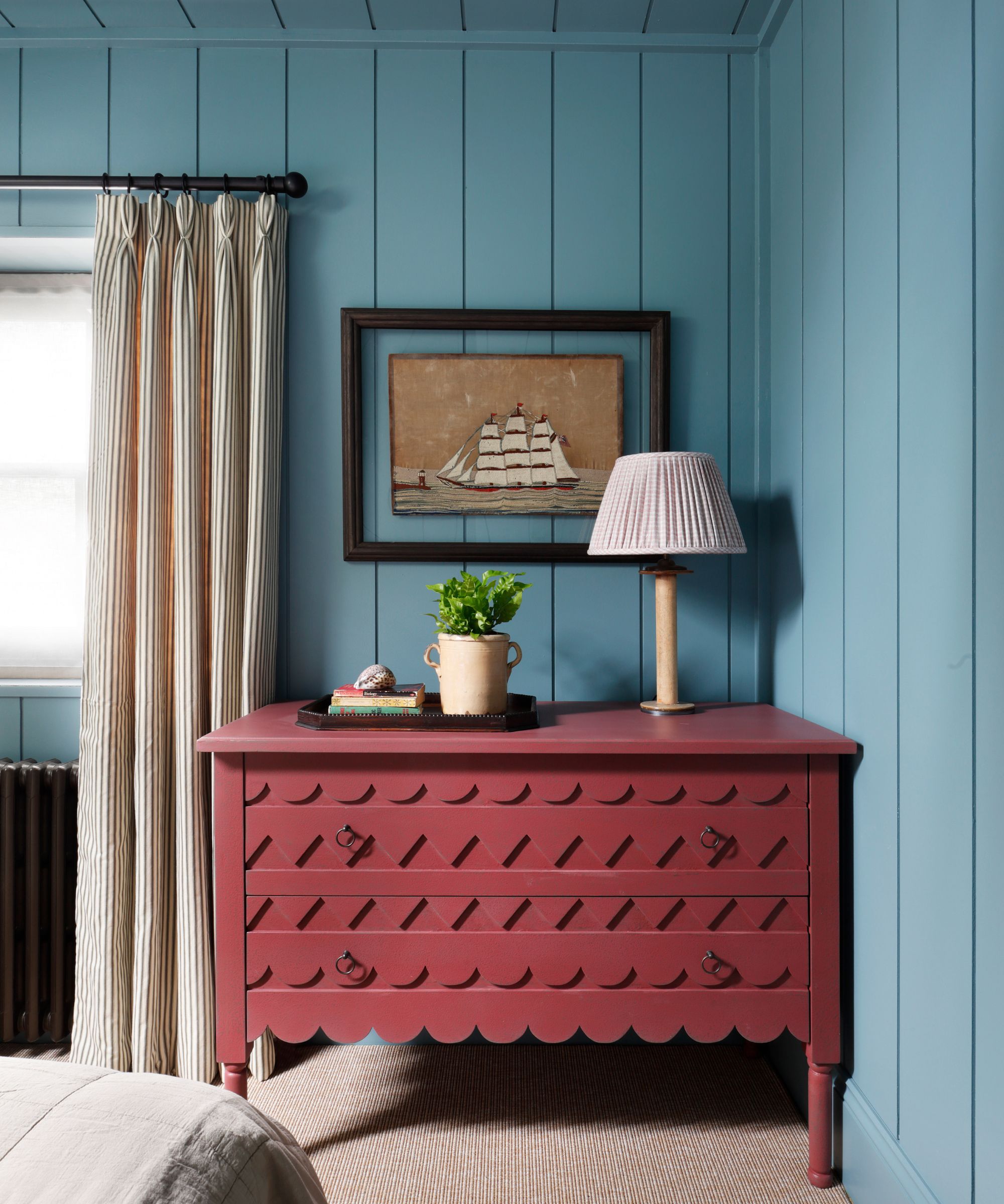
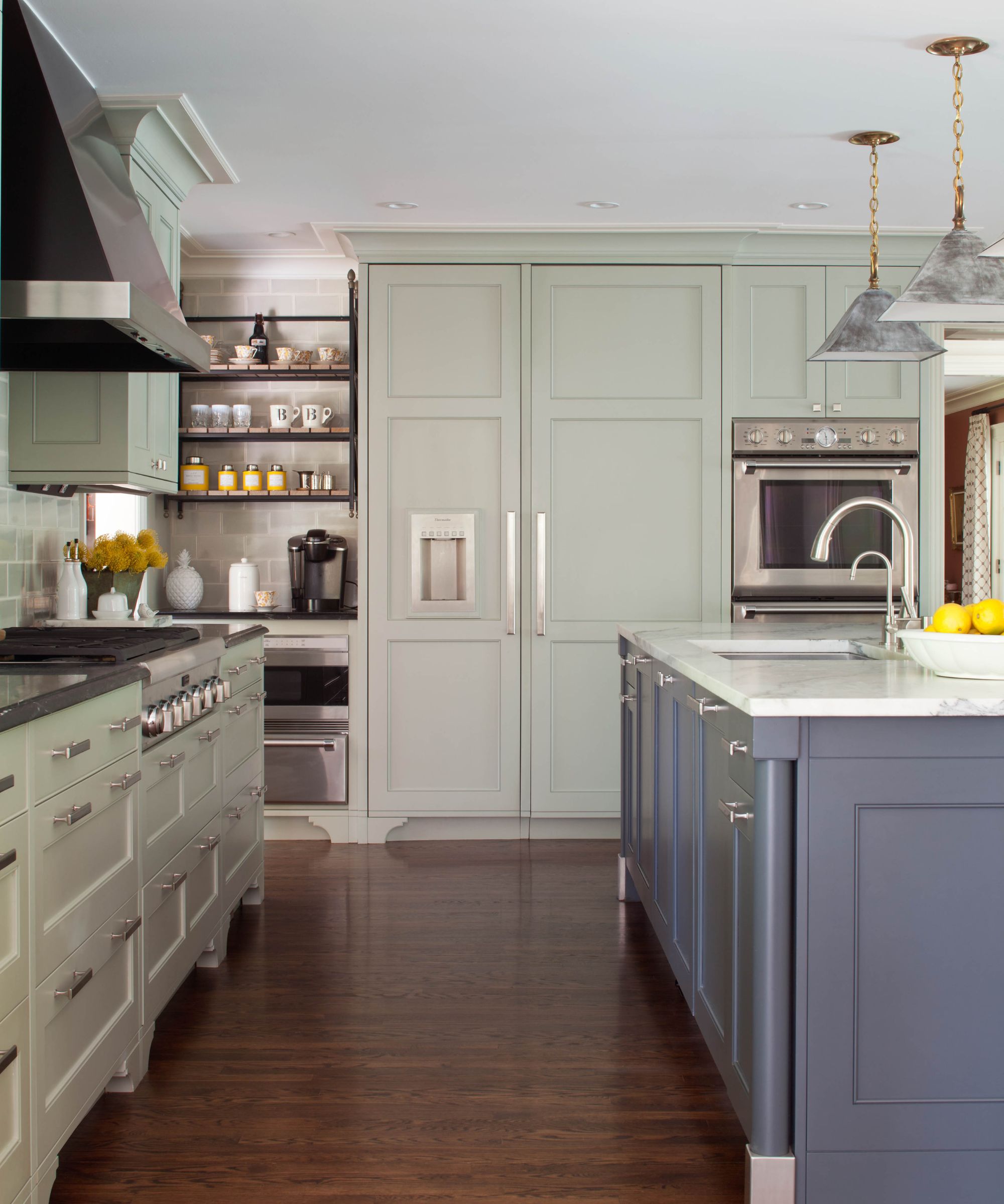
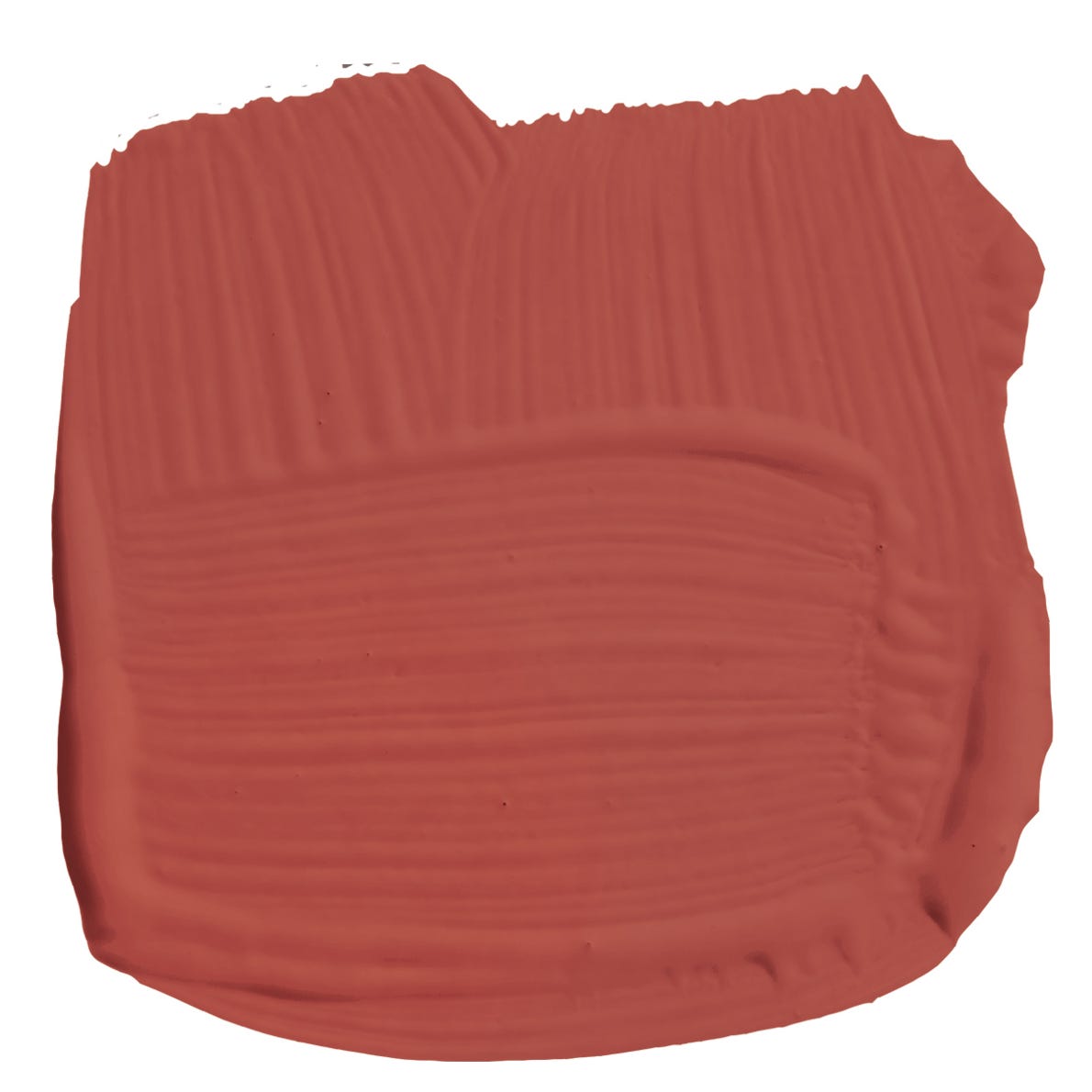
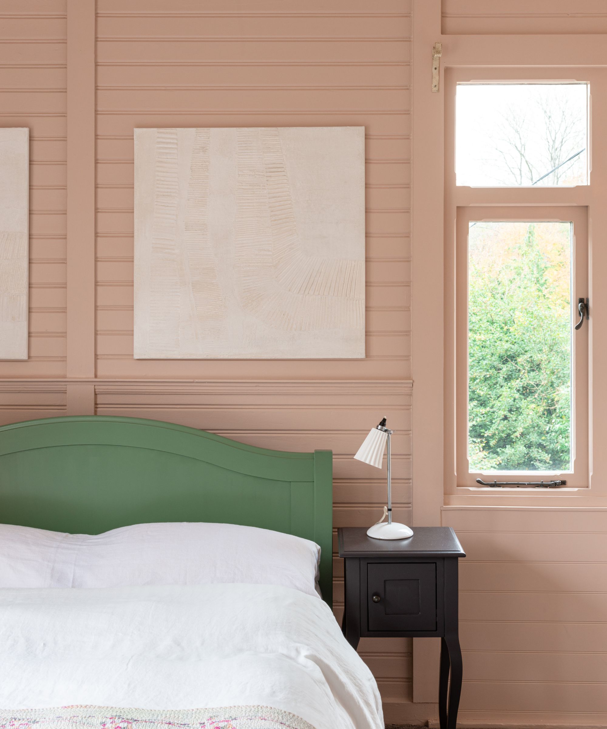
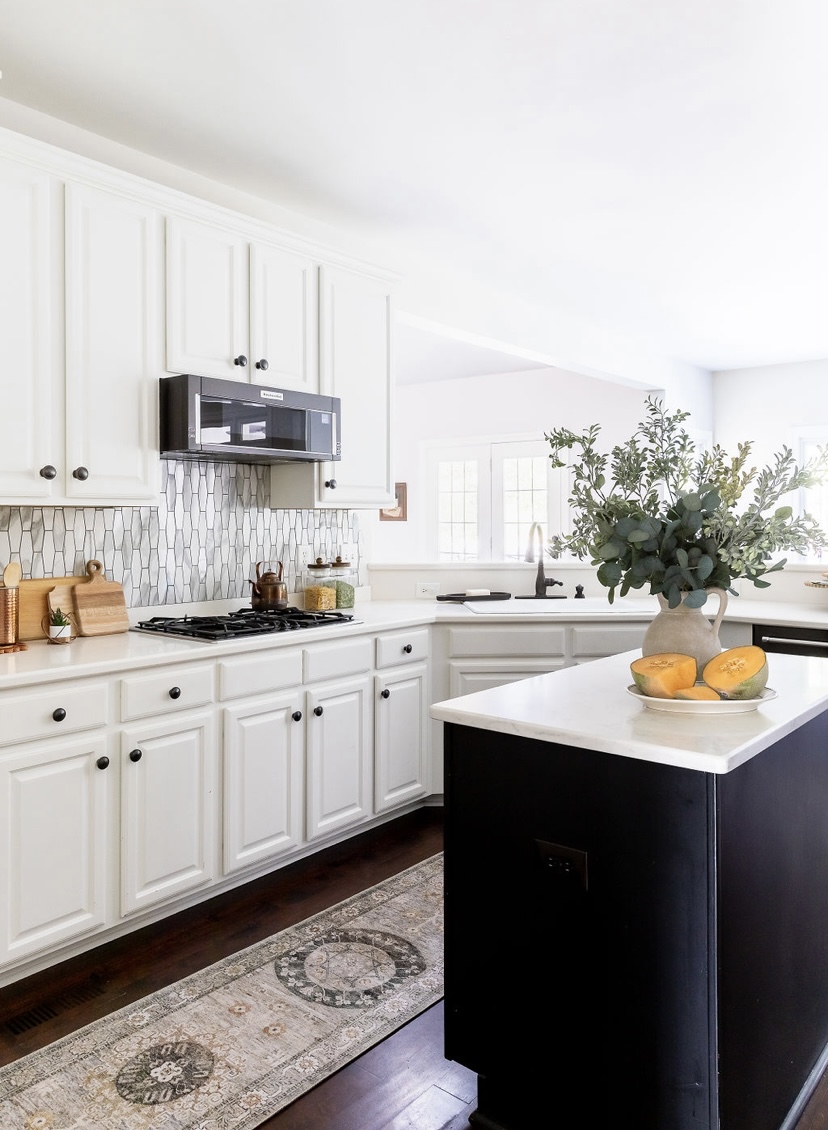
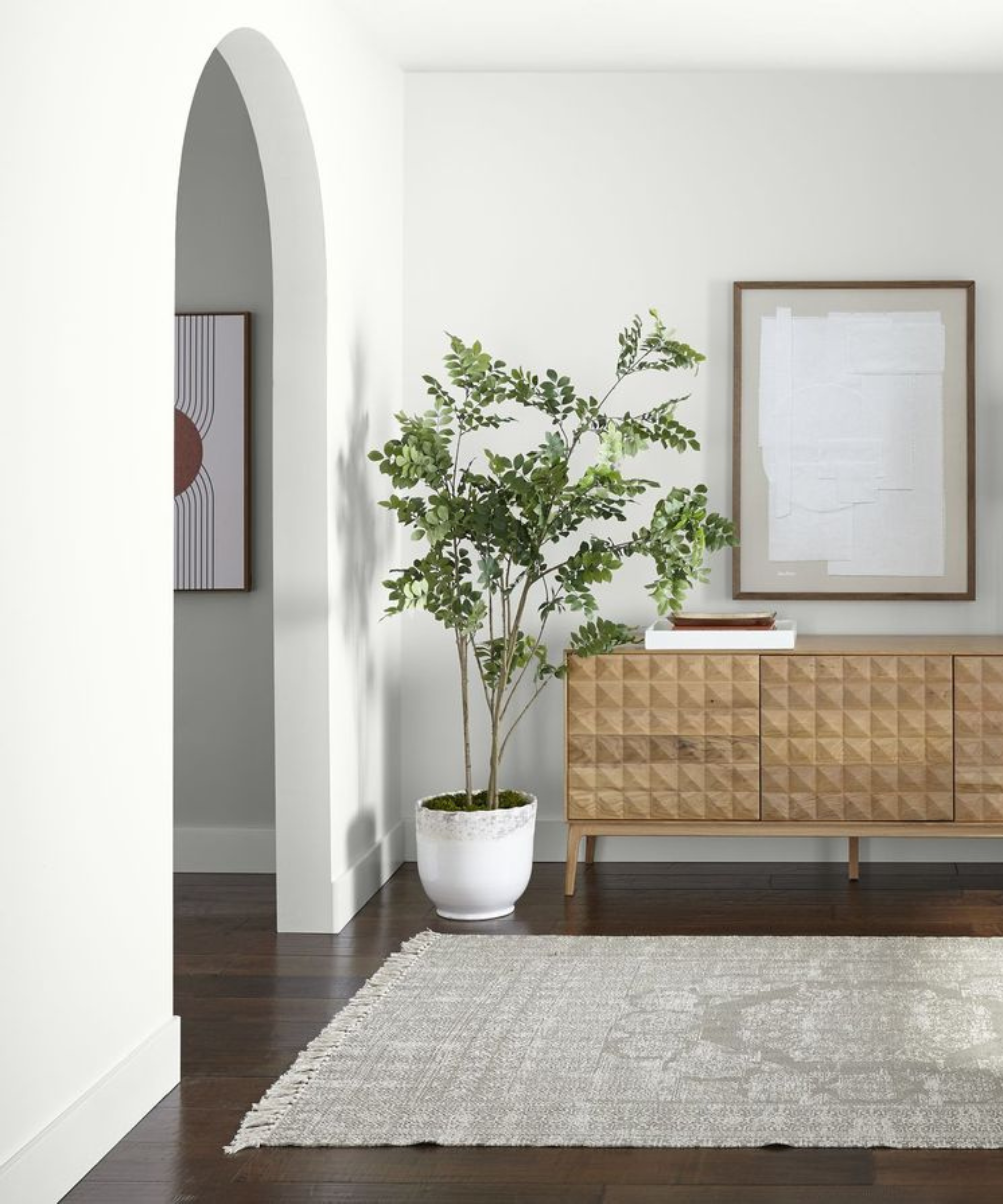
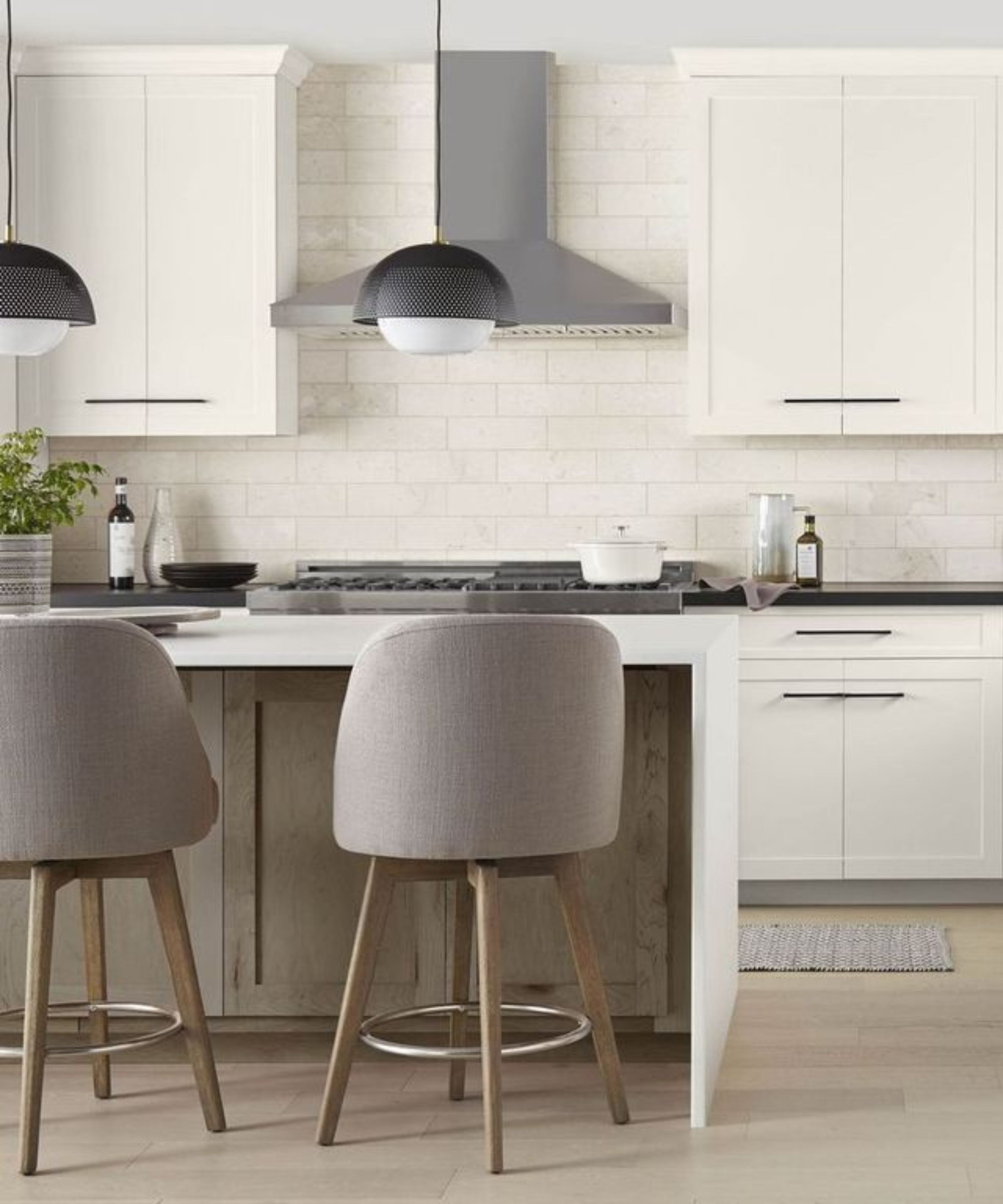
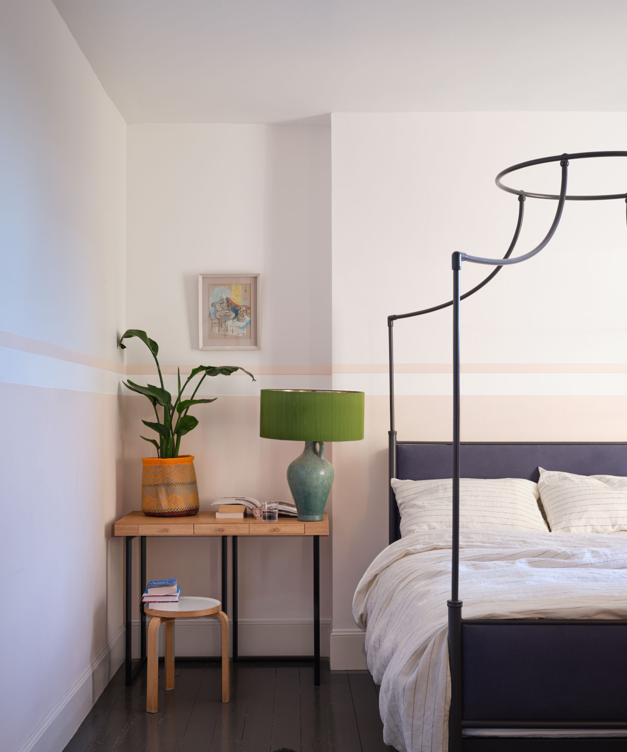
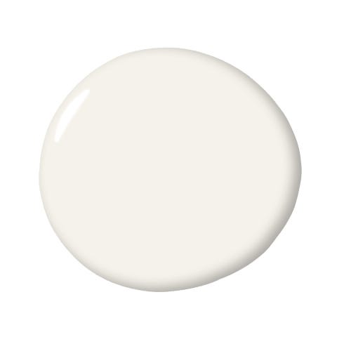
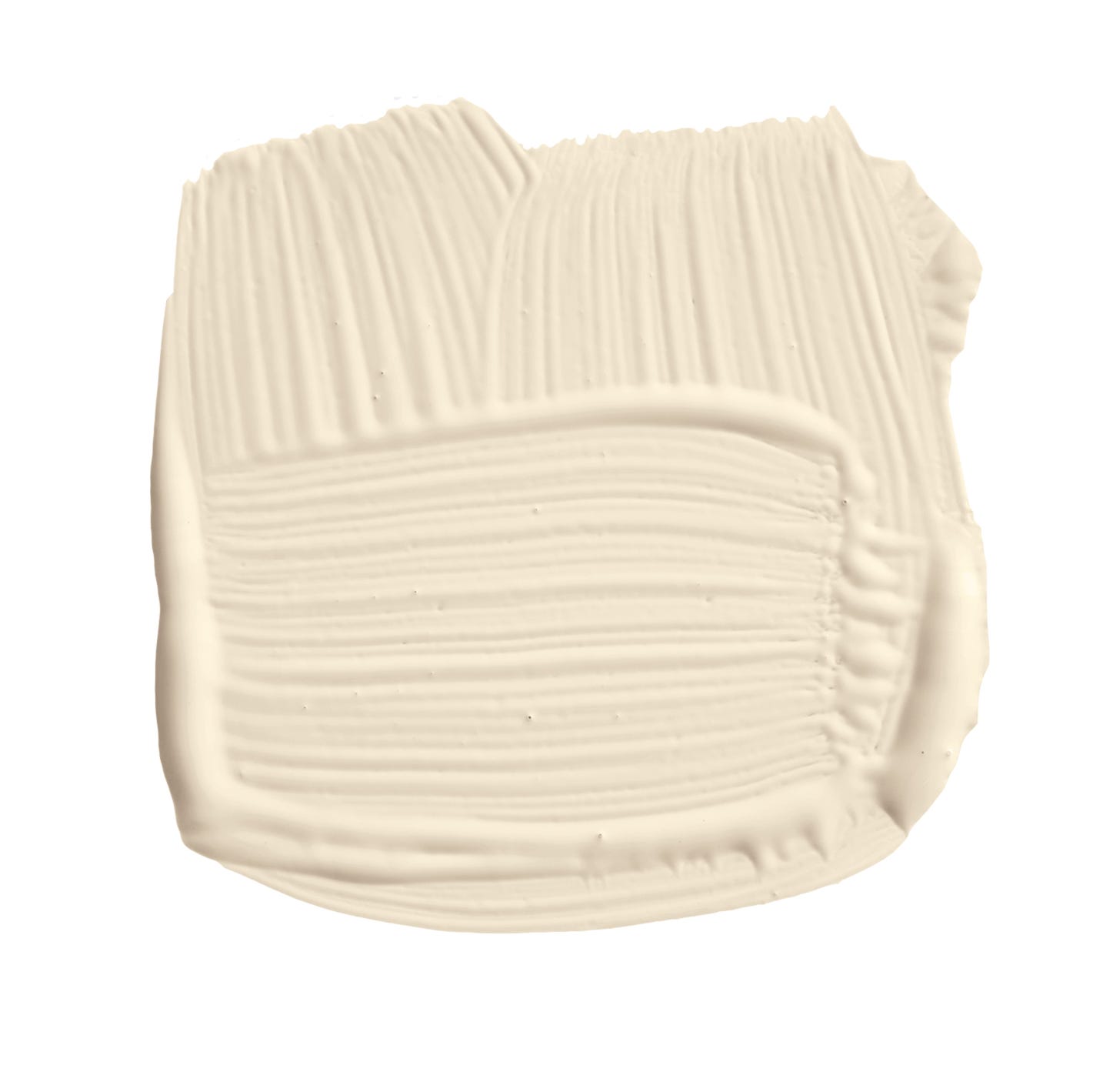
'Sulking Room Pink,' a muted rose with warm tones, draws inspiration from the French word ‘bouder’ (to sulk) and boudoir shades. Joa describes it as an incredibly soft and easy-to-use color, perfect for furniture and walls in contemporary homes when paired with complementary darker tones or 'Great White.' 'Hague Blue,' a strong blue with green undertones, is derived from Dutch woodwork and is suited for north or east-facing rooms due to its warmth. Joa advises using it with the same color on woodwork and a dark neutral like 'Shaded White' on the ceiling for sophistication. 'Strong White,' a cool white with light gray undertones, adds a contemporary touch to homes. Joa highlights its popularity in kitchens for a fresh look and its ability to create an illusion of space, especially in rooms with small windows.
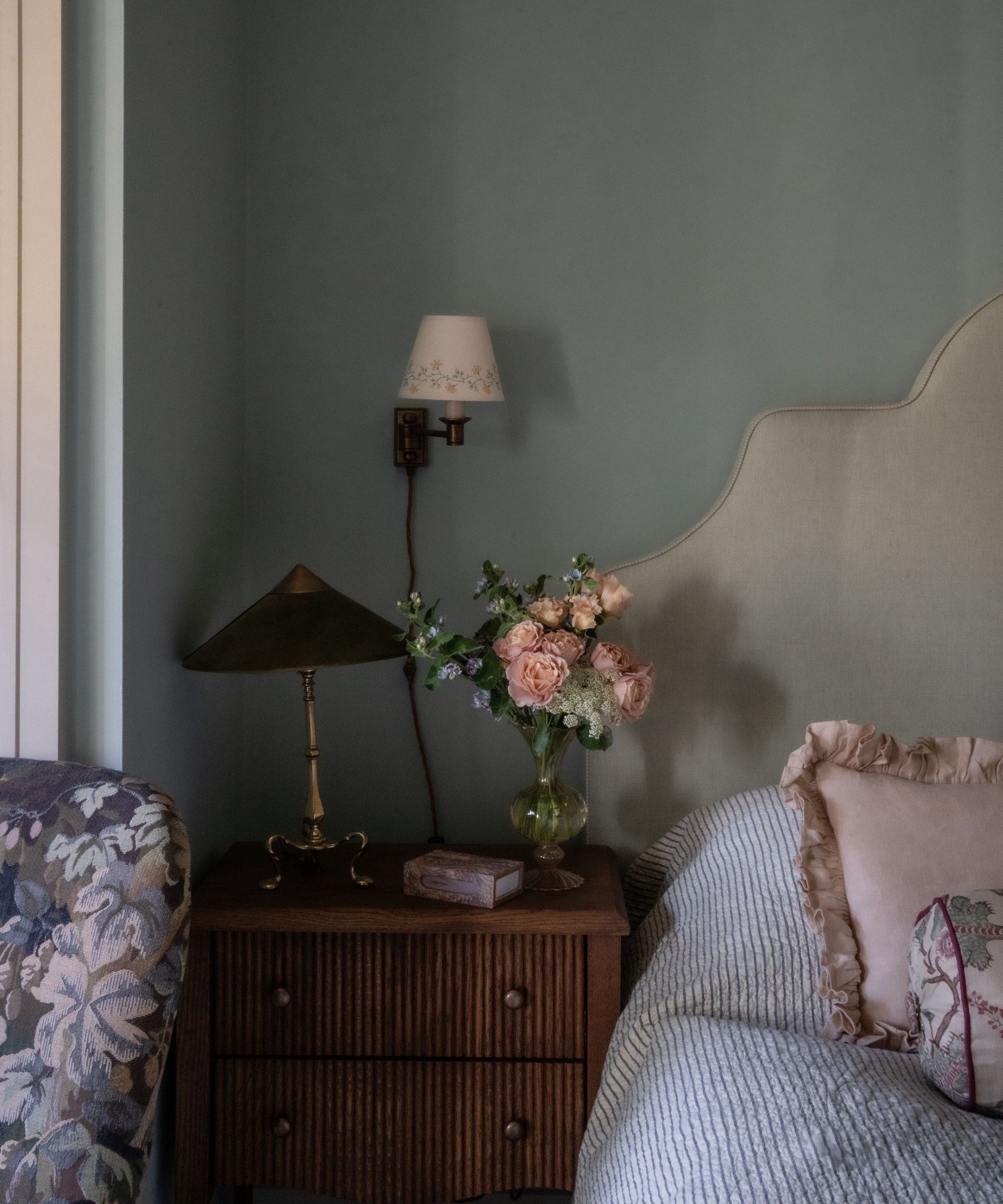
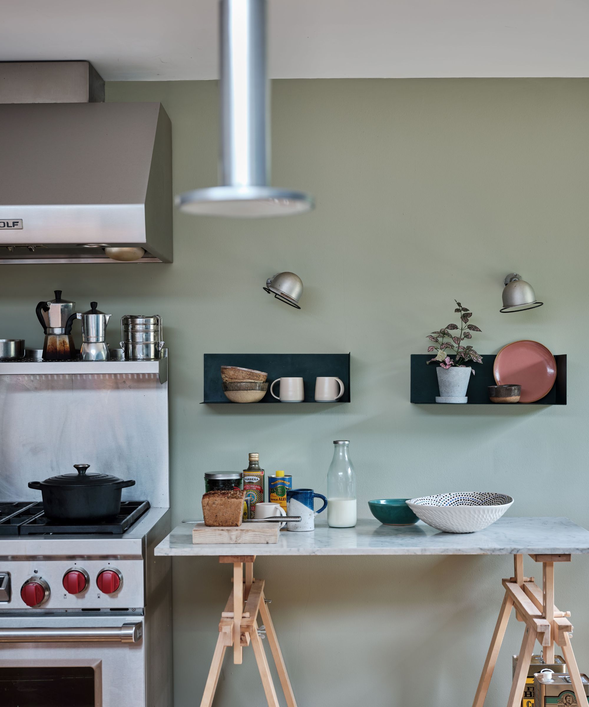
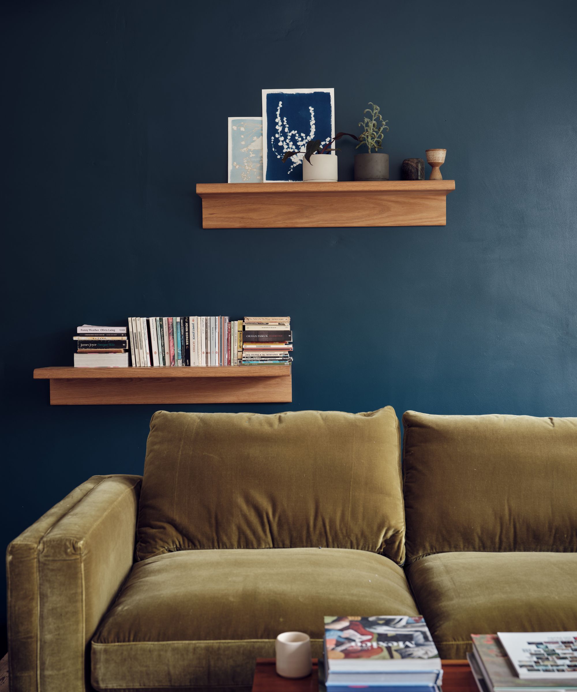
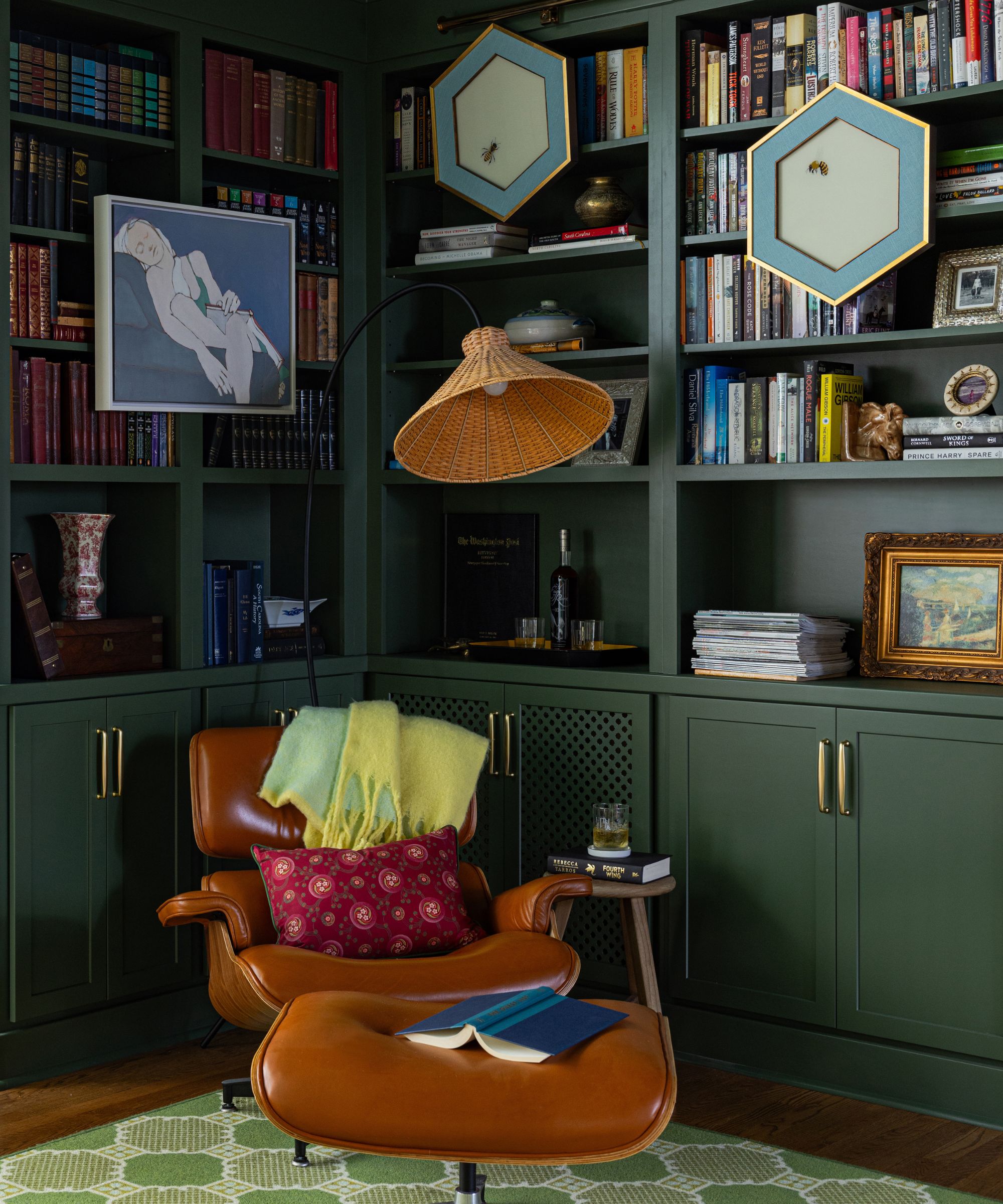
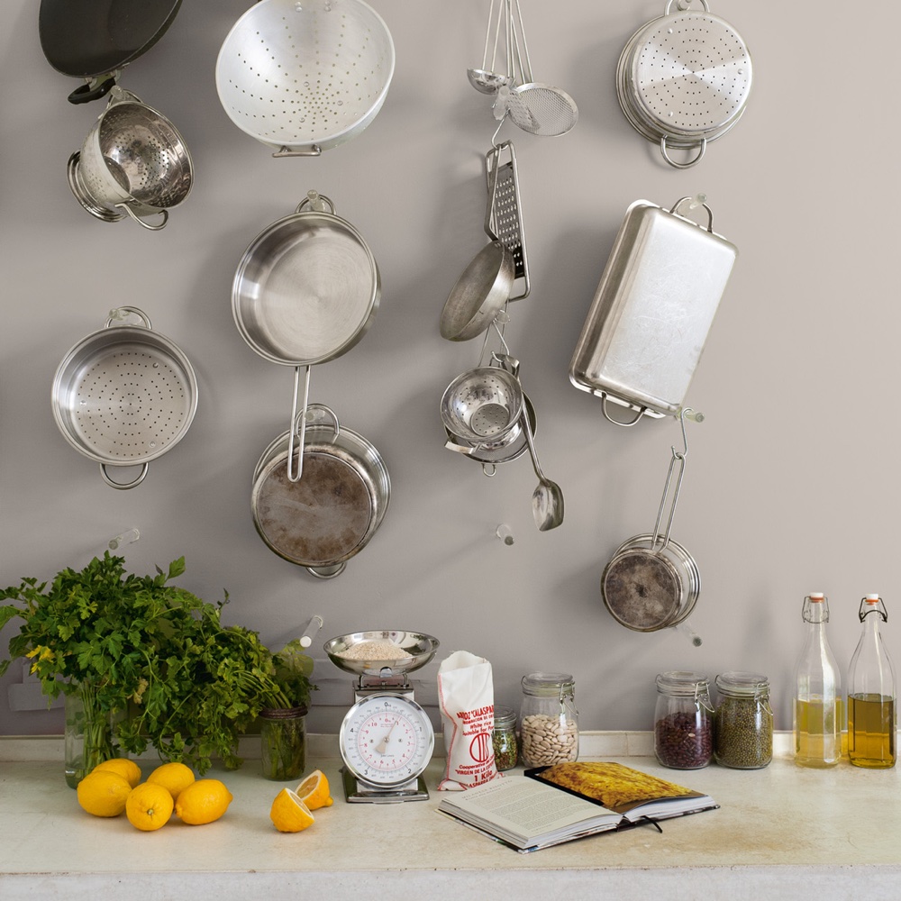
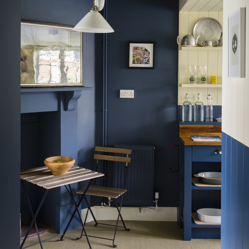
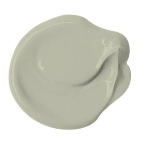
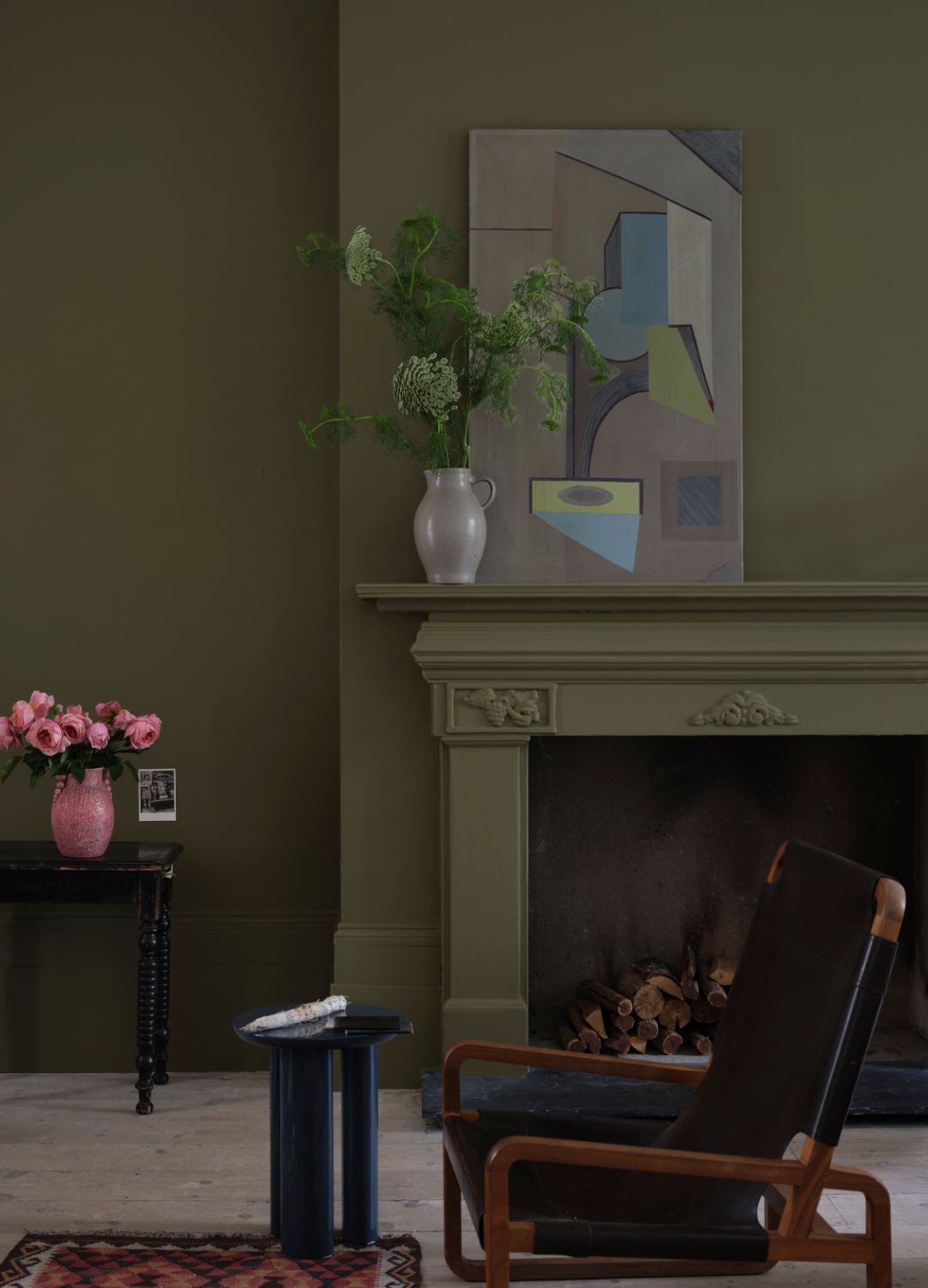
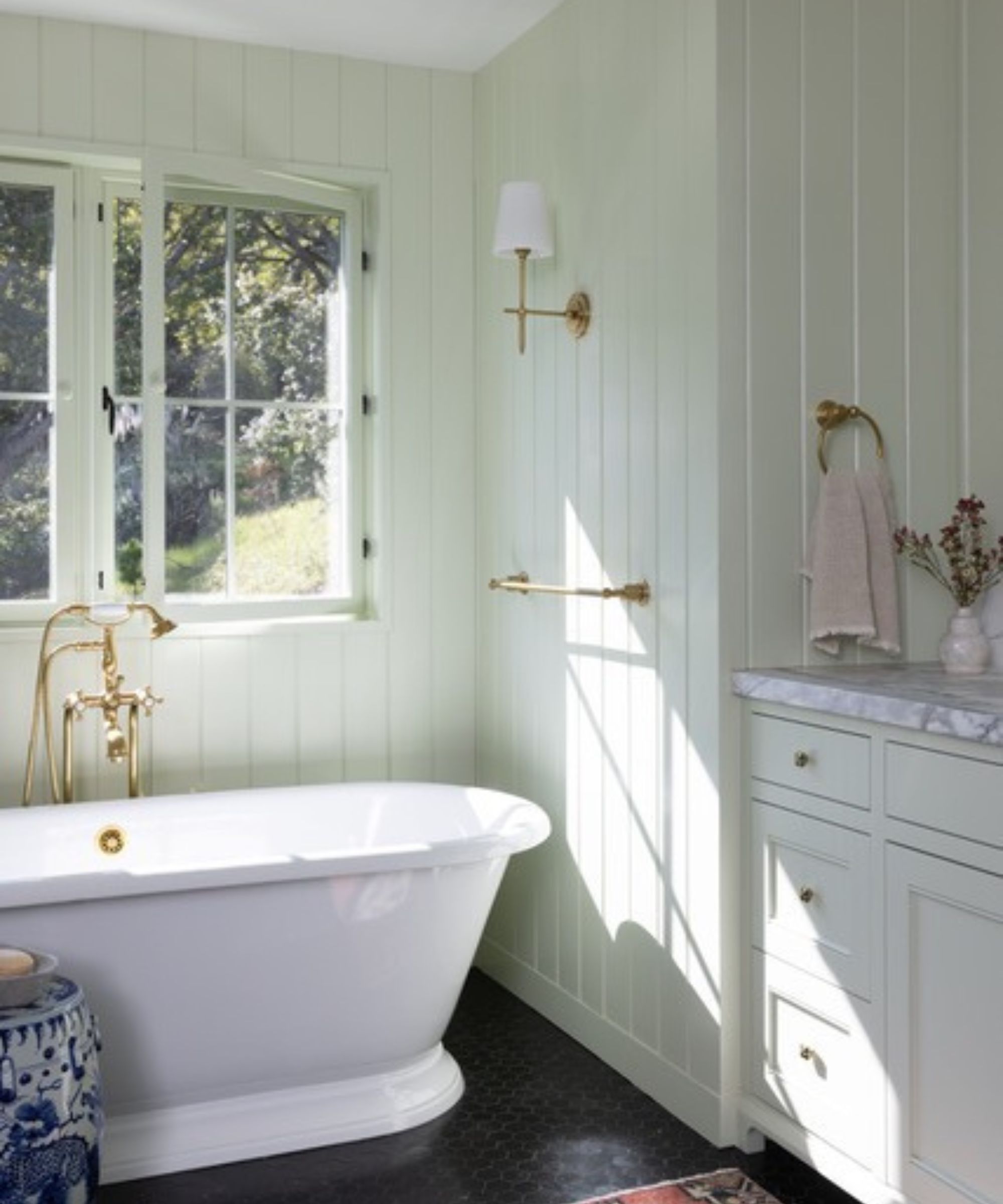
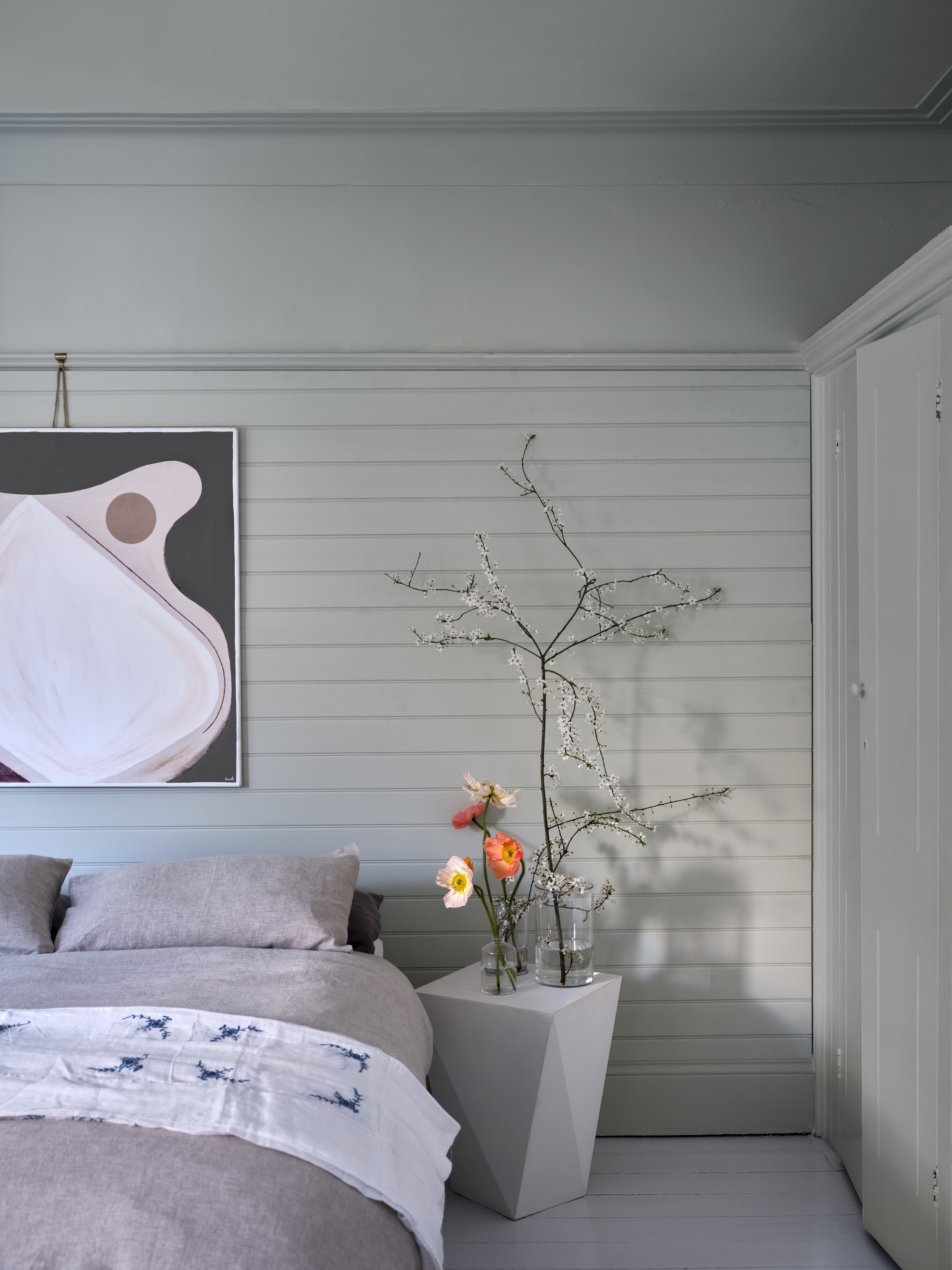
'Green Smoke,' a smoky green with blue pigment, is a muted shade referencing late 19th-century interiors. Charlotte notes its inviting depth, particularly under candlelight and in exterior spaces, and its ability to create a serene atmosphere. 'Elephant's Breath,' a warm-toned gray with a hint of magenta, is a beloved shade for decorating with gray. Charlotte describes its uplifting warmth, which can appear lilac in west-facing spaces, and its versatility when paired with sophisticated shades like 'Sulking Room Pink' or 'London Clay,' or with 'Strong White' for a softer neutrality. Lastly, 'Stiffkey Blue,' an inky blue named after a Norfolk beach, offers a dramatic yet optimistic feel, appearing bluer in well-lit spaces and more indigo in darker rooms. Joa notes its uncomplicated and upbeat feel compared to other strong blues.
Farrow & Ball attributes its popularity to high levels of pigment, rich resin binders, and quality ingredients, which provide a unique depth of color and long-lasting finish. Charlotte Cosby emphasizes the meticulous testing of their paints to ensure extraordinary color and durability, offering a thoughtfully curated palette for various interior and exterior applications, suitable for both modern and traditional styles.
#FarrowAndBall #PaintColors #InteriorDesign #HomeDecor #ColorTrends #NeutralColors #BoldColors #DesignInspiration #HomeImprovement #FarrowAndBall #PaintColors #InteriorDesign #HomeDecor #ColorTrends #NeutralColors #BoldColors #DesignInspiration #HomeImprovement
0 comment in total
 No comments yet
You may also like
15 Farrow & Ball paint colors in real homes – from calming blues to warm neutrals
What Are the Most Popular Behr Paint Colors? These Hand-Picked Shades Promise to Bring Your Walls to Life

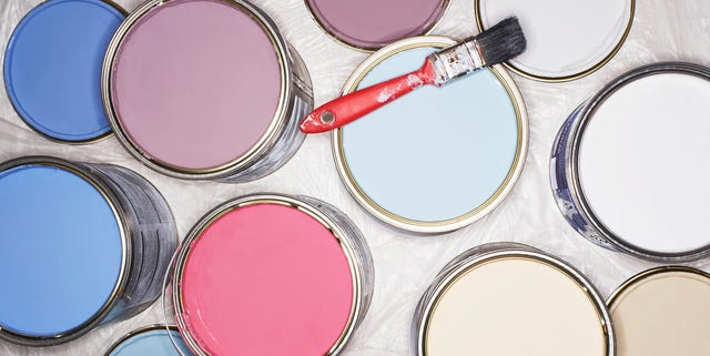
These Are The 12 Best-Selling Paint Colors From All Your Favorite Brands

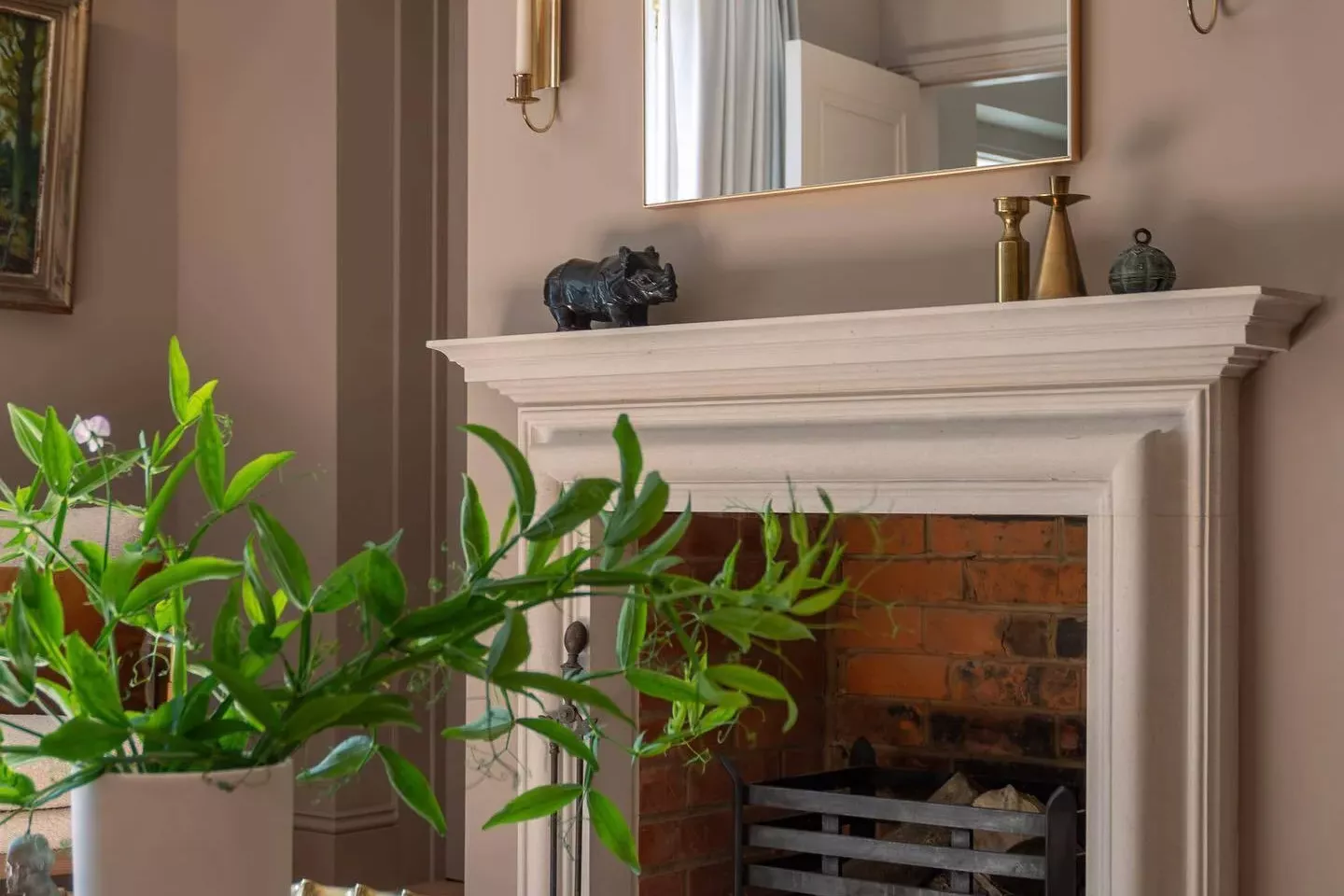
33 Absolutely Perfect Paint Colors Designers Love

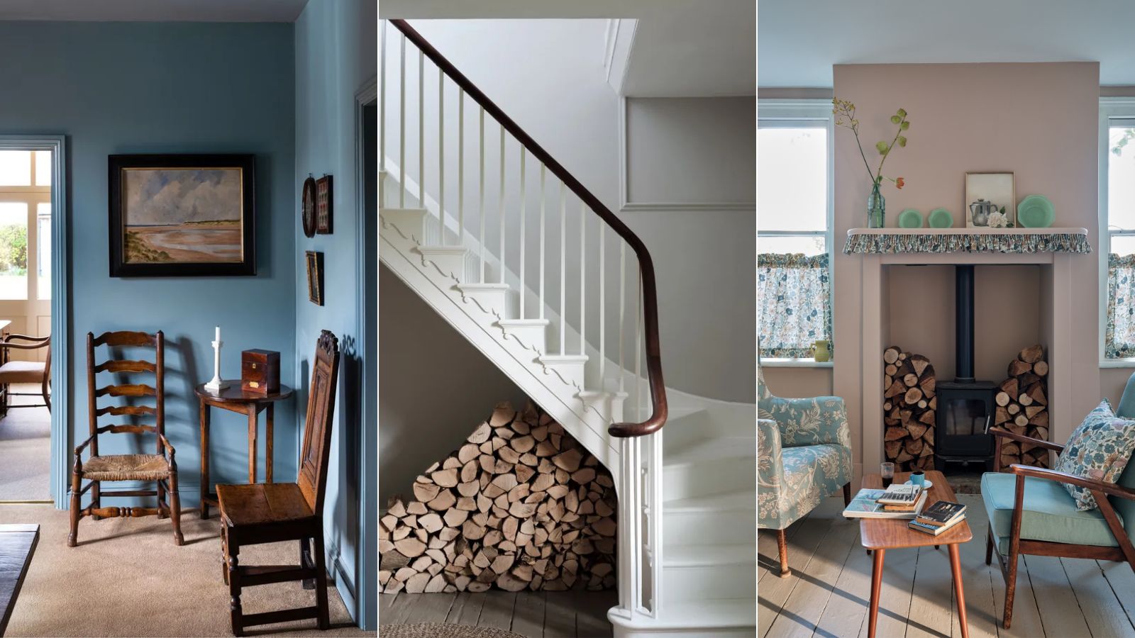
Interior designers' favorite Farrow & Ball paint colors
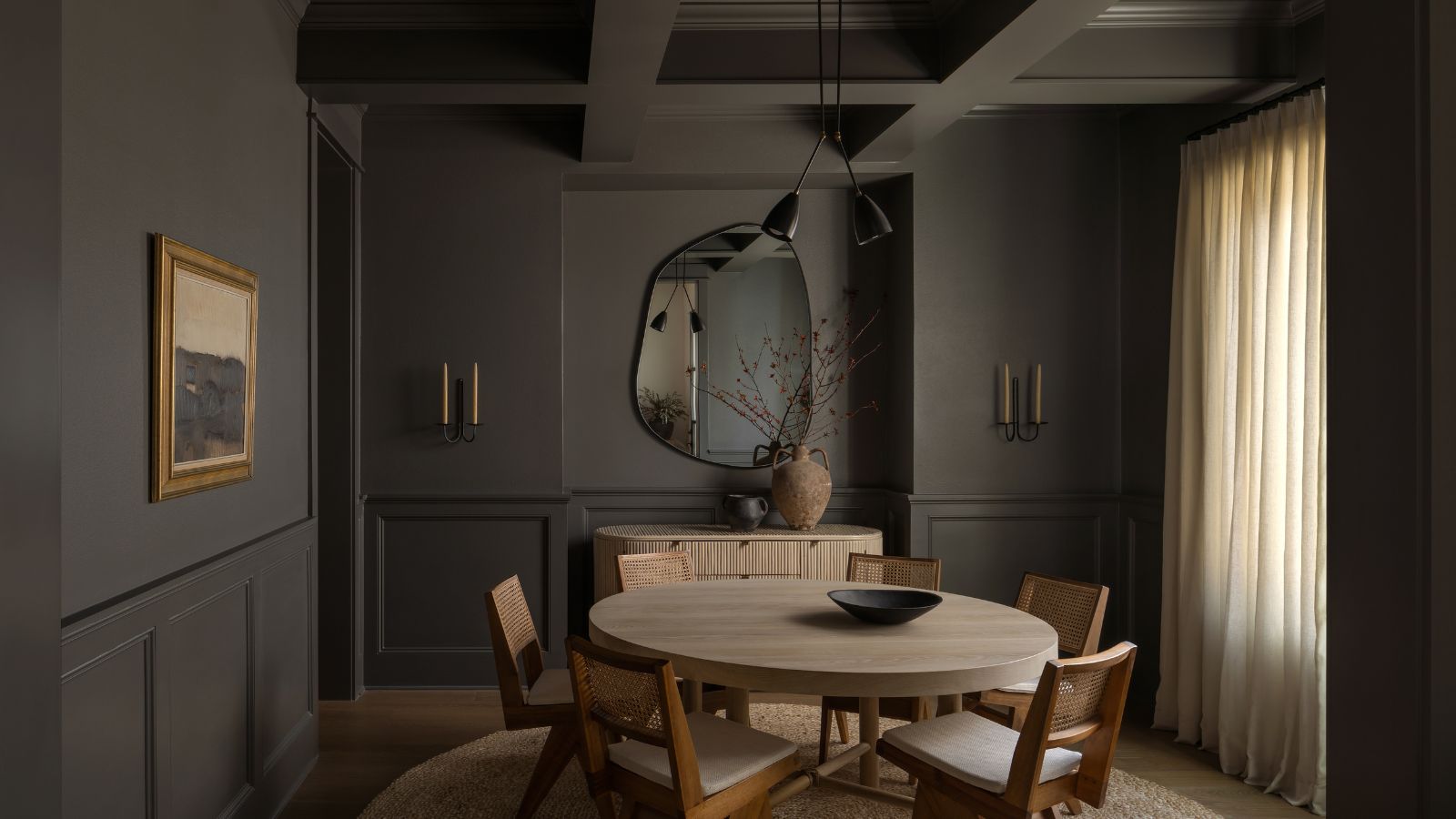
The best dark neutral paints – 9 favorites among designers from Farrow & Ball, Sherwin-Williams, and more
The 18 Most Popular Paint Colors of All Time

Kelly Wearstler Shares How to Create a Color Palette for Your Home

First look! Farrow & Ball has just released 11 new colours
10 Best-Selling Behr Paint Colors of All Time

The top 54 paint colours of the decade – all the shades we couldn't live without
Benjamin Moore paint colors in real homes – 10 favorite shades amongst designers, from neutrals to brights
The 10 Best Farrow & Ball Paint Colors of All Time
These are Behr's best-selling paint colors of all time – and there's something to suit every style
These 20 Paint Colors Will Never Go Out of Style, According to Designers

Farrow & Ball's new colors have just launched – we ask designers how to use this calm, yet colorful palette
These are Farrow & Ball's current 'most loved' paints – and how to decorate with them throughout the home
6 calming and cozy paint colors from Farrow & Ball
Interior paint colour trends 2025: 10 hues you'll be seeing everywhere this year

10 Best-Selling Glidden Paint Colors of All Time