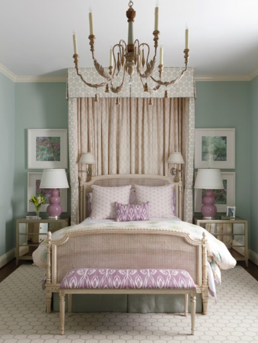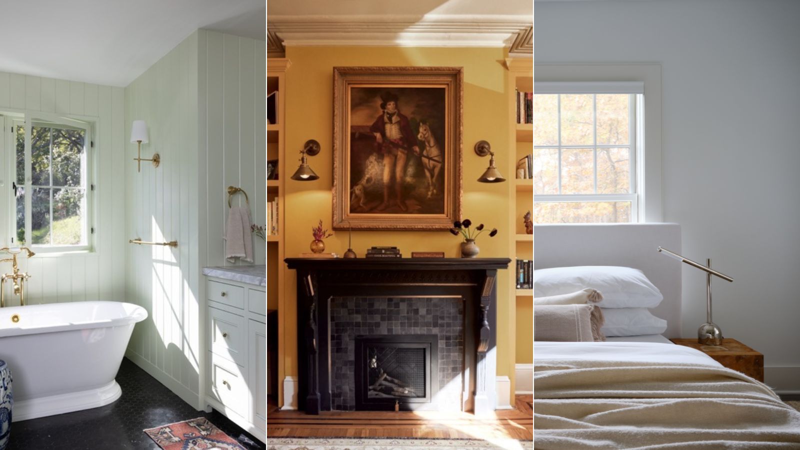
1/12
Benjamin Moore paint colors in real homes – 10 favorite shades amongst designers, from neutrals to brights
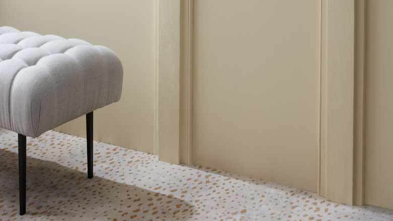
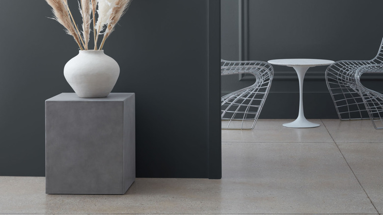
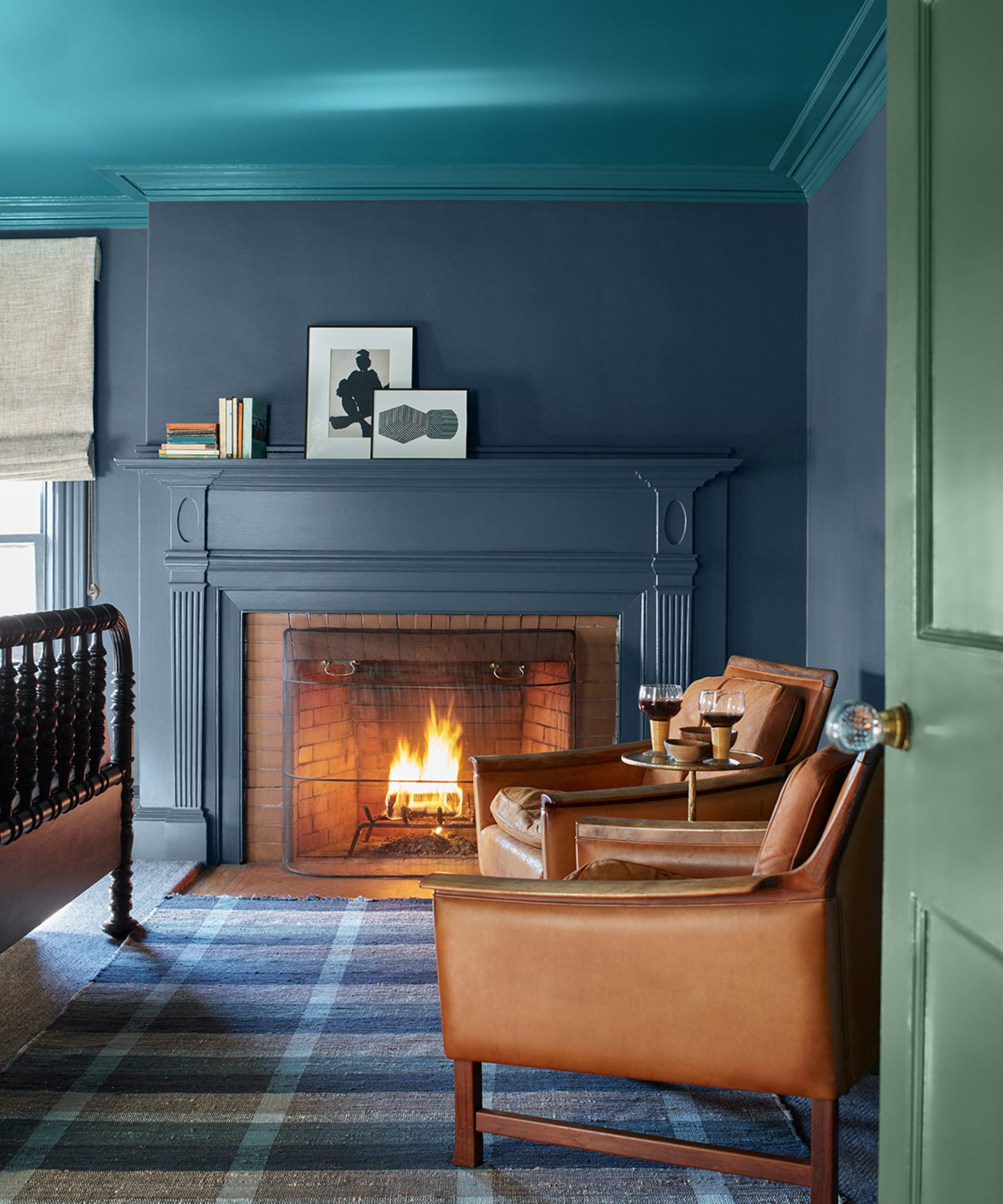
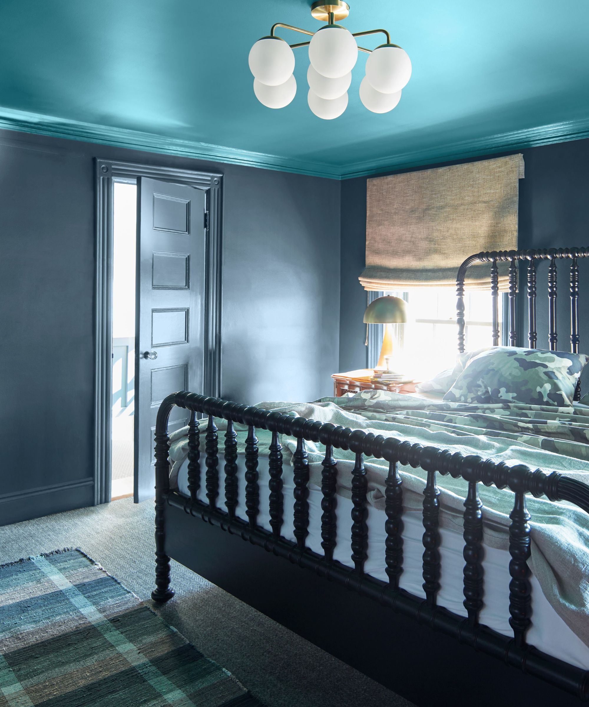
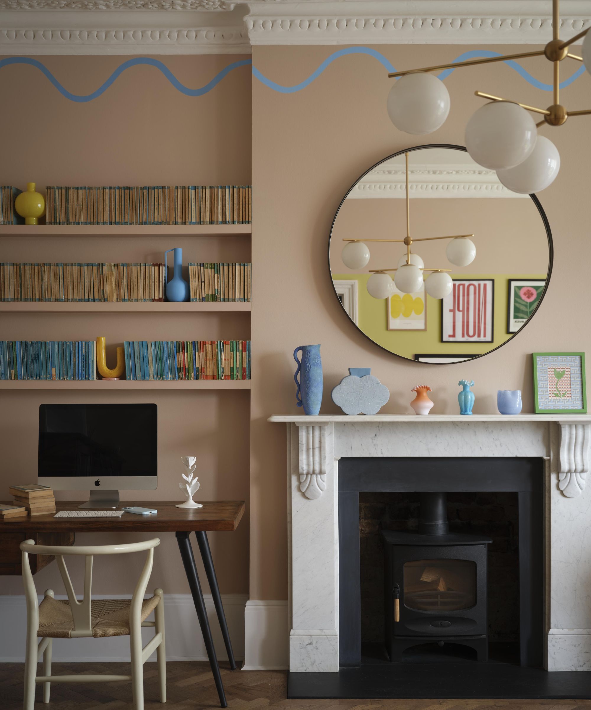
Benjamin Moore paints are consistently chosen by interior designers for their durability and extensive color range, which spans from highly praised whites and soothing earthy neutrals to vivid brights and deep, saturated tones. Despite the wide selection, choosing the perfect shade for a specific space can be challenging. To assist with this decision, ten distinctive projects are highlighted, showcasing popular Benjamin Moore shades in various real-life settings.
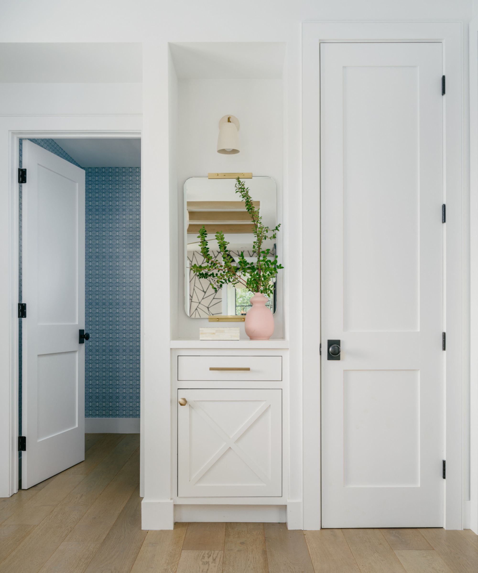
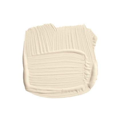
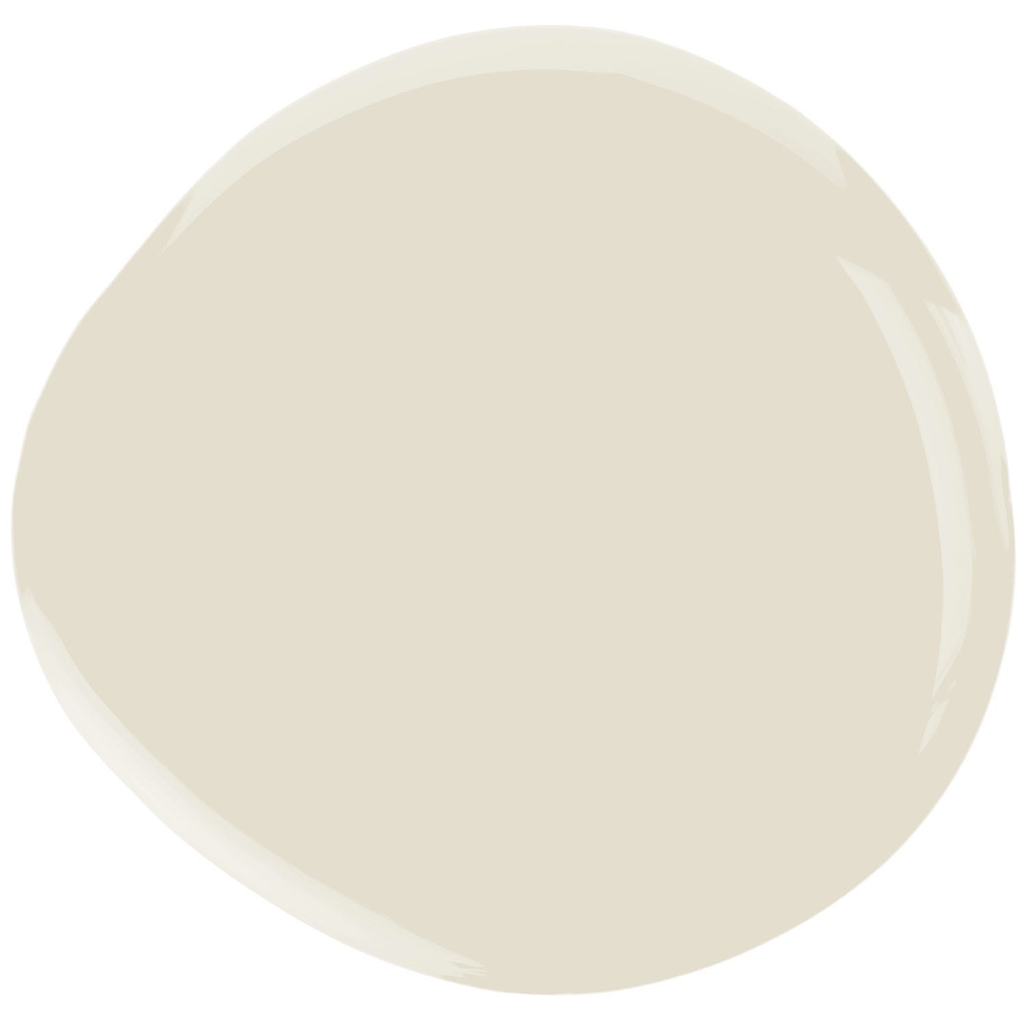
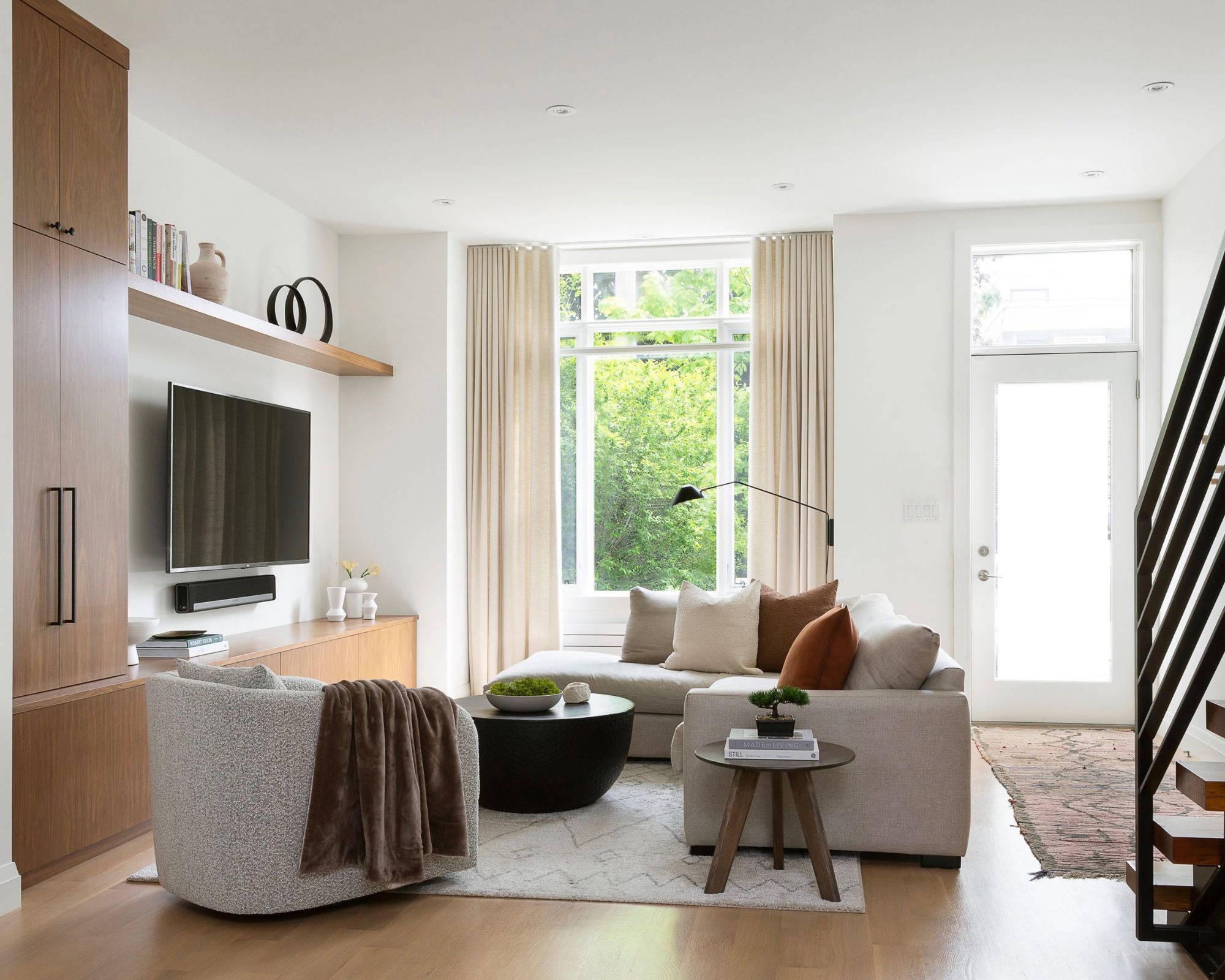
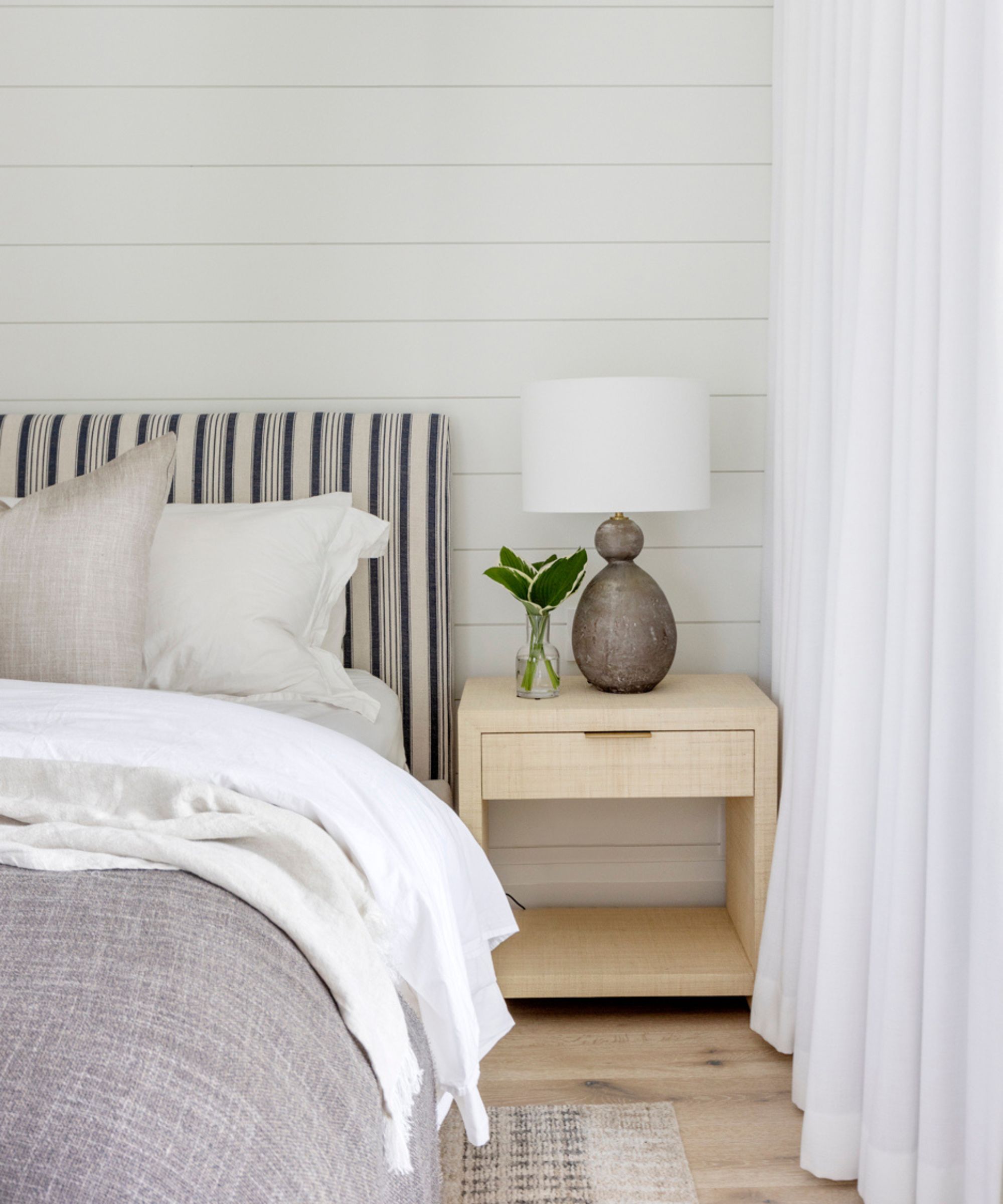
One of the featured colors is Hancock Green, a soft mint green, used by Courtney Smith Design in a bathroom. Smith notes the color's calming effect and its ability to complement marble and brass fixtures, evoking memories of Parisian patisseries. Another designer, Lindsay Lucas of Lindsay Laine Interiors, favors Seapearl, an off-white with cool gray undertones. This greige color creates an earthy, natural backdrop, particularly when paired with darker browns, and is celebrated for its ability to adapt to varying light without displaying yellow undertones.
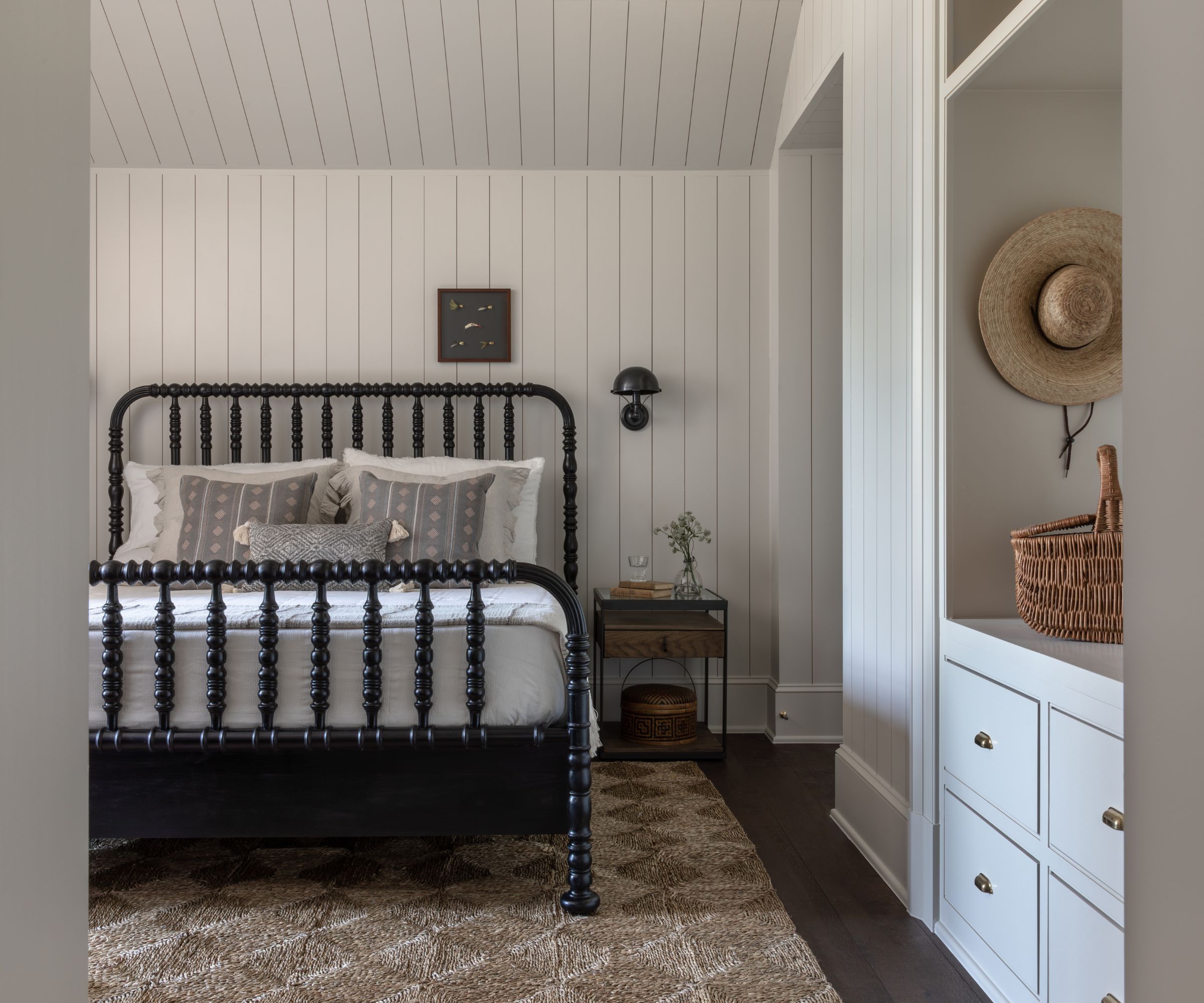
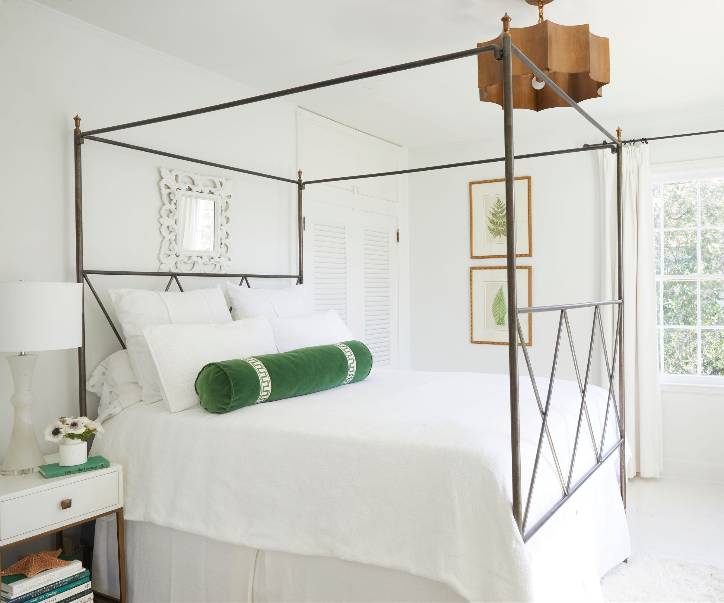
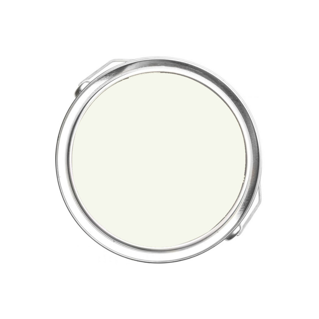
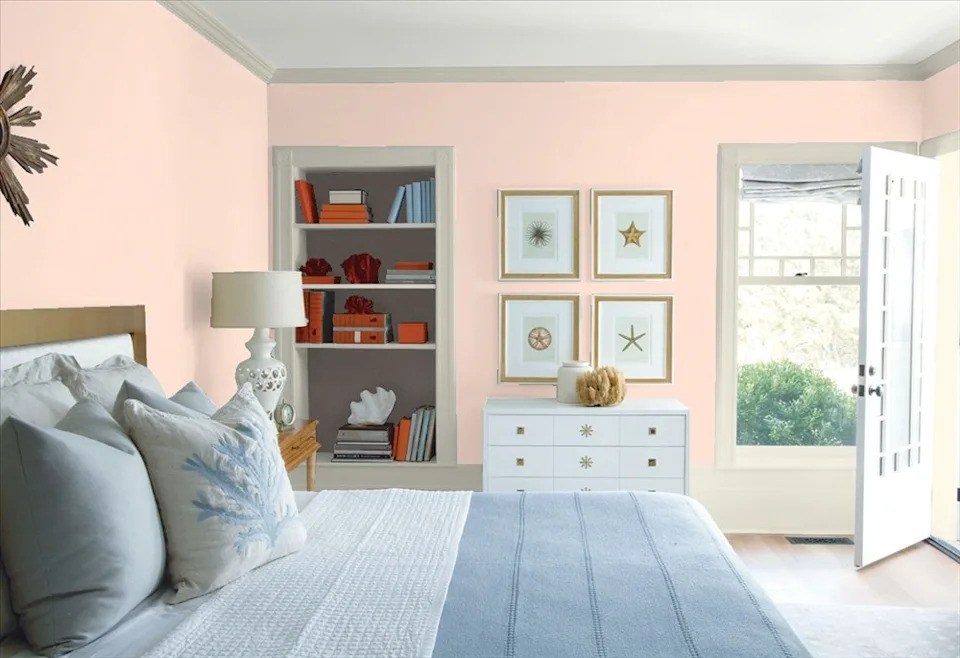
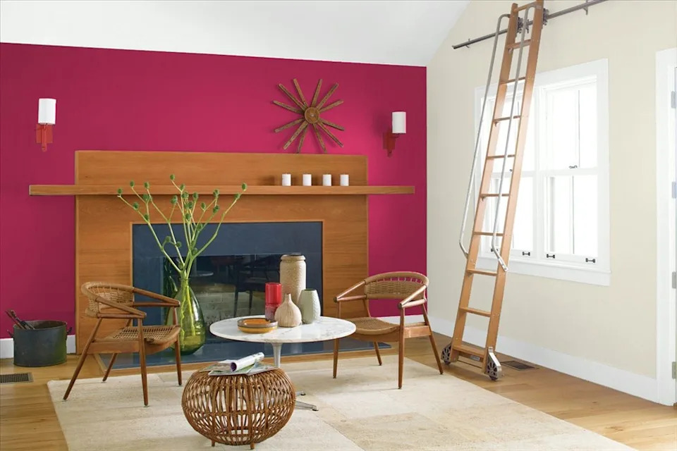
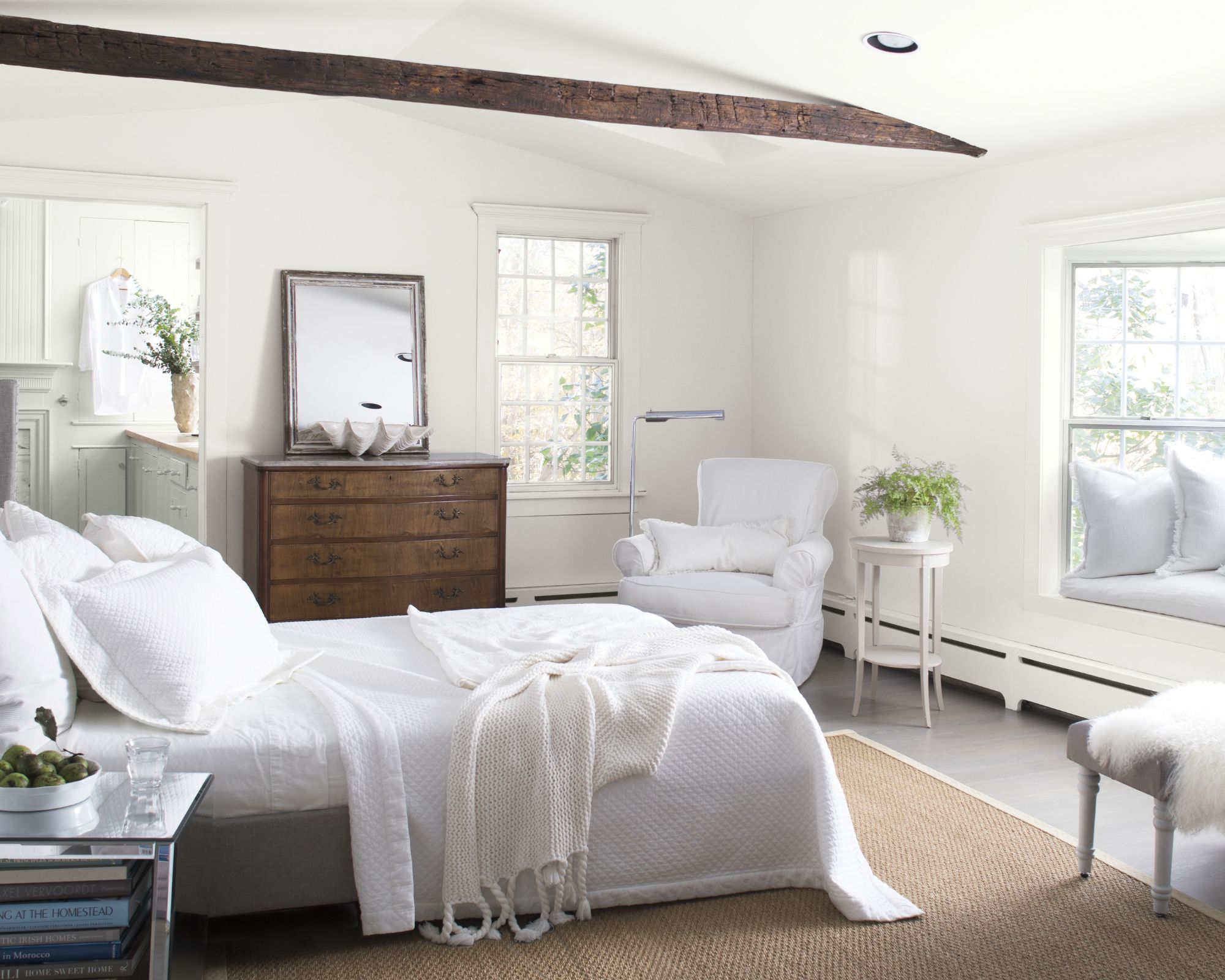
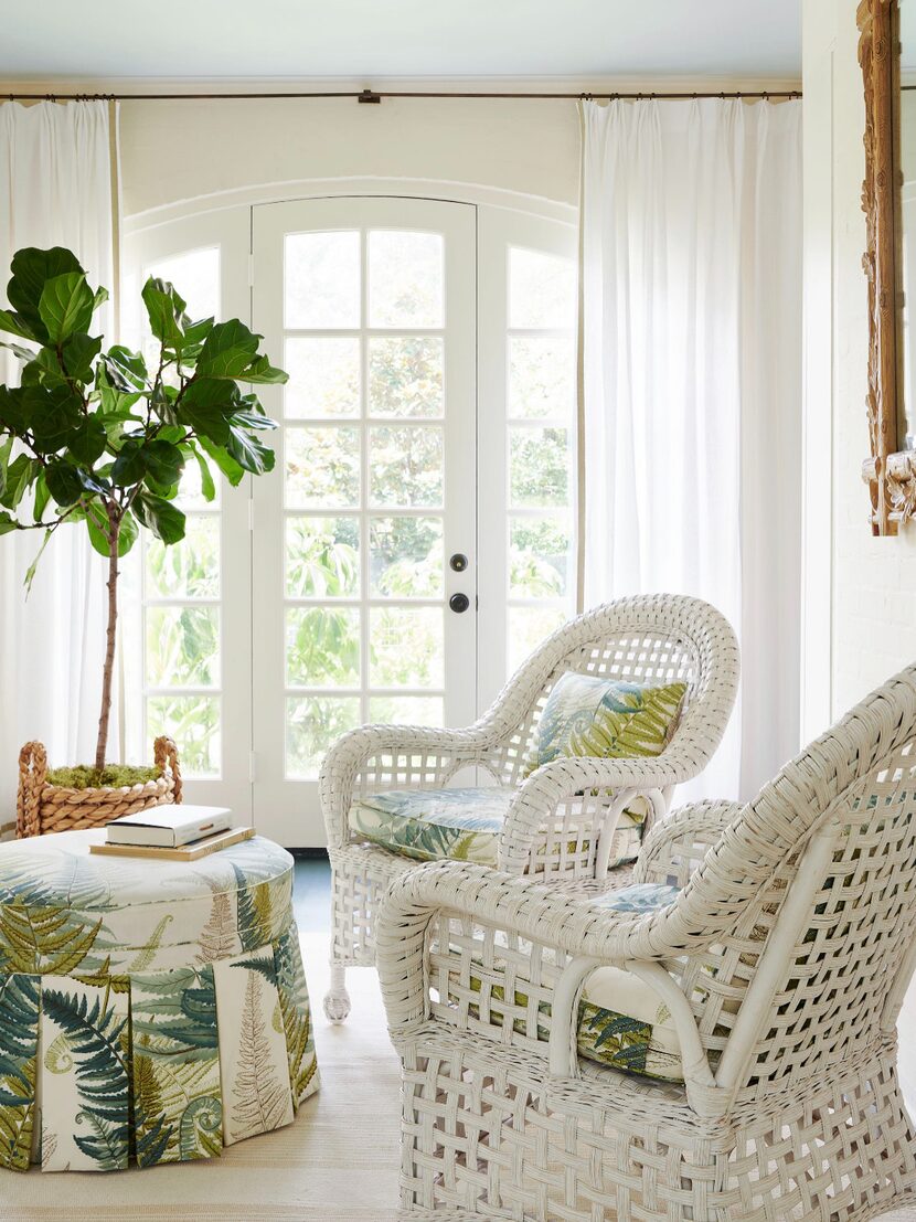
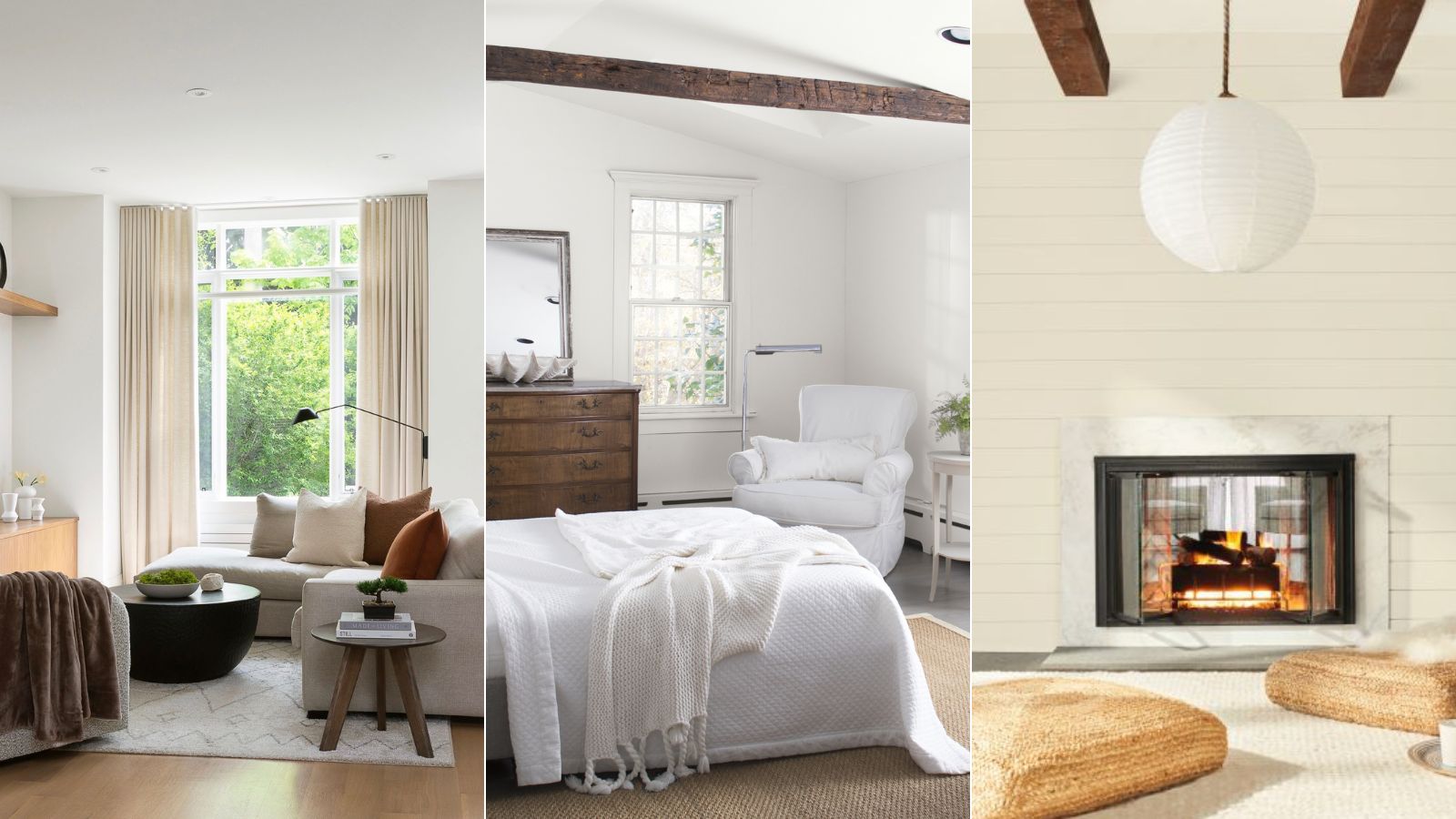
For bolder statements, Benjamin Moore offers shades like Habanero Pepper, a vibrant orange-red utilized by MAP Architect in a kitchen breakfast nook. Merritt Amanti Palminteri, the principal of MAP Architect, describes this color as warm and cheerful, providing a refreshing contrast to creamier whites elsewhere. Chantilly Lace is another popular choice among designers for its crisp and airy white hue, free of strong undertones. Marina Hanisch Interiors employed this color in a Hamptons guest bedroom to create a serene atmosphere that allowed diverse textures to stand out.
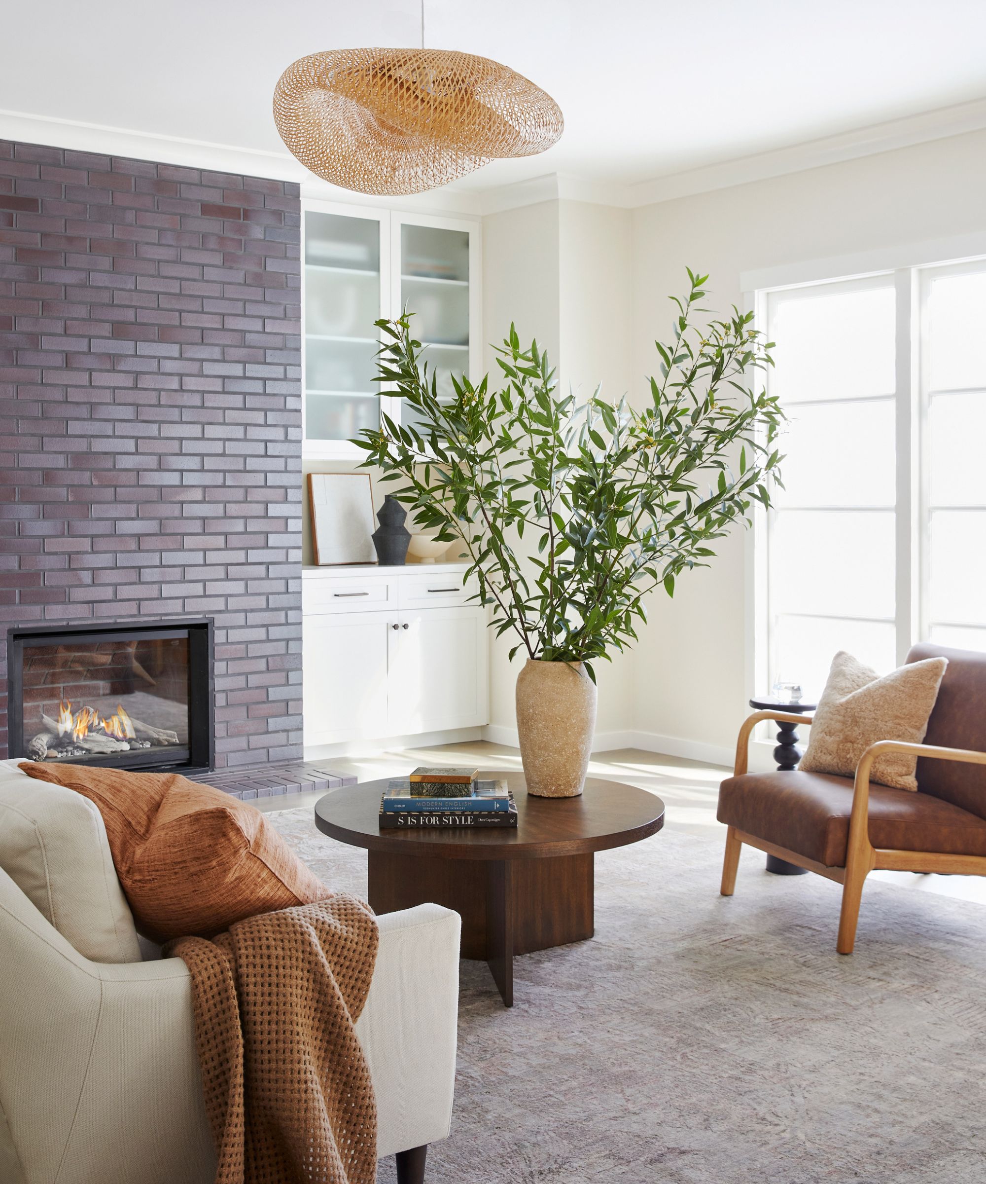
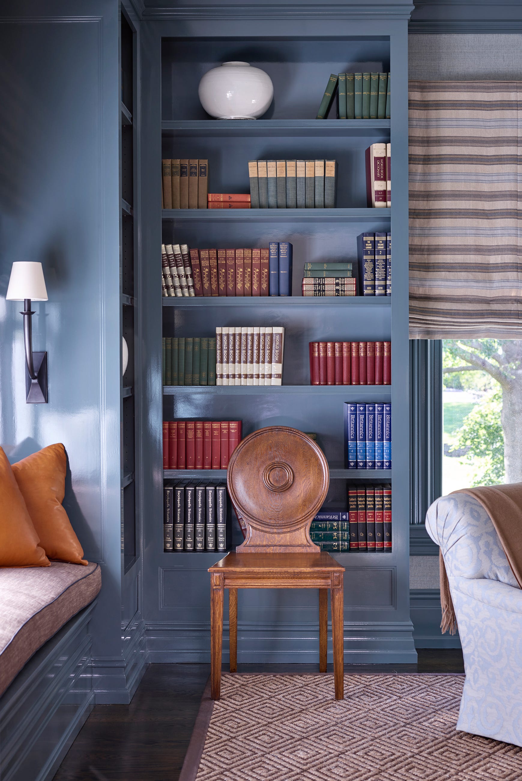
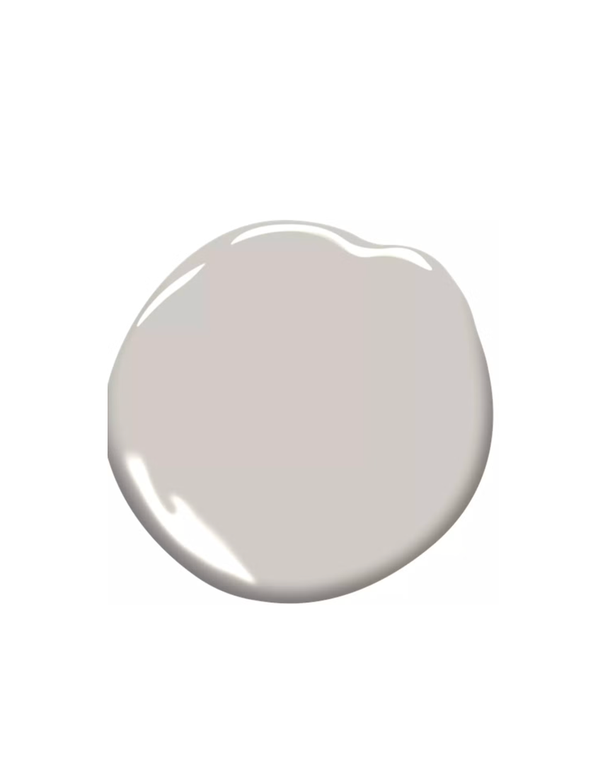
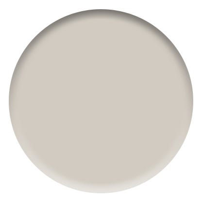
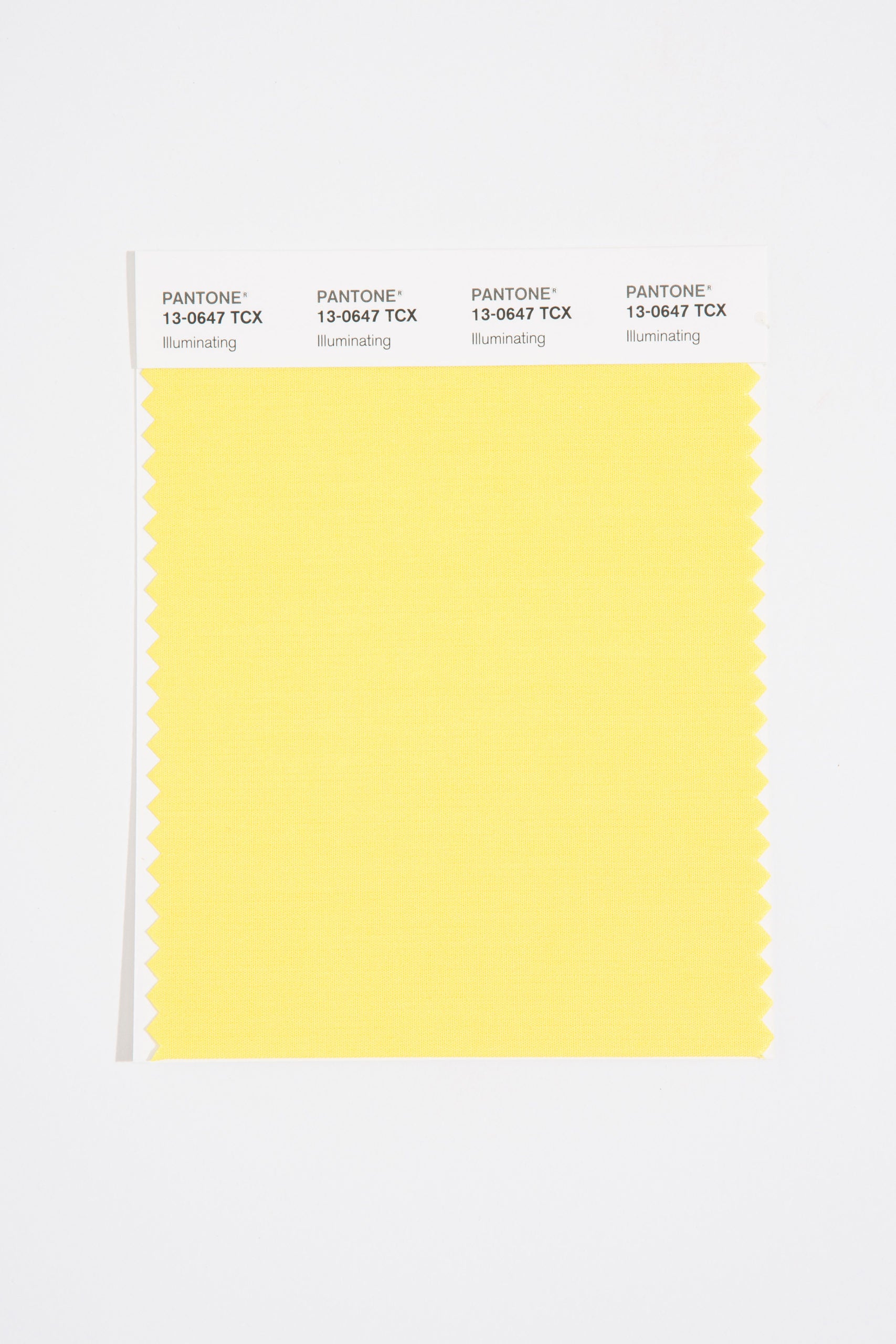
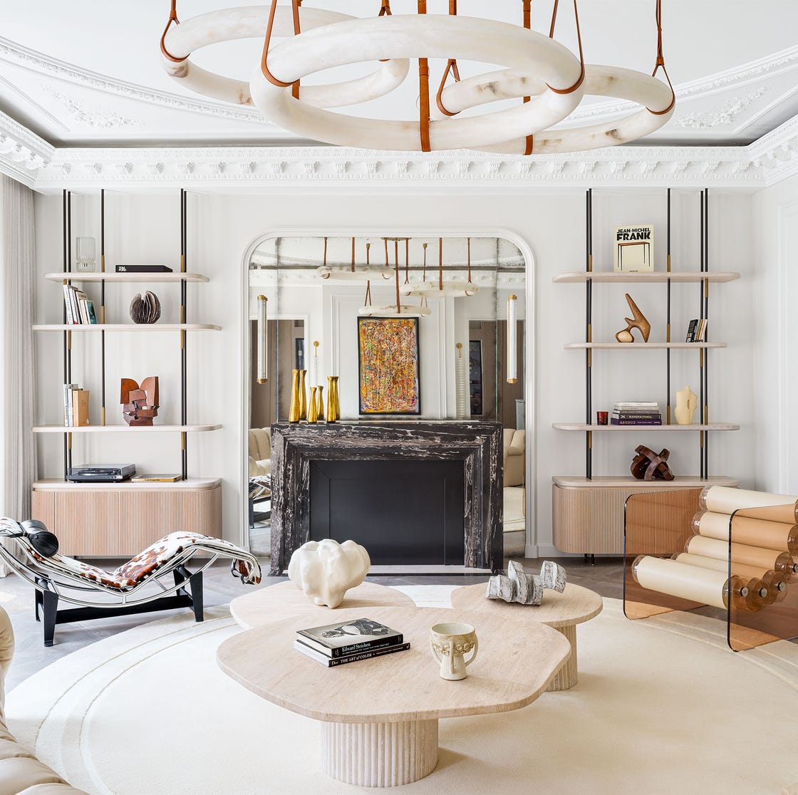
Revere Pewter is a timeless neutral that balances warm and cool tones, making it a versatile option for various rooms. J. Fuller Interiors selected this color for a neutral bathroom, appreciating its ability to maintain a light and airy feel while harmonizing with other colors. Stuart Gold, a vibrant yellow, adds a welcoming and uplifting ambiance to any space, exemplified in a library-inspired living room by Emma Montgomery Design. This shade transitions from moody in the evenings to bright and sunny during the day.
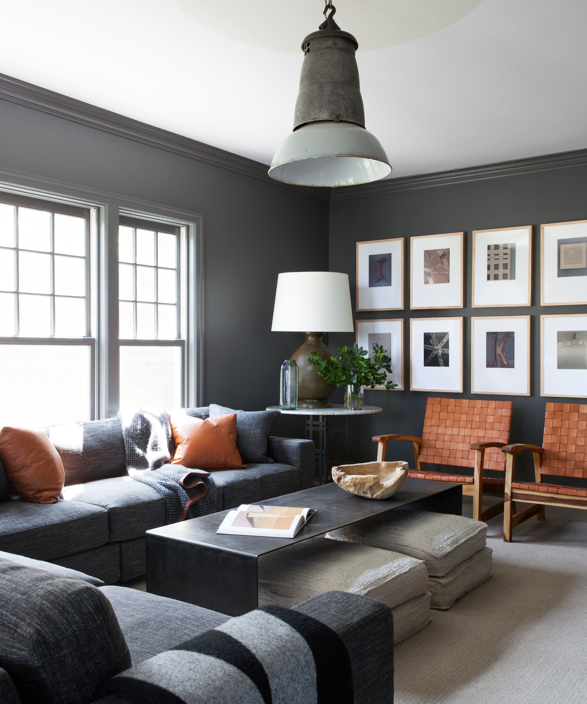
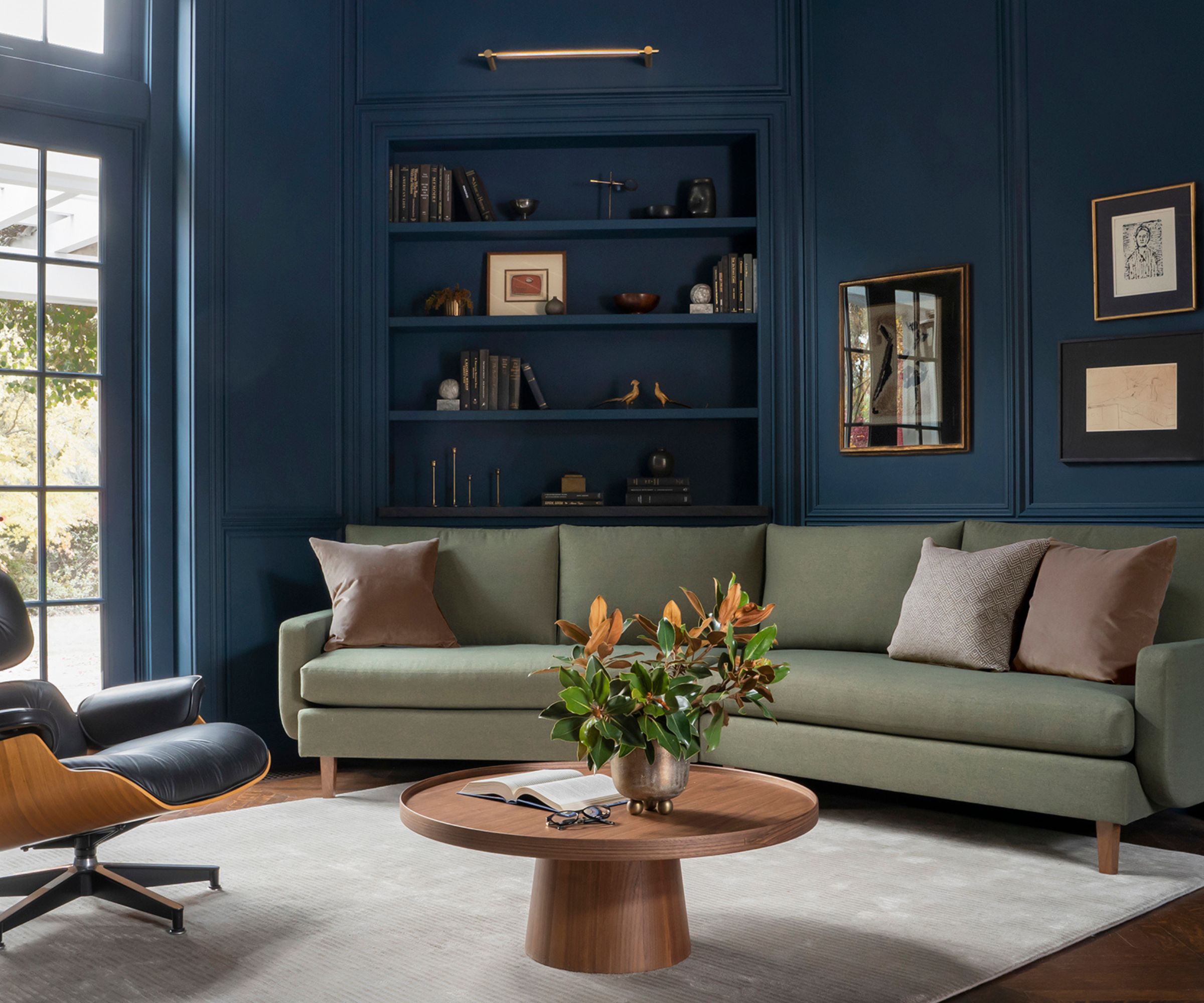
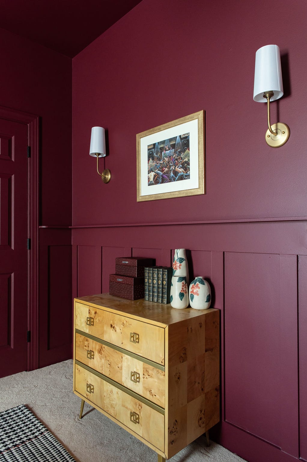
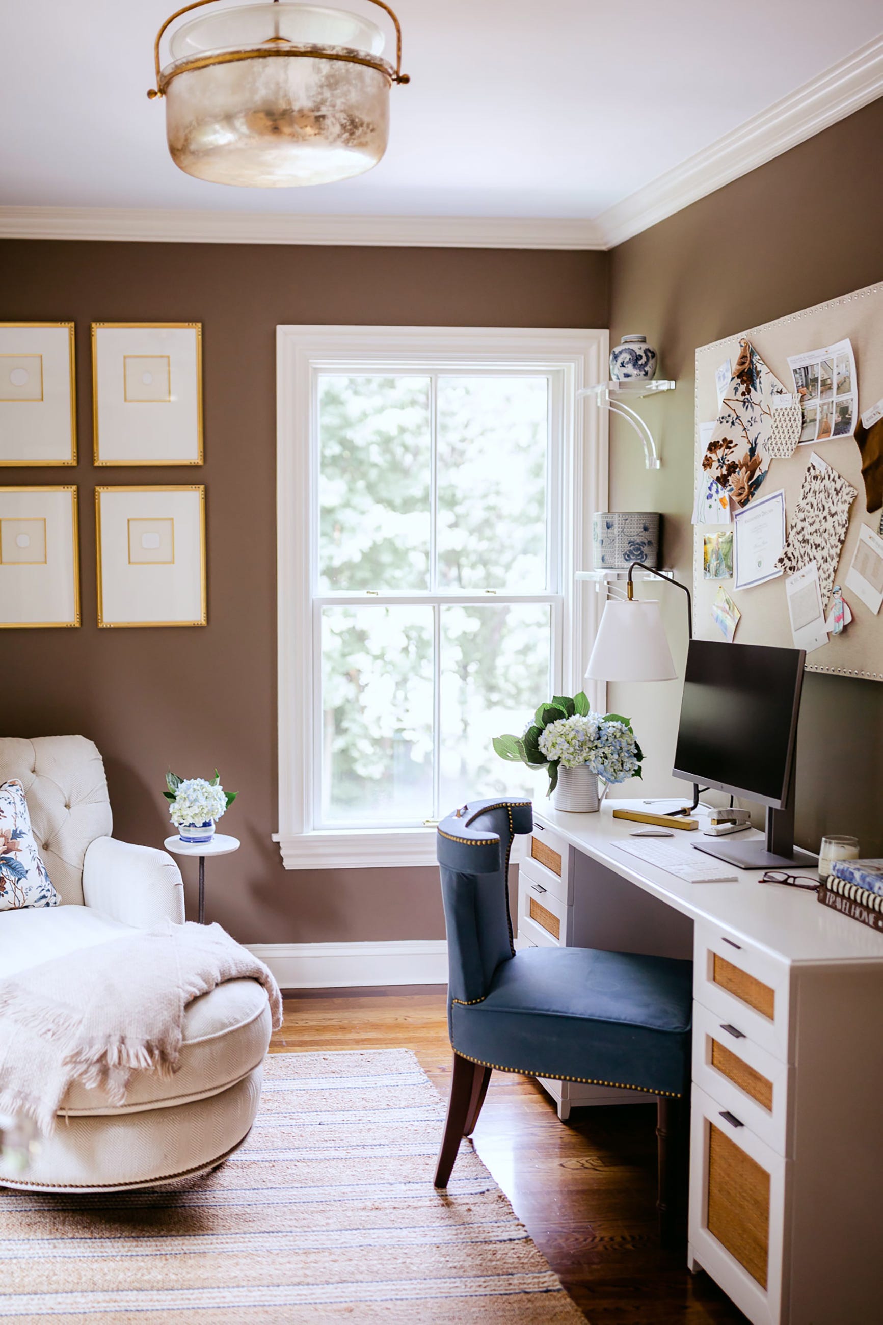
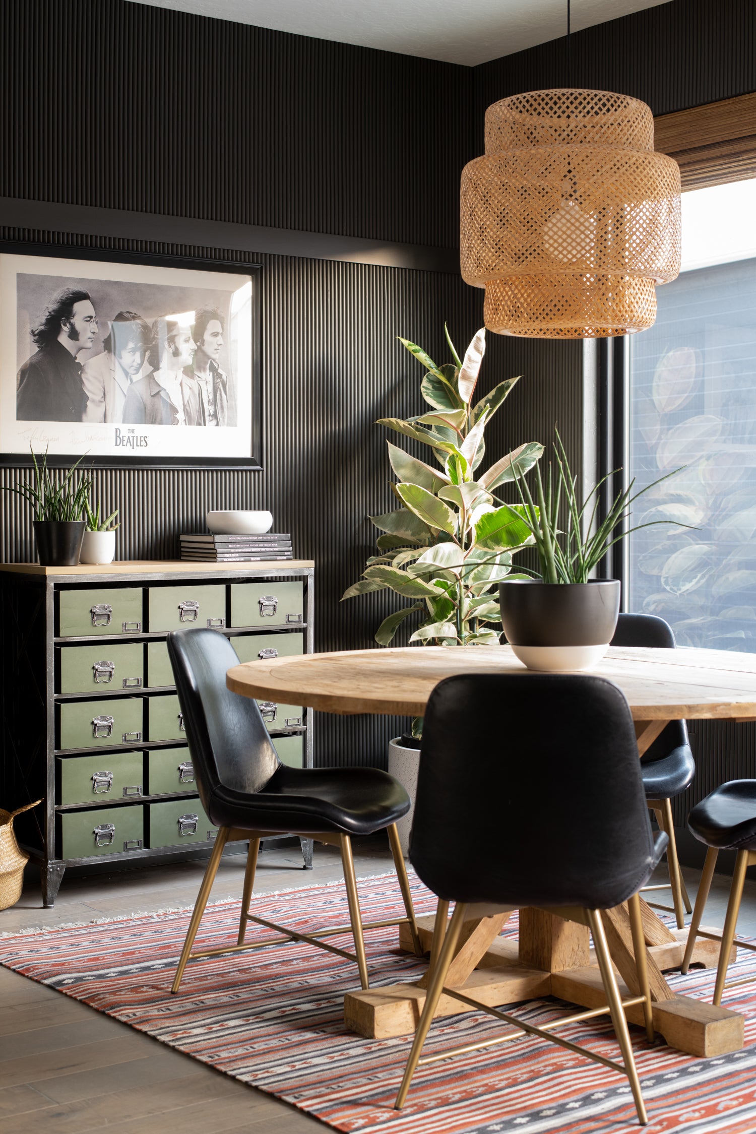
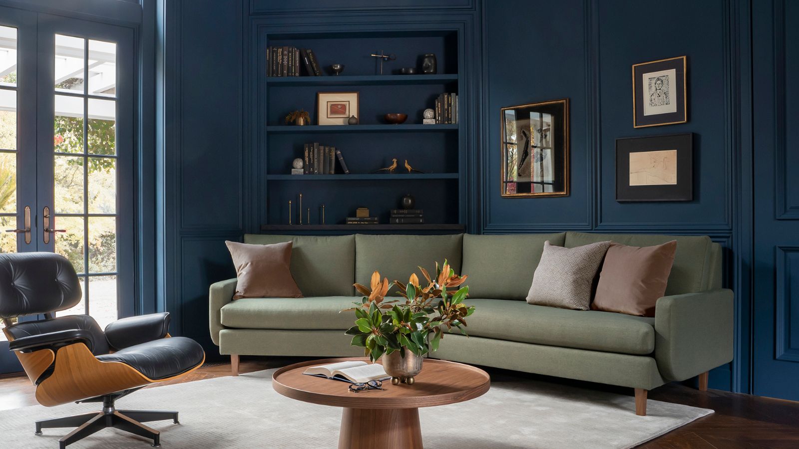
Peruvian Chili, a bold and warm orange, creates a luxurious and dramatic dining experience, as demonstrated by MDI Luxury Design. Margaret Donaldson, founder of MDI Luxury Design, highlights its ability to make the dining space more memorable and vibrant. Martha’s Vineyard, a dark forest green, offers a sophisticated moodiness suitable for a home office, as seen in a project by Courtney B. Smith Design. This color’s subtle warmth prevents it from appearing harsh, making it suitable for color-drenched small rooms.
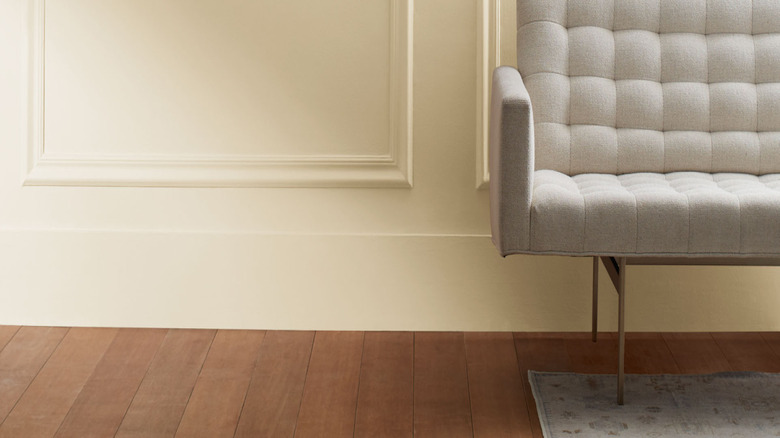
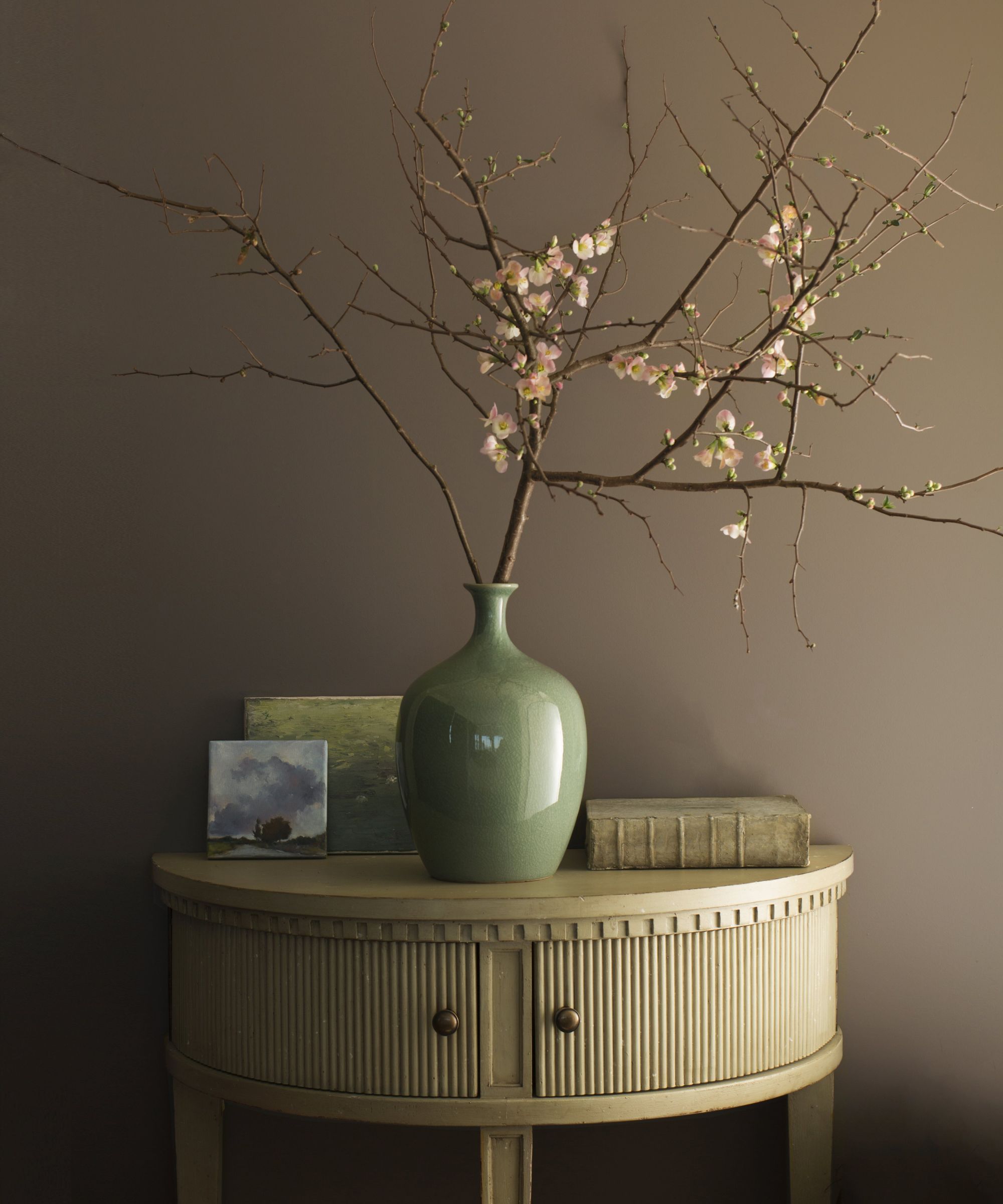
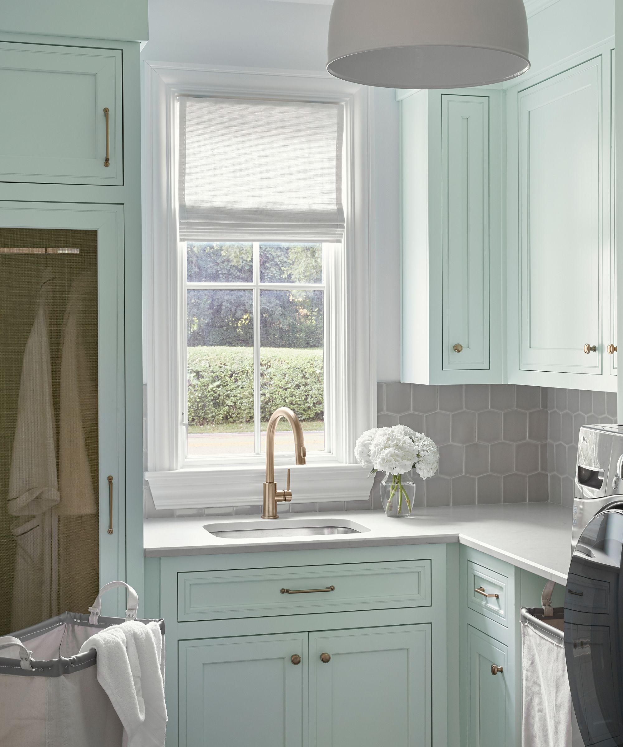
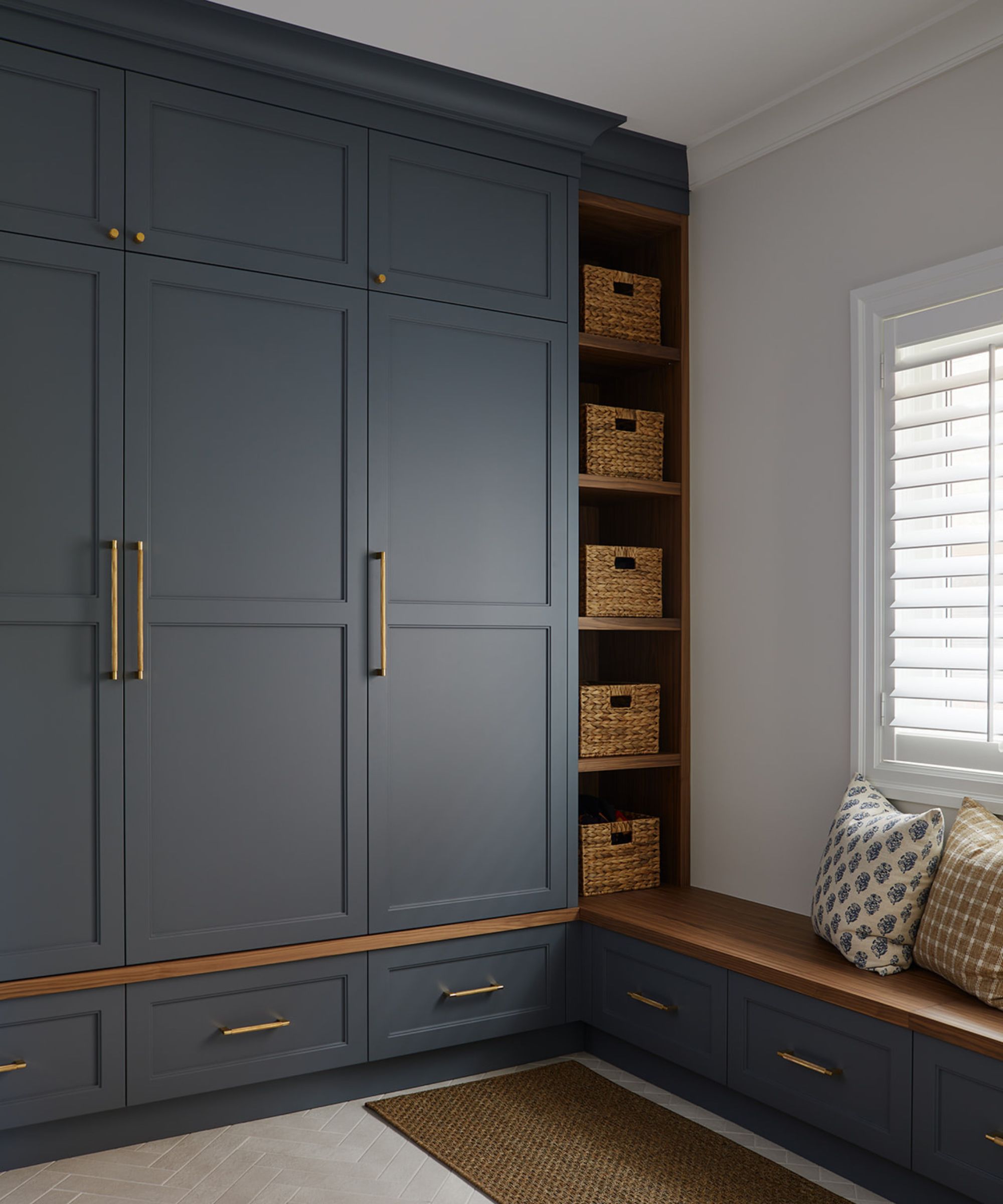
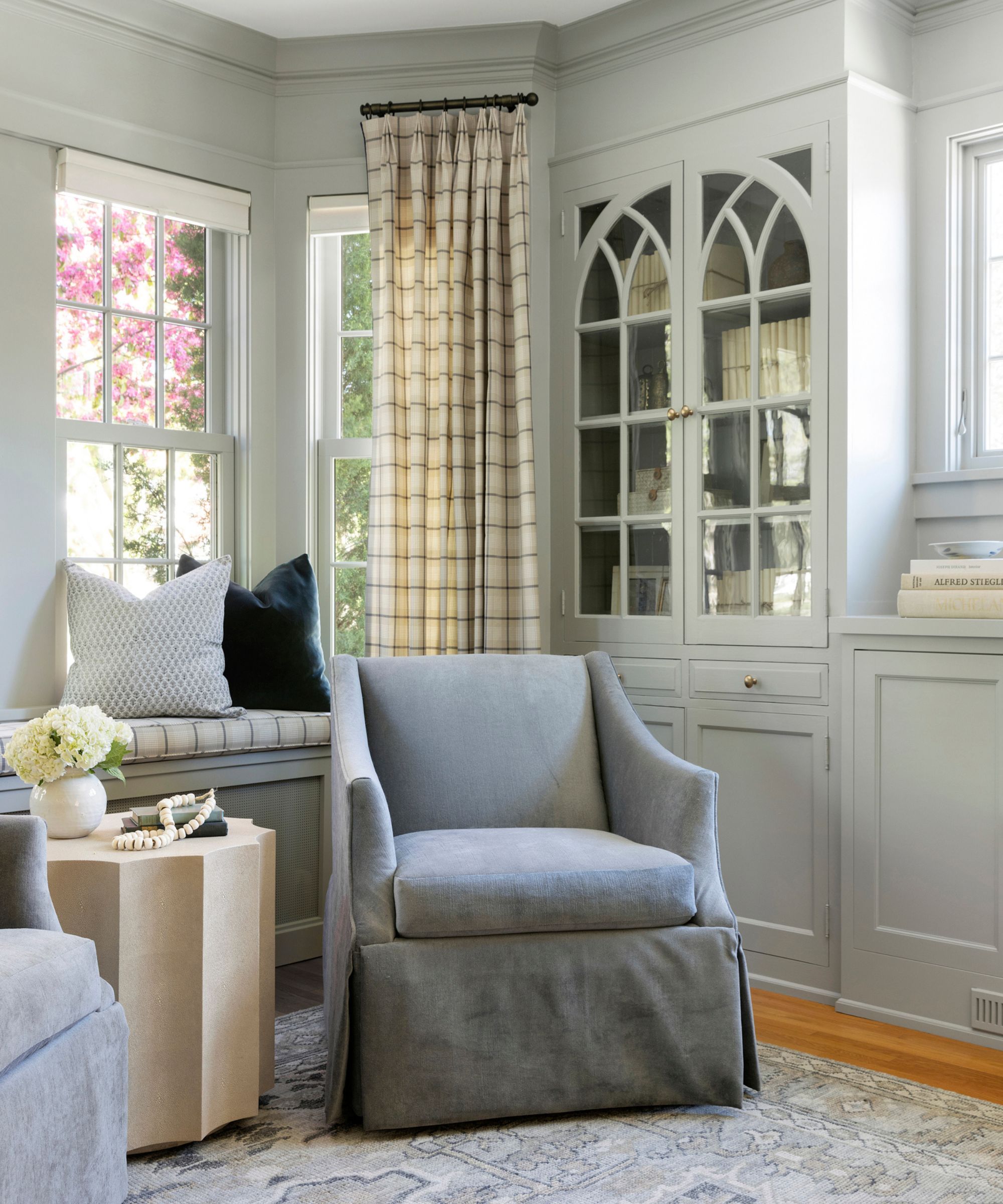
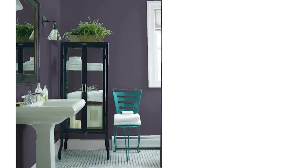
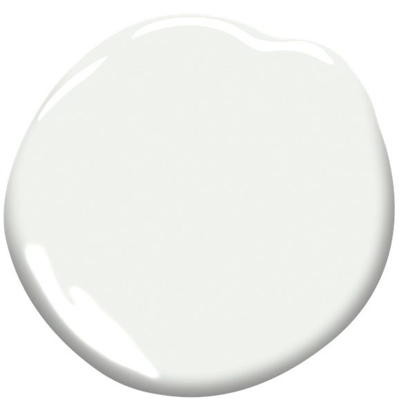
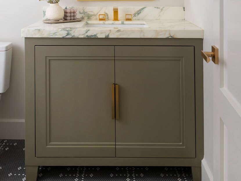
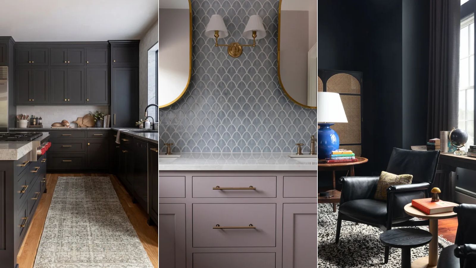
Silver Marlin, a gray with a hint of green, provides a unique twist on traditional gray, ensuring an inviting feel rather than a drab one. Smith Home Studios used this color for cabinetry in a bathroom, where it complemented Calacatta Monet marble and modern brass fixtures. Finally, White Dove, a frequently used white paint, offers a clean and bright backdrop. Debbie Mathews Antiques & Designs selected it for a dressing room that also functions as a small office, desiring a neutral setting to allow clothing colors to pop and minimize distractions.
Ultimately, the selection of Benjamin Moore colors caters to diverse design preferences, from minimalist to maximalist. Designers emphasize the importance of testing paint samples in different lighting conditions to ensure the chosen shade achieves the desired effect within a specific environment.
#BenjaminMoore #InteriorDesign #PaintColors #HomeDecor #DesignerFavorites #NeutralColors #BrightColors #ColorPsychology #BenjaminMoore #InteriorDesign #PaintColors #HomeDecor #DesignerFavorites #NeutralColors #BrightColors #ColorPsychology
0 comment in total
 No comments yet
You may also like
Interior designers share their favorite Benjamin Moore paint colors – and there's something for every style
The best Benjamin Moore paint colors to use in bedrooms – 14 stylish shades recommended by interior designers
Sherwin-Williams paint colors in real homes – 13 designer-approved shades, from neutrals to bolds
Benjamin Moore Just Released Its 2026 Color Forecast—These 8 Paint Shades Will Be Huge Next Year


Benjamin Moore's Trendiest Paint Colors (& Which Ones To Avoid)

The Interior Paint Colors You'll Be Seeing Everywhere in 2024

33 Absolutely Perfect Paint Colors Designers Love
5 of the best Benjamin Moore white paints – classic shades that experts always use in interior projects
Is Benjamin Moore's Gentleman's Gray the perfect navy blue paint?
9 Classic Paint Colors For Interior Doors That Designers Can't Get Enough Of
Beige, Begone: Bring Your Walls to Life With These 14 Beautifully Bold Colors

Take 'Disco Nap,' and other 2021 colors of the year, for a spin

The 12 Best-Selling Benjamin Moore Paint Colors of All Time


An A-List Designer’s Secrets To Picking Perfect Paint Colors


8 Favorite Paint Colors of Local Interior Designers

19 go-to paint colors that Dallas designers love
I'm a color editor and I'd never heard of these Benjamin Moore paint colors that interior designers swear by
These Are the Neutral Paint Colors Interior Designers ACTUALLY Use
35 Neutral Paint Colors Interior Designers Can't Get Enough Of

The Best Beige Paint Color of All Time