Benjamin Moore Just Released Its 2026 Color Forecast—These 8 Paint Shades Will Be Huge Next Year
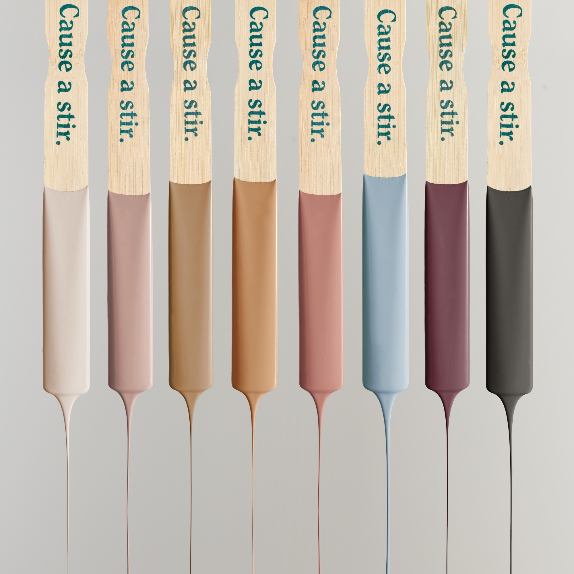
Benjamin Moore has unveiled its Color Trends 2026 Palette, a selection of eight paint shades predicted to influence interior design over the coming seasons. This announcement accompanies the reveal of Silhouette AF-655 as the Color of the Year 2026. Hannah Yeo, senior manager of color marketing at Benjamin Moore, explains that the palette was meticulously curated through an extensive editing process, ensuring that all eight colors are balanced and complementary, allowing for versatile layering within a space. The palette is divided into two categories: "enchanting pales" and "handsome midtones."
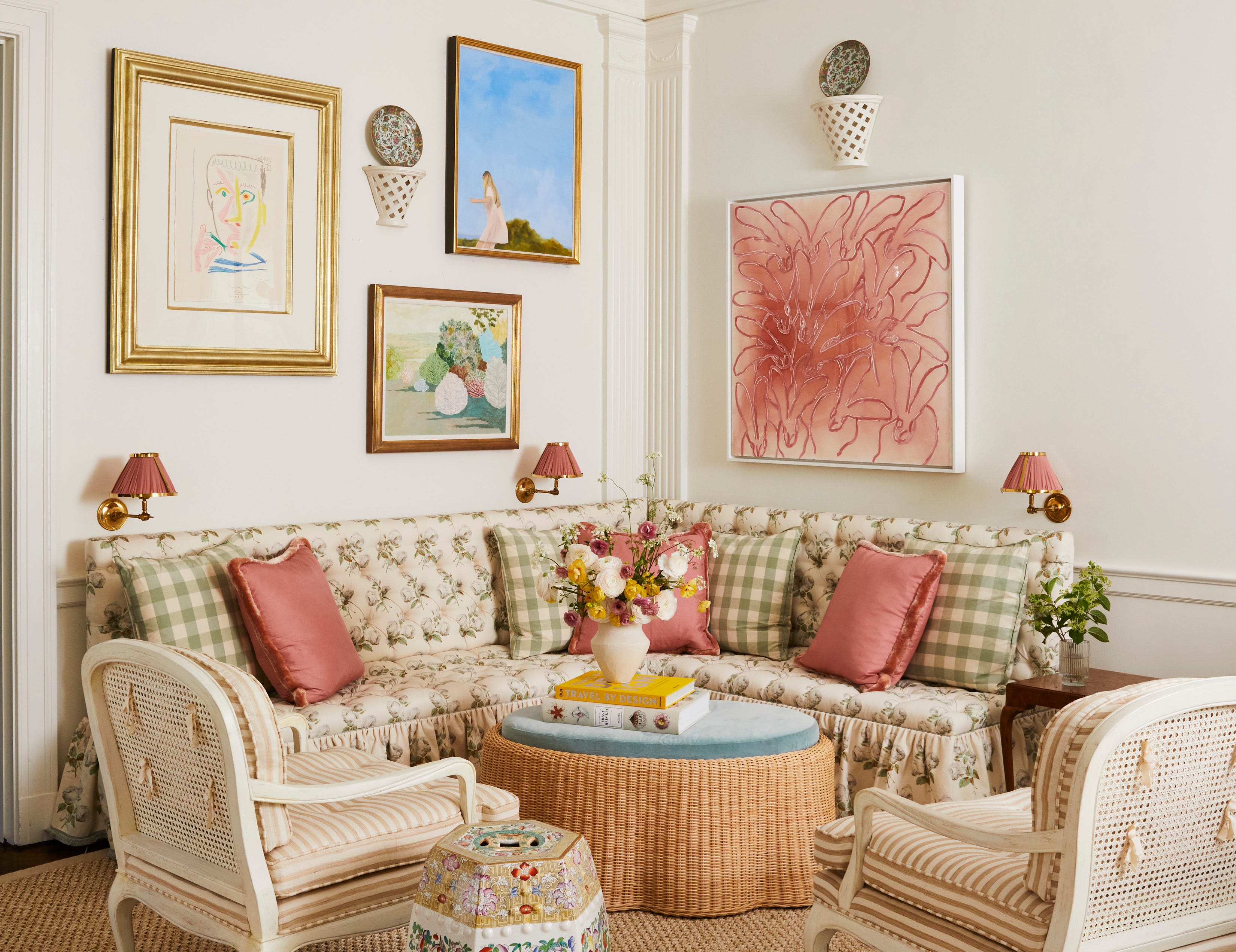
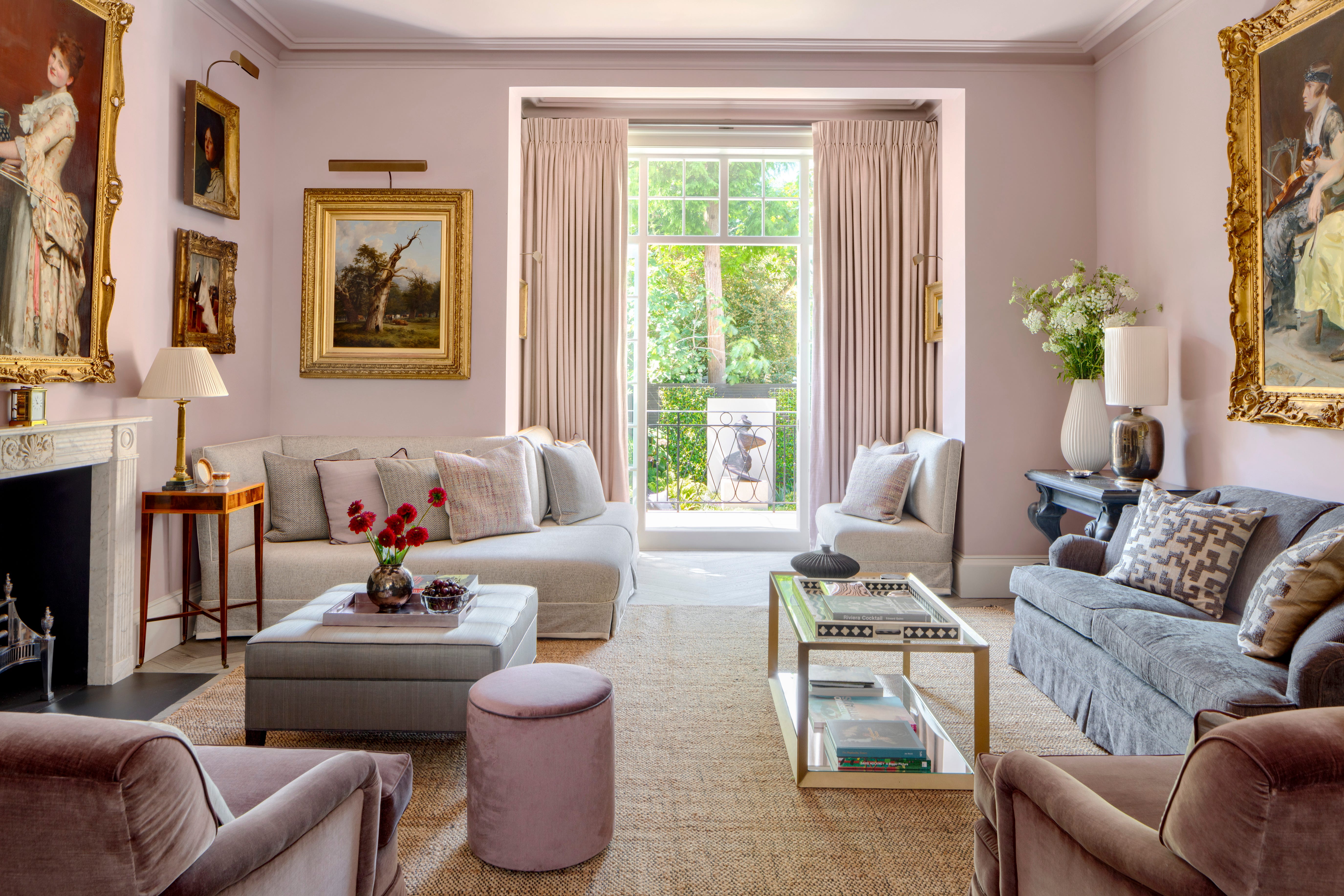
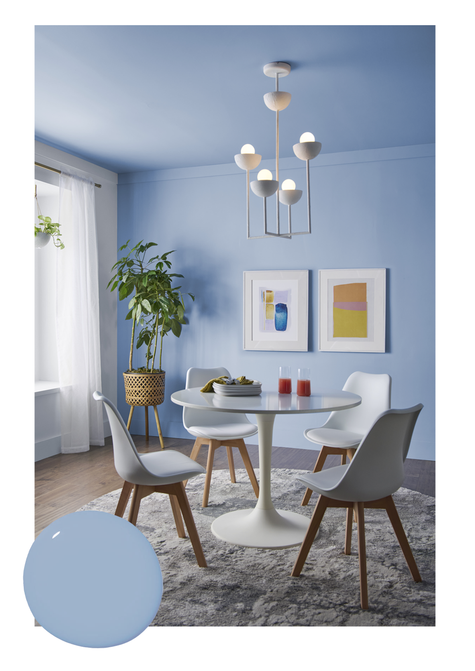
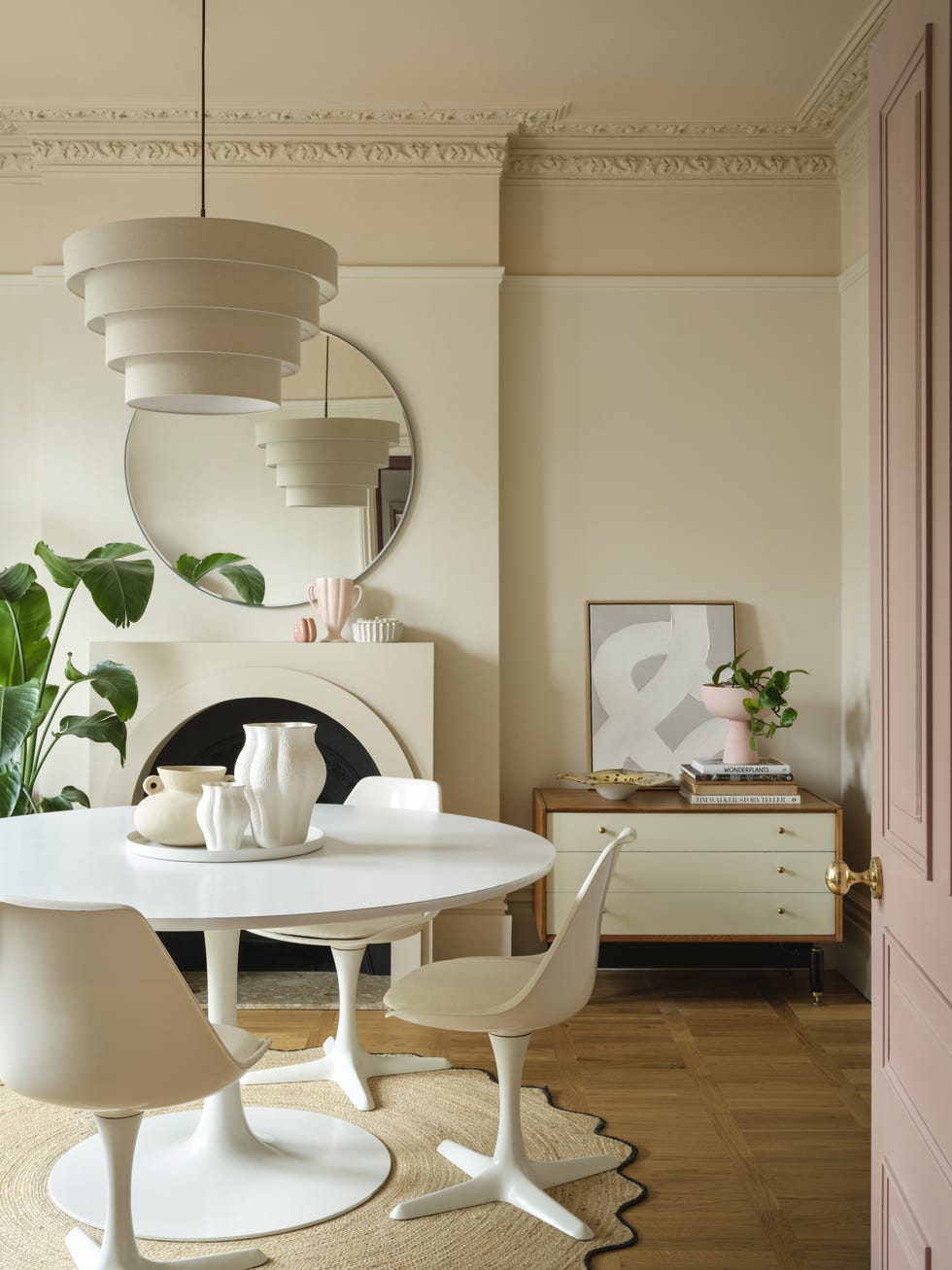
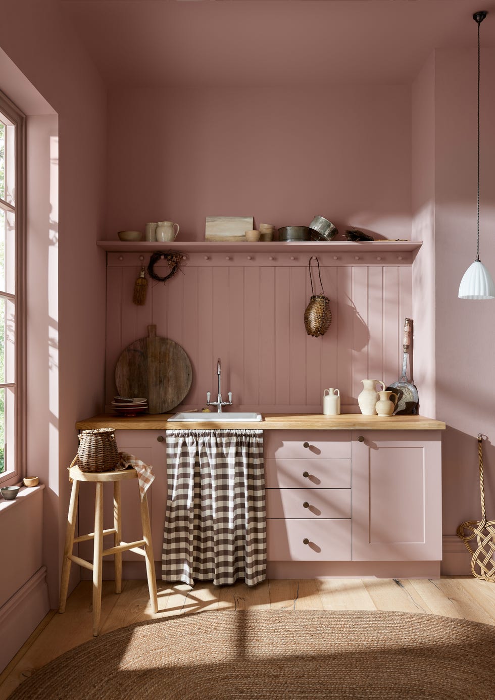
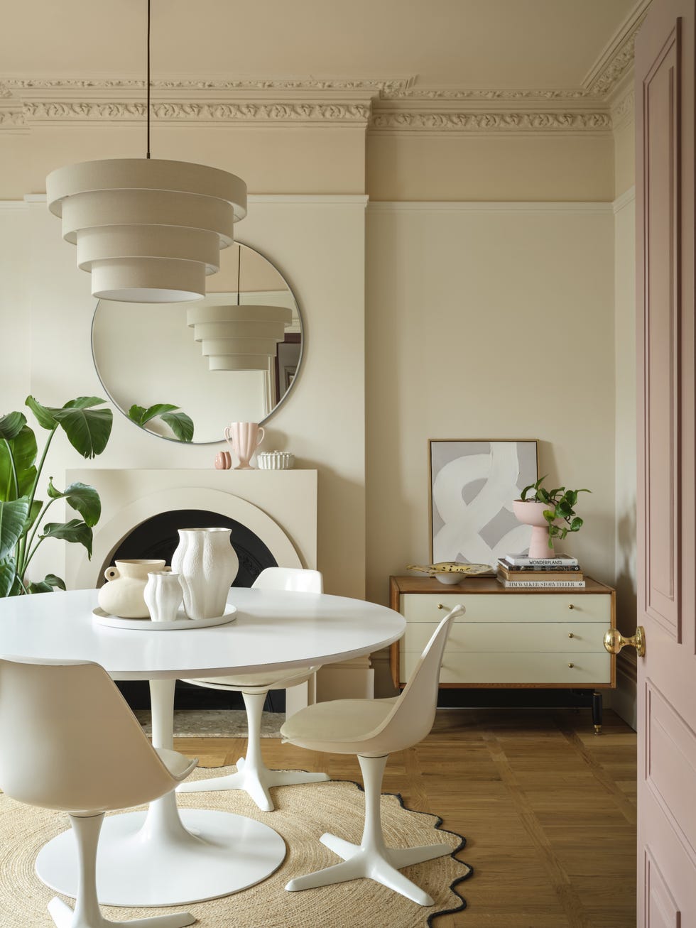
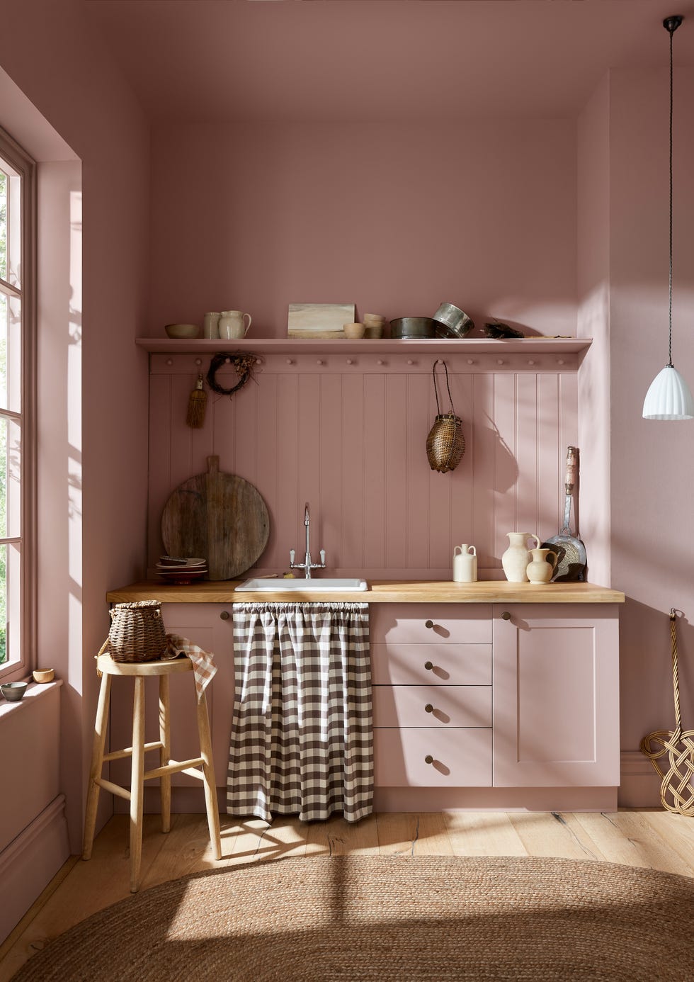
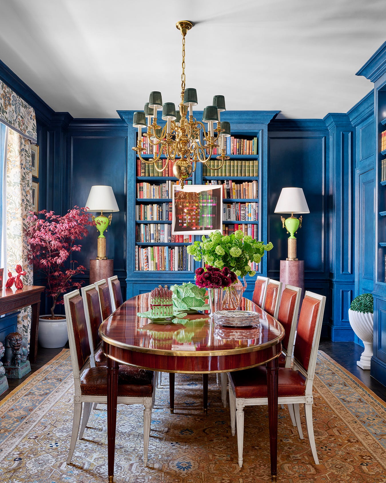
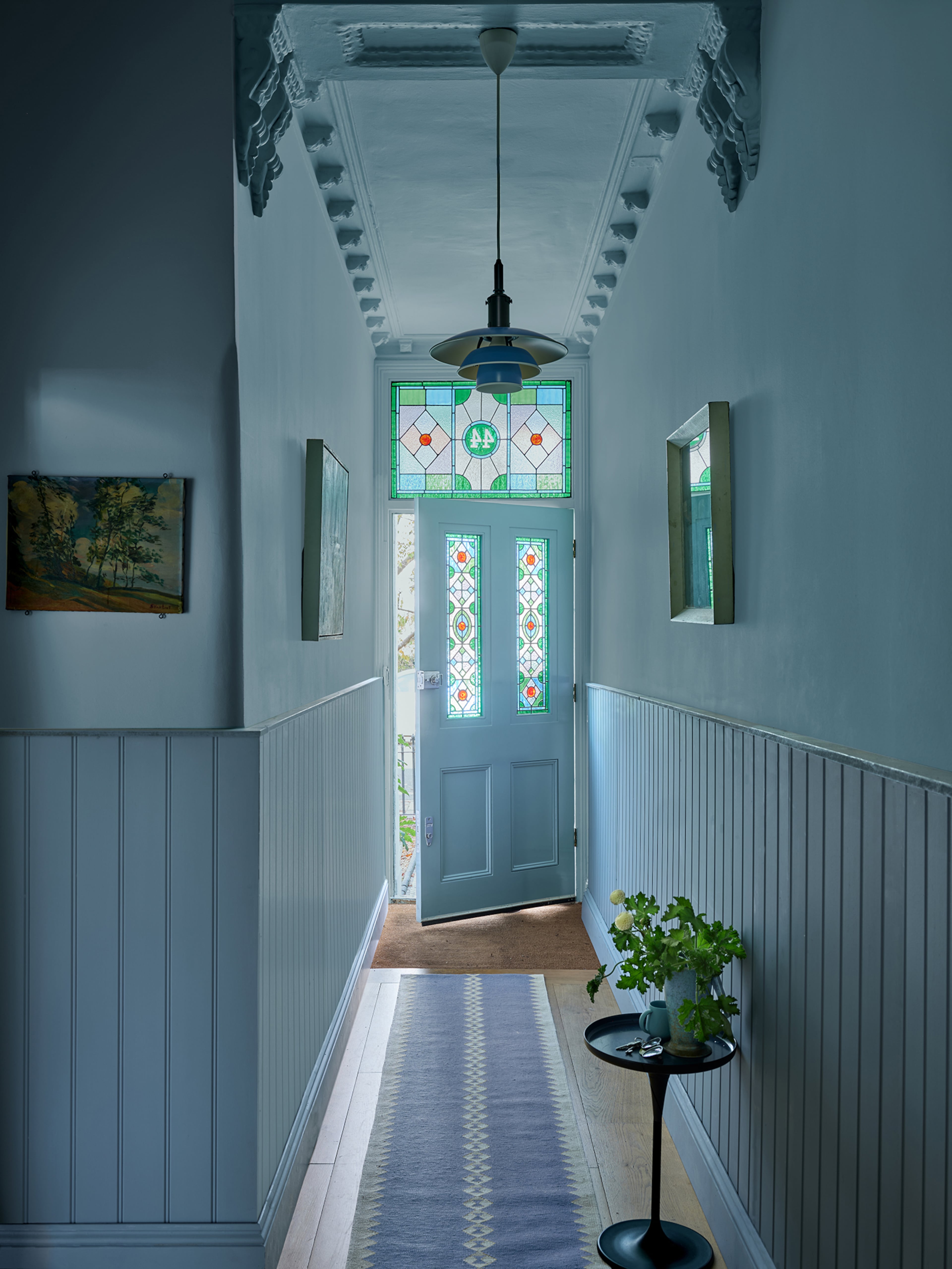
The "enchanting pales" category includes Raindance 1572, a pale blue-green with a gray undertone. This adaptable shade is described as "easygoing" and suitable for various design styles, from rustic farmhouse to traditional spaces. Its subtle nature ensures it doesn't overpower other elements in a room. First Crush CSP-310 is a delicate blush color that can evoke a sense of well-being, ideal for bedrooms, powder rooms, or primary baths. It can create both high-contrast, playful settings and quieter, more traditional atmospheres, highlighting a space's details and textures. Swiss Coffee OC-45, an iconic creamy white, is a staple in design, praised by designers for its versatility. It harmonizes with any color in the palette and can be used both indoors and outdoors, offering a warm backdrop that beautifully contrasts with darker accents and emphasizes architectural features like built-ins. Batik AF-610, the final shade in this category, is an ethereal blend of violet and rose with a gray undertone. It acts as a soft, subtle neutral that can appear purplish in certain lighting, adding a personalized and tailored touch to a room's detailing.
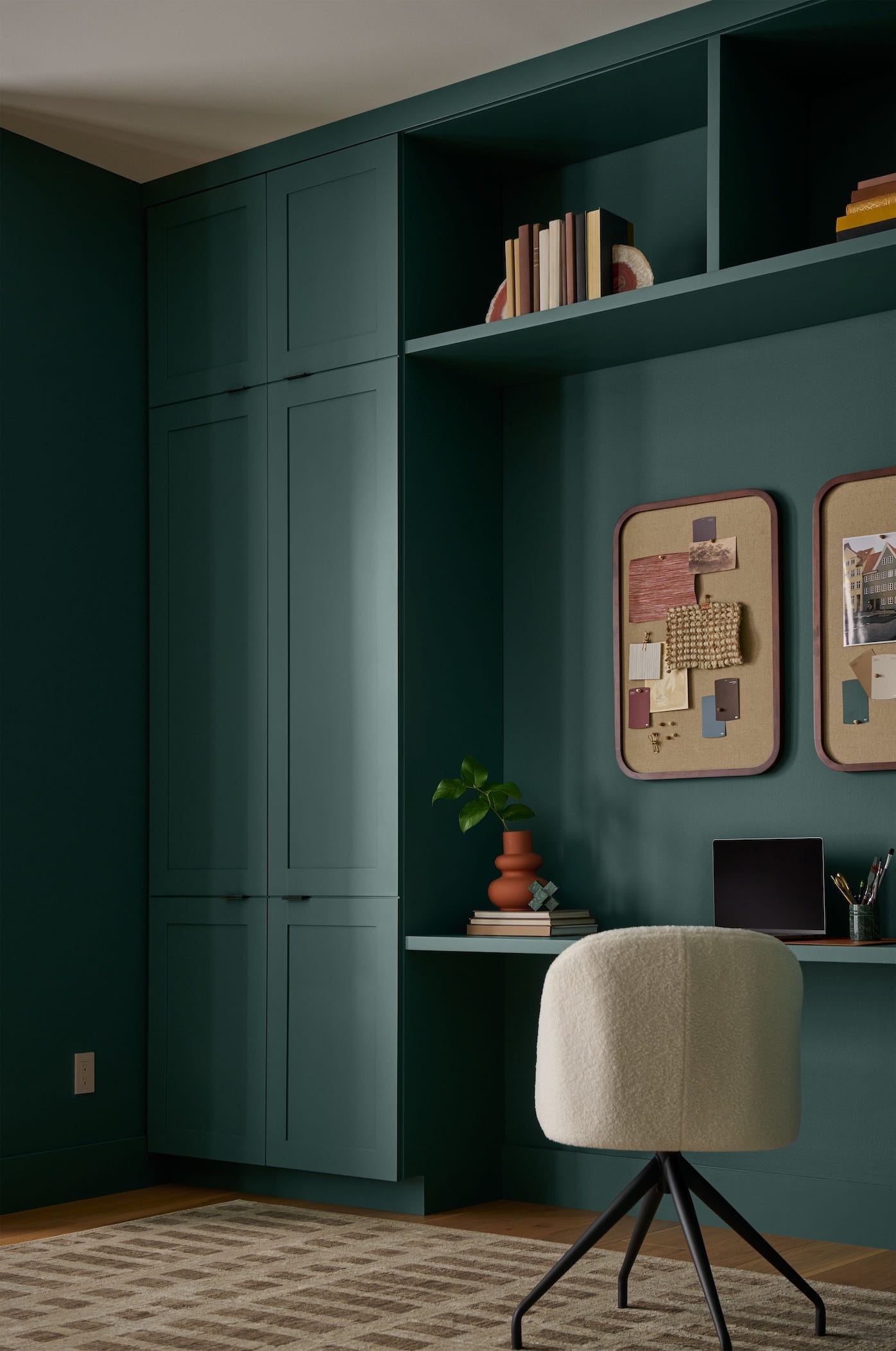
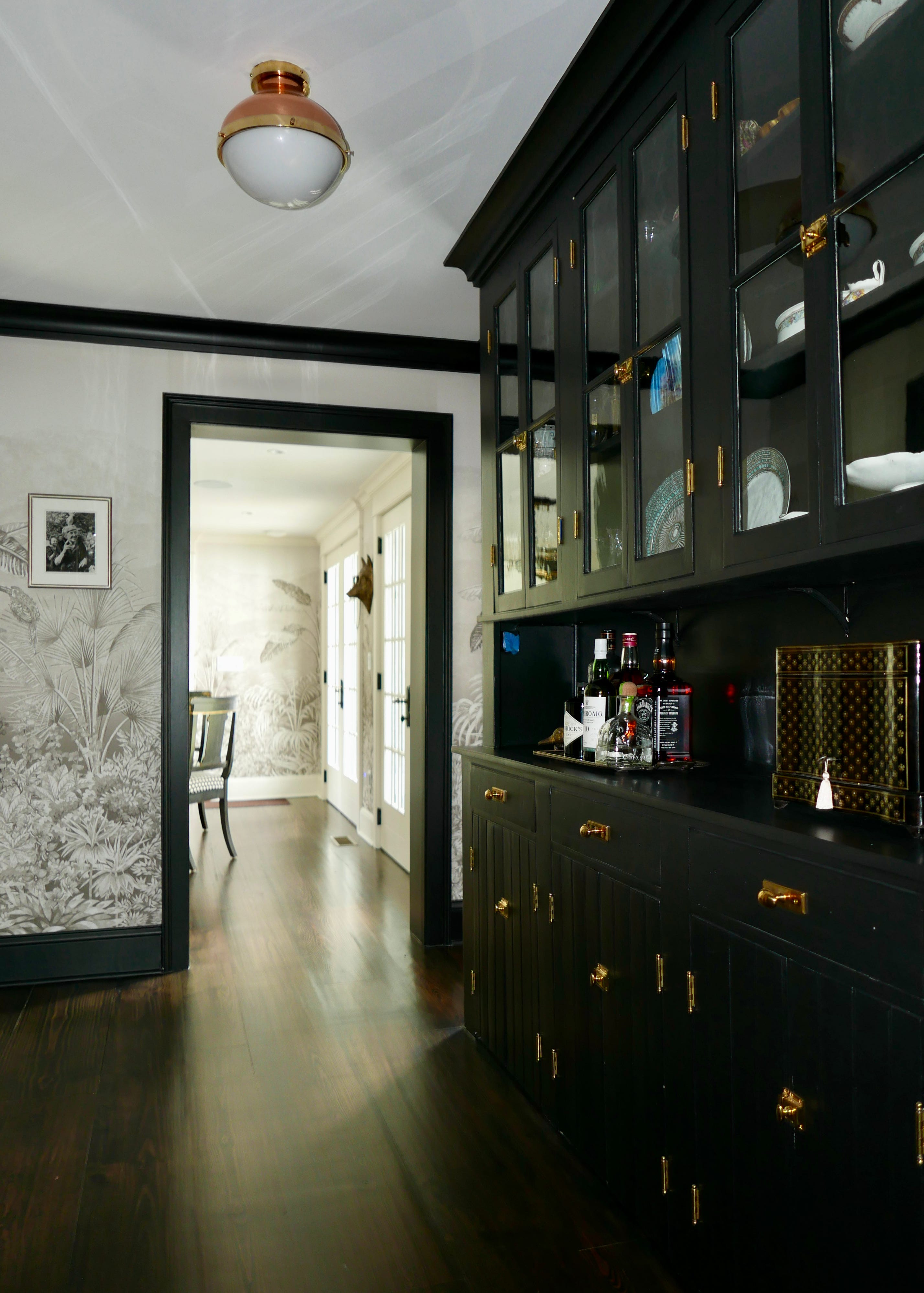
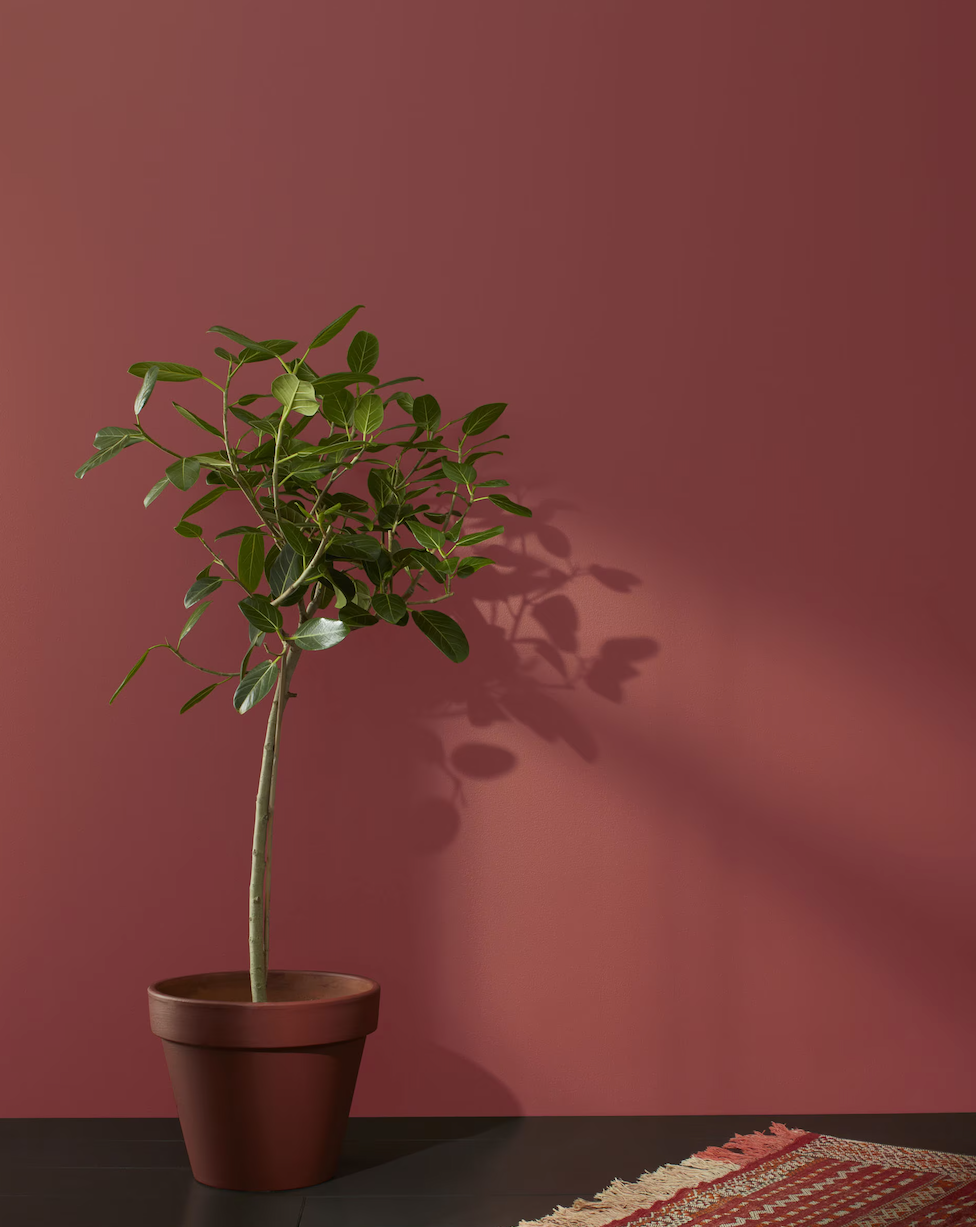
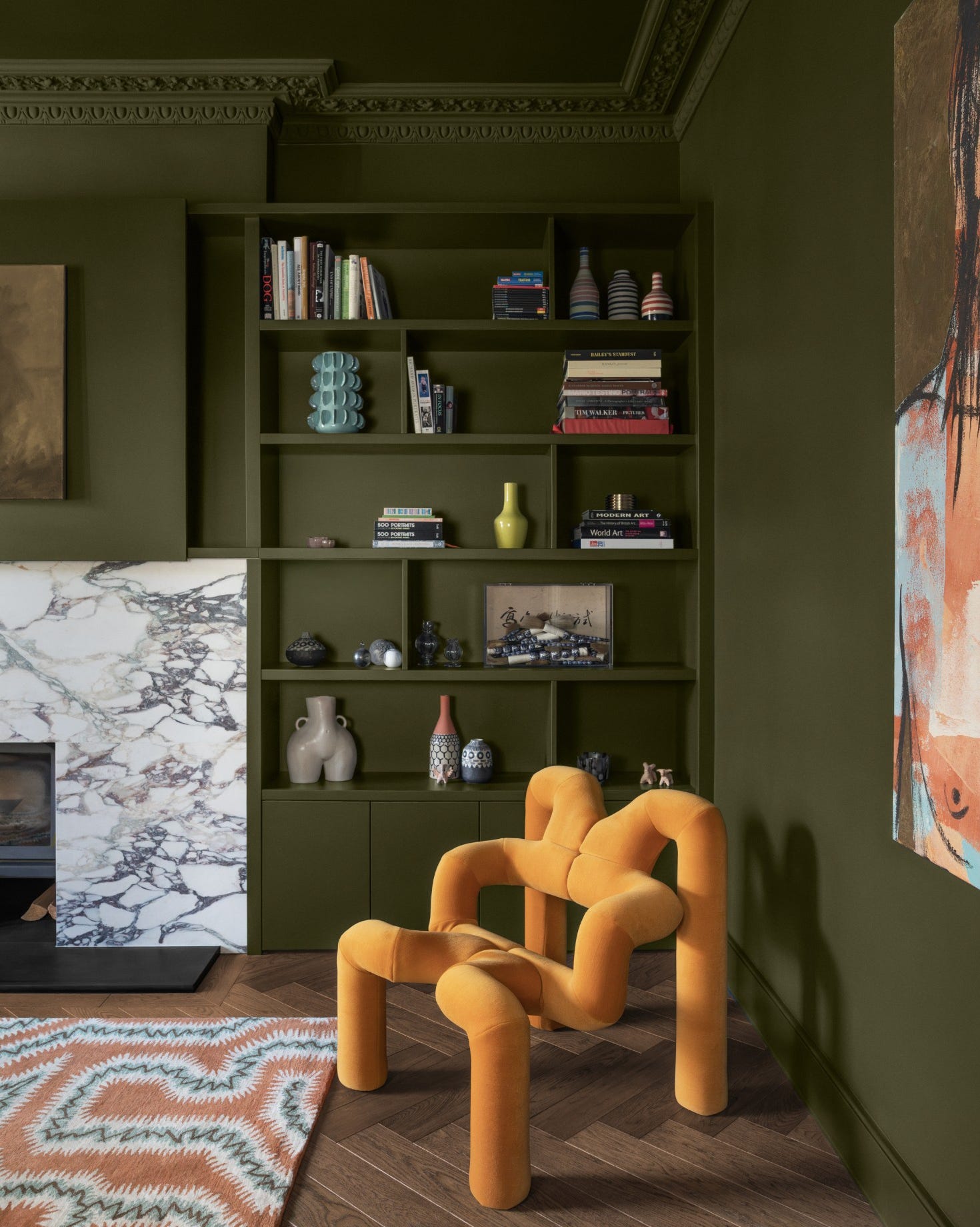
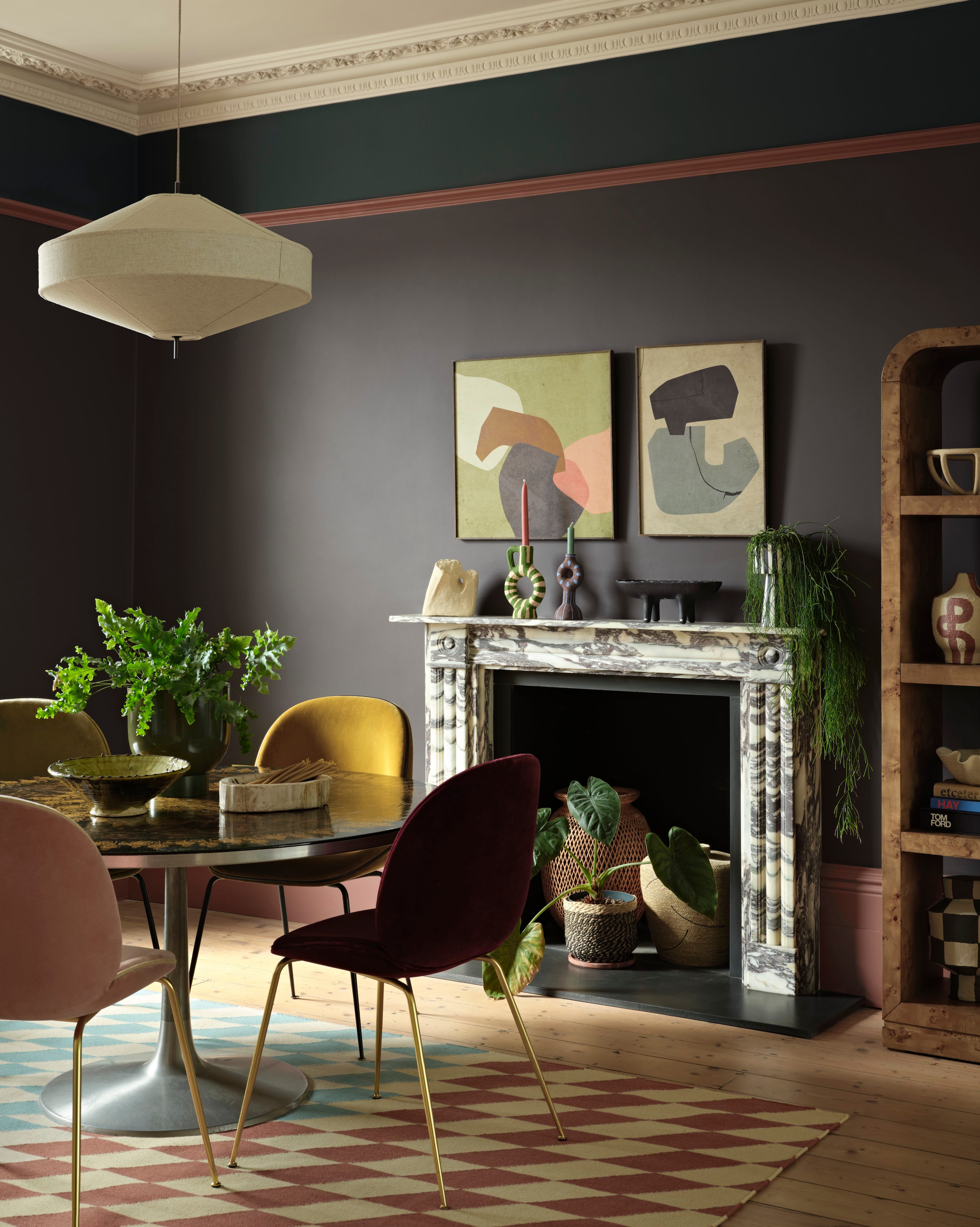
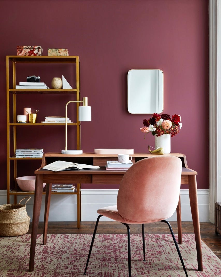
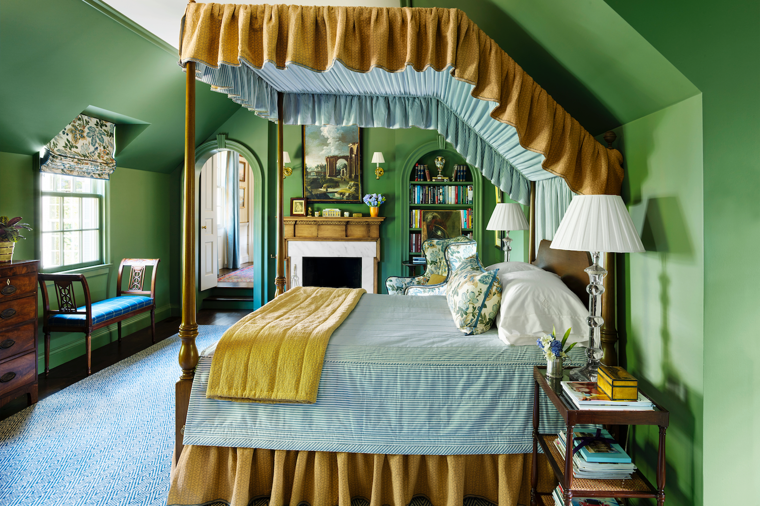
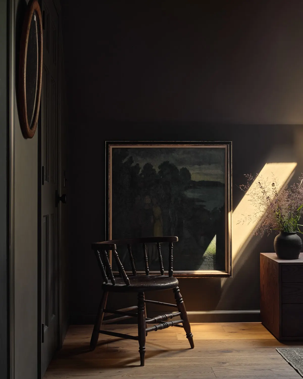
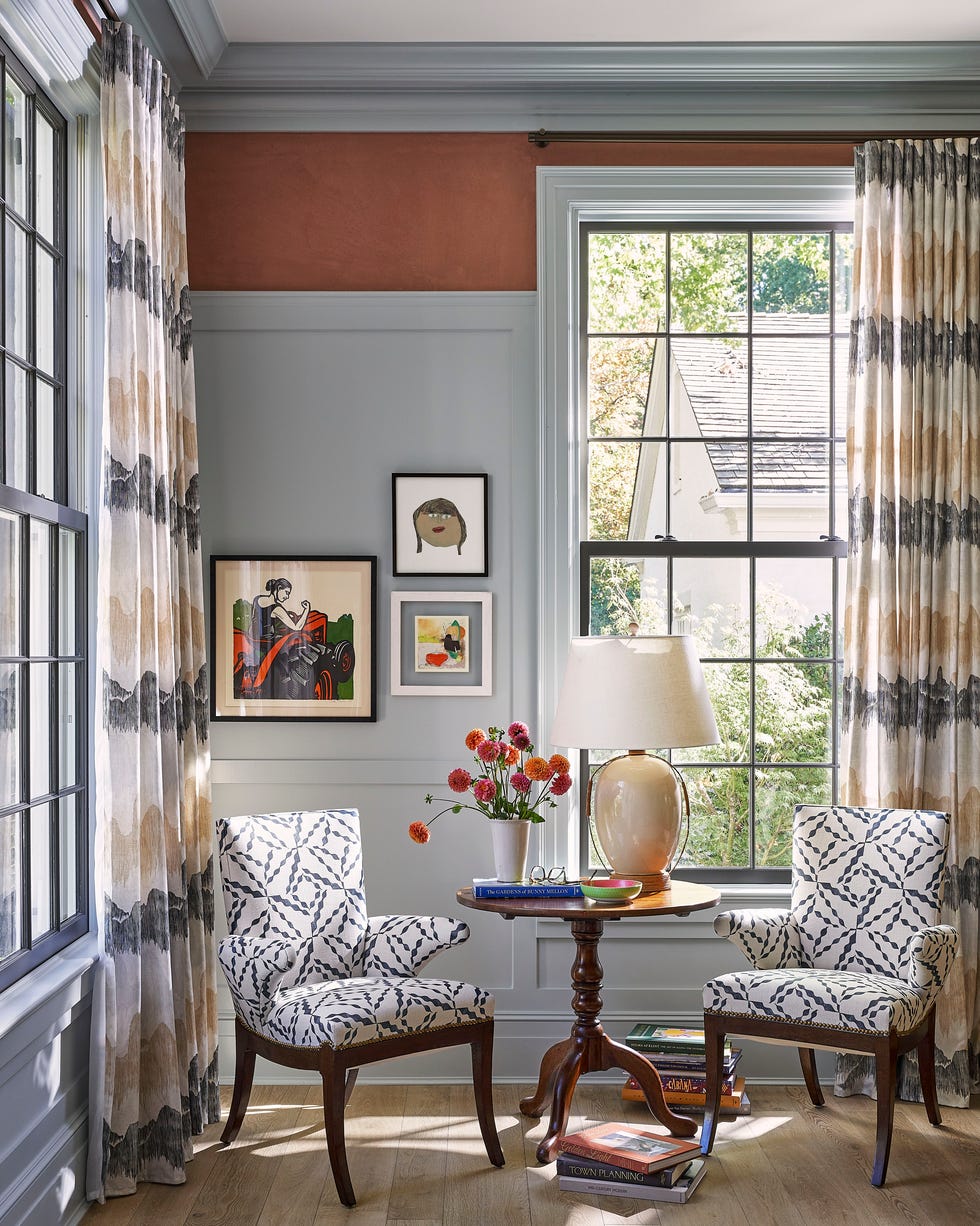
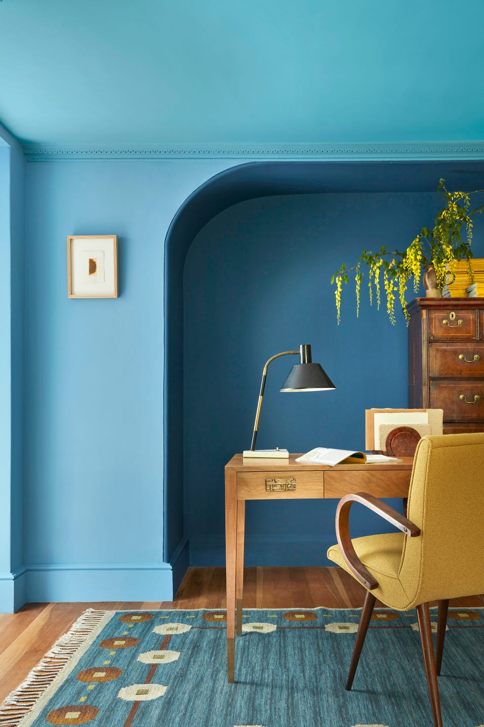
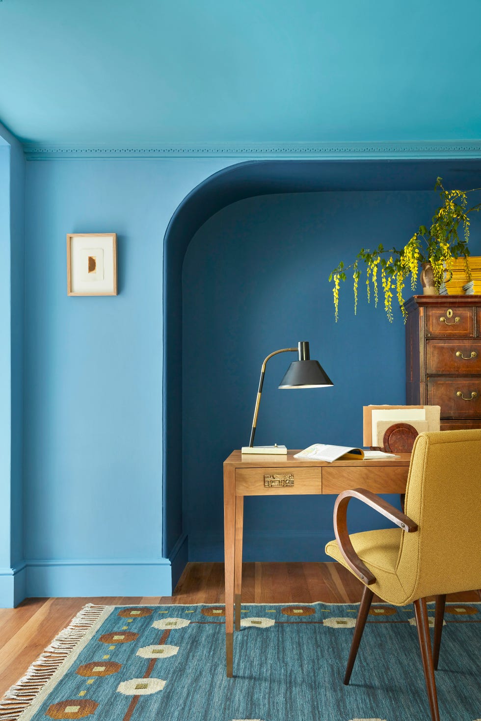
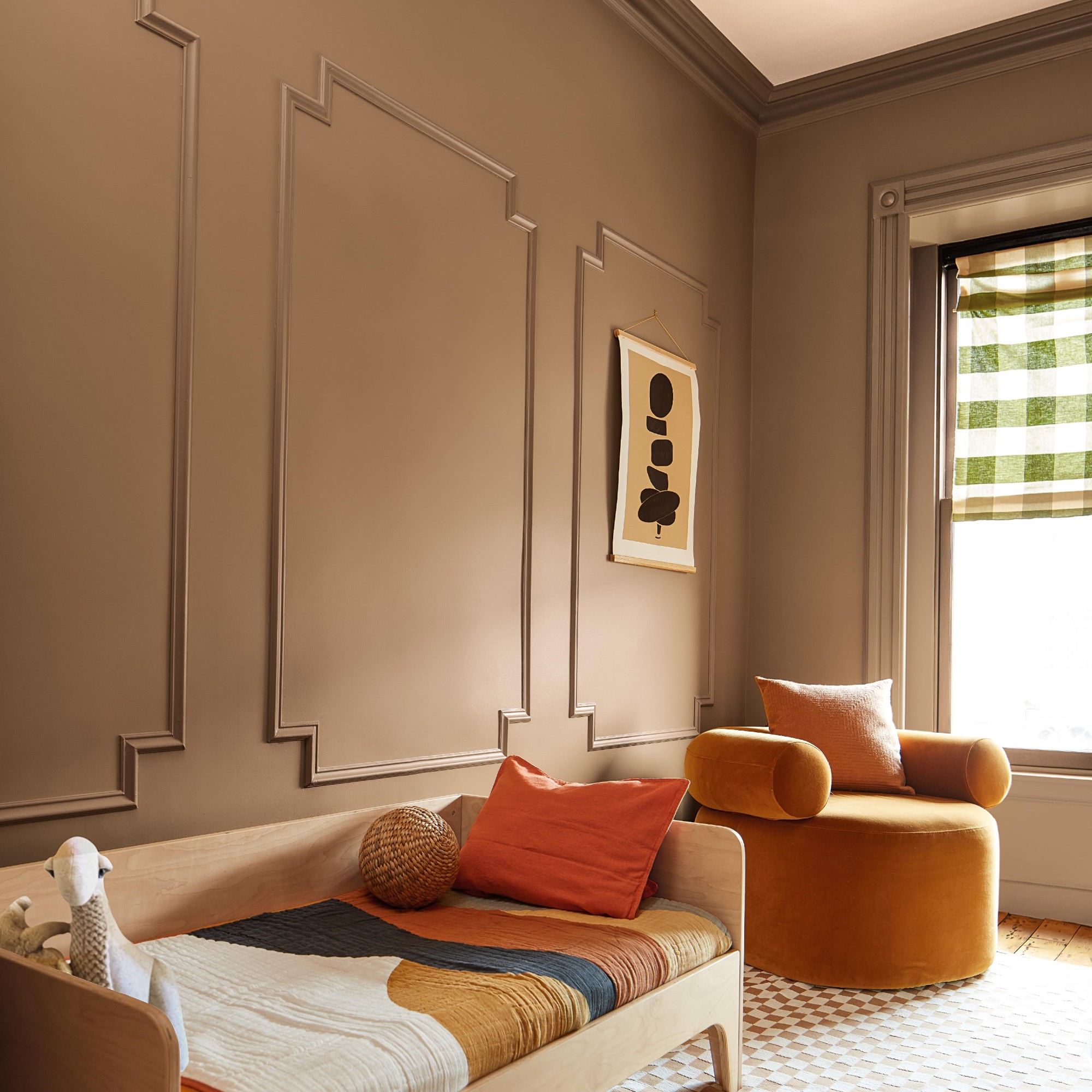
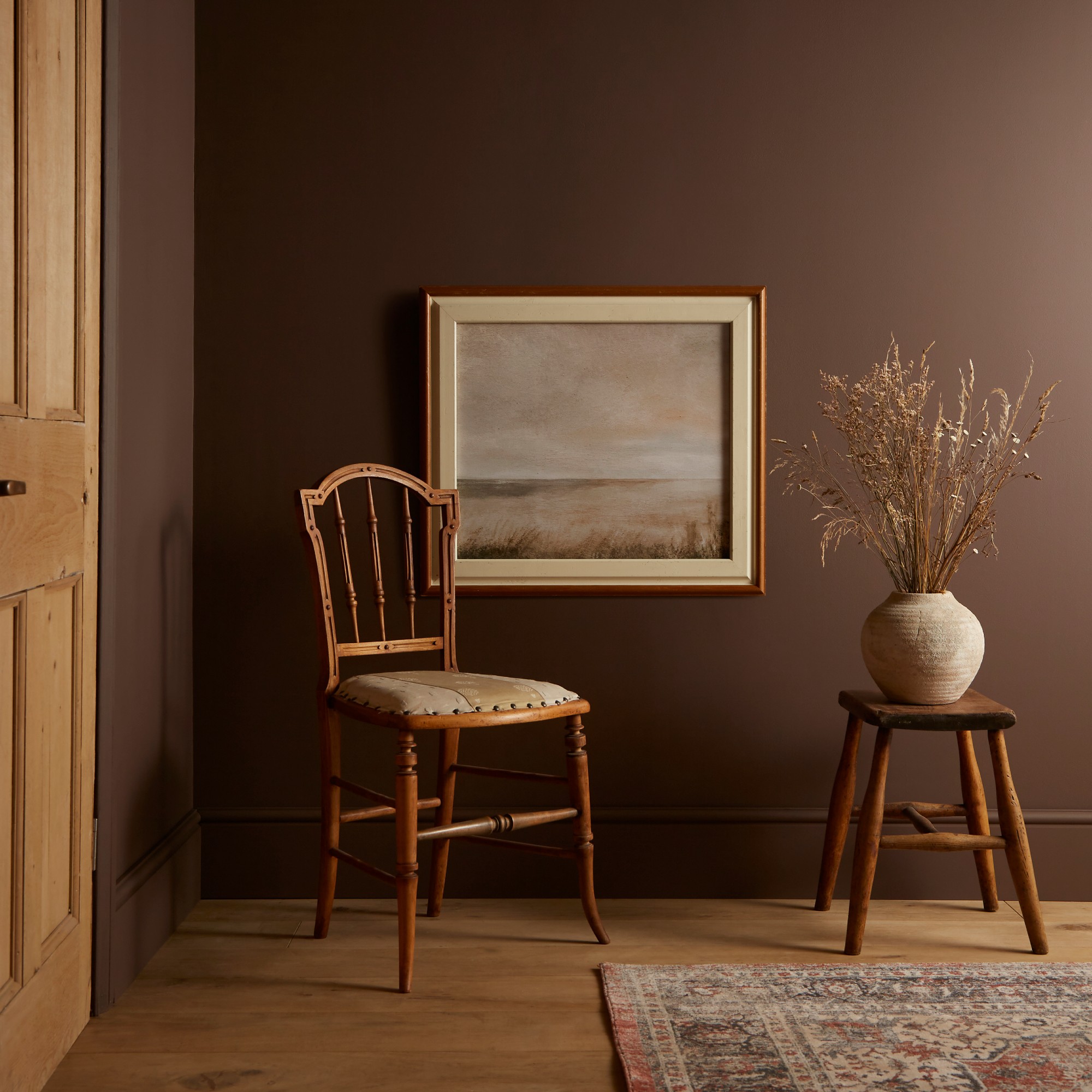
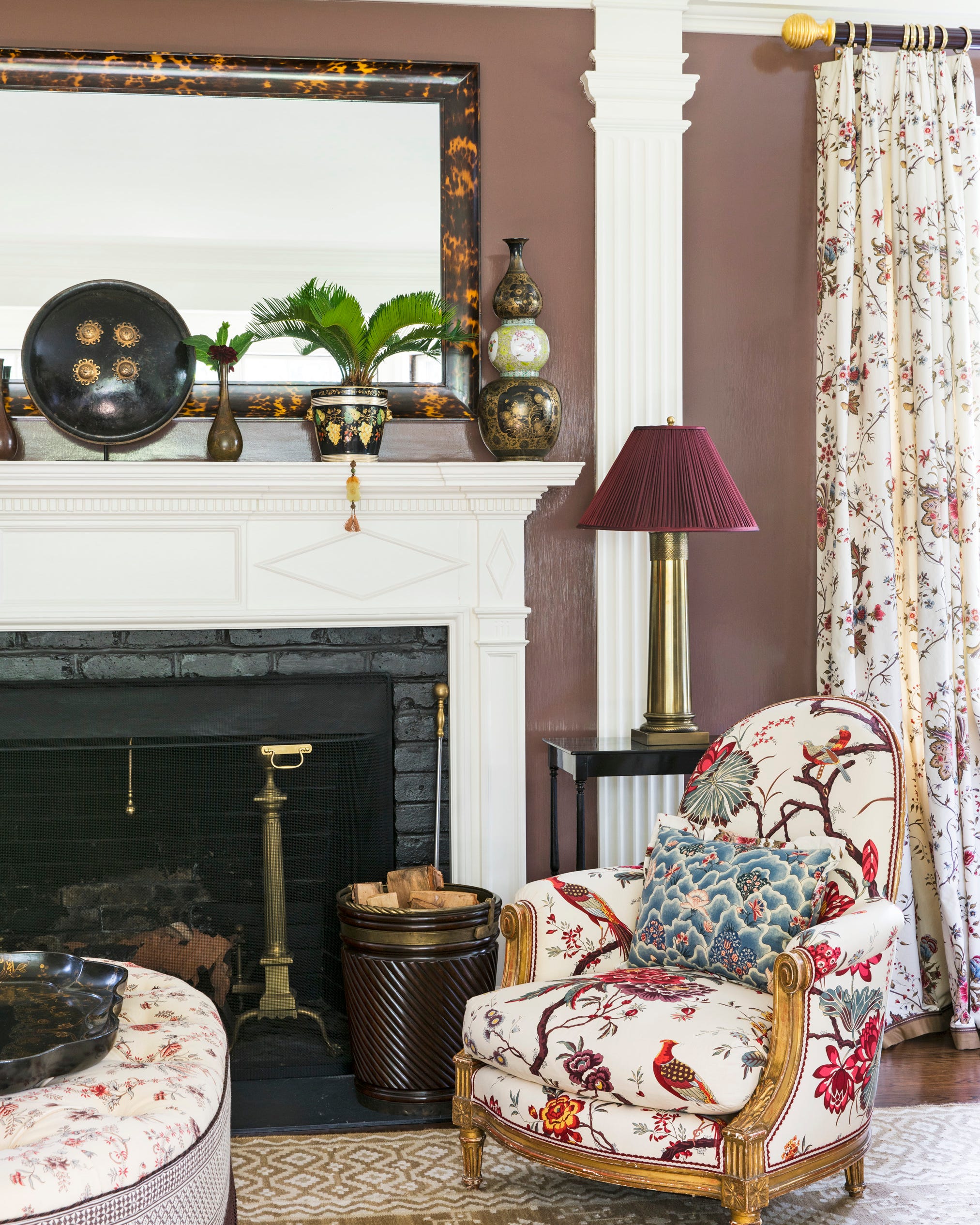
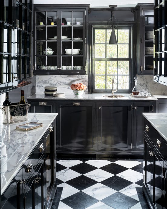
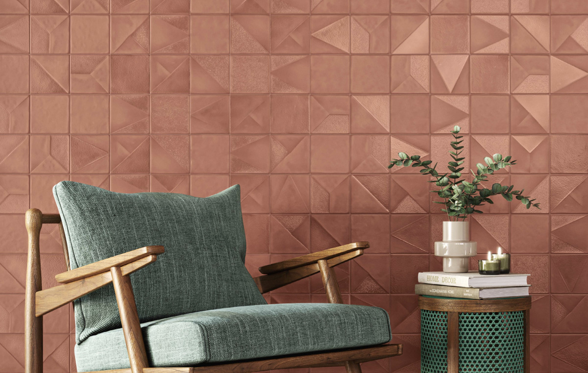
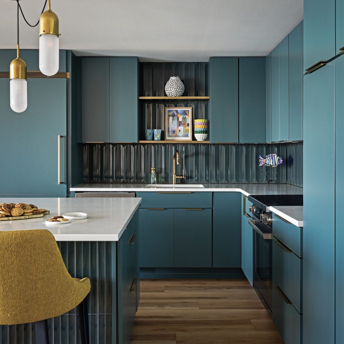
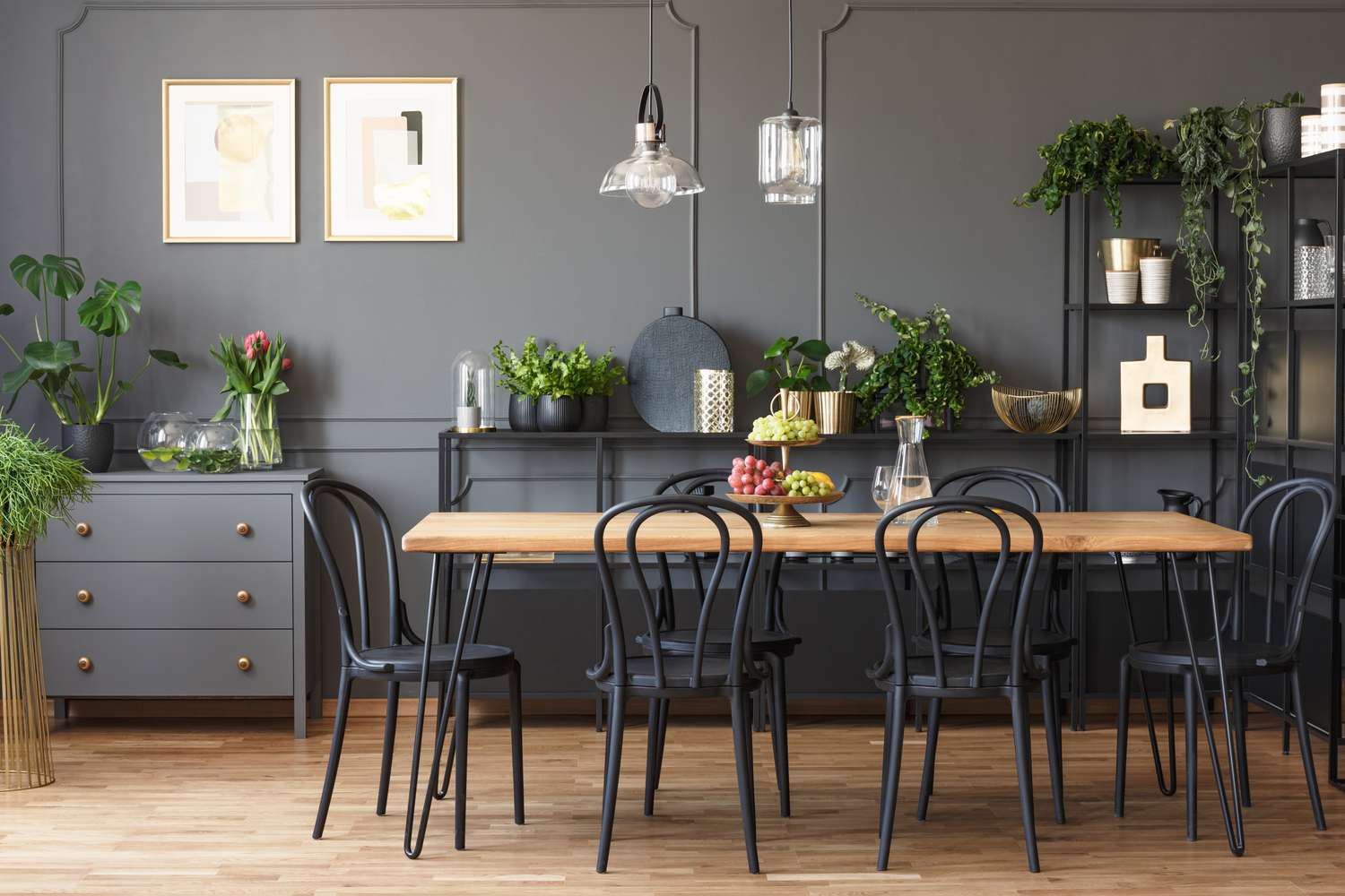
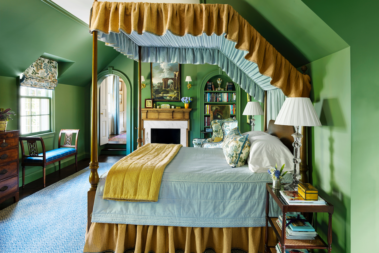
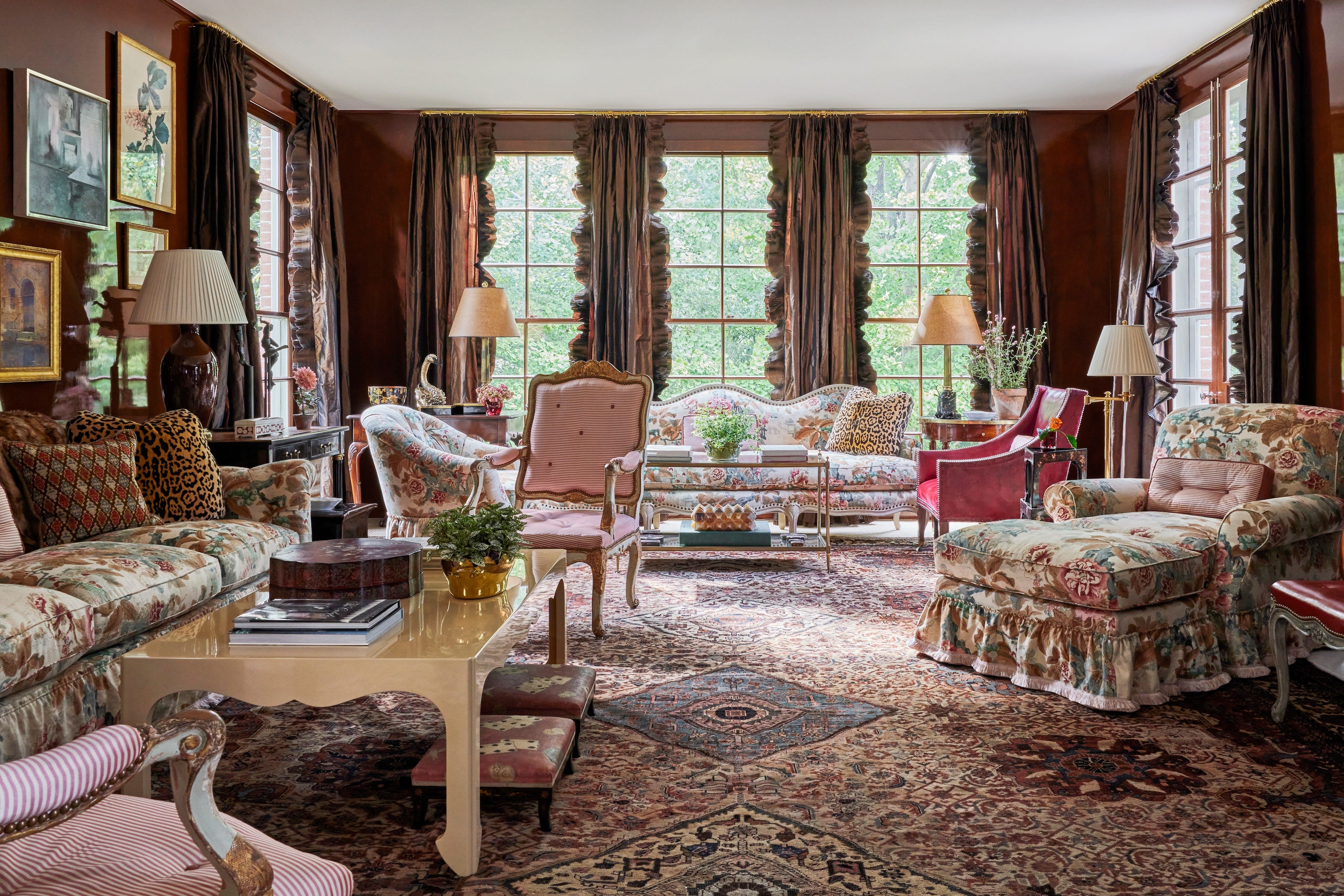
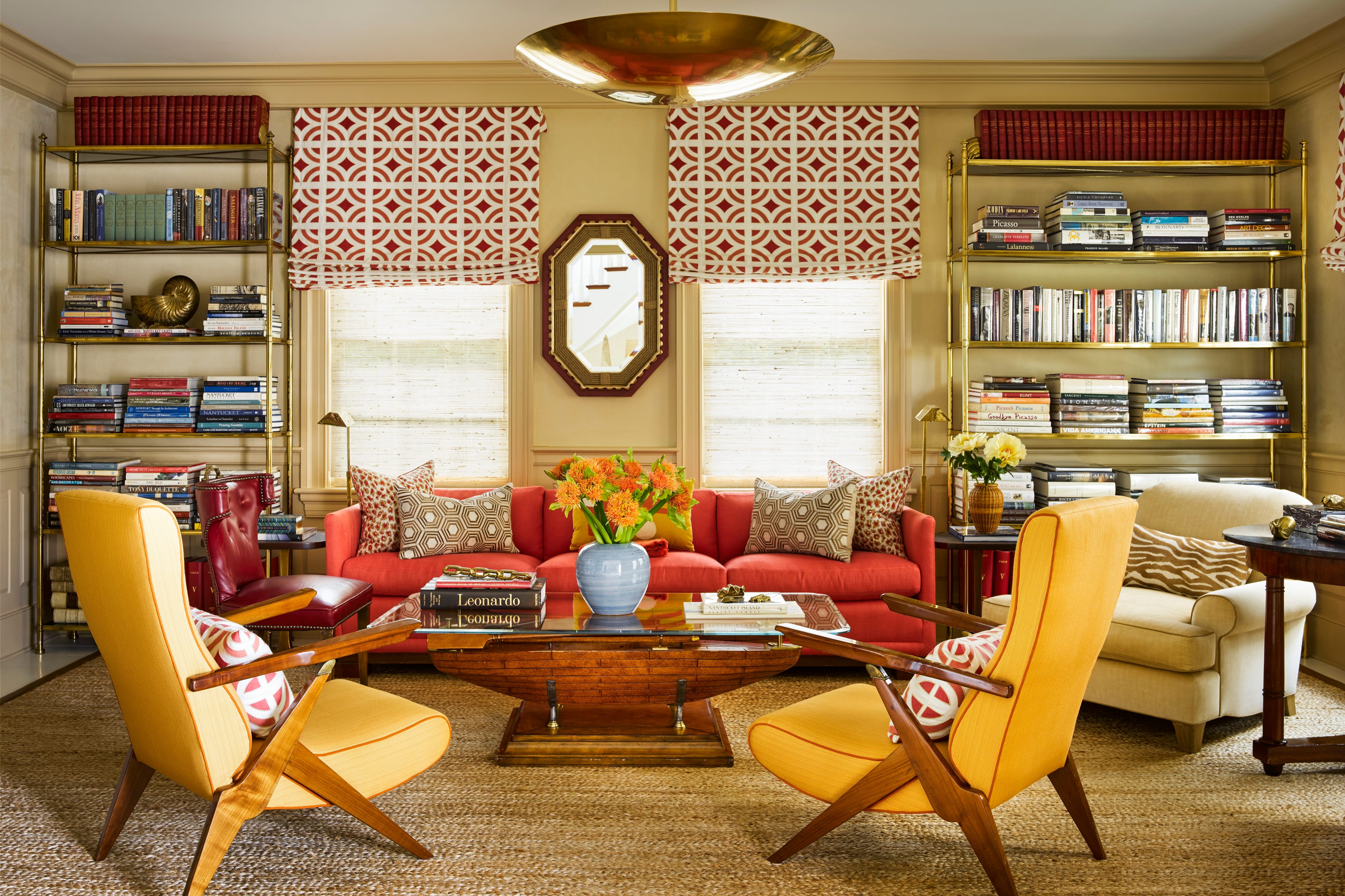
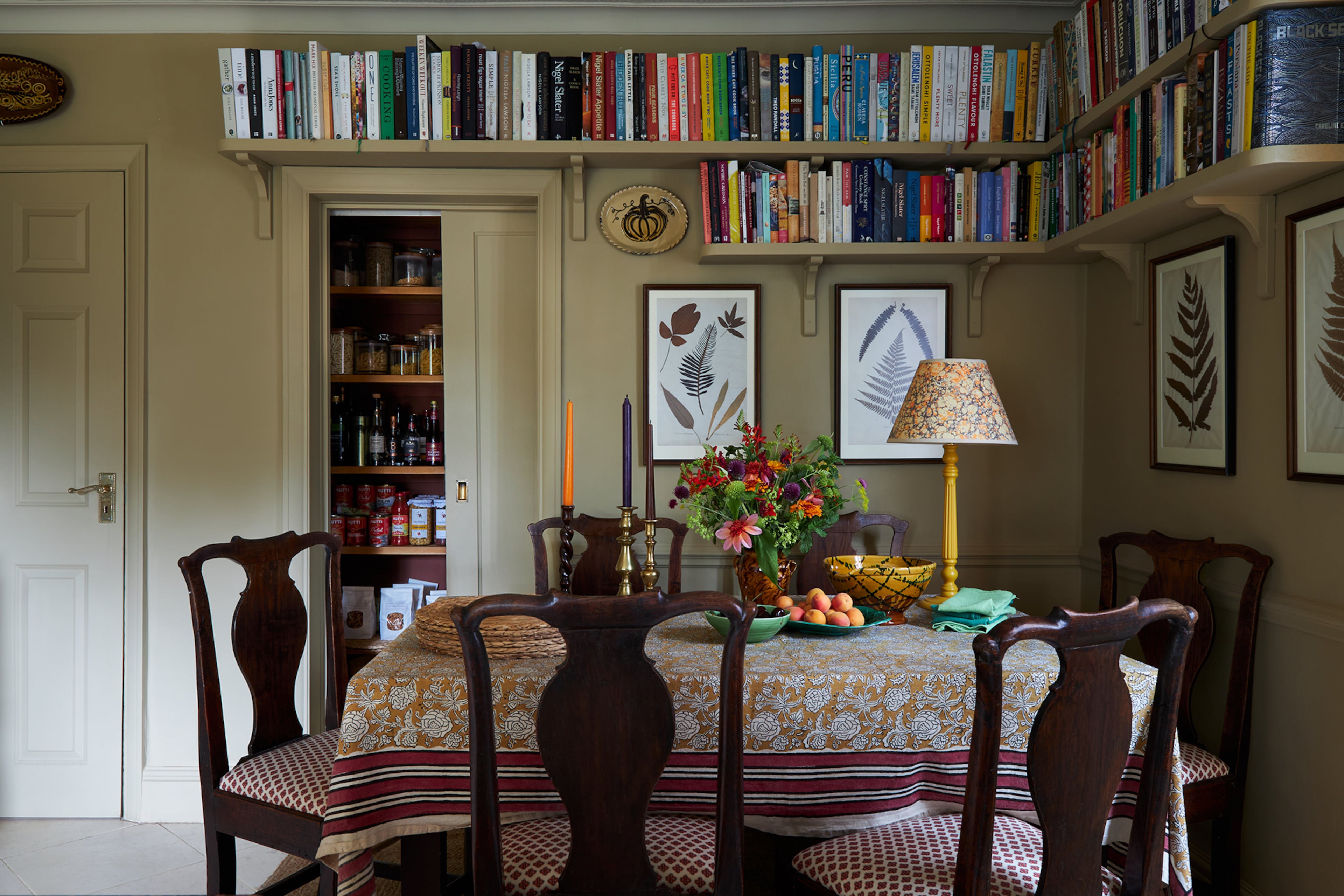
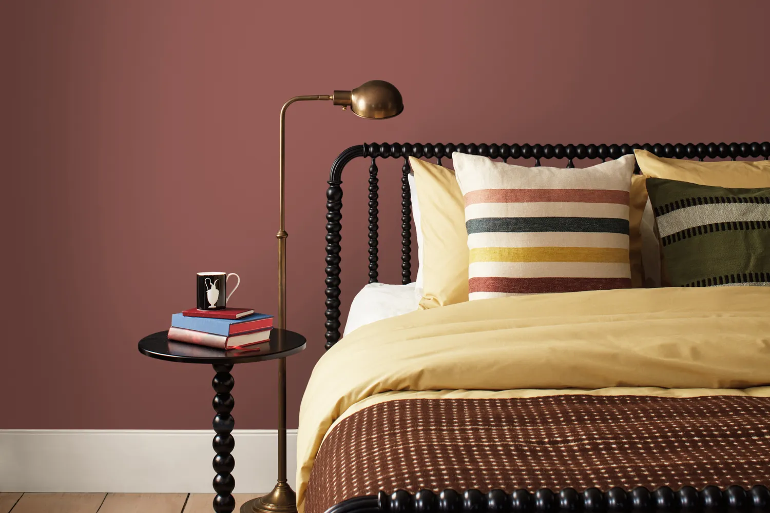
The "handsome midtones" begin with Narragansett Green HC-157, a striking black and teal from Benjamin Moore’s Historical Color Collection. This stately color conveys a strong sense of history and architectural relevance. It can be balanced with soft textures or even a hint of Batik to create a dynamic interplay of bold and soft, cool and warm elements, and is also suitable for exterior use. Southwest Pottery 048 is a versatile brown-red hue reminiscent of clay, offering numerous styling possibilities. Its character changes significantly based on the accompanying elements, allowing it to be paired with raw wood for one look or slate and off-white for another. Ochre is suggested as an accent color that beautifully complements Southwest Pottery. Sherwood Tan 1054, an earthy tannish brown, serves as a classic neutral backdrop, capable of bringing other elements to the forefront. Its flexibility makes it suitable for both traditional and modern spaces, whether paired with creamy whites like Swiss Coffee for a soft, layered effect or darker shades for dramatic contrast. Finally, Silhouette AF-655, the Color of the Year 2026, is a deep, dramatic charcoal-brown. This highly versatile shade can be used in formal settings or to create a cozy, intimate atmosphere. It pairs well with various patterns for dramatic impact or with subtle neutrals for a calming retreat. For those hesitant about its darkness, Yeo suggests using it in smaller doses, such as on wainscoting, trim, or doors, balanced with Swiss Coffee on walls and ceilings.
#BenjaminMoore #ColorTrends2026 #PaintColors #InteriorDesign #HomeDecor #ColorPalette #DesignTrends #DecoratingTips #BenjaminMoore #ColorTrends2026 #PaintColors #InteriorDesign #HomeDecor #ColorPalette #DesignTrends #DecoratingTips
0 comment in total
 No comments yet
You may also like
Designers Say These 12 Paint Colors Will Be Everywhere in 2026

These 8 Colors Will Rule Interiors in 2026, According to Experts

The colour palette for 2025 – these are the shades paint experts say we’ll see everywhere next year

Designers Agree: These 7 Underrated Paint Colors Will Be Huge in 2026


8 Paint Color Trends You'll ACTUALLY Want to Live With in 2026, According to Designers

What Paint Colors Will Rule 2026? Designers Make Their Predictions

The 2026 paint Colors of the Year Have Been Announced


These 6 Colors Will Rule Interiors in 2026, According to Experts


Experts Say These 5 Paint Colours Will Be Everywhere In 2026
8 Paint Colors Going Out of Style In 2025, According to Designers

These 8 Color Trends Will Rule in 2025, According to Color Pros

These 7 Colors Will Rule Interiors in 2026, According to Experts
We're Calling It: The 7 Paint Colors That Will Be Huge in 2026

Interiors experts predict this will be the biggest paint trend of 2026


The #1 Paint Color Trend of 2025, According to Designers
Bold, edgy color drenching is going to be big in 2024
What Paint Colours will Rule 2026? The Experts Make Their Predictions
Designers Predict This Will Be The Biggest Paint Trend Of 2026
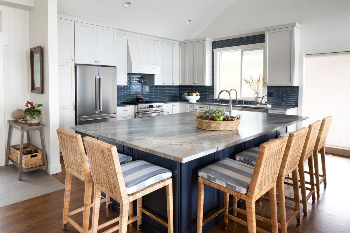
Color Explosion: 2025 Color Trends

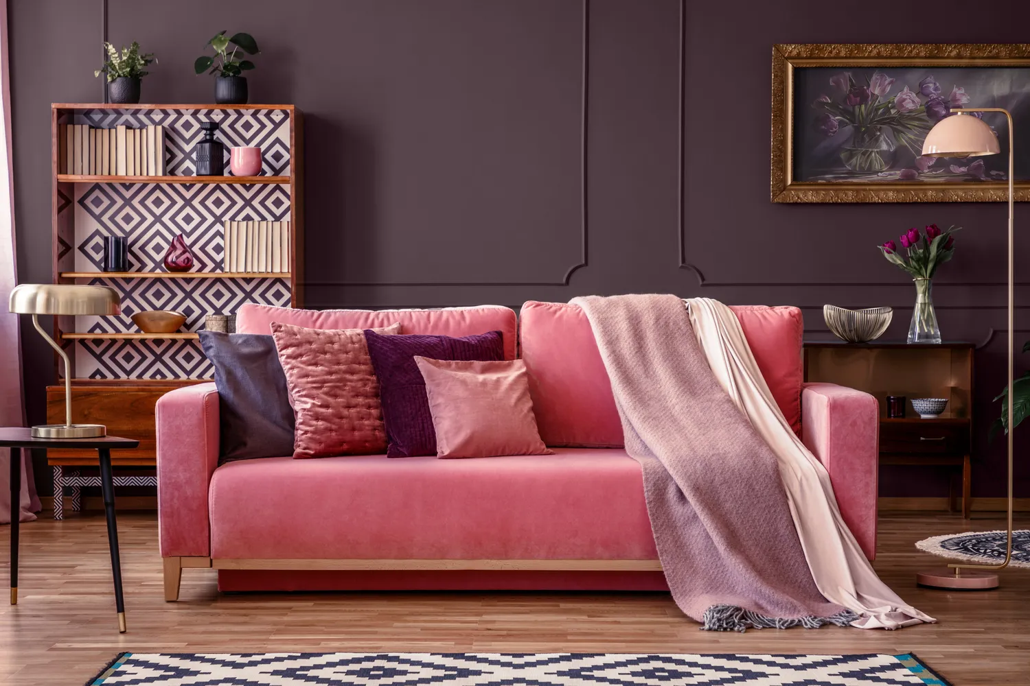
17 Paint Colors That You'll See Everywhere in 2026, According to Dunn-Edwards