1/13
Take 'Disco Nap,' and other 2021 colors of the year, for a spin
The article delves into the anticipated color trends for home interiors in 2021, showcasing how various leading paint companies and color authorities have unveiled their picks for the upcoming year. These selections are presented as embodying themes of resilience, optimism, wellness, and a desire for stability, reflecting the global context of the time.
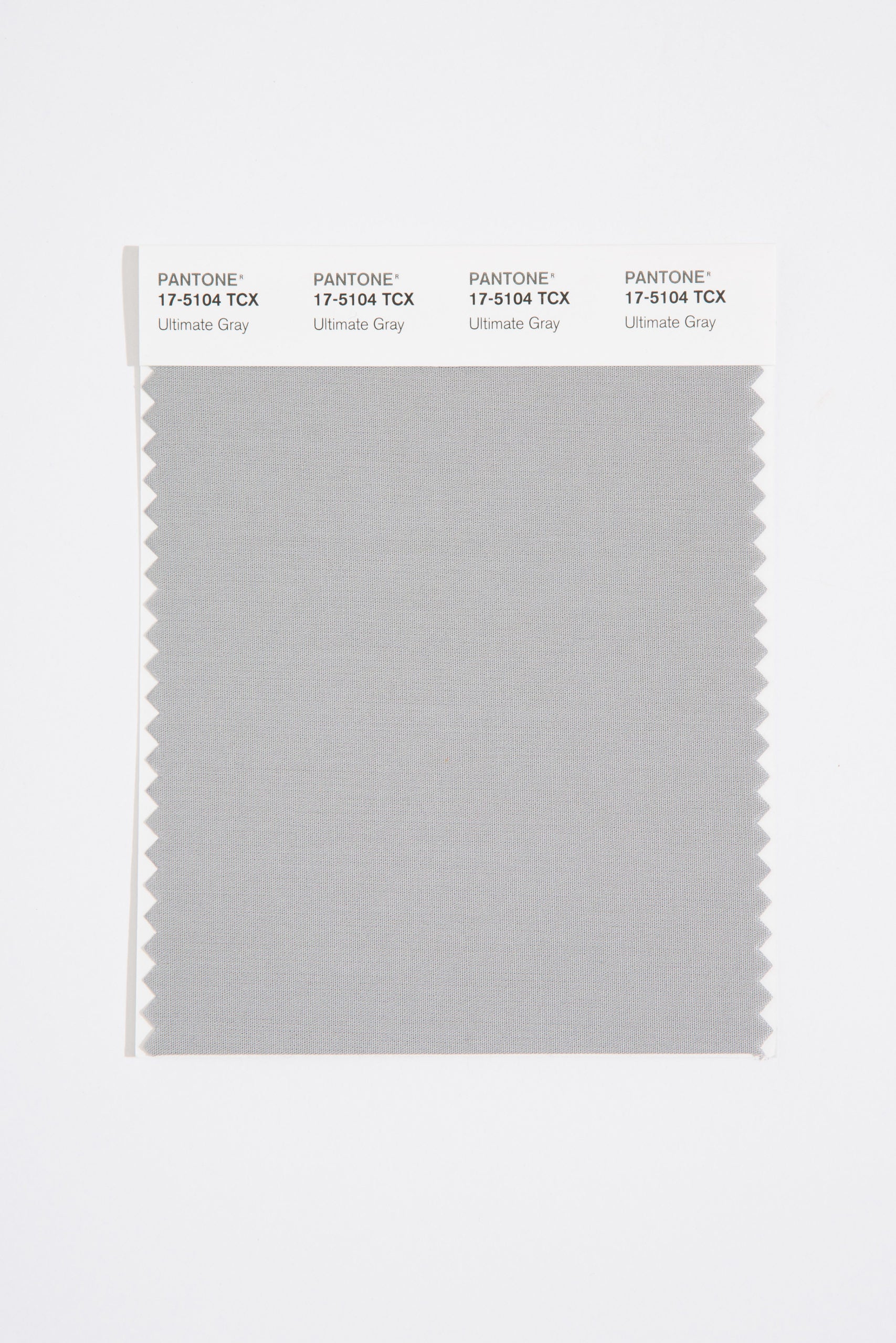
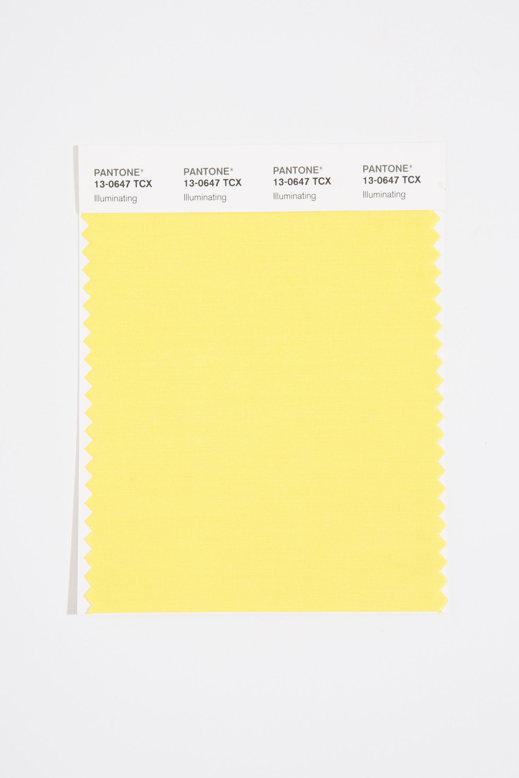
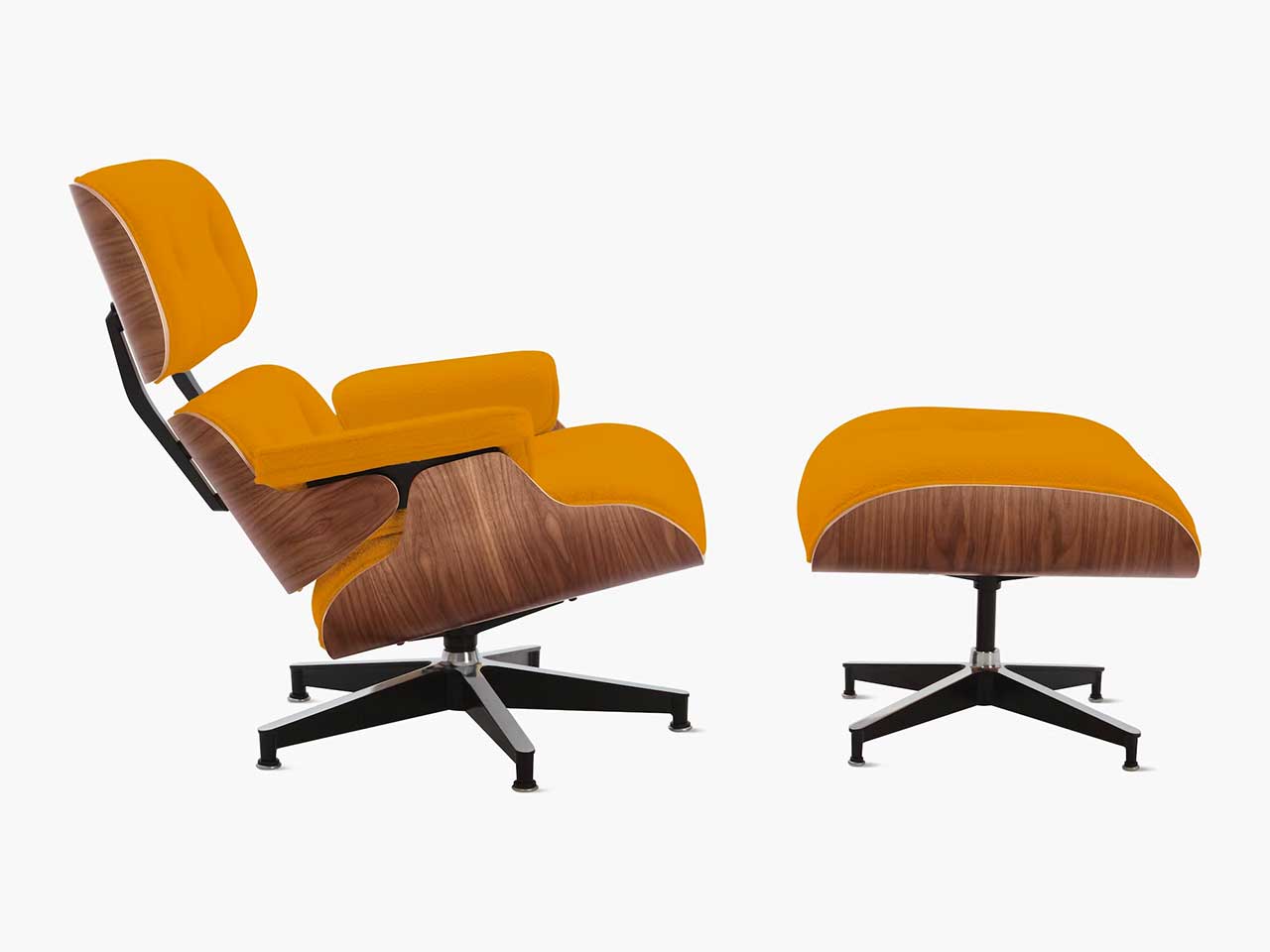
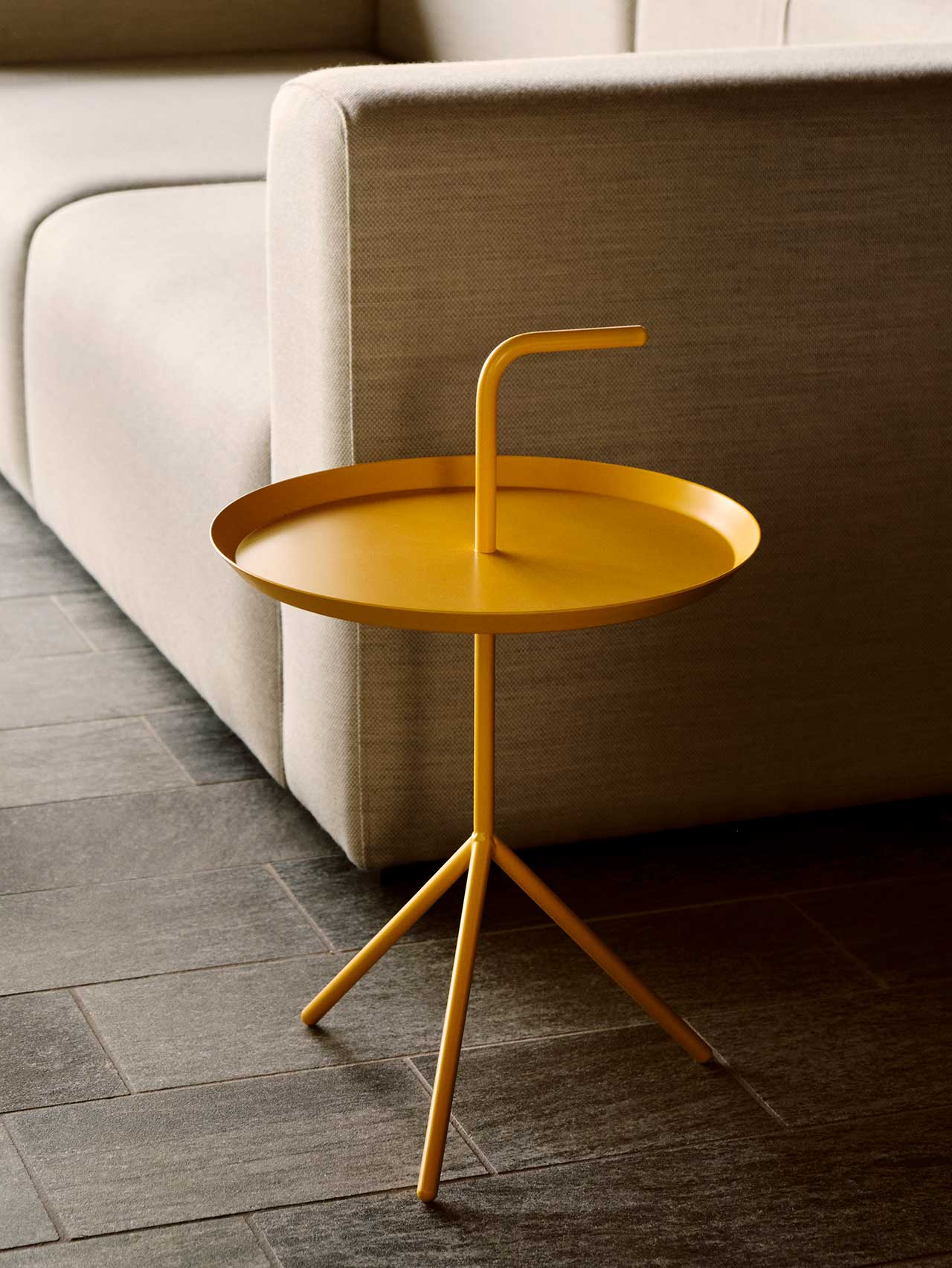
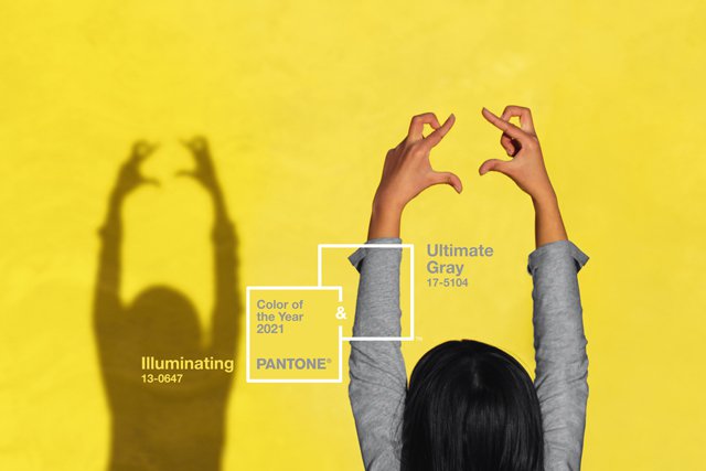
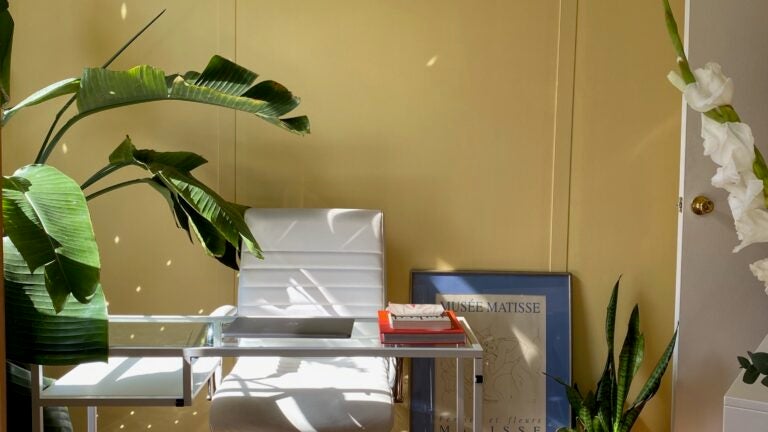
Pantone Color Institute, a globally recognized authority in color standards, announced a duo of colors for 2021: "Ultimate Gray," a neutral midtone, and "Illuminating," a vibrant yellow. This combination is described by Leatrice Eiseman, executive director at Pantone, as conveying a message of positivity underpinned by fortitude, blending practicality with warmth and optimism to foster resilience and hope. The article notes that this pairing is particularly suitable for living spaces, including home offices.
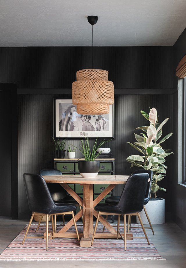
Sherwin-Williams introduced "Urbane Bronze" as its color of the year, a grayish-brown shade that evokes the richness of natural materials like metal, stone, and wood. This color is positioned as ideal for creating a sense of sanctuary within personal spaces and harmonizes well with warmer earth tones. Holistic interior designer Gala Magriñá suggests using "Urbane Bronze" for home exteriors or as an accent color for doors or focal walls, recommending its pairing with blush pink to add warmth and a contemporary touch.
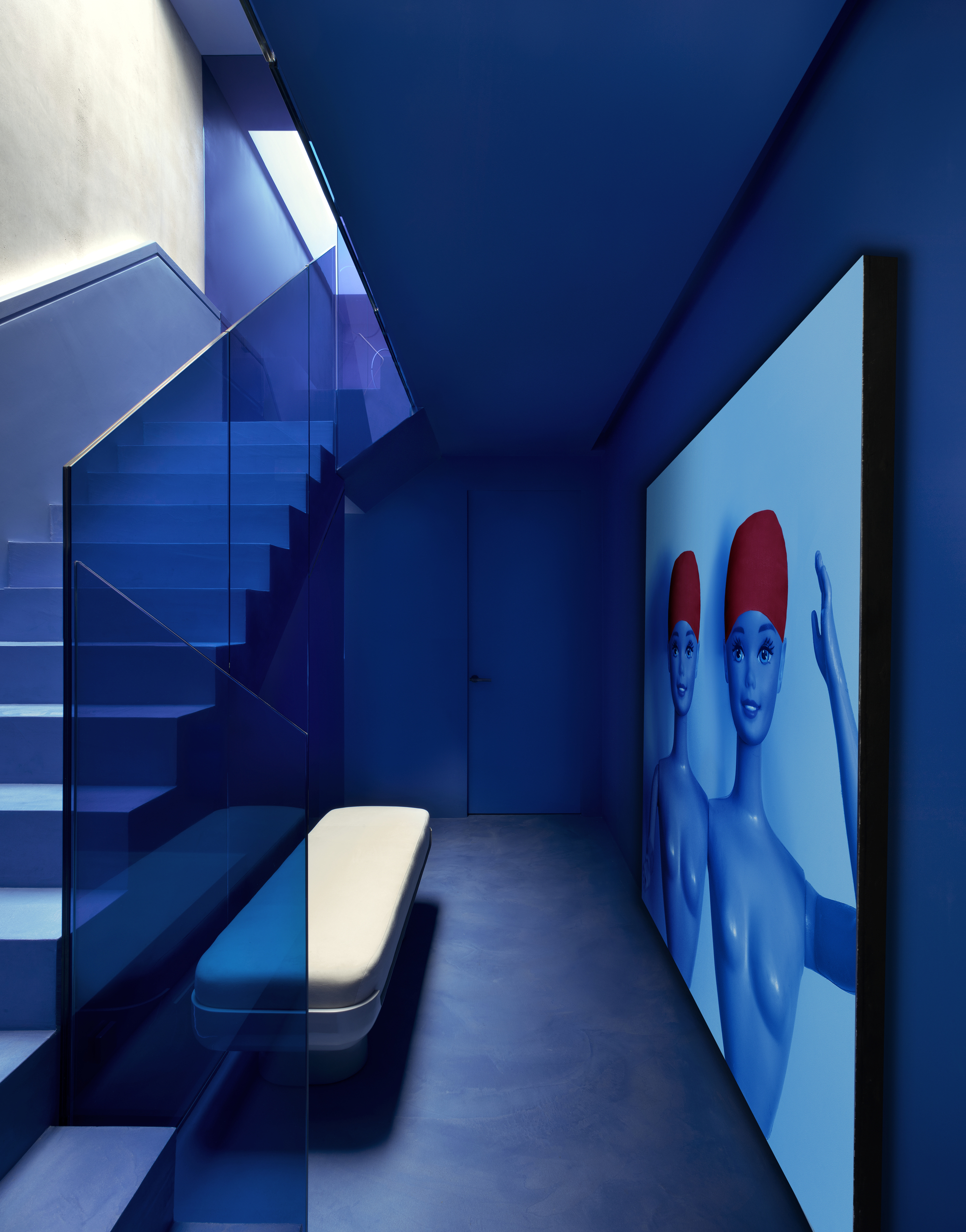
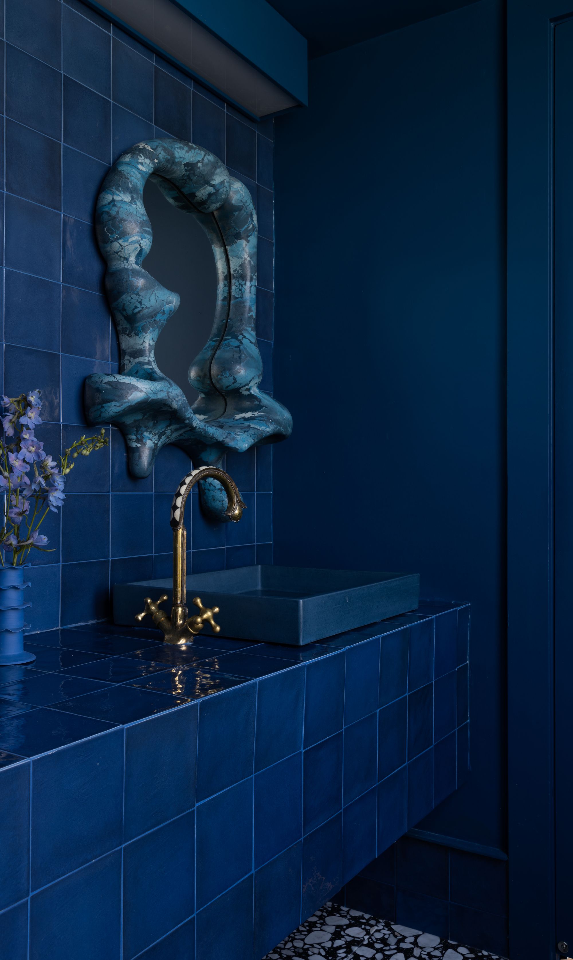
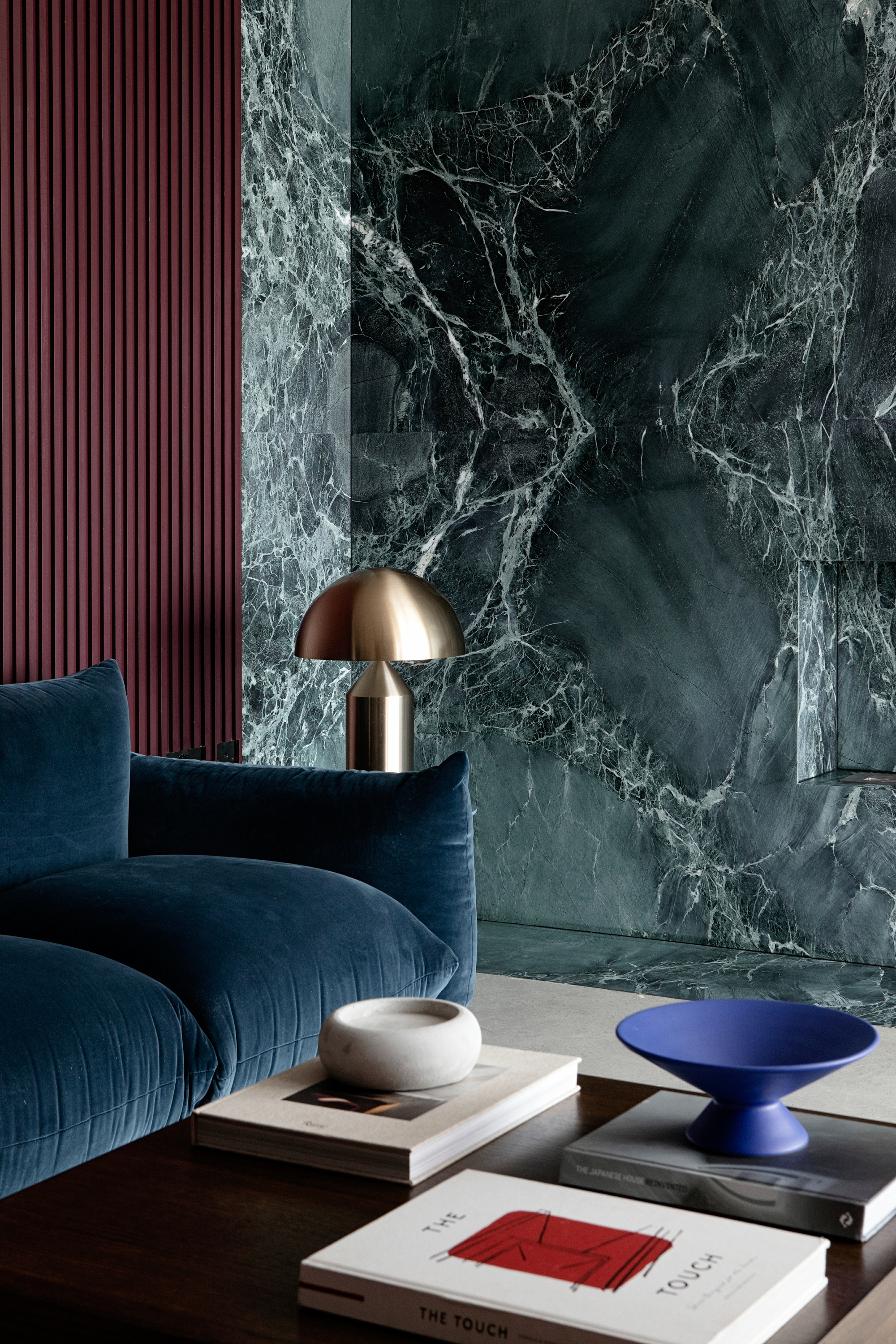
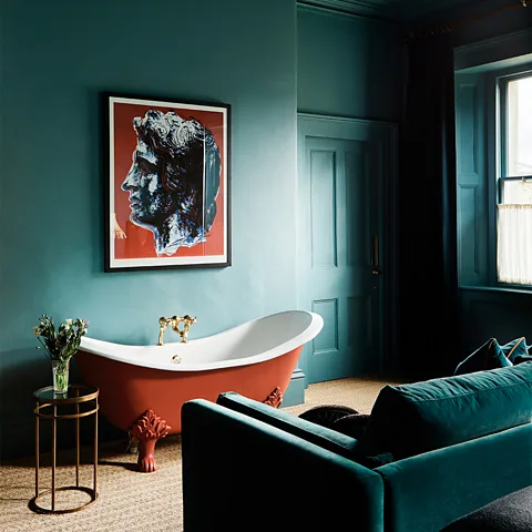
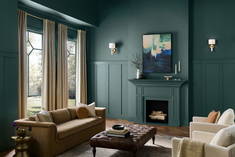
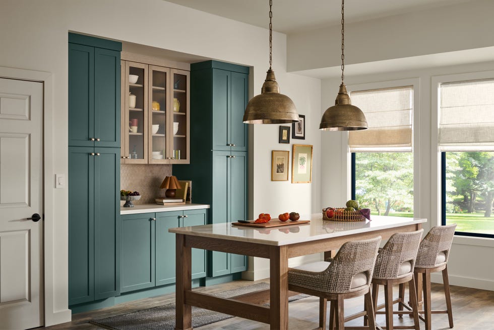
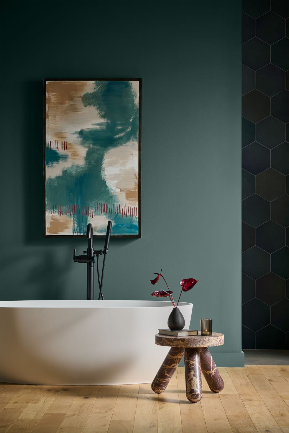
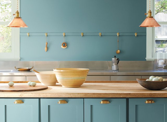
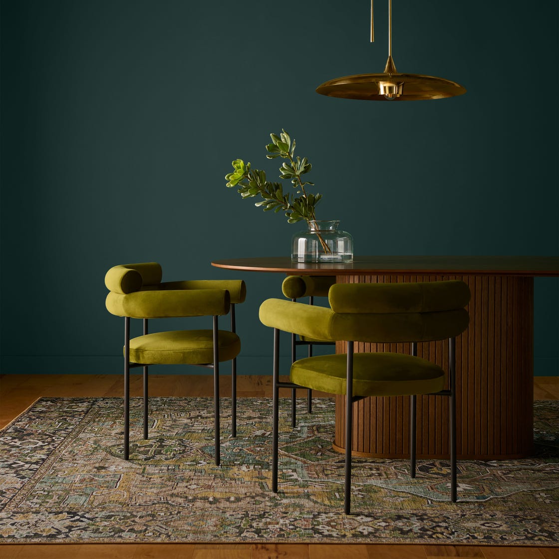
Benjamin Moore selected "Aegean Teal," an oceanic blue-green, as its color of the year, accompanied by a palette of 12 earthy shades. Andrea Magno, Benjamin Moore’s director of color marketing and development, explains that these colors respond to a human yearning for stability amidst uncertainty, highlighting their potential to positively influence emotions and well-being. Lilit Devejian of LuxySpace finds "Aegean Teal" relaxing and suggests pairing it with white, noting its vintage yet modern feel, suitable for minimalistic millennial lofts.
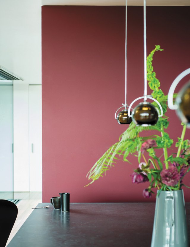
Behr's Color Trends 2021 Palette features 21 colors, including popular neutrals like "Smoky White" and "Barnwood Gray," which has a subtle green hint and is versatile for both interior and exterior use. Warmer tones such as "Almond Wisp" (taupe) and "Sierra" (earthy) are also gaining traction. Designer Katie Rosenfeld observes an '80s vibe in the palette and mentions her current preference for chocolate brown, beige, cream, nude, and various yellow shades.
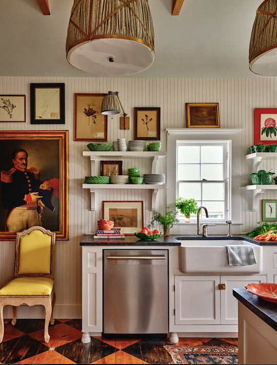
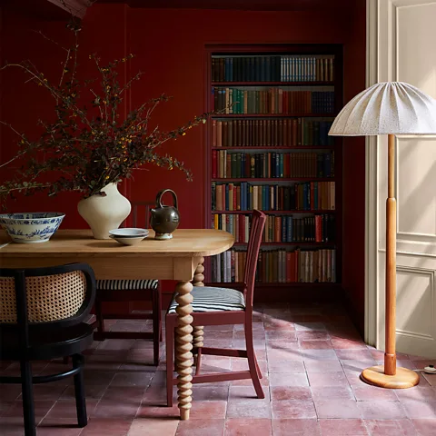
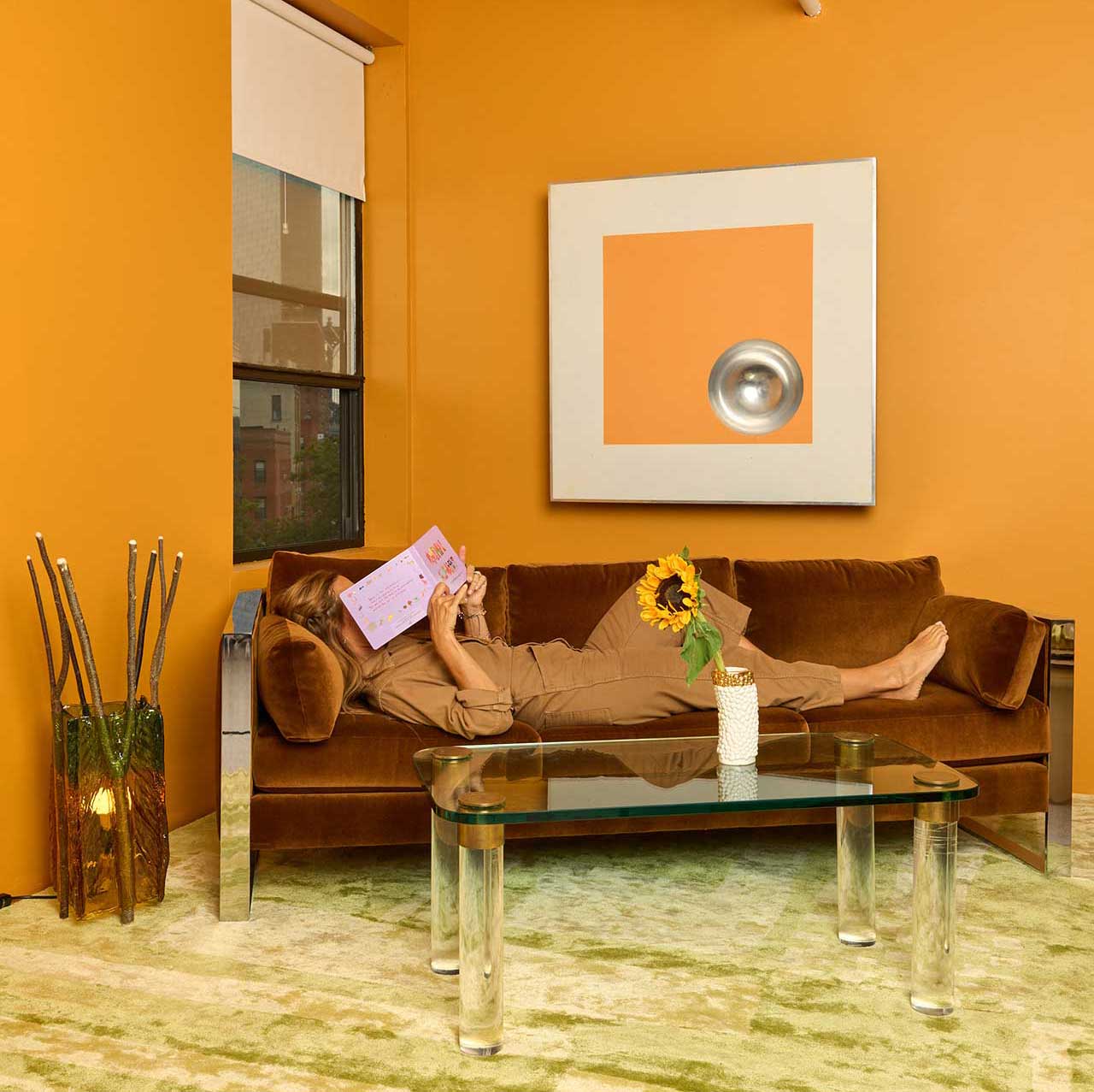
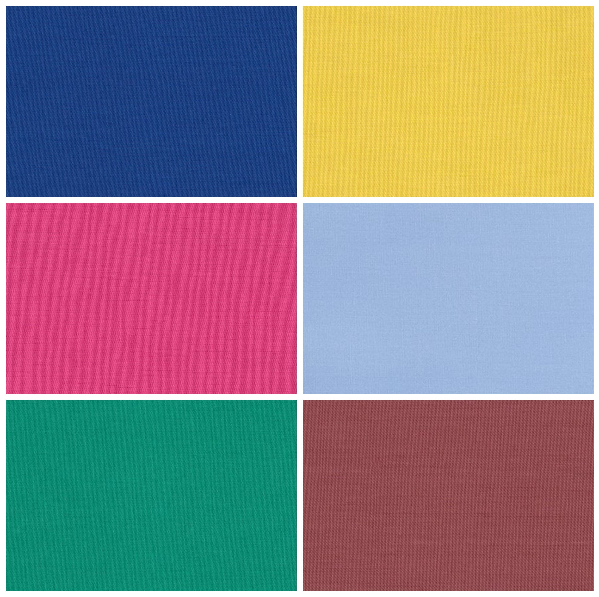
Backdrop, an online paint company, through co-founder Natalie Ebel, highlights earth tones and blues like "Surf Camp" (dark blue with green undertones), as well as warm terra-cotta hues such as "Ghost Ranch." Ebel also points to uplifting yellows, including "Disco Nap," as having a significant moment. Magriñá suggests using energetic yellows like "Disco Nap" in breakfast nooks or home offices to create an uplifting atmosphere, recommending pairings with whites and blues.
PPG Paint Brand's "Be Well" palette comprises 14 colors, featuring "Transcend" (mid-tone beige), "Big Cypress" (ginger orange), and "Misty Aqua" (muted tropical turquoise). Katie Sprague of CallisonRTKL emphasizes the wellness-promoting and calming effects of these colors, drawing parallels to their use in hospital environments for their impact on healing and mental well-being.
Clare, another online paint brand, uses sales data and customer feedback to identify popular colors. Their best-sellers are whites and neutrals, with a notable increase in sales for cheerful yellows like "Lemonade" and pinks such as "Rosé Season," indicating a consumer desire for brighter, more uplifting shades.
Angie Hranowsky, a designer from Charleston, S.C., advises against relying solely on online color views. She recommends finding color inspiration from existing decor, narrowing down options, and testing paint samples directly on walls, as digital representations can differ significantly from real-life appearance. The article also mentions a new device, the ColorReader EZ, which helps match desired colors to major paint brands, retailing for $59.
#ColorTrends #InteriorDesign #PaintColors #HomeDecor #Pantone #SherwinWilliams #BenjaminMoore #Behr #PPGPaint #ColorTrends #InteriorDesign #PaintColors #HomeDecor #Pantone #SherwinWilliams #BenjaminMoore #Behr #PPGPaint
0 comment in total
 No comments yet
You may also like
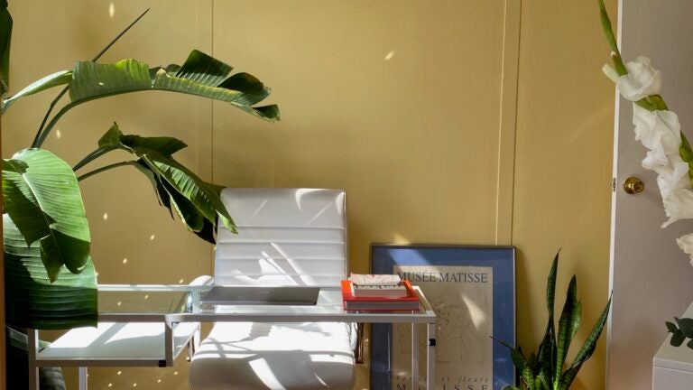
Take ‘Disco Nap’ for a spin. This lively hue is one of 2021’s colors of the year.
Deeper, moody colours and precious jewel tones are in style this year
8 Kitchen Trends Designers Predict Will Be Everywhere in 2025

UPDATE: Here Are All the 2026 Colors of the Year—Including Pantone’s Shocking Pick
Backdrop + Coming Soon Reveal Bold Color of the Year
Every Single Pantone Colour Of The Year From 2000 – 2026

Going Green: Inside This Year’s Color Craze
A Guide to All the Pantone Colors of the Year and What They've Represented
If You Want To Feel More Creative In 2022, Wear This New Color
The 2025 Colors of the Year Are Here—and They All Have One Thing in Common

Four designers weigh in on Pantone's Colour of the Year


2026 Color of the Year Announcements Have This In Common
White is the 2026 Pantone Color of the Year. They say the choice isn’t political.
2021’s Palette of Possibilities
'Cloud Dancer' to Claret: Eight paint colours that can easily transform your home

Designers Weigh in on 'Very Peri'—Pantone’s Color of the Year 2022
Homes With This Color Inside Are Worth More

We Already Know the Color That's Going to Have 2027 in a Chokehold — Now's Your Chance to Beat the Trend

Behr's 2026 Color of the Year Is Here—And It’s Moody
Update! From Evening Blue to Cinnamon Slate: See All the 2025 Colors of the Year We Know So Far