1/9
'Cloud Dancer' to Claret: Eight paint colours that can easily transform your home
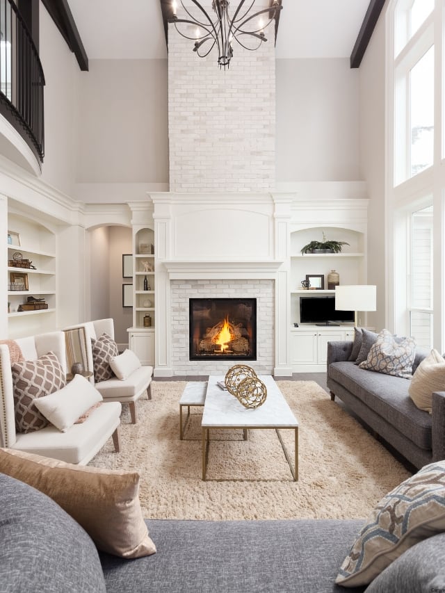
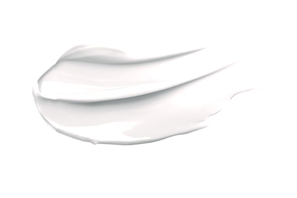
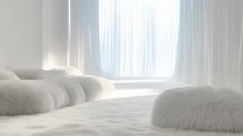
Pantone has announced "Cloud Dancer," a vanilla off-white, as its color of the year for 2026. This selection is intended to reflect a global mood shifting towards serenity and a desire for simplicity in a hyper-connected world. While some critics view color of the year announcements as marketing gimmicks, Pantone asserts that Cloud Dancer embodies an aspiration for a future free from toxicity and excess, providing a blank canvas for overstimulated minds. The choice of white signifies new beginnings, versatility, and serves as a clean base for other hues.
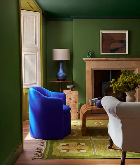
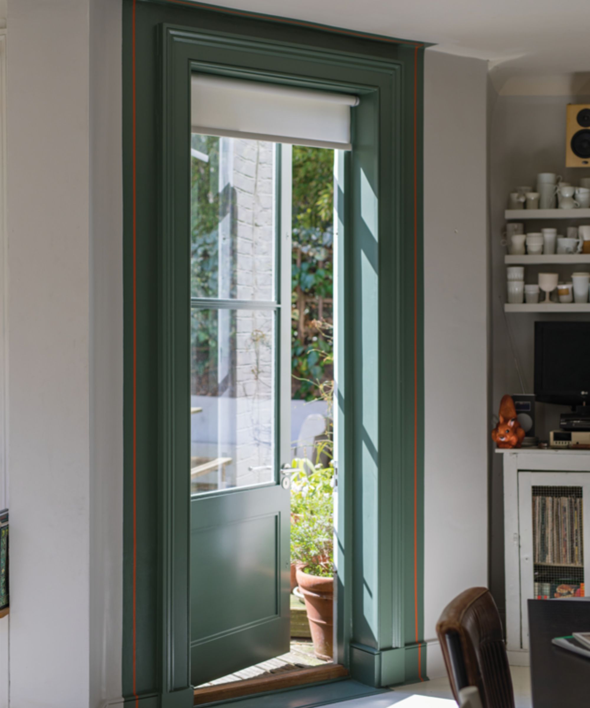
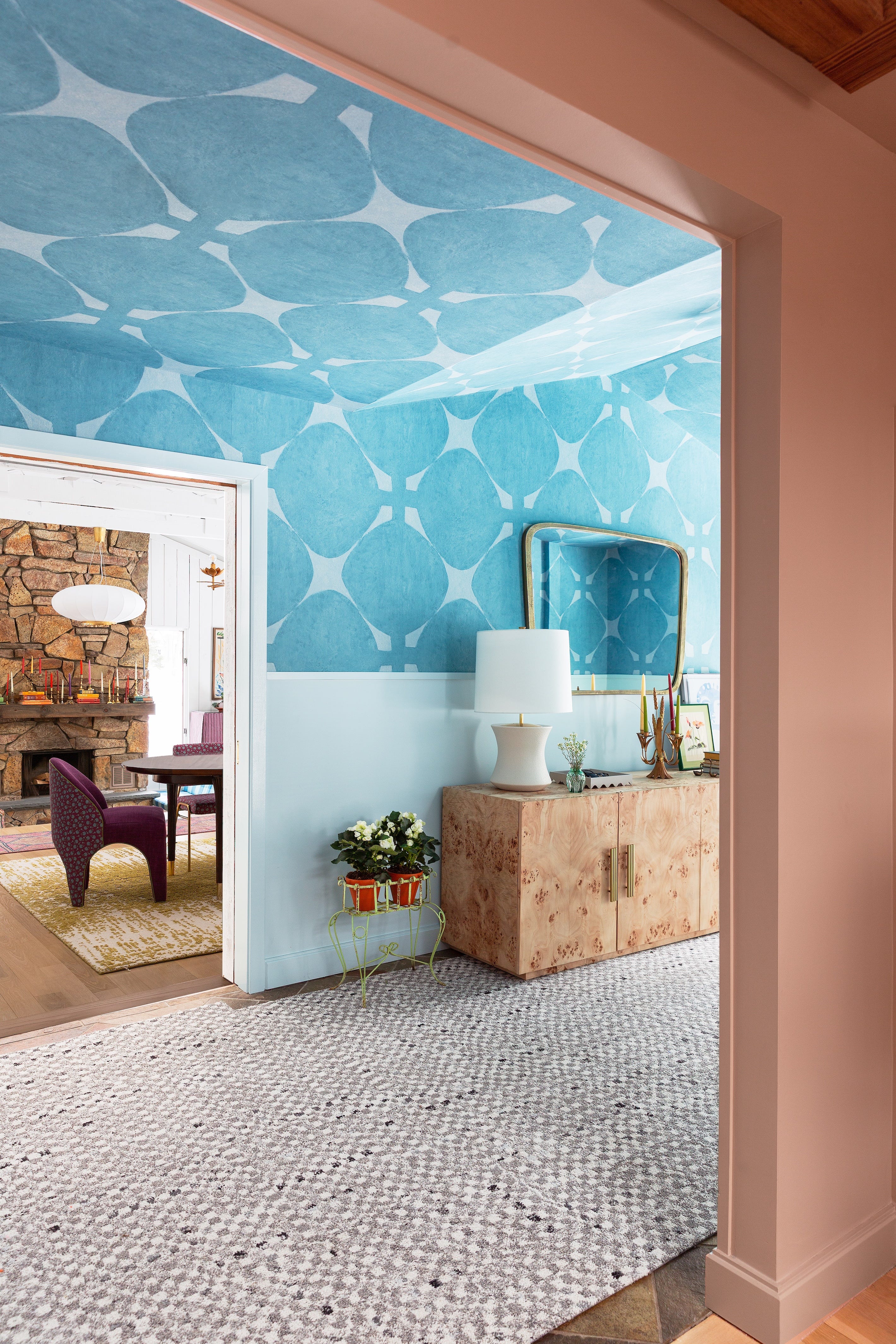
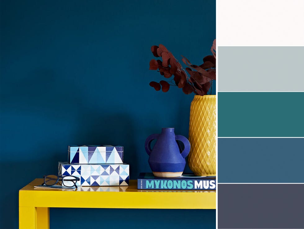
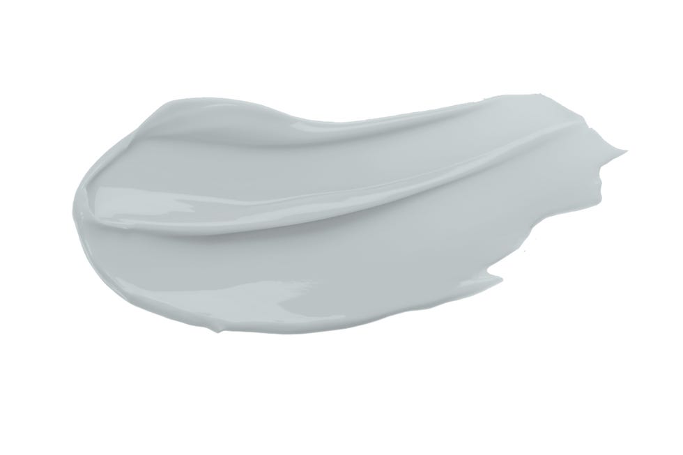
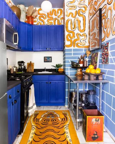
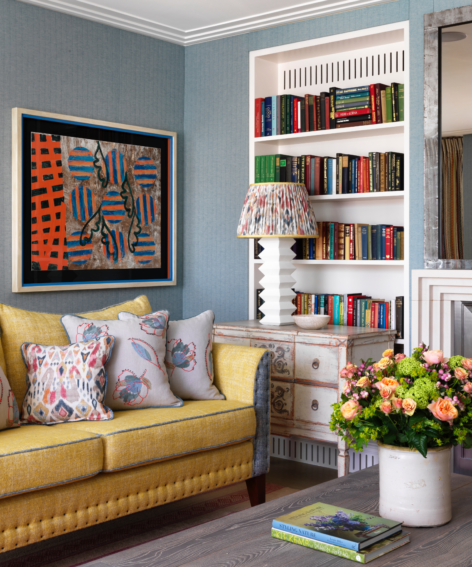
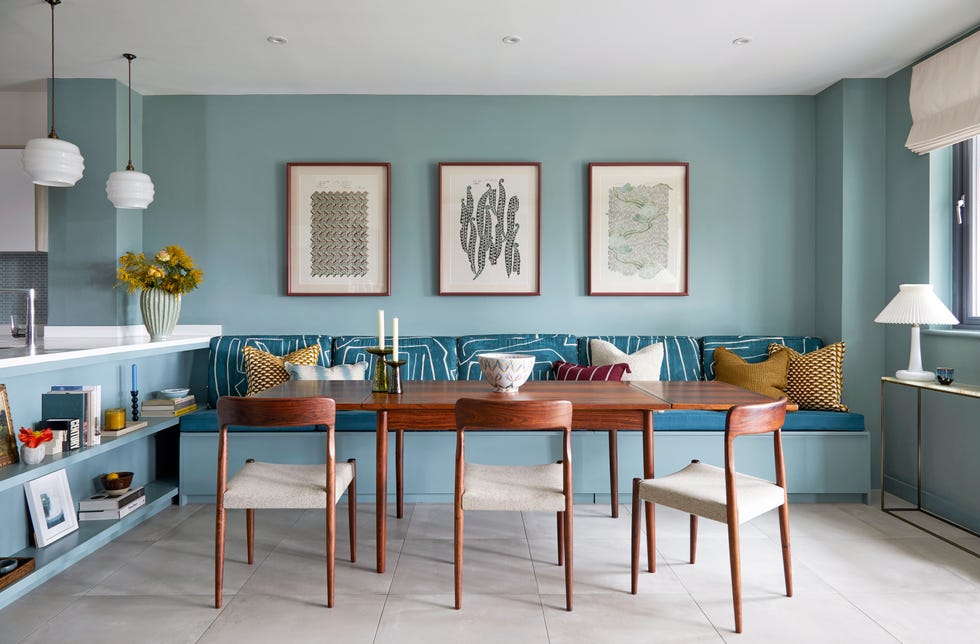
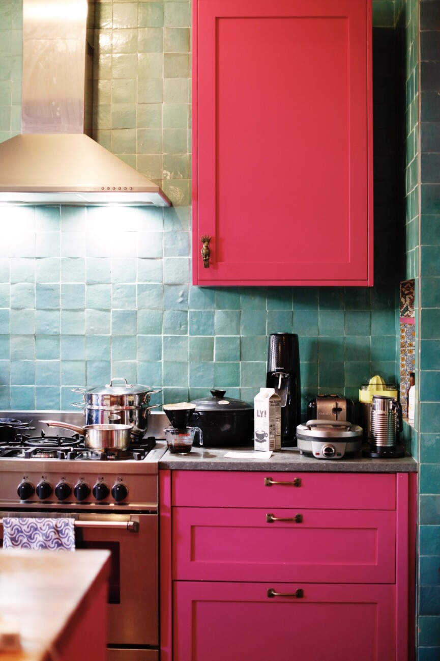
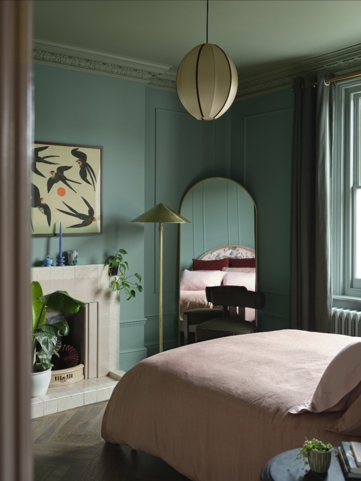
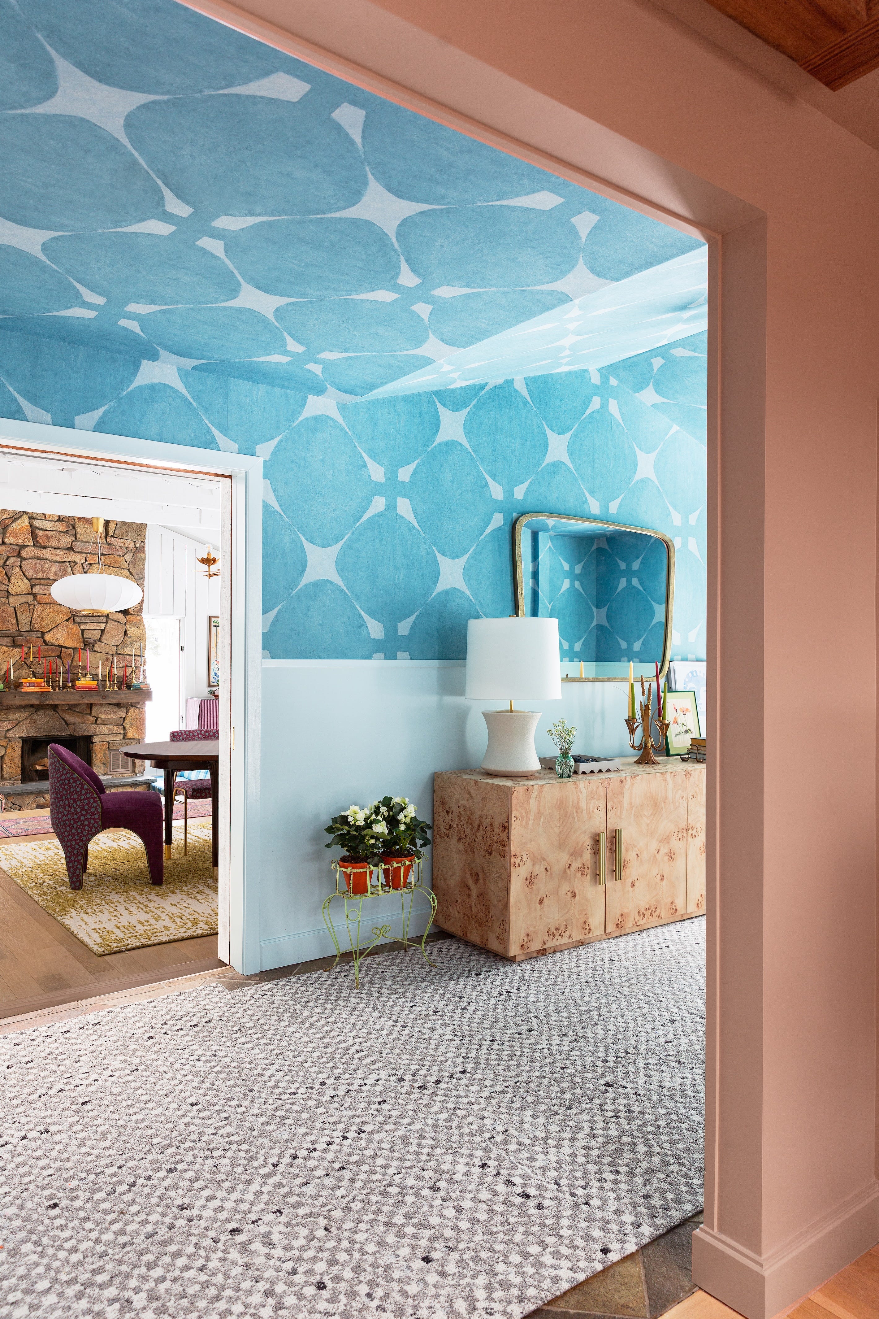
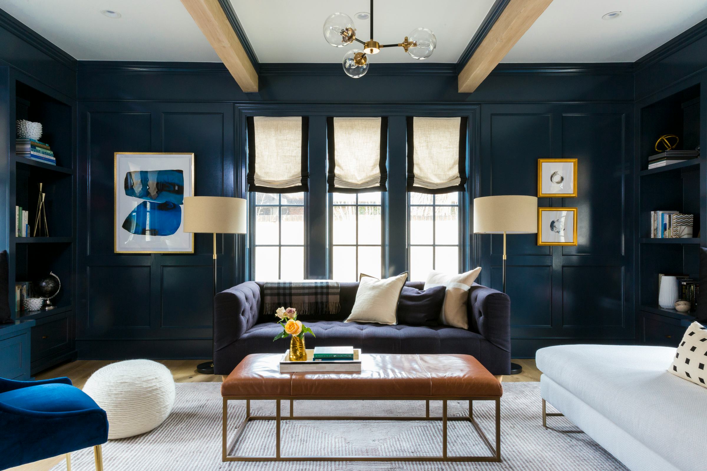
Beyond Cloud Dancer, other trending colors for interiors in 2026 include teal, which trend forecasters WGSN predicted as their color of the year, emphasizing an "Earth-first mindset" and a connection to nature. Teal, a blend of green and blue, is seen as embodying restoration and escapism. Dominic Myland, CEO of Mylands, supports this, noting that blue-green hues promote calmness and are easy to integrate into decor, often used to create immersive, comforting spaces when applied to walls, woodwork, and ceilings.
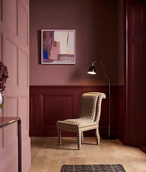
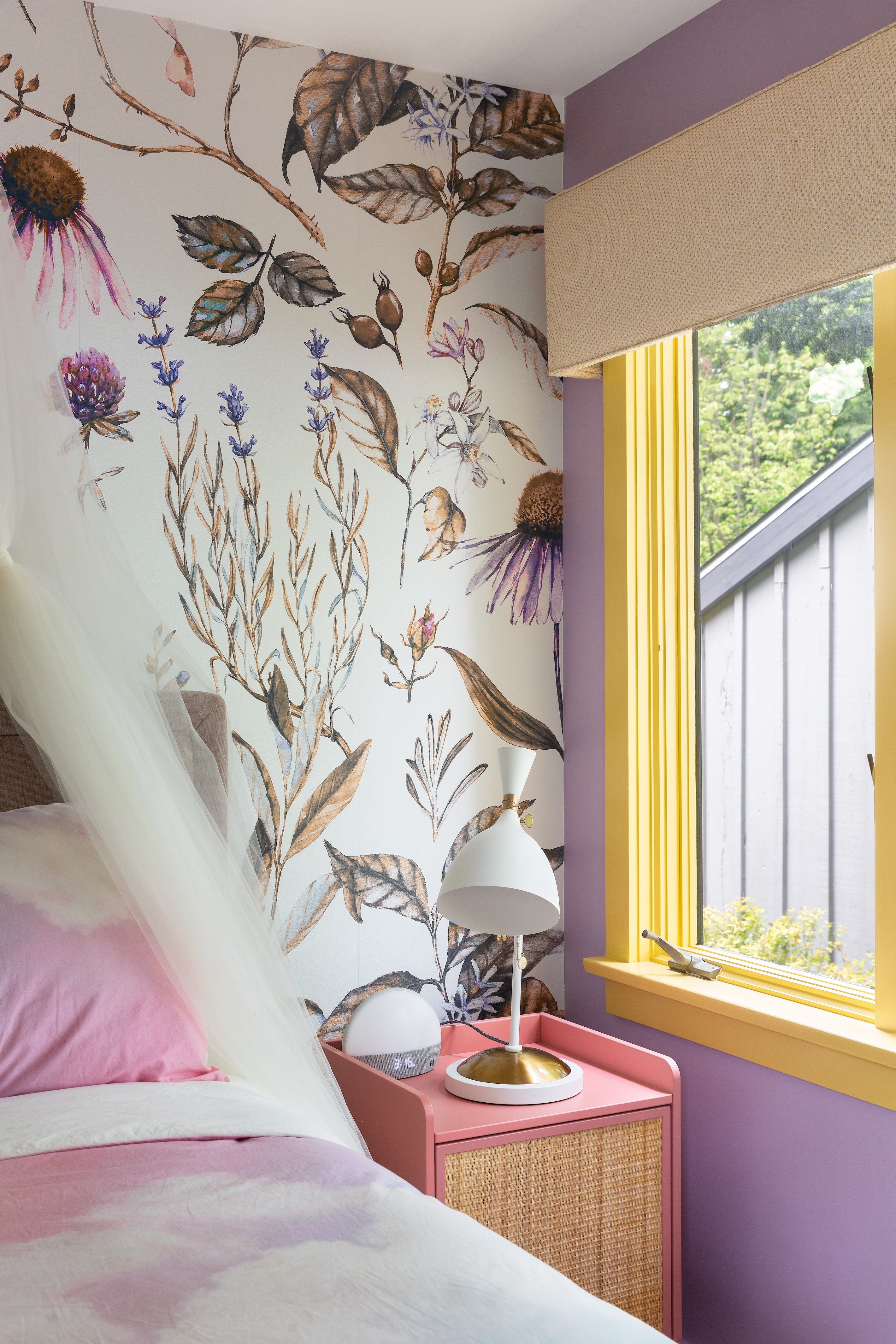
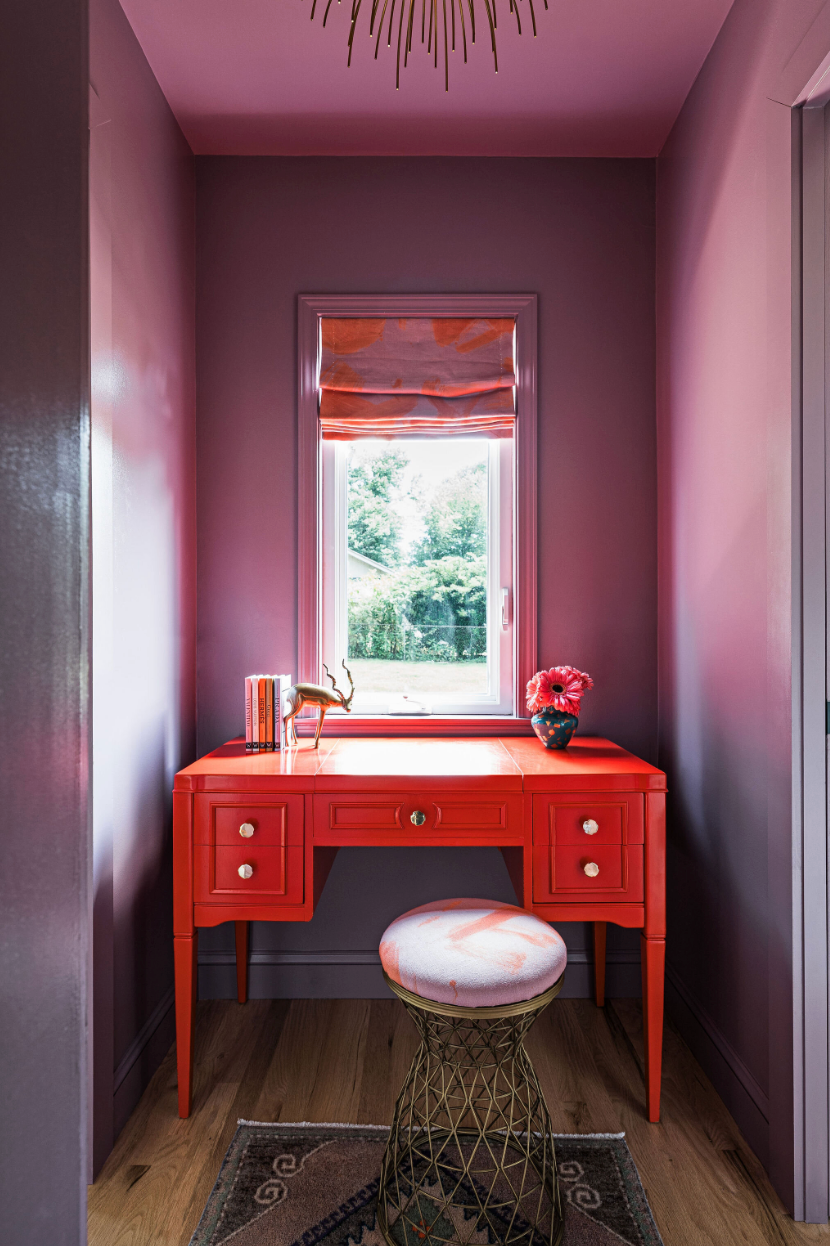
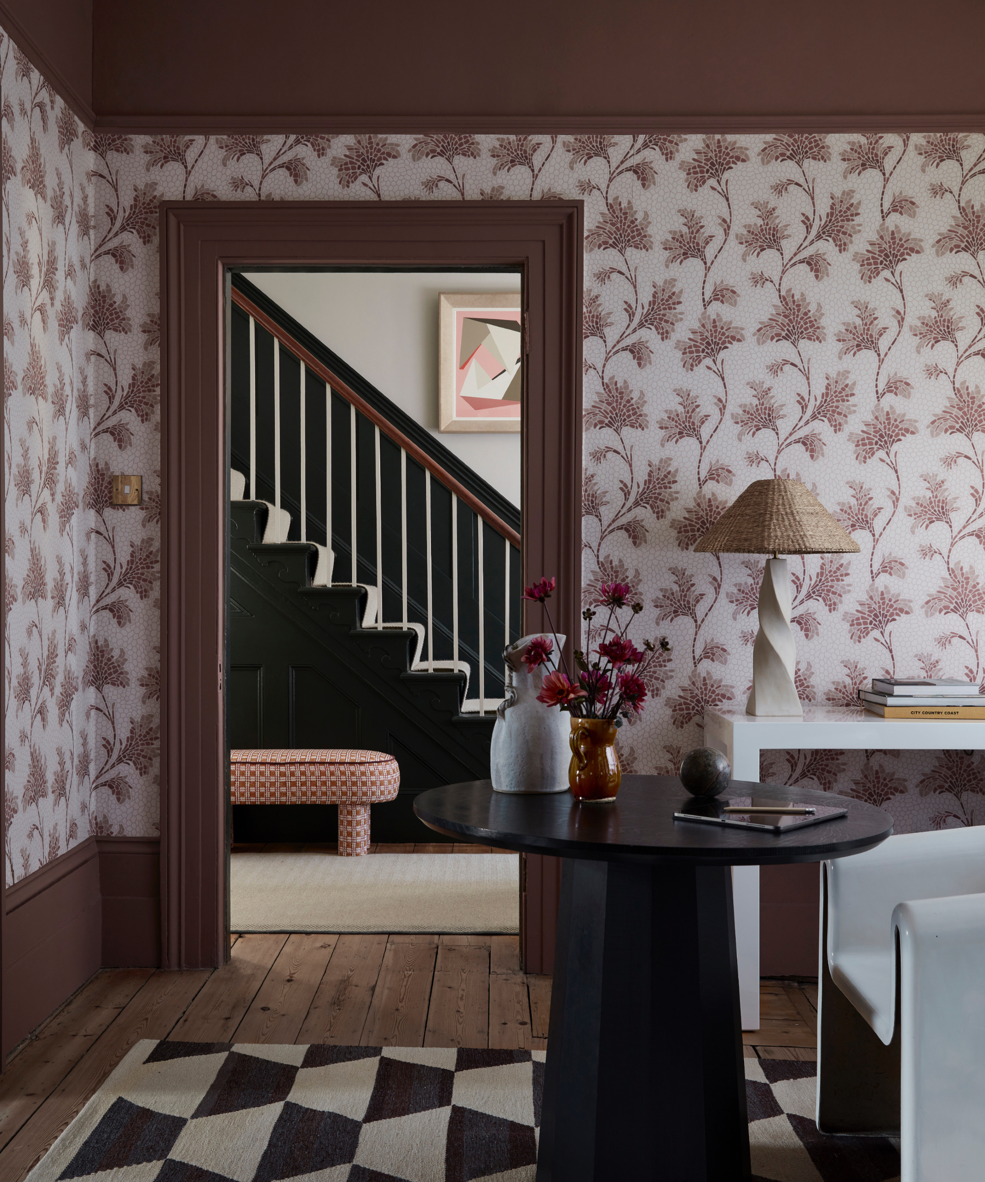
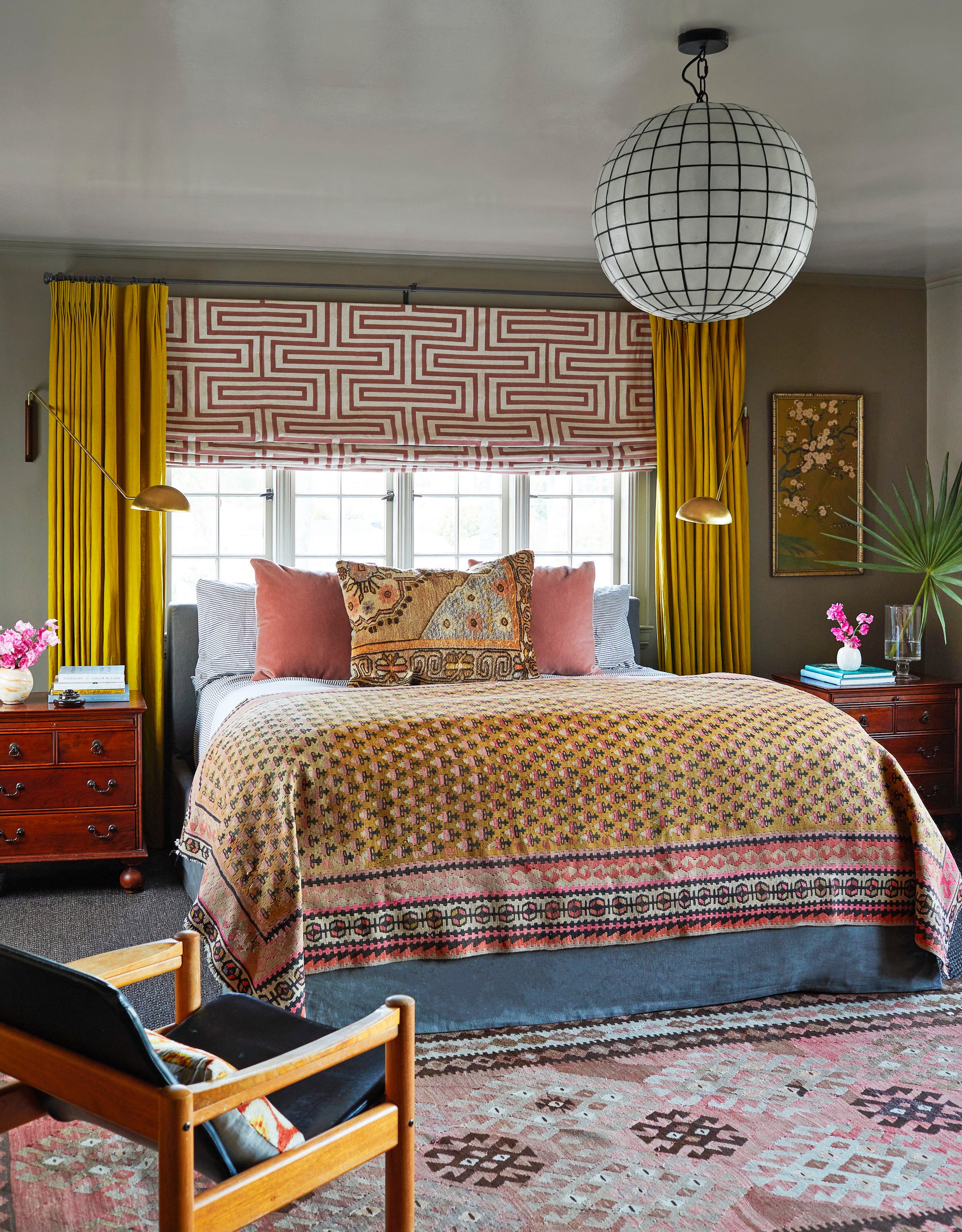
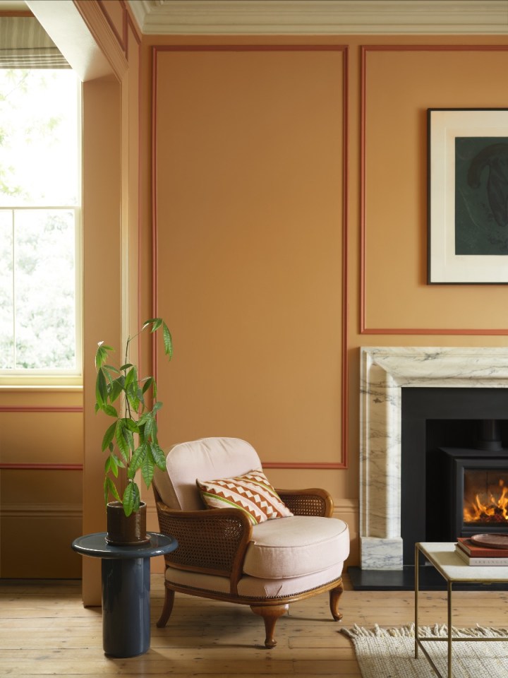
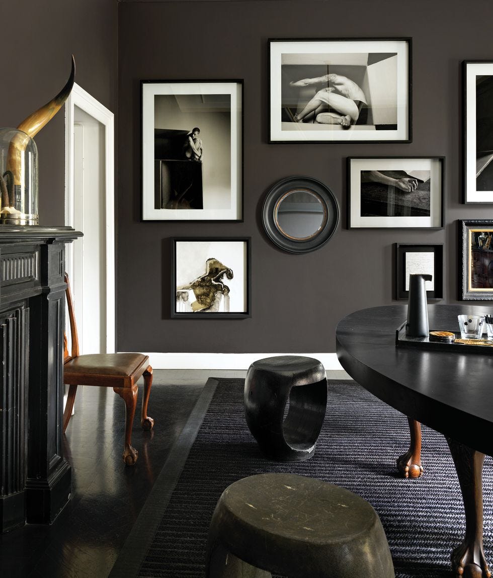
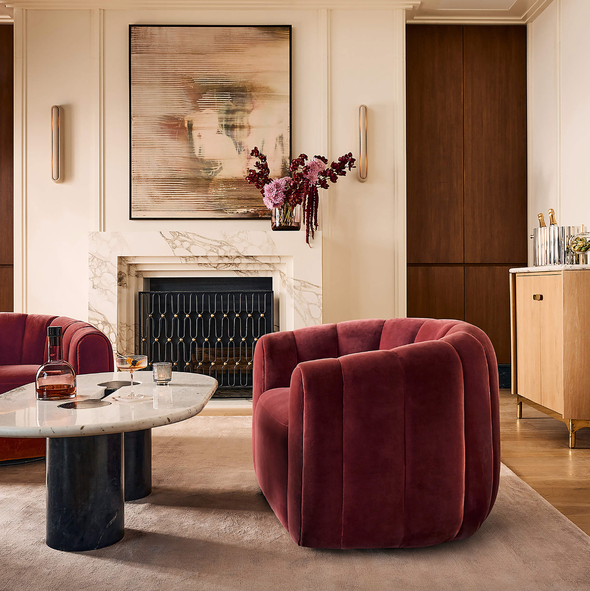
Earthy red tones, such as claret, bronze red, and garnet, continue to be popular, subtly reimagining the burgundy and plum shades of 2025. These rich, comforting hues, described by Ruth Mottershead of Little Greene, offer a sophisticated alternative to traditional browns and pair well with natural materials like wood. Grey ochre also features as a neutral choice, contributing to pared-back palettes that allow artworks and antique furniture to stand out, reflecting a "quiet nostalgia" and a layered, modern use of countryside tones.
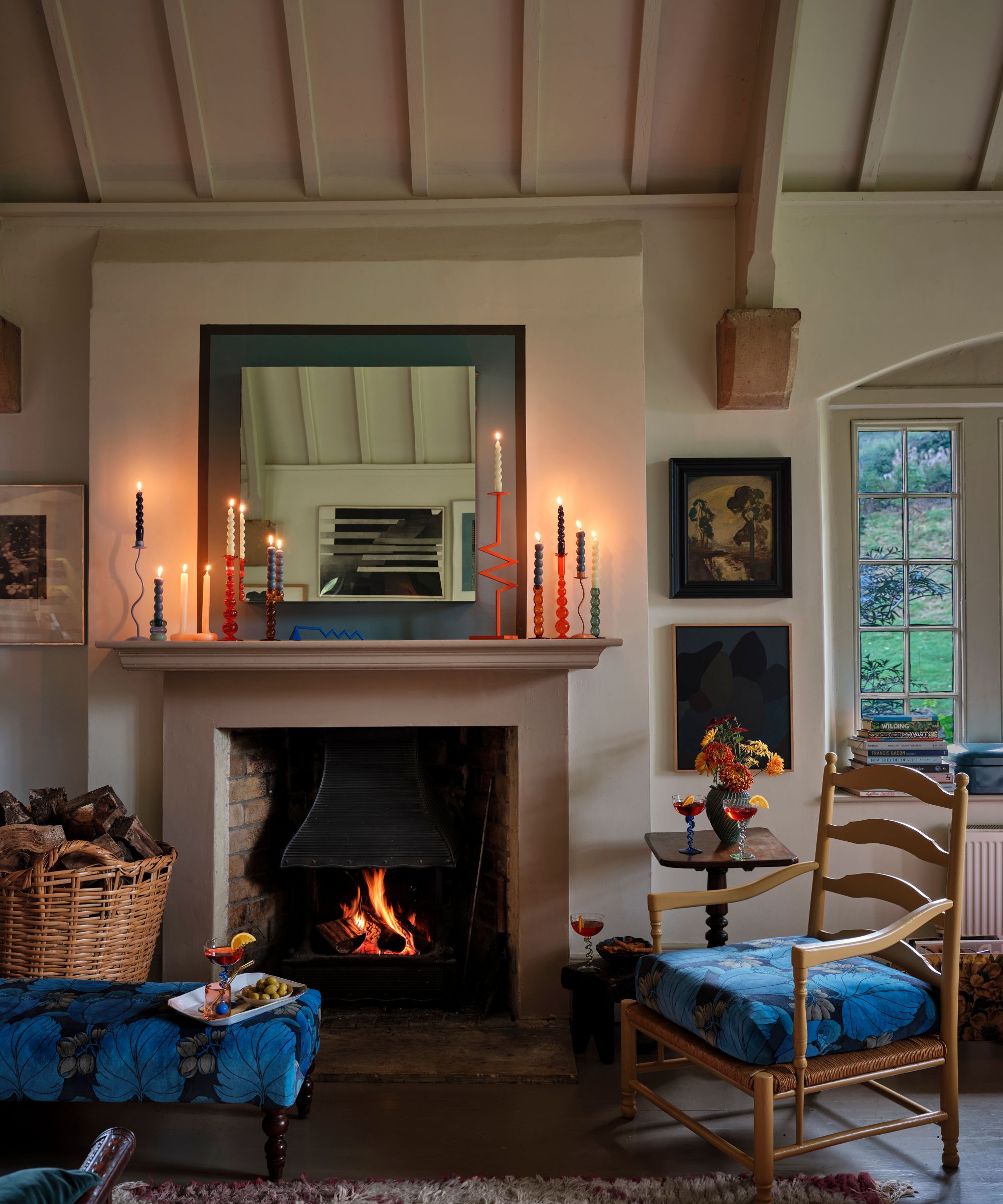
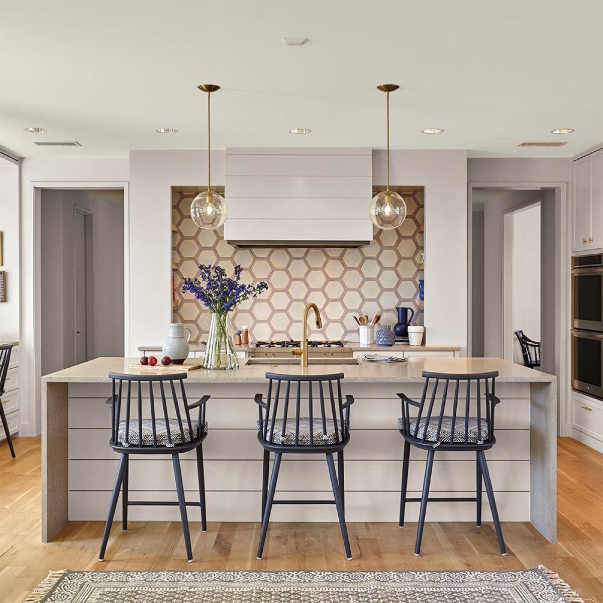
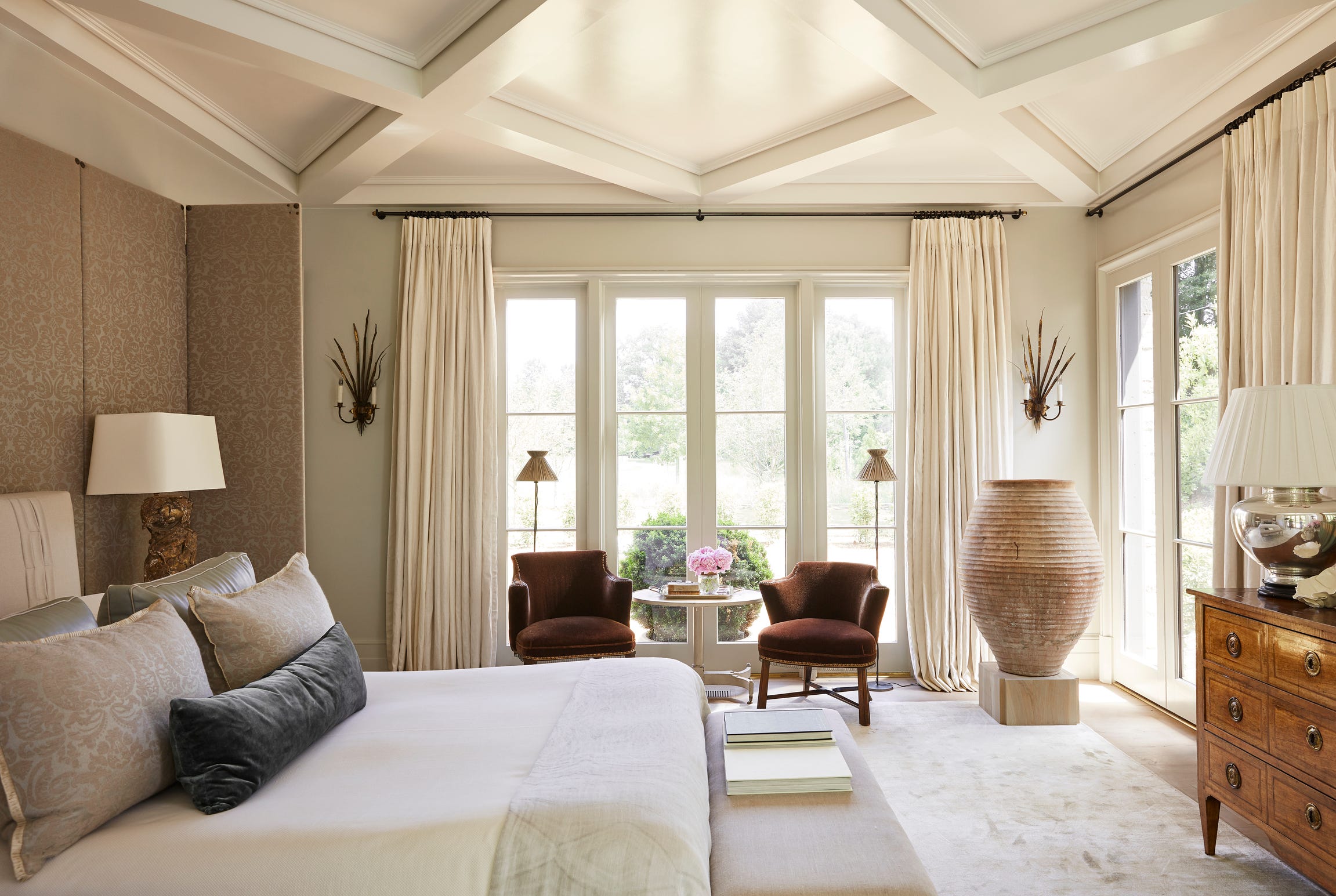
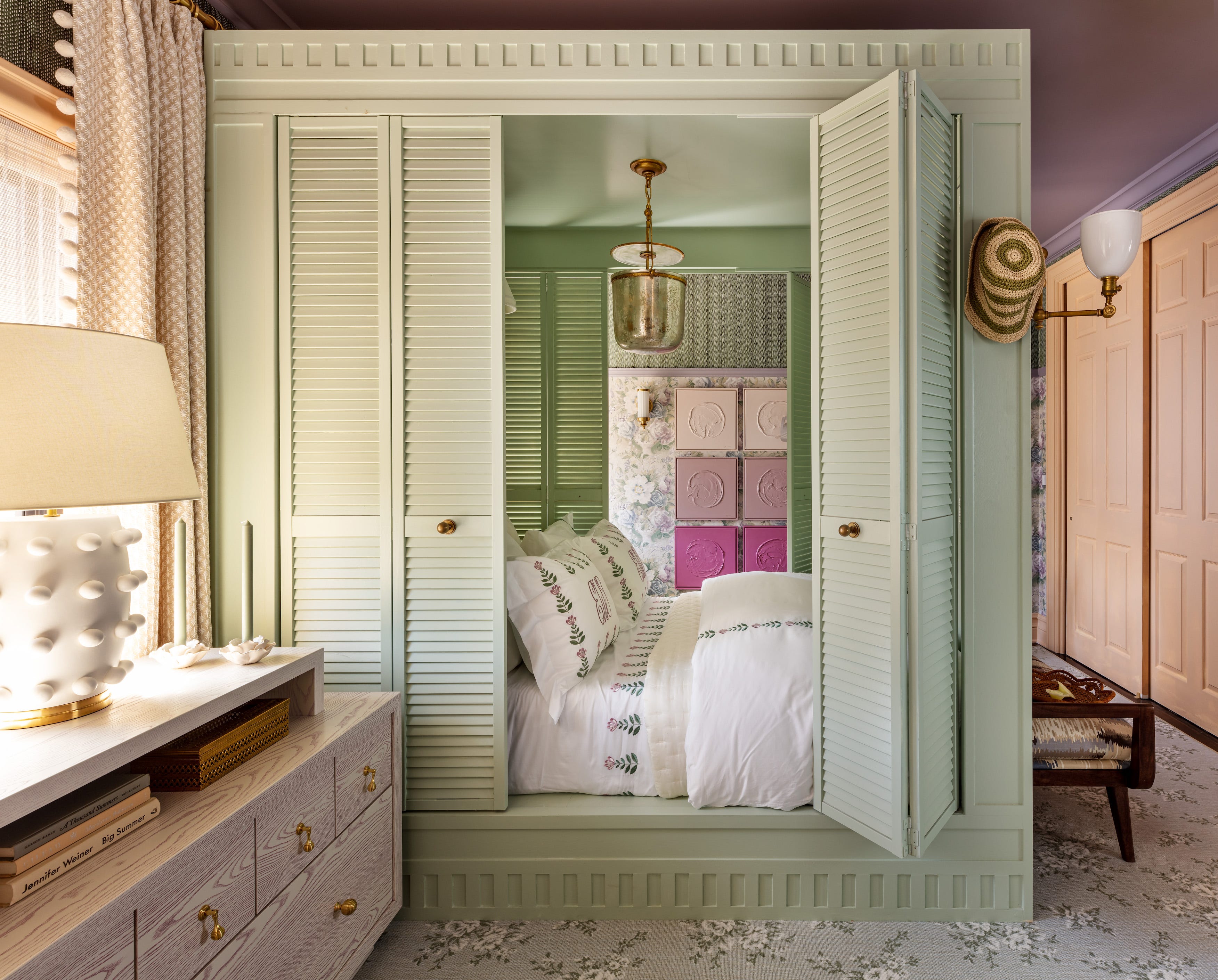
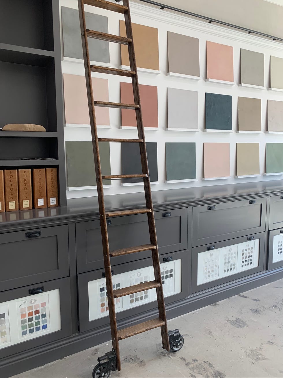
Same-family palettes are trending, exemplified by ecru and chestnut, where different shades within the same color family are layered. Cathryn Sanders of Earthborn Paints suggests defining the mood first, then layering with a mid-tone on walls, a lighter tint above, and a deeper shade on woodwork, often involving "color-capping" where ceilings use a paler version of the wall color. Mixing finishes, such as matte walls with satin joinery, adds depth.
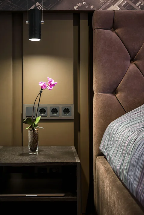
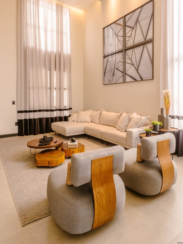
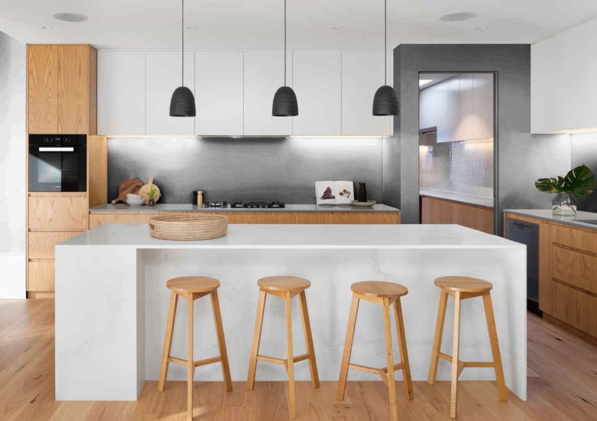
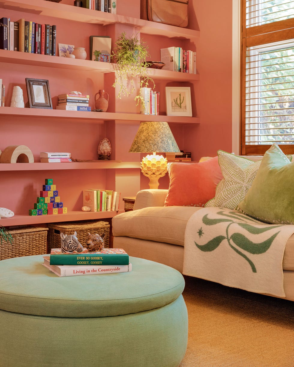
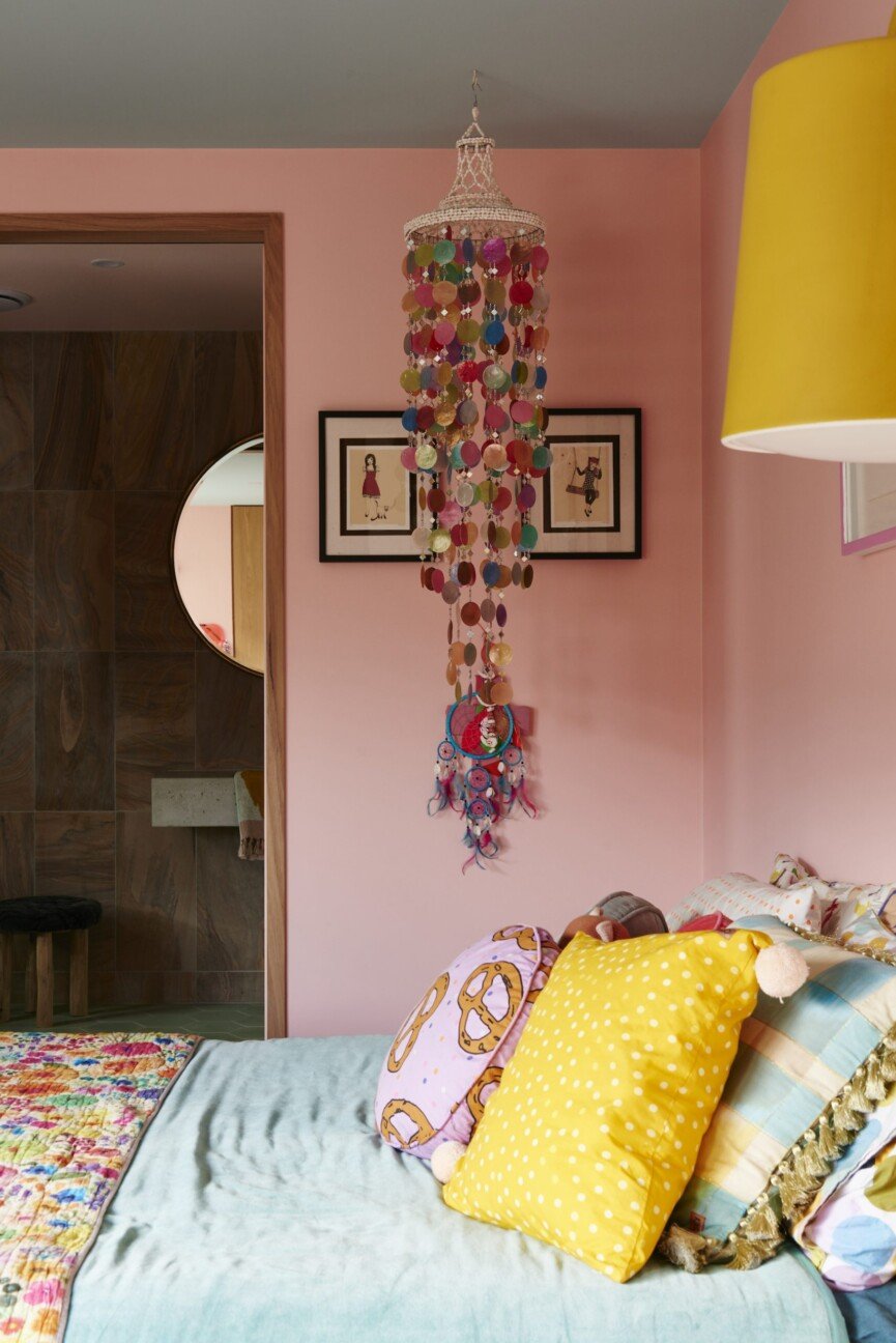
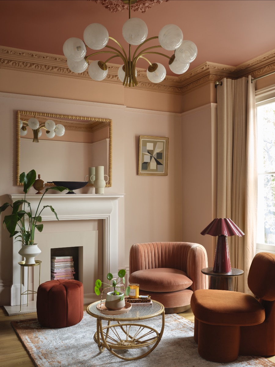
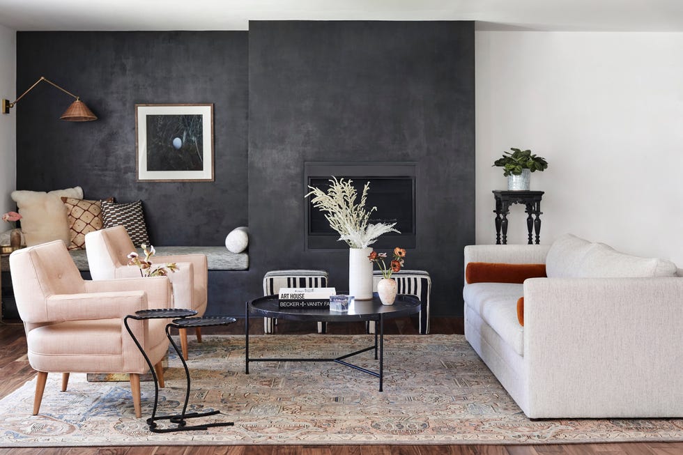
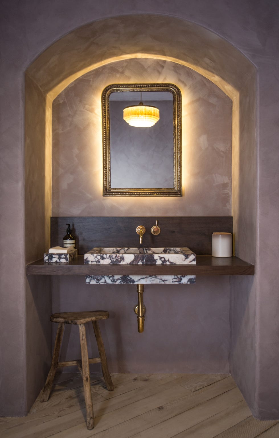
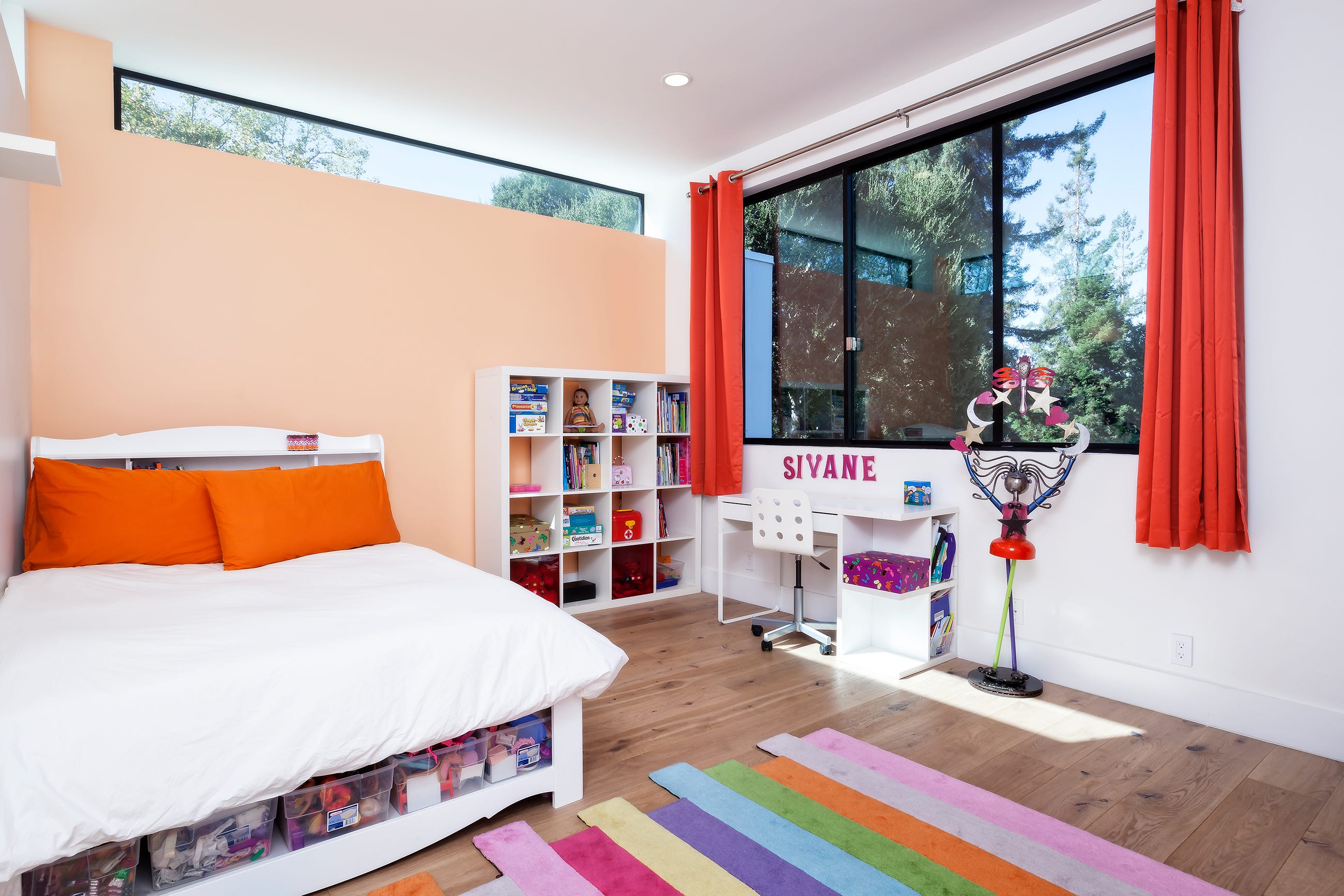
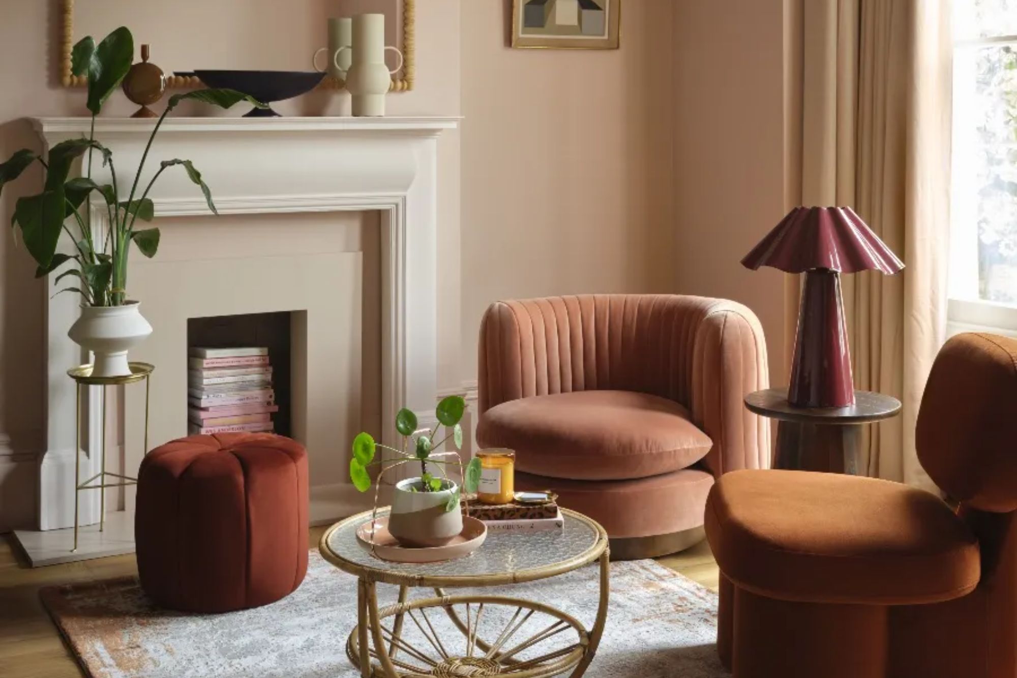
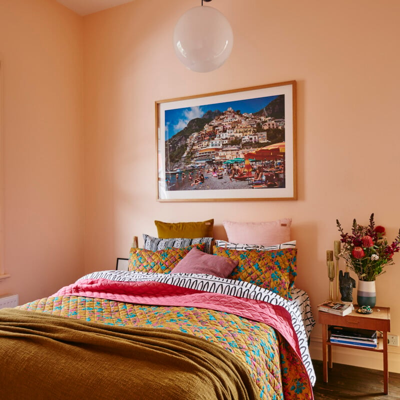
Warm neutrals, including peach, soft browns, and cream, are considered backdrops for layering rather than focal points. Interior designer Christian Bense highlights how mixing tones allows for organic styling, using warm neutral browns with peachy cream accents and various textures. These comfort colors are evolving from simple beiges and blushes to include enveloping taupes and complex mid-tone neutrals that offer emotional warmth without overwhelming a space.
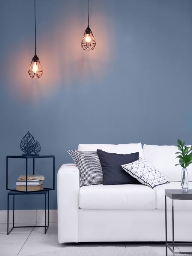
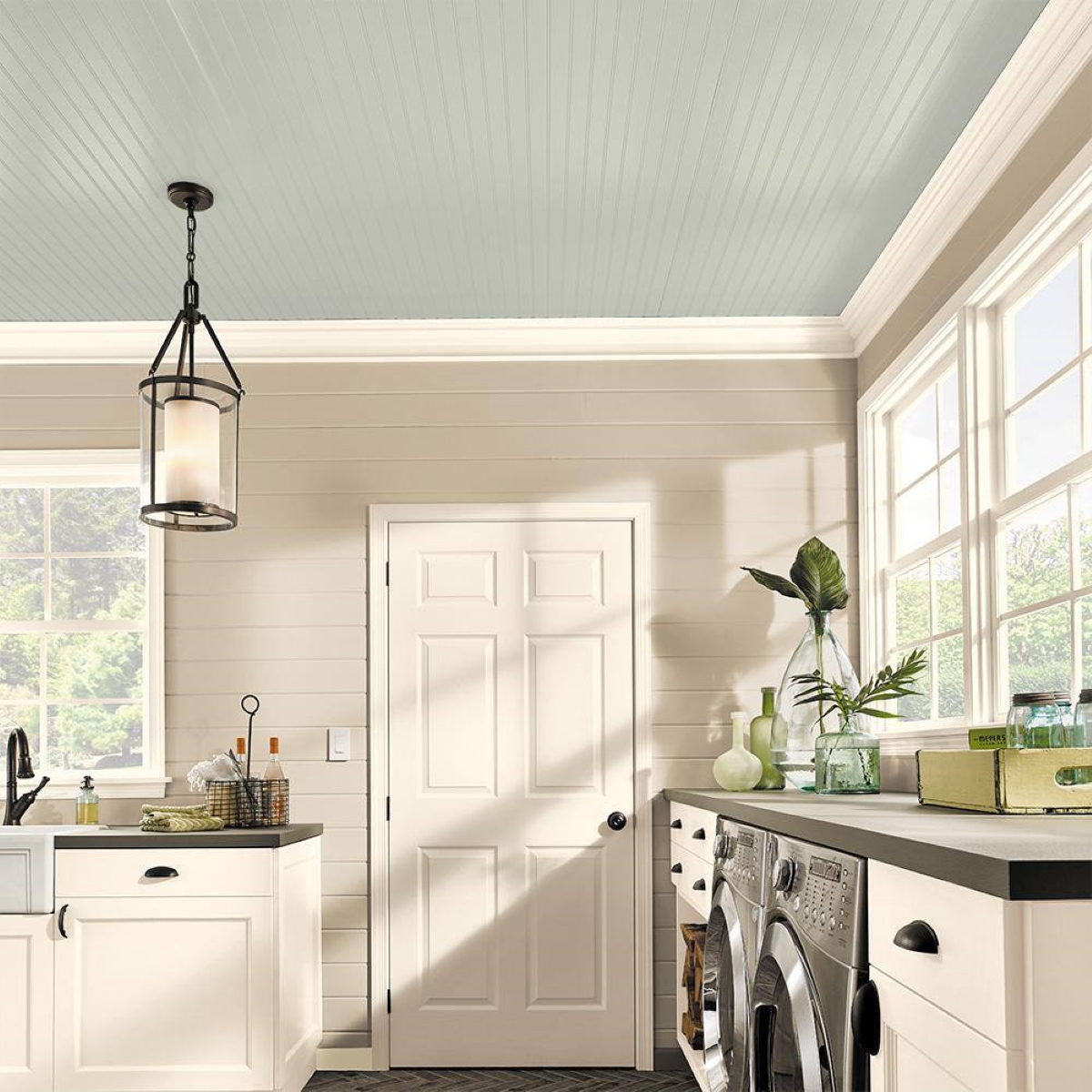
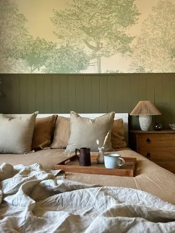
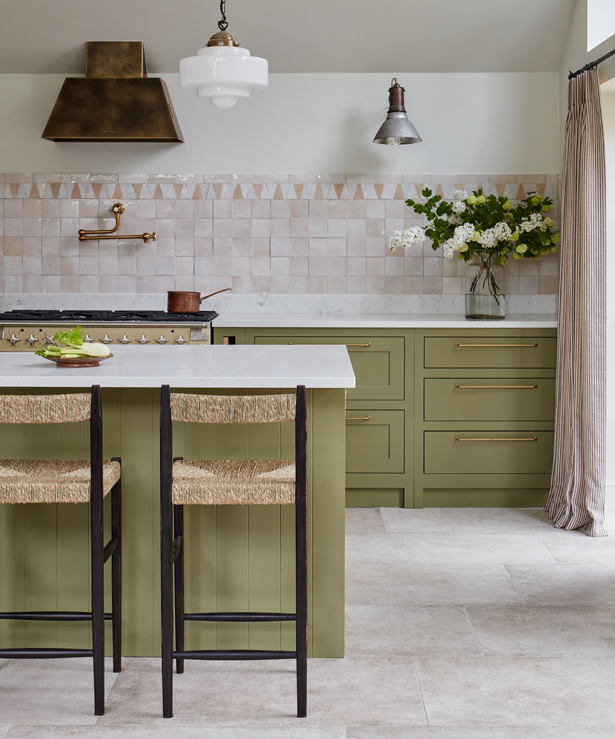
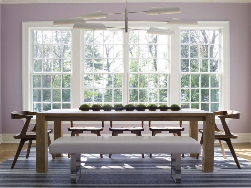
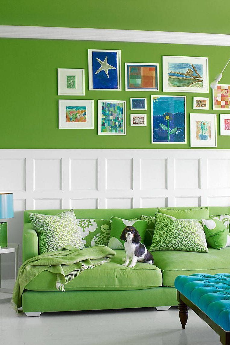
Finally, mineral blue, deeply connected to nature, and sage and jade greens continue to resonate with designers. These hues bring a sense of ease and draw on centuries of symbolism, from springtime renewal to Georgian interiors. Designer Birdie Fortescue notes that these calming tones can accentuate architectural details often overlooked when left white, demonstrating that color choice is fundamental to mood, memory, and levity in interior design.
#PantoneColorOfTheYear #InteriorDesignTrends #HomeDecoration #PaintColors #ColorPsychology #CloudDancer #EarthyTones #NeutralPalettes #TealInteriors #PantoneColorOfTheYear #InteriorDesignTrends #HomeDecoration #PaintColors #ColorPsychology #CloudDancer #EarthyTones #NeutralPalettes #TealInteriors
0 comment in total
 No comments yet
You may also like
'Mocha mousse' to plum: The nine paint colours that can transform your home
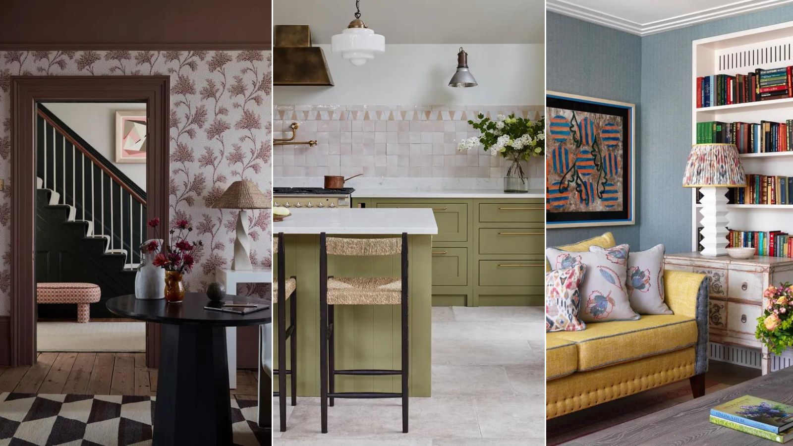
Designers Say These Unusual Paint Color Combos Will Transform Your Home

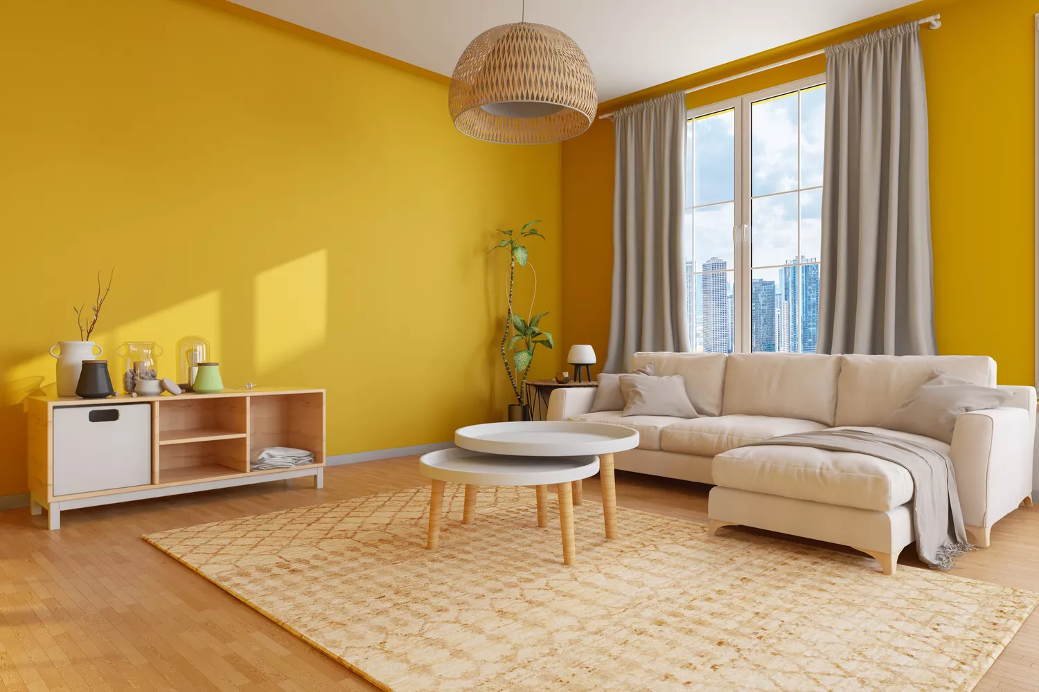
10 beautiful transitional color schemes for every room in the house

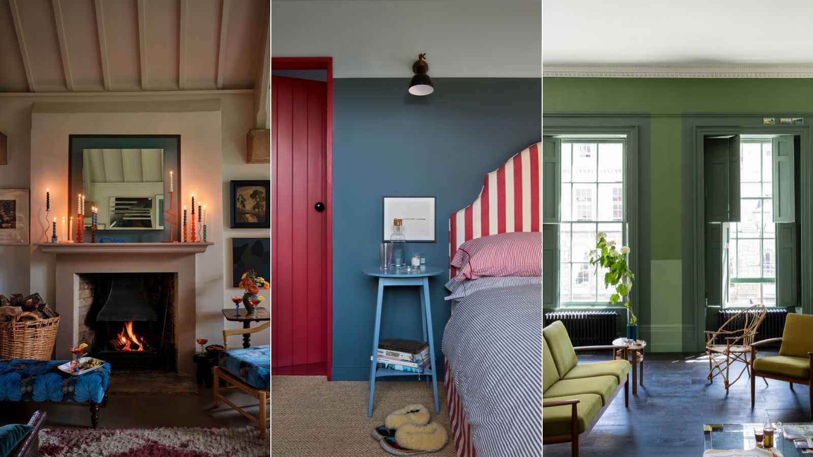
5 Paint Colors to Never Use in Your Living Room, According to Interior Designers
'Modest amounts of color can make huge statements' – Farrow & Ball's color curator shares 5 simple ways to transform the home with paint

Experts reveal the best living room paint colours to transform every space

6 Gorgeous Home Color Trends That Aren't Just Neutrals

Interior designers reveal the home decor trend that will take over 2026 & why it's time to bin off accent walls

7 colour tricks to transform your mood and living room design

Painting hacks: How to transform your home with paint
How to make your home look instantly more stylish with clever use of colour

This Paint Brand Will Transform Your Room In A Day

The 5 Most Overused Paint Colors and What to Try Instead, According to Designers

30 on-trend paint colours for every room in your home

These Beautiful Paint Colors Will Make You Want to Switch Up Your Bedroom Right Now

These Accent Color Ideas Will Transform Any Room
8 Ceiling Paint Color Trends to Consider for Your Next Home Refresh

12 Chalk Paint Colors That Will Transform Your Furniture, Walls, and More

The Brighter, the Better—These Vibrant Paints Will Infuse Your Home With Positivity

This Color Will Transform Your Living Room Instantly