1/4
Is Benjamin Moore's Gentleman's Gray the perfect navy blue paint?
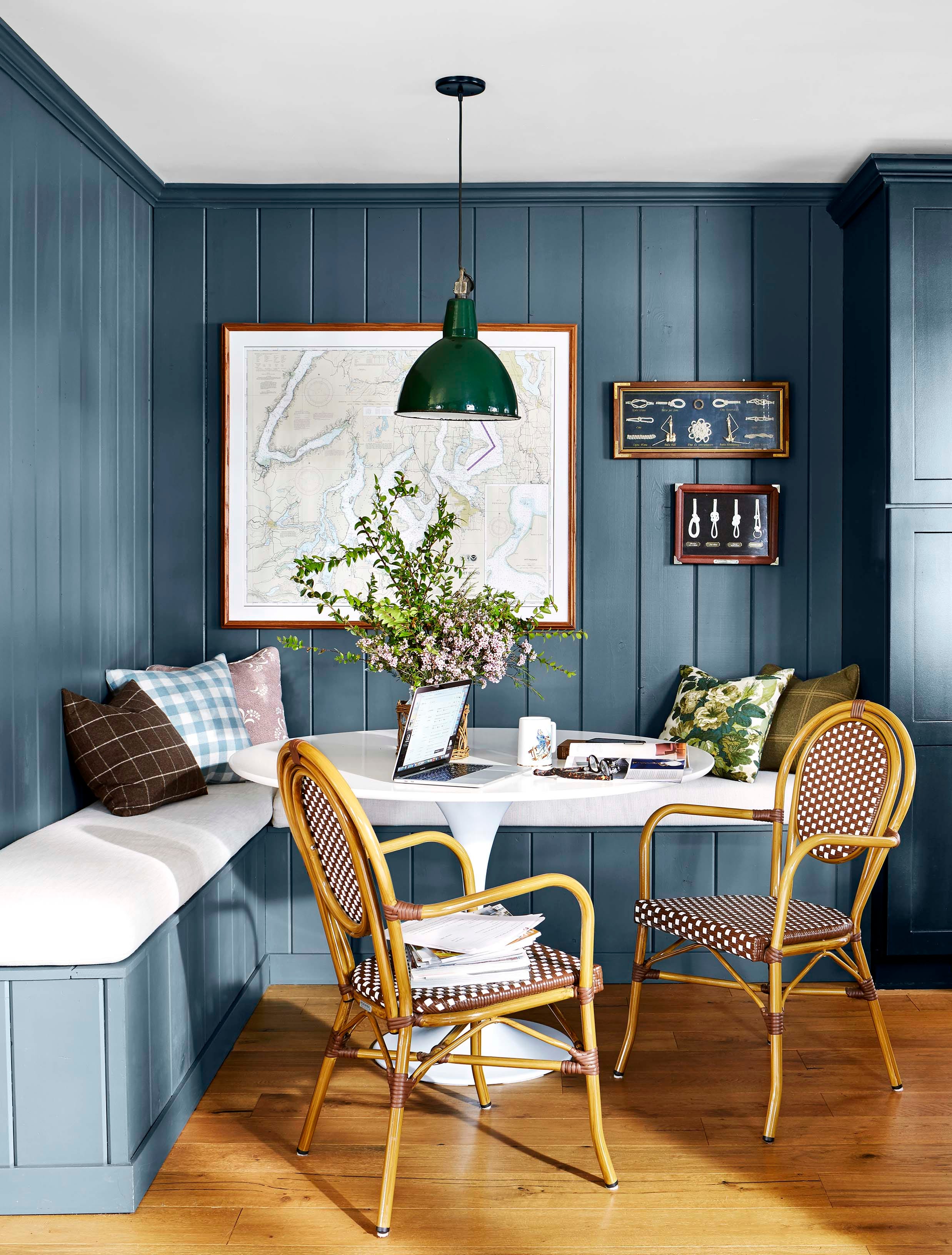
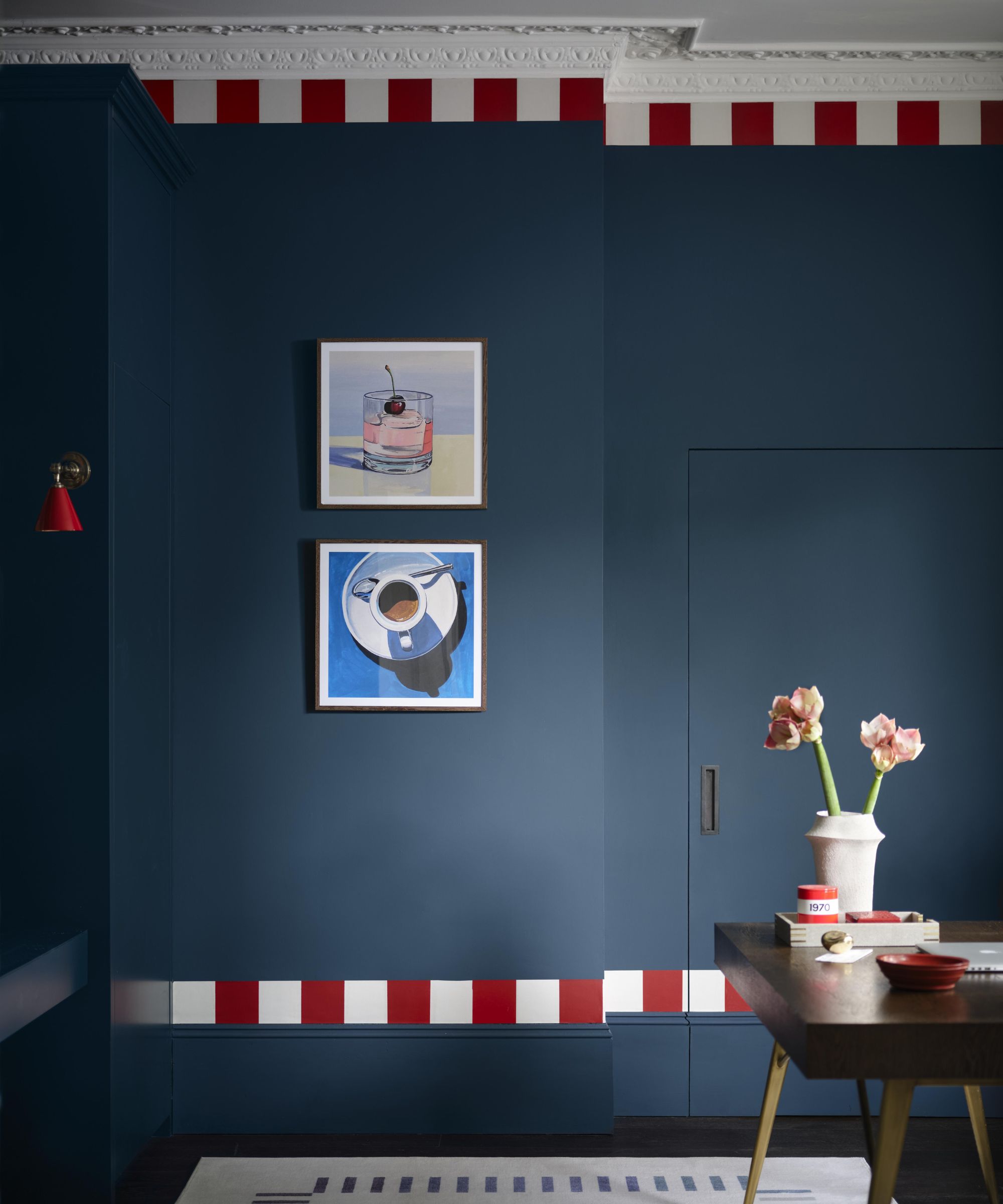
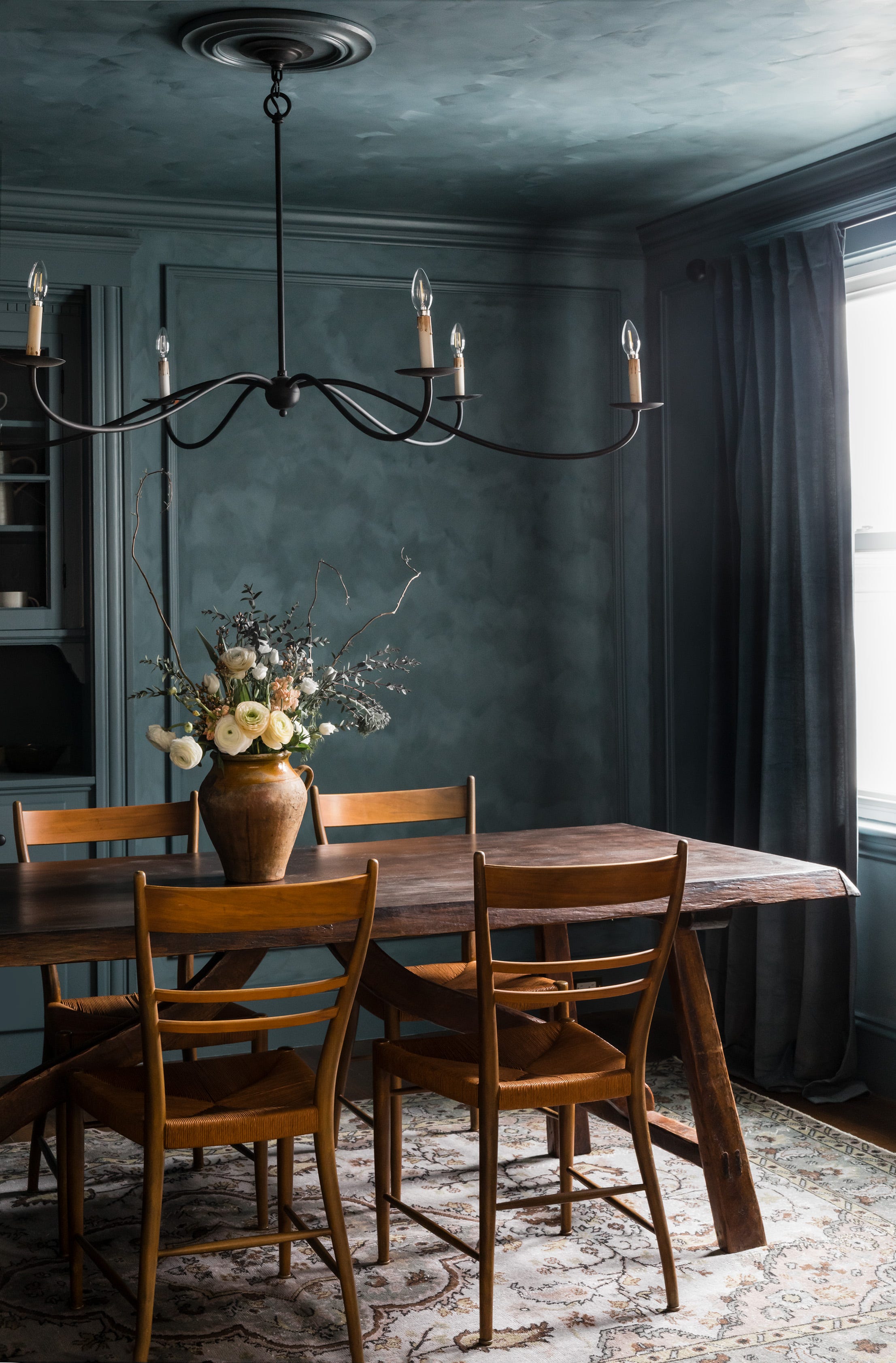
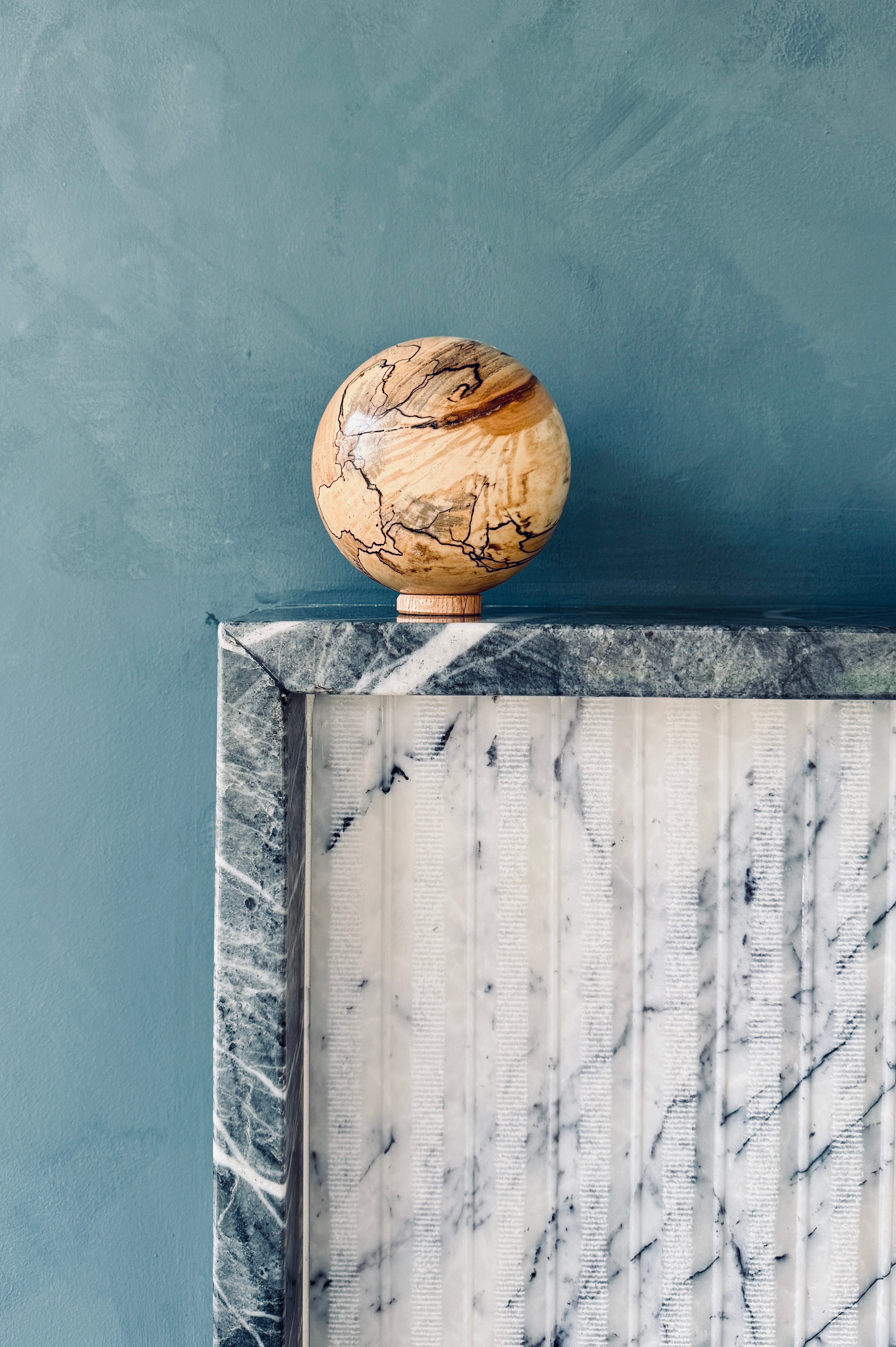
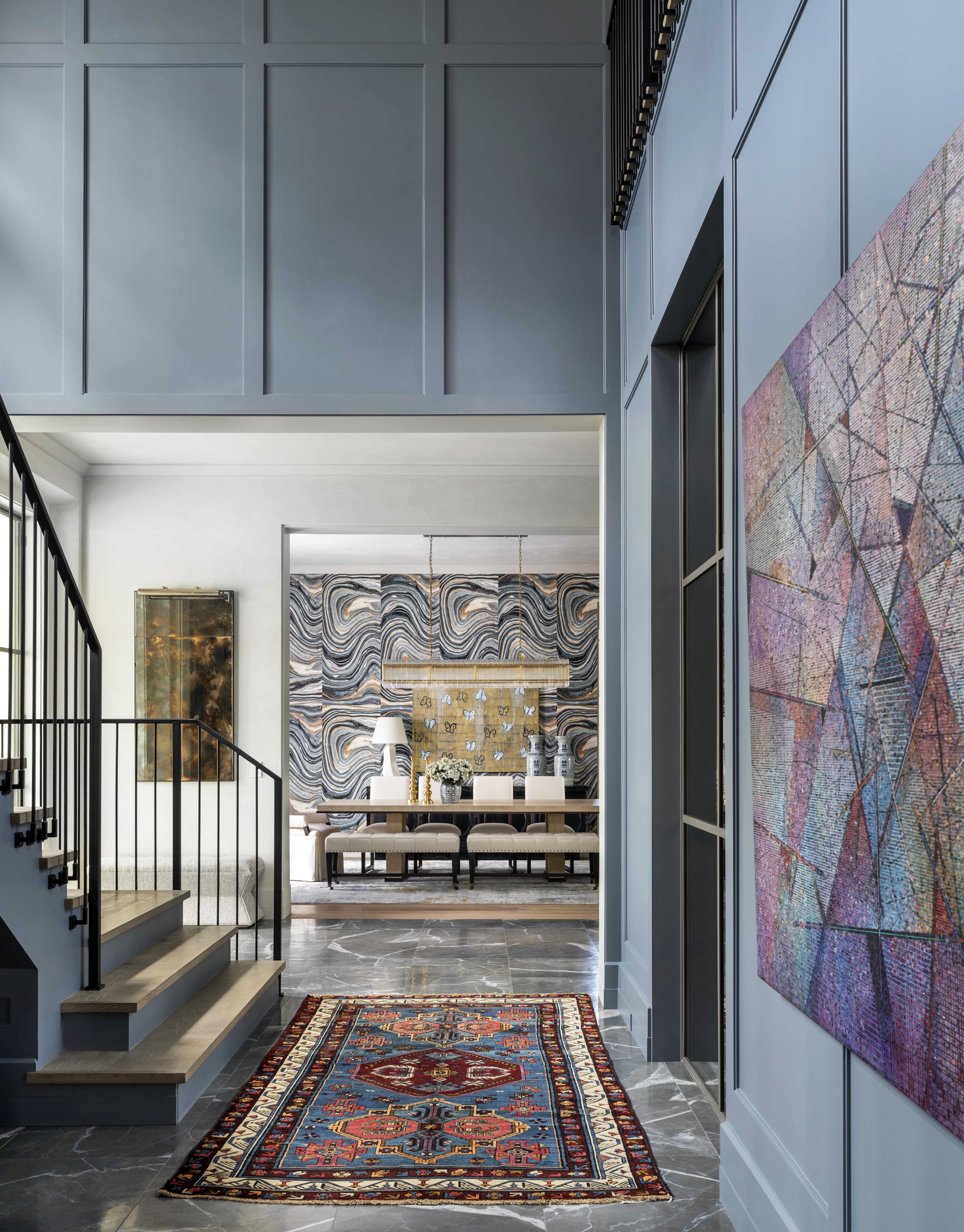
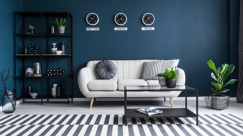
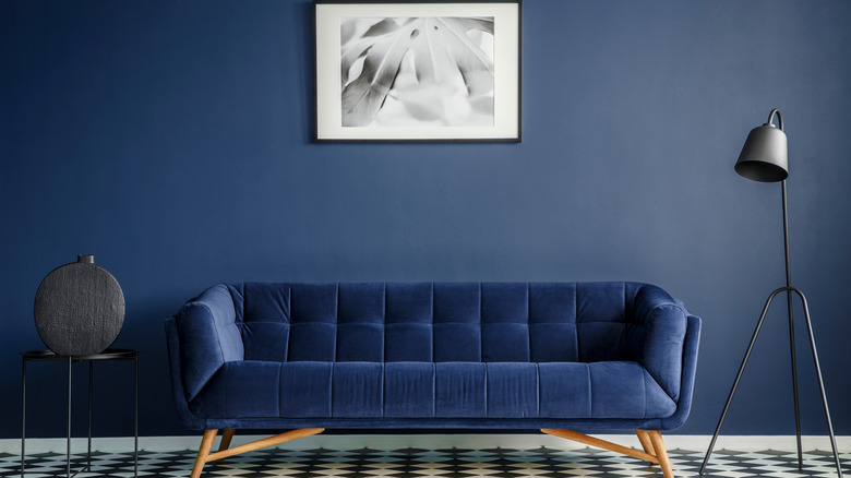
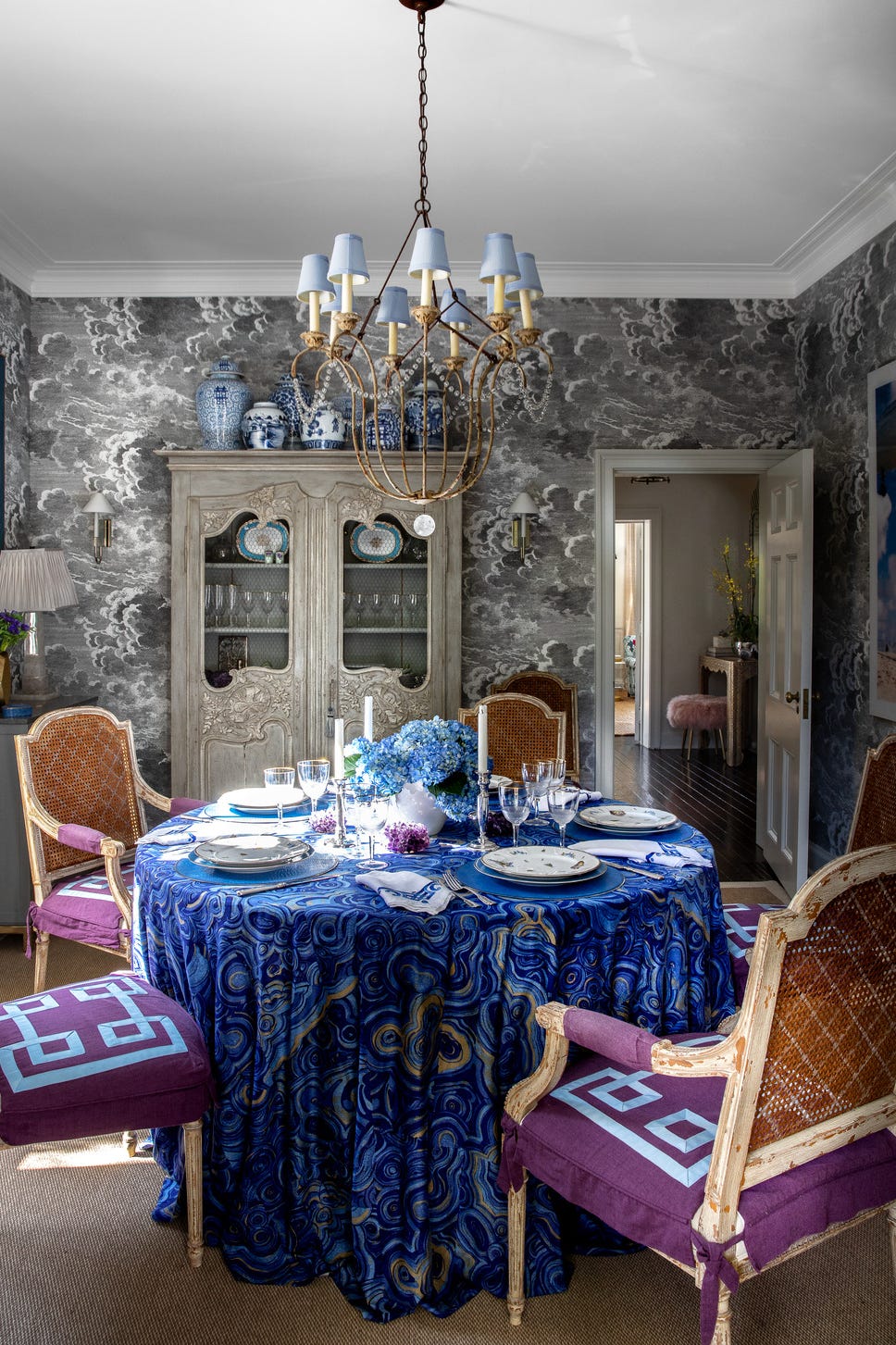
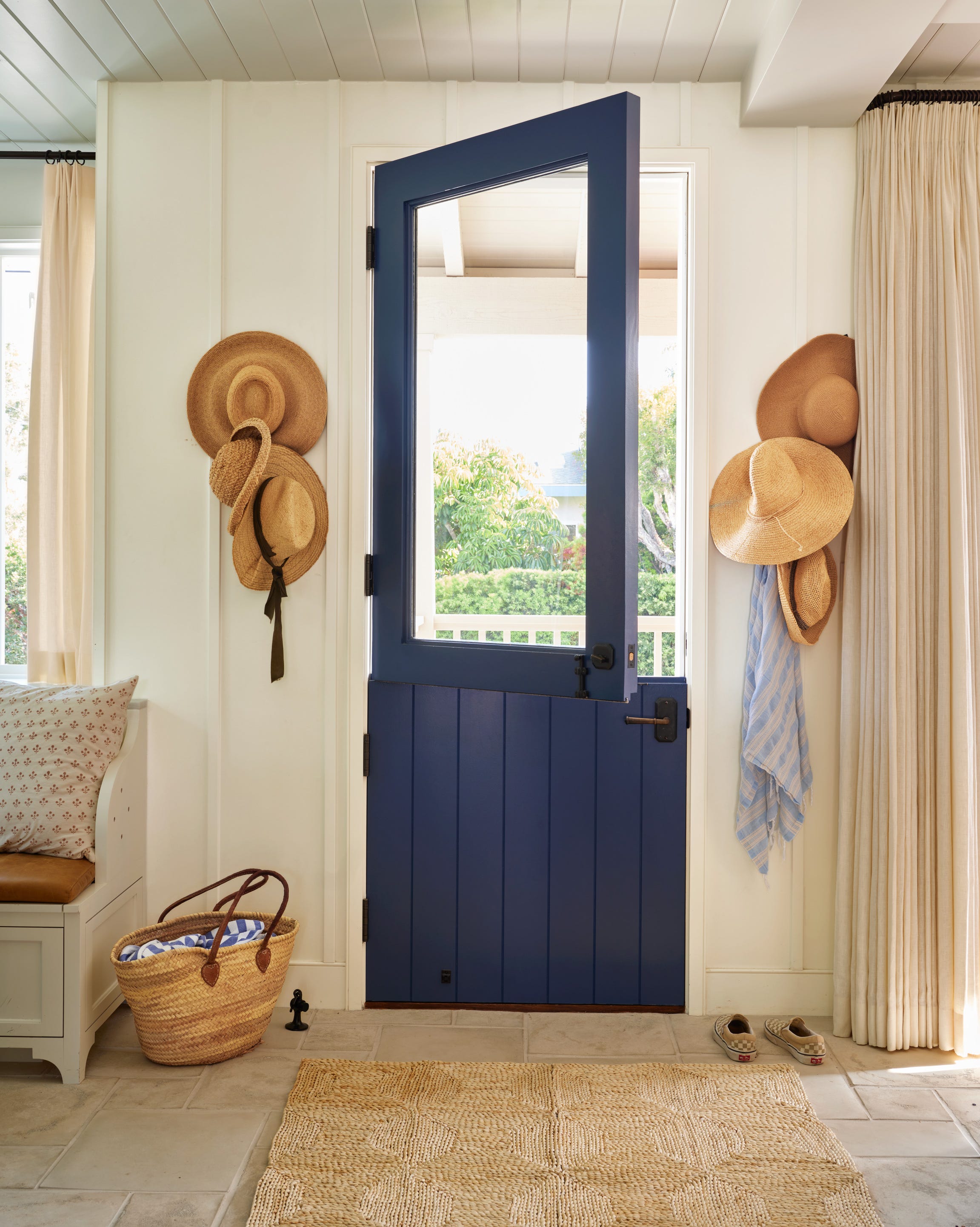
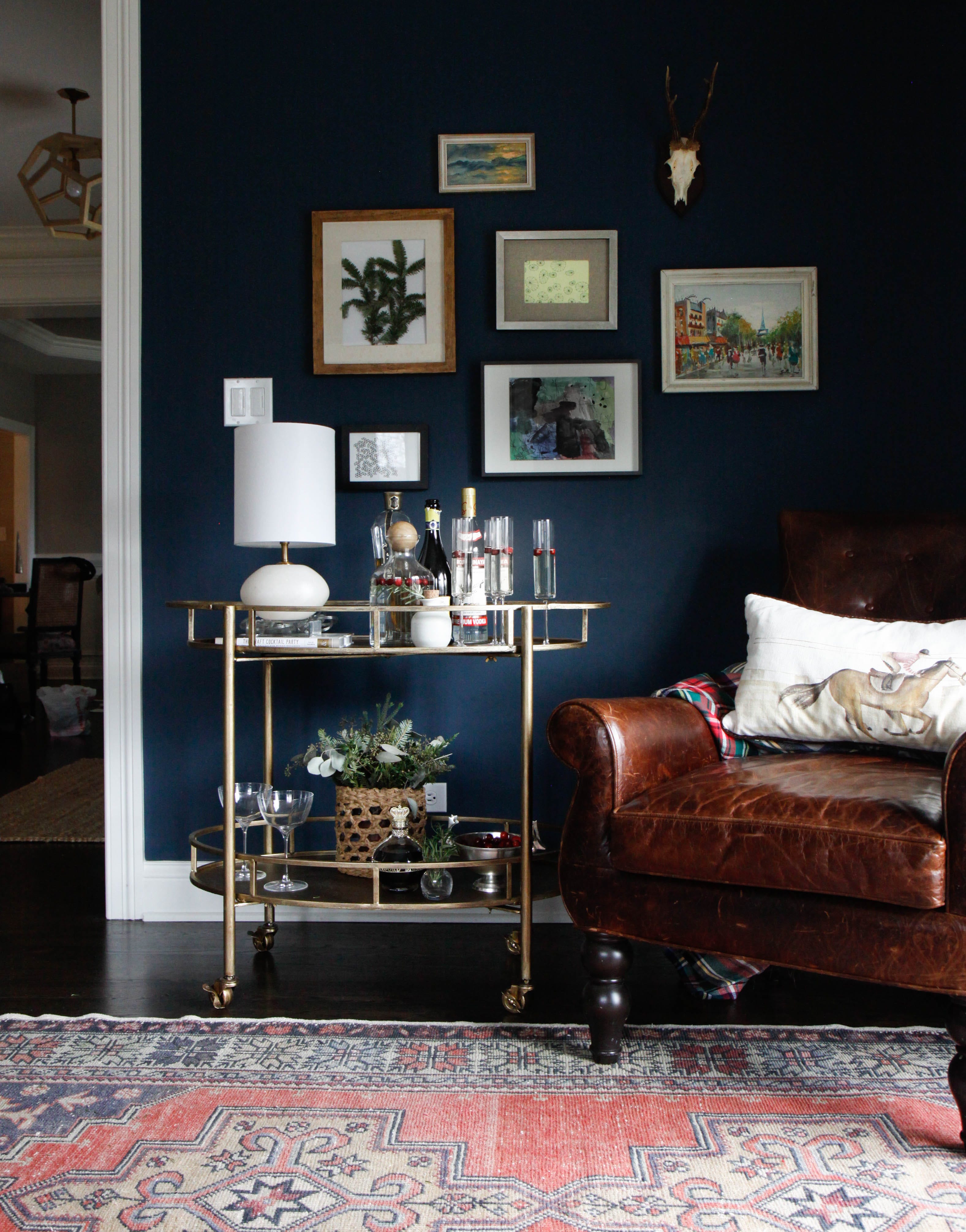
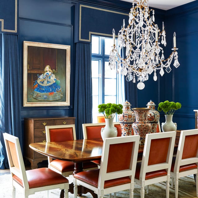
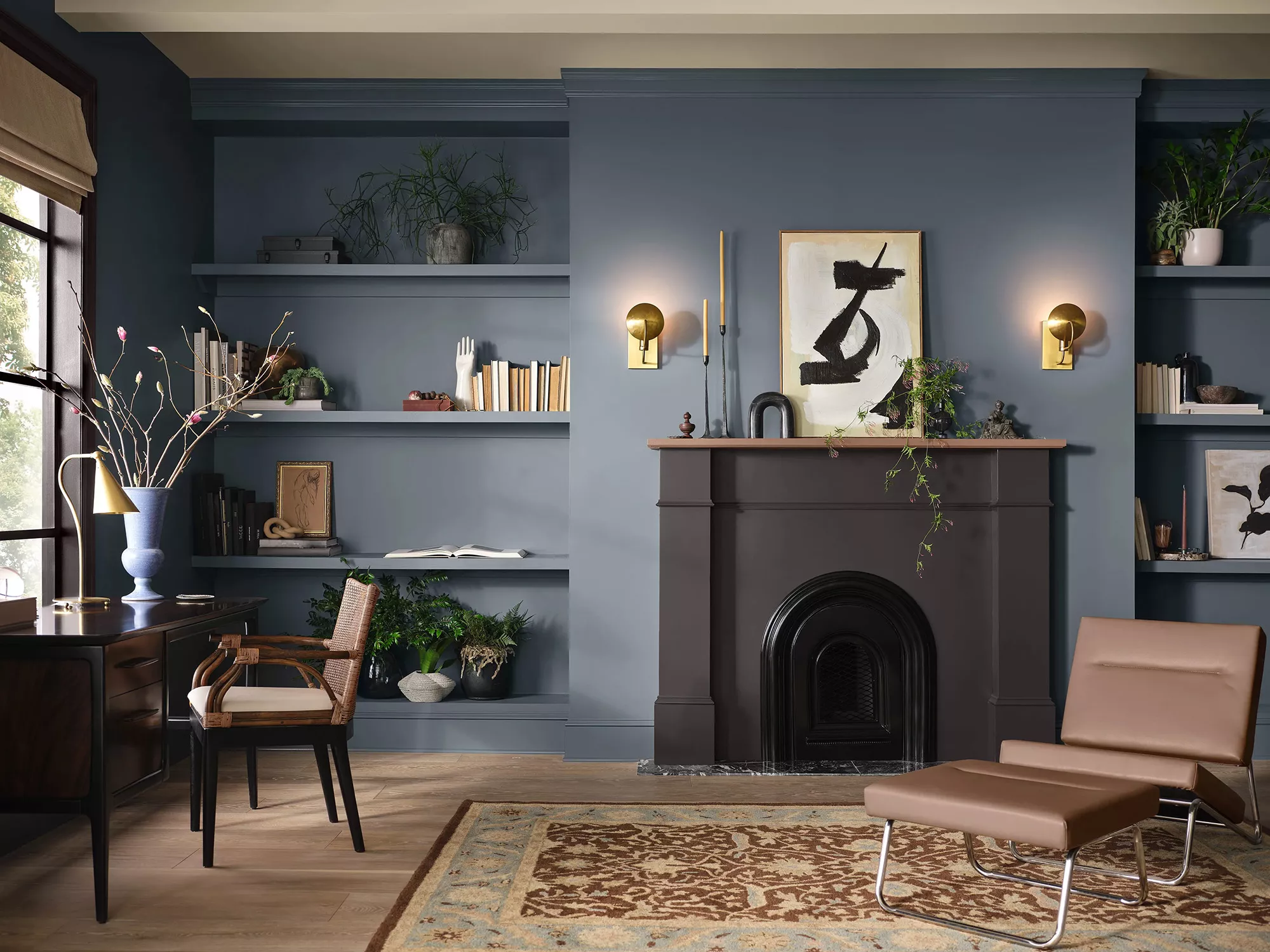
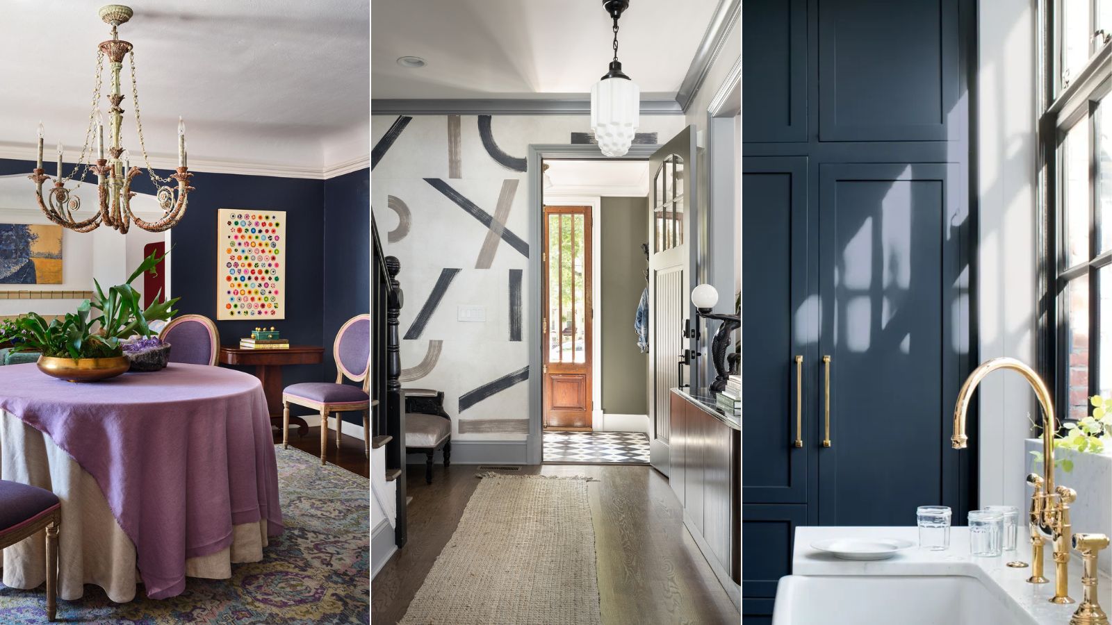
Benjamin Moore's Gentleman's Gray, despite its name, is a deep, rich navy blue that has become a favorite among interior designers. This heritage-inspired color exudes sophistication and luxury, while also being surprisingly versatile. It is one of Benjamin Moore's best-selling dark paints, fulfilling its title by evoking a sense of grandeur and timeless elegance often associated with historic architecture and traditional design. Helen Shaw, Director of Marketing at Benjamin Moore, describes it as “a blackened teal blue that balances richness and restraint,” making it a popular choice for those seeking a dramatic hue for their homes, whether used across all four walls or as an accent color.
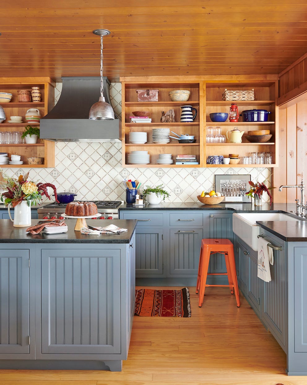
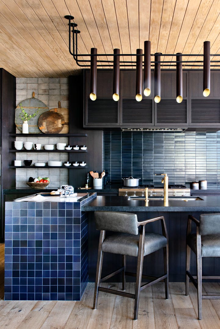
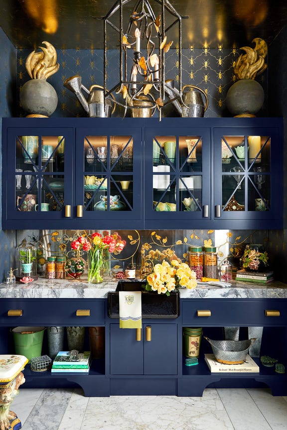
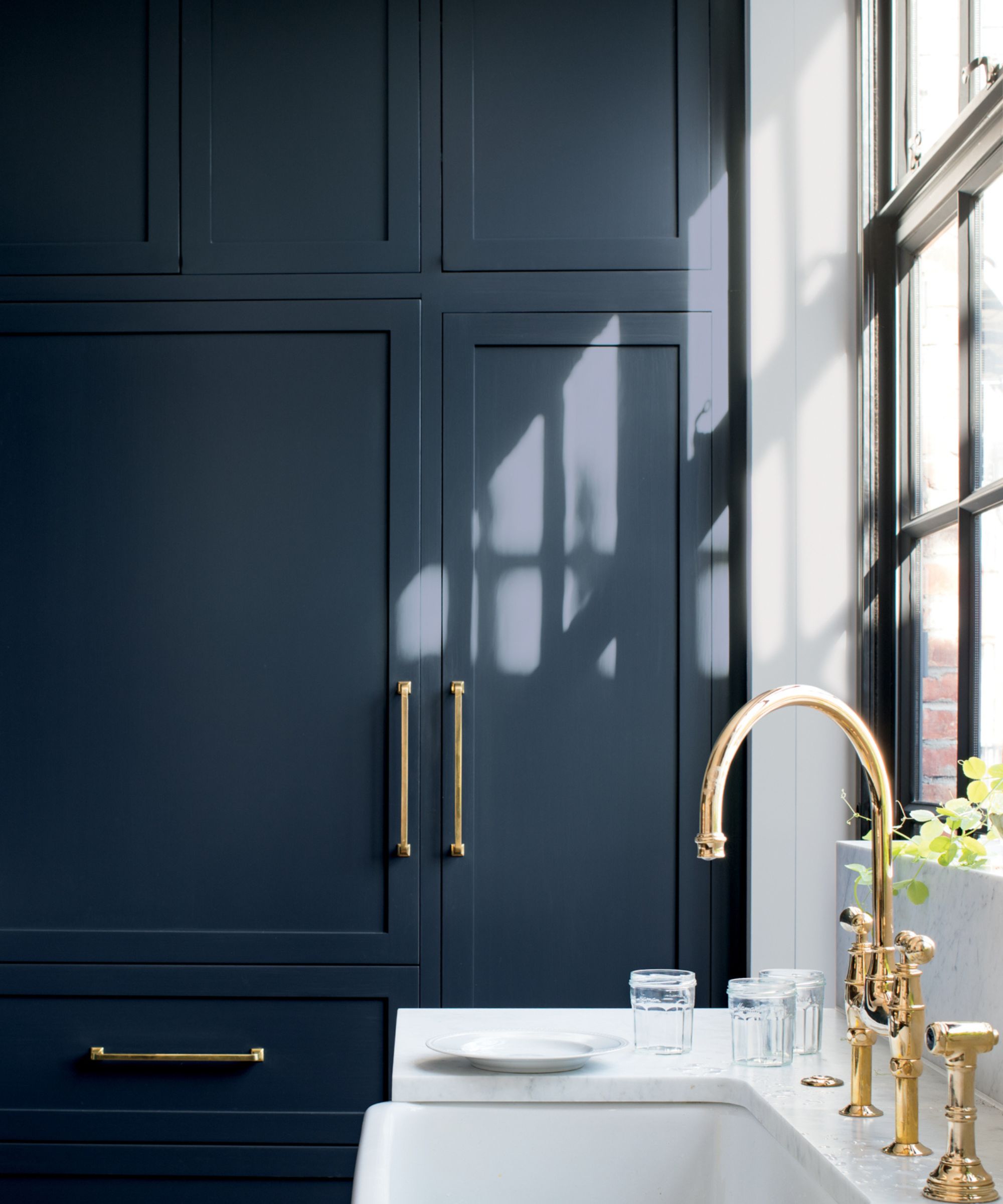
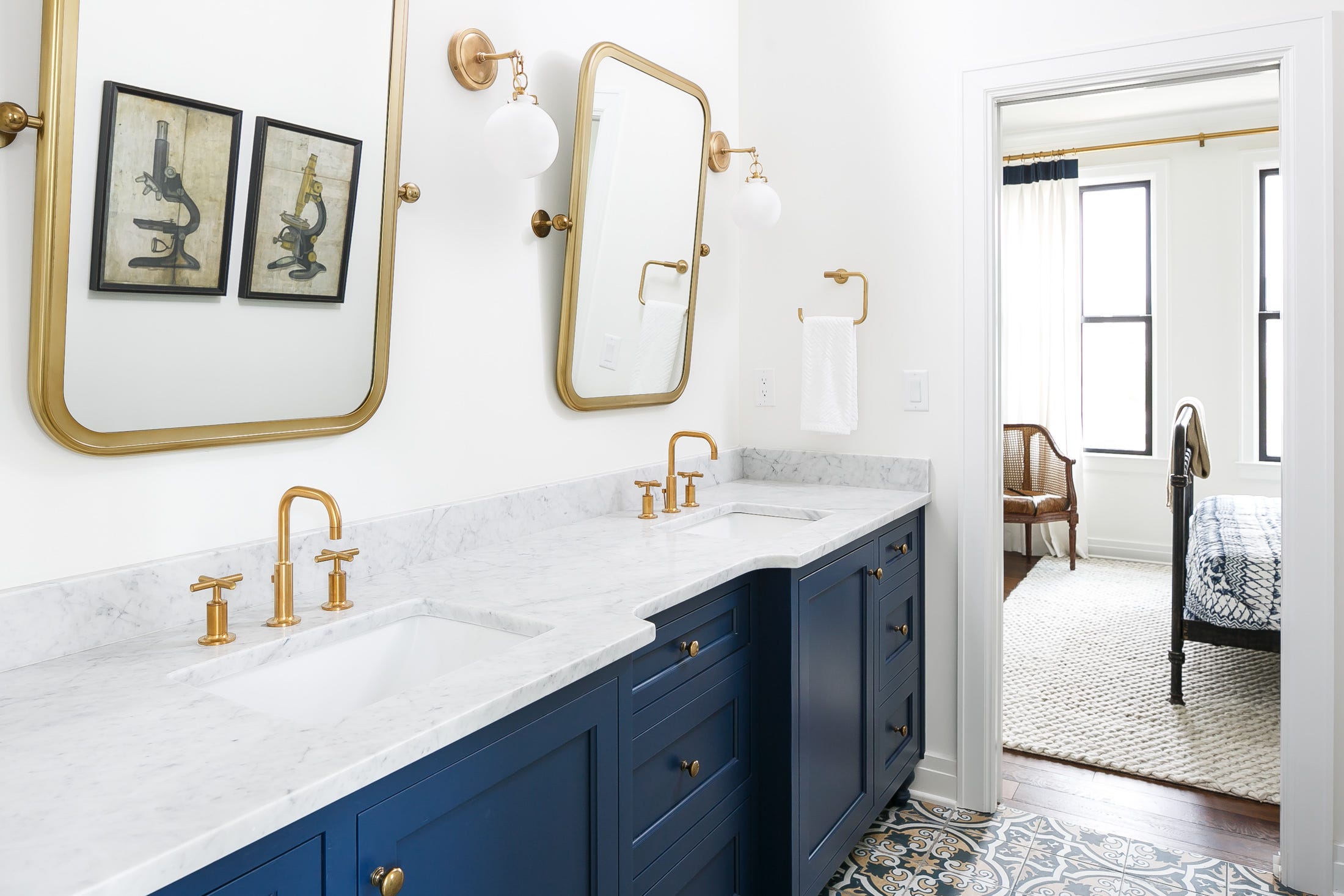
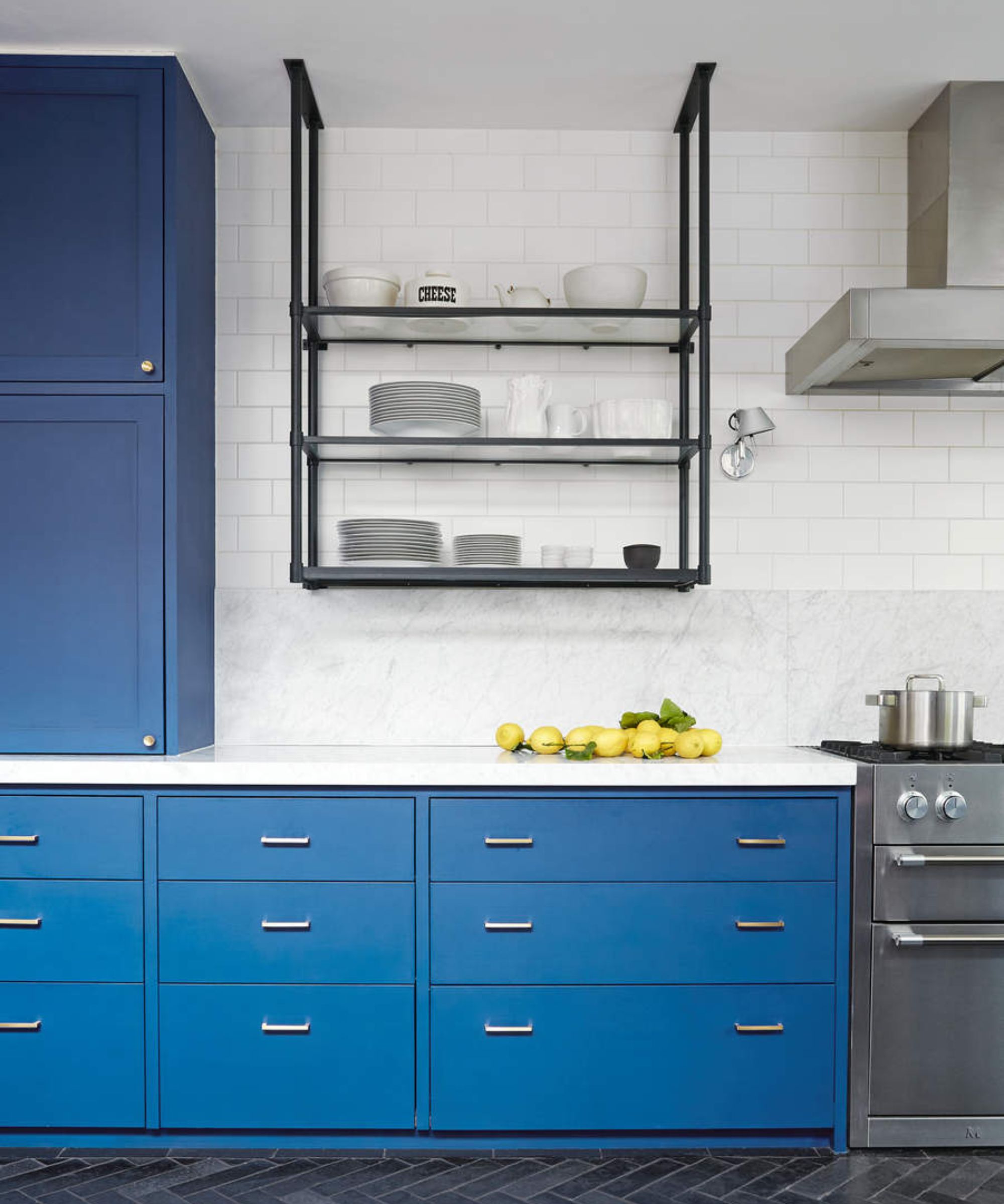
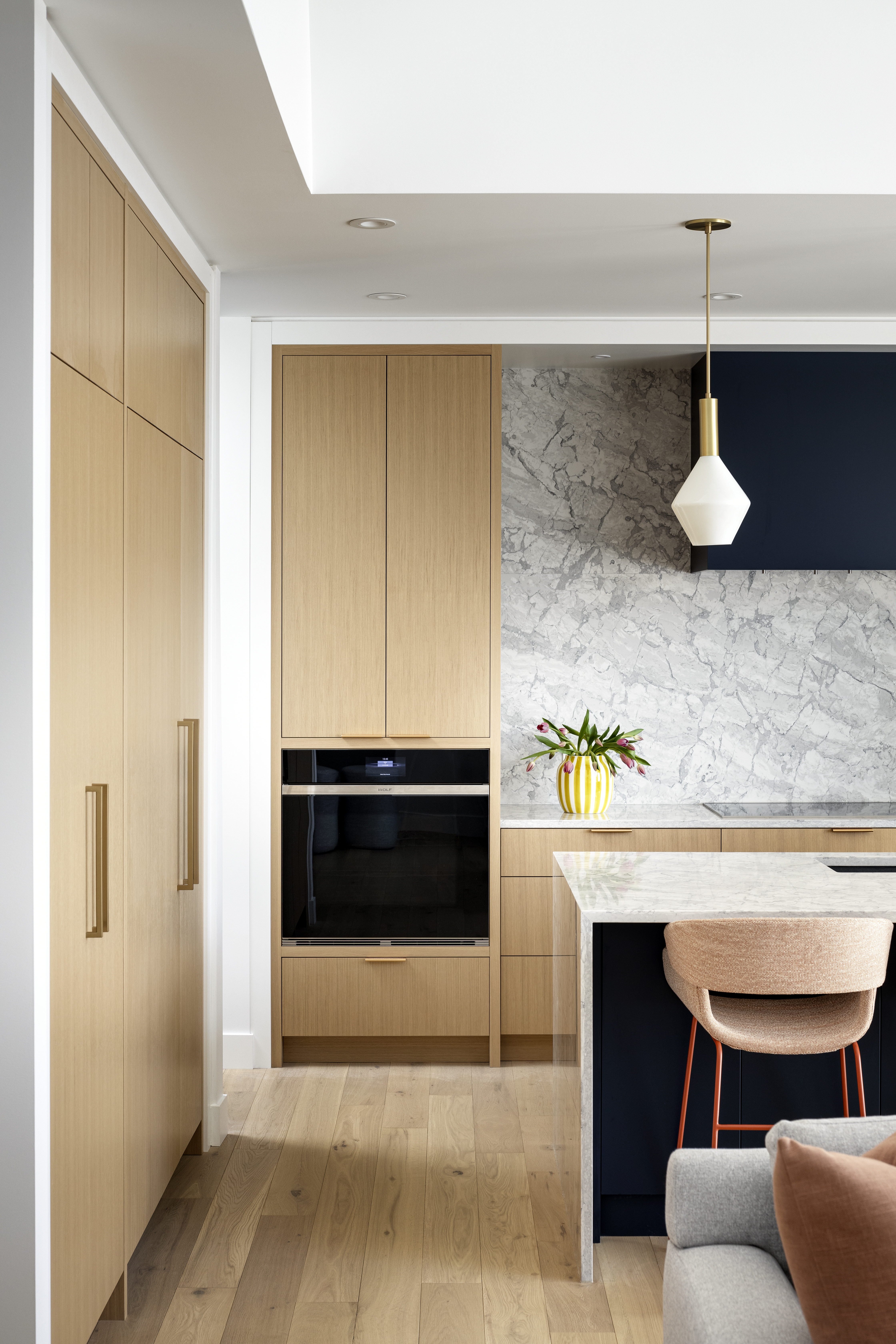
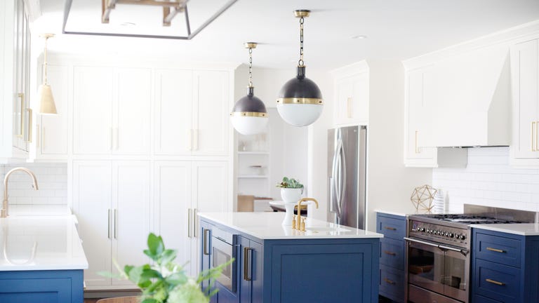
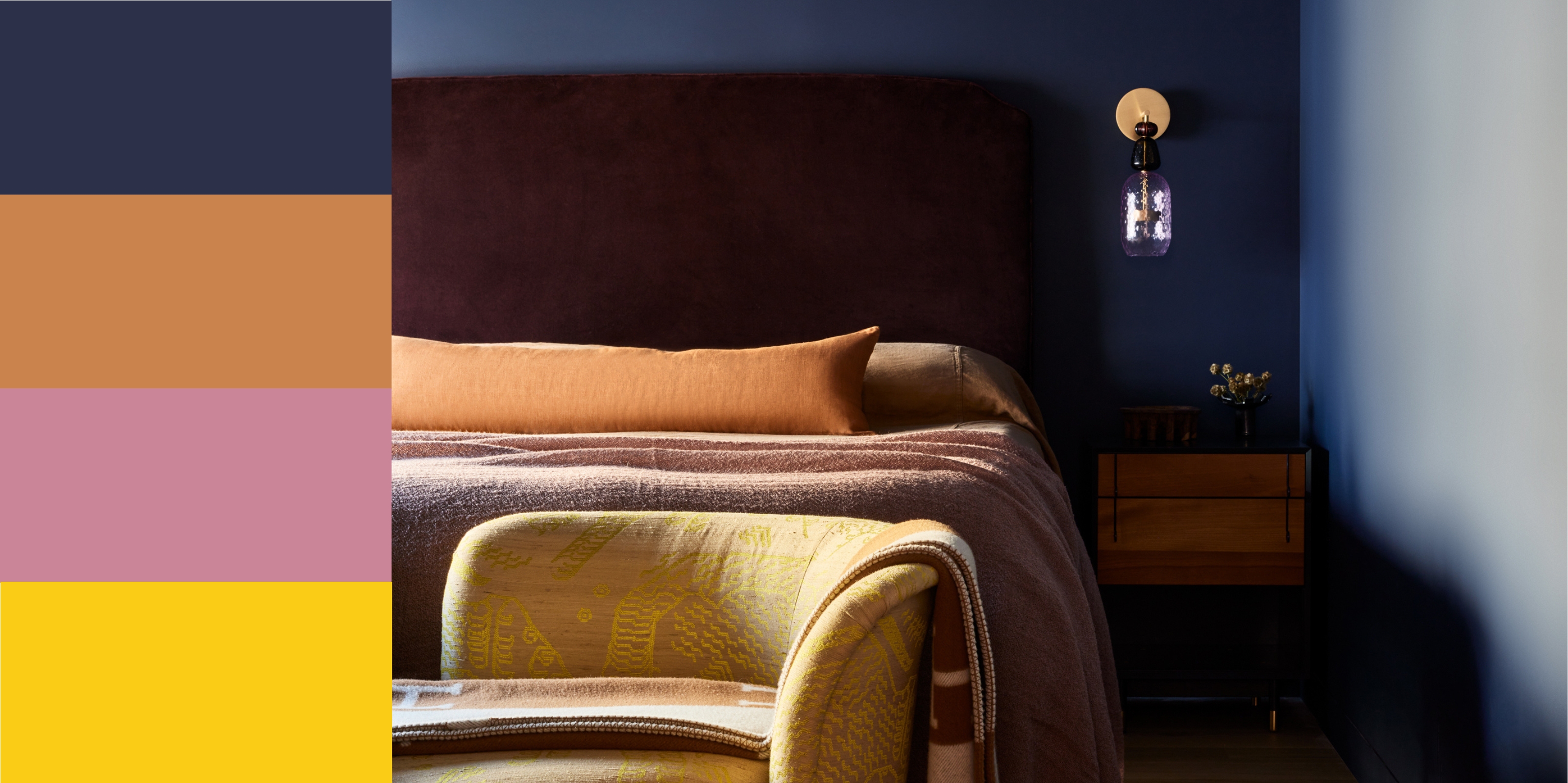
Shaw suggests that Gentleman's Gray would significantly enhance any kitchen cabinetry, imparting a luxurious and elegant feel. It works well with both industrial and traditional shaker designs, and can be paired with a clean, sleek white for a sharp, timeless, and contemporary contrast. For a more subtle approach, a pale pink can be combined with Gentleman's Gray to create a playful balance of light and dark. This dusky rose balances beautifully with the cool, anchored blue-black, resulting in a soft, approachable, and sophisticated color combination.
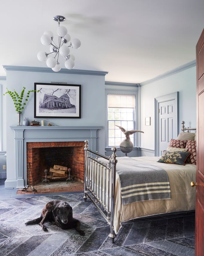
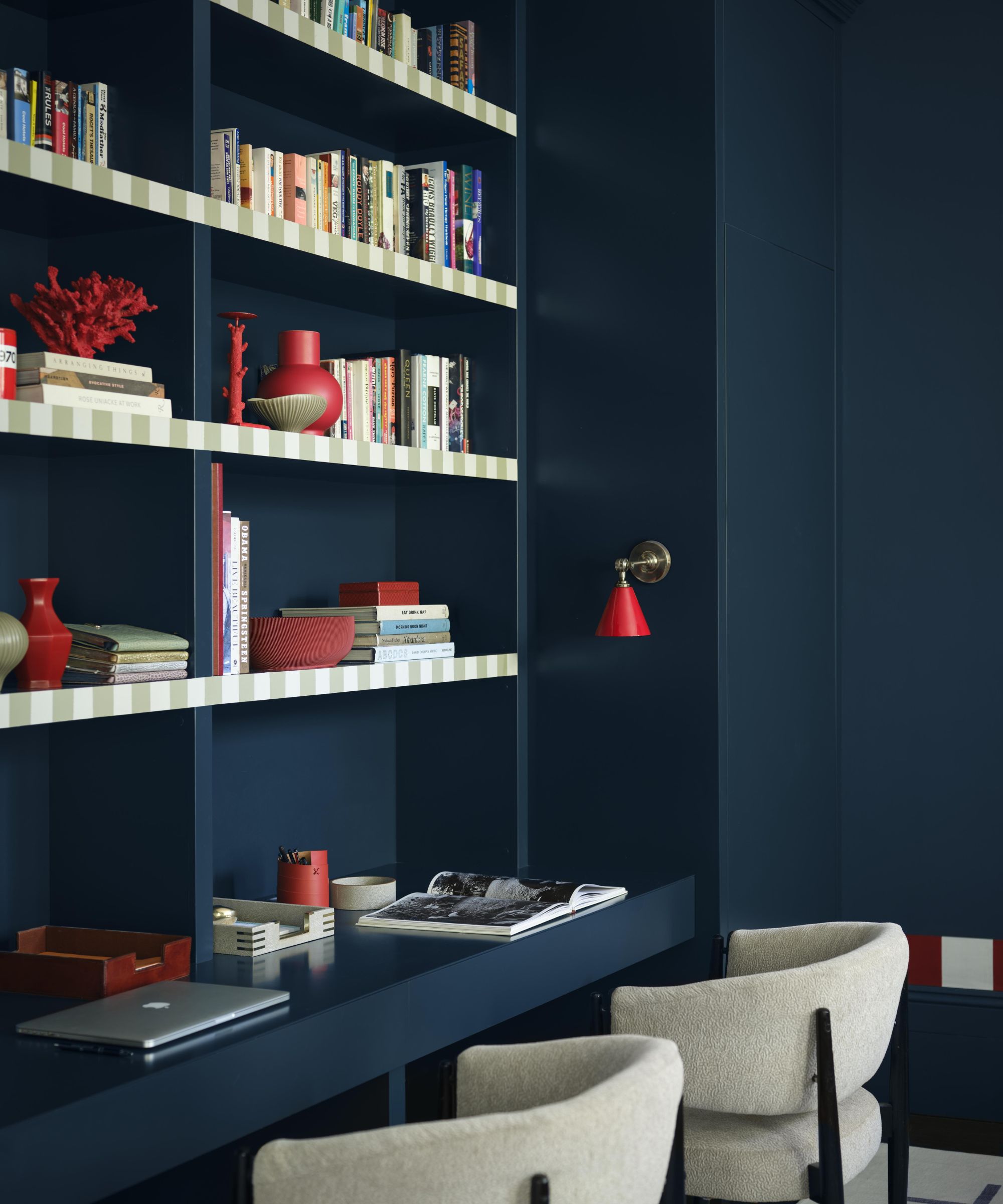
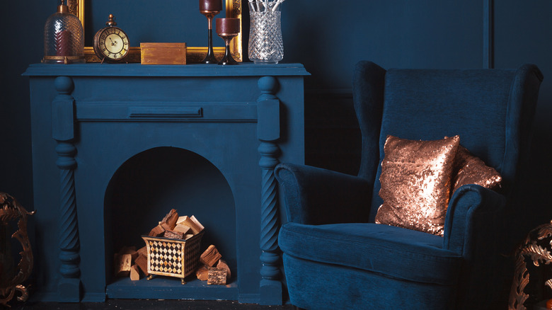
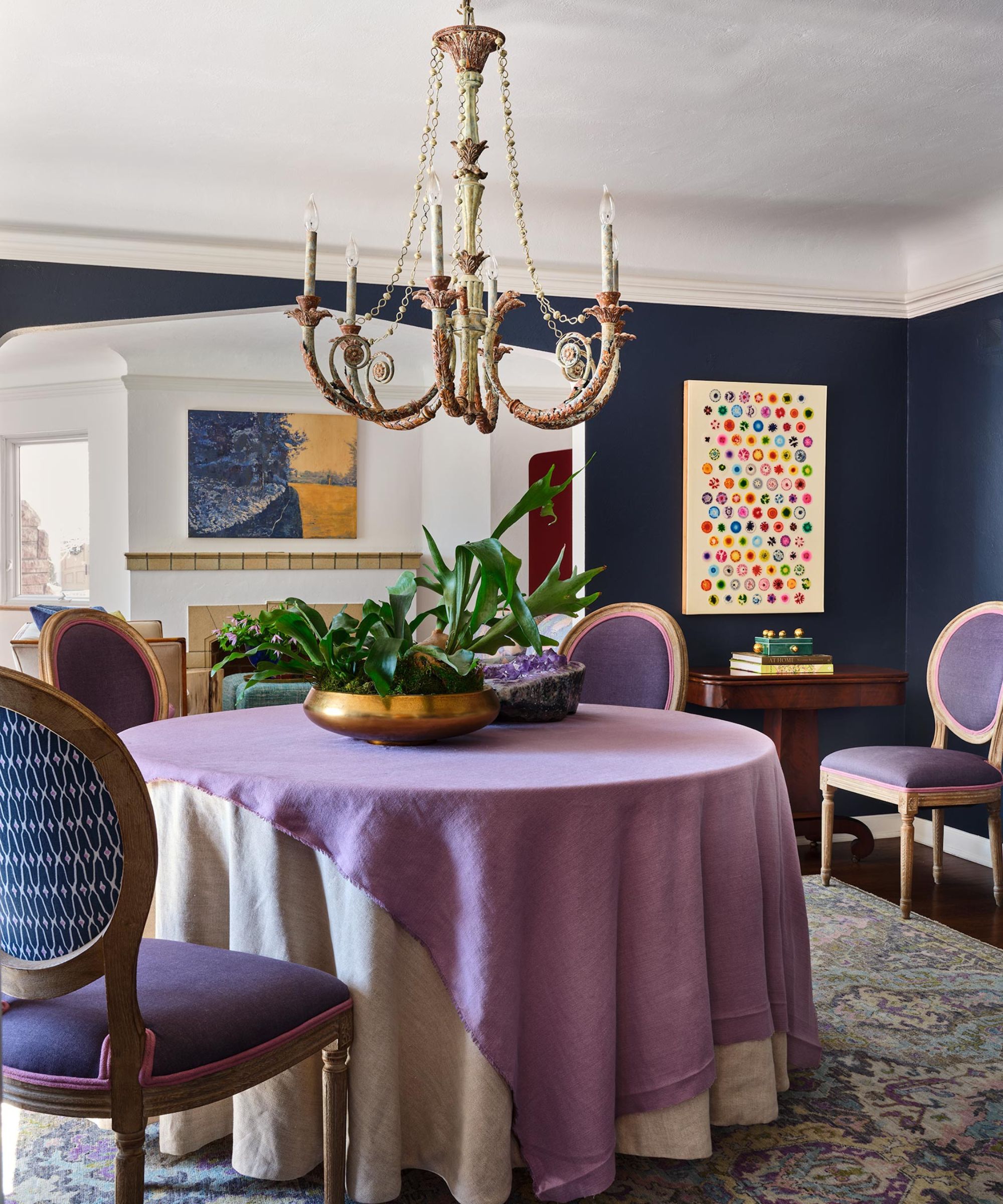
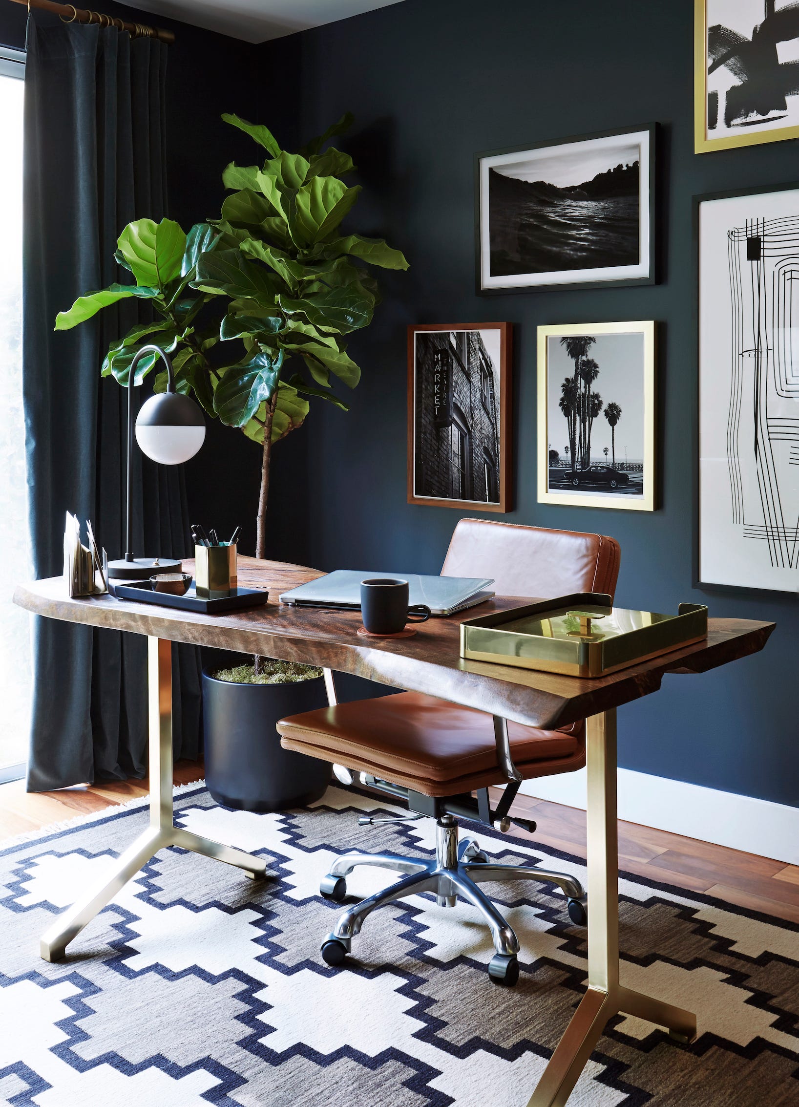
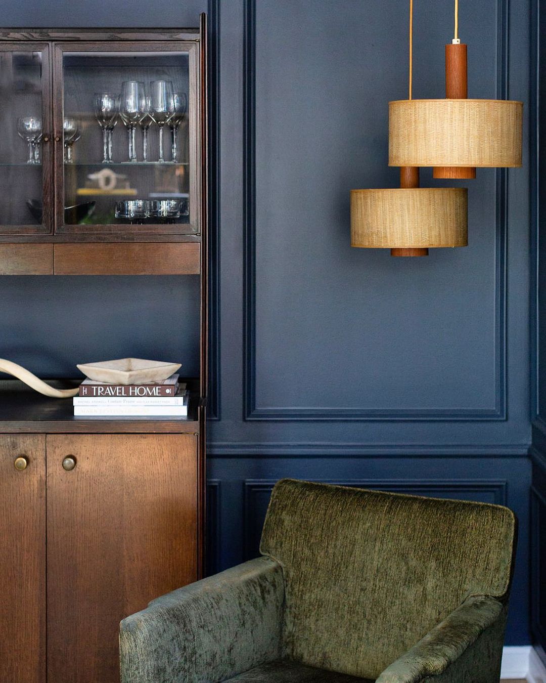
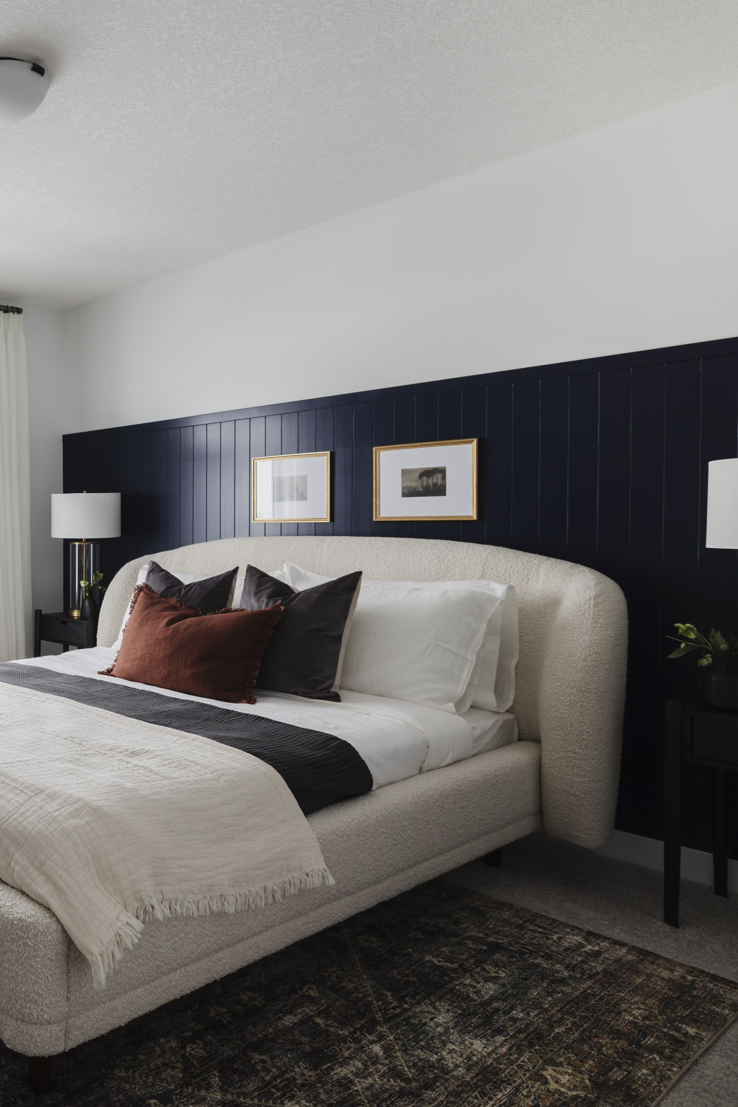
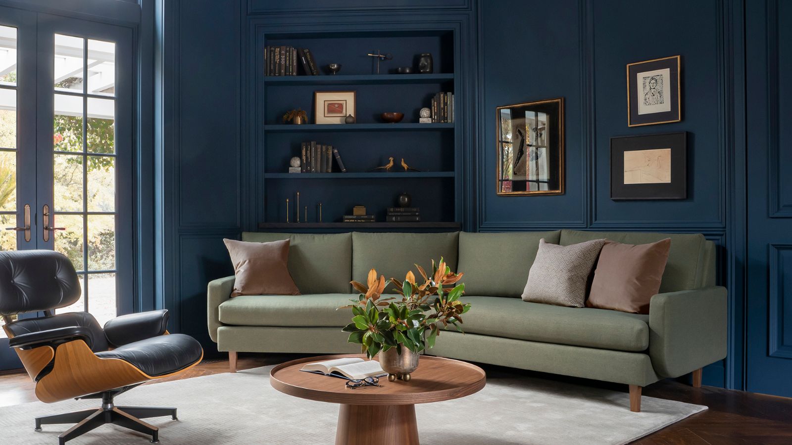
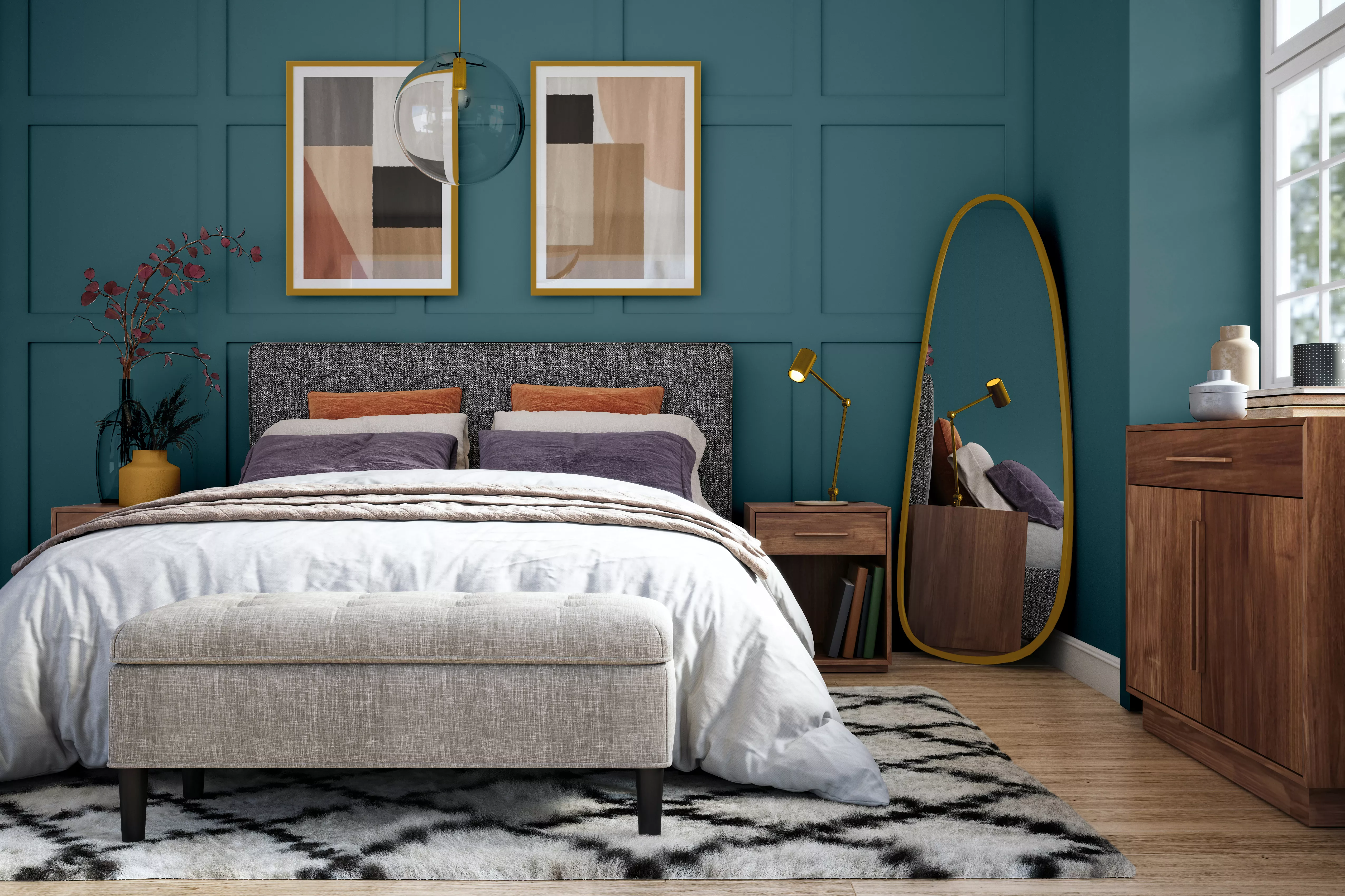
Arianna Barone, Color Marketing Manager at Benjamin Moore, recommends Gentleman's Gray as an ideal bedroom color. She notes that it blends the easygoing qualities of blues and greens with the alluring characteristics of deeper hues, creating a statement-making shade. It can readily replace dark grays, browns, and black paints in any color palette, working beautifully when color-drenched on all four walls of a bedroom or home office to cultivate a moody atmosphere. Barone advises pairing it with brass fixtures, velvet textiles, and wooden accents for a refined yet welcoming aesthetic.
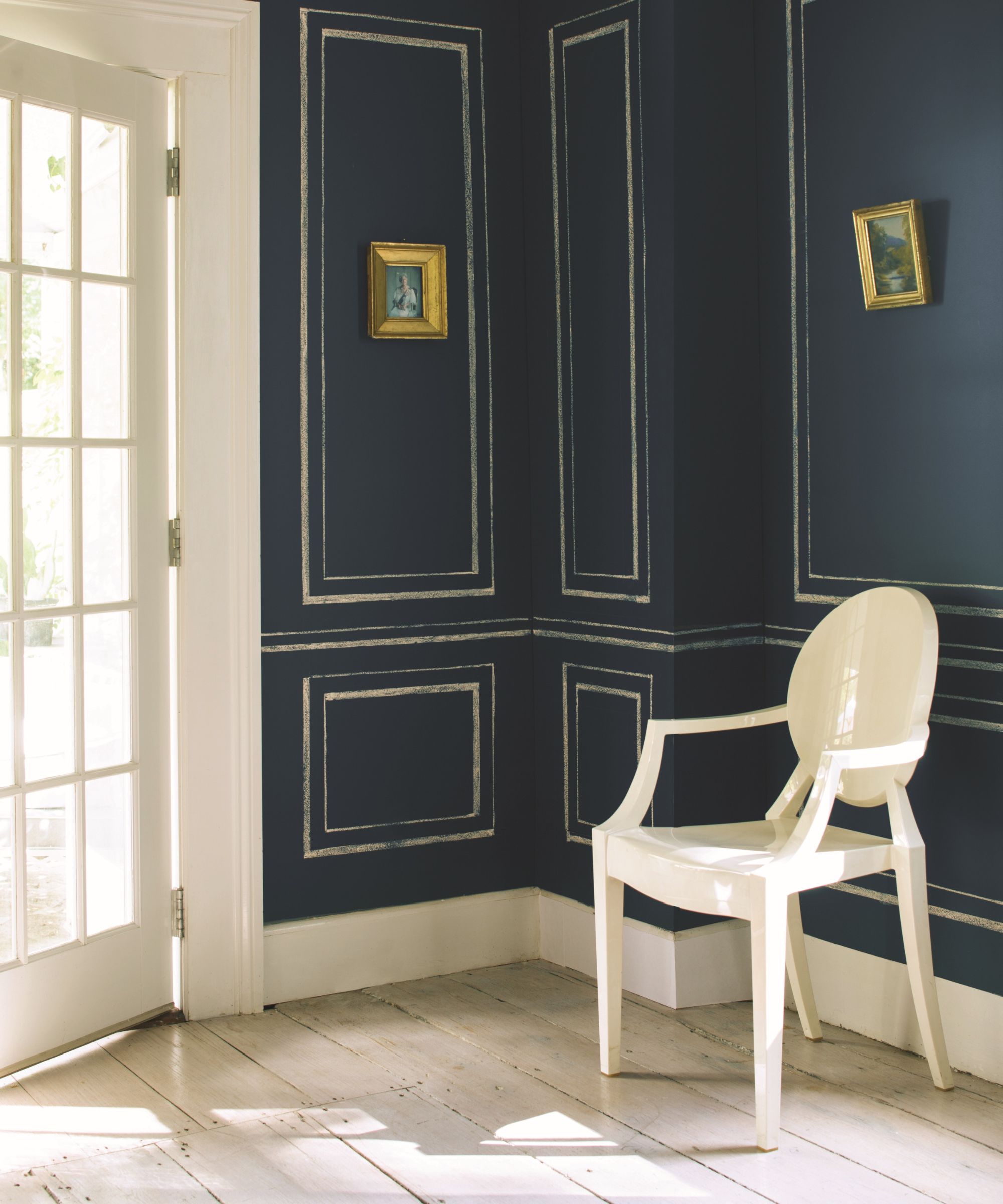
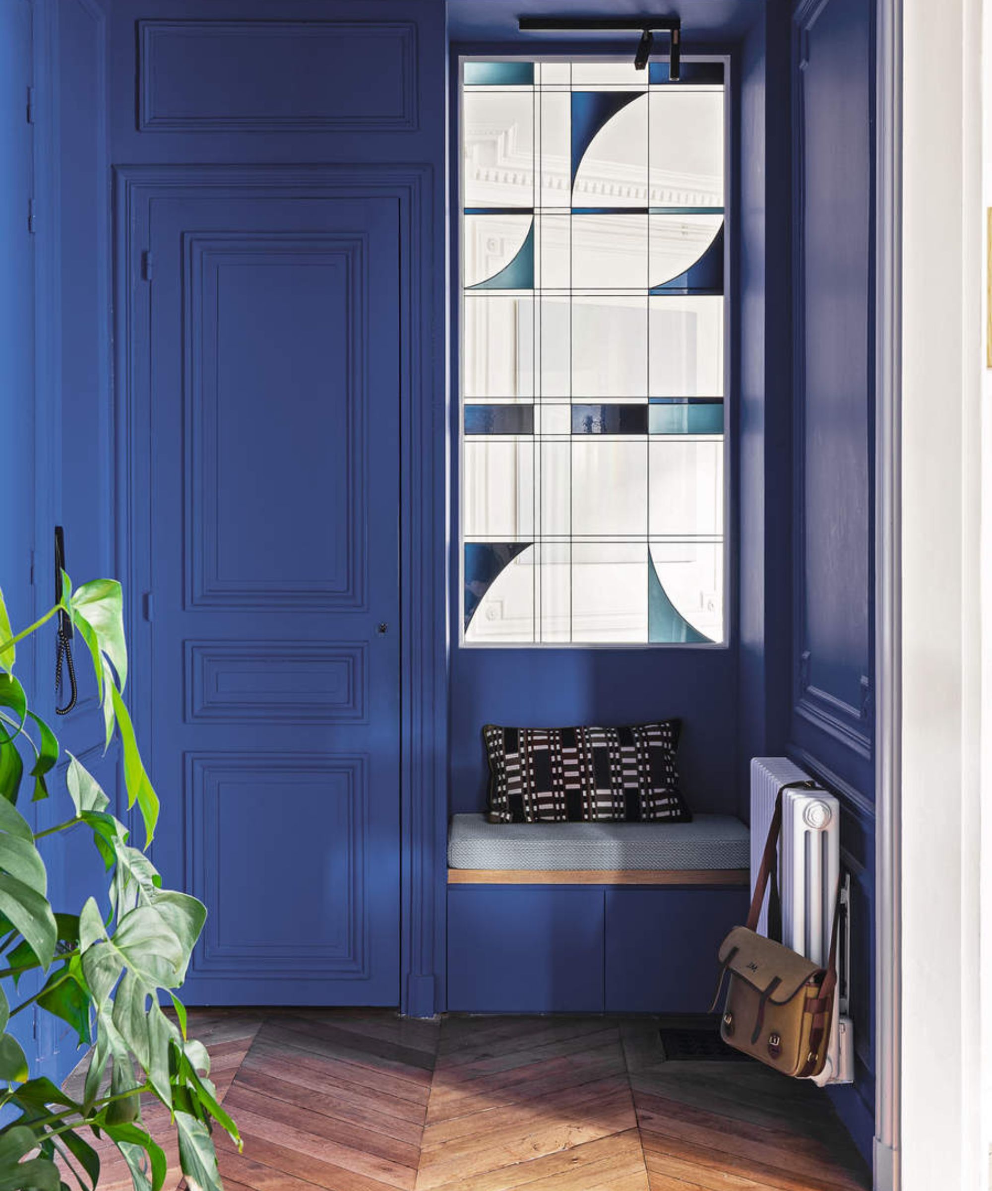
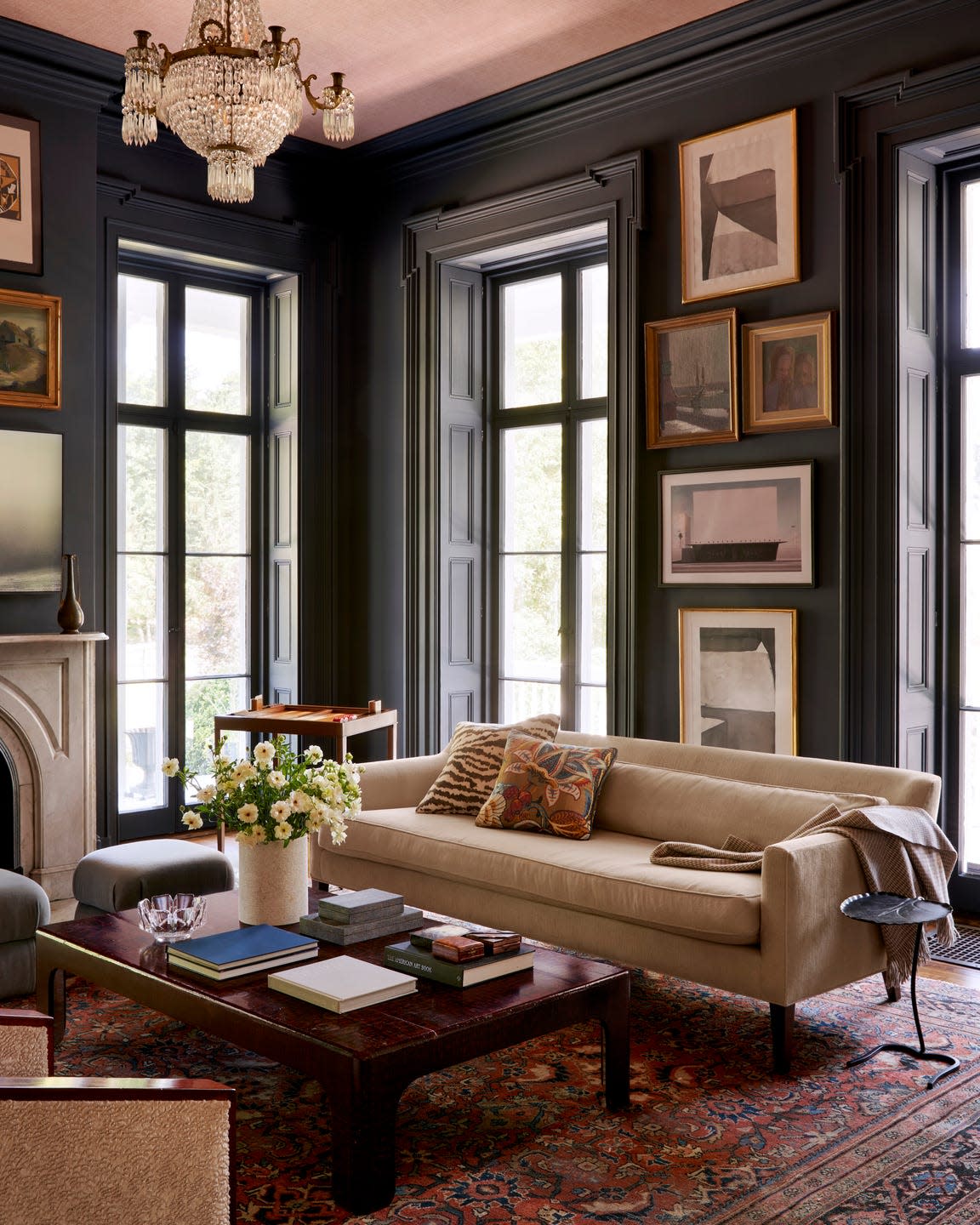
Nina Long, Principal Designer at Mathews Design Group, also expresses her admiration for Gentleman's Gray, citing its moody and rich tone. She highlights its unique blend of deep blue with hints of green and black, distinguishing it from navy or teal. Long recommends using it in spaces where a sophisticated dramatic effect is desired, such as offices, libraries, or bedrooms. She particularly favors its application in a color-drenched manner, as it can make trim and molding pop. Long typically pairs it with neutrals, occasionally incorporating chocolate brown, ochre, and forest green for added depth.
Jennifer Jones, Principal Designer at Niche Interiors, echoes these sentiments, stating her preference for Gentleman's Gray in creating moody bedrooms, libraries, and home offices. She emphasizes that the hue is a perfect mix of saturated blue with sophisticated gray undertones, making it a suitable companion for warm woods and brass finishes. The article concludes by encouraging readers not to be deterred by the dark undertones of Gentleman's Gray, emphasizing its versatility and ability to bring warmth and sophistication to any space. It particularly highlights its effectiveness in home offices, snugs, and bedrooms, offering suggestions for incorporating this deep blue through various home decor items if a full paint project is not immediately desired. For those preferring lighter blue shades, Benjamin Moore's blue-gray paint colors are recommended as a refreshing and uplifting alternative.
#BenjaminMoore #InteriorDesign #PaintColors #HomeDecor #ColorSchemes #DecoratingIdeas #LuxuryInteriors #DesignTrends #BenjaminMoore #InteriorDesign #PaintColors #HomeDecor #ColorSchemes #DecoratingIdeas #LuxuryInteriors #DesignTrends
0 comment in total
 No comments yet
You may also like
25 Dreamiest Blue-Gray Paint Colors for Any Room in the House
How to decorate with Benjamin Moore's Van Deusen Blue

18 Designer-Approved Colors That Go With Navy Blue

15 Blue-Green Paint Colors the Experts Recommend

What are the best Benjamin Moore gray paints? 7 go-to shades recommended by designers
The 10 Best Blue-Green Paint Colors Designers Can't Stop Using

24 Blue-Gray Paint Colors the Experts Swear By
Navy Blue And Gold Is Pinterest's New Favorite Neutral Color Scheme
Why Benjamin Moore's Classic Gray Is a Designer-Favorite Paint Color
15 Navy Paint Colors the Pros Swear By for a Sophisticated Space
The 13 Best Greige Paint Colors to Buy Right Now
What colors go with navy blue? 7 combinations with this timeless shade
What Looks Best With Navy Blue
15 Designer-Approved Blue-Gray Paint Colors That Will Never Go Out of Style
The 60 Best Blue Paint Colors for Every Room in Your Home
Colors That Go With Navy Blue — 12 Combinations Designers Are Choosing in 2025

This Is the Best Blue Paint Color, According to Designers
10 Dazzling Navy Blue Paint Colors That Are Perfect For Any Home
Designers who never follow trends swear by this color family to make their homes look timeless
These Are the 11 Best Colors to Pair with Navy Blue in Your Home, According to Designers