1/4
How to decorate with Benjamin Moore's Van Deusen Blue
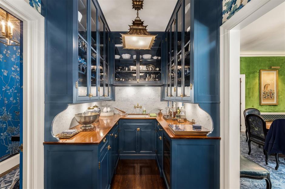
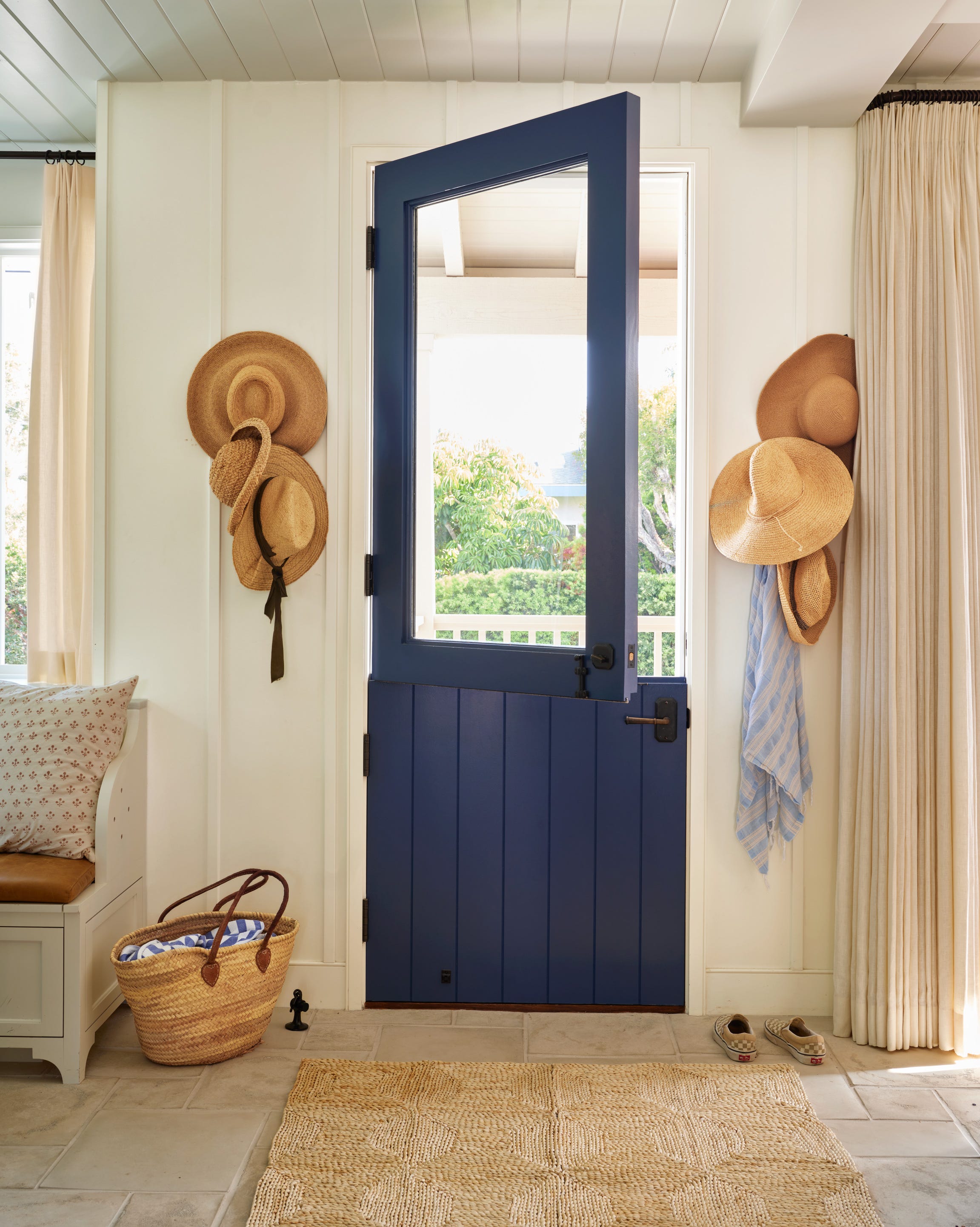
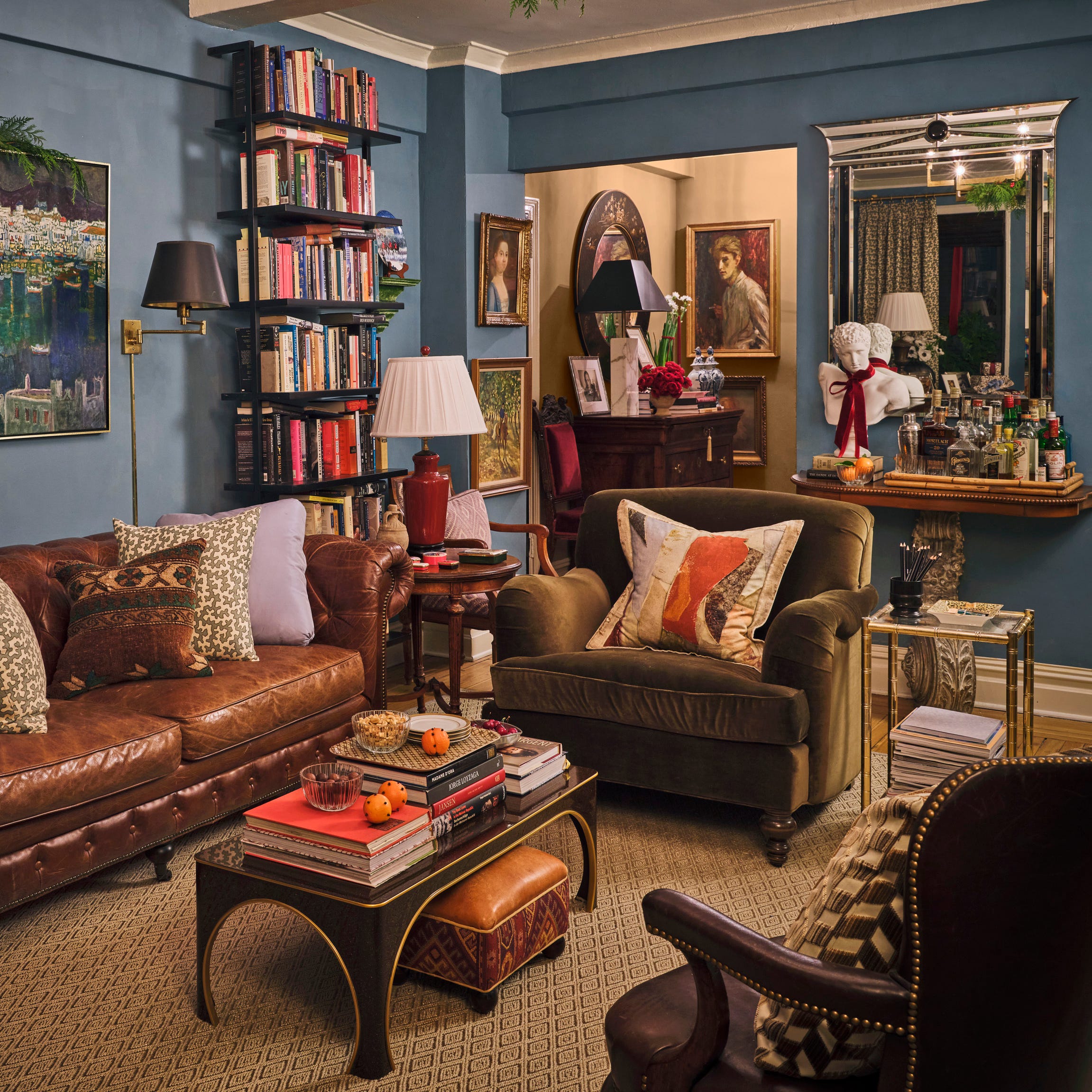
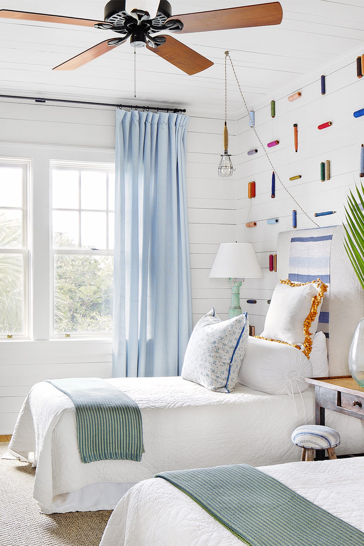
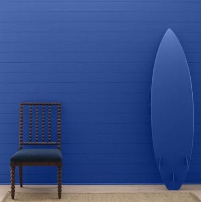
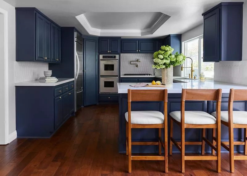
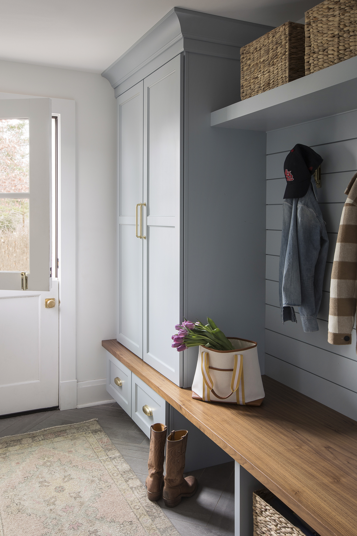
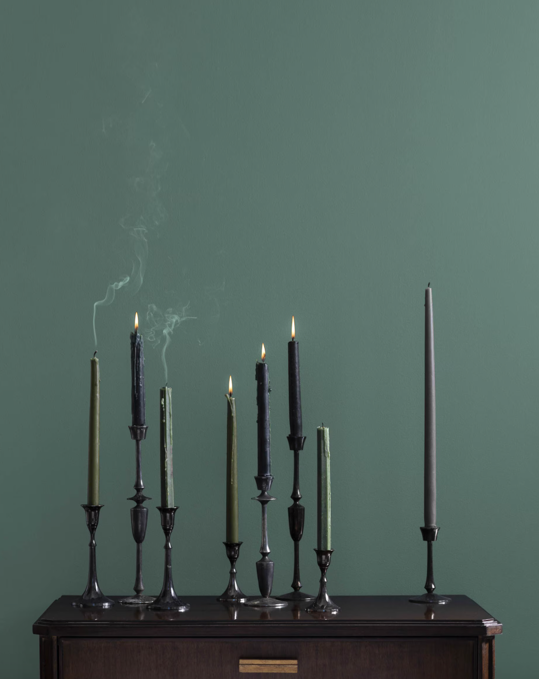
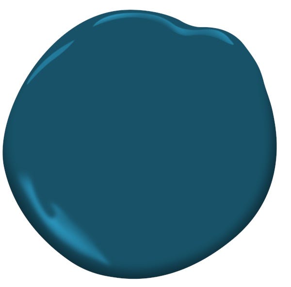
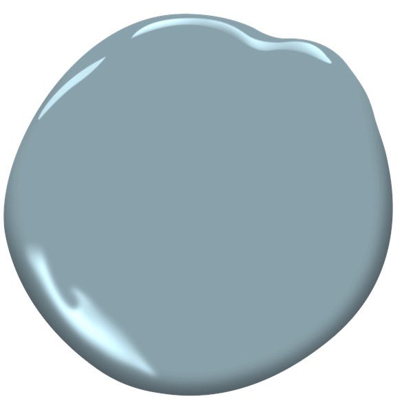
Benjamin Moore's Van Deusen Blue is highlighted as a foundational navy blue paint offering versatility for various spaces, blending timelessness with depth. Helen Shaw, Director of Marketing (International) at Benjamin Moore, describes the shade as a mid-tone that is livable in many rooms, striking a balance between understated quality and distinct tones. The article suggests it is a suitable alternative for those seeking a richer option than traditional neutrals without being overly bold or dramatic.
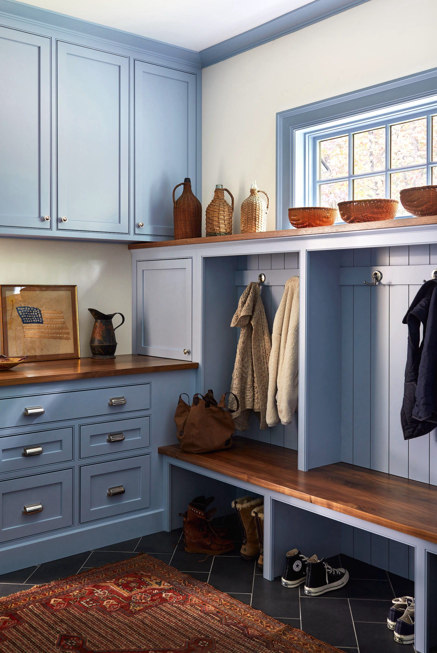
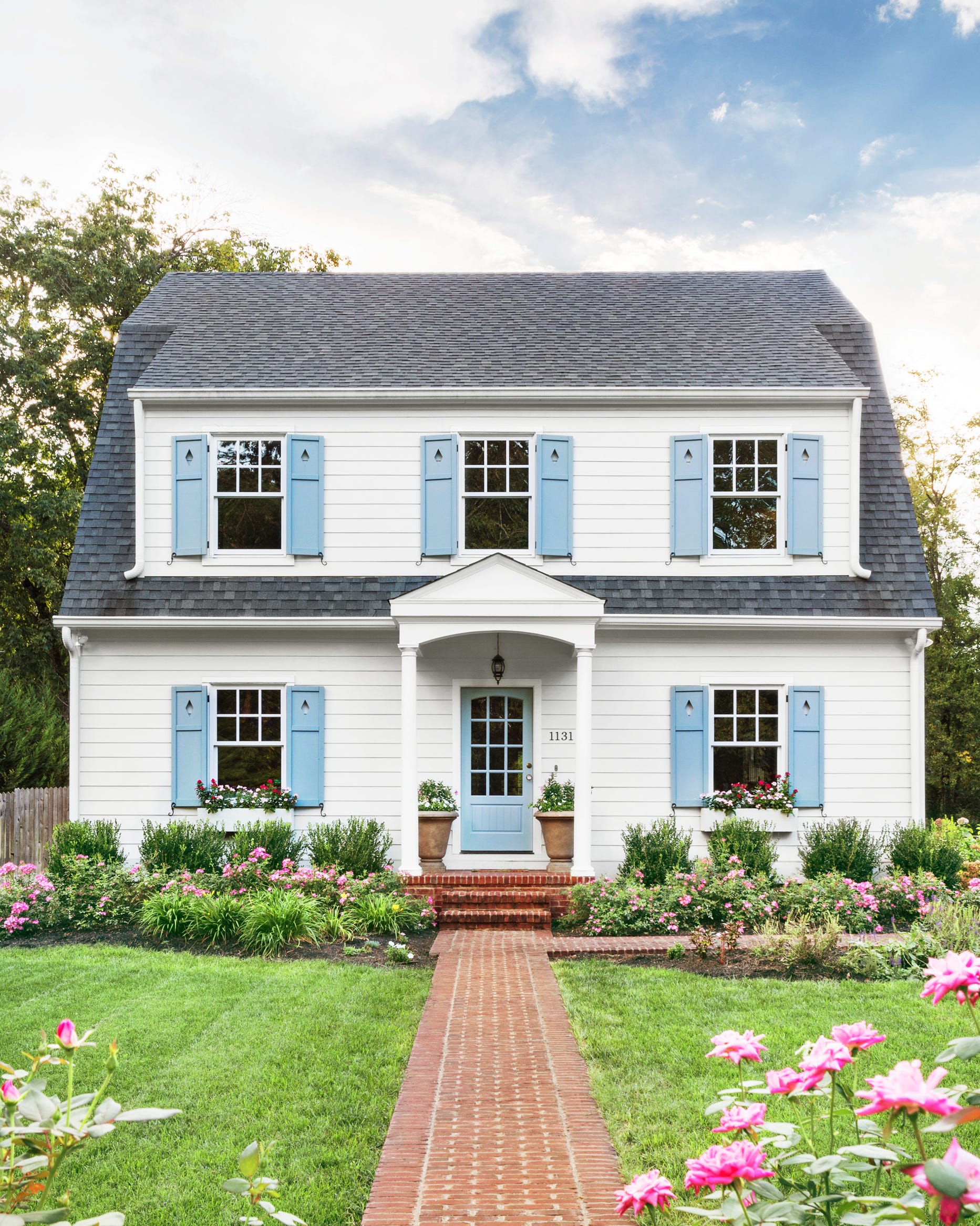
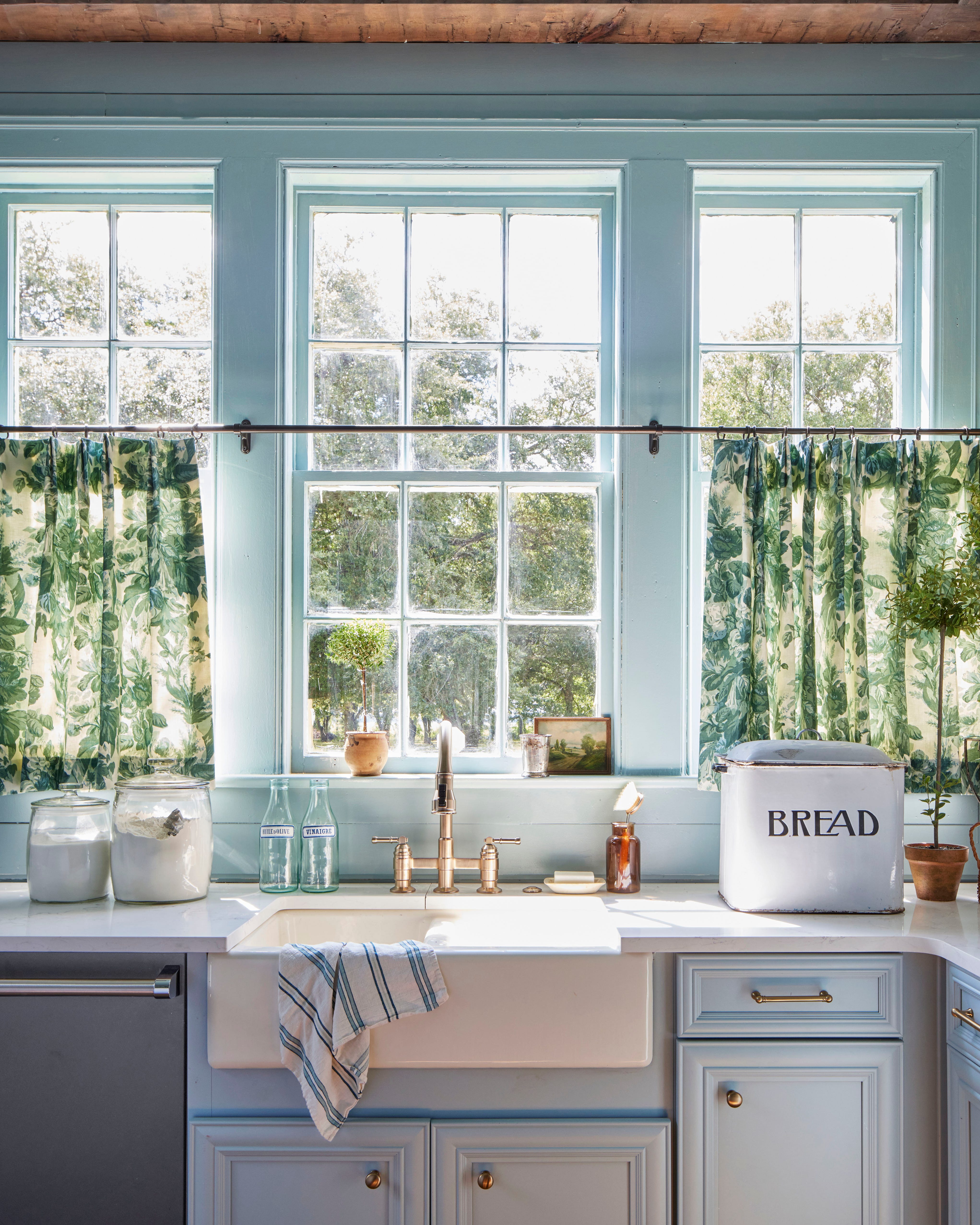
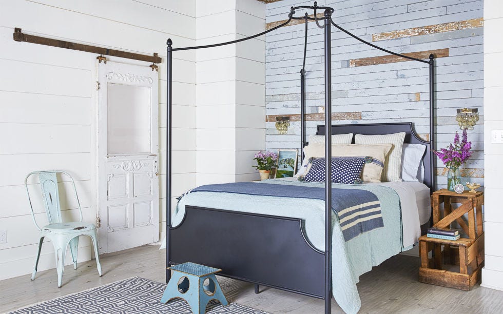
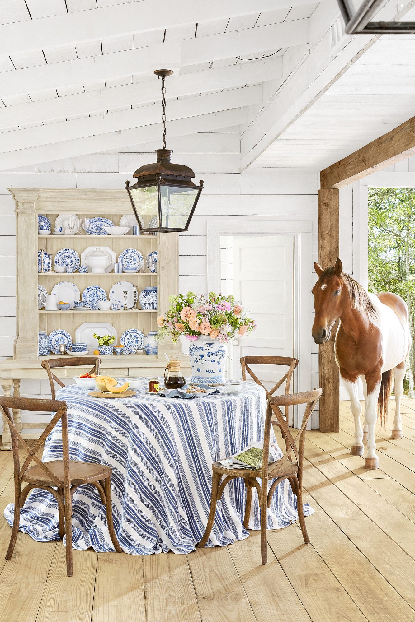
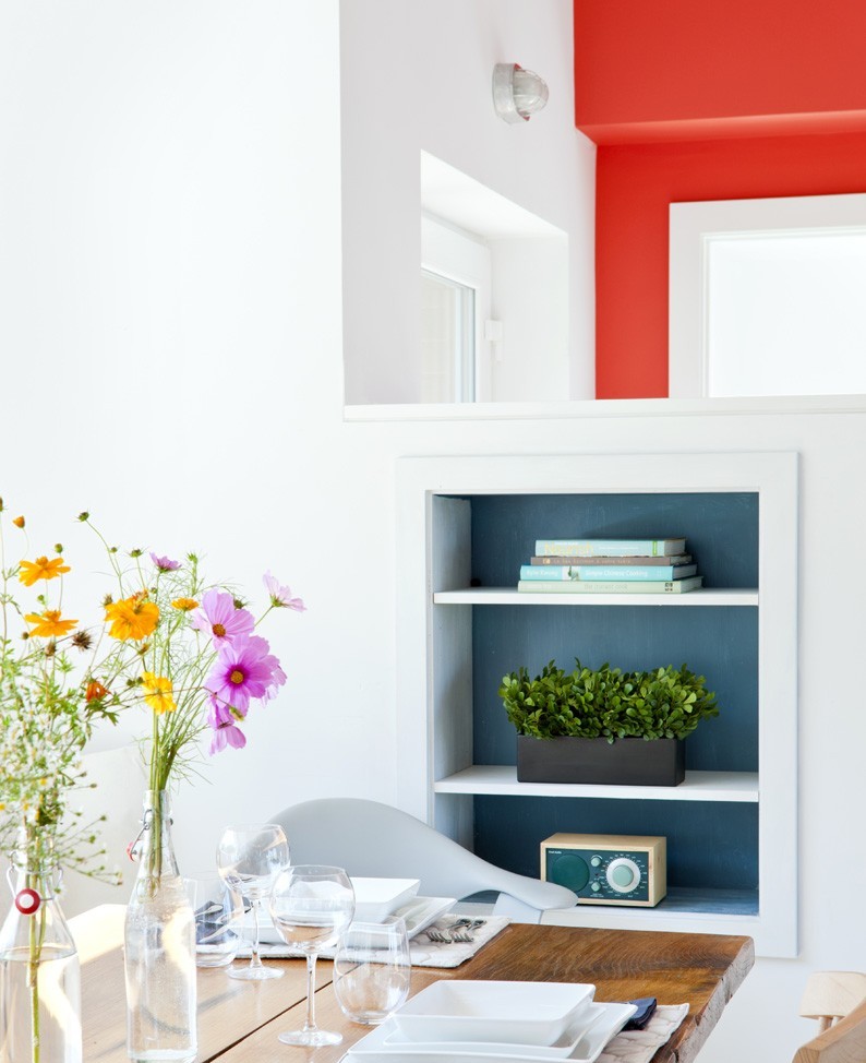
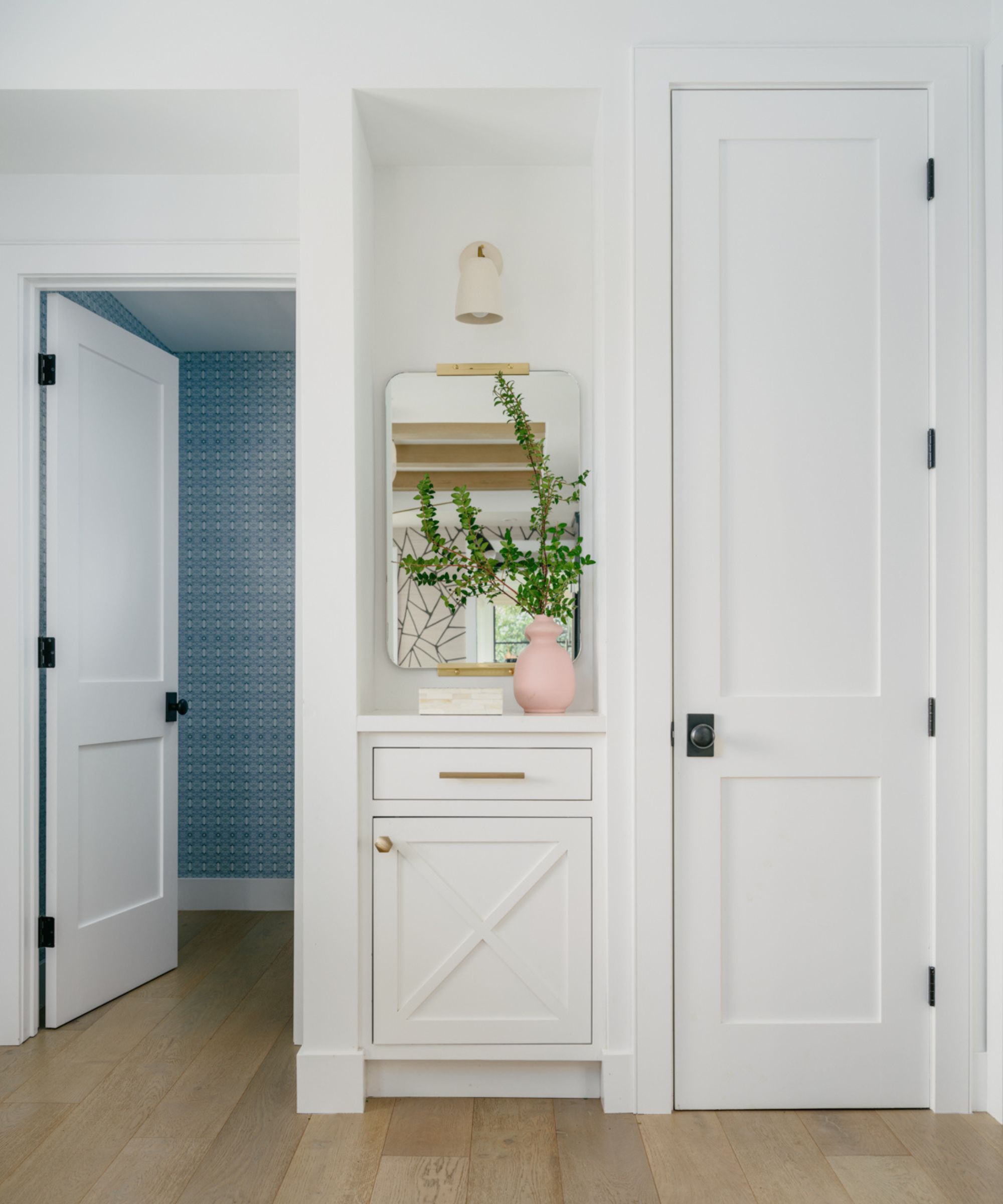
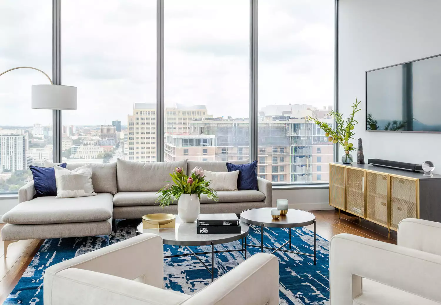
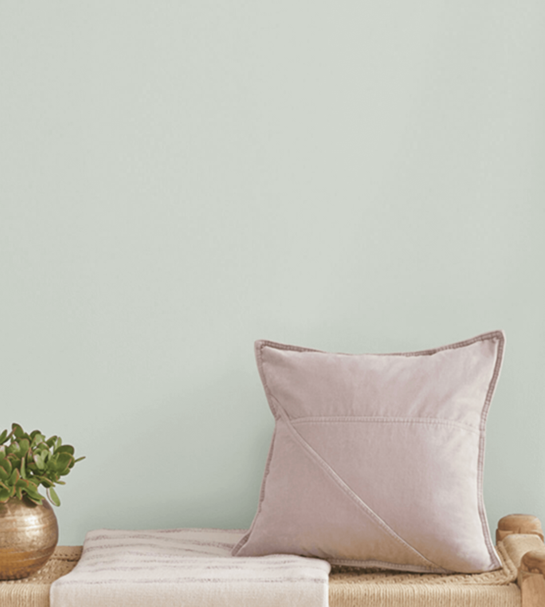
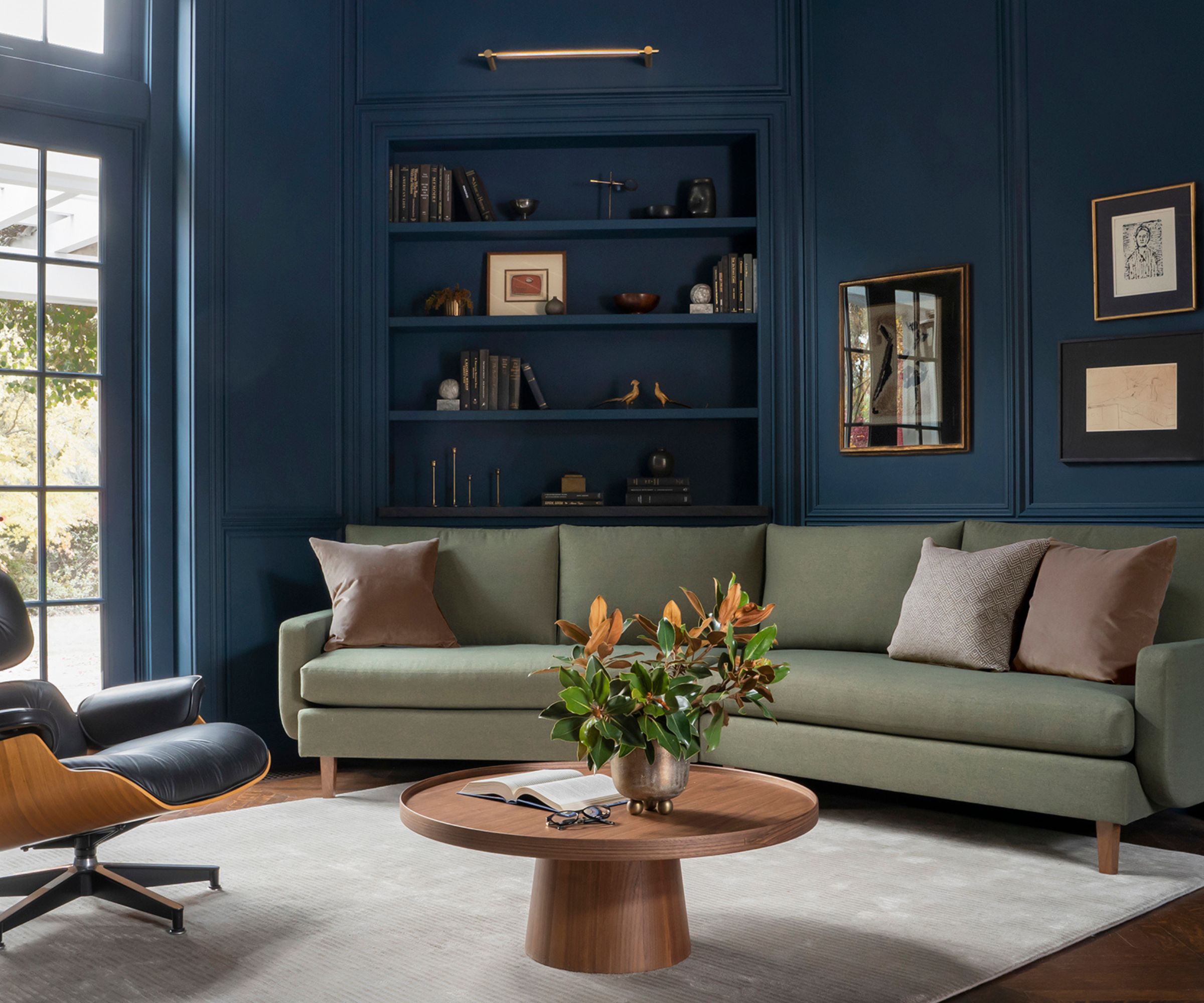
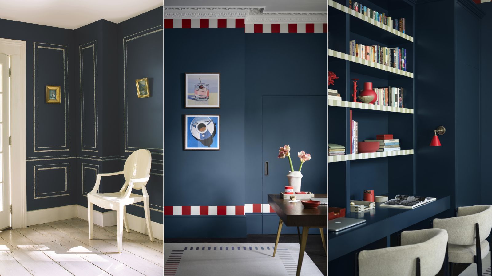
When incorporating Van Deusen Blue into interior design, it is recommended to use it as the dominant color, complemented by light neutral accent paints. To maintain a cohesive aesthetic, designers advise choosing neutrals with cool undertones that align with the blue paint. Helen Shaw specifically suggests pairing Van Deusen Blue with cool whites that have hints of blue or gray, such as Benjamin Moore's White Ice or Mirage White, to create a clean and contemporary look.
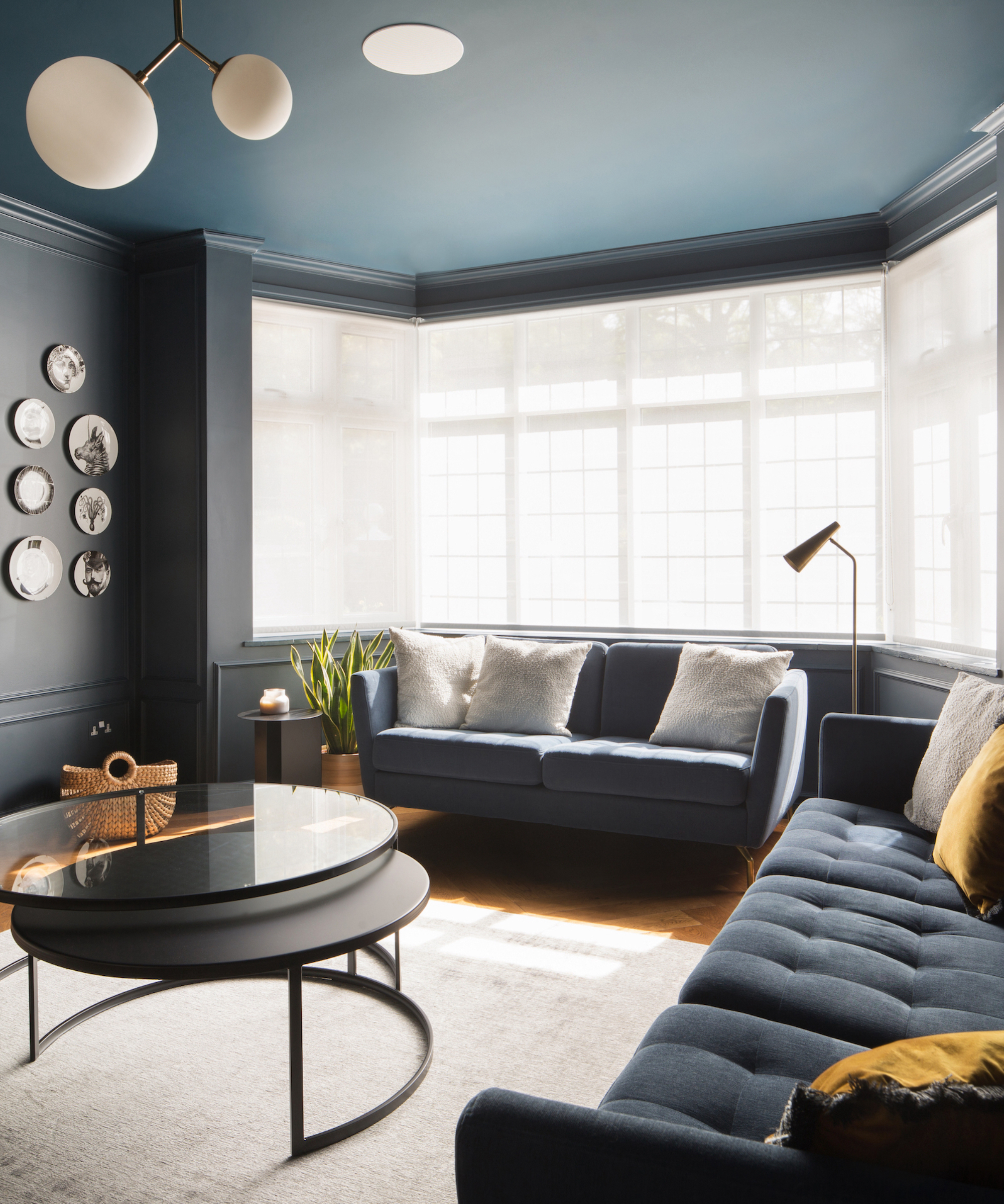
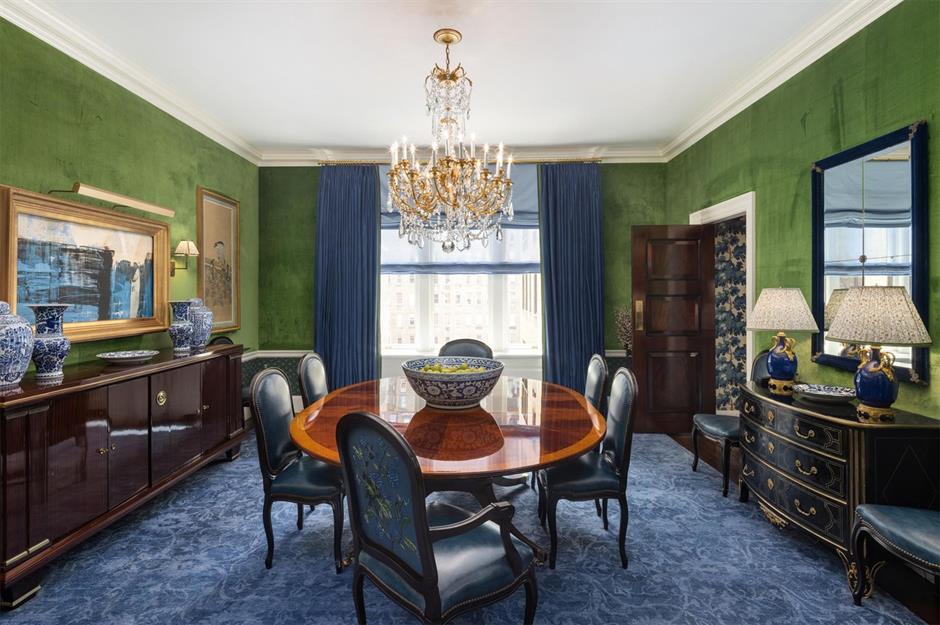
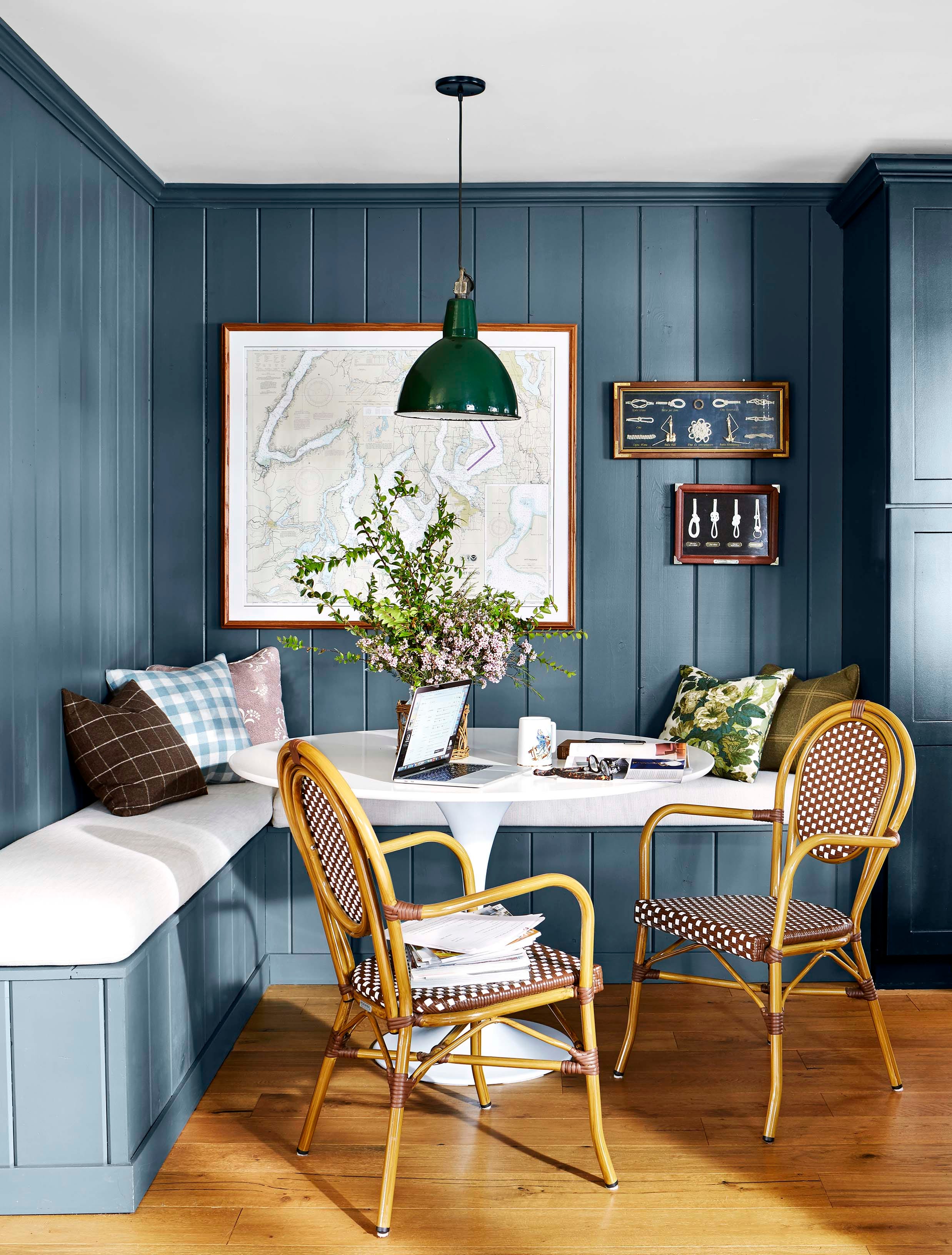
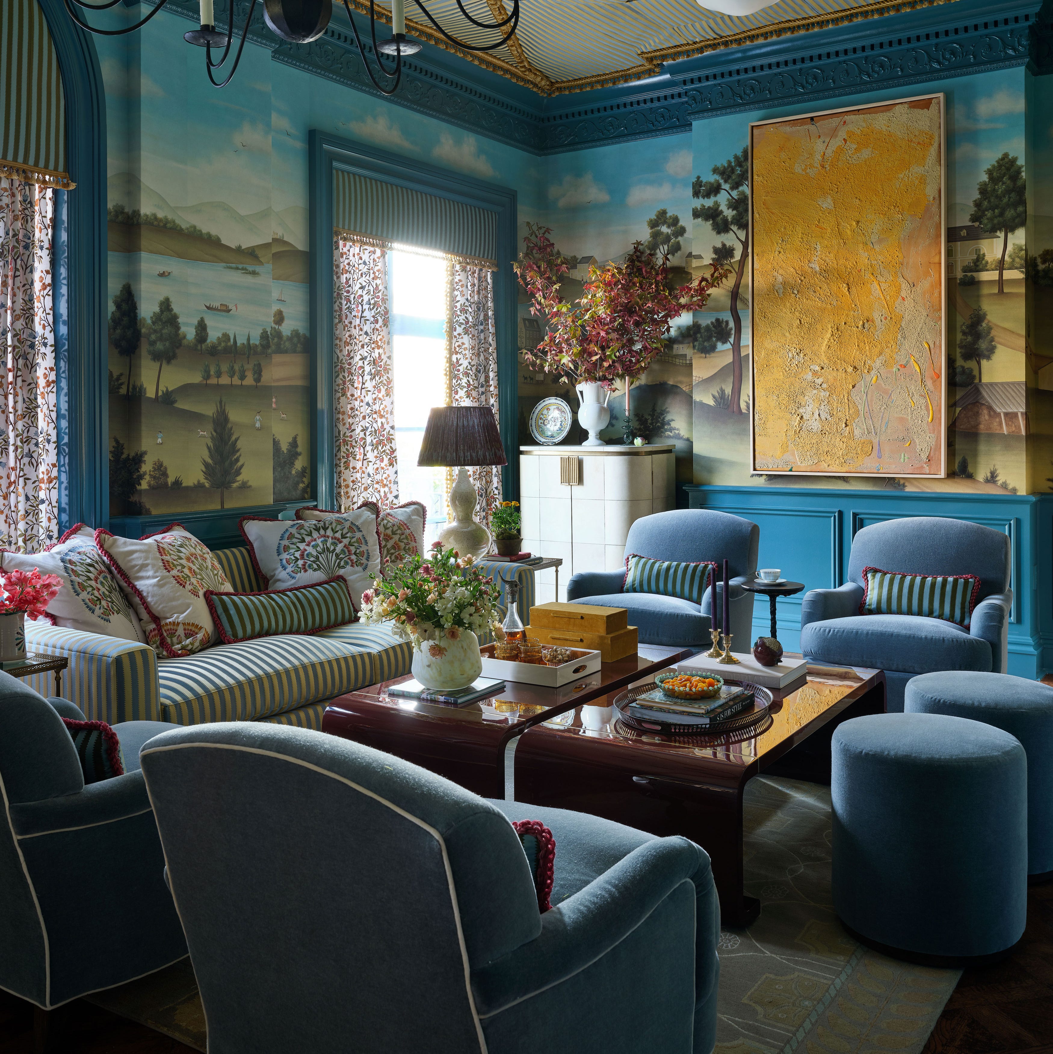
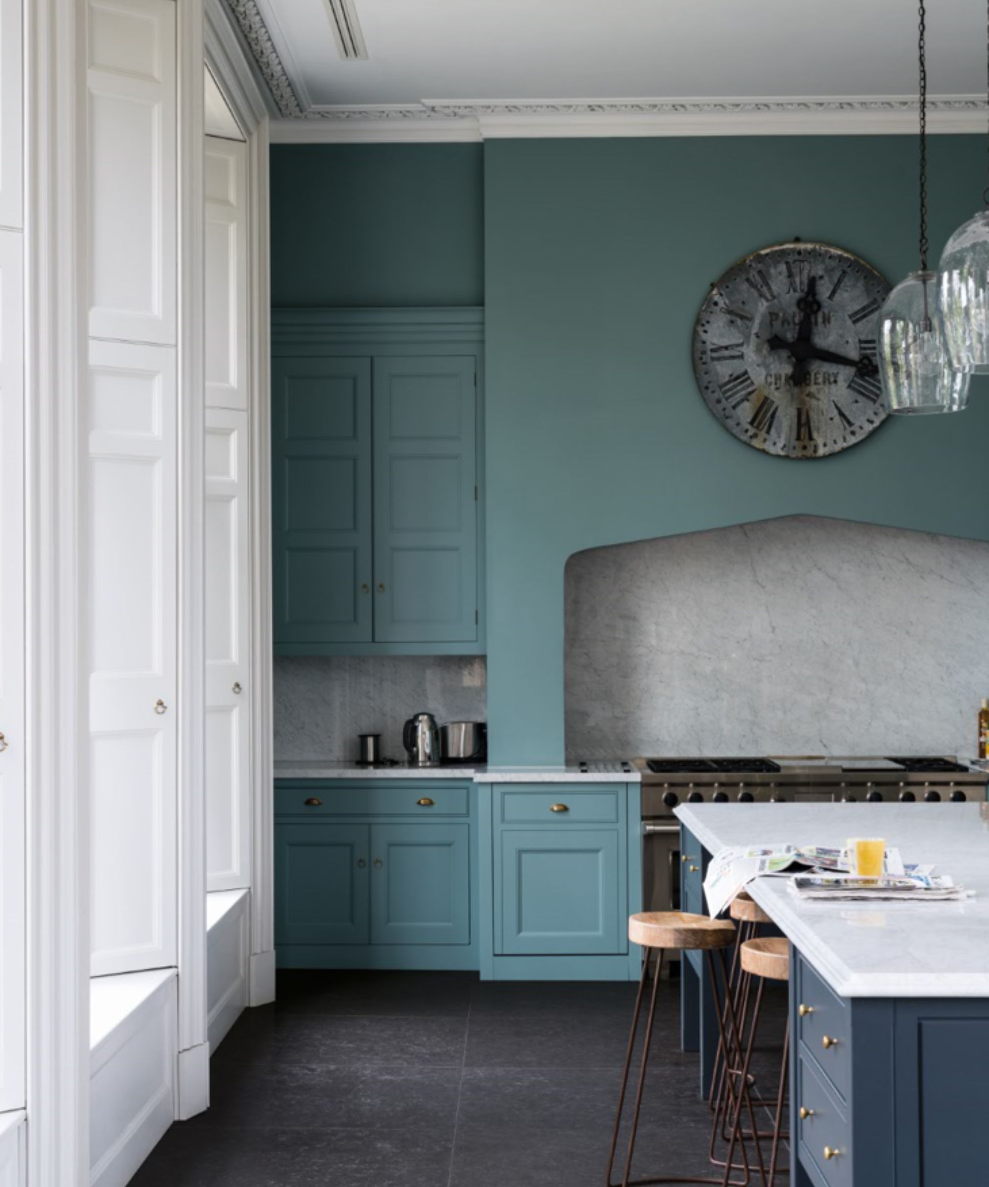
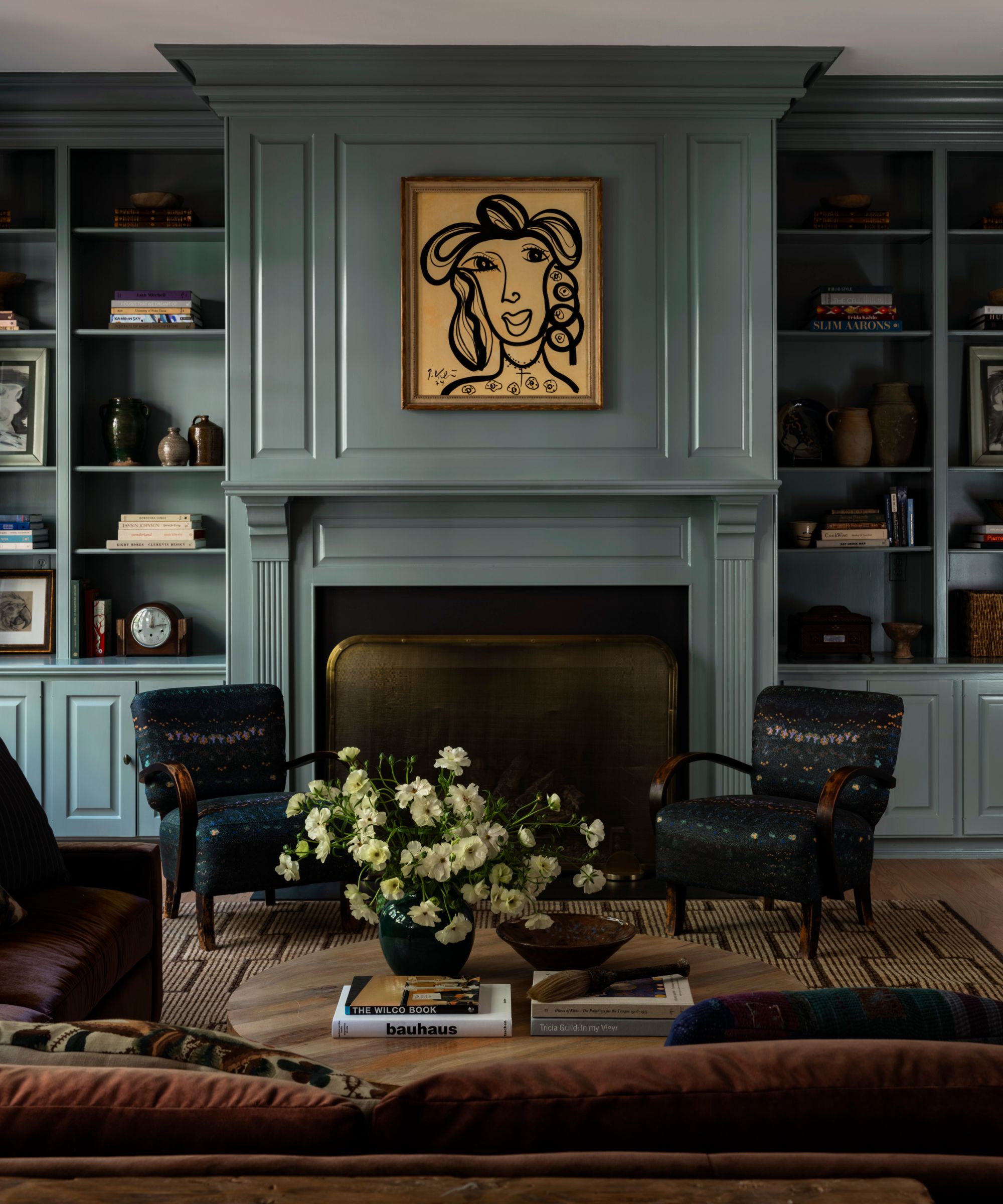
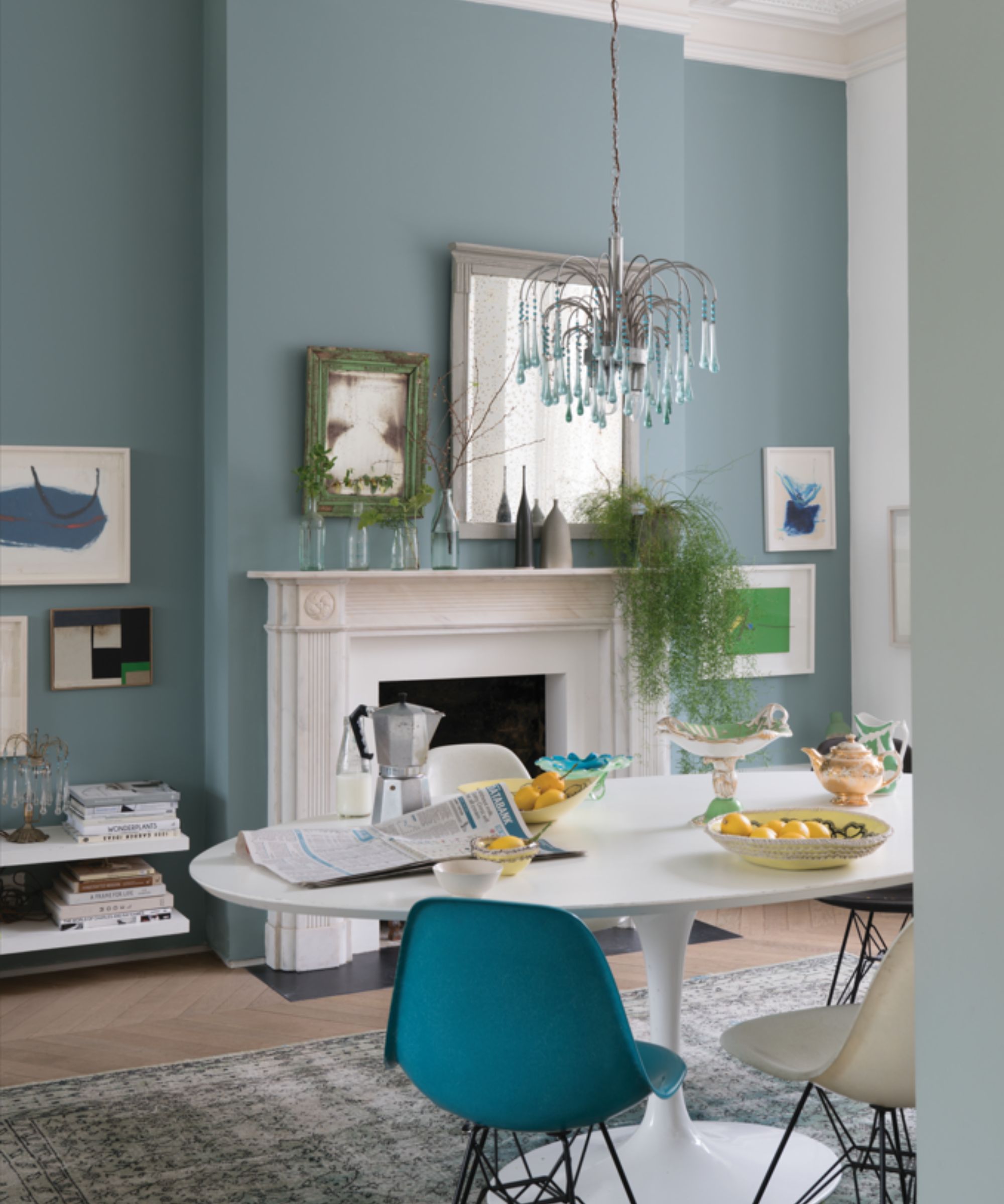
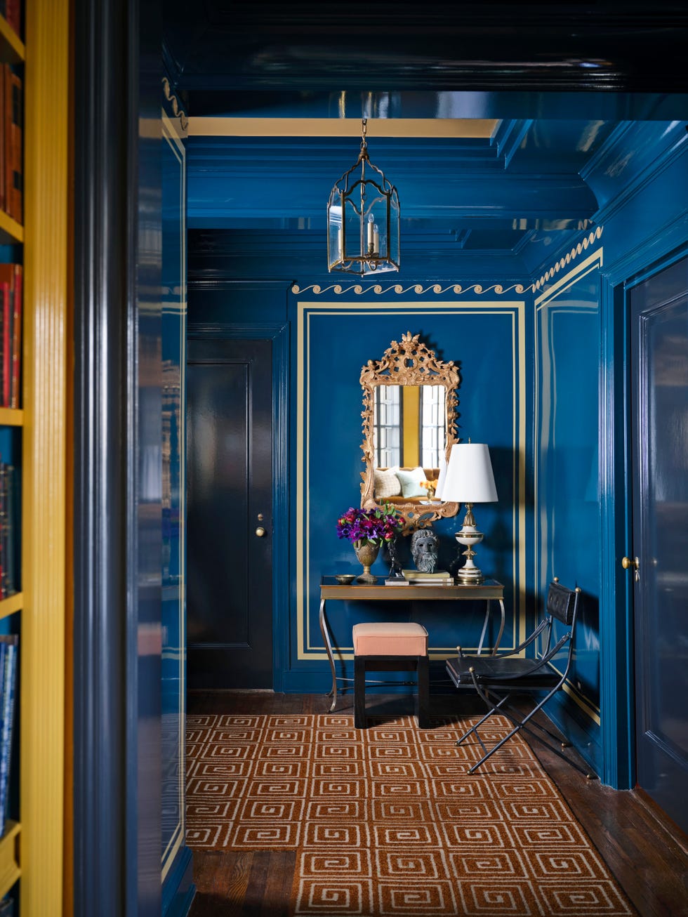
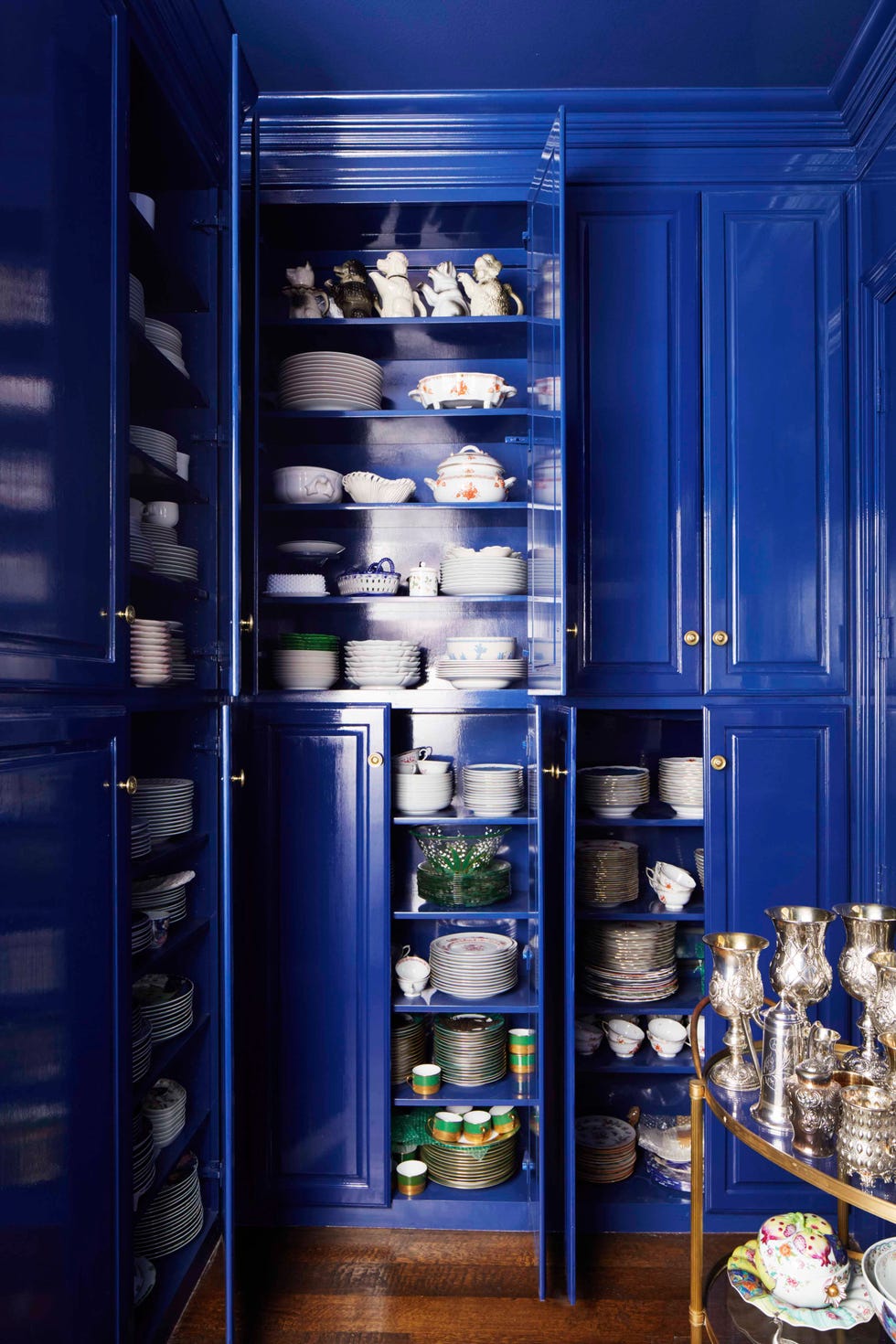
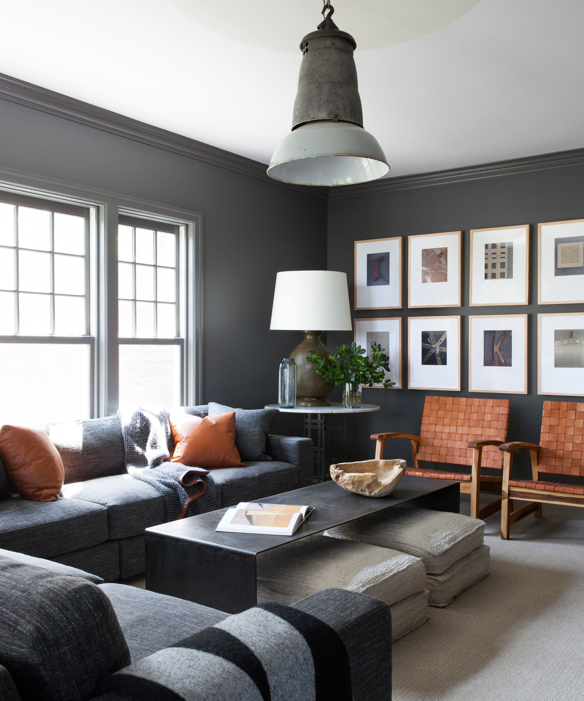
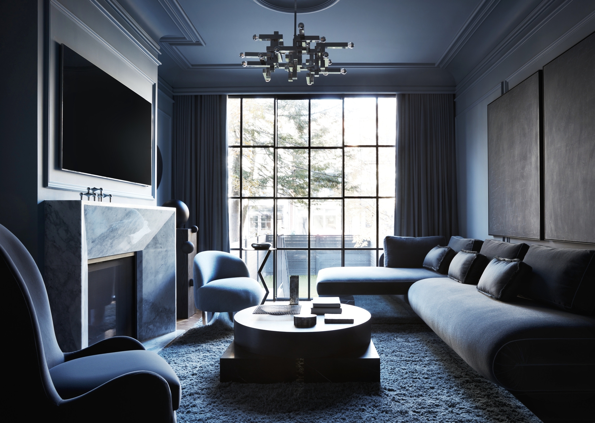
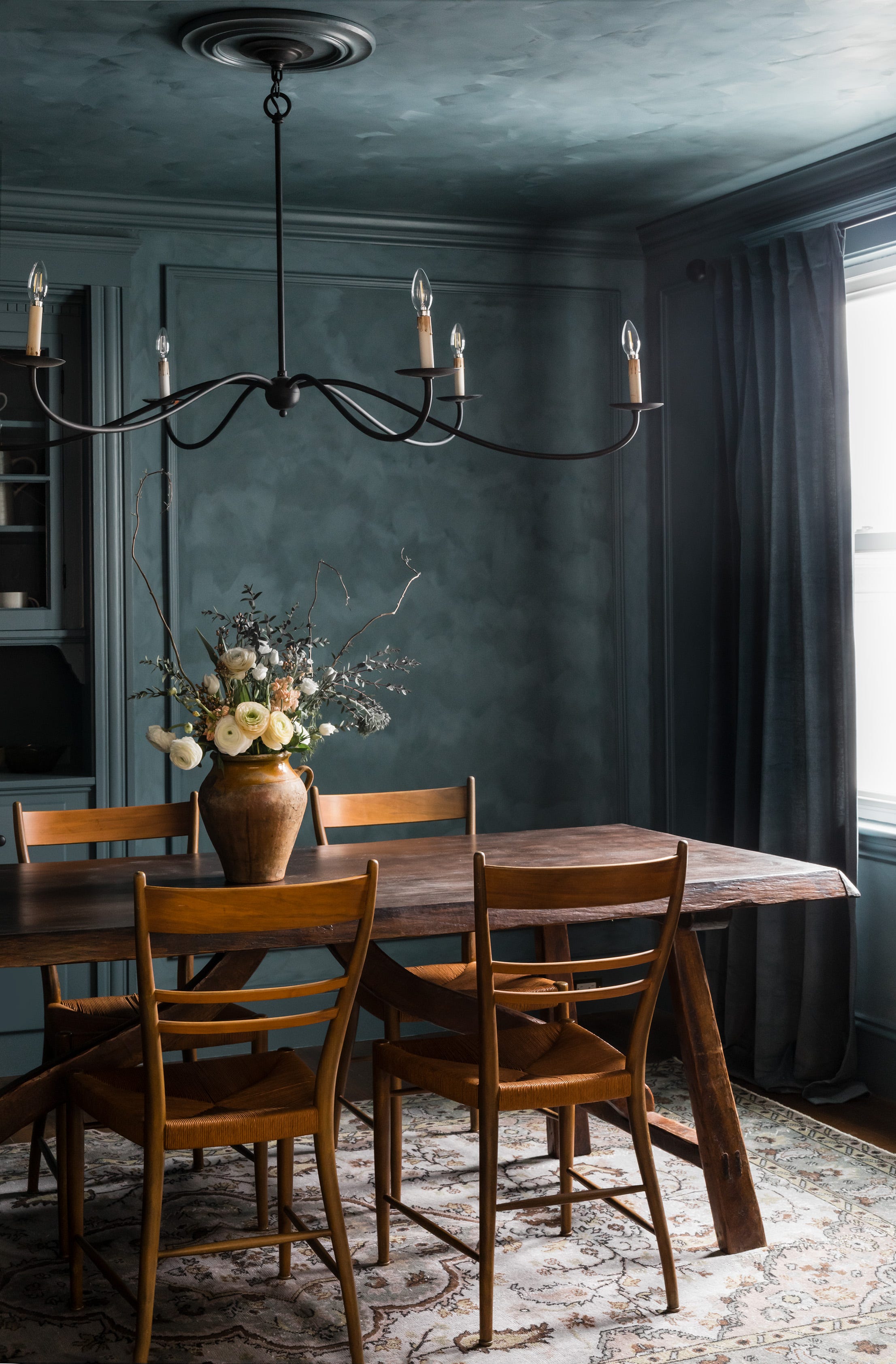
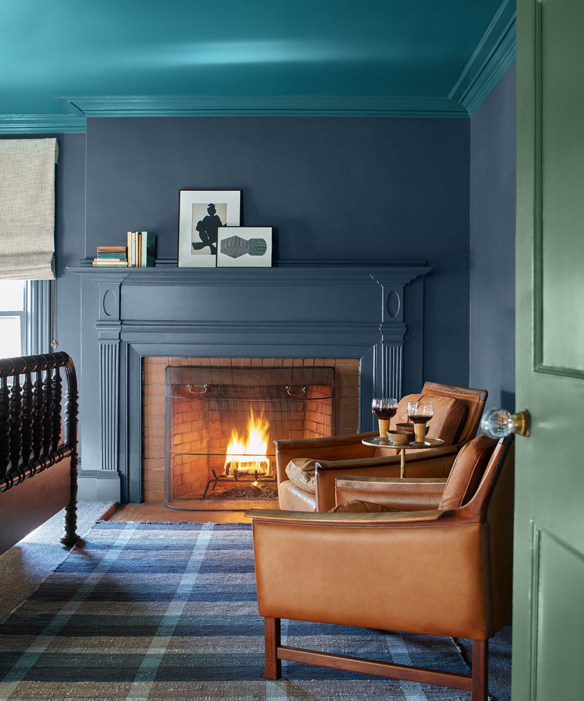
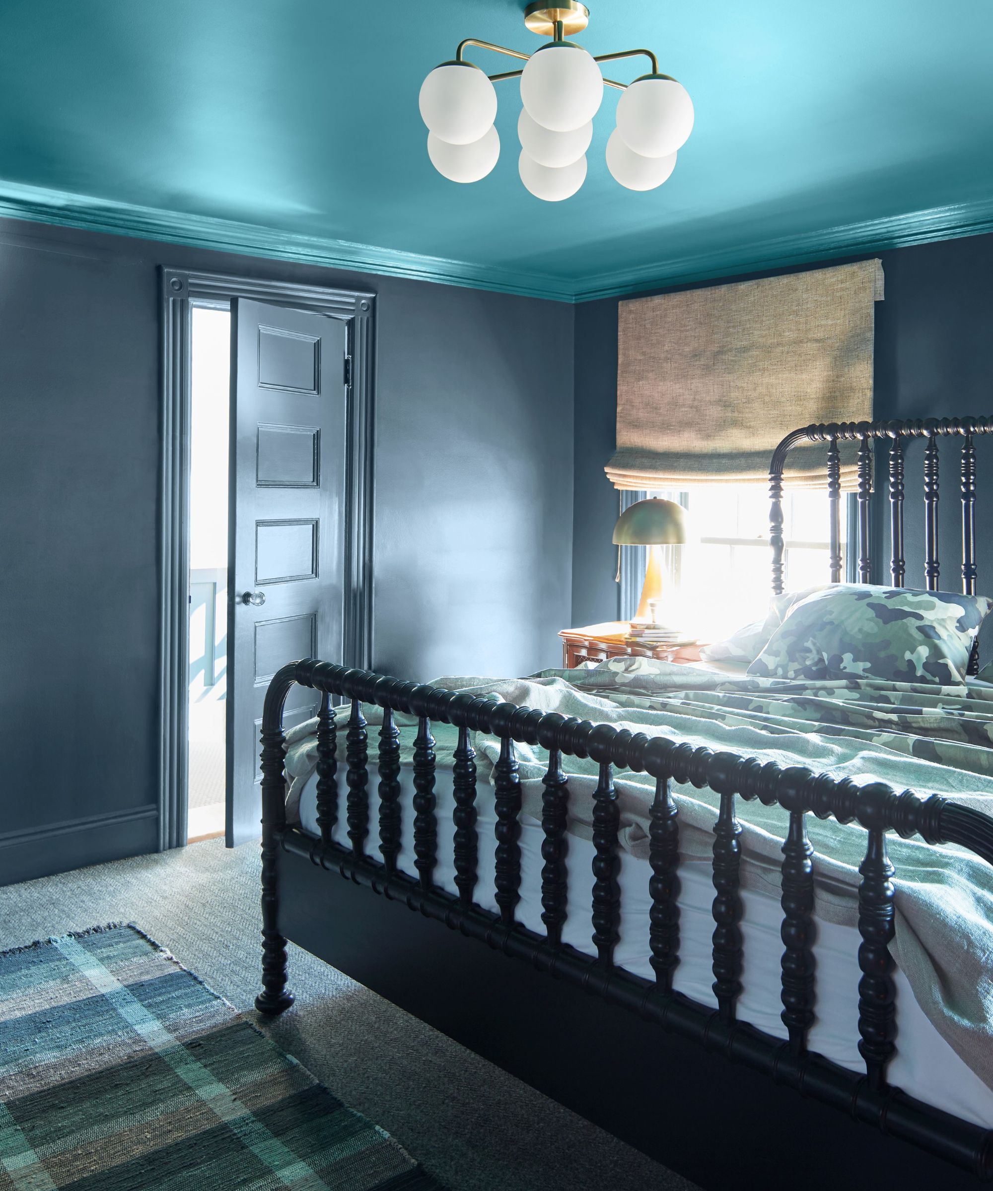
For a more impactful and modern approach, the article suggests embracing color drenching with Van Deusen Blue. This technique involves applying the color liberally across a room's walls, ceiling, and woodwork to create a cohesive and immersive environment. This method is particularly effective for designing cozy and relaxing spaces, as it eliminates harsh contrasts and promotes a unified feel. Examples of suitable rooms for this application include dining rooms and living rooms, where a rich, all-encompassing hue can enhance intimacy and comfort.
To optimize the effect of color drenching with Van Deusen Blue, the article emphasizes the importance of considering paint finishes and lighting. Using higher sheen finishes, such as semi-gloss or high-gloss, can introduce reflection and dimension, adding to the visual interest of the space. Additionally, strategic lighting, including material shades and dimmer switches, can contribute to creating an ultimate cozy ambiance, allowing inhabitants to adjust the mood and intensity of the lighting to their preference.
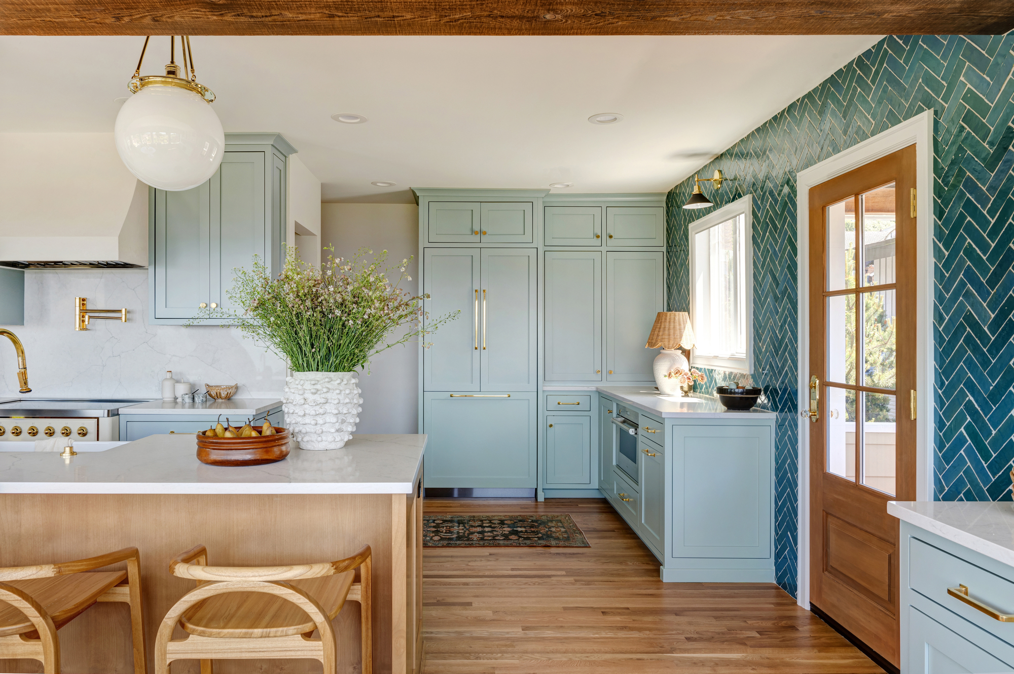
Van Deusen Blue is presented as a timeless and adaptable paint choice, suitable for various homes and interior design styles. Its versatility allows it to be paired with lighter neutrals for a balanced scheme or used in a bold, color-drenched application. The article positions it as a reliable option for those looking to introduce a sophisticated yet practical blue into their color palette, promising an enduring appeal regardless of the chosen decorating approach.
#BenjaminMoore #VanDeusenBlue #NavyBluePaint #InteriorDesign #ColorDrenching #NeutralPaints #AccentColors #PaintFinishes #LightingIdeas #HomeDecor #BenjaminMoore #VanDeusenBlue #NavyBluePaint #InteriorDesign #ColorDrenching #NeutralPaints #AccentColors #PaintFinishes #LightingIdeas #HomeDecor
0 comment in total
 No comments yet
You may also like
5 best blue paints as chosen by interior designers
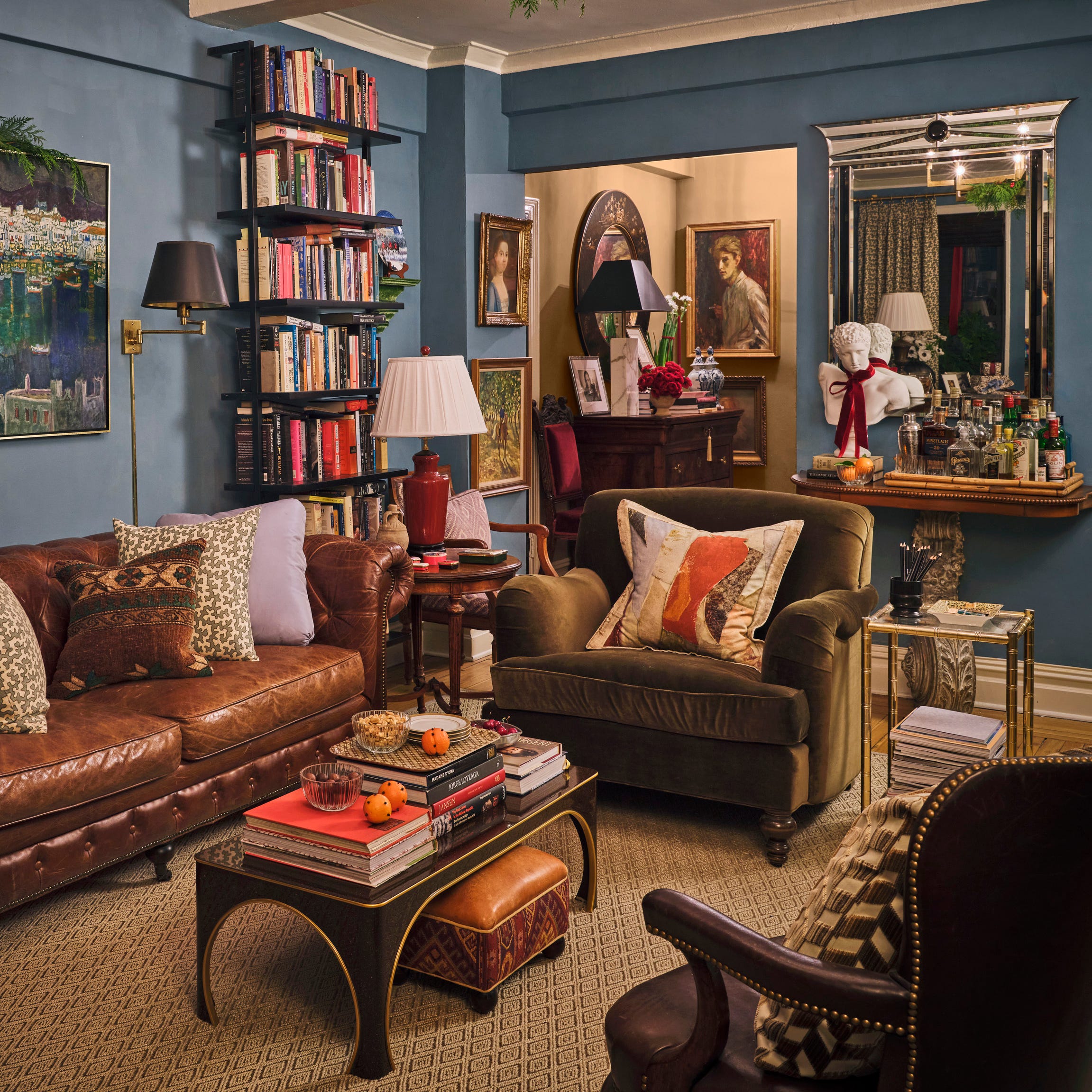
Designers Swear By These 11 Dark Blue Paint Colors for Chic and Moody Spaces

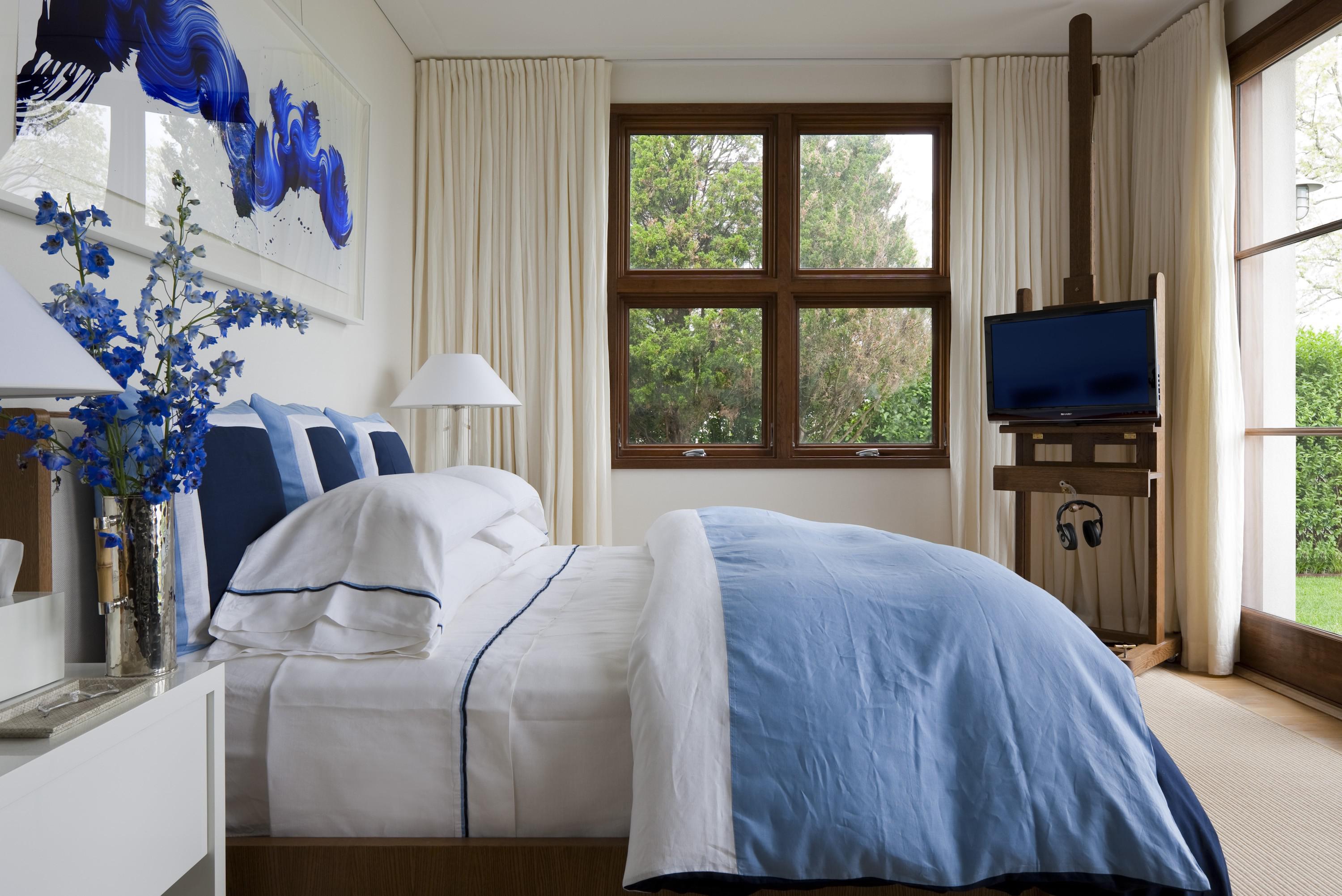
Here are 9 stunning ways to decorate with the color blue

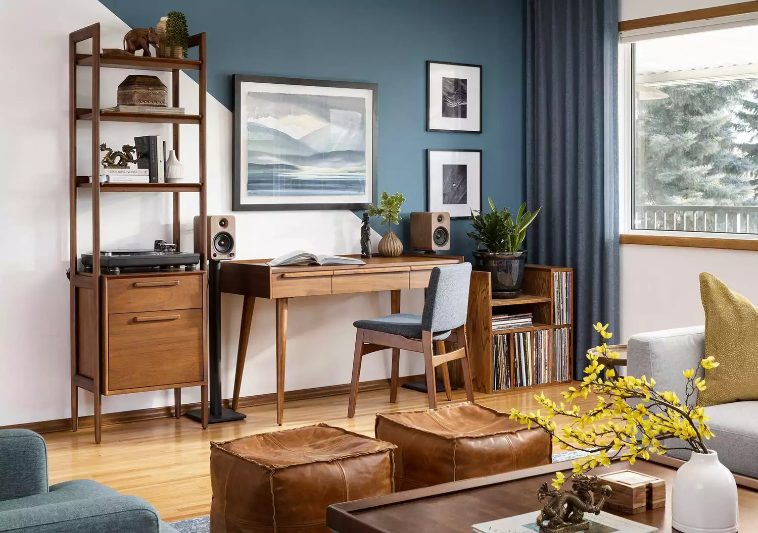
These 10 Colors Always Look Beautiful With Blue

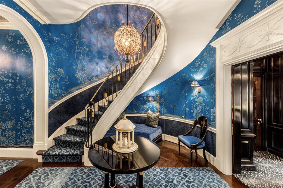
Beautiful blue decorating ideas for every room | loveproperty.com

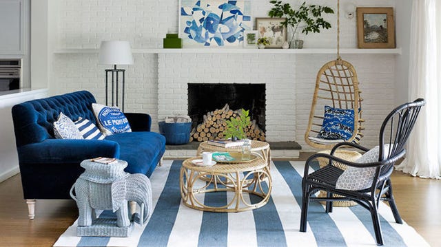
25 Reasons Why Blue Is the Best Color for Decorating Your Home
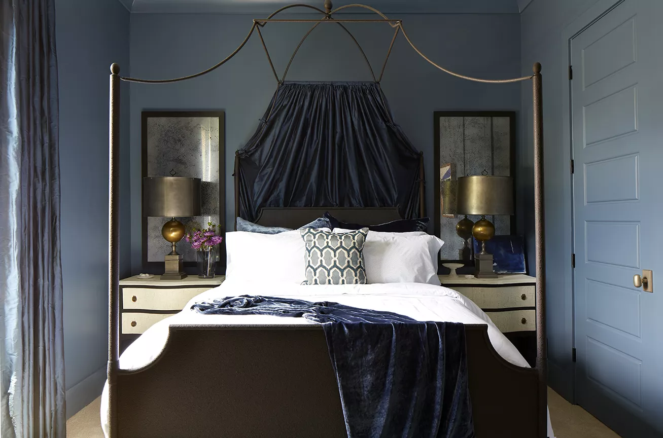
Looking for the Perfect Dark Blue Paint Color? Look No Further Than These Top Picks
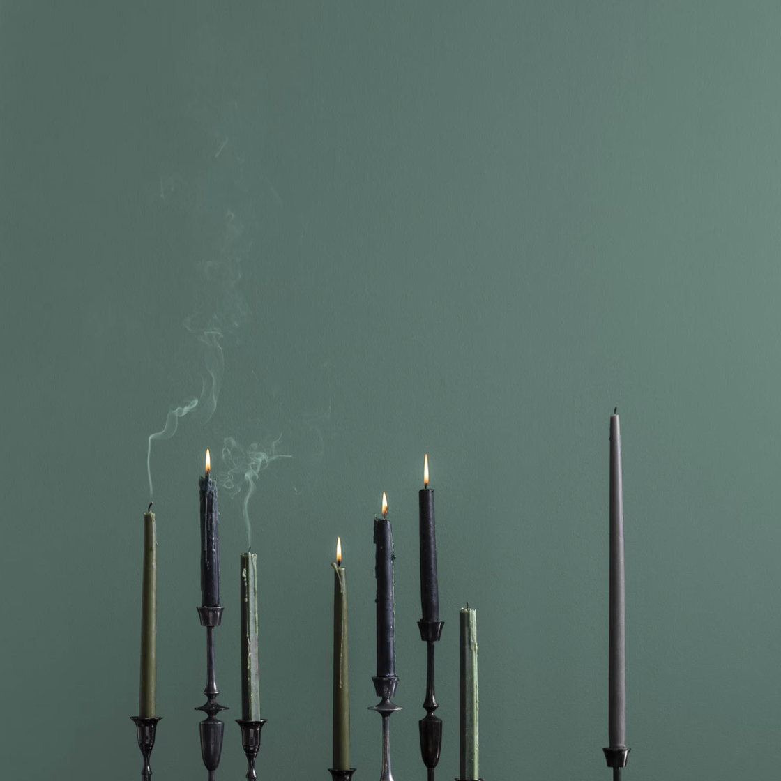
The 10 Best Blue-Green Paint Colors Designers Can't Stop Using

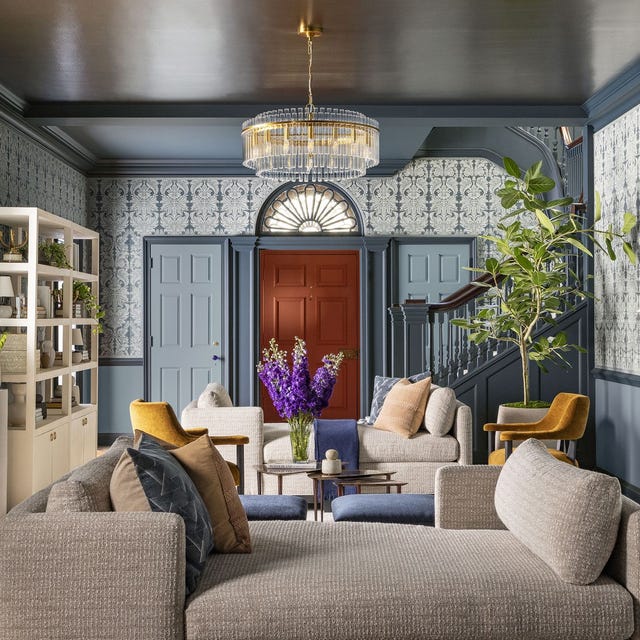
This Is the Best Blue Paint Color, According to Designers

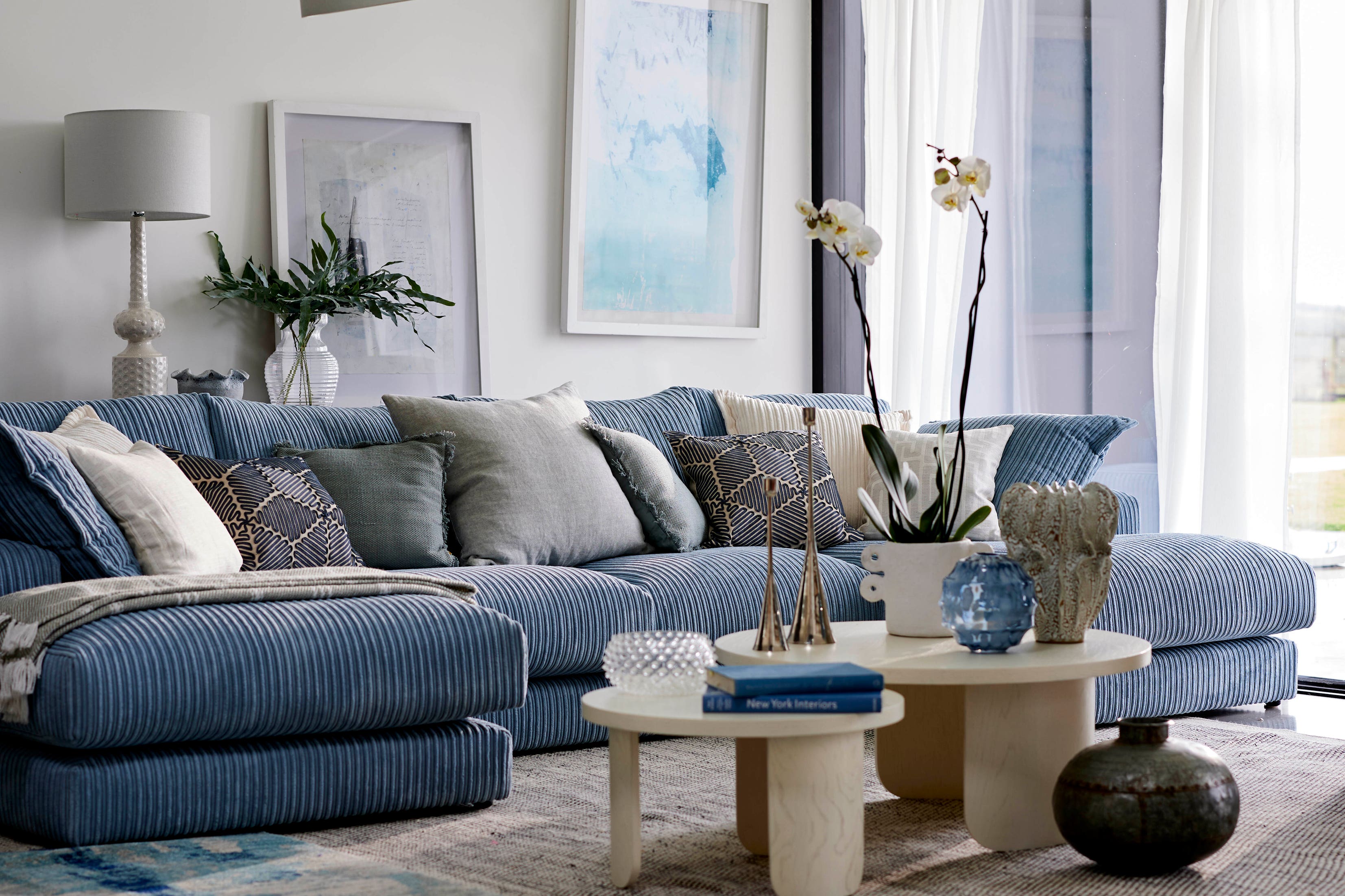
9 must-have brilliant blue homewares and decor
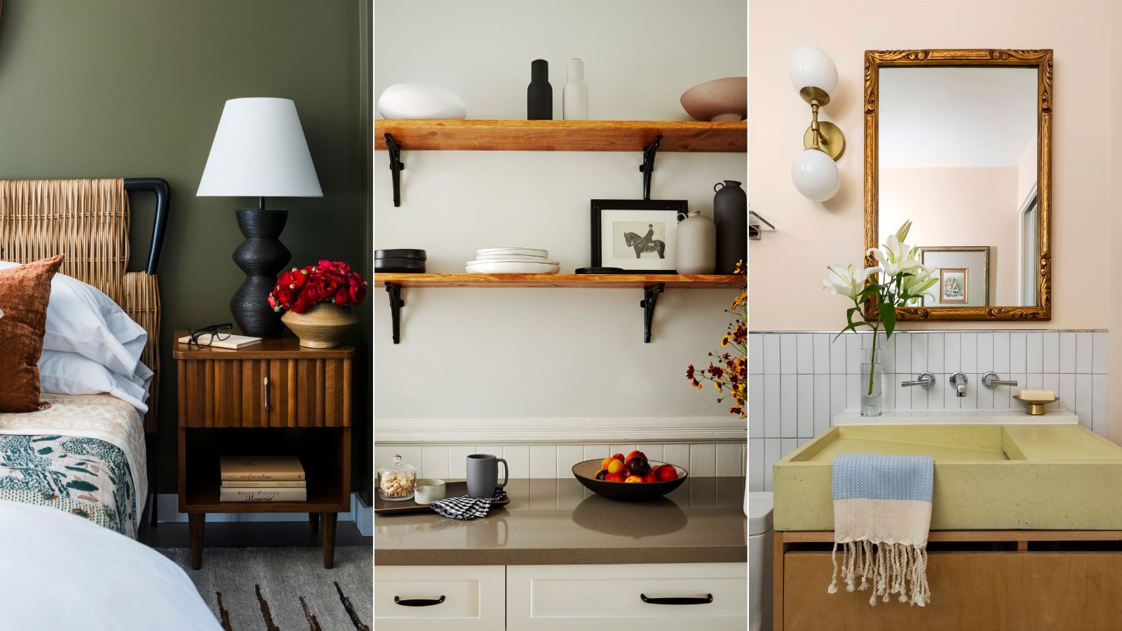
Interior designers share their favorite Benjamin Moore paint colors – and there's something for every style
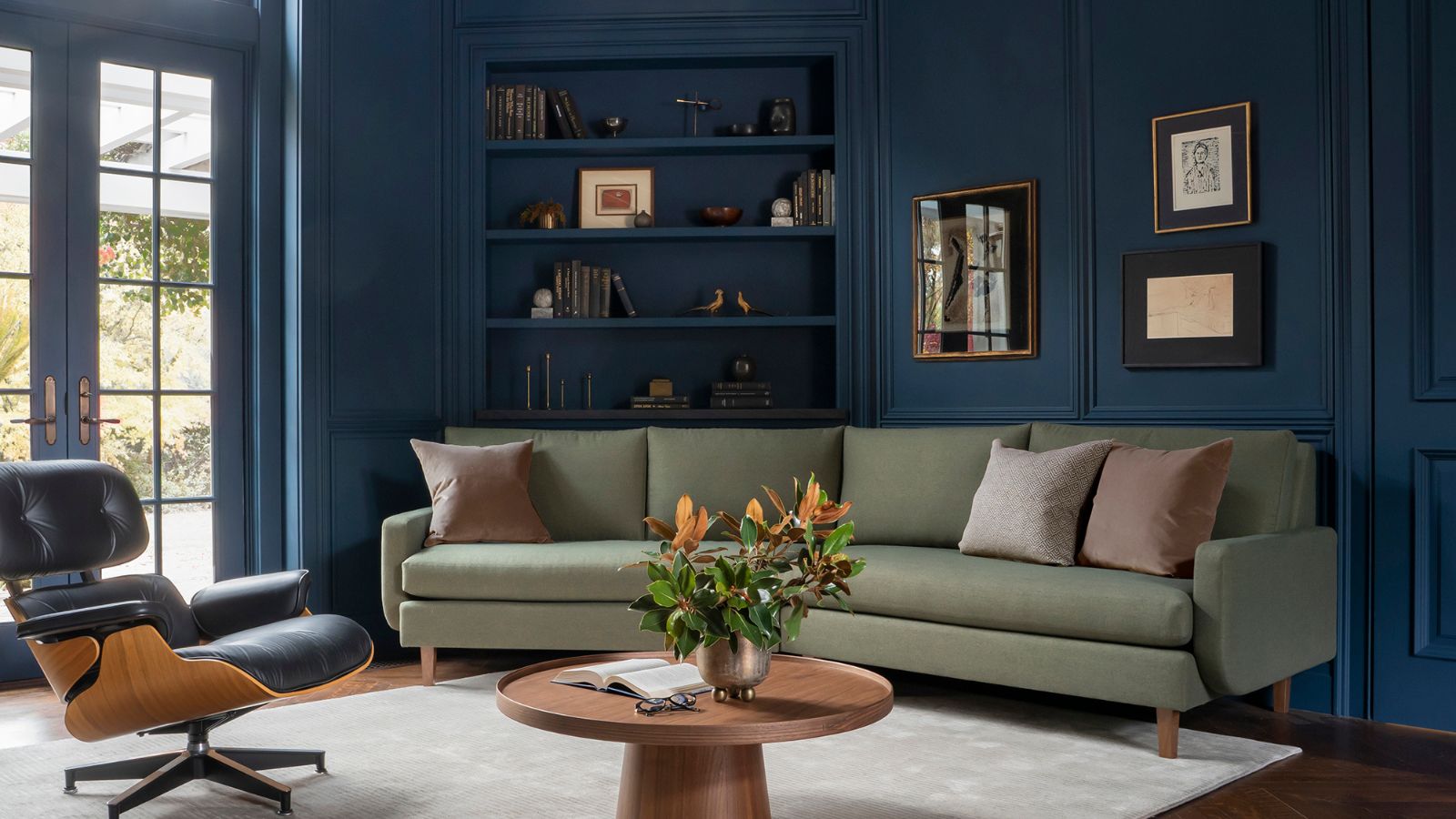
Is Benjamin Moore's Gentleman's Gray the perfect navy blue paint?
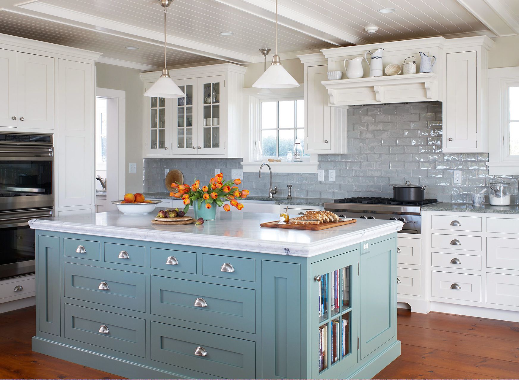
The Best Light-Blue Paint Colors for Every Room, According to Designers

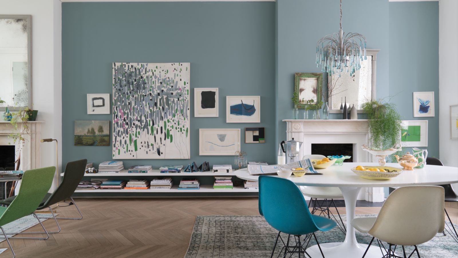
Farrow & Ball's Oval Room Blue is a nuanced blue paint that creates 'timeless elegance' – here's how to decorate with it
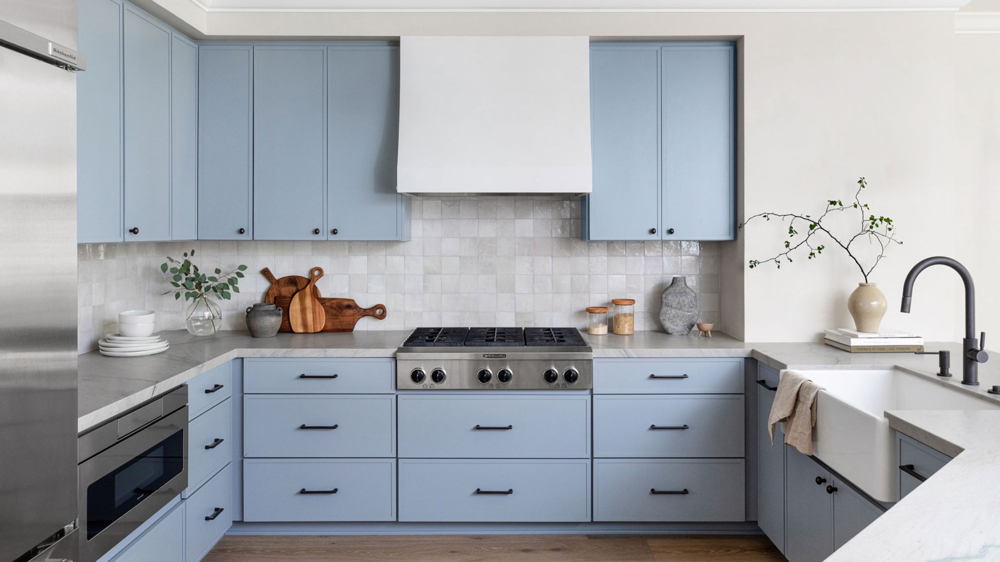
We Asked Designers: What's the Best Light Blue Paint Color? Here's 6 Shades They Swear By

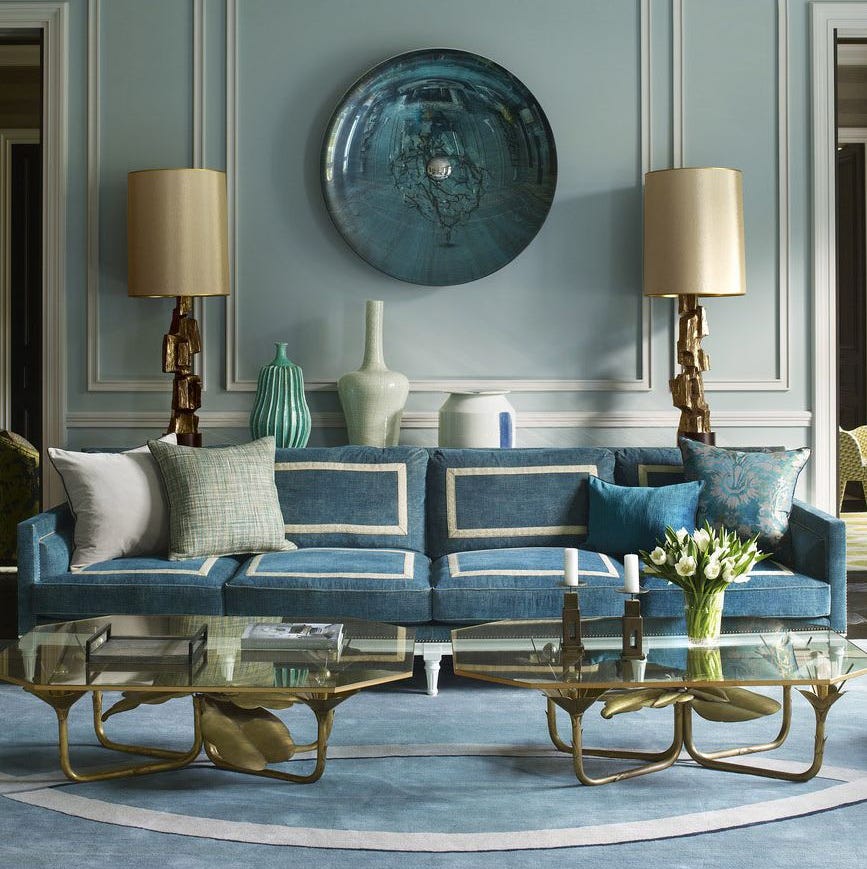
55 Tried-and-True Blue Paint Colors
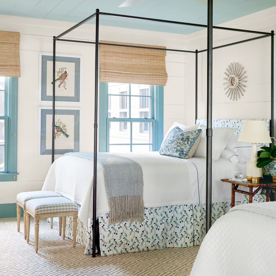
The 60 Best Blue Paint Colors for Every Room in Your Home
How to Decorate with Cobalt Blue the Right Way, According to Designers
Navy blue is the new black — here’s how to decorate with it

Decorating Tips and Techniques