The Best Light-Blue Paint Colors for Every Room, According to Designers
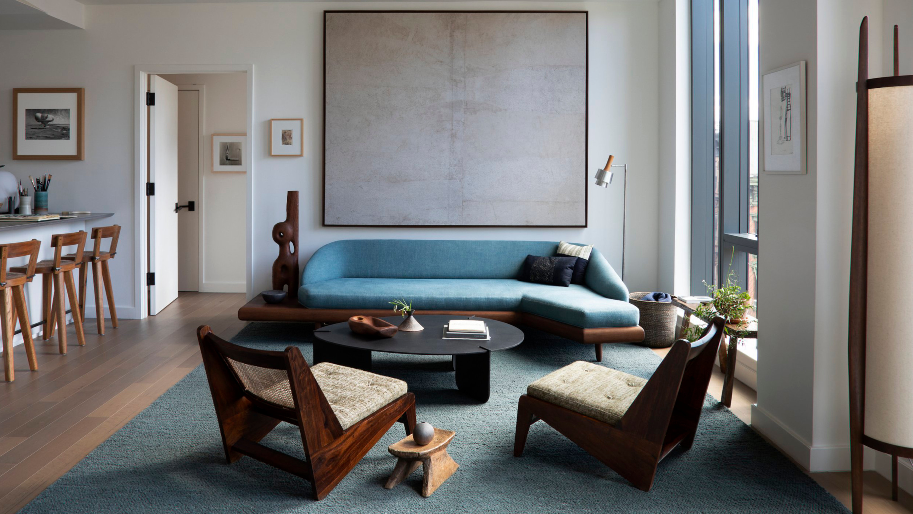
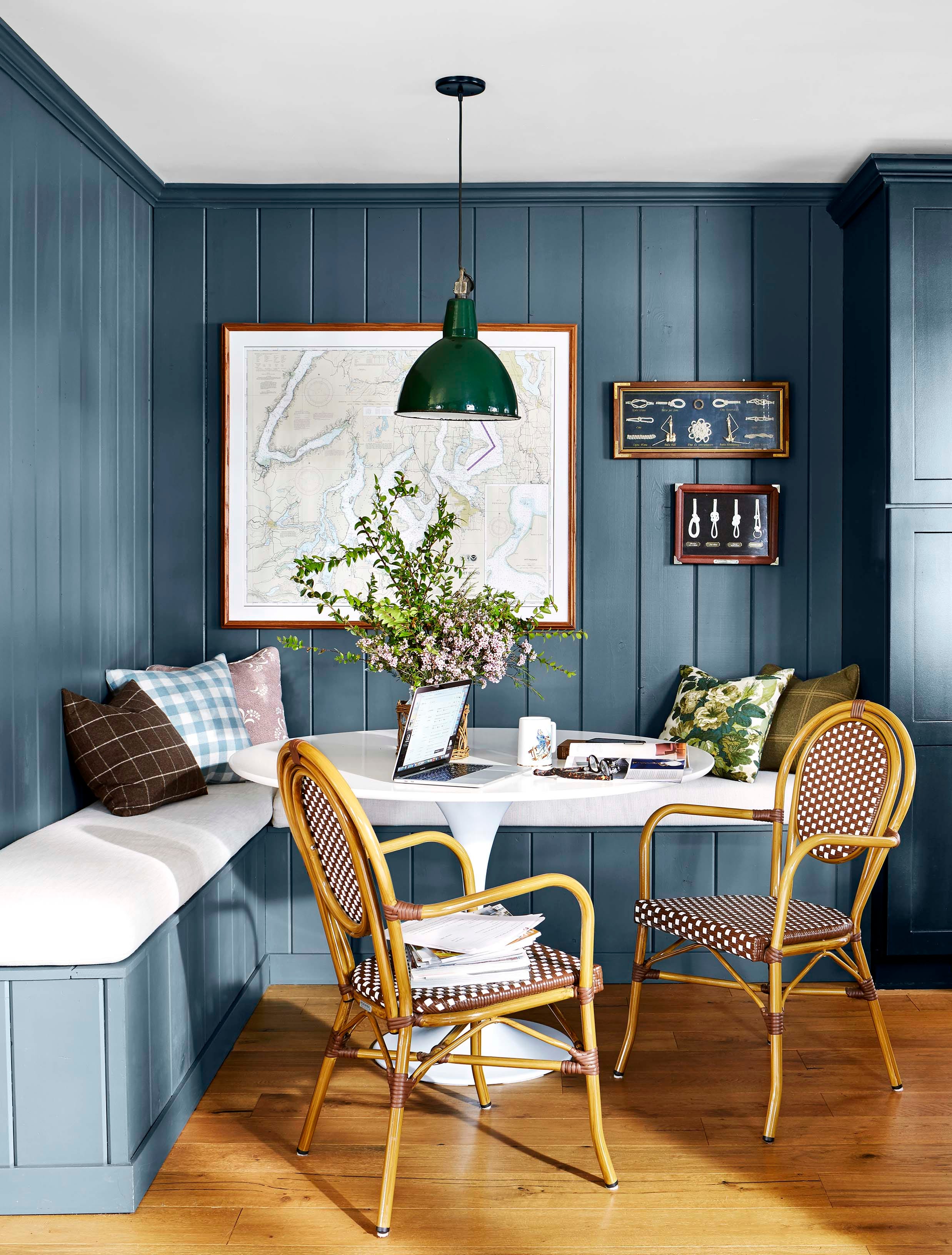
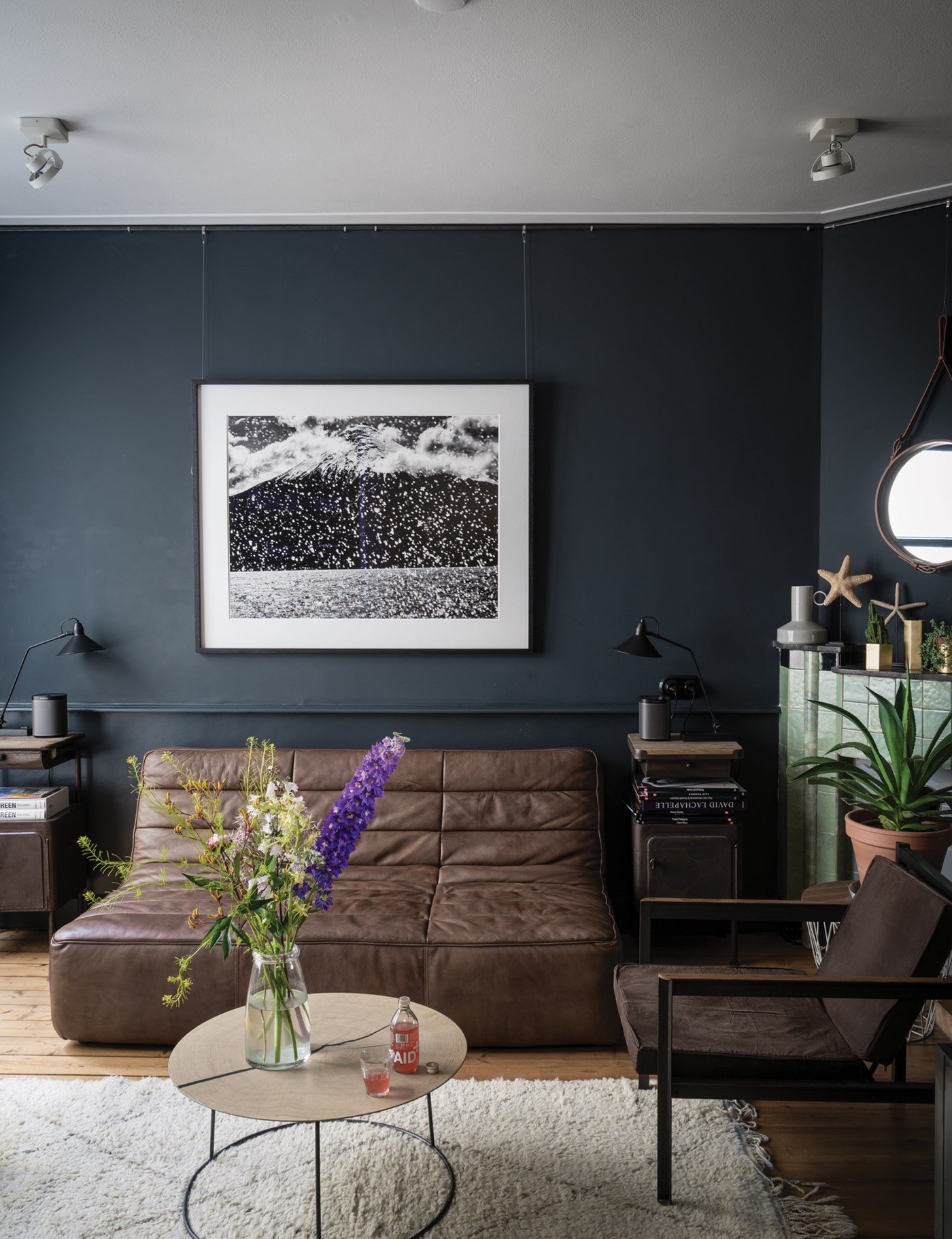
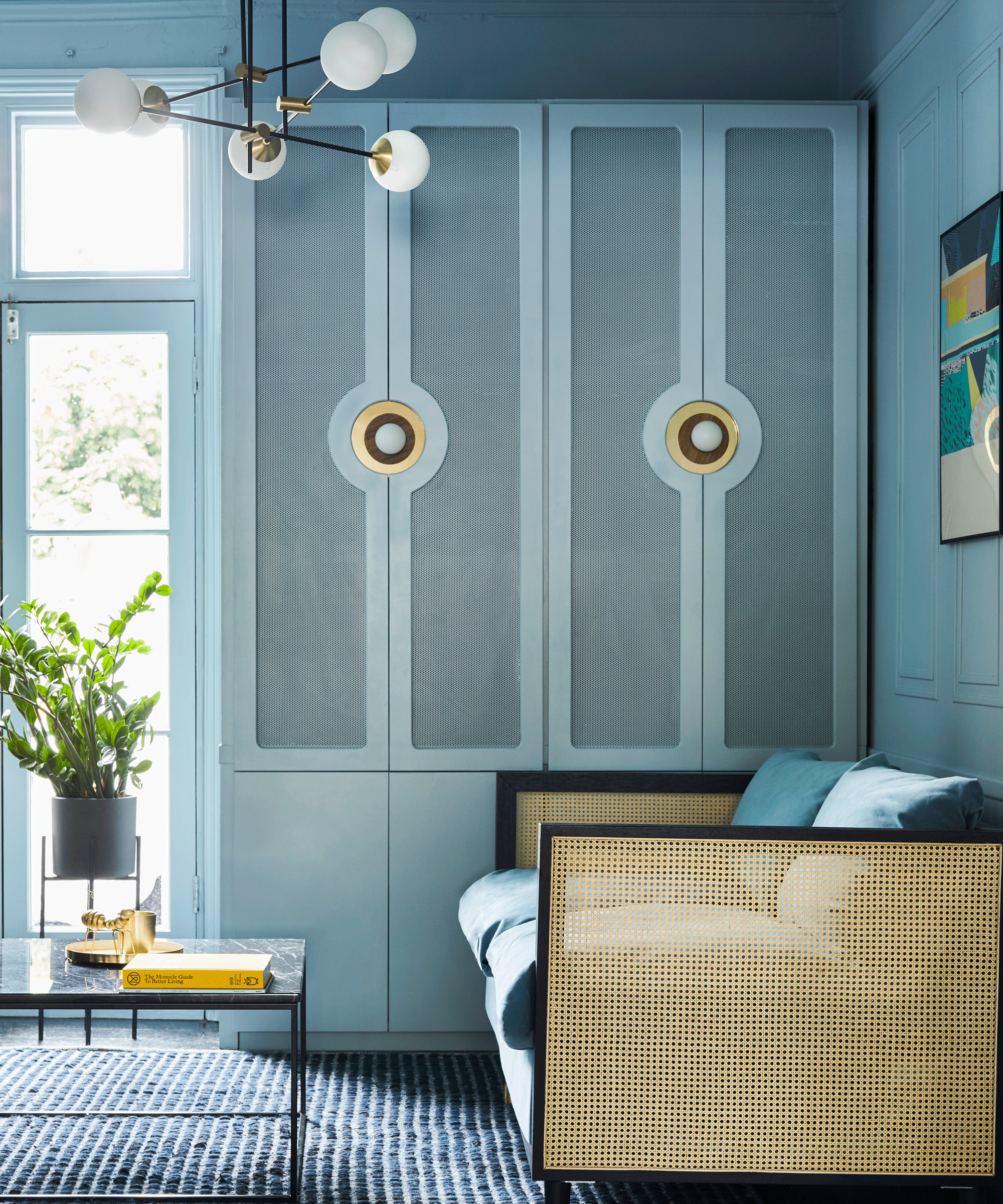
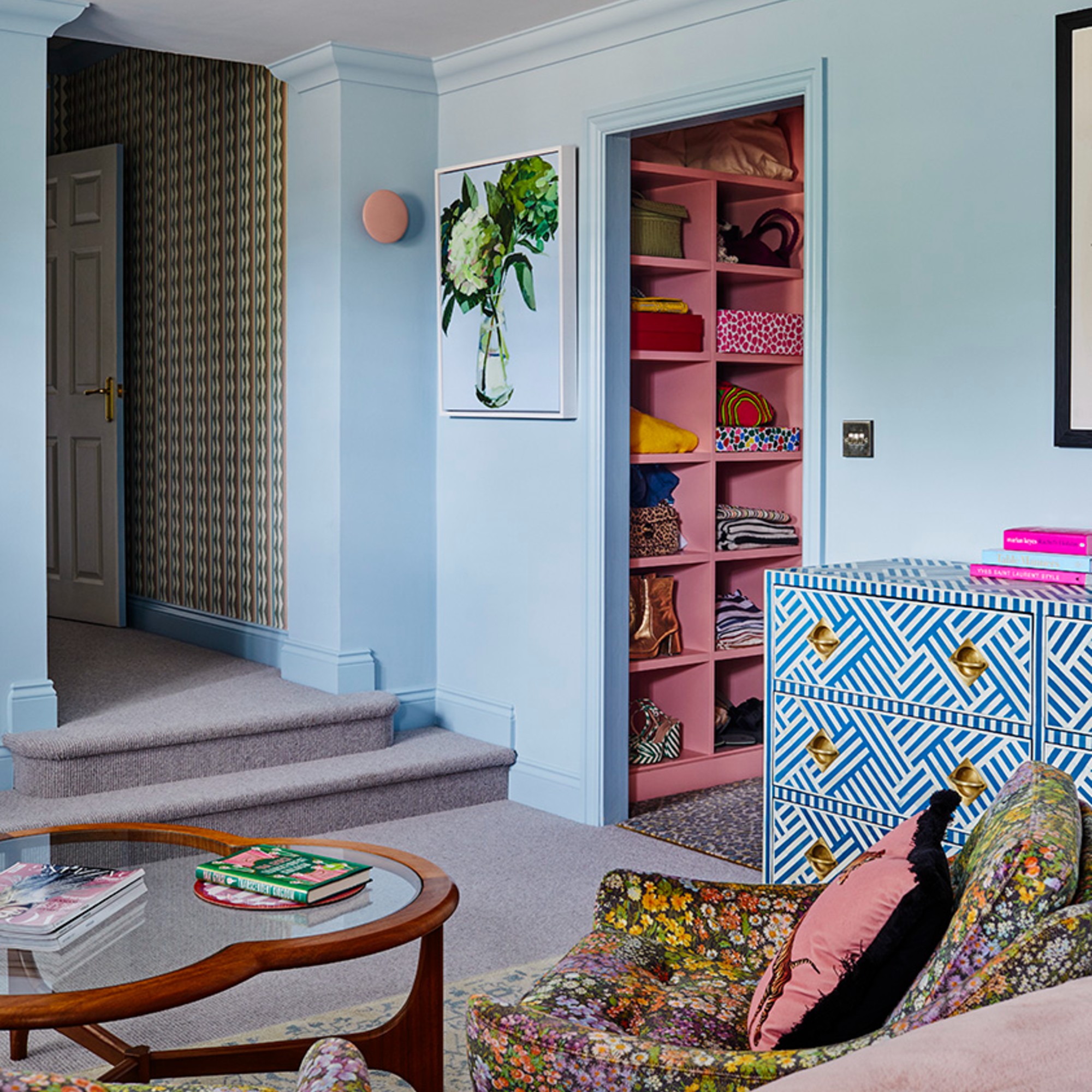
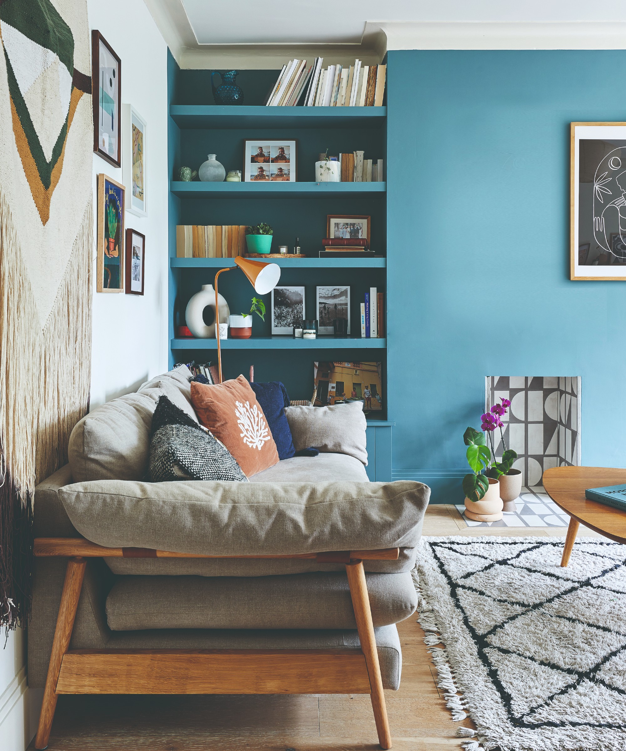
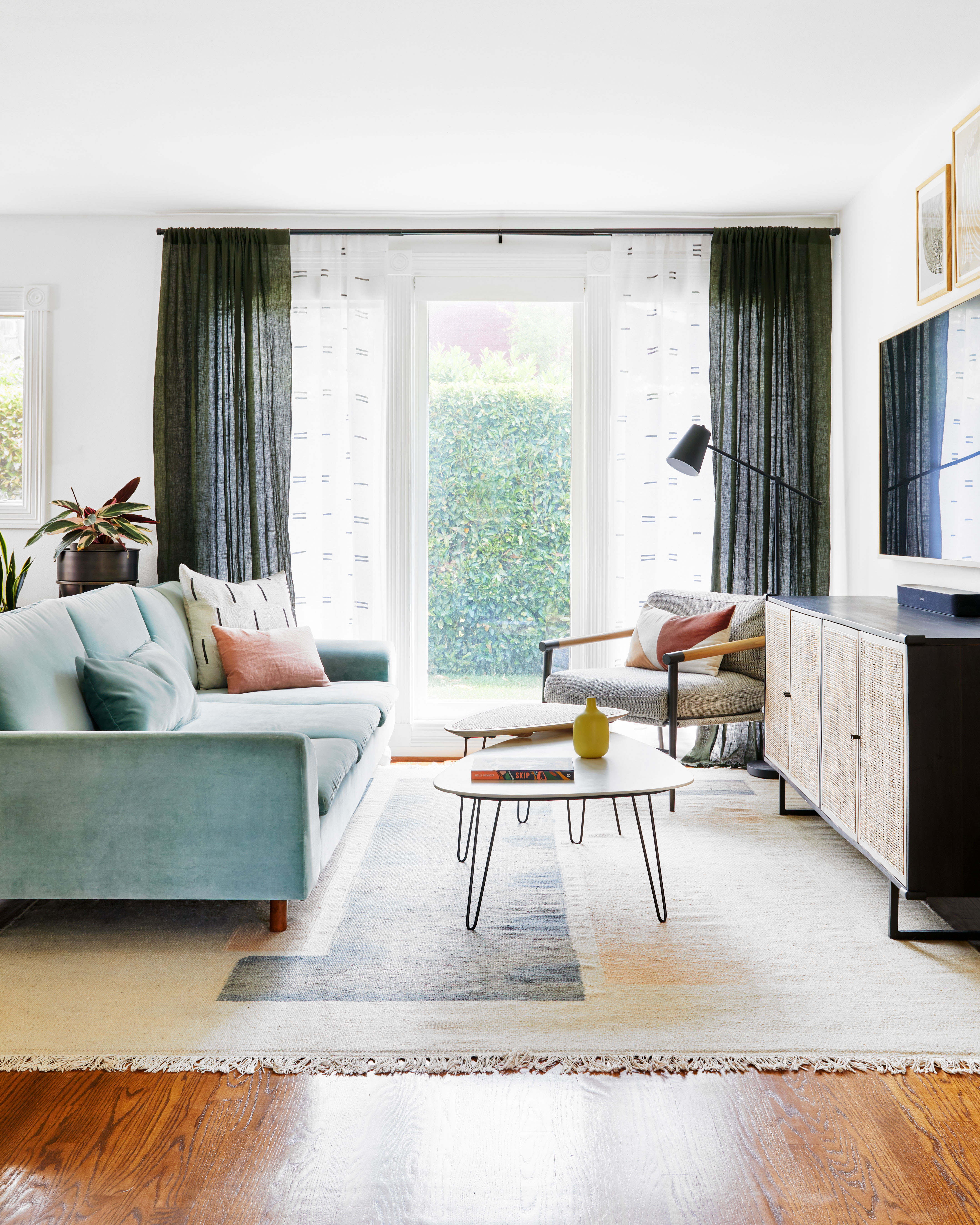
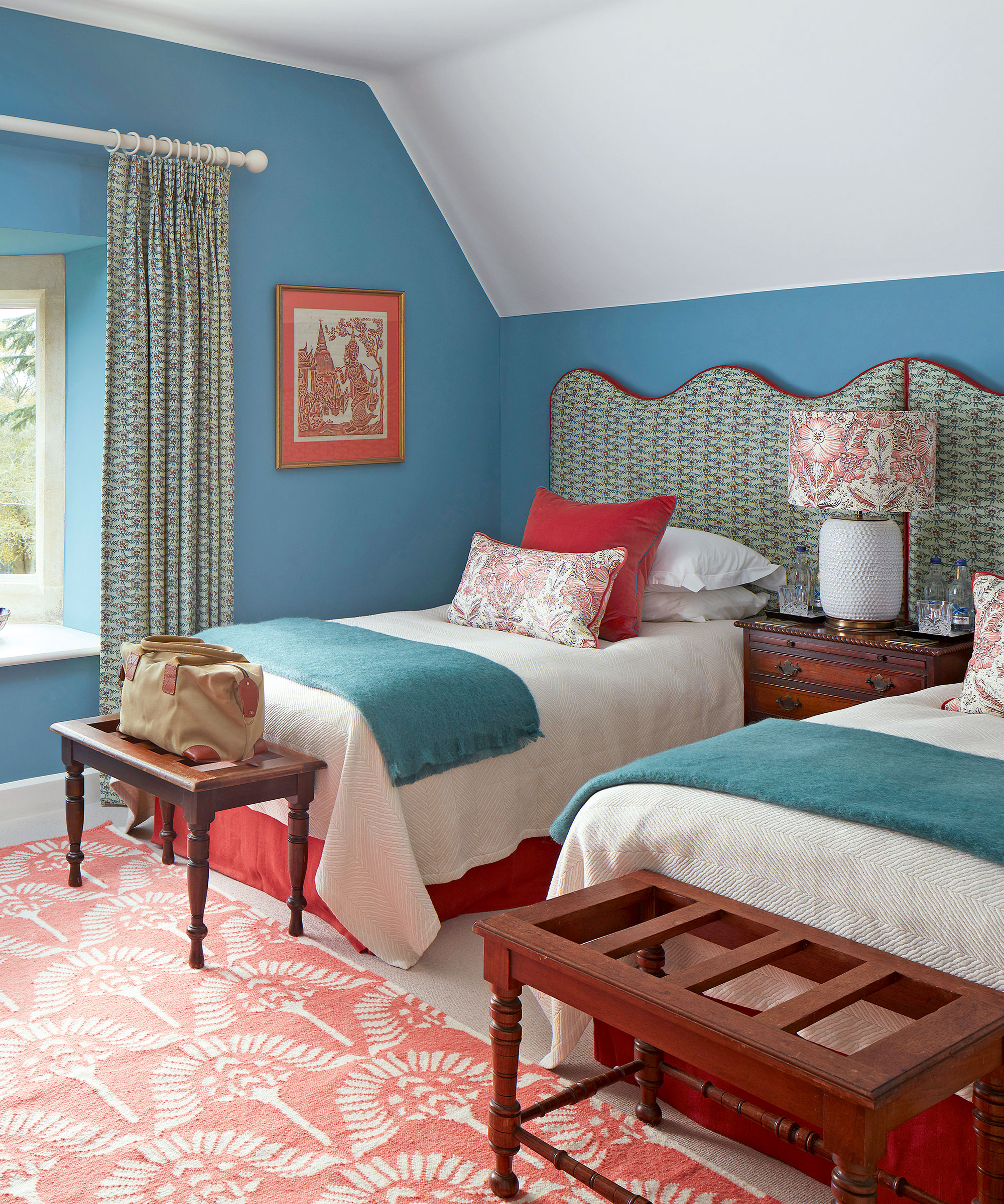
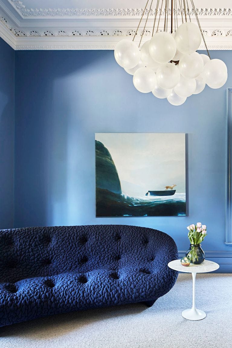
This article explores the enduring appeal of light blue paint colors in interior design, offering insights from industry experts on how to select and apply these versatile shades. Light blue, ranging from icy blue to pale blue-greens, is highlighted for its soothing, fresh, and relaxing ambiance, making it a popular choice for various home applications such as kitchen cabinetry, trim, shelving, and bathroom vanities. Sue Wadden, director of color marketing for Sherwin-Williams, emphasizes the nostalgic and comforting aspects of dusty blue shades, likening them to natural elements and traditional aesthetics. Patrick O'Donnell of Farrow & Ball notes the ease with which these hues integrate with diverse art, furniture, and architectural styles.
The selection process for the ideal powder blue shade involves careful consideration of undertones. Wadden advises avoiding shades with too many red undertones, which can lead to a periwinkle appearance, and suggests incorporating a touch of gray to prevent the color from appearing overly sweet or infantile. Nivara Xaykao from Benjamin Moore stresses the importance of assessing existing room colors, like trim and doors, to ensure harmonious undertones. Lighting conditions also play a crucial role; Xaykao explains that in cool, dim natural light, a brighter blue with a hint of green can achieve balance. The article then presents a curated list of top light blue paint color recommendations from interior designers, showcasing their application in various rooms.
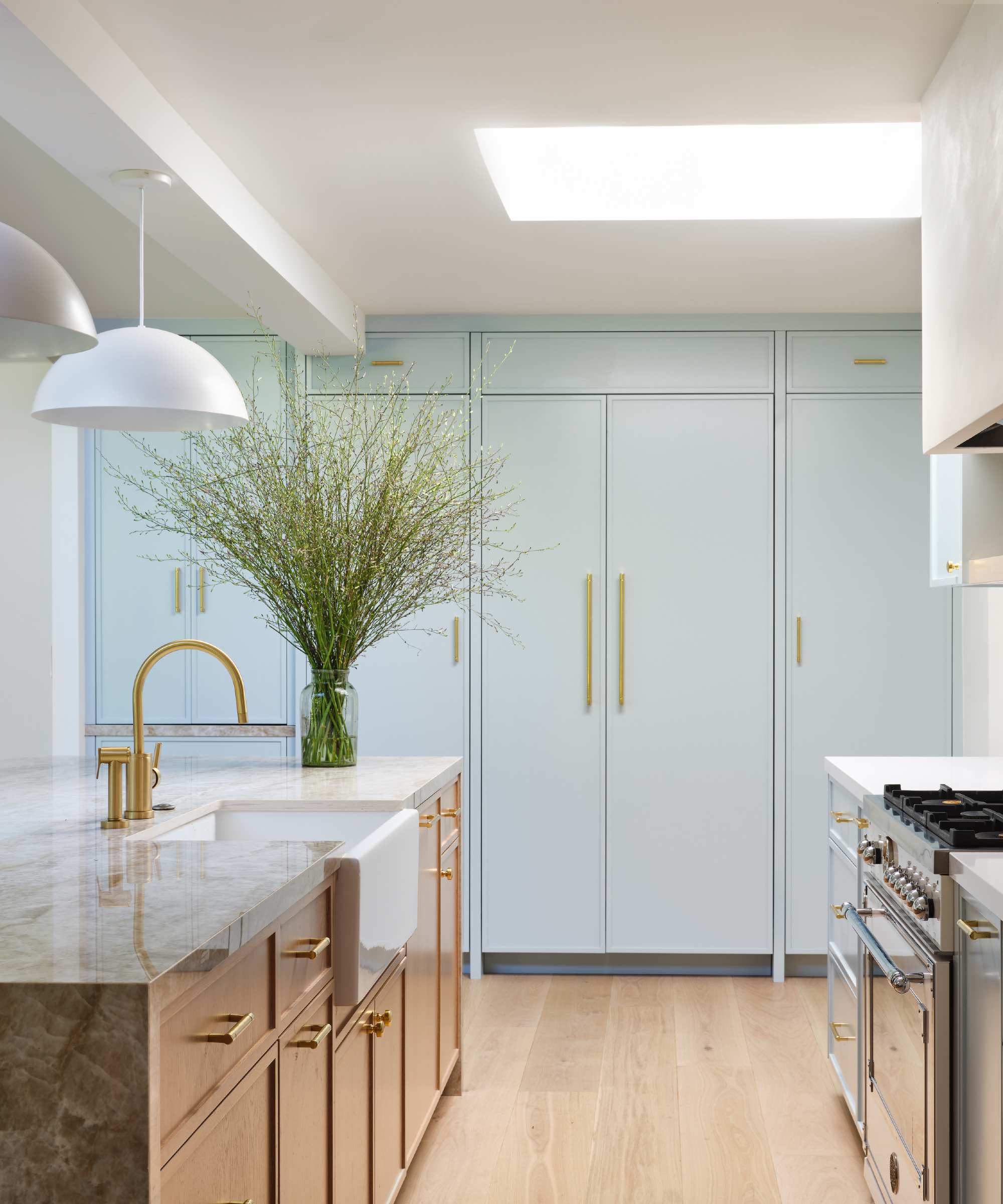
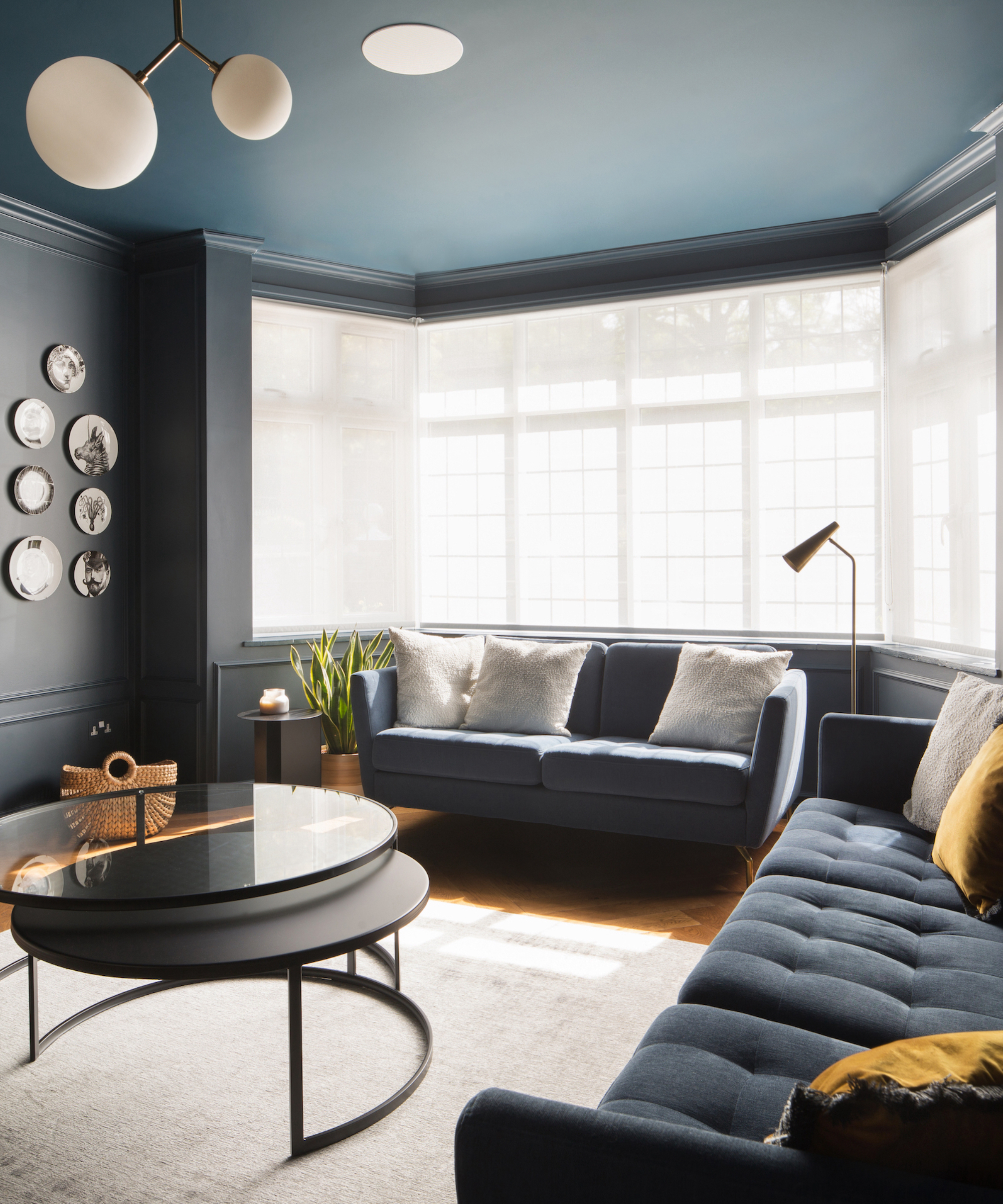
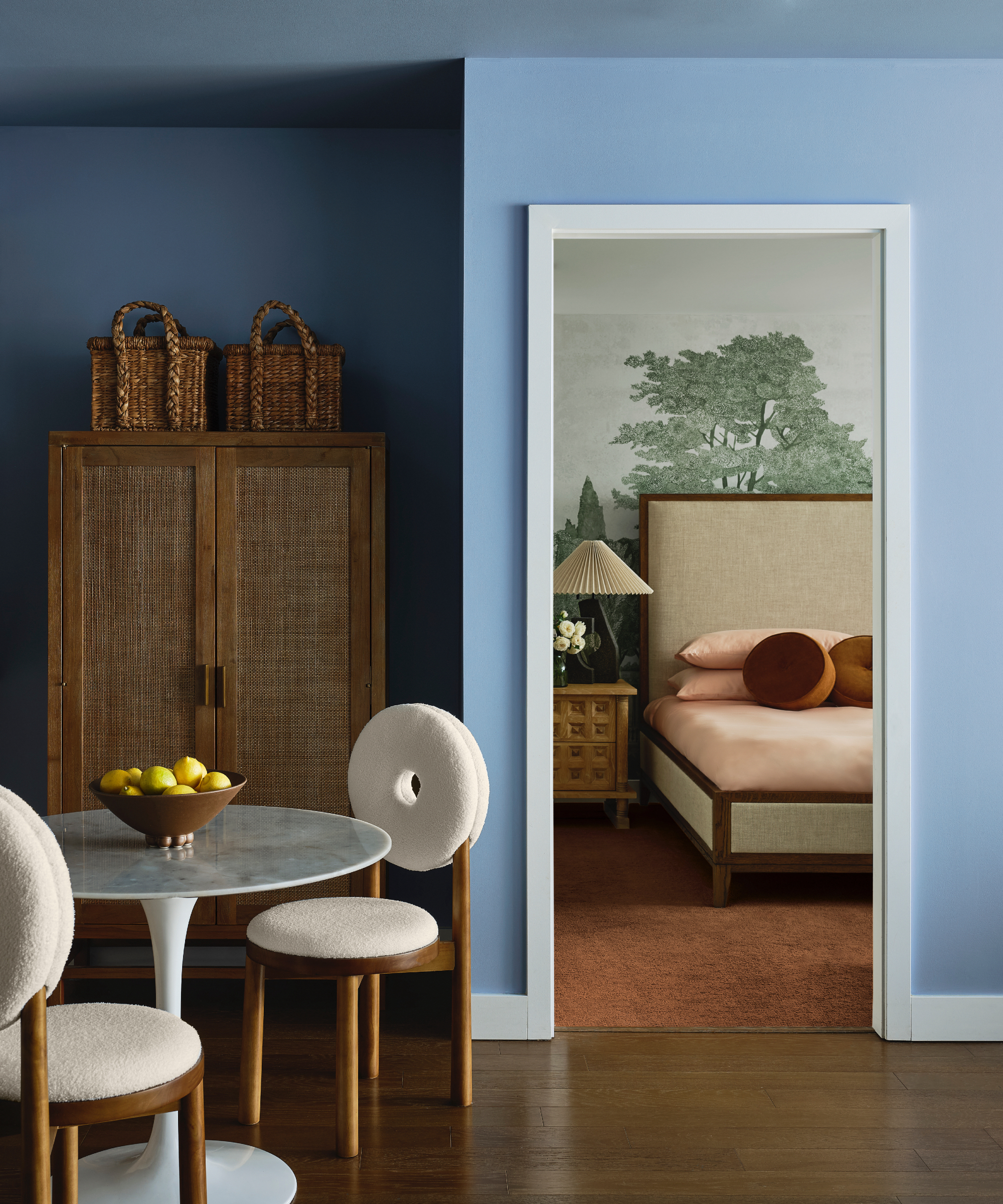
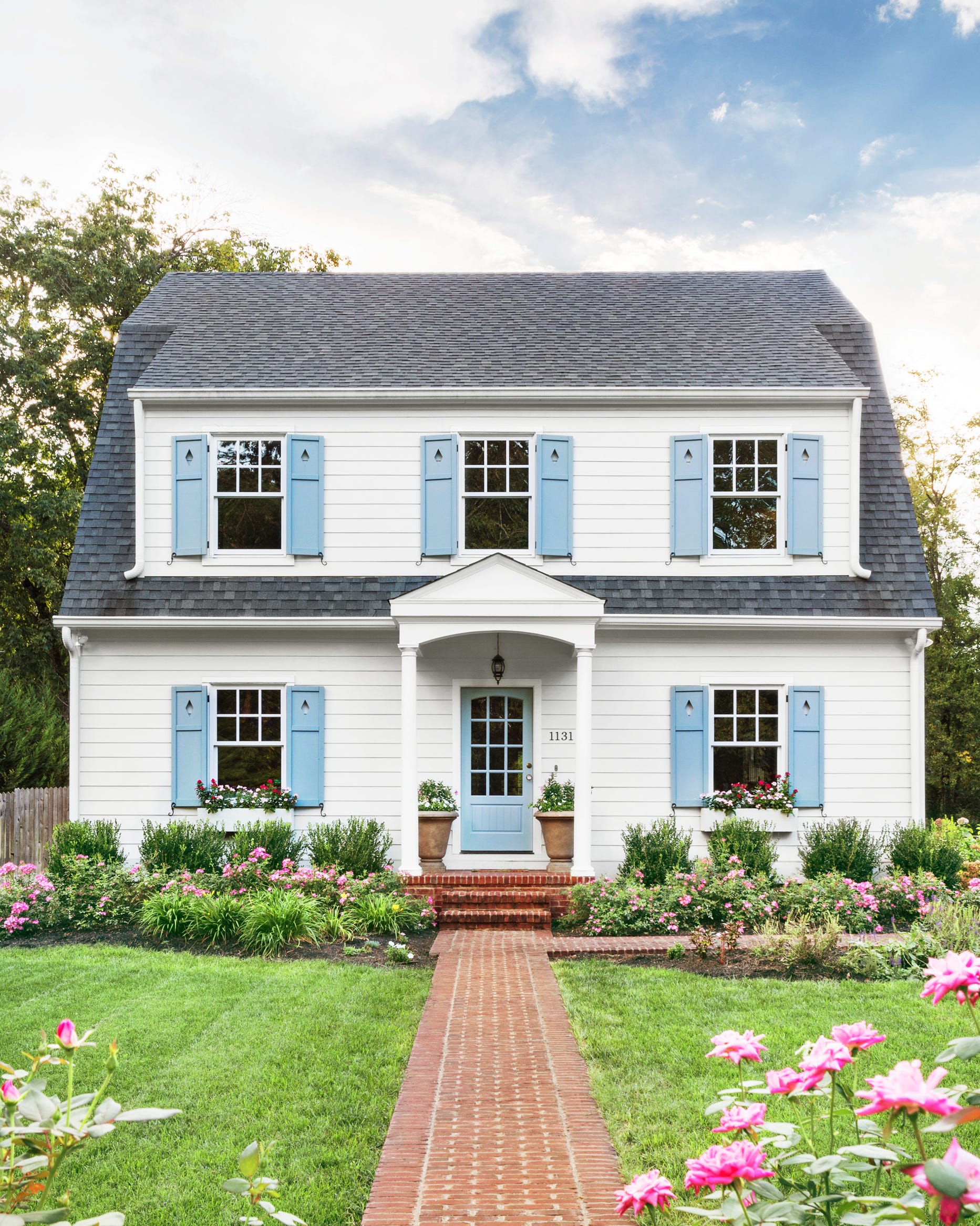
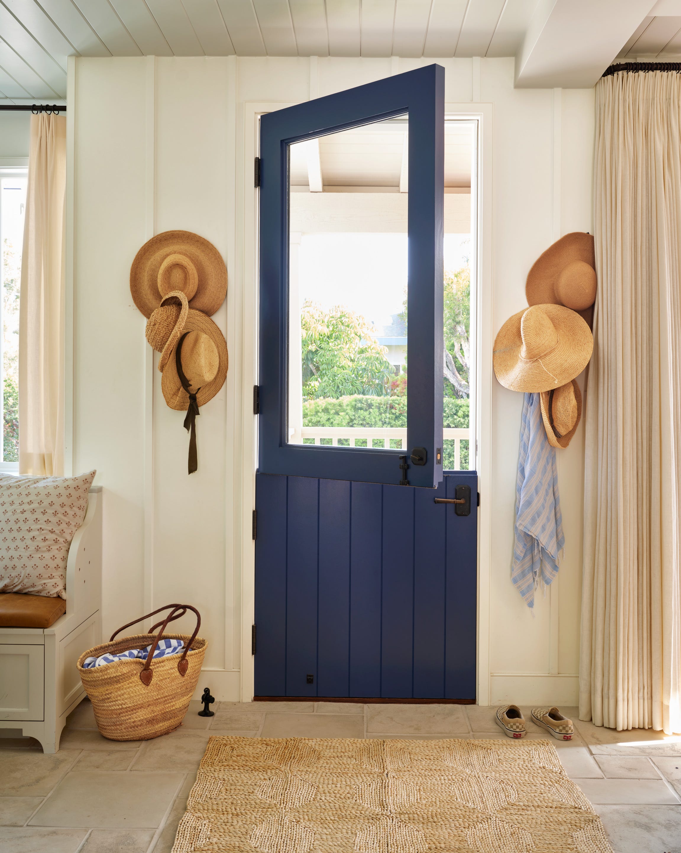
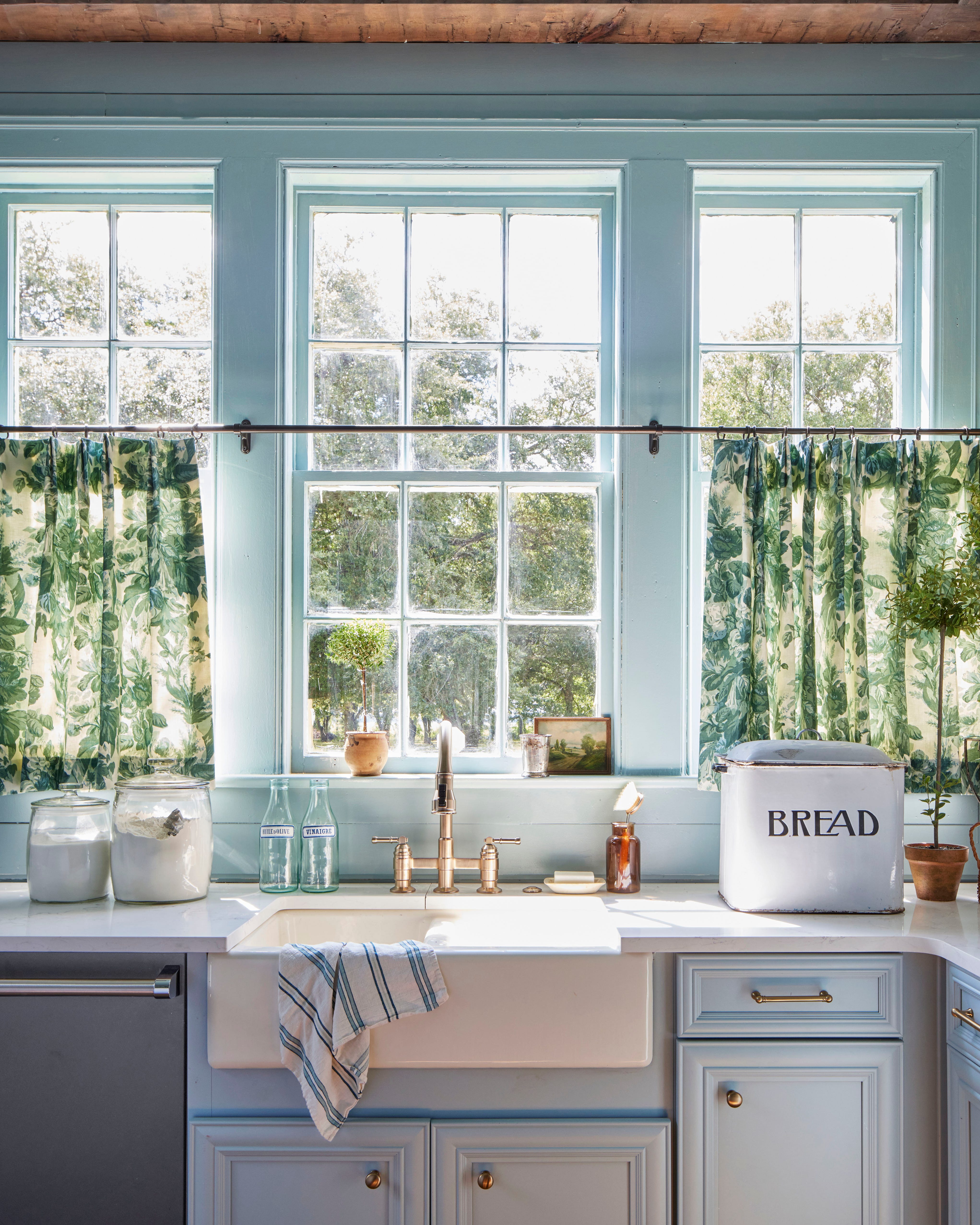
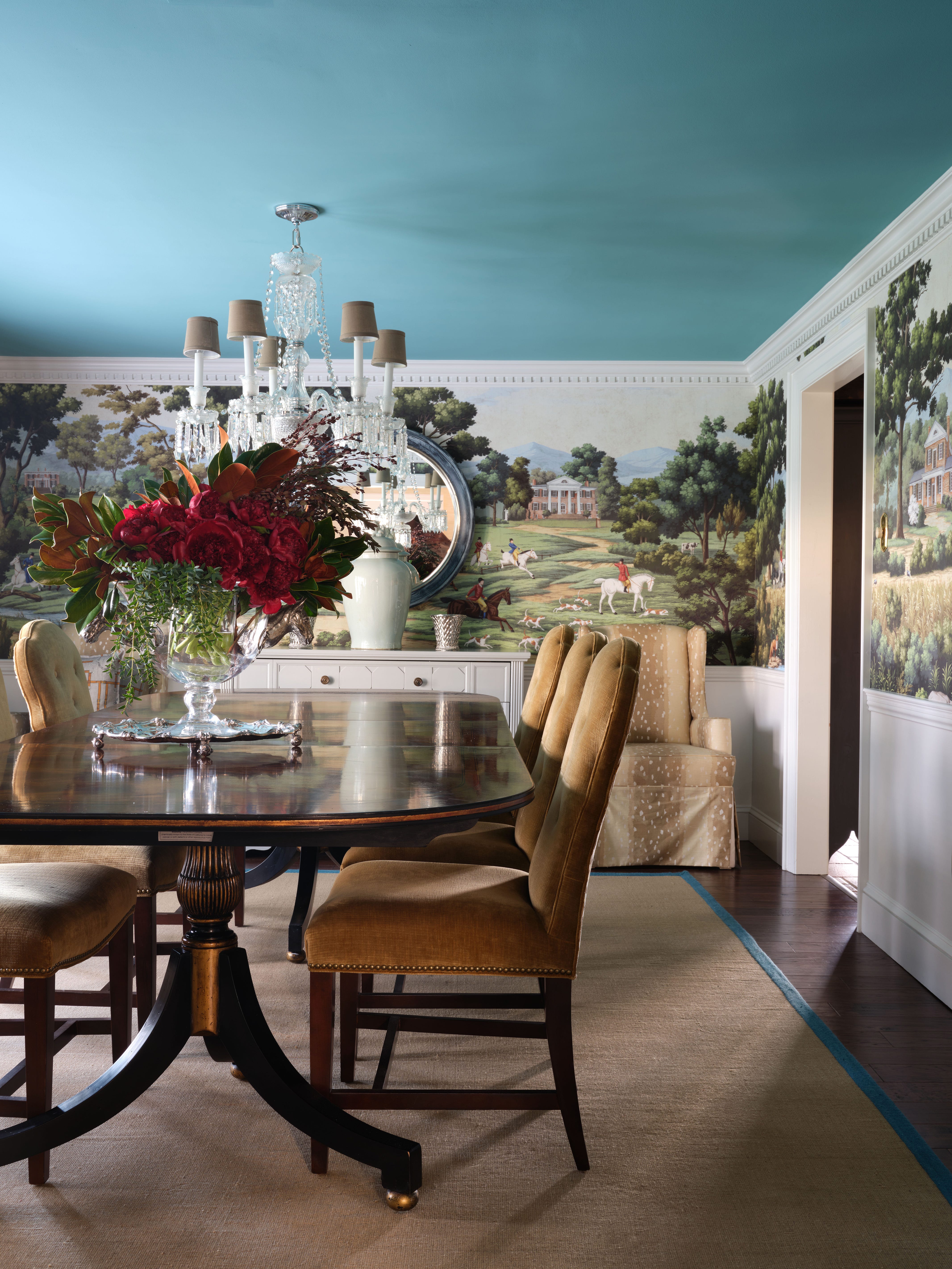
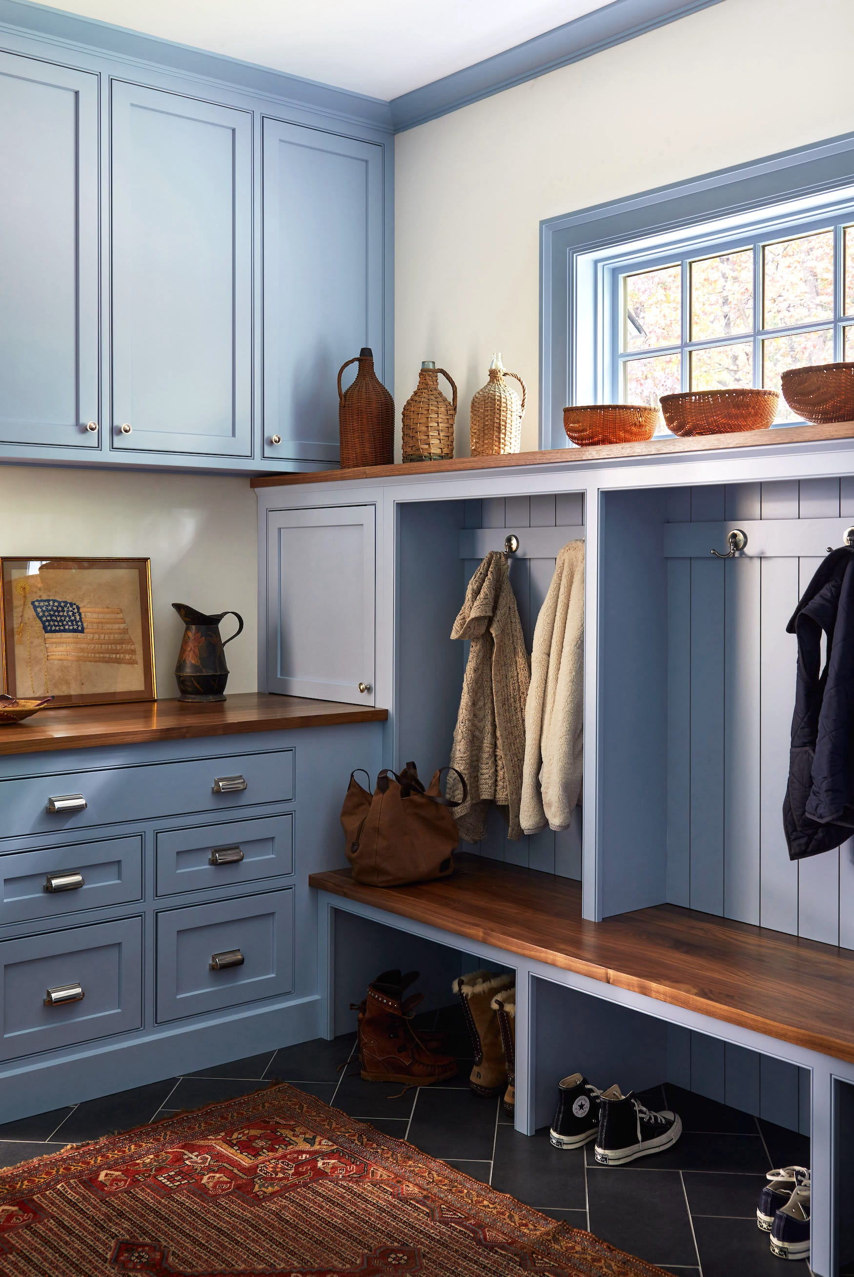
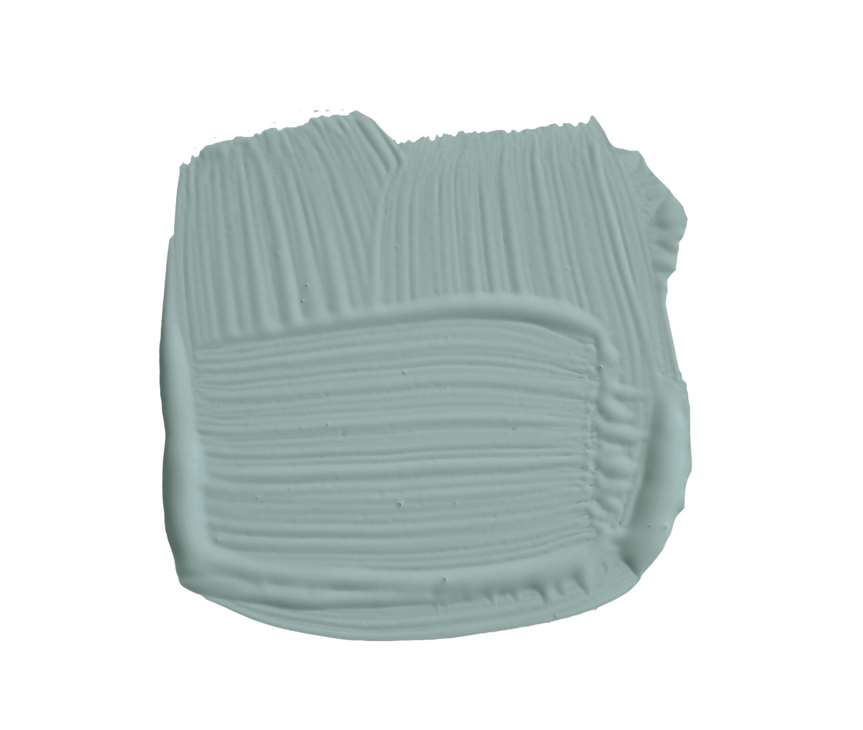
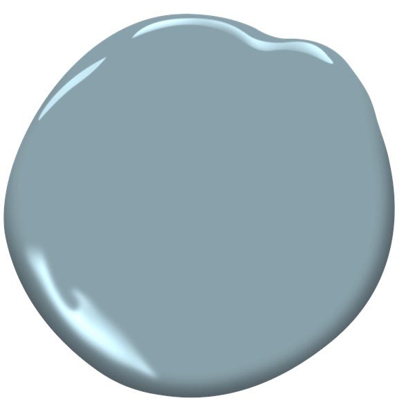
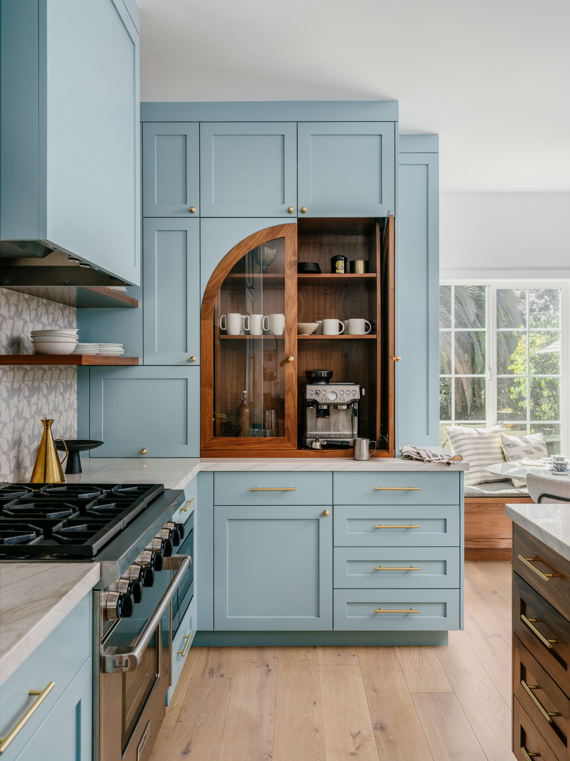
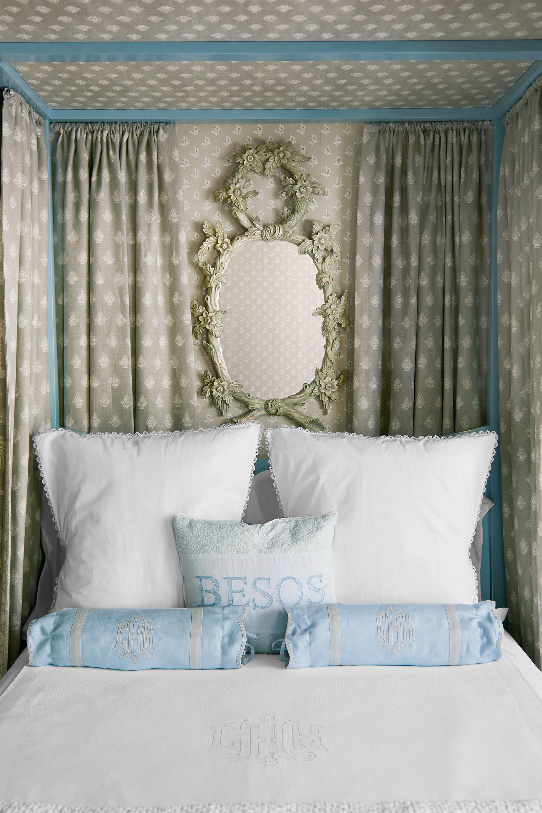
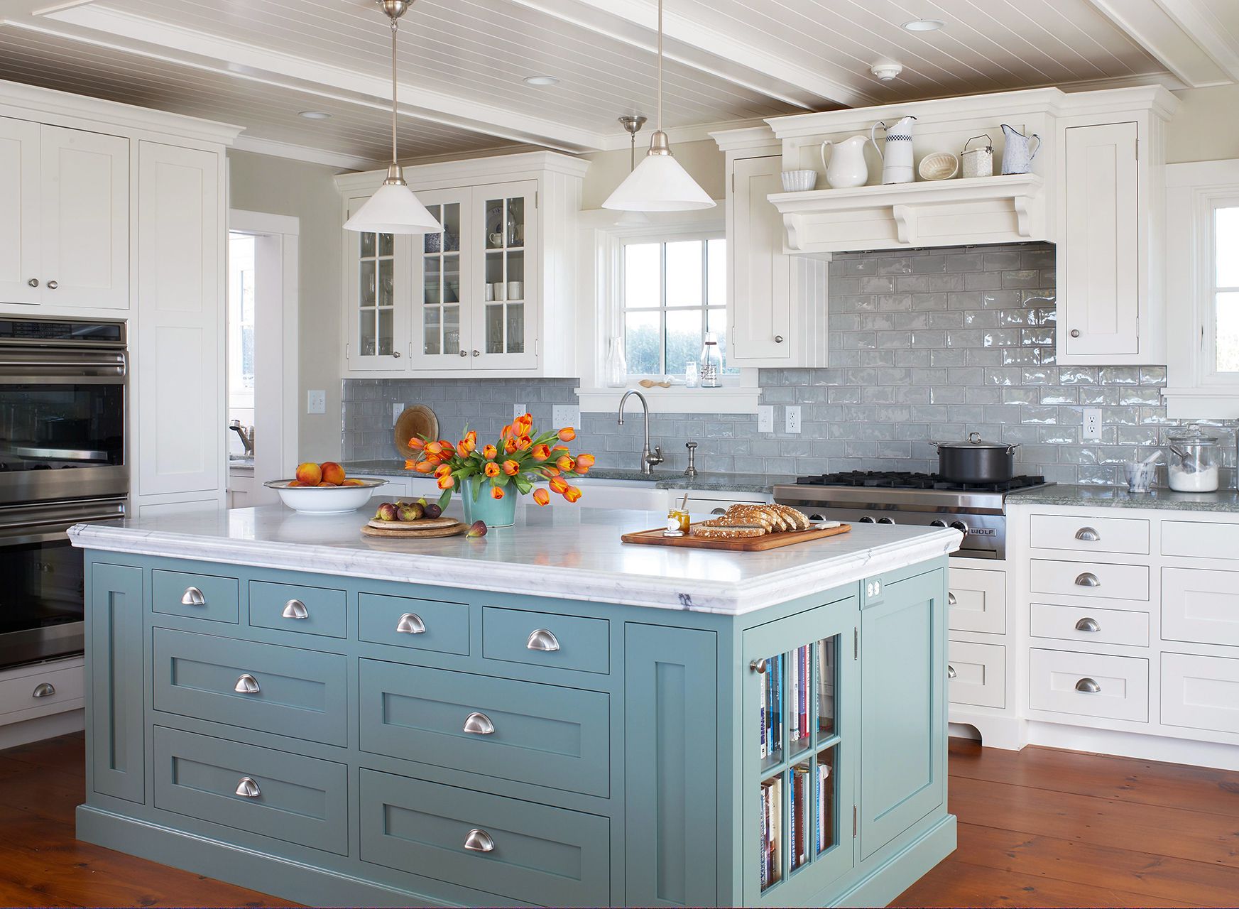
Specific designer recommendations include Benjamin Moore's Beach Glass, chosen by Lisette Voûte for a serene galley kitchen due to its minty blue-green quality, and Sherwin-Williams' French Moire, applied by Tori Alexander to a bathroom vanity and paneling for a charming cornflower blue effect. Brooke Crew of Brooke Crew Interiors utilized Benjamin Moore's Mediterranean Sky for a front door, creating a striking contrast with white trim and rich wood floors. Amy Studebaker Design suggests Sherwin-Williams' Notable Hue for kitchen cabinets to achieve a fresh and sophisticated look. Mallory Mathison Glenn selected Benjamin Moore's Tranquility for an elegant kitchen, valuing its calming, clear, and historic qualities. Lisa Henderson Interiors created a custom color inspired by Farrow & Ball's Skylight to complement Phillip Jeffries wallpaper, emphasizing the fresh and airy impact of light blue.
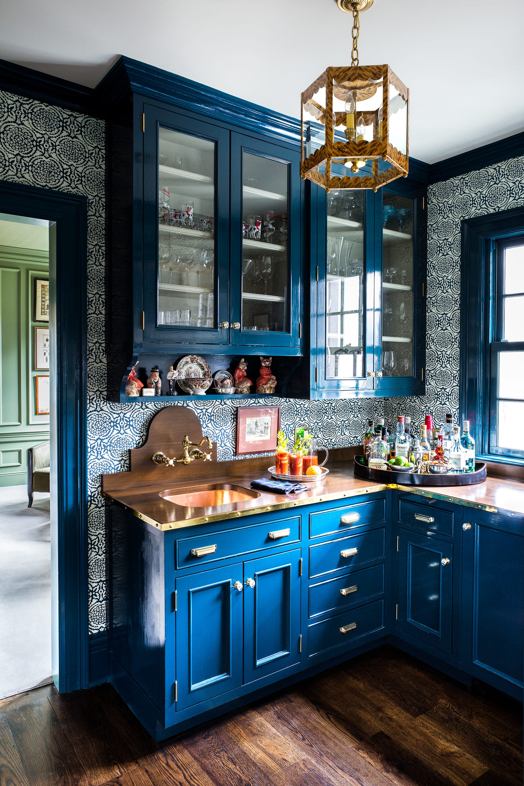
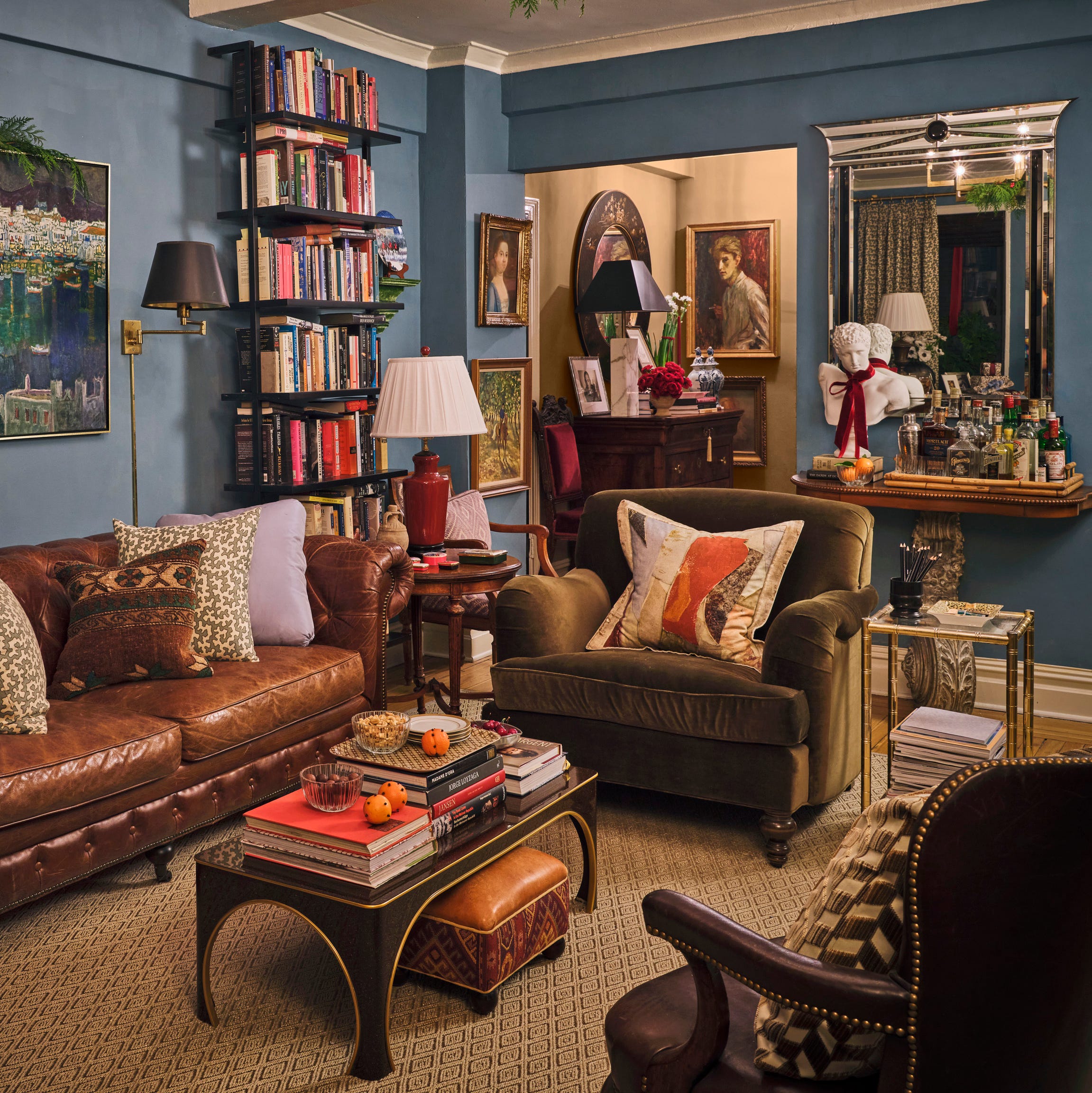
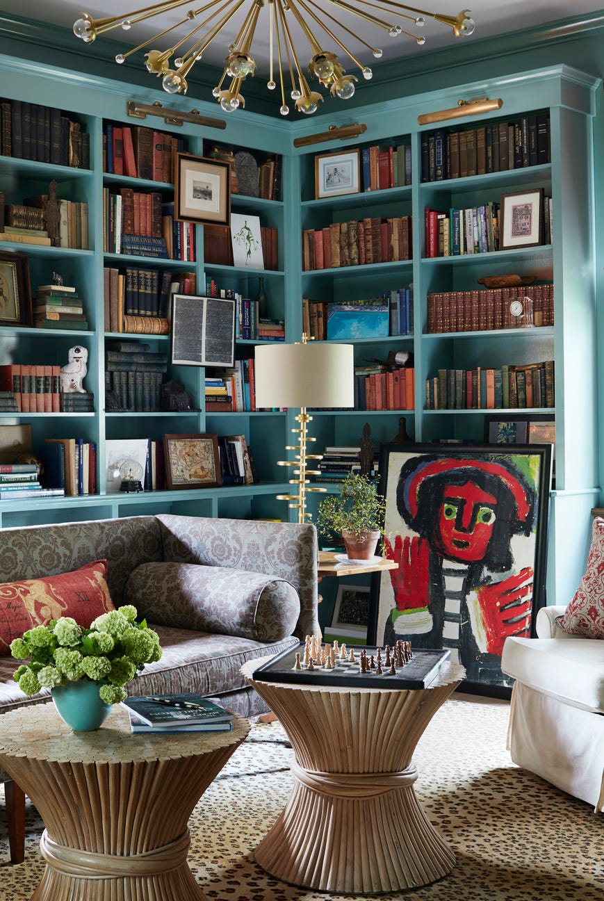
Bria Hammel Interiors frequently uses Benjamin Moore's Gentle Gray, noting its soft blue appearance despite its name, which adds visual interest and a calming vibe without being too bold. Jennifer Barron of Jennifer Barron Interiors recommends Sherwin-Williams' Meditative for a cheery kids' bathroom vanity and Benjamin Moore's Normandy Blue for kitchen cabinets, a powder room, study, or front door, highlighting its unique anchoring effect. Brooke Crew also chose Benjamin Moore's Yarmouth Blue for a kitchen island and built-in bar, integrating it into the home's overall blue color scheme. Claudia Kalur of CFK Interiors used Benjamin Moore's Blue Seafoam on bathroom vanities to make them stand out as unique pieces. Finally, Nadia Subaran of Aidan Design created a fun kitchen with Benjamin Moore's Mt. Rainier Gray, appreciating its soft, calming effect and ability to add depth to a galley kitchen.
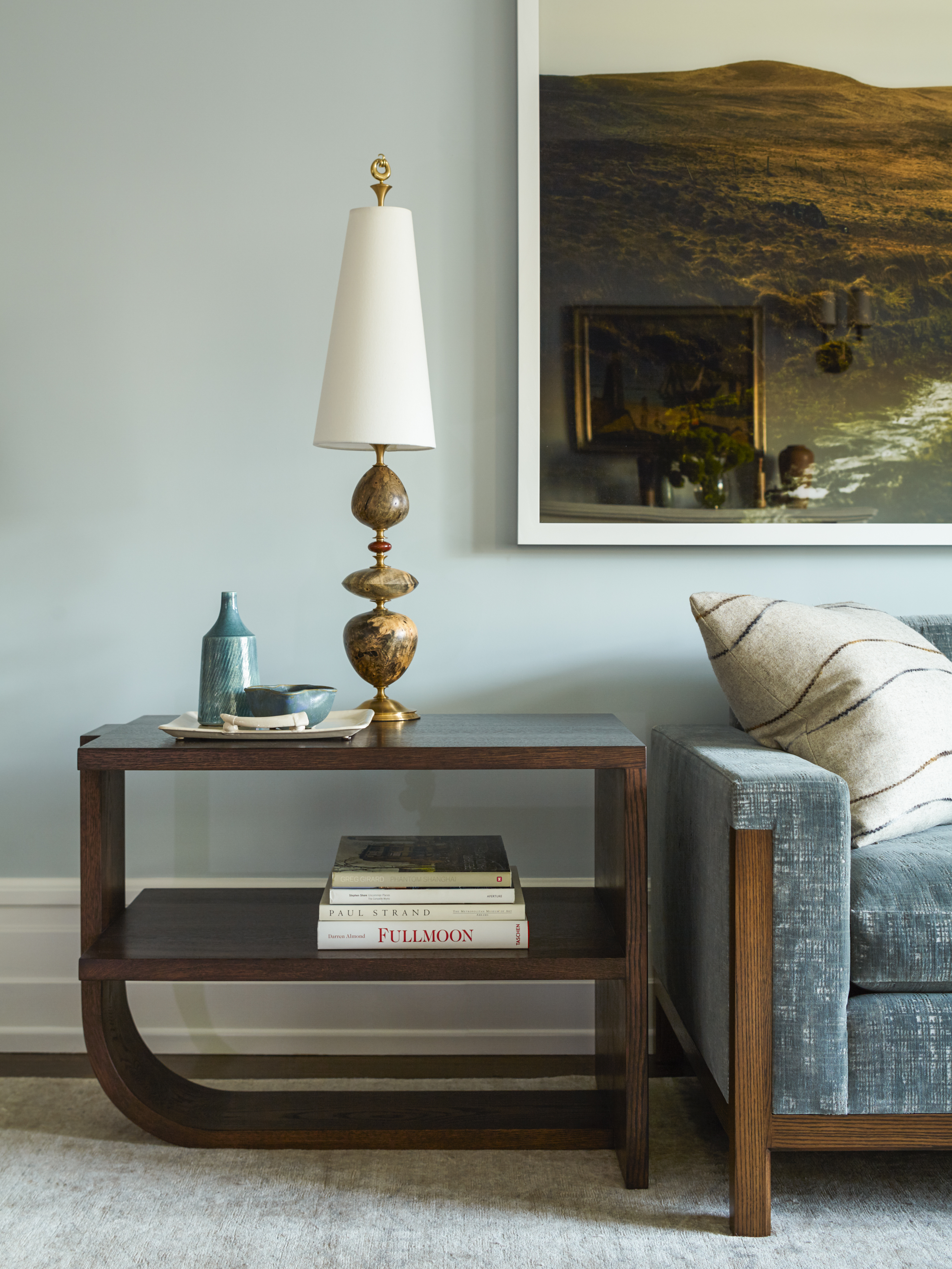
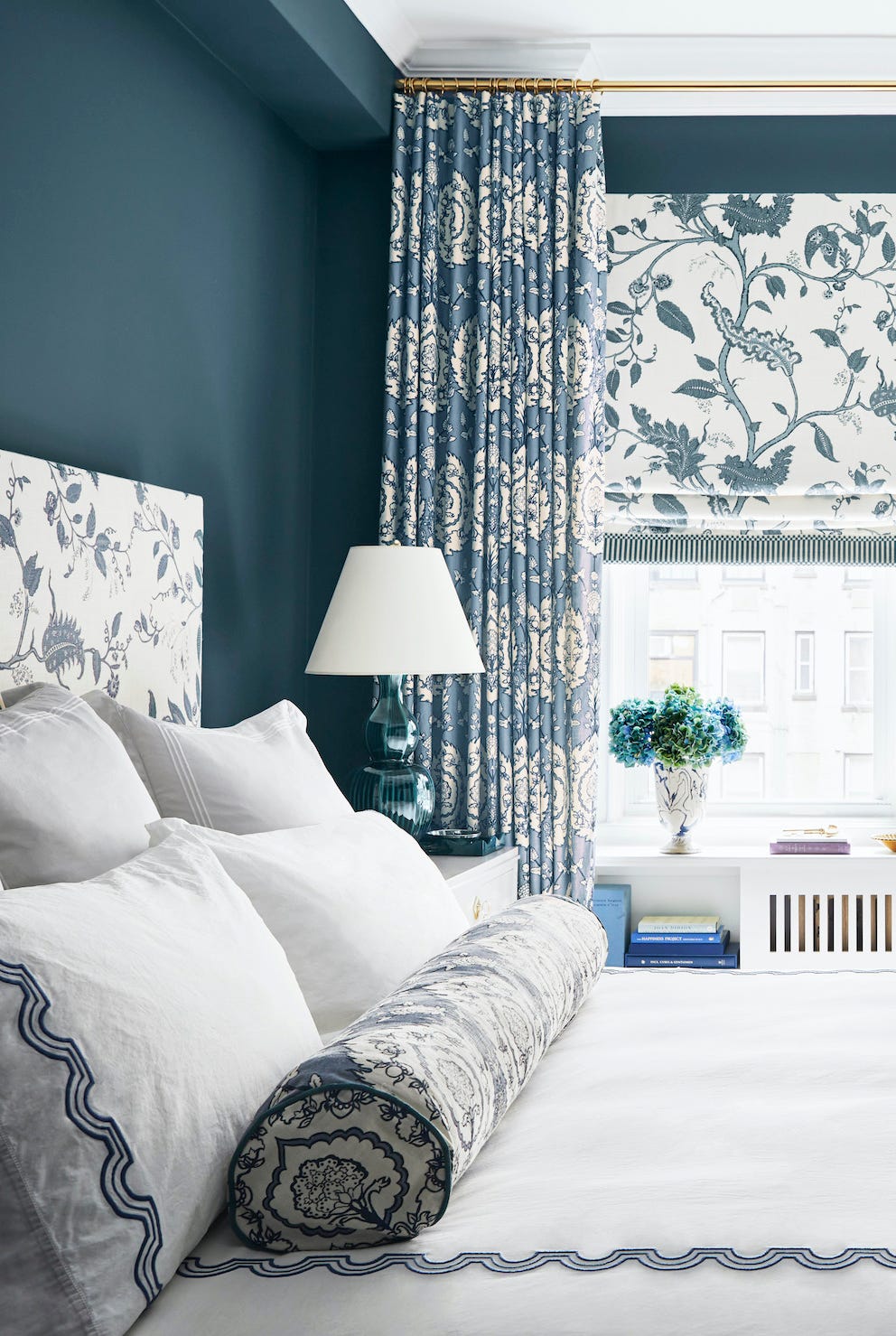

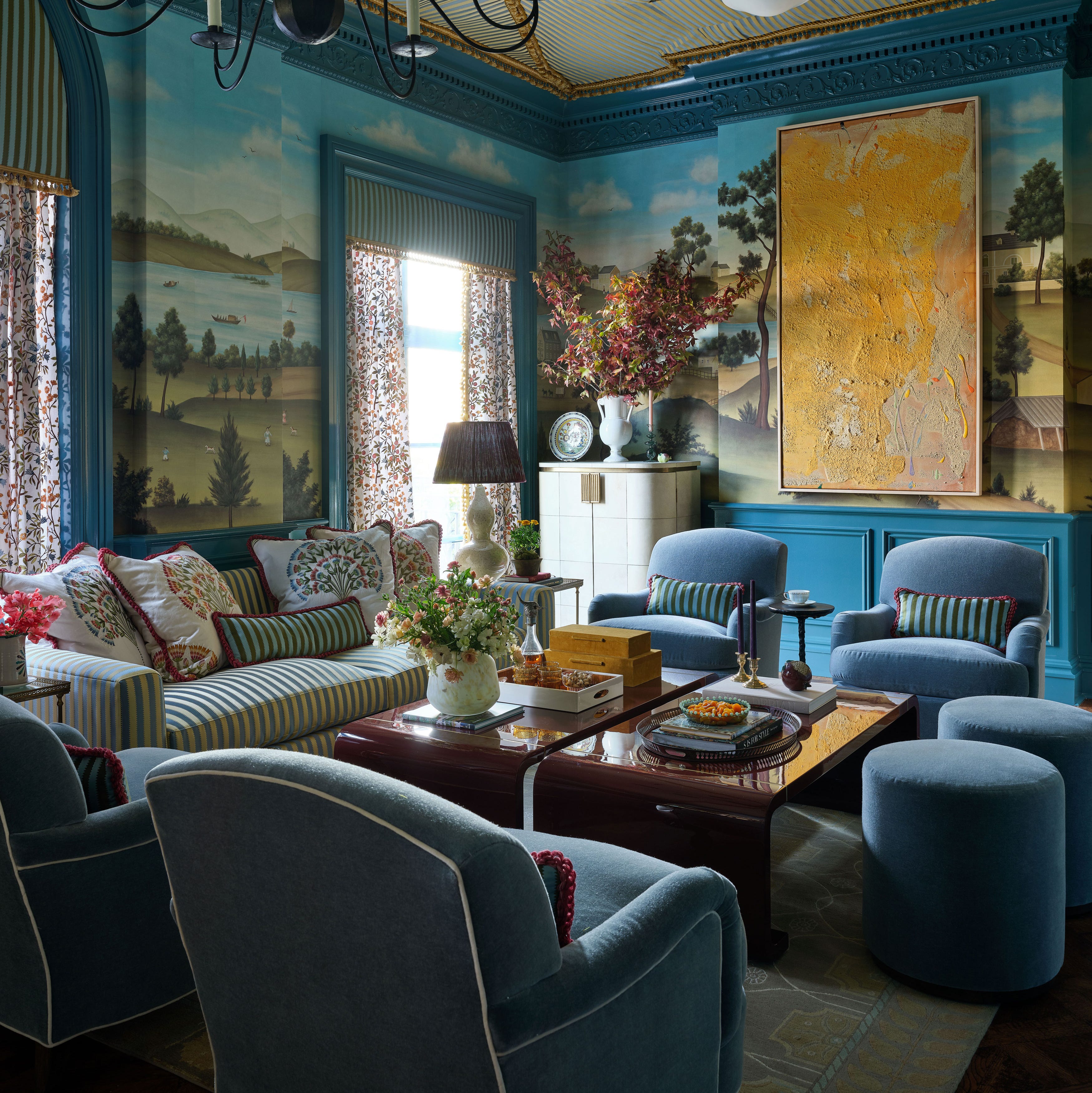
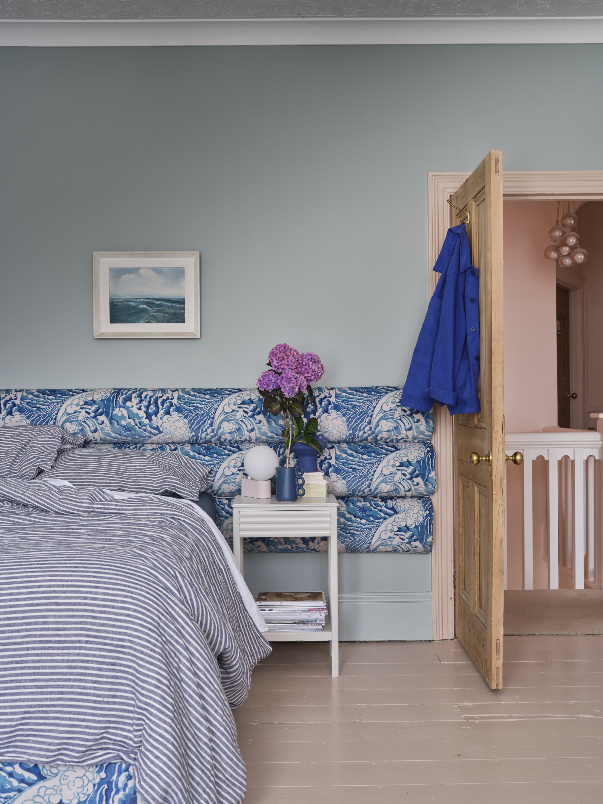
The article also provides additional recommendations from paint professionals: Benjamin Moore suggests Windmill Wings, Serenata, Riviera Azure, Sunrise, and Soft Jazz for bright, icy, or blue-violet tones. Farrow & Ball's O'Donnell recommends Light Blue for its chameleon-like quality and Pale Powder for a soft duck-egg shade. Sherwin-Williams' Wadden points to Sleepy Blue, Tradewind, and Krypton for classic powder blue looks, and Stardew for a modern dusty blue. The versatility of light blue is further discussed, noting its suitability for any room and its timeless appeal when paired with white. Designers also suggest using patterned wallpaper with coordinating pastel blue trim for a whimsical touch and pairing dusty blue with white marble or natural stones for sophistication, or with terra-cotta tiles for warmth.
#LightBluePaint #InteriorDesign #ColorTrends #HomeDecor #PaintColors #DesignTips #BenjaminMoore #SherwinWilliams #FarrowAndBall #LightBluePaint #InteriorDesign #ColorTrends #HomeDecor #PaintColors #DesignTips #BenjaminMoore #SherwinWilliams #FarrowAndBall
0 comment in total
 No comments yet
You may also like
5 best blue paints as chosen by interior designers

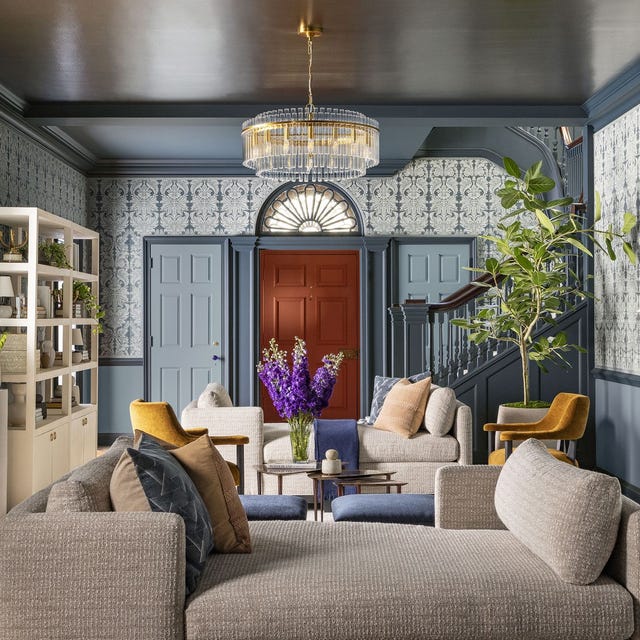
This Is the Best Blue Paint Color, According to Designers

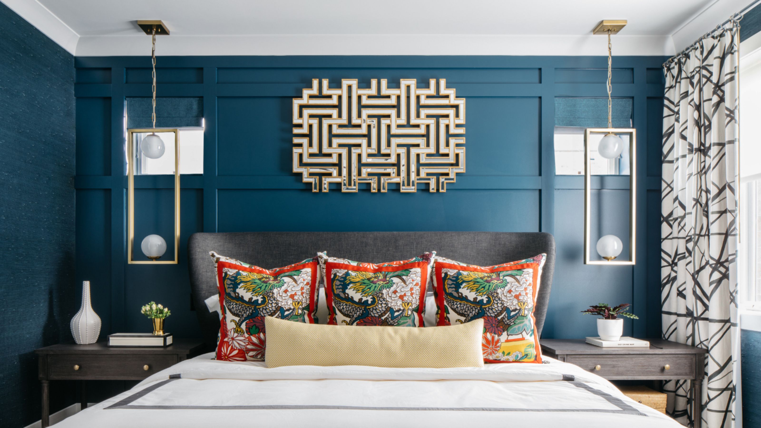
What Is the Most Expensive-Looking Blue? 7 Specific Shades to Paint Walls That Will Always Elevate Your Home

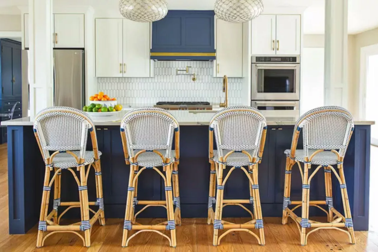
The 14 Best Blue Paint Colors For Your Kitchen, According To Designers
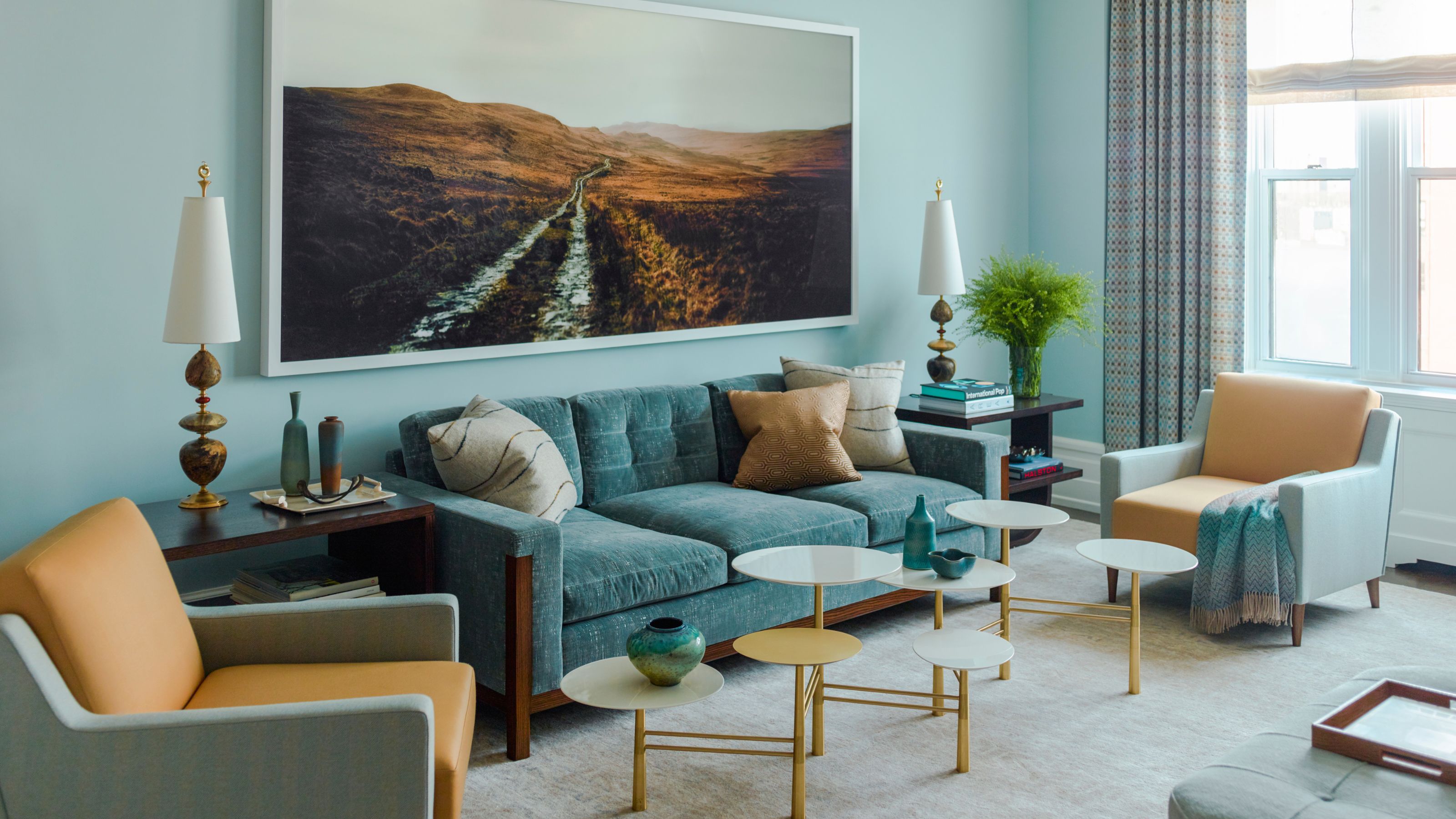
6 Light Blue Living Rooms That Find the Perfect Balance Between Cool and Cozy
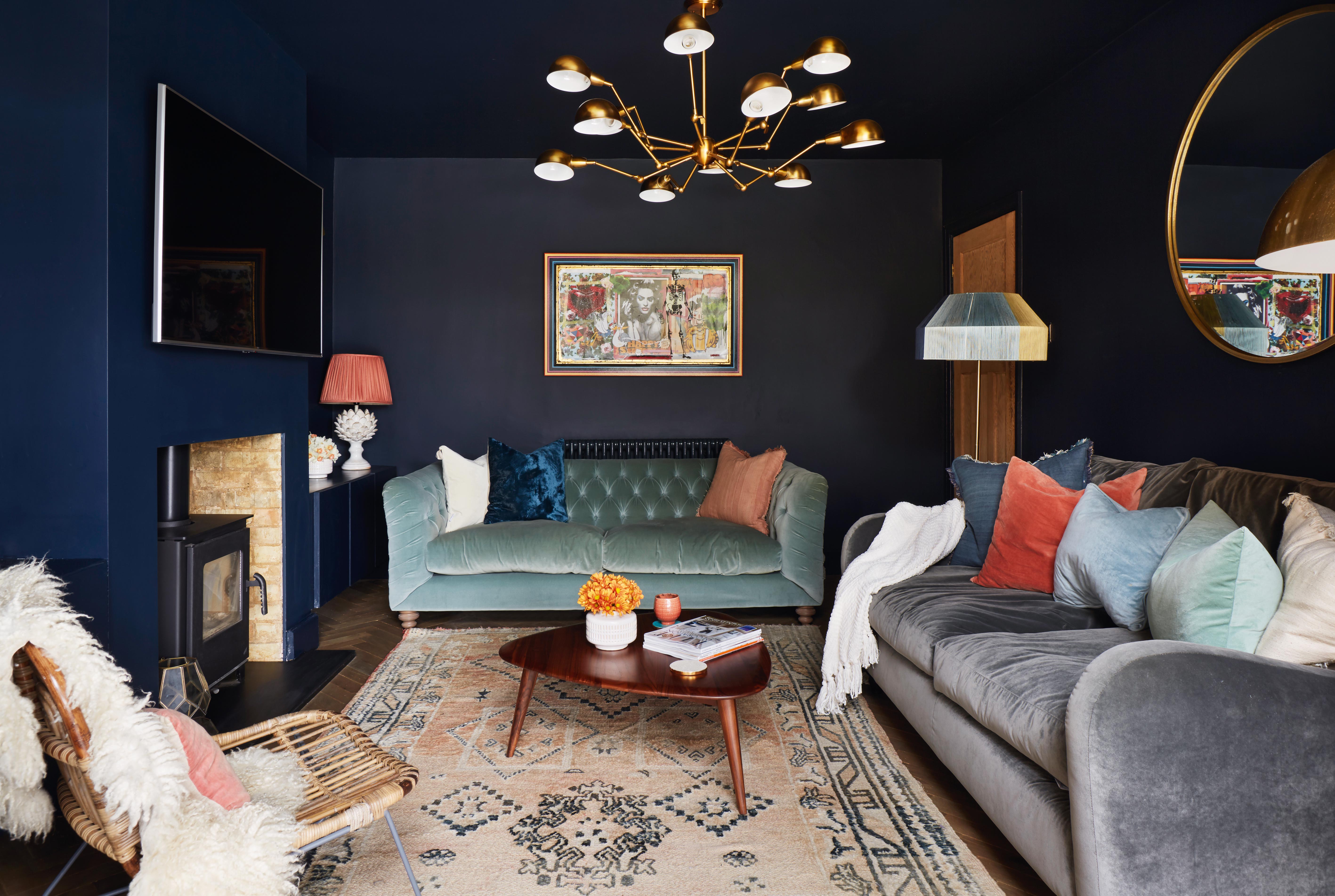
11 blue living room ideas to show to how to work with this on trend hue

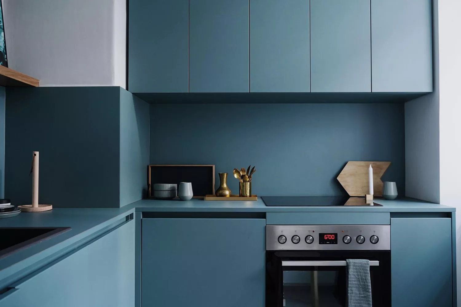
47 Stunning Blue Room Ideas for Every Style

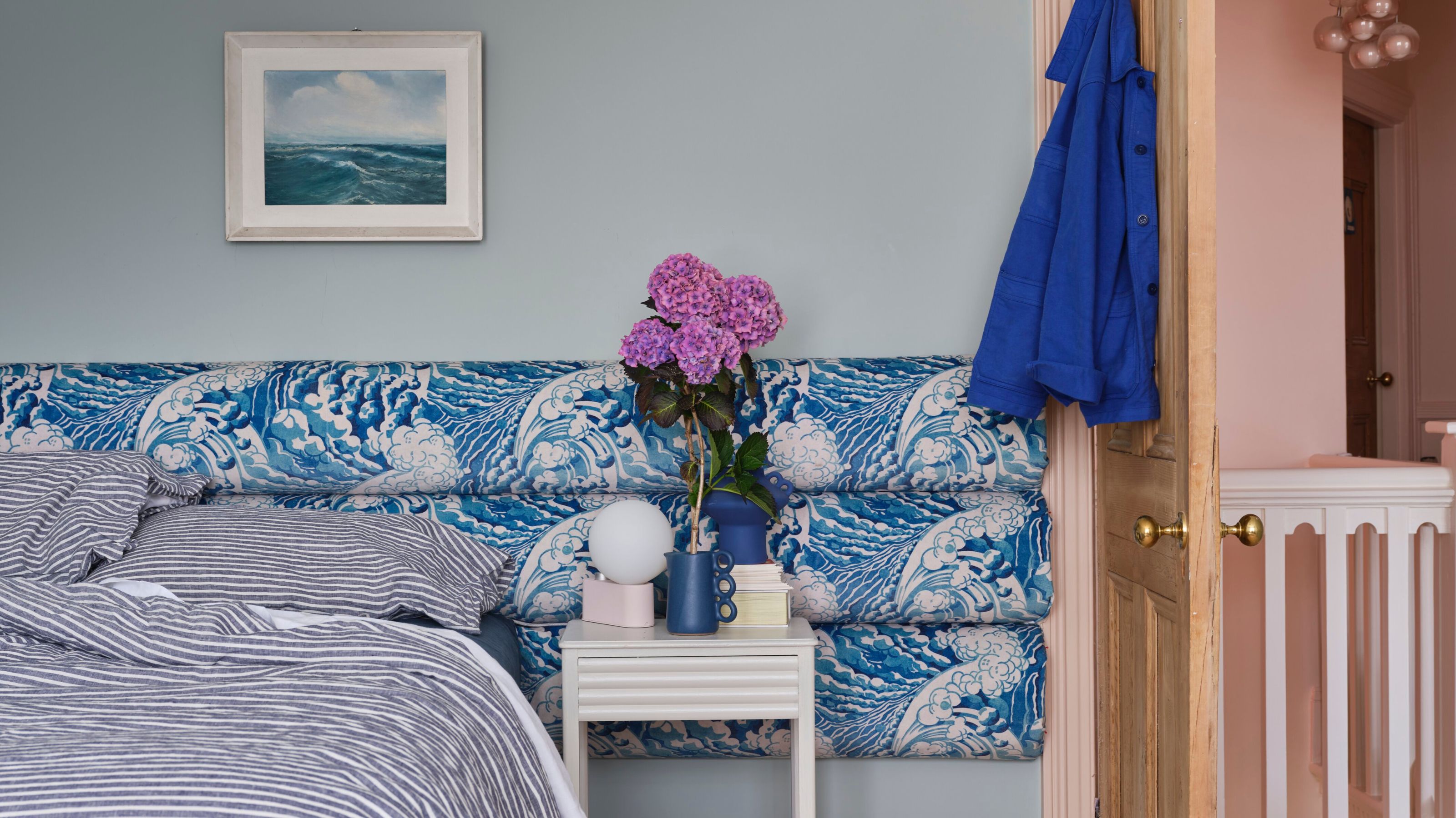
What a Paint Color Expert Would Pair With Light Blue Walls
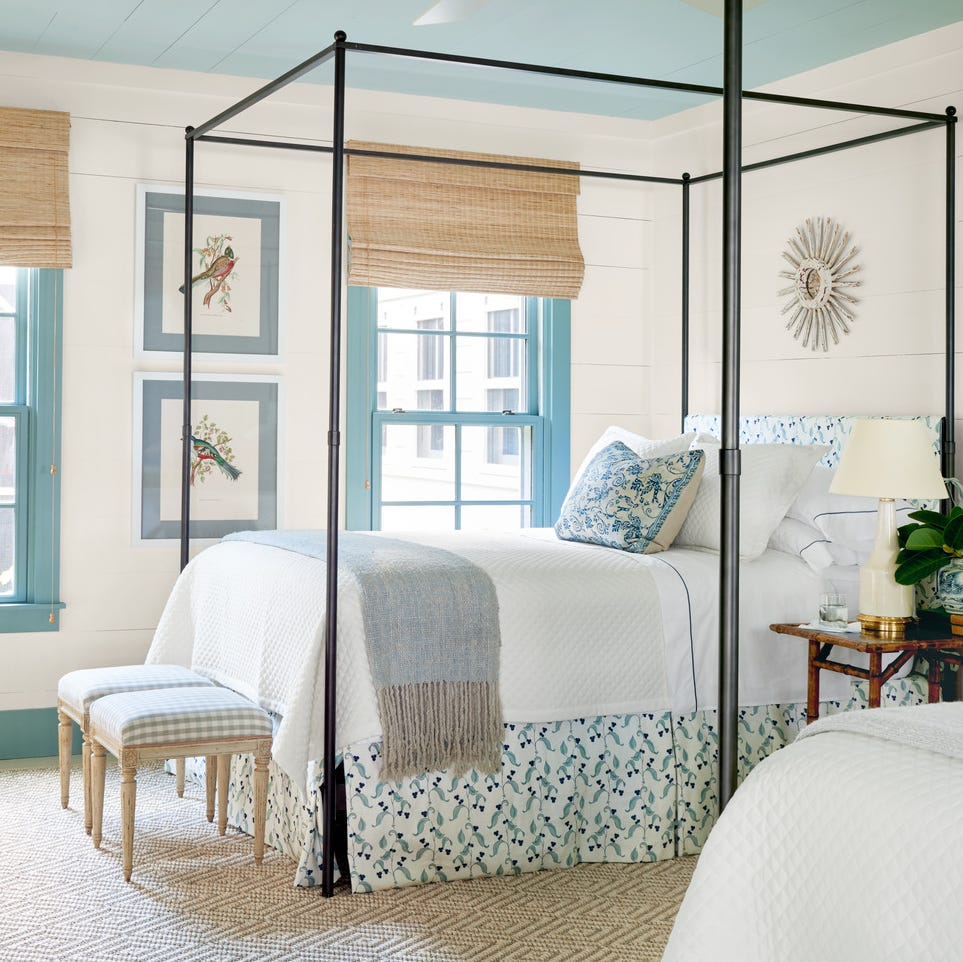
The 60 Best Blue Paint Colors for Every Room in Your Home
The Best Living Room Paint Colors, According To Designers

55 Tried-and-True Blue Paint Colors


Designers LOVE Pairing These Unexpected Colors With This One Timeless Hue
The Best Living Room Paint Colors, According To Designers
Blue is one of the UK’s most popular living room colours – this is how to elevate your lounge with the timeless hue
Designers Swear By These 11 Dark Blue Paint Colors for Chic and Moody Spaces

45 Blue Rooms That Prove It's the Most Amazing Color in the Rainbow
Why Designers Love This Shade of Blue Paint for Just About Any Room In the House
What Colors Go With Light Blue? 18 Pairings for Pale, Baby, and Sky Blue That Will Make Your Home Look Modern
Blue room ideas – 27 timeless and fresh ways to use blue at home
These 10 Colors Always Look Beautiful With Blue