1/8
What are the best Benjamin Moore gray paints? 7 go-to shades recommended by designers
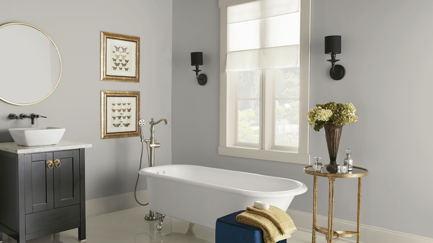
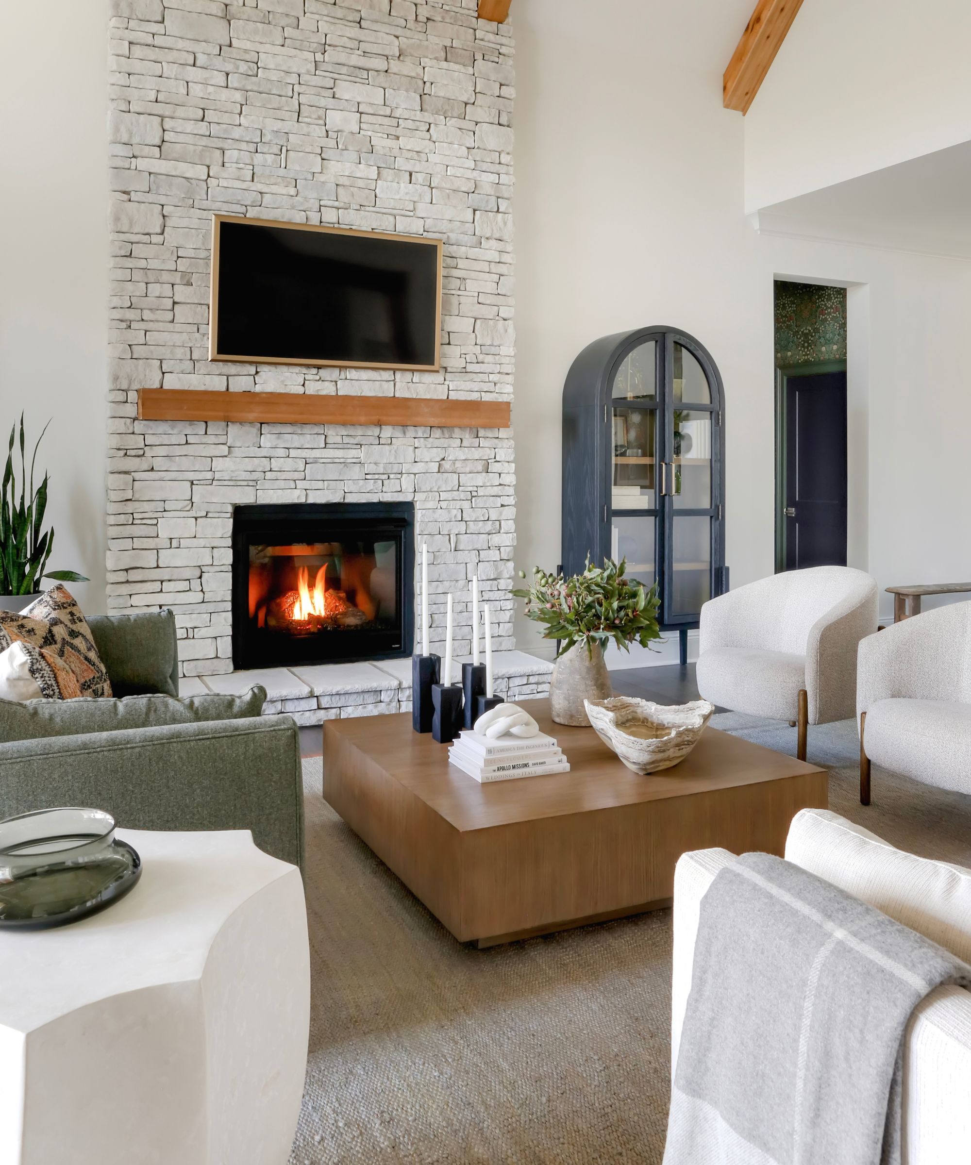
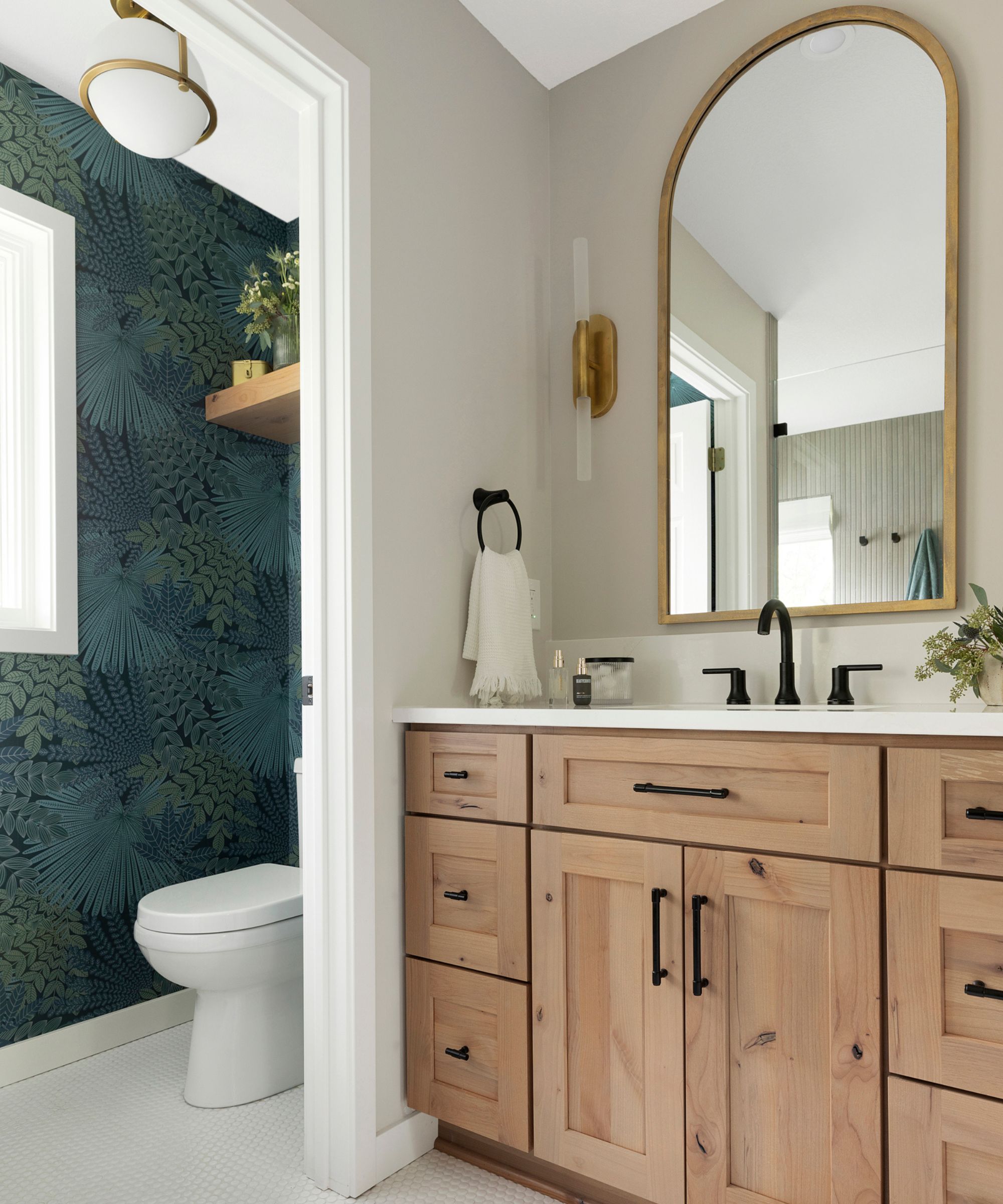
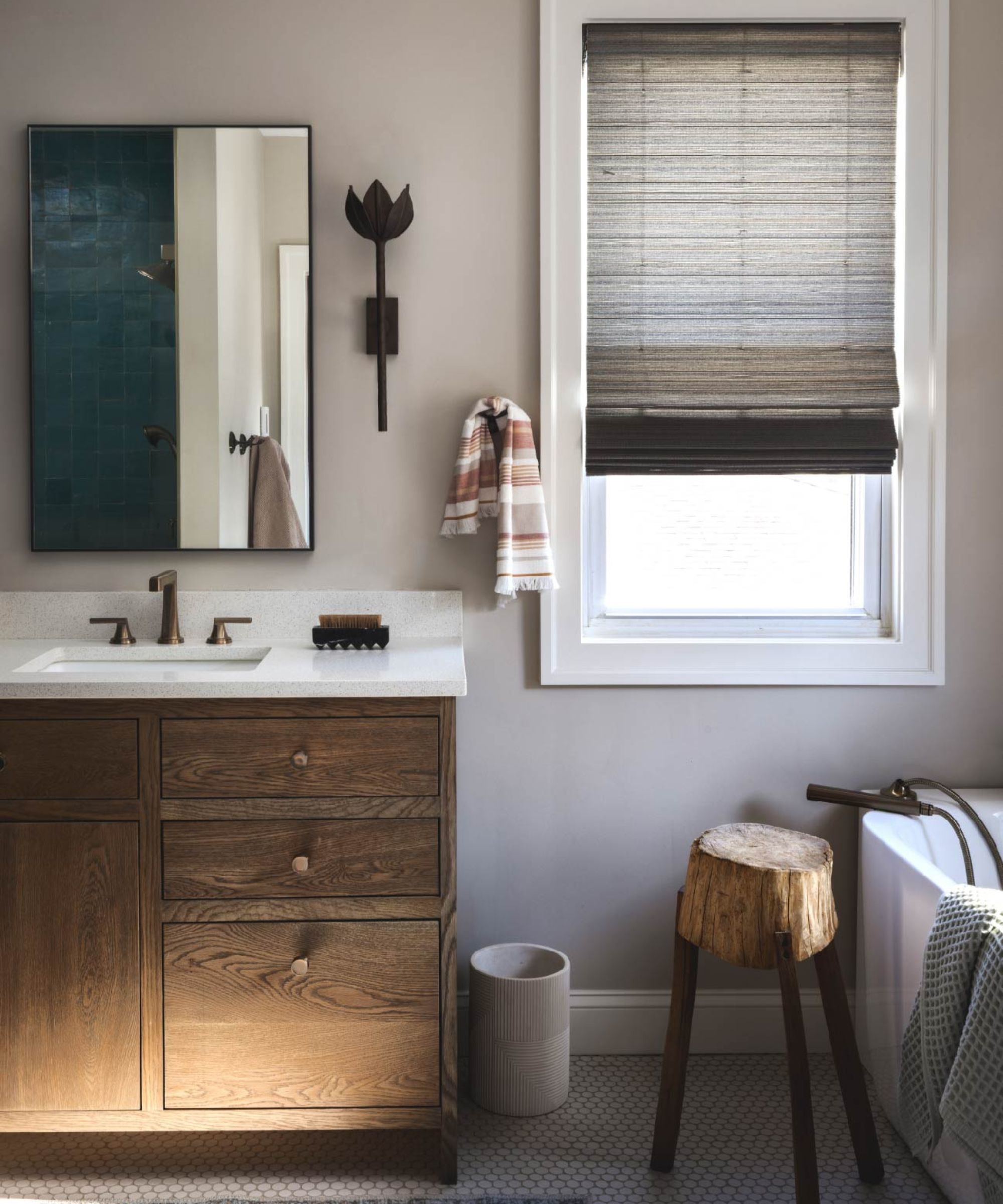
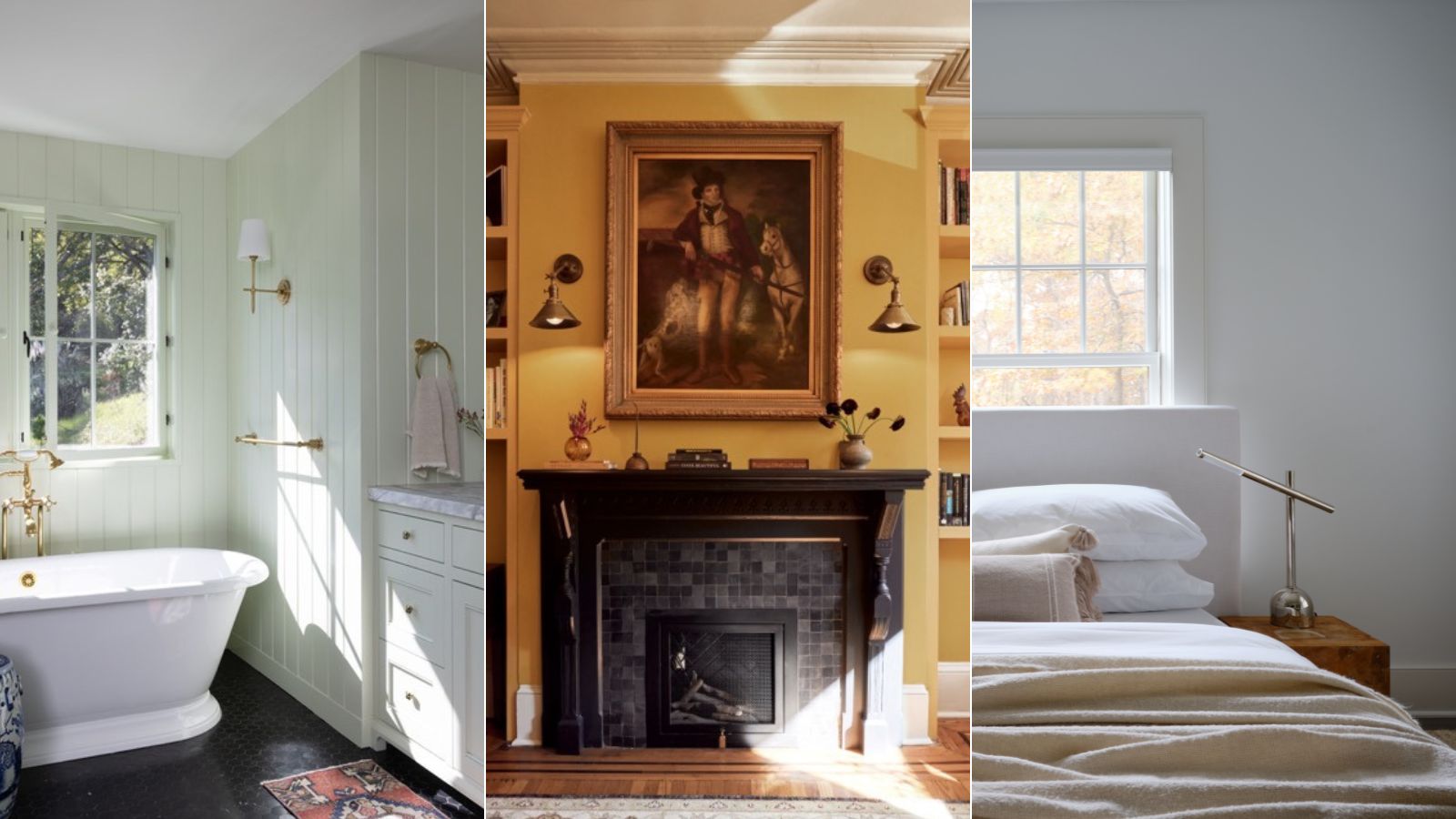
Gray paint is a timeless choice for interior schemes, but selecting the right shade is crucial to avoid a drab appearance and instead create a sophisticated backdrop that enhances a room's decor. Benjamin Moore offers a variety of popular gray paints frequently utilized by designers. This article highlights seven favorite shades, ranging from light grays with warm undertones to dark, moody charcoals.
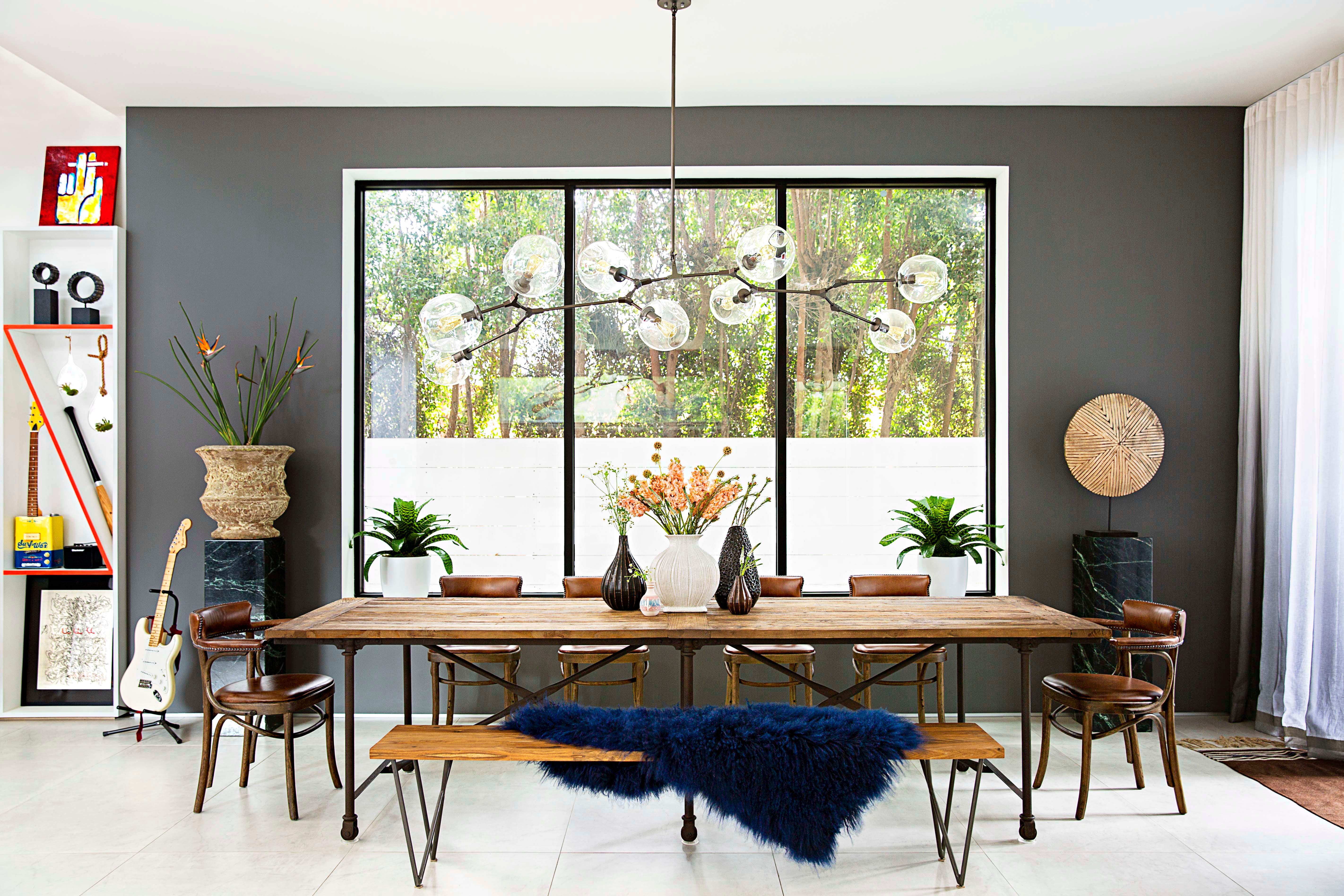
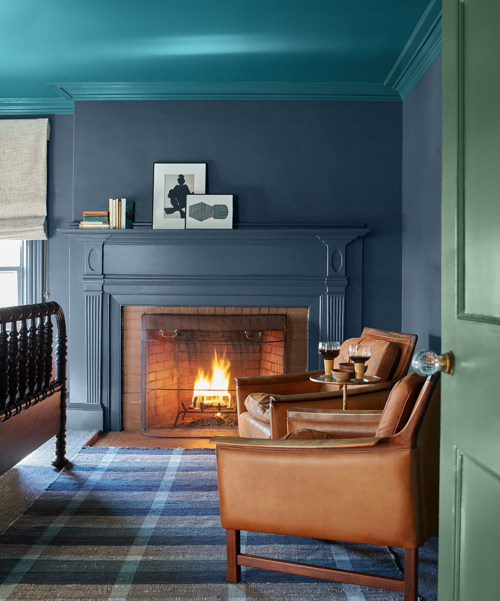
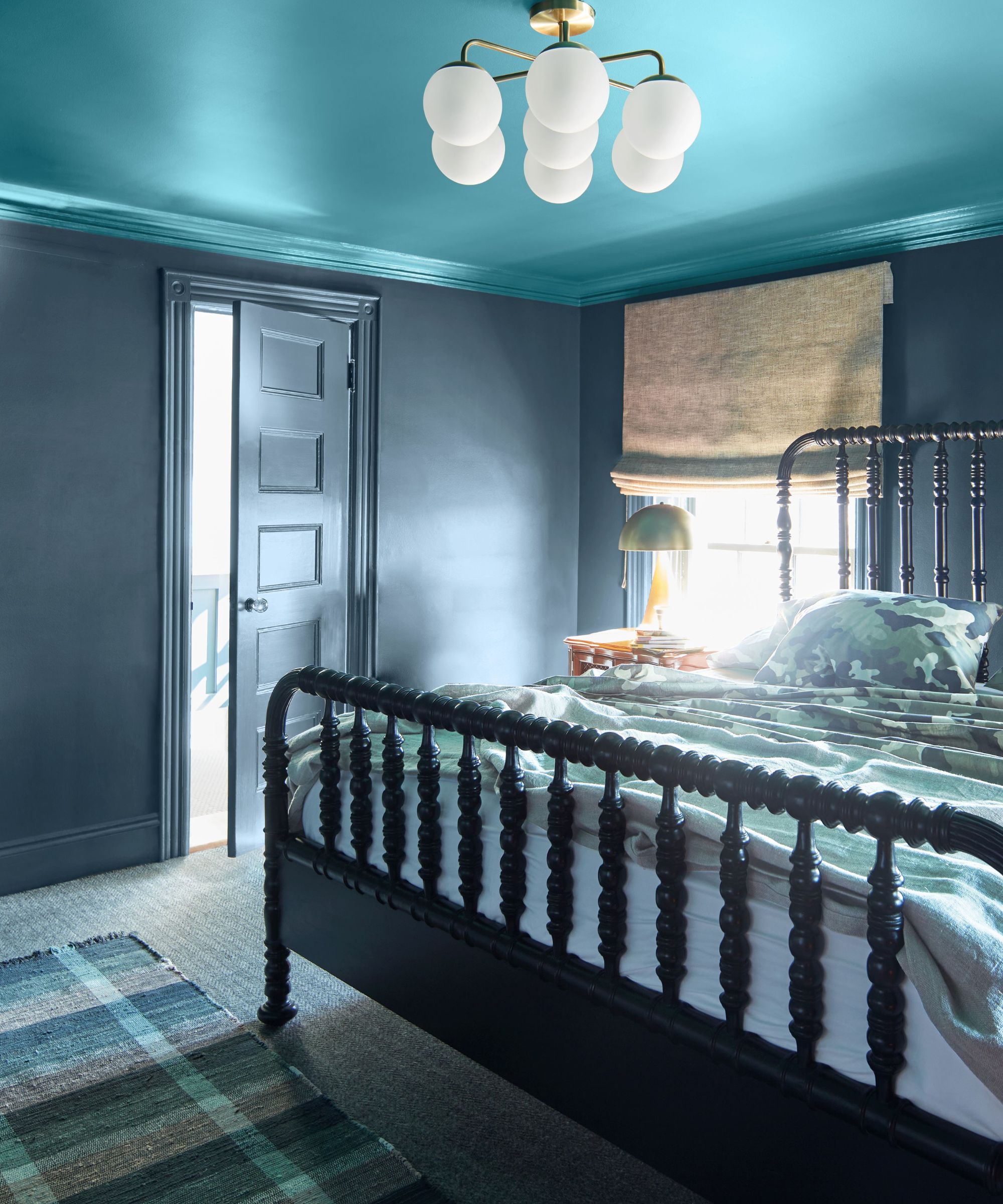
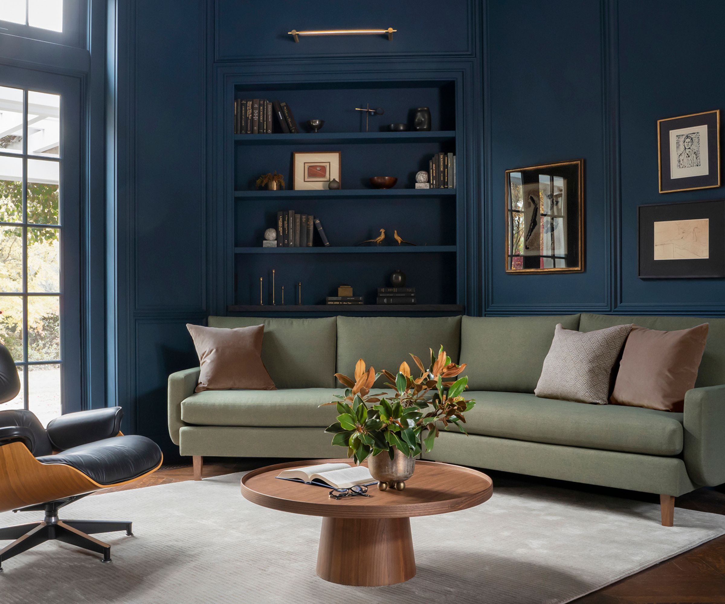
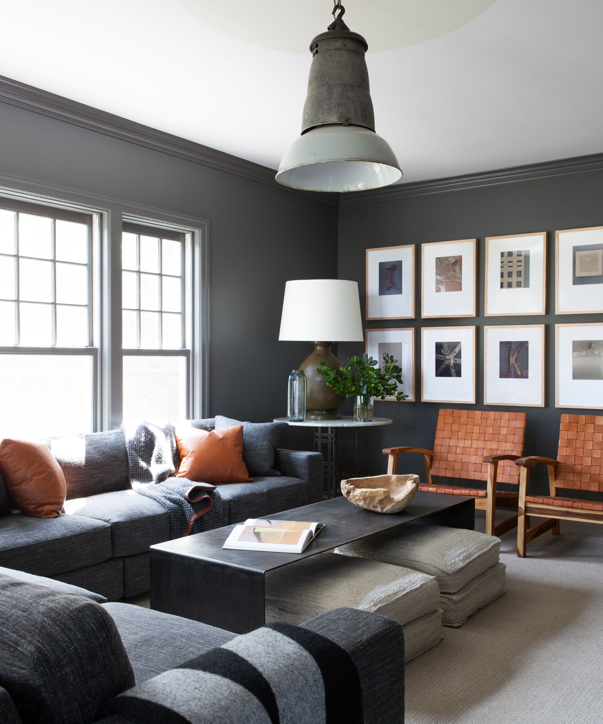
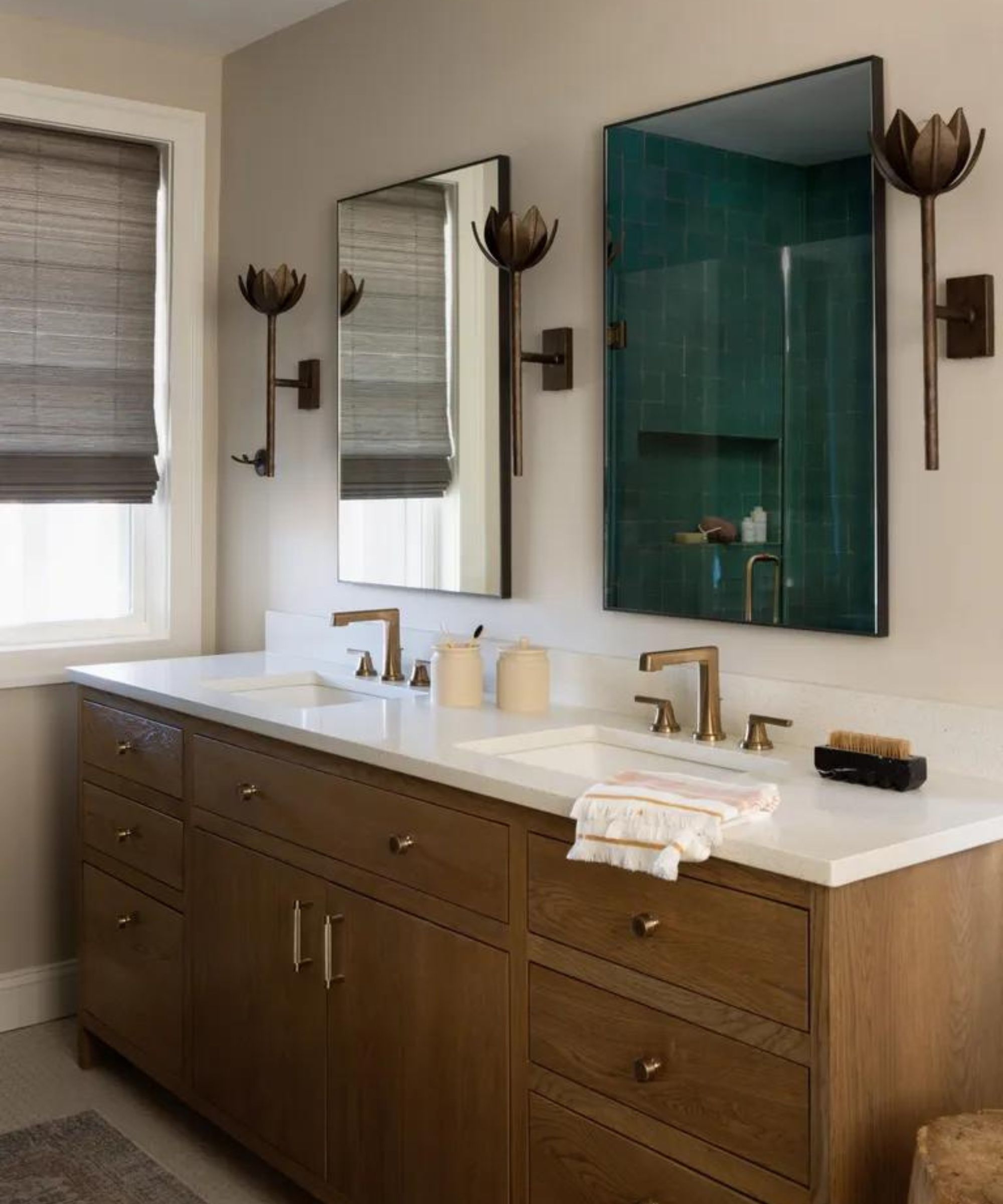
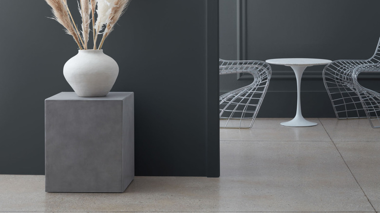
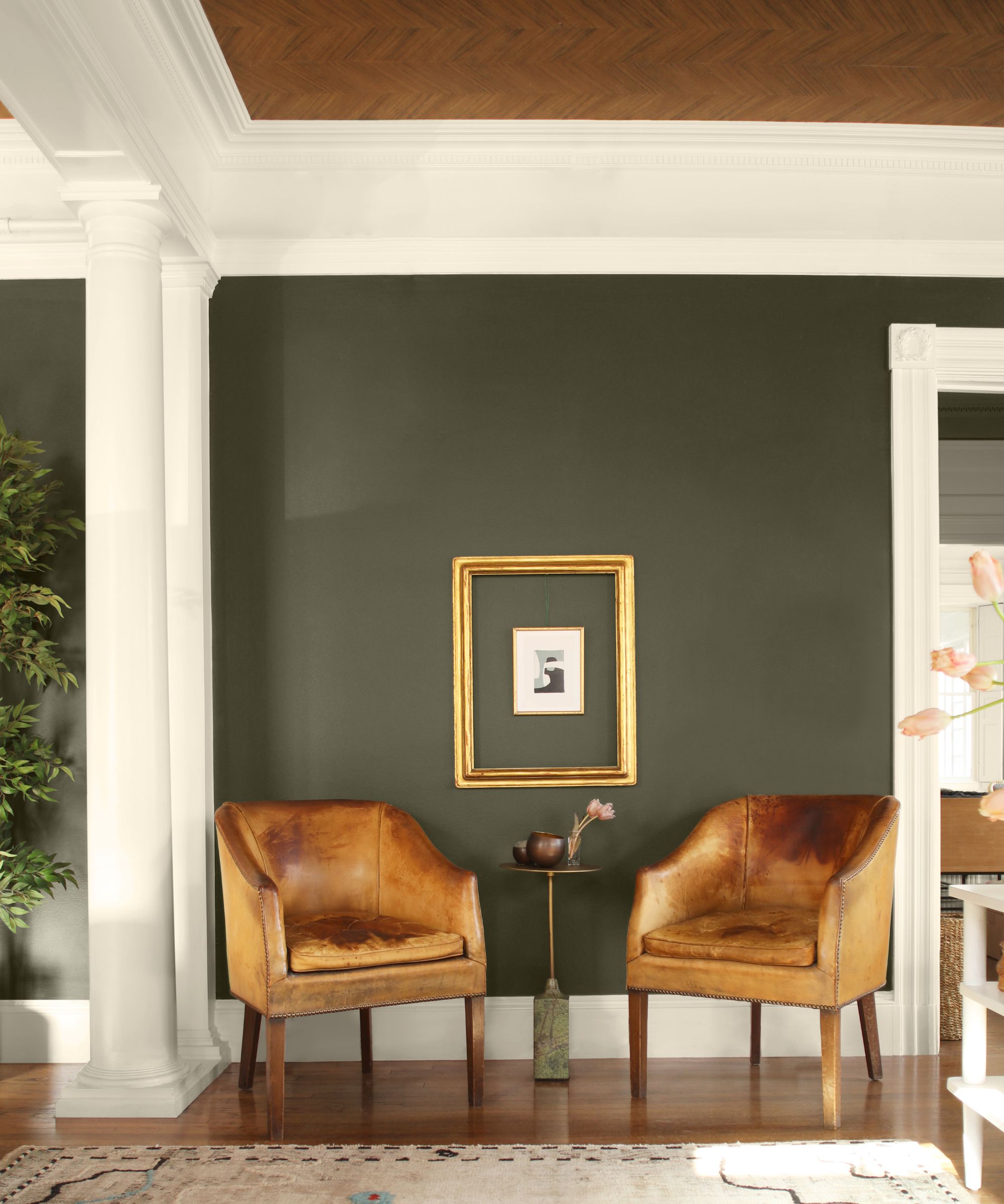
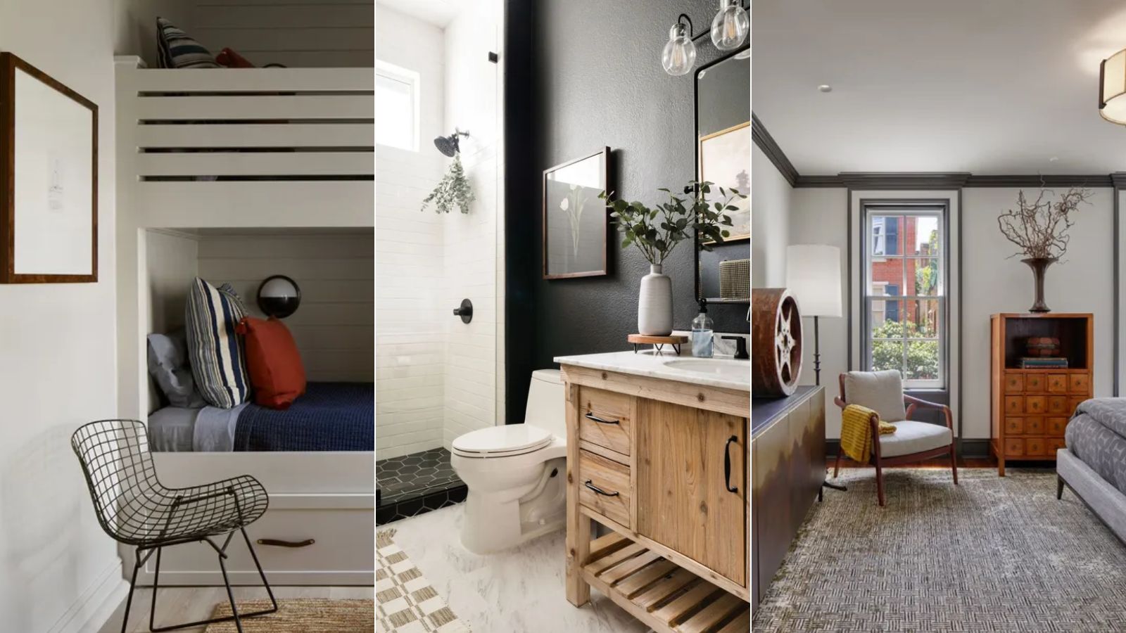
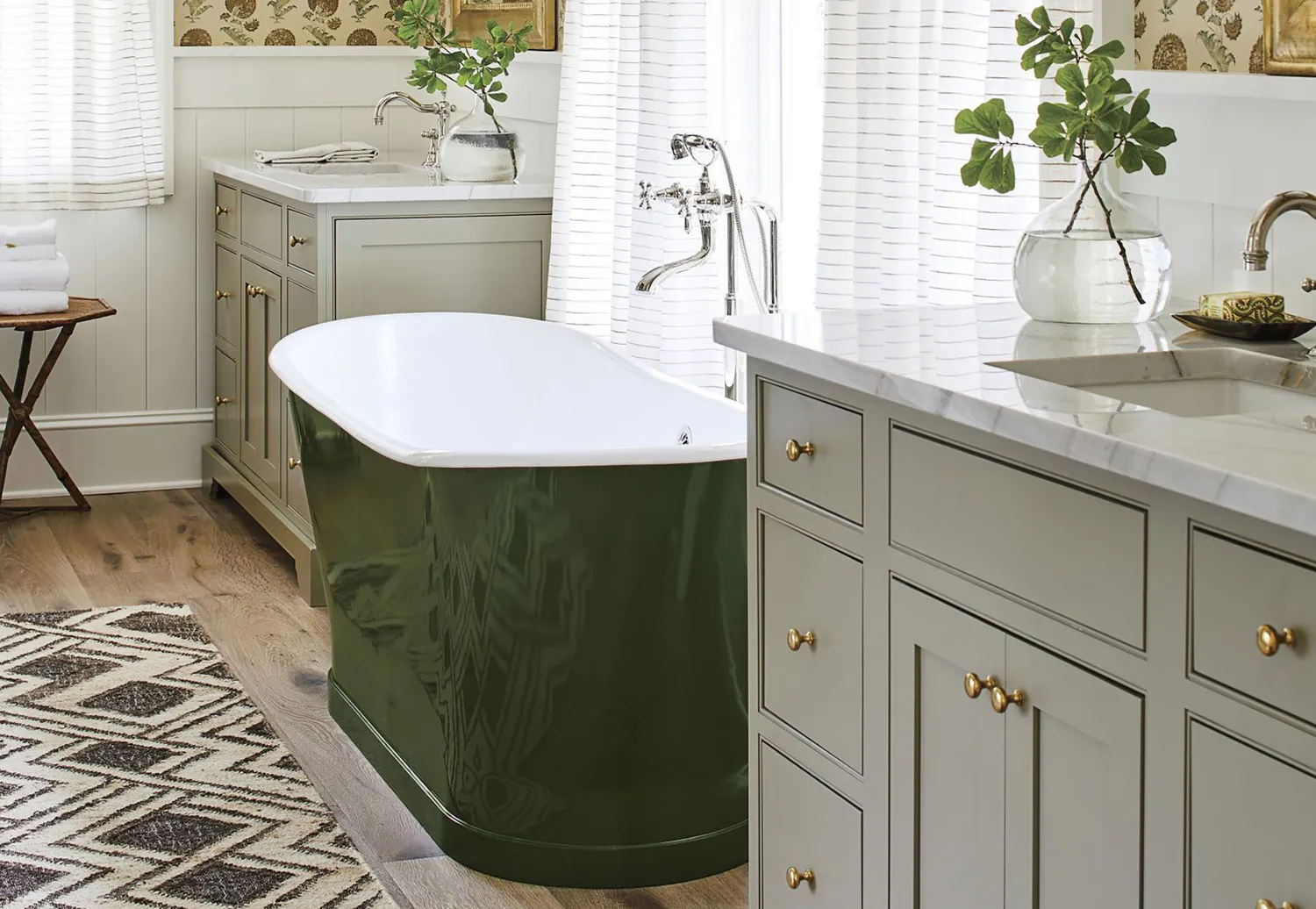
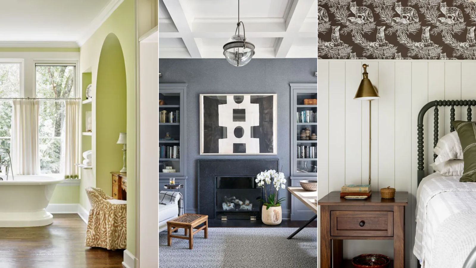
One of the darkest gray options is Benjamin Moore's Cheating Heart, a deep charcoal with cool undertones. This shade provides a moody impact and serves as a softer alternative to black, allowing for a bold interior scheme without being overpowering. Interior designer Laura Williams used it in a guest bathroom, painting walls, trim, and doors for a cohesive, dramatic effect.
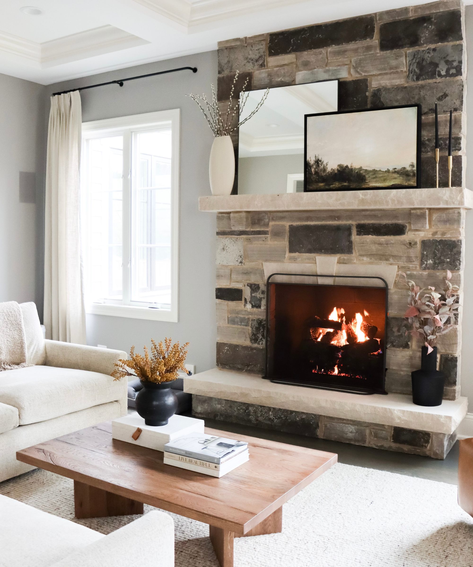
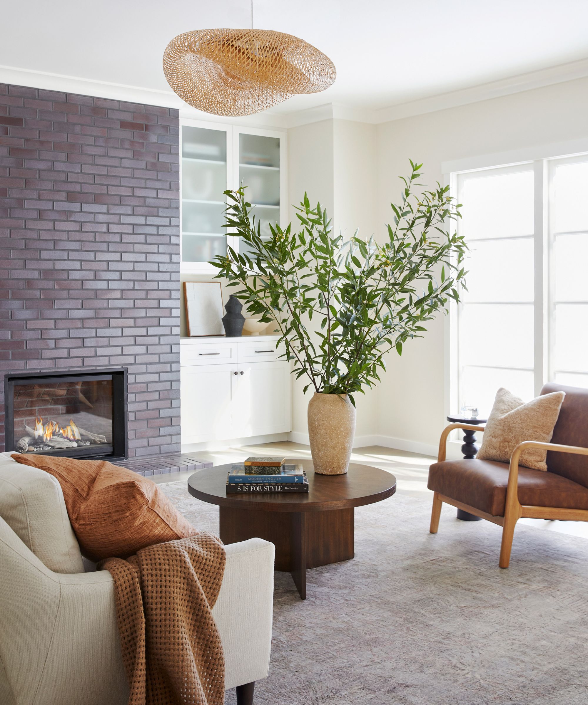
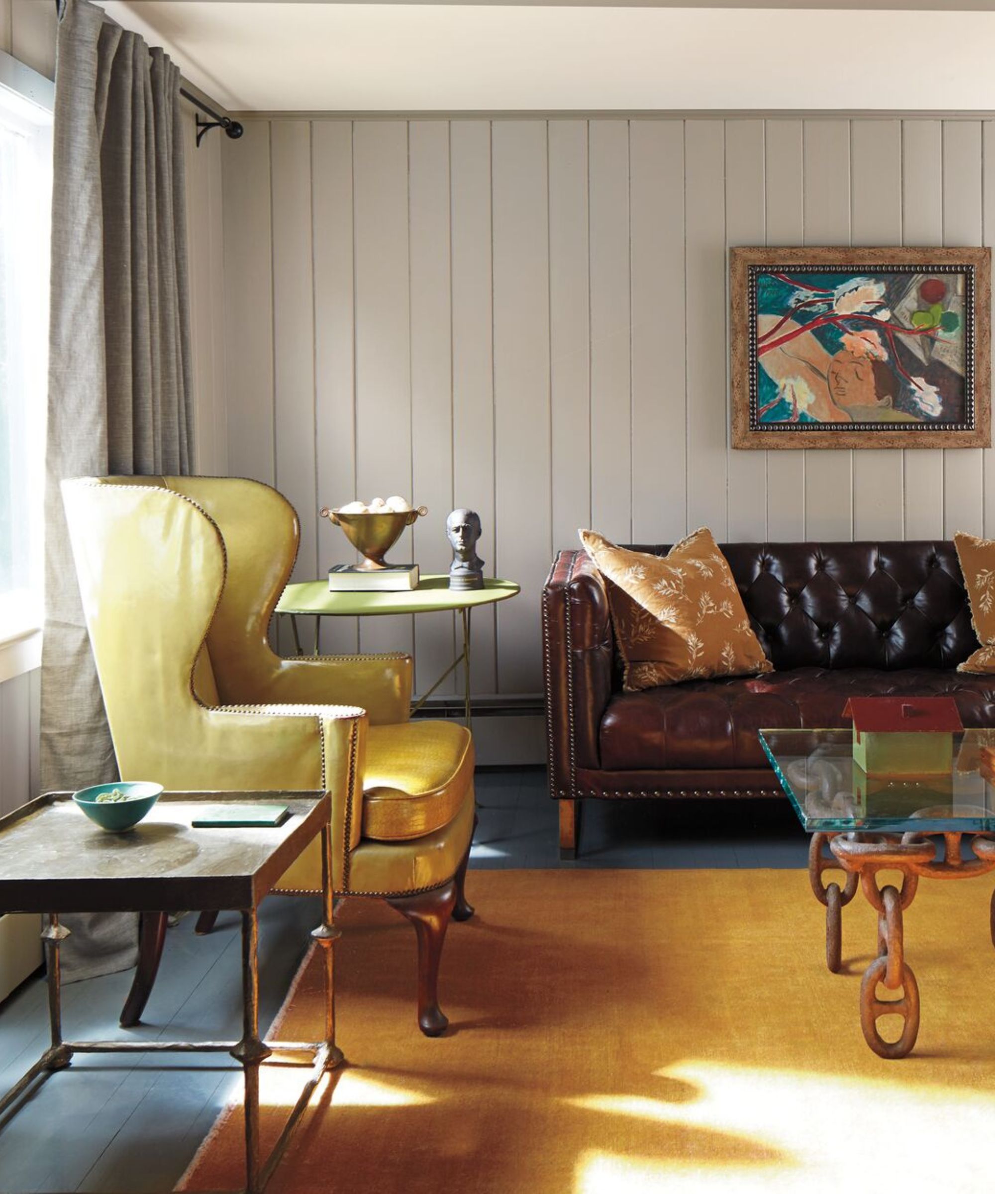
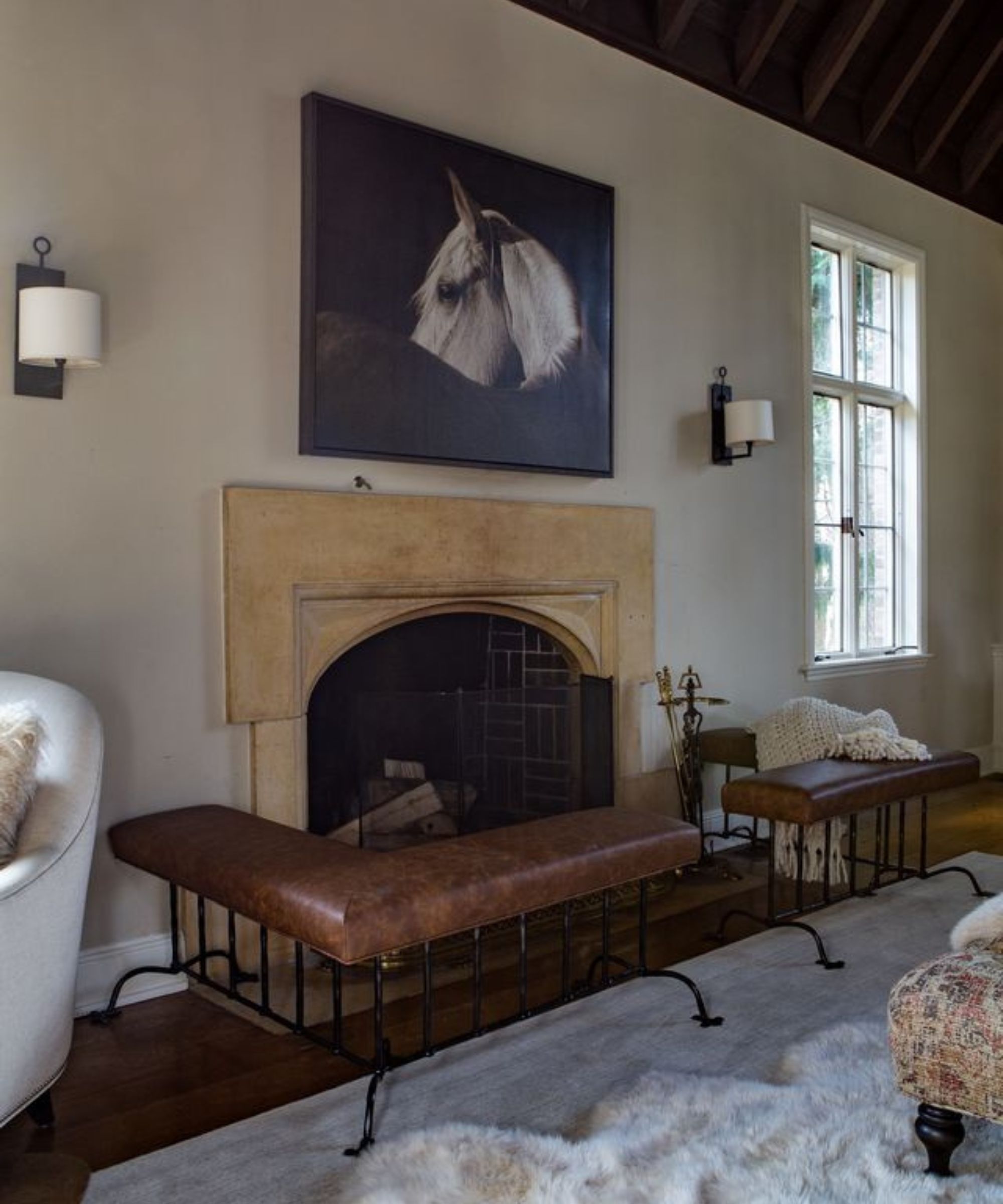
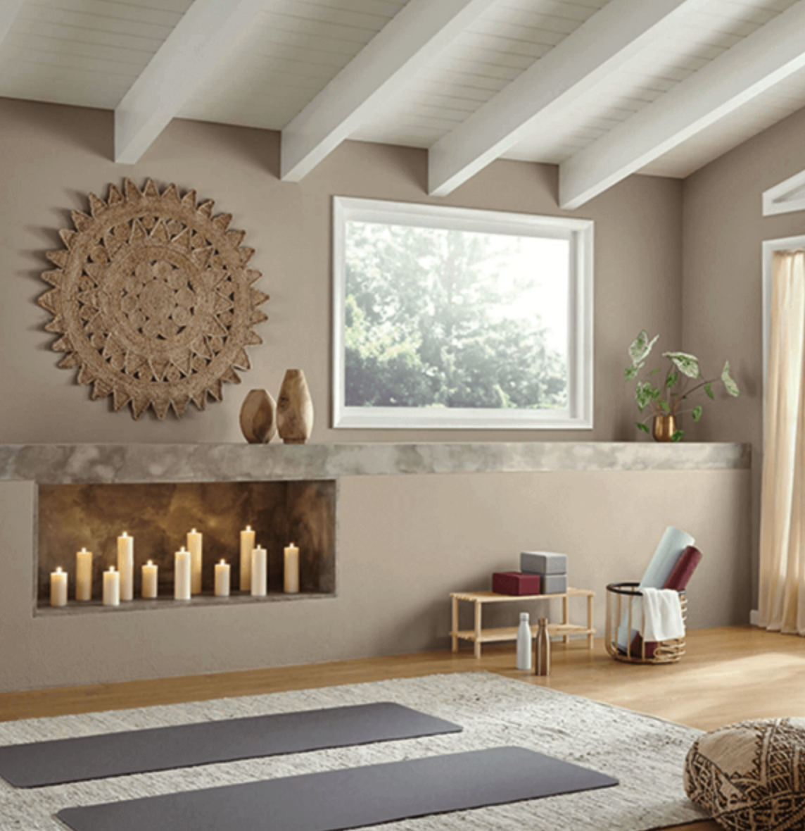
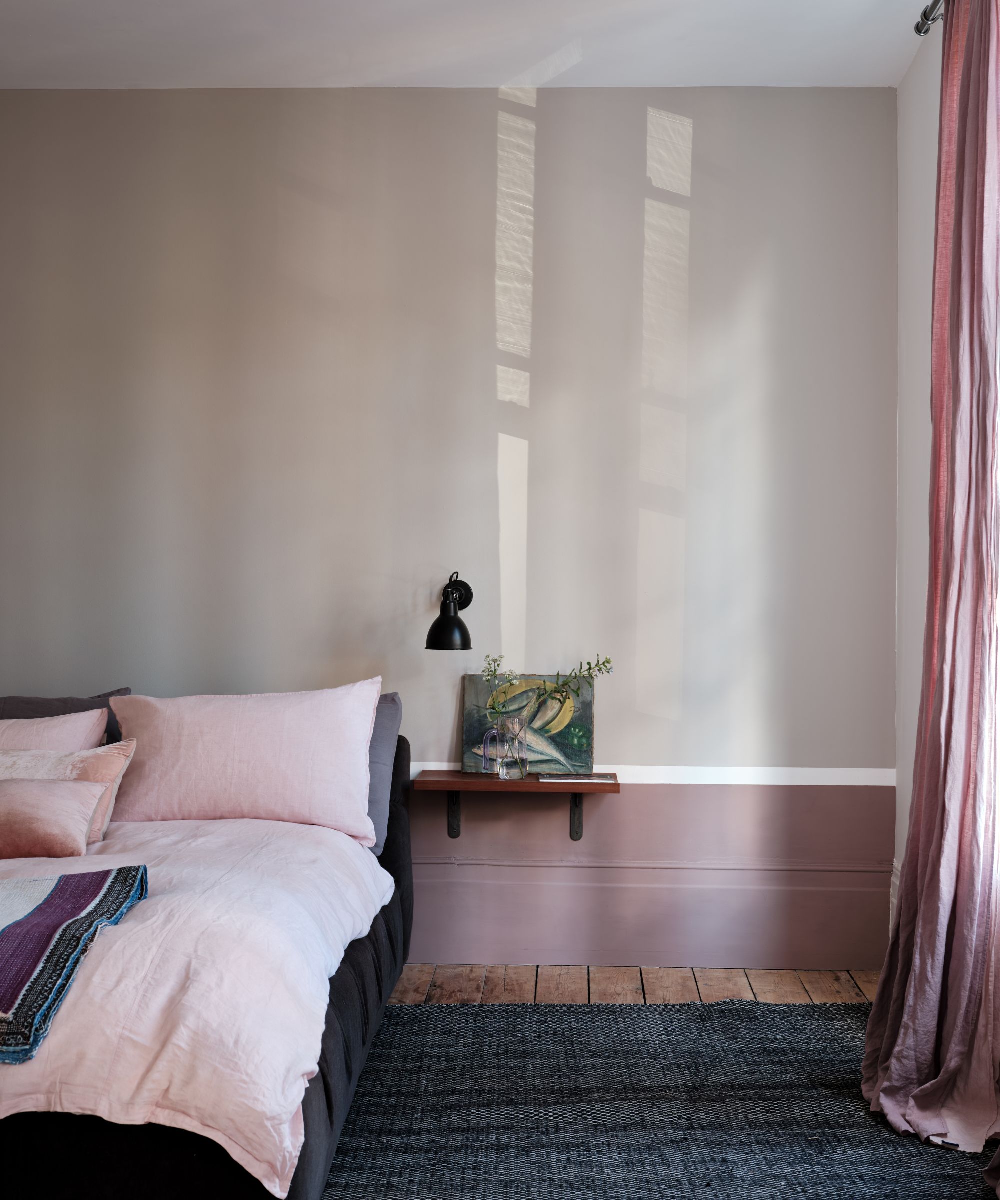
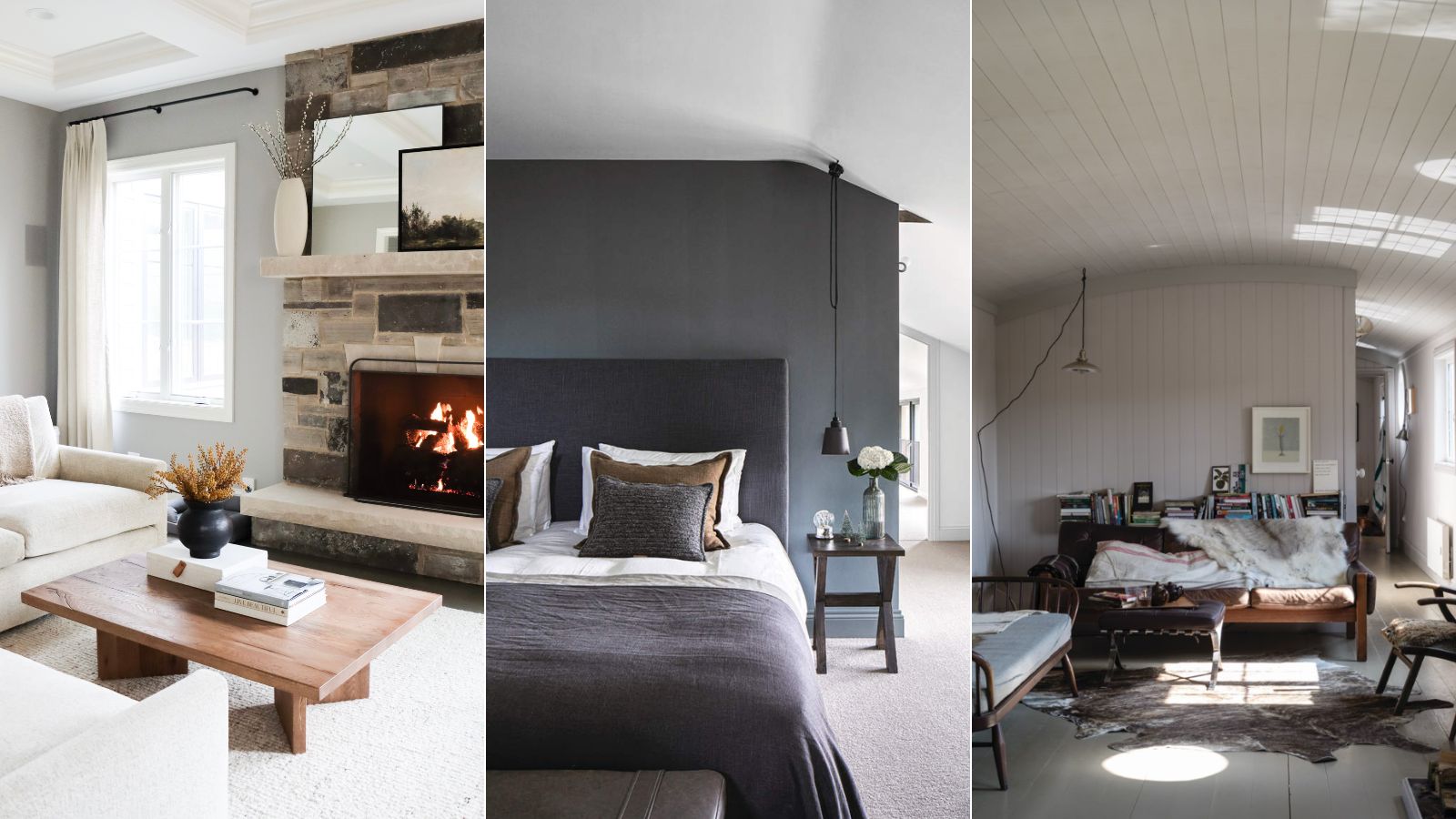
Revere Pewter is a widely favored neutral paint from Benjamin Moore, admired for its balanced warm and cool tones, often reading as a warm gray. This shade contributes to a cozy atmosphere and was employed by interior designer David Frazier in a bedroom for a color-drenched look that felt more engaging than pure white. Frazier notes its taupe undertones prevent it from feeling too cold or austere.
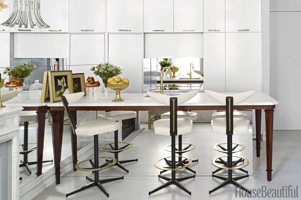
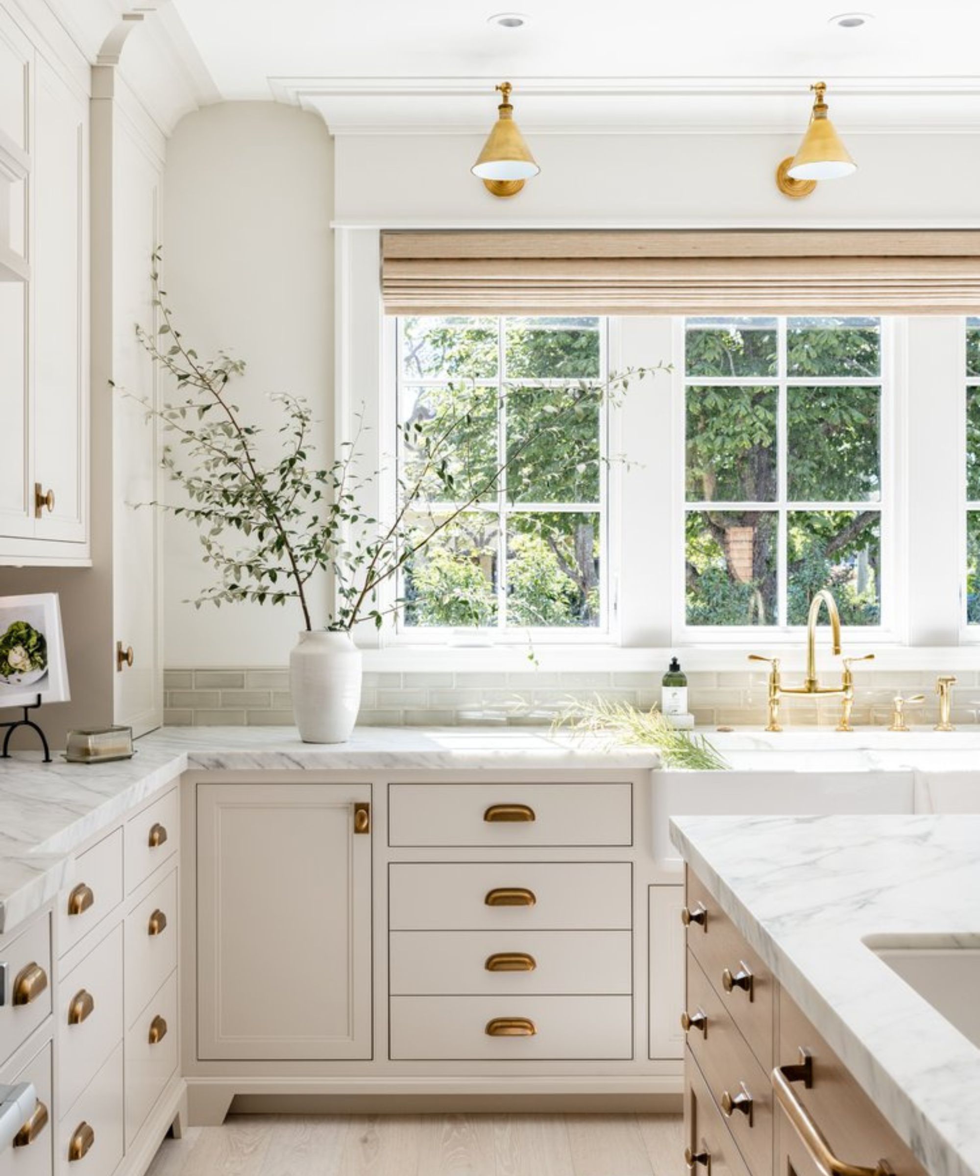
Collingwood is a versatile light gray paint recommended by designers for its adaptability. Jessica Cinnamon Design Inc. used this shade on kitchen cabinets, praising its slightly cooler yet soft undertones and its ease of integration with other materials and colors. Swati Goorha Designs also favors Collingwood for its sophisticated and cozy blend, providing a versatile backdrop that complements various decor styles.
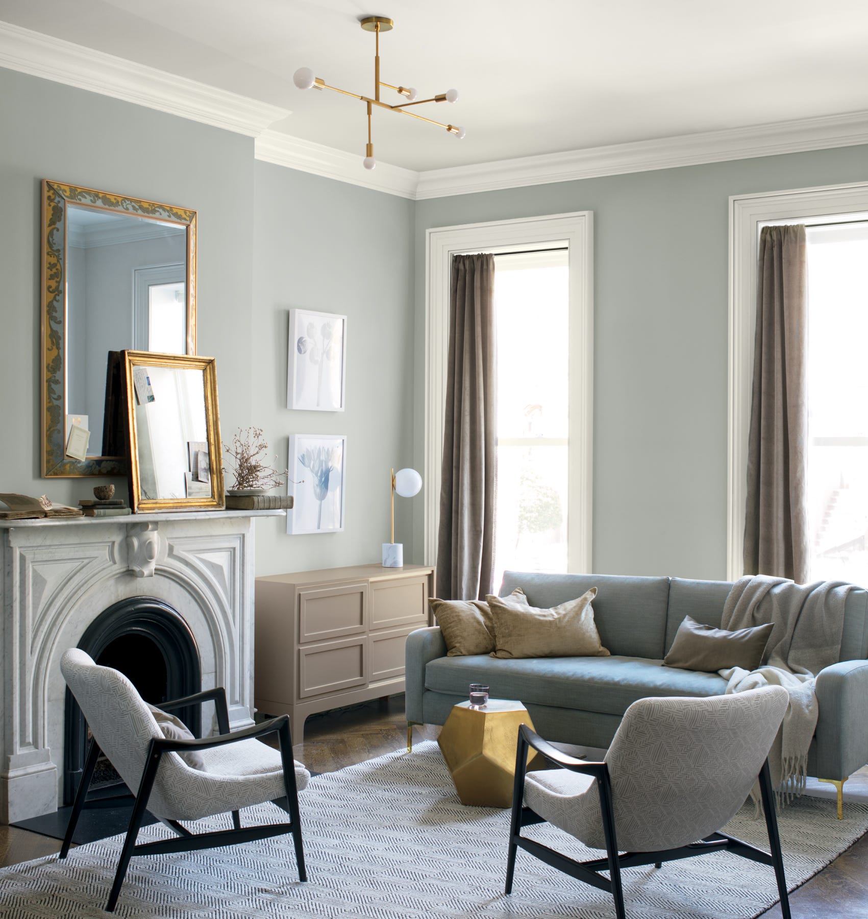
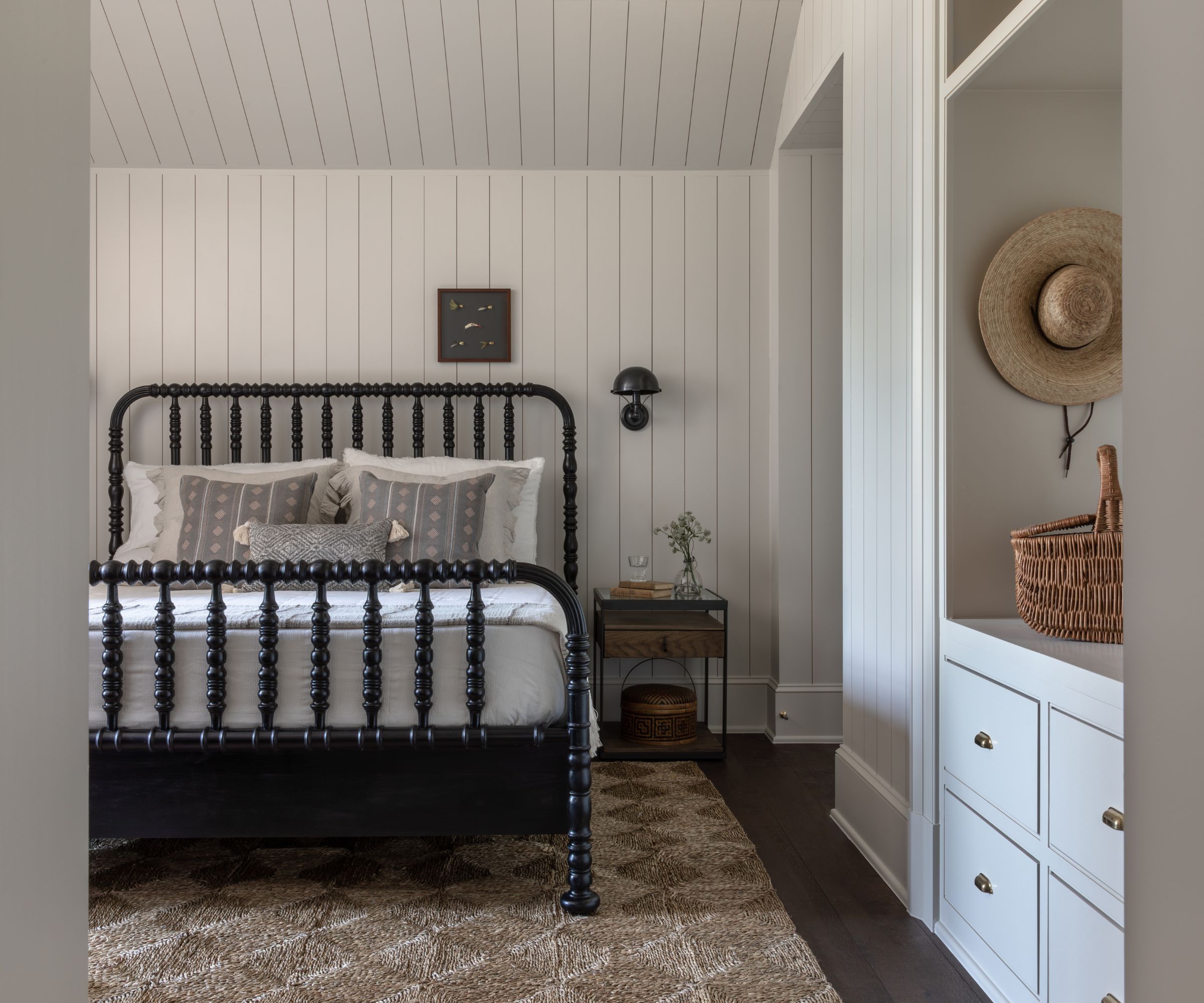
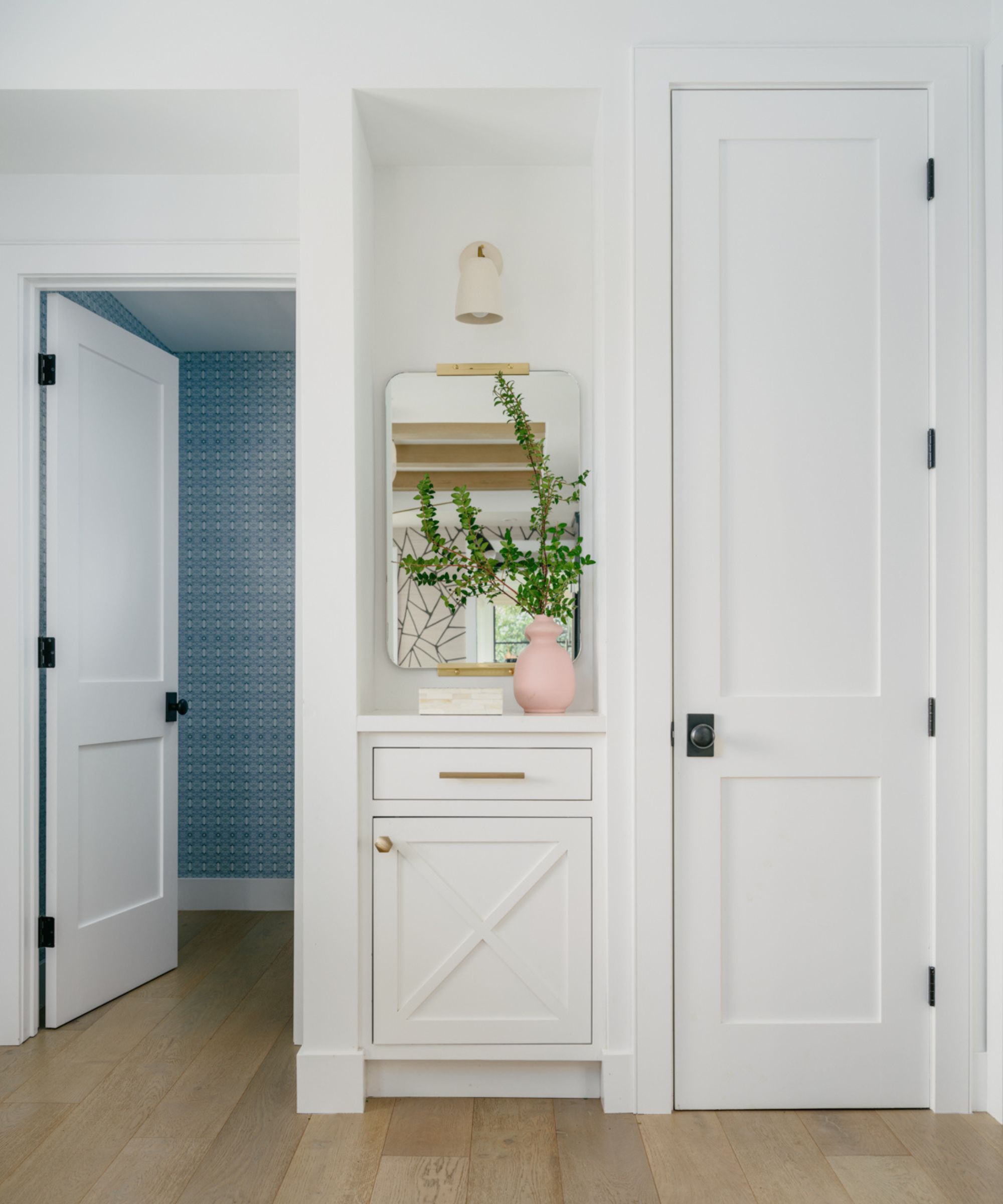
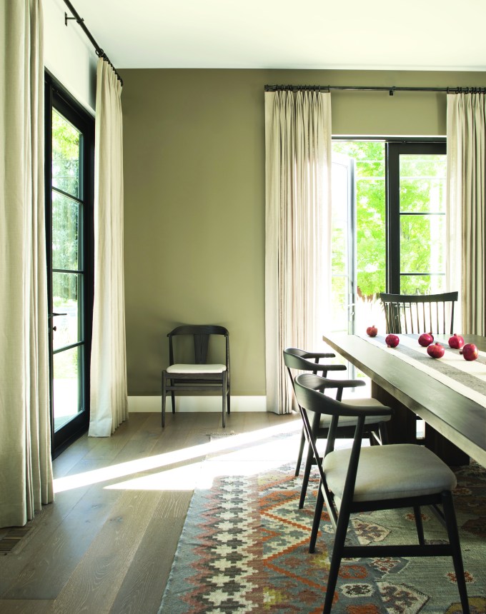
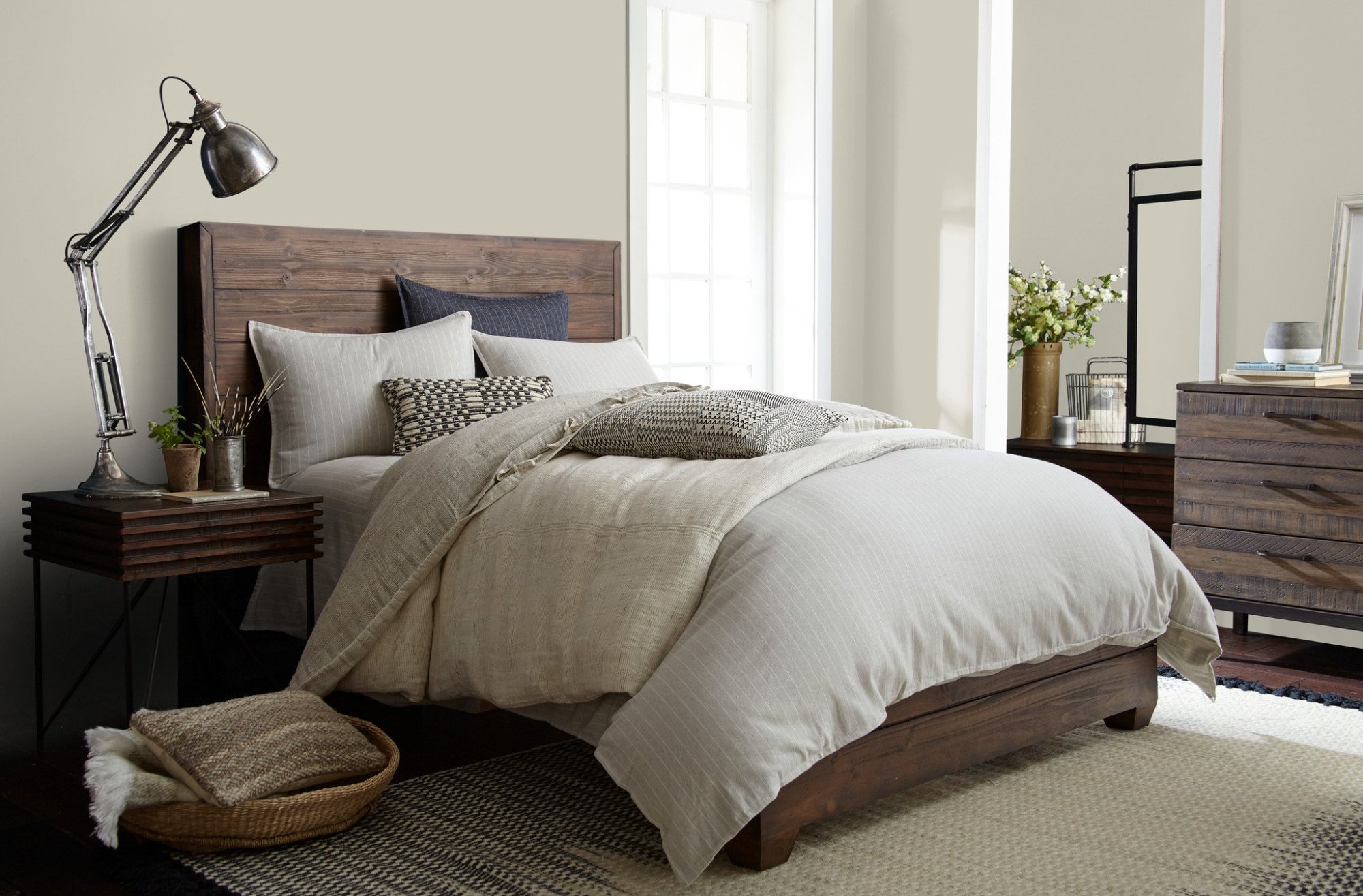
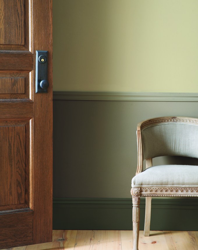
Gray Mist, a greige paint by Benjamin Moore, is a highly versatile neutral that functions as an excellent backdrop in many rooms. Leigh Anne Schurr of Marguerite Rodgers describes it as a warm and creamy shade that offers a sense of tranquility, using it in a guest bedroom with a darker trim for a timeless aesthetic.
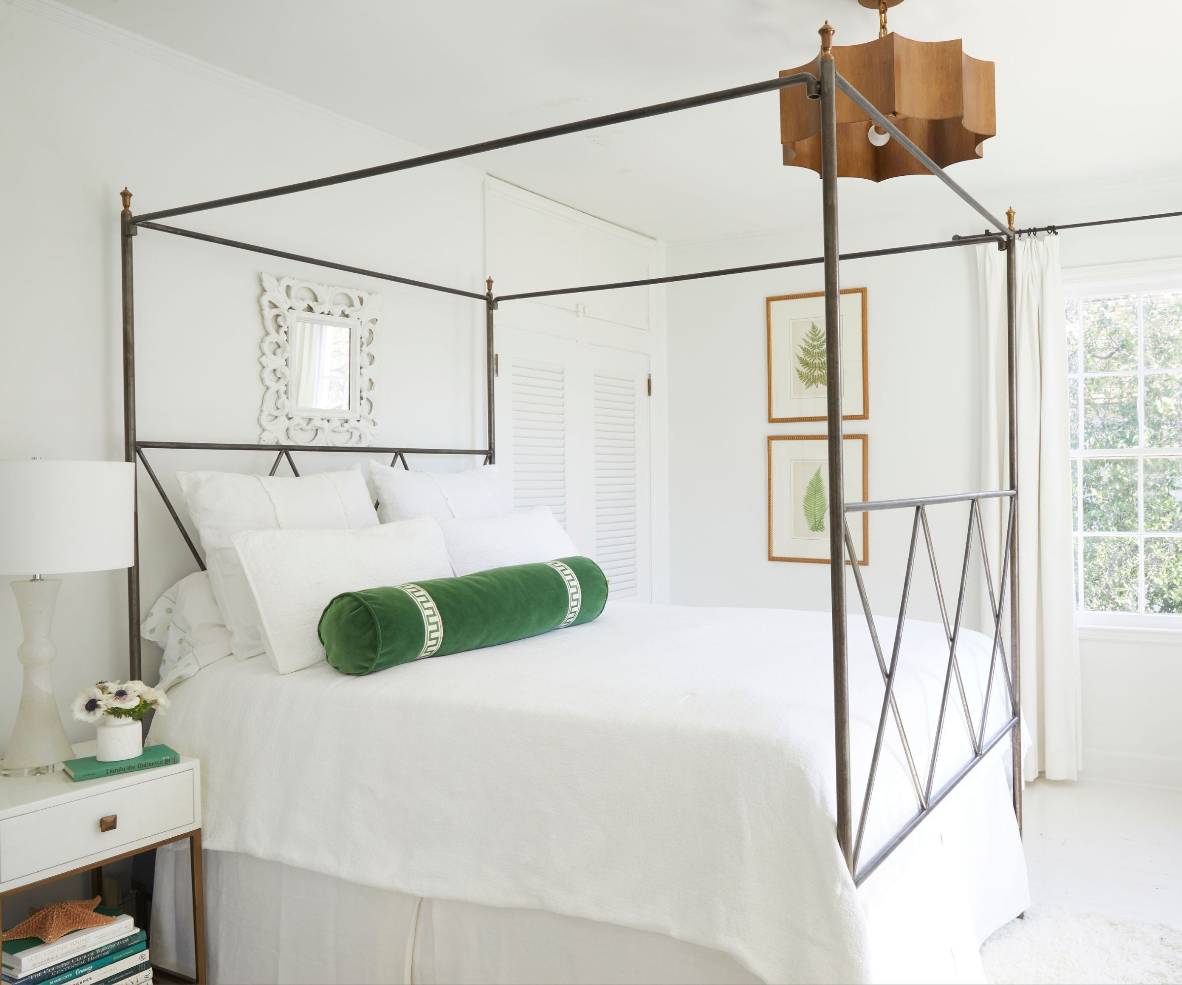
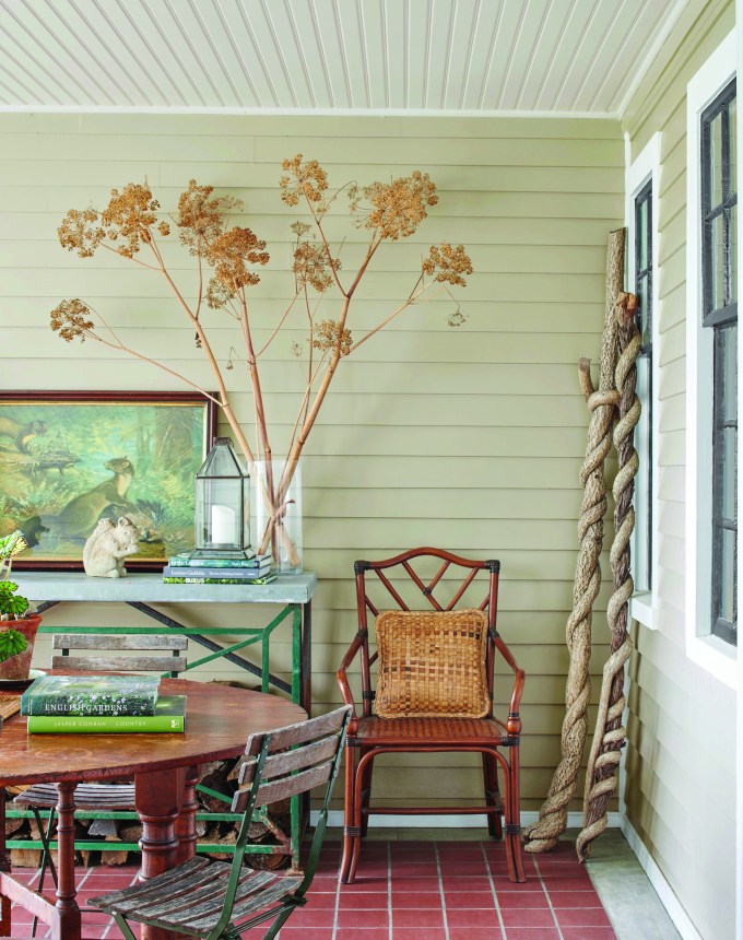
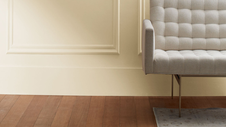
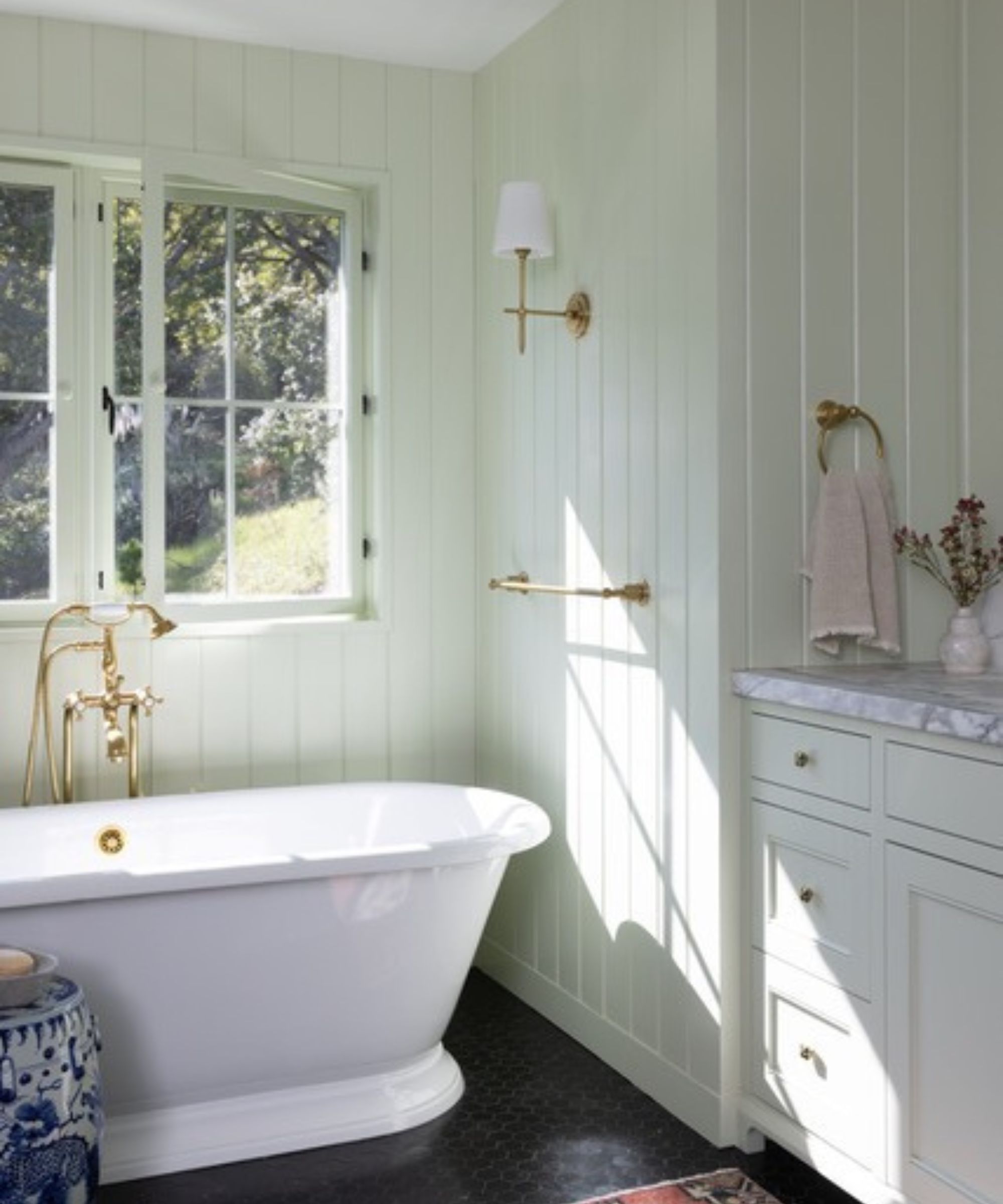
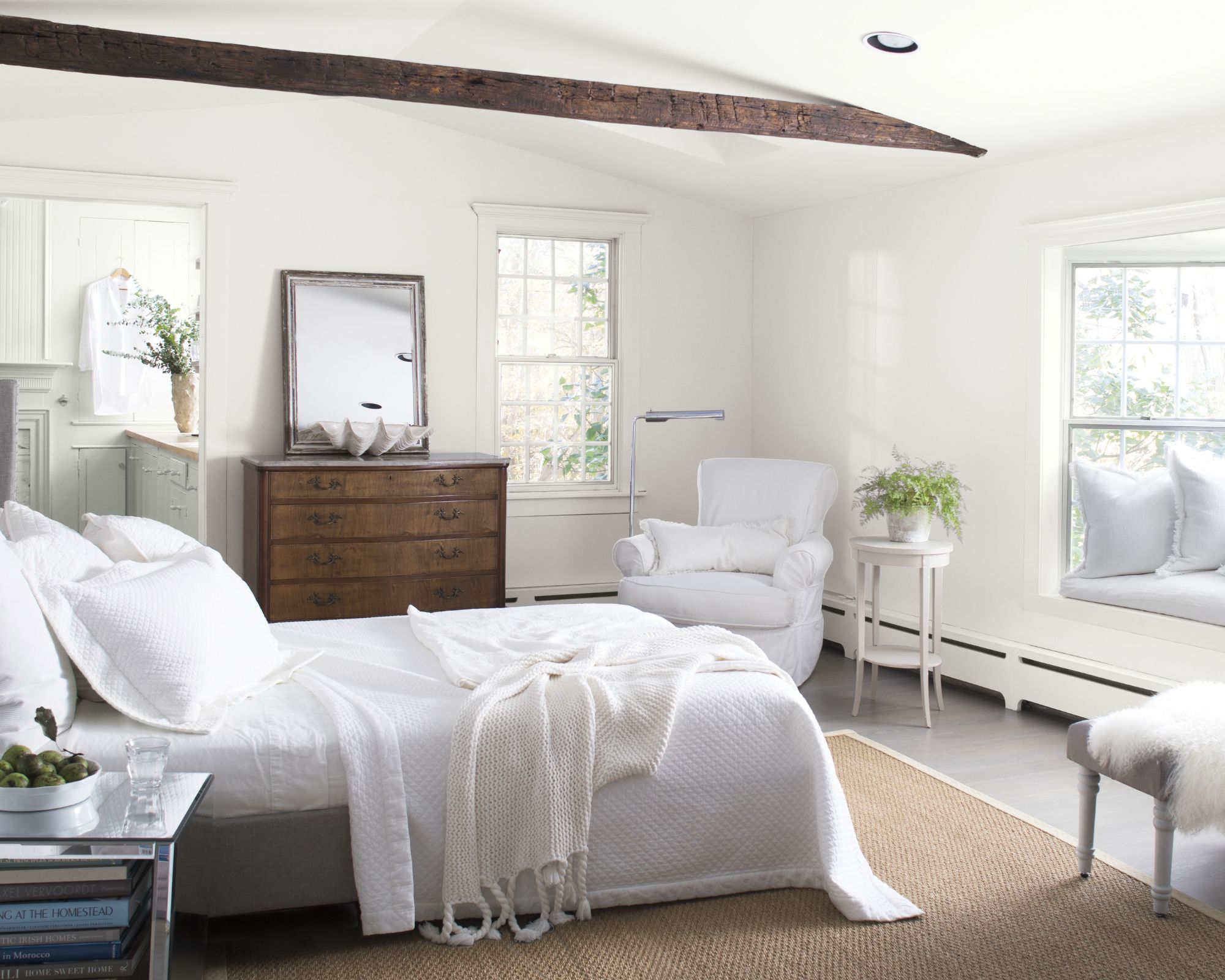
Benjamin Moore's Halo is a subtle gray described as a silvery white with green undertones, reading almost as a beige. Interior designer Sarah Storms appreciates its seamless blending capability, having used it in hallways and living rooms to create a clean slate for layering or as a gentle contrast to darker rooms.
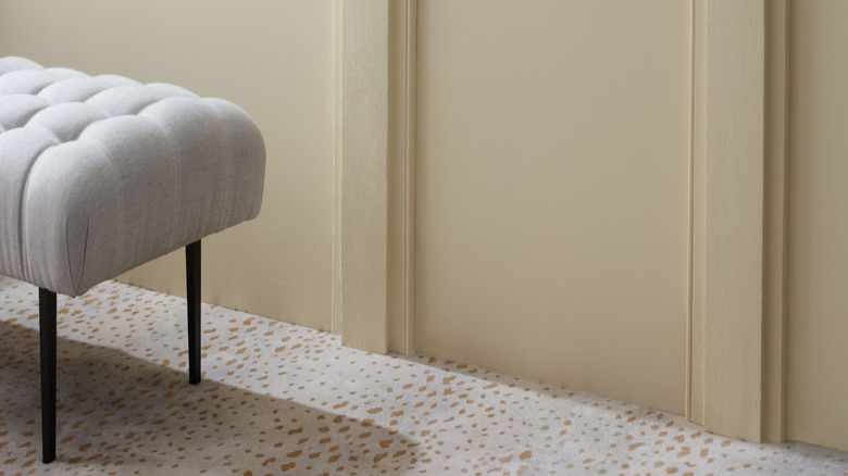
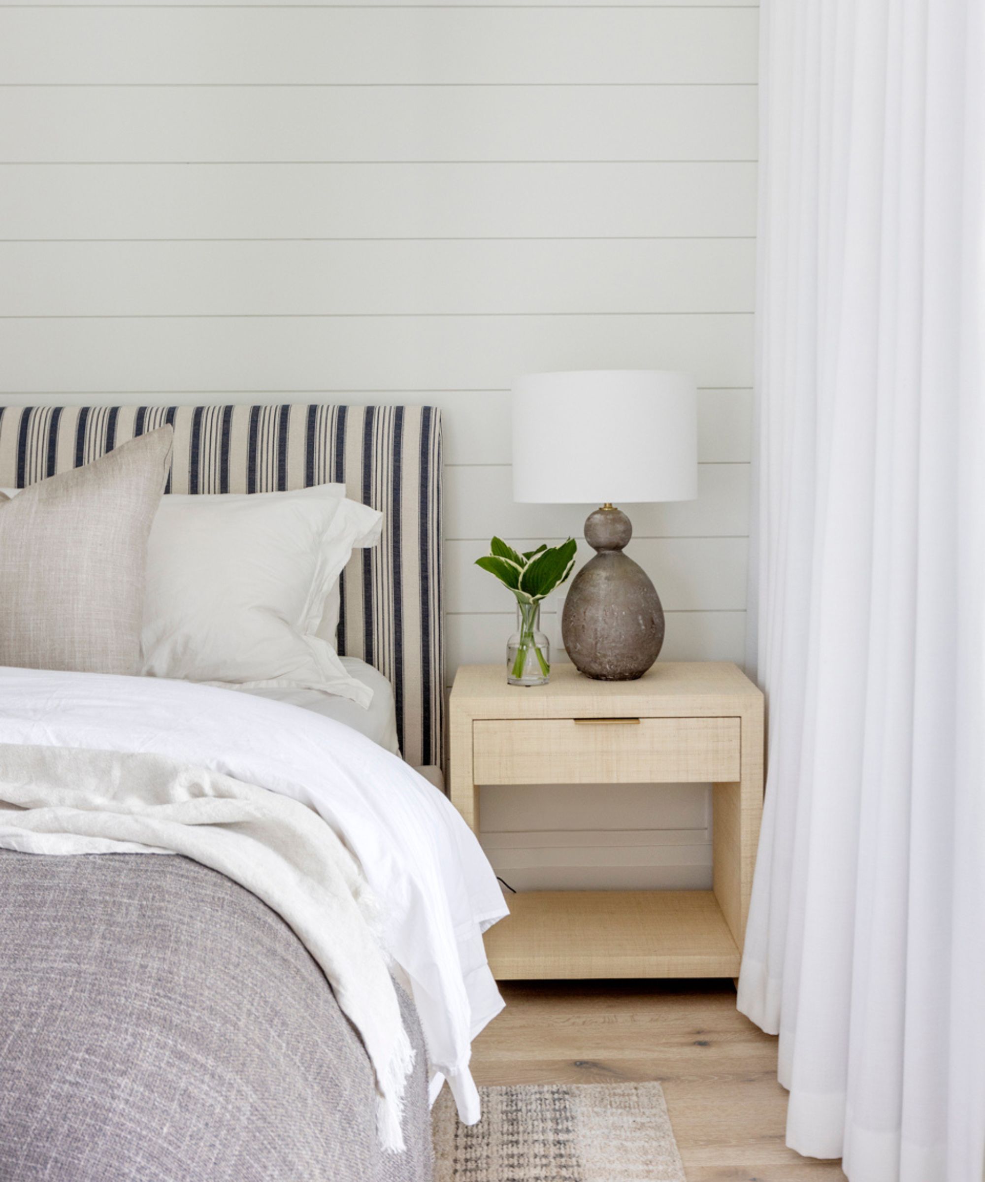
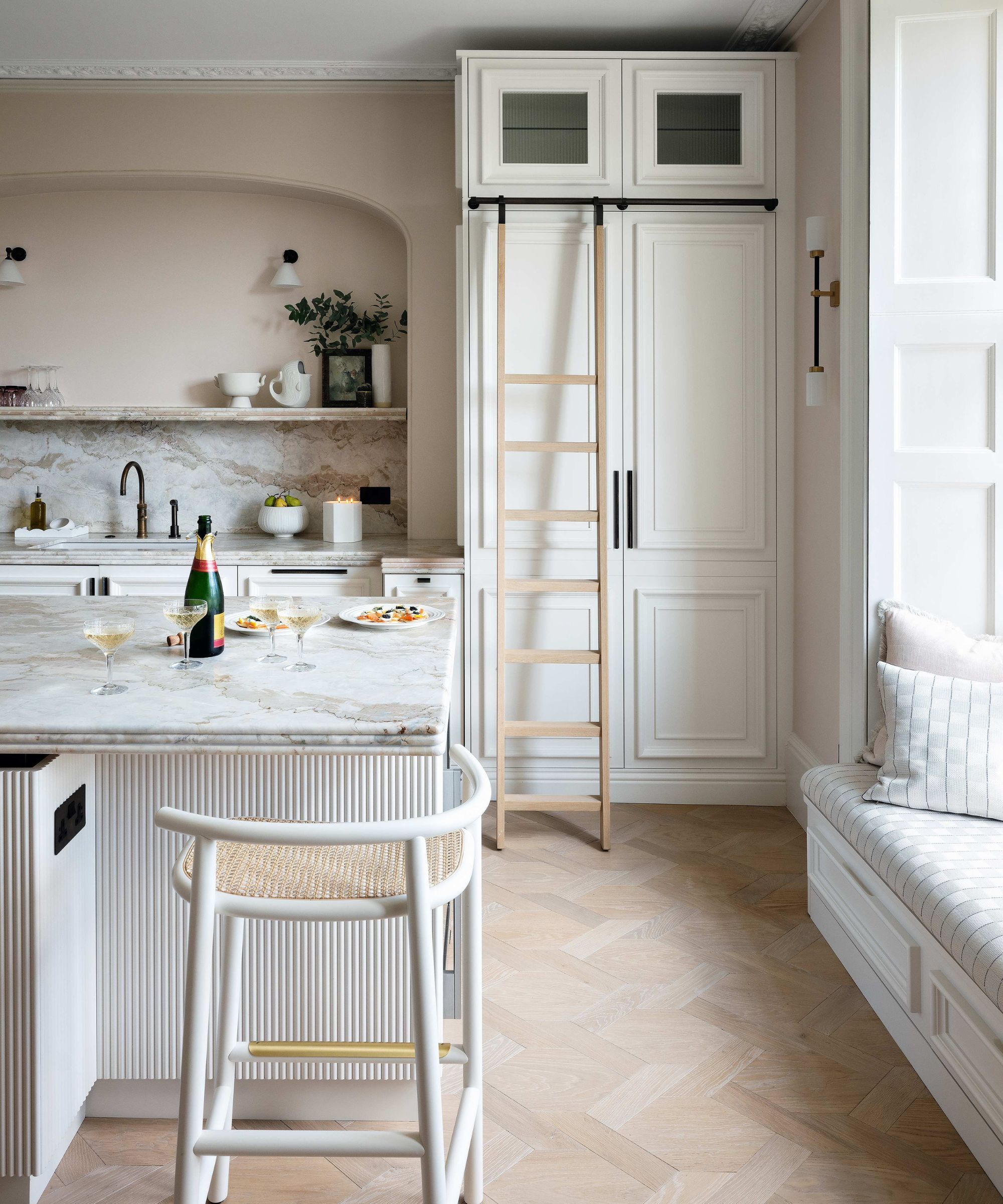
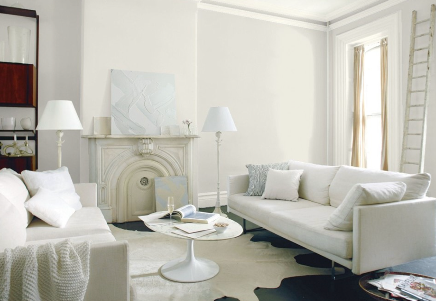
Classic Gray is another designer favorite, offering an ultra-light gray that provides a tonal shift from pure white without appearing too yellow or stark. Christine Zippert of CC Zippert Design highlights its suitability for kitchen cabinets where a soft, warming effect is desired without going too dark or monotone.
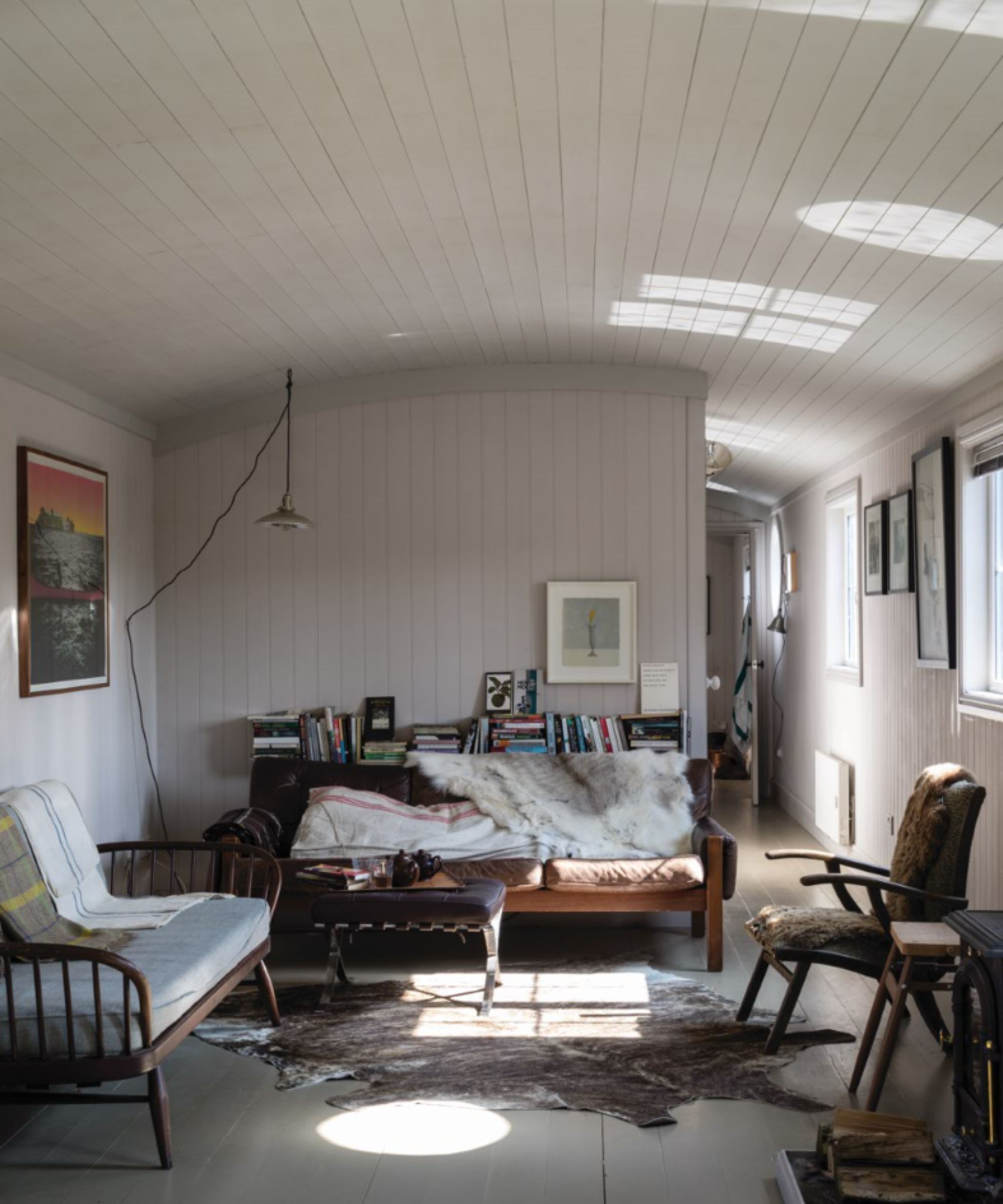
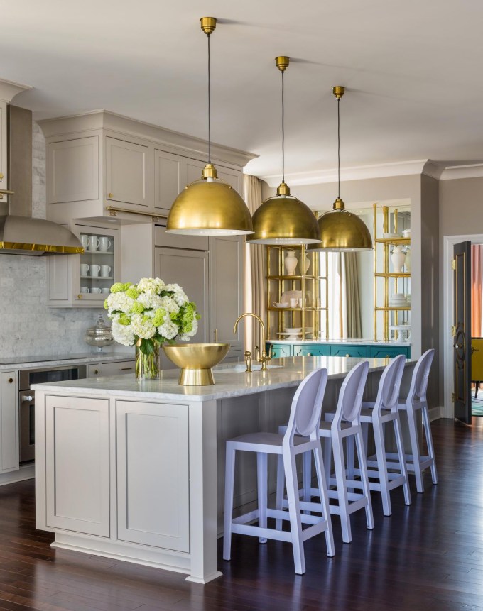
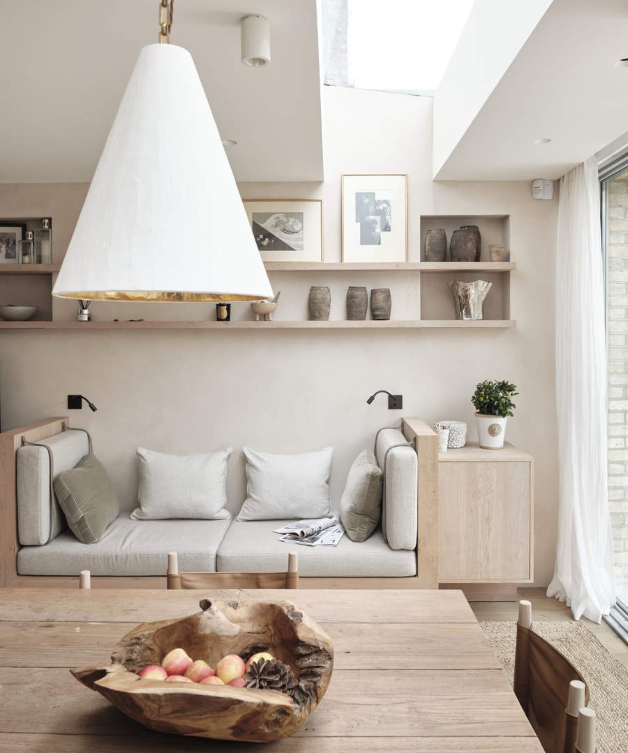
Finally, Nimbus is a warm shade of gray paint from Benjamin Moore, praised for its ability to create a cozy feel while maintaining an understated look. Rosanna Bassford of Memmo Interiors used Nimbus on kitchen cabinets to complement warm wood tones and warmer countertop stone, preventing the space from feeling cold. These selections demonstrate the breadth of Benjamin Moore's gray palette, offering options for diverse design preferences and functional requirements, and proving that gray can be far from drab when chosen correctly.
#BenjaminMoore #GrayPaint #InteriorDesign #PaintColors #HomeDecor #DesignTrends #NeutralPalette #ColorPsychology #BenjaminMoore #GrayPaint #InteriorDesign #PaintColors #HomeDecor #DesignTrends #NeutralPalette #ColorPsychology
0 comment in total
 No comments yet
You may also like
Why Benjamin Moore's Classic Gray Is a Designer-Favorite Paint Color

Interior designers share their favorite Benjamin Moore paint colors – and there's something for every style
Benjamin Moore paint colors in real homes – 10 favorite shades amongst designers, from neutrals to brights
10 Greige Paint Colors Designers Recommend Again And Again
5 of the best gray paints that interior designers love using
The 13 Best Greige Paint Colors to Buy Right Now
This Paint Color Has Been Benjamin Moore’s Best Seller for Years—and Designers Swear by It

6 ways to decorate with Revere Pewter, Benjamin Moore's best-selling gray paint
The best Benjamin Moore paint colors to use in bedrooms – 14 stylish shades recommended by interior designers
Top 32 Expert-Recommended Gray Paint Colors, Plus How to Pick the Best Shade

I'm a color editor and I'd never heard of these Benjamin Moore paint colors that interior designers swear by
This is the most versatile shade you can bring into your home – designers share the 5 best greige paints
The Best Gray Paint Colors Interior Designers Swear By

5 ways to decorate with Edgecomb Gray, Benjamin Moore's softest gray paint
5 of the best Benjamin Moore white paints – classic shades that experts always use in interior projects
Dark green paints are the 'it' color right now – here are 4 shades from Benjamin Moore to use in small rooms
Is Benjamin Moore's Gentleman's Gray the perfect navy blue paint?

Benjamin Moore's Trendiest Paint Colors (& Which Ones To Avoid)

The Best Greige Paint Colors for a Warm, Welcoming Home

The 12 Best-Selling Benjamin Moore Paint Colors of All Time