Top 32 Expert-Recommended Gray Paint Colors, Plus How to Pick the Best Shade
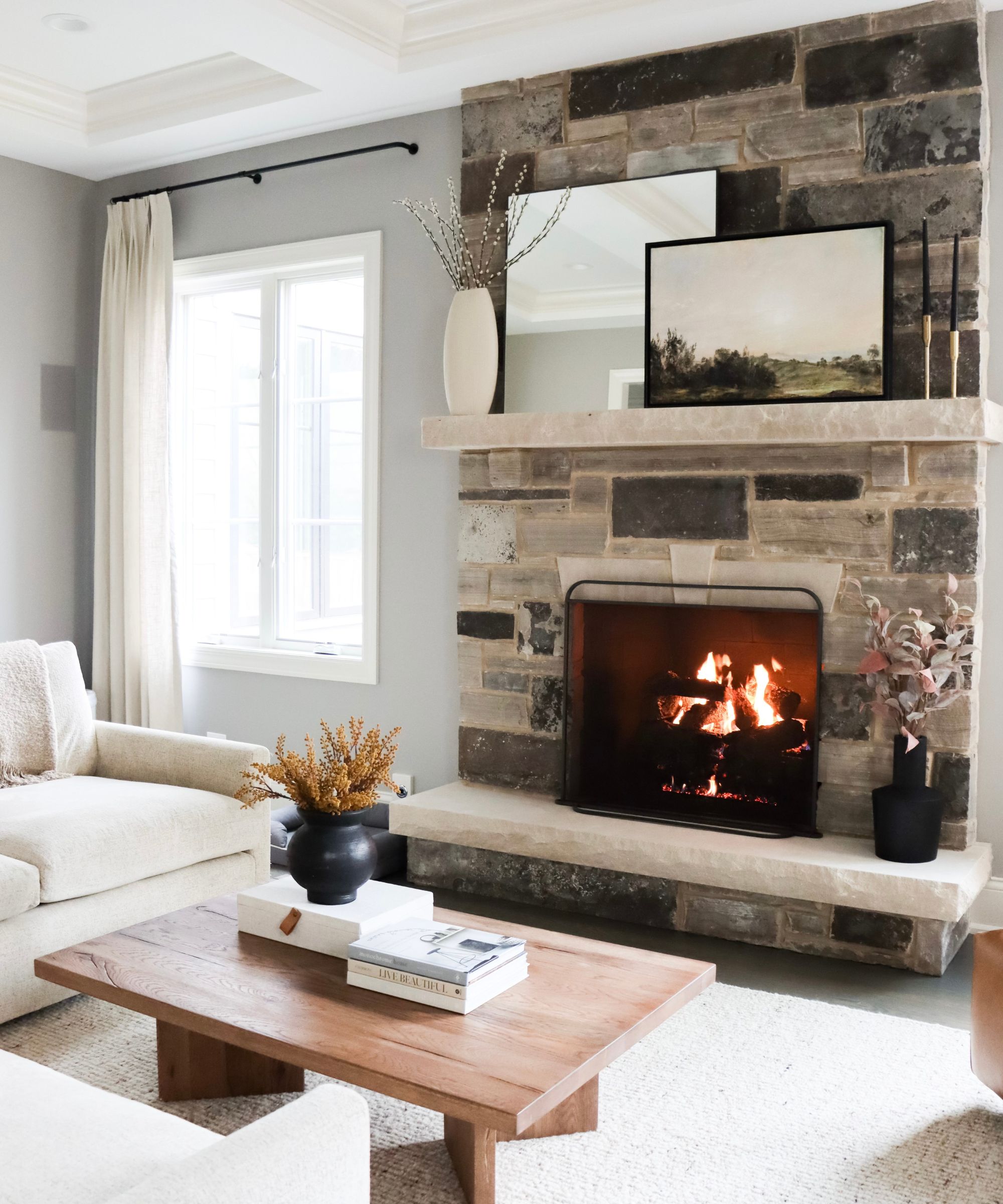
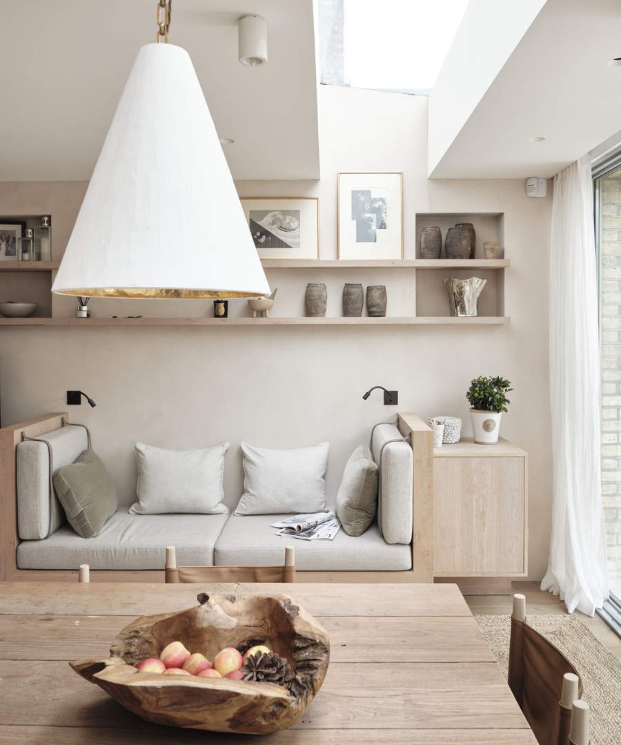
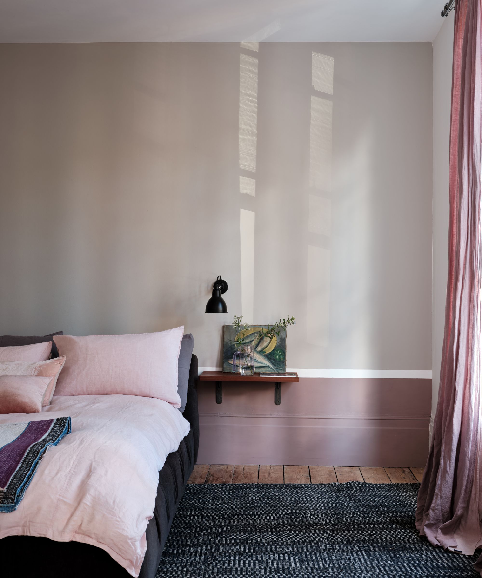
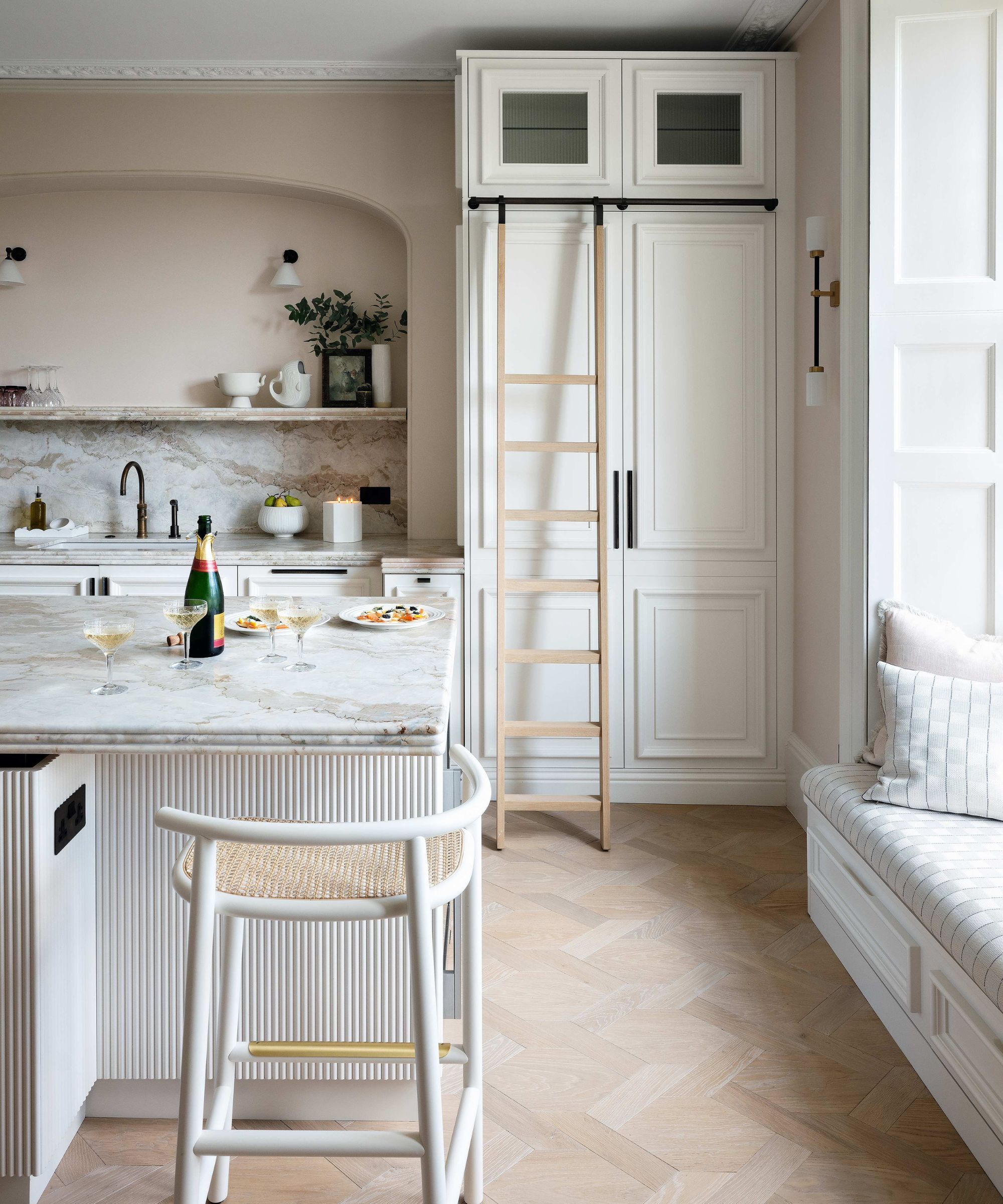
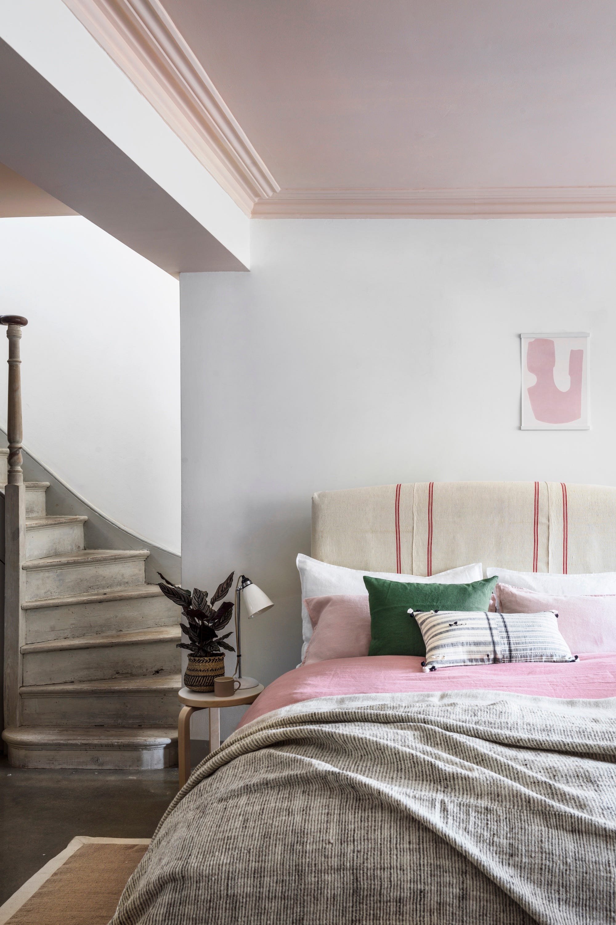
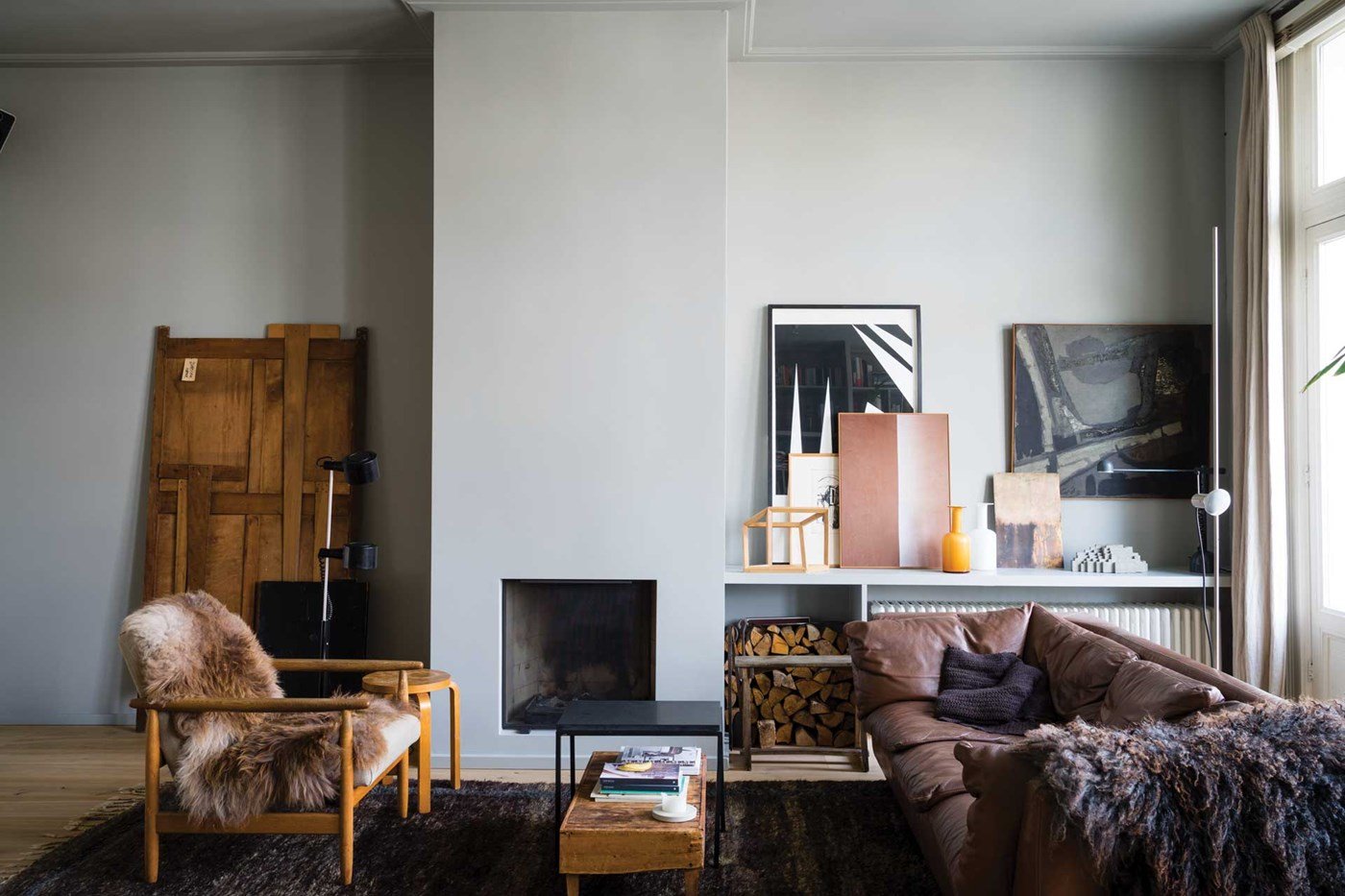
Gray paint colors consistently rank among the most popular shades for interior design, offering a versatile backdrop for various decor styles. These colors, whether cool or warm, light or bold, effectively complement tiles, countertops, furnishings, and artwork. However, selecting the right gray can be complex due to its shifting undertones and sensitivity to natural light. Variations between paint samples and the final application are common, making careful consideration essential.
Choosing a gray paint color requires attention to several factors. Undertones, which are subtle warm or cool hues mixed into the paint, significantly influence how the color appears on a wall, especially under different lighting conditions. Darker rooms tend to make grays appear warmer, while abundant artificial lighting can sometimes cause gray walls to take on a greenish tint. Therefore, testing paint shades in the actual space with its unique lighting is crucial before committing to a purchase.
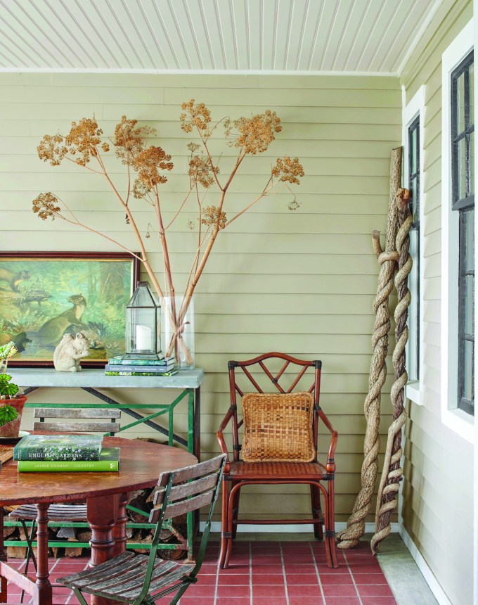
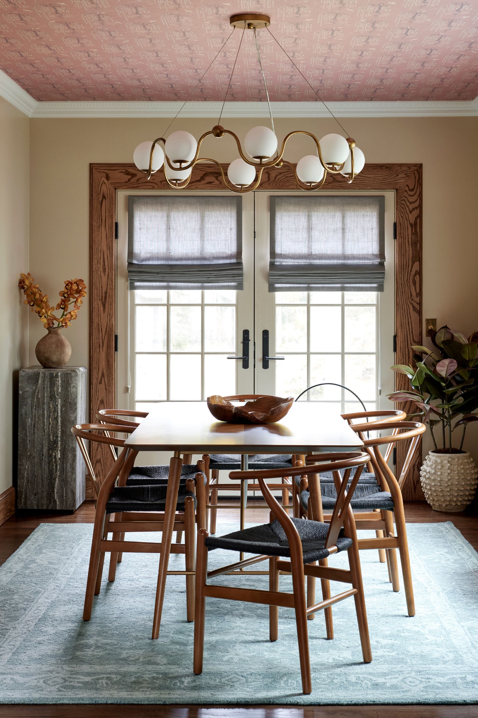
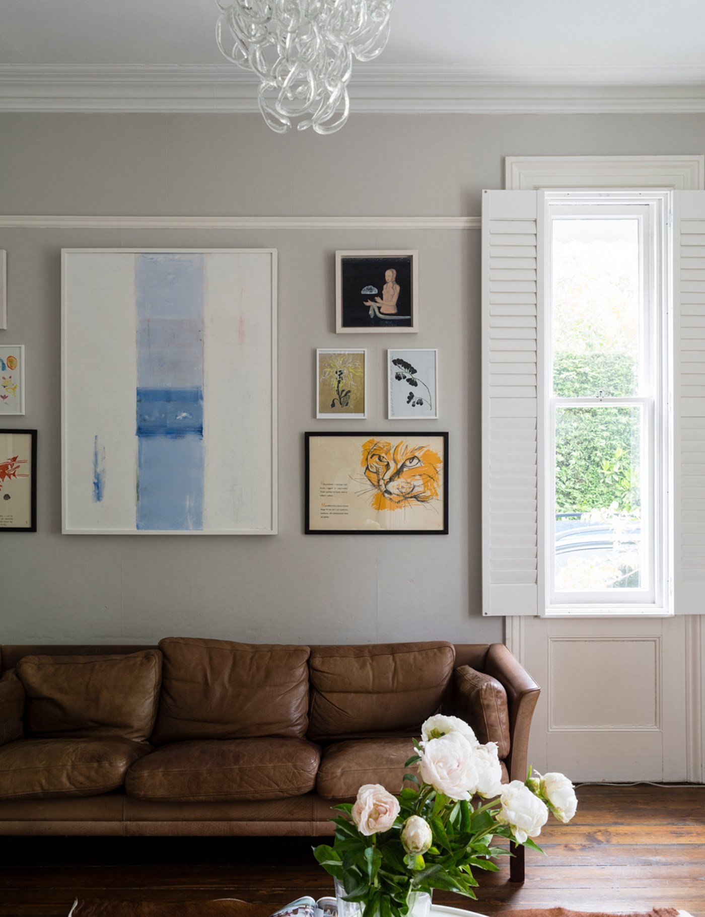
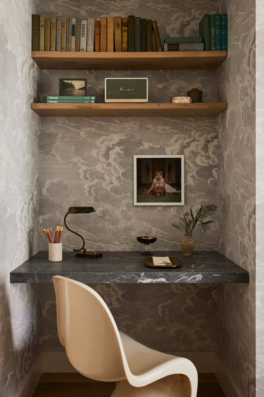
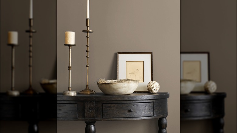
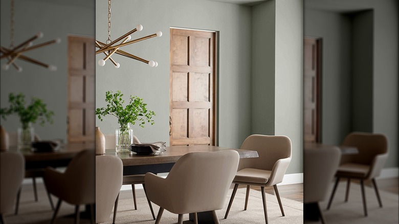
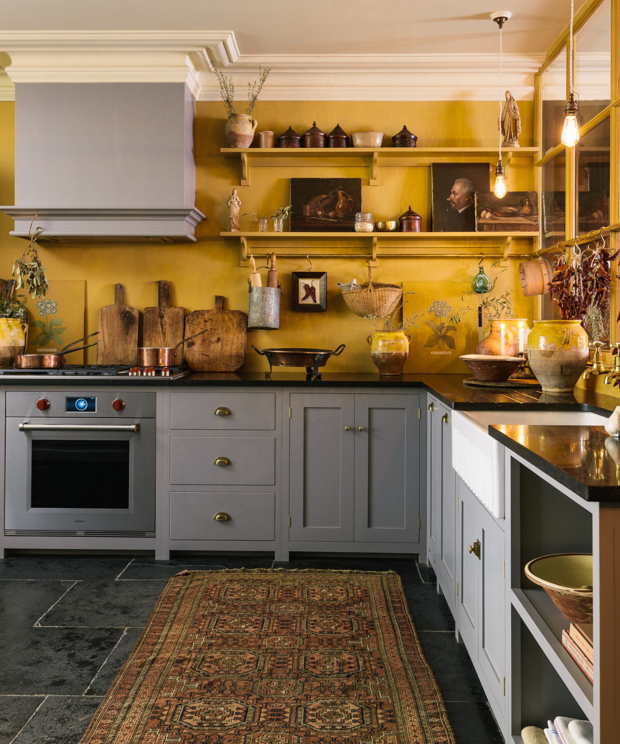
Existing decor and flooring materials also play a vital role in how gray paint is perceived. Coordinating the gray paint's undertones with these elements is important. For instance, if a room features warm-toned furniture or wood elements, a gray with warm undertones would be more harmonious. Conversely, grays with green undertones might clash with wood, appearing more prominent than desired. Understanding the interplay between paint, light, and existing elements helps ensure a cohesive design.
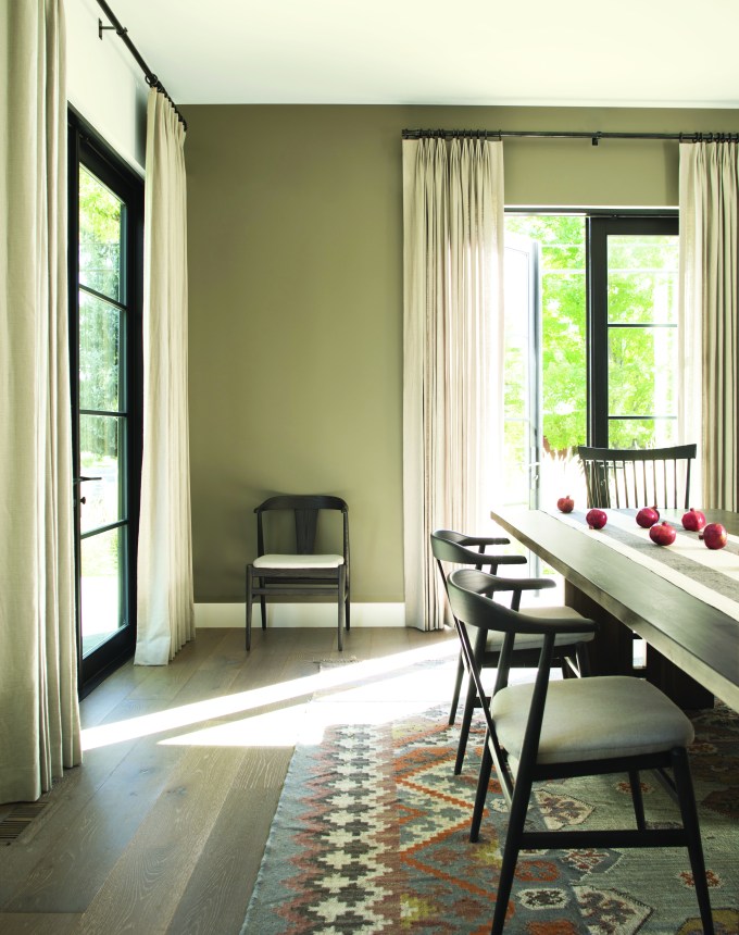
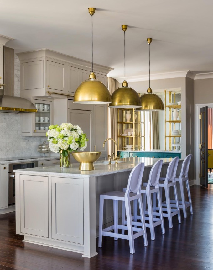
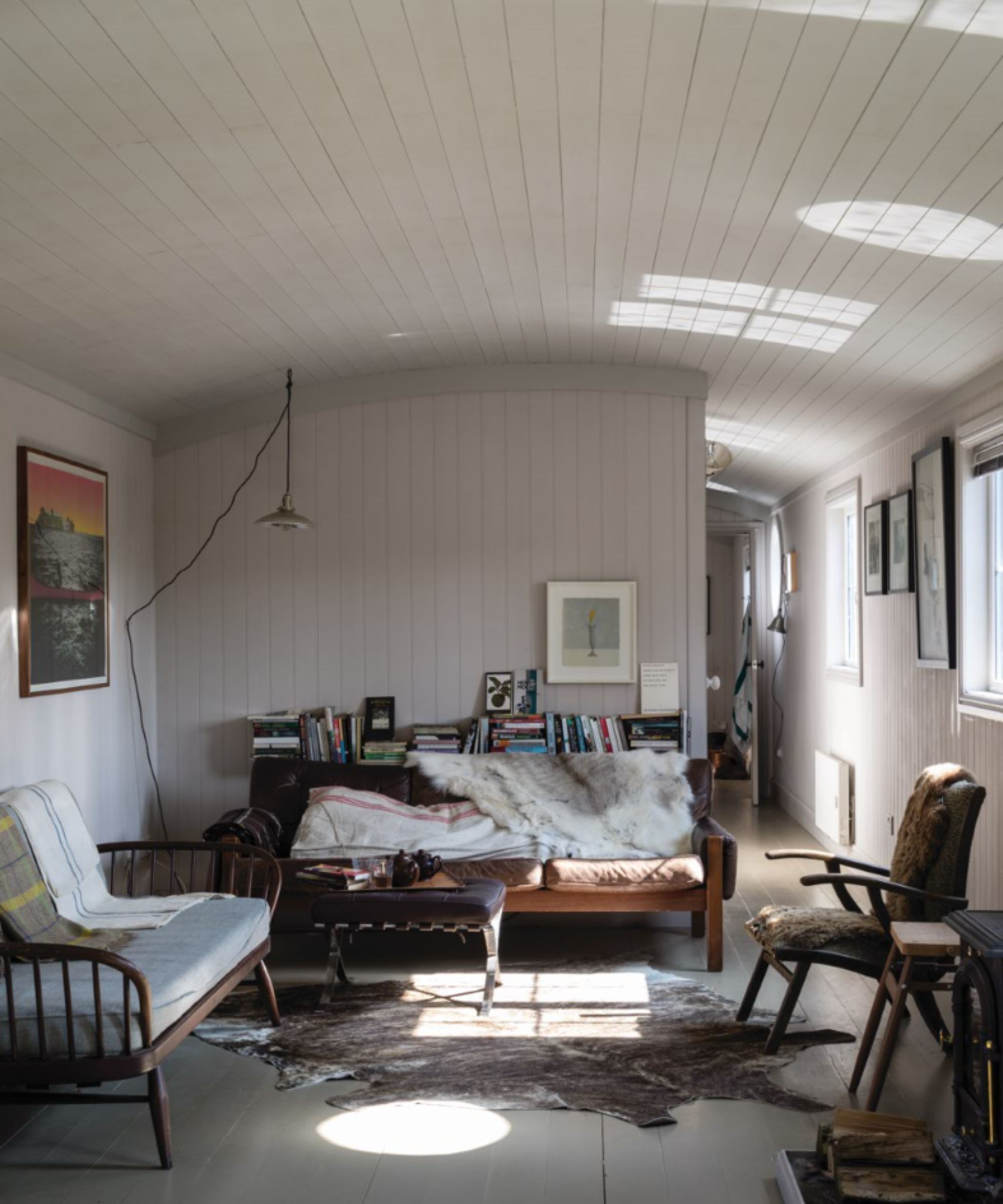
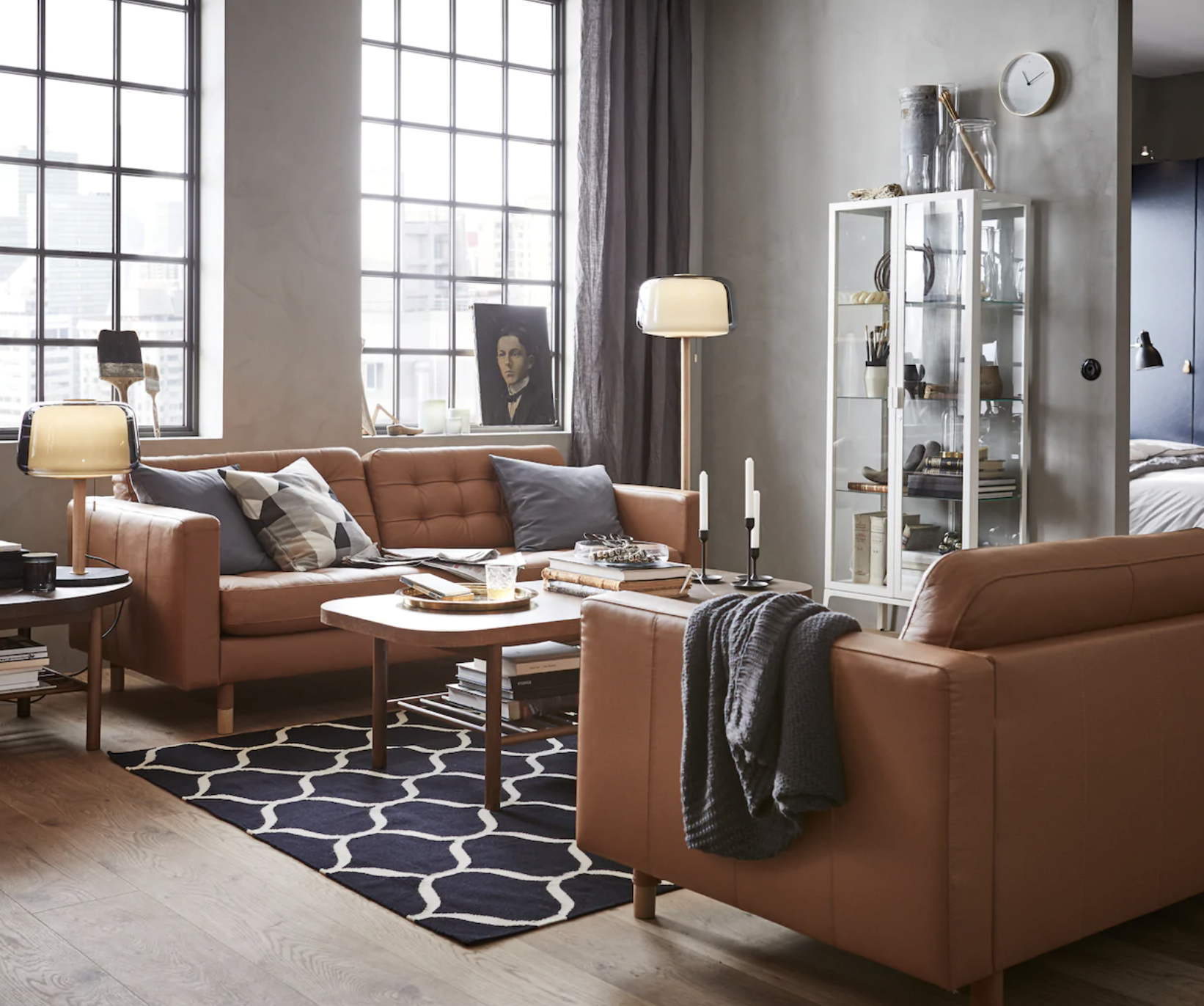
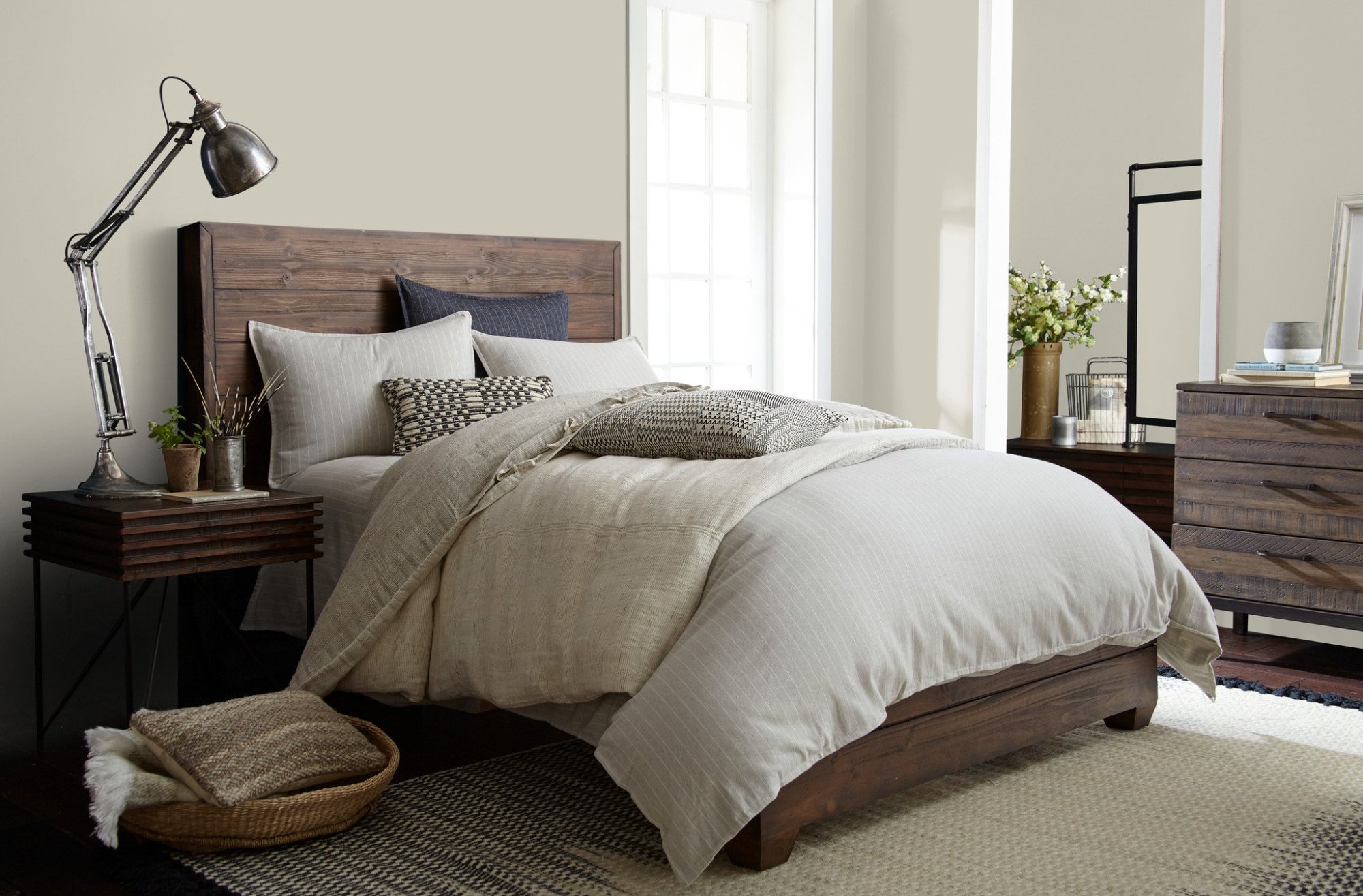
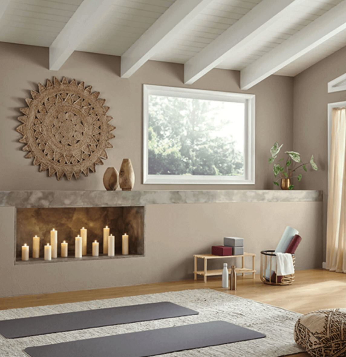
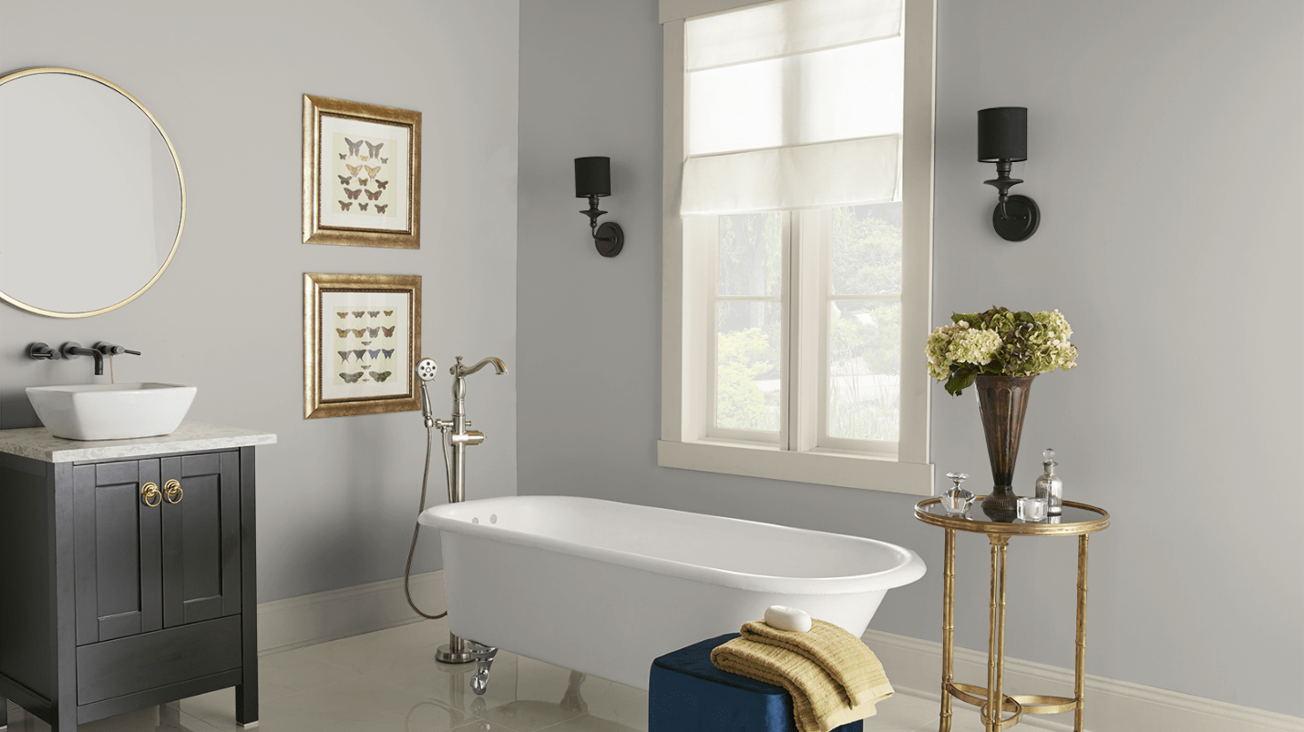
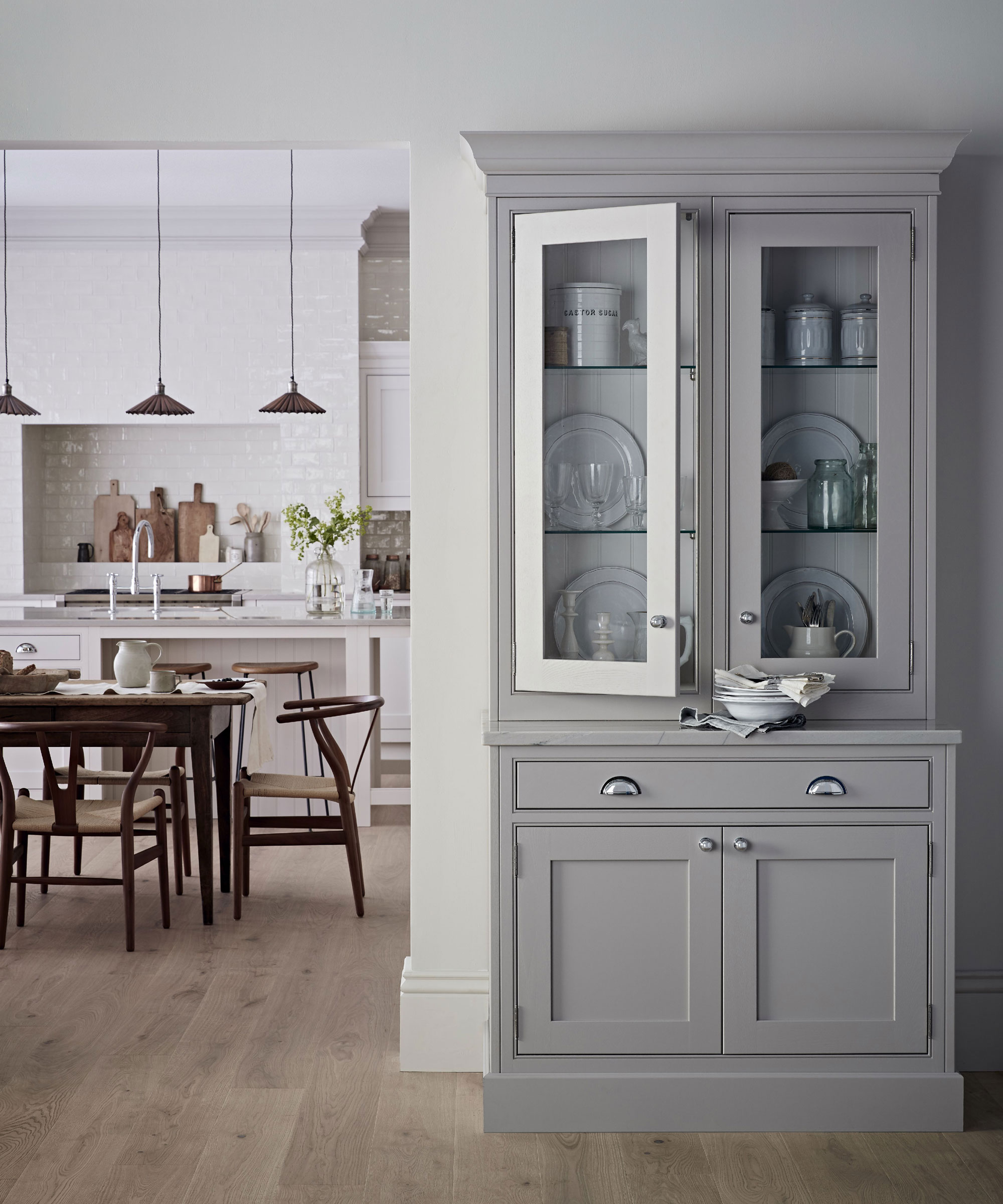
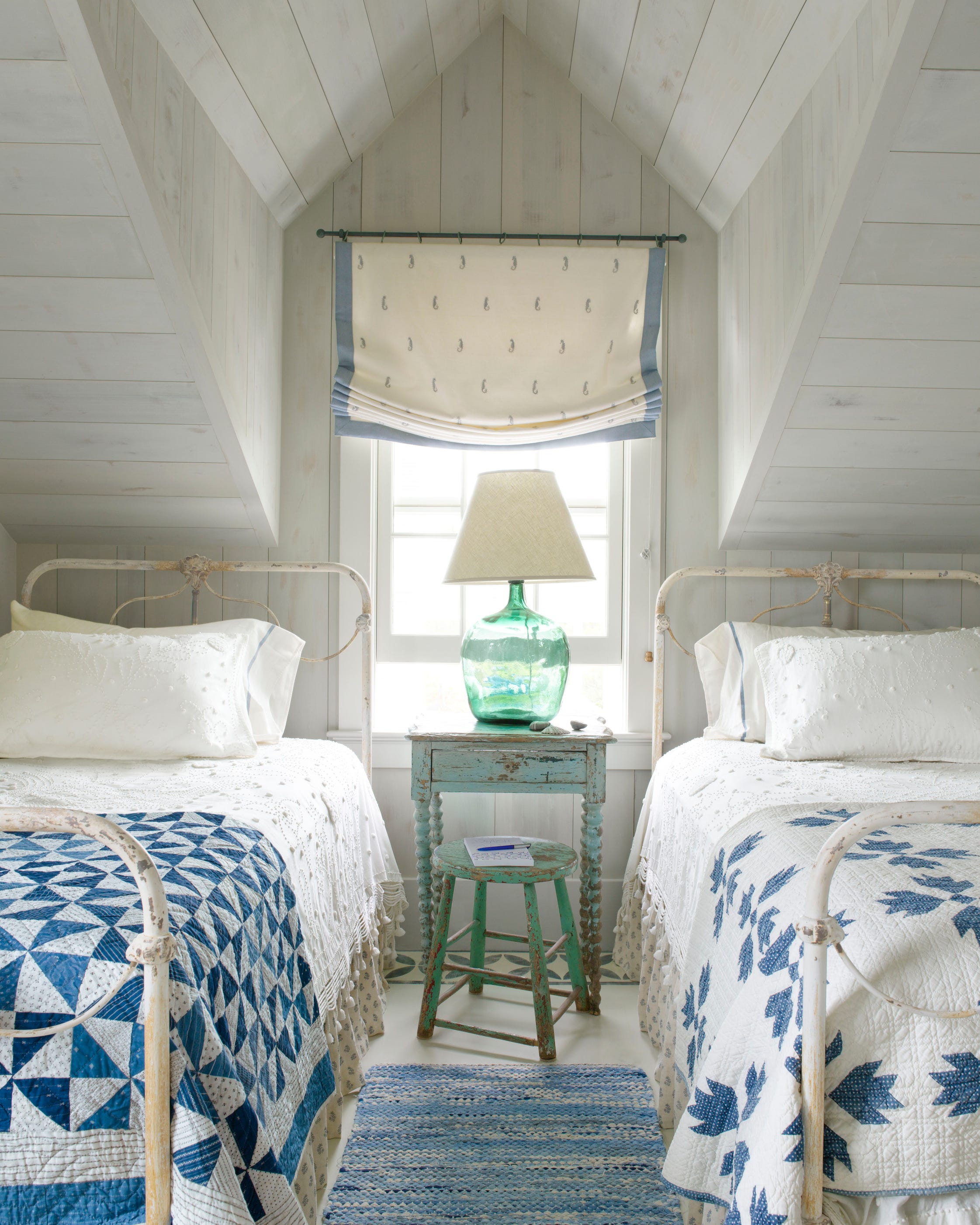
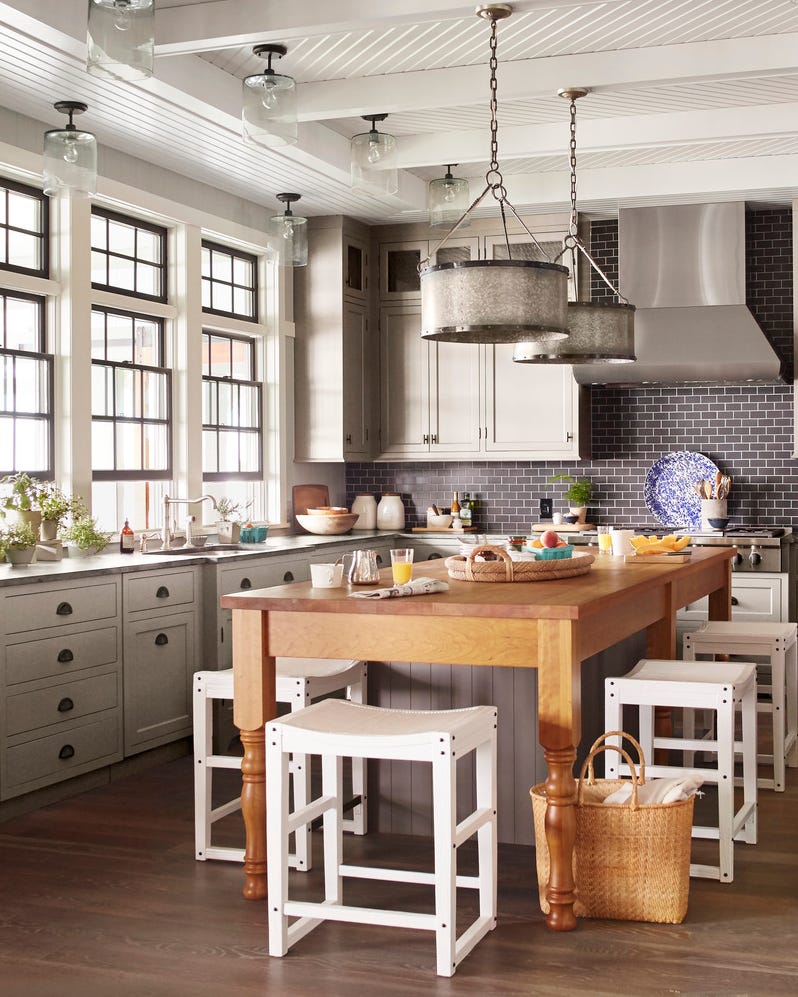
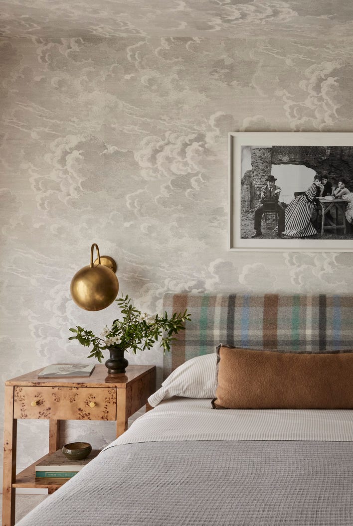
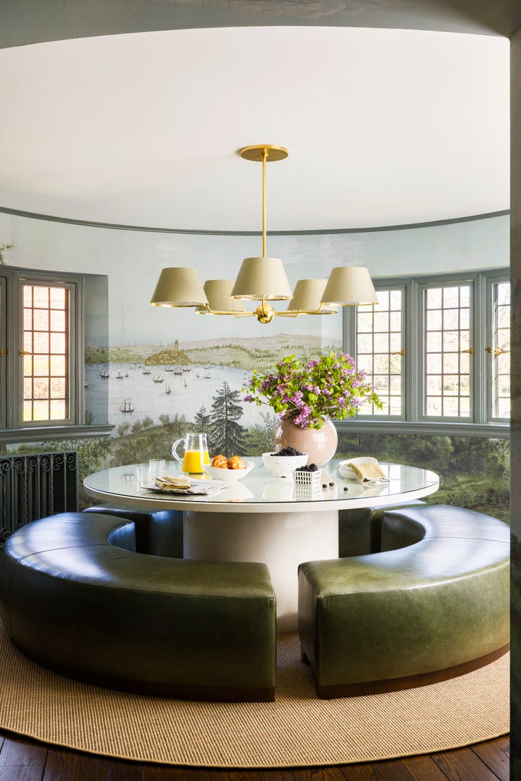
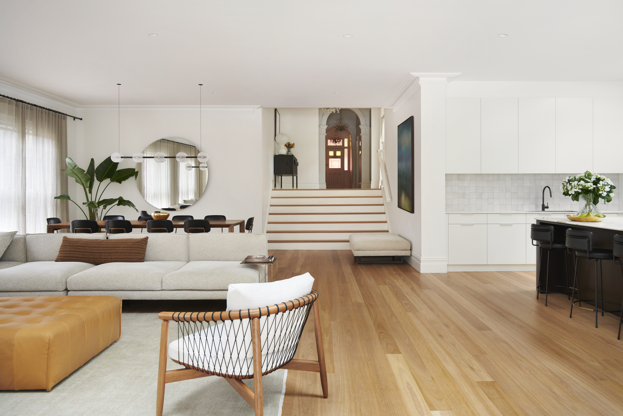
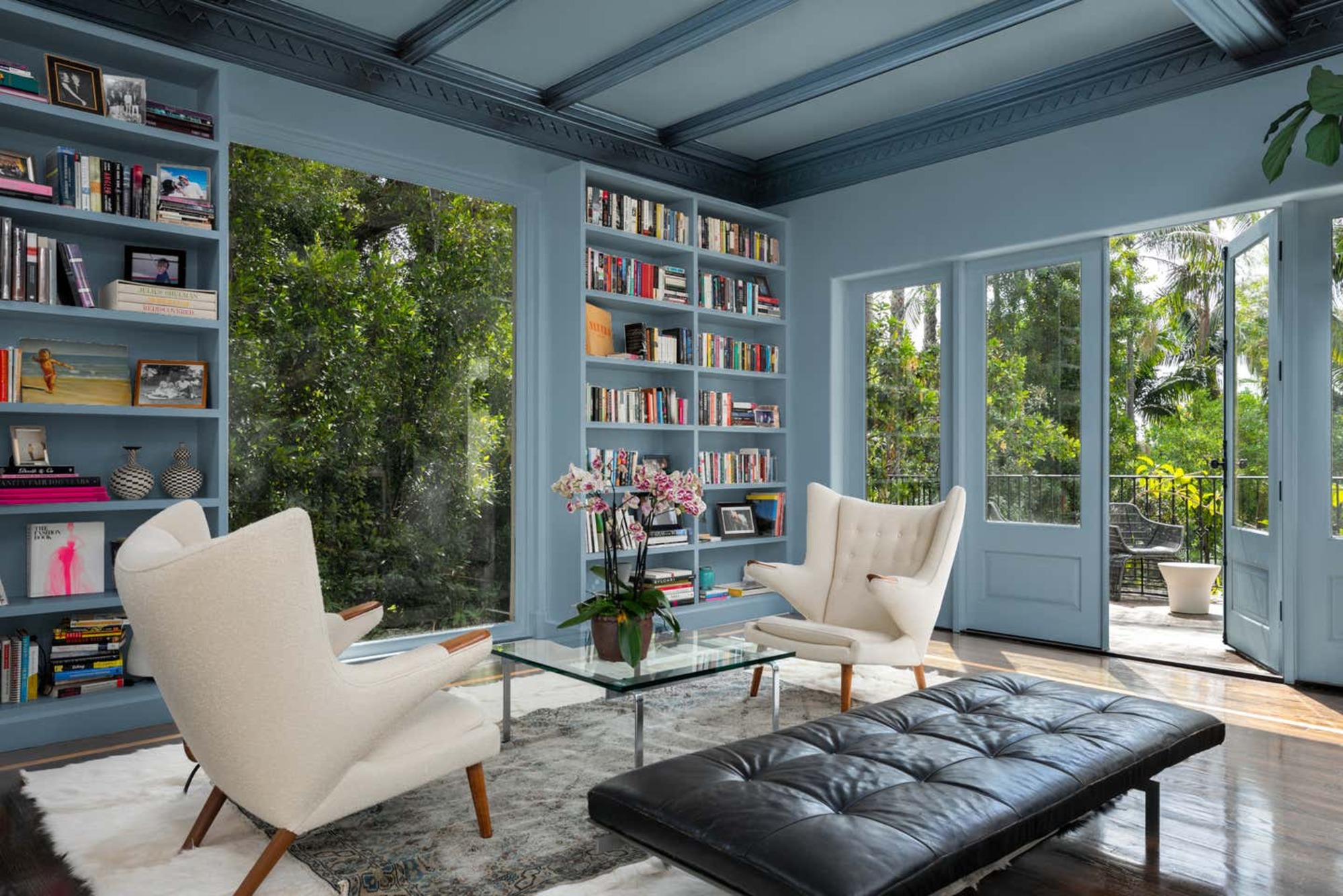
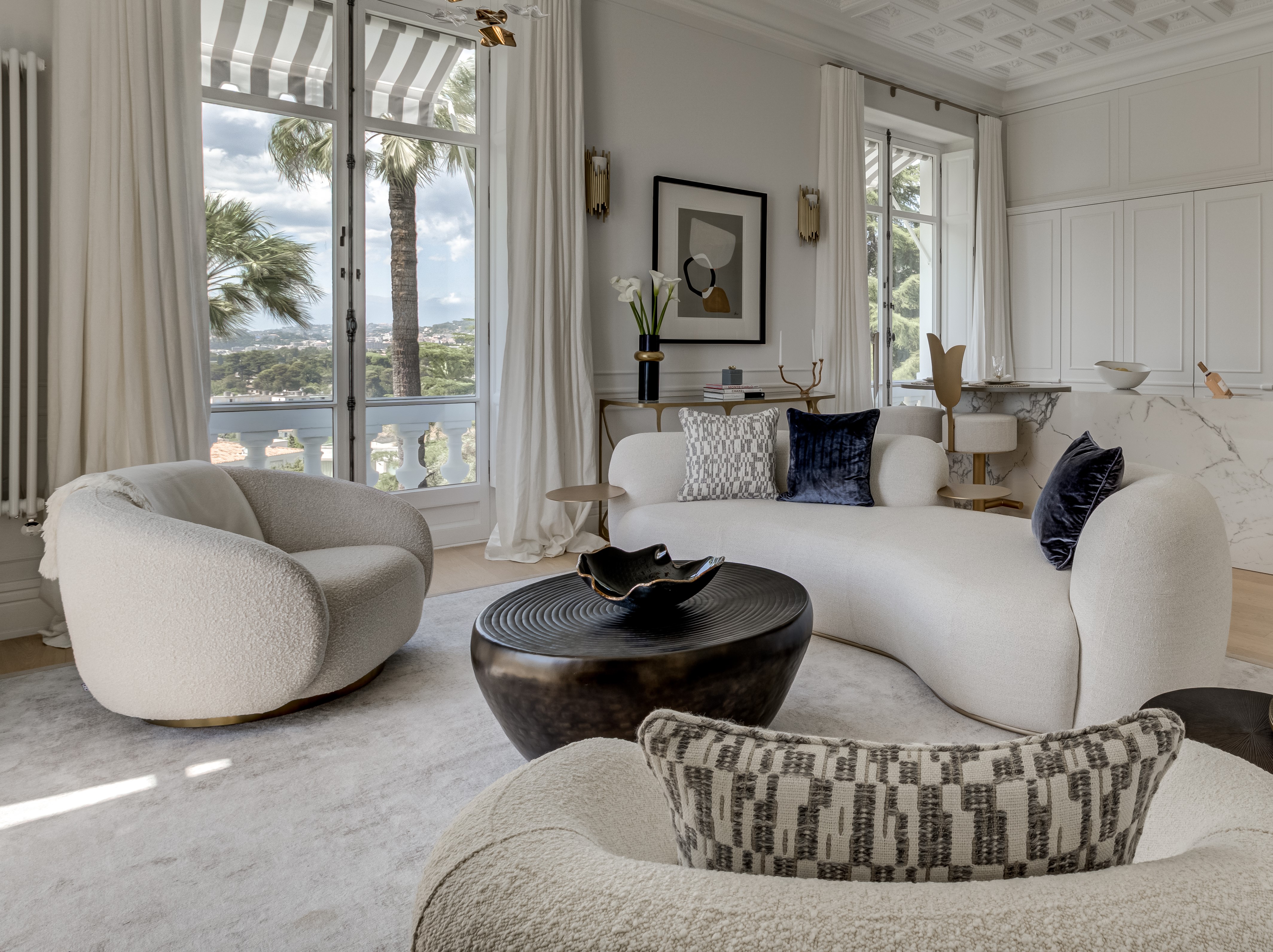
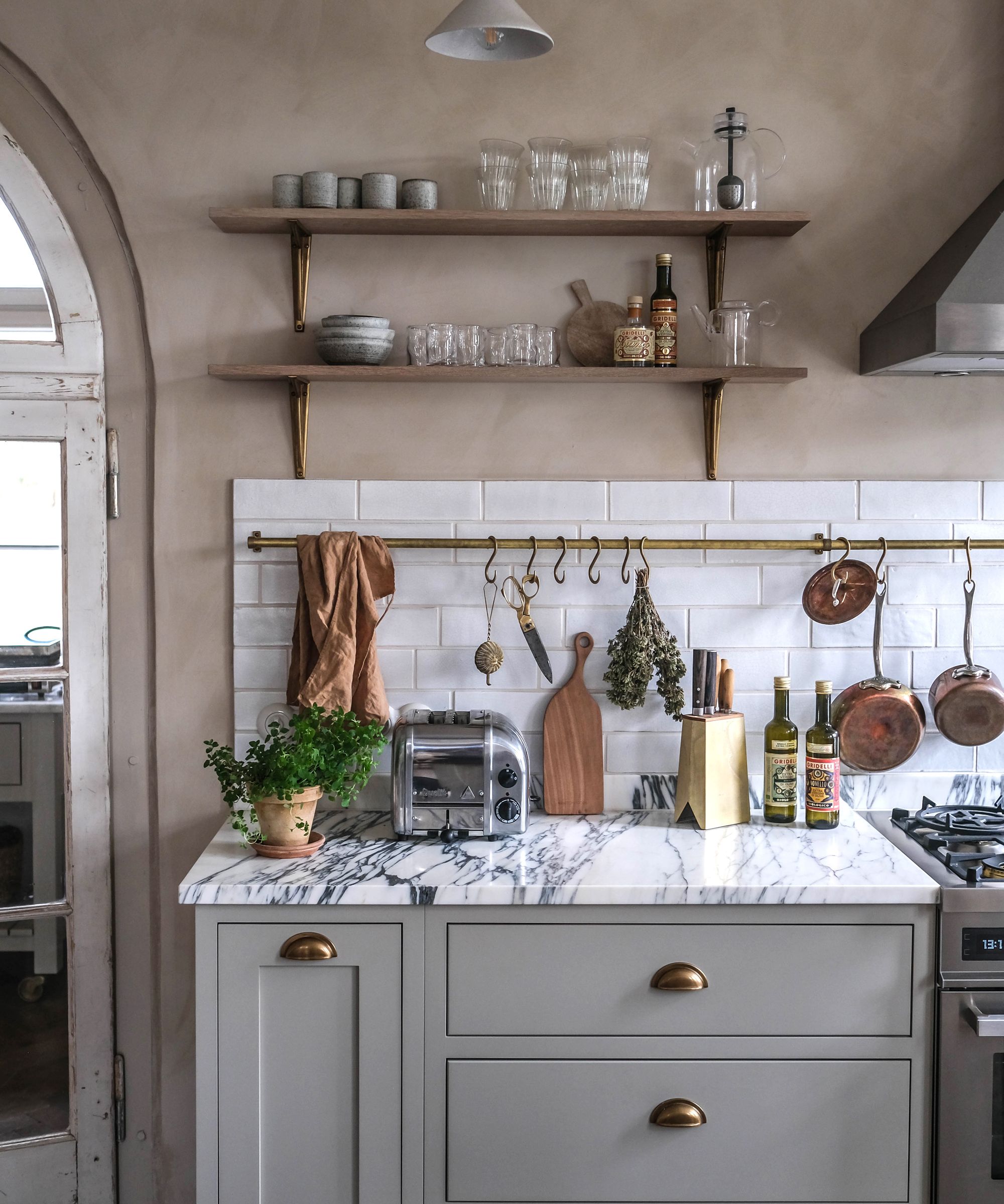
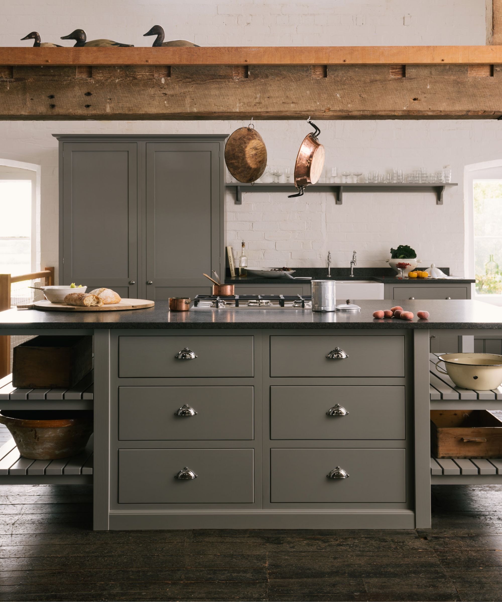
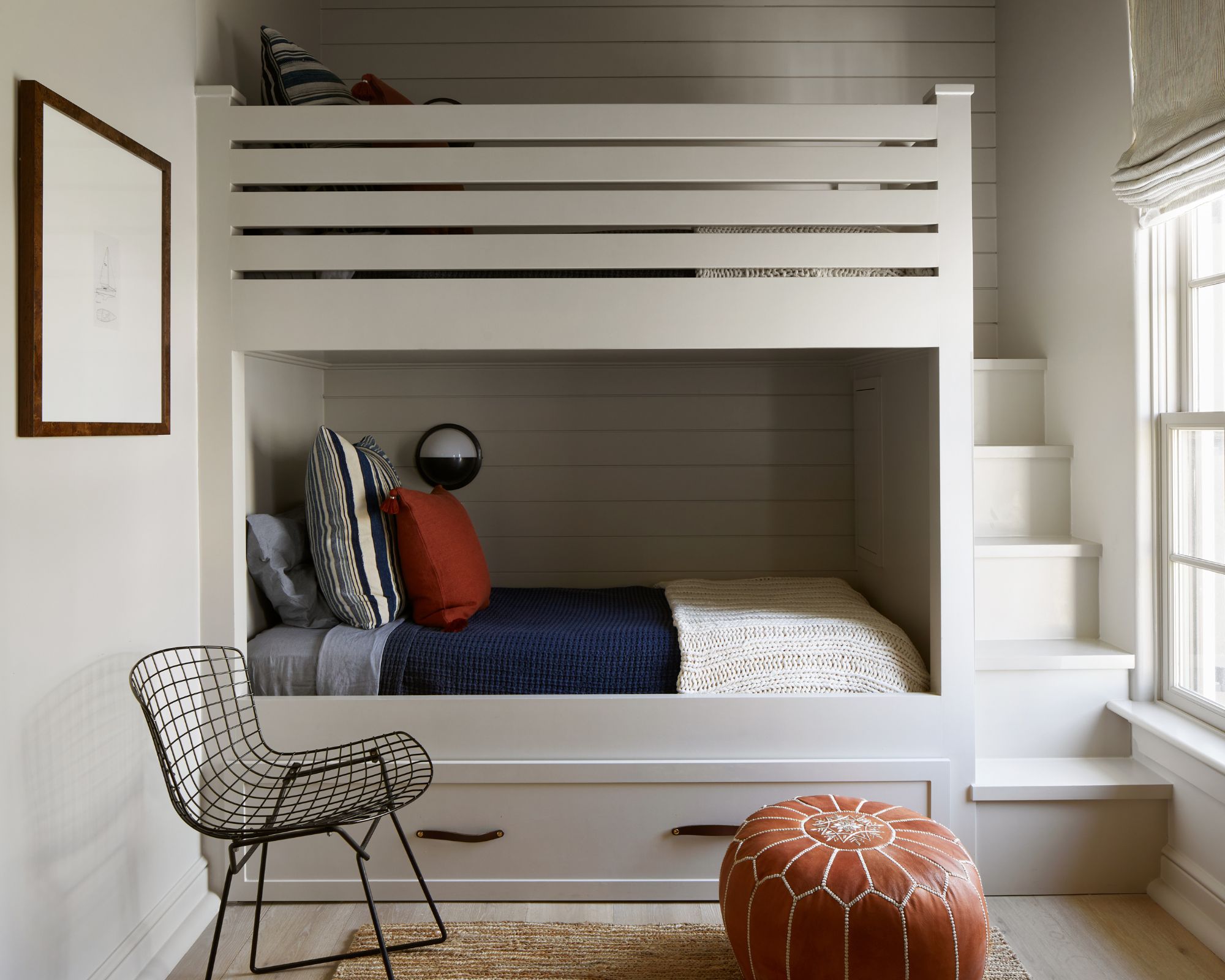
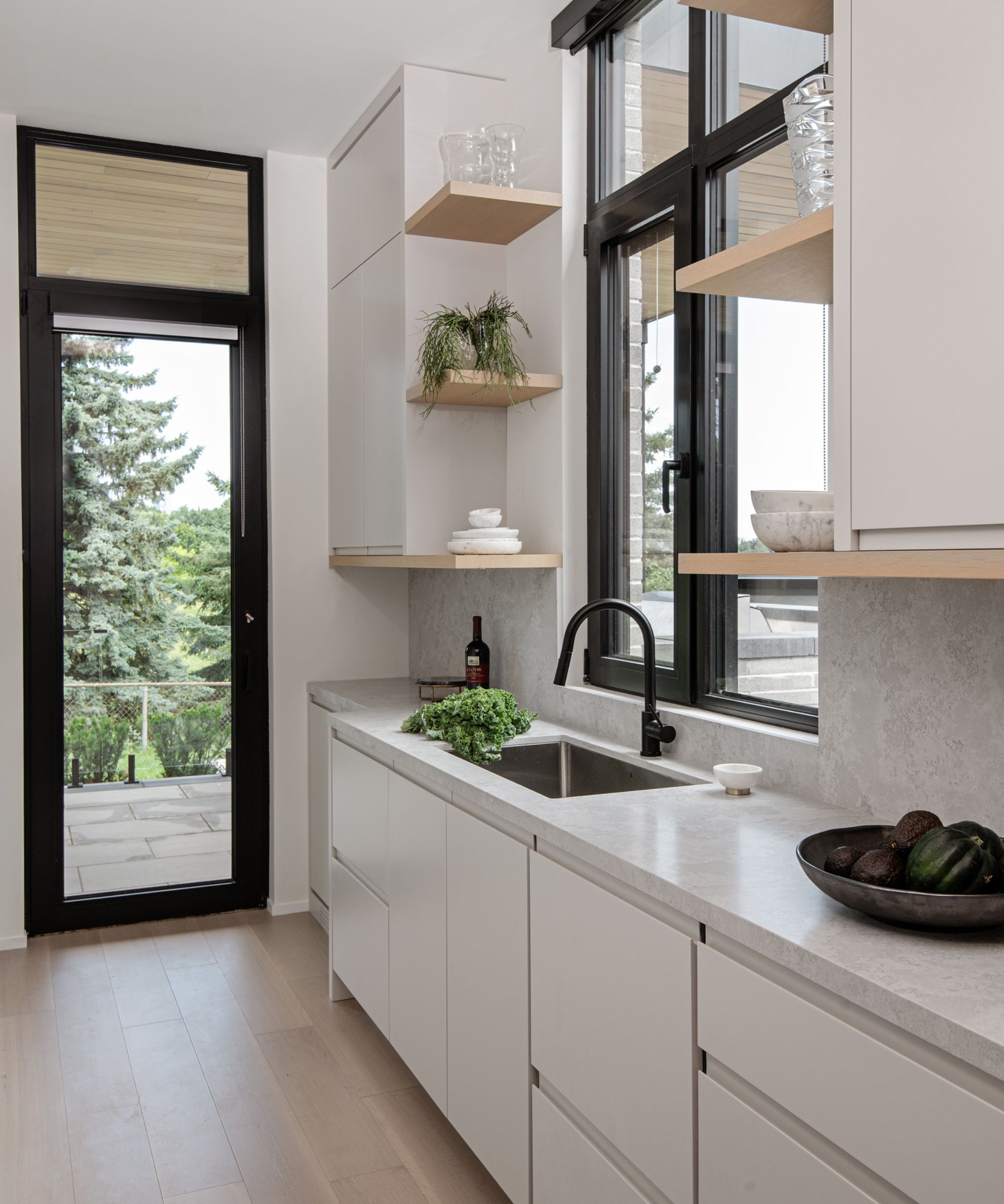
Designers and paint experts recommend a wide array of gray shades for various rooms and purposes. Light gray options include BEHR's Tranquil Gray, a delicate taupe-gray ideal for creating a neutral yet inviting atmosphere, and Valspar's Filtered Shade, a warm gray suitable for making small spaces feel more expansive. Sherwin-Williams' Agreeable Gray is a popular neutral that works well in family rooms and bedrooms, while their Naturel brings warmth to kitchen cabinetry. Benjamin Moore's Classic Gray is praised for its adaptability and lack of strong purple or pink undertones, making it a versatile neutral. Gray Owl by Benjamin Moore is a true gray that balances warm and cool, often favored for bedrooms. Other light grays, such as Sherwin-Williams' Anonymous and Mantra (a blue-toned gray), and Benjamin Moore's Silver Chain and Repose Gray, offer different nuances and calming qualities. Farrow & Ball's Ammonite and Hardwick White (a green-tinged gray), along with Benjamin Moore's Coventry Gray and Pashmina, provide further options for achieving specific aesthetic goals. Sherwin-Williams' Rare Gray, Glidden's Shaded Whisper and Elemental, and BEHR's Rock Crystal offer unique undertones like green, subtle lilac, and cool tones for diverse design preferences.

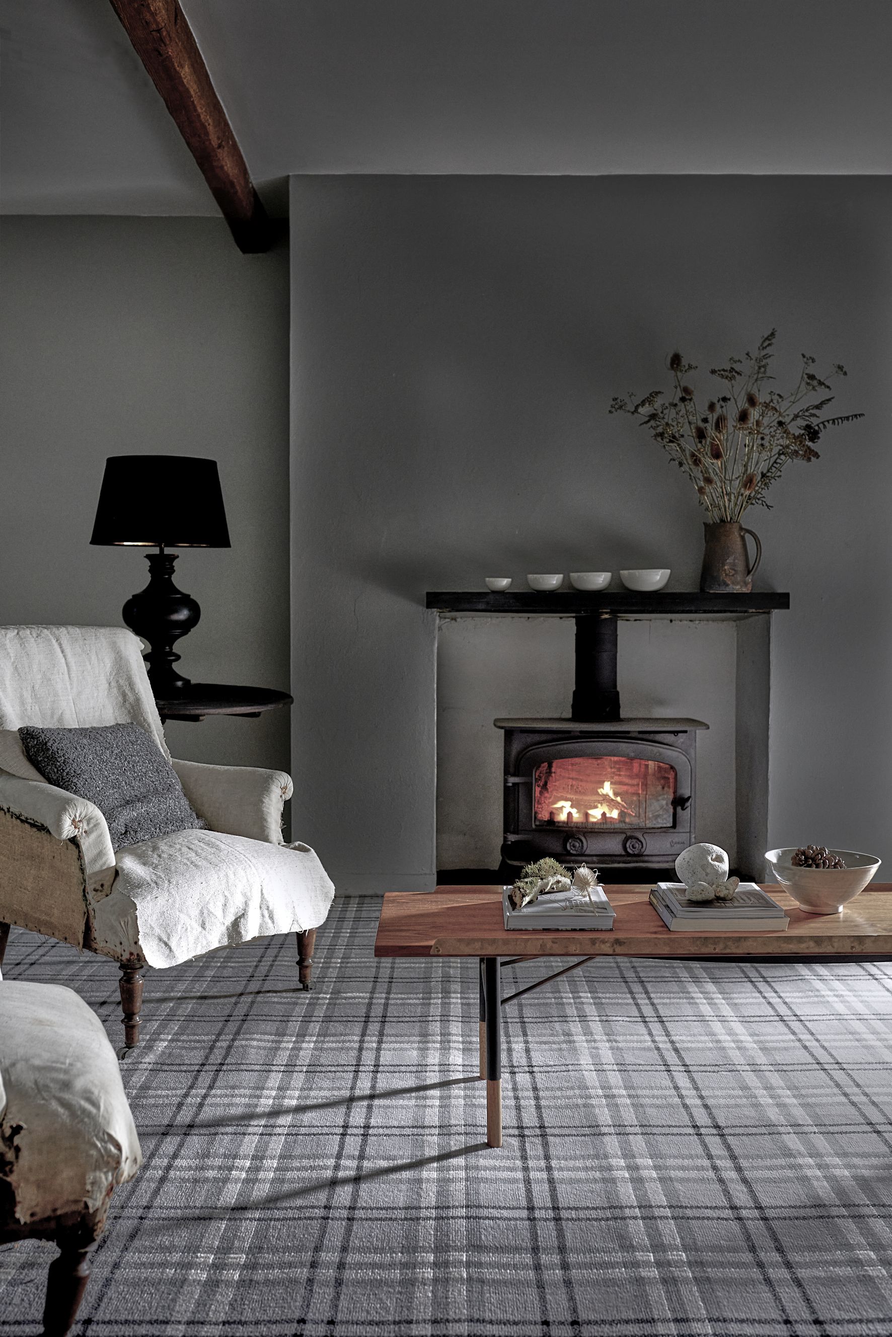
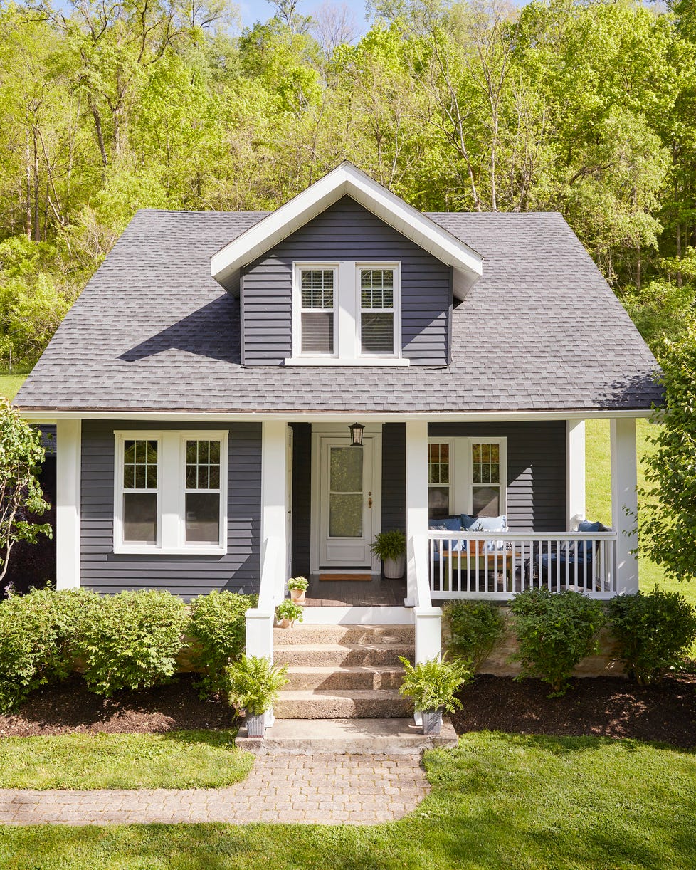
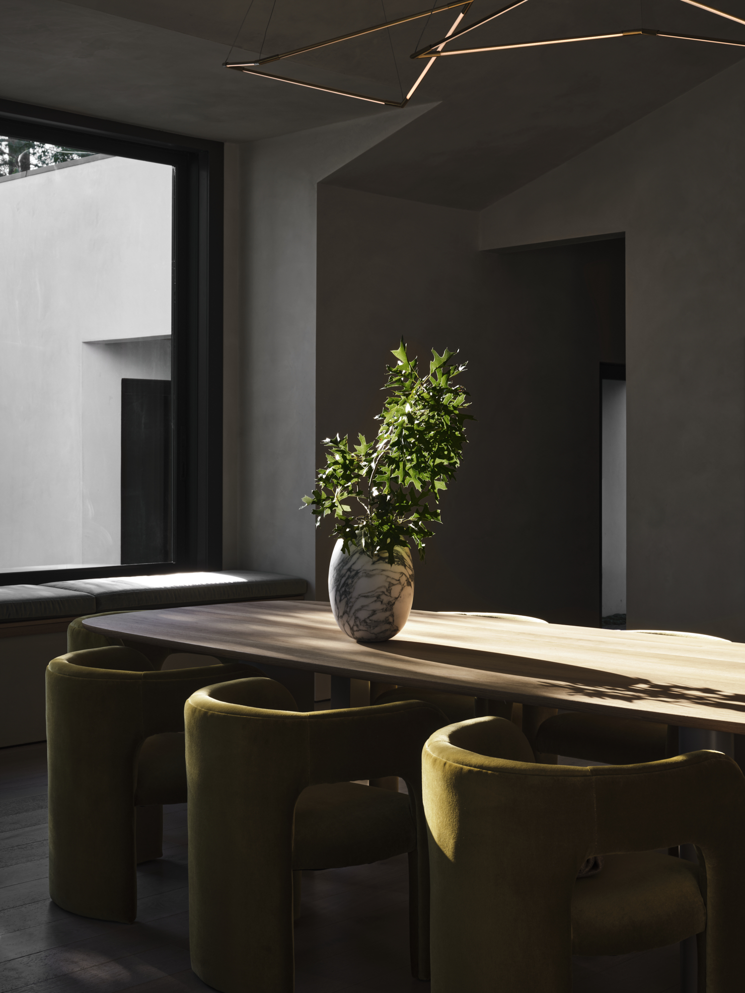
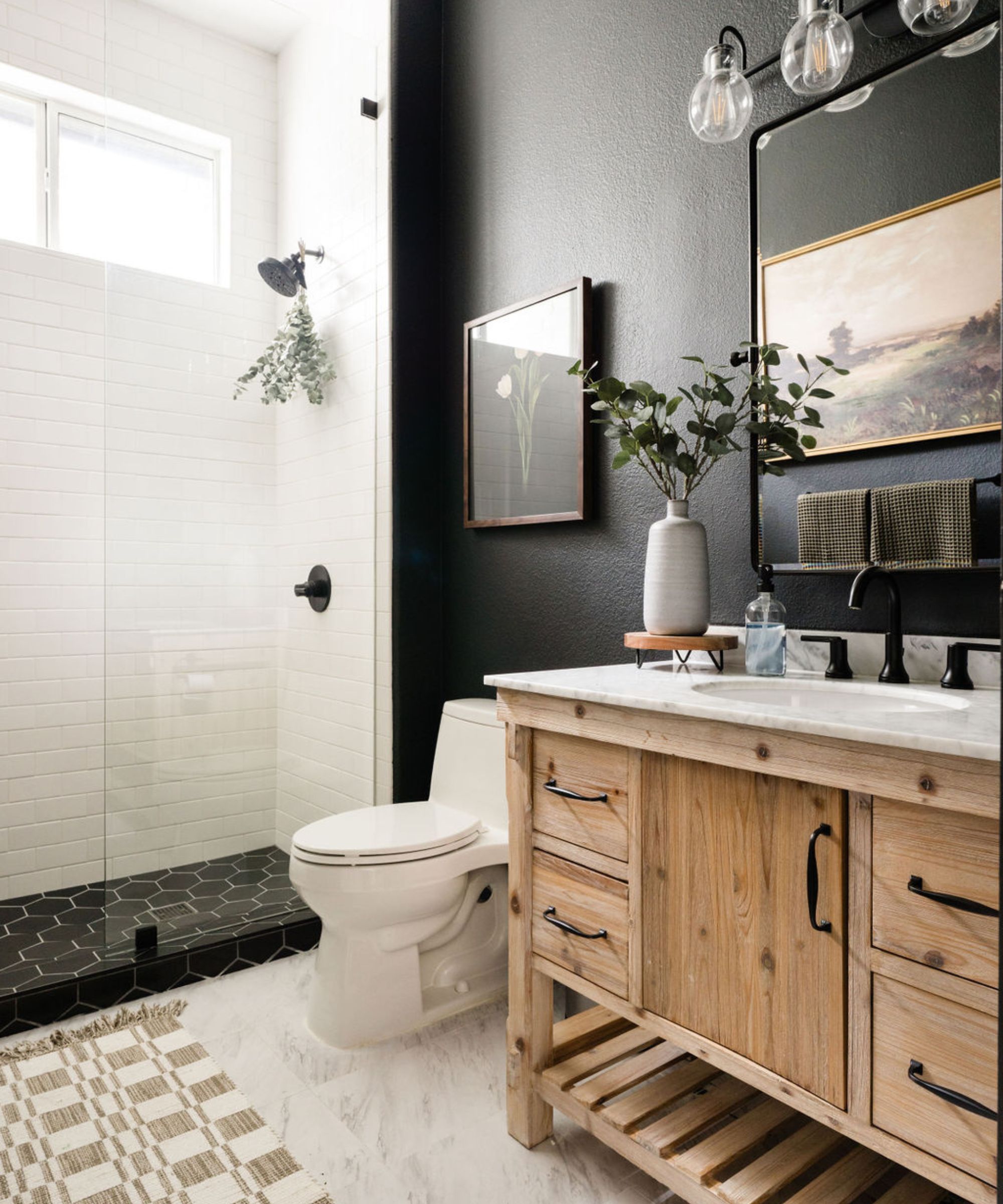
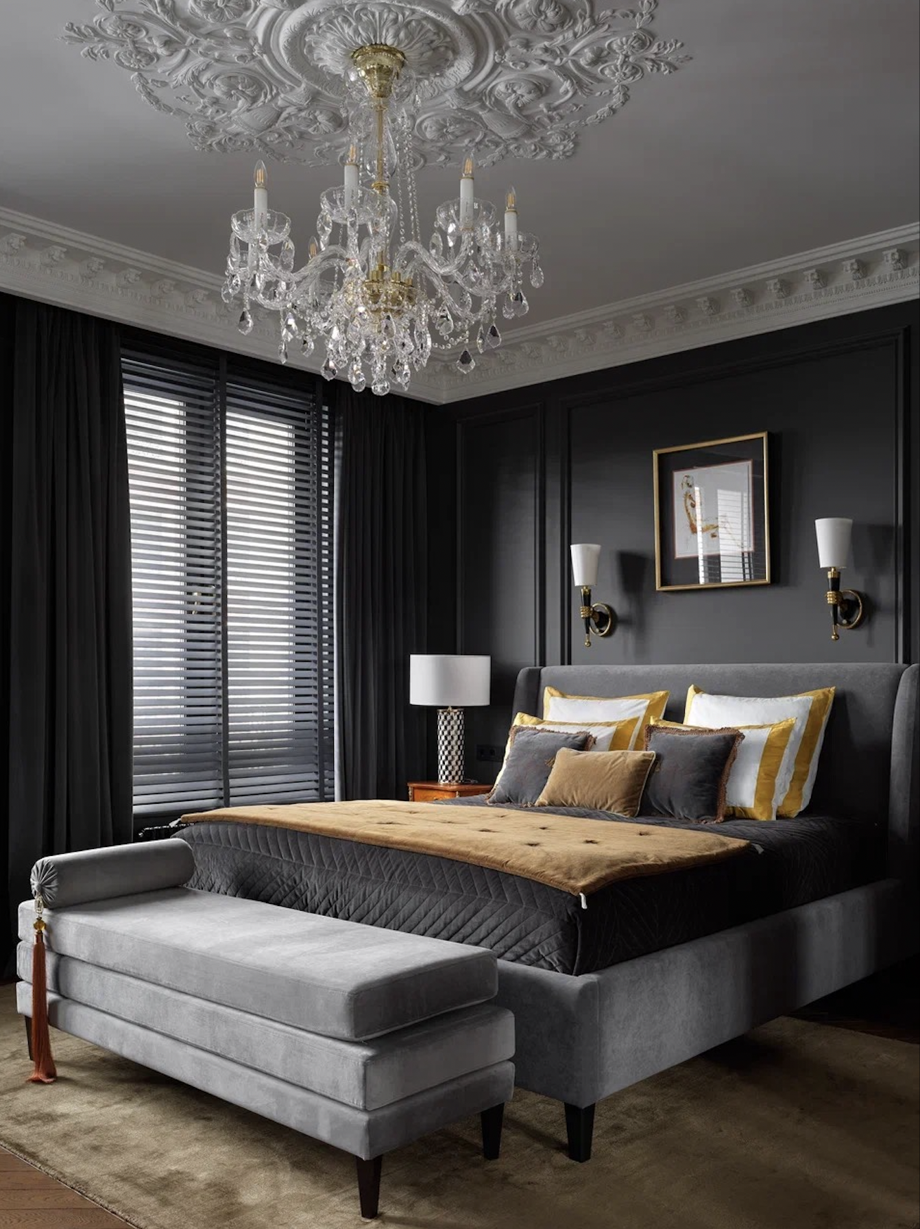
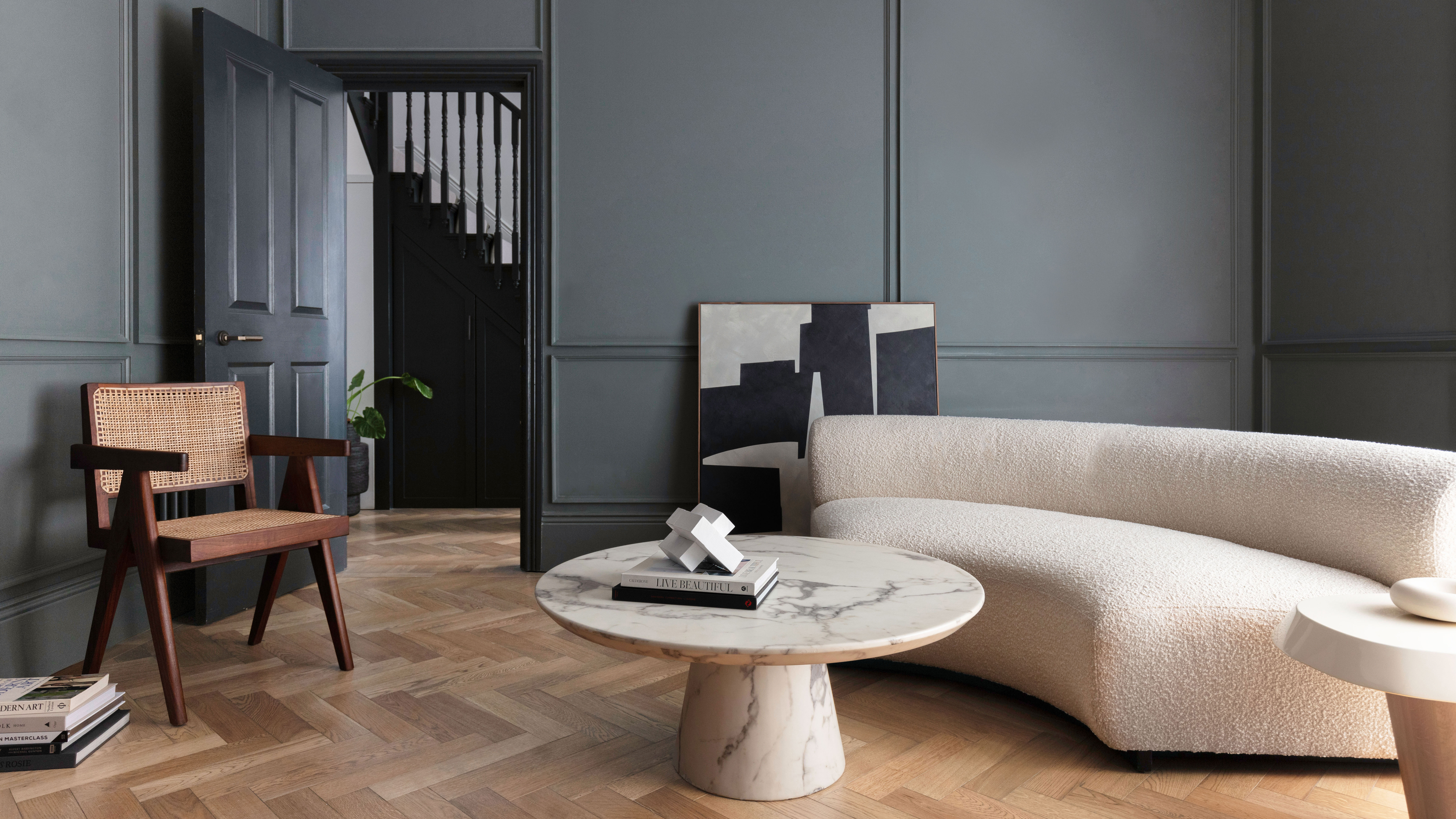
For those seeking a bolder statement, dark gray paint colors are also available. Farrow & Ball's Beetle Black offers a muted dark gray that can be complemented by both moody and bright shades. Benjamin Moore's Carter Gray, inspired by historical architecture, creates a warm, cocoon-like atmosphere. Glidden's Zombie provides a mysterious yet grounded dark gray. Benjamin Moore's Rockport Gray, with its warm taupe undertones, is versatile and blends well with green and brown hues. Englewood Cliffs by Benjamin Moore adds depth and dimension, while Farrow & Ball's Plummett is a soft, soothing dark gray. Benjamin Moore's Cheating Heart, a dramatic soft black/dark gray, and Deep Space, a deep blue-undertoned gray, offer sophisticated alternatives. Farrow & Ball's Downpipe, a dark and surprisingly warm gray, is suitable for dining rooms and exteriors. Finally, Benjamin Moore's Kendall Charcoal and BEHR's Wild Truffle provide deep neutrals with complex undertones that work well both indoors and outdoors, and Valspar's Cadet Gray offers a unique gray with a trace of lavender.
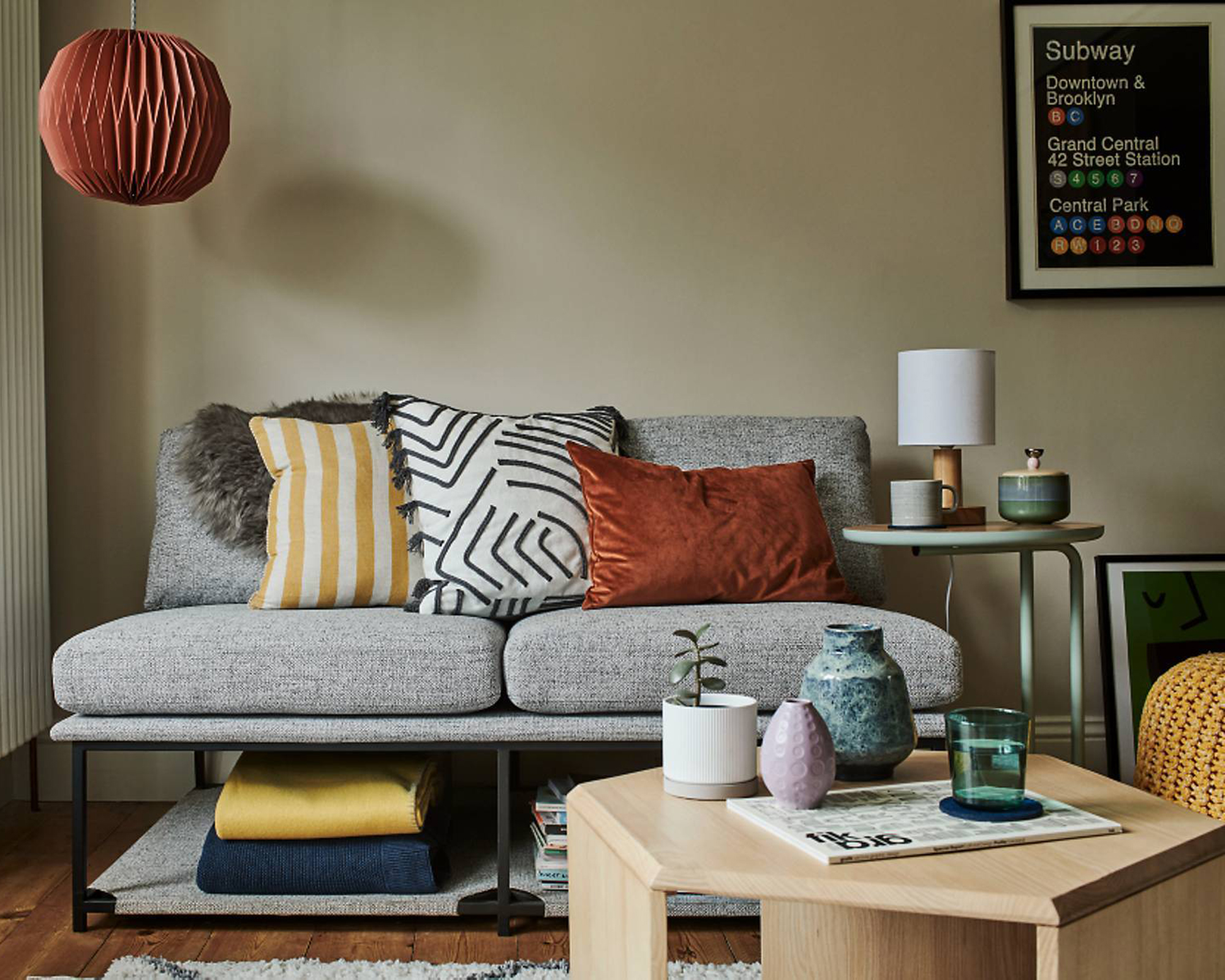
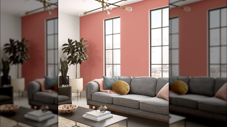
Ultimately, successful paint selection involves testing colors in person. Experts recommend painting a 3-foot square in the chosen space and observing it at different times of day and under various lighting conditions. This allows for a proper evaluation of how undertones emerge and how the color interacts with its environment, ensuring the desired aesthetic is achieved. Gray's versatility means it can be paired with a multitude of colors, from warm earth tones and jewel tones to cool teals and navies, depending on its undertones and the desired mood of the room.
#GrayPaintColors #InteriorDesign #HomeDecor #PaintSelection #Undertones #LightingImpact #NeutralColors #DesignerRecommendations #WarmGrays #CoolGrays #GrayPaintColors #InteriorDesign #HomeDecor #PaintSelection #Undertones #LightingImpact #NeutralColors #DesignerRecommendations #WarmGrays #CoolGrays
0 comment in total
 No comments yet
You may also like
The 13 Best Greige Paint Colors to Buy Right Now
23 colours that go with grey, as revealed by interior stylists

Committed to Your Millennial Gray Walls? Designers Share the Best Colors to Pair With It
The 11 Best Gray Paint Colors for a Stylish Bedroom

5 of the best gray paints that interior designers love using

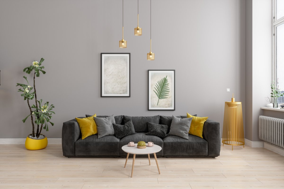
The Best Greige Paint Colors for a Warm, Welcoming Home

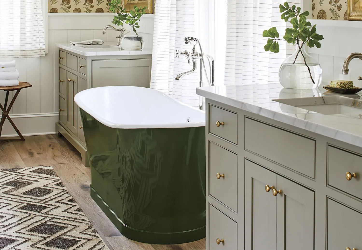
10 Greige Paint Colors Designers Recommend Again And Again
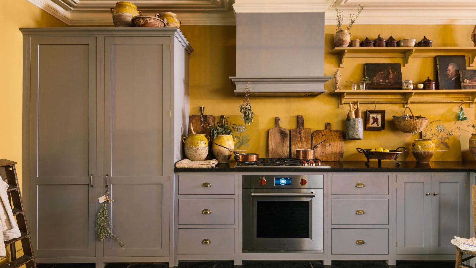
What colors go best with gray kitchen cabinets? Interior designers explain how to decorate with this cool neutral
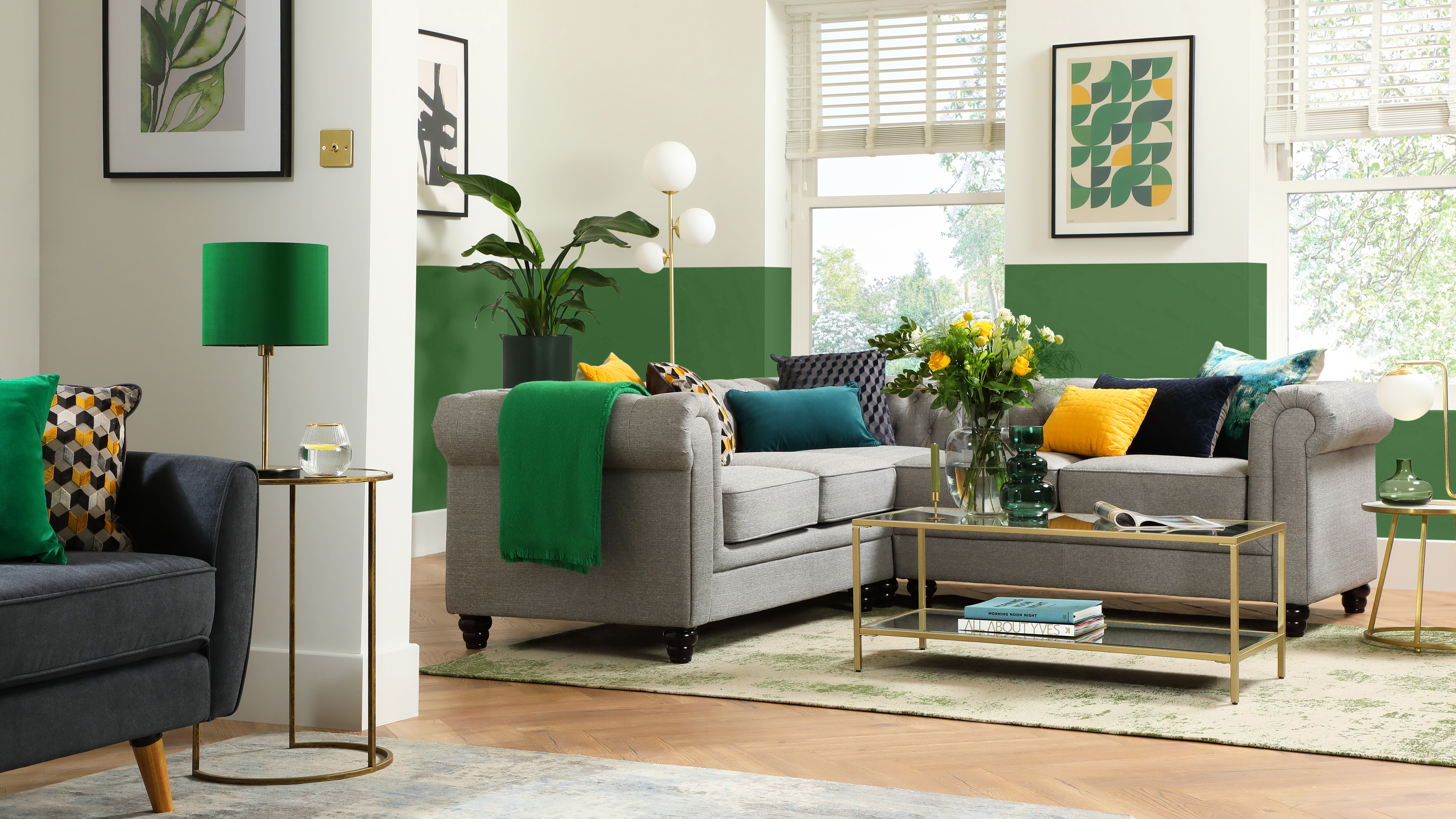
What colors go with grey? 13 palette pairings according to interior designers

15 Best Greige Paint Colors for Every Decorating Taste
The 12 Best Wall Paint Colors To Complement Your Gray Floors
What are the best Benjamin Moore gray paints? 7 go-to shades recommended by designers
The Best Gray Paint Colors Interior Designers Swear By

REVEALED: Is grey paint going out of style?
What colors will go best with my grey rug? Here's how to decorate around this timeless floor covering

What Colors Go With Gray? 19 Arresting Combinations With This Time-Tested Neutral
This is the most versatile shade you can bring into your home – designers share the 5 best greige paints
23 Colors, Patterns, & Textures To Pair With Gray
What Colors Go With Dark Gray? 13 Designer-Approved Pairings That Are Versatile and Timeless
Top 5 Gray Exterior Paint Colors for your Home