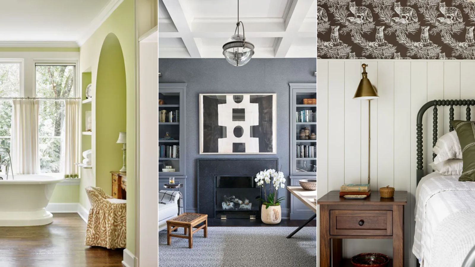
1/15
I'm a color editor and I'd never heard of these Benjamin Moore paint colors that interior designers swear by
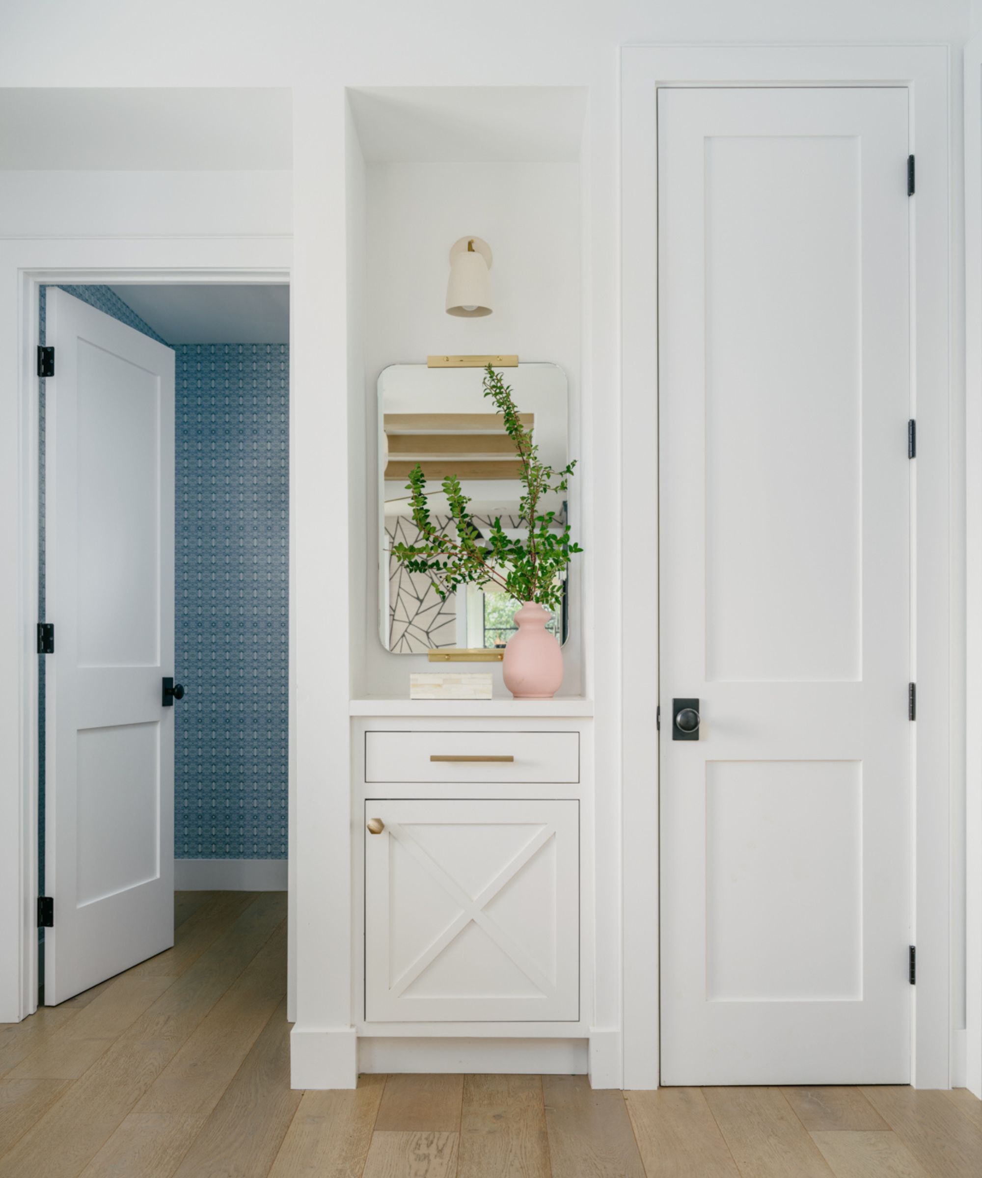
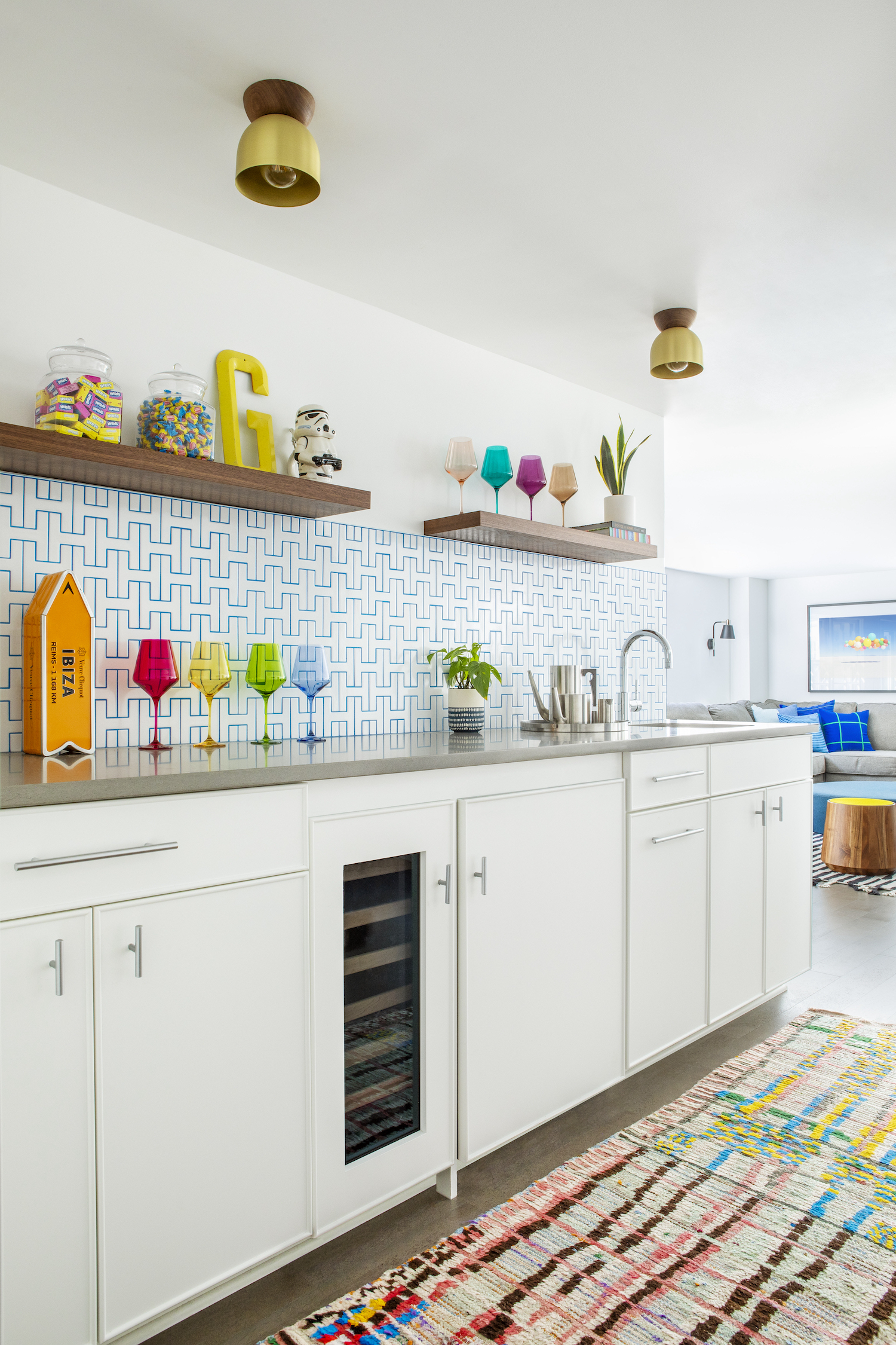
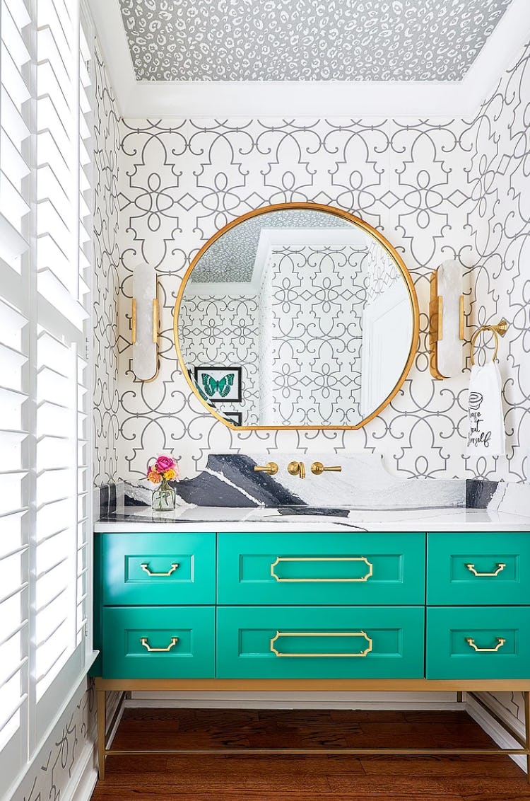
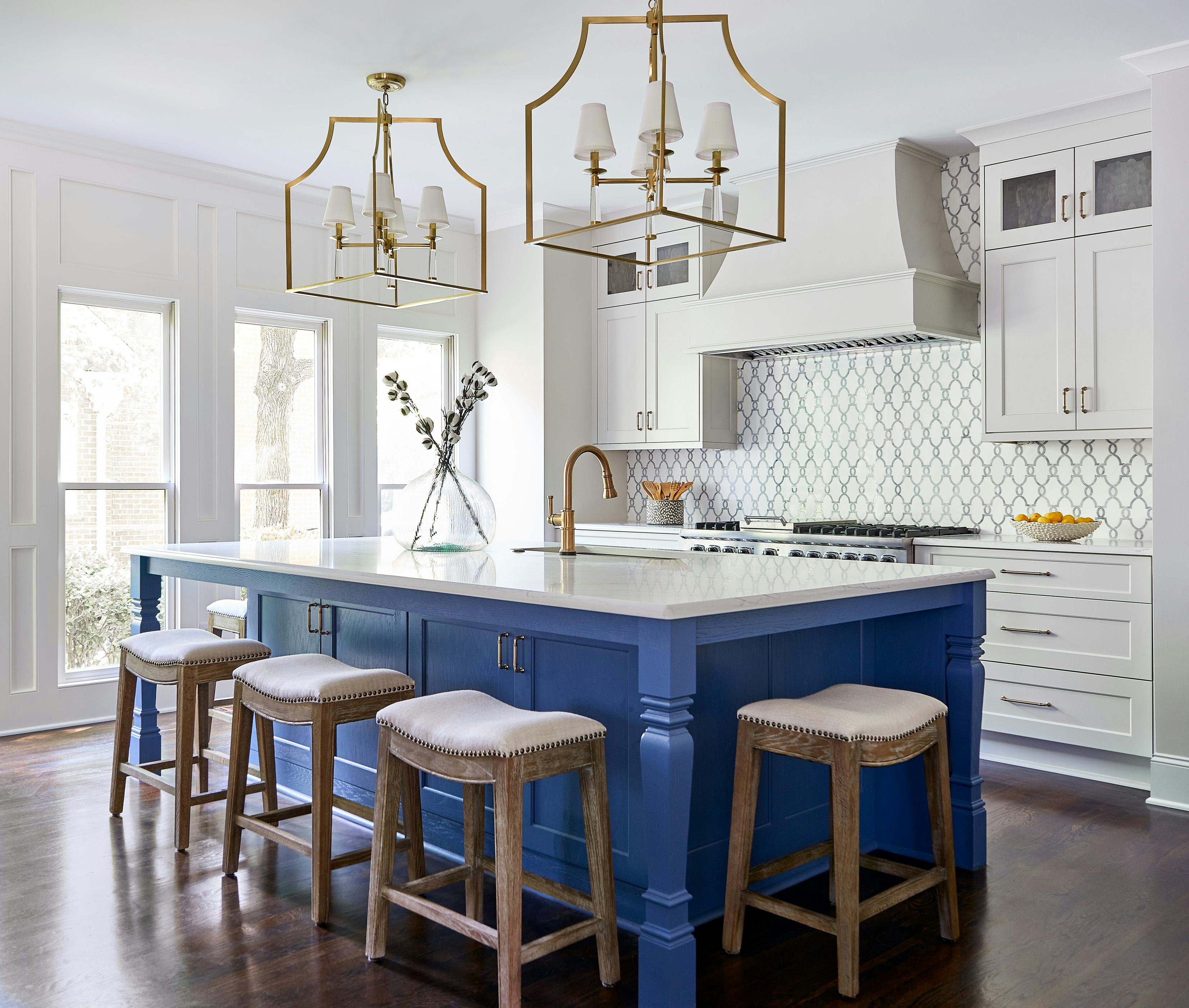
The article explores a selection of Benjamin Moore paint colors that, despite being less commonly known, are highly favored by interior designers for their unique qualities and versatility. The author, a color editor, delves into 14 distinct shades, highlighting their characteristics, ideal applications, and suggested complementary palettes.
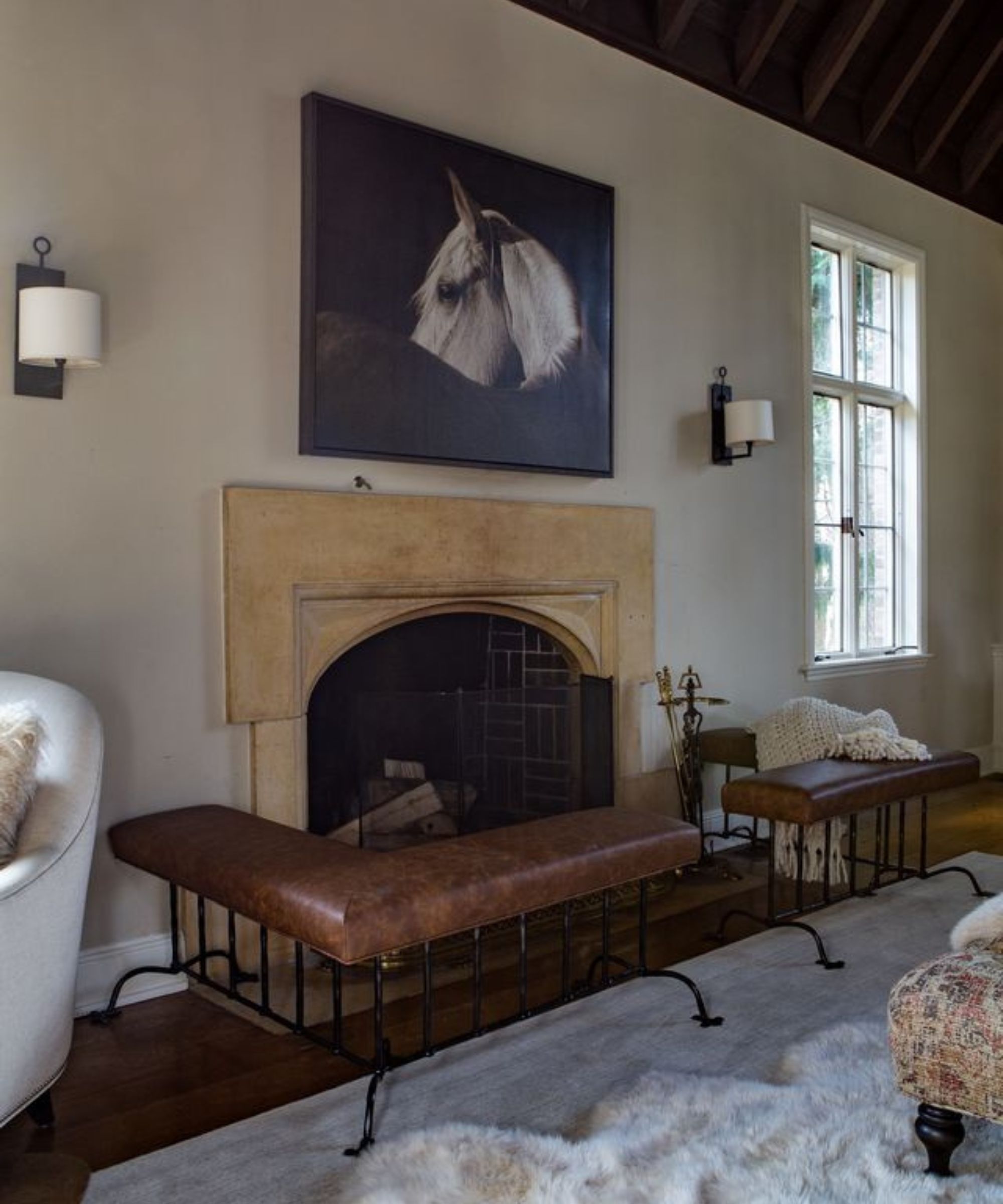
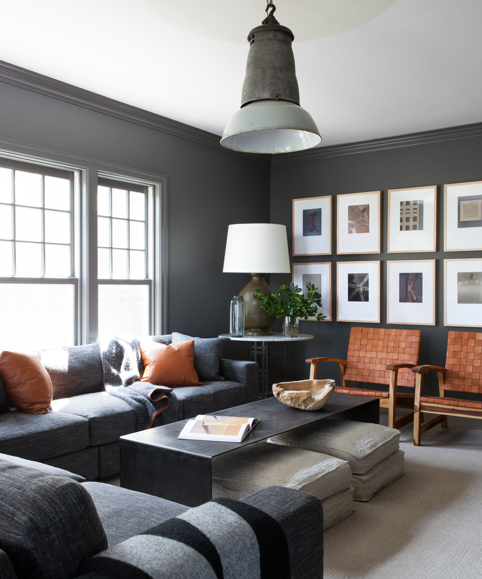
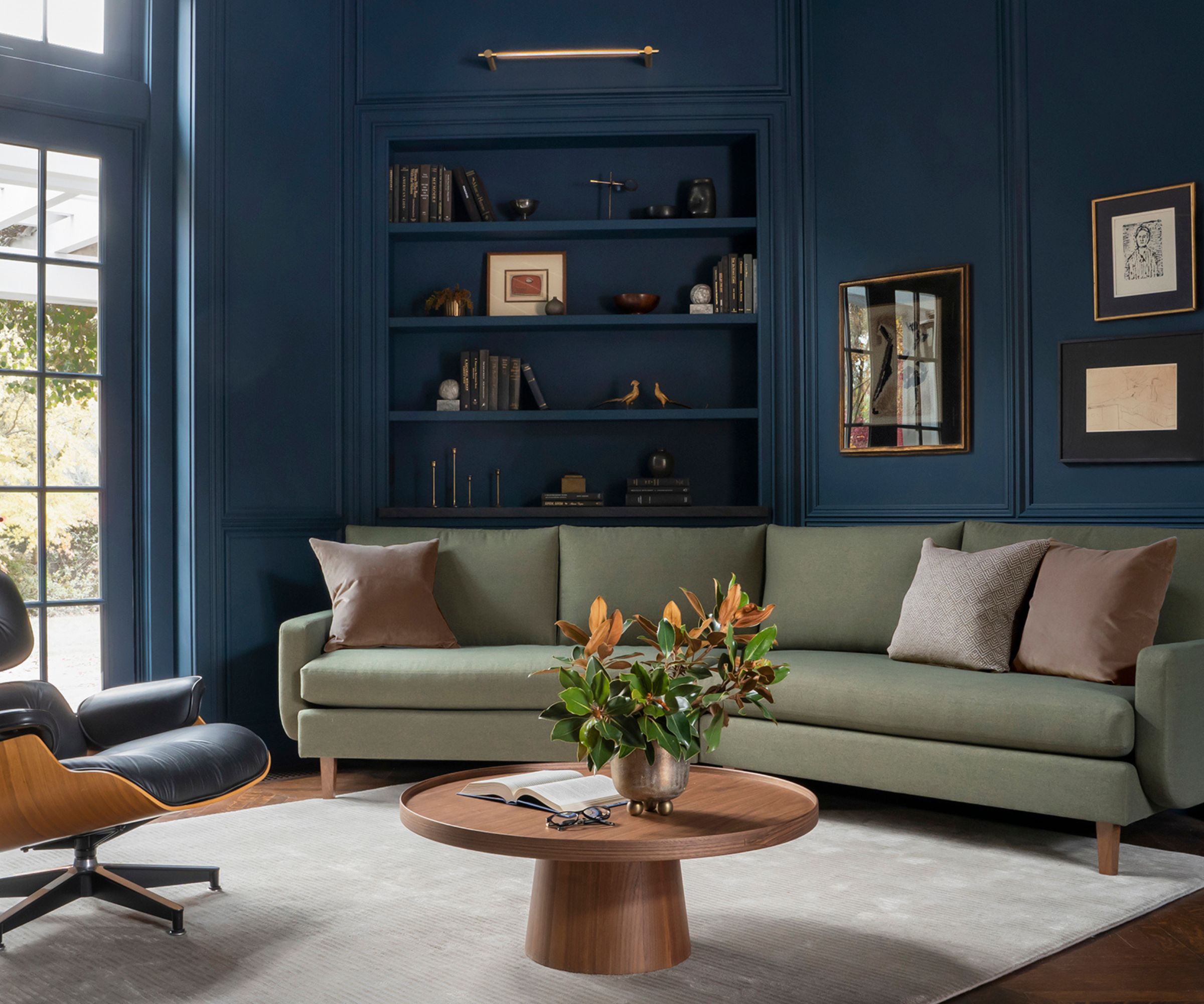
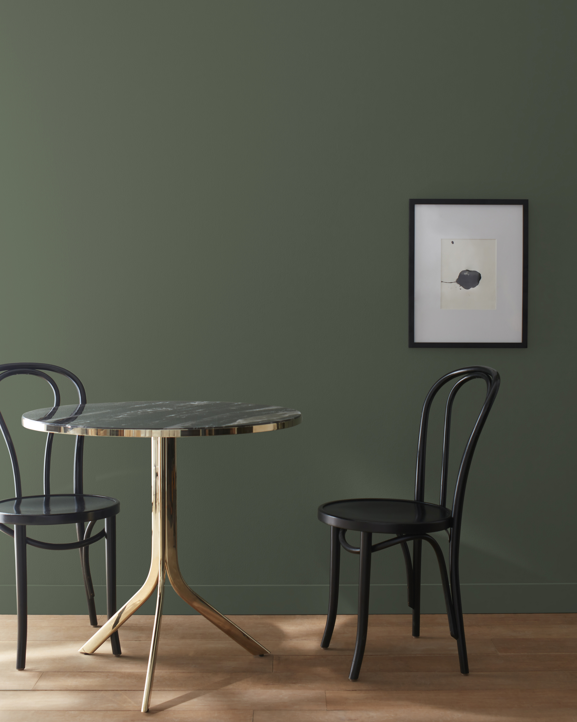
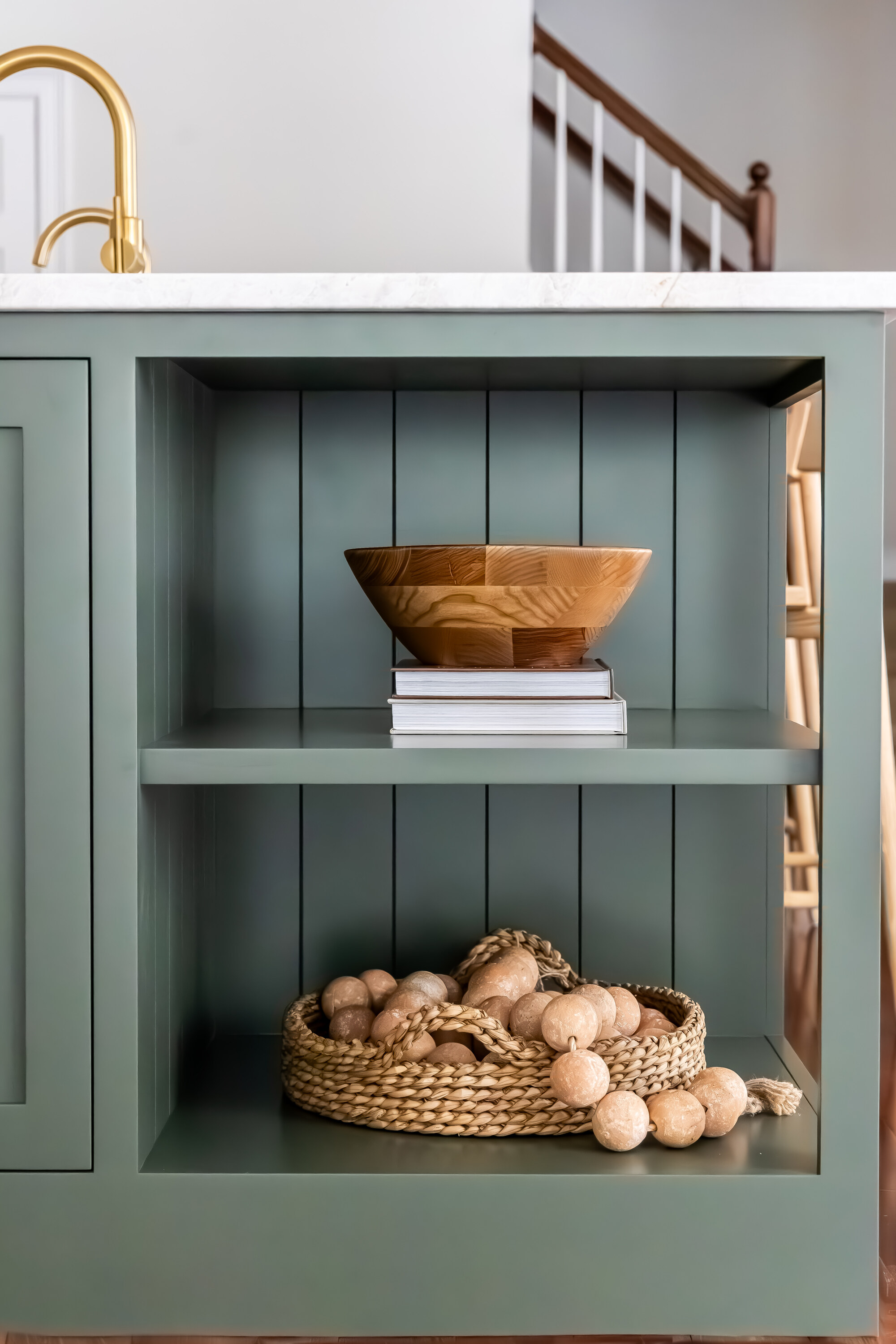
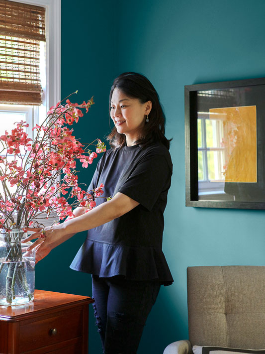
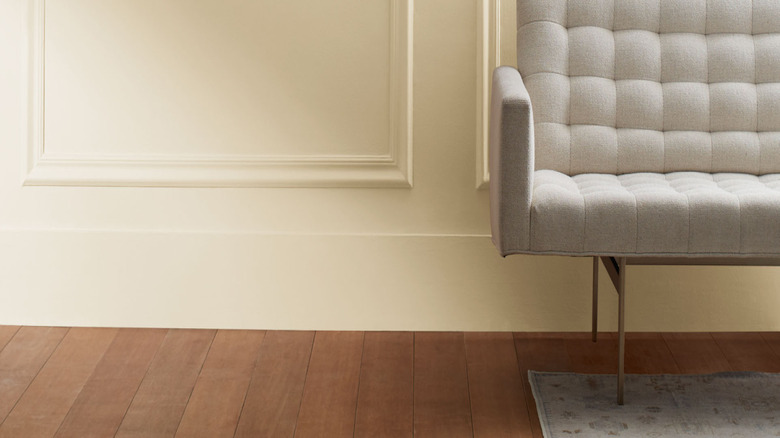
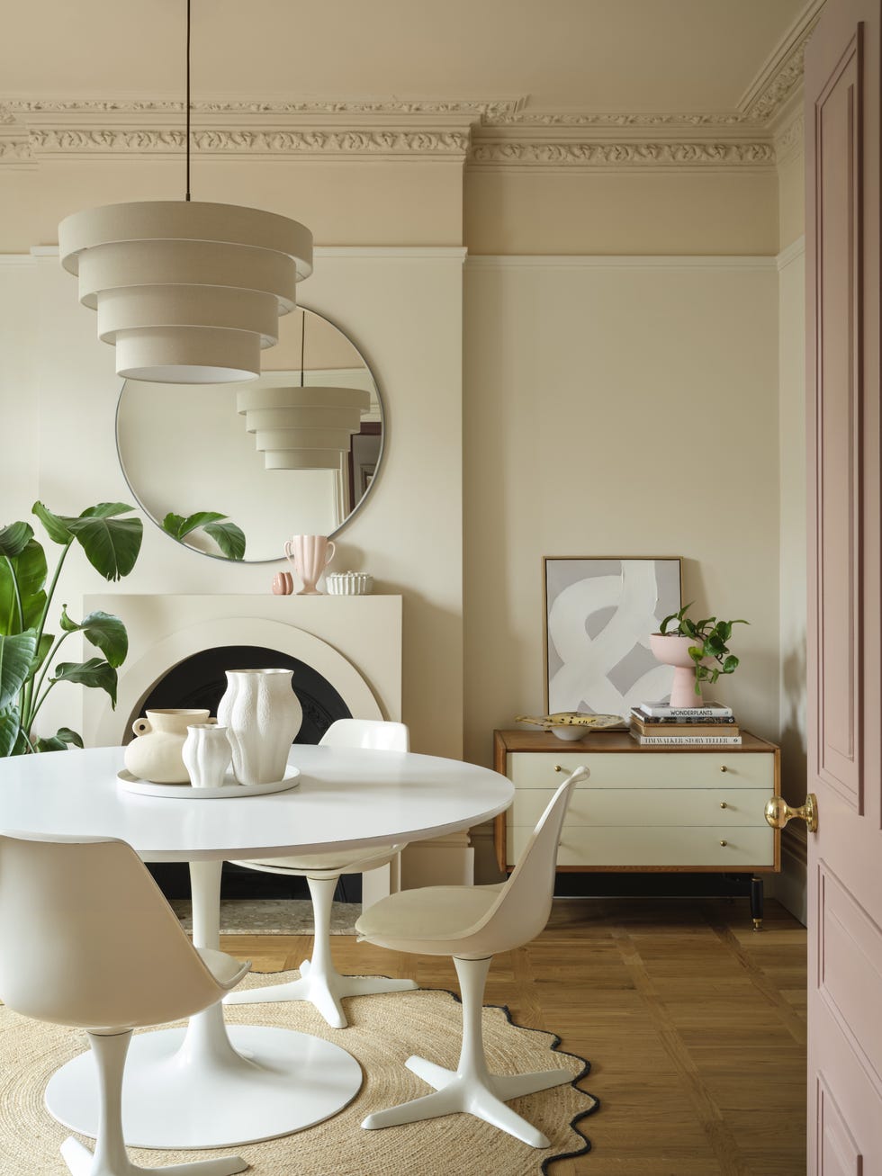
Beginning with "Salamander," a rich, sophisticated green, the article notes its calming and focusing effect, making it suitable for home offices when paired with neutral accents and warm wood tones. Next, "Weimaraner" is presented as a warm gray with smoky brown undertones, reminiscent of vintage leather and aged plaster, recommended for sitting rooms and dining spaces to create a sense of quiet luxury. It is advised against pairing it with bright white, suggesting softer tones like Classic Gray or muted olive instead.
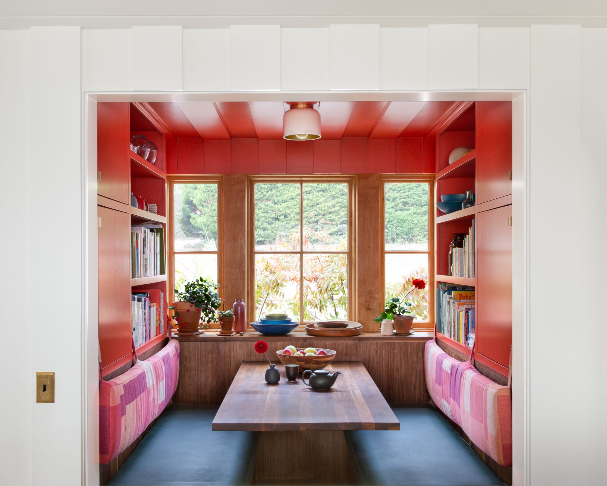
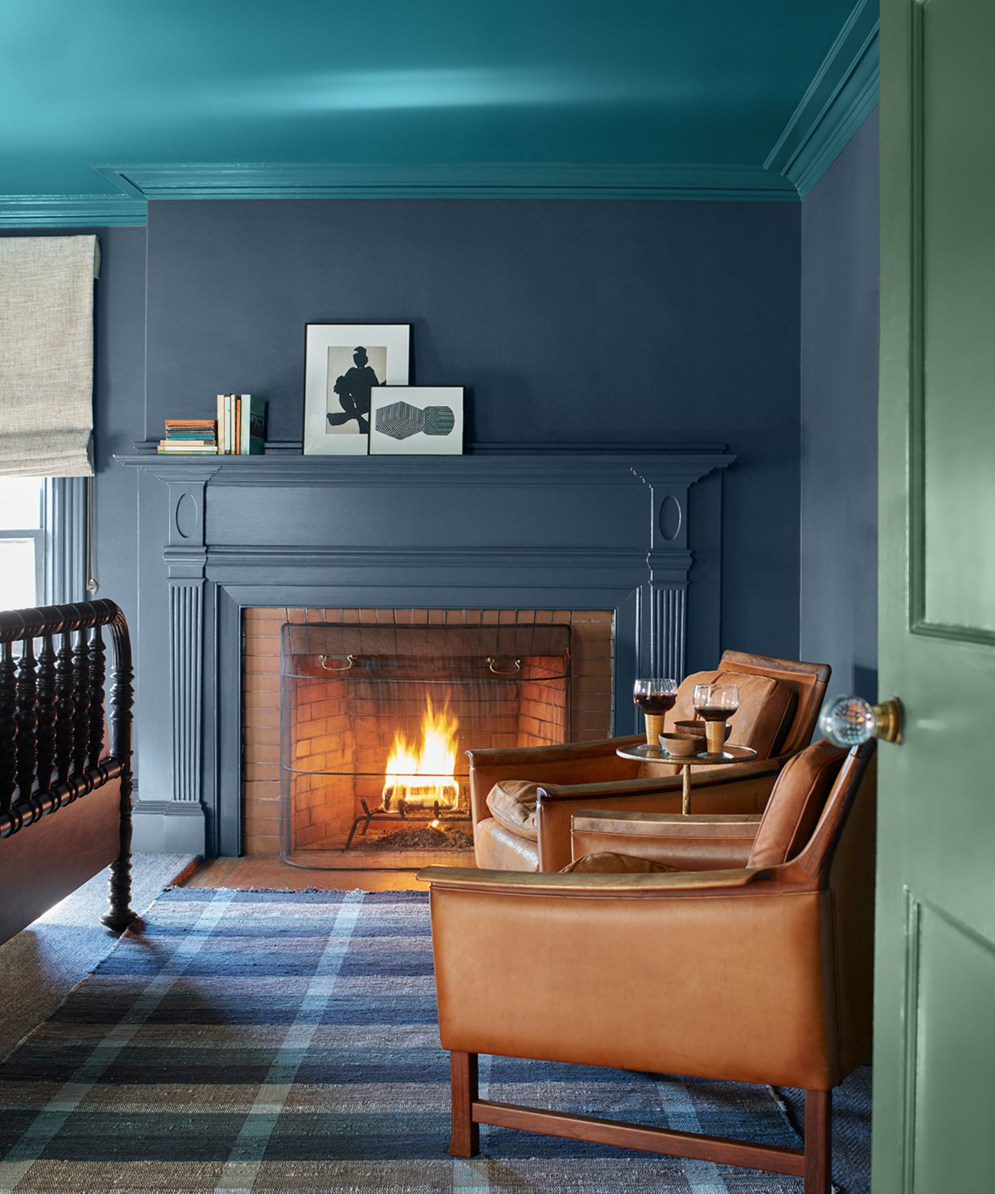
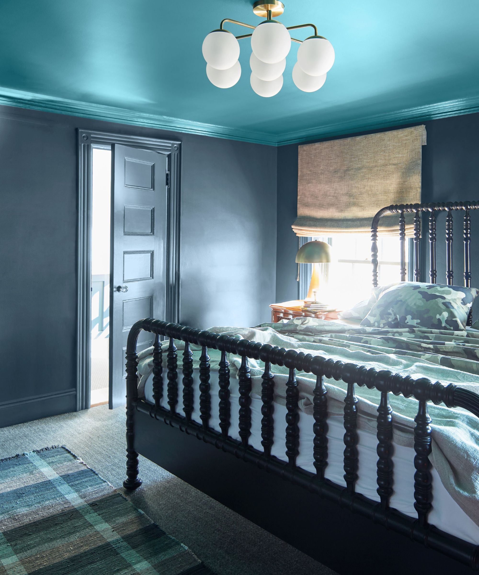
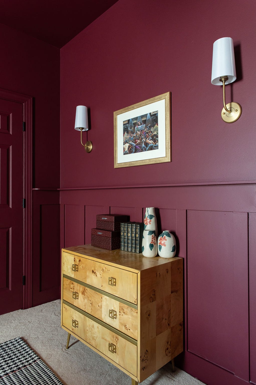
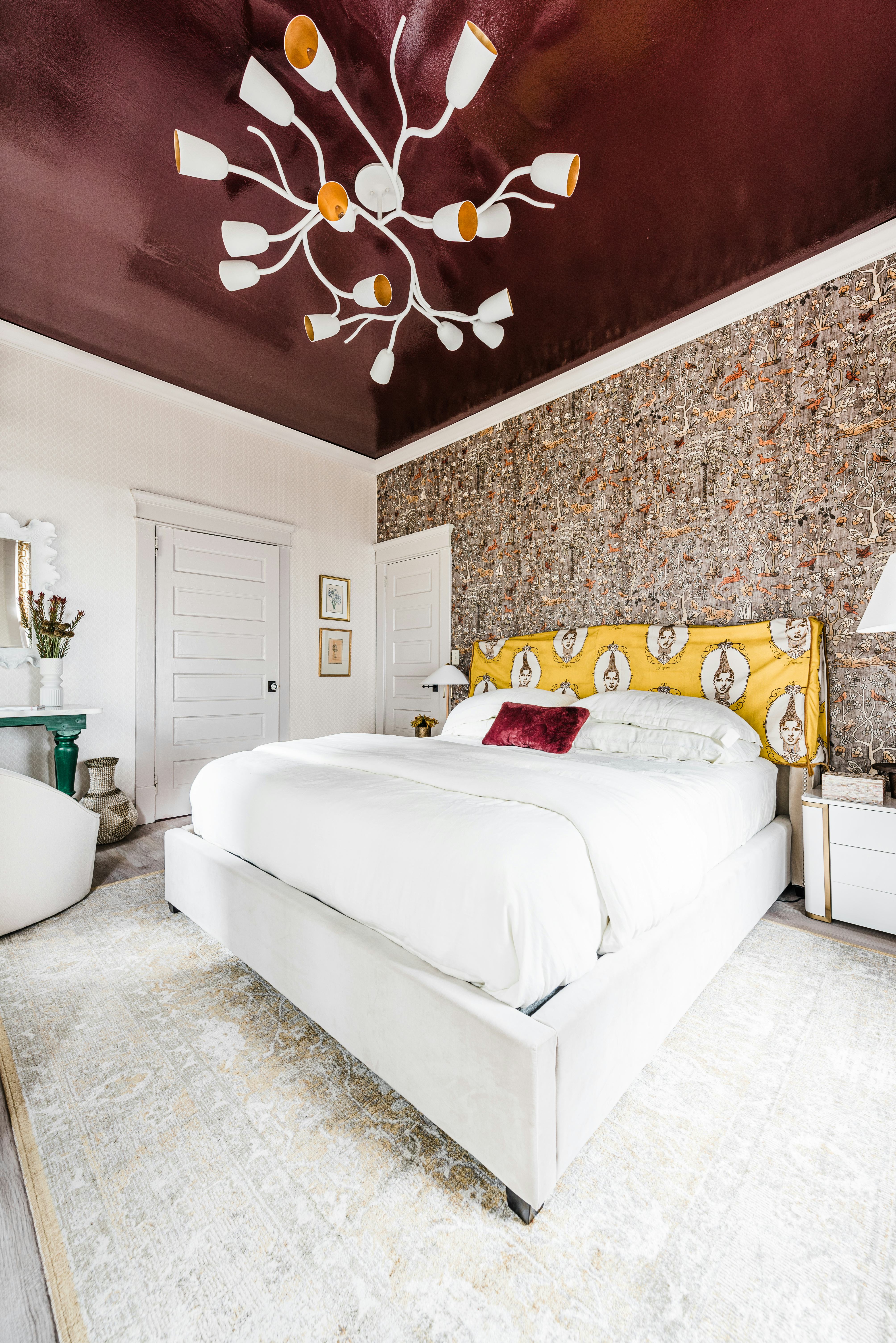
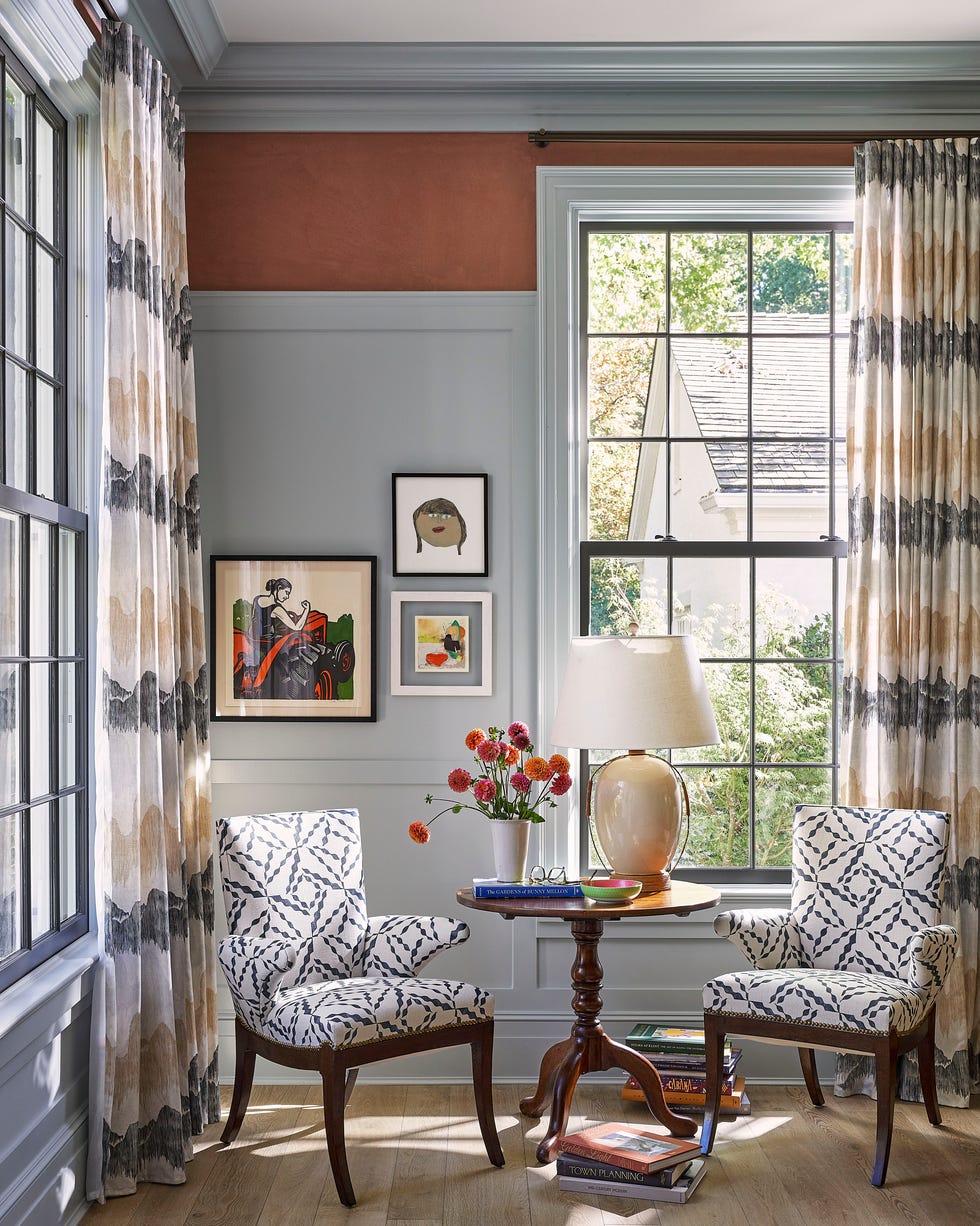
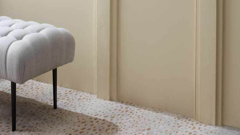
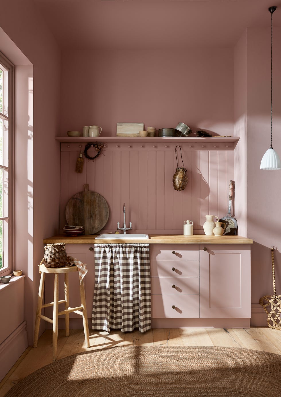
"Terra Bella," a muted terracotta, is described as warming and uplifting, suitable for paneled dining rooms, cabinetry, or even as an unexpected ceiling color. This shade is particularly recommended for bohemian, eclectic, or maximalist aesthetics when combined with deep greens like Essex Green or soft, plaster-like neutrals. Following this, "Castleton Mist," a soft yellow-green from Benjamin Moore's historic collection, is introduced as a versatile color that brings freshness to various rooms, especially when paired with crisp white trim or used uniformly on walls and trim in smaller areas.
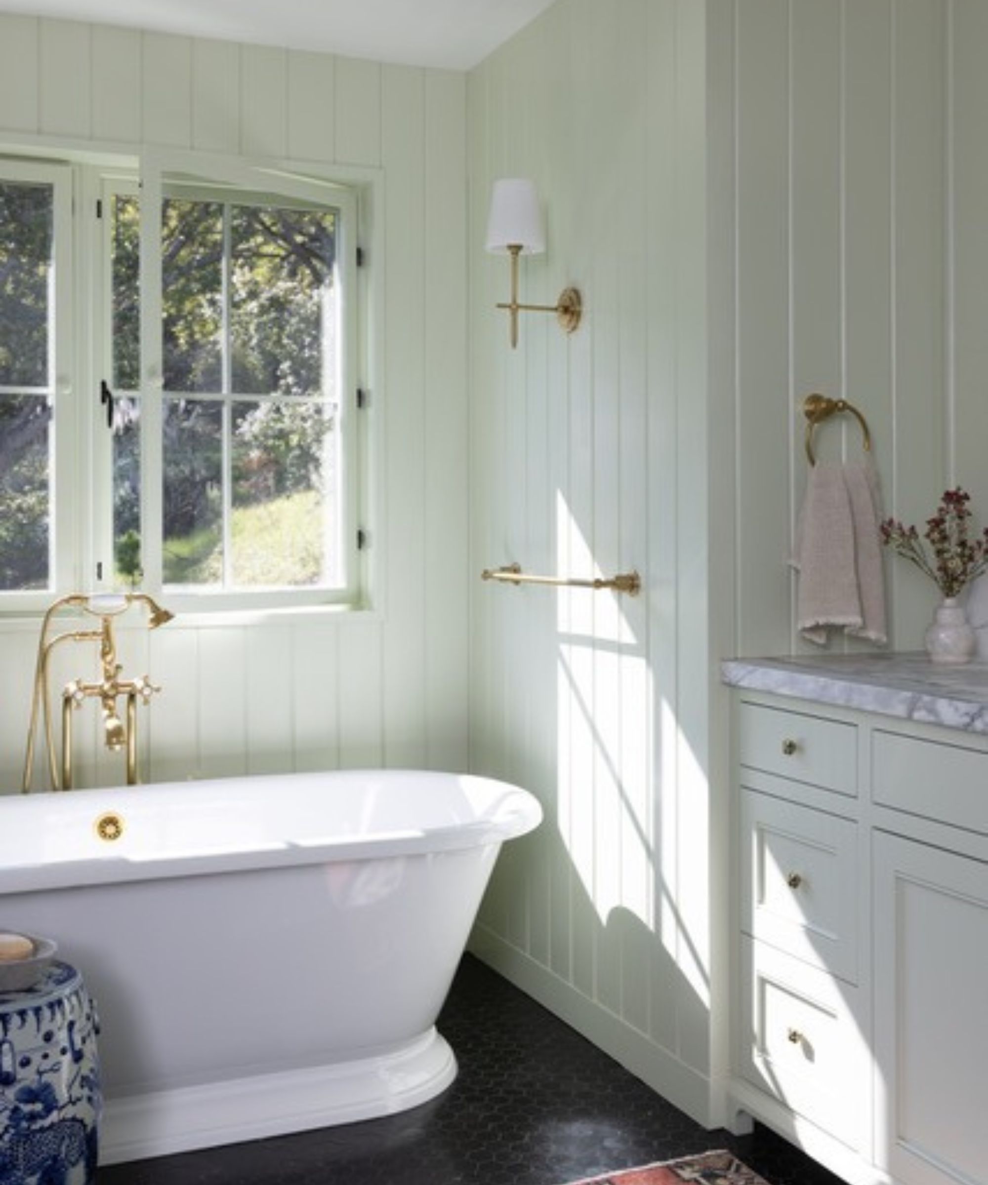
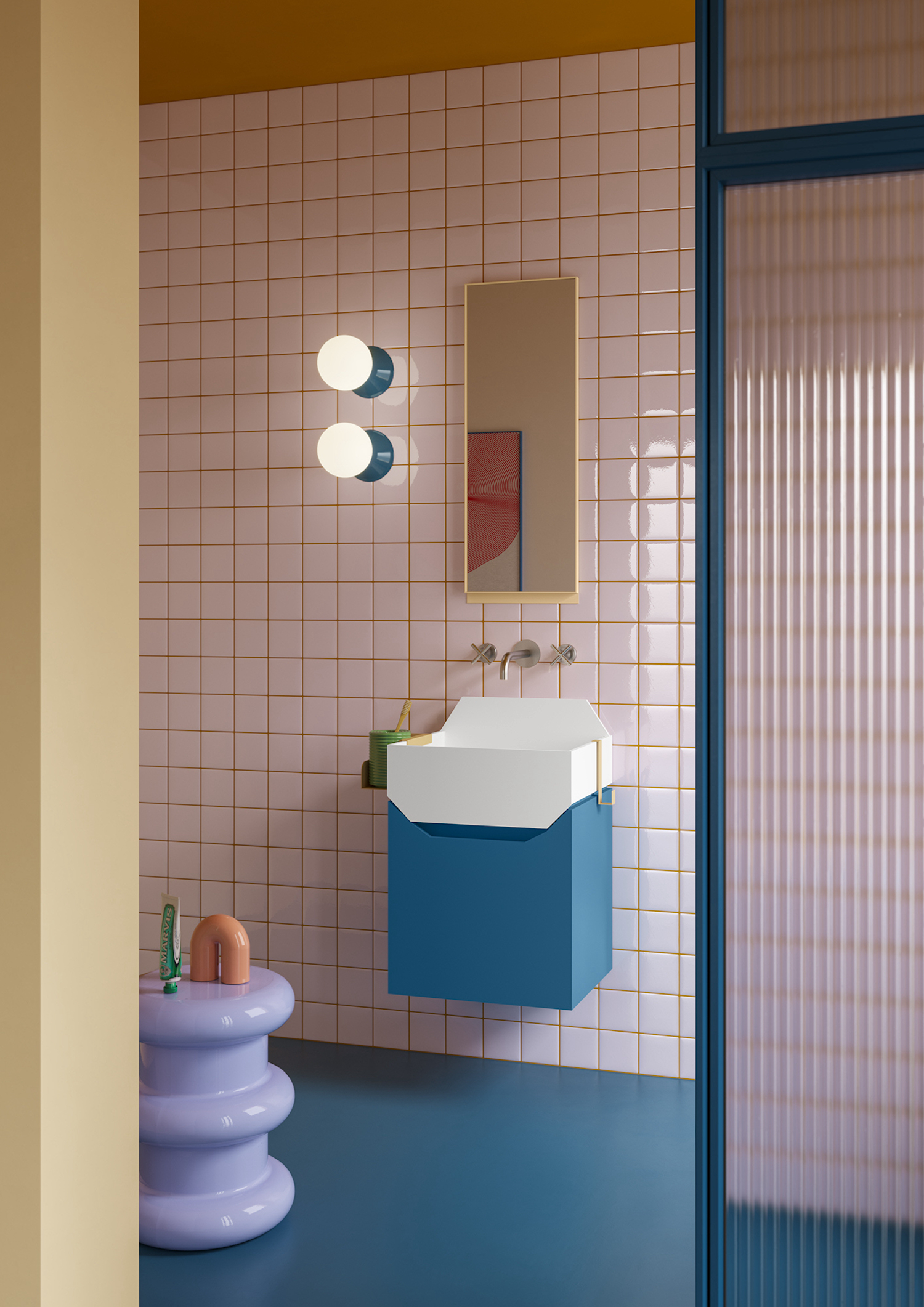
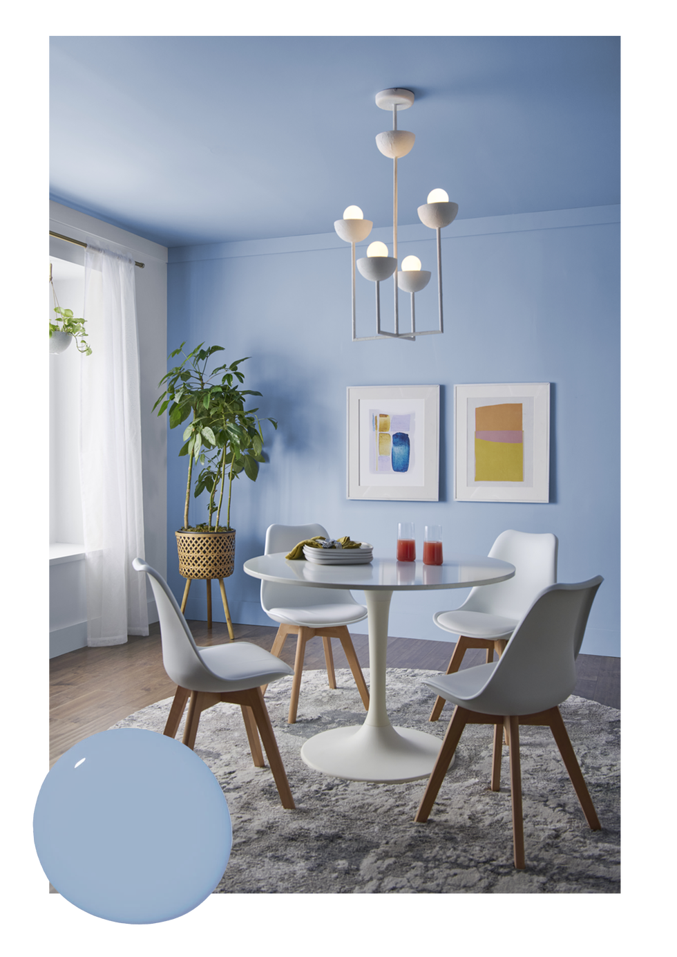
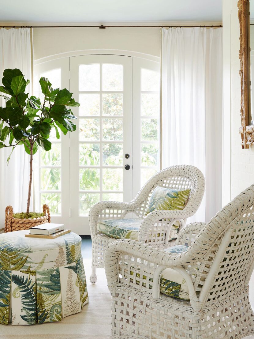
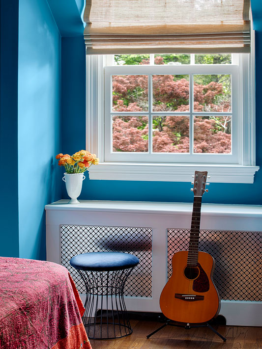
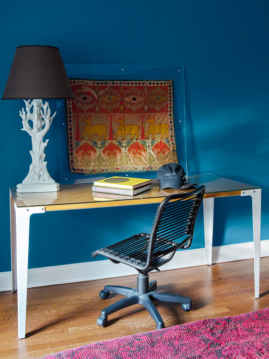
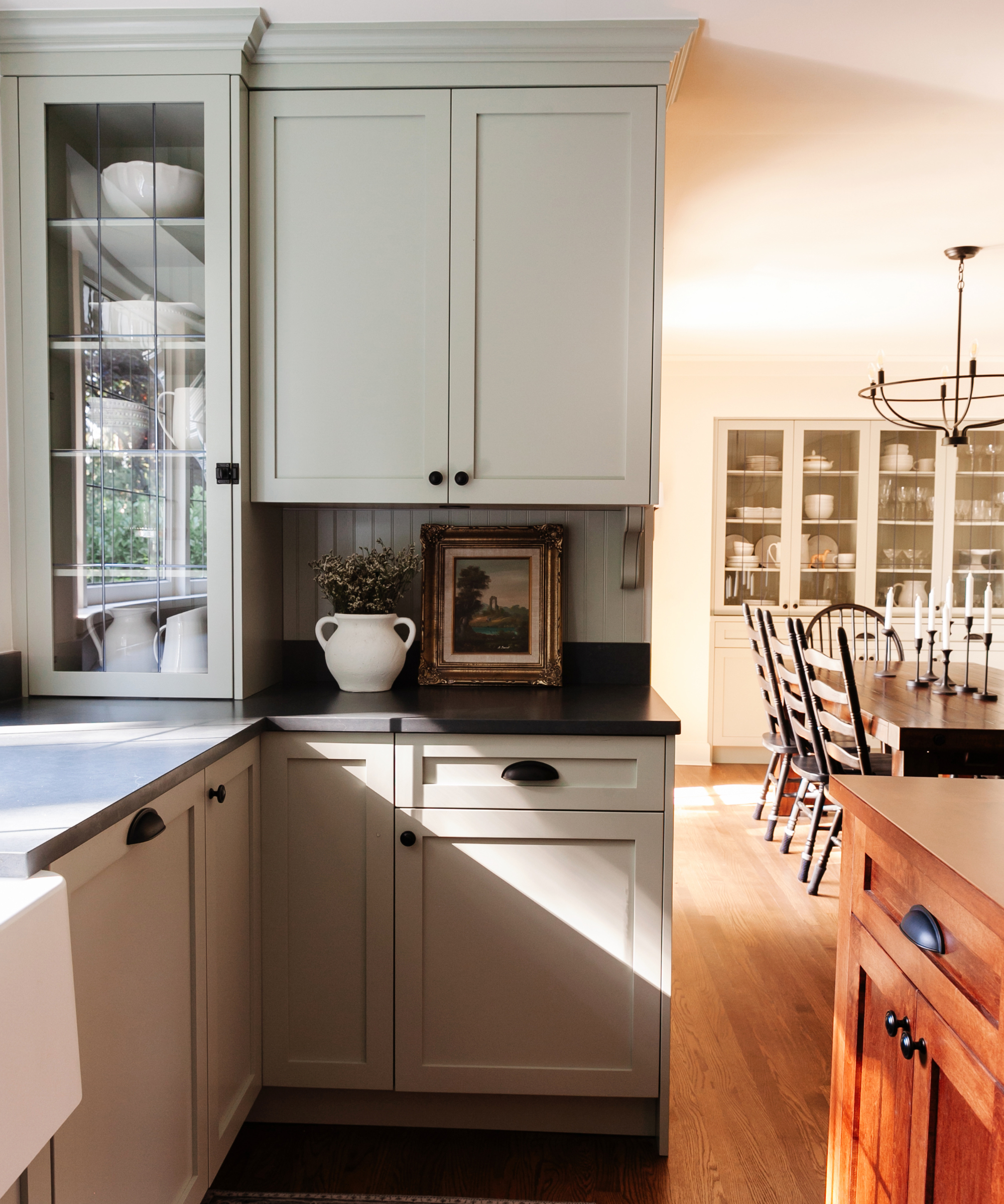
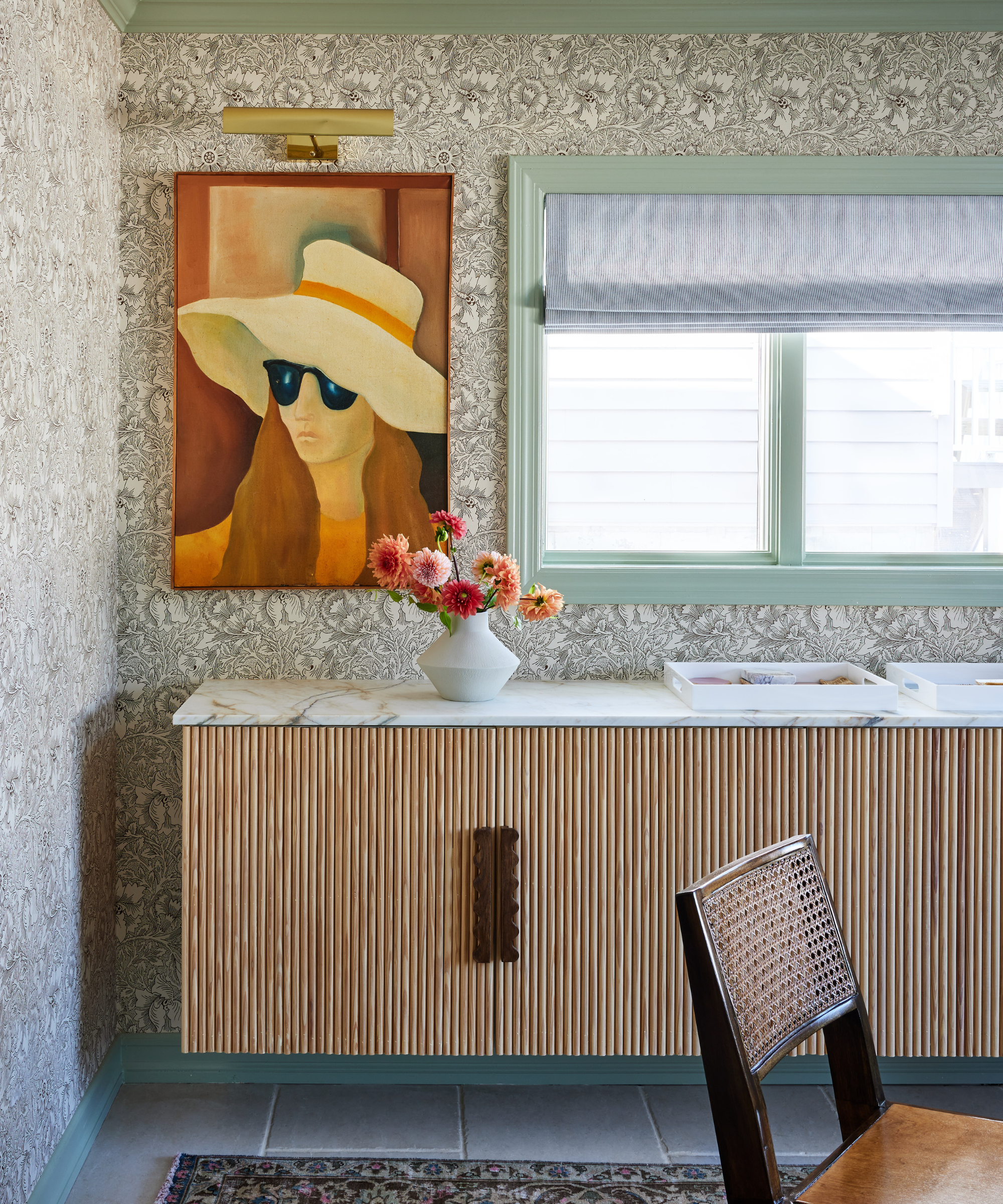
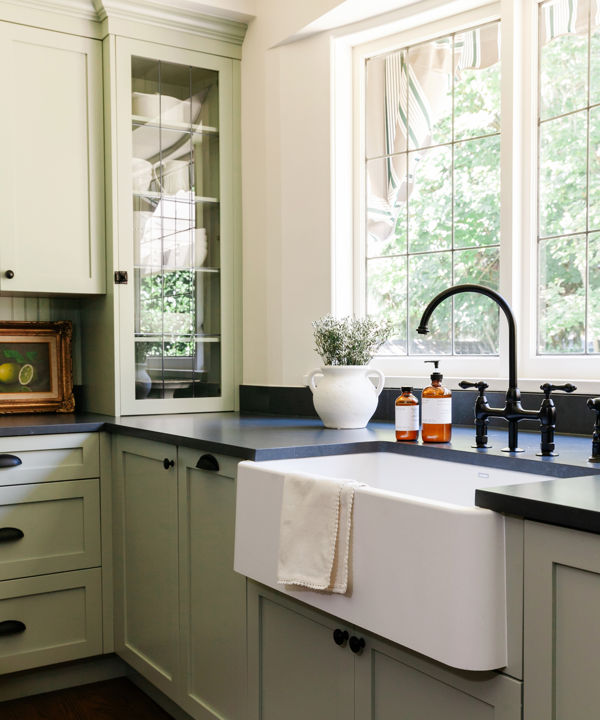
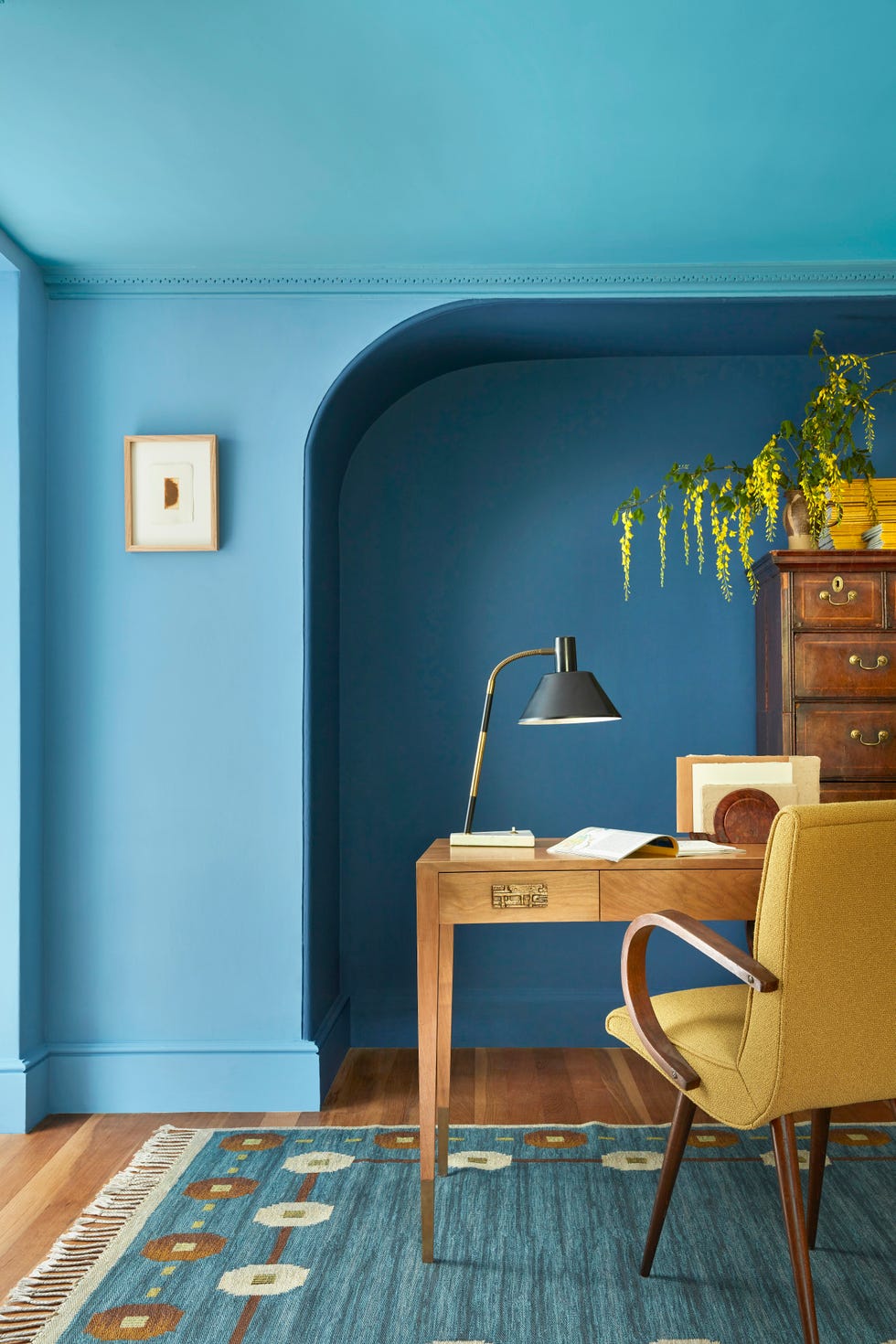
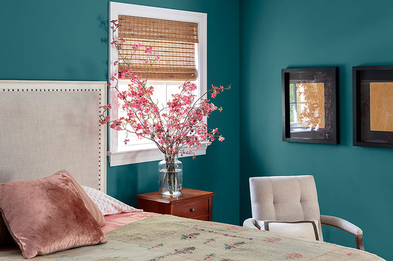
"Hazy Skies" is highlighted as a calming, gender-neutral putty gray-green, ideal for nurseries and guest bedrooms to create an inviting atmosphere. "Tate Olive," a dark green with warm undertones, offers a moody and sophisticated look, best complemented by warm neutrals and browns. "Marilyn's Dress," a cool blue with a hint of periwinkle, is noted for its ability to create a calming and soothing effect, making it perfect for large-scale walls in bedrooms.
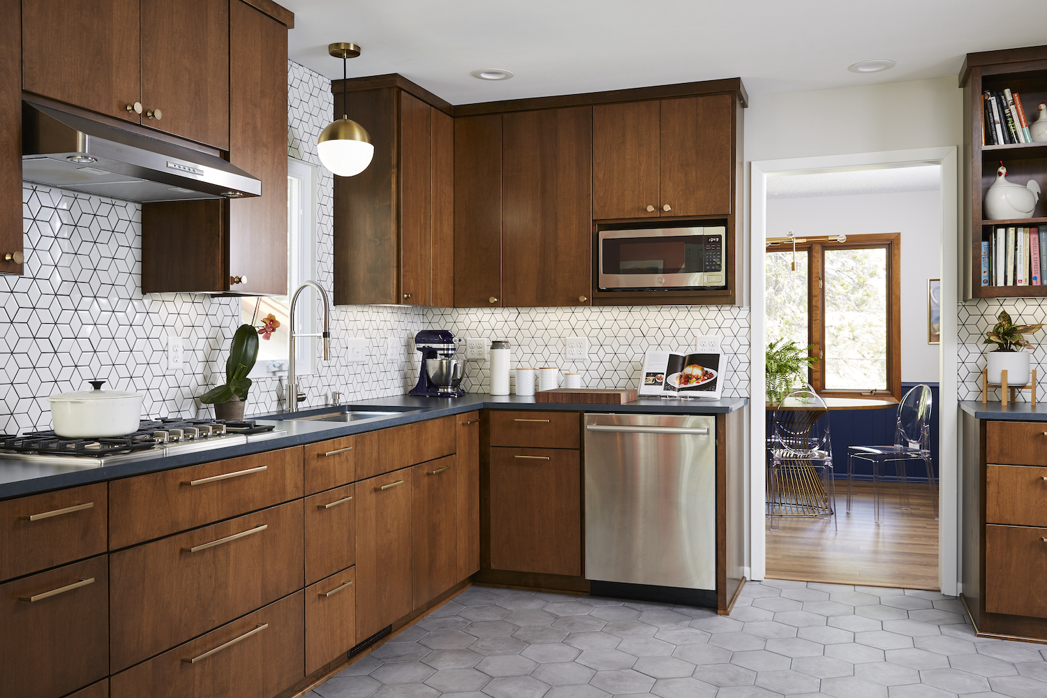
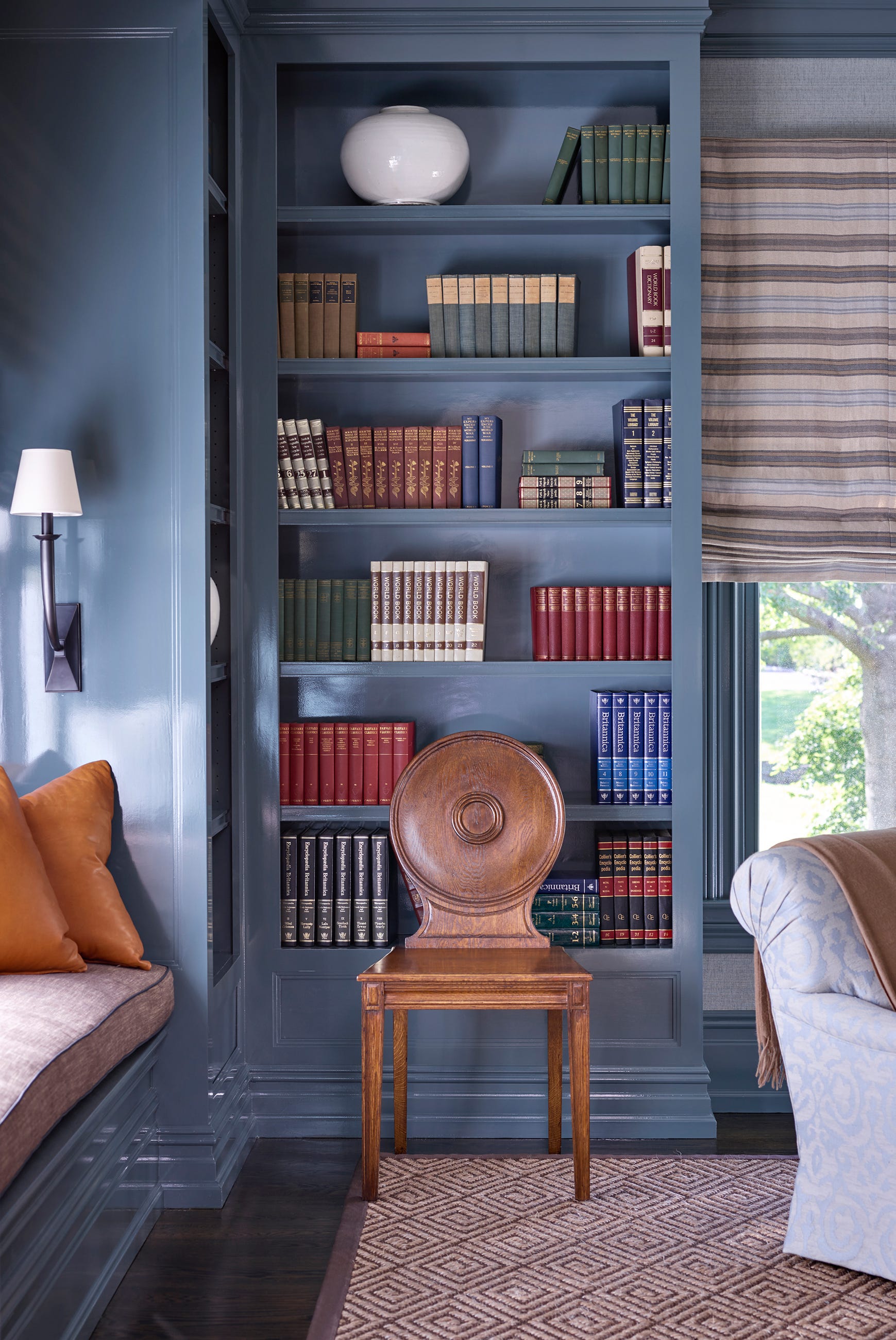
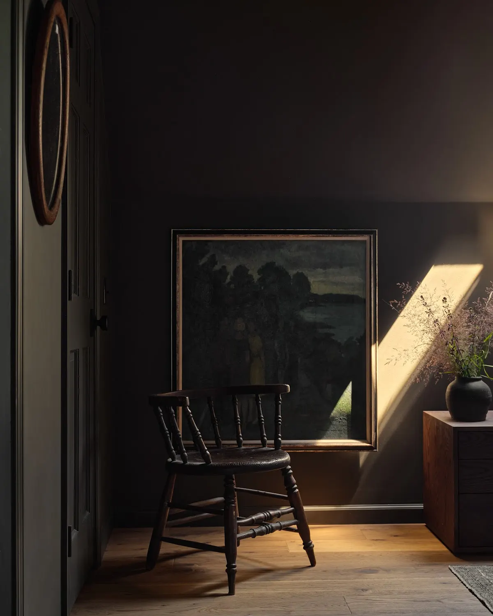
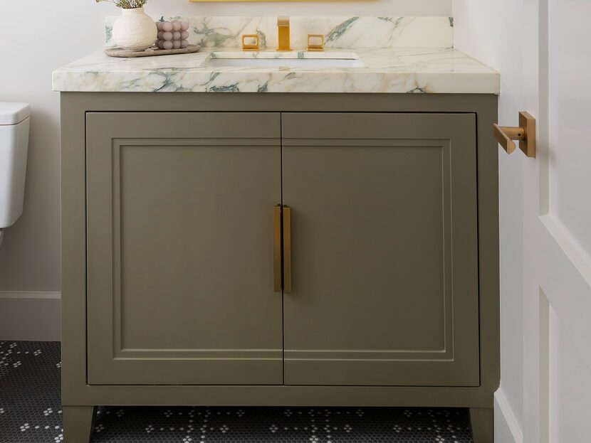
The article also features "Mink," a complex brown-black that adds depth and moodiness without the starkness of pure black. It's recommended for vanities, kitchen cabinets, and color-drenching powder rooms, hallways, and dens. "Hearthstone," a light gray with blue undertones, is presented as a warm and inviting choice that contrasts well with light interiors, particularly when paired with Benjamin Moore’s Sea Pearl or White Dove.
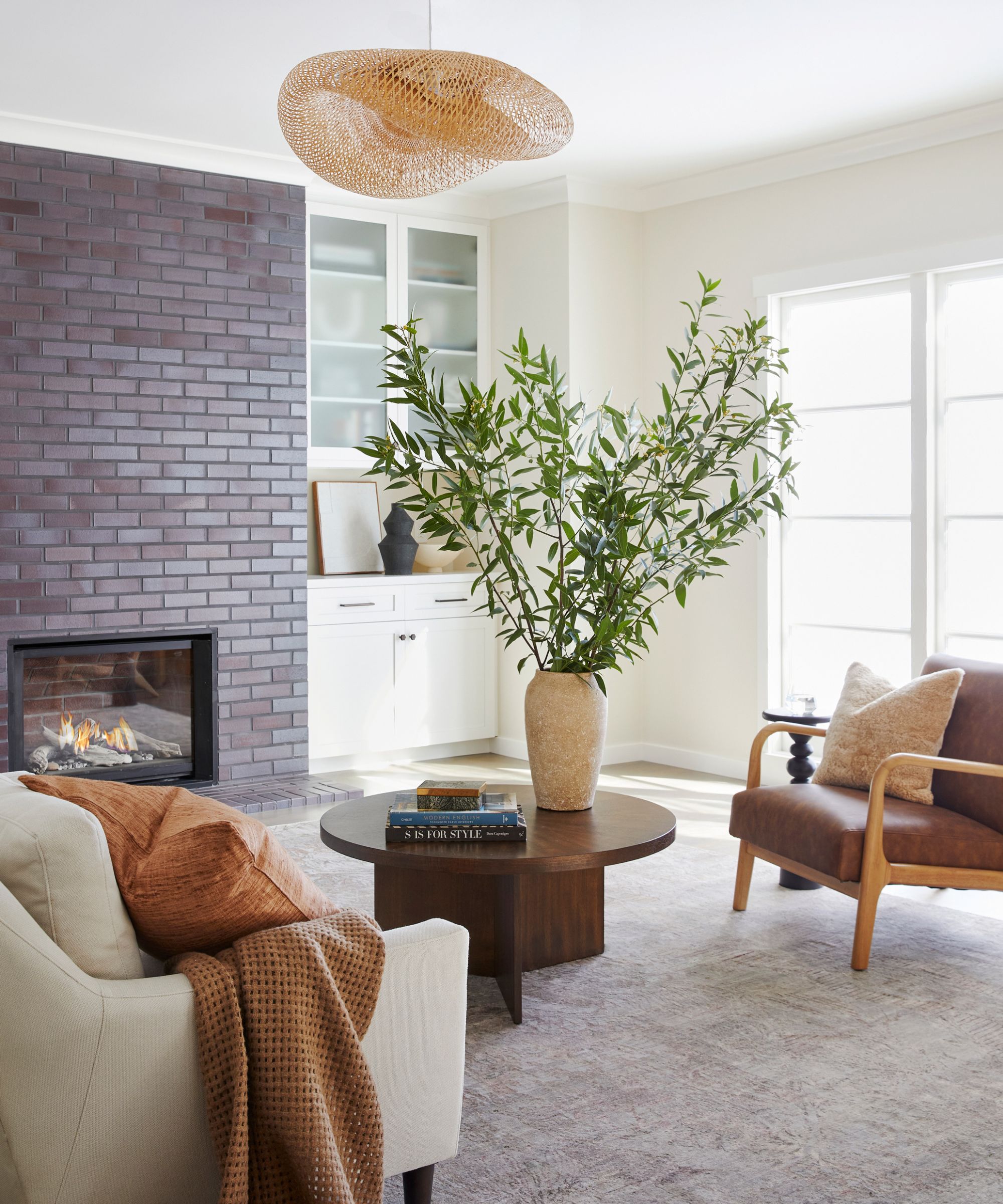
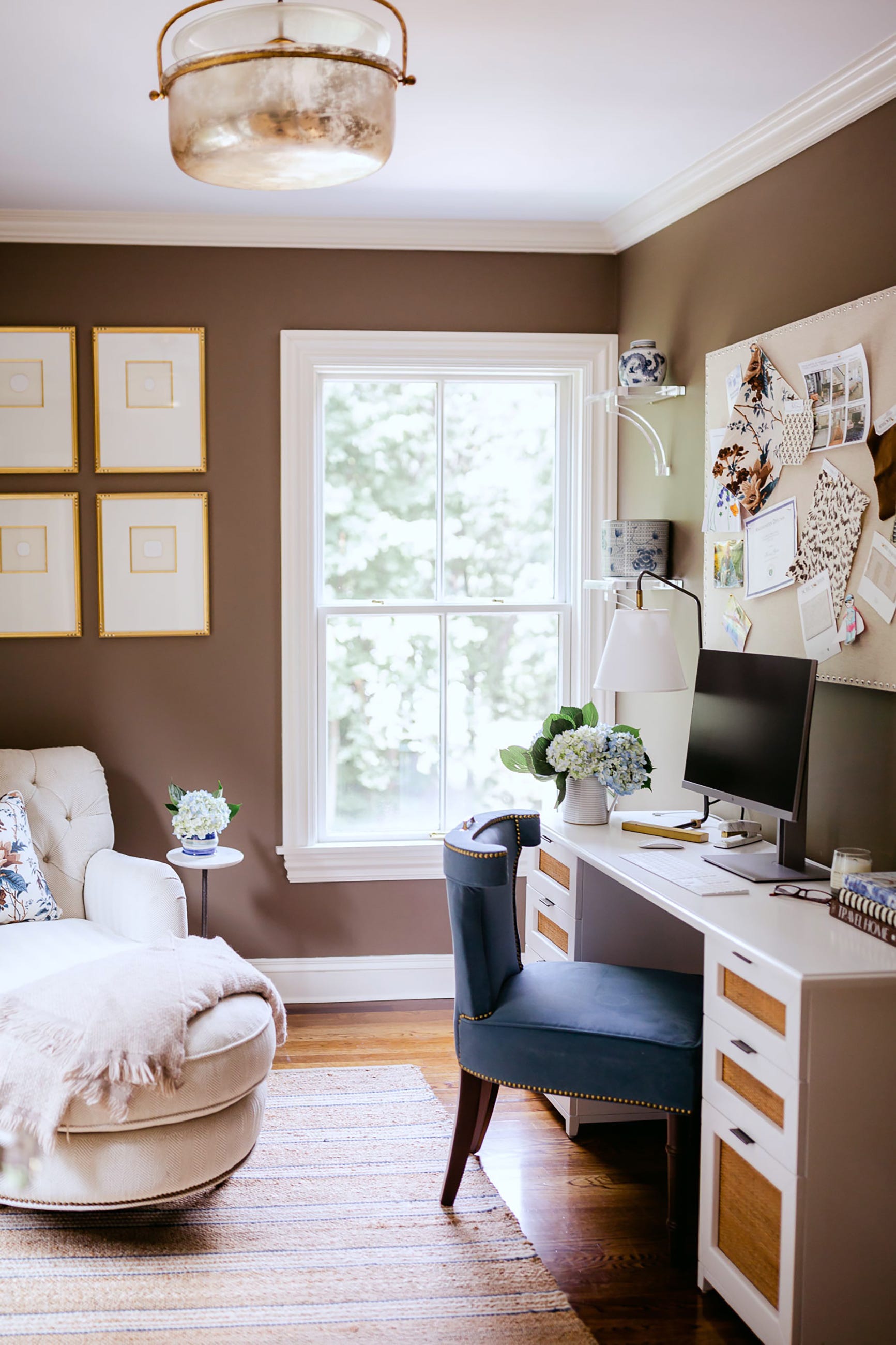
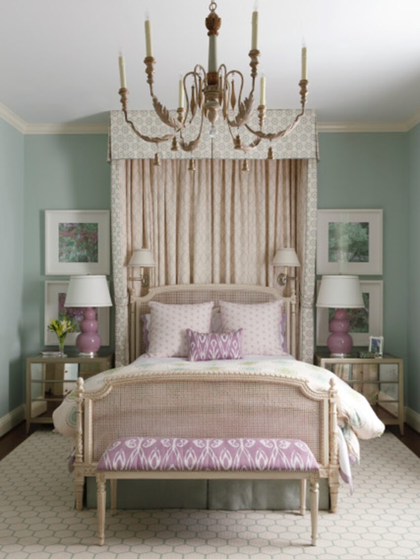
"Half Moon Crest," a soft, serene blue-gray, is suggested for bedrooms to foster a tranquil environment. "Topeka Taupe," a warm brown with a violet drop, is identified as an on-trend, versatile color suitable for living rooms, bedrooms, and for color-drenching walls, trim, and cabinetry. "Trout Gray," a mid-tone charcoal gray with cool blue undertones, is recommended for a moody, masculine feel, particularly in basement rooms to add interest without making the space too dark.
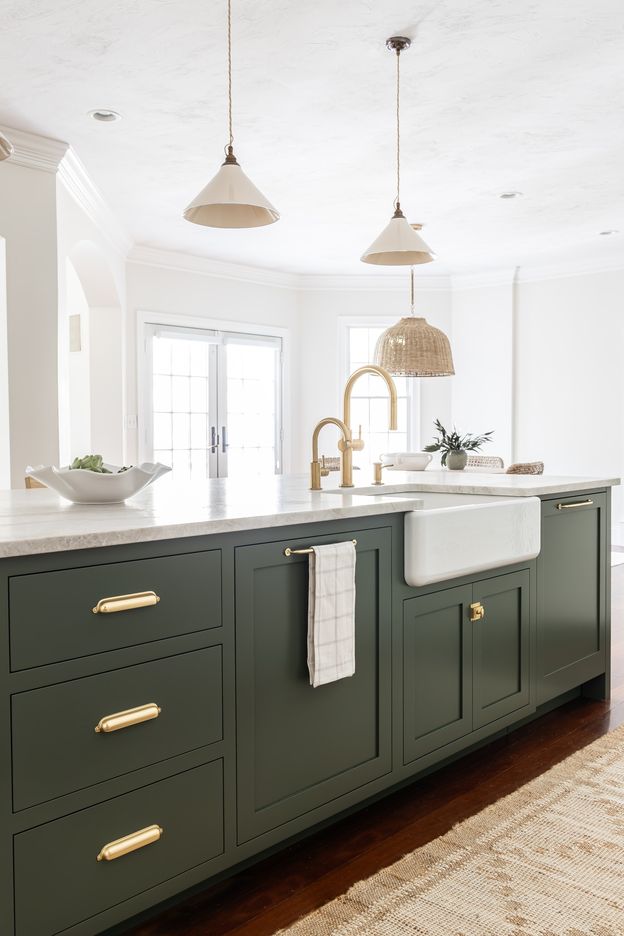
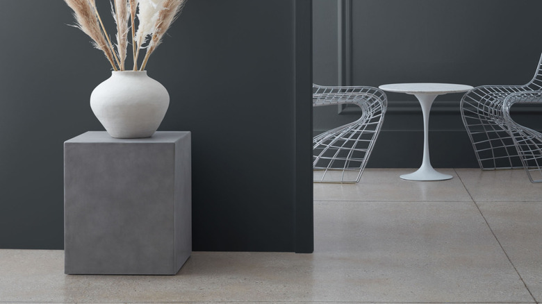
Finally, "Dark Olive" is described as a moody hue aligning with current color trends, versatile enough to be used on cabinetry, furniture, millwork, and doors as a neutral tone with a touch of color. "Gravel Gray" is presented as a fail-proof dark paint that reads as a deep, inky blue-black, excellent for highlighting millwork and pairing with grasscloth in offices, bedrooms, or dens. The article concludes by encouraging readers to consider these stylish and timeless shades for their interior design projects.
#InteriorDesign #PaintColors #BenjaminMoore #HomeDecor #ColorSchemes #DesignInspiration #DecoratingIdeas #InteriorStyling #InteriorDesign #PaintColors #BenjaminMoore #HomeDecor #ColorSchemes #DesignInspiration #DecoratingIdeas #InteriorStyling
0 comment in total
 No comments yet
You may also like
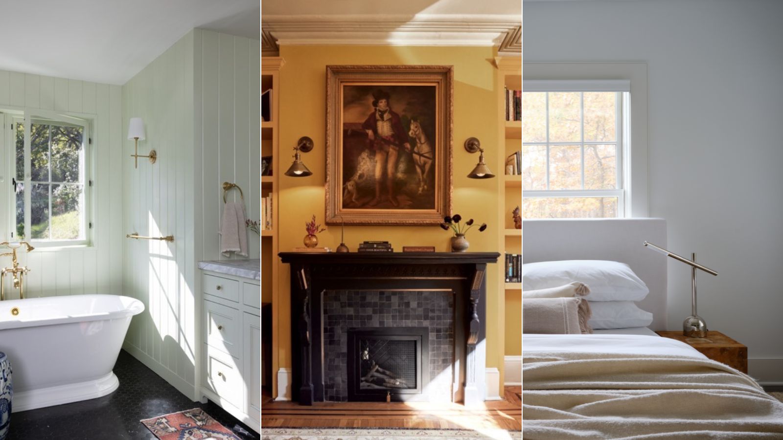
Benjamin Moore paint colors in real homes – 10 favorite shades amongst designers, from neutrals to brights
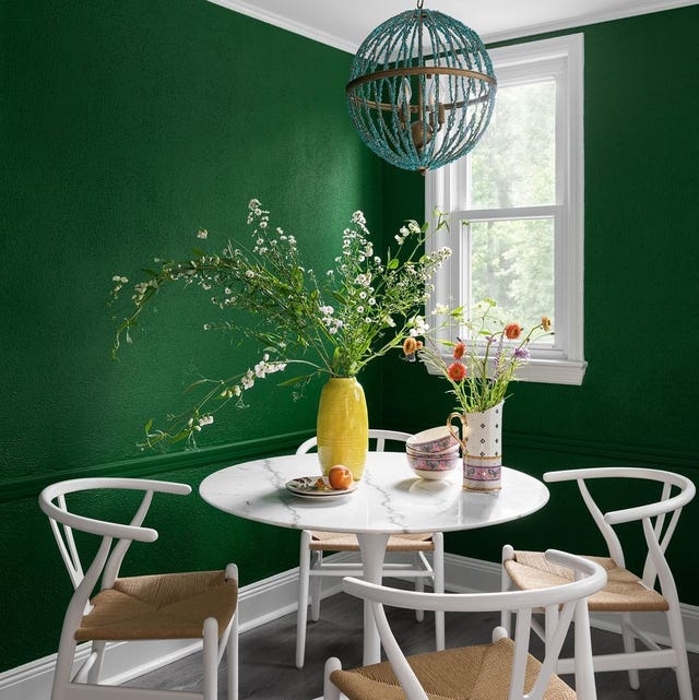
The Interior Paint Colors You'll Be Seeing Everywhere in 2024

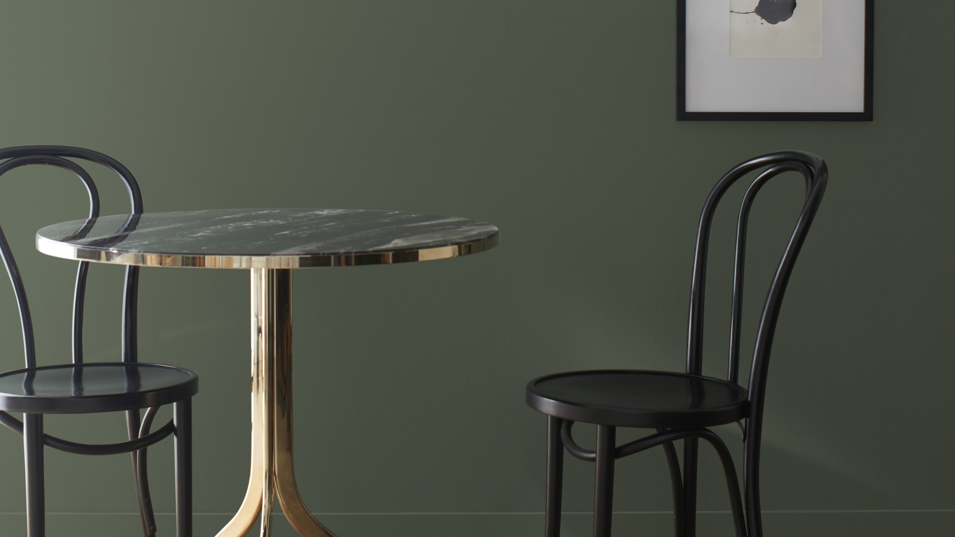
I Think I May Have Just Discovered the Most Timeless Green Paint Color

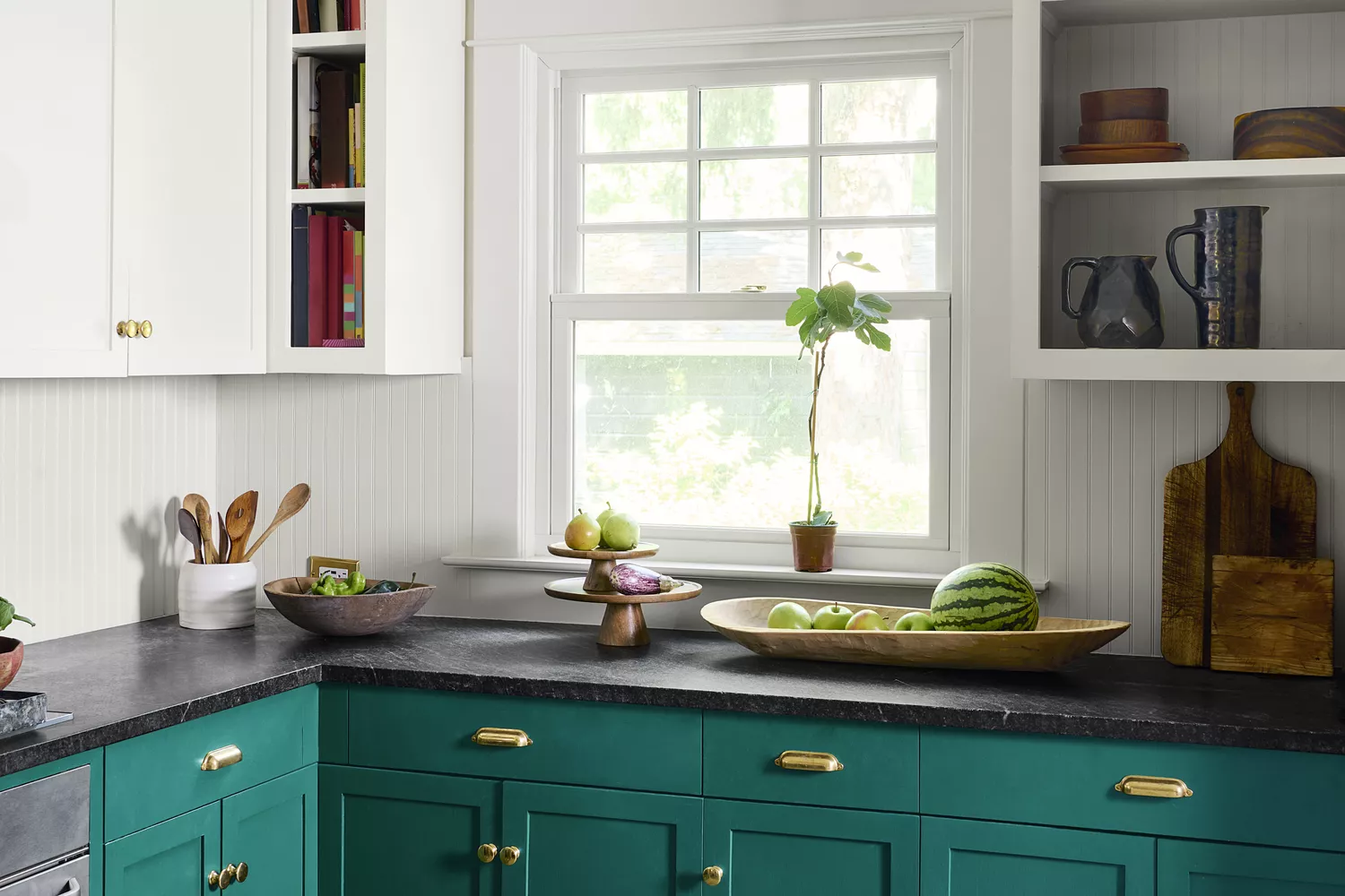
This Paint Color Has Been Benjamin Moore’s Best Seller for Years—and Designers Swear by It

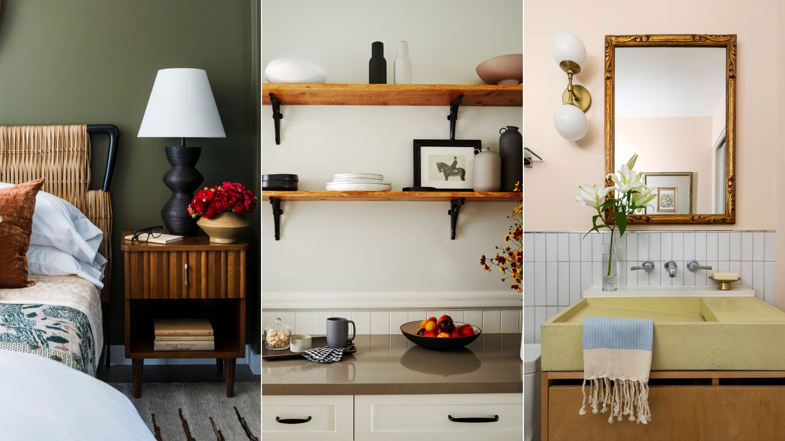
Interior designers share their favorite Benjamin Moore paint colors – and there's something for every style

An A-List Designer’s Secrets To Picking Perfect Paint Colors

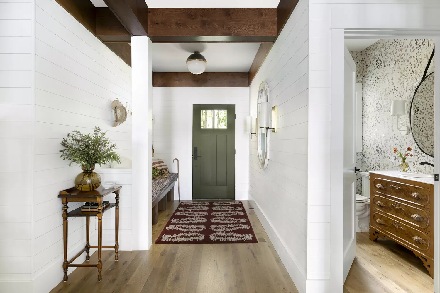
9 Classic Paint Colors For Interior Doors That Designers Can't Get Enough Of

Benjamin Moore's Trendiest Paint Colors (& Which Ones To Avoid)

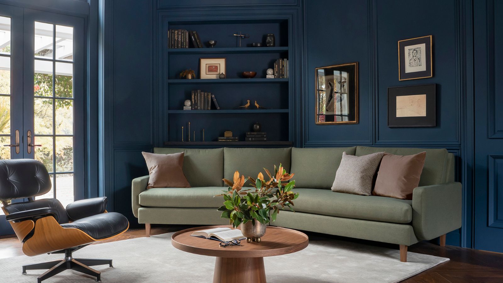
Is Benjamin Moore's Gentleman's Gray the perfect navy blue paint?
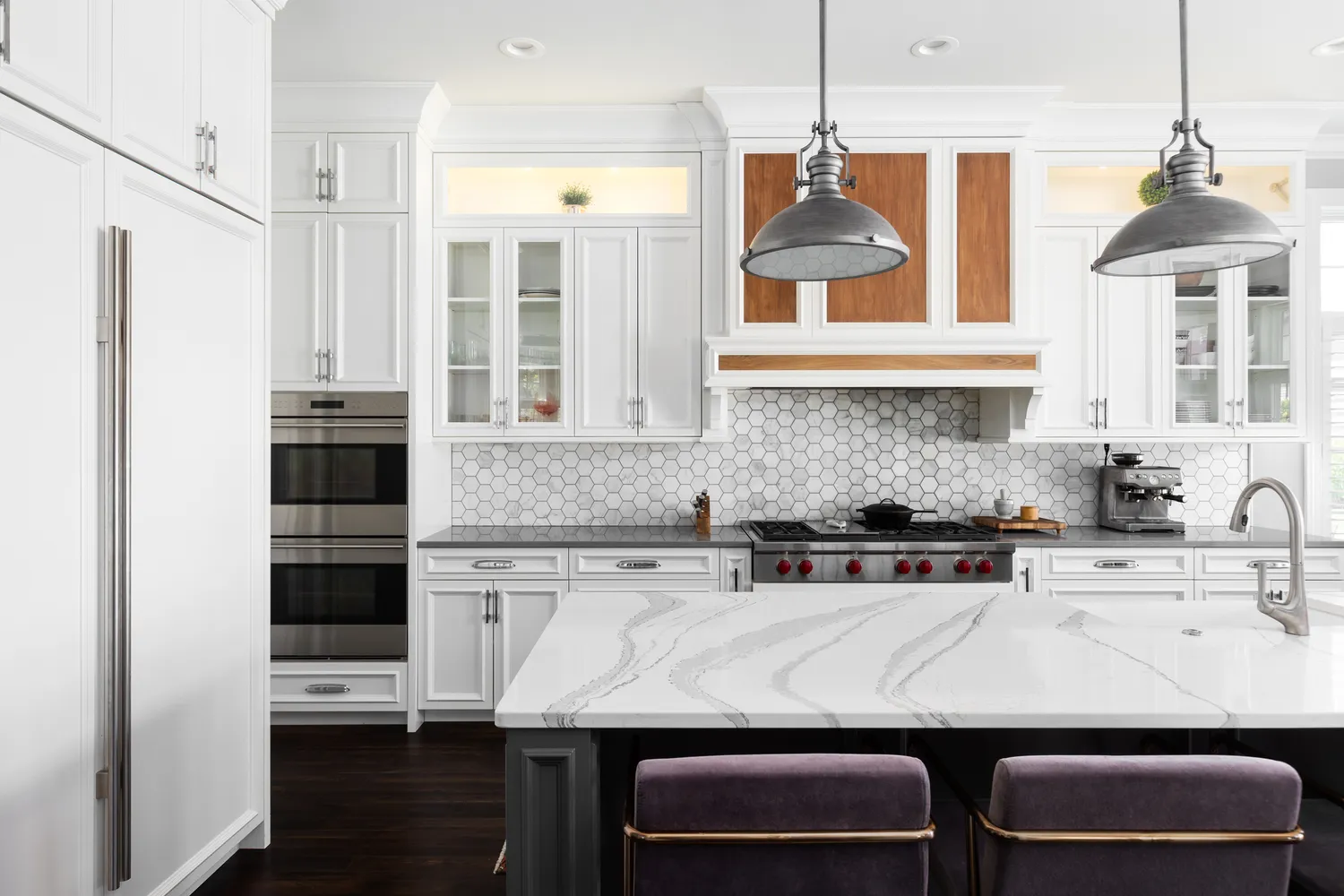
The Kitchen Paint Color Designers Refuse to Use—And the Shades They Love Instead

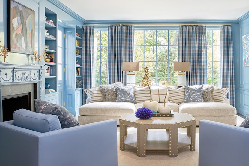
19 go-to paint colors that Dallas designers love
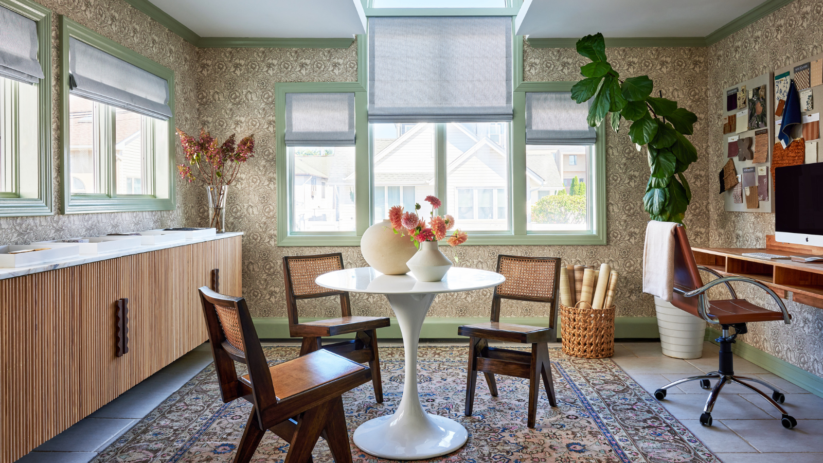
'It's one of those colors that just works' – why Benjamin Moore's Saybrook Sage could be the perfect calming green gray paint for your home
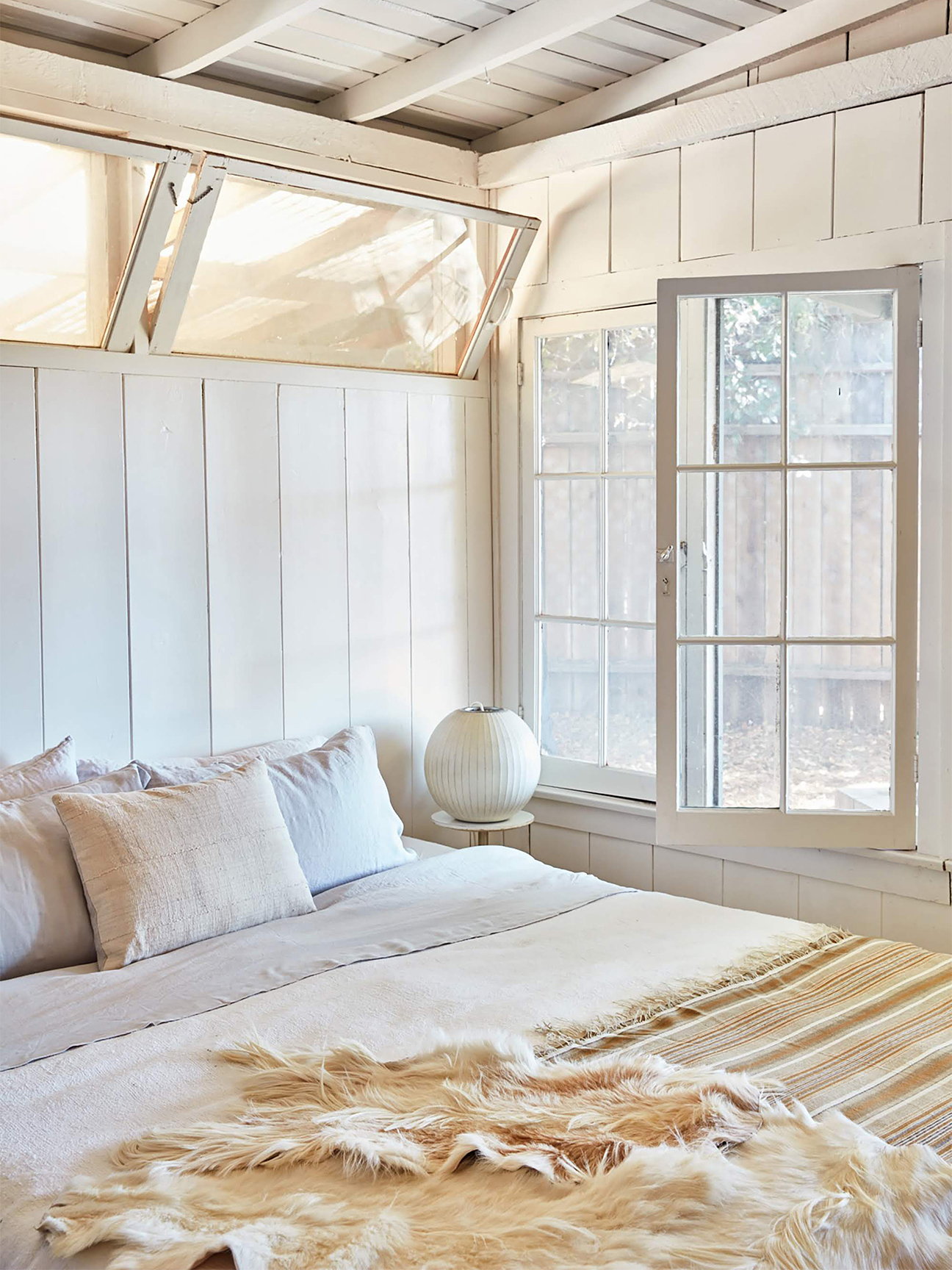
9 Paint Colors You’ll Never Find in an Interior Designer’s Home
These Unusual Paint Colors May Not Be An Obvious Choice, But Designers Can’t Get Enough

8 Favorite Paint Colors of Local Interior Designers

Designers Predict This Will Be The Biggest Paint Trend Of 2026

5 Times Interior Designers Used Colorful Tile Grout That Make Me Never Want to Choose White Again
Sherwin-Williams Just Announced the Color of the Year
Read This Interior Designer's Tips For Modernizing a Space Using Color

We Asked Designers for Their Favorite Kitchen Cabinet Paint Colors—and Not One Picked White