1/16
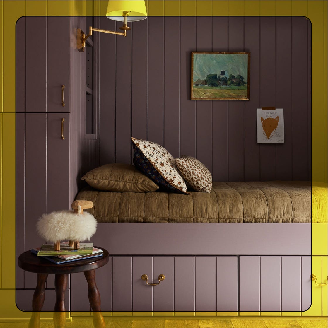
Sherwin-Williams Just Announced the Color of the Year
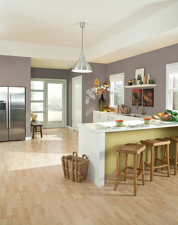
The article explores upcoming interior paint color trends for 2026, drawing insights from various design and color experts. The overarching theme observed by designers is a shift towards more personal, expressive, lived-in, mineral, and naturally rooted tones, moving away from cool tones, stark color-blocking, and impersonal all-white spaces. Homeowners are increasingly seeking personality and character in their homes, with paint being recognized as an accessible and affordable tool to achieve this.
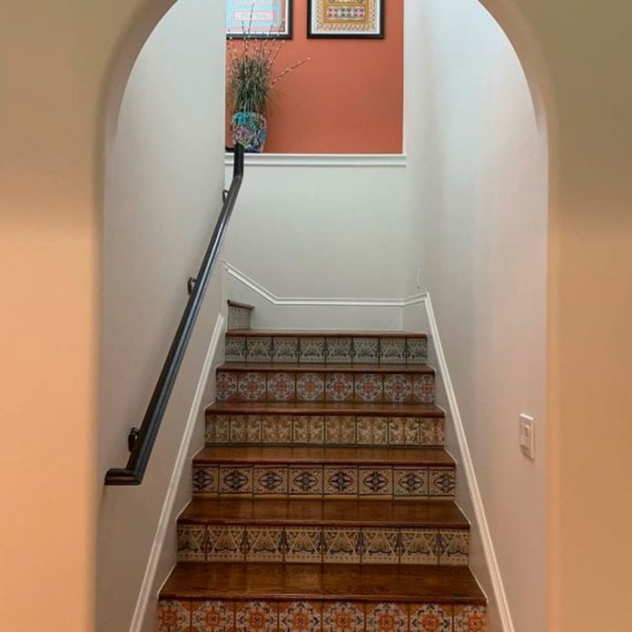
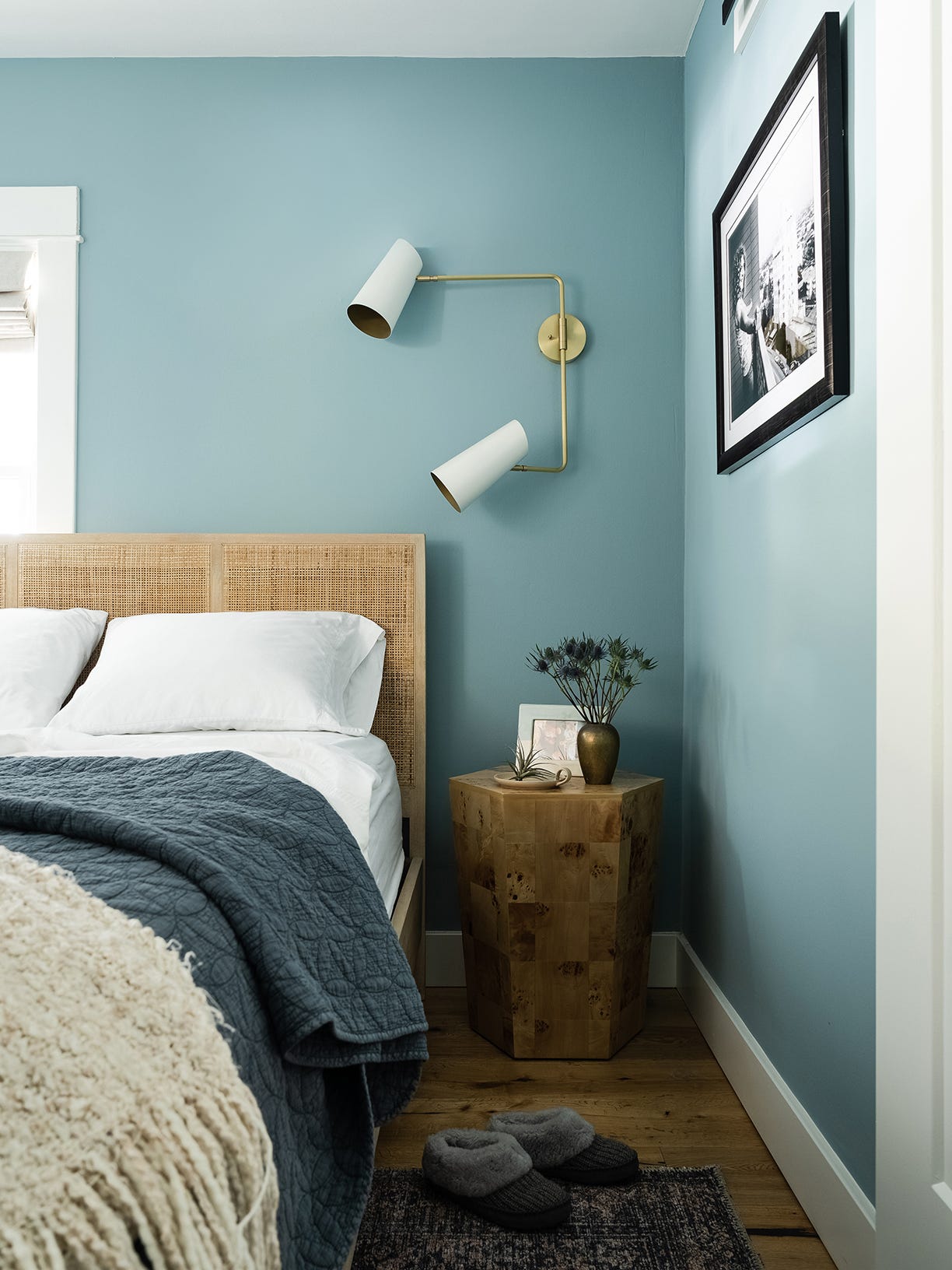
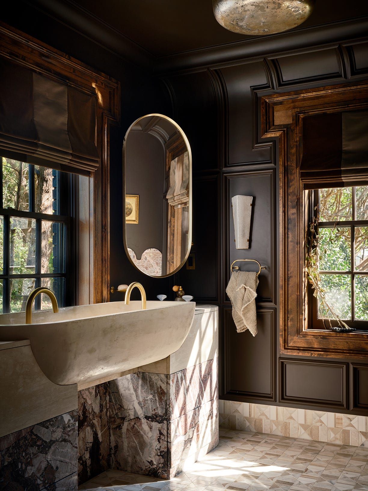
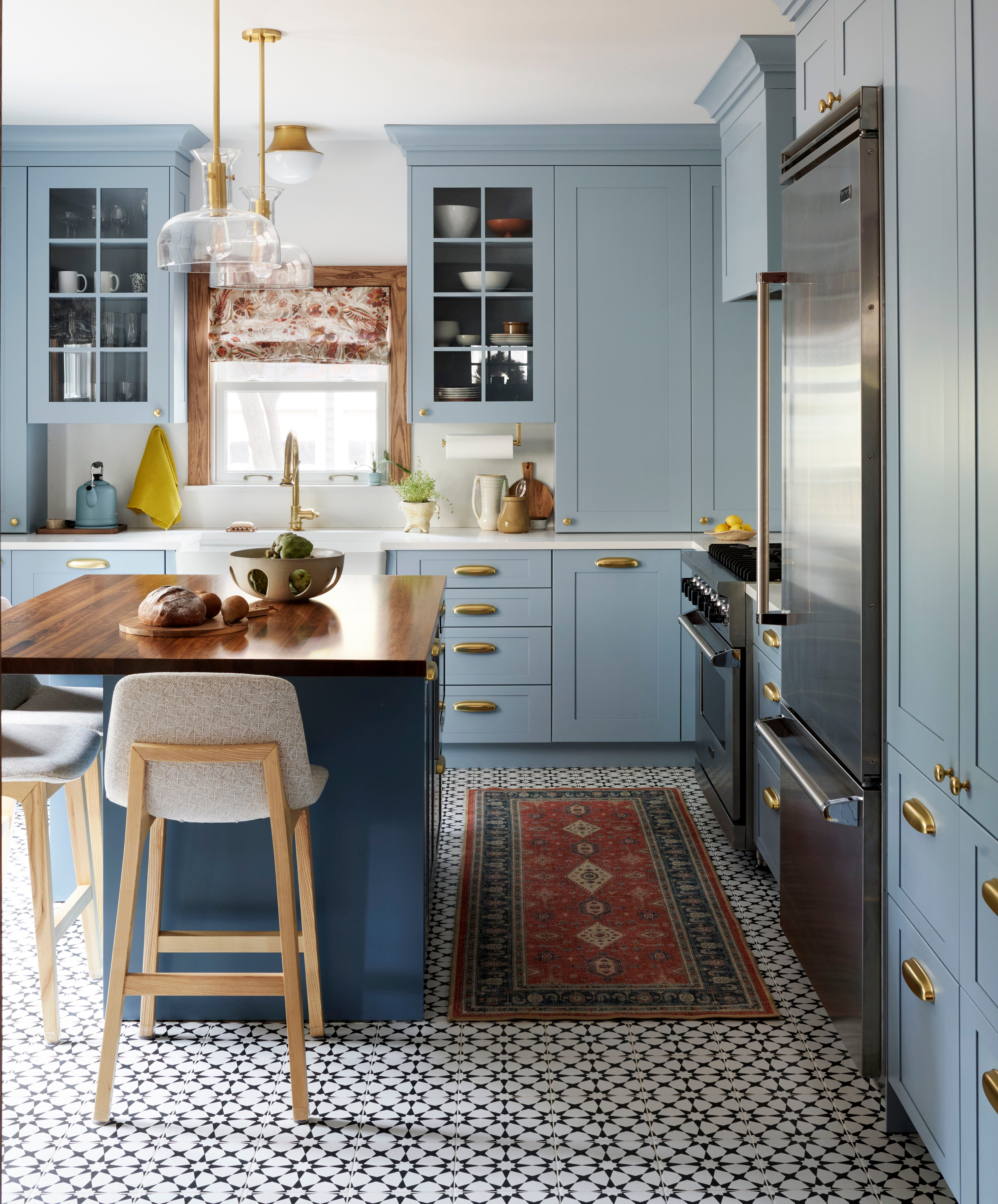
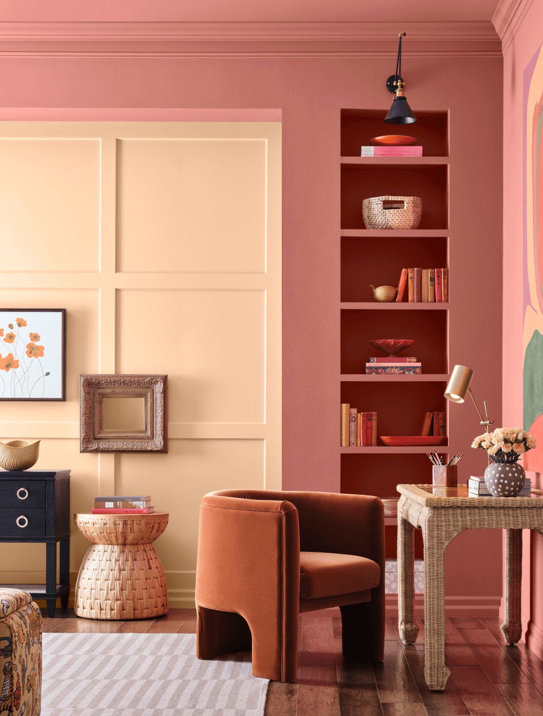
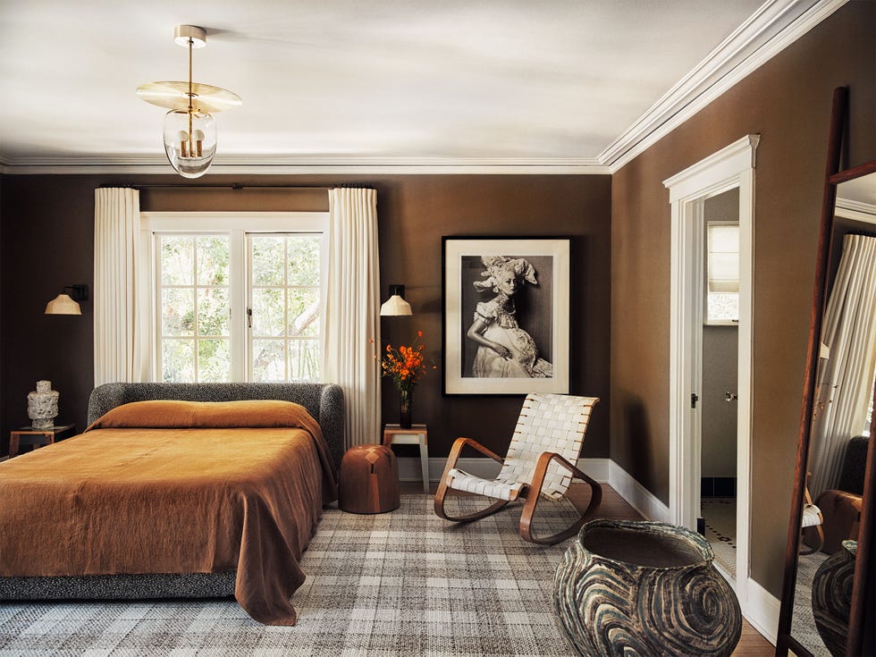
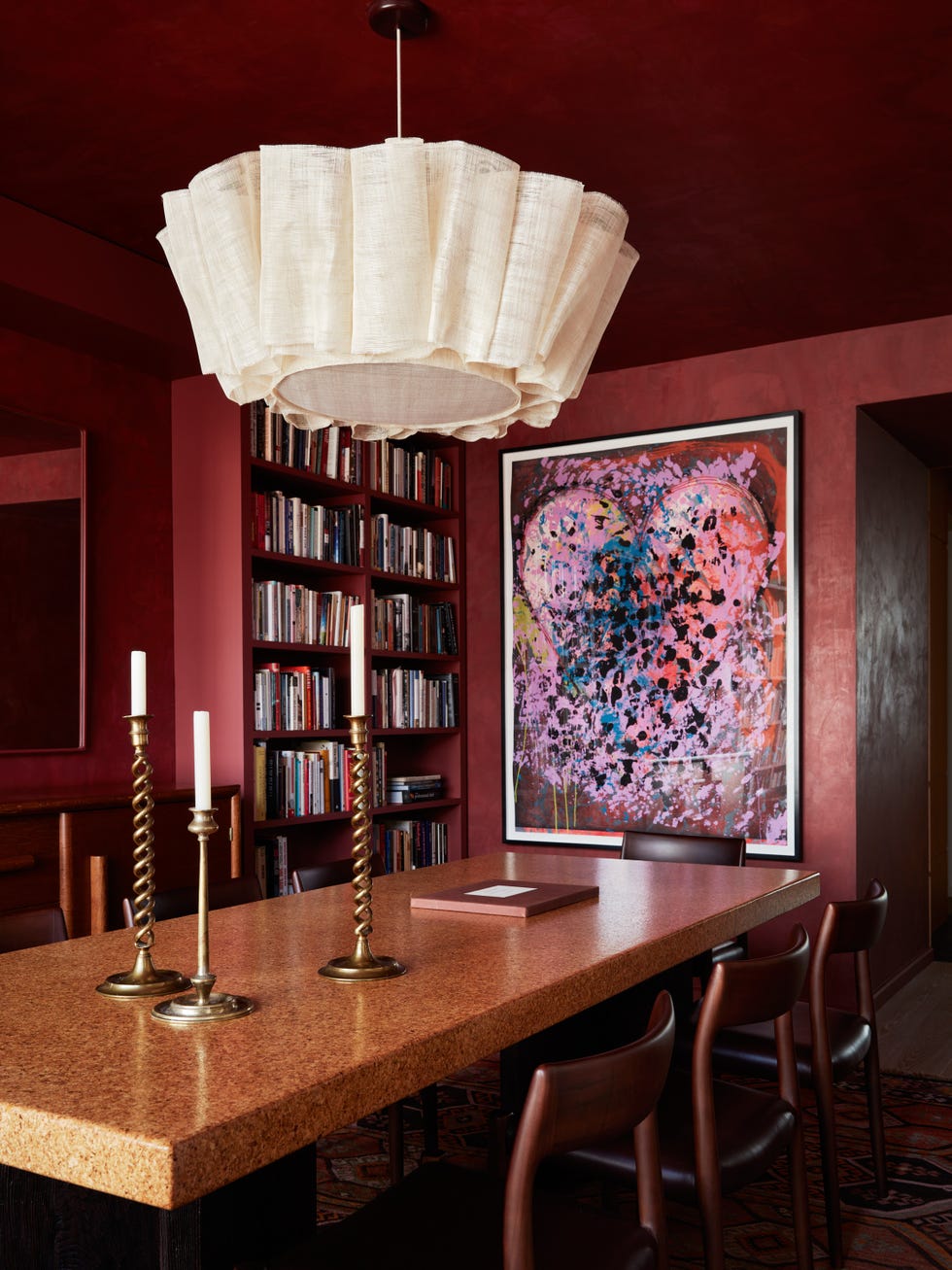
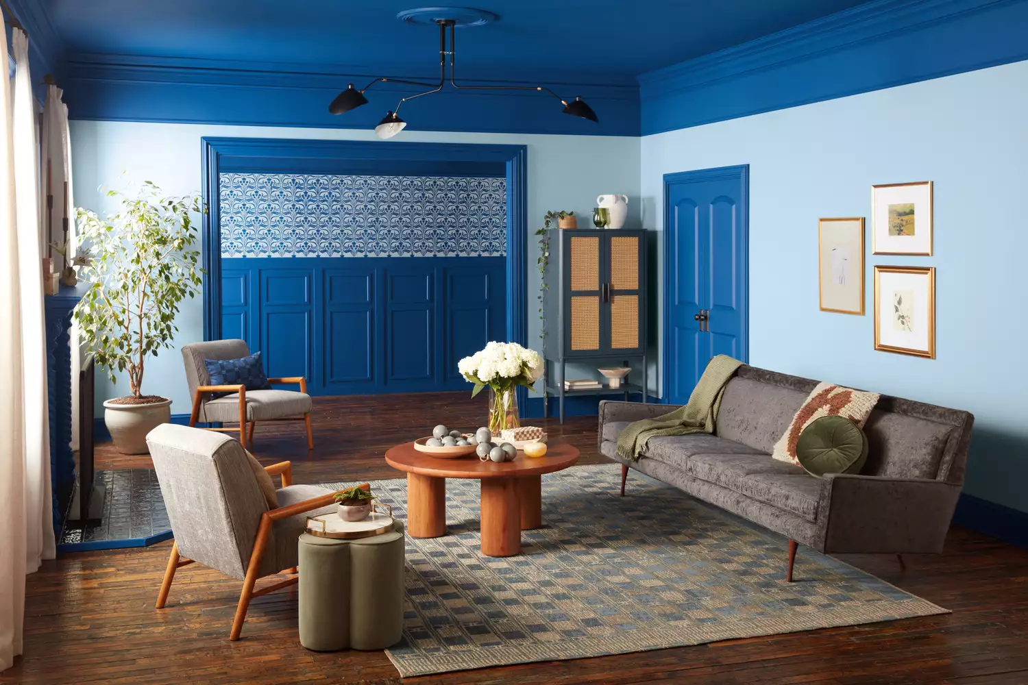
Several specific color predictions are highlighted. Blair Moore of Moore House Design anticipates Oiled Bronze, a rich, near-black tone with brown and metallic charcoal undertones, will be popular for cabinetry, powder rooms, or accent walls. She suggests Sherwin-Williams’s Superior Bronze and Urbane Bronze as examples. Moore also predicts Weathered Clay, a muted terracotta, will gain traction, describing it as warm, tactile, and grounding, reminiscent of European plaster walls. Ashley McCollum, a color expert for Pittsburgh Paints Co., agrees, specifically mentioning Glidden’s Cinnamon Spice. For brighter options, Erika Woelfel of Behr suggests Aerial View by Behr, a sky blue that promotes peace and relaxation.
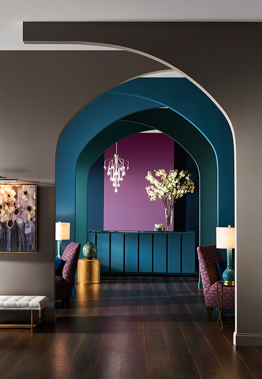
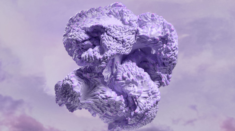
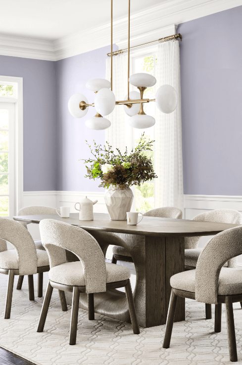
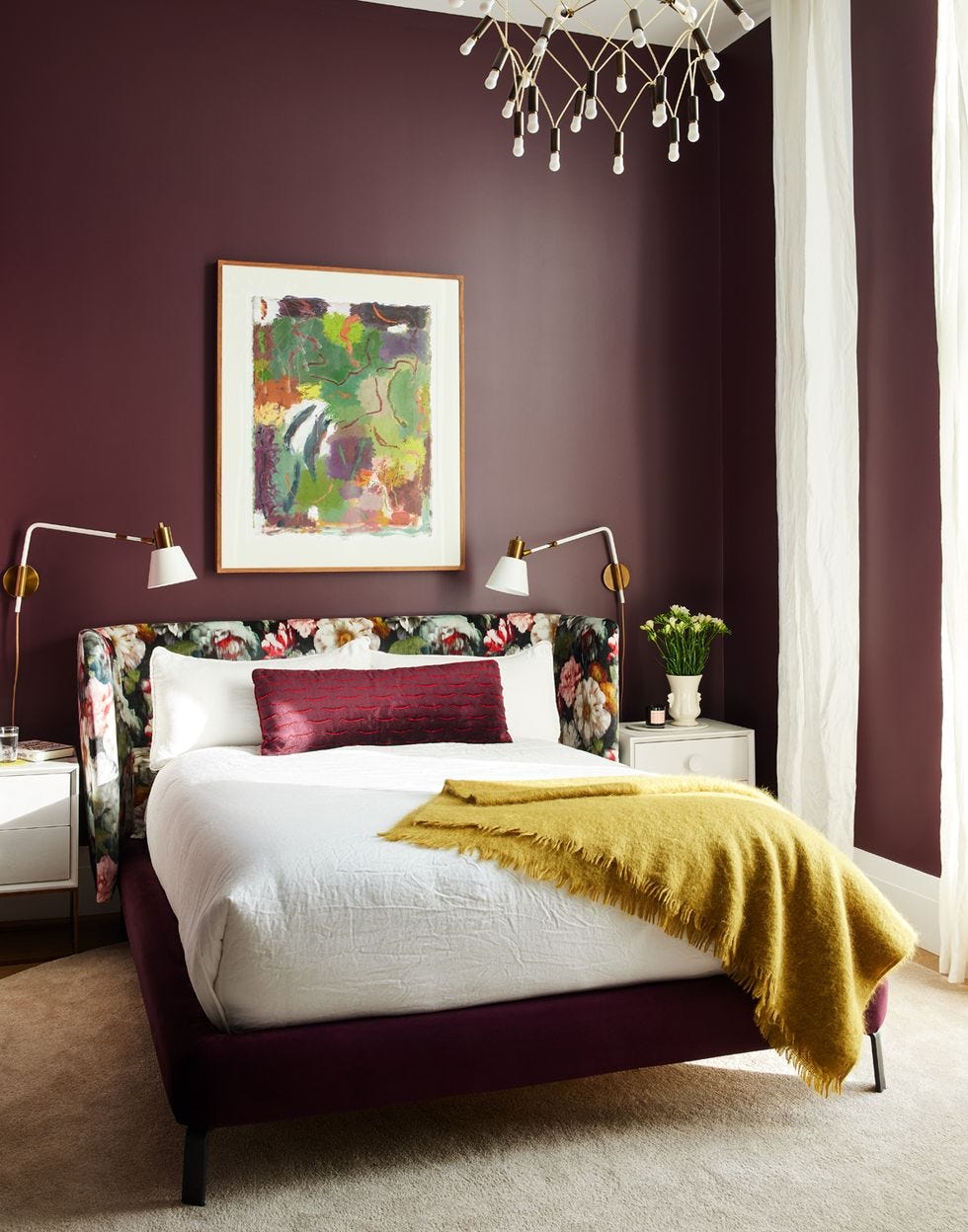
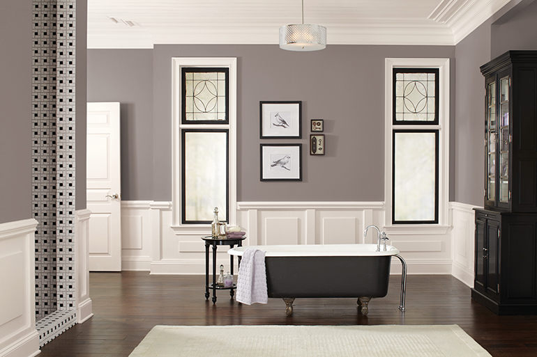
Lucy O’Brien of Tartan & Toile advises moving away from gray interiors and foresees plum shades, such as Glidden’s Purple Basil, gaining momentum due to their full-bodied yet bright, versatile, warm, and cool qualities. Melissa Oholendt of Oho Interiors is confident in muted rose tones, having painted her own primary bedroom in Farrow & Ball Sulking Room Pink. Sue Kim, director of color marketing at Valspar, predicts nocturnal black, like Valspar’s Nevermore, an elegant deep violet black, will be used in carved-out spaces like reading nooks.
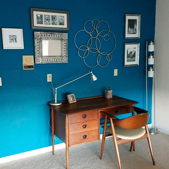
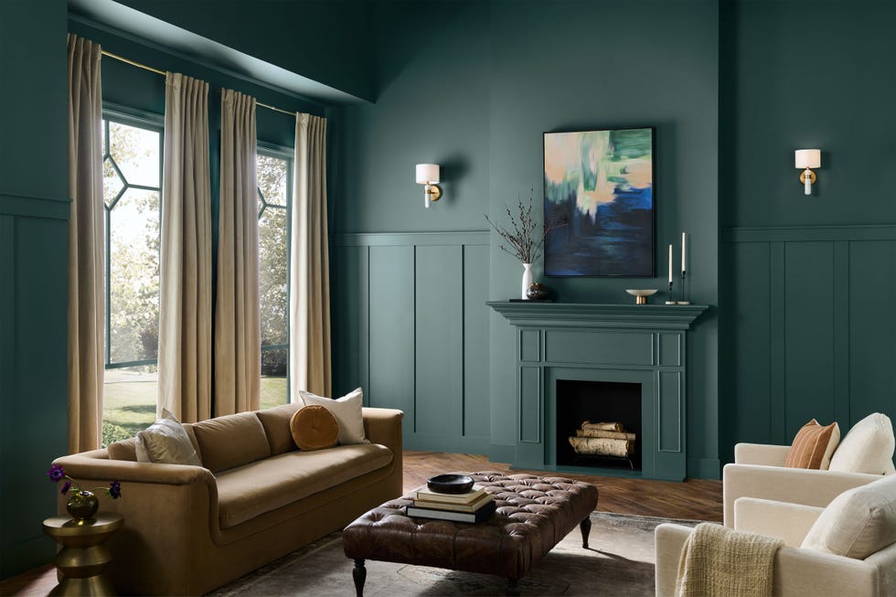
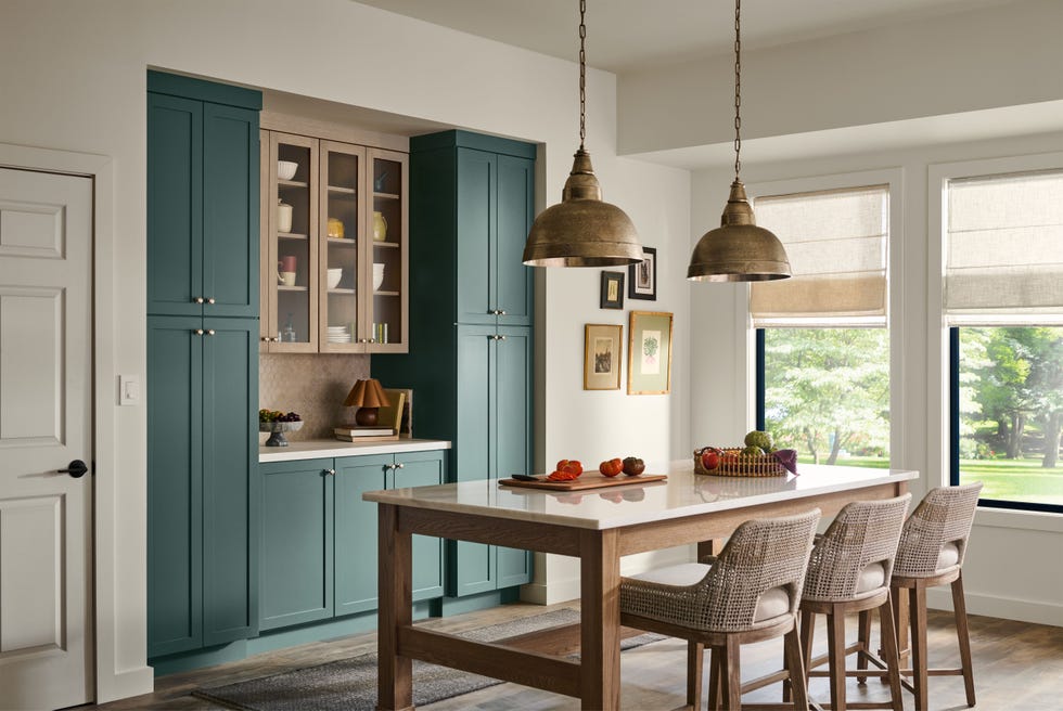
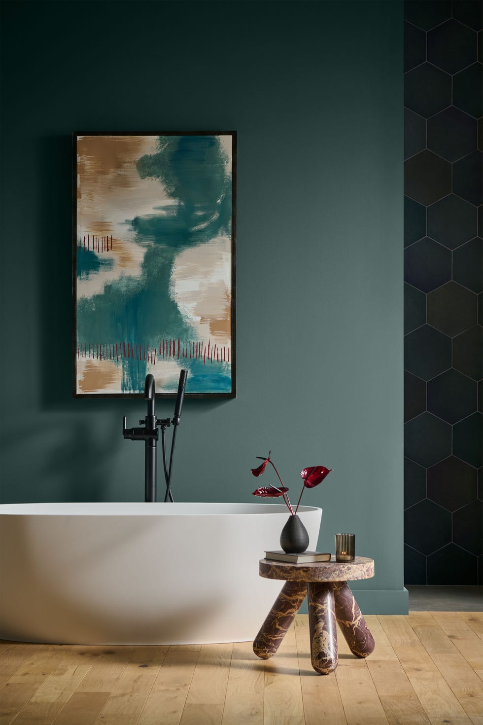
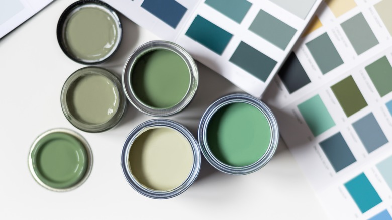
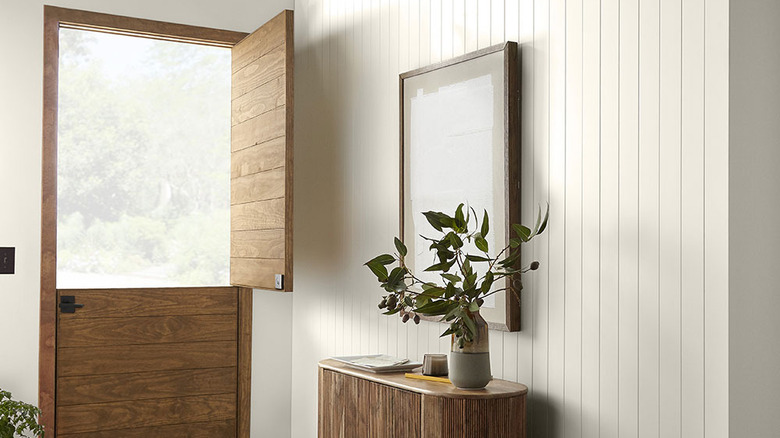
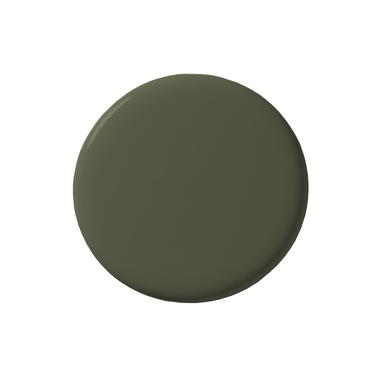
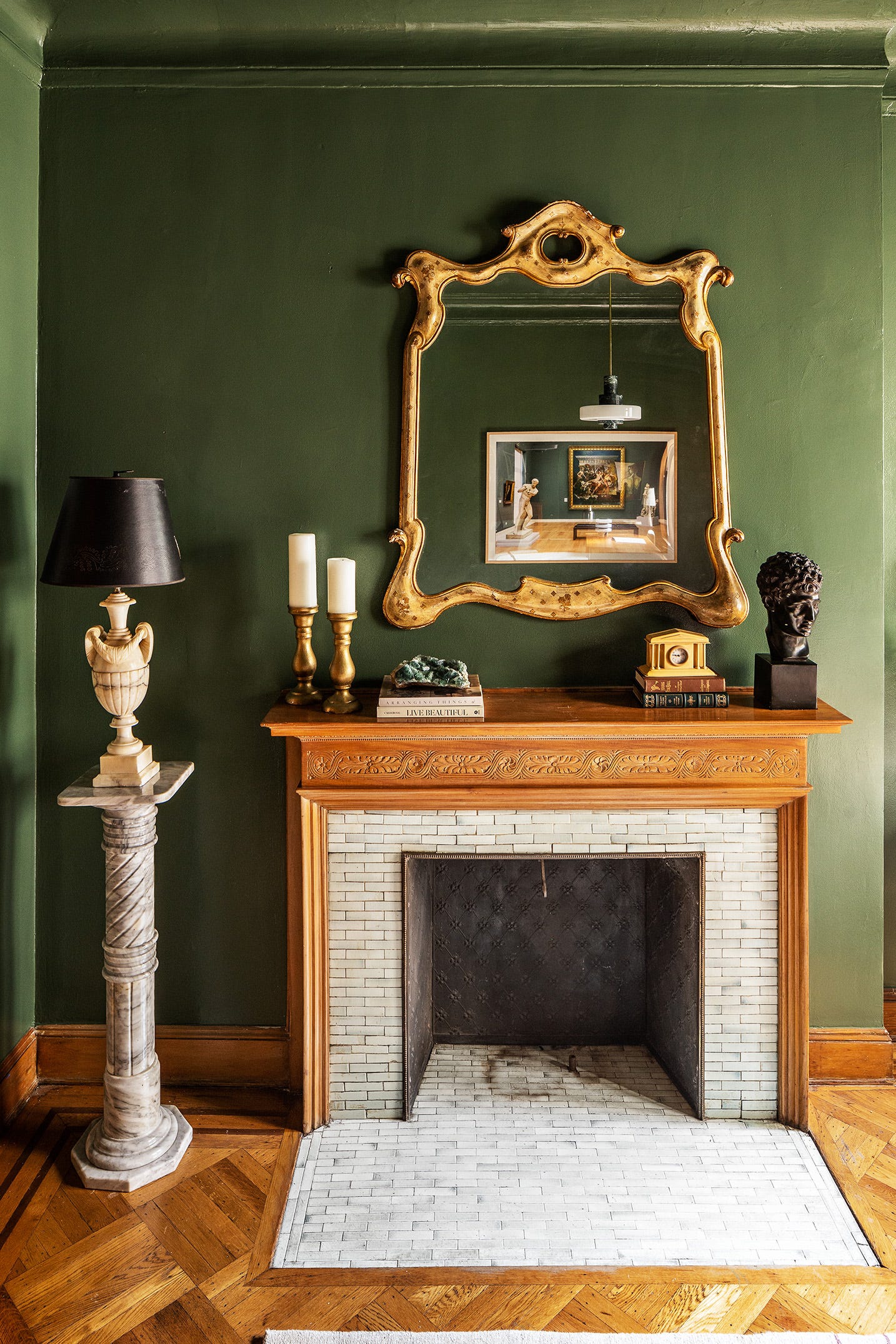
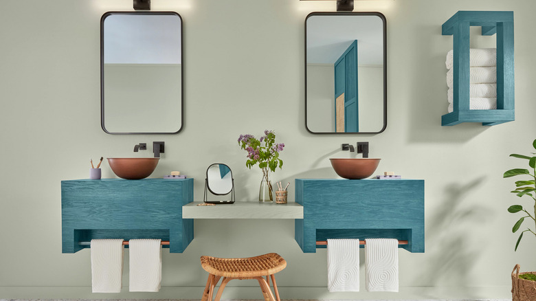
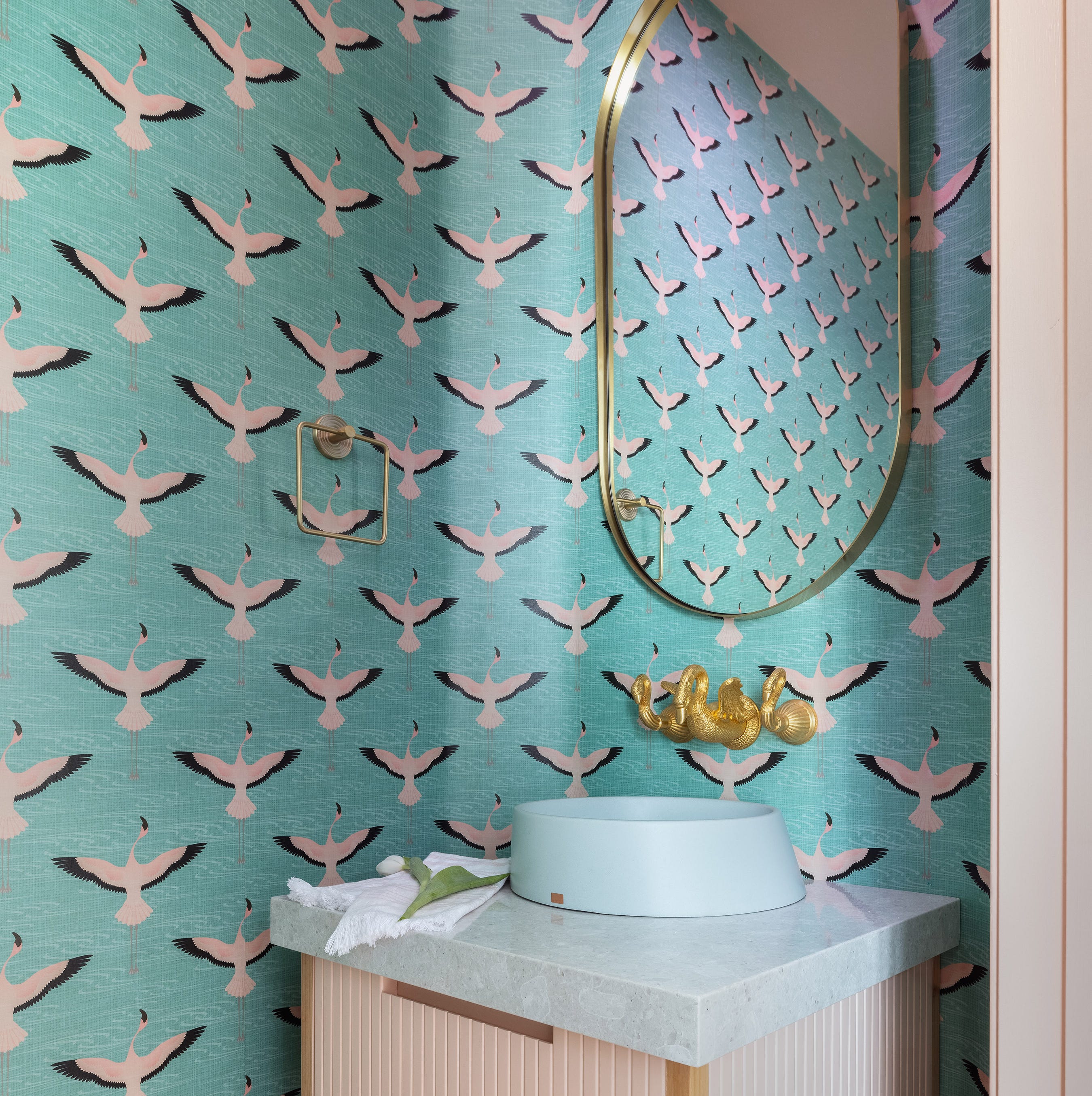
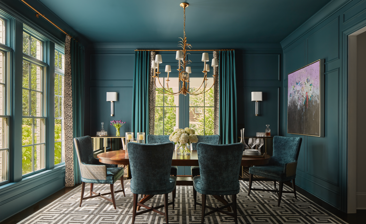
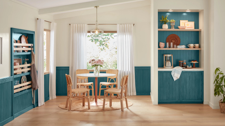
Muddy greens are also expected to trend, with Oholendt recommending Farrow & Ball’s Reduced Green as a “perfect green-brown.” Moore describes this as an aged, earthy green with a brown-black base that feels masculine and refined. In terms of neutrals, a creamy white is expected to replace stark whites. Breegan Jane recommends Sherwin-Williams’s Snowbound, emphasizing that white should be clean but not stark, with hints of chalk and raw linen. Light teal shades, such as Sherwin-Williams’s Quietude, are also predicted to be prevalent, bringing punchy personality to spaces.
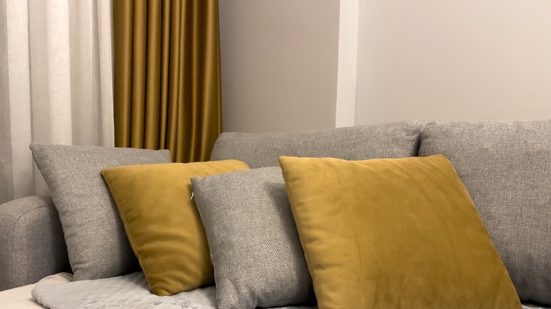
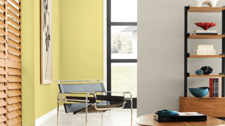
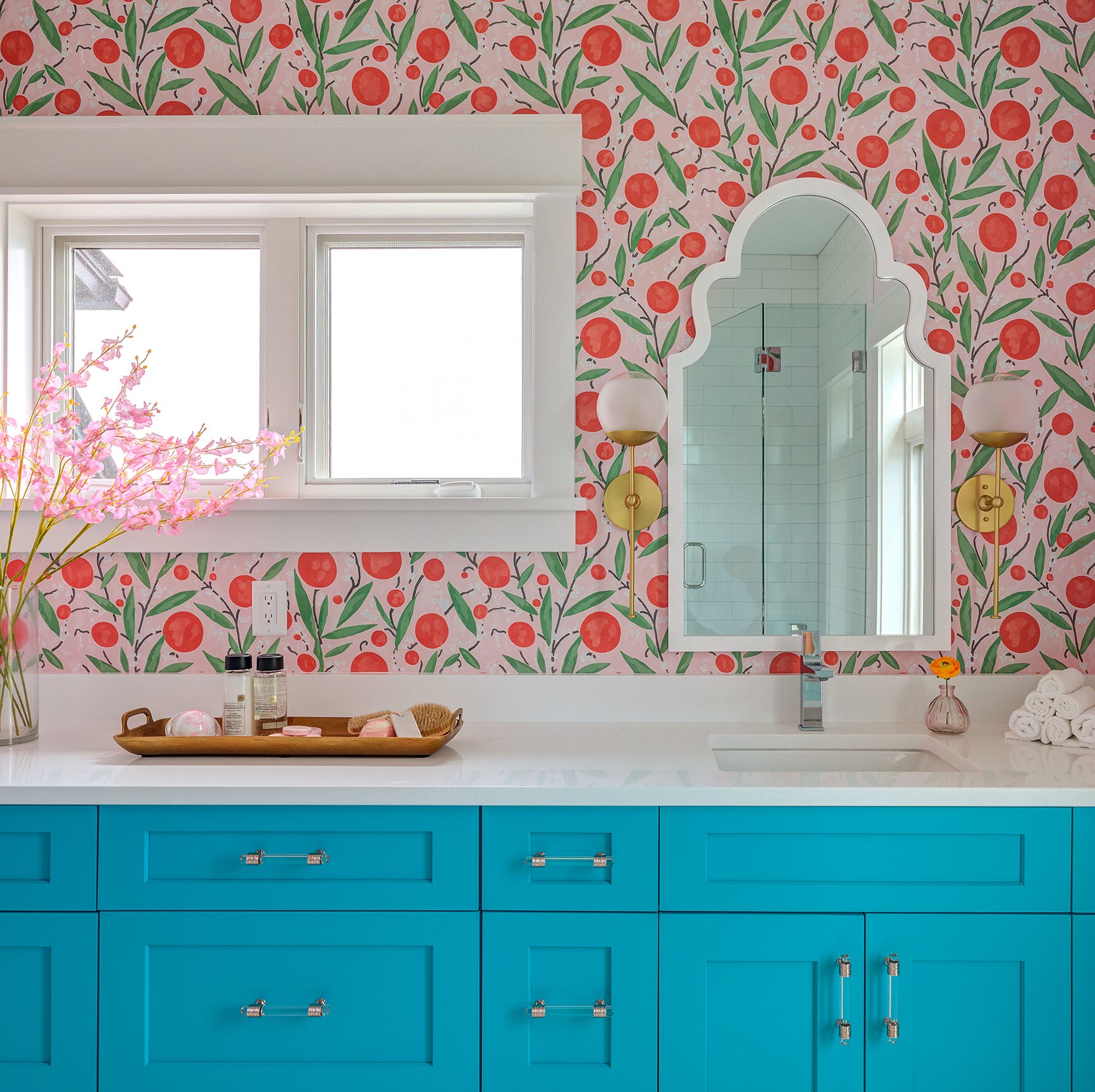
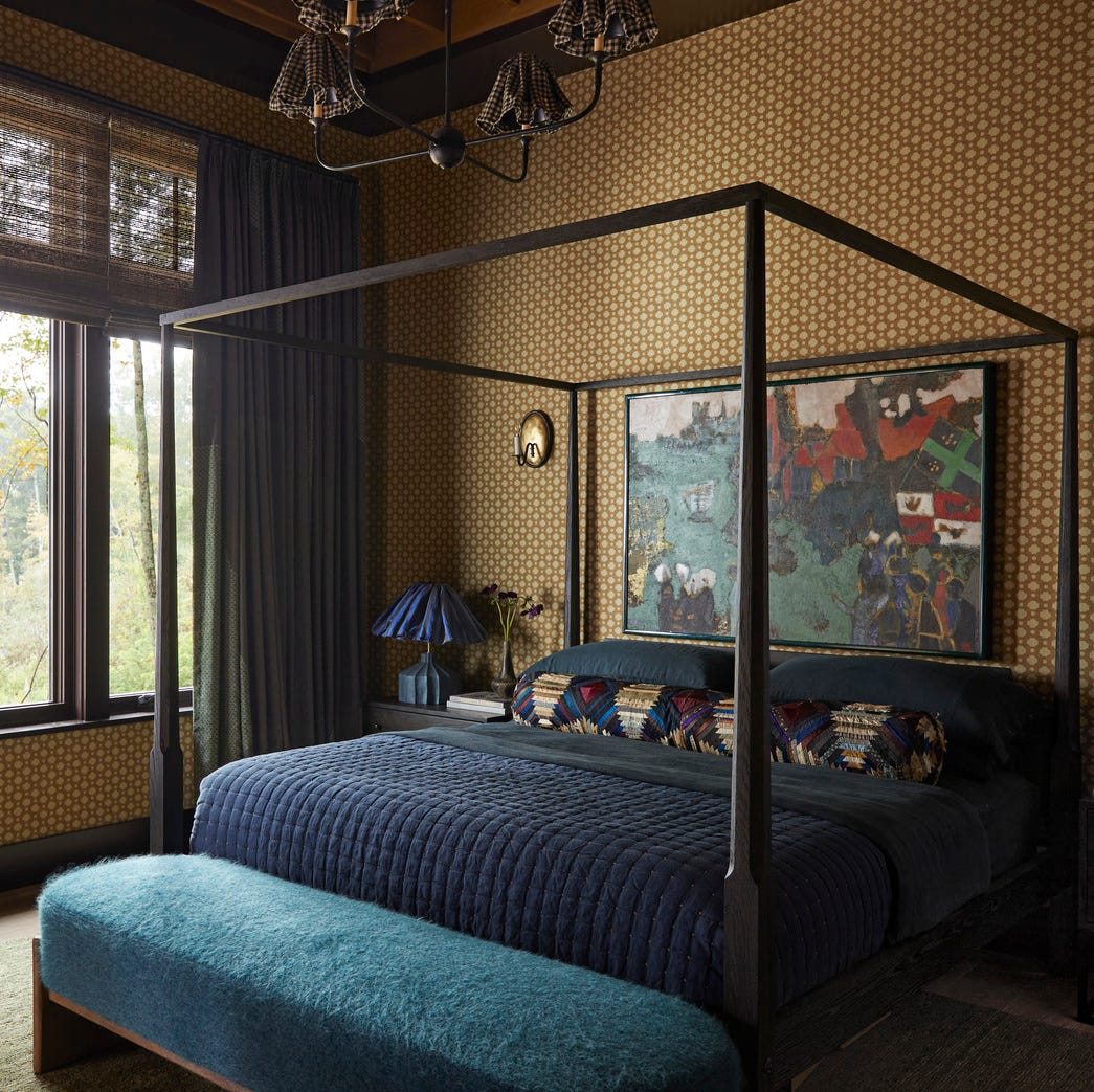
Further predictions include magenta hues, like Benjamin Moore’s Gypsy Pink, for adding personality through accents, and mustard yellow, exemplified by Behr Celebration, as an evolution of the butter yellow trend. Atmospheric blues with violet undertones, such as Valspar’s Encore, are also expected to be popular for their nurturing, joyful, and futuristic qualities. Lastly, O’Brien notes that gold, in both paint and wallcovering, will appear more in “jewel box” spaces, mentioning Little Greene’s Giallo. Both O’Brien and Moore also foresee a warmer, foggier green, like Farrow & Ball’s Green Ground or Sherwin-Williams’s Svelte Sage, for creating layered, calm, and complex interiors.
#PaintColors #InteriorDesignTrends #ColorPrediction #HomeDecor #DesignExperts #SherwinWilliams #Behr #FarrowAndBall #Valspar #BenjaminMoore #PaintColors #InteriorDesignTrends #ColorPrediction #HomeDecor #DesignExperts #SherwinWilliams #Behr #FarrowAndBall #Valspar #BenjaminMoore
0 comment in total
 No comments yet
You may also like
Sherwin-Williams, Benjamin Moore Pick Colors of the Year for 2015

20 Coordinating Hues To Pair With Sherwin-Williams' Gorgeous Color Of The Year
12 Trending Paint Colors for 2024, According to Design Experts

Valspar Reveals Their 2025 Color of the Year—And It's a Surprising Take on a Timeless Shade

Poised Taupe Is the Sherwin-Williams Color of the Year

What To Expect For 2023 Paint Color Trends

Sherwin Williams Announces Its Wood Stain Color Of 2024
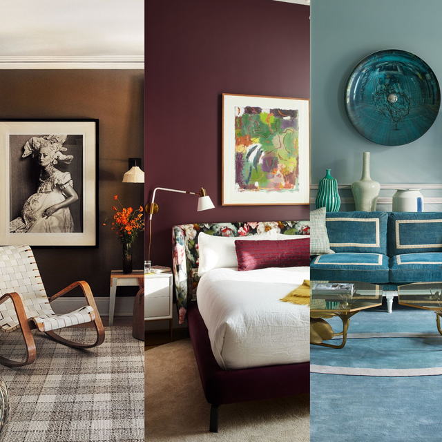
We’re Calling It: These Are the Official Color Trends of 2025

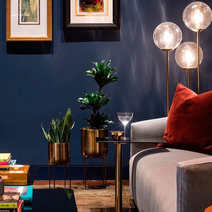
A Look Back at the Last Decade of Sherwin-Williams’ Color of the Year

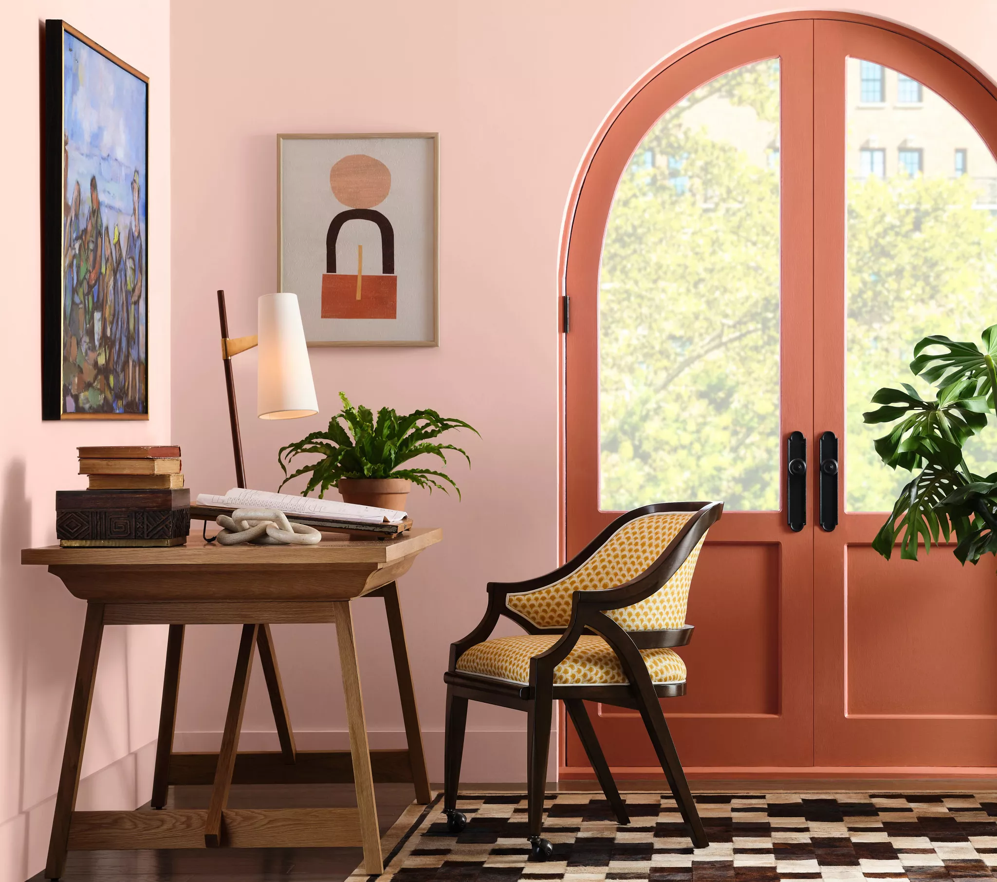
The New Sherwin-Williams 2025 Color Trends Are Bursting with Energetic Hues

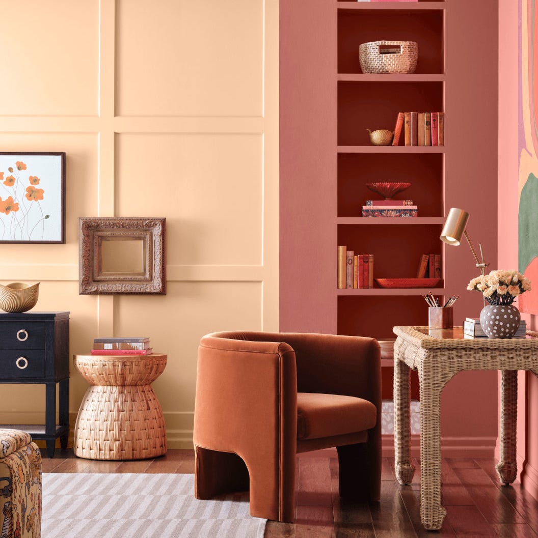
Sherwin-Williams' 2026 Color Forecast Is Here and It’s Packed With 48 Fresh Hues
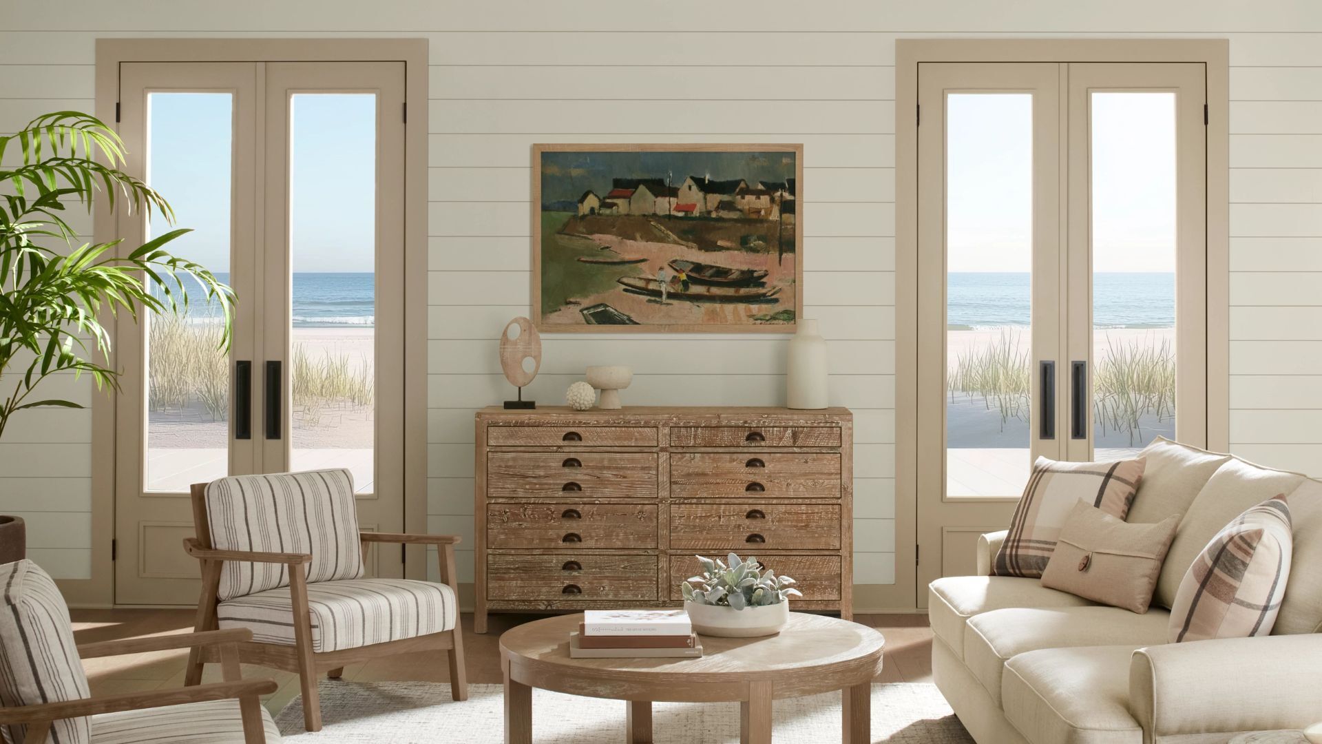
Sherwin-Williams' color of the month is the mushroom-toned neutral you didn't know you needed


Sherwin-Williams Just Named Its Loneliest Color of 2025—and Everyone Should Be Using It
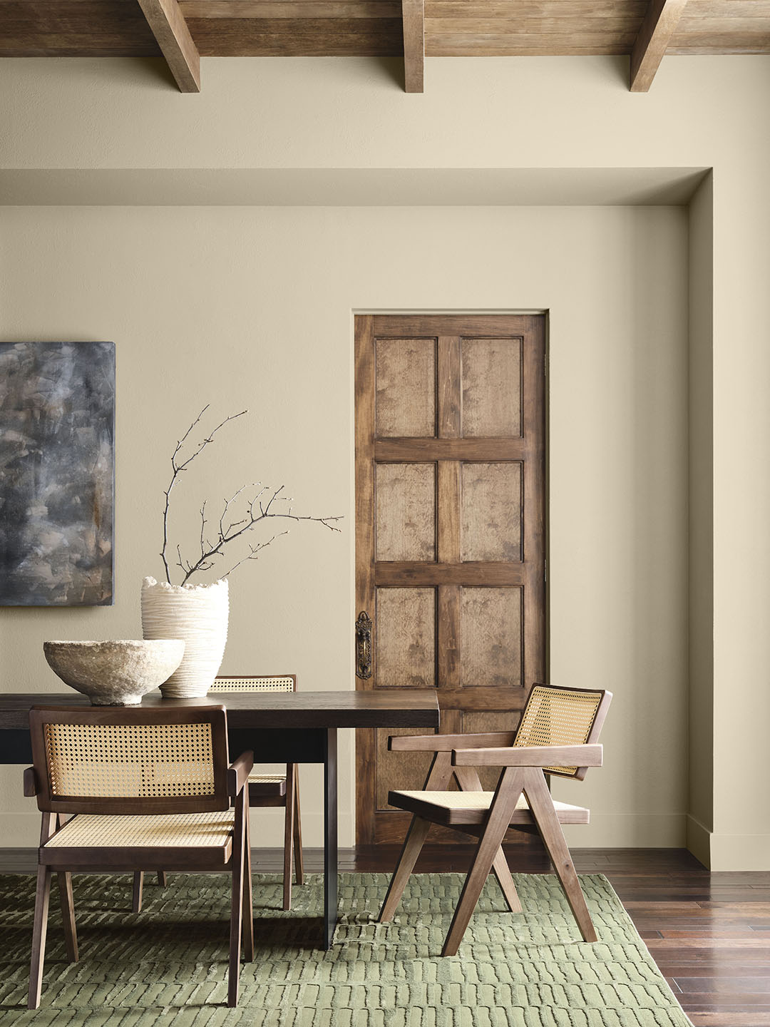
This Controversial ’90s Hue Deserves a Second Chance in 2026


2026 Color of the Year Announcements Have This In Common

Deeper, moody colours and precious jewel tones are in style this year
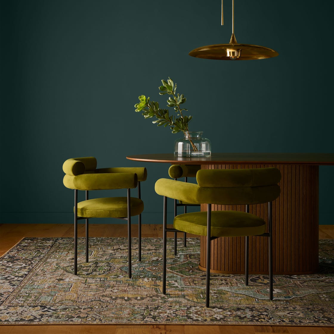
Behr's 2026 Color of the Year Is Here—And It’s Moody
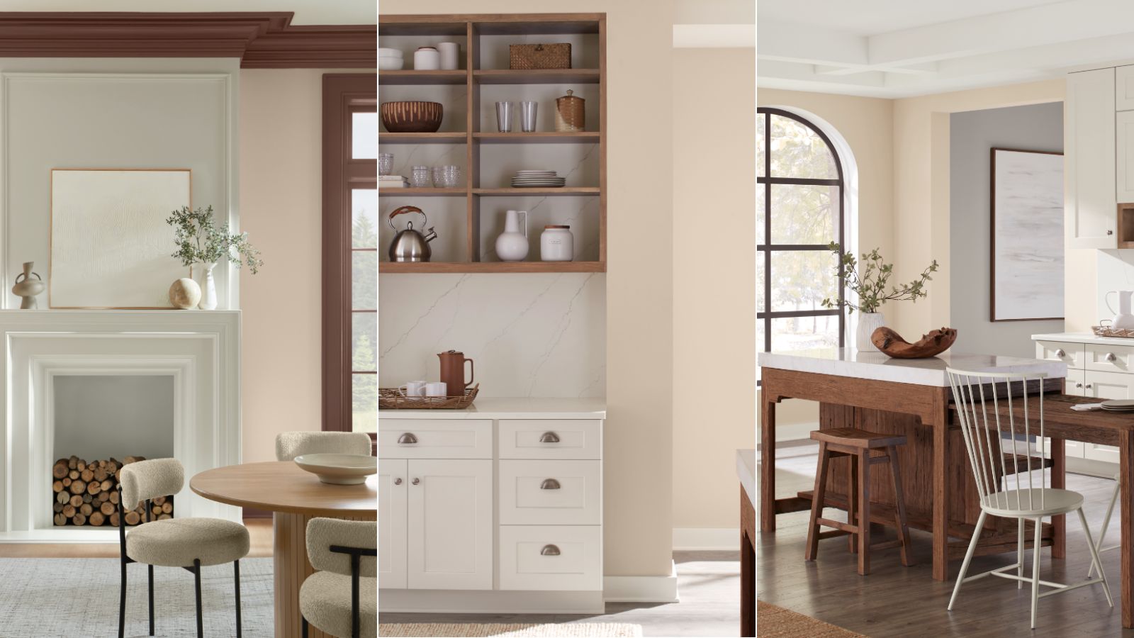
Sherwin-Williams' December Color of the Month
This Very "Controversial" Color Is About To Be Everywhere Again
The 2026 paint Colors of the Year Have Been Announced