1/6
Why Benjamin Moore's Classic Gray Is a Designer-Favorite Paint Color
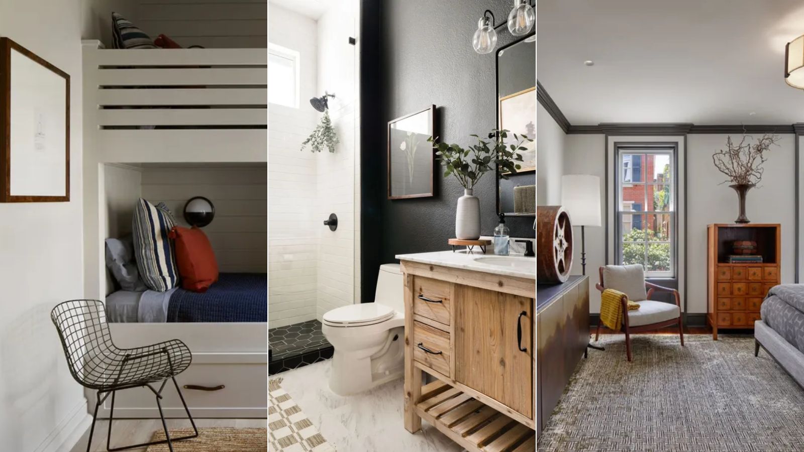
Choosing the right paint color for a home can be a difficult task, especially when aiming for a neutral tone that provides versatility without being too stark or too warm. While white is a common neutral choice, gray has emerged as a preferred alternative among interior designers. This article highlights Benjamin Moore's Classic Gray as a top designer favorite, along with five other highly recommended gray shades from the brand.
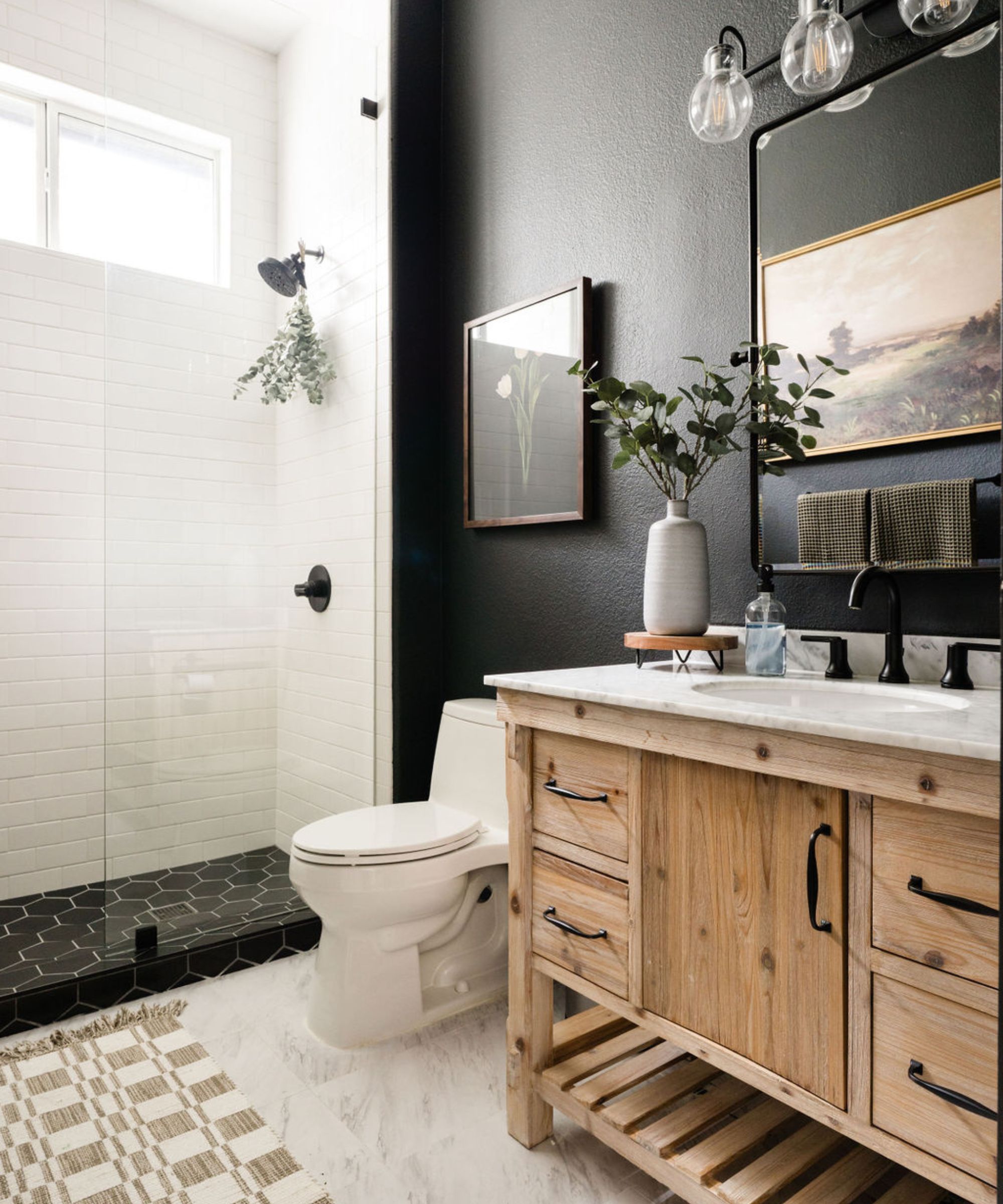
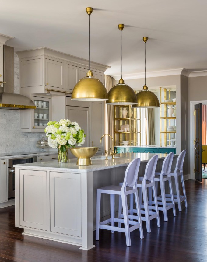
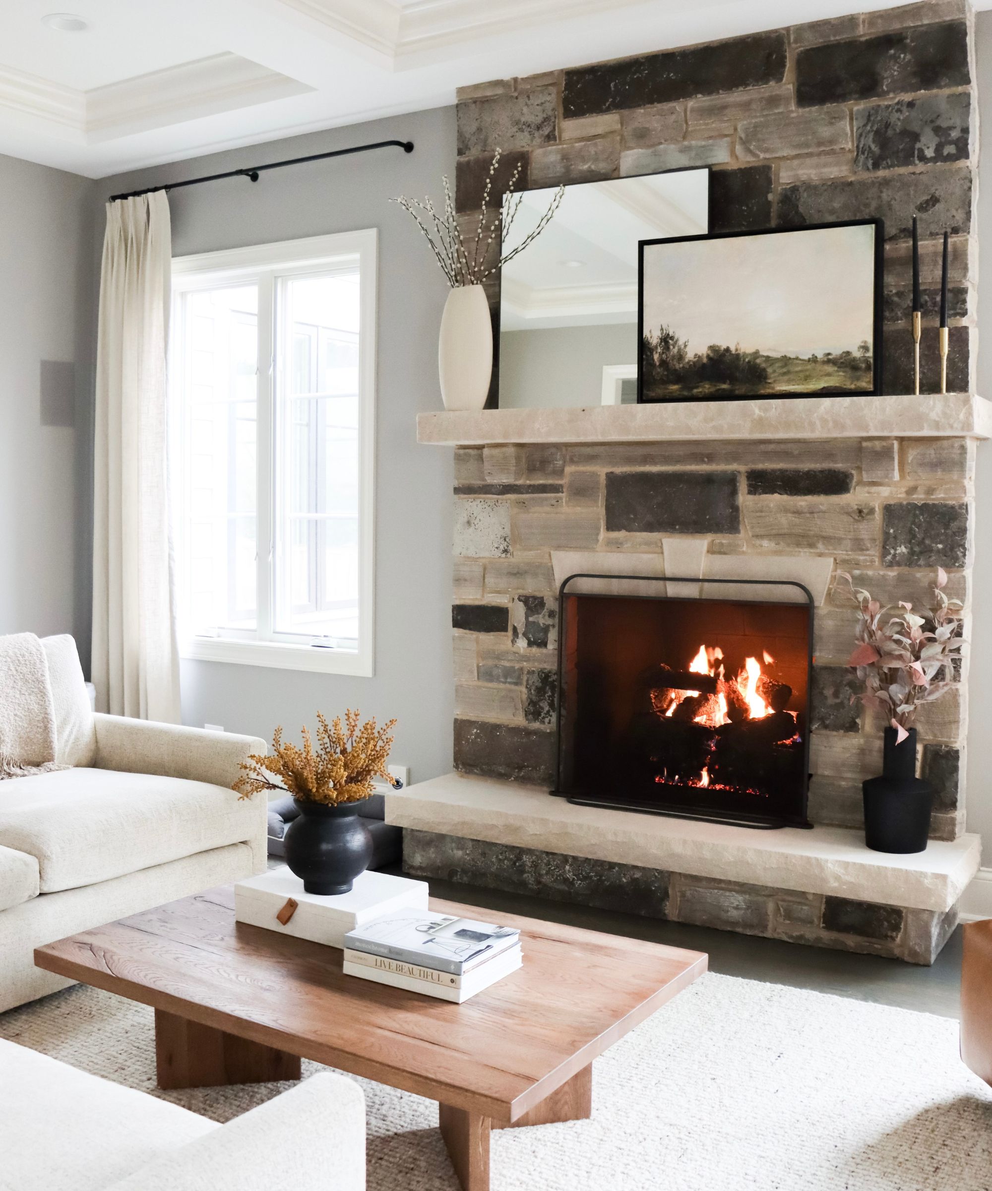
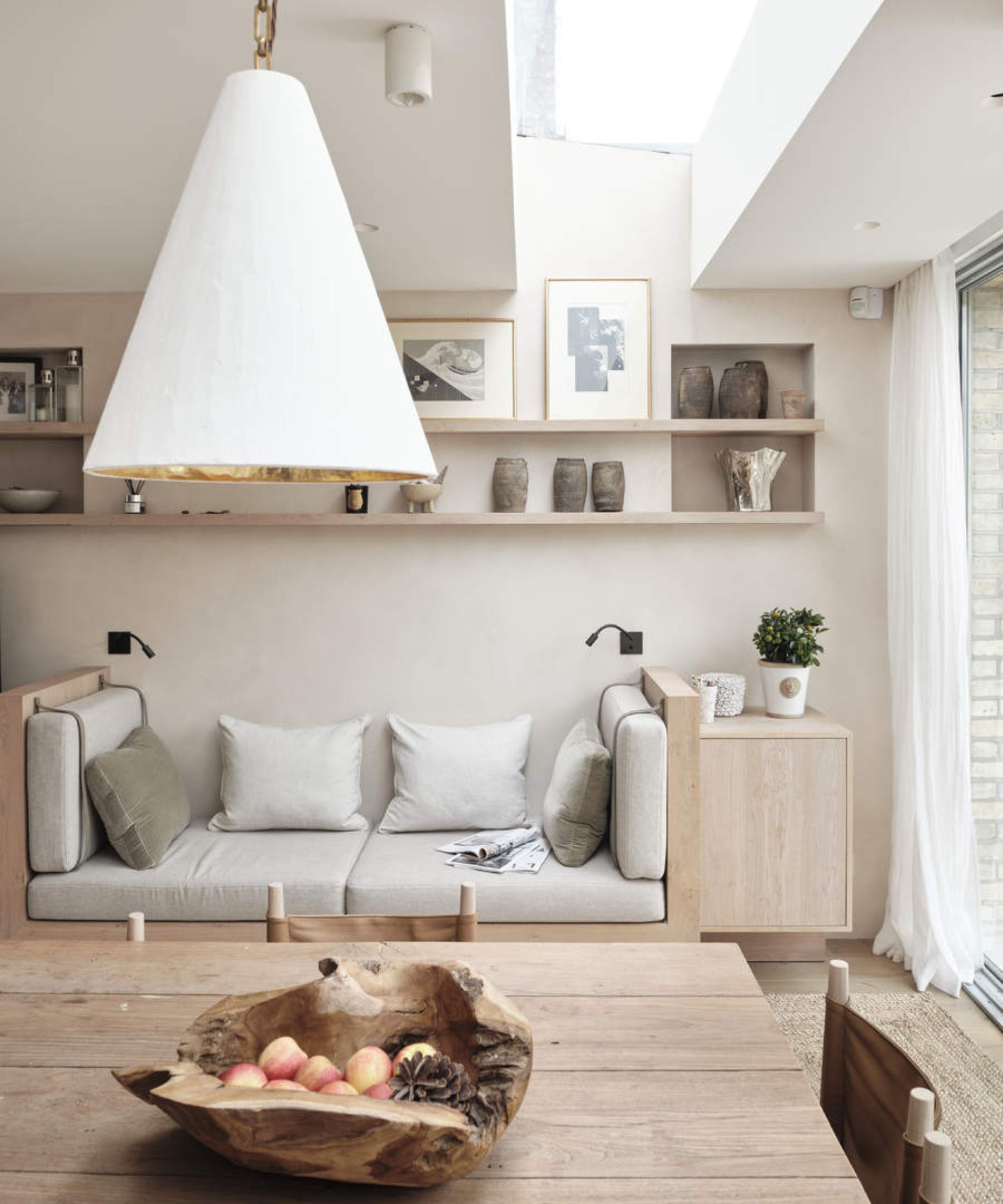
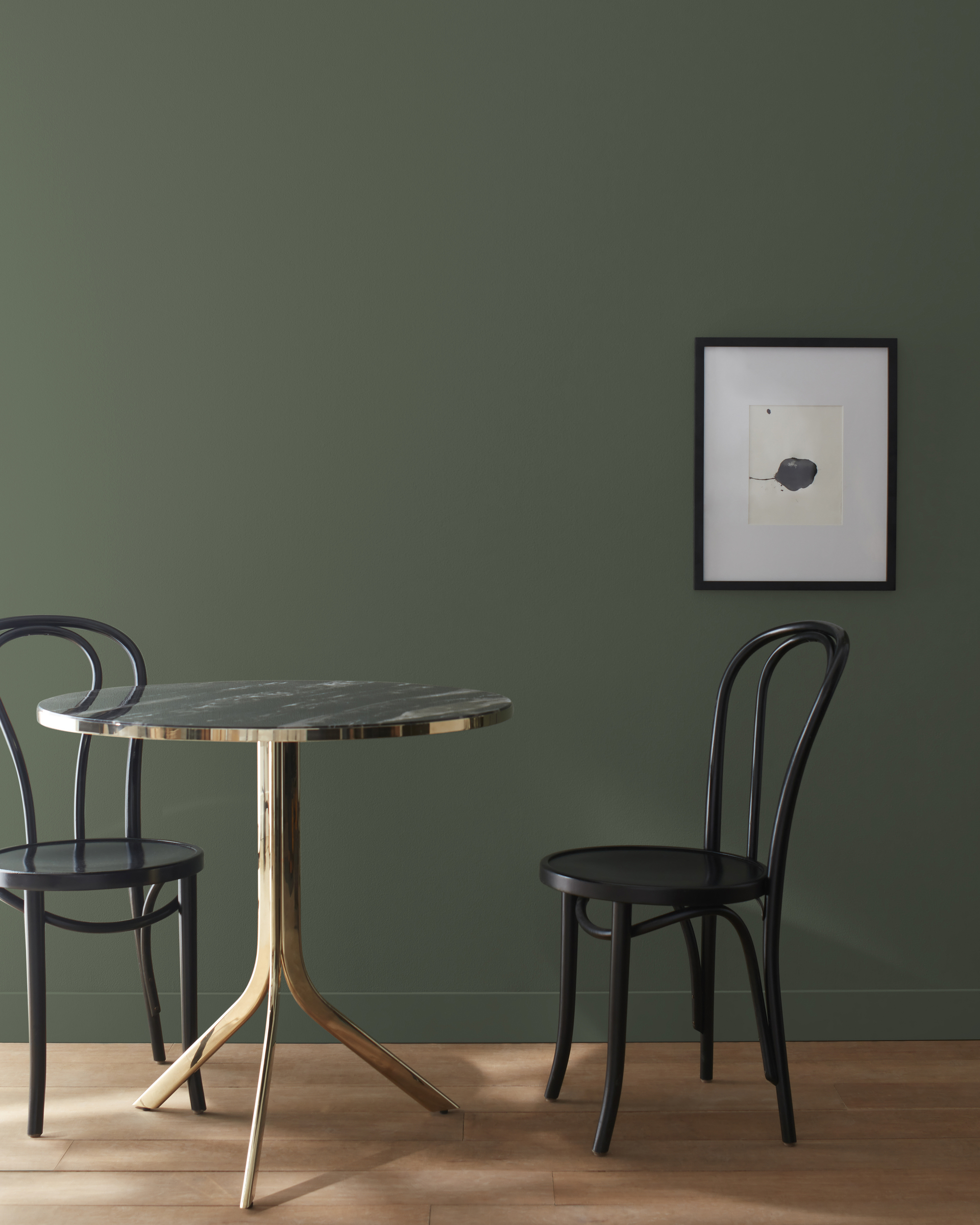
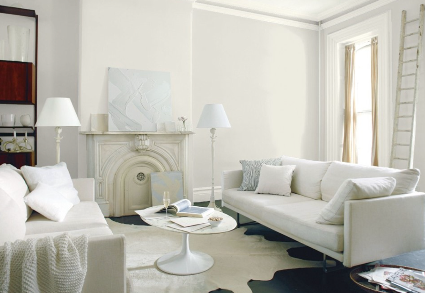
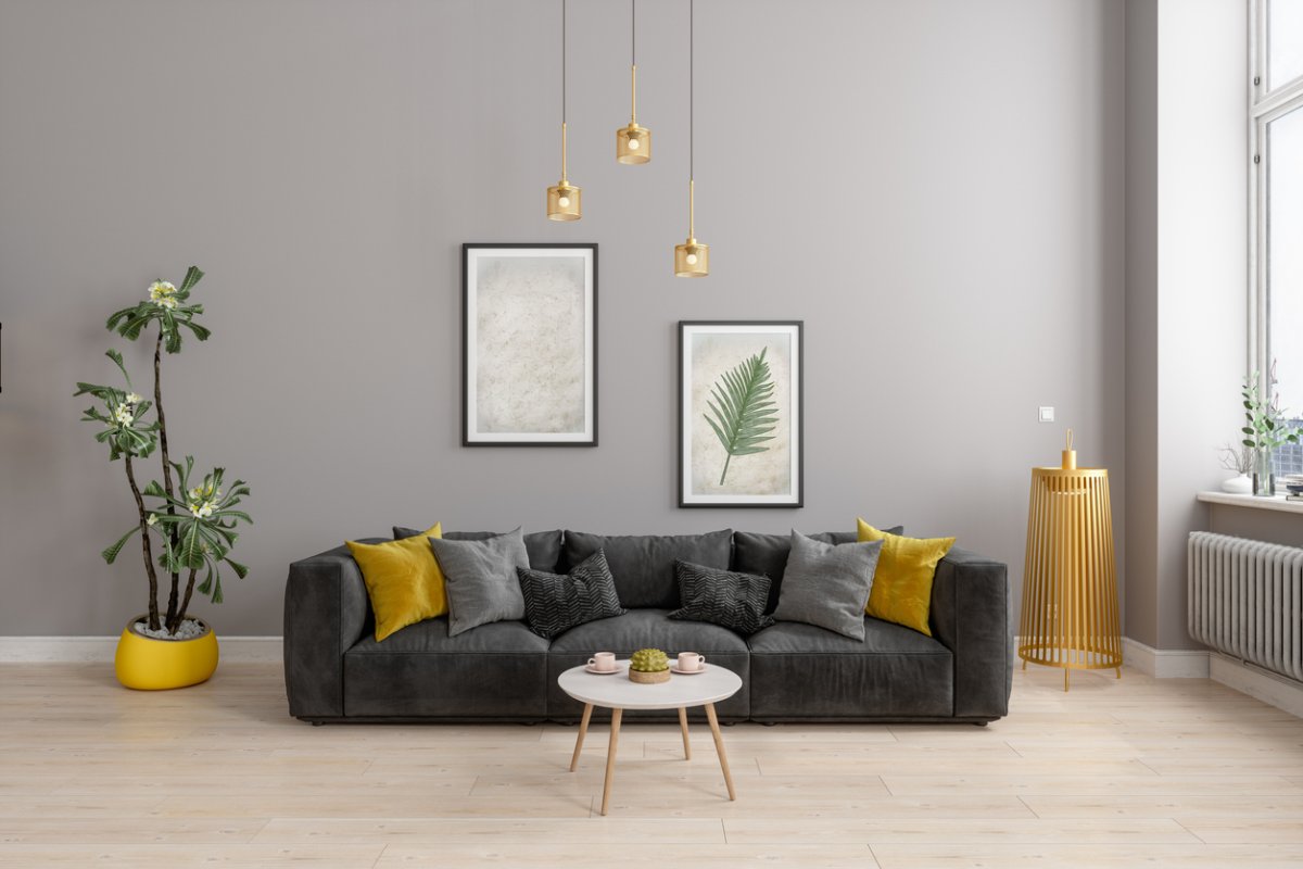
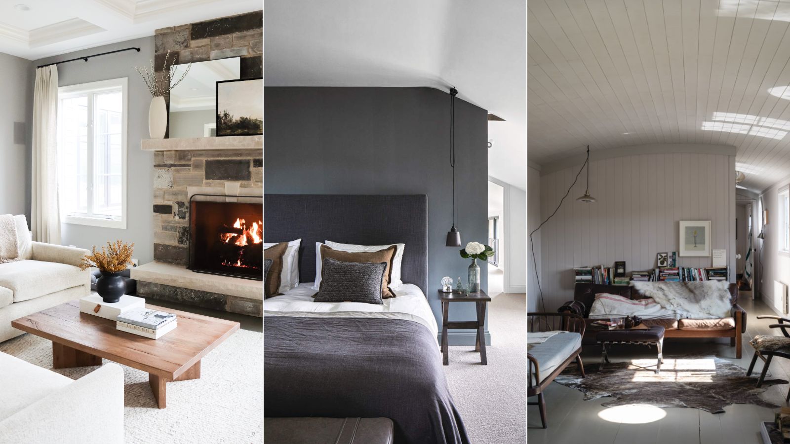
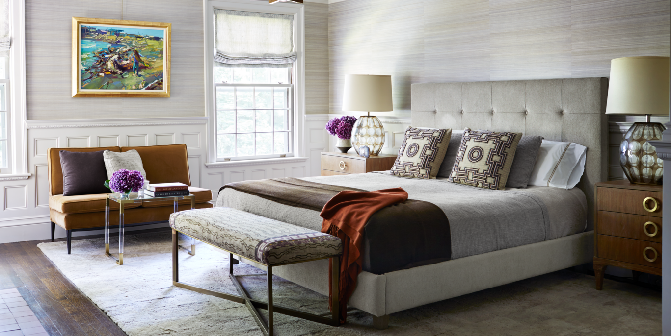
Classic Gray is lauded for its extreme versatility, offering a cool and calm aesthetic that serves as an ideal backdrop for various art pieces and room designs. Designer Nancy Price notes that this particular gray allows the room's elements to shine, rather than the paint color itself. It embodies the concept of 'greige,' a modern neutral that blends gray with warm beige, preventing it from leaning too cool or too warm. This balanced hue makes it suitable for a wide range of interior styles.
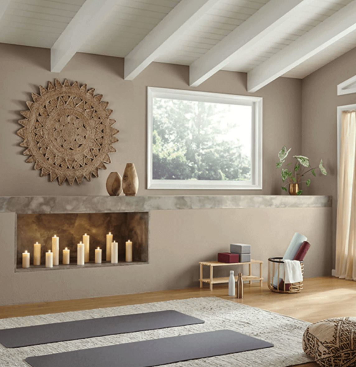
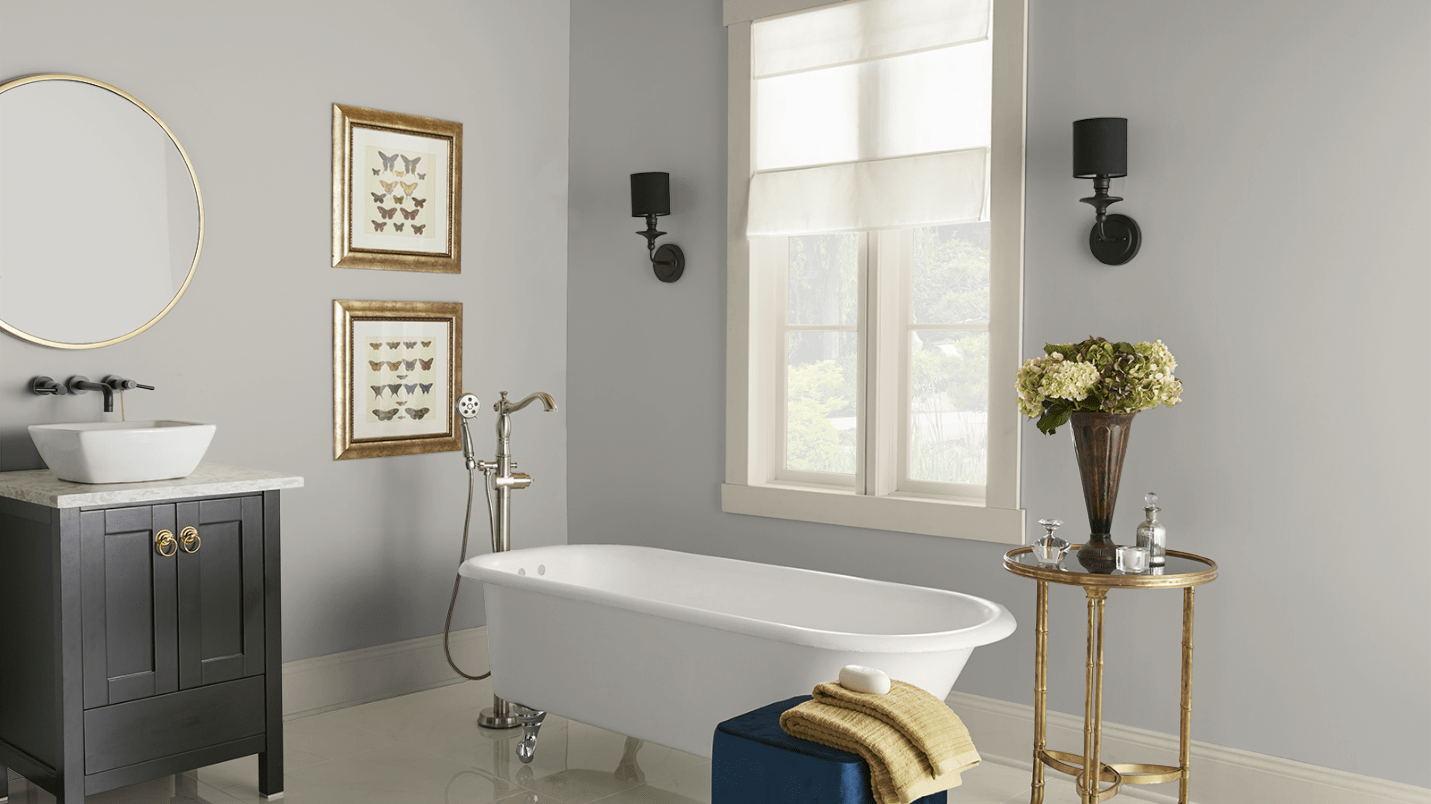
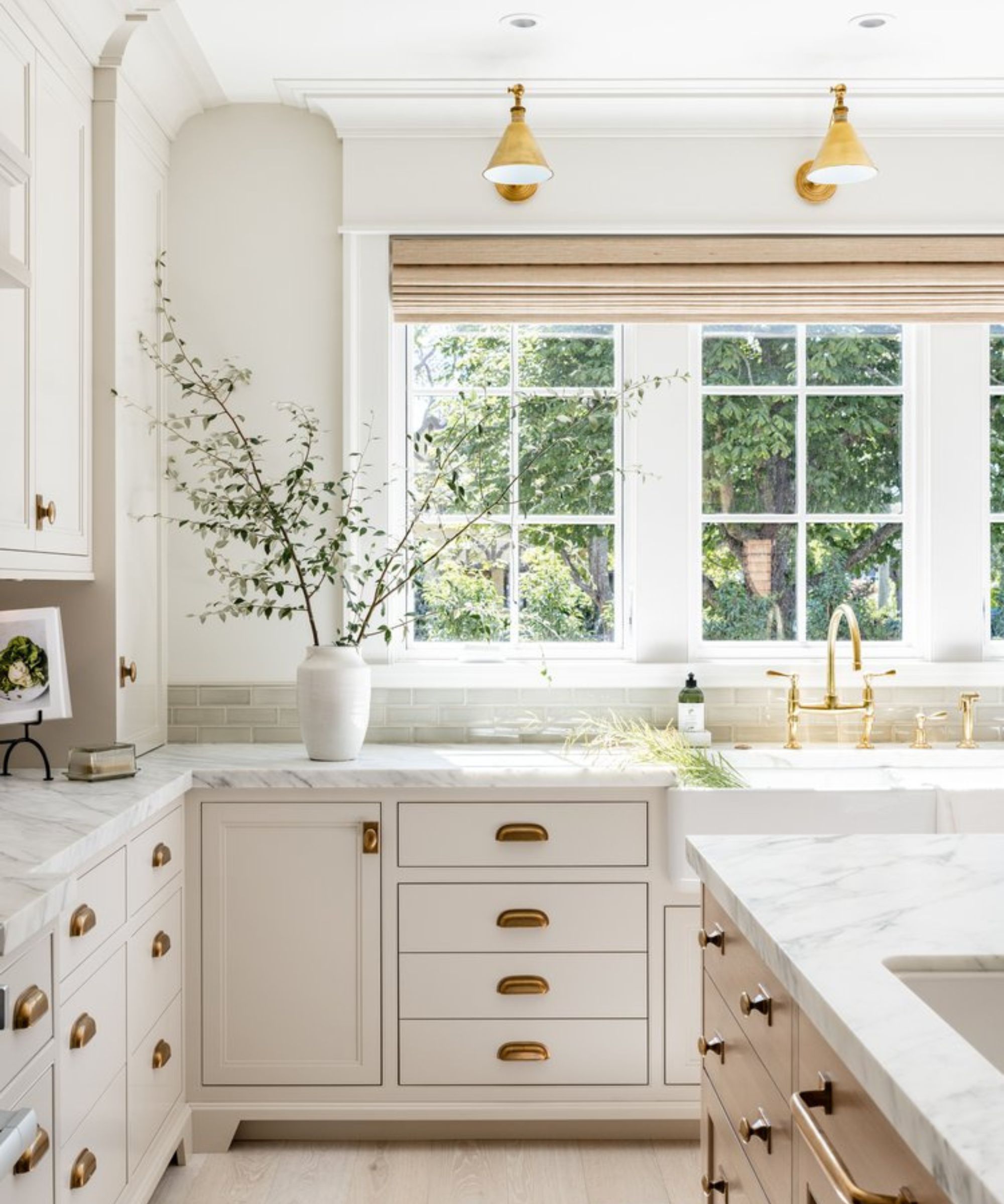
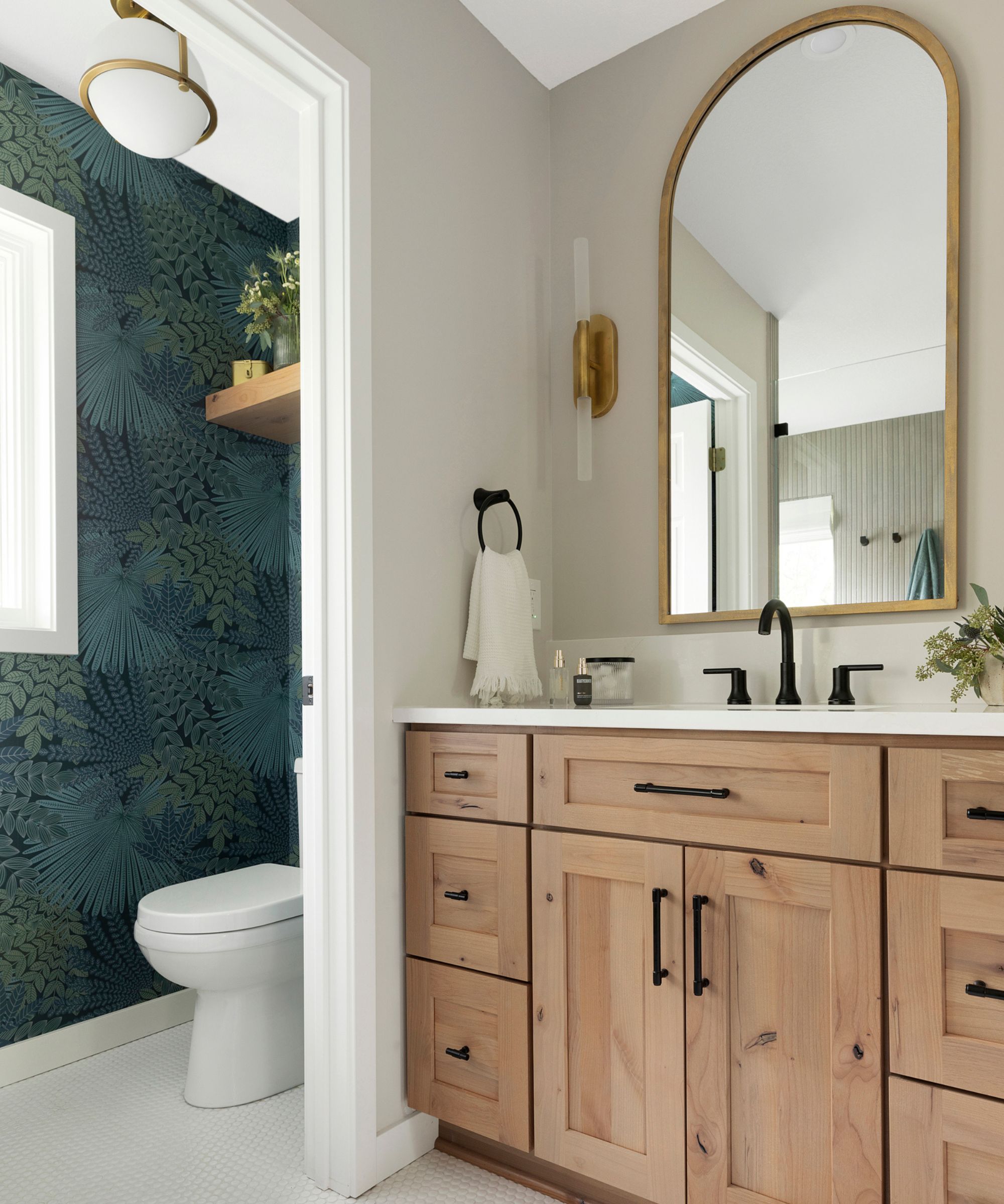
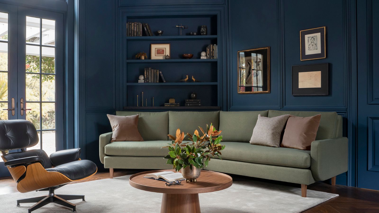
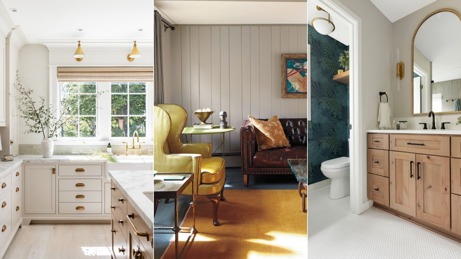
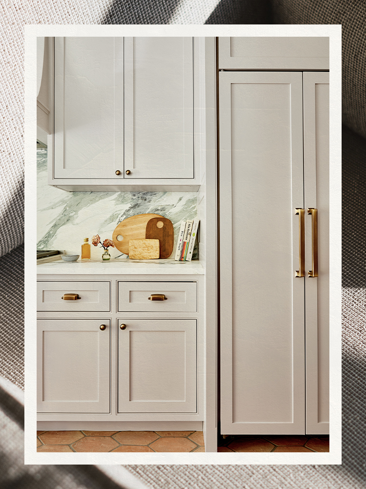
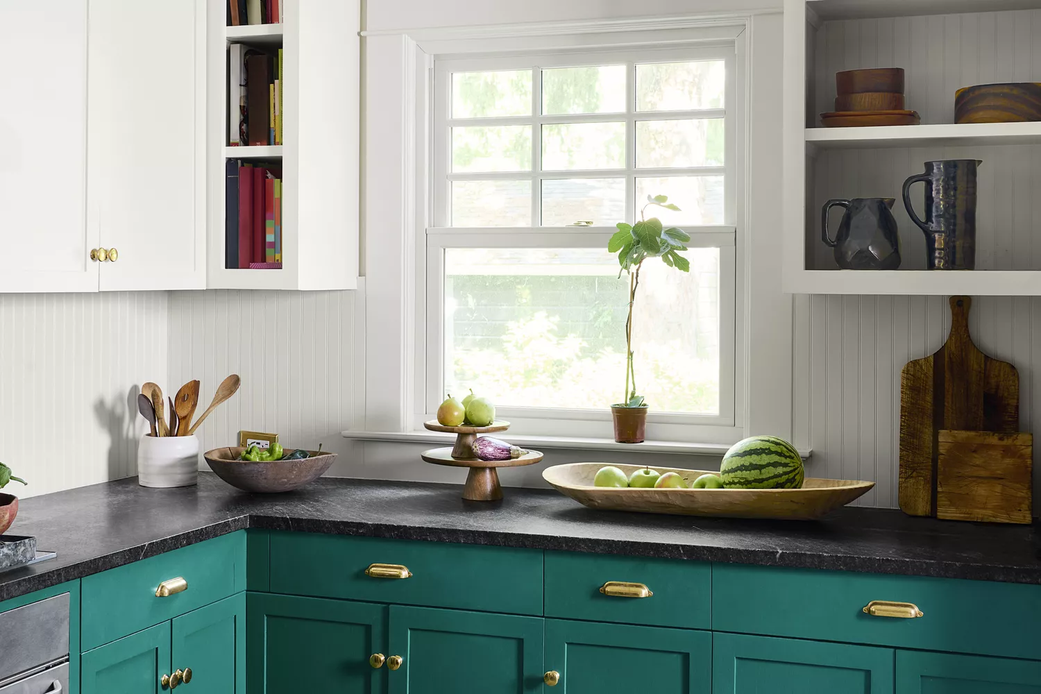
Beyond Classic Gray, the article presents other notable Benjamin Moore gray paints. Harbor Gray is featured in a Manhattan apartment designed by Amir Khamneipur, contributing to a luxurious and spacious feel despite the apartment's size. This soft, tonal gray is used on kitchen cabinetry, showcasing its ability to create a serene environment. Metropolitan, Benjamin Moore's 2019 Color of the Year, is described as a sleek and sophisticated soft gray with cool undertones. Ellen O’Neill, Benjamin Moore's director of strategic design intelligence, explains that Metropolitan fosters a contemplative state and provides an understated yet glamorous common ground for design elements.
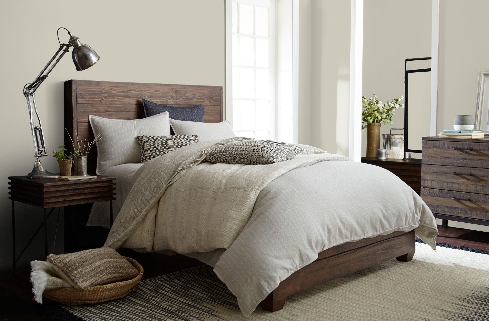
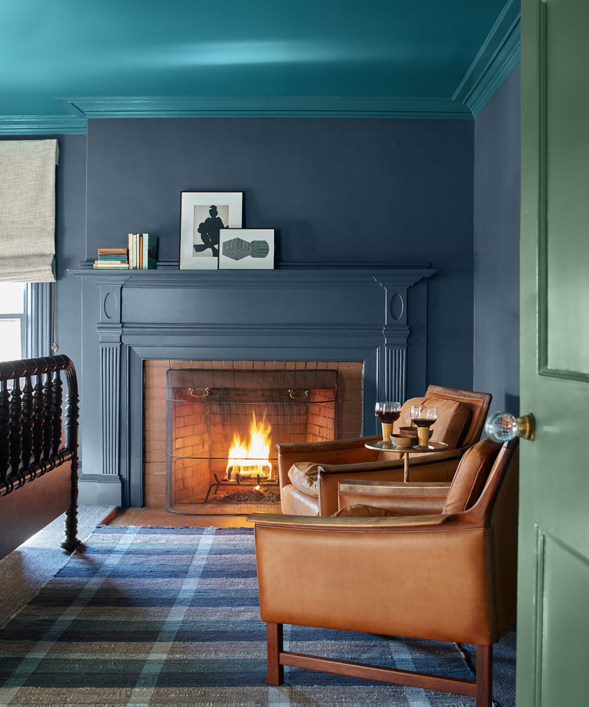
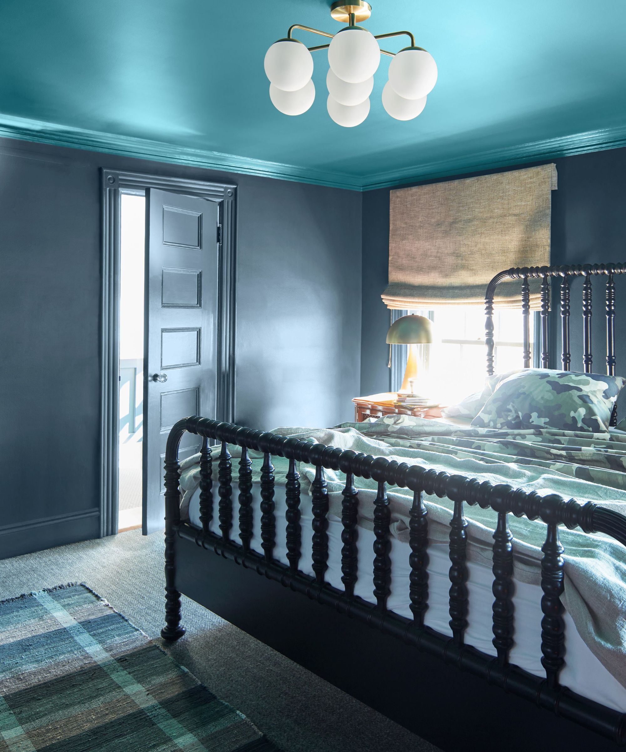
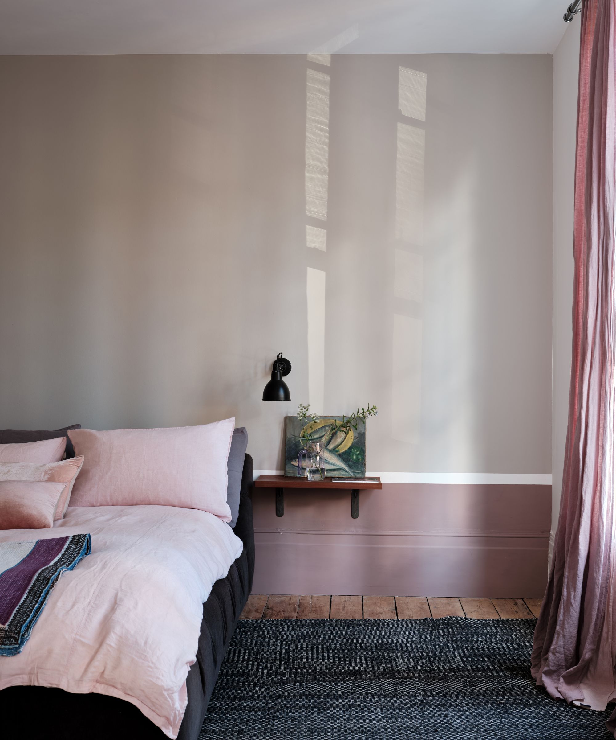
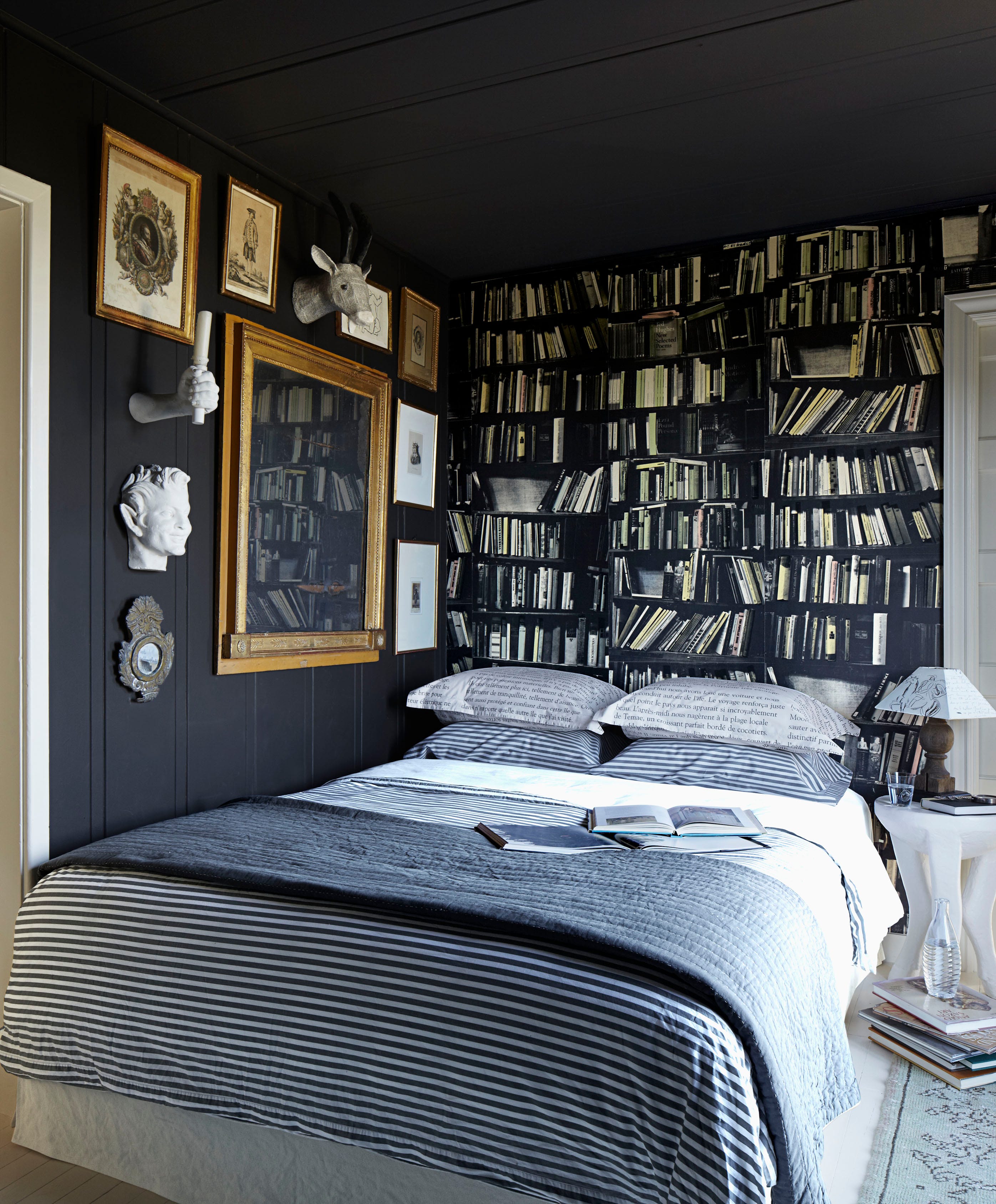
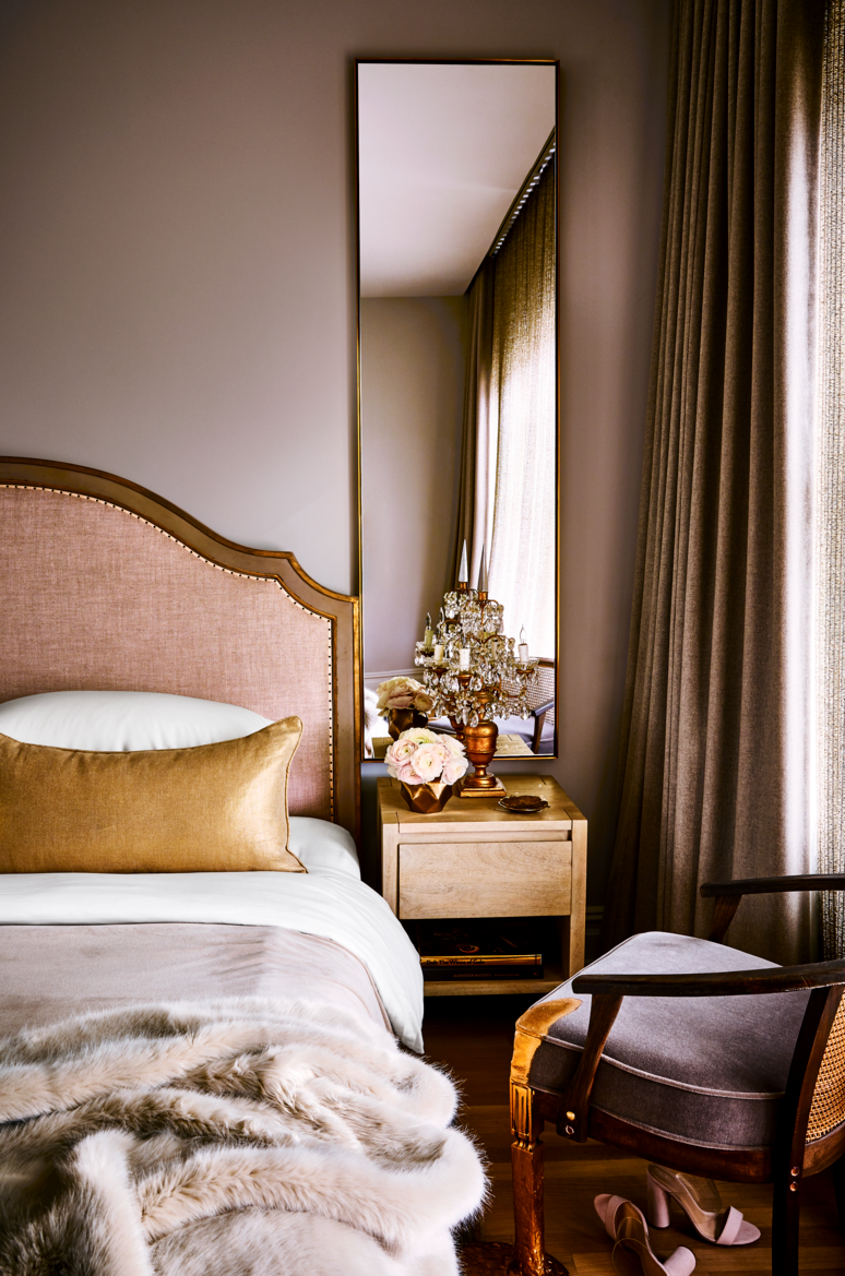
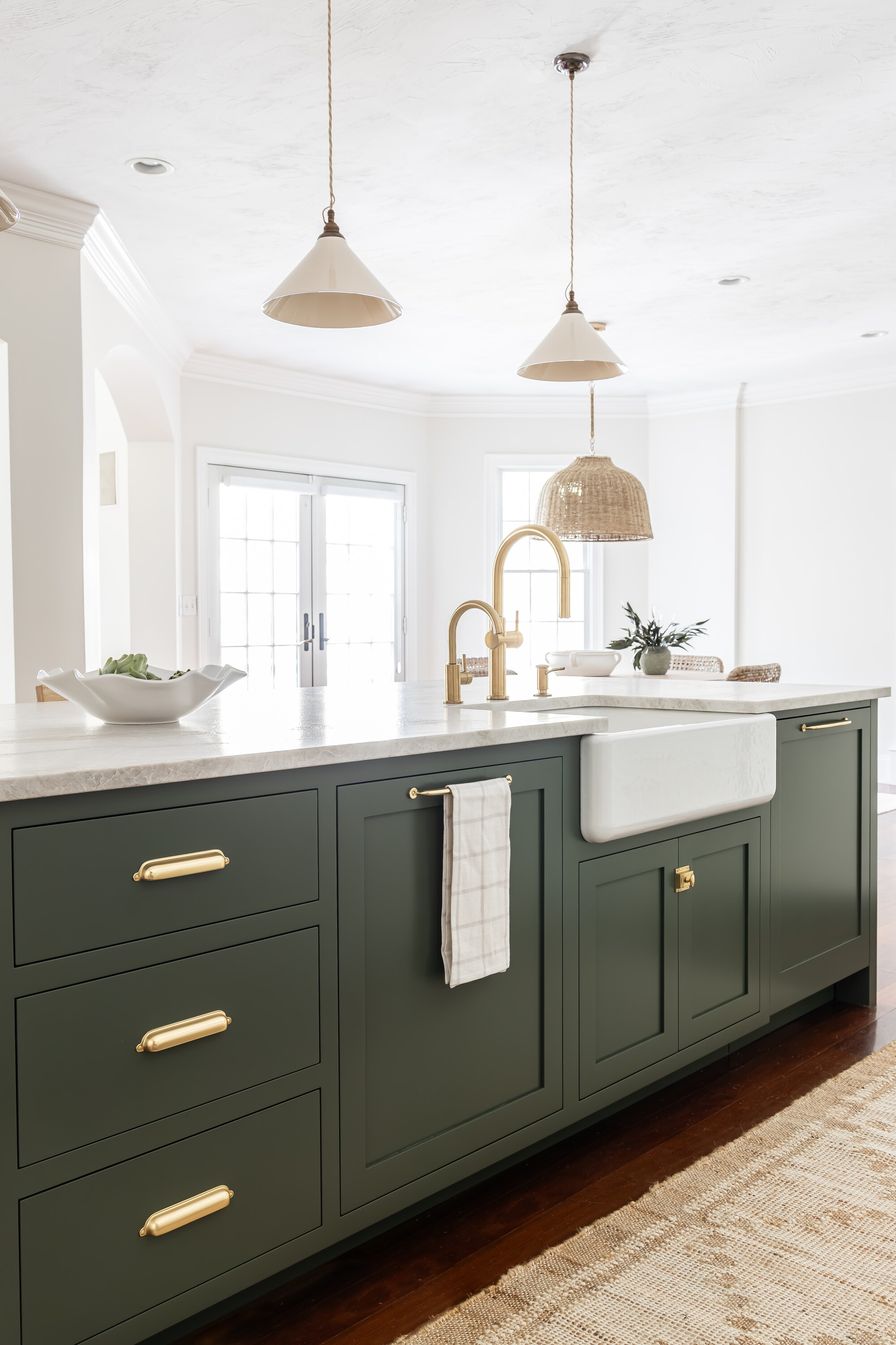
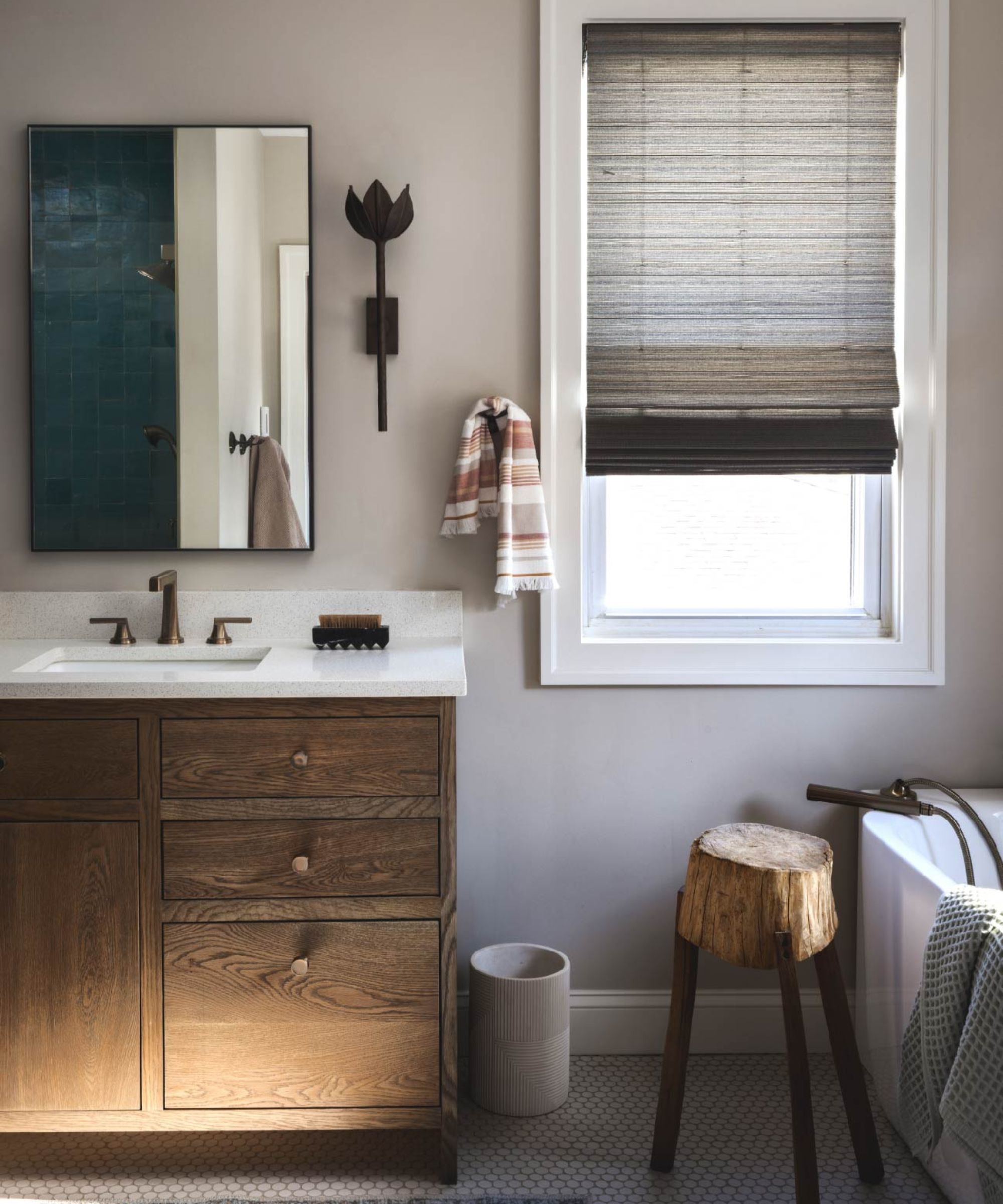
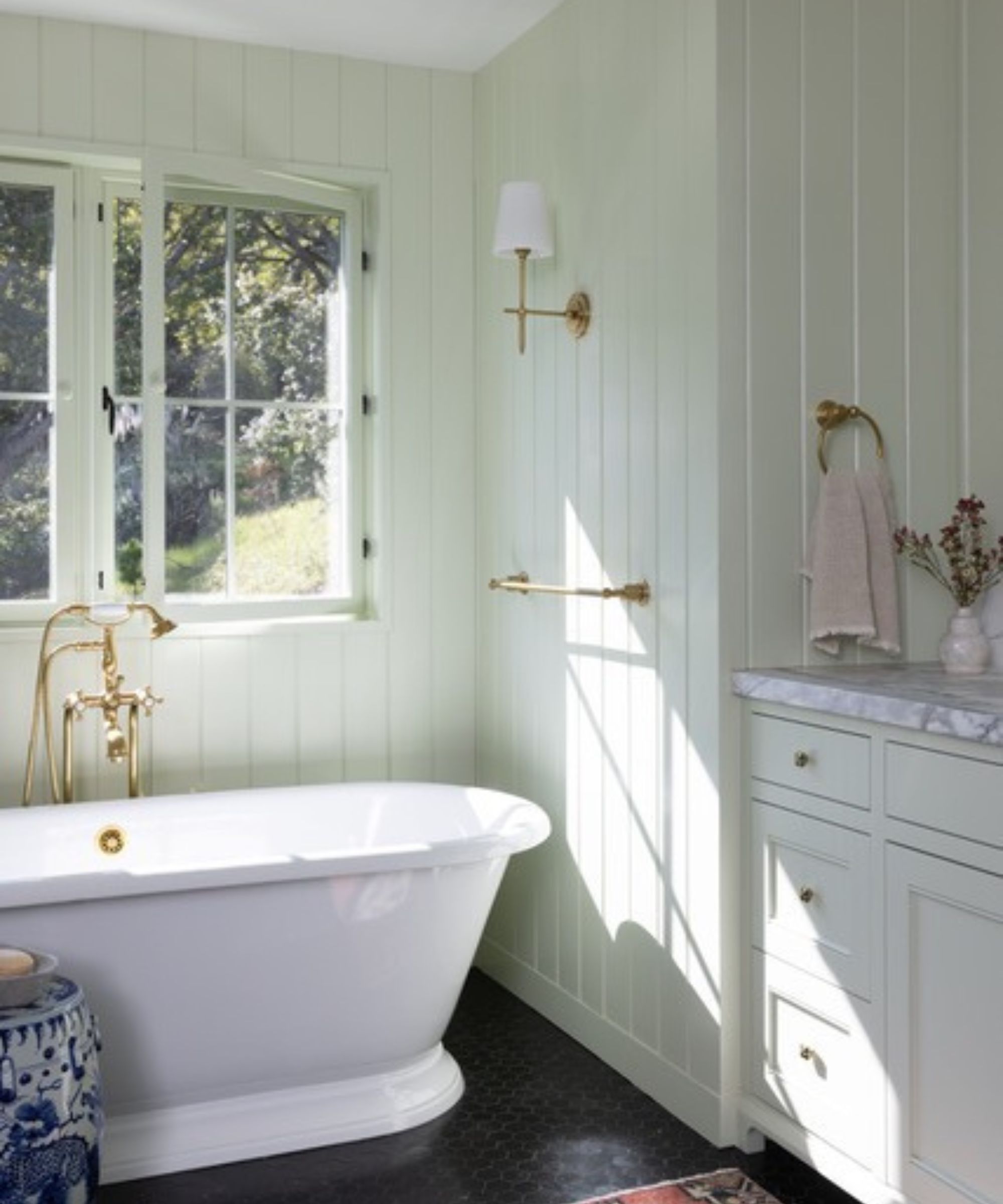
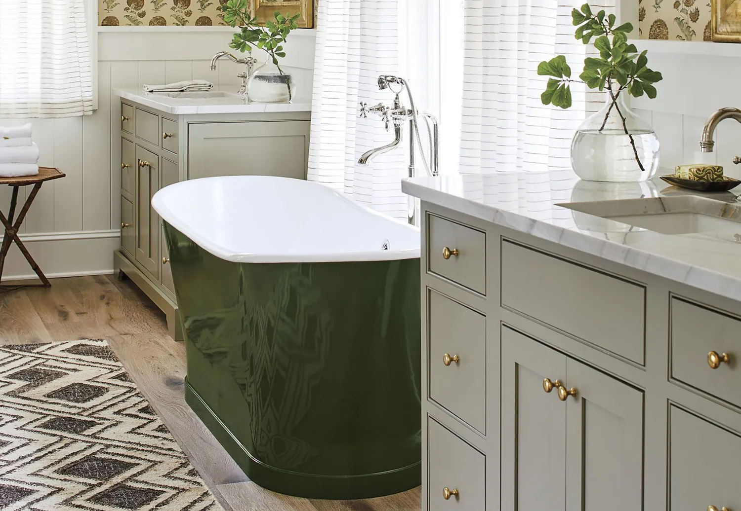
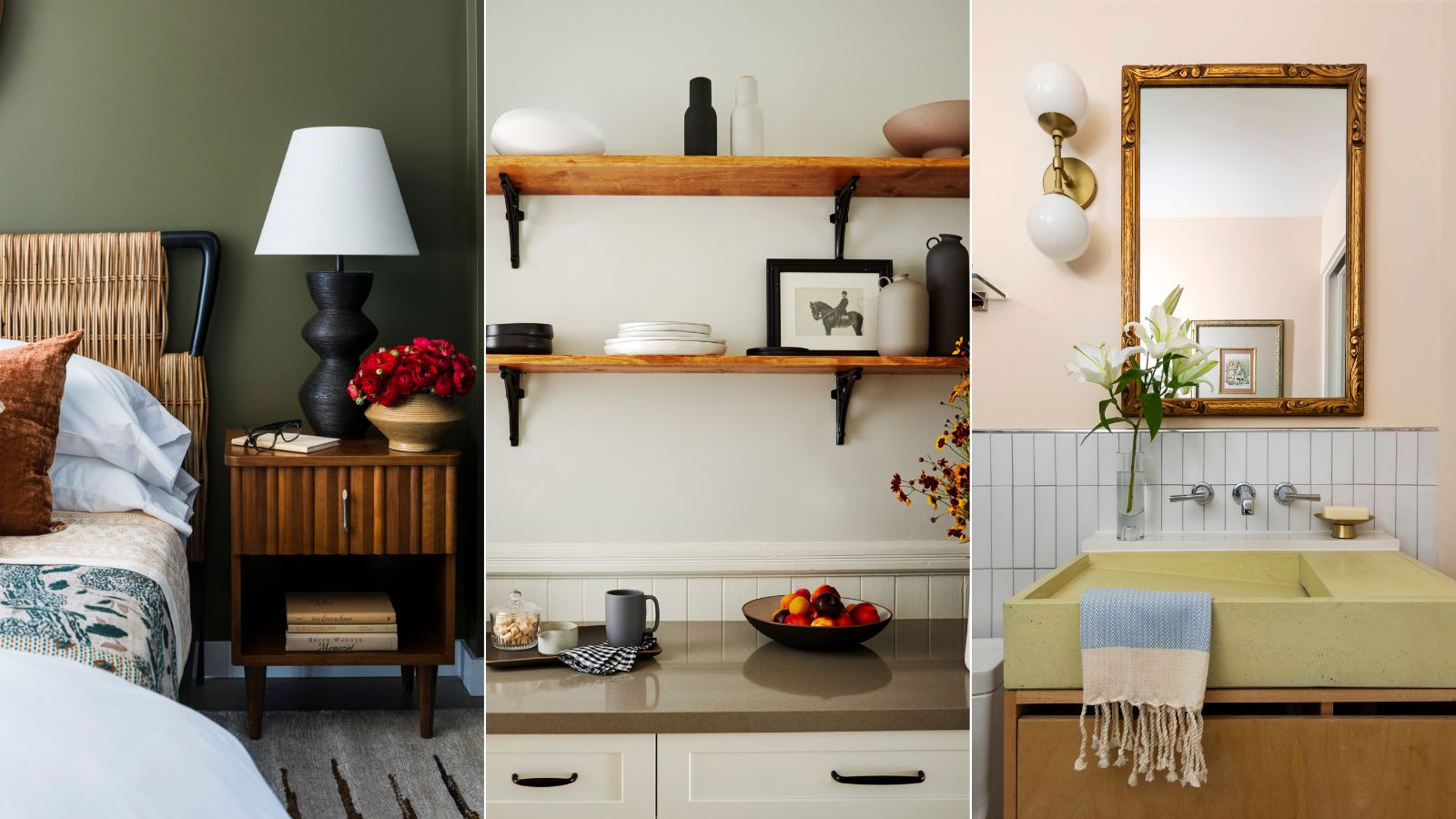
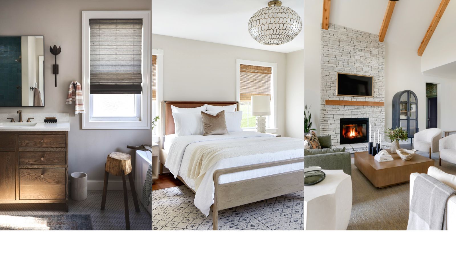
For those seeking deeper gray tones, Kendall Charcoal is introduced as a rich and dark option. Designer Peti Lau utilized this shade in DJ Drew Taggart's West Hollywood home, specifically in the dining area, where it provides a striking contrast against white ceilings and trim. Amherst Gray offers another elegant dark gray choice, as demonstrated by designer Analisse Taft-Gersten in her Connecticut home. She used it to paint a kitchen island, creating a sophisticated contrast with Calcutta gold countertops and Silver Satin cupboards. Finally, Gray Owl is recommended for its soft quality with subtle blue undertones. Designer Ann Wolf used this color in a Houston bedroom to create a warm and inviting atmosphere, particularly effective in spaces with high ceilings, where many colors tend to stand out.
The article emphasizes that these designer-approved gray paints from Benjamin Moore offer diverse options, from light and airy to rich and deep, ensuring suitability for various preferences and design schemes. The selections are presented to assist homeowners in finding a fail-safe gray paint that enhances their living spaces.
#InteriorDesign #PaintColors #BenjaminMoore #GrayPaint #HomeDecor #DesignerFavorites #Greige #InteriorDesign #PaintColors #BenjaminMoore #GrayPaint #HomeDecor #DesignerFavorites #Greige
0 comment in total
You may also like
What are the best Benjamin Moore gray paints? 7 go-to shades recommended by designers

Is Benjamin Moore's Gentleman's Gray the perfect navy blue paint?
5 ways to decorate with Edgecomb Gray, Benjamin Moore's softest gray paint
10 Greige Paint Colors Designers Recommend Again And Again
The 13 Best Greige Paint Colors to Buy Right Now
Why This Hue Is Suddenly Dominating Every Designer's Wishlist—Plus, How to Style It

Why This Hue Is Suddenly Dominating Every Designer's Wishlist—Plus, How to Style It

Benjamin Moore paint colors in real homes – 10 favorite shades amongst designers, from neutrals to brights
The Best Greige Paint Colors for a Warm, Welcoming Home

The Best Gray Paint Colors Interior Designers Swear By

Gen Z Just Declared This “Boring“ Color the New Millennial Gray and I Am So Upset
Interior designers share their favorite Benjamin Moore paint colors – and there's something for every style
This Paint Color Has Been Benjamin Moore’s Best Seller for Years—and Designers Swear by It

This is the most versatile shade you can bring into your home – designers share the 5 best greige paints
I Think I May Have Just Discovered the Most Timeless Green Paint Color

The 12 Best Wall Paint Colors To Complement Your Gray Floors
5 of the best gray paints that interior designers love using
Why Gray Is the Most Versatile Bedroom Color
6 ways to decorate with Revere Pewter, Benjamin Moore's best-selling gray paint
A versatile neutral, gray goes with anything