This Paint Color Has Been Benjamin Moore’s Best Seller for Years—and Designers Swear by It
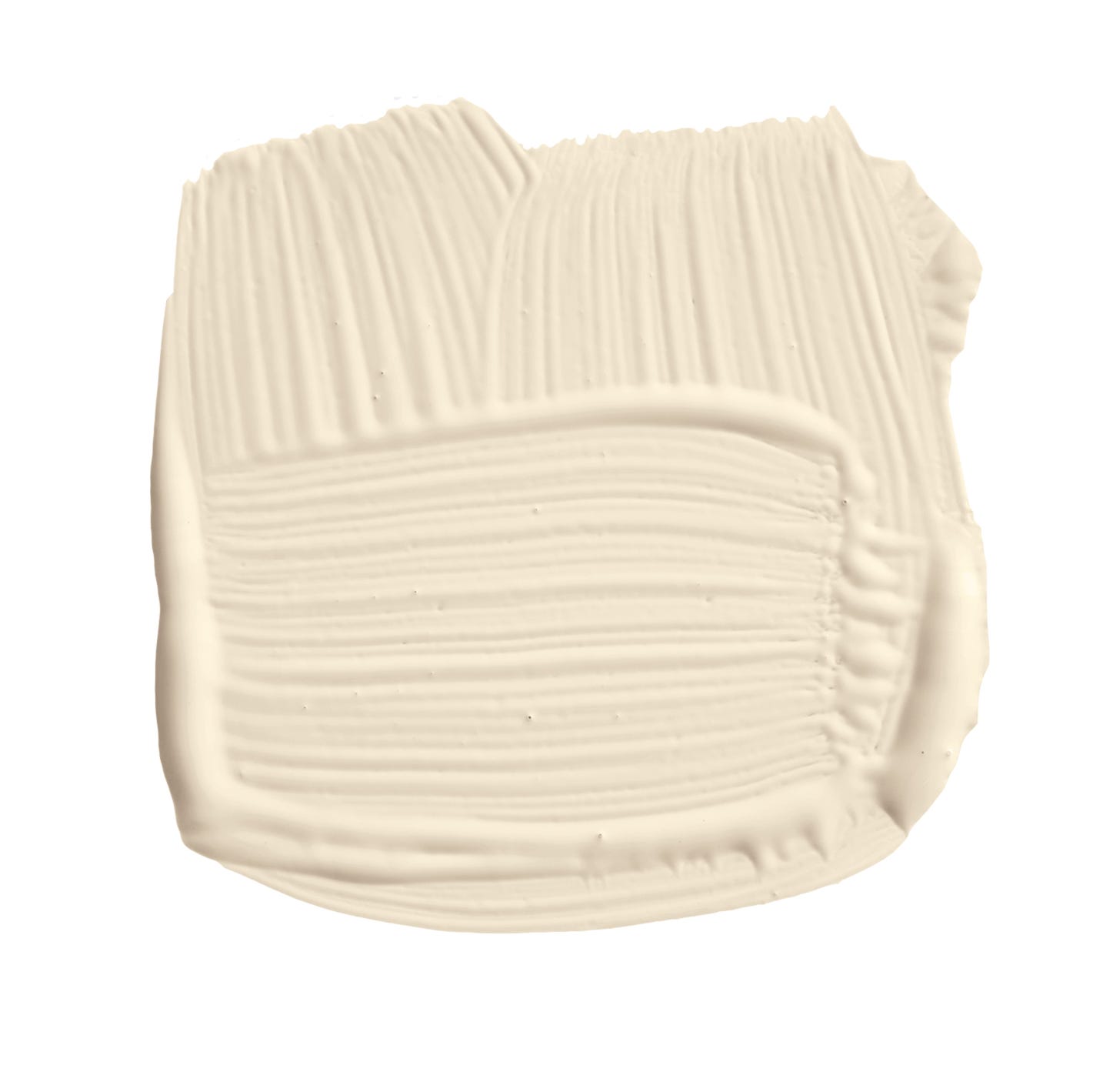
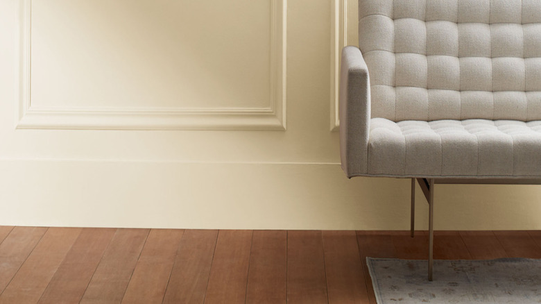
Choosing a paint color can be a challenging task given the multitude of options and subtle variations, even within neutral palettes. Benjamin Moore's top-selling paint color, White Dove (OC-17), has consistently held this position for years, lauded by homeowners, contractors, and designers alike for its exceptional versatility and timeless appeal. According to Arianna Barone, color marketing manager at Benjamin Moore, White Dove is distinguished by its subtle hint of warmth, making it a perfect choice for any project and ensuring its enduring popularity.
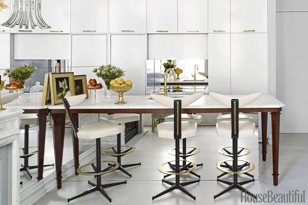
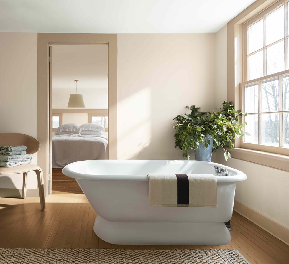
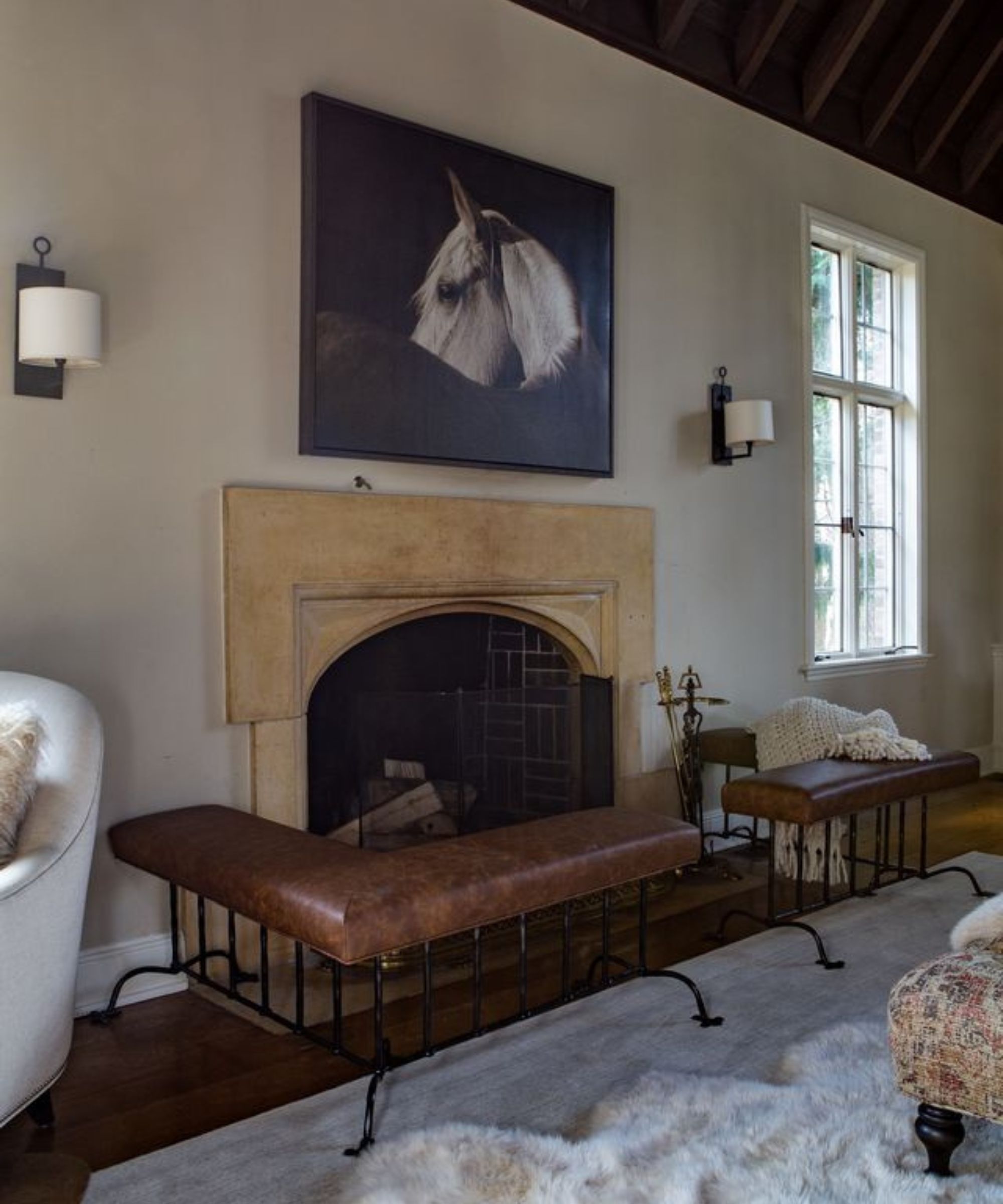
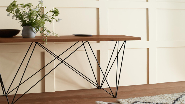
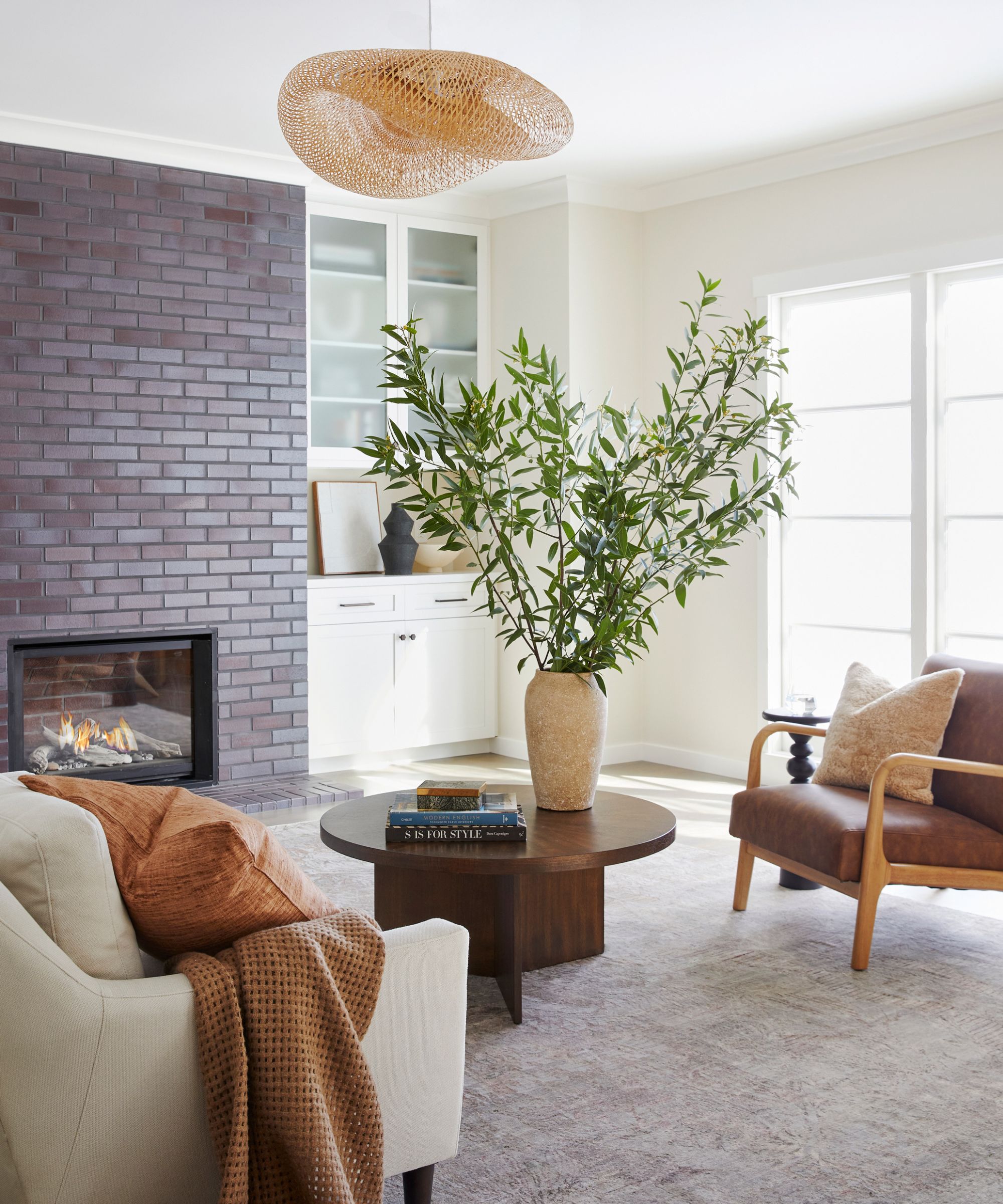
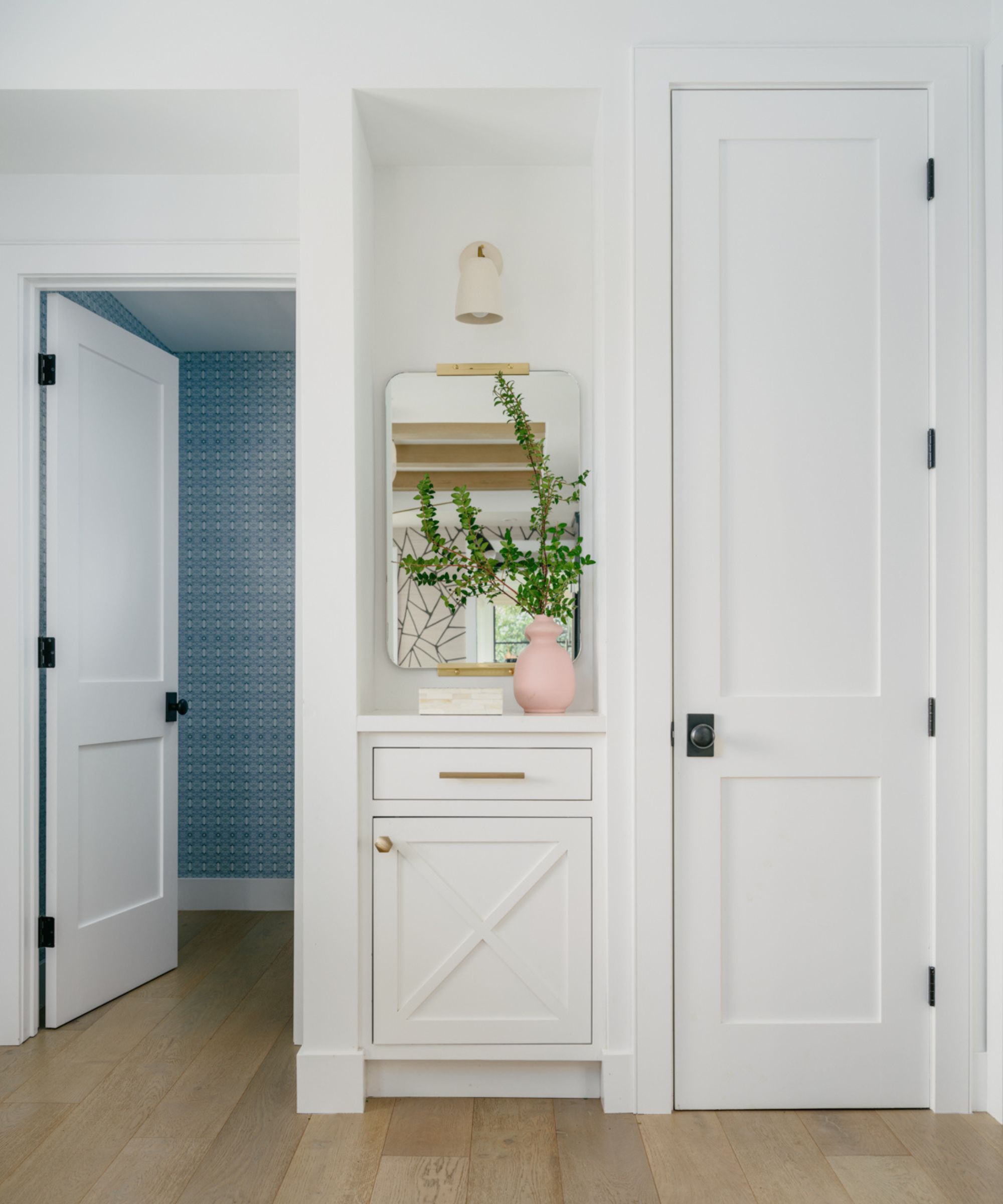
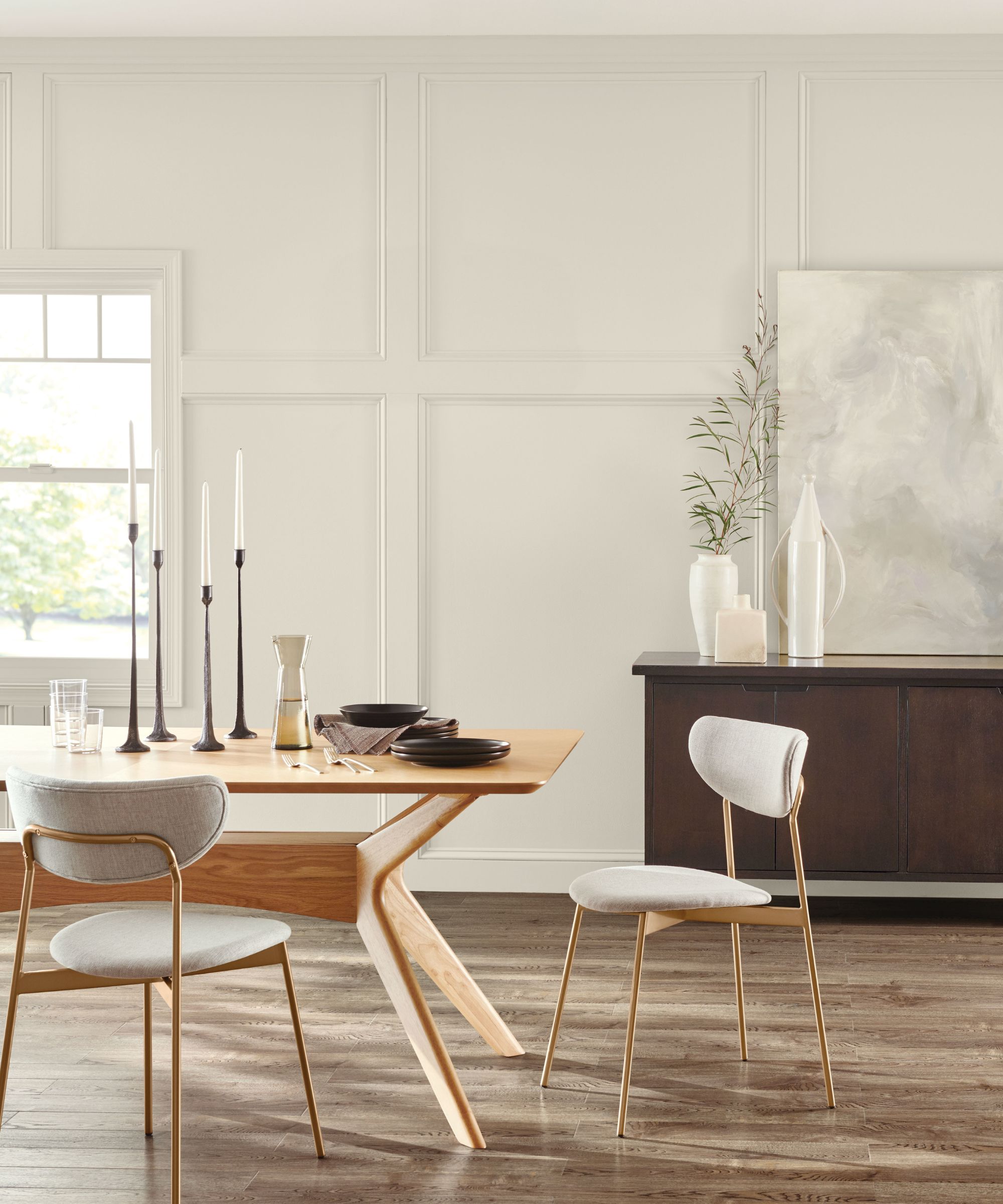
Designers universally agree on White Dove's adaptability. New York City-based interior designer Betty Wasserman highlights its softer quality compared to brighter whites like Decorator’s White, likening the selection process to choosing a wedding dress. She explains that while bright whites can appear fluorescent or cold, White Dove, with its slightly off-white, ivory-like tone, offers a gentle warmth that is neither overtly yellow nor tan. This characteristic makes it easy to integrate with both cool and warm color schemes and fabrics, providing a flexible backdrop that complements various design elements, including artwork.
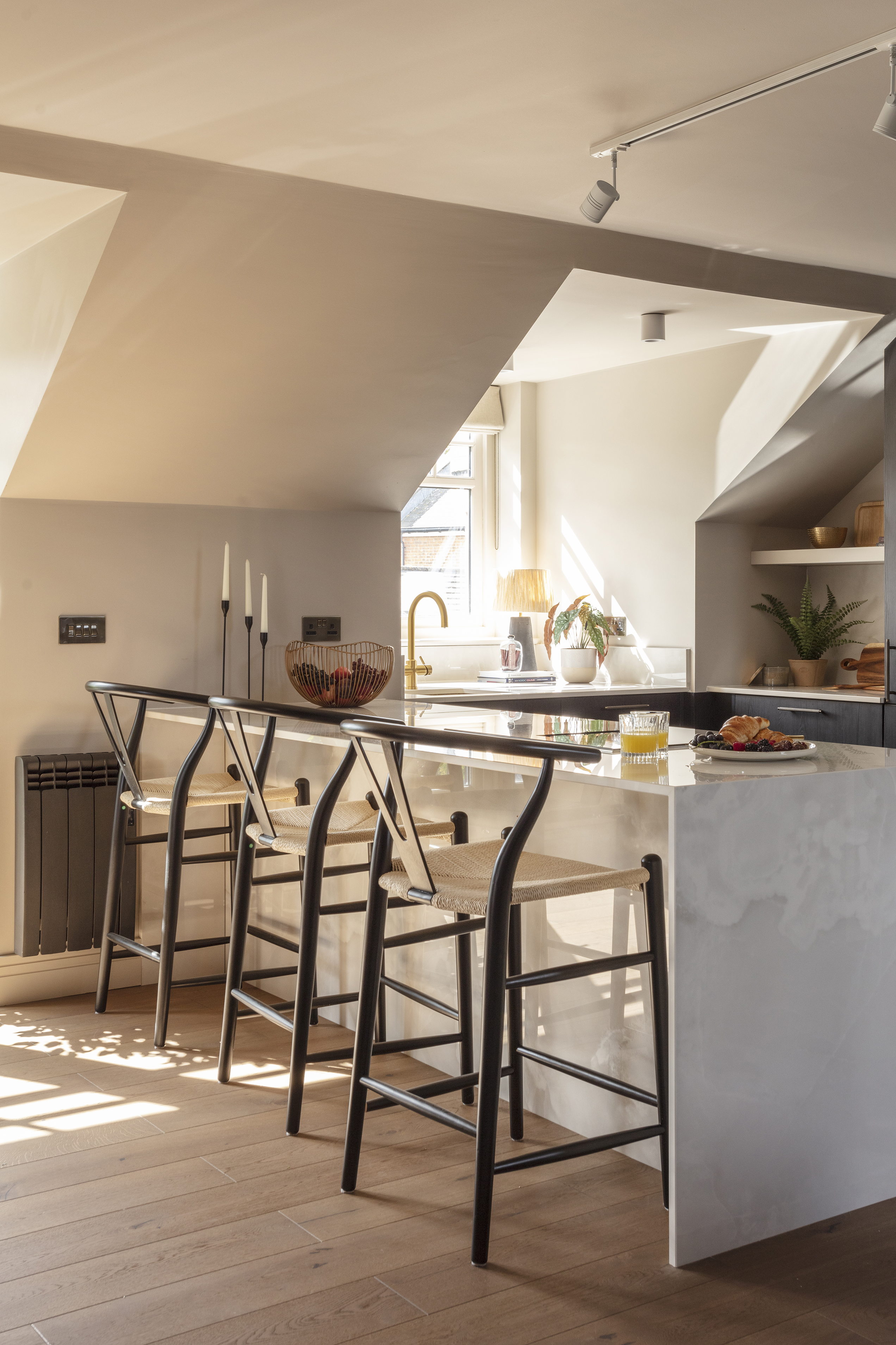
Olivia Hnatyshin, an interior designer and associate vice president of brand and creative at Furniture.com, emphasizes White Dove's classic nature, noting its ability to be timeless without appearing sterile. She describes it as a perfect balance of soft and crisp, a rare combination in a white paint, which allows it to harmonize effectively with both warm and cool tones, making it suitable for modern spaces. This inherent versatility contributes significantly to its broad appeal and consistent demand.
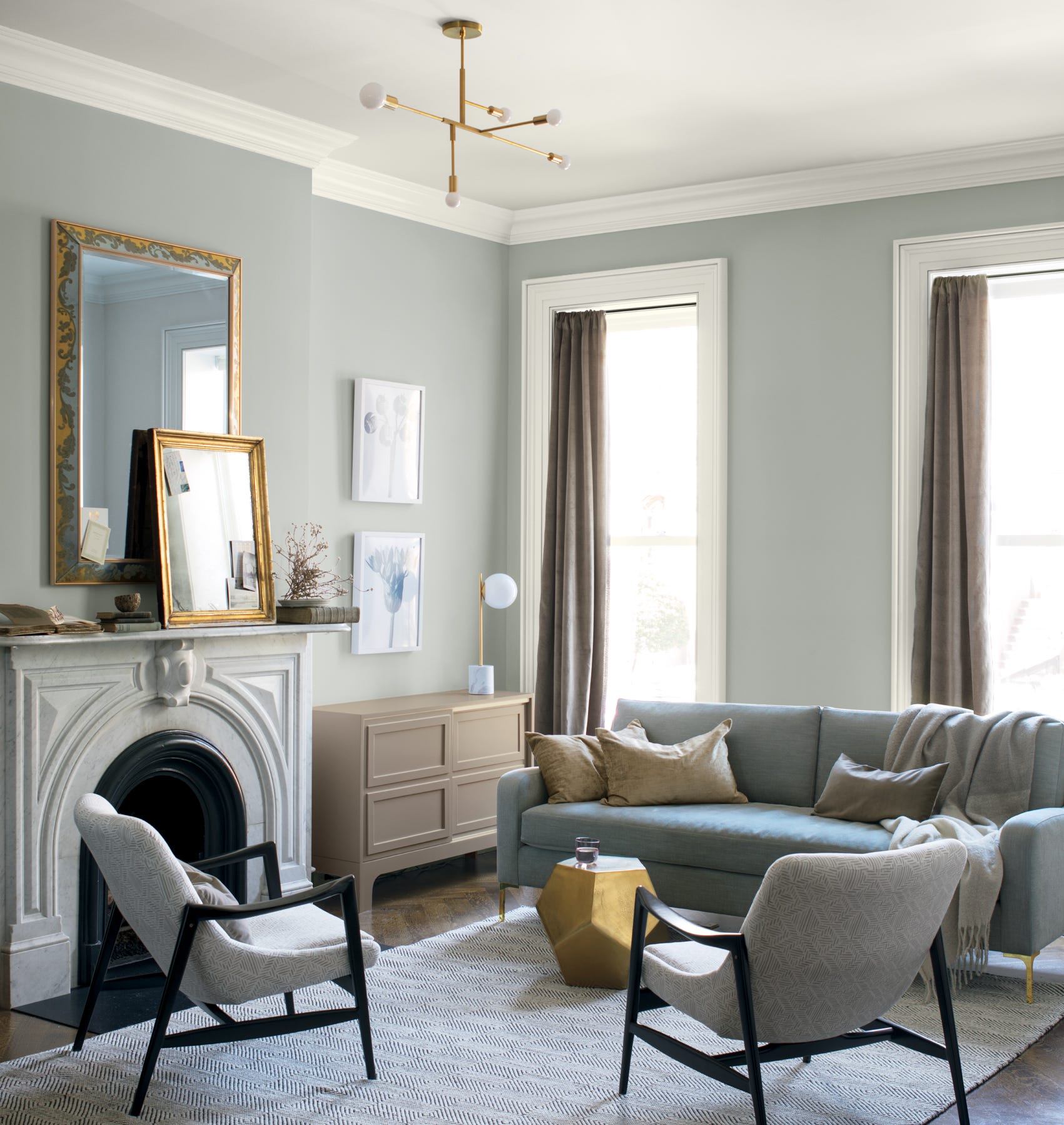
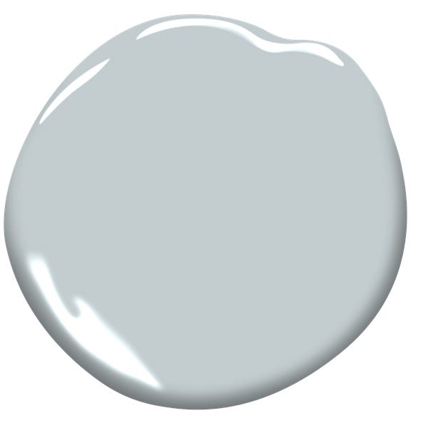
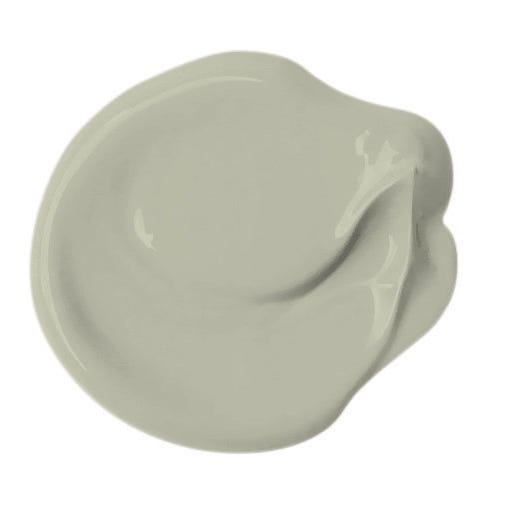
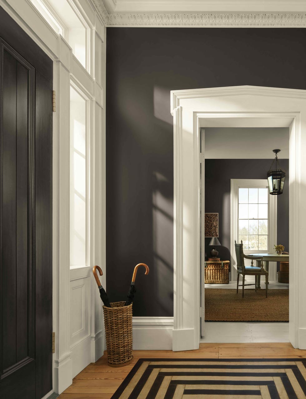
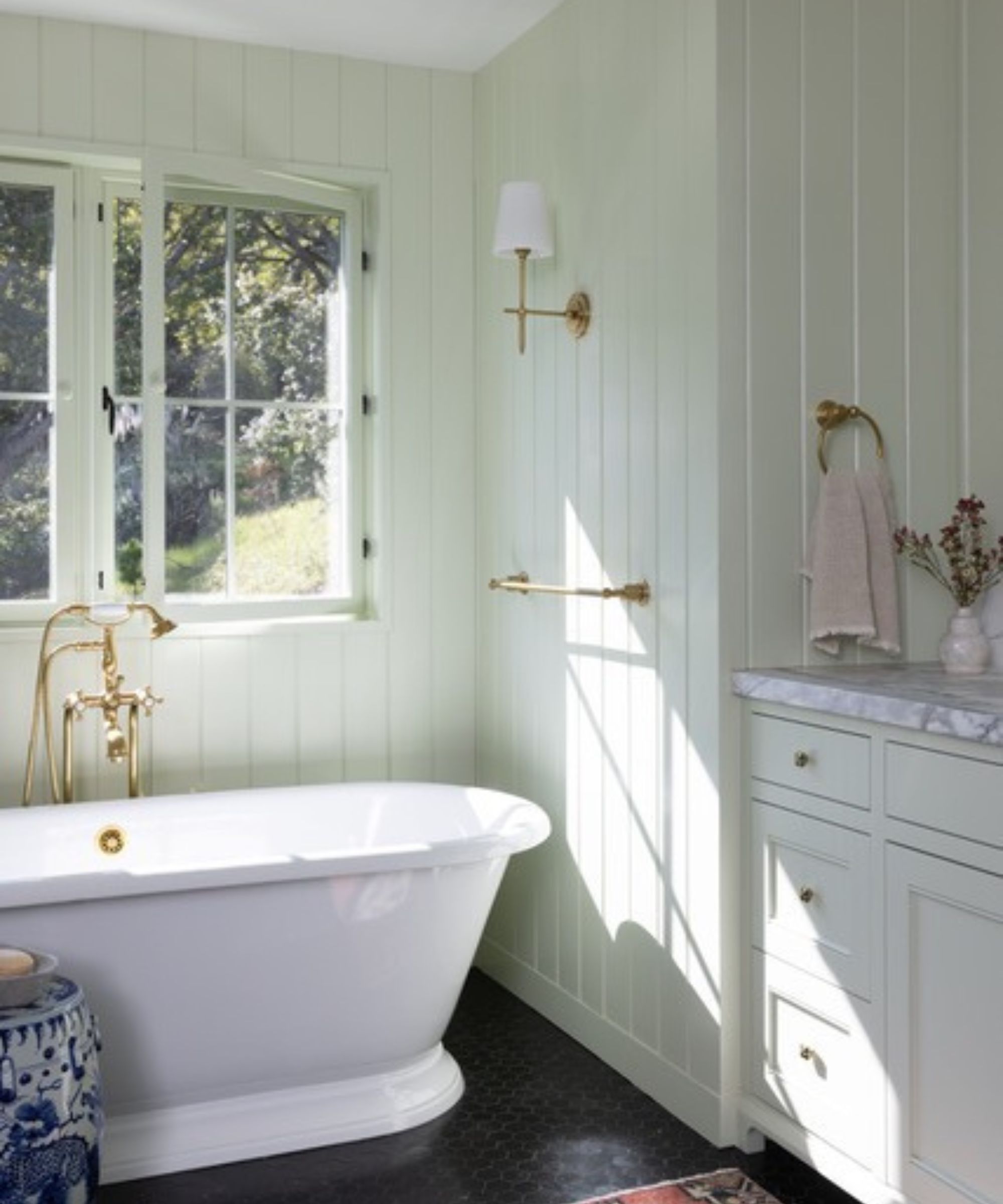
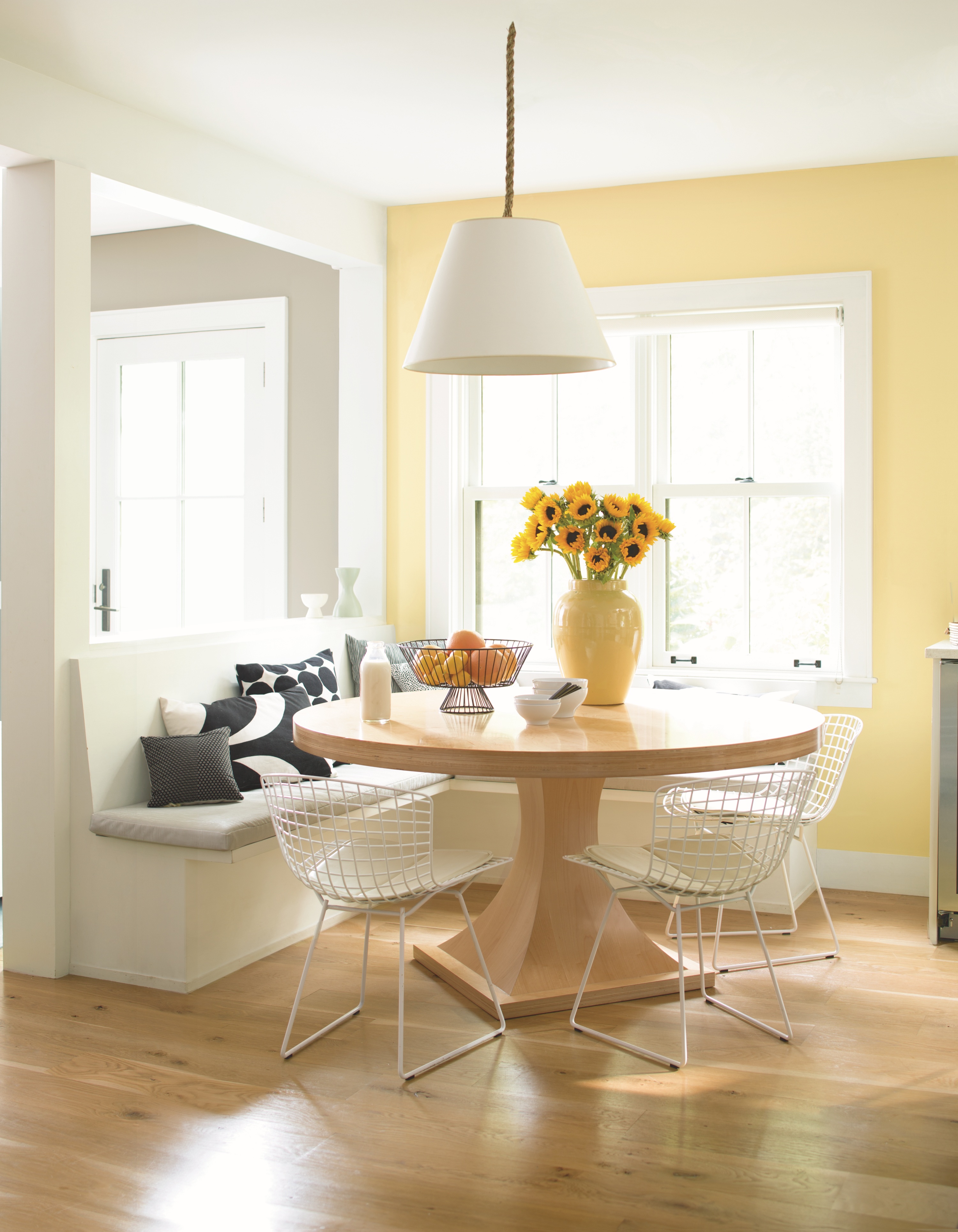
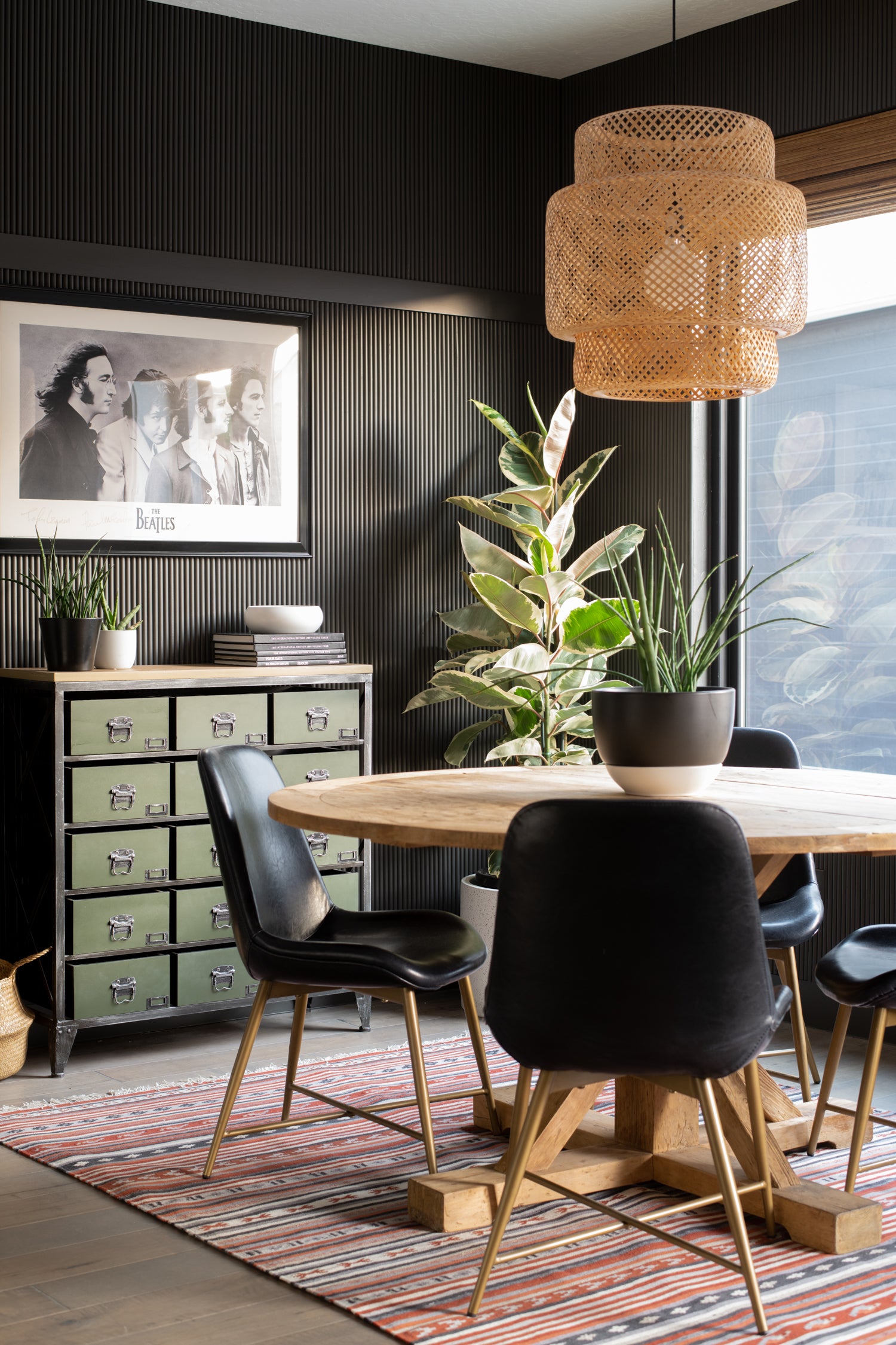
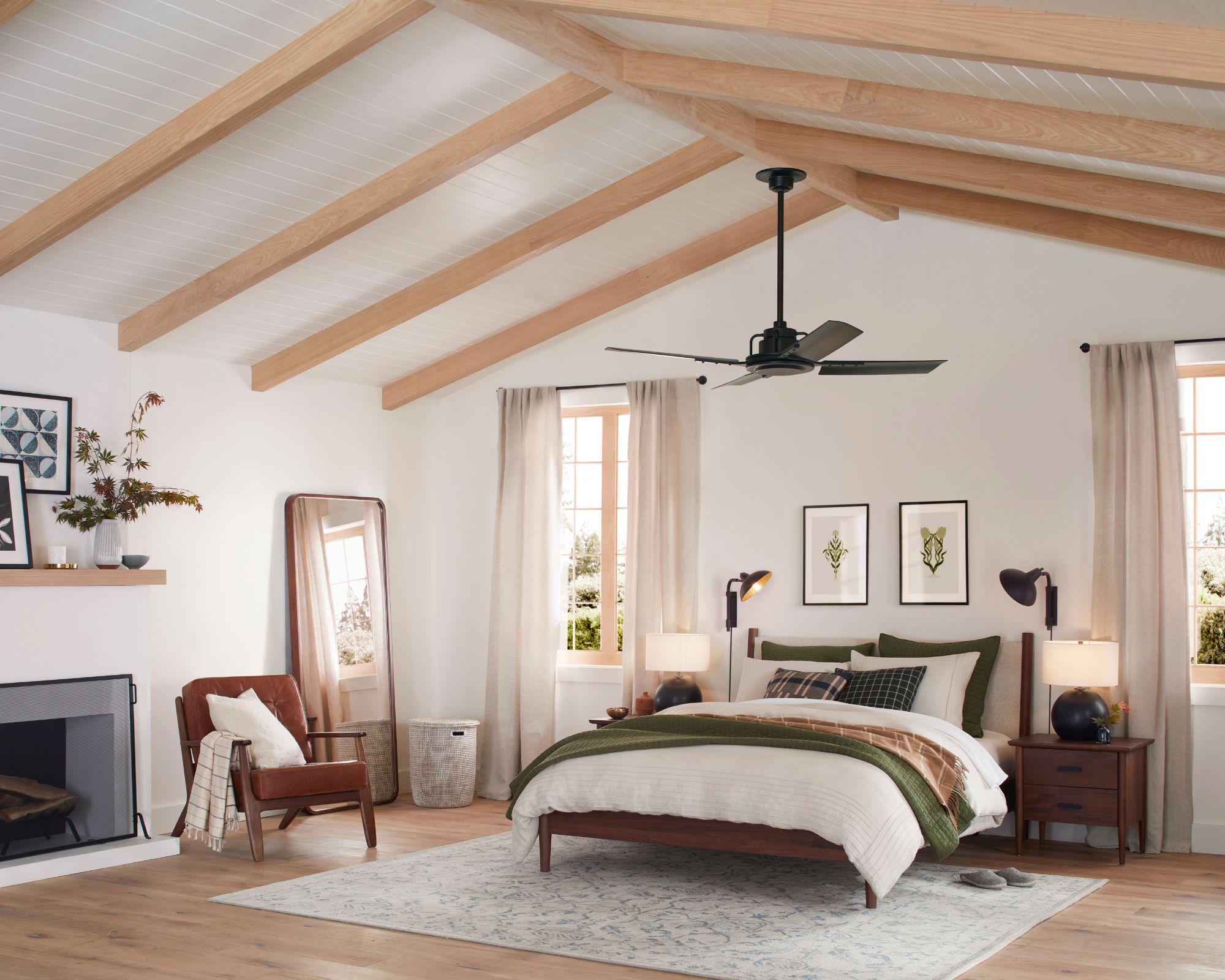
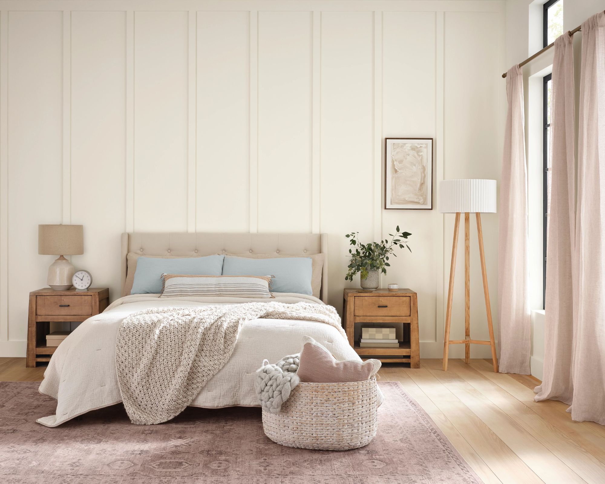
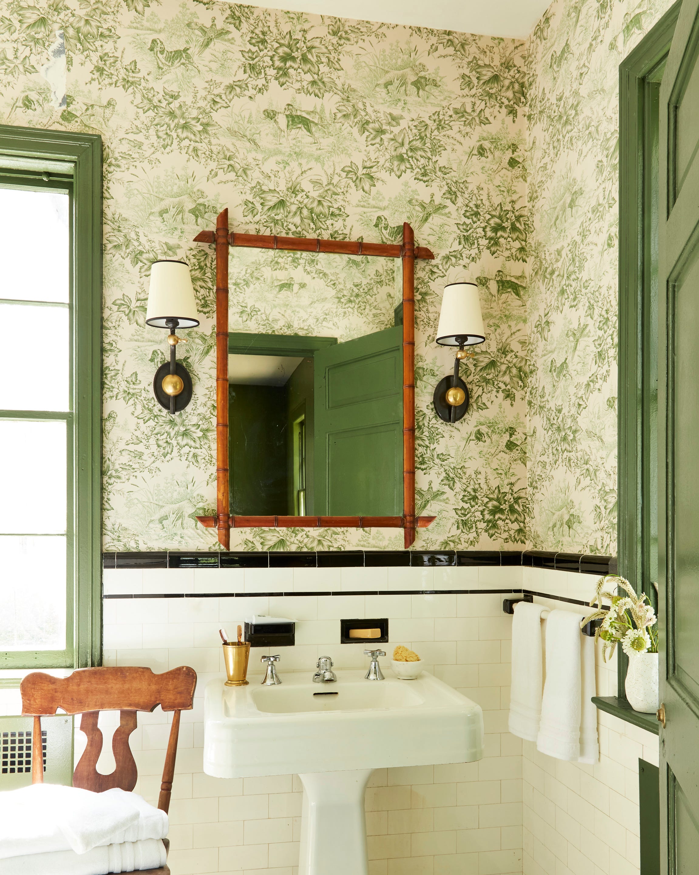
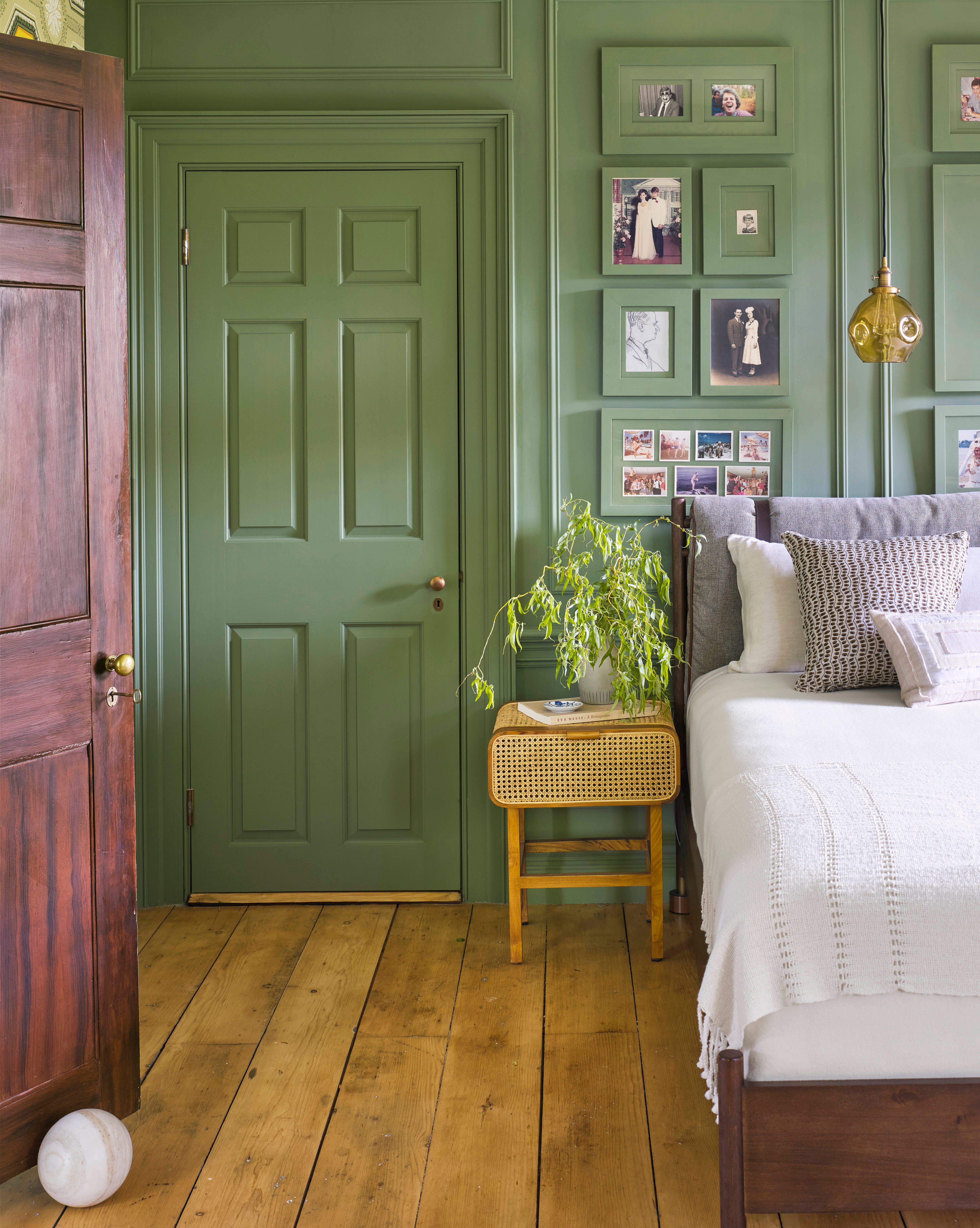
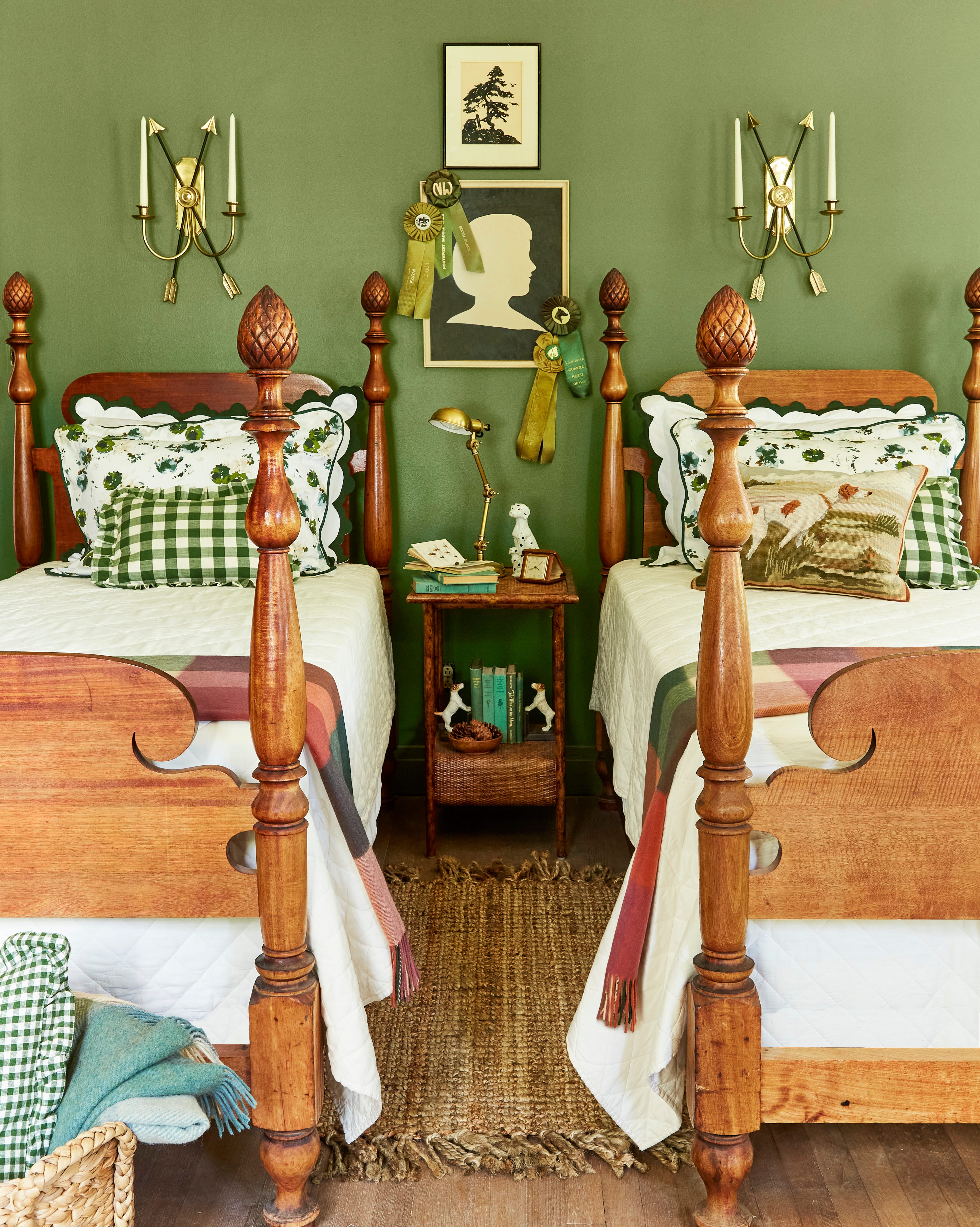
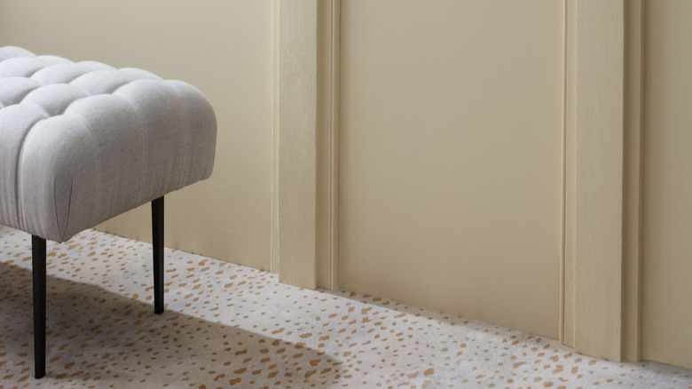
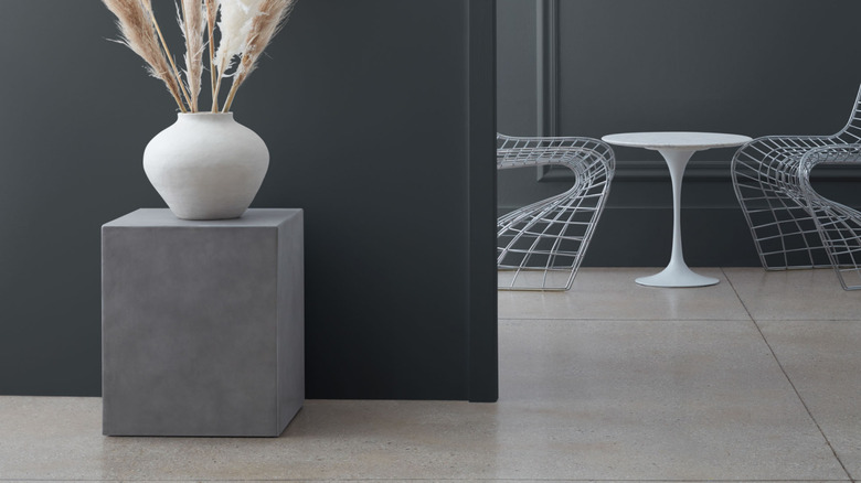
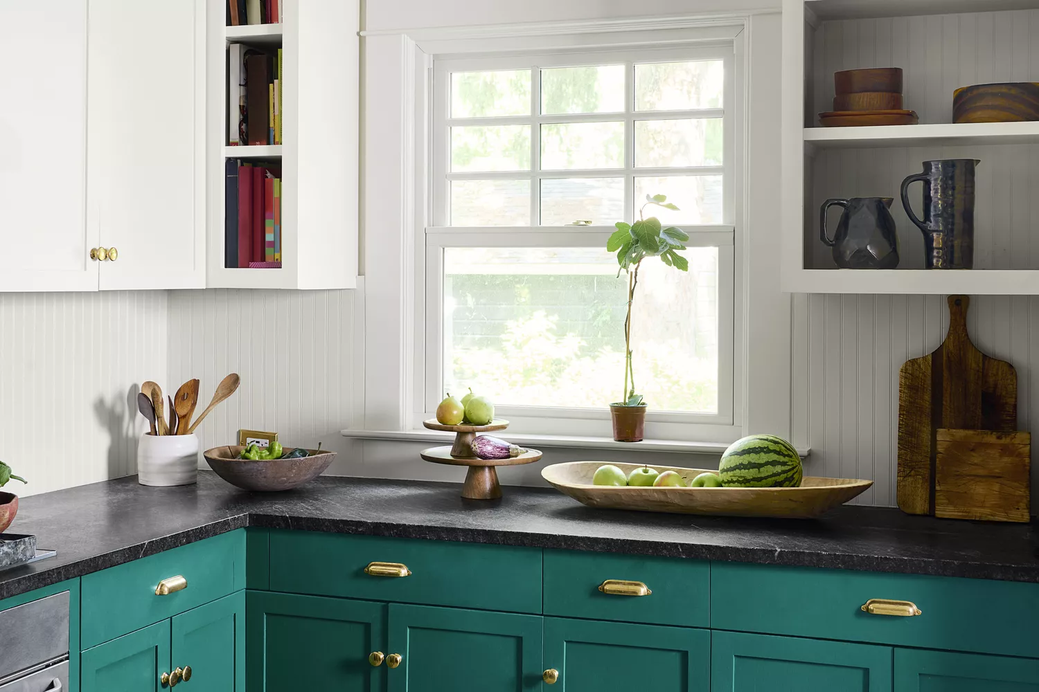
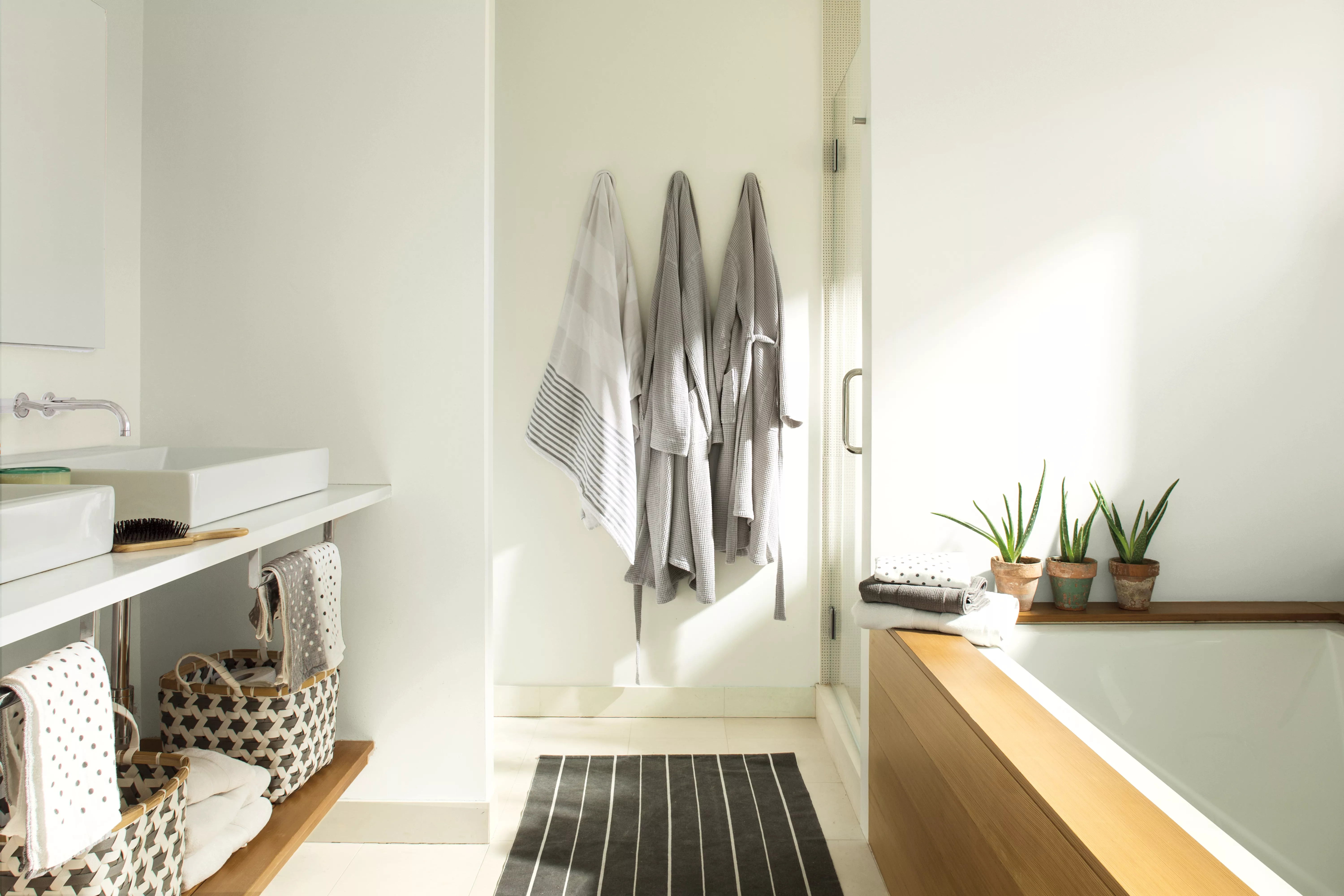
White Dove's application extends beyond just walls; it is also highly recommended for trim, ceilings, wainscoting, beadboard, and furniture to achieve a cohesive look within a room. For those seeking a softer aesthetic, Barone suggests pairing White Dove with Classic Gray, a light, off-white gray, or Pristine, an off-white with subtle dusty peach undertones. For a bolder statement, she recommends combining it with Forest Green or Hancock Gray, a muted moss with a hint of brown, demonstrating its capacity to anchor both subtle and vibrant palettes.
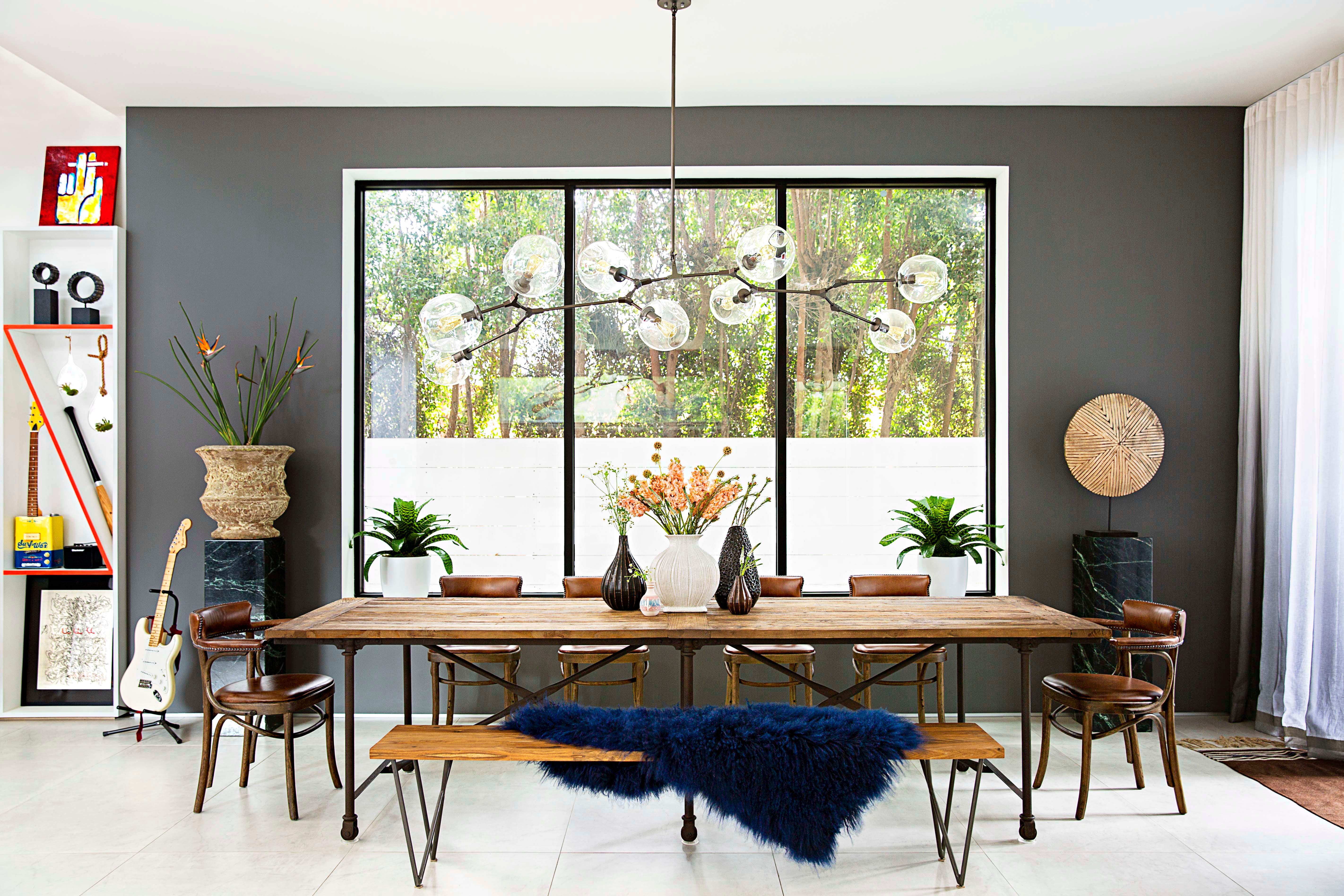
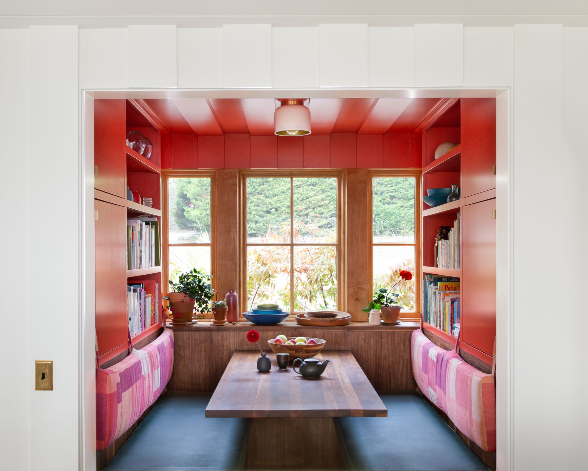
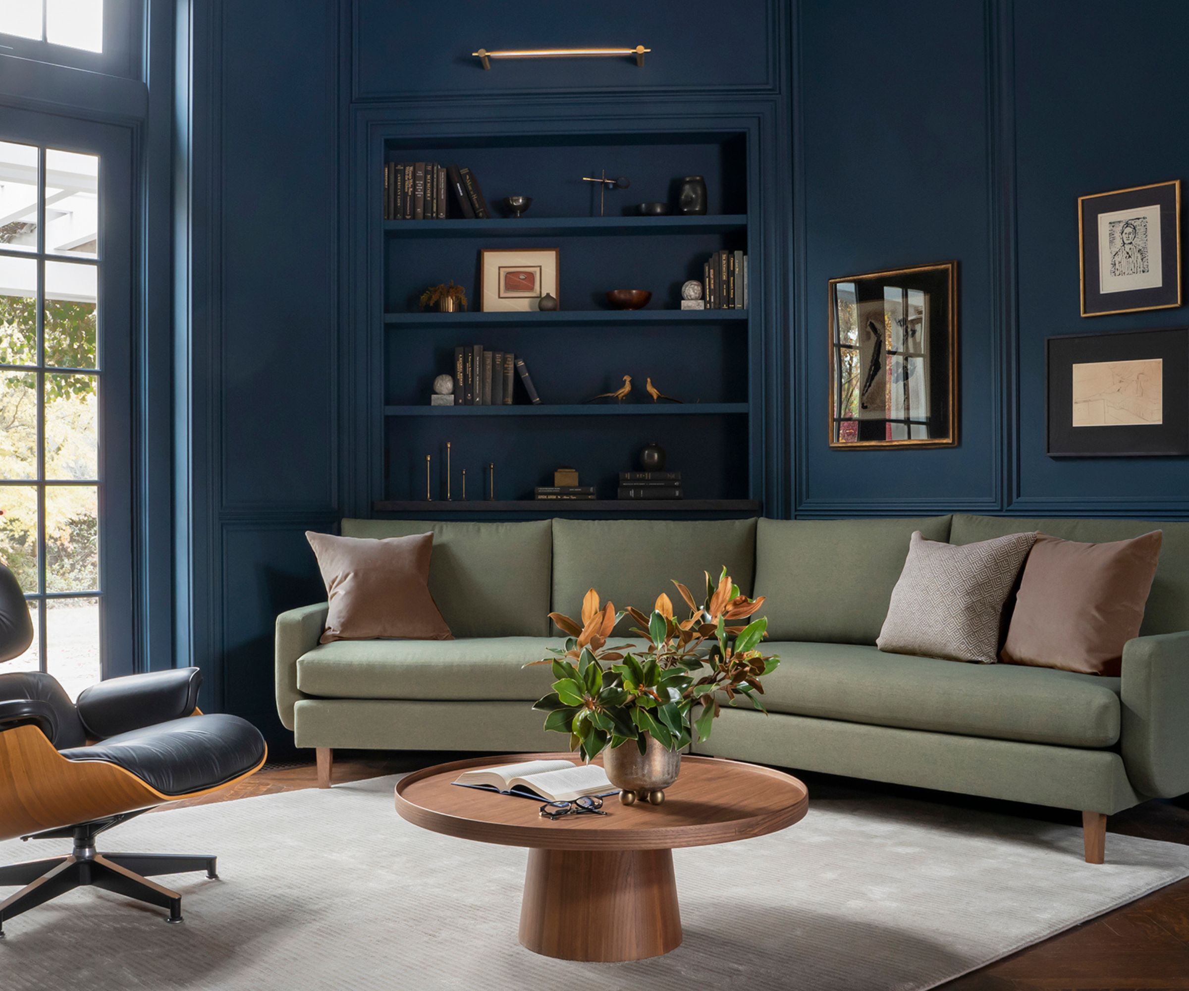
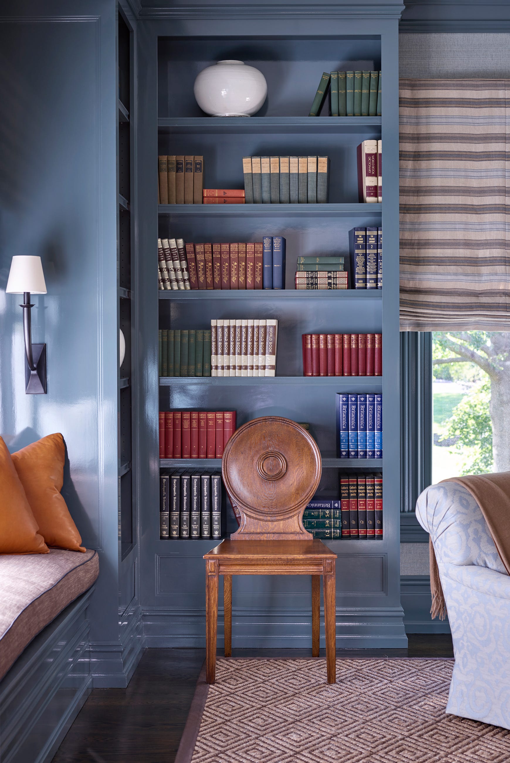
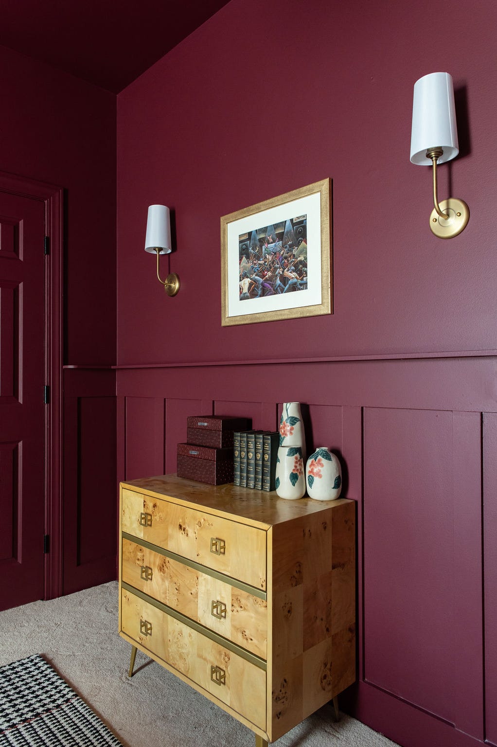
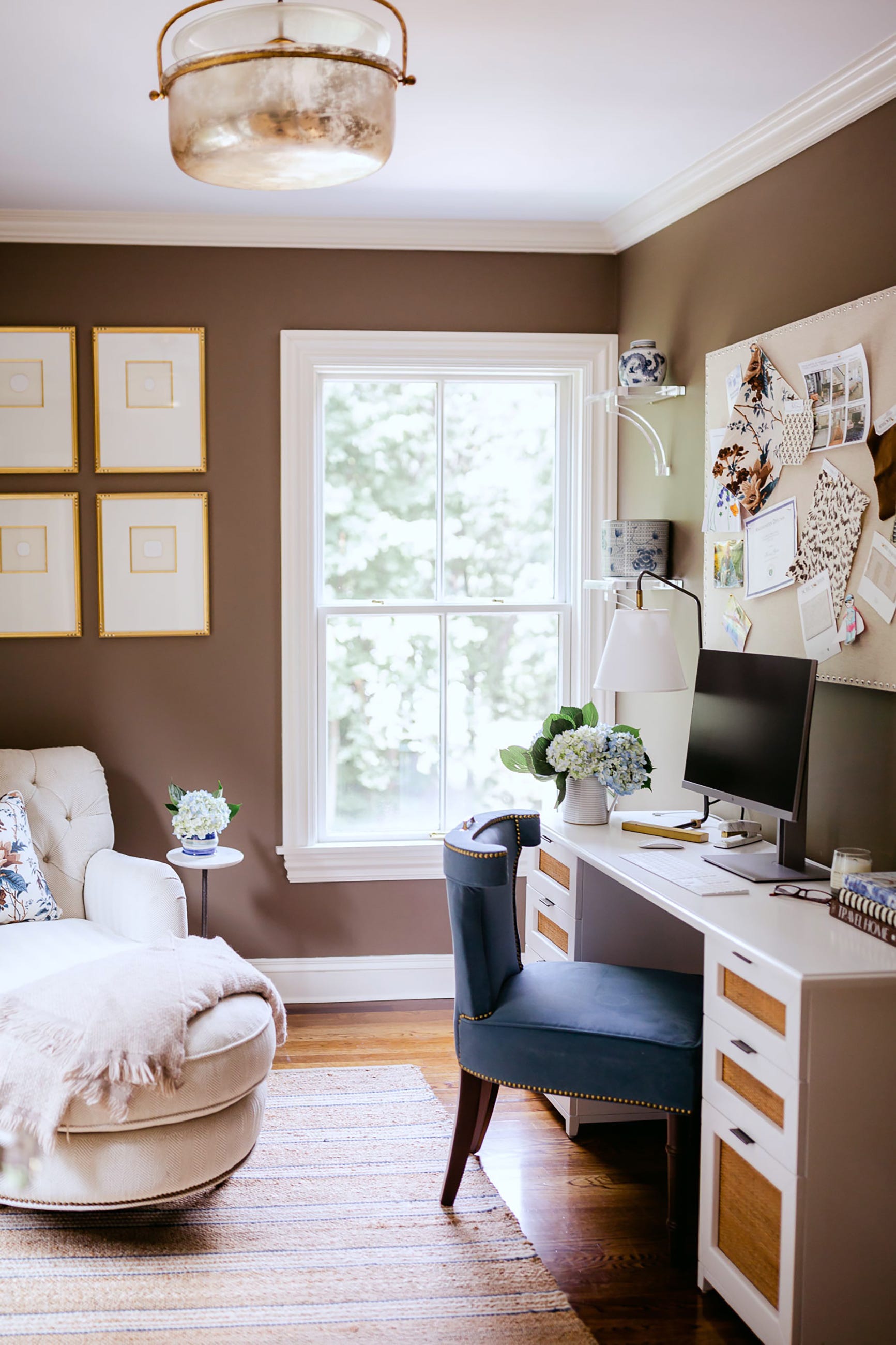
Hnatyshin echoes this sentiment, advocating for White Dove in both neutral and color-forward designs. She particularly favors its use with layered neutrals such as putty, greige, and natural wood, or as a understated backdrop for more assertive colors like olive green, oxblood, or slate blue. White Dove's understated elegance ensures that it enhances its surroundings without demanding attention, making everything else in the space appear more refined and thoughtfully chosen. Its enduring popularity stems from this unique ability to be both subtle and impactful, adapting effortlessly to diverse design visions.
#BenjaminMoore #WhiteDove #PaintColor #HomeDecor #InteriorDesign #DesignersChoice #VersatilePaint #TimelessDesign #HomeImprovement #BenjaminMoore #WhiteDove #PaintColor #HomeDecor #InteriorDesign #DesignersChoice #VersatilePaint #TimelessDesign #HomeImprovement
0 comment in total
 No comments yet
You may also like
Why Benjamin Moore's Classic Gray Is a Designer-Favorite Paint Color

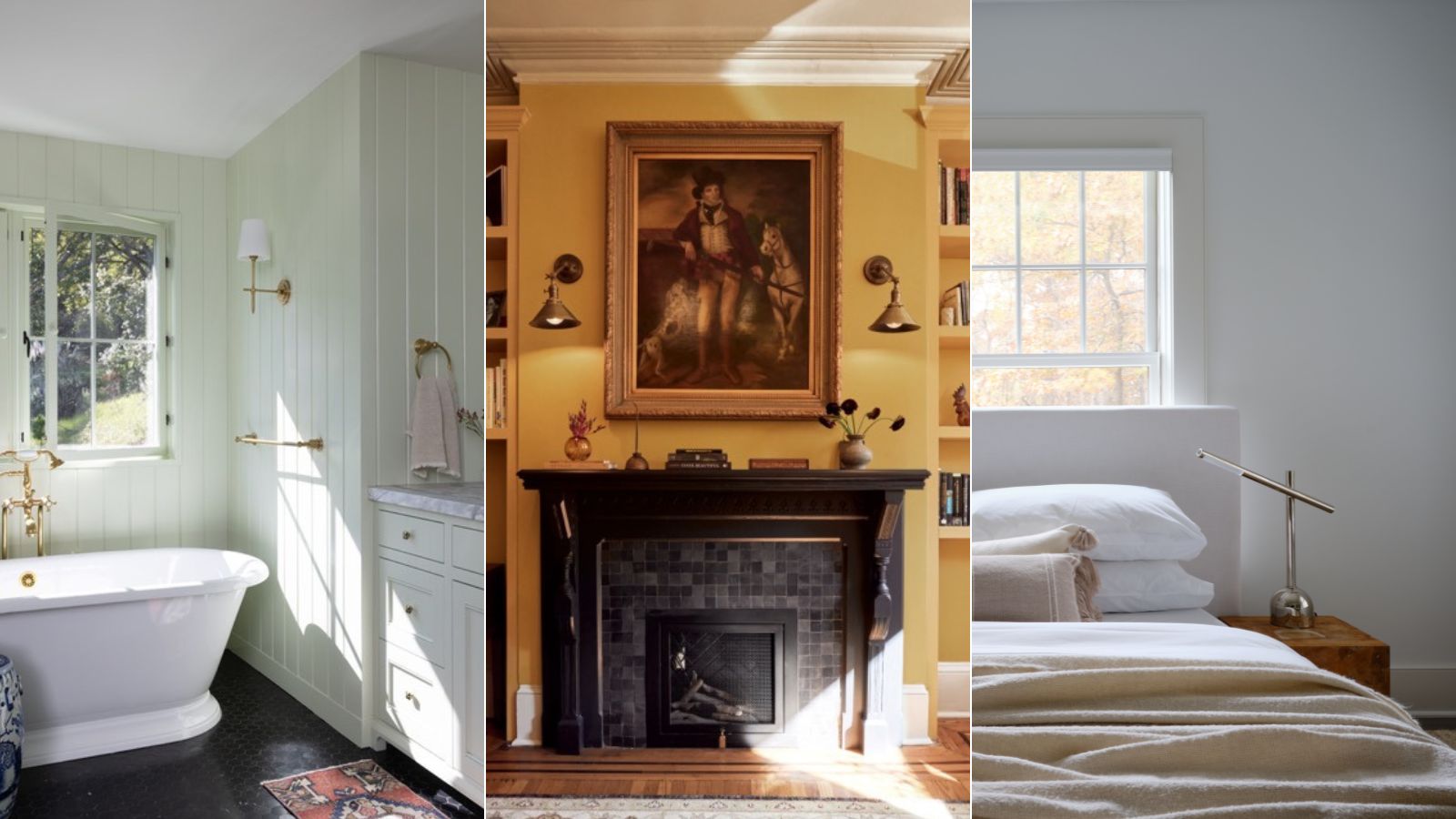
Benjamin Moore paint colors in real homes – 10 favorite shades amongst designers, from neutrals to brights

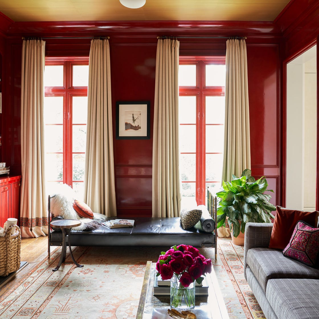
Why This Hue Is Suddenly Dominating Every Designer's Wishlist—Plus, How to Style It

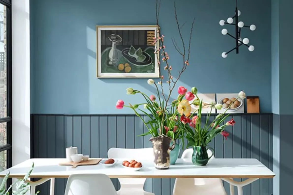
7 Bold Paint Colors Interior Designers Are Longing to Use on Their Next Projects
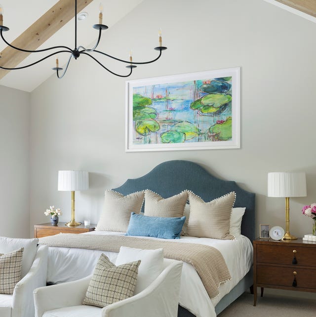
These 20 Paint Colors Will Never Go Out of Style, According to Designers

Is this the best beige paint? Why designers love Stone Hearth by Benjamin Moore
Why This Hue Is Suddenly Dominating Every Designer's Wishlist—Plus, How to Style It

The Interior Paint Colors You'll Be Seeing Everywhere in 2024

The most timeless paint colors according to designers
This Stunning Benjamin Moore Paint Color Is The Perfect Crisp White Alternative

We asked paint brands what their most popular shades of 2024 were – these were the 13 favorites
5 Paint Colors You'll See Everywhere in 2025—None of Them Are Beige
The 12 Best-Selling Benjamin Moore Paint Colors of All Time

Take 'Disco Nap,' and other 2021 colors of the year, for a spin

Gen Z Just Declared This “Boring“ Color the New Millennial Gray and I Am So Upset

Benjamin Moore's Trendiest Paint Colors (& Which Ones To Avoid)
Benjamin Moore's 2026 Color of the Year Is Brown—Here's What to Pair It With in Your Home
Interior designers share their favorite Benjamin Moore paint colors – and there's something for every style
Is Benjamin Moore's Gentleman's Gray the perfect navy blue paint?
The 2026 paint Colors of the Year Have Been Announced