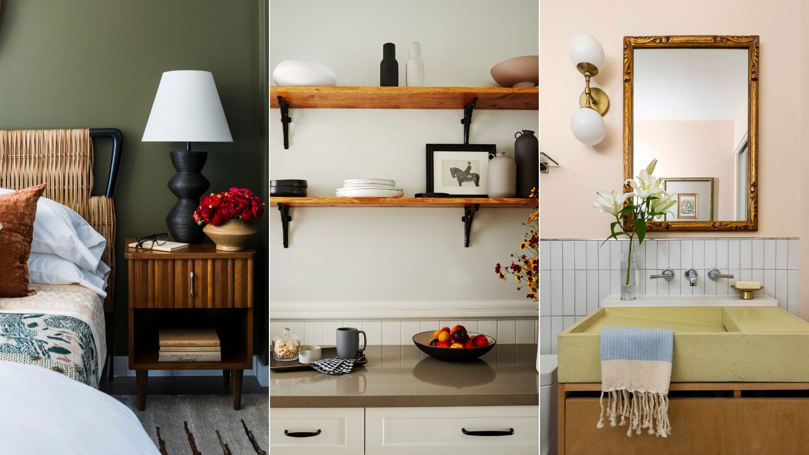
1/18
Interior designers share their favorite Benjamin Moore paint colors – and there's something for every style
Choosing the right paint color for a room can be an overwhelming task due to the vast number of options available, even when considering specific undertones, color families, or light sensitivity. To simplify this process, interior designers have shared their preferred Benjamin Moore paint shades, encompassing both best-sellers and more unique selections.
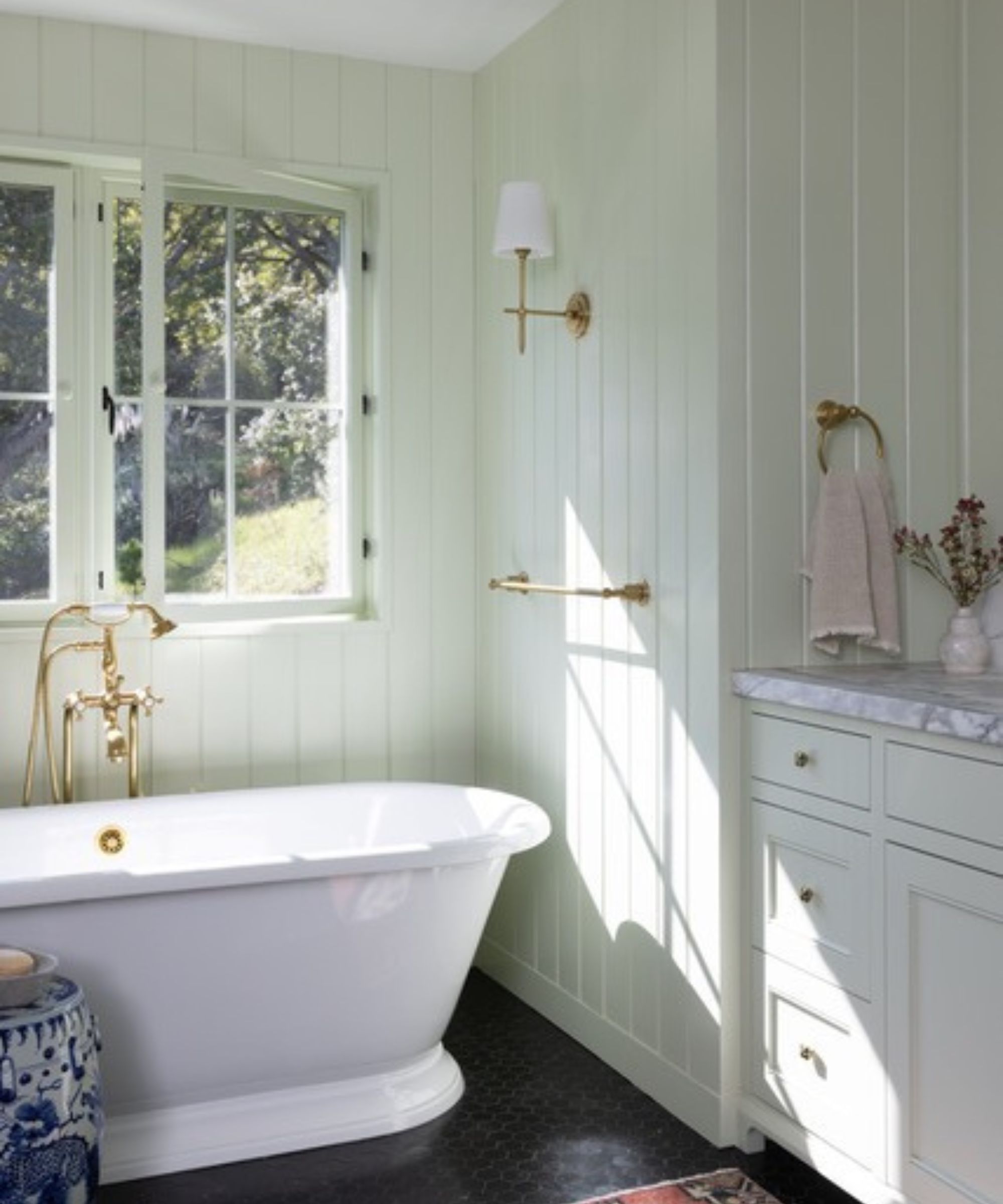
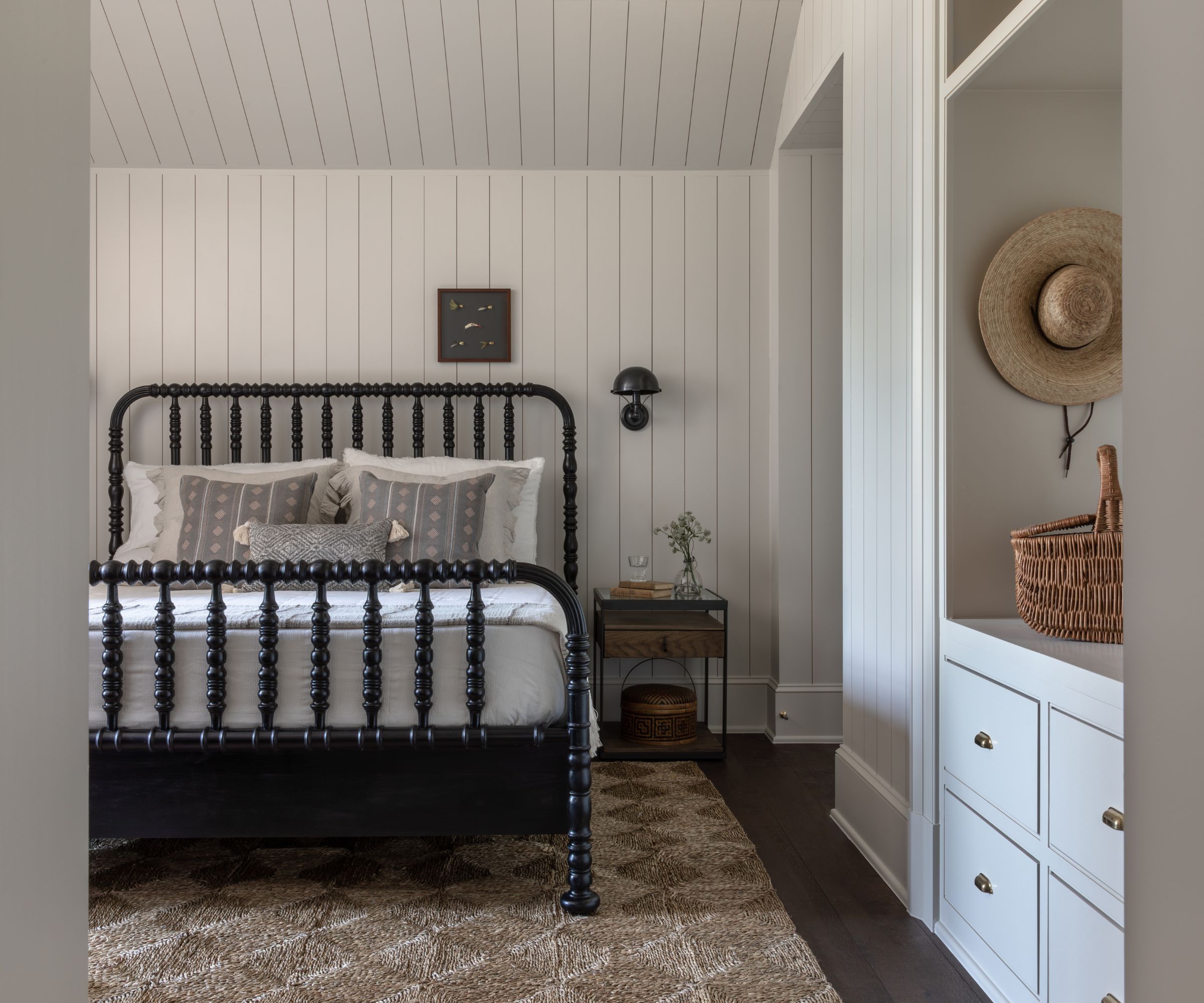
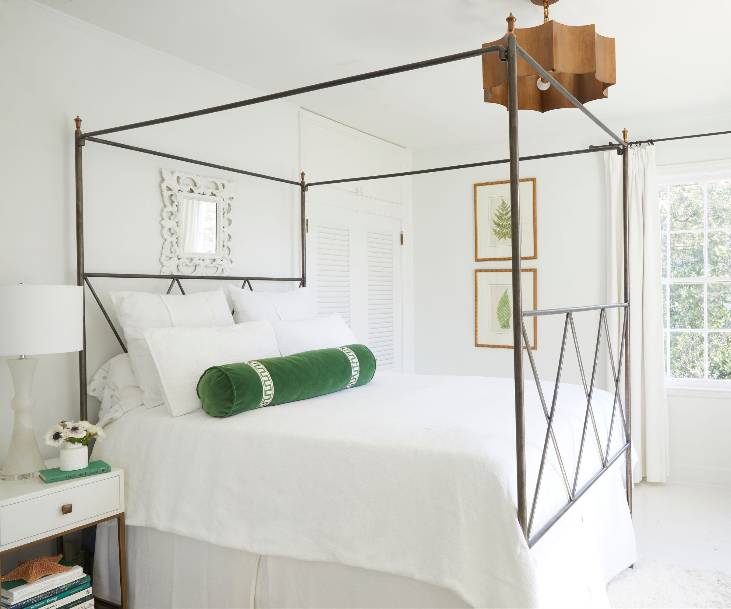
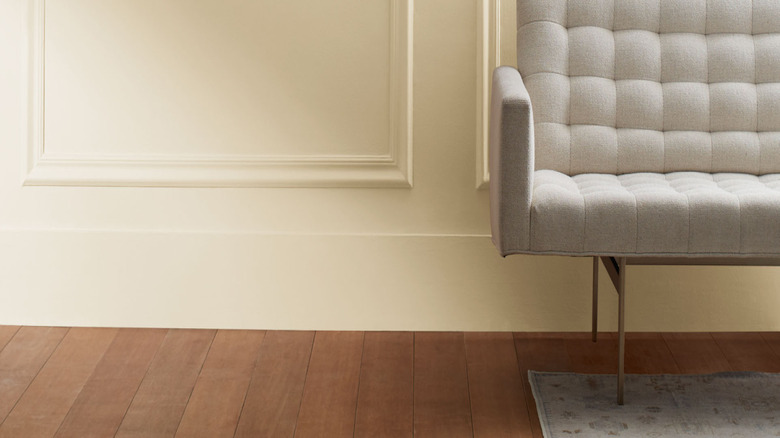
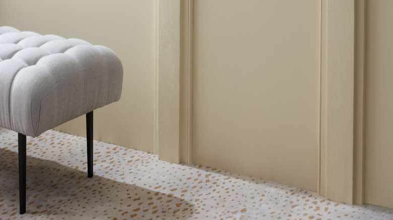
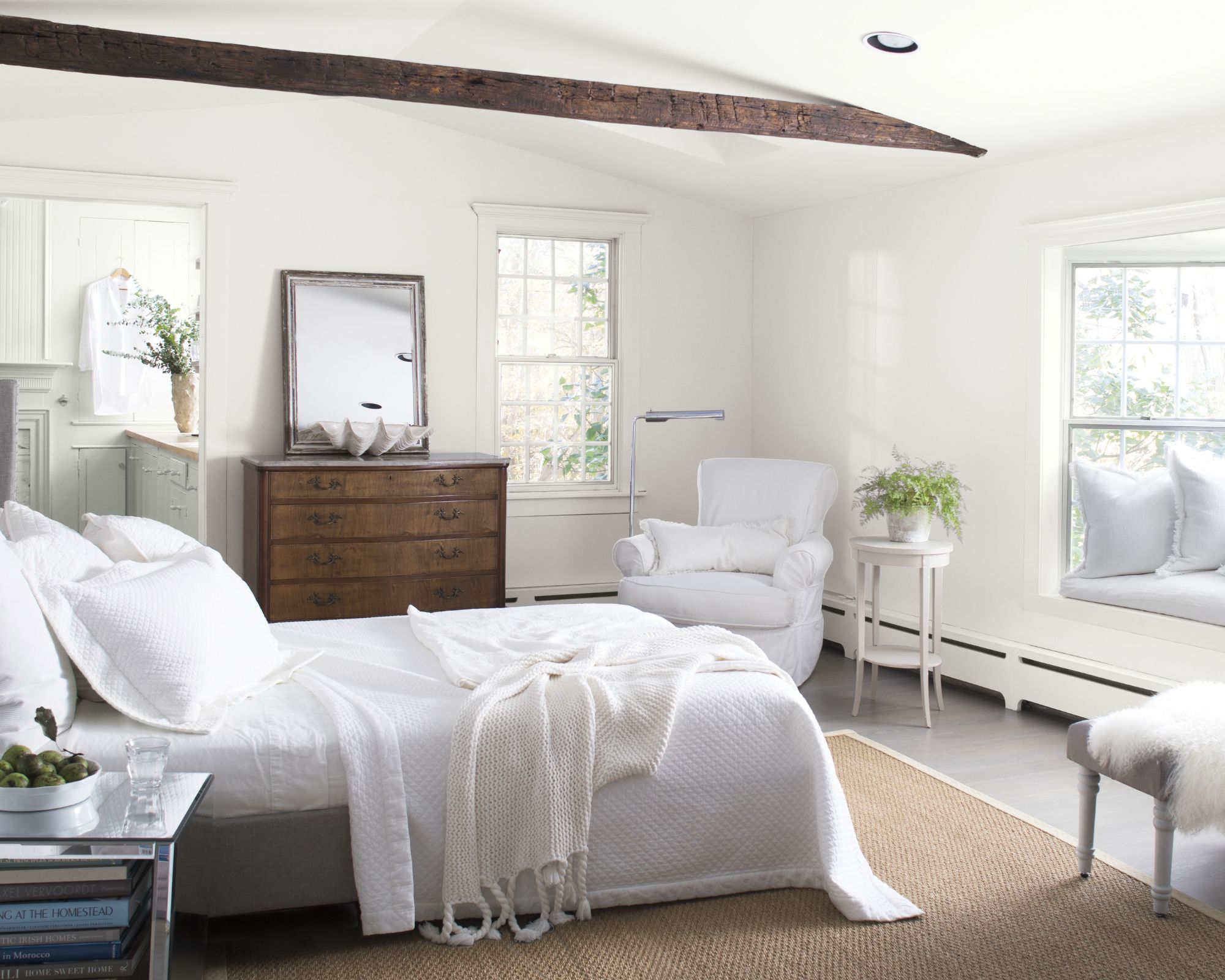
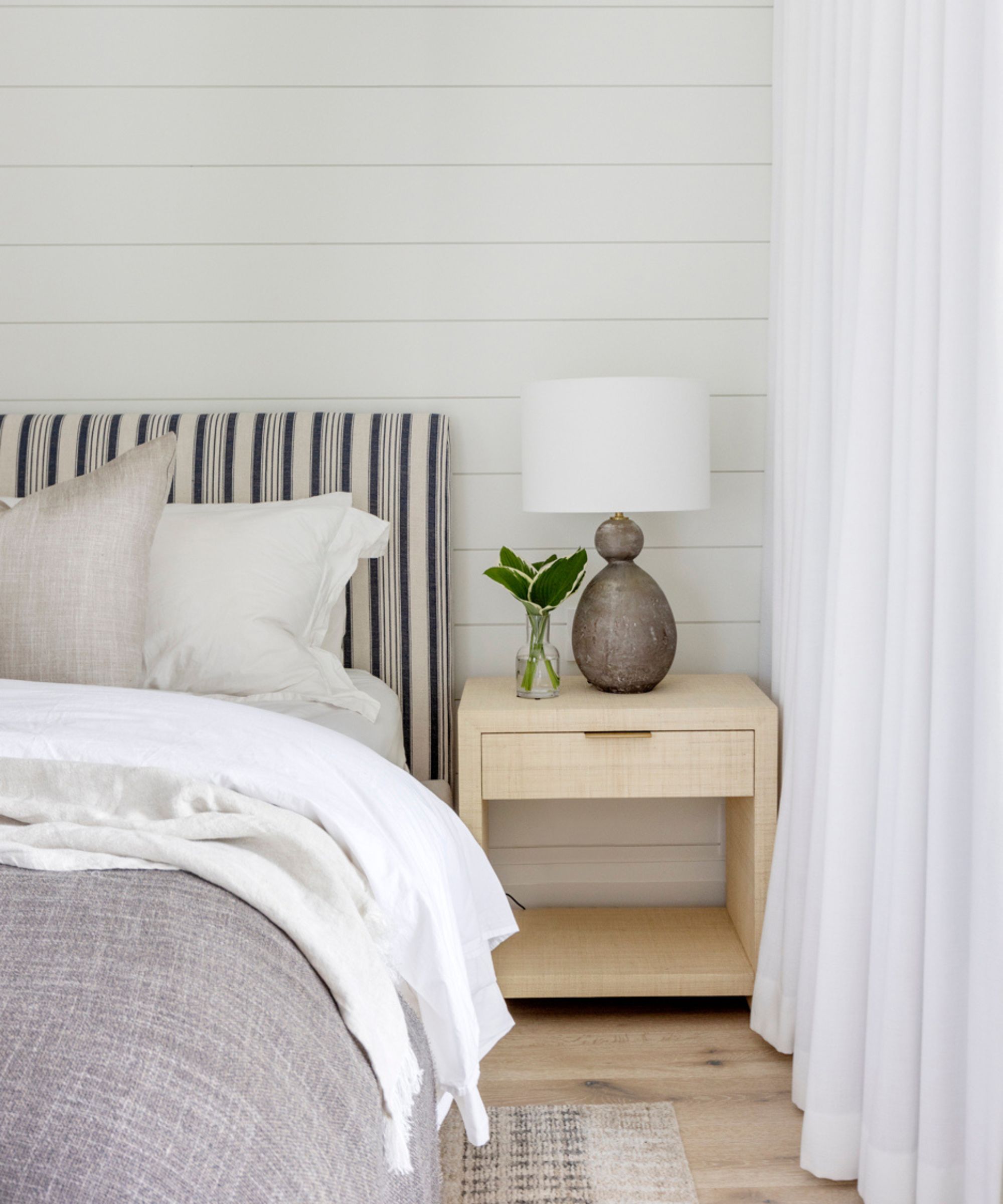
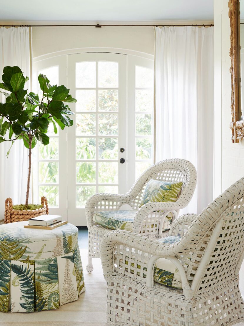
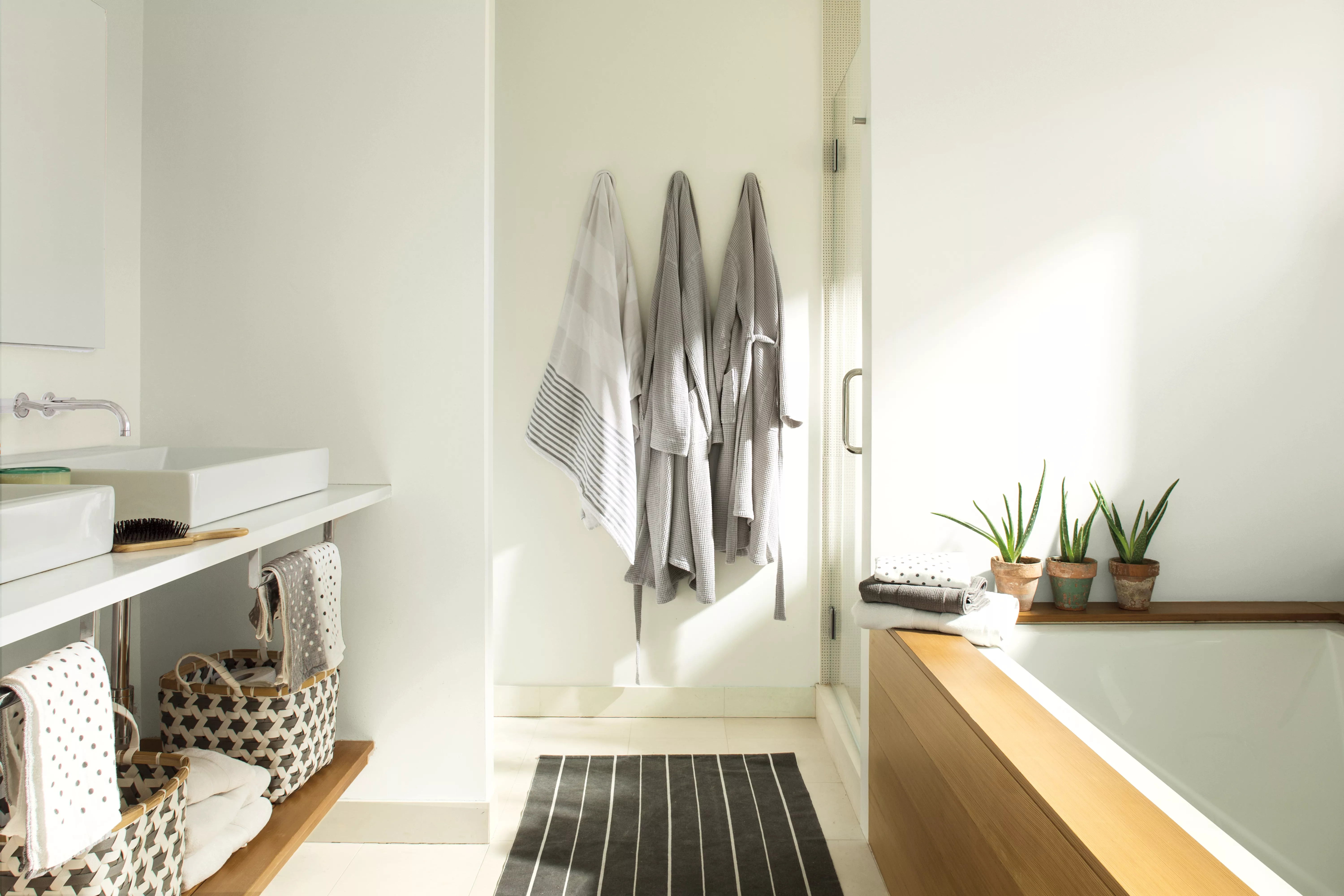
The article categorizes these designer-approved paints by color family, starting with white paints. White, despite appearing simple, is often the most challenging to select due to the importance of undertones and light sensitivity. Designers recommend several white shades for their versatility. Alice Chiu, founder of Miss Alice Designs, favors Cloud White, a soft, warm white with a taupe undertone that avoids a 'yellowish' cast. She suggests pairing it with crisp whites like Chantilly Lace for subtle contrast or earthy tones for a natural feel, noting that dark accents enhance its creamy hue. Kyle O'Donnell and Christopher Sale of Gramercy Designs prefer Simply White for its slight warmth, which beautifully complements natural wood, veined stone, and tile. For a cleaner white without significant warmth, Kendra Nash of Nash Design Group and Artem Kropovinsky of Arsight recommend Chantilly Lace, praising its pure, crisp quality and lack of unwanted undertones, making it easy to pair with other colors and highlight design details. Benjamin Moore's Swiss Coffee is highlighted as a timeless, well-balanced warm white suitable for various lighting conditions, often chosen by designers like Nicole Cullum of Color Caravan and Kathy Kuo of Kathy Kuo Home. Swiss Coffee, with its subtle green undertone, pairs effectively with cooler and jewel tones, fitting well with French country and modern organic aesthetics.
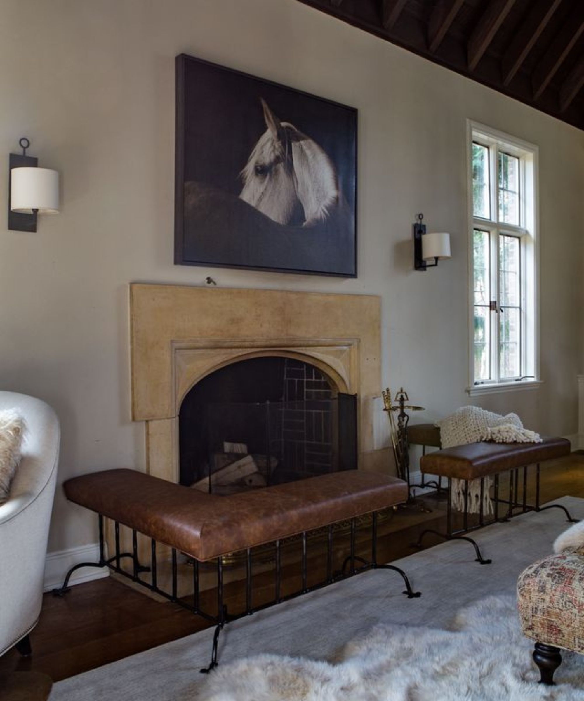
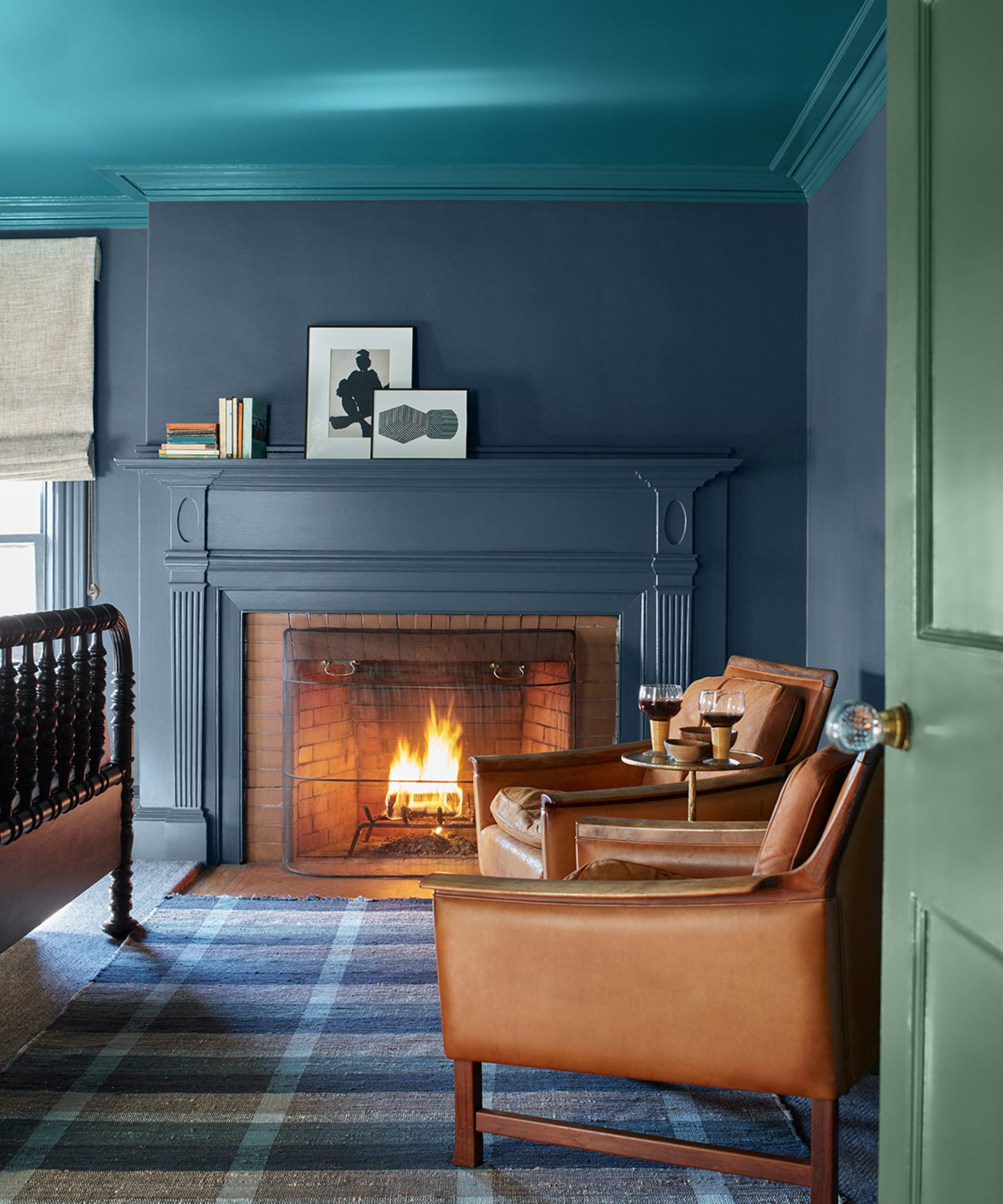
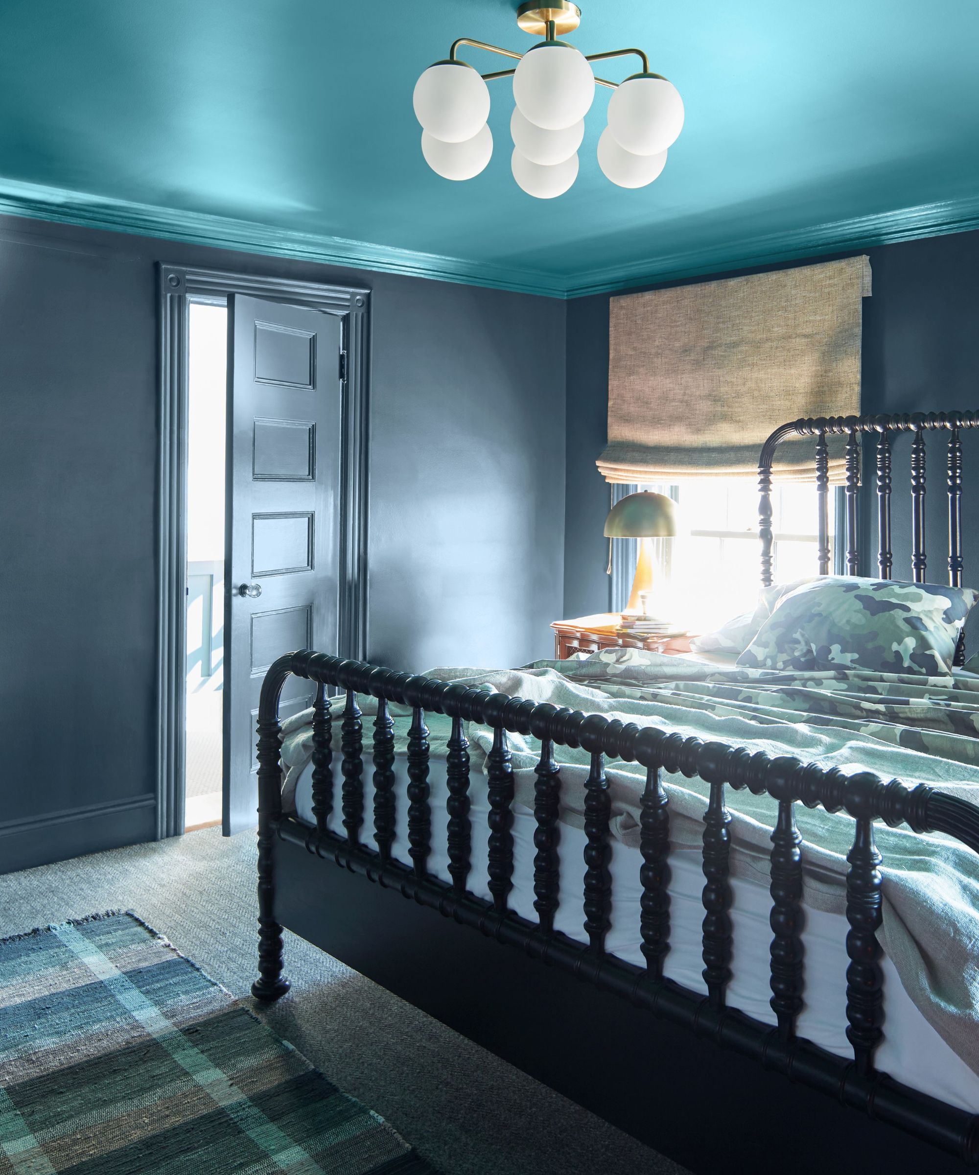
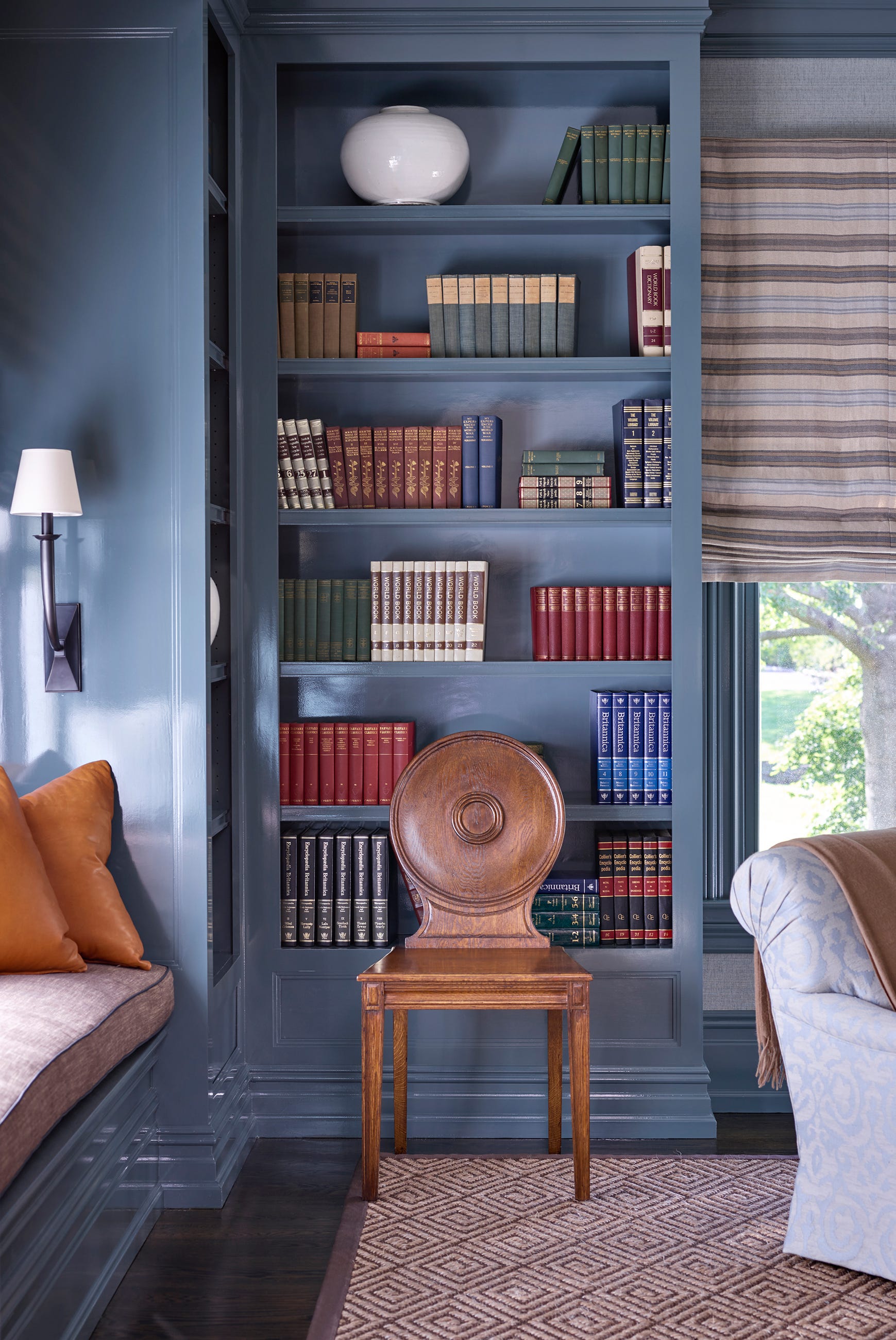
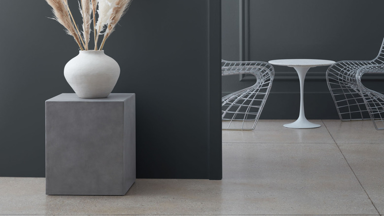
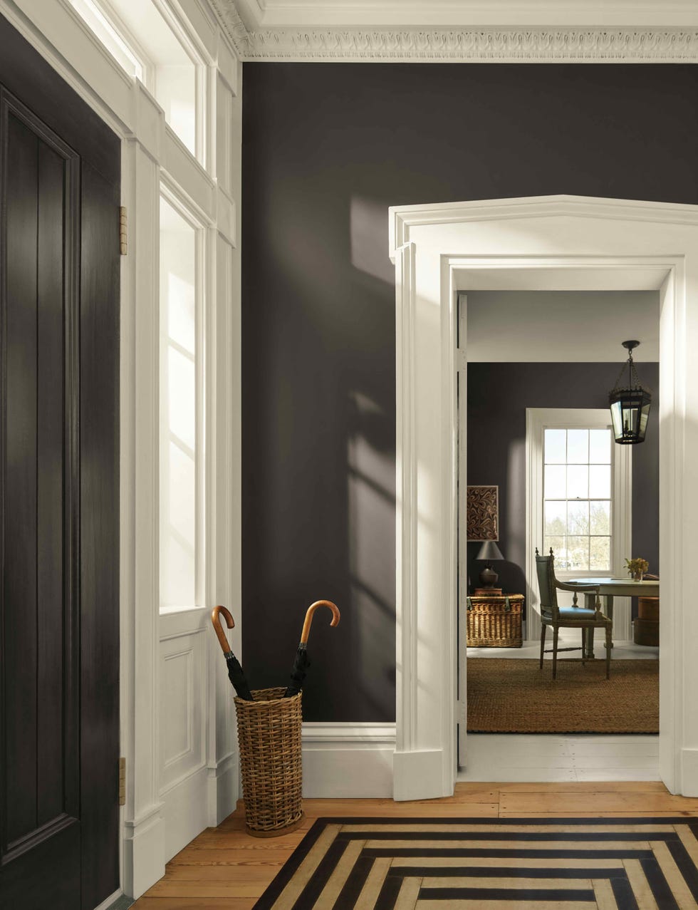
Moving to gray paints, designers offer options from deep charcoal to lighter hues. For a moody yet cozy atmosphere, Nicole Cullum suggests Kendall Charcoal, which adds drama without making a space appear too dark. Dan Mazzarini of BHDM Design describes it as a 'cocoon color' ideal for home libraries, hearth rooms, and bedrooms, recommending a flat finish for a velvety appearance. For a lighter gray, Alice Chiu's top choice is Gray Owl, a versatile neutral that adapts to different styles and can exhibit blue or green undertones depending on lighting and surrounding elements. Nicole also recommends Stonington Gray for its versatility and silver-like undertones, allowing it to transition seamlessly between warm and cool palettes. Kendra Nash uses Kitty Gray for cabinetry, appreciating its ability to reflect surrounding tones, including hints of green, blue, or a true classic gray, adding drama and intensity.
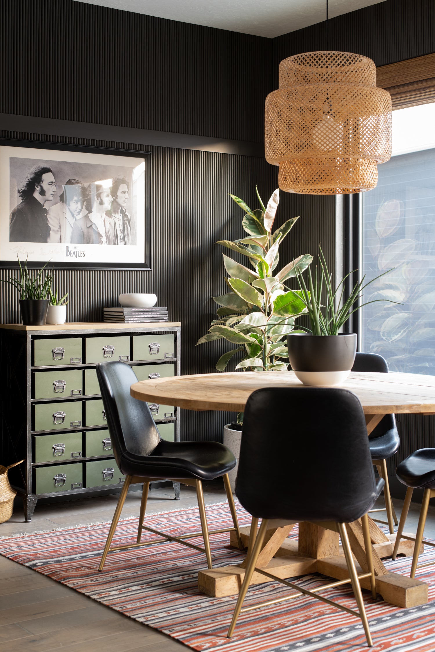
For black paints, Elizabeth Drake, principal designer of her firm, recommends Wrought Iron for its deep, rich quality that provides impact without overpowering a space, as demonstrated in a display cabinet. Nicole Cullum also suggests Iron Mountain, a soft black that balances warm and cool tones, offering excellent contrast with a soft finish. Onyx is another favorite for its luxurious, earthy black hue, which pairs well with warm or bright whites and creates stunning contrast with light neutrals or bold accent colors.
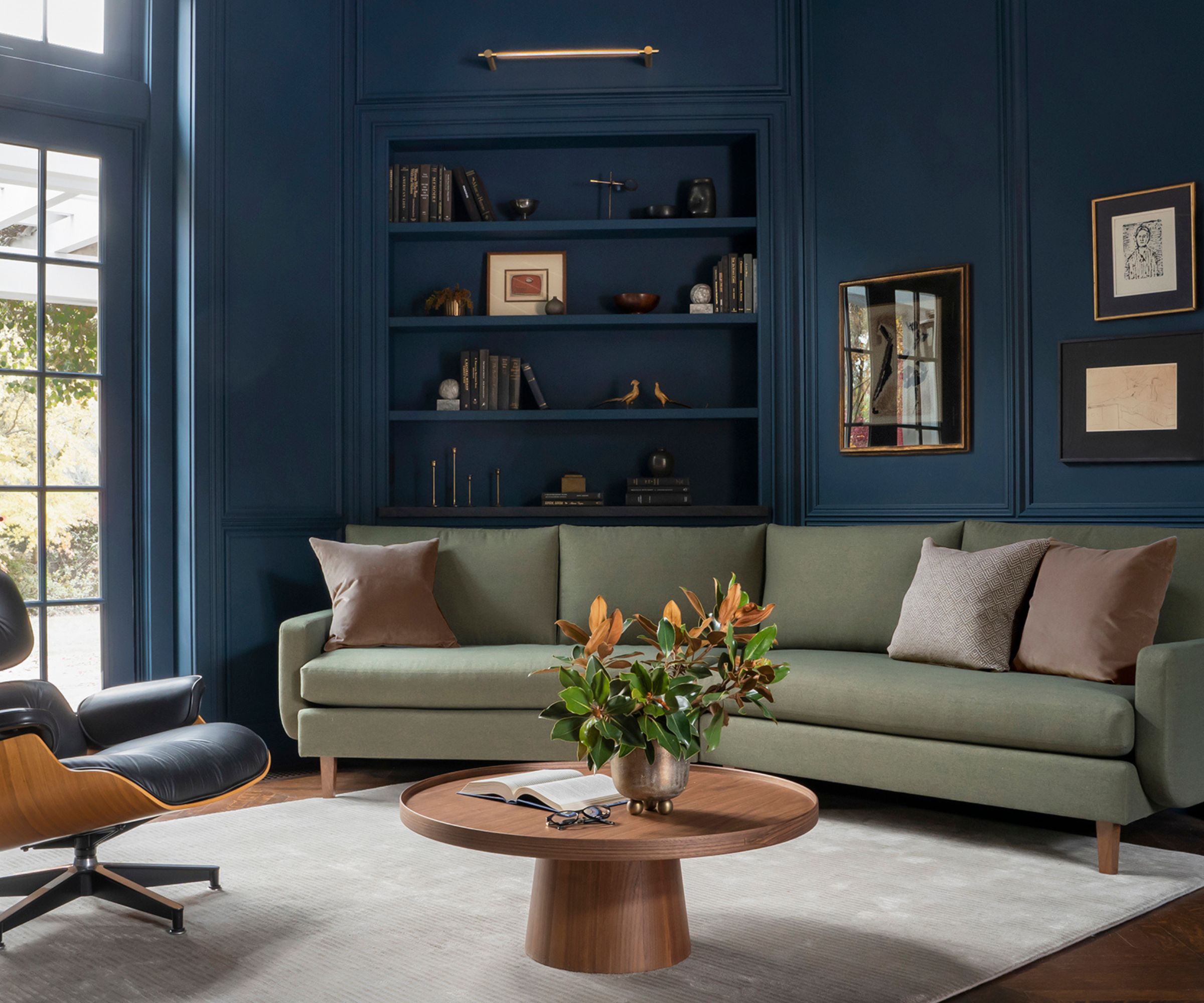
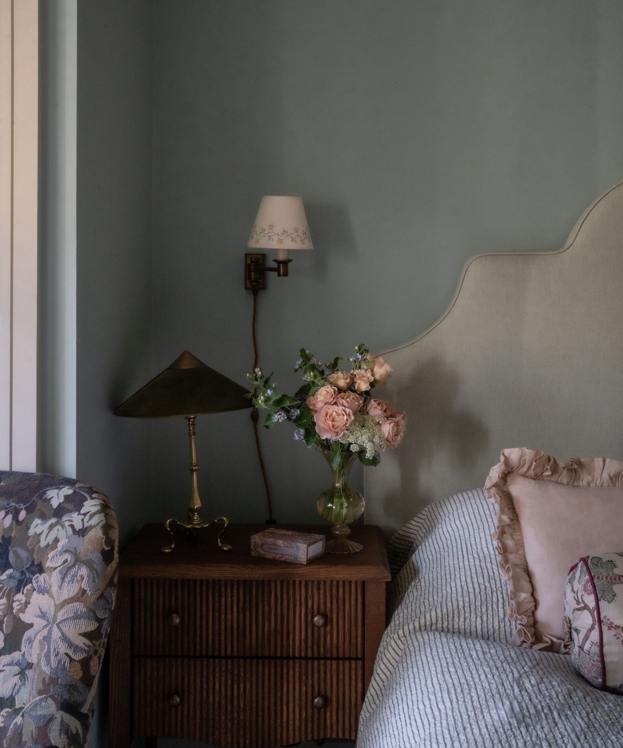
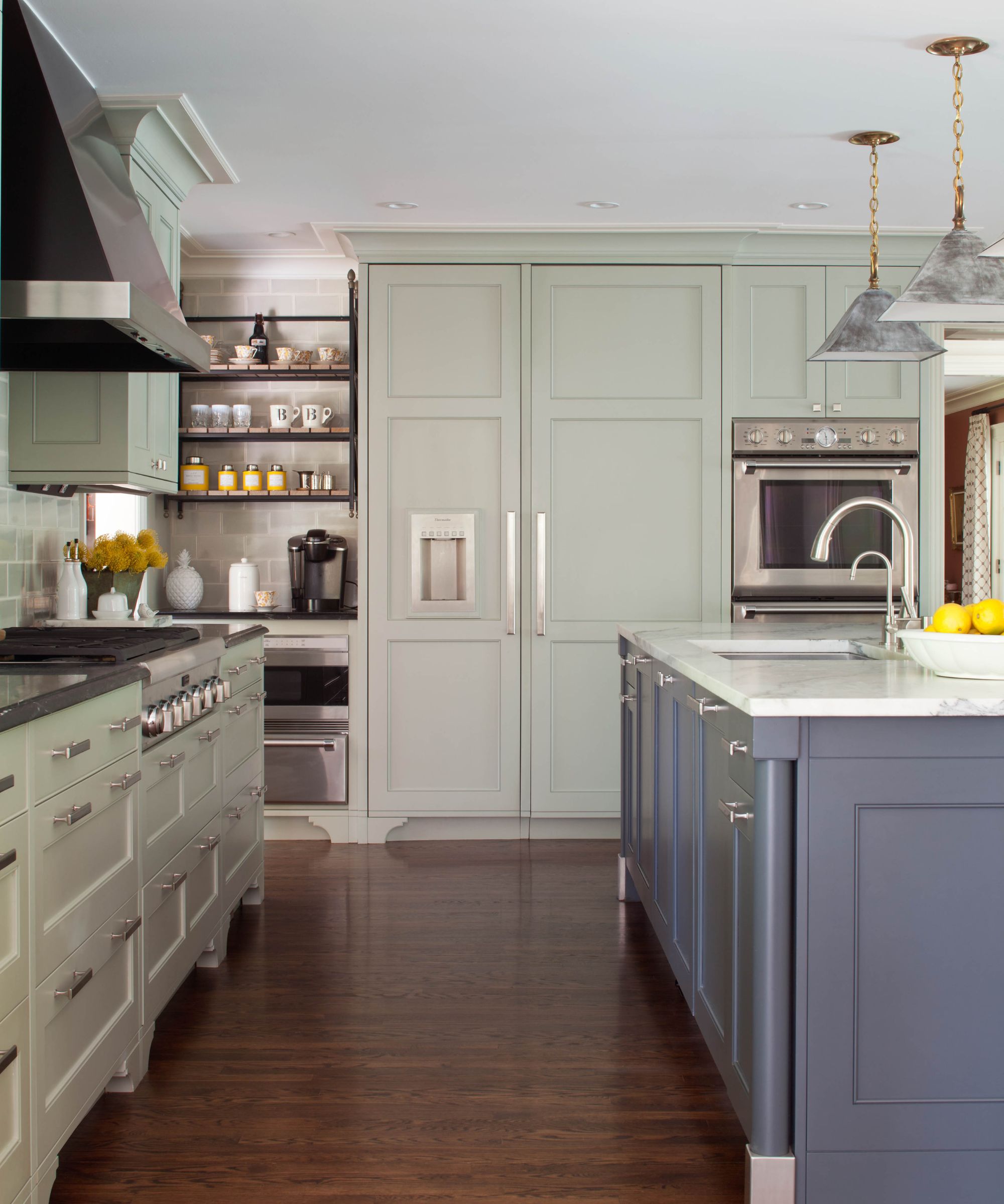
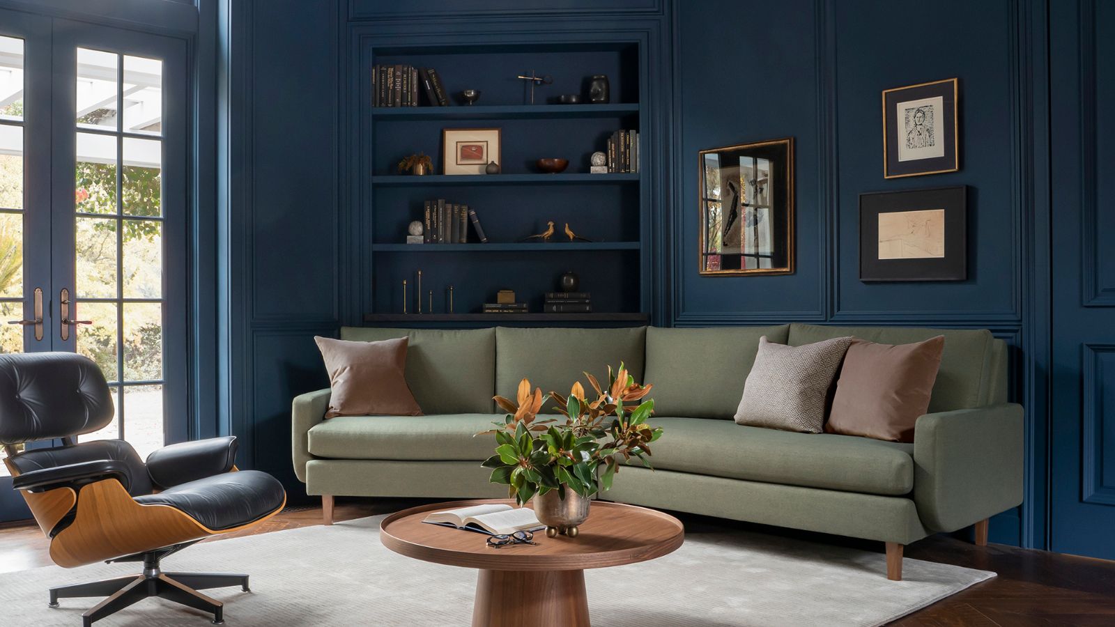
Blue paints, a trending color family, offer numerous variations. Elizabeth Drake highlights Palace Pearl for soft backdrops that are neither bland nor too bright, especially appealing when combined with rich olive greens. Dan Mazzarini's choice is Templeton Gray, a historical color that, despite its name, presents as a blue with gray and green undertones, acting as a 'chameleon color' that adapts to the room's decor. He uses it for doors, kitchen islands, and libraries. Kyle O'Donnell and Christopher Sale suggest Van Deusen Blue, a timeless shade suitable for children's rooms or as a versatile trim color.
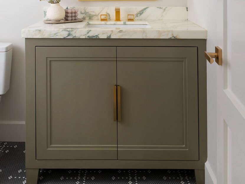
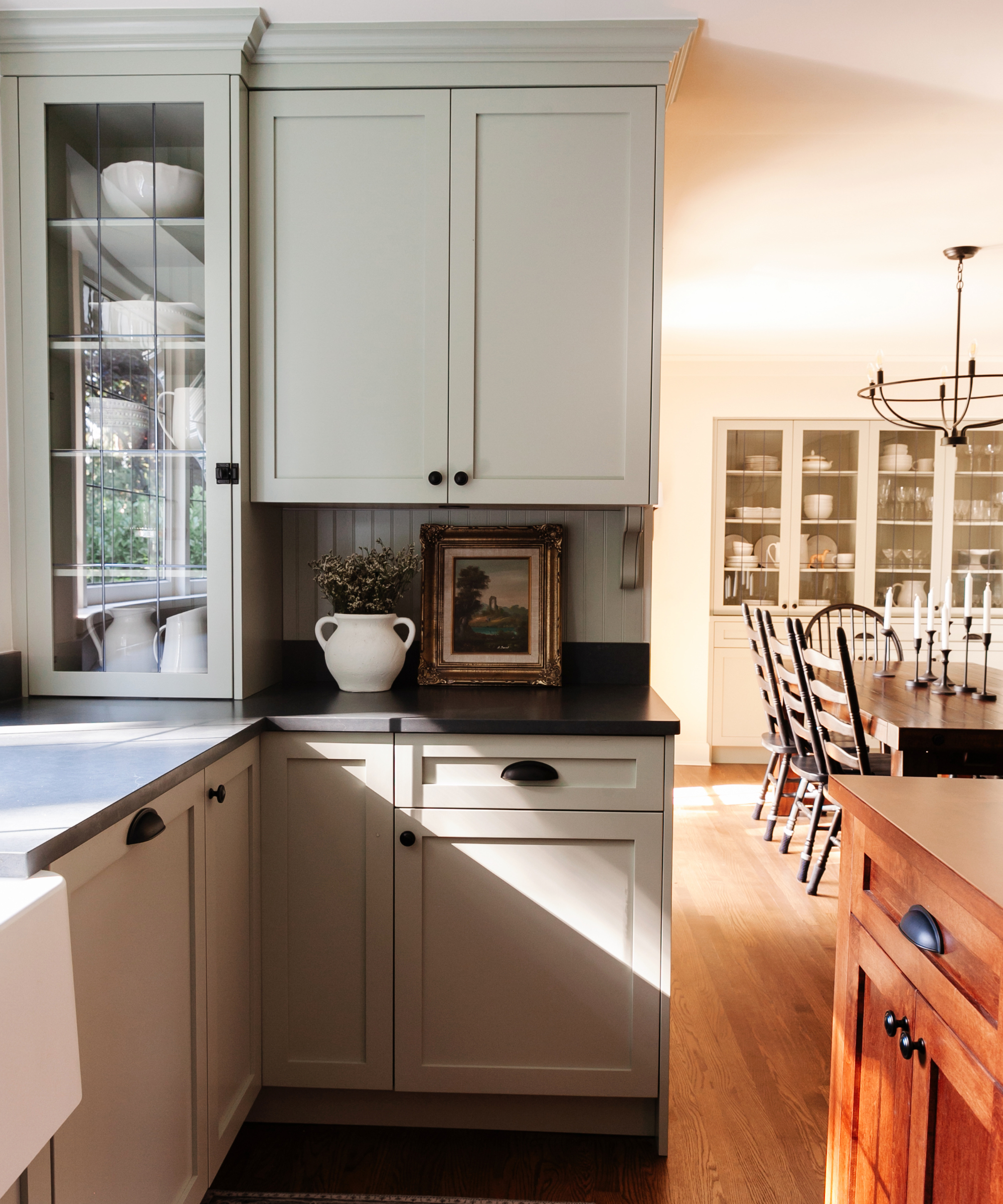
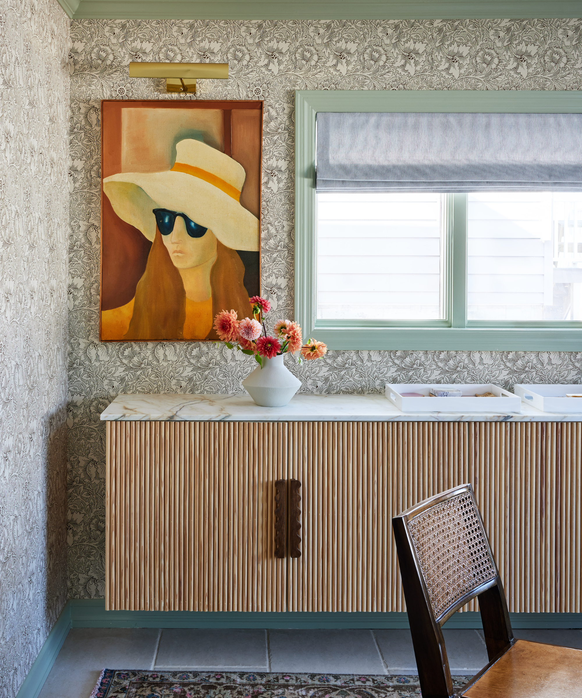
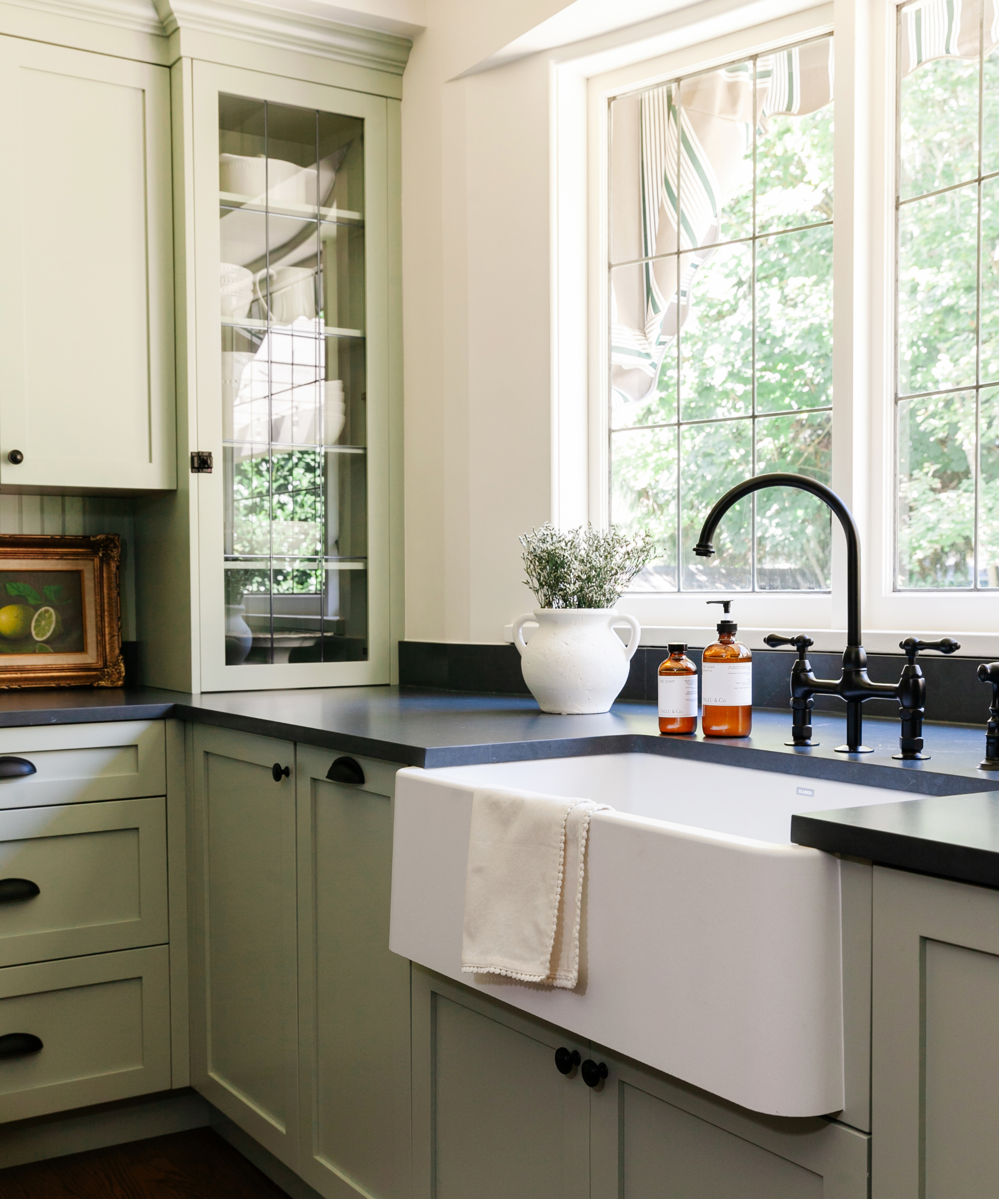
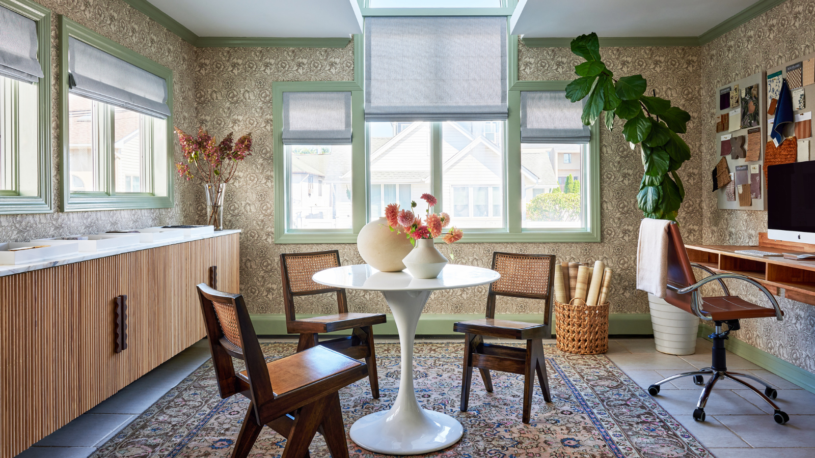
Green paints are currently popular and adaptable to various design styles. Caroline Brackett of Caroline Brackett Studio of Design often uses Peale Green for vanities, moody spaces, or front doors. Nicole Cullum notes Saybrook Sage for its timeless appeal, suitable for cabinetry and providing contrast with warm whites and light neutrals. Mediterranean Olive is another go-to green for Dan Mazzarini, used for walls and millwork in different sheens. Veronica Colby of Evergreen Design Co. favors Chimichurri for its deep, rich appearance, which beautifully complements gold accents and hardwood floors.
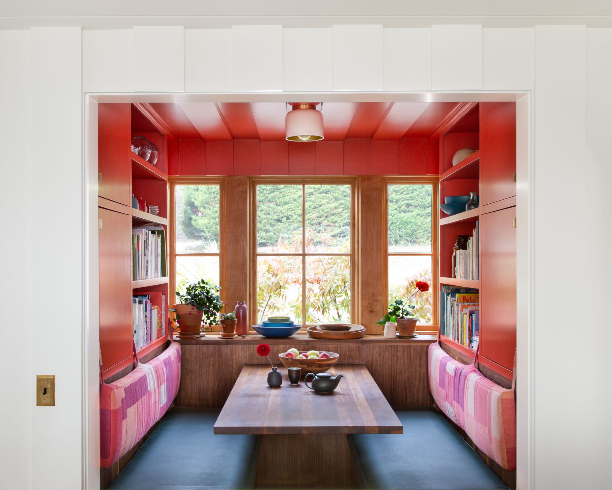
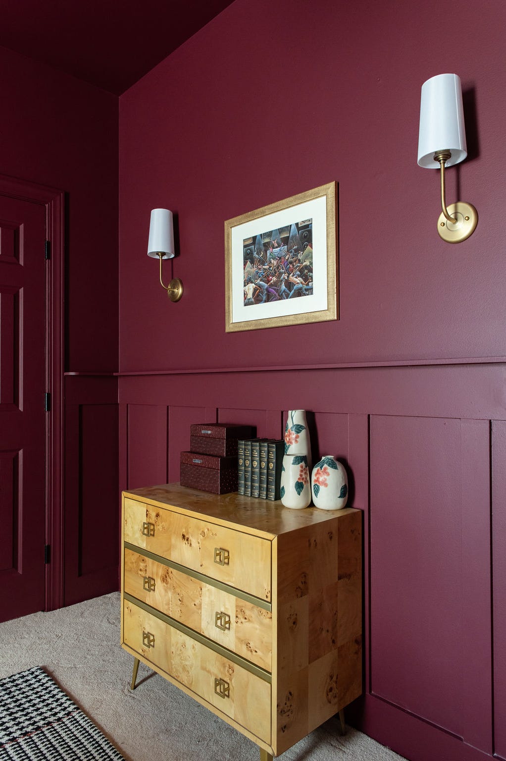
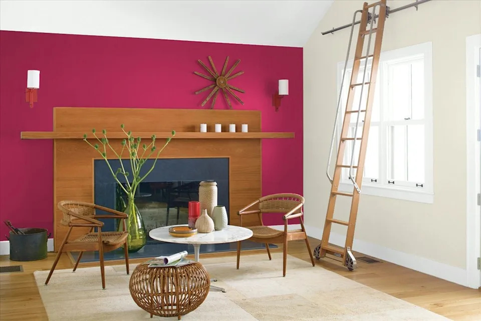
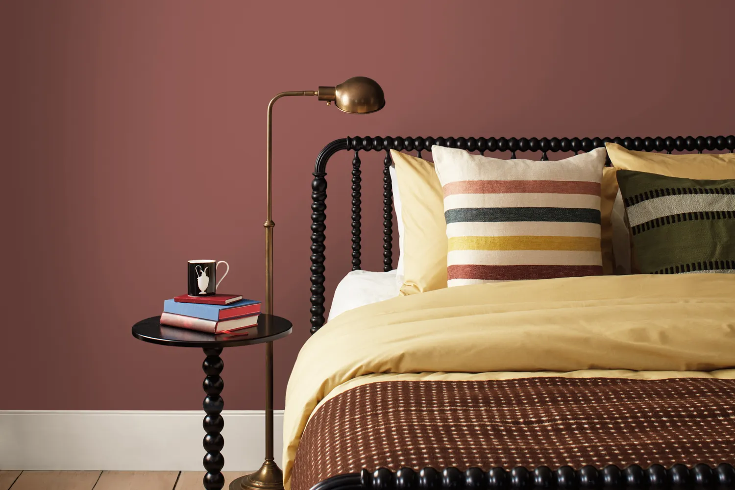
Red paints have gained popularity, with Emily June Spanos of Emily June Designs recommending Bordeaux Red for its deep red and purple tones that add character and drama, especially when contrasted with pale wood millwork. Nicole Cullum also likes Boston Brick, which draws from terracotta hues but incorporates a historical red to balance orange tones, creating a rosy tint with an earthy brown-orange base.
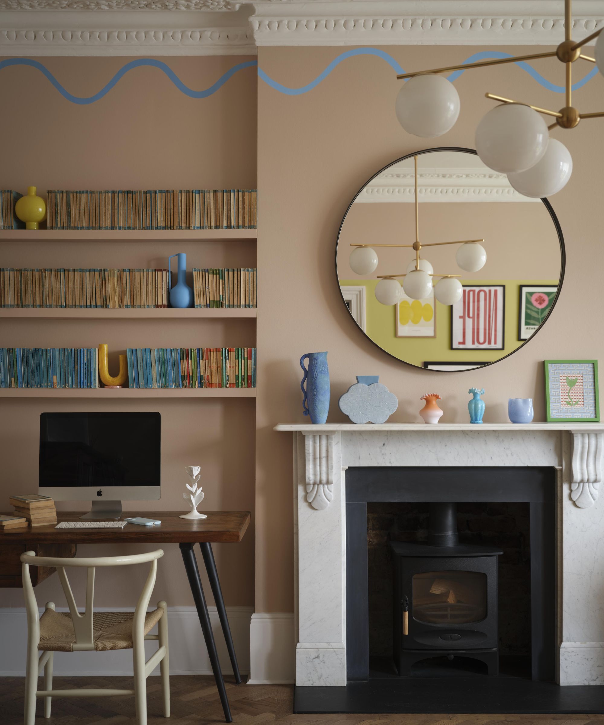
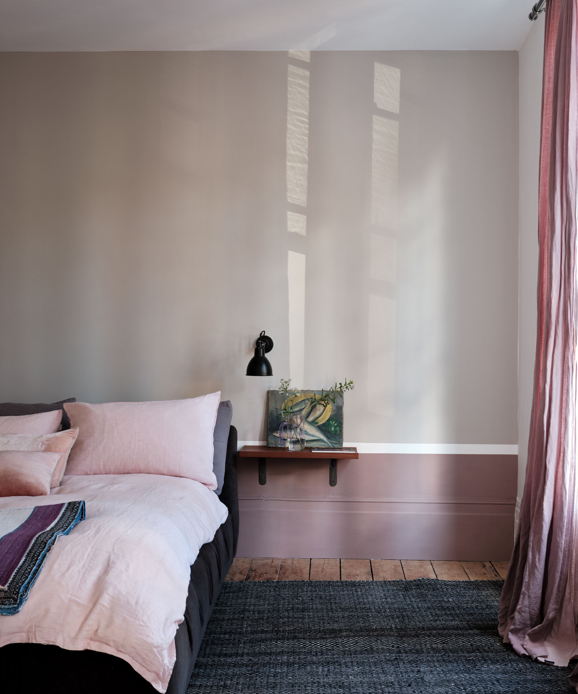
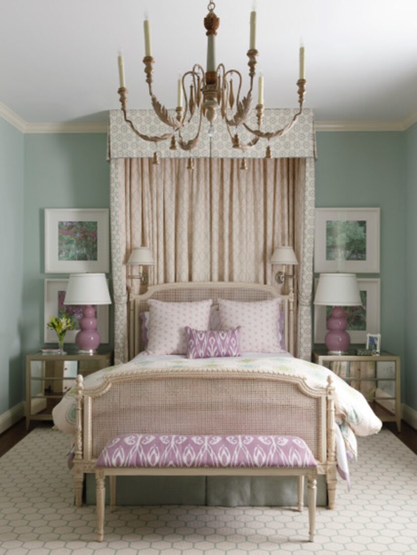
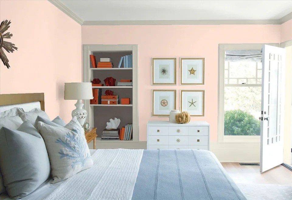
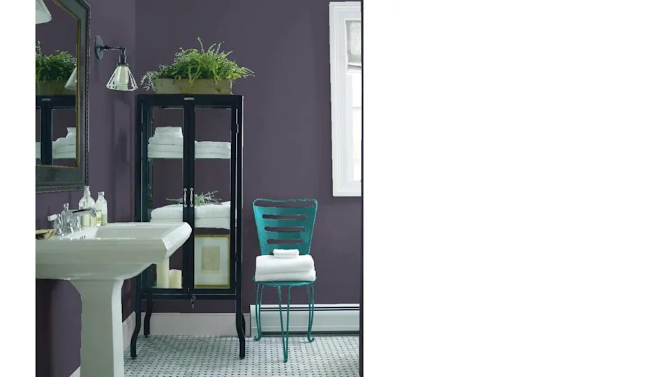
Pinks and purples, while sometimes challenging, also have designer favorites. Emily June Spanos suggests Arizona Peach as a perfect pale pink or blush alternative to white, providing a warm glow and acting as a versatile neutral. Nicole Cullum adds First Light, Peach Parfait, Lavender Mist, Lily Lavender, and Shadow to her list, covering a range from dark and moody to light and uplifting.
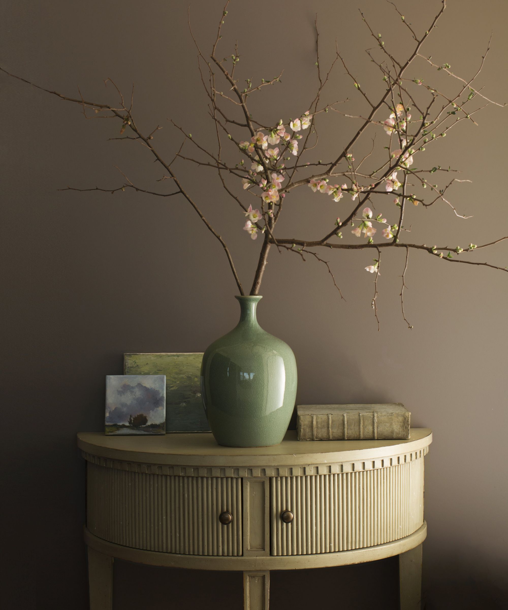
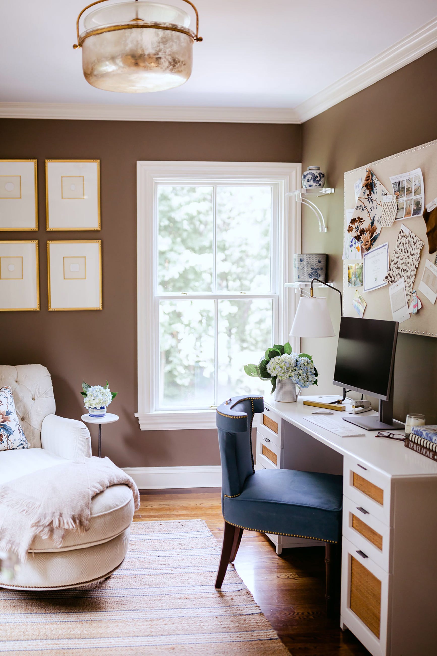
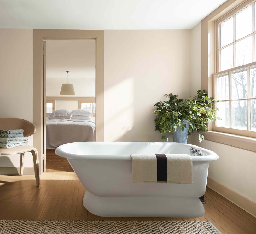
Finally, neutral paints are cherished for their timeless appeal. Kyle O'Donnell and Christopher Sale find Fairview Taupe to be a perfect brown, balancing warm and cool tones. It works well in monochromatic schemes or as a backdrop for moody blues. Revere Pewter is widely praised by designers like Artem Kropovinsky for its versatility and warm undertones, adapting comfortably to different lighting and bringing a sense of comfort. Veronica Colby prefers Pale Oak for its depth and taupe undertones, offering a gray alternative. Jessica Shaw of The Turrett Collaborative recommends Muslin for a warmer hue, especially when combined with black lacquer for a classic, classy style.
These designer-recommended Benjamin Moore paint colors offer a diverse palette to refresh any room, providing inspiration and favored shades for various interior design styles.
#BenjaminMoore #InteriorDesign #PaintColors #HomeDecor #ColorPalette #DesignerFavorites #WhitePaints #GrayPaints #BluePaints #BenjaminMoore #InteriorDesign #PaintColors #HomeDecor #ColorPalette #DesignerFavorites #WhitePaints #GrayPaints #BluePaints
0 comment in total
 No comments yet
You may also like
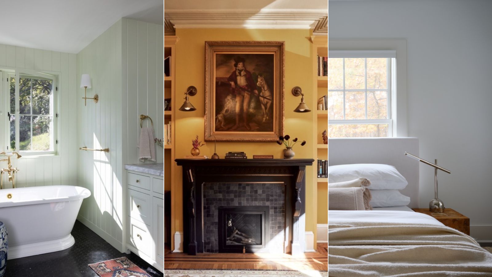
Benjamin Moore paint colors in real homes – 10 favorite shades amongst designers, from neutrals to brights
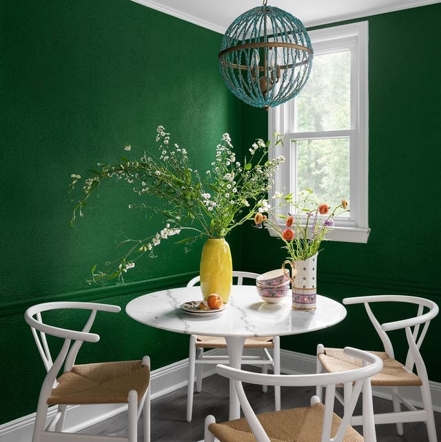
The Interior Paint Colors You'll Be Seeing Everywhere in 2024

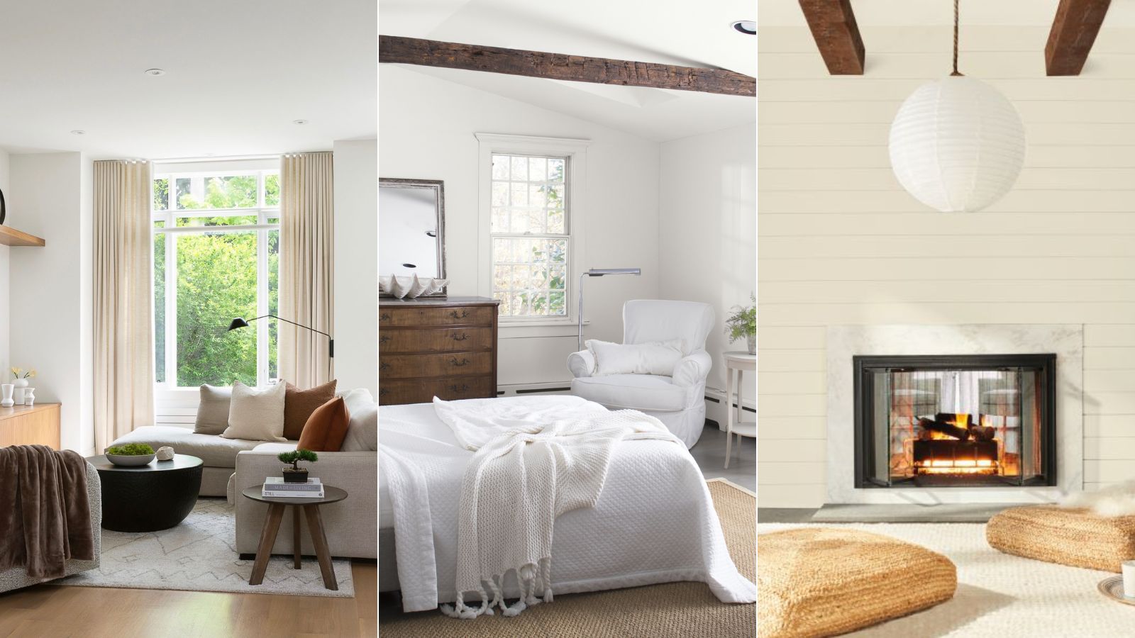
5 of the best Benjamin Moore white paints – classic shades that experts always use in interior projects
Benjamin Moore Just Released Its 2026 Color Forecast—These 8 Paint Shades Will Be Huge Next Year

Is Benjamin Moore's Gentleman's Gray the perfect navy blue paint?

Benjamin Moore's Trendiest Paint Colors (& Which Ones To Avoid)

The 12 Best-Selling Benjamin Moore Paint Colors of All Time

'It's one of those colors that just works' – why Benjamin Moore's Saybrook Sage could be the perfect calming green gray paint for your home
I'm a color editor and I'd never heard of these Benjamin Moore paint colors that interior designers swear by
9 Classic Paint Colors For Interior Doors That Designers Can't Get Enough Of
Interior designers' favorite Farrow & Ball paint colors
Beige, Begone: Bring Your Walls to Life With These 14 Beautifully Bold Colors

This Paint Color Has Been Benjamin Moore’s Best Seller for Years—and Designers Swear by It


An A-List Designer’s Secrets To Picking Perfect Paint Colors

19 go-to paint colors that Dallas designers love
Take 'Disco Nap,' and other 2021 colors of the year, for a spin

The best Benjamin Moore paint colors to use in bedrooms – 14 stylish shades recommended by interior designers

Benjamin Moore's 2026 Color of the Year Is Brown—Here's What to Pair It With in Your Home


8 Favorite Paint Colors of Local Interior Designers

33 Absolutely Perfect Paint Colors Designers Love