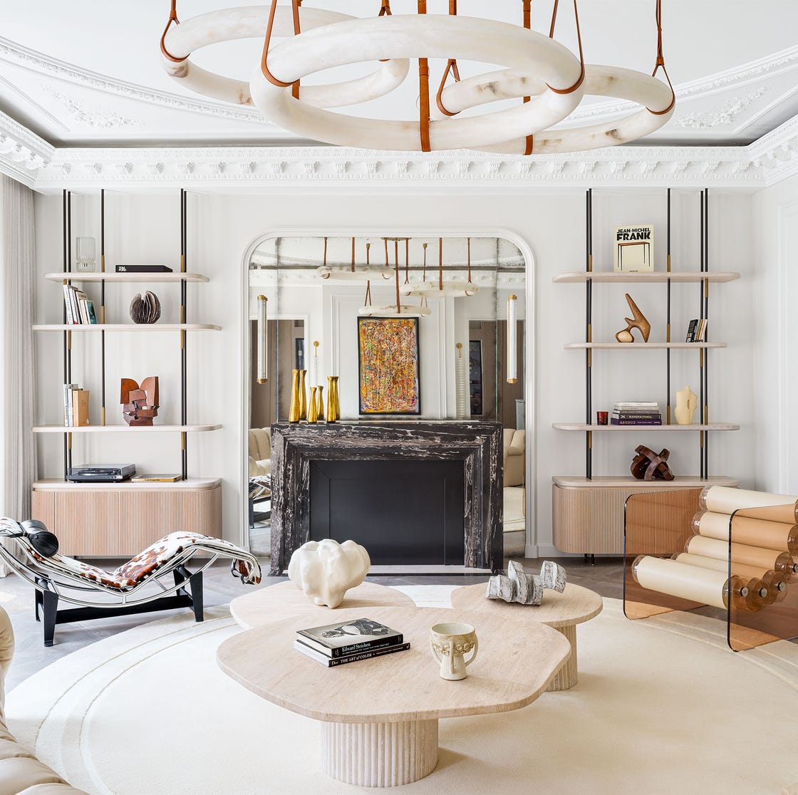
1/21
These Are the Neutral Paint Colors Interior Designers ACTUALLY Use
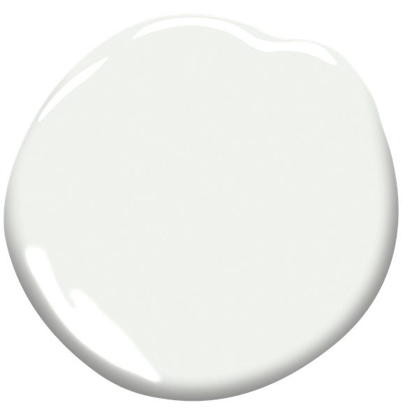
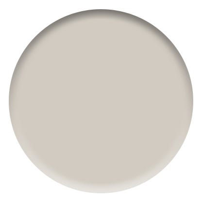
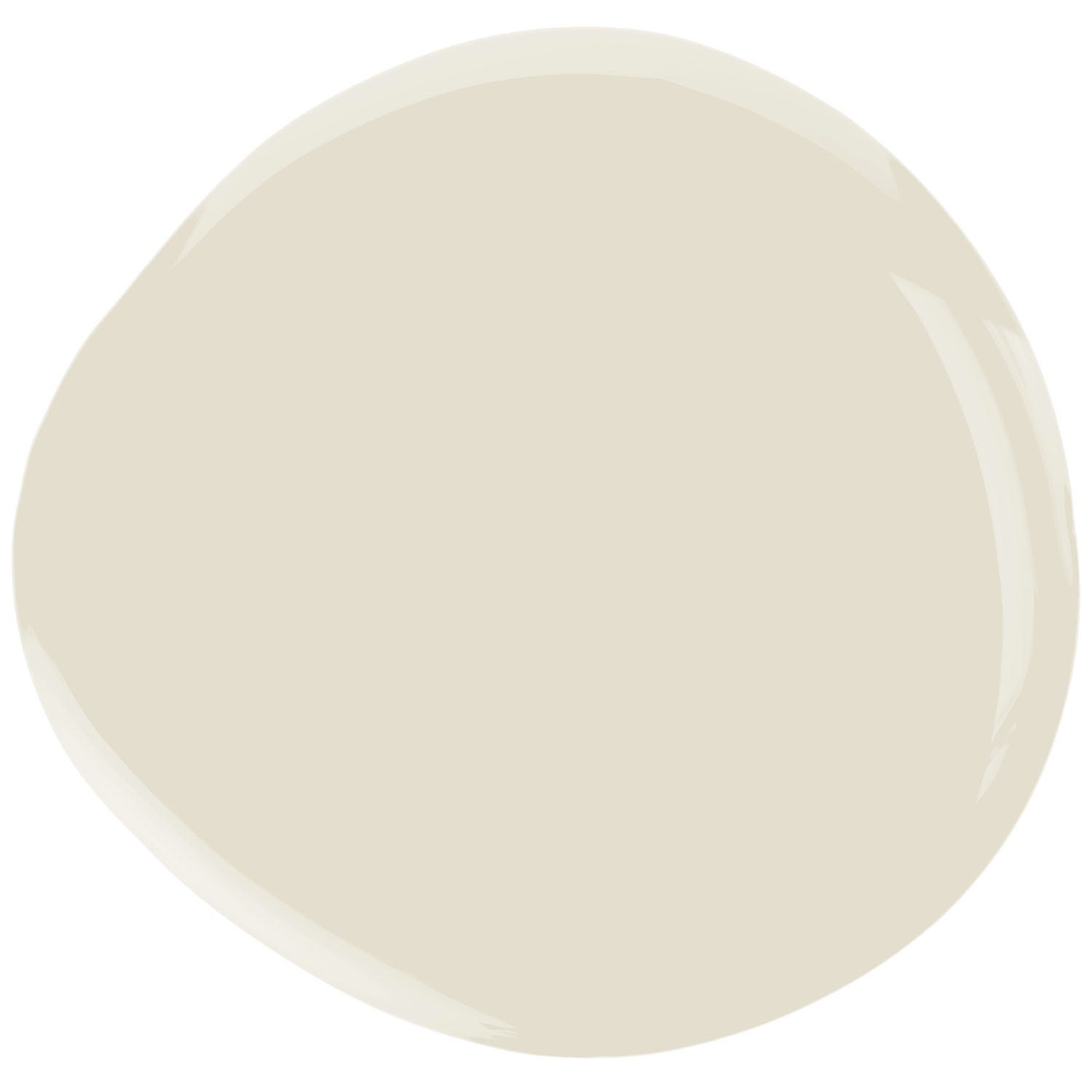
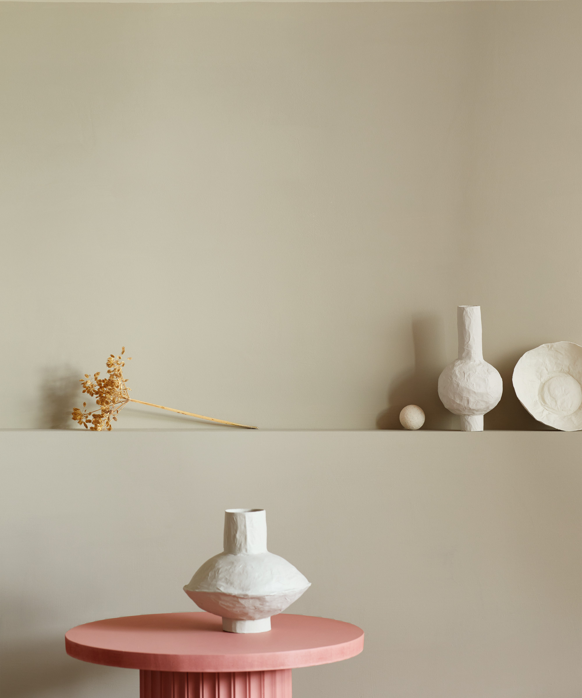
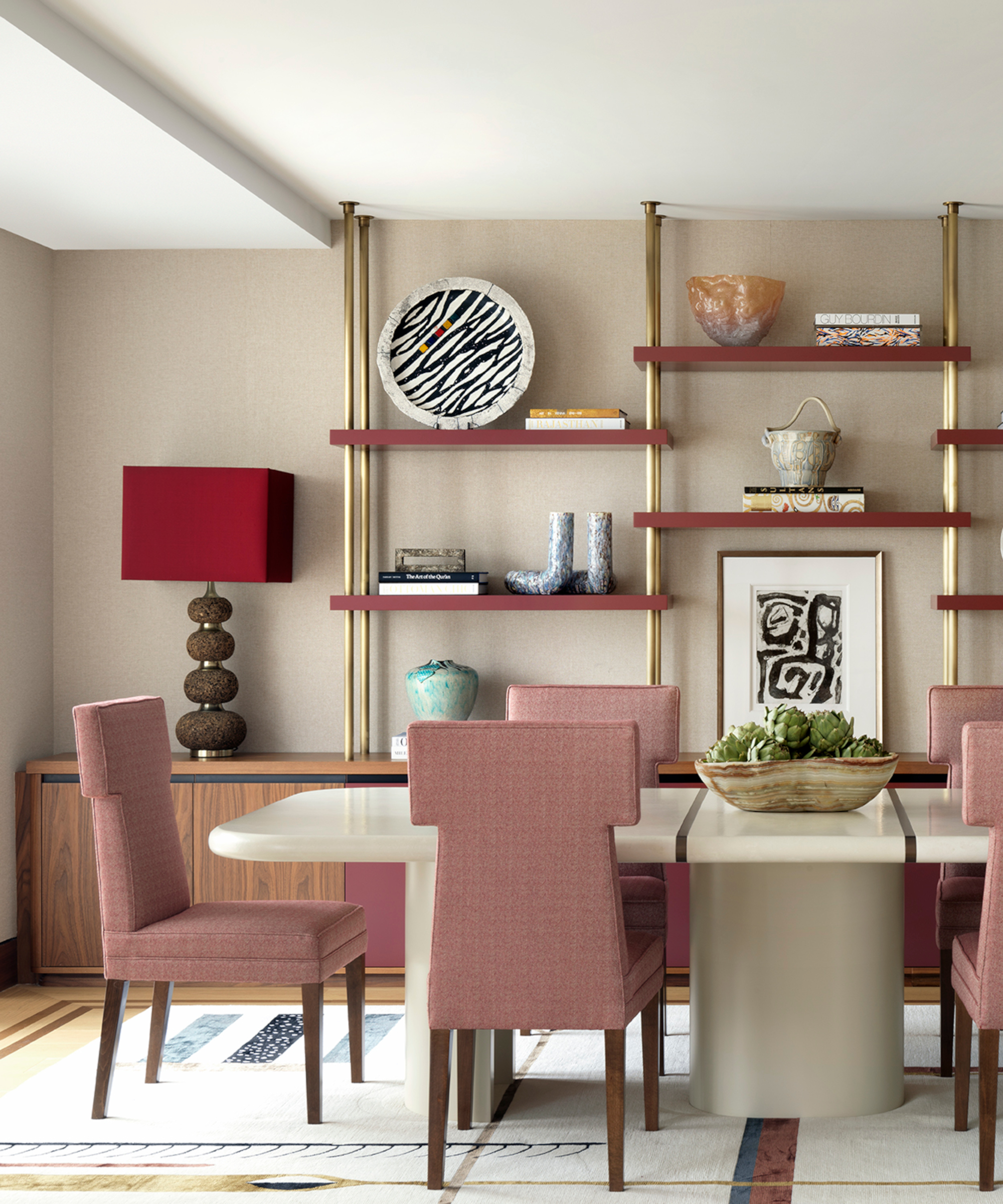
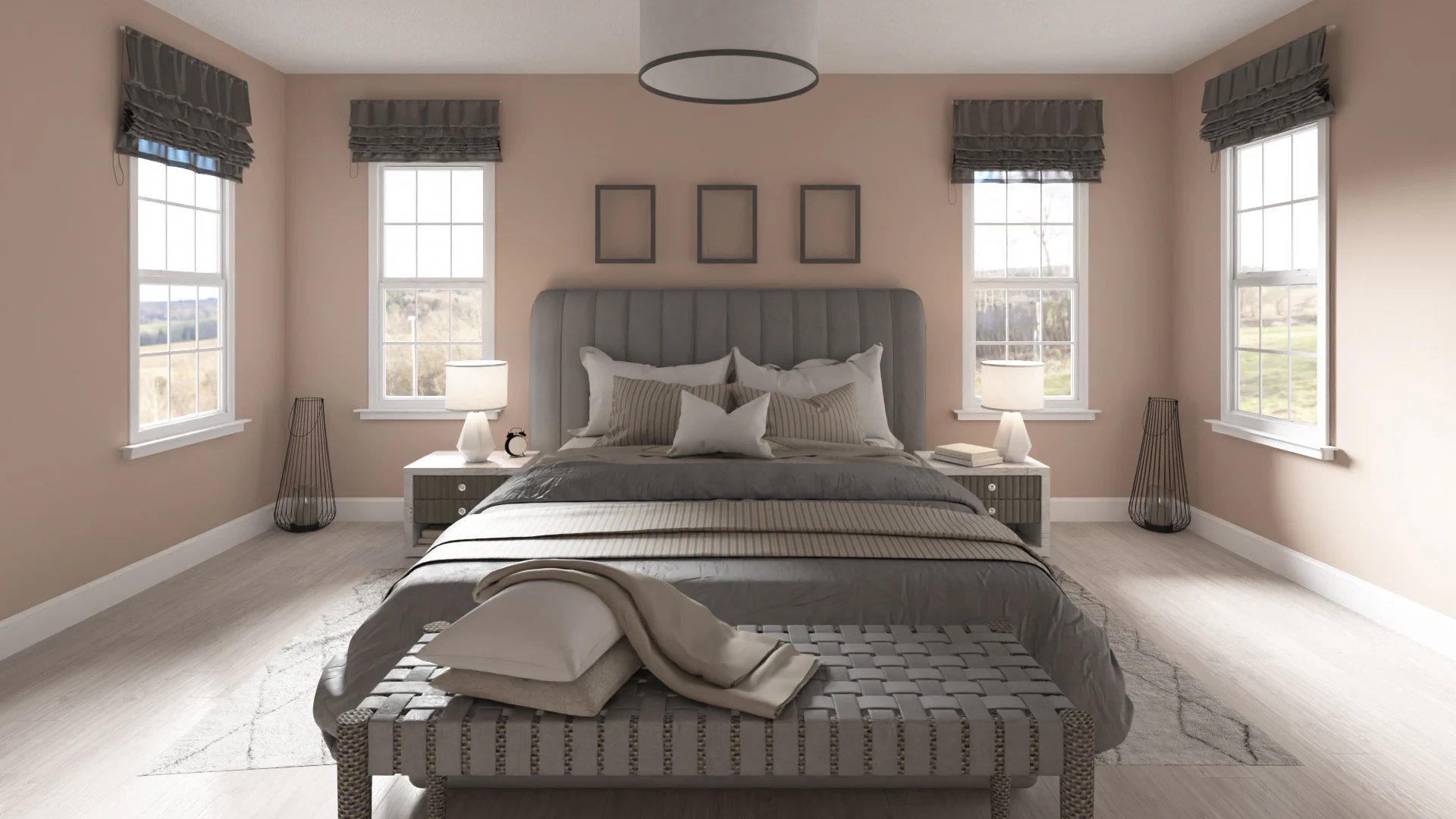
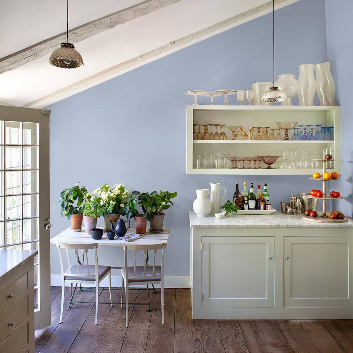
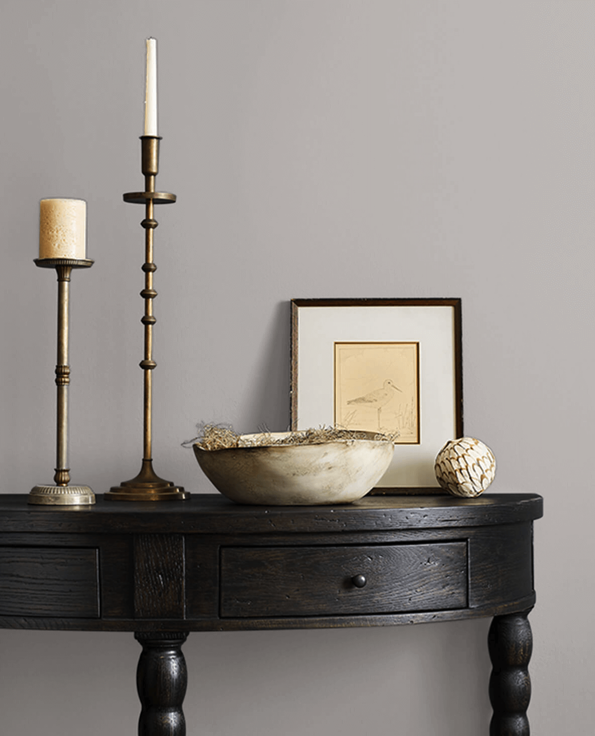
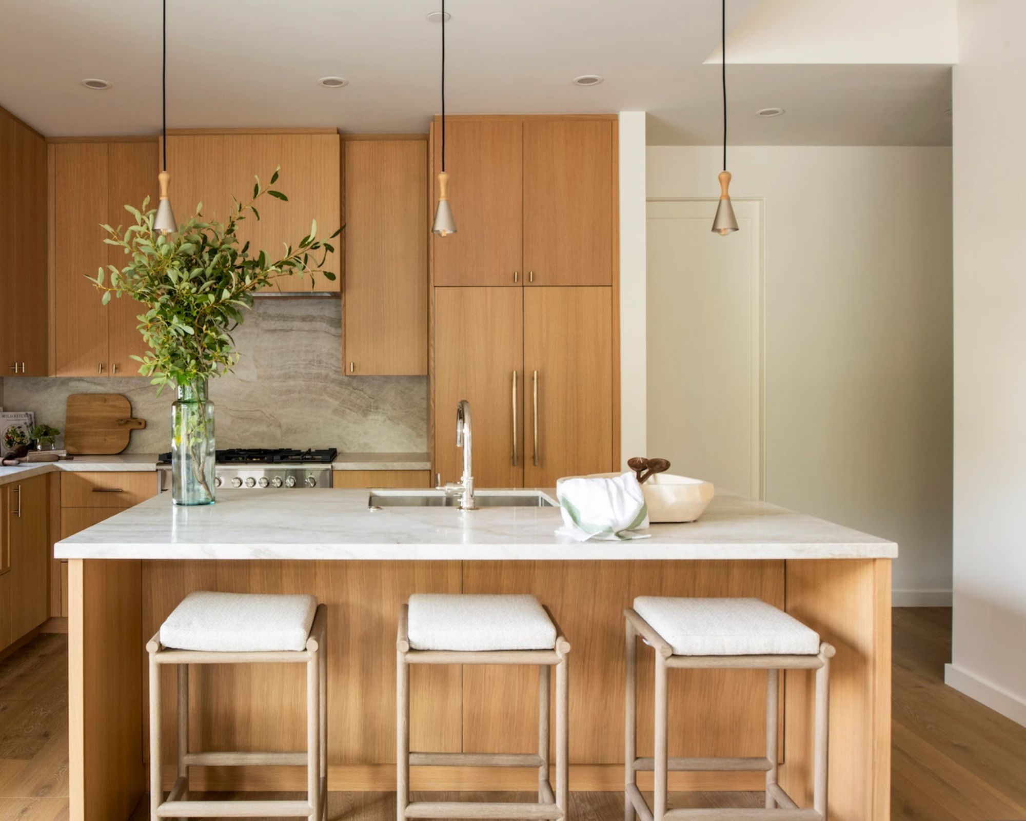
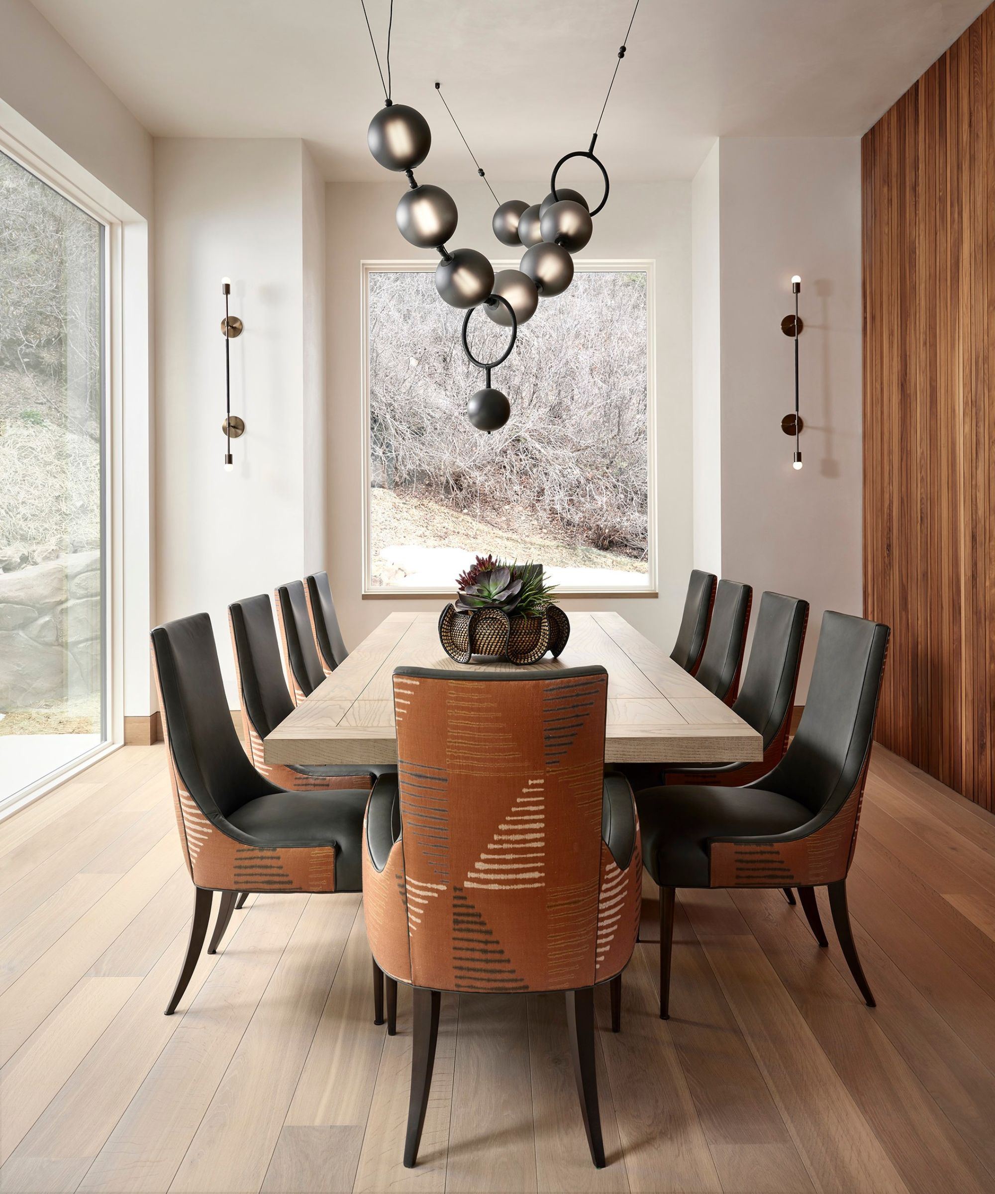
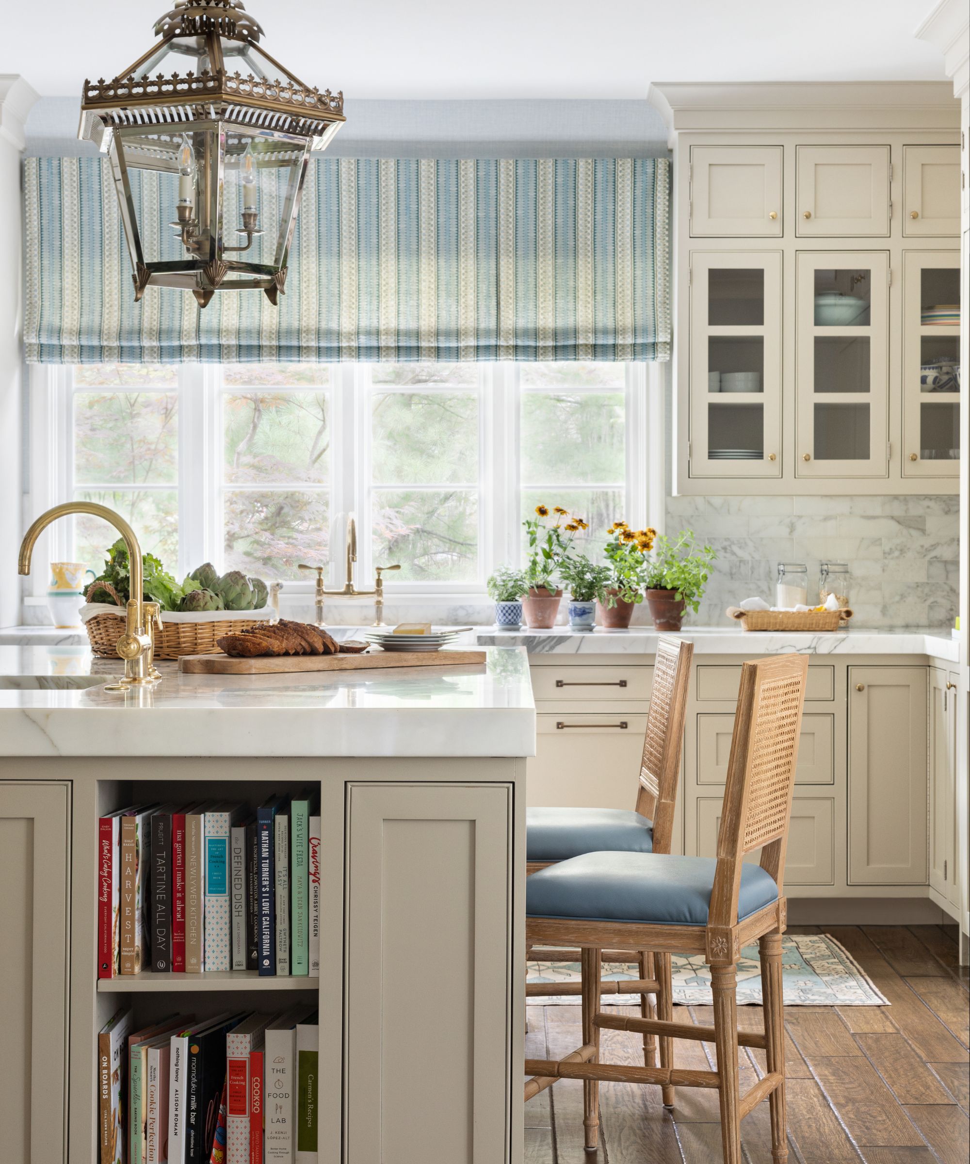
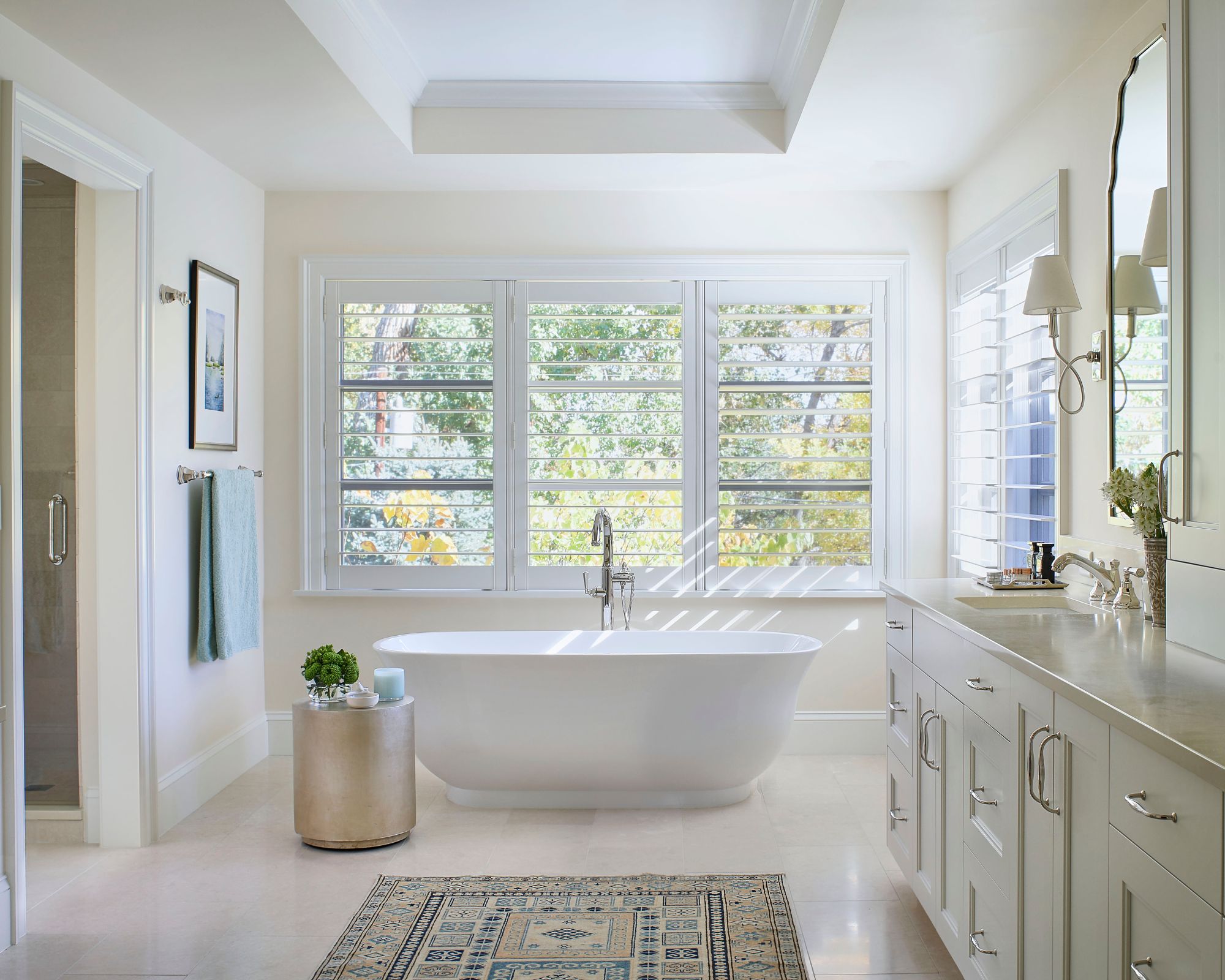
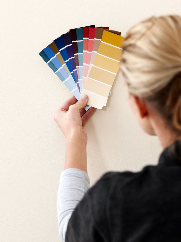
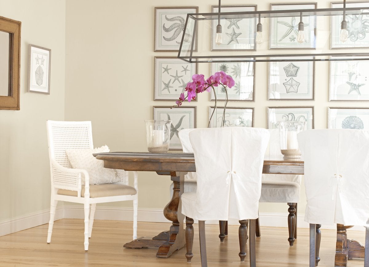
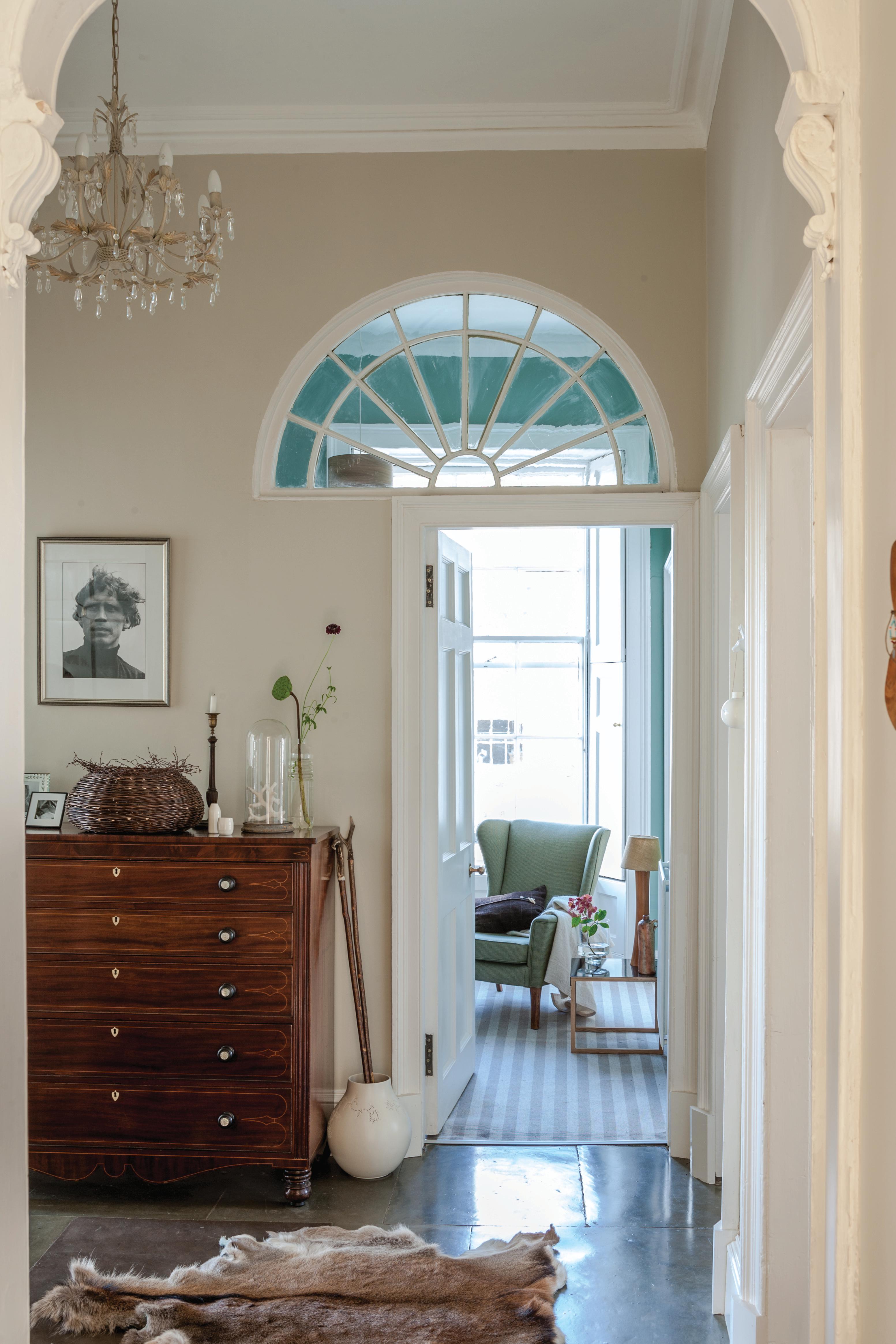
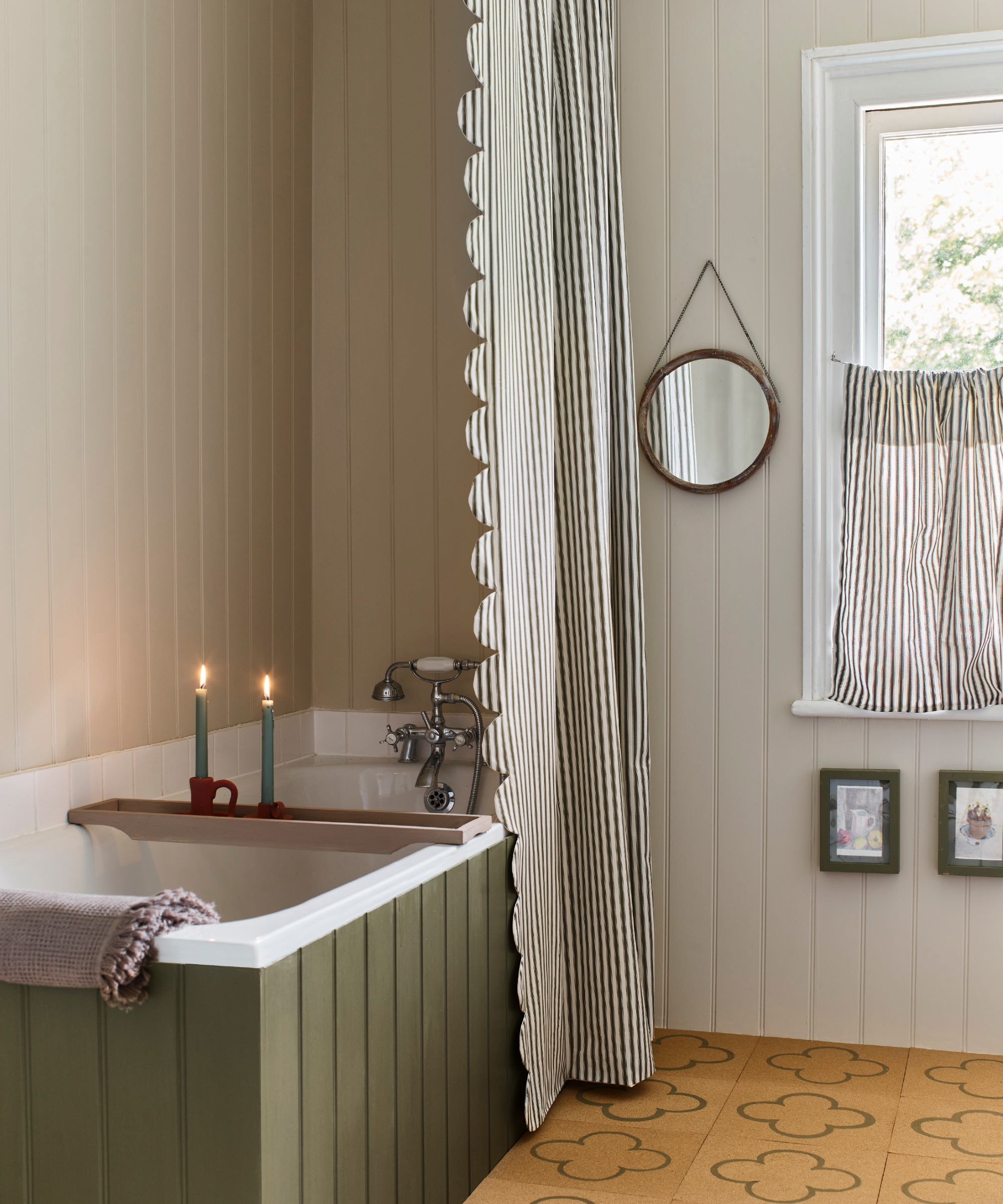
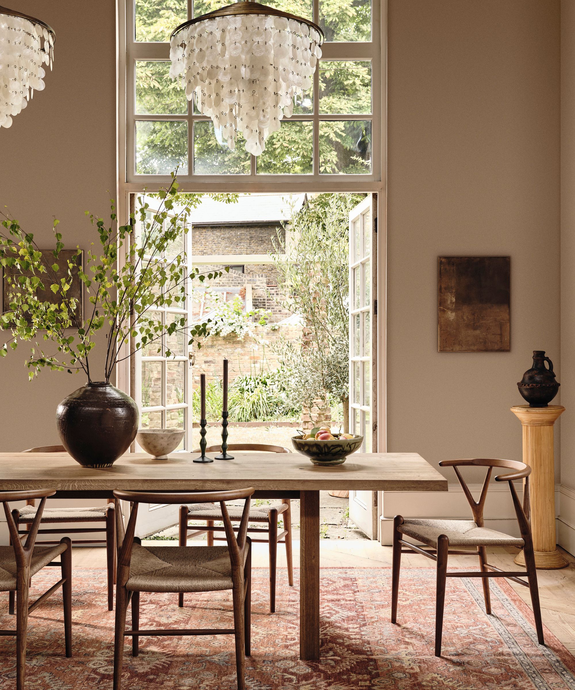
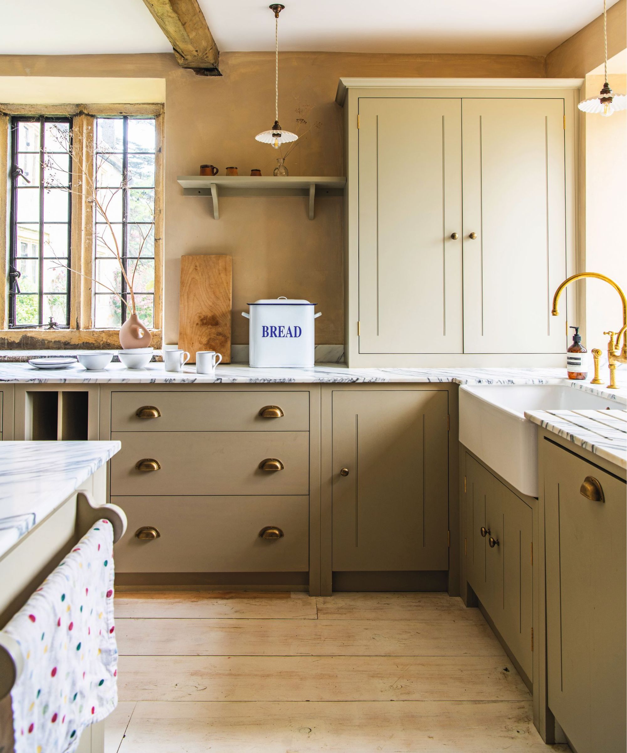
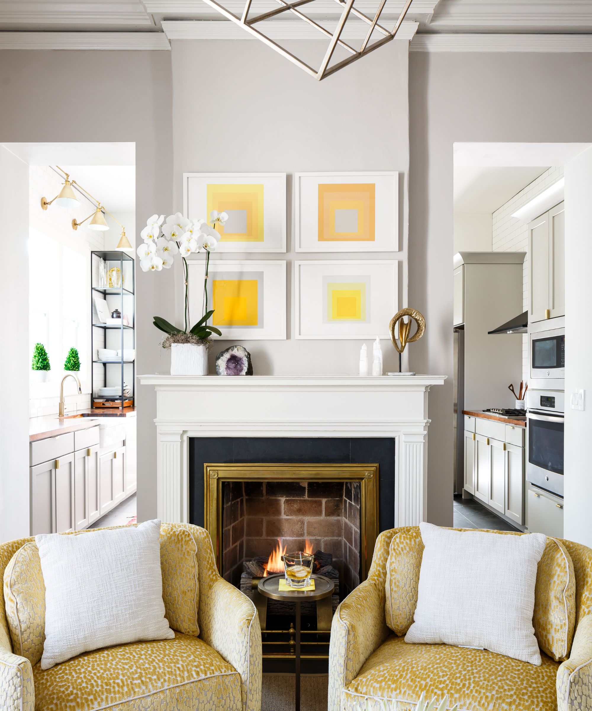
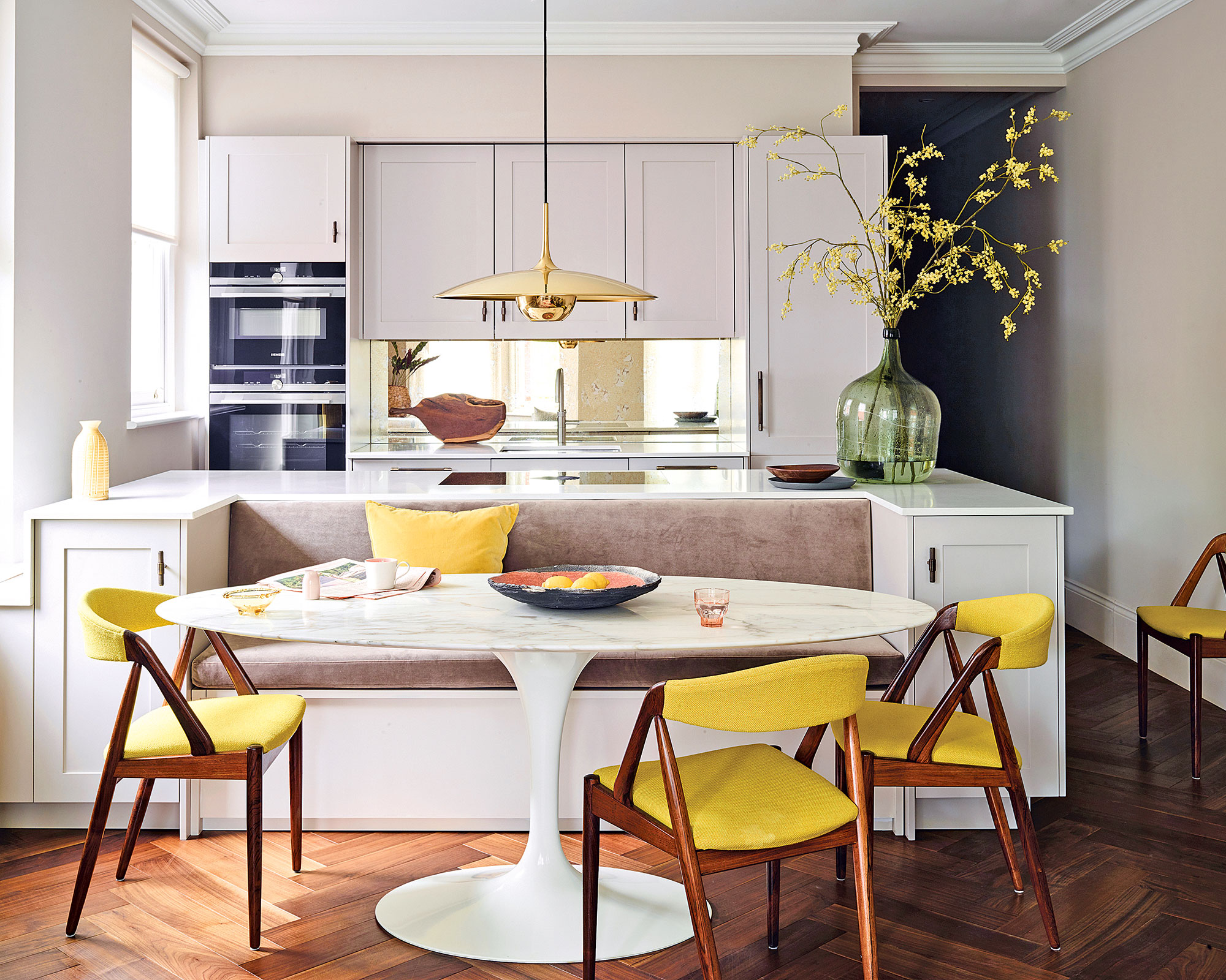
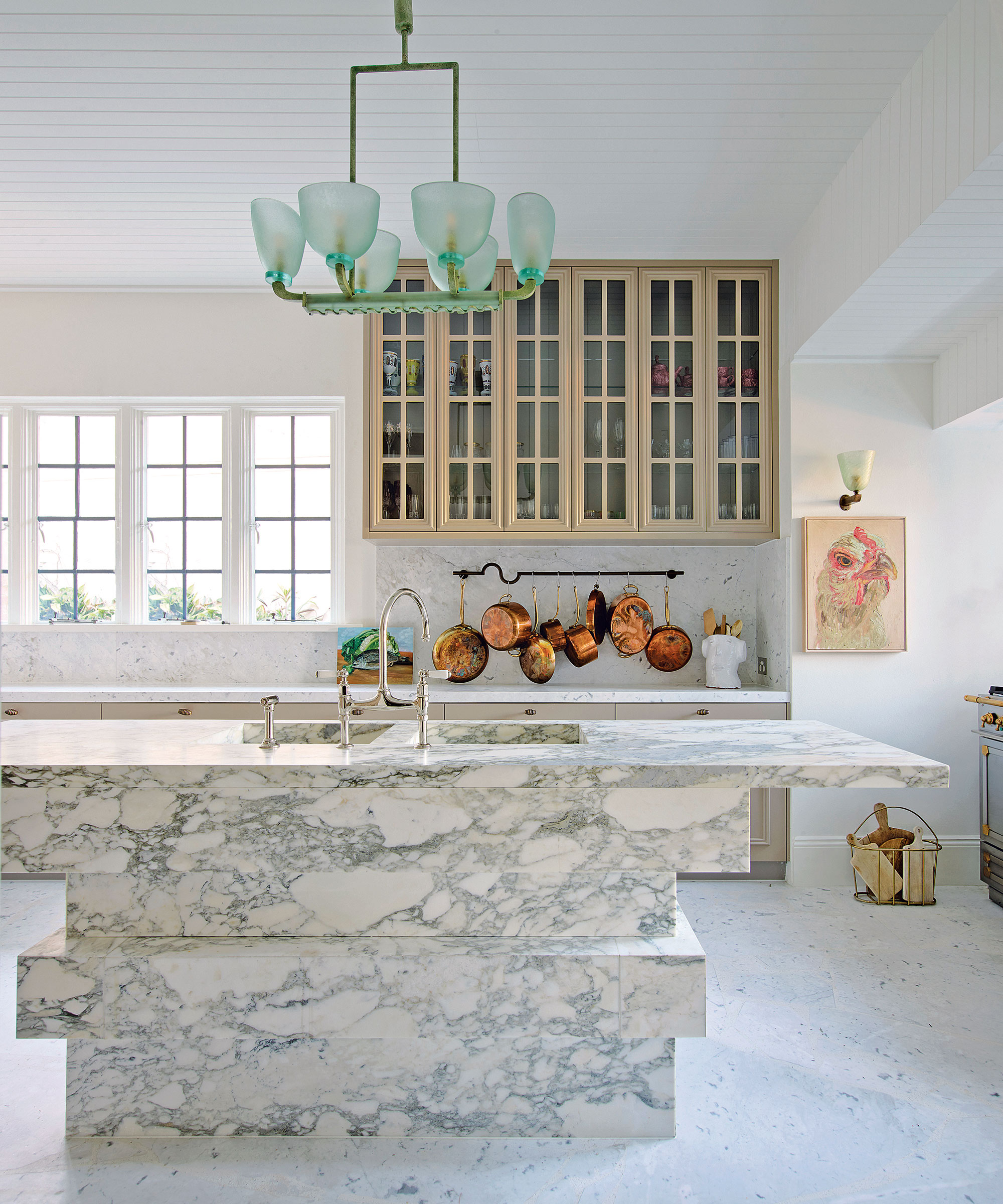
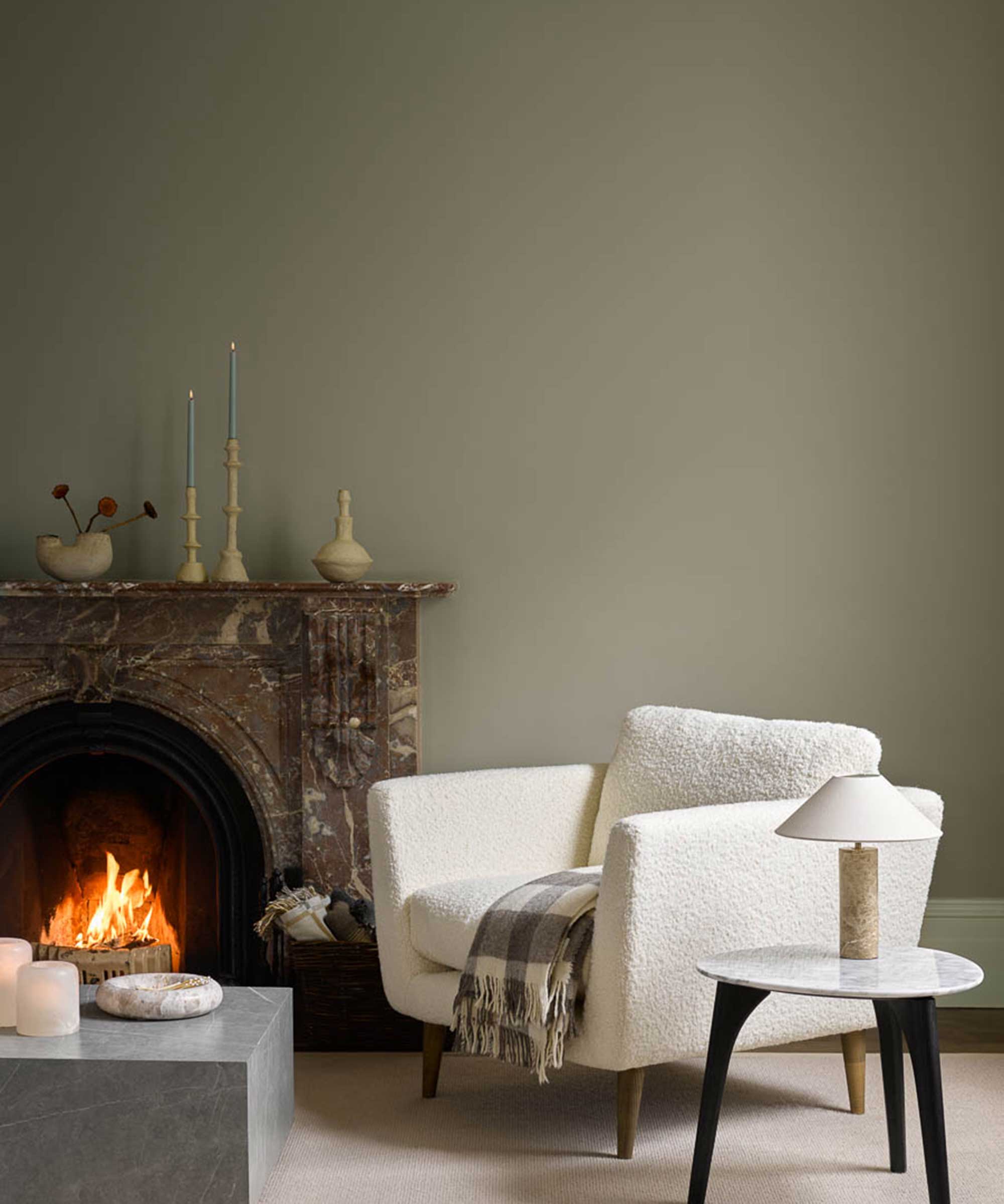
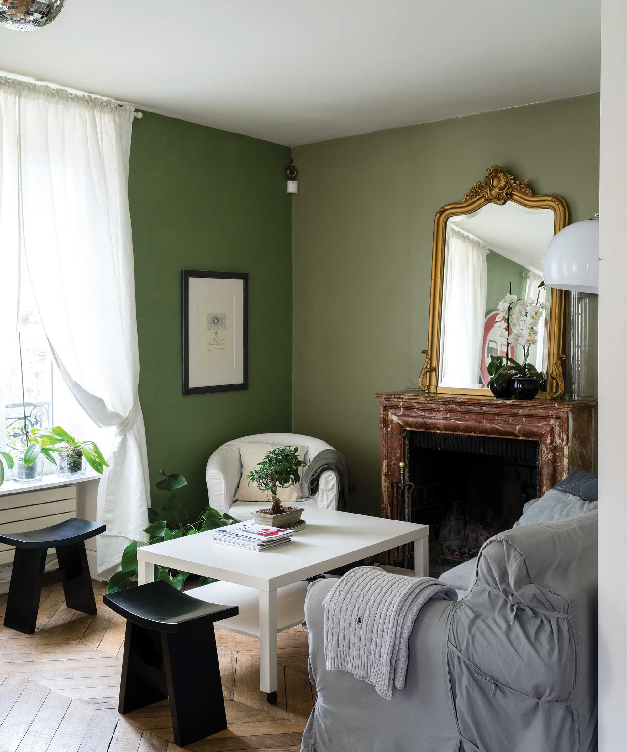
The article highlights the enduring appeal and versatility of neutral paint colors in interior design. It argues that far from being bland, neutrals act as foundational elements that can create a serene atmosphere and complement various decor styles. Miminat Shodeinde, an ELLE DECOR A-Lister, emphasizes that a neutral palette evokes calmness and peace, allowing the inherent qualities of materials, textures, and architectural features to stand out. Selecting the right neutral shade requires careful consideration of the room's characteristics, including desired warm or cool tones, potential accent colors, and the amount of natural sunlight it receives. The article compiles recommendations from numerous interior designers, offering a comprehensive guide to their preferred neutral paint colors, categorized by shades of taupe, gray, and off-white. Each recommendation provides insights into the specific qualities of the color and how it can enhance a space.
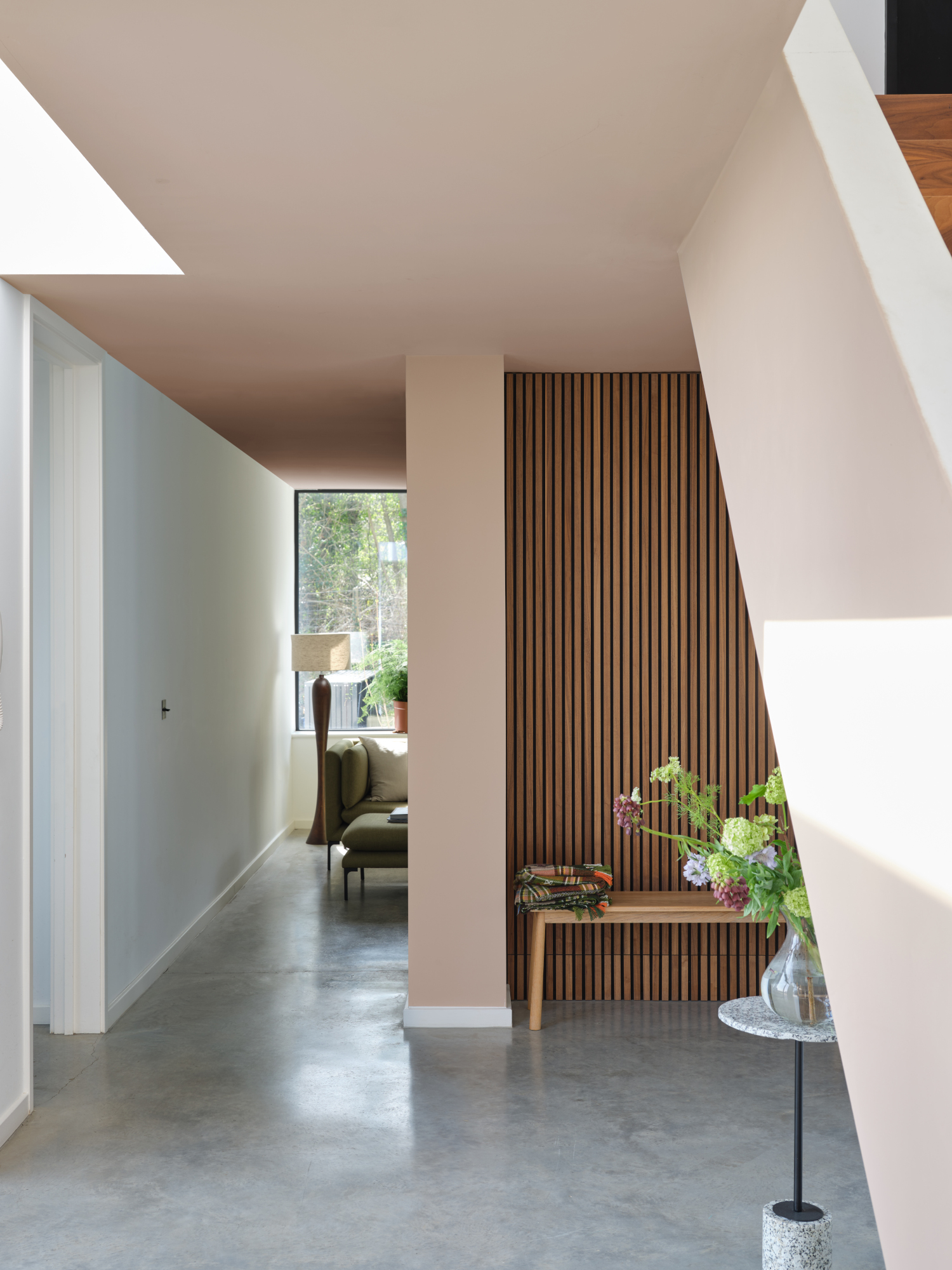
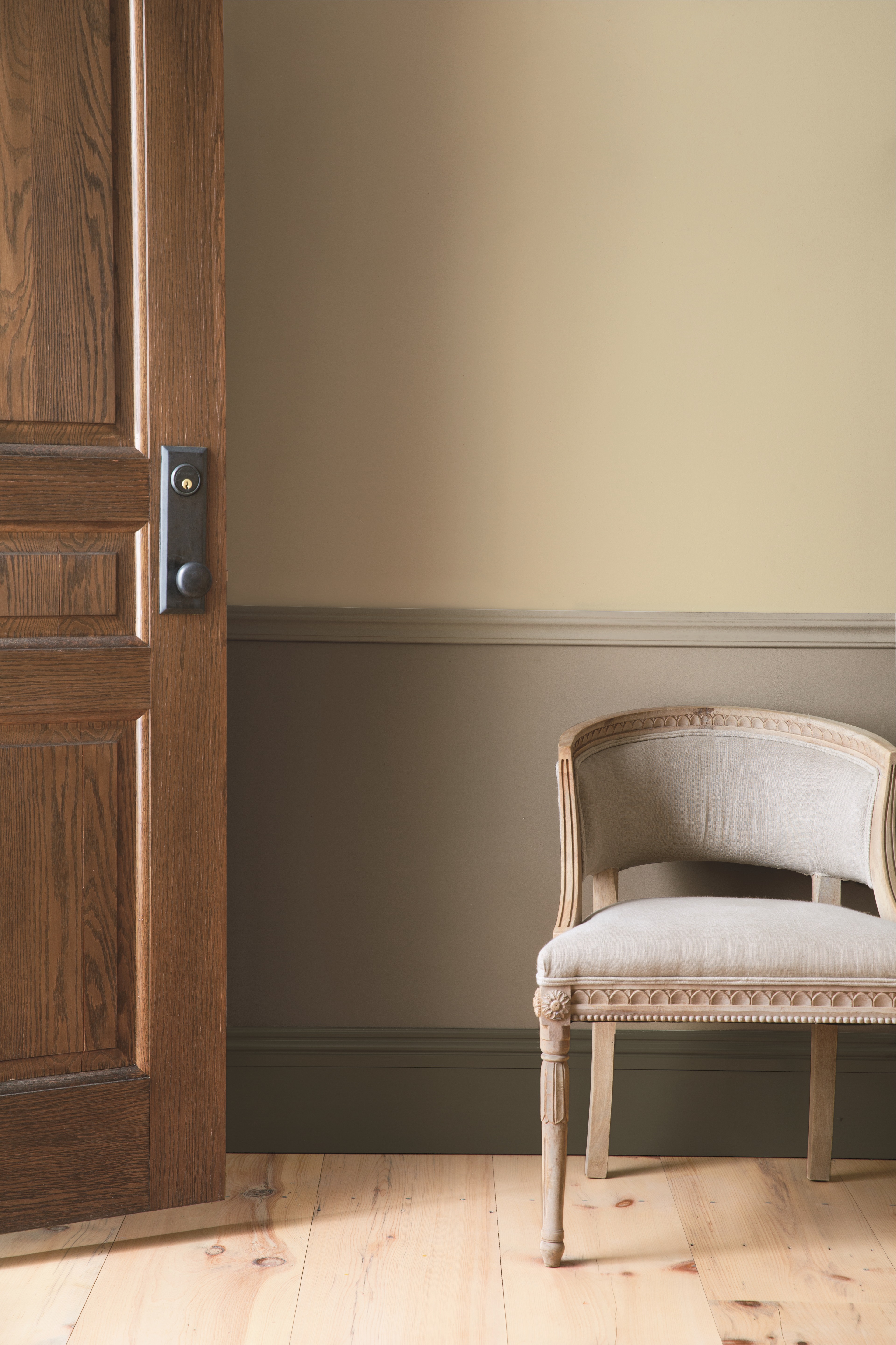
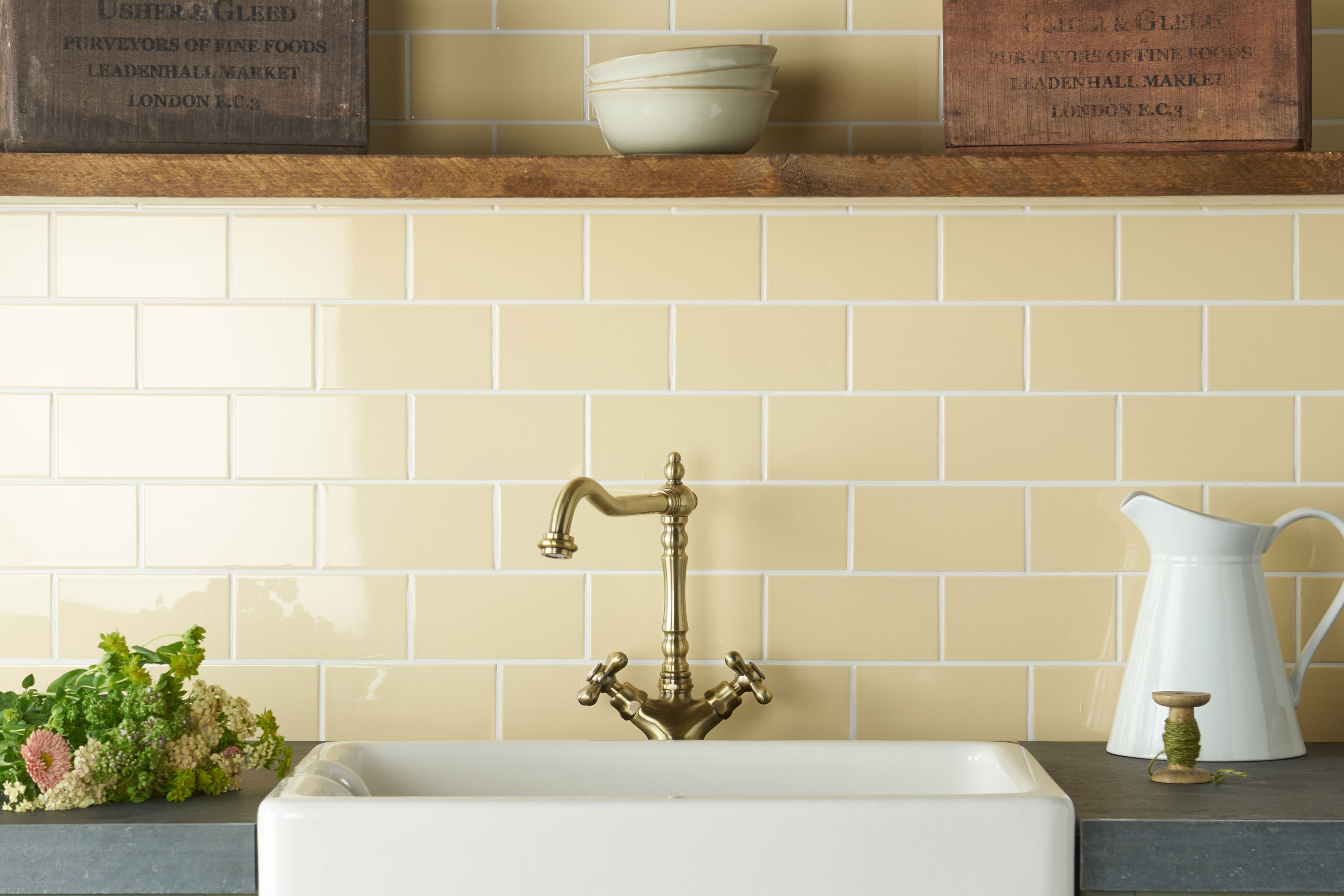
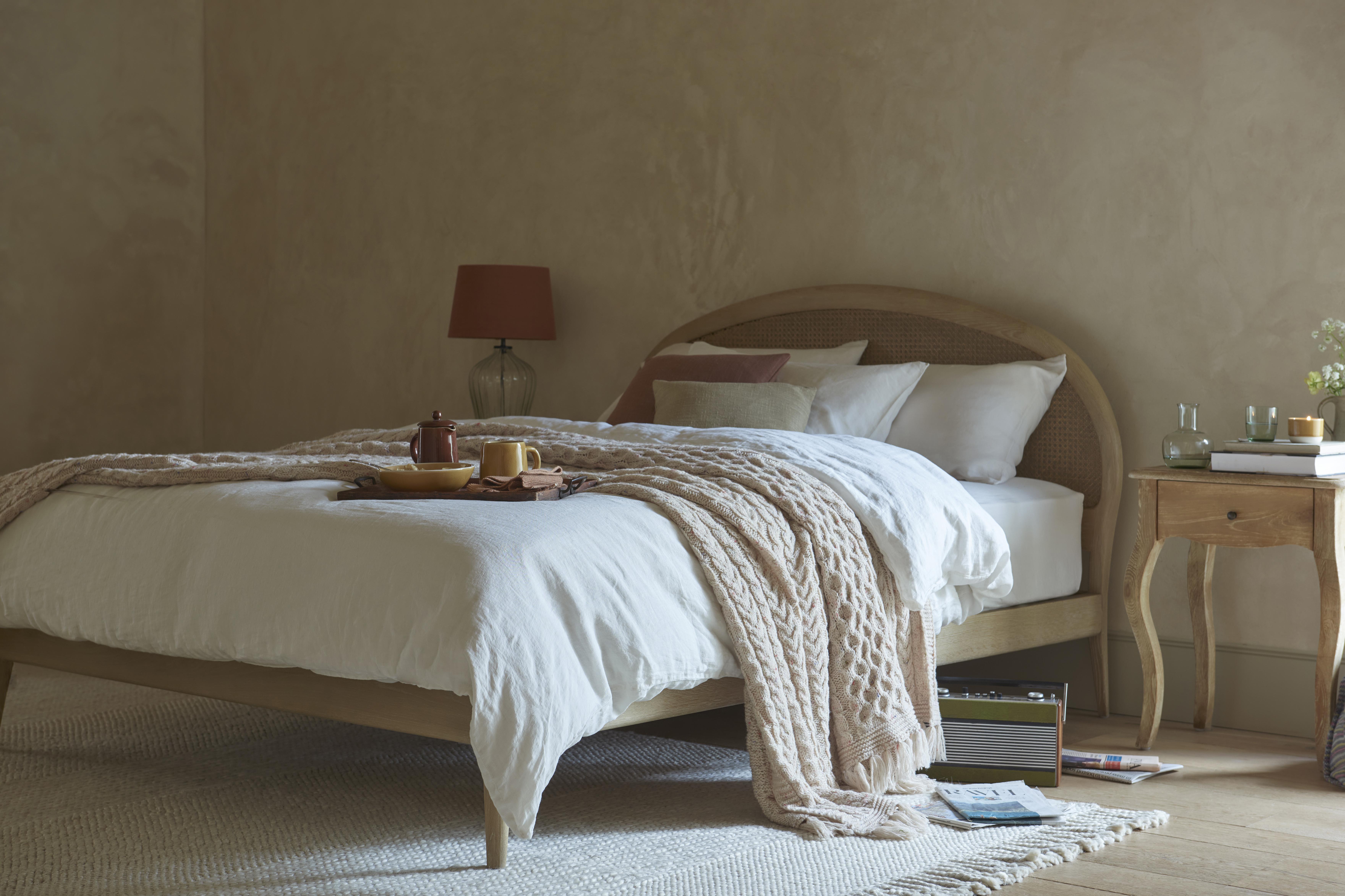
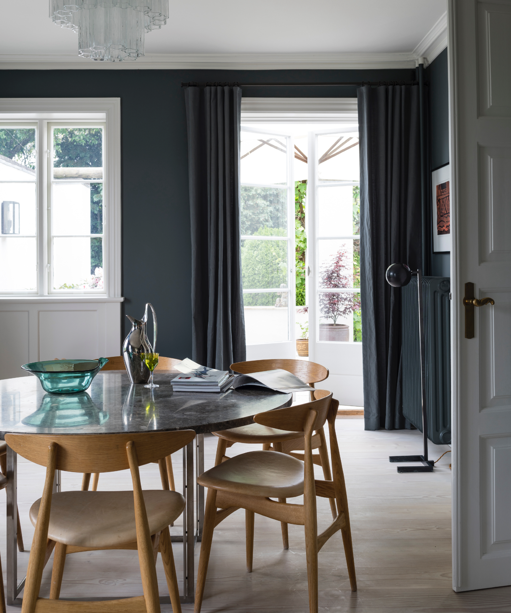
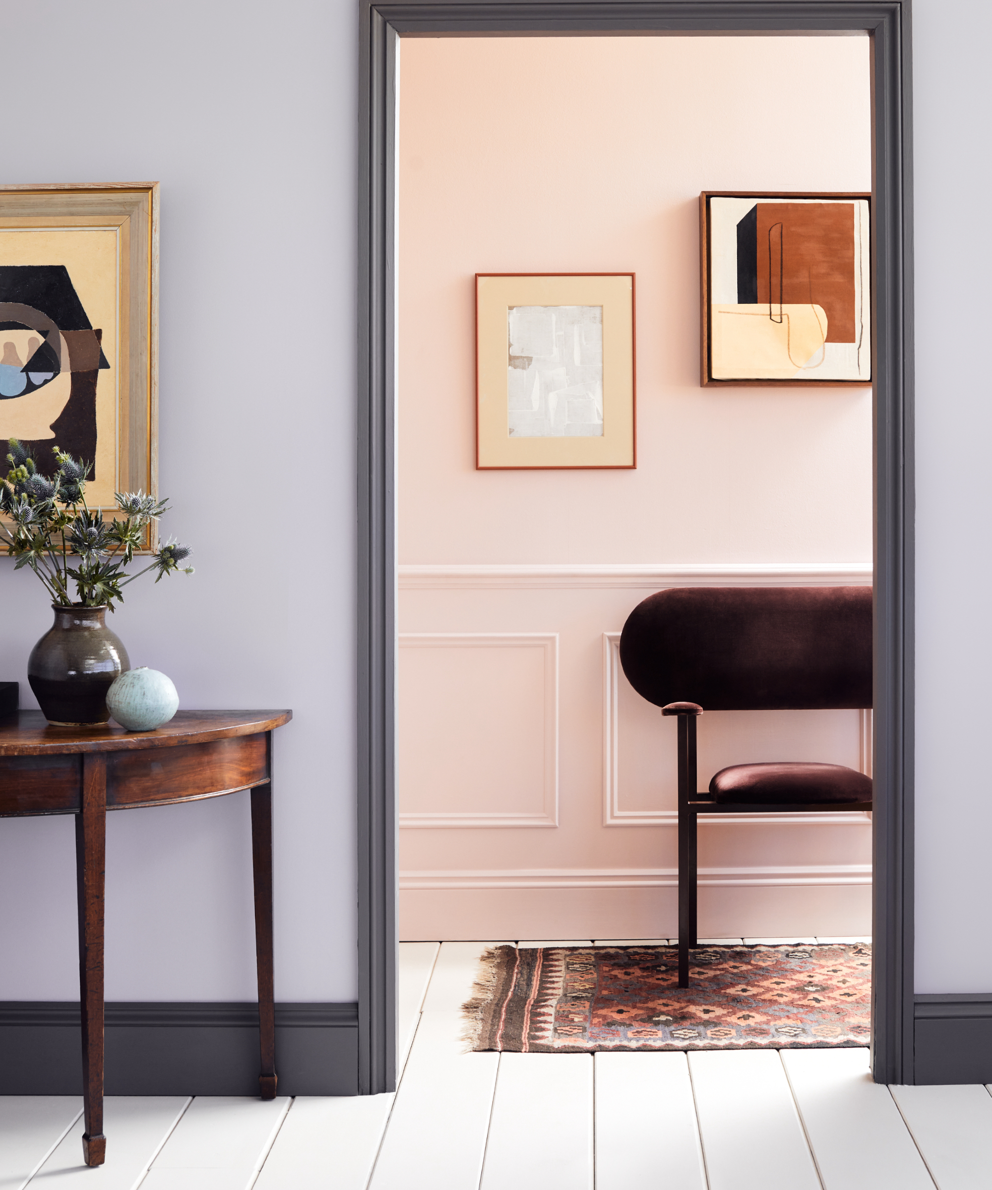
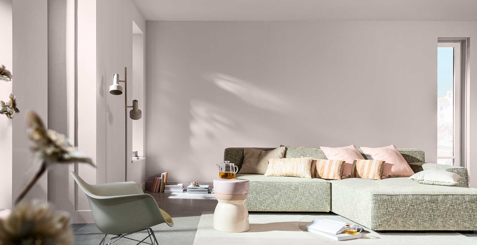
Key recommendations include Benjamin Moore's Cotton Balls, praised for its warm yellow undertone that suits various decor styles, and Farrow & Ball's Slipper Satin, noted for its subtle depth. Abalone by Benjamin Moore is highlighted for its surprising blend of gray and a hint of pink, proving neutrals can be far from boring. For cool tones, Mt. Rainier Gray by Benjamin Moore is suggested for its icy blue-gray shade that brings a sense of calm. Sherwin-Williams' Playa Arenosa is described as a warm, cafe latte hue with pink undertones, offering comfort without dullness. Metropolitan by Benjamin Moore is a favored warm gray for creating a moody and modern environment, particularly in bedrooms. Iced Mocha by Sherwin-Williams is lauded for its fresh and modern feel due to its pink tint. Havana Tan by Benjamin Moore provides a rich, warm backdrop with pink undertones, ideal for art and furnishings. Clare's Turbinado is celebrated for its earthy, plaster-inspired beige, offering eco-friendly and stylish options.
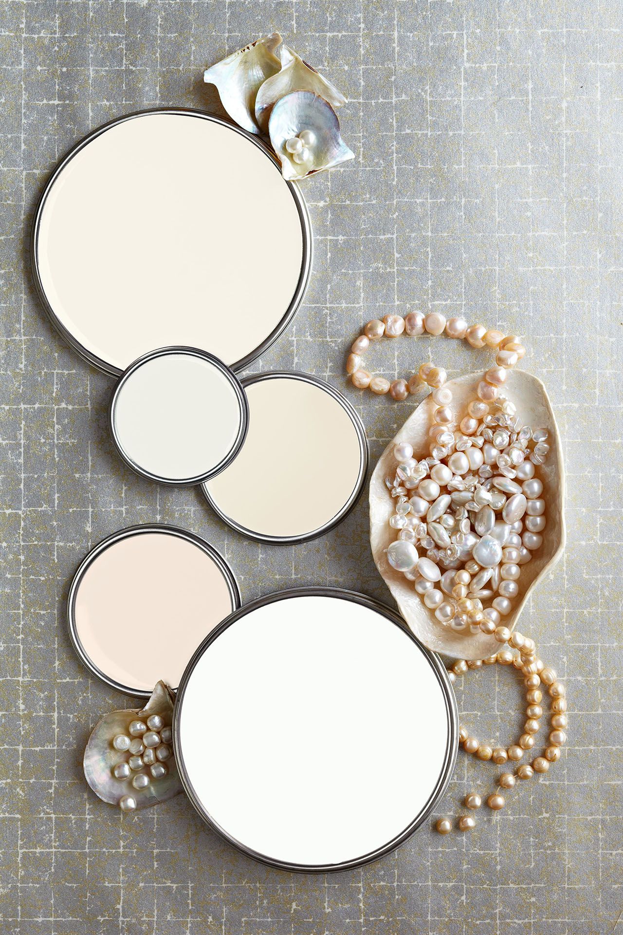
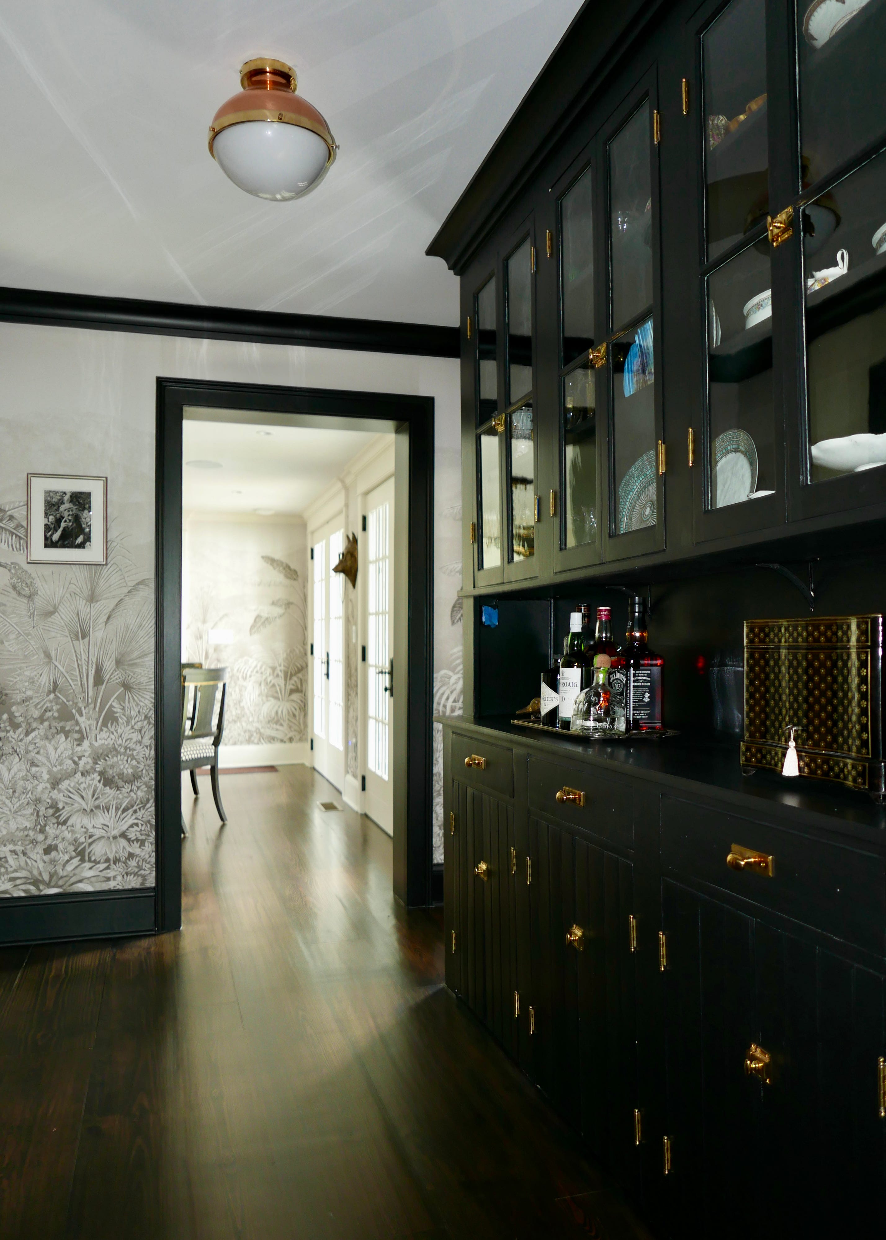
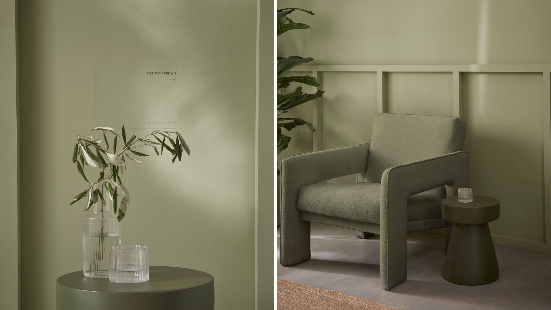
Additional recommendations feature Farrow & Ball's Paean Black for its velvety black shade that enhances wallcoverings, and Portola Paints' Table Linen, a creamy off-white that appears warm when paired with deeper colors. Benjamin Moore's Manchester Tan is a versatile chameleon, adapting to both modern and traditional styles. Silver Satin by Benjamin Moore is recognized for its blend of gray and beige, adding depth without overpowering. Shaker Beige by Benjamin Moore serves as an excellent canvas for showcasing artwork. Harbor Gray by Benjamin Moore is a balanced warm and cool gray, suitable for diverse applications. Lost Locket by Benjamin Moore is ideal for creating soothing bedrooms. French Canvas by Benjamin Moore, with its green undertone, offers an organic feel. Navajo White by Benjamin Moore stands out as a pure beige without unwanted undertones, while Farrow & Ball's Ammonite is a dynamic chameleon, changing with natural light. Cedar Key by Benjamin Moore is a warm, inviting off-white that avoids sterility. These diverse selections emphasize that the best neutral color is ultimately one that can adapt to evolving design needs and preferences.
#InteriorDesign #PaintColors #NeutralPalette #HomeDecor #ColorTrends #DesignTips #BenjaminMoore #FarrowAndBall #SherwinWilliams #InteriorDesign #PaintColors #NeutralPalette #HomeDecor #ColorTrends #DesignTips #BenjaminMoore #FarrowAndBall #SherwinWilliams
0 comment in total
 No comments yet
You may also like
35 Neutral Paint Colors Interior Designers Can't Get Enough Of

White vs Cream: designers weigh in on these enduring neutrals
Designers Say These 12 Paint Colors Will Be Everywhere in 2026

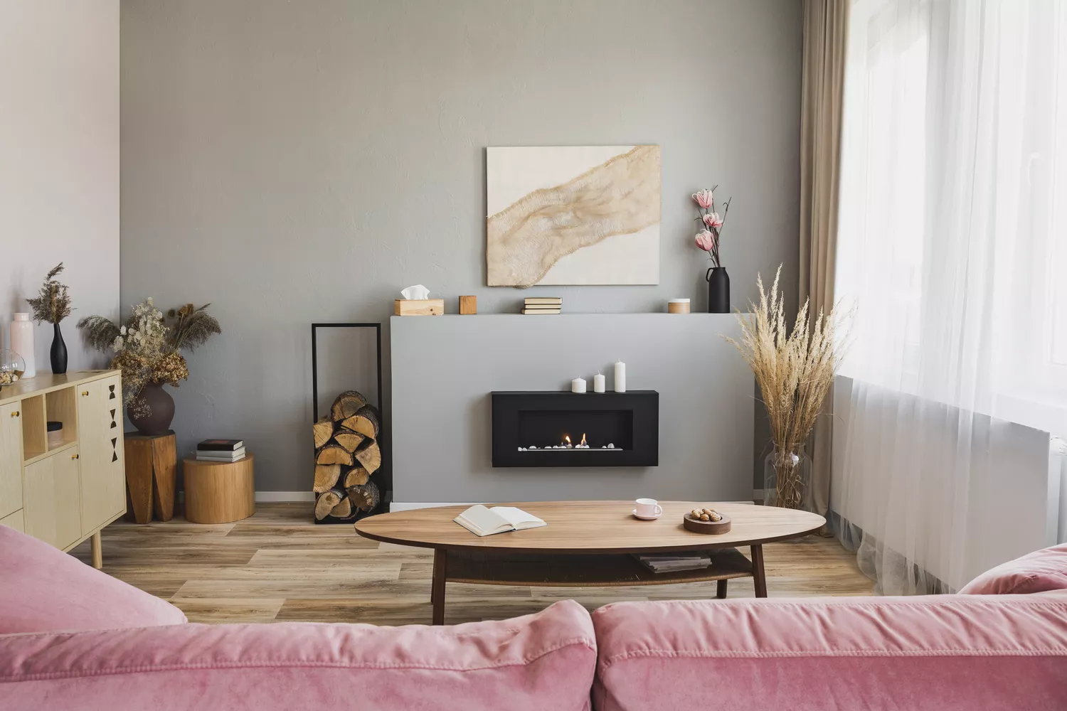
Bored With White Walls? Try One of These Designer-Recommended Neutral Paints Instead

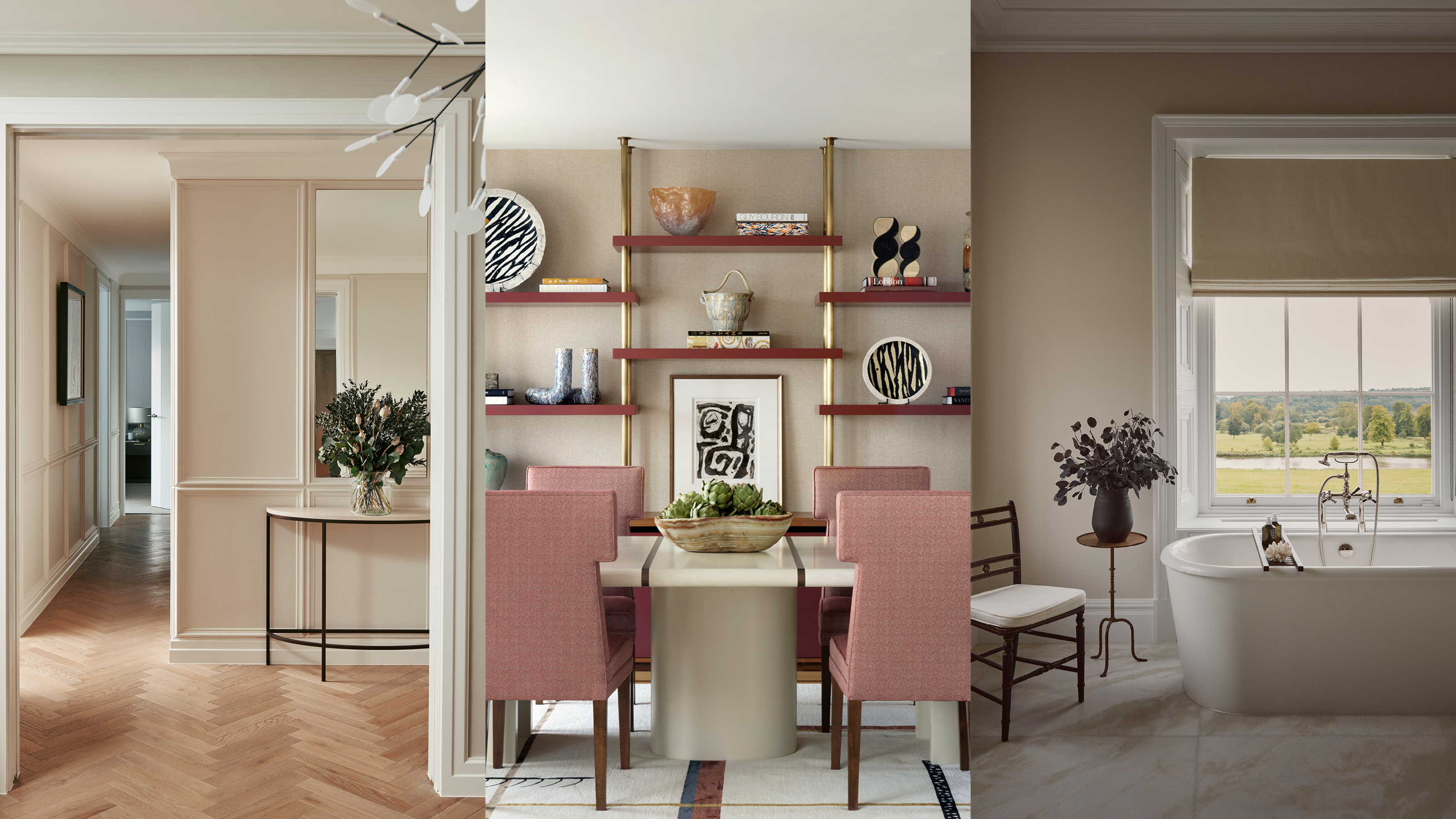
Beige-grey – the timeless paint color perfect for a barely-there backdrop

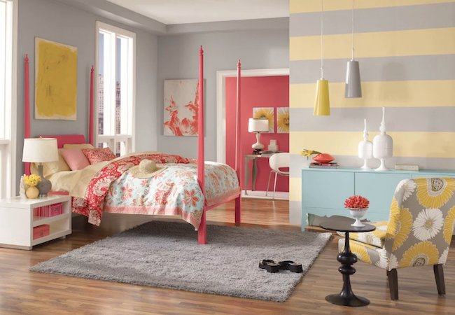
The Most Popular Paint Colors in America

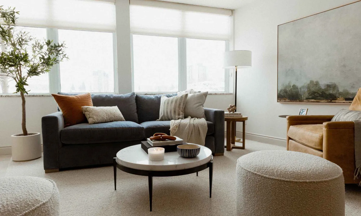
Are Neutral Paint Colors Finally Out of Style? We Asked Designers and They All Agreed

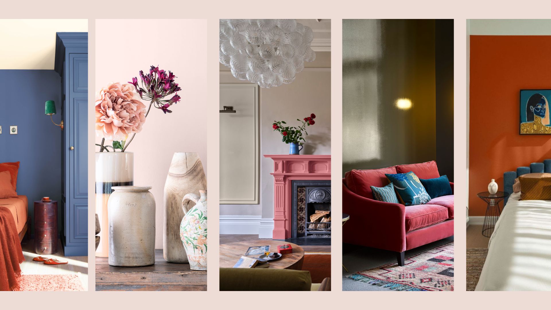
Interior Paint Colour Trends 2024: 14 influential shades to inspire our homes

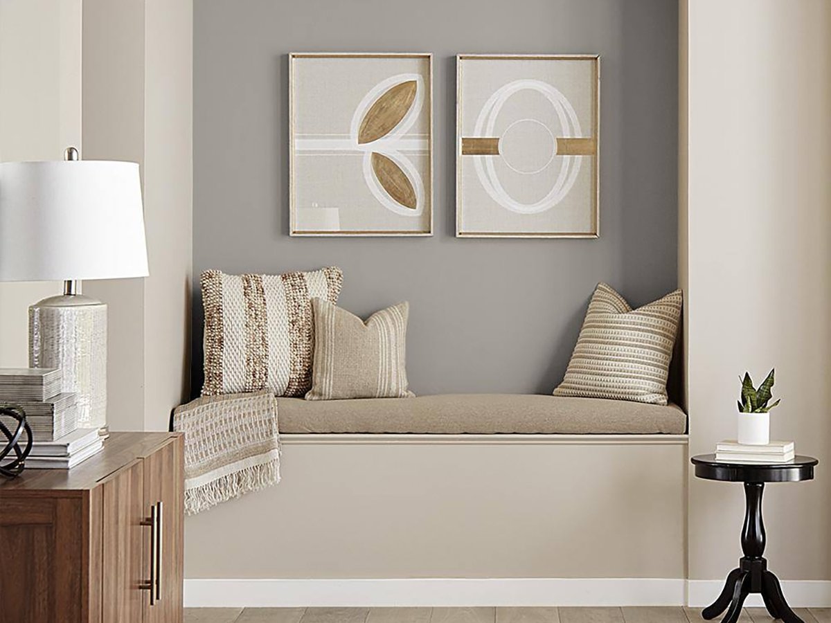
The 20 Best Neutral Paint Colors for Your Home in 2025

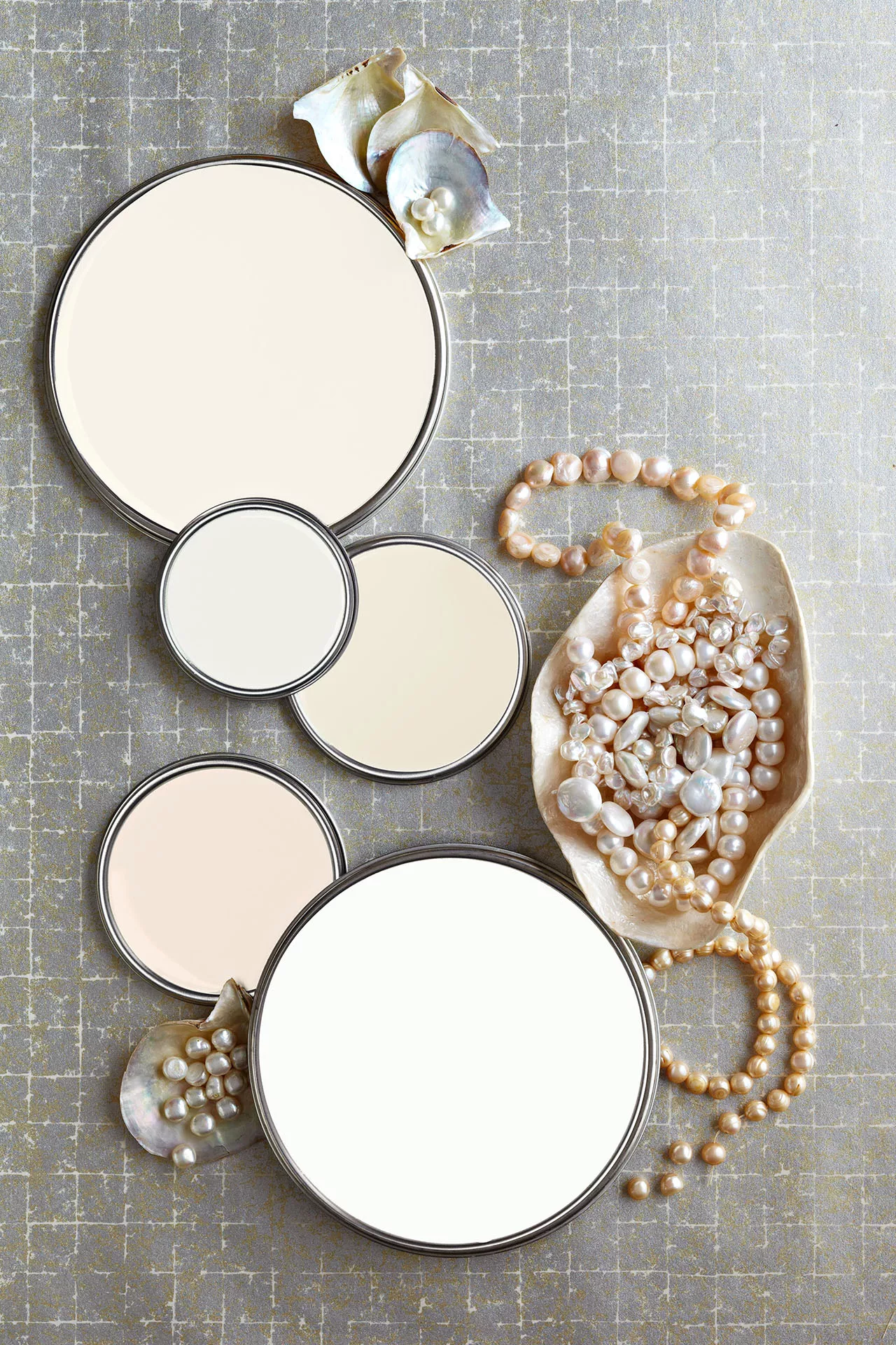
27 Neutral Paint Colors and Tips from Experts On How to Use Them

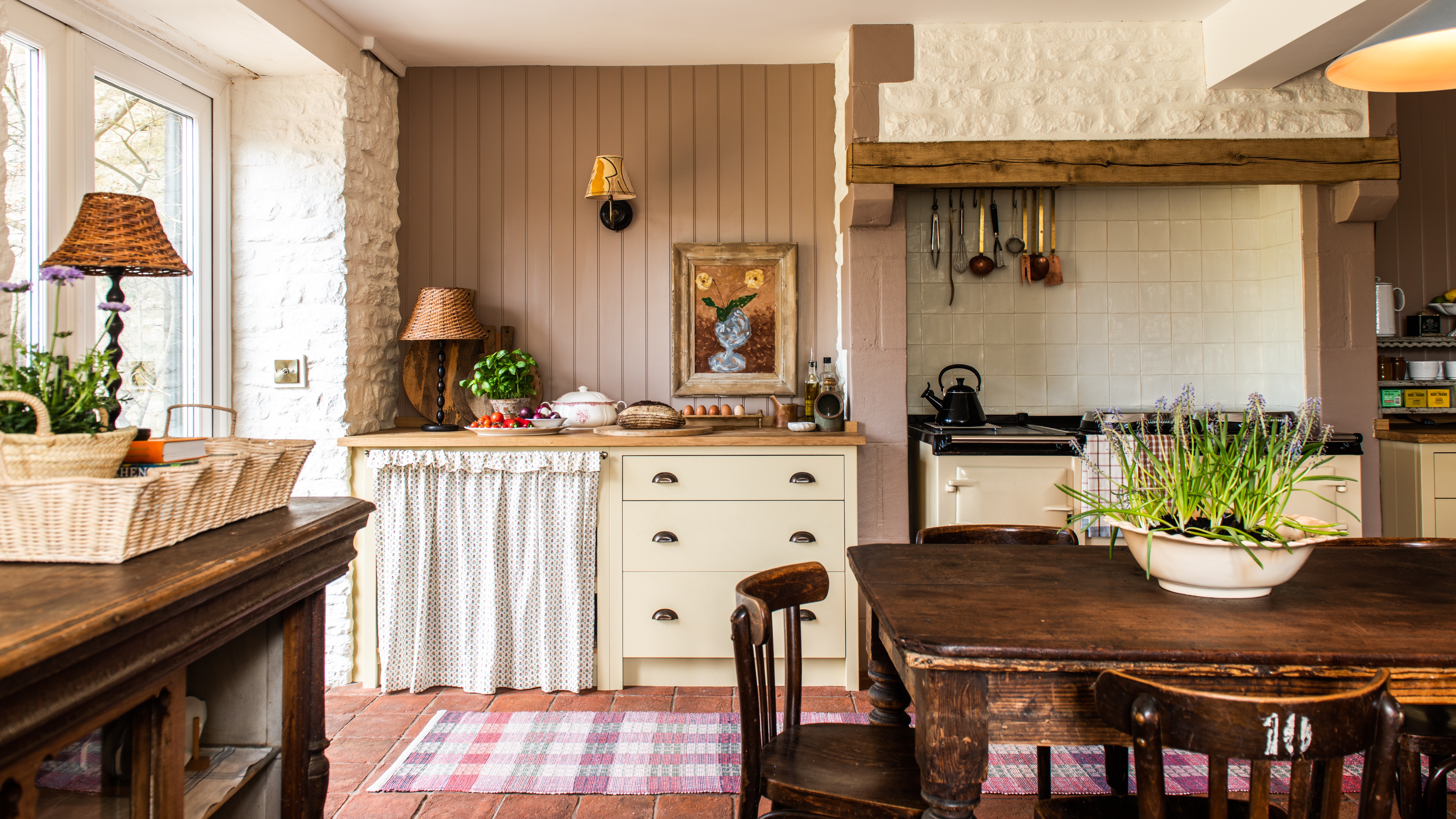
Creamy neutral paint colours are back — just don’t call it magnolia
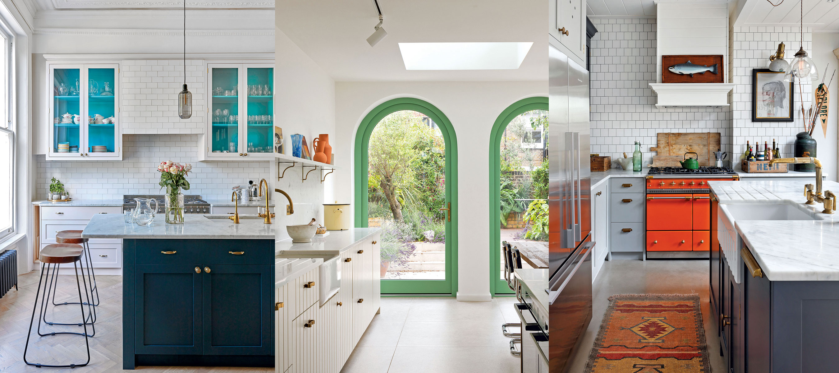
10 creative ways interior designers work color into neutral kitchens
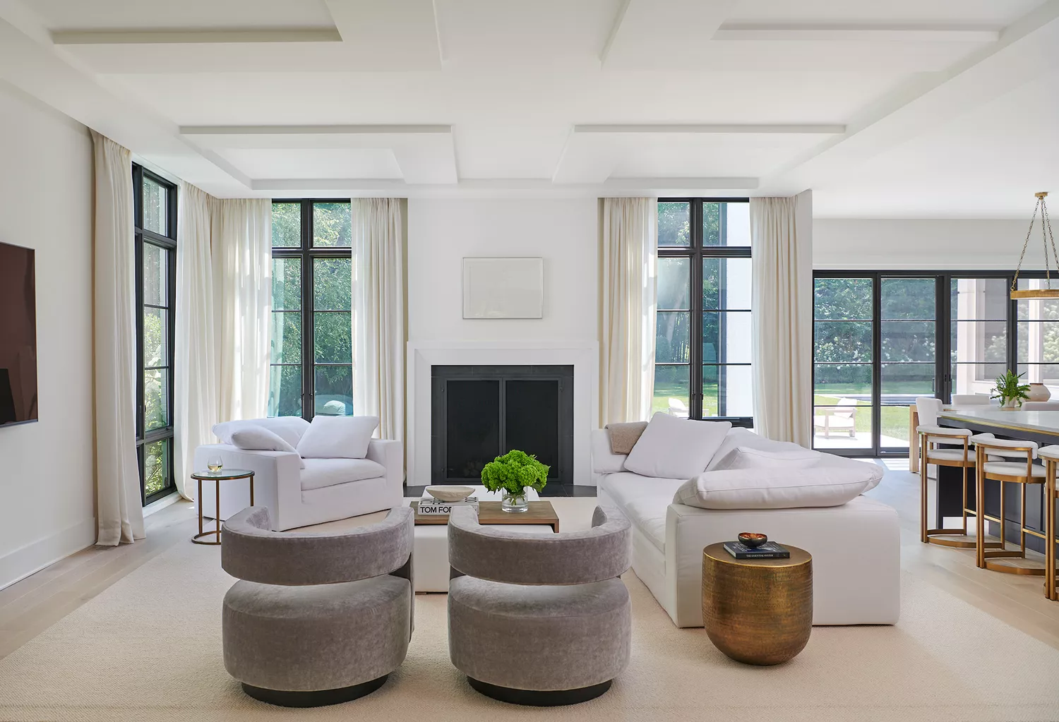
12 Neutral Paint Colors That Will Look Beautiful in Every Room
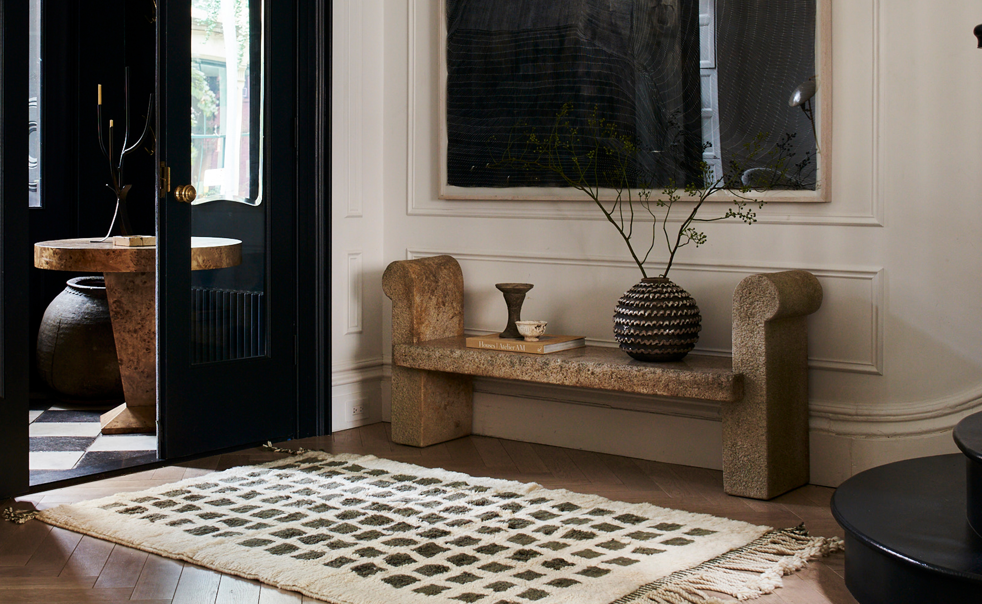
The 3 Best Neutral Entryway Paint Colors to Set the Right Tone for a Sophisticated Home


7 of the most versatile and easy to use paint colors according to designers
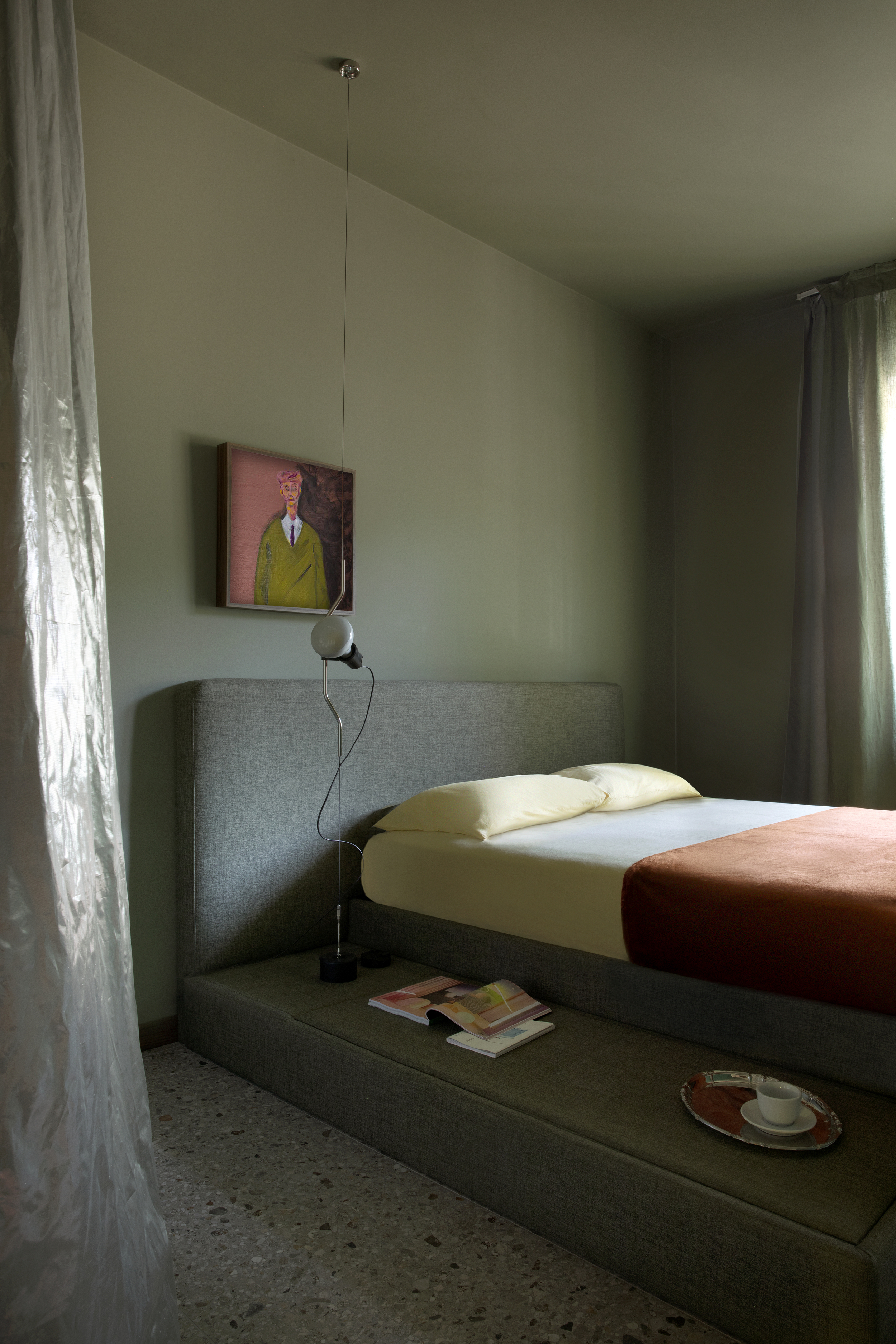
Is Green the New Neutral? Interior Designers Argue We Should All Be Using This Soothing Shade as Our Base Color
10 best warm neutral paints as recommended by interior designers – from beige to muted pink

8 Paint Color Trends You'll ACTUALLY Want to Live With in 2026, According to Designers
Is gray or beige more on trend for 2025? Designers share all on these popular neutrals
20 Interior Paint Colors Decorating Experts Love