1/11
10 best warm neutral paints as recommended by interior designers – from beige to muted pink
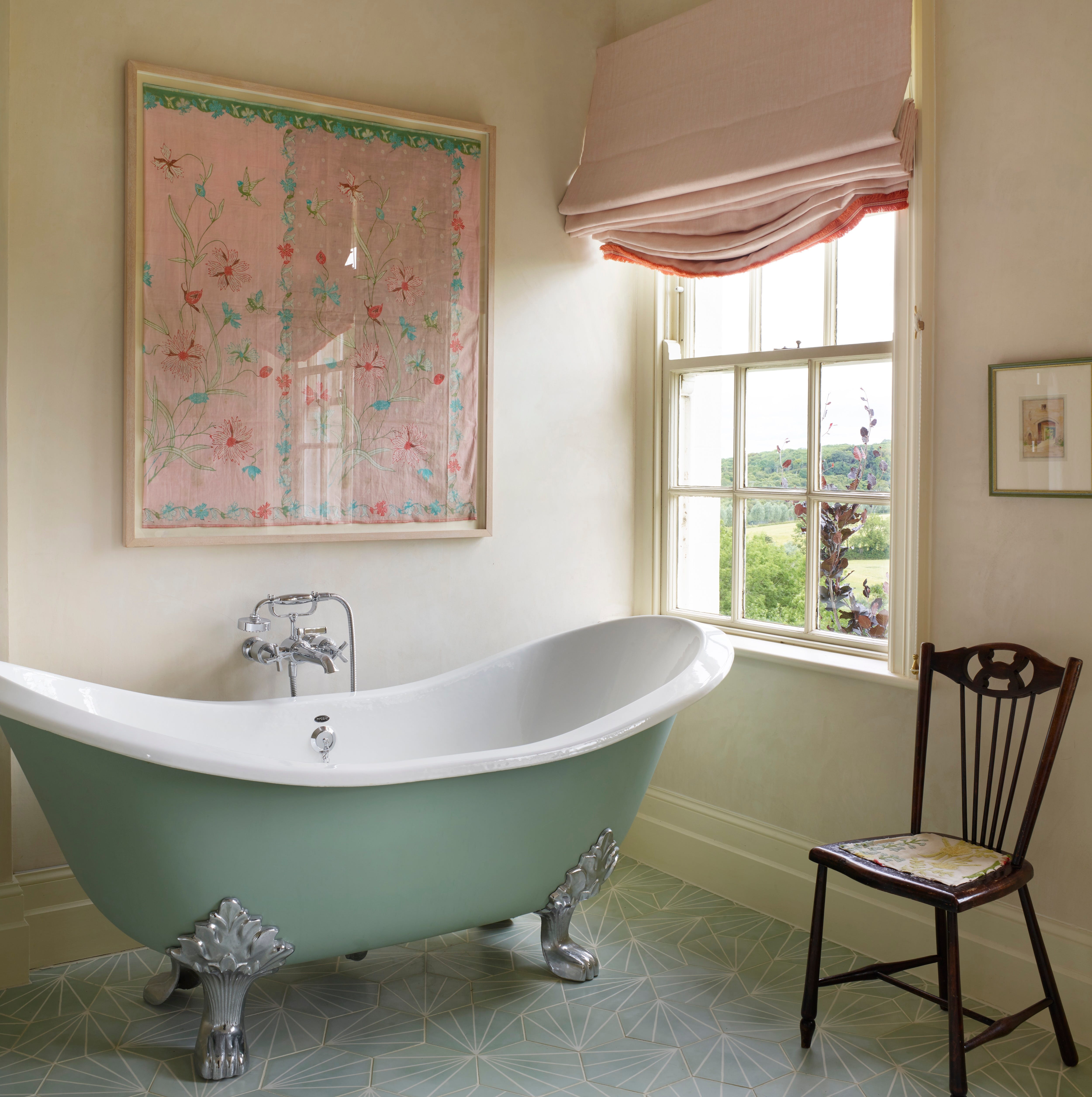
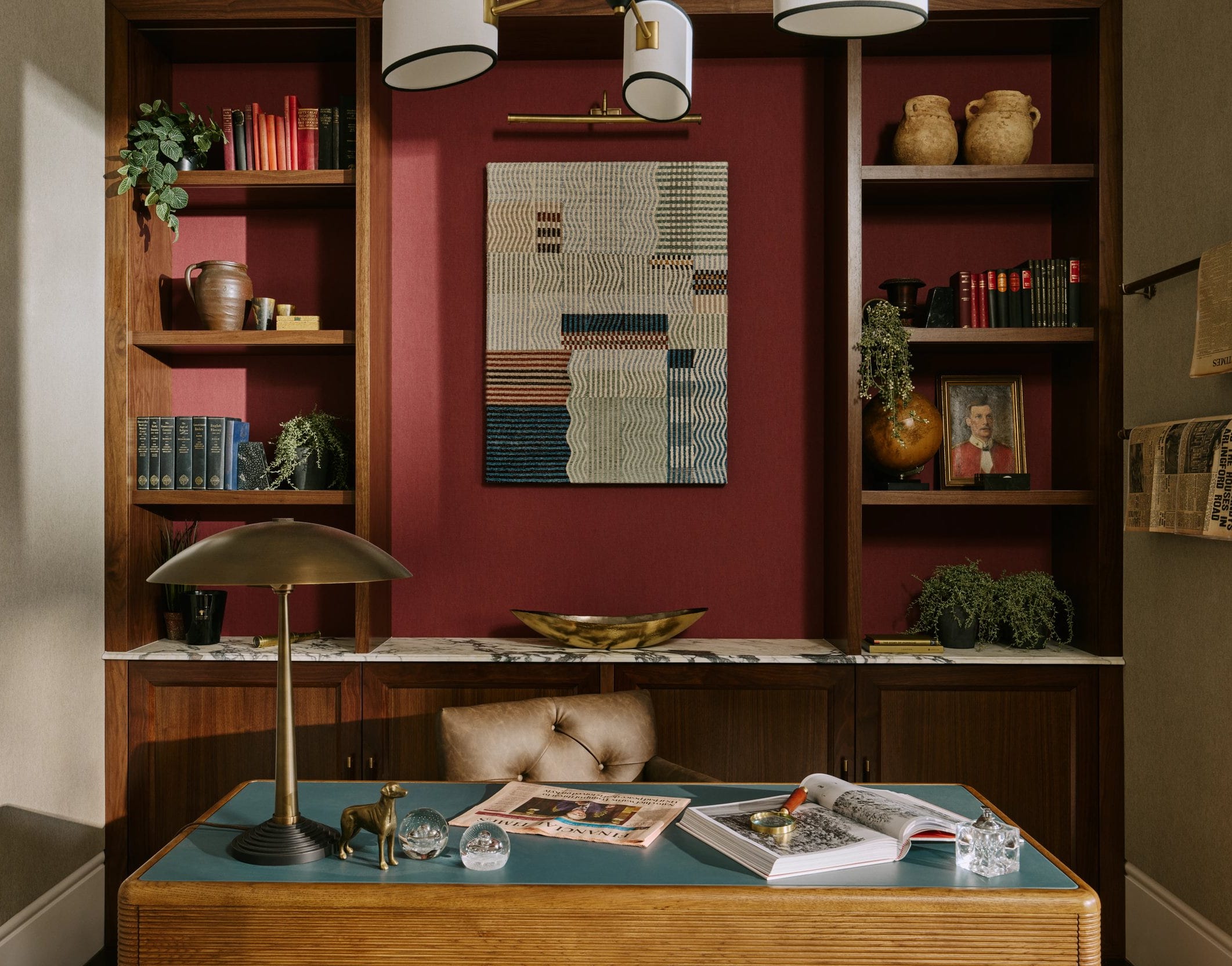
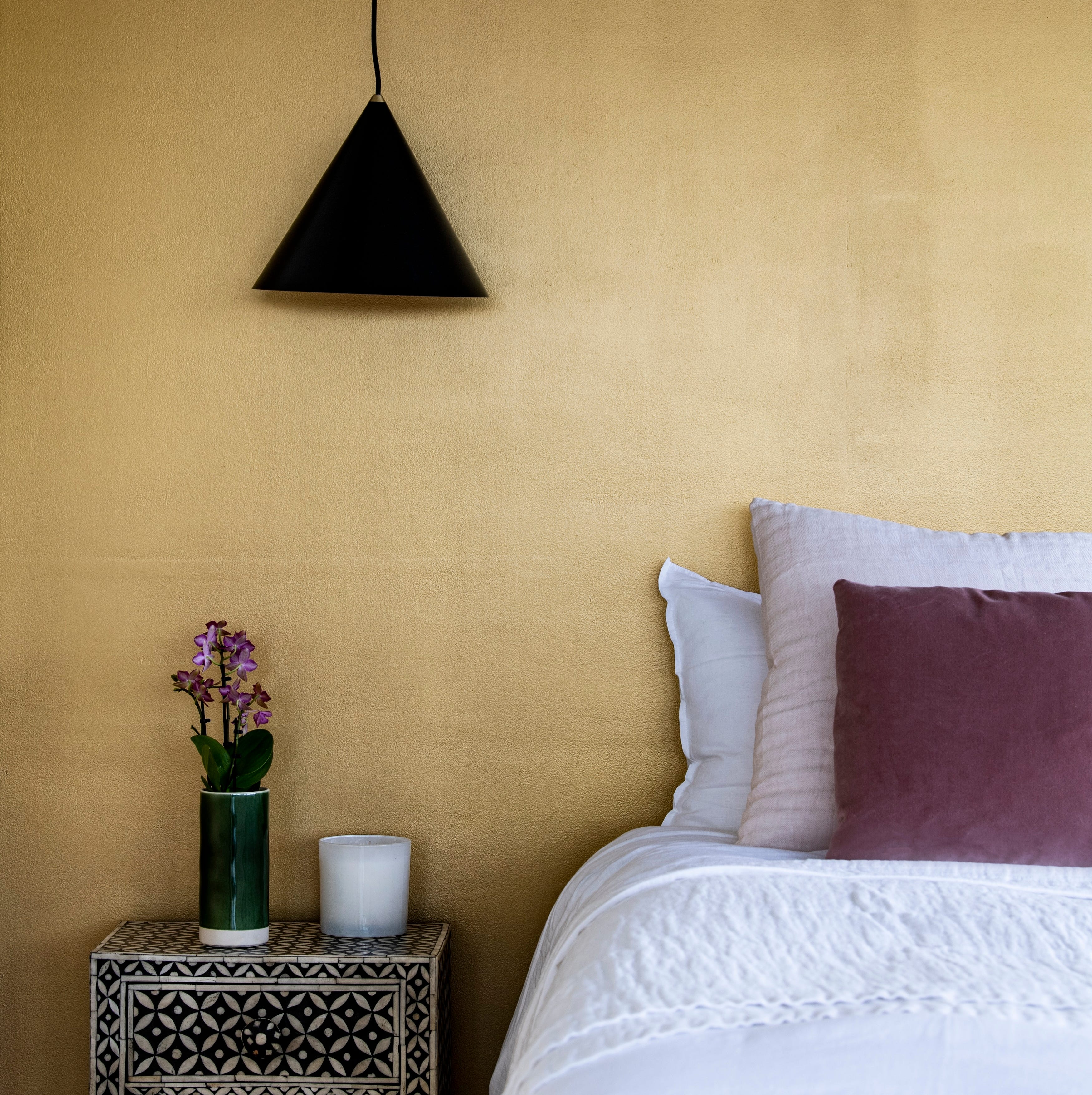
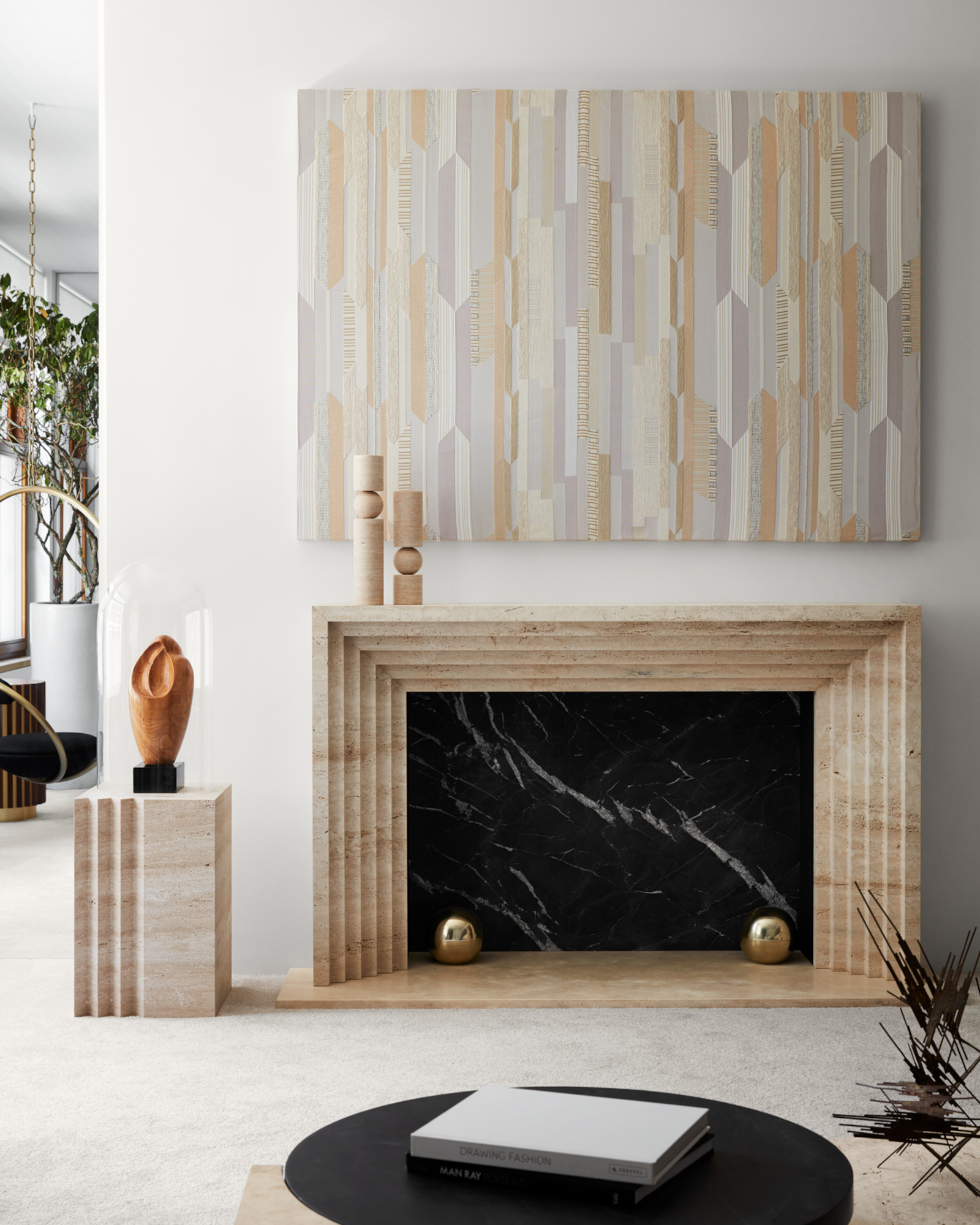
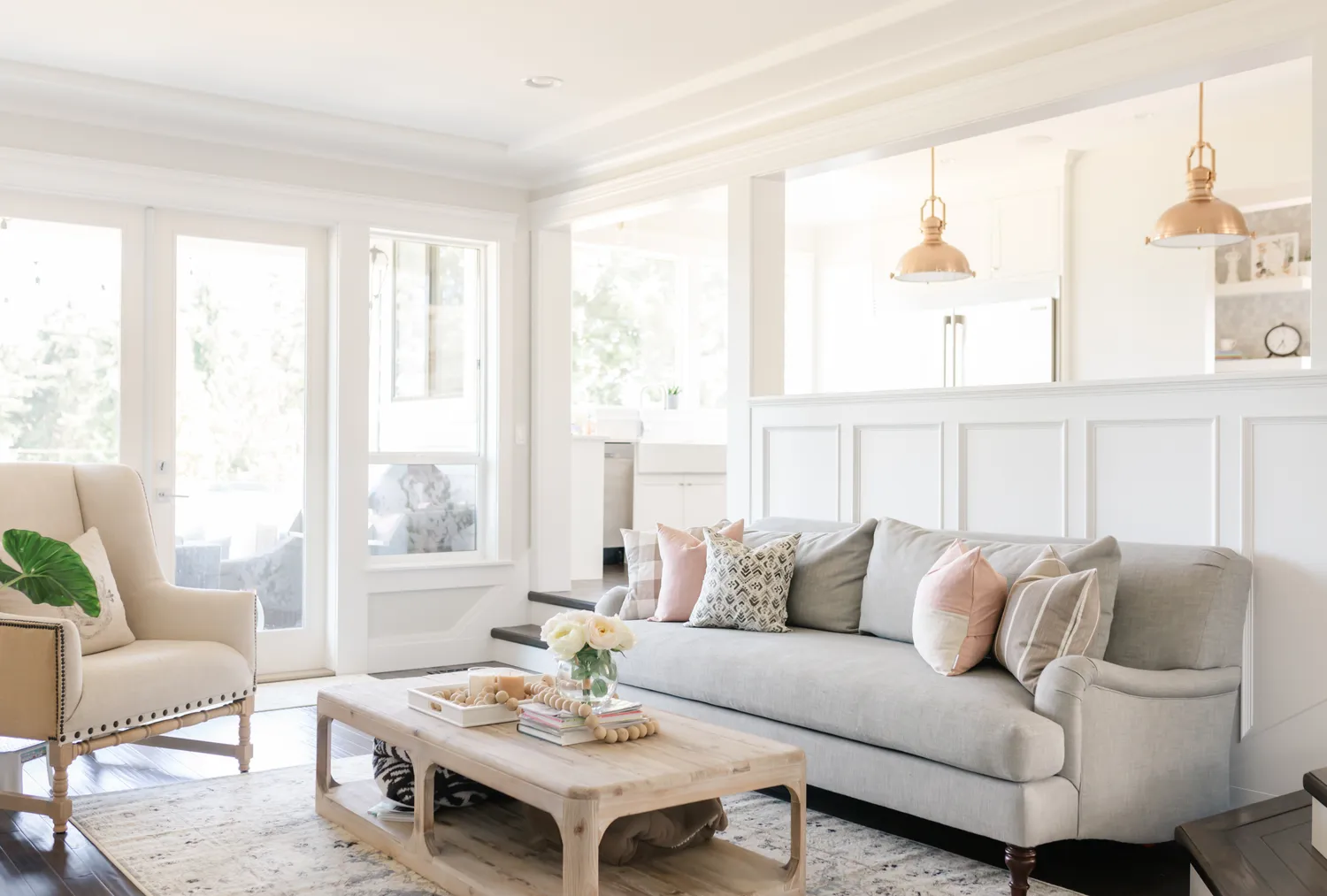
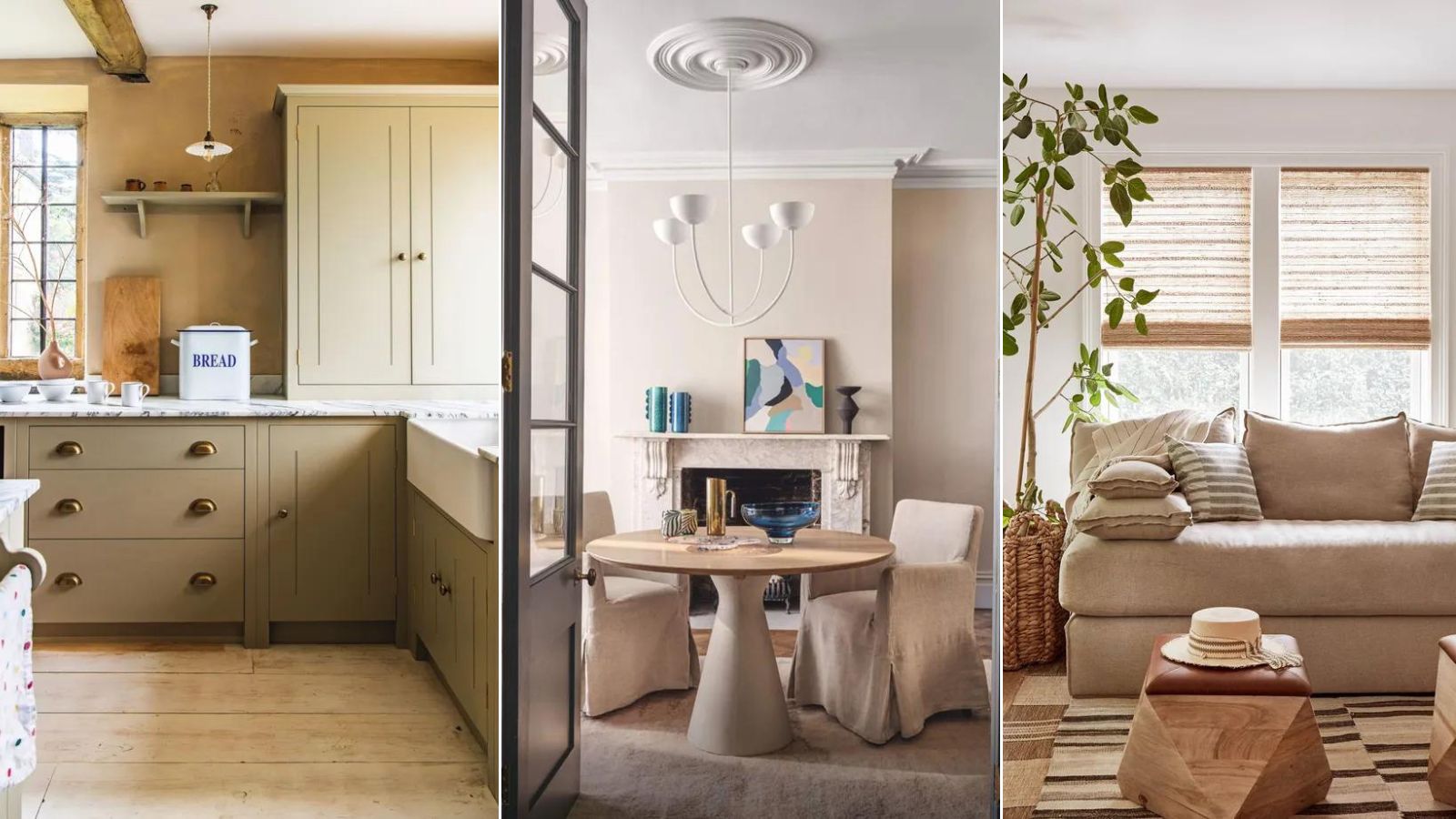
This article explores ten warm neutral paint colors highly recommended by interior designers for creating cozy and inviting interior schemes. It highlights specific shades from popular brands like Benjamin Moore, Sherwin-Williams, and Farrow & Ball, detailing their unique characteristics and applications. The selections range from off-whites to muted pinks and earth-toned beiges, offering a diverse palette for various design preferences.
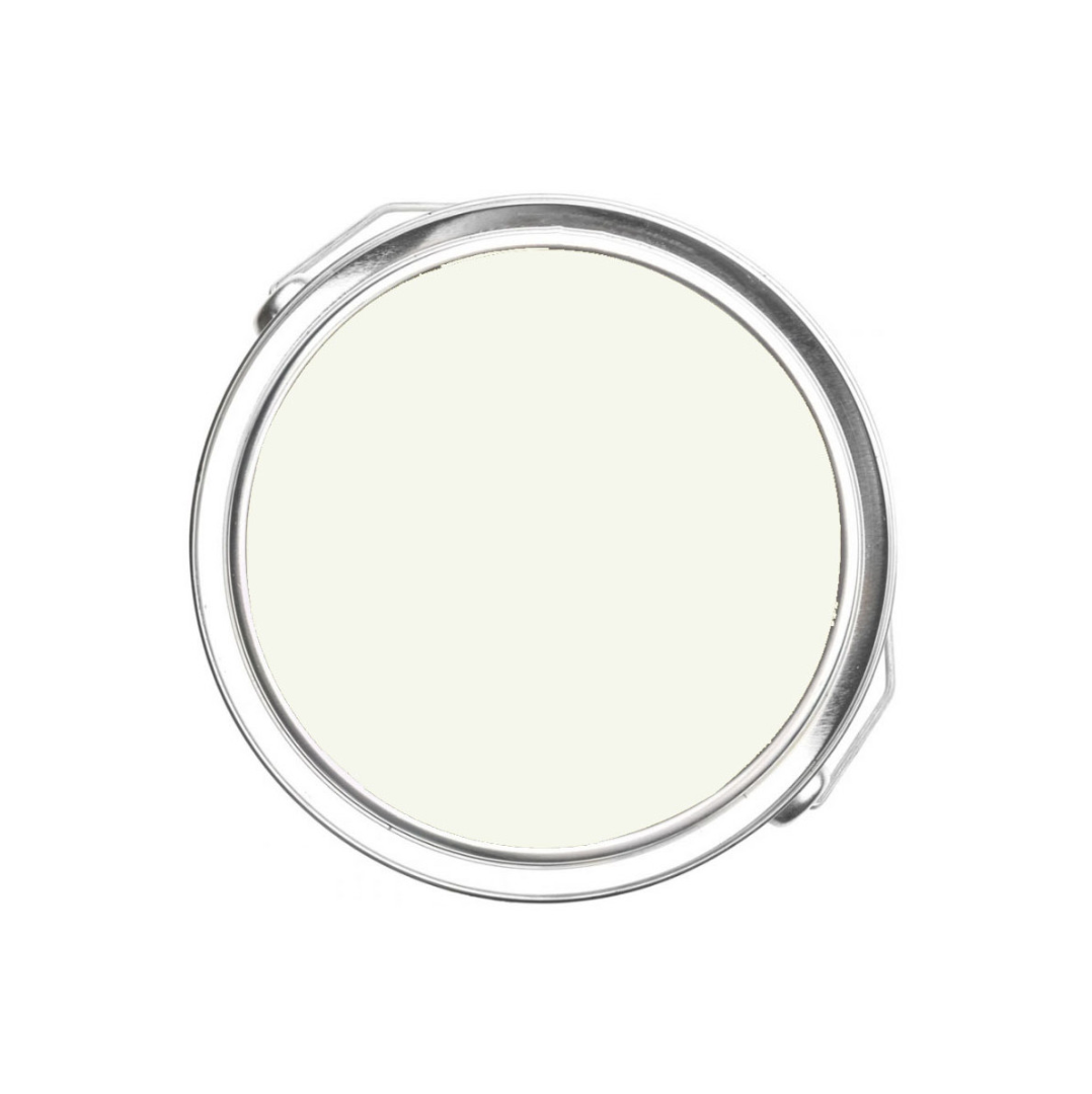
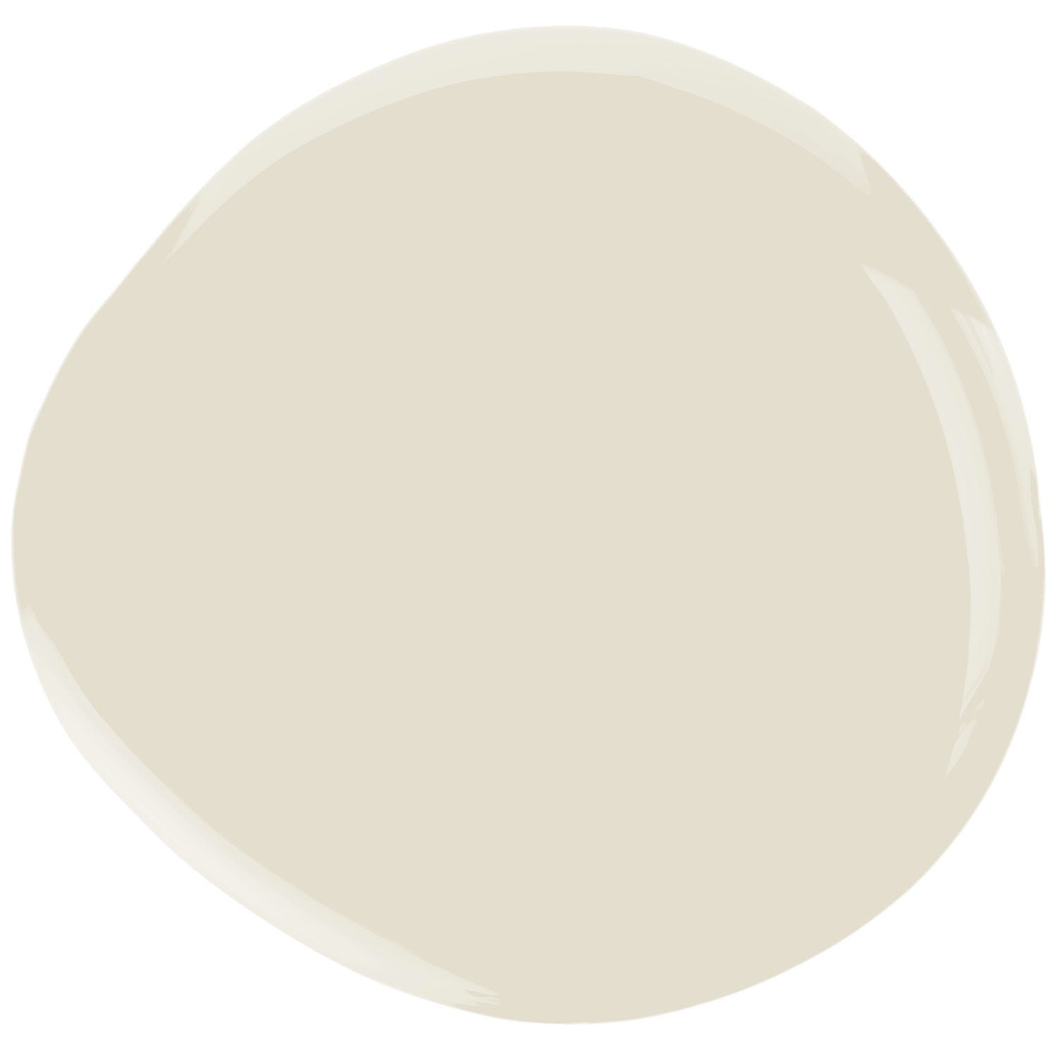
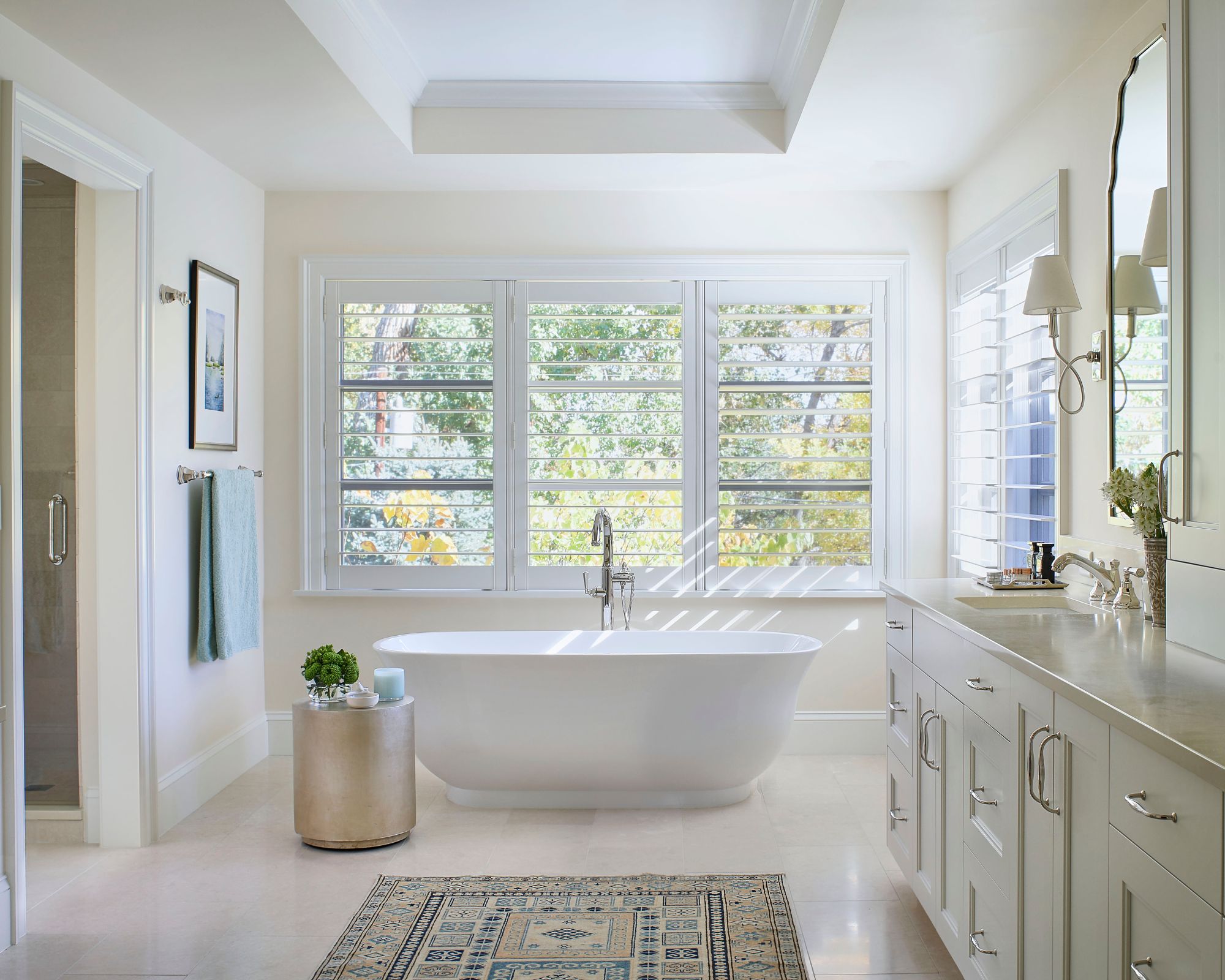
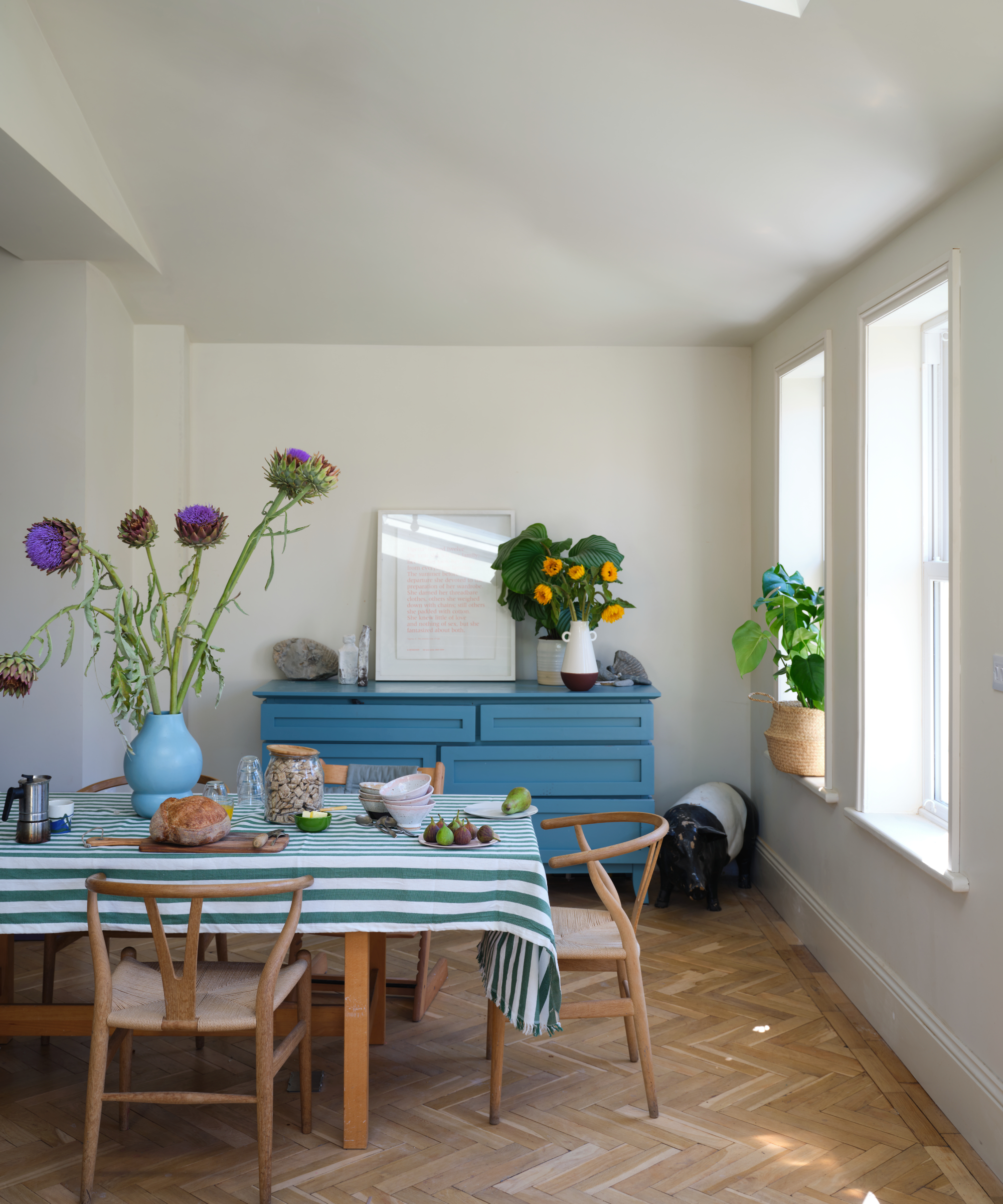
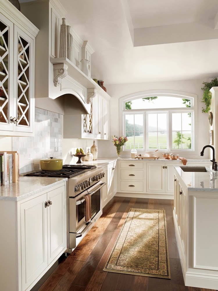
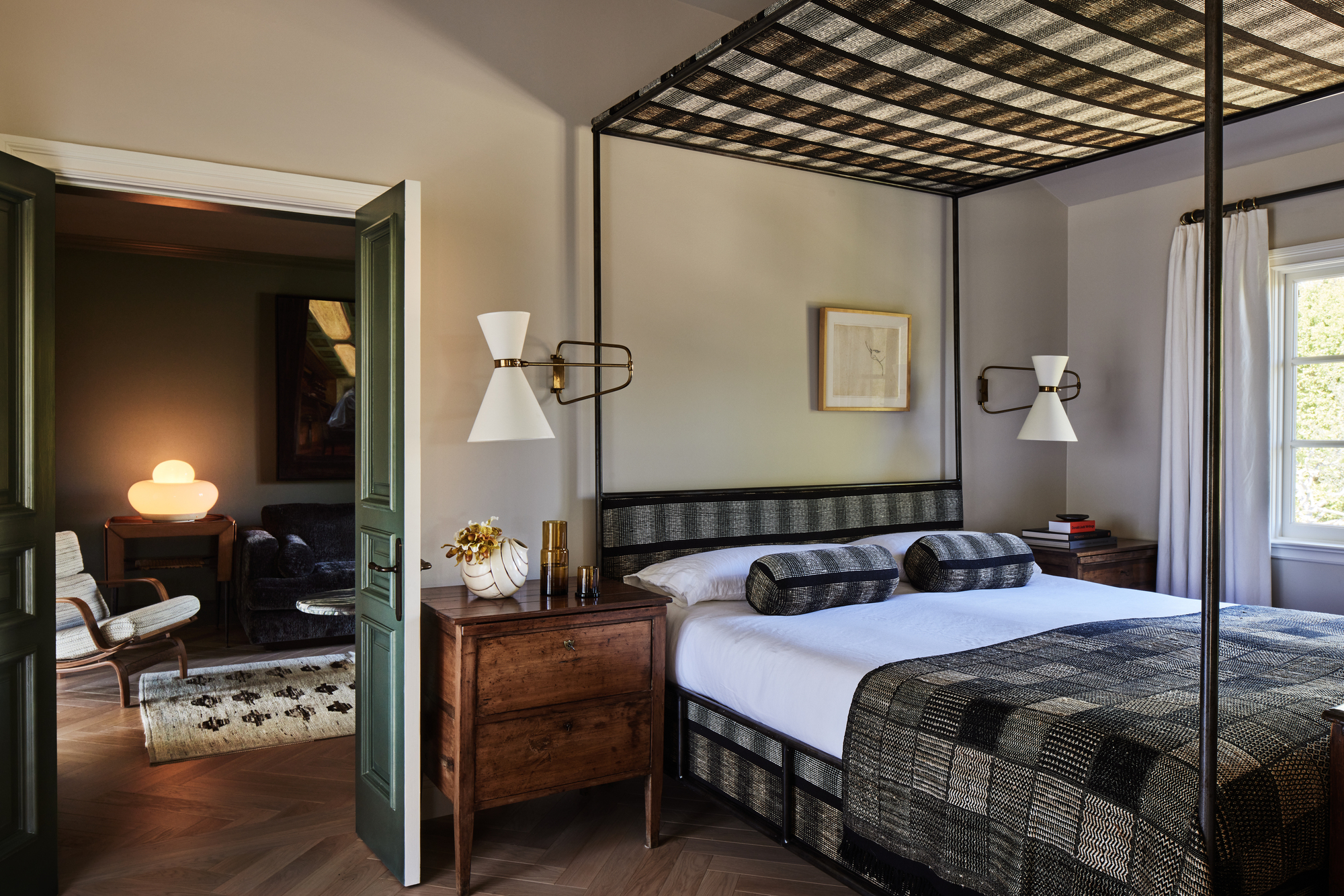
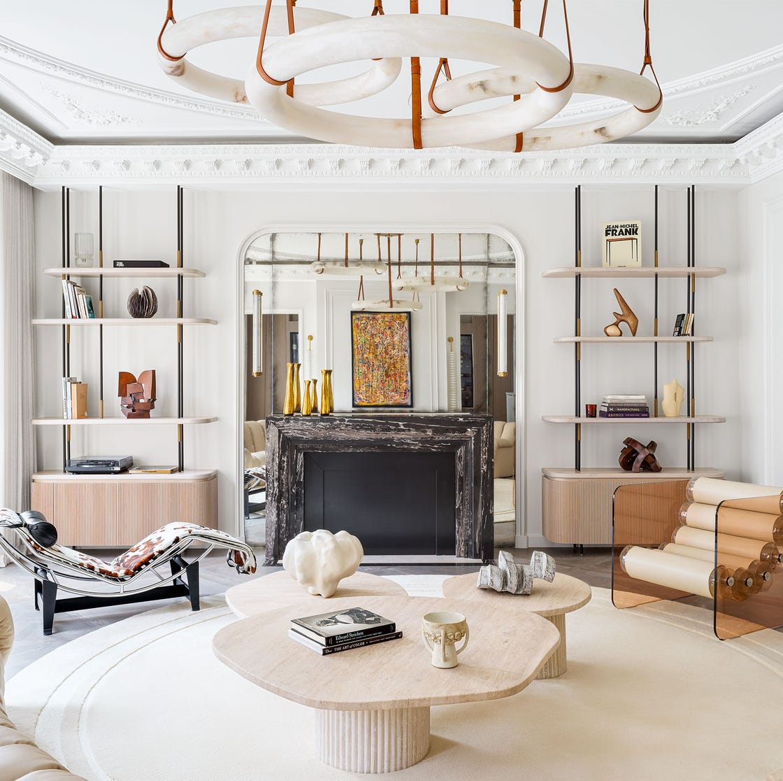
The first recommendation is Benjamin Moore’s White Dove, an off-white celebrated for its perfect balance of warmth without being too creamy or yellow. Designers commend its versatility, noting its ability to complement different wood tones, brighten dark rooms, and add depth where needed. Joshua Smith, for instance, points out how its appearance shifts across finishes, leaning creamy in a flat finish but offering a subtle aged look in satin on trim or ceilings.
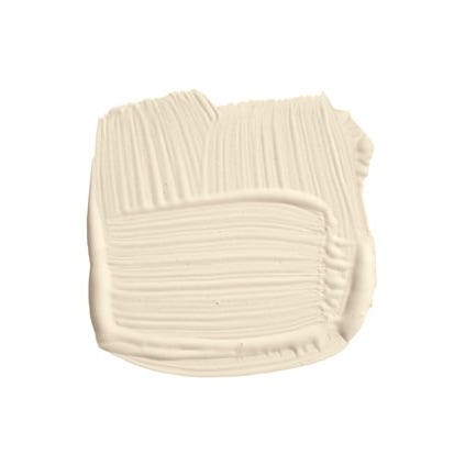
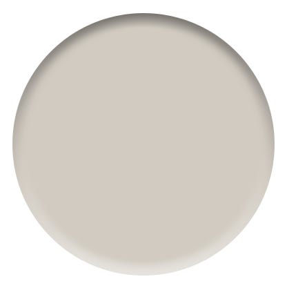
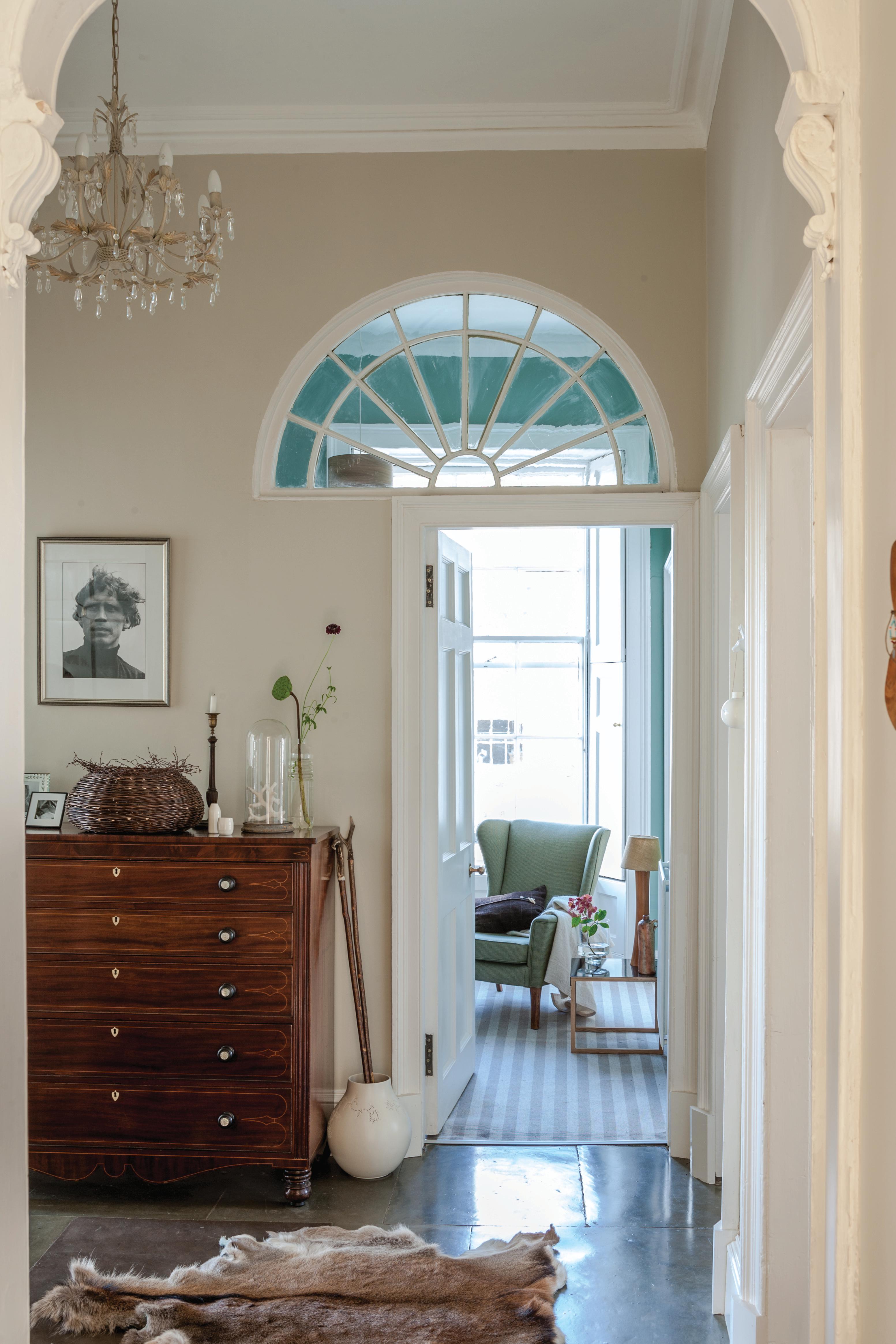
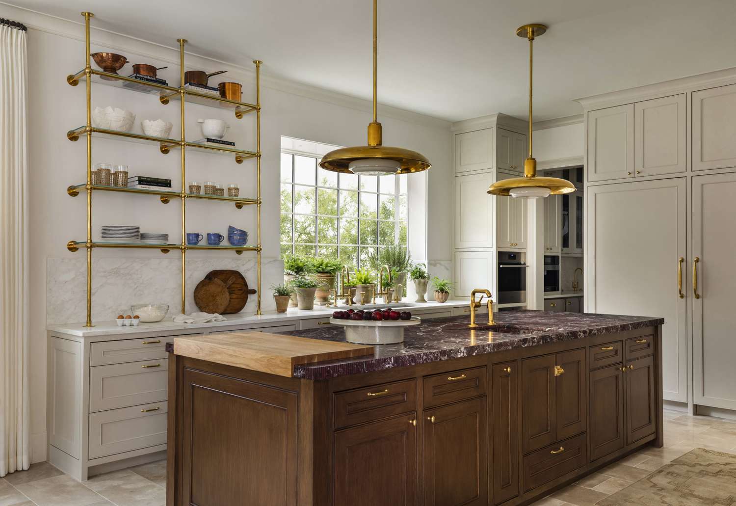
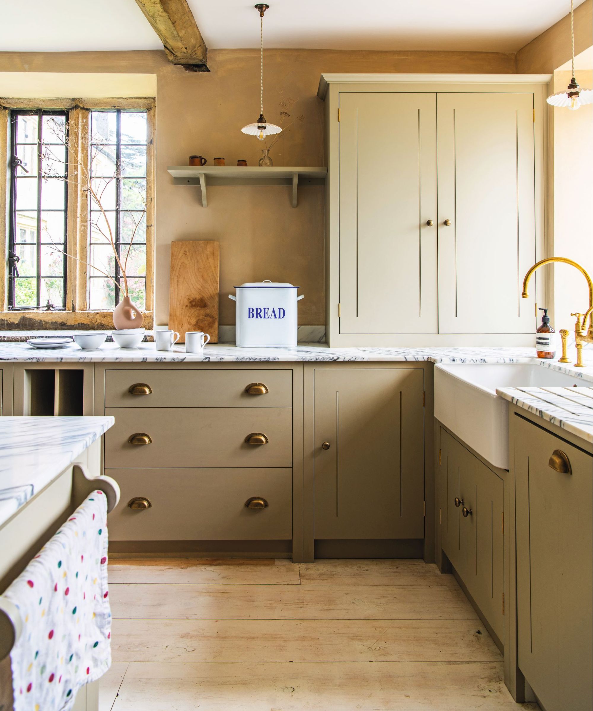
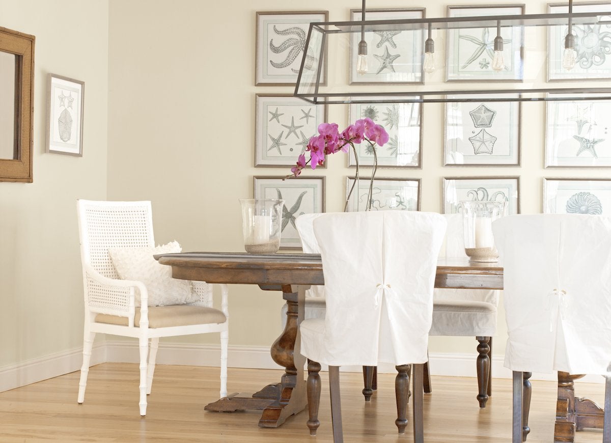
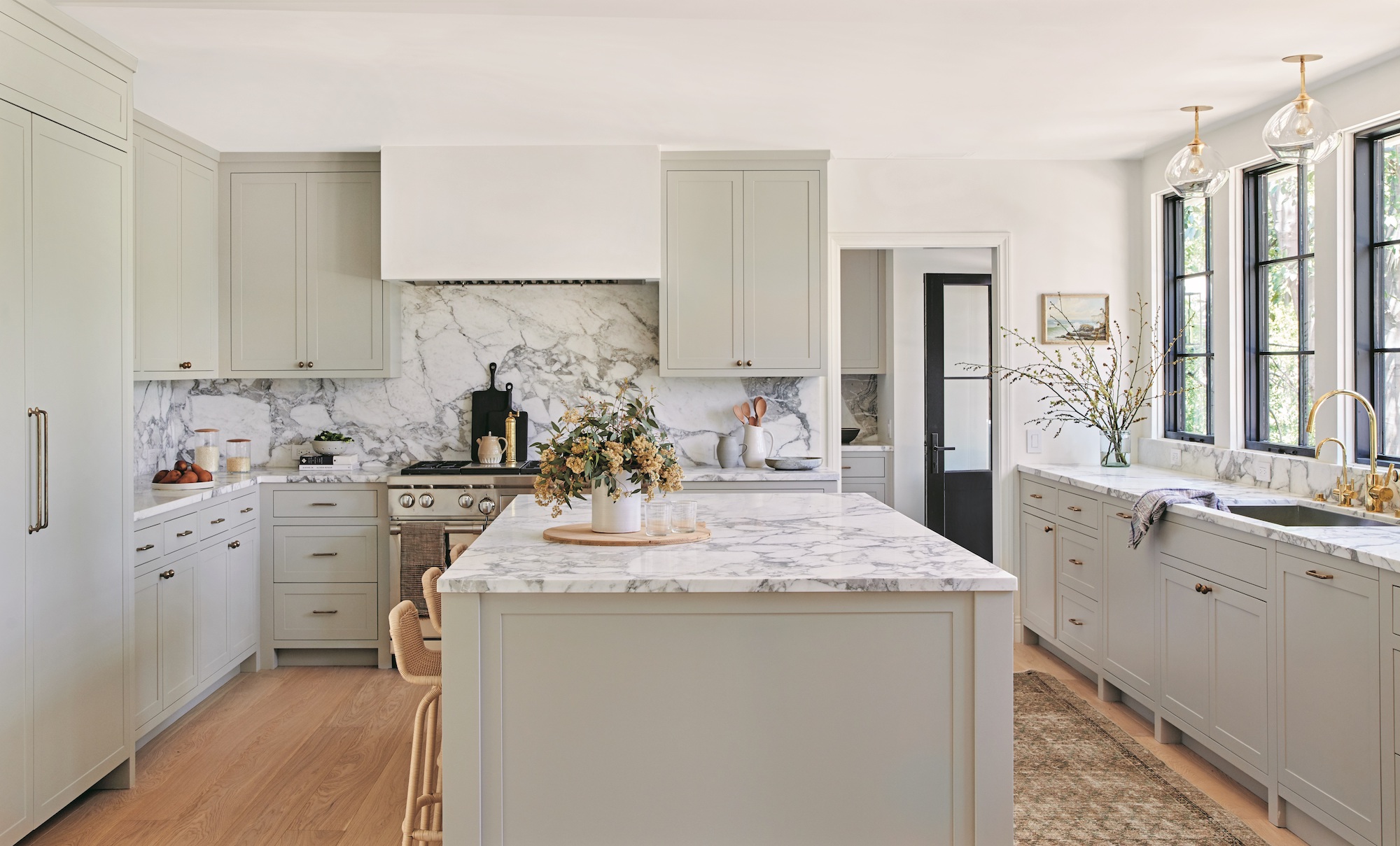
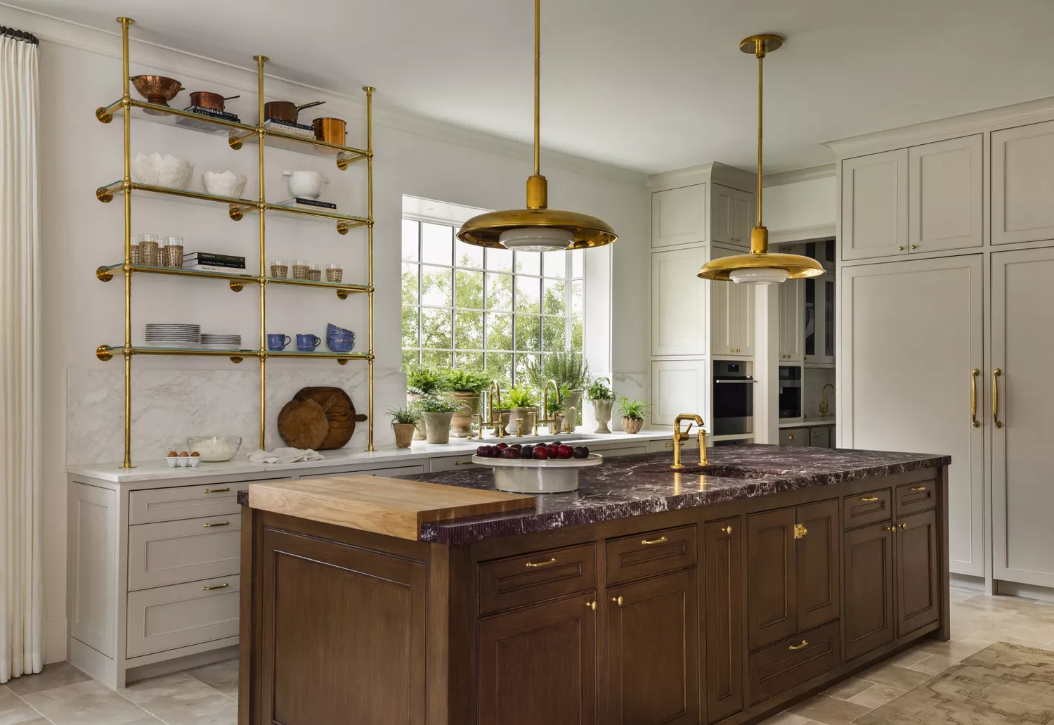
Next, Sherwin-Williams’ Snowbound is praised by Miranda Cullen of Inside Stories for its warm, creamy white base that effectively sets a beautiful interior stage. Farrow & Ball’s Drop Cloth is presented as a sophisticated neutral, bridging the gap between beige and gray. This shade avoids the dated look of overly creamy neutrals by incorporating gray tones, offering a modern yet warm aesthetic with significant depth, making it ideal for kitchen cabinets or walls.
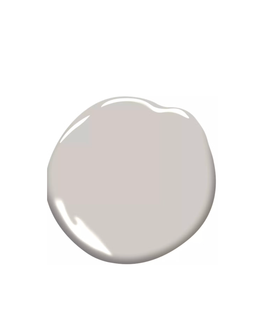
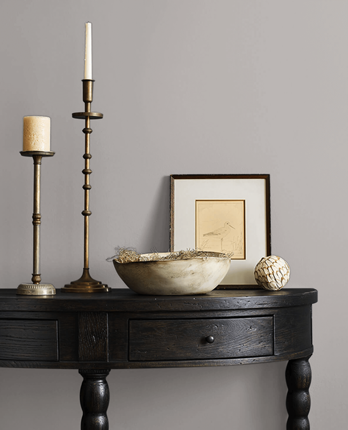
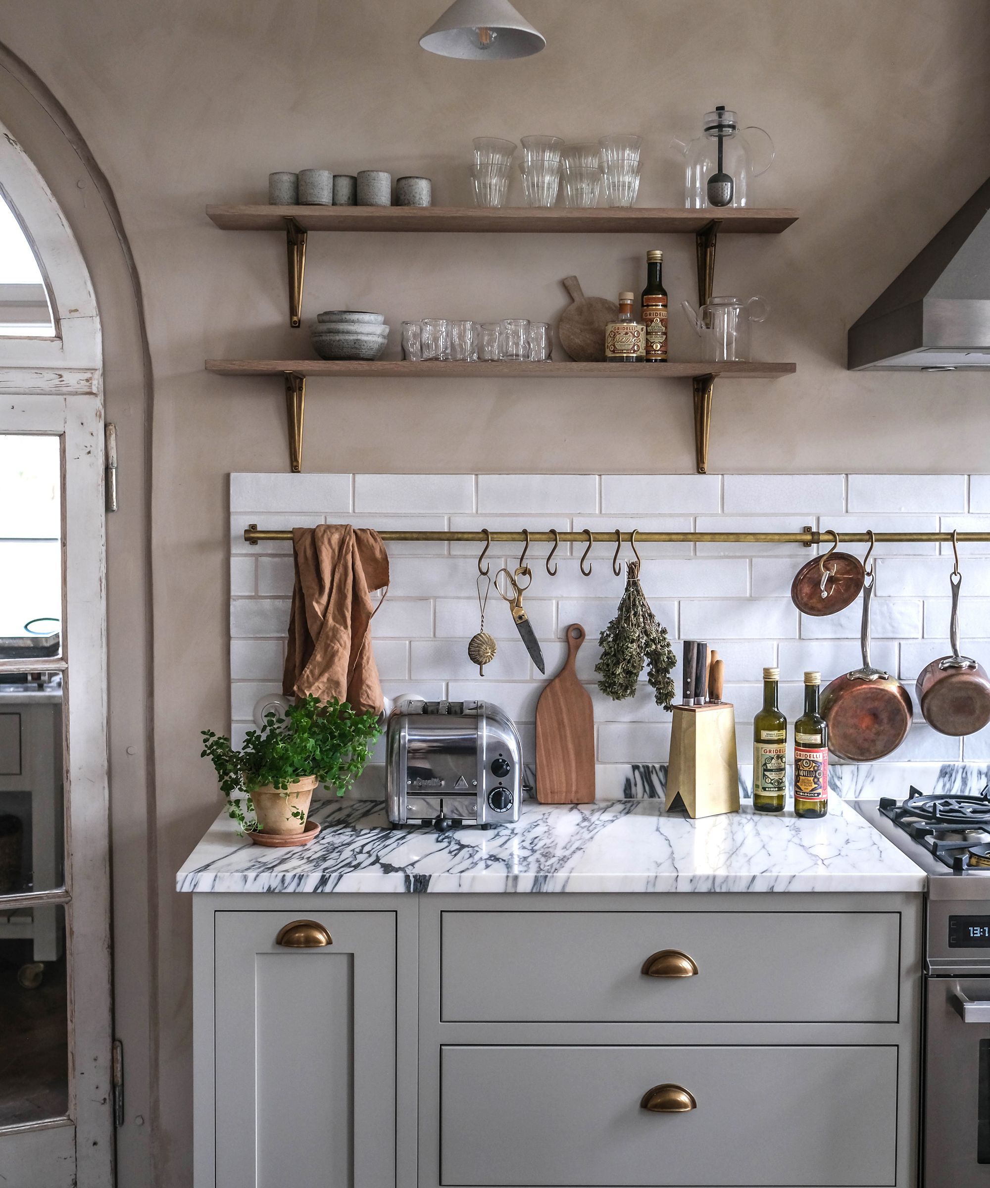
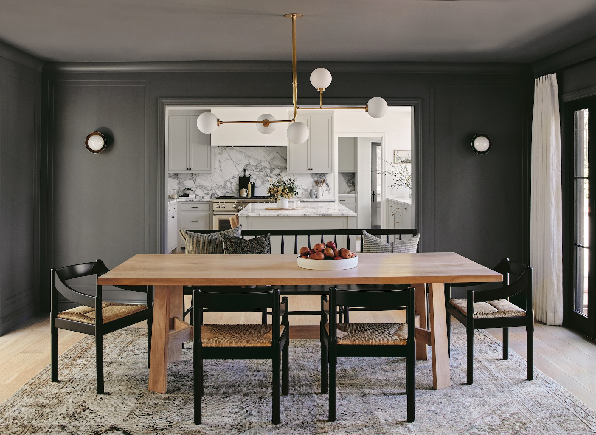
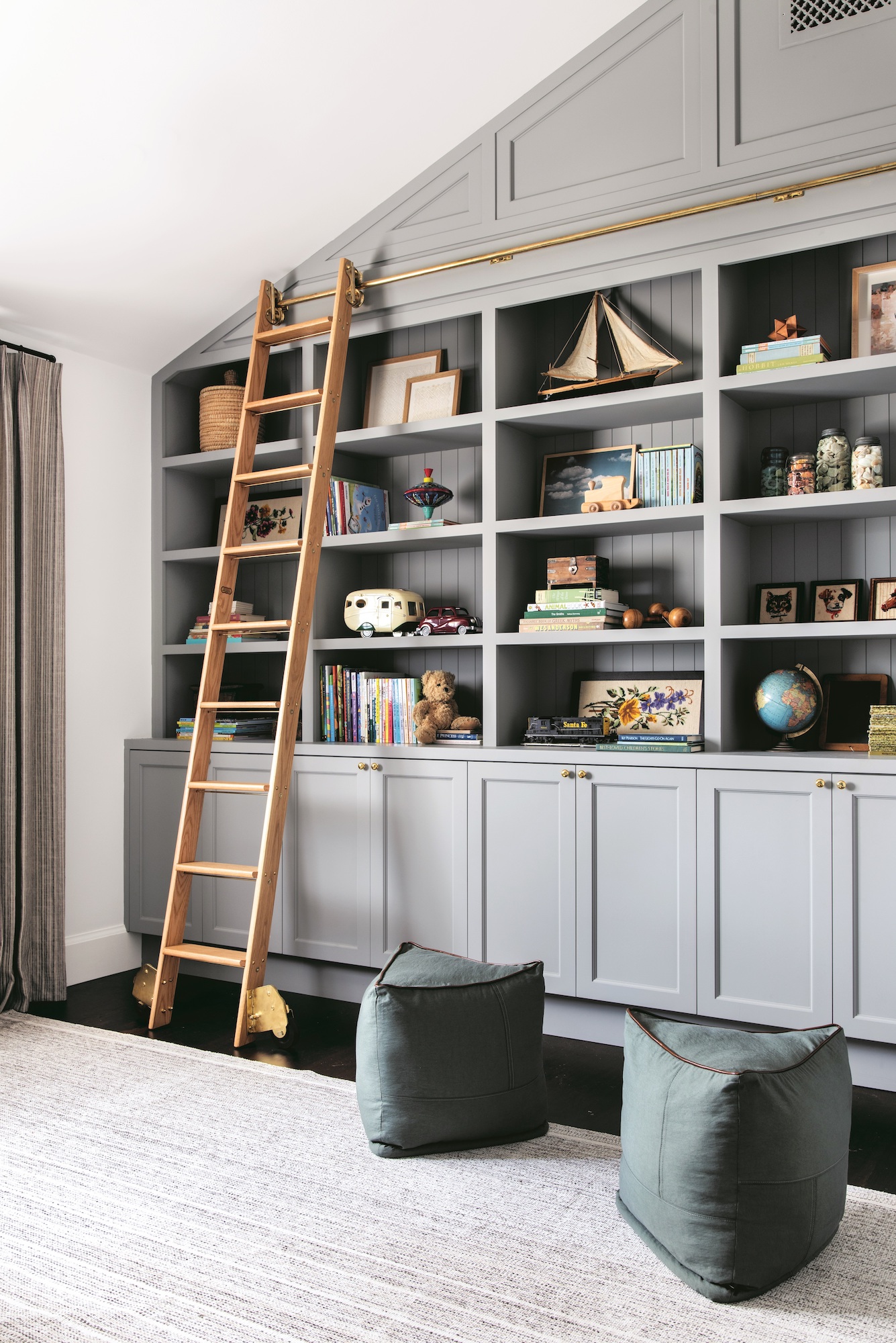
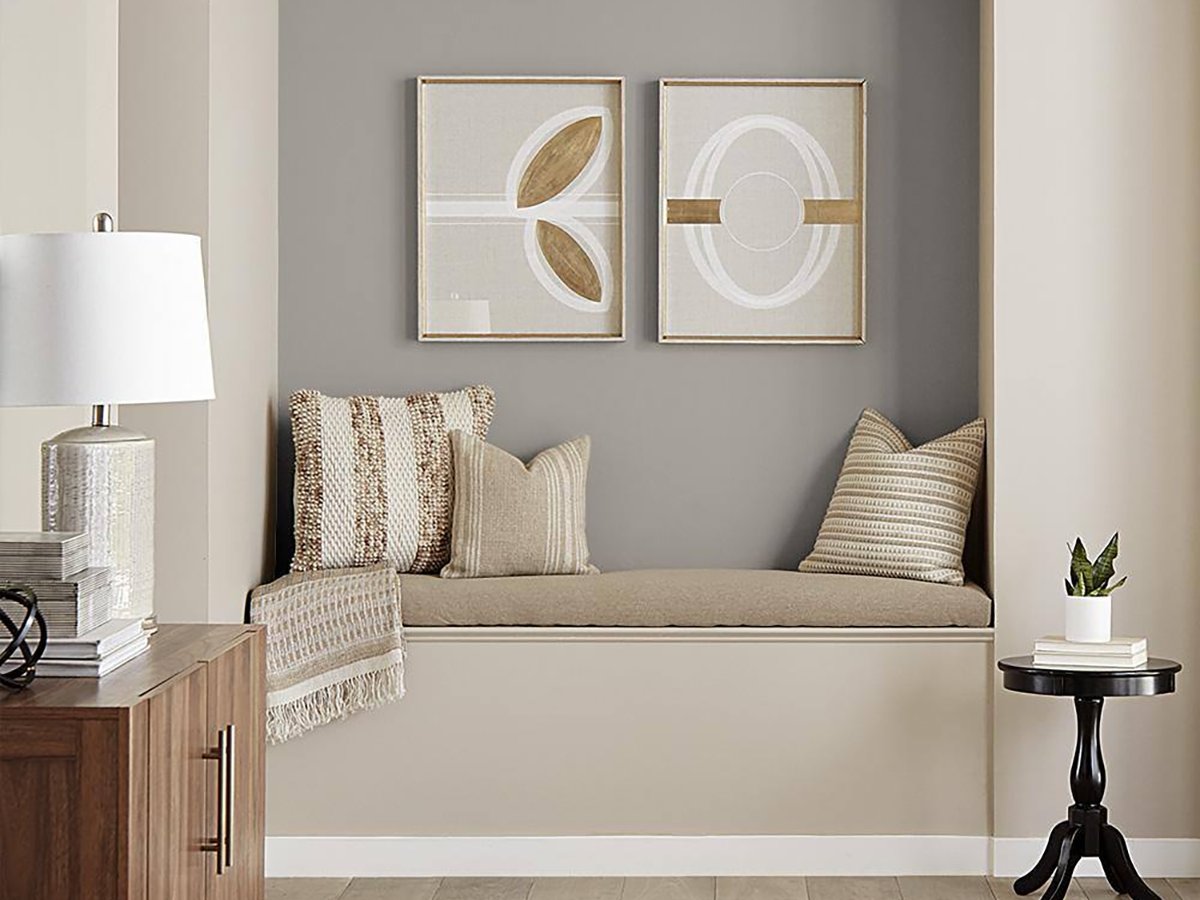
Benjamin Moore’s Balboa Mist is highlighted as an excellent warm-toned gray. It prevents the starkness often associated with cool grays, providing a taupe-based neutral that integrates seamlessly with almost any color palette. Designer Brandon Lange suggests it can create a moody ambiance in darker spaces and add depth in brighter ones.
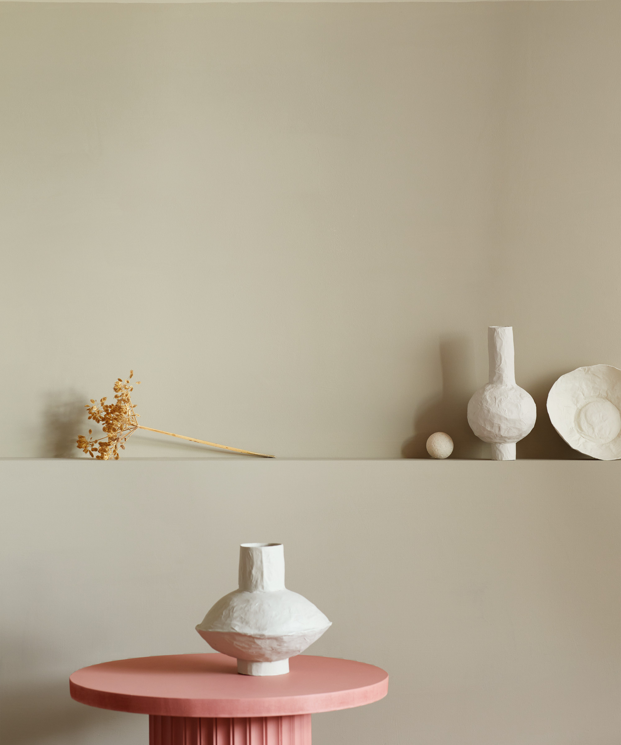
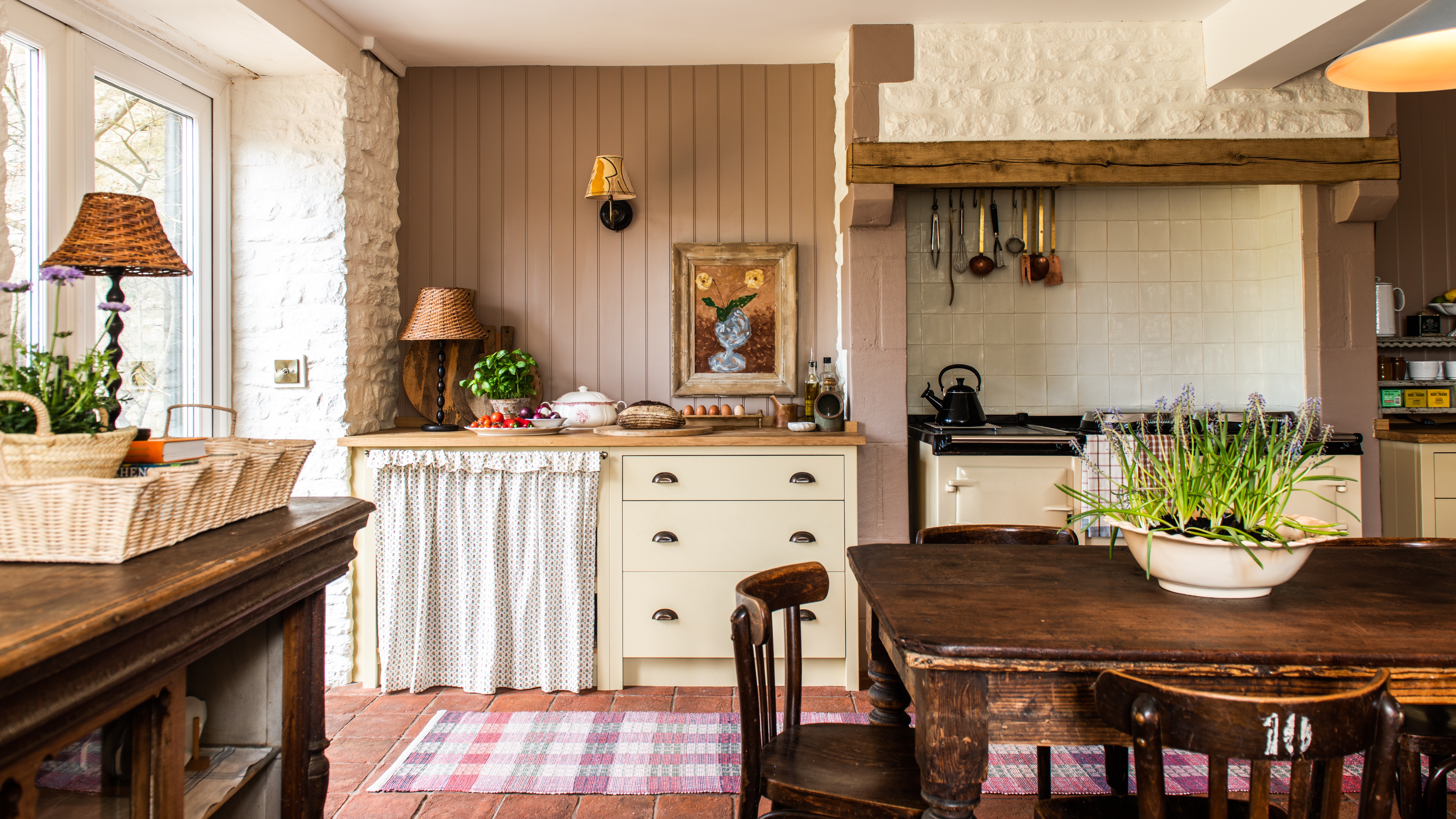
For those embracing the resurgence of beige, Backdrop’s Brooklyn Cowboy is a top pick. Carrie Moore describes it as an earth-toned beige infused with orange and rosy pigments, resulting in a light and cheerful feel. Another Benjamin Moore favorite is Swiss Coffee, which Kathy Kuo appreciates for its subtle warmth, combining off-white with undertones of gray, yellow, and green, making it suitable for diverse styles from French country to mid-century modern.
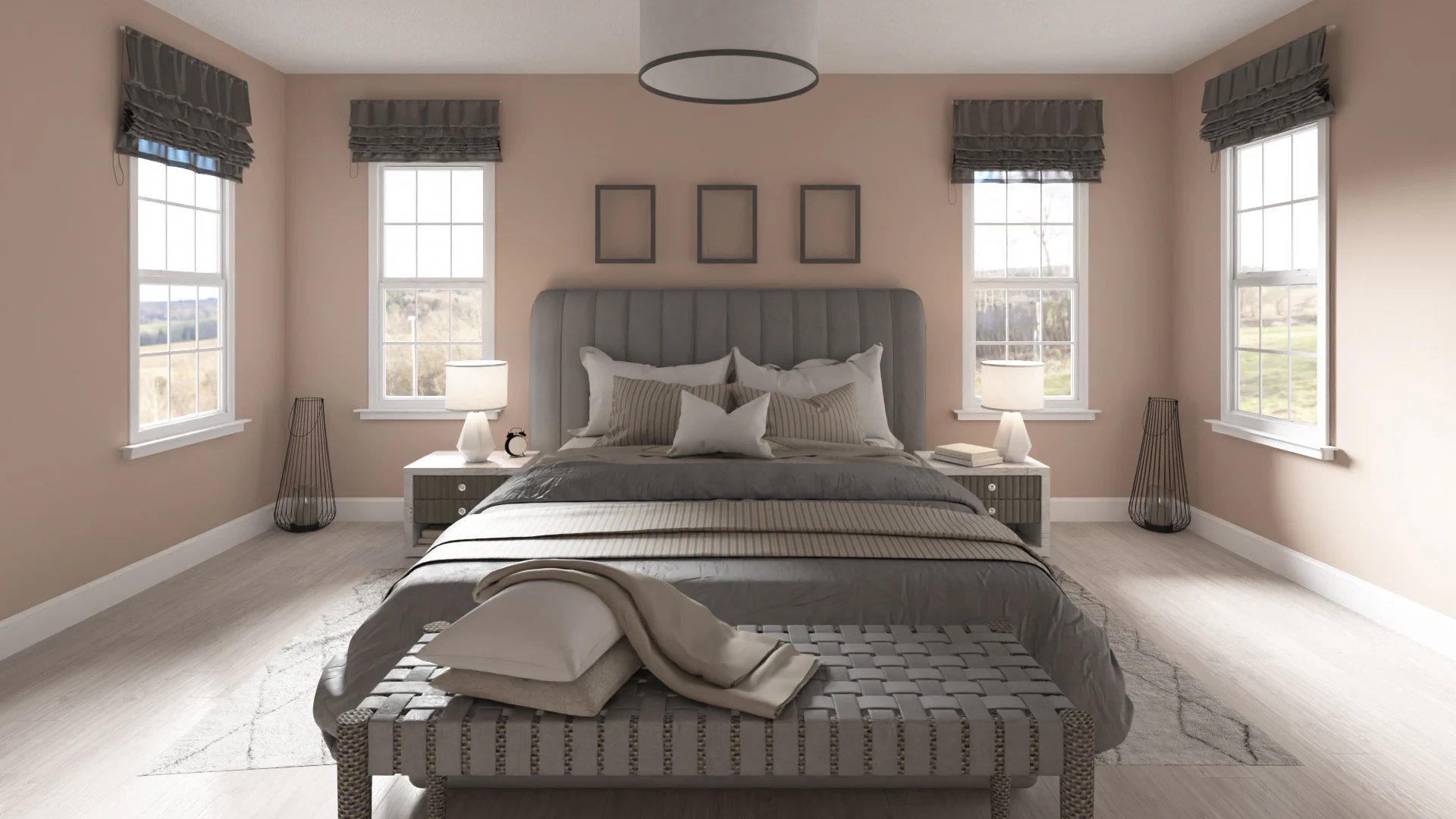
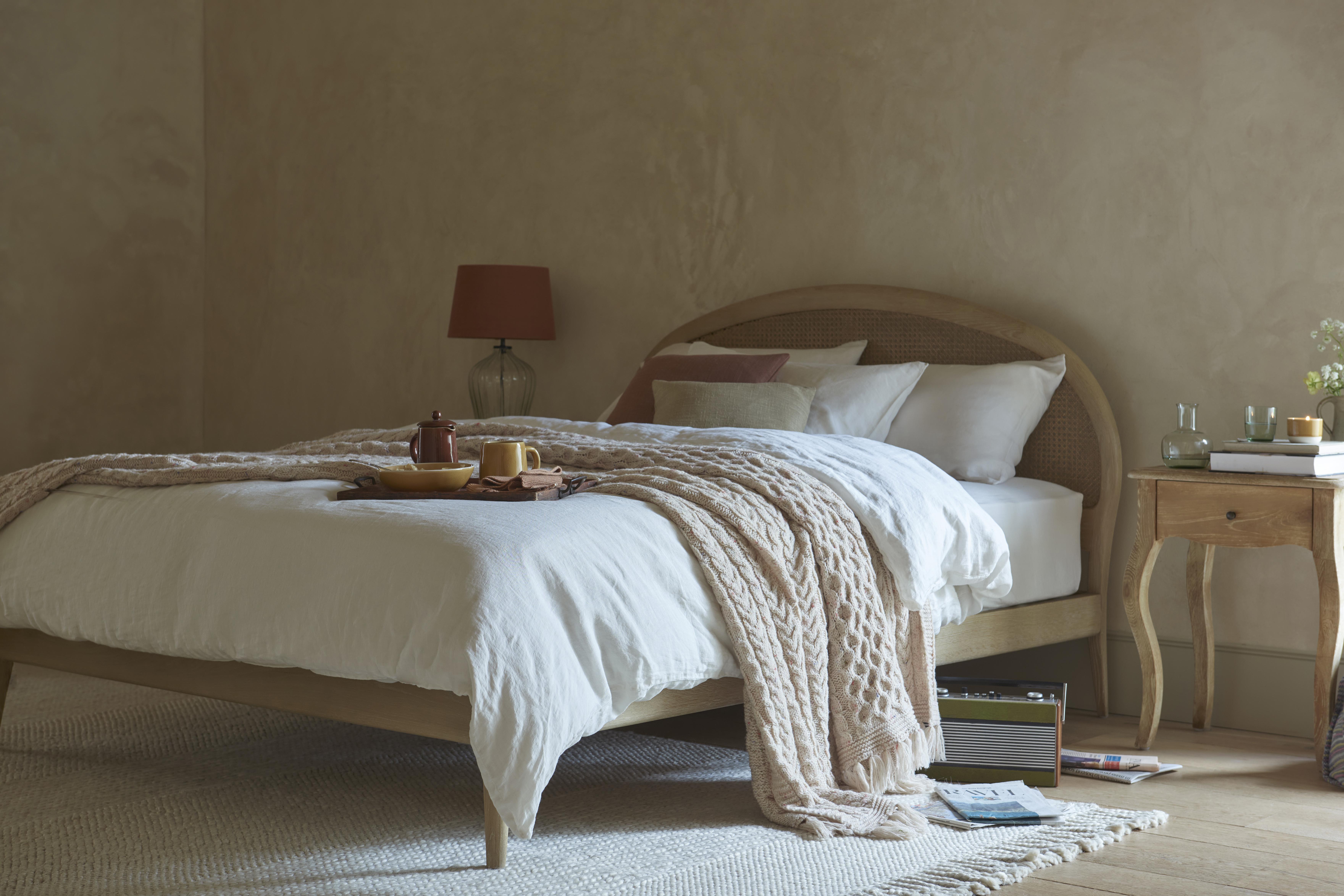
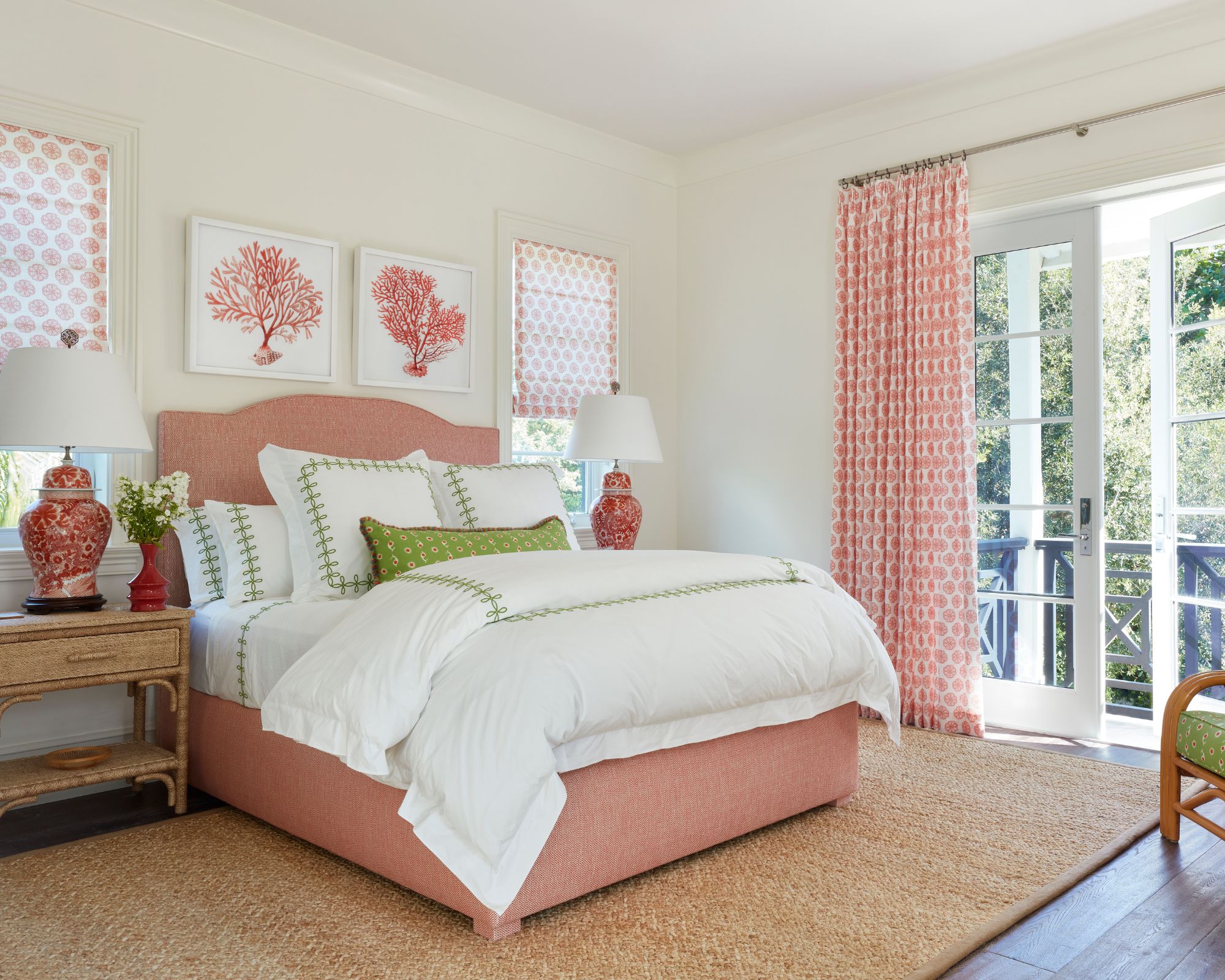
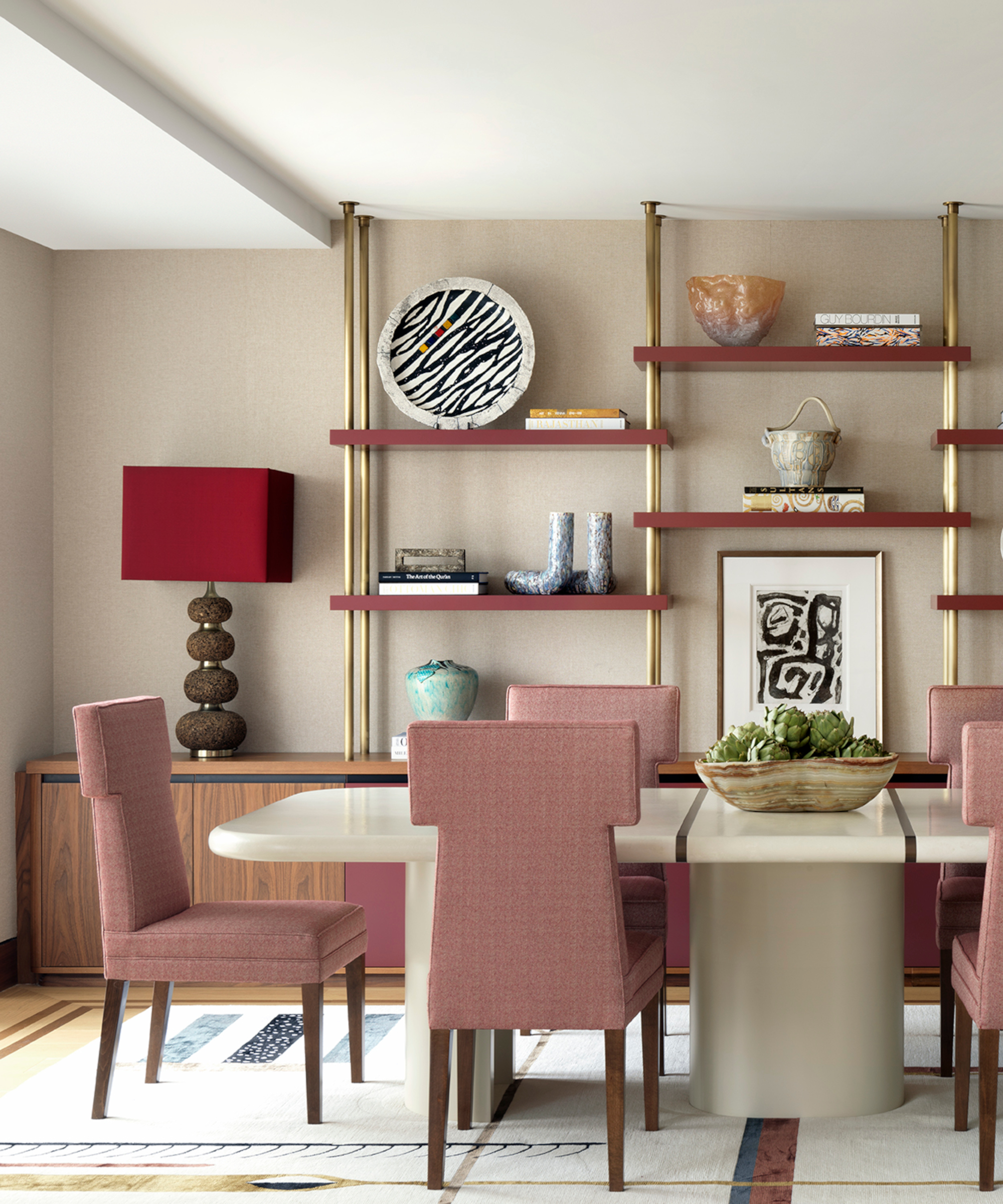
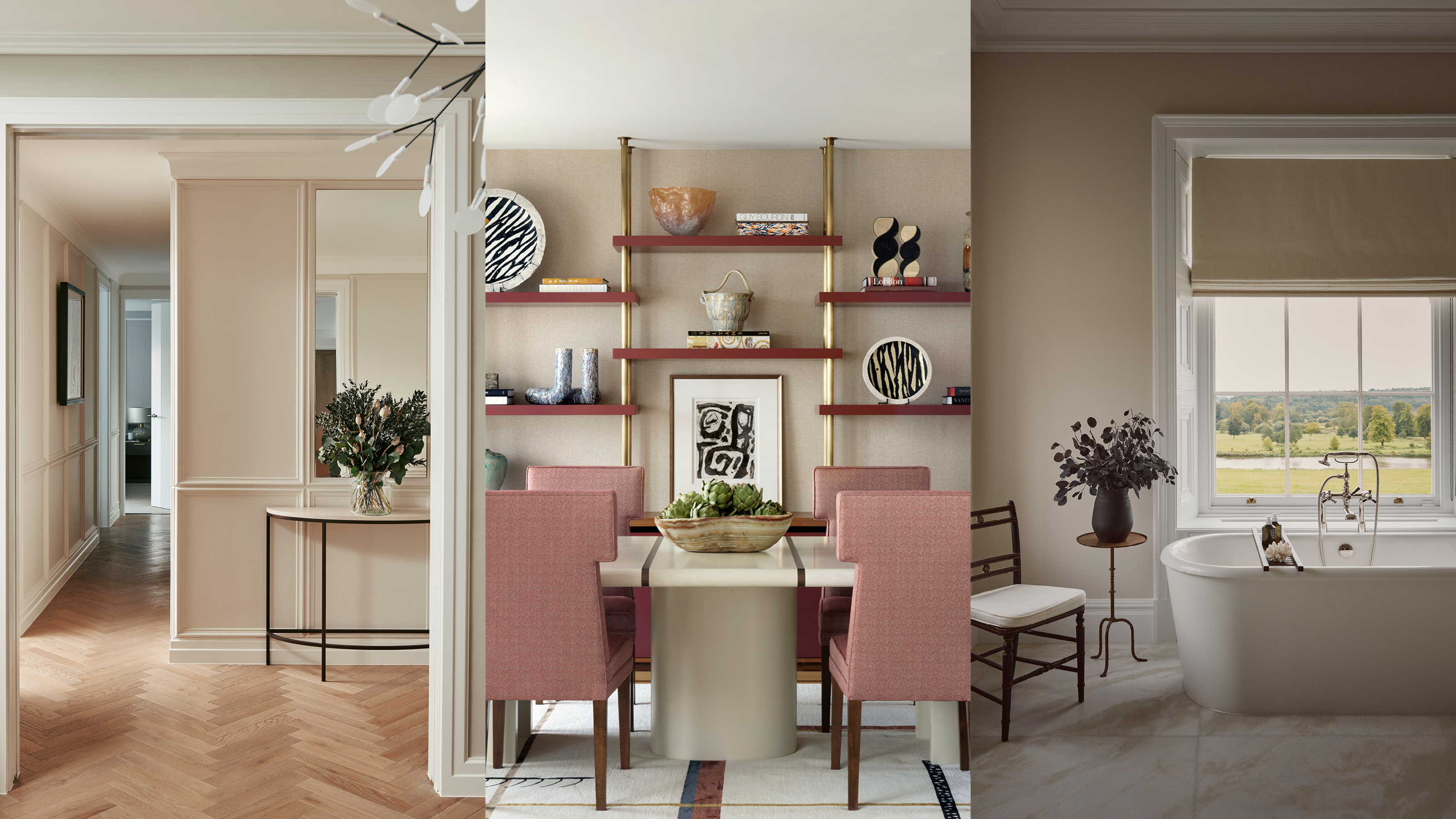
Backdrop’s Modern Love is introduced as a flattering pink that acts as a neutral. Nicole Lanteri emphasizes its ability to strike a balance between light and cozy, bringing intentional warmth and complementing natural materials and textures. Farrow & Ball’s Matchstick, inspired by unbleached wood, offers a warm interior scheme without excessive yellow undertones, as noted by Margaret Donaldson, who uses it for brightening rooms or as a backdrop for bold accents.
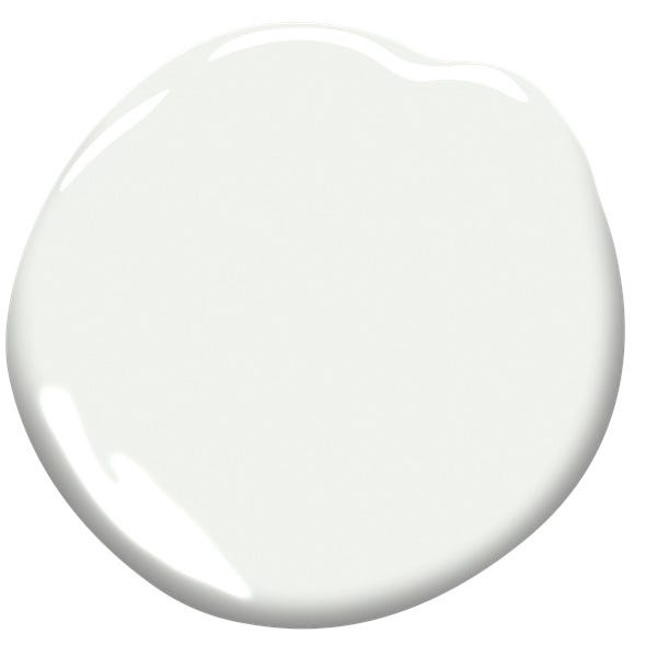
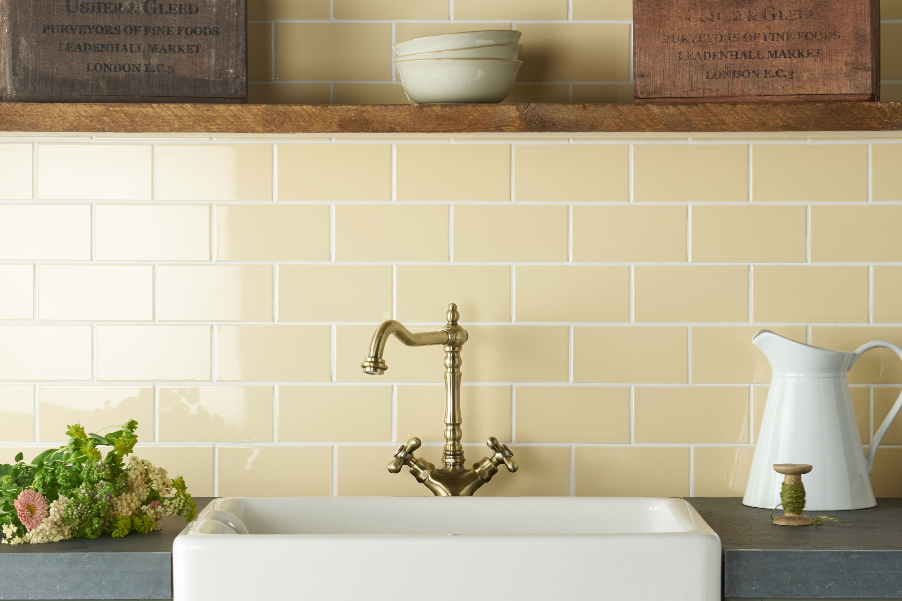
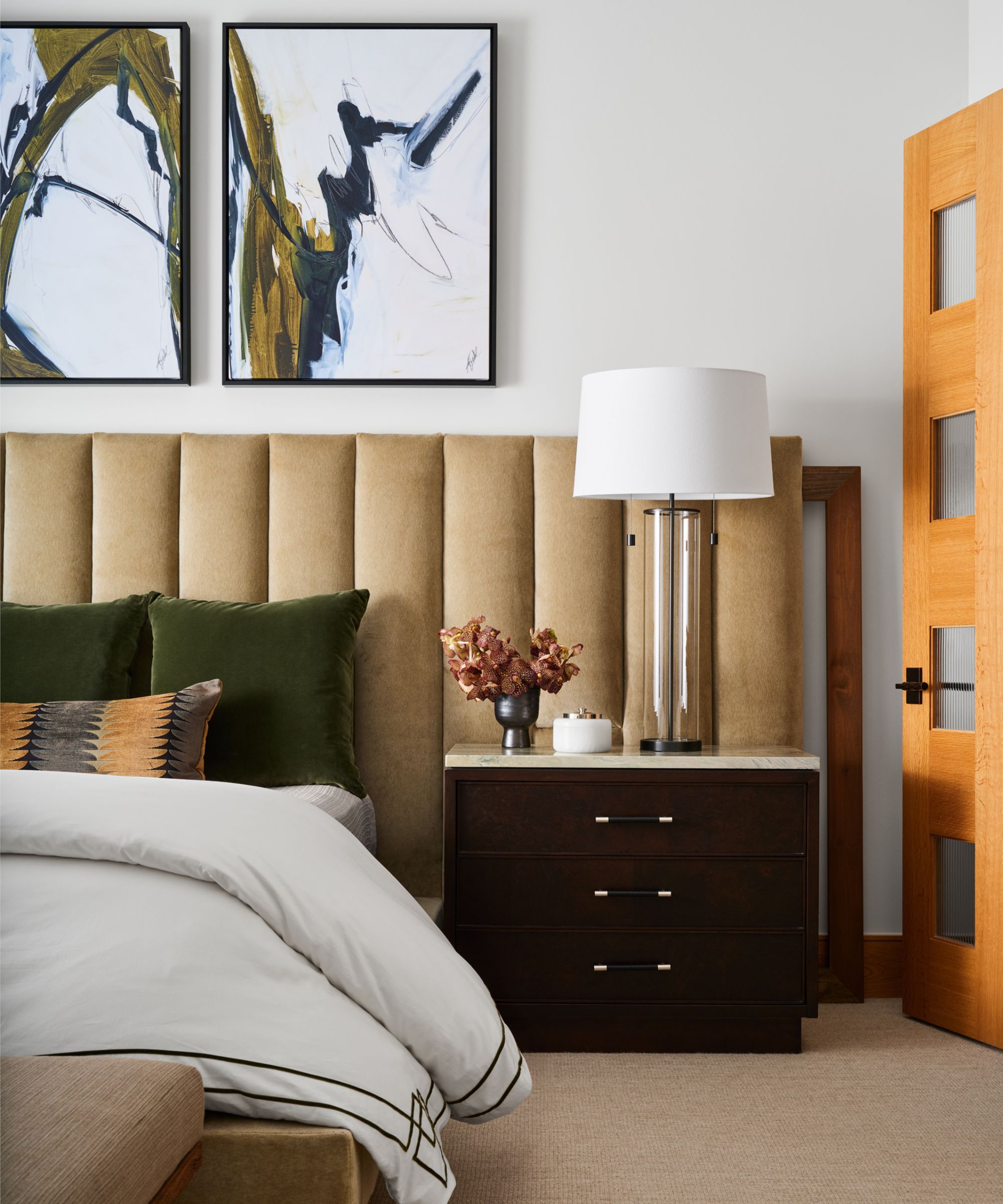
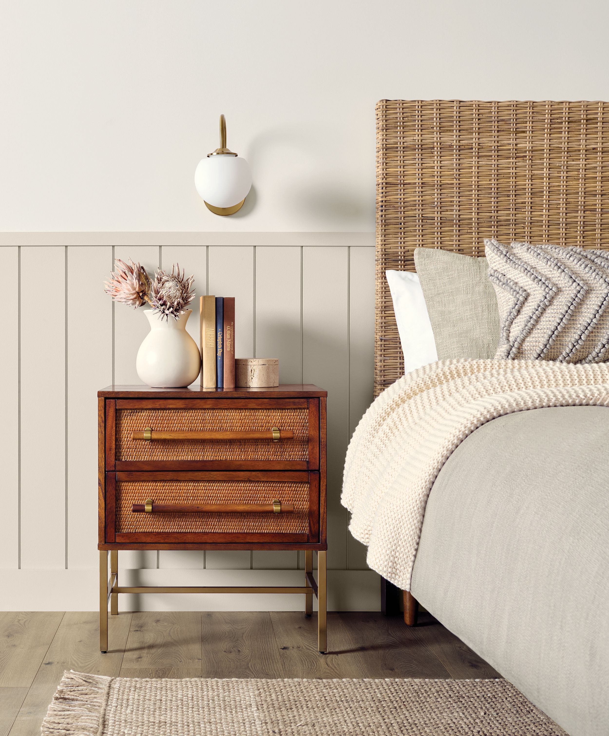
Margaret Donaldson also champions Benjamin Moore’s Shaker Beige from its historical collection, describing it as an elegant mid-tone tan that avoids being too gray, yellow, or pink, providing timeless depth and warmth. Finally, Benjamin Moore’s Simply White is valued for its warm touch, which prevents the sterile appearance often associated with white paints in large spaces, making it versatile for achieving a cozy feel, particularly due to its subtle yellow undertones.
#WarmNeutralPaints #InteriorDesign #PaintColors #BenjaminMoore #SherwinWilliams #FarrowAndBall #HomeDecor #NeutralPalette #DecoratingTips #WarmNeutralPaints #InteriorDesign #PaintColors #BenjaminMoore #SherwinWilliams #FarrowAndBall #HomeDecor #NeutralPalette #DecoratingTips
0 comment in total
 No comments yet
You may also like
These Are the Neutral Paint Colors Interior Designers ACTUALLY Use

Creamy neutral paint colours are back — just don’t call it magnolia
The Most Popular Paint Colors in America

10 Best Warm White Paint Colors for a Cozy Neutral Refresh

35 Neutral Paint Colors Interior Designers Can't Get Enough Of

White vs Cream: designers weigh in on these enduring neutrals
12 Neutral Paint Colors That Will Look Beautiful in Every Room
9 Neutral Paint Colors Designers Constantly Reach For — "It's My Tried-and-True"

The 20 Best Neutral Paint Colors for Your Home in 2025

The Trendiest Neutral Of The Year Is A 2000s Classic—But Better
Beige-grey – the timeless paint color perfect for a barely-there backdrop

Amber Lewis Shares the Best Neutral Paint Colors for Every Room
6 Colors Designers Say to Skip in 2026—Yes, Even This Popular Neutral

What color is replacing gray? This is the shade designers say is becoming the perennial favorite

7 Most Underrated Paint Colours, According To Colour Experts
How colour experts decorate with neutrals – 10 gorgeous ways to use this muted colour palette

8 Paint Color Trends You'll ACTUALLY Want to Live With in 2026, According to Designers

4 Interior Designers Share the Biggest Paint Color Trends Right Now (and What’s Out!)


The #1 Paint Color Trend of 2025, According to Designers

Bored With White Walls? Try One of These Designer-Recommended Neutral Paints Instead