1/17
What Are the Most Popular Behr Paint Colors? These Hand-Picked Shades Promise to Bring Your Walls to Life
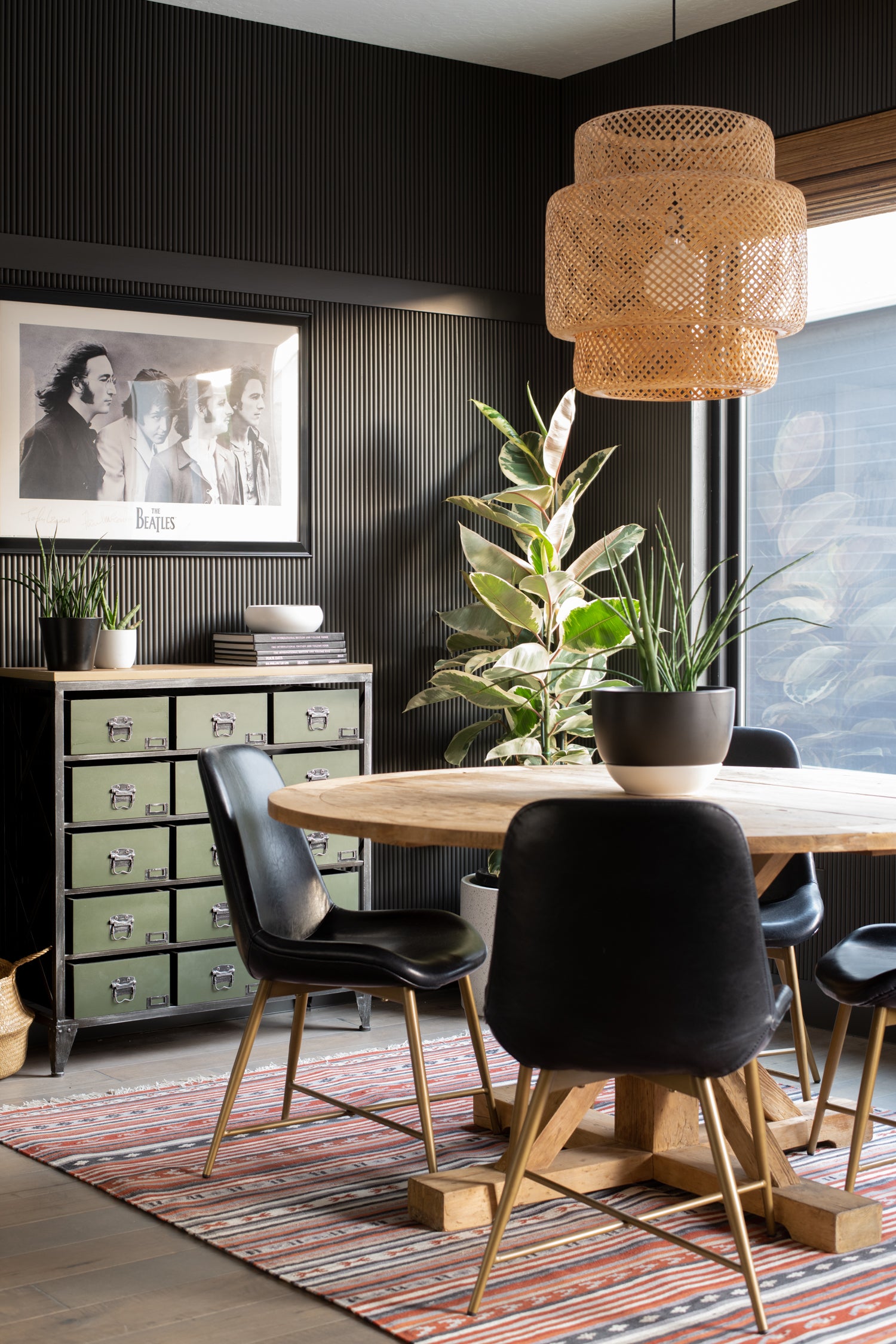
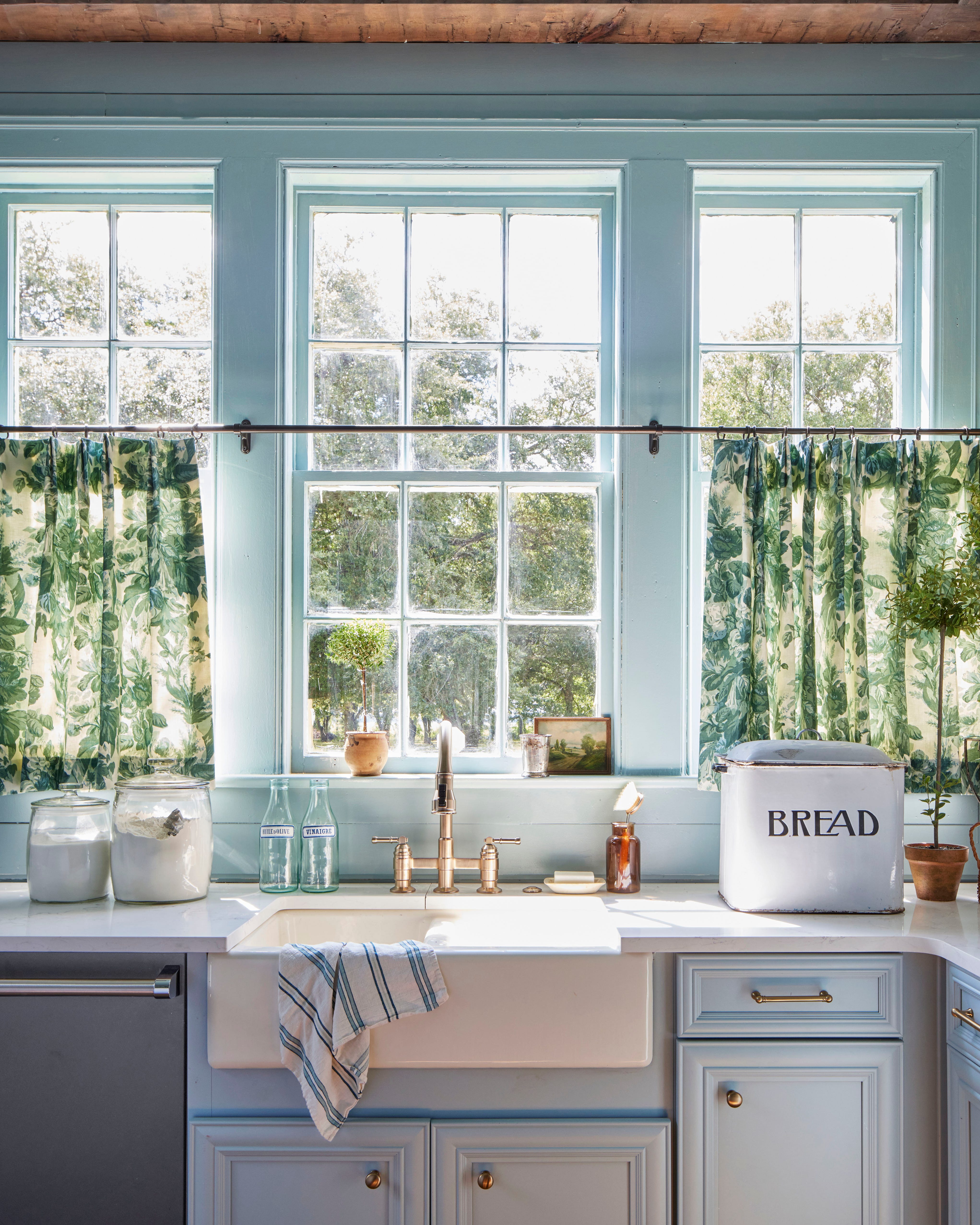
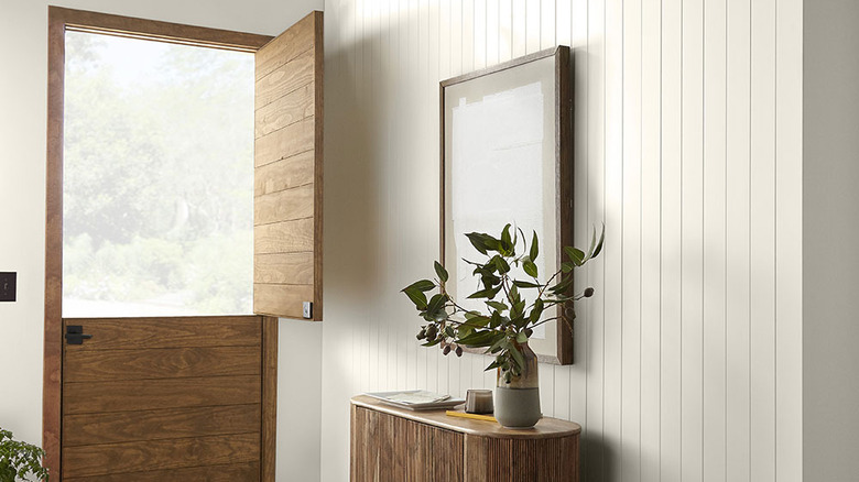
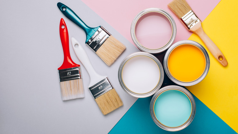
Behr paints are renowned for their quality, offering excellent adhesion, easy application, and long-lasting color. However, selecting the ideal shade for your home can be a daunting task. To simplify this decision, exploring Behr's most popular paint colors can provide valuable inspiration. These highly favored hues range from versatile neutrals to calming blues, all designed to revitalize any living space. Erika Woelfel, VP of Color and Creative Services at Behr, notes that consumers are increasingly gravitating towards sophisticated neutrals such as beige, taupe, white, and gray. These colors offer significant versatility, serving as a foundational base that can be complemented with furniture and decor to create a personalized and inviting environment. Whether the aim is to apply a single color across an entire room or introduce vibrant accents through painted furniture or trim, Behr's extensive palette offers suitable options.
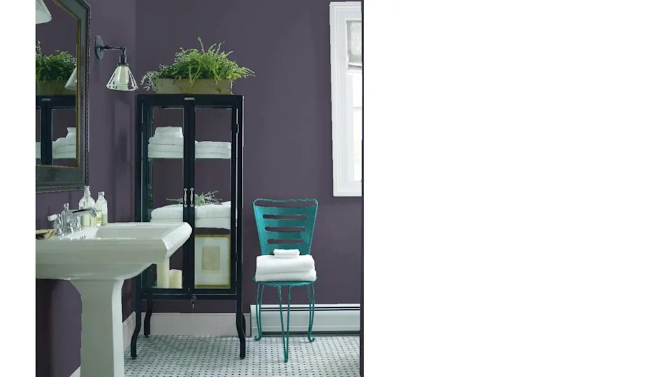
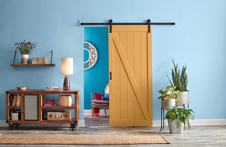
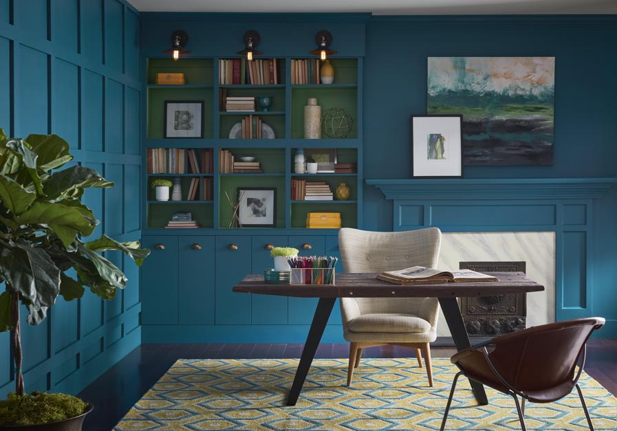
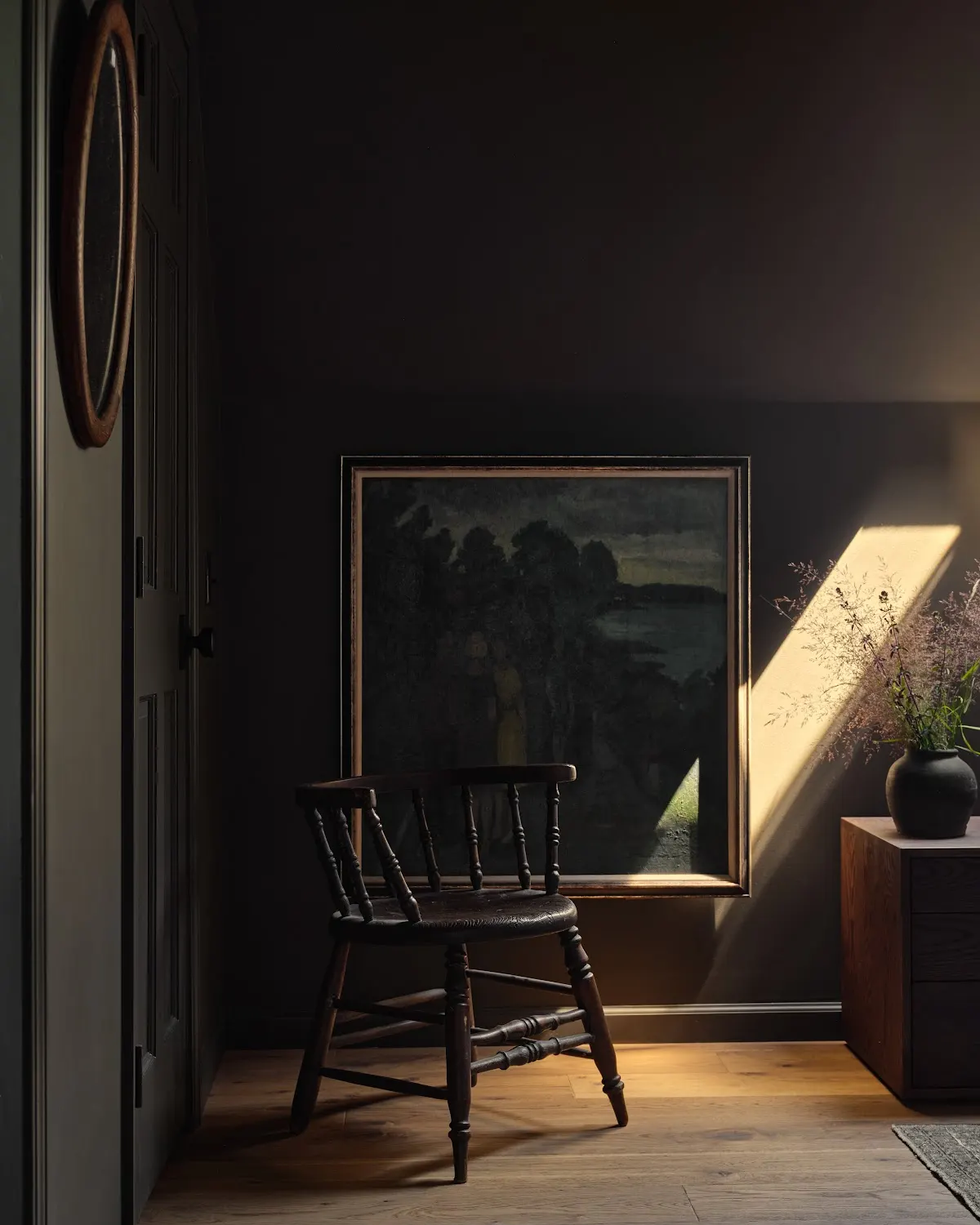
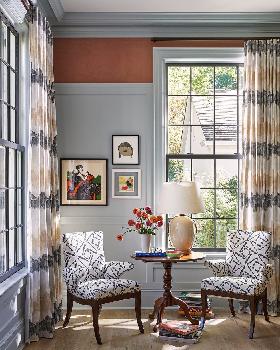
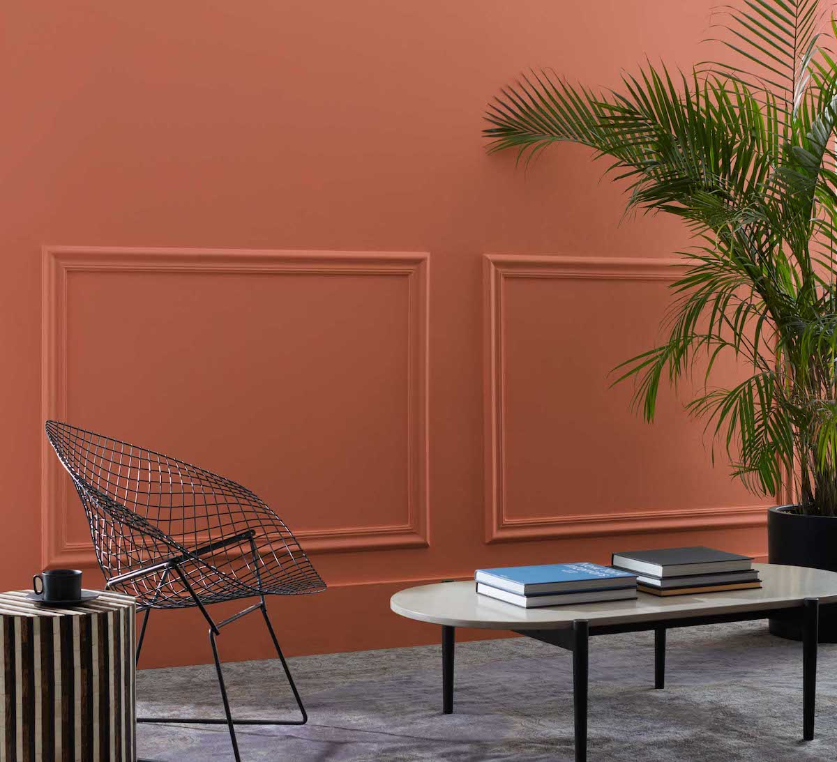
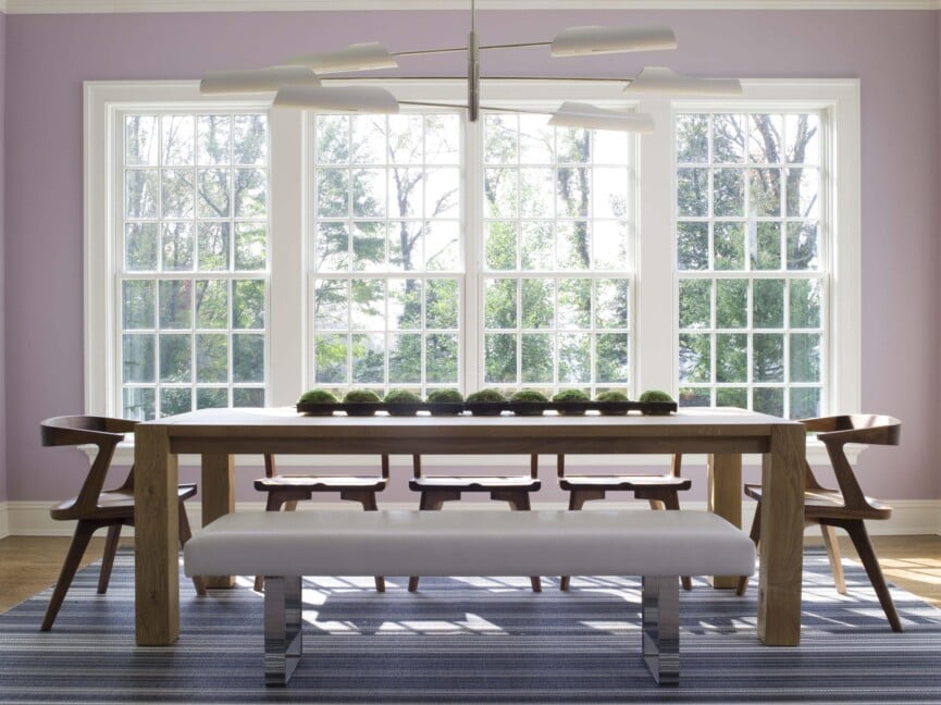
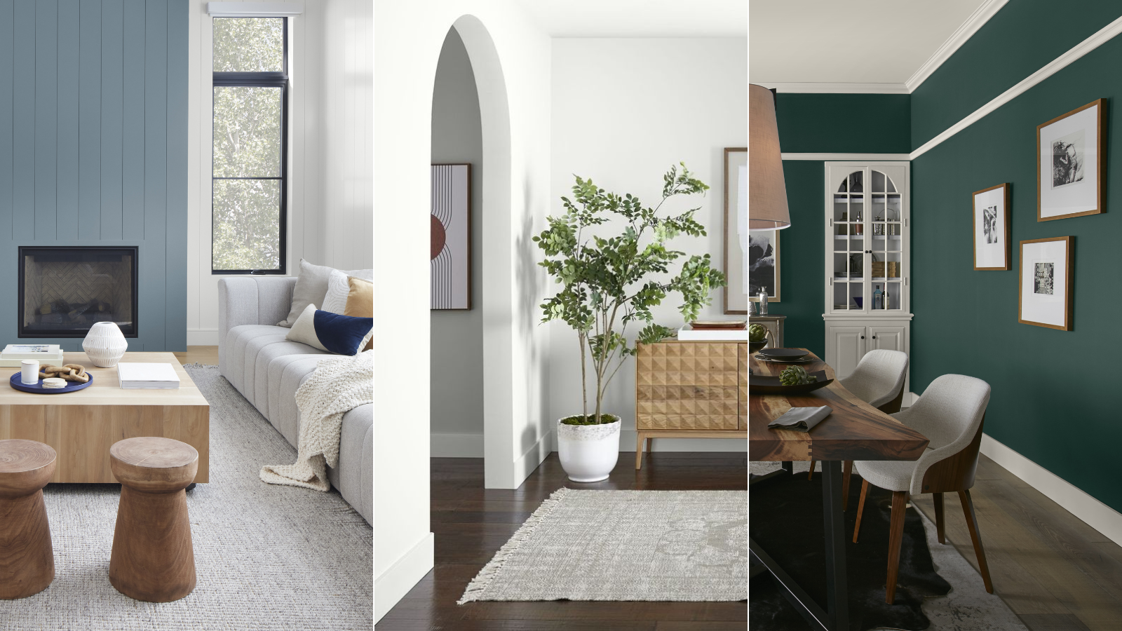
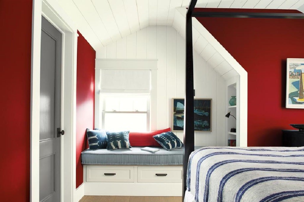
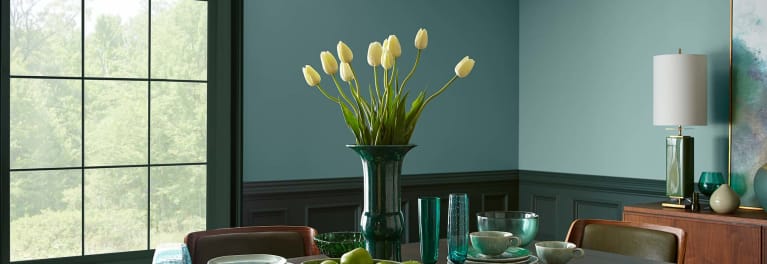
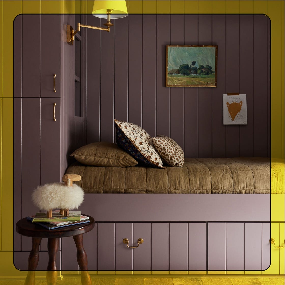
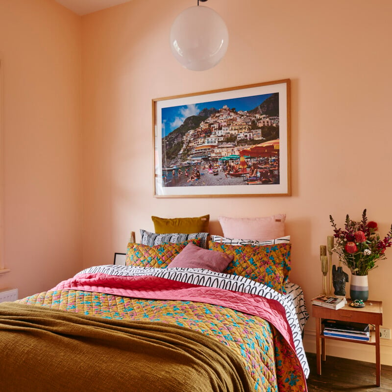
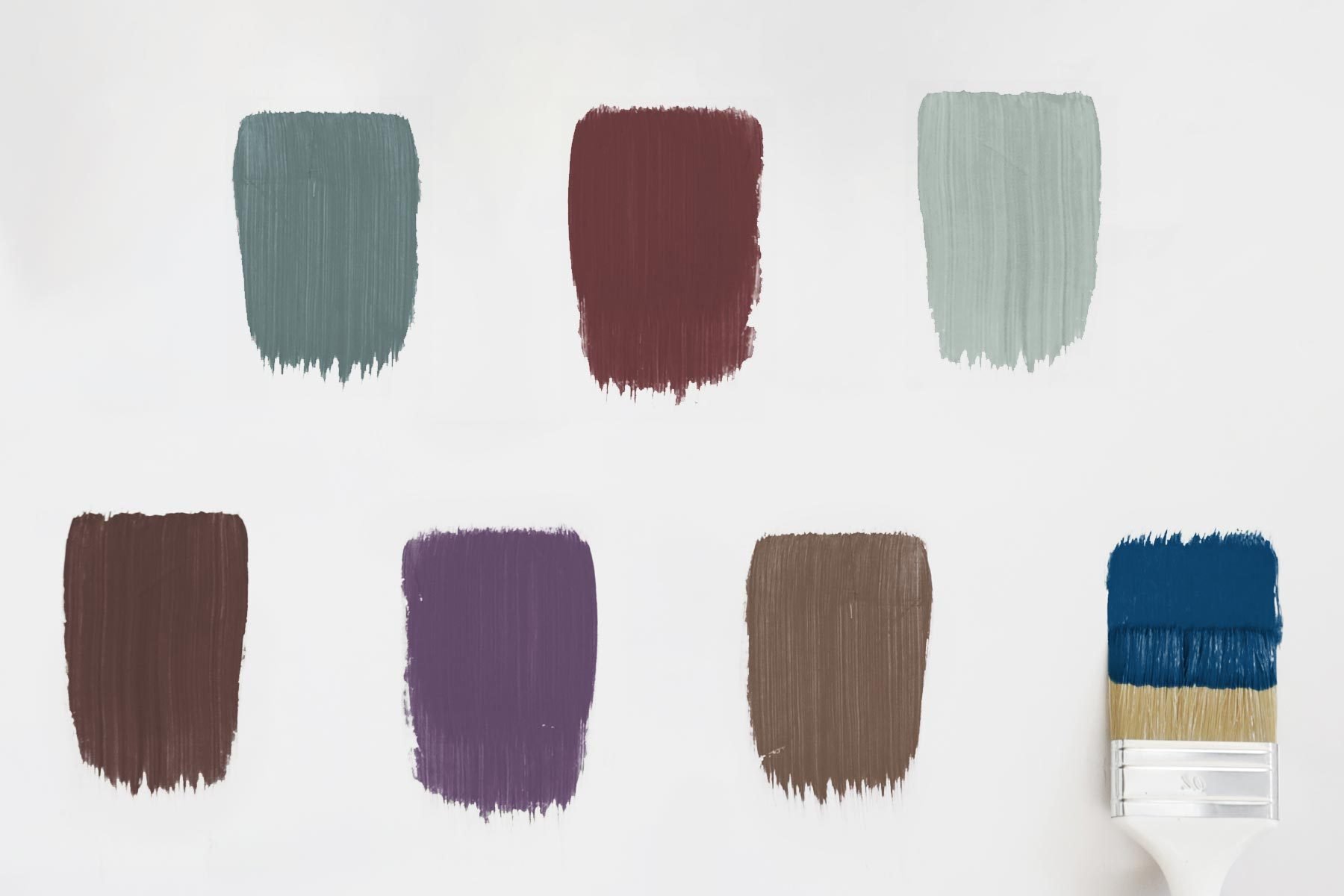
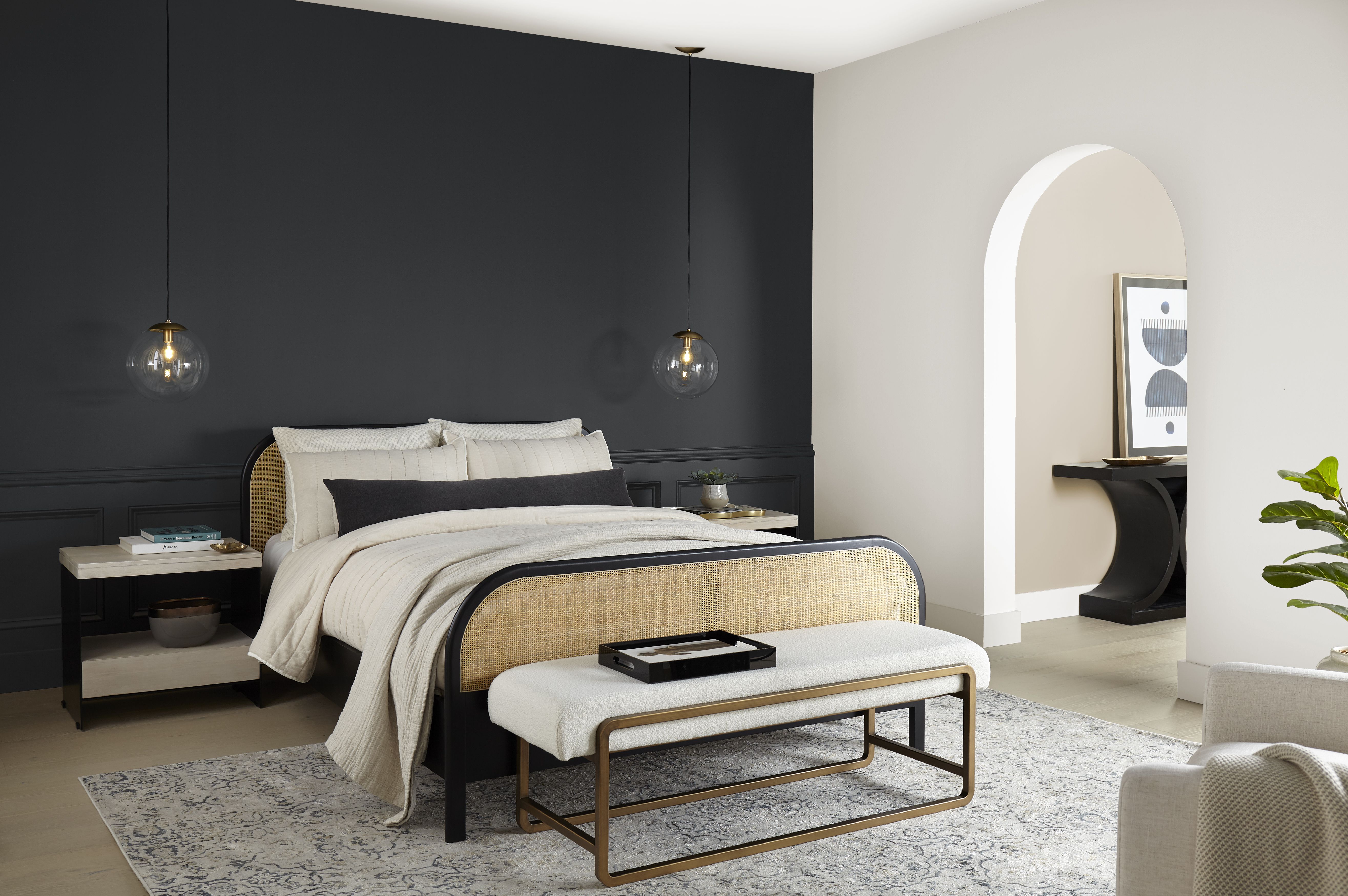
Experts in interior design frequently recommend specific Behr shades for their projects. Laguna Blue (PPU14-18) is highlighted as a prominent color trend for 2024, known for its soothing, nature-inspired qualities that make it ideal for living rooms and bedrooms. Heather Thompson, Principal and Owner of Fulton Park Designs, describes Laguna Blue as a saturated inky blue perfect for accents, cabinetry, and trim, evoking a 'beachy California vibe' when paired with black and white, burnished gold, and rust accents. Cracked Pepper (PPU18-1), Behr's 2024 Color of the Year, remains popular for its classic, moody tone. This versatile soft black can act as a contrasting element in lighter schemes or as a bold, all-over color. Erika Woelfel emphasizes its ability to 'instantly elevate not only the room you’re in, but the way you feel in it.' Heather Thompson advises selecting true neutrals, including whites and blacks with minimal undertones, to avoid colors that lean too cool or too warm. Creamy Mushroom (PPU5-13) is a soft, gentle creamy shade that embodies the timeless appeal of neutral color schemes. Erika describes it as a 'calming, earthy tone of gray' that is both relaxing and inviting, suitable for minimalist aesthetics or as a base for more vibrant colors. It pairs well with earthy tones like Toffee Crunch and natural textures for a cozy atmosphere, and creates an elegant contrast with black accents.
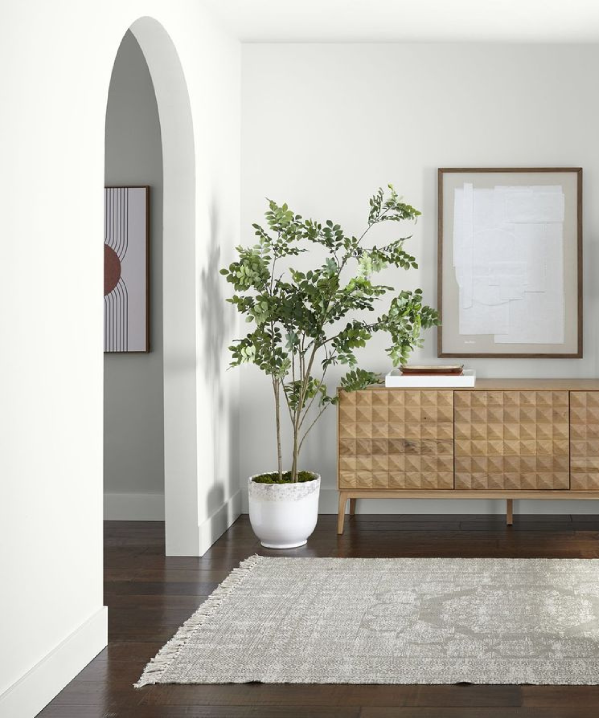
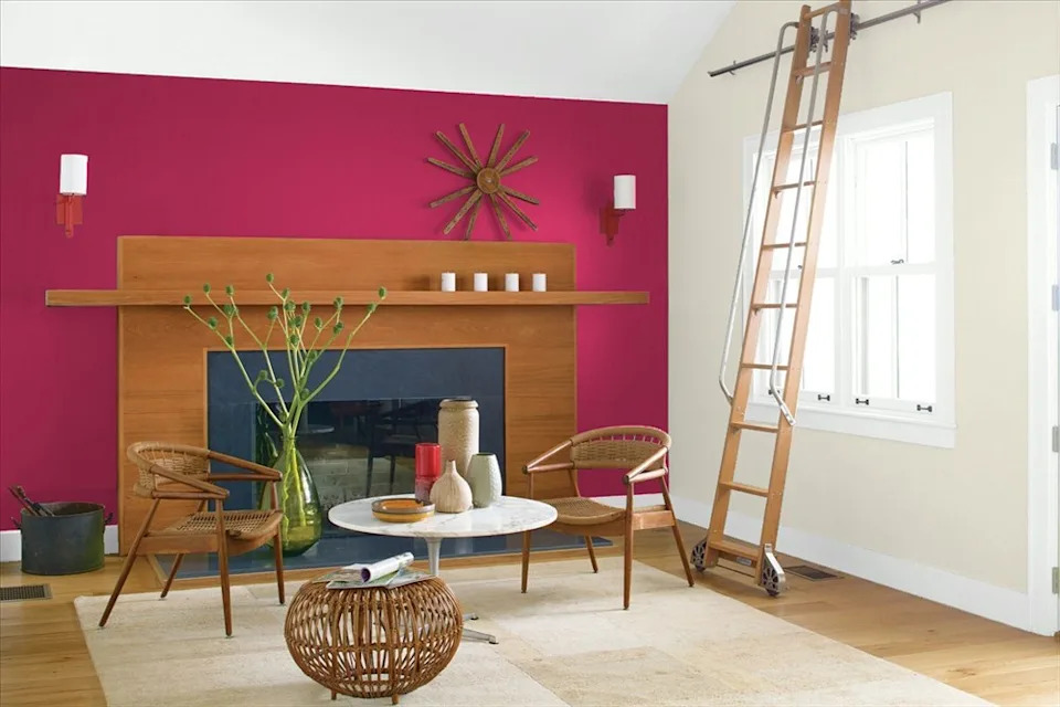
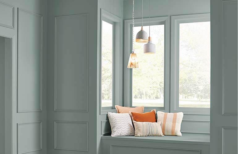
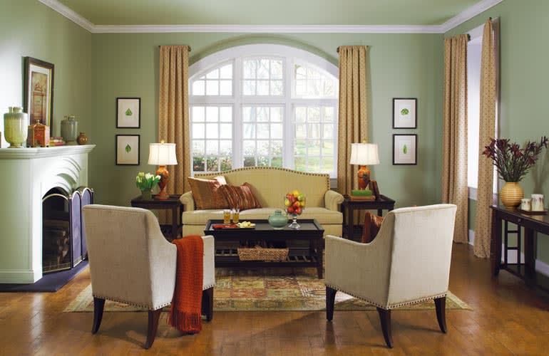
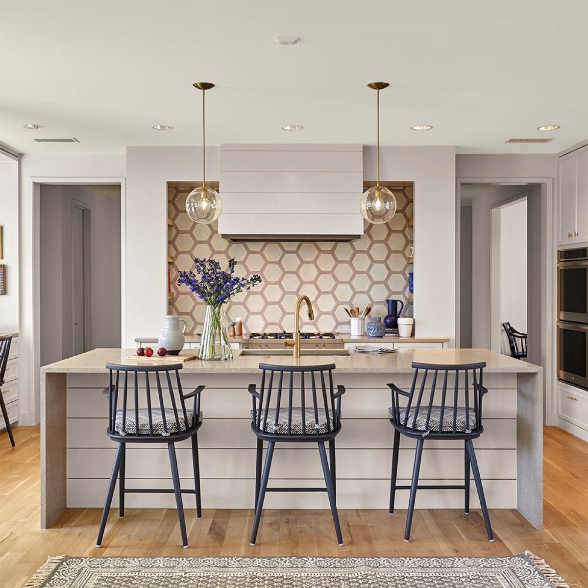
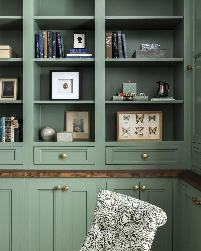
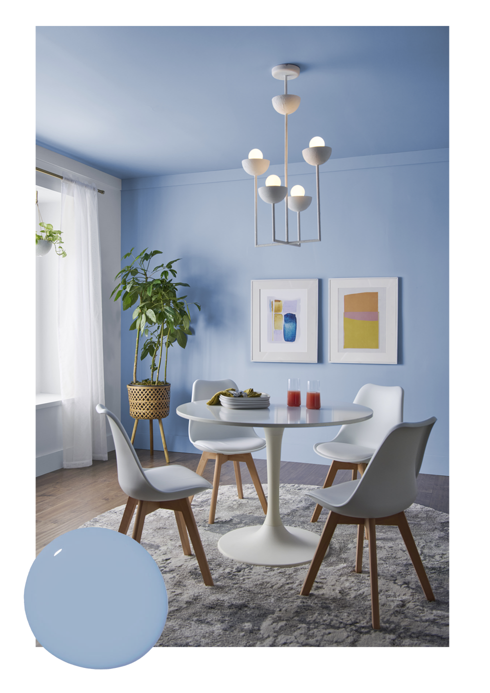
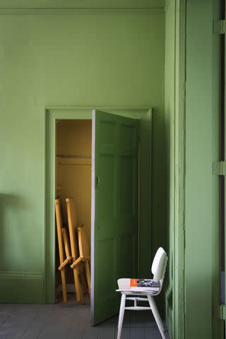
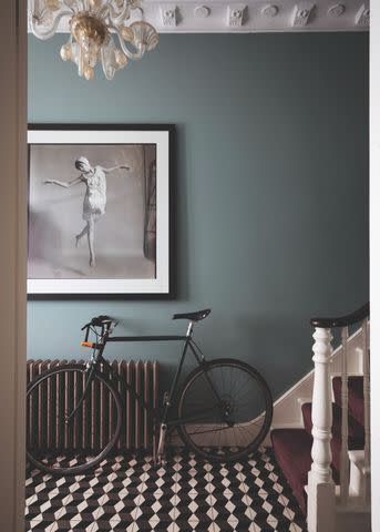
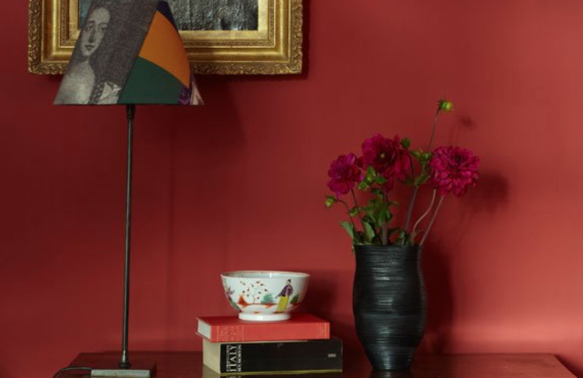
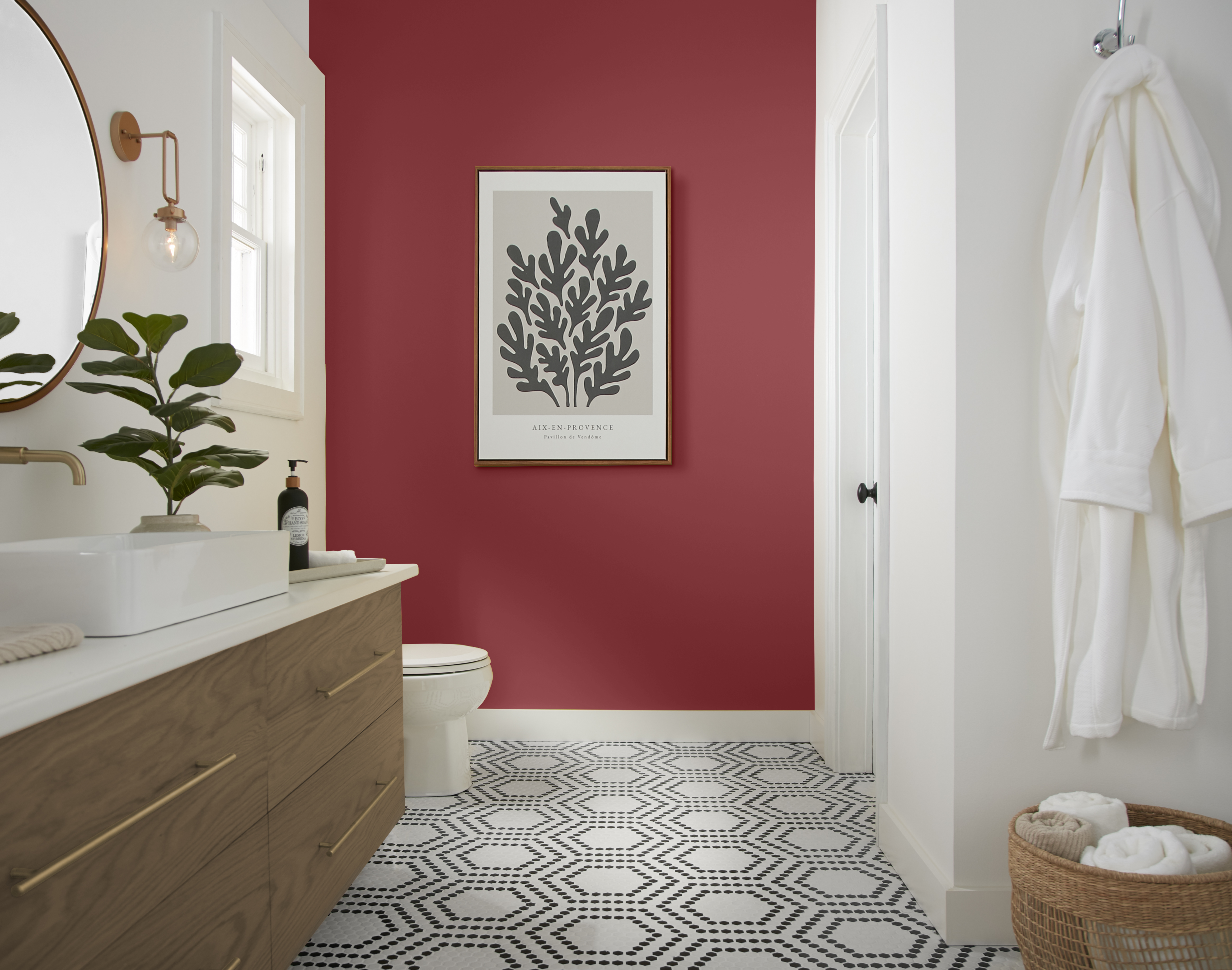
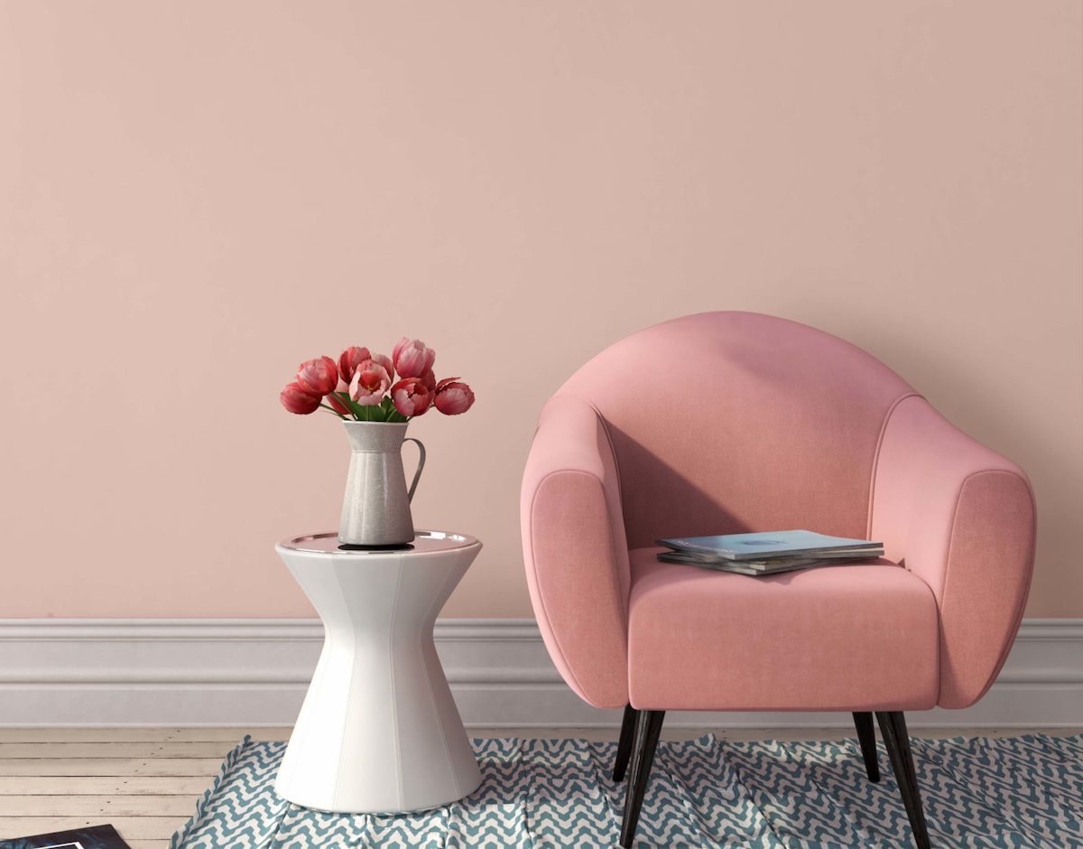
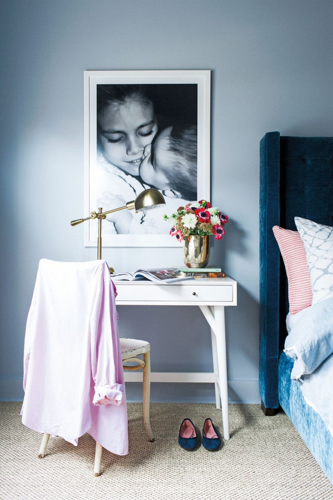
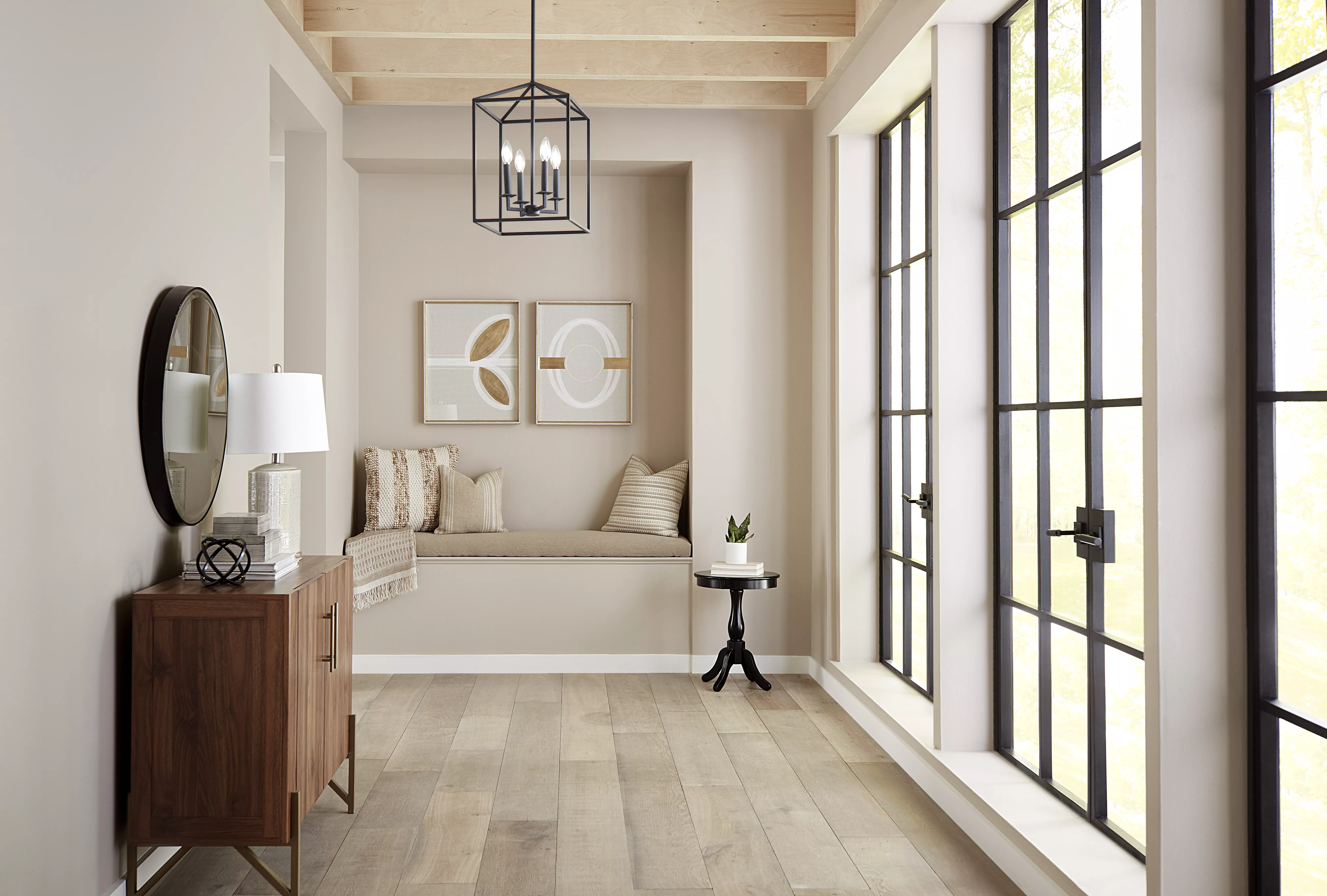
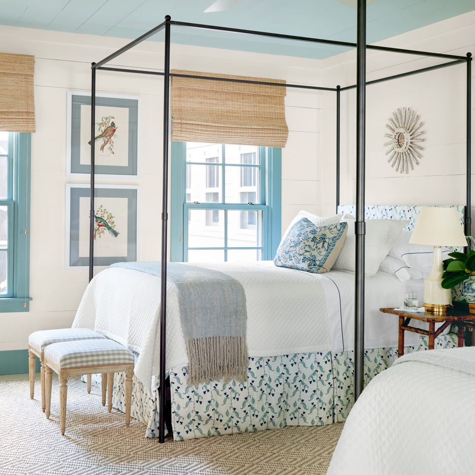
Greyhound (PPU24-21) offers a warm, soft gray alternative for those who prefer muted schemes without the beige. This popular shade integrates seamlessly with taupes and wood finishes, offering endless possibilities for color pairings. Heather Thompson notes that current gray preferences lean towards 'warmer, deeper, earthier tones,' and Greyhound serves as an excellent transitional color, providing sophistication and gravitas suitable for walls, trim, ceilings, and both interior and exterior applications. Blank Canvas (M320-1), Behr's 2023 Color of the Year, is a creamy off-white that continues to be a favorite for its versatility. Erika explains its enduring popularity stems from its ability to serve as a 'perfect backdrop that is easy to build upon to highlight other features in the home,' offering 'limitless design opportunities.' Tuscan Herbs (S400-6) reflects a contemporary shift towards more saturated, mid-tone greens. This delightful shade, reminiscent of natural oregano and rosemary, is praised by Heather for its ability to 'instantly bloom' a room, especially when used on trim, cabinetry, or accent walls, and paired with warm whites like Blank Canvas to bring the outdoors in. Adirondack Blue (N480-5) from Behr’s Designer Collection is a calming slate blue with smoky undertones, making it a versatile accent color that adds timeless sophistication. Erika highlights its ability to create a 'calm and serene feel,' ideal for bedrooms and living areas, and suggests pairing it with crisp whites and soft grays for a refreshing, modern look. Finally, Dark Crimson (M140-7) represents the growing popularity of deep, saturated reds. This magenta-like hue, inspired by the 'Unexpected Red' theory, can elevate a room with small doses, adding 'a note of elegant luxe.' It can be paired with soft taupes or deep navy hues to create refined and on-trend color schemes that promise a professional-worthy paint project.
#BehrPaintColors #InteriorDesign #PaintTrends #HomeDecor #ColorSchemes #AccentWalls #NeutralColors #BlueHues #GreenHues #BehrPaintColors #InteriorDesign #PaintTrends #HomeDecor #ColorSchemes #AccentWalls #NeutralColors #BlueHues #GreenHues
0 comment in total
You may also like
These are Behr's best-selling paint colors of all time – and there's something to suit every style

Take 'Disco Nap,' and other 2021 colors of the year, for a spin

Tips for adding the hottest paint colors to your decor
The 2026 paint Colors of the Year Have Been Announced

Beige, Begone: Bring Your Walls to Life With These 14 Beautifully Bold Colors

These Paint Colors Will Dominate Our Homes in 2022

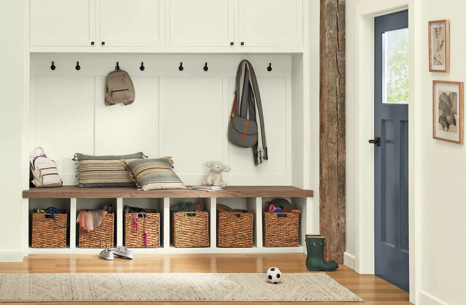
14 Mudroom Paint Colors That Will Hide All Kinds of Dirt and Grime

The 16 Best Accent Wall Colors

Hottest Interior Paint Colors of 2018
The 18 Most Popular Paint Colors of All Time

Sherwin-Williams Just Announced the Color of the Year

What To Expect For 2023 Paint Color Trends

10 Best-Selling Behr Paint Colors of All Time

Take ‘Disco Nap’ for a spin. This lively hue is one of 2021’s colors of the year.
The 60 Best Blue Paint Colors for Every Room in Your Home
The Brighter, the Better—These Vibrant Paints Will Infuse Your Home With Positivity

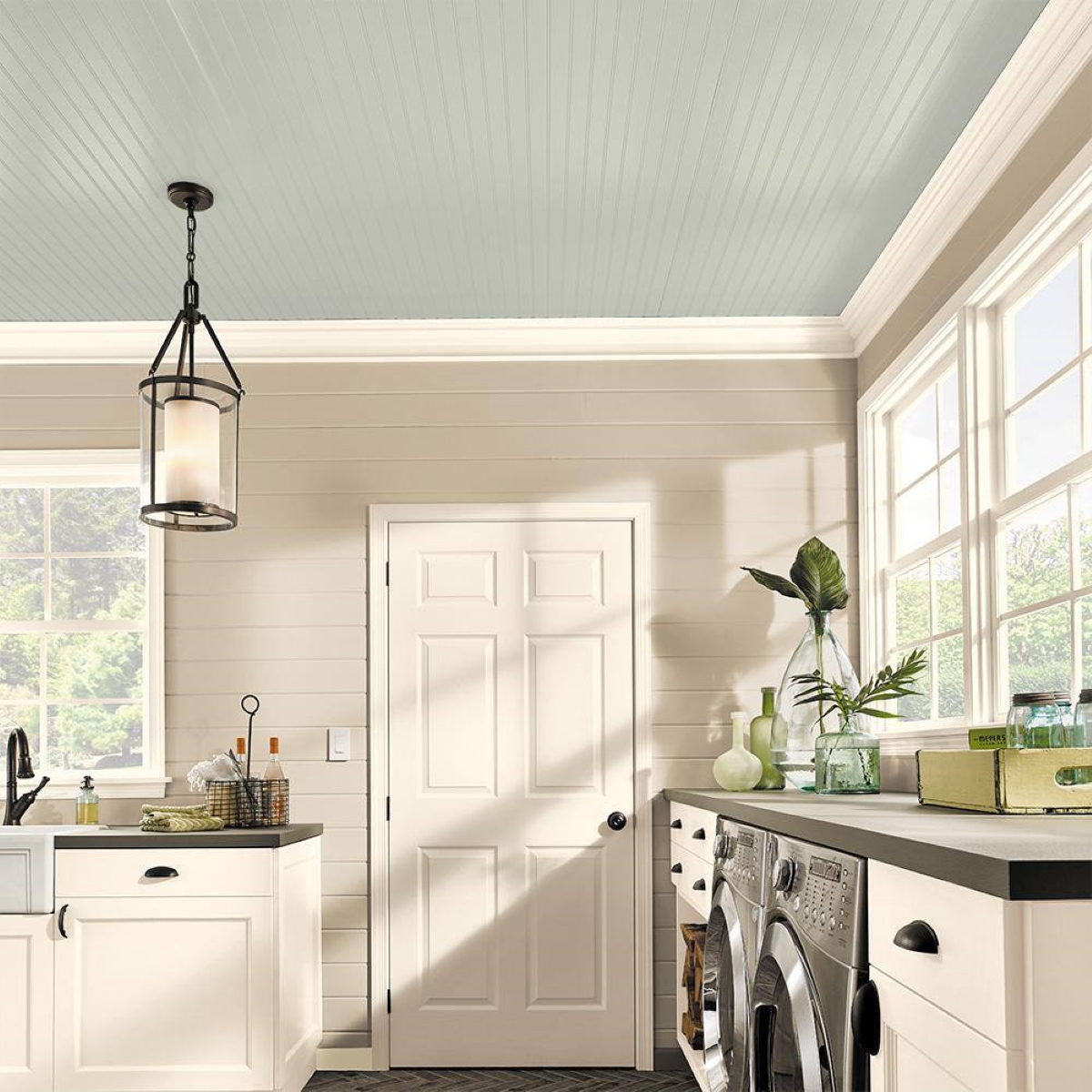
8 Ceiling Paint Color Trends to Consider for Your Next Home Refresh
2025 Colors of the Year, and How to Use Them

20 Hallway Paint Colors That Bring This Space to Life
The 10 Best Accent Wall Colors From the Paint Experts