1/20
20 Hallway Paint Colors That Bring This Space to Life
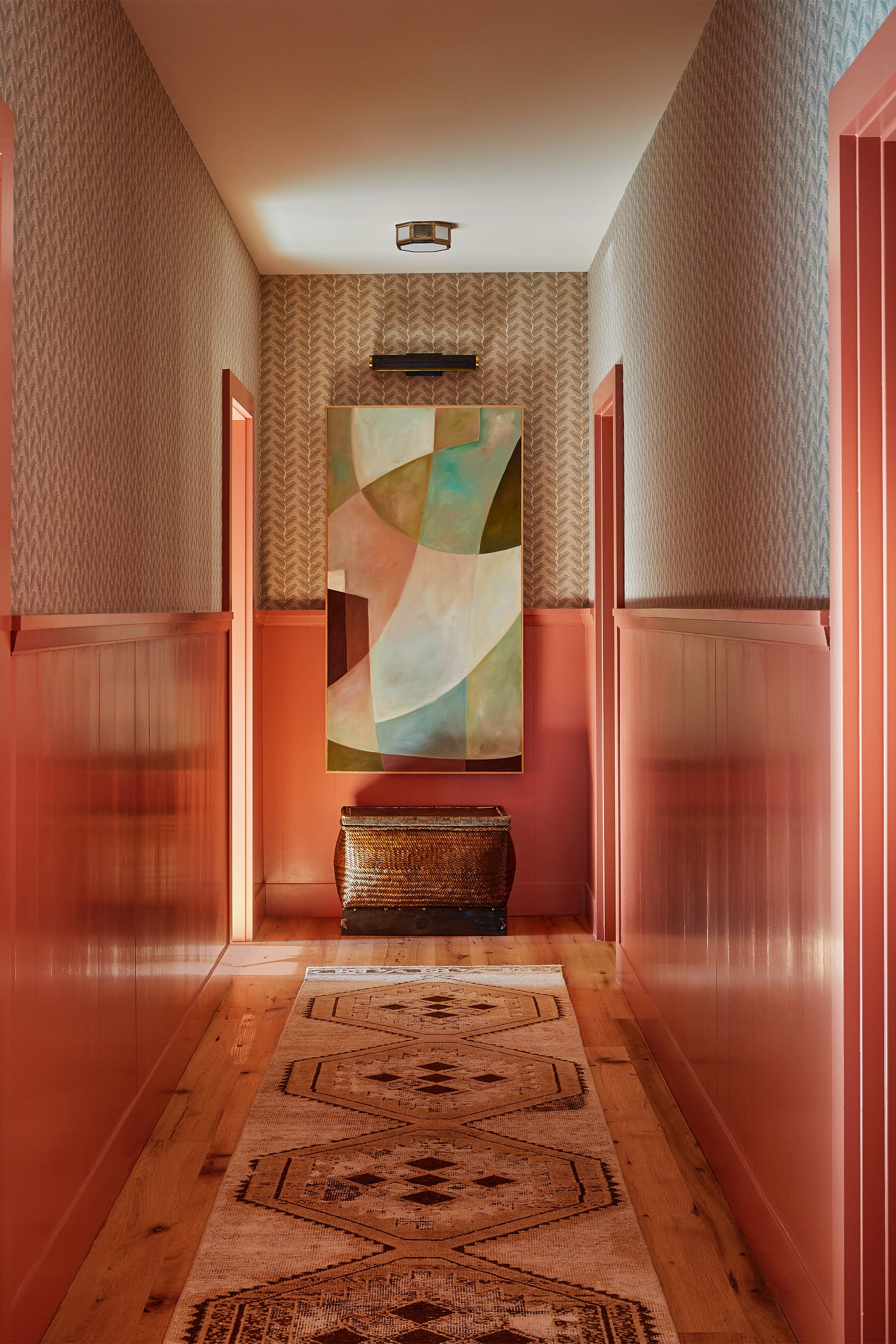
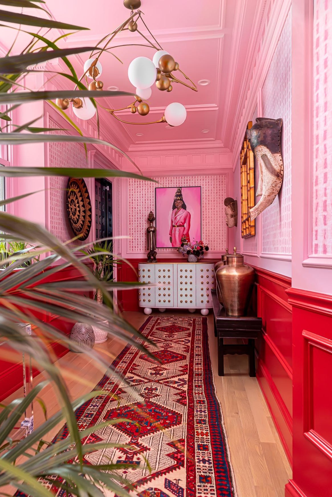
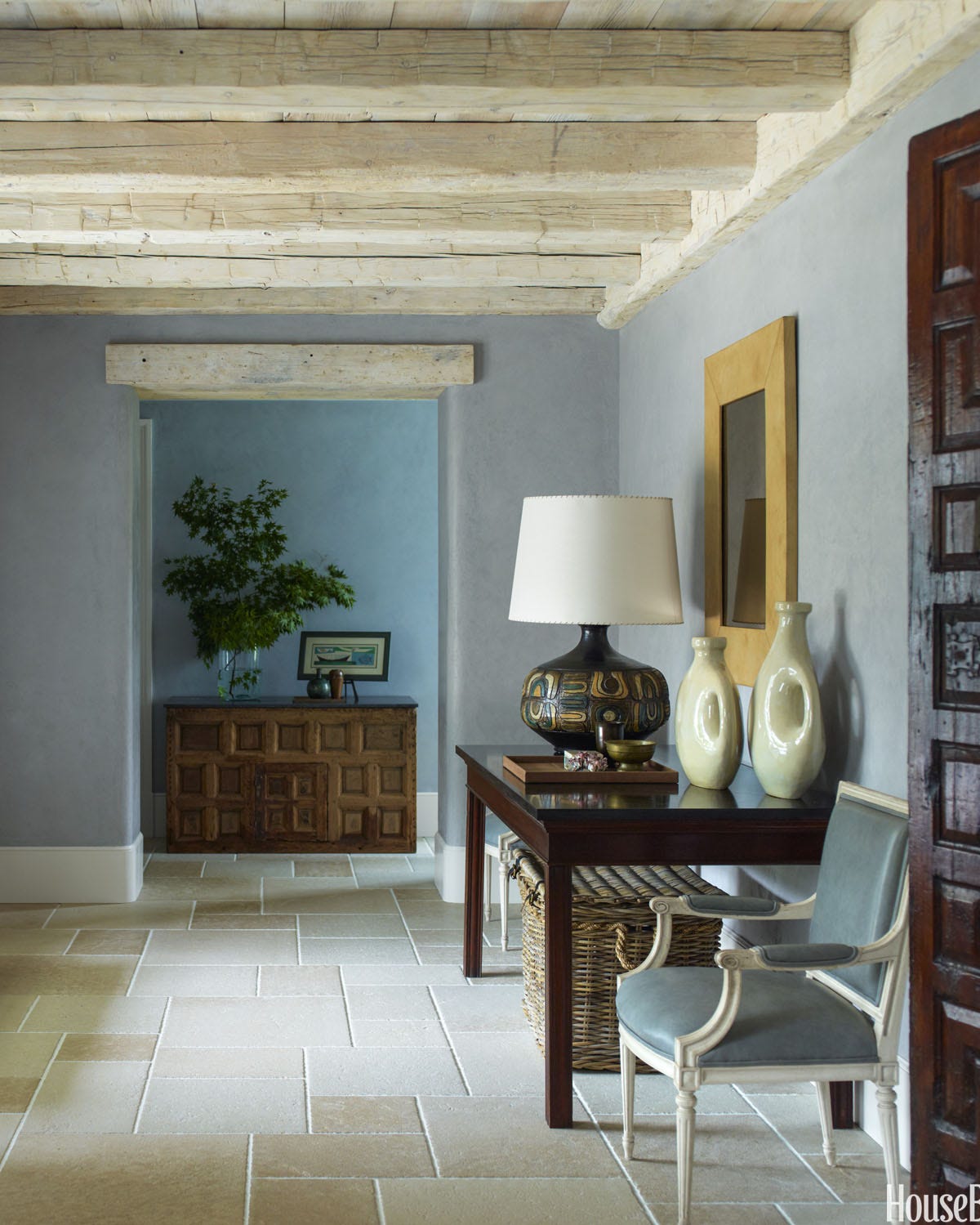
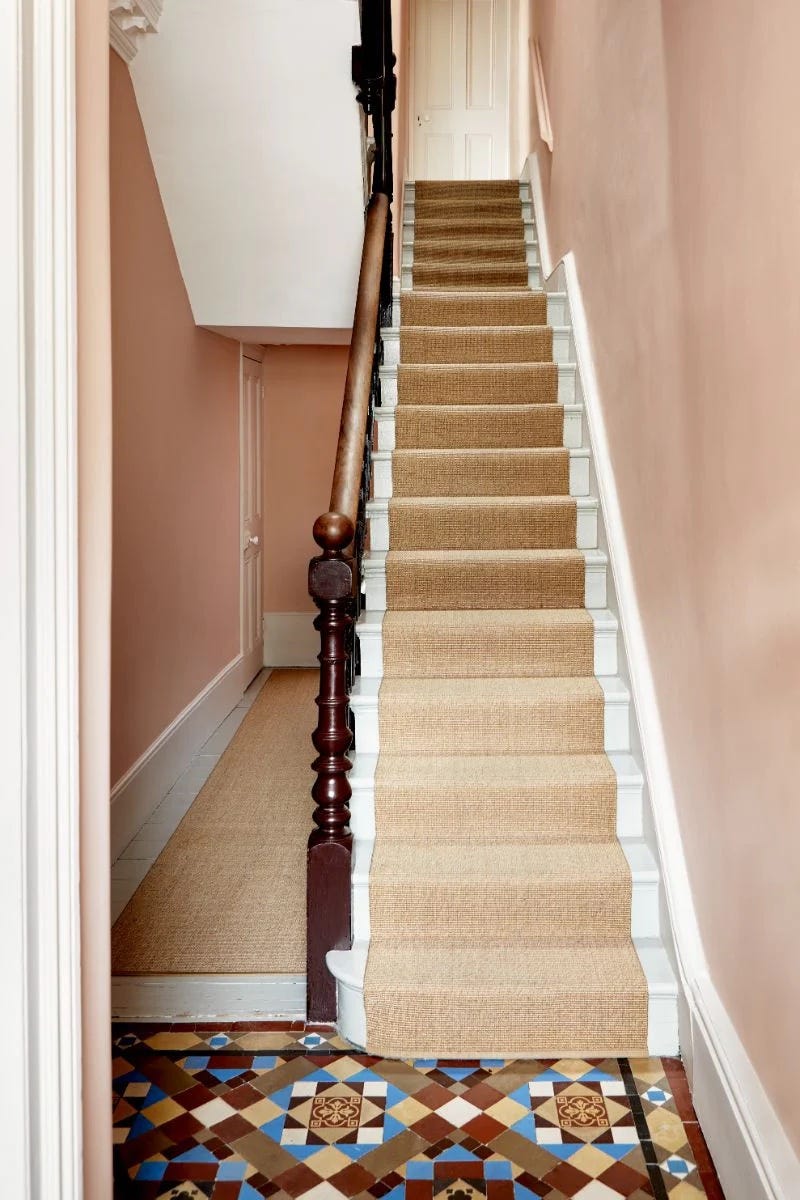
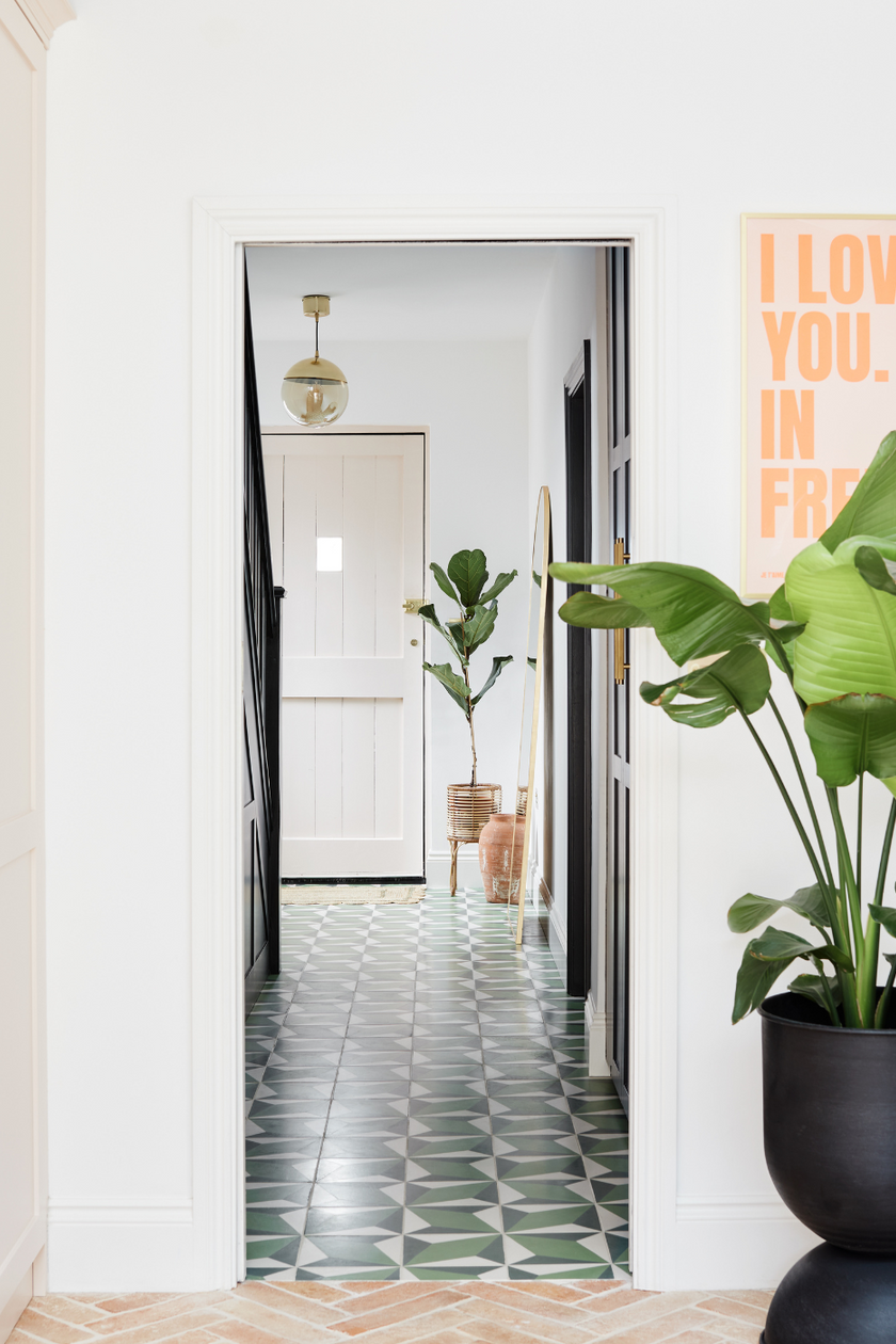
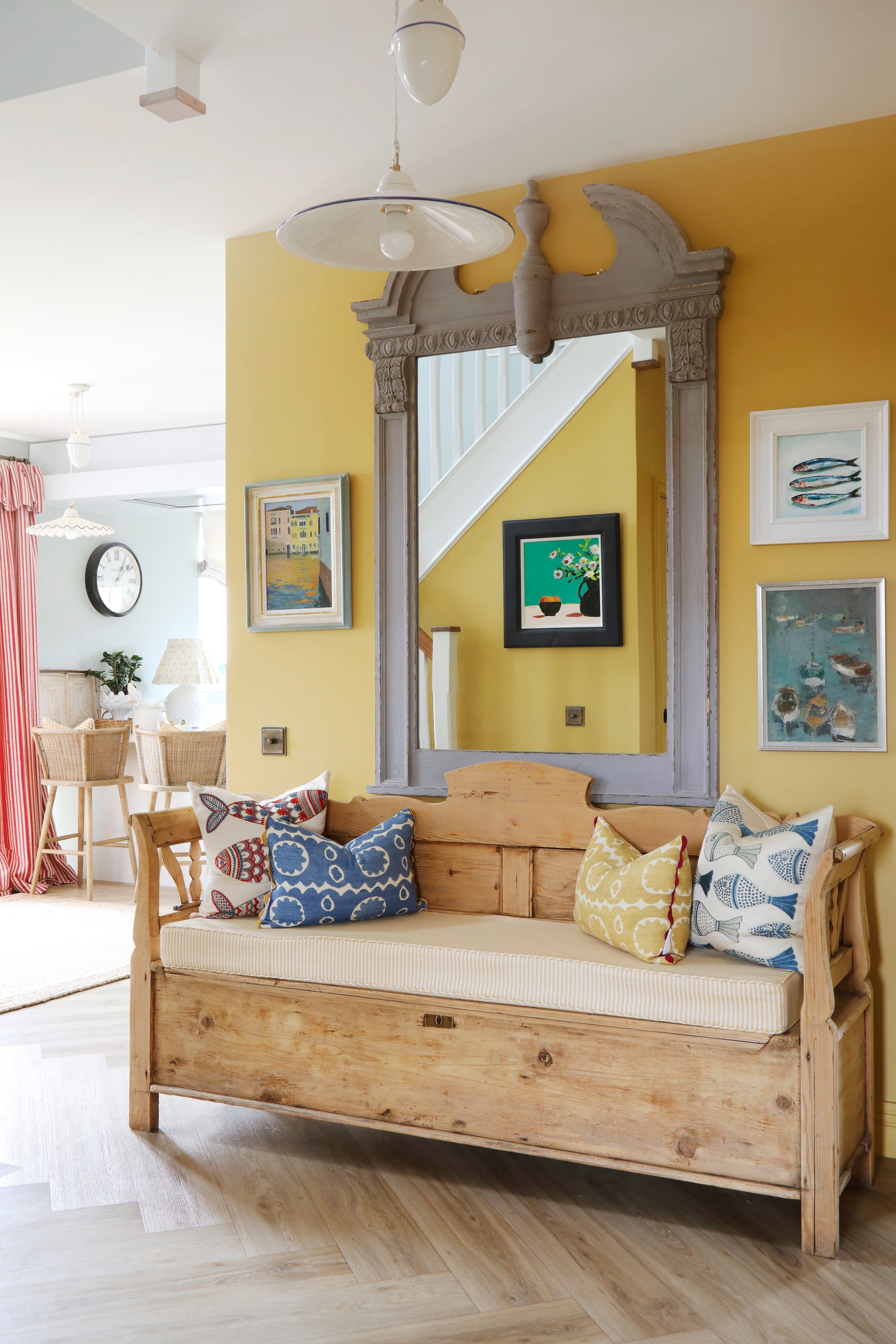
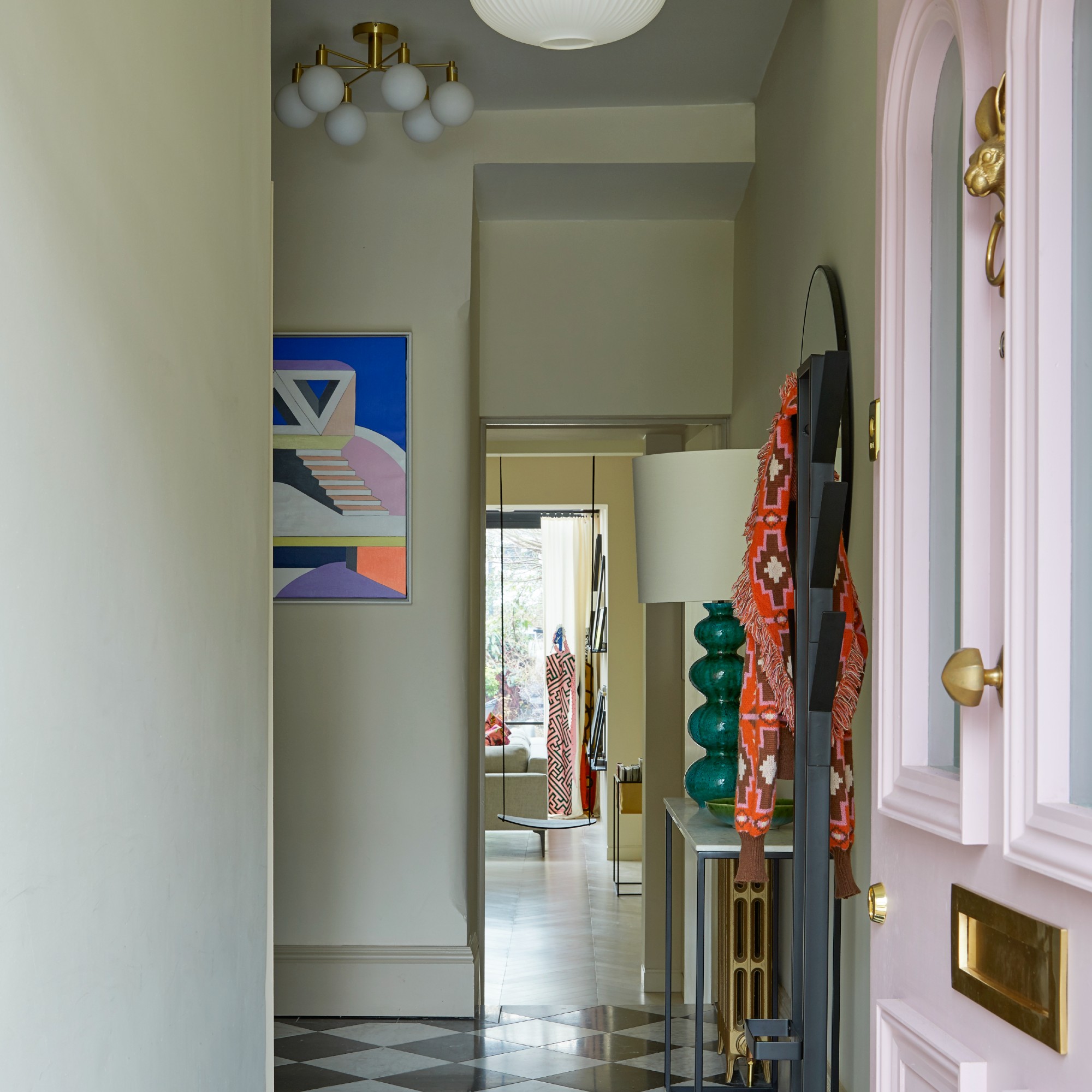
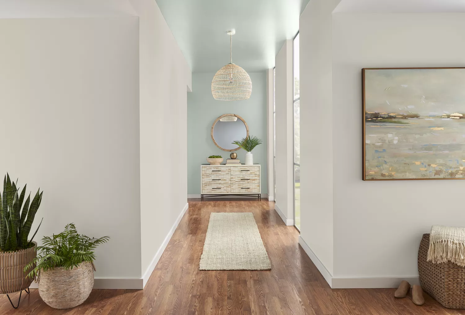
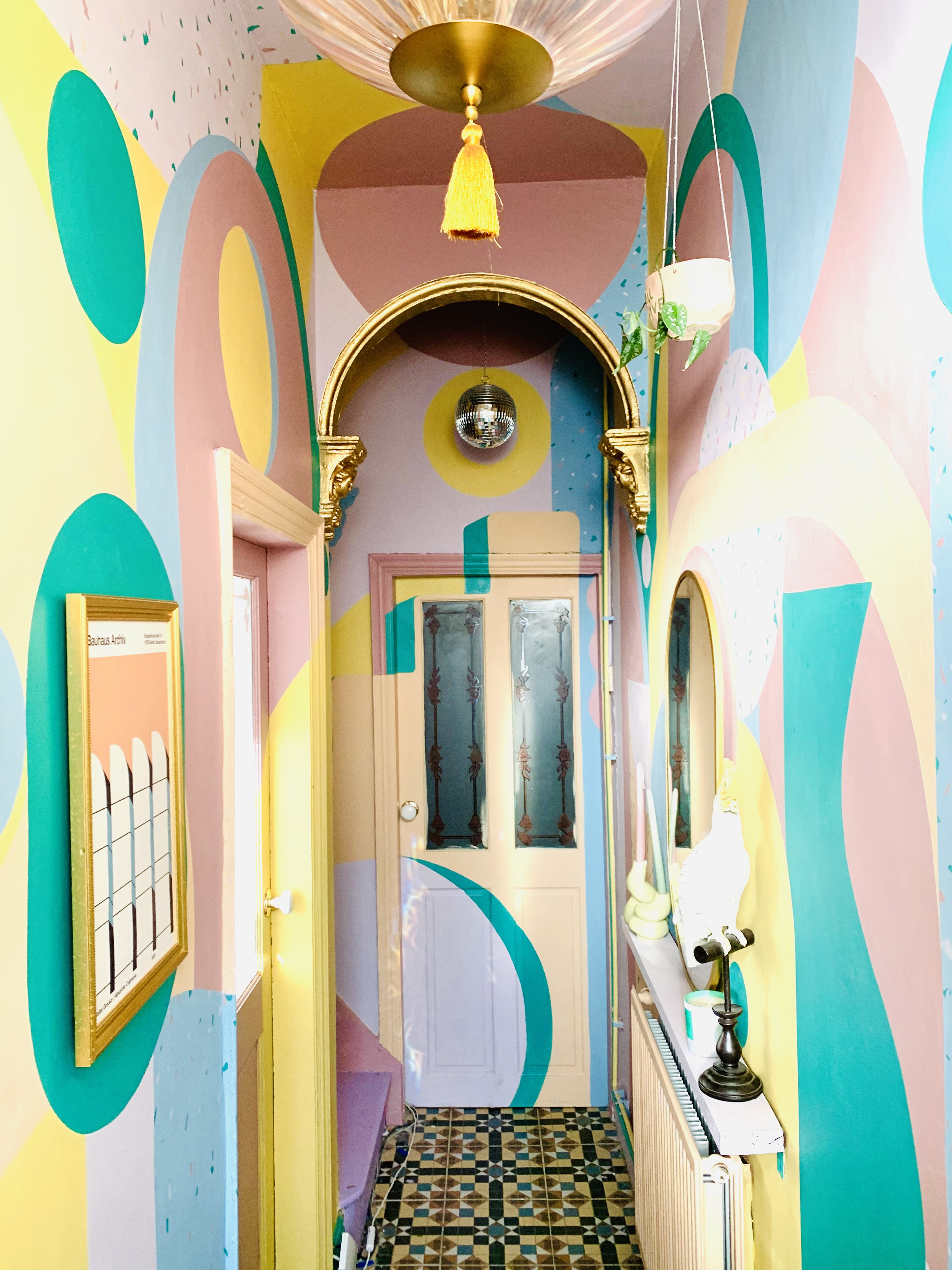
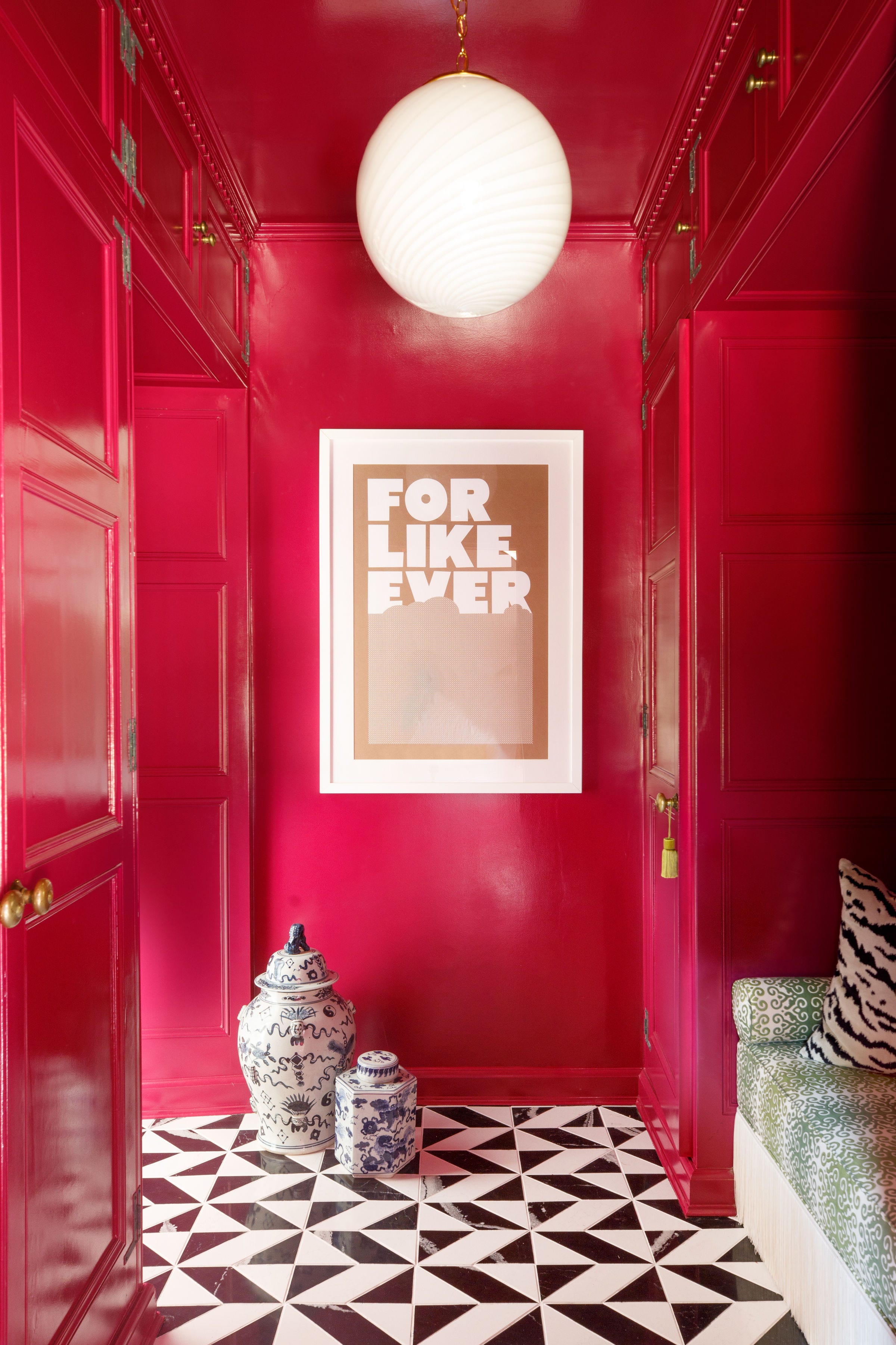
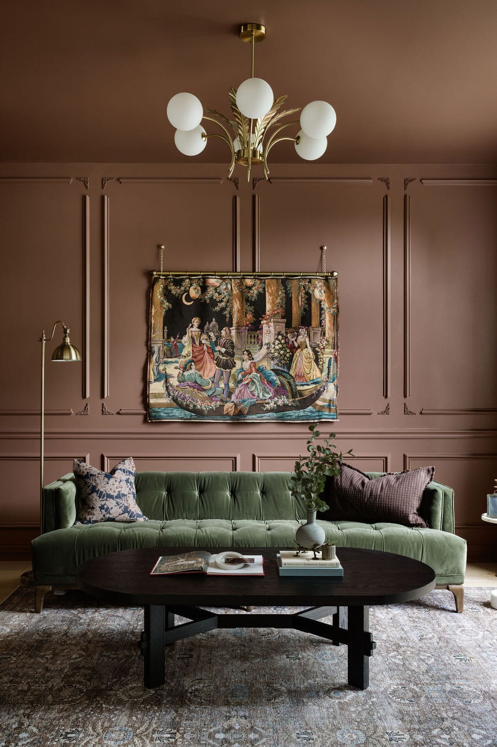
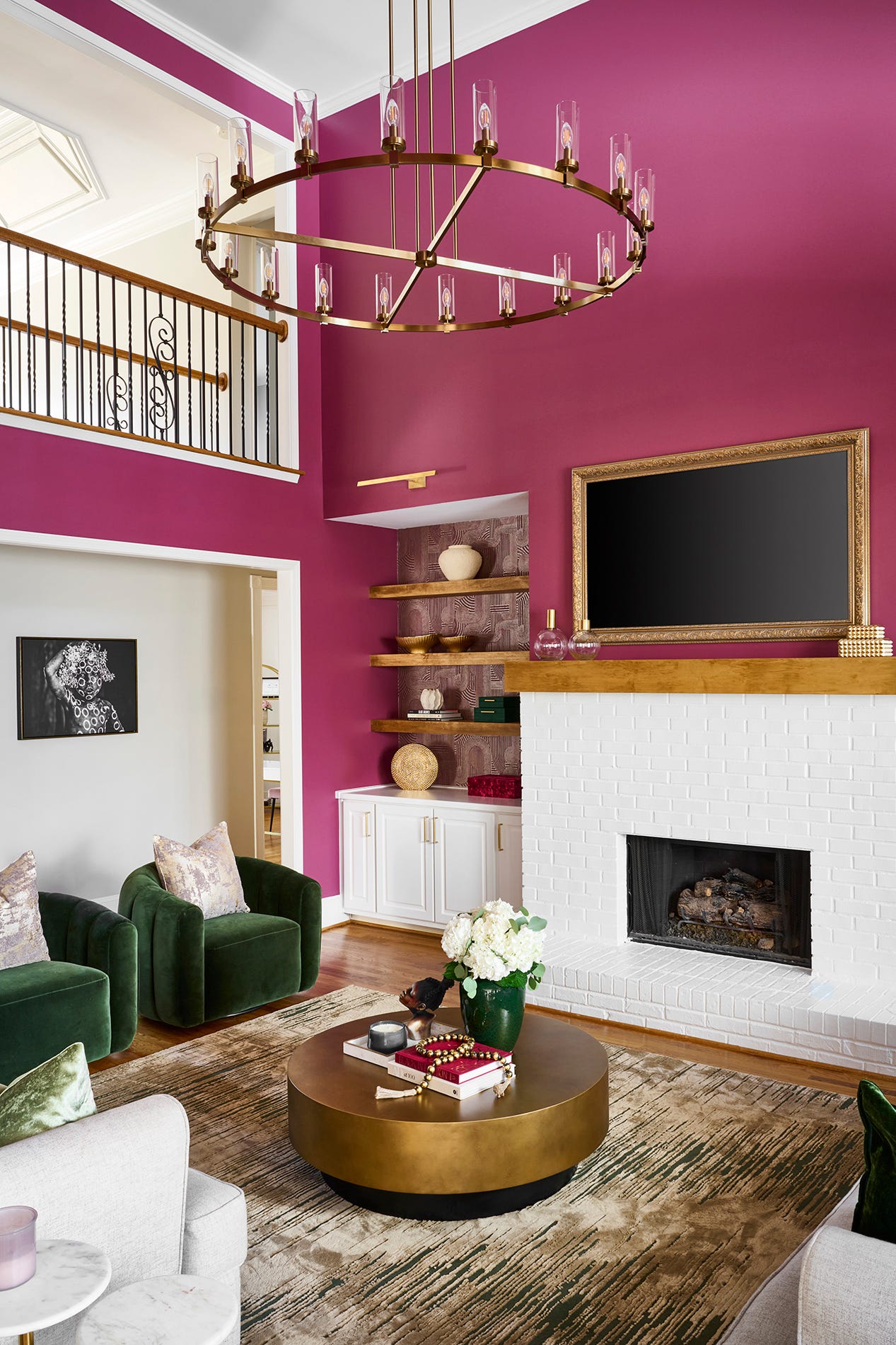
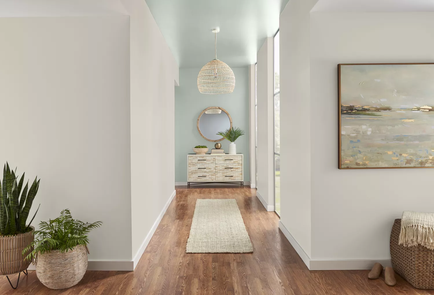
Hallways, often considered mere transitional spaces, offer significant potential for enhancing a home's aesthetic and mood through thoughtful paint choices. While many homeowners opt for bland neutrals, the colors selected for these corridors are as crucial as those in living areas and bedrooms, capable of transforming a forgotten space into a vibrant or serene pathway. This article compiles recommendations from paint color experts, showcasing 20 foolproof shades designed to imbue hallways with personality and purpose.
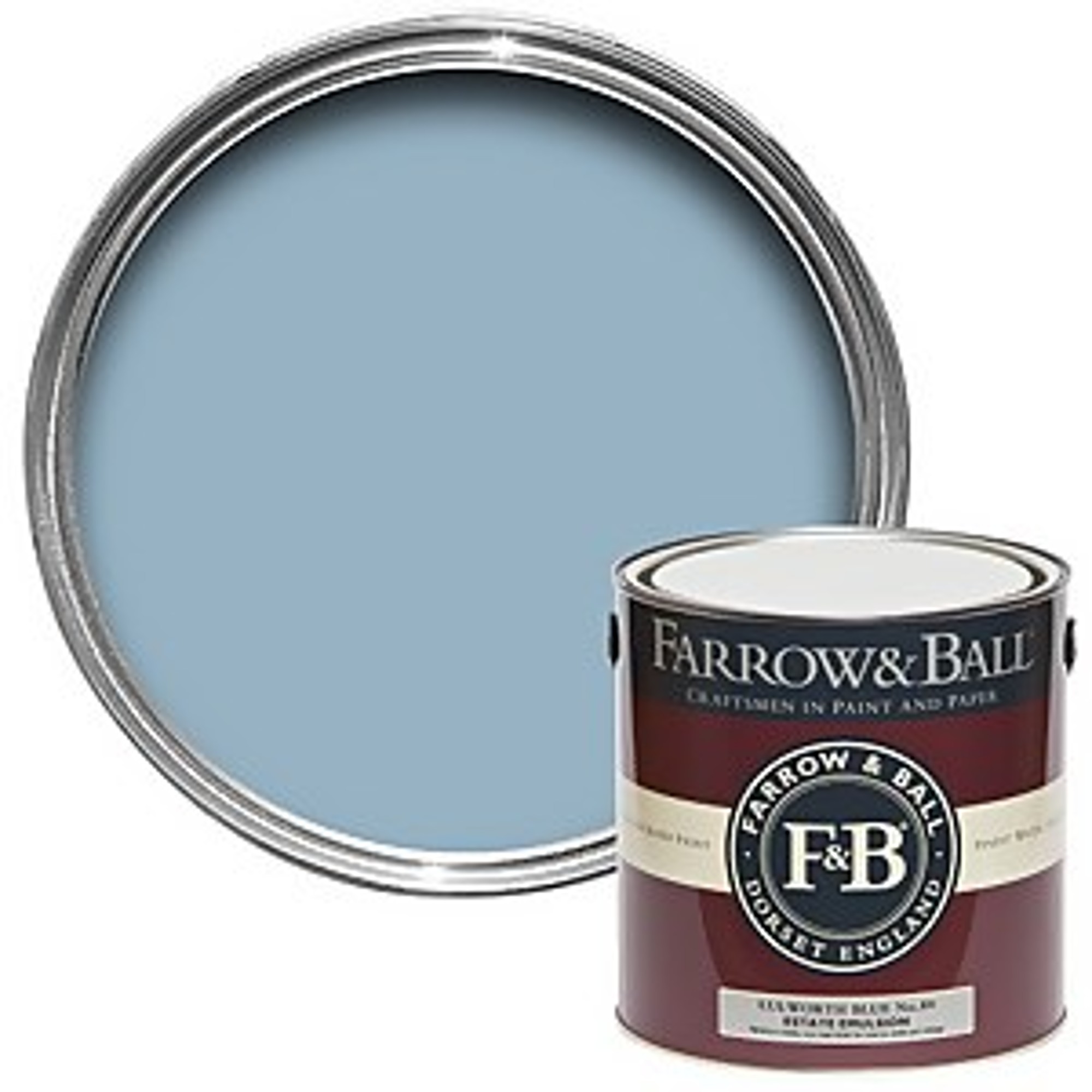
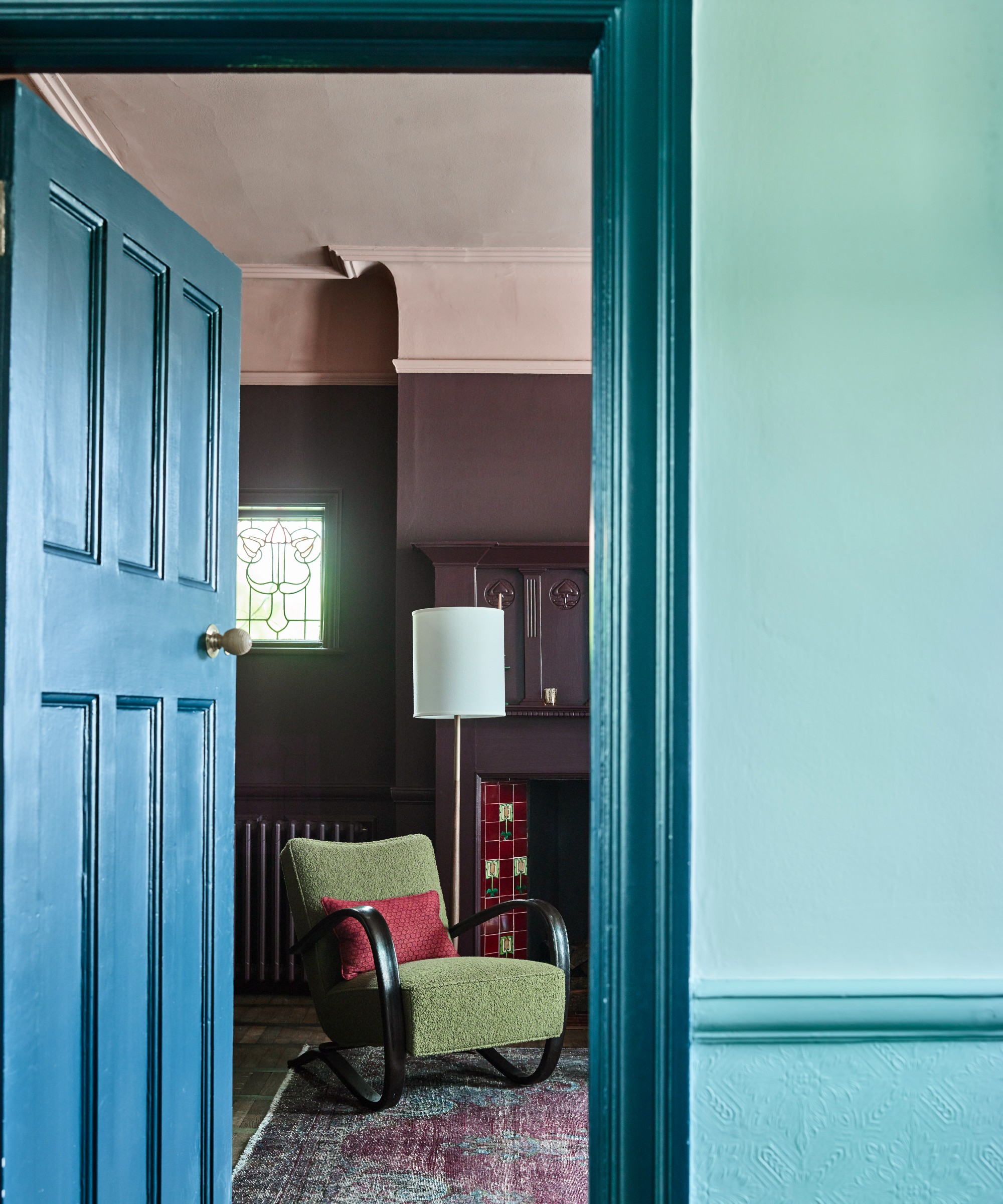
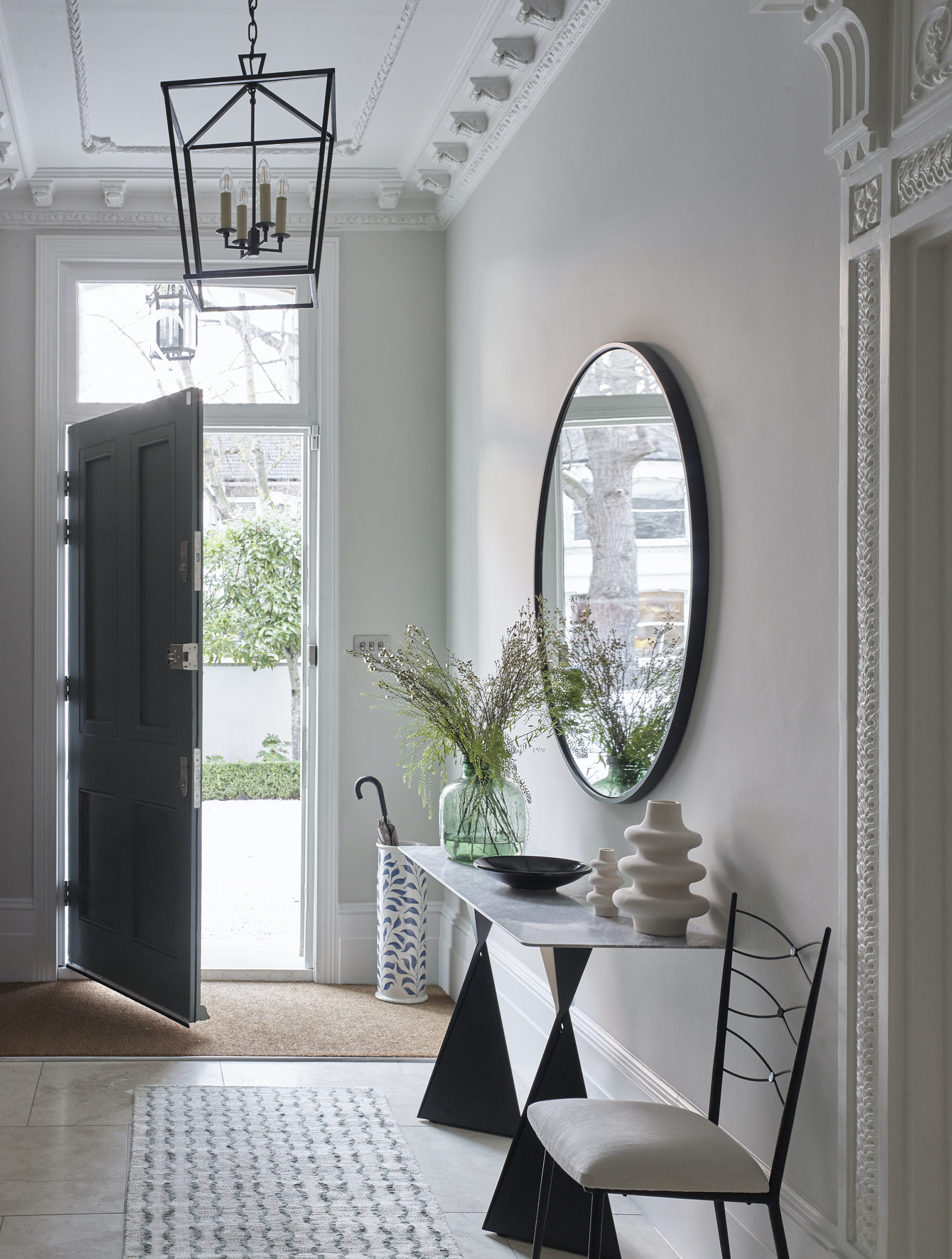

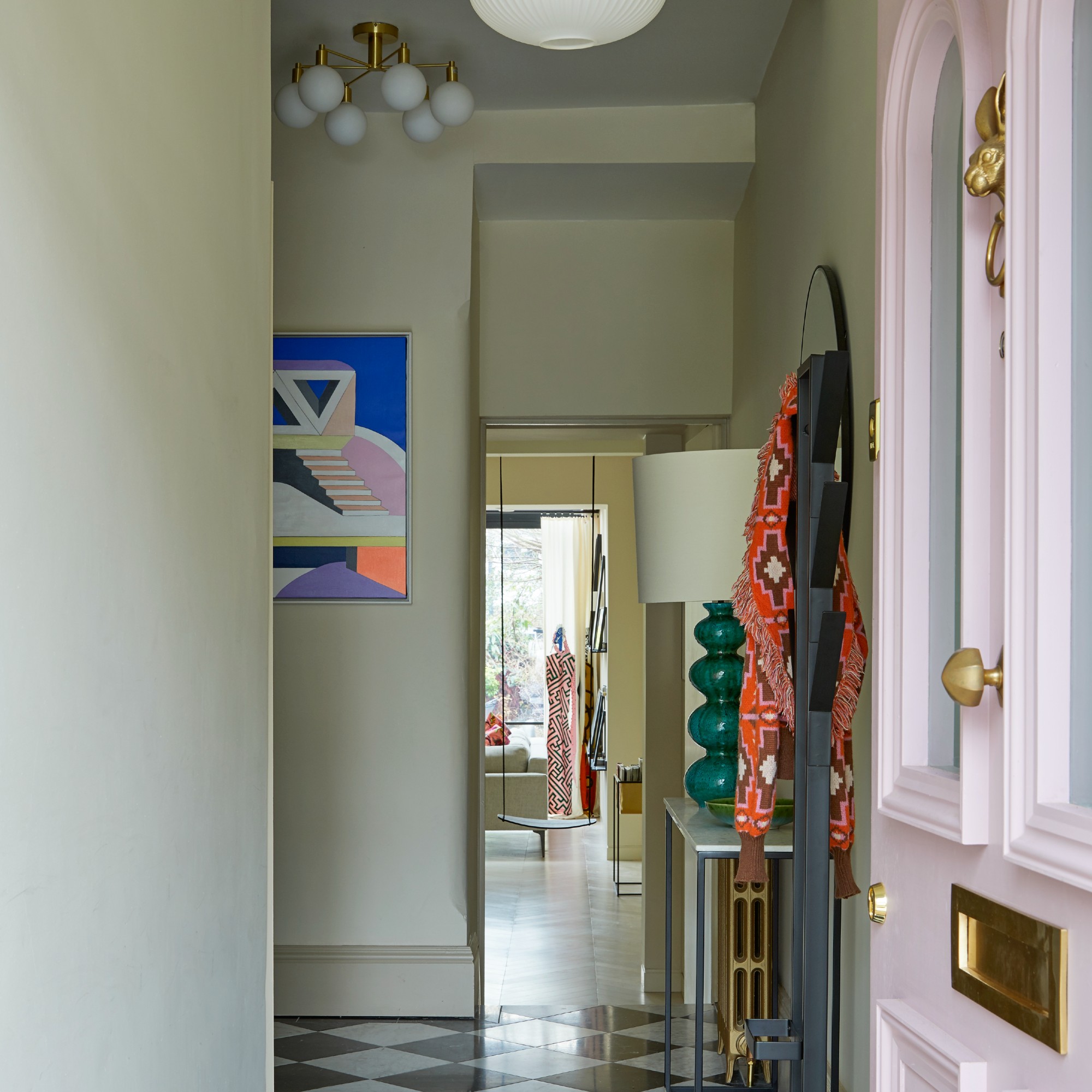
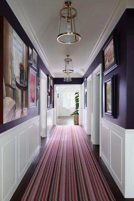
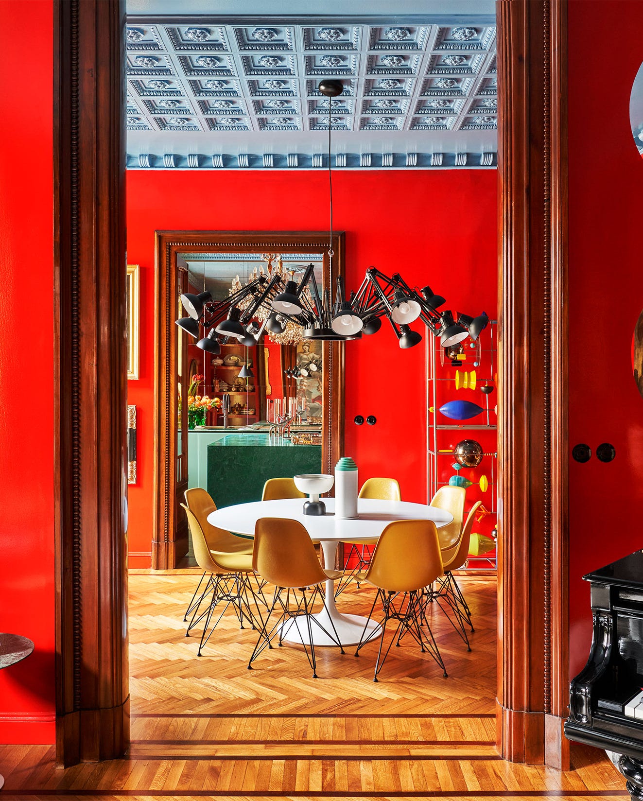
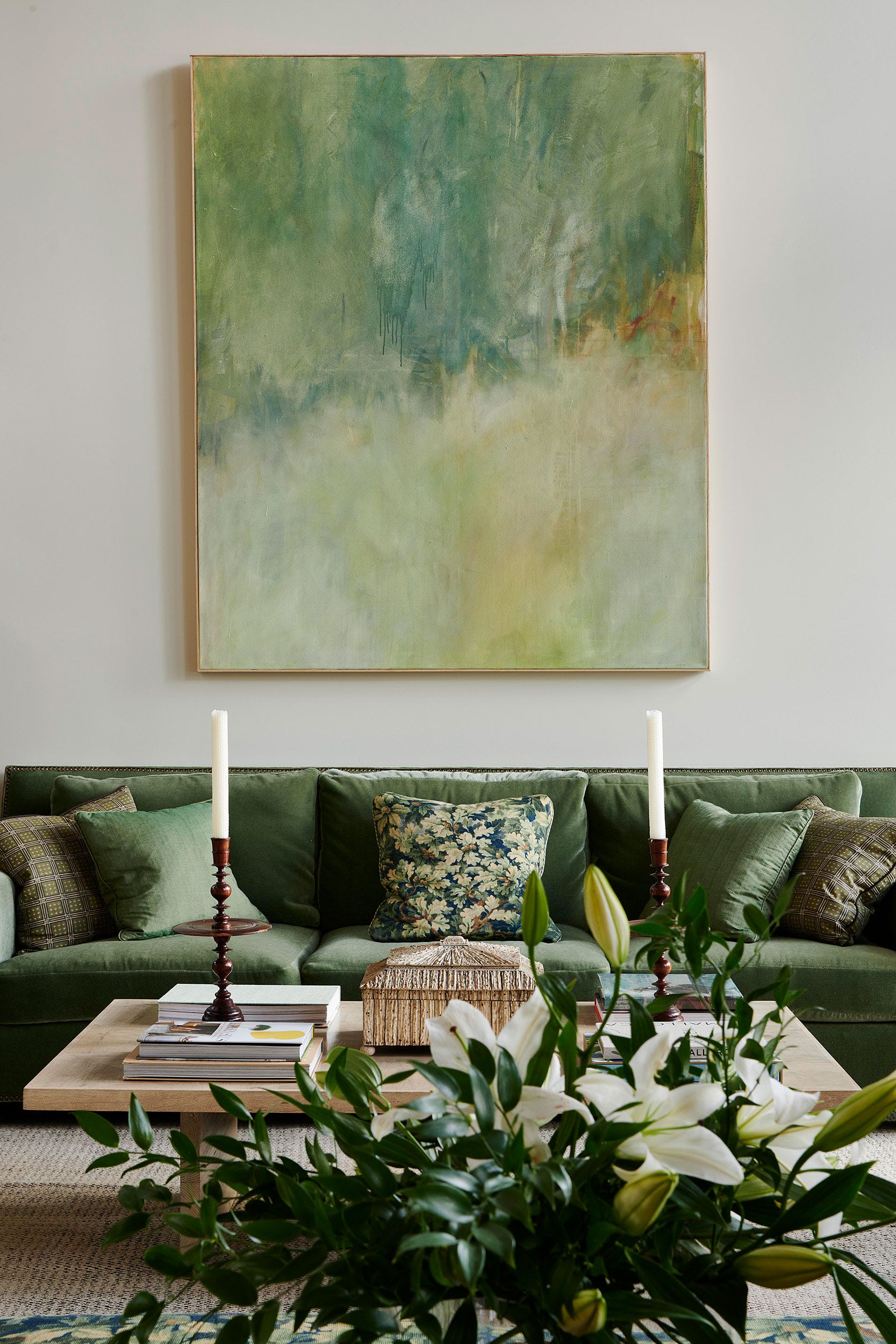
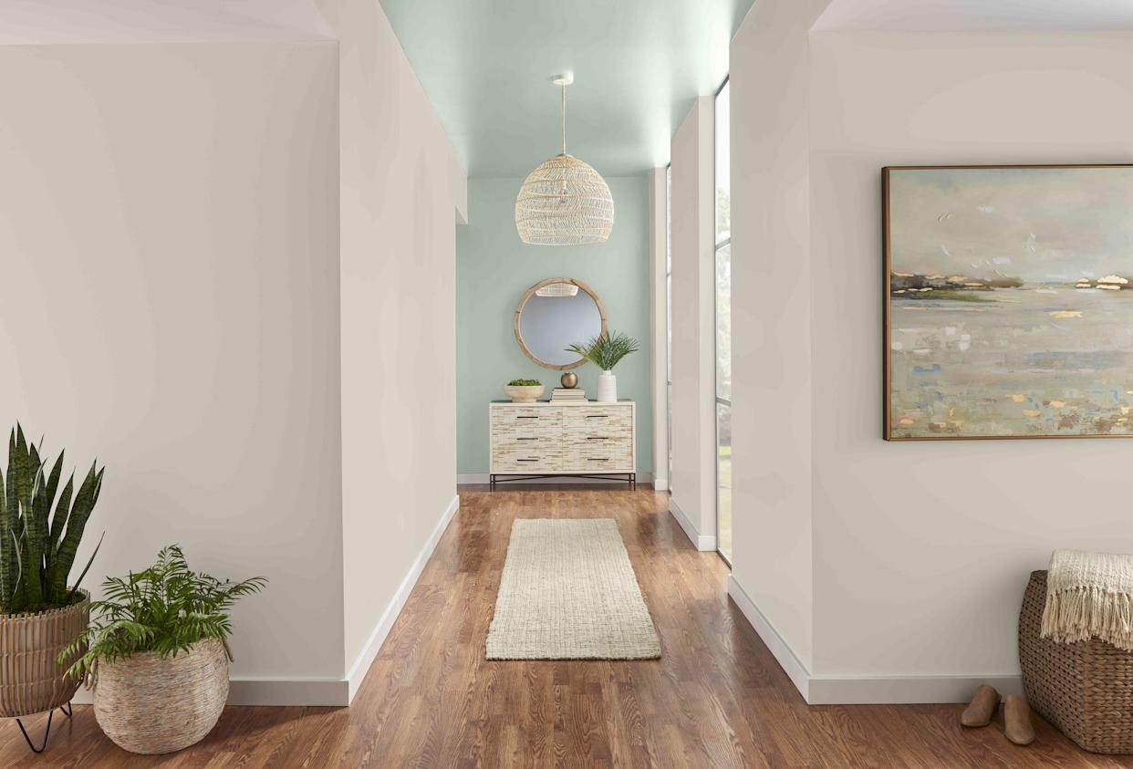
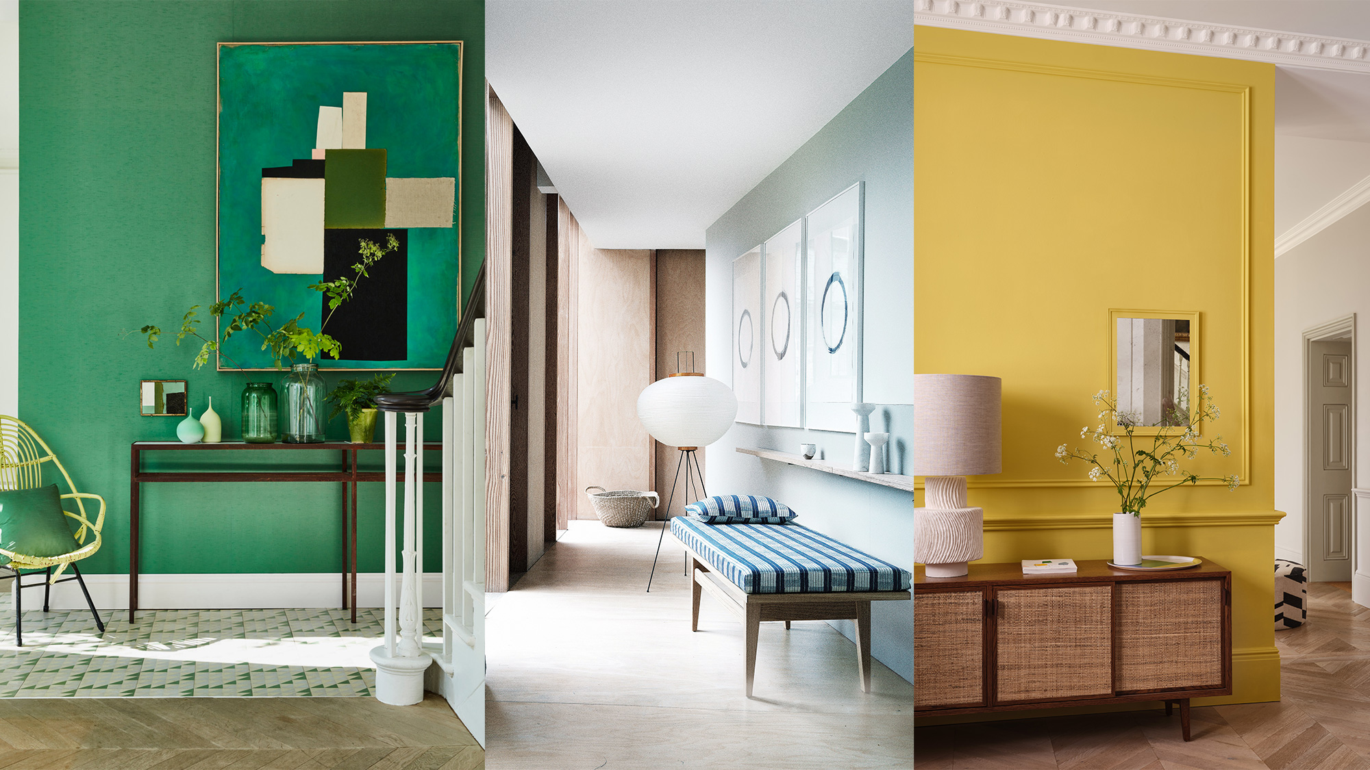
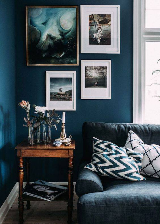
The featured colors span a wide spectrum, from refreshing greens like Farrow & Ball's Yeabridge Green, described as a joyful and optimistic shade that complements pictures and brown furniture, to the rich, versatile blue-green undertones of Farrow & Ball's Oval Room Blue, which suits both modern and traditional tastes. For those seeking understated elegance, Benjamin Moore's Cotton Balls, a clean off-white with warm undertones, allows architectural details and wall decor to take center stage, especially when paired with a deeper trim color like Peale Green. Sherwin-Williams' Basque Green introduces an organic vibrancy reminiscent of olives and tranquil bays, offering an effortless yet bold statement.
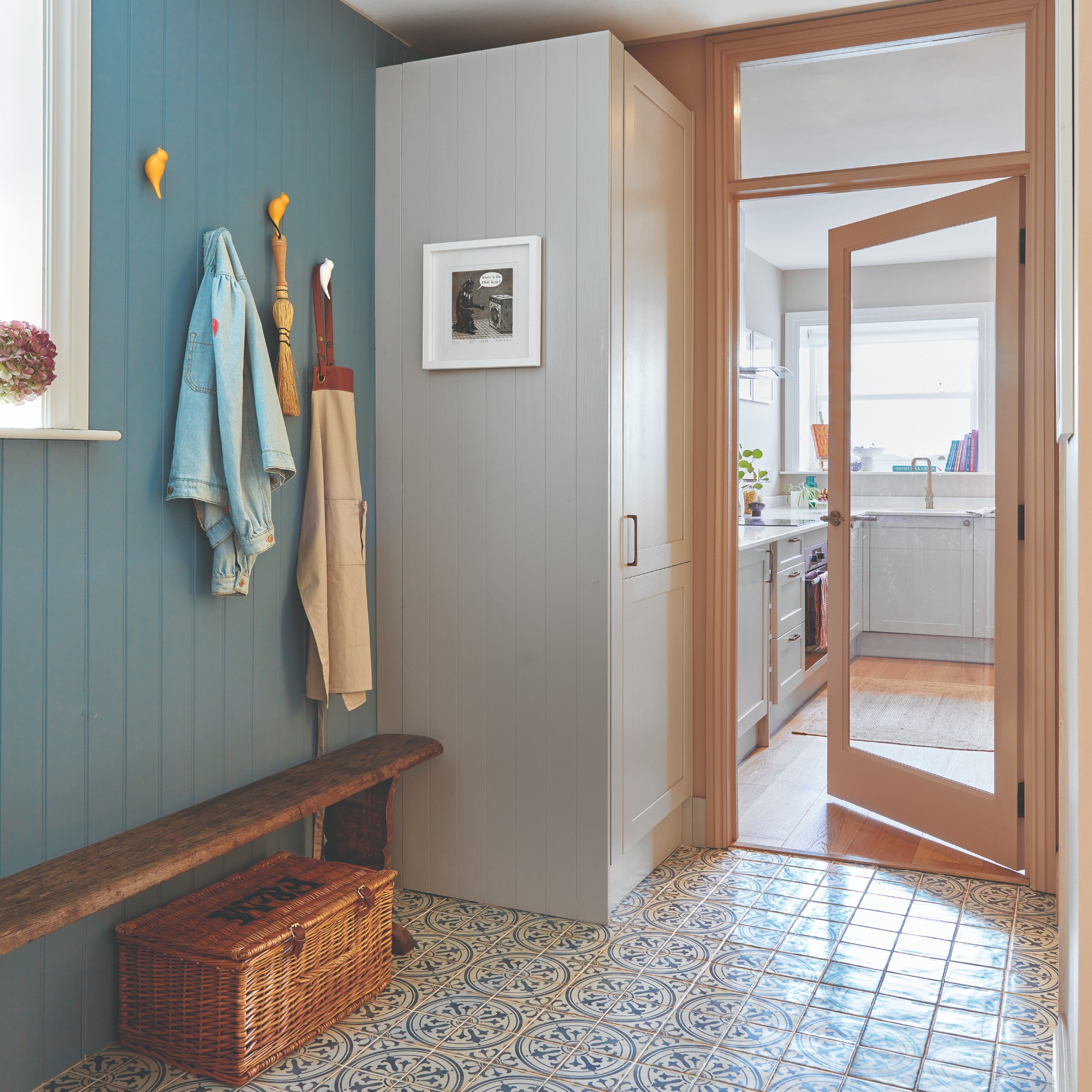
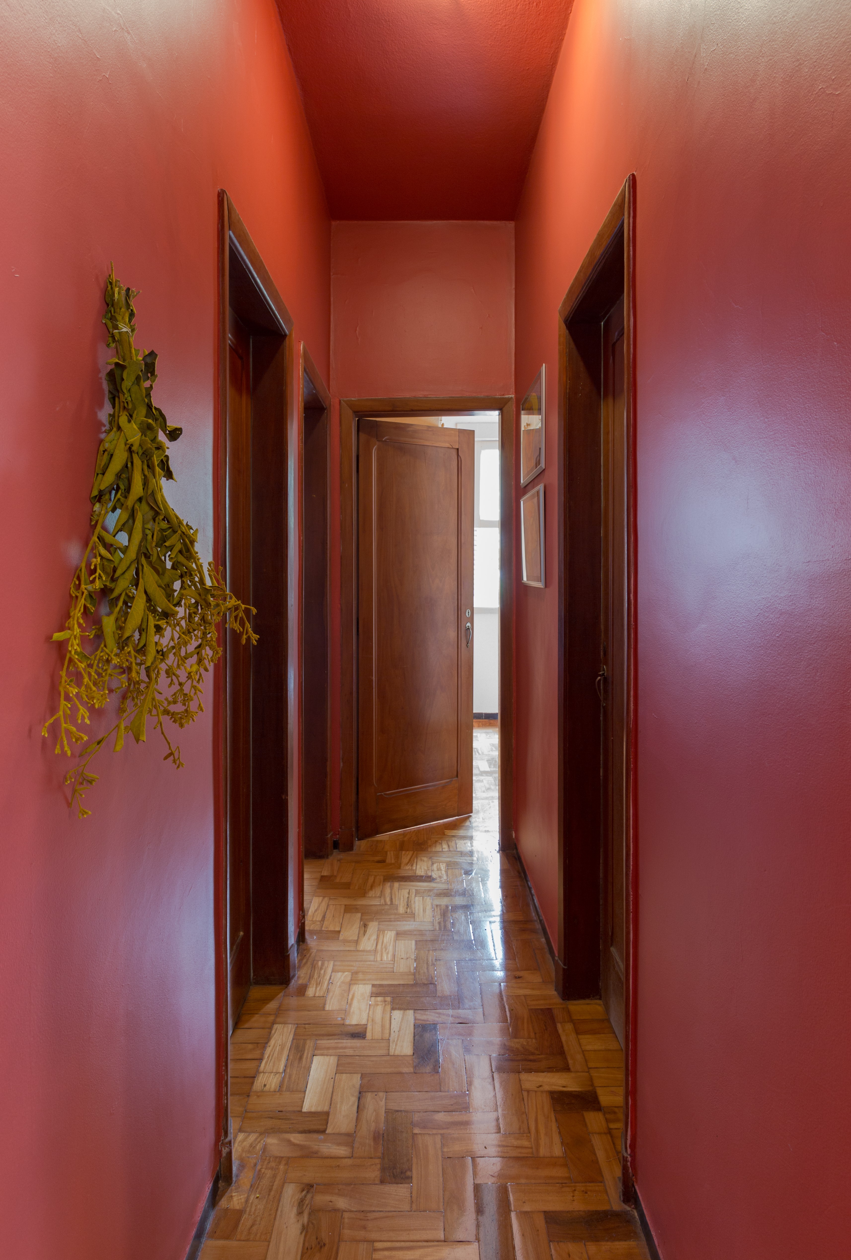
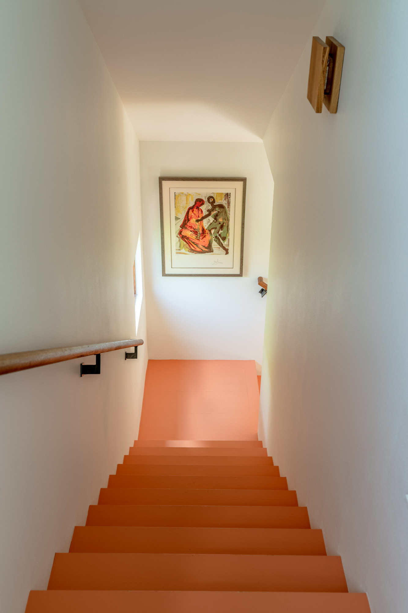
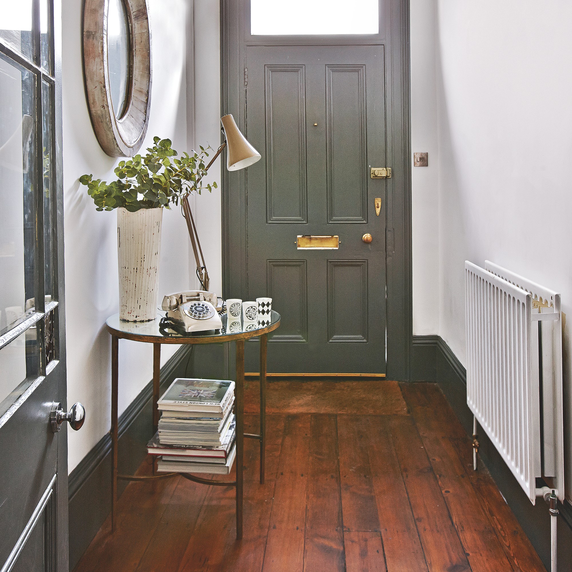
Nearly neutral blues, such as Benjamin Moore's Lookout Point and Valspar's Renew Blue, provide subtle color that remains light and bright, making them ideal for spaces with limited natural light and transforming hallways into calming havens. For bolder statements in small doses, Sherwin-Williams' Iron Ore, a deep charcoal with a sophisticated air, is recommended for those new to dark colors. Valspar's Rustic Oak, a warm cinnamon paired with a crisp white like Halogen, offers a low-investment, high-impact contrasting tone.
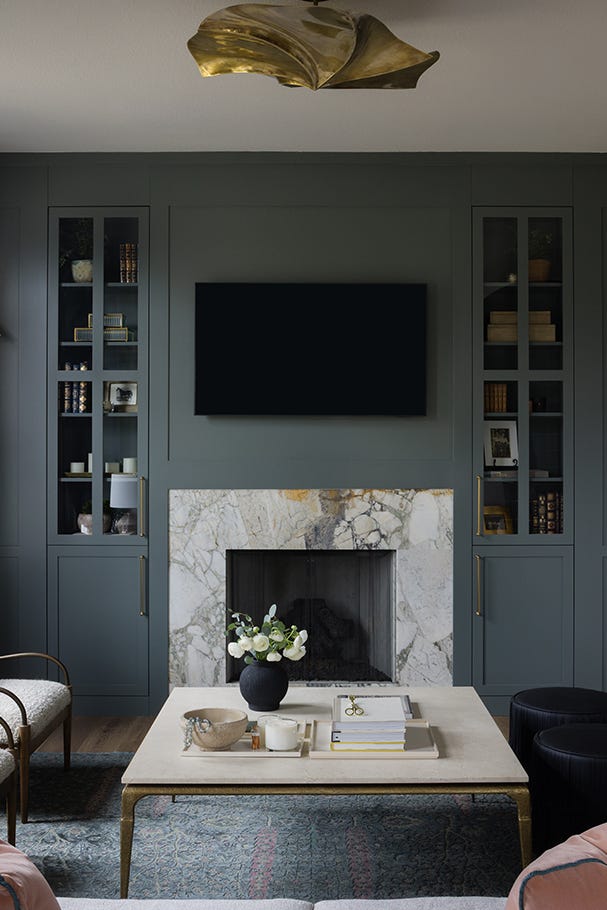
Neutral options continue with Benjamin Moore's Copley Gray, a versatile mid-tone that connects diverse adjacent rooms, and Behr's Tranquil Gray, a light gray with taupe undertones that fosters a soft and serene transition. For poorly lit spaces, Farrow & Ball's Down Pipe, an urbane and moody deep gray with a gentle green accent, works by absorbing shadows rather than trying to overpower the lack of light. Farrow & Ball's London Stone provides a warm mid-neutral that avoids blandness while highlighting detailed molding and trim.
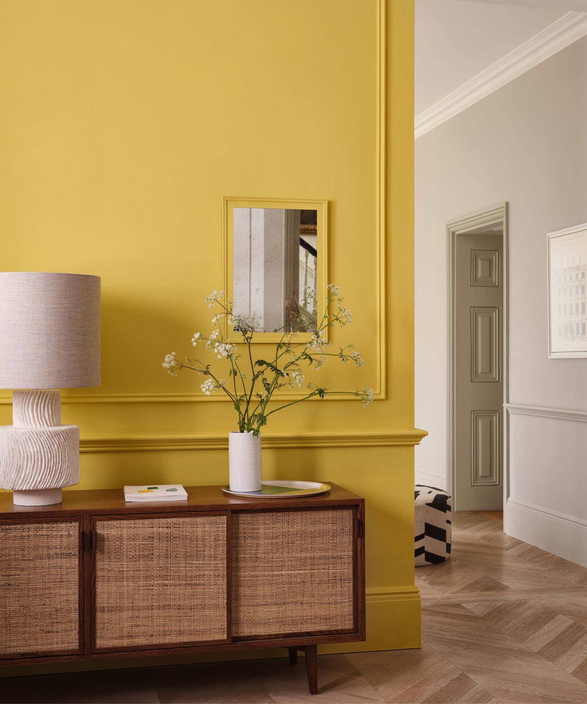
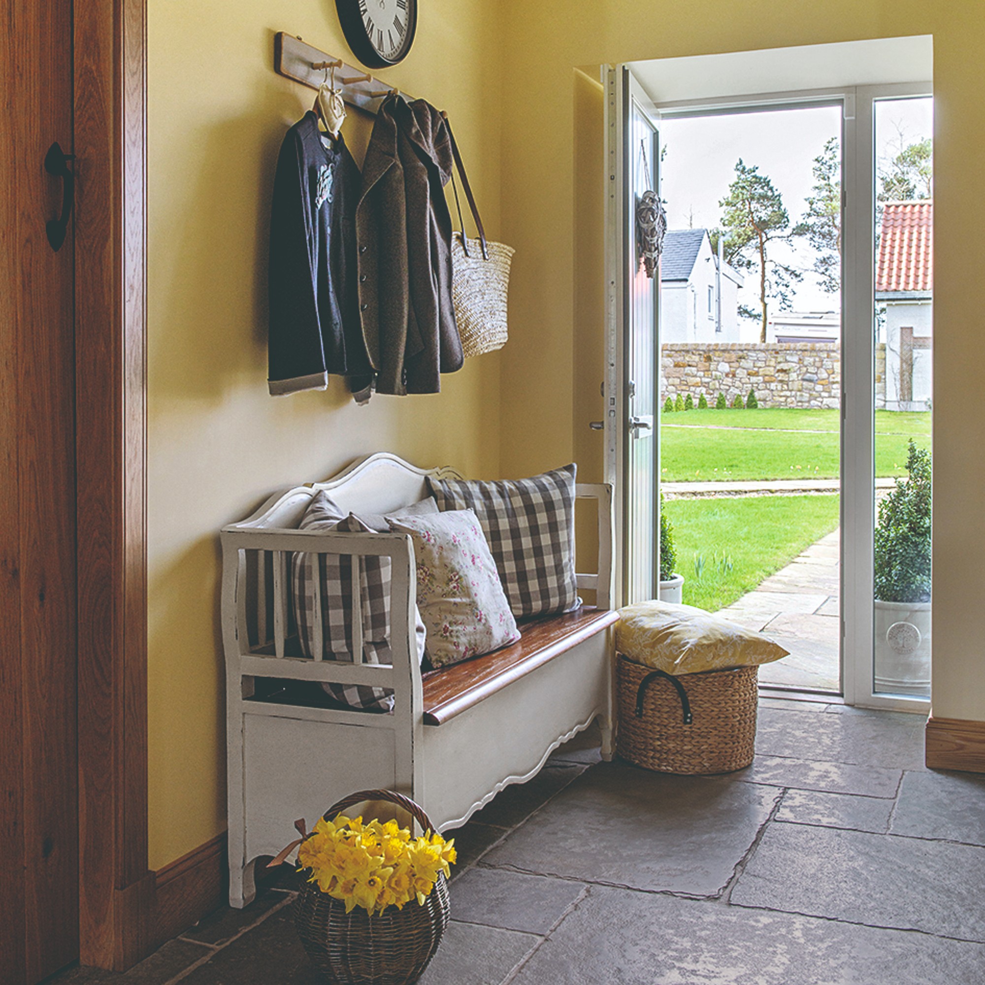
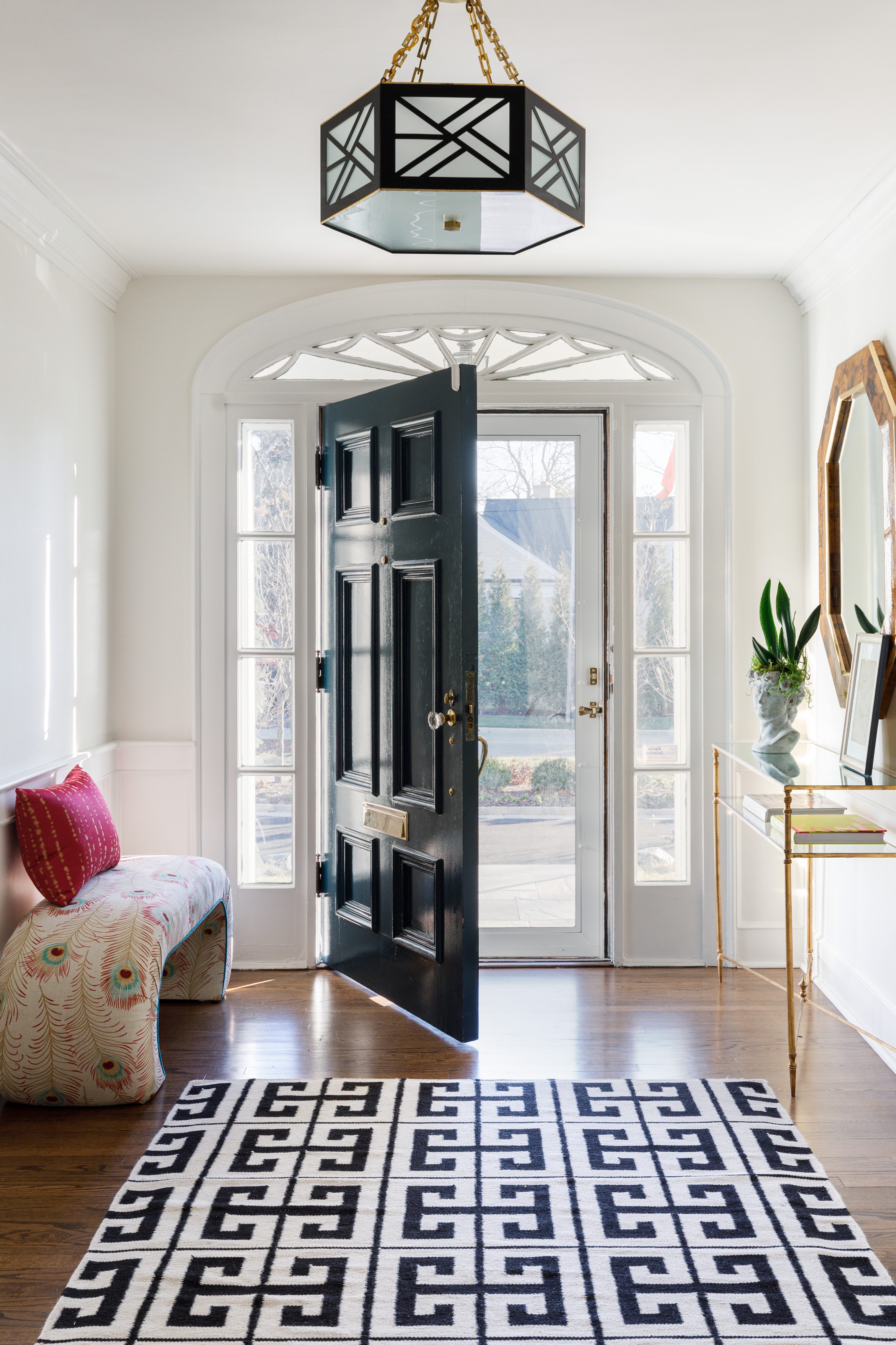
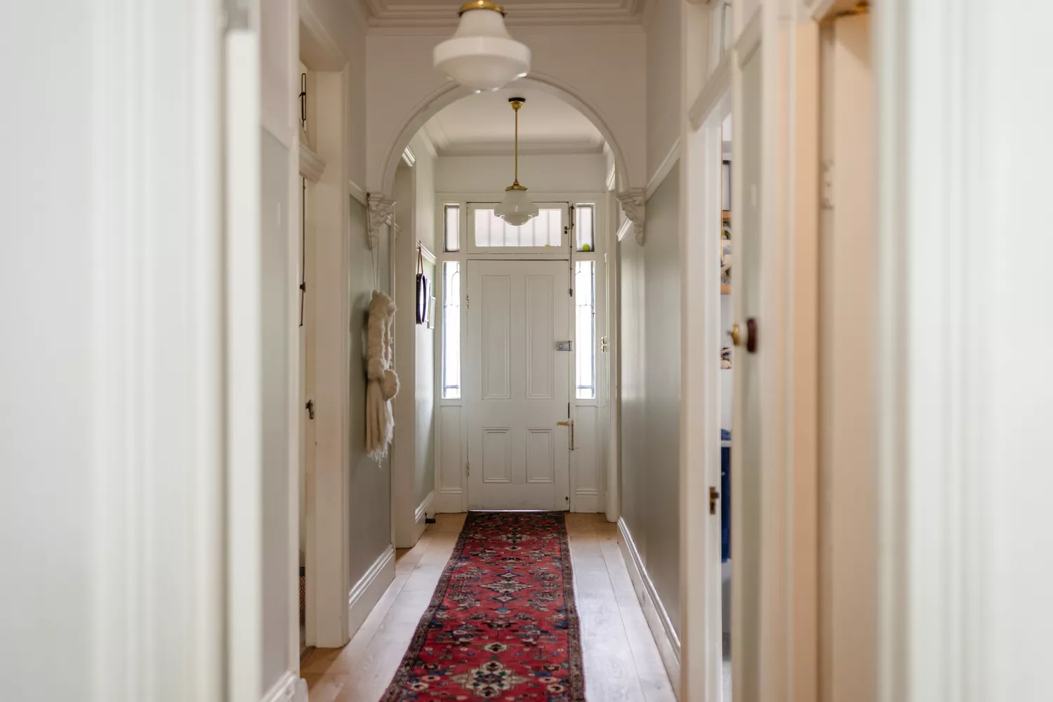
White and off-white selections include Behr's Blank Canvas, a warm white perfect for showcasing artwork and photo frames, and Benjamin Moore's Decorator's White, a reliable crisp white that offers high light reflectance and serves as a gallery-like canvas. Earthy grays, such as Sherwin-Williams' Drifts of Mist, offer an airy, inviting feel that doesn't appear too dark in low-light conditions. Warm beige and cream shades like Behr's Even Better Beige, Valspar's Holmes Cream, and Valspar's Gilded Linen provide versatile warmth, connect open floor plans, and allow woodwork to shine, with Gilded Linen particularly suited for creating seamless transitions between rooms.
Finally, calming green-blue hues like Sherwin-Williams' Sea Salt, which shifts subtly with light, and Valspar's Sky Space, a mood-lifting blue with deep green undertones, bring depth and serenity. These options are particularly effective in opening up narrow spaces without being overwhelming, often pairing well with sharp white trim or warm neutrals. Collectively, these expert-recommended paint colors demonstrate how hallways can be intentionally designed to reflect personality, enhance architectural features, and contribute significantly to the overall ambiance of a home.
#HallwayPaintColors #HomeDecor #InteriorDesign #PaintColorTrends #FarrowAndBall #BenjaminMoore #SherwinWilliams #Valspar #Behr #HallwayPaintColors #HomeDecor #InteriorDesign #PaintColorTrends #FarrowAndBall #BenjaminMoore #SherwinWilliams #Valspar #Behr
0 comment in total
 No comments yet
You may also like
19 Elegant Hallway Paint Colors That Designers Swear By in 2025

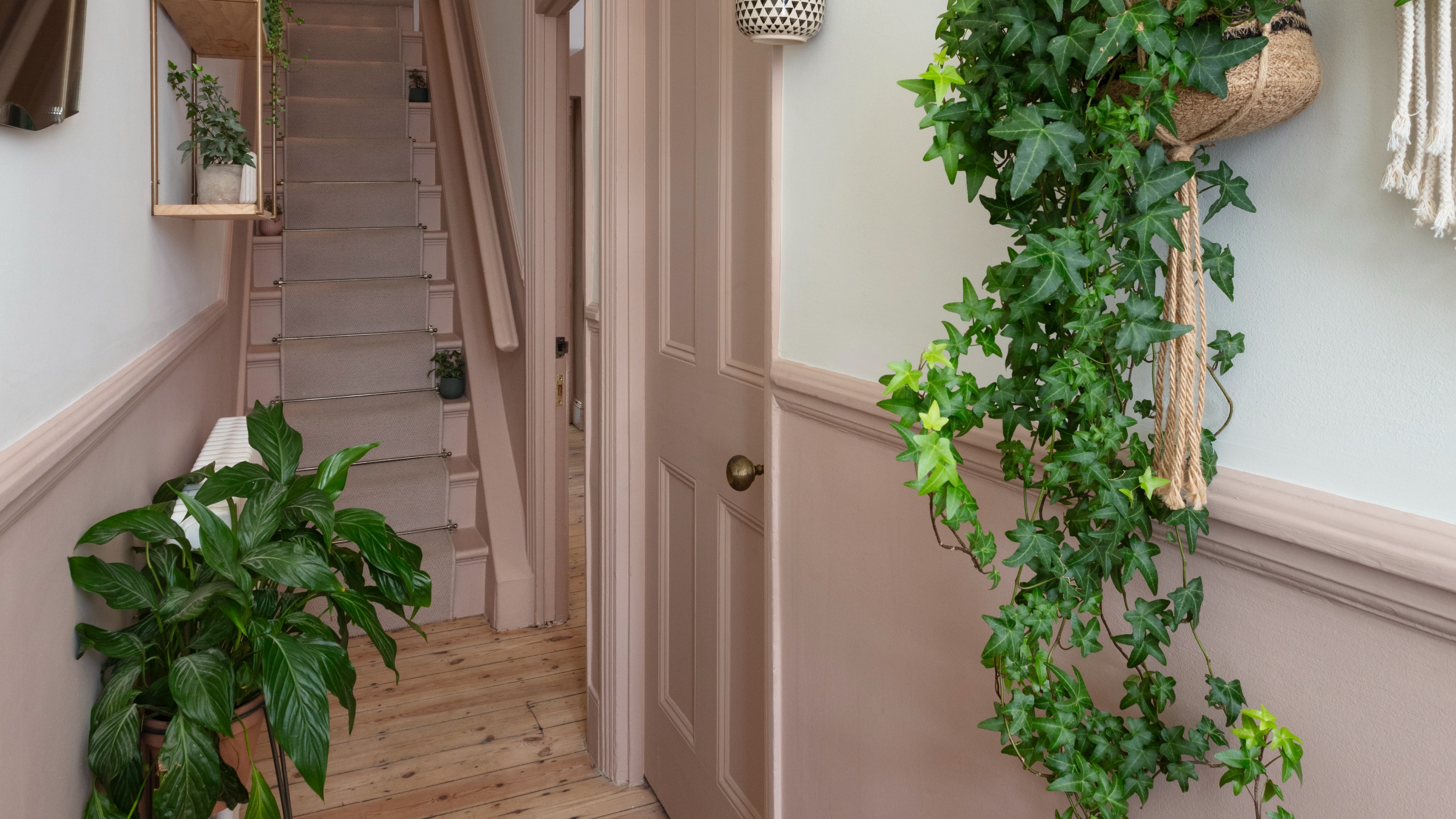
‘The colours that we decorate our hallway with should make us excited to be back’ – 16 hallway colour ideas to help you create a welcoming entryway
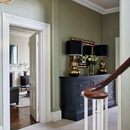
Sherwin Williams' Framboise Was the Perfect Color to Upgrade This Hallway

The One Space in Your Home You're Forgetting to Make Colorful

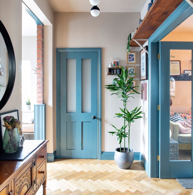
What colour should I paint my hallway? 28 ideas to inspire you
What colors brighten up an entryway? 5 shades that will bring light and life to your space

4 Paint Colors Designers Say You Should Never Use In A Hallway
colorful living rooms (no beige allowed)!
19 paint ideas for hallways – elevate your space with clever tricks and lustworthy shades
8 Paint Colors to Enhance Your Hallways, According to Interior Designers

Trust us, these are the colours to avoid when painting a small hallway
55 Living Room Color Ideas That Will Take Your Space from Drab to Fab

20 Hallway Paint Colors That Bring This Space to Life
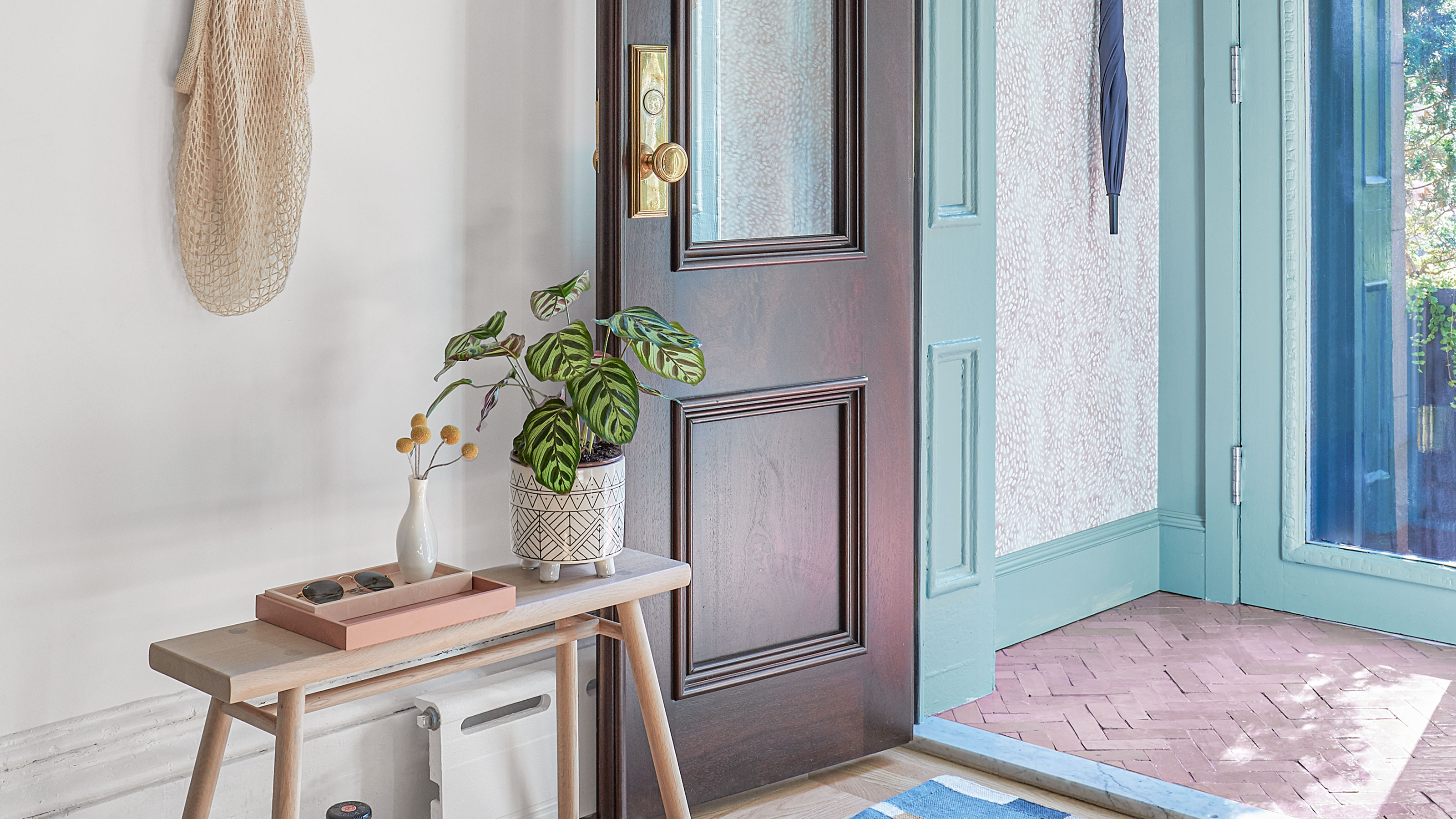
Hallway paint ideas – 15 ways to give this narrow room big personality

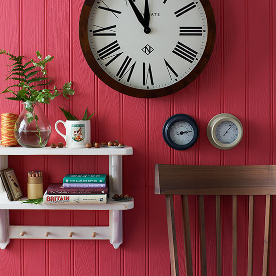
You should never paint your hallway this colour, according to colour psychologists
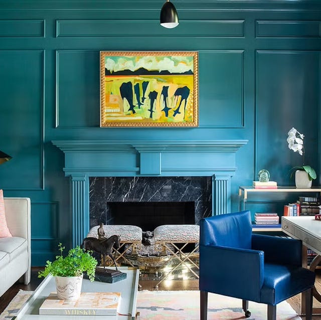
Listen Up: These Are the Best Paint Colors for Your Living Room

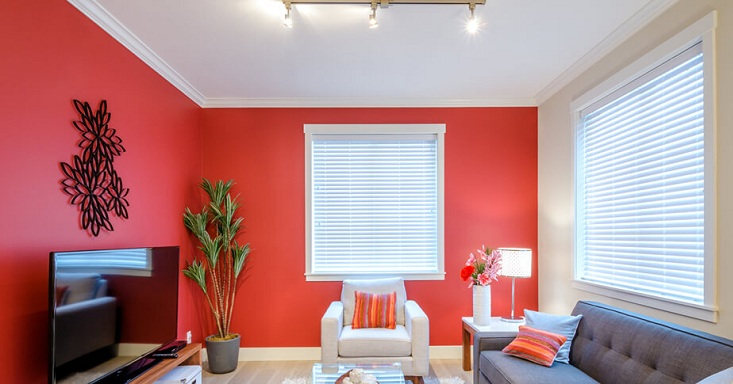
25 Latest Hall Painting Designs With Pictures 2024
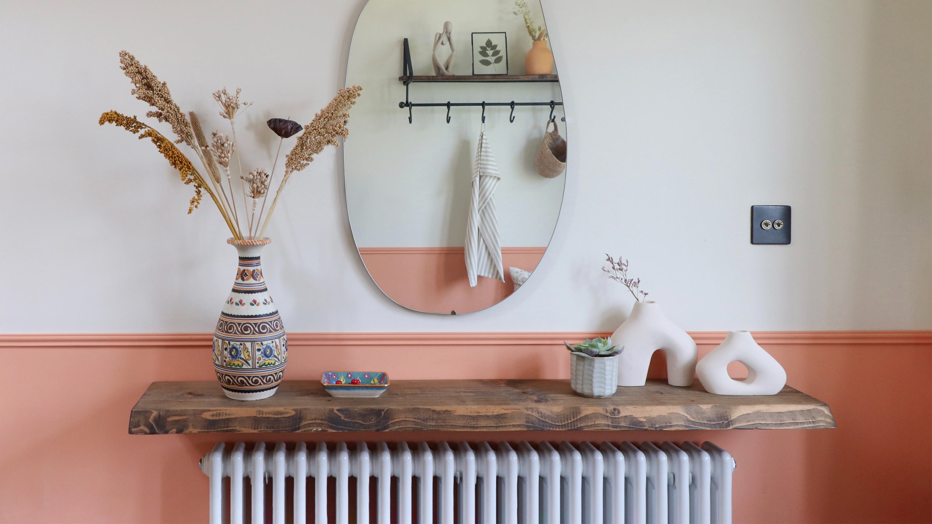
Hallway paint ideas to elevate your space with clever tricks
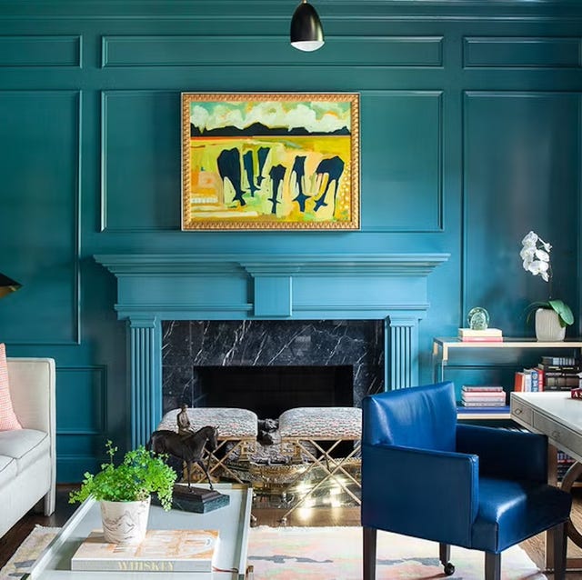
The 60 Most Popular Living Room Paint Colors Right Now
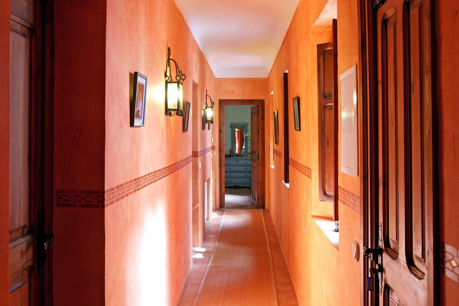
5 Colors You Should Never Paint Your Hallway, According to Designers